
Art’s Toxic Assets and a Crisis of Connoisseurship ~ Part II: Paper (sometimes photographic) Fakes and the Demise of the Educated Eye
“…Works on paper, however, have not been so completely studied and categorised, so there remains scope for mis-identification and skulduggery.”
~ Michel Strauss, “Pictures, Passions and Eye: A Life at Sotheby’s”, London, 2011.
An anonymous bidder has reportedly acquired a manuscript by the late forger Eric Hebborn for more than sixty times its reserve price – “Mystery bidder buys forger’s key to fakes in top museums”,
The Times, 25 October 2014.
“The only attributions that I have discussed neither in the text nor in the Catalogue Raisonné are of drawings. We have no assurance that any of Domenico’s drawings has survived. None was given to him in Berenson’s Drawings of the Florentine Painters (1938) or by Salmi (1936 and 1938). The ascription of a group of drawings to Domenico by Degenhart and Schmitt (1969) lacks credibility, and scattered earlier attributions by Wickhoff (1899), Böck (1934), Geiger (1948), and Grassi (1961) seem equally implausible. The absence of drawings – Domenico Veneziano must have been a tireless as well as a brilliant draftsman – is the oddest of the many gaps in our knowledge of this great artist.”
~ Hellmut Wohl, “The Paintings of Domenico Veneziano”, Oxford and New York, 1980.
“The state of methods and protocols used in attribution is a professional disgrace. Different kinds of evidence, documentation, provenance, surrounding circumstances of contexts of varied kinds, scientific analysis, and judgement by eye are used and ignored opportunistically in ways that suit each advocate (who too frequently has undeclared interests). Scientific evidence is particularly abused in this respect. The status of different kinds of evidence is generally not acknowledged, particularly with respect to falsifiability. It is generally true to say that the most malleable of the kinds of visual evidence are those that bear in most specifically on issues of attribution (e.g. the individual artist and precise date), while those that are least malleable (e.g. pigment analysis) are only permissive (i.e. nil obstat) rather than highly specific. I will attempt to bring some systematic awareness into this area, which is a necessary first step in establishing some rational protocols. The case studies will be drawn from Leonardo.”
~ Martin Kemp, a synopsis for a paper – “It Doesn’t Look Like Leonardo” – delivered on May 7th, 2014 at a congress at the Hague on “Authentication in Art: What happens when the painting you are buying, selling, investigating, exhibiting, insuring – Turns Out to be a Fake or a (Re)Discovery…”
In the early 1990s we noted that damaging restorations and misattributed works stemmed from common failures of visual discrimination, or lapses of connoisseurship – which are the same thing. Almost an entire generation of scholars had swallowed official defences of the controversial Sistine Chapel restoration and, generally, had seemed to have stopped appraising restorations – and especially those at the National Gallery (London) where cleaning controversies had run from the institution’s earliest days. In the late 1960s, the gallery had broken the spirit of many scholar-critics with its artful spinning of the (ruinous) restoration of Titian’s Bacchus and Ariadne as a triumph of the restorer’s art (see …Titian and Great Women Conservators). In 1977 a former director of the National Gallery, Kenneth Clark, declared picture cleaning to have been a battle won by restorers and pro-cleaning museum curators like him.
Scholarly failures to respond to restoration-induced injuries ran in tandem with failures to “read” pictures when assigning authorship. The National Gallery’s curators had made extraordinary contortions to sustain the attribution to Michelangelo of an unfinished painting (The Entombment of Christ) that was clearly the product of two separate hands working perhaps a generation apart. At first it was claimed that the two radically different manners of painting stemmed from separate campaigns of work by Michelangelo, one during 1504-08 before work began on the Sistine Chapel ceiling and another sometime after 1515. In the first stage of work, it was said, Michelangelo had painted smooth and enamel-like, as in the Doni Tondo of c. 1507. In the second stage his looser freer brushwork was said to reflect the experience of having painted the Sistine Chapel ceiling. Later, it was claimed that this unfinished painting in two styles and manners had been entirely painted by Michelangelo when he was only twenty-five years old in 1500. Cecil Gould had held that such technical and stylistic anomalies stemmed from the fact that the young Michelangelo was: “…ranging forwards or backwards within his own development, reworking one motive…or anticipating another”.
The doyen of British Michelangelo scholarship, Michael Hirst – a key supporter/adviser of the Sistine Chapel restoration – has endorsed this reading (of Michelangelo’s sole authorship). Professor Hirst’s stance in both cases seems visually obtuse: during the restoration Michelangelo’s Sistine Chapel paintings had lost many unquestionably original features that had been copied during his own lifetime; the Entombment’s so-called “anticipations” were not of Michelangelo’s subsequent work but of later work by artists like Rosso Fiorentino and Pontormo (who were both six years old at the time – see Figs. 7 and 8). We said of such visually unsupported hypotheses: “The fact that our scholars and technical experts flit quite so promiscuously through time and space might suggest uncertainty of connoisseurship and ability to ‘read’ paintings” (“How to Make a Michelangelo”, Michael Daley, Art Review, October 1994). We had appealed earlier that year to the authority of the educated eye in the May issue of The Art Newspaper in response to a restorer’s hostile review of the James Beck/Michael Daley book Art Restoration ~ The Culture, the Business and the Scandal:
“…this concern [over restorations] is shared by others. The current director of the Prado, Calvo Serrraller, has condemned the Sistine Chapel restoration as a misguided ‘face-lift’. A restorer in St Petersburg complains of the ‘perniciousness of radical British restoration techniques’. A curator of New York’s Metropolitan Museum condemns the ‘strident tones’ produced by ‘the exuberant cleaning of paint surfaces, for which the National Gallery has unfortunately become famous’. It is a pity that the National Gallery staff are not prepared to debate these matters directly. It is a pity that discussion should be necessary at all when, to educated eyes, the evidence of injury contained in before and after cleaning photographs is so unmissable.”
Three years later, in connection with another visual evidence-denying National Gallery attribution (its Rubens Samson and Delilah) we wrote: “In recent years the art of connoisseurship has become entangled with the scientific analysis of paintings. Problems of attribution, once resolved by the educated ‘eyes’ of individuals, are increasingly seen as the property of interdisciplinary teams of curators, restorers and scientists who enjoy the technical, financial and professional support afforded by large museums. But how sound are the new procedures – and how reliable are the published accounts given of them?” (“Is this really a Rubens?” Michael Daley, Art Review, July/August 1997).
Mixed campaigning results
After two decades of campaigning on these cross-linked issues, there are signs of resurgence in old-style connoisseurship – or at least, of support in principle for it. In May 2014 the Mellon Centre hosted a conference titled “The Educated Eye? Connoisseurship Now” and one speaker, Bendor Grosvenor, the editor of the Art History News blog, cited the restoration of Michelangelo’s Sistine Chapel ceiling as proof of failures of connoisseurship among restorers. At the same time, the art market is processing more upgraded and elevated studio works and copies than ever before, almost always doing so on the authority of some conservation “investigations” and treatments. “Rediscovered” Rubens’s, van Dycks, Michelangelos, Caravaggios or Leonardos are appearing on an almost monthly basis. Autograph preparatory drawings or studies have undergone similar expansions: with Michelangelo, where only 250 sheets of drawings were accepted in the 1960s, over 600 sheets are accepted today. In the same month, as indicated above, a congress was held on the great problems of establishing authenticity today: “Authentication in Art: What happens when the painting you are buying, selling, investigating, exhibiting, insuring – Turns Out to be a Fake or a (Re)Discovery”.
It is hard to exaggerate how far and how fast we have moved away from visually alert and sound scholarly practices. In 1980, as the Sistine Chapel restoration began, Hellmut Wohl published a monograph on Domenico Veneziano as a study of Florentine art in the early Renaissance. It was the fruit of three decades of researches. As indicated above, Professor Wohl made no attempt to discuss drawings that had been attributed to the artist for the simple reason, he explained, that surprising as it was, there was no evidence that any (of the very many) drawings he must have made had survived. In his catalogue raisonné, Wohl discussed sixty-two attributions to Domenico, his workshop and his immediate followers, which he considered to be apocryphal. The force of that analysis is still accepted (see caption at Figs. 4a and 4b). His study offered no new attributions or documents and confined itself to a re-examination of the artist himself through his known works, documents and sources in the light of various art historical readings. Judging Domenico to have been one who was “centrally involved in the artistic process of his time and place”, Wohl began his study not with consideration of the artist’s early works but of his St. Lucy Altarpiece, which stands chronologically and conceptually at the centre of his extant oeuvre. His reason for doing so was because the work’s sacra conversazione and predella “provide the richest, most complex and most revealing testimony of the anatomy of his art.” In discussing this crucial work, Wohl saw that it was artistically imperative to acknowledge its condition:
“In its original state the sacra conversazione, which was drastically overcleaned at the end of the nineteenth century, must have been one of the most luxurious examples of tempera painting in its time. Even in its present condition we can follow the shaping of its forms in untold layers of brushstrokes, responsive to the subtlest directional nuances, and weaving a pattern within which each form emerges as spatially alive and as a bearer of light.”
If this seems like exemplary visual and conceptual analysis, it gets better:
“The nature of Domenico’s modelling is such that light seems to be embedded in the fabric of each coloured surface – a method which is one of the unmistakable indications of Domenico Veneziano’s hand, and one that contributed much to that ‘change of vision’ by which the figure was no longer seen in isolation, but as part of a given field,’ which Offner (1924) recognized in Piero della Francesca…”
Such writing and scholarship not only illuminates, it arouses curiosity, whets the visual appetite, makes one want to see for oneself. There are fourteen excellent black and white plates of the altarpiece in Wohl’s book. The now forever restoration-damaged work itself is in the Uffizi, Florence – the scene of this particular crime against art: it had been in a good state until taken to the Uffizi, where, as the scholar Cavalcasselle had protested it had been subjected to:
“so disgraceful a cleaning and to so many retouchings as to lose much of its original quality, and thus to produce a disagreeable impression, having been left with a cold tonality, with its paint surface laid bare (‘posto allo scoperto’) unevenly in several places, and gone over.”
Wohl meticulously and eloquently lays out the hazards to interpretation that are presented by bad and restoration-damaged condition:
“The present condition must be kept in mind as a corrective in estimating style. The blue mantle covering the knees of the Virgin has been reduced to a state of semi-transparency, its barest patches have been filled in with a flat tone that roughly matches the remaining original blue. The Virgin’s dress and part of the mantle around her left arm are similarly worn. The extent of the damage to the faces of the Virgin and the Child can be gauged from the relative rigidity and opaqueness of their expressions as compared with the mobility and subtlety of expression in the head of Madonna at I Tatti. The transparent veil which originally covered the hair and forehead of the Virgin has disappeared except for a remnant of its fringed border on her shoulder. The niche behind the Virgin, especially its shell, is so heavily repainted that it no longer functions properly as a hollow in the pictorial space. The figures of the saints have suffered somewhat less, the Baptist very little. The habit of St. Francis is worn in the shadows, and there are repairs above his tonsure and around his ear and lower lip. There is damage along the left edge of the face of St Zenobious. The contour of his skullcap has been redrawn. The dress and mantle covering the shoulder of St. Lucy are very threadbare. The contour of her profile has been reinforced, and her face retouched, especially to the left of her eye. The background above and to the right of her head is also extremely thin. The effects of the ‘disgraceful’ nineteenth-century cleaning and retouching of the sacra conversazione are not, however, confined to these areas, where they are particularly conspicuous, but show throughout the panel…”
If a scholar could still write so aptly and freely in 1980, how had the cat got the tongues of so many by 1990? Why had so many been blind or indifferent to the even more disgracefully injurious and art historically corrupting “restoration” of Michelangelo’s Sistine Chapel ceiling? Is it not shaming to the profession that it took a sculptor, Venanzo Crocetti (who had worked as a young man on the restoration of the Sistine Chapel ceiling during the mid 1930s), to blow the whistle in the 1980s? Is it not shaming to the profession that when James Beck, an esteemed scholar and a brilliant, popular teacher at Columbia University, sided with the artist critics of the restoration and advanced an art historically informed critique that the art historical sky fell on him?
Crocetti’s testimony on the AB 57 cleaning method (a thixotropic cocktail of solvents and detergents) then being used on Michelangelo had been as percipient as it was damning. He noted that while the first 3 minute-long application left the frescoes looking cleaner, the second on the following day left them with altered and considerably degraded colours. He believed that the first applications effectively “degreased” the surfaces leaving them open to greater penetration by the second applications. He was convinced that the immediately apparent visual effects of these twin applications would not be their final outcome. He argued – correctly, it has turned out, see below – that their corrosive actions would continue because of the absorption of the water rinse operations (after each application of the chemically-loaded thixotropic gel) to a depth of half a centimetre. Some days after the second applications he noticed (from the scaffold itself) the appearance of “whitish oxidations of variable intensity” over large zones. These have been reappearing throughout on a massive scale since 2010 and have created panic measures and diversionary technical “initiatives” at the Vatican. (See “Michelangelo’s disintegrating frescoes” and “Sistine Chapel frescoes turning white”.) The official explanation for the oxidations is that they are caused by the combination of humidity given off by the press of visitors (up to 2,000 in the chapel at any one moment) and the atmospheric pollution in the chapel itself. At least as likely a cause is that the humidity is activating the water-soluble ammonium and sodium salts that were washed into the fabric of the frescoes.
The unfounded restoration premise
Crocetti considered the restorers’ claimed discovery of “stratifications of dirt gathered on the frescoes over the centuries” to be both exaggerated and misleading, and he held that the early photographs of the lunettes by Anderson made the extent of this exaggeration clear. He believed that the ferocity of the AB 57 cleaning agent made any finely tuned cleaning gradated to meet local conditions impossible. He believed that the greatest injury was to the chief feature of the frescoes – their disposition of lights and shades, and not their local colours. He believed that the restorers, in their pursuit of more intense colours, had penetrated the frescoes to their brighter, less modulated preparative layers. He felt confident that he had seen at first-hand how, with “cleaning”, the figures in the lunettes had been remade, becoming “false in form and colour” alike. He saw that many of the shadows from which the figures had formerly emerged had simply disappeared. He saw that corrections which Michelangelo had, with mastery, made invisible, had been exposed. Above all, he confirmed that the condition of the frescoes had remained “excellent” at the time of the restoration, and that this in part had been due to the absorption over the centuries of greasy substances of chapel smoke which had “strengthened the colour. Leaving upon it a glittering shift of the lightest varnish [thereby counterbalancing] the aridity and fragility” of old fresco. Having worked on the restoration in the 1930s and known Michelangelo’s work intimately, he found himself in despair.
We believe that today’s independent scholars are even shyer to speak against bad restorations and misattributions because of the above mentioned grip of restorers, scientists and curators in museums under the new collective ground rules of the so-called Technical Art History. This hybrid activity is not so much art history as an art historical gloss that is put on whatever state pictures are left in by museums’ technical ‘conservators’ whose own actions, for art-political reasons, can never be gainsaid. This collectivist or interdisciplinary practice precludes external input and appraisal and does not recognise the legitimacy of other independent sources of disinterested criticism. It may also be because many scholars and curators today have been educated under the so-called New Art History – a species of study that seems to leave students ideologically averse to the very notion of connoisseurship – which practice is held synonymous with snobbery, amateurism and art market shenanigans. For scholars in today’s academic world, it would seem to be professionally safer to view art through the distancing sociological prisms of Marxism, Feminism and such, rather than to heed and appraise its physical and, therefore, aesthetic condition (which action can upset owners, public or private). it can seem safer, too, not to scrutinise attributions (which can upset owners, public or private). In some countries, and the USA in particular, scholars harbour legal anxieties about challenging an attribution.
Running the Risks
At our annual memorial lecture (see CODA below) in honour of Professor James Beck of Columbia University, the Renaissance scholar and founder of ArtWatch International, a modest prize is awarded for services to art in memory of a another founder member of ArtWatch, the painter Frank Mason. In 2014 the prize was awarded to Martin Eidelberg for the launch of his excellent Watteau Abecedario, a developing online catalogue raisonné of the artist. In an ArtWatch International interview, A Weight of Evidence, Professor Eidelberg said of the problem of misattributions:
“First of all, the oeuvres of Watteau’s followers have been clouded over because works not worthy of their master have been assigned to them in a haphazard manner. It takes time to sift it all out. Wrong attributions have serious repercussions for our understanding of these artists. Impartiality is the key to it all. The dealer, auction house, and collector alike don’t want to hear bad news about paintings being downgraded. That’s one of the major dangers these days for the catalogue raisonné-er. There are cases where people whose works of art were downgraded became belligerent or litigious. Legislation currently pending in the New York State Assembly would prevent people from suing someone who is preparing a scholarly catalogue raisonné just because they disagree with your opinion.”
On the reluctance of some scholars to say as much as they might on the subject of attributions and misattributions and the possible effects of the pending New York State legislation, Eidelberg noted:
“There are important questions surrounding this pending New York legislation. Whom will it protect? Will it protect only an art historian working in New York State? Or will it protect Americans in general? And what about on the international scale? I don’t think France or Germany will abide by New York State legislation. That needs to be dealt with. What if an ordinary person like myself, who has no financial investment, gets involved in a lawsuit? The expense involved is incredible. Lawyers charge several hundred dollars an hour, and a case can go on for several years. The opposition can wear you down just by the incredible demands they put on your lawyer, whom you are financing. And if you win, what do you win? You don’t win money to pay even for your legal representation. That is a serious issue, because there are a lot of people in the art world who are dealing with large sums of money. When a painting sells for millions of dollars, there is strong motivation for wanting positive attributions.”
The Consequences of Bad attributions
One reason why professional neglect of condition is so unfortunate is that paying due attention to it increases capacities and skills when making or appraising attributions. It is too easy to mock the notion of the connoisseur. If its more peripheral exponents can sometimes resemble the narrator of the classic Croft Original Sherry advertisements (“One instinctively knows when something is right”) we should note that Daumier’s depictions were as affectionate and respectful as they were wry. Those collectors and dealers who can identify not only the author of an engraved print but its state and edition have eyes and scholarly expertise running in harmony. The high costs of neglecting the development of the ability to recognise by eye the difference between one thing and another in an otherwise very similar grouping; and of vacating the entire arena of condition to restorers who, like the professional aristocrats they have been allowed to become, never apologise for or acknowledge any of their errors, has become apparent within the last two decades at the Sistine Chapel where what little was left of Michelangelo’s work is now disintegrating. Any professional culpability for this outcome, however, would be joint and not restricted to the restorers (who, for all we know, may have been “under orders”). The initial, almost universal art historical acceptance of the apologia for the visible consequence of that restoration’s singular cleaning method, as offered by the Vatican and its prominent adviser/supporters, permitted a contested folly to continue when it might still have been halted. The original peddling of claims to have discovered a “New Michelangelo” (for whom no corroboration is to be found in art history or in the many copies that were made of the Sistine Chapel ceiling) was as egregious a pollution of scholarship as the actions of the restorers were artistically destructive.
If, as might seem to be the case, many of today’s art historians still cannot recognise a gross adulteration that left Michelangelo’s ceiling as a false witness to its own original state, how likely are they to be able to distinguish between an autograph work and a very good studio copy – or a clever forgery? In a field where, as every blockbuster exhibition and new monograph now testifies, the consequence of successive restorations is that the great majority of works have been left as restoration-reduced shadows of their former selves, how are scholars to formulate and retain mental pictures of an artist’s distinguishing “bedrock” traits so as to avoid errors of attribution? With so many now many-times restored and progressively adulterated works failing to resemble their original selves, scholars are effectively left making judgements on the authority of works that have themselves become partial fakes. In an aesthetically corrupted critical milieu fakes can be extremely seductive. They spring fully-formed with artfully planted reassurances (see below and Fig. 1). They enter our world not emaciated and debilitated by successive restorations but freshly minted and at the peak of their calculatedly deceiving powers. When scholars lack the confidence even to acknowledge the grossest restoration injuries and adulterations; when they have lost the habit of appraising condition, how secure might their critical defences be against outright forgeries?
The value of fake drawings
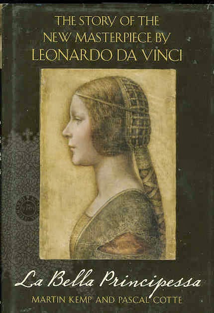
Drawings, as the former auctioneer Michel Strauss has noted, are an especially sensitive and forgery-prone sphere, being both easier and cheaper to produce than paintings or sculptures. They can also be more pernicious in their effects. A badly attributed, supposed preparatory drawing can trigger a chain of misattributed paintings (as with the National Gallery’s Rubens Samson and Delilah and the Art Gallery of Ontario’s Rubens Massacre of the Innocents). And, yet, visual warnings are always present: the supposed preparatory drawings on which questionable painting attributions stand frequently display features that are unusual or unprecedented within the artist’s oeuvre. The National Gallery’s Michelangelo Entombment and its Rubens Samson and Delilah are two such cases – see below and opposite. With the latter, the supposed original sketch drawing shows distinct signs of being a 20th-century forgery, as does also the recently claimed Leonardo drawing that has been dubbed “La Bella Principessa” by its principal art historical supporter, the Leonardo authority, Professor Martin Kemp (see below).
With drawings, the need to maintain vigilance against fraud is particularly urgent precisely because the field itself is insufficiently studied. As for the success of forgeries (which always seems inexplicable and incredible in retrospect) Michel Strauss offers this explanation for the phenomenon of initial too-ready acceptance of problematic works:
“It is a strange and curious factor that looking now at de Hory’s fakes, they seem so facile and such obvious, unlikely pastiches. It turned out that Frank Perls, with whom I compared notes, and I, were the only ones, to my knowledge, among many experienced international experts and dealers, who sussed him out at that time. I can only explain this as an example of the herd instinct: if one accepts, then the rest will follow…”
Artists’ assistance on spotting fake drawings
Fortunately, in the detection of fake drawings, much assistance can be had from artists (whose own eyes are constantly educated through engagement in the practices of art). Drawings are the most purely autographic category of visual works – successful artists might delegate parts or stages of paintings to assistants but rarely do so at the crucial designing or drawing stages. The skilful faker may get many things right but to escape detection he (- it invariably is a he?) needs to get everything right. Conversely, the connoisseur needs to spot only a single disqualifying error. This task should be made easier by the fact that drawings are the most direct and speedy manifestations of thought and purpose. How plausibly a drawing speaks of its role as an aid to the production of another and more substantial work constitutes a crucial indicator of authenticity. The forger might mimic a given artist’s graphic effects but, like a restorer (which he often is) he can never enter the mind of bona fide creative artists so as to grapple with and replicate an original and imaginative purposive graphic intent.
By long tradition artists have been outspoken on dud attributions. In the early 1900s the artist, M. H. Spielmann, F.S.A., wrote a series of articles for The Magazine of Art, which he edited. In one, “Art Forgeries and Counterfeits”, Spielmann listed no fewer than eight members of “the picture-trickster’s profession”. His second category was that of The Cleaner, who “unhappily includes the restorer; and both, in the vast majority of cases are the sworn enemy of a picture’s quality. Though the cleaner may skin the picture of its glazes as well as of its dirt and discoloured varnish, though he may destroy the work of art, aesthetic criminal though he be, he is, more’s the pity, no law-breaker. He may scrape a picture to the under-painting, and he may ‘restore’ what was never there; still, in the eyes of the law, he is as honourable as the original artist.”
Another forgery specialist was The Monogrammist, a student and scholar of art history who “knows exactly how an artist signed his name at different periods of his career, in what portion, on what spot…in what manner…” His cousin The Sealer acquires “quite a little gathering of […] seals from the most important collections, and he can then command a fair price for attaching one or other of his ‘certificates of quality’ to any picture that may be brought to him for the purpose.” The erudite old Genealogist then steps in: “to make things more certain still. He, too, is a student of the movement of art, and he uses his knowledge to determine what lineage he may safely attribute to a picture, and what he may not attempt…”
Scholars beware
Spielmann articulated the most critically instructive category of all, that of The Portmanteau Picture, the work in which motifs plundered from a number of authentic works are fused into a temptingly plausible synthesis. If a work looks reassuringly familiar at first glance it might well be because, in its component parts, it is already familiar from a number of “borrowed” sources. In the case of the putative Leonardo “La Bella”, a useful question to consider would be this: “If a twentieth century forger had wished to produce a profile female portrait in the manner of Leonardo, where would he most likely have found useful motifs that might plausibly be assembled into an identikit Leonardo-like whole?” (We suggest a number of candidate works opposite.)
If there is one source of advice potentially more helpful to connoisseurs than that of an artist, it is that of an artist gone-bad. There is a literature of garrulous fakers who have exulted in their powers to deceive professional experts. One, the notorious forger of drawings, Eric Hebborn, single-handedly left a small library of instructions to forgers and connoisseurs alike. In his 1997 The Art Forger’s Handbook, Hebborn effectively provides a Guide for the Connoisseur on the detection of fake drawings.
TWO CASE HISTORIES
In art criticism, as in the appraisal of restorations, comparisons can be instructive. In the previous post we discussed a “van Dyck” drawing that became a Rubens ink sketch and, a “Veronese” – from the same dealers – that collapsed after sixty years and presently stands on offer as an attributed Agostino Carracci. Here, we reconsider that supposed, upgraded and now accepted Rubens ink sketch which recently sold for more than £3 million, along with a claimed autograph Leonardo, the so-called “La Bella Principessa” which sold in 1998 as a not-Leonardo for $21,850. On its current Leonardo claims it has been estimated, perhaps optimistically, to be worth some £150 million.
The two attributions were made nearly a century apart. While the now-Rubens has been officially accepted with the previously described chain of consequences, the latter is locked in an increasingly acrimonious international battle for critical acceptance. In both cases, espousal of the work has generated implausible art historical narratives and an over-riding of technical and aesthetic alarms. In both, indications of modern forgery are present, and – apropos Hebborn’s disclosures – in both there happens to be a strong close-by candidate as a potential forger.
The history or “provenance” of two dubious works
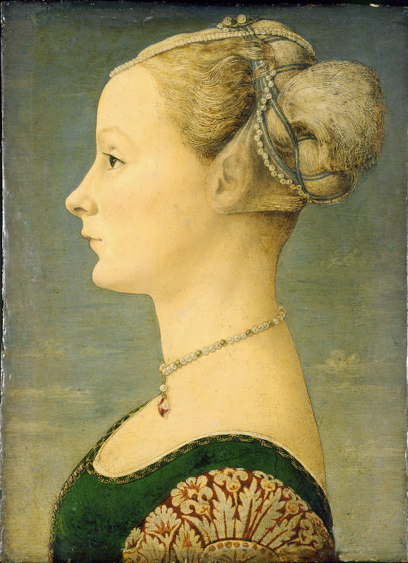
Both drawings were foundlings deposited on the art market’s doorstep. The now-Rubens ink sketch emerged in dealers’ hands in 1926, as a van Dyck (it is initialled V. D.) and with no history of prior ownership or existence, some 316 years after its presently claimed date of execution. The would-be Leonardo appeared in 1998 – a full five centuries after its now-claimed 1496 execution – and, again, with no history of prior ownership or existence. It was offered in a 1998 sale of old master drawings at Christie’s in New York as “German School, early 19th century” and “the property of a lady”. It only later transpired (after a vain legal tussle launched against Christie’s by the anonymous vendor on hearing of the drawing’s claimed worth of £150 million) that the lady in question was Jeanne Marchig.
Giannino Marchig
Jeanne Marchig was the widow of the painter and restorer Giannino Marchig (1897-1983). For some years she had been selling works under cloak of anonymity from her late husband’s collection to fund animal charities. Marchig was said by his widow to have kept the now-claimed Leonardo drawing in a portfolio and to have held it to be by Domenico Ghirlandaio (see Fig. 5). As the only known owner of a work with a five centuries-long provenance lacuna, Giannino Marchig must be considered as a potential Leonardo forger. He was a talented artist who worked with facility in a variety of manners and showed in his own drawings a fondness for female figures with faces in profile (see Fig. 17). He had studied in the studios of artists in Trieste and became Professor of Drawing at the Florence Academy of Fine Arts in the 1920s, immersing himself in works that reflected his studies of the old masters. After achieving some success as an artist, winning prizes, exhibiting in Paris, Berlin and the USA, as well as participating in the 13th Venice Biennale in 1922, in the 1930s he met Bernard Berenson and, thereupon, switched from art to art restoration and publishing. He spent the war assisting Berenson who had remained in Italy under aristocratic protection. At the end of his war time diaries (written in 1947 and published in 1952 as Rumour and Reflection) Berenson thanks his “dear friend, the delicate restorer and picture expert, Giannino Marchig” for helping to conceal his collections from the Germans.
The Berenson connection hardly augurs well for the drawing. Kenneth Clark, himself a former assistant of Berenson, recalled in 1977 how the great scholar “sat on a pinnacle of corruption” and that “for almost forty years after 1900 he did practically nothing except authenticate pictures”. Clark knew of what he spoke: his own extremely youthful positions as director of the Ashmolean Museum and then of the National Gallery had been achieved on the commendations of Berenson’s partner in attributions, the dealer Lord Duveen. In the 1950s, after some sort of crisis, Marchig abandoned Italy and moved to Geneva where he met his wife, Jeanne, and began practising as an international picture restorer.
(It should be said that none of the above was known when “La Bella” first began to attract support as a Leonardo, and that one of the drawing’s earliest advocates, Nicholas Turner, a former curator of drawings at the British Museum and the Getty Museum, has a courageous record of challenging misattributed drawings in museums – including those of Eric Hebborn. If the present battle between camps of experts over this proposed attribution is sharply contested and heated, it is being fought by all parties as a matter of scholarly/artistic judgement and advocacy.)
The spectre of forgery
Although the identity of the vendor emerged late, among the chief present supporters of the Leonardo attribution, Professor Martin Kemp and Pascal Cotte of Lumiere Technology (the joint authors of the 2010 book The Story of the New Masterpiece by Leonardo da Vinci: La Bella Principessa – see review opposite), have said that: “At the time of the writing of the book, the ownership of the portrait before 1998 was not known, leaving it’s supporters open to the charge that it might be a recent forgery undertaken with knowledge of modern technical examinations of Leonardo’s paintings – even though the modern technical examination of the portrait itself seemed to preclude this.” Given those initial suspicions, it might be wondered how the subsequent disclosure of an intimate connection with a restorer and confidant of Berenson had laid them to rest.
For Kemp and Cotte, the fact that Marchig had “worked internationally as a respected restorer, and in 1976 undertook major conservation on one of the two prime versions of Leonardo’s Madonna of the Yarnwinder, then owned by Wildenstein’s in New York”, the possibility of the drawing being a modern forgery can now be ruled out. This is upside down: when artists work as restorers on old master paintings, they are licensed precisely to forge original work at their “retouching” stages. (At the National Gallery, restorers even paint false lines of craquelure onto their own fresh and speculative synthetic repaints, in a technique known as “deceptive retouching”). Marchig’s experience of working on one of the two prime versions of Leonardo’s Madonna of the Yarnwinder would hardly disqualify him as a forger able to work “with knowledge of modern technical examinations of Leonardo’s paintings”.
The material composition of the drawings
With both the “Rubens” and the “Leonardo” drawings only the front of the sheet can be examined. Both have been glued onto secondary supports. The “Rubens” ink drawing has been glued onto a second sheet of paper. The visible side of the second sheet is heavily abraded in a manner that might suggest a ham-fisted attempt at its removal. In one corner, part of this “backing” sheet has been removed, exposing (unintelligible) chalk lines on the “recto” of the ink drawing. It is never safe to take signs of age and previous treatments as proofs of antiquity, let alone of authenticity. In his section “Creating an atmosphere of age” (p. 51) of The Art Forger’s Handbook, Hebborn writes:
“If our work is to convince it must have a feeling of having a past. That is to say it should show signs of having been through the hands of former dealers and collectors…Three forms of protection for drawings have traditionally been used: pasting them into albums, putting them into mounts for storage in boxes, and framing them…the most obvious sign of a drawing having once been stuck down is when the work is still attached to the page of an album. This, of course, is very easy for us to imitate. We simply paste our drawing on a blank page taken from an old book. A nice refinement is to show signs of another drawing having once been stuck on the back of the page, and to do this you really do stick a drawing on the back. Wait for a week or so until the ‘old’ glue or paste has hardened, then remove the drawing. There is no need to be over-careful about this procedure. If you should leave a little of the paper of the drawing adhering to the mount, or of the mount to the drawing, it adds a very convincing touch…”
An unusual support
The claimed Leonardo “La Bella” is made with three coloured chalks, body colour and brown ink on a sheet of vellum. That is to say, this work was executed in mixed-media of a kind nowhere encountered in Leonardo and on a support never encountered in Leonardo. Much has been made of the fact that it has been established by Cotte’s technical examinations and by some astute art historical research that the vellum may be of a late 15th century origin, one of a number of vellum leaves – some of which were blank – removed at an unknown date from a Renaissance volume or “codex” held in Poland. If correct, this circumstance would be no proof of the authenticity or antiquity of the drawing that is presently found on the only recently encountered sheet. Even if the presently hypothecated origins and antiquity of the support were somehow to be established, neither the date when the sheet might have been removed (by knife or razor) from the book, nor that of the drawing executed upon it would be known. By coincidence, Jeanne Marchig was Polish and, it has been said, an artist of sorts herself. She proudly preserved the box of pastels with which she said Giannino restored the “Principessa”. So, the Marchigs themselves claim responsibility for a restoration that might otherwise have implied a degree of antiquity in the drawing and the fact remains that the first and only known owner of this supposed Leonardo of 1496 was a 20th-century artist/restorer whose widow put works on to the market anonymously.
Wide margins of error
In addition to Pascal Cotte’s “La Bella” examinations, carbon dating tests of the drawing’s vellum support were made by the Zurich Institute for Particle Physics. The dating itself came with a customarily wide margin of error. There was said to be a 95 per cent probability of the vellum having been made at some point between 1440 and 1650. Note: in betting parlance, this is to say only that the odds, on this technical evidence, were three to one against it having been made before or by 1496, the now-contended date of execution. Suggestions that this analysis has somehow determined “once and for all” that the drawing is not a later pastiche are hardly credible. Kemp himself says no more than that the carbon dating “greatly diminishes the possibility of the drawing being a clever forgery”. Much, too, has been made of the fact that this drawing bears signs of age and restorations, but old supports can be bought and “evidence” of restoration can easily be forged (see below).
Cod antiquity and dodgy backs
This particular vellum sheet has been glued onto an old oak panel – on the face of it, an improbable and inappropriate treatment, given that wood expands and contracts and would therefore threaten to tear or buckle an affixed sheet. The presence of the panel is taken by Pascal Cotte to testify to the drawing’s antiquity:
“The vellum was at some point laid down on an old oak board, which has been repaired on two occasions with butterfly joints. Jeanne Marchig identified the later pair of untinted joints as characteristic of those made by hand by Giannino. The portrait has been subject to at least two campaigns of restoration, including that by Marchig over 50 years ago. It seems likely that the vellum had been laid down on the panel long before it entered his hands. On the reverse are two customs stamps: DOUANE CENTRALE/ EXPORTATION/ PARIS. This stamp seems to have been introduced in 1864 but it is unclear when it ceased to be used in this form. The likelihood is that it is not later than the early 20th century. In any event, the stamps indicate the presence of the panel in France, presumably with its attached portrait and probably framed (as indicated by the brown paper strips around its margins). Whether it was owned for a period in France or imported temporarily is unclear.”
Again, nothing here helps to establish the antiquity let alone the authenticity of the drawing. The unsupported phrases,“seems likely” and “presumably”, have little force because anything can be stuck to anything at any point. In terms of making an attribution, the primary support (the vellum), and the secondary support (the panel), should be kept conceptually apart. The source of neither has been established and nor has the date at which they came together. All that we know is that if Marchig had repaired splits in the panel as well as carrying out one of the “restorations” on the drawing, his finger prints are everywhere on this artefact. His widow advanced no information on any possible owner before her late husband but did once hint that it might have been “acquired” from Berenson’s collection. Berenson himself had been taken in by forged paintings and kept one of them in his home as a means of testing the art critical credentials of his visitors. Nothing material here might refute a suggestion that Marchig was the drawing’s author, working on old vellum that was at some point attached to an old, previously repaired and labelled panel, thereby conferring a spurious antiquity and concealing the back of the vellum.
From the time the work was presented by Marchig’s widow for sale in 1998 no owner has thought to remove the vellum from the panel as a precautionary conservation measure or to permit an examination of the sheet’s recto. Cotte says of this: “Unfortunately, since it is laid down on panel (and separation would be hazardous) the verso of the vellum is not visible”. Hebborn commends the acquisition of old panels to forgers:
“…and this brings us to one of the big problems with panel pictures: their tendency to bend out of shape or split due to changes in humidity. The best precaution against warping and cracking is to use thoroughly seasoned wood, and no wood is more seasoned than that of a truly old panel picture. Artistically worthless old pictures on wood do come up for sale from time to time, and these provide the support that suits our purpose best. Panels from old furniture are also desirable. Unfortunately they are no less desirable to our colleagues engaged in the making of new ‘antique’ furniture, so we have to pay quite a lot for them…Just like old paper, old panels and canvases need no ageing…”
Left-handedness
Much has been made of the seeming left-handedness of the drawing’s author when such indications are easily forged (sheets can be rotated). The hatched shading of the background was not spontaneously drawn in the manner seen, for example, in Leonardo’s drawing at Fig. 18, but comprised a careful, deliberate “inking-in” of previously drawn ultra fine chalk lines. How often, if ever, did Leonardo work in such a slow and deliberated manner carefully and fastidiously shading in one medium and then even more fastidiously covering and concealing his first efforts? For a copyist or a forger to proceed in such a cautious manner would be quite unremarkable.
Uncharacteristic features
Drawings that are said to have been made as preliminary studies for what are problematic upgraded paintings commonly contain features found nowhere else in the claimed master’s oeuvre. Two drawings have been especially associated with the National Gallery’s Entombment (see Fig. 7). One is widely accepted as autograph and the other is not. The two are drawn in different manners that correspond to different stages of Michelangelo’s graphic evolution (the earlier being in ink, the later in chalk) and they have been dated as being as much as thirty years apart – which constitutes a considerable problem as claimed preparatory studies for a painting which itself is now said to have been entirely made by Michelangelo when he was twenty five and had not yet started drawing in chalk. The more challenged of the two, an ink drawing, is claimed to be a study for a kneeling figure in the painting, but even supporters of its attribution acknowledge that it contains problems as a Michelangelo: it is clearly drawn from a girl, not from a man; it is drawn very carefully on a pink ground in three separate stages; the plane of the ground is, uncharacteristically for Michelangelo, indicated; its Michelangelo ascription has often been challenged. Bernard Berenson took it to be by Passerotti or to be an engraver’s copy.
Although it is owned by the Louvre, it is not accepted as a Michelangelo by the museum. As with the supposed Rubens Samson and Delilah ink sketch, its chief perceived qualification is its close resemblance to a figure in a separately problematic and challenged painting. Both of these challenged and problematic National Gallery paintings (the Samson and Delilah and the Entombment) happen to lean on their problematic and challenged supposed preparatory ink sketches. Thus, the attributions of both drawings stand in circular fashion on their close resemblance to figures in the challenged paintings. As attributions, these two drawings and two paintings are as sand built upon sand.
A once well-accredited “Portmanteau” fake goes down…
Less than four years after the publication of Hebborn’s guide to connoisseurs and forgers, another small profile portrait, A Young Woman (Fig. 1), was down-graded at the Detroit Institute of the Arts to “Imitator of Verrocchio” (after sixty-five years good years as a Leonardo/Andrea del Verrocchio), by David Alan Brown, curator of Italian Renaissance art at the National Gallery of Art, Washington. Brown describes the painting as having been revealed as “a probable forgery by its anachronistic materials and unorthodox construction” (– see the catalogue to the Washington National Gallery of Art’s 2001-02 exhibition, Virtue and Beauty, p. 18). Thus, this work can now be considered a product of the 1930s, the period when Marchig was working for Berenson. One disqualifying feature that it has in common with “La Bella Principessa” is its depiction of an abnormally beefy “stevedore’s” arm in a young woman.
“La Bella Principessa” (13 x 9 and 3/4 inches) and A Young Woman (14 and 1/4 x 10 inches) are small works on panels of almost identical format. The “unorthodox construction” of A Young Lady really does seem to have been most unorthodox, even in the realm of the forged. Technical examination shows it to have been painted on “what appears to have been photographic paper applied to a wood panel that was repaired before it was readied for painting”. Also working against any possible retention of a Verrocchio or Leonardo attribution is the fact that at least one of the pigments on the painting is modern – zinc white. Further, what is described by Brown as “preliminary” examination disclosed the fact that worm-holes, which appeared to testify to the antiquity of the panel, had been filled before the gesso ground was applied.
Hebborn had another word to say on the importance of obtaining old wood. In his section “Ageing old panels” he advised “If you have not been able to procure a period panel, then you must find the oldest wood available. Even for a decorative painting, plywood and such stuff is anti-aesthetic, so at least have sufficient respect for your work to get a real piece of timber. This acquired, you may make worm holes and darken the wood to match the age required. Nevertheless, there is no way that these things can be artificially achieved well enough to deceive the connoisseur.”
The Detroit Young Woman was acquired in 1936. It was one of a group of three works judged by the Detroit Institute’s Director, W. R. Valentiner, to be (“tentatively”) by Leonardo. Valentiner was struck – and reassured – by a similarity between the curls in the painting and those encountered in both Leonardo’s Ginevra de’ Benci painting and the Verrocchio marble Bust of a Lady in the Frick Collection (Fig. 2), which attribution is doubted by Nicholas Penny, the director of the National Gallery, London. Carter Alan Brown suspects that “further examination” might confirm that the painted profile of A Young Woman was indeed made over a photograph of the profile of the Frick’s marble Bust of a Lady. In truth, the reassuring curls, properly read, constitute a disqualification – see opposite.
How to obtain old paper
As for the no-provenance van Dyck drawing that was immediately upgraded to a no-provenance Rubens, obtaining paper of the desired antiquity (it was described simply as “laid” paper by Christie’s) would have posed no problem for an early 20th century forger. As Hebborn testifies:
“The best places for handling genuinely old sheets of paper prior to buying them are: the saleroom, where you can rummage through the unframed lots of prints and drawings; the print-seller, who has similar folders of unframed pictures, and the antiquarian bookseller, where you may find the end-papers more interesting than what lies between them…Books are particularly useful for the beginner because the date and the place of publication are normally to be found on the title page, and these more often than not indicate the date and the provenance of the paper on which it is printed…”
Previous restorations
The ink drawing on the “Rubens” sheet bears little sign of restoration or rubbing – the ink lines have a lovely glossy chestnut colouring – but the sheet on which the drawing was made shows signs of acute physical distress for reasons described opposite. Concerning wear, tear and earlier restorations, Hebborn counsels that old drawings must always show signs of rubbing. This may be achieved for drawings in soft media by “a soft cloth (an old woollen sock serves admirably)”, and for ink drawings by means of “a gentle rubbing with pumice powder or the application of the very finest grade of sandpaper”.
Potential executors of fakes
A question often posed by defenders of challenged attributions is: “If not by artist X, then by which other artist?” This ploy precludes the possibility of the author being a forger. A question that might always be considered prudent with unsupported attributions that emerge from nowhere centuries after their supposed creation is: “If not by artist X, then by which artist, copyist or forger?” Although it is not necessary to identify a faker when suggesting that a work might be a forgery, it so happens that in both of our cases a highly graphically competent artist and teacher of art hovered close by at the moments of “discovery” in 1926 and 1998 respectively.
The then van Dyck but now-Rubens and the then Veronese but now hopefully-Agostino Carracci emerged in the hands of a firm of dealers “R. W. P. de Vries, Amsterdam”. There were two R. W. P. de Vries’s. Reinier Willem Petrus de Vries Senior lived from 1841 until 1919 and was a respected antiquarian dealer (chiefly books and maps but also drawings and other works of art). With relatives, he ran the firm “R. W. P. de Vries, Amsterdam”. When de Vries Snr. died the firm continued until its liquidation in 1933. Reinier Willem Petrus de Vries Junior was born in 1874 and lived until 1953. He was a talented painter, graphic artist, book cover designer, print-maker and author. Like Giannino Marchig, de Vries Jr. was also a teacher of drawing (at a high school in Hilversum from 1913 to 1953).
We have no firm grounds for suggesting de Vries Jr. to be the author of the now-Rubens Samson and Delilah ink drawing that has sold for over £3million to an anonymous buyer, or of the no longer-Veronese drawing, but given that there are strong grounds for considering the Rubens drawing to be fake (see right), and that de Vries Jr. was, at the time the drawing emerged in his family’s business, a fifty-two year old teacher of drawing, he might properly be considered a candidate, if only because he was perfectly placed both to acquire the necessary materials to forge period drawings, and to offload them safely onto the market. Even if the firm was generally honourable, would it be inconceivable for an in-the-family forger to be indulged in a certain extra-curricula activity?
In any event, for reasons given in the previous post the drawing is quite implausible as a Rubens first-thought sketch. What makes it such an immediate suspect as a forgery (quality aside) is that when it came onto the market from nowhere it contained a feature that is nowhere encountered in Rubens’s many surviving ink sketches: a drawn enclosing box that implies a pre-determined format for the painting, and an artistic intention on Rubens’ part from the very beginning to crop the toes of Samson in just the manner of those found in a painting that was very shortly to come onto the market, not (yet) as a Rubens but as a Honthorst. This might have been taken as a coincidence, were it not for the fact that the immediate upgrading of the Honthorst painting to Rubens was made on the authority of the then recently upgraded drawing. The scholar who upgraded the painting, Ludwig Burchard, was the man who had upgraded the ink drawing from van Dyck to Rubens – and he is now known to have made many (over sixty) Rubens attributions that have subsequently fallen. Moreover, in upgrading the drawing and the painting, Burchard knew that the two contemporary copies of the original and long lost Rubens’ Samson and Delilah painting show that the toes of Samson had not been cropped at all; that they were set well and comfortably within the painting. The persisting institutional determination (despite informed protests) to retain the attribution of this implausible drawing, and of the equally implausible painting it was swiftly pressed to validate, has generated a sub-set of scholarship that flies in the face of visual evidence. That this untenable position is held without any attempted account being offered for the contra-testimony of the two contemporary copies of the original painting speaks of a contempt for the historic record and a preparedness to lower the bar of artistic quality for inclusion within within Rubens’ oeuvre.
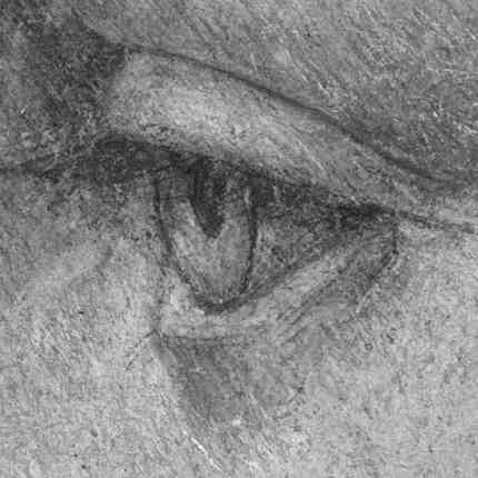
Barriers to any acceptance of La Bella Principessa
As for for the so-called “La Bella Principessa” being an autograph work by Leonardo da Vinci, there is a single feature in it that should be seen by any educated eye to be instantly disqualifying – the drawing of the subject’s eye. This particular eye is so anatomically weak and ill-conceived; so out of perspective; so improperly wandering in its gaze; so planar and “Cubist” in its articulation; and, so comprehensively out of character with both Leonardo’s treatment of eyes and those of other artists working within the strictly regulated female portrait profile type that generated entirely sideways-on elevations of the head and bust of young ladies in emulation of likenesses on ancient coins, as to be inconceivable as a work of the period let alone one executed by Leonardo. At the supposed date of execution (1496), the profile portrait type attempted in “La Bella Principessa” had virtually run its course. By that date portraits – and most especially Leonardo’s own – favoured more complex perspectives and increased levels of psychological engagement with the subject. One Leonardo scholar, Frank Zollner, sees Leonardo’s 1478-1480 painting Ginevra de’ Benci (Fig. 3b) as the point at which Leonardo broke away from “the profile view traditionally employed in Florence for portraits of women” in favour of the three-quarters view, previously the preserve of portrayals of men, and in order to impart “a pyschological dimension to his sitter – something that would become the hallmark of Renaissance portraiture”. If Leonardo really had opted to work against his development and artistic practice by working within an archaistic form he had superseded, in this proposed drawing he would have been eclipsed by lesser artists, as is shown right.
The fact that in addition to its technical shortcomings, this singular drawing resembles nothing within (or adjacent to) Leonardo’s oeuvre obliges Martin Kemp to make his art historical case for its inclusion on the grounds that it “reveals a previously unknown dimension in the way in which he [Leonardo] fulfilled his duties at the court of Duke Ludovico Sforza”. This hypothesized rationale for a (regressive) departure within Leonardo’s oeuvre is given a defence that might itself be taken for special-pleading: “Any important new work, to establish itself, must significantly affect the totality of Leonardo’s surviving legacy over the longer term.” Acceptance of this drawing would certainly expand that totality but it would do so in an art historically injurious manner.
This previously unknown work and its hitherto unsuspected manner of working which a (minority) group of scholars would situate within the oeuvre is a mongrel work. It is a drawing that thinks it might also be a painting. In terms of graphic and pictorial laws it is neither fish nor fowl but something of both. That this conflation is a not a product of Leonardo’s hand is evident in the laboured, stilted and monotonously uniform handling. It purports to constitute a kind of “presentation” drawing of which Michelangelo made a (dazzling) few but Leonardo none. The depicted figure is static, ponderous and matronly for a supposed child bride who had died by her fourteenth year (see Figs. 23a – 24b).
The anatomy is poorly realised and evasively handled – where might the arm be situated? And what are its dimensions? The drapery is perfunctorily and unconvincingly evoked and might seem positively designed to shirk the problem of depicting a convincing arm that would give life and expression to the pose (see Figs. 22a and 22b). The pose here is bereft of lateral movement in the body/neck/head equation. This is true even of the individual features of the face’s profile where the features seem to be individually conceived and stacked one on top of another rather than to mark the “terminus” of a unique and humanly distinctive head, as seen for example in Figs. 20, 21, 23a and 25. There is nothing to convince one that is a drawing made from life. The treatment of the coiffure is monotonous and crude. In its formulaic treatment it is bereft of the adornments that are characteristic of this particular portrait type which fused notions of the classical “ideal” and literary “virtues” with ostentatious displays of wealth. (See Figs. 21, 25, 27 and 28b.)
As if in an insurance policy safeguard against this glaring lacuna Martin Kemp assigns a second, alternative historical moment of execution, suggesting that this may not, in fact, have been a drawing made from life in celebration of a fabulously privileged child bride, but was instead a commemorative work made after her death. If it had been so the question would arise how might so-detailed and laboured a study of a head have been made from memory? Or was it made after some other, now-lost, portrayal? If one dons a forger’s hat and asks which other works a twentieth-century forger might have selected to assemble a “portmanteau” image for such a purpose, it is quite easy to identify candidates – see Figs. 20, 21, 23a, 25 and 27.
Some might be bemused that among many experts, a small group should have become such impassioned partisans of so eccentric and problematic a work. Perhaps Michel Strauss has it right: there exists an ingrained human herd instinct to which even the most distinguished figures might not be immune. Perhaps the indicator of inauthenticity lies in this: although the quality varies, with every other work of this type shown here, something novel, fresh or idiosyncratic is brought to the party. Not one work looks as if derived from any other, or from any small group of others, or – and least of all – from “La Bella Principessa”. Did Leonardo ever make a portrait of a woman that made no waves; that left no trace; and that aroused no comment in half a millennium?
CODA
The Inaugural James Beck Memorial Lecture
Our annual memorial lecture (which alternates between London and New York) is given by distinguished scholars in honour of Professor James Beck of Columbia University, the Renaissance scholar and founder of ArtWatch International. The inaugural lecture was given most fittingly in London in June 2010 by Hellmut Wohl, a scholar whose methodological rigor and scrupulous connoisseurship is widely considered by his peers to be exemplary (as in the review below, and the caption at Figs. 4a and 4b ). Professor Wohl’s lecture, “The Integrity of the Work of Art: The case of the Early Michelangelo”, comprised a demolition of a group of early Michelangelo attributions and it was published in the ArtWatch UK Journal No. 27, as shown on this attached pdf.
Review of Hellmut Wohl’s The Paintings of Domenico Veniziano by Anne Markam Schulz, in the June 1981 Art Bulletin.
Anne Markham Schulz, an independent scholar and Visiting Scholar at Brown University, is a prolific author of books on Italian Renaissance sculpture, including Antonio Rizzo: Sculptor and Architect (1983) and Giambattista and Lorenzo Bregno (1991). Her Art Bulletin review began:
“This monograph is exemplary in every way, it treats with respect the works of a supreme painter and by way of its percipient and lucid analyses of their techniques, style, and iconography demonstrates their high artistic worth. It is thorough: there is no source of information it overlooks and every particle of evidence provided by the documents, the sources, the paintings themselves and the works of Domenico’s contemporaries is made by judicious scrutiny to yield its quota of meaning. To the extent that words can interpret the characteristics of a painter’s style, this book does so. That Wohl should have conceived this a goal worth pursuing he no doubt owed to the tutelage of Richard Offner, under whom his dissertation on Domenico Veneziano was prepared many years ago; indeed, Offner’s scrupulous method informs this book. For Wohl, as for Offner, definition is its own justification: Domenico’s art is not correlated with historical events, and even its impact on contemporary artistic currents is narrowly portrayed. But to have explicated, to the extent possible, the subject of each painting, when and under what circumstances it was made, the sources and the characteristics of its style, and the evolution of its composition, is to have amply fulfilled the obligations of a monographer.”
Michael Daley
Comments may be left at: artwatch.uk@gmail.com


Martin Kemp and Pascal Cotte, Hodder & Stoughton, London, 2010
ISBN 978-1-444-70626-0


The Lady with an Ermine of 1489-90;
The Belle Ferronniere of 1493-4;
and, The Mona Lisa of 1502 onwards.
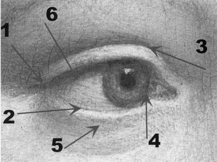
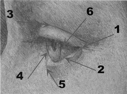
Cotte claims and diagrammatically pinpoints six of what he takes to be “identical” features. In his first example, “The outer corner of the eyelid (1)”, he does not notice that while in the Leonardo the point at which the lower eyelid runs under the upper is not delineated and pinpointed but is only implicit in the softly melded tones. In the “La Bella” by contrast, this lower lid is articulated by three individually distinct and sharp straight lines. There is one for the edge of the upper eyelid; one for the outer edge of the lower eyelid; and, a third line that drops as a perpendicular so as to establish a sharp and entirely un-Leonardesque facet at the side of the lower eye. This treatment is a travestying simplification of form.


The drawing’s animation is indeed truly remarkable. Much of the exhilarating graphic dynamism stems from the speed and confidence of drawing and from the great directional variety of hatching (i.e. showing both “left” and “right-handed” hatching) which is used not only to shade but also to indicate the directional curvature of a form’s surfaces (as in the neck). Such graphic vivacity contrasts greatly the consistently uniform, officiously “left-handed” directional hatching of “La Bella Principessa”. Even though left-handed draughtsmen (like this author) naturally favour a top-left to bottom-right stroke, their drawing hands rotate easily at the wrist so as to give different directions to hatched strokes, as required. Repositioning the arm by moving the elbow outwards, makes yet other directions of hatching realisable. Further, hatching can be given virtually any direction for left or right-handed draughtsmen by the simple expedient of rotating the sheet. Disney cartoon artists used to (may still do) draw on sheets fixed to inset circular surfaces on drawing boards that rotated freely enabling any part of an image to be made swiftly and boldly with an optimal stroke.


![]()