
Sex, Trigonometry and Anne Boleyn’s Recovered Likeness
Art can suffer many injuries and indignities. The worst of these, short of outright destruction – but also irreversible – is restoration damage. Misattributions corrupt and debilitate oeuvres and can mask restoration injuries – but they can be corrected. In portraiture depicted sitters can be misidentified but, again, these can be corrected. When presented to the world, injurious restorations, misattributions and misidentifications alike are commonly trumpeted as “discoveries”. Such discoveries, as in the misidentification examined here, can be claimed without supporting evidence or, even, against strong contra-evidence.
ANNE BOLEYN’S NEW HEAD
On 14 March 2007 the Daily Mail (“Finally historians can give Anne Boleyn her head back”) reported:
“A Holbein drawing has been revealed as the only portrait of Henry VIII’s second wife Anne Boleyn. The c.1530 picture carries Anne’s name but other evidence suggested this was an error. Now expert Bendor Grosvenor and historian David Starkey have traced the inscription to her contemporary Sir John Cheke, confirming she is indeed the subject.”
Four years later the claimed confirmation of the Royal Collection’s “Anne Boleyn” drawing graduated into “certainty” on Bendor Grosvenor’s 15 December 2011 Art History News post “Anne Boleyn regains her head”:
“This isn’t ‘news’ as such, but in a foray into the Tudor realms of Twitter last night I mentioned the drawing of Anne Boleyn by Holbein in the Royal Collection. I said that although in the past the identity was doubted by art historians, the sitter was now catalogued with certainty as ‘Anne Boleyn’, as you can see on the Royal Collection website…”
THE TRUE ANNE BOLEYN LIKENESS
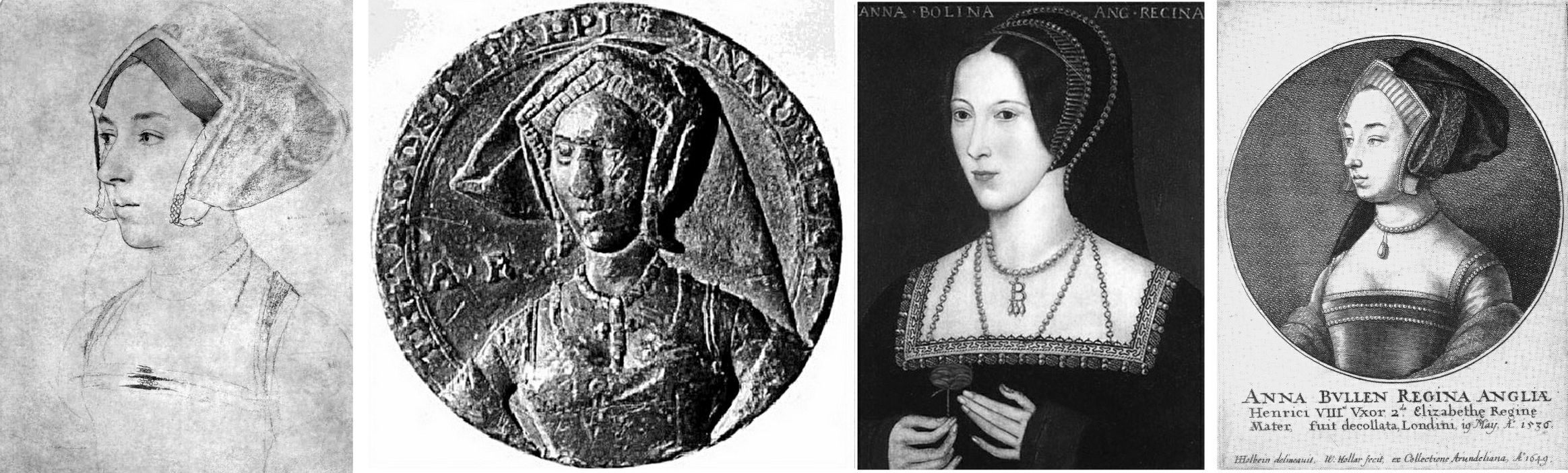
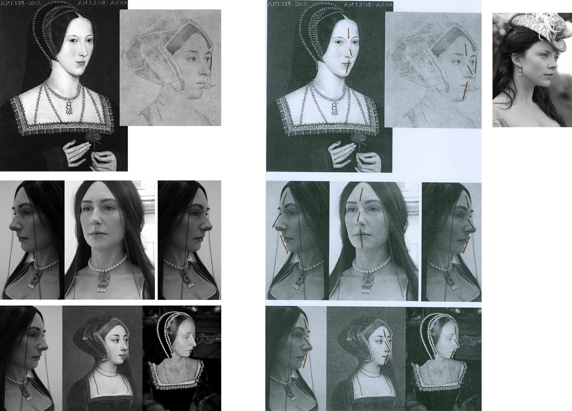
Since 1977, the dispute over Anne Boleyn’s likeness has turned on two Holbein portrait drawings of equal artistic merit and provenance strength but of manifestly different sitters. One drawing is in the British Museum, the other is in the Royal Library at Windsor (see Fig. 1 below). While the Windsor drawing’s advocates claim “certainty” on their “Anne Boleyn” identification, both drawings bear written Anne Boleyn ascriptions derived from the same largely reliable historical source and the British Museum drawing had been considered the true likeness for many centuries. How, then, had the switch occurred? The now protracted Anne Boleyn Identity Literature discloses the Royal Collection’s acceptance of a campaign which had eschewed all use of the most illuminating art critical tool – the photo-comparison. In this switch of identities, Art had been denied its own voice as words trumped the intrinsic – and markedly contrary – visual testimony of images.
EYES, NOSES and MOUTHS: GIVING A VOICE TO HOLBEIN
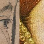
In a letter to the Times (5 July 2023) we had hoped a forthcoming Holbein portrait drawings exhibition might address the drawn method by which Holbein unerringly fixed the characteristic trapezoidal relationships between a sitter’s eyes, nose, and mouth.
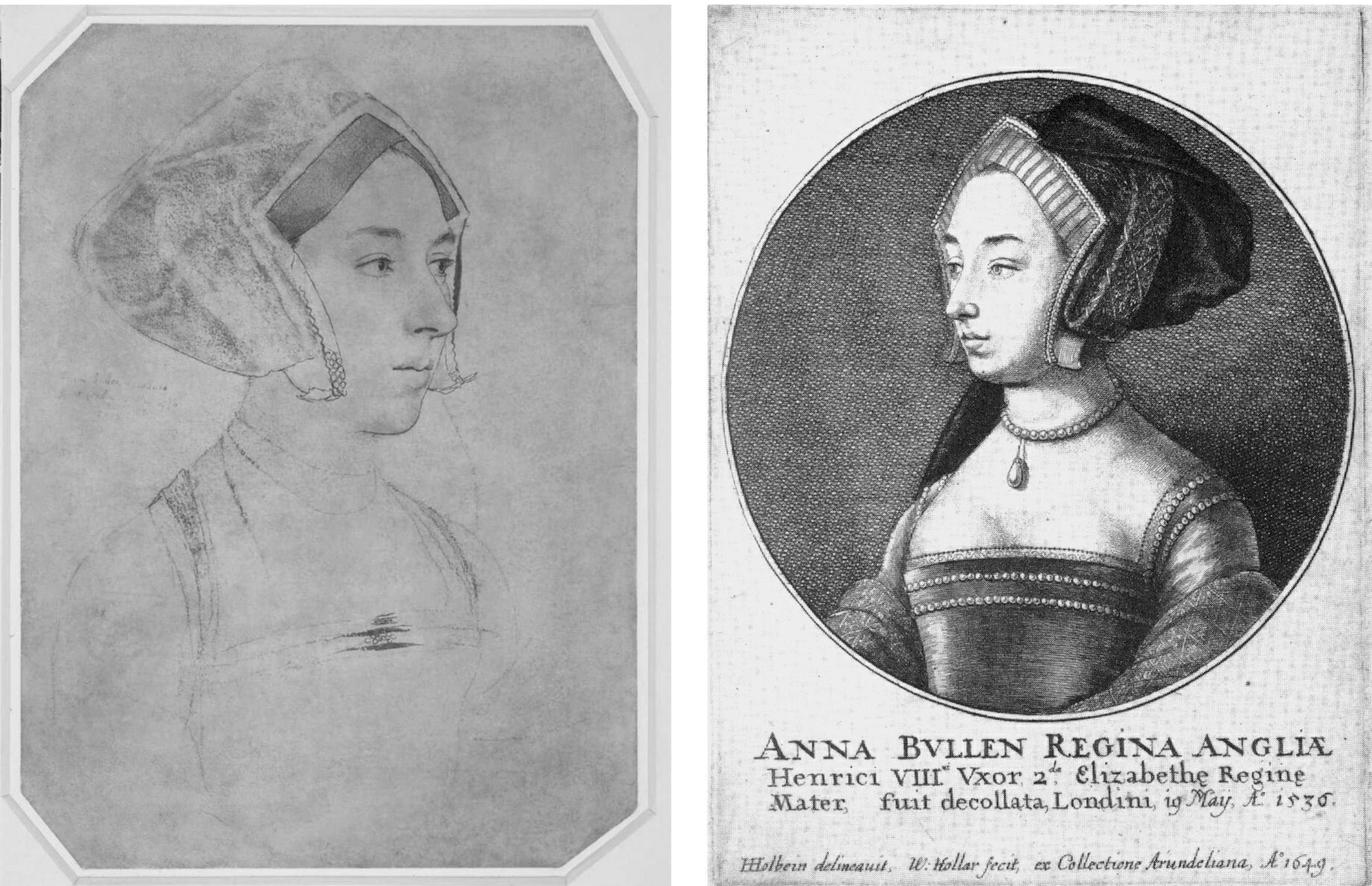
Above, Fig. 1: Left, ArtWatch UK letter; centre, the British Museum Holbein drawing formerly said to depict Anne Boleyn; right, the Royal Collection Holbein drawing now said to depict Anne Boleyn.
The British Museum Anne Boleyn drawing was not in the Buckingham Palace exhibition Holbein at the Tudor Court and therefore was not discussed. The Royal Collection Trust’s Senior Curator of Prints and Drawings, Kate Heard, speaks in the catalogue of Holbein’s “sensitive and life-like” depictions that “bring us face to face” with key Tudor players. The portraits are addressed in terms of social history and patterns of patronage, as in Holbein’s rise from foreign itinerant to court artist, and with Heard wondering whether, as the only artist of his day to possess a horse, Holbein travelled to his sitters, or they to him. His drawing method was discussed as “taking likenesses” and on the frequency with which his chalk drawings had been reinforced with ink in possible preparation for transfer as “patterns” for painted portraits.
Heard’s “taking likenesses” was a telling phrase because distinctions are commonly drawn between making drawings and taking photographs and because Holbein’s depicted facial features can seem as reliably fixed as in any photograph.
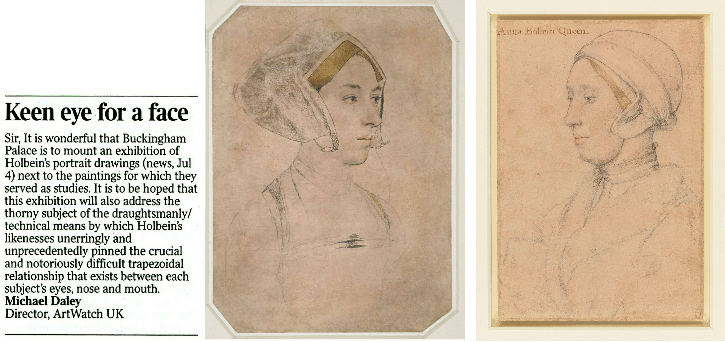
Above, Fig. 2: Durer’s depiction of a method of capturing traced outlines and features on a pane of glass.
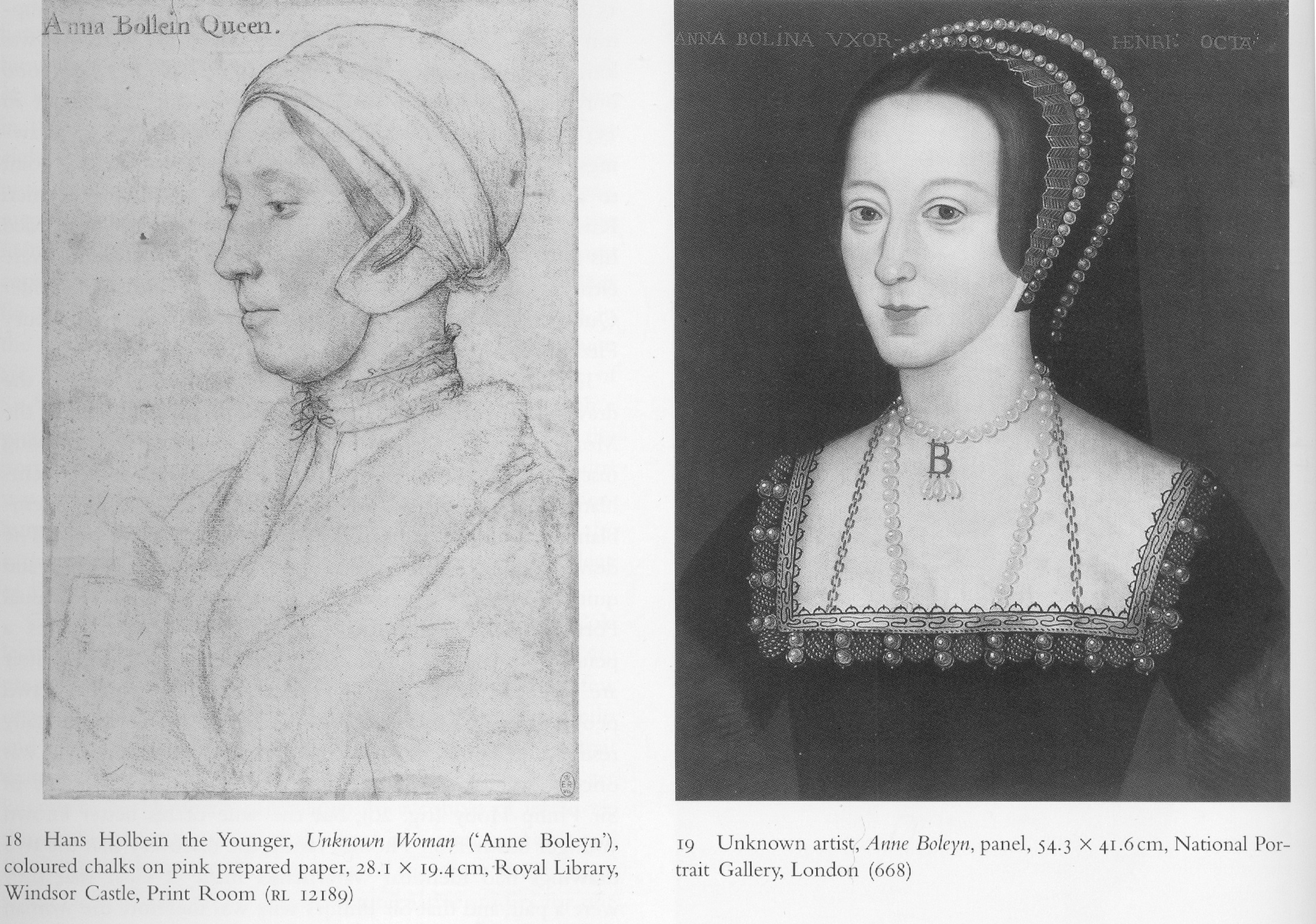
The scholar who had held the formerly Bradford family, now British Museum, Holbein portrait of Anne Boleyn to be the true likeness (Fig. 1, above, centre) was K. T. Parker in his seminal 1945 book The Drawings of Hans Holbein in the Collection of His Majesty the King at Windsor Castle. Parker succeeded Kenneth Clark as Keeper of the Department of Fine Art in the Ashmolean Museum, Oxford, and was Keeper of the whole museum from 1945 until his retirement in 1962. His high reputation as a connoisseur is said to have been laid when working in the British Museum’s Department of Prints and Drawings with A. E. Popham and Campbell Dodgson.
THE RELIABILITY OF INSCRIPTIONS
In Parker’s book, the Windsor Royal Library drawing’s inscribed identification as “Anna Bollein Queen” (Fig. 1, above, right) was bluntly dispatched:
“The inscription is certainly incorrect, the features showing no resemblance whatever with the well authenticated drawing of Anne Boleyn in Lord Bradford’s possession”.
Parker drew a distinction between “two kinds” of evidence – “pictorial” and “literary” (or visual and documentary) and was duly alert to the importance of both. As will be examined separately, he also advanced a pictorially sophisticated hypothesis that Holbein, like Durer at Fig. 2 above, might have fixed the essential features of his sitters by tracing them onto a pane of glass and transferring the resulting image to paper. Here, we consider how and why visual records failed to receive due critical consideration when the Anne Boleyn sitters’ identities were switched.
A REVISIONIST CHALLENGE
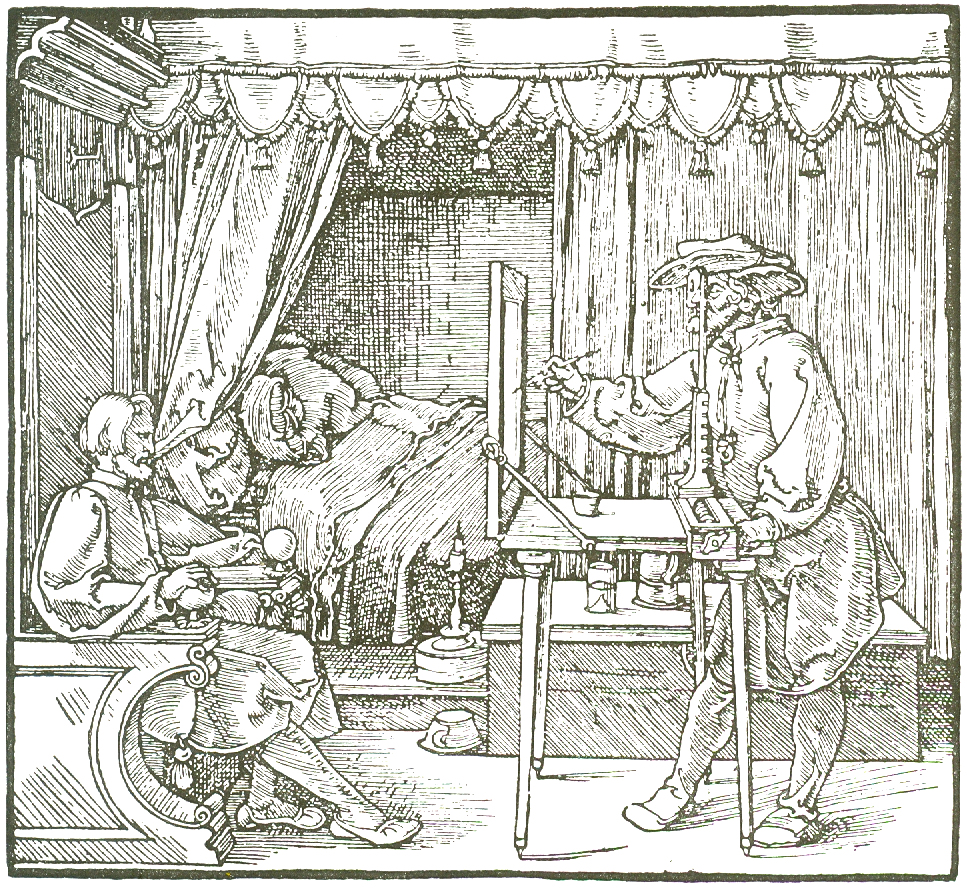
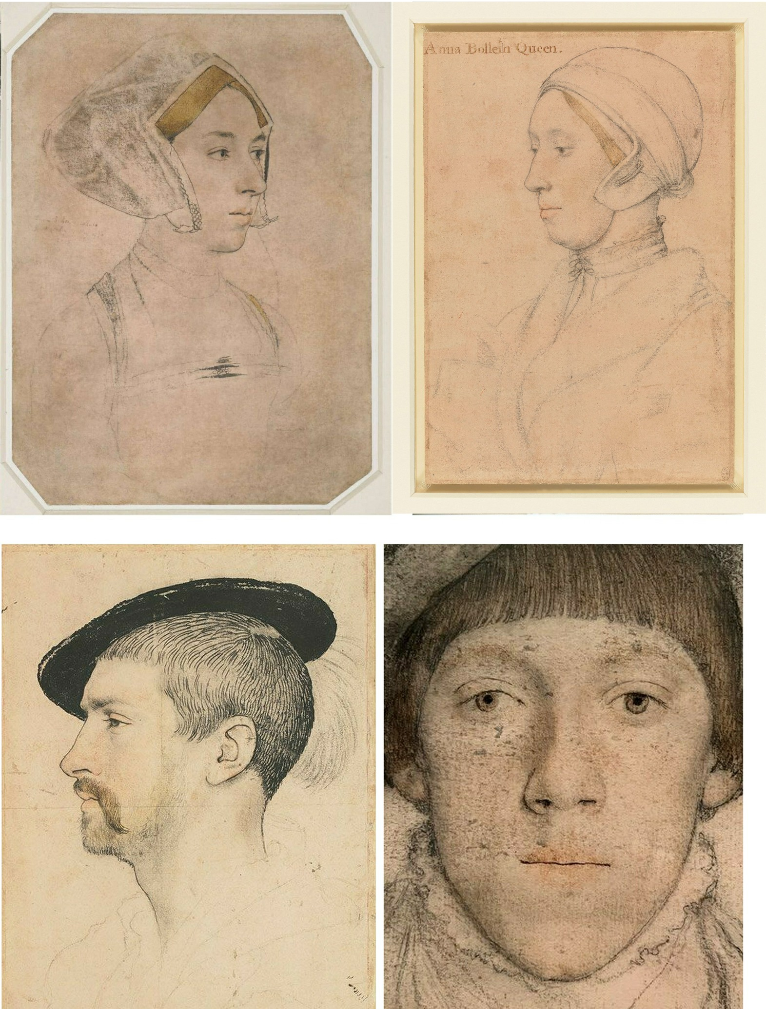
In 1977 John Rowlands, the then deputy keeper of prints and drawings at the British Museum (and, later, Keeper from 1981 to 1991), challenged the Anne Boleyn identification in the Parker-endorsed drawing. The “demotion” was curiously, if not inappropriately executed. First, it was made not in a scholarly journal – which could have facilitated a correspondence – but in the museum’s own YEARBOOK No. 2 (“A portrait drawing by Hans Holbein the Younger”). Second, it was not advanced on its own merits but was slipped within a commemorative article on the British Museum’s recent acquisition from the Bradford family of its landmark Holbein drawn portrait. The article itself carried just three photographs (as shown below) and with none of the Royal Library drawing being espoused as the new, true Anne Boleyn likeness.
Above, Fig. 3: The three illustrations to Rowlands’ British Museum Year-Book II article. There was also a full colour plate of the newly acquired drawing.
Rowlands acknowledged the new acquisition as an outstanding drawing that had traditionally been held to be of Queen Anne Boleyn (Paul Ganz,1937; Karl Parker 1945). He offered no artistic grounds for his “de-identification” of the drawing’s sitter – indeed, as shown below, he celebrated the drawing’s supreme artistry – and he made no suggestion of another likely or possible sitter. The relative visual authority/plausibility of the two radically different depictions of the same historical figure was not examined. Rowlands’ sole objection to the British Museum’s own drawing was documentary – that its Anne Boleyn ascription could be traced no further back than 1649 when in the Earl of Arundel’s collection and where it was copied in Wenceslaus Hollar’s etching (Fig. 3 above, top left).
The objection seemed something of a pedantic contrivance: both the etching and the drawing bore an inscription which identified the sitter as Anne Boleyn and gave the date of her beheading – “Anna Bullen decollata fuit Londini 19 May 1536”. On the general authority of the inscriptions on Holbein’s drawings, Parker had reported that of the eighty-five Royal Collection Holbein drawings sixty-nine bore written inscriptions from an inventory made in 1590 to which the names of the identified sitters had been “subscribed” by “Sir John Cheke, Secretary to King Edward the 6th”. Cheke had died in 1557. The British Museum’s new drawing had been part of the Royal Collection’s Holbein holdings after the artist’s sudden death in 1543 from the plague. Most inscriptions on Holbein’s portraits thus originate from the turn of the sixteenth and seventeenth centuries. Parker held that because Cheke had had direct contact with many of the drawings’ sitters, his subscribed names enjoyed “abundant claim to interest and attention, though not, of course, to blind faith.” The eventual acceptance of Rowlands’ misidentification by the Royal Collection evidently rested on a claimed near-infallibility of Cheke’s recorded identifications – even though he had evidently given the same sitter to two incompatible drawn portraits.
IN AND OUT OF HISTORY
Rowlands, who would later be supported by two historians (David Starkey and Bendor Grosvenor) and opposed by a third (Eric Ives, author of an acclaimed Anne Boleyn biography), acknowledged “a strong likelihood” that the Bradford/BM drawing had been incorporated in the famous “Great Booke” of bound Holbein drawings and had subsequently been removed from it:
“How and when the ‘Anne Boleyn’ sheet became separated from the rest is unknown, but this probably occurred after the death of the earl of Arundel in 1646”.
Rowlands also held that although the British Museum drawing had been incorporated within the famous book, such incorporation was no guarantor of pedigree: the Windsor group “undoubtedly contains drawings which are not by Holbein”. Such a consideration would, of course, apply to all works bound in the book. Parker had said in 1945 that: “The Windsor series certainly contains extraneous matter, but the only drawing known to be incorporated at a later date is the so-called ‘Amelia of Cleves’…in the eighteenth century”. Rowlands spoke too of “extractions” from the book, with the first having probably begun “around 1630″. With the British Museum drawing, he said its date of extraction was unknown but had “probably occurred after the death of the Earl of Arundel in 1646” and “probably in the reign of Charles II [1660-1685]”.
A CLASH OF DATES AND AN ARISTOCRATIC VILLAIN
Against his own “probablys”, Rowlands cited and accepted a detailed account of how the now British Museum drawing had been stolen by the Bradford family when the great book was owned by Jonathan Richardson, senior. Rowlands quoted Richardson’s son’s account of the theft in full:
“The Original of this Drawing, by Holbein, of his finest style & most Capital, the Old E[arl] of Bradford cheated my father of Thus. When he was confined with gout, a little before his Death, He sent request to my F[ather] that he would lend him a Book of Drawings to Divert him; w[hi]ch my F[ather] compl’d with. The E[arl] sent him back the Book in a few Days, but without this Drawing. My F[ather] went immediately to wait on him, & found the Drawing hanging by the Bed side in which he lay, in a Frame & Glass. There was other Company in the Room, so my F[ather] could not claim it at that time; but look’d several times at ye Drawing, stedfastly, & lookd at my L[or]d. My L[or]d stood it, discoursing with him, quite unconcerned; & in two or three days failly sneak’d out of the world, & kept the Drawing. My F[ather] could not claim it afterwards of his Heir (L[or]d Torrington I think) without accusing Bradford of a most infamous piece of Villany, of which he had no witness.”
Rowlands thought the Earl was likely to have been Henry Newport who died in 1734 and added “since then this drawing has been in the possession of the Earl’s descendants”. Parker (whose Holbein scholarship is considered “exemplary” by Susan Foister) had stated that the great book was “broken up” in 1727 when back in royal possession and that by 1728 the drawings had been glazed, framed, and displayed at Richmond Lodge. The Bradford theft must therefore have occurred before the book returned to Royal ownership, the date of which Parker said remains unknown in a period “so full of problems”.
Rowlands acknowledged that after Hollar’s 1649 printed copy, “all representations of Anne Boleyn, whether they were painted or engraved, were based on the Bradford drawing, right through the next two centuries.” He did not ask why this had been so or wonder why no such comparable copies had been made from the Royal Collection “Anne Boleyn” drawing he was championing as the sole and true record of Anne Boleyn’s likeness. On Rowlands’ account, the theft of the drawing had clearly left the Richardson family highly aggrieved. At the time of the theft, Jonathan Richardson senior had owned both inscribed Anne Boleyn drawings and had made a pencil copy of the British Museum version (Fig. 13, below). Similarly, when the Earl of Bradford had both inscribed “Anne Boleyn” drawings bound in the (loaned) book before him, he stole the now British Museum version and not the one that returned to the Royal Collection. As Eric Ives would later point out, when Hollar had had the the option of copying either of the Anne Boleyn-inscribed Holbein drawings, he opted – or was instructed – to copy the now British Museum likeness.
Above, Fig. 4: Left, the Bradford/BM Holbein Anne Boleyn drawing and, right, the Hollar copy of 1649. Hollar had of necessity resorted to a degree of invention with the costume and jewellery – and he showed only one of the three necklaces indicated on the Holbein drawing. His seemingly strengthened shading around the cheek, jaw and neck might indicate a subsequent loss of chalk shading on the drawing itself (see Fig. 13, below).
A SOLE RELIABLE RECORD
Rowlands noted that the only securely known contemporary likeness of Anne “is the medal struck to commemorate her coronation in 1533” but which, he said, is too worn to give any indication of her features (see Fig. 5 below). Given his unsteady and visually unsupported 1977 account, it might seem timely to consider the expanded and invigorated joint Rowlands/David Starkey 1983 Burlington Magazine article, but note should first be made of the methodological and visual shortcomings in Rowlands’ solo challenge to Parker – on the (slim) authority of which all subsequent accounts rested. Rowlands had not shown the drawing he was espousing. He had not shown the relationship between the two rival “Anne Boleyn” drawings. He had not shown how the two drawings respectively related to the medal’s likeness as the only securely dated contemporary image of Anne. Nor had he claimed any resemblance of the Windsor drawing to either the medal’s image of Anne Boleyn or any of the later painted portraits of her. His case comprised little more than a visually unsupported expression of a contrary professional opinion – an unsubstantiated glancing swipe, as it were, from a rising mid-career scholar to one who had retired fifteen years previously.
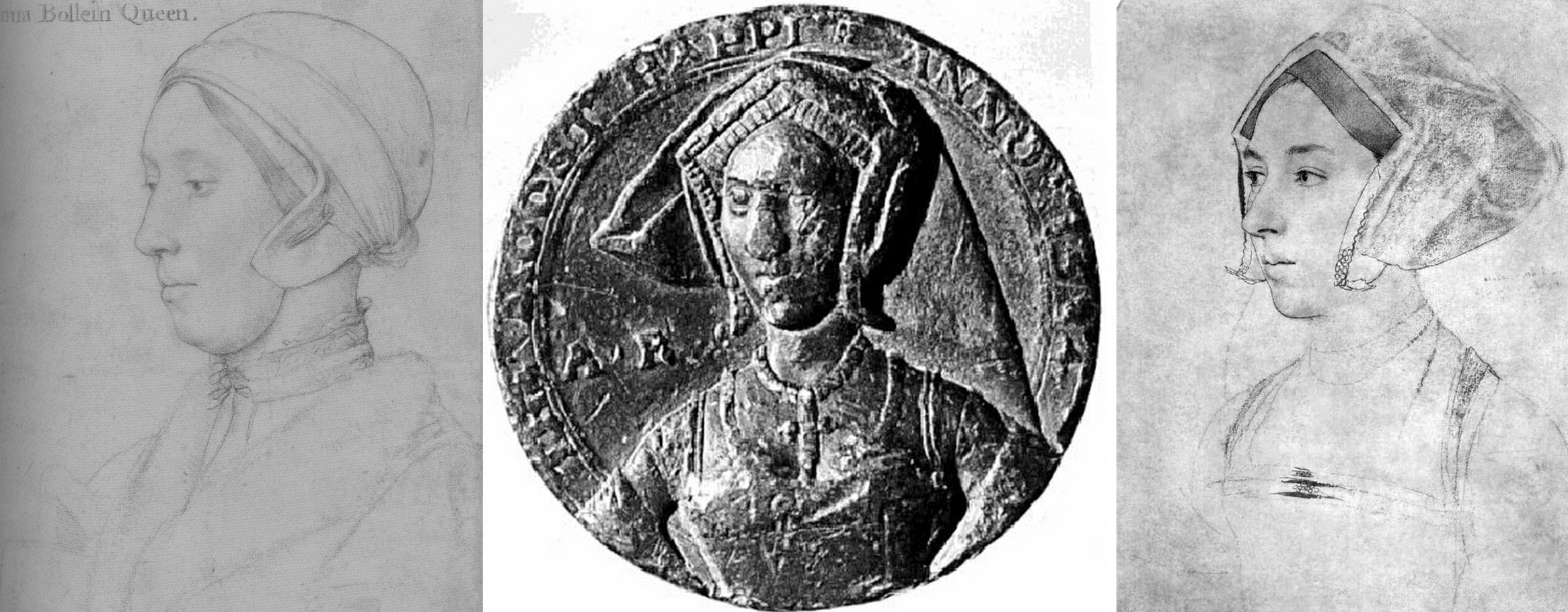
Fig. 5 above. When the Royal Collection drawing (left) and the Bradford/B.M. drawing (right, here mirrored) are seen with the medal it shows markedly more kinship with the latter drawing.
That scholarly prudence and diligence is required on these matters was recognised in Susan Foister’s 2004 Mellon Centre/Yale published monograph Holbein & England:
“There is every reason to suppose that Holbein might have painted Anne’s portrait, but no clear evidence that he did… No portraits of Anne Boleyn are mentioned as such in contemporary inventories, and official images of her are unlikely to have circulated after her execution…The only contemporary likeness of Anne appears to be that in a medal, showing her thin-faced and in a gable headdress; later painted portraits echo this image, and show her wearing jewellery with the initials A and AB…”
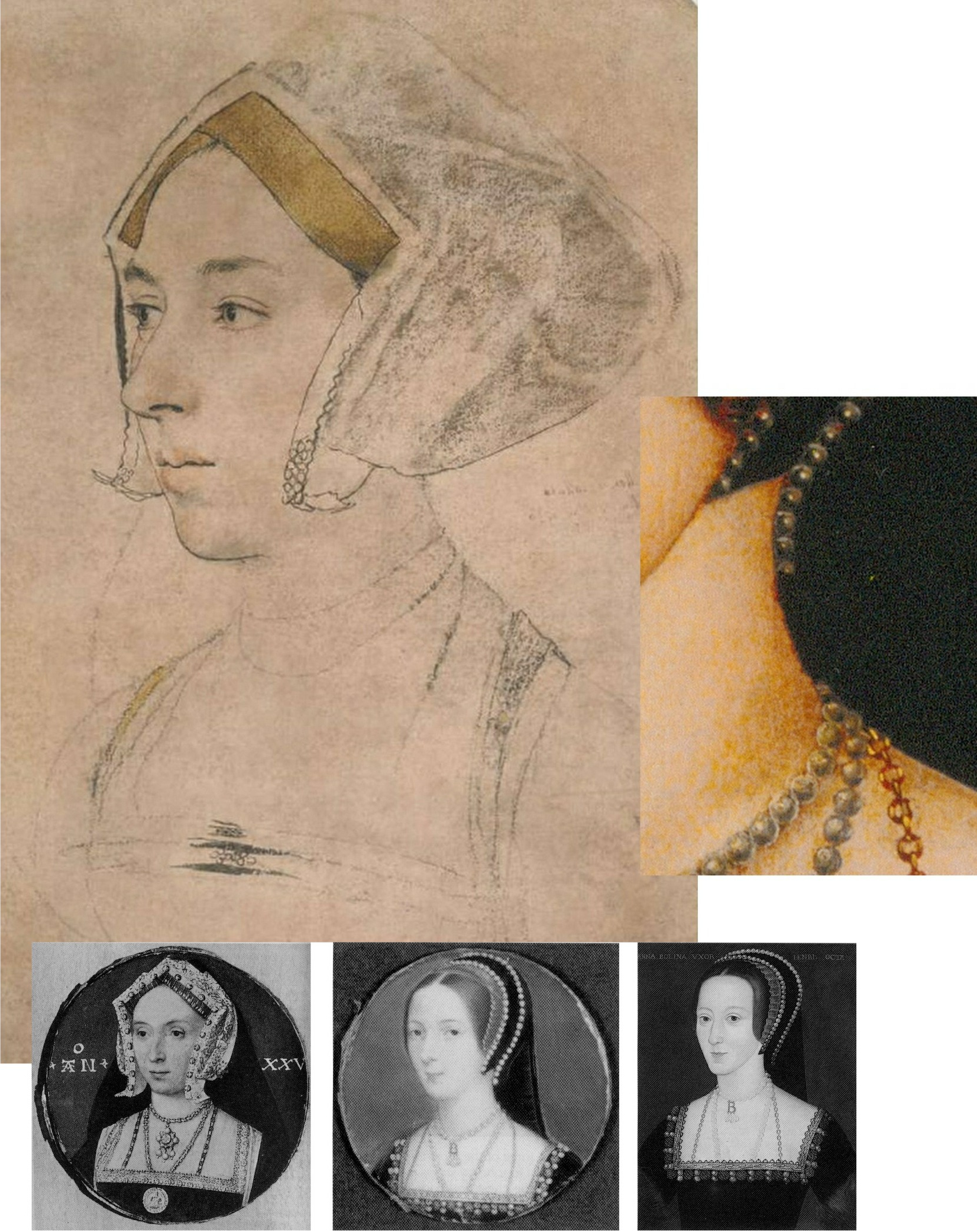
Above, Fig. 6: This photo-comparison, carried in Foister’s 2004 Holbein & England, showed the great discrepancy between the Rowlands-claimed Royal Library near-profile portrayal of Anne Boleyn (above left) and one of the many subsequently painted three-quarters view portraits like that in the National Portrait Gallery (above right) and at Hever Castle (as in Figs. 9, 10, and 13, below.)
THE WRONG HAIR COLOUR
Foister objected that the Windsor “Anne Boleyn” drawing (see Figs. 1, 14 & 18) “shows a sitter with fair hair and quite a different appearance to the [painted] portrait in the National Portrait Gallery in which the dark-haired sitter wears a pendant B.”
A seeming attempt to defuse problems arising from the Royal Collection’s acceptance of the fair-haired Windsor “Anne Boleyn” presently appears on its website:
“A portrait drawing of Anne Boleyn (c.1500-1536) on pink prepared paper. She is shown bust length in profile facing to the left. She wears a fur collar and linen cap… Although the identification of the sitter has been doubted, her informal dress and the presence of an inscription based on an identification made by Sir John Cheke have been cited as convincing evidence that the sitter is the queen (see, for example, John Rowlands and David Starkey in the Burlington Magazine, February 1983, pp. 90-2)…
“Abrasion has removed some pigment from the sitter’s hair meaning that it may now appear lighter than it did when the drawing was made. The sitter’s eyes are brown…”
Certainly, as Parker had noted, the “Windsor Holbeins have suffered in both ways from rubbing and reworking, and the fact has long been known and all too emphatically stressed.” The recorded superimposition of oiled paper for the purpose of making tracings (for engravings) can only have had deleterious effects on drawings made largely of chalks. Nonetheless, one must wonder what kind of precisely selective abrasion might have left a sitter’s eyes brown while turning her dark brown hair fair.
In her 2006 Tate Gallery catalogue Holbein in England, Foister cast doubts on both “Anne Boleyn” drawings – but not equally so. Of the British Museum drawing, and echoing Rowlands/Starkey: “The identification as Anne Boleyn arose when the drawing was in the Arundel collection and was etched by Hollar in 1649. It appears to have been based on a superficial similarity to portraits which have a reasonable claim to represent Anne… Whether Holbein portrayed Anne remains an open question: a drawing at Windsor (Parker 63) inscribed with her name shows a fair-haired woman whose appearance differs greatly from the painted portraits.” Of the British Museum drawing Foister said the dress is “similar to that of representations of those of the More family but also those of higher status: the jewels on her hood and on her bodice indicate that she might have been a member of a noble family…”
PICTORIAL TESTIMONY
What seems not to have been appreciated by any supporters of the Royal Collection drawing is that in the absence of a Holbein painted portrait of Anne – or an evidently intermediary work – adjudications between the two rival and incompatible “Anne Boleyn” drawings can only proceed on an examination of their respective correspondences with both the historically secure and dated medal and the many later painted depictions of Anne. With Anne long deceased, the later paintings had to have derived from something already painted or drawn, so the question is: which of the rival drawings is a better fit with the surviving Anne Boleyn depictions. Given the virtually complete concordance of design in Holbein’s portrait drawings and paintings (Figs. 10 and 11), appraising and comparing the now rival “Anne Boleyn” drawings with the medal and the depictions of Anne that followed her 1536 execution and the 1547 death of Henry VIII, is not only germane, it becomes, in the absence of “literary” records, of the pictorial essence – and thus is, pace Foister, a far from superficial exercise.
For example, the three rows of jewellery indicated in shorthand at the neck of Anne in the British Museum drawing are also found in completed form on the necks of both the National Portrait Gallery and Hever Castle paintings of Anne (see Figs. 7 and 11 below). Further, while this now officially discounted Holbein drawn likeness of Anne had either directly determined or – somehow – anticipated a crucially important and distinctive feature common to both types of the later painted portraits of Anne, the upgraded Royal Collection “Anne Boleyn” drawing found no echo in either type of the many later paintings.
Above, Fig. 7: Top, the British Museum Anne Boleyn (mirrored); right, inset, a detail of the Hever Castle Anne Boleyn painting; bottom row, painted portraits of Anne by Lucas Horenbout (in the gable hood type) and (in the French bonnet type) by John Hoskins, and anonymous.
THE MEDAL IN THE ROOM
The only securely surviving – and dated – contemporary likeness of Anne is on the damaged 1534 commemorative medal. The medal itself, however, will have derived from a drawn design or model – but by whom? Given his designs for jewellery and other precious objects, might Holbein be considered in this regard?

Above, Fig. 8: Left, the British Museum-owned 1534 medal; second and third left, respectively, the British Museum and the Windsor Holbein “Anne Boleyn” portraits; right an 18th century engraved copy by Francesco Bartolozzi of the Windsor “Anne Boleyn”. Prints of the Bartolozzi copy can be obtained from the National Portrait Gallery – where they are described as “Unknown woman, formerly known as Anne Boleyn”. Because of the Bradford family’s theft, there is no comparable Bartolozzi copy of the now British Museum Anne, but it might be noted that Bartolozzi showed the Windsor sitter to be fair- not dark-haired and, thus, any abrasion to the sitter’s hair must have preceded this record.
Above, Fig. 9: A possible chronological migratory sequence of depictions and motifs spanning one hundred and fifteen years. From left to right: the British Museum’s Cheke, Ganz, and Parker-ascribed Holbein drawing (here mirrored); the 1534 commemorative medal; third left, the Hever Castle, late 16th century English School oil-painted portrait of Anne Boleyn; right, the 1649 Hollar engraved copy of the British Museum drawing. It might be proposed that the British Museum drawing more likely predated the 1534 medal (struck just two years before Anne’s execution) and that it might, with its gable hood and indications of jewellery, have served in mirrored form as something of a guide to the medal maker.
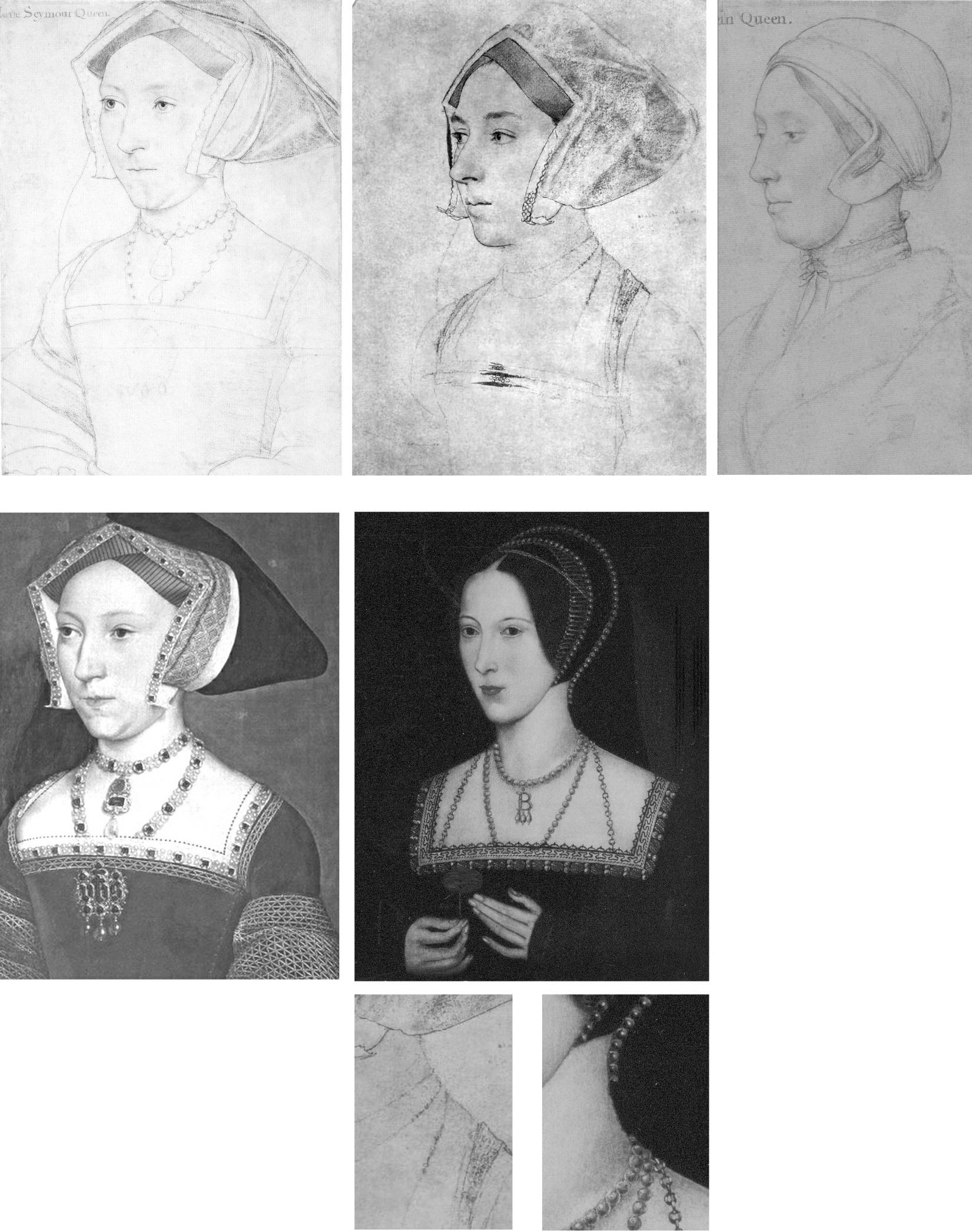
Above, Fig. 10: The extremely close design relationship between Holbein’s drawings and paintings can be seen (left column) in his drawn and painted portrayals of Jane Seymour. Such constancy would be expected also in a Holbein painting of Anne but, given either that one was never made or that none has survived, we must therefore consider from whence the (above, centre) Hever pattern of portraits might have sprung. Clearly, in terms of costume and physiognomy, it could not possibly have derived from the Windsor drawing – whereas, as seen at Fig. 7 and above here, the triple necklaces motif had migrated from the British Museum drawing to the later paintings while the Royal Collection linen cap and fur-collared nightwear costume would seem to have influenced no other work.
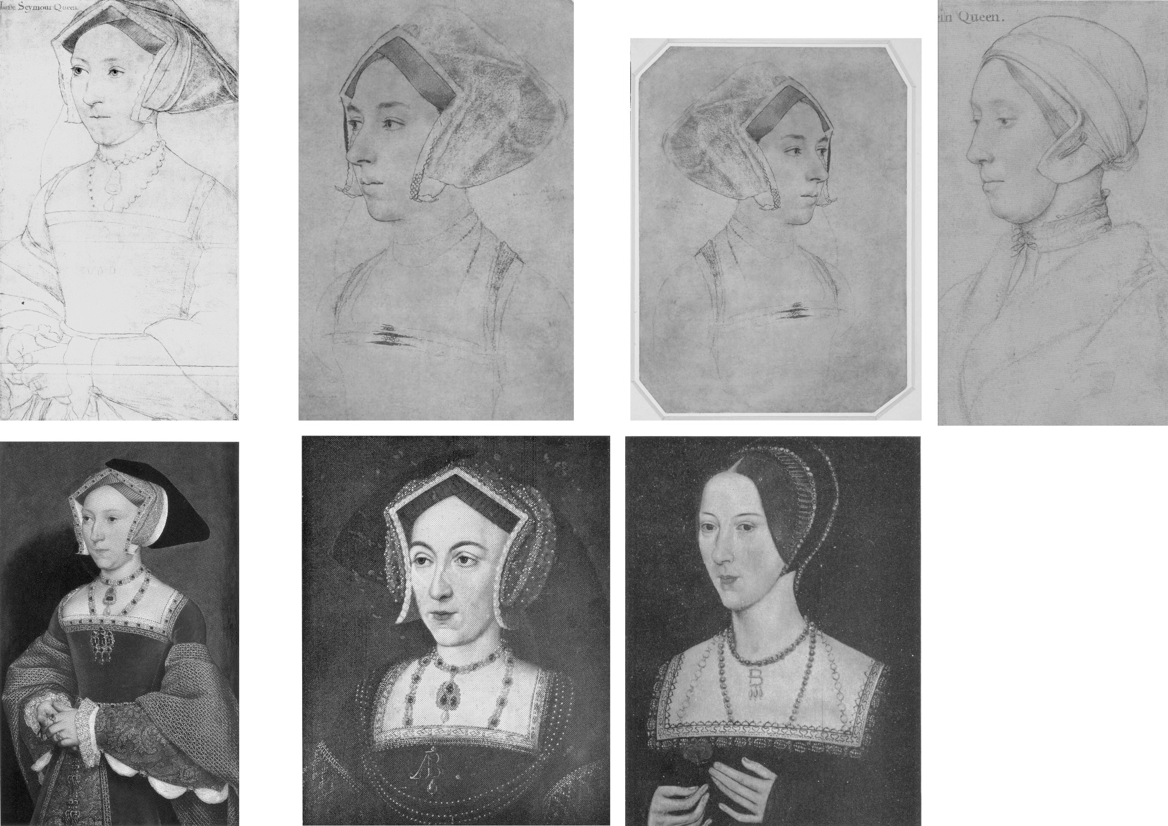
Above, Fig. 11: In the left-hand column we again see the absolute unity of design in Holbein’s drawing (top) and painting (bottom) of Jane Seymour. In the second and third columns we see degrees of kinship between Holbein’s British Museum portrait of Anne Boleyn (top row) and, below, with the two types of the later painted portraits, as found formerly at Nidd Hall, now privately owned, and at Hever Castle.
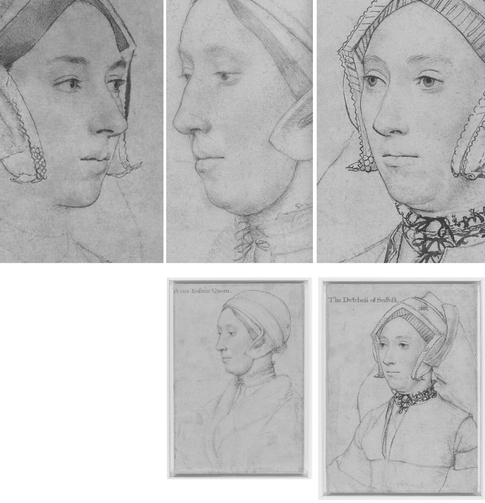
Above, Fig. 12. While all agree that the rival “Anne Boleyn” drawings (top, left and centre) could not have been made from the same person, it has not been remarked that with the Windsor “Anne Boleyn” (centre column), the general set of the face, the disqualifying double chin, and, the greater age of the sitter, find correspondences in the Royal Library’s “The Dutchess of Suffolk” (right hand column) – which include an almost identically tied, high-necked chemise. (An unsuccessful attempt was made to re-assign the identity of the Duchess of Suffolk’s sitter to an earlier wife and to count the proposed switch as a “discovery” in the 2007 Philip Mould Gallery Lost Faces exhibition.)
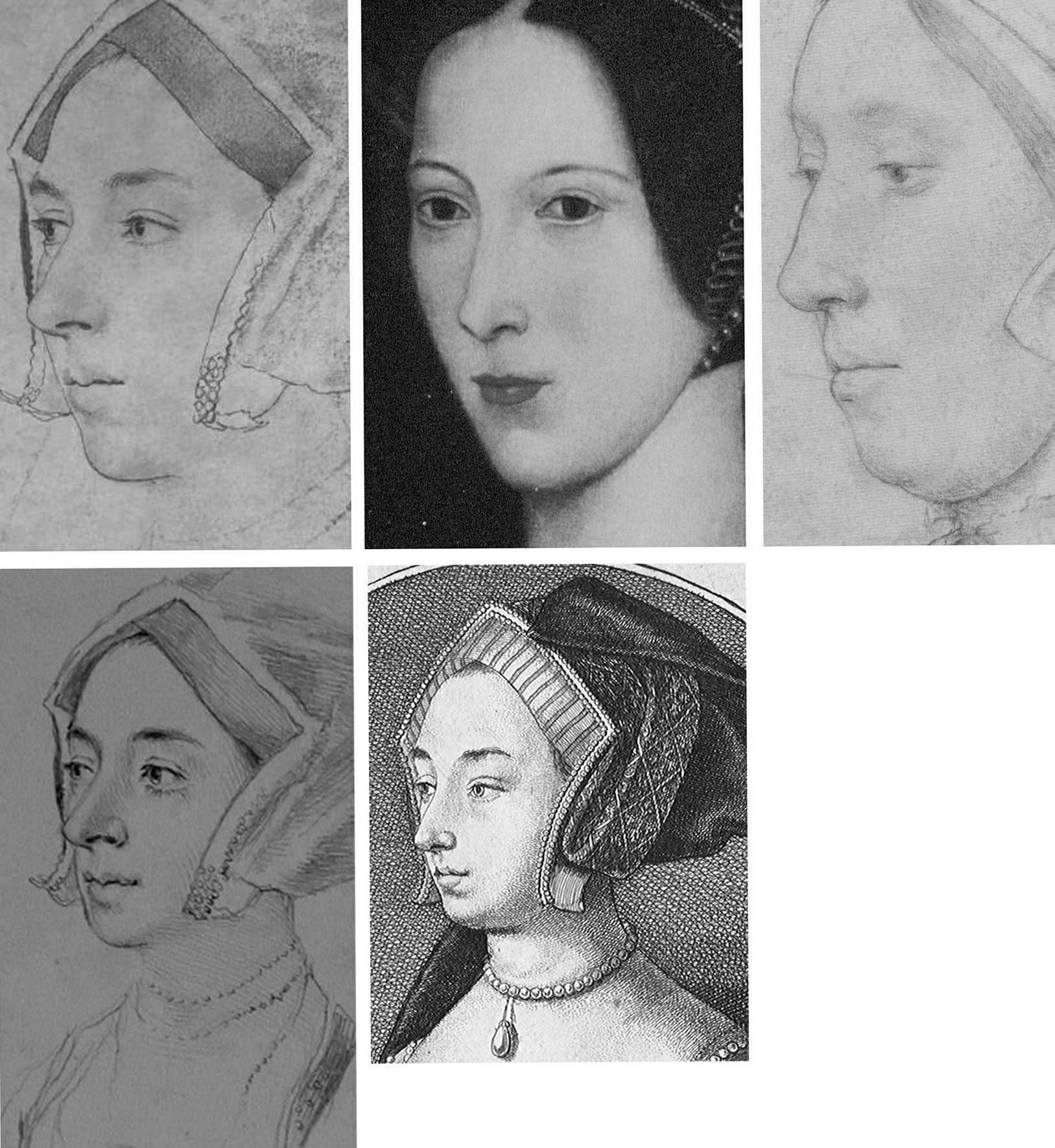
Fig. 13, above. In terms of likenesses, the late sixteenth century painted portrait at Hever Castle (above, top, centre) has common traits with the BM drawing (mirrored, above, top left) but none with the Windsor drawing (above, top, right) – other, that is, than a sharply drawn edge to the lower face caused, doubtlessly, by tied bonnets. As seen at bottom left, a (mirrored) pencil copy of the Bradford/BM drawing held in the Ashmolean Museum, Oxford, and now attributed to Jonathan Richardson senior, suggests that more supplementary chalk shading might formerly have articulated the head/neck relationship on the Bradford/BM drawing – and, as seen at bottom, centre, above, (and at Figs. 3 and 4), the Hollar copy of 1649 had indicated by tonal variations an implicitly continuous line of demarcation between the lower face/jaw and the neck.
HOLBEIN’S CAPTURED LIKENESSES AND THEIR ORIENTATIONS
Above, Fig. 14: Top, The British Museum and Royal Collection “Anne Boleyn” Holbein drawings; bottom, left, Holbein’s “Simon George”, which carries an inscription “S. George of Cornwall”; bottom, right, Holbein’s “Henry Howard, Earl of Surrey” (detail).
Holbein possessed a seemingly effortless ability to draw heads from any position – in one perspectival tour de force, John Poyntz (in the Royal Collection) was drawn from behind and below. Because the portraits are such vivid, compelling likenesses the artist’s remarkable spatial/plastic illusionistic facility can be underestimated. As shown below at Fig. 15, Holbein, like a sculptor, clearly appreciated that a head is an object, and that depicted faces constitute a record of the visible front of an object that is deeper than it is wide – and, therefore, that a face drawn full-on must find the graphic means to evoke the depths of a head (as was brilliantly achieved by Holbein in Henry Howard, above, right) by plastically nuanced tonal variations. So-saying is not to fail to recognise that for very good reasons and from infancy, human beings attend more to faces than to profiles – and nor is it to disregard Holbein’s own distinctive human engagement and psychological penetration*. It is simply to recognise the paradoxical ease with which viewers can safely make plastic/sculptural extrapolations from Holbein’s predominantly linear drawn likenesses. In this regard, Paul Ganz, spoke eloquently in his 1950 The Paintings of Hans Holbein: “…line was the means by which he rendered form, indicated movement and suggested expression. It remained the sure foundation even of his painting, and gave to his figure compositions, his portraits and even his decorative works an astonishing clarity and organically coherent solidity.” (*On Holbein’s emotional truthfulness, see Susan Foister’s fine “Holbein the Portraitist” in her 2004 Holbein & England.)
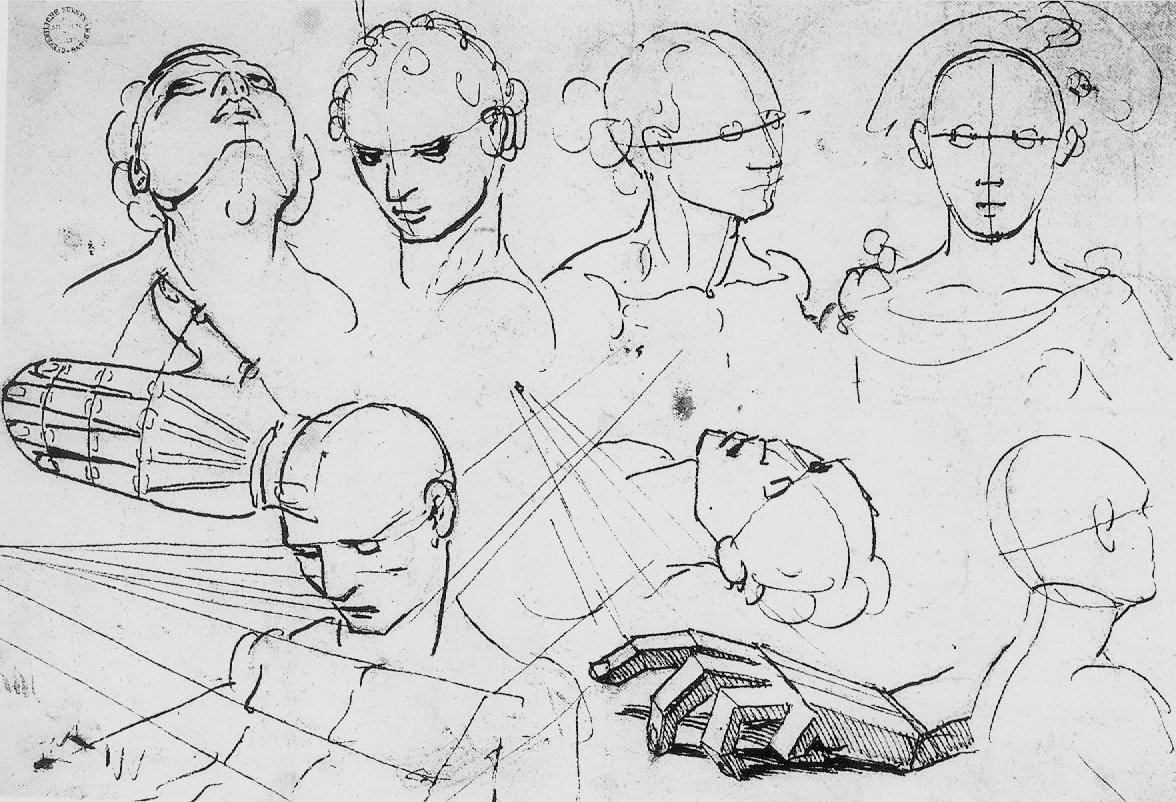
Above, Fig. 15: An ink-over-chalk study sheet in which Holbein simultaneously examines the plastic structures of heads; the expressive force of directional gazes; and – with a curving line in each head (except for the top right head where, being seen from the front, the profile registers as a straight line) – unfailingly locates and orientates the faces’ profiles. (Ӧffenliche Kunstsammlung, Basel, Kuperfestichkabinett.)
In all graphic, painted, and sculptural media, the profile of a head is the single most potent contour because the plastic entirety of a head is bounded by and articulated within it. Expressively speaking, the profile also fixes the distinctive “set” of a sitter’s head, as seen below and above at Fig. 14 with Holbein’s “Simon George” drawing.
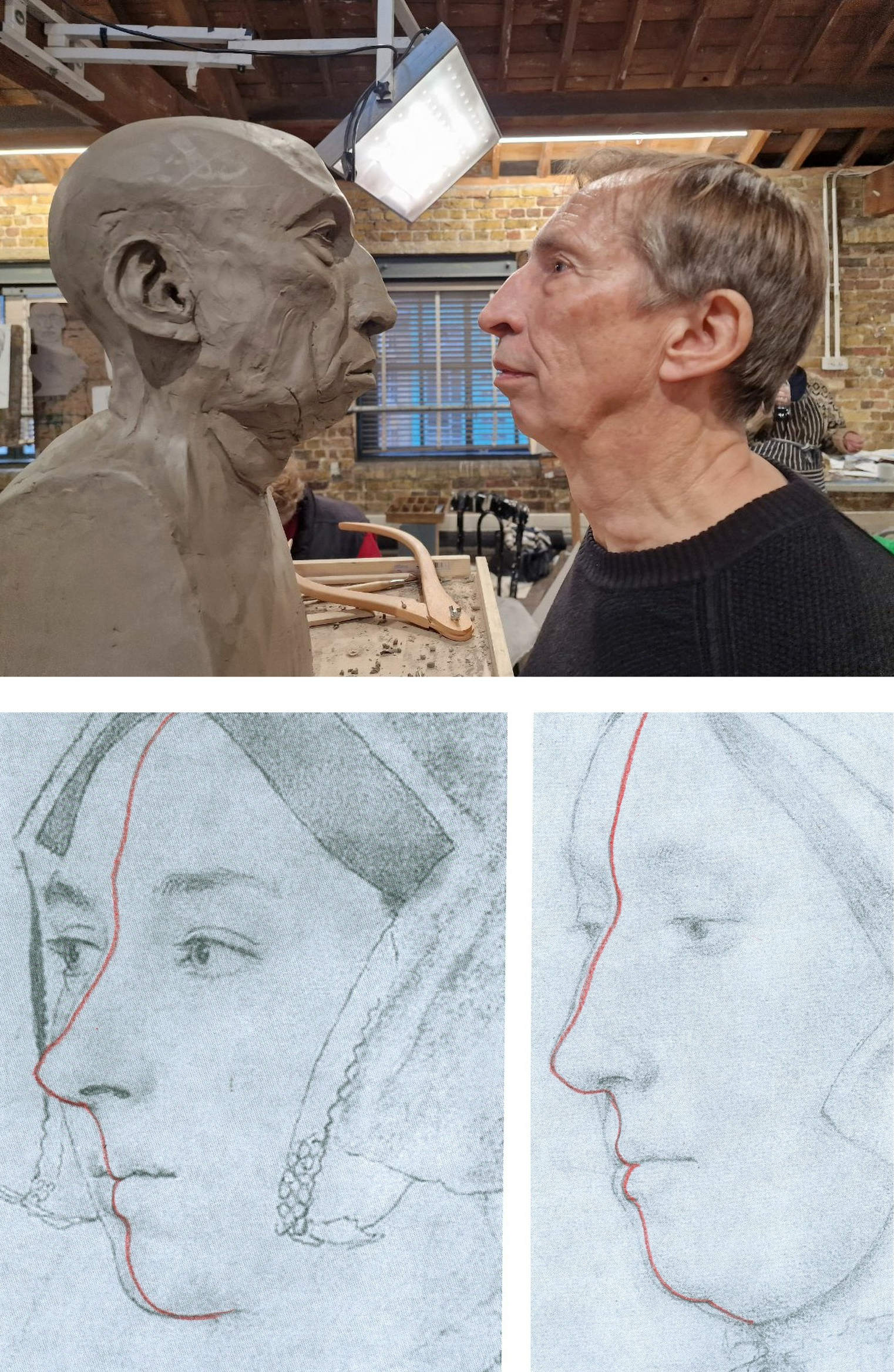
Above, Fig. 16: Top, a modelled head-in-progress and its sitter, at the Royal Drawing School; bottom, extrapolated lines indicating the location of the sitters’ profiles in the two contested “Anne Boleyn” portraits. While flesh might sag with age, the bony part of the nose does not continue to grow.
Above, Fig. 17: Top row, the Hever Castle Anne Boleyn painting (mirrored) and a detail of the British Museum Anne Boleyn drawing, far right, the actor Natalie Dormer in role as Anne Boleyn in the 2007-10 TV series The Tudors; centre row, views of an Anne Boleyn waxwork at Hever Castle modelled by Emma Pooley (– “I settled on Holbein’s sketch of Anne as it has always been my favourite, and is by far the most realistic reproduction, in terms of skill, of her image from around the time”); bottom row – the Pooley waxwork at Hever Castle; a painting of Anne Boleyn at Hever Castle; a waxwork of Anne Boleyn at Warwick castle.
All the above paintings and waxwork reconstructions of Anne Boleyn share a common and simple three-part dynamic in their profiles with that present in the British Museum drawing. That is, in each, from the top downwards: the forehead advances somewhat; the nose advances more rapidly; but then, from the base of the nose the profile moves into reverse and retreats appreciably down through the mouth and to the chin. The Royal Collection drawing’s profile has a different, flatter dynamic and for clear reasons of anatomy could not have been made from the same sitter.
WHO WAS ANNE BOLEYN?
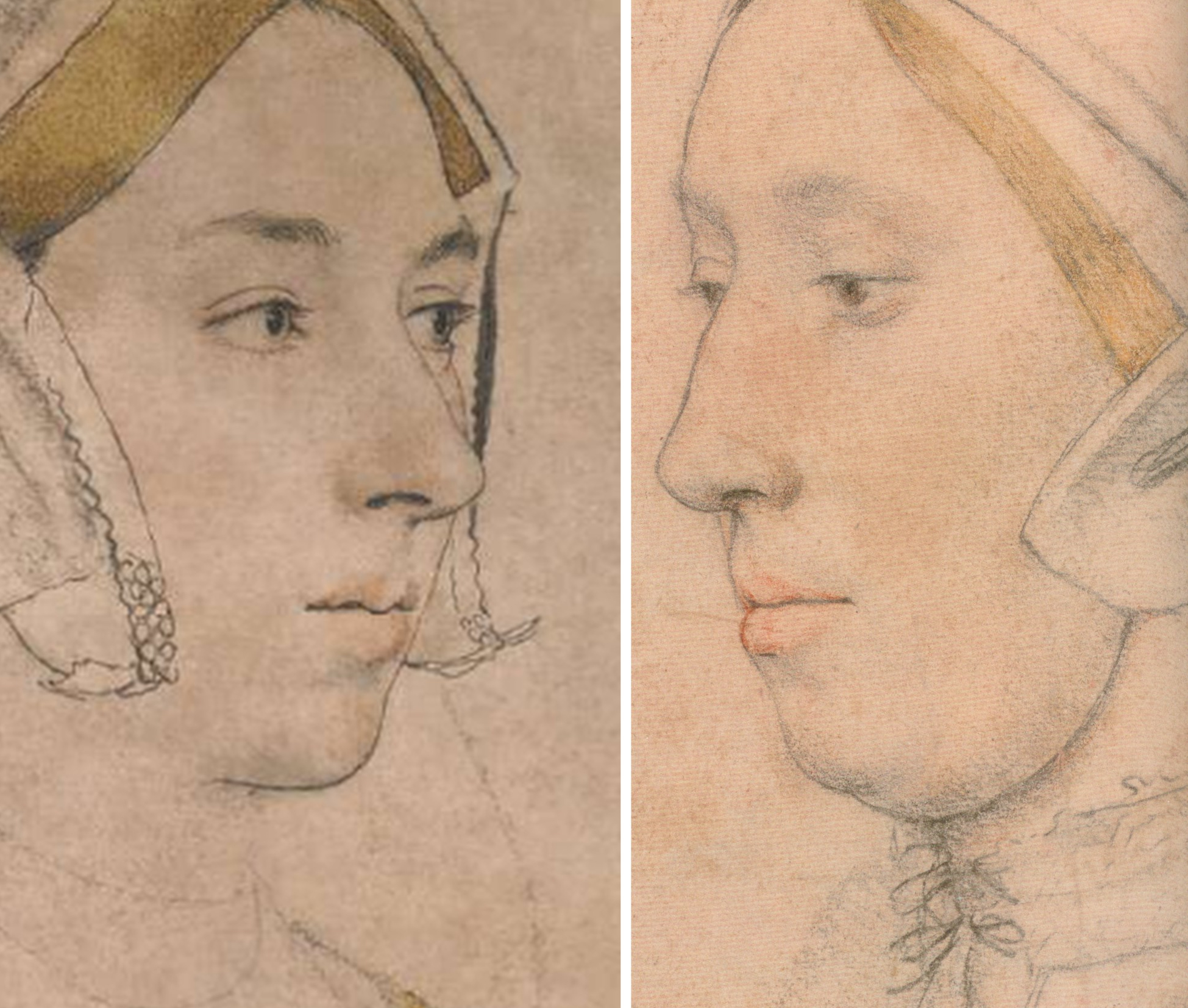
Above, Fig. 18: Left, the British Museum Holbein Anne Boleyn drawing (detail); right, the Royal Collection Anne Boleyn drawing (detail). Note the line that descends from the turned-up wing of the gable hood on the right of the BM drawing.
The sitter on the left is younger, slimmer, brighter-eyed (albeit with grey/blue eyes, not brown) and is shown to have dark hair and dark eyebrows. She has a sharper, less highly bridged and more upturned nose with markedly larger nostrils. Her eyes are focussed, attentive, seemingly purposive, certainly not downcast, or self-absorbed and reflective – or with a pronounced fold of flesh over the upper eyelids. She has a single, not a double chin. In this context, Anne’s recorded character and appearance might be considered. Eric Ives, author of the acclaimed 2004 The Life and Death of Anne Boleyn (which succeeded his 1986-1994 Anne Boleyn), wrote:
“Captivating to men, Anne was also sharp, assertive, subtle, calculating, vindictive, a power dresser and a power player, perhaps a figure to be more admired than liked…All reports agree that she was dark. As well as Sanuto’s ‘swarthy’, Thomas Wyatt gave her the poetic name, ‘Brunet’.”
Ives cited a host of contemporary descriptions:
“…beautiful with an elegant figure”; “very beautiful”; “very eloquent and gracious, and reasonably good looking”; “young and good looking”; “not one of the handsomest women in the world, she is of middling stature, swarthy complexion, long neck, wide mouth, a bosom not much raised, and eyes which are black and beautiful…” Ives summarised: “Looks only tolerable, but a splendid head of dark hair and fine eyes”. One observer expanded on Anne’s use of her eyes: “…eyes always most attractive Which she knew well how to use with effect, sometimes leaving them at rest, and at others sending a message to carry the secret witness of the heart. And truth to tell, such was their power That many surrendered to their obedience.” Ives remarked that Anne “…radiated sex”. Emma Pooley’s choice of source image was sound: no female sitter’s eyes in Holbein’s drawings better evoke such reported properties and powers than those found in the British Museum drawing of Anne Boleyn – and, on this emotionally charged correspondence, Rowlands had seemed almost to concur in 1977: “The eyes, of a rare beauty, the eyebrows and eyelashes are all marvellously drawn”.
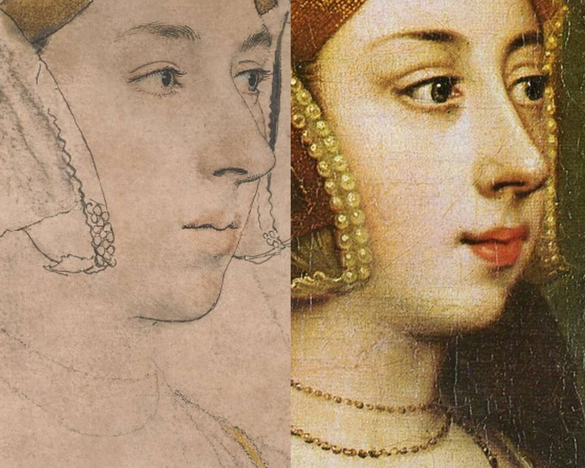
Above, Fig. 19: The arresting eyes, quivering nostril and sensuous mouth drawn by Holbein had migrated so faithfully and vividly to the (above right) later painted portrait at Hever Castle that there would scarcely seem space between them for an intermediary work. The line of the descending hood drapery in the bottom right corners of the above details departs from behind precisely the same points on the respective turned-over wings of the gable hood. Similarly, there is an almost perfect duplication in the painting of Holbein’s lightly indicated triple necklaces. Trigonometry (and see below) no less than sexual animation, testifies here to an almost identical and – surely – true likeness of Anne?
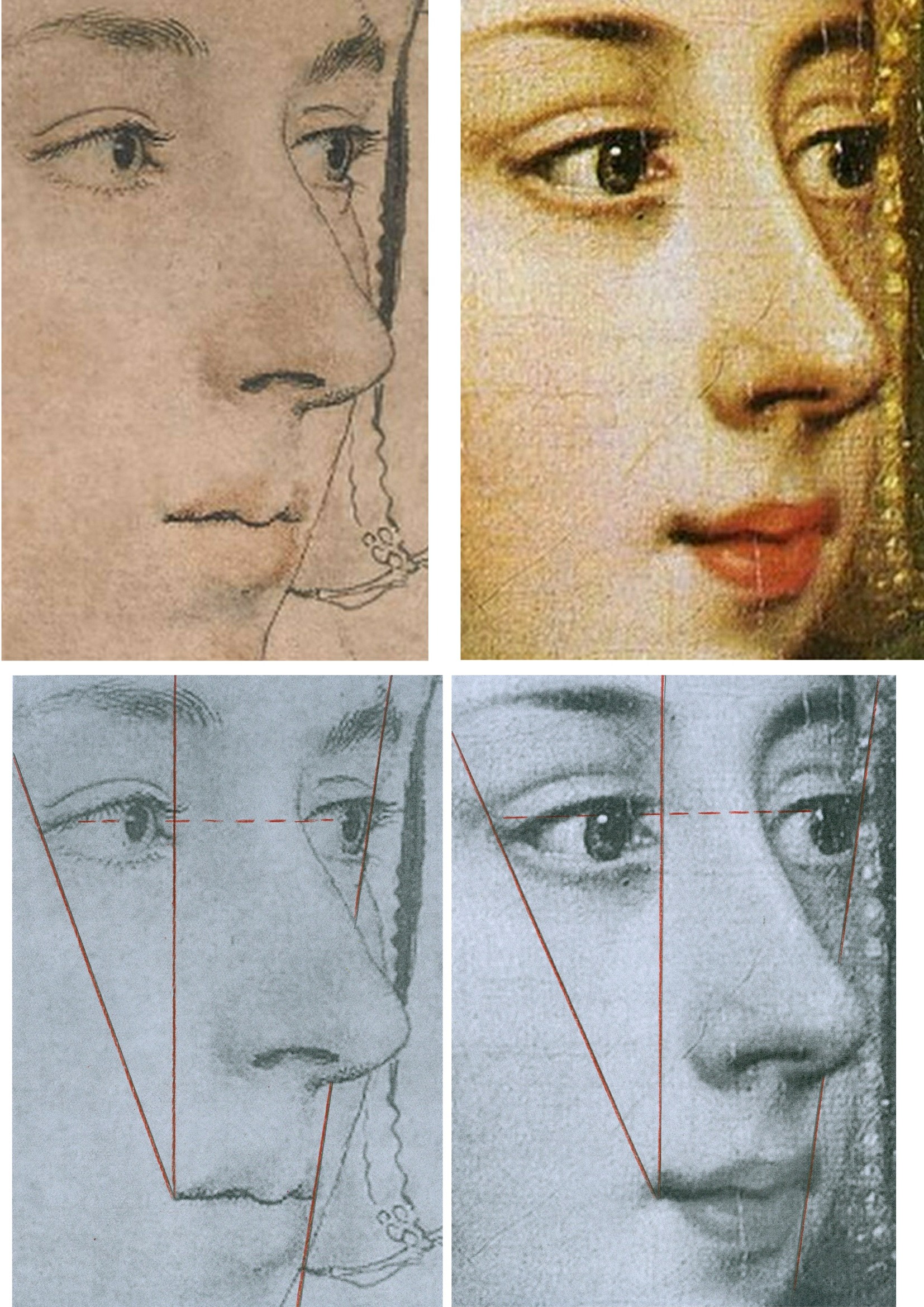
Above, Fig 20: There are differences sufficient between the drawn and painted images above to show that the painting was not made on a transposed tracing of the drawing, but the essential trigonometric relationships between the features make it inconceivable that the one image had not derived from the other – and with both describing the same sitter – even though the drawing is a more sparingly rendered account than that in the weightier, lusher and historically later oil painting. The immense odds against the reflected highlights in the eyes of two different works made decades apart and in different mediums coincidentally occurring in alignment, at the same latitude, and at the junctions of the pupils and irises, leave no option other than to conclude that what we have here is two near-identical heads that share a common light source because the one image derived from the other and both share the common sitter of Anne Boleyn.
The mouth in this Holbein drawing may be unique in the artist’s portraits. So far as we recall, Holbein invariably showed a single line of demarcation between his sitter’s upper and lower lips. On the mouths of both the drawing and painting above there seems to be a parting of the lips on the left. Ives mentions that the most hostile witness, the “Elizabethan recusant activist”, Nicholas Sander, claimed Anne had “a projecting tooth under the upper lip”. The same witness also testified that, nonetheless, as well as being handsome, Anne had “a pretty mouth”.
THE 1977 ROWLANDS CASE
On his methodologically flimsy and not duly illustrated account Rowlands had gingerly proposed in 1977 that “An implication of the rejection of the Bradford/BM portrait as a representation of Anne Boleyn, is that the drawing in the Royal Collection series with the inscription Anna Bollein Queen could in principle be once again a candidate for consideration as the Queen.” Having also admitted that the problem of the identity of his (not-shown) candidate Royal Collection drawing “must remain unsolved” for “want of less inconclusive evidence”, Rowland’s espousal in toto constituted little more than a-case-proposed-but-not-made. On occasions, Rowlands seemed bent on deconstructing his own case: when speaking of the British Museum drawing’s “precision” and “excellence” of outlining, for example, he well noted that “In addition to giving depth to the face, the brush-line of varying thickness defines the line of the wavy outer edge of the right-hand side of the headdress, and has enabled the artist to determine its position exactly in relation to the line of the cheek and the nose” – just as is shown in the close-up in Fig. 20, above, left. That so-careful and deft recording of the features, he ended, “is the hallmark of all Holbein’s portraiture, and it is particularly disappointing that the painting that would no doubt have been done from this drawing, should not have survived.” Disappointing indeed, but no reason to pivot towards an alternative drawing that had left no waves and triggered no echoes – not least because in regretting the likely destruction of Holbein painted version of this particular Anne Boleyn-ascribed drawing, Rowlands had overlooked the fact that the drawing itself had found a close and faithful painted expression in a second Hever Castle Anne Boleyn work, as shown above.
Six years later Rowlands would co-author an article with the Tudor historian David Starkey in the February 1983 Burlington Magazine – “An Old Tradition Reasserted: Holbein’s Portrait of Anne Boleyn”.
THE ENTRANCE OF DAVID STARKEY
Above, Fig. 21, an ink drawing (in the collection of Professor Edward Chaney) of David Starkey that was made by the author to illustrate a profile article, “The apoplectic academic”, by D. J. Taylor, in the Independent on Sunday, 9 November 2001.
In Part II, we examine how the Starkey-bolstered Rowlands’ Case came to persuade the Royal Collection that it now holds the true Anne Boleyn Likeness.
Michael Daley, Director; 18 April 2024
ArtWatch at Thirty, Part II: The Artful Promotion of the World’s Worst Restorations

15 APRIL 2023. MICHAEL DALEY WRITES:
In Part I we set the 1980-1994 cleaning of Michelangelo’s Sistine Chapel frescoes in the era’s ambitiously experimental and accident-prone restorations. Here, we examine the art-historically untenable scholarship that arose when Michelangelo’s debilitated frescoes were endorsed as if constituting revelations that merited a rewritten history of art. Three decades on, identifying and examining the polished art-political stratagems that draw so many scholars and art critics into supporting egregiously destructive restorations remains a matter of professional urgency.
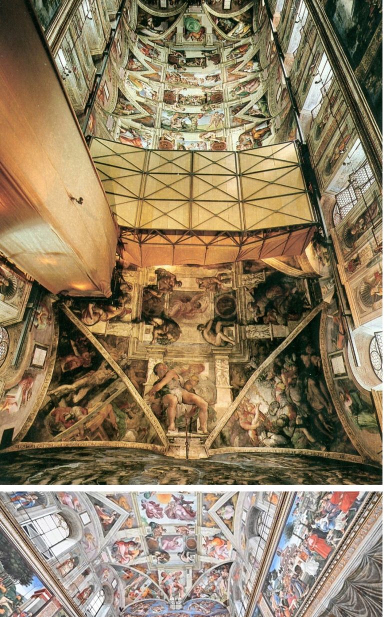
Above, Fig. 1, Top: National Geographic’s iconic photo-record of the Sistine Chapel ceiling which captured the last moments of the most acclaimed late stage of Michelangelo’s painting, including his The Crucifixion of Haman, the Prophet Jonah, and the Libyan Sibyl. Above, the post-cleaning, LED-lit chapel. When unveiled in 1512, the then brilliantly lit and shaded figures set in deep architectural spaces were eulogised for having made surfaces which physically advanced towards the viewer recede optically through Michelangelo’s powers of design and unprecedented deployment of lights and shades. At the time, no one spoke of Michelangelo’s colour – “brilliant” or otherwise.
TWIN AND CROSS-LINKED ASSAULTS ON A CRITIC
On 8 October 1987, halfway through the cleaning of the Sistine Chapel Ceiling, the restoration’s leading scholarly critic, Professor James Beck, Chairman of Columbia University’s Art History and Archaeology Department, was branded the “most culpable of the critics” by Sir John Pope-Hennessy in the New York Review of Books (“Storm Over the Sistine Ceiling”). Two months later, that attack was followed by another in the December Apollo magazine by Kathleen Weil-Garris Brandt (“Twenty-five Questions about Michelangelo’s Sistine Ceiling”). Like Pope-Hennessy, Brandt was a professor of Renaissance art at New York University’s post-graduate art history school, The Institute of Fine Arts (which incorporates a Samuel H. Kress Program-sponsored conservation department), and she was considered a long-standing friend by him.
Brandt characterised the restoration’s critics as “a tiny, heterogenous and vociferous cadre”. She likened their arguments to “the wild cries of some ferocious mutant of Chicken Little” and added “Many believe that the critics, like that benighted bird, were misunderstanding insufficient evidence, to draw mistaken conclusions to the alarm and detriment of the neighbours.” She conceded the issue “is a serious one” but only the better to sting: “Are the critics merely opportunists, bodysurfing in a wave of publicity they would never otherwise have enjoyed?” In his 2016 memoir, Michelangelo and I, Gianluigi Colalucci, the restorer/co-director of the Sistine Chapel restorations, described Brandt as “sweet and gentle in appearance but with a character of steel” who, having “obtained her own office in the museum complex”, had “put just about everybody under pressure with her inflexible activity”.
“THINGS ARE NOT AS YOU THINK”
There were degrees of hypocrisy in both attacks. Pope-Hennessy’s charge of professional culpability had followed his invitation to Beck to serve on a Metropolitan Museum Advisory Committee. As Colalucci would later disclose, Brandt’s denigration was not made as the self-effacing and disinterested scholar she had implied in Apollo – “Like many Renaissance scholars, I have held a kind of informal watching brief for the cleaning operation since its inception in 1981 [sic] and I talk on the subject with groups and individuals of all kinds.” Formally speaking, Brandt had two dogs in this fight. First, she had obtained her Vatican office as the official spokesman on “Scholarly and General information” for Arts and Communications Counsellors, a division of the New York Public Relations firm Ruder and Finn Inc. which had been retained by the Vatican to handle the restoration crisis. Second, she was a member of a shadowy, secretive scientific advisory committee the Vatican had set up, ostensibly, to monitor the controversial restoration. On learning of that committee, Colalucci threatened to resign but was dissuaded by his restoration co-director, Fabrizio Mancinelli, who urged him to calm down because: “You’ll see that things are not as you think…” In due course, Colalucci recalled, “we were given to understand that the findings were positive”.
As will be shown in Part III, the ploy of an institutionally self-appointed, supposedly invigilating but intended exonerating body, had been honed at the National Gallery in 1947 and 1967. Given the importance of the greatest art, whenever major restorations are started, they must, of political necessity, be defended unequivocally for the duration and at length thereafter, for fear of triggering institutional melt-downs. When a restoration of sacred art in a sacred place is funded in advance by a foreign corporation in a commercial exchange for film and photography rights, any admission of error becomes doubly inconceivable. Little surprise therefore that, as Colalucci disclosed, the Vatican’s own scientific advisory committee remained in place as a supportive “working group” throughout the entire restoration of Michelangelo’s Sistine Chapel frescoes. Headed by André Chastel, this group’s members, in addition to Brandt, were:
“Carlo Bertelli of Lausanne University, initiator of the restoration of Leonardo’s Last Supper executed by Pinin Brambilla [See: The Perpetual Restoration of Leonardo’s Last Supper, Part I: The Law of Diminishing Returns]; Pierluigi De Vecchi, an expert on Michelangelo; Sydney J. Freedburg from Washington; Giovanni Urban[i] former director ICR [the Istituto Centrale di Restauro]; Luitpold Frommell and Matthias Winner, directors of the Bibliotecca Hertziana in Rome; Umberto Baldini, director of the ICR [and head of the Brancacci Chapel restoration]; Michael Hirst, an expert on Michelangelo’s drawings; John Shearman, an expert on Raphael and the Sistine Chapel…The restorers were Alfio Del Serra from Florence…and Paul Schwartzbaum from New York, head of the ICCROM school and projects in Rome. Norbert Baer from New York University was the only chemist.”
THE SAMUEL H. KRESS FOUNDATION INTERVENTION
Colalucci aired a secondary grievance concerning the advisory committee in 2016: “By express desire of Chastel and the other members, we were not allowed to inform the press of the work of this group of experts, even though it would have been of great benefit to us because” [the quasi-invigilators] “wished to keep a low profile and avoid the attention of the already overly excited public opinion”. However, “Shortly afterwards, Marilyn Perry, the pleasant and dynamic president of the Kress Foundation, set up another working group, this time consisting almost exclusively of restorers on her own initiative.”
“The members were Mario Modestini, the foremost restorer in America; John Brealey, director of the restoration department of the Metropolitan Museum of Art in New York; the young Dianne Dwyer, then assistant to John Brealey [see Fig. 11 below]; Andrea Rothe, director of the restoration department of the J. P. Getty Museum in Malibu; David Bull, director of the restoration department of the National Gallery in Washington [see Figs. 2 and 3 below]; and Leonetto Tintori, a highly skilled restorer from Florence [see Fig. 3 below].
“The group’s task was to monitor our work, give advice and put forward criticisms. The [single] meeting was very fruitful and ended positively with a report drawn up [by] the members of the group aimed in particular at public opinion in the United States.”
The resulting open letter from this committee to the American press executed its expressly intended effect to perfection. In April 1987, Time’s art critic, Robert Hughes, claimed:
“…most experts on Renaissance art, and on Michelangelo in particular, strongly endorse it and reject out of hand the anti’s allegation of haste or insufficient study…Last week a further vote of confidence came from the Samuel H. Kress Foundation, a long-established non-profit organisation concerned with the care and preservation of Italian art. Six of the world’s leading conservators… reported in an open letter that the ‘new freshness of the colours and the clarity of the forms on the Sistine Ceiling, totally in keeping with 16th century Italian painting, affirm the full majesty and splendor of Michelangelo’s creation’”
John Russell reported in the New York Times:
“An international Group of leading conservators of Italian paintings has given its unanimous and strongly enthusiastic approval to the current restoration of Michelangelo’s frescoes in the Sistine Chapel in Rome…Though not intended as a riposte to recent criticism of the restoration the report could be said to rebut the attacks that have been made upon it. Among those who have opposed the restoration are Prof. James Beck of Columbia, Alexander Eliot, formerly of Time Inc. and a group of 14 American artists who asked the Pope to halt the work…”
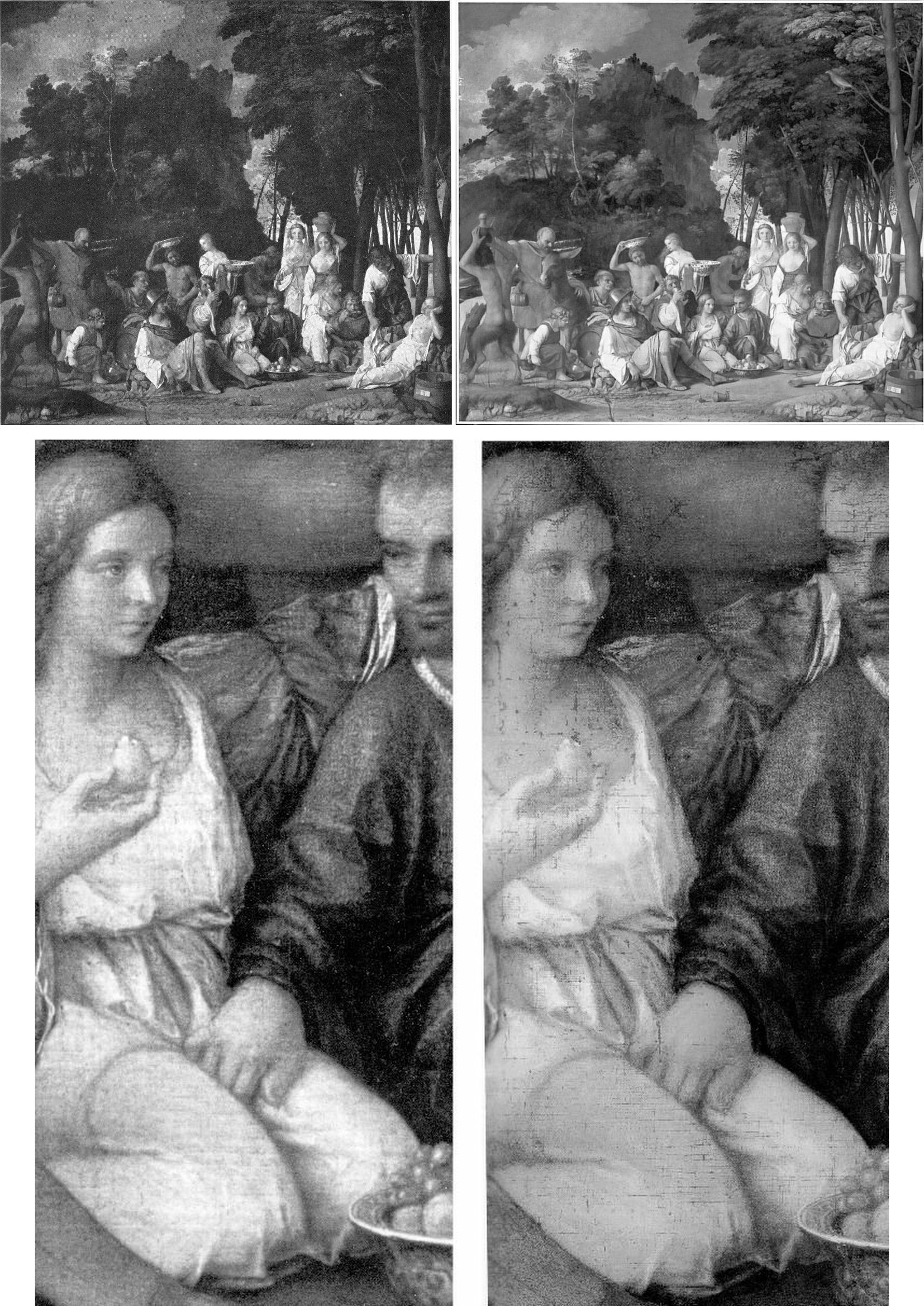
Above, Fig. 2: Top, the David Bull-restored Bellini/Titian Feast of the Gods, (before cleaning, left; after cleaning, right); below, a detail before cleaning, left, and immediately after cleaning, right. If Bull had simply removed a discoloured film of varnish, the previously discernible tonal values would have emerged enhanced – and not, as seen, diminished, compressed, and with a flattening of previously tangible forms. Such losses were Bull’s forte: when he restored Turner’s Rockets and Blue Lights (Fig. 3, below), one of the picture’s two distressed steamboats disappeared and its plume of once-black smoke was painted into a waterspout. (When that restorations-wrecked picture was sent to the UK on a tour, credulous British art critics took their lead from a Tate Gallery press release and gushingly proclaimed it “One of the stars of the show”.)
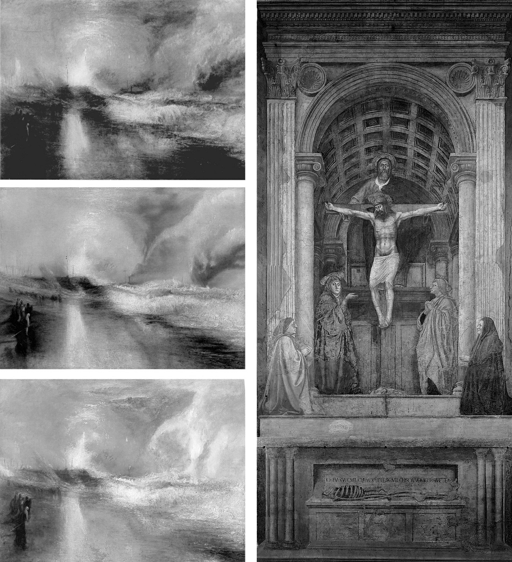
Above, Fig. 3: Left, Turner’s painting of two steamboats in distress, “Rockets and Blue Lights…” as seen in: 1896 (top); 1934 after restoration by William Suhr (centre); 2003 after restoration by David Bull (above). Right, Massacio’s Holy Trinity in the Santa Maria Novella, Florence, after restoration by Leonetto Tintori.
SUCKERED ART CRITICS
Where the Kress Committee’s open letter achieved immediate propagandistic effect, it took time for the claimed unanimity of its expert endorsement to dissolve. In a 28 April 2012 post we made the following (uncontested) disclosures:
“ArtWatch has been haunted for two decades by a nearly-but-not-made restoration disclosure. In the 1993 Beck/Daley account of the Nippon TV sponsored Sistine Chapel restoration (Art Restoration: The Culture, the Business and the Scandal), we reported that in the late 1980s Leonetto Tintori, the restorer of Masaccio’s Holy Trinity in the Santa Maria Novella, Florence [Fig. 3, above] and a member of the international committee that investigated the controversial cleaning, had urged the Sistine team privately to preserve what he termed ‘Michelangelo’s auxiliary techniques’ which in his view included oil painting as well as glue-based secco. What we had not been able to say was that Tintori (who died in 2000, aged 92) had prepared a dissenting minority report expressly opposing the radical and experimental cleaning method.
“Shortly before the press conference called to announce the committee’s findings, Tintori was persuaded by a (now-deceased) member [Fabrizio Mancinelli] of the Vatican not to go public with his views. He was assured that his judgement had been accepted and that what remained on the Sistine Chapel ceiling of Michelangelo’s finishing auxiliary secco painting would be protected during the cleaning. With a catastrophically embarrassing professional schism averted, the restoration continued and the rest of what Tintori judged to be Michelangelo’s own auxiliary and finishing stages of painting was eliminated. Without knowledge of Tintori’s highly expert dissenting professional testimony, the public was assured that despite intense and widespread opposition the cleaning had received unanimous expert endorsement. Critics of the restoration were left prey to disparagement and even vilification.”
Our 1993/2012 claims on the dissent within the international committee had been double-sourced by James Beck and the Florence-based art historian Richard Fremantle in conversations with Tintori (a member of ArtWatch). They became triple-sourced and document-backed on 8 June 2011 when the Titian expert and former director of the Warburg Institute, Professor Charles Hope, gave the following account when delivering the third James Beck Memorial Lecture (“The National Gallery Cleaning Controversy”) at the Society of Antiquaries, London:
“It would be unrealistic to suppose that those directly involved in the restoration would willingly concede that large areas of Michelangelo’s own work were removed. But even those who believe that the restorers did a good job ought to recognise that much of the controversy could have been avoided if a more careful assessment of the art-historical evidence had been carried out before the restoration began. But no serious investigation was made of the records of earlier restorations, the issues raised by Wilson were not addressed, and Vasari’s testimony was accepted as conclusive evidence that Michelangelo only used buon fresco, without any recognition of its problematic character (which was well understood in the nineteenth century) and without any discussion of the evidence of Armenini. In this context, one might also mention an article in the 1995 Revue de l’art by Leonetto Tintori, the most experienced restorer of Tuscan frescoes of his generation, who died in 2000 at the age of 92. Tintori was consulted about the desirability of restoring the ceiling, and I understand that he opposed it. The most important point in his article is that the technique supposedly used by Michelangelo on the ceiling, buon fresco alone, with only very small additions in secco, was entirely inconsistent with the practice of other painters in Tuscany, from Buffalmacco to Lippi and Sarto; and the same point was made by Eve Borsook [art historian and author of the 1960 and 1980 The Mural Painters of Italy] in the same journal. Tintori ended his article by deploring the modern practice of ever deeper cleaning, concluding, ‘This new orientation aimed at the total restitution of the original paint has had the paradoxical effect that the appearance of pure authenticity has become increasingly rare.’ Given his membership of the [Kress-assembled] committee that recommended, apparently against his own advice, the restoration of the ceiling, he could hardly have attacked the results explicitly, but it cannot be by chance that he chose to say what he did, a year after the publication of the [Vatican’s] final restoration report.
WHO HAD KNOWN OF TINTORI’S DISSENT?
In his 2016 memoir, Colalucci made no mention of Tintori’s opposition or his 1995 Revue de l’art views on the destructiveness of the Sistine Chapel restorations – his sole reference to the opposing restorer came in his above-cited composition of the Kress committee. Presumably, all other members of the working group – Modestini; Brealey; Dwyer [-Modestini]; Rothe and Bull had known of his opposition, as had Mancinelli. Perhaps Marilyn Perry and Colalucci had not known, but, certainly, Robert Hughes, John Russell, and very many other journalists were duped. Brandt gave no hint of Tintori’s opposition in Apollo but she stopped fractionally short of claiming unanimity:
“Everyone agrees with David Bull, Head of Paintings Conservation at Washington’s National Gallery of Art, that ‘the work being done on the frescoes should be meticulously watched, examined and questioned… (Fresco conservators seem not to be disturbed by the cleaning.)”
POPE-HENNESSY’S ATTACK ON BECK
When dubbing Beck the most culpable scholar/critic, Pope-Hennessy detached himself from his professional obligations:
“If you are an art historian, it is essential to free yourself from the fetters of your profession. The Sistine Ceiling is no more the property of art historians than the Ninth Symphony is the property of musicologists.”
The analogy was perversely inapt: in the Sistine Chapel, two recently appointed young officials – an art historian/curator and a quasi-scientific restorer – were rewriting a score they had ignorantly/wilfully misread in defiance of their predecessors’ views and reports and they were demanding that musical history be re-written to sanctify their systematic adulterations.
Pope-Hennessy was not alone in standing on such treacherous ground – he was running with a pack. His denunciation of Beck was made in a review of the 1986 book The Sistine Chapel: The Art, the History, and the Restoration (- published in the UK as The Sistine Chapel: Michelangelo Rediscovered). The book carried accounts from the three principal Vatican agents of the restoration: Professor Carlo Pietrangeli (Director General of the Vatican Museums); Dr Fabrizio Mancinelli (Curator of the Vatican Museums’ Byzantine, Medieval and Modern collections); and Gianluigi Colalucci (the Vatican’s Chief Restorer) – the latter two being the restoration’s co-directors. Their views were implicitly endorsed by accompanying scholarly essays from André Chastel, Pierluigi de Vecchi, Michael Hirst, John O’Malley, and John Shearman. The book was co-published by the Nippon Television Network Corporation which had sponsored the 1980-1994 restoration for $3million in exchange for all film and photography rights throughout each of the restoration’s three stages (the upper wall lunettes; the ceiling; and the Last Judgement altar wall) and for three years afterwards on each part.
INDEFENSIBLE METHODS
Pope-Hennessy appreciated that the restoration breached fundamental protocols by being conducted piecemeal on a narrow, enclosed platform when under intense film-set lighting that denied the restorers any means of appraising the actions and artistic effects of their radical, oven cleaner-like gelled cocktail of soda, ammonia, and detergents. (See Figs. 1 and 4.)
The cleaning paste, AB57, had been formulated to strip all historic organic materials from the plaster surface in two three-minute applications set twenty-four hours apart and removed each time with copious amounts of sponged water. The solvents-contaminated rinse water saturated the fresco plaster so completely that underdrawings on a lower plaster layer became visible. Empty assurances were given that a new air-conditioning system would protect the newly exposed bare plaster surfaces from the Chapel’s notoriously high levels of dirt, humidity, and fluctuating temperatures. Reports later emerged of secret night-time removals of white powder accumulations on the ceiling frescoes. By 2013 the ceiling had been lit to brighter and more colourful effect with powerful LED lights, when the chief defence of the restorers had been their supposed recovery of originally brilliant colours. See “The Twilight of a God: Virtual Reality in the Vatican” where we asked:
“Given this recent history, might Prof. Brandt – or any of the restoration’s supporters at that time – ever have imagined that within a couple of decades the Vatican would conclude that the chromatically brilliant ‘New Michelangelo’ would require artificial lighting ten times more powerful than that installed at the time of the restoration?”
In 2016, Colalucci blamed the chapel’s initially too-powerful levels of artificial lighting for the cleaning controversy itself:
“None of us had realized that after cleaning, these frescoes needed minimal lighting in order to be seen correctly. We should have considered the fact that, having been painted to be seen solely in light from the windows or candles and torches, they would look wrong in very brights lights such as television crews use.”
Despite the claim that the restoration had recovered an original intense chromaticism in Michelangelo’s painting that required low levels of lighting, the apparently natural light entering through the chapel’s windows was subsequently turbo-charged:
“…in the end the entire lighting system was revolutionized and moved outside with quartz lamps behind the window panes in accordance with a project devised by the technical department for a combination of natural and artificial light. Today with the new [LED] technologies, the Vatican Museums have installed a new lighting system with good results.”
THE STILL-UNSOLVED ATMOSPHERIC POLLUTION PROBLEM
On 10 January 2013 we reported:
“It is now clear that having first engineered a needless artistic calamity, the Vatican authorities have additionally contrived a situation in which the already adulterated remains of Michelangelo’s Sistine Chapel frescoes are presently in grave physical peril. On January 2nd 2012 Art Daily carried an Agence France-Presse report on the panic that has beset the Vatican authorities over the present and worsening environmental threat to the Chapel’s frescoes:
“The Vatican Museums’ chief warned that dust and polluting agents brought into the Sistine Chapel by thousands of tourists every-day risk one day endangering its priceless artworks. Antonio Paolucci told the newspaper La Repubblica in comments published last Thursday that in order to preserve Michelangelo’s Last Judgment and the other treasures in the Sistine Chapel, new tools to control temperature and humidity must be studied and implemented. Between 15,000 and 20,000 people a day, or over 4 million a year, visit the chapel where popes get elected, to admire its frescoes, floor mosaics and paintings. ‘In this chapel people often invoke the Holy Spirit. But the people who fill this room every day aren’t pure spirits,’ Paolucci told the newspaper. ‘Such a crowd… emanates sweat, breath, carbon dioxide, all sorts of dust,’ he said. ‘This deadly combination is moved around by winds and ends up on the walls, meaning on the artwork.’ Paolucci said better tools were necessary to avoid ‘serious damage’ to the chapel… The Sistine Chapel, featuring works by Michelangelo, Botticelli and Perugino, underwent a massive restoration that ended in the late 1990s. The restoration was controversial because some critics said the refurbishing made the colours brighter than originally intended.”
POPE-HENNESSY’S MANIFEST AMBIVALENCE
Without addressing the invasive actions of AB57 – the use of which had been condemned by restorers, scientists, artists, and art historians – or the abnormal film lighting – Pope-Hennessy did acknowledge some of their artistically disruptive consequences:
“On the other hand, it must be recognised that the effect made by any section of the fresco is contingent on the cleaning not only of that section but of the areas contiguous to it. The figure of God the Father in the Creation of the World could be cleaned faultlessly, but it would appear less dominant if the equation between the figure and the fictive moulding around it were disturbed. This has occurred in the first half of the ceiling…where the upper strip of the [fictive architectural] framing is now too light. If this happened in the second half of the ceiling, there would be protests that the Genesis scenes had been diminished or spoiled. The present width of the scaffolding is the equivalent roughly of one bay of the ceiling, and it is extremely difficult when standing on it to judge the relationship of the part of the ceiling that is within touching distance to the cleaned part beyond. I have repeatedly wondered whether it would not be prudent in the second half of the ceiling to employ a platform of double width, even at the cost of denying a larger area of the fresco to current visitors.” (Emphases added.)

Above, Fig. 4: The Sistine Chapel ceiling showing the restorers and film-makers’ platform approaching the most brilliant, deep-space final stages of Michelangelo’s painting.
“TO RESTORE OR NOT TO RESTORE” – COLALUCCI’S BREACH OF PROTOCOLS
Had Pope-Hennessy’s suggestion been made and accepted (thereby tacitly acknowledging an unsound seven-year long procedure) it would have had no effect. Colalucci had stipulated the pre-set, no variations, two three-minute AB57 applications precisely to prevent his restorers from making individual appraisals for fear of undermining his desired aesthetic homogeneity. As he put it in 2016: “I wanted to have every square centimetre under my control and was reluctant to expose others to the risk of failure or controversy.” We can now be clear that this restoration truly was one man’s folly. On his unwarranted and unfounded insistence that Michelangelo had not painted on the fresco surface, the restoration was reduced to the brutally simplistic and non-artistic goal of executing the most technically expeditious removal of all historic materials from the plaster surface – which, in truth, was to say, primarily, the last stages of Michelangelo’s own work. For this reason, even if the restorers had been able to compare the already cleaned fresco sections with the one being cleaned, they had no authority to depart from Colalucci’s twin, three-minutes AB57 applications procedure. Later, in self-exculpation at a Kress-organised conference in New York, Colalucci claimed that the heat and the brilliant film-set lighting had “fatigued the eyes” and made aesthetic appraisals impossible – when the decision to clean with AB57 had been taken before the deal with the Japanese film-makers had been struck.
On his own admission, Colalucci had sanctioned a procedure that breached the most fundamental restoration protocol of all – and one that had recently been stated by Professors Paolo and Laura Mora, the inventors of AB57 – that, at all times, the restorer and not the cleaning agent itself must assume responsibility for all the resulting changes of appearance in the work of art. The absence of declared support for the Sistine restorations by the Moras themselves is conspicuous. My (Leonardist) colleague, Jacques Franck, recalls – and may still possess – a 1980s Italian newspaper report in which it was claimed that the Moras had resigned from a Vatican committee because they had judged AB57 (which had been developed to remove traffic pollution from Rome’s marble buildings) unsuitable for Michelangelo’s frescoes. Had they been invited to serve on the Kress-assembled committee, along with Tintori – and if not, why not? Or on the Vatican’s own committee? Our researches had found a single enigmatic comment on the subject. In the Summer 1987 Art News (“Michelangelo Rediscovered”), M. Kirby Talley, Jr. wrote: “The decision to restore the Sistine frescoes was not taken lightly. ‘To restore, or not to restore, that’s the question you have to ask yourself every time you are confronted with a problem.’ cautioned Professor Laura Mora, restorer at the Istituto Centrale del Restauro and a leading authority on fresco conservation.” Talley continued: “This question was posed by the Vatican authorities, and the pros and cons were scrupulously weighed before the final go ahead was given”. No doubt they were, but the fact remains that contrary to the Kress-driven propaganda coup that may have turned Pope-Hennessy, three – and arguably, the top three – leading fresco authorities had not been on the scales. Brandt brought no clarification on the matter in Apollo with her gnomic observation “Fresco conservators seem not to be disturbed by the cleaning”.
SACRIFICING MICHELANGELO’S “COMMUNICATIVE POWER”
Above, Fig. 5, top: two engraved copies of the Libyan Sibyl, both of which showed the Sibyl’s left arm relieved by a tonally dark background; above, a detail of Michelangelo’s Libyan Sibyl before (left) and after (right) Colalucci’s cleaning and showing the profound and systematic losses of Michelangelo’s secco-extended tonal range of shading and aerial placements. As well as making broad-brush tonal adjustments, Michelangelo had – as Charles Heath Wilson had testified in the late nineteenth century (when very closely examining the ceiling from a special scaffolding) – also drawn secco revisions to contours and to many details such as hair and eyes. In the above photo-comparison, it can be seen that many lines which had clarified and reinforced details like the Sibyl’s thumb, lower jaw, the hair band, and the edges of the giant book, had all perished in Colalucci’s soda/ammonia/detergent double-washing. Further, Wilson had supplied an incontrovertible material/scientific proof that the secco painting was Michelangelo’s own: the secco painting had cracked as the plaster had cracked. The ceiling had begun cracking in Michelangelo’s own lifetime. Had the painting been applied centuries later by subsequent restorers, as the Vatican claimed on no evidence, it would have run into the cracks. It had not run into the cracks – but the world heard nothing of this: Wilson’s crucial, utterly subverting testimony on the secco painting had been air-brushed out by all players at the Vatican and, wittingly or unwittingly, by all of their art historical supporter/apologists.
For his part, Pope-Hennessy harboured and instanced futher (well-founded) aesthetic and historical anxieties:
“…you come in, as you have always done, through the little door under the Last Judgement and look up, speechless at the rebellious Jonah, the melancholy Jeremiah, and the Libyan Sibyl heroically supporting her colossal book [Fig. 5, above]. But about halfway down the chapel is a scaffolding resting on rails along the walls, covered with mustard-coloured fabric on which appear the shadows of ordinary mortals busily at work. [Fig. 4, above.] Beyond it you look towards the Zechariah, the Joel, and the Delphic Sibyl, suffused with light and seemingly the work of another, more lively, more decorative artist…Inevitably, judgement contains a strong subjective element, the more so as two kinds of verdict are involved, short-term judgement dominated by pleasure at the unwonted freshness of paint surface and long-term judgement in which one asks oneself whether the image has the same communicative power that it possessed before… Each time I go back to the chapel and sit, as I have so often sat, before the pitted surface of the Jeremiah, I feel concern that future generations may be denied an experience that raised the minds and formed the standards of so many earlier visitors. This is the basis of the claim of Beck and many others that the cleaning should be suspended at this point.” (Emphases added.)
Against all of which, he baldly insisted: “If there were the least reason to believe that the late frescoes would be overcleaned, this would be a valid view. But there is no evidence of overcleaning in the restored section of the chapel and there is no reason to suppose that the later frescoes will be treated less judiciously.”
THE WILFULLY DISREGARDED HISTORICAL VISUAL RECORD
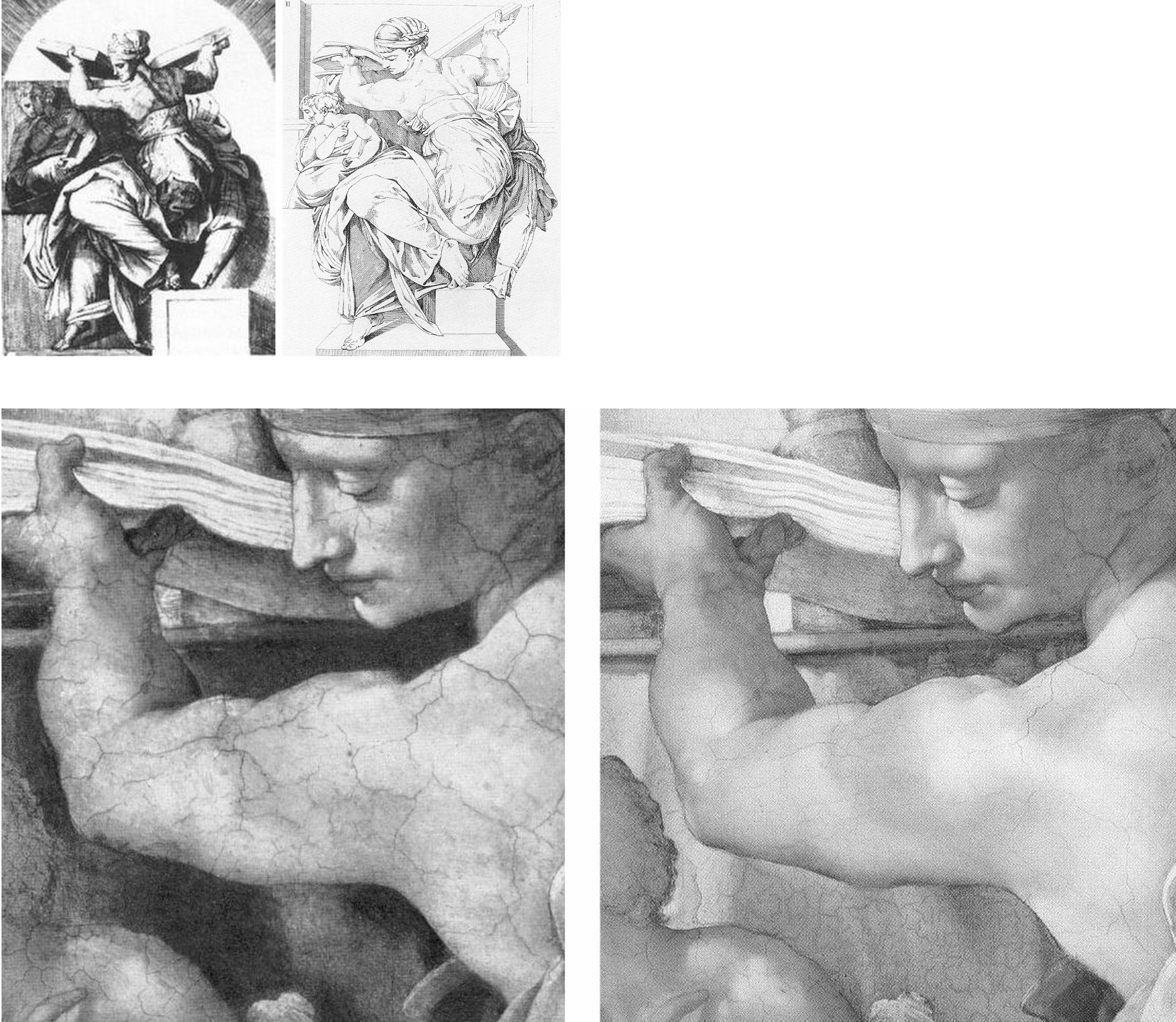
On Pope-Hennesy’s own – albeit limited – admissions, there was every reason not to take the Vatican restorers’ methods on trust, not the least of these being the fact that, as any visually alert scholar should have appreciated, the many copies of the Ceiling made from Michelangelo’s day to our own, had all testified to his secco overpainting:
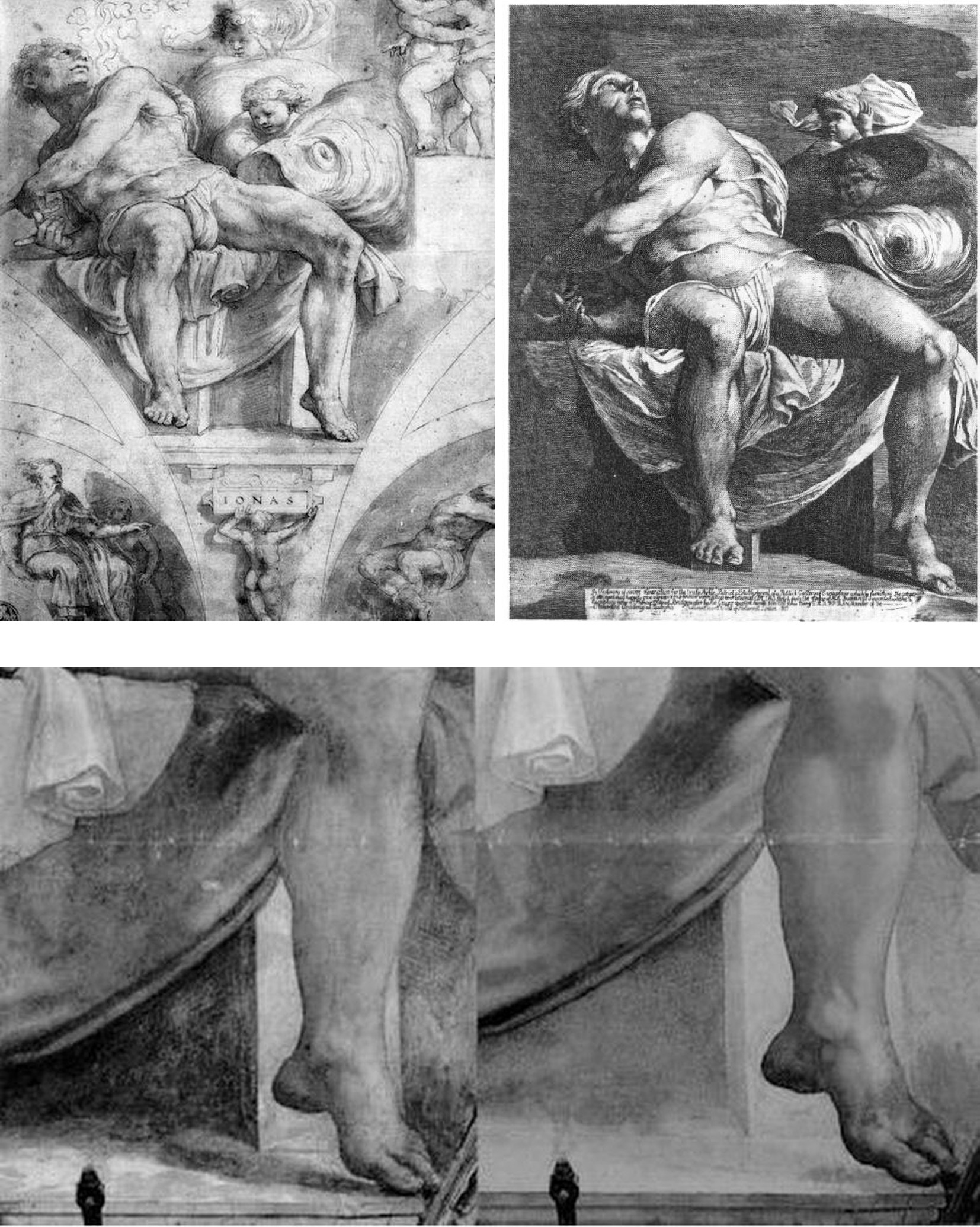
Above, Fig. 6: Top, left, the ink and wash copy of Michelangelo’s Sistine Ceiling figure Jonah, made between 1524 and 1534 by Giulio Clovio; top, right, a c. 1800 etched copy of Michelangelo’s Jonah by the Irish painter James Barry, R. A.; above, left, a detail of Michelangelo’s Jonah before Colalucci’s cleaning and showing the then surviving secco remains of the Clovio-copied dramatic shadow cast from the Prophet’s left foot; above, right, Jonah’s left foot after Colalucci’s elimination of the secco-enhanced shadows.
Disregarding all such historical visual testimony, the Vatican insisted that what had been understood since the 1512 unveiling to be Michelangelo’s own shadows, were arbitrary accumulations of soot trapped in “glue-varnishes” applied centuries later by successive restorers with sponges tied to thirty-feet long poles – poles of which, we established, no record existed and which, had they existed, would have stopped thirty-feet short of the ceiling. The phantom poles were summoned by Vatican officials in the absence – which we also established – of Vatican records of ceiling-high restoration scaffolding.
THE BOOK THAT WOULD HAVE BLOCKED THE SISTINE CHAPEL RESTORATION:
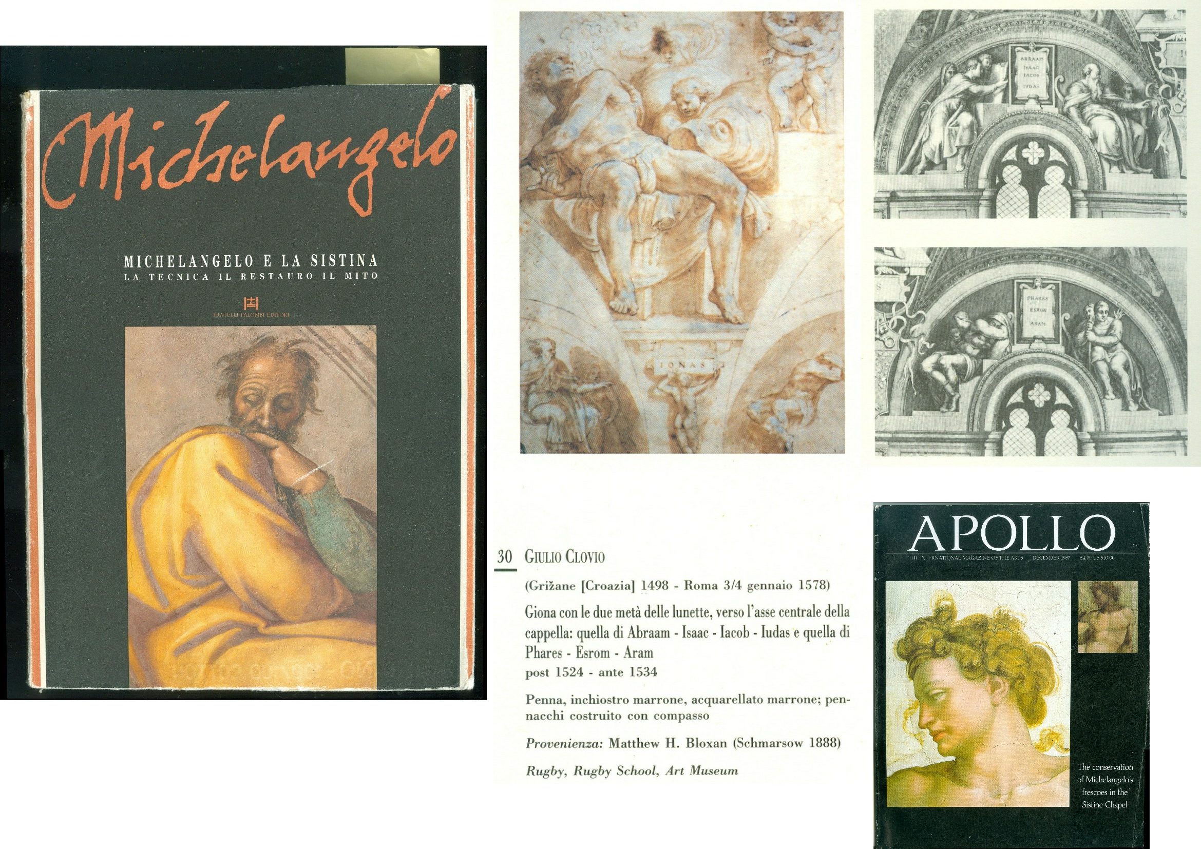
Above, Fig. 7: Left, the compendious 1990 book of historic copies of Michelangelo’s Sistine Chapel frescoes; centre, the book’s reproduction of Giulio Clovio’s Jonah drawing; right, the book’s reproduction of 19th century engravings (after lost copies) of the two lunettes Michelangelo had painted on the Chapel’s altar wall and would later destroy when preparing that wall for his Last Judgement.
Had the above book been published before 1980 and due consideration been given to Wilson’s account, a cleaning of the ceiling would have been stopped dead by the testimony of the above two images. The Clovio drawing alone constituted a proof positive that Michelangelo’s instantly-acclaimed lights and shadows had not only been present on the Ceiling but were also present on Michelangelo’s upper wall lunette frescoes – just as Colalucci’s Vatican restorer predecessors had reported. It did so because the two lunettes part-shown in its lower corners, were the very ones that Michelangelo destroyed to paint his Last Judgement. Thus, the sharply pronounced shadow that had been cast along the ground by Jonah’s left foot had been painted before any restorer had been near the frescoes. It could not, therefore, have been a freakishly artistic by-product of soot trapped within successive “glue varnishes” applied by restorers. Moreover, the glimpses of the shadows cast by Michelangelo’s lunette figures in Clovio were in turn confirmed by the etched copies of the two destroyed lunettes on the altar wall. Even the Clovio-recorded nude boy supporting Jonah’s name tablet had originally cast his own shadow on the wall before Michelangelo painted his Last Judgement.
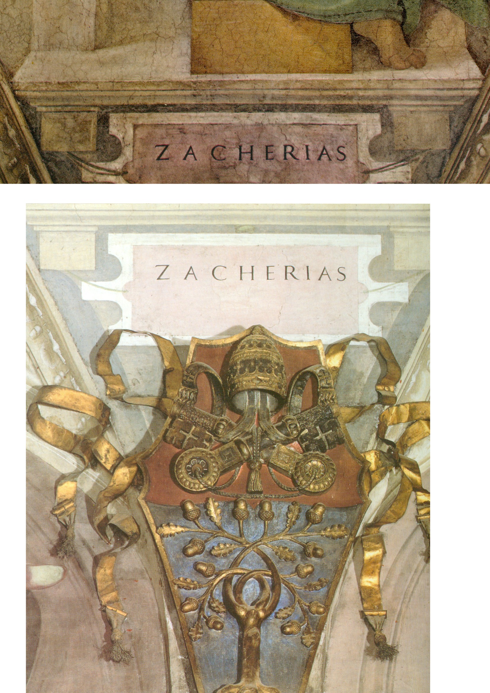
Above, Fig. 8: The name tablet for the Prophet Zacherias – top, before cleaning: above, after cleaning.
THE ELEPHANT ON THE CEILING
Michelangelo had not been the first artist to depict cast shadows. What stunned his contemporaries had been the thunderous force of spatial illusionism within which his figures had realised an unprecedentedly vivid sculptural presence-in-space. It was precisely in the wake of the illusionistic shading’s evisceration that Pope-Hennessy had (correctly) noted that where the name tablets had previously been “firmly integrated in the [real and fictive] architecture of the chapel…they [now] read like supertitles in an opera house” – see Fig. 8, above. To repeat: that tragically late-published book had shown beyond any dispute that there had been no break in the visual record of Michelangelo’s shadows from his day to ours – and, therefore, that the Vatican’s restorers had destroyed the finishing stages of Michelangelo’s own painting throughout the ceiling. In retrospect – and after all the account/demonstrations we have published (see, for example, Cutting Michelangelo Down to Size) – it might increasingly seem that this visually self-evident truth was a truth too big and too inconvenient in its implications ever to be ceded by the Vatican and the compliantly supportive art historical establishment it had garnered.
UNDERSTANDING POPE-HENNESSY’S SCHOLARLY BLANK CHEQUE
As a former director of both the Victoria and Albert Museum and the British Museum; a professor of art history at New York University’s post-graduate Institute of Fine Arts; and the very recently retired Chairman of European Paintings at the Metropolitan Museum of Art, Pope-Hennessy’s essay had effortless clout despite his self-subverting acknowledgements of both disturbing artistic results and – even – a wide distrust of the restoration among professionally sound peers. He opted to berate the critics while lauding the restorers, not on what they had done (on some of which he was critical) but on what he expected them to do next. Perhaps he had been privy to Mancinelli’s assurance to Tintori? He had certainly registered concern over of a group of cleaned Prophets and Sibyls:
“Optically, seen from the altar end of the chapel, they look a little smaller and less weighty than they did before. In the heads, a gain in definition is accompanied by a loss of ambiguity.”
Given that the visual arts work on and through their optical reception, how could Pope-Hennessy discount his own art historically informed, optically received, reading of diminished volumes and weights in Michelangelo’s figures? Perhaps he, like the art critics Hughes and Russell, had been swayed (or cowed) by the sheer authority of the supposedly unanimous Kress Foundation report? In any event, he wrote:
“…a gulf opened between those who adhered to the old concept of the ceiling and those who embraced the ceiling as it seemed originally to have been. The dispute was taken up in the American press, in largely polemical terms. There were demonstrations; and vociferous protests were made by both academic and non-figurative artists. The Vatican authorities went so far as to explain publicly, in two days of conferences in New York, the restoration program and the data on which it was based. Not unnaturally American criticism was reported throughout Italy, and had a disturbing, though not demoralizing, effect on the restorers involved. Arrangements, however, were made for a number of restorers of acknowledged excellence (three of them specialists in fresco decoration) to visit Rome, and they one and all endorsed the wisdom of what was being done.” (Emphases added.)
LEARNING TO LOOK
Aside from this explicit professional deference to a Higher Technical Authority in matters of aesthetic appraisal, other possible explanations for Pope-Hennessy’s stance emerged in his 1991 memoir, Learning to Look. This most distinguished scholar had a visual Achilles Heel – of time spent in an art school, he recalled “I disliked this too, and to this day I cannot draw.” Moreover, he had developed aversions to fellow art historians – and even (like Colalucci) to subjective judgements:
“One of the things about art history that I found puzzling from the first was that clever art historians (there were stupid ones too, of course, but a lot of them were really clever) should reach diametrically opposite conclusions on the basis of a tiny nucleus of evidence. The reason, so far as one could judge, was that the subjective element in art history was disproportionately large. If this were so, it was not only works of art that needed to be looked at in the original but art historians too, since their results were a projection of their personalities. So for some years, I made meeting art historians a secondary avocation.”
From the first, Pope-Hennessy had indeed made it his business to meet as many art historians as possible. When he left Balliol College, Oxford, with a second-class degree in history and an alumnus’s legendary “tranquil consciousness of an effortless superiority” (- in his case, specifically: “in the form of a self-confidence that sometimes verged on arrogance and a clear understanding of the difference between success and a succès d’estime”) he sold some inherited coconut islands off Borneo as income to be devoted “to travelling and to the preparation of a book” – and all this when, like Max Beerbohm’s Young Arnold Bennet, already having “a life plan in my mind.” During the Second World War he “found himself” in the Intelligence Department of the Air Ministry and there, for the first time, “met ordinary people” whom he considered “congenial and interesting”. In later life he expressed a preference for works of art over people of any kind:
“Objects mean more to me than people. It is not that I am frigid or reclusive, but that object-based relationships are more constant than human ones (they never change their nature and they do not pall).”
THE CHURNING “RAW MATERIAL” OF SCHOLARSHIP – AND A NEW SPECTATOR SPORT?
However, and despite his avowed attraction to the constancy of objects, as a self-made art historian, Pope-Hennessy came to welcome their radical alteration by restorers:
“People sometimes complain that there is nothing new to be said about Italian painting. They mean by this there are now monographs on many minor painters and that the works of great artists have been discussed in a large number of books. But the truth is that the raw material of Italian painting is in a constant state of flux. When paintings change through cleaning, our view of the artist who produced them changes as well.”
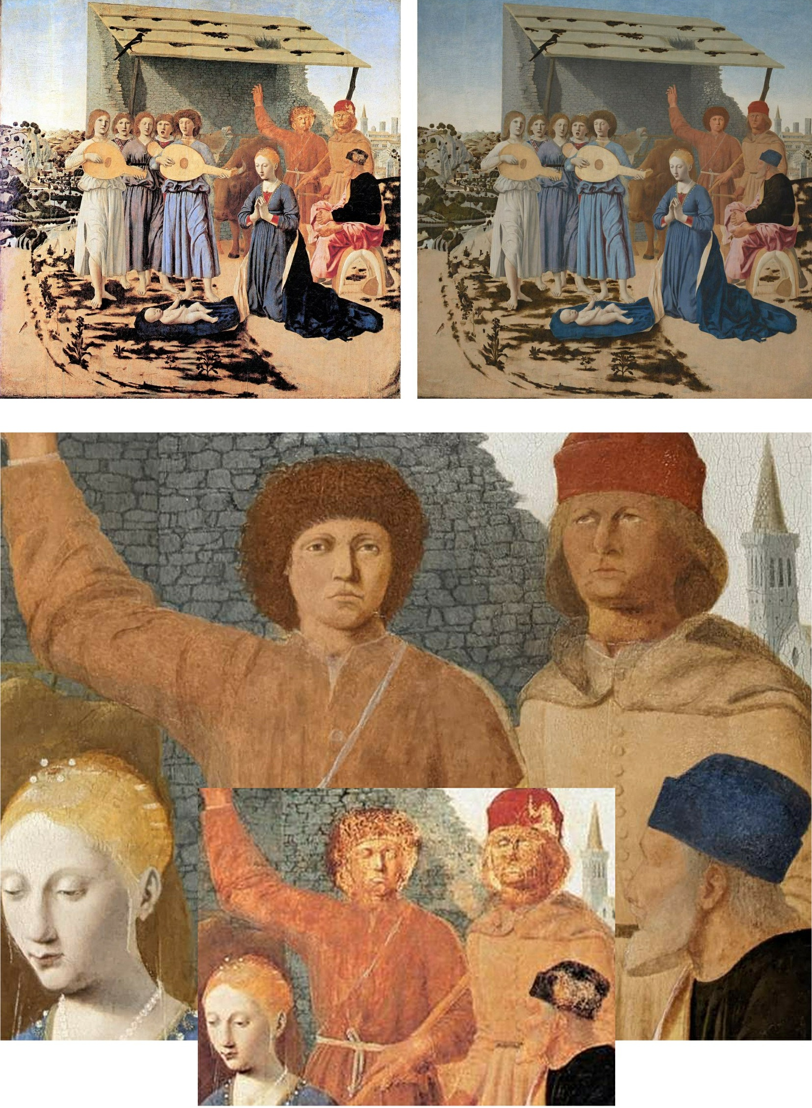
Above, Fig. 9: Top, the National Galley’s Piero della Francesca The Nativity before its latest restoration (left), and afterwards (right); above, a comparative detail showing the recently repainted shepherds and wall, with (inset) their previous state.
Like many of their scholarly peers, newspaper art critics have come to welcome the easy copy-generating potential of restorers’ alterations. In December 2022, Waldemar Januszczak of the Sunday Times, extolled the National Gallery’s controversially reconstructed Piero della Francesca Nativity (Fig. 9, above) and claimed that museums themselves now welcome “the inevitable brouhaha that follows any big restoration” because it “provokes interest and gets people through the door.” However, the art historian Giorgio Bonsanti deplored the intervention in IL GIORNALE DELL’ARTE and fears that such “controversies are destined not to subside but to remain and grow in future years, because the problem exists, and will remain evident to the millions of visitors to the National Gallery”. Scarcely less alarming to the Gallery must have been the Guardian critic, Jonathan Jones’, (earlier) assault on the repainted Nativity.
Jones had been the newspaper art critic of choice who was embedded within the Gallery’s conservation department during the restoration of its version of the Leonardo Virgin of the Rocks. The Evening Standard art critic, Brian Sewell, a student of Anthony Blunt at the Courtauld Institute, and a long-time scourge of National Gallery restorations, had been similarly co-opted within the restoration of Holbein’s The Ambassadors (Fig. 10, below). When so embedded, Jones predicted (wrongly) that “ArtWatch will attack the restoration”. On the Nativity, Januszczak similarly predicted: “There will be those, of course, who will howl at the changes – there always are.” In this case, at least three have now done so on the record – in addition to Jones and Bonsanti, in the March/April 2023 issue of the Jackdaw, its editor, David Lee (“Abbronzatura Solaire”), complained that aside from imposing complexions on the shepherds that are “more appropriate to Love Island than Bethlehem”, the Gallery has confounded a manifestly un-finished painting with a damaged finished painting.
Having previously studied the Nativity’s historic and restoration dossiers, we would add that this panel painting has likely suffered more accumulated restoration blunders than any other in the collection – with the possible exception, perhaps, of Giovanni Bellini’s Madonna of the Meadow. Both of those two pictures received disastrous “structural surgery” from a restorer (Richard D. Buck) who had been hired and brought over from America in 1948 by the National Gallery’s Director, Sir Philip Hendy, to introduce supposedly advanced conservation methods. Januszczak, who defends the Nativity’s recent repainting make-over on the grounds that “an active artwork that is doing what it is supposed to be doing must always trump a charming ruin”, begs the crucial question – “What is an historic picture supposed to do?” – and he clearly fails to appreciate that it is not Time and Neglect but, rather, restorers who, through their ceaseless Un-doing and Re-doing of pictures, create ruins. Where no auction house or dealer would dream of boasting that a picture on offer has had multiple restorations, museum pictures are treated today like so many bags on an airport carousel waiting to be picked up and done over on the whims and fancies of the next available restorer.
(Incidentally, Jones, Bonsanti, and Lee have by no means exhausted the many due criticisms of the Nativity’s latest restoration makeover. The ruined stone wall behind the repainted Shepherds, for example, has itself been repainted in a manner that robbed it of thickness and perspectival placement and left it running flatly across the picture plane, like so much stone-patterned wallpaper, to serve as a backdrop foil to the hypothetically reconstructed heads, as seen at Fig. 9.)
PROCLAIMED RESTORATION TRANSFORMATIONS – AND THINGS THAT CRITICS OVERLOOK
Where Pope-Hennessy had likened the Sistine Ceiling to Beethoven’s Ninth and noted that “another, more lively, more decorative artist” was emerging, Januszczak whooped at the spectacle of the transformation:
“The thin and neat scaffolding bridge moved elegantly along the ceiling like a very slow windscreen wiper. In front of it lay the old Michelangelo, the great tragedian, all basso profundo and crescendo. Behind it the colourful new one, a lighter touch, a more inventive mind, a higher pitch, alto and diminuendo. It was being able to see both of them at once – Beethoven turning into Mozart before your eyes – that made this restoration such a memorable piece of theatre.”
Unlike Januszczak, Pope-Hennessy had not always welcomed restoration-induced changes. In his 1970 book, Raphael, he observed: “But Raphael restored is Raphael interpreted; it is different from the real thing” – and in 1987 he would likely have known that a recent “Raphael restored” at the Vatican had proved disastrously different from the real thing. In 1982, Mancinelli had said of a bungled, chemically experimental restoration that required extensive repainting by Colalucci in Raphael’s Loggia, “It is the best demonstration that a restoration can also not go along well.” In 2016, Colalucci recalled that the Vatican had faced “a serious problem” when “a new inorganic substance that had not been sufficiently tried and tested” was used.
In 1991, as the Sistine Chapel restorations neared completion, Pope Hennessy reverted to his younger self’s restoration-critical stance and noted:
“In London since 1945 the National Gallery had been the target of ceaseless criticism. There had been intermittent controversies in the press over the cleaning of paintings, but successive directors had enjoyed the support of a passive, compliant board. The policy of Radical Cleaning had been espoused by Philip Hendy (who must have suffered from some retinal defect which made him see pictures as flat areas of colour) and had continued under his successors for so long that proof of the damage done to the collection over thirty years could be seen in almost every room.”
That judgement on National Gallery cleanings was sound and it constituted an international commonplace. Mario Modestini wept for half an hour at the sight the Gallery’s “flayed” restorations; in 1970 Pietro Annigoni painted “MURDERERS” on the National Gallery’s doors in protest; in March 1999 when I visited the Gallery with Professor Anatoly Alyoshin, head of the Repin Institute, St. Petersburg (Russia’s leading institute for the training of picture restorers), he was shocked by the paintings’ uniform brightness and seeming newness. Stopping between galleries, he swept his arm around and said “See! Everything in every school looks as if it was painted in the same studio at the same time.” In a sense, everything had been – after stripping paintings of all they judge extraneous, National Gallery restorers are permitted to this day to paint onto them whatever they take to have been an artist’s original intentions, even with pictures as old and venerated as Holbein’s The Ambassadors and Piero’s Nativity. Old masters are being treated like neglected scores awaiting the life-restoring interpretation of a would-be pictorial Furtwängler, von Karajan or Barenboim – but with the difference that where musical scores outlive their successive interpreters, a painting is its own score.
PURISM AND FAKISM: FALSE AGE CRACKS AND RE-INTERPRETATIONS ON RESTORED PAINTINGS
In the 1990s the National Gallery’s then head of restoration, Martin Wyld, contended: “The ‘Good Restorer’ is the one who ‘does the minimum necessary but not too little… we remove everything not put on by the artist and then use our judgement to get back to the original.” On 8 April 2023, the Financial Times (“Behind the seams at the museum”) reported that the present head of restoration, Larry Keith, said of his restoration of Parmigianino’s Saint Jerome’s vision of John the Baptist revealing the Virgin and Jesus, “We are editing, in a way. The work is informed by science and objective criteria, but there are decisions you take, which on some level are interpretive”. In an Esso-sponsored, BBC-filmed restoration of the Ambassadors (which has ceased to be available), Wyld was seen to have repainted much of the carpet to a new design on the authority of a “carpet expert”, and to have repainted much of Holbein’s famous anamorphic skull to a new and elongated design derived from a computer-distorted photograph of another skull. The Gallery’s defence of Wyld’s first-ever insertion of a Virtual Reality image into an old master painting was its claim that “modern imaging techniques” offered more “scope for exploring possible reconstructions” than the perspectival and optical conventions by which the skull had been produced. The pronounced differences between the Ambassadors’s old original paint and Wyld’s newly redesigned and presumptuously repainted parts of the skull, were concealed by his painting fake lines of cracking onto his own newly painted hypothetical reconstructions to match the real cracks on the real old paint.
Above, Fig. 10: Top, a detail of Holbein’s The Ambassadors, showing a section of redesigned and repainted carpet, before treatment (left) and after treatment (right); centre, the pre-restoration anamorphic skull in Holbein’s Ambassadors; above, the Wyld-extended, computer-generated skull in the Ambassadors.
PRODUCING “DIFFERENT, MORE POWERFUL” IMAGES
The New York restorer and Kress-appointed Sistine Chapel invigilator, Dianne Dwyer Modestini (formerly Clinical Professor, Kress Program in Paintings Conservation at NYU’s Institute of Fine Arts) – very extensively repainted and artificially distressed the much-damaged Leonardo School Salvator Mundi that fetched a world record $450 million in 2017 at Christie’s, New York – prompting Thomas Campbell, a former director of the Metropolitan Museum of Art, to ask: “450 million dollars?! Hope the buyer understands conservation issues – #readthesmallprint”. Dwyer Modestini had published this small-print report of an early intervention in her decade long undoing and redoing of the picture:
“The initial cleaning was promising especially where the verdigris had preserved the original layers. Unfortunately, in the upper parts of the background, the paint had been scraped down to the ground and in some cases to the wood itself. Whether or not I would have begun had I known, is a moot point. Since the putty and overpaint were quite thick I had no choice but to remove them completely. I repainted the large missing areas in the upper part of the painting with ivory black and a little cadmium red light, followed by a glaze of rich warm brown, then more black and vermilion. Between stages I distressed and then retouched the new paint to make it look antique. The new colour freed the head, which had been trapped in the muddy background, so close in tone to the hair, and made a different, altogether more powerful image. At close range and under a strong light the new background is obvious, but at only a slight remove, it closely mimics the original [paint work] … Most of the retouching was done with dry pigments bound with PVA AYAB. Translucent watercolours, mainly ivory black and raw siena, were used for final glazes and to draw [false age-] cracks…” (Emphasis added.)
Above, Fig. 11: Top, a section of drapery on the $450million Leonardo school Salvator Mundi, as seen in 2011-12 at the National Gallery (left), and (right) as when sold in October 2017 at Christie’s, New York; centre row, showing left, and second left, the picture detail, as when acquired in 2005 and taken to Modestini for restoration; third left, the Modestini-restored picture detail when shown as an autograph Leonardo in 2011-12 at the National Gallery; and, right, the Modestini re-modified feature, as sold in 2017 as an autograph Leonardo, at Christie’s, New York; bottom row, left, the Wenceslaus Hollar engraving that was said by the National Gallery to have been copied from the National Gallery-exhibited Salvator Mundi picture (bottom right) when in the collection of Charles I. That claim was subsequently disproved when the lost Charles I Salvator Mundi emerged in Moscow and was seen to be of an entirely different composition – at which point, the previous resemblance of the painting’s complex shoulder drapery folds to those in the Hollar etching had become more of a disqualification than a potential corroboration.
CHRISTIE’S RESPONSE
In December 2017, Christie’s was presented with photographic evidence (Fig. 11, above, top) assembled by Dr Martin Pracher, a lecturer in technical art history, that showed the changed states of the Salvator Mundi’s (true left) shoulder drapery between 2012, when exhibited at the National Gallery as an autograph Leonardo prototype painting, and 2017, immediately before the $450million October 2017 sale at Christie’s, New York, in which the picture was offered as a then different but supposedly still-autograph Leonardo prototype that enjoyed “an unusually strong consensus” of scholarly support. Under Press questioning (see Dalya Alberge in the Daily Mail) a Christie’s spokeswoman said Modestini had “partially cleaned the passage of paint in the shoulder and the dark streaks disappeared… To imply something incorrect has taken place would itself be incorrect”. Thus, it was insisted that the recently “disappeared” multiple folds, were not folds but mere “dark streaks” that had appeared during Modestini’s 2005-2010 restorations only to disappear under her 2017 ministrations.
INSTITUTIONALLY SEALED LIPS
Of whatever it consisted, Modestini’s last-minute intervention had been made under sworn secrecy at NYU’s Institute of Fine Arts conservation studios, as she disclosed in her 2018 memoir, Masterpieces: Based on a manuscript by Mario Modestini. That is, when the Salvator Mundi returned to New York in July 2017 ahead of Christie’s November sale, Modestini, was instructed “not to inform anyone” when the painting was “delivered to the Conservation Center under guard and in great secrecy”. Modestini further disclosed that a deal brokered by Christie’s ahead of the sale whereby the vendor would receive at least $100million had also been “successfully kept under wraps.”
THE NATIONAL GALLERY’S ABIDING INFLUENCE ON RESTORATION “REVELATIONS”
When Pope-Hennessy deviated in 1987 from his earlier soundness on transformative restorations, he bought into the National Gallery’s longstanding picture cleaning rationale by endorsing two of the 20th century’s most spectacularly controversial restorations:
“In its cleaned form the [Sistine] ceiling has become again what Michelangelo’s contemporaries considered it, one of the supreme achievements of mankind. With Titian, the revelation started in the National Gallery in London, when the Bacchus and Ariadne was freed of centuries of dirt and proved to be painted in an altogether different tonality from any that had previously been supposed.”
That there had been no “centuries of dirt” to remove from the Titian will be shown in Part III. A fuller understanding of Pope-Hennessy’s late-life restorations lapse and an appreciation of the methodological and promotional similarities between the two most controversially transformative restorations in the second half of the twentieth century will be tracked through the records of the two successive National Gallery directors from 1934 to 1967, Sir Kenneth [later Lord] Clark, and Sir Philip Hendy. By the 1980s, that pair’s polished formulations had come to serve as an internationally infectious template for the unbridled techno-experimentalism seen in the Brancacci and Sistine chapels during what, for Colalucci, had constituted the terminus of “the golden age of restoration in Italy, the halcyon era from the late 1940s to the mid-1990s.”
In Part III, we correlate the false scholarship that flowed from the Titian Bacchus and Ariadne and Michelangelo Sistine Chapel restorations, along with the artfully engineered professional endorsements both restorations received from the then highest authorities.
Michael Daley, Director; 15 April 2023
ArtWatch at Thirty, Part I: The Unstoppable, “Rapidly Filed Away” Sistine Chapel Restoration
Michael Daley writes: November this year will mark ArtWatch International’s thirtieth anniversary and May 26th marks the fifteenth anniversary of the death of its founder, James Beck, Professor of Renaissance Art History at Columbia University. After facing down a possible three-year jail sentence and punitive damages on charges of criminal slander for condemning a restoration that had left Jacopo Della Quercia’s beautiful marble Ilaria del Carretto looking like oiled soap (Fig. 1), Beck created ArtWatch International in 1992 to speak for a proper and due stewardship of works of art. His “trials”, however, had begun half a decade earlier when he supported artist critics of the Nippon Television Corporation-sponsored and filmed restoration of Michelangelo’s Sistine Chapel frescoes – which act of artistic solidarity was taken by the restoration’s high-placed art historian apologists as an unforgiveable professional betrayal.
Throughout the famously contested* Sistine Chapel ceiling restoration it was politically impossible for the Vatican to admit error and halt the multi-million dollars NTV-filming. This obliged the authorities to permit nothing to count against the restoration. While disregarding and dismissing all contra-testimony, the Vatican’s restorers, curators, and art historical supporters claimed that things had occurred for which no evidence exists and denied the existence of things on which evidence abounded.
[* “The restoration of Michelangelo’s magnificent frescoes in the Vatican’s Sistine Chapel is perhaps the most controversial event in the art world in the past three decades” – Pierluigi De Vecchi and Gianluigi Colalucci in Michelangelo The Vatican Frescoes, the Vatican’s 1996 final account of the restoration.]
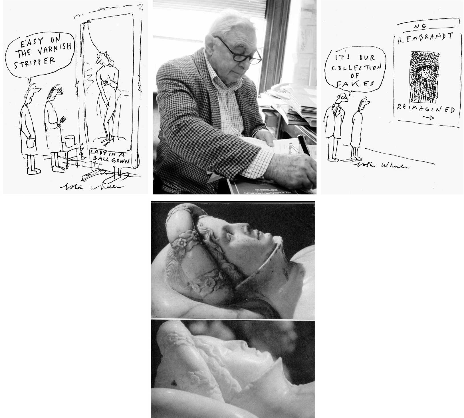
Above, Fig. 1: Top, centre, Prof James Beck (Photo: Lynn Catterson); Cartoons by Colin Wheeler; above, centre, the marble Ilaria del Carretto tomb sculpture before (top) and after the restoration in which it was both abraded and oiled.
AN ABIDING CULTURAL CONUNDRUM
Revisiting that momentous 1980-1994 battle after three decades – and when variously armed with the complete published Vatican restoration literature (see Endnote 1), the study of scores of conservation dossiers in major public institutions, and the preparation of countless visual arguments against mis-restorations and misattributions – it is now clearer than ever that much as the restoration of the Sistine Chapel ceiling was an artistic abomination it was not an aberration. It was not the only great fresco cycle to have been chemically assaulted, stripped to its bare plaster surface and left artistically debilitated, falsified, and looking as never previously seen.
The successive Sistine Chapel mis-restorations (- of the lunettes, the ceiling and the Last Judgement wall) occurred within a remorselessly expansionary nexus of lavishly sponsored conservation sensation-seeking* techno-adventurism in which the intervals between restorations on major works have now dwindled to… almost nothing. In effect, the fabric of art heritage has become host to a self-propelling, self-regarding, socially favoured, artistically and culturally impoverishing job-creation engine in which every generation of restorers works-over every major work of art as of right and in response to some conjured “conservation necessity”.
[* Restorers at the Sistine and Brancacci chapels revelled in anticipated scholarly upheavals that would attend their chemical radicalism. Some years ago, the British Museum and a newspaper arts journalist combined to run a course that coached restorers on planting promotional press coverage.]
A day does not pass without press reports of some solvents-armed heritage operative having painstakingly subtracted this while “discovering” that. Despite this omnipresent PR tide, no one ever says: “This work is in marvellous condition – it has been restored x times in the last fifty years.” Auctioneers boast of excellent condition with never, or little-restored works and the term “untouched” remains a bankable guarantor of retained authenticity. Deference to conservation’s artfully cultivated mystique rests on a double sleight of hand. Deemed “picture rats” in the nineteenth century, restorers rebranded themselves “picture-surgeons”, assumed quasi-medical airs and dubbed their research “diagnostic”, their actions “treatments”, their studios “laboratories”, and their students’ “interns”. Their greatest wheeze was adopting the morally coercive appellation “conservators” as a shield against interrogation and disinterested appraisal.
THE ANTI-CRITICAL IMPERATIVE
James Beck, a highly respected Renaissance art scholar, had trained first in fine art and then politics. He appreciated that no sphere of professional activity should be free from scrutiny and appraisal, not medicine, not aeronautical or civil engineering, not art administration or restoration. Every artist, actor or musician is subject to professional critical appraisal – why, then, should those who act on and alter art evade critical evaluation?
NEEDLESS INTERVENTIONS?
Above, Fig. 2: Left, a 1930 black and white photograph of Egon Schiele’s recently found early portrait – right, Schiele’s “Leopold Czihaczek at the Piano”.
To give a current example of the compulsions to “restore” works: on 5 May 22, Artnet reported that a lost early Egon Schiele portrait has been found and that, despite seeming to be in excellent condition (as above), it is to undergo restoration.
The picture has been loaned for five years to the Leopold Museum which wishes to buy it. Because the museum’s finances have been hit by the latest Chinese plague, a plan has reportedly been devised to created NFTs (non-fungible tokens) of the work in editions of 100, 10 and 2, for €500, €15,000 and €100,00 respectively, with the hoped-for proceeds total of €400,000 going “towards the cleaning and restoration of the painting”. “Towards”? And the “restoration” of what? The above comparison of the painting today with a 1930 photograph suggests no apparent visual deterioration.
The museum’s director, Hans-Peter Wipplinger, speaks frankly: “We start with the physical object, then we make a digital image and, if we can sell it, we can afford the painting.” Thus, a museum proposes to sell virtual reproductions of a likely never-restored painting as if in lieu of a slice of the painting itself but, if enough money is raised, will alter the painting by “restoring” it, which act will leave the NFTs standing in lieu of the picture’s disappeared earlier untouched state. A mere incanted proposal to restore seems to stand as a talismanic signifier of high moral and artistic purpose. This case is no aberration: on acquiring works in excellent condition museums routinely plunge them into restorers’ tanks to make them their own through restoration alteration and published “research findings”. See:
“An ominous silence at the Metropolitan Museum of Art, New York”; “Discovered Predictions: Secrecy and Unaccountability at the Metropolitan Museum of Art, New York”; and “Why is the Metropolitan Museum of Art afraid of public disclosures on its picture restorers’ cleaning materials?”
THE RISE AND DEMISE OF RADICAL ART CONSERVATION FADS
The 1980-1994 Sistine Chapel saga was launched on a whim with a new, aggressive, insufficiently tested cleaning agent at a moment when the discredited Italian mania for ripping frescoes from chapel walls was being replaced by fresh absolutist quests for intensified colour in ancient painting and for brilliant whiteness in ancient sculpture and buildings. For a massively falsifying modernist chemical imposition of intensified whiteness throughout a great cathedral, see: “Brighter than Right, Part 1: A Modernist Makeover at St Paul’s Cathedral” ; and, “Brighter than Right Part 2: Technical Problems of Protection, Health and Safety at St Paul’s Cathedral”.
For the most shameless and brazen art institutional PR glosses on catastrophic restoration injuries, see: “Hyping museum-restoration wrecks”; “And the world’s worst restoration is…”; and, “The world’s worst restoration and the death of authenticity”.
THE INSINUATION OF ALIEN AESTHETICS AND ANATOMICAL DEFORMITIES INTO OLD MASTERS’ PAINTINGS
Above, Fig. 3: Mistreatments of a Titian at the Prado and a Veronese at the Louvre.
Above, Fig. 4: Left, top and centre, restoration changes made to facial features in Veronese’s Pilgrims of Emmaüs at the Louvre (top) and Titian’s Empress Isabella of Portugal at the Prado; right, top and centre, diagrams of the same illustrating unwarranted restoration changes of drawing and anatomy on works in major museums; above, three photographs of actual nose/mouth configurations and, right, a drawing (by the author) of the head of Klimt’s Judith II.
As seen above, the restorer of the Prado Titian greatly enlarged the nostril and moved the lower nose from the nasal groove and tucked it behind one of the two ridges that define the groove, as if in homage to Picasso-esque cubist contortions. As shown in the bottom row above, the base of the nose always sits centred above the top of the nasal groove. While necessarily following anatomical laws, individual mouth/nose configurations are highly distinctive and expressively mobile – which is why portrait painters pay the greatest attention to their precise depictions. Everybody is a connoisseur of mouths’ fluid and elusive expressions – hence John Singer Sargent’s rueful description of a portrait as “a picture in which there is always something not quite right about the mouth”. No power on earth can stop restorers from undoing and redoing that which they fail to comprehend.
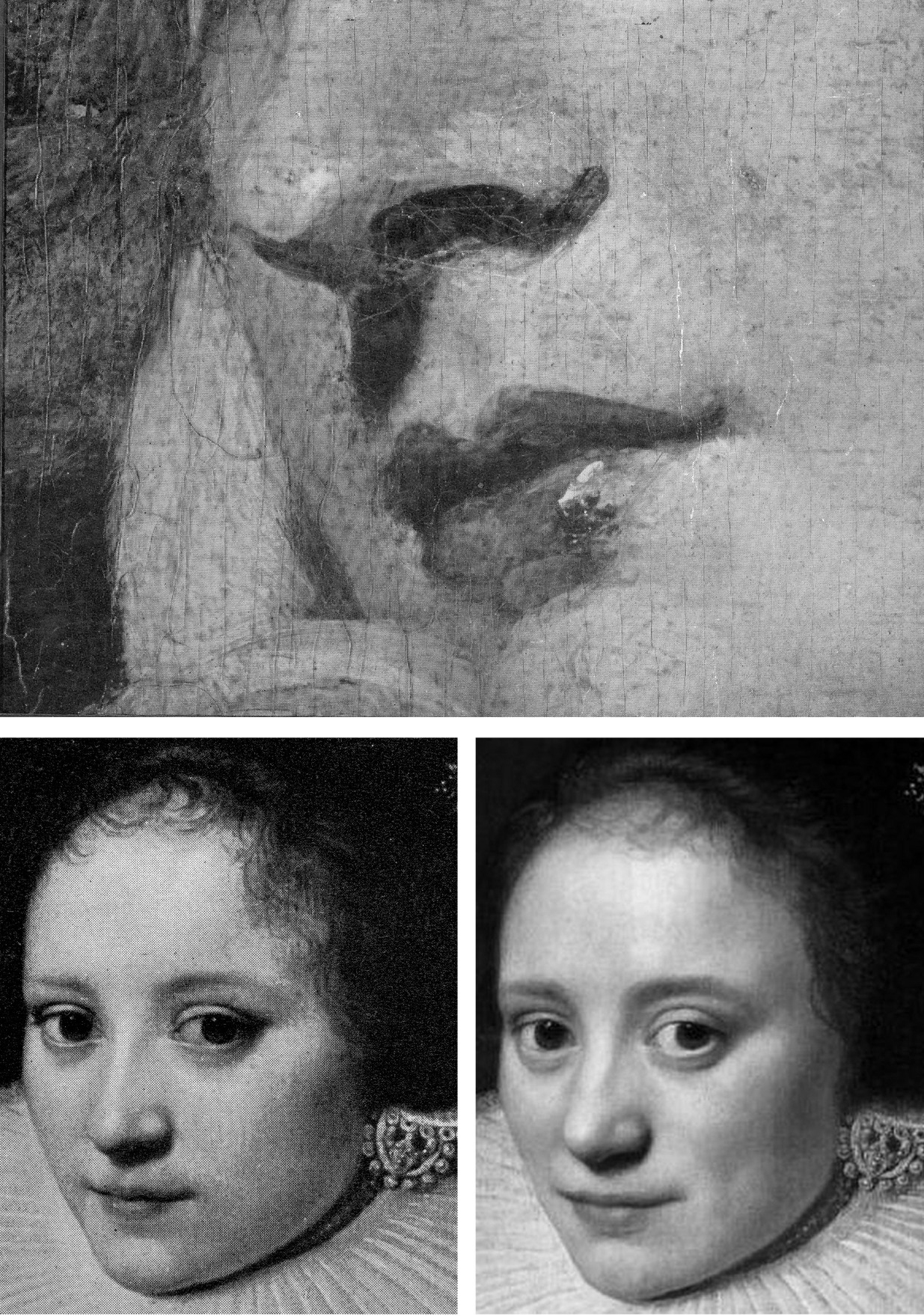
Above, Fig. 5: Top, a detail of Sir Joshua Reynolds’ Mrs Bradyll, as carried on the cover of the 1942 edition of Bertram Nicholls’ Painting in Oils; above, left, a detail of the Wallace Collection’s A Dutch Lady by Michiel Jansz Van Mierevelt; above, right, the same Dutch lady after a 1986 cleaning at the Wallace Collection in which all the features were coarsened, the hair was thinned, and the jewellery dimmed. Note, for example, the thickened edges of the lower eye lids; the expression-changing greatly widened (true left) upper eye lid; and how the nose’s former thin highlight has been widened and deflected by a new bump.
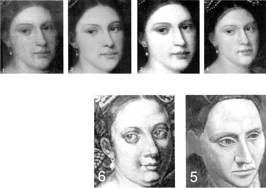
Above, Fig. 6: Top, nos. 1 to 4, a privately owned accredited Titian portrait (Laura de Dianti) after successive modern restorations; above, left (no. 6) a contemporary engraved copy of the original but now many-times changed portrait; above, right (no. 5) Picasso’s portrait of Gertrude Stein.
It is striking how greatly more sculptural and anatomically sound the head had been when rendered by light and shade in an early engraved copy than in any of the restored states of the painting. Successive restorations imposed a modernist mask-like aspect on a refined in-depth Renaissance conception. The engraved record of the subject’s up-turned nose highlights modern restorers’ arbitrary and anatomically ill-informed impositions on eyes, mouths, and noses. The arch of the nostril rises and falls in a succession of variations on a theme in which each restorer “corrects” the previous state without ever recovering the originally recorded state. The eyes fall out of alignment, focus and life, as in the Picasso portrait. On official, highest-level indulgences of cosmeticizing “picture surgeons”’ nose- and eye-jobs, see:
“Something Not Quite Right About Leonardo’s Mouth ~ The Rise and Rise of Cosmetically Altered Art” and “From Veronese to Turner, Celebrating Restoration-Wrecked Pictures”.
“SCRUBBED UP”
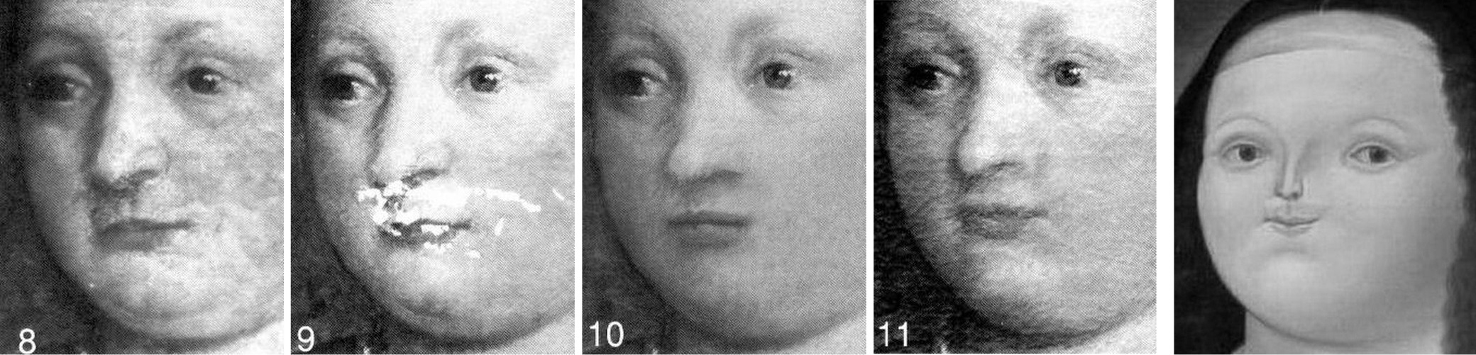
Above, Fig. 7: In the above Assorted-Mistreatments-of-a-Veronese-Face-at-the-Louvre, no. 8 shows the face before cleaning; no. 9 the face after cleaning and before restoration; no. 10 the face after cleaning and after restoration. That outcome was widely condemned and ridiculed: “A spectacular restoration own-goal…”. In response, the Louvre re-restored the face in an undocumented covert operation that spawned the fatter-lipped, sharper-nosed and more lopsided-mouth version seen at no. 11, thereby re-igniting the controversy – as was reported below at Fig. 8. Yet again, the restorers imposed a modernist aspect (as above right) by echoing Botero’s pufferfish-like spoof Mona Lisa.
Above, Fig. 8: The UK news magazine, The Week carried the above condensed report on the controversy.
DOUBLE WHAMMY

Above, Fig. 9: A former – implausibly – attributed Vermeer portrait, as seen after two modern restorations. In the first (at nos. 1 and 2), a great loss of material and shading occurred; an eyebrow disappeared; and the necklace was substantially thinned. After the next cleaning (nos. 3 and 4), the restorer lost the central section of the necklace and painted-out the surviving remnant on the right to minimise the glaring injury. The restorer also painted out an earlier striped disfigurement on the sitter’s left cheek, which action left the lit side of the face flatter and less tonally modulated than in 1941. When exhibited in a major Vermeer anniversary exhibition, no Vermeer scholar commented on its cumulative losses and alterations. The two dark stripes on the right-hand, lit side of the hat, as seen above left at no. 1, have disappeared. No one seems to have asked what kind of a striped fabric might have presented a series of parallel stripes when affixed to a cone-shaped hat.
WHAT COMES OFF IN CLEANINGS
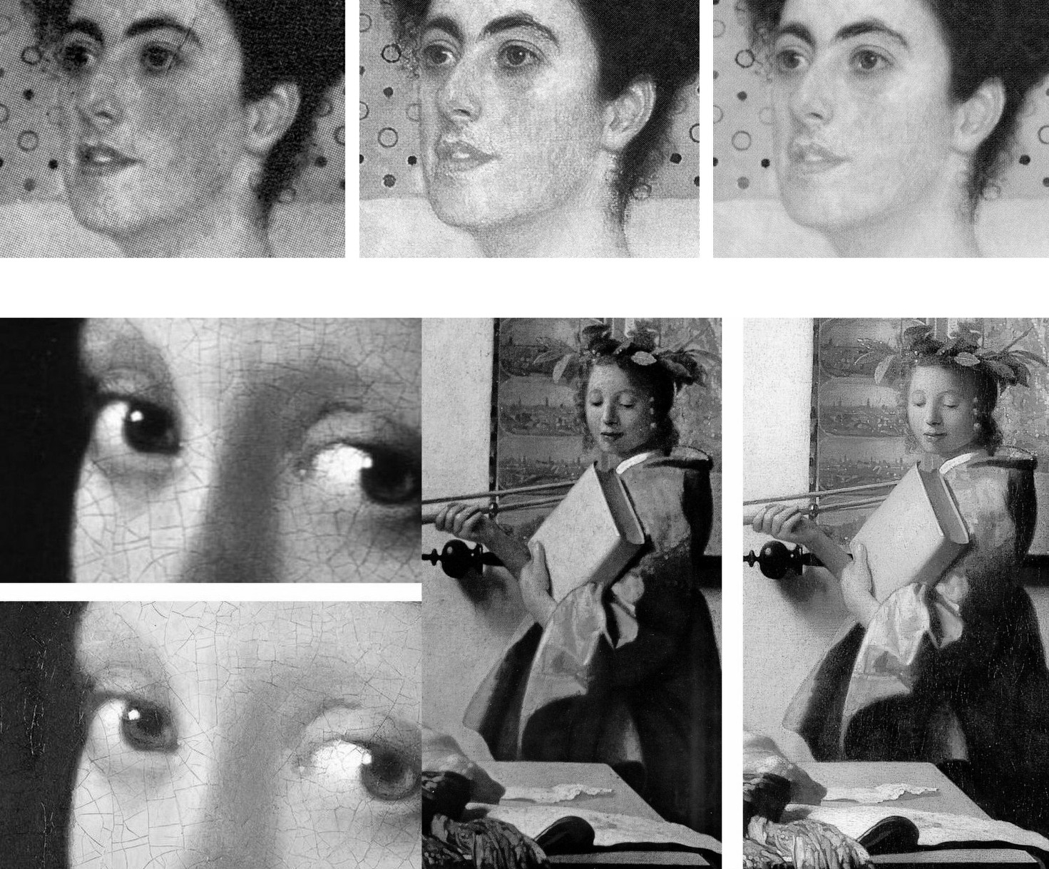
Above, Fig. 10: Top, a detail of Klimt’s 1905 Portrait of Margaret Stonborough-Wittgenstein after successive cleanings; above, two published before- and after-cleaning details of two important Vermeer paintings showing the small- and large-scale losses of value that routinely occur when pictures are cleaned with swabs and solvents. Note, in Vermeer’s portrayal of the artist’s muse (on the right) how the weakened shading in the face and the formerly relieving darker tones of the map behind the lit side of the face, again imparted a mask-like quality to a plastically weakened head.
PSEUDO-SCIENTIFIC CONCEITS AND CONVENIENT UNTRUTHS
Where scholars might once have protested such losses as those shown between Figs. 3 – 10, they increasingly hail newly lighter, brighter, and compressed relationships of tonal value as if on a conviction that an overall cleanliness is next to godliness. For their part, restorers take any natural ageing in a varnish as an alien disfigurement that licenses a full-scale and “investigative” restoration. When artists, the makers of art, object to restoration injuries and falsifications, they are dismissed as subjective, sentimental, unscientific. The late Head Restorer and co-director of the Sistine Chapel restorations, Gianluigi Colalucci, (who had not done well at school and who had had no art training) boasted in 1986 that:
“restoration has become a fully-fledged discipline with a strong philosophical basis eliminating all subjective and arbitrary elements and a precise technical and scientific approach formulation eliminating trial and error.”
In contrast with such naïve pseudo-scientific conceit, during a controversy over paintings secretly cleaned by the National Gallery in the Second World War, Laura Knight, speaking on the authority of hands-on knowledge of the craft of painting (much as Degas and Delacroix had done in earlier controversies at the Louvre), protested in a letter to the Times in 1946 that:
“With the exception of direct painting, a comparatively modern method, a painter builds his pigment on to canvas or panel – always with the final effect in view. The actual surface of a picture is the picture as it leaves the artist’s hand. The varnish which finally covers the work for protection to a varying extent amalgamates with the paint underneath. Therefore, drastic cleaning – removal of the covering varnish – is bound to remove also this surface painting and should never be undertaken.”
Clearly stated artistic truths weigh little in an art conservation world where claimed scientific verifications are of immense political utility. Kenneth Clark disclosed in his 1977 memoir The Other Half that he had set up a science department at the National Gallery in the 1930s “with all the latest apparatus” because “until quite recently the cleaning of pictures used to arouse extraordinary public indignation, and it was therefore advisable to have in the background what purported to be scientific evidence to ‘prove’ that every precaution had been taken.”
WHAT COMES OFF IN THE WASH
Above, Fig. 11: Top, the head of “Christ the Judge” before and after cleaning; above, Colalucci applying solvents to the Last Judgement through a paper foil.
When Colalucci cleaned the head of “Christ the Judge” (to applause from assembled restorers, one of whom filmed the event with Colalucci’s own camera, computer operators, journalists, co-director Fabrizio Mancinelli, a cleaner and the ever-present ten NTV film crew members), he applied the solvents through “a special Japanese paper” and waited for the rigidly pre-set time of fifteen minutes before removing the paper. Normally the sheets were dropped on to the floor but this time a brother restorer, Bruno Barratti, who kept a diary throughout, noted that Colalucci had “placed the sheets almost with care, crumpled though they are, in a corner of the platform.” The scaffolding cleaner whispered to the restorers as the NTV film was running “look, boys, those sheets are mine…don’t try anything on.”
If, as Colalucci maintained, his solvents had removed nothing but dirt, grease, soot and ancient glue-varnishes, the sheets would have borne no intelligible after-image. However, had he removed a secco adjustments to the head (as we believe was the case), a ghostly Turin Shroud-like image would have been captured on paper (and might still be if the sheets were not subsequently consumed by the solvents). Certainly, something was considered covetable and, as seen above at Fig. 11, the differences between the pre- and post-cleaned heads were pronounced. A photograph of those removed sheets would be of considerable evidential value today – as would be the filmed record made on Colalucci’s camera – in the absence of an official Vatican report on the restorations, which absence Colalucci attributed in 2016 to the early death in 1994 of his co-director of the restoration, Fabrizio Mancinelli, the curator of the Vatican Museums:
“This is the cause of the void created in the post-restoration studies and elsewhere. His death and the subsequent death of Pietrangeli, which was more foreseeable due to his age, led to a break in continuity of the management of the Vatican Museums that led in turn to the historic restoration being rapidly filed away as finished business.”
ART RESTORATION’S HABITUAL TECHNICAL OVER-REACHES
In the Times Educational Supplement (“As good as new?” 18 January 1991) I had written:
“The justification for the ultimate dismissal of artists’ expertise is that they are ‘unscientific’… [when] In matters of artistic controversy, artistic criteria must be sovereign – art operates by persuasion, not by proof. Much of the scientific validity of conservation is a sham. Conservation’s record in recent years comprises anything but a sure-footed march towards truth. In the fifties and sixties, there was a fashion, encouraged by art historians and museum curators, for removing frescoes from their surroundings, remounting them as panel pictures (thereby flattening the irregularities of the original plaster surface) and exhibiting them in museums. Much acclaimed at first, the strappo technique is now thoroughly discredited*. It damaged the walls of the buildings as well as the frescoes themselves. And, of course, it irreversibly falsified the paintings by severing them from their architectural contexts, leaving the buildings denuded and impoverished. To this day, many frescoes wrenched from their homes lie rolled unseen and unmounted in museum basements.
“A succession of cleaning solvents has been devised and used on frescoes only to be abandoned. The director of one project [the Vatican’s late Fabrizio Mancinelli, co-director with Gianluigi Colalucci of the Sistine Chapel restorations] which so damaged works of Raphael’s that they required repainting, remarked ‘what was damaged cannot be undamaged’. Frescoes recently stripped of varnish protection have been left exposed to high levels of atmospheric pollution. Synthetic resins which it was hoped offer protection have been abandoned. Air conditioning units which were also thought to be a solution are to be installed even though no one can be sure what the ideal temperature and humidity settings are and even though malfunctions by these units might result in gross damage (as happened to a major Renaissance picture being restored at the National Gallery a few years ago)…”
[* By 2003 the International Council of Monuments and Sites – ICOMOS – had warned that:
“Detachment and transfer [of frescoes] are dangerous, drastic and irreversible operations that severely affect the physical composition, material structure and aesthetic characteristics of wall paintings. These operations are, therefore, only justifiable in extreme cases when all options of in situ treatment are not viable. Should such situations occur, decisions involving detachment and transfer should always be taken by a team of professionals, rather than by the individual who is carrying out the conservation work. Detached paintings should be replaced in their original location whenever possible. Special measures should be taken for the protection and maintenance of detached paintings, and for the prevention of their theft and dispersion.”]
“OFF YOU COME!”
Above, Fig. 12: Left, “Detachment of a fresco by the strappo method.” right, “Detachment of a fresco by the stacco method.”
Both photo-illustrations above were carried in the 1968 catalogue to the Great Ages of Fresco, Giotto to Pontormo exhibition at the Metropolitan Museum of Art, New York. In an introductory note on fresco techniques and their detachment from walls Professor Ugo Procacci explained the two methods:
“Stacco. The process of detaching a fresco painting from the wall by removing the pigment layer and a layer of intonaco [the final smooth thin layer of plaster which receives the artist’s painting]. Usually an animal glue is applied to the painted surface and then two layers of cloth (calico and canvas) are applied, left to dry, and later stripped off the wall, pulling the fresco with them. It is taken to a laboratory [a scientifically coercive word for a studio] where excess plaster is scraped away and another cloth is attached to its back. Finally the cloths on the face of the fresco are carefully removed. The fresco is then ready to be mounted on a new support.”
“Strappo. The process by which a fresco painting is detached when the plaster on which it is painted is greatly deteriorated. Strappo is the process of ripping off only the colour layer without removing excessive amounts of plaster. It is effected by the use of a glue considerably stronger than that used in the stacco technique. The procedure which follows is identical with that in the stacco operation. It should be noted, however, that after certain frescoes are removed by means of strappo, a coloured imprint may still be seen on the plaster remaining on the wall. This is evidence of the depth to which the pigment penetrated the plaster. These traces of colour are often removed by a second strappo operation on the same wall.”
CHEMICALLY-STRIPPING FRESCOES: 1) THE SISTINE CHAPEL
There are many dis-proofs of Colalucci’s claim that only soot and earlier restorers’ discoloured glue-varnishes were removed from the Sistine Chapel ceiling. To cite one: the loss of artistic values that had been recorded by copyists both in Michelangelo’s own lifetime and for centuries afterwards – as with Giorgio Ghisi’s engraving below of c. 1570, which was thus made long before any restorers had worked on the ceiling.
Above, Fig. 13: Top and right, details of Michelangelo’s Sistine Chapel ceiling figure the Erythraean Sibyl, before and after the cleaning in which, for example, relieving shading to the right of the face’s profile was stripped away, as was internal shading on the head and neck. It was always beyond inconceivable that any naturally accruing films like soot could have organised themselves to reinforce the modelling within the contours of Michelangelo’s figures.
CHEMICALLY-STRIPPING FRESCOES: 2) THE BRANCACCI CHAPEL
“The history of restoration clearly shows that with the passage of time, nearly all restorations have proven to be negative…We cannot be certain that the work we’ve done here [at the Brancacci chapel] has been positive.”
So said one of the Brancacci Chapel restorers, Marcello Chemeri, in an interview carried in Ken Shulman’s invaluable 1991 book on the Olivetti-sponsored restoration, Anatomy of a Restoration – The Brancacci Chapel. “Invaluable” because although Shulman was generally parti pris with the restorations of both the Sistine and the Brancacci chapels, he drew out full first-hand accounts from the key Brancacci players – and, also, most unusually, from across the board in their assembled team – as with Chemeri.
Thus, we learned from Shulman that Chemeri had hoped to be a painter from his early teens; that he still painted in his spare time; that as a boy he was always drawing or experimenting with colours; that he had [only] gone into restoration because he needed a job when he left art school. That he had been reluctant to give an interview. From another restorer, reluctant even to be identified, we were urged:
“Let’s be honest and admit what all restoration directors will say in private. At the beginning of any restoration, you order as many tests as you can imagine, fully aware that only about five per cent of them will be of any use during the project. The rest of them are merely window dressing.”
Shulman further explained that:
“This competition among historians to link their names to a specific method or restoration is both inevitable and understandable. With the meagre monetary remuneration usually afforded to historians and restorers, restoration professionals are usually left to vie for the various badges of merit and prestige. The Brancacci Chapel was the most prestigious jewel in the block – perhaps even more prestigious than the concurrent Sistine Chapel restoration because of the mystery surrounding the Brancacci and its history – and Baldini had it in his pocket. There were many interests involved here – the enormous artistic importance of the work, the contention between Florence and Rome, the jostling among scientists, industry, and government for the honour of participating in the project, and Baldini’s own noted ambition. Given all these, it was unthinkable that Baldini would allow the long-awaited restoration to deteriorate in the public eye into what might appear an unglamorous, methodical, albeit thoroughly effective cleaning.”
EXTREME AESTHETIC CLEANSING:
Chemeri, the most artist-like of the Brancacci restorers, had put his finger on the nub of the problem with both of the period’s major and controversial fresco restorations – which is to say, on the unwavering absolutist assertion that the original artist authors of the Brancacci and the Sistina murals had entirely confined their work to painting directly into the plaster while wet and had not made any revisions or embellishments with a secco painting. As will be shown, the restorers in both chapels had – wittingly or unwittingly – demonstrably misdiagnosed the material which they removed entirely and to artistically disastrous effects. Had they fully acknowledged and correctly addressed the known histories and circumstances of both chapels’ frescoes, the complexity and subtlety of their tasks would have leapt exponentially, and every inch of the cleaning would have been dependent on more problematically (for restorers) aesthetic and artistic appraisals and not on the proffered simplistic “brush it in on, wait a bit, wash it off” chemical solution procedures.
A PHOTO-COMPARISON WORTH A THOUSAND WORDS
Here, a single before and after- greyscale photo-comparison will suffice, as below at Fig. 14, to demonstrate the artistic debilitation of Masaccio’s work:
Above, Fig. 14: Top, Masaccio’s wall scene, “The Tribute Money”, as published in the 1981 edition of the 1968 Masaccio (in the series L’opera complete di); centre, the same scene after restoration, as published in the 1992 edition English-language edition of The Brancacci Chapel Frescoes by Umberto Baldini and Ornella Casazza; above, the post-restoration scene in colour and before the conversion into greyscale shown above it.
The above photo-comparisons show precisely how the Brancacci Chapel restoration had damaged Masaccio’s then-revolutionary painting. As with the Sistine Chapel ceiling, it does so on the restorers’ own accounts: if the paintings really had simply been obscured by centuries-worth of filth, decaying restorations, decaying varnishes and such, then, on the laws of optics, at their removal by the restorers, the visual values and relationships that previously had been evident through the dimming and obscuring film would have emerged with hugely increased vivacity – the darks would be darker and the lights lighter; the tonal relationships would span greater ranges and so on. Instead, after stripping the frescoes of all supposedly alien “accretions” the painting emerged a pale shadow of its former supposedly badly obscured but in truth greatly more vivacious earlier self. How could that be? Why should the removal of a disfiguring film of organic material have reduced the aerial depths and space, the tonal dynamism, the previously legendary sculptural corporeality of the figures and their dramatically orchestrated narrative lucidity?
The restorers, content with their new, all-on-the-picture-surface litter of clean pastel-ised colours, made no attempt to explain the phenomenon. They declined, even, to offer direct photographic comparisons of the pre- and post-cleaning states despite having boasted of “investigating” the murals with every conceivable type of photography – viz: “1) photographic documentation using direct lighting before the restoration of the frescoed sections; 2) photographic documentation using close lighting before the restoration of the frescoed sections; 3) examination of ultraviolet fluorescence…”
In a sponsor’s note to the 1992 book on the restoration, Carlo De Benedetti, President of the Olivetti Corporation (the sponsors of the travelling fresco exhibitions), said it would be followed by a second book “containing the documentation of the analyses, studies and technical and scientific operational interventions in preparation for and during the course of the work…” So far as we know, that promised second volume – like the report on the Sistine Chapel restorations – never materialised. A condensed version of the 1992 book issued as The Brancacci Chapel in the Electa Art Guides series, carried a note on the “The Restoration: Research and Method”. It listed no fewer than fifteen methods of investigation from “photographic documentation” (1) to “designing a system to continually de-pollute the interior in ‘real time’ so as to prevent the arrival of harmful agents in the chapel’s atmosphere, especially when visitors are present” (15). Number 14 laid bare the methodological heart of the restoration’s core purpose, by seeking the:
“…development of an appropriate cleaning technique which did not alter the pigments or the surface of the frescoes in any way while chemically removing the traces of organic substances, including the residues of earlier attempts at restoration…” (Emphasis added.)
The conceptual and methodological flaws in this restoration slip out: if the frescoes, as liberated by Baldini/Casazza, have survived intact, why would earlier restorers have needed to restore them? However, if Masaccio had embellished and completed his work with a secco painting on the plaster surface, such overlaid painting would have been susceptible to decay or injury through cleaning…and therefore more likely to have been repaired or replaced by restorers. The so-called “traces” were more frequently disparagingly described as “beverone” – a veritable soup of organic material found to be comprised of egg or animal glues, both of which are well-known binders for pigments. As Shulman put it, an earlier painter/restorer called Sacconi was said to have “basted the surface of the frescoes with an egg-based protective layer which also gave the paintings a temporary transparent clarity.”
The overall assertion of absolute safety and confidence in the entirely extraneous and alien nature of everything that lay on the fresco surface was precisely that of the Vatican’s team. In 1988 Colalucci told Shulman that his cleaning technique on the ceiling:
“cannot harm the materials used in fresco, as the chemicals in the AB57 solution only react with organic matter. All we are removing are the layers of glue and wine and dust which have accumulated over the centuries.”
Like Baldini/Casazza, Colalucci appealed to the authority of “preliminary” technical analysis but, in his case, the supposedly decisive analysis had been undertaken only “on the Eleazar and Mathan lunette” at the conclusion of which, it was claimed, “Michelangelo’s use of buon fresco was unequivocably vindicated” throughout the lunettes and the (then unexamined) ceiling.
Thus, both sets of restorers had felt licensed by their own research to undertake the most profoundly radical “conservation” measures by stripping everything off the surfaces of fresco cycles that were, respectively five and a half, and more than four and half centuries old – and all of this techno-buccaneering took place as the earlier fresco-stripping infatuation (in which key restorers in Florence played most prominent roles, as shown below) had fallen into disrepute.
THE FRESCO-STRIPPING MANIA
The Great Travelling Fresco Exhibitions – the 1968-69 “The Great Age of Fresco – Giotto to Pontormo” at the Metropolitan Museum of Art and the Rijksmuseum, and the 1969 “Frescoes from Florence” exhibition at the Arts Council’s Hayward Gallery, London – had, like the Sistine Chapel restorations, attracted enthusiastic groupthink support among the highest art historical echelons. That support was trumpeted in the catalogues’ inflated “Committees-of-Honour” lists shown below at Figs. 15 to 18. In the herd-like stampede to strip, no thought was given to the risks and long-term consequences of detachment or, indeed, to the risks of sending them on tours.
Seventy of “the finest fresco paintings from Tuscany” were transported across the Mediterranean and the Atlantic Ocean to New York in a single ship, the Cristofo Columbus – much as Mussolini had dispatched Italy’s greatest art treasures forty years earlier on the SS Leonardo da Vinci, with a back-up tug, in December 1929 from Genoa to London via a storm, in which ships were lost, off Cape Finisterre, Spain, to the legendary 1930 Royal Academy Italian Art show. The detached Tuscan frescoes show in New York was hubristically hailed:
“Birnham Wood has come to Dunsinane. What was rooted in Florence, what was bound to the walls of churches and town halls, has been freed by newly refined techniques and brought to New York for display in the galleries of the Metropolitan Museum of Art.”
A FLAGSHIP MODERN CONSERVATION CAMPAIGN’S “PRACTICALLY NEGLIBLE” LOSSES…
Lavish credit was conferred in the catalogue:
“Almost all the sinopia (or preparatory drawings in red earth), concealed by the overlying frescoes since they were made, have been uncovered in the great modern campaign to conserve the surviving examples of this art. The campaign has been led with extraordinary knowledge and enthusiasm by Professor Ugo Procacci, aided in recent years by Professor Umberto Baldini, and it has been conducted with consummate skill by the specialists Leonetto Tintori, Dino Dini, Giuseppe Rossi and Alfio Del Serra*. These men have so refined the techniques of detachment that the loss to the fresco and underlying sinopia is practically neglible.”
A restorer at the Museum of Modern Art, New York, has claimed there is a working professional concept of “acceptable potential loss” with loaned museum works – see “Protecting the Burrell Collection ~ A Blast against Risk-Deniers”.
[* Baldini, Alfio Del Serra, and Tintori would later formally underwrite Colalucci’s treatments of the Sistine Ceiling but, on Tintori’s contrary, privately expressed views and withheld minority report, see “Rocking the Louvre: the Bergeon Langle Disclosures on Leonardo da Vinci” – viz:
“Without knowledge of Tintori’s highly expert dissenting professional testimony, the public was assured that despite intense and widespread opposition the cleaning had received unanimous expert endorsement. Critics of the restoration were left prey to disparagement and even vilification.”]
In his 2016 memoir Michelangelo and I – Facts, People, Surprises and Discoveries, Colalucci listed the membership of two invigilating committees set up under the jurisdictions of the Vatican and the Kress Foundation – the latter being administered by Professor Kathleen Weil-Garris Brandt, of New York University, who became a spokesman for the Sistine Chapel restorations and moved to Rome for a year to organise a celebratory exhibition and conference on the completion of restoration of the ceiling and the studies for the Last Judgement restoration. The membership of these bodies of scholars, restorers and scientists comprised:
André Chastel; Sidney J. Freedberg; Carlo Bertelli (the initiator of the 1977- 1999 re-restoration of Leonardo’s Last Supper which had been executed only twenty-three years earlier in 1947-1954 and to acclaim from Bernard Berenson); Pierluigi De Vecchi; Giovanni Urbani; Luitpold Frommel; Matthias Winner; Umberto Baldini; Michael Hirst; John Shearman; Kathleen Weil Garris Brandt; Alfio Del Serra; Paul Schwartzbaum; Norbert Baer; Mario Modestini; John Brealey; Dianne Dwyer (then Brealey’s assistant at the Metropolitan Museum, New York, who later married Mario Modestini and famously repainted and artificially distressed much of the $450million Leonardo school Salvator Mundi); Andrea Rothe; David Bull; and Leonetto Tintori.
THE GREAT, THE GOOD AND THE SPONSOR
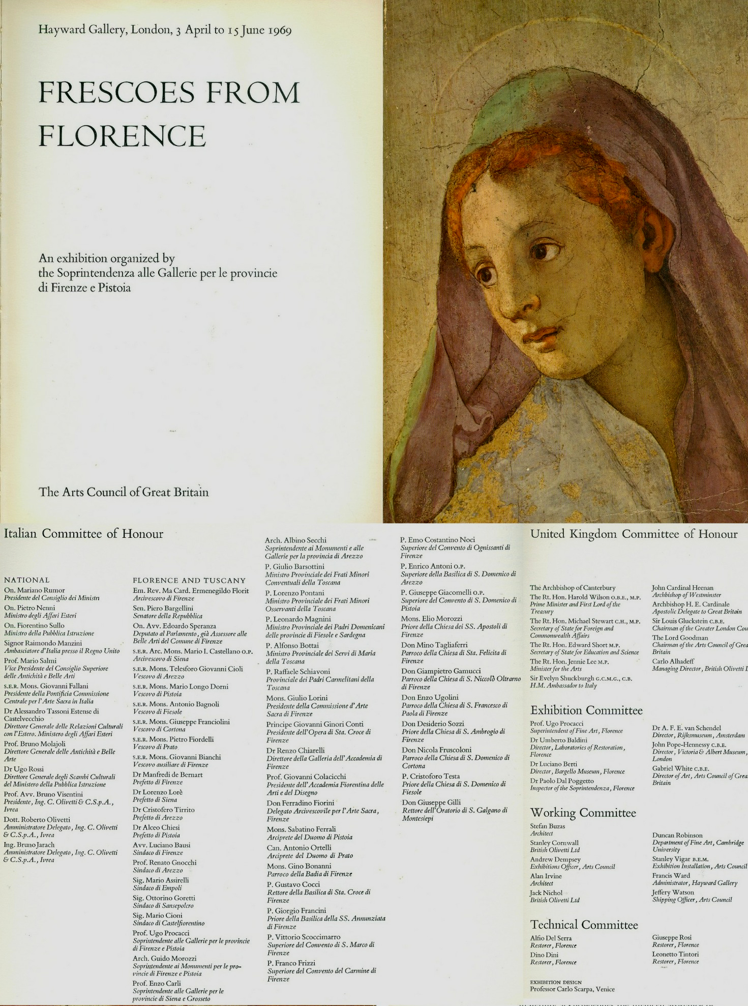
Above, Figs. 15 to 18, showing the committees of honour who had endorsed the stripping of frescoes from walls.
INSATIABLE, RISKY APPETITES FOR TRAVELLING ART LOANS
In 2014 the Metropolitan Museum mounted an exhibition of six entire windows removed from Canterbury Cathedral (in the course of “restoration”). See “How the Metropolitan Museum of Art Gets hold of the world’s most precious and vulnerable treasures”.
In 2016 we reported that, as with Canterbury, plans were underway to fly restored windows at Chartres Cathedral to the United States: “Chartres’ Flying Windows”. (In the event, and following interrogation from Florence Hallett, author of the post, the authorities decided that the risks were not worth taking and the windows stayed in France.)
Most inexplicably of all (as reported in the ArtWatch UK Journal No. 29), in December 2014 the British Museum’s Courtauld Institute-trained director, Neil MacGregor, had gratuitously conferred a museological vote of confidence in Putin’s Russia by recklessly – and, to Greece, provocatively – sending one of the most precious Parthenon sculptures on a roundabout route that avoided EU airspace to the Hermitage Museum, St Petersburg. The flights occurred just months after Russian troops had annexed part of Ukraine and Russian-armed separatists in eastern Ukraine had brought down a Malaysian Airlines Boeing with a loss of 298 lives including around 100 children. The British Museum loan, which enjoyed no conservation pretext and which replicated the Hermitage’s own fine early plaster cast of the sculpture made by Lord Elgin, was conducted in an act of secrecy that blindsided the UK Government at a time when economic sanctions had been imposed on Russia in response to its annexation of Crimea.
Above, Fig. 19: The cover of the ArtWatch UK Journal No. 29, Spring 2015 showing the directors of the Hermitage and the British Museum, Mikhail Piotrovsky and Neil MacGregor; right, ArtWatch UK Letter, The Times, 9 December 2014.
THE SISTINA RESTORATION’S COSTS AND CONSEQUENCES
In his highly informative exhibition catalogue essay to the Tuscan Frescoes exhibitions, Professor Ugo Procacci set the “great mural paintings of golden age of Italian paintings” from Cimabue to Michelangelo as an interval of “true frescoes”. That common but misleading characterisation of Michelangelo’s Sistine Chapel painting methods served as cover for the Sistine Chapel restorers’ overall applications of the oven-cleaner-like new agent AB57 which had been designed to remove pollution-encrusted salt efflorescence from marble and not for removing a secco paint or supposed glue-varnishes. It made mincemeat of the Sistine Chapel frescoes’ highly distinctive a secco features, including those shown above which had been copied by Michelangelo’s contemporaries and by subsequent artists for centuries thereafter. Procacci and Baldini had shared Colalucci’s and Mancinelli’s desire to intensify chromatic values by making a complete removal of all material on the plaster fresco surfaces of the Brancacci Chapel. In both cases this radical aesthetic cleansing subverted the “sculptural” and “aerial” roles that tonal relationships had played within the two artists’ famous murals as shown above at Figs. 13 and 14 above.
CAUGHT ON THE HOP AND IN THE ACT
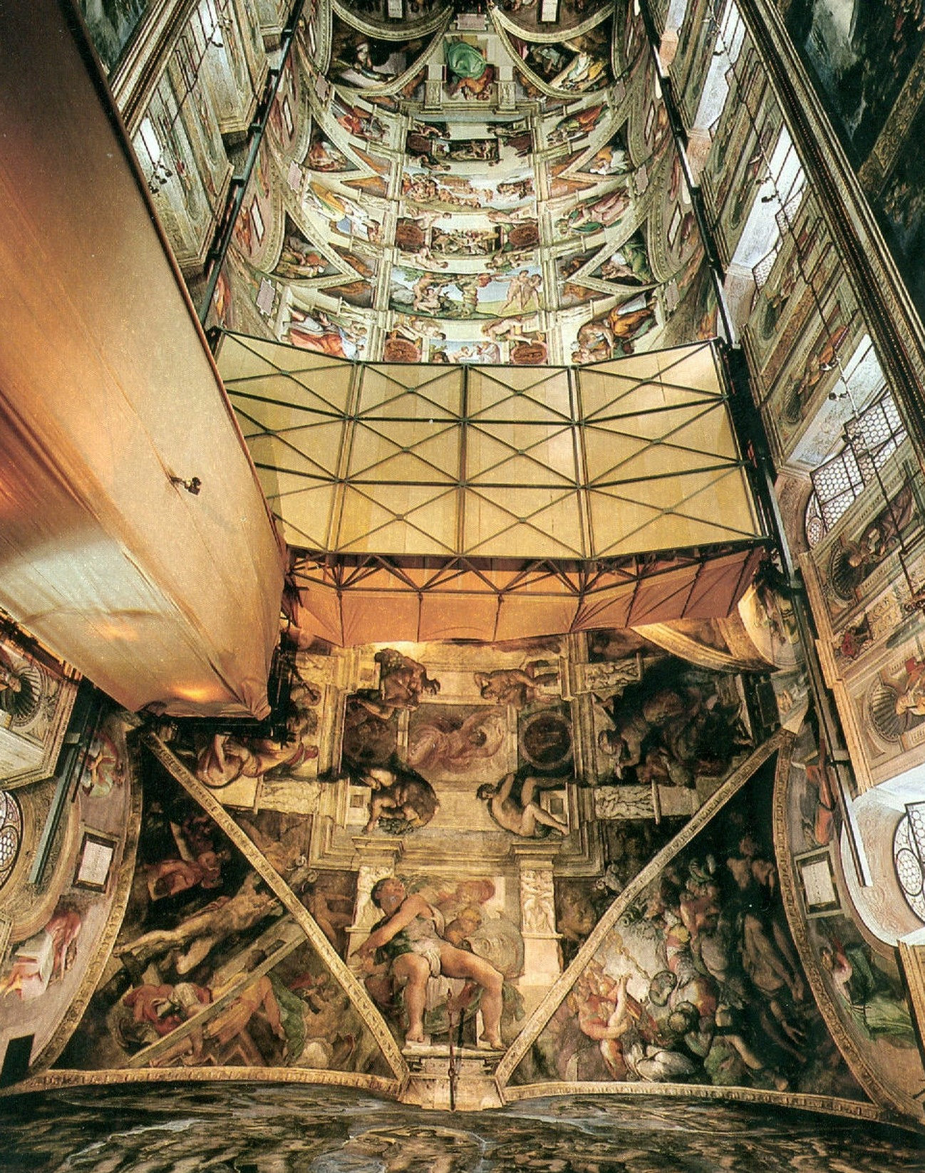
Above, Fig. 20: National Geographic’s iconic photo-record of the Sistine Chapel ceiling showing the last moments of the unrestored and most brilliant final stages of Michelangelo’s ceiling painting – which included his acclaimed portrayals of the Crucifixion of Haman, the Prophet Jonah and the Libyan Sibyl, all set in their deep and darkened spatial dramas within the forcefully articulating projections of Michelangelo’s fictive architecture.
To preserve a lucrative Vatican revenue stream from paying visitors, the chapel remained open throughout the restoration but at the cost and consequence of enabling viewers to see and compare the cleaned and not-yet-cleaned frescoes simultaneously – as above at Fig. 20. That unprecedented directly comparative opportunity drew instant criticisms and forged an unusually strong alliance of artist/critics and scholar/critics. When the art historical establishment looked the other way as Beck, a leading Renaissance scholar/critic, was put at very great personal and professional risk in the Italian courts for his critical view on the restoration of a sculpture by the artist on whom he was the world authority – and on which particular sculpture he had written a commemorative book (Fig. 22) – immense media and publishing interest was aroused. That in turn lead to the publication of the 1993 and 1996 James Beck, Michael Daley, book Art Restoration: The Culture, the Business and the Scandal.
THE SHARPENING OF HOSTILITIES AND DENIALS OF EVIDENCE
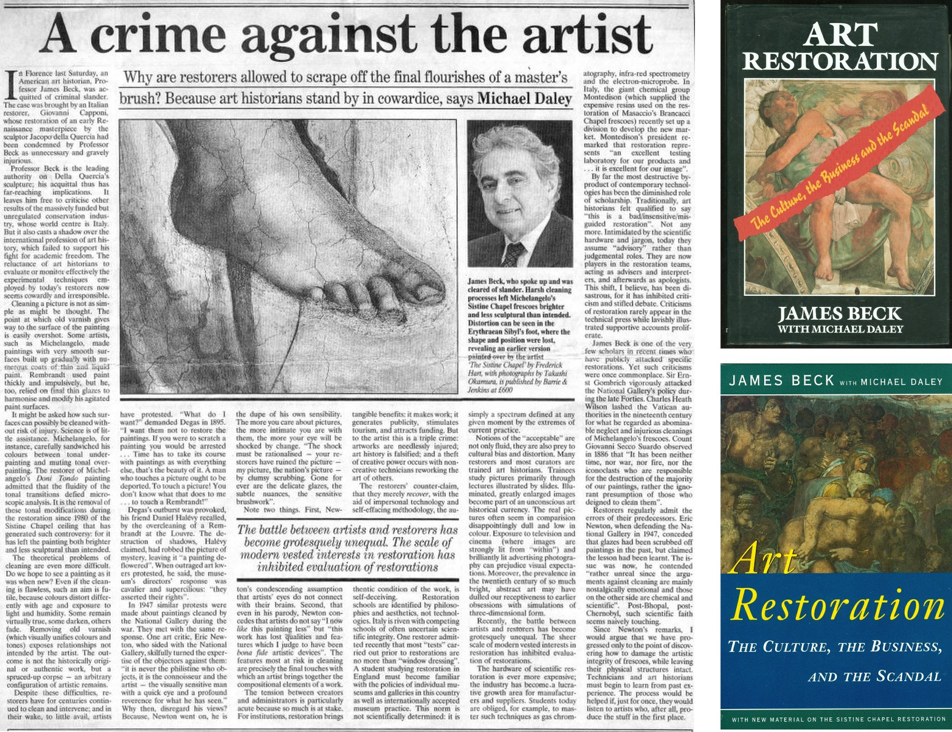
Above, Fig. 21: Above, an article carried in the 22 November 1991 Independent when Professor James Beck had been acquitted of criminal slander charges brought by the restorer of Jacopo Della Quercia’s marble Illaria del Carretto tomb monument in Lucca’s Duomo (Fig. 22); right, the 1993, London, and 1996, New York, editions of Art Restoration, The Culture, the Business and the Scandal.
PRAISE, WHERE DUE…
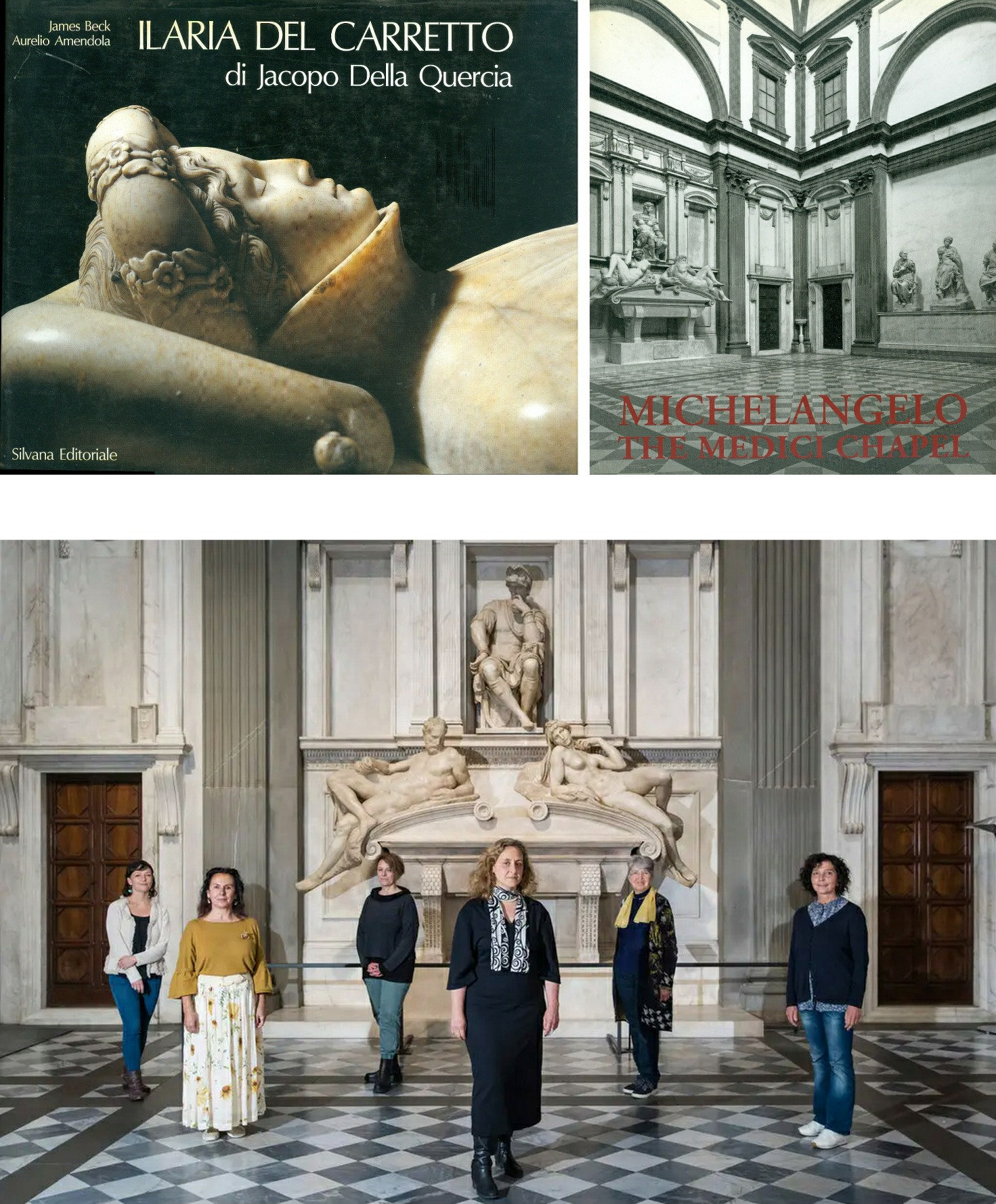
Above, Fig. 22: Top left, the 1988 James Beck and Aurelio Amendola book ILARIA DEL CARRETTO di Jacopo Della Quercia; top right, the 1993 book Michelangelo: The Medici Chapel by James Beck, Antonio Paolucci, Bruno Santi – and with notes on the chapel’s restoration by the restorers Agnese Parronchi and Francesco Panichi; above, the team of restorers who spent eight years between 2013 and 2021 re-restoring the Medici Chapel with a “top secret” bacteria-infused gel, as reported in the Guardian and the New York Times (Photo. by Gianni Cipriano.)
In Art Restoration Beck had noted that while nothing was more demoralizing than being obliged to respond negatively to the vast majority of restorations, there had happily been some notable successes:
“The cleaning of Michelangelo’s sculpture for the Medici tombs in the New Sacristy of San Lorenzo, in Florence, was completed in mid-1991, and it was done with noteworthy sensitivity. Since the work was executed more or less at the same time as the Ilaria and since both were of fine-quality marble, I am enormously relieved to be able to speak enthusiastically about it. What is extraordinary about the cleaning which, again like the Ilaria, involved sculpture that was housed indoors, was that no harsh chemicals were used, no mechanical means employed, no oil applied to the surface. The dust and the dirt were gently removed with cotton wads and distilled water. What is more, the cleaning was conducted by an artistically oriented and enlightened young woman, Agnese Parronchi, who had trained a decade earlier at the Opificio. The money was supplied by a private sponsor, a foundation whose director showed the deepest respect for the works of art, while the superintendent in charge was extremely well-informed and co-operative. In other words, this restoration, together with one by the same restorer conducted on Michelangelo’s Battle of the Lapiths and Centaurs relief located in the Casa Buonarroti, has provided encouraging proof that sensitive cleanings are indeed possible.”
That optimistic note was carried in both the 1993 and 1996 editions of Art Restoration. Perhaps Beck’s approval was considered a provocation by the restoration establishment. Perhaps with a change of superintendent in 1992 it was soon forgotten that the chapel had been restored to acclaim. Perhaps new donors presented themselves. In any event, as the New York Times recently splashed:
“Send in the Bugs. The Michelangelos Need Cleaning.
“Last fall, with the Medici Chapel in Florence operating on reduced hours because of Covid-19, scientists and restorers completed a secret experiment: They unleashed grime-eating bacteria on the artist’s masterpiece marbles…Nearly a decade of restorations removed most of the blemishes…In November 2019, the museum brought in Italy’s National Research Council, which used infrared spectroscopy that revealed calcite, silicate and other more organic, remnants on the sculptures and two tombs that face one another across the New Sacristy. That provided a key blueprint for Anna Rosa Sprocati, a biologist at the Italian National Agency for New Technologies, to choose the most appropriate bacteria from a collection of nearly 1000 strains, usually used to break down petroleum in oil spills or to reduce the toxity of heavy metals. Some of the bugs in her lab ate phosphates and proteins, but also the Carrara marble preferred by Michelangelo. ‘We didn’t pick those’, said Bietti…”
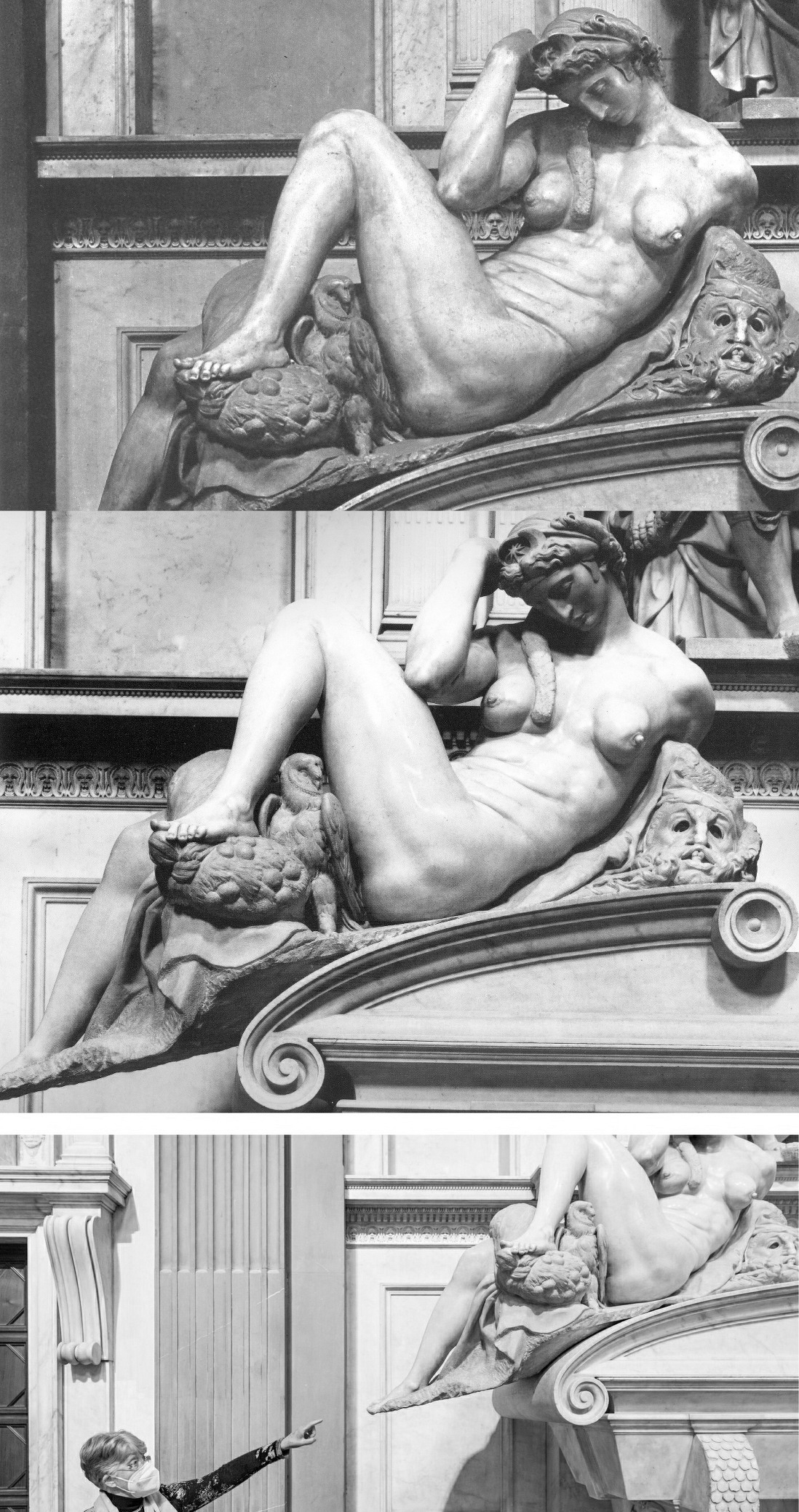
Above, Fig. 23: Michelangelo’s Medici Chapel portrayal of Night as respectively seen in: (top) the 1986 edition of Ludwig Goldscheider’s Michelangelo: Paintings, Sculpture, Architecture; (centre) the 1993 Michelangelo: The Medici Chapel by James Beck, Antonio Paolucci, Bruno Santi; (above) in recent press reports. The interval between the two last and prolonged restorations had barely been two decades. As can be seen above, the figure of Night is greatly more highly polished and the former pronounced tonal difference between the figure and its supporting accoutrements – the owl, the mask, draperies – has been greratly diminished.
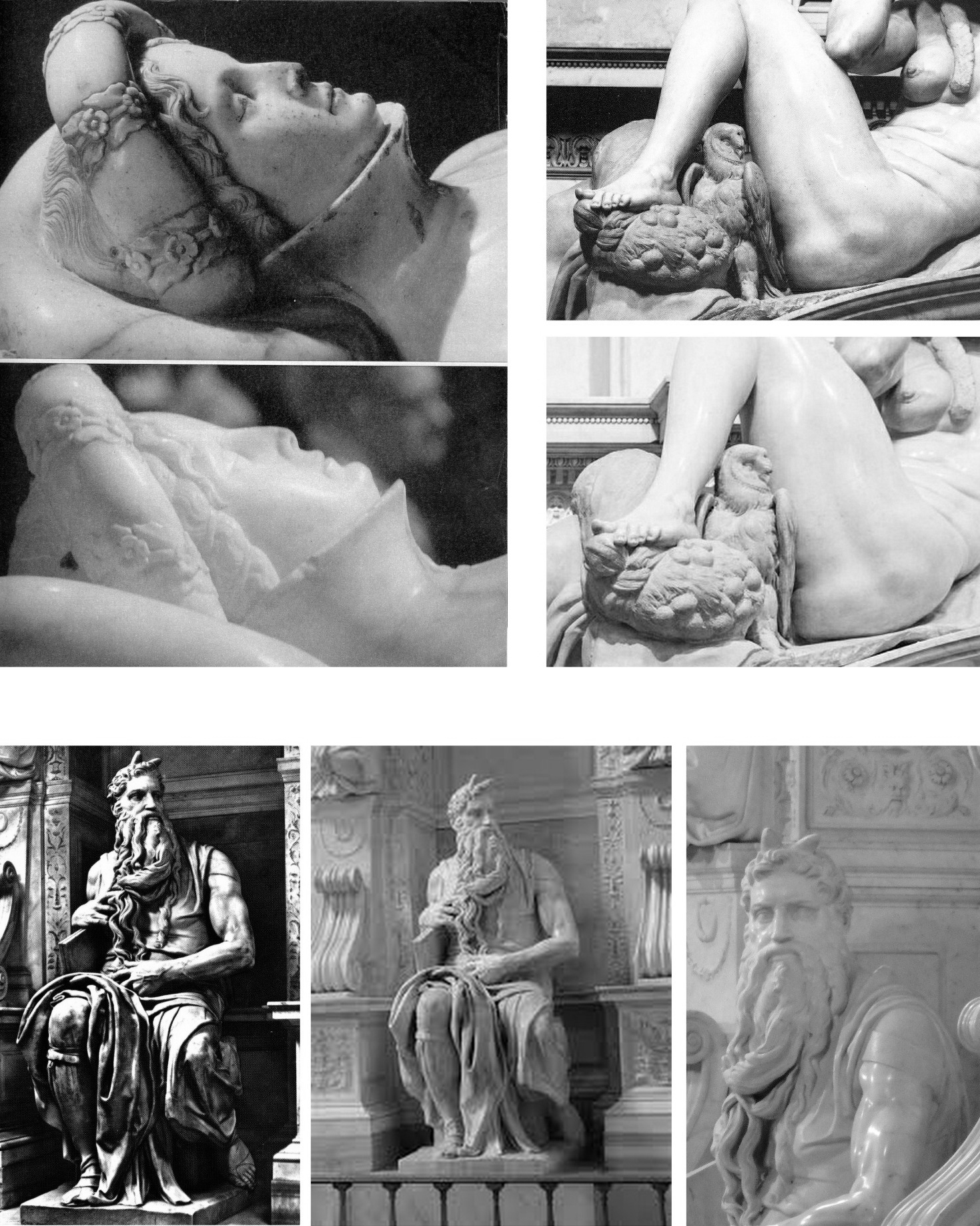
Above, Fig. 24: Top left, the head of Jacopo Della Quercia’s Ilaria del Carretto Tomb Monument, as seen before and after its last restoration; top right, a detail of Michelangelo’s Night as seen in 1993 and today; above, Michelangelo’s carving Moses in the church of San Pietro in Vincoli, as seen (left) in an old post card and (right) after a restoration that began in 2001 and that was jointly funded by the firm Lottomatica and the Italian Ministry of Culture.
The gambling company Lottomatica was acquired for over a billion euros in 2021 by the Gamenet Group. A webcam was set up at the church in Vincoli to broadcast the restoration process in real time. The restoration itself thus became part of a multimedia event which included a series of photographs by the German photographer Helmut Newton and a concert by the British composer Michael Nyman. The restorer, Antonio Forcellino, fairly acknowledged that the sculpture “will never be as it was when Michelangelo made it” and that to take out the stains made when replicas were made from the carving was so risky that “we’ll limit ourselves to lower the tone of the stains themselves.” Nonetheless, the push towards a perfectly white shininess that hinders appraisals of sculptural forms and makes old stone resemble new plastic, had made a quantum leap.
FORM: ITS REALISATIONS, ITS FINISHES AND ITS READINGS
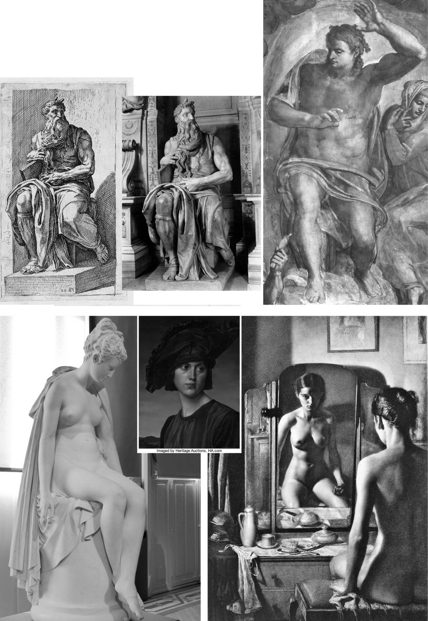
Above, Fig. 25: Top, left, an etching of 1638 by Franҫois Perrier after Michelangelo’s Moses; top, centre, Moses before its last restoration; top, right, Michelangelo’s “Christ the Judge” (mirrored); above, left, a marble carving of Psyche by Albert-Ernest Carrier-Belleuse; above, centre, a portrait by Gerald Brockhurst; above, right, Brockhurst’s etching The Artist and the Muse.
Before it becomes a thing, sculpture is an idea. Ideas can be given verbal, written, graphic, pictorial or plastic – or other – expression. A sculptural idea can be realised as a piece of sculpture – at which point it becomes a real thing-in-the-world and is subjected to any number and direction of external light sources – or, it can be given expression in graphic or pictorial form. Ideas realised as things i. e., as sculptures, are bounded by their surfaces, unlike graphic or pictorial works in which sculptural ideas find expression as depictions-on-surfaces. Although a sculptural idea expressed pictorially is generally confined to a form as perceived from a single position (as in the Brockhurst etching above – albeit where a craftily deployed mirror affords a second viewpoint) the image can carry implicit suggestions of how objects would appear from a different viewpoint. But it is never possible (not even for Picasso in full cubist mode) for a depiction to match the infinite multiplicity of indivisibly linked aspects that a given sculpture presents to a viewer when seen “in the flesh” and “in the round”. The great drawback with sculpture is that it is much slower to make and finish a thing than to depict one. When Michelangelo was compelled to stop making the figures he had planned to join his Moses he executed over three hundred figures on the Sistine ceiling alone including his suite of monumental seated Prophets and Sibyls. His “Christ the Judge” deployed every ounce of sculptural know-how but with the advantage of containing its own optimalised light-source to maximise by the play of its lights, darks and in-betweens, the greatest possible plastic vivacity.
The surface “finish” of a sculpture is an intrinsically problematic notion and an aspect of sculptural practice which is subject to personal and/or cultural preferences as well as to the nature of (sometimes) stipulated materials of construction.
A sculpture made with clay (which needs to be kept moist while being worked) will have a pleasant sheen which results in highlights and gradated shadows as the surfaces of forms turn away from the light source. If the clay is kept hollow and allowed to dry out completely, the sculpture can be fired in a kiln to varying degrees of hardness and finish, but it will emerge with a matt light-absorbing surface which most sculptors find unsatisfactory and visually deadening. If the clay sculpture is supported by an armature, it will not be able to dry out without cracking. In such cases, to preserve the form, the clay must either be kept wet indefinitely, or a “negative” cast be made from it with fine plaster. That plaster cast negative surface (the mould) can then be filled with other substances but, most commonly, this would be with reinforced plaster. The outer original cast mould can then be chiselled away to expose a hard durable positive facsimile of the originally modelled soft and wet clay. The initial surfaces of plaster casts, however, are also matt and sculpturally deadening in their highly light-absorbing capacities. Sculptors can go to considerable and resourceful lengths to work up a desired degree and nature of surface finish. There is a fascinating and eloquent video here on the “restoration” of a large Henry Moore painted plaster sculpture protype for a bronze cast as it was being “prepared” for inclusion in an exhibition by being given a “re-activated” and as if freshly worked surface.
In the case of Michelangelo’s New Sacristy sculptures, the last-but-one restoration team, Parronchi and Panichi, set out the issues raised for would-be restorers by Michelangelo’s own famously varied levels of sculptural finish. The restorers first described the approach of their own programme in general terms:
“The recent restoration of Michelangelo’s marble sculptures in the New Sacristy was the first of this century. They have been superficially cleaned from time to time, but this was the first true restoration scheme. At the beginning of the programme, it appeared that the tombs and seven statues, together with those of Saints Cosmas and Damian, had been kept in almost ideal conditions. The level of relative humidity inside the Sacristy is not very high (70% approx). The light is gently filtered through large, high windows, and for most of the day the Chapel is bathed in a glowing half-light which is accentuated by the reflection from the marble surfaces, A brilliant but soft light from the lantern is diffused inside the cupola before shining down onto the tombs, which are not subject to the full glare of direct rays. The micro-climate does not vary with the seasons, but the extreme heat of summer is alleviated by the solidity of the structure. In winter the attendants have to show a certain spartan toughness.
“In spite of this, the statues had a dull appearance. They were covered with a layer of dust beneath which thicker deposits, some sticking to the substratum, were found. They were irregularly distributed over the surfaces of the statues and were found in greater or lesser concentrations according to the angle and working of the surface, and the form, outline and position of the sculpture. It was important to establish which of the many waxes found were of animal origin and therefore particularly sensitive to climatic and atmospheric influences. They also react to light as well as to relative humidity and extremes of temperature. Restoration work is justified (one should always ask whether it is really necessary) by the presence of obvious accumulations of atmospheric particles which block the surfaces, alter their precarious balance of interacting elements, and even blur them to the point where it is no longer possible to see them accurately. At this point, in order to put the case for the critics of ‘patina’, it is appropriate to try to explain how much was removed, how much was left in place, and the reasons. We shall therefore begin by describing and analysing the factors that cause an acceleration in the natural aging process, and lead inevitably to permanent deterioration in a work of art…”
The restorers’ alertness to artistic considerations of which Beck spoke was particularly evident in this passage:
“If, as art historians maintain, Michelangelo’s sculpture was born mature, it is impossible to doubt that the finish he gave to the surfaces of Night was deliberate, as was the working of Day, which is blocked out with the subbia [a pointed heavy tool] and slightly smoothed on the face with the gradina [a sharp-toothed chisel] and is a perfect example of what is known as non-finito. After the restoration of Dusk, the way in which the gradina has been used to smooth the face and create an effect of chiaroscuro between the head and the finely polished upper body, can clearly be appreciated. This technique is even more obvious on the right shin, where the lower part is smoothed, but the upper part where the light falls, is finely polished, creating an effect of both softness and movement, and light and shade. The symbolic figure of Night is the most finito, the most lustrous of Michelangelo’s seven statues. After restoration it glows with the radiance of a moonlit night, in an obvious metaphorical and tonal contrast with the other three allegorical figures which, as the restoration has revealed have a warmer and more misty colour range…
The restorers concluded with a summary of the methods adopted and the materials used in the restoration:
“Six thousand man hours, hundreds of photographs taken by us, and thousands sent in by visitors from all over the world, litres of de-ionized water, several kilograms of cotton, cottonbuds, and volatile turpentine essence. Using these materials we tried to maintain a balance between sensitivity and research, so that art would not be destroyed by science. One hundred square metres of marble surface were restored without, of course, using any waxes or protective coatings that might create new ‘patina’…We must ask ourselves, and above all ask all art historians, and everyone to whom culture matters, whether this masterpiece bequeathed to us by the artist will survive the overweening attentions of the high priests of gleaming whiteness; whether this accumulation of technique, art, feeling and culture should be lost, or through restoration be given back to us.”
Sadly, we already now know the answer to that question: the serried, bug-happy, high priestesses of “gleaming whiteness” have had their swift revenge. We can only await their published report. It is a small consolation, but the 1993 Beck et al book and its superb Aurelio Amendola photographs was a jewel of publishing in its day, and it must now do further and extra service as a sumptuous elegiac record of what so briefly was allowed to be – as can be appreciated below in the two Amendola shots of the back of Michelangelo’s Day and that of the face of Night:
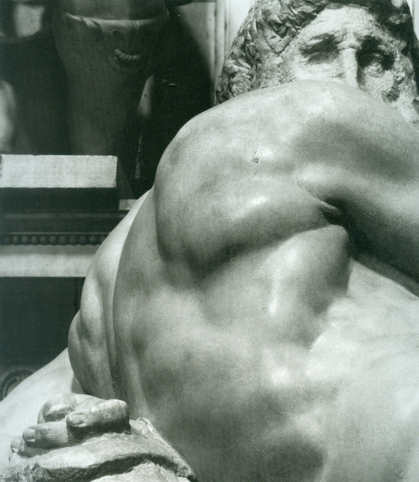
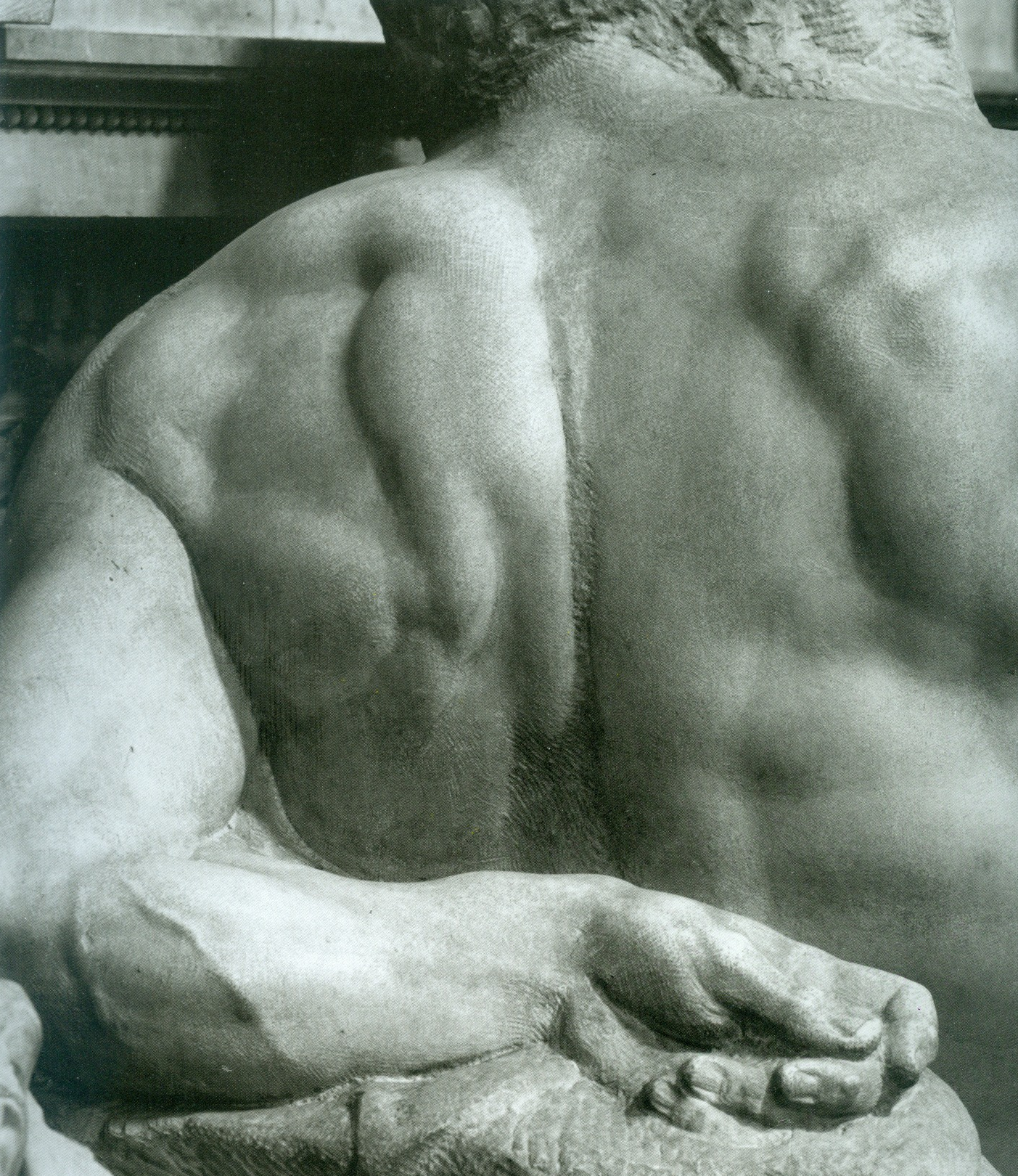
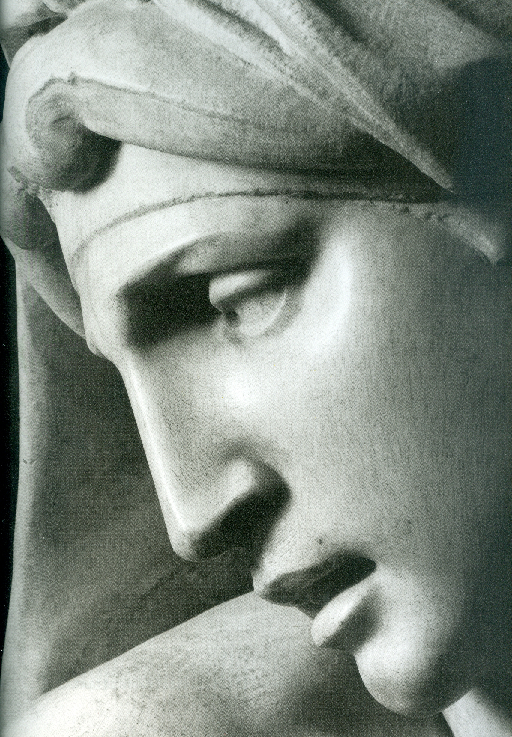
In Part II we examine how the twin Sistine and Brancacci Chapels colourisation projects came into being.
Michael Daley, Director, ArtWatch UK, 26 May 2021
ENDNOTE:
The Vatican’s complete official account is carried in this sequence of books:
1986: The Sistine Chapel: Michelangelo Rediscovered – featuring Carlo Pietrangeli, Fabrizio Mancinelli, Gianluigi Colalalucci, John Shearman, John O’Malley, S. J., Pierluigi de Vecchi, Michael Hirst.
1987: The Conservation of Wall Paintings Getty/Courtauld Symposium, Fabrizio Mancinelli – “The Frescoes of Michelangelo the Vault of the Sistine Chapel: Conservation Methodology, Problems, and Results”, and Gianluigi Colalucci – “The Frescoes of Michelangelo on the Vault of the Sistine Chapel: Original Technique and Conservation”.
1991: The Sistine Chapel (2 Vols., Edition 500) – featuring Frederick Hart, Gianluigi Colalucci, Fabrio Mancinelli.
1992: The Sistine Chapel ~ A Glorious Restoration – featuring Carlo Pietrangeli, Fabrizio Mancinelli, Gianluigi Colalucci, Nazzereno Gabrielli, Michael Hirst, John Shearman, Matthias Winner, Edward Maeder, Pierluigi de Vecchi, Piernicola Pagliara.
1992: The Art of the Conservator, Ed. Andrew Oddy (British Museum Press), Fabrizio Mancinelli – “Michelangelo’s Frescoes in the Sistine Chapel”.
1996: Michelangelo: The Vatican Frescoes – featuring Pierluigi de Vecchi and Gianluigi Colalucci.
1997: Michelangelo: The Last Judgement – featuring Dr Francesco Buranelli, acting Director General Papal Monuments, and Galleries, Loren Partridge, Fabrizio Mancinelli, Gianluigi Colalucci.
2013: La Capella Paolina – Featuring Anonio Paolucci, Arnold Nesselrath, Paolo Nicolini.
Additionally, for technical, methodological, and philosophical fresco conservation matters, see:
1984 Conservation of Wall Paintings (Butterworth) – by Paolo Mora, Laura Mora, Paul Phillipot (see Fig. 11 above).
And, for the chief restorer’s own account:
2016: Michelangelo and I ~ Facts, People, Surprises and Discoveries in the Restoration of the Sistine Chapel – Gianluigi Colalucci.
The Demise of the National Gallery’s “made just like Rubens” Samson and Delilah with inexplicably cropped toes

Michael Daley writes: In a bombshell article (Observer, 26 September 2021), Dalya Alberge reported on a series of Artificial Intelligence comparisons of the Samson and Delilah’s brushwork with that on 148 uncontested Rubens paintings. The exercise had produced a negative result of such magnitude that the Swiss company, Art Recognition, disbelieved its own findings and ran the tests a second time. The results were identical: an unprecedentedly crushing 91% probability that the picture was not painted by Rubens:
“…Critics have long suggested that the painting is not by Rubens. And now a series of scientific tests employing groundbreaking AI technology have concluded that the 17th-century Flemish master could never have painted it. ‘The results are quite astonishing’, Dr Carina Popavici, the scientist who carried out the study, told the Observer… ‘I was so shocked…Every patch, every single square came out as fake, with more than 90% probability.’”
ArtWatch UK was cited as observing that “coming so soon after its ill-advised espousal of the now-rejected and disappeared $450m Salvator Mundi, these results are a calamity for the National Gallery” [see POSTSCRIPT, below]. A spokesman said: “The gallery always takes note of new research. We await its publication in full so that any evidence can be properly assessed. Until such time it will not be possible to comment further.” That was a far cry from its response in the 21 May 2000 Independent on Sunday: “We have absolutely no doubts about the authenticity of the picture and nor do most experts on Rubens”.
Doubts or not, the Samson and Delilah, which is promoted by the gallery as one its top thirty stars – and therefore as the best of its twenty odd Rubens’ paintings – is now a three-times disabled attribution: it had no provenance as a Rubens before a notoriously unreliable scholar’s 1929 upgrade; stylistically, it has long been shown to be untenable as a Rubens and to be compositionally incompatible with the copies made of the lost original Rubens Samson and Delilah ; and now, on multiple close technical comparisons, its brushwork finds no match with that in secure Rubens’ pictures. How the gallery comes to terms with this latest source of disqualification will test the mettle of its director and trustees, none of whom was party to the picture’s 1980 acquisition.
AN ATTACK ON THE MESSAGE
Alberge’s disclosure has been greeted by a thunderous silence of the Rubens experts – but the art history blogger, auctioneer and film-maker, Bendor Grosvenor, tweeted an immediate blanket dismissal of the findings:
“The only thing this tale should tell us is that computers still don’t understand how artists worked. And probably never will.” And “If you like a bit of science with your art history, it’s still hard to beat the National Gallery’s 1983 technical bulletin for showing the picture is indeed by Rubens.”
Grosvenor’s unsupported assertion bolstered by an appeal to the authority of an old and profoundly unsatisfactory National Gallery report gained tweeted support from the Sunday Times’ art critic, Waldemar Januszczak. In crucial respects the erratic art critical volatility of this pair of commentators (who conduct joint “Waldy and Bendy” podcasts on Januszczak’s ZCZFilms website), exacerbates the National Gallery’s now perilously exposed position. Holding Plesters’ report aloft as a standard may have been thought unhelpful by the gallery – the link Grosvenor provided to it now produces this message: “Page not found – Sorry, the page you requested has been removed or the link was incorrect.”
Above, Fig. 1: Left, the National Gallery’s attributed Rubens Samson and Delilah; second left, the Grosvenor-attributed fragmentary “Raphael” of a Madonna at Haddo House, Scotland; third left, the disappeared and demoted “Leonardo” Salvator Mundi; right, a Colin Wheeler cartoon.
Grosvenor’s appeal to the authority of National Gallery expertise was rich: when, after long examinations, that gallery’s experts recently judged his would-be “Raphael” painted fragment of a Madonna in an all’antica cross-over dress (Figs. 1 and 3) to be no more than a “possible 18th century work” he crossly rejected their findings and called for yet further tests. Where Januszczak now supports the Samson and Delilah’s Rubens attribution he does so in flat repudiation of his 1997 younger self’s rumbustious denouncement of it (Fig. 2). With their joint appeal to the authority of the National Gallery conservation staff’s record, Grosvenor and Januszczak have opened the door to the gallery’s skeleton cupboard.

Above, Fig. 2: The cover of the 5 October 1997 Sunday Times Culture Magazine which trailed Waldemar Januszczak’s article “A Rubens or a costly copy”
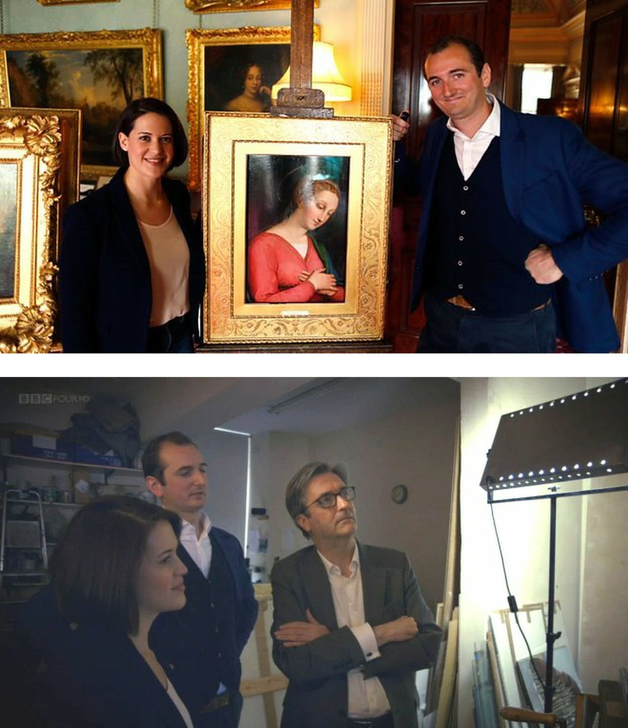
Above, Fig. 3: Top, BBC4 Factual Report, 03. 10, 2016: “Britain’s Lost Masterpieces discovers hidden painting believed to be by Raphael. ‘Finding a potential Raphael is about as exciting as it gets. At first I couldn’t quite believe it might be possible, but gradually the evidence began to all point in the right direction.’ Dr Bendor Grosvenor”. So reported the art-credulous BBC with a photograph (top) of the programme’s co-presenters, art historian Jacky Klein and Bendor Grosvenor, with the putative Haddo House Raphael; above, the presenters consider the “Raphael” on the Lost Masterpieces programme with the former director of the National Gallery, Sir Nicholas Penny.
Invited to pass judgement on the attempted upgrade, Sir Nicholas (whose proselytising on behalf of the $450m Salvator Mundi had been defended by Grosvenor in the 9 October 2011 Sunday Times – “They are taking a risk and I can’t applaud them enough for it”) said that he would place the painting somewhere between “probably by Raphael” and “by Raphael” and that with a “little more time and courage” he might well go the whole hog. That stylishly diplomatic locution was of limited utility – rather like informing a woman that she is somewhere between probably pregnant and pregnant. The pity is that aside from his defences of National Gallery restorations and championing of a not-Raphael and a not-Leonardo, Penny proved the gallery’s most unapologetically serious scholar/director in recent times – as instanced in an excellent Financial Times interview.
ROLL UP
In another Financial Times interview, Simon Gillespie, the restorer who works with Grosvenor on the BBC’s Britain’s Lost Masterpieces programme, disclosed that he, too, believes that he might own yet another Raphael. Gillespie is believed to be the owner of a claimed Lely copy of the £10m “Last Van Dyck Self-portrait” that was sold by the Mould Gallery to the National Portrait Gallery for £10m on 1 May 2014.
DEFENDING INSTITUTIONS AND ATTACKING JOURNALISTIC MESSENGERS
Grosvenor frequently tilts at journalists whose stories embarrass art institutions. In a February 2019 Art History News blog post (“Salvator Mundi & the Louvre”) he berated Sunday Telegraph and Mailonline reports that the Louvre would not be showing the $450m supposed-Leonardo Salvator Mundi in a forthcoming Leonardo exhibition. That story, he sniffed, “is based on the opinion of one Jacques Franck.” It was. Franck’s judgements as the world authority on Leonardo’s painting technique have institutional clout (- and often the ear of French presidents). Franck’s prediction proved precisely correct: the Salvator Mundi was not included in the Louvre exhibition, and it was described in the exhibition catalogue as what it is and what it has remained despite successive restoration makeovers and intense global marketing razzamatazz (- which marketing Grosvenor lauded as the best ever seen) namely, the Leonardo studio work that entered the Cook Collection in 1900, viz: “Salvator Mundi, version Cook, vers 1505-1515″. (See “The Louvre Museum’s bizarre charge of “fake information” on the $450 million Salvator Mundi”.) The Art Newspaper has reported (November 2021, “Prado downgrades $450m Leonardo Salvator Mundi”) that the Prado, too, has demoted the Salvator Mundi to its original standing as the Cook version: “The Prado curator Ana Gonzáles Mozo comments in her catalogue essay that ‘some specialists consider that there was a lost prototype [of Leonardo’s Salvator Mundi] while others think that the much debated Cook version is the original’ However, she suggests ‘there is no painted prototype by Leonardo’.”
(For the latest observations on the $450m Salvator Mundi, see Jacques Franck’s “Further thoughts about the ex-Cook Collection” and ArtWatch UK’s “The Disappeared Salvator Mundi’s endgame: Part I – Altered States and a Disappeared Book”. For ArtWatch UK’s first objections to the Salvator Mundi upgrade, ahead of Christie’s November 2017 $450m sale, see: Dalya Alberge, 19 October 2017: “Mystery over Christ’s orb in $100m Leonardo da Vinci painting” and, “Problems with the New York Leonardo Salvator Mundi Part I: Provenance and Presentation”.)
THE RAMIFICATIONS
The Rubens and the Leonardo attributions are items of considerable public policy interest. Both works achieved world record prices. Both received major and controversial modifications at the hands of restorers. Both upgrades have now collapsed. Both had been championed by National Gallery directors – Michael Levey with the Samson and Delilah and Nicholas Penny with the Salvator Mundi. While Waldy and Bendy both now support the Samson and Delilah, Waldy rejected the Salvator Mundi (which Bendy supports) because: “It resembles nothing else Leonardo painted”; and, because Christie’s claimed resemblance of it to the Mona Lisa “had me laughing out loud”.
THE NATIONAL GALLEY’S WOBBLY DEFENCES
The Art Recognition findings are not, as Grosvenor would imply, off-the-wall. In June 1997 the National Gallery issued a notice claiming that the reason why the Samson and Delilah looked like no other Rubens in the gallery was because it had been painted at a special and very brief moment when Rubens had just returned from Italy and was keen to show off newly acquired Caravaggist traits. That apologia was not credible.
In a pioneering 1992 report, the scholar/painter Euphrosyne Doxiadis and the painters Stephen Harvey and Siân Hopkinson, conducted a focussed survey of six Rubens paintings of 1609 and 1610 and demonstrated that “All these display a consistency and quality of style which is not shared by the Samson and Delilah”. That report – “Delilah cut off Samson’s hair, but who cut off his toes? The case against the National Gallery’s ‘Rubens’ Samson and Delilah” – was placed in the National Gallery’s Samson and Delilah dossiers and is published on the dedicated In Rubens Name website.
THE ART RECOGNITION REPORT
We are very pleased to publish here the full Art Recognition report on the Samson and Delilah, as below, and would urge all to study it along with the pioneering, methodologically exemplary Doxiadis/Harvey/Hopkinson report.
REPORT_Samson_Delilah_Rubens_encr
With no match to be found for the picture among a score of National Gallery Rubens paintings or among six bona fide Rubens’ works of the precise (claimed) historical moment, why should it come as an affronting surprise that none was found by Art Recognition among 148 secure paintings? Just as Grosvenor demanded more tests on his wannabe Raphael, so he would seem to want the Samson and Delilah compared with every single picture in the oeuvre. On September 30th he complained: “To claim a judgement on the Samson & Delilah based only on scans of 400 [sic] works (and at what resolution? We are not told) out of an oeuvre of over 1000 works seems to me optimistic.” Rather than pressing for every work in the oeuvre to be tested, he might prefer to cite and photographically demonstrate a single other painting with brushstrokes that, to his eye, match those of the Samson and Delilah.
The National Gallery has long been unable to cite a single report or record that shows the Samson and Delilah to have been planed-down and mounted on blockboard before it was bought for a world record Rubens price in 1980. In place of evidence, the gallery, too, falls back on appeals to authority, claiming, for example, in a 23 May 2000 press statement, that “…a large number of distinguished scholars who have devoted their careers to the study of Rubens unanimously agreed that the painting was one of the artist’s masterpieces”.
Such appeals cut little ice: every restoration or attribution ArtWatch has challenged in the last thirty years had been supported by a bevy of art historical bigwigs – from the Sistine Chapel ceiling to the recent so-called Leonardo “Male Mona Lisa” (Fig. 1 above). Moreover, of all scholarship, that on Rubens remains the most problematic and herd-like, its key players being uniquely obligated by a family bequest to defer to the scholarship and judgements of the long deceased (and now discredited) scholar Ludwig Burchard.
ARTISTS KNOW
The challenge to that art historical authority has come principally from artist/scholars who are freer agents and arrive armed with hands-on knowledge of art’s practices – knowing, for example, how to put brush to paint and paint to surface. A quarter of a century ago Euphrosyne Doxiadis neatly encapsulated the now technically confirmed deficiencies of the picture’s brushwork in an interview:
“This picture is betrayed by brush strokes which are almost staccato and broken up, rather than having been done with one stroke of the wrist, which you see in all Rubenses. There is an absence of Rubens’ vibrant, pulsating-with-life strokes. In actual Rubenses, each stroke is a tour-de-force. This is clumsy and awkward.” (Dalya Alberge, “Expert denounces National Gallery’s Rubens”, The Times, 25 November 1996.)
Above, Fig. 4: Top, details of the National Gallery’s Samson and Delilah; above, Rubens’ The Raising of the Cross, Antwerp Cathedral. Where the former is claimed to be a lost picture Rubens painted in 1609-10, the latter was indisputably made by Rubens between 1610-11. Such pronounced differences in brushwork are inconceivable as that of two autograph paintings made at the same moment in Rubens’ oeuvre. Who, looking at this photo-comparison, could believe that Rubens had flitted between the ugly angular Cubist faceted feet in the Samson and Delilah statue (– try counting the toes and note the Art Deco zigzagging hem), and the superb fluency, grace and anatomical fidelity seen in the Raising of the Cross?
THE TESTIMONY OF NATIONAL GALLERY TECHNICAL BULLETINS
When Tweeting support for Grosvenor, Waldemar Januszczak, had seemingly forgotten his own 5 October 1997 Sunday Times article headed: “One of the World’s most valuable paintings hangs in the National Gallery. But Samson and Delilah, widely assumed to be by Rubens, is not by him but is a copy, argues Waldemar Januszczak. Who then did paint it?” Januszczak had ended with this ringing declaration: “The one thing we doubters all agree on is that the painting bought by the gallery for a staggering sum in 1980 is not by Rubens.” What has changed to un-doubt Januszczak? Under challenge on Twitter, Grosvenor admitted that he too had once entertained doubts about the Rubens ascription.
Joyce Plesters’ 1983 Technical Bulletin account was tendentious and error prone. She had counted six planks in the Samson and Delilah panel when the picture’s restorer, David Bomford, made it five and the gallery’s panel specialist, Anthony Reeve, counted seven – as would a dendrochronologist in 1996. Plesters thought the National Gallery’s attributed Michelangelo Entombment of Christ had been painted on a single giant plank when the panel is comprised of three butterfly-keyed planks. The senior curator, Christopher Brown, accepted Plesters’ six planks in the catalogue to the National Gallery’s 1983 “Acquisition in Focus” celebratory exhibition of the restored Samson and Delilah. In 1997 Januszczak poked fun at the conservation department’s shambolic technical reporting:
“I am shown these authoritative-looking documents and, on the first page, the information that the Samson is painted on five planks has been crossed out and changed to seven planks. In the published technical report we are told there are six planks. A conservation report that cannot count the number of bits of wood the gallery’s most expensive painting was done on hardly inspires confidence.”
One of the painting dossiers that I later I examined at the National Gallery (under the directorships of Charles Saumarez Smith and Nicholas Penny) disclosed that a large and important picture had been mounted on “Sundeala” boards with a honeycomb paper core. The disclosure had not been made in the report itself but had been written on an attached yellow post-it note. Plesters’ haplessness was more than arithmetical. The year before Januszczak’s tease she had suffered a mortifying professional reverse. In the 1960s, when scholars like Ernst Gombrich and Otto Kurz warned Gallery restorers against removing all-over tinted varnishes from Renaissance paintings, she insisted that the entire documented technical history of art showed “no convincing case” for any artist having emulated Apelles’ legendary dark varnishes and that the famous passage from Pliny was of “academic rather than practical importance”. She even offered to “sift” and “throw light upon” on any future historical material that Professor Gombrich might uncover.
A BURIED INCONVENIENT TRUTH
In 1977, in the National Gallery’s first Technical Bulletin, Joyce Plesters had mused complacently “one or two readers may recall the furore when the cleaning of discoloured varnishes from paintings…began to find critics.” In that year the scarcely less complacent former National Gallery director Kenneth (Lord) Clark pronounced picture cleaning “a battle won”. A third of a century after the original controversy, the practical import of Pliny’s testimony emerged in a 1996 Technical Bulletin disclosure that a Leonardo assistant, Giampietrino, had toned down his colours with a final dark “varnish” layer of oil with black and warm earth pigments.
Had those pigments been bound in a resin it would have been deemed an earlier restorer’s attempt to impart a spurious “old masters’ glow” and removed. However, Giampietrino’s dark overall toning was identical to the oil medium of the painting itself and any solvent that would dissolve the one would dissolve the other. The gallery had to leave the coating in place. Shamefully, it stifled any acknowledgement of its momentous art historical significance – and it even neglected to inform Gombrich of the corroboration of his earlier claims, despite the fact that the gallery’s then director, Neil MacGregor, held the 1960s dispute to have been “one of the most celebrated jousts” in modern art history.
When ArtWatch UK informed Gombrich of his vindication he was approaching his 87th birthday and responded: “I could hardly have a nicer present than the information you sent me. I don’t see the National Gallery’s Technical Bulletin and would have missed their final conversion to an obvious truth. There is more joy in heaven (or Briardale Gardens…)” Two years later he observed: “I believe it was Francis Bacon who said that ‘knowledge is power’. I had to learn the hard way that power can also masquerade as knowledge, and since there are very few people able to judge these issues, they very easily get away with it.” (See “How the National Gallery belatedly vindicated the restoration criticisms of Sir Ernst Gombrich”.)
THE MISSING BACK, A LEGAL CHALLENGE, AND OTHER SAMSON AND DELILAH PROBLEMS
Above, Fig. 5: Two special issues of the ArtWatch UK Journal that examined the Samson and Deliah’s credentials as a Rubens.
In Journal No. 21, Kasia Pisarek wrote:
“I am in possession of a privately printed pamphlet entitled The Biggest Scandal since the Fake Vermeer written in 1960 by a well-known French art dealer Jean Neger. In it, he openly denounced Dr. Ludwig Burchard as being a dishonest man writing a certificate of authenticity for a painting that he knew was a copy. The picture in question was Diana departing for the Hunt, a large oil on canvas, sold in 1960 as a Rubens for a huge amount of money to the Cleveland Museum in America. It first appeared in an Amsterdam sale (Valkenier family) in 1796, in fact as late as 180 years after its supposed creation c.1615. Neger accused Burchard of ‘defrauding the American state of 550.000 dollars’.
“In his highly dramatic pamphlet he declared that Dr. Burchard wrote the certificate of authenticity in 1958, even though he knew that another, nearly identical version (his own) of the painting existed, and had a considerably better provenance, going back to 1655 and the prestigious Spanish collection of the marquis de Leganes, a friend of Rubens. This was the most important collection in Spain, aside from that of the King Philip IV. Leganes probably owned more paintings attributed to Rubens than any other aristocratic collector in Spain, with the possible exception of Gaspar de Haro. After researching his painting, Neger discovered that the number 214 in white paint present on his canvas was the corresponding Leganes inventory number. Moreover, his version of Diana had a lot of pentimenti visible even to the naked eye, which would indicate that it was an original, not a copy.
“According to Neger, Burchard has tried to avoid him on many occasions and has refused to see or to certify his version because he had already certified the other one as the original. When approached, he tried to ‘compromise’ by saying that he would state that Neger’s version was the first one, which Rubens had sketched and abandoned, and that he had then painted a second version, the one from Cleveland. Later, he took up Neger’s picture again, corrected it and completed it. That solution was satisfactory to Neger and yet, Dr. Burchard changed his mind again, and refused to certify Neger’s painting at all. Subsequently, he chose not to reply to Neger’s allegations which appeared to be his usual attitude in such situations.”
Dr. Pisarek concluded:
“I verified most of Neger’s statements, which on the whole appear to be true. I traced both pictures: one is in the Cleveland Museum, effectively considered to be the original by Rubens; the other is in The Getty Museum in Malibu, as ‘a workshop copy’. And yet, the Getty picture (ex-Neger’s) has better chances of being the original: it is the larger of the two versions; it has a superior and older provenance (1655 as compared to 1796); it agrees in most details (presence of sandals, lack of birds in the sky, missing tiger’s skin, background landscape) with an old copy in Cassel which provenance (1756) predates that of the alleged Cleveland’s ‘original’.”
Pisarek discussed the merits of these two pictures in the third chapter – “The two versions of Rubens’s Diana Departing for the Hunt: an American cause célèbre” – of her doctoral thesis, Rubens and Connoisseurship. On the problems of attribution and rediscovery in British and American collections, University of Warsaw, 2009, and there concluded that both the Cleveland and Getty pictures are mostly products of Rubens’s workshop.
DEFENDING MUSEUM FAKES I
On 4 March 1929, the year that Ludwig Burchard found and upgraded the Honthorst painting then owned by van Diemen and Benedict (who had bought it, Doxiadis disclosed, from a painter/restorer) and that is today the National Gallery Samson and Delilah, Rene Gimpel, author of the 1996 Diary of an art dealer, wrote:
“The Italians have sold Americans $2m worth of marbles done by Dossena (a faker). A laughable sum compared with the amounts obtained by means of certificates given daily by German experts to German dealers. Just as there were paper marks, so there are paper canvases, an easy way of bringing dollars into Germany. I went this morning to the Van Diemen gallery, which has an exhibition of sixteen Venetians. Three pictures are good, apart from the Guardis and perhaps the Longhi. Last Sunday’s Times devoted an entire page reproducing this scandalous exhibition, which gives only a faint idea of what is brought in. Bode, the director of the Berlin Museum died two or three days ago. The king is dead long live the king! The Mayers, the Gronau will replace him. The German title of Doktor impresses the Americans. The museums are even more intent than the collectors on defending their fakes or their mistaken attributions.”
WHAT LIES BEHIND
Above, Fig. 6: A spread of pages from ArtWatch UK Journal No. 11 contrasting the Samson and Delilah’s present back with the labelled and cradled backs of comparable period panel paintings.
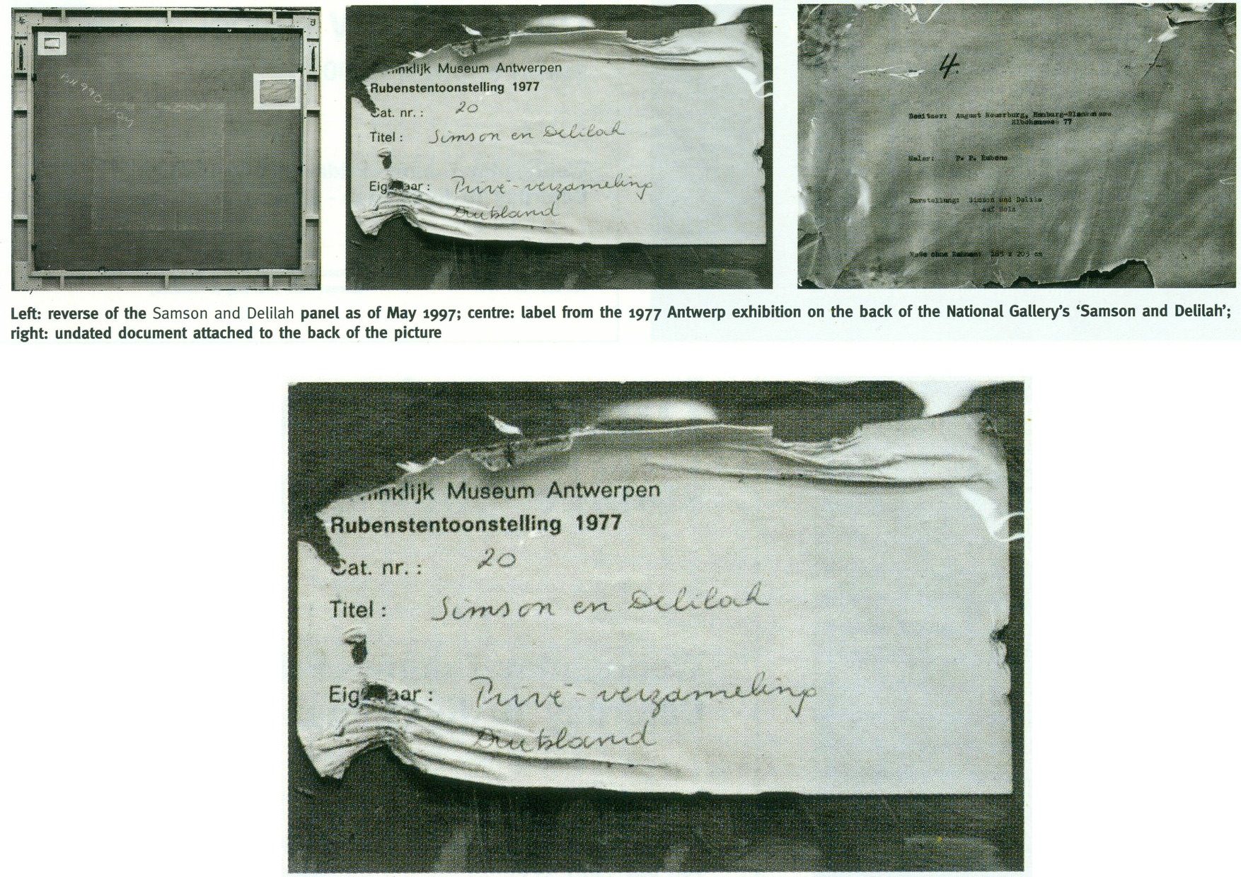
Above, Fig. 7: Illustrations of the back of the Samson Delilah picture as supplied by the National Gallery and as published in the June 2000 Art Review (“The Back is Where It’s At”) where we showed the back of the Samson and Delilah and its attachments, as recorded in 1997. Our detailed technical and art historical case against the Rubens attribution in the Art Review ran, in full, as follows:
“Last month I referred to a National Gallery picture which lacks a back or a record of a back but on the back of which an incomplete provenance depends. This bizarre, paradoxical case arose as follows.
“On 11 July 1980, the National Gallery paid £2.53m (through Agnew’s at a Christie’s auction) for a large picture, Samson and Delilah, that was said to be an ‘entirely autograph’ Rubens, probably in its original frame. The price was a world record for the artist and, at the time, the second highest for any painting bought at auction. The acquisition was presented to the world with great fanfare, orchestrated as much by the gallery as by the auctioneers. In 1982 the picture was cleaned, restored and reframed in preparation for a special ‘Acquisition in Focus’ exhibition to be held the following year. So far, so straightforward.
“In 1983, two accounts of the restoration were published in the National Gallery’s Technical Bulletin by David Bomford, restorer, and Joyce Plesters, head of science. At this point the painting, which hitherto had always been described as a panel, begins to be described in different terms. Namely, as a planed-down sliver of a panel mounted on a modern laminate sheet of blockboard. As Bomford put it, ‘the large panel on which Samson and Delilah is painted must originally have been substantially thicker than it is now. At some point, probably during the present century, the panel was planed down to a thickness of less than 3 mm and subsequently glued on to a sheet of blockboard.’ This seems in strict, factual terms to be correct, but the word ‘probably’ later came to be questionable.
“Plesters’ account was seriously misleading. She claimed that the planed-down panel had been set not onto but ‘into’ (which it had not) the sheet of blockboard, which supposed placement prevented its edges from being examined for tree-ring dating purposes – which it did not. She insisted that this phantom relationship was of no consequence because ‘the date and provenance of the painting are not in doubt.’ Which claim, as will be shown, was not the case. Plesters admitted that the planing, on an unidentified occasion ‘before the picture was acquired by the Gallery’, might well have destroyed, among other evidence, a branded or carved panel-maker’s mark – a far from trivial matter because such a mark might have sunk the attribution to Rubens. The original Samson and Delilah is dated 1609, sometimes 1610; its engraved and painted copies to c. 1613 and 1615 [sic – 1625-35] respectively. Very few panel-makers marks were made before 1617 when they first became a guild requirement; after this date they can help with datings. Michiel Vrient, whose mark is most commonly found on the back of Rubens’ later panels, only qualified in 1615. His mark on the Samson and Delilah would have been fatal.
“Clearly, establishing when, by whom, and for what purpose a planing was carried out – and what records were kept of the original back – would under any circumstance be a matter of urgency and a test of propriety. In this instance it became greatly more so when, in 1997, a number of eye witnesses reported to ArtWatch UK that the picture had retained its original, label-bearing and ‘cradled’ back immediately prior to and during its auction at Christie’s in 1980. When informed of this, Neil MacGregor, the gallery’s director, dismissed the testimony as ‘mistaken’ (letter 7 April 1997). He later said (9 April) ‘the National Gallery does not have any record, photographic or written, of the back of this picture before it was planed down.’
“This year [2000], in compliance with its ‘Code of Openness’, adopted in anticipation of Government legislation on freedom of information, the gallery reversed an eight-year-old decision and allowed me to examine the dossiers held on the picture and its treatments. I have been assured that the dossiers were complete and that no material was withheld. I am forced to report that the records are therefore lamentably incomplete. This is the more disturbing because, contrary to assurances, the picture’s provenance is extremely insecure. It is not to the gallery’s credit that it took six years of assiduous research by three painters – Euphrosyne Doxiadis, Stephen Harvey and Siân Hopkinson – between 1986 and 1992 – for this embarrassing reality to be brought to light. They demonstrated that the picture is not compositionally consistent with contemporaneous engraved and painted copies of the original picture. Their examination drew from Christopher Brown, the curator responsible for the acquisition, the admission that ‘there are gaps at the beginning and the end of the Liechtenstein provenance which makes it impossible to be 100 per cent certain that this is the picture painted for Rockox.’
“The provenance as presented by Christie’s in their sale catalogue was a daisy-chain of speculations pegged on disconnected and not always accurate citations. It was claimed in the first instance that the picture was ‘probably’ the one known to have been painted in 1609-10 for Nicolaas Rockox’s house. It was said to have ‘perhaps’ been in the possession of the painter Jeremias Wildens (albeit only as a ‘Samson’ and not as Samson and Delilah) before 1653. It was further said to have ‘perhaps’ been in the possession of a ‘Guill Potteau’ before 1692. It was then said to have passed into the hands of the Prince of Liechtenstein on 30 May 1700. The second, third and fourth suggestions are all dependent on an event having taken place for which there is no evidence whatsoever: that the original painting left Rockox’s house at his death in 1640.
“As Euphrosyne Doxiadis established (and as Dalya Alberge reported in The Times of 25 November 1996), the records show that Rockox’s collection remained in his house until its sale in 1714 after the death of Rockox’s last descendant in 1712. The house in Antwerp survives and was restored in 1977 as a museum to Rockox. A booklet produced that year by the museum acknowledged with regret that it had been impossible to reassemble the whole of the original collection which had been dispersed by a public auction in 1715. Knowledge of this sequence of events seems rapidly to have slipped from official art historical consciousness
“By coincidence, the National Gallery’s picture (then in a private German collection) was exhibited in Antwerp in 1977 in a large exhibition celebrating the 400th anniversary of Rubens’ birth. In the catalogue Frans Baudoin described it as a ‘panel’. In the same year, in his book Nicolaas Rockox: ‘Friend and Patron’ of Peter Paul Rubens, Baudoin said the panel was ‘excellently preserved’. He also reported that the picture had been ‘rediscovered’ (when owned by a dealer as a Gerit van Honthorst) in 1929 by Ludwig Burchard, on whose advice, the German magnate August Neuerburg bought it in 1930 (along with another Burchard ‘Rubens’, since de-attributed).
“Burchard’s ‘rediscovery’ closed the second gap in the provenance to which Christopher Brown referred. Samson and Delilah is said to have disappeared after being sold by the Liechtenstein collection in 1880. In addition to the ‘gaps’ of 60 and 50 years at either end of the Liechtenstein provenance there are two further problems. First, the Samson and Delilah was described in every Liechtenstein inventory as a copy. Even the dealers who sold it to the collection thought it not to be by Rubens and to be greatly inferior to a work by Van Dyck. Second, every painting in the Liechtenstein collection was marked with a seal on its front or back. The National Gallery’s picture has no seal on the front. If it had one on its back, what happened to it? What possible reason could there be for removing and destroying such an important feature of a picture’s pedigree?
“When pressed on such specifics, the National Gallery summons the fogs of time. Bomford thought the planing might have taken place in the 19th century. His director, MacGregor, suggested that it was ‘possibly done this century, perhaps when the painting was in the hands of the art trade in the 1920s’ (Letter 9 April 1997.) This really will not do. The dossiers contain, I discovered, an undated sheet of typescript by Burchard (which the gallery’s archivist tells me is part of a letter dated 8 April 1930, but which contains a handwritten postscript referring to an article of 1942) which not only describes the picture as being ‘in a remarkably good state of preservation’ but, crucially, testifies that ‘even the back of the panel is still in its original condition.’ Given Burchard’s testimony, and bearing in mind that Christopher Brown made a special study of Burchard’s manuscript notes on the painting (which we have not been allowed to see) prior to the 1983 ‘Acquisition in Focus’ exhibition, how could the gallery have believed that the planing might have taken place before the last [the 20th] century or when the picture was in French hands?
“These questions are the more perplexing because, after Burchard’s testimony, every single reference to the picture describes it as a ‘panel’ in good – or better – condition. A further document in the [National Gallery] dossier that throws light on the picture’s condition also seems to have been overlooked. Christopher Norris, a benefactor of the gallery, sent a letter of congratulations to Michael Levey, the director, the day after the sale at Christie’s. Norris attributed the picture’s still ‘amazing condition’ to the fact that the German owners [between 1930 and 1980] had not touched it. It still retained, he noted, the varnish applied during its stay in France in 1929. The only change that had occurred during Norris’s forty-seven years’ acquaintance with the picture was that the varnish had toned down. (In 1983 Bomford cited the picture’s ‘thick, considerably yellowed varnish’ as the ‘principal reason’ for cleaning.)
“In 1977, Gregory Martin, the author of Christie’s catalogue entry, reviewed the Antwerp Rubens exhibition. He observed with relief that the Samson and Delilah was one of two ‘great works…on panel’ that were ‘none the worse for their journeys’ to Antwerp. (In 1982, the picture was described in the National Gallery’s Technical Bulletin as one of only three well-made and untroublesome panels in the collection.) Three years later the picture again left Germany when it was sent, on offer of sale, to a Belgian museum. On its arrival, a condition report (dated 4 March 1980) was prepared by a leading Rubens expert. He described the picture as a ‘panel…in good shape’ with painting in a condition ‘which can be called excellent’. The panel remained for several months at the museum before being dispatched directly to Christie’s. During its stay at the museum, the picture was seen to be an old, thick, somewhat bowed, label-bearing and cross-battened panel. Brian Sewell (who had discovered the Samson and Delilah modello some years earlier at Christie’s) recalls that the picture, when at Christie’s, was an intact, cross-battened panel with a blackish painted back on which the Christie’s number [as given to every work on arrival] was stencilled in white paint.
“On 27 May 1997, Neil MacGregor sent me photographs of the picture’s back ‘as it is now’. He drew attention to the Christie’s number (chalked and stencilled in black paint) and to ‘two labels attached to the back of the blockboard’ (see illustrations). One, he said, is from the Antwerp exhibition of 1977, the other ‘rather older, from the Neuerburg Collection’. It was, he said, ‘hard to imagine any of these being put on after the picture left Christie’s.’ It is not. Neither document – only one of which appears to be a label – would seem to be glued or pasted to the blockboard. Both appear to be held in place, identically, with cellophane fixed by clean masking tape. Both documents are clearly proud of the surface and are seen to cast shadows on it. The 1977 Antwerp label shows clear signs of having been attacked with a scraper. Why? When? And by whom? After receiving these photographs, I asked to see the back on an occasion when the picture had been removed from its frame. So far, I have not been permitted to do so, and two requests to government ministers for an inquiry have been turned down.”
THE DIFFERENCE A MISPLACED HISTORICAL WORD CAN MAKE IN AN AUCTION CATALOGUE
Today, given the Samson and Delilah’s recent further disqualification on a technical analysis of its brushwork, the National Gallery’s continuing claim of a Rubens authorship runs increased risks.
First: That espousal continues to fly in the face of historical documentary evidence that the picture cannot safely be ascribed to Rubens – evidence that had emerged and was published twenty-five years ago by Dalya Alberge (“Artists raise fresh doubts on gallery’s Rubens masterpiece” 26 September 1996, the Times”):
“ARTISTS challenging the attribution of Rubens’s Samson and Delilah in the National Gallery believe that evidence presented in an auction house’s catalogue was mistaken. The artists also allege that the gallery refuses to acknowledge historical facts that cast doubt on the picture being by the 17th-century master. The National Gallery acquired the painting from Christie’s in 1980 for £2.5 million, equivalent to £6 million today. The auction catalogue referred to a 1653 inventory which described the painting as ‘Eenen Samson van Rubens’, which would mean ‘by Mr Rubens’. But a Flemish genealogist who has studied the inventory said that it read ‘Eenen Samson naer Rubens’: ‘naer’ is translated as ‘made just like Rubens’ or ‘after Mr Rubens’. Another inventory, dated 1692, lists it as ‘copye’ – a copy.
“Euphrosyne Doxiadis, an artist and scholar, and the painters Steven Harvey and Siân Hopkinson believe that the genealogist’s finding backs the stylistic evidence against the picture being by Rubens… It was only as recently as 1929 that the painting was hailed as a long-lost Rubens. For 180 years it was in the collection of the Princes of Liechtenstein and inventories in 1767, 1780 and 1873 attributed it to a minor hand, Jan Van Den Hoecke…”
THE SHIFTING TESTIMONY OF LUDWIG BURCHARD
Second: With this picture never having been thought an autograph Rubens before Burchard’s 1929 upgrade, everything rests on that scholar’s tarnished standing. Aside from the Neger scandal, Pisarek noted in the Spring 2006 ArtWatch UK Journal (No. 21, “The ‘Samson and Delilah’ – a question of attribution”) that over 60 pictures, albeit mainly small works, attributed by Burchard to Rubens had been down-graded in Corpus Rubenianum to studio works, copies or imitations. In a 1950 letter to a fellow art historian, Burchard had said of a painting now in the North Carolina Museum of Art: “The Rubens-like painting was once shown to me. I missed the transparency of the shadows, which one would expect at least in places. The picture seemed to me like a compilation by a contemporary of Rubens.” However, in 1954 he had said of the same painting in a certificate of 28 May addressed to the D. M. Koetser Gallery, London: “the vigour of the design, the brilliance of the vivid colours, the concentration of movement are comparable in several details to the painter’s Defeat of Sennacherib c. 1612…”
THE FIXED TESTIMONY OF PAINTWORK
Third: As mentioned, the 1992 Doxiadis/Harvey/Hopkinson Report had anticipated and thereby now effectively corroborates the Art Recognition findings in its section on Rubens’ painterly technique:
“We have now studied the technical deficiencies in the execution of the National Gallery Painting; we have collected a very comprehensive catalogue of faults which are demonstrated by comparison with works of that period. This can be done when visual material is included…
“It is totally out of character for Rubens to use what the National Gallery calls ‘bold’ handling over the entire surface of a painting. In all his other works, areas of beautiful and infinitely detailed work appear, in addition to areas which have been handled boldly – a woman’s jewellery, for instance, the lace on a ruff, or a flower in the foreground. On the whole, the great downfall of the National Gallery’s picture is the crudeness with which it has been painted. Quite apart from the unsubtle transitions from tone to tone and from colour to colour (look for example on the Venus statue in the background [here, Fig. 4, above], or at Samson’s ear [Fig. 24, below], compared with his own ear in the self portrait of Rubens and Isabella Brant in the Honeysuckle Bower painted in the same year) there are two enormous drips of paint on the surface of the work, which no painter with even the most basic training would have allowed himself to do at that period….
“Looking closely at Samson and Delilah one misses the vibrant, twisting nature of the brushstrokes themselves. The shapeless, unanimated strokes in this painting seem flat and unexciting when compared with Rubens’ usual virtuosity.”
SO, ONCE AGAIN, WHO PLANED THE BACK OFF THE SAMSON AND DELILAH PANEL?
Fourth: The Samson and Delilah picture retains an abiding technical mystery: at what date and by whom was the panel planed down and attached to a modern laminate sheet of blockboard?
It should always be appreciated that no reference had ever been made to a planing and a blockboard backing before the Plesters/Bomford accounts of 1983, and that the National Gallery’s accounts are inconsistent, shifting and full of holes. As seen, some have said the planing may have occurred in the 19th century or early 20th century, others that it took place between 1930 and 1980. The gallery claims to have kept no records of the picture’s state in 1980 when purchased and, even, to have prepared no reports for its trustees when seeking authorisation to make a then massive purchase that would consume most of the gallery’s annual purchases grant. A director, Neil MacGregor, expressly admitted (in a 1997 letter to ArtWatch UK) that “The National Gallery does not have any record, photographic or written, of the back of this picture before it was planed down” – which, as indicated above and as is further shown below, was not the case.
When the senior curator at the time of the 1980 acquisition, Christopher Brown, and his successor, David Jaffé, both held that it was planed down when in the collection of the German magnate, August Neuerberg, between 1930 and 1980, they did so against the testimony of the National Gallery benefactor (who had gifted a Poussin), Christopher Norris. As first mentioned in the 2000 Art Review, Norris testified in a letter to the director in 1980, Michael Levey, that between 1929 and 1980, no change of condition had occurred in the painting, other than a toning down in its 1929 varnish, because the owners had not touched it. Thus, because we know, on Burchard’s (written) testimony held by the National Gallery, that the panel was intact in 1929 when sold to Neuerburg and, on Norris’s (written) testimony, held by the National Gallery, that the owner had never touched the picture, the only parties who might have planed-off the back are Christie’s and the National Gallery. Christie’s, who described and sold the picture as a panel – not as a reduced or marouflaged panel – are hardly likely to have so-transformed someone else’s property – or even to have had the time and means of doing so. On currently available records, the National Gallery, becomes, willy-nilly, the sole candidate, having itself never once described the picture as a planed-down panel before 1983 – and because its own published records testify that the work was an intact panel up to 1982.
REDUCTIO AD ABSURDUM: THE CASE OF A TOTALLY DISAPPEARED NATIONAL GALLERY ALTARPIECE PANEL
Above, Fig. 8: Top, the National Gallery’s 1504 altarpiece The Incredulity of S. Thomas by Cima da Conegliano, as seen before and after an utterly transforming campaign of restoration in which a modern synthetic composite support was substituted for the original giant poplar panel and a new frame was built to replace the gallery’s own 19th century frame; above, a 1978 pen and ink drawing, “The Ages of Woman”, by the author.
As can be seen above, top, the cleaning and subsequent retouching of the picture surface left a tonally and perspectivally altered appearance: what had been dark and tonally relieving (the back wall) became lighter; what had been contrasted became equalised (the wall and ceiling); what had been dramatically central and axially assertive (the “spotlighted” figure of Christ) became quietened and subsumed within a group. The reduced ornamentation on the new frame left two architecturally assertive raised circles that now vie for attention with the picture’s own depicted half-round windows – which features, the lightening of the wall has brought closer to the picture plane and, therefore, closer also to the new more abstractly assertive frame. The net effect of the physical and pictorial transformations this altarpiece underwent was to leave a painted image surface that is now as flat, de-natured and ahistorical as a giclée print. Above, to a draughtsman (who necessarily commences work on a sheet of – initially – “no-values” to a gradually built-up and considered disposition of “values”, the alterations that are routinely made by restorers during “cleanings” and “restorations” to other artists’ works are as un-missable as they are perplexing and artistically impoverishing.
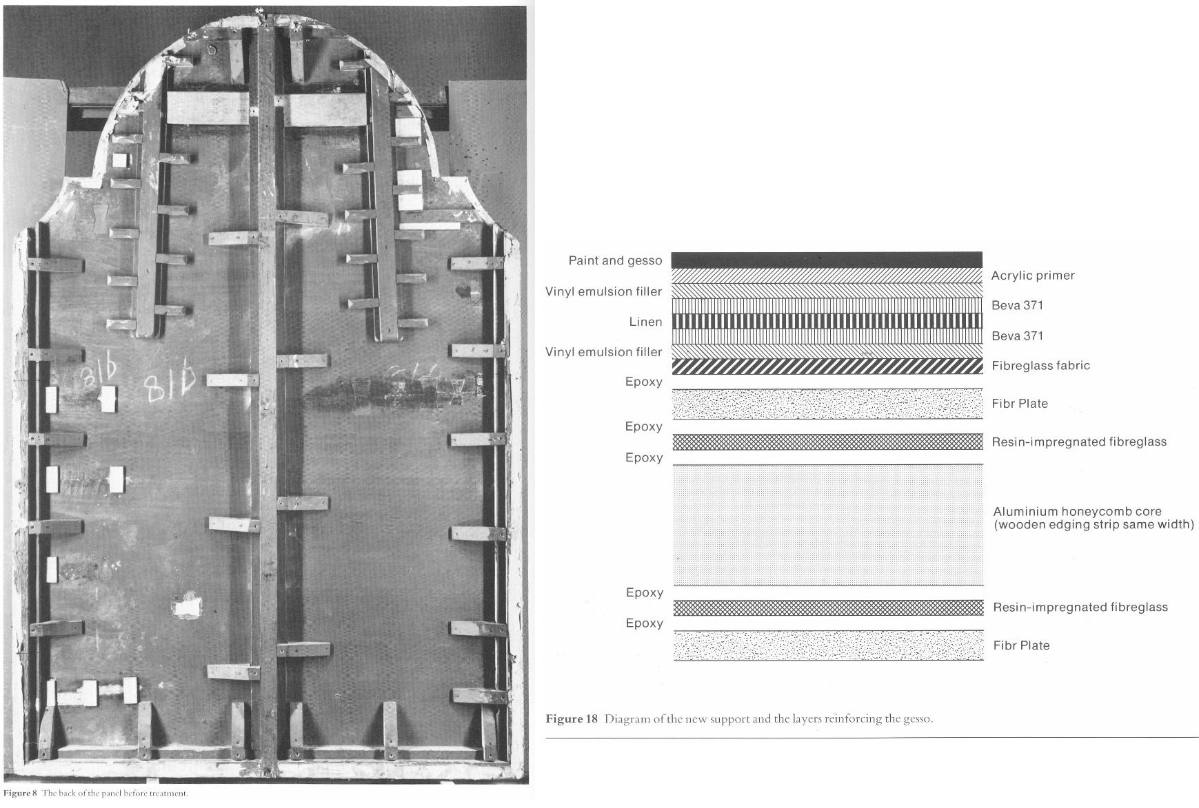
Above, Fig. 9: Left, the back of the altarpiece panel which was totally removed (i. e. destroyed) and replaced by a multi-layered fibreglass and aluminium board – the long-term stability of which is unknown – during restoration. Right, the diagram of the new, entirely synthetic glass fibre and aluminium support in cross-section, as published in the gallery’s 1985 Technical Bulletin.

Above, Fig. 10: The Cima altarpiece, as published in the 1986 Technical Bulletin with the caption: “The picture after cleaning and transfer, before restoration.”
A MASTERFUL JOB
When Waldemar Januszczak was in art critically doubting mode on the Samson and Delilah’s attribution in October 1997, he addressed the persisting Whodunnit Mystery of the Disappeared Back:
“I put this to the gallery’s chief conservator, Martin Wyld, who quips cheerfully that he was rather proud of having been accused; planing a 17th-century oak panel to wafer thinness and attaching it perfectly to blockboard while leaving its surface in pristine condition, is an exceptional feat of restoration. Nobody would or should do it today. Whoever did it earlier did a masterful job. Why did they do it at all? If a painting is in exceptionally good condition, why was there any need to hazard the transfer to blockboard? A question neither the chief conservator nor MacGregor can answer. All I got them from both is the National Gallery version of: it wasn’t us, guv.”
If stunned by Januszczak’s question, Wyld and MacGregor can hardly have been caught unawares. In a then recent letter in the Daily Telegraph (“Doubts about gallery’s Rubens”, 16 August 1997) we had written on that very question:
“…More disturbingly, crucial technical and documentary evidence concerning the picture’s weak provenance was destroyed when the back of its oak panel was planed away in a mysterious intervention for which no one accepts responsibility and during which no records were kept. The National Gallery claims the planing took place before the picture was bought at Christie’s for a record £2.5 million in 1980. If this was so, two questions arise. Why did the gallery’s trustees authorise the acquisition of a picture with no back (the planed-down remains having been glued on to a sheet of blockboard) and with no documented history of a back? And why did the gallery not ask the vendors, who had owned the painting for 50 years, for an account of the planing and a record of the pre-planed back?… Answers to all these questions lie in the reports that were prepared by the gallery staff for the trustees prior to the 1980 purchase and prior to the gallery’s 1982 cleaning and restoration of the picture. The gallery has not responded to requests that these reports be made available for inspection. Nor is it prepared to produce photographs of the picture’s back, as taken by Christie’s staff before the sale, or by gallery staff before the restoration.”
Unable to answer those questions, the head restorer had clearly been ‘avin a larf when he suggested to the Sunday Times’ art critic that planing a panel down to 3 mm and gluing it onto a sheet of block board was an exceptional feat far beyond anyone’s capacities at the National Gallery. Back then in 1997, a reading of recent National Gallery Technical Bulletins would soon have disclosed the gallery’s great pride in its radical substitutions of modern synthetic composite backings for old pictures’ historic (wood or canvas) supports. We had complained in the 1993 and 1996 James Beck and Michael Daley book Art Restoration: The Culture; the Business and the Scandal of the gallery’s use of the compressed paper “Sundeala” boards on to which Titian’s Bacchus and Ariadne, Seurat’s The Bathers and Sebastiano’s The Raising of Lazarus had been affixed.
The spectacularly gung-ho treatment of the latter picture – the largest in the Gallery’s collection – epitomised the artistic presumption and techno-adventurism of the gallery’s restorers. The deleterious consequences of that intervention began to be conceded by the gallery’s restorers in its 2009 Technical Bulletin:
“…eventually it was decided to brush on multiple thin layers of warm wax-resin dissolved in white spirit, embedding a layer of inert terylene net fabric [-“Terylene is a specific form of polyester, more specifically polyethylene terephthalate. It is created via the extraction and mixing of ethylene glycol and terephthalic acid. When turned into a fiber with dyes and other treatments, it becomes a great synthetic with a lot of potential in different sectors” ] within the layers as they solidified. Although the discoloured varnishes had yet to be removed from the paint surface, the appearance of the picture was considered to be darker than intended as a result of lack of reflectance from the ground and so titanium white (titanium dioxide) was added to the wax cement…Once the wax and titanium white layers had been built up to a sufficient thickness the painting could then be mounted on a solid new support. This had previously been coated with wax-resin allowing a bond to be achieved by ironing with a thermostatically controlled iron to soften the wax-resin layers which then fused as they cooled. Although it is unlikely that these methods and materials would be used nowadays, the treatment can be judged a success in that there has been no further flaking of the paint layers. Unfortunately, the work took place before the introduction of lightweight and stable panels made from glass fibre with aluminium honeycomb cores. The painting is mounted, therefore, on a support constructed with a ‘sundeala’ composite board outer faces and a core of paper honeycomb. In spite of its wooden edges and an internal wooden framework this panel is now showing signs of instability, with a tendency to flex and twist when the painting is moved, an operation which is therefore avoided as far as possible.” Emphasis added.

Above, Fig. 11: Staff in the National Gallery’s restoration studio at work on the remains of Cima da Conegliano’s altarpiece, The Incredulity of S. Thomas, after the complete removal of its giant poplar panel and before its transfer onto a multi-layered synthetic support – as shown in the NG’s 1985 Technical Bulletin.
A reading of the 1985 and 1986 Technical Bulletins would have disclosed how gallery restorers had chiselled away the entire wood panel of seven giant planks just under two metres long of Cima’s altarpiece The Incredulity of St Thomas (Figs. 8-10). In the first stage, the panel was reduced “from c. 5 cm to 1 cm.” In the second, the remaining 1 cm of wood was chiselled away entirely until the back of the original gesso coatings was exposed. In the 1985 Technical Bulletin, Martin Wyld described the means and the tools of that perilous operation:
“The removal of the wood then commenced. The techniques used were entirely manual. Though mechanical routers and planes are often used with success in transfer, there is a danger of a power tool, however carefully handled, snagging on knots in the wood or on the bent nails which are mysteriously but commonly found in old panels, and ripping up far more wood than is intended. Semi-circular 15 mm gouges were pushed along the grain, cutting channels 6-7 mm deep, and the ridges left between the channels were then cut down. Each plank was reduced by a similar amount, and the process repeated until the panel had been reduced from c 5 cm to 1 cm in thickness. Many nails were found embedded in the panel and several knots were also cut out.
“The removal of the first layers of wood is usually the easiest part of a transfer [of a paint film to a new support]. The removal of the final layer of wood was complicated by several factors. Many different blister-laying adhesives had been used on the Cima, often in very large quantities. Fig. 6 shows a detail of the Apostles’ heads on the right; the lines of white dots are holes of a syringe in order to inject animal glue under the gesso. Much of this glue, which must have been considerably diluted with water in order to be used in a syringe, had run into the worm channels and soaked into the wood, making the panel surface more brittle…Areas where wax had been used for blister-laying presented less difficulty.
“Experience during earlier transfers had shown that the safest method of removing the last layer of wood was to cut a very shallow slope at a slight angle to the direction of the grain and to shave away the tapered edge of the wood with a small fish-tail chisel. The method proved to be impractical on the Cima. The parts of the panel affected by thick animal glue (of the consistency of carpenter’s glue) or putty filling the worm channels, by knots and by later or original inserts of wood obviously needed individual treatment. However, the remainder of the wood was so insecurely attached to the gesso that it was impossible to cut a shallow slope because strips broke away along the grain no matter how carefully the chisel was used. Strips of wood 10-12 cm long and 3-4 cm wide would become completely detached, but usually with a few small fragments of paint and gesso stuck to them. These fragments were laboriously cut off the wood and replaced… It was found that the safest method of removing the last layer of wood in the very loose areas was to cut it away at an angle of 30 ? to the gesso, instead of across at the very shallow angle normally used, and to cut across rather than along the grain…”
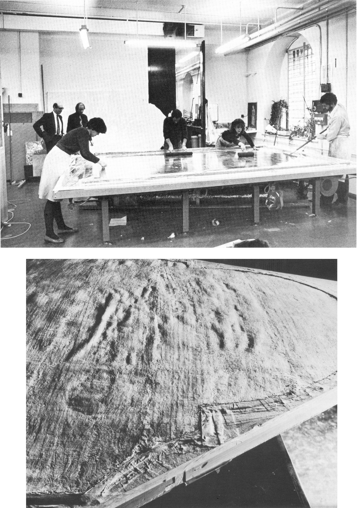
Above, Fig. 12: Top, the director, Michael Levey, and the head restorer, Martin Wyld (top left), watching four restorers in the National Gallery’s basement restoration studios attaching the pictorial remains of Cima da Conegliano’s altarpiece, The Incredulity of S. Thomas, to a linen interleaf on the hot-table after the complete removal of its giant poplar panel and before its transfer onto a multi-layered synthetic support – as shown in the NG’s 1985 Technical Bulletin. Above, the exposed and buckled gesso months after the Cima panel had been chiselled away entirely and the air-conditioning system had malfunctioned.
AN OVERNIGHT MALFUNCTION
Note Wyld’s own account of the “conservation treatment” of the Cima altarpiece:
“Fig. 13 [here, “Fig. 12, above”] shows the arched top of the picture, where the removal of the final layer of wood had started. The panel and gesso had been carefully covered with Melinex and heavy rubber mats all through the transfer, but the gesso had absorbed some moisture from the atmosphere and swollen slightly. An air-conditioning malfunction, which produced RH of 100% for several hours one night, led to pronounced swelling and buckling of the gesso [and the paint layers attached to it] which can be seen in this photograph taken months later.”
Wyld further reported:
“Fig. 13 shows the severe buckling of the top of the picture due to the gesso having absorbed moisture from the atmosphere. Less pronounced buckling had affected some of the lower half of the picture as well. The facing layers had moved with the gesso, and were still secure. The picture was detached from the temporary support and slid face-down onto the Melinex covered hot-table, sealed with a membrane and heated to 40 ? C at a pressure of 15 mbar (1.5 kPa) for an hour. The buckling slowly reduced until the picture was almost flat and relaxed, and the same low pressure, which prevented any alteration of the surface texture, was maintained while the hot-table cooled.”
ALAS, POOR HOLBEIN
The apogee of the white heat of technically transforming restorations was eventually reached in Wyld’s luxuriously long, Esso-sponsored, BBC-televised 1993-96 swank-restoration of Holbein’s The Ambassadors. There, the gallery’s head of restoration produced the world’s first painted insinuation of “virtual reality” into an old master painting by reconstructing the picture’s famous (but damaged) anamorphic skull not according to the laws of perspective by which it had been constructed but from a gallery-generated computer manipulation of a photograph of a medical model of a skull. That operation was defended by the then director, Neil MacGregor on the grounds that “We believe it is our duty to try to present to the public, as much as we can, what the artist intended them to see.” Wyld went further, re-painting a section of the rug to a new design on the authority of a rug expert and painting false and camouflaging “age cracks” onto his own new painting.
And yet, notwithstanding Wyld’s publicly paraded technical expertise, he would have had Waldemar Januszczak believe that the National Gallery’s restorers lacked the wherewithal to reduce a panel to a thickness of c 3 mm and glue it onto a sheet of blockboard.
In the absence of any prior record of a planing, the National Gallery’s last resort defence against suspicions of having carried out the operation has rested on what might seem to be a confession of exceptional negligence – rather as if saying: “With this picture, which we considered a pre-eminent masterpiece within Rubens’ oeuvre and for which we had paid a fortune, we failed to follow our customary procedures and safeguards. We made no records; we took no photographs, neither when we bought it for a world record Rubens price nor earlier, ahead of the sale at Christie’s, when we had borrowed it and were seeking our trustees’ permission to buy it”.
AN OPEN GOAL?
Januszczak might have pressed his point harder. On the absence of records, we had recently reported (“Is this really a Rubens?” The Art Review, July/August 1997) that:
“In the 1980/81 Annual Report the then director, Michael Levey, thanked Christie’s for ‘allowing the trustees to see this painting in the gallery before the sale.’ A trustee at the time has disclosed that in all such purchases curators present a case for the purchase to the trustees who then examine the work ‘in the flesh’. A former Keeper and Deputy Director, Allan Braham, has disclosed that reports on the desirability and condition are prepared by curatorial and conservation staffs for the director before any major purchase…”
A TALE OF TWO OLD PANELS BOUGHT BY THE NATIONAL GALLERY IN 1980
The Gallery’s seeming failure to record and investigate this single work is the more perplexing because the director, Michael Levey, had truly nailed his professional and managerial colours to the painting. He had announced in 1979 that, having reassessed the National Gallery’s holdings of Rubens, he had concluded that it lacked a monumental figurative composition and that he intended to pass this information on to the Trustees at their next Meeting with a recommendation that they should look to acquiring one at the first opportunity. He did not have long to wait for the emergence at Christie’s of the Burchard Samson and Delilah – which might have seemed like a prayer answered. Notwithstanding the eventual very high cost, Levey’s enthusiasm for the picture seemed unbounded. In his foreword to the 1983 “Acquisition in Focus” exhibition, he wrote:
“When on Friday 11th July 1980 the National Gallery acquired at auction in London a Rubens painting of Samson and Delilah – at a cost of over two million pounds – some people might have asked why the nation needed another Rubens. In the Collection at Trafalgar Square there were already twenty paintings by the artist.
“This exhibition, the second in our ‘Acquisition in Focus’ series, will serve as a striking demonstration, I believe, that the painting was indeed needed and will confirm that a crude numbers game in matters of great painters and great paintings is no less obtuse than asking how a piece of canvas [?] can ‘be worth’ so many million pounds. An odd aspect of such questions is that they are rarely directed to areas of national expenditure outside the arts.
“Rubens’ Samson and Delilah is a large scale, early and entirely autograph painting of a kind the National Gallery previously lacked. Its splendid colour and vigorous handling of paint can all the better be appreciated now that it appears cleaned in this exhibition…”
ATTRIBUTIONAL TURBULENCE
If a whiff of defensiveness about the cost of the acquisition might be sensed, it would be understandable: a ferocious dispute was running in the early 1980s between Rubens scholars over the famous paper cartoons-for-tapestries that had been bought for the National Museum Cardiff as by Rubens – and Levey was in the thick of it, having sided with Julius Held who had dissed his arch rival Michael Jaffé’s attribution of the cartoons to Rubens. This would have been the very worst of times for another museum to have been thought to have acquired a dud “Rubens” – and, indeed, for Levey to have been its principal begetter.
In that context, it must be said that the self-declared failure to keep customary (if not statutory) records on the Samson and Delilah stands in bewilderingly sharp contrast with the abundance of prior investigations and records kept and published on another old panel picture bought by the gallery in 1980, (for an undisclosed sum made with contributions from The Art Fund, The Pilgrim Trust and the National Heritage Memorial Fund) – namely, Altdorfer’s Christ taking Leave of His Mother. That purchase was also discussed in the 1983 Technical Bulletin. In Wyld’s report on the treatment of that picture, the first note is headed “The condition on acquisition”. It begins:
“Altdorfer’s Christ taking Leave of his Mother (No. 6463) was examined by the National Gallery Conservation Department before its acquisition in October 1980. As is customary, X-radiographs and infra-red photographs were taken and the picture was studied with infra-red vidicon system and under ultra-violet light…” By those and other examinations it was established ahead of the purchase that the panel was composed of six planks joined vertically and that these had been planed-down to about 6 – 8 mm and cradled. In a section on the subsequent treatment of the panel, Wyld notes of one photograph, “Fig. 5 shows the back of the panel as it was on acquisition…” (Emphasis added.) No such photograph has ever been produced of the Samson and Delilah.
LOOP OF SILENCE
When, on 6 April 2002 (letter), we asked the National Gallery’s then director, Neil MacGregor, whether Dr. Brown had been aware in 1982 of Burchard’s 1930 testimony on the condition of the Samson and Delilah, he replied (letter, 9 April 2002): “As I am sure you know, Christopher Brown left the National Gallery some years ago…I suggest you pursue the matter with him.” When Brown was asked (December 2005) by the US magazine, Salon to comment on his past involvement in the controversy surrounding Samson and Delilah, he replied: “I am sorry but I don’t want to do this. Please address your questions to the National Gallery.” And so, a great silence fell.
On re-visiting the Technical Bulletins today, the mystery of the disappeared picture back deepens. Not only had no one ever spoken of a planing and mounting on blockboard before the picture was acquired in 1980 but no one at the gallery had done so in the two years before the 1983 Plesters/Bomford report. Quite to the contrary, in the 1982 Technical Bulletin, Christopher Brown, Martin Wyld and the gallery’s (now deceased) timber specialist, Anthony Reeve (who was described by Mr MacGregor as the “supreme practitioner of his generation”), wrote on the cleaning and restoration of Rubens’ The Watering Place. In discussing the highly problematic construction of many Rubens’ panels, Reeve wrote:
“Of all the pictures in the National Gallery, Rubens’ panels have been of greater concern, because of their condition, than any other part of the collection. The reason for this is well-known. Rubens frequently found it necessary to enlarge his pictures after he had started painting…Rubens’ oak panels, often enlarged in several different stages, are amongst the most inherently unstable supports used by any artist.”
However, Reeve drew a distinction between “the oak supports which, although made up of many planks joined together, were not enlarged during the painting process, and those which were added to.” On that former, unproblematic, type, Reeve cited just three examples:
“The Rape of the Sabine Women (No. 38) (1.699 x 2.362 m), The Judgement of Paris (No. 6379) (1.339 x 1.1.74 m); Samson and Delilah (No 6461) (1.85 x 2.05 m), the panels of which are made up of six, five and seven oak planks respectively. The grain of every plank, and hence the joins, are horizontal and all the planks are roughly the same width.”
In consequence, Reeve continued, although “these large panels are sensitive to changes in relative humidity (RH), they provide a sound and permanent support if kept in a controlled environment and not exposed to sudden changes in RH.” Conspicuously, he made no mention of the Samson and Delilah as being then a radically reduced panel that had been glued onto a larger blockboard support (Doxiadis reported seeing something like a four inches wide surround of pinkish blockboard when the picture was out of its frame and flat on its back). Of those three fortunate panels Reeve wrote:
“Wood expands and contracts across rather than along its grain. The effect of wood shrinkage of the exposed back [emphasis added] when all the planks are parallel is for the front to become convex, and perhaps slightly corrugated. This shrinkage may cause the joins between the planks to open, or splits to form at the end grain, but treatment and stabilisation are usually straightforward.”
In other words, although all three pictures had been well and favourably constructed, all three were at potential risk of injury through their exposed backs in the event of atmospheric fluctuations – not to mention air-conditioning malfunctions. That was said in 1982. Had the Samson and Delilah already been planed-down to 3 mm and glued or cemented to a larger blockboard panel at that date, a timber craftsman so expert and informed as Reeve could not have bracketed the three panels as being at equal risk of atmospheric changes through their exposed backs.
The planed-down and mounted-on-panel Samson and Delilah artefact described by Plesters and Bomford in 1983 was no longer exposed to fluctuations of humidity: its front was protected by priming, painting and varnish; its back was sealed by its fixture to the blockboard; even its slender 3 mm edges were sealed and protected by putty. Indeed, as Bomford put it in 1983: “Although the nature of this treatment would not find favour today, Samson and Delilah, fortunately, had been treated skilfully. The joins and splits are still secure, the panel is firmly attached to blockboard in all areas and the overall warp (which one might expect to be considerable in a picture of this size) is minimal”. Bomford noted, “no further support treatment is necessary.”
How to account for the two restorers’ discrepancies of accounts between 1982 and 1983? Mr MacGregor once suggested that Burchard might have mistaken a planed-down panel laid on blockboard for an original and intact early 17th century oak panel, but after three decades of removing cradles and reducing panels, Reeve was even less likely to have mistaken a modern blockboard for a 17th century oak panel. He knew the differences well and had noted in the 1981 Technical Bulletin that:
“A very large number of the fifteenth and early sixteenth century Italian panels made of poplar have been planed-down and cradled before they came to the National Gallery collection. This form of panel treatment seems to have been very common in England in the 19th century. The problems caused by the planing-down and cradling vary from panel to panel, but it leaves almost all the panels vulnerable in that they are liable to splitting. Thirty years of experience removing cradles, rejoining splits in the panels and securing them by the method described above has shown that, providing the pictures are then kept in a reasonably well-controlled environment, the panels will remain stable.”
If Burchard truly had mistaken a planed-down panel on blockboard for an original early 17th century, it was a mistake made by everyone else who ever encountered the panel up until the moment it was restored at the National Gallery. Proceeding on the testimony of all the available records, the question might now sensibly be narrowed: who, between 1982 and 1983, planed down the panel and mounted it on blockboard – and who authorised the action?
THE MUTE, ELOQUENT TESTIMONY OF PHOTOGRAPHED BRUSHWORK
While past and present National Gallery players have yet to comment on the Art Recognition findings, eloquent witnesses remain in the Samson and Delilah’s own brushstrokes. Grosvenor’s snap dismissal that computers do not and cannot understand art mis-states the issue: computer programmes do not have to possess all human capacities and levels of understanding to perform otherwise immensely laborious but valuable visual tasks with unerring reliability. To give a commonplace example: for graphic artists who work on A3 or larger sheets, it is prohibitively expensive and space consuming to acquire scanners of corresponding size and capacity; in practice, it not necessary to have such equipment because there are now many computer programmes capable of seamlessly “stitching” overlapping part-scans of large images – as was done with this author’s drawing below at Fig. 13.

Above, Fig. 13: The author’s drawing of Donald Trump’s Relationship with the Republican Party, as published in The Conservative, September 2017.
The earlier revolution of photographic reproduction facilitated all manner of handmade graphic inventions by collage and montage but absolutely seamless conjoining was not possible – the sharpest scalpel cutting through paper cannot do other than leave a trace of its actions. It has taken digitalised computer power to accomplish seamless and effortless manipulations of images and, even, with the advent of AI, of videos. Just as it is not necessary to understand the programming means by which part-images can be invisibly joined, so it is not necessary to envisage the mechanisms whereby a programme might successfully identify distinguishing traits within individual artists’ brushstrokes. Pace Grosvenor, such a programme cannot be deemed theoretically inconceivable for the simple reason that we can already see for ourselves precisely such autographically distinguishing characteristics in paintings – were they not already present and discernible, how would any connoisseur identify any work’s author by eye?
THE NEGLECT OF PHOTOGRAPHIC AIDS TO CONNOISSEURSHIP
Far from being an incredible prospect, the study and evaluation of distinctive brushwork through magnified photographic examination has been around as a diagnostic aid for nearly a century. Despite their proven and demonstrable usefulness, the studies in question and their potential applications have been greatly and perhaps wilfully neglected in subsequent art world practices which have favoured the technical analysis of art’s material components rather than the patterns of artistry which are realised through them.

Above, Fig. 14: An image reproduced in our Journal No. 21 with the following caption:
“This illustration is a photomicrograph of the highlight on the shoulder of [Rembrandt’s] Woman Bathing, National Gallery, No. 54. The patch is pasted on from a photomicrograph of a picture whose attribution had to be tested. It will be seen that the brushwork is identical in both cases. It is possible for a skilful forger to imitate a signature, but it is quite impossible to combine the quality of the paint, the nature of the brush, and the handling of the paint by the painter, so as to reproduce this complete identity.”
So said A. P. Laurie, Professor of Chemistry to the Royal Academy of Arts, in his 1949 book The Techniques of the Great Painters. Would anyone, looking at the above photographic splicing of two brushstrokes from two paintings doubt that both brushstrokes were products of the same author? Professor Laurie was also the author of the invaluable pioneering The Brushwork of Rembrandt and his School (1932), New Light on Old Masters (1935), and, The Painter’s Methods and Materials (1960). Fascinated by scientific means of examining art, Laurie was firm in his conviction that we cannot separate the history of style from the history of artistic technique. Unfortunately, the lesson of Laurie’s penetrating and helpfully clarifying studies were displaced by more clamorous and institutionally self-serving appliances of science – and photography – and in Britain the principal villain had been an earlier director of the National Gallery.
THE PURPORTED SCIENCE OF THE NATIONAL GALLERY
As a very young (and Lord Duveen-engineered) director of the National Gallery, Kenneth Clark, whose picture cleanings produced fury among artists, set up a scientific department so as, as he put it in his 1977 autobiography, to “have in the background what purported to be scientific evidence to ‘prove’ that every precaution had been taken [by the gallery’s restorers and curators].” In pronounced contrast, Laurie’s impeccably disinterested and transparent method was conducted in good faith.
First, he explained, by magnifying details of paintings: “…we isolate the drawing with the brush: we magnify the individual strokes, and, owing to the dark varnish lying in the hollows of the paint, reveal every stroke of the brush with the utmost definiteness.” Second, “If we now proceed to take silver prints of the magnified photographs of two pictures, one known and the other unknown, and cutting up the one, put a portion of the other print so adjusted that the strokes of the brush follow on, we have an infallible method of identification.”
Thus, Laurie appreciated, the marks of brushes left in paint can be as “forensically” helpful as the rifling marks on a bullet. Unlike Plesters, Laurie combined technical ingenuity with artistic perspicacity. On his schema, great precision of identifications of authorship might indeed be attained by almost anyone – and therein may lie the rub and an explanation of institutional resistance and exclusion: his method demystified the mumbo-jumbo of pseudo-scientific museum world “conservation”.
On the certainly pertinent and potential tripwire question “Can we be sure that artists brushstrokes do not evolve to the point of transformation?” Laurie answered in the affirmative: “As in writing, once a painter has formed his style of brushwork, it is curiously persistent. His pictures may alter with the years: they may develop a greater depth of meaning and a richer quality, as we find with Rembrandt, but the brushwork remains the same.” Laurie, who claimed nothing that he was unable to demonstrate for all to see, continued: “Now take a jump from 1633 to about 1660 and examine through a lens the impasto of the portrait of himself (No. 221 in the National Gallery). You will recognise the same impasto, though with a more stiffly ground paint. Or again, the lens will reveal same impasto as in the portrait of Titus in the Wallace Collection. [See Fig. 15 below] A study of these three painters, Velazquez, Rembrandt and Frans Hals will soon convince the reader of the truth of what has been said above. If then we can emphasise this characteristic, we have a powerful weapon to assist in the attribution of painters.”
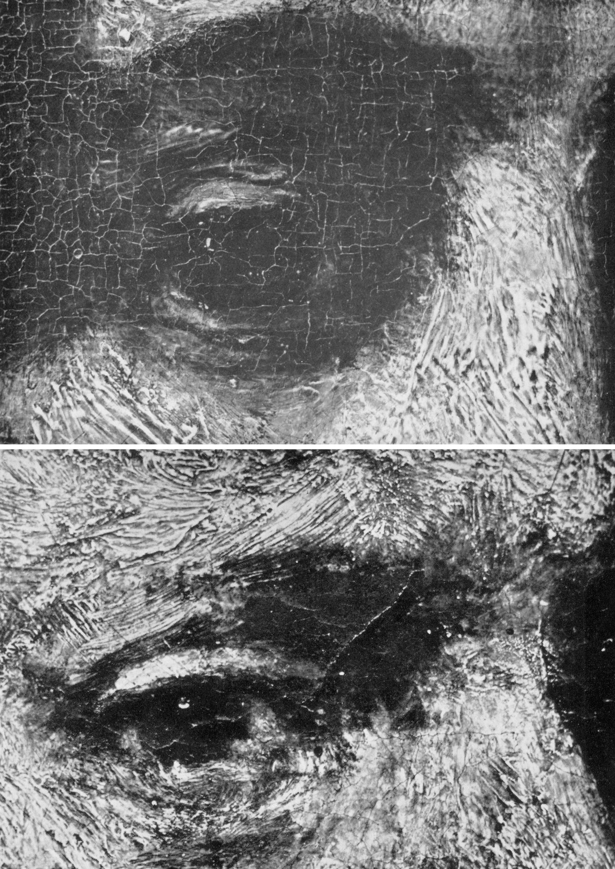
Above, Fig. 15: Top, in this juxtaposition of the eye in the Wallace Collection portrait of Titus, (the condition of which Laurie described as above in his ground-breaking 1932 study of Rembrandt’s brushwork) and, above, the eye in the National Gallery self-portrait (of which picture’s condition Laurie noted “This, except for the coarse repairs in the corner of the eye and on the upper lip, is in excellent condition and is the best example of his latest manner I have seen which has not been injured by the restorer”), it can be seen that Rembrandt’s brushwork could swish without change through time.
The test of Laurie was truly in the looking: he published comparative details of artists brushwork in which authorial differences were manifest and indisputable – see Figs. 16-19 below. He squarely addressed all potential practical/theoretical/methodological difficulties: “In order to apply this method in a thorough way it is necessary to study a painter through his whole career, and also to study the work of his pupils and imitators, so as to prepare a complete dossier for reference. I have been able to make some approach to doing this for Rembrandt and his school, for which thanks are due to the Duke of Westminster, and the results of the inquiry have been published as The Brushwork of Rembrandt and his School.” As is perfectly demonstrated at the photo-comparison at Fig. 15 above, the signature brushwork patterns of Rembrandt do indeed straddle his early and late works with complete consistency and a seeming interchangeability.

Above, Fig. 16: Laurie’s photomicrograph of the moustache in the Frans Hals portrait of Verdonck (National Gallery of Scotland).
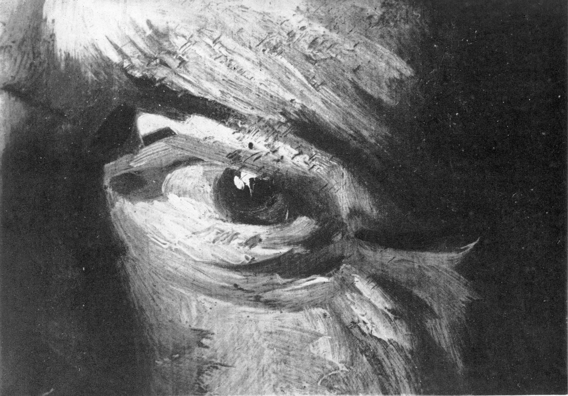
Above, Fig. 17: Laurie’s photomicrograph of the eye in the Frans Hals portrait of Verdonck (National Gallery of Scotland).
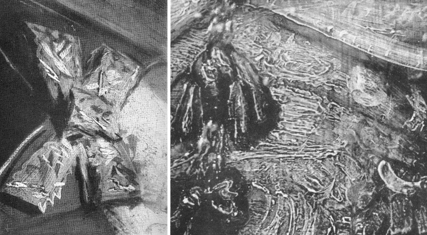
Above, Fig. 18: Left, a photomicrograph of a bow in the Frans Hals Portrait of a Lady (National Gallery of Scotland); right, a detail of the tassel on the shoulder of Rembrandt’s Saskia Laughing, Dresden Gallery. On such a photo-comparison, a child of six would be unlikely to confound the one author with the other.
If perceived in some quarters to constitute a professional threat to vested interests, Laurie acknowledged a personal indebtedness to the London art trade, reporting that his own interests had been aroused by the late Mr Vicars of Bond Street:
“We were all engaged in the famous Romney trial and he took me to see a perfect gallery of the English portrait school belonging to a well-known London banker. ‘We dealers’, he told me, ‘go by brushwork, that is the artist’s true signature which nobody can forge.’ Going up to a Reynolds he said, ‘Do you see how Reynolds has put in that touch there?’ ‘Now come here and see how Romney does it; this is Gainsborough’s touch.’ After we had studied the English portrait school from this point of view, I said to him, ‘I have learnt more from you than from all the art connoisseurs’. He turned to me and said, ‘My boy, we’ve got to know, we risk our money on it!’”
DEFENDING MUSEUM FAKES II
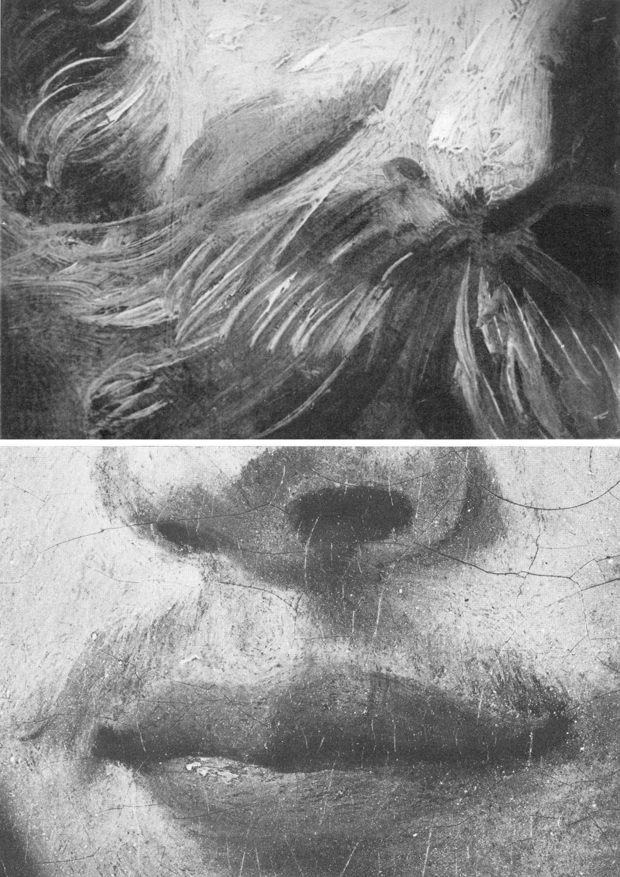
Above, Fig. 19: Top, Laurie’s detail of the Hals moustache; above, a section of a half-page detail of the National Gallery’s du Jardin Portrait of a Young Man, as published in the Technical Bulletin of 1982.
The caption to the Technical Bulletin photograph reads:
“Detail after cleaning, before restoration. The unusually large pigment particles, including those from the lower layer of the ground, can be seen. The paint film is slightly worn so that small areas of grey priming have been exposed, especially to the right of the mouth.”
Thus, as can be seen with this detail of du Jardin’s Portrait of a Young Man, the National Gallery certainly had the means in 1982 to provide Laurie-style detailed photo-comparisons that might have shown, for example, the consequences of its cleaning methods (see Fig. 8 above), or the stylistic correspondences or otherwise between works attributed to a given author. The Gallery had accepted Laurie’s comparative photo-demonstration (as at Fig. 14) that a challenged work was an autograph Rembrandt, but it has commissioned no detailed photo-comparisons of the Samson and Delilah brushwork with that of its own uncontested Rubens pictures (see Fig. 22). Instead of better studying the creative handiwork of artists, the gallery has photographed a million microscopically minute samples of paint ground down so as to reveal paint in stratigraphic cross-sections. In the 1993, 1996 Art Restoration, we complained that the National Gallery’s restorers and scientists were more interested to learn of the chemical constituents of paint than to understand the artistic uses to which artists put their paint, viz:
“…the green earth pigment consisted of ‘glauconite and celadonite [which] have closely similar constitutions, although their primary origins differ: the former is present in certain marine sedimentary deposits, while the latter occurs as inclusions in igneous rocks such as basalt. They are difficult to distinguish by XRD. Both types are layered silicate materials containing FE(II) and FE(III); also characteristic is a content of aluminium, silicon, potassium and sometimes magnesium…” Does this have a point, we asked, or is it swank? Was Rubens handicapped when painting in ignorance of such chemical constituencies?
Laurie encountered hostility from institutions wishing to defend their attributions. He warned: “I suggest a voyage of discovery to some young student with a magnifying camera through the galleries of Europe, but he must be careful to conceal his real object or he will never return alive. I have never forgotten the rage of the Director of a famous continental gallery when he thought I was suggesting that one of his pictures was not by Rembrandt. ‘Nonsense, nonsense’ he shouted, ‘one of the finest Rembrandts in the world’. I hurried to explain that I was referring to a Rembrandt in another Gallery, he smiled sweetly and said, ‘You are probably quite right’.”
TIMES CHANGE
In conclusion, and in Laurie’s inquiring spirit, we consider some close photographic comparisons of the National Gallery’s version of the 1609-10 Samson and Delilah with a bona fide Rubens painting which has retained its back – Rubens’ The Raising of the Cross of 1609-11, Antwerp Cathedral. As with that comparison at Fig. 4, above, the successive comparative details from Fig. 20 to Fig. 25 below are of two works of the same supposed historical moment and stage of development within the oeuvre. Great differences of brushwork might hardly, therefore, be expected. Matches are not to be found.
“SMOOTHLY BRUSHED, THINLY APPLIED”
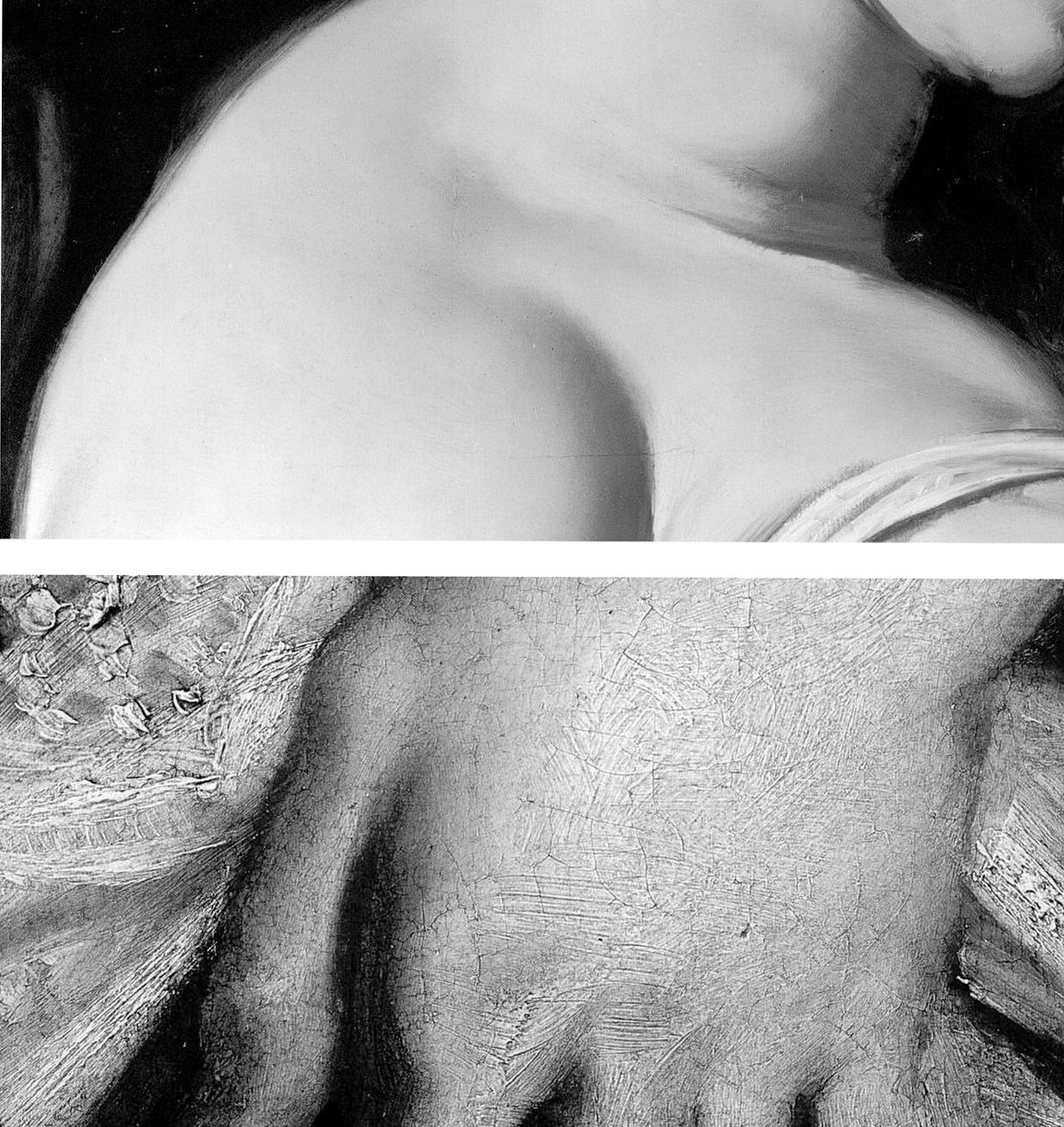
Above, Fig. 20: Top, a section of Delilah’s flesh; above; a detail from Rubens’ The Raising of the Cross.
The astonishing contrast above, is of an apparently phenomenally well-preserved smoothness and absence of age cracks in the Delilah, and the entirely characteristic four centuries old painting of flesh on The Raising of the Cross. Plesters, convinced of the picture’s authenticity, perceived no stylistic discrepancies and remarked on the Samson and Delilah’s seemingly youthful paint: “The flesh of Delilah was in such perfect condition that no small damage could be found from which to take a [microscopically tiny] sample, but viewed under the stereoscopic binocular microscope at low magnification the pale parts of the flesh appear to consist of lead white tinted with a little vermilion, a mixture which results in a clear rosy pink. The transition between the white, pinkish and more creamy tones (probably lead white with a little yellow earth colour) are smoothly brushed apparently in a single paint layer.” Moreover, “Apart from the strongest highlights the flesh paint is quite thin, so much so that in parts the striped pattern of the yellowish imprimatura below is visible lending a pearly translucent effect which Rubens may have calculated…”
As if inoculated against all visual anomalies, Plesters deemed it interesting to find that “in the full-scale version of Samson and Delilah the striped imprimatura, so characteristic of his preparatory and exploratory oil sketches on panel, has been used.” Without her conviction that what she was examining what was unquestionably Rubens’ handiwork, Plesters might have found the exposed imprimatura in a major painting, commissioned by a friend and patron, surprising and incongruous. Perhaps she did sense danger: “…it could of course, in this case, be the accidental result of [unusual] speed and boldness in painting.”

Above, Fig. 21: Two faces of the Rubens “beautiful young blond woman” type. Again, the same striking differences of paint film properties are apparent (thick v. thin; smooth v. textured) but note also how in the secure Rubens picture the “drawing” of the subject’s profile has been realised by modelling the features (brow, nose, lips and chin) over a darker background. In the National Gallery picture the drawing of the profile is weaker, sharper, anatomically inferior and has been realised principally by the encroachment of a superimposed dark background which, at the nose, results in flat, angular edges like cut-out paper that bear no relation to the form of the nose (which, anyway, is itself plastically and anatomically ill-conceived) and with no illusion of aerial recession beyond the figure.

Above, Fig. 22: Top, in the Samson and Delilah the forms of the lips are chaotically and messily unresolved. The upper lip is drawn as if from a three-quarters and above viewpoint, but the lower lip is drawn as if seen sideways on and with no hint of interconnecting flesh. By comparison, in the proper-Rubens head all the surfaces turn, move, and cohere convincingly, as if placed on a piece of sculpture.
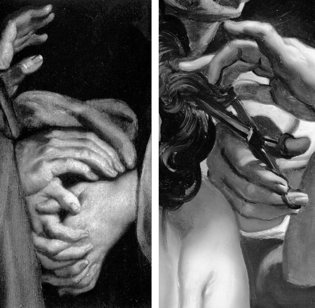
Above, Fig. 23: In these portrayals of hands, the superbly realised expressive resolutions within the one, disqualify the crass and clumsy shorthand treatments seen in the other.
Above, Fig. 24: In these two details on the Burchard/National Gallery painting, the scant, near-void-like treatment of the background is accompanied by a flabby musculature in Samson’s back. The enlarged detail of the ear discloses an angular, almost Cubist treatment of the forms laid hastily over the stripy sketch-like imprimatura.
A TRIPLE COMPARISON AND A SECOND, “TWINNED” RUBENS UPGRADE
Above, Fig. 25: In this comparison we show three very different treatments of female hands which pose the question: Did Rubens paint female hands so variously in 1609-11?
On the left, we see that encountered in the secure Raising of the Cross in Antwerp cathedral. In the centre we see the Delilah hand from the National Gallery. On the right, we see a hand from the (presently) most-expensive “Rubens” painting, The Massacre of the Innocents which realised £49.5m at Sotheby’s on 10 July 2002. The latter, like the Samson and Delilah, had been regarded as a follower’s copy for centuries. Where our eyes can only tell us that these three hands were executed by different artists, the official Rubens Art Scholarship World insists that all three had been painted almost simultaneously by Rubens. The hand in the centre is an anaemic semblance of a Rubens hand. That on the right is a stridently caricatured – almost comic book-like – derivative.
GROWING OEUVRES DESPITE THE EVIDENCE OF TREE RINGS
When misattributed works are accepted within oeuvres, they immediately exert a toxic influence – if “X Mark I”, then why not also a matching “X Mark II”? And so on, ad infinitum…until an inevitable eventual crisis of confidence arises.
Up to December 2001 the Massacre (Fig. 30, below), like the Samson and Delilah, had for centuries been regarded as a follower’s copy. The upgrading was said to have been made by five experts, only three of whom were named – Paul Huvenne, Arnout Balis and Elizabeth McGrath (the other two were believed to be National Gallery staffers). In the 2006 AWUK Journal No. 21 we reported that Dr. McGrath had corresponded with the National Gallery about Jan van den Hoecke, whom she believed had worked with Rubens in his studio and had possibly collaborated with him on a Rubens temporarily loaned to the National Gallery. She had expressed a fear to the Gallery that if her material were to be passed to the press, she might be thought to be propounding her own theories.
Some of the five experts thought the Massacre had been painted before the Samson and Delilah, some, after it. Of all Rubens paintings of the period under consideration – 1609-11, the National Gallery picture – and not, for example, the absolutely secure Raising of the Cross – was taken by Sotheby’s and the experts to be the “benchmark” picture in making this new Rubens ascription even though both the Samson and Delilah and the Massacre had spent many years together in the Liechtenstein Collection not as Rubens’s but as Jan van den Hoecke copies of Rubens pictures. The Massacre had Liechtenstein seals on the back and front of its panel which, just like the Samson and Delilah in 1929, was said to be original and in excellent condition.
BURYING REPORTS
Sotheby’s had commissioned detailed technical reports which were not carried in the sale catalogue but which were there said to be available on request in a separate volume. The reports carried much material that was injurious to the Rubens ascription, as we reported in the October 2002 Jackdaw (“Is this £49.5 million painting by Rubens?”). The Independent’s financial correspondent William Kay, had advised on 20 July 2002 (“A little detective work can pay off”): “Don’t look at a company’s profits-and-loss account – start at the back of the accounts, where the notes are, not at the front where the chairman puts a gloss on the numbers.”
Turning quickly from the first page of Sotheby’s commissioned reports on the Massacre (- which page carried the disclaimer “The independent reports contained in this document are provided for prospective bidders’ information only and without warranty by Sotheby’s or the seller”) to the very last page, I discovered that the two last lines of a dendrochronological report by Peter Klein on the picture’s oak panel (dated 2 April 2002) read:
“Under an assumption of a median of 15 sapwood rings and 2 years for seasoning a creation is plausible from 1615 upwards.”
That meant the Massacre’s proposed Rubens upgrade as “a just-returned-from-Italy” work of 1609-11 was toast. On the tree ring evidence, this panel could only be considered to have been painted at least four years afters after its claimed date of execution. When Dr Klein examined the wood of the Samson and Delilah in 1996 his technical findings were said by the National Gallery to have corroborated the claimed 1609-10 date of execution. That claim, however, had rested not on the data but on the authority of a Klein covering letter which stated: “The felling date [of the tree] corresponds very well with the art historian attribution” and that a date of execution for the painting “is plausible from 1605 upwards”.
Two British dendrochronologists held that Klein’s summary characterisation of tree ring data was misleading. One said: “it is unsafe to say 1609 is any more likely than a later date of 1620.” Another observed “All Klein should be saying is that the range is 1597 to 1630”. The forces that were desirous of the Massacre being taken as a bona fide Rubens were unmoved by the earlier Samson and Delilah controversy and warnings – and the marketing enterprise rolled on despite the presence of much other disqualifying evidence in the volume of reports. As we reported in the Jackdaw:
“Preliminaries studies failed to link the Massacre’s wood with that found in any of Rubens’ panel. As well as being too late, the Massacre contains the wrong materials. A pigment, orpiment, that is found in no Rubens painting is present here. A second pigment, smalt, said to have been in use ‘mainly in the mid-seventeenth century’ and which seems only to be found in Rubens’ later works is also present. The orpiment yellow is anomalous not only in its presence but in its manner of application – it is mixed with lead tin yellow. Such a combination is said to be “unusual since it was considered unstable” and, even, to be a practice ‘not encountered in 17th century works’…Speaking of Rubens’ debt to classical sources, the anonymous author of the catalogue entry correctly concedes, ‘one of the background figures appears to derive from the Borghese Gladiator…[which] was not excavated until late in 1611’…”
The absence of under-drawing and pentimenti has been remarked in both works. No less anomalous is that both also betrayed an uncharacteristically stinting use of lead white pigment. Plesters, convinced at every turn that a Rubens ascription was beyond question, noted: “The striking feature of the composite X-radiograph is how comparatively sparingly and how subtly Rubens has used lead white, reserving the strongest touches for the brightest highlights and tapering the thickness of the white highlight to almost nothing. This system of painting which uses the light-coloured ground showing through thin translucent paint layers for the middle tones, particularly of flesh, is similar to that used by early Netherlandish painters who also used a chalk ground on oak panel.”
Where Plesters had attempted to explain the absence of underdrawing on the Samson and Delilah by claiming there had been no need to make any because the (anomalously complete) oil sketch for the painting had resolved all matters, in Sotheby’s reports it was more frankly acknowledged that such absences of under-drawing and pentimenti in the Massacre are consistent with pictures originating in Rubens’ workshop:
“…we can identify the use of minor but significant applications of paint to modify the outline and define the shape of the elements in the composition. These can be seen as strongly contrasting additions, frequently following the line of a limb or suchlike. Wadum [J] has effectively argued that these features represent Rubens’ studio control, and that he was in the habit of inspecting works before they left the workshop and making corrections.”
Clearly, had Rubens painted the Massacre with his customary perpetual revisions (as are to be seen on the Raising of the Cross), he would not have needed to make last-minute corrections with ‘brushstrokes of paint containing carbon black’ to his own work.
SCHOLARLY ACCOUNTABILITY
We asked in the 2002 Jackdaw: “Can it be right that we are all asked to take this leap of faith when the [five] experts, displaying a seeming ignorance of – or disregard for – so much germane material evidence, have yet to publish accounts of their verbal endorsements.”
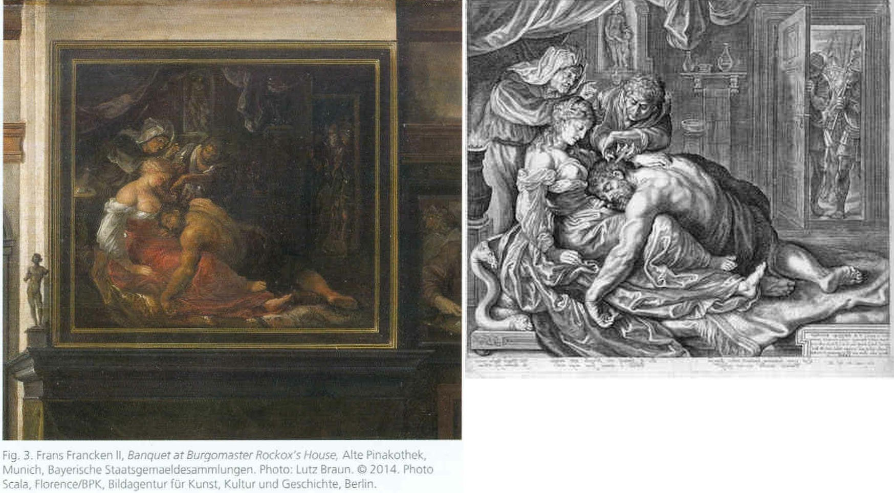
Above, Fig. 26: The two copies made respectively of the original (and subsequently lost) Rubens Samson and Delilah in 1625-35 by Frans Francken (left), and in 1613 by Jacob Mathan (right) in both of which Rubens can be seen to have painted the whole of Samson’s right foot and space beyond.
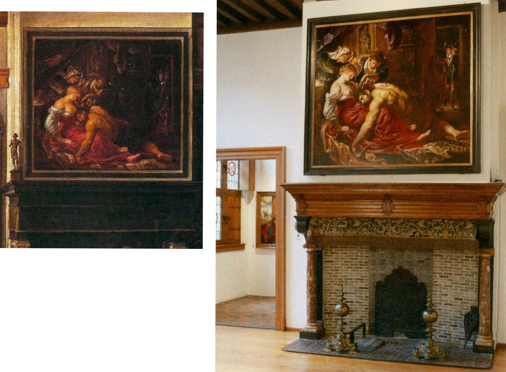
Above, Fig. 27: Left, detail of the Frans Francken painting showing the original Rubens’ Samson and Delilah; right, the National Gallery Samson and Delilah, as exhibited in 1983 in its then new, post-restoration, frame and above a mock-up of the grand fireplace in Nicolaas Rockox’s house. The recorded positioning of Samson’s right foot in the Franken copy testifies to a compositionally taught bisecting of the picture on a descending diagonal. In contrast, the foot is not only cropped in the National Gallery picture, but it first wanders up the edge of the painting leaving a broken-looking leg.
Above, Fig. 28: The whole of Frans Francken’s copy of the original Rubens Samson Delilah enjoying pride of place in Nicolaas Rockox’s house.
Above, Fig. 29: Top left, detail of feet on Rubens’ The Raising of the Cross; top right, the cropped foot in the National Gallery Samson and Delilah; above, a Rubens chalk figure study for The Raising of the Cross showing how Rubens drew separately on the sheet a cropped leg.
The most visibly disturbing disqualification in the National Gallery picture – as Doxiadis, Harvey and Hopkinson immediately flagged in their 1992 Report – was the fact that the toes of Samson had been cut off at the edge of the painted area on the panel when both copyists of the original painting in Rockox’s house had recorded an intact foot set well away from the edge of the painting in a more reassuringly “Rubensesque” treatment.
The cropping in the National Gallery version is itself disqualifying on two counts. First, few painters have been more attentive to their depicted subjects’ digits than Rubens. When a foot was not included in a large swiftly drawn figure study, as above at Fig. 29, Rubens drew it separately on the sheet so as to have a record of the entire figure. Second, as we have examined previously, copyists frequently produce truncated versions of master works and the £49.5 million Massacre of the Innocents which is now in the Ontaria Museum is – just like the Samson and Delilah – a compositionally cut-down version of a larger composition that is found in a School of Rubens Massacre in the Royal Museum of Fine Arts Belgium as seen below in Figs. 30 and 31.

Above, Fig. 30: Left, a detail of a Rubens School work in the Museum of Fine Arts, Belgium; centre, the former Jan van den Hoecke copy that became the £49.5 million Massacre of the Innocents and now lives in the Ontario Museum; right, the Francken copy of the (lost) original Rubens Samson and Delilah.
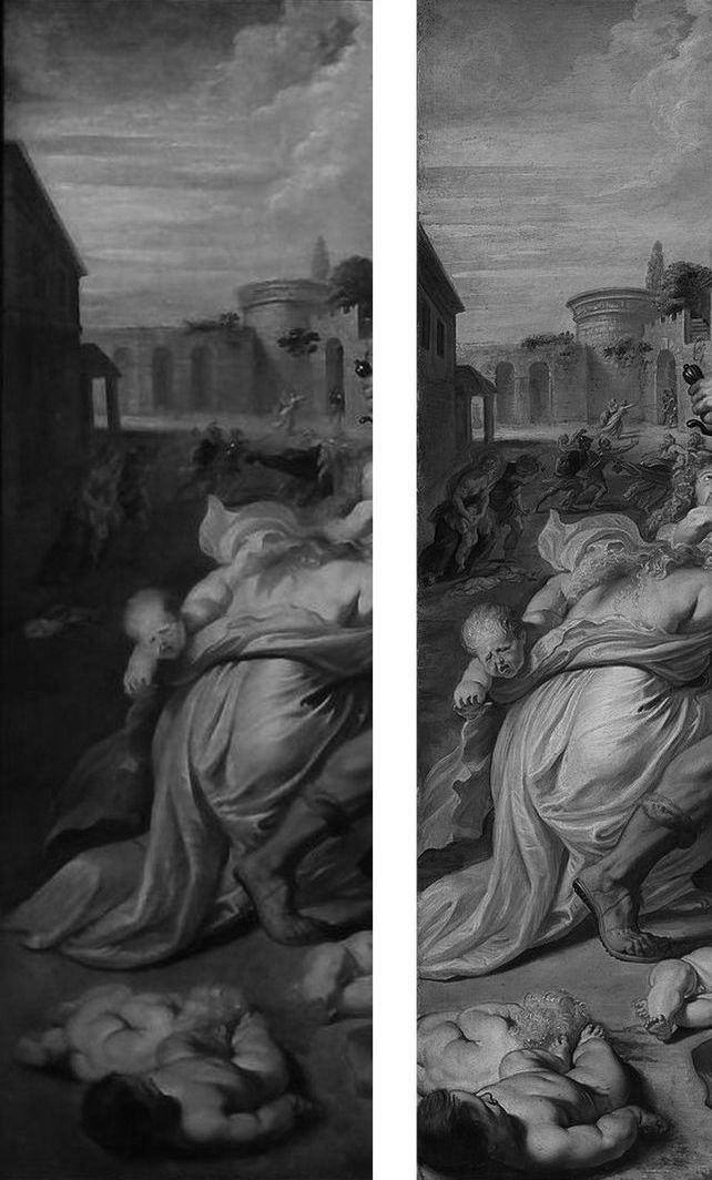
Above, Fig. 31: The left-hand sections showing the pair of murdered babies in the bottom left corner of two versions of Rubens’ Massacre – that in the Royal Museum of Fine Arts, Belgium version, left, and, right, that in the cropped £49.5m Ontario Museum, former Jan van den Hoeke version.
On the fact of the 1980 and 2002 upgrades, must we now believe that Rubens had cropped the compositions and subjects in both his Samson and Delilah and his Massacre of the Innocents pictures so disturbingly as to prompt copyists of both works to expand the pictures to more comfortably and characteristically Rubens-like compositions?
How many allowances may be made, how many disqualifications disregarded, to uphold a single troubled attribution? In our experience, it is very often the case that when one thing is wrong with an attribution, everything else is.
Michael Daley, Director, 5 November 2021
POSTSCRIPT: On 12 November 2021, Eric Biétry-Rivierre reported in LE FIGARO (“A Salvator Mundi still record but less and less credible”):
For the Prado Museum, the most expensive painting in the world is not by Leonardo da Vinci. Rather, it is the work of an assistant or follower.
In the catalogue of this exhibition running until 23 January 2022 and relating to an old copy of The Mona Lisa which it preserves, the Prado does not attribute to Leonardo da Vinci the Salvator Mundi of the Crown Prince of Saudi Arabia. According to the Madrid Museum, this version called “Cook” (named after a former owner because there are no fewer than 22 paintings in the world in the Leonardesque style and representing Christ in the manner of a God the Father) belongs to a close assistant or follower. This further darkens the episode of the highly marketed and hypermediatized sale, organized by Christie’s New York in 2017. And it justifies less the $ 450.3 million disbursed by Mohammed Bin Salman.
The curator Ana Gonzalez Mozo even suggests that a prototype made by the master may never have existed. As for which would be the oldest version, she leans towards another Salvator Mundi: the so-called “Ganay” version, also in private hands. Its pedigree, admittedly incomplete, being much less incomplete. It was already this oil painting that, although less beautiful and less well restored, had the preference of the specialists of the Louvre during the retrospective organized at the end of 2019 on the occasion of the 500th anniversary of the death of the master.
After much debate, hesitation, and even the publication of a scientific brochure validating the “Cook” was finally discarded, the “Ganay” completed its exceptional journey. And this not only because the Gulf panel painting was missing (MBS would have conditioned his loan to a hanging near Mona Lisa, which would, de facto, have “consecrated” the work as an authentic Leonardo).
The “Cook” version was also weakened by a recent documentary by Antoine Vitkine. In his Salvator Mundi: the astonishing case of the last Vinci, the main supporter among international “Leonardologists”, the Englishman Martin Kemp, appears less affirmative. As for Luke Syson, the present director of the Fitzwilliam Museum, Cambridge, who in 2011 was the unconditionally supportive curator/architect of the first public presentation of the work at the London National Gallery, he is more and more among peers who denounce his recklessness.
Bernd Lindemann is one of them. In another documentary on the Salvator Mundi, by Andreas Koefoed, Lindemann, director of the Gemäldegalerie in Berlin, says: “It’s not the role of serious museums to present such a controversial painting.” Thus is the reputation of the great British museum damaged. This is bad at a time when its Samson and Delilah, bought at a golden price for a Rubens forty years ago is seriously questioned.
On 14 November 2021 The Times of Israel reported that the $450m Salvator Mundi has been deemed not a Leonardo:
“Sold for $450m to Saudi prince, ‘Salvator Mundi’”
“The Prado catalogue also contains an opening essay by Vincent Delieuvin curator of Paris’s Musée du Louvre’s 2019 retrospective of works by the artist. He discusses the Saudi-owned painting, referring to ‘details of surprisingly poor quality’. Delieuvin concluded, ‘It is to be hoped that a future permanent display of the work will allow it to be reanalyzed with greater objectivity’…”
The initial near-universal hyperbolic analysis has indeed been found wanting but Waldy and Bendy are not the only fleet of foot art critics. As Jacques Franck notes:
“This is interesting news indeed, but it is not how the real story ran when it started in 2016. Delieuvin, no less than Penny and Syson at the National Gallery, had been convinced all along that the Cook Salvator Mundi was by Leonardo, there can be no possible doubt about that. Aside from the strong support Delieuvin gave the painting on the occasion of the Leonardo exhibition he curated at the Italian Embassy in Paris in September 2016, he had long planned to include the work as the guest star in the blockbuster Leonardo show which he co-organised with curator Louis Frank at the Louvre in October 2019. This is testified by the first version of the catalogue which reproduced the Cook Salvator Mundi on the front cover, wherein one could read that it was attributed to Leonardo himself and had been listed as such at no. 157 in the show. That first version was junked for undisclosed reasons and the whole catalogue was reprinted. What is known is that the loan of the Saudi picture was not granted by the owner; that the picture was not exhibited; and, that the non-appearing picture was simply reproduced in the new catalogue as “Salvator Mundi version Cook”, fig. 103 bis, p. 303 thus meaning “studio work”. (See Fig. 32 below.) In December 2019, six weeks after the late October opening of the above-mentioned Leonardo exhibition, a book titled Léonard de Vinci. Le Salvator Mundi by Vincent Delieuvin (Louvre curator), Myriam Eveno and Elisabeth Ravaud (both Louvre laboratory scientists) was put on sale in the Louvre’s bookshop and swiftly withdrawn. However, some copies or photocopies of the latter book have nevertheless circulated around the world and are now in the hands of many Leonardo scholars, like me. In that notoriously disappeared book, the authors concluded enthusiastically (p. 14) that the work had been shown by “decisive scientific tests” in 2018 to be by Leonardo. That is the true story and there exists no other”.
In the December 2021 Art Newspaper, Bendor Grosvenor, over-looking the annual Apollo magazine awards, complained of an absence of art world annual awards and launched a self-styled “Diary of an Art Historian awards”. Two especially rich items caught the eye. His book of the year award was given not to a book but to an online catalogue raisonné, which he contends “might not yet have the kudos of a book published by Yale priced at £150, but it will have a thousand times more readers, and just as impressive a legacy. (Readers might recall Grosvenor’s own recent unsuccessful joint bid with the dealer Philip Mould (who has a degree in art history) to replace the four specialist scholars-authored, Yale-published, 2004 catalogue raisonné Van Dyck A Complete catalogue of the Paintings – see Art-Trading, Connoisseurship and the Van Dyck Bonanza.) Richer still, perhaps, was Grosvenor’s award for “Auction Consignment of the Year to whoever had the imagination to capitalise on Leonardo-mania by buying a humdrum 20th-century copy of the Mona Lisa on eBay for £2,750 and swiftly consigning it to Sotheby’s Old Master Sale in London, where it made £378,000″ – a small beer hike compared with the conversion of a recent, repeatedly restored, one thousand-dollar wreck into the $450m pretendy and now-disappeared Leonardo Salvator Mundi. On the night of that notorious Christie’s, New York, sale Grosvenor swooned: “Christie’s just did something that re-writes the history of auctioneering. They took a big gamble with their brand, their strategy to sell the picture, and not to mention the reputations of their leadership team, and they pulled it off – the best piece of marketing I’ve ever seen. Above all, they had absolute faith in the picture. AHN [Art History News] congratulates them all.”
With the Sistine Chapel ceiling we know, but who wrecked Gustav Klimt’s Helene and Sonja portraits?

The restoration injuries on Klimt’s paintings now rival those seen on Michelangelo’s Sistine Chapel ceiling frescoes. Both cases testify to profession-wide failures to read pictures as art and to heed the testimony of photo-records – that is, they testify to the linked failures of restorers who inflict damage and of scholars who accommodate adulterated works within their narrative accounts.
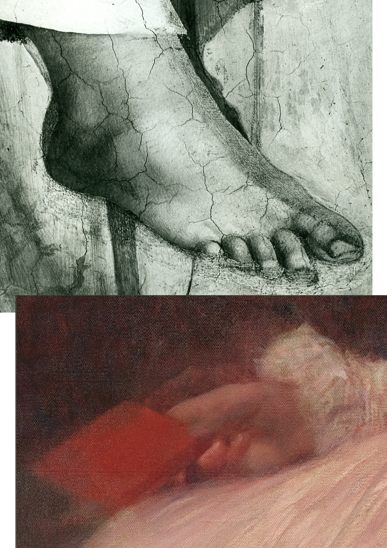
Above, Fig. 1: Top, the after-restoration right foot of Michelangelo’s monumental Erythraean Sibyl on the Sistine Chapel ceiling; below, the after-restoration right hand in Klimt’s 1898 Portrait of Sonja Knips, as seen today (in the Galerie Belvedere, Vienna).
Above, Fig. 2: Top, the after-restoration right hand in Klimt’s Portrait of Sonja Knips, as in Christian M. Nebehay’s 1992 Gustav Klimt; above, the after-restoration right hand in the Portrait of Sonja Knips today. Inset, left, the book held by Sonja Knips in Klimt’s portrait.
Above, Fig. 3: A detail of Klimt’s portrait of Helene Klimt as seen before restoration, left, in 1956 and after restoration, right, in 2012.
While the injuries to the two artists are comparable in magnitude, the means are quite unalike. With the Sistine Chapel, there is no mystery about the cause. Before the cleaning of the ceiling started (after the cleaning of Michelangelo’s lunettes on the chapel’s upper walls), leading Michelangelo scholars endorsed a Dan Brown-esque claim that self-declared New-Era restorers had uncovered a New Michelangelo whose true traits had gone unnoticed by all those who had, in the artist’s lifetime and for nearly half a millennium afterwards, copied and studied his work. The claim was preposterous, but the fact of the ceiling’s highly controversial and radically transformed appearance was acknowledged by all parties and is now on the historical record. Moreover, twenty-two years after the greatly contested restoration finished, the late chief restorer, Gianluigi Colalucci, admitted that his predecessor at the Vatican, Luigi Brandi, “the old chief restorer”, had warned him that Michelangelo had conducted much if not most of his painting with “pigments perhaps diluted with oil or resin or varnish” on the fresco surface.
What neither Colalucci nor the Vatican ever acknowledged was that in the late 1980s, as we had first reported in 1993, Leonetto Tintori, the restorer of Masaccio’s Trinity in the Santa Maria Novella, Florence, and a member of the international committee that investigated the controversial cleaning in the mid-1980s, had “urged the Sistine team privately to preserve what he termed ‘Michelangelo’s auxiliary techniques’ which in his view included oil painting as well as glue-based secco”.
Cleaning the ceiling had been thought impossible because of the complexity and vulnerability of Michelangelo’s method. To justify the use throughout the ceiling of a ferocious solvent gel that was robotically brushed on and washed off twice in twenty-fours like an oven cleaner in a pre-determined method devised to ensure a homogenous appearance, the restorers and curators claimed – against material and documentary evidence – that Michelangelo had not worked on top of his frescoes when dry. The Vatican never delivered a report on the restoration and now, with the death of Colalucci, never will. The photo-record, thanks to digitalisation and the web will endure.
With Klimt’s oeuvre, the debilitation occurred piecemeal in public and private collections over (roughly) half a century and on no overtly declared programme. Again, thanks to photography, there can be no long-term cover for mis-restorations because we know how Klimt left his works and can calibrate and demonstrate injuries to them, as with the two portraits of Sonja Knips and Helene Klimt.
Klimt’s instruction that those wishing to understand him need only look at his pictures is widely acknowledged but little comprehended. “I am convinced that I am not particularly interesting as a person”, he had written, “if anyone wants to find out about me – as an artist, the only capacity in which I am of any note – they should look carefully at my paintings and try to learn from them what I am and what I have tried to achieve.”
That is no longer possible. It no more occurred to Klimt that his works would cease to bear true witness than it had to Michelangelo that he would one day be hailed as the Matisse of the Renaissance by a restorer (see our “Maestro Colalucci: His Method and its Madness”, Jackdaw, May/June 2021, and “A crime against the artist”, The Independent, 22 November 1991, at Fig. 34 below.) Now, a century on from Klimt’s death and with scarcely a single picture true to its original self, the most charitable view of scholarly silences on injuries might be to assume that those who depend on access to Klimt’s works and records either know or fear they cannot afford professionally to embarrass private or institutional owners by citing past or recent injuries. However, Klimt scholarship and publications have exploded in recent years and it is now possible (through photo-illustrations) to make fair appraisals of the various changes his works have undergone at the hands of restorers – even though their actions remain almost nowhere acknowledged.
HELENE KLIMT: ASKING THE RIGHT QUESTIONS
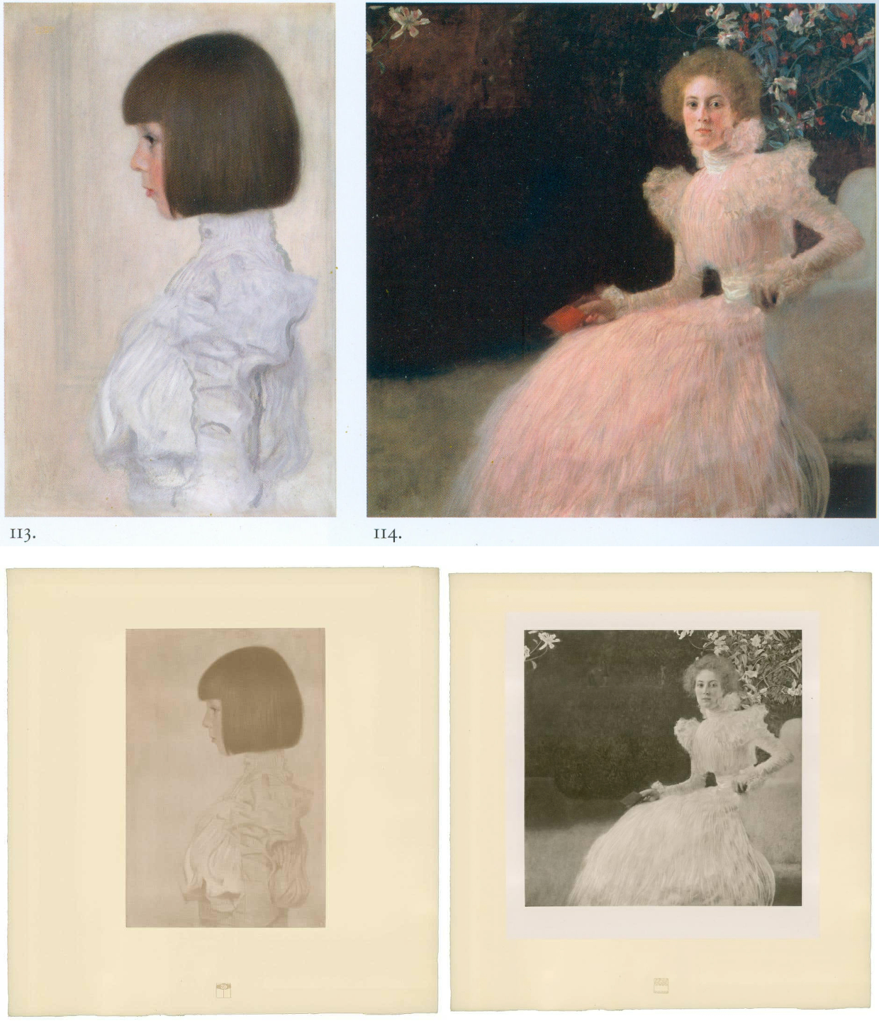
Fig. 4, above: Top, Klimt’s portraits of Helene Klimt and Sonja Knips, as bracketed in the precious and giant – it weighs 16 lbs – 2012 Taschen Gustav Klimt The Complete Paintings, Ed. Tobias G. Natter; above, the Klimt and Knips portraits as published with Klimt’s approval between 1908-14.
As Dr Natter hoped, the Taschen book is now a standard work of reference. His ambition to supplement updated “details about each work, its provenance, exhibition history and selected bibliographic references” with a picture of “how it was received in its day” proves richly informative. Notwithstanding such art historical diligence, no account is given of what restorers euphemise as pictures’ “conservation histories” and therefore this book, like all others in the field, fails to address how each work looked in its day and to estimate how much or how little it does so today. Seemingly failing to recognise that every work of visual art starts life as its own primary document, this ambitious book takes what restorers have left in their wake as synonymous with the art Klimt produced. As is customary in the field, Natter expresses deep and sincere gratitude to all owners and “in particular, the private owners” for their trust, helpfulness, and inspiring conversations.
ART HISTORICAL NARRATIVES
One of the book’s contributors, Susanna Partsch, (“Paintings of women”), sets the above two portraits as staging posts in a now prevalent art historical schema:
“The earliest portraits on display at that occasion [a 1903 Klimt exhibition] were the private ones of his young niece Helene Klimt and the Portrait of Sonja Knips both of which were completed in 1898. The some twenty portraits that Klimt produced between 1891 and 1898, most of them showing anonymous models, seem to have been finger exercises on the way to a new style.”
With the Portrait of Helene Klimt, the artist’s then six years old niece who became his ward on the death of his brother (Fig. 4, above left), Natter jumps straight into formalist art criticism:
“If Klimt’s portraits of the early 1890s had shown him dissolving line and blurring colour in a painterly manner, the artist here explores the harmony of the strict profile view. This is reinforced by the precision of the page-boy haircut, the neutral background and the high-necked blouse, its fabric interpreted and ennobled by the generosity of the execution. The dualism of mimesis and dissolution, of faithful reproduction and painterly openness, is already in evidence here as a stylistic means.” (Emphases added.)
Thus, the head is said to be painted in one manner and the blouse in a radically contrary one, but this supposed pictorial dichotomy rests on an assumption that the picture’s present traits are as when originally executed when the photo-record (at Fig. 3 and below) testifies that they are not. Natter cites but does not reproduce an early record of the Portrait of Helene Klimt: “A previously unheeded photograph published in the magazine Das Interieur in 1911 [that] shows the child’s portrait hanging in a bedroom in the Flöge sisters’ home in Ungargasse, Vienna (N.N. 1911).” Having brought photography to the table, Natter neglects to consider the testimony of the earliest published photographs of this painting including one above at Fig. 4 of 1908-14 which Klimt himself had carefully vetted and endorsed.
This profession-wide neglect of historical photo-records persists even as Klimt’s own use of photography attracts attention. In 2012 Prestel published Gustav Klimt & Emilie Flöge Photographs, edited by Agnes Husslein-Arco and Alfred Weidinger, the scientific director of the Linz Upper Austrian State Museum; former vice-president of the Belvedere in Vienna; and a digital and film photography specialist with a preference for black and white images. Agnes Husslein-Arco, a former figure skater and Sotheby’s Austrian director, was director of the Belvedere museum between 2007 and 2016 and is credited with transforming it into a major tourist attraction in Vienna. In the book’s preface, the then director said: “The product, a chronological presentation of photographs and snapshots, illustrates a biographical panoptic of these two personalities who were so influential in the fin-de-siècle art world…The following contribution by Alfred Weidinger provides information about Klimt’s relationship to photography and the use of the same in his artistic creations.” Weidinger wrote: “The reference to Klimt’s involvement with photography, only briefly sketched out here, is meant to offer a first look at a hitherto neglected area of Klimt research, and, at the same time, make evident the importance of this medium to the artist.”
Above, Fig. 5: Left, one of a group of Moriz Nähr photographs acquired by the Austrian National Library in 1943 that recorded both Klimt himself and “revealing reproductions” of his paintings, as here above left with his 1900 The Large Poplar I. Above right, The Large Poplar I, as reproduced (with slightly trimmed edges) in Alfred Weidinger’s 2007 Prestel Gustav Klimt – an earlier massive and compendious complete catalogue with specialist essays which had weighed in at a respectable 10 lbs. Weidinger expressed the hope that the book, which offered a fundamentally new basis for research, “holds out an invitation to discover many new aspects of the life and work of the great painter whose artistic home is the Vienna Belvedere.” (We welcome and accept that invitation.)
A SECOND OPINION
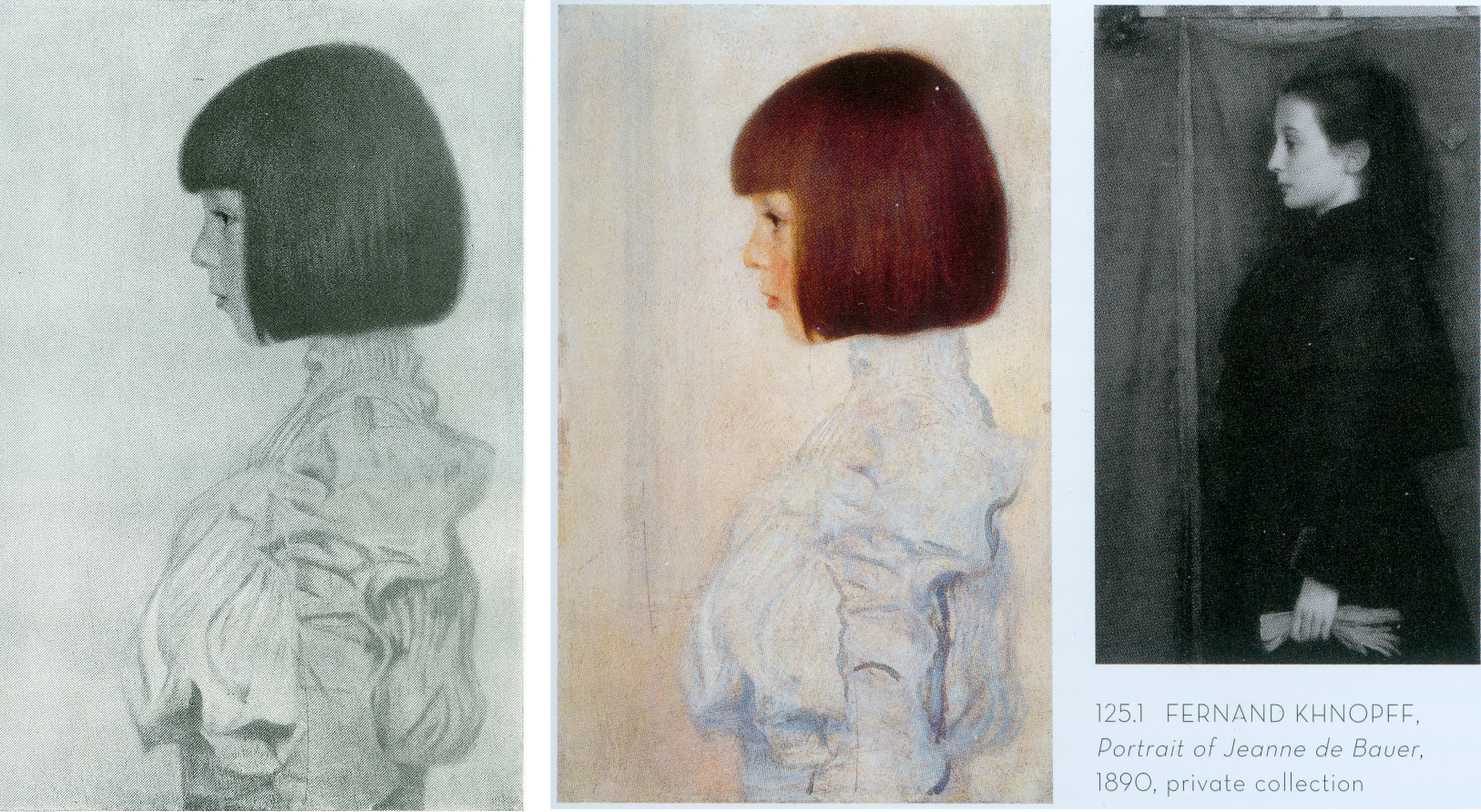
Above, Fig. 6: Left, Klimt’s 1898 portrait of his niece (and later ward), Helene Klimt, as published in Emil Pirchan’s pioneering 1942 and 1956 book Gustav Klimt and, centre and right, Helene, as paired with a Fernand Knopff profile portrait by Alfred Weidinger in his 2007 Gustav Klimt.
As with Dr Natter, Dr Weidinger’s catalogue entry on the Helene Klimt portrait made no reference to the Pirchan book’s photographic testimony. Instead, he drew attention to Klimt’s apparent indebtedness to an 1890 Fernand Knopff portrait in which “a severely profiled half-length portrait faces to the left, with an almost monochrome background which is divided into two areas by a thick brown vertical line.” Weidinger further notes that while Klimt “reduces his composition to the girl and the pale background we may detect a reminder of Knopff’s composition in the group of vertical lines in the front of Helene’s face, which in the Jeanne de Bauer portrait, functions as a special accent”. The stylistic comparison with Knopff is apt and fair but no mention is made of the photographically recorded fact that the lines to which Weidinger refers had not been visible in the picture in its 1908-14 and 1942-1956 photographs.
Weidinger takes pride that it had been “a major concern of ours to see, as far as possible, all Klimt’s pictures in the original and to take new photographs of them” and that their wishes had been met in the great majority of cases. That the lines in the portrait’s background had not previously been present must mean that they had emerged in a post-1956 restoration, which in turn suggests that a restorer had uncovered and left exposed a feature previously begun and then painted out by Klimt, perhaps because of second thoughts about introducing a parallel secondary motif that would have stood distractingly in competition with the picture’s subject.
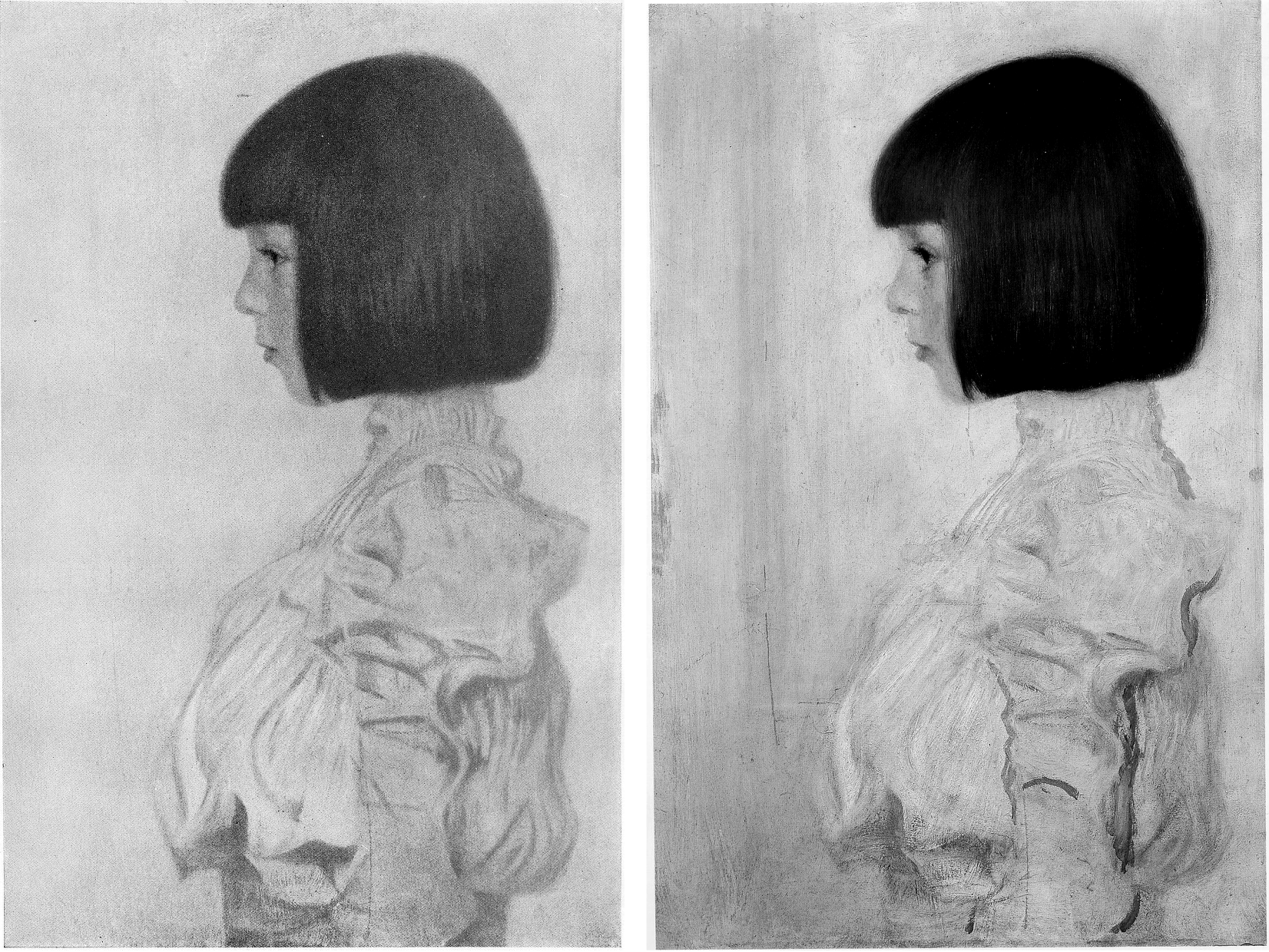
Above, Fig. 7: Left, Klimt’s portrait of Helene Klimt as recorded before 1956 in Pirchan; right, the portrait as reproduced by Weidinger in 2007.
Had Weidinger compared the above pair of images he would surely have noted not only the late emergence of the lines but also the many changes to the blouse – and perhaps have offered some account for them. Instead, and seemingly accepting the 2007 state as if Klimt’s own, he drew a stylistic distinction between the treatment of the undamaged head – “the fine brushstrokes with which Klimt renders her hairstyle and profile give a draughtsman-like character to the girl’s head” – and the body, where: “the treatment of the high necked, puff-sleeved blouse, which Klimt paints in cream and light blue tones, is sketchy.” In 2012, Natter saw more in the blouse than sketchiness – viz: “fabric interpreted and ennobled by the generosity of the execution”; and, in the now disrupted head/blouse relationship, “a dualism of mimesis and dissolution, of faithful reproduction and painterly openness”. The photo record shows that both scholars missed countless injuries and adulterations to the blouse – including superimpositions that crudely redrew the collar and the arm’s contours – all of which they took to comprise evidence of a significant step in the march of Klimt’s stylistic development of which Partsch spoke in 2012.
Had Weidinger addressed such a comparison as that above, he would likely have seen that the draughtsman-like character of the head had been no less evident in the economical but precise elegant treatment of blouse, too, and that viewed as a whole, the work had originally shown no great dichotomy of pictorial means and, rather, comprised a beautifully measured record of a young girl’s dutifully patient self-conscious expression and resolute little soldier-like stance.

Above, Fig. 8: Left, Klimt’s portrait of Helene Klimt as in Weidinger, 2007 and, right, as reproduced by Natter in 2012.
The above, same-size, greyscale, direct photo-comparison shows that the painting underwent further changes between 2007 and 2012: the long-invisible vertical lines that emerged in 2007 had by 2012 turned more clearly towards the child suggesting a framed picture on a parallel background wall; an area of damage in the centre of the picture’s left edge that was visible in 2007 has been touched out, as were several scratches of long-standing.
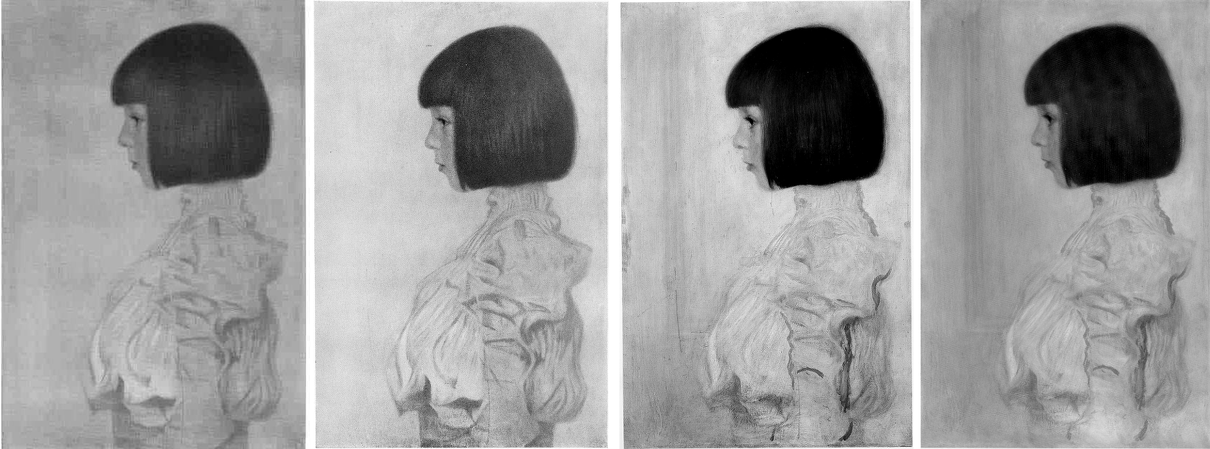
Above, Fig. 9: Klimt’s portrait of Helene Klimt as recorded, left, between 1908-14; as before 1956, second left; as by Weidinger in 2007, second right; right, as by Natter in 2012.
Comparing four same-size successive photographs above shows the first two records of the blouse (1908-14 and 1942-56) to be identical and radically different from the two in 2007 and 2012. The post-2007 traits that are now enshrined in the literature as “sketchy”, or an “ennoblement by generosity of execution” can be seen on a simple photo-comparison to be products of hands other than Klimt’s. The photographic record incontrovertibly shows that in this portrait, autograph features that survived until at least 1956 were subsequently weakened or erased, and that new and stylistically alien contours had been added in an evident attempt to simulate something of the then-botched blouse’s original coherence and richness of design. Thus, field-leading contemporary scholarship had failed to notice, acknowledge, or condemn a vandalising act of bowdlerisation. Instead, it has incorporated a restorer’s deformations into a celebratory narrative of a privately owned work that is on loan to a public museum (Berne, Kunstmuseum).

Above, Fig. 10: Top, left, Klimt’s Portrait of Helene Klimt in Pirchan, 1956; and, top right, in Weidinger’s 2007 Gustav Klimt. Above, left, Klimt’s 1894 Seated Young Girl; above, centre and right, a diagram showing first the 1956 Pirchan illustration with the then folds of the blouse outlined in black, and right, with what we take to be a post-1956 restorer’s superimpositions also identified in black.
Weidinger’s comments on Klimt’s indebtedness to Knopff (and to Whistler) are constructive and, in Klimt’s early Seated Young Girl, above left, he sees indebtedness to both Klimt’s brother, Ernst, and their joint master, the painter Hans Makart. Despite such fine-tuned stylistic discrimination, Weidinger seems to see no relation in the Seated Young Girl to Helene’s blouse. Had Natter addressed the losses and additions in the post-1956 blouse, would he have spoken of a “dualism of mimesis and dissolution, of faithful reproduction and painterly openness, [that] is already in evidence here as a stylistic means” in Klimt’s supposedly contrasting handling of the head and blouse? The blunt tuth is that, with Helene’s blouse, the dissolution was chemically and physically induced decades after Klimt’s death by an unidentified restorer on an unrecorded/undisclosed occasion.
SONJA KNIPS
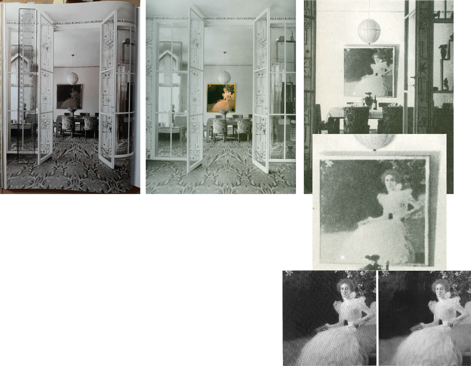
Above, Fig. 11: A 1915 photograph of the Sonja Knips portrait in the dining room of the Villa Knips, as in the giant 2012 Taschen book, left; as in the Neue Galerie’s, 2008 Gustav Klimt: The Ronald S. Lauder and Serge Sabasky Collections, Ed. Renée Price, where a modern colour photograph of the painting has been superimposed, centre; and right, top and centre, as in Christian M. Nebehay’s, 1976 Gustav Klimt; bottom right, Sonja Knips as published respectively in Weidinger, 2007, and Natter 2012.
Natter and Weidinger both carry historic photographs showing Klimt paintings in the background but without comment on their then appearances. The Nebehay image above, right and centre, is small and printed on poor paper but even at this level of reproduction, it gives indication of the picture’s tonal hierarchies and dispositions – the subject is brilliantly lit on the left and moves into shadow on the right of the picture.
Klimt’s paintings were much photographed in his lifetime (that is, before his death in 1918), many were seen in their exhibited environments, some were photographed before being first exhibited and then again after subsequent reworking. For all this, and even though both 1898 portraits at Fig. 4, top, have exceptionally long and secure photo-histories, their narratives have been written without regard to such evidence and in terms of constituting steps towards subsequent pictorial developments – which progressivist schema happens to provide perfect art historical cover for dramatically altered pictures.
Of the Portrait of Sonja Knips, Dr Natter summarises: “This graceful female portrait marks a turning point in Klimt’s portraiture and is rightly considered a prelude to his Secessionist works. The sitter is portrayed in life size, seated in an outdoor setting. The square format is new and represents a fundamental choice whose possibilities Klimt would explore over the next few years. New, too, is the corresponding juxtaposition of light and dark, foreground and background, fullness and void.” That account was more consistent with the picture’s 2012 published appearance, Fig. 4, top right, than when first recorded as at, Fig, 4, bottom right, where today’s “void” comprised distinctly articulated spaces, forms and, even, mini-figures.
Of the painterly means, Natter adds: “Klimt employs a differentiated manner of painting, executing some areas of the portrait in a cursory fashion while focussing with great precision upon others. He thereby creates a fascinating contrast between the naturalistically modelled head of the sitter and the gauzy shimmer of her dress. This latter conceals a wealth of painterly effects and is infused with a rustling tension by a cascade of multiple parallel brushstrokes. Klimt at the same time camouflages the highly artificial nature of the arrangement as a snapshot.” In terms of a perceived stylistic dichotomy no mention is made of the picture’s former second carefully composed and precisely, naturalistically realised component – the now transformed and deranged small red sketchbook, as seen at Figs. 1 and 2.
AN AFFAIR – OR NOT?
With Klimt and his female subjects there is always a relationship issue and with this picture scholarly differences have arisen. Natter is agnostic: “Whether – as some suspect – Klimt and Sonja Knips enjoyed an intimate relationship, cannot be verified. But it is certainly the case that the painter presented her with one of his sketchbooks as a token of his particular affection.” He first speculates: “Whether he indeed pressed one such red leather-bound book into her hand during a sitting, because he felt the painting needed an accent of colour at that point remains conjecture”. (The reported source for this formalist reading had been the subject herself, as discussed below.) Natter takes the fact that such a scenario is conceivable to be “a clear reminder that Klimt, unlike the expressionists, continued to legitimize internal compositional requirements by cloaking them in external motifs.” Thus, a key question is begged: Whatever the relationship between the artist and the sitter, the book served an essentially formal pictorial purpose – the pink dress had “needed” on chromatic/pictorial grounds to be offset by a small red parallelogram of which just such an instance was conveniently to hand in a book of sketches Klimt had gifted to the picture’s beautiful subject whom he had known since her teenage years.
Thus was a formalist painterly purpose attributed to an immensely charged and fastidiously depicted small book, even after its – undiscussed – visually deranging transformation into the quasi-Cubist construct at Figs. 1 and 2.
TWO SCHOLARLY TAKES ON THE TWO PORTRAITS
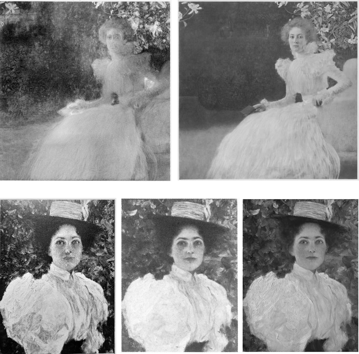
Above, Fig. 12: Top left, the infra-red image of the Sonja Knips portrait published by Weidinger in 2007; top right, the second oldest (1908-1914) photo-record of the painting; below, Klimt’s 1896 Girl in the Foliage as published, left, in Emil Pirchan’s 1942 Gustav Klimt, centre, in Johannes Dobai’s 1978 Klimt, and, right, by Weidinger in 2007.
Weidinger situates the Sonja Knips portrait in the same part of the oeuvre’s developmental arc but also within social artistic and fashion contexts:
“This portrait is considered a turning point in Klimt’s portrait painting…the beginning of a series of large format portraits of ladies, predominantly of the prosperous, Viennese upper-middle class…and their wish for prestigious portrayal…[Knips] was one of his few models from the circles of – albeit minor – nobility…Klimt portrayed Sonja Knips sitting in a chair. A portrait formula he had already tried out in small-format portraits of ladies of 1896-98. The diagonal division of the painting into two zones places the subject opposite an empty space in tones of dark brown – a motif also used in Whistler’s Arrangement of Grey and Black No 1: Portrait of the artist’s mother (1867-71) and already taken up by Klimt in his Lady in an Armchair (cat. 106) and Lady by the Fireplace (cat. 106)…”
While the social/professional account of Klimt’s developing career is of interest, the perceived dichotomy of subject and void better accords with the picture’s present appearance than that seen in the special reproduction of 1908-14 (Fig. 4, right). Weidinger’s “empty space” had been closer than Natter’s “void” to the picture’s original and distinctly articulated spaces and forms but, then, he brushed away all claims that Klimt had originally “painted figures, a pool, or even a horse in the background which he then overpainted” on the grounds that no figural elements can be identified in the infra-red image. Thus, the testimony of a single undated technically penetrating image trumps all the compendious photo-records that testify to the contrary.
Above Fig. 13: Left, Dante Gabriel Rossetti’s 1868 Lady Lilith; right, the undated infra-red image of the Sonja Knips portrait made – presumably – at the Belvedere, Vienna.
In lieu of an evaluation of the infra-red image in the context of the picture’s full photo-history, Weidinger pursues stylistic antecedents and influences: “The all-over brushstrokes suggest a landscape of bushes and trees such as Klimt had already once depicted in his Girl in the Foliage”, as above Fig. 12. Further, “In the upper left-hand corner of the picture there is a recognisable view, accentuated by a flower. Since Sonja is presumably in a garden, as suggested by the lilies above her head, this may be a view of the landscape, similar to Rossetti”. (In the Rossetti above, the landscape view is a reflection in a framed mirror.)
Above, Fig. 14: Above, Rossetti and Klimt details; centre, details, of Klimt’s Sonja Knips and Emilie Flöge portraits before restorations; below, Klimt’s Two Girls with Oleander.
Notwithstanding his reading of the infra-red testimony on foliage, Weidinger adds: “Admittedly, it is also possible that the setting is an interior room.” The picture’s present void may thus be read either as an ex-interior or an ex-garden or even a landscape – but which and how to decide? While the lilies above Sonja’s head might have been made in homage to Rossetti’s roses, in terms of Klimt’s stylistic development, they might also be considered to have anticipated his first placement of a decorative foil behind a portrait, which scholars have located in Klimt’s slightly later and more abstracted 1902 portrait of Emilie Flöge, as above, centre right. At the same time, Klimt might have been nodding back to his recent self’s 1890-92 counterpointing of closely adjacent flowers and young female subjects in the Wadsworth, Connecticut Two Girls with Oleander (as above, bottom) – which picture Weidinger nicely pairs with Alma Tadema’s deep-spaced 1893 Unconscious Rivals, at Bristol City Museum.
KLIMT’S CROPPING DEVICE
Above, Fig. 15: Top, left, J. C. Leyendeker, Couple Descending a Staircase, c. 1925; right a detail of Klimt’s Sonja Knips portrait; above, left, John Singer Sargent’s 1884 sensation-generating “Madame X”; centre, Klimt’s c.1894 Portrait of a Lady in Black as seen today; right, Klimt’s Lady in Black as shown in 1978.
Sonja Knips is shown wearing an elaborate evening dress and seated in a softly upholstered armchair. Her and the chair’s images are cropped by the bottom and right-hand edges of the picture and therefore are brought closer to the viewer while left without a clear relationship to a ground plane. Such cropping facilitates key modernist picture plane-asserting strategies – as evident in the above Sargent and Klimt portraits of a standing lady in a black costume. Sargent sets the whole figure in a dark enveloping but bounded space. The fused figure and (vertically, not horizontally, cropped) table are as securely placed on the floor as a linked piece of sculpture on a plinth. Adding to that palpable sense of the body, Sargent’s light picks up form-disclosing drapery configurations within the dress’s overall blackness. That mix of a theatrically lit figure and minimal but precisely realised furniture may have found echo in the American illustrator J. C. Leyendecker’s brilliant advertisement for Arrow Shirts (above, top left).
With the cropped chair and figure in Klimt’s lady-in-black, above centre, we are given fewer such lights and altogether less spatial orientation – except in narrow overlapping recessional relief: the chair overlaps the lady, who overlaps the hanging carpet and the wall, which overlaps a second parallel wall. While such treatment can be read as a staging post in a long march towards modernism, Klimt had shown fondness for precisely such compositional parallelisms and eschewing of deep spaces at the height of his neo-classical “historicist” period, as recapitulated in his Young Girls with Oleander at Fig. 14 above.
In any event, whether a recapitulation or an anticipation, in his lady-in-black, the emphatically extravagant shapes of the black dress pin the subject to the picture plane like a butterfly to a board. Or, rather, they do so in the picture’s present restored and buffed state. Originally, and as late as in its 1978 appearance as above right (in Johannes Dobai’s Klimt) when much of Klimt’s complex and nuanced hierarchy of values survived, the lighting was not uniformly bright but softer and more focussed, in a more Sargent-like theatrically light-animated space. Then, the décolleté was rendered both more brilliant and more plastic by adjacent as well as internal tonal values. A darker tone at the back of the neck/shoulder in combination with the more shadowed profile face and shoulder (offset by a spotlighted halo) bestowed a more columnar, sculptural neck.
Klimt was then disposing lights and shades imbibed from his classical training like a masterly cinematographer with his lamps. The great British cinematographer, Jack Cardiff, learnt his lighting in childhood from studying old masters in museums and his lighting was so skilful and flattering that great actresses of a certain age would only appear in films employing him. (One of Klimt’s sons, Gustav Ucicky, began a distinguished filmmaking career as a camera man in 1916, as Nebehay discussed in his 1992 Gustav Klimt: From Drawing to Painting.)
THE FULL PHOTO-RECORD
Weidinger’s inclusion of the Belvedere infra-red image raised awkward methodological questions. With a century old painting, can a “below-the-surface” view reliably locate a work’s original appearance? If infra-reds are admissible evidence, what grounds exist for excluding the testimony of all other photographic records?
Above, Fig. 16: Top, Klimt’s Helene and Sonja portraits, as published between 1908-14 through the H. O. Miethke gallery in Vienna; and (above), the portraits as published in 1942 and 1956 in Emil Pirchan’s Gustav Klimt.
In Klimt’s portrait of Sonja Knips, the group of lilies shown above and close behind her head must be presumed to be either cut flowers in a hidden vase or some free-floating artistic/symbolic device. Presently (as at Fig. 11, bottom right), the subject herself aside, all is indeed darkly mysterious and serves effectively as a backdrop/foil to the brightly lit head and spectacular dress – almost as in Leyendecker (Fig. 15, top left) when the early photo-record shows Sonja set in an articulated and bounded space.
In 1908, Klimt and Galerie Miethke had collaborated on the publication of a group of collotypes marketed under the name Das Werk Gustav Klimts, a project aimed to distribute his work to a new type of collector. From 1908 to 1914, Klimt personally supervised the 50-print enterprise, which faithfully reproduced what he thought to be his most important paintings from 1898 to 1913 and he designed a unique signet for each print, which was placed beneath the image and impressed in gold ink. Emperor Franz Joseph I of Austria was the first to own the initial instalment.
Where some might sniff at the enterprise’s commercialism, Weidinger reminded us (2008, the Tate, “The master of erotic theatre” ) that: “Contrary to what people think and what has been written about the Secession, it was not a museum, but a gallery operation that generated cash. The artists had families and needed the money.” In the event, those limited edition ultra-high quality photographic reproductions generated a niche market as quasi-artworks. (See, for example, 1stDibs; Acquisitions of Fine Art and the Jason Jacques Gallery.)
If the art historical testimony of these images remains neglected, their role in the withdrawal of the Klimt group of artists from the Secession was reported in Nebehay, 1992:
“In the spring of 1905, after a difference of opinion regarding Carl Moll’s activities in the then leading gallery H. O. Miethke, the ‘Klimt group’ had left the Secession. This group, which comprised apart from Klimt, architects such as Josef Hoffmann and Otto Wagner and artisans such as Kolo Moser, was opposed by the so-called painter group, led by Jose Engelhart, who protested against Moll’s exhibition activities at Miethke’s which, they said (not without reason) were damaging to the Secession. When it came to a ballot, the opponents – having roped in one of their members then staying in Berlin – won by only one vote. Again, the real talents gathered around Klimt: the rest were mediocre. The eight wonderful years of the Vienna Art Spring were over: after the ‘Ver Sacrum’ came no mild summer, no fruitful autumn, no contemplative winter.”
A MOST ADVANCED METHOD OF PHOTOGRAPHIC REPRODUCTION
The following technically informative account of the role of the originally created portfolio of ten Klimt works is given by 1stDibs:
“…the folios of collotype prints published by H.O. Miethke in Vienna between 1908-1914 known as Das Werk Gustav Klimts, are important art documents worthy of as much consideration for the bold stand they take on established ways of thinking about artistic collaboration as they are for their breathtakingly striking images…Miethke’s pioneering art house had become Klimt’s exclusive art dealer and main promoter of his modernist vision. Paul Bacher and Carl Moll, a founding member with Klimt of the Vienna Secession, who all broke away during the rift in 1905, took stewardship of the gallery following the fallout with the Secession. Das Werk Gustav Klimts is a prime example of Miethke’s masterful and revolutionary approach to marketing art. Miethke’s innovative marketing strategy played to a penchant for exclusivity. The art gallery and publishing house utilized the press and art critics – such as Austria’s preeminent Art Historian, Hugo Haberfield, who became Director of the gallery in 1912 – as a means of gaining publicity as well as maintaining effective public relations. Miethke used the grand exposition format to extend the art gallery’s market reach, cultivating their product’s prestige by stroking the egos of current art patrons while simultaneously creating accessibility for newcomers and other avid collectors to share a relative proximity to other wealthy and respected members of the art collecting community… Between 1908 and 1914, H.O. Miethke published a total of 5 instalments of print folios of Klimt’s painted work, each comprising 10 prints. The series was limited in availability to 300 and purchase was arranged through subscription. Each issue was presented unbound in a gold embossed black paper folder…These folios were not comprehensive of Klimt’s work; but rather, they feature what he believed were his most important paintings from 1898-1913. Only 2 collotypes in each folio were multicolored…Alice Strobl’s scholarship on this subject confirms Klimt’s involvement throughout the 7-year production process. The Virgin, for example, which dates from c. 1912-1913, was created well after the portfolio was first conceived c. 1908. Its corresponding signet, therefore, could not have been created a priori [see Fig. 17 below] … Understanding the fragile nature of the collotype printing process also reinforces this project’s distinctive and ground-breaking characteristics. The fragile collotype plates could not be reused. As such, this necessitated the completion of a run on the first go and also dictated the limited production numbers such as the 300 pulled for Klimt’s Das Werk. Printed by hand, the collotypes required deft handling by the printer, k.k..Hof-und Staatsdruckerei. A complicated and lengthy process involving gelatin colloids mixed with dichromates, the creation of 16 color separation thin glass filters to achieve the light-sensitive internegative images which could faithfully capture all of the painting’s tonal gradations and colors, exposure to actinic light, and delicate chine collie papers which allowed for greater color saturation, the printer’s collaborative role in capturing and transmitting Klimt’s nuanced paint strokes is nothing short of remarkable. Ernst Ganglbauer, Director of kaiserlich-konigliche Hof-und Staatsdruckerei (1901-1917) was eager to promote art prints. An innovator, he elevated the Kaiser’s press to international renown by assembling the best of the best in technical and aesthetic advisors. This dream team of free-lance artists developed adaptive uses for the Staatsdruckerei’s existing equipment and, together with the printers there, perfected the multicolor print process for Miethke and Klimt’s Das Werk.
(Emphases added.)
Clearly, these early Klimt-approved images were as good as could be made at the time and might properly form the starting point for any comparative study of the two pictures’ photo-records. Their then technological sophistication was truly remarkable: in key respects, the multiple colour separations made to capture the exact tones and hues anticipated by a century the ground-breaking multi-spectral high-definition digital camera invented by the engineer/optician Pascal Cotte of Lumiere Technology.)
Other collotypes made and produced in limited-edition books today sell at eye-watering prices. In 1942 and again in 1956 the two portraits (along with many others) were published in Emil Pirchan’s book Gustav Klimt, as above at Fig. 16.
PHOTOGRAPHIC DEMONSTRATIONS OF RESTORATION INJURIES

Above, Fig. 17: Left, a collotype print of Klimt’s The Virgin published between 1908-14 through the H. O. Miethke gallery in Vienna, here overlapped by its Wiki image. The chromatic and tonal differences between the two records speak for themselves.

Above, Fig. 18: Top left, Klimt’s Sonja Knips portrait (a Miethke 1908-14 collotype); right, the left section of the Belvedere infra-red image published by Weidinger in 2007. Above left, the portrait as in 2007 and, above right, in 2012.
The above comparison of the testimony of the 1908-14 photo-record and the pre-2007 infra-red image, suggests that formalist accounts of a light v. dark triangular pictorial dualism are over-stated, space-denying simplifications. Note that almost half-way up the photo-record’s left-hand edge, the picture is bisected by a short horizontal tonal division between a darker upper area and a less dark, seemingly shadowed area of ground. That crisp horizontal division speaks not of a void but of a distinction between a wall and a ground plane. Such an architectural reading is further indicated in the top left-hand corner of the infra-red image by a seeming bottom corner of a window or aperture. On the combined evidence of the Klimt-approved Miethke collotype and the Weidinger infra-red image we can conclude – much as with the Helene portrait – that Klimt had toyed with the idea of inserting an implicit rectangular feature (a fragment of a window, or aperture) in the picture’s top left-hand corner which would have echoed the picture plane but that he had decided against it and painted it out. Having painted out the feature, Klimt then pulled that corner of the picture back towards the picture plane with the “echoing” parallelism of the flowers’ motif. (Had the superimposed fragmentary flowers not been in place, the restorers might well have semi-excavated the window aperture as with the frame behind Helene.)
With further regard to the Klimt-approved Miethke-recorded spaces and structures, if we read leftwards from the centre of Klimt’s strategically placed little red book, another tonal division runs horizontally before turning upwards diagonally to meet (almost) that of the wall/floor junction running in from the left edge. Above this lower division there are leaf-like formations that suggest a shrub or topiary that runs upwards and behind the lilies. However, on the infra-red image detail, above right, the leaf-like formations also run below the book and into the area that had read in 1908-14 as the shadowed section of the floor. That would indicate that Klimt had painted out the lower leaf-like forms to produce the ground plane as recorded in the Miethke gallery collotype. Today, as seen above in 2007 and 2012 (Fig. 18), the originally distinct tonal zones have been subsumed in the larger, undifferentiated dark zone that is now taken as a Klimt-intended emptiness or void. However, even today, within this supposed void, a seeming tableau of small figures and statuary can still be glimpsed despite having been ruled out on the supposed evidence of the sole infra-red image.
FIGURES IN THE BUSHES OF A TRULY EXCEPTIONAL PICTURE
In her 1989 Klimt, Life and Work, Susanna Partsch wrote of the Knips portrait:
“Sonja Knips is sitting in a park or garden, on the edge of a light-coloured chair…The light earth contrasts with the dark background, which has some red in it on the left. There is something mysterious about the dark, irregularly applied colour, which casts shadows on the light earth. There is the merest suggestion of a pond in the background. Against this background Sonja Knips sits in a sumptuous pink dress with high neck and ruffles, narrow waist and full skirt. The lower edge of the picture cuts off the bottom of the skirt, which is therefore not visible, any more than are the feet. With her left hand, Sonja Knips grips the armrest, as if she were just about to get up, and this impression is strengthened by the way she sits on the edge of the chair but is contradicted by her right hand, which rests quietly on her leg clasping a red booklet. Nor does the expression on her face suggest that she is about to move, she gazes straight ahead out of the picture, disquieting in her immobility. This portrait is the only one with a hint of landscape in the background. Klimt painted many landscapes and many people but kept the two distinct, which makes this portrait truly exceptional. It was painted at a time of upheaval, when Klimt had abandoned historicism but not yet found his own style. In the same year he painted his first landscape pictures. The orchids and the pond in the portrait represent a subdued symbolism, hinting at sumptuousness and mystery.”
That nicely observed account presumably preceded the picture’s restoration. Twenty-three years later in her 2012 Taschen essay “Paintings of women” Dr Partsch writes of the same picture:
“…She is sitting at the very front of the seat of a generously sized armchair and is leaning on the upholstered arm as if she were about to stand up. In her right hand she holds a small red book. With her body angled to the left, she has turned her head so that she is looking straight out the picture and fixes the viewer with her gaze. The curls of her hair are taken up in the ruffles of her dress, while her head is framed as a whole by a backdrop of flowers – lilies or orchids that are either growing in a garden or standing in a large vase on the floor. Beyond the top of the canvas, blooms and branches form an invisible arch that descends into the picture in the top left-hand corner in the shape of another flower. This left half of the picture consists of two planes clearly divided by their colour. The [lower] area of pale brown, in some places shot with green, in the lower left-hand corner barely distinguishes itself from the tender pink dress and forms a floor of some kind. The dominant field of blackish brown, which provides a foil to the flowers and the female sitter, contains several lighter patches. These have inspired numerous interpretations, with some authors suggesting that Klimt had painted over what was originally a garden setting. Infra-red photography has failed to confirm this theory and it thus remains unclear whether Sonja Knips is situated in a room or outdoors in a garden…”
The two accounts of the same picture by the same author differ – but what has changed if not the picture itself? A certain hardening of a feminist stance emerges. Sonja is now more assertively “looking straight out the picture” and “fixes the viewer with her gaze”. Partsch now complains generally that Klimt’s portraits of women “seldom reveal the individuality, character or abilities of the women they depict” and raps him over the knuckles for having reduced one female subject, his Rose von Rosthorn-Friedmann of 1901, “to a figure of elegance and sensualism” while neglecting to indicate that “she was a pioneering female alpinist who became the first woman to climb the East Face of Watzmann and Thurwieserspitze in the Ortler Alps”. The complaint seems something of an ideology-signalling contrivance: short of tying some rope, climbing boots and crampons around his subject’s neck, it is hard to see how Klimt might better have done justice to her than as below at Figs. 19 to 21.
A digression is merited on this female portrait: the charge of “reducing” his subject to elegance and sensualism – as if those two traits preclude all others – is unfounded. Klimt, who said of Alma Schindler “She is beautiful, she is clever and witty, she has everything that a fastidious man can expect from a woman”, did not rob the subjects of his commissioned female portraits of dignity, gravity or intelligence, any eroticising tendencies notwithstanding – and nor was he formulaic in his portrayals: every subject prompted a re-invention, and a re-invention that was preceded by multiple exploratory studies. Natter’s close attention to the receptions initially given to Klimt’s paintings is pertinent on Rosthorn-Friedmann: “her death, still relatively young, on 19 January 1919, prompted Hugo von Hoffmannsthal to write a letter to her widowed husband, in which he emphasized the striking beauty, intelligence and warmth of this exceptional woman.”
Above, Fig. 19: Left, Sargent’s “Madame X”; right, Klimt’s portrait of Rose von Rosthorn-Friedmann, as in Natter, et al, 2012.
In Rosthorn-Friedmann Klimt fused glamour athleticism and grit, if not steel (note the eyes; the pinched nostrils; the mouth and its bared teeth); not to mention the sinuous lightness of a delicately perched and coiled figure whose torsion more than vies with that of Sargent’s “Madame X”. With what is known of his subject, all would seem to be in order in Klimt’s painted account. Partsch casts doubt on Alma Schindler’s claim that Klimt had just begun an affair with his model, but Natter spells it out: “In her diary entry of 19 January 1900, Alma mentioned Klimt’s latest liaison: ‘What’s more, he’s just started an affair with Rose Friedmann, that old hag! He takes where he finds.”
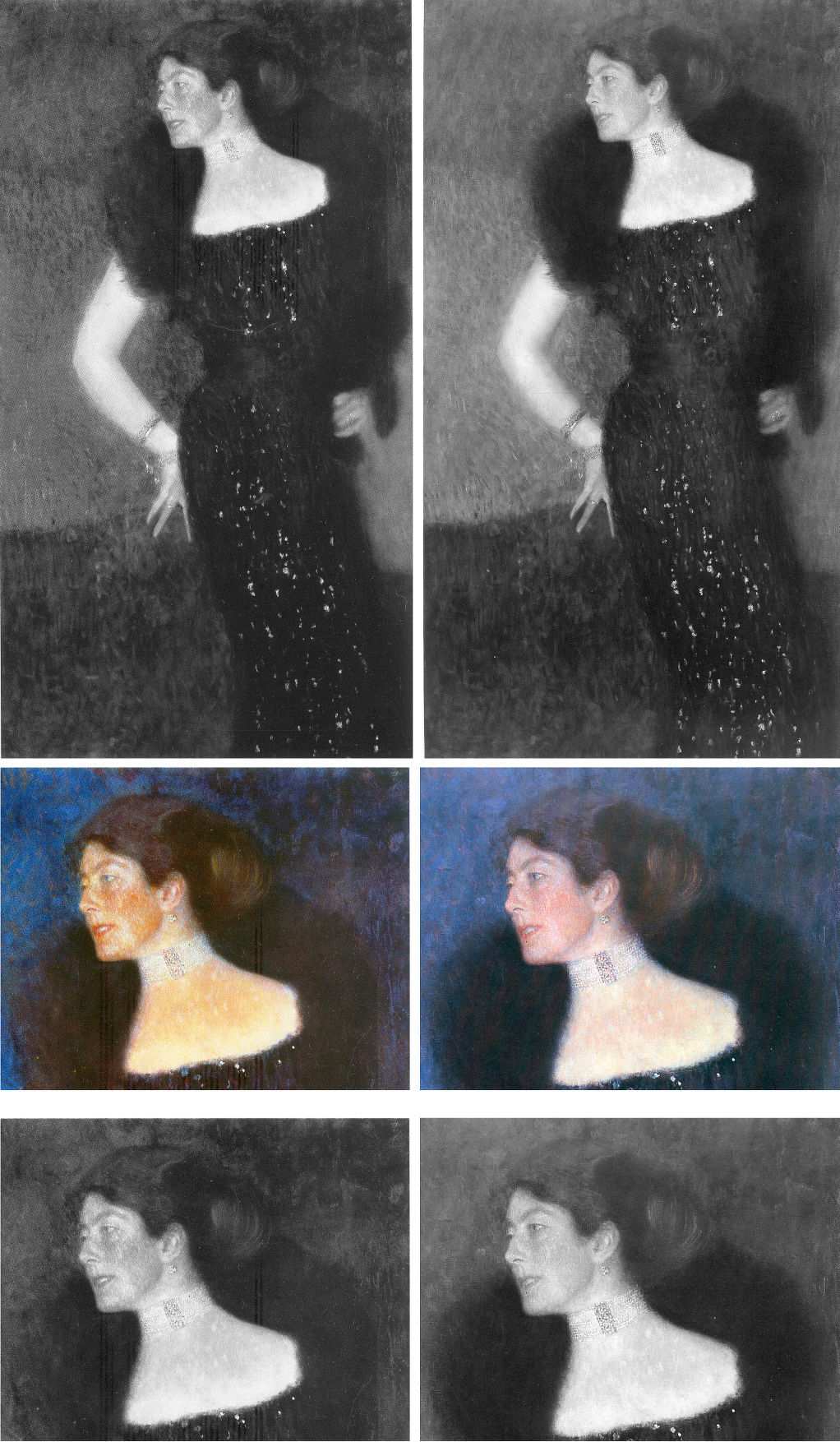
Above, Fig. 20: Klimt’s 1901 portrait of Rose von Rosthorn-Friedmann as seen in the two deluxe Klimt catalogues: that is, as in Weidinger, 2007 left; and as in Natter, 2012, right.
We cannot vouch for the veracity of the two books’ reproductions of the painting and both publishers take fair pride in their productions. Yet, as seen above, there are numerous chromatic and tonal differences in the respective photo-illustrations which, given the chronology, suggest a post-2007 restoration. Because Weidinger attempted to have every Klimt work re-photographed for the 2007 Prestel book’s catalogue we can, perhaps, safely take the images above left to be a fair record of the then state of the picture. So what might account for the general losses of tonal and chromatic vivacity as seen on the right in 2012? For example, Partsch notes (Taschen, 2012) that “her dark, coiffured hair is barely distinguishable from the blue of the background”. That indeed was the case, but it had not been so in the 2007 Weidinger reproduction as above left, centre, when the blues, blacks and whites were warmed and enriched by red. The evident weakening of the strong form and shape of the greatly more lustrous hair in 2007 is not an isolated incident within the picture. It had been accompanied in 2007 by a markedly sharper, darkly unified near-diamond shape of background enclosed by the arm and body.
WHICH IS THE REAL KLIMT?
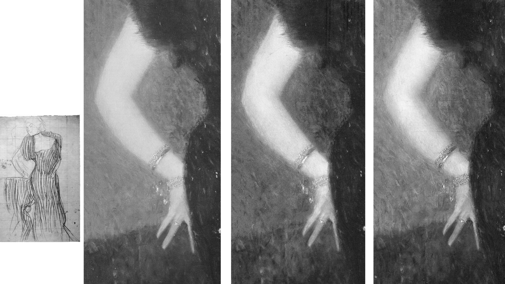
Above, Fig. 21: Left, Klimt’s working drawing for the Rose von Rosthorn-Friedmann portrait (which picture is held in a private collection in Switzerland); right, a detail of the painting, as reproduced respectively in: 1988, Gabriella Belli, Gustav Klimt Masterpieces; 2007, Weidinger, et al; and in 2012, Natter, et al.
The picture had long been thought lost and was known only by a single photograph. Unfortunately, no one seems to have reproduced that early record. What is to be made of the above trio of details recorded consecutively in just twenty-four years? With the above detail, we see three successive states: 1988; 2007; 2012. With the second and third – which is to say, the two most recent states – we can dismiss the possibility of photo/reproduction variations because such could not be responsible for distinctly local changes, as with the dramatically and selectively darkened space between the little and the ring finger that occurred between 2007 and 2012. All three images are individually of a piece and speak of distinct appearances in the picture. Of the three states, the first (1988) is the one that is least like the others: its arm has two sharply defined contours and is slimmer than those in the other two photographs. To this photo-testimony, might anything be gleaned from what is known and what has been said about the picture?
Writing on the most recent (2012) state Natter speaks first of its reception and then of Klimt’s initial struggle: “Klimt wrestled long and hard with the composition and the standing motif, as his preliminary drawings testify… Only gradually did he arrive at the curvaceous, serpentine pose of the final portrait… Noteworthy is the dialogue between the figure and background…Such a permeability of natural forms and representations of the human figure is therefore thoroughly typical of Klimt…” (Emphasis added.)
Writing on the 2007 state, centre image above, Weidinger related the picture’s “erotic connotations” to Klimt’s “numerous snaky women who populate the symbolist paintings of 1898 to 1907” and held that, in this portrait, Klimt “emphasizes both line and area so as to produce a stylized rendering of the body such as manifested itself first in his Symbolist works…Instead of twisting three-dimensionally around her own axis, as do Mannerist figures [and Sargent’s “Madame X”] Rose von Rosthorn’s S-shaped body appears to be all on the same plane; the effect of this, coupled with the emphatic outlining, is to make the portrait seem curiously flat.”
There is a crucial difference in the two accounts. Where Natter speaks of the permeability evident in a dialogue between the figure and its background, he seems on safe ground with the borders of the extravagant fur stole and the lower body on the right, and with the division between the background and the assumed reddish chair, but there is no such permeability at the contour of the face and choker, or at the scissors-like fingers and chair back. Weidinger notes that the red of the armchair had been achieved with “the application of innumerable tiny brushstrokes, pointing in all directions at once” and that “the same method is used for the skin, although here the outcome is not so coarse”. The key difference in the two accounts lies in Weidinger’s recognition of Klimt’s deployment of both line and area. The line (which bounds impermeable shapes) is confined to the areas of bare flesh – the head neck and arm – where Klimt’s classically trained draughtsmanship asserts itself. In his commissioned portraits Klimt retained a respectful and more traditionally hierarchical attentiveness to the forms of heads and hands, whatever indulgence might have been given elsewhere to symbolism, pattern-making abstractions, and decorations.
The earliest photograph, above left is, by definition, the record that is temporally closest to the picture’s original appearance and it should, accordingly, be taken as a more reliable record than the two later states. Additionally, this 1988 state better accords with a vivid contemporary response to the painting. In contradiction of the present (post-2012) chilled blue background, Natter cites Frans Servaes’ captivation in 1901 with Klimt’s use of colour: “The shimmering violet of the background plays with tumultuous gentleness around the bare propped arm and the dark dress covered with spangles in the most wonderful fashion.” Today, one sees no violet against the arm in Figs. 19 and 20. A patch of background to the right of the dress might be thought of as violet but the larger cooler blue areas certainly could not. Might there have been earlier losses in the background as with those seen more recently in the hair? Natter also mentions that Ludwig Hevesi had been particularly struck by “Slender elastic lines having a singular swing, profile to the left…A slim pale arm supports itself on three fingertips on a piece of furniture; one realizes immediately that a figure such as this really does not need to support itself” – like that of an agile, super-fit rock climber, perhaps? Klimt’s final, working study, above left, had fixed the slim arm’s outer contour with deftness and precision. Such decisiveness of design in the arm is best seen here in the oldest record (1988) and is least evident in the most recent and most fumbled arm (2012) where the contours have succumbed to a havering state of permeability. To discount the 1988 photo-testimony in favour of the later states it would be necessary to claim that an earlier restorer had wrongly imposed an alien linearity on the arm and that in two successive restorations an original, fumbled and fatter arm had been recovered. The non-publication of the sole photograph by which this once lost painting was known is to be regretted.
VOID SPACE OR INTRIGUE?
To return to the Knips portrait, in both Figs. 16 above and 22 below it is possible to read miniature figures or statuary within the vegetation along a horizontal line to the left of Sonja Knips’ forehead.
Above, Fig. 22: Left, the 1908-14 collotype of Sonja Knips; right, a lightened section of the collotype’s left-hand area, in which the original two-tone ground/wall/shrubbery boundary is clearer. The above greyscale inset is a detail of a photograph carried in the October 1900 Figaro Illustré, as discussed by Emily Braun in the 2001 Gustav Klimt Modernism in the Making, Ed. Colin B. Bailey. In all three images the horizontal line of figures and a statue is discernible.
Above, Fig. 23: Top row, left, the 2007 Weidinger infra-red image; right, the 1908-14 Miethke collotype – in these, we indicate (in red) the moving ground/wall boundaries and the placement of the “window”. Below, in the centre group, we see how the reported figures had appeared in early photographs. In his 2007 rejection of earlier claims of perceptible figures in the picture’s upper half on the testimony of the infra-red image, Weidinger cites scholarly experts who had variously identified: “cupids and two figures…[a] pool and fish-like creatures… [and a] horse’s head…” Given such testimony – and the fact that discernible figures had registered in the dark background to the left of Sonja’s head in the Klimt-approved collotype and subsequent photographs to this day, as in Fig. 24, right below – those figures’ status might better have been resolved by the publication at high resolution of all the Belvedere’s photographs and technical records of the picture rather than with a dismissal by technical fiat on a single, out-of-context, difficult-to-read infra-red image.
The small, photographed free-standing Cupid sculpture in the centre group above is the former antiques shop find that has been upgraded and displayed at the Metropolitan Museum, New York, as an autograph early Michelangelo. If it might seem improbable that Klimt should have included secondary figures in a large and exceptional portrait, it could equally be held that the photographically-recorded figures in question were forerunners of the artist’s later incorporations of entire armies of people and horse riders – as in the above three later portraits of The Dancer (1916-17), left; Adele Bloch-Bauer II (1912), top; and Elisabeth Lederer (1914-16) bottom right.

Above, Fig. 24: The Portrait of Sonja Knips, as in 1908-14, left, and today, right, as seen in both colour and in greyscale.
THE DEMISE OF THE LILIES AND THE RISE OF “APPROPRIATE RESTORATION STRATEGIES” AT THE BELVEDERE
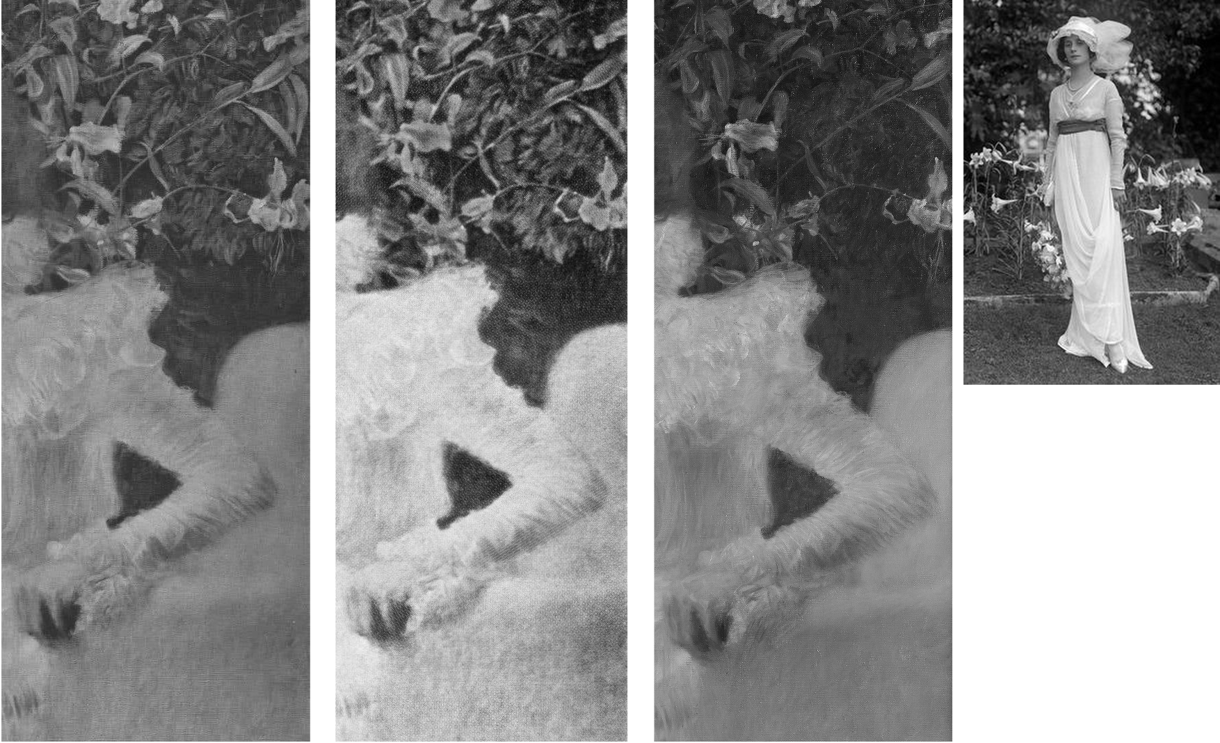
Above, Fig. 25: Three details of the lilies backdrop as recorded in: 1908-14, left; 1942-56, centre; today, right. In the inset, above right, a 1912 British Vogue fashion shot.
The differences seen above between 1908-14, left, and 1942-56, centre, are not substantial and might amount to little more than variations in reproduction values. The subsequent differences seen above, right, however, are of another magnitude and show outright losses of autograph material, as to the foliage between the upper arm and the back of the chair.
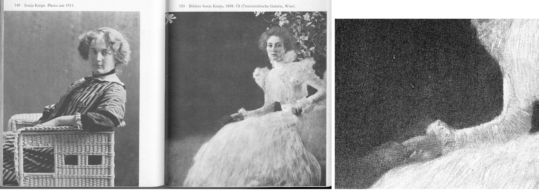
Above, Fig. 26: Left and centre, a two-page spread from Christian Nebehay’s 1969 Gustav Klimt, showing Sonia Knips in 2011 and her portrait when the hand/notebook motif was still intact; right, a detail from Johannes Dobai’s 1978 Klimt showing that by that date the hand/book had been injured and left incoherent. The offending restoration must, therefore, have taken place between 1969 and 1978. The picture itself was commissioned by Sonja Knips (1873-1959) and owned by her until 1950 when she was seventy-seven and it was bought by the Belvedere, Vienna. The museum says of its (manifestly hyperactive) conservation department:
“The Belvedere’s restoration and conservation department is dedicated to the preservation and care, restoration, and technological research into the art and cultural assets of the Belvedere’s collection, which ranges from the Middle Ages to contemporary art. Its mission is to record and preserve objects of historical and cultural significance. Conserving these irreplaceable originals requires a methodical and scientific approach in order to shed light on the historical, stylistic, iconographical, technological, and material aspects of the artworks. With this in mind, the Belvedere’s conservators devise appropriate strategies. On average, the department conserves and restores 150 paintings and frames each year, and frames and mounts between 100 and 150 graphic works.”
THE DECONSTRUCTION OF SONJA’S LITTLE RED BOOK

Above, Fig.27: The red leather-bound Klimt sketch book held by Sonja Knips, as seen, respectively in 1908-14, top; in 1956, centre; and today, above.
In this photo-sequence we see that crucial differences of appearance arose between 1956 and 2012 – in fact, on above evidence, between 1956 and 2007. Given the book’s changed appearances, Dr Natter’s claim that “The dualism of mimesis and dissolution, of faithful reproduction and painterly openness, is already in evidence here as a stylistic means” becomes problematic. Given that the once faithfully tight and precise book/right-hand had by then been left in a quasi-Cubist double image that resembles time-lapse photography, should it have been regarded as an instance of mimesis or dissolution? Natter’s view remains unknown because has not commented on the present condition. Such questions arise with other Klimt portrait pictures:
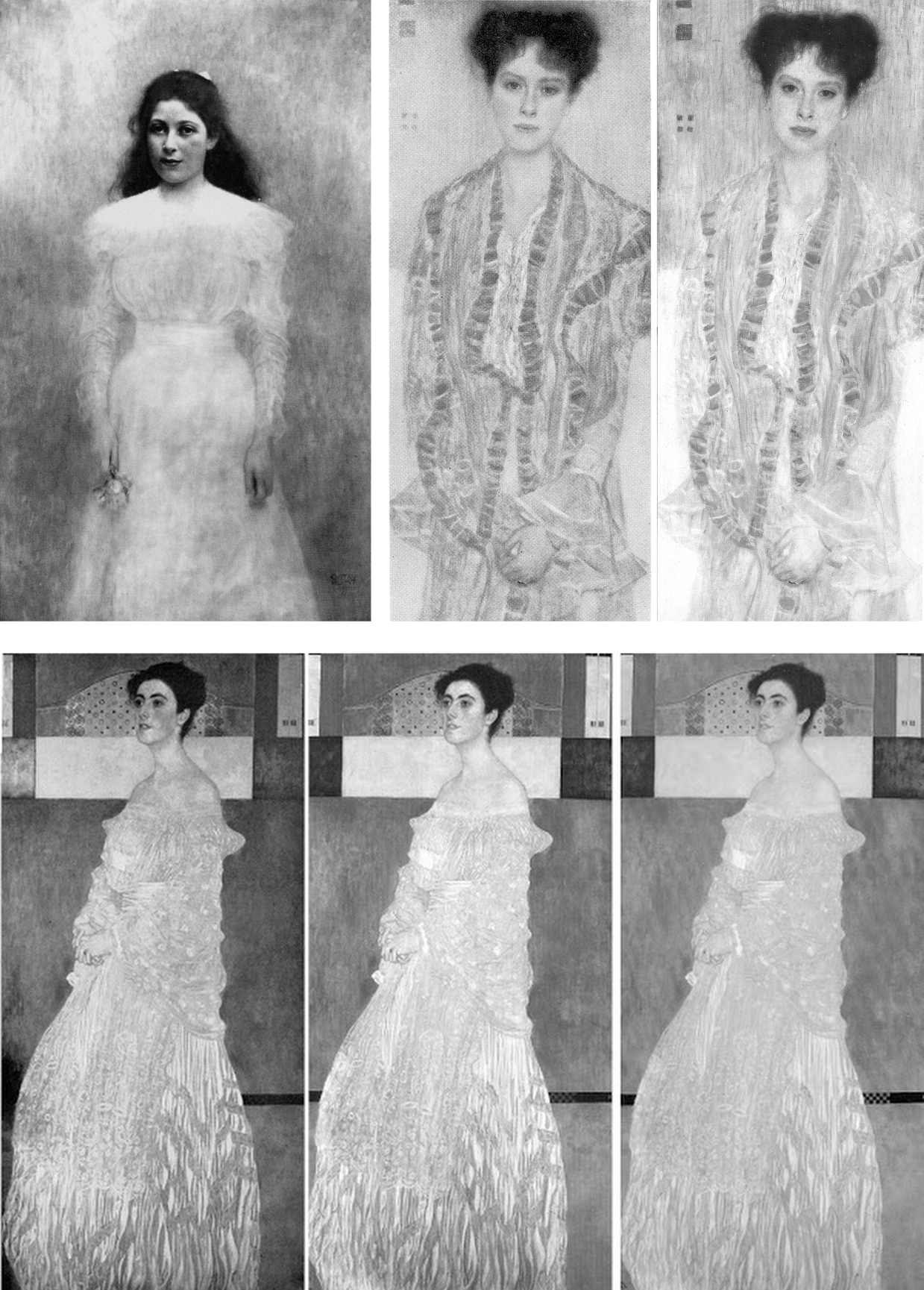
Above Fig. 28: Top, left, Klimt’s now lost 1900 portrait of the thirteen-years old Trude Steine (note the strong line of the shoulders); centre and right, a large detail of Klimt’s 1902 Portrait of Gertrud Loew, as in 1956 and today; above, a three-part chronological sequence of Klimt’s 1905 Portrait of Margaret Stonborough-Wittgenstein.
As a lost work, the Trudy Steine picture, will at least now never lose its great – photographically preserved – vivacity and force. Gertrud Loew disappeared when sent to Berlin in 1938. Her portrait survives but it has not been spared by restorers. Speaking to its condition today, as top right, Weidinger writes:
“Ludwig Hevesi [1902] referred to the portrait of Gertrud Loew – shown for the first time at the ‘Klimt Collective exhibition’ at the Secession in 1902 – as ‘the most fragrant lyric of which the painter’s palette is capable’. Like Serena Lederer the subject is clad in white. Colour accents are set by her long, downward cascading shawl with its lilac-coloured border. Klimt renders her pale skin in tones close to that of her dress, and only her red lips, blue eyes and dark hair supply the necessary contrasts. Her loosely flowing dress betrays no sense of corporeality. In this connection, Natter speaks of her ‘dematerialization’”. Weidinger adds that when exhibited in 1903 it had been said to possess “all the charm of radiant filminess” and “the gauziest lyricism of which the palette is capable.”
That was then. Restorers thought the filminess might be taken further and, to that end, simultaneously darkened the upper background and lightened the upper costume, thereby dematerializing the previously clear articulation of the subject’s shoulders. To add to the tonal mayhem, both the lower background and the lower dress have been lightened. This is no longer the picture Klimt painted of Loew. The Pirchan reproduction gives a truer account than the painting itself.
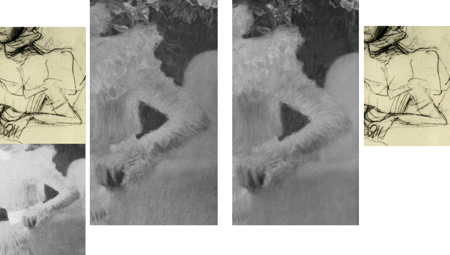
Above, Fig. 29: Main centre images: a detail of the picture as recorded in 1956 and today, in which sequence it is easy to identify the obliteration of leaves, multiple micro-losses of value in this dress and the loss/painting-over of the original foliage between the shoulder and the chair back; insets, a detail of one of Klimt’s preparatory studies for the painting; and (bottom left), a detail from a photograph of the portrait carried in the October 1900 Figaro Illustré (as discussed by Emily Braun in the 2001 Gustav Klimt Modernism in the Making, Ed. Colin B. Bailey).
Natter’s claim that Klimt camouflaged disparate pictorial means by simulating a photo snapshot holds fair insofar as Sonja grips the arm of chair firmly and (as others have noted) leans forward as if caught when about to rise, but the picture was no product of a snatched moment, as the many studies Klimt made of his subject when in costume and in the chair testify (see Fig. 30 below). It is also part-true that Klimt conjured a “fascinating contrast between the naturalistically modelled head of the sitter and the gauzy shimmer of her dress” (we are advised that the material was likely either very finely pleated silk chiffon or muslin) but, aside from the abundant skirt, there is no near-abandonment of corporeality: even in semi-repose this dress in animated and formed by the lithe, almost geometricized, body that was captured in Klimt’s preliminary studies.
Notwithstanding the abundance of small folds on the sleeves, the thin shapely taught-ness of the arm seen by Klimt and captured in the drawn studies had asserted itself in the painting. On comparing the above photographic sequence, it is evident that in the very earliest recorded state (1900, bottom left), the orchestrated collection of shadows at the bottom of the lower arm much better and more decisively “drew” the limb’s contour: at the turn of the sharply defined elbow there is first a discernible concavity and then a convexity that straightens as it runs down towards the wrist. That original taught-ness of form/anatomy and relative weight of shadow at the lower contour was also evident even in the small low-quality image from Nebehay’s, 1976 Gustav Klimt, shown above at Fig. 11, but, like so much in Klimt, it has subsequently been fuzzed and lost.
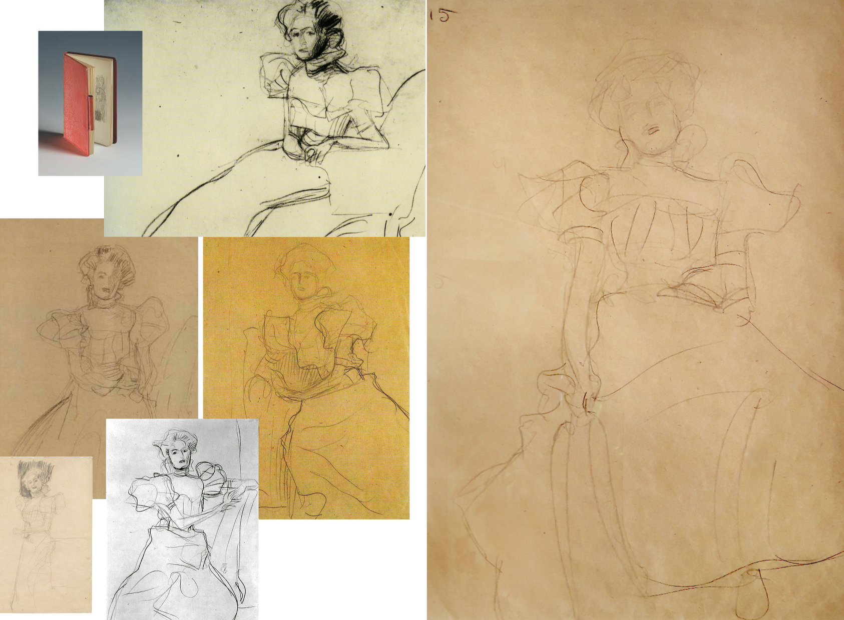
Above, Fig. 30: Some of Klimt’s many sketches for the Portrait of Sonja Knips, in every one of which the forms and the massing of the hair were noted in relation to the head.
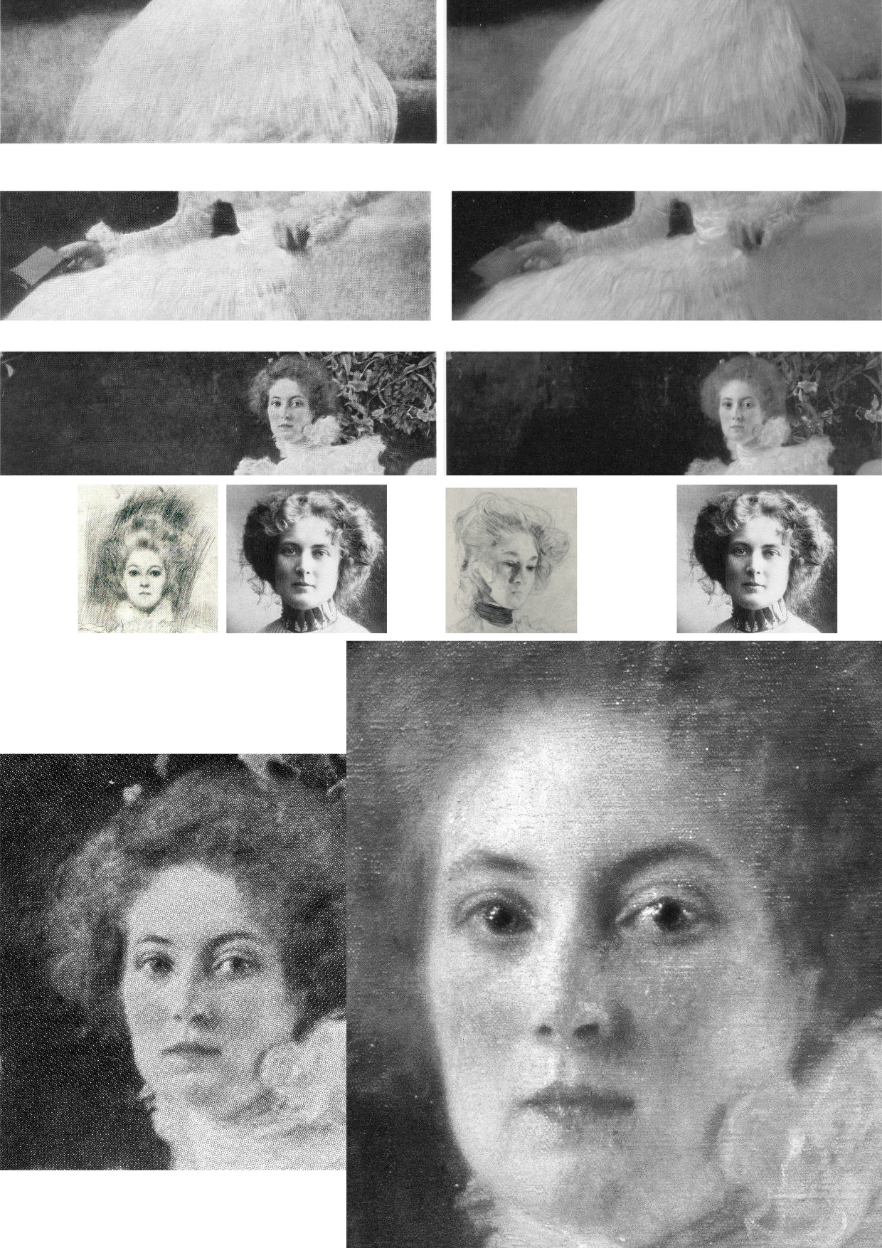
Above, Fig. 31: Top, three photo-comparisons of details showing changes between 1956 and today; centre row, left, a drawing of Sonja Knips and a later photograph; right, a Klimt study for another painting; bottom row, Knips in 1956 and in 2007 (Weidinger).
More than a first foray into a new type, this arguably stands as one of Klimt’s best female portraits, its twenty-five years-old subject being utterly composed, beautiful, intelligent and with a resolute, if poignant gaze. As mentioned, having first seen Sonja to be gazing out of the picture, Susanna Partsch (“Paintings of Women”, Taschen, 2012) now sees a Gorgon-like demeanour with Sonja turning her head “so that she is looking out of the picture and fixes the viewer with her gaze”. That reading is not remiss on today’s appearance but in Pirchan’s 1956 image (here bottom left) the gaze seemed fractionally averted and the effect markedly more reflective than confrontational. Moreover, a comparison of the mouth’s two states shows that Sonja has received a fresh lipstick that no long conforms to the shapes and forms of her lips.
Partsch writes that “The curls of her hair are taken up in the ruffles of her dress” without noticing that the earlier softly disposed forms and luxuriance of the hair have been drained of form and vitality – as with the disappeared darkly accented shadow at the lower temple and cheek that formerly served to draw the contour of the face and drew attention to Knips’ right eye. Considering the importance of hair as a feminine adornment and how hard artists labour to do justice to its glories, it seems odd that clear injuries to it, as here and with Rose von Rosthorn-Friedmann alike, should generally go unremarked.
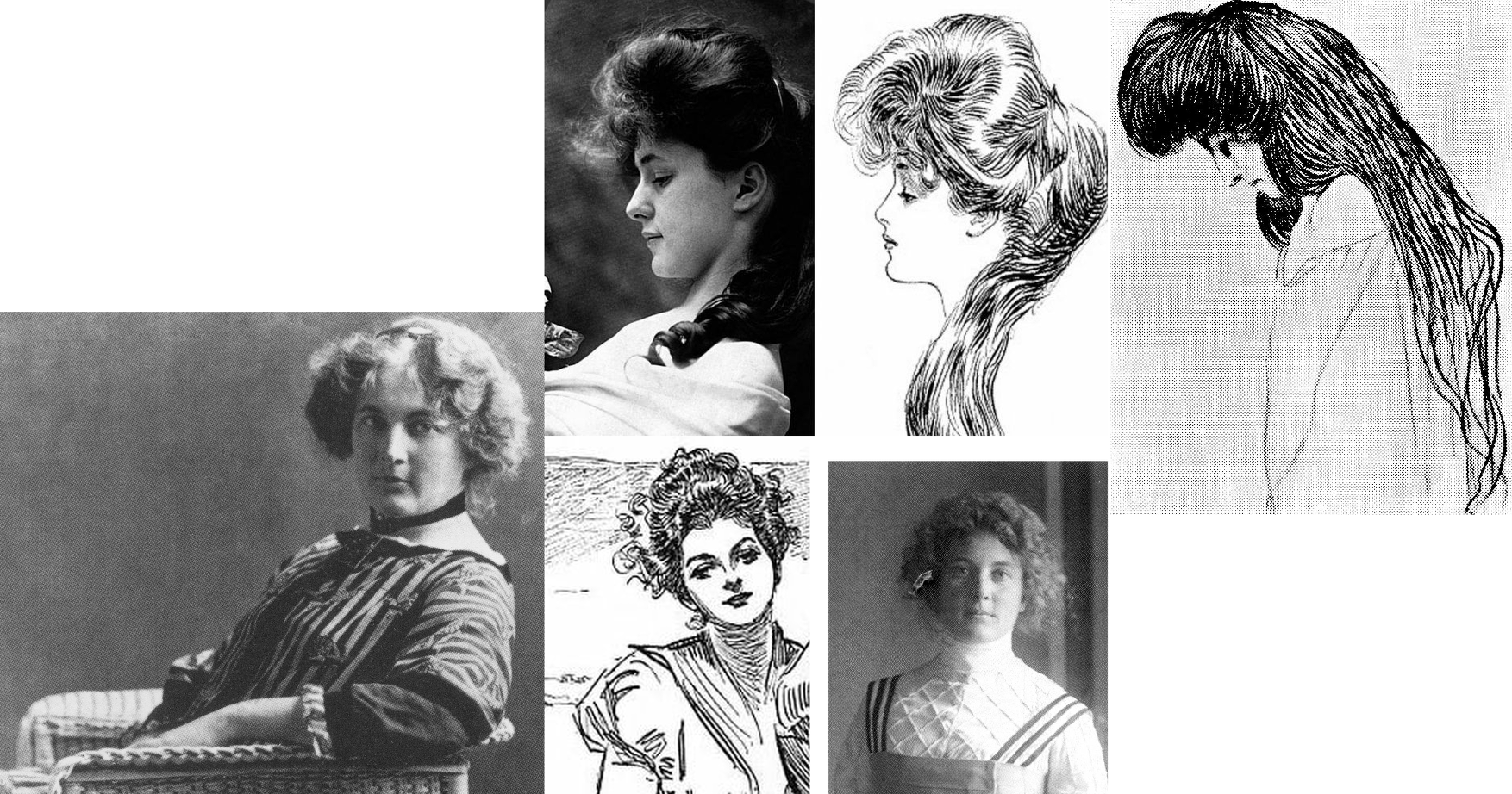
Above, Fig. 32: Left, Sonja Knips in 1911; centre, top, Evelyn Nesbit, the muse of the American illustrator Dana Gibson, left, and one of Gibson’s famous “Gibson Girl” drawings; right, a Klimt drawing of 1898-1900; centre above, a Gibson Girl left and Sonja Knips in 1911 in Japanese-style Reformklied, as carried in the Neue Galerie 2007 Gustav Klimt. (For live early film footage of American women sporting Gibson Girl hairdos, see “The Real Edwardian Gibson Girls of the USA” at Glamour Daze.)
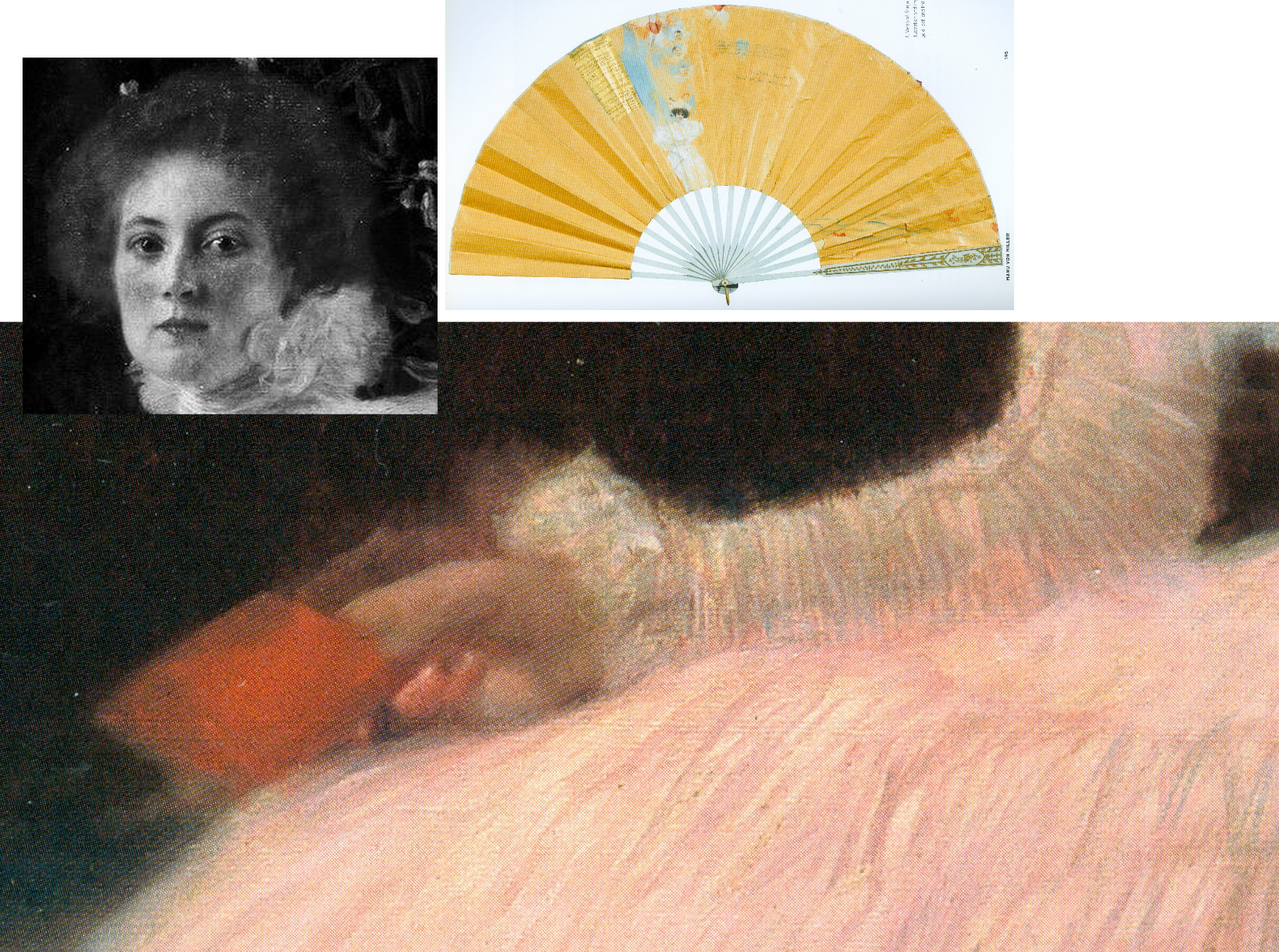
Above, Fig. 33: Main picture, the right hand of Sonja Knips; top left inset, Sonja Knips; above right, Sonja Knips’ fan, as decorated by Klimt.
Consensual views break down on Klimt’s and Sonja Knips’ relationship. In the 2007 Neue Galerie book, Knips’s granddaughter, Dr Manu von Miller, author of Sonja Knips Und Die Wiener Moderne, 2004, reports (“Embracing Modernism, Gustav Klimt and Sonja Knips”) that recently disclosed materials from the Knips family revealed much about Sonja and shed light on previously unknown aspects of Klimt’s life and person. Thus: Klimt’s Sonja portrait “likewise contains hints about the life of the artist” and that the two had had an affair years before it was painted, Klimt having known her since she was a teenager. Painting Sonja had released Klimt from his role as “a ‘decorative’ painter”, and he in turn enormously influenced Knips enabling her to “break free of the rigid bourgeois conventions of her time, and to create her own highly personal approach to aesthetics and collecting.” In 1896 Sonja married the industrial magnate Anton Knips – a mismatch, he not sharing her passions for socialising, modern art and young artists. Klimt’s relationship had, Dr Miller reported, “blossomed at some point into an amorous relationship. How long the affair lasted is not known but Gustav and Sonja’s romance is substantiated by notations on a paper fan found among Sonja Knips’s personal effects.” Those included a love poem dated 1895, the year before Sonja married Anton. A member of her family had told Miller the affair ended because Klimt was unwilling to marry her. The fan was thus “a love note and a farewell”, Klimt having ended another affair in the same manner…and given that Sonja sat for Klimt’s portrait scarcely a year after her wedding, Miller felt “It is hard to imagine that the painting could have been produced without their recent love affair being in the minds of both artist and sitter. She may have viewed the portrait as an enduring reminder of the relationship; it was noted by an acquaintance of Sonja’s that her eyes would light up when she was asked about the history of the painting’s creation.”
As mentioned, Sonja Knips kept the painting until her seventy-seventh year and, as Miller noted, she purchased Klimt’s unfinished (and highly erotic) Adam and Eve after his death and hung it “in the small boudoir next her bedroom”. Partsch will have none of Miller’s account, writing (Taschen, 2012): “On the basis of this fan and the decoration on the reverse side, Manu von Miller reconstructed a love affair between Gustav Klimt and Sonja Knips before her marriage and proposed that Klimt used the fan as a way of ending their relationship. Miller also suggests that Klimt may have done the same with a second fan destined for an unknown recipient and on that occasion carrying the German proverb… (‘Best to get unpleasant things over and done with’) … It is my view that the fan belonging to Sonja Knips points neither to a love affair between the artist and his model nor to a rupture between the two. Rather, it shows Klimt expressing his congratulations to Sonja Knips upon her engagement…”
What then, to make of the prominently displayed (- almost at the picture’s geometrical centre) little red book? In 1992 Nebehay wrote of “a small red notebook: a sketchbook that Klimt gave her.” It had been found in Sonja Knips’s estate and edited by Nebehay and was one of only three such surviving notebooks. It contained a small photograph of Klimt. Alice Strobl had dated Klimt sketches in it to between 1897 and 1899. Strobl had reported an eyewitness’s recollection of Klimt’s studio floor “strewn with thin red notebooks in which he jotted his artistic ideas down in shorthand, as it were.” Nebehay notes that Klimt was as disorderly with his notebooks as with his sketches which lay about in heaps on the floor.
On the book’s possible significance, Nebehay, like Partsch, leaned towards scepticism: “A married society woman would never have dared keep anything that was more than a souvenir” and, he went on, “Johannes Dobai reports that the lady [Knips] told him that the figures hidden in the foliage behind her had no symbolic meaning and as for the notebook in her hand, that was chosen for the colour effect.” Against that, Weidinger wrote in 2007:
“During his second series of studies, Klimt appears to have wanted to portray Rose von Rosthorn-Friedmann holding a rose in her right hand, but in the final version decided against this. The little sketchbook Sonja Knips is portrayed holding serves a similar purpose. Her claim that Klimt had merely wanted to add a shot of colour can be refuted on the grounds that the book appears in the studies for this work as well. Klimt is clearly using the book as an attribute which he considers apposite.”
Alma Schindler who so jealously and angrily cited Klimt’s affair with Rose had been delighted when Klimt preferred to make a new fan for her rather than contribute to a fan gifted by another man. Klimt pursued Alma as a teenager and was greatly distressed when prevented from initiating an affair with her. Klimt, as mentioned had known Sonja, too, as a teenager before her marriage. If the presence of the book is to be discounted, what of the picture’s part-hidden Cupid and figures and why have they been so uniformly dismissed on the sole testimony of a technically penetrating image?
Partsch contests an affair against much evidence and trusts an infra-red image: “The dominant field of blackish brown, which provides a foil to the flowers and the female sitter, contains several lighter patches. These have inspired numerous interpretations… [which infra-red photography] has failed to confirm…” In 2008 Rachel Barnes (Gustav Klimt) wrote: “There was a theory that Klimt painted a number of things in the background, including a horse. Subsequent infra-red examination has proved this was not the case.”
It is unfortunate on many levels that in modern times scholars turned from artists to restorers for guidance on technical and aesthetic matters when restorers have no technical means of analysing artistic values and, through their interventions, so repeatedly demonstrate inabilities even to recognise and respect them. It seems that nothing might arrest their long march through the world’s art – no matter how egregiously they mangle its images and, hence, meanings. We live in hope that owners and scholars will better defend the integrity and dignity of works of art but note that we first complained of restorers’ manifestly and indefensibly destructive actions – and of art historians’ effective complicity – in an article, “A crime against the artist”, in The Independent of 22 November 1991 as reproduced below at Fig. 34:
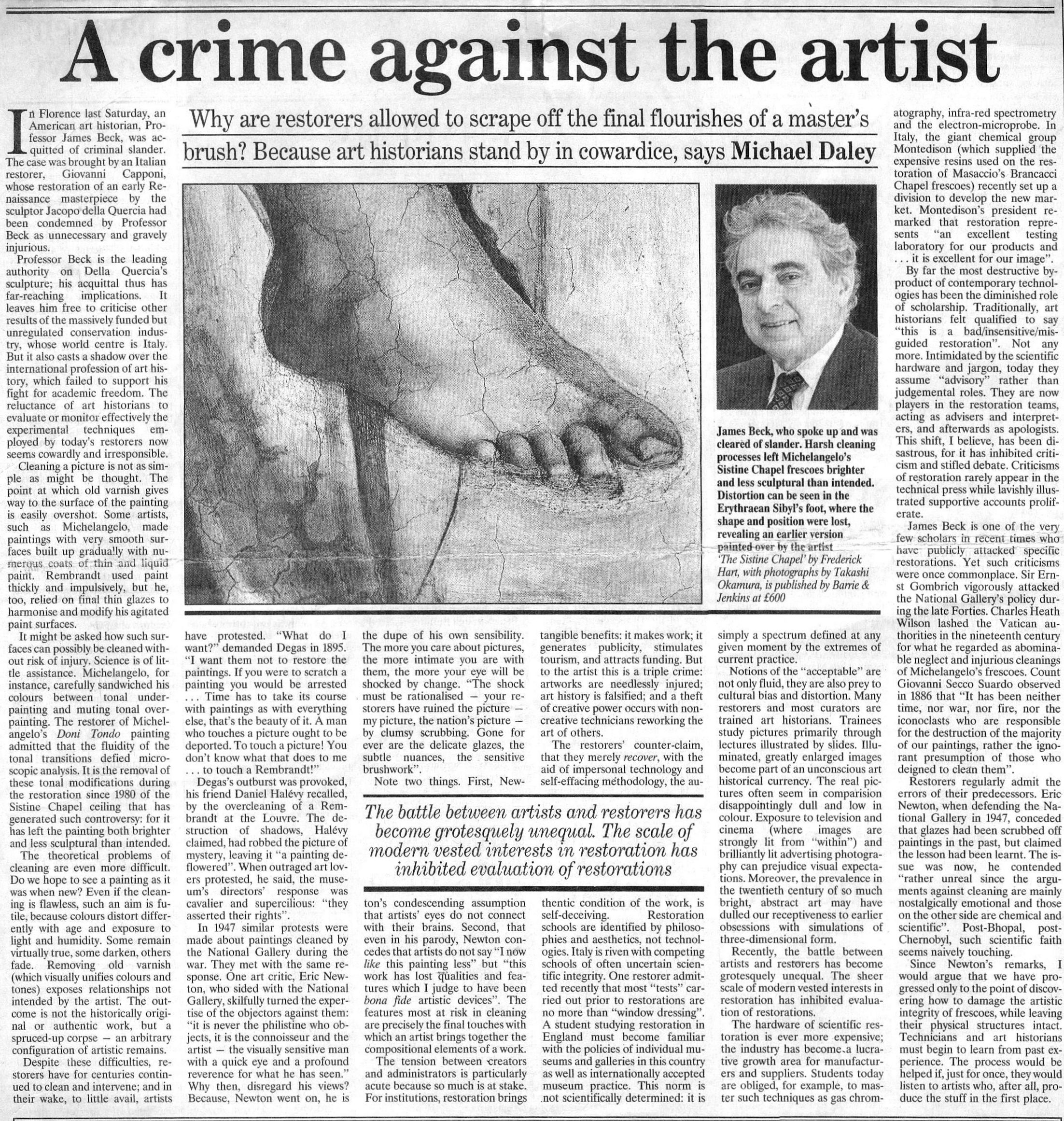
Michael Daley, Director, 29 April 2021
Art-Trading, Connoisseurship and the Van Dyck Bonanza
There are now two upgraded paintings in two museums that have been claimed as “The Last Van Dyck Self-Portrait” and an upgraded third painting has been presented in a third museum as a lost, earlier Van Dyck self-portrait – see Fig. 1 below. This acceptance by three museums of three self-portraits in six years has coincided with a spate of exposed forgeries and restoration-led upgraded “discoveries”. The opaque means by which three problematic pictures found their separate ways into three museums as upgraded autograph Van Dycks are items of cultural/art-political concern.
This triple elevation has spotlighted levels of scholarship and transparency within the cross-linked spheres of connoisseurship, ownership, restoration, promotion and sales in the wake of the spectacular rise and demise of the now downgraded and disappeared $450m Leonardo School Salvator Mundi that had been bought for barely a thousand dollars and somehow netted nearly two thirds of a billion dollars through three sales in five years on an implausible provenance. The institutionally sensitive roles of upgraded old master paintings serving as conduits for financial exchanges and investment are attracting attention as never before. The Van Dyck bonanza has prompted public challenges on both the artistic status of the pictures being traded and the means and manner by which public and private monies pass hands.
THREE UPGRADED VAN DYCK SELF-PORTRAITS
Above, Fig. 1: Left, the National Portrait Gallery’s “Last Van Dyck Self-Portrait”; centre, the new Bendor Grosvenor-accredited (and owned) “Last Van Dyck Self-Portrait”, as loaned to the Rubenshuis Museum, Antwerp; right, the Philip Mould/Grosvenor accredited, privately owned painting that has been loaned as an autograph Van Dyck self-portrait to the Minneapolis Institute of Arts, Minnesota.
All three of the above self-portraits changed hands recently as autograph Van Dyck self-portraits with the first two both now claimed to be the last Van Dyck self-portrait. All three have undergone modern or recent restorations. The two on the right were transformed within the last decade (and possibly by the same restorer). The picture on the left – an undeclared, covert upgrade – was bought by the National Portrait Gallery in 2014 for £10m.
Above, Fig. 2: Left, the “Last Van Dyck Self-Portrait” that was published in 1941 by Gustav Glück in The Burlington Magazine (“Reflections on Van Dyck’s early death”); right, the “Last Van Dyck Self-Portrait” that was sold to the National Portrait Gallery in 2014.
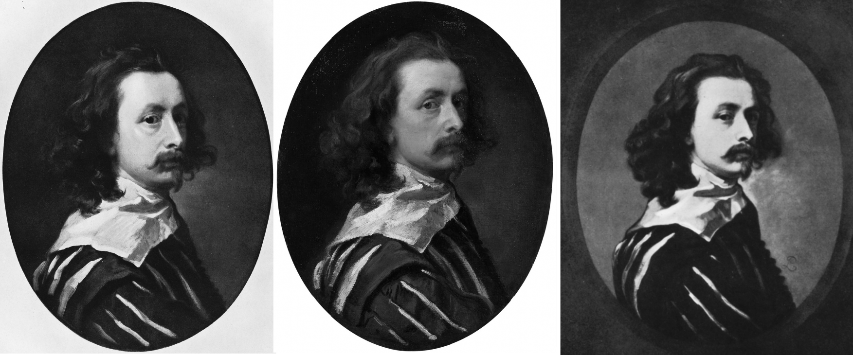
Above, Fig. 3: Left, the “Last Van Dyck Self-Portrait” as published by Glück in 1941; centre, the “Last Van Dyck Self-Portrait” as sold to the National Portrait Gallery in 2014; right the painting published by Glück in 1941 as a copy by Sir Peter Lely of the Glück claimed last Van Dyck self-portrait shown left, here.
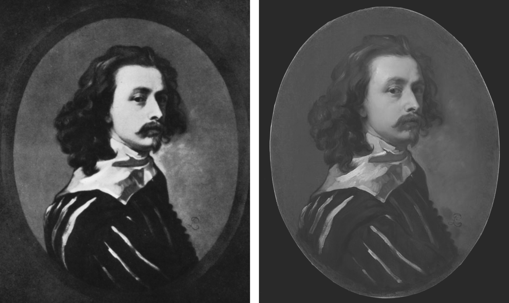
Above, Fig. 4: Left, the painting published by Glück in 1941 as a copy by Sir Peter Lely of the then-claimed last Van Dyck self-portrait shown above left at Fig. 3; right, the painting published in 2011 as a copy by Sir Peter Lely of the then-claimed last Van Dyck self-portrait at Fig. 1, left, which was sold to the NPG in 2014.
MILLAR’S WARNINGS
The notoriously vexing challenge of identifying autograph Van Dycks was set out with frankness and high expertise by Sir Oliver Millar, a former Surveyor of the Queen’s Pictures, in his contribution to the 2004 catalogue raisonné Van Dyck – A Complete Catalogue of the Paintings, by Susan Barnes, Nora De Poorter, Oliver Millar and Horst Vey and published by the Paul Mellon Centre, London, the educational charity committed to supporting original research into the history of British art and architecture of all periods.
Covering Van Dyck’s last English period from 1632 to 1641, Millar listed 264 works and added an appendix of 37 works that comprise records of lost original paintings. Taken together they would average more than thirty-three paintings a year, including many double and very grand group portraits with brilliant elaborate costumes, accoutrements, settings, animals and part-landscapes but the work rate was even higher because of Van Dyck’s many and often long absences and periods of illness – he spent more than a year abroad in 1634-5 and suffered increasing pain in his painting hand. His employment of assistants caused some patrons to complain of work that was not autograph.
Millar assumed that Van Dyck had emulated the practices and “distribution of responsibilities as organised in Rubens’s studio” when setting up his own studio in London and he could hardly have spoken more bluntly of the artistic consequences of such production systems. A great deal of work “especially towards the end of his life”, he noted, “was assigned to Van Dyck’s assistants, and there was a heavy demand for repetitions, whether replicas, part replicas, variants or copies […] Sometimes Van Dyck would himself paint a new detail in a repetition otherwise painted entirely by an assistant”, whereas his “finest English portraits are painted…noticeably with a greater variety of touch.” A pronounced monotony of touch might itself, therefore, ring authorial alarms.
NEW EXPERTS ARE GROWING THE VAN DYCK MARKET
The art market correspondent, Colin Gleadell, restated the attribution problem in relation to current market expansionism, in the Telegraph (28 April 2018):
“Interestingly, Van Dyck has had more re-attributions than any other Old Master in recent times. Philip Mould, presenter of the BBC’s Fake or Fortune, traces this phenomenon to the publication of the first reliable catalogue raisonné in 2004, which allowed for detailed study of nearly 800 examples of the artist’s work.
“Of the catalogue’s four original scholars, only two are still alive, and a number of former museum directors have offered their views on attribution since. It’s differences in opinion that have allowed additional works to be added to the recognised Van Dyck corpus.
“Because Van Dyck was prolific and used studio assistants in his work, it can be tricky to unravel how much of a painting is solely by the master. Consequently, the number of works attributed to him, his studio and his many followers is plentiful. Around 300 have come up for auction in the last four years, with dozens subsequently upgraded with a full attribution.
“Taking some credit for the change in status was Mould’s researcher, Bendor Grosvenor, now a TV presenter in his own right and also a Van Dyck connoisseur, who has been quietly accumulating a small collection of discoveries of his own.
“But while Grosvenor prefers to keep his finds, his friend, Fergus Hall, is in the business of selling, his trained eye capable of recognising Van Dyck’s touch even through centuries of dirt, degraded varnish and additional paint. It is only after painstaking cleaning, though, that the full picture emerges…”
MAGICIANS ANNOINT SECOND-STRING WORKS
There exists an aggravating sub-phenomenon whereby venerable scholar/connoisseurs effectively acquire powers to elevate best available copies to autograph status. Some, like the late Sir Denis Mahon, have been known to elevate more than one such work to a single “vacancy”. (See “Art’s Toxic Assets and a Crisis of Connoisseurship”.) Occasional misattributions are inevitable (and correctable) in a field that necessarily rests on fine judgements, but wholesale upgrades risk diluting and adulterating oeuvres to the point of jeopardising market confidence. Risk is compounded when upgrades are products of prolonged restorations in which paint is subtracted and added to the surviving carcasses of pictures on singular, sometimes optimistic, readings of authorship.
BENDOR GROSVENOR’S ASSORTED CONTRIBUTIONS
Above, Fig. 5: All six works above have been supported by Bendor Grosvenor.
The three recently and problematically upgraded Van Dyck self-portraits above left were all researched and espoused by Grosvenor. All three works on the right are manifest fakes. The Hals and the Gentileschi were initially accepted by Grosvenor and the “Raphael” attribution was made by him on television.
Respectively, the six are: left, the National Portrait Gallery’s “Last Van Dyck Self-Portrait”, as shown on the gallery’s 2015 celebratory book on the painting; second left, Grosvenor’s own and self-upgraded “Last Van Dyck Self-Portrait”, as loaned by him to the Rubenshuis Museum; third left, the privately owned, Grosvenor/Mould-attributed Van Dyck “Portrait of the Artist” that is now on loan to the Minneapolis Institute of Arts; third right, the now notorious “Frans Hals” (which Grosvenor, the Louvre Museum and a London dealer took to be authentic before Sotheby’s proved by technical analysis that it was a modern paints-riddled fake and fully refunded its buyer ); second right, the self-contained painted fragment of a figure that Grosvenor held to be part of a larger Raphael panel on his BBC4 Britain’s Lost Masterpieces programme (5 October 2016) with near-unequivocal support from the National Gallery’s then director, Sir Nicholas Penny. (The “Raphael” was subsequently rejected and deemed possibly 18th century by the National Gallery in August 2019 following lengthy examinations, but Grosvenor still insists that Raphael had painted this fragment of a “Madonna in a Cross-over Dress” even though it had been painted inside the edges of a piece of wood and therefore could never have been part of a full panel painting); right, the fake Orazio Gentileschi David and Goliath painted on a lapis lazuli slab and which had been exhibited as authentic at the National Gallery when loaned by an anonymous private collector who had bought it from the dealer who had sold on the fake Hals through Sotheby’s.
RESTORATION “SCIENCE” AND THE DETECTION OF AUTHENTICITY
Even before Millar’s warnings, a non-art market exercise had confirmed the problem of identifying studio contributions in 1999 when, in the National Gallery’s Technical Bulletin, the restorer Larry Keith reported that a recent restoration of the Rubens studio work Drunken Silenus supported by Satyrs (Fig. 6 below) had “allowed the opportunity to consider the questions around its authorship and execution afresh in the context of a collaborative technical investigation with the scientific department”. Despite the gallery’s advanced scientific apparatuses and its staffs’ best efforts, it was recognised that “The very nature of the Rubens studio, with its streamlined production and group participation, meant that the painting techniques and materials were also largely uniform, which inevitably limits the ability of technical study to inform specific attributional problems.” In the absence of documentation and relying “heavily on traditional style-based Morellian connoisseurship” the gallery attributed the picture to Van Dyck on a traditional appraisal by eye.

Above, Fig. 6: Above, top left and centre, photographs of a part of the National Gallery’s Rubens studio work Drunken Silenus supported by Satyrs, showing the work before restoration (left), after restoration (centre) and (right) as digitally presented today; below, a detail of a face before and after restoration.
As seen above, the pre- and the post-restoration states are artistically different in their tonal values and relationships. We have examined the National Gallery’s dossiers on the painting and the gallery kindly supplied the two good, hard-copy directly comparative photographs above, top. Where Gleadell shared the sleeper hunters’ proclaimed view of restoration as a benign and “enabling” process, careful comparison of the above detail of a face and its relationship to the foil of a background/sky before and after a single restoration show the debilitating disruptions of values and relationships (relative values) that can occur during a single restoration. Given that what comes off first under restorers’ swabs is what went on last with the artist’s brush, and that highly successful painters like Rubens and Van Dyck often touched up and finished off works that had been largely executed by assistants, it is not hard to appreciate how such subtractions through cleaning followed by painted additions can aggravate difficulties of attribution.
MADE-OVER UPGRADES
The principal instrument in art market upgrades is a long, supposedly “diagnostic”, visually transforming restoration. With dramatically altered pictures, scholars can more easily be chivvied to endorse new and elevating ascriptions. Few restorations give rise to downgrades. Sleeper hunters invariably swear by the brilliance and moderation of their favourite restorers and impute scientific veracity to their methods. In naïve non-specialist circles like the BBC, there exists an unexamined conviction that because today’s technologies are more advanced than earlier ones, aesthetic judgements are now scientifically validated. For example, in short £540 weekend courses at the Royal Academy (with light refreshments, an evening reception and a certificate thrown in), Philip Mould’s former apprentice, Bendor Grosvenor, (who read modern – not art – history and now works as a BBC television arts programme maker, art history blogger, occasional journalist, auction house director, a self-declared ex-dealer collector and, most recently, a picture restorer – see below), promises that “The theory and history of connoisseurship will also be explored, along with the latest scientific techniques for assessing attribution”.
There are no such techniques – science cannot appraise authorship. No matter how technically sophisticated “non-invasive” images might be, they still need to be read for significance. While the “scientific” technical analysis of pictures’ material components can readily disqualify attributed old master works that have been liberally constructed with modern materials, there are no scientific means of assessing authorship, per se.
VISUAL APPRAISALS
Painters make pictures by eye to be viewed by eye and appraisals must also be made by eye, as the National Gallery recognised with its Rubens school picture. When Berenson praised the “seeing eye” and “active not passive eyes” he meant eyes employed “with all the faculties co-operating” but in so-saying he spoke a (self-confessed) part-truth: “As a consumer of the art product I have the right to do all that. As I am neither figure artist nor architect, nor musician, I have no certain right to speak of the producer. I am in the position of most critics, philosophers and scholars. We have enjoyed experiencing the creative process in the art of words only with the logical result that writers on art seldom have in mind any of the arts except the verbal ones.”
Faculties, however refined and words however eloquent, are not the whole story. Too often overlooked is the extent to which for art-practitioners (artists) the powers of the eye are drilled into being both constructive and critical through the marriage of looking and doing that comprises artistic practice. Strictly speaking, that sequence should read: thinking, looking; doing; appraising; looking… Those who see-through-doing are best placed to recognise what counts as undoing and redoing in art. Best-placed but holding no monopoly – Millar fully recognised that restoration alterations handicap appraisals: “…the treatment it may have undergone in the past may also make it impossible to be entirely confident about its quality”. In this regard and for good reasons auctioneers place high premiums on little- or never-restored pictures.
TWO PUBLICATIONS FOUR YEARS APART AND TWO OVERLAPPING CAMPAIGNS OF ATTRIBUTION
Above, Fig.7: Top, left, the 80 pp full colour catalogue FINDING VAN DYCK , pub. PHILIP MOULD LTD, June/July 2011; top right, the Winter 2015/16 British Art Journal, which carried Bendor Grosvenor’s article “A Self-portrait by Sir Anthony van Dyck (1599-1641) from the collection of Charles I”; above, left, the £10m National Portrait Gallery “Last Van Dyck Self-Portrait”; above, right, the Grosvenor-owned, Rubenshuis Museum exhibited, “Last Van Dyck Self-Portrait”.
SHARED EXCITEMENTS, RISKS, AND AVOIDANCE OF SIN
In 2011 Grosvenor, then an employee of the Philip Mould gallery, lauded the gallery’s (and later the National Portrait Gallery’s) “Last Van Dyck Self-Portrait” picture in the FINDING VAN DYCK catalogue shown above, top left:
“Our first exhibit, Cat. 1, is Van Dyck’s last self-portrait. It was acquired by this gallery in partnership with Dr Alfred Bader in December 2009 for £8.3m at Sotheby’s in London, a record for the artist at auction. Self-portraits tend to stand out among a painter’s oeuvre as some of their most compelling works, and as an instructive connoisseurial guide in what an unquestionably genuine and pre-eminent Van Dyck looks like, Cat. 1 takes some beating.” (Emphases added.)
As fulsome advocacy the entry itself takes some beating. The FINDING VAN DYCK exhibition celebrated recently claimed works of or after Van Dyck and it constituted the high-water mark of Van Dyck sleeper-hunting at Philip Mould Ltd which became Philip Mould and Co. from which Grosvenor would depart in 2014 with a (rumoured) £1m settlement. Grosvenor seemed unaware that the Cat. 1 picture, then unsold after eighteen months in the Mould gallery, was a recent upgrade made by stealth and without due scholarly interrogation – see below.
The catalogue bore the gnomic dedication “For Dr Alfred Bader CBE. A distinguished progenitor of adventure in old masters”. Bader, an industrialist, philanthropist as well as an “inveterate collector”, as he once put it, died in December 2018 but he had been a key player in the Mould gallery’s acquisition of the “Last Van Dyck Self-Portrait” and its subsequent sale to the NPG. Bader and Mould seemed not to – but should – have appreciated how recently the painting had been upgraded. The NPG might not have been aware when buying the £10m painting as Van Dyck’s Last Self-Portrait that it was one of three Van Dyck self-portraits then being processed by the Mould gallery, one of which would shortly be presented as being both the true Last Van Dyck Self-Portrait and one with a better provenance, to boot.
LOVE IS ALL YOU NEED
In the catalogue’s foreword, Mould held that “every time a work of art is bought for reasons of love it is a discovery of sorts, albeit of a personal regard or strong emotional connection that has been visually crystallised” and that by “getting to know the signature strokes and habits of a great master, the characteristics of age, restoration and degradation, the [professional sleeper-hunter’s] eye becomes attuned, and even though there may not be many others around who can see it as you do, it can appear little short of sinful not to express the excitement of it all.” A note of anxiety crept into the self-exultation: the exercise of discovering, proclaiming, and selling lost masterpieces “involves excavation, science, observation and research – as well as a fair degree of sometimes hair-raising financial risk”. The precise burdens of risk and divisions of ownership are rarely disclosed.
WHO FUNDS ATTRIBUTION UPGRADES?
Clarity on ownership is occasionally achieved in the courts. Recent London Court of Appeal proceedings revealed that the fake Frans Hals (Figs. 5 and 9) had been bought jointly by a London-based dealer, Mark Weiss Gallery in Paris, and an investment company, Fairlight Art Ventures, for €3m in 2010 from the prime suspect in a French criminal investigation into a huge group of suspected fake Old Masters. The painting was sold in 2011 by private treaty through Sotheby’s (on a 5% commission) to the Seattle collector Richard Hedreen, for $10.75m. Weiss and Fairlight were shown to have taken an equal share of the benefit. See “’The law has to fall on someone’: Seller of allegedly fake Frans Hals must pay Sotheby’s $5.3m for cancelled sale, judge insists”, The Art Newspaper, 29 November 2020.
After discovering the fraud, reimbursing the buyer, and establishing a technical analysis department, Sotheby’s pursued the dealer, who settled first, and the investment company in protracted legal actions which were only resolved last November. In 2013 the now disappeared and Louvre Museum de-attributed $450m Leonardo School Salvator Mundi was sold by a consortium of New York dealers through Sotheby’s in a private treaty sale. The immediate flipping of the picture from $80m into $127m to a Russian oligarch triggered still-running legal proceedings. The London Court of Appeal held that at the time of the Hals sale there was “no general accepted view of the authenticity” of a “newly discovered painting which had no proper provenance, had not been published and had never been in an exhibition”.
NO FAKE-BUSTER, THIS ATTRIBUTION-MAKER
On 21 March 2016 Grosvenor reported that the London art dealer Mark Weiss had bought and sold-on the fake Orazio Gentileschi that deceived the National Gallery (Figs. 5 & 9). He also provided a (now inactive) link to Weiss’s catalogue note on the Gentileschi and asked: “Is the Gentileschi genuine? I suspect it is, but again I’m not a Gentileschi expert, and nor am I much good with late 17th Century Italian art anyway. My conviction about the painting, such as it is, must be led in part by the fact that greater minds and eyes than mine (not least at the National Gallery) have declared the picture not only period, but genuine… My best guess at this stage, working mainly from photos, is that these pictures are not all fakes.” In truth photographs should have sufficed and would have saved time expense and error. Grosvenor later wrote: “For what it’s worth, I believe it is a forgery. But it took me a long time, and a flight to Berlin to see an undisputed original Gentileschi for comparison, to figure it out.”
Unlike Berenson, Grosvenor has evident difficulty reading photographic testimony: he spent decades believing that critics of the Sistine Capel ceiling restoration were “myopic” until a trip to Rome and sight of the chapel itself disabused him. But how so? What is left on the ceiling is still Michelangelo, and retains its magnificent – abeit less sculpturally enhanced – designs. Today, the restoration injuries can only be identified by recollection of how it once was or, less subjectively, through comparative photo-records of its pre- and post-cleaning states.
Richard Feigen, a New York Old Master art dealer and the author of Tales from the Art Crypt, called the recent fakes affair “one of the biggest scandals in my memory”, and one which should make institutions “very wary about things they are offered and the sources of those things”. Grosvenor reportedly expressed a sneaking admiration for the Moriarty of the Old Masters: “Whoever has been making them is an artist of extraordinary skill. Equally skilful is the ability to age these modern creations in such a way as to make them look centuries old. Sadly, we don’t yet know who this genius is.”
Above, Fig. 8: Patrick Chappatte’s 2017 take on the Salvator Mundi sale/attribution for the New York Times.
On 16 November 2017 Grosvenor responded immediately to the auction of the then attributed Leonardo Salvator Mundi on his Art History News website:
“…Christie’s just did something that re-writes the history of auctioneering. They took a big gamble with their brand, their strategy to sell the picture, and not to mention the reputations of their leadership team, and they pulled it off. They marketed the picture brilliantly – the best piece of art marketing I’ve ever seen… AHN congratulates them all… I was sure the picture would sell, but never imagined it would make this much… We must all now wonder where the picture is going to end up next… Will the sale prompt people to now look anew at Old Masters? Maybe. It will surely end for good now the tired clicheé [sic] that the Old Master market is dead.”
Feigen, who had been offered the “Cranach”, passed on it, and reportedly noted: “We’ve got to know the background and provenance of each object, and be more demanding for sources.”
PHOTO-TESTIMONY AND “ESSENTIAL JUXTAPOSITIONS”
Above, Fig. 9: Here, left, we see the real Orazio Gentileschi David and Goliath (in the Galleria Spada, Rome) and, right, the loaned fake accepted as authentic by the National Gallery. Bottom right corner, the face of the fake Frans Hals portrait.
If, instead of whatever technical and art historical examinations were carried out, the National Gallery had run a few simple photo-comparison checks, as above at Fig. 9, it would have been apparent that the bona fide picture on the left had served as the model for the markedly inferior modern-looking version on the right. Had the fake Hals also been brought into comparison, as above, it would have disclosed a common authorial fondness – in two ostensibly historically disparate pictures – for arbitrary superimposed streaky white smears on the faces. In many respects, photo-comparisons are more helpful to appraisals than ones made from present and recollected pictures. First, there is a chronic logistical problem that Millar put well in 2004:
“…Although in tackling this particular problem it is more than ever essential to see the works in the original, it is difficult to compare works which are closely related but hundreds of miles apart, if not in different hemispheres. In spite of the legendary kindness of their owners these pictures often hang in inaccessible positions and never in ‘museum conditions’. Essential juxtapositions can hardly ever be made. The present state of the picture and the treatment it may have undergone in the past may also make it impossible to be entirely confident about its quality…”
Millar’s alertness to restoration-induced deformations may have been more evident in private than in public: in a letter held in a dossier at the Royal Collection he complained angrily of damage done to a Vermeer. As for his recognition of the need to effect ideal juxtapositions for comparative purposes, today’s sleeper-hunters might heed artists’ examples: when drawing or painting from nature they invariably align their sheet or canvas as closely as possible to their view of the subject, so that their eyes can either flick continuously upwards and downwards or sideways and thereby maintain a stream of direct visual comparisons between the subject and its evolving depiction. Such vital visual comparisons cannot be achieved with pictures in different locations and restorations can only be judged by before- and after treatment photo-comparisons because pre-restoration states disappear in restoration.
THE TWO PRETENDERS?
Above, Fig. 10: Left, the NPG “Last Van Dyck Self-Portrait”; right, the newly-restored, red-lipped and Grosvenor-accredited (and owned) “Last Van Dyck Self-Portrait”, as loaned to the Rubenshuis Museum, Antwerp.
When Grosvenor was about to unleash his own “Last Van Dyck Self-Portrait” in 2015 (above right), the NPG’s formerly “unquestionably genuine, pre-eminent, Van Dyck” £10m world-record price “Last Van Dyck Self-Portrait” (above left) constituted an intrinsic threat: any closely attentive aesthetic appraisal and comparison of the now two rival supposed last self-portraits risked injury to the standing of one or the other. Although many other unresolved problems were attached to Grosvenor’s newly upgraded work (see below), it can sometimes seem that nothing ever counts against an on-the-market potential upgrade – as with the evident discounting of the NPG picture’s utterly out-of-character, out-of-period, anomalous droopy Mexican Bandit-style moustache seen above and below.
Above, Fig. 11: Top, detail of the National Portrait Gallery “Last Van Dyck Self-Portrait”; above, detail of the 2015 rosy-lipped Grosvenor-proposed “Last Van Dyck Self-Portrait”.
THE ANOMALOUS MOUSTACHE PROBLEM, PART I: GROSVENOR
Grosvenor has proposed that the NPG picture was a study for his own picture despite their numerous differences (see below). The most inexplicable difference is found in the two pictures’ moustaches, one of which is swept up, the other down. This divergence is presented with some ingenuity as a purposive species of social semaphore. Thus, within the NPG picture, which Grosvenor has reassigned to the role of a “study…[a] first attempt at the creation of a new type of self-portrait”, the moustache droops, where, in his own picture, the “moustache is raised, allowing not only for a more formal look perhaps appropriate to court appearance…” but also to illustrate the “difference between Van Dyck’s public and private faces…” Are we to understand, on the sole testimony of this (covertly upgraded) picture, that Van Dyck brushed his moustache down when going about his house and studio and brushed it up to attention whenever he thought he might be being observed?
While prompting incredulity, such a notion also defies artistic logic: given that works of art are made to a purpose within an artist’s practice, how can the same work be held a magnificent, self-sufficient masterpiece one minute and, in the next, to have been a study for another work of a different composition that would present a different aspect of the artist’s self-image to the world? In 2011 Grosvenor held that “the care and finesse of the brushwork in the face [of the NPG picture] is particularly assured” and that the whole was finished off with “more delicate and transparent glazes”. If Van Dyck really had been rehearsing the frigidly swanky public self-display found in Grosvenor’s painting, why would he have produced a highly resolved head which is not cocked back; where the artist does not look down his nose at the viewer; where he does not sport a cloak; where he does not hold a hand to his breast; or, even, where he does not wear a plausible collar that emerges from within his doublet?
THE ANOMALOUS MOUSTACHE PROBLEM, PART II: GLÜCK
Curiously, the problem of accounting for a rogue occurence within the oeuvre was not a new one. In 1941 Gustav Glück had addressed the same problem when he proposed yet another “Last Van Dyck Self-Portrait” version [*] to be Van Dyck’s last self-portrait (as at Figs. 2 and 3 above and 12 below). Describing his Self-portrait (which he had discovered a few years earlier “in a London private collection”) as a much more realistic and therefore interesting version than the Duke of Westminster’s sunflower self-portrait (then regarded as the last), Glück held it to constitute “authoritative evidence of the master’s appearance a short time before his death”, with features “still energetic and expressive, though lean and almost emaciated” – as at Fig. 12 below. The face looked, he felt, almost “spiritualised, and the melancholy character of the expression is enhanced by the ends of the moustaches being turned down instead of showing the upward twist they have in all of Van Dyck’s portraits”. No doubt yet other rationalisations could be made for this unique depiction.
[* We thus encounter two pairs of pictures, each comprised of a supposed Last Van Dyck Self-portrait and a supposed Lely copy of itself. In pressing his two discoveries, Glück acknowledged that “As is the case with most of Van Dyck’s works, several replicas and copies are known of this Self-portrait.” He recalls seeing the [later Mould/Bader/NPG] version and a head and collar copy (“near Matlock”) and a miniature. In 2011, Grosvenor, in contrast, simply accepted the then Mould/Bader picture as an indisputable autograph Van Dyck masterpiece on the authority of Sotheby’s (misleading) provenance and, perhaps, on the strength of it having recently been bought as such for the world record £8.3m by his employer and an investor.
Conspicuously, Grosvenor did not engage with Millar’s estimation of the picture – “The best surviving version of (probably) the last Self-portrait”. Instead, he gushes over the then-loaned privately-owned supposed Lely copy shown at Figs. 4, 12 and 13, as an “exceptionally good copy of a Van Dyck” which “must show that Lely had owned Cat. 1” – the then Mould/Bader picture. But why “must show?” when, as he further reports, the picture’s owners had “contacted us to say that they had a copy of our painting ascribed to Sir Peter Lely, but doubted by some to be by him…the monogram ‘PL’ was not of a type usually seen on Lely’s English portraits, and was thought to be false.” Grosvenor continued “We were immediately interested in researching Cat.4 further, for if it was indeed owned by Lely, it would help confirm that Lely owned Van Dyck’s last self-portrait, a theory much speculated on but unproven.”]
MOVEABLE FEASTS: THE NEW LAST VAN DYCK SELF-PORTRAIT
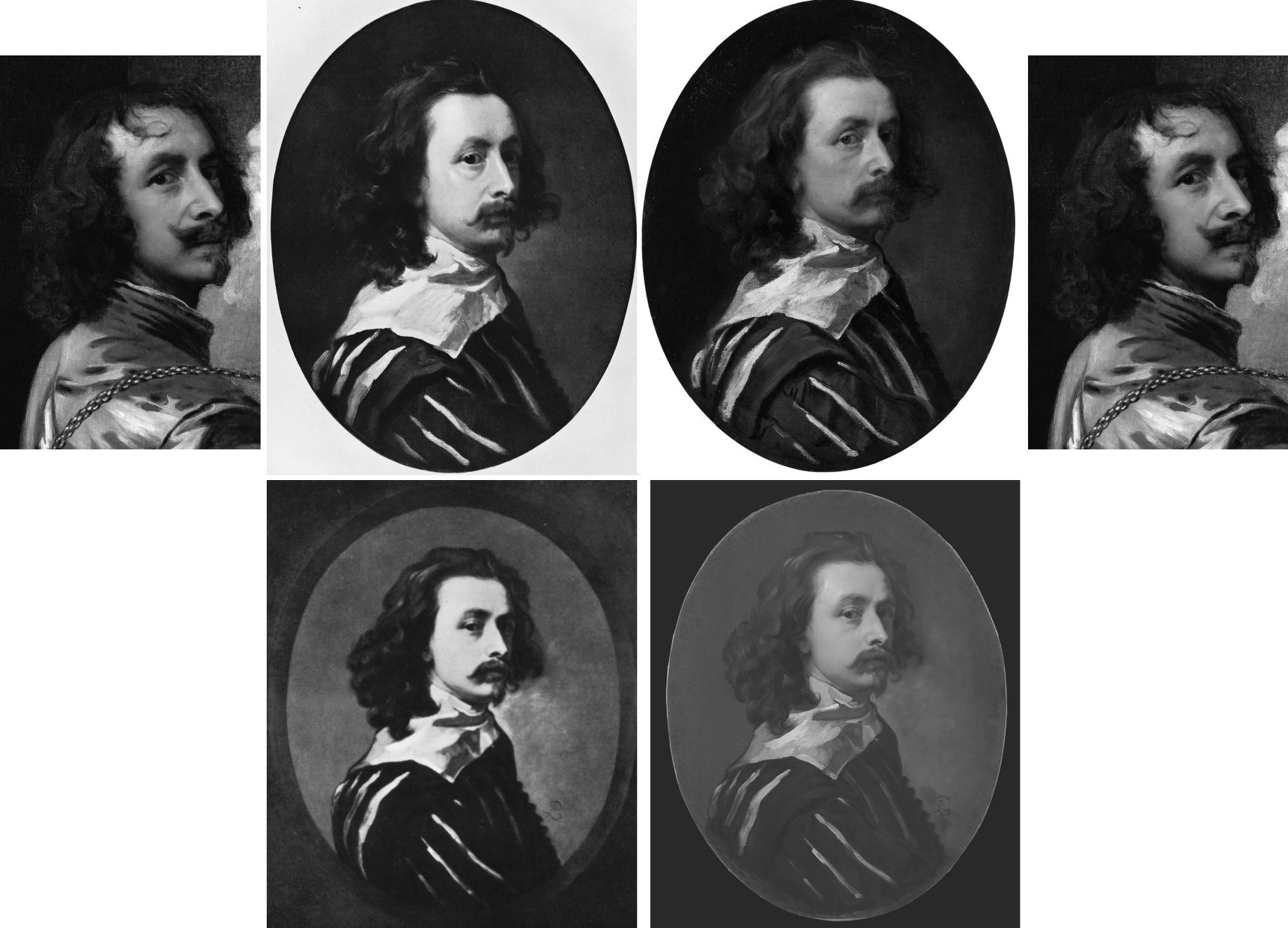
Above, Fig. 12: Top, left and top right, a detail of Van Dyck’s post-1633 Portrait of the Artist with a Sunflower; second left, the 1941 Glück-claimed “Last Van Dyck Self-Portrait”; third left, the National Portrait Gallery “Last Van Dyck Self-Portrait”. Above, left, a detail of the 1941 Glück-claimed Sir Peter Lely copy of the above claimed Van Dyck self-portrait; right, the Mould/Bader-claimed Sir Peter Lely copy of the NPG self-portrait (as published in the 2011 Mould gallery exhibition and catalogue as Cat.4).
In defence of his own Rubenshuis Museum-loaned “Last Van Dyck Self-Portrait” (above, Fig. 10, right), Grosvenor cheekily suggested “the dating of the National Portrait Gallery picture, currently thought to be c.1640 may need to be reconsidered, to perhaps between c.1637-39.” But why so – and on what stylistic basis is such chronological fine-tuning estimated? Not only had the NPG picture’s properties, appearance and relationship to other pictures not changed, only four years earlier Grosvenor had endorsed its late dating by “most scholars” to about 1640-1 – and on that late estimation he, like Glück (on another picture), had perceived a “faint air of melancholy” that added poignancy amidst the origins of the civil war about to erupt in London when the artist was “all the while plagued by the ill health that would shortly cause his death.”
It might seem that such recent perceptions notwithstanding, the NPG picture’s previous dating and estimation had to be jettisoned because Grosvenor was now seeking to attach his own painting to a “vacant” entry for a Van Dyck oval self-portrait, painted to the shoulders and with a hand to the breast, in an inventory of Charles I’s collection. If successfully attached, that entry would constitute a provenance jewel beyond price. But, most awkwardly, the original long-missing self-portrait had been recorded in the collection between 1637-39 and, therefore, Grosvenor’s newly upgraded candidate picture could not be said to have post-dated 1639. However, if so dated, and if the NPG picture were to be left in place at c.1640-1, the latter, with its pronounced differences from Grosvenor’s picture, would not only invite potentially damaging qualitative comparisons, it would retain the prized romantic cache on which it had been heavily promoted as Van Dyck’s last and most “modern” personal free-flowing etc., etc. depiction of himself.
Thus, and seemingly as if in protection of his own picture/investment, Grosvenor contended that the NPG picture, may no longer be considered the magnificent self-sufficient masterpiece that had commanded £1.7m on top of its world record £8.3m when sold to the NPG, and must now be moved back in time so as to do fresh duty as a study for his own picture – and therefore to predate his own picture which would become the new “Last Van Dyck Self-Portrait”, albeit at a somewhat earlier dating.
Although Millar had judged Grosvenor’s picture to be a copy of the lost picture that had been recorded in the Charles I collection, Grosvenor’s redating manoeuvre may have intimidated the NPG. Where it had held in its 2015 celebratory book Van Dyck – The Last Self-Portrait, that “Van Dyck’s self-portrait, now in the collection of the National Portrait Gallery… is probably the last and arguably the finest…” it now claims only that its picture is “one of three known self-portraits painted by van Dyck when he was in England, and it probably dates from the last years of his life”.
GROWING THE PROVENANCE
As seen, where Sotheby’s had claimed only that the [NPG] picture was “Possibly in the collection of Sir Peter Lely, d. 1680” and “possibly” in the 18th April 1682 sale of Lely’s estate, Grosvenor held in the 2011 FINDING VAN DYCK catalogue that his Cat. 4 (supposed) Sir Peter Lely copy of the NPG picture, “must therefore confirm that Lely owned [the then Mould/Bader picture and later NPG picture] and that it was sold from his [Lely’s estate] sale in 1682.” Again, why must it so confirm when the justification was especially feeble: “It is quite possible the self-portrait in Van Dyck’s possession at his death in 1641 was his last […] and that it passed into Lely’s possession at some point…Lely may have acquired it in a number of ways…Or, it may be that the painter and art dealer George Geldorp, for whom Lely worked when he first to came to London, was involved…” (Emphases added.)
In other words, Grosvenor had not added an atom of evidence that Lely had owned and copied the now NPG picture. He had not established when Lely first came to London or whether he had ever met Van Dyck: “Frustratingly, we do not know exactly when Lely first arrived in England, and [or?] the extent to which he knew of Van Dyck or knew of his estate. His early biographer Richard Graham, writing in 1695, said that Lely came over in 1641 (the year of Van Dyck’s death), whilst the art historian Arnoult Houbraken gives a date of 1643. It is perhaps most likely that the ambitious young Lely came to London in response to Van Dyck’s death thus ruling out any possible direct connection.” (Emphases added.) Nothing learned, no value added.
Not only had Grosvenor produced no evidence, he had disclosed in 2011 that the self-portrait in Van Dyck’s estate had not been rated highly by the artist’s contemporaries; and, that while the then Mould/Bader picture “now holds the world record for a work by Van Dyck” the painting in Van Dyck’s estate “had little value placed upon it” – to be precise, it was valued at 6s 8d, a fifteenth of a Van Dyck of Charles I in armour, and a sixtieth of Titian’s Perseus and Andromeda now in the Wallace Collection.
“IT IS, IF I SAY SO”
Lacking evidence that Lely had owned and copied the Bader/Mould self-portrait, Grosvenor, too, betrayed a note of anxiety in the 2011 catalogue: “The pictures after Van Dyck demonstrate that for the Van Dyck hunter the quantity and sometimes the quality of such copies can present potential danger.” In the absence of documentary evidence, Grosvenor played a bold card by appealing to the authority of his own eye: “…the first and most important skill you need to find a Van Dyck is simply the ability to spot a painting of the highest quality. If a painting is truly exceptional, the chances are it is by a truly exceptional artist.” Chance might be a fine thing, but its prospect is not a proof or a demonstration in the here and now.
THE SUPPOSED LELY COPIES OF THE SUPPOSED LAST VAN DYCK SELF-PORTRAITS
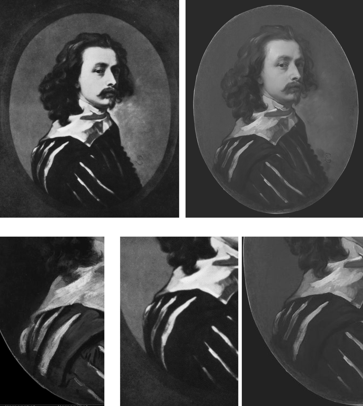
Above, Fig. 13: Top left, the attributed Sir Peter Lely copy, as published in 1941 by Glück; top right, the supposed Sir Peter Lely copy of the NPG self-portrait, as published in the 2011 Mould gallery exhibition catalogue. Above, details of costume from, respectively: the NPG self-portrait; the 1941 Glück-attributed Lely copy; the 2011 Mould/Grosvenor attributed Lely copy of the NPG picture.
Which of the two above versions is the more plausible Lely copy? Where is the Glück version today? Had it fallen by the wayside, much as had his 1934 espousal of what is now the Grosvenor/Rubenshuis last self-portrait (see below)? When did the Grosvenor/Mould-endorsed version of a supposed Lely copy first appear? Was it anywhere recorded before being taken to the Mould gallery? Do early photographs of it exist showing its reported appearance when enlarged onto a rectangular canvas? Did either of the canvases carry any historic material? Who owns it today?
It is said that when this unsettling mystery painting was brought to the Mould Gallery in 2010 shortly after the much-publicised acquisition of the £8.3m Sotheby’s self-portrait, it was “quite dirty and masked by a thick and substantially discoloured varnish.” The cleaning and researching were carried out by the Mould Gallery. Grosvenor claimed they had confirmed Lely’s authorship on the following grounds: [1] that after cleaning and restoration “there is no reason to doubt” it; [2] that “it is in fact by Lely”; and [3] that this is “a rare example of him copying another artist’s work”. The third claim weighed against it being a copy by Lely. The first statement was bluster – “there is no reason to doubt it”. The second contention was a non sequitur – Grosvenor asserted as fact something which had not been established.
SPOT THE DIFFERENCES
Grosvenor declined to address the discrepancies between the supposed Lely copy that had presented itself through an unidentified party to the Mould gallery from nowhere in 2010 or early 2011, and the supposed self-same Lely copy picture that had been published in December 1941 by Gustav Glück in The Burlington Magazine, “Reflections on Van Dyck’s early death” pp 172, 193, 195 and 199 (Fig. 12 above). There is a clear problem here: there are now two rival supposed versions of Van Dyck’s last self-portrait and each has its own supposed copy by Lely. Both pairs cannot be right. Where are the Glück ascribed pictures today? Have they been dismissed? Have they ever been compared with the two published Mould/Bader pictures?
A COVERT UPGRADE
In 2004, the now NPG picture had been described by Millar as:
“the best surviving version of (probably) the last Self-portrait, painted towards the end of Van Dyck’s years in London. The face is delicately modelled. The costume is handled very swiftly and in rough dry paint. There are some alterations made in the painting and it may be partly unfinished.”
In 2009 when included in the Tate’s “Van Dyck in Britain” exhibition, it was described in the catalogue on the (misleading) cited authority of Millar, as “thought to be Van Dyck’s last self-portrait”. Having died in 2007, Millar could not demur over the disappeared qualifier “after”.
On 9 December 2009, on the strength of that very recent Tate show and catalogue, Sotheby’s unequivocally presented what five years earlier had been no more than Millar’s “best surviving version” as an absolutely secure and precisely dated “Sir Anthony Van Dyck” – albeit on a provenance that began with two “Possiblys” – the first being “Possibly in the collection of Sir Peter Lely, d. 1680”. Sotheby’s declaimed:
“An outstanding self portrait by Sir Anthony van Dyck (1599-1641) – one of the most important Continental European artists to have worked in England – comes to auction with exemplary provenance[*] and an estimate of £2-3 million. The masterpiece, which is the artist’s last portrait of himself, was painted in London in 1641 in the final months of his life. It is one of only three self portraits that he painted in England and this, his last, captures him grandly attired in a black and white slashed silk doublet. The painting epitomises the elegant poise and relaxed informality that van Dyck brought to the art of portraiture in Britain and it undoubtedly ranks among the most important works by the artist ever to come to the auction market.” (Emphases added.)
[* On the accuracy of this estimation of the provenance, see Susan Grundy, below.]
THE “POSSIBLYS” AND “PROBABLYS” PLAGUE
A distinguishing characteristic of the upgrades stampede is the parading of superlatives and the drafting of fanciful provenances linked in daisy-chains of “possiblys” or “probablys”. This method was deployed to the most spectacular effect ever by Christie’s, New York, (albeit on the borrowed authority of the National Gallery which had earlier lifted it from a young art historian’s failed attempt to upgrade another and closely related Leonardo School Salvator Mundi) in their November 2017 sale provenance for the Louvre Museum-demoted $450m disappeared Leonardo School Salvator Mundi. It carried no fewer than three “possiblys” in the first item:
“(Possibly) Commissioned after 1500 by King Louis XII of France (1462-1515) and his wife, Anne of Brittany (1477-1514), following the conquest of Milan and Genoa, and possibly by descent to Henrietta Maria of France (1609-1669), by whom possibly brought to England in 1625 upon her marriage to King Charles I of England (1600-1649), Greenwich…”
In 1980, in Christie’s (London) sale of the now-National Gallery “Rubens” Samson and Delilah, the provenance began with three items prefaced: “Probably”; “Perhaps”; and “Perhaps”. The “Probably” – “Probably painted for Nicolaas Rockox” – was an own goal: if autograph, the work had to have been painted for Rockox because he was known to have commissioned Rubens to paint the subject. It was also known that two contemporary copies had been made from the subsequently lost Rockox Rubens original. They had survived. Both depart compositionally in the same manner from the National Gallery picture. In another Christie’s provenance item, the NG picture was said to be “perhaps” that recorded in an inventory of 1653 as a Samson (not a Samson and Delilah) by Rubens. There are two entries in that inventory, one to a Samson by Rubens, another to a Samson after Rubens…If those Samsons had been shorthand for Samson and Delilah, then the subject existed in two versions by 1653, one by Rubens and one after Rubens.
OVERTURNING AN INSTITUTIONAL APPLE CART
When, eventually, the Mould/Bader/Grosvenor campaign succeeded and the “Last Van Dyck Self-Portrait” was acquired by the NPG acquired in late 2014 many were happy: this was deemed a picture at the very top of the tree and Philip Mould’s apprentice, Grosvenor, had claimed no little credit for making it so (see below). However, some had seen matters differently: the means and manner of this particular upgrade attracted censure in a succession of expert warnings. In the May/June 2014 issue of the Jackdaw, its editor, David Lee, noted both disregarded expert opinion and a seeming over-eagerness to sell the picture – as seen below at Fig. 14:
On 23 January 2014 the Evening Standard’s art critic, Brian Sewell, had written of what was about to become the NPG picture:
“…Van Dyck looks wistful, apprehensive and uncertain; he has not flattered himself and his image is the more compelling for its melancholy, yet this careful self-analysis is set on a bust painted with almost vulgar bravura, a rumpled collar of white lawn over a black doublet slashed with white. Not since he painted himself in Italy in black and white has there been such impetuous painting — and not nearly with so loaded a brush.
“I sense dissonance between the face and the costume, as though two quite opposing aesthetics are at work. Does the head sit easily on the bust, the shoulder more brilliantly lit than the face? What exactly is the form of the wide collar and how is it related to the neck? Has the hair been extended over the collar to disguise this awkwardness? It is of a darker tone and subdued definition.
“One question leads to another. Is it possible that Van Dyck painted no more than his face and rather shorter hair, and left posterity an unfinished portrait, to be completed by another painter?”
FOLLOW THE MONEY
Sewell’s doubts had been elicited more colourfully by the MailOnline on 7 December 2013 (“Petra Ecclestone’s husband hopes fight to keep £12.5m Van Dyck in Britain will fail as he snaps it up for their £55m palace of bling in LA”):
“Mr Sewell said: ‘The painting must have been as important in 2009 as it is now. Why did we not buy it then? They [the NPG] didn’t try.[*] They said they put their heads together with Tate Britain to see whether they could do a joint purchase, but they didn’t say a word in public. There was no question of raising funds from the public. But now they’re perfectly happy to start a fundraising campaign at £12.5m. The logic of it completely escapes me…If the picture is as important as everyone’s saying it is, it should have been bought at £8.3m. Now that it hasn’t, they’re putting £4m in the pockets of Philip Mould.”
[* What was not disclosed at the time was that the National Heritage Lottery Fund and the National Heritage Memorial Fund had told the Tate and the National Portrait Gallery, in terms, that they would not get a grant towards the picture’s purchase because of the great drain on those funds for the 2012 Olympics. That unexpected arts funding shortfall had killed off any chance that might have been hoped to exist to make a quick-flip profit on the world record £8.3m Van Dyck by selling it on to the NPG.]
On 9 December 2013, Grosvenor responded in a blog post (on his Art History News site) to Sewell’s criticisms with a double slur: “This is, of course, only the latest salvo in Brian’s apparent campaign against the painting, which can only, I presume, benefit the overseas buyer… His remarks are a good example of that unattractive British habit of demeaning anyone who happens to be successful. Sewell sniffed at something Mr Stunt may or may not have said about his collection (which is already one of the best for 17th C English portraits), when as a lover of art he should applaud the fact that a successful British businessman under the age of 30 not only cares about ‘old’ British art, but also supports, very strongly, exhibitions, publications, loans and research.” (Had Stunt supported the Mould Gallery’s FINDING VAN DYCK exhibition and its 80 pp catalogue? On his support for other Mould/Grosvenor research, see below.) Sewell’s remarks had been given in response to this MailOnline quote from Stunt:
“All my Lelys are important. In Althorp, the Earl of Spencer has the Windsor Beauties, which is a very famous group of pictures by the artist. I’ve been trying to rival the Windsor Beauties. I have more, I think, than him, and I’m just five off the Royal Collection.”
That does not sound made-up. Sewell had responded: “Oh dear. I don’t know him but if he’s setting out to rival Althorp and Buckingham Palace, that’s hardly a meritorious way of collecting. It’s cigarette cards.” Snobby, perhaps, but not without force and humour. Of course, there is nothing wrong with successful businessmen buying art – if: a) they have the means and really are buying; and b) they buy judiciously and not as if from some competitive, vainglorious shopping list. Stunt’s taste for old masters was entirely worthy.
SOME SERIOUSLY AWKWARD CONNECTIONS
The NPG picture’s standing had been again and more radically challenged by Susan Grundy on its authorship, condition, and circumstances. She has shown that both Sotheby’s and the Mould gallery’s citations of the scholarly literature had implied high scholarly support for a Van Dyck ascription that was simply not present. As mentioned, Gustav Glück had seen the now NPG self-portrait picture in 1941 but, then, he had judged it a copy – as had Eric Larsen in 1980 and 1988, and, as seen above, Oliver Millar in 2004. There had been no major scholarly support for the picture as an autograph Van Dyck.
On 26 April 2020 the Mail-on-Sunday reported Grundy’s further startling investigations: “Is the £10m Anthony Van Dyck ‘selfie’ that Kate Middleton helped save for the nation a cheap copy?”
Specifically, Grundy had said: “Philip Mould, the dealer who brokered the sale at such a handsome price, is one of Britain’s most recognisable art experts. He makes regular appearances on the Antiques Roadshow [he also fronts, with Fiona Bruce, the BBC’s Fake or Fortune] and is known as something of an authority on Van Dyck. But this story also involves the unlikely figure of Petra Ecclestone’s ex-husband James Stunt, who once described himself as a billionaire art collector, but is today known as a shambolic, foul-mouthed bankrupt. The Mail-on-Sunday has previously revealed that Stunt lent a number of fake paintings to Prince Charles’s charity at Dumfries House in Scotland where, embarrassingly, they were put on public display. And that attempts had then been made by intermediaries to use the fakes as collateral for millions of pounds worth of loans. The paintings have now been taken down from public view, although Stunt still maintains they are originals. But the businessman’s reputation was intact back in 2013 when, while still married to Formula 1 heiress Petra, he was looking to add to a vast and rapidly expanding collection of masterpieces and agreed to buy the Van Dyck from Mould’s client, Canadian industrialist Alfred Bader.”
In Grundy’s account “agreed to buy” is both the operative and a problematic term. “Client”, too, is problematic: confusion over the 2009 £8.3m purchase at Sotheby’s abounds. It was rumoured that Mould had bought with money loaned by Bader; some expressed surprise that Stunt should have bought it at all at £12.5m, because his purchases rarely exceeded six figures. Many reports referred to a joint Mould/Bader sale to Stunt but those were ambiguously phrased, and it is nowhere confirmed that Stunt had paid £12.5m, taken title of the picture and was about to remove it to the U.S. The Heritage Fund claimed the picture “was sold to a private collector who wished to take it abroad” but the Art Fund disclosed that the picture was bought by the NPG not from Stunt – or Mould – but from “Alfred Bader Fine Arts”, which, if correct, would necessarily mean that that picture had not been sold to Stunt and, therefore, that public monies had been given to block a supposed but phantom pending removal of the picture from the country.
WHEN WAS THE GROSVENOR “LAST VAN DYCK SELF-PORTRAIT MARK II” BOUGHT?
Establishing the point at which Grosvenor acquired his own supposedly superior and historically more significant “Last Van Dyck Self-Portrait” is of interest re both his claimed value-adding role in the promotion of the NPG picture and his subsequent cheerleading role for the public fundraising campaign to secure the picture’s entry into the NPG in 2014. In 2015 Grosvenor disclosed that a restoration of his own picture (Figs. 7 and 10) had taken place “over the last few years”. See below. He also declared that it was only when “all the overpaint and dirt” had been removed, that the very “possibility of a full attribution to Van Dyck [had become] worth pursuing further”.
The “I-had-no-idea-at-first” dealers’ trope was also encountered with the now-famous consortium of New York dealers who had never suspected that their manifest Leonardo School Salvator Mundi might be an autograph Leonardo prototype painting until a certain pentimento on a thumb emerged during restoration. Grosvenor, too, reports a pentimento-on-the-thumb that he, similarly, holds to confirm autograph Van Dyck status on his own picture. However, hands are notoriously difficult to draw even when making a copy – and, as Jacques Franck has demonstrated here, if such thumb pentimenti are to be taken as proofs of autograph states, the Salai copy of Leonardo’s St. John the Baptist would now be considered a second autograph Leonardo St. John the Baptist.
Intriguingly, Grosvenor disclosed that the (eventual) NPG self-portrait had been joined during its near five-year long residence in the Mould gallery by other Van Dyck finds. Of one such, the privately owned picture now on loan to the Minneapolis Institute (Figs. 1, 15 and 19), Grosvenor disclosed on 5 March 2015: “What a pleasure it was to work with Philip Mould in his gallery with it [the now Minneapolis picture] – sometimes we would treat ourselves and hang it next to the later Van Dyck self-portrait we also had in the gallery (the one which was bought by the National Portrait Gallery last year).” But what of the Grosvenor-owned picture which was loaned to the Rubenshuis Museum on 8 March 2016? Had that picture, too, been hung next to the hard-to-shift self-portrait that would enter the NPG in 2014?
A HANDY SOURCE OF POTENTIAL VAN DYCK SELF-PORTRAIT UPGRADES
For those wondering how quite so many Van Dyck self-portraits could turn up in one place in such short time there is a simple explanation: Grosvenor and Mould, like many of us, are avid students of the 2004 catalogue raisonné.

Above, Fig.15: Top row, three “self-portraits” as published in an appendix of copies by Oliver Millar in his contribution to the 2004 Van Dyck catalogue. Bottom row: the three recently upgraded former Millar self-portrait copies, as they presently appear, and the not-for-sale Indianapolis picture.
In this one small section of that invaluable and indispensable account of Van Dyck’s English period, Millar had unwittingly compiled a sort of sleeper-hunters’ treasure chest. Grosvenor has now upgraded the first two of Millar’s three Van Dyck self-portrait copies – and acquired one – both having been privately owned. Only Millar’s third self-portrait copy (above, top right) which cannot turn a penny because it is already in a museum – The Clowes Fund Collection, Indianapolis Museum of Art – remains on the upgrades shelf.
Thus, in the bottom row at Fig. 15 we see: left, the NPG picture judged by Millar to be “The best surviving version of (probably) the last Self-portrait, painted towards the end of Van Dyck’s years in London”; second left, the privately owned, Grosvenor/Mould upgraded self-portrait, now loaned to the Minneapolis Institute; second right, the Grosvenor-owned, restored and new “Last Van Dyck Self-Portrait” that Millar judged a copy of an unknown work recorded in the collection of Charles I; right, the Indianapolis picture with a fine gold chain – for excellent close-up photos, see here – that Millar judged the best-surviving version of an informal Van Dyck self-portrait of c.1634. It might be noted that in this informal attire and unhaughty demeanour, the artist’s moustache had not drooped or turned down.
VAN DYCK’S NOW TWO “LAST SELF-PORTRAITS”
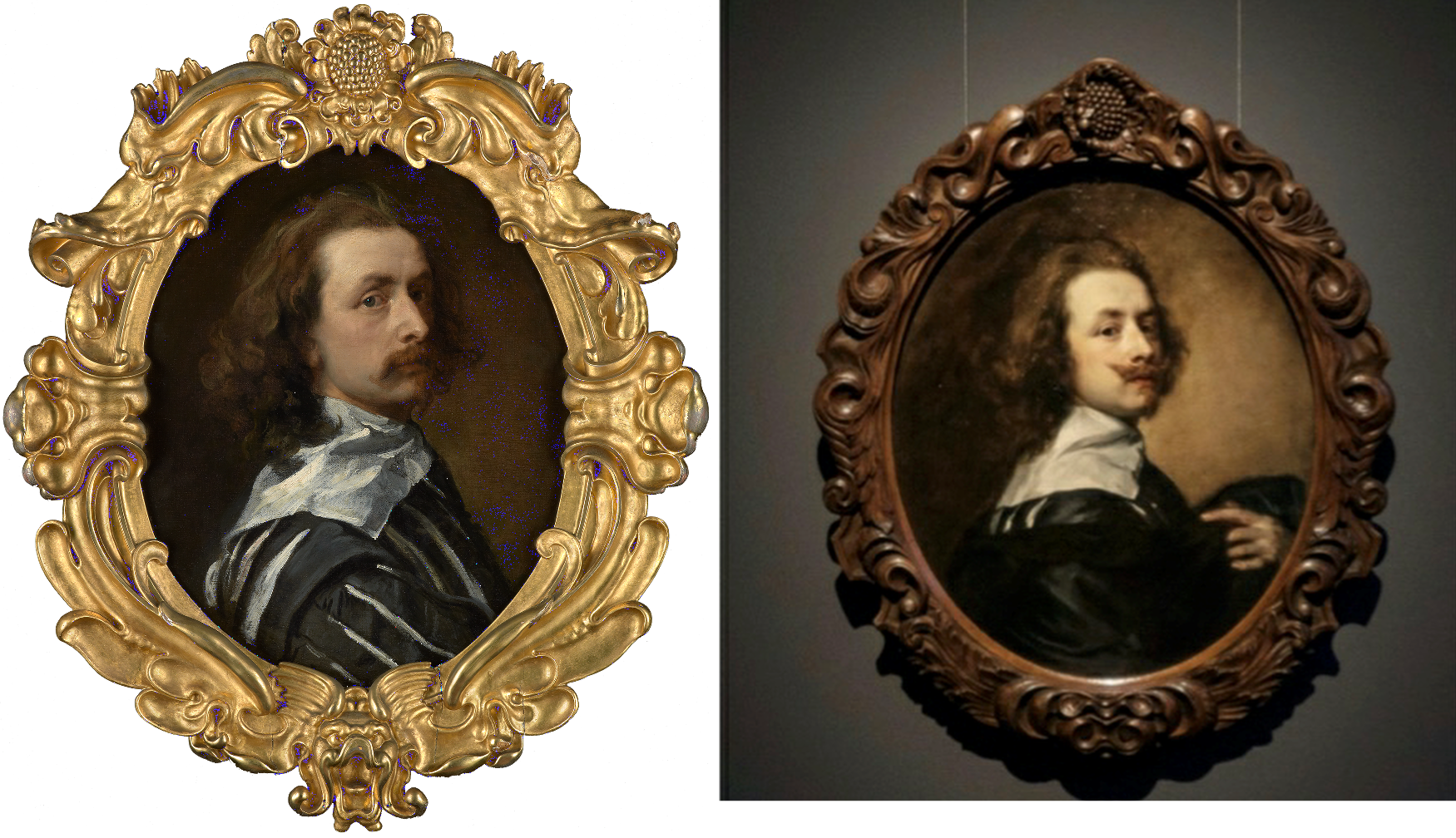
Above, Fig. 16: Left, the National Portrait Gallery’s “Last Van Dyck Self-Portrait”; right, the Grosvenor/Rubenshuis Museum “Last Van Dyck Self-Portrait”.
So, to return to Grosvenor’s second and Rubenshuis loaned “Last Van Dyck Self-Portrait”, there are, as he acknowledges in his 2015-6 British Art Journal account, many outstanding problems of provenance: 1) “We cannot currently draw a direct documentary link from the painting today back to the royal collection”; 2) “there is no record of a payment by Charles I for the picture”; 3) the picture “was first certainly recorded in 1854 when accepted by Gustav Glück” [- sic Glück was born in 1871*]; 4) had the picture been the one owned by Charles I, it would most likely bear the royal monogram (the letters “CR” capped by a crown) on the back of the canvas – but it does not – see Fig. 18 below; and, 5), that the “somewhat loose, rapid handling of the Self-portrait is unlike the high degree of finish and detail that Van Dyck normally produced for Charles I”.
The last admission might seem particularly damaging given Grosvenor’s claim that the (in part) highly wrought NPG picture had been executed as a dress rehearsal for his own picture. Indeed, the NPG’s 2015 book had made a somewhat fanciful virtue of its picture’s stylistically incongruous execution: “The broad, rapid, virtuoso handling of the costume contrasts with the exquisitely fine painting in the face. The relative lack of finish in the costume draws attention to the act of painting that has produced this portrait, perhaps even suggesting that the artist is still in the process of creating it, while we, as viewers, watch him. It may be that Van Dyck was working in a more experimental way in this part of the painting, or it may simply be that it was left unfinished.” (Emphasis added.)
Which, then, might have been the case? The NPG, understandably, was at a loss because: “Nothing is known of the circumstances in which this portrait was produced: whether it was a gift for, or a commission from, a friend, relative or patron, or whether the artist had painted it for himself…” The work is therefore, an orphaned “one-off” or unicum – that intrinsically problematic art historical creature of which Professor James Beck warned his students at Columbia University always to beware. (He also cautioned students to address “what we know about this artist before what has been said or written”.)
[* Grosvenor effectively self-corrects the above slip in his BAJ footnote no. 27, when he cites the earlier and intended Gustav – Gustav Waagen – and his 1854 three-volume Treasures of Art in Great Britain [**]. Although Grosvenor gives the page number, he does not disclose how Waagen had referred to the painting. Had he said something flattering or simply cited an inventory? Grosvenor notes that Gustav Glück had later identified the picture as that in the collection of Charles I and that he had done so not on the grounds of stylistic analysis but of a contingent availability:
“As no other self-portrait answering to the same description is known, there can be no doubt that the picture…once belonged to the royal friend and warm supporter of Van Dyck.” Glück was playing the above-mentioned Denis Mahon Manoeuvre – conferring autograph status on the best available picture. In this case, Glück conferred it to the only possible surviving candidate. With his own (Rubenshuis) self-portrait picture, Grosvenor seems to follow the Gluck/Mahon practice even though he has also identified a second version of the picture that is of similar size and composition. Without addressing the possibility that both versions might have been copies of a lost autograph prototype, as Millar had concluded at the end of a long and distinguished career, Grosvenor holds the newly discovered version (below, Fig. 17, top left) to be a later copy of his own picture, and thereby elevates his own picture from Millar’s copy of a lost original to the original Van Dyck painting.]

Above, Fig. 17: Top row, left a copy of a Van Dyck self-portrait attributed by Bendor Grosvenor to Charles Jervas (1675-1739); the Grosvenor attributed Van Dyck self-portrait before its two-year long restoration; the Grosvenor attributed Van Dyck self-portrait after its restoration. Bottom row: left, the NPG “Last Van Dyck Self-Portrait”; centre, the Grosvenor, Rubenshuis “Last Van Dyck Self-Portrait” before restoration; centre and right, the Grosvenor, Rubenshuis “Last Van Dyck Self-portrait”, as before and after restoration.
In the above-cited Mahon case, it took fifty years for the now accepted original version (at the Prado) to emerge and show Mahon’s claimed “autograph original” to have been a copy – which should have been recognised all along because it, just as with the National Gallery “Rubens” Samson and Delilah, was known from an etched copy to be a compositionally truncated version of a lost original. Where Millar resisted temptation to play the Glück/Mahon/Grosvenor gambit and judged what is now Grosvenor’s picture (above, Fig. 17, top right) to be no more than an early copy of a missing painting, Grosvenor has followed Glück’s earlier “opportunist” elevation (of what is now his own painting) even though it had not gained critical acceptance on Glück’s ascription and had been sold in 1969 for $350 as “after Van Dyck” and for $3,120 in 2006 as “after Van Dyck” (- when possibly bought by Grosvenor). As Millar appreciated, being the only available candidate is not a sufficient qualification for a painting to be accepted as autograph.]
[** As for Waagen’s cited but not quoted observation of Grosvenor’s picture, it too might best be treated with caution. When Nicholas Penny upgraded the Duke of Northumberland’s “Madonna of the Pinks” to Raphael in the February 1992 (Burlington Magazine – “Raphael’s Madonna dei garofnai rediscovered”), he quoted Waagen’s fulsome comment: “on occasion of my visit to England in 1854 I had the privilege of spending a day at Alnwick castle as his Grace’s guest…It is well known that the charming composition is by Raphael and of all the numerous specimens of the picture that I have seen, none appears to me so well entitled to be attributed to his hand as this.” High praise, certainly, but there were three overlooked dangers. First, gushing hyperbole in ascriptions might seem a required social obligation for guests of Dukes – Bernard Berenson and his wife were thrown out of a Scottish Duke’s lair late on a stormy evening when the scholar advised that his Grace’s “Leonardo” was no such thing. Second, Waagen had spoken twice on the Northumberland picture and both of his comments should have been addressed together. Waagen’s helpful-to-Penny’s-cause, praise appeared in the fourth and supplementary 1857 volume to his three-volume 1854 Treasures of Art in Great Britain. In the 1854 Vol. III, p. 253, Waagen, who had yet to enjoy the Duke’s hospitality, had dismissed the Northumberland picture (that would, like the NPG Last Self-portrait be Saved the for The Nation at £22m as the National Gallery’s Raphael “Madonna of the Pinks“): “the small picture in the Camuccini collection at Rome which I do not consider to be original. The tone of the flesh has something insipid and heavy. The treatment makes me suspect a Netherlandish hand.” Third, Waagen’s later fulsome revised comments were written in the knowledge that the whole Camuccini collection was to come to Alnwick Castle, having been bought by the Duke in 1856 (- as James Beck disclosed in his posthumously published 2007 book From Duccio to Raphael: Connoisseurship in Crisis, three chapters of which anatomised the untenability of the National Gallery picture’s Raphael ascription). Had Waagen stuck in 1857 to his earlier scholarly/critical guns, a Duke would likely have been mightily displeased, and Italy’s already lucrative “old masters” export industry would have been thrown into question if not crisis. However, of the two Waagen accounts that of the slightly younger, more disinterested c.1854 self better withstood the test of time: as with the Glück-ascribed now Grosvenor last self-portrait, the Duke’s picture duly came to be seen as a version of a lost Raphael autograph prototype painting – as Penny himself described it, as one of “numerous versions” with none being “generally acknowledged as an original work by Raphael”. It was only on Penny’s 1992 advocacy resting on the authority of the slightly older Waagen’s 1857 obsequious effusion that the scholar’s own earlier, sounder appraisal was eclipsed. When Penny stayed at Alnwick Castle – the second greatest castle in Britain – in the early nineteen-nineties (“The author is grateful to the Duke of Northumberland, the Duchess of Northumberland and Lady Victoria Cuthbert for their hospitality and encouragement”) the potential “oven-ready” upgrade in the form of the ex-Camuccini picture remained lurking-in-residence in its elaborate 19th century frame bearing the proud ascription “Raphael”, patiently awaiting a new scholarly response.]
THE MISSING MONOGRAM ON A GROSVENOR UPGRADE
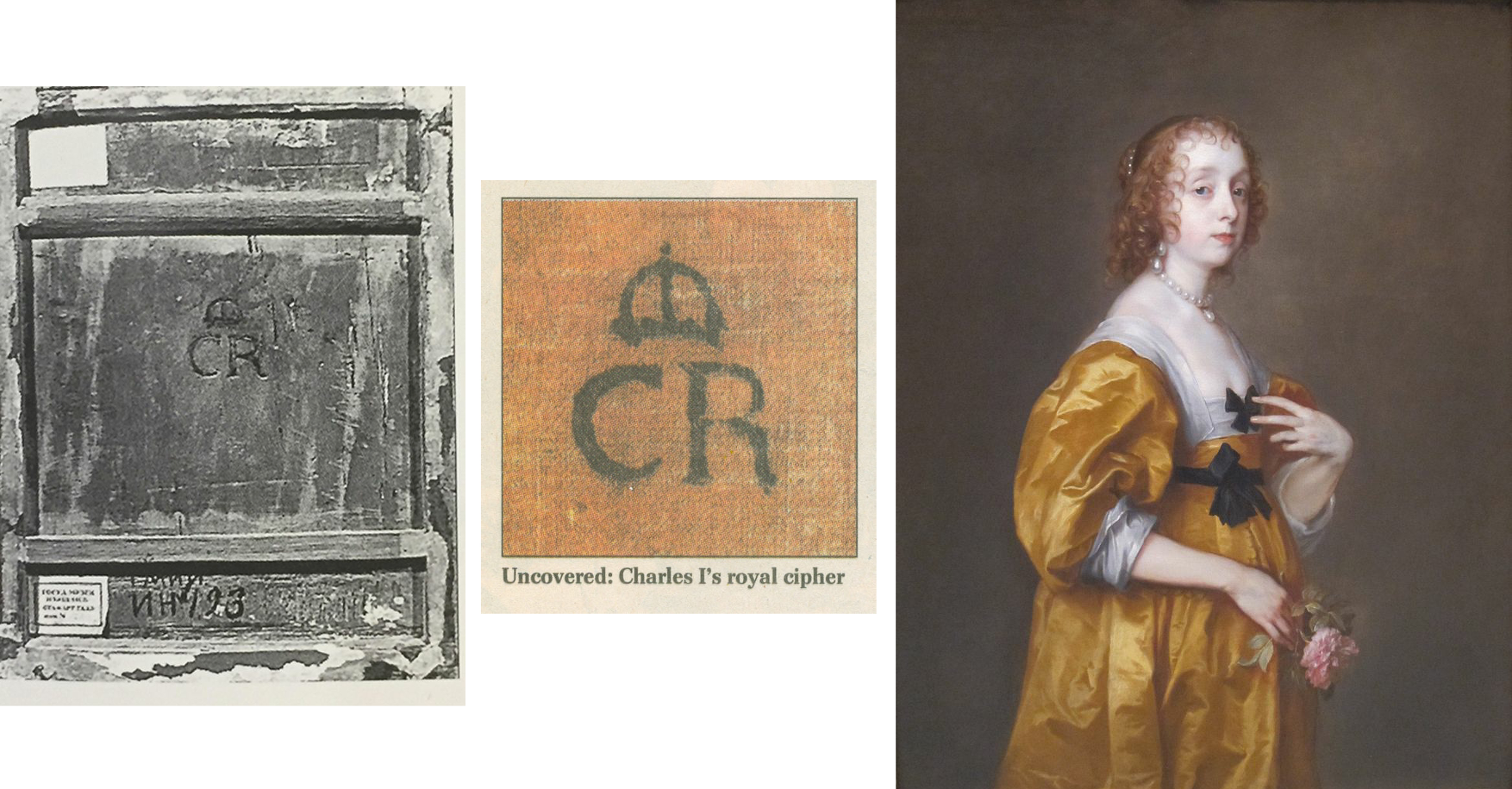
Above, Fig. 18: Left, the back of the Pushkin Museum’s Salvator Mundi by Giampietrino which carries the Charles I monogram, at which period the picture had been attributed to Leonardo; centre, the Charles I monogram found on the back of the Van Dyck painting of Mary Villiers; right, Van Dyck’s Mary Villiers portrait
The presence of a monogram confirming ownership by Charles I adds very considerable value. In 2002 the Mould gallery discovered one (above, centre) on a Van Dyck portrait of Mary Villiers (above, right) that had been bought for £437,587. On discovery of the monogram (made, as with Grosvenor’s picture, during the traumatic act of stripping off and replacing a backing canvas) the Mould picture’s asking price leapt almost fourfold to £1.6m. It follows that Grosvenor’s Rubenshuis Van Dyck will likely be worth a quarter of what it might otherwise have beeen, had it been in Charles I’s collection and duly stamped with the royal monogram.
OUT OF THE FRYING PAN…
Lacking evidence that his picture had been in Charles I’s collection, Grosvenor addressed the absent record of a payment with an initial surmise that the picture had been presented by Van Dyck as a gift to the King. He then added: “Of course, the presumption that the self-portrait was originally presented to Charles I may be incorrect, and if it was part of the collection of Henrietta Maria instead (whose collection was looked after by Daniel Soreau of whom we know little), we would not expect to find a cypher [monogram] on the back.” (Emphases added.)
A neat swerve, but an expectation of an absence of evidence that rests on an unsupported supposition cannot be rolled together and taken to constitute evidence of any kind. If the picture lacks a monogram it lacks a monogram and that tells against it having been in the collection. If it lacks both a monogram and a record of payment, there is certainly no ground for concluding that it must therefore have been gifted by Van Dyck to the King’s wife, because that blatantly begs the question. Grosvenor reports that after the king’s execution the Van Dyck self-portrait that had been in the collection had been bought by the artist’s former assistant and copyist, Remigius van Leemput – and he says so on the cited authority of Oliver Millar, who judged the now-Grosvenor picture…to be a copy of that lost, formerly Charles I Van Dyck self-portrait.
The escape clause possibility of the picture having been owned by Henrietta Maria was suggested to Grosvenor by Margaret Dalivalle who had attempted to underpin the claimed double royal pedigree of the (now-disappeared and Louvre Museum-downgraded) $450m Leonardo school Salvator Mundi with a speculative suggestion that the painting might have been brought to England from the French royal collection by Henrietta Maria. It was also being claimed that the (then New York) Leonardo-attributed Salvator Mundi was the Leonardo Salvator Mundi that had been recorded in the Charles I collection. No evidence supported that claim and in 2018 another picture – the one that really had been attributed to Leonardo when in the collection of Charles I and the one which really does bear the royal monogram (above left, Fig. 18) had emerged in the Pushkin Museum, Moscow. However, that Salvator Mundi is of a different composition and, besides, it had been downgraded to Leonardo’s assistant Giampietrino. Thus, the painting that had been in Charles I’s collection as a Leonardo was not a Leonardo, regardless of whether or not it had been brought from the French royal collection, which it hadn’t: after years of trawling archives, Dalivalle admitted that she had found no evidence that Henrietta Maria had brought the painting from France and had abandoned her search.
A SERIALLY BEGGED QUESTION
In the absence of material or documentary evidence on his Last Van Dyck self-portrait, Grosvenor again appeals in circular fashion to the authority of his own judgement-by-eye on the picture’s artistic merits, which judgement he again confounds with hard evidence: “There is however, other evidence to suggest that this painting did indeed hang at Whitehall, in addition to the fact of its overall quality, and the fact that it certainly appears to be an original work by Van Dyck.” Having conflated his own impressions and judgements with facts, Grosvenor proceeds to add that Van Dyck, “is unlikely to have presented his patron with a second version or a studio replica” when he has not established that the (formerly $350) picture which he owns had been presented to Charles at all. (All emphases added.) Once again, “evidence” that “suggests” that something had happened of which there is no evidence, is not evidence, it is simply wishful thinking. Grosvenor’s painting could not have whispered in the Mould gallery (- had it ever been presented there) that it had once hung somewhere else in London.
If proof were ever to emerge that Van Dyck had gifted an unrecorded portrait of himself to the king’s wife, it would immediately beget another sleeper-hunting opportunity: Where is the Van Dyck self-portrait that was listed in the king’s collection and that would be expected to bear the royal monogram? Were such a monogrammed Van Dyck self-portrait to turn up tomorrow, we would then have two self-portraits gifted by Van Dyck to the royal couple (one to each), just as we now have two claimed last Van Dyck self-portraits in the NPG and Rubenshuis pictures.
BOUNCING THE NPG?
Whatever the exact relationship in this recent Mould and Bader “adventure in old masters”, two things are clear. First, an initial attempt to sell the £8.3m picture to the NPG failed. When the Philip Mould enterprise found no buyer for the picture between 2009 and 2013, the £8.3m purchase at Sotheby’s must indeed have seemed a hair-raising liability. Second, that although James Stunt’s much-reported purchase of the painting for £12.5m never materialised, his repeated and noisily declared intention to remove the painting from Britain greatly assisted the picture’s eventual sale to the NPG.
On the picture’s true or fair value between 2009 and 2014, there is no evidence that the already world record £8.3m Van Dyck had been sold for £12.5m to Stunt, a well-known collector of six-figure Lely paintings. Waldemar Januszczak mused in the Sunday Times: “Why Stunt has chosen to go for the Van Dyck now, when it has been hanging in Mould’s gallery for three years I do not know.”
HYPING A TOP-PRICE WORK
Putting Stunt’s involvement to one side, it might also be asked how the NPG’s £10m purchase of a picture that had been stealthily offered as a safely autograph work (on no scholar’s published account) in 2009 and on a £2-3 million estimate at Sotheby’s, came to be taken as a matter of Very Great National Concern. On 8 December 2013, Richard Brooks rebuked the NPG for dilatoriness over the purchase (Sunday Times “£3m bungle over Van Dyck selfie”): “…the gallery had the chance to buy it four years ago for at least £3m less than it will now have to pay”. If Brooks had meant that had the gallery bid directly at Sotheby’s 9 December 2009 auction it could have got the picture for the £8.3m paid by Mould/Bader, Grosvenor has countered: “we were delighted to acquire it in partnership with Alfred Bader for £8.3m. In fact, we had been prepared to bid much higher, and were slightly surprised when the hammer came down.”
Brooks continued: “In fact it [the NPG] missed the opportunity to buy the painting not once but twice…The gallery had in fact been tipped off by the auctioneer, Sotheby’s, that the painting was coming up for sale four months earlier, in August 2009, when one of its staff went to see Sandy Nairne, the director of the Gallery. ‘It was a heads-up for them to see if they could buy,’ said Sotheby’s last week. Nairne decided not to bid. Last week Nairne confirmed that the approach had been made but said he had worried about the ‘uncertainty’ of buying at auction. It was also thought that the earl [of Jersey] did not seem interested in selling privately to the gallery.” This last was likely the case – Grundy established that the earl had put his own family pile on the market at c.£10m, so he was not likely in financial self-sacrifice mode.
Having bought the picture for £8.3 million at auction, Brooks continued, “Mould and Bader offered the gallery another chance to buy it, this time from them. Initially they asked for £10 million but this was subsequently dropped to £9.5 million…” Those successive reductions might have been public-spirited generosity towards a national institution, but they could also have been hard-nosed commercial realism: the picture was proving impossible to shift. Four other parties, including two non-UK museums, were said to have driven the auction price to £8.3m but having dropped out at that price they were unlikely to re-enter at £10m, £9.5m or £12.5m – as indeed had resoundingly proved to be the case by 2013 when the work remained unsold. All in all, Brooks seemed rather cross that the NPG was not playing ball with a gallery that had failed to shift a picture bought three years earlier at a world record price with the assistance of an industrialist/collector.
HOW SOLID WAS STUNT’S OFFER TO BUY AT £12.5m?
Januszczak appreciated that: “the timing [of Stunt’s late-buying and declared intention to remove from the country] has forced the NPG and the government into action” – which action he and Grosvenor supported. As for Stunt’s declared intention to remove the picture from the country, had he bought it earlier for less and immediately applied for an export licence, there would, Grosvenor has claimed, have been no opposition and the picture would certainly “have left the country”. Instead of quietly buying it for £9.5m and removing it unopposed from the country, Stunt waited until the end of 2013 to declare an intention to buy the picture at the then full Mould/Bader £12.5m asking price and, simultaneously, to remove it from the country. For sure, that last declaration prompted the picture’s supporters to seek and obtain a three-month government export ban in November 2013. Stunt then amplified his Threat-to-Remove by saying that although he well understood the move to block his purchase from Mould, he still hoped he would be able to “take it to his home in Los Angeles and enjoy it.” Thus, without costing Stunt a penny, his noisy public stance greatly facilitated the Mould/Bader sale to the NPG when no other buyer was in sight.
A MAN OF SEVERAL HATS
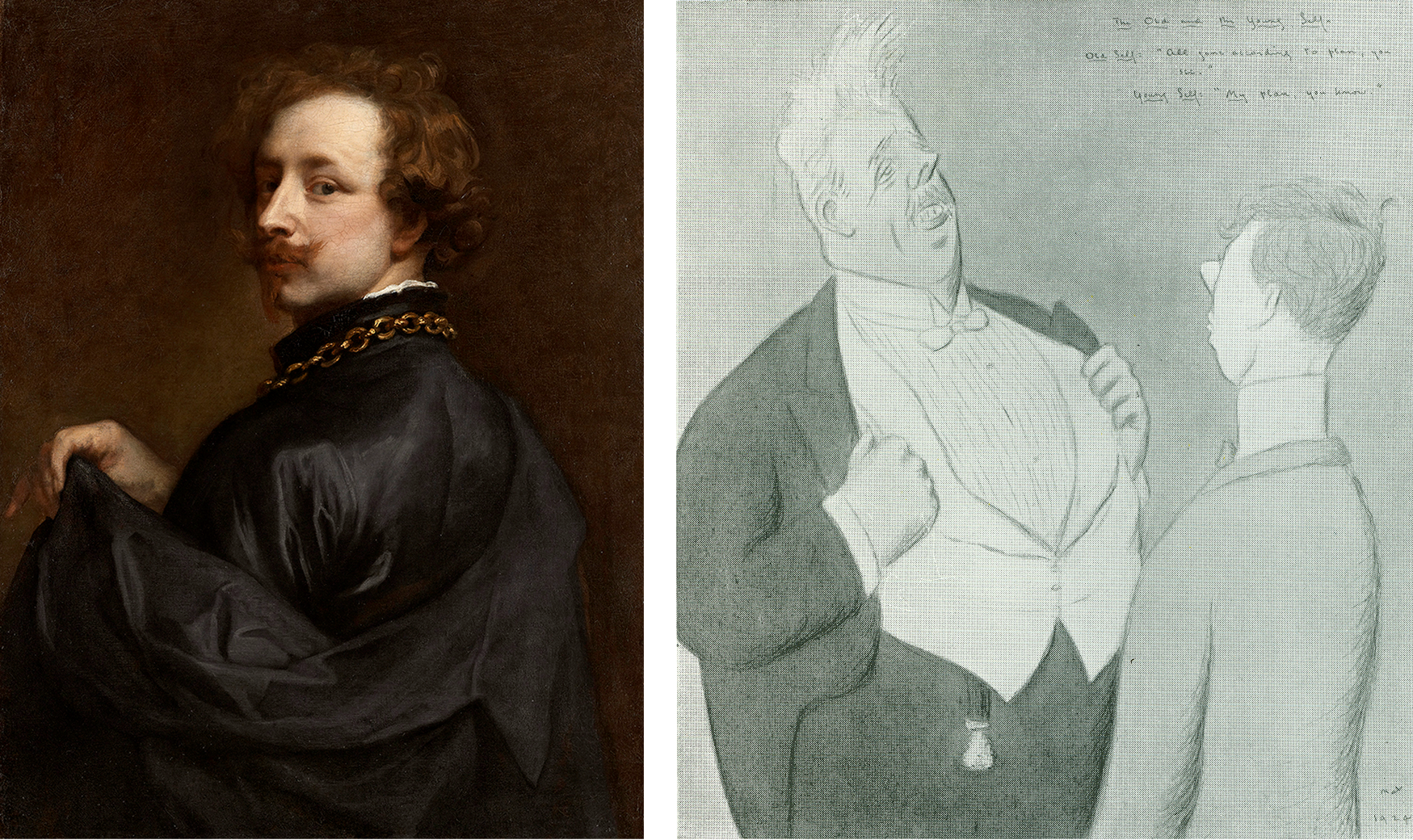
Above, Fig. 19: Left, the newly attributed Van Dyck self-portrait on loan to the Minneapolis Institute of Arts (as discussed below); right, a 1925 Max Beerbohm cartoon in his “The Old and the Young Self” series. (Caption: Mr Arnold Bennett – Old Self: “All gone according to plan, you see.” Young Self: “My plan, you know.”)
Grosvenor’s role as a Mould employee becomes a greater matter of interest given his possibly overlapping role as a private, stand-alone collector/connoisseur. On 14 November 2013 he posted a blog saying that the picture had been sold to an overseas buyer [Stunt] and added: “For the art dealing day-jobber in me, this has to be seen as a Good Thing. We [at Philip Mould] bought the picture (in the thick of the global downturn) because we believed in it, and had the aim of adding value and selling it on. And I believe we have done that… However, for the Van Dyck fan, it obviously pains me that the picture might leave the UK. And it doubly pains me that I might in some small way be responsible for that!”
How so? In addition to his value-adding obligations as a Mould gallery employee, Grosvenor had attended a Government Export Licence Review “as a representative of the picture’s buyer [Stunt]”. It is not clear whether Grosvenor had spoken in support of, or against, Stunt’s declared intentions to remove the picture, at the Review – or whether, whichever line he adopted on that occasion, Stunt had known of it. It is possible that Grosvenor confined his remarks to underlining the seriousness of Stunt’s threat to remove the picture from the country but on 14 November 2013 he hinted that he had opposed the Mould gallery client’s declared intentions:
“A month or so ago we attended the UK government’s Export Licence Reviewing Committee – as representatives of the picture’s buyer – at the Arts Council’s new office… [and the picture] was temporarily blocked for export by the committee on all three ‘Waverley’ criteria (which is unusual). I felt a strange pride in Sir Anthony for pulling that off.” For “Sir Anthony”, we can only read “Dr Grosvenor” and further assume that Stunt was happy to have his by then doubly expressed determination to remove the picture from the country thwarted by a Mould gallery employee. Grosvenor asked: “Will a UK institution [now] be able to raise the funds to stop the sale?” With his gallery salesman’s hat on, he helpfully volunteered: “The price is £12.5m (about 1/3 of a Koons Orange Dog).”
Eleven days later (25 November 2013) Grosvenor reported: “I went to the launch this morning of the National Portrait Gallery’s campaign to save Van Dyck’s last self-portrait for the nation. The picture has been sold to an overseas buyer, and the NPG has 8 months to try and raise £12.5m to keep the painting in the UK. It’s the largest such campaign ever mounted by the NPG… Regular readers will know that I work for the company which has sold the picture, so I’m in something of a predicament. But of course, the Van Dyck fan in me (he’s my favourite artist) wants to see the picture remain on public display in the UK. A large part of whether the campaign to save the picture succeeds will come down to how the public reacts…” (All emphases added.) On the face of it, Grosvenor was openly campaigning against the interest of a Mould/Bader client who, reportedly, had already paid £12.5m and delivered a £4.2m profit to Mould/Bader on an £8.3m picture, and yet, at the same time, he was commanding the country to come to the aid of a public institution so as to help it buy the picture for £12.5m from a dealer and his “progenitor of adventures in old masters” partner/backer.
“ULTIMATE BUYERS”
Again, concerning the price, in his 25 November 2013 post, when scolding Sewell for challenging the attribution and for claiming the NPG could have bought for less than £12.5m had it acted sooner, Grosvenor retorted: “How does Brian know where we, as the ultimate buyers (in partnership with Alfred Bader fine arts) would have stopped bidding? I can tell you now that the NPG would not have got it at auction for less than the asking price today.” Thus, we learn that the Bader-backed Mould gallery had been prepared to buy the supposed Last Van Dyck Self-Portrait for very appreciably more than £12.5m. Having already routed all opposition in 2009 with an £8.3m bid, who – other than the NPG – might have been expected to buy the picture after four years of no-sale? We say “no-sale” because if the picture had belonged to Stunt it would have been reputationally reckless behaviour for the vendor, after taking payment, to seek to block the buyer.
In November 2013 Grosvenor complained “Waldemar [Janusczcak] is mounting a one-man campaign to have my employer donate the picture to the NPG…” – which tacitly disclosed that Mould/Bader were still the owners. An anonymous, but evidently well-informed reader commented on Grosvenor’s website: “…Mould and co are entitled to profit from 1) saving the Van Dyck four years ago by taking the risk of purchasing it at auction during a very difficult period 2) holding the painting for four years with a lot of someone’s capital in it 3) researching the picture to add to its value all that is now known about it.”
THE PRESS WEIGHS IN
When Stunt’s reported bid to remove the picture spurred the NPG’s attempt to retain the picture in Britain at £12.5m, many journalists urged the public to contribute to the “Save-the-Picture” fund. In the Times Ben Macintyre hailed Van Dyck as an exemplary immigrant who had enriched his adopted home – a mongrel nation avidly open and welcoming to foreign talents, in which he was knighted, married into the aristocracy, buried in St Paul’s and had left as his legacy a transformed British school of painting that, having passed through Gainsborough and Reynolds to Singer Sargent, “is still felt nearly four centuries later”. That was a perfectly fair and attractive (if by no means original) analysis. Van Dyck’s last and greatest of all self-portraits, Macintyre assured readers, depicts a man who has found his home from home, “and that is where he should stay.” Against that somewhat sentimental reading, evidence suggests that, ahead of the end of Charles I’s reign, Van Dyck was looking to jump national ships.
Jonathan Jones in the Guardian asked “£12.5m for a self-portrait by Anthony van Dyck? That’s what the National Portrait Gallery and the Art Fund are trying to raise in an appeal launched today. Is it worth it?” Sporting hyperbolic philistinism, he self-answered: “Absolutely. I think this is one of the most worthwhile campaigns in years to ‘save’ a work of art for the nation. Van Dyck’s Self-Portrait would make a spectacular addition to the National Portrait Gallery. Quite frankly, it could make the place. It would give a gallery stuffed with pictures of primarily historical interest a true artistic masterpiece, by the man from Antwerp who gave birth to British art.”
In the Spectator the historian Andrew Roberts wrote: “Of all the great British portrait painters, Van Dyck is by far the most important not to be represented by his own portrait in one of the great British public collections, considering how central he is to the history of the British school of painting and how his influence has grown over the centuries. ‘We are all going to heaven’, Gainsborough said on his deathbed, ‘and Van Dyck is of the company.’ For the National Portrait Gallery, the story of Britain that it attempts to tell through portraiture is simply incomplete without a portrait of Van Dyck, which has long been identified as one of the major lacunae in its otherwise superb collection. This is the only chance a museum or a gallery in the United Kingdom has of acquiring the masterpiece and it’s the only portrait of the artist ever likely to be made available for acquisition by a British public collection…”
Grosvenor purred on his 28 November 2013 post: “excellent piece by historian Andrew Roberts in the Spectator on the NPG’s campaign” without disclosing that since May 2013 Roberts had been an NPG trustee. Nor did he demur when Roberts assured the public that this was “the only chance” of acquiring what was the “only portrait of the artist ever likely to be made available for acquisition”. Not the slightest hint was given that three Van Dyck self-portraits were in the offing and on 8 December 2013, the Sunday Times prodded laggards: “James Stunt, who is married to Bernie Ecclestone’s younger daughter Petra, has already put in an offer of £12.5m and hopes to hang the piece in his Los Angeles mansion.”
A PROLONGED STRUGGLE TO RAISE THE READIES…
On 17 February 2014 Grosvenor announced:
“The National Portrait Gallery has successfully argued for an extension to the export bar on Van Dyck’s c. 1640 Self-Portrait. This means they have another 5 months to try and raise £12.5m, which is the sum required to match the picture’s sale price. The NPG has already raised a quarter of that amount, from bodies such as the Art Fund, the Monuments Trust, and also (impressively) nearly a million from smaller donations made by members of the public…” That left some £8.2-3m to find – effectively the full original world record price paid at auction. Once again, Grosvenor reminded his readers: “I’m in something of a quandry [sic] on this one, given that Philip Mould & Co., for which I work, sold the picture to an overseas buyer.” (Emphasis added.)
AN EMPLOYEE HELPS BROKER A NEW CUT-PRICE MYSTERY DEAL
On 26 March 2014 Grosvenor announced he had been working on “a new deal to help the National Portrait Gallery’s campaign to acquire Van Dyck’s final Self-Portrait” and that the target price “has now been reduced from £12.5m to £10m.” Who exactly was working with whom – and how – on this deal? What role had Grosvenor played? Stunt, he reported, had issued a statement: “When I agreed to buy [not when I bought] this great portrait I didn’t expect the huge swell of public opinion and strength of emotion its export would generate…I have reconsidered my position and have decided, with Dr Bader and Mr Mould’s agreement, to withdraw from the process.” Had Stunt owned the painting he would neither have been able to withdraw from a process, nor have required the agreement of Bader and Mould to sell his own picture to the NPG at a supposed-billionaire’s public-spirited £2.5 million loss, should he have wished. Presumably, Stunt meant only that he was withdrawing both an earlier undertaking to purchase and a declared threat to remove the painting on purchase.
Had Stunt feared opprobrium on removing the picture from the country, he could have bought it on an agreement not to remove it – he had three homes in London at that time. Given that, for whatever reason, the well-publicised Stunt purchase had vaporised, and that Mould/Bader still had no buyer in view – other than the NPG which was clearly struggling to match the reported sale at £12.5m – why did they not revert to their earlier £9.5m offer to the gallery?
At that price, Mould/Bader would still have made £1.2m profit on their £8.3m purchase – almost as much as the £1.4m contributed by the donations of 10,000 members of the public – while earning kudos for contributing to the public weal. Grosvenor reported that Mould and Bader had responded separately. Mould had said: “I am delighted to be able to help the National Portrait Gallery’s campaign in this way”. In what way had he helped? Had he volunteered a £2.5 million cut on a painting he (or he and Bader) still owned but could not sell? Or, had the elderly Bader been the near- or actual owner, with Mould and Grosvenor having acted as his agents in an attempt to flip a £8.3m painting to the National Portrait Gallery?
A CHEERLEADER CONSTRAINED
“And, for what it’s worth”, Grosvenor continued, on 26 March 2014, “here’s what I have to say. Regular readers will know that previously I’ve had to tread carefully when it came to the NPG’s campaign. Van Dyck is my favourite artist, and I’d naturally like to see his final Self-Portrait stay in the UK and on public display. But my responsibilities towards our clients meant that I couldn’t be as much of a cheerleader for the [fund-raising] campaign as I’d liked. Now that Mr Stunt is no longer buying the picture, and Dr Baders [sic] and Philip Mould have agreed this new plan in favour of the NPG, however, all efforts can be focused on the Gallery’s fundraising. I’m pleased with the outcome.” (All emphases added.)
Ostensibly, that was inscrutable: Grosvenor talks of clients when only Stunt had reportedly been in the picture; Stunt is now not buying and therefore, contrary to all previous claims, he had not bought. How real, then, had been the threat to remove the picture from the country? Had it become apparent to Mould/Bader that even with the extended leave to raise funds, the NPG was unlikely to raise the necessary £12.5m? Was it not the case that no one was interested in buying the picture and that to be sure of a sale, the high asking price to the NPG would have to be slashed; that having paid £8.3m for a stealthily upgraded former copy, Mould/Bader had simply bitten off more than they could chew?
As for who was making the twenty per cent price reduction, Bader made no comment. His family responded: “Alfred Bader CBE, an established philanthropist on both sides of the Atlantic, has been impressed by the public’s response to the painting, and the efforts that both the Art Fund and the National Portrait Gallery have made to keep the picture on public display. He very much hopes that the National Portrait Gallery is able to complete the rest of its fundraising challenge.” That would fit with the view some held at the time that (the then ailing) Bader and his family were impatiently seeking the return of his undisclosed investment/stake in the picture.
THE SECOND “LAST VAN DYCK SELF-PORTRAIT”
In the light of a £2.5m reduction after four years of no-sale, it might again be wondered at what point the now Grosvenor-owned True “Last Van Dyck Self-Portrait” that today hangs in the Rubenshuis Museum had emerged. In his December 2015 BAJ article, Grosvenor disclosed that his painting had undergone a long and “sensitive conservation, leaving us with the picture we see today”. Skipping an owner’s obligatory guff on “sensitive conservation”, for how long was it in restoration? Answer: “over the last few years”. That is a lot of sensitivity on a modest painting and it suggests that Grosvenor might have acquired the picture no later than c.2013. [*] Had he at any point advised his employer or the National Portrait Gallery that he had single-handedly acquired a supposedly artistically superior Van Dyck self-portrait with a supposed royal provenance that he would shortly publish and lend to a foreign museum as the True Last Van Dyck Self-portrait? For that matter, had Mould and Grosvenor jointly advised the National Portrait Gallery when the third Van Dyck self-portrait (Figs. 1, 15, 19 and 20) – that would be sold privately and thereafter loaned to the Minnesota Institute of Arts – first came to their attention?
[* Although Grosvenor gives no indication of when or where he acquired the picture, he does track its history as far as 2006 when it fetched $3,120 at Christie’s, NY, in a 6 June sale, as lot 40, ‘After Van Dyck’.]
A RESEARCH AND ADVOCACY-LED BREAK-THROUGH
“Well, hurrah”, Grosvenor had cheered on 1 May 2014, “the National Portrait Gallery in London has successfully raised £10m to buy Van Dyck’s late ‘Self-Portrait’” – but note Grosvenor’s new description of the soon-to-become National Portrait Gallery picture: “Van Dyck’s “late ‘Self-Portrait’”. Why late and no longer last?
“I may write more about the acquisition process later”, Grosvenor went on, “but I’m quite proud to have been involved in both that and the process of research and advocacy that has resulted in the [NPG] portrait becoming what it is today. It’s certainly been a privilege to have handled the picture here at the Philip Mould Gallery. Seeing Sir Anthony in our offices every day made it feel as if he was part of the family. I don’t mind admitting that most days I would greet him with a quiet ‘Morning Ant’, and if I was the first in I’d positively shout it, and even give him a wave. He never waved back of course, but that vivid, knowing expression made it seem as if he was reciprocating in some way. And then there was the strange feeling of having Van Dyck look over us as we made the occasional discovery of a new work by him. These have included – if you’ll forgive the boast – the Portrait of Olivia Porter in the Bowes Museum, the Portrait of a Young Girl now hanging at the Ashmolean, two male full-length portraits painted by Van Dyck while he was in Italy, a Holy Family painted in Sicily, three important head studies, and his last Portrait of Queen Henrietta Maria as St Catherine. There are others which unfortunately I can’t tell you about – at least, not yet. I hope, now that he’s left us, the discoveries don’t dry up.”
THE THIRD VAN DYCK SELF PORTRAIT
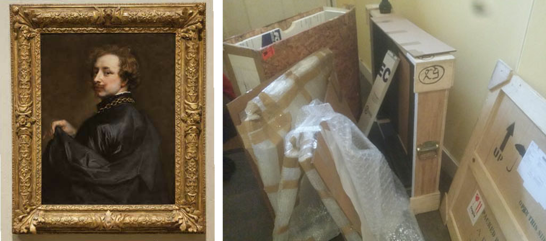
Above, Fig. 20: Left, a photo accompanying Grosvenor’s 5 March 2015 post on a painting loaned as an autograph Van Dyck self-portrait to the Minneapolis Institute of Arts, Minnesota; right, a Grosvenor photo carried on 31 March 2015 with the caption: “Wanted – good homes for second-hand picture crates.”
So, yet other Van Dyck Discoveries-in-Waiting – but which would emerge next? Well, the one now hanging in the Rubenshuis museum had first been written up by Grosvenor in the December 2015 British Art Journal but, in 2018, Gleadell had reported in the Telegraph that Mould’s favourite Van Dyck upgrade “is a self-portrait that he found at auction in Germany, in 2012. Thought to be a copy and with a €30,000 estimate, he bought it for €572,000. By 2015 he had sold it on privately, since it appeared at the Minneapolis Institute of Art on loan from the American investment financier, Scott Minerd. Taking some credit for the change in status was Mould’s researcher, Bendor Grosvenor, now a TV presenter [etc….]” Presumably, with Mould having bought for only half a million, Minerd will have paid very considerably less for his attributed Van Dyck self-portrait than had the NPG for its now Grosvenor-shunted former “Last Van Dyck Self-Portrait”?
KNOCKING SIR OLIVER MILLER
Grosvenor had claimed his own credit on the upgrading of the Mould-to-Minerd self-portrait on 5 March 2015:
“The Art Newspaper seems to have scooped a story I’ve been dying to tell you about for some time; the re-discovery of an important self-portrait by Van Dyck. The picture was one of the last important portraits I worked on with Philip Mould in London.” Grosvenor then cited Martin Bailey’s Art Newspaper coverage:
“Martin Bailey writes: ‘A self-portrait by Van Dyck that was dismissed a decade ago as a copy is now hanging in the Minneapolis Institute of Arts, Minnesota, as an original work. The painting which has been authenticated by experts, was quietly put on display in February…An unpublished paper on the self-portrait, prepared for the owner, dates the work to around 1629 and states that this attribution is accepted by four key experts: Susan Barnes, a co-author [one of four] of the 2004 Van Dyck catalogue raisonné, Christopher Brown [*], the former director of the Ashmolean Museum in Oxford, David Jaffé [**], a former senior curator at the National Gallery in London, and Malcolm Rogers, the outgoing director of the Museum of Fine Arts Boston. The attribution is also accepted by Patrick Noon, the head of paintings at the Minneapolis Museum…The late Oliver Millar, another co-author of the 2004 catalogue raisonné, dismissed the work as ‘possibly a very early copy’. He assumed that the original painting was missing…’”
[* As senior curator at the National Gallery in 1982, Christopher Brown had been instrumental in the gallery’s £2.5m 1980 purchase of the Rubens Samson and Delilah. **David Jaffé, a successor as senior curator, strongly defended the picture’s acquisition and in 2005-6 organised the National Gallery exhibition, Rubens: A Master in the Making that showcased the Samson and Delilah. Conspicuously, neither of the contemporary copies of the original lost Rubens Samson and Delilah – which, as mentioned, had both testified to a wider composition in which Samson’s toes had not been cut off at the edge of the painting – were brought to the exhibition.]
Grosvenor continued: “The unpublished paper referred to above was written by me, and I’ll share further details with you soon. There’s a great deal to discuss. I think the picture was probably painted in late 1628. A few quick additional points: The Art Newspaper mentions that the late Sir Oliver Millar ‘dismissed the work’ – but in fact when he saw it at an Agnews exhibition in 1968 he pretty much accepted it. [Source?] Indeed, although the picture was little known and only exhibited once, it was continuously published as ‘a Van Dyck’ right up until 1999, and it was only in the 2004 Catalogue Raisonné co-written by Sir Oliver Millar that the picture was first doubted. I’m not sure why Sir Oliver changed his mind, but it was probaby [sic] due its pre-conservation condition; it had been substantially over-painted, and was also really quite dirty under old varnish. I believe Sir Oliver was perhaps also misled by the gold chain, thinking that chain was that given to Van Dyck by King Charles I, and that the portrait must therefore be an English-period work (that is, in the section of the catalogue that he was responsible for), dating to after 1632 – when Van Dyck’s technique was rather different. In fact, I linked hte [sic] portrait to a a [sic] gold chain Van Dyck was given earlier, in 1628 by the Archduchess Isabella in Brussels, when she appointed him her court painter…”
The paper for which Grosvenor claimed credit may well have formed the whole or part of this entry in the Mould gallery’s Historical Portraits Picture Library.
The Minneapolis picture, too, Mould reports, had gone into restoration. Had that been in London and, perhaps by the same restorer who sensitively “retrieved” the now Rubenshuis picture over a couple of years? Given that Grosvenor had researched this second, 2012 acquired, rival Van Dyck self-portrait and prepared a scholarly paper on it for the Mould Gallery, had either sleeper hunter informed the NPG of its presence in London before the gallery paid £10m for it’s then – but now Grosvenor-demoted “Last Van Dyck Self-portrait”?
If it might be thought a remarkable coup for all three Mould/Grosvenor Van Dyck self-portraits to have found homes in museums – the NPG, the Rubenshuis and Minneapolis – on this aspect, Grosvenor has shown a certain professional diffidence. Writing in the Financial Times of 3-4 March 2018 on the subject of collectors lending works to museums, he weighed the pros and cons of collectors lending and held: “Critics claim that museums are being used by lenders to enhance the value of their work…It is true that in some circumstances a period on loan can make an artwork better known, and thus more saleable. And there are other benefits to lending, too; the former National Gallery director Sir Nicholas Penny points out that museums can offer collectors the ‘double service of a free safety deposit with a shop window.’” Grosvenor hastened to add: “But the suggestion that a period of display can transform an artwork’s value is overblown…And while there undoubtedly are unscrupulous art owners, most collectors are driven not just by a passion for art, but by a passion to share it, too (disclaimer, this includes me; I have lent works anonymously since I started collecting over a decade ago)…at the Rubenshuis museum in Antwerp, which has only a small collection of its own and an even smaller budget, the well-publicised loan of a Tintoretto that once belonged to David Bowie helped increase visitor numbers by 30 per cent…It is time for museums to become the liggers of the art world, and borrow as much as they can. There’s a good chance they’ll get to keep it.” Grosvenor made no mention of his own loaned Last Van Dyck Self-Portrait, but we all get the picture, so to speak.
“CALL THE CONNOISSEURS!” – MOULD, GROSVENOR AND STUNT BID TO PRODUCE A NEW VAN DYCK CATALOGUE RAISONNÉ

Above, Fig. 21: Top, the entrance to the Paul Mellon Centre, London. Above, left, Bendor Grosvenor; centre, James Stunt; right, Philip Mould.
Leaving the Minneapolis Museum picture aside for Part II, we can now disclose that in 2014, Grosvenor and Mould jointly sought support from the Paul Mellon Centre to write a new catalogue raisonné on Van Dyck – and, also, that James Stunt had presented himself to the centre in support of the two dealers’ proposal with an offer to fund the costs of their proposed venture. It was a combined offer and proposal that could not be accepted, a) because the above-mentioned major catalogue – written by the four specialist Van Dyck authorities, Susan J. Barnes, Nora De Poorter, Oliver Millar, and Horst Vey – had been published by the Mellon Centre in 2004 and which work was then, as it remains today, widely regarded as an indispensable reference source; and, b) because the two would-be revisers were considered to have no real scholarly credentials to conduct such a massive and monumentally important art historical project.
When Mould and Grosvenor parted company (the latter with the rumoured £1m payoff) Waldemar Januszczak declared support for Grosvenor – and the pair now give joint podcasts (“WALDY AND BENDY’S ADVENTURES IN ART” on the Sunday Times’ fire-walled website.)

At 9.44 on 10 January 2021 Grosvenor tweeted the above “in-restauro” picture with this comment: “Ever fancied a go at cleaning a painting. In this week’s #WaldyandBendy we talk conservation and I have a go myself. It’s easy!”
GROSVENOR’S PROLONGED CALLS FOR A NEW VAN DYCK CATALOGUE RAISONNÉ
In August 2014 Grosvenor began disparaging past catalogues of Van Dyck’s work. Thus, of one painting on 19 August: “The above picture has recently gone on display at the Courtauld Gallery in London. It’s currently catalogued as ‘Van Dyck’. I think it was last published by the late Erik Larsen (whose Van Dyck catalogue raisonné is, alas, probably the worst single demonstration of connoisseurship ever published).” Ten days later in another post: “Surely, the most important pre-requisite in compiling a catalogue raisonné is not a degree in art history[*], but the confidence that you will be able to know for certain that your chosen artist really did paint the picture that some label/institution/scholar says they did…Now, I haven’t written a catalogue raisonné[**], but I have (and I hope this doesn’t sound too much like boasting, but there’s no other way of saying it) a proven track record of having a good ‘eye’. So for the benefit of any budding connoisseurs out there, I would add the following three crucial tips (obviously, this is all mostly relevant to Old Masters, and not modern and contemporary catalogues)…”
[* Although Grosvenor does not possess a degree in art history, having read modern history, his PhD dissertation on “The Politics of Foreign Policy: Lord Derby and the Eastern Crisis, 1875-8” might well have developed the usefully transferable research skills that were sometimes in evidence on the BBC’s Fake or Fortune programme. For sure, such desirable skills are not always inculcated within today’s university art history departments, so many of which prefer to fry almost any fish other than those of art and its history, but, as mentioned, Grosvenor has gone further and contended (AHN post, 29 August 2014) that “Actually, I’d be tempted to argue that a degree in history is more useful, as it gives a better training in how to evaluate evidence.”]
[** Tantalisingly, in a footnote, Grosvenor added: “Though that might be about to change!” But then… no further dangled hints of a new Grosvenor Van Dyck catalogue raisonné. As for Grosvenor’s not wishing to boast, some might chuckle – before relinquishing his career as a dealer and when temporarily shutting down his own website, he likened what he described as his “enemies” within the art trade to Salieris. As boasts go, likening oneself to Mozart might take some beating.]
FRUSTRATION AND IMPATIENCE WITH ACADEMIC IMPARTIALITY
Perhaps Grosvenor’s fullest expression of dissatisfaction with art historical scholarly expertise came in a March 2015 Art Newspaper piece (“Spare us the so-called experts and call for the connoisseurs”) which carried another Larsen-was-rubbish diatribe with an added slur: “The late Eric Larsen was a hopeless ‘expert’ on Van Dyck, and (it is said) took cash for attributions…Larsen’s example demonstrates two things. First, that it is dangerously easy to become ‘an expert’: all you need is a publishing contract. And second, that the art world – especially the art market – believes that if a painting is published in the latest book, it must be authentic no matter how bad or good that book is…In the quest for academic impartiality, however, we often ignore actual ability. True attributional expertise…can only be gained through years of experience…”
When Gleadell reported in 2018 that Grosvenor now prefers to keep his finds and is “quietly accumulating a small collection of discoveries of his own”, he added: “At this rate, the 2004 [Van Dyck] catalogue raisonné is going to need updating fairly soon – if everyone can agree on things, that is.” Perhaps Mould and Grosvenor have not altogether abandoned hopes of pulling off The Great Connoisseurship Double of being the art trade’s most proactive sleeper hunters and the arbiters of their own field?
In Part II we consider the Two Last Van Dyck Self-portraits on their relative artistic merits.
Michael Daley, 27 January 2021
A National Gallery restoration that repudiates earlier National Gallery restorations

When major museums acquire major pictures, they invariably take additional technical and artistic possession of them through restorations. By transforming pictures’ appearances, museum staffs lay claim to an exclusive up-to-the-minute knowledge of a picture’s material and artistic traits that renders all earlier studies obsolete and activates use of the possessive “our” – as in “our Duccio” or “our Artemisia Gentileschi”. For much-criticised museums like the National Gallery and the Metropolitan Museum of Art, New York, the introduction of a well-preserved picture within a collection risks spotlighting in-house restoration damage – as might well have happened, for example, had the Met exhibited its newly acquired, fabulously well-preserved Velazquez portrait Juan de Pareja and its Perino del Vaga The Holy Family with the Infant St John the Baptist before restoring them. Today, the National Gallery seeks to counter long-standing criticisms by allowing its restorers to present their own interventions and purposes through broadcast social media. In a press release of 2 August 2019, the gallery’s Director of Collections and Research, Caroline Campbell, said of a restored panel painting:
“The National Gallery is one of just a handful of institutions across the world that is able to carry out painting conservation of this complexity. As this work has been carried out behind closed doors, this display is an opportunity to share this expertise with the public and also to celebrate our conservation skills, in a similar way to how we shared the conservation of our Artemisia Gentileschi self-portrait via a series of films.”
Such hubristic public relations manoeuvres are risky. As Michel Favre-Felix, painter and President of ARIPA (Association Internationale pour le Respect de l’Intégrité du Patrimoine Artistique), demonstrates below, restoration errors are still to be encountered among the nation’s pictures and the restorers’ own explanations leave conspicuously unaddressed questions. [M.D.]

Above, Fig. 1: Left, the National Gallery’s Artemisia Gentileschi Self-portrait as Saint Catherine of Alexandria, as presented by the Paris-based auctioneer Christophe Joron-Derem for the 19 December 2017 auction; right, as subsequently restored by the National Gallery.
Michel Favre-Felix writes:
Artemisia Gentileschi’s Self-portrait as Saint Catherine of Alexandria, which was acquired two years ago for £3.6 million (a record for the artist), has already become a new iconic painting of the National Gallery. To the appeal of a self-portrait by the most celebrated female painter of the 17th century, the picture (above, Fig. 1) adds a telling symbolic aura. Commentators have not failed to underline that this martyred saint Catherine, holding the instrument of her ordeal – the miraculously broken spiked wheel – persevering in her faith in the midst of persecution and rewarded with eternal salvation, mirrors the shattering life-story of Artemisia herself, young victim of a rape, maintaining her testimony under torture and finally triumphing in her female artist career. This emblematic portrait is the central feature in the present major exhibition of her work – the first ever in UK – “Artemisia”, National Gallery, London WC2, until 24 January 2021.
Just two weeks after announcing the purchase, in July 2018, the National Gallery began posting on YouTube the first of what became a long series of videos of the restoration in progress (see the list at the end of this article). No fewer than four of them deal with the picture’s cleaning – the need for it (which will be discussed below); the expected effects; its progress and its results.
Such a pedagogic/celebratory (to re-use Caroline Campbell’s expression) public programme is unprecedented. Hitherto, if the Gallery decided to communicate an account of one of its restorations it usually appeared in its scholarly Technical Bulletin, with a strong emphasis on the scientific analysis of the picture’s material structure and a minimal part, if any, given to the hands-on cleaning process itself. The set of YouTube videos exactly reverses that relationship.
As in political discourses, vocabulary plays a key role and carries far-reaching meanings. Old traditional terms might surface, as when the curator, Letizia Treves, observes rather innocently that ‘the picture is quite dirty’, expressing her expectations from its forthcoming cleaning (in Who was… 4:18). ‘Dirty’ is the customary loaded codeword used to justify a total varnish removal. It leaves no room for investigations or nuances: ‘dirt’ cannot reasonably be even partially kept on a painting; it must be entirely wiped out. (See Fig. 1, above, left, for the pre-restoration condition.)
Larry Keith’s expressions are purposefully different. He not only restrains himself from using the loaded and derogatory, non-scientific term ‘dirt’ to describe what is in reality a coat of old varnishes, but he takes care to amend the ambiguous twin-word of ‘cleaning’, by changing its sense, at the start of his talk (in Cleaning… 0:25): ‘Cleaning meaning the… [short pause] …reduction of the old discoloured degraded varnishes’ (“reduction” being the operative word). This singular short pause in his otherwise fluent and dynamic speech is eloquent.
A closer look shows that this change of definition has matured over several years. The cleaning of the Virgin of the Rocks, in 2009/2010, was already presented as a ‘reduction’ [Endnote 1], although this peculiar aspect went rather unnoticed at the time [2]. Earlier, when commenting on the restoration of Guido Reni’s The Adoration of the Shepherds in 2007, Larry Keith mentioned that to clean might be ‘to remove or reduce the old discoloured varnishes’ [3]. If cleaning now means a reduction rather than an elimination, this new position has generated a number of unaddressed questions.
1) First, what does this policy change reveal about the systematic total cleanings made in the past? What happened to the previous certainties on which the gallery’s conservation policy was grounded and which had served to authorise its restorations? Since the post-Second World War ‘Great Picture Cleaning Controversy’, the gallery’s conservation department maintained, against its national and international critics, that a complete removal of varnish was the only way to establish the true, objective, unfalsified state of a painting, and to recover as closely as possible its original appearance as created by the artist. This was not held to be one option among others. It was the inescapable and inevitable conclusion of methodical reasoning itself. The leading proponent of this policy, the de facto chief restorer, Helmut Ruhemann, went so far as to list nine ‘main Arguments against Part Cleaning’ in a crucial chapter of his 1968 book The Cleaning of Paintings (pp. 214-217), which had set the Gallery’s official institutional methodology for more than half a century – and still exerts an influence.
Part-cleaning was not only ruled out in theory but was held to be both unfeasible and deceiving in practice. Ruhemann’s strongest and most persuasive arguments were technical ones. Using the authority of the practitioner, he asserted that a reduction of the varnishes regularly produces an uneven result leaving disruptive and disfiguring ‘patches’ scattered all over the paint. He claimed that a half-way cleaning was arbitrary and inevitably imprecise, the restorer being ‘condemned to groping in the dark’. He stressed that, if there was some old varnish left, it would be impossible to suppress all the faulty and distorting old retouching that might lie underneath. Moreover, he added that the new retouches would never correctly match the still imperfectly cleaned paint.
This argumentation, unchallenged for decades, happens to have been refuted by Larry Keith’s recent practical demonstration. Although Keith used traditional means (no revolution in tools or solvents or monitoring is used in the Gallery) his ‘reduction’ did not generate the Ruhemann-predicted failures: it neither failed to suppress the old retouches nor to avoid uneven ‘patches’ – nor even failed to achieve perfectly matching indiscernible new retouches.
2) What is the reason for adopting partial cleaning today? On the one hand, in hindsight, we can see that the previous policy of total cleaning was based on spurious arguments but, on the other, it is striking that no revised or new justification is provided in support of the present policy.
Why is it now considered to be appropriate, required – or even essential – to keep a part of the old so-called ‘degraded and discoloured’ varnishes on this painting? Is it to serve as a guarantee for the safety of the paint and possible original glazes underneath when subjected to the cleaning with solvents? Does this last layer of old varnish bear a meaningful aesthetic and/or historic value that ought to be preserved? Does the remnant of the surface coating constitute part of the artistic authenticity of the work of art? Keith provides no indication at all. A full range of arguments in favour of part-way cleaning have been put forward elsewhere since the 1950s by connoisseurs, critics and art historians but Keith refers to none.
In reality these questions concern a majority of works because this portrait is not at all an exceptional case. It was, at the time of its acquisition, in a ‘standard’ condition that is common to so many paintings from past centuries that have been subjected to restorations: from the Gallery’s report it turns out that its surface bore the usual old retouching, and its canvas, already relined as was customary in the past, had since suffered a small tear and will be relined anew.
Acknowledging the ‘reduction’ of the varnishes as the best possible care for this painting implies/concedes that it should have been similarly prescribed and applied successfully to so many comparable paintings, affected by the same usual damages, but which were radically cleaned at the National Gallery.
3) Larry Keith never explains in his videos why he chooses to thin rather than to remove the coat of ‘degraded’ varnish, as was the rule before. He simply strives to show why the old varnish needed a treatment and to demonstrate that he achieved ‘key improvements’ on the test areas where it has been reduced.
About the state of the varnish he draws a distinction, not without reason, between two effects: ‘these old varnishes when they degrade, they turn yellow and they turn foggy…’
That is true in a general way, but it is precisely from there that reflections should begin, because while the first is the natural, predictable, regular evolution of traditional materials, the latter is an unfortunate degradation that preventive care could avoid.
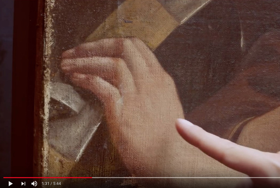
Above, Fig. 2: Screen capture from the video “Cleaning…” – See the full linked-list of videos below.
On this first issue, that of yellowing, the explanations are especially puzzling:
[in Cleaning… 1:27] “You see that where the varnishes have been reduced, the overall tonalities of the picture are much less yellow. The fingers [on the left] are emerging rather pink, instead of this kind of yellow colour [on the right] and I am sure that will become more evident as we move across the picture…”
These comments are puzzling because they hardly fit with what is shown. The old varnish did not turn the skin tonalities markedly and disturbingly yellow (compare the back of the hand on the right with the old varnish on, to the ‘reduced’ one on the fingers on the left at Fig. 2 above), and it is indeed anything but ‘evident’ that it distorted the perception of the colours. It may be recalled that in December 2017, during the presentation of the painting before its auction in Paris, the expert Eric Turquin praised the ‘subtle pinks’ – in his own words – he had no trouble distinguishing in the flesh tones of the portrait with the old varnish on [4].
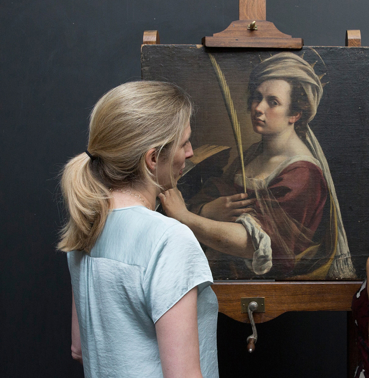
Above, Fig. 3: Photograph (detail) from the Hyperallergic site, 12 July 2018, showing the “Artemisia” exhibition curator, Letizia Treves, facing the self-portrait before cleaning began. Although top lighting caused a pale reflection on the canvas, lightening the dark tones, it can be seen here that Artemisia’s flesh tones are not so much yellowish as close in their pinkness to the curator’s own natural colouring.
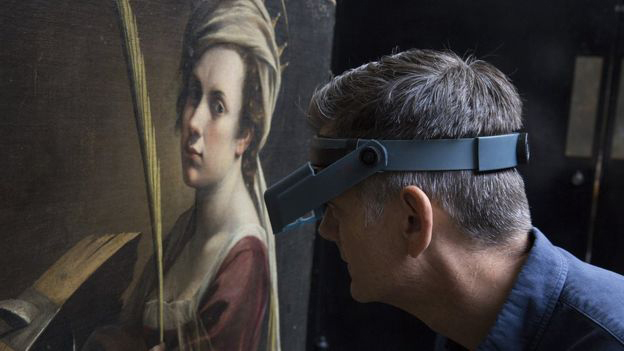
Above, Fig. 4: The restorer Larry Keith, examining the painting before cleaning began, as shown on BBC News 6 July 2018.
The above photos published in July 2018, at the very start of the intervention, in which spectators are present confirm that the variety of colours in the painting was clearly perceptible: the shades of pink of the face, the cream tone of the headscarf, the Naples yellow of the palm leaf or the ochre of the wood read easily and naturally. One can observe that there was no oppressing monochrome veil distorting the shades of the portrait, which were quite close to the natural skin tones of the viewers, as the photographs testify (Figs. 3 and 4).
Surprisingly, if not tendentiously, Keith even evokes an ‘accumulation of varnishes’, which he ventures would result from ‘many restorations that have probably occurred’ in the past (in Cleaning… 4:35). ‘Many’ is merely hypothetical since the history of this painting is totally unknown between the years of its creation, circa 1615-1617, and the 1940s when it resurfaced, only to be quietly kept in a French family (Pes, J. 2018).
Looking at the photographs of the initial state, it is difficult to deduce a superimposition of many added layers. Fortunately, this will be checked since Keith has announced that ‘minuscule samples [will] help us understand the layers structure of the accumulation of varnishes’ (in Cleaning… 4:35). Fine. It will be of great interest for the public and the experts that the result of this investigation by the laboratory be disclosed: how many layers of old varnishes? To what total thickness? Until these results are established and cited the idea of an ‘accumulation’ of layers of varnish will remain a puzzling assumption.
4) Beside the issue of yellowing – that he admitted not to be ‘evident’ – Keith places a greater emphasize on the second, undisputable, aspect of the picture condition, that of the varnish getting foggy. This loss of its transparency is, by contrast, plainly documented.
Even during the presentation at the 2017 auction in Paris, while the subtlety of the colours was praised, the ‘dullness of the varnish’ was nonetheless underlined and attributed to the fact that the painting had remained in the same family for several generations.
The video illustrates the consequences of this phenomenon (in Cleaning… from 1:40):
“… where [the foggy varnishes] are over the darker tones, the darker tones become quite a bit lighter. You can see that here, with that sort of hazy presence. And whereas down here where I started reducing the old varnishes, you can see the darker colours are much darker and the range from light to dark is much enhanced. And I think this helps you understand how [Artemisia] has laid out the folds, and helps you understand what is in front of what.
“…I think the thing here [in the ‘reduction’ in progress] that is most significant and really very rewarding is to see now the range from light to dark, which [Artemisia] has used, and her modelling of forms, which gives this sculptural presence.”
Indeed, Artemisia’s artistic expression rests on the illusion of spatial depth and on the convincing impression of three-dimensional figures. And this pictorial achievement is only displayed when the half-tones, dark values and contrasts have their full effect, which requires a good transparency of the varnish final layer.
It is hence plainly justified to try to regain this fundamental quality. However, in the case of this painting, such faint cloudiness is a common and rather benign alteration caused by humidity (that is to say, by a lack of prevention from its keepers). Physically, this phenomenon results from the scattering of light – not exactly on the ‘varnish’s own kind of fine cracks’ as it is said rather simplistically in the video – but on a multitude of micro-fissures, much smaller than usual cracks, that have developed within the varnish film at a microscopic scale that is invisible to the naked eye.
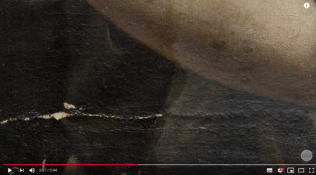
Above, Fig. 5: Above, Fig. 5: detail of Artemisia’s arm, showing un-thinned (slightly dull) varnish on the right and thinned varnish on the left.
As can be seen on the video, the thinning of the varnish has cleared the cloudy effect and has thus enhanced saturation and contrasts [above, Fig. 5]. Yet, the cause/effect relationship is not that simple. The dissipation of the hazy opacity is the result of a specific physical process: it comes from the ‘closing’ of the micro-fissures, which is obtained through the momentary softening and swelling of the varnish film when suitable solvents are applied to it. Once the solvent has evaporated, the micro-fissures have closed and so, vanished. Since the ‘reduction’ was done with solvents, their penetration into the varnish film provoked the swelling/closing result. Thus, this was a linked side-effect and it would not have been necessary to thin the entire varnish layer for that to happen. For this kind of light haziness, a simple exposure of a varnish surface to an appropriate solvent, at much lower levels – i.e. ethanol in form of vapours – without any ‘reduction’, could have produced the same positive result (Pfister, P. 2011, Demuth, P. 2001): the saturation of colours; the in-depth setting of the figure; the sculptural modelling created by Artemisia, would all have been recovered.
Of course, when such a minimal treatment is chosen, the tonality of the varnish remains unchanged, since its thickness is undisturbed even as its transparency is regained.
Knowing this, we realize that there is confusion between the two results. In truth, a physical reduction was not essential to recover the range of values from light to dark and modelling of forms intended by the artist, which could have been achieved otherwise. Essentially, the thinning of the varnish was used principally and specifically to obtain the ‘much less yellow’ overall tone. This result is held – in Larry Keith’s account – to be such an obvious improvement as to require no further justification. Yet, it does – and we see below why it needs questioning.
5) The transparency is a basic undisputed requirement for this varnish (as for any other). But what is the justification for making it ‘much less yellow’?
When we leave aside our own era’s cultural preferences and consider the materials and varnishing practices that prevailed in the XVIIth century, we realize that the (disparaged) ‘old varnish’ found on this painting had the best chance of resembling the original finished appearance as made by Artemisia herself.
Above, Fig. 6: A section of de Mayerne’s text (Folio 151r) mentioning Artemisia Gentileschi and her varnish.
Throughout these supposedly informative and instructive videos it is striking that no reference is ever made to the kind of varnish that would have been used by the artist herself, or, even, to those that were common in her circle and time in Italy. This omission is hard to justify since relevant historical and technical references have survived and are accessible. For example, Turquet de Mayerne’s manuscript notebook (written between 1620 and 1646), which is the main historic testimony and source of information on the painting techniques of this period, contains a famous reference to an ‘amber varnish’ [5], ascribed to both Artemisia (active c. 1610-1653) and her father Orazio Gentileschi (active c. 1587 -1639) – see Fig. 6, above. De Mayerne specifies that this varnish had a strong reddish tone and was used by the instrument makers to varnish lutes [6].
It should be borne in mind that, at that time, in the absence of precise identification, the term ‘amber’ (otherwise called ‘c(h)arabe’) encompassed a group of resins that were close by their consistency, colour, workability and effect – and among which were chiefly the different semi-fossil resins that we now classify as copals, which range from semi-hard to hard and are easier to dissolve than true fossilized amber (Leonard et al. 2001, Holmes, M. 1999).
Furthermore, the expression amber varnish ‘coming from Venice, with which they varnish lutes’, added in the passage on Orazio (Folio 9v), most probably indicates a ready-made product. At that time in Italy many varnish formulations were no longer made in the artists workshops but prepared and sold by colours merchants. The painter Gian Battista Volpato quotes the ‘amber varnish’ as one of them [7]. De Mayerne states that a so-called ‘Oil of Amber from Venice’ (that is, a fat varnish made of ‘amber’ dissolved in a possibly larger proportion of oil), which he supposes to be the one used by Orazio, was sold in every Italian colour shop [8]. The main point is that these prepared varnishes formed a dry film that approached the legendary hardness of amber and had a similar golden-brassy colour. Some rosin (colophony) could be added, which was useful for improving the working properties of the mixtures (Leonard et al. 2001). Its marked orange hue would also increase the warm tonality of the whole – see Fig. 7 below.

Above, Fig. 7: Colophony (or rosin, resinous part remaining after the essential oil has been extracted from the balsam of Pinus maritima Lamb. by distillation.)
It is mentioned that Artemisia mixed her ‘amber’ varnish with oil and spread the blend as an intermediary layer upon the already dried parts of her work in progress, before continuing to paint (Folio 151r). This method, commonly called ‘oiling-out’, has three benefits for reworking: it brings back the initial saturation of the first colours that might have turned dull when drying; it enables a fluent application of the later colours; and, it promotes their physical adhesion to the ones beneath.
Concerning Orazio, de Mayerne notes that he used to add a drop of ‘amber’ varnish directly to his colours on his palette – especially to the ones of the flesh tones – in order to make them more ductile and quicker to dry (Folio 9v).
Was it also chosen as final varnish? The use of the same compound for mixing with colours, for intermediary ‘oiling-out’ and for final varnishing is indeed consistent with what is known of painters’ practices at the time. Examinations of paintings by Caravaggio (of whom Orazio was a disciple) have shown that remains of his final varnish – resin in oil – were similar to the ‘oiling-out’ layers found in his paint structure (Arciprete, B. 2004).On the same folio (151r) where de Mayern mentions Artemisia’s oiling-out method, he reports on another ‘charabe’ varnish, which can be used ‘for varnishing and for mixing on the palette with the colours’ [9].
Moreover, a discovery made by the Getty Conservation Institute in 2000 confirms that Orazio also adopted an ‘amber type’ varnish of his final coating. Found on one of his painting (Lot and his Daughters, J. Paul Getty Museum, Los Angeles) executed about 1622, this rare original varnish proved to be composed of Manilla copal and rosin, precisely (Leonard et al. 2001) [Figs. 7 and 8].

Above, Fig. 8: Manilla Copal (from Agathis dammara Lamb.)
This tangible historical/material evidence of what was an ‘amber-like’ formulation provides a precious testimony of its visual effect on the picture: it displayed a notable warm golden tone over the parts where it was still present (see Figs. 9 and 10 below). Given that Artemisia learnt to paint in her father’s studio, it is beyond doubt that Orazio would have shared both his materials and his practices with his daughter.

Above, Fig. 9: The effect of Orazio’s varnish on the sky of his Lot and his Daughters (in The Burlington Magazine’s article, Vol CXLII n°1174, p.5.)
Above, Fig. 10: Macro-photograph of the varnished sky. Note the bright blue colour of the paint that appears in some spots where the ‘amber-like’ varnish is missing (from the same Burlington Magazine article, p.9.)
In addition to those clues, there is the certainty that Artemisia’s varnish could only have been composed with resins among those of her time (the end of 16th/ first half of 17th centuries): sandarac; oleoresins balsams from the silver fir, the larch or the spruce; colophony; mastic; copals, with or without oil [10] (Figs. 7, 8, 11 and 12). Reconstructions of historical recipes with such ingredients, prepared and applied following traditional methods are converging to show that they provided a natural warm tone – a ‘golden glow’ – that moreover increased surprisingly quickly (Favre-Félix, M. 2017, Carlyle, L. 2005, CCI 1994) (Fig. 13).

Above, Fig. 11: Strasbourg turpentine (balsam – oleoresine – of the silver fir, Abies pectinata DC. – from Kremer Pigmente.)

Above, Fig. 12: Sandarac (from Tetraclinis articulata Mast.)
Above, Fig. 13:As an example, the reconstruction of an historical recipe, using one resin and one oleoresin – a type that became increasingly prevalent from the end of the 16th and throughout the 17th centuries – showed a notable increase of its natural coloration within a short time.
Thus, there lies a major contradiction of modern restoration: the profession asserts a strict adherence to the scientific study of the artists’ materials and techniques, but continues to ignore the technical characteristics of the varnishes that are known to have been used in those centuries. Further, while it aims to present paintings as close as possible to the artists’ conception it still declines to take into account how their paintings had once looked with their original final layer on, and it persists in eliminating the ‘yellow tone’ of any varnish encountered on old master paintings.
CODA:
A last video deals with the significant choice of a frame for Artemisia’s self-portrait. The Head of Framing, Peter Schade, points out that an authentic frame from the 16th century – wood-carved, painted or gilded – will always surpass any copy of it, even those that look to be perfect reproductions. He makes the following crucial remark [Choosing… 8:45]: “We always carry the baggage of modernity, of our time… And that gets always in some way transferred into reproduction frames. Usually, we don’t see it now but you can look it back at the history of frame reproductions, in the gallery as well, and [see that with] most reproduction frames, after twenty, thirty years they don’t match up to originals.”
Larry Keith had then to admit – albeit in carefully chosen words – that the same rule of unwilling, modern distortion applies to restoration:
“[9:12] …It is the same thing about how we… decisions we make about restoration itself, you know. We think we try to be… I guess what we can say now, is that we are very transparent about the decision-making process but it’s definitely an interpretation all the way down the line”.
Restoration being a contemporary “interpretation” of the work of the past, transparency is essential, and transparency implies clear explanations for the present and for the older interventions. But, strikingly, Larry Keith has not explained in any way the main justification for reducing rather than eliminating surviving varnishes. With regard to the use of retouching – e.g. in the reconstruction of the cropped top of the crown – his presentation and discussions are fair (see Reconstructing… and Retouching…) But on matters of cleaning and varnish this essay’s conspicuous technical, aesthetic and historical documentary omissions testify to an enduring institutional avoidance of transparency on the most vital artistic questions of art conservation at the National Gallery.
Above, Fig. 14: Artemisia’s Self-portrait, left, as in 2017 at auction; centre, same state but as provided by the National Gallery to the press in July 2018, before cleaning; and, right, as at the end of 2018 at the National Gallery, after cleaning and restoration.
Michel Favre-Felix, 9 October 2020.
THE NATIONAL GALLERY RESTORATION VIDEOS:
1) Starting the restoration of Artemisia Gentileschi’s ‘Self Portrait’ – Now entitled: “The art restoration plan for Artemisia Gentileschi’s ‘Self Portrait'” – as posted on the 20th of July 2018.
2) Cleaning Artemisia Gentileschi’s ‘Self Portrait’ – as posted on the 27th of July 2018.
3) ‘It’s such a 17th century thing to do’ | Cleaning Artemisia Gentileschi’s ‘Self Portrait’ – as posted on the 3rd of August 2018.
4) Who was Artemisia Gentileschi? – as posted on the 20th of August 2018.
5) Finishing the cleaning | Cleaning Artemisia’s ‘Self Portrait’ – as posted on the 30th of August 2018.
6) Repairing a 17th century canvas – as posted on the 10th of September 2018.
7) Applying the moisture treatment – as posted on the 21st of September 2018.
8) Finishing the relining – as posted on the 2nd of October 2018.
9) Reconstructing the unusual composition of Artemisia’s ‘Self Portrait’ – as posted on the 9th of October 2018.
10) Retouching a 17th century painting – as posted on the 13th of November 2018.
11) Choosing a frame – as posted on the 26th of November 2018.
12) Framing Artemisia – as posted on the 14th of December 2018.
ENDNOTES:
[1] “Indeed not all the old varnish was removed – it was simply reduced to a level which helps us to fully appreciate the painting.” (Larry Keith – Restoring Leonardo, National Gallery website.)
[2] “By removing the ugly varnish…” Jonathan Jones commenting on this cleaning in The Guardian, 13 July 2010. When reviewing the National Gallery’s restoration of its Leonardo Virgin of the Rocks, Jones expressed delight that the painting had been “freed from an amber prison”.
[3] National Gallery Podcast: Restoring Reni’s ‘Adoration of the Shepherds’, 1 :48.
[4] ARTECENTRO – Artemisia Gentileschi, Sainte Catherine d’Alexandrie, vente le 19 décembre 2017. Time 2: 47.
[5] ‘Vernix d’Ambre venant de Venise’ (Sloane MS 2052 Folio 9v).
[6] ‘Ce Vernix est fort rouge & est celuy des faiseurs de Luths’ (Sloane MS 2052 Folio 150 v).
[7] ‘quella d’ambra si compra, quella di mastice la facio io’ (Merrrifield, M.P, p. 743).
[8] ‘Chés touts les vendeurs de couleurs en Italie on vend une huile espaisse, qu’ils appellent Huile d’Ambre de Venise […] Je croy que c’est ceste huyle dont m’a parlé & se sert Gentileschij ’ (Sloane MS 2052 folio 146v).
[9] ‘Et pour vernir: & pour mesler sur la palette avec les couleurs’ (Sloane MS 2052 folio 151r).
[10] Such a choice of resins for varnishes is also noted by Van Dyck, at the same period, on a folio of a sketchbook: fir balsam, colophony, unspecified ‘vernizia’ and amber varnish (Kirby, J. 1999, p. 13).
BIBLIOGRAPHY:
Arciprete, B. (2004), ‘Il restauro’, La Flagellazione di Caravaggio, il Restauro, Electa Napoli.
Carlyle, L. (2005) ‘Representing authentic surfaces for oil paintings: experiments with 18th and 19th-century varnish recipes’, Art of the Past, Sources and Reconstructions. Proceedings of the first symposium of the Art Technological Source Research study group. Archetype Publications.
CCI (1994) Varnishes: Authenticity and Permanence Workshop, Canadian Conservation Institute, (Reviewed by Neil Cockerline).
Christiansen, K., Mann, J. W. (2001) Orazio and Artemisia Gentileschi – New York Metropolitan Museum of Art, Yale University Press, New Haven.
De Mayerne, T. Turquet, (1620) Pictoria Sculptoria & quae subalternarum artium, British Library, Sloane MS 2052. Trancription in Berger, E. (1901) Quellen für Maltechnik Während der Renaissance und Deren Folgezeit (XVI.-XVIII. Jahrhundert), München.
Demuth, P. (2001) ‘Regeneration of blanched natural resin varnishes with solvent vapour’ Hochschule für Bildende Künste – Dresden/ The ENCoRE Symposium: Recent development in conservation-restoration research 19-21 June 2001.
Eastlake, C. L., (1847) Methods and Materials of Painting, Dover Publications, New York (2001)
Favre-Félix, M. ‘On the recipe for a varnish used by El Greco’, Conservar Património 26 (2017) pp. 37-49 – ARP – Associação Profissional de Conservadores-Restauradores de Portugal http://revista.arp.org.pt/pdf/2016023.pdf
Holmes, M. (1999), ‘Amber Varnish and the Technique of the Gentileschi’, in Artemisia Gentileschi and the Authority of Art: critical reading and catalogue raisonné, R. Ward Bissel, Pennsylvania State University Press, pp. 169-182.
Kirby, J. (1999) ‘The Painter’s Trade in the Seventeenth Century: Theory and Practice’- National Gallery Technical Bulletin, Vol 20.
Leonard M., Khandekar N., Carr D.W. (2001) ‘Amber Varnish and Orazio Gentileschi’s Lot and his Daughters ’, The Burlington Magazine Vol. CXLIII, pp. 4-10
Merrifield, M. P. (1849) Medieval and Renaissance Treatises on the Arts of Painting, Dover Publications, New York (1999).
Pes, J. (2018) ‘The National Gallery’s New Artemisia Gentileschi Should Be a Triumph – But Clouds Are Forming Over Its Ownership During WWII’, December 12, 2018, News-artnet.com.
Pfister, P. (2011) ‘Régénération : l’emploi des vapeurs d’alcool et les dangers des alcools liquides’ / Kunsthaus – Zürich / Nuances 42/43, pp. 24-29.
Ruhemann, H. (1968) The Cleaning of Paintings. Problems & Potentialities. Praeger Publishers.
The Disappeared Salvator Mundi’s endgame: Part I: Altered States and a Disappeared Book

Michael Daley writes: As the world reels from China’s latest plague, the fifteen-year Salvator Mundi Saga has slipped into never-never land. The famously disappeared picture has been likened to an opera by its instigators and is set to become a musical in 2022 in which “artistic liberties will be freely taken to make an enlightening and entertaining experience”. Amazon is offering T-Shirts that carry the Salvator Mundi not as it looked in 2017 when it disappeared but as it looked in 2011 when first presented as a Leonardo at the National Gallery (see below, Fig. 3). The restorer’s own paintbrushes (which had been used to produce three distinctly different states or appearances) were auctioned on eBay with a $1,000 reserve. No bid was received. Back in the real world, before considering the rise and demise of a perpetually morphing disappeared picture’s attribution upgrade that netted $80 million, $127 million and $450 million in two restoration guises over four years on a $1,000 purchase that was overstated tenfold by its owners, we note three further bizarre developments, including a disappeared book of technical analysis and a disappeared Louvre catalogue.
1 – THE LOUVRE’S DISAPPEARED BOOK OF TECHNICAL DATA FOR A DISAPPEARED PAINTING
Above, Fig. 1: Left, a disappeared book; right, a disappeared ascription.
On 30 March, the Art Newspaper disclosed that last year the Louvre vaporised a 45-page book of technical examinations made in 2018 on the disappeared Salvator Mundi painting by C2RMF (Centre for Research and Restorations of the Museums of France). The Editions Hazan book, Léonard de Vinci: Le Salvator Mundi (Fig. 1, above, left), had been produced for the October 2019 opening of Léonard de Vinci, the Louvre’s major exhibition marking the 500th anniversary of Leonardo’s death, but it was withdrawn shortly before the opening even though the authors reportedly considered their examinations “to have demonstrated that the work was executed by Leonardo”. (The claim, of course, is implausible: technical examinations can sometimes disprove an attribution but can never establish artistic authorship.)
A Louvre spokesman said the book, written by the Louvre curator Vincent Delieuvin and C2RMF’s Myriam Eveno and Elisabeth Ravaud, had been “a project in case the Louvre got the chance to exhibit the painting” and that because this had not happened “it is not going to be published” – which seems tantamount to saying “If we can borrow it, it’s a technically-supported Leonardo; if we cannot, it’s not”. A copy of the disappeared book has been seen by Dianne Dwyer Modestini, who had restored the picture between 2005 and 2017. Modestini feels the conclusions confirm her own, earlier, judgements, even though they “do not reveal anything I did not already know about the materials and techniques…”
2 – THE LOUVRE’S DISAPPEARED CATALOGUE WITH A NON-APPEARING, NOW DISAPPEARED PAINTING
Second, to the embarrassment of a disappeared book of technical examinations, we disclose another disappeared Louvre publication: the catalogue for the museum’s 2019-20 Léonard de Vinci exhibition was also junked and replaced shortly before the opening. The two editions of the catalogue were identical except for one detail. In the first, the disappeared painting was splashed on the front cover as by Leonardo – “Front cover: Leonardo da Vinci, Salvator Mundi (detail of cat. 157), Ministry of Culture, Saudi Arabia Kingdom”. (See Fig. 1, above, right.) The author of that endorsing entry was Vincent Delieuvin, who co-curated the exhibition with Louis Frank. Delieuvin’s public commitment to the Leonardo attribution was made in the catalogue of a small 2016 Leonardo exhibition at the Italian Embassy titled: Léonard en France. Le maître et ses élèves 500 ans après la traversée des Alpes, 1516-2016 (Leonardo in France. The master and his pupils 500 years after the crossing of the Alps, 1516-2016). There, Delieuvin ventured of the now-disappeared picture “…Leonardo da Vinci’s Salvator Mundi whose autograph version seems to have reappeared very recently, unfortunately in very bad condition. The circumstances of the creation of this work are unfortunately not known.”
In the second printed catalogue, Delieuvin – with no explanation for the volte-face – correctly describes the Salvator Mundi as the Leonardo studio work that entered the Cook Collection in 1900 (on no provenance and that was later sold for £45) – namely: “Salvator Mundi, version Cook, vers 1505-1515″. A second Leonardo studio version, the de Ganay Salvator Mundi, was included in the Louvre exhibition as catalogue no. 158: “Salvator Mundi, version Ganay”. The choice of substitute may have been pointed: the Ganay picture had flopped when proposed in 1978 and 1982 as the supposedly lost autograph Leonardo prototype Salvator Mundi painting of which no record exists. Such notwithstanding, provenance claims made on behalf of that candidate were adopted and merged with those made on behalf of the Cook version. Because of the non-appearance of the disappeared Cook version, originally no. 157 in the catalogue, there is now a gap in the published catalogue between cat. 156 and cat. 158. That numerical lacuna testifies to the fateful loss of institutional support for the second would-be autograph Leonardo Salvator Mundi in forty years. (See Fig. 1, above, right.)

Above, Fig. 2: Left, the de Ganay Salvator Mundi which, in 1978 and 1982, had been proposed as a long-lost Leonardo prototype painting; right, the more heavily damaged and made-over ex-Cook Collection Salvator Mundi, which was presented as a long-lost Leonardo prototype painting at the National Gallery in November 2011.
3 – SOME DAY, MAYBE, NEVER…
After fetching $450 million in 2017 at Christie’s, New York, as Leonardo’s (supposedly) autograph, (supposedly) long-lost, (supposedly) iconic male equivalent of the Mona Lisa, the painting (really did) disappear without a trace, leaving the world bemused and the picture’s briefly “vindicated” advocates to play blame games. It was promised the painting would be launched as a Leonardo at the official opening of the United Arab Emirates spanking new Abu Dhabi Louvre Museum in 2018. That did not happen. It was said the painting would star as A Discovered Leonardo at the Paris Louvre’s grand 2019 Leonardo blockbuster. That did not happen either, just as we had predicted. The Wall Street Journal has reported that Saudi Arabia’s Ministry of Culture has possession of the disappeared painting and plans to store it while deciding whether or not to build an exclusively Western art museum to house this once again officially-deemed Leonardo school Christian image (“Saudi Arabia’s Secret Plans to Unveil Its Hidden da Vinci-and Become an Art-World Heavyweight”, 6 June 2020).
A MUSEUM FOR A PICTURE NO MUSEUM WANTED
It might seem unlikely that the disappeared former Leonardo Salvator Mundi will reappear in a purpose-built museum of Western art in Arabia when it is now well known (thanks to Ben Lewis’s 2019 lid-lifting book The Last Leonardo) that the picture had been offered to, and rejected by: the Getty Museum; the Hermitage; the Museum of Fine Arts, Boston; the Vatican; the Dallas Museum; a German auction house; Berlin’s Gemäldegalerie, and even, at a knock-down $80 million, to the Qatari royal family.
WHY DID THE BIG WESTERN MUSUMS BACK OFF?
The National Gallery launched the Leonardo attribution in its 2011-2012 Leonardo blockbuster, Leonardo da Vinci: Painter at the Court of Milan, after covertly helping to assemble its proclaimed “Unusually Uniform Scholarly Consensus”. The gallery made no attempt, however, to buy the Salvator Mundi. Similarly, and notwithstanding National Gallery claims of blanket endorsement by the Metropolitan Museum’s curators of pictures and drawings, the Met, too, did not buy what Christie’s dubbed “The Last Leonardo”. Despite publicly avowing support for the Leonardo ascription, the Met’s Chairman of European Paintings, Keith Christiansen, has (so far as we know) written nothing in its support – in marked contrast to his decisive role in the museum’s 2004 purchase of the tiny Madonna and Child that Christie’s offered as the “The Last Duccio”. Where the Met’s director, Philippe de Montebello, shuffled financial mountains to acquire the Duccio at Christiansen’s behest, Thomas Campbell, de Montebello’s successor from 2009 to 2017, tweeted after the 2017 $450 million Salvator Mundi sale that he hoped the mystery buyer “understands conservation issues” and had “read the small print”. Many were sickened by Christie’s globally-hyped removal of a sixteenth century painting from an old masters’ sale context to offer it (buttressed by cross-linked and mutually assured sale guarantees) among trophy modernist “icons” – and all on a picture Christie’s had passed over when it was offered in 2005.
“SALVATOR MUNDI IS A PAINTING OF THE MOST ICONIC FIGURE IN THE WORLD BY THE MOST IMPORTANT ARTIST OF ALL TIME” – LOÏC GOUZER

Above, Fig. 3: Left, Loïc Gouzer, Christie’s former co-chairman of Americas post-war and contemporary art, next to Jean-Michel Basquiat’s Untitled at a press preview; centre, the Salvator Mundi as when sold as a Leonardo at Christie’s, New York, on 15 November 2017; right, the Amazon T-Shirt sporting the Salvator Mundi as it appeared at the National Gallery in 2011 with many more folds visible in the drapery at Christ’s (true) left shoulder – see below, Figs. 8, 9 and 10.

Above, Fig. 4, top row: Left, a c. 1913 photograph of the Salvator Mundi when in the Cook Collection, England; right, the Salvator Mundi as when sold at Christie’s in November 2017. Bottom row: the same time-line changes with three intermediary states from 2005; 2005; and 2011-2012 (when exhibited as a Leonardo at the National Gallery).
THE INTENSIFYING CRISIS OF ART MARKET CONNOISSEURSHIP
The epically long Salvator Debacle has put the abiding old masters’ connoisseurship crisis centre stage. To restate the intractable root problem: supply is finite – the old masters aren’t working any-more; most big-name works are already in museums; and infinite new global money craves art that bestows cachet and respectability. In February 2018, Guillame Cerutti, Christie’s CEO, purred: “our major clients are looking for trophies. They want quality and rarity in any field. This painting had both aspects, it ticked all the boxes”. Such a global trophy-hungry market can only be grown with dramatically upgraded art trade “sleepers” or outright forgeries. Both stand on restorers’ transforming skills which, along with claimed technical discoveries, licence scholars’ elevation of formerly nondescript works to revered Lost Masterpiece status.
MUSEUMS BEWARE
For Big-Name buyers, risks are high and can trip the grandest museums. The Metropolitan Museum’s David was one of its most popular paintings… until it wasn’t a “David” anymore. In 2004 the Met’s director, Philippe de Montebello, spoke of the “Stoclet Duccio” Madonna and Child as “Filling a gap in our Renaissance collection that even the Metropolitan had scant hopes of ever closing, the addition of a Duccio will enable visitors for the first time to follow the entire trajectory of European painting from its beginnings to the present. Moreover, the Duccio Madonna and Child is a work of sublime beauty. This was a unique opportunity to not only to add a masterpiece to the Museum’s holdings but to give its collections a new dimension.”
The institutional gush was infectious: “The Stoclet Duccio – we can now proudly call it ‘the Metropolitan Duccio’ – is an astonishing achievement”, wrote the New York restorer/some-time dealer, Marco Grassi, who likened the picture’s emergence to a discovered Mozart quartet. The disappeared Salvator Mundi is now likened by its original owners/supporters to the discovery of a new planet: “Paintings by the master are as significant culturally as the planets are celestially”. (It must seem cruel to have discovered and lost a planet in six short years.) Circumspection would have been prudent for Grassi and de Montebello: the Stoclet vendors had prepared a “four-inch thick” legal contract document and refused to allow the picture to be examined technically by the three big museums (the Met, the Getty and the Louvre) selected by Christie’s to bid in a private treaty sale. In 2003, the vendors had withdrawn the picture at the last moment from a big Duccio exhibition in Siena at which specialists would have had the first opportunity since 1935 to examine the picture – not one of the four Duccio scholars who had published monographic studies since 1951 had ever seen the picture which was known only by an old black and white photograph.
MARKETING “A LAST DUCCIO” AND “A LAST LEONARDO” AT CHRISTIE’S, NEW YORK
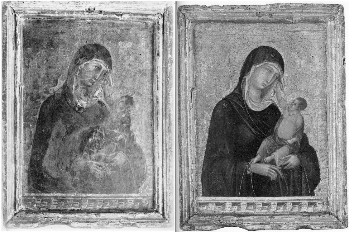
Above, top, Fig. 5: The Met Duccio as first photographed before 1904 (left); and as seen when sold in 2004.
Above, Fig.6: The disappeared $450 million Salvator Mundi as seen in c. 1913 (left); and as seen when sold at Christie’s, New York, in 2017.
In 1901 no one thought the tiny Madonna and Child (Fig. 5, above, left) a Duccio. Some thought it a Sano di Pietro. The picture had emerged after 1900 and, just like the Salvator Mundi (above, Fig. 6), it did so without provenance. It was said to have been found in a Tuscan antiques shop by Count Stroganoff, a Russian friend of Bernard Berenson and a big collector of “inediti” works that had not appeared in scholarly publications or exhibitions. Stroganoff had it restored and cradled. When, after buying it, Met conservators removed the cradle in 2005 (the year the Salvator Mundi was bought in a provincial U.S. sale for less than the low estimate of $1,200 – for $1,000 plus a $175 charge – it, as mentioned, having been turned down by Christie’s), they found that the panel’s originally gesso-ed back had been scraped down to the bare wood which bore a pencilled ascription to “Segna della Buoninsegna”, an apparent confusion between the Ducciesque painter Segna di Buonaventura and Duccio. In 1904 the head of the Uffizi Gallery judged it “in the manner of Duccio”. When an exhibition of early Sienese painting was held in 1904, a friend of Berenson’s, Carlo Placci, commended a late inclusion of Stroganoff’s recently restored picture which by then was incorporated within a larger frame bearing a metal plaque announcing a Duccio. Stroganoff had attributed his own antique shop purchase. Berenson’s circle would usher it into stardom at a time of considerable intellectual and financial crisis for the scholar – his principal source of income had dried; finding part-replacements for it were proving elusive; he had stopped writing. (Ironically, Berenson had held hopes until 1904 of finding employment as an advisor on Italian purchases at the Metropolitan Museum of Art.)
By 1904, as Frances Vieta discovered, Stroganoff had no fewer than eight similarly small gold background Sienese style panels, one of which was ascribed to Duccio’s follower Simone Martini and later bequeathed to the Hermitage in St. Petersburg. The “Simone Martini” had been dismissed in 1901 by the art historian Giorgio Bernardini as “so heavily restored in the skin tones, and in the red and blue robes, that it is not easy to attribute to anyone.” After seeing it at the Hermitage in 1929, George Martin Richter complained (Burlington Magazine): “Beneath this mantle there is concealed not an organically constructed body but a form rather suggestive of a bag full of washing.”
For all the Christie’s Hype, the Met had bought a Berenson Family-accredited pig in a poke. The museum came under challenge. In 1984 the now c. $50 million picture had been rejected by one of the Big Three Duccio Specialists, Florens Deuchler. ArtWatch International’s founder, Professor James Beck, wrote to the Met’s Chairman, calling for an inquiry and advising the museum to ask for its money back (see Beck’s, From Duccio to Raphael – Connoisseurship in Crisis, 2006, Italy, chapter 6 and Addendum). The Duccio pedigree, like that of the Salvator Mundi, is short, modern and precarious. The Salvator Mundi had no pre-20th century history. The Met’s official history of the Duccio begins not in 1901, when no-one considered it a Duccio, but in 1904 after it had been attributed by Bernard Berenson’s wife, Mary Logan (once), and (twice) by Berenson’s protégé, Frederick Mason Perkins, who trained in music, not art history. Christiansen elaborated: “from that point on the picture has held a central place in the Duccio literature”. Central, but with an unseen and unexamined work that had been dismissed by scholars on its six centuries-late emergence. The then 28-year old Perkins, is cast by Christiansen as a leading specialist in Sienese painting when Logan had written his first article and most of his first book.
Worse, as Vieta further established, Perkins was a fount of lucrative attributional errors. In 1923, he advised Helen Frick (then creating the incredible scholarly resource that is today’s Frick Research Library) to buy two huge marble sculptures from an antiques dealer for $150,000. He attributed these “wonderful” sculptural “masterpieces” to Duccio’s heir, Simone Martini. They had recently been made by the sculptor/forger, Alceo Dossena. Perkins’s fee was ten per cent. In 1933 he attributed an unpublished Madonna and Child surrounded by Angels to Duccio in an article carried in La Diana. The Belgian collector Adolphe Stoclet, the then owner of the now-Met Duccio, bought that second “Perkins Duccio”. In 1989 it was loaned to the Cleveland Museum of Art and there identified by Gianni Mazzoni, an Italian scholar of Sienese art and its forgers, as by the forger Icilio Federico Joni – which experience might have chilled the Stoclet family. Joni is known to have run a little factory of forgers whose works were put onto the market by middlemen, one of whom was Perkins himself. The lynchpin of Christiansen’s case for the “Met Duccio” is Berenson’s subsequent (private) hymning of the Stoclet picture as the loveliest and most characteristic thing Duccio ever did to the Duveen firm which paid him ten per cent on Italian purchases. Despite Berenson’s effusions, Duveen would not touch the “very small and ineffective” picture with a “nearly black” robe.
AN UNPUBLISHED TECHNICAL EXAMINATION AT THE MET
A top-secret post-purchase technical examination of the Duccio was carried out at the Metropolitan Museum. Staff were forbidden to talk to the press. No reports were published. The findings were discussed by Christiansen in the February 2007 Apollo. That article carried an x-ray of the painting showing modern, round-headed, wire nails underneath the picture’s ancient, badly distressed, “candles-burnt” gesso-ed frame. That hard, subversive material fact drew no comment (- other than ours in three consecutive issues of The Jackdaw, in 2008-09, as reprised in this post.) No comment was made, either, about the Met Duccio’s eccentric and pronounced craquelure. Scarcely less remiss than these “material” silences was the Met’s failure to acknowledge and address the uncharacteristically sloppy drawing of the figures, as revealed by infra-red imaging (see Fig. 7, below, centre).
Above, Fig. 7: Left, an infra-red image of the National Gallery’s Duccio triptych (detail); centre, an infra-red image of the Met Duccio (detail); right, an infra-red image of the National Gallery’s indisputably Duccio panel, The Annunciation.
De Montebello, Christiansen and the Met picture restorer Dorothy Mahon travelled to London in autumn 2004 to view the Duccio at Christie’s. They were buying “blind” (unable to conduct technical examinations of the kind made on the other Stoclet/Perkins Duccio) and in knowledge that “the Louvre was working on trying to get the money together”. They spent an hour and a half at Christie’s where “The director made an offer for it on the spot”, and they all then went to see the National Gallery’s “rare and very beautiful Duccio triptych” – “a touchstone of Duccio’s work” (detail, above, left) so that the director “might assure himself that the two works were equivalent”. It would have been better to have gone to the National Gallery first, not only to see the triptych but to study its historical and technical dossiers, and those of the gallery’s absolutely secure Duccio Annunciation. Having bought the picture, all three “felt ‘ours’ was every bit as fine and in some respects more intimate and direct” than the triptych and was “a painting that represented the artist at the very height of his powers”. Two Duccio specialists, Deuchler and James Stubblebine, thought the NG triptych “Shop of Duccio: Simone Martini”.
Having thus bought very expensively without a trace of “buyer’s remorse”, other possible grounds for concern may have been overlooked. For example, Christie’s had won the right to conduct its private, three-museum sale by putting “a significantly higher valuation on the painting than anyone else – by multiples”, as Nicholas Hall, the international director of Christie’s Old Masters department, later told the New Yorker (Calvin Tomkins, “The Missing Madonna”, 11 July 2005). When Hall invited Christiansen (an old friend) to lunch to show him a recent transparency of the Stoclet Madonna, he was immediately smitten and proactive. As he later recalled: “‘Fantastic, how about the price?’ I asked. He told me. ‘OK,’ I said, ‘I will deal with that later,’ and then we finished our lunch.” (Danny Danziger, Museum – Behind the Scenes at the Metropolitan Museum of Art, New York, 2007.)
Had the Met officers opted to compare the under-drawing of the three works, as above, Fig. 7, before buying, they might have seen that on the quality of drawing one of the three was the other two’s inferior. If we think of the three images as a triptych, it is striking how much more fully and vividly realised the draperies and figures are as form in the two “wings”. Consider the left and centre under-drawing: in the outer image the drapery folds are not notionally indicated with lines that converge, as on the Met picture, but are realised, in anticipation, as autonomous three-dimensional folds and hollows that move over and around the implicit body within – one senses, for example, precisely where the unseen elbow is located, this being no “bag of washing”. The contour on the National Gallery Madonna’s outer edge is not depicted, as is the case in the Met picture, with a long un-lovely single continuous unbroken line of few deviations along which it is impossible to sense the elbow’s location. Rather, it is conceived and shown as a record of the points at which the forms and undulations of the cloth turn away from the viewer. Such differences of drawing speak of radically differing degrees of plastic/sculptural sensibility and comprehension. That on the left is greatly and decisively more sculptural, dynamically expressive, and plausible as a figure adjusting itself to support the weight of a child. Drawing has rightly been described as the probity of art and, as such, its study and evaluation must be considered one of the most pertinent and indispensable tools of critical analysis.
In the face of artistic weaknesses Christiansen blusters: “The drapery of the Virgin is astonishingly three-dimensional in the way it falls over the arm; it’s like a Roman sculpture.” All style judgements are relative: this is more, or less, or identical with, that. When drawing is weak, associated aspects often prove deficient. Viewing the triptych immediately after the Christie’s Duccio, Christiansen noted the former “struck a slightly different key than the picture we had been examining.” That difference, as the Met’s subsequent examinations disclosed, had a material basis. Ultramarine pigment was used in the triptych as opposed to the Met picture’s cheaper azurite. Moreover, the painted relief of the triptych’s ultramarine blue drapery was modelled not so much by progressive (and chromatically-debilitating – as Duveen had complained) dilution with white pigment, but by the addition of carbon black shading enriched by a red glaze – a tri-partite finish made with the best materials – and one that was emulated by Modestini on the background of the Salvator Mundi. Modestini has given two accounts of her actions. They both merit attention, because both are more detailed, and frank, than is commonly encountered in restoration reports.
REPLICATING HISTORICAL AUTHENTICITY TO PRODUCE A “DIFFERENT, ALTOGETHER MORE POWERFUL IMAGE”
Writing in a 2012 conservation report (see below), Modestini recalled:
“There were actually two stages of the current restoration. In 2008 when it went to London to be studied by several Leonardo experts, there was less retouching: I hadn’t replaced the glazes on the orb, finished the eyes, suppressed the pentimenti of the thumb and stole, and several other small details, but, chiefly the painting still had the mud-coloured modern background that was close in tone to the hair. Two years later I was troubled by the way the background encroached upon the head, trapping it in the same plane as the background. Having seen the richness of the well-preserved browns and blacks in the London Virgin of the Rocks”, and based on the fragments of black background which had not been covered up by the repainting, I suggested to the [then two] owners that it might be worthwhile to try to recover the original background and finish the incomplete restoration.
“I began to remove the overpaint mechanically under the microscope. Where it had been protected by the Verdigris [layer, that had been scraped off “at an unknown date and replaced by a mud-coloured background”], the original background was intact, and much of it survived under messily applied fill material. The difference between the original black and the modern brown was dramatic.
“The initial cleaning was promising especially where the Verdigris had preserved [because applied soon after?] the original layers. Unfortunately, in the upper parts of the background, the paint had been scraped down to the wood and in some cases to the wood itself. Whether or not I would have begun had I known, is a moot point. Since the putty and overpaint were quite thick I had no choice but to remove them completely. I repainted the large missing areas in the upper part of the painting with ivory black and a little cadmium light, followed by a glaze of rich warm brown, then more black and vermilion. Between stages I distressed and then retouched the new paint to make it look antique. The new colour freed the head, which had been trapped in the muddy background, so close in tone to the hair, and made a different, altogether more powerful image. At close range and under strong light the new background paint is obvious, but at only a slight remove it closely mimics the original.
“The retouching was done with time-tested materials.” Viz: “with dry pigments bound with PVA AYAB. Translucent water colours, mainly ivory black and raw siena, were used for final glazes and to draw [fake age] cracks. For the black background both AYAB and Maimeri Colori per restauro were used. Except for the background, I mainly used treble 0 sable watercolor brushes in a series of vertical passes until the area of loss matched the surrounding material.”
RESTORATIONS BEGET RESTORATIONS
In her 2018 memoir, Masterpieces, Modestini recalled:
“When the painting returned [in 2008 from London] to New York, I saw it on many occasions and became increasingly dissatisfied with my hastily concluded restoration. This is inevitable, especially when the painting is a damaged work by a great artist. Although I was aware of this, I itched to have it back. Leonardo’s [sic] Virgin of the Rocks in London had just been cleaned, and I made an appointment to see it. It is relatively well-preserved and, at that time, the only Leonardo that was not encumbered with centuries-old, thick, yellow, decayed coats of varnish like the Mona Lisa and the St John the Baptist in the Louvre. When I saw it, I was struck by the richness and depth of Leonardo’s blacks and realized that the principal problem of the Salvator Mundi was that the image was imprisoned by the nineteenth-century, sludge-colored repaint of the background. In a few areas, mostly around the contours of the figure, the original deep black was visible, and I knew from one [!] of the cross sections that Leonardo had paid great attention to it, building it up with four layers consisting of two different blacks, and black mixed with vermilion. I explained this to Robert [Simon], who immediately understood.
“For retouching [aka repainting] I use high-quality dry pigments, and I had a number of different blacks to work with – bone black, which Leonardo was known to favor, and a sixty-year-old tin of finely ground, pure ivory black that I had inherited from Mario [Modestini], which is no longer made. I had never used it but suddenly remembered Mario talking about how special it was…After I had polished and distressed my new paint, the result was reasonably satisfactory, at least when compared to the previous iteration. The difference it made to the painting was astounding: the great head surged forward and became much more powerful. I allowed myself to think that the decision I had taken was not so terrible after all. With the figure now more prominent and three-dimensional, some minor areas of loss and wear began to clamor for attention. This sequence is an essential part of the process of restoring a damaged painting.
“Luke Syson, the curator of the National Gallery’s Leonardo exhibition, asked to borrow the painting, notwithstanding some cavilling from colleagues about exhibiting a work that was on the market…”
Where Modestini was licensed by the owners to act as a painter-in-arms with Leonardo, Christiansen downplayed the triptych’s greater richness of effects and materials by deeming it “Obviously…a deluxe object” made for a rich client as opposed to “the first owner of the Metropolitan’s [who] was also someone of wealth or social standing”. If the force of that distinction is not immediately apparent, there are other, no less telling, differences where cost is immaterial: the triptych’s under-drawing was made with a quill pen – the instrument said to be Duccio’s favourite. That of the Met painting was made with brush… Making repeated allowances for atypical traits is never reassuring. Modestini has disclosed that although the all-blue draperies of the disappeared ex-Cook Collection Salvator Mundi are of ultramarine, it is of low grade – as was the panel on which it was painted. (In 2019 Simon reported that the ultramarine had not undergone full purification and had retained large particles of quartz.) It has been claimed, as described below, that by some technical quirk, whenever the restored Salvator Mundi is re-varnished, the forms of the true left shoulder draperies expand or contract in numbers (see Fig. 8, below) precisely as occurred between 2011 when the picture was at the National Gallery, and 2017, when it was on offer at Christie’s.
ART WORLD CLOAK AND DAGGER

Above, Fig. 8: Left, top, and detail below left, the Salvator Mundi when exhibited at the National Gallery in 2011-12 as a long-lost autograph Leonardo painted prototype Salvator Mundi; right, top, and detail below right, the (disappeared) Salvator Mundi when offered in 2017 at Christie’s, New York, as a long-lost autograph Leonardo painted prototype Salvator Mundi with “an unusually strong consensus”.
In her 2018 memoir, Masterpieces, Modestini describes how the painting was brought to her place of work at New York University’s Institute of Fine Arts’ Conservation Center in 2017:
“…I called [the Sandy Heller Group] immediately and was told the Salvator Mundi would be arriving in New York shortly and I was not to inform anyone. On Wednesday evening, July 19, the painting was delivered to the Conservation Center under guard and in great secrecy and was stored in the vault.”
Why? Does Christie’s lack safe storage facilities? Modestini seems to have made preparations for the picture to be sent on its whistle-stop global promotional tour even though she does not approve of such risks being taken: “I had some concerns…A museum would not have agreed to this but the painting was on the market, and I realized that it was essential that prospective buyers in far-flung locations could examine it in person.” With a colleague, she “supervised the reframing and packing at Christie’s.” Why, and on whose authority was it sent to an academic institution, under guard and in great secrecy before being dispatched on its global tour? And, what happened to the painting between being stored in the Conservation Center’s vault and its being prepared for that world tour by Modestini, at Christie’s, New York? For Christie’s explanation of this episode, see Dalya Alberge’s “Auctioneers Christie’s admit Leonardo Da Vinci painting which became world’s most expensive artwork when it sold for £340m has been retouched in last five years”. The Christie’s spokeswoman said to Alberge: “Prior to its presentation for sale at Christie’s, Modestini partially cleaned the passage of paint in the shoulder and the dark streaks disappeared”. So, to disappearing books and catalogues, and paintings, must be added disappearing features within a disappeared painting. It is a pity that Modestini, while describing the manner in which the Salvator Mundi painting returned to her safe-keeping in NYU’s Institute of Fine Arts, drew a veil over her own actions therein when writing her 2018 memoir Masterpieces. There are so many questions now dangling: “Why did a small painting that was cleaned in a day and had then undergone several campaigns of restoration over six-years between 2005 and 2011, receive further, covert, treatment just six years later? When Modestini first worked on the painting its varnish was “sticky”. Was it sticky once-more when sold for nearly half a billion dollars in 2017? The disappearances within the painting are one concern. Another is the differences between the picture’s appearance in 2011 when launched at the National Gallery as by Leonardo and its appearance in 2017 when offered to the world in a different guise at Christie’s, New York, as a National Gallery-endorsed miraculously discovered and recovered Leonardo. Those unexplained differences might seem encapsulated in our early split-halves composite image of Christ’s face (as shown below at Fig. 10) where there is a mismatch between the two halves. This Christ has had two faces in our times, the later one with more colour in the cheeks and more focussed eyes. Clearly, both cannot be taken as recovered authentic faces, so the real and urgent question is: Should either of them ever have been presented as Leonardo’s own work?
Above, Fig. 9: Top, left, the Salvator Mundi, c. 1913, when in the Cook Collection; top right, the Salvator Mundi as catalogued by the St Charles Gallery, New Orleans, as “After Leonardo da Vinci” for the April 9-10 2005 sale. Above, left, the Salvator Mundi as taken to the restorer, Dianne Modestini in April 2005 (with a still sticky varnish); right, the picture in May 2008 when about to be taken by Robert Simon (as above) to the National Gallery for a (confidential) examination by a small and select group of Leonardo scholars, after the first stage (as described above) of Modestini’s restorations .

Above, Fig. 10: Left, the ex-Cook Collection Salvator Mundi face, as exhibited in 2011 at the National Gallery; right, the ex-Cook Collection Salvator Mundi face, as offered at Christie’s, New York, in 2017.
A POST HOC SALVATOR MUNDI LITERATURE
As will be examined in Part II, our challenges to the perpetually mutating and “improving” Salvator Mundi were made: a) within days of its November 2011 launch at the National Gallery; b) nearly a month before Christie’s November 2017 sale; c) five days before Christie’s 2017 sale; d) the day before Christie’s sale; and, subsequently, e) in nearly a score of posts – see Endnote below. The undisclosed identity of the original owners was only uncovered in September 2018 (by The Washington Post). Until that date and disclosure, the true purchase price in 2005 was exaggerated ten-fold by both the original owners and the painting’s advocates -and therefore in all press reports over a thirteen-year period. The publication of researches that had been promised in 2011 by the owners and by the National Gallery did not occur until 2019 and, even then, it was not in full.
Four recently published books now comprise a small, belated literature on the rise and demise of the long-unloved Leonardo School work that morphed into the world’s most expensive and least visible picture. They were: Living With Leonardo – Fifty Years of Sanity and Insanity in the Art World and Beyond, by Professor Martin Kemp, London, 2018; Masterpieces (“Based on a manuscript by Mario Modestini” and with informative chapters on: the Salvator Mundi; Cleaning Controversies; and, Misattributions, Studio Replicas and Repainted Originals) by Dianne Dwyer Modestini, Italy, 2018; The Last Leonardo – The Secret Lives of the World’s Most Expensive Painting, by Ben Lewis, London, 2019; and, Leonardo’s Salvator Mundi & The Collecting of Leonardo in the Stuart Courts, by Margaret Dalivalle, Martin Kemp, & Robert B. Simon, Oxford, 2019.
Until those four works appeared, the literature consisted of the catalogue entry “Christ as Salvator Mundi, about 1499 onwards” in the National Gallery’s 2011-12 Leonardo exhibition catalogue by its curator, Luke Syson; and, Dianne Modestini’s account of the Salvator Mundi’s restoration and art historical credentials that was delivered in January 2012 at a National Gallery conference and published in 2014 as “The Salvator Mundi by Leonardo da Vinci rediscovered History technique and condition” in Leonardo da Vinci’s Technical Practice, Paintings, Drawings and Influence, Ed. Michel Menu, Paris. Both Syson’s and Modestini’s accounts acknowledged indebtedness to the private researches of one of the picture’s owners, the New York dealer, Robert Simon.
Specifically, Syson declared in 2011: “This discussion anticipates the more detailed publication of this picture by Robert Simon and others. I am grateful to Robert Simon for making available his research and that of Dianne Dwyer Modestini, Nica Gutman Rieppi and, (for the picture’s provenance) Margaret Dalivalle, all to be published in a forthcoming book.” In 2014 Modestini acknowledged having benefited from “…the knowledge and good eyes of Robert Simon with whom I worked closely on the restoration for six years and who generously shared with me the results of his research for this paper. I am especially indebted to Nica Gutman Rieppi, Associate Conservator in the Kress Program at the Conservation Center of the Institute of Fine Arts, New York University, who took the samples, made the cross-sections and coordinated the analytic work which was carried out with great thoroughness, precision and dedication by Beth Price and Kenneth Sunderland, research scientists at the Philadelphia Museum of Art, with the help of Dr Thomas J. Tague of Broker, Billerica, Massachusetts who carried out the ATR FTIR analysis of the sizing.”
That research had still not been published in 2013 when the picture was sold privately and under (Simon has revealed) a non-disclosure agreement through Sotheby’s for $80 million. The research had not been published by 2017, when Alan Wintermute of Christie’s wrote (in “Leonardo’s Salvator Mundi”, one among other endorsing/bolstering essays by Frances Russell, Dianne Modestini, David Franklin and David Ekserdjian, in the auction house’s 2017 Salvator Mundi book/catalogue): “The reasons for the unusually uniform scholarly consensus that the painting is an autograph work by Leonardo are several… The present painting, although only recently discovered, has already been extensively studied, with a remarkable campaign of research lead by Dr. Robert Simon. The most insightful and broad-ranging examination of the painting was presented by Luke Syson in the 2011 catalogue of the Leonardo exhibition in London. The following discussion depends heavily on Dr. Syson’s entry, which itself drew on the unpublished research made available to him by Robert Simon, Dianne Dwyer Modestini, Nica Gutman Rieppi, Martin Kemp and, for the picture’s provenance, Margaret Dalivalle…” Having thus drawn the scholarly research wagons around the picture (and the auction house) Wintermute disclosed that the still-unpublished researches by Dalivalle, Kemp and Simon would not be published until 2018 – which was to say, a full seven years after the painting had been declared and exhibited as a Leonardo, at the National Gallery. In the event, and even with its pared-down authorship (see below), the book would be further delayed until 2019, by which date the mystery over the subsequently disappeared picture’s ownership and whereabouts had deepened yet further.
The Simon Researches had originally been earmarked for a book of essays to be published by Yale University Press and sold at the National Gallery’s “Leonardo da Vinci: Painter at the Court of Milan” exhibition. That book proved to be the first on this Salvator Mundi picture that failed to materialise. Reasons for its demise were volunteered by Professor Martin Kemp in his Living with Leonardo:
“Robert [Simon] thought it was a good idea to publish a book of essays by various authors, including Margaret Dalivalle and myself. Yale University Press, which does not normally publish monographs on single paintings, was signed up as publisher. I was happy to go along with this, while expressing reservations about a volume with multiple authors being finished on time. Academics are notably adept at missing deadlines, and I was unconvinced that all the authors actually had anything new to say… In the event the complete book was not delivered and, deprived of the rationale of selling a good number of books at the time of the show, Yale withdrew.”
A GOOD SHEPHERD, AN UTTERLY FANTASTIC CONSENSUS AND A DONE-DEAL
The long-promised book of essays emerged in 2019 (through Oxford University Press) as the Dalivalle/Kemp/Simon compilation – but without a proper technical account of the picture’s campaigns of restoration and technical examination. Simon presents the book as “the first to treat the subject monographically” and “the first complete analysis of this essential addition to Leonardo’s oeuvre”. The authors liken their authorially-trimmed exercise to a three-act opera with each act constituting an in-depth facet of the story while “necessarily bypassing many ancillary issues”. The first act is said to chronicle the painting’s “journey from anonymity in America, with no provenance and in severely compromised condition, to its public revelation as a work by Leonardo at the exhibition in London. The six-year process of research and conservation is related by Robert Simon, who shepherded the Salvator Mundi on this remarkable journey…” When Simon took the painting to London in May 2008 (Fig. 9, above) to show it to a select group of Leonardo scholars assembled at the National Gallery, he made a good and lasting impression on Martin Kemp who, in his 2018 memoir, underscored Simon’s decisive role in the institutionally and ethically problematic attribution upgrade:
“…A general discussion followed. Robert Simon, the custodian of the picture (whom I later learned was its co-owner), outlined something of its history and its restoration. He seemed sincere, straightforward and judiciously restrained, as proved to be the case in all our subsequent contacts. We looked, we talked and we looked again. It was a remarkable occasion. By the time I left, I was determined to research every aspect of the Salvator Mundi. It seemed at first sight to resonate deeply with key aspects of Leonardo’s science of art, and his views of the role of God in the cosmos.
“I remained in touch with Robert Simon who is strongly committed to scholarly research. I learned that the eloquent painting we had viewed was in fact one of the known versions of the Salvator Mundi, formerly in the Cook Collection – previously heavily overpainted, it had now been cleaned and retouched. It had never before received serious attention; we had paid only passing attention to the black and white photograph of it [Fig. 6] that had occasionally been used as an illustration…
“All of the witnesses in the gallery’s conservation studio were sworn to confidentiality [by whom?] and the painting travelled back to New York with Robert. It was becoming ‘a Leonardo’ […and later: ‘Robert quietly introduced the Salvator Mundi to a judicious selection of experts, who – remarkably, given the usual leakiness of the art world – kept their counsel for three years. By the time the painting emerged in public there was a critical mass of influential voices who would speak in the painting’s favour.’]
“…Was it on the market? Would exhibiting it mean that the National Gallery was tacitly involved in a huge act of commercial promotion? It seemed highly likely that it was also ‘in the trade’. All I knew at this stage was that it was being represented by Robert Simon. He told me that it was in the hands of a ‘good owner’ who intended to do the right thing by it, and I did not enquire further. I was keen to consider the painting in its own right, not in relation to ownership. I speculated, of course, that Robert might have a financial interest, perhaps a share in its ownership, and I assumed he was gaining some kind of legitimate income from his work on the picture’s behalf…
“It was, however, a great surprise to find that the Salvator was to be sold at Christie’s in New York on 15 November 2017 in a mega-auction of celebrity works of art from the modern era. The auctioneers sent the painting on a glamorous marketing tour of Hong Kong, San Francisco and London. I was approached by the auctioneers to confirm my research and agreed to record a video interview to combat the misinformation appearing in the press – providing I was not drawn into the actual sale process.”
TIGHT LIPS
The anonymity of which Simon spoke was a self-imposed, prolonged tactical ploy. In 2013, the three art dealing co-owners, Alexander Parish, Robert Simon and Warren Adelson (who in 2010 bought a one-third share for $10 million, thereby giving Simon and Parish a ten-thousand-fold return in five years on their $1,000 purchase), realised that because it was known within the opaque but gossipy art trade that the picture was being offered to museums, it would be too risky to put it to public auction: “there’s not a deader-in-the-water [thing] than a picture which you put up for auction and which then bombs”, Parish told Ben Lewis: “Supposing we had put a pretty reasonable price on the Salvator Mundi – let’s say we put a $100 million reserve on it – and it tanked, where do you go from there? Absolutely dead.”
The unidentified consortium of owners had other needs for opacity. Again, Parish to Lewis: “We’re a little opaque as to the date and location of acquisition. We purposefully have never corroborated Louisiana as the place where we bought it. And I’m not going to now. Why? Because some grandson of whoever these people are who sold it is going to decide, ‘Oh, that’s my $450 million picture. Who can I sue?’” Parish identified a third danger in professional transparency: “Part of the reason for the secrecy was the mechanics, if you will, that Bob [Simon] had to employ to get the utterly fantastic consensus that he compiled. Because in academic realms, if A says yes, B’s going to say no, just to be a dick. It’s not unheard of that certain experts are contrarian just because an opposing expert has said something else.” That last may sometimes occur but witnessing such spats enables the scholarly and art market communities to gauge the relative strengths of competing or conflicted argument and evidence. In art attributions and art restorations, as in law and in politics, things work better when propositions, expertise and evidence are subject to open appraisal and interrogation. Syson’s exclusion from the May 2008 National Gallery examination of the two leading Leonardo specialists most likely to respond negatively to the picture drew Lewis’s attention and is discussed below. The National Gallery’s preference for a select group of experts was disclosed by Kemp in 2018 when he published his March 2008 invitation to the event from the National Gallery’s new director, Nicholas Penny:
“I would like to invite you to examine a damaged old painting of Christ as Salvator Mundi which is in private hands in New York. Now it has been cleaned, Luke Syson and I, together with our colleagues in both painting and drawings in the Met, are convinced that it is Leonardo’s original version, although some of us consider that there may be [parts] which are by the workshop. We hope to have the painting in the National Gallery sometime later March or in April so that it can be examined next to our version of the Virgin of the Rocks. The best-preserved passages in the Salvator Mundi are very similar to parts of the latter painting. Would you be free to come to London at any time in this period? We are only inviting two or three scholars.”
TWO OF A KIND
Note: the claimed similarities between the two supposed autograph Leonardo pictures would once have weighed heavily against the Salvator Mundi. A former director of the National Gallery and a Leonardo specialist, Kenneth Clark, had said of the gallery’s version of the Virgin of the Rocks “A pupil did the main work of drawing and modelling, and before his paint was dry, Leonardo put in the finishing touches. Most of these have been removed from the Virgin’s face but remain in the angel’s, where perhaps they were always more numerous” – see “The National Gallery’s £1.5 Billion Leonardo Restoration”. As for claims of the Cook Salvator Mundi being a long-lost prototype-for-all-other-versions, Clark judged it “one of the versions ‘less close to the [presumed] original’”. He attended the 1958 sale at Sotheby’s where this very Salvator Mundi version limped away for £45 to the United States, and hence, eventually, to Louisiana in 2005, where it would draw just two bids and fetch its $1,000 plus $175 charges – thus, below the picture’s low estimate of $1,200. Even with the overheads of a castle to find, Clark had money to spend on art. As he reported to Bernard Berenson: “In a fit of madness I even bought some pictures at the sale of the remnants of the Cook Collection, including a very beautiful Alonso Cano of Tobias and the Angel, and a Giulio Romano; also a splendid Granet. They were sold for the price of a small Cézanne pencil drawing…” (Letter, 14 July 1958, in My dear B. B. The Letters of Bernard Berenson and Kenneth Clark, 1925-1959, ed. Robert Cumming, Yale University Press, New Haven and London.)
THE NATIONAL GALLERY’S SHOW-CASING WITH EXTRA OOMPH
Four months before its 2011-12 Leonardo exhibition the National Gallery defended its decision to include the undocumented privately-owned painting as “an important opportunity to test this new attribution”. Had the painting been included on precisely those terms and shown when cleaned and not-yet restored few would have complained at an opportunity to see a recently discovered version of the Leonardo school Salvator Mundi. That did not happen. It did not happen because Penny had become an instant partisan of the proposed upgrade and was advising Simon on building a necessary consensus of scholarly support for the picture when, all the while, the picture was undergoing transforming campaigns of restoration in accordance with Simon’s (anthropomorphising) conviction that the picture should be allowed to “live once again as a work of art”. Instead of a disinterested display of the work “as-was” after cleaning and before restoration, the Gallery exhibited it after multiple bouts of restoration, the second of which was made in declared emulation of the National Gallery’s own (questionable) version of The Virgin of the Rocks, as a miraculously recovered and, supposedly “long-lost” Leonardo. Begging a monumentally large question of attribution in this manner was a plain abuse of institutional authority and – given the picture’s fanciful and preposterously bloated provenance – a gross misrepresentation of the historical record to boot.
When Ben Lewis asked Luke Syson why the work had been catalogued unequivocally as a Leonardo, he replied: “I catalogued it more firmly in the exhibition as a Leonardo because my feeling at that point was that I was making a proposal and I could make it cautiously or with some degree of scholarly oomph. It is important not to float an idea without saying where you yourself stand on it.” Syson was standing on a house of (double-borrowed) cards. When the exhibition opened on 9 November 2011 our first objection was published within days – see Figs. 11 and 12 below.
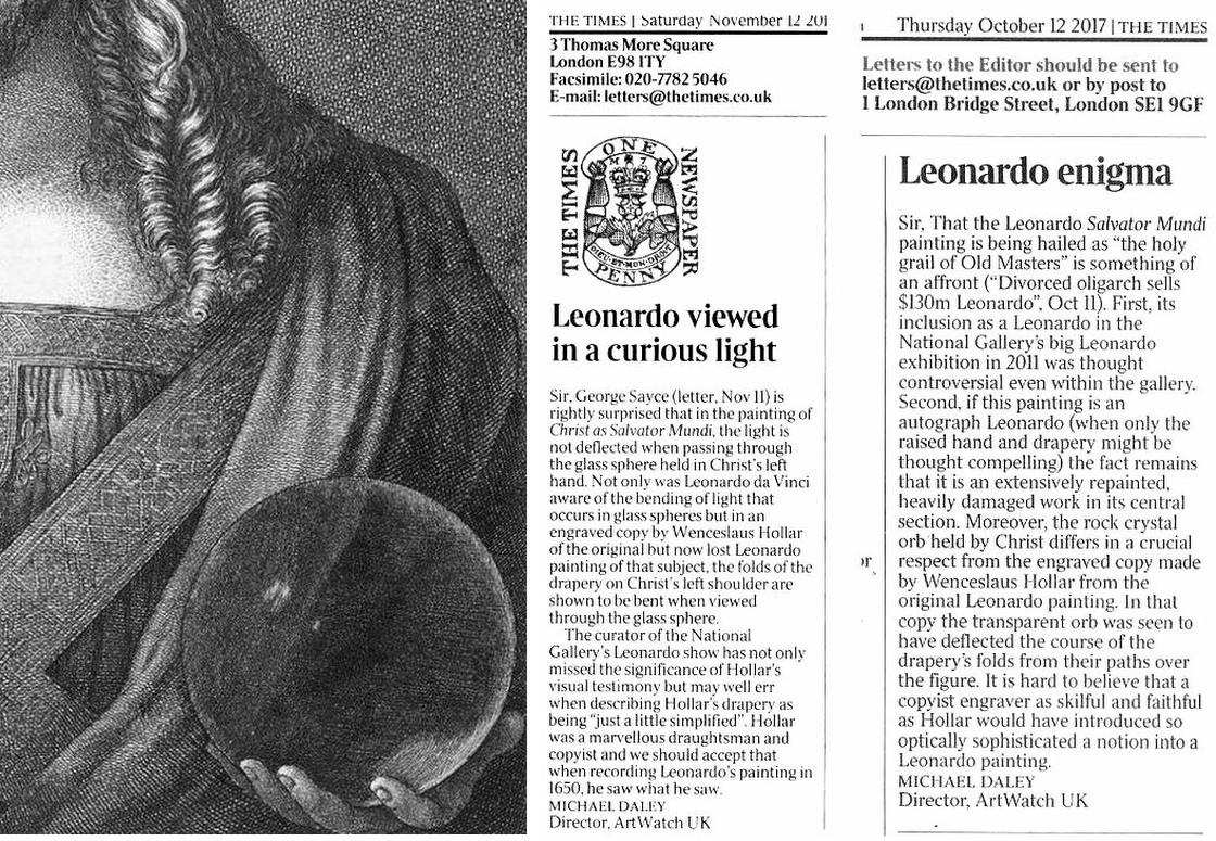
Above, Fig. 11: Left, a detail of 1650 etched copy by Wenceslaus Hollar of a painting then attributed to Leonardo that was being claimed to be a record of the Salvator Mundi version in the National Gallery; right, ArtWatch UK letters contesting the attribution on the absence within the painting of optical features recorded by Hollar.
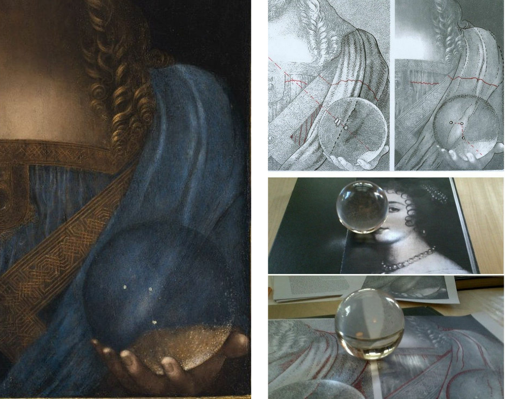
Above, Fig. 12: Left, a detail of the Salvator Mundi as it was immediately before its disappearance in 2017; right, top, AWUK diagrams highlighting many optical differences between the Hollar copy and the painting exhibited at the National Gallery.
SCHOLARLY RESPONSES TO THE NATIONAL GALLERY’S LEONARDO ATTRIBUTION
In the event, the Leonardo attribution was publicly challenged by at least four scholars in reviews of the 2011-12 National Gallery exhibition. Carmen Bambach, of the Metropolitan Museum and author of the major 2019 four-volumes Leonardo da Vinci Rediscovered, rejected the Leonardo attribution in a 2012 Apollo review of the National Gallery exhibition and gave the painting to Leonardo’s student Boltraffio (with possible modifying touches by Leonardo). Frank Zöllner of Leipzig University and author of the Leonardo catalogue raisonné, Leonardo da Vinci – The Complete Paintings (Bibliotheca Universalis) had said ahead of the exhibition that the proportions of the nose were “too long” for such a perfectionist as Leonardo and were more likely to have been painted by a talented follower. When the late husband of the restorer, Mario Modestini, first saw the Salvator Mundi he thought it by a very great artist a generation after Leonardo.
Later, in the revised 2017 edition of his book, Zöllner said of the ex-Cook Salvator Mundi that while it surpasses the other known versions in terms of quality, it: “also exhibits a number of weaknesses. The flesh tones of the blessing hand, for example, appear pallid and waxen, as in a number of workshop paintings. Christ’s ringlets also seem to me too schematic in their execution [Fig. 6, above], the larger drapery folds too undifferentiated, especially on the right-hand side [Fig. 8, above]. They do not begin to bear comparison with the Mona Lisa, for example. It is therefore not surprising that a number of reviewers of the London Leonardo exhibition initially adopted a sceptical stance (Bambach 2012; Hope 2012; Robertson 2012; Zöllner 2012). In view of the arguments put forward to date and the above-mentioned weaknesses, we might sooner see the Salvator Mundi as a high-quality product of Leonardo’s workshop, painted only after 1507, on whose execution Leonardo was substantially involved. It will probably only be possible to arrive at a more informed verdict on this question after the results of the painting’s technical analyses have been published in full (Dalivalle/Kemp/Simon 2017).”
As seen, the Dalivalle/Kemp/Simon account did not materialise until 2019. Recently, Professor Charles Hope, former director of the Warburg Institute, pinned the scholarly nub in the London Review of Books (“A Peece of Christ”):
“Many of those who specialise in making such attributions have great confidence in their own judgment, even when this has proved fallible, and they tend to discount or give a tendentious spin to documentary evidence and information about provenance that does not fit with their theories.”
In 2017, Christie’s, New York, cited fifteen scholars as supporters of the Salvator Mundi’s Leonardo ascription. They were:
Mina Gregori, Nicholas Penny, Dianne Dwyer Modestini, Carmen Bambach, Andrea Bayer, Keith Christiansen, Everett Fahy, Michael Gallagher – the Met’s head of picture restoration, David Allan Brown, Maria Teresa Fiorio, Martin Kemp, Pietro C. Marani, Luke Syson, David Ekserdjian and Vincent Delieuvin.
One, Carmen Bambach, as seen above, had rejected the ascription in 2011. As also seen above, another, Delieuvin, has now downgraded the picture to a school work. Crucially, none had supported the attribution in a scholarly publication or forum, and several would disavow their inclusion in this list. When Lewis spoke to the select and confidential group of five Leonardo scholars invited to see the Salvator Mundi at the National Gallery (Pietro Marani, Maria Teresa Fiorio, Carmen Bambach, David Alan Brown and Martin Kemp), he discovered that only two had committed to a Leonardo attribution; two had declined to express an opinion; and one had rejected it.
Moreover, Lewis noted two striking omissions from the event that would likely have tipped the balance. One was our colleague, Jacques Franck, a Leonardo expert who had advised Syson on the restoration of the National Gallery’s version of the Virgin of the Rocks – much as he had done at the Louvre with its Leonardo restorations. Like others, Franck identifies two authorial hands in the Salvator Mundi picture, but he sees no participation by Leonardo in the painting – see his “Further thoughts about the ex-Cook Collection Salvator Mundi” and our “The Louvre Museum’s bizarre charge of ‘fake information’ on the $450 million Salvator Mundi”.
The second was Frank Zöllner, who then had recently written within his catalogue raisonné of Leonardo’s paintings: “In conclusion, mention must be made of the increasing attempts, above all in recent years, to attribute second- and third-class paintings to Leonardo’s hand. In this context it should be noted that the catalogue of paintings presented here is definitive. While there may be works circulating in the fine art trade that stem from Leonardo’s pupils, the likelihood of an original by the master himself ever making a new appearance is extremely small.”
Syson admitted to Lewis that Zöllner’s omission had been a mistake but justified Franck’s exclusion on the grounds that as a trained painter he was “too far outside the world of academic and institutional art history to be invited in to this project”.
Michael Daley, Director, 12 (& 24) August 2020
In Part II, we outline reasons why it might sometimes be of assistance to scholars and curators to heed the views of artists.
Endnote: ArtWatch UK Posts on the Salvator Mundi:
14 November 2017, “Problems With the New York Leonardo Salvator Mundi, Part I: Provenance and Presentation”
1 January 2018, “The $450m New York Leonardo Salvator Mundi, Part II: It Restores, It Sells, Therefore It Is”
20 February 2018, “A Day in the Life of the New Louvre Abu Dhabi Annexe’s Pricey New Leonardo Salvator Mundi”
27 February 2018, “Nouveau Riche? Welcome to the Club!”
11 March 2018, “In Their Own Words: No. 3 – The Reception of the First Version of the Leonardo Salvator Mundi”
29 March 2018, “Startling Disclosures on the Re-re-restored Leonardo Salvator Mundi”
10 April 2018, “The Leonardo Salvator Mundi Saga: Three Developments”
9 August 2018, “Leonardo Scholar Challenges Attribution of $450m Painting”
18 September 2019, “How the Louvre Abu Dhabi Salvator Mundi became a Leonardo-from-Nowhere”
11 October 2018, “Two Developments in the No-Show Louvre Abu Dhabi Leonardo Salvator Mundi Saga”
12 November 2018, “The Pear-Shaped Salvator Mundi”
6 February 2019, “The Leonardo Salvator Mundi Part I: Not ‘Pear-Shaped’ – ‘Dead-in-the Water’”
22 February 2019, “The Louvre Museum’s Bizarre Charge of ‘Fake Information on the $450 million Salvator Mundi’”
4 July 2019, “Salvator Grumpi – updated”
20 September 2019, “Forthcoming events: The Ben Lewis Salvator Mundi Lecture and the new ArtWatch UK Journal”
28 October 2019, “The non-appearing, disappeared, $450million, now officially not-Leonardo, Salvator Mundi”
15 November 2019, “Books on No-Hope Art Attributions”
5 & 11 February 2020, “The Saviour and a Stealth-Attribution”
3 August 2020, “Further thoughts about the ex-Cook Collection Salvator Mundi”
Situating “La Bella Principessa’s” Eye
In today’s rolling connoisseurship crisis, the credibility stakes are higher with the unsold claimed Leonardo “La Bella Principessa” drawing than with the spectacularly sold but immediately disappeared $450 million Salvator Mundi painting.
Turning a $1,175 Salvator of 2005 into a record-breaking $450 million in 2017 was achieved with a work that is of its claimed Renaissance period and that is of Leonardo’s school. At issue is whether an unpublished badly damaged, much- restored school work with a couple of good passages (two folded fingers and a section of trompe l’oeil knot pattern) is an autograph Leonardo painting that served as a finished prototype for all other Leonardo school Salvator Mundi paintings.
With “La Bella Principessa” an upgrade is being attempted on a work that first emerged in 1998 without provenance and that was presented anonymously as 19th century German by Christie’s, New York, and sold for $22,850 to a dealer who divested it in 2007 for $19,000 to an art collector who reportedly keeps it in a Swiss Freeport. We propose below that “La Bella” bears the stamp of a singular 19th century school of academic art practice.
WHO DREW “LA BELLA PRINCIPESSA”?
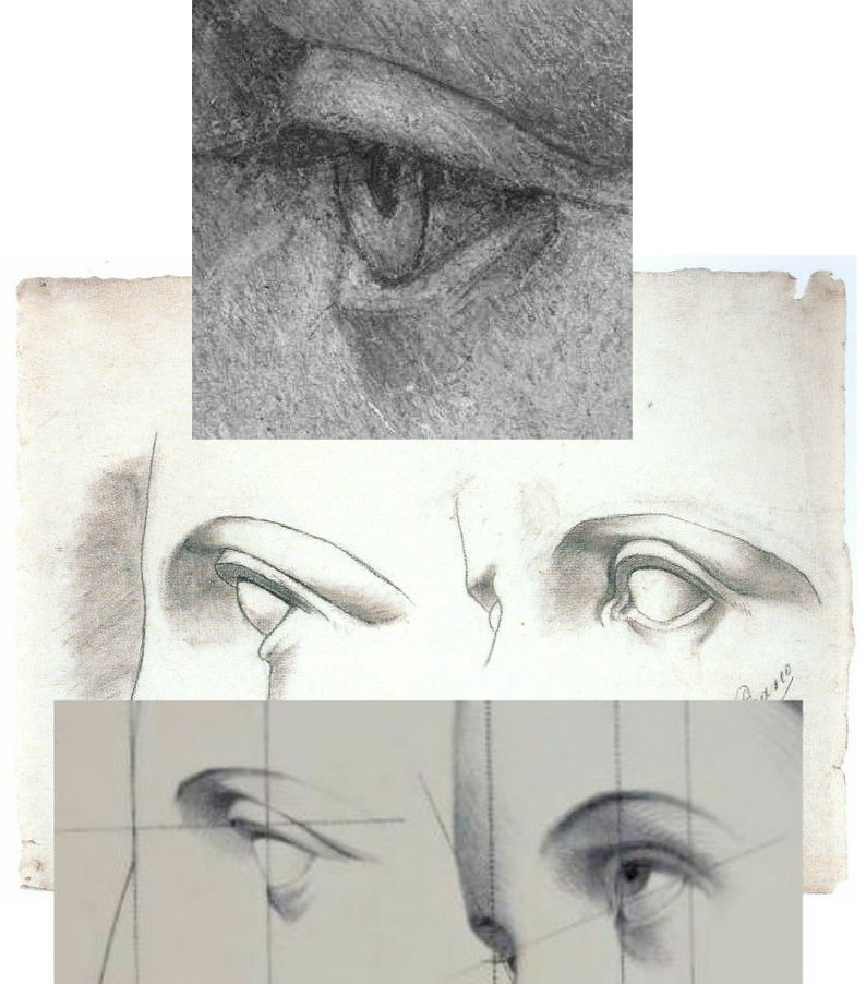
Above, Fig. 1: top, the eye of “La Bella Principessa”; centre, eyes drawn by Picasso, aged eleven; bottom, eyes drawn c. 1860 by Bernard-Romain Julien (1802-1871).
THE DISCOVERY OF THE SOLE PRE-1998 OWNER
In 2010 “La Bella’s” 1998 vendor, Jeanne Marchig, stepped from the shadows to sue Christie’s following press reports that fingerprint evidence had established Leonardo authorship and a value of $100/150 million. That claim was later discredited and dropped. Despite twelve years of assiduous searches by journalistic and art historical advocates, no record of the work predates its only known owner, Jeanne Marchig’s deceased artist/restorer husband, Giannino Marchig (1897–1983). Notwithstanding “La Bella’s” five-century provenance gap and stylistic incongruity advocates have declared it a 1496 portrait of Bianca Sforza. (See “Books on No-Hope Art Attributions”.)

“La Bella Principessa’s” stylistic disqualifications (above, Fig. 2, bottom right) coalesce in the drawing of the eye (above, top left) and against a bona fide Leonardo eye drawing (bottom left). That is, “La Bella’s” eye is constructed by straight-edged planar surfaces when every Leonardo eye was constructed with curves and curving surfaces in accord with anatomically-dictated surface shifts at the eye/cheek intersection (see Fig. 3 below).
Where “La Bella’s” eye could never have been drawn by Leonardo, it could have been made by many skilful artists trained during the late 19th or early 20th centuries when an emphatically linear/planar manner of drawing was widely imposed. Giannino Marchig’s (above) self-portrait and etched profile of a lady betray such stylistic indebtedness. As well as being “La Bella’s” only known/claimed owner – and one who reportedly declined to disclose to his wife from whom or when the drawing had been obtained – Marchig fits the classic forger’s profile by being a talented well-trained artist who after initial successes found himself professionally unfashionable; became a close friend of Bernard Berenson; worked as a restorer; grew inexplicably rich…
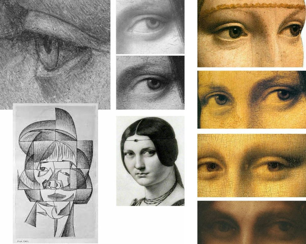
As previously noted, “La Bella’s” eye bears stylistic affinities with Cubist artists like Juan Gris (Fig. 3, above, left) and is anatomically incompatible with Leonardo’s drawn and painted eyes as instanced (above, centre) in La belle ferronnière in an infra-red image that discloses the preparatory drawing for the curving, thin lower eyelid; as painted by Leonardo; and, as copied in pencil by Ingres. The chronological sequence of Leonardo eyes above right (the Lady with an Ermine, La belle ferronnière, the Mona Lisa, and the St. John) shows Leonardo striving for an ever-greater softness of effect and nowhere constructing eyes with short straight lines and flat planes.
A NOTE ON THE FAILED-ARTISTS, RESTORERS AND ART FORGERS’ FRATERNITY:

Following the recent publication of Giannino Marchig’s self-portrait, a self-portrait, Fig. 4 above, left, has been attributed to Han van Meegeren (1889-1947), the forger and highly skilled author of the drawn illustration, above right. As Susan Grundy discussed here in 2016 (“A restorer’s aim – The fine line between retouching and forgery”), van Meegeren took a discarded copy by an unknown artist and, by careful restoration and creative additions, turned it into an autograph “Frans Hals” which sold handsomely. Eric Hebborn trained as a medals-winning painter at the Royal Academy Schools in the 1950s before working in London’s West End as a restorer specialising in repairing large paint losses with seemingly continuous old and cracked paint. In his 1997 memoir Confessions of a Master Forger, Hebborn discloses that under the tutelage of his restorer-employer he so improved his knowledge of old techniques, materials and styles as to “become able to ‘restore’ a whole painting – from nothing at all.”
GIANNINO MARCHIG
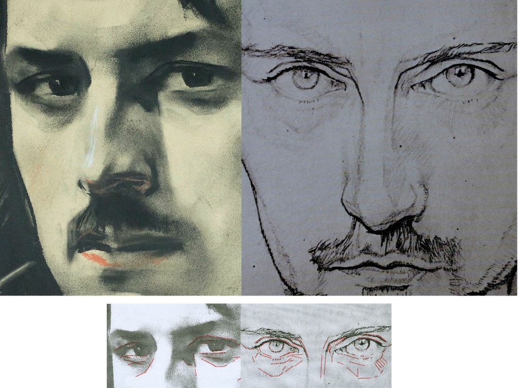
Above, Fig. 5, details of van Meegeren’s and Marchig’s self portraits. Although Marchig seems to have left no memoir, he did restore a Leonardo school painting and his wife reportedly sold many other works through Christies, New York, presumably also anonymously. It is possible that Marchig made no forgeries. It is possible that he had, as has been claimed since 2010, bought the drawing in the 1950s when forged Renaissance Ladies-in-Profile were commonplace. It is possible that having so bought, he came to doubt the drawing’s authenticity (- on Jeanne Marchig’s testimony, he “restored” the drawing with his own pastels). It is possible that he had made the drawing on a piece of old vellum with “lettering and a little dragon” on the side that has been glued onto an old oak panel, not to sell but to assure himself as a classically trained artist and teacher at the Florence Academy that, had modernism not swept the board, he “could have been a contender”.
THE ROOTS OF A DISTINCTIVE CULT OF DEPICTION BY FRAGMENTARY SURFACE PLANES
Because Marchig’s ownership rests on unsupported and shifting hearsay, anything might be the case with “La Bella Principessa” but, as is stylistically evident in the two self-portrait details above, Marchig and van Meegeren adhered to straight-edged, planar analyses of form.

In the self-portrait details of ears at Fig. 6 above, we see a common predilection for planes and edges and the eschewing of curved lines and surfaces. In van Meegeren (left), three intersecting straight lines confer two sharp points on the lower ear, precisely in the manner of the two diagrammatic ears above that are encountered below at Fig. 8 on the instruction sheet for artists drawn by Charles Bargue in May 1878.
To this draughtsman, the human ear (as drawn for the above 2001 Independent profile portrait of the then President of Zimbabwe, Robert Mugabe) presents an engaging formal/plastic challenge of complexly turning convexities and concavities in which straight lines and points of intersection make no appearance.
As mentioned, the pointy-eared diagrams at Fig. 6 are found on one of nearly two hundred sheets of dawn aids for art students from 1868 onwards that have been gathered in an invaluable 2003-2011 book above at Fig. 8 by Gerald M. Ackerman (in collaboration with the artist Graydon Parrish). It was felt in France during the late 1800s that shortcomings in art training might be corrected by placing better “models” of art before students who would then improve their drawing techniques and imbibe artistic good taste by copying exemplary lithographic drawings of sculptural casts, works of art and life drawings of male models. The national and international influence of the Charles Bargue (1826/27–1883) Jean-Léon Gèrôme Drawing Course (Cours de dessin) was immense. It spread to England and Spain. Van Gogh worked repeatedly through the plates and Picasso famously copied them.
CASTS’ WARS: EVALUATING THE JULIEN v BARGUE LEGACIES
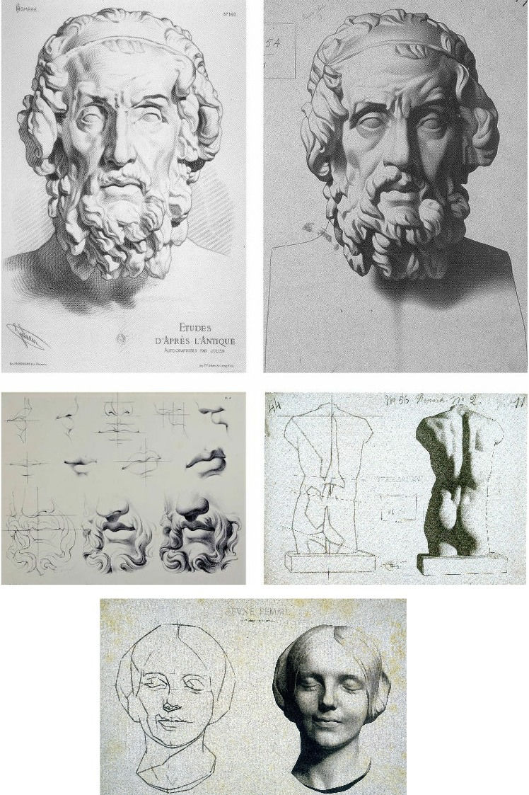
There are two principal components of drawing: shapes and shading. Shape is best and most expeditiously made by line. Line is the principal agent of design being the most precise, accurate and swift tool in the graphic box. Shading is located within a design and can serve many roles. It can mimic the tonal values of colours. It can make surfaces advance or recede optically. Above all, by making gradations of tone from light to dark it can indicate depth and volume in forms or figures. (See Fig. 15.)
The Bargue-Gérôme drawing course was largely executed by Bargue (he drew the lithographs if not all of the prior charcoal drawings of casts) but it was not the first of its kind. A course had been published around 1860 by Bernard-Romain Julien (1802-1871), whose method is shown above left at Fig. 9, against the slightly later Bargue method, above right. Here we have a direct means of comparison in drawings of the same cast classical sculpture and, below, of the successive stages between line and line-with-shading.
Julien seizes the bull by the horns and fixes the shapes of forms immediately with curves and precision. Bargue splits the process into two conceptually discrete stages by depicting the cast first as a straight-edged mapping of “key” points and angles as at centre right, above. By so “abstracting complicated curvilinear outlines into straight lines and angles”, Bargue, as Gerald Ackerman puts it, is “making it something measurable”. Today’s key champions of Bargue (artists who adhere to the practice of accurately measured “sight-size” drawings) hold that an understanding of form will arise from such accurate and checkable (map-like) plotting of successive points and angles. While true to a degree, the practice generates an impoverished understanding of form – impoverished because it derives from an essentially pictorial exercise on a flat surface that is conducted from a rigorously fixed point in relation to the “model” when form exists in the round and offers infinitely changing aspects to a mobile viewer.
Bargue’s corpus is massively impressive and graphically brilliant but it confers an air of accuracy that may be spurious and it sometimes spawns slackly curvaceous outlines and lazily rounded shading that says little of internal structures (- see Fig. 22 below). Sometimes Bargue contrives a still-angular, facetted outline in his second-stage drawings and these impart a “cut-out photograph” quality, as on the entirely shaded life-cast of a young woman’s head as at Fig. 9, bottom.
On the Bargue v. Julien dichotomy, Ackerman holds: “In both, the drawing is excellent, tight and accurate. However, the proliferation of hatching in Julien’s example confuses the relationships of the various volumes of the face. Bargue works tonally, logically progressing from light to dark. The result is a greater range of value from black to white, providing more drama, unity and volume. It’s almost as if Julien were emphasizing the decorative aspects of the antique bust as opposed to Bargue’s stress on the sculptural qualities.” We take issue with this last claim.
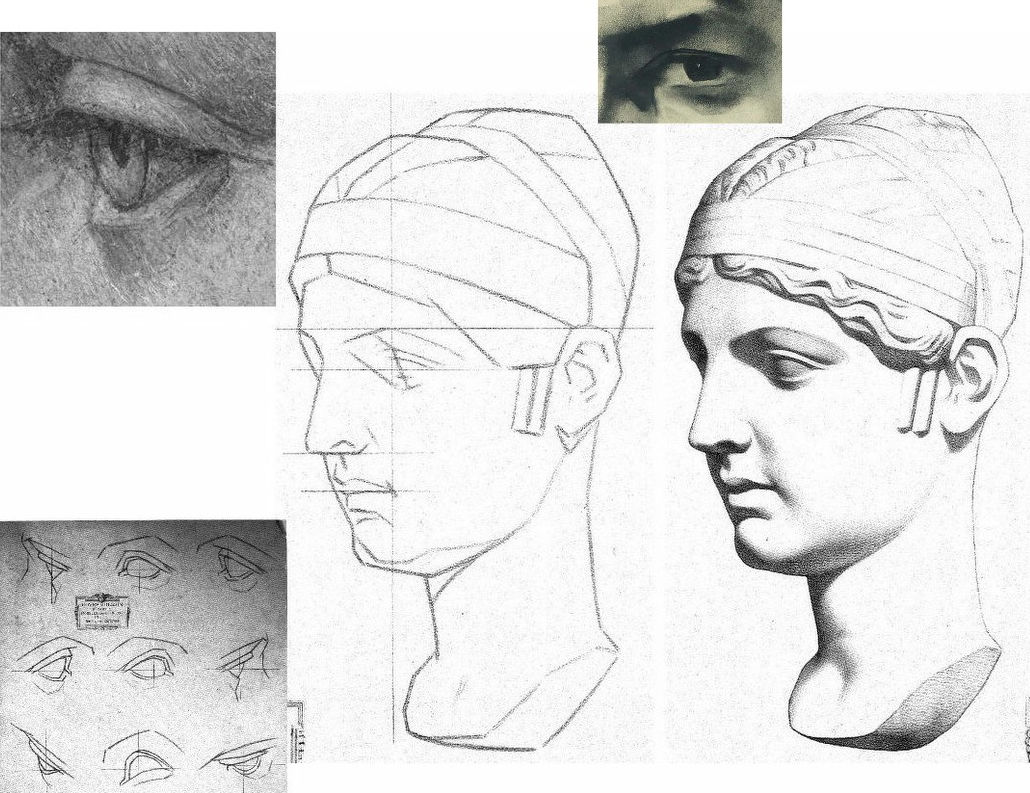
Above, Fig. 10, Bargue’s sheet of a cast sculpture, “Faustine” (the Roman empress Faustina), here mirrored in alignment with the eye of “La Bella”, top left. Before addressing Ackerman’s reading, consider the relationships of the eyes of “La Bella” and van Megeeren’s self-portrait, top right, and with Bargue’s sketch and final shaded stage. By comparison with van Megeeren’s graphic subtlety, fluidity and richness, the author of “La Bella’s” eye seems trapped within the preliminary sketching vocabulary – as at bottom left in the first Bargue “plate of instruction”. Against Bargue’s second stage eye rendering, “La Bella” not only lacks tonal fluidity and coherence, it looks superimposed upon the uncertain forms of “La Bella’s” head.
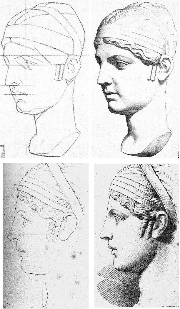
The lower line and line/shaded sequence above at Fig. 11 by Julien is also of the Faustine cast, albeit from a different view and not showing the whole head. Ackerman suspects that Julien’s refined, linear neo-classical style incurred official disfavour and that its more elaborate stylized refinement might have been considered to make impractical models for the teaching of basic drawing skills. While such judgements may well have been the case we take Julien’s graphic qualities and legacy to have been significantly underestimated – and perhaps especially so with Picasso, as discussed below.
In general terms and with regard to working artists’ methods, it is a moot point whether prior sketching with exclusively straight lines is a necessary or helpful step towards the imperative end of drawing accurately with curved lines and contours. Why delay engagement with an essential skill by erecting a conceptually complicating two-stage graphic means, like a music teacher who advises pupils to get the notes right first and then put the expression in later? Bargue’s two-stage pedagogic model is nowhere found in working artists’ practices and we should not be intimidated by the sheer beauty and descriptive power of Julien’s Faustina. His subtle precisely curving lines confer not only great elegance of drawing and design but hard, precise, well-organised information and great sculptural clarity.
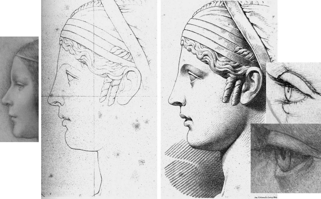
The three photo-inserts, above at Fig. 12, highlight the incompatibility of “La Bella’s” slightly wayward, downcast, sideways glancing, thick angular-lidded eye with either a true classical portrait’s eye, or those drawn by Leonardo.
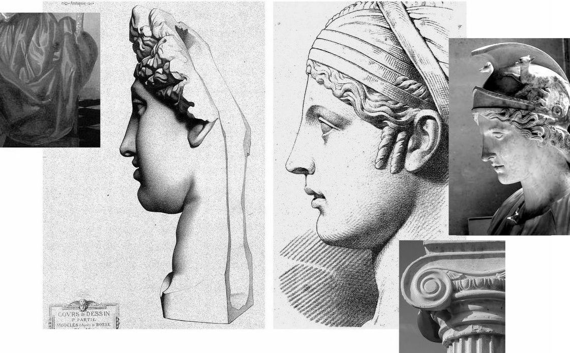
At Fig. 13 above we see, left, Bargue’s second stage depiction of a cast of The Capitoline Ariadne, left, and Julien’s Faustina, right. This is a prime example of Bargue’s forceful graphic combination of crisply decisive shapes and a rich tonal spectrum of shading. In depicting the forms of the hair, Bargue seems to luxuriate in tonal variety for reasons more painterly than sculptural. His decoratively shaped discrete tonal values resemble Vermeer’s treatments of drapery, as above left. In contrast, Julien’s account of the hair is sculpturally pellucid. His shading escalates gently to a degree that supplements, not obscures, the precise linear description. Although only part-drawn, his head seems as crisply carved as a classical sculpture and as plastically coherent as a column capital through his scrupulously observed face and neck articulation. Julien’s lighter tonal notations perfectly capture the neck’s anatomical forms where Bargue’s heavier more uniform tones evoke an unfortunate rounded softness of a pig’s trotter.
PICASSO’S DUAL ENGAGEMENT
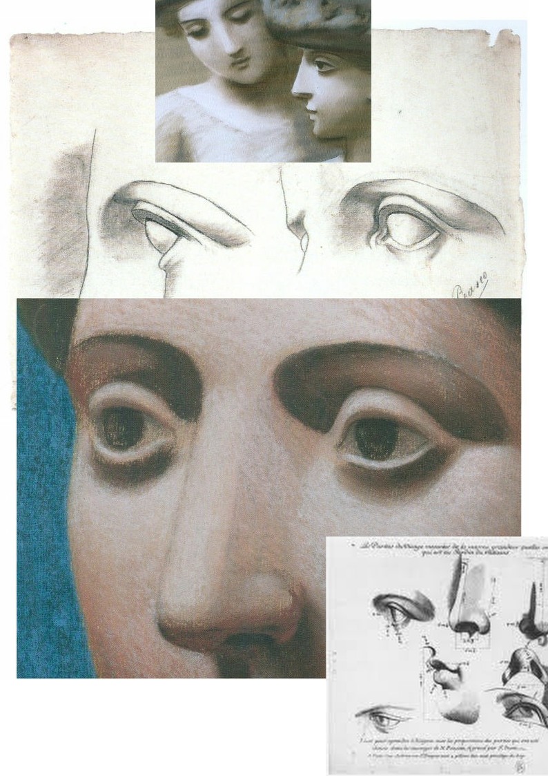
At Fig. 1, we contrasted “La Bella’s” masonry-like forms with two Julien sheet eyes copied by the eleven year-old Pablo Picasso and attached to that drawing a pair of Julien eyes that might have been taken as the young artist’s models were it not for the smooth transition from nose to eyebrow in the right-hand drawing where that transition was shown furrowed by Picasso. Further searching (- see Fig. 15 below) revealed that the particular Julien sheet Picasso had copied contained three line drawings of a woman’s left eye as seen in profile, in three-quarters view and head-on (and with three shaded versions of the same). Here above at Fig. 14 we place the eleven-year old’s eyes above a mirrored detail of the forty-year old Picasso’s pastel Head of a Woman made at Fontainebleu with superimposed details of Picasso’s 1921 pastel, Two Women with Hats and a 1683 engraving by Gerard Audran of Features of the Pythian Apollo.

Picasso had copied the Julien eyes under the guidance of his father at the Instituto da Guarda in La Coruña. His copy of the two eyes is, as Joan P. Uraneck noted in the August 2003 Burlington Magazine, (“Picasso’s ‘Two views of a left eye’, of 1892-93: a recent discovery”) one of seven surviving sheets the eleven-year old made – with four from Bargue. Uraneck sees a “remarkable resemblance” between Picasso’s juvenile copy of Julien eyes and his neo-classical work of the 1920s, and she reproduces one of the studies (above Fig. 15, top left) for Picasso’s Three women at the fountain. The main top image here is an ink transcription (made by this author as part of a suite of classical heads from antiquity onwards) of another of the Fontainebleu Picasso pastels, the Head of a Woman, Fondation Beyeler, Basel, which starred in the Frick Collection’s 2011 “Picasso’s Drawings, 1890-1921 exhibition”. At the time of drawing I had known nothing of Julien’s work but had been struck by the opacity in the eyes of Head of a Woman and especially so in comparison with eyes of a Graeco-Egyptian encaustic portrait a woman as below at Fig. 16. Today, that opacity is the more intriguing when we know of the astonishing vivacity of Julien’s eyes – as above and as in the bottom detail at Fig. 16. What we do not know is how many Julien sheets Picasso had seen and copied but given that he was being taught by his artist father we might safely assume that he had seen and produced appreciably more than seven such copies.
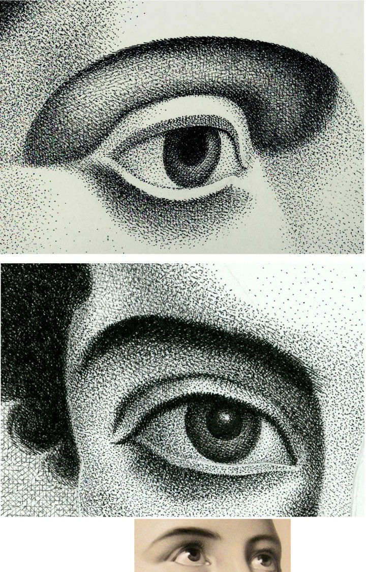
Uraneck’s discovery is intriguing: could Picasso have summoned the suite of monumental heads seen below (Fig. 17) in the Pushkin Museum’s invaluable photograph of Olga Picasso in the studio at Fontainebleu in 1921 without exposure to Julien’s fastidious intelligent studies? By the same token, had copying Bargue’s “analytical” first sketches (as with his Homer below) implanted a conceptual schema or template for a Cubist deconstruction/reconstruction of figures? Or, even: had Picasso’s simultaneous exposure to two powerful conflicted pedagogical programmes at a tender, highly susceptible age left him artistically like a dog between two bones – never fully able to decide which kind of artistic voice to adopt?

In Fig. 18 above, it might look at a casual glance as if the same drawing has been reproduced twice on differently coloured grounds. In fact, that on the left is Bargue’s second stage study of an antique torso and that on the right is a copy made by Picasso when only twelve. This drawing is sometimes cited as a proof that the young Picasso was able to draw as well as Raphael and had needed to learn how to throw off his classical manacles. Although Picasso has replicated Bargue’s disposition of dark, mid and light tones with great precocity and therefore seemingly succeeded in producing a striking copy of the “model” drawing before him, the drawing contains elementary errors.
Despite having the two states of Bargue before him, Picasso greatly exaggerated every subtle movement and shift of direction in the torso’s right-hand contour. In Fig 20 above we subject the two versions to identical simple checks on proportion and alignment and soon discover an accumulation of egregious errors. Picasso was not attentive to the “architecture” of the design or to the placement of the cast’s torso on the rectangular plinth which Bargue set on a slight diagonal that runs away from the viewer. Projecting the bottom left and top right edges of Bargue’s base (as with the blue lines) imparts a perspective in which the vanishing point gives a horizon line that crosses the torso at about one third of its height. Projecting the same edges in the Picasso copy sets the horizon at chest height. The dotted red central vertical line in the Bargue version shows subtle counter sways in the upper and lower parts of the torso that are broadly balanced and give a securely composed symmetry within the figure. Picasso, seemingly mesmerised by the seductively dramatic powers of shading, loses sight of the torso’s taught musculature and allows his own reading of too-large and too-soft forms to sway precariously to (our and his) right – and to bulge at the left hip. Michelangelo said that his compasses were in the eye. If at any stage Picasso had dropped a plumb-line in his mind’s eye from the point where the right arm parts company with the torso down towards the cast’s base he would have seen immediately how badly his figure was listing.
BENCHMARK DRAWINGS
Bargue had not invented the schema of a strongly outlined figure with one side brightly lit and the other heavily shaded. At Fig. 20 below stands one of the most graphically and sculpturally masterful combinations of line and tones ever to be dropped onto a sheet of paper – Benvenuto Cellini’s awesome Juno.
In 1980, some years after first encountering Cellini’s Juno, I paid homage to his graphic/sculptural dispositions in a section of a pen and ink drawing (“Male Chauvinist Pig and the Object of His Desire”) as above right at Fig. 21, albeit establishing the lit side not with a line but with a tonal distinction. In 1996 David Lee, then editor of the Art Review, challenged six people (John Ward RA; Michael Kenny RA; Timothy Clifford, then Director, National Galleries of Scotland; Oliver Berggruen, old master drawings dealer; Michael Daley, AWUK, and Leonard McComb RA, then Keeper of the Royal Academy Schools) to say in under two hundred words each of what Good Drawing consists. I pitched for technical drawing in part as a polemical antidote to then current art school practices (see below) on the firm conviction that participation in a short crash course in technical drawing would do more to improve standards of drawing than anything else. Technical drawings have to be clear, comprehensible, coherent and unambiguous because they trade in objectively verifiable facts. Such is their precision and authority that they can – and often do – form part of legal contracts.
Fast forward a century from the competing talents of Bargue and Julien to State art schools in Britain. By this time, insofar as drawing was encouraged or permitted, it was under the empty rubric “Mark Making” and its brain-dead twinned invitation to “Explore Marks” – as, for example, in this sadly characteristic art school directive:
“At the end of this project the student will be involved in drawing in a creative way and not consider it as a mechanical function carried out somewhere at the end of his hand. In this studio the project is devised to increase the student’s experience of drawn marks and of drawing techniques. To do this a varied selection of drawing implements are used, e. g. sponge, sticks, stones, finger, hand, hair, glass marbles, string, pencil, pen, brush, etc…e. g. Drawing with a glove on – with the glove filled with small stones – with the glove having two fingers knotted – with the glove filled with sand – with various kinds of gloves e. g. industrial gloves to supple cricket gloves…e. g. Drawing on a sheet placed on a board which is suspended from the ceiling by rope. Trying to draw a controlled mark on this swinging surface. Using the same board but having two students drawing, one on each side influencing each other’s marks…e. g. Drawing through visual restrictions: through glasses, glasses with dots painted on them – through smoked glass – with one eye covered – wearing a gas mask – with strings obstructing vision – with moving strings doing the same (using a hair dryer to blow the strings). Drawing in a dark room. Drawing with hand under water…e. g. Physical restrictions: with one arm tied to the shoulder using the mouth to hold the implement…etc. etc.”
Above, Fig. 22, one of Bargue’s weaker, more slackly drawn sheets.
In London, from the beginning of the Second World War, The Studio magazine published an extensive series of “How to draw…” books that channelled lessons derived from Bargue–Gèrôme, Julien and others in the simplest, most direct manner. In Fig. 23, above, a suite of introductory drawings is shown from Leonard W. Sharpe’s 1945 How to Draw Merchant Ships. Sharpe begins with a sermon on the marriage of technical necessities and poetry in ships: you must know the what and the why before you can appreciate ships and hope to draw them successfully. Sharpe’s first lesson was to understand the sheer (the curvature in side elevation) of a ship’s hull. To aid buoyancy in driving seas, the forward sheer needs to be greater than that of the after sheer – less lift is required against a sea that is following a vessel. The creation of this vital seaworthiness is not just a matter of maritime efficacy: “A good designer arranges the design of his ship…handsomely so as to ‘take the eye’…the hull is a combination of exceedingly graceful curves which could very well be described as ‘poetry in steel’, particularly when seen from the bow or quarter.” Sharpe, like Julien, assumes a novice draughtsman’s willingness to master curves. Until recently every ship in the world had been an orchestration of curves. To the sheer is added the flare at the bow “so that heaving waves are flung outwards instead of cascading in full force onto the deck”.
CLOTH EYES AND SCHOLARLY CLOSED SHOPS
Sharpe’s comments were underpinned by his drawn sketch demonstrations. As seen in Fig. 23 above, top, he made two drawings of a nominal hull to illustrate different types of shading. No one looking at the pair would likely suspect that Sharpe had been the author of only one of the drawings. Looking at the above two details of ink sketches that carry a bent female arm, how many would feel just as confidently that these are the work of the same artist (Rubens) working at the same time (c. 1610 and c. 1608-12, respectively) in the same medium (pen, ink, paper)? Both drawings were included as autograph in Julius Held’s canonical 1959 work Rubens – Selected Drawings. We catalogued a stream of alarm calls in September 2014 (“Art’s Toxic Assets and a Crisis of Connoisseurship”):
The arm on the left belongs to a supposed Rubens ink sketch for the painting of Samson and Delilah that is given to Rubens by the National Gallery even though a director of the gallery admitted that it does not look like any other of the many Rubens’s held. If by Rubens, this ink sketch would be the only one framed on the paper by an ink box that severs part of one of Samson’s feet – an anomaly in Rubens that is also found in the National Gallery’s Samson and Delilah painting. Like “La Bella Principessa”, this drawing (which bears the inked initials “V.D.”) emerged only in the 20th century – 1926 – from a Dutch firm of antiquaries (a family member of whom was a graphic artist) when it was sold as a van Dyck. Contemporary copies of the (long-lost) original Rubens Samson and Delilah painting showed that Samson’s toes had not been cropped at the edge of the painting. The ink sketch had been authenticated by the esteemed Rubens scholar Ludwig Burchard very shortly before he also authenticated the then recently discovered Samson and Delilah painting that is now in the National Gallery and is there paraded on the website as one of the Gallery’s “not-to-be-missed” paintings. In his 1930 certificate of authenticity for this painting, Burchard said the picture was in excellent condition and even retained its panel’s original back. Following a restoration at the National Gallery it was reported that the original back had disappeared sometime in the late 19th century or early 20th century when the panel had been planed down to wafer thinness and glued onto a sheet of blockboard. As reported in our 2006 Journal No. 21, over sixty Burchard attributions had subsequently been down-graded in Corpus Rubenianum.
The second stage of the Bargue course consisted of his copies of exemplary, taste-conferring models found among great artists’ drawings. The stunning drawing above (detail) at Fig. 24 is by Bargue after a (now lost) drawing by Adolphe-William Bouguereau (1825-1905). Ackermann congratulates Bargue for replicating the character and manner of a great variety of artists. Of this (near-profile) drawing entitled A Roman Woman (Femme romaine) he observes:
“It is a wonder, displaying a marvellous balance between the observation of a realist and the ideals of a classicist. Bouguereau is more concerned with anatomy than some of the other masters. The bony appearance of her nose, the sunken eyes and cheeks, and the thickness of her neck are qualities he describes so accurately that it places the woman in her late forties, at not quite overripe maturity. The outline is elegantly, sensitively drawn by means of a line that continually changes its thickness or emphasis as it gives sensitivity to the nose and lips, strength to the chin, and fullness to the neck. The hair is complex without being detailed. In this drawing Bouguereau is an absolute master of the Academic realist drawing technique, a mixture of observation, knowledge and ideals.”
As with “La Bella”, in this (near-) profile portrait the eye has a downward cast, sideways glancing eye with a thick and facetted lower lid. Is it conceivable that Leonardo, in a single out-of-character work, should have anticipated a means of drawing encountered in one 19th century artist’s copy of another 19th century artist’s work?
HIGH STAKES

In our view, if the scholars who still hold that Leonardo made both of the eyes and both of the faces above (and at the same art historical moments) were to prevail, the parameters of the artist’s oeuvre would be so greatly elasticised as to undermine international art market credibility, which credibility has already been rocked by the recent spate of exposed fake modern and fake old master paintings.
Michael Daley, Director, 18 January 2020
From Guido to Boccioni – The Liberation and Repudiation of Classicism

A fascinating and ground-breaking show – Umberto Boccioni: Recreating the Lost Sculptures – centres on four three-dimensional recreations of Boccioni’s lost plaster and mixed media sculptures. This exhibition – running at the Estorick Collection, London, until 22 December – prompts far-reaching technical, artistic and art historical questions.
Above, Fig. 1: Top left, a detail of a 1913 photograph of a lost sculpture Empty and Full Abstracts of a Head with a superimposed reconstructed 3D mesh; top right, Umberto Boccioni, c. 1914; below, a note on the technical means of the presently exhibited recent recovery/replications.
THE TECHNICAL/INTERPRETIVE PROBLEMS
The wizardry whereby old photographic records of lost sculptures were aggregated to produce digitally “virtual”, in-the-round, simulations of sculptures to be printed out or milled in 3D is well-described in an excellent catalogue. This “recovery” or “recreation” of sculptures that were destroyed in 1927 was made by two digital artists and designers, Anders Rådén and Matt Smith.

Above, Fig. 2: Detail of the catalogue cover. Rådén and Smith acknowledge that technical difficulties required a degree of interpretation and creativity in what are necessarily provisional reconstructions: “the discovery of new or better photographs will always necessitate a rethinking of certain shapes”. Inconsistencies of surface finish and sometimes forms emerge between the new simulations and old photographic records – as was also the case with the bronze casts of plaster sculptures made after Boccioni’s death. Such notwithstanding, the authors’ hopes that fresh insights into Boccioni’s sculptural practice will offer new interpretive opportunities for specialists and the general public are not vain: accepted as what they are, even a part-hypothesized proximate and provisional physical recovery of four lost sculptures that were made at a crucial stage of Boccioni’s late development can assist appraisals of the oeuvre of a seminal figure who, personally and professionally speaking, remains problematic.
WHITHER BOCCIONI’S FUTURIST EYE?
Among early 20th century noisy proselytising art movements, Italian Futurists were obnoxious for their ultra-nationalistic, proto-Fascist fervour; their international cultural competitiveness and their affected cults of death and destruction. Speed and industrialization were glorified. War was hymned as the world’s “only true hygiene”. Explosions were likened to flowers. Past artistic glories were excoriated – museums were cemeteries and mausoleums; traditions were contaminations to be excised. Boccioni’s proclaimed terror of being crushed by past cultural attainments triggered his demand that everything had to go: “In the monuments and exhibitions of every European city, sculpture offers a spectacle of such pitiable barbarism, clumsiness and monotonous imitation that my Futurist eye recoils from it with profound disgust!” All nations, he held (Technical Manifesto of Futurist Sculpture, 1912), were being crushed by blind, foolish and cowardly adherence to past cultural attainments that ranged from Greece and Michelangelo to Slavic countries with their “archaic Greek and Nordic and Oriental monstrosities, a shapeless mass of influences that range from the excess of abstruse details deriving from Asia, to the childish and grotesque ingenuity of the Lapps and Eskimos.” Boccioni further complained of “Greek-ized Gothicism sweetened with effeminate care by German pedantry” and saw the public as “scum whom we must lead into slavery”.
This belligerent naughty movement par excellence was doubly parasitical and brazenly hypocritical. A century on, Boccioni’s position is assured. He is in the art history books. His works are in great museums and prosper on the market: on 12 November 2019 a bronze cast of his now iconic Unique Forms of Continuity in Space sold for $16.1 million – appreciably more than the $4.8 million achieved the following day by a recently discovered Artemisia Gentileschi Lucretia – albeit while dramatically less than Jeff Koons’ silvered bunny which made $91 million this year.
A MONUMENTALLY PROVOCATIVE AND MYSTIFYING PROSPECTUS
Above, Fig. 3: Top, Boccioni with his mother, an assistant and, left, Giacomo Balla; below, right, Balla’s head caught in double exposure. Boccioni was nothing if not philosophically and programmatically ambitious: the “means of achieving the complete renewal of this mummified art”, he insisted, would only be possible if “the essence [of Art] itself” were renewed. Constructing with elements drawn from Egypt, Greece, or Michelangelo was like “wanting to draw water from a dry well with a bottomless bucket”. At the same time he (initially and perhaps, even essentially, a painter) betrayed a lack of sculptural self-confidence – even if and when purged of historical contaminations, sculpture would remain subservient to painting which had “taken on a new life, profundity, and breadth through a study of the landscape and the environment, which are made to react simultaneously in relation to human figures or objects, reaching the point of our Futurist INTERPENETRATION OF THE PLANES [Technical Manifesto of Futurist Painting, 11 April 1910].” On that deferential prospectus, it was hoped that: “In the same way sculpture will find a new source of emotion, hence of style, extending its plastic quality to what our barbarous crudity has made us think of until now as subdivided, impalpable, and thus plastically inexpressible.”
Above, Fig. 4: Top, the four digitally and plastically reconstituted sculptures, as printed in 1/4 scale, these being, from the left, top: Spiral Expansion of Muscles in Movement; Speeding Muscles; Empty and Full Abstracts of a Head, and Synthesis of Human Dynamism. Below them are: left, Boccioni’s sculpture Synthesis of Human Dynamism as photographed when first constructed in plaster; centre, as part-described in 3D mesh form and part as originally realised; and, right, as when wholly reconfigured by 3D printing.
Above, Fig. 5: Rådén and Smith’s (persuasive) proposed chronological sequence of Boccioni’s four striding figures based on stylistic similarities and evolving shapes – showing, as from 1 to 4, Synthesis of Human Dynamism, Speeding Muscles, Spiral Expansion of Muscles in Movement and Unique Forms of Continuity in Space. This sequence bears witness to a dramatically critical “late period” development (1912-13) in the artist’s short life (he died in 1916 on a military exercise).
What might be said of this evolution? On his own programme, Boccioni sought not to construct sculptural bodies but three-dimensional records of “a body’s action”. He initially worked with multiple materials in an “architecture of the pyramid” which he abandoned for one of “the spiral”. He disclaimed any quasi-cinematographic freezing of discrete figural moments and any notion of an immobile body being set in motion. He expressly postulated an inherently dynamic body – “a truly mobile object, which is an absolutely new and original living reality. In order to represent a body in motion, I do not render its trajectory – that is to say, its passage of one state of rest to another – but strive to capture the form that expresses its continuity in space.” If such an aspiration is thought to have been realised in his Unique Forms of Continuity in Space, it followed much synthesizing of manifestly concrete realisations of forms and trajectories. The authors of this recent exercise in replication have performed great service by fleshing out the photo-record of what was, by any standards, a remarkably swift genesis of an arresting and encapsulating motif. Now that the entire sequence of those figures-in-movement can be comprehended in our own lived spaces, the question arises: What carried Boccioni so very swiftly from Figure 1 to the acclaimed and ambitiously conceived Figure 4?
In 1958 Marianne Martin lauded Boccioni’s Unique Forms of Continuity in Space as a summation of his endeavours and an embodiment of the Futurist ideal of the modern man: “…he is impersonal and unsentimental, clean, clear cut, and disciplined, intelligent but unphilosophical, masculine yet without sexual passion. His strength and capabilities are magnified a hundredfold through science which is conceived by him. He strides majestically and weightlessly on winged feet, forcing ‘the muscles… into streamlined shapes as if under the distorting pressures of supersonic speed’ [Alfred H. Barr Jr.].” Notwithstanding such heroising accounts, the arc of Boccioni’s artistic development betrays indebtednesses at every turn to both his contemporaries and artistic glories of the past against which he railed.
A RAPID STYLISTIC TRANSFORMATION
Above, Fig. 6: From left to right, Aphrodite at the Watering Hole, as featured in the 1961 film The Rebel; Boccioni’s Synthesis of Human Dynamism; George-the-Bear as featured in the 1980s advertising campaign for Hofmeister lager. Boccioni’s assumed “start of sequence” (No. 1) figure, Synthesis of Human Dynamism, is a near-incoherent seeming depiction of a lumbering, part-armoured, part-flayed human figure; a disturbing, mongrel conflation of the deconstructed and reconstructed peppered with penetrating symbolic and literal motifs/devices like a modern day secular St. Sebastian. Rådén and Smith tactfully compare this (and the assumed second figure) unfavourably with the last two figures on account of being: “characterised by a sense of heaviness and complexity of form that renders their ‘movement’ far more staccato” than the latter two in which are eliminated “those extraneous details…such as the hair, nipple and navel…and the architectural elements”. The emphatic navel and nipples and sharply upturned foot are precisely encountered in the 1961 film The Rebel’s spoof-modernist Aphrodite sculpture. Similarly, No. 1’s gait, with its line-ahead feet, see-sawing shoulders and balance-assisting hands anticipated George-the-Bear in the 1980s British Hofmeister beer advertisements.
Body No. 2 effects a huge transition from lumbering horror-film apparition to a racing figure: the head comes down to reduce wind resistance; the feet fly and the leading leg leaves a succession of “before” positions in a bridged supporting triangular wall. The hands and arms are drawn into the now compacted upper body which leans into the motion as if pulling and willing the legs that transport it. The former painfully impacted planes of window frames and such at No. 1 are being digested and incorporated within the body’s armoured architecture.
Quantum leaps occur at No.3. The arms are now as much implicit as sculpturally realised; the legs separate, articulating a wedge of space and with each leg becoming an individual powerhouse of accumulated replications of “musculature” and hard, bony or armoured forms (shin turning into snow plough); the combined forms of the lower legs suggest the pulling power of a dray horse; the figure proceeds in stately purposive fashion as if advising its predecessor “Less Haste, More Speed”. Paradoxically, the legs’ aggregated trajectories congeal into stolid pyramids that root the figure to its base thereby rendering it immobile, arrested and frozen in time. The double breakthrough of interpenetrating space, and a dramatically contracting torso came within a year of the exhibiting of Rodin’s The Walking Man and Archipenko’s six-feet high prepossessing and lucid carved Family Life – Fig. 7, below.
Boccioni’s final figure begins to take flight and vault chasms: the forms thin-down, like those of a carcase left shriven in the sun, and yet stretch, curve and bite on the air like propeller blades. The torso is further de-humanised: the arms are gone; the “head” becomes vestigial, hollowed and mask-like in one aspect. Where, in No. 3, the lower legs are rooted to the base, in No 4 the ‘feet’ are both greatly reduced and perched on blocks, with the resulting elevation implying an imminently airborne state. This figure’s posited/realised rush through the air has seemingly generated stringier, more fluid, less mechanised or armoured forms. Like a gazelle, speed has become its protector and its means of existence.
Above, Fig. 7: Left, Rodin’s The Walking Man; centre, Archipenko’s 1912 Family Life; right, Duchamp-Villon’s 2010 Torso of a Young Man. Although anatomically rooted, Rodin’s figure had been rendered partial and fragmentary, so as concentrate attention on the muscular dynamics of the act of walking – or, more accurately, striding. Where Henry Moore saw a self-conscious attempt to create a classicism-without-associations or historical baggage, Boccioni repudiated classicism outright and denied having taken assistance from other artists, living or dead or from time-sequence multiple images photographs (chronophotography). The supposedly coincidental near-simultaneous occurrence in both Rodin and then Boccioni of a decisively articulated wedge of space between the legs and a ruthless paring of the upper figure simply strains credulity. The Estorick exhibition’s authors and others have noted Boccioni’s eager exposure to the sculptures of Duchamp-Villon, Brancusi and Archipenko – whose superb essay in the unification of diversely scaled and finished rounded/facetted forms on an integral base (as above), could scarcely be thought to have left Boccioni indifferent or untouched. John Golding noted that Boccioni might well have seen his own work as an updating of Duchamp Villon’s 2010 Torso of a Young Man with its truncated limbs and forward-thrusting torso (above, right) but, even more, he had sensed in Boccioni a late-stage repentance and acceptance of an “indigenous Italian and ultimately classicising tradition”.
Certainly, the initial conceptual and plastic clumsiness of Boccioni’s attempted renderings of a purported scientifically-conceived distinctively modern notion of movement compared badly with the verve and lucidity of his more sculpturally competent and focussed contemporaries. If given classical movements can tire and lose their appeal, the extent to which classicism itself has repeatedly proved to be both intrinsically dynamic and irrepressibly enduring should not be overlooked. As will be seen in Part II, consideration of past Italian manifestations of that most long-lived and endlessly various cultural construct would not only likely have proved beneficial to Boccioni’s own formal ambitions, a careful reading of the now once again in-real-space plastic evolution of Boccioni’s “Flying Man” figures, suggests that his now iconic Unique Forms of Continuity in Space might itself better be seen as product and vindication of Classicism, not its avowedly intended Nemesis.
Michael Daley, 26 November 2019
The non-appearing, disappeared, $450million, now officially not-Leonardo, Salvator Mundi

Where history is generally held to be the handiwork of victors, in the art world, losers are often quickest off the block to re-write official narratives. No sooner had the catastrophic restoration losses on the Sistine Chapel ceiling become apparent than Vatican Museum officials declared that art history would have to be re-written in light of their chemically-excavated discoveries. The art historical establishment that had underwritten the restoration’s untested technical radicalism obligingly rewrote Michelangelo (as a long-unsuspected brilliant colourist) in a score of learned articles. In Italy today that exercise might seem to have succeeded: every Italian school child now learns of the “Glorious Restoration”.
Rachel Spence, the Financial Times’ reviewer of the newly opened Louvre “not-a-blockbuster” blockbuster “Léonard de Vinci” exhibition, advised (26/27 October 2019): “Forget all the brouhaha around the ‘Salvator Mundi’ (it’s not here and shows no sign of arriving)…” How sweet that invitation not-to-address must have sounded to the Louvre authorities who had asked the day after the November 2017 sale at Christie’s, New York, to borrow the by then greatly-transformed work for their long-planned 2019 Leonardo anniversary extravaganza. That request was accompanied by one from the Royal Academy craving to include the work in their great Charles I Collection blockbuster exhibition. The 2017 sale’s outcome was taken by many of the Salvator Mundi’s advocates as an absolute validation of its post-2011 upgraded ascription.
Christie’s “unusually broad consensus” of scholarly support included Vincent Delieuvin, the co-author of the present Louvre “Léonard de Vinci” exhibition. In the 2016 catalogue to the exhibition “Leonardo in Francia – Léonard en France, 1516-2016” (Figs. 2 and 3 above), held at the Italian Embassy in Paris in September/November 2016, Delieuvin wrote, p. 286: “The composition [of Salai’s Christ in the Ambrosiana, Milan] is strikingly close to Salvator Mundi, whose autograph version seems retrieved now, unfortunately in very bad condition”. Thus, in their fig. 1 reference to the restored Cook version (shown at our Fig. 1, above right, in both its 2011-12 state at the National Gallery and its 2017 Christie’s sale state) the Louvre presented the picture as the supposedly “long-lost” autograph prototype painting for the many other Salvator Mundi versions – just as it had been claimed to be by the National Gallery, in the catalogue entry for its 2011-12 Leonardo blockbuster “Leonardo da Vinci – Painter at the Court of Milan”.
In the catalogue of the present Louvre Museum Leonardo exhibition, the (absent) Salvator Mundi is no longer attributed to Leonardo da Vinci. Instead, it is simply listed as: “Fig. 103 bis, Salvator Mundi, the Cook version, c. 1505-1515”. It is reproduced in colour (p, 305) but with no catalogue entry. A chapter (pp. 302-313) by Delieuvin is devoted to a Salvator Mundi composition that has traditionally been attributed to Leonardo, though unsupported by any contemporary archival document. In other words, the New York/Abu Dhabi Salvator Mundi has reverted to being one anonymous Leonardesque painting among many “with no decisive arguments which could have let a consensus emerge [regarding the attribution to Leonardo] from the concerned specialists”. Christie’s once-vaunted “unusually broad consensus” is now no consensus at all!
Some today hold that the “brouhaha” was triggered not by the substantial and various opposition to the picture’s upgrading but by the startling auction price it achieved in 2017 ($450million). At the time of the sale, many held that the attributed picture’s astronomical sale price had crushed the work’s critics and few more so than the sometime old masters art dealer and auctioneer, Bendor Grosvenor, who gushed support for Christie’s decision to pull the Salvator Mundi away from the old masters’ sale so as to thwart the depressing effect of informed art trade “nay-sayers”:
“It’s 1 a m here in the UK and I’ve just witnessed the most extraordinary moment of auction drama at Christie’s New York (via Facebook live). Leonardo’s Salvator Mundi has sold for £400m hammer, or $450m with fees.
“The lot was first announced as ‘selling’ at $80m, which I presume represents the level of the guarantee. Bidding was then brisk to the high $100ms, before, to audible gasps in the room, the picture broke through the $200m mark. Thereafter it was a battle between two phone bidders. The winning bidder kept making unilateral bids way above the usual bidding increments. Their final gambit was to announce, with the bidding at $370m, that their next bid was $400m. This finally knocked the competition out, and – after 19 minutes – the hammer came down. Whoever it was evidently has some serious cash to burn.
“And so an Old Master painting has become the most expensive artwork ever sold. It will have completely overshadowed everything else in the sale. The next lot, a Basquiat (usually a high point for contemporary sales) bought in as the room buzzed with Leonardo chatter. Will the sale prompt people to now look anew at Old Masters? Maybe. It will surely end for good now the tired cliché that the Old Master market is dead.
“Some immediate thoughts. First, the guarantor has made a few quid, and deserves it – guaranteeing that picture at this stage in its history (post rediscovery, and in the midst of an ugly legal battle between the vendor and his agent) was quite a risk. Second, the vendor – Russian billionaire Dmitry Rybolovlev – has made about $180m. He’s in the midst of a legal battle with the person he bought the picture from, an art agent called Yves Bouvier, alleging that he was over-charged (it has been reported that Bouvier bought it from Sotheby’s for about $80m, and sold it to Rybolovlev for about $125m – allegedly). I’m not sure how that over-charging allegation plays out now.
“Third, Christie’s just did something that re-writes the history of auctioneering. They took a big gamble with their brand, their strategy to sell the picture, and not to mention the reputations of their leadership team, and they pulled it off. They marketed the picture brilliantly – the best piece of art marketing I’ve ever seen. Above all, they had absolute faith in the picture. AHN [Grosvenor’s Art History News website] congratulates them all.
“Finally, despite the fact that this picture enjoyed near universal endorsement from Leonardo scholars, and had a weight of other technical and historical evidence behind it, there was a tendency in many quarters to be sniffy about it. I found this puzzling – not just because (for what it’s worth) I believed in the picture myself – since the determination amongst some to criticise the picture was in inverse proportion to their art historical expertise. It sometimes seems that the more famous the artist, the more people assume they are an expert in them. And with Leonardo being the most famous of them all, the armchair connoisseurs have been having a field day these last few weeks.
“Anyway, I’m going to bed. What a ride. I was sure the picture would sell, but never imagined it would make this much. We must all now wonder where the picture is going to end up next.”
Two years later, when we, the Louvre, and everyone else, were still wondering where the picture might be, Grosvenor, in or out of his arm chair, suffered a reverse when his earlier television-launched Great Raphael Discovery bit the dust after professional examination at the National Gallery – as we observed in the 19 August 2019 Daily Telegraph:
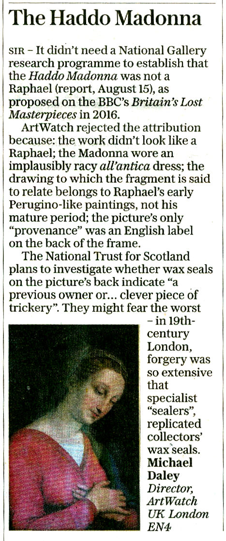
In 2018 Professor Martin Kemp, a key member of the Scholarly Consensus was cooler on Christie’s choice of sale in his memoir Living with Leonardo:
“It was, however, a great surprise to find that the Salvator was to be sold Christie’s in New York on 15 November 2017 in a mega-auction of celebrity works of art from the modern era. [Some saw that as being apt in view of the picture’s extensive repainting.] The auctioneers sent the painting on a glamorous marketing tour of Hong Kong, San Francisco and London. I was approached by the auctioneers to confirm my research and agreed to record a video interview to combat the misinformation appearing in the press – providing I was not drawn into the actual sale process.
“The price inched upwards from less than $100 million to $450 million, shattering the world record for a work of art. The result was cheered to the rafters. I was besieged by media requests for comment. Three weeks later reports that it had been purchased by one of two Saudi princes began to circulate, prompting Christie’s to announce that it had been acquired by Abu Dhabi’s Department of Culture and Tourism for the Louvre Abu Dhabi, the remarkable new ‘world museum’, where it will join Leonardo’s La belle Ferronnière. A public home at last, I hope.”
The brouhaha should not be brushed aside. Too many urgent issues have arisen concerning, for example, the singular debate and scrutiny-avoiding means by which the supposedly solid consensus was assembled (- and, on this, see Ben Lewis’s The Last Leonardo), and the top-secret restoration work that was carried out at the Conservation Center of New York University’s prestigious Institute of Fine Arts, during which covert operation the drapery at the (true) left shoulder of Christ was transformed and simplified (Figs. 1 above and 7 below) immediately ahead of the pre-sale world marketing tour – as revealed in “Auctioneers Christie’s admit Leonardo da Vinci painting which became the world’s most expensive artwork when it sold for $340m has been retouched in the last five years”. While in truth we still don’t know the whole story or even the post-sale whereabouts of the picture, much of the recent ground is covered in the ArtWatch UK members’ Journal No 32, as sampled in Figs. 5-8 below. [AWUK Journals are distributed free to members. New members receive the previous two issues – presently as shown at Fig. 1 above. For membership application details please write to Membership at: artwatch.uk@gmail.com ]


Michael Daley, Director, 28 October 2019
Notre-Dame: A Tale of Two Pathologies

MICHAEL DALEY WRITES:
Already the victim of one cultural pathology, Notre-Dame Cathedral may be about to fall to a second. Two months after the April 15th inferno a preliminary report claims that an accident (- a cigarette or perhaps an electrical fault), not arson, was the likeliest cause. Whatever the cause, the ease with which the fire was able to spread was the product of neglect by the French State which for centuries has shown antipathy towards all things Gothic, “superstitious” and non-rational. At the beginning of the 19th century an obliging architect offered a scheme whereby a Gothic church might be razed by fire in an afternoon without risk to the revolutionary arsonists. In April, even before Notre-Dame had cooled or dried, a further State-initiated assault was launched with political, ideological and architectural ghouls crying as one: “we must rebuild anew”. Why anew? Why not first establish the nature and extent of the damage and then simply repair it? President Macron, France’s thwarted moderniser-in-chief, self-identifying Jupiter (Fig. 4) and would-be creator of a European Army, instantly announced an international competition to redesign Notre-Dame in a manner “adapted to the techniques and challenges of our time” so as to make a “contemporary art gesture” and leave the building “more beautiful” than before. Again, why this instantaneous rush to compound grave injury with extreme and perverse stylistic adulteration?

In sanctioning a modernistic retread of Paris’s near fire-destroyed cathedral Macron was effectively commissioning a Gallic equivalent of Berlin’s Norman Foster New Reichstag revamp which had left that historic parliament building shorn of its emphatic central vertical axis (Fig. 1 above) and turned into a skateboard-friendly tourist magnet with a larky dome that acts as a reverse lighthouse (Fig. 2 above).
Perhaps Macron, who created his own political party to gain office, sees a potential monument to himself in a made-over Notre-Dame – as the Guardian cartoonist, Steve Bell, swiftly and brilliantly suggested (Fig. 3, above). We had flagged Macron’s Jupiter-complex in the November 2017 The Conservative, as below at Fig. 4.

ARBITRARY DEADLINES AND A DANGEROUS LEGAL PRECEDENT
Macron insists all work will be finished for the 2024 Paris Olympics – much as the UK Prime Minister, Gordon Brown, (vainly) promised the negligent restoration burnt-out tea clipper, the Cutty Sark, would be “brought back to its former glory” for the 2012 Olympics. A law drafted for the cathedral’s reconstruction would provide exceptionally and controversially high tax exemptions (up to 75%) for pledged donations from French billionaires like François Pinault (€100 million) and Bernard Arnault (€200 million). It would also give to the competition winner blanket exemption from all French building and environmental regulations. This hasty and cavalier double blank cheque triggered national and international condemnation. After two months not a penny of the billionaires promised money has arrived and it is now said to be conditional upon their approval of measures to be taken.
DEMOLISHING HERITAGE SAFEGUARDS
Alexandre Gady, president of the Association for the Defence of Heritage Sites and Monuments, said: “We are against the very principle of an exceptional law… There is no justification for this law, which takes the restoration of Notre Dame out of the normal framework. The use of orders and derogations sets a dangerous precedent, when we already know how to move quickly within the framework of existing law.”
As shown below, the dismantling of heritage safeguards was an essential prerequisite of Modernism’s phenomenal late twentieth century boom in Britain.
THE POST-INFERNO STRUCTURAL REALITIES
On 28 April, over a thousand experts petitioned Macron not to bypass expertise on an ill-advised arbitrary deadline: “Let us not erase the complexity of thought that must surround this building work with a display of efficiency.” For the inferno’s devastating effects on stone and glass, see “Notre Dame: former Met director Philippe de Montebello among 1,000 experts urging Macron not to rush restoration” and “Notre Dame: experts explain why Macron’s five-year restoration deadline is impossible”.
It is now known that structural reinforcements are needed (above, Fig. 5) to prevent the burnt-out building’s collapse in gale-force winds when previously the cathedral could withstand storm winds of 220km per hour.
A POLITICAL AND POPULAR SETBACK
The French President may already be rattled: his culture minister, Franck Riester, vows transparency and claims the people “will be able to express themselves” upon which “we will decide after a great debate and great consultation.” The people, however, had already decided without permission – more than twice as many (54%) called for a straight replacement over a modernist make-over (21%). On 27 May a Senate requirement that the restoration must include a traditional spire was added to the bill.
The Senate has effectively placed an immoveable object in front of a hitherto irresistible modernising tendency that is now said to be spearheaded by the Belgian artist Wim Delvoye and the UK firm Foster + Partners. The artist is unfazed: “I am confident that they will change their mind 100 times, and possibly bend towards my solution.” The Architect’s Newspaper reports that Senate members insist the cathedral must be repaired precisely to its “last known visual state” and use original materials (“French Senate declares Notre Dame must be rebuilt as it was before, quashing competition”). It remains to be seen how or whether the two houses in the French Parliament will square the circle. We might expect some resourcefully enhanced assertions of Modernity-as-the-New Tradition. Already modernist big guns are wheeling – the Gagosian Gallery’s Paris branch is running “An Exhibition for Notre-Dame” (June 11 through July 27) with proceeds to go to the initiative Friends of Notre-Dame de Paris and its affiliated French entity La Fondation Notre Dame.
THE MODERNISERS’ BEDROCK IDEOLOGICAL STANCE
Two days after the fire, the Daily Telegraph invited the design critic Stephen Bayley and Simon Thurley, the former head of English Heritage, to address the question: “Should Notre-Dame be rebuilt in the mould of the original or reimagined for the modern age?” Bayley contended not to modernise would travesty the cathedral, lose an opportunity and constitute: “a terrible failure of nerve”. Thurley predicted: “there will inevitably be some who will call for a new contemporary roof and condemn the idea of replicating the old one. Perhaps an enterprising and creative architect will suggest a glass roof with a viewing platform for the millions of tourists who come each year to see the cathedral. Another might design a gleaming aluminium spire to replace the burnt wooden one erected in the nineteenth century.”
Whereupon, Norman Foster (aka Foster + Partners) proposed a new glass and steel-framed roof and a viewing platform and a new super-sleek, super-extended crystal glass and steel pyramid (above Fig. 6, top) in lieu of Viollet-le-Duc’s 1884 180-foot replacement spire for the unstable medieval spire removed in 1786 (see Fig. 8 below). Foster promises to use the “technology of the age” to “contemporary and very spiritual” ends when his proposed increase of daylight in the cathedral would diminish the force of the stained glass windows and assumes that light will bypass the cathedral’s stone-vaulted ceiling. (At the Reichstag, Foster funnelled light from his glass dome into the debating chamber below through a mirrored cone – Fig. 2, top). Other proposals (Fig. 6 above, and Fig.7 below) range from a swimming pool, a market garden, a gilded cast metal inferno, to legions of upward-thrusting night-time light effects.
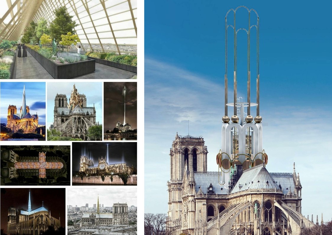
THAT “TRADITION OF THE NEW”
In pressing his bid, Foster (Baron Foster of Thames Bank, OM, RA) patronised the French President: “The decision to hold a competition for the rebuilding of Notre Dame is to be applauded because it is an acknowledgment of that tradition of new interventions”. He had claimed all previous fire-destroyed cathedral roofs were rebuilt by modernisers using the most advanced technology of the age, when York Minster’s (part) fire-destroyed roof was rebuilt precisely as was. Reducing the weight of the roof might not be the smartest move: the roof’s weight had assisted the buttresses in stabilising the walls. Much as winds now threaten Notre-Dame for the first time, at the Basilica of San Francesco in Assisi, an ill-considered concrete replacement of a wood roof had the unintended consequence of increasing the building’s stiffness by an estimated factor of 200 and, thereby, resulted in unprecedented earthquake damage in 1997.
THE ANTI-HISTORY CASE FOR MODERNIST BOLT-ON ADULTERATIONS
Whether the current vogue for appending modernist elements to historic buildings constitutes a tradition or an indulged adulterating fad, by ignoring questions of style, Foster presents architecture as a succession of pioneering technical problems solved – and, inariably, with small green bonuses (insofar as entirely glassed-over big steel boxes or blobs can be nudged towards energy efficiency). At Notre-Dame, Foster would convert the entire roof into a vast greenhouse and instal trademark structures to whizz tourists to and from his viewing platform. Such aesthetically and historically disruptive built radicalism is being proposed when there is no need to “re-imagine” the roof because abundant photo-records and construction drawings exist (Fig. 8 above) and, as mentioned, most people and the French Senate wish it to be replaced as was. The modernisers are contriving a cause célèbre without a cause.
The spire’s weathervane cockerel and a gilded head of an angel was found in the rubble and the late American academic, Andrew Tallon, (above, Fig. 9), who founded the Friends of Notre-Dame de Paris when the French Ministry of Culture stopped financing repairs to the cathedral, had created a digital virtual replica of the cathedral through more than a billion points of measurement. See CNN’s “Four years ago, an art historian used lasers to digitally map Notre Dame Cathedral. His work could help save it.”
SHEDDING UNDAMAGED SCULPTURES AND FORGING A NEW VOCABULARY OF RESPECT
Macron’s iconoclastic bid to license a modernist makeover on an unstable historic building is as clear an abnegation of heritage responsibilities as could be imagined and where Foster promises “a respectful combination of the dominant old with the best of the new”, his own record with heritage buildings has repeatedly suggested otherwise – see below. The modernisers’ aspirations predicate the exclusion of the spire sculptures (Fig. 10, below) including that of the figure shown top right at Fig. 8 of St. Thomas, the patron saint of architects, which incorporated a likeness of Viollet-le-Duc (top, far right). Those sculptures were said to have “miraculously” escaped when removed from the roof in the days preceding the inferno. The French official overseeing their removal, Marie-Hélène Didier, described it as a “magical moment,” to see the statues close up for the first time since placed on the cathedral 135 years ago.
RESPECTING THE PAST, TELLING THE STORY OF A BUILDING
Pace Foster + Partners, what counts as respecting the past? Do we really better respect the past by updating it stylistically? Whatever differences archaeological purists might have with Viollet-le-Duc’s restoration philosophy, he held the restorer’s goal should be “to save in each part of the monument its own character, and yet to make it so that the united parts don’t conflict with each other…” Which is to say, he worked within the building’s own developed gothic style so as to maintain (and in his view, better realise) its coherence of language, this being a Gothic cathedral, not a Classical or Baroque – let alone Neo-Futurist – one. Of course, Viollet-le-Duc’s replacement spire and gingerly descending Apostles (above, Figs. 8 & 10) were not historically original but they were in the spirit in a way that no avowedly modernist production can be. They have long been part of the cathedral’s fabric and they have kept company with Quasimodo.
Cynthia Gamble, former Chairman of The Ruskin Society, and a writer on Proust and Ruskin cites the latter’s appreciation of a previously damaged Notre-Dame in a 19 January 1871 letter:
“As examples of Gothic, ranging from the twelfth to the fourteenth century, the cathedrals of Chartres, Rouen, Amiens, Rheims, and Bourges, form a kind of cinque-foil round Notre Dame of Paris, of which it is impossible to say which is the more precious petal; but any of those leaves would be worth a complete rose of any other country’s work except Italy’s. Nothing else in art, on the surface of the round earth, could represent any one of them, if destroyed, or be named as of any equivalent value.
Central among these, as in position, so in its school of sculpture; unequalled in that specialty but by the porch of the north transept of Rouen, and, in a somewhat later school, by the western porches of Bourges; absolutely unreplacable as a pure and lovely source of art instruction by any future energy or ingenuity, stands – perhaps, this morning, I ought rather to write, stood – Notre Dame of Paris.”
Ruskin, Gamble further notes: “did not remain in an ivory tower, but took practical action by establishing a fund-raising committee to assist the French. This great Victorian writer, campaigner and passionate advocate of Gothic, France and its cathedrals, was inspirational in Marcel Proust’s life and work. For Proust, who translated into French Ruskin’s The Bible of Amiens and Sesame and Lilies, he was his guiding star and ‘maître à penser’”.
VICTOR HUGO
Two years before the conflagration Richard Buday, an architect and broadcaster, held it is hard to separate Victor Hugo’s Notre-Dame de Paris from the cathedral itself:
“Novel and cathedral are so intertwined, so reinforcing of each other, they’ve become inseparable. It’s a magical relationship that architects would do well to study. Hugo wrapped a stealth of behavioural intervention inside a love story embedded in architecture. Like nested Russian dolls, Notre-Dame de Paris is a story within a story within a story. Outwardly, it’s save the girl. Inwardly, the hidden payload is save the building. Hugo wedded narrative to architecture and fermented intrinsically motivated behaviour change on a societal scale, turning local apathy into public action. Imagine what might have become of New York City’s Penn Station had Harper Lee or J.D. Salinger written a 1960 best-seller persuasively set in the great terminal.” See “How a Novel Saved Notre-Dame and Changed Perceptions of Gothic Architecture”. Re the reference to Penn Station, one of the most powerful laments on a barbarically destroyed building (one that today’s modernists might well dismiss as “pastiche”) was broadcast by Alistair Cooke, in his BBC Radio 4 “Letter from America” on 31 October, 2003. We carry the transcript below.
In the preservation of religious buildings even more than history and its stories are at issue. The Rev. Canon Michael Smith at York Minster (whom PBS broadcasters describe as “a traditionalist”) reminds us: “we have to acknowledge that places like here and places like Notre Dame are actually repositories of prayer. They hold the memory, they hold the joys and sorrows, the tears and the laughter, the questions, the doubts, the affirmations of faith of generations of people.”
One such now-embedded memory at Westminster Abbey is Earl Spencer’s throne-shaking funeral eulogy for his sister Princess Diana:
“…I would like to end by thanking God for the small mercies he has shown us at this dreadful time. For taking Diana at her most beautiful and radiant and when she had joy in her private life. Above all we give thanks for the life of a woman I am so proud to be able to call my sister, the unique, the complex, the extraordinary and irreplaceable Diana whose beauty, both internal and external, will never be extinguished from our minds.”
SAUCE FOR THE GOOSE
Where buildings capture, shape and nourish imaginations, Bayley holds that to rebuild “as was” is an affronting absurdity because “a great cathedral is a palimpsest established over time and it is quite impossible to establish exactly what ‘original’ means”. Replacing a recent discrete and well-recorded component part requires no philosophical/conceptual identification of an over-arching “originality” – there is nothing to be rethought or re-imagined because what is about to be replaced was there, just ten minutes ago and we know exactly how it was. Whereas, however, if such a philosophical obligation really did pertain, how might Foster clear that very hurdle so as to deliver his intended “respectful combination of the dominant old with the best of the new”?
PROLONGING LIFE IN OLD BUILDINGS

In the two buildings above at Fig. 11 we see, left, the gate portion of a shrine in Kyoto, Japan (as beautifully captured by the late William Corey). The building is 2,000 years old and has been maintained “as originally-was” throughout that period – which is to say, it has remained mint-fresh while becoming ancient. Is it now, therefore, a modern sham or pastiche? The building on the right, the Church of the Theophany (1693), Kuhayiv, Lviv Oblast in the Ukraine, is part of a tradition of wood-built churches that goes back to the 10th—11th centuries. It shows signs of age. Over 3,000 such churches survive in the Ukraine and eight were included in 2013 on UNESCO’s World Heritage List. Many are said to be in need of conservation. The Ukraine Weekly Digest reports a workshop being held in consideration of possible treatments (June 24 to July 6 2019).
If either building above were to be part-destroyed by fire, would anyone insist that damaged portions be rethought and remade in a modernist manner with modern materials and techniques? As for Bayley’s “lost-opportunities”, an opportunity lost to a would-be insinuator of modernist motifs cannot be taken as the whole story. Was there a net loss when, in 1994-2004, Dresden rebuilt “as was” the magnificent 18th century Frauenkirche and surrounding square (Fig. 12 below) which had been destroyed in the Second World War?
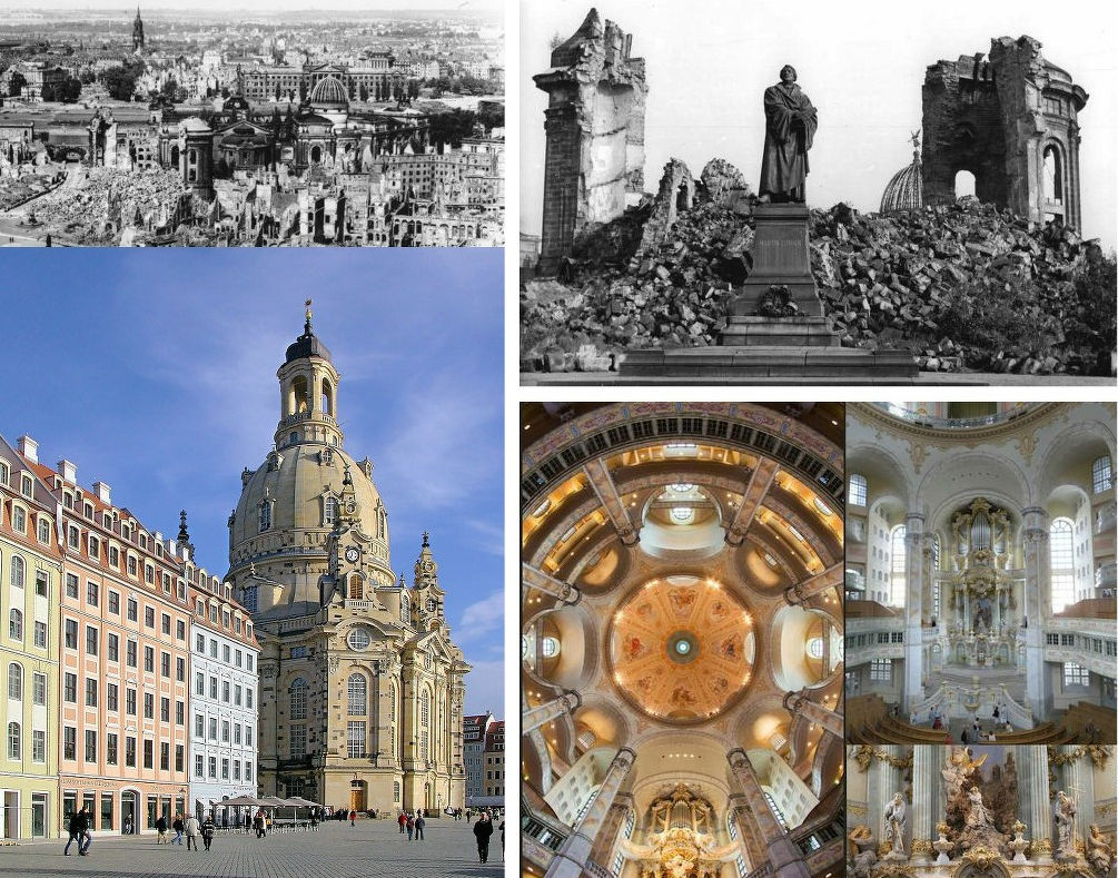
How many modernists visiting Florence protest: “fake”; “lazy replica”; “pastiche” or “lost opportunity”? Who contends that the city’s war damaged buildings and bridges would better have been replaced by early post-war (and now passé) modernists than by being remade from surviving drawn records, as Bernard Berenson successfully urged?
THE ART OF BUILDING BRIDGES
Florence’s Ponte Santa Trìnita bridge of 1567-1569 (above, Fig. 13), the oldest elliptical arched bridge in the world, was blown up in 1944 by retreating German troops. British troops built a temporary bridge and the original bridge was reconstructed in 1958 with surviving stones from the river Arno and new stone from the original quarry. (When Foster revamped the British Museum he used the wrong stone – French, not English.) In 1993, the old stone bridge at Mostar in Bosnia and Herzegovina was destroyed by Croat shelling having stood for 427 years (Fig. 14 below). Under UNESCO it was rebuilt, as was, using recovered stones and freshly quarried local stone, by 2004. The exercise discovered that under Islam knowledge of sophisticated geometrical methods of calculating, cutting and joining stones had survived that had been used on the Parthenon in Athens. Would Bayley have preferred the insertion of a technically ground-breaking shiny metal bridge into the ancient stone buildings that served as bulwarks to the stone bridge once considered a technological miracle of its day?

FOSTER + PARTNERS’ WOBBLY METAL BRIDGE AND THE WRONG KIND OF PEDESTRIANS
On 10 June 2000, The Millennium Bridge, above, right, Fig. 14, an £18.2m metal footbridge over the River Thames opened, two months late and £2.2M over budget. It closed two days later. It had been officially opened by the Queen in May, when behind schedule and only two thirds complete. It had been co-designed by Lord Foster, the sculptor Sir Anthony Caro, OM, and the engineers Ove Arup. It was closed because it wobbled when used by people. The co-designers fell into disarray. Foster reportedly caused great resentment when appearing to shrug off responsibility by describing the problem as “engineering led”. Caro blamed planners who had “cut down and trampled on the innovative designs” The project’s chief engineer blamed “unintentional synchronisation of walking [by people walking over the… footbridge]”.
“THE REAL WORLD” BITES BACK
The problems arose in attempt to create a novel bridge as a “blade of light”. Royal Fine Art Commission experts predicted problems with vibration and further fears were expressed when the new Pont de Solferino in Paris was closed because of vibrations. Tony Fitzpatrick, the engineer at Arup responsible for the bridge later admitted: “The real world produced a greater response than we had predicted. No one has effectively studied the effect of people on a horizontally moving surface.”
FOSTER’S “NOSTALGIA” SMEAR
Suspension bridges’ vulnerability to waves of vibration has long been known. The Albert Bridge in central London carries a sign stating that soldiers must break step when crossing the bridge – I recall being told in a school maths lesson that soldiers could not march in step on bridges. Fitzpatrick’s phrase “horizontally moving” is the key: the problem with the Millennium Bridge arose because it was not so much suspended (with its weight and downwards pull opposing lateral movement) as held near-horizontally on wide “Y” shaped supports in order to permit uninterrupted views. The “blade of light” more resembles a trampoline than a conventional suspension bridge. It was a technical invitation to wobble. Fixing its bounce and sway with “dampers” resulted in closure until January 2002 and a further £5million costs. Foster subsequently presented the debacle as midwife to a great technical advance and he averred: “Can you ever be over-ambitious? I would rather be accused of being over-ambitious than of being lily-livered and retreating into a nostalgic past that never existed.”
THE GODZILLA TENDENCY WITH ARCHITECTURAL HERITAGE
New buildings are inserted into historical contexts, that is, into “presents-with-pasts”. Foster’s latest addition to the City of London, a 1000-ft (305-metre) viewing tower (above, second left and centre, Fig. 15), has been politely dubbed the Tulip and derided as an architectural Freudian slip. It gained planning approval despite intense opposition, public mockery and Foster’s failure to attend the planning committee. It has been objected that it would fit better into Dubai than London; that there was no need for “this phallic-shaped attraction, with little aesthetic merit”; and, that the proposal “reeks of desperation in its straining after ostentatious effect”. It serves no purpose other than to harvest tourist revenues. With this building, Foster does to his own notorious “Gherkin” at 30 St Mary Axe (above, left) precisely what it had done to its neighbours – dwarfing and out-shouting them (above, second left).
In the above, top centre, computer representation the viewing tower stands directly in front of the Gherkin for which building the Baltic Exchange – a Grade II* listed building (its interior as above, right) the IRA attempted to destroy in 1992 – was demolished. Approval was given at a secret English Heritage planning meeting at which officers objected that the Gherkin would be “unduly dominant and assertive…damaging to [a long list of items including the] general skyline of the City of London…The setting of the Tower of London…part of a World Heritage site…” See “Clamps Off”, Mira Bar-Hillel, ArtWatch UK Journal 12, Winter 2001-2.
FALLING GLASS AND REMOVED PLANNING CLAMPS
On 26 April 2005 the Guardian reported that a large window had fallen out of an unoccupied floor of the Gherkin and smashed into the landscaped plaza that surrounds the building. It is possible that it had been pushed out by one of the ghosts of the Baltic Exchange after its listed 1922 memorial to members killed in the First World War was dismantled to make way for the Gherkin. Responsibility for English Heritage’s failure to protect that fine listed building and its contents was self-attributed to its departing Chairman, Sir Jocelyn Stevens (1992-2000) who had recently written that in the 1980s “I asked Richard Rogers and Norman Foster why they were not working in England. They replied that it was largely because of the planning procedures of English Heritage. Now Lords Foster and Rogers have approximately twenty schemes in London. English Heritage deserves some of the credit for this; it has helped that we have taken the clamps off.”
THE HEARST HEADQUARTERS TOWER, NEW YORK

With regard to a possible outcome of a Foster intervention on Notre-Dame, over a number of years on New York visits I regularly passed (on Eighth Avenue, between Fifty-sixth and Fifty-seventh Streets) a stone building with richly dramatic sculptural decorations that provided unfailing delight. Then hoardings sprang (above, Fig. 16) announcing: “The Hearst Corporation’s new headquarters will be a modern tower which expresses its own time with distinction, yet respects the original landmark building”. Foster + Partners were to be the instrument of this respectful development and I would have an intermittent ringside seat.
The building’s façades afford an animating interplay of horizontals, verticals, projections and recessions. The elevations link smoothly at the building’s base in broad two-storey corner chamfers above which tall triangular voids give space and home to dramatic fluted columns bearing archaistic Greek allegorical figures at their bases and geometrically decorated urns that break the skyline like minarets or pinnacles (above, Fig. 17). The central main entrance (as below, left, at Fig. 18) is a simple arch set flush with the smooth flat base apart from a progressive fanning projection of keystones supporting a balcony balustrade. Above, and stepped behind the balustrade, twin columns frame a central block of windows comprising a feast of advancing and receding shadow-casting surfaces. Notwithstanding the minimalist (Art Deco) vocabulary the whole recalled the sophisticated plastic/conceptual game-playing at the vestibule of Michelangelo’s Laurentian Library in Florence, as below, right.
The 1927-8 building comprised the base of a planned skyscraper for William Randolph Hearst that was scuttled by the Great Depression. We now know – thanks to a fine and richly illustrated 2009 monograph by John Loring (design director for Tiffany & Co. from 1979-2010) that the architect was Joseph Urban, a brilliant and prolific designer of buildings, stores, ballrooms, theatre, film and opera sets who had studied architecture at the Academy of Fine Arts Vienna under Karl von Hasenauer. Urban moved to America in 1911 as an accomplished international architect, illustrator, theatre and cinema set designer (with over 50 productions from his home Vienna Royal Opera, the Champs Elysée Opera, and Covent Garden) and then to New York in 1914, becoming a stage designer for the Metropolitan Opera in 1917. He died at fifty-one in 1933 but his sets remained in the repertoire into the 1950s. In architecture he was an originator of the Art Deco style and, in his 1930 “New School” building at 66 West Twelfth Street (- a stone’s throw away from the great Strand Bookstore) at Fig. 33 below, he introduced the first international Modernist building in New York. The Hearst and the New School are Urban’s only surviving New York buildings.
What a richly stimulating challenge and responsibility had been granted to an architect who today would combine the “dominant” old with the best of the new at Notre-Dame Cathedral.
During subsequent trips I watched with dismay and disbelief as the sprouting New dominated the fixed Old to a shocking degree (above, Fig. 19). Lord Foster’s contribution burst from within the brutally hollowed Urban building and it progressively assumed (depending on viewpoint) the character of either an incubus or a jack-in-the-box, as below at Fig. 20. (Fuseli’s Nightmare, is shown as before a recent debilitating restoration.)
JOSEPH URBAN’S NEW YORK LEGACY
It is possible that had Loring’s book preceded the development of the Hearst Tower there might have been a more appropriately respectful and fitting treatment for the major surviving building of a prodigiously gifted culturally-enriching New York immigrant who was described by Fritz Kreisler as “the last Viennese”. Urban excelled equally in the plastic, graphic and pictorial arts. In Fig. 21 below, top, we see his 1926-27 Ziegfeld Theater in a wash presentation drawing, left, and in the flesh, right, at the northwest corner of Sixth Avenue and Fifty-fourth Street. Thus, in both anticipation and realisation, Urban delights in counterpointing a dead flat façade with richly sculptural decorations that collectively ripple in synchronised waves.
In Fig. 21 below, bottom left, we see the astonishingly audacious – and still surviving – auditorium of Urban’s New School of 1930 – in competition for which building he beat Frank Lloyd Wright (whom he had helped financially). Below, bottom right, we see Urban’s 1922 Wiener Werkstätte of America showroom. Visiting Vienna in 1919 Urban found many famous artist friends who were almost starving. He bought their works and displayed them in this exquisite setting – has any Klimt painting ever been displayed to greater and more sympathetic effect? Is it fanciful to see, in Fig. 22 below, echoes of Urban’s 1930 auditorium, respectively, in Frank Lloyd Wright’s 1959 Guggenheim Museum (top) and Norman Foster’s 1999 Berlin Reichstag dome?
FOSTER’S WAY WITH HISTORY
At the Hearst building, Urban’s façades survived only as a shell to a Giant’s Entrance Lobby. Immediately above Urban’s building, his inventively articulated decorations were swamped by the gargantuan leaps of scale on the tower’s glassed-over big steel box (above Fig. 20). Small was dwarfed; warmth was frosted out; variety, interplay and dramatic sculptural groupings were all eclipsed by gigantic shiny repetitively monotonous units (Fig. 35 below). Against old stone relief surfaces that absorbed light and cast ever-changing shadows, the grossly assertive inner New-Build Tower’s darkened glass and stainless steel trim facades bounce light straight back at the viewer. Before considering some of the less disrespectful forms a modern tower might have taken, we consider the Hearst Headquarter’s somewhat anomalous position within Foster’s oeuvre.
FOSTER’S OEUVRE AND BORROWED NOTIONS
Foster’s buildings moved from a “bare-all” structure-determined crystalline geometry (first, second, third, fourth and seventh, above Fig. 23) to a curvilinear organic vocabulary (fifth, sixth and eighth above) that famously runs through the testicular towards the phallic. With the Hearst Tower (seventh in Fig. 23 above) the arc is disrupted by a regression to flat-faced geometries in what is one of Foster’s most manifestly indebted motifs. Even though the building was widely acclaimed as a novel and invigorating treatment of tower buildings in New York, its indebtednesses drew notice. In the 11 December 2005 New Yorker, Paul Goldberger (“Triangulation: Norman Foster’s thrilling addition to midtown Manhattan”) noted:
“In some ways, the Hearst tower calls to mind a famous unbuilt design from a heyday of modernism: a six-hundred-foot skyscraper in Philadelphia, proposed by Louis Kahn and Anne Tyng in 1957, which would have had a zigzag shape based on a framework of triangular supports. [Fig. 24 centre, below.] Kahn and Tyng weren’t the only designers to have understood that the triangle is an inherently strong and efficient structural form; Buckminster Fuller and the engineer Robert Le Ricolais made the same claim. Foster’s use of triangles is, in this sense, a borrowed notion.”

In the 7 October 2004 New York Times (“Hearst Tower Echoes Trade Center Plan”) David W. Dunlap suggested that the design had originated in Foster’s 2002 study for the new World Trade Center: “With its bold introduction of a quiltwork diagonal grid, or diagrid, into the relentlessly right-angled cityscape, the future headquarters of the Hearst Corporation gives some sense of what New York might have experienced in Lord Foster’s proposal for the trade center site.” Dunlap was disconcerted by the Tower’s most distinctive and novel innovation – its treatment of the vertical corners: “More disorienting than any other feature of the Hearst Tower are its crimped corners. They will slope inward at 75 degrees for four stories, then outward at 105 degrees for four stories, then inward, then outward, inward, outward, inward, outward, inward.”
The consequence of those gigantic repeating angled incursions (which were likened by Foster to birds’ mouths) is that when the tower is viewed from three-quarters (so that the flat front face and one of the flat side faces are seen together) it bears strong resemblance to Brancusi’s Endless Column sculptures. There had been earlier discussion of a Brancusian indebtedness with Foster’s originally proposed 2002 Twin Tower replacement. A collector, Alec Biele, was struck by the Foster designs’ similarity with piece of sculpture he owned – an Ode to Brancusi by John Bartolomeo, a retired architect turned full-time artist. As Dalya Alberge reported in the 12 February 2003 Times (“The other twin towers spark talk of plagiarism” – Fig. 25 below), a letter of complaint by Biele to the Lower Manhattan Development Corporation went unanswered but Foster’s twin towers proposal (which had been considered the favourite) was eliminated.

Watching the Hearst Tower development it soon became apparent that the promised integration of the old and the new was an exercise more of defiance than compliance. Moreover, the pronounced “disconnect” between the Urban base and the Foster tower is strikingly similar to that encountered in the monumental version of Brancusi’s Column without End at Târgu-Jiu in Romania (Fig. 26 above and Fig. 27 below left). In the giant sculpture the trapezoidal modules (plastically-speaking, each consisting of two conjoined and mirroring truncated square pyramids) were made individually in cast-iron and successively threaded onto a vertical steel central core which was integrated with a steel pyramid set below ground in a fifteen feet cubic concrete block. In the sculpture, when the bottom of the first module reaches its widest section, instead of narrowing it drops down vertically and seemingly sinks into the ground. That very treatment of termination is replicated in Foster’s tower – with the difference that his disappears from view on the outside but drops right through the roof of Urban’s now-gutted building and reappears within. Below the original base building’s roof level, the descending vertical columns receive diagonal buttressing (as in the cut-away drawing above and Fig. 36 below).

In the model of the Hearst Headquarters shown above right at Fig. 27, we can see most clearly the utterly dwarfing impact of the tower on Urban’s base: his building becomes Jack to the tower’s Beanstalk. This is not a marriage of old and new but the explosive emergence of a tower in transparent disregard of an immovable landmarked stylistic encumbrance at its feet.
MIGRATING MOTIFS – A CREATION, A HOMAGE, A BORROWING/COINCIDENCE, AND A RECAPITULATION
In Fig. 28 above, we see successively and chronologically: one of Constantin Brancusi’s endless column carvings; Bartolomeo’s steel sculpture, Ode to Brancusi, that had been published on its maker’s website; Foster’s submission to the competition to rebuild New York’s Twin Towers; a model showing the development of the Hearst Tower from within the surviving Landmarked Urban base for the Hearst building.
MODERNISM IN DENIAL
That Urban’s building had been planned as a base might have been taken as a helpful cue in designing the new tower. The word “base” nods towards the classical sub-divisions within a column: base; shaft; capital. As seen below (Fig. 29) even in almost nominal allusion such adopted and adapted schema variously lent charm and coherence to a thousand tall buildings in New York:
There is no more satisfying a high-rise structure in New York than the 1902 Flatiron Building, above right. The Flatiron’s construction began with a base from which a shaft sprang and, then, harmony and lucidity were achieved by completion of its “capital”. Given that Foster had been gifted a base – what force impelled him not to build on that implicit logic and in sympathy with New York’s own rich architectural precedents? If Foster can nod backwards to sculptural motifs, why not do so with comparably helpful/stimulating architectural paradigms? As it happens, there exists in New York a building of much more recent origin (1984) than the Flatiron that might almost have been taken as a template on which to achieve a happy and fruitful synthesis between the creations of Urban’s late 1920s and Foster’ early 2000s – see below.
ALTERNATIVE SOLUTIONS TO THE HEARST TOWER PROBLEM
Arguably, the most pertinent and attractive post-war New York skyscraper was the revolutionary Philip Johnson and John Burgee 1984 AT&T Building – now the Sony Tower (Fig. 30 above). David Langdon in ArchDaily has fairly said of the building’s crowning open pediment: “It may be the single most important architectural detail of the last fifty years…[It] singlehandedly turned the architectural world on its head. This playful deployment of historical quotation explicitly contradicted modernist imperatives and heralded the mainstream arrival of an approach to design defined instead by a search for architectural meaning. The AT&T Building wasn’t the first of its type, but it was certainly the most high-profile, proudly announcing that architecture was experiencing the maturation of a new evolutionary phase: Postmodernism had officially arrived to the world scene.”
Unfortunately, while Postmodernism certainly identified modernism’s Achilles Heel (its self-impoverishing conviction that style is a by-product of correct applications of permanently advancing technical procedures), in practice it has served widely to license whimsy, incoherence, exhibitionism. The profound radicalism of the AT&T Building was its re-affirmation of the universal and perpetually invigorating force of classical architectural notions. This can be seen in the many affinities between the Johnson building and Urban’s Hearst building, even though the one was returning to classicism as the other was departing from it. As if oblivious, Foster, while happy to feast on an earlier sculptural modernism, missed the connection between Urban and Johnson and an opportunity to effect a bridge and synthesis across seven decades of architectural development.
AN EASY VISUAL ALIGNMENT

As can be seen above, at Fig. 31, it would be no insuperable task to marry the vocabularies of Urban and Johnson, so as to produce a harmonious/dynamic play of vertical and horizontal forces but Foster would seem blind, indifferent or hostile to any such stylistic resolutions. While properly enforced heritage laws meant Urban’s landmarked building had to remain in place, Foster retained only its shell to serve as an anomalous period raincoat to a pretentious over-sized futurist private “civic” square within. From within the Urban shell, Foster struck his own variation on a Brancusian theme, as below, second left at Fig. 32.
AN ARCHITECTURAL COMMUNION AND AN OPPORTUNITY MISSED
Urban and Johnson shook hands firmly in their doorways (above, top, Fig. 33). Urban’s progressively leaner, sparer – but always elegant – minimal modernism distilled his command of the riches of classical architecture as seen below at Fig. 35 in his designs for department stores, stage sets and, right, his 1919 plan for a World War I memorial that was never built.
SCALE ABUSES AND THE TYRANNY OF THE TRIANGE
In the detail above at Fig. 35 we see how there was no attempted mediation between the old and the new. To the contrary we see how (aside from dropping down a vertical face in echo of Brancusi’s Column without End at Târgu-Jiu) there was no attempted integration. Instead, there are massively abrupt shifts of scale, of vocabulary and of materials. Perhaps even more contemptuous than the inflicted giantism, is the imposition of an alien triangulated vocabulary on Urban’s interplay of horizontals and verticals. Two things might be noted: first, the visual deployment of the diagonals is essentially a wilful aesthetic contrivance not a product of some structural necessity. Although the massive diagonal structural elements sported on the glass facades permitted a lighter steel construction within, watching the erection of the building (Figs. 19 & 20) it was clear that this skscraper was, its nibbled corners aside, yet one more big steel box of office space to be clad entirely in energy wasteful glass. The diagonal structural elements did not in themselves dictate the contrived illusion of a giant concertina-ing of forms. Second, in mitigation, Foster was not so much imposing a private language as positioning himself in the van of an international vogue for the triangular and the pyramidal – a pronounced cultural infatuation that might be taken to betray a pathological desire to subvert and repudiate architecture’s classical architectural norms of stability and coherence through disorientation and derangement. This impulse is a pan-continental cultural manifestation – or zeitgeist – not a personal proclivity (see below).
AN INTERIOR GUTTED
Who, looking at Urban’s outwardly still-standing building today could have inkling of what lies within? As seen above (Fig. 36), the whole has been gutted to create an antiseptic Foster quasi-public space. Triangulation is supreme. On the lower, entrance level, the escalators run diagonally so as to bisect the rising metal slope (that doubles as a waterfall) into triangular sub-divisions in concert with the shiny triangular buttresses of the tower that rises within. If not unique to Foster, from where might this triangulating impulse have originated? (A clue: it was not from a love of ancient Egyptian pyramids.)
MODERISM’S BRUTAL ANTECEDENTS

In our 2008 Journal No. 24 (on the fight to save the classical architecture of St Petersburg) we drew attention to certain stylistic similarities between the reinforced concrete U-Boat pens and gun emplacements of the German sea-board defences in the Second World War and the architecture of Denys Lasdun, as left and right above at Fig. 37 (“Modernism’s Secret Passion?” – Michael Daley.) How might such similarities of formal language have arisen? In the late 1960s Lasdun spoke of his source influences in a lecture at the Royal Academy Schools. They were wide-ranging: from African mud hut villages, through Palladio and Hawksmoor, but there had been no mention of German concrete defence installations. Lasdun’s attachment to concrete as a building material is generally said to have arisen in the 1930s at a time when international modernism was seen as a “counter-thesis to fascism” (which rising political movement was notoriously prone to appropriate classical vocabularies) but in 2003 Lasdun’s son, James, mentioned in a frank and illuminating memoir (The Master Builder) that his father had “crossed over on D-Day, built airstrips with the royal engineers and captured a German horse that was wondering around a gun emplacement filled with dead German officers.”
A 1994 monograph on Lasdun effectively drew a veil over his war-time experiences: “Lasdun’s formation… [was]…interrupted by the war…Lasdun remembers the technical headaches which they all encountered, but also his private fascination with using bulldozers to sculpt the landscape into platforms and mounds…all [his later] use of decks and bridges might seem to suggest some nautical preoccupation…but he is really more interested in things like ancient mounds, overgrown ruins or the breaks and cracks of rocks.” Really? Had such generated the structure’s of Lasdun’s National Theatre? Given his infatuation with Le Corbusier’s concrete (- and: “You know James, there’s something aphrodisiacal about the smell of wet concrete”), is it conceivable that first-hand encounters with German concrete defences left no impression; no memories; or, that throughout the six-year long war, the shapes, forms, edges and aspects of no warships or embattlements caught the architect’s eye or aroused his plastic/sculptural creative passions?
THE UBIQUITOUS TYRANNY OF TRIANGULATION PLUS GLASS
Whatever the antecedents, we have seen more recently that with computer-aided design, triangulation has provided a means of building almost anything to any design, as with the part-entombed Cutty Sark by Grimshaw Architects and the errupting Hearst Tower by Foster + Partners at Fig. 38 above. But suspicion persists of an underlying darker side to triangulation’s imperative appeal for so many architects. Consider the work of the esteemed late architect I. M. Pei.

It was said in a recent obituary of Pei in the New Yorker (“The Impeccably Understated Modernism of I. M. Pei”) that he was: “… a consummate professional, one of the people who made modernism feel conservative and traditional. The East Building of the National Gallery, in Washington, D.C., married a sharp, trapezoidal construction with a monumental marble veneer. Here was a modern project that accommodated itself to the neoclassical ethos of the self-embalming American capital.” That is one way of looking at it. As in New York, we saw no accommodating marriage. We saw, in the forms, if not in the veneer, an assault on classicism inside and out through a disorientating arbitrary grouping of intersecting wedges that constitute one of the most uncongenial, art-contemplation unhelpful galleries to be found, the contrived manner and means of which is evident in the photographs and designs above left, Fig. 39. In the Marc Riboud/Magnum photograph of I. M. Pei ascending a stair in the East Building of the Washington National Gallery, above, right, the architect is perfectly pinpointed as the tip of one of his own contrived arrow head motifs.
In Pei’s most famous pyramids, at the Louvre, as above, top, Fig. 40, the great formalism of the courtyard is echoed by the axis of the large central and two small symmetrically flanking pyramids. Nonetheless, the large pyramid sits smack in front of the face of the host building’s façade. No such respect is shown at the National Gallery, Washington, (above, centre), where Pei’s Pyramids are intrusively alien and arbitrarily grouped – almost as if a stealth bomber had crashed and part buried itself into the ground. Whether architects like Pei, Grimshaw and Foster appreciate or intend it, or not, their combined triangulations constitute a disruptive assault on, or deviation from, the built world’s near universal deployment of horizontal and vertical forms, sometimes mediated by circular, elliptical or pointed arches. Littering that universe’s rational and coherent public and civic spaces with appliqued artefacts as visually disruptive as tank traps (Fig. 41 below, bottom left) or crashed stealth bombers – as by Foster’s former associate, Ken Shuttleworth, third down, above – may guarantee attention and public notice but stealth-bomber chic should not be permitted to present itself as some classicism-of-our-times. Nor should it even be taken as a modernist expression of a building’s “frankly laid-bare” structural integrity. These contrived devices are best seen as a species of window dressing that confers easy spurious dynamism on maximised rentable spaces. Just how appliqued today’s façades can be is seen bottom right, above, where Foster’s “diagrid” structural logic does not constitute a structurally realised building top but, rather, a deceiving screen that conceals the roof’s bric-a-brac.

UNANTICIPATED EXTRA-TRIANGULATION
When Foster presented the designs for the Hearst Tower, the first question asked was “how will the windows on the corners be cleaned?” It was a good question. In 2002 Foster subcontracted the world’s largest builder of window-cleaning platforms, Tractel Swingstage, to provide the answer. The technical ingenuity of the solution is staggering (it took three years and cost $3 million) but technical ingenuity, in itself, is never the whole story. In this case it required a very long, centrally hinged, cleaning platform (to contain window cleaners) that could fold around corners – the story was well told and illustrated in The New Yorker (“Life at the top”, 27 January 2013). But just months later, in June 2013, two maintenance workers were left stranded for nearly two hours 500 feet above ground when the folding platform snapped in the hinged centre (see Fig.42 below).
They were rescued when fire-fighters took out a window. The New York Times reported that in 2008, Tractel was issued a notice of violation by the New York State Labor Department for failing properly to maintain a scaffold at the Solow Tower at 265 East 66th Street. The violation related to an accident in December 2007, in which two window cleaners fell 47 stories when cables on their mechanical platform, serviced by Tractel, failed. One worker was killed, and the other was gravely injured.

By virtue of New York’s heritage landmarking programme the above, nominally “Art Deco” – but, in truth, vigorous archaistic classical figures – at Fig. 43 survived on Joseph Urban’s building. They are thus able to maintain their conversations with earlier backward-looking and “constrained” archaistic sculptures made within Greek and Roman classicisms at the height of their developed sophistication. It is presently within our power to return Viollet-le-Duc’s “backward-looking” Apostles to their roof/spire setting at Notre-Dame and not confine them in some store room. The question is: will we be allowed to do so? Or will the negligent State that half-destroyed the cathedral now also instigate a programme of modernist stylistic subversion?
Michael Daley, 30 June 2019
CODA: Towering Glass and Steel – Alistair Cooke, BBC Radio 4 “Letter from America” 31 October, 2003:
Forty years ago last Monday morning, a gentle south-east wind carried up through Manhattan what many New Yorkers at first thought was a series of explosions of some kind.
Pretty soon there came on television what to most New Yorkers was an incomprehensible sight and sound.
The pictures showed jackhammers clawing away at the walls of a famous building and then at slow, rhythmic intervals a huge, airborne shining ball swung and crashed against the long stately Doric colonnade of – were they mad? – the Baths of Caracalla.
Well, yes – not of course the original but a superb recreation of a Roman architectural masterpiece.
Why were they doing this? And who were they?
What we saw was America’s most famous railway station – the Pennsylvania Station [Fig. 44, below.]
It had been designed at the turn of the 19th-20th Centuries, during the finest hour of the new multimillionaires – especially the robber barons who had made their fortunes in coke, iron ore, railroads – a time when little old Andrew Carnegie was proclaiming the new age of steel.
Once such a man was a millionaire he became eager to advertise the grandeur of his social position by ordering up a new house, a mansion, as like as possible to the mansions not of the new rich of Europe but to the ancient houses of the old aristocracy, especially the nobles of France and Italy.
At that time Goethe had given an encouraging line to the poor or oppressed of Europe who emigrated to America: “Du hast es besser” – You have things better in America.
An American journalist, watching the robber barons fight each other to procure the old master paintings and the models of the old aristocrats’ houses, wrote: “Their motto was – they DO things better in Europe”.
Such was the temper of the time when the most fashionable architectural firm of the day had an idea beyond the dreams of the culture vulture robber barons.
McKim, Mead and White proposed to the owners of the Pennsylvania railroad that they would like to build, not a mansion for the chairman of the board, but a railroad station for the city.
And to do so they proposed to recreate a jewel of a building of ancient Rome.
Why not, they suggested to the railroad company, have the city’s new railroad station a recreation, if not an improvement, on the Baths of Caracalla, the masterpiece of Roman architecture as the Parthenon was the masterpiece of Greece?
Only Charles McKim or his dashing junior partner, Stanford White, would have the audacity and the skill to attempt such a thing.
It was done and in 1910 it was opened to the public who came in awestruck droves to gaze at the block long line of stately Doric columns, which led to the vast waiting room, which was indeed with its splendid vaulted ceiling a huge image of the Baths of Caracalla.
And from there you passed into the great concourse, where without catching breath, McKim had produced a creation of glass arches, domes and fan vaulting with the new steel – a breathtaking development of the glass and iron architecture of London’s Crystal Palace.
Americans who were not taking any train came to gaze and marvel at it. And so for a time did the European tourists.
But fashion in architecture, as in everything else, changes and can sometimes change drastically.
By the mid 20th Century the European intelligentsia came and looked at Pennsylvania Station and remained to chuckle and to sneer.
By that time America and American businessmen had been ordered to admire the revolutionary works of a German – Walter Gropius, a rebel against all classical romantic, all Victorian styles of architecture.
He invented what he called an international style.
By his time, certainly, a general reaction had set in against the gaudiness of the Victorian age, the fussiness, the writhing decoration, the lumpishness of furniture, the stuffiness which overtook everything from women’s clothes to lampshades.
When the Victorian style first came in the leading Regency architects of the day had called it ugly and barbaric.
And just a hundred years later, by the 1930s, it seems even the ordinary middle classes agreed with them.
And then came the fuehrer of the revolution – this new god of modern architecture, Walter Gropius.
He simply, earnestly, dogmatically reacted to everything that had gone before – from the Greeks on.
He invented the monolith – the large upright plank of concrete – or what an independent American pioneer, one Frank Lloyd Wright, called the new log cabin that misuses steel – “faceless, characterless, god-awful rectangles of concrete and steel”, leading, said Mr Wright, to its peak in the United Nations buildings which he called “an anthill for a thousand ants”.
Certainly the towering plank of glass and steel took over America’s cities.
And when the Second World War was over and building of everything from cottages to skyscrapers could begin again, Gropius, Mies van der Rohe – the so-called Bauhaus School – became almost compulsory for any city contemplating a new airport, a city hall, a big business about to bloom. The god himself ruled from his pulpit at Harvard.
Now, these tycoons didn’t have to like the style, it simply became essential to their social standing.
And so by the 1960s Tom Wolfe wrote: “There had never been a place on earth where so many people of wealth and power paid for, put up and moved into glass box office buildings they detested.”
By then every child went to school in a building that looks like a duplicating machine wholesale distribution warehouse.
In such an atmosphere there was only one thing more ridiculous than designing a Victorian or Georgian house and that was retaining the huge absurdity of a recreated Roman classical building.
Such is the hypocrisy of fashion that since the end of the Second War I don’t recall a visiting friend of tourist ever saying: “I must go down to 34th Street and look at Pennsylvania Station” as their successors would always obediently pad off to the Museum of Modern Art, the Guggenheim, the Whitney.
By that time nobody had heard of the Baths of Caracalla and nobody cared – except the board of directors of the Pennsylvania railroad, who decided in 1960 or thereabouts that their Roman station was an expensive burden and also something of an embarrassment.
They decided to destroy it. And so at 9am on 28 October 1963 the jackhammers clawed and the wrecking ball crashed down on the Doric pillars and soon would demolish what was the last reminder in New York of the grandeur that was Rome.
There had been no pre-emptive campaign of protest that I can remember.
It was only when the noisy fact of demolition assailed our eyes and ears that a collector or two, a startled author, and then the intelligentsia magazines woke up.
To its credit it was the New York Times that first sounded the protesting trumpet. On its editorial page it had a leader calling the demolition “a monumental act of vandalism”.
The little spurt of public shame and horror came of course too late. It took three years to destroy the station and on its ashes arose what the excellent blue guide to New York calls “the utterly graceless and unappealing Madison Square Garden” – a 20,000-seat arena in a pre-cast concrete drum, a movie theatre, a bowling alley and an office building.
However, out of this calamity, out of that ill October wind, there came one great and good thing.
In the last year of the demolition, when the long block at 34th Street began to look like a pre-vision of Ground Zero, a small clique of outraged artists, authors, art lovers, citizens, petitioned the mayor and then the city council and formed a body called The Landmarks Preservation Commission.
And since 1965 their agents have snooped around the city with the zeal of the FBI, ticketing period relics of every style of building to be preserved.
There was a big move in the 1970s on the part of the owners of the brilliant and majestic Grand Central Station to have it demolished and replaced by a 54-storied glass and steel Gropism.
The squabble was fierce and prolonged. Thanks however to the tenacity of two members of the Landmark Commission – one was man named Brandon Gill, a witty Irish American staff writer on the New Yorker magazine in its heyday, the other, the presidential widow Jacqueline Kennedy – the fight was taken all the way to the Supreme Court which upheld the protest and in 1978 decreed that Grand Central Station was to be immortal and never to be subject to the jackhammer and the wrecking ball.
Notre-Dame Cathedral: Another restoration, another fire – and more unanswered questions

The Notre-Dame Cathedral inferno was not an act of God. It arose within a particular restoration programme under a singular (ambivalent) French heritage ethos that has spawned many fires – these include, as our colleague Michel Favre-Felix of ARIPA (Association Internationale pour le Respect de l’Intégrité du Patrimoine Artistique) points out: interventions on the roof of Saint Pierre cathedral in Nantes which had led to a similar blaze disaster in 1972, and, in the very same conditions again, on Nantes’ basilica Saint Donatien in 2015; a fire caused by repairs that had threatened Amiens’ cathedral in 1987; and, a severe roof fire that destroyed unique paintings in the Hôtel Lambert, an architectural jewel of the XVIIth century in Paris, during its controversial restoration in 2013.
In the wake of the shocking cataclysm in Paris, joining up restoration’s conflagration dots seems more urgent than ever. The pattern of occurrences and reoccurrences is not confined to France. Collectively it might all be taken to reflect gross international laxity in today’s heritage stewardship regardless of administrative systems. Consider the circumstances of the following seven fires.
CASE 1: NOTRE-DAME CATHEDRAL, PARIS
See various comments below.
CASE 2: NOTRE-DAME CATHEDRAL, LUXEMBOURG
On 5 April 1985, welding work caused a fire in the belfry of Luxembourg’s Notre-Dame Cathedral’s west tower which then collapsed, destroying the bells and part of the roof. It was repaired within the year.
CASE 3: WINDSOR CASTLE

The United Kingdom, under less centralised heritage management than France, is scarcely less fire-afflicted. In 1992 the Great Fire at Windsor Castle (above) occurred when picture restorations were taking place in the Queen’s Private Chapel. A number of accounts of the cause were given but all contained a lamp, a curtain and picture restoration paraphernalia. The outcome was a fire-gutted chapel that cost £36.5 million to repair and reconstruct as closely as possible to “as was”.
Grievously damaged ancient buildings often unleash anti-history, would-be “modernising” impulses. Today, at the Notre-Dame Cathedral, President Macron, already a self-styled political Jupiter (who was possibly still in school shorts when the Louvre sprouted its pyramid), instantly assumed the role of Style King and licensed the modernisers by plucking an arbitrary five-year target date to rebuild Notre-Dame with the inducement “an element of modern architecture could be imagined” and the accompanying assurance that such a recreation will be even better than before (“more beautiful”). In consequence, war has broken out already between those who would make good the injuries and return the cathedral to its pre-conflagration state and those who would insinuate today’s professionally-dominant tastes and anti-style predilections. (The unfolding of that important debate merits separate examination.)
CASE 4: CUTTY SARK

On 21 May 2007, the famous tea clipper, the Cutty Sark, was gutted by fire during restoration (above) at Greenwich. The ship’s sprinklers had been removed for the duration of the renovation. No fire alarm went off. The fire burned through all three decks, destroying all the building work structures and tools onboard. A planned £25 million renovation then became a transforming “more than £50m” rebuild that took two extra years. The ship – a globe-traversing maritime Concorde of its day – was left too weakened to support itself in water. Against highly expert advice from within and without the project, it was then raised off the ground and entombed on stilts within a modernist architectural techno-swank steel and glass structure covering a dry dock that had become a themed visitors’ centre (£13.50 entrance). This new ship/building hybrid (below) presents to the world as a sagging turquoise conservatory with a part-visible boat on top and is set in a sanitised, municipalised space with not a drop of water or a single bollard in sight:
Architecture and Interiors photography by Jim Stephenson / clickclickjim
Within this modernist makeover visitors are denied the opportunity to see real artefacts like the ship’s historic log books and instead are offered electronic “interactivity” (shaped, as always, by unseen programmers and their unexamined agendas) and off-ship catering facilities:
PHILISTINE POLITICAL GRANDSTANDING
In February 2010 the super-sleuth journalist, Andrew Gilligan, reported in the Telegraph that the then Prime Minister, Gordon Brown, had promised that the Cutty Sark, already in restoration since 2006, would be “brought back to its former glory” in time for the Olympics. “It will be yet another jewel for visitors in 2012 to enjoy,” Mr Brown predicted, notwithstanding the fact that the project’s chief engineer, Peter Mason, had resigned on grounds that the restoration should be “stopped and reviewed” because it will “damage the fabric of the ship” and could cause it to fall apart. The project had run massively late and over-budget and its main backer, the Heritage Lottery Fund, had cut off payments for most of a year amid “serious concerns” over the “governance and financial controls” of the restoration project. Prime Minister Brown, however, very much inclined to equate high-spending with “investment-in-the-future”. The Olympic Games opened in July 2012. The Cutty Sark was finally reopened four months later in November 2012 by Her Majesty the Queen, for whom the occasion might have seemed like deja vu all over again.

No one will ever again see the sleek majesty of the hull and its great projecting bowsprit rising above a body of water, as above, top, when first arriving in Greenwich in 1954 and, left, when opened by the Queen in 1957, and below, top, when opened by the Queen, and left, when resting on its keel in dry dock.
BORN FREE, FREE AS THE WIND BLOWS…

While the spirit of the ship may live on in the imagination, and in depictions, as above, the vessel itself will never again move in response to a breeze or see water. She is frozen permanently and propped (perilously, perhaps) in modernist aspic, sans water, sans buoyancy, sans motion, sans mobility. She now has no natural flexibility in the face of high winds which will inescapably subject her greatly weakened hull to unequal and un-natural stresses and tensions. She has literally been left high and dry. Ships are built from the bottom upwards on their keels. They can support themselves on their keels in dry docks with surprisingly few steadying props but Cutty Sark has been hoisted in the air and held entirely aloft on props around her hull. The fire-weakened vessel’s full weight now rests entirely on those props. The consequences of a possible second fire amidst the catering facilities do not bear thinking about.
CASE 5: GLASGOW SCHOOL OF ART

Above, as reported by the Mirror, the June 2018 conflagration – the second burning down of Charles Rennie Macintosh’s Glasgow School of Art – occurred towards the end of the restoration that followed the May 2014 fire. That restoration had cost £36million. It was said to have been caused by an unattended continuous slide projection unit forming part of a student’s final year exam presentation. As with the Cutty Sark, the art school’s sprinkler system had been removed during the second restoration. The second fire was found to have been started by oily rags. Such materials are a known fire hazard: when stored in restricted spaces where heat cannot dissipate they self-combust. A spokesman for the British Automatic Fire Sprinkler Association has said that while automatic fire sprinklers had not been fitted while the building was undergoing restoration, “it should be realised that sprinklers can be fitted in buildings throughout construction on a temporary basis, as there is a considerable risk from fire during this period”. Not only had a new or a temporary sprinkler system not been installed, the removal of the old sprinklers, as the BBC reported on 17 January 2019 (“Fire expert ‘puzzled’ over art school mist system”) had itself been found mystifying:
“Holyrood’s culture committee has been taking evidence on the circumstances surrounding the second blaze. On Thursday it heard from independent fire, security and resilience adviser Stephen Mackenzie. Speaking about the equipment, which relies on cooling mist to extinguish flames, committee member Tavish Scott asked Mr Mackenzie: ‘The committee wasn’t told it was removed after the first fire and we are all puzzled as to why it would have been removed. Why would it have been removed?’ Mr Mackenzie said: ‘I’m also puzzled as an expert.’” The second rebuild is expected to cost £100million.
COMMON CAUSES
The Cutty Sark fire was found to have been caused by a blocked industrial vacuum cleaner that was left switched on and unattended over a weekend. Investigation found that unattended electrical equipment was often left plugged in; that there were loose electrical connections on the site; and, that building work debris was not removed immediately. In short, the fire had broken out and run out of control because of grossly bad practices and truly rotten management. Security guards first failed to carry out patrols and spot the start of the fire and then falsified their log book – see “Vacuum cleaner caused £10 million pound Cutty Sark fire as guards slept.
CASE 6: CLANDON PARK

Faulty electrics were said by a fire officer to have caused the devastating spontaneous (albeit not restoration-linked) fire, above, that gutted Clandon Park and its contents in 2015: “The cause of the fire was a faulty connection in the fuse board…We believe a lack of fire protection to the ceiling of the electrical fuse cupboard allowed the fire to spread quickly to the room above, and it then spread throughout the house owing to its historic design.”
CASE 7: THE TURIN SHROUD

On 11 April 1997, the Turin Shroud had its third known encounter with fire. The dome of the Guarini Chapel, which was undergoing renovation for forthcoming public exhibitions, caught fire. It spread quickly and engulfed the chapel interior. Fortunately, the Shroud’s custodians had moved it from the chapel’s altar to a safer place inside the Cathedral itself while the restoration was underway. The Shroud’s silver casket had been placed behind bullet-proof plate glass which firemen smashed before taking the casket to the apartment of Cardinal Giovanni Saldarini, Archbishop of Turin and Custodian of the Shroud, for safekeeping. The incident is vividly told here with more photographs captured by RAI Italian Television. Whatever the status of the Shroud is taken to be that incident shows that the safety of an artefact can sometimes be treated as a matter of paramount importance.
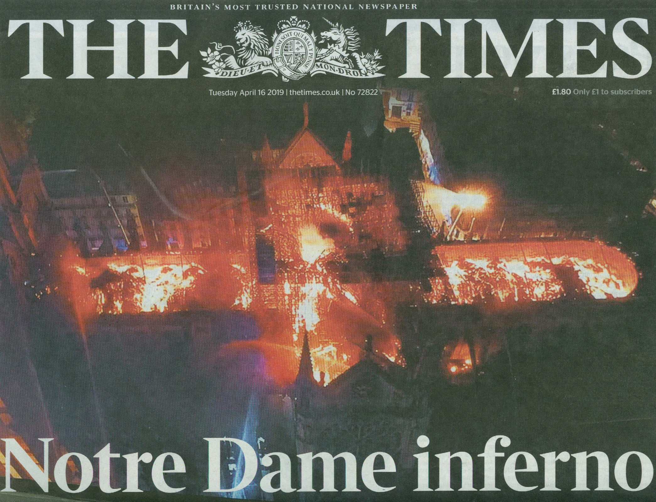
WHAT STARTED THE NOTRE-DAME CONFLAGRATION?
With the extensive, entire-cathedral threatening fire at Notre-Dame (above), the Mailonline reported that a young construction boss had boasted about the ability of his small firm (“Cathedral Restorers”) to protect historic sites when it won a £5million contract to repair the Notre-Dame spire. Investigators reportedly believe the blaze started in the roof cavity below the spire – see below. It has since been denied that work had begun on the spire itself or that tools were present. The last of a group of large free-standing copper sculptures that surrounded the base of the spire (as also seen below) had been removed just days before the fire.
The blaze is now said to have been discovered at “around 6.50 pm” after workers reportedly downed tools between 5pm and 5.30pm. It has not been said what those workers had been doing or with what tools they had been working. According to investigators, an alarm had gone off at 6.20pm but no fire was found. The alarm sounded again at 6.43pm, by which time the flames were already burning out of control and visible across Paris. The contagion’s unaddressed half hour before the second alarm might have had even more disastrous consequences: the Notre-Dame fire-fighters had been within half an hour of losing control of the blaze and, hence, of being able to save the cathedral’s stone fabric. It would seem that this end was only achieved by an astute structural appraisal and the decision by the fire-fighters to sacrifice part of the interior in order to protect the massive timbers of the bell tower which buttresses the accumulated lateral thrust of the nave vaulting and thereby prevents the collapse of the building. (See the Architect’s Newspaper – “Here’s what saved the Notre Dame Cathedral from total destruction” )
GENERAL LESSONS
As the fire raged late into the evening of Monday 15 April, many despaired throughout France. Our colleague, the Leonardo specialist Jacques Franck, wrote:
“…We are all in tears. Just think of the same happening to Westminster Abbey and you’ll know how we feel tonight. All I can say is that we are all shattered and desperately sad: the unthinkable has destroyed 50% of France’s most beautiful cathedral! Whatever the cause of the fire, disasters of this kind should never happen. In my country the law forces ordinary people, that’s to say those not owning historical monuments with precious contents, to put warning signals in any flat or house so that the slightest sign of fire can be detected at any moment. Was it not the case in this emblematic building which had resisted the worst, wars and revolutions, through nearly a millennium? Notre-Dame will be reconstructed but the precious and unique works of art it contained are gone for ever. It is a shame that the French cultural authorities did not make such a terrible event impossible, given that all the security techniques to prevent it exist nowadays.”
In the event, although the catastrophe was less than total (the extent of the damage to the building’s stone fabric after its ordeal by fire and massive volumes of water and resulting steam, remains to be established) it seems clear that it is only through the great courage and good judgement of the fire-fighters that much of the building still stands. Had the ancient stone vaulting not largely withstood the crashing and burning spire and giant roof timbers the entire length of the cathedral including the bell Tower would likely have been engulfed. Franck’s charge of manifest official negligence still stands, a week later and as disturbing reports of prior negligence by the authorities have emerged through Italy, a French newspaper and a French arts blog.
In the 22 April 2019 La Tribune del l’Art, blog (“Audrey Azoulay est-elle légitime pour s’occuper de Notre-Dame?”) Didier Rykner points out that an alarming report on the security of the Notre-Dame in Paris had been in the French administration’s hands since 2016. The existence of this report was disclosed by the French newspaper, Marianne, on April 18 (“Notre-Dame de Paris : “Nous avions alerté le CNRS sur les risques d’incendie””). The newspaper published an interview with Paolo Vannucci, professor of mechanical engineering at the University of Versailles, which revealed that a study funded by the CNRS (- the National Centre for Scientific Research, and therefore the State) was carried out in 2016 on the safety of Notre-Dame de Paris, especially in the event of a terrorist attack. The study had concluded, it was said, that: “the risk of a burning of the roof existed”, and “it was absolutely necessary to protect and install a system of extinction”. It was further disclosed that: “In truth, there was virtually no fire protection system, especially in the attic where there was no electrical system to avoid the risk of short circuit and spark.” Worse: even lightning could trigger a fire (- much as had happened at York Minster in July 2009) and it was therefore necessary “to install a whole system of prevention”. Rykner reports that Prof. Vannucci, had confirmed that there were no smoke or heat detectors and believed that “the government was well aware” of this absence. Vannucci had attended a concluding meeting at the Ministry of Education with seven or eight people from different institutions. While he did not remember whether a representative of the Ministry of Culture was present he found it hard to imagine that the ministry, which is in charge of the Notre-Dame monument, would not have been made aware of such an alarming report, not least because although the CNRS is under the supervision of the Ministry of Higher Education, Research and Innovation, it has very close links with the Ministry of Culture.
What would seem on the fire-fighters’ forensic analysis to be beyond question, is that the fire began underneath the base of the spire from around which the group of copper sculptures had just been removed (see above). What might also be considered, perhaps, beyond dispute is that today’s custodians of western heritage have become astonishingly un-averse to risk-taking in their stewardship of artefacts – even when those artefacts comprise integral parts of ancient cathedrals.

In 2014 we complained that the authorities at Canterbury Cathedral had permitted six whole windows, each with a single monumental seated figure that, in its grandeur and gravity, had anticipated Michelangelo’s giant Sistine Chapel ceiling prophets, to be packed and sent off across the Atlantic (see above) to tour American Museums – even though these were now the only surviving parts of an original cycle of eighty-six ancestors of Christ that had once formed one of the most comprehensive stained-glass cycles known in art history. The pattern and the gravity of heritage stewardship failures seems clear and beyond dispute but from where might the will to correct it spring?
Michael Daley, 23 April 2019
The Leonardo Salvator Mundi Part I: Not “Pear-shaped” – Dead in the water
The attribution of the world’s most expensive painting – the $450 million Louvre Abu Dhabi Salvator Mundi – has collapsed under the combined weights of two scholars’ findings and the picture’s own artistic and art historical implausibility. Having disappeared immediately after its world-record sale at Christie’s, New York, in November 2017, this Leonardo-in-hiding is also mired in allegations of a joint involvement in the sale by presidents Trump and Putin. The toxic proximity of those two heads of state is a matter of intense national political concern in the United States where high-level official investigations are underway – as are a number of legal actions concerning auction house buyer/seller conflicts of interest. As those disputes play out, we consider the workings of today’s art historical and art market interface.

THE ART CRITICAL CONTEXT
In the 1990s we claimed common failures of connoisseurship in bad restorations and misattributions but thought the latter less serious because potentially correctable. That distinction is dissolving as increasingly many upgrading attributions are made on the back of “improving” restoration transformations. Generally speaking, connoisseurship shortcomings are evident in failures to detect outright fake old masters and in too-ready acceptances of elevated restoration-enhanced school works. Purpose-made fakes are closely related in their fabrications to the painted “recoveries” of supposedly original authentic appearances on stripped-down pictures. (See “A Restorer’s Aim – The fine line between retouching and forgery”.) The fakery of artificially distressed new paint and false painted craquelure is common to routine restorations; to restoration-assisted upgrades; and, to outright fakes. On the additional, extraordinary rise of the “painted-in” insinuation of computer-generated virtual reality into old master pictures, see “The New Relativisms and the Death of ‘Authenticity’” and Fig. 4 below.
Above, Fig. 2: Top row, the Metropolitan Museum’s Duccio Madonna and Child, as seen in 1904 and in 2004 (when sold for c. $50 million); above, the Leonardo Salvator Mundi as seen in c. 2005 and in 2017 (when sold for $450 million).
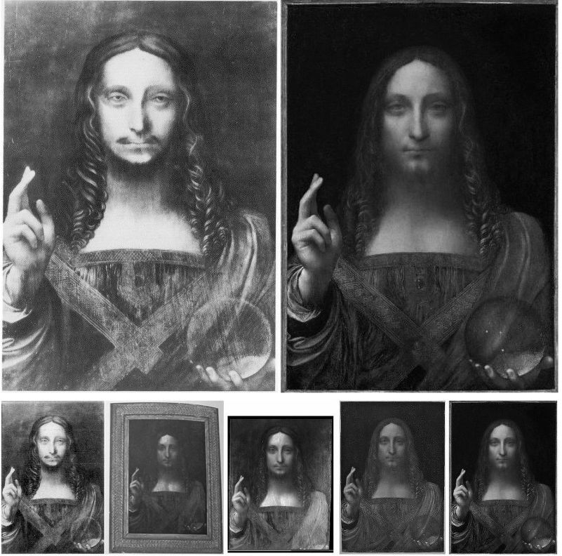
Above, Fig. 3: Top row, the present Louvre Abu Dhabi Salvator Mundi painting as seen in 1912 and when sold in November 2017. Bottom row: as at the same dates but showing some intermediary restoration states.
Attributions, like restorations, are made in socio-cultural contexts. Here, we examine the marketing of the upgraded Salvator Mundi with reference to the marketing of a picture that had received a spectacular upgrading a century earlier – the Metropolitan Museum’s 2004 acquisition of a tiny Duccio Madonna and Child. In both cases we see elevations of studio works that had first emerged at the beginning of the 20th century and were converted through restorations into claimed major autograph works. In both cases, when viewed dispassionately and art critically, the upgraded works are seen to stand anomalous within their allotted oeuvres. In both cases, the elevations thwarted the articulation of potentially more fruitful and better informed art historical narratives.
In studying the two cases we encounter errors of connoisseurship that rest on plain failures to look; failures to discern; and failures to make use of the sharpest art critical tool in the connoisseur’s tool box – the humble photo-comparison. This methodological abstemiousness can seem wilful and perverse as much as neglectful – some disavow photo-testimony outright as a critical tool. In the visual arts, and with today’s greatly enhanced photographic means of reproduction and transmission, there can no excuse for advocates’ declining to provide visual demonstrations of claims made in support of attributions or restorations.
THE PROBLEMS OF SCHOLARLY ADVOCACY ON THE MARKET
Where once a respected scholar might have proposed an attribution in an academic journal or forum in anticipation of critical responses, today, at the high end of the art market, teams of professional supporters are assembled one-by-one behind the scenes prior to some Big Media Announcement of a “discovered” masterpiece. Within such procedures, successive scholars’ invitations to appraise works are inescapably compromised by awareness of already committed supporters. At a certain point of accumulated critical mass it can be felt a) tempting to join and/or b) professionally unwise to dissent openly. A sense can grow that nothing will be permitted to count as evidence against that which has been collectively endorsed, and that any opposition will incur a risk of being dubbed a “hostile” party. At the low end, the trade euphemism for the many restoration-enhanced upgrades is “a sleeper”.
RECENT ARTWATCH WARNINGS AND ENGAGEMENTS

ArtWatch warnings on the Salvator Mundi’s Leonardo attribution: 1) On 11 November 2011 we pointed out (letter, the Times, Fig. 5 above) that the Salvator Mundi painting then on exhibition as a Leonardo at the National Gallery, and that is now the Louvre Abu Dhabi picture, lacked a sophisticated optical effect copied in 1650 by Wenceslaus Hollar from a painting then thought to be a Leonardo. 2) On 19 October 2017, nearly a month ahead of the 15 November sale of the Salvator Mundi at Christie’s, New York, we objected (in the Guardian) that the painting was inconsistent with Leonardo’s depictions of figures; that it lacked the sophisticated optical effects copied by Hollar; and, that there was insufficient evidence to support a Leonardo attribution. 3) On 14 November 2017, the day before the Salvator Mundi sale at Christie’s, New York, we warned that the provenances compiled by the National Gallery in 2011 and Christie’s in 2017 were unsupported, inflated and overly-reliant on then (and still) unpublished researches of one of the work’s first owners – see “Problems with the New York Leonardo Salvator Mundi Part I: Provenance and Presentation”.
CHRISTIE’S MARKETING OF A SALVATOR MUNDI AS A “MALE MONA LISA” AND AN EARLIER CASE
Above, top, Fig. 6: Left, Loïc Gouzer, co-chairman of Americas post-war and contemporary art at Christie’s stands next to “Untitled” by Jean-Michel Basquiat during a Christie’s, New York, press preview; right, the Salvator Mundi when sold as a Leonardo at Christie’s, New York, on 15 November 2017 – the last time it was publicly seen. (It is presently rumoured to be in a Freeport storage depot in Switzerland.)
Gouzer, who is leaving Christie’s, had claimed: “Young people look at Leonardo the same way they look at Basquiat.”
The day after Christie’s 15 November 2017 sale of the $450million Salvator Mundi, Thomas Campbell, former director of the Metropolitan Museum of Art, observed that the “eye-popping” price was no surprise in a market where “speculation, marketing and branding have displaced connoisseurship as the metrics of value”.
Todd Levin, an art adviser, told the New York Times: “This was a thumping epic triumph of branding and desire over connoisseurship and reality.” (See “How Salvator Mundi became the most expensive painting ever sold at auction”.)
George Goldner, former chairman of drawings and prints at the Metropolitan Museum, has said the allure of the Salvator Mundi “has nothing to do with art and everything to do with money,” and that “If you were to spend $450m on a rare car or diamond and put it on display, a lot of people would come to see it. If the Salvator Mundi had sold for $20m, nobody would go. Any painting that sells for $450m will attract crowds for a while. Then, all of a sudden, people won’t care anymore”.
THE METROPOLITAN MUSEUM DUCCIO MADONNA AND CHILD
Above, Fig. 7: Three views of the Metropolitan Museum’s Duccio Madonna and Child
Goldner is right of course – who queues now to see the Met’s famous “Duccio” (Fig. 7, above) which, like the Leonardo Salvator Mundi, emerged at the beginning of the 20th century with no history? The then recently restored Duccio had been launched by Berenson’s wife (Mary Logan) and a protégé (Frederick Mason Perkins) in 1904 at a time when Florence was “a factory of forgers”, according to Federico Zeri, and with modern wire nails embedded under its ancient and battered gilded gesso. By further coincidence, both pictures arrived at the beginning of this century after long absences (1949 to 2004 for the Met Duccio, 1958 to 2005 for what is now the Louvre Abu Dhabi Salvator Mundi-in-storage.)
In hindsight, the sale of the $50 million Duccio in 2004 served Christie’s as a model for that of the Salvator Mundi. The task in both cases was to market as an absolutely secure blue chip autograph old master, a work that had arrived very late in the historical day, without provenance, and from within a large group of related but artistically diverse pictures. Both works were successfully presented by Christie’s, on substantial expert authority, when, on a full art critical and documentary interrogation, neither can safely be so regarded.
Although we still cannot examine the Salvator Mundi’s unpublished technical literature, with the Duccio we can (thanks to earlier generous assistance from Keith Christiansen, the John Pope-Hennessy Chairman of European Paintings at the Met) examine that picture’s part-published technical literature and the under-reported means by which it had emerged from an antiques shop a century earlier and was, after restoration, instantly attributed to Duccio by its owner. As with the Salvator Mundi, there is no record of such a work having been produced by Duccio and no attempt has been made either to demonstrate that the Met picture was an original prototype for the many other versions of the type or to acknowledge the many historic variants themselves. Instead, five modern forgeries of the Berenson-upgraded Duccio are cited by Christiansen on grounds that they “testify to its prestige.”
THE MET DUCCIO CONTROVERSY LITERATURE:
The case for the Metropolitan Duccio has been put principally by Keith Christiansen in: the Fall 2005 Metropolitan Museum of Art Bulletin (“Recent acquisitions”, p. 15 – “among the most important single acquisitions of the last two decades”); an October 2007 Apollo article, “The Metropolitan’s Duccio” – which was described as “the first full account”; the Summer 2008 Metropolitan Museum of Art Bulletin – “Duccio and the Origins of Western Painting”; also in 2008, a special Met re-printed publication, Duccio and the Origins of Western Paintings.
The case against was put by Professor James Beck in the last chapter of his 2006 book From Duccio to Raphael – Connoisseurship in Crisis, and by Michael Daley who, after corresponding with Christiansen over the attribution, published three articles in the Jackdaw magazine between November 2008 and March 2009: “GOOD BUY DUCCIO?”; “BUYER BEWARE”; “TOXIC ATTRIBUTIONS?”
FURTHER SALVATOR MUNDI AND MET DUCCIO CONNECTIONS: MARKETING THE ATTRIBUTIONS
As with the Salvator Mundi, Christie’s marketed the painting as a “Last Chance to Buy a Duccio”. Christiansen is listed by Christie’s as one of the Salvator Mundi’s supporters, as also is the Met’s chief picture restorer, Michael Gallagher, and as was Christiansen’s predecessor as paintings’ chairman, the late Everett Fahy.
When purchased, the Met Duccio had never been technically analysed. This long out-of-sight work was only subjected to technical analysis by the Met after acquisition and after challenges to its authenticity had been made by Beck and other scholars. As with the Louvre Abu Dhabi Salvator Mundi, the subsequent technical examination reports were not published or made available to independent scholars.
GUSH, ACQUISITIONS, SUSCEPTIBLE VIEWERS, SYCOPHANCY AND ABSENCES OF “STYLE CRITICISM”
Like Robert Simon on the Salvator Mundi, Keith Christiansen is a life-long devotee of the artist in question. His accounts of the Met Duccio have inclined towards the rhapsodic while eschewing direct engagement with style criticism. He recalls being struck on his first (2004) encounter with the Duccio at Christie’s, London, that “Like a poem or a piece of music, a great work of art – even a very small one – it has the power to cast a spell over susceptible viewers, to draw them into the world of its creator. For a few moments we were silent, each of us registering our impressions… Ever since, almost forty years ago, I first stood before the Maestà in the Museo dell’Opera del Duomo in Siena, I have been haunted by Duccio’s singular gift for suggesting an ineffable, sacred presence in his depictions of the Virgin and Child, and it is this quality that first struck me – except that in this small picture there is an intimacy in the relation of mother to child that is quite different from what one finds in the artist’s public altarpieces, and the face of the Virgin is touched by a haunting melancholy even more poignant than I remembered from his larger public paintings…I knew the picture from old black and white photographs in books on Sienese painting and the two principle monographs on Duccio and his followers…There are few works of art I longed to see more than this small but astonishing picture…[which] would have been at the top of anyone’s wish list for acquisition…”
With big acquisitions museums take hyperbole and heroising gush to be in institutional order. The Met Duccio was by far the museum’s costliest ever and for a while it sparked an ecstatically uncritical hysteria. A New York restorer/dealer, Marco Grassi, for example, likened the picture’s emergence to the discovery of a manuscript score for a Mozart quartet. The world had earlier missed the chance to see it, he wrote (New Criterion, February 2005), because it was “on its way to London to be offered for sale, privately, through Christie’s.” But then, the happiest of endings:
“The Stoclet Duccio – we can now proudly call it ‘the Metropolitan Duccio’ – is an astonishing achievement…the artist places the Virgin at a slight angle to the viewer, behind a fictive parapet. She gazes away from the Child into the distance while He playfully grasps at Her veil. One must appreciate that every aspect of this composition represents a departure from pre-existing convention. With these subtle changes, Duccio consciously developed an image of sublime tenderness and poignant humanity, almost an echo of the spiritual renewal that St. Francis of Assissi had wrought only a few decades earlier…If, adding ‘strength to strength’ is a judicious policy in building collections, then, with the addition of the Duccio, its rewards will be particularly bountiful for the Metropolitan…And so, the Metropolitan’s recent arrival now rules supreme in this exalted company, and surely this could not have happened were it not for the outstanding quality of the museum’s curatorial resources. Chief Curator Everett Fahy and Associate Curator Keith Christiansen of the Department of European Paintings, in addition to Laurence Kanter, Curator of the Lehman Collection, constitute, together, a particularly prestigious concentration of scholarly expertise in the field in earlier Italian painting. No other museum can boast of a more distinguished team. One suspects that they, more forcefully and convincingly than anyone, made the case for the Metropolitan’s prodigious expenditure, and their advocacy merits our gratitude and applause…”
The celebration of “every aspect a departure” within an oeuvre is an inherently problematic and art-critically dangerous intoxication.
HOW A DREAM WISH MATERIALISED
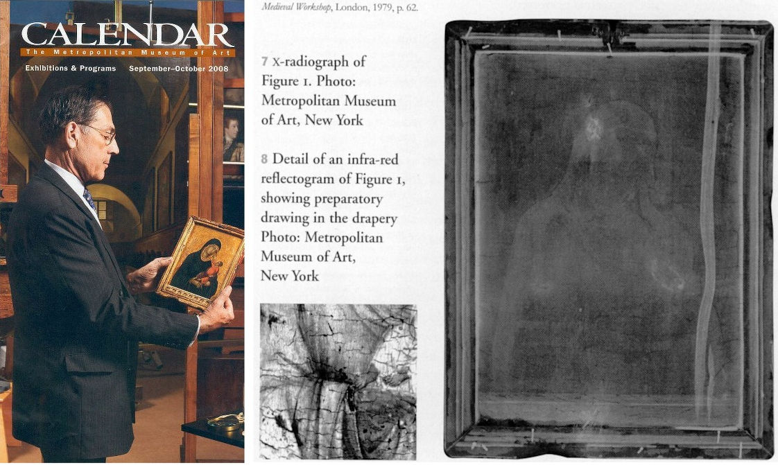
Above, Fig. 8: Left, the Director of the Metropolitan Museum of Art, Philippe de Montebello contemplating the museum’s Duccio Madonna and Child (after its acquisition); centre, a fragment of an infra-red image of the painting, as published in Apollo in 2007; right, an x-ray of the framed Metropolitan Duccio panel, also as published in Apollo and showing the modern wire nails that no one had noticed or acknowledged.
Christiansen described how the Duccio picture was drawn to his attention in Danny Danziger’s (endlessly fascinating) 2007 Museum – Behind the Scenes at the Metropolitan Museum of Art:
“Nicholas Hall of Christie’s, with whom I have been friends for many years, phoned me up and said ‘I would like you to have lunch with me; there is something I’d like to show you.’ During the meal he slipped me a transparency, and I looked at it. It was a painting that had not been seen by any of the major Duccio specialists for fifty years…”
What could possibly go wrong? Nothing, Christiansen clearly thought: “…it had been in the Stoclet family and out of circulation. ‘Fantastic, how about the price? I asked. He told me. OK, I said, ‘I will deal with that later.’ And then we finished lunch.” Note, re frequently disparaging art world dismissals of photo-testimony, first, a curator had committed to the cause of a work he had never seen on sight of a single photograph; second, the Met’s director, Philippe de Montebello, would also become hooked on the painting through that photograph; third, that for over half a century, professionally-speaking, the picture’s Berenson-made attribution had been sustained on photo-testimony alone. Christiansen would later put it like this: “In 1949, [the then owner of the Duccio, the financier Adolfe] Stoclet and his wife died within a short time of each other. The collection was divided among their children, but access to it was increasingly difficult and there was even uncertainty as to whether the Duccio had been sold. The result was that a generation of scholars had to formulate their opinions on the basis of photographs, of which, fortunately, extremely good ones had long been available.”
THE CIRCUMSTANCES CONCERNING THE WITHDRAWAL FROM THE 2003 SIENA EXHIBITION
In Calvin Tomkins’ 11 July 2005 New Yorker article “The Missing Madonna”, it is said that the Met’s then head of European paintings, the late Everett Fahy, visited the Stoclets’ house in Brussels in 2002 to negotiate with of one the relatives for the Duccio’s loan (later rescinded) to the 2003 exhibition in Siena. Fahy may possibly have been the first scholar to see the painting in over fifty years. Tomkins reports Fahy saying that the picture “still hung then where it had always had, in Adolphe Stoclet’s private studio”. Christiansen later reported (Apollo 2007) that “Stoclet did not hang his gold ground pictures in this modern [Josef Hoffmann-designed house] setting but kept them in a large cupboard, taking them out, one by one, on Sunday afternoons or on the occasion of a visit of a guest such as Berenson.” Kenneth Clark had been the source of the cupboard storage claim. Fahy noted, “Everything the Stoclets collected was something you could put in your hand, small and precious”. Small, but not always precious. As Frances Vieta established (and Beck acknowledged in his 2006 connoisseurship book), Stoclet had owned two little Duccios, one of which proved to be a modern forgery in 1989. It, too, had been attributed to Duccio by Berenson’s protégé, Frederick Mason Perkins, who, along with Berenson’s wife, Mary Logan, had also upgraded the Met Duccio Madonna and Child, and two hugely expensive sculptures bought by Helen Frick that were also subsequently exposed as modern forgeries. Berenson himself had been taken in by half a dozen or so modern forgeries. The Cleveland Museum had been taken, too, but recovered when it identified modern wire nails and paints in a “Sano di Pietro” and declared it a fake. Before the Met picture had been first upgraded to Duccio by its owner, some had thought it a Sano di Pietro. The Cleveland Museum downgraded another Sano di Pietro to a school work when it – like the Met picture – was found to contain azurite not ultramarine. “With attributions”, Fahy held, “it’s not the number of people who agree with you, it’s the quality of their judgments.” The Louvre Abu Dhabi Salvator Mundi had, reportedly, been unsuccessfully offered to Christie’s in 2005.
The Met picture, having narrowly missed a public viewing in the 2003 Siena exhibition for Duccio and his followers, suffered further non-visibility when Christie’s put the newly-emerged work into a private sale among just three major museums: the dollar-rich Getty Museum, which had balked at the asking price; the Louvre, which was said to be working on getting the money for the (then and still not-disclosed) asking price; and the Metropolitan Museum. Under this private sale arrangement it is possible that barely more than a dozen experts had seen the painting before it was sold to the Met and thereafter was trumpeted as an unquestionably autograph seminal and revolutionary work in the history of Western painting – and all this, as mentioned, ahead of a technical examination. The avoidance of public scrutiny during the sale seems to have occurred by design, not accident. Calvin Tomkins, whose New Yorker disclosures have not, so far as we know, been challenged, added:
“Although the ‘Madonna and Child’ was well-known in art-historical circles as the only one of Duccio’s dozen or so surviving paintings to remain in private hands, its whereabouts had been uncertain since the death, in 1949, of its last registered owner, the Belgian collector Adolphe Stoclet. In fact the picture never left the Stoclet House in Brussels. Stoclet and his wife… had willed the house to their son, Jacques, whose widow held onto it until her death in 2001. Soon after that, her heirs, (four daughters) who are very high on anonymity, agreed to lend it to an important exhibition in Siena, Duccio and his school…a few weeks before the opening in 2003, the painting was withdrawn. This coincided with rumours of an impending sale, which turned out to be true.
“Although everyone involved in the transaction is bound by omertà, it is known that both Sotheby’s and Christie’s, the principal auction houses, engaged in lengthy and fiercely competitive negotiations with the heirs, and Christie’s eventually won the prize. ‘The family was very keen that the painting go to a public museum or institution,’ according to Nicholas Hall, international director of Christie’s Old Masters department. This was one reason that the family decided upon a private ‘treaty’ sale, in which the auction house and the seller determine the price and then offer the work to selected potential buyers, rather than letting it take its chances at public auction; another reason was that a private sale is more private. ‘We got it by putting a significantly higher valuation on the painting than anyone else – by multiples – based on its being the last Duccio in private hands and its being so impeccably preserved,’ Hall told me. Hall himself never met the sellers. ‘The contract document must have been four inches thick, and it was the most rigidly controlled transaction I’ve ever been involved in,’ he said…”
CHRISTIE’S LAVISH PRESENTATION LITERATURE
Tomkins reported that, in addition to the transparency, Nicholas Hall had given Christiansen the “lavish presentation booklet that Christie’s had prepared for prospective buyers”. On whose imprimatur or on what scholarly authority had that booklet been prepared? How many people got to see it? When Christie’s auctioned the Salvator Mundi, the publicly-disseminated provenance was frankly acknowledged to have derived from the National Gallery’s 2011 catalogue entry; the restorer’s 2012 report; and, through their declared joint indebtedness, to the (still today) unpublished researches of one of the original 2005-2012 consortium of dealer/owners.
A COURTIER FLATTERS?
When Christiansen left his lunch with his old friend at Christies, he wondered what to do next about the tiny work he considered “probably the most important early Italian picture that could ever come on the market”. Should he call his director who was on vacation in Canada? He decided to wait: “and then I went into his office and said, ‘I am duty bound to show you this,’ and then I showed him the transparency. I casually said to him, ‘You know, Philippe, you deserve this picture. Tom Hoving had his [1970 $5.5 million Velazquez] Juan de Pareja, Rorimer had his Rembrandt [“Aristotle Contemplating the Bust of Homer” for $2.3 million in 1961]; I don’t see why you shouldn’t have this towards the end of your career’.”
Christiansen continued (to Danziger): “My director fortunately is a person who loves old master paintings, who grew up with old master paintings and worked as a curator in this department and does not need to be told much. He was completely riveted by it. He asked me the price while he kept looking at it, and then he said, ‘I don’t see how we can get it…’ But that, I imagine, was also when the wheels began to turn in his head, because when I left, I thought there was a real possibility.” In the heady post-acquisition days of November 2004 Christiansen recalled to Carol Vogel in the New York Times that when the director was first shown the photograph “it took him about 30 seconds to say ‘We really have to have this’”.
At the same time, Tomkins had made clear why de Montebello might have gagged on the price. The Getty Museum (which has been bitten by fakes) had already turned it down: “reportedly, because of the price. This struck Christiansen as ironic because the price was so clearly predicated on the fifty-five million dollars that the Getty had agreed to pay, two years earlier, for Raphael’s small, perfectly preserved Madonna of the Pinks.” That little Raphael in the mint of condition had, like the even littler Met Duccio, lost its original back when, for some reason it was polished by its artist/restorer/dealer/smuggler owners. When the cradle was removed from the back of the by-then Met Duccio, it was found to have been scraped down to the bare wood, on which was written an ascription to…a member of Duccio’s school. Like the Salvator Mundi, the little Raphael was one of many versions of the subject – there are over fifty-five Madonna of the Pinks. James Beck remarked in his 2006 connoisseurship book: “I find it appropriate to claim, given the situation as has already been sketched, there is no chance whatever that the Northumberland painting is an original Raphael.” But for sure, within a couple of weeks of seeing the photograph, de Montebello, Christiansen and the Met’s chief restorer, Dorothy Mahon, flew to London to see the Madonna and Child armed with a magnifier and a UVF lamp to spot retouches.
BUY FIRST LOOK AFTERWARDS
The next morning, after a couple of hours of inspection at Christie’s in London with Christiansen and Mahon, de Montebello made a quick and high offer (without Board authorisation). It was immediately accepted by Christie’s but under the terms of this “private treaty sale” the picture could not be removed from Christie’s to undergo examinations at the Met and be presented to the Board’s Acquisitions Committee for appraisal and possible approval, as was customary. This was because, as Christiansen put it, “the picture wasn’t leaving Christie’s until the whole deal was finished”. Why so – and why accepted by the Met when such a huge sum was at stake? Had this condition been stipulated by owners who seemingly had developed cold feet about the picture being seen for the first time in over half a century in the context of a show on Duccio and his followers?
In his 1993 memoir Making the Mummies Dance Thomas Hoving recalled that when he went to Christie’s in London in 1970 (with the then head of restoration, Hubert von Sonnenberg, Everett Fahy, and a Board member, Ted Rousseau), the chairman of the auction house, Sir Peter Chance – “the very symbol of upper-class culture neatly folded around commerce” – explained “The condition’s perfect…the picture will not be cleaned up for the sale. Lord Radnor forbids it. He is also against anyone…examining it…scientifically. But no matter, we all matriculated into connoisseurs without all these fashionable instruments, if I may say so, Dr. von Sonnenberg.” (Hoving was bemused when Sir Peter put the price at “approaching the two million guinea mark” – a guinea being a pound, plus a shilling: “While Sotheby’s always conducted their sales in pounds, Christie’s favoured the more pretentious guinea.” In those days the joke was that at Christie’s gentlemen pretended to be salesmen while at Sotheby’s salesmen pretended to be gentlemen. In today’s globalised ownership-fluxing art world it might prove impossible to slide a cigarette paper between them.)
That Velazquez painting truly was one of the greatest portraits ever to come to market – and, in some part it was so because it had probably not been touched in a century and a half. When the Met staffers revisited the next day, von Sonnenberg held the picture against the window when the guard left the room and discovered that it had never been lined – hence the extraordinary vigour and sparkle of the brush work. As soon as Hoving and von Sonnenberg took possession it was sent secretly to Wildenstein’s – not to the Met itself – and there it went straight under the conservation chemical cosh on a claim of dirty varnish-removal but, in reality, in conformity with the museum’s imperious proprietary and aesthetic imperatives. (See “Discovered Predictions: Secrecy and Unaccountability at the Metropolitan Museum of Art, New York” and “Why is the Metropolitan Museum of Art afraid of public disclosures on its picture restorers’ cleaning materials?”) Even before it might become “The Metropolitan Velazquez” the portrait became a Met-treated painting and no one else at the museum, let alone its paying public, ever got to see the great masterpiece in its unadulterated state. To his credit Rorimer had earlier confessed (privately) to Alexander Eliot that the Met’s restorers had ruined its Rembrandts – and those poor paintings were not alone:
Above, Figs. 9 and 10: Details of the Met’s Goya portrait of the young Manuel Osorio Manrique de Zuñiga who died before he was eight years old. As seen before cleaning (left) and after cleaning (right).
In July 2005 Philippe de Montebello explained to Calvin Tomkins (New Yorker): “It’s the single most important purchase during my twenty-eight years as director – It’s my ‘Juan de Pareja’, it’s my ‘Aristotle.’” De Montebello later explained in the Summer 2008 Met Bulletin that he had moved so fast on an unexamined work because he felt authorised by:
“the assurance that comes from the trust I have learned to place in the curators and conservators of this great institution…As I held the picture in my hands, enraptured by its wonderful quality…I was treated all the while to Keith’s impassioned scholarship…it was particularly Keith’s precise and learned assessment of the picture that allowed me to consider the acquisition an imperative.”
(For a fuller account of de Montebello’s decision to buy, see CODA below.)
Immediately after spending nearly $50million on the unexamined Duccio at Christie’s in London, Christiansen, de Montebello and Mahon went to see the National Gallery’s Duccio triptych The Virgin and Child with Saints. Christiansen recalled (as reported in Danziger, 2007): “After about two hours at Christie’s we all walked down to the National Gallery where they have a very rare and beautiful Duccio triptych, which is simply marvellous – a touchstone of Duccio’s work – and we all felt that ‘ours’ was every bit as fine and in certain respects, more intimate and direct.” The following year, in a foreword to the 2008 Summer Met. Bulletin Christiansen elaborated:
“…we decided to walk the few blocks to the National Gallery, which owns a portable triptych by Duccio that has long been a cornerstone of its superb collection of early Italian paintings. The triptych is a work of extraordinary beauty and impeccable craftsmanship. Duccio struck a slightly different key than in the picture we had been examining, placing greater emphasis on the regal bearing of the Virgin. The motif of the Child playing with his mother’s veil is further developed, so that Christ unfurls a rich cascade of folds. But these enhancements came at the expense of the simple dignity and touching humanity of the small panel we had seen at Christie’s. In short, we felt that we had before us the opportunity of acquiring a painting that was on a par with one of Duccio’s most admired and best-preserved works, a painting that represented the artist at the very height of his powers.”
Michael Daley, Director, 6 February 2019
In Part II we consider why the Met team might have been advised to view the National Gallery Duccio triptych (and its dossiers) before visiting Christie’s and buying on the spot.
CODA:
Martin Gayford accompanied Philippe de Montebello on a walk around the Metropolitan Museum, as recorded in his 2014 book RENDEZ-VOUS WITH ART. In his chapter “The Case of the Duccio Madonna”, Gayford wrote: “We ended up sitting on a bench near perhaps Philippe’s most celebrated acquisition: a small exquisite Madonna and Child by the 14th century Sienese master, Duccio. It remains the most expensive single object ever purchased by the museum. So how, I asked, did he make the momentous decision to buy it?” De Montebello replied:
“When the Duccio was on offer, I had, as Director, to decide whether the picture was worth the huge sum I would have to raise to acquire it. To arrive at this decision, I had to wear several hats all at once: one of these was that of an informed art lover, the French ‘amateur’, and in that role focus on the seductive and lyrical lines, the harmony of the colours, the felicitous choreography of the hands and feet, the wonder of the human contact coincident with a certain respectful detachment in the depiction of figures, that are, after all divine. I also had to don my art historian’s hat and note that this Duccio was one of the very first pictures that mark the transition from medieval to Renaissance image making. It represented a key moment, a break from hieratic Byzantine models to a more gentle humanity.
“To be more specific, and it is more than just a recondite detail, look at how the parapet at the bottom connects the fictive, sacred world of the painting with temporal one of the viewer. This important observation – among others – was made by the curator Keith Christiansen as we were examining the picture in London. This led him to conclude that Duccio must have seen the Giotto frescoes in Assisi depicting the life of St. Fancis, where the illusionistic framework, including the parapet, relates the narrative scenes to the architecture of the church.
But Martin, you want to know the truth? All those considerations were largely irrelevant when the time came to decide whether to spend in the region of $45 million on the work. For this, I needed my museum director’s hat. The quantitative assessment had to be based on different criteria. First and foremost were the old-fashioned notions of quality, craft and skill. Did the work sing? Did it stop me in my tracks and did it then hold my attention? Was I reluctant to turn away from it too quickly?
“However, in my mind, the question of relative importance and quality was always pushing itself forward. That the work was beautiful and admirably well painted was not enough. It needed also to be very important, exceptional in every way, and extremely rare. If there had been three or four others similar to this one it would have meant that this picture should command a lower price.
“Then there was the question of what the price of this panel should be in comparison with one of the missing predella panels from Duccio’s Maestà in Siena were it to come up for sale. This is because the Madonna was and is a self-contained, independent and devotional image; it doesn’t belong to a larger work, the wholeness of it is part of its beauty and impact. The entire story is there in that one painting. That, too, added to its value.
“Then, as curators, we also needed to be concerned with the physicality of the work. After all, this object, which can be held in the hand, has weight and a certain thickness, and is vulnerable to the vagaries of time. Part of what drove me to buy the Duccio was the fact that for close to an hour I did hold it in my hands, that I did turn it around, looking at the back, sensing its weight, measuring its thickness. It had a corporeal reality that was almost, to use a paradox, mystical.
“No longer bound by image alone, as one would be when looking at a photograph – or even from a distance – I then focussed on the deep burn marks at the bottom of the frame, obviously made by votive candles, confirming that this was indeed a devotional picture. Just a few additional details resulted from close examination, not the least of which was that the picture was in impeccable condition, a rare thing when it comes to Trecento gold ground pictures, as most works have suffered greatly over time, mostly I’m afraid at the hands of restorers.
If you are a student of art, just think of the Jarves collection at Yale, where many of the pictures, early renaissance works, are now a near total ruin. We were also able to confirm that this was indeed not an incomplete work, a wing of a Diptych for example, there is a hole at the top indicating that the picture was hung from a hook.
“Then, of course, came the issues of the provenance or ownership history, an important preoccupation of art historians, for what it may reveal about the work. While it obviously began life as a devotional picture, made for an unknown patron, it eventually ended up in the hands of two major European collectors: Count Grigory Stroganoff at the end of the 19th century, and later the Belgian financier Adolphe Stoclet, in his Brussels house, which is a masterpiece of the Wiener Werkstätte. Also, the Duccio had been lent to the great Sienese exhibition of 1904 where it was highly praised; indeed one art historian Mary Logan (Bernard Berenson’s wife), deemed it the single finest work in the exhibition.
In addition, and not a minor factor in gauging the price, was the knowledge that there would most probably never be another Duccio for sale, as this was the only work of his known to exist outside of a museum. I also knew – which is why I made a quick and high offer – that the Louvre, the other major museum that did not have a Duccio, was after it as well and was going to make a real effort to buy it.
“So some competitive nerve was struck, and thus the need for pre-emptive action. While it may not have been conscious, I think that there is no question that a part of me wanted my institution to own that Duccio – over and above its importance to the proper representation of the development of Sienese art in the Trecento – simply to have it as yet another major work that would confirm the stature of the Met.
“At this point, the sum of all the above, which occurred in a rush of sensory and intellectual responses, led to an important psychological factor, which should not be underestimated in such cases: it is that of the curator/acquisitor experiencing what is a quasi-libidinal charge (you might even call it lust, albeit of a high order); the irrepressible need to win; to have taken the object of desire. You can’t get away from that. We are all human beings. Institutions are not just made of stone, glass and steel, they are run by people. It is absurd to try to maintain and project total objectivity.
“As a result of all these considerations, these thoughts, observations, calculations and feelings, as well as the confidence I gained from learned colleagues, the Met boasts this masterpiece of Trecento painting, while the Louvre, with its outstanding collection of Italian paintings, is still, and may forever be, lacking a Duccio. This actually saddens me, and I hope that a fine Duccio does turn up someday, from somewhere, and they can get it.”
The pear-shaped Salvator Mundi
Things have gone very badly pear-shaped for the Louvre Abu Dhabi Salvator Mundi. It took thirteen years to discover from whom and where the now much-restored painting had been bought in 2005. And it has now taken a full year for admission to emerge that the most expensive painting in the world dare not show its face; that this painting has been in hiding since sold at Christie’s, New York, on 15 November 2017 for $450 million. Further, key supporters of the picture are now falling out and moves may be afoot to condemn the restoration in order to protect the controversial Leonardo ascription.
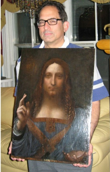
Above, Fig. 1: the Salvator Mundi in 2008 when part-restored and about to be taken by one of the dealer-owners, Robert Simon (featured) to the National Gallery, London, for a confidential viewing by a select group of Leonardo experts.
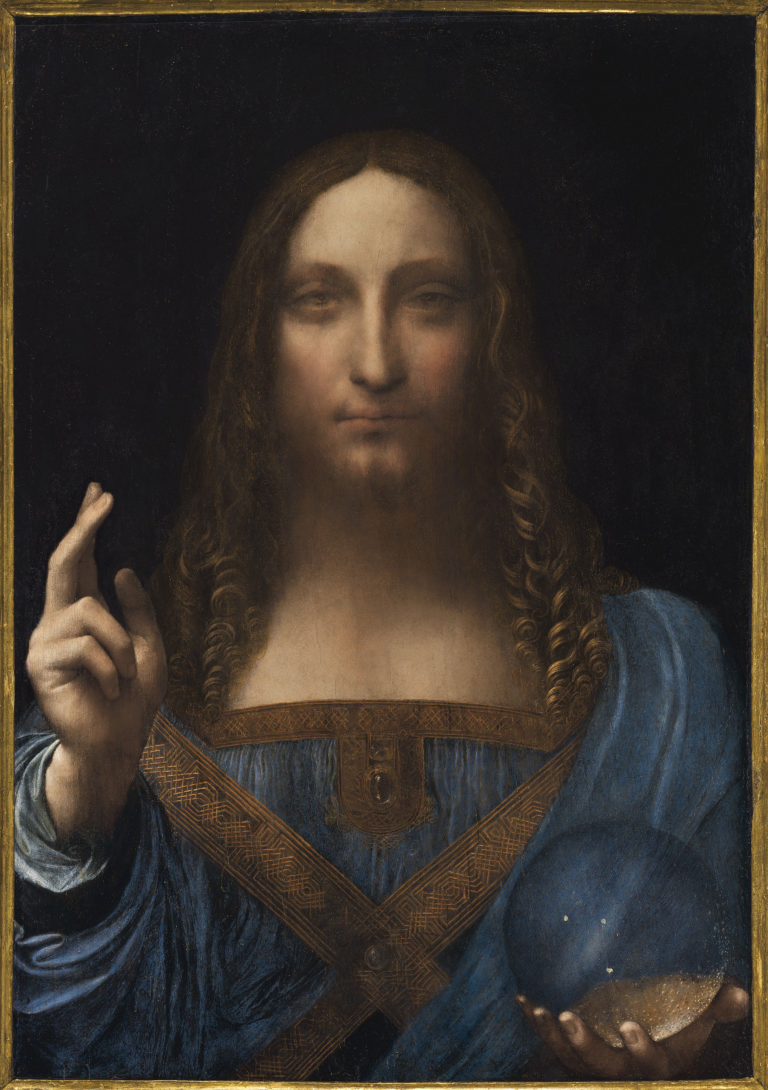
Above, Fig. 2: The Salvator Mundi, as it appeared when sold at Christie’s, New York, on 15 November 2017.
THE SECOND SALVATOR MUNDI MYSTERY
The New York arts blogger Lee Rosenbaum (aka CultureGrrl) has performed great service by “Joining the many reporters who have tried to learn about the painting’s current status”. Rosenbaum lodged a pile of awkwardly direct inquiries; gained a remarkably frank and detailed response from the Salvator Mundi’s restorer, Dianne Dwyer Modestini; and drew a thunderous collection of non-disclosures from everyone else. A full year after the most expensive painting in the world was sold, no one will say where it has been/is or when, if ever, it might next be seen. (See “Leonardo Canards: Conservator Dianne Modestini Debunks Doubts Over the Elusive ‘Salvator Mundi’”.)
After the Salvator Mundi’s recent no-show at Abu Dhabi Louvre, concerns and rumours have grown exponentially. (See our “Two developments in the no-show Louvre Abu Dhabi Leonardo Salvator Mundi saga” and “How the Louvre Abu Dhabi Salvator Mundi became a Leonardo-from-nowhere”.)
AN ENDURING SUPPORTER
Throughout this protracted no-show, Professor Martin Kemp, the most high profile art historical advocate of the painting’s Leonardo attribution, has offered assurances. Immediately ahead of the November 2017 sale he made a promotional video for Christie’s, New York, that was specifically designed to combat our and other warnings, warnings that he now characterizes in his self-valedictory memoir Living with Leonardo as “misinformation appearing in the press”. The Times reported on 28 August: “‘looking at the whole science’ including the rock crystal sphere that Christ was holding and the depth of field convinced [Kemp, that] ‘with Leonardo you have this wonderful body of context, of extra evidence…it is rock solid, it is damaged but rock solid’.” Kemp frequently fuses appeals to rock solid scientific evidence with art critical hyperbole. For example, to the owner of the supposed Leonardo drawing “La Bella Principessa”, he said of a partial finger print:
“This is yet one more component of what is as consistent a body of evidence as I have ever seen. I will be happy to emphasize that we have something as close to an open and shut case as is ever likely with an attribution of a previously unknown work to a major master. As you know, I was hugely sceptical at first, as one needs to be in the Leonardo jungle, but now I do not have the slightest doubt that we are dealing with a work of great beauty and originality that contributes something special to Leonardo’s oeuvre. It deserves to be in the public domain.”
So far as we know, that supposed Leonardo drawing (which the National Gallery excluded from its 2011-12 Leonardo show) remains unsold in one of Yves Bouvier’s freeports. Kemp recently assured the world that wonderful things are in train for the Salvator Mundi next year. Against his bullishness, the picture’s long-serving restorer, Dianne Dwyer Modestini, has now disclosed to Rosenbaum: “I have no idea about the future of the painting. No one does. Not the French, not Martin Kemp. I assume the people from Abu Dhabi know something, but they are not talking to anyone, not even the French.”
Rosenbaum had tried the Louvre, Paris:
“I thought the venerable French museum would at least be able to answer my question regarding its own exhibition plans, but Sophie Grange of the Louvre’s press office said only this: ‘It is too early, one year ahead, to communicate on the list of the loans for the Louvre exhibition. Concerning Louvre Abu Dhabi, they communicate themselves about their own collection.’ Grange advised me to get in touch with Faisal Al Dhahri at Abu Dhabi’s Department of Culture and Tourism—one of the three officials whom I’d already attempted to contact several times, to no avail. I think this is called: ‘Getting the Run-Around.’”
THE GOOD THINGS TO COME
Kemp may have had in mind the forthcoming 2019 Louvre exhibition to mark the 500th anniversary of the artist’s death but no one at the Paris Louvre will now confirm that the Abu Dhabi Louvre Salvator Mundi will be included. Is Paris about to spurn Abu Dhabi’s $450 million acquisition? Failure to include the work next year would risk humiliating the United Arab Emirates (who paid something like Euros 400 million for the right to exploit the Louvre title – roughly the cost of one big yacht) when French foreign policy dictates every deployment of soft cultural power to gain influence in that traditionally Anglophile quarter.
…AND THE UNKOWN UNKNOWNS
Why are so many players so silent on this painting? Why is the art world being kept in this state of darkening paralysis? Some background might help explain the jitters. The art market greatly fears the pending trial in New York between Sotheby’s and the Russian collector Dmitry Rybolovlev who seeks $380 million from the auction house for an alleged conspiracy to defraud him through his own adviser, Yves Bouvier. In 2013 Sotheby’s brokered a private sale of the Salvator Mundi for $80 million to Bouvier, the owner of a string of “tax-efficient” freeports – his Geneva facility alone reputedly holds $100 billion of art. The consortium of vendors claimed that a non-disclosure agreement made with Sotheby’s preventing them from disclosing the picture’s origins. Bouvier immediately sold the painting on (“flipped” in art trade parlance) to Rybolovlev for $127.5 million – an undisclosed mark-up of $47.5 million, with Sotheby’s, reportedly, pocketing $3 million as an agent’s fee. The Swiss police authorities recently detained Rybolovlev for questioning due to “reported allegations of corruption and ‘influence peddling.’ Rybolovlev is allegedly tied to Philippe Narmino, the former justice minister in Monaco, who retired last year after he was accused of working under the influence of the Russian collector in his fraud case against Bouvier…” Earlier, Rybolovlev had filed a complaint against Bouvier in Monaco. The latter was arrested on charges of fraud and money laundering and released on $10 million bail. Bouvier is now reported to be in Singapore. With Rybolovlev furious at being over-charged in 2013, the consortium of vendors who sold indirectly to him for $80 million are thought to remain aggrieved at being short-changed by $47.5 million on the picture’s value and having been pre-emptively blocked from action by a Sotheby’s law suit. Sotheby’s are reportedly seeking assistance from Christie’s in a separate legal fight with a dealer over the sale of a demonstrably and now scientifically-confirmed fake Frans Hals…
THE ART AND ATTRIBUTION STAKES
Unsavory art market churning must not swamp the serious art and attribution concerns at stake with this Salvator Mundi. Modestini’s reported statement to Rosenbaum merits close reading. Her first concerns are the painting’s physical condition, well-being and whereabouts:
“It’s supposed to have been in Switzerland, but I’m not quite convinced, because a conservator who was asked to make a condition report more than a month ago still hadn’t seen it as of last Monday [22 Oct. 2018]. I’m rather worried because although it was framed in a microclimate, it is not a long-term solution. I’m pretty sure it left Christie’s in mid-May. Then it disappeared. It never went to Abu Dhabi… However, the panel is badly damaged and exceptionally reactive to changes in RH [relative humidity]. It needs to be at not less than 45% RH, even though it has some protection because it’s in a microclimate created by sealing it up in an envelope of Marvelseal —a standard technique.”
Modestini’s second concern is professional and personal:
“The Abu Dhabi announcement [that it had postponed display of the painting] had nothing to do with the nonsense about its being 85% by Dianne Modestini and the rest by [Bernardino] Luini. [The Luini theory, advanced by Leonardo scholar Matthew Landrus, was reported by Dalya Alberge in the Guardian and picked up by Smithsonian Magazine, among others.]”
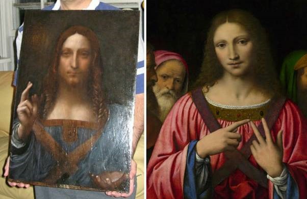
Above, Fig. 3: Left, the Salvator Mundi as restored in 2008; right, a National Gallery painting attributed to Bernardino Luini.
A GREAT FALL-OUT?
It is understandable that Modestini should be sensitive and defensive – no professionally conscientious person enjoys criticism. Following our demonstrations of the extent to which the painting changed appearances at her hand (albeit on the advice of and with support from a high-ranking group of art historical experts) between 2005 and 2017, there are now signs that art historical advocates of the Salvator Mundi may be preparing to disavow the successive restorations to protect the credibility of their attribution. Consider Jonathan Jones’ recent (15 October) account in the Guardian – “The Da Vinci mystery: why is his $450m masterpiece really being kept under wraps?”
Jones, who was the embedded journalist-of-choice within the National Gallery’s conservation department when its version of the Virgin of the Rocks was being restored, bluntly contends that it might have been better if the Salvator Mundi had not been restored at all:
“Surely it would have been more true to the greatest artist who ever lived to let his timeworn masterpiece speak to us directly. Is the Louvre Abu Dhabi taking a closer look? I think it should.”
In this maneuvre, Jones seems to draw support from Martin Kemp, who, along with a few other select experts, had been invited by the National Gallery’s incoming director, Nicholas Penny, to the confidential 2008 viewing of the Salvator Mundi when part repainted, as at Fig. 1:
“When the painting was cleaned, it turned out that Christ had two right thumbs… ‘Both thumbs,’ says Kemp of the raw state, ‘are rather better than the one painted by Dianne.’”
Kemp will likely have known that Modestini had painted out the restoration-exposed second thumb on the advice of Luke Syson, the curator of the National Gallery’s 2011-12 Leonardo exhibition in which Kemp had been set to have some curatorial input until, as he puts it: “it was later decided that all the curation should be conducted in-house”. Modestini acknowledged Syson’s guidance in her (2014) published account of her restorations preceding the painting’s appearance in the National Gallery’s 2011-12 Leonardo exhibition. Syson, who went to the Metropolitan Musem, New York, has recently been appointed director of the Fitzwilliam Museum, Cambridge. It is possible that had Kemp been co-curator, the National Gallery Leonardo show would have included a second Kemp-supported Leonardo upgrade, the “La Bella Principessa” drawing. In any event, an emboldened Jones has now challenged Robert Simon, one of the original consortium of dealer-owners: “Why didn’t he leave the painting in its raw yet beautiful state after it was stripped down? Wasn’t that an incredible object in itself?” Simon stood firm:
“We considered leaving it, considered more limited restoration, as well as a more extensive one…In the end we decided to do what we felt was best for the picture…we felt that bringing it back to life as much as possible was the way to go.”
Jones reports Simon’s annoyance with criticisms of the restoration – he absolutely rejects the possibility of any artistic “falsehood” being introduced. “I found [Thomas Campbell’s] comments both ill-informed and offensive. ‘Inpainting’ is the right way to describe what has happened here – retouching restricted to areas of loss. In the restoration no original paint was covered.”
(When the picture was sold in November 2017 Thomas Campbell, the former director of the Metropolitan Museum, presciently tweeted that he hoped the anonymous buyer who had just paid $450m “understands conservation issues” and had “read the small print”.)
WHAT WAS DONE IN THE SALVATOR MUNDI RESTORATIONS
The claim never to have over-painted is universally asserted by restorers. While no code of restoration “ethics” sanctions painting over surviving original paint, the profession’s philosophical pieties constantly conflict with observable visual facts. We have previously shown that if you juxtapose halves of the two Salvator Mundi faces, as seen in 2011-12 at the National Gallery and at Christie’s in November 2017 (see Fig. 7 below), there is a mismatch: scarcely any passages of painting run across the halves. As the photo-records below testify, this version of the many Leonardesque Salvator Mundis has enjoyed two distinct identities in seven years and three in ten years. We discuss the unreported covert transition from the second to the third below.
DISPARAGING PHOTO-TESTIMONY
Modestini and Kemp are united on one point: both hold that restorers cannot be held to account by photo-comparisons of the alterations they make to works of art. The claim is untenable – how else might appraisals of restorations be made given that pre-restoration appearances are consumed in restorations? Both the restorer and the art historian further contend that photographs are inherently unreliable because susceptible to malicious manipulation. Modestini offers this variation on that ancient restoration slur:
“I have refrained from commenting on some of the recent articles about the restoration. However, in light of the fact that no one can now see the actual painting, various digital images are standing in for the original, all of which can be manipulated any way one wants and are a sort of falsification of the original.”
That is unworthy. First, why would anyone maliciously tamper with images to make false claims of non-existent injuries that could easily be exposed by the photographic record? How long did it take to expose the Trumpian White House’s tampering with film footage of a journalist’s attempt to retain a microphone? Second, does Modestini mean to imply that the clear photographically recorded differences between the painting’s 2011 and 2017 states are the combined result of malicious critics and auction house promotional manipulations? Modestini’s citation of the second plank of the traditional Restorers’ Defence – that all photographs of paintings are inherently untrustworthy and misleading – is scarcely more credible:
“It is very difficult to photograph any painting accurately, this one especially, because of the many thin layers, subtlety of skin tones, delicacy of transitions etc. Most paintings have three dimensions, not two. That affects our perception of them. I hardly recognize the image that now passes for the ‘Salvator Mundi.’ The photo lamps or strobes (in the case of the Christie’s images) produce a simulacrum of the actual painting, more vivid, sharper, snazzier, if you will, than the actual battered image that I restored as carefully as I could, trying not to invent anything. These flashy images cannot include the nuances and problems created by the three dimensionality of the corrugated surface and are being compared with an only slightly more accurate scan of a good 8×10 transparency of the cleaned state, which was more honest.”
That last image (here at Figs. 5-10) has been published with a drum roll by Jones in the Guardian as if a proof of Leonardo’s hand when it had been published by Modestini in 2014 (albeit small and in printed not online form). Although a considerable improvement on earlier versions (as published by us) it does not tell a different story. On the Jones premise, will Modestini now produce equally high-resolution photographs taken before and after each of her various interventions (2005-08; 2008-11; post 2012 and pre-2017)? If she insists that all photographs are inherently untrustworthy and easily falsifiable, will she explain why so many photographs of paintings are made and published and why they never carry visual health warnings? Are all photographs previously made for restorers’ own restoration reports now deemed to be unreliable testimony?
THE ART CRITICAL UNDERPINNING OF THE SALVATOR MUNDI’S CHANGING APPEARANCES
We incorporate below the Guardian’s newly released high definition photograph of the painting when cleaned but not-yet repainted within the public record of Modestini’s restorations and then consider Kemp’s scientific/art theoretical input into the restoration in the light of certain accounts in his new memoir, Living with Leonardo – Fifty Years of Sanity and Insanity in the Art World and Beyond. But first, the changes to the painting:

Above, Fig. 4: Left, the photograph of the Salvator Mundi painting when in the Cook collection and judged to be a work of Bernardino Luini; right, the former Kuntz family and then Basil Clovis Hendry Sr. estate painting, as in the 2005 St. Charles Gallery catalogue.
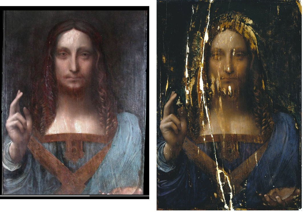
Above, Fig. 5: Left, a screen grab of the Salvator Mundi as when taken, still sticky from a previous restoration in 2005 to Dianne Modestini’s New York studio; right as in 2007 in the newly released high-resolution photograph following cleaning and repairs to the panel but before any retouching, infilling or repainting. Will Modestini publish a photograph of the painting as presented to her in 2005?
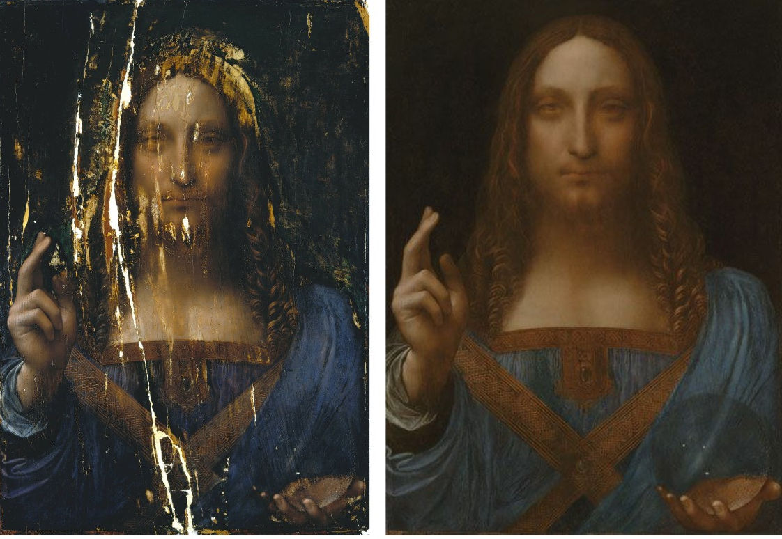
Above, Fig. 6: Left, the Salvator Mundi as in 2006/7 (in high-resolution) after cleaning; right, as in 2011 as exhibited as a Leonardo at the National Gallery, London, and after much repainting – some of which was distressed and contained false, painted lines of cracking in emulation of aged paint cracks.
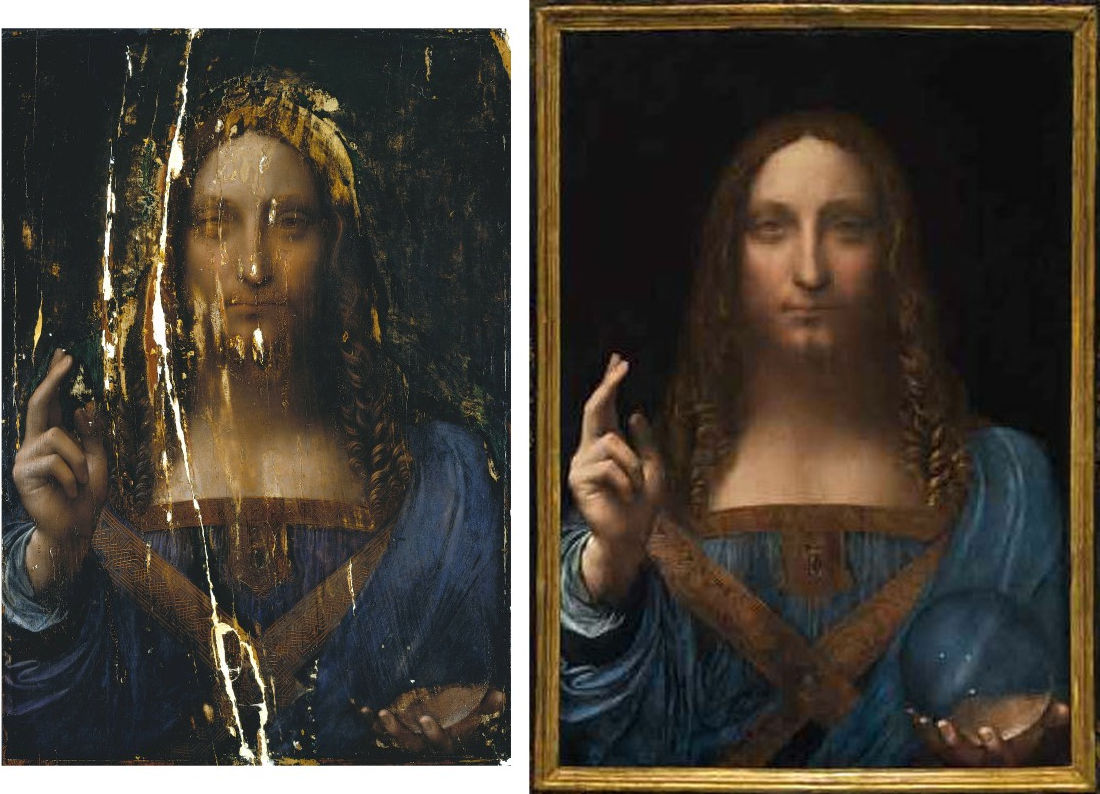
Above, Fig. 7: Left, the Salvator Mundi as in 2006/7 (in high-resolution) after cleaning; right, as in 2017 when sold at Christie’s, New York, after further covert restoration.
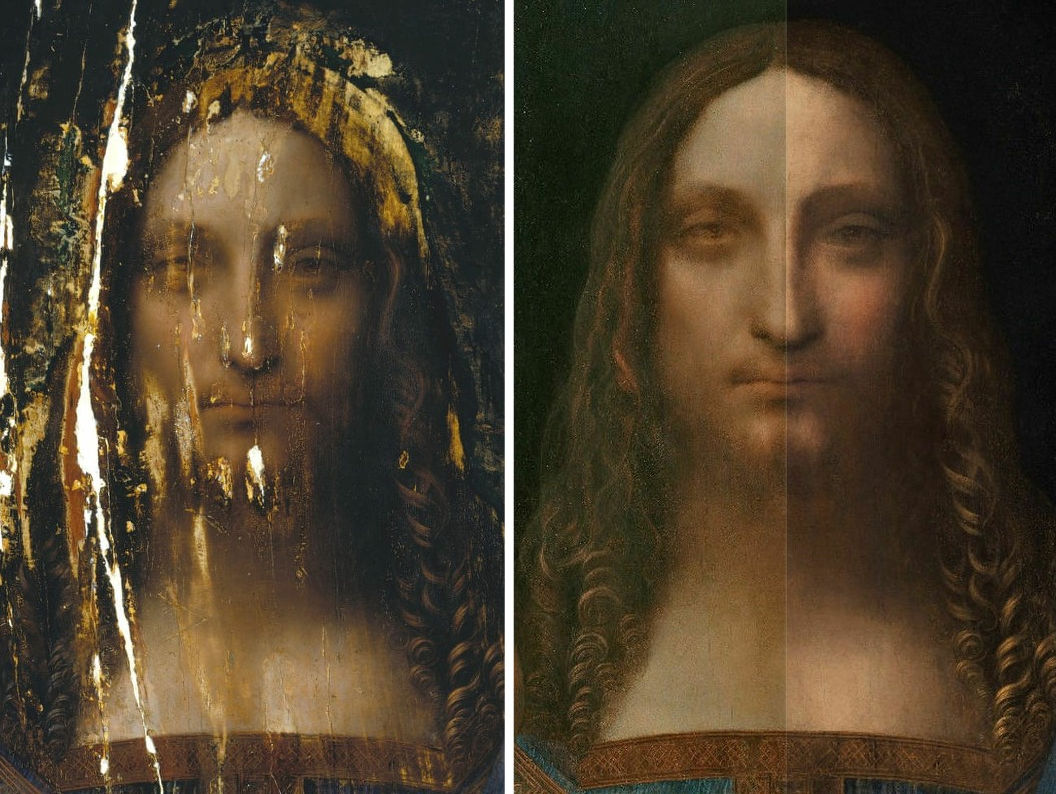
Above, Fig. 8: Left, the head of the Salvator Mundi as in 2006/7 (in high-resolution) after cleaning; right, the head in a split screen compilation showing the appearance in 2011 on the left and in 2017 on the right.

Above, Fig. 9: Top, a detail of the Salvator Mundi’s eyes as in 2006/7 after cleaning and before repainting (and as published by Modestini in 2014); above, left, the face, in 2011, and, right, as in 2017.
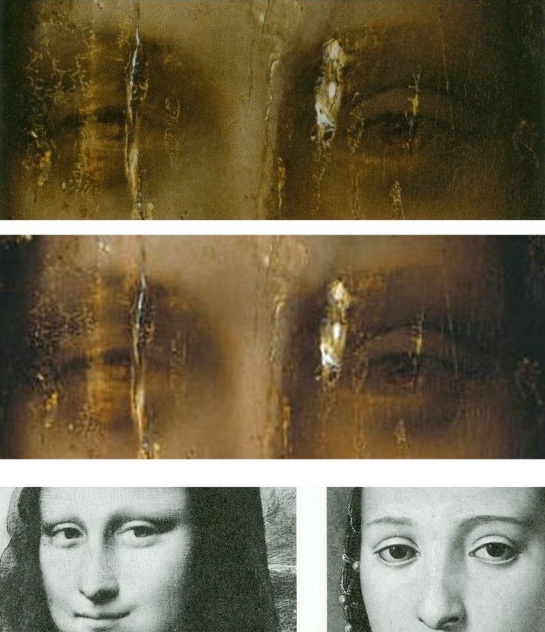
Above, Fig. 10: Top, a detail of the new high resolution photograph, as published online by the Guardian; centre, the corresponding detail as published by Modestini in 2014, the previously best detail of the cleaned and not-yet repainted eyes; above, eyes by Leonardo and Bronzino. The lower images are surely instructive here? The Salvator Mundi was hyped by Christie’s, New York, as an iconic thing – a “Male Mona Lisa”. Martin Kemp holds that it was painted by Leonardo after he had painted the Mona Lisa and that he had deliberately put the face “out of focus” so as create spiritual mysteriousness on the one hand and an illusion of spatial depth and recession in an emphatically flat (and heavily cropped composition) on the other. If we look at these images art critically we can safely make a number of factual, verifiable observations – and these are not “subjective”. First, although the high-resolution photograph is superior as a photograph to the lower resolution image, as published in a book, it does not tell a materially or artistically different story – in both we can see the extent of losses and the fact the treatment of the eyes is neither identical nor consistent. In particular we can see that the treatment of the heavy flattening upper eye lid on the right is sharply (and badly) drawn, while that on the left is softer and almost undoubtedly abraded. Modestini somehow equalized the effect of the eyes while leaving the implausible severity of drawing found in the lid of the eye on the right. Neither eye in this painting is remotely comparable with the Mona Lisa’s eyes where softness of effect has been achieved without loss of sculptural lucidity or anatomical veracity. These differences are ones of quality more than of style. The creases formed by the meeting of the soft flesh of the upper lids with the more taught flesh of the brow is more sharply drawn in the Bronzino but it is also drawn with greatly more acuity and finesse than the eye on the right of the Salvator Mundi. Much of the great benefit photography brings to art historical scholarship lies in the ease with which detailed style comparisons can be made. In an age of high quality and electronically transmissible photography, if you are going to claim Leonardo you really should take the opportunity to demonstrate Leonardo.
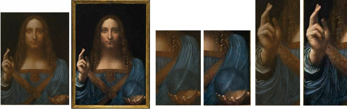
Above, Fig. 11: A succession showing the picture and two details, with the first each time, as in 2011 and, second, as in 2017. The question raised by Modestini is the extent to which the differences shown above are products of Christie’s own “more vivid, sharper, snazzier” images of the 2017 state or of her own repainting. It can safely be said that repainting must substantially account for the differences because changes have been made to the design of forms as can be seen here in the comparison of the details of the shoulder drapery. It would be helpful if all parties to the post 2005 “conservation treatments” would publish full accounts of them accompanied by the best available photo-records.
MARTIN KEMP’S THEORETICAL AND SCIENTIFIC INPUT
On the very day when the Salvator Mundi went on exhibition at the National Gallery (9 November 2011) Kemp published an article, “Art History: Sight and salvation” in Nature magazine. In it, he made a number of significant contentions/observations: 1) that although connoisseurship still has a role to play, it involves “subjective criteria that should long ago have been superseded as the key tool of attribution”; 2) that art historical evidence can be supplemented by “the scientific”, of which there are two kinds – technical examinations of pictures’ component material parts, and scientific evidence that is “particular to Leonardo”; 3) that the Salvator Mundi bears such witness in two regards: it “plays with depth-of-field problems. None of the contours is absolutely sharp, but the blessing hand and the tips of the fingers cradling the orb are discernibly clearer than the features of Christ’s face. The rapid lack of clarity in depth serves to give space to what would other-wise be a quite flat image.”
What is striking in the above series of comparisons is the extent to which Modestini has apparently added force and clarity to the hands and globe in the foreground. The globe, for example, has been emphatically darkened towards its circumference and lightened at its centre between 2011 and 2017. Modestini partially accounted for these changes in 2014: “The rock crystal orb, symbolizing the cosmos, was painted with practically nothing, thin glazes and scumbles which unfortunately have been abraded, especially along the top of the wood grain. Originally the illusion must have been magical since simply toning down the lighter areas with translucent watercolor glazes rendered it convincing.”
In Living with Leonardo Kemp discusses the two thumbs and, there, had praised Modestini’s “painstaking and diplomatic filling in of lost areas with readily soluble paint”. Kemp reports that after viewing the picture at the National Gallery in 2008 “Robert and I corresponded during the course of that summer and autumn.” There can be little doubt that differences between the painting’s appearance, when first taken to London (Fig. 1), and later in 2011 when exhibited in London (Fig. 2) are considerable. Even more dramatic are the differences between 2011 and 2017. The question, then, is under what or whose ambition or programme, were Modestini’s changes made? Was she and/or the owners in thrall to Kemp’s quasi-photographic depth-of-field thesis? We know from her own account that she made a number of artistic changes to the painting with a view to increasing spatial force:
“I repainted the large missing areas of in the upper parts of the painting with ivory black and a little cadmium red light, followed by a glaze of rich warm brown, then more black and vermilion. Between stages I distressed [how?] and then retouched the new paint to make it look antique. The new color freed the head, which had been trapped in the muddy background, so close in tone to the hair and made a different, altogether more powerful image.”
Note: these are only the changes that were made between 2007 and 2011. There has been no account of the subsequent restorations. If we look at the top of the split-image of the face at Fig. 8, we can see that the hair immediately to the right of the parting had become much darker by 2017 while the flesh tones in the forehead and nose had become lighter. No account of these changes has been published.
REFRACTIONS OR PENTIMENTI?
To return to Kemp’s 2011 Nature article, where he made this account:
“The other optical effect is unique to this painting, both in Leonardo’s work and in the Renaissance more generally. The orb is not the standard globe of the world. It is translucent and glistens internally with little points of light. These are not the spherical bubbles found in glass, but are the kind of cavity inclusions (small gaps) that appear in some specimens of rock crystal and calcite. Leonardo, we know, was considered an expert in such semi-precious materials. It seems that he observed the double refraction produced by calcite. The Heel of Christ’s hand exhibits two distinct contours, not in this case due to a change of mind.” [Emphasis added.]
That could not be clearer, could it? In Kemp’s characteristically adroit fusion of the technical and the spiritual, the superseding of traditional subjective practices of connoisseurship by newer, more astute technically and scientifically-informed analysis might seem well demonstrated – but how are such formulations to be evaluated? Must scholars without scientific backgrounds simply defer to the supposed superiority of science-loaded art historical scholarship – if told, on cited geological authority, that a material is so and so and, therefore uniquely gives rise to such and such effects, (that is, if calcite, then be on the lookout for its double refractions) who might query or dissent? Seven years later, in Living with Leonardo, Kemp retells his story on the significance of the orb and its near magical optical properties as a concrete embodiment of Leonardo’s mind, but with a twist: “The most satisfying aspect of my own research concerned my hunch that the globe was made of rock crystal”; he had “toyed with the idea that the double image of the heel of Christ’s right hand might be the result of the double refraction characteristic of rock crystal; but the optics would not work. The apparent doubling is almost certainly another pentimento [i. e. change of mind in the design – emphasis added].”
Thus, without a blush, Kemp offers a new diametrically opposite rationale: with this orb Leonardo “was not making a ‘portrait’ of an actual sphere, nor was he following all its optical consequences to their logical conclusions.”
Without mention of Hollar’s testimony, a pragmatic explanation is offered for an intellectual flip: “the optics” were put to the test and it was found by due and diligent research that they “would not work”. By “would not work” Kemp suggests that his efforts with a real crystal orb to replicate the kind of refraction he had earlier claimed to recognise in the double image of the hand holding the orb had been unsuccessful. But might there not have been another reason for dropping the earlier refracted hand thesis? As mentioned, Kemp’s Nature article appeared on the day the National Gallery’s Leonardo exhibition opened, 9 November 2011. On 11 November, a correspondent asked in the Times why no optical deflections were evident in Christ’s globe. The next day the Time’s carried our letter (Fig. 12, below) pointing out that in an etched copy by Wenceslaus Hollar of the original but now lost Leonardo Salvator Mundi the drapery seen through the orb had been deflected.
For the National Gallery this was politically awkward: if Hollar had copied an optically sophisticated, characteristically Leonardesque, effect from a painting then attributed to Leonardo that was not present in the painting on exhibition as the original Leonardo from which Hollar had made his copy, this could only mean that Hollar’s copy had, in fact, been made from another painting. Worse, on a careful visual reading of the relationships between the etching and the Salvator Mundi painting in the exhibition, there were further grounds for drawing the same conclusion: Hollar’s Christ was stouter and heavily bearded; his face was long and it tapered inwards from the level of the eyes, it did not widen, chipmunk-like towards the jaw; the eyes looked slightly to our left, not directly at the viewer; a radiant halo-like light emitted from Christ’s head; the transparent orb had gathered light around its circumference – and not grown darker, as in the painting…
This problematic visual mismatch must have compounded political problems: the gallery’s decision to exhibit a proposed Leonardo of little provenance and no art historical or technical literature and that was in the hands of a group of dealers (and therefore, inevitably, on the market) was institutionally questionable and certainly controversial. It became the more so when at least four Leonardo scholars challenged the attribution of the painting. Kemp, at that point, was hoist on his own scientific petard. Where the gallery had claimed in its catalogue entry on the painting that “There could be no doubt that this is the picture that was copied by Hollar”, it was now evident that it could not have been – and without that claimed connection, the picture’s supposed provenance collapsed from one in which it had passed down to us first through the French royal family in Leonardo’s day and then to the English royal family in the 17th century… to one that only began in England in 1900 when it had emerged from no acknowledged source, with no history and only as a painting given to Luini. How would the gallery respond to this very public correspondence and challenge? How would Professor Kemp respond? The National Gallery made no reply to the letters in the Times perhaps judging silence to be a better defence than open art critical engagement. Professor Kemp, too, was silent in the public prints, so far as we know.

Above, Fig. 12: Two ArtWatch UK letters to the Times.
Seven years later, while the National Gallery remains silent, Kemp, in Living with Leonardo, now writes with patronising verve and confidence to a new position:
“We should remember that Leonardo was drawing on his knowledge of rock crystal to devise a large sphere [the former ‘orb’ or ‘globe’] for Christ to hold – he was not making a ‘portrait’ of an actual sphere, nor was he following all of its optical consequences to their logical conclusion. I have been asked on more than one occasion why the drapery behind the sphere is so little affected by what is, in effect, a large magnifying lens. The answer, in a word, is decorum; that is to say, pictorial good manners…Leonardo’s endowing of Christ with a rock crystal sphere was not just a case of optical and geological cleverness for the sake of it…”
Perhaps not, but then why not introduce into the discussion the visual/artistic fact that Hollar had copied a deflection of curved forms of drapery when seen through a curved transparent body symbolising the cosmos? Would a copyist have invented an optical distortion in a painting he believed to be an autograph Leonardo? In journalism, as supposedly in science, facts are held sacred and opinions somewhat less so. Are awkward facts expendable in science-rich art history? Properly considered, Hollar’s testimony is an important event in the history of scientific engagement in art – just as it had been in Holbein’s use of an optic to correct the anamorphosis in the foreground skull of The Ambassadors in the National Gallery – as a scholar had proposed in the 1970s and I had corroborated in the 1990s. How long will such testimony remain institutionally and professionally un-personned?
SOME FURTHER UNADDRESSED, PHOTOGRAPHICALLY RECORDED ARTISTIC FACTS:

Above, Fig. 13: Left, a section of drapery in the Louvre Abu Dhabi Salvator Mundi when exhibited at the National Gallery in 2011-12; right the Modestini-changed section of drapery when sold at Christie’s New York in 2017.

Above, Fig. 14: Left, Hollar’s 1650 engraved copy of a Salvator Mundi attributed to Leonardo that shows deflected folds of drapery within the transparent orb; right, the Abu Dhabi Louvre Salvator Mundi as seen at the National Gallery at the time of the above correspondence in the Times. The double edge of the hand holding the orb had been left in place on the then Kempian view that it demonstrated Leonardo’s sophisticated optical knowledge. Had that double image been judged a pentimento it would, like that encountered on the thumb of the raised true right hand, likely have been painted out by Modestini on the advice of the National Gallery curator, Luke Syson.
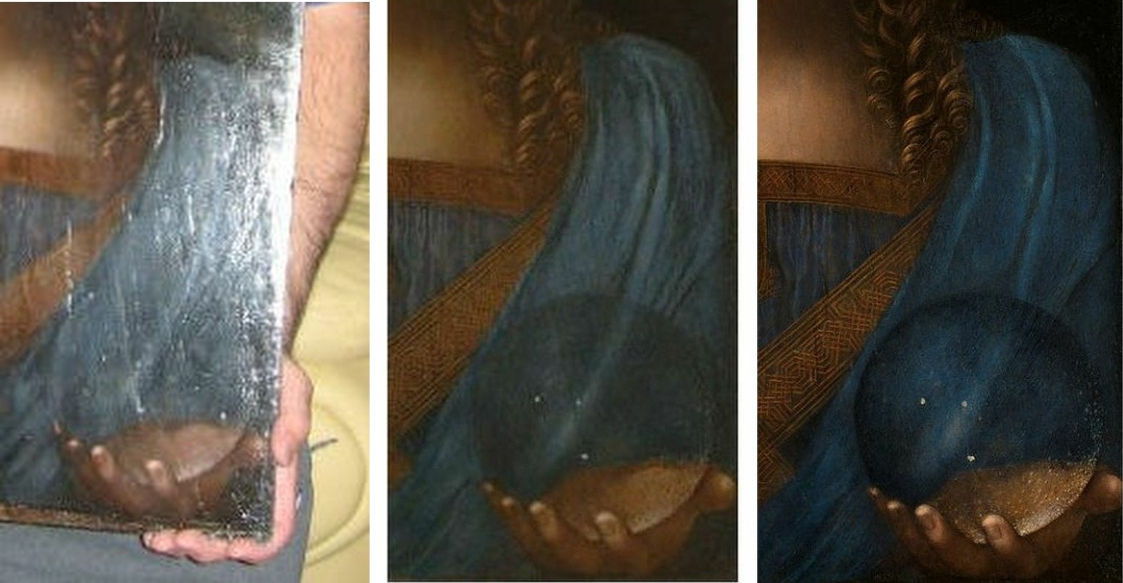
Above, Fig. 15: Changes made to the Salvator Mundi’s orb and adjacent draperies as seen respectively (from left to right) in 2008, 2011 and 2017.
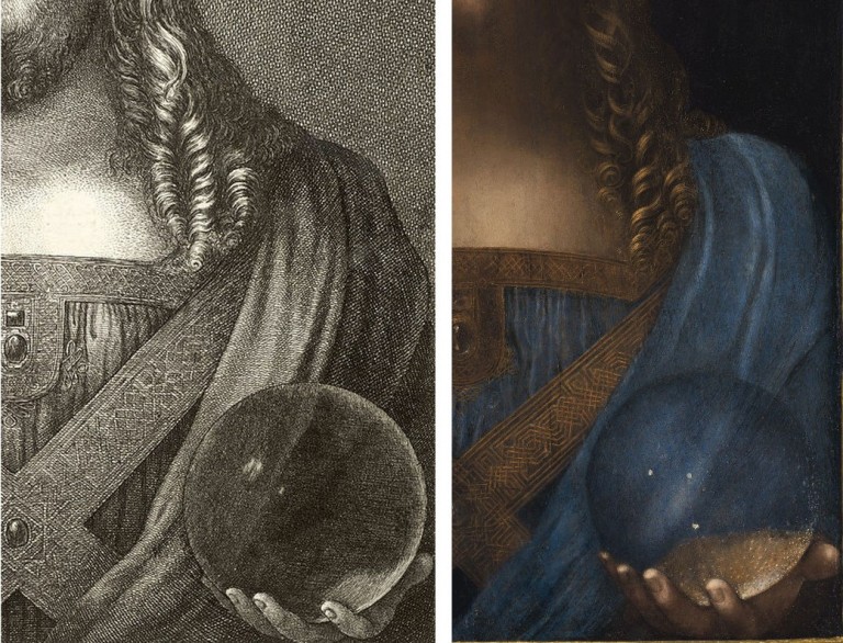
Above, Fig. 16: Left, the 1650 Wenceslaus Hollar etched copy of a Salvator Mundi painting; right, the Abu Dhabi Louvre Salvator Mundi, as seen in 2017 with changed draperies. In the Hollar we can how the central, highlighted fold of drapery is deflected from its convex path into a concave formation as it runs through the centre of the orb and between the aligned double and single light reflections. We can see how the heel of the copied hand was smaller and deflected towards the circumference of the orb; right, in the Louvre Abu Dhabi painting (third state) we can see how Modestini had darkened the circumference of the orb and brightened the interior. It is simply inconceivable that as skilled a copyist as Hollar could have drawn his orb from this, now Louvre Abu Dhabi painting.
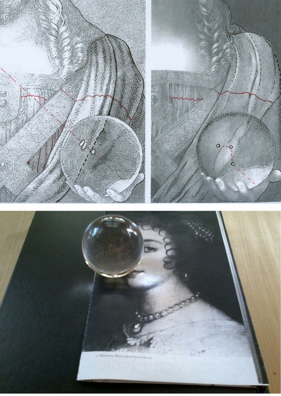
Above, Fig. 17: Top, two diagrams showing differences of design and modeling between the 1650 Hollar copy, left, and, right, the Louvre Abu Dhabi Salvator Mundi as sold in 2017. The three reflected highlights in the Hollar orb are aligned in accord with the picture’s top-left down light source which is evident throughout the painting that Hollar copied. The three unaligned white spots in the Louvre Abu Dhabi picture were attributed by Modestini to “reflections on the sphere to an outside source, but since many of the original glazes have perished, even when toned down, they float with context.” Above, a glass sphere owned by the author that shows the pushing of light towards the circumference, as copied by Hollar.
Above, Fig. 18: The author’s glass sphere. Where Martin Kemp failed to locate a double refraction in a small rock crystal orb, we demonstrated, as above, that when parallel straight lines (as here in the white gap between two photocopy diagrams) are viewed through a glass orb they are deflected into curves.
THE HOLLAR GLOBE’S BETTER FIT WITH THAT FOUND IN THE DE GANAY SALVATOR MUNDI<
In our previous post the painter Hikaru Hirata-Miyakawa showed through the three graphics below that in addition to all the above problems with the suggestion that the Hollar engraved copy had been made from the Louvre Abu Dhabi picture, the globe copied by Hollar bears a much closer relationship to the globe found in another Leonardesque painting, the so-called de Ganay Salvator Mundi, than to the globe seen in the Louvre Abu Dhabi Salvator Mundi.
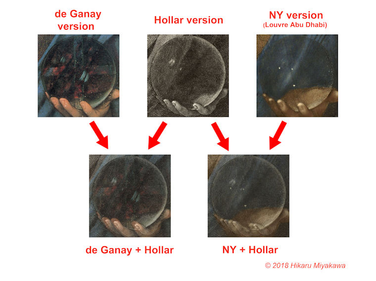
Michael Daley, 12 November 2018
Whiter than right

Robin Simon, editor of the British Art Journal and Honorary Professor of English at University College, London, has visited Chartres Cathedral and condemned its present restoration on a Facebook post and in a tweet:
“Just visited Chartres and I am appalled at the misguided ‘restoration’ that is covering the old stone walls in paint, with false pointing, creating a bland and uniform interior where the articulation of the architecture is crudely diminished. The history of the walls, of the building itself, is lost beneath a futile attempt to return the building to some imagined date in the distant past. What makes it much, much worse is the presence of bright electric lighting at crossing, choir and east end that destroys the effect of the greatest stained glass ever made, which used to cast the most wonderful haunting blue light throughout what was a uniquely ethereal interior. The magnificent chiefly 17th-century carved choir screen that wraps around the high altar end is also being whitewashed and the figures painted white, which is diminishing the three-dimensionality of these dramatic groups fully carved in the round. They now, remarkably, look flat, and have a smooth slimy surface with much of the miraculous crispness of the carving and detail lost.”
Robin Simon @robinsimonbaj:
“Just seen #Chartres #cathedral shocking #restoration. Walls painted, false pointing, glaring lights ruining blue light of glass, 17C carved choir screen flattened by white paint. State vandalism, arrogant architects, wrong-headed’experts’. Sign the petition https://bit.ly/2AmSRmN”
10:15 AM – 22 Oct 2018
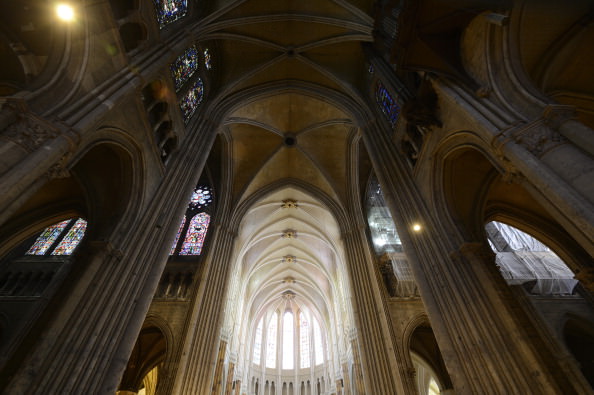
Above, Fig. 1: Chartres Cathedral, with repainted vaulting in the choir contrasting with the existing nave and transepts in the foreground, Chartres, France, as published on July 11, 2012 in the New York Review (Photo: Hubert Fanthomme/Paris Match via Getty Images)
We have repeatedly attacked this restoration and on 16 December 2014 (“Chartres Cathedral Make-Work Scheme”) reported that this restoration had first been challenged in May 2012 by Alasdair Palmer in the Spectator – see his “Restoration tragedy” which began:
“Should old buildings look old? Or should they be restored to a condition where they look as if they could have been put up yesterday? Those questions are raised in a particularly pertinent form by the work going on at one of the most beautiful and inspiring of all old buildings: Chartres cathedral in France.
“Most of Chartres cathedral dates from between 1194 and 1230, when the bulk of the colossal stone structure, with its nearly 200 stained-glass windows and thousands of sculptures, was built. The extraordinary speed of its construction means that Chartres has an architectural and decorative unity that is unique among surviving cathedrals, most of which took a hundred years or more to complete, and were then altered drastically over the succeeding centuries.
“Chartres has suffered from the inevitable indignities inflicted by time. The paint with which the medieval artists originally covered the statues and the walls faded and flaked off within a few generations. Centuries of burning wax candles covered the interior with a thick layer of black soot. But Chartres remains far closer to the original building than almost any other medieval cathedral. The biggest effect of the intervening centuries since 1230 has been the accretion of the patina of age. A sense of the passing of time is part of the experience of looking at Chartres. The stone, the glass, the sculpture — it all looks very old, and its age is part of its fascination and its mystery.
“Or at least, it is in those parts of Chartres cathedral that have not yet been cleaned by the latest restoration project. It isn’t in those parts where the restorers have finished their work, for they look brand-new. There’s no patina of age here: there are only clean and bright surfaces.
“Is that an improvement? The restorers insist that it is…”
On 14 December 2014 Martin Filler, an architectural historian of Columbia University, New York, protested against the aims and consequences of such restorations in the New York Review (“A Scandalous Makeover at Chartres”):
“In 2009, amid a rising wave of other refurbishments of medieval buildings, the French Ministry of Culture’s Monuments Historiques division embarked on a drastic, $18.5 million overhaul of the eight-hundred-year-old cathedral. Though little is specifically known about the church’s original appearance—despite small traces of pigment at many points throughout the interior stonework—the project’s leaders, apparently with the full support of the French state, have set out to do no less than repaint the entire interior in bright whites and garish colors that are intended to return the sanctuary to its medieval state. This sweeping program to ‘reclaim’ Chartres from its allegedly anachronistic gloom is supposed to be completed in 2017.
“The belief that a heavy-duty reworking can allow us see the cathedral as its makers did is not only magical thinking but also a foolhardy concept that makes authentic artifacts look fake. To cite only one obvious solecism, the artificial lighting inside the present-day cathedral—which no one has suggested removing—already makes the interiors far brighter than they were during the Middle Ages, and thus we can be sure that the painted walls look nothing like they would have before the advent of electricity.”
Although the Chartres interior had initially been painted Filler noted that:
“…the exact chemical components of the medieval pigments remain unknown. The original paint is thought to have flaked off within a few generations and not been replaced, so for most of the building’s eight-century history it has not been experienced with painted surfaces. The emerging color scheme now allows a direct, and deeply disheartening, before-and-after comparison.”
Above, Fig. 2: left, Chartres cathedral stone work in its pre- and post-restoration conditions; right, the view looking SE in Chartres cathedral showing painted and unpainted areas adjacent to each other.
THWARTING A THREAT TO CHARTRES CATHEDRAL’S STAINED GLASS WINDOWS
As well as making a historically falsifying transformation of the interior, the funding of the restoration was itself exposing the ancient stained glass windows to needless risks. On 18 February 2016, Florence Hallett (“Chartres’ Flying Windows”) protested against plans to fly part of the cathedral’s stained glass to the United States as a fund-raising quid pro quo for support given by the American Friends of Chartres:
“While the cost of the controversial repainting of the cathedral’s interior has been met by the French state and donors including Crédit Agricole, Caisse Val de France et Fondation, and MMA assurances, the restoration of the cathedral’s famous glass has been funded in part by the American Friends of Chartres (AFC), an organisation that works ‘to raise awareness in the United States of Chartres Cathedral and its unique history, sculpture, stained glass, and architecture and their conservation needs.’
“Based in Washington, the AFC has ambitious plans to fund the restoration of the cathedral’s windows and sculptures. In 2013 it announced on its own site, and via the crowd-funding website razoo.com, that in return for funding the restoration of the Bakers’ Window (two lancets and a rose in the nave), the 13th-century glass would travel to a US museum. Indeed, the still extant webpage makes explicit the nature of the exchange, proclaiming: ‘American Friends of Chartres INVITES YOU to Restore and Bring to the United States a 13th-Century Stained Glass Window for Museum Exhibit’.”
Hallett’s specific challenge to the American Friends on the foolhardy plan to fly ancient stained glass windows to the United States seemed to have proved a successful deterrent. As we reported in a footnote:
“STOP PRESS: At 17.33 today, in answer to an email of 14 February, Florence Hallett was notified by the American Friends of Chartres that:
‘The exhibit of Bay 140 which had been envisaged will not take place because of cost reasons. And, to answer your question, of course all the proper authorizations from the French Ministry of Culture and other authorities had been secured by the DRAC-Centre Val de Loire, which had been nominated by the Ministry of Culture to execute the project. All the arrangements for the exhibit of Bay 140 would have been contractually arranged between the DRAC on behalf of the French authorities and the cultural institution that would have exhibited the window. American Friends of Chartres would not have been part of these contractual arrangements.’ ”
Above, Fig. 3: Top, a section of the Belle Verrière windows at Chartres. Above, a potential means of transport for early 13th century glass
If you owned or were the guardian of such ancient precious glass painting, would you pack it onto an aeroplane and dispatch it across an ocean to another continent? If “yes” you would be able to claim precedents: the ecclesiastical authorities at Canterbury cathedral sent the entire surviving six parts of an original cycle of eighty-six ancestors of Christ, once one of the most comprehensive stained-glass cycles known in art history, on a museum tour around the United States. (See “How the Metropolitan Museum of Art gets hold of the world’s most precious and vulnerable treasures”. )
Florence Hallett is the architecture and monuments correspondent at ArtWatch UK and visual arts editor at theartsdesk.com
Robin Simon gave the ninth annual ArtWatch International James Beck Memorial Lecture – “Never trust the teller trust the tale” – on 7 November 2017 at the Society of Antiquaries of London, in Burlington House, Piccadilly, London.
Alasdair Palmer has written frequently on art restoration for the Spectator and the Sunday Telegraph – see “Restoration tragedies” 26 August 2012.
Martin Filler is a prominent American architecture critic and a fellow of the American Academy of Arts and Sciences.
WHO PROFITS?
The various strongly made cases against the Chartres Cathedral restoration project, rest in essence on the folly of attempting to replicate a speculative incompletely-informed notion of how an interior might have appeared many centuries ago when brand new. At Chartres this particular exercise is not only wrong-headed, it is, as Alasdair Palmer pointed out five and a half years ago, especially egregious: this attempted replication of an original state is inflicting a peculiarly brutal and unforgivable expunging of an ancient building’s historically lived evolving appearance. “Brutal”, because having been uniquely executed as a distinct artistically integrated whole this cathedral’s precious fabric had thereafter survived in uniquely unmolested form. Here was a building whose monumental lucidity might be considered a match for the timeless Parthenon. Here was a building which, unlike the Parthenon today, had not become a cadaver on a test bed for aggressively invasive conservation methods; which retained its forms and, even, an especial ancient illumination – one that, as Robin Simon attests, had once “cast the most wonderful haunting blue light throughout what was a uniquely ethereal interior”. Gone. And all in exchange for an $18million building contract that is already running over schedule and will, no doubt, end over budget.
When faced with incomprehensibly barbaric mistreatments of old art and monuments we must ask not only “why?” but “who profits?” The last is no slur. It is a necessary step towards explanations for otherwise inexplicably perverse cultural actions. It is indisputably the case that such high-prestige art and architecture restorations generate much employment, purchases of materials, scaffolding etc. – and that they can greatly enhance professional reputations. None of those consequences is necessarily wrong or bad in itself but due acknowledgement of them should constitute a component part of any calculus of appraisal of restorations or proposed restoration campaigns. It is concerning that in today’s rapidly accelerating restoration boom, material/professional interests are looming ever-larger as it proves increasingly easy to raise funds for large-scale building projects made on the back of the culturally-loaded, ethically coercive, names of “conservation” and “restoration”.
We have shown that it is European Union policy to increase activity in the arts sphere as a means of generating jobs in compensation for those being lost to less moribund economies: “I am especially happy to highlight the importance of culture to the European Union’s objective of smart, sustainable and inclusive growth. At a time when many of our industries are facing difficulties, the cultural and creative industries have experienced unprecedented growth and offer the prospect of sustainable, future-oriented and fulfilling jobs.” See “Why is the European Commission instructing museums to incur more risks by lending more art?” and “The European Commission’s way of moving works of art around”.)
We know that the Chartres project has been part funded by the French Government. In this climate, greatly more vigilance and disclosure are now urgently required. No such project should ever be sprung on the world again. Monumentally dramatic proposals should be examined widely publicly and well in advance of the scaffolders moving in.
ASSORTED CONSERVATION RATIONALES
Above, Fig. 4: Left, the original interior of St Paul’s Cathedral as recorded in an undated but apparently 18th century painting that is owned by The Worshipful Company of Goldsmiths, at which date Sir Christopher Wren’s original painted finish comprised of three coats of warmly tinted oil paint that had been stipulated, according to Wren’s son, “not just for beautifying, but to preserve and harden the stone” still survived.
It was only disclosed during the recent under-researched stripping of the interior of St. Paul’s that Wren’s oil painted surface had contained lead white, ochre and black pigments so as to produce precisely the warm “stone colour” found in other Wren churches. Above, right, we see the new dazzling white surfaces of the building’s interior and its sculptures when illuminated by one of new electric chandeliers installed during the restoration because, as Martin Stancliffe, the cathedral’s then 17th Surveyor to the Fabric, put it, “the heart of my vision for the interior [was] to clean it and relight it”.
It is striking not only how frequently programmes have proceeded on artistically/art-historically injurious premises, but also how very contrary the aims of those various programmes can be. Where at Chartres cathedral attempt is being made to replicate a far-distant hypothesized original decorative scheme, at St Paul’s Cathedral, London, as Florence Hallett established, a major project to transform an interior was made on a reverse (and equally perverse) artistic/historical agenda. At St Paul’s, with a much more modern documented and visually recorded building, a programme was implemented to expunge the last traces of the original architect’s initial (and easily replicable) decorative programme with aesthetically falsifying – and, in the event, health-threatening – consequences even though the originally applied tinted oil paint was a known quantity, having survived intact in protected places.
In London too, much money was quickly raised but here it was spent stripping an interior down (with chemically-invasive materials never before used inside an occupied, still functioning cathedral) to create an a-historical modernist whiteness rather than to retain surviving traces or fully replicate the known original historic surface decoration. In consequence, not only has a powdery surface of stripped-down raw stone been exposed, but an already misleading appearance was subjected to the very greatly amplified artificial lighting that is shown above and was first established by Florence Hallett’s investigations: “Cleaning St. Paul’s Cathedral”, ArtWatch UK Journal 17, Winter, 2002; and “The supposedly ‘model’ restoration of St. Paul’s Cathedral”, ArtWatch UK Journal 18, Spring/summer 2003. Online, see Michael Daley: “Brighter than Right, Part 1: A Modernist Makeover at St Paul’s Cathedral” (1 June 2011) and “Brighter than Right, Part 2: Technical Problems of Protection, Health and Safety at St Paul’s Cathedral” (5 July 2011).
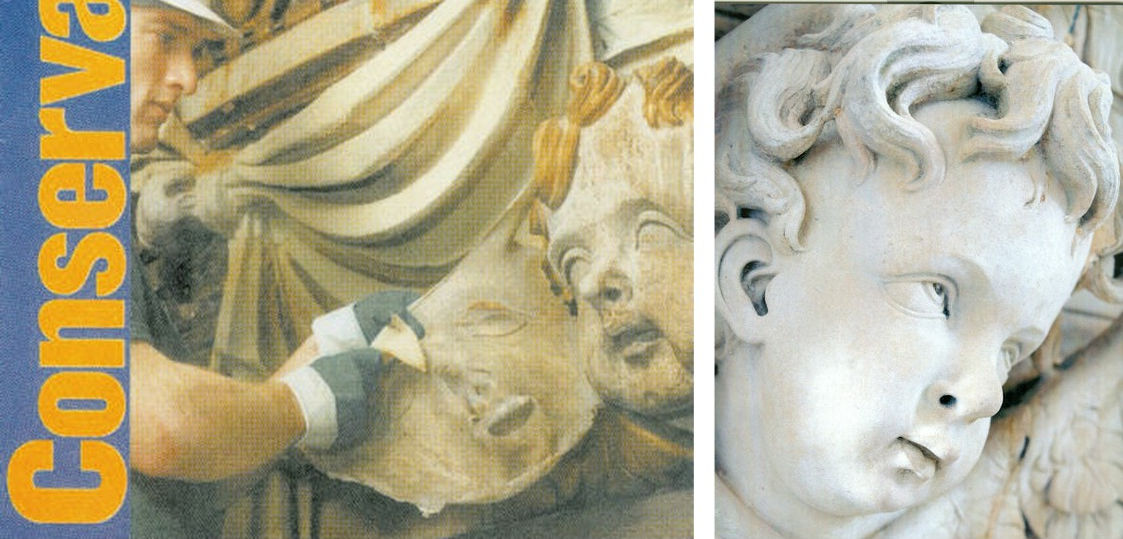
Above, Fig. 5: Left, a conservator removing a latex “cleansing pack” from a carved head at St Paul’s Cathedral, as published on the cover of Conservation News in May 2002. The journal reported that the latex was left on the surface for “one to four days” and that after its removal the stone was cleaned with “damp sponges and bristle brushes”. Right, a carved head at St Paul’s after being cleaned with water and bristle brushes. (Photography by Peter Smith/Jarrold Publishing.)
The chemical stripping-down of the cathedral’s interior surfaces to a novel whiteness was in accordance with an idée fixe of the 17th Surveyor to the Fabric, not of Sir Christopher Wren. In a 2005 programme note to a service held in honour of the restoration’s donors (“How the glory of St Paul’s was restored”), Mr Stancliffe declared that “the heart of my vision for the interior [was] to clean it and relight it”. In the Times of 10 June 2004 he announced his “pretty controversial” intention to introduce “six huge chandeliers” to flood the interior with artificial light. A year later he told the Guardian “we have installed new chandeliers and more lights” and expressed specific satisfaction on “seeing our initial vision gloriously realised.”


Above, Figs. 6 and 7: Top, the blotchy appearance of the stripped-down stone surfaces. Above, a simple, quick demonstration of the present dangerously powdery surfaces.
The brightness of this “restoration” was achieved at great aesthetic and material cost. As shown above, the surfaces have been left without patina and remain disfiguringly blotchy even after cosmetic attempts to mitigate the grosser consequences of the standardised indiscriminate cleaning method (see below). As for the supposed “conservation” purposes of this multi-million pounds programme, the interior’s now powdery surfaces are more vulnerable to environmental pollution and fluctuations of temperature and humidity than at any time in the building’s history. That the originally oil-paint protected surface of this limestone has been left as powdery as chalk was easily demonstrated by brushing the above sleeve against it.
CHECKS? BALANCES? TOOTHLESS WATCHDOGS?
Approval for the use of an experimental cleaning method on the interior of a publicly occupied and in-service cathedral had been given by The Cathedrals Fabric Commission for England in November 1999 following (claimed) earlier approvals by a bevy of heritage watchdogs: English Heritage; SPAB (The Society for the Protection of Ancient Buildings); The Victorian Society; and The Georgian Group. It is not possible to establish the precise chemical basis on which formal approval was given by the Cathedrals Fabric Commission for England because, in breach of good conservation practices, the three technical parts of the eight part submission document were withheld on grounds of commercial confidentiality. For information on technical matters we had to rely on the cathedral’s own fluctuating (and often self-contradicting) accounts; on our correspondence with the 17th Surveyor to the Fabric, which he terminated in March 2003; and on documents obtained by cathedral employees whose health was adversely affected by the restoration.
The cleaning agent used on St Paul’s interior was an experimental, technically undisclosed, adaptation of a commercial product. In both its composition and effects, it earned censure from leading conservation experts (see below). It was a commercially available, latex rubber poultice laced with a mix of chemicals that were said to comprise an agent specifically tailored to be similar to the mild alkalinity of St. Paul’s Portland stone – that is, it was a special version of the “Arte Mundit” water-based paste manufactured by the Belgian company FTB Restoration. The instigator/director of the restoration, the architect and the 17th Surveyor to the Fabric at St Paul’s Cathedral, admitted (at a lecture on October 21st 2003) to having slim knowledge of matters chemical and of having devolved – “entrusted” – responsibility for the application of the new paste to the conservators of the firm Nimbus who themselves were learning on the job while the cathedral remained in full commercial and ecclesiastical use.
Professor Richard Wolbers, conservation scientist and solvents expert at the Winterthur Museum and Gardens, University of Delaware Art Conservation Department, was highly critical of a number of technical features of the programme and reiterated his fear that the authors “seem to have taken a poorly characterised material, a latex paste, and modified it with the addition of a considerable amount of EDTA – largely as an adaption in their minds, I suppose, of one of the main ingredients in the Mora’s AB57 cleaning system.”
(The Mora AB57 method was the notorious cocktail of EDTA, sodium and ammonium, detergent and other ingredients in a paste that was twice applied and twice washed off Michelangelo’s Sistine Chapel ceiling paintings. We have chronicled the artistically disastrous consequence of stripping all organic material from the ceiling plaster. Within a generation the newly-exposed bare plaster had been secretly re-restored to remove powdering of the plaster, and then, in part-compensation, it was massively relit with coloured LED lights – see “The Sistine Chapel Restorations: Part I ~ Setting the Scene, Packing Them In” and “The Twilight of a God: Virtual Reality in the Vatican”.)
John Larson, the then Head of Sculpture and Inorganic Conservation at the Conservation Centre, National Museums and Galleries on Merseyside, said that applications of moulding materials had contributed so much damage over the past 200 years that museums around the world “have now banned” their use, and that the application of liquid latex by brush or spray “has a dramatic effect on porous material such as stone…as it dries latex shrinks and clings tenaciously to the surface.” The effect of pulling it off the stone “exerts strong mechanical forces on the surfaces when the stone is carved and deeply undercut, as shown on the cover of Conservation News.” (See Figs. 5, 6 and 7 above.)
Above, Fig. 8: Left, sculptures at St. Paul’s being cleaned by steam jets; right, a detail showing the sculptures in the ambulatory of Chartres Cathedral on 11 July 2012. (Photograph by courtesy of Hubert Fanthomme/Getty Images.)
All horrible restorations are horrible in their own ways. Steam cleaning sculpture is considered an acceptable “conservation technique” even though it is visually deadening and leaves marble surfaces resembling white granular sugar and greatly more exposed to environmental pollution and fluctuations of humidity and temperature. We have witnessed conservators at the Metropolitan Museum of Art, New York, painting dead white steam-cleaned Greek marble carvings with water colours. One, when asked what he was doing, replied that he was “putting back the patina” destroyed by the cleaning. That, presumably, is why the Greek sculptures at the MET now sport a uniformly tasteful biscuit-coloured “patina” regardless of their age and geographical origins. As seen above, at St Paul’s Cathedral the all-white, sans-patina effect found favour and sculptures were left as raw-white as the building itself. At Chartres, however, the new visually deadening whiteness of the sculptures is the product of yet another method and philosophy. The sculptures are not being stripped down to the innate interior whiteness of the stone but are having a white skin of paint superimposed – before also being further brightened by artificial lights. The aesthetic, psychological and spiritual consequences of this practice at Chartres can be seen above right where just a few years ago the not-yet “restored” figures in the ambulatory still shared our common spaces. There, among us, touchable and as if alive, they had for centuries acted their roles in a drama greater than Shakespeare’s – one that, millennia ago, had been played for real on earth and, for believers, at God’s will for our benefit. Their once miraculously constructed living tableaus and endlessly changing chiaroscuro are now, as Robin Simon has so poignantly described, flattened and left with “a smooth slimy surface with much of the miraculous crispness of the carving and detail lost.”
Even now, it is not too late to save an unmolested portion of this cathedral for future generations who would otherwise never be aware of the loss and adulteration: a petition – and an invitation to comment – beckons at a touch.
Michael Daley, 30 April 2018
CODA:
Today, 30 April 2018, Electronics Weekly reports that the lighting firm Osram has announced it has won a contract to light St. Peter’s in Rome: “‘We won worldwide recognition for the LED lighting system we installed in the Sistine Chapel’, said Osram Licht CEO Olaf Berlien. ‘We are very excited about this new opportunity to demonstrate our skills as a provider of complex, large-scale lighting solutions by conducting the lighting project in St. Peter’s.’” The report does not say how much Osram will be paid to light St. Peter’s (and, thereby, showcase its own products) but it does give further information on the lighting installed in the Sistine Chapel “The aim was to light the paintings so they appear to be lit by sunlight…Researchers went so far as to incorporate the current thinking of historians – that Michelangelo mixed paints in daylight rather than under candlelight or the light of torches, and therefore needed a cooler over-all colour temperature to get the best view of them today”. Michelangelo, of course, painted in the light of the chapel and for the chapel’s then sources of lighting. Indeed, when the ceiling was stripped down with the Moras’ AB57 chemical cocktail, art historian apologists for the garish colours that emerged contended that Michelangelo had had to make his colours so intense in order for his painting to read through the gloom of the chapel. As Professor Kathleen Weil-Garris Brandt of New York University and a Vatican spokesman for the restoration, put it in Apollo in December 1987: “Michelangelo…painted the ceiling in the knowledge that his forms would have to carry in the daylight or in the golden glow of candles and oil lamps. That’s one reason why his [restored] colours are so bright. Now that they are being revealed, the anachronistic spotlights only distort the appearance of the frescoes. In fact, the strong artificial lighting of cleaned areas of the Ceiling originally contributed to the false impression which disturbed critics of the conservation project.” In other words, now that the original colours of Michelangelo had been recovered, the chapel’s strong artificial lighting was surplus to aesthetic requirements. Why, then, was Osram recently invited to create a system of lighting for those (controversially) restoration-intensified colours that mimics the power of direct sunlight? For St Peter’s, Osram have a different agenda: “the lighting will be adjustable to suit different occasions, and will ‘accentuate the properties of the materials used and the building itself, highlighting the plasticity of the structure, its marbles and its architecture.'”
Two developments in the no-show Louvre Abu Dhabi Leonardo Salvator Mundi saga

The art world is like no other. It goes its own way. It makes (and sometimes breaks) its own declared rules. Politicians scarcely dare touch it. Lawyers do well on it. It is often averse to disclosure and transparency and it is always full of surprises: since our 18 September post, there have been two spectacularly dramatic developments concerning the marketing and the appearance of the (still un-exhibited) Louvre Abu Dhabi Salvator Mundi, which work appeared from nowhere in 1900 and has now rocketed from a $750 appraisal to a $450 million sale and elevation to the Louvre in barely a decade.
How? The most effective way to improve a picture’s standing and value is to change its appearance in the names of “conservation” and “restoration” – the sanctified procedures that facilitate the “discoveries” on which new evaluations may stand. In effect, restored works are new works that have shed old selves and reputations, thereby inviting re-appraisals in a new milieu. In technical parlance “conservation” is the overall process of transformation commonly described in quasi-medicalese as a “treatment” following state-of-the-art “diagnostic” technical analysis. The term “restoration” got a very bad reputation: when this Salvator Mundi was being downgraded from Luini to a Boltraffio copy, picture restorers had been dubbed “picture rats”. It is now confined to describing the late stages of conservation where conservator/restorers pick up brushes and paint towards the “recovery” of art historical authenticity. With this particular Leonardo upgrade, the changes of appearance were protracted and under-reported. Even less examined or reported were the picture’s geographical art market origins.
In “How the Louvre Abu Dhabi Salvator Mundi became a Leonardo-from-nowhere” we noted failed attempts by journalists, authors and researchers to identify the auction at which the Salvator Mundi had reportedly been sold for $10,000 to a “consortium” – which is not a “ring” – of buyers who had bid by proxy in 2005. How, in the world’s most technically advanced society in our digitalised era could records of a public auction and an auction house itself disappear? We asked of the picture:
“How had it been listed? Who sold it? When? Where? Many have searched and no one has found answers but this serially redone as-if-from-nowhere work has been sold twice already – with a different face of Christ each time – for a total of over half a billion dollars”
We noted that despite its unverifiable origins, this Salvator Mundi had been showcased as a Leonardo by the National Gallery in 2011-12 and then sold privately the following year by Sotheby’s for $80 million to the owner of a string of freeports who immediately sold it on to a Russian oligarch for $127 million. That sale was made under a nondisclosure agreement which, somehow, was back-dated by the vendors to include the identity of the auction house from where the picture had been bought eight years earlier. In 2017 after further (covert) restoration it was sold by Christie’s, New York, for $450 million. We asked if the initial 2005 opacity on ownership had passed through the National Gallery and into the art market because, on 9 October 2011, the Sunday Times had reported:
“For a few weeks in London you will be able to see the Salvator Mundi (Saviour of the World) up close. It might be your only chance. Much of the painting’s history remains obscure. Its ownership is a closely guarded secret. Robert Simon, a New York art dealer, is representing the owner or owners – the official line is it is a ‘consortium’. Why all the secrecy? ‘It’s just privacy and security’, says Simon, ‘One doesn’t want people knocking on the door.’”
PERSISTING ART MARKET OPACITY
Six years later, by courtesy of super-diligent investigations by both a newspaper and the author of a forthcoming book on the Louvre Abu Dhabi Salvator Mundi, many answers have emerged on the 2005 sale (see below). At the same time, a long-running legal dispute over the manner of the Salvator Mundi’s 2013 New York private sale has flared into a legal action against Sotheby’s in the U.S. As Bloomberg and The Art Newspaper report (“Billionaire Slaps Sotheby’s With $380 Million Lawsuit”; and “Russian billionaire Rybolovlev sues Sotheby’s for $380m in fraud damages”), it is claimed in a New York lawsuit that the Salvator Mundi’s 2013 buyer, Yves Bouvier, had been materially assisted by Sotheby’s in what Rybolovlev describes as the “largest art fraud in history” by acquiring paintings at lower prices than he represented before selling them to Rybolovlev at unduly marked up rates, fraudulently pocketing millions for himself.
Rybolovlev’s widely reported legal action in New York against Sotheby’s, New York, for $380 million of damages, specifically charges the auctioneers with having knowingly and intentionally bolstered the plaintiff’s “trust and confidence in Bouvier and rendered the whole edifice of fraud plausible and credible” by brokering certain sales and inflated valuations.
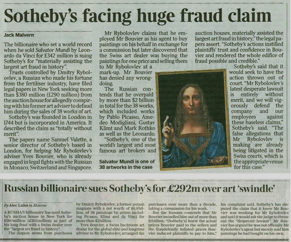
Above, Fig. 1: Reports of the Rybolovlev v. Sotheby’s action carried by the Times and the Daily Telegraph on 3 October 2018.
SOTHEBY’S DEFENCE
The Antiques Trade Gazette reports that Bouvier’s legal representatives declined to comment on the latest case (“Sotheby’s refutes $380m fraud claim filed in New York court”). Where Rybolovlev had believed Bouvier to be negotiating with sellers on his behalf in return for a commission, Bouvier’s legal representatives claimed that because there had been no written agreement appointing Bouvier as an agent to Rybolovlev, their client had “acted as an independent seller transacting at arm’s length with Rybolovlev”. However, as the Art Newspaper reports, in addition to spectacularly large mark-ups, Bouvier was indeed charging Rybolovlev a commission fee: “some of the works in question include Gustav Klimt’s Wasserschlangen II (1904) which Bouvier bought in 2012 for $112m before selling it to Rybolovlev for $183.8m plus $3.6m in commission”. The Art Newspaper also reported earlier pre-emptive auction house moves to stymie Rybolovlev:
“Sotheby’s jointly sued Rybolovlev with Bouvier in Geneva in 2017 in order to block a lawsuit the Russian oligarch was planning to file in the UK. Since then, however, Rybolovlev has been granted the use of confidential documents from Sotheby’s to build his case by a New York court. The complaint filed in Manhattan on Tuesday yesterday likely stems from this development, though the documents remain publicly undisclosed.”
This is a case of potentially enormous importance in a trade that was traditionally conducted on gentlemanly agreements within a single country but now increasingly straddles borders around the globe. If, for example, the U.S. courts should find in favour of Rybolovlev, would the consortium of vendors who sold privately for $80million in 2013 under a non-disclosure agreement (only to see the painting resold immediately for $127 million), also have a case against Sotheby’s, New York? Certainly, as Professor Martin Kemp alludes in his latest book, Living with Leonardo, a sense of grievance resides in that quarter:
“In November 2016, an article in The New York Times reported the latest developments: three ‘art traders’ (Robert Simon, Warren Adelson and Alexander Parrish) were disconcerted to find that painting was ‘flipped’ by Bouvier for $47.5m more than their selling price. Was Sotheby’s a knowing party to the resale? The auction house claimed that it was not, taking pre-emptive legal action to block any law suit by the ‘traders’…”
THE FORMERLY UNDISCLOSED 2005 AUCTION HOUSE SALE
Previously, we have chided Kemp for seeming to make light of the fact that no visual record existed of the picture either when sold at Sotheby’s, London, for £45 in 1958 or at some untraceable place in the U. S. in 2005:
“Given that we do not know the identity of the 2005 vendor or the venue of the sale and given the still sticky varnish then present on the New York/Abu Dhabi Salvator Mundi, it could be useful to establish the identity of the previous owner who might well have information on previous restorations and photo-records of the painting from 1958 onwards.”
The next day (19 September 2018), The Wall Street Journal reported its discovery of the 2005 sale location (“How a $450 Million da Vinci Was Lost in America —and Later Found”). The hugely informative article by Denise Blostein, Robert Libetti and Kelly Crow, raises further questions – but first, it also carries an important reproduction of the painting when framed and on offer in 2005. This new image can now be set in its historic context.
THE SALVATOR MUNDI’S EXTENDED, EVER-MORPHING, VISUAL NARRATIVE:
Above, Fig. 2: A detail from the catalogue to the 9-10 April 2005 sale at the St. Charles Gallery auction house, New Orleans, showing a work to be sold from the estate of a Baton Rouge business man Basil Clovis Hendry Sr.
It is clear – even on the small scale, low-resolution catalogue photograph above – that the painting’s appearance had changed considerably at some point (or points) after the earliest known photograph when in the Sir Francis Cook collection (Fig. 3, below, left). Unfortunately, the 2005 vendor has yet to speak and we do not know whether any changes to the painting had been made while in the Cook collection, or by Sotheby’s (London) ahead of the 1958 sale to “Kuntz”, or by the Kuntz family and relatives at some point between 1958 and 2005.
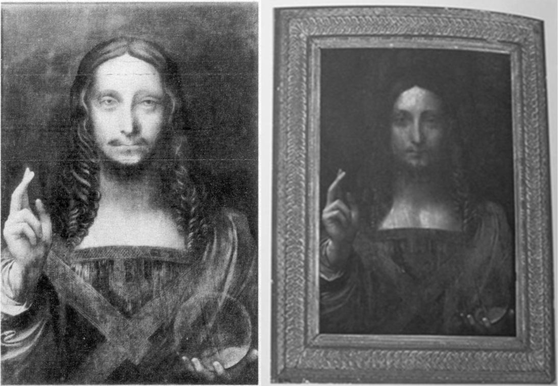
Above, Fig. 3: Left, the photograph of the painting when in the Cook collection and judged to be a work of Bernardino Luini; right, the former Kuntz family and then Basil Clovis Hendry Sr. estate painting, as in the 2005 St. Charles Gallery catalogue.
With this new photo-record the extent of successive restoration transformations in the painting’s 1900 to 2017 journey from a Luini to a $450 million Leonardo can better be appreciated.
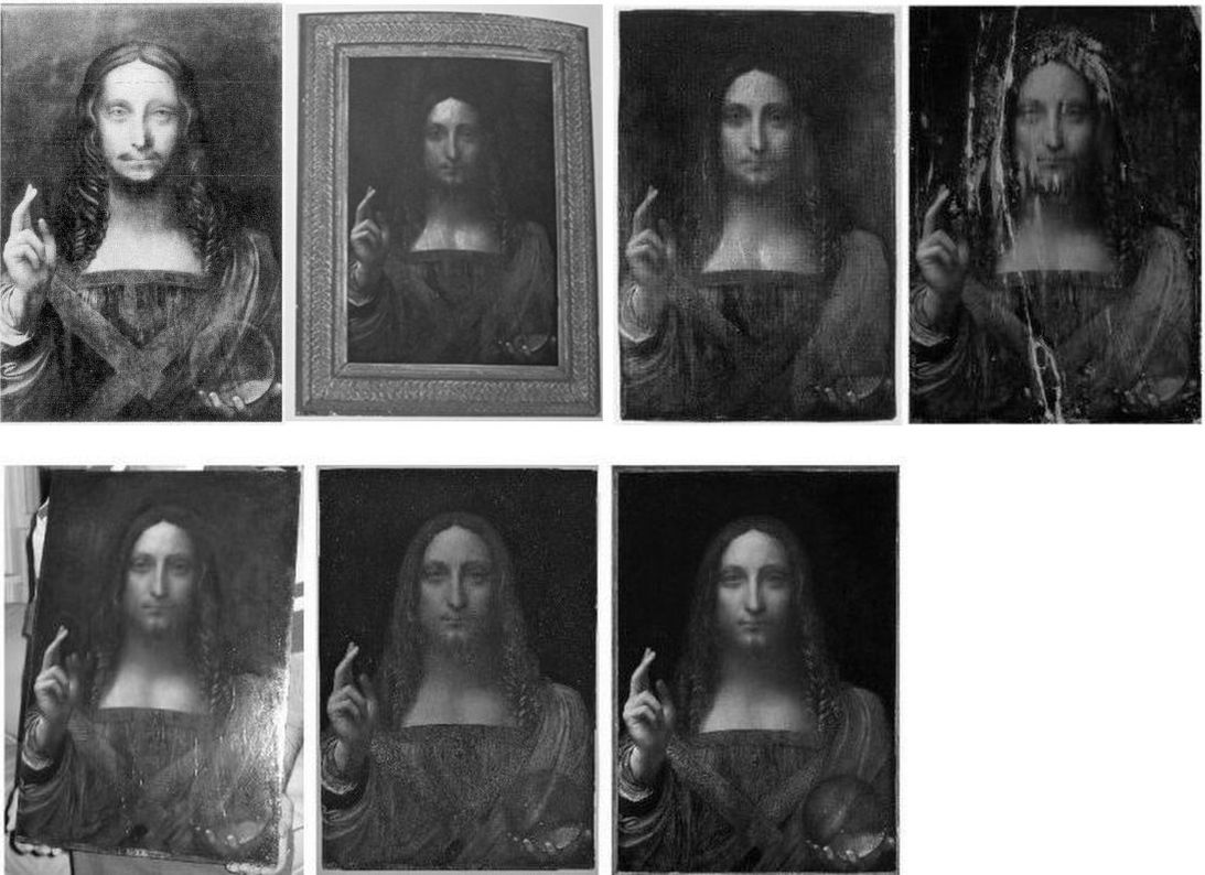
In Fig. 4, above, in the top row we see, successively: 1) the c. 1900 Cook collection photograph; 2) the 2005 New Orleans sale catalogue photograph; 3) the painting as when taken in 2005 (still sticky from some recent activity) to the New York studio of the restorer Dianne Dwyer Modestini; and, 4) the 2007 record of the painting after it had been stripped and had its panel repaired. Aside from areas of total paint loss, how much of the original paint surface had been lost? If hardly any at all, as was once claimed, why so much subsequent repainting? If the original surface had been much-abraded, was due acknowledgement made of the extensive subsequent artistic changes on a single restorer’s judgements and painting? (The brushes used for this extended repainting were offered on Ebay but failed to sell.) Had all bidders in 2017 been aware of the extent to which the restorer distressed her own extensive new painting so as to confer a spurious impression of antiquity to it? (See below.) How many who bid for this painting in Sotheby’s and Christie’s sales were aware of the ratio of old to new paint?
In the second row above at Fig. 4, we see successively: 5) the painting in 2007 after Modestini’s first campaign of restoration repainting and when about to be taken to London for examination at the National Gallery by a select group of Leonardo experts who had been sworn to confidentiality; 6) the painting in 2011 after its second campaign of restoration and as exhibited at the National Gallery for the first time as a Leonardo in the gallery’s Leonardo da Vinci – Painter at the Court of Milan exhibition; and, 7) in November 2017, as sold at Christie’s New York, for $450 million after a further (covert) campaign of restoration in which the globe and the draperies at Christ’s left shoulder were radically changed.
It is not known whether the painting had been restored in 2012-13 after the National Gallery exhibition and before the opaque private sale at Sotheby’s, New York. In December 2017 (after the painting had been sold for $450 million) Christie’s, New York, acknowledged that the work had undergone further restoration by Dianne Modestini ahead of the November 2017 sale (see Dalya Alberge, “Auctioneers Christie’s admit Leonardo Da Vinci painting which became world’s most expensive artwork when it sold for £340m has been retouched in last five years” and our “The $450m New York Leonardo Salvator Mundi Part II: It Restores, It Sells, therefore It Is”.)
THE STRIPPING-DOWN AND REPAINTING METHOD USED ON THE LOUVRE ABU DHABI PAINTING:
“The initial cleaning was promising especially where the verdigris had preserved the original layers. Unfortunately, in the upper parts of the background, the paint had been scraped down to the ground and in some cases to the wood itself. Whether or not I would have begun had I known, is a moot point. Since the putty and overpaint were quite thick I had no choice but to remove them completely. I repainted the large missing areas in the upper part of the painting with ivory black and a little cadmium red light, followed by a glaze of rich warm brown, then more black and vermilion. Between stages I distressed and then retouched the new paint to make it look antique. The new colour freed the head, which had been trapped in the muddy background, so close in tone to the hair, and made a different, altogether more powerful image. At close range and under a strong light the new background is obvious, but at only a slight remove, it closely mimics the original…Most of the retouching was done with dry pigments bound with PVA AYAB. Translucent watercolours, mainly ivory black and raw siena, were used for final glazes and to draw [false age-] cracks…”
The above account of the repainting was delivered at a conference in the National Gallery, London, during the 2011-12 Leonardo in Milan exhibition, by Dianne Dwyer Modestini. It was later published as “The Salvator Mundi by Leonardo da Vinci rediscovered History, technique and condition” in 2014 in “Leonardo da Vinci’s Technical Practice – Paintings, Drawings and Influence”, ed. Michel Menu, Paris. It covers only the first six years of restoration up to 2011 and the National Gallery exhibition. So far as we know, no accounts have been given of the subsequent restoration work.
THE WENCESLAUS HOLLAR ETCHING PROBLEM
When this particular Leonardesque Salvator Mundi was included in the National Gallery’s Leonardo da Vinci – Painter at the Court of Milan exhibition and catalogue it was, as previously shown, presented as the original autograph Leonardo prototype for all of the other versions. In support of that claim, this version was held to have been a Leonardo painting in the collection of Charles I that had (probably) passed down from the French royal descendents of King Louis XII, who, it was suggested against contrary evidence, had commissioned Leonardo to produce the picture. As previously seen, it is now counter-claimed – again on no evidence – that although the painting had not passed down through the French royal family, it had been appropriated by Charles I from the Hamilton collection. In addition to the disintegrating provenance that buttressed the Leonardo endorsements of the National Gallery, Sotheby’s, and Christie’s between 2011 and 2017, there remains the plain visual objection that the Louvre Abu Dhabi painting is simply not consistent with Hollar’s 1650 etched copy of a Salvator Mundi painting then taken as a Leonardo.
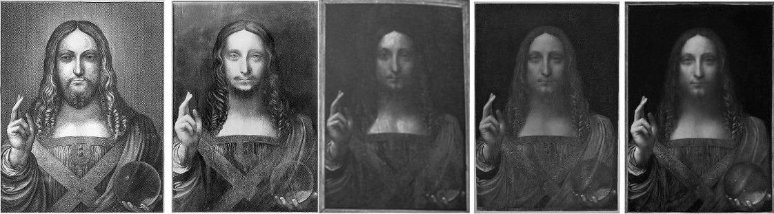
Above, Fig. 5: Successively, from the left: 1) Wenceslaus Hollar’s 1650 engraved copy of a painting believed to be a Leonardo; 2) the 1900 Cook collection painting when attributed to Luini; 3) the former Cook painting when offered for sale in 2005 from the Hendry estate; 4) the former Cook/Hendry painting when restored by Modestini and exhibited in the National Gallery’s 2011-12 Leonardo show; 5) the painting in 2017 when further restored by Modestini and sold by Christie’s, New York.
SECOND TIME LUCKY
The Cook/Kuntz/Hendry painting is not the first of the score or so Leonardo school Salvator Mundis to be attributed to Leonardo himself. As previously discussed, the so-called de Ganay Salvator Mundi (below, left) was attributed to Leonardo in 1978 and 1982 and it enjoyed a greatly more plausible French lineage.
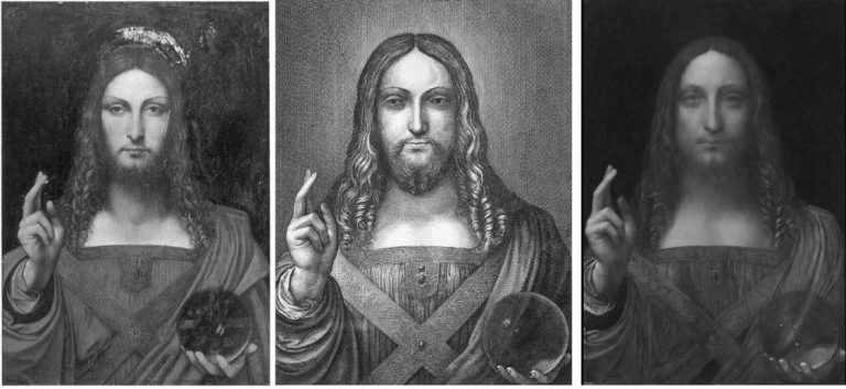
Above, Fig. 6: Successively from the left: 1) the de Ganay Salvator Mundi; 2) the Hollar 1650 etching; 3) the Cook/Kuntz/Hendry Salvator Mundi which emerged without history in England in 1900.
The compositions of neither painting above are entirely consistent with that of the Hollar copy but the de Ganay version comes closer in a number of crucial respects: its Christ has much greater sculptural presence and pictorial lucidity; its (true) left shoulder drapery has a more angular, less rounded configuration; its long, downwards-tapering, heavily bearded face is an altogether more prominently assertive feature within the painting (- and clearly was not designed to sink into the kind of “out-of-focus” aerial recession as characterised and applauded by Martin Kemp who takes this quasi-photographic effect as a confirmation of Leonardo’s hand in the Abu Dhabi picture); and, on a small but highly expressive detail, the corners of the mouth are more upturned.
As previously discussed, there is only one respect in which the Abu Dhabi picture is more compatible with the Hollar: the hand and globe are equally tightly tucked into the bottom right-hand corner of the composition. As shown previously and below at Fig. 7, within that local coincidence, nothing approaches a “fit” between the Hollar and Abu Dhabi images.
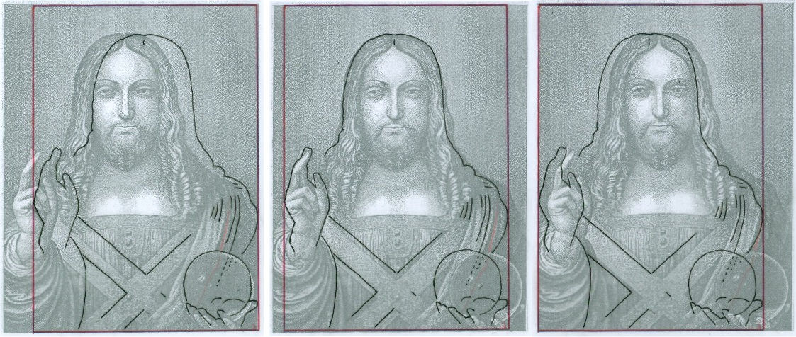
In the three-part diagram above, a tracing of the Abu Dhabi picture’s figure (black line) and format (red box) is laid over the Hollar etching in three different positions.
In the diagram, above left, the traced outline of the Abu Dhabi painting is positioned over the Hollar image so as to align their respective and distinctive right-hand edges. That edge is a critical consideration because it had not been cut down (as the left-hand edge has been) and it shows that the painting’s author ineptly ran out of space when painting the truncated thumb that sticks out at a right angle from the hand holding the globe. This feature is utterly anomalous. Had this painting been Leonardo’s own prototype for all other versions, why had no one copied it?
In this arrangement we can see that although the globe in the Hollar is larger than that in the Abu Dhabi picture, their circumferences coincide at one point. However, when so-aligned, everything else is misaligned. If the fingers of the blessing hand are aligned, as in the second overlay, above, centre, there is also a correspondence with the outline of the tops of the heads. In the overlay above right, where the respective left-hand edges are aligned, everything is misaligned.
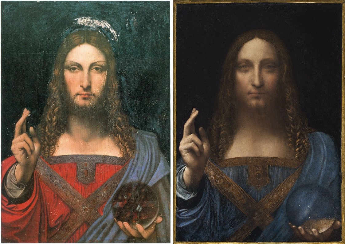
Above, Fig. 8: Left, the de Ganay Salvator Mundi as published in 1982; right, the Louvre Abu Dhabi Salvator Mundi as sold in November 2017.
In addition to earlier comments on the de Ganay and Abu Dhabi globes, we reproduce four self-explanatory graphics below that show the hand/globe configuration in the de Ganay picture to accord more closely with the Hollar etching configuration than does that of the Louvre Abu Dhabi painting. These illustrations are the work of a Japanese painter, Hikaru Hirata-Miyakawa, who has long-engaged with Leonardo’s painted images. He writes:
“Regarding the comparison of Hollar’s etching to the Louvre Abu Dhabi Salvator Mundi and de Ganay Salvator Mundi, I have juxtaposed them using Photoshop. I have found that, as with the positions of the left hand, the shape and areas of reflections on the Hollar and the de Ganay globes are quite similar. Whereas, the Abu Dhabi globe does not show any reflection of the light source at all – except for the three white dots that remind me of the tiny holes for holding bowling balls. To make the comparisons I confined the images strictly to the globe and its supporting hand. While it was necessary to adjust the image sizes to make clear comparisons, I have not changed any ratios – the width and height ratio is intact and no manipulation was made to the images.”
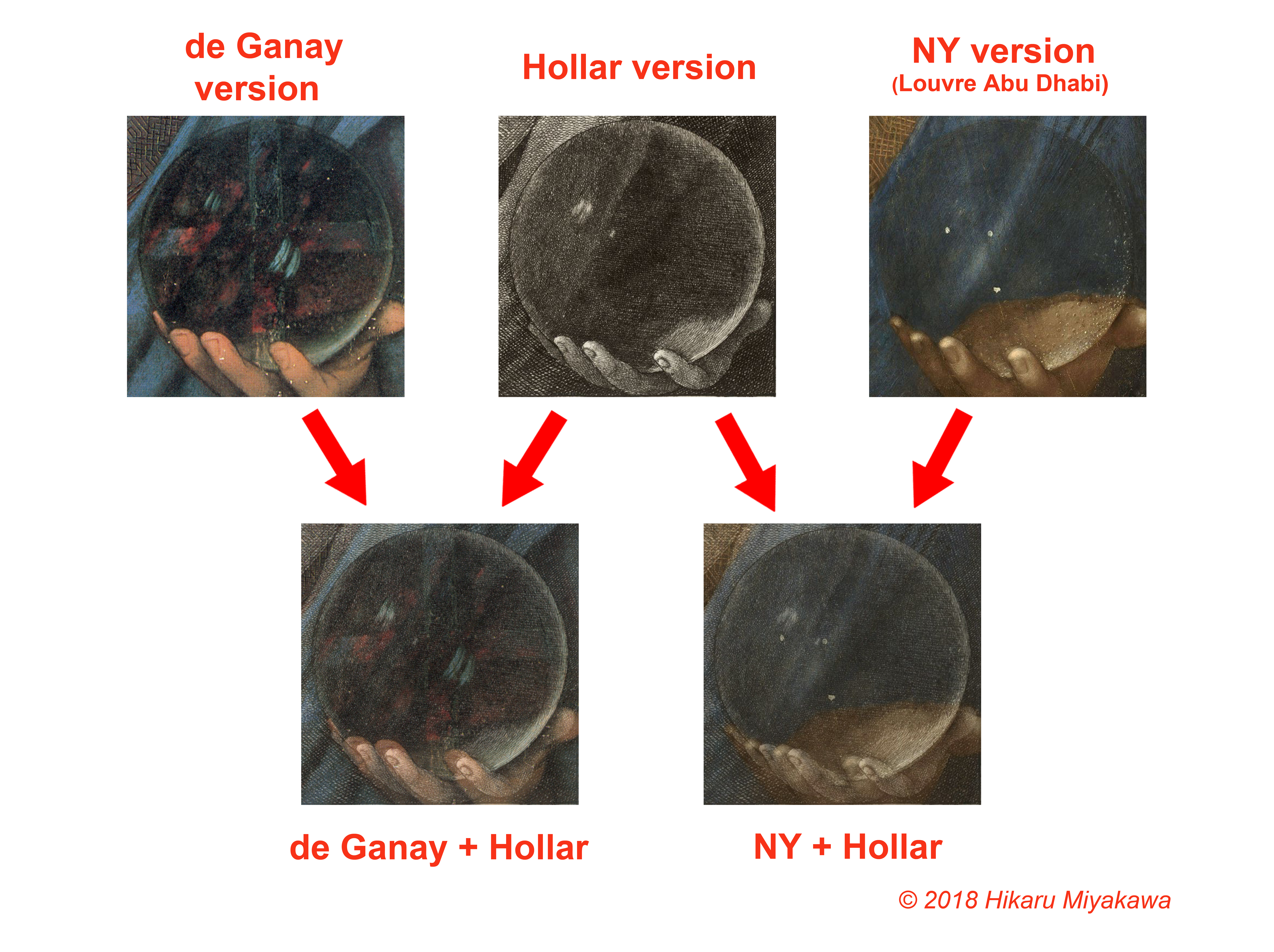
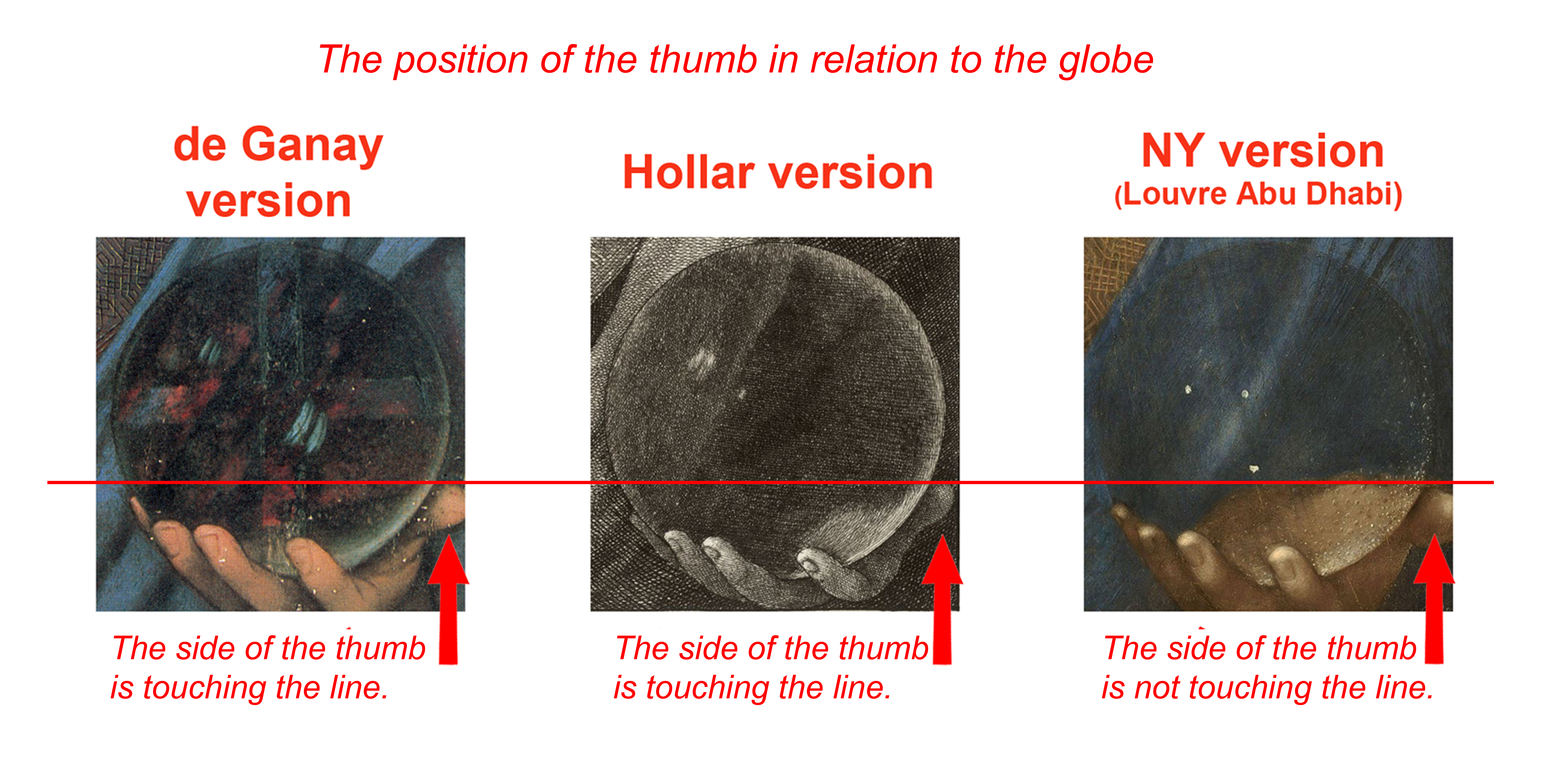

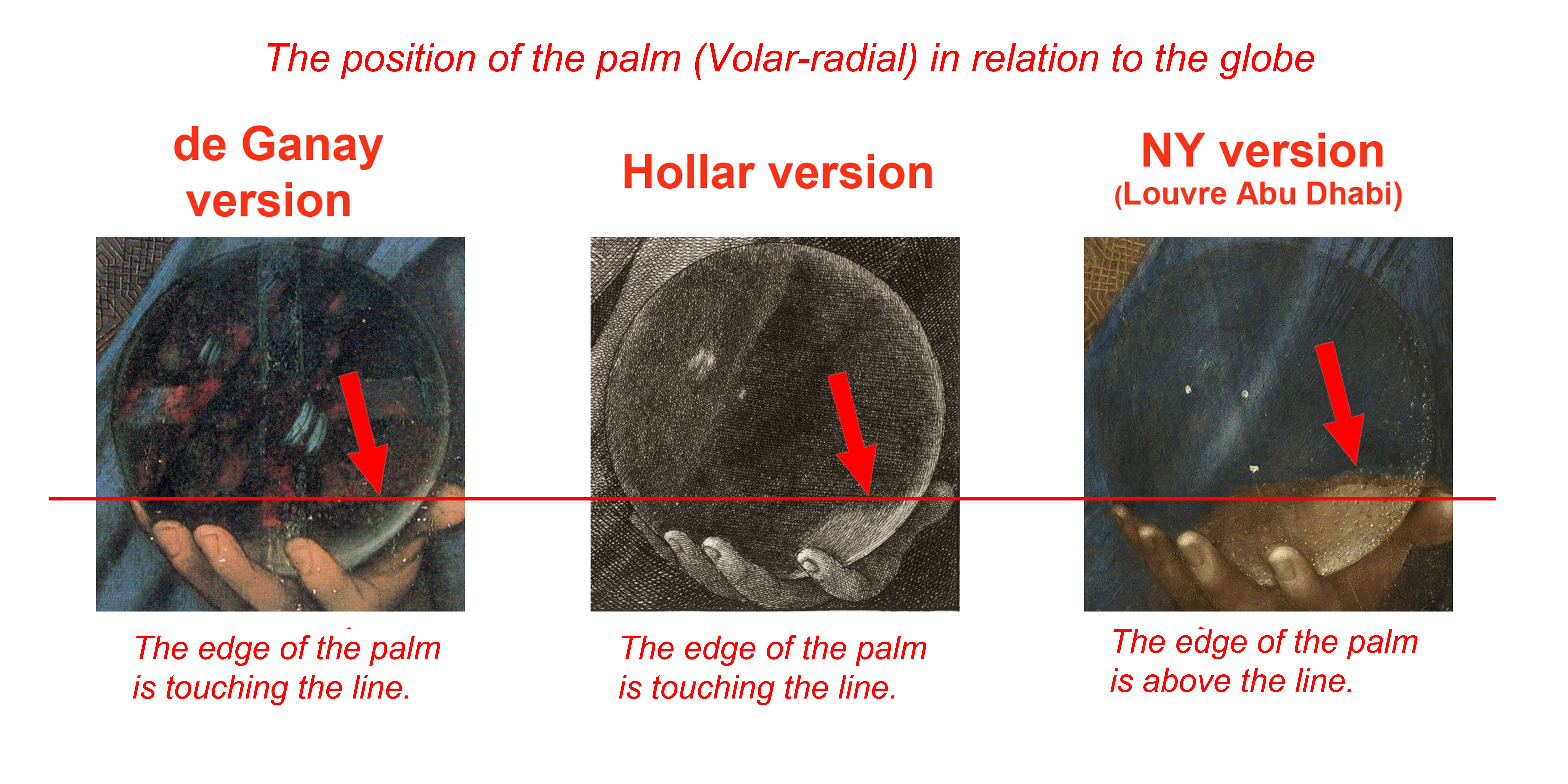
PRESENT POSITIONS ON THE LOUVRE ABU DHABI SALVATOR MUNDI IN THE WAKE OF RECENT DISCLOSURES:
1 There is nothing to confirm that Wenceslaus Hollar’s 1650 etched copy of a Salvator Mundi painting was made from the Louvre Abu Dhabi picture.
2 There is no evidence that the painting sold in 1651 from the estate of Charles I as “A peece of Christ done by Leonardo” was either the painting copied by Hollar in 1650 or the painting acquired by the Louvre Abu Dhabi in 2017.
3 There is no evidence to support suggestions that the painting in Charles I’s collection is the painting later acquired for the Sir Francis Cook collection in 1900.
4 There is no evidence to support suggested claims that the painting in Charles I’s collection had been in French royal collections, let alone commissioned from Leonardo by Louis XII as suggested in the opening of Christie’s, New York, 2017 provenance:
“(Possibly) Commissioned after 1500 by King Louis XII of France (1462-1515) and his wife, Anne of Brittany (1477-1514), following the conquest of Milan and Genoa, and possibly by descent to Henrietta Maria of France (1609-1669), by whom possibly brought to England in 1625 upon her marriage to King Charles I of England (1600-1649)…”
5 No one has ever explained why Leonardo might have painted a prominently raised hand of Christ with two fingers that are artistically compatible with those of the Mona Lisa and three other digits that are ill-drawn, un-anatomical and consistent with no Leonardo work.
6 We do not know what, if any, provenance was provided by Sotheby’s, New York, when what is now the Louvre Abu Dhabi picture was sold privately in 2013 to Yves Bouvier. The contractual nature of Bouvier’s relationships to Sotheby’s and to the collector Dmitry Rybolovlev has yet to be determined by the courts of law in New York.
7 We now know, thanks to the Wall Street Journal, that the auction house in New Orleans at which the New York consortium/Rybolovlev/Louvre Abu Dhabi Salvator Mundi was reportedly sold in 2005 for $10,000 on a $1,200-1,800 estimate (after being privately appraised for the vendor at $750) was the St. Charles Gallery branch of the New Orleans Auction Gallery in New Orleans. The New Orleans Auction Gallery reportedly went into bankruptcy proceedings and later came under new ownership as the New Orleans Auction Gallery. The Wall Street Journal reports that the director of marketing and public relations at the present New Orleans Auction Gallery has said that the new company has no records from the previous company of the same name and that: “We are not associated with that company at all”. This means that there was no possibility for the 2005 vendor to bring an action for negligence against the earlier New Orleans Auction Gallery. It means that there is presently no way of identifying/verifying/establishing who was the proxy for the consortium said to have bought the Louvre Abu Dhabi picture for $10,000 in 2005. If this is the case today, what was the situation in 2011-12 when the picture was exhibited at the National Gallery; in 2013 when Sotheby’s, New York, sold the picture privately to the fast-flipping Bouvier; and in 2017 when the picture was sold publicly by Christie’s, New York? If answers cannot be given to such questions, could anyone today challenge our 2014 contention that “As things stand, it can be safer to buy a second-hand car than an old master painting” (“Art crime”, Letter, the Times, 13 August 2014)?
THE OTHER LEONARDO-FROM-NOWHERE
In 1998 a drawing was put on the market by Christie’s, New York, as: “German School, early 19th century” and “the property of a lady”. When, some years after the sale, the work was said in the press to be a Leonardo worth $150-200 million (as the so-called “La Bella Principessa”) on fingerprint evidence (- see “PROMOTING THE DRAWING THAT CAME FROM NOWHERE”) the lady concerned disclosed her identity and brought an action for damages against the auction house on what was then only a claimed valuation on a proposed attribution, not a market-established sale. Only then was it learnt what the first buyer, a New York dealer, had not known: the vendor, Jeanne Marchig, was the widow of Giannino Marchig who was the drawing’s only owner and a painter/restorer (of Leonardo, among others) who had been an intimate of Bernard Berenson, helping him to conceal his collection from the Germans during the War. When the drawing’s second purchaser, the collector/dealer, Peter Silverman, and the Leonardo specialist, Professor Martin Kemp, trawled the Berenson archives together in search of a reference to the drawing they drew a blank. That drawing remains without history outside of the artist/restorer’s studio and, physically, it remains, as far as we know, unsold in a Swiss freeport. Such is precisely the kind of information to which potential buyers should rightfully be privy.
On the Salvator Mundi, the Wall Street Journal has said: “Mr. Simon says he has been unable to disclose details of the 2005 sale because of a nondisclosure agreement he signed when he sold the painting in 2013.” In the April 6 Antiques and Arts Weekly, Dr Robert Simon was asked: “Can you say where you found Leonardo’s ‘Salvator Mundi’?” He replied:
“Alex and I acquired the painting at an estate auction in the United States, but we’ve never divulged the location of the auction. We were not permitted to, according to the terms of the confidentiality agreement we signed at the time we sold the painting.”
Whatever purpose might have been served by the 2013 nondisclosure agreement with Sotheby’s, the painting’s origins had been unclear even before it was exhibited as a Leonardo at the National Gallery in its 2011-12 Leonardo in Milan exhibition. In the National Gallery’s 2011 catalogue entry it was said only that the Salvator Mundi was from a “Private collection”. In October 2011, the Sunday Times reported: “Luke Syson [the show’s curator] is one of the few people who knows who owns the picture. ‘We couldn’t exhibit it otherwise. It’s not being wafted to us in a brown envelope.” (Kathy Brewis, “Leonardo? Convince Me”, the Sunday Times, 9 October 2011.) Brewis wondered about the ownership and whether the National Gallery was taking a risk putting the painting on display, “so soon after its authentication”. A month afterwards the mystery of ownership remained. In the Times (“It’s kind of scary – I wrapped it in a bin liner and jumped into a taxi with it”, 12 November 2011), Ben Hoyle reported:
“Robert Simon has always hero-worshipped Leonardo da Vinci. When the New York art historian was 15 and a small-scale art dealer, he made a ‘pilgrimage’ to the artist’s birthplace in Vinci, in Tuscany. In his 20s he almost wrote his doctoral thesis on Leonardo’s followers, but was dissuaded by the immensity of the task. So when some old friends in the art world came to Mr Simon six years ago with a crudely restored picture that they had bought, he wondered if he was getting carried away when he started to speculate that it might be by one of the great man’s apprentices…He now has a stake in the picture as ‘sweat equity’ for the work he has done on it…”
Whatever the precise arrangements of ownership with the 2005 acquisition, it must be asked why the National Gallery agreed to participate in this public secrecy on a painting whose (contested) Leonardo ascription was being supported by the gallery’s director, by one of its curators and by one of its trustees.
A FURTHER THREAT TO ART WORLD TRANSPARENCY
The present lack of transparency is likely to increase with the growing practice of settling international art market disputes not through open courts but behind closed doors with lawyers working with conflicted parties on mutually confidential “mediations” or “arbitrations”. In London on 3 October 2018, an international art lawyers’ symposium on the resolution of art world and cultural heritage disputes was jointly organised by the School of International Arbitration (SIA), Queen Mary University of London, and the Switzerland and Singapore-based arbitration and mediation centre of the World Intellectual Property Organisation (WIPO). The event was (generously) hosted in Park Lane by Wilmer Cutler Pickering Hale and Dorr LLP, America’s second biggest law firm which is famed for its federal government connections and which employs over a thousand lawyers worldwide. A former partner, Robert Mueller, is Special Counsel to the investigation into Russian interference in the last U.S. presidential campaign. Although much interesting material was disclosed at the symposium about the nature and successes of these procedures, the resolutions of no specific art world disputes were identified because of their built-in confidentiality agreements. It might be the case that the new practices will favour the big guys over the little guys – who necessarily will forfeit their strongest card – the capacity to raise institutionally embarrassing press coverage. It might not. The problem is that no one will have any way of knowing, while both parties to settlements will be able (privately) to hint at satisfaction with the invisible outcome. No one will be publicly embarrassed, chastened, admonished, exonerated or vindicated. Virtue will be unrewarded because unrecognised.
In “SECRET DEALS AND THE ARTS CLUB” we said that since our first warning in 2014 of the threat to market confidence posed by the art world’s toxic attributions, and our specific call that year (in the above-mentioned Times letter) for increased transparency through a statutory requirement that vendors should “disclose all that is known and recorded about the provenance and the restoration treatments of works of art”, Georgina Adam had written in her 2017 book Dark Side of the Art Boom, that:
“At its base, the Bouvier/Rybolovlev dispute was about the nature of their business conducted within a market that has always thrived on secret backroom deals. By keeping vendors and buyers apart – they may never know who the other is – and insisting on discretion, agents, dealers, advisors can use this anonymity to their advantage. Various reasons can be put forward, from the need for security to the desire to avoid family quarrels or the taxman, to the risk of someone else bagging the work for sale. In the Bouvier/Rybolovlev case, one of Bouvier’s emails about a Magritte, said: ‘I must carry out this [negotiation] with the greatest discretion to avoid drawing attention to the painting and its owner; the risk is that we could lose it at auction’.”
Paintings can only be “lost” at auctions if others are prepared to pay the vendor more. It would seem that, aside from facilitating stealth manoeuvres, under privately conducted sales a larger sum of monetary value is likely to accrue to the buyer and a smaller one to the owner/vendor. Traditionally, auction houses’ first loyalty has been to the sellers: by going to an open competitive market, the highest possible price is achieved for a given work – that is the promise. By comparison, the deal for buyers is less assured: the small print insists that it is for buyers to satisfy themselves that works offered for sale are as they are described to be by the auction house – descriptions are not guarantees. Were auction houses to favour big, regular buyers over vendors they would jeopardise their own reputations. In his latest book, Martin Kemp discloses that when “La Bella Principessa’s” first vendor, Jeanne Marchig, publicly filed a suit against Christie’s in 2010 and again, on appeal, in July 2011, the auction house settled out of court by donating an undisclosed sum to the vendor’s own animal charity even though, as he adds:
“It has been reported to me that anyone who asks Christie’s what they now think is told privately that the portrait is a forgery.”
Michael Daley – 11 October 2018
How the Louvre Abu Dhabi Salvator Mundi became a Leonardo-from-nowhere
If it’s not over in opera until the fat lady sings, it’s not over in art attributions until the paint dries and the provenance settles. In art historical disputes over the origins (provenances) or conditions (restorations) of art, the weight of academic study and curatorial politics has assumed a greater importance than the dwindling creative/technical expertise of living artists. That this imbalanced dynamic is culturally destabilising, can perfectly be seen in the Leonardo Salvator Mundi Saga. Following a scholar’s recent re-attribution of the Louvre Abu Dhabi Salvator Mundi to Leonardo’s follower, Bernardino Luini, dedicated supporters of the $450million painting are re-writing its provenance in the wake of a second scholar’s newly discovered documents. The painting itself has not been seen since it was sold at Christie’s, New York, on 15 November 2017 and it is not clear when it might be seen again – the Louvre Abu Dhabi indefinitely postponed its planned launch of the painting a day ahead of a visit by the French Foreign Minister, Jean-Yves Le Drian, to mark the announcement of the museum’s programme of events for the next year.
The first question here is stark: Is the picture that was sold for nearly half a billion dollars an entirely autograph painting by Leonardo or a dressed-up school work? The second question is: Had a proper art historical case been made for this painting before it was exhibited in 2011 at the National Gallery as a Leonardo? In our view, the latter had not happened, partly because no attempt had been made, and partly because on a reading of the available historical evidence, the Leonardo case could not be made. On the former question, the Vienna Times reported scholarly concerns on 17 September 2018 (“What Happened With the 450 Million Dollars Painting”):
“Is there anything wrong with the painting that was auctioned at the Christie’s New York in November 2017 for the world record price of 450 million dollars? Experts suspect that the image of Christ had been doctored before sale. When it was exhibited at the National Gallery London in 2011, there were some doubts: the pedantic Leonardo would never have painted the folds of the robe behind the glass ball, ignoring the refraction of the light. At the 2017 auction, the wrinkles suddenly looked ‘right’. In the magazine ‘Art’ the German specialist Prof. Frank Zöllner (62) [The author of the catalogue raisonné Leonardo da Vinci – the Complete Paintings and Drawings] wrote about Leonardo: ‘The question arises whether the restorers responded with a modification of the folds to the objections of the critics.’ So, a manipulation to seduce connoisseurs and drive up the price? Zöllner: ‘An absurdity, if that happened.'”
On the pre-sale re-restoration, see Dalya Alberge – “Auctioneers Christie’s admit Leonardo Da Vinci painting which became world’s most expensive artwork when it sold for £340m has been retouched in last five years” – and our: “The $450m New York Leonardo Salvator Mundi Part II: It Restores, It Sells, therefore It Is.”
WHAT HAPPENED?
From the first this work has been soaked in mystery. Professor Martin Kemp discloses in his latest book Living with Leonardo: Fifty Years of Sanity and Insanity in the Art World and Beyond that it: “crossed Robert’s [Robert Simon] path in 2005 when it came up for sale at a regional auction house in Louisiana. Robert and his fellow New York art dealer Alexander Parrish, who had also noticed it, thought it might be a bit better than it superficially looked – without imagining that it might be the original. They decided to bid by proxy, and met with success, apparently acquiring it for less than $10,000, which at the time would have seemed like quite a high price.” “Apparently”? For how much? How had it been listed? Who sold it? When? Where? Many have searched and no one has found answers but this serially redone as-if-from-nowhere work has been sold twice already – with a different face of Christ each time – for a total of over half a billion dollars, first in a private sale by Sotheby’s in 2013, reportedly for $75-80 million to the owner of a string of free ports who immediately sold it on to a Russian oligarch for $127 million, and then, famously, by Christie’s, New York, for $450million in 2017. Did that initial opacity pass freely through the National Gallery and into the art market food chain? It might seem so: when the painting was taken to the National Gallery for a private viewing by a select group of experts, “All of the witnesses were sworn to confidentiality”, Kemp has disclosed, “and the painting travelled back to New York with Robert. It was becoming a Leonardo.” The invitation to view, appraise and perhaps authenticate flattered: “We are only inviting two or three scholars.”
Kemp believes that the National Gallery had not included another Leonardo attributed work he supports (the so-called “La Bella Principessa” drawing) in the 2011 Leonardo show because the curators did not accept its attribution and he now feels that that rejection had highlighted: “the rationale for the inclusion of the Salvator Mundi. Was it on the market? Would exhibiting it mean that the National Gallery was tacitly involved in a huge act of commercial promotion? It seemed highly likely that it was also ‘in the trade’. All I knew at this stage was that it was being represented by Robert Simon. He told me that it was in the hands of a ‘good owner’ who intended to do the right thing by it, and I did not inquire further. I was keen to consider the painting in its own right, not in relation to its ownership. I speculated, of course, that Robert might have a financial interest, perhaps a share in its ownership; and I assumed he was gaining some kind of legitimate income from his work on the picture’s behalf. But the gallery was assured that the painting was not actively on the market. Understandably keen to exhibit, they were happy to accept this assurance.”
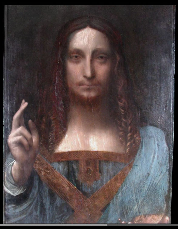
Above, Fig. 1: Part of the Louvre Abu Dhabi Salvator Mundi painting (as shown on television) when it arrived in 2005 (still sticky from a previous restoration) at the New York studio of the restorer Dianne Dwyer Modestini.
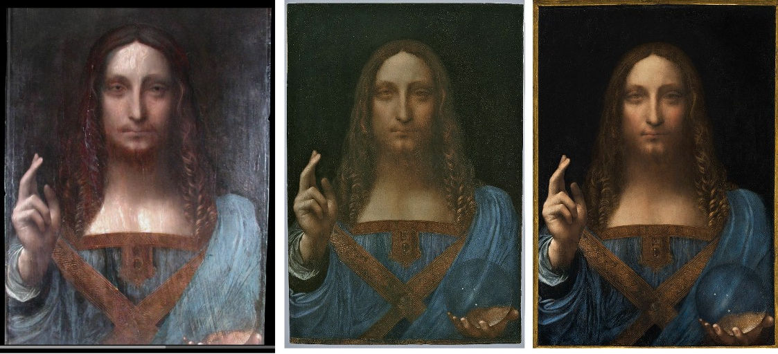
Above, Fig. 2: Left, the screen grab of the 2005 state; centre, the picture as exhibited as an autograph Leonardo painting in 2011-12 at the National Gallery ; right, the picture as sold at Christie’s, New York, in November 2017 after further and recent restoration repainting.
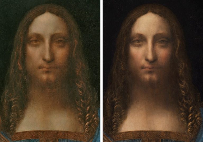
Above, Fig. 3: Left, the head as in 2011-12 when at the National Gallery; right, the head in 2017 when sold at Christie’s, New York.

Above, Fig. 4: Left, the face as in 2011-12 at the National Gallery; right, the face as sold st Christie’s, New York, in 2017.
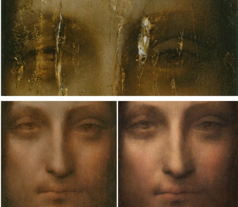
Above, Fig. 5: Top, the eyes after cleaning but before any repainting; left, the face, as in 2011-12; right, the face, as in 2017.
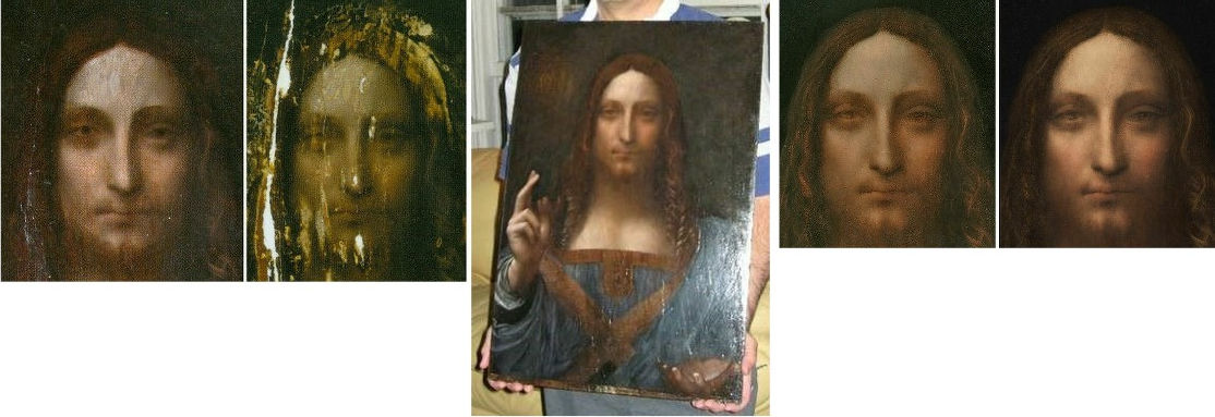
Above, Fig. 6: Far left, the face, as in 2005; left, the face as 2007 after the panel had been repaired and cleaned; centre, the painting in 2008 when taken to London for a private viewing at the National Gallery; right, the face as exhibited at the National Gallery in 2011-12; far right, the face as when sold at Christie’s, New York, in 2017.
GROWING THE PROVENANCE
We had warned ahead of the picture’s 15 November 2017 sale that the provenances compiled by the National Gallery in 2011 and Christie’s, New York, in 2017, were inflated and overly-reliant on the unpublished researches of one of the first consortium of owners (see “Problems with the New York Leonardo Salvator Mundi Part I: Provenance and Presentation”):
“…this work, now unequivocally described as a fully autograph Leonardo painting that is the artistic equal of the Mona Lisa, first materialised in 1900 when bought as by Leonardo’s follower, Bernardino Luini (- it was later taken to be a copy after Boltraffio). That purchase, and what followed immediately afterwards remained in the realm of verifiable facts until the painting went missing [after 1958] before reappearing in 2005. What was suggested to have happened before 1900 is speculation and/or contention. The first reference to such a Leonardo subject is in 1651. Christie’s provides the following provenance:
“(Possibly) Commissioned after 1500 by King Louis XII of France (1462-1515) and his wife, Anne of Brittany (1477-1514), following the conquest of Milan and Genoa, and possibly by descent to
Henrietta Maria of France (1609-1669), by whom possibly brought to England in 1625 upon her marriage to King Charles I of England (1600-1649), Greenwich;
Commonwealth Sale, as ‘A peece of Christ done by Leonardo at 30- 00- 00’, presented, 23 October 1651, as part of the Sixth Dividend to
Captain John Stone (1620-1667), leader of the Sixth Dividend of creditors, until 1660, when it was returned with other works upon the Restoration to
King Charles II of England (1630-1685), Whitehall, and probably by inheritance to his brother King James II of England (1633-1701), Whitehall, from which probably removed by
Catherine Sedley, Countess of Dorchester (1657-1717), or her future son-in-law, John Sheffield, 1st Duke of Buckingham and Normanby (1648-1721), and probably by descent to his illegitimate son
Sir Charles Herbert Sheffield, 1st Bt. (c. 1706-1774); John Prestage, London, 24 February 1763, lot 53, as ‘L. Da. Vinci A head of our Saviour’ (£2.10).
Sir [John] Charles Robinson (1824-1913), as Bernardino Luini; by whom sold in 1900 to
Sir Francis Cook, 1st Bt. (1817-1901), Doughty House, Richmond, and by descent through
Sir Frederick [Lucas] Cook, 2nd Bt. (1844-1920), Doughty House, Richmond, and
Sir Herbert [Frederick] Cook, 3rd Bt. (1868-1939), Doughty House, Richmond, as ‘Free copy after Boltraffio’ and later ‘Milanese School’, to
Sir Francis [Ferdinand Maurice] Cook, 4th Bt. (1907-1978); his sale, Sotheby’s, London, 25 June 1958, lot 40, as ‘Boltraffio’ (£45 to Kuntz).
Private collection, United States.
Robert Simon, New York.
Private sale, Sotheby’s, New York.
Acquired from the above by the present owner
Pre-Lot Text
Property from a Private European Collection
“Thus, from a claimed execution either before or after 1500 (the supporters are divided on a possible position within Leonardo’s oeuvre) it is said to have passed through four centuries via a ‘(Possibly) Commissioned’; ‘Possibly by descent’; ‘by whom possibly brought to England’; ‘probably by inheritance’; ‘from which probably removed’; ‘and probably by descent’ to 1900. It then took a further 111 years for this work to gain accreditation as a Leonardo when it was included in the National Gallery’s special exhibition Leonardo, Painter at the Court of Milan after a long and highly problematic restoration.” Emphases added.
On 2 February 2018, in “The $450m New York Leonardo Salvator Mundi Part II: It Restores, It Sells, therefore It Is”, we held the National Gallery’s 2011 provenance to have been similarly problematic:
“This Leonardo ascription has been made on almost no published scholarship. It rests on a largely unstated and, therefore, unexamined art critical case. Apart from the restorer’s report and the National Gallery exhibition catalogue’s entry by its curator, Luke Syson, almost nothing, so far as we know, has been published in support of this Leonardo. Christie’s lot essay appealed to the authority of the unpublished researches of one of the original owners, Dr Robert Simon, a New York art dealer, and to [the restorer] Diane Dwyer Modestini’s and Syson’s accounts when they, too, both acknowledged indebtedness to the researches of Simon. After twelve years, serial restorations and two sales at a combined total of over half a billion dollars, those researches have yet to be published… Luke Syson writes:
“‘The re-emergence of this picture, cleaned and restored to reveal an autograph work by Leonardo, therefore comes as an extraordinary surprise’ but, he adds, of Wenceslaus Hollar’s engraved testimony: ‘None of this, of course, is evidence for the picture’s autograph status. After all, the pictures by pupils copying Leonardo’s design may sometimes have been rather good, and one such might easily have been owned by Henrietta Maria.’ Quite so, and in view of Jacques Franck’s account [that Leonardo had not painted a prototype Salvator Mundi because he was otherwise engaged and devolving painting to his studio – see below] … that very possibility, as advanced by Ludwig Heydenreich, is the first mountain that any autograph Leonardo Salvator Mundi aspirant must be seen to have scaled. It is now six years since Syson alerted us that ‘This discussion anticipates the more detailed publication of this picture by Robert Simon and others’ but he gave little indication of any corroborative evidence being to hand. It would sometimes seem that Simon’s researches on the New York candidate echo or adapt the extensive researches earlier conducted by Joanne Snow-Smith in her support of the unsuccessful Paris candidate, the so-called de Ganay Salvator Mundi. If Syson should prove to have been a dutiful student of Simon we might be in for a daisy-chain of hypotheses in which awkward and peculiar features are advanced as material corroborations with rhetorical flourishes. Syson ends his account thusly:
“’Snow-Smith has shown that King Louis XII and his consort, Anne of Brittany, were particularly devoted to Christ as Salvator Mundi, and that they could connect this cult with the Mandylion of Edessa twice-over we now see. Given the date – around 1500 – of Leonardo’s preparatory drawings [only two sheets of drapery studies, one of which is thought not to be entirely autograph], the style of the picture and its association with a French princess [Charles I’s queen, Henrietta Maria], Louis and Anne become the most likely patrons for Leonardo’s Salvator Mundi, probably commissioning the work soon after the conquest of Milan and Genoa. This would therefore be one of the French commissions mentioned by Fra Pietro da Novellara. And it was perhaps to accommodate their wishes that Leonardo based Christ’s features, the set of the eyes, the heavy lower lids, and especially his smoothly arched eyebrows [sic] down into a long nose, on the Christ of the Mandylion of Edessa.’”
“How can you extract a ‘would therefore be’ from a ‘could’, a ‘most likely’, and a ‘probably’? In lieu of a single hard shiny fact, we are offered a forest of fancies, maybes, perhaps’s and scholarly borrowings.” Emphases added.
THE FRA PIETRO DA NOVELLARA CONNECTION
When Luke Syson claimed that the now-Louvre Abu Dhabi Salvator Mundi had “therefore been” one of the French commissions by King Louis XII and his consort mentioned by Fra Pietro da Novellara he risked readers confounding his “therefore” with a proof rather than a contention. In a footnote, Syson cites paintings (of only recent provenances) that “must also” have derived from this Royal commission. One, the Young Christ by Marco d’Oggiono in the Galleria Borghese, Rome, is discussed below at Fig. 14. On the precise testimony of Fra Pietro da Novellara, see Jacques Franck, below.
ALL CHANGE
When the Leonardo scholar Matthew Landrus recently contended that most of the upgraded Salvator Mundi was painted by Leonardo’s assistant, Bernardino Luini (the very artist under whose name the secure provenance began in 1900 – see “Leonardo scholar challenges attribution of $450m painting” and “Salvator Mundi: Why Bernardinino Luini should be back in the frame”) he was disparaged by his former teacher, Martin Kemp, at the Edinburgh Festival, and on CNN, who reported:
“Others are in less doubt. Curator of Italian Paintings at London’s National Gallery [sic], Martin Kemp, sent the following statement to CNN Style by email: ‘The book I am publishing in 2019 with Robert Simon and Margaret Dalivalle (…) will present a conclusive body of evidence that the Salvator Mundi is a masterpiece by Leonardo. In the meantime I am not addressing ill-founded assertions that would attract no attention were it not for the sale price.’”
Kemp’s disinclination to address “ill-founded assertions that would attract no attention were it not for the sale price” marked a change of policy and showed a touch of humbug. Last year, immediately ahead of the sale that produced the astronomical price of the Salvator Mundi, Kemp engaged polemically with those who rejected the picture’s Leonardo attribution: “I was approached by the auctioneers to confirm my research and agreed to record a video interview to combat the misinformation appearing in the press – providing I was not drawn into the actual sale process.” As for the long-forthcoming Book That Will Answer All Doubters, its co-authors failed to meet a Yale University Press deadline to publish in time for the 2011-12 National Gallery Leonardo show, in part, Kemp now discloses, because “I was unconvinced that all the authors actually had anything to say.”
THE JEREMY WOOD WALPOLE SOCIETY FINDINGS
Certain discoveries in Jeremy Wood’s Walpole Society article “Buying and Selling Art in Venice, London and Antwerp… c.1637-52” have thrown the earlier Salvator Mundi provenances of the National Gallery and Christie’s, New York, into question. Because so much credence is (rightly) attached to documentation, the sudden discovery of a parallel never-seen but documented ghost painting has undermined official accounts of the Louvre Abu Dhabi picture’s history. Within a single country at the same historical moment there are now two records of a Leonardo painting in the Collection of Charles I and two records of a Leonardo Salvator Mundi painting in the (nearby) Hamilton collection. With the Charles I collection, the first record is in the 1649 inventory of Charles I’s possessions drawn up in the year of his death. It is not of a Christ as Salvator Mundi but was recorded simply as ‘A peece of Christ done by Leonardo’ when sold in 1651. It tells us that Charles I had had a painting of that description but not when or how it had been acquired. The second and later record of 1666, as disclosed in Martin Kemp’s new book, is a work in the numbered list of the “King’s Closet” in Whitehall and “featured as number 311: ‘Leonard De Vince O.r Savio.r w.th a gloabe in one hand & holding up y.e other’.” Today, thanks to Wood’s researches those two records are balanced by the discovery that a ‘Christ with a globe in his hande done by Leonardus Vinsett’ was in the Chelsea home of James, 3rd Marquis, later 1st Duke of Hamilton, between 1638 and 1641. A second record further testifies to a Salvator Mundi in the Hamilton collection in 1643, as is discussed below.
The four records of two Salvator Mundis attributed to Leonardo in two important collections might be taken to show that two Leonardo Salvator Mundis co-existed in England at that time. But records of two Leonardo Christs cannot safely be taken to confirm that two Leonardo paintings of Christ were present in England. Nor need it mean that one painting was a Leonardo and the other not – they might both have been misattributed. Max Friedlander warned that “The inventories of princely galleries – such as those of Margaret of Austria, Vicereine of the Netherlands, or of King Charles I of England…are to be utilized sceptically and to be taken seriously only to the extent that facts derived from style criticism do not contradict them.”
LEONARDO HAD NO TIME TO PAINT
In part the destabilisation stems from an emerging contrast between the unexpected abundance of records in mid-seventeenth century England of an attributed Leonardo picture and the complete absence in early sixteenth century Italy of any record or mention of a Leonardo Salvator Mundi. Not only is there no documentary record of Leonardo ever having painted a Salvator Mundi prototype, in material/visual terms, there are no characteristically faithful copies of the kind executed from such autograph Leonardo paintings as the Mona Lisa and The Virgin and St. Anne. The day before the 15 November 2017 sale at Christie’s, New York, we contrasted that marked absence of copies with the plethora of variants (more than twenty) of a Leonardesque Salvator Mundi – all of which seemingly derive from little more than a couple of drapery studies that have been attributed to Leonardo. This might all indicate, as Heydenreich had concluded after a most exhaustive study, that while Leonardo – a notoriously fastidious and slow artist – had made drawings for his school, he had not painted a Salvator Mundi. We reported then that Jacques Franck, the expert of Leonardo’s painting techniques and a restoration adviser to the Louvre, had noted that the logistics of Leonardo’s life at the time were known to have made painting all but impossible:
“By 1500 onwards, the period in which the painted panel is said to have been executed, for want of time Leonardo produced few works. Fra Pietro da Novellara, who visited his studio in April 1501, reported: ‘His mathematical researches have so much distracted him that he can’t stand the brush’, and, he added, ‘Two of his pupils make copies to which he adds some touches from time to time’. In 1501, he was commissioned to produce a ‘Madonna of the Yarnwinder’ by Florimond Robertet (the French King Louis XII’s secretary) at the time when he was already creating both the major group ‘The Virgin and Child with Saint Anne’ and the phenomenally accomplished ‘Mona Lisa’. Both panels were seen during their executions in October 1503 by Agostino Vespucci, an assistant of Machiavelli at the Signoria in Florence but he, too, made no reference to a Salvator Mundi. Giorgio Vasari says of the ‘Mona Lisa’s’ execution that Leonardo, as a meticulous and slow-working painter had ‘toiled over it for four years’. Between May and August 1502 until early 1503 Leonardo was committed with Cesare Borgia as an architect and general engineer in the Marches and Romagna. He was then fully employed by the City of Florence during the Summer of 1503 as a military architect and, two or three months later, he worked fully on the commission of a huge mural (the now destroyed ‘Battle of Anghiari’) until late May 1506, before travelling between Florence and Milan up to mid 1508, because of his appointment as painter and engineer to the French King while serving Charles II d’Amboise, the new governor of Milan. Because of such taxing commitments – and all of the above were in addition to his intense scientific researches and literary activities – Leonardo increasingly resorted to workshop productions from 1500 onwards. The ‘Salvator Mundi’ must, of necessity, be thought to be one of those works and, given the preceding it is very likely that a fully original version never existed.”
That was then. Franck was speaking from memory. He has now revisited the source and adds:
“Novellara’s text says (letter to Isabella d’Este of 14 April 1501): “…if he could free himself from his obligation to His Majesty the King of France without disgrace, as he hopes to do within a month at the most, he would be ever so ready to serve your Excellency more than anyone else in the world” (“…se si potea spiccare da la maestà del Re di Franza senza sua disgrazia, como sperava, a la più longa fra meso uno, servirebbe più presto Vostra Excellentia che persona al mondo”). In the two letters written by Fra Pietro to Isabella on the 3rd and 14th April 1501, this is the only mention regarding Leonardo’s commitment with the French King. No mention that the “obligation to the King” in question is a painting. The other French commission described very precisely by Isabella’s emissary in Florence is the small devotional Madonna painted for Florimond Robertet, the King’s secretary (the Madonna of the Yarnwinder). But it wasn’t a royal commission. Another painting described in this famous correspondence is the Saint Anne in its preliminary graphic stage (cartoon): Novellara does not say who commissioned it. In other words, no hint about a Salvator Mundi, even as a possibility, to be connected to Louis XII and Anne of Brittany in Novellara’s above-mentioned letters.”
AN ATTEMPTED PROVENANCE SWITCH
The response of the supporters of the Abu Dhabi painting to Jeremy Wood’s disclosure of twin records of a rival candidate painting of a Christ with a globe in the Hamilton collection is concerning. Margaret Dalivalle, a former Martin Kemp student who has been conducting provenance research for some years on the Abu Dhabi picture, seems to have been the first properly to spot the potentially game-changing significance of Wood’s research findings. Alison Cole, the editor of the Art Newspaper, reported on 30 August (- “Leonardo’s Salvator Mundi: expert uncovers ‘exciting’ new evidence”) that Dalivalle finds Wood’s discovery of the Hamilton picture “exciting” and says “I immediately recognised the significance of one item hanging in the Lower Gallery: ‘Christ: with a globe in his hande done by Leonardus Vinsett’”.
However, before any open scholarly discussions and evaluations of the two now-rival recorded candidates have taken place, Dalivalle has placed this reading on that most significant finding:
“The painting was in a collection closely, almost incestuously, related to the Royal Collection; the king, according to a document of 18 October 1638, expressly wished to have the pick of paintings bought by Hamilton in Venice, threatening the imposition of customs duty, and the king and queen’s predilection for Leonardo is documented. Therefore, I consider there is a strong possibility that this painting was seen at Chelsea House and chosen by the king at some point between 1638 and 1641, finding its way to the queen’s apartments at Greenwich.”
Thus, the Hamilton picture would now find itself located in the royal collection as an earlier incarnation of what is held to be the Abu Dhabi Leonardo picture. In the absence of any visual records such a switch might be thought plausible on circumstantial grounds but the suggestion is made against the testimony of another Wood document that makes clear that the painting could not have been purloined by Charles I between 1638 and 1641.
THE WOOD/HAMILTON DOCUMENTS
Pace Dalivalle’s reading of the earlier document, Wood discloses that in 1643 Hamilton’s collection was crated in order to be sent to Scotland. The move was blocked in Parliament but one case contained a “Christ Holding up his two fingers.” A Christ with two fingers held up in blessing testifies no less to a Christ as Salvator Mundi than does a Christ with a globe. That the picture was in Hamilton’s possession as late as 1643 makes a subsequent transfer to the royal collection greatly less likely: the following year the Queen (Henrietta Maria) and the copyist Wenceslaus Hollar both fled to Antwerp. Was Charles I seizing paintings at that turbulent moment – even assuming that the Hamilton pictures had been un-crated? In any event, we have a doubly confirmed Hamilton Salvator Mundi in 1643 – just six years before the first record of a Leonardo in the Charles I collection. Either two attributed Leonardos ran in parallel or the Hamilton picture was snatched for the royal collection shortly before the execution of Charles I. Because there is no record of a switch between 1643 and 1649 does not, of course, mean that it could not have taken place but much hangs on the question.
While leaving the question open, Alison Cole has pointed out (re Hollar’s 1650 copy of a Salvator Mundi) that there is another possibility:
“Wood and Dalivalle have also discussed other possible hypotheses… After James Hamilton’s execution in 1649, his brother, the 2nd Duke, transported a large portion of his collection to the Netherlands to be sold. Could Hamilton’s Salvator Mundi have been part of this consignment, and could this explain the “how and the why” Hollar etched it “from the original” in Antwerp at that precise time? (Indeed, in 1649 and 1650, Hollar made a number of etchings after Italian paintings that were available to him in the original.)”
That would be to say: the twice-recorded Hamilton Salvator Mundi then stayed in the collection after 1643 until it was sent to Antwerp to be sold in 1649, the year of Charles I’s execution. This possibility is being dismissed: Cole further reports that Dalivalle places this hypothesis among what she terms the “red herrings” to be addressed in her contribution to the long-forthcoming (now Oxford University Press book) Leonardo’s Salvator Mundi and the Collecting of Leonardo in the Stuart Courts that she is co-authoring with Robert Simon and Martin Kemp. That dismissal is premature and question-begging. It also offers a degree of protection to the now-challenged claim that the Abu Dhabi picture had been copied in 1650 by Wenceslaus Hollar – see below.
THE END OF THE FRENCH ROYAL CONNECTIONS IN THE SALVATOR MUNDI PROVENANCE
For the Louvre Abu Dhabi picture’s supporters, situating the Hamilton picture within the royal collection would compensate for the loss of the painting’s supposed French royal origins in the official provenances. Margaret Dalivalle, in talking to the Art Newspaper , has now disclosed that:
“I have found no evidence that the Salvator Mundi was brought by Henrietta Maria from France; it belonged to her [only] by dint of the fact that it was recorded in a property of her jointure in 1649.”
As seen, it has not been established that the Hamilton Salvator Mundi had entered the royal collection at all. The previously suggested arrival of the painting at court with Henrietta Maria in 1625 had comprised the lynchpin of the Abu Dhabi painting’s 2011 and 2017 provenances – those supposed initial double royal connections were flaunted in Christie’s 2017 global marketing pitch (see – The Leonardo Salvator Mundi Saga: Three Developments).
In the 2011-12 National Gallery exhibition catalogue Luke Syson said (of the copyist Wenceslaus Hollar) “The several connections with the Queen suggest that the Salvator Mundi is likely to have come to England when she married Charles in 1625, and was originally the property of the French Royal family; several of the best copies have a French provenance.” Emphases added. There were multiple problems with that account. First, the above described absences of records in Italy. Second, the nature of the visual testimony of the Hollar copy, as discussed below. Third, the now Dalivalle-confirmed absence of any evidence that Henrietta Maria had previously owned and brought a Leonardo Salvator Mundi with her from France when she married Charles I in 1625. In consequence, the opening sequence of Christie’s 2017 provenance below evaporates:
“(Possibly) Commissioned after 1500 by King Louis XII of France (1462-1515) and his wife, Anne of Brittany (1477-1514), following the conquest of Milan and Genoa, and possibly by descent to Henrietta Maria of France (1609-1669), by whom possibly brought to England in 1625 upon her marriage to King Charles I of England (1600-1649)…
Without the previously implied royal pedigree the open question of when or whether the Hamilton painting entered the royal collection becomes pressing, because, as Martin Kemp ackowledges, despite all Dalivalle’s researches, nothing links the Abu Dhabi Salvator Mundi painting to anything beyond the painting’s entry into the Cook collection in 1900:
“We could not be absolutely sure that Charles’s Leonardo was the same as ‘Robert’s’ [Robert Simon and others’] Leonardo, rather than one of the copies, but it seemed highly likely. Margaret was subsequently able to track the picture back to the beautiful Queen’s House in Greenwich, where it was in one of the ‘closets’ of Queen Henrieta Maria…she was also able to track its later history though not yet as far as the Cook collection.”
The Greenwich record was dated 1666 when Henrieta Maria had fled England in 1644. Whichever picture was then present, it could not have been copied by Hollar in his 1650 etching because he and Henrietta Maria were then in Antwerp (and perhaps later, on one account, in France), and for reasons given it was unlikely to have been the Abu Dhabi picture. In truth, we have no idea which of several possible paintings was recorded by Hollar.
Without a secure Hollar connection, the Abu Dhabi Salvator Mundi’s provenance begins only at 1900, four centuries after its supposed execution. The pre-1900 history which Dalivalle has failed to establish is itself highly problematic. It is not known from whom, where or when the picture had been acquired by Sir Charles Robinson who bought the work as a Bernardino Luino for the Cook Collection. We have been informed (as has Robert Simon) that an English fossil-hunter, Thomas Hawkins (1810-89), seems to have donated a “Leonardo Salvator Mundi” in 1848 to a church in Birmingham. That church was closed down in 1895, at which date its collection was presumably disbursed. Had Robinson bought the Abu Dhabi picture from that church? Or, were there two claimed Leonardo Salvator Mundi versions then at large in England? Or three – the whereabouts of a third version formerly in the Worsey and Yarborough Collections is presently unknown…
The Cook collection picture’s provenance ran into the ground in 1958 when sold by Sotheby’s for £45. Between 1900 and 1958 no one thought the New York, now Abu Dhabi Salvator Mundi to be a Leonardo. Christie’s 2017 sale provenance ended: “Kuntz, Private Collection USA”. Kemp suggests that this might have been a punning play on the German word for art, and Sotheby’s have no additional information on Kuntz. That trail should not be given up lightly.
Wiki has an entry on a US artist Roger Edward Kuntz, a talented painter who wavered between abstraction and representation and died in 1975. In the early 50s he and his wife travelled for four months in Europe so that he could visit museums. They had a daughter in 1951. If Kuntz, an artist with a “pensive, thoughtfully naturalistic sensibility” made another European trip in 1958, might he have had £45 (at that date about a month’s wage for an unskilled worker in Britain) to spare on an old Italian painting? Roger Kuntz died in 1975 but was succeeded by his wife and daughter. If not that particular Kuntz family, what of others in the United States? As previously reported, our colleague Alexa Tzarnas has identified a Kuntz family in Louisiana who used to be avid collectors of paintings, antiques and historical documents. Rosemund E. and Emile Kuntz had two sons, one of whom donated a majority of their collection to Tulane University in New Orleans. Given that we do not know the identity of the 2005 vendor or the venue of the sale and given the still sticky varnish then present on the New York/Abu Dhabi Salvator Mundi, it could be useful to establish the identity of the previous owner who might well have information on previous restorations and photo-records of the painting from 1958 onwards.
THE WENCESLAUS HOLLAR 1650 ETCHING OF THE LEONARDO SALVATOR MUNDI – AND THREE PROPOSED PAINTINGS THAT MIGHT HAVE PROVIDED THE MODEL
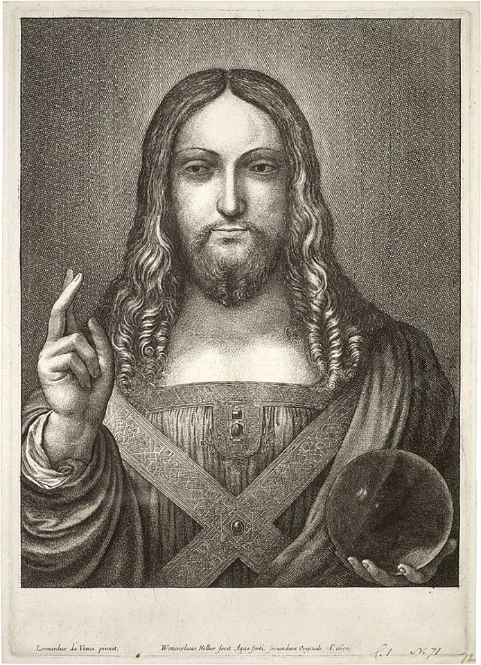
Above, Fig. 7: The Wenceslaus Hollar etching which carries in (Latin) the following inscription: “Leonardo da Vinci painted the original from which Wenceslaus Hollar etched [this copy] in 1650 Anno Domini”
The Hollar copy (above) is being treated today as if unquestionably a record of the painting in the collection of Charles I but certain difficulties with this assumed relationship were acknowledged by Luke Syson:
“Hollar must have made a drawing of Leonardo’s painting while he was still in England, when it still belonged to the King and Queen. This drawing then formed the basis of the print, an image that had come to have additional associations for the Catholic Henrietta Maria.” Emphases added.
Against Syson’s suggestion that Hollar had made a drawing before 1644 and taken it with him to Antwerp, keeping it for at least six years before making an etching from it in 1650, we return to the Alison Cole/Jeremy Wood hypothesis that the Hamilton Salvator Mundi had been among the large proportion of the collection sent to Antwerp to be sold in 1649. On this proposed account Hollar would have had no need to work from a six or more years old drawing at a time when he was making copies of other Italian paintings in Antwerp. The inscription on the etching itself suggests that it was made from the painting itself rather than from memory and an old drawing:
“Leonardo da Vinci painted the original from which Wenceslaus Hollar etched [this copy] in 1650 Anno Domini”.
Before looking at the etching itself in relation to rival paintings with a view to formulating some “style criticisms”, there is a third candidate Salvator Mundi painting to be considered. That is the so-called “de Ganay Salvator Mundi” which painting was presented in 1978 and 1982 as the original Leonardo Salvator Mundi by the art historian Joanne Snow-Smith (with, it was posthumously stated, the endorsement of Ludwig Heydenreich). Its claims merit consideration if for no other reason than that aspects of Snow-Smith’s account have been incorporated in the Simon/Syson/Christie’s/Kemp accounts – and most especially her claim of French royal origins for the painting. Moreover, the de Ganay and the Abu Dhabi versions are the two Salvator Mundi paintings that offer the most credible “fits” with the 1650 image produced by the accomplished draughtsman/copyist Wenceslaus Hollar. As will be seen, neither version achieves a full match but they depart from the Hollar record in different ways.
In support of her attribution Joanne Snow-Smith suggested this chronology:
“1506 – Leonardo’s second Milanese period begins upon return to Milan at invitation of Louis XII. Active at the court of Charles d’Amboise, the French governor of Milan;
1507 – Louis XII in Milan with Jean Perréal, his court painter. Leonardo appointed painter and engineer to the King;
c. 1507-08 – Commission for the Salvator Mundi given to Leonardo by Louis XII;
c. 1510 – Preliminary drawings in red chalk on red-prepared paper for a Salvator Mundi, now at Windsor Royal Library, begun;
1510-13 – Salvator Mundi in Leonardo’s studio in Milan. Copies made by pupils in various stages of completion;
1513, Spring – Salvator Mundi completed by Leonardo by order of Louis XII. Given to French general for delivery to Louis XII in France;
[…] 1514 – January 9, Anne of Brittany, beloved wife of Louis XII, dies at Blois. The King presents Leonardo’s Salvator Mundi to a Franciscan convent of the Order of Saint Claire in Nantes as votive funerary offering for her soul. Painting remains cloistered until late 19th-early 20th century…”
In support of her claim of a French-owned painting as the subject of Hollar’s etching, Snow-Smith imagined a trip along the Loire by Henrietta Maria:
“There were along the course of the Loire convents of the Order…and making such a trip may well have been suggested to Henrietta Maria by…further impetus for a journey to Nantes would have been supplied by the fact that her mother, Marie de’ Medici, had in 1626 laid the cornerstone of the convent there. It is suggested that Henrietta Maria requested Hollar to accompany her in the role of court etcher. There is no question but that his sense of duty to the family he loved so well would have induced his acceptance. Whether they stayed in Nantes in the convent of the Visitation or of the Calvairiennes need not concern us. Suffice it to say that in either place she would have heard of the Salvator Mundi by Leonardo cloistered in the Clairician convent in that city…and it would certainly be understandable that she…would have wished Hollar to copy for her a painting in which the kindness and love of the ultimate justice were expressed with such strength, tenderness and pathos…” Emphases added.
Even if we discount Snow-Smith’s imaginary journey, Hollar’s presence in France in 1650 is credible – his etchings were published in Paris. Given Hollar’s close connections with Henrietta there are thus two locations in which he might have etched the Salvator Mundi – Antwerp or Nantes. In Antwerp, he might conceivably, on Syson’s account, have made it from a drawing made in London six or more years earlier if a salvator Mundi had entered the royal collection before 1644, or from the Hamilton Salvator Mundi; or, in Nantes from the de Ganay Salvator Mundi.
With the Abu Dhabi Leonardo attribution the etching’s testimony is double edged: there are, for sure, clear general correspondences – as there are with the de Ganay version – but Hollar’s 1650 recording of painting of a Christ as Salvator Mundi is different in significant stylistic respects from the Louvre Abu Dhabi picture. Greatly compounding the problem today of plausibly attaching rival documentary records and accounts to the sole etched copy, is the fact that the Abu Dhabi painting has itself borne rival appearances since it emerged in 2005 – and has existed in two distinct states in the last five years. As seen at Fig. 6 above, those appearances are: the painting as it was when it first appeared in 2005 still sticky from some previous treatment; as it was in 2007 after being cleaned and repaired; as it was in 2008 when part-restored and first taken to London for appraisal by a select group of Leonardo experts; as it was when further repainted and taken back to London in 2011 to be included in the National Gallery Leonardo exhibition; and, as it was when yet further restored by Christie’s ahead of the November 2017 sale.
This shifting appearance poses an acute problem for supporters: with which state/version of the Abu Dhabi picture might the Hollar etching be considered to show a better correspondence? Is it that seen when exhibited at the National Gallery in 2011-12, as below left at Fig. 8? Or is it that seen at Christie’s, New York, in 2017, as below right at Fig. 8? If the latter, had Christie’s requested the original restorer to work further on the painting to that end?
“STYLE CRITICISMS” AND CERTAIN VISUAL DISPROOFS
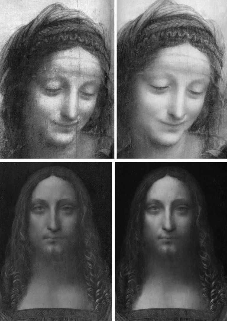
Above, Fig. 8: Top, Leonardo’s face of St. Anne (on the Louvre’s The Virgin and St Anne with Child), before cleaning, left; after cleaning, right; above the Louvre Abu Dhabi face of Christ, left, as exibited at the National Gallery in 2011-12, and, right, as when sold at Christie’s, New York, in 2017
In the double comparison above we see the destructive and reconstructive faces of picture restoration. At the top, pictoral values are depleted by cleaning (“abraded” is the commonly encountered official euphemism). In the before and after comparison of the Salvator Mundi we see the superimposition of a more marketable state by repainting (officially, “retouching”) an earlier National Gallery endorsed appearance. The extent of this pictorial transformation is only demonstrable because the long 2007-2017 restoration was temporarily halted to allow the painting to rub shoulders with Leonardo and others at the National Gallery in 2011-12.

Above, Fig. 9: Left, the de Ganay Salvator Mundi; centre, the Wenceslaus Hollar etched copy; right, the Abu Dhabi Salvator Mundi.
While both above paintings depart from the Hollar copy, they do so differently. Such variations speak against the Abu Dhabi painting being an original autograph prototype for all others. In one respect, Hollar comes close to recording a unique feature of the Abu Dhabi picture – the closely cropped composition around the hand holding the orb in the bottom right-hand corner of the composition – see Fig. 11. Against that local similarity, the Abu Dhabi picture departs from Hollar (and all other painted versions) with its aberrantly wide, chipmunk-like face. In every other version, Christ has a long narrow face that tapers downward from the widest point at about the level of the eyes. Uniquely, the Abu Dhabi face is widest at a level a little above the mouth. It also lacks the pronounced beard that was recorded by Hollar and is widely encountered among the variants. Such icongraphic deviations make it inconceivable that the Abu Dhabi picture was recorded by Hollar in 1650.
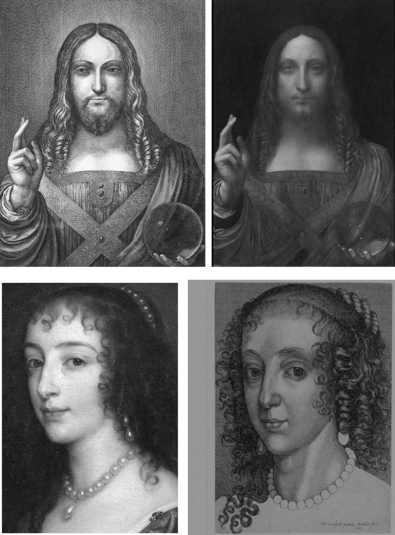
Above, Fig. 10: Top, left, the 1650 Hollar etching; top, right the Louvre Abu Dhabi Salvator Mundi, as it was when exhibited at the National Gallery in 2011-12. Above, left, a portrait of Henrietta Maria by van Dyck; above right, a copy by Hollar of a similar van Dyck portrait of Henrietta Maria.
When comparing etchings to paintings allowances have to be made for restoration injuries and falsifications to the latter and for the fact that copyists do not make “photographically” accurate facsimiles. Nonetheless, claims that Hollar’s copy was made from the Abu Dhabi painting are insupportable. In his 2011 catalogue entry, Luke Syson acknowledged that “the fit” between the print and the painting was not a complete one:
“It has always seemed likely that Leonardo painted a picture of Christ as the Saviour of the World. In 1650 the celebrated printmaker Wenceslaus Hollar signed an etching of Christ raising his right hand in blessing, holding a transparent orb in his left, with a nimbus of light behind his head: the image was taken he states, from a painting by Leonardo. Though Hollar was generally well-informed, this would not be enough on its own to prove that an autograph picture by Leonardo had once existed…Though Hollar’s Christ is very slightly stouter and broader, the two images coincide almost exactly. The draperies are just a little simplified and there is no glow of light around Christ’s head. Otherwise the newly discovered painting has the same…etc.”
Hollar recorded three sources of light in the picture he copied, not the single ineffectual one encountered in the Abu Dhabi painting. Hollar’s overall disposition of tonal values is greatly more vivacious and lucid. Light falling on Christ from above left creates a consistent shift from the (viewer’s) brightly lit left side of Christ to his shaded right side. Variations of shading on the drapery at Christ’s left shoulder cause the figure to turn away from the viewer and recede into shadow. Christ, emits his own illumination. So does the globe as light accumulates around its circumference. The inner fold on the drapery of Christ’s raised arm casts a shadow on the tunic’s folds. In Hollar a clear, plastically expressive distinction exists between the arm’s draperies and the tunic. Throughout, Hollar recorded a progressive disposition of lights and darks to establish form and space. Although the above Hollar van Dyck copy is not taken from the adjacent van Dyck painting it demonstrates how faithfully Hollar captured Henrietta Maria’s mouth’s upturned corners. Had he made his copy from the Abu Dhabi picture, would he have turned the corners of Christ’s mouth upwards? On the superiority of the print over the painting in 2011, see below. But first, hear Leonardo on his lights and shades:
“The primary purpose of the painter is to make a plane surface display a body in relief, detached from the plane, and he who in that art most surpasses others deserves most praise, and this concern, which is the crown of the science of painting, comes about from the use of shadows and lights, or, if you wish, brightness and darkness. Therefore whoever avoids shadows avoids what is the glory of the art for noble minds, but gains glory with the ignorant public, who want nothing in painting but the beauty of colour, altogether forgetting the beauty and marvel of depicting a relief on what in reality is a plane surface.”
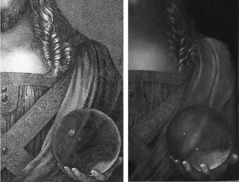
Above, Fig. 11: Left, a detail of Hollar’s 1650 etching; right, a detail of the Abu Dhabi Salvator Mundi as it was when offered for sale by Christie’s, New York, in November 2017.
It strikes again how greatly more vivacious and lucid is the etched copy than the Abu Dhabi painting. It might be objected that painters work on a larger scale and have greatly more pictorial weapons at their disposal than the tones of etchers who must say everything with monochromatic drawing and shading. But, as seen, Leonardo embraced such pictorial self-restraint as the most precious tool in the painter’s box.
We mentioned the coincidence of design and composition in this section of the painting: the knuckles of the hand rest in both cases on the bottom of the composition and the protruding thumb seems equally constrained. Those coincidences notwithstanding, even in this section the differences are legion. In the painting the thumb is cropped at the picture’s edge – and not because the picture was trimmed. The panel had been set in its frame and only then prepared for painting, as a build-up of priming and paint along the edge testifies. Whoever painted this picture was careless with its design. It is possible that the artist had transferred a cartoon onto a too-small painting and ran out of space along the right-hand edge. This Salvator Mundi figure is not just cropped above the waist as are a number of Leonardo figures, it is also severely cropped on both sides. Such a design would not be shocking in our age of photography but it was unprecedented in Leonardo’s own finished work. While there are similarities in this corner, they are confined to the design alone and not to the content within.
Uniquely, in Abu Dhabi picture the visible palm of the globe-supporting hand is massive and anatomically indeterminate. Professor Kemp holds that this unclarity is a pentimento and, hence, a token of authenticity. But the hand was drawn differently in all other versions, including Hollar’s. Everywhere else it is optically compressed towards the circumference of the globe. Why would every school work have thus made Leonardo’s clumsily drawn effort more optically sophisticated? Why did everyone else “correct” the drawing of the thumb by placing it on a diagonal, not horizontal, axis? The prevalent top left down lighting caused three reflections in a diagonal row on the surface of the globe Hollar copied. The globe itself (necessarily one of glass on that scale, not of polished rock crystal, as Kemp insists) is radiant in Hollar: dark at its centre and with light accumulating around its circumference. Kemp remarks that he has “been asked on more than one occasion why the drapery behind the sphere is so little affected by what is in effect a large magnifying lens.” He answers that Leonardo would not have concerned himself with such natural phenomena out of respect for “decorum – that is to say pictorial good manners”. It is a stylish answer but it ignores a point I had made when the National Gallery exhibition opened (“Leonardo viewed in a curious light”, letter, The Times, 12 November 2011). Namely, that in Hollar’s copy “the folds of the drapery on Christ’s left shoulder are shown to be bent when viewed through the glass sphere.” Kemp’s ex cathedra pronouncement collides with the artistic/material facts of a work of art. This is not a question of what Leonardo would or would not have done. It is a question of what Hollar did when copying a painting he believed to be a Leonardo. As previously published and shown below, in Hollar the sweeping curve of a fold on the shoulder drapery is seen to be deflected inside the globe – and a shift of direction in a drawn image cannot be gainsaid: if a convex fold of drapery becomes concave while seen through a glass orb, that is a graphic fact, not a possibly, a perhaps, a likely or maybe. If Hollar had been copying the Abu Dhabi painting, why would he have rendered a sophisticated optical phenomenon that was not present in the painting before him?
Above, Fig. 12: Left, an illustration of a rock crystal sphere in Martin Kemp’s book Living with Leonardo; right, the globe in the now lost Salvator Mundi that was formerly in the Worsey and Yarborough Collections, England.
Kemp writes that the most satisfactory facet of his own research concerned his hunch the globe was made of rock crystal. He looked at specimens of crystal spheres – all small – and realised that large crystal spheres would “exhibit both inclusions and jagged cleavage planes, compromising the ‘purity’ for which the best crystal is prized.” On the abnormally large hand seen through the globe, he writes:
“I had toyed with the idea that the double image of the of the heel of Christ’s right hand [sic] visible through the sphere might be the result of the double refraction characteristic of rock crystal; but the optics would not work. The apparent doubling is almost certainly another pentimento.”
The above crystal sphere Kemp examined at Oxford University’s Museum of Natural History was under two inches wide and therefore “quite large as such spheres go”. Reproducing the lighting direction in the Abu Dhabi picture had confirmed that there should have been (as there is in Hollar) a shiny highlight in the upper left:
“He is unlikely to have left this out, and it seemed likely that the raised area of white pigment had been abraded off at some point in the painting’s chequered history.”

Above, Fig. 13: In the top row diagrams we see, left, how, in Hollar, the globe’s reflected lights are aligned with the directional lighting and not as found in the 2017 state of the Abu Dhabi picture on the right. We see on the left (black dotted line) how the sweeping curved fold of drapery is deflected when viewed through the globe. While Kemp says that the original properly placed highlight on the globe must have been abraded off, he offers no explanation for the three randomly placed, unaligned “reflections” that emerged during the cleaning. If they were not added during the past restoration they must have been painted out previously. As seen in the television screen-grab at Fig. 1, there was no trace left in place of any impastoed white reflections when the painting was presented for restoration in 2005. One correspondent (Dr. Stefaan Missinne) has suggested that the three present lights were a depiction of a cluster of stars seen in the Southern hemisphere that had been noted in Italy in 1503. If these now miraculously recovered lights had been integral to the Abu Dhabi painting all along, they too would indicate that Hollar had made his 1650 copy from some other painting. Curiously, an alignment of lights like that seen in Hollar is present in the now lost Salvator Mundi that was formerly in the Worsey and Yarborough Collection in England (as seen above at Fig. 12).
Our glass sphere shown above is also no more than two inches in diameter. In the lower image above it rests on the photocopied sheet of diagrams that is shown here above, top. The white space between the two copied images on the sheet appears as two curving lines when viewed through the globe. We can see here how the differing degrees of refraction depend on the position within the globe. The curvature is least pronounced at the globe’s centre and increases as it approaches the circumference. The deflection on the drapery that was recorded in Hollar’s etching is consistent the distortions in evidence in the glass sphere above.
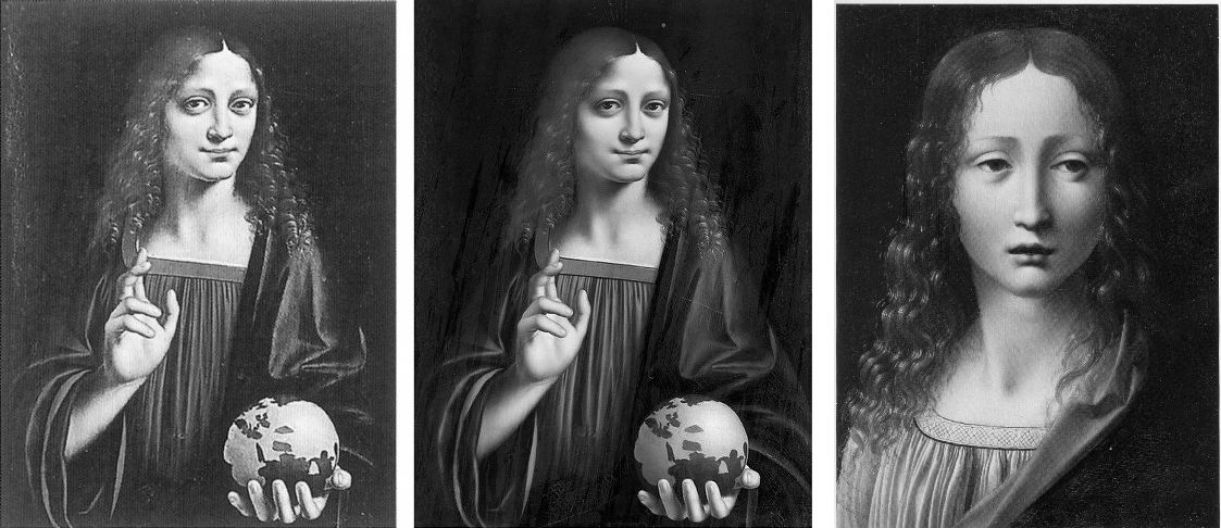
Above, Fig. 14: Left and centre, The Young Christ by Marco d’Oggiono in the Galleria Borghese, Rome, as seen before and after restoration; right, Marco d’Oggiono’s The Young Christ in the Fundación Lázaro Galdianiano, Madrid.
Luke Syson cites the Galleria Borghese picture above left and centre as a work of about 1500 that is clearly derived from the Abu Dhabi painting. The Madrid Young Christ picture, above right, was included in the National Gallery’s 2011-12 Leonardo in Milan exhibition as a newly attributed work of Marco d’Oggiono. Unlike the Abu Dhabi picture, its whereabouts in the 20th century are known. Indeed, its history is confined to that century. A work in oils on beech, its literature begins in 1910 as “circle of Leonardo” (Meier-Graef) and in 1932 it was elevated to Ambrogio de Predis by Berenson. More recently, in 1981, it was moved to “pseudo-Boltraffio” by Romano. In 1985 the “pseudo-” was dropped by Ballarin. In 1985 Marani (who has been said to support the Abu Dhabi picture) re-attached the “pseudo-”. In 1990 Baudequin gave it to Marco d’Oggiono but the following year Brown preferred Ambrogio de Predis and was supported in this by Ruiz Manero in 1996 and by Fiorio in 2000. In 2004 Saguar Quer gave it unreservedly to Boltraffio – and with “a detailed provenance” which, presumably, had not gone further back than 1910. In 2005-6 Marani suggested “a Milanese artist close to Leonardo”. In 2006-07 Danieli settled for “a Lombard painter close to Boltraffio”. (In art historical circles, “Pseudo-“ is sometimes used as polite way of saying “not kosher”.)
In the National Gallery’s 2011-12 exhibition catalogue this work is dated to c. 1490-01 and assigned to Marco d’Oggiono by Antonio Mazzotta who notes that “this is a [Leonardo] pupil’s skilful combination of workshop models and techniques, with such a commitment to ‘academic’ rules and his master’s ideas, that the pupil here seems to be acting, in the words of William Suida, ‘as Leonardo’s right hand’.” Mazzotta points out that this work has previously been given to Boltraffio – “a hypothesis explicable in the light of its high quality and of Marco’s close working relationship with him in the 1490s. Indeed, there are many features here that evoke Boltraffio’s work: the lighting and structure of the head, hair and neck are similar to his Madonna of the Rose; the swathe of drapery over the shoulder and concertina folds of the shirt recall his early drapery studies…”
Mazzotta is somewhat back-handed in his support: while Marco’s “greyish skin tones” are similar to Boltraffio’s, the latter is more elegant and controlled. “The rather too prominent eyes are typical of Marco d’Oggiono: the sfumato modelling is applied like make-up, though the eyelids remain both flat and puffy. As a result, Marco loses control of Christ’s expression, which is at the same time melancholic and slightly gormless, an expression that strongly resembles that of the sitter for the Archinto Portrait…” The latter, a National Gallery painting in oil on walnut, was included in the 2011-12 exhibition as Marco d’Oggiono. Its literature began with Morelli in 1880 – “inadvertently by Amrogio de Predis” and at the same time “as by Bernardino dei Conti”, the latter ascription being re-affirmed by Morelli five years later…The literature ended with Syson in 2004 as “attributed to the Master of the Pala Sforzesca”.
Within this moveable feast of attribution, Marco d’Oggiono’s Madrid and Rome “Young Christs” might yet be taken as a benchmark indication of the painterly skills found in Leonardo’s studio between c. 1490 and c. 1500. Both of these school works (or pseudo-school works) reflect Leonardo’s own long-standing aversion to frontal or profile figures. Leonardo was an arch repudiator of archaistic (and, in anticipation, 20th century Modernist) affirmations of the picture plane within a painting. The planar picture surface was no more than a necessary convenience for Leonardo’s compulsion to display bodies in relief and detached from the plane. That he must have been party to the plethora of archaistic Salvator Mundis is not disputed and many see his hand in parts of the Louvre Abu Dhabi painting. Had he gone so far as to have painted an entire fully-realised autograph departure from his very hard won accomplishments it would have constituted a pictorial reversal of noteworthy surprise. Not only has there been no whisper of such an upheaval, nothing survives of any contribution other than the two sheets of drawn studies shown below.
Above, Fig. 15: The two sheets of drapery studies attributed to Leonardo and taken as preparatory studies for the Leonardesque Salvator Mundis. The main study for the costume seems taken from a garment suspended on a hanger, not worn by a person. That flattening arrangement seems to have transported itself to the Abu Dhabi Salvator Mundi. In the Hollar copy the concertina folds form groups that swell and catch the light accordingly. It is striking that greater variation of lighting is present in the studio work shown at Fig. 16, below, than in the now much-restored Louvre Abu Dhabi painting.
Above, Fig. 16: Top, a detail of the c. 1490 Spanish “Young Christ” of Marco d’Oggiono; above, a comparable detail from the Abu Dhabi painting.
Martin Kemp, who has championed both of recently attributed works in which Leonardo is claimed to have embraced the picture plane (- the Abu Dhabi painting and the profile drawing he dubbed “La Bella Principessa”), suggests that the Salvator Mundi appealed to its first buyer, the Russian oligarch Dimitry Rybolovlev, because “he had earlier collected Eastern Orthodox icons, and it is not difficult to see how the typically hieratic, frontal presentation of holy figures in Russian devotional images would have resonated powerfully with the traditional composition and spiritual power of the Salvator Mundi.” When addressing the painting’s spatially disjointed parts, he offers a quasi-photographic rationale:
“I wondered why Christ’s soft-focus features contrasted so strongly with the precise definition of his right hand. Was it simply a question of condition? It was true that the face was quite abraded; but even the best-preserved parts, such as his left eye, seemed blurred. Or was it was photographers call the depth of field problem? If a camera lens is physically or digitally focussed on a form at a certain depth in a scene, objects closer or further away will be out of sharp focus – increasingly so as they are more distant from the focussed zone.
“Depth of field is in photography is an anachronistic concept when looking at a Renaissance painting. However… [Leonardo] explored the reasons why vision worked less than perfectly under different circumstances. He stated that something would not be seen well if much too close, and it would lose clarity as it moved further away (though he did not have any sense that the lens of the eye focuses our vision). He realized that there was an optimum distance at which some something would be seen most sharply. Christ’s hands are at that distance. The softening of Christ’s more distant facial features works to define depth in an image that is otherwise very shallow, and serves brilliantly to evoke the otherness of Christ’s gaze.”
Kemp, presumably, is talking about the painting as when sold last year, not as it was when exhibited at the National Gallery in 2011. His “vari-focal” thesis addresses neither the evidence of Hollar’s copy nor the transformation by restoration the painting underwent from 2006 to 2017. On Kemp’s schema the tip of the nose would be in sharper focus than any other part of the face. In truth the most obtrusively sharp distinction encountered on this inconsistently rendered face remains the emphatic and anatomically ill-drawn crease above the true left eyelid at the brow. Where Kemp talks of the “softened” “otherness” of Christ’s gaze, he does not address the fact that the irises in Hollar eyes were not dreamily forward-looking but cast rightwards almost as if looking over his raised blessing fingers. There is no hint of an overhanging upper lip in Hollar, his lower lip protrudes. Throughout the etching, light falls even-handedly so as to illuminate by light and shade the three-dimensional forms of the figure. A full range of tones renders the blessing hand “emphatic” but it is no more so than the forms of the face. In fact there is a parity of graphic force between the hand, the face and the orb and the only retiring passage falls between, in the treatment of the costume. But even in that recorded quiet zone if we look at the Leonardesque concertina folds in the two comparative details above, who would say that the Louvre Abu Dhabi displays superior artistry?
Above, Fig. 17: Top, a detail, of Leonardo’s La belle ferronnière of about 1493-1494; above, a detail of the Louvre Abu Dhabi Leonardo Salvator Mundi which is generally dated by its supporters as c. 1500. For Kemp it is taken as c. 1504-1507, having been painted between the Mona Lisa of c. 1503-1516 and the St. John the Baptist of 1513-1516. Viewing drapery seen in the earlier Leonardo La belle ferronnière, could anyone hold that the Salvator Mundi drapery above showed superior painting technique or a more vividly tangible body?
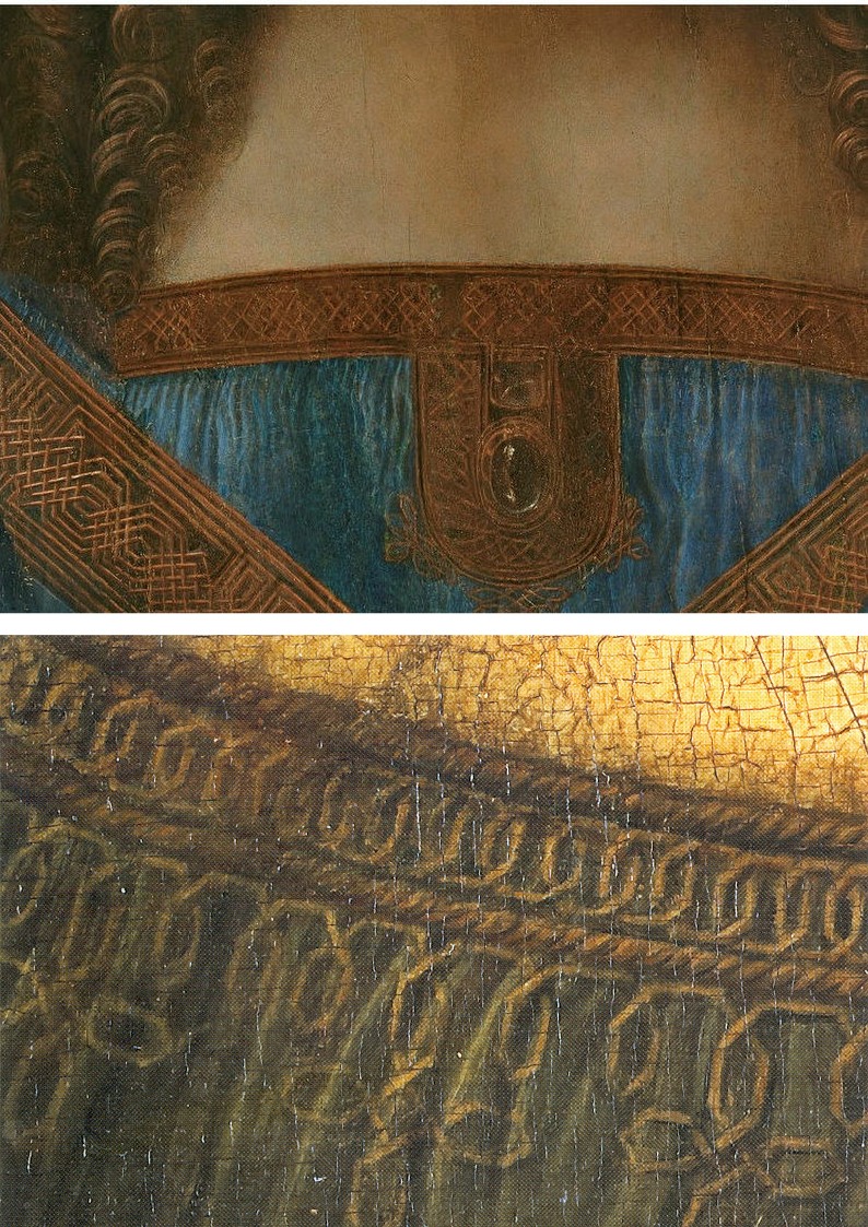
Above, Fig. 18: Top, the Abu Dhabi Salvator Mundi detail; above, a detail of the Mona Lisa. Quality aside, what would explain the manifest differences of age in the two details? Why has the paint cracked so markedly in one work and retained such a youthful bloom in the other?
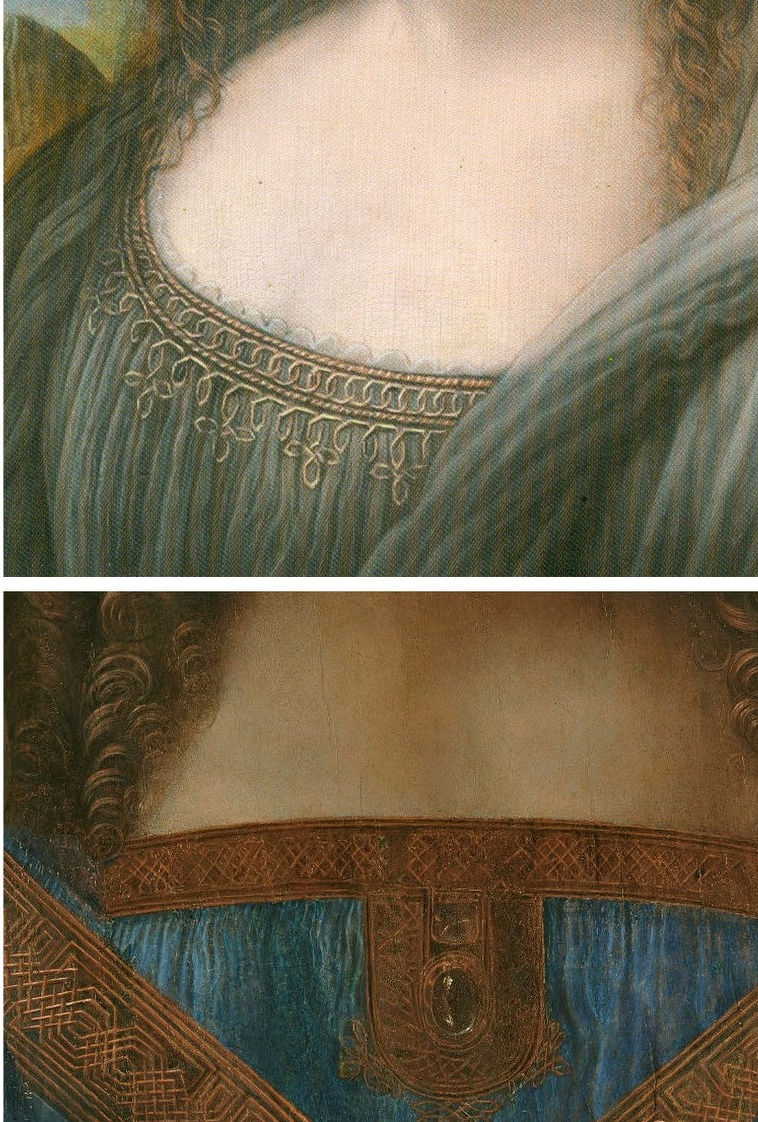
Above, Fig. 19: A detail, top, of a copy of Leonardo’s (then-unfinished) Mona Lisa that has been attributed to his assistant Salai; above the detail of the Louvre Abu Dhabi Salvator Mundi. Although the flesh passages in the two works are comparably smooth, bland and unblemished, could anyone claim that the handling of the hair, the knot patterning and the drapery folds in the Salvator Mundi is superior to that seen in the copy above?
More detailed examinations of parts of the Louvre Abu Dhabi Salvator Mundi painting will be carried in future posts.
Past posts, in chronological order, were:
23 October 2017 – Leonardo, Salvator Mundi, and an “unusual lapse”
14 November 2017 – Problems with the New York Leonardo Salvator Mundi Part I: Provenance and Presentation
02 February 2018 – The $450m New York Leonardo Salvator Mundi Part II: It Restores, It Sells, therefore It Is
12 February 2018 – A day in the life of the new Louvre Abu Dhabi Annexe’s pricey new Leonardo Salvator Mundi
27 February 2018 – Nouveau riche? Welcome to the Club!
11 March 2018 – The Reception of the First Version of the Leonardo Salvator Mundi
Michael Daley, 18 September 2018
The Leonardo Salvator Mundi Saga: Three Developments

“The more I read it, the more it looks probable.”
Above, Salvator Mundi, the painting attributed to Leonardo da Vinci and sold at auction in 2017 for $450 million. Photo: Drew Angerer/Getty Images – as published on 2 April 2018 in Buffalo News
The sensational Mail Online story (“EXCLUSIVE: The world’s most expensive painting cost $450 MILLION because two Arab princes bid against each other by mistake and wouldn’t back down (but settled by swapping it for a yacht”) discussed here in this News & Notices post, has been questioned or disparaged by a number of commentators but not directly challenged by Christie’s, so far as we know. On March 30 Bendor Grosvenor wrote (“Who underbid the Salvator Mundi?):
“I’m sceptical about this version of events. First, the source seems determined to prove mainly that the picture is somehow ‘not worth’ what it made – the figure of $80m is mentioned – when there were other underbidders up to the $200m level. Second, I’ve been told that the underbidder to $400m was not from the Middle East, from a source who would know.”
Had Grosvenor’s source been correct and the Mail’s story, thus, been seriously misleading, one would expect Christie’s’ lawyers to have demanded either changes to the online article or its removal. Grosvenor’s seeming partisanship on the Salvator Mundi case takes two forms. As well as knocking the knockers, he hypes his brother-auctioneers’ hype, as, on November 12 2017 (“Leonardo’s ‘Salvator Mundi’ to be sold at Christie’s”):
“I love this video of people seeing Leonardo’s Salvator Mundi. Christie’s say 20,000 have been to see the painting on its world tour. I’ve been impressed by how Christie’s have marketed the picture – in fact, I’d say that they’ve taken marketing Old Masters to a whole new level. A well deserved AHN pat on the back to all involved. The sale is on Wednesday 15th November. Anyone care to make a prediction?”
On November 16, the day after the $450m sale, Grosvenor was ecstatically supportive (“’Salvator Mundi’ – the most expensive artwork ever sold at auction”):
“Christie’s just did something that re-writes the history of auctioneering. They took a big gamble with their brand, their strategy to sell the picture, and not to mention the reputations of their leadership team, and they pulled it off. They marketed the picture brilliantly – the best piece of art marketing I’ve ever seen. Above all, they had absolute faith in the picture. AHN congratulates them all.”
Pace Grosvenor and his sources, questions on Christie’s marketing of the Salvator Mundi persist. The whispering campaign against the Mail’s disclosures has not worked. In this weekend’s Financial Times the author Melanie Gerlis closed her art market column with the item below:

As things stand, no one has disproved the Mail’s suggestion that the (disputed) Leonardo Salvator Mundi has been swapped for a luxury yacht. In her book Art as Investment, Gerlis noted that because the “worth and price are known to only a few” in an art market that is underpinned by a lack of “verifiable and meaningful data”, those looking to art purely as a secure investment “might first consider looking elsewhere.”
With the Salvator Mundi, some 13 years after its emergence, we still do not know when, where and by whom the painting was bought. There have been many conflicting accounts on the work’s ownership (see below). In the April 6 Antiques and Arts Weekly, the New York dealer Dr Robert Simon was asked: “Can you say where you found Leonardo’s ‘Salvator Mundi’?” He replied:
“Alex and I acquired the painting at an estate auction in the United States, but we’ve never divulged the location of the auction. We were not permitted to, according to the terms of the confidentiality agreement we signed at the time we sold the painting.”
The sale was conducted privately in 2013 through Sotheby’s when it was acquired by the “Freeport King”, Yves Bouvier, who was acting as an agent for the Russian oligarch Dmitry Rybolovlev. Did Sotheby’s insist that the origin of the picture not be disclosed? Or Bouvier? Whomever – the enforced confidentiality clause was made eight years after the claimed discovery/acquisition in 2005. However constricting the terms of the 2013 sale agreement might have been, they could hardly account for the non-disclosure of the owners’ identities for the previous eight years – including the time the picture spent in the National Gallery. When the Salvator Mundi was about to enter the Gallery’s big Leonardo show in 2011 as an autograph Leonardo, the Sunday Times reported:
“Its ownership is a closely guarded secret. Robert Simon, a New York art dealer, is representing the owner, or owners – the official line is it is a ‘consortium’.”
Why, then, did the National Gallery agree to participate in this secrecy on the ownership of a painting whose (contested) Leonardo ascription had been supported by the gallery’s own director; by one of its curators; and, by one of its trustees?
Another of the scholar-supporters of this upgraded Leonardo is Professor Martin Kemp. In 2011 Kemp told the Sunday Times how he had been invited to view the work by the National Gallery (“there’s something it’s worth you coming in to look at”, was how Kemp put it). Kemp described entering the National Gallery’s conservation studios and joining “a little group of people, including some Leonardo scholars from Italy and America, and Robert Simon.” Robert Simon had been accompanied on that trip by the Salvator Mundi’s restorer, Dianne Dwyer Modestini. In 2012 Modestini would deliver a paper on the picture’s (then) two restoration campaigns at a conference held in the National Gallery.
FRESH CLAIMS
On April 6 Buffalo News reported that Dianne Modestini was to speak on April 9 in the Burchfield Penney Art Center at SUNY Buffalo State and was about to make two new claims.
First, that she and her late husband, the restorer Mario Modestini, had entertained no doubts that this was an autograph Leonardo painting: “We were completely convinced and we felt that we could justify this to anyone without sounding like idiots.” This goes further than Modestini’s 2012 paper: “…when I first saw it I never imagined what would transpire with this lovely but damaged painting on panel…I wasn’t aware of a lost, much-copied Salvator Mundi by Leonardo and I was perplexed. I showed the painting to my then 98 year old husband, Mario…He looked at it for a long time and said, ‘It is by a very great artist, a generation after Leonardo’.”
Second, that no technical evidence had emerged to confirm authorship by Leonardo. Modestini reportedly said that what made her so sure was not “the discovery of any single clue attributable to the master’s style or any technical element of the painting that could be traced to his hand, but rather the quality of the painting”. There was “no under-drawing for example, that was Leonardo’s drawing style, or anything like that. The pigments are the pigments that any one of his contemporaries could have used, and did.” This attribution was entirely a matter of judgment: “the quality of the painting, the sort of old-fashioned connoisseurship and skills, which art historians have always used to make an attribution, were in the end the telling factor for us.”
Those present at her lecture might have learnt why a painting that had so soon revealed itself as an autograph Leonardo to two experienced restorers and in which “apart from the discrete losses, the flesh tones of the face retain their entire structure, including the final scumbles and glazes” had needed a third campaign of restoration with substantial repainting of the face, some time between 2016 (when the Qataris reportedly turned down a private offer of the painting for $80m) and the spectacular $450m sale at Christie’s on 15 November 2017 amidst modern works, not old masters.
A NEW BOOK – FURTHER COMPLICATIONS
Above: left, Peter Silverman, the owner of the drawing “La Bella Principessa”; right, Professor Martin Kemp, author of the 2010 book “La Bella Principessa” – The Story of the New Masterpiece by Leonardo da Vinci. Photo: as published in Martin Kemp’s Living With Leonardo
Professor Martin Kemp has published a new book (Living with Leonardo – Fifty Years of Sanity and Insanity in the Art World and Beyond) in which he pays a back-handed compliment to ArtWatch in his second chapter: “Theirs has been the most sustained and fully researched of the hostile polemics”. Elsewhere he launches a series of slurs against three named ArtWatch UK contributors and officers in defence of his own support for two recently attributed Leonardos, the Salvator Mundi painting, and the mixed media drawing on vellum glued onto oak, that he dubbed “La Bella Principessa”. The slurs will be refuted, but we note here that Kemp has now provided a fuller, and apparently verbatim, account of the National Gallery’s invitation to him to view the Salvator Mundi:
“On 5 March 2008, my birthday, an email arrived, announcing the appearance of a new Leonardo – a painting rather than a drawing […It] came from a well known source: Nicholas Penny, then director of the National Gallery in London.
“I would like to invite you to examine a damaged old painting of Christ as Salvator Mundi which is in private hands in New York. Now it has been cleaned, Luke Syson and I, together with our colleagues in both paintings and drawings in the Met, are convinced that it is Leonardo’s original version, although some of us consider that there may be [parts? – Kemp’s parenthesis] which are by the workshop. We hope to have the painting in the National Gallery sometime later in March or in April so that it can be examined next to our version of the Virgin of the Rocks. The best preserved passages in the Salvator Mundi panel are very similar to parts of the latter painting. Would you be free to come to London at any time in this period? We are only inviting two or three scholars.”
The following observations on that stage of the Salvator Mundi’s Leonardo accreditation might be made:
1) The method of inviting successive select groups of scholars to see and appraise the painting in the prior knowledge of others’ support for the new attribution might be thought to have fallen short of the National Gallery’s own practices. When Nicholas Penny, as a curator at the National Gallery, proposed the Northumberland version of Raphael’s Madonna of the Pinks as the original painted prototype of the very many versions, he first published a thorough and well-received scholarly article in the Burlington Magazine, and later invited a group of some thirty Raphael scholars to discuss the matter during a day-long symposium at the National Gallery.
2) With this Salvator Mundi upgrade, none of the fifteen or so invited experts has published a case for the attribution. Robert Simon has yet to publish the researches to which both Modestini’s restoration report and Luke Syson’s exhibition catalogue entry were indebted. It is not clear whether Modestini was present when the painting was examined at the National Gallery. Kemp writes in his new book:
“No one in this assembly was openly expressing doubt that Leonardo was responsible for the painting, although the possibility of participation by an assistant or two was generally acknowledged. I sensed that Carmen [Bambach, of the Metropolitan Museum drawings] was the most reserved about the painting’s overall quality. A general discussion followed. Robert Simon, the custodian of the picture (whom I later learnt was its co-owner), outlined something of its history and its restoration. He seemed sincere, straightforward and judiciously restrained, as proved to be the case in all our subsequent contacts…”
Carmen Bambach rejected the Leonardo attribution in a 2012 Apollo review of the National Gallery exhibition and gave the painting to Leonardo’s student Boltraffio. Ironically, the Times reported on 9 April 2017 that Kemp has now demoted the Hermitage Museum’s Litta Madonna (which was included as a Leonardo in the National Gallery’s 2011-12 exhibition) from Leonardo to Boltraffio.
3) After seeing the Salvator Mundi next to the National Gallery’s version of Leonardo’s Virgin of the Rocks (which is to say, its second version), Dianne Modestini was inspired to change the appearance of the former:
“There were actually two stages of the current restoration. In 2008 when it went to London to be studied by several Leonardo experts, there was less retouching. I hadn’t replaced the glazes on the orb, finished the eyes, suppressed the pentimenti on the thumb and stole, and several other small details but, chiefly, the painting still had the mud-coloured modern background that was close in tone to the hair. Two years later I was troubled by the way the background encroached upon the head, trapping it in the same plane as the background. Having seen the richness of the well-preserved browns and blacks in the London Virgin of the Rocks and based on fragments of the black background which had not been covered up by the repainting, I suggested to the owners that it might be worthwhile to try to recover the original background and finish the complete restoration.”
Thus, Modestini had intervened radically on the painting shortly before it was included in the National Gallery’s major 2011-12 Leonardo exhibition and two years after it was appraised by selected Leonardo scholars at the National Gallery.
4) Restoration campaigns, like wars, are easy to start. In 2012 Modestini acknowledged an ambition to finish a “complete restoration”, after seeing the National Gallery’s restored Virgin of the Rocks. Permission, she recalled, was granted to strip and repaint the entire background:
“The initial cleaning [i. e. paint and varnish removal] was promising especially where the verdigris had preserved the original layers. Unfortunately, in the upper parts of the background, the paint had been scraped down to the ground and in some cases the wood itself. Whether or not I would have begun had I known, is a moot point. Since the putty and overpaint were quite thick I had no choice but to remove them completely. I repainted the large missing areas in the upper part of the painting with ivory black and a little cadmium light red, followed by a glaze of rich warm brown, then more black and vermilion. Between stages I distressed and then retouched the new paint to make it look antique. The new colour then freed the head, which had been trapped in the muddy background, so close in tone to the hair, and made a different, altogether more powerful image.”
5) “Restorations”, which might more accurately be described as “stripped and painted re-presentations commissioned by owners”, are rarely straightforward and unproblematic. Modestini made her decisions in the sincere belief that the London Virgin of the Rocks is an entirely autograph Leonardo painting and therefore a reliable guide to her own interventions on the Salvator Mundi. However, that Leonardo attribution has only been widely thought to be the case since the painting’s recent restoration. Kenneth Clark, when director of the National Gallery thought otherwise. In 1944 he said of the head of the picture’s angel: “This is one part of our Virgin of the Rocks where the evidence of Leonardo’s hand seems undeniable, not only in the full, simple modelling, but in the drawing of the hair. The curls around the shoulder have exactly the same movement as Leonardo’s drawings of swirling water. Beautiful as it is, this angel lacks the enchantment of the lighter, more Gothic angel in the Paris version…” Of the head of the Virgin, Clark wrote:
“…It is uncertain how much of this replica [of the first, Louvre, Virgin of the Rocks] he [Leonardo] executed with his own hand, and this head of the Virgin is the most difficult part of the problem. It is too heavy and lifeless for Leonardo and the actual type is un-Leonardesque; yet it is painted in exactly the same technique as the angel’s head in the same picture; and that is so perfect that Leonardo must surely have had a hand in it. Both show curious marks of palm and thumb…made when the paint was wet, and no doubt covered by glazes long since removed. This perhaps is a clue to the problem. A pupil did the main work of drawing and modelling, and before the paint was dry Leonardo put in the finishing touches. Most of these have been removed from the Virgin’s face but remain in the angel’s, where perhaps they were always more numerous.”
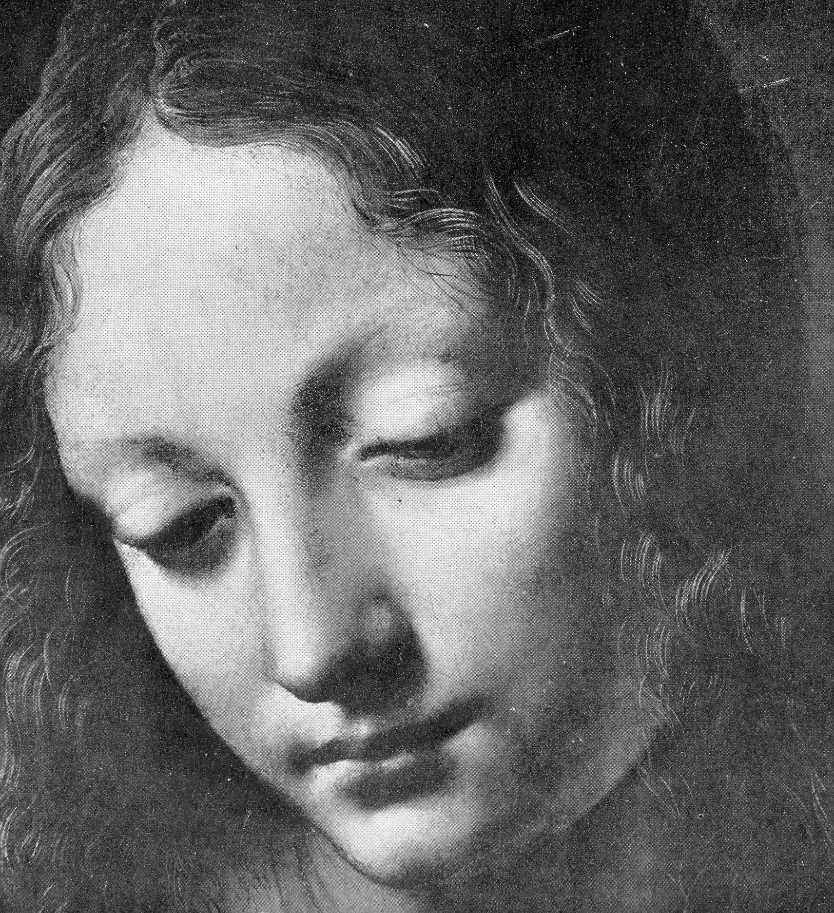
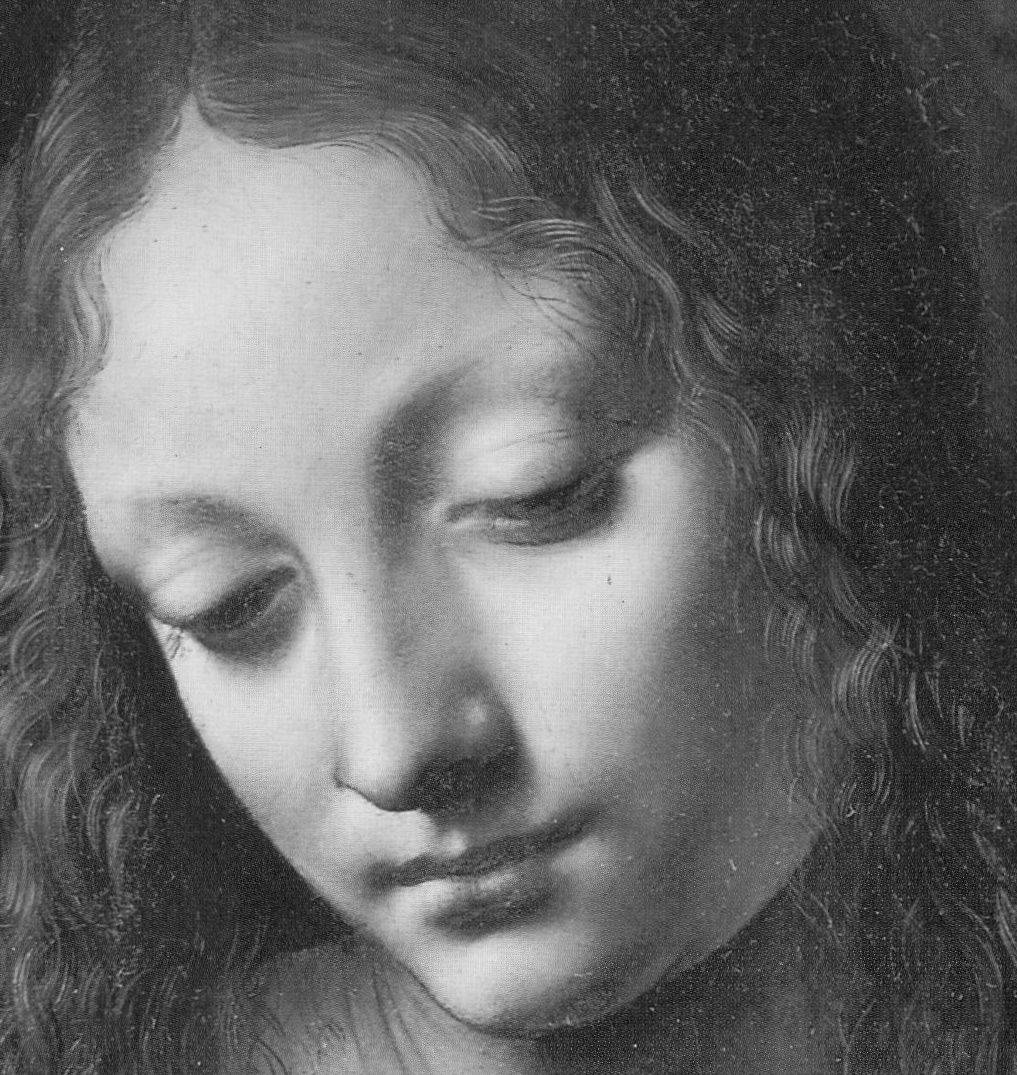
Above, top: The head of the Virgin in the National Gallery’s (second) version of Leonardo da Vinci’s The Virgin of the Rocks, as published in 1944 in Kenneth Clark’s One Hundred Details from Pictures in the National Gallery. Above, the Head of the Virgin as published in the 1990 re-issue of Clark’s “Details” book and, therefore, after its post-war restoration by Helmut Ruhemann but before its more recent re-restoration by Larry Keith (in which the mouth of the Angel was altered, on Luke Syson’s advice, as discussed here in “Something Not Quite Right About Leonardo’s Mouth ~ The Rise and Rise of Cosmetically Altered Art”).
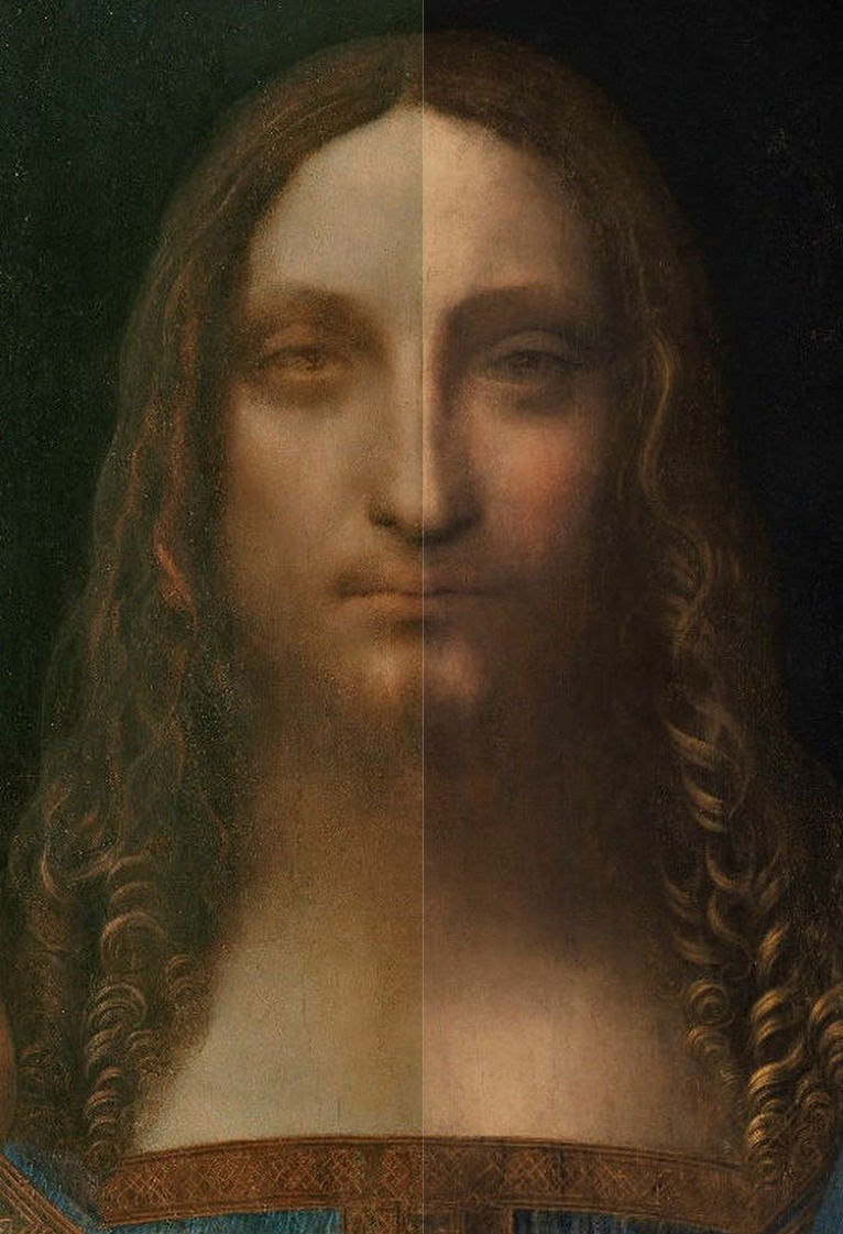
Above, the face in the accredited Leonardo da Vinci Salvator Mundi, as exhibited, left, in the National Gallery in 2011-12, and, right, as when sold at Christie’s in November 2017.
In 1990 the National Gallery remarked that “as a result of” the picture’s 1949 restoration “the differences between the heads are perhaps less apparent”. That being so, either one face had received new glazing or the other had lost original glazing. For Kemp, a crucial technical proof of Leonardo’s authorship of the Salvator Mundi is the fact that technical examinations had disclosed that “As is generally the case with Leonardo, infrared rays delivered the most striking results. It was good to be able to see that the artist had pressed his hand in to the tacky paint above Christ’s left eye – which we have seen to be characteristic of Leonardo’s technique.”
THE UNDERSTANDING TODAY ON THE SALVATOR MUNDI’S OWNERSHIP BETWEEN 2005 AND 2013
In his seventh chapter (“The Saviour”) Kemp twice discusses the ownership of the Salvator Mundi. He does so first with regard to the exclusion from the National Gallery’s 2011-12 exhibition of the “La Bella Principessa” drawing (– whose Leonardo ascription he has energetically advocated):
“This episode highlighted the rationale for the inclusion of the Salvator Mundi. Was it on the market? Would exhibiting it mean that the National Gallery was tacitly involved in a huge act of commercial promotion? It seemed highly likely that it was also ‘in the trade’ [like the ‘La Bella Principessa’]. All I knew at this stage [2011] was that it was being represented by Robert Simon. He told me that it was in the hands of a ‘good owner’ who intended to do the right thing by it, and I did not inquire any further.”
So, it would seem that the National Gallery had not disclosed the identity of the owner/owners to the scholars it invited to appraise the painting. Kemp continued:
“I was keen to consider the painting in its own right, not in relation to its ownership. I speculated, of course, that Robert might have a financial interest, perhaps a share in its ownership; and I assumed that he was gaining some kind of legitimate income from his work on the picture’s behalf. But the gallery was assured that the work was not on the market. Understandably keen to exhibit it, they were happy to accept this assurance…Might the Salvator have been less well regarded if its messy sale [in 2013, privately through Sotheby’s] to Bouvier [for $80m – $68m in cash and a Picasso valued at $12m, according to Georgina Adam in her “Dark Side of the Boom” book] and its resale [to Dimitry Rybolovlev for $127.5m] had been apparent before its public debut [at the National Gallery in 2011-12]? It has turned out to be a substantial mess. In November 2016, an article in The New York Times reported the latest developments: three ‘art traders’ (Robert Simon, Warren Adelson and Alexander Parrish) were disconcerted to find that painting was ‘flipped’ by Bouvier for $47.5m more than their selling price. Was Sotheby’s a knowing party to the the resale? The auction house claimed that it was not, taking pre-emptive legal action to block any law suit by the ‘traders’….It was however a great surprise to find that the Salvator was to be sold at Christie’s in New York on 15 November 2017 at a mega-auction of celebrity works from the modern era. The auctioneers sent the painting on a glamorous marketing tour of Hong Kong, San Francisco and London. I was approached by the auctioneers to confirm my research and agreed to record a video interview to combat the misinformation appearing in the press – providing I was not drawn into the actual sale process.”
Where would we be without a free and vigilant press? Where, precisely, is the $450m Salvator Mundi today?
Michael Daley, 10 April 2018
The $450m New York Leonardo Salvator Mundi Part II: It Restores, It Sells, therefore It Is

ITEM 1: “Thomas Campbell, former director of the Metropolitan Museum of Art, held that while the price was ‘eye-popping, it should come as no surprise in a market where speculation, marketing and branding have displaced connoisseurship as the metrics of value’. Todd Levin, an art adviser, told the New York Times: ‘This was a thumping epic triumph of branding and desire over connoisseurship and reality.’” – The Guardian 16 November 2017
ITEM 2: “The freakish sale of the Leonardo work – or, according to the detractors, the remains of a historic picture very partially by Leonardo and very largely by the hand of skilled restorers – caused not only incredulity and amazement but also a sort of stunned revulsion. This, some people felt, was just too mad. It was perhaps the first inkling that a market that is undeniably exciting and exhilarating might be on the edge of becoming seriously troubling.” – “The $400m question”, Jan Dalley, the Financial Times, 9/10 December 2017
ITEM 3: “Questions about Salvator Mundi’s authenticity, quality, and physical state were no match for the drive to possess this singular trophy. The acquisition also uniquely encapsulated art’s evolving role in the manufacture of soft-power and negotiation of geopolitics.” – “The Year in Visual Culture”, an Artsy editorial, 22 December 2017 [emphasis added]
ITEM 4: “As Christie’s aggressively marketed Leonardo da Vinci’s Salvator Mundi before the work sold for an astonishing $450m last November, the art world raged anew with questions about the painting’s attribution– even though London’s National Gallery had largely settled the debate by including the work in its 2011-12 Leonardo show.” – Judith H. Dobrzynski, The Art Newspaper, January 2018 [emphasis added].
ITEM 5: “The painting Salvator Mundi will be shown at The National Gallery, London, exhibition: “Leonardo da Vinci: Painter of the Court of Milan” from 9 November 2011 – 5 February 2012.
Leonardo is known [sic] to have painted the Salvator Mundi – an image of Christ holding a globe, with his right hand raised in blessing. The version in a private collection in New York was shown after cleaning to the Director of the National Gallery and to the Curator of the exhibition as well as to other scholars in the field. We felt that it would be of great interest to include this painting in the exhibition as a new discovery. It will be presented as the work of Leonardo, and this will obviously be an important opportunity to test this new attribution by direct comparison with works universally accepted as Leonardo’s. A separate press release on the Salvator Mundi is issued by the owner.” – A National Gallery press statement, July 2011
ITEM 6: “By 1500 onwards, the period in which the painted panel is said to have been executed, for want of time, Leonardo produced few works. Fra Pietro da Novellara, who visited his studio in April 1501, reported: ‘His mathematical researches have so much distracted him that he can’t stand the brush’, and, he added, ‘Two of his pupils make copies to which he adds some touches from time to time’. In 1501, he was commissioned to produce a Madonna of the Yarnwinder by Florimond Robertet (the French King Louis XII’s secretary) at the time when he was already creating both the major group The Virgin and Child with Saint Anne’ and the phenomenally accomplished Mona Lisa. Both panels were seen during their executions in October 1503 by Agostino Vespucci, an assistant of Machiavelli at the Signoria in Florence but he, too, made no reference to a Salvator Mundi. Giorgio Vasari says of the Mona Lisa’s execution that Leonardo, as a meticulous and slow-working painter had ‘toiled over it for four years’. Between May and August 1502 until early 1503 Leonardo was committed with Cesare Borgia as an architect and general engineer in the Marches and Romagna. He was then fully employed by the City of Florence during the Summer of 1503 as a military architect and, two or three months later, he worked fully on the commission of a huge mural (the now destroyed Battle of Anghiari) until late May 1506, before travelling between Florence and Milan up to mid 1508, because of his appointment as painter and engineer to the French King while serving Charles II d’Amboise, the new governor of Milan. Because of such taxing commitments – and all of the above were in addition to his intense scientific researches and literary activities – Leonardo increasingly resorted to workshop productions from 1500 onwards. The Salvator Mundi must, of necessity, be thought to be one of those works and, given the preceding it is very likely that a fully original version never existed.” – Jacques Franck, “Problems with the New York Leonardo Salvator Mundi Part I: Provenance and Presentation”, 14 November 2017
ITEM 7: “The Board asked to be reminded of the Gallery’s policy on display of loan paintings which were or had been for sale. The Deputy Director confirmed that the Gallery would not display on long term loan any painting which was known to be for sale. In relation to exhibition loans, the Gallery would weigh up the advantage to the exhibition in including it: the benefit to the public in seeing the work and its contribution to the argument and scholarship of the exhibition as a whole. The work would be included solely on its own merits. The argument for the inclusion of such a work would usually be presented in the exhibition catalogue.” – Minutes of the National Gallery Board of Trustees – July 2011
ITEM 8: “One scholar [invited to see the Salvator Mundi] said that the consortium had turned down an offer of $100m for the painting. ‘I was told they’re asking $200m for it’” – Milton Esterow, “UPDATED: A Long Lost Leonardo” ARTnews, August 2011
“It’s a historic moment: we’ll wait”, said Christie’s Global President and auctioneer, Jussi Pylkkänen, when bidding dried on the New York Salvator Mundi at the 15 November 2017 sale of modern art. It was certainly unprecedented. In the excitement no one noticed (or divulged) that what smashed records and had sleeper-hunting dealers swooning over prospective $1billion privately-owned Leonardo studio works was not the last Leonardo in private hands, let alone Leonardo’s male “Mona Lisa”, as Christie’s claimed, but, rather, a switch in which a twice-restored and substantially repainted work (Fig. 1, below left), which no expert between 1900 and 2007 had ever thought a Leonardo, was re-presented in a further cosmetically-restored and modernised form – “Every generation finds its own Leonardo”, it has been remarked. (See Fig. 1, below right). To put it another way, what fetched nearly half a billion dollars was the third state of an intermittent twelve-year long twenty-first century restoration-in-progress during which the restorer had first re-restored her own restoration after looking at the Virgin of the Rocks in the National Gallery, and then re-restored it again at some undisclosed point or points between February 2012 and November 2017.
A RESTORATION SWITCH
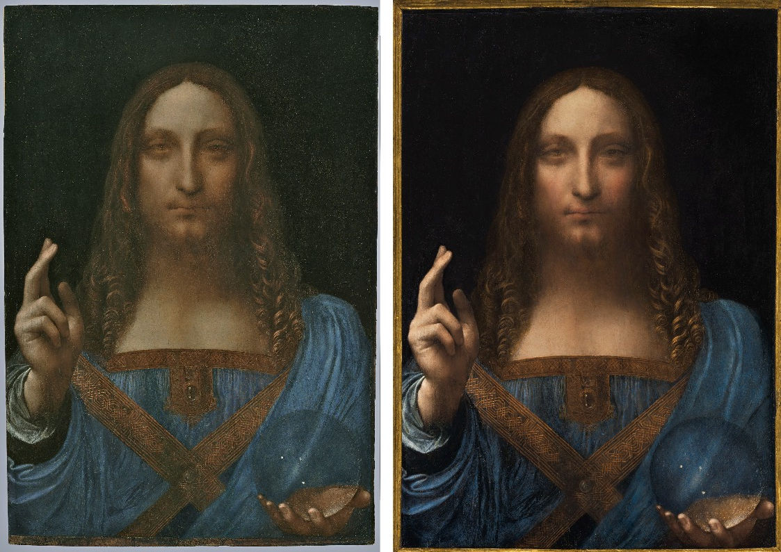
Above, Fig. 1: The attributed New York Leonardo Salvator Mundi as exhibited at the National Gallery in 2011-12, left; and, right, as sold by Christie’s New York on 15 November 2017. The picture above right is not the same as that above left. (To see how the two halves of the face are now disconnected, see Fig.17 below.) So when; on whose authorisation; and, on what rationale was the one eclipsed by the other? The Salvator Mundi returned to New York in 2012 from the National Gallery and was sold the following year for $80m to a Russian collector’s agent. Had it been re-restored before that 2013 sale? Or while in Russia? Or when at Christie’s prior to its 15 November 2017 sale?
The first two restoration campaigns between 2005 and 2010 were said to have recovered a Leonardo but we do not know who first thought or said this. We do know that before 2007 none of the parties involved in the upgrading attribution thought the picture a Leonardo – not the then owners (a consortium with two identified members); not the restorer, Dianne Dwyer Modestini; not the restorer’s husband, [the now late] Mario Modestini. Mario, a man with an experienced Leonardo eye who had been commended by Berenson to clean the Kress pictures, who had attributed the Ginevra de Benci to Leonardo, who had reputedly brought a restoration-wrecked Rubens back from the dead, and who had wept for half an hour after seeing the National Gallery’s restoration-ruined pictures, thought the painting by a great artist a generation after Leonardo. In 2012 Frank Zöllner, the author of Leonardo’s catalogue raisonné (who had not been consulted on the new work’s authorship) saw the restored picture’s sfumato as being closer to a talented Leonardo pupil of the 1520s than to Leonardo himself. Zöllner further felt that the very extensive restoration of this “badly damaged painting” had made any assessment of the original condition extremely difficult.
Christie’s spoke of an unusually broad consensus of expert support but the group consulted was small – approximately fifteen compared with the thirty invited to appraise the version of the Madonna of the Pinks that was upgraded to Raphael after a National Gallery symposium and a major scholarly article in the Burlington Magazine (February 1992). With this Salvator Mundi upgrade, none of the invited experts has published a case for the attribution but the ascription was endorsed by the National Gallery and the picture was included in its major 2011-12 “Leonardo da Vinci: Painter at the Court of Milan” exhibition as “a work in which Leonardo set out to make his divine inspiration obvious to all”.
What had the undisclosed subsequent third restoration hoped to achieve – a better-than divinely inspired Leonardo? If an institutionally-celebrated Leonardo can be improved by a restorer, is the restorer a better artist than Leonardo – or a medium through whom he still paints? A question that might be considered is: Was the latest re-restoration undertaken to bolster an attribution rejected by four scholars in 2012 when reviewing the National Gallery exhibition, and challenged the year before – without apparent reply – in three Times letters (see Fig. 16 and ITEMS 5 and 7 above).

Above, Fig. 2: Detail – left, the New York Leonardo Salvator Mundi, as at the National Gallery in 2011-12 and, right, as when up for sale at Christie’s New York on 15 November 2017.
Christie’s 2017 lot essay noted a “completion of conservation treatment in 2010” and gave no hint of a post-2012 restoration. Even though the painting had been known since 1900 in England as a Leonardo school work, had been rejected by Bernard Berenson, and had been spurned in Sotheby’s saleroom by Kenneth Clark in 1958 when it fetched £45, the National Gallery gave no hint of any further need for restoration when discussing the painting in its catalogue entry in 2011. Shortly before November 2017 the latest unacknowledged transformation was hiding in plain view in a subliminally brief time-lapse video puff where the painting morphs “miraculously” to a religiose musical accompaniment from its 1913 condition into its most recently restored state. This marketing wizardry can still be seen on the Guardian’s website here.
EVIDENCE OF AN UNDISCLOSED CAMPAIGN OF ALTERATION
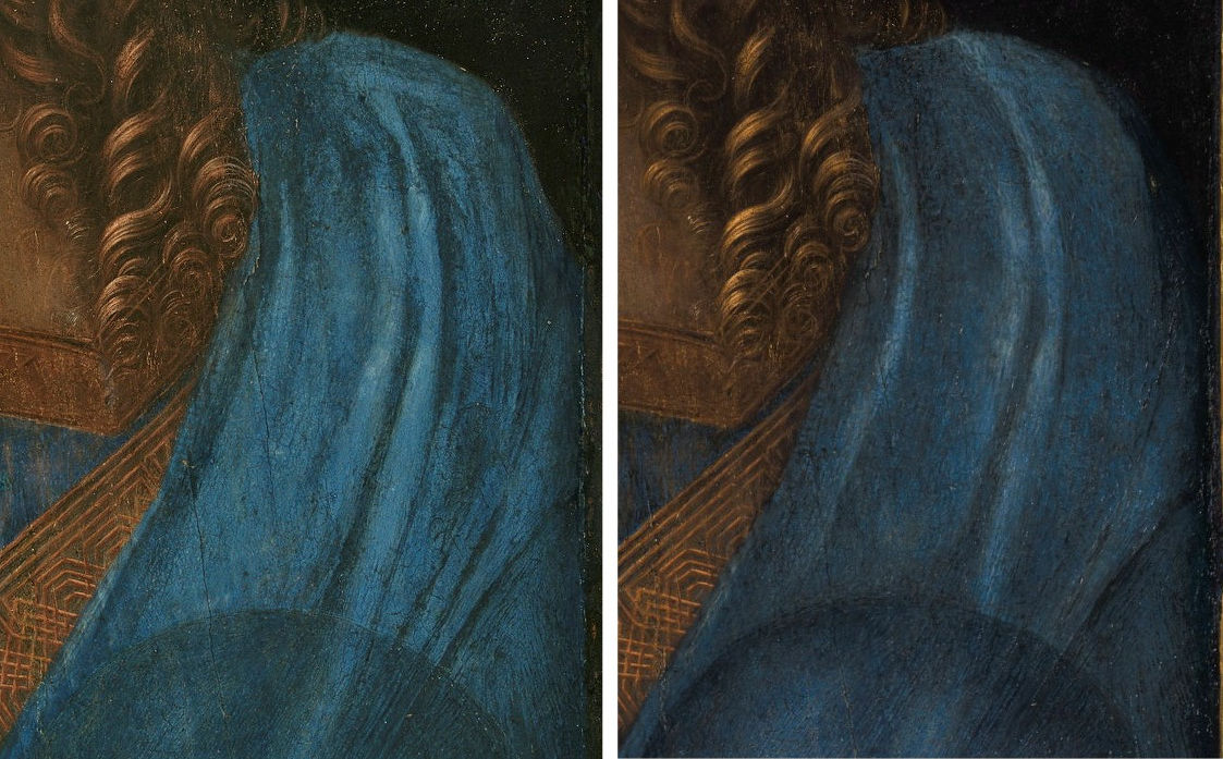
Above, Fig. 3: Left, the drapery at the left shoulder of Christ, in 2011-2012 at the National Gallery’s Leonardo exhibition; and, right, in Christie’s 15 November 15, 2018, sale.
In December 2017, Christie’s was presented with photographic evidence assembled by Dr Martin Pracher, a German Lecturer in technical art history, and an assessor of paintings’ condition, that showed changes to the shoulder drapery between 2012 and 2017. A spokeswoman disclosed that the picture’s original (2005-10) restorer, Dianne Modestini, had worked on the painting “Prior to its presentation for sale at Christie’s”. (See “Auctioneers Christie’s admit Leonardo da Vinci painting which became world’s most expensive artwork when it sold for £340m has been retouched in the last five years”.) Specifically: “Modestini partially cleaned the passage of paint in the shoulder and the dark streaks disappeared”. The spokeswoman added: “To imply something incorrect has taken place would itself be incorrect”. The recently “disappeared” folds, it was insisted, were not folds but “dark streaks” that appeared accidentally during the 2005-2010 restoration.
WHEN IS A STREAK NOT A STREAK?
In support of this claim, Christie’s cited part of the restorer’s report – “The Salvator Mundi by Leonardo da Vinci rediscovered History, technique and condition”. The auction house declined to supply the whole report to the Daily Mail even though it had been presented at a National Gallery conference in 2012 and published in 2014 in Leonardo da Vinci’s Technical Practice: Paintings Drawings and Influence, Edited by Michel Menu, Hermann, Paris. This selective presentation of a documentary record was seriously misleading. It was true that Modestini had claimed in her report that the changes were not changes to the forms of the drapery – “the black streaks at the [true] left shoulder of the Salvator Mundi’s blue mantle are not pleats…They are marks caused by the deterioration of the blue pigment made from the semi-precious stone, lapis lazuli…” – but that claim was quite implausible because material decomposition cannot mimic artistic designs and, besides, it was abandoned by Modestini herself in the same report when she acknowledged that the changes were changes to the drapery. The changes, she explained, were unintended consequences of invasive cleaning solvents: “Unexpectedly, the shadows of the folds over the proper left shoulder… became progressively stronger.” [Emphasis added.] Of those shaded folds: “I did not reinforce them… the effect of normal solvents, acetone, mineral spirits and ethyl alcohol mixtures, the initial varnish, and intermediate local varnishes containing ethyl alcohol, reformed the blanching to some degree…”
Photographic evidence published in Modestini’s report offers some credence to her solvent-led explanation (see Figs 5-7) but Christie’s December 2017 response strained credulity further with the extended claim that Modestini’s cleaning solvents, having first made visible what had been invisible, had recently made invisible what they had made visible a decade earlier. We sketch an alternative and more plausible hypothesis.
CHANGED DRAPERY DESIGN
![06 [6] three shoulders (3)](http://artwatch.org.uk/wp-content/uploads/2018/02/06-6-three-shoulders-3.jpg)
Above, Fig. 4: In this greyscale sequence, we see the shoulder as exhibited at the National Gallery in 2011-12, left; as seen, centre, at Christie’s November 2017 (after Modestini’s only recently acknowledged intervention); and, right, as in an earlier infra-red image.
THE SALVATOR MUNDI ATTRIBUTION PROBLEM
In view of this work’s extraordinary recent conservation history and its extremely poor provenance, there are only two possibilities to entertain:
1) This work was, since its discovery in 1900, an unrecognised autograph Leonardo that had suffered massive restoration injuries and adulterations in the past, all of which, since 2005, have been successfully mitigated/masked/ by a single restorer’s further repairs and repainting, some of which have been recorded and some not.
2) This picture is a school work on which the master (Leonardo) intervened in one or two places and is not, therefore, a finished and entirely autograph Leonardo painted prototype for the group of twenty or so Leonardesque Salvator Mundi versions.
If we are to talk Leonardo da Vinci, we must talk of supreme painterly accomplishment. If we are to talk of an autograph painted protoype by Leonardo we should identify derivations from it in the many other Leonardesque Salvator Mundis and demonstrate a parity of artistic qualities with those encountered in historically recorded bona fide Leonardo paintings. If we are to talk Leonardo on the back of an only very recently upgraded, greatly injured and much restored painting, we must first talk of picture restoration’s methods, consequences and role in attribution upgrades.
WHAT RESTORERS DO (WRONG)
Restorers undo and redo pictures. The first is quasi-archaeological and risks misdiagnosis and abrasive/chemical injuries. The second is reconstructive in a quasi-artistic sense and risks adulteration or falsification.
Restorers strip off what they judge inauthentic and paint-on what they think might recover/simulate lost original and authentic appearances. The former is notoriously if not inherently destructive because restorers bear down with their solvents and scalpels on picture surfaces which carry artists most considered and final adjustments (see comments at Fig. 9). The latter is a fraught, presumptuous ambition that can be exercised with greatly varying levels of skill and artistic/anatomical comprehension (see figs. 10 and 11). Restorers are forever debating the ethics of attempting to reconstruct with their own modern materials the lost original surfaces of paintings. Whatever their outcomes, for good or ill, restorations facilitate attribution upgrades because “restored” works become new, hitherto-unseen works with “out-of-history” states that permit experts to discard previous judgements without professional embarrassment.
THE NEW YORK SALVATOR MUNDI’S CHANGING APPEARANCE
![05 [5] three shoulders (2)](http://artwatch.org.uk/wp-content/uploads/2018/02/05-5-three-shoulders-2.jpg)
Above, Fig. 5: The drapery at the left shoulder of Christ. First left, as seen in 2005 when the Salvator Mundi was taken by one of its then owners, Robert Simon, an old masters dealer, to Modestini’s studio. Second left, in 2007 when the panel had been repaired and stripped of varnish and repaint. Third left, as exhibited in 2011 at the National Gallery. Right, as sold at Christie’s in November 2017.
In 2012 Dianne Modestini reported the picture’s arrival at her studio in 2005: “I shudder to think what might have been used. There was relatively recent varnish, sticky and uneven, and some crude retouches which may have been done by the owner or a local amateur.”
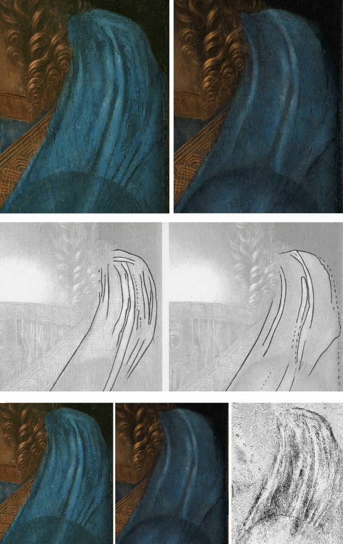
Above, Fig. 6: In the top, left, row we see the drapery folds as exhibited at the National Gallery in 2011-12 and, right, as when sold at Christie’s in 2017. Anyone might establish the extent of the changes by simply tracing photographs as above, middle row. Recent digital advances have made it possible to “subtract” a former state from a later one and represent the “differences” as dark shapes on a light ground, as above, bottom row, right, in a graphic prepared by Gareth Hawker. That graphic indicates with the clarity of a brass rubbing the location of material that had been added within the confines of the shape of the blue drapery. Moreover, visual appraisals of the 2011 and 2017 states of the painting show that changes had not been confined to the shoulder drapery but were present throughout the painting. In the details shown above, for example, it is apparent that the circumference of the orb has been strengthened by darkening (as is discussed below).
THE FULL TIMELINE

Above, Fig. 7, top row: First left, an engraved copy of 1650 by Wenceslaus Hollar of a Salvator Mundi attributed to Leonardo in the collection of Charles I. Second left, a 1913 photograph of the present Salvator Mundi when in the Cook Collection, England. Third left, the Salvator Mundi as it arrived at Modestini’s studio in 2005. Right, the Salvator Mundi in 2007 after it had been repaired and cleaned.
Above, Fig. 7, bottom row: First left, the Salvator Mundi in 2007 after it had been repaired and cleaned. Second left, the Salvator Mundi in 2008, after its first restoration and when about to be taken to the National Gallery. Third left, when exhibited at the National Gallery in 2011. Right, as when sold at Christie’s in November 2017.
![08 [7] first london outing](http://artwatch.org.uk/wp-content/uploads/2018/02/08-7-first-london-outing.jpg)
Above, Fig. 8: Top, one of the then owners, Robert Simon, holding the painting at his home the night before taking it to be viewed by a number of Leonardo specialists at the National Gallery, London, in 2008; above, the painting being examined in the National Gallery in 2011. (See “Da Vinci’s ‘Salvator Mundi’ painting took a winding 60-year path from under $200 to a record-breaking $450 million”)
In the sequence above we see the painting near the end of its first stage of restoration in 2008, top, and, below it, at the end of its second stage of restoration in 2011. Here we use the term “restoration” in the specialised sense of restorers who often draw a distinction between cleaning (stripping down) and repainting (which they euphemise “retouching”). In such trade usage the term “restoration” is applied to the post-cleaning repainting, not to the whole treatment. Injuries can occur in both the stripping and the reconstructive stages.
THE TWO PRINCIPAL TYPES OF PICTURE RESTORATION DAMAGE
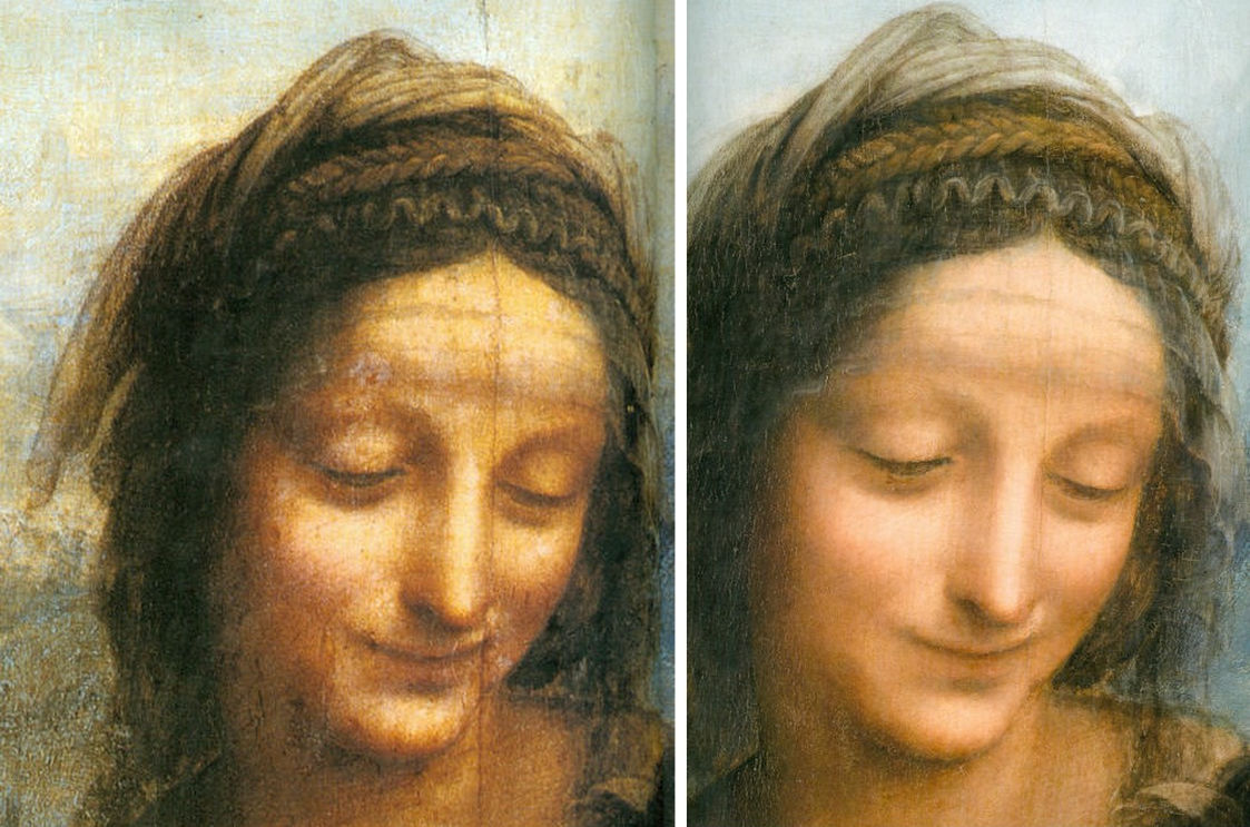
Above, Fig. 9: The face of St Anne in Leonardo’s The Virgin and Child with St. Anne before restoration, left, and after restoration, right. (See “Another Restored Leonardo, Another Sponsored Celebration – Ferragamo at the Louvre”.)
Restorers exult in liberating paintings from predecessors’ repainting, it being a principal justification for new restorations. The photographically demonstrable cumulative net result of successive restorations is the routine scrubbing away of pictorial heritage. With photo-records of modern paintings which can often be seen in their original untouched conditions, we still encounter the same long-standing patterns of destruction, as here shown with artists like Renoir and Klimt. (See “THE ELEPHANT IN KLIMT’S ROOM” and “Stone-washed Renoirs and the Shock of the Undone”)
WHAT RESTORERS DO AFTER STRIPPING PICTURES DOWN
Because of the decline in traditional art teaching practices the pool of painterly expertise is dwindling and for many restorers today conducting their own repairing stage, after stripping off earlier repairs, can induce panic (a workshop conference was called recently to enable restorers to pool experiences, swap recipes and “learn by looking and listening [in a] welcoming and supportive environment”). For more confident practitioners the occasion can unleash over-reaching quasi-artistic ambitions.
![010 [8] nose jobs](http://artwatch.org.uk/wp-content/uploads/2018/02/010-8-nose-jobs.jpg)
![11 [9] zzNew Fig. 2](http://artwatch.org.uk/wp-content/uploads/2018/02/11-9-zzNew-Fig.-2.jpg)
Above, Figs. 10 and 11: However good their intentions, however avowedly “ethical” their professional codes, restorers, like forgers (who are often themselves restorers or ex-restorers), cannot avoid leaving personal imprints and those of their cultural milieus in their repainting. The more ambitious the aspirant, the more deficiencies of artistic reading and anatomical understanding can be imposed on mute works of art. The Louvre Veronese restorer above seemed in thrall to the pneumatic forms and miniaturised features of Botero. That such eccentric aesthetic predilictions should ever have been institutionally authorised might augur badly for the Mona Lisa herself in a Louvre Museum today where curators are binging on radical restorations as they play catch-up with the technological adventurism long-encountered in British and American museums.
MODESTINI’S METHODS ON THE SALVATOR MUNDI
Dianne Dwyer Modestini is a highly skilled and highly regarded restorer who teaches at the prestigious Conservation Center of the Institute of Fine Arts at New York University. She is also refreshingly frank. In her 2012 report on the New York Salvator Mundi, she gives a more detailed account of her actions and the problems she encountered than is commonly recorded in restoration reports. She disclosed that her initial (2005-10) restoration was a two-stage affair. What is at issue here is not one of brutal cleaning or ham-fisted technique but, rather, of very great painterly skill applied on a conviction of authorship that is arguably unsound and in a treatment that may or may not have been entirely of her own making. She discloses, for example, having taken guidance from Luke Syson, the organising curator of the National Gallery’s Leonardo exhibition. Earlier, Syson had instructed a National Gallery restorer to alter the expression of the angel’s mouth in the gallery’s version of Leonardo’s The Virgin of the Rocks by removing a piece of ancient paint that had survived an earlier restoration by a National gallery restorer now notorious for his policy and muscular advocacy of “total Cleaning”. (See: “Something Not Quite Right About Leonardo’s Mouth ~ The Rise and Rise of Cosmetically Altered Art”.)
After the repairing and cleaning stages (2005-2007), Modestini worked for three years with her paint brushes on a picture that she, the owners and an accumulating group of experts increasingly took to be an autograph Leonardo painting. In a television interview she characterised her repainting as an attempt to “help it as much as you could while not in anyway suppressing this extraordinary virtual quality that it had”. Her goal of assisting a badly damaged work was executed slowly with fine brushes and synthetic paint:
“Most of the retouchings were done with dry pigments bound with PVA AYAB. Translucent watercolours, mainly ivory black and raw siena, were used for final glazes and to draw cracks. For the black background both AYAB and Maimeri Colori per restauro were used. Except for the background I mainly used treble 0 sable watercolour brushes in a series of vertical passes until the areas of loss matched the surrounding material.”
Restorers draw fake age cracks onto their own new painting to conceal its whereabouts – or, as they euphemise, to “integrate” it with surviving original paint. Forgers sometimes produce overall fake cracks by this method and sometimes they scratch them into the paint and rub dirt in. With restorers, no less than with forgers, the intention is to deceive the viewer by conferring an air of antiquity and an illusion of unbroken pictorial integrity. When the National Gallery restored Holbein’s The Ambassadors its restorers justified their deceiving false painted cracks on the ground that they had photographed their actions and that the photographs were held in the painting’s dossiers. The then director of the Gallery, Neil MacGregor, defended fresh reconstructive painting but did concede that “recovering the intentions of a long-dead artist is a complex and tentative business”. (See “The New Relativisms and the Death of “Authenticity”.)
Dianne Modestini’s notion of help without suppression is oxymoronic: you help or enhance by applying new paint onto…the surface you have stripped…and, thereby, suppress or amend the values you have revealed – why else would you intervene with paint at all? Conceptually speaking, restorers treat or present this part of their work work as a matter-of-fact mechanical/optical process when what you do is determined by what you think, how you see, how you “read” visual phenomena, how art historically informed you are, and, to an invevitable degree, by the professional circumstances under which you are operating. If you think and are assured that you are working on a Leonardo, how can you do other, in conscience, than steer the picture towards a more satisfactory realisation of your conception of that artist’s work?
There is another specific danger: if you apply lots and lots of paint over a long period you produce a progressively altering painting that is not only based on your own initial assumptions but one that is increasingly being made in accord with your own previously incorporated modifications. By stealth you confer a superimposing material form of your own conception of what the work should be like and should further become. Apart from any guidance that may be being given by others in the studio, this work is otherwise done privately, free from external professionally disinterested appraisal and artistically informed criticism. Modestini disclosed in a television interview that she became greatly attached to the painting and found her eventual separation from it emotionally painful.
On the extent of her retouching, Modestini said that aside from damage resulting “from past cleanings [which] can be seen in some passages where the final modelling is lost…” elsewhere, “apart from the discrete losses, the flesh tones of the face retain their entire layer structure, including the final scumbles and glazes. These passages have not suffered from abrasion; if they had I wouldn’t have been able to reconstruct the losses. The blessing hand is intact.” Thus, the initially declared object of retouching was simply to bring discrete losses up to the values of surviving original paint and, in places, to reconstruct assumed lost final modelling layers. Crucially, the face was said to require no reconstruction or repair of any sort, aside from to certain clear and self-contained losses. On that account, the face as exhibited in 2011 at the National Gallery should have looked (largely) as it had emerged from cleaning by 2007. And, certainly, there should have been no difference between the face as exhibited at the National Gallery in 2011 and as sold at Christies in 2017. This was not the case (see Figs. 17-19). Modestini disclosed in 2012:
“There were actually two stages of the current restoration. In 2008 when it went to London [see Fig. 8] to be studied by several Leonardo experts, there was less retouching. I hadn’t replaced the glazes on the orb, finished the eyes, suppressed the pentimenti on the thumb and stole, and several other small details but, chiefly, the painting still had the mud-coloured modern background that was close in tone to the hair. Two years later I was troubled by the way the background encroached upon the head, trapping it in the same plane as the background. Having seen the richness of the well-preserved browns and blacks in the London Virgin of the Rocks and based on fragments of the black background which had not been covered up by the repainting, I suggested to the owners that it might be worthwhile to try to recover the original background and finish the complete restoration.”
MAKING “A DIFFERENT ALTOGETHER MORE POWERFUL IMAGE”
With her decared ambitions to finish a “complete restoration”, after seeing the National Gallery’s restored Virgin of the Rocks, Modestini begins to take an overarching artistic possession of the painting as a painting. Permission, she recalled, was granted to strip and repaint the entire background:
“The initial cleaning [i. e. paint removal] was promising especially where the verdigris had preserved the original layers. Unfortunately, in the upper parts of the background, the paint had been scraped down to the ground and in some cases the wood itself. Whether or not I would have begun had I known, is a moot point. Since the putty and overpaint were quite thick I had no choice but to remove them completely. I repainted the large missing areas in the upper part of the painting with ivory black and a little cadmium light red, followed by a glaze of rich warm brown, then more black and vermilion. Between stages I distressed and then retouched the new paint to make it look antique. The new colour then freed the head, which had been trapped in the muddy background, so close in tone to the hair, and made a different, altogether more powerful image.”
SO WHY CHANGE THE OVERALL APPEARANCE OF AN ACREDITED LEONARDO?
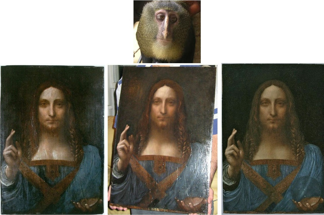
Above, Fig. 12: In this sequence we see how the face’s distinctive bug-eyed, long thin bent-nosed monkey-like anti-classical appearance on acquisition in 2005 had persisted throughout the 2008 visit to the National Gallery and into the 2011-12 stay in the National Gallery’s Leonardo exhibition.
What might account for the substantial covert post-2012 re-restoration? In the absence of information and reports we must speculate. It can be said that for the credibility of so elevated an ascription as an entirely autograph Leonardo da Vinci it is imperative that a clear “fit” be evident with secure works within Leonardo’s oeuvre. Anything anomalous or discordant becomes a threat that must be explained away by being incorporated as an especially confirming feature within the attributed work’s New Narrative . For example, when Professor Martin Kemp was actively engaged as an advocate of another proposed Leonardo, the mixed media drawing on vellum he dubbed “La Bella Principessa”, he contended that atypical or previously unknown features (including working in a medium “that has not previously been seen”) can safely be taken as a “new facet” of the artist’s engagement with his circumstances. Perhaps. But when a work has been specifically likened to the greatest and most maturely sophisticated works of Leonardo the bar has been set extremely high and the scope for great surprises is reduced. For the owners and professional champions of this Salvator Mundi – a work that was very soon afterwards to be offered to the market – the scholarly rejections that attended the National Gallery exhibition might have seemed disappointing, if not alarming.
Today we see three principal cross-linked concerns with the painting that has recently sported two separate identities – the one displayed at the National Gallery and the one worn for the recent sale. The problems are: the painting’s appearance; its (lack of) provenance; and the (over-heated) means of its promotion and accreditation.
GHOST SCHOLARSHIP
This Leonardo ascription has been made on almost no published scholarship. It rests on a largely unstated and, therefore, unexamined art critical case. Apart from the restorer’s report and the National Gallery exhibition catalogue’s entry by its curator, Luke Syson, almost nothing, so far as we know, has been published in support of this Leonardo. Christie’s lot essay appealed to the authority of the unpublished researches of one of the original owners, Dr Robert Simon, a New York art dealer, and to Modestini’s and Syson’s accounts when they, too, both acknowledged indebtedness to the researches of Simon. After twelve years, serial restorations and two sales at a combined total of over half a billion dollars, those researches have yet to be published. It is impossible to know whether or not weaknesses in the two published accounts derive from or fairly reflect Simon’s still unpublished material but dangers must lurk in an unexamined triangulated loop of research in which much seems to be assumed or borrowed and from which little concrete evidence emerges – and where caveats abound. Luke Syson writes:
“The re-emergence of this picture, cleaned and restored to reveal an autograph work by Leonardo, therefore comes as an extraordinary surprise” but, he adds, of Wenceslaus Hollar’s engraved testimony (see below): “None of this, of course, is evidence for the picture’s autograph status. After all, the pictures by pupils copying Leonardo’s design may sometimes have been rather good, and one such might easily have been owned by Henrietta Maria.” Quite so. And in view of Jacques Franck’s account above (ITEM 6), that very possibility, as advanced by Ludwig Heydenreich, is the first mountain that any “Autograph Leonardo Salvator Mundi” aspirant must be seen to have scaled. It is now six years since Syson alerted us that “This discussion anticipates the more detailed publication of this picture by Robert Simon and others” but he gave little indication of any corroborative evidence being to hand. It would sometimes seem that Simon’s researches on the New York candidate echo or adapt the extensive researches earlier conducted by Joanne Snow-Smith in her support of the unsuccessful Paris candidate, the so-called de Ganay Salvator Mundi (see Fig. 13). If Syson should prove to have been a dutiful student of Simon we might be in for a daisy-chain of hypotheses in which awkward and peculiar features are advanced as material corroborations with rhetrorical flourishes. Syson ends his account thusly:
“Snow-Smith has shown that King Louis XII and his consort, Anne of Brittany, were particularly devoted to Christ as Salvator Mundi, and that they could connect this cult with the Mandylion of Edessa twice-over we now see. Given the date – around 1500 – of Leonardo’s preparatory drawings [only two sheets of drapery studies], the style of the picture and its association with a French princess, Louis and Anne become the most likely patrons for Leonardo’s Salvator Mundi, probably commissioning the work soon after the conquest of Milan and Genoa. This would therefore be one of the French commissions mentioned by Fra Pietro Novellara. And it was perhaps to accommodate their wishes that Leonardo based Christ’s features, the set of the eyes, the heavy lower lids, and especially his smoothly arched eyebrows [sic] down into a long nose, on the Christ of the Mandylion of Edessa.” Emphases added.
How can you extract a “would therefore be” from a “could”, a “most likely”, and a “probably”? In lieu of a single hard shiny fact, we are offered a forest of fancies, maybes, perhaps’s and scholarly borrowings.
THE HOLLAR AND DE GANAY CONNECTIONS
Even if the claimed correspondence between the New York Salvator Mundi and Hollar’s etched copy had been visually compelling – which on many counts it is not – the etching’s ascription to Leonardo would still need treating with caution. Max Friedlandler warned in On Art and Connoisseurship: “The inventories of princely galleries – such as those of Margaret of Austria, Vicereine of the Netherlands, or of King Charles I of England…are to be utilized sceptically and to be taken seriously only to the extent that facts derived from style criticism do not contradict them.” With the New York Salvator Mundi’s countless stylistic incompatibilities, attempts to press a correspondence with the Hollar are quite counter-productive.
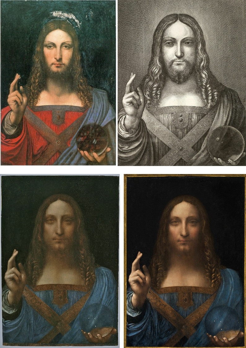
Above, Fig. 13: Top row, left, the “de Ganay Salvator Mundi” (the painting had formerly been in the collection of the Marquis de Ganay, Paris); top row, right, the 1650 Hollar etching. Bottom row the New York Salvator Mundi in 2011, left; and in 2017, right.
The de Ganay picture, top left, was proposed in a scholarly article in 1978 and a book of 1982 to be an original Leonardo painted prototype for around twenty Leonardo-like Salvator Mundi paintings. That attribution did not find general favour but the case advanced for it by the scholar Joanne Snow-Smith provided a template for the New York Salvator Mundi. It, too, was said to have been the painting etched by Hollar, above, top right. Its material composition was also said to have passed the technical tests of its day. Its paintwork, too, betrayed no discernable brushwork – in this last respect both of the proposed Leonardo protypes are physically unlike such secure but heavily cracked bona fide Leonardo works as the Mona Lisa and the St. John the Baptist.
While both of the two painted versions shown above, left, are said to have provided the model for Hollar’s etching, in neither case is this plausible. Both have the complicated and rather ugly configuration of drapery folds at the true left shoulder in which a horizontal fold runs below the below the shoulder creating an epaulette-like touch of power-dressing that is not present in Hollar’s copy. The alteration of the New York version’s shoulder drapery thus might be thought to have conferred two stylistic benefits: it makes a closer fit with the Hollar copy and it puts distance between itself and an earlier failed contender as an original painted prototype by Leonardo.
The 2012-17 repainting might be thought to have brought other benefits vis-à-vis the very marked departures from the Hollar seen in the New York Salvator Mundi. In the etching there are two principal sources of light: a strong, top left corner-down natural light source that imparts a pronounced chiaroscuro on the figure (– and even an unremarked cast shadow from the raised arm) and, a source of radiance (“nimbus”) behind Christ’s head. Although the newly imposed uniform blackness of the background is counterproductive in terms of the claimed correspondence with the historic Hollar copy, the recent general beefing-up of tonal contrasts – and particularly so with the foreground arm drapery and the orb – has mitigated to a considerable degree the previous deadening flatness (of which we have complained see: “Mystery over Christ’s orb in $100m Leonardo da Vinci painting”.)
The face in the Hollar is long thin, bearded and tapering, as is that in the de Ganay painting. In contrast, the face in the New York picture emerged from the first restoration with an entirely disqualifying lopsided shape that was markedly wider at the jaw than at the cheekbone and thus combined a chipmunk-like aspect with a monkey nose. The latest post-2012 shading on the face of the New York picture has served to narrow the lit lower face and make the overall aspect more symmetrical. Similarly, Modestini’s widening of the right nostril aperture (see Fig. 19) masks another anatomical solecism in a purportedly hierarchic frontal classical face, which, Modestini assures us was “deliberately adapted by Leonardo from a Byzantine prototype and also used by Giotto in the Peruzzi Altarpiece in Santa Croce, with which he was certainly familiar…” Similarly, too, for Syson the question is re-begged: “the face of Christ – rigid, symmetrical, absolutely frontal – is deliberately archaic. He seems to have been aware of the central panel of a polyptych ascribed to Giotto and his workshop…” Two asserted “deliberatelys” do not a secure fact make. The idea of Leonardo as a backward looking archaistic figure is a notion that finds realisation in only two works: the proposed Leonardo drawing “La Bella Principessa” – which has no history before its emergence in 1996 from the studio of a painter who became a friend of Berenson and a restorer of …Leonardo, among others; and, the recently upgraded New York Salvator Mundi. The argument is circular. If ever Leonardo might have been tempted to do a frontal, backward-looking hierarchic face of Christ it would have been on his triumphantly frontal, wall-asserting mural The Last Supper. Instead, of course, he carved space by playing every head and limb off against the unseen picture plane.
THE PROVENANCE
Without the Hollar connection this Salvator Mundi’s provenance begins only at 1900 four centuries after its supposed execution. The pre-1900 history is problematic. It is not known from whom, where or when the picture had been acquired by Sir Charles Robinson who bought the work as a Bernardino Luino for the Cook Collection. We have been informed that an English fossil-hunter, Thomas Hawkins (1810-89), seems to have donated a “Leonardo Salvator Mundi” in 1848 to a church in Birmingham. That church was closed down in 1895, at which date its collection was presumably disbursed. Had Robinson bought it from that church? Or, were there two claimed Leonardo Salvator Mundi versions then at large in England? To complicate matters, the whereabouts of a third version formerly in the Worsey and Yarborough Collections is presently unknown. So there might have been three Leonardo Salvator Mundi candidates in 19th century England.
The Cook collection picture’s provenance ran into the ground in 1958 when sold by Sotheby’s for £45. Between 1900 and 1958 no one thought the New York Salvator Mundi to be a Leonardo. Christie’s 2017 sale provenance ended: “Kuntz, Private Collection USA”. Sotheby’s have no additional information on Kuntz. Wiki has an entry on a US artist Roger Edward Kuntz, a talented painter who wavered between abstraction and representation and died in 1975. In the early 50s he and his wife travelled for four months in Europe so that he could visit museums. They had a daughter in 1951. If Kuntz, an artist with a “pensive, thoughtfully naturalistic sensibility” made another European trip in 1958, might he have had £45 (at that date about a month’s wage for an unskilled worker in Britain) to spare on an old Italian painting? Roger Kuntz died in 1975 but was succeeded by his wife and daughter. If not that Kuntz family, what of others in the United States? A Kuntz family in Louisiana used to be avid collectors of paintings, antiques and historical documents. Rosemund E. and Emile Kuntz had two sons, one of whom donated a majority of their collection to Tulane University in New Orleans. As things stand we do not know the identity of the vendor in 2005 or the venue of the sale – which might seem odd in the world’s most information-rich country in the twenty-first century. Given the still sticky varnish present on the New York Salvator Mundi in 2005 when the painting was bought for $10,000, it could be useful to establish the identity of the previous owner who would have information on the previous restoration and very possibly photo-records of the painting from 1958 onwards.
THE SALVATOR MUNDI’S APPEARANCE

Above, Fig. 14: Details of the Hollar etching and the 2017 version of the New York Salvator Mundi.
If the removal of the “epaulette” and the rounding off of the shoulder brings the painting a little closer to the etching, the painted orb has become even more at variance. In the Hollar copy the orb accumulates light around its circumference in contrast to the pools of darkness at its centre but that symbolic tonal logic is inverted in the New York painting and the line of three reflected lights on the surface recorded by Hollar contrasts with a triangular configuration which some see as a depiction of stars in the southern hemisphere but which again, is nowhere else encountered. As if oblivious of all this conflicting testimony, Syson writes of the New York painting’s orb: “This perfect sphere is seen both to contain and transmit the light of the world.” And again, against visual evidence he writes: “Moreover, Christ’s hand remains miraculously undistorted. Leonardo has therefore created an object that would be understood as a piece of divine craftsmanship, but still be his own invention. Never did he make the connection between his own creativity and God’s more explicit.”
A key part of the case advanced for the New York version is that it contains a number of pentimenti. Luke Syson writes “There is, for example a major pentiment in the thumb of Christ’s proper right hand, and other, lesser adjustments of the contours elsewhere (such as in the palm of the left hand seen through the transparent orb).” Syson contends that such are typical of Leonardo and would be surprising “in a copy of an existing design”. He fails to explain why, had this painting provided a fully realised painted prototype for all the other versions (as opposed to having provided studies and possibly a cartoon, as other have concluded), no other version depicted the hand holding the orb in the manner of the New York picture – as we discussed in Part I and will examine further in Part III. No other version shows as much of the palm of the hand and all show what little is seen of the hand and the thumb itself to be on a rising diagonal (see Fig. 15), as does the Hollar copy. Perhaps Robert Simon has assembled in his researches an explanation for how it came about that Leonardo painted a hand, as presently in the New York version, and how, then, when Hollar copied it a century and a half later, he opted to make it both smaller and rotated from its horizontal axis to a diagonal one? Modestini describes the collective thinking/handling of one of the other changes of position:
“A pentimento of the thumb [on the blessing hand] appeared as soon as the varnish was removed. It had been covered over by successive layers of background paint and, when these were scraped off, was itself damaged in the process. It was never a complete thumb, only the bright pink underpaint, rather amorphous because of the damage. Normally I like to see pentimenti, sometimes veiling them slightly if they are too prominent and disturb the image. In this case I tried various solutions, including: reconstructing it, after which it was too assertive; toning it down with dark translucent glazes; pushing it back with scumbles containing green to subdue the bright pink. It never looked right and interfered with the well-preserved hand. I was greatly relieved when Luke Syson agreed that, under the circumstances, it could be completely suppressed.”
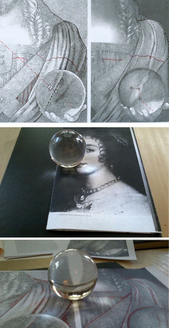
Above, Fig. 15: In the top row above we see how greatly more commanding and authoritative is the design and sculptural massing of forms in the small etched copy by Hollar than in the much larger New York painting. It is inconceivable that Hollar, if copying the New York picture, would have changed so many aspects of the design and so greatly intensified the overall theatre of lighting and form-evoking shading. In the Hollar we see the central drapery ridge descending from the shoulder in a convex sweep before entering the orb’s circumference and then abruptly inverting from convexity to concavity – which aspect it maintains throughout its passage within the orb until, on exiting, it immediately reverts to convexity. In the centre of our own glass “orb” (which lies on the surface) in the lower picture we see how the narrow parallel white division between the two photocopied diagrams at first disappears from view and then reappears, within the orb curving outward slightly on one side and more dramatically so on the other before beginning to converge at the approach the circumference. If the New York painting were a Leonardo that had been copied by Hollar, how likely would it be that the latter copyist took the liberty of making a more complex and scientifically astute optic within the orb than was present on the painting he believed to be by Leonardo?
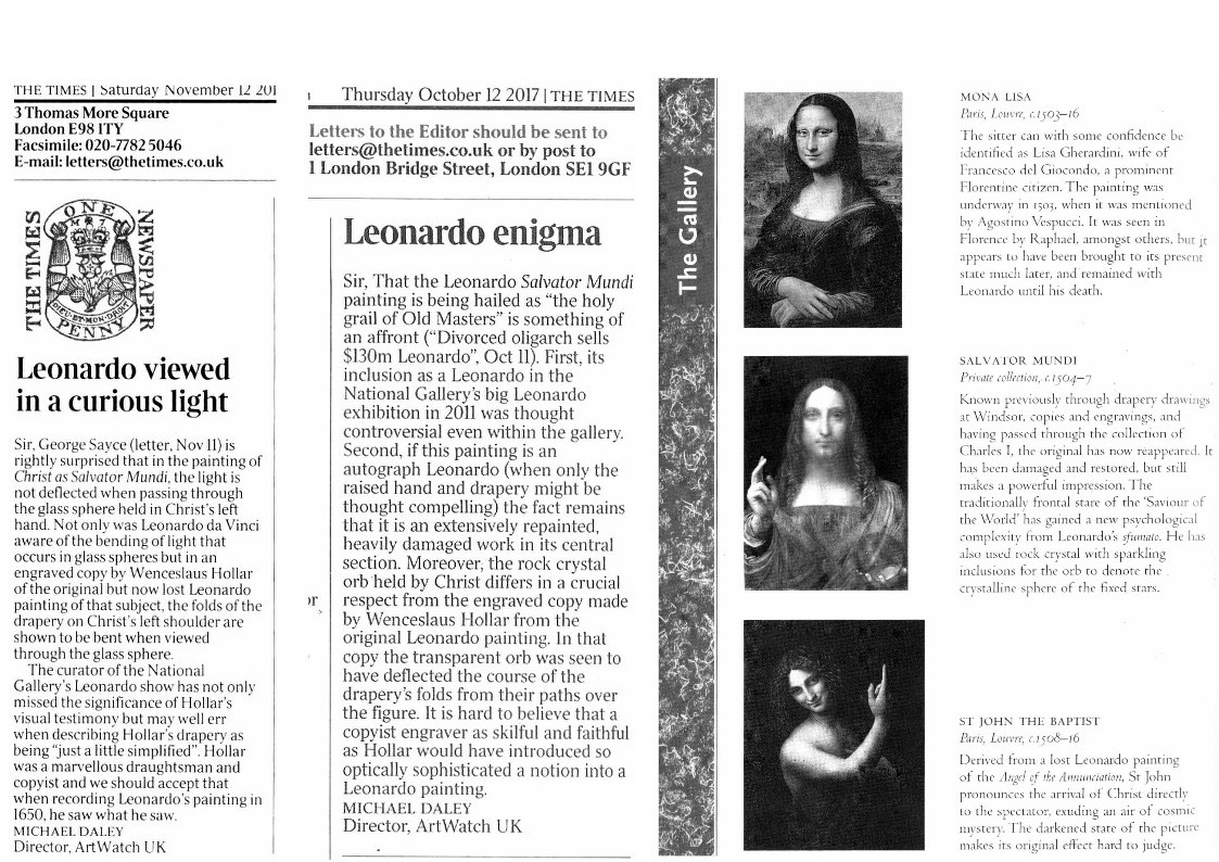
Above, Fig. 16: Left, two ArtWatch letters to the Times on the orb; right, Professor Martin Kemp’s endorsement of the Salvator Mundi’s Leonardo attribution, as set out in the 2011 edition of book Leonardo. His illustration, being that of the 2011 state, is now obsolescent. His dating (c. 1504-07) places the picture chronologically (and therefore stylistically) between the Mona Lisa and the St John the Baptist. In an earlier entry in his book’s “Gallery”, Kemp also endorses the mixed media drawing on vellum glued onto an oak panel which he dubbed “La Bella Principessa (Portrait of Bianca Sforza?)” – see Fig. 20. He dates that proposed Leonardo at c. 1495-6 in tandem with the beginning of Leonardo’s Last Supper. He states as fact that this drawing had been cut from the Warsaw copy of the Sforziada produced for Galeazzo Sanseverino. He and the owner of the drawing each made a trip to Warsaw with a National Geographic crew to locate the spot in the codex from which the sheet was cut. They both found the spot, or rather, two different spots. Kasia Pisarek established that neither could have been the case because the book had been bound with five double stitch holes, when the drawing has only three single holes. (See “Fake or Fortune: Hypotheses, Claims and Immutable Facts”)
![017 [10] split](http://artwatch.org.uk/wp-content/uploads/2018/02/017-10-split-700x1024.jpg)
Above, Fig. 17: In this split image above we see the 2011 face on the left, and the 2017 face on the right. We can see the extent to which Modestini has intensified all the values present in her first version: she has lightened her lights and darkened her darks and warmed the hue of the cheeks. This rouging of the flesh is at variance with the face of the Mona Lisa. In effect, Modestini has treated her own 2011 second-state painted restoration as if it were an etcher’s proof and worked afresh on the plate before pulling a new, further worked-up state with intensified pictorial vivacity. In doing so she demonstrates a painterly expertise that is rare among restorers today and a sophisticated pictorial sensibility. However it is one, as shown below, deployed to arbitrary and ahistorical purposes.
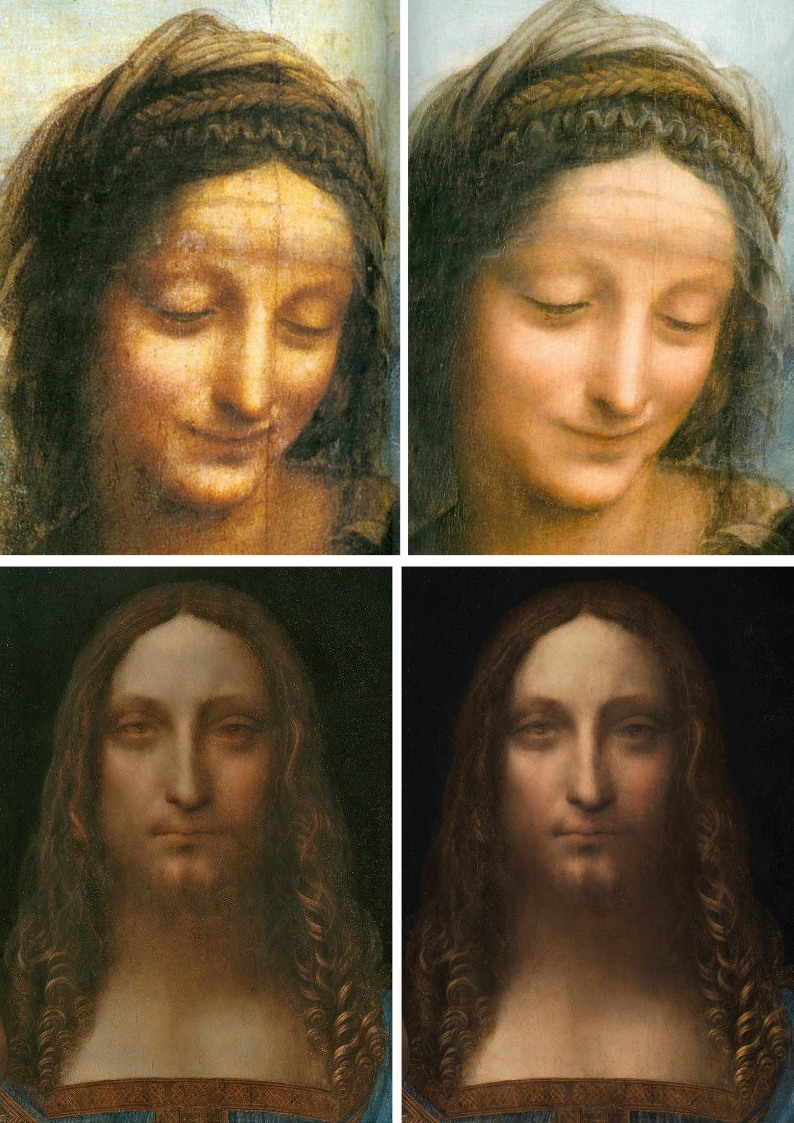
Above, Fig. 18: In the top row detail of St. Anne, we see how a major bona fide Leonardo in the Louvre has borne the commonplace “reductive” pictorial material-shedding brunt of radical restorations. Restorers, when challenged on their sculpturally flattening modernist impositions, invariably insist that what critics lament as losses were no more than dirt, disfiguration and arbitrary alien accretions. Curators should know better and for the longest time in the 20th century those at the Louvre did do so. In the bottom progression we see how Modestini avoided one picture restoration affliction only to effect another by imposing a ceaselessly-evolving painterly elaboration which comes to constitute a series of variations on a theme.

Fig. 19, above: As mentioned, when considering great artists the primary evaluation must always be one of artistic quality. In Part III we examine the New York Leonardo Salvator Mundi with regard to the great bona fide Leonardo works to which it has been likened. Here, above, we show a close-up of Christ’s (changing) face as seen in 2012 left, and 2017, right. Above it we show the eyes as in 2007 when cleaned but not yet repainted. The attentive viewer will see how Modestini has variously changed the expression of Christ by: raising the right-hand side of the parting line of the lips; by de-fluffing some of the beard on the left upper mouth; and, by further adjusting the misaligned eyes. There is as yet no published record or account of the reasons for making these changes. As seen, Syson saw in the (2011) eyes of this Salvator Mundi Leonardo’s accommodation with the wishes of certain historical figures with whom no connection has been established. We do have Modestini’s account of the induced appearance of the eyes, as they were seen in the 2011-12 National Gallery exhibition:
“Since both eyes have been abraded, the left one to a greater degree than the right, the ambiguity between abrasion and highlight made the restoration extremely difficult and I redid it a number of times. As little as possible was done to the left eye. No attempt was made, for example, to emphasize the pupil which is reasonably well preserved in the right eye. Carefully following the remnants of original, which contain a line of drawing to place the lower lid, resulted in eyes of slightly different size; the left is smaller than the right. Imposing a more logical or definite shape caused the eyes to completely change character.”
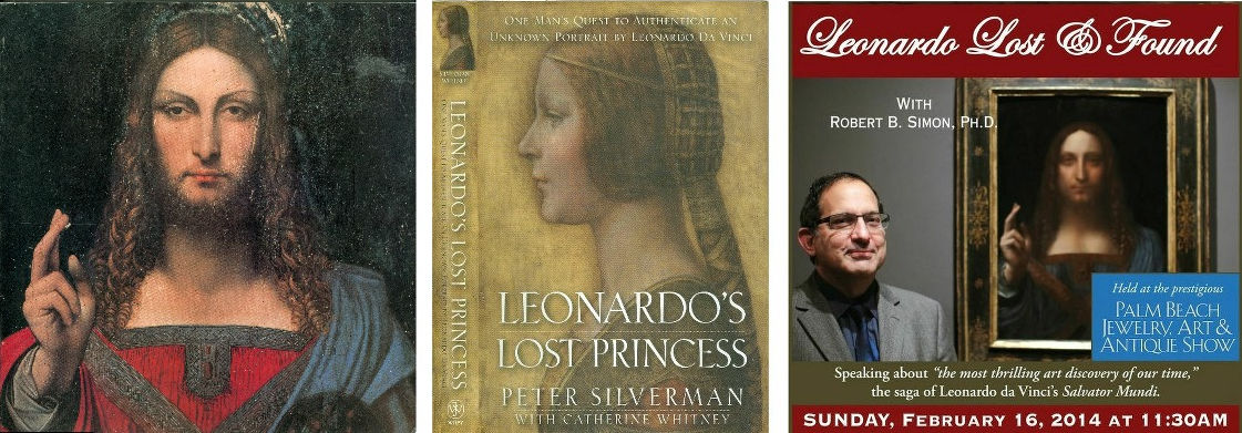
Above, Fig.20: Left, the cover of Joanne Snow-Smith’s 1982 book THE SALVATOR MUNDI OF LEONARDO DA VINCI; Centre, the cover of the owner’s account of his (so far vain) quest to authenticate the “La Bella Principessa” drawing; Right a poster for a talk given by one the original owners of the New York Salvator Mundi at the 2014 Annual Brunch for Friends of the Uffizi Gallery.
Michael Daley, 2 February 2018
Problems with the New York Leonardo Salvator Mundi Part I: Provenance and Presentation

The Art Newspaper reports that questions of authenticity, provenance and attribution constitute the greatest risks to the art market according to 83% of wealth managers and 81% of art professionals (“Ultra-rich will spend $2.7 trillion on art by 2026 says Deloitte”).

Above, Figs. 1 & 2: ArtWatch UK members’ Journal No.31 and its lead article. For membership details please contact Helen Hulson at hahulson@gmail.com .
In our current Journal (above) we carry a report on the crisis triggered by the collapsing numbers of scholars who possess specialised expertise in particular artists and fields, and on whose authority and powers of appraisal the art market relies. Scholarly shortcomings are also evident in a widespread disinclination to conduct rigorous, visually comparative interrogations of restored and/or attributed works – perhaps out of deference to institutionally-powerful picture restorers who nowadays call themselves Technical Art Historians. Some museum curators openly farm out responsibility for attributions…to private collectors. At elevated scholarly levels the highest ascriptions are sometimes attached to what are only the best surviving versions of lost works.
TELL-TALE CROPPING
The late Sir Denis Mahon supported as original and authentic a version of Annibale Carracci’s Venus, Adonis and Cupid, of c. 1588-90 until the Prado restored its own version and declared it the authentic original. Mahon saw vindication in an instantly switched allegiance:
“When I first wrote about this composition, some fifty years ago, my observations on style and chronology were based not on the Prado painting, since this was as yet unknown, but on the excellent early copy in the Kunsthistorisches Museum in Vienna and on the preparatory drawings for the figure of Adonis in the Uffizi. When the Prado painting was first published in 1965, by Pérez Sánchez, it was gratifying to realize that, although all those of us who concerned ourselves with Emilian painting had mistakenly assumed that the Vienna picture was Annibale’s original, one’s intuitions about the importance of the work and where it fitted in the artist’s evolution were confirmed.”
So that was alright then? No. Sir Denis was parading methodological laxity. Even before the Prado picture emerged, he should have appreciated that an old engraved copy testified that the original work was larger and compositionally richer than the cropped version he was espousing. Cropped digits and limbs are so commonly encountered in copies as to constitute attribution alarm bells. They are found (as we showed in “Art’s Toxic Assets and a Crisis of Connoisseurship”) in works given to Caravaggio, Rubens and Leonardo. Just as the thumb on Christ’s left hand in the New York Salvator Mundi is inexplicably cropped (- and nowhere addressed), so are Samson’s toes in the National Gallery’s Rubens Samson and Delilah and so are the legs and part buttocks of a slain infant in the Old Masters world record-beating Lord Thomson Rubens Massacre of the Innocents. In the National Gallery’s (second) version of Leonardo’s Madonna of the Rocks, the foot of the infant Baptist runs off the painting whereas it falls comfortably within the edge of the composition in the unquestionably autograph first version in the Louvre. It is being claimed that the New York Salvator Mundi (Fig. 3) is the prototype original for all other versions when it is in fact the only version to carry a cropped thumb (see Fig. 4). Did every other artist ignore/correct a mismanaged painted prototype composition by Leonardo?

Above, Figs. 3 and 4: Top, the New York Salvator Mundi which, since 2011 has been attributed to Leonardo (photo. courtesy of Christie’s); Above, details left, of the so-called de Ganay Salvator Mundi; centre, of the Detroit Institute Giampietrino Salvator Mundi; and, right, of the New York, Leonardo Salvator Mundi.

Above, Fig. 5: Left, the proposed but rejected de Ganay Leonardo Salvator Mundi; right, the New York Leonardo Salvator Mundi.
THE HISTORICAL CONTEXT OF THE NEW YORK SALVATOR MUNDI
The New York Salvator Mundi is billed as a miraculous once-in-a-century discovery when it is the second such claimant drawn from a pool of more than twenty clearly Leonardo-derived and sometimes partially Leonardo-assisted Salvator Mundis. In 1978 and 1982 Joanne Snow-Smith, with the support of the Leonardo scholar Ludwig Heydenreich, proposed that the de Ganay Salvator Mundi (above, left) was the original autograph Leonardo prototype for all other variants.
Earlier, Heydenreich had concluded on the evidence of the various treatments seen in this group – which included the then lost, now New York Salvator Mundi – that Leonardo had more likely executed designs or a cartoon to inform his assistants and associates than to have executed a finished painted panel.
THE LEONARDO SALVATOR MUNDI FIELD
Although the quality here is very poor we reproduce below at Figs. 6–10 all of the reproduced images included in Heydenreich’s neglected but, as Frank Zöllner holds, “enduringly significant” 1964 study “Leonardo’s ‘Salvator Mundi’”. The initial images set the scene and context of the subject, others are examples of the score or more Salvator Mundi works now associated with Leonardo.
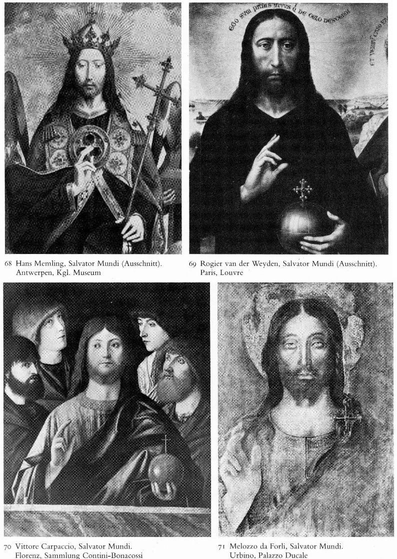
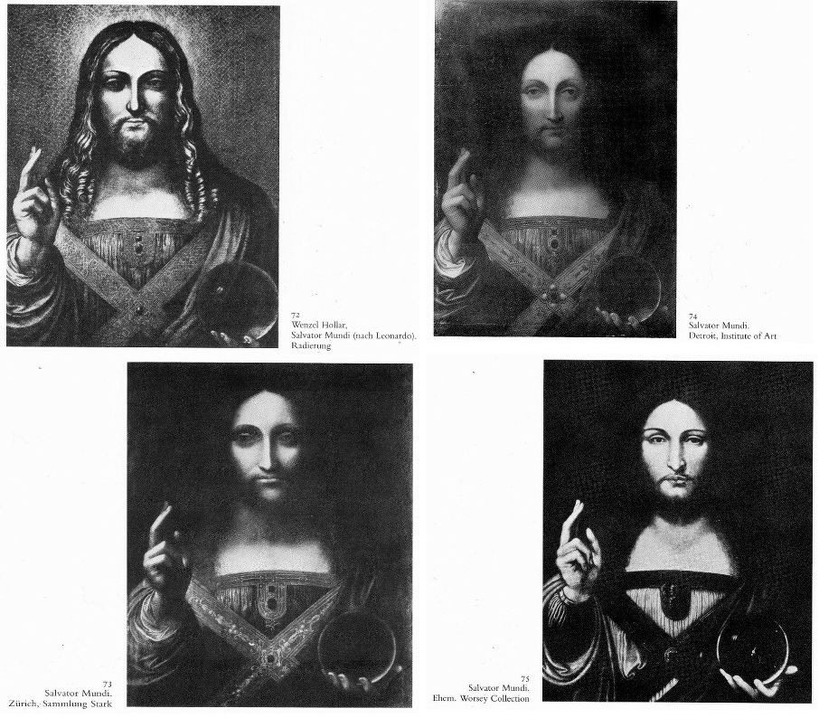
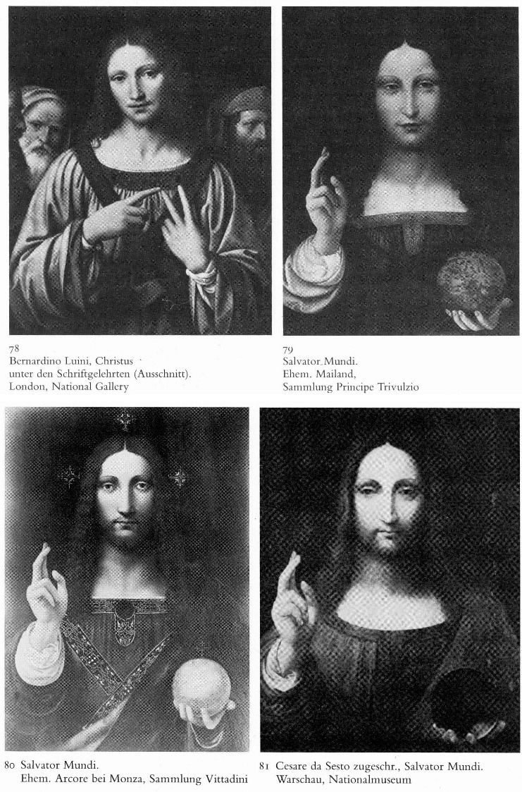
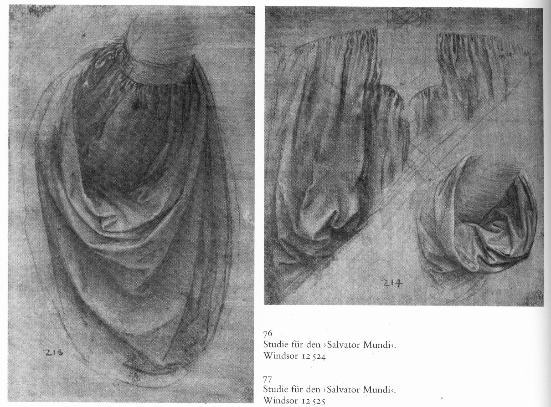
Above, Fig. 10: This image is crucial to the attribution, being the two (Windsor Castle) drapery studies that comprise the entire extant material evidence for Leonardo’s involvement in the genesis of the large associated group of Salvator Mundi works. Characteristic Leonardo drapery fold motifs in the two studies recur in varying ways in many but not in all of the associated works. These two sheets provide a small base for a claimed Leonardo attribution for a particular painting. At the heart of this present (contested) Leonardo Salvator Mundi attribution is, therefore, the question of whether Leonardo provided further designs, studies, cartoons and some painterly assistance to his students (as Heydenreich held and Frank Zöllner now holds), or whether Leonardo painted a prototype painting which provided the basis for all of the many variant Salvator Mundis. What is for sure is that there exists no study by Leonardo for an otherwise out-of-character fully frontal view of Christ’s face, or for the distinctive and recurrent hand/orb motif.
This quest for an autograph prototype Leonardo painting might seem moot or vain: not only do the two drapery studies comprise the only accepted Leonardo material that might be associated with the group, but within the Leonardo literature there is no documentary record of the artist ever having been involved in such a painting project. The first record of a work of this subject by the (attributed) hand of Leonardo occurs only in the 17th century in England.
THE OPPORTUNITY FOR LEONARDO TO PAINT A SALVATOR MUNDI
That there should be no more than a couple of drapery studies and absolutely no mention of Leonardo’s involvement on such a painting fits with records that do exist of his activities at the post-1500 period. Jacques Franck, the expert of Leonardo’s painting techniques and a restoration adviser to the Louvre, notes that:
“By 1500 onwards, the period in which the painted panel is said to have been executed, for want of time Leonardo produced few works. Fra Pietro da Novellara, who visited his studio in April 1501, reported: ‘His mathematical researches have so much distracted him that he can’t stand the brush’, and, he added, ‘Two of his pupils make copies to which he adds some touches from time to time’. In 1501, he was commissioned to produce a ‘Madonna of the Yarnwinder’ by Florimond Robertet (the French King Louis XII’s secretary) at the time when he was already creating both the major group ‘The Virgin and Child with Saint Anne’ and the phenomenally accomplished ‘Mona Lisa’. Both panels were seen during their executions in October 1503 by Agostino Vespucci, an assistant of Machiavelli at the Signoria in Florence but he, too, made no reference to a Salvator Mundi. Giorgio Vasari says of the ‘Mona Lisa’s’ execution that Leonardo, as a meticulous and slow-working painter had ‘toiled over it for four years’. Between May and August 1502 until early 1503 Leonardo was committed with Cesare Borgia as an architect and general engineer in the Marches and Romagna. He was then fully employed by the City of Florence during the Summer of 1503 as a military architect and, two or three months later, he worked fully on the commission of a huge mural (the now destroyed ‘Battle of Anghiari’) until late May 1506, before travelling between Florence and Milan up to mid 1508, because of his appointment as painter and engineer to the French King while serving Charles II d’Amboise, the new governor of Milan. Because of such taxing commitments – and all of the above were in addition to his intense scientific researches and literary activities – Leonardo increasingly resorted to workshop productions from 1500 onwards. The ‘Salvator Mundi’ must, of necessity, be thought to be one of those works and, given the preceding it is very likely that a fully original version never existed.”
THE CRITICAL RECEPTION OF THE NEW YORK SALVATOR MUNDI
Christie’s lists a broad group of international scholars and experts to whom the painting had been shown at various points between 2007 and 2010, which is to say only after “the initial phase of conservation” had been completed between 2005 and 2007. It says also that there exists a “broad consensus that the Salvator Mundi was painted by Leonardo da Vinci, and that it is the single original painting from which the many copies and student versions depend” with most placing it in the later 1490s while some date it slightly later and believe it to have been painted over a number of years. The following experts are listed:
Mina Gregori, Nicholas Penny, Carmen Bambach, Andrea Beyer, Keith Christiansen, Everett Fahy, Michael Gallagher (restorer), David Allan Brown, Maria Teresa Fiorio, Martin Kemp, Pietro Marani, Luke Syson and David Ekserdjian.
However, of the thirteen, one, Carmen Bambach, can hardly be considered a supporter of an autograph Leonardo attribution. In a review in Apollo, February 2012 (“Seeking the universal painter”) she wrote:
“The attribution of the Salvator Mundi…is an important addition to the scholarship, but requires a more qualified description, for its severely damaged original painting surface exhibits a large proportion of recent integration [i. e. new, superimposed painting]. In the present reviewer’s opinion, having studied and followed the picture during its conservation treatment, and seeing it in context in the [National Gallery’s 2011-12 major Leonardo] exhibition, much of the original surface may be by Boltraffio, but with passages done by Leonardo himself, namely Christ’s proper right blessing hand, portions of the sleeve, his left hand and the crystal orb he holds.”
Of the remaining twelve, how many have written publicly in support of an unreserved Leonardo attribution? We recently asked one of those listed if he supported the Leonardo attribution unreservedly but have yet to receive a reply. One seeming casualty of the (heavy) promotion of the Salvator Mundi as the last chance to buy a Leonardo is the mixed media drawing on vellum known as “La Bella Principessa”. Is that work no longer on the market? Its Leonardo ascription was supported by two of those listed in support of the Salvator Mundi – Mina Gregori and Martin Kemp, but then, two listed supporters of the New York painting, David Ekserdjian and Pietro Marani, have roundly rejected the “La Bella Principessa” – as presumably also did Luke Syson and Nicholas Penny when the work was excluded from the National Gallery’s 2011-12 Leonardo exhibition to the annoyance of its owner and its scholarly advocates.
In addition, there is a glaring absentee on the Christie’s list – the author of the catalogue raisonné Leonardo da Vinci – the Complete Paintings and Drawings, Frank Zöllner. In the revised 2017 edition of his book, Zöllner says in his entry on the New York Salvator Mundi that while it surpasses the other known versions in terms of quality, nonetheless, it:
“also exhibits a number of weaknesses. The flesh tones of the blessing hand, for example, appear pallid and waxen as in a number of workshop paintings. Christ’s ringlets also seem to me too schematic in their execution, the larger drapery folds too undifferentiated, especially on the right-hand side. They do not begin to bear comparison with the Mona Lisa, for example. It is therefore not surprising that a number of reviewers of the London Leonardo exhibition initially adopted a sceptical stance…(Bambach 2012; Hope 2012; Robertson 2012; Zöllner 2012). In view of the arguments put forward to date and the above-mentioned weaknesses, we might sooner see the Salvator Mundi as a high-quality product of Leonardo’s workshop, painted only after 1507, on whose execution Leonardo was substantially involved. It will probably only be possible to arrive at a more informed verdict on this question after the results of the painting’s technical analyses have been published in full (Dalivalle/Kemp/Simon 2017).”
In his book’s revised 2017 preface, Zöllner writes:
“With regard to Leonardo da Vinci’s oeuvre, finally, the most sensational discovery to date has been the Salvator Mundi… The painting of Christ making the sign of the blessing has been known to art historians [only] since the start of the 20th century but subsequently disappeared from view. In 2005 it appeared on the art market and in 2011 was presented to the public in a spectacular exhibition in London (Syson/Keith 2011); since then its attribution to Leonardo da Vinci has been the subject of heated debate. This attribution is controversial primarily on two grounds. Firstly, the badly damaged painting had to undergo very extensive restoration, which makes its original quality extremely difficult to assess. Secondly, the Salvator Mundi in its present state exhibits a strongly developed sfumato technique that corresponds more closely to the manner of a talented Leonardo pupil active in the 1520s than to the style of the master himself. The way in which the painting was placed on the market also gave rise to concern.”
The long-promised delivery of the Dalivalle/Kemp/Simon technical accounts has now retreated to 2018 – seven years after the work was exhibited as a Leonardo in London and five years after it was first sold (for $80m) as a Leonardo. In 2012, Charles Hope wrote (New York Review):
“Much more suspect, however, is a recently cleaned painting of Christ as Salvator Mundi from a private collection. This was recorded in a print of the mid-seventeenth century, and the composition is known in other versions. But even making allowances for its extremely poor state of preservation, it is a curiously unimpressive composition and it is hard to believe that Leonardo himself was responsible for anything so dull.”
As shown below, the print (Fig. 11a) mentioned by Hope is crucial to the New York Salvator Mundi enjoying any provenance prior to 1900.
A HEAVILY-HYPED SALE AND THE NEW YORK SALVATOR MUNDI’S SCANT PROVENANCE
A sleeper-hunting dealer/blogger has written: “I’ve been impressed by how Christie’s have marketed the picture – in fact, I’d say that they’ve taken marketing Old Masters to a whole new level. A well deserved AHN pat on the back to all involved.” Christie’s, New York, is offering the work it describes as “The Last da Vinci” on November 15 2017 in a sale of contemporary art:
“Salvator Mundi is a painting of the most iconic figure in the world by the most important artist of all time,” says Loic Gouzer, Chairman of Post-War and Contemporary Art, “The opportunity to bring this masterpiece to the market is an honour that comes around once in a lifetime. Despite being created approximately 500 years ago, the work of Leonardo is just as influential to the art that is being created today as it was in the 15th and 16th centuries. We felt that offering this painting within the context of our Post-War and Contemporary Evening Sale is a testament to the enduring relevance of this picture.”
Few will likely be persuaded that Leonardo exerts as much influence on today’s artists as on those of his own times, and some might feel that removing the work from the context of an old masters sale will be helpful to its chances, given its heavily damaged condition and its very recently and substantially reconstructed twenty-first century appearance. There are other problems. The first concerns provenance, where the facts come late and are grafted onto a daisy-chain of hypotheses, claims and assumptions.
As mentioned, this work, now unequivocally described as a fully autograph Leonardo painting that is the artistic equal of the Mona Lisa, first materialised in 1900 when bought as by Leonardo’s follower, Bernardino Luini (- it was later taken to be a copy of a copy by Boltraffio). That purchase and what followed immediately afterwards are in the realm of verifiable facts until the painting went missing before reappearing in 2005. What is suggested to have happened before 1900 is speculation and/or contention. The first reference to such a Leonardo subject is in 1651. Christie’s provides the following provenance:
“(Possibly) Commissioned after 1500 by King Louis XII of France (1462-1515) and his wife, Anne of Brittany (1477-1514), following the conquest of Milan and Genoa, and possibly by descent to
Henrietta Maria of France (1609-1669), by whom possibly brought to England in 1625 upon her marriage to King Charles I of England (1600-1649), Greenwich;
Commonwealth Sale, as ‘A peece of Christ done by Leonardo at 30- 00- 00’, presented, 23 October 1651, as part of the Sixth Dividend to
Captain John Stone (1620-1667), leader of the Sixth Dividend of creditors, until 1660, when it was returned with other works upon the Restoration to
King Charles II of England (1630-1685), Whitehall, and probably by inheritance to his brother
King James II of England (1633-1701), Whitehall, from which probably removed by
Catherine Sedley, Countess of Dorchester (1657-1717), or her future son-in-law, John Sheffield, 1st Duke of Buckingham and Normanby (1648-1721), and probably by descent to his illegitimate son
Sir Charles Herbert Sheffield, 1st Bt. (c. 1706-1774); John Prestage, London, 24 February 1763, lot 53, as ‘L. Da. Vinci A head of our Saviour’ (£2.10).
Sir [John] Charles Robinson (1824-1913), as Bernardino Luini; by whom sold in 1900 to
Sir Francis Cook, 1st Bt. (1817-1901), Doughty House, Richmond, and by descent through
Sir Frederick [Lucas] Cook, 2nd Bt. (1844-1920), Doughty House, Richmond, and
Sir Herbert [Frederick] Cook, 3rd Bt. (1868-1939), Doughty House, Richmond, as ‘Free copy after Boltraffio’ and later ‘Milanese School’, to
Sir Francis [Ferdinand Maurice] Cook, 4th Bt. (1907-1978); his sale, Sotheby’s, London, 25 June 1958, lot 40, as ‘Boltraffio’ (£45 to Kuntz).
Private collection, United States.
Robert Simon, New York.
Private sale; Sotheby’s, New York.
Acquired from the above by the present owner
Pre-Lot Text
Property from a Private European Collection”
Thus, from a claimed execution either before or after 1500 (the supporters are divided on a possible position within Leonardo’s oeuvre) it is said to have passed through four centuries via a “(Possibly) Commissioned”; “Possibly by descent”; “by whom possibly brought to England”; “probably by inheritance”; “from which probably removed”; “and probably by descent” to 1900. It then took a further 111 years for this work to gain accreditation as a Leonardo when it was included in the National Gallery’s special exhibition “Leonardo, Painter at the Court of Milan” after a long and highly problematic restoration.
THE HOLLAR RECORD
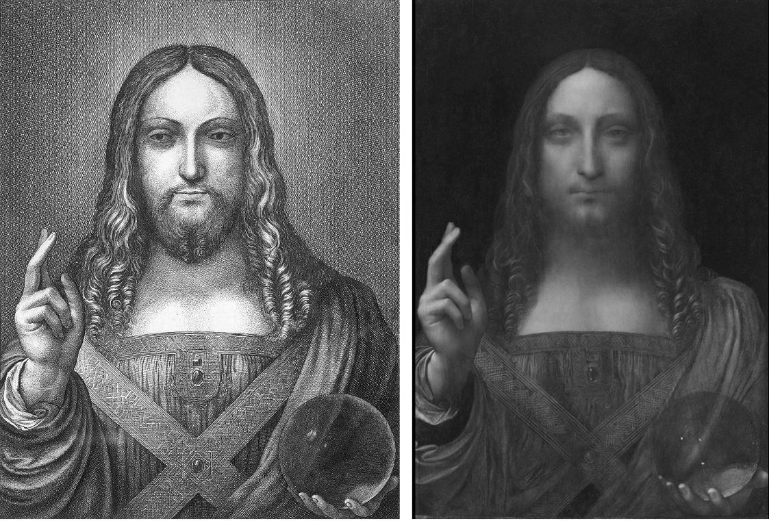
Above Fig. 11: Left, the Hollar copy declared by the engraver to be of a Leonardo; right, the New York Salvator Mundi
The 2011-12 London National Gallery Leonardo show catalogue entry on the New York Salvator Mundi was written by the (then) National Gallery curator Luke Syson, who acknowledges indebtedness to “the more detailed publication of this picture by Robert Simon [the then owner] and others…to be presented in a forthcoming book.” At first, Syson is dismissive of the seventeenth century engraved copy by Hollar which had been cited in 1978 and 1982 in support of the de Ganay version (Fig. 5a) on the grounds that the copyist, Wenceslaus Hollar, “might very well have been copying a copy.” Indeed. However, two paragraphs later Hollar commands centre stage:
“The re-emergence of this picture, cleaned and restored to reveal an autograph work by Leonardo, therefore comes as an extraordinary surprise. Though Hollar’s Christ is very slightly stouter and broader, the two images coincide almost exactly…There can be no doubt that this is the picture copied by Hollar.”
The general extent to which the Hollar copy fits the present New York Leonardo Salvator Mundi is (as seen above) is considerable, as Syson notes, but then, so too is the number of ways in which it departs from that record. Both will be examined in Part II.
Michael Daley, 14 November 2017
Fakes, Falsifications and Failures of Connoisseurship
2017 marks the twenty-fifth anniversary of ArtWatch International and, today, the tenth anniversary of the death of its founder, Professor James Beck. This year, the eleventh anniversary of Beck’s From Duccio to Raphael: Connoisseurship in Crisis, will see the ninth annual James Beck Memorial Lecture (in London) and publication of the proceedings of the 2015 ArtWatch UK, LSE Law, and the Center for Art Law conference “Art, Law and Crises of Connoisseurship” – which examined the crises from the perspectives of artists, scholars, scientists, and lawyers.
During the early 1990s Michelangelo restoration battles we soon saw misattributions and restoration injuries as twinned failures of connoisseurship. Subsequent events confirmed that analysis and vindicated our warnings on toxic attributions [1]. Our recent protracted silence covered studies of the present fakes/connoisseurship malaise and the results will be published during the year.
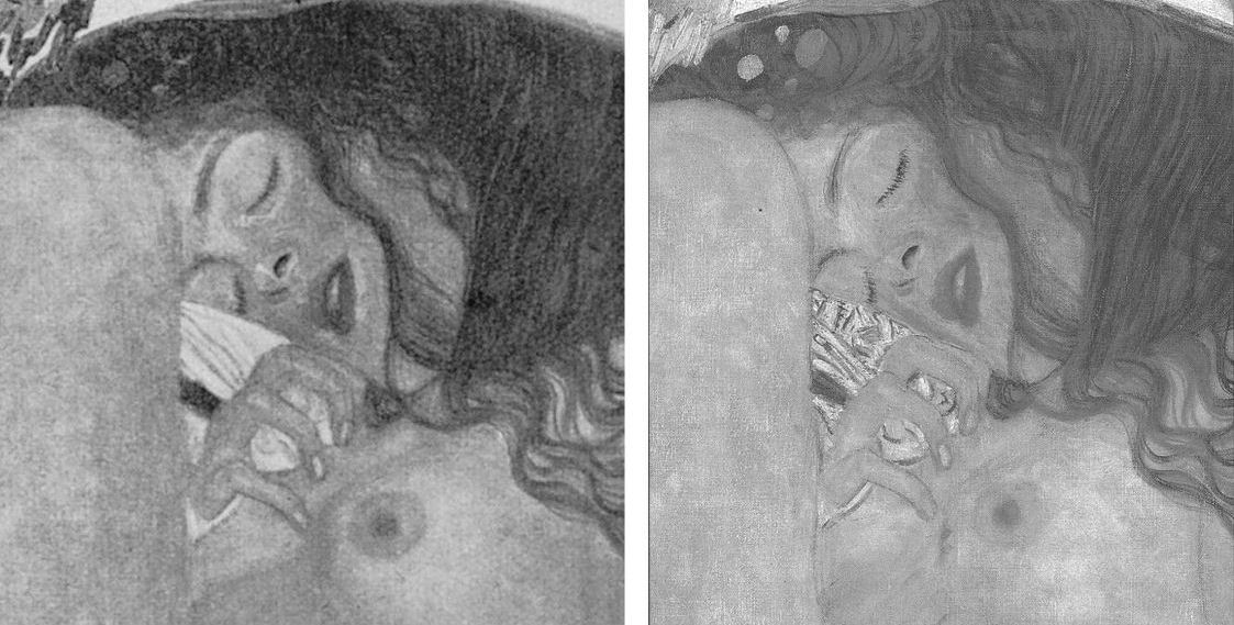
Above, Figs. 1 and 2: restoration degradations to two Klimt paintings – his Danae of 1907-08, as seen before 1956 and today; and his oil on canvas Portrait of Margaret Stonborough-Wittgenstein, as seen, left in 1905 when not-yet finished and subsequently in 1911, pre-1956 and today.
The starburst of exposed fakes that brought down New York’s (unrepentant) House of Knoedler, embarrassed ancient firms like Colnaghi’s and venerable publications like the Burlington Magazine has also humiliated the Louvre, the National Gallery, the Metropolitan Museum, the British Museum, the Art Institute of Chicago, the Tate, the Galleria Nazionale in Parma, the Van Gogh Museum and the Kunsthistorisches Museum in Vienna. On 11 April the FBI warned there could be hundreds more fakes in circulation in addition to the forty the agency has identified from a single forger who donated works to the Smithsonian American Art Museum, the Los Angeles County Museum, the Museum of Fine Arts, Boston, and the Detroit Institute of Arts. Had the FBI prosecuted the forger Ken Perenyi there might have been as many embarrassments again [2]. The problem of fakes occurs online, on land, and at sea outside of legal jurisdictions, as Anthony Amore has shown in his 2015 compendium of scams, The Art of the Con.
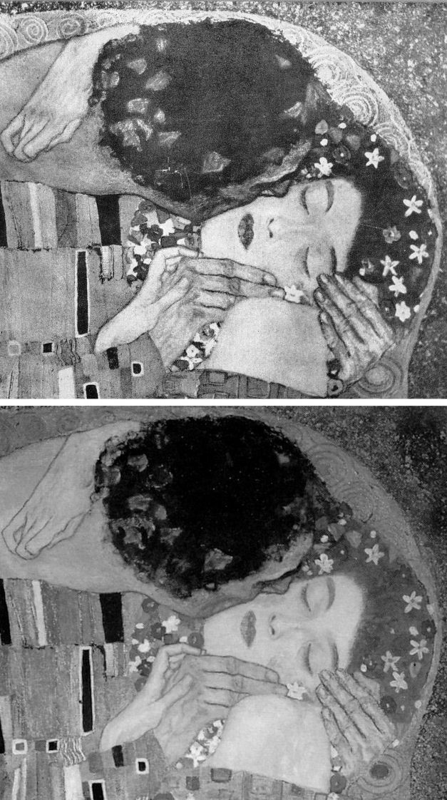
Above, Fig. 3, Klimt’s 1907-08 The Kiss, (detail) as seen before 1956 (top) and today.
With fakes and restoration injuries, the latter are greatly more destructive. Misattributions can be corrected, money can be paid back. However it might be ascribed at a given moment, the work of art – the art object – remains its own prime document (insofar as restorers permit). Sometimes restoration injuries are localised within a work, sometimes they are overall and catastrophic. Successive damaging restorations compound injuries and falsifications irreversibly (as seen above with Klimt and below with Renoir, Degas and Michelangelo). Slow cumulative damages are perhaps more serious than abrupt aberrant mistreatments that draw immediate notice. Scholars who shy from considerations of condition [3] must proceed on the premise that what is today is what originally was – an untenable view given that every restorer loves to undo and redo the works of predecessors but does so at a yet further remove from the work’s original condition and artistic milieu.
RESPONSES TO THE PRESENT ATTRIBUTIONS CRISIS
Responses to the attributions crisis have ranged from panic through self-exculpation and blame-casting to denial and cheerleading assurances of future streams of discoveries from sleeper/hunters. This is not an exclusively art market problem. Its roots are deeper and wider. The market trades objects on what others claim them to be. There has been concern among leading experts over the trade’s capacities of recognition and discrimination because of a precipitate decline in hands-on objects-informed expertise within the academic and museum spheres which have traditionally underpinned market activity [4]. Where Sotheby’s swiftly refunded purchases and took technical precautions, public museums are still flaunting restoration-wrecked pictures [5] and dubious attributions [6]. Much of art historical academia absents itself, fretting over alleged “engendered gazes”, for example, while missing (or disregarding) restoration-wrecked Renoirs and Klimts.
Above (top), Fig. 4, Klimt’s portrait of his niece Helene in 1956 and in 2007. Above, a detail of Klimt’s Judith II (Salome) of 1909, as published in 1956 (left) and in 1985 (Gustav Klimt ~ Women).
Below (left), Fig. 5, a detail of Renoir’s La Loge, as seen in 1921 and in the Courtauld Gallery’s 2008 exhibition catalogue Renoir at the Theatre – Looking at La Loge.
MUSHROOMING MARKETS
Without the cover of museums’ previously thought invincible technical authority, the mechanics of error are suddenly in plain view. To repeat our warnings, three years ago in “Art’s Toxic Assets and a Crisis of Connoisseurship” we wrote:
“‘Buy land’, Mark Twain advised, ‘they’re not making it anymore’. This logic ought to apply to the old masters but does not. Land makes sound investment not only because of its scarcity and its potential for development but because, in law-abiding societies, it comes fixed with legally defendable boundaries… Attributions, however, are neither guaranteed nor immutable. They are made on mixtures of professional judgement, artistic appraisal, art critical conjecture and, sometimes, wishful thinking or deceiving intent. They remain open to revision, challenge, manipulation or abuse… as some buyers later discover to their cost. Buyers are advised in the small print to beware and proceed on their own judgement… few people would dream of buying a house without legal searches and a structural survey.”
Eleven years ago we noted: “…The artists themselves may be dead but their works proliferate. As recently as the 1960s, 250 sheets of drawings were accepted as authentic Michelangelo. Today, over 600 sheets are. Such increases are fed not so much by forgery or the discovery of genuinely long-lost original works (both of which occur) but by a too-ready upgrading of copies, or studio works, to ‘original’ status.” [7.]
Three years ago we warned that buying old master paintings could be riskier than buying second-hand cars and asked for vendors to be required to disclose all that is known about a work’s provenance and restoration history (13 August 2014, letter, the Times – Fig.6, above). At the time we received silence. This month the art market blogger, Marion Maneker, complained (Art Market Monitor, 2 May 2017) that:
“The Financial Times has yet another ‘How Transparent Is the Art Market?’ story written by an announced participant in an upcoming art market regulation conference revealed in the pages of the Financial Times the week before. Considering the amount of interest the FT has shown in regulating the art market, one would expect the international business newspaper to have some proposals about how to police the trade.” See Georgina Adams, “How transparent is the art market”. Where Maneker complained: “The closest the story comes to offering ideas is to compare the art market to the second-hand car market (unfavorably)” Adams had quoted two art world players who so liken the art market:
“The fundamental problem, according to the FBI’s art and antiquities special agent Meredith Savona, is the lack of records of ownership. ‘Even for cars, I can see who owned it for a certain period of time,’ she says. ‘In the art market there is nothing, no regulation. If someone will not tell you who was the previous owner there’s a reason. There needs to be a way of having records maintained for, say 20 or 30 years.’ This chimes with the stand taken by Nanne Dekking, a Dutch entrepreneur whose start-up Artory aims to bring more transparency to the market through catalogue raisonnés and provenance research – ‘In Holland there is a digital registry for second-hand cars – it’s obligatory to register, so if you buy a car you know exactly what you are getting’, he says. ‘…That’s the kind of transparency we’re after.”
In 2013 Dekking was appointed Sotheby’s Executive Vice President and Vice Chairman, Americas after eleven years with Wildenstein & Co. He is a board member of the Authentication in Art group which first welcomed and then rejected a proposed paper we had offered on the flaws of Technical Art History for a forthcoming AiA conference. We see open and freely published debate as a precondition to reforming a system that is proving unfit for purpose.
PROVENANCE RESEARCH
Georgina Adams also reported calls for a levy on art sales to fund independent bodies to establish and maintain standards in the protection of buyers but such suggestions, in our view, are unworkable. The art market is global and increasingly an arena of private/secret transactions. Taxes are levied by governments. How and by whom would levies be collected around the world, pooled and then disbursed? Who would guarantee the independence of such bodies? Would they be national or international and to whom would they be answerable? Would they charge fees to offset their own costs? Less problematic, much cheaper and perhaps more to the point would be for governments to give buyers enshrined statutory rights to be informed about what should appropriately be known when buying a work of art. Presently, vendors enjoy de facto rights not to disclose their identities; not to disclose how often and to what extent works have been made over by restorers.
CONCEALMENT OF IDENTITIES
In 1998 a pastiche Leonardo drawing was put on the market by Christie’s NY as “German School, early 19th century” and “the property of a lady”. When the work was claimed to be a Leonardo worth $200million (as the so-called “La Bella Principessa”) the lady concerned disclosed her identity and brought an action for damages against the auction house on what was only a claimed valuation, not a sale. Only then did we learn that the vendor was the widow of a painter/restorer (of Leonardo, among others) who had been an intimate of Bernard Berenson, helping him to conceal his collection from the Germans during the War, and the drawing’s only known owner. When the new owner, and Professor Martin Kemp, an AiA board member and a leading advocate of the Leonardo attribution, trawled the Berenson archives together in search of an earlier reference to the drawing they drew a blank. The drawing remains without history outside of the studio of the artist/restorer who is said to have restored it. Such is precisely the kind of information to which potential buyers should rightfully be privy.
THE LAW, SECRECY AND MAKING THE BONA FIDE FAKE
When the Art Newspaper examined the legal ramifications of the current crisis (“It’s time the art market got tough on fakes” 2 February 2017) it found no appetite for either external regulation or self-policing and a blithe acknowledgement that bad restorations convert bona fide pictures into effective forgeries:
“At the annual art-crime symposium held in November at New York University, participants agreed that the culprit was the market’s notorious secrecy. But discussions revealed deep divisions about what should be done. Insurers, auction houses, dealers and other players each have their own interests to protect in a market where, as one participant remarked, the ‘level of greed…is so great’.
‘Information is the currency of the art market,’ said lawyer Steven Thomas, the head of the art law practice at the Los Angeles law firm Irell & Manella. He offered an example showing how information was withheld in trying to close a sale. When one of his clients learned that an impressionist painting he was interested in had been restored so extensively it was no longer considered authentic, he confronted the dealer, a prominent New York gallerist. ‘Oh, you found out,’ was the cavalier response. Such is the attitude in a market where the burden of due diligence as a practical matter may fall on the buyer.”
ACKNOWLEDGING RESTORATION INJURIES TO SAVE AN ATTRIBUTION – AND THE PARAMOUNT IMORTANCE OF PHOTOGRAPHIC RECORDS
Secrecy on condition can tempt owners. Duncan Phillips privately admitted that his great Renoir The Luncheon of the Boating Party (detail below, Fig. 7) was so mauled by two pre-eminent restorers that it was rejected as authentic when loaned to the Louvre:
“Fortunately we were able to put them right because our friends had taken the precaution of filming their work on the canvas. I have a copy of the film which you’re welcome to view. In it you’ll notice actual colour stains coming off on the cotton swabs. But please, for God’s sake, don’t report this tragedy. It’s too dreadful.” [8.]
Today one can see on the painting where a colour in one part was introduced into the cracks of another area – and yet Phillips’s widow, Marjorie, wrote in her 1970 memoir Duncan Phillips and his Collection “the Sheldon Kecks, outstanding restorers, operated on the Renoir successfully!” We have asked the Phillips Collection’s director several times to see the film and the painting’s restoration records but always without reply. At the National Gallery, under the directorships of Charles Saumarez-Smith and Nicholas Penny, we were given permission to examine the historic and conservation dossiers of paintings with the kind and helpful assistance of the gallery’s librarians and archivists. In contrast, when we asked to see the records of the Bellini/Titian The Feast of the Gods at the National Gallery, Washington, the conservation department refused outright. A curatorial department was more open and supplied good-quality pre and post-restoration photographs of the painting’s states which enabled us to demonstrate losses of value during the cleaning (as at Fig. 8 below). We learn that a member of the gallery’s conservation staff keeps more sensitive photographic records at home for fear that they “might fall into the wrong hands”.
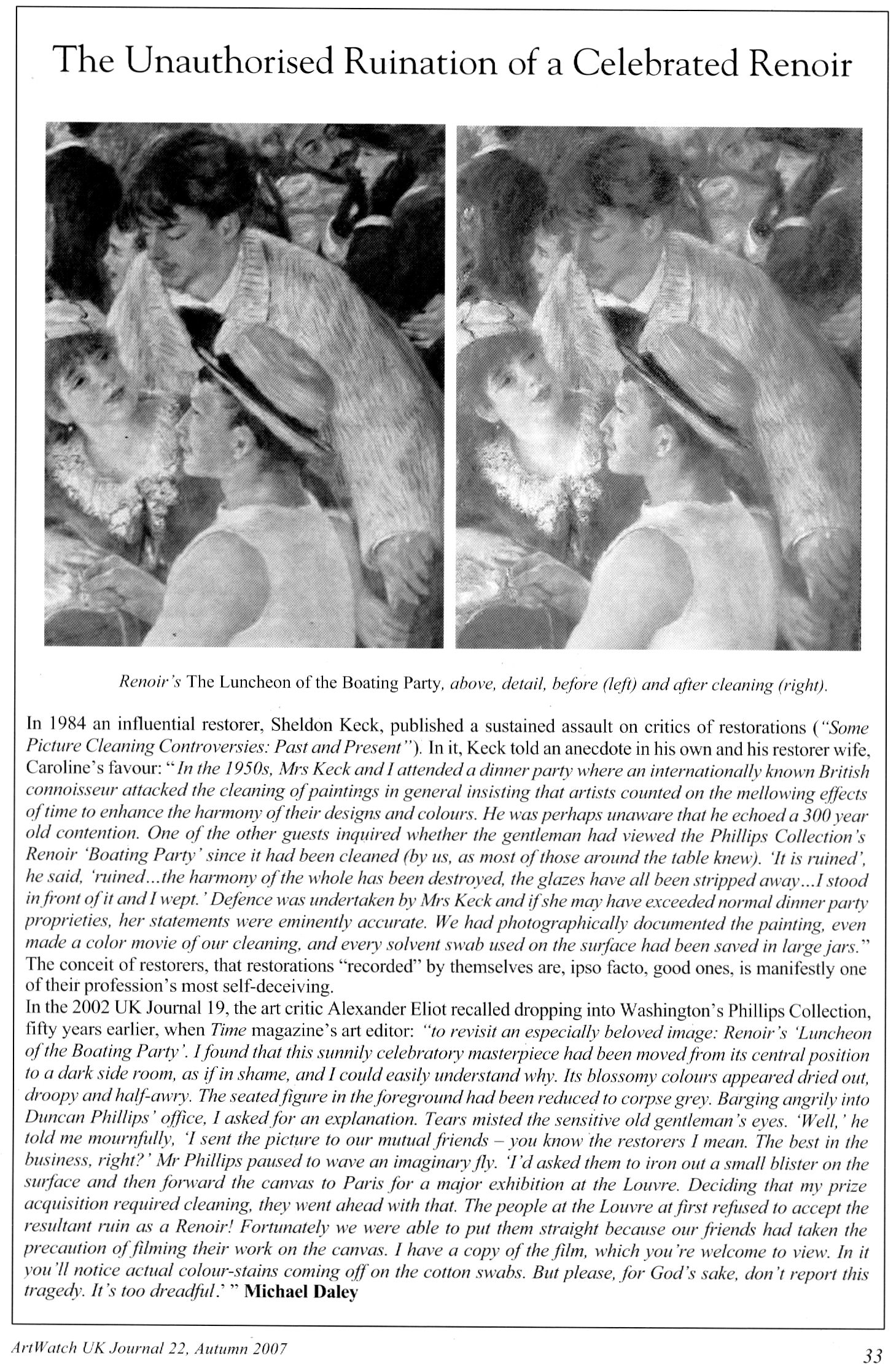
Above, Fig. 7: a page in the Autumn 2007 ArtWatch UK Journal published in memory of James Beck who died on 26 May 2007. In the same journal we published a comparison of a detail of the Feast of the Gods, as taken before cleaning (left) and after cleaning but before repainting – see Fig. 8, below:
SPURIOUS CONSERVATION SCIENCE
Above, top, Fig. 9: a detail from the National Gallery’s Renoir The Umbrellas before cleaning (left) and after cleaning in 1954. Below, Fig. 10, the face, after cleaning and restoring.
It should be clear to any scholar or connoisseur of paintings that the National Gallery cleaning was injurious, that the picture’s values and relationships were degraded and deranged – and yet the technical promises underpinning the restoration were “top-of-the-range” and authoritative. Cleaning was preceded by a physical and a chemical analysis of the painting by two gallery scientists who concluded that an “extremely thin” natural resin varnish could safely be removed “by solvents of a strength well below that likely to attack the paint film, which is resistant to the solvent action of pure acetone.” The scientists offered an additional assurance: “In the hands of a competent restorer [Norman Brommelle, husband of the National Gallery’s head of science, Joyce Plesters, was chosen] there is no reason to fear that the paint layers will be disturbed in the course of cleaning. Since, in this particular picture, there is no evidence of a linoxyn film, nor the presence of any resin in the medium, there is, in our opinion, no need to adopt any special precaution.”
Brommelle reported that the varnish was removed with a 3:1 turpentine/acetone mixture containing a small percentage of diacetone alcohol and that the last traces were removed with toluene but no one explained why an extremely thin varnish layer of no great antiquity needed to be removed. The cracks seen above at Fig. 10 were products of the cleaning (some local cracking had occurred previously where the canvas vibrated against a central stretcher bar on its regular exchanges between London and Dublin. (Technical information by courtesy of the National Gallery Conservation Department.)
THE TECHNICAL AND SCHOLARLY UNDERWRITING OF A FAKE AT THE NATIONAL GALLERY

One of the recently disclosed fakes, an “Orazio Gentileschi” (above right at Fig. 11 next to an authentic work), had been accepted by the National Gallery on a loan from its owner. When the now rejected no-history painting was withdrawn, the gallery justified its inclusion with the claim (Antiques Trade Gazette): “The gallery always undertakes due diligence research on a work coming on loan as well as a technical examination.” After this historical and technical examination, the Gallery label declared that “the poetic depiction of ‘David Contemplating the Head of Goliath’” had been produced by Gentileschi “for a collector’s cabinet” – an unsupported claim that, like “made for private devotion”, often serves as a flag of convenience for small recently-discovered old works without histories.
Above, Fig. 12, here we see a detail (top left) of the real Gentileschi David and (top right and below) the loan accepted as authentic by the National Gallery. If, instead of whatever technical and art historical examinations were carried out, the Gallery had run a few simple photo-comparative checks of the kind shown here, it should have been obvious to anyone with an alert eye that the picture in the top left had been the bona fide historical prototype for the other, markedly inferior and modern-looking, version. Qualitatively, they are not remotely co-equals: the one is a crude pastiche of the other. In every detail the chasm of quality should have identified the loan as a pastiche.
THE CONSEQUENCES OF (UNACKNOWLEDGED) RESTORATION INJURIES
Although this impostor has now been rejected from the National Gallery there is no redress for individual badly restored bona fide works – and often not even an acknowledgement of their plight. Nor is there any apparent means of stemming the swelling tide of destruction that masquerades as a conservation service while delivering incremental degradations of pictures, such as those that can be shown to have taken place in less than a century on what is now the Denver Art Museum’s Degas’ superb pastel and charcoal The Dancing Class or Dance Examination of 1880 below at Fig. 13. The first photograph in the sequence was published in 1918 (Degas, Paul Lafond) when the drawing was not yet forty and therefore likely to have been in an original or near-original state. The third photograph was published in 2002 in the catalogue to Degas and the Dance, a sponsored travelling exhibition organised by the American Federation of Arts (- the “the prime movers”), the Detroit Institute of Arts, and the Philadelphia Museum of Art. The show was curated by the leading Degas specialists Richard Kendall and Jill Devonyar.

The sequence of states at Fig. 13 above resembles a succession of an etching’s proof states in reverse: the most complete condition is seen in the oldest record and the most debilitated state is recorded most recently. If we make the most direct comparison with the earliest and the most recent records of this drawing, as at Fig. 14 below, the differences become startling and heartbreaking. What happens to one artist happens to all in turn, as was most shamefully seen to Michelangelo at the Sistine Chapel – see Fig. 15 where an early Anderson photograph of a lunette is shown with its post-restoration state. By such simple comparative means we can see/demonstrate that Degas and Michelangelo have not been restored or conserved so much as subjected to a cultural pathology – an infantile revulsion at or terror of darkness and a failure to appreciate that darkness, as artists appreciate, confers brilliance and radiance. Without shadows to relieve lights there is no great vivacity – art’s life-affirming gift. Our historic cultural legacy is being made over into a blander, more homogenised arbitrary colourfulness. With so much value and vivacity already lost in the Dance Class’s first century, who, if offered the chance, would today vote for “More of the same, please” in the next? Restorers can never put the clock back. They can only offer more of the same: yet further intensifications of hue and losses of form and space-creating tones.
THE INCALCULABLY VALUABLE TESTIMONY OF PHOTOGRAPHS
Photographic reproductions do not have to be taken as absolutely faithful replications to have great value as record – why else would they be published and consulted in such great numbers? They are particularly eloquent as witnesses when seen in company with predecessors and successors, because the patterns that successive images make disclose the truth about present conditions. The net consequence of restorations during the last much-photographed century can be seen/shown to have been gravely damaging, effectively washing away art’s pictorial strength, disrupting the internal relationships of individual works, rendering oeuvres capriciously erratic and incoherent and, thereby, creating spaces, opportunities and, even, seeming precedents for misattributions and outright fabrications.
COLOURS V TONES
Although we do not have a colour photograph to match the black and white Durand Ruel photograph published in 1918, we can, by juxtapositions, estimate the degrees of loss today. At Fig. 16 below, the top comparison shows that the bump on the head of the woman in the upper right-hand corner was formerly a red feathery hat decoration. It now survives as a smear of colour that, tonally, is almost indistinguishable from the wall behind. We can see in the greyscale comparison at the bottom that the red decoration had originally been given a halo. On his own declared pictorial statagems, we might deduce that Degas had used the pocket of red to create a triad of local counterpointing primary colours: red feathers, ochre spots and an intense dark blue ribbon bow. Certainly, speculations aside, since that date the ineffably soft back of the standing dancer’s tutu has both hardened and become see-through. The feathered, layered back of the bending dancer’s tutu has, on some bizarre and alien tidy-minded logic, been reduced a ghostly but sharp-edged right angle. Degas is leaving us, involuntarily. He learnt and extracted much from photography. Is it too much to ask that all scholars use our very great resources of photography and historic photographic evidence to calibrate the injuries done to his oeuvre and therefore more fully appreciate and give due account of Degas’ great and supremely fresh and audacious genius?
Certainly, the most urgent single reform needed in today’s crisis of connoisseurship lies in increasing the accessibility of photographic records of condition and treatments. In an age of electronically transmissible, high quality photographic images this would be easier to achieve and more instructive than ever before. There are no good reasons for institutions, owners and dealers continuing to sit on such material and thereby prevent people from seeing what’s what.
Michael Daley, 26 May 2017
Coming next: Degrading Degas and Michelangelo
ENDNOTES:
[1] We first used the term in connection with the so-called Stoclet Madonna, the Metropolitan Museum’s attributed Duccio, in “Toxic Attributions?” The Jackdaw March/April 2009.
[2] “In the end, after a five-year investigation and a mountain of evidence collected, no one, neither the two ‘conspirators’ nor I, was ever charged with a crime or indicted” – so wrote Ken Perenyi, in his 2012 memoir Caveat Emptor, p. 312.
[3] One scholar who has engaged on this territory with his pioneering book Condition:The Ageing of Art, Paul Taylor, incurred immediate wrath from some restorers who would claim monopoly rights on all discussions in the field, but a firm welcome elsewhere. Apollo noted that “There are unquestionably many art critics and even academic art historians for whom the material context of art, and particularly flat art, has become a rarefied field. That needs to change, if we are not to see total severance between those who work to preserve physical objects and those who claim to construe their meanings.”
[4] In a paper delivered at the ArtWatch UK/LSE/Centre for Art Law December 2015 conference (“Throwing the baby out with the bathwater”), Brian Allen, a former director of the Paul Mellon Centre for Studies in British Art (1992 to 2012) and Chairman of the Art Fund observed: “…increasingly, the only young connoisseurs emerging are to be found in the commercial art trade and this surely cannot be a desirable state of affairs. It might be argued that many of the best ‘eyes’ have always been in the art trade but, until recently, there was always a body of disinterested academic ‘experts’ to counterbalance commercial self-interest…” In the March 2017 Art Newspaper, Anna Somers Cocks, the paper’s Chairman and a former curator at the Victoria and Albert Museum, discloses that the V&A now considers the giving of opinions a drag on its curators’ time and devotes only three hours a month to it when, in the 1990s, it reserved two afternoons a week to telling the public what their heirlooms were. In the same issue of the Art Newspaper Mark Jones, a former director of the Victoria and Albert Museum, said that expertise, by which he meant “the ability to recognise and identify objects, surmise their history from their appearance, tell the genuine from the false and make judgements about quality” has become patchy, even rare, in museums. Mark Jones was the curator/organiser of the British Museum’s legendary 1990 exhibition “Fake? The Art of Deception”, the catalogue of which remains a seminal study in the field.
In response to Mark Jones the dealer Peter Nahum wrote in the April 2017 Art Newspaper (letter, “Dealers and curators should work together to spot fakes”):
“The art forger Shaun Greenhalgh and his father George visited my gallery in 1984. It was after 6pm and they offered me a painting they said was by Samuel John Peploe, for which I gave them a cheque. As soon as the banks opened at 9am the next morning I cancelled the cheque and called in the police. I was the first to report the family from Bolton for purveying a fake, 16 years before their arrest.
“When they were finally arrested, my cheque was still on their desk. I also advised Bolton Museum on the purchase of the painting by Thomas Moran and subsequently saved them from buying a fake watercolour purportedly by the same artist.
“I have long campaigned for the art and antiques trade and academics, especially those in museums, to work more closely together. Our job, as dealers, is to defend our clients against the legion of fakes and wrongly catalogued items on the market. As we are personally financially responsible for all transactions we make and advise on, we are the most vulnerable and, by necessity, the most careful. As a result we are often best placed to authenticate works.
“Academies and museums obviously have great experts on their staffs, but their prime focus is the history and provenance of objects and thus their visual skills often take a secondary position. When both professions work together, mistakes are lessened.
“I have made it my mission to track down and report those who make fake art, as they are the bane of our lives and can cost those who buy art a great deal of money. They are simply con-men extracting money from innocent people by deceit.
“As dealers, academics and collectors, we are all motivated to push the boundaries of our knowledge, and thus all of us are vulnerable to those who wish to take money under false pretences. We have to be constantly on our guard as each one of us will fall into one of the fakers’ traps sooner or later – we are all human after all.
“Thus, I applaud Mark Jones’s article: scholarly research is flourishing but curators’ ability to judge an object’s quality is not (The Art Newspaper Review, March, p.13) with two main comments. The painting by Samuel John Peploe was not sold, and academics have rarely been the greatest visual judges – that is more our job than theirs. That does not mean that there are not great visual experts in academia – of course there are – it simply means it has never been their primary function.
Peter Nahum.
Peter and Renate Nahum Agency (the Leicester Galleries), London.”
[5] See “From Veronese to Turner, Celebrating Restoration-Wrecked Pictures” and “Taking Renoir, Sterling and Francine Clark to the Cleaners” and THE ELEPHANT IN KLIMT’S ROOM and, finally, “Now let’s murder Klimt”.
[6] The National Gallery includes one of its most dubious and controversial attributions – the Rubens Samson and Delilah – in its list of 30 “must-see” pictures. There are more than twenty secure and superior works by Rubens in the gallery including the magnificent Minerva protects Pax from Mars (‘Peace and War’). When controversy broke over the attribution in 1997 the gallery’s director, Neil MacGregor, placed a statement next to the painting to explain why it looked like no other Rubens in the collection. Two special issues of the ArtWatch UK Journal have been devoted to this picture’s problems. See: “The Samson and Delilah ink sketch – cutting Rubens to the quick” and “Art’s Toxic Assets”
The National Gallery’s highlights list also includes the restoration-wrecked Bacchus and Ariadne by Titian, on which, see: “The Battle of Borja: Cecilia Giménez, Restoration Monkeys, Paediatricians, Titian and Great Women Conservators”
[7] “Oh Blessed Honthorst”, Michael Daley, ArtWatch UK Journal No. 21 Spring 2006 – a Rubens special issue dedicated to the National Gallery’s ascribed Rubens Samson and Delilah), p.4.
[8] As reported by Alexander Eliot, a former Time magazine art critic, in “A Conversation about Conservation”, The World and I (Volume: 15), June 2000.
Connoisseurship: Examinations, Debates and Snap Visual Responses

The rising tide of old master “sleepers” and “discoveries” carries great dangers and demands snap judgements. Some candidates for upgrades intrigue, some look dubious, some scream “Fake!” Last week two cases caught our eye.
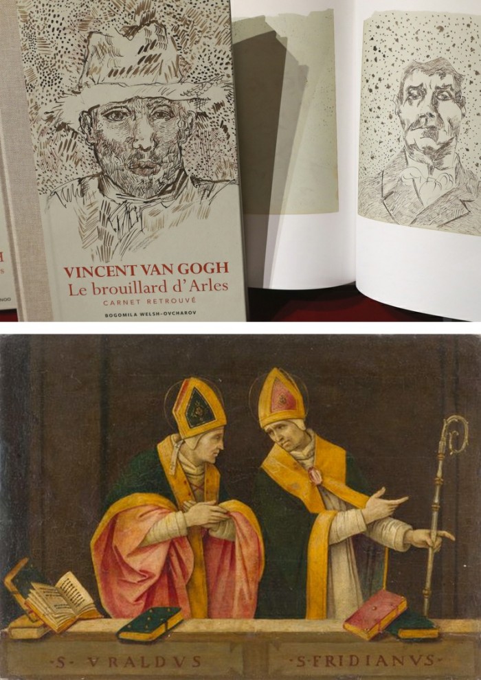
Fig. 1, above. Fig. 2, below. The newly discovered “Lost” Van Gogh sketchbook (above, top) rang our and many other fake bells. Then came a report that a small “Florentine School” painting on a €3-4k estimate fetched €375k at auction as a sleeping Filippino Lippi (above, Fig. 1). A link to another small work attributed to the artist at the North Carolina Museum of Art (Fig. 2, below) showed pronounced, seemingly reassuring correspondences, but something jarred.
On connoisseurship we hold that every claimant work should be rigorously “interrogated” in three crucial respects. Technically, in its physical composition; by documentation on its known or claimed histories (provenance); and, above all, by visual analysis because, in the visual arts, every picture is its own prime historical document and its inbuilt historically-generated artistic relationships constitute the primary subject of art critical appraisal and evaluation.
Failure to excise bad attributions deceives the public and corrupts oeuvres. A good picture has nothing to fear from challenges. No amount of scrutiny constitutes a threat as good pictures outlive their doubters and can fight another day. Argument is healthy and a successfully repulsed challenge can increase understanding and enhance a good picture’s lustre.
Vincent van Gogh: The Lost Arles Sketchbook
Above, Fig. 3. The controversial lost-but-now-found Van Gogh sketch book above is by Professor Bogomila Welsh-Ovcharov, a Van Gogh authority whose claims of authenticity are supported by Ronald Pickvance, author of Van Gogh in Arles, but the cover’s supposed Van Gogh ink self-portrait announces itself as a draughtsman’s pastiche, as Mark Hudson noted in the Daily Telegraph (“A romantic story but can it really live up to its promise?”, 16 November 2016).
Above, Fig. 4. Simply by placing the supposed Van Gogh self-portrait next to an autograph portrait, immense and glaring differences become apparent: the author of the “discovered” drawing has abandoned symmetry with eyes of radically different sizes and a nose that seems product of a car crash. Throughout, the author mimics Van Gogh’s pen marks without comprehension of his form, power of design, and psychological acuity.
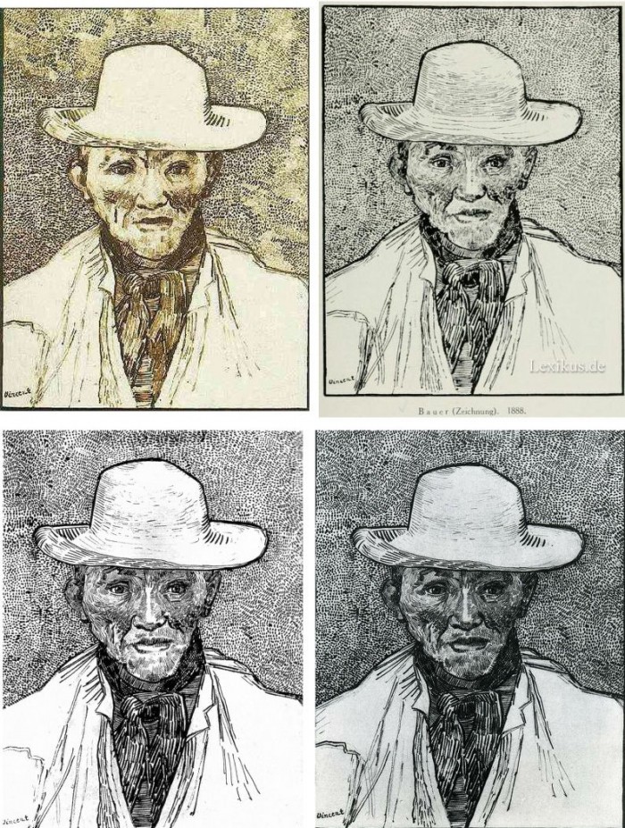
Above, Fig. 5. Instead of a form-camouflaging jumble of marks, the bona fide Van Gogh disports five graphically discrete component parts: a light-coloured jacket; a dark shirt and scarf; a varied but, on aggregate, mid-toned face; a light-toned hat with some mid and dark-toned form articulating shading; and, throwing all other values into relief, an agitated but tonally cohering background. Each of these spheres is allotted its own graphically purposive notations. The four images we show above for comparison are easily found online in historically successive reproductions. While these reproductions vary considerably, the force and artistic coherence of Van Gogh’s graphic intent and method shines through all.
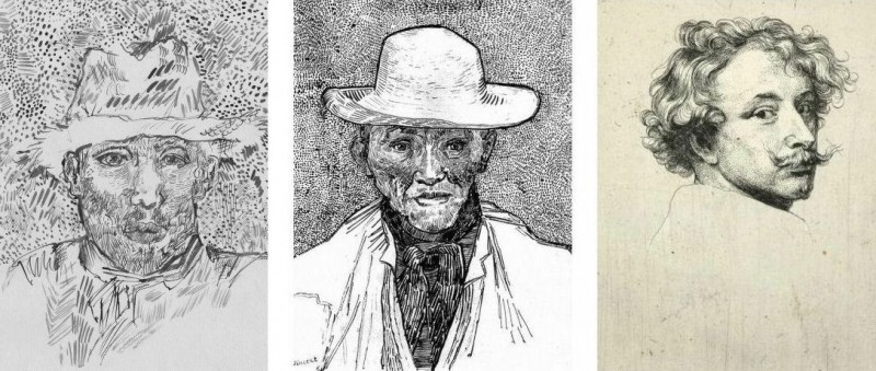
Above, Fig. 6. If we place the bona fide Van Gogh between the clumsy mimicking newcomer and a masterpiece of the greatest graphic brilliance – van Dyck’s etched self-portrait – it is clear that the Van Gogh has more kinship with the latter than with the former.
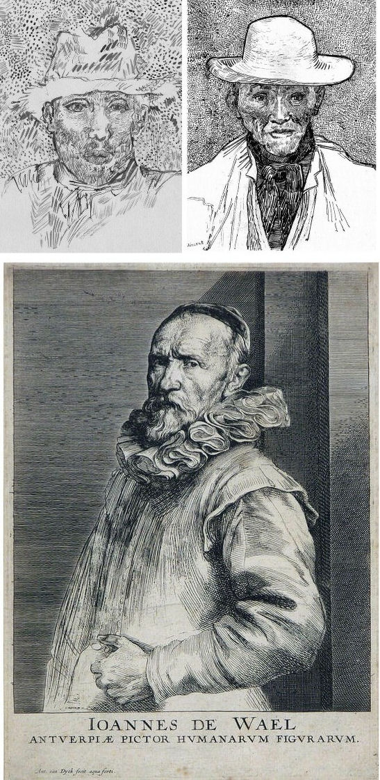
Above, Fig. 7. And if we compare the Van Gogh with an entirely autograph van Dyck etched state of a figure we find a common use of a toned background that throws both subjects’ flickeringly brilliant lights and darks into relief.
The Van Gogh Museum’s objections to the “Lost Arles Sketchbook” and its track record on Van Gogh attributions
Above, Fig. 8. Prof. Welsh-Ovcharov (top) has responded to the Van Gogh Museum’s dismissal of the drawings with a rebuttal and a challenge to debate – thereby showing conviction and good faith. Her publisher reportedly characterises the proposed debate as “an opportunity to shed light on the conditions under which the Van Gogh Museum is claiming the de facto right to a monopoly of attribution.” This is a common plaint against authorities that block would-be, high-value attributions but our impression of the museum’s judgements is favourable.
In 2006 a Van Gogh – The “Head of a Man” owned by the National Gallery of Victoria in Australia (above left, on an easel) – was challenged by the art historian and Sunday Times art critic Frank Whitford when the portrait was loaned to an exhibition in Edinburgh. The newspaper asked our opinion and, when we demurred, sent a (revelatory) high resolution full colour compilation of all of Van Gogh’s painted portraits. We supported Whitford, saying to the newspaper (as reported in ArtWatch UK Journal, Spring 2008):
“The specific warning signs that should have alerted the buyer are:
“1] It is unique in Van Gogh’s portrait oeuvre
“2] It does not fit in the stylistic chronology that exists within that oeuvre. Compare it for example with the brushwork, colours and ‘attack’ of the Old Man with Beard, painted the year before that is in the Van Gogh Museum, and the Portrait of Camille Roulin painted a year or so later and that is also in the museum. There is an enormous but clear and logical development between those two pictures, from thick, laboured, relatively coarse brushwork to much more refined and ‘decorative’ marks – but both are entirely consistent and ‘all-over’ in their treatment.
“3] If its provenance goes back no further than Germany in the late 20s or early 30s, that is particularly unfortunate. Germany at the time was notorious for the certification by scholars (for a fee or sales cut) of dud works. The dealer René Gimpel has referred to the scandalous ‘amounts obtained by means of certificates given daily by German experts to German dealers. Just as there were paper marks, so there are paper canvases, an easy way of bringing dollars into Germany…The German title of Doktor impresses the Americans. The museums are even more intent than the collectors on defending their fakes or their mistaken attributions….’ By coincidence, in the current ArtWatch Journal [No 21], Kasia Pisarek cites the case of the great Rubens scholar Ludwig Burchard who issued so many optimistic certificates that he was unable ever to write his definitive book on the artist…She has identified over 60 Burchard attributions that have subsequently fallen. It was Burchard who first upgraded to Rubens the Samson and Delilah that is now in the National Gallery.
“I would add that the fact that it seems to be admitted that it is a cut-down canvas that was glued onto a panel compounds suspicions… Why should a (presumably) then only forty years old canvas, have needed gluing onto a secondary support? It might be worth asking the Gallery curators if any scholar has questioned the picture publicly or privately.
“It may be coincidence, but two of the pictures that ArtWatch has challenged in our own National Gallery, the Rubens Samson and Delilah and the Raphael Madonna of the Pinks, no longer retain their original backs. The former was planed down to 2 or 3mm thickness and glued onto a sheet of blockboard; with the latter, the family of restorers who sold the picture in the 19th century had (most unusually) polished the back of the panel thereby removing all historical evidence.”
As we have seen more recently, the claimed lost Leonardo drawing “La Bella Principessa” that emerged anonymously in 1998 had been glued to an old oak panel. Gluing canvases or drawings onto boards conceals half the material evidence. On 3 August 2007 Andrew Bolt reported in the Australian Herald Sun:
“The curious thing about the National Gallery of Victoria’s fake van Gogh is how easily it was spotted as phoney once it went on tour…. For more than 60 years this painting hung in the NGV without anyone screaming ‘Fake!’ True, a few experts now say they had their doubts, but it was only when the NGV proudly loaned its ‘van Gogh’ to Scotland’s Dean Gallery last year that the painting was denounced. Three British critics took one look at it and snorted… Even then, there were some back in Melbourne who couldn’t accept the evidence of their own eyes, as ABC Television’s 7.30 Report found:
“‘Two of the critics include Michael Daley from ArtWatch UK and Times art critic Frank Whitford. But Robyn Sloggett [an art authentication expert at Melbourne University] has questioned their expertise. ROBYN SLOGGETT: I don’t think either of them are Van Gogh experts, certainly not known to be such…[Director of the National Gallery of Victoria] DR GERARD VAUGHAN: It is a slightly offbeat picture. It doesn’t fit into the natural progression of Van Gogh’s work at that time because it was a moment in late ’86 and into early 1887 where he was experimenting with two or three different styles. In many ways, this is slipping back into his earlier realist style of the mid 1880s where he concentrates and uses these earthier ochre colours. It is a transitional picture.’”
“Conceived at special moments” and “sometimes repeating, sometimes anticipating themselves” are commonplace apologias for disqualifying incongruities in upgrades. In 1997 and 2000 the National Gallery claimed its Rubens Samson and Delilah did not look like any other Rubens in the gallery because it was “the only work in this collection typical of the artist when he had returned from Italy in 1608”. In truth the painting was unlike the (secure) one that immediately preceded it and unlike the (secure) one that immediately followed. If a Rubens, it would be the only one on which he employed flat brushes and painted finger tips with rectangular highlights. During ABC Television’s 7 August 2006 programme (“NGV’s Van Gogh Labelled a fake”), James Mollison, a former NGV director said: “This picture has been doubted by people very often.”
The upshot of the controversy was that the NGV director announced that such was the gallery’s confidence that the painting would be submitted (voluntarily) to full technical examination at the Van Gogh Museum. A year later the Herald Sun reported the attribution’s demise at the Van Gogh Museum:
“The Dutch team used X-radiograph, digital photographs, light microscopy and paint and thread analysis. Among conclusions were: THE work’s ground layer of white paint is not found in Van Gogh’s Antwerp and Paris works. ITS use of pure ochre is not found in other Van Gogh work. THE portrait shows just the top of the man’s shoulders. Van Gogh usually showed more of the clothes. “A COMBINATION of a fairly coarse and detailed painting style”, with more detail in the mouth, eyes, skin and beard than Van Gogh used. NO reference to the portrait or the sitter in Van Gogh’s extensive letters. The experts also noted no record of the work could be found before 1928, when it appeared at Berlin’s Galerie Goldschmidt and Co.”
The Rubens Samson and Delilah emerged in Germany the following year at Van Diemen and Benedict where it was offered as a Honthorst before being upgraded by Ludwig Burchard. Previously it had been attributed to Jan van den Hoecke, a follower of Rubens. Burchard had recently upgraded the supposed Rubens ink sketch design for the Samson and Delilah (see Art’s Toxic Assets and a Crisis of Connoisseurship ~ Part II: Paper – sometimes photographic – Fakes and the Demise of the Educated Eye ).
The Newly Upgraded Filippino Lippi
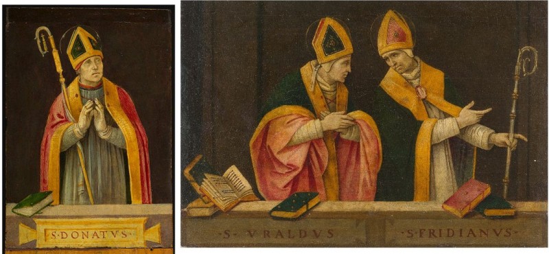
Above, Fig. 9. At first glance the awakened “Filippino Lippi” (above right) seems more plausible than the new Van Gogh drawings – especially when linked to a work attributed to the painter at the North Carolina Museum of Art (above left). In terms of palette, condition and design the two seem as peas in a pod but this closely related pair triggers no recollections of anything similar in the artist’s oeuvre. If their strikingly common format suggests original incorporation in a larger work, disjunctive variations in their parapet walls and stone inscription tablets dispels the possibility. Most inexplicably of all, the new upgrade is incongruously modernist in its emphatic planar and ‘on-the-picture-surface’ geometrical vocabulary.
Above, Fig. 10. In 1901 the painting of Saints Uraldus and Fridianus was sold (not as a Philippino Lippi but as a Masaccio) to an English aristocrat, the Earl of Ashburnham. As with the recently proposed Haddo House Raphael (Fig. 10 above), there is little on the panel’s back other than a label in English for an exhibition of “Early Italian Art” (Fig. 10 top). For the Carolina Saint Donatus, the museum offers only a date – “circa 1490” – and the identity of the picture’s donor, the Samuel H. Kress Foundation. Such lacunae are perplexing because Filippino Lippi is a well-chronicled artist whose securely attributed works might easily be brought into direct comparison with the two more recent attributions.
Above, Fig. 11. The backs of attribution upgrades often prove problematic, and none was more so than the small panel “discovered” as a Duccio Madonna and Child (above right) in 1904 after having been bought in an antiques shop in Italy. It was then rarely seen until bought with fanfare (but no technical examinations) for $50m in 2004 by the Metropolitan Museum of Art, New York, in a blind “treaty” sale conducted by an auction house among a few leading museums shortly after the picture was withdrawn from an imminent comparative exhibition of Duccio and his followers that would have introduced the painting to many scholars for the first time and in an instructive context. That withdrawal – despite the painting’s inclusion in the catalogue – might have been made out of fear of repeating the demise of the owners’ second Duccio, as described below.
The back of the tiny picture had been cradled with no fewer than eight mahogany bars and when these were later removed at the Met. a hand-written ascription to Duccio’s pupil “Segna” was found on the bare poplar wood from which painted work had been stripped. The Met Duccio contained modern wire nails, a fact not acknowledged in the museum’s post-purchase technical examination reports. When we asked after the antiquity of the nails the museum claimed they had been inserted as repairs after the panel had been cradled in the 1930s. As “proof” of that unsupported chronology it was said that one of the nails had entered one of the mahogany bars. However, as we pointed out, the head of that particular nail had been visible on the front of the frame throughout all of picture’s photographically recorded history and, while some nail heads were visible most were not and therefore had been applied before the (now heavily distressed) frame was gessoed and gilded. Thus, the panel arrived in the world at the beginning of the 20th century with modern nails intersecting a cradle that concealed an awkward ascription on a stripped-down back.
Above, Fig 12. A face painted in the 14th century by a follower of Duccio (identified by Pèleo Bacci as Segna) is shown above to the right of the face of the Met’s Duccio as it was before restorations established the blue of the Virgin’s mantle to be azurite, not the requisite ultramarine. No one ever suggested that the painting on the right was by Duccio and no one judged the Met’s picture an autograph Duccio before Bernard Berenson’s wife (Mary) in 1904 with the support of Berenson’s protégé Frederic Mason Perkins. An earlier suggestion had been that it was a work of Sano di Pietro, as Frances Vieta discovered in researches at the Frick Library, New York, that were kindly made available to us.
In 1933 Perkins attributed a second Madonna and Child to Duccio and persuaded the then owner of the Met.’s Ducio (the Belgian collector, Adolphe Stoclet) to buy it. In 1989 that Duccio was loaned to the Cleveland Museum of Art and was there identified on technical examination by Gianni Mazzoni as a fake by Icilio Federico Joni who ran a forgery factory fronted by middlemen, one of whom was Berenson’s protégé Frederic Mason Perkins.
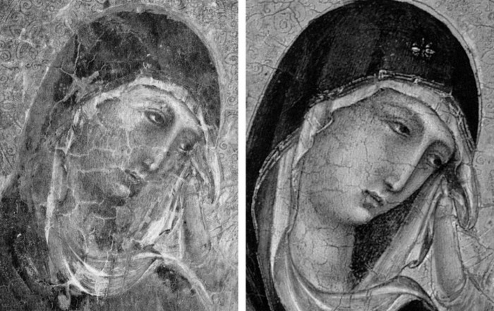
Above, Fig. 13. A cult of Supreme Art Historical Importance was activated around the Met. Duccio and part of this mythology rested on the picture’s supposedly miraculously well-preserved, little-restored, condition. Comparison of the photographs above showing its present state (right) and an earlier state (left) discloses how extensively the work has been repainted – note the altered design of the dominant eye, and the extensive reworking of the veil. The potentially falsifying nature of restorations when determining attributions remains a conspicuously under-examined area – as does the extent and nature of repainting on stripped-down “sleepers”. (But see “A restorer’s aim – The fine line between retouching and forgery”. For a fuller account of the Met.’s Duccio difficulties, see Michael Daley: “Buyer Beware”; “Good Buy Duccio?” and “Toxic Attributions?” in the Jackdaw magazine issues of Nov/Dec. 2008, Jan/Feb. 2009, and March/April 2009.)
The Newly Upgraded Filippino Lippi (continued)
Above, Fig. 14. With the two small “Filippino Lippi” pictures at Fig. 9 and below, top, said to have been painted between 1490 to 1494, precise stylistic comparisons can be made with securely attributed works in the oeuvre. What is believed to be Filippino Lippi’s self-portrait above was executed by the artist in 1481-1482 in the Brancacci Chapel, Santa Maria del Carmine, Florence.

Above, Fig. 15. Filippino Lippi’s Apparition of the Virgin to St Bernard of 1480-86 was said by Bernard Berenson (in his 1938 revised Drawings of the Florentine Painters) to comprise “Filippino’s masterpiece, the last picture in which he is still a pure Quattrocentist, in which there is no sense of the Baroque.” Is it conceivable that some years later this artist painted the two small pictures shown here above the Apparition? Berenson reports that Filippino went on to betray excesses, not to purge and severely abstract his pictorial vocabulary: “Filippino’s Baroque, however had little in common with the qualities of the genuine [Baroque] style, and much with its worst vices. These were the sins of extravagance, of wantonness – the vulgarity of the newly enriched, who feel life is enhanced by the mere act of showy spending.”
Above, Fig. 16. At the top we see how Filippino Lippi painted books before 1486 in his Apparition of the Virgin to St Bernard and before his lapse into Baroque excesses. In this secure work we not only see great technical accomplishment but a fascination with the very means by which books were stitched together in assembled folded sections. Is it conceivable that after this tour de force celebration of the book binder’s craft skills Filippino should have been satisfied with the out-of-perspective simplifications of books in the Saint Uraldus? While the opened book has been painted in utter ignorance of book binding methods, the ochre coloured book at the bottom left of the pile has managed to anticipate to a remarkable degree the appearance of a neat modern machine-bound book.
Above, Fig. 17. Again, does the chasm of technique and sophistication in this further comparison from the Apparition and the Saint Uraldus not strain credulity at claims of a common author?
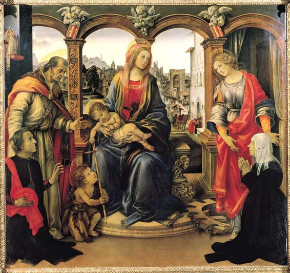
Above, Fig. 18. By 1493-94 the artist had completed his Madonna and Child with St Catherine of Alexandria and St Martin of Tours as above and we see precisely the over-elaboration Berenson castigated as Filippino’s squandering “like a nabob with a heady disorderliness all the decorative motives which the heritage of antiquity, the hard earnings of his precursors, and his own fancy had put into his hands.”

Above, Fig. 19. How conceivable is it that Filippino might, at the same short period, have made two so diverse treatments of a man parting drapery with an advancing left arm as in these two paintings? In the one the “Blanket-like drapery dear to Filippino” (in Berenson’s term), curves, twists and folds naturally across the body, while in the other it moves as if fabricated by a former sheet metal worker with little regard for any underlying body, or even for the means by which the glimpsed parts of the (wildly varying) decorative border of the cope might ever have been united as woven material. Why the arbitrary, asymmetrical placement of indeterminate embroidered decorations on the cope’s border? What holds the cope together? Is it a giant garnet or ruby, or a small tambourine? Where else in Filippino might we encounter such flattening abstractions and lax indeterminacy of depiction?
Above, Fig. 20. If the logic and treatment of Saint Donatus’ cope border (above, left) seems plausible and suitably understated, what might have carried the same artist to the Byzantine and conceptually irresolvable twin conundrums of the cope border as encountered on Saint Uraldus (above right)? What accounts for the very different depictions of the inscribed tablets on the parapet wall? If that of Saint Donatus is somewhat overly monumental and set uncomfortably close to the top of the parapet, at least it is sculpturally resolved and satisfactorily symmetrical along its horizontal axis with its twin decorative “butterfly wings” termini. Why, then, would the twinned tablets of Saints Uraldus and Fridianus meet in the middle with single butterfly-wing termini while leaving blank endings at the outer edges of the picture’s composition? Why are these two inscribed tablets skimped and devoid of projection when the saints above are greatly more dynamic and humanly engaged – almost as if in anticipation of Raphael’s later depicted dialogue between Aristotle and Plato?
Below, Fig. 21. What theological reading of Saint Uraldus’ life prompted the vast frilled neck lizard-like display of the cope’s pink lining below? If intentionally “Baroque” in its explosive ostentation and theatrical impact, why, then, its implausible combining with a geometric severity of draperies that are more snapped than folded?

With such bizarrely anomalous visual constructs, might it not be prudent to consider the waking “Filippino Lippi” sleeper as a possible product of the late 19th and early 20th century Italian forgeries boom that was tailor-made for British and American collectors? We know that many skilful artists were employed in that trade because when the Italian Government proposed stringent export taxes in 1903 to stem the country’s out-flow of art treasures, the Florentine art dealers association petitioned that the new laws would throttle the large and thriving trade in forged art and antiquities for foreign collectors. (Where did all those often excellent works go?)
At the December 2015 ArtWatch UK/LSE Law/NY Center for Art Law conference Art, Law and Crises of Connoisseurship (the proceedings of which will be published shortly), Professor Charles Hope pointed out how effectively 20th century scholarship had winnowed previously overblown numbers of Titians, Raphaels and such. Markets are good things and the London art market has long been a very good (much envied in Europe) force for Britain, but there are developing dangers. If perceptions were to grow that previously downgraded works are being systematically rehabilitated through “sleeper-discovery” mechanisms at a time when leading houses are fighting to the death for pole position on market share, confidence in the lots on offer might evaporate. Already, certain external structural changes are weakening the London market’s traditional and much-valued symbiotic relationship with disinterested scholarship. Increasing litigation by owners against dissenting independent scholars suppresses debate and frank expert appraisal. In a paper at our conference (“Throwing the baby out with the bath water – the Demise of Connoisseurship since the 1980s”), Brian Allen, former director of studies at the Mellon Centre, warned that recent changes of philosophy and views on connoisseurship in the academic world are greatly reducing the traditionally available body of disinterested academic expertise that counterbalances purely commercial interests:
“In my own field of British art the number of so-called ‘experts’ has now diminished alarmingly as the older generation dies off not to be replaced. It seems extraordinary to me that major artists such as Stubbs, Wright of Derby and Sir Thomas Lawrence, to name but three, don’t have an acknowledged expert to whom one can turn for a reasonably reliable, independent opinion. And this has also certainly happened in other specialist fields… Younger scholars nowadays, especially those in the universities, have almost no contact whatsoever with the art trade compared to fifty years ago. Yet for many years it was perfectly possible for the two worlds to co-exist harmoniously.”
Michael Daley 23 November 2016
Chartres’ Flying Windows

By Florence Hallett
When in 2014, six stained glass windows were removed from Canterbury cathedral to star in an exhibition at the Getty Museum, California and the Metropolitan Museum of Art, New York, it seemed that the Rubicon had been crossed. As the Met boasted in its exhibition publicity, this was the first time that the windows had left the cathedral precincts in their 850-year history; now, they were not only to be removed, but removed far away and subjected to the extreme risk of air transportation.
In the past, various circumstances have led to the temporary removal of stained glass, with routine cleaning and maintenance the most common cause, followed by war and conflict. During the Reformation and the English Civil War and more recently during the Second World War, glass was, on occasion, removed and stored to protect it from danger.
This is of course, fundamentally different to removing glass in order to put it on display in museums thousands of miles away and thousands of miles apart. The glass at Canterbury, made by men alive at the time of Thomas Becket’s death in 1170, had seemed as immovable as the cathedral itself, a building old enough to have more in common with the rivers and hills than the relative transience of bricks and mortar. It is fair to say that the very fact of their transatlantic tour has changed the character of these windows irrevocably.
Art up in the air
Some 20 months ago, as the Canterbury glass touched down in New York from the Getty in California, we asked how in the middle of the one of the worst years in aviation history the Met could be confident of the safety of air transportation [How the Metropolitan Museum of Art gets hold of the world’s most precious and vulnerable treasures]. As we begin 2016 fresh with the news of recent air disasters, aeroplanes have not seemed more dangerous in decades – indeed, on February 15th this year, the Art Newspaper reported that American Airlines and seven others are being sued over damage to a Lucio Fontana sculpture when it was flown from Paris to the Armory Show in New York last year.
And yet, preparations are underway for another cargo of stained glass to take to the skies, as windows removed as part of the controversial, wholesale restoration of Chartres cathedral form the centrepiece of an exhibition originally scheduled for 2016, but currently postponed, to be hosted by an as yet undisclosed US museum.
As at Canterbury, the removal of the Chartres glass for restoration has been taken as a convenient opportunity to send it overseas. Where we speculated as to whether the Church had received any payment for the loan of the Canterbury windows (a question to which we still do not have a definitive answer), in the case of Chartres, just such a transaction is known to have taken place.
A fund-raising quid pro quo
While the cost of the controversial repainting of the cathedral’s interior has been met by the French state and donors including Crédit Agricole, Caisse Val de France et Fondation, and MMA assurances, the restoration of the cathedral’s famous glass has been funded in part by the American Friends of Chartres (AFC), an organisation that works “to raise awareness in the United States of Chartres Cathedral and its unique history, sculpture, stained glass, and architecture and their conservation needs”.
Based in Washington, the AFC has ambitious plans to fund the restoration of the cathedral’s windows and sculptures. In 2013 it announced on its own site, and via the crowdfunding website razoo.com, that in return for funding the restoration of the Bakers’ Window (two lancets and a rose in the nave), the 13th-century glass would travel to a US museum. Indeed, the still extant webpage makes explicit the nature of the exchange, proclaiming:
“American Friends of Chartres INVITES YOU to Restore and Bring to the United States a 13th-Century Stained Glass Window for Museum Exhibit
WELCOME TO AMERICAN FRIENDS OF CHARTRES’ UNPRECENTED [sic] PROJECT: THE RESTORATION OF A MEDIEVAL STAINED GLASS WINDOW FOR EXHIBIT IN AMERICA.”
In appealing to members of the public to donate to the project, the AFC invokes American efforts to save Chartres from destruction during World War Two, treating the fundraising project as the corollary of the cathedral’s status as “a wonderful testimony to the friendship between the French and American people. The French people honor every year the memory of the Americans who contributed to saving the cathedral from destruction at the end of WWII.” But why, if the AFC is so concerned for the welfare of the cathedral, must the glass be removed from the building, and subjected to a transatlantic tour?
Speaking to French Morning in 2014 about the plans to exhibit the windows in the US, Dominique Lallement, the president of the AFC said: “The lancet windows measure more than 6 meters in height, which means there will have to be a structure built similar to the cathedral to accommodate them.” Given the success of the Canterbury exhibition, which represented a huge coup for the Met, already notorious for its ability to secure rare loans from reluctant lenders, the Chartres exhibition is likely to be equally high-profile, on a scale indicated by the planned construction of a special display area within some as yet un-chosen or unannounced venue.
A “scandalous desecration of a cultural holy place”
Perhaps the significance and sensitivity of the deal were indicated by the official reaction to architecture critic Martin Filler’s heartfelt but thoughtful attack on the repainting of the cathedral interior. In his blog on the New York Review of Books website, Filler expressed shock at the “scandalous desecration of a cultural holy place”, and accused the French government of breaching the international rules of conservation established in the 1964 Charter of Venice.
As Filler’s article spread around the internet, those in charge of the restoration were notable for their silence. Patrice Calvel, the architect who oversaw the project prior to his retirement over three years ago was high-handed in his dismissal of Filler, saying that he had never heard of him. He had previously refused to respond to a highly critical report in Le Figaro, telling the Guardian that its author Adrien Goetz “has no competence in this matter.”
From the horse’s mouth…
Less reticent than the architects and restorers, however, was Caroline Berthod-Bonnet, who at the time was head of fundraising at Chartres, but has since left the role. Speaking to the Guardian in response to Filler’s blog she asked: “What will be the effect on our sister organisation in the United States, which is raising money to restore stained glass windows to be displayed in the US?”
By highlighting the link between the restoration project as a whole and the loan of the glass to the US, Berthod-Bonnet’s comment cut to the heart of the matter, but without providing any plausible justification for so rash and ill-advised an operation. In fact, the only extended defence of the repainting project has come from Professors Madeline H. Caviness and Jeffrey F. Hamburger, American academics and members of the AFC’s advisory panel, the organisation masterminding the loan of the glass to the US. Responding to Martin Filler via the New York Review of Books website, they adopted a tone of weary condescension, describing Filler as “well-meaning but also misinformed”, conjuring up a picture of a hopelessly deluded aesthete, clinging to a romantic but impossible vision of glorious decay.
Revelations beyond restorations and recreations
Professor Hamburger has been a loyal supporter of the Chartres restorers, writing a second defence of the project for Apollo last April, in which he argued that “The restoration of the false masonry proved more of a revelation than a restoration, let alone a recreation”. Either naive or a wilfully blinkered interpretation of the flimsy evidence produced in support of the work, Hamburger’s statement ignores the complexities of the material evidence that exists while also dismissing out of hand the ethical, philosophical and aesthetic problems this project presents.
Hamburger and Caviness are keen to put distance between the deal struck in relation to the windows and the restoration project overall, but the relationship between glass and masonry is so thoroughly entwined, on every level, that they are not entirely convincing. Stained glass is such an intrinsic and essential aspect of any Gothic building, as exemplified at Chartres, that common sense dictates that any programme of cleaning and restoration must take into consideration both elements.
Accordingly, the rationale put forward by Hamburger and Caviness in support of the restoration hangs on the relationship between glass and masonry, and they insist that: “Combined with the restoration of the windows, the restoration of the original color scheme in fact enhances the perception of color in the windows.” In both intellectual and practical terms, the projects to repaint the masonry and to clean the windows are mutually and irrevocably dependent.
Such interdependency seems also to extend to the fundraising projects relating to Chartres. In their response to Martin Filler, Hamburger and Caviness emphasised that the AFC “raises funds only for the restoration of the windows” but fail to explain the function of this arbitrary divide. Dominique Lallement, president of the AFC, told us: “To the best of my knowledge, no donor to American Friends of Chartres is supporting other aspects of the restoration”. But records of donations made to the cathedral’s funding organisations over the past five or six years suggest that there has been overlap between the funding of different aspects of the restoration. In addition, there seems to have been professional overlaps among key players.
The Revelation Brokers
Both the president of the AFC, and its former vice-president, the late Pierre Louis-Roederer, are listed as donors to Chartres Sanctuaire du Monde (CSM), AFC’s sister organisation. In addition, the president of CSM, Servane de Layre-Mathéus is an honorary member of the Board of Trustees at the AFC, a position which affords no voting rights. Today, CSM raises money for the restoration, principally, of stained-glass windows but has also funded work on the organ, the steps to the high altar and the liturgical furniture in the choir and has a more general role in co-ordinating fundraising efforts made on behalf of the cathedral.
While recent fundraising efforts have focused on the restoration of the glass, in the lifetime of the current programme of works its scope has been broader. Indeed, CSM newsletters of March 2008 and February 2009 explain that in addition to financing the restoration of stained-glass windows, it contributed the full cost of a trial restoration of the Chapel of the Apostles (the axis chapel). This trial, completed in 2009, involved the application of a latex peel to reveal “the traces of old polychrome decorations” beneath layers of dirt. The 2008 newsletter anticipates that “The experience gained from these important preliminary works should enable the Monuments Historiques division of the Ministry of Culture to undertake the far more ambitious program of restoration of the vaulting of the nave.”
Asked to what extent donors to AFC are also involved in funding other areas of the project, Dominique Lallement said: “our fundraising activities are totally separate, as well as the use of our funds. To the best of my knowledge, CSM is also working only on the restoration of the stained-glass windows. CSM finances a percentage of the restoration costs of certain windows, and AFC finances other windows. Thus, for our first project, AFC financed 50% of the restoration costs of the 5 lancets of the South Portal, and the French Government financed the other 50%. For our second project, AFC finances 100% of the restoration costs of Bay 140, the Bakers’ Window.” While both CSM and AFC now confine their activities to the glass, CSM’s funding of a trial that informed the restoration overall, seen in light of the close working relationship between the two organisations, and the crossover of personnel, surely undermines the rather curious attempts to separate the work on the windows from the project as a whole.
Just as the French restorers have failed to respond to criticisms regarding the treatment of the cathedral’s walls, AFC have adopted a similar approach when it comes to sharing information on the cleaning and restoration of the windows. When we asked AFC to supply us with high-resolution files of their photographs showing the removal of the Bakers’ Window in Bay 140, Craig Kuehl of the AFC replied: “Before we provide the photos, we’d like to see your draft article, especially the references to the photos. Otherwise we can’t give the authorization.”
As advisors to the AFC, Hamburger and Caviness’s defence of the restoration programme clearly cannot be separated from the AFC’s prestigious and lucrative coup to bring the glass to the USA. The anxiety expressed above by chief Chartres fundraiser Catherine Berthod-Bonnet, seems astute in hindsight, having anticipated the wider consequences that such negative publicity could bring to the entire project – a project that, in truth, extended far beyond the cathedral itself and into an intended commercial deal with an American museum.
A petition demanding an immediate halt to the restoration work was started in the autumn by American student Stefan Evans and has attracted such high-profile signatories as Professor Sophie Guillouet, an art historian at the University of Rouen.
Watchdogs that Don’t Bite
The petition argues that the 1964 Charter of Venice – a document setting out internationally agreed principles for the care and restoration of ancient buildings – has been breached, and makes particular reference to articles 3 and 6. Article 3 stipulates that “The intention of conserving and restoring monuments is to safeguard them no less as works of art than as historical evidence”, a guideline that would seem to have been compromised at Chartres not just because distinctions between building phases have been muddied, but also because evidence of 800 years of aging has been removed.
Article 6 states that: “The conservation of a monument implies preserving a setting which is not out of scale. Wherever the traditional setting exists, it must be kept. No new construction, demolition or modification which would alter the relations of mass and colour must be allowed.” Critics argue that current interventions alter the relation of mass and colour fundamentally, and indeed, it could be argued that this is outcome is in fact the primary objective of the project.
In addition, article 11 appears to address the specific actions taken at Chartres, and emphasises the importance of seeking expert opinions beyond that of the person in charge of the project: “The valid contributions of all periods to the building of a monument must be respected, since unity of style is not the aim of a restoration. When a building includes the superimposed work of different periods, the revealing of the underlying state can only be justified in exceptional circumstances and when what is removed is of little interest and the material which is brought to light is of great historical, archaeological or aesthetic value, and its state of preservation good enough to justify the action. Evaluation of the importance of the elements involved and the decision as to what may be destroyed cannot rest solely on the individual in charge of the work.”
Given the concerns about the Chartres project raised by experts from around the world, the onus would seem to be on ICOMOS to investigate allegations of such a serious breach or breaches of the very charter that serves as the foundations for the organisation’s existence. But as the charter makes clear that each country is responsible “for applying the plan within the framework of its own culture and traditions” there is little prospect of any meaningful intervention from ICOMOS.
The plight of Chartres is further highlighted by the case of a member of the public who petitioned the European Parliament in 2013, demanding an immediate stop to the restoration at Chartres. A document issued on 31 January 2014, states “The European Union’s competence in the field of cultural heritage is limited.” Despite co-funding the restoration of Chartres, “the Commission cannot interfere in the way national cultural heritage is protected.” The petitioner, an Italian named Marta Mariani, was told that responsibility for the project lies with the French government and the regional prefecture. As neither international outrage nor a petition have so far elicited anything more than disdain from the French authorities, it is clear that no institution has either the teeth or the will to act.
STOP PRESS: At 17.33 today, in answer to an email of 14 February, Florence Hallett was notified by the American Friends of Chartres that:
“The exhibit of Bay 140 which had been envisaged will not take place because of cost reasons. And, to answer your question, of course all the proper authorizations from the French Ministry of Culture and other authorities had been secured by the DRAC-Centre Val de Loire, which had been nominated by the Ministry of Culture to execute the project. All the arrangements for the exhibit of Bay 140 would have been contractually arranged between the DRAC on behalf of the French authorities and the cultural institution that would have exhibited the window. American Friends of Chartres would not have been part of these contractual arrangements.”
Florence Hallett is architecture and monuments correspondent at AWUK and visual arts editor at theartsdesk.com
Comments may be left at: artwatch.uk@gmail.com


CAN YOU SPOT THE DIFFERENCE ABOVE?
WHAT CAN BE SEEN TODAY?


![]()