
Situating “La Bella Principessa’s” Eye
In today’s rolling connoisseurship crisis, the credibility stakes are higher with the unsold claimed Leonardo “La Bella Principessa” drawing than with the spectacularly sold but immediately disappeared $450 million Salvator Mundi painting.
Turning a $1,175 Salvator of 2005 into a record-breaking $450 million in 2017 was achieved with a work that is of its claimed Renaissance period and that is of Leonardo’s school. At issue is whether an unpublished badly damaged, much- restored school work with a couple of good passages (two folded fingers and a section of trompe l’oeil knot pattern) is an autograph Leonardo painting that served as a finished prototype for all other Leonardo school Salvator Mundi paintings.
With “La Bella Principessa” an upgrade is being attempted on a work that first emerged in 1998 without provenance and that was presented anonymously as 19th century German by Christie’s, New York, and sold for $22,850 to a dealer who divested it in 2007 for $19,000 to an art collector who reportedly keeps it in a Swiss Freeport. We propose below that “La Bella” bears the stamp of a singular 19th century school of academic art practice.
WHO DREW “LA BELLA PRINCIPESSA”?
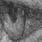
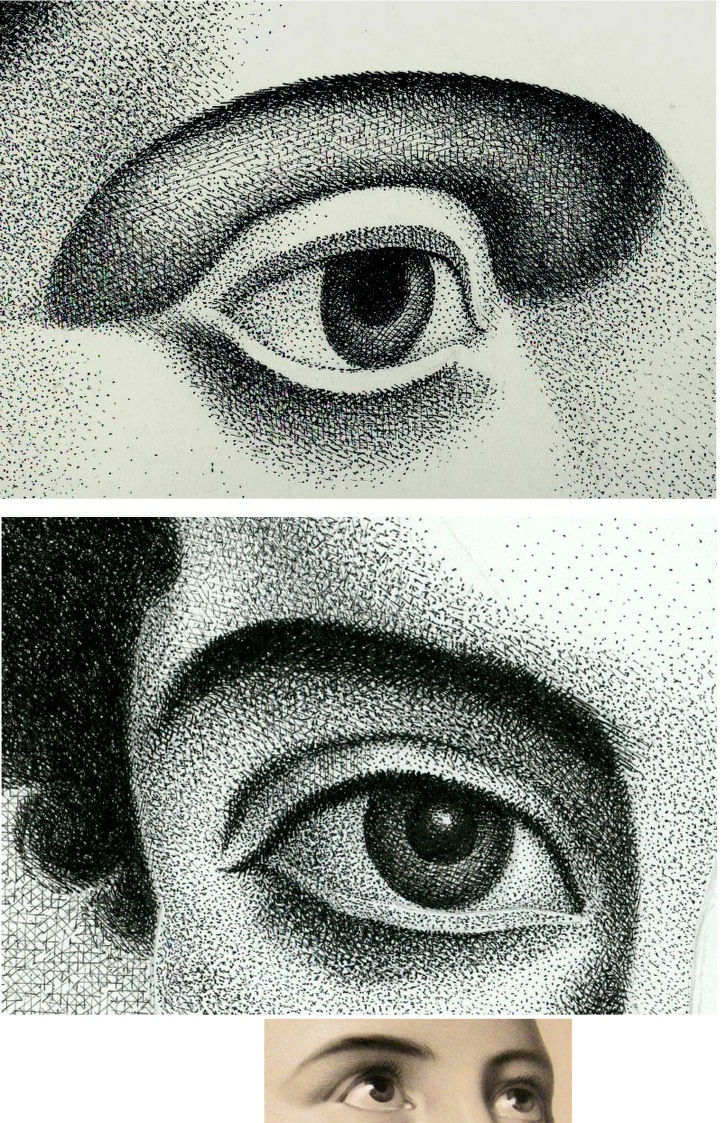
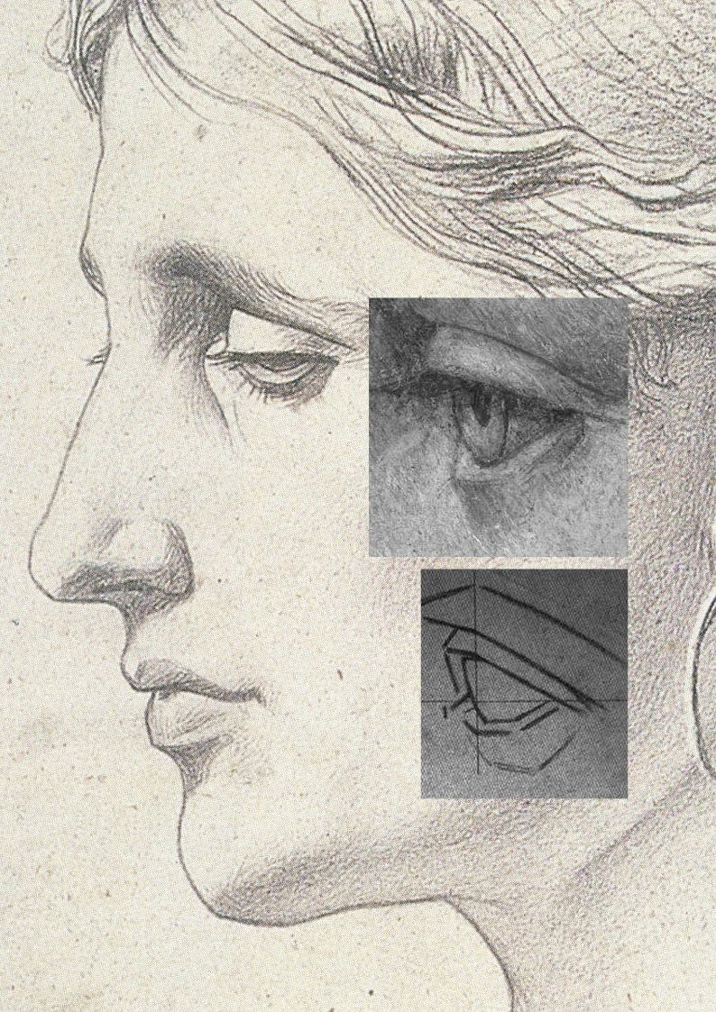
Above, Fig. 1: top, the eye of “La Bella Principessa”; centre, eyes drawn by Picasso, aged eleven; bottom, eyes drawn c. 1860 by Bernard-Romain Julien (1802-1871).
THE DISCOVERY OF THE SOLE PRE-1998 OWNER
In 2010 “La Bella’s” 1998 vendor, Jeanne Marchig, stepped from the shadows to sue Christie’s following press reports that fingerprint evidence had established Leonardo authorship and a value of $100/150 million. That claim was later discredited and dropped. Despite twelve years of assiduous searches by journalistic and art historical advocates, no record of the work predates its only known owner, Jeanne Marchig’s deceased artist/restorer husband, Giannino Marchig (1897–1983). Notwithstanding “La Bella’s” five-century provenance gap and stylistic incongruity advocates have declared it a 1496 portrait of Bianca Sforza. (See “Books on No-Hope Art Attributions”.)

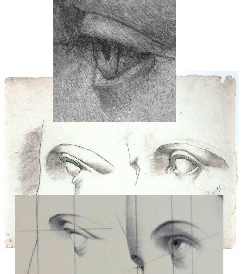
“La Bella Principessa’s” stylistic disqualifications (above, Fig. 2, bottom right) coalesce in the drawing of the eye (above, top left) and against a bona fide Leonardo eye drawing (bottom left). That is, “La Bella’s” eye is constructed by straight-edged planar surfaces when every Leonardo eye was constructed with curves and curving surfaces in accord with anatomically-dictated surface shifts at the eye/cheek intersection (see Fig. 3 below).
Where “La Bella’s” eye could never have been drawn by Leonardo, it could have been made by many skilful artists trained during the late 19th or early 20th centuries when an emphatically linear/planar manner of drawing was widely imposed. Giannino Marchig’s (above) self-portrait and etched profile of a lady betray such stylistic indebtedness. As well as being “La Bella’s” only known/claimed owner – and one who reportedly declined to disclose to his wife from whom or when the drawing had been obtained – Marchig fits the classic forger’s profile by being a talented well-trained artist who after initial successes found himself professionally unfashionable; became a close friend of Bernard Berenson; worked as a restorer; grew inexplicably rich…
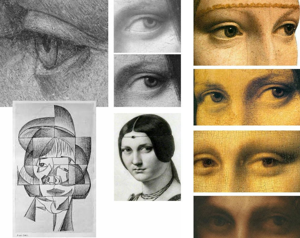
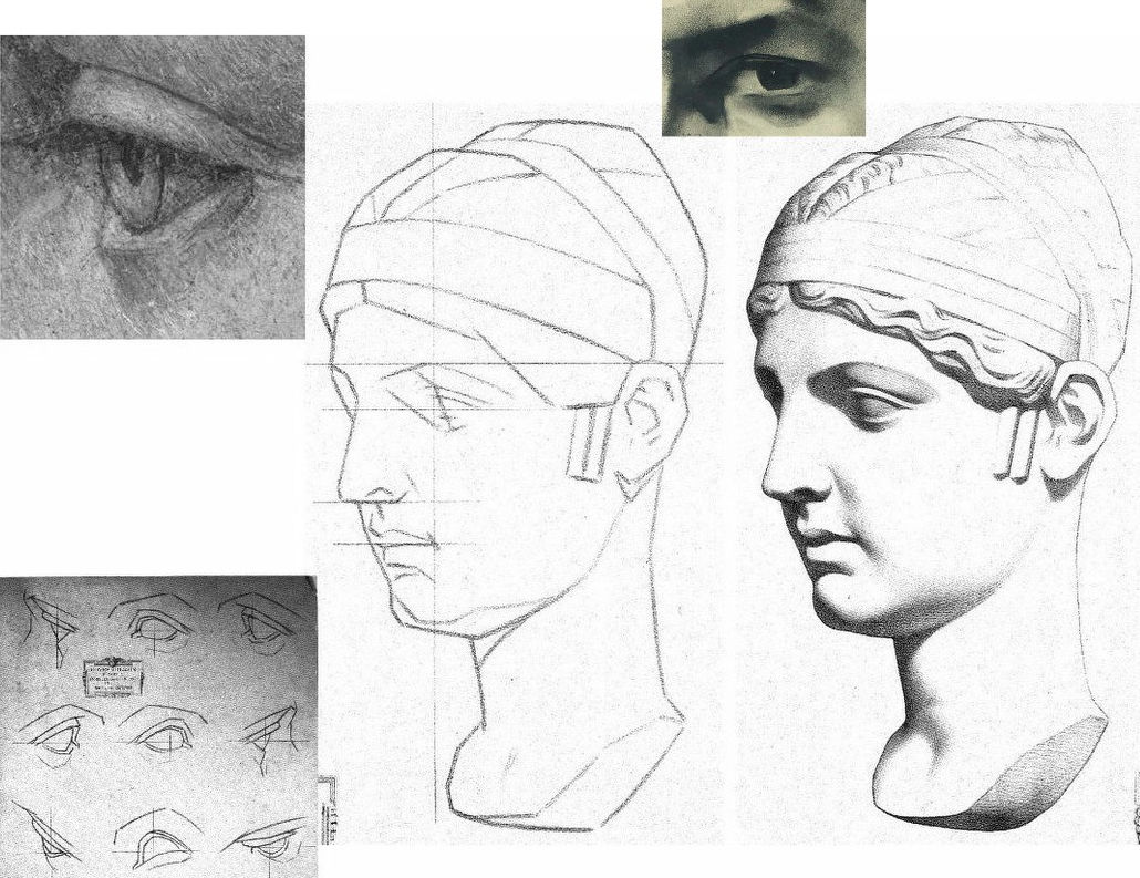
As previously noted, “La Bella’s” eye bears stylistic affinities with Cubist artists like Juan Gris (Fig. 3, above, left) and is anatomically incompatible with Leonardo’s drawn and painted eyes as instanced (above, centre) in La belle ferronnière in an infra-red image that discloses the preparatory drawing for the curving, thin lower eyelid; as painted by Leonardo; and, as copied in pencil by Ingres. The chronological sequence of Leonardo eyes above right (the Lady with an Ermine, La belle ferronnière, the Mona Lisa, and the St. John) shows Leonardo striving for an ever-greater softness of effect and nowhere constructing eyes with short straight lines and flat planes.
A NOTE ON THE FAILED-ARTISTS, RESTORERS AND ART FORGERS’ FRATERNITY:

Following the recent publication of Giannino Marchig’s self-portrait, a self-portrait, Fig. 4 above, left, has been attributed to Han van Meegeren (1889-1947), the forger and highly skilled author of the drawn illustration, above right. As Susan Grundy discussed here in 2016 (“A restorer’s aim – The fine line between retouching and forgery”), van Meegeren took a discarded copy by an unknown artist and, by careful restoration and creative additions, turned it into an autograph “Frans Hals” which sold handsomely. Eric Hebborn trained as a medals-winning painter at the Royal Academy Schools in the 1950s before working in London’s West End as a restorer specialising in repairing large paint losses with seemingly continuous old and cracked paint. In his 1997 memoir Confessions of a Master Forger, Hebborn discloses that under the tutelage of his restorer-employer he so improved his knowledge of old techniques, materials and styles as to “become able to ‘restore’ a whole painting – from nothing at all.”
GIANNINO MARCHIG
Above, Fig. 5, details of van Meegeren’s and Marchig’s self portraits. Although Marchig seems to have left no memoir, he did restore a Leonardo school painting and his wife reportedly sold many other works through Christies, New York, presumably also anonymously. It is possible that Marchig made no forgeries. It is possible that he had, as has been claimed since 2010, bought the drawing in the 1950s when forged Renaissance Ladies-in-Profile were commonplace. It is possible that having so bought, he came to doubt the drawing’s authenticity (- on Jeanne Marchig’s testimony, he “restored” the drawing with his own pastels). It is possible that he had made the drawing on a piece of old vellum with “lettering and a little dragon” on the side that has been glued onto an old oak panel, not to sell but to assure himself as a classically trained artist and teacher at the Florence Academy that, had modernism not swept the board, he “could have been a contender”.
THE ROOTS OF A DISTINCTIVE CULT OF DEPICTION BY FRAGMENTARY SURFACE PLANES
Because Marchig’s ownership rests on unsupported and shifting hearsay, anything might be the case with “La Bella Principessa” but, as is stylistically evident in the two self-portrait details above, Marchig and van Meegeren adhered to straight-edged, planar analyses of form.

In the self-portrait details of ears at Fig. 6 above, we see a common predilection for planes and edges and the eschewing of curved lines and surfaces. In van Meegeren (left), three intersecting straight lines confer two sharp points on the lower ear, precisely in the manner of the two diagrammatic ears above that are encountered below at Fig. 8 on the instruction sheet for artists drawn by Charles Bargue in May 1878.
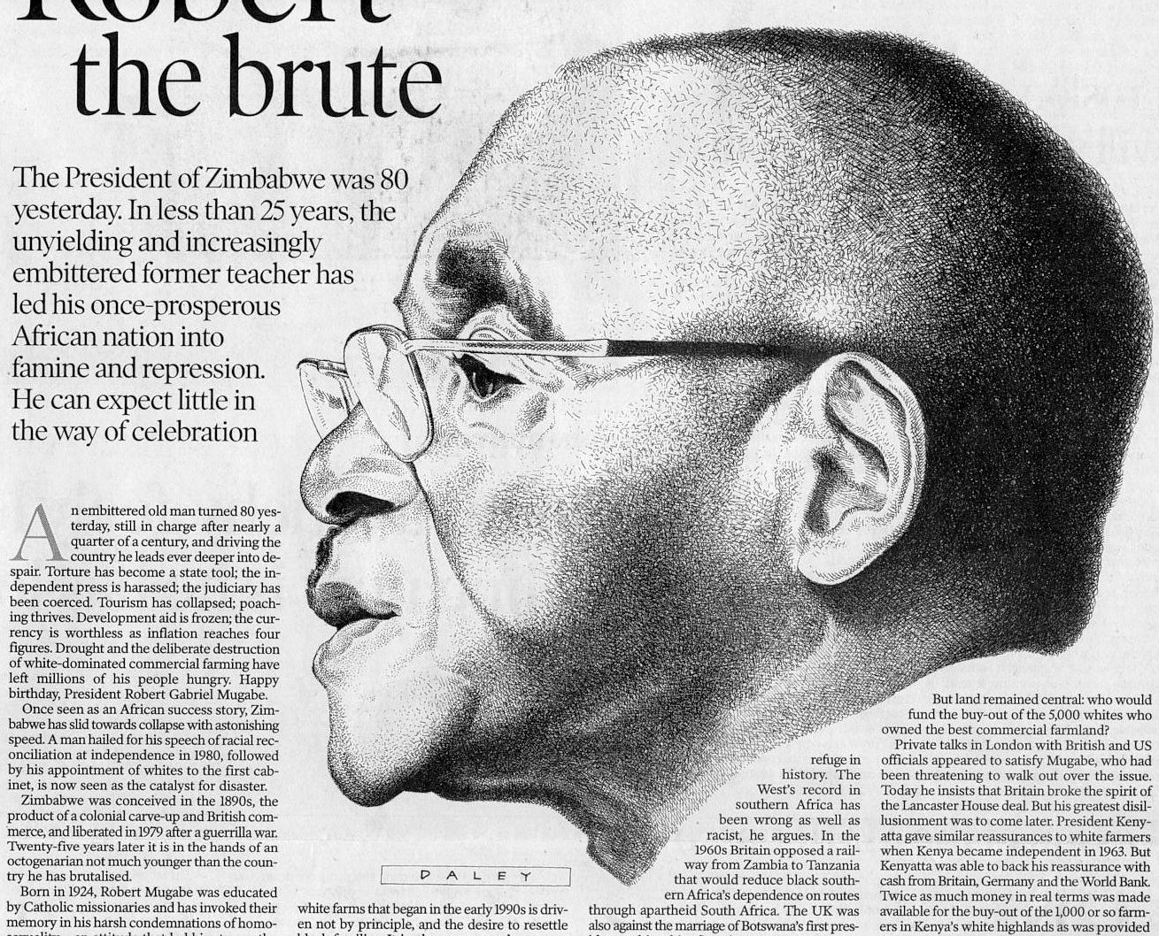
To this draughtsman, the human ear (as drawn for the above 2001 Independent profile portrait of the then President of Zimbabwe, Robert Mugabe) presents an engaging formal/plastic challenge of complexly turning convexities and concavities in which straight lines and points of intersection make no appearance.
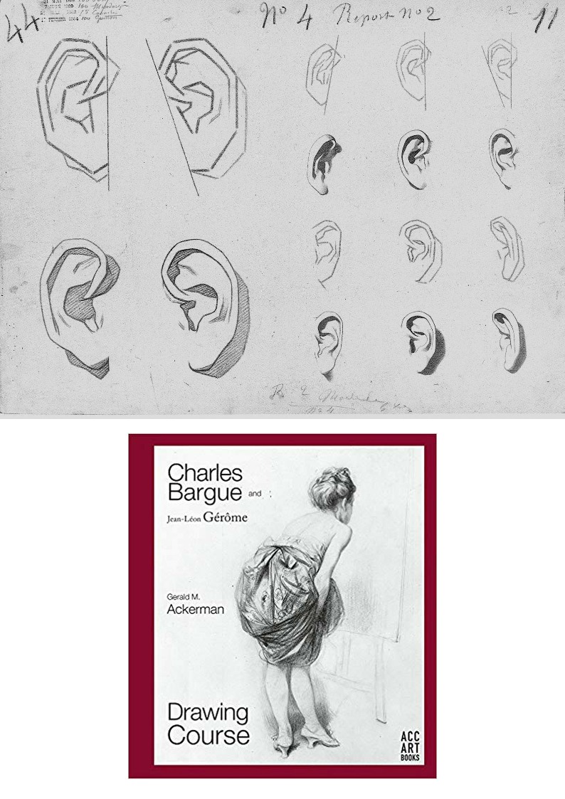
As mentioned, the pointy-eared diagrams at Fig. 6 are found on one of nearly two hundred sheets of dawn aids for art students from 1868 onwards that have been gathered in an invaluable 2003-2011 book above at Fig. 8 by Gerald M. Ackerman (in collaboration with the artist Graydon Parrish). It was felt in France during the late 1800s that shortcomings in art training might be corrected by placing better “models” of art before students who would then improve their drawing techniques and imbibe artistic good taste by copying exemplary lithographic drawings of sculptural casts, works of art and life drawings of male models. The national and international influence of the Charles Bargue (1826/27–1883) Jean-Léon Gèrôme Drawing Course (Cours de dessin) was immense. It spread to England and Spain. Van Gogh worked repeatedly through the plates and Picasso famously copied them.
CASTS’ WARS: EVALUATING THE JULIEN v BARGUE LEGACIES
There are two principal components of drawing: shapes and shading. Shape is best and most expeditiously made by line. Line is the principal agent of design being the most precise, accurate and swift tool in the graphic box. Shading is located within a design and can serve many roles. It can mimic the tonal values of colours. It can make surfaces advance or recede optically. Above all, by making gradations of tone from light to dark it can indicate depth and volume in forms or figures. (See Fig. 15.)
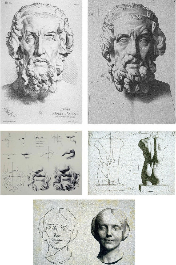
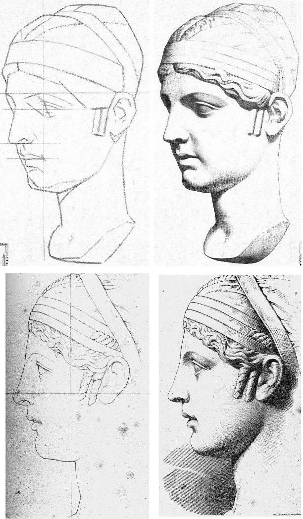
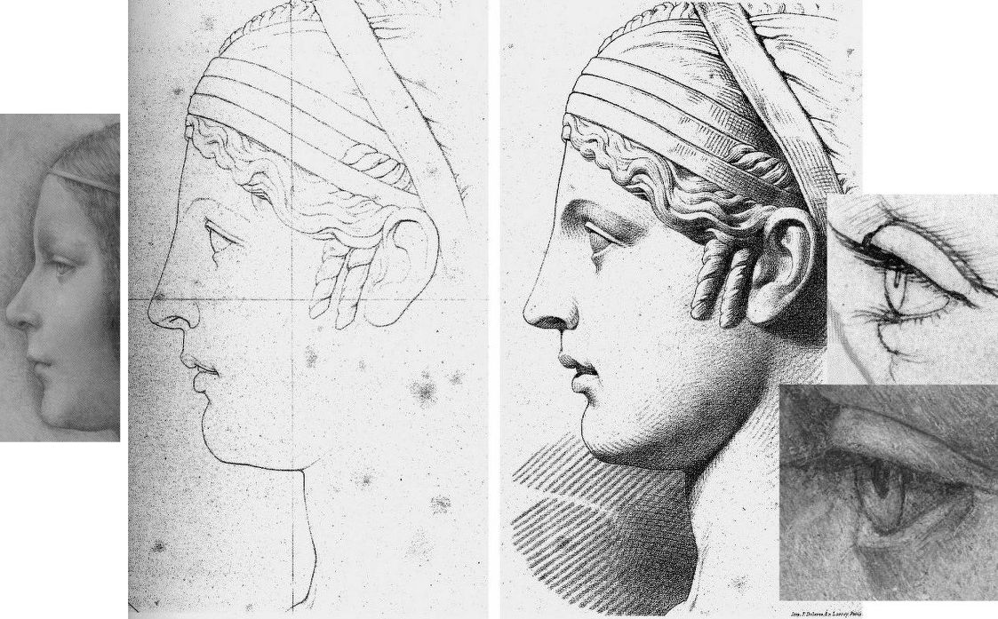
The Bargue-Gérôme drawing course was largely executed by Bargue (he drew the lithographs if not all of the prior charcoal drawings of casts) but it was not the first of its kind. A course had been published around 1860 by Bernard-Romain Julien (1802-1871), whose method is shown above left at Fig. 9, against the slightly later Bargue method, above right. Here we have a direct means of comparison in drawings of the same cast classical sculpture and, below, of the successive stages between line and line-with-shading.
Julien seizes the bull by the horns and fixes the shapes of forms immediately with curves and precision. Bargue splits the process into two conceptually discrete stages by depicting the cast first as a straight-edged mapping of “key” points and angles as at centre right, above. By so “abstracting complicated curvilinear outlines into straight lines and angles”, Bargue, as Gerald Ackerman puts it, is “making it something measurable”. Today’s key champions of Bargue (artists who adhere to the practice of accurately measured “sight-size” drawings) hold that an understanding of form will arise from such accurate and checkable (map-like) plotting of successive points and angles. While true to a degree, the practice generates an impoverished understanding of form – impoverished because it derives from an essentially pictorial exercise on a flat surface that is conducted from a rigorously fixed point in relation to the “model” when form exists in the round and offers infinitely changing aspects to a mobile viewer.
Bargue’s corpus is massively impressive and graphically brilliant but it confers an air of accuracy that may be spurious and it sometimes spawns slackly curvaceous outlines and lazily rounded shading that says little of internal structures (- see Fig. 22 below). Sometimes Bargue contrives a still-angular, facetted outline in his second-stage drawings and these impart a “cut-out photograph” quality, as on the entirely shaded life-cast of a young woman’s head as at Fig. 9, bottom.
On the Bargue v. Julien dichotomy, Ackerman holds: “In both, the drawing is excellent, tight and accurate. However, the proliferation of hatching in Julien’s example confuses the relationships of the various volumes of the face. Bargue works tonally, logically progressing from light to dark. The result is a greater range of value from black to white, providing more drama, unity and volume. It’s almost as if Julien were emphasizing the decorative aspects of the antique bust as opposed to Bargue’s stress on the sculptural qualities.” We take issue with this last claim.
Above, Fig. 10, Bargue’s sheet of a cast sculpture, “Faustine” (the Roman empress Faustina), here mirrored in alignment with the eye of “La Bella”, top left. Before addressing Ackerman’s reading, consider the relationships of the eyes of “La Bella” and van Megeeren’s self-portrait, top right, and with Bargue’s sketch and final shaded stage. By comparison with van Megeeren’s graphic subtlety, fluidity and richness, the author of “La Bella’s” eye seems trapped within the preliminary sketching vocabulary – as at bottom left in the first Bargue “plate of instruction”. Against Bargue’s second stage eye rendering, “La Bella” not only lacks tonal fluidity and coherence, it looks superimposed upon the uncertain forms of “La Bella’s” head.
The lower line and line/shaded sequence above at Fig. 11 by Julien is also of the Faustine cast, albeit from a different view and not showing the whole head. Ackerman suspects that Julien’s refined, linear neo-classical style incurred official disfavour and that its more elaborate stylized refinement might have been considered to make impractical models for the teaching of basic drawing skills. While such judgements may well have been the case we take Julien’s graphic qualities and legacy to have been significantly underestimated – and perhaps especially so with Picasso, as discussed below.
In general terms and with regard to working artists’ methods, it is a moot point whether prior sketching with exclusively straight lines is a necessary or helpful step towards the imperative end of drawing accurately with curved lines and contours. Why delay engagement with an essential skill by erecting a conceptually complicating two-stage graphic means, like a music teacher who advises pupils to get the notes right first and then put the expression in later? Bargue’s two-stage pedagogic model is nowhere found in working artists’ practices and we should not be intimidated by the sheer beauty and descriptive power of Julien’s Faustina. His subtle precisely curving lines confer not only great elegance of drawing and design but hard, precise, well-organised information and great sculptural clarity.
The three photo-inserts, above at Fig. 12, highlight the incompatibility of “La Bella’s” slightly wayward, downcast, sideways glancing, thick angular-lidded eye with either a true classical portrait’s eye, or those drawn by Leonardo.
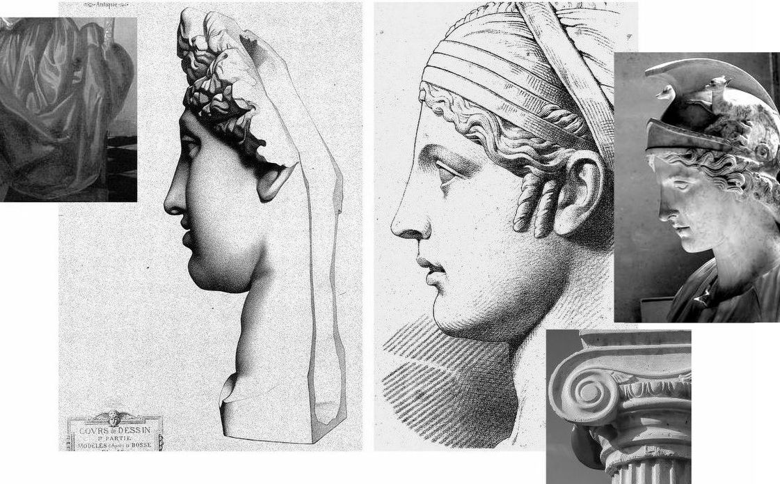
At Fig. 13 above we see, left, Bargue’s second stage depiction of a cast of The Capitoline Ariadne, left, and Julien’s Faustina, right. This is a prime example of Bargue’s forceful graphic combination of crisply decisive shapes and a rich tonal spectrum of shading. In depicting the forms of the hair, Bargue seems to luxuriate in tonal variety for reasons more painterly than sculptural. His decoratively shaped discrete tonal values resemble Vermeer’s treatments of drapery, as above left. In contrast, Julien’s account of the hair is sculpturally pellucid. His shading escalates gently to a degree that supplements, not obscures, the precise linear description. Although only part-drawn, his head seems as crisply carved as a classical sculpture and as plastically coherent as a column capital through his scrupulously observed face and neck articulation. Julien’s lighter tonal notations perfectly capture the neck’s anatomical forms where Bargue’s heavier more uniform tones evoke an unfortunate rounded softness of a pig’s trotter.
PICASSO’S DUAL ENGAGEMENT
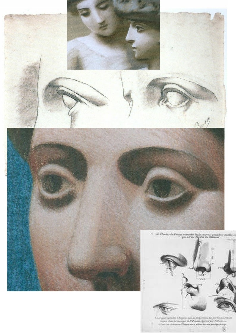
At Fig. 1, we contrasted “La Bella’s” masonry-like forms with two Julien sheet eyes copied by the eleven year-old Pablo Picasso and attached to that drawing a pair of Julien eyes that might have been taken as the young artist’s models were it not for the smooth transition from nose to eyebrow in the right-hand drawing where that transition was shown furrowed by Picasso. Further searching (- see Fig. 15 below) revealed that the particular Julien sheet Picasso had copied contained three line drawings of a woman’s left eye as seen in profile, in three-quarters view and head-on (and with three shaded versions of the same). Here above at Fig. 14 we place the eleven-year old’s eyes above a mirrored detail of the forty-year old Picasso’s pastel Head of a Woman made at Fontainebleu with superimposed details of Picasso’s 1921 pastel, Two Women with Hats and a 1683 engraving by Gerard Audran of Features of the Pythian Apollo.

Picasso had copied the Julien eyes under the guidance of his father at the Instituto da Guarda in La Coruña. His copy of the two eyes is, as Joan P. Uraneck noted in the August 2003 Burlington Magazine, (“Picasso’s ‘Two views of a left eye’, of 1892-93: a recent discovery”) one of seven surviving sheets the eleven-year old made – with four from Bargue. Uraneck sees a “remarkable resemblance” between Picasso’s juvenile copy of Julien eyes and his neo-classical work of the 1920s, and she reproduces one of the studies (above Fig. 15, top left) for Picasso’s Three women at the fountain. The main top image here is an ink transcription (made by this author as part of a suite of classical heads from antiquity onwards) of another of the Fontainebleu Picasso pastels, the Head of a Woman, Fondation Beyeler, Basel, which starred in the Frick Collection’s 2011 “Picasso’s Drawings, 1890-1921 exhibition”. At the time of drawing I had known nothing of Julien’s work but had been struck by the opacity in the eyes of Head of a Woman and especially so in comparison with eyes of a Graeco-Egyptian encaustic portrait a woman as below at Fig. 16. Today, that opacity is the more intriguing when we know of the astonishing vivacity of Julien’s eyes – as above and as in the bottom detail at Fig. 16. What we do not know is how many Julien sheets Picasso had seen and copied but given that he was being taught by his artist father we might safely assume that he had seen and produced appreciably more than seven such copies.
Uraneck’s discovery is intriguing: could Picasso have summoned the suite of monumental heads seen below (Fig. 17) in the Pushkin Museum’s invaluable photograph of Olga Picasso in the studio at Fontainebleu in 1921 without exposure to Julien’s fastidious intelligent studies? By the same token, had copying Bargue’s “analytical” first sketches (as with his Homer below) implanted a conceptual schema or template for a Cubist deconstruction/reconstruction of figures? Or, even: had Picasso’s simultaneous exposure to two powerful conflicted pedagogical programmes at a tender, highly susceptible age left him artistically like a dog between two bones – never fully able to decide which kind of artistic voice to adopt?
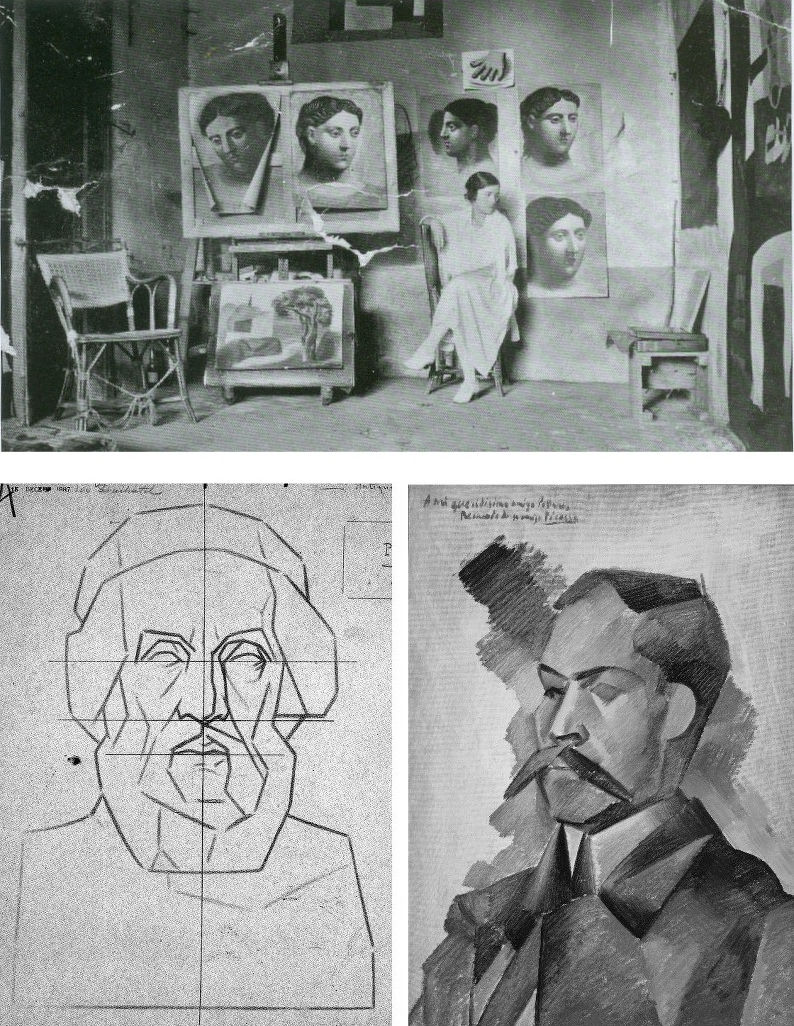

In Fig. 18 above, it might look at a casual glance as if the same drawing has been reproduced twice on differently coloured grounds. In fact, that on the left is Bargue’s second stage study of an antique torso and that on the right is a copy made by Picasso when only twelve. This drawing is sometimes cited as a proof that the young Picasso was able to draw as well as Raphael and had needed to learn how to throw off his classical manacles. Although Picasso has replicated Bargue’s disposition of dark, mid and light tones with great precocity and therefore seemingly succeeded in producing a striking copy of the “model” drawing before him, the drawing contains elementary errors.
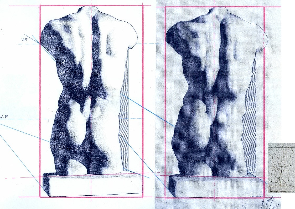
Despite having the two states of Bargue before him, Picasso greatly exaggerated every subtle movement and shift of direction in the torso’s right-hand contour. In Fig 20 above we subject the two versions to identical simple checks on proportion and alignment and soon discover an accumulation of egregious errors. Picasso was not attentive to the “architecture” of the design or to the placement of the cast’s torso on the rectangular plinth which Bargue set on a slight diagonal that runs away from the viewer. Projecting the bottom left and top right edges of Bargue’s base (as with the blue lines) imparts a perspective in which the vanishing point gives a horizon line that crosses the torso at about one third of its height. Projecting the same edges in the Picasso copy sets the horizon at chest height. The dotted red central vertical line in the Bargue version shows subtle counter sways in the upper and lower parts of the torso that are broadly balanced and give a securely composed symmetry within the figure. Picasso, seemingly mesmerised by the seductively dramatic powers of shading, loses sight of the torso’s taught musculature and allows his own reading of too-large and too-soft forms to sway precariously to (our and his) right – and to bulge at the left hip. Michelangelo said that his compasses were in the eye. If at any stage Picasso had dropped a plumb-line in his mind’s eye from the point where the right arm parts company with the torso down towards the cast’s base he would have seen immediately how badly his figure was listing.
BENCHMARK DRAWINGS
Bargue had not invented the schema of a strongly outlined figure with one side brightly lit and the other heavily shaded. At Fig. 20 below stands one of the most graphically and sculpturally masterful combinations of line and tones ever to be dropped onto a sheet of paper – Benvenuto Cellini’s awesome Juno.
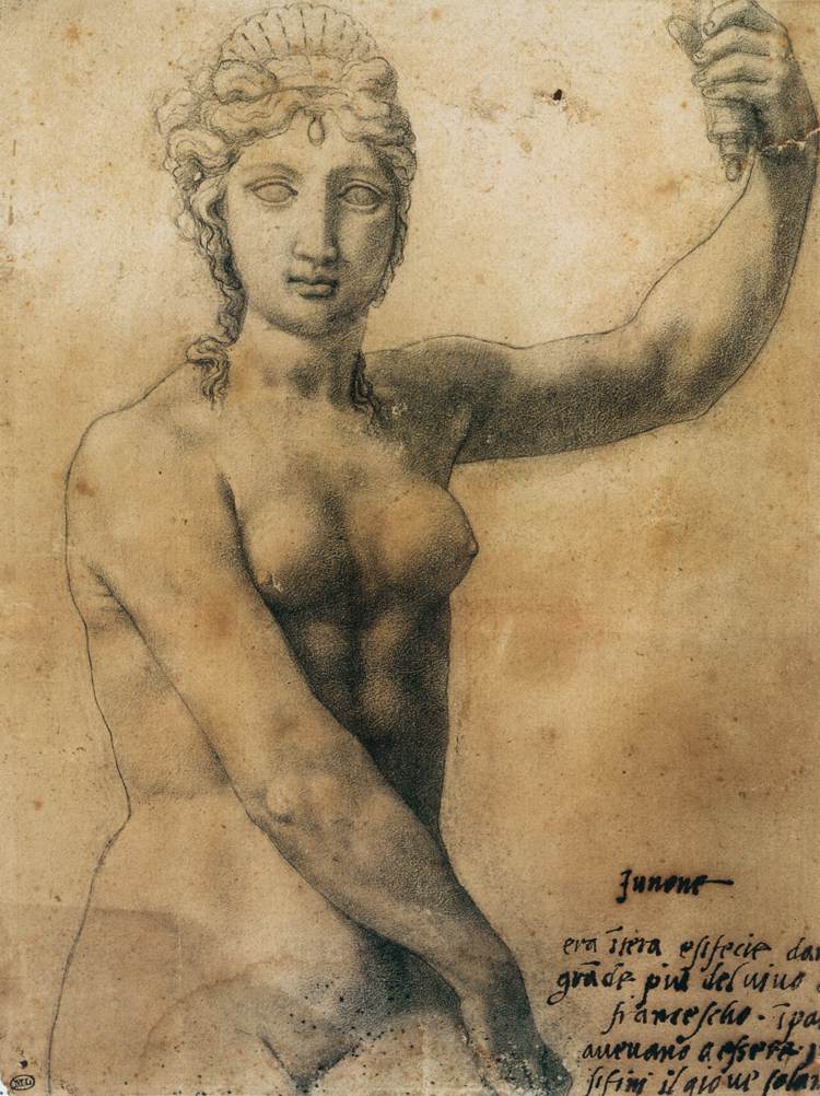
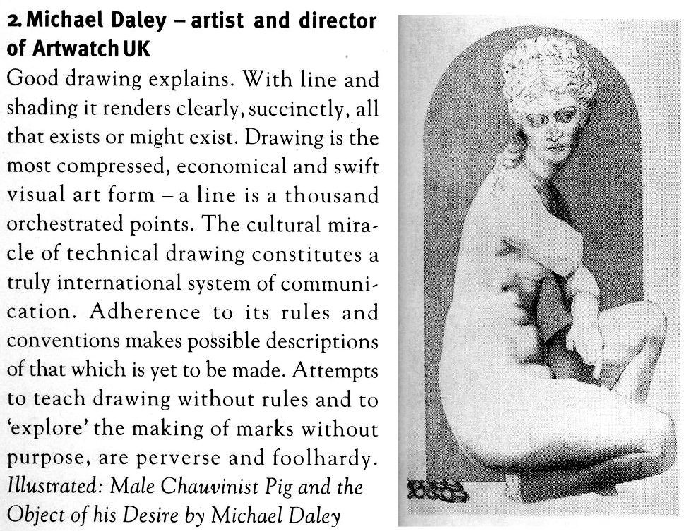
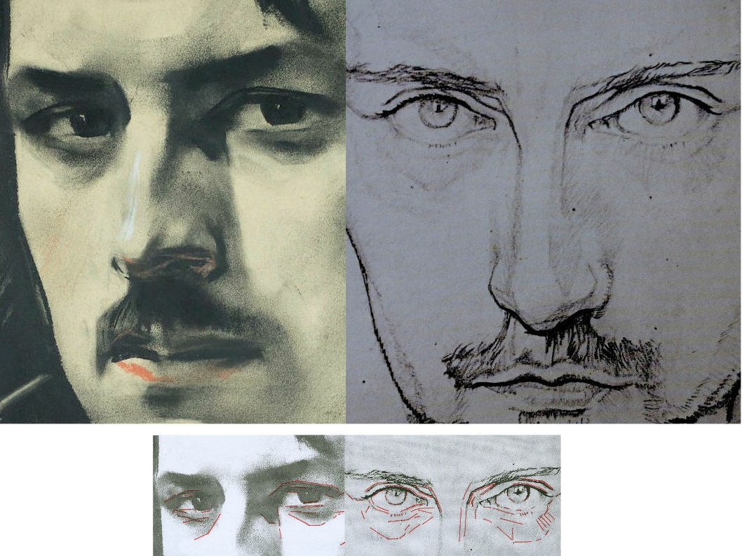
In 1980, some years after first encountering Cellini’s Juno, I paid homage to his graphic/sculptural dispositions in a section of a pen and ink drawing (“Male Chauvinist Pig and the Object of His Desire”) as above right at Fig. 21, albeit establishing the lit side not with a line but with a tonal distinction. In 1996 David Lee, then editor of the Art Review, challenged six people (John Ward RA; Michael Kenny RA; Timothy Clifford, then Director, National Galleries of Scotland; Oliver Berggruen, old master drawings dealer; Michael Daley, AWUK, and Leonard McComb RA, then Keeper of the Royal Academy Schools) to say in under two hundred words each of what Good Drawing consists. I pitched for technical drawing in part as a polemical antidote to then current art school practices (see below) on the firm conviction that participation in a short crash course in technical drawing would do more to improve standards of drawing than anything else. Technical drawings have to be clear, comprehensible, coherent and unambiguous because they trade in objectively verifiable facts. Such is their precision and authority that they can – and often do – form part of legal contracts.
Fast forward a century from the competing talents of Bargue and Julien to State art schools in Britain. By this time, insofar as drawing was encouraged or permitted, it was under the empty rubric “Mark Making” and its brain-dead twinned invitation to “Explore Marks” – as, for example, in this sadly characteristic art school directive:
“At the end of this project the student will be involved in drawing in a creative way and not consider it as a mechanical function carried out somewhere at the end of his hand. In this studio the project is devised to increase the student’s experience of drawn marks and of drawing techniques. To do this a varied selection of drawing implements are used, e. g. sponge, sticks, stones, finger, hand, hair, glass marbles, string, pencil, pen, brush, etc…e. g. Drawing with a glove on – with the glove filled with small stones – with the glove having two fingers knotted – with the glove filled with sand – with various kinds of gloves e. g. industrial gloves to supple cricket gloves…e. g. Drawing on a sheet placed on a board which is suspended from the ceiling by rope. Trying to draw a controlled mark on this swinging surface. Using the same board but having two students drawing, one on each side influencing each other’s marks…e. g. Drawing through visual restrictions: through glasses, glasses with dots painted on them – through smoked glass – with one eye covered – wearing a gas mask – with strings obstructing vision – with moving strings doing the same (using a hair dryer to blow the strings). Drawing in a dark room. Drawing with hand under water…e. g. Physical restrictions: with one arm tied to the shoulder using the mouth to hold the implement…etc. etc.”
Above, Fig. 22, one of Bargue’s weaker, more slackly drawn sheets.
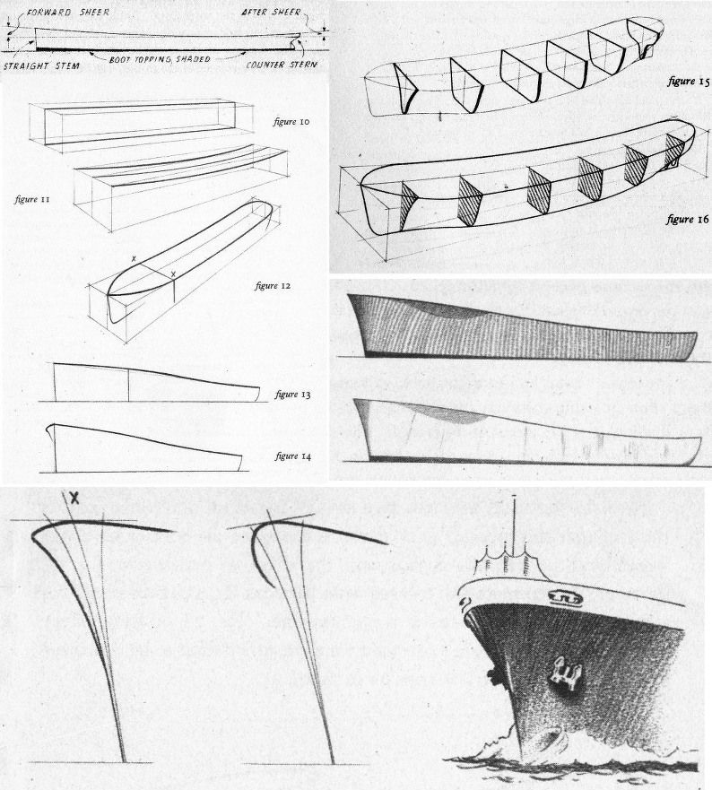
In London, from the beginning of the Second World War, The Studio magazine published an extensive series of “How to draw…” books that channelled lessons derived from Bargue–Gèrôme, Julien and others in the simplest, most direct manner. In Fig. 23, above, a suite of introductory drawings is shown from Leonard W. Sharpe’s 1945 How to Draw Merchant Ships. Sharpe begins with a sermon on the marriage of technical necessities and poetry in ships: you must know the what and the why before you can appreciate ships and hope to draw them successfully. Sharpe’s first lesson was to understand the sheer (the curvature in side elevation) of a ship’s hull. To aid buoyancy in driving seas, the forward sheer needs to be greater than that of the after sheer – less lift is required against a sea that is following a vessel. The creation of this vital seaworthiness is not just a matter of maritime efficacy: “A good designer arranges the design of his ship…handsomely so as to ‘take the eye’…the hull is a combination of exceedingly graceful curves which could very well be described as ‘poetry in steel’, particularly when seen from the bow or quarter.” Sharpe, like Julien, assumes a novice draughtsman’s willingness to master curves. Until recently every ship in the world had been an orchestration of curves. To the sheer is added the flare at the bow “so that heaving waves are flung outwards instead of cascading in full force onto the deck”.
CLOTH EYES AND SCHOLARLY CLOSED SHOPS
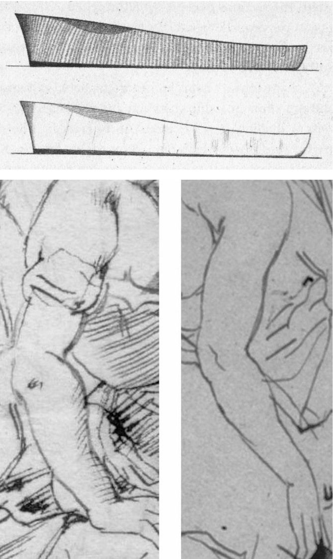
Sharpe’s comments were underpinned by his drawn sketch demonstrations. As seen in Fig. 23 above, top, he made two drawings of a nominal hull to illustrate different types of shading. No one looking at the pair would likely suspect that Sharpe had been the author of only one of the drawings. Looking at the above two details of ink sketches that carry a bent female arm, how many would feel just as confidently that these are the work of the same artist (Rubens) working at the same time (c. 1610 and c. 1608-12, respectively) in the same medium (pen, ink, paper)? Both drawings were included as autograph in Julius Held’s canonical 1959 work Rubens – Selected Drawings. We catalogued a stream of alarm calls in September 2014 (“Art’s Toxic Assets and a Crisis of Connoisseurship”):
The arm on the left belongs to a supposed Rubens ink sketch for the painting of Samson and Delilah that is given to Rubens by the National Gallery even though a director of the gallery admitted that it does not look like any other of the many Rubens’s held. If by Rubens, this ink sketch would be the only one framed on the paper by an ink box that severs part of one of Samson’s feet – an anomaly in Rubens that is also found in the National Gallery’s Samson and Delilah painting. Like “La Bella Principessa”, this drawing (which bears the inked initials “V.D.”) emerged only in the 20th century – 1926 – from a Dutch firm of antiquaries (a family member of whom was a graphic artist) when it was sold as a van Dyck. Contemporary copies of the (long-lost) original Rubens Samson and Delilah painting showed that Samson’s toes had not been cropped at the edge of the painting. The ink sketch had been authenticated by the esteemed Rubens scholar Ludwig Burchard very shortly before he also authenticated the then recently discovered Samson and Delilah painting that is now in the National Gallery and is there paraded on the website as one of the Gallery’s “not-to-be-missed” paintings. In his 1930 certificate of authenticity for this painting, Burchard said the picture was in excellent condition and even retained its panel’s original back. Following a restoration at the National Gallery it was reported that the original back had disappeared sometime in the late 19th century or early 20th century when the panel had been planed down to wafer thinness and glued onto a sheet of blockboard. As reported in our 2006 Journal No. 21, over sixty Burchard attributions had subsequently been down-graded in Corpus Rubenianum.
The second stage of the Bargue course consisted of his copies of exemplary, taste-conferring models found among great artists’ drawings. The stunning drawing above (detail) at Fig. 24 is by Bargue after a (now lost) drawing by Adolphe-William Bouguereau (1825-1905). Ackermann congratulates Bargue for replicating the character and manner of a great variety of artists. Of this (near-profile) drawing entitled A Roman Woman (Femme romaine) he observes:
“It is a wonder, displaying a marvellous balance between the observation of a realist and the ideals of a classicist. Bouguereau is more concerned with anatomy than some of the other masters. The bony appearance of her nose, the sunken eyes and cheeks, and the thickness of her neck are qualities he describes so accurately that it places the woman in her late forties, at not quite overripe maturity. The outline is elegantly, sensitively drawn by means of a line that continually changes its thickness or emphasis as it gives sensitivity to the nose and lips, strength to the chin, and fullness to the neck. The hair is complex without being detailed. In this drawing Bouguereau is an absolute master of the Academic realist drawing technique, a mixture of observation, knowledge and ideals.”
As with “La Bella”, in this (near-) profile portrait the eye has a downward cast, sideways glancing eye with a thick and facetted lower lid. Is it conceivable that Leonardo, in a single out-of-character work, should have anticipated a means of drawing encountered in one 19th century artist’s copy of another 19th century artist’s work?
HIGH STAKES

In our view, if the scholars who still hold that Leonardo made both of the eyes and both of the faces above (and at the same art historical moments) were to prevail, the parameters of the artist’s oeuvre would be so greatly elasticised as to undermine international art market credibility, which credibility has already been rocked by the recent spate of exposed fake modern and fake old master paintings.
Michael Daley, Director, 18 January 2020