
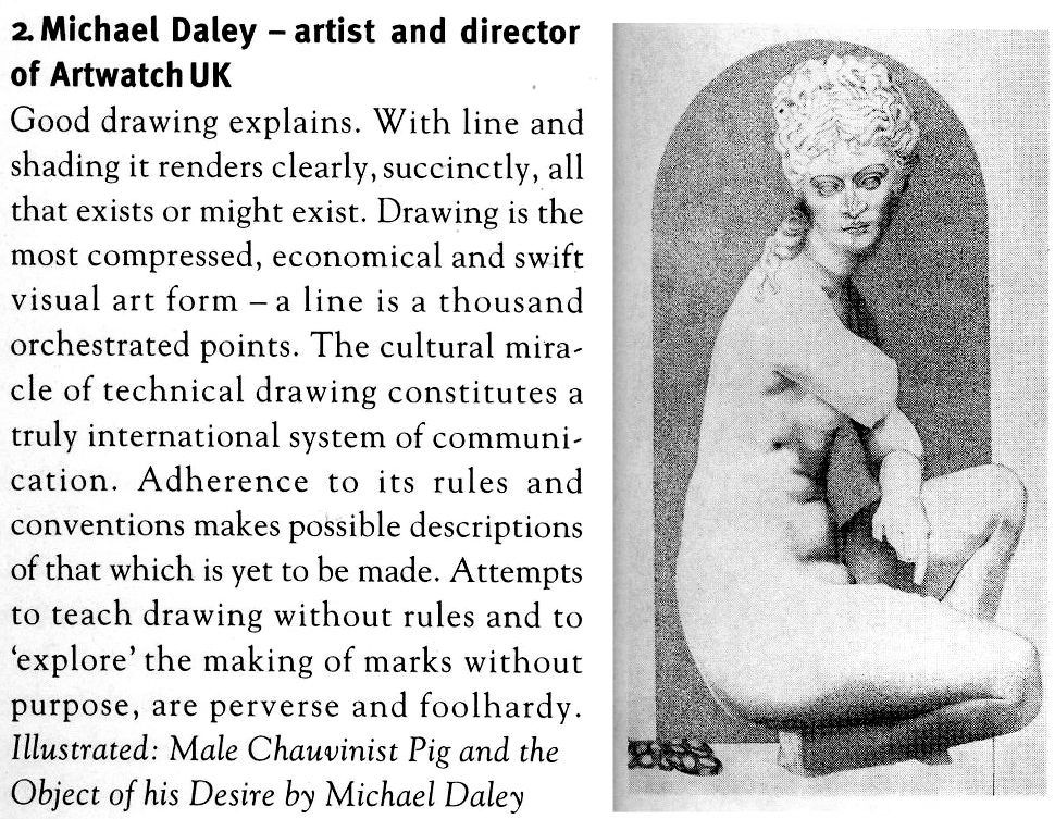
Situating “La Bella Principessa’s” Eye
In today’s rolling connoisseurship crisis, the credibility stakes are higher with the unsold claimed Leonardo “La Bella Principessa” drawing than with the spectacularly sold but immediately disappeared $450 million Salvator Mundi painting.
Turning a $1,175 Salvator of 2005 into a record-breaking $450 million in 2017 was achieved with a work that is of its claimed Renaissance period and that is of Leonardo’s school. At issue is whether an unpublished badly damaged, much- restored school work with a couple of good passages (two folded fingers and a section of trompe l’oeil knot pattern) is an autograph Leonardo painting that served as a finished prototype for all other Leonardo school Salvator Mundi paintings.
With “La Bella Principessa” an upgrade is being attempted on a work that first emerged in 1998 without provenance and that was presented anonymously as 19th century German by Christie’s, New York, and sold for $22,850 to a dealer who divested it in 2007 for $19,000 to an art collector who reportedly keeps it in a Swiss Freeport. We propose below that “La Bella” bears the stamp of a singular 19th century school of academic art practice.
WHO DREW “LA BELLA PRINCIPESSA”?
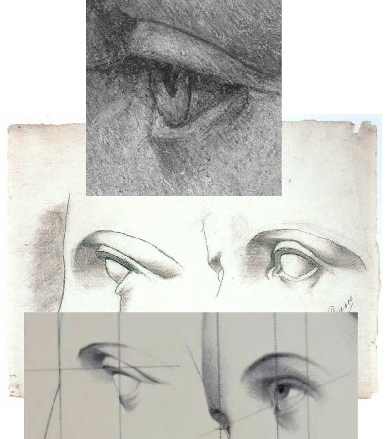
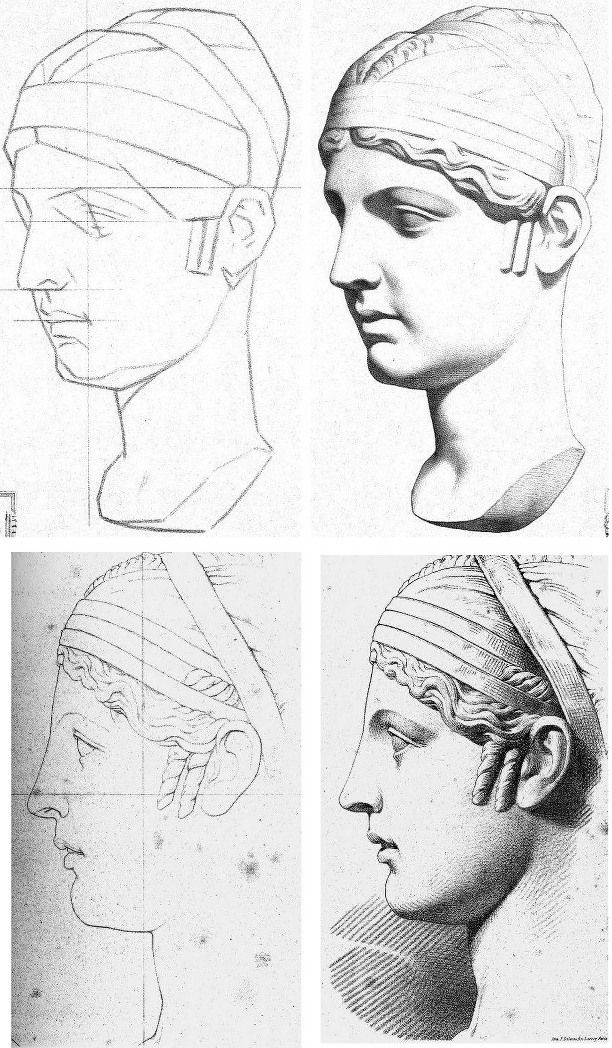
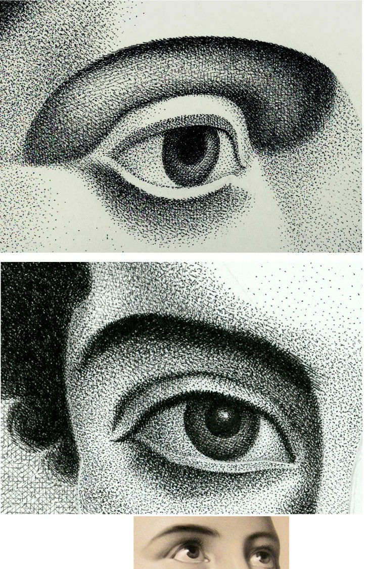
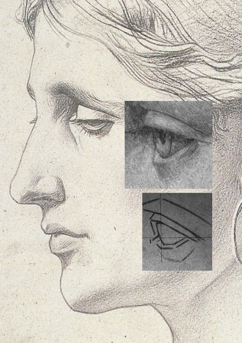
Above, Fig. 1: top, the eye of “La Bella Principessa”; centre, eyes drawn by Picasso, aged eleven; bottom, eyes drawn c. 1860 by Bernard-Romain Julien (1802-1871).
THE DISCOVERY OF THE SOLE PRE-1998 OWNER
In 2010 “La Bella’s” 1998 vendor, Jeanne Marchig, stepped from the shadows to sue Christie’s following press reports that fingerprint evidence had established Leonardo authorship and a value of $100/150 million. That claim was later discredited and dropped. Despite twelve years of assiduous searches by journalistic and art historical advocates, no record of the work predates its only known owner, Jeanne Marchig’s deceased artist/restorer husband, Giannino Marchig (1897–1983). Notwithstanding “La Bella’s” five-century provenance gap and stylistic incongruity advocates have declared it a 1496 portrait of Bianca Sforza. (See “Books on No-Hope Art Attributions”.)

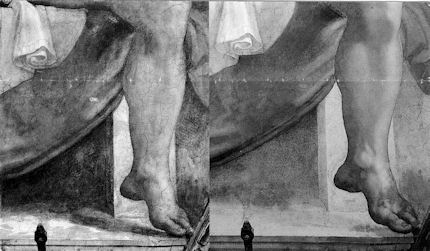
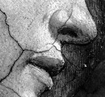
“La Bella Principessa’s” stylistic disqualifications (above, Fig. 2, bottom right) coalesce in the drawing of the eye (above, top left) and against a bona fide Leonardo eye drawing (bottom left). That is, “La Bella’s” eye is constructed by straight-edged planar surfaces when every Leonardo eye was constructed with curves and curving surfaces in accord with anatomically-dictated surface shifts at the eye/cheek intersection (see Fig. 3 below).
Where “La Bella’s” eye could never have been drawn by Leonardo, it could have been made by many skilful artists trained during the late 19th or early 20th centuries when an emphatically linear/planar manner of drawing was widely imposed. Giannino Marchig’s (above) self-portrait and etched profile of a lady betray such stylistic indebtedness. As well as being “La Bella’s” only known/claimed owner – and one who reportedly declined to disclose to his wife from whom or when the drawing had been obtained – Marchig fits the classic forger’s profile by being a talented well-trained artist who after initial successes found himself professionally unfashionable; became a close friend of Bernard Berenson; worked as a restorer; grew inexplicably rich…
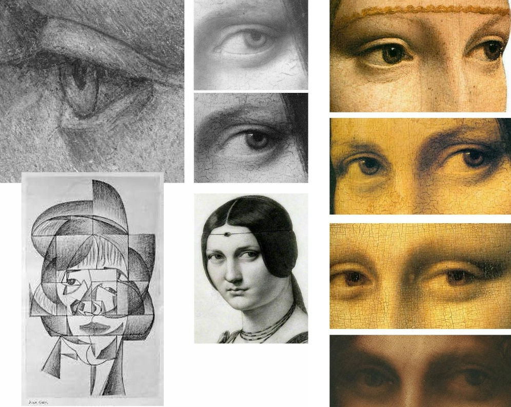
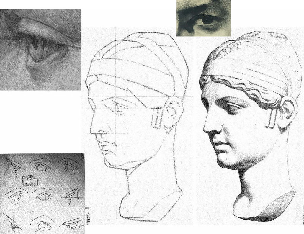
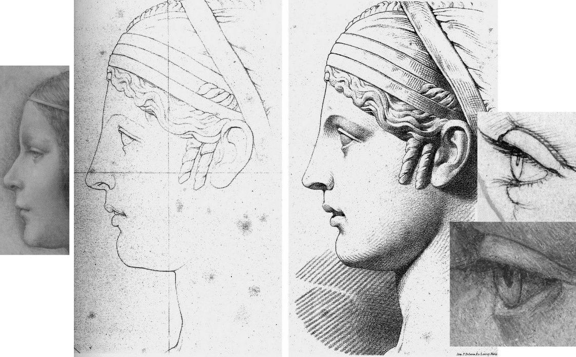
As previously noted, “La Bella’s” eye bears stylistic affinities with Cubist artists like Juan Gris (Fig. 3, above, left) and is anatomically incompatible with Leonardo’s drawn and painted eyes as instanced (above, centre) in La belle ferronnière in an infra-red image that discloses the preparatory drawing for the curving, thin lower eyelid; as painted by Leonardo; and, as copied in pencil by Ingres. The chronological sequence of Leonardo eyes above right (the Lady with an Ermine, La belle ferronnière, the Mona Lisa, and the St. John) shows Leonardo striving for an ever-greater softness of effect and nowhere constructing eyes with short straight lines and flat planes.
A NOTE ON THE FAILED-ARTISTS, RESTORERS AND ART FORGERS’ FRATERNITY:

Following the recent publication of Giannino Marchig’s self-portrait, a self-portrait, Fig. 4 above, left, has been attributed to Han van Meegeren (1889-1947), the forger and highly skilled author of the drawn illustration, above right. As Susan Grundy discussed here in 2016 (“A restorer’s aim – The fine line between retouching and forgery”), van Meegeren took a discarded copy by an unknown artist and, by careful restoration and creative additions, turned it into an autograph “Frans Hals” which sold handsomely. Eric Hebborn trained as a medals-winning painter at the Royal Academy Schools in the 1950s before working in London’s West End as a restorer specialising in repairing large paint losses with seemingly continuous old and cracked paint. In his 1997 memoir Confessions of a Master Forger, Hebborn discloses that under the tutelage of his restorer-employer he so improved his knowledge of old techniques, materials and styles as to “become able to ‘restore’ a whole painting – from nothing at all.”
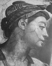
GIANNINO MARCHIG
Above, Fig. 5, details of van Meegeren’s and Marchig’s self portraits. Although Marchig seems to have left no memoir, he did restore a Leonardo school painting and his wife reportedly sold many other works through Christies, New York, presumably also anonymously. It is possible that Marchig made no forgeries. It is possible that he had, as has been claimed since 2010, bought the drawing in the 1950s when forged Renaissance Ladies-in-Profile were commonplace. It is possible that having so bought, he came to doubt the drawing’s authenticity (- on Jeanne Marchig’s testimony, he “restored” the drawing with his own pastels). It is possible that he had made the drawing on a piece of old vellum with “lettering and a little dragon” on the side that has been glued onto an old oak panel, not to sell but to assure himself as a classically trained artist and teacher at the Florence Academy that, had modernism not swept the board, he “could have been a contender”.
THE ROOTS OF A DISTINCTIVE CULT OF DEPICTION BY FRAGMENTARY SURFACE PLANES
Because Marchig’s ownership rests on unsupported and shifting hearsay, anything might be the case with “La Bella Principessa” but, as is stylistically evident in the two self-portrait details above, Marchig and van Meegeren adhered to straight-edged, planar analyses of form.

In the self-portrait details of ears at Fig. 6 above, we see a common predilection for planes and edges and the eschewing of curved lines and surfaces. In van Meegeren (left), three intersecting straight lines confer two sharp points on the lower ear, precisely in the manner of the two diagrammatic ears above that are encountered below at Fig. 8 on the instruction sheet for artists drawn by Charles Bargue in May 1878.
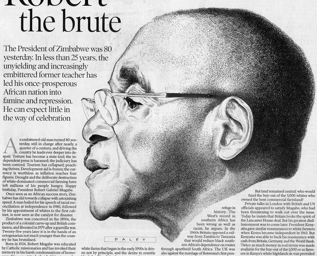
To this draughtsman, the human ear (as drawn for the above 2001 Independent profile portrait of the then President of Zimbabwe, Robert Mugabe) presents an engaging formal/plastic challenge of complexly turning convexities and concavities in which straight lines and points of intersection make no appearance.
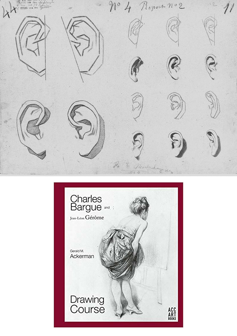
As mentioned, the pointy-eared diagrams at Fig. 6 are found on one of nearly two hundred sheets of dawn aids for art students from 1868 onwards that have been gathered in an invaluable 2003-2011 book above at Fig. 8 by Gerald M. Ackerman (in collaboration with the artist Graydon Parrish). It was felt in France during the late 1800s that shortcomings in art training might be corrected by placing better “models” of art before students who would then improve their drawing techniques and imbibe artistic good taste by copying exemplary lithographic drawings of sculptural casts, works of art and life drawings of male models. The national and international influence of the Charles Bargue (1826/27–1883) Jean-Léon Gèrôme Drawing Course (Cours de dessin) was immense. It spread to England and Spain. Van Gogh worked repeatedly through the plates and Picasso famously copied them.
CASTS’ WARS: EVALUATING THE JULIEN v BARGUE LEGACIES
There are two principal components of drawing: shapes and shading. Shape is best and most expeditiously made by line. Line is the principal agent of design being the most precise, accurate and swift tool in the graphic box. Shading is located within a design and can serve many roles. It can mimic the tonal values of colours. It can make surfaces advance or recede optically. Above all, by making gradations of tone from light to dark it can indicate depth and volume in forms or figures. (See Fig. 15.)
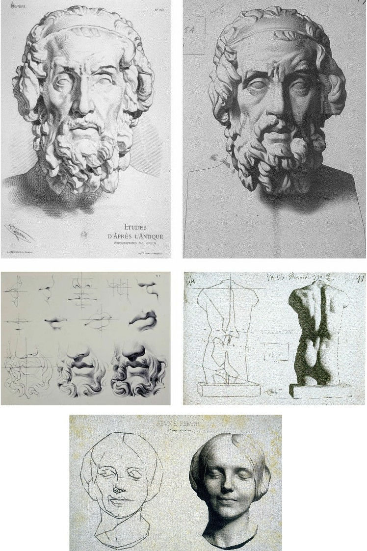
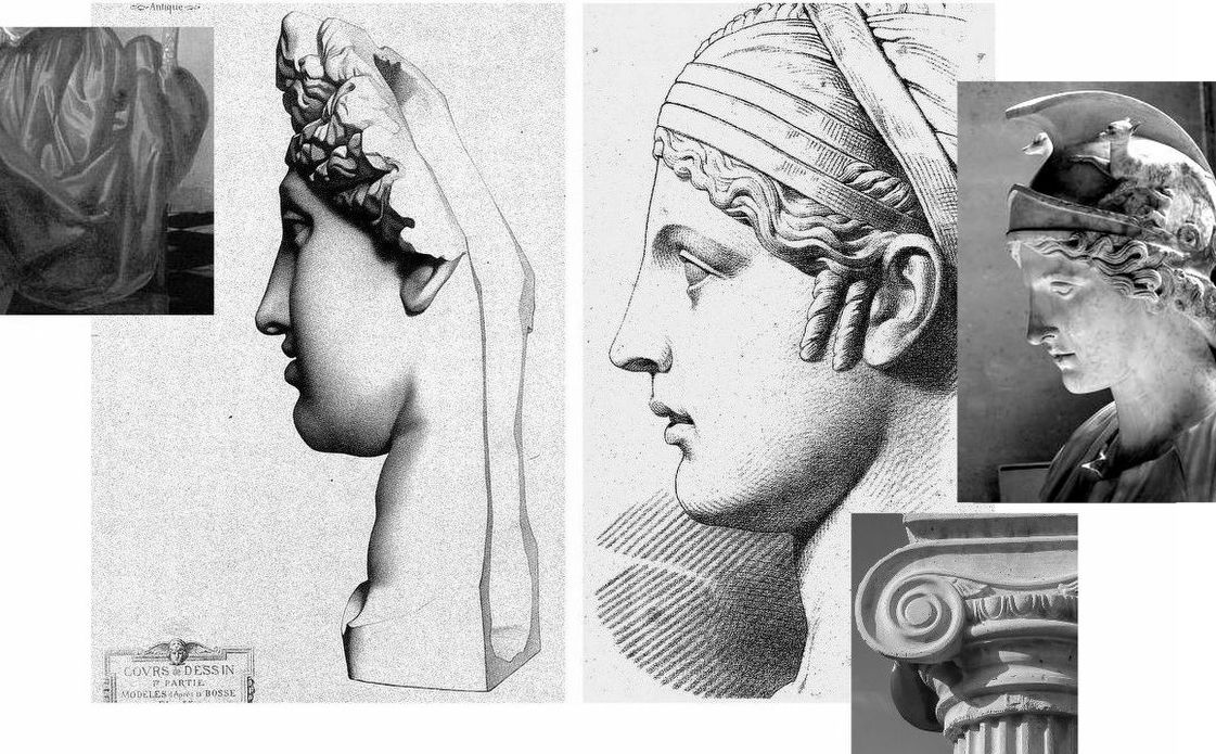
The Bargue-Gérôme drawing course was largely executed by Bargue (he drew the lithographs if not all of the prior charcoal drawings of casts) but it was not the first of its kind. A course had been published around 1860 by Bernard-Romain Julien (1802-1871), whose method is shown above left at Fig. 9, against the slightly later Bargue method, above right. Here we have a direct means of comparison in drawings of the same cast classical sculpture and, below, of the successive stages between line and line-with-shading.
Julien seizes the bull by the horns and fixes the shapes of forms immediately with curves and precision. Bargue splits the process into two conceptually discrete stages by depicting the cast first as a straight-edged mapping of “key” points and angles as at centre right, above. By so “abstracting complicated curvilinear outlines into straight lines and angles”, Bargue, as Gerald Ackerman puts it, is “making it something measurable”. Today’s key champions of Bargue (artists who adhere to the practice of accurately measured “sight-size” drawings) hold that an understanding of form will arise from such accurate and checkable (map-like) plotting of successive points and angles. While true to a degree, the practice generates an impoverished understanding of form – impoverished because it derives from an essentially pictorial exercise on a flat surface that is conducted from a rigorously fixed point in relation to the “model” when form exists in the round and offers infinitely changing aspects to a mobile viewer.
Bargue’s corpus is massively impressive and graphically brilliant but it confers an air of accuracy that may be spurious and it sometimes spawns slackly curvaceous outlines and lazily rounded shading that says little of internal structures (- see Fig. 22 below). Sometimes Bargue contrives a still-angular, facetted outline in his second-stage drawings and these impart a “cut-out photograph” quality, as on the entirely shaded life-cast of a young woman’s head as at Fig. 9, bottom.
On the Bargue v. Julien dichotomy, Ackerman holds: “In both, the drawing is excellent, tight and accurate. However, the proliferation of hatching in Julien’s example confuses the relationships of the various volumes of the face. Bargue works tonally, logically progressing from light to dark. The result is a greater range of value from black to white, providing more drama, unity and volume. It’s almost as if Julien were emphasizing the decorative aspects of the antique bust as opposed to Bargue’s stress on the sculptural qualities.” We take issue with this last claim.
Above, Fig. 10, Bargue’s sheet of a cast sculpture, “Faustine” (the Roman empress Faustina), here mirrored in alignment with the eye of “La Bella”, top left. Before addressing Ackerman’s reading, consider the relationships of the eyes of “La Bella” and van Megeeren’s self-portrait, top right, and with Bargue’s sketch and final shaded stage. By comparison with van Megeeren’s graphic subtlety, fluidity and richness, the author of “La Bella’s” eye seems trapped within the preliminary sketching vocabulary – as at bottom left in the first Bargue “plate of instruction”. Against Bargue’s second stage eye rendering, “La Bella” not only lacks tonal fluidity and coherence, it looks superimposed upon the uncertain forms of “La Bella’s” head.
The lower line and line/shaded sequence above at Fig. 11 by Julien is also of the Faustine cast, albeit from a different view and not showing the whole head. Ackerman suspects that Julien’s refined, linear neo-classical style incurred official disfavour and that its more elaborate stylized refinement might have been considered to make impractical models for the teaching of basic drawing skills. While such judgements may well have been the case we take Julien’s graphic qualities and legacy to have been significantly underestimated – and perhaps especially so with Picasso, as discussed below.
In general terms and with regard to working artists’ methods, it is a moot point whether prior sketching with exclusively straight lines is a necessary or helpful step towards the imperative end of drawing accurately with curved lines and contours. Why delay engagement with an essential skill by erecting a conceptually complicating two-stage graphic means, like a music teacher who advises pupils to get the notes right first and then put the expression in later? Bargue’s two-stage pedagogic model is nowhere found in working artists’ practices and we should not be intimidated by the sheer beauty and descriptive power of Julien’s Faustina. His subtle precisely curving lines confer not only great elegance of drawing and design but hard, precise, well-organised information and great sculptural clarity.
The three photo-inserts, above at Fig. 12, highlight the incompatibility of “La Bella’s” slightly wayward, downcast, sideways glancing, thick angular-lidded eye with either a true classical portrait’s eye, or those drawn by Leonardo.
At Fig. 13 above we see, left, Bargue’s second stage depiction of a cast of The Capitoline Ariadne, left, and Julien’s Faustina, right. This is a prime example of Bargue’s forceful graphic combination of crisply decisive shapes and a rich tonal spectrum of shading. In depicting the forms of the hair, Bargue seems to luxuriate in tonal variety for reasons more painterly than sculptural. His decoratively shaped discrete tonal values resemble Vermeer’s treatments of drapery, as above left. In contrast, Julien’s account of the hair is sculpturally pellucid. His shading escalates gently to a degree that supplements, not obscures, the precise linear description. Although only part-drawn, his head seems as crisply carved as a classical sculpture and as plastically coherent as a column capital through his scrupulously observed face and neck articulation. Julien’s lighter tonal notations perfectly capture the neck’s anatomical forms where Bargue’s heavier more uniform tones evoke an unfortunate rounded softness of a pig’s trotter.
PICASSO’S DUAL ENGAGEMENT
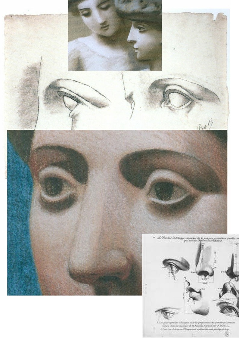
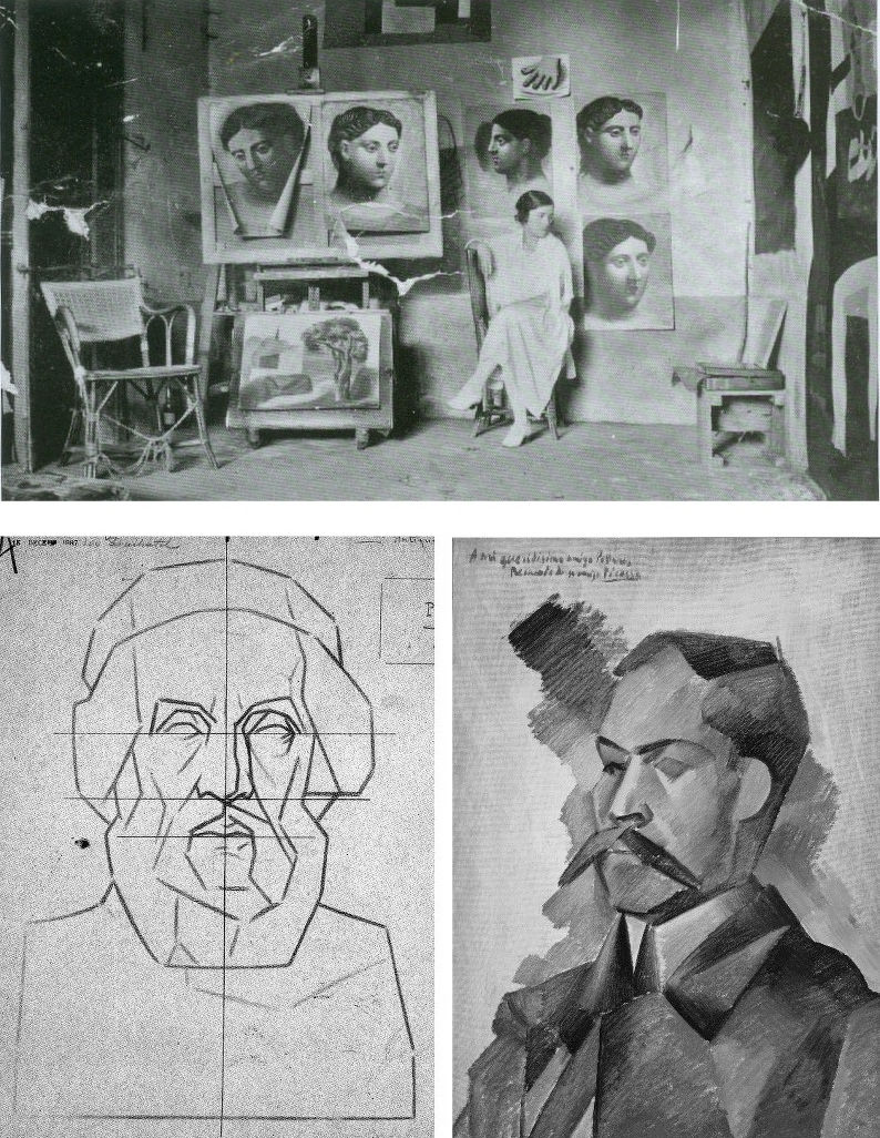
At Fig. 1, we contrasted “La Bella’s” masonry-like forms with two Julien sheet eyes copied by the eleven year-old Pablo Picasso and attached to that drawing a pair of Julien eyes that might have been taken as the young artist’s models were it not for the smooth transition from nose to eyebrow in the right-hand drawing where that transition was shown furrowed by Picasso. Further searching (- see Fig. 15 below) revealed that the particular Julien sheet Picasso had copied contained three line drawings of a woman’s left eye as seen in profile, in three-quarters view and head-on (and with three shaded versions of the same). Here above at Fig. 14 we place the eleven-year old’s eyes above a mirrored detail of the forty-year old Picasso’s pastel Head of a Woman made at Fontainebleu with superimposed details of Picasso’s 1921 pastel, Two Women with Hats and a 1683 engraving by Gerard Audran of Features of the Pythian Apollo.

Picasso had copied the Julien eyes under the guidance of his father at the Instituto da Guarda in La Coruña. His copy of the two eyes is, as Joan P. Uraneck noted in the August 2003 Burlington Magazine, (“Picasso’s ‘Two views of a left eye’, of 1892-93: a recent discovery”) one of seven surviving sheets the eleven-year old made – with four from Bargue. Uraneck sees a “remarkable resemblance” between Picasso’s juvenile copy of Julien eyes and his neo-classical work of the 1920s, and she reproduces one of the studies (above Fig. 15, top left) for Picasso’s Three women at the fountain. The main top image here is an ink transcription (made by this author as part of a suite of classical heads from antiquity onwards) of another of the Fontainebleu Picasso pastels, the Head of a Woman, Fondation Beyeler, Basel, which starred in the Frick Collection’s 2011 “Picasso’s Drawings, 1890-1921 exhibition”. At the time of drawing I had known nothing of Julien’s work but had been struck by the opacity in the eyes of Head of a Woman and especially so in comparison with eyes of a Graeco-Egyptian encaustic portrait a woman as below at Fig. 16. Today, that opacity is the more intriguing when we know of the astonishing vivacity of Julien’s eyes – as above and as in the bottom detail at Fig. 16. What we do not know is how many Julien sheets Picasso had seen and copied but given that he was being taught by his artist father we might safely assume that he had seen and produced appreciably more than seven such copies.
Uraneck’s discovery is intriguing: could Picasso have summoned the suite of monumental heads seen below (Fig. 17) in the Pushkin Museum’s invaluable photograph of Olga Picasso in the studio at Fontainebleu in 1921 without exposure to Julien’s fastidious intelligent studies? By the same token, had copying Bargue’s “analytical” first sketches (as with his Homer below) implanted a conceptual schema or template for a Cubist deconstruction/reconstruction of figures? Or, even: had Picasso’s simultaneous exposure to two powerful conflicted pedagogical programmes at a tender, highly susceptible age left him artistically like a dog between two bones – never fully able to decide which kind of artistic voice to adopt?

In Fig. 18 above, it might look at a casual glance as if the same drawing has been reproduced twice on differently coloured grounds. In fact, that on the left is Bargue’s second stage study of an antique torso and that on the right is a copy made by Picasso when only twelve. This drawing is sometimes cited as a proof that the young Picasso was able to draw as well as Raphael and had needed to learn how to throw off his classical manacles. Although Picasso has replicated Bargue’s disposition of dark, mid and light tones with great precocity and therefore seemingly succeeded in producing a striking copy of the “model” drawing before him, the drawing contains elementary errors.
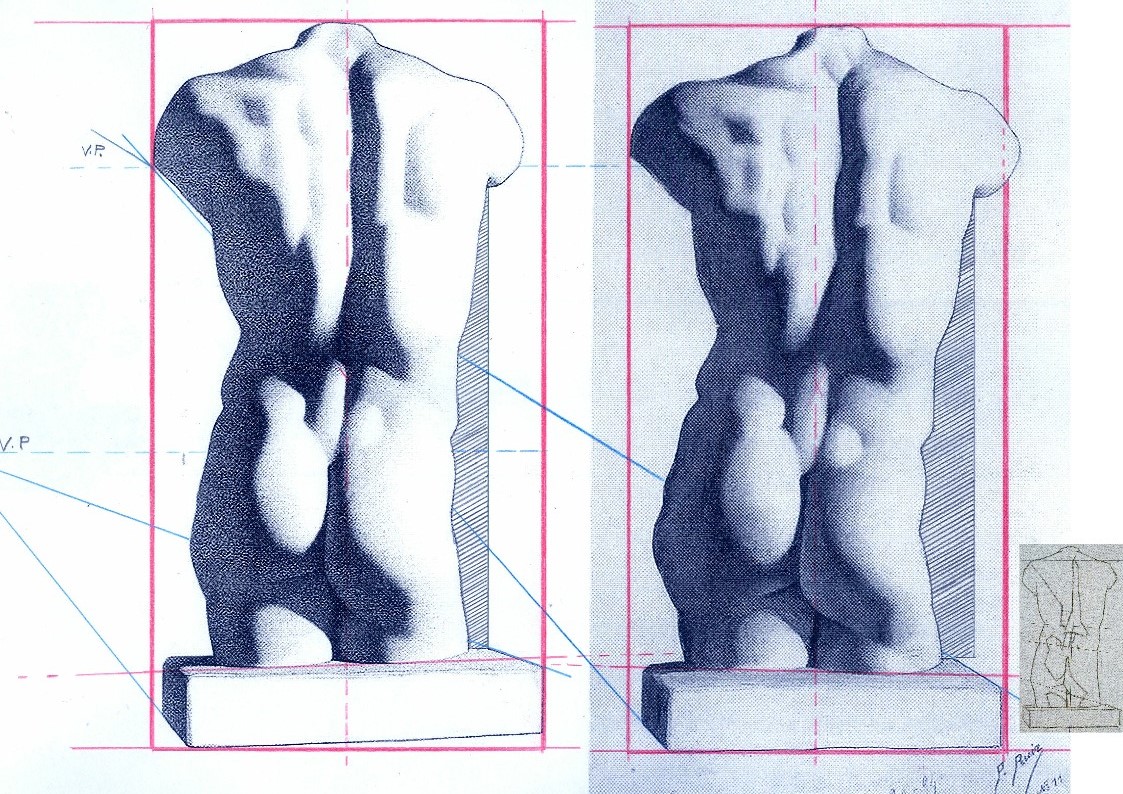
Despite having the two states of Bargue before him, Picasso greatly exaggerated every subtle movement and shift of direction in the torso’s right-hand contour. In Fig 20 above we subject the two versions to identical simple checks on proportion and alignment and soon discover an accumulation of egregious errors. Picasso was not attentive to the “architecture” of the design or to the placement of the cast’s torso on the rectangular plinth which Bargue set on a slight diagonal that runs away from the viewer. Projecting the bottom left and top right edges of Bargue’s base (as with the blue lines) imparts a perspective in which the vanishing point gives a horizon line that crosses the torso at about one third of its height. Projecting the same edges in the Picasso copy sets the horizon at chest height. The dotted red central vertical line in the Bargue version shows subtle counter sways in the upper and lower parts of the torso that are broadly balanced and give a securely composed symmetry within the figure. Picasso, seemingly mesmerised by the seductively dramatic powers of shading, loses sight of the torso’s taught musculature and allows his own reading of too-large and too-soft forms to sway precariously to (our and his) right – and to bulge at the left hip. Michelangelo said that his compasses were in the eye. If at any stage Picasso had dropped a plumb-line in his mind’s eye from the point where the right arm parts company with the torso down towards the cast’s base he would have seen immediately how badly his figure was listing.
BENCHMARK DRAWINGS
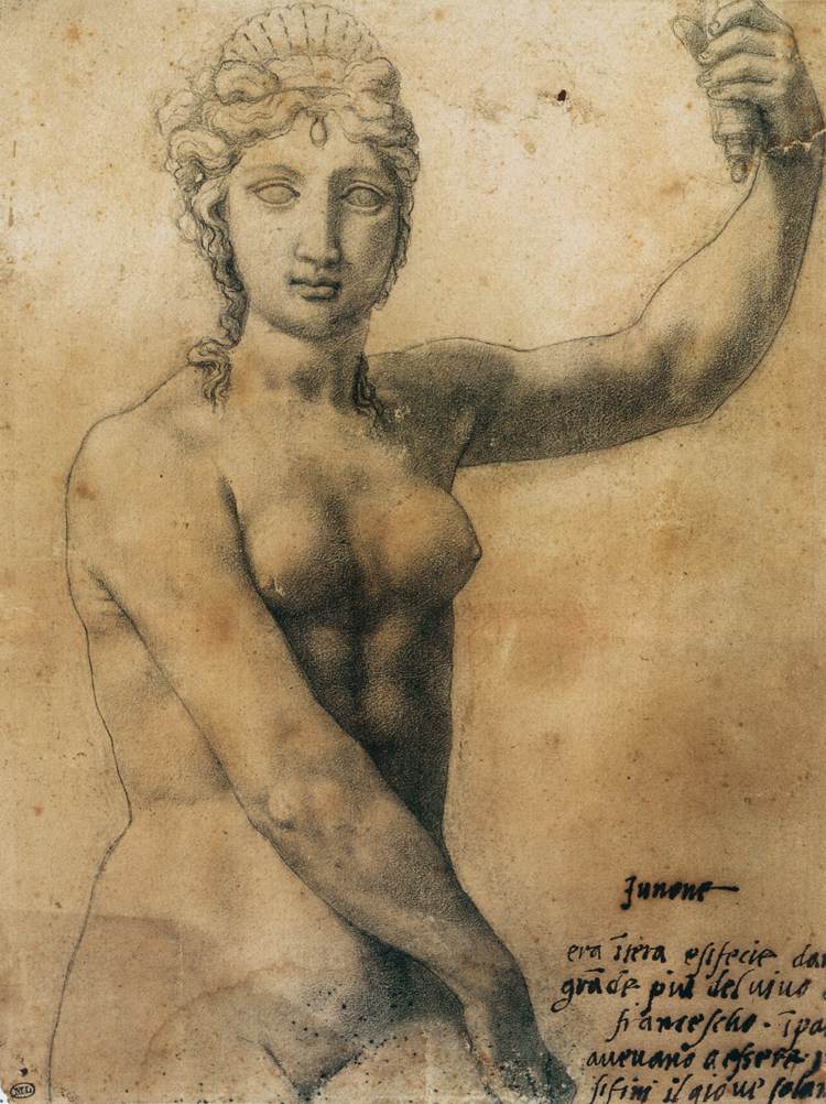
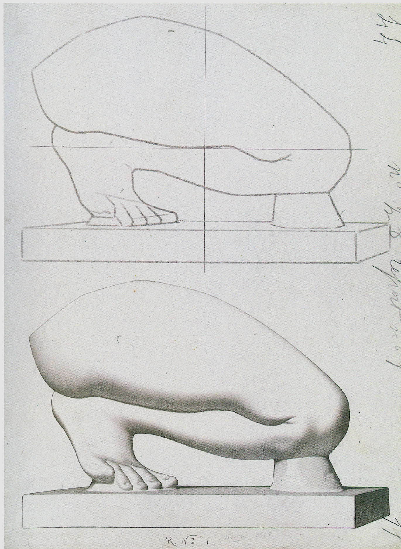
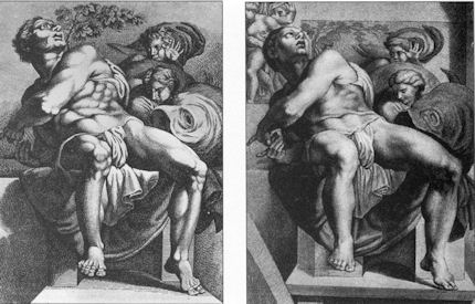
Bargue had not invented the schema of a strongly outlined figure with one side brightly lit and the other heavily shaded. At Fig. 20 below stands one of the most graphically and sculpturally masterful combinations of line and tones ever to be dropped onto a sheet of paper – Benvenuto Cellini’s awesome Juno.
In 1980, some years after first encountering Cellini’s Juno, I paid homage to his graphic/sculptural dispositions in a section of a pen and ink drawing (“Male Chauvinist Pig and the Object of His Desire”) as above right at Fig. 21, albeit establishing the lit side not with a line but with a tonal distinction. In 1996 David Lee, then editor of the Art Review, challenged six people (John Ward RA; Michael Kenny RA; Timothy Clifford, then Director, National Galleries of Scotland; Oliver Berggruen, old master drawings dealer; Michael Daley, AWUK, and Leonard McComb RA, then Keeper of the Royal Academy Schools) to say in under two hundred words each of what Good Drawing consists. I pitched for technical drawing in part as a polemical antidote to then current art school practices (see below) on the firm conviction that participation in a short crash course in technical drawing would do more to improve standards of drawing than anything else. Technical drawings have to be clear, comprehensible, coherent and unambiguous because they trade in objectively verifiable facts. Such is their precision and authority that they can – and often do – form part of legal contracts.
Fast forward a century from the competing talents of Bargue and Julien to State art schools in Britain. By this time, insofar as drawing was encouraged or permitted, it was under the empty rubric “Mark Making” and its brain-dead twinned invitation to “Explore Marks” – as, for example, in this sadly characteristic art school directive:
“At the end of this project the student will be involved in drawing in a creative way and not consider it as a mechanical function carried out somewhere at the end of his hand. In this studio the project is devised to increase the student’s experience of drawn marks and of drawing techniques. To do this a varied selection of drawing implements are used, e. g. sponge, sticks, stones, finger, hand, hair, glass marbles, string, pencil, pen, brush, etc…e. g. Drawing with a glove on – with the glove filled with small stones – with the glove having two fingers knotted – with the glove filled with sand – with various kinds of gloves e. g. industrial gloves to supple cricket gloves…e. g. Drawing on a sheet placed on a board which is suspended from the ceiling by rope. Trying to draw a controlled mark on this swinging surface. Using the same board but having two students drawing, one on each side influencing each other’s marks…e. g. Drawing through visual restrictions: through glasses, glasses with dots painted on them – through smoked glass – with one eye covered – wearing a gas mask – with strings obstructing vision – with moving strings doing the same (using a hair dryer to blow the strings). Drawing in a dark room. Drawing with hand under water…e. g. Physical restrictions: with one arm tied to the shoulder using the mouth to hold the implement…etc. etc.”
Above, Fig. 22, one of Bargue’s weaker, more slackly drawn sheets.
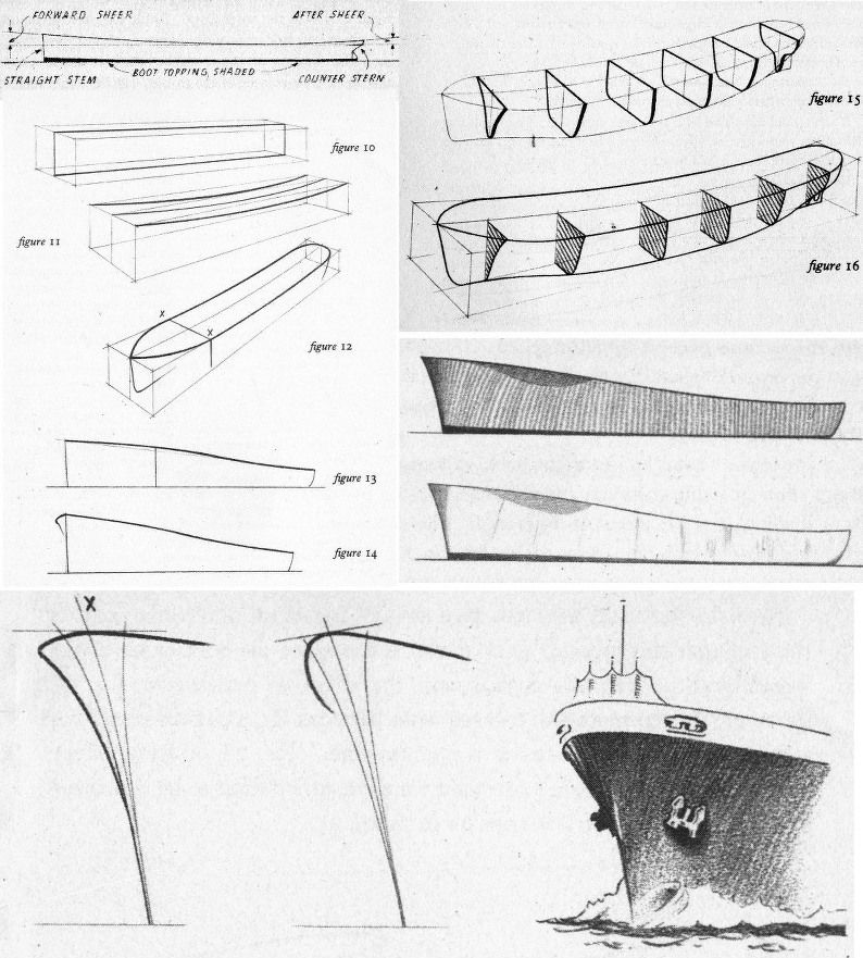
In London, from the beginning of the Second World War, The Studio magazine published an extensive series of “How to draw…” books that channelled lessons derived from Bargue–Gèrôme, Julien and others in the simplest, most direct manner. In Fig. 23, above, a suite of introductory drawings is shown from Leonard W. Sharpe’s 1945 How to Draw Merchant Ships. Sharpe begins with a sermon on the marriage of technical necessities and poetry in ships: you must know the what and the why before you can appreciate ships and hope to draw them successfully. Sharpe’s first lesson was to understand the sheer (the curvature in side elevation) of a ship’s hull. To aid buoyancy in driving seas, the forward sheer needs to be greater than that of the after sheer – less lift is required against a sea that is following a vessel. The creation of this vital seaworthiness is not just a matter of maritime efficacy: “A good designer arranges the design of his ship…handsomely so as to ‘take the eye’…the hull is a combination of exceedingly graceful curves which could very well be described as ‘poetry in steel’, particularly when seen from the bow or quarter.” Sharpe, like Julien, assumes a novice draughtsman’s willingness to master curves. Until recently every ship in the world had been an orchestration of curves. To the sheer is added the flare at the bow “so that heaving waves are flung outwards instead of cascading in full force onto the deck”.
CLOTH EYES AND SCHOLARLY CLOSED SHOPS
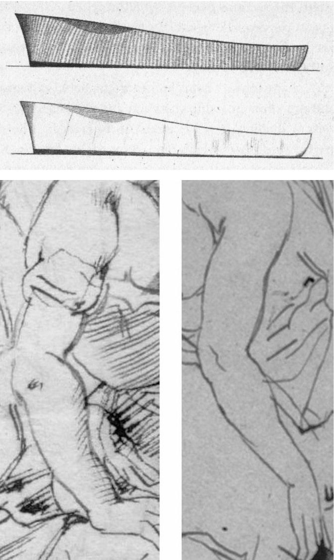
Sharpe’s comments were underpinned by his drawn sketch demonstrations. As seen in Fig. 23 above, top, he made two drawings of a nominal hull to illustrate different types of shading. No one looking at the pair would likely suspect that Sharpe had been the author of only one of the drawings. Looking at the above two details of ink sketches that carry a bent female arm, how many would feel just as confidently that these are the work of the same artist (Rubens) working at the same time (c. 1610 and c. 1608-12, respectively) in the same medium (pen, ink, paper)? Both drawings were included as autograph in Julius Held’s canonical 1959 work Rubens – Selected Drawings. We catalogued a stream of alarm calls in September 2014 (“Art’s Toxic Assets and a Crisis of Connoisseurship”):
The arm on the left belongs to a supposed Rubens ink sketch for the painting of Samson and Delilah that is given to Rubens by the National Gallery even though a director of the gallery admitted that it does not look like any other of the many Rubens’s held. If by Rubens, this ink sketch would be the only one framed on the paper by an ink box that severs part of one of Samson’s feet – an anomaly in Rubens that is also found in the National Gallery’s Samson and Delilah painting. Like “La Bella Principessa”, this drawing (which bears the inked initials “V.D.”) emerged only in the 20th century – 1926 – from a Dutch firm of antiquaries (a family member of whom was a graphic artist) when it was sold as a van Dyck. Contemporary copies of the (long-lost) original Rubens Samson and Delilah painting showed that Samson’s toes had not been cropped at the edge of the painting. The ink sketch had been authenticated by the esteemed Rubens scholar Ludwig Burchard very shortly before he also authenticated the then recently discovered Samson and Delilah painting that is now in the National Gallery and is there paraded on the website as one of the Gallery’s “not-to-be-missed” paintings. In his 1930 certificate of authenticity for this painting, Burchard said the picture was in excellent condition and even retained its panel’s original back. Following a restoration at the National Gallery it was reported that the original back had disappeared sometime in the late 19th century or early 20th century when the panel had been planed down to wafer thinness and glued onto a sheet of blockboard. As reported in our 2006 Journal No. 21, over sixty Burchard attributions had subsequently been down-graded in Corpus Rubenianum.
The second stage of the Bargue course consisted of his copies of exemplary, taste-conferring models found among great artists’ drawings. The stunning drawing above (detail) at Fig. 24 is by Bargue after a (now lost) drawing by Adolphe-William Bouguereau (1825-1905). Ackermann congratulates Bargue for replicating the character and manner of a great variety of artists. Of this (near-profile) drawing entitled A Roman Woman (Femme romaine) he observes:
“It is a wonder, displaying a marvellous balance between the observation of a realist and the ideals of a classicist. Bouguereau is more concerned with anatomy than some of the other masters. The bony appearance of her nose, the sunken eyes and cheeks, and the thickness of her neck are qualities he describes so accurately that it places the woman in her late forties, at not quite overripe maturity. The outline is elegantly, sensitively drawn by means of a line that continually changes its thickness or emphasis as it gives sensitivity to the nose and lips, strength to the chin, and fullness to the neck. The hair is complex without being detailed. In this drawing Bouguereau is an absolute master of the Academic realist drawing technique, a mixture of observation, knowledge and ideals.”
As with “La Bella”, in this (near-) profile portrait the eye has a downward cast, sideways glancing eye with a thick and facetted lower lid. Is it conceivable that Leonardo, in a single out-of-character work, should have anticipated a means of drawing encountered in one 19th century artist’s copy of another 19th century artist’s work?
HIGH STAKES

In our view, if the scholars who still hold that Leonardo made both of the eyes and both of the faces above (and at the same art historical moments) were to prevail, the parameters of the artist’s oeuvre would be so greatly elasticised as to undermine international art market credibility, which credibility has already been rocked by the recent spate of exposed fake modern and fake old master paintings.
Michael Daley, Director, 18 January 2020
Coming to Life: Frankenweenie – A Black and White Michelangelo for Our Times

As an organisation with an essentially critical raison d’etre we get few opportunities to celebrate bona fide creative achievements. This post, in part, is an exception. Longer than usual, it is a tale of two separate but cross-linking events. One is the case of a dog that has not barked, the other is a story of a dog that has been brought back from the dead. To a surprising degree, the latter throws light on the former, which case we consider first.
The 500th anniversary of the completion in 1512 of Michelangelo’s Sistine Chapel ceiling paintings has gone almost entirely un-celebrated. On October 31st, in a small “in-house” service marking the 500th anniversary of Pope Julius II’s service celebrating the completion of the ceiling, Pope Benedict XVI asked a group of cardinals, Vatican employees and guests to imagine what it must have been like 500 years ago, adding that contemplating the frescoes renders them “more beautiful still, more authentic. They reveal all of their beauty. It is as if during the liturgy, all of this symphony of figures come to life, certainly in a spiritual sense, but inseparably also aesthetically.”
Apologists for the transforming 1980-90 restoration of the ceiling are nonplussed by the missed opportunity for a mega-beano half-millennium art celebration. In truth, it is not hard to see why this opportunity should have been foregone by the Vatican. Just two decades after completion of the most intensely controversial restoration of modern times, the state-of-the-art air-conditioning system installed to protect the chemically stripped-down plaster ceiling is failing to cope with the “unimaginable amounts of dirt” and massive atmospheric fluctuations caused by the Sistine Chapel’s throngs of paying visitors whose disrespectful raucous behaviour is a source of shame and censure within Italy. On November 1st it was reported that the Vatican has “no plans to try to limit tourists”. There is not a lot to celebrate here.
This latest failure of an “ultimate restoration” to anticipate and meet future conservation needs carries an implicit call for further urgent conservation but, with it, an indication of art restoration’s specious philosophy and too-frequently destructive consequences. When Art begets art there is pure gain, a life-giving gift. The old art remains to exert its own powers; the new brings fresh experiences and perspectives; running in tandem, each enriches the other as traditions are extended and invigorated (see Figs. 29 and 30). Restoration begetting restoration is another matter altogether.
Art restoration is not a bona fide life-conferring process. Because Art is self-renewing and self-extending, it does not follow that its historically rooted artefacts may be renewed endlessly, routinely, by technicians. To the contrary, in order to read Art’s trajectories it is imperative that its works remain unadulterated. Restorers, with their ever-more ambitious and presumptuous attempts to undo and redo earlier restorations and to reverse all evidence of age, leave old works of art as increasingly spurious impostors. It cannot be otherwise. This is not a question of finding the right “Professional Ethics”. Restorers cannot act outside of their own heads and times, which is why the most authentic old works of art remain those that are least restored. Nor can restorers submit to criticism and evaluation, as all bona fide creators must do. Their professional mystique must be preserved at all times. It rests on impenetrable screeds of pseudo-science and systems of technical “analysis” that preclude evaluation of the optical consequences of interventions on works of visual art.
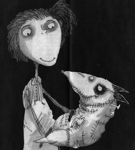
In this depressing art cultural milieu it was startling and refreshing to encounter the recent stunningly brilliant black and white photographic stills promoting Tim Burton’s new animated film Frankenweenie (Figs. 1, 3, 10, 11, 12, 13, 14, 23 and 27). The wit and force of these images rewards examination. The technical key to what might otherwise seem an improbable (if not blasphemous) artistic connection between the unique theologically-charged high art enterprise of Michelanglo’s painting of the Sistine Chapel ceiling, and an animated horror film for children in which one reviewer detected an anti-creationism polemic, can be found in the film’s eschewing of colour, and in Michelangelo’s superimposition of black painting over his own frescoes.
A more general connection is that, for all the marketing hullabaloo of expensively made films, Frankenweenie proves to have been a remarkably art-driven and shaped enterprise (see Figs. 10 to 14). That the full-blown cinematic realisation of this film’s essentially personal and idiosyncratic vision required the specialised contributions of an enormous range of talents and expertises, links it organisationally to the ambitious artistic productions of the great Renaissance art studios.
In part, the power of Burton’s images stems from the simple optical fact that the contrast between a pure solid black and a clean white is the most potent tool in the visual box. But even more, it stems from the fact that between those graphic poles an effectively infinite but individually discernible continuum of values (tints and tones) can be run. An examination of the highly disciplined, imaginatively constructive deployment of such tone/values in Frankenweenie helps pinpoint the nature and the scale of the artistic losses suffered through the “restoration” of Michelangelo’s Sistine Chapel paintings (see Figs. 2, 8, 9, 19, 20, 21, 22, 31, 32, and 33).
Burton’s vivid black and white photographic imagery truly participates in one of modern Western art’s most distinguishing traits. From Alberti to Ruskin, artists have appreciated and explained how tonal gradations can magically conjure three-dimensional structures (form) on flat pictorial surfaces. Until the 1960s every art student learnt to manipulate tonal values in this fashion. Tragically, such conventions have been discarded in (most) fine art education and in much of today’s fine art practice. Fortunately, Cinema and Photography generally have sought (however awkwardly) to absorb those ancient empowering lessons, and in Burton’s hands they find singularly powerful expression.
To take Michelangelo first: he did not want the job of painting the Sistine Chapel ceiling. He wished to work on a massive carved marble tomb of sculpted figures. When compelled by the Pope (Julius II) to paint the ceiling as a novice frescoist, he attempted to get out of the job as soon as he encountered technical difficulties. He was made to continue after being instructed on avoiding future errors (by mixing plaster properly) and concealing existing ones (by applying transparent washes of glue/size). The onerous duty turned into a labour of love and on completion of his hurried, direct painting into the wet plaster of the ceiling, Michelangelo continued working on the dried fresco surface with dark pigments bound with glue or size – to the fury of an impatient Julius II. With those additional (or “auxilliary”) paints he added details and generally strengthened and revised his designs so as to make his pictorial effects more dramatically and unprecedentedly sculptural.
Between 1980 and 1990 the frescoes were transformed in a filmed restoration sponsored by NTV, the Nippon Television Corporation. The restorers contended that the paint applied on the dried frescoes’ surface was not Michelangelo’s and they removed it to artistically adverse and violently controversial effect (for a full account of which, see “Art Restoration ~ The Culture, the Business and the Scandal”, by James Beck and Michael Daley, chapters III and IV). With the work left less sculptural and more stridently coloured, the restorers pronounced the “discovery” of a New and True Michelanglo – an artist who, contrary to all previous understanding, was a brilliant colourist who had abandoned “traditional chiaroscuro modelling” in favour of vibrating “electic contrasts of hue and much irridescence”. This post hoc rationale defied both historical testimony and technical evidence.
It is a matter of record both that Michelangelo made sculptural models of the ceiling figures to study the shadows that their forms would cast (see Fig. 9), and that the shadows he had painted onto the dry ceiling were copied countless times from within his own lifetime until the time of the last restoration (see Figs. 19 to 22). When Michelangelo was compelled to stop painting, the world was astonished by his sculptural – not chromatic – effects. He had revolutionised mural painting by imposing upon the chapel’s curved ceiling the (inverted and paraphrased) monumental architectural tomb peopled by carved figures that he would have preferred to be executing. The restorers, having injured the material realisation of Michelangelo’s revolutionary pictorial conception, demanded a re-writing of art history. That so many scholars were intitially compliant might testify to a profession that writes more than it looks and that uses images as illustrations to theories or texts, rather than as records of the most primary of all sources – the works of art themselves.
Thus, the restorers and their art historical supporters jointly insisted, against hard evidence, that what had been taken for centuries to be carefully studied sculptural effects were deceiving byproducts of “candle smoke and still more of glues” applied by previous restorers. Their suggestion that such phenomena were responsible for “the kind of suggestive painting by shadows for which Michelangelo was admired until a few years ago” was patently absurd: how could gradual arbitrary accumulations have arranged themselves along Michelangelo’s designs so as to enhance his sculptural effects? Conversely, if those effects really had been products of gradual accidental accretions over the centuries, what might have deceived Michelangelo’s own contemporaries, biographers and copyists into believing that they already existed?
Consider further the very weight of the historical evidence. One of Michelangelo’s biographers, Giorgio Vasari, marvelled at his ability to conjure seemingly palpable bodies that had somehow wrested themselves from the surfaces on which they had been painted, into the (seemingly) real space of the artist’s invention:
“Then who is not filled with admiration and amazement at the awesome sight of Jonah…The vaulting [of the ceiling] naturally springs forward, following the curve of the masonry; but through the force of art it is apparently straightened out by the figure of Jonah, which bends in the opposite direction; and thus vanquished by the art of design with its lights and shades, the ceiling even appears to recede.”
Vasari’s testimony on Michelangelo’s deployment of “lights and shades” to sculptural effect was echoed in the short biography written by Ascanio Condivi, a student and assistant through whom Michelangelo is believed to have spoken by proxy. For Condivi, too, the figure of Jonah was:
“…most admirable of all…because contrary to the curve of the vault and owing to the play of light and shadow, the torso which is foreshortened backward is in the part nearest the eye, and the legs which project forward are in the part which is farthest.”
As a single instance of evidence, consider the copy of Jonah shown at Fig. 22. This ink and wash record was made by Giulio Clovio who was known as “the Michelangelo of small works” and recognised by Vasari as a most “excellent illuminator or painter of small things…who has far surpassed all others in this exercise”. His copy happens also to record a group of figures below Jonah. These figures had been painted by Michelangelo beteween 1508 and 1512 but were destroyed by him in 1535 when he prepared the altar wall to receive his single massive Last Judgement mural. Thus, we can see through Clovio’s copy of those long lost passages of Michelangelo painting that strong and cast shadows were decisively present when the painting was brand new. A nude youth then held the tablet bearing Jonah’s name. That figure and the tablet both cast shadows onto the very wall on which they were painted. Michelanglo had thus employed a trompe l’oeil pictorial device to deceive the eye into believing that the figure stood in front of the surface to which it adheres. On this testimony alone claims that Michelangelo’s “suggestive painting by shadows” was a product of “candle smoke and still more of glues” should never have been uttered.
Where the Vatican’s restorers cavalierly discarded Michelangelo’s shadows, in Frankenweenie, Tim Burton has laboured lovingly to produce his shadows. It is remarkable to how great an extent photography and film-making today have been informed and nourished by fine art conventions and the lessons of painting (see Fig. 16). On the influence of painting on the great cinematographer, Jack Cardiff, for example, see the tribute paid to him by Martin Scorcese in Fig. 15. On the early cinematic influences on Burton, see Figs. 4 and 5. It is also remarkable to how great an extent film-making has taken possession of the traditional humanly engaging story-telling and symbolic functions of art that contemporary museum and gallery “fine artists” have abandoned. With animated films, where the characters and their settings are drawn or modelled, distinctions between artistic and photographic media lose almost all force.
Burton’s own film – a remake of his earlier (1984) half-hour, live-action film of a boy who resurrects his pet dog after a fatal accident – was made on an acknowledged artistic impulse: “I’d look at the drawings I did originally, and there was a simplicity to them I wanted to get” (see Fig. 11). Where Michelangelo had completed his vast cycle of painting with hundreds of figures – and probably thousands of preparatory studies – in just four years, thirty modellers (led by puppet makers Ian Mackinnon and Pete Saunders and the animation director, Trey Thomas) each spent over a year working on Burton’s 86 minutes long film. Technically speaking, the film is a 3D black and white stop-motion animation. That is, models of characters are placed in model sets to be moved in tiny increments each of which is separately recorded in a process that is notoriously slow and laborious – a skilled animator might produce five seconds of footage in a week. Burton, a former Disney animator, opted for this method in preference to digital animation for a variety of reasons but, perhaps, primarily because “There’s an amazing amount of artistry in it”, as he told Mark Salisbury in the Daily Telegraph.
This is certainly the case. In the first instance the models for every character and prop are made by hand (see Fig. 10). Then they are then painted. Then they are arranged on sets. Then they are then lit. Finally they are animated and photographed. The models themselves exert great appeal to Burton who loves their handcrafted tactile feel. He loves the challenge of embedding characters in inanimate objects and then “bringing them to life” through motion and changing expressions and relationships. The tactility of the models is deliberately enhanced by showing the film in 3D: “…it’s the closest thing to walking on the set of stop-motion animated film, seeing what the artists have done, feeling those textures and feeling the dimensional quality you get when you are there.” (A delicious glimpse of the artistry evident in the sets by Rick Heinrichs can be found in the online animation magazine Skwigly.)
Capturing individual characters in the models was preceded by immense thought and study. For “Sparky”, Burton required the animators to visit dog shows, and to study and film dogs in the studio. This is very much in the Disney tradition: in Katherine and Richard Greene’s 1991 “The Man Behind the Magic”, a photograph shows no fewer than eighteen draughtsmen and an instructor, surrounding and drawing a live deer from every angle as preparation for the film Bambi. Disney is quoted as holding that “We cannot do fantastic things…unless we first know the real”. (Modern art schools notwithstanding, the Renaissance and its studio practices are not yet extinct.)
The beauty of Burton’s enterprise is that everything in it is given a value and every value serves an express purpose in terms of physical structure, characterisation, emotional force, and/or narrative development. When made, the models were painted in monochrome, in shades of black, white and grey (apart from grass, flowers, drapes and certain other items) because, for Burton “The black and white is very much part of the story, the character and the emotion of it. There’s something very pleasing about it, seeing this kind of animation this way, a certain depth, and the way things go in and out of shadows…” On which, let us further consider Michelangelo’s “suggestive painting by shadows”.
In Fig. 18 we see an apparently brilliant (but in truth deceivingly) “cinematic” photographic exploitation of cast shadows. In Fig. 19 we see (on the left) that before restoration Jonah’s left foot cast a strong shadow across the floor, which shadow merged with another dark shadow under the seat. The shadow under the seat “drew” a sharp, tonally contrasting vertical boundary between the lighter front-facing plane of the upright block that supports the seat and the receding (shaded) side face of that block. To the right of that block (and Jonah’s left leg) another, albeit less strong, shadowed zone threw the block’s right-hand edge into relief. After the restorers removed what they took to be dirt and disfigurement, the shadow cast by the foot disappeared (as seen on the right) – as also did much of the shadow under the bench, thereby exposing the previously hidden side of the upright block. The shadow to the right of the block was also weakened.
Mere dirt settling on a painting would weaken and blur outlines and edges. It would lighten dark sufaces and darken light ones, thereby compressing the range of values present. It is technically inconceivable that it might sharpen edges by intensifying contrasts. There is no dirt (or discoloured varnish) that is simultaneously capable of lightening already light surfaces while darkening dark ones. Had the shadows really been applied, as is claimed, by later restorers, the paint would have run into cracks in the plaster ceiling. And yet we know that it had not. We know that it had in fact cracked as the plaster had cracked. The paint was therefore applied when the plaster was smooth and new – because we also know that the plaster had cracked before any restorers went near it. Besides all of which, as we have seen, the shadows were recorded before 1535. The inescapable truth is that restorers removed painting that could only have been Michelangelo’s own.
Burton’s handcrafted models have an immediate engaging presence but the means of their humorous psychologically charged personalities are complex and artistically sophisticated. They display distinctly sculptural qualities and the satisfyingly palpable presences of diminutive figures in a real space that is continuous with our own. We are drawn into their world much as Michelangelo brought living old testament figures into ours. For force of cartoon-like effect and clarity, Burton’s heads are highly stylised and plastically simplified. Of Sparky, Burton explains: “Obviously he looks like a cartoon. It’s not like he’s an anatomically correct dog” (see Figs. 10 to 14).
Formally speaking, these sculptural simplifications might be related to the abstractions of 20th sculptors such as Brancusi who were in pursuit of “pure” or “significant” form (see Figs. 23, 24 and 25). However, plastic simplification is only part of the artistic/expressive equation with Burton’s Gothic characters who must be sentient engaged actors in intense psychologically-charged emotional dramas.
The chief expressive features of a face are the eyes and the mouth. Making the eyes large and the jaws small enhances childhood traits and vulnerabilities (see Figs. 1, 3, 14 and 27). The placement of the black pupils in the large wide-open eyes permits acute laser-like precision of gaze, as is seen to masterful effect at Fig. 14 in the affectionate twin-engagement of the boy and his beloved and devoted dog. The mouth is the most emotionally expressive feature of all, and although childhood-small in these characters, it becomes a vehicle of astonishingly subtle expressions (see Figs. 1, 3 and, especially, 27).
The antithesis of Brancusi’s plastic self-compression is Daumier’s cartoon-like sculptures where the imperatives of caricature pull the head this way and that with scant regard for any residual internal self-composure (Fig. 26). If the subject in Daumier has a bird-like personna, the nose may become a beak and the forehead may recede at an alarming rate. Burton’s compactly eloquent pebble-smooth but animated heads are a remarkably successful synthesis of these disparate sculptural traditions.
In terms of connections with Michelangelo’s painting, particular consideration should be given to the brilliantly combined effects of modelling and lighting in Frankenweenie. The boy’s head shown at Fig. 27 is articulated with seamless lucidity. It also happens to be exquisitely lit. Everyone knows the Impressionists to be painters of light but, then, light is fair game for painters who may produce their own (artistically, not literally). For the apprehension of form sculptors depend on actual light in the world. (Sculptors can, however, create an implicit light in their own graphic renderings of form, and may even depict forms that are lit as if from within, as seen at Fig. 28.) Cinematic model-making animators are advantaged: they make their own forms and may then provide their own expressively optimal actual light. The lessons of cinema, in this regard, are the more valuable because the relationship between sculptors’ forms and light may be insufficiently appreciated – certainly sculptures suffer terribly at the hands of exhibition designers. Rodin famously described sculpture as the art of the bump and the hollow – or, perhaps more accurately, as an art of hollows and projections: “de creux et de bosses”. He demonstrated this claim to Paul Gsell (“Art, by Auguste Rodin”, Paul Gsell, 1912) in the following manner:
“One late afternoon, when I was with Rodin in his atelier, darkness set in while we talked… He lighted a lamp as he spoke, took it in his hand, and led me towards a marble statue which stood upon a pedestal in a corner of the atelier. It was a delightful little antique copy of the Venus di Medici. Rodin kept it there to stimulate his own inspiration while he worked. ‘Come nearer,’ he said. ‘What do you notice?’ he asked. At the first glance I was extraordinarily struck by what was suddenly revealed to me. The light so directed, indeed, disclosed numbers of slight projections and depressions upon the surface of the marble which I should never have suspected…At the same time he slowly turned the moving stand which supported the Venus. As he turned, I still noticed in the general form of the body a multitude of almost imperceptible roughnesses. What had at first seemed simple was really of astonishing complexity. Rodin threw up his head smiling. ‘Is it not marvellous?’ he cried. ‘Confess that you did not expect to discover so much detail. Just look at the numberless undulations of the hollow which unites the body to the thigh…notice all the voluptuous curvings of the hip…And, now, here, the adorable dimples along the loins…You almost expect, when you touch this body, to find it warm…'”
Unfortunately, Rodin’s demonstrations were not recorded on film (as far as we know) – although a short film does exist of Henry Moore and Kenneth Clark making a nocturnal visit with a lamp to the British Museum’s Greek and Roman collection in order to re-enact Rodin’s lesson. In any event, in the case of Burton’s boy’s head, at Fig. 27, every depression and prominence finds beautiful expression in subtle tonal transitions that would have warmed Rodin’s heart. There is pictorial/plastic alchemy here, as there once was in Michelangelo’s frescoes. The softly continuous undulations of the head are gently disclosed within a dramatic over-arching artificiality of illumination that sets the relatively bright head off against a Great Gothic Darkness. Within the stridency of these clashing lights and darks, the subtlest emotional expression of the mouth is perfectly captured.
The expression of a mouth is controlled by the interplay of many facial muscles and it is notoriously difficult to capture, as even so great a portraitist as John Singer Sargent ruefully noted (“A portrait is a picture in which there is something not quite right about the mouth”). In this model the play of facial muscles at the mouth has given rise to a subtle but distinctive mini-topography of light-catching bosses and light-evading depressions that perfectly express the boy’s finely balanced state of delight and trepidation/wonderment. The artistry here is consumate – this is a mouth to rival Ingres’s or Holbein’s in the precision of its forms and its delicacy of expression. We see another living expression evoked in a painting at Figs. 29 and 30 where Picasso, in one of his greatest neo-classical inventions, has not modelled actual forms but evoked them by simulating an optimal play of light and shade on his imagined forms with a myriad of mosaic-like deftly placed and adjusted patches of tone.
In the Michelangelo head seen in Fig. 2, we see how (before restoration) the artist had expressed sculptural forms by drawing and by tonal manipulation. The tones disclose a three-dimensional head held in very specific and sculpturally revealing lighting. Long before cinema, in his painting, Michelangelo was simultaneously his own model-maker, lighting specialist and recording “camera man”. (This is not to claim that he, in any sense, invented or anticipated photography. Rather, it is to note the extent to which photography was a mechanically aided outgrowth of pre-existing artistic preoccupations.) Before discussing the specific lighting scheme Michelangelo deployed, it might be helpful to consider something of the great variety of lighting options that cinema and photography show to be available. Brilliant examples of lighting made for the purpose of specific and self-consciously artistic effects from the 1920s to the 1950s in the Kobal collection (see Figs. 6, 7 and 18) are illustrated and technically explained in the marvellously instructive book “Hollywood Portraits ~ Classic Shots and How to Take them” by Roger Hicks, a writer on photography, and Christopher Nisperos, a studio portrait photographer who specialises in Hollywood-style photographs (which subject he has studied for nearly thirty years).
In their examination of the photographs, the authors deduce from personal knowledge and the evidence of the images themselves, how many sources of light (lamps) were employed and where they were positioned in relation to the subject. With each photograph a diagram shows the likely positioning of the light sources. In the course of this highly instructive exercise, photography is seen to acknowledge great indebtedness to painting. Such technical analysis of photographic means has, we believe, direct application to the analysis of changes made by restorers to the artistic values of painters, as is discussed at Figs. 8, 19, 27 and 31-33.
In figs. 6 and 7 we see two heads of two beautiful women that have been expertly lit to very different expressive purposes. In the portrait of Ingrid Bergman (Fig. 6) the lighting is soft and greatly emphasises the invitingly tactile values of the wool clothing, the hair, and, above all, of the face itself, which is a perfect essay in the soft plastic undulations that Rodin so cherished in the “radiant appearance of living flesh” found in the finest sculptures of late antiquity. In the portrait of Lana Turner (Fig. 7), a more self-consciously sculptural purpose is evident as the beauty of the subject’s head is directly juxtaposed and equated with both a classical bust and a bouquet of flowers. This portrait is more intensely lit so as to contrast the planar divisions between the front face of the head and its shadowed sides, and to isolate the features of the eyes and mouth. The lights and the darks generally are placed with the utmost calculation, but to the end of a more chilling, marbled perfection – here, the groomed perfection of the coiffure extends no invitation to touch. Every part of the subject’s head and shoulders is drawn with the utmost Bronzino-like clarity by means of carefully adjusted tonal contrast: where the face is brightest there is a dark shadow. Where the blonde hair sinks into dark shadows there is a lighter background. However, these seeming photographically recorded artful placements of value have, the authors disclose, been achieved with the assistance of considerable photographic retouching, which practice was extensively prevalent in the portraits under examination (see comments at Fig. 7).
In Michelangelo’s (unrestored) head at Fig. 2 we see a treatment of background lighting that is, like that of the Lana Turner portrait, subservient to the clear plastic expression of form. Within the head, however, Michelangelo deployed a much wider range of half-tones. His head runs progressively from its brightly lit profile of the face to a very darkly shaded neck and shoulder. The bright profile is emphasised and thrown into relief by a shaded background, while the very dark back of the neck is set off against a light background. We see in Fig. 8, however, that after “restoration” the logic and the dispositions of the tones have been massively weakened and subverted: the dark ground at the face’s contour has been largely removed; the consistent form-disclosing tonal progression within the shading of the head (from brightest light on the upper right to the strongest darks on the left) has been horrendously undermined. This head now looks as if lit by a multiplicity of form-flattening lamps
But that is not all the damage. If one looks carefully at the left contour at the back of the head, it is evident that the very design of Michelanglo’s head has been changed. The forms have been reduced. The space, for example, between the body of the hair and the little plaited “pony tail” has grown larger. This feature of the coiffure has grown smaller and smoother. We have seen recently how a restorer at the National Galleries of Scotland promised to “improve Titian’s contours” with the assistance of his director. Who might have authorised this redrawing of Michelangelo’s contours? Or was the change simply not noticed? Whichever, the more closely one looks into the details of this restored work the more evident the losses of Michelangelo’s work become.
In Fig. 31 we see how, before restoration, the aperture of the nostril was larger. We see how shading that had made the corner of the mouth tuck more covincingly into the forms of the cheek has been sacrificed. We see how the background had been darkened by systematic parallel vertical strokes of black. The restorers deny that such work was Michelangelo’s own. Once again, they defy historical testimony. Giovanni Battista Armenino went to Rome in 1550 and stayed for seven years copying the “best Pictures”, including Michelangelo’s very recently painted Last Judgement (which was made between between 1536 and 1541). In 1587 Armenino produced a treatise on fresco painting in which he noted that, as frescoes begin to dry and no longer absorb pigments with same effectiveness, the painter must:
“…then finish it of with moist and dark shade tints…the muscles of the naked figures as being of greater difficulty, are painted by hatching them in different directions with very liquid shade tints, so that they appear of a texture like granite; and there are very brilliant examples of this painted by the hand of Michelangelo…they can be perfectly harmonized by retouching them in secco…in retouching the dark parts in this manner, there are some painters who make a watercolour tint of black and fine lake mixed together, with which they retouch the naked figures and produce a most beautiful effect, because they make the hatchings upon the painting, as is usual to do while drawing upon paper with black lead…Some persons temper these dark tints with gum, some with thin glue…this I affirm from what I have both seen and done and also what I have been told by the best painters.”
When the ceiling was examined in the 19th century by the painter and fresco expert, Charles Heath Wilson, he found that not only had Michelangelo’s ancient size painting cracked originally as the plaster had cracked but that it now melted readily to the touch of a wet finger. In accordance with Armenino, Wilson saw that the surface painting consisted of:
“…a finely ground black, mixed with size…The shadows of the draperies have been boldy and solidly reouched with this size colour, as well as the shadows on the backgrounds…other parts are glazed with same material, and even portions of the fresco are passed over with size, without any admixture of colour, precisely as the force of water colour drawings is increased with washes of gum. ..These retouchings, as usual with all the masters of the art at the time, constituted the finishing process or as Condivi expresses it, alluding to to it in the history of these frescoes, ‘l’ultima mano’. They were evidently done all at the same time and therefore when the scaffold was in place.”
All of that retouching has gone but record of it survives. In 1967/8 the writer, painter and former art critic of Time, Alexander Eliot and his film-maker wife, (now the late) Jane Winslow Eliot, spent over 500 hours on the scaffold making The Secret of Michelangelo, Every Man’s Dream, in the course of which film they noted that:
“With the exception of the previously restored Prophet Zachariah, almost everything we saw on the barrel vault came clearly from Michelangelo’s own inspired hand. There are passages of the finest, the most delicately incisive draughtsmanship imaginable.”
Someday, the Eliots’ film (made for ABC Television) might be re-shown, but meanwhile, Alexander Eliot’s testimony is now on the record in a new full-length film/DVD biography, A Light in the Dark: The Art and Life of Frank Mason, in which he and other early campaigners against the restoration (including the late painter, Frank Mason, and the late Professor James Beck) are given voice on the Sistine Chapel restoration. Not least of the delights among this film’s precious and historical footage, are Tom Wolfe’s account of his lessons in Frank Mason’s painting classes at the Art Students League, New York, and the sight of the former Metropolitan Museum of Art director, the late Thomas Hoving, belligerently boasting that he himself had helped sponge from the ceiling the “filth” that was in truth the last stages of Michelangelo’s painting.
Michael Daley
Comments may be left at: artwatch.uk@gmail.com


![]()