
An Appliance of Science in Art Historical Studies
A slim but eloquent and persuasive study of the assorted depictions of rock in Leonardo’s The Virgin and Child with St. Anne examines the pictorial means of the most perplexing figural invention in the artist’s oeuvre.
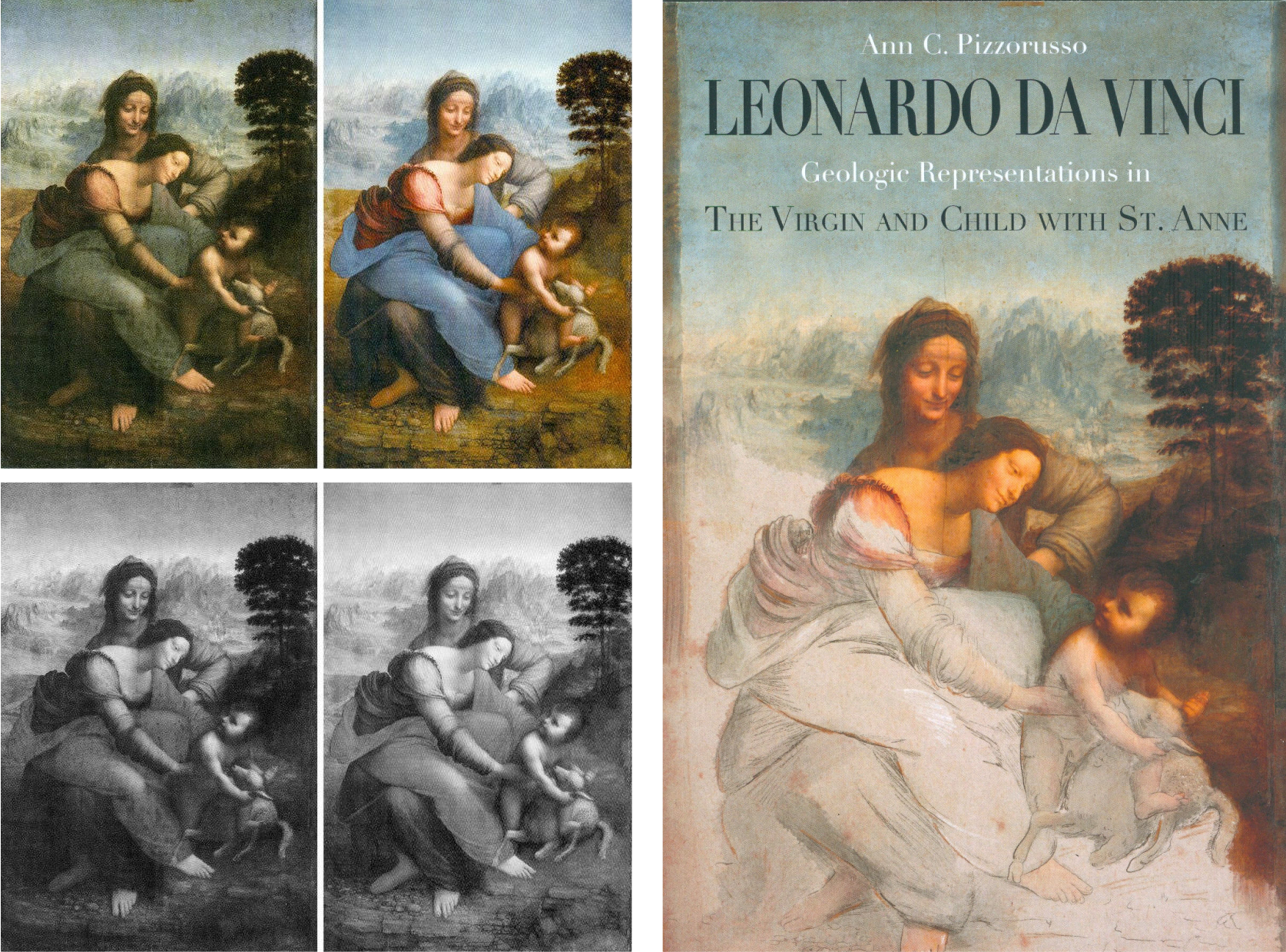
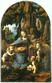
Above, Fig. 1: Left, Leonardo’s The Virgin and Child with St. Anne as seen before after its recent controversial cleaning at the Louvre; right, Ann Pizzorusso’s latest book – Cover design: Francesco Filippini.
This volume is slim because its material is handled with deft and engaging concision. Whether a bright child, a lay adult, or a professional art historian, the reader will enjoy and profit from this vivid journey through time and Italy – its geography; its mountains; its fauna, and, its most famous, multi-talented artist. As one Leonardo specialist puts it:
“The thrilling focus put by Ann Pizzorusso’s researches on the geology of Leonardo’s landscapes in works such as the Virgin of the Rocks and the Louvre’s The Virgin and Child with St. Anne is of foremost importance. Pizzorusso’s analyses and synthetic, clear explanations, help us better to understand Leonardo’s amazing attachment to a truthful, scientific-like, investigation into the world in which we live. Retrospectively, it also helps to see the Master at work concretely in his quest for perfection.” – Jacques Franck
(Ann Pizzorusso‘s work was cited extensively in the geology sections of Walter Isaacson’s biography of Leonardo, Leonardo da Vinci – see Fig. 5, below.)


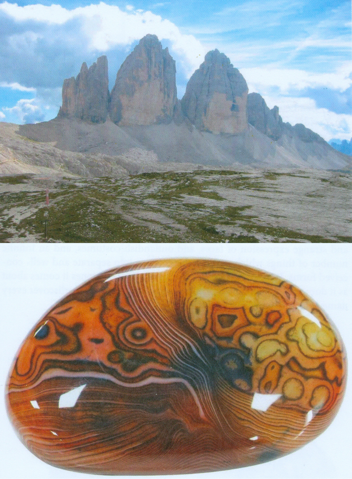
Above, Figs. 2, 3 and 4: A section of Pizzorusso’s focussed geological and botanical illustrations that run from the general to the very particular.
In current Leonardo art scholarship there are two practitioners who lay claim to direct scientific expertise. The first, Professor Martin Kemp, studied natural science at Downing College, Cambridge, with the aim of becoming a biologist but then, as he put it in his 2018 memoir Living with Leonardo, “steadily lost impetus in my studies of science” and “was drawn” into film, the visual arts and music. The second, Ann C. Pizzorusso, trained all the way through to qualifying and practicing as a geologist – but then, in the mid-1990s, “After many years of doing virtually everything in the world of geology – drilling for oil, hunting for gems, cleaning up pollution in soil and groundwater…” turned her skills towards Leonardo. Her debut article, “Leonardo’s Geology: The Authenticity of the Virgin of the Rocks” (Leonardo Magazine, Vol. 29, No, 1996, pp. 197-200 – Leonardo is a peer-reviewed academic journal published by the MIT Press) was a bomb that still reverberates.
THE TWO VIRGIN OF THE ROCKS PAINTINGS

Pizzorusso’s game-changing contention that shortcomings of scientific understanding evident in the geological and botanical descriptions in the National Gallery version of the Virgin of the Rocks were disqualifying, was well summarized and illustrated in the Guardian in 2014 (“The daffodil code: doubts revived over Leonardo’s Virgin of the Rocks in London”).
In her essay, Pizzorusso said of the National Gallery version:
“An observer with some knowledge of geology would find that the rock formations…do not correspond to nature; most of Leonardo’s drawings and paintings do. It seems unlikely that Leonardo would have violated his knowledge of geology in favour of abstract representation, considering that he executed an even more geologically complex picture – the “Virgin and St. Anne” (1510) – after he had completed the National Gallery painting.”
In so claiming, Pizzorusso lent belated technical support to Kenneth Clark, whose aesthetically appraised views on the authorship of the National Gallery’s second and later version of the Virgin of the Rocks had been carried in the 1938 book One Hundred details of Pictures in the National Gallery when Clark was the gallery’s director. His views on the picture’s (contested) authenticity were expressed as follows:
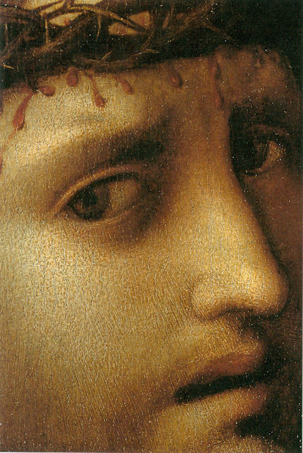
“There is no longer any doubt that the National Gallery’s Virgin of the Rocks is a second version of the subject undertaken by Leonardo some twenty years after the picture in the Louvre… It is uncertain how much of this replica he executed with his own hand, and this head of the Virgin is the most difficult part of the problem. It is too heavy and lifeless for Leonardo and the actual type is un-Leonardoesque [see Fig. 6 below, top left]; yet it seems to be painted in exactly the same technique as the angel’s head in the same picture [Fig. 6 bottom, centre]; and that is so perfect that surely Leonardo must have had a hand in it. Both show curious marks of palm and thumb (they are visible in this detail on the bridge of the Virgin’s nose) made when the paint was wet and no doubt covered by glazes long since removed [by restorers]. This perhaps is a clue to the problem. A pupil did the main work of drawing and modelling, and before his paint was dry Leonardo put in the finishing touches. Most of these have been removed from the Virgin’s face but remain in the angel’s, where perhaps they were always more numerous”
In 1990 the National Gallery republished Clark’s book with new photographs. The then director, Neil MacGregor, made two memorable comments in his foreword. The first concerned the testimony of photographs. Clark, MacGregor acknowledged, had been “fearful of what might be found if the golden veils of dirt and varnish were ever to be removed. In the years since, many have been…The reader who can compare the earlier edition with this one will decide how much is gain, how much loss.” (Emphasis added – that was the last time National Gallery staff admitted the indispensable value of photo-testimony in appraisals of restorations.) In a 1990 edition footnote, it was further conceded on the differences Clark had described between the Virgin’s and the angel’s head that: “As a result of the cleaning of the altarpiece in 1949 the differences between the heads are perhaps less apparent.” That tacit confession that such work as had recently testified to Leonardo’s partial/minimal involvement in the picture had perished in the restoration, did nothing to dissuade the gallery from further restoring the painting just eighteen years later.
Clark had seen no evidence whatsoever of Leonardo’s hand in the handling of the rocks and the plants, and Pizzorusso’s (above) charge highlights the fact that the handling of those subjects in this painting was markedly sloppier than in both Leonardo’s earlier and later outputs, as seen, respectively, in the Paris Virgin of the Rocks and the Paris Virgin and Child with St. Anne. For its part, the National Gallery perseveres with a conviction that its second (2008-9) restoration in barely more than half a century had dug sufficiently deep to uncover an entirely autograph Leonardo painting.
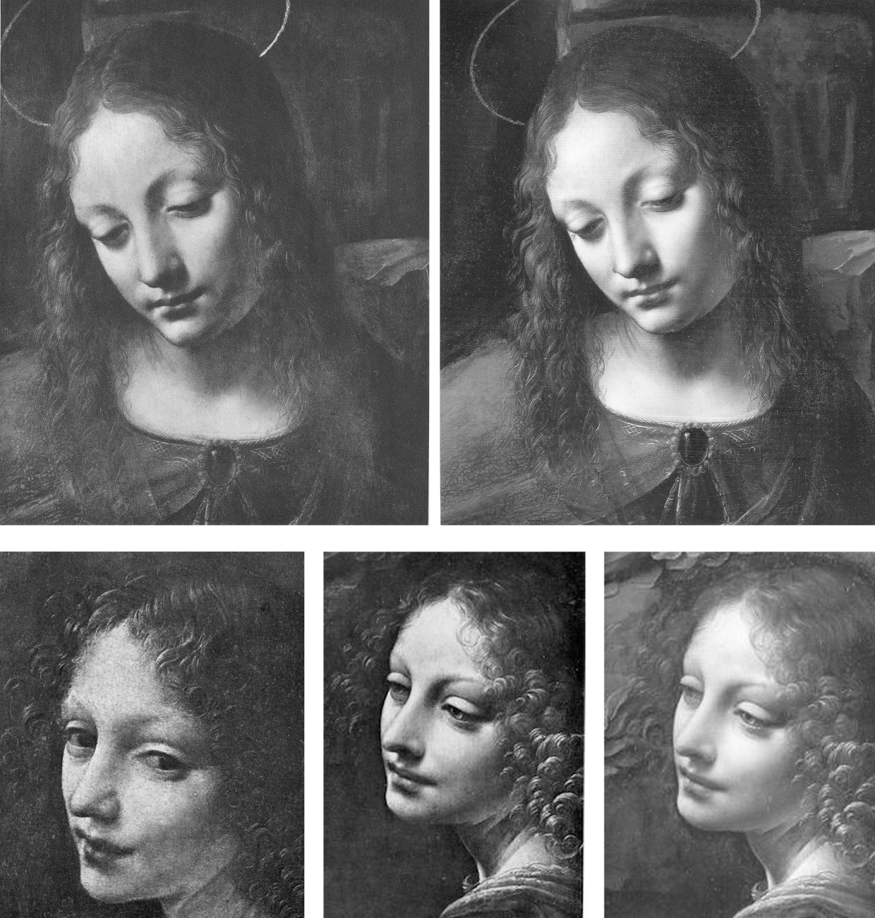
Above, Fig. 6: Top, the Virgin in the London Virgin of the Rocks as seen (left) in 1938 and (right) in 1990; above, left, the angel in Leonardo’s Virgin of the Rocks in the Louvre; centre and right, the angel in the National Gallery’s version, as seen in 1938 (centre) and (right) in 1990 and after its 1949 restoration.
MAPPING THE WORLD
In her Leonardo da Vinci cartographer and Inventor of the Google Map, Pizzorusso holds that:
“We can access any location on Earth with a simple click on our computer or cell phone. This wasn’t always the case, but it was always a desire, for man has continually sought to understand the extent of the Earth and his place on it. While this is not a treatise on the history of cartography, it will serve to show the vital importance of maps and the little known, but extraordinary accomplishments of Leonardo da Vinci as a Renaissance cartographer. Since many examples of his maps survive today, (with an extensive collection in the Royal Collection Library at Windsor Castle), we can appreciate not only his skill, but the instruments he invented to achieve nearly perfect accuracy in his measurements. He melded his knowledge of geology, engineering, surveying, hydrology, and of course art to revolutionize cartography. We can see his innovations on every map we use today and can even name him the inventor of the Google Map.”
A NOTORIOUSLY PRECARIOUS GROUPING
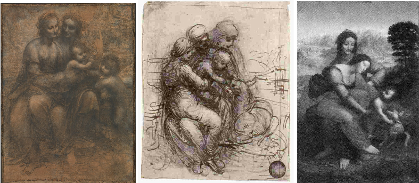
Above, Fig. 7: Left, Leonardo’s The Virgin and Child with St Anne drawing (the Burlington House Cartoon); centre, Leonardo’s (Venice – Gallerie dell’Accademia) study for The Virgin and Child with St Anne,;right, the Louvre’s Virgin and Child with St Anne before its recent restoration – see Pizzorusso’s 12 June 2012 “Could the Louvre’s ‘Virgin and St. Anne’ provide the proof that the (London) National Gallery’s ‘Virgin of the Rocks’ is not by Leonardo da Vinci?
In her latest book, Leonardo da Vinci – Geologic Representations in The Virgin and Child with St. Anne, Pizzorusso presses an appreciation of Leonardo’s understanding of geology and botany into an examination of the vexing figural complexities of Leonardo’s Virgin and St. Anne:
“In discussing the figure of the Virgin, Carlo Pedretti states that ‘Critics have often wondered why Leonardo should have abandoned the most satisfactory Classical sense of balance achieved in the London Burlington House Cartoon in favour of a pose that has always been taken as conveying a sense of uneasiness’. Bernard Berenson summarized his dismay with Leonardo’s treatment of St Anne as follows; ‘Seated on no visible or inferable support, she (St. Anne) in turn on her left knee sustained the restless weight of a daughter as heavy as herself.’”
And the resolution of the conundrum? It begins: “Had Berenson known his geology, he would have seen that…” The that is for the reader to discover.
The book is available worldwide, both in Kindle ebook form and in Paperback at Amazon UK and Amazon US Pizzorusso’s website is: Ann Pizzorusso – annpizzorusso.com .
Michael Daley, 12 May 2021
Art’s Toxic Assets and a Crisis of Connoisseurship
“Buy land”, Mark Twain advised, “they’re not making it anymore”. This logic ought to apply to the old masters but does not. Land makes sound investment not only because of its scarcity and its potential for development but because, in law-abiding societies, it comes fixed with legally defendable boundaries. Karl Marx, plundering English classical economists, held that all value is unlocked by human labour – but all labour does not generate equal values. In given periods and places all painters work pretty much with the same materials but their artistic transformations of those materials are various and unequal in accomplishment and merit. Such differences drive reputations and hence the market value of artists’ works but they do so in ways that are intrinsically problematic.
Artists’ reputations may or may not endure. With many surviving works the identities of authors are either not securely established or entirely unknown. In such cases paintings are appraised and then attributed to particular artists or schools. Attributions, however, are neither guaranteed nor immutable. They are made on mixtures of professional judgement, artistic appraisal, art critical conjecture and, sometimes, wishful thinking or deceiving intent. They remain open to revision, challenge, manipulation or abuse. The experts who make attributions exist in professional rivalry with one another (sometimes with vehemence) and while their disagreements are signs of art critical health, a consequence is that legal guarantees for attributions are untenable and non-existent, as some buyers later discover to their costs. Buyers are advised in the small print to beware and to proceed on their own judgement. With art, as we recently pointed out (see Endnote 1) it can be safer to buy a second-hand car than an old master painting (- and few people would dream of buying a house without legal searches and a structural survey.)
“Scientific” red herrings
In recent years attempts have been made to impart quasi-legal assurances to attributions by appealing to the authority of supposedly “scientifically verifiable” technical proofs. The exercise is vain and, technically, philistine: by its very nature, art is not reducible to scientifically quantifiable component parts. The technical evidence cult reflects a collapse of confidence in powers of connoisseurship on the one hand and a grab for cultural and institutional power by technocrats and bureaucrats on the other. The new hybrid discipline “Technical Art History” in which restorers, conservation scientists and curators pool expertises in attempt to arrive at professionally impregnable positions, has proved pernicious. Art-politically, this united front seeks to neutralise all charges of art critical and methodological failure with professional mystification and displacement activities – by fostering a “closed-shop” mentality and claiming that its mysteries are beyond the reach of any outsiders [2]. The new technocrats insufficiently appreciate that paintings are no more and no less than the products of artists who, working by brain, eye and hand, fix values and the relationships between values so as to produce specific and unique artistic effects that can be comprehended by others using eyes and minds in response. In the visual arts the visual should remain paramount – what you see is what it is about. Art loving viewers and professional art experts alike might be said to have duties of appropriate response to art itself and not to its shadows and encumbrances. It is the optically perceived quality of artists’ artefacts that drives reputations and market values. Understanding art is not the same thing as poking and poring over the component parts of its fabric – let alone presuming, as “restorers” (or now, “conservators”) perpetually do, to undo and redo its features at regular intervals. What matters is what you see, not what might be said or thought to lie under the surface.
Managing lapses of connoisseurship
This is not, of course, to say that technical examinations can serve no purposes. Rather, it is to say that in matters of art attribution and appreciation technical examinations of the physical composition of works might supplement informed visual appraisals but they cannot stand in lieu of them. Nor can the supposedly disinterested and neutral character of technical examinations themselves be taken at face value. In practice, with every technical investigation and its resulting “findings”, someone, some institution, some interest group, has commissioned/conducted the exercise and controlled its dissemination. Paintings in powerful institutionally-protected locations (particularly major museum) can be afforded dispensations from otherwise injurious findings [2]. It sometimes seems that just as banks are now too big to be allowed to fail, so big museum attributions cannot be allowed to fall, whatever evidence and arguments accumulate against them [3], for fear of undermining public, political and art market confidence.
Follow the money and look at the drawings
Concerning the frequency of art world upgrades, it would seem easier to grow old master drawings than paintings. Where only 250 sheets of drawings were attributed to Michelangelo in the 1960s, today that oeuvre has been expanded to over 600 sheets. Although drawings do not command the high prices of paintings they can greatly assist their attributions. In the late 1920s a firm of antiquarian dealers in Holland, R.W.P. de Vries of Amsterdam, sold a number of old master drawings some of which have ended in museums, and two of which concern us here (Figs. 1 and 2). Neither of these had a provenance (i.e. a proven history of previous ownership). Both had simply materialised in the dealers’ hands with old master attributions. The first sold in 1927 for 26 florins (guilders), some € 235.80 at today’s values. The second sold two years later for 750 florins, some €6,801.91 today. The first was attributed to van Dyck, the second to Veronese. Neither attribution survived and the original perplexing ratio of value between them (which approached thirty to one) has reversed dramatically.
The Veronese attribution crashed in 1984 when Richard Cocke published his catalogue raisonné Veronese’s Drawings and dismissed the drawing with the single (apt) sentence: “The heavy forceful cross-hatching in the drapery and the forms of the head and hands have nothing to do with Veronese.” That drawing sold in 1991 at Christie’s for £7,000 as “attributed to Agostino Carracci”. In contrast, the former van Dyck drawing morphed into the work that sold at Christie’s on July 10th as an autograph Rubens ink sketch for a world record Rubens drawing price of £3,218,500. The former “van Dyck” has thus enjoyed a 14,000-fold increase of value since 1927.
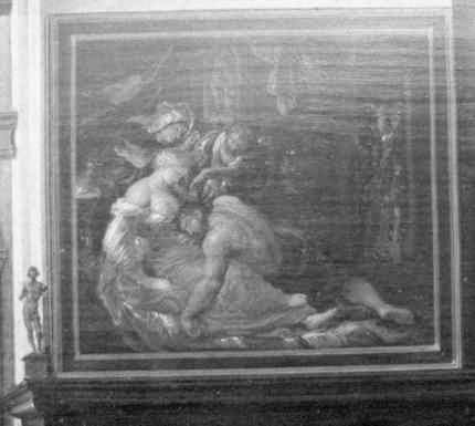
The extraordinary success of the van Dyck that is now a Rubens was due only in part to Christie’s masterful promotion. It was very much on the strength of its current art-historical position that the drawing was drum-rolled as the starred lot in a sale of part of the prestigious I. Q. van Regteren Altena drawings collection. Most helpfully of all, the drawing was precisely characterised as Rubens’s “first thought” preparatory ink sketch for the National Gallery’s Samson and Delilah painting (Fig. 4). Notwithstanding its anomalous traits (see our previous post), its artistic shortcomings and its dubious provenance, the drawing remains bolstered by its crucial allotted role in a sequence of three Samson and Delilahs, two of which have been acquired by museums (Figs. 3 & 4). Although Christie’s July 10 sale realised more than twice its highest estimates and broke many records for individual artists, only one of the top ten works went to an art gallery or museum. Two were sold on to the trade. Seven, including the Samson and Delilah drawing, went to anonymous individuals.
Making four Rubens’s
Christie’s catalogue entry burnishes the drawing’s pedigree with upbeat optimism. It is said for example: “When I. Q. van Regteren Altena bought the drawing in 1927, he listed it in his inventory under its traditional attribution to Sir Anthony van Dyck (1599-1641). That attribution also accounts for an earlier owner’s inscription of the letters ‘V.D.’ in the lower left corner.” What traditional attribution? Which earlier owners? Christie’s account of the provenance begins: “with R.W.P. de Vries Amsterdam; from whom purchased by I.Q. van Regteren Altena on 20 December 1927 for 26 guilders (‘387.t. A. v. Dijck. Samson & Delilah’)”. And that is all. There had been no previous owners and no evidence exists of any “traditional” reception as a van Dyck – or anything. Any suppositions aside, all that can safely be said is that this drawing emerged from nowhere at a time when forgery was rife and the art world suffered from what Bernard Berenson [!] described as “the universal tendency to ascribe a given work of art to the greatest artist to whom wishful thinking and excited imagination can ascribe it.” (“Essays in Appreciation”, 1958, p. 95.)
Christie’s entry continues: “With the emergence of the finished painting and the connected oil sketch the drawing’s significance rapidly became apparent.” There was no rapidity and the claimed significance is mythic. The supposed second stage oil sketch or modello did not appear until 1966. The claim that, “The picture of Samson and Delilah was only rediscovered in 1929”, also misleads. The painting was not “rediscovered” as a Rubens. It had never been a Rubens. When it appeared in 1929 it was, just like the ink drawing three years earlier, without provenance and it was not judged a Rubens by its German dealers, Van Diemen and Benedict, who were offering it as a Honthorst. It was later upgraded to Rubens in a certificate of authenticity by Dr Ludwig Burchard and it then sold in 1930 to August Neurburg, a German tobacco magnate.
Burchard was a leading Rubens scholar, but today his attributions have a notoriously poor record [4]. Far from the ink drawing being corroborated as a first stage sketch by the arrival of the painting, Burchard had upgraded the painting on the authority of the drawing which he had himself upgraded to Rubens in 1926. In Christie’s catalogue the drawing’s “Literature” begins with Burchard’s attribution: “L. Burchard, ‘Die Skizzen des jungen Rubens’ in Sitzungsberichte der Kunstgeschichtlichen Gesellschaft, Berlin, 8 October 1926, p. 30, no. 2.” At that date no one had previously owned or discussed the work. Burchard thus upgraded a drawing that had never been exhibited and was in a dealer’s hands without any provenance. Notwithstanding his claims on behalf of the drawing, in 1927 both the dealer selling and the collector buying still held it to be a van Dyck.
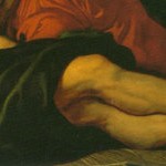
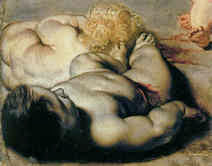
When the modello eventually appeared in 1966 it had no provenance. Its history consisted of a hearsay account (from the anonymous lady vendor) of an ancestor said to have bought the work for a few shillings in an antique shop in York during the 1930s because she liked the frame. This supposed Rubens oil sketch had been painted on a support that is found in none of the artist’s oil sketches – on a soft, conifer wood, not on his customary oak panel. Its appearance was, for a Rubens oil sketch, disturbingly close in design and effects to those of both the ink drawing and the finished painting (see Figs. 2, 3 and 4). Its arrival completed an unicum in Rubens’ oeuvre: a suite of stages of work without evidence of development. Notwithstanding that problem, the modello on the wrong wood was given to Rubens by Christie’s themselves, to join the company of a panel painting whose back, it later emerged, had disappeared in an operation for which no one acknowledged responsibility, and a drawing whose back was concealed by being pasted onto a second sheet even though it bore drawing itself. The modello sold to a London gallery for £24,000, going to a private collector before passing through Agnews to the Cincinnati Art Museum in 1972. The last of the trio to emerge, this technically problematic work-without-provenance was the first to achieve museum status. At some point, pieces of wood were removed from its sides (creating a closer compositional alignment with what is now the National Gallery painting) and, at another, the Cincinnati museum claimed the panel to be oak. Presently the wood is not identified, the work being described as on “panel”.
Why? Why? Why? Delilah?
In July 1980, the supposed third stage, the Samson and Delilah painting, was sold by Neurburg’s heirs through Christie’s to Agnews, acting on behalf of the National Gallery, for a then Rubens world record price of £2.53m. In 2002, with two parts of the Samson and Delilah trio now secure in museums and the third in a respected private collection, Sotheby’s sold a painting, The Massacre of the Innocents (see Fig. 13), as an autograph Rubens on the back of its perceived shared characteristics and collections history with the National Gallery’s Samson and Delilah for £49.5m, to Lord (Kenneth) Thompson. Even though those paintings are riddled with problems (see “Is this really a Rubens?” Michael Daley, Art Review, July/August 1997, and “Is this a Rubens?” Michael Daley, Jackdaw, October 2002), and the Samson and Delilah had been challenged for over a decade [5], the price was an outright old masters’ world record. Thompson loaned the Massacre to the National Gallery and then bequeathed it to the Art Gallery of Ontario, Toronto, thereby making it publicly available and greatly enhancing its pedigree. Thus, today, three high valued well-placed but individually problematic museum Rubens’s owe their positions to a belated acceptance of Burchard’s initial attribution of what is still a privately (but now anonymously) owned ink drawing.
Who cut Samson’s toes?
The reason why all of these subsequent Rubens upgrades rest on the authority of this ink drawing is because of a glaringly anomalous feature in the National Gallery painting – the fact that the toes of Samson’s right foot are cropped by the edge of the picture. This was not because the panel had been trimmed at some point. Rather, it is because the painting simply stops disturbingly, inexplicably, at the beginning of the toes. Thus, without the drawing’s seeming testimony that Rubens had planned to crop Samson’s toes by cropping his own initial design within a precisely drawn ruled box that anticipated (even before he had executed an oil sketch) the final format of what is now the National Gallery painting, that painting could never have been attributed to him. This is so for reasons that are implicit in Burchard’s 1930 certificate of authenticity. It read:
“The photographed painting on the other page is one of Peter Paul Rubens’ major works from the time of the master’s return from Italy. It must have been painted in 1609 or 1610. With Rubens’ agreement, Jacob Matham reproduced the painting with a copper engraving around 1615. As witnessed by the inscription of the painting, the picture at that time was in the possession of Antwerp mayor Nicolas Rockox. Indeed, the inventory of Nic. Rockox’ estate, dated 19 Dec. 1640, lists the picture as “Eene schilderne…(Annales de l’Academie d’Archaeologie de Belgique, Anvers 1881, p. 437). On pp. 143-44 in vol. I of 1886, the five-volume catalogue of Rubens’ work by Max Rooses, the painting is described in detail as number 115, based on the Matham engraving and mentioning the Rockox inventory. The picture itself remained as unknown to Rooses as to all literature since. It is further notable that a picture of an interior by Frans Francken (Pinakothek Munchen No 720), which appeared to be of mayor Rockox’s living room, showing the painting in pride of place above the mantelpiece, while in an adjoining room is the picture of the “Doubting Thomas” which we know Rubens painted for Rockox. According to S. Hartveld of Antwerp, the room with the mantelpiece exists even today in the Kaiserstraat in Antwerp where Frau Gruter-Van der Linden now lives in the Rockox house. A sketch for the Samson picture (pen, varnished, 16.4 x 16.2) is in Amsterdam in the collection of Mr J.Q. Regteren, Altena. The picture is in a remarkably good state of preservation, with even the back of the panel in its original condition.” [By courtesy of the National Gallery Archives Department.]
Note, even as Burchard asserts that this is the original painting of the subject that Rubens is known to have made shortly after 1608, he acknowledges that the original painting itself had universally been understood to have been lost since 1641. (To this day, despite detailed and sustained searches, nothing connects the present version to the original painting.) Crucially, Burchard also acknowledges that the appearance of the original Samson and Delilah had been recorded in two contemporary copies, one of which had been supervised by Rubens. Both of these copies by two artists who likely worked decades apart, testify that Samson’s original right foot had not been (improbably) cropped at the toes, as in the National Gallery version, but had originally been painted intact and set comfortably inside the composition and consistently with the artist’s known manner. See, for example, the almost contemporary, probably pendant (and near mirror-image compositional group) Cimon and Pero – “Roman Charity”, at Fig. 9.
A perplexing silence
It was in defiance of such hard historical testimony that Burchard claimed his own upgraded ink drawing to be not only by Rubens but, specifically, to be his preliminary sketch for the former Honthorst painting that is now in the National Gallery. When attributing that painting to Rubens Burchard executed a sleight of hand by implying but not stating that the ink drawing (which had only recently been sold as a van Dyck) was by Rubens. The truth is this ink drawing-from-nowhere and without-history had needed to exist if the Berlin Honthorst were to be presented remotely credibly as a Rubens. Had Burchard sincerely believed that the cropped-foot drawing was Rubens’ original ink sketch, he would have felt himself the agent of a remarkable double art historical coup: first, for having identified a famous masterpiece that had been lost for 289 years; second, for having further established that both of the contemporary copies of that original Rubens’ painting (through which it had been known for centuries), had been compositionally misleading in identical manners.
Conspicuously, Burchard trumpeted neither of these “discoveries” [6]. His diffidence contrasts markedly with the reaction of the day’s leading Vermeer scholar, Dr. Abraham Bredius, who believed in 1937 that he had found an unknown Vermeer (in what was the first of a stream of Han van Meegeren fakes). Firstly, Bredius’ certificate of authenticity was ecstatically and unreservedly fulsome: “…I found it hard to contain my emotions when this masterpiece was first shown to me and many will feel the same who have the privilege of beholding it. Composition, expression, colour – all combine to an unity of the highest art, the highest beauty”. Secondly, he rushed news of his discovery onto the scholarly record via the Burlington Magazine (“A New Vermeer”, November 1937).
If Bredius betrayed credulousness as an eighty-two year old scholar, what of Burchard’s manoeuvres as a forty-four year old at the peak of his powers? It can only be said that suspicions are in order. When, shortly after the First World War, the great German scholar, Wilhelm von Bode, was reproached for having certificated an implausible Petrus Christus, he replied, “You don’t understand the intricacies of the German language. After a brief description of the subject I say ‘I have never seen a Petrus Christus like this!'” (- “The Partnership”, Colin Simpson, 1987, p. 240). One must suspect that Burchard’s twinned and circular Rubens attributions were made sotto voce out of fear that his “attributional” heist might be exposed by anyone with an alert eye who appreciated that it is surprisingly common for later copies of original works to be cruder compositionally cut-down and abridged versions – and who would, therefore, recognise the “Honthorst” as a prime member of that type.
We have found that not only are such insensitively truncated pictures frequently encountered (in Rubens twice-over with the Samson and Delilah and the Ontario Massacre, and in artists like Leonardo, Raphael, Caravaggio and Annibale Carracci – see opposite) but, also, that with a little effort they can in almost every instance be shown to post-date the superior models and prototypes from which they derive. As shown opposite, in copyists’ hands, no part of an original composition can be considered sacrosanct. As well as toes, dogs’ noses and cupids’ wings, even portions of dead infants have been cropped to fit pre-existing images to new supports and formats. Mistaking a copy for an absent original is one thing. Disregarding clear and contrary historical evidence, as Burchard would seem to have done, is another altogether. Knowingly elevating adulterated versions to a master’s oeuvre pollutes the well of scholarship and ultimately threatens the credibility of the field.
Such lapses of critical judgement are as common in appraisals of restorations as they are in the making of attributions. How much or little of an original surface has survived the vicissitudes of time and “conservators” attentions might seem a lesser matter but it is not. Professional art critical failures to spot the tell-tale differences between autograph and studio works are the twins of failures to recognise restoration-induced injuries. The differences of states within individual works can be as pronounced as the differences between autograph and studio works (see Figs. 28a, 28b, 29 and 30). Failures of judgement in both areas are frequently found in even the most high-ranking individual scholars.
Making two Caravaggios in one decade
Within little more than a decade the late Sir Denis Mahon upgraded two pictures to autograph Caravaggio status. This might seem unremarkable given that Mahon was a prolific finder/maker of old masters. What is remarkable is that he did so with two versions (of more than a dozen) of the same painting – Caravaggio’s The Taking of Christ. This Caravaggio survives in two formats, one being a truncated version of the other. Mahon managed to endorse one version of each type, doing so in the wake of two “investigative” restorations in which each team claimed revealed authenticity on the basis of its own “discoveries”. (Mahon had serious form in the double attributions stakes – we discuss opposite a painting of Annibale Carracci where he authenticated one version and later suavely switched to another, less abridged, picture. See Figs. 25-30.)
During the first restoration in 1993 in Dublin, a long-attributed Honthorst copy was found to have been made largely without revisions and it was declared the original autograph Caravaggio by Mahon precisely by virtue of its revisions-light painterly fluency. This version was of the truncated type. In Rome in 2004 Mahon conferred autograph Caravaggio status on a work from Florence (where acquired from the Sannini family) that was found to have been made with many and major revisions taken to be “serious afterthoughts as was Caravaggio’s wont”. This version was composed in the larger format and Mahon reportedly said he had “no doubt that this was now the original work”. Dublin was not best pleased and Mahon promptly rowed his position back and claimed that both versions were now original but that one was rather more so than the other. (See “New twist in the tale of two Caravaggios”, Daily Telegraph, 17 February 2004; “A dangerous business”, Michael Daley, letter, Daily Telegraph, 19 February 2004; and, “The real Caravaggio is . . . both of them” Daily Telegraph, 20 February 2004.)
Like the two R.W.P. de Vries of Amsterdam drawings, the two “autograph” Mahon Caravaggios have enjoyed unequal fortunes. In 1993 the (revisions-light) Dublin Caravaggio was loaned to the National Gallery in London and then, permanently, to the National Gallery in Dublin. The later 2004 Florence/Rome Caravaggio with numerous major revisions and other “cast iron” technical proofs enjoyed no institutional protection, being still in private hands. Its cause seems to have fallen into abeyance following legal disputes over ownership. In 2005 the initial 1993 “discovery” of the now institutionally protected Dublin Caravaggio (Mahon enjoyed a long-standing relationship with the National Gallery in London, as a trustee and as a generous benefactor-in-waiting) became the subject of an illuminating, if somewhat parti pris book, “The Lost Painting”, by Jonathan Harr.
In an epilogue, Harr has described a falling-out over the ownership of the Florence/Rome version. Technical examinations of the painting were ordered by court prosecutors without the knowledge of the owners. They were carried out by Maurizio Seracini, a leading private technical diagnostician who has examined something like half of Caravaggio’s output. The pigment Naples Yellow, which contains the metal antinomy, was found. Because that pigment is presently said not to have been used on paintings before 1630 (or “from around 1620”, according to Wikipedia), and therefore twenty years after Caravaggio’s death in 1610, Seracini held the painting inauthentic. Harr accepts the force of this technical testimony and, concluding that Mahon had demonstrably blundered in his support for the Rome/Florence painting, imagines that that old scholar’s long-time adversary, Roberto Longhi, might now be enjoying “a mirthless laugh” over Mahon’s discomfiture. The conclusion was hasty and perhaps too trusting of technical testimony.
It is certainly the case that the presence of a modern, manufactured pigment within the fabric of a supposedly old painting can safely be considered fatal to an attribution. However, Naples Yellow is not a product of a known and precisely dated modern manufacture – such as Prussian Blue of 1704 – it is ancient and greatly pre-dates Christ. Harr acknowledges that the pigment is found on a painting of 1615 by Orazio Gentileschi – just five years after Caravaggio’s death. Harr further reports that traces of this pigment had been found on another Caravaggio, his Martydom of St Ursula, which is owned by Banca Intesta in the Palazzo Zevallos, Naples. He reports a suggestion that the offending material might have come from an 18th century restoration that had subsequently been removed. Such hypothetical exculpation would only be necessary if claims that Naples Yellow could not have been used by anyone before 1630 were Gospel and if the painting’s attribution was insecure. Neither is the case. The Martyrdom is one of Caravaggio’s most reliably and completely documented works so there can be no question about its authenticity. Further, it was almost certainly his last work. It was recorded as still being wet in May 1610. If this painting contains antimony, and unless evidence exists to support the former existence of a now entirely disappeared 18th century restoration, we should accept that this material has now been found in two Caravaggio paintings and adjust the technical literature chronologies accordingly.
In this episode, we see that negative hard “scientific evidence” can be discounted on the basis of assumptions, hunches, and suspicions. We also see that the claimed chronologies of materials within the literature of technical analysis are moveable and, only ever, provisional feasts. (For such chronologies to be considered reliable it would be necessary for every painting in the world to be analysed at the same time by the most advanced technologies – and even then, subsequent technical advances would require further examinations: it is common for old formerly “advanced” tests to be re-run in conservation departments when new and improved apparatus become available.) We have asked Seracini, in the light of Harr’s comments, if “it is still the case that the presence of antimony is considered an absolute technical disqualification in paintings made before 1630?” Meanwhile, Jacques Franck, the Consulting Expert to The Armand Hammer Center for Leonardo Studies at The University of California, Los Angeles, advises that:
“The best scientific bibliographic reference concerning the history and chemistry of pigments over here is: J. Petit, J. Roire, H. Valot, “Des liants et des couleurs pour servir aux artistes peintres et aux restaurateurs”, EREC éditeur, Puteaux, 1995. Regarding Naples yellow, it says: ‘(Lead antimonate yellow) was rediscovered in Europe at the end of the Middle-Ages and was later mentioned in a document dating from 1540, “Pirotechnia”. The oldest recipes, written in 1556-1559, were supplied by Cipriano Piccolpaso…who was a painter of ceramics”
Although those recipes were indeed written primarily in connection with ceramics, given that they existed before Caravaggio’s birth (1571) it should never have been insisted that knowledge of them could not have been obtained by contemporary painters. As it happens, a study on Lorenzo Lotto’s pigments was made in connection with the exhibition “Lorenzo Lotto” (Venezia, 1480 – Loreto, 1556-57) at the Scuderie del Quirinale in Rome in spring 2011. On that occasion, more than fifty Lotto paintings spanning from 1505 to around 1556 were studied using non-invasive techniques by Maria Letizia Amadori, Pietro Baraldi, Sara Barcelli and Gianluca Poldi. The authors’ report (pages 2 and 19):
“About yellows, he uses both lead-tin and lead-antimony (Naples yellow) pigments, the latter found by XRF, in works starting from 1530 to the last years: it can be related to the ‘zalolin da vasarj’ cited by Lotto in 1541 in his account book (Libro di spese diverse)”, and, “As XRF analyses show, in some works, starting from 1530 to the last years of the century, also lead-antimony (Naples yellow) pigments, can be found, together with the previous yellow or almost alone: they can be related to the “zalolin da vasarj” cited by Lotto in 1541 in his account book (Libro di spese diverse).”
Thus, the presence of antimony would seem not to have given grounds for dismissing the Florence/Rome version of the Taking in the courts. Perhaps we can see that it might have been more to the point for the courts to require the production of the best possible photographs of as many of the versions as possible to permit visual comparisons of the two rival versions. There are many indications of the limitations of modern conservation practices to be had in Harr’s fascinating account. On page 169 he describes an encounter between the Dublin National Gallery of Art’s two picture restorers, Andrew O’Connor and Sergio Benedetti (who had re-attributed the Hontorst Taking to Caravaggio, and who had experienced “a fleeting moment of doubt” about his attribution while cutting ever larger ‘windows’ through the painting’s varnish):
“One day, about three weeks after the painting’s arrival, O’Connor and Benedetti crossed paths in the studio. Benedetti was staring at the painting. He stood with his arms crossed, his eyes narrowed in concentration, his mouth compressed into a frown. ‘Look at the arm of Judas’, Benedetti said to O’Connor. ‘What do you think?’ O’Connor studied the painting. ‘What are you getting at?’ he asked. ‘It seems too short, doesn’t it?’ said Benedetti. It did…O’Connor realised that Benedetti was wrestling with his doubts. ‘Well’, said Benedetti finally, ‘he wasn’t a perfect anatomist. He made other errors like this. In the Supper at Emmaus, the apostle’s hand is too large.’”
In this recollection we might be witness to a double failure of art critical methodology. Given his doubts, Benedetti might have assembled all available photographs of the many versions of this painting to determine whether or not the short-coming that concerned him was unique or common to (some or all) other versions. A greater lapse may be evident in the fact that while Benedetti expressed anxiety over the arm of Judas, he seems not to have done so over the compositionally and emotionally more important advancing left arm of the fleeing St John who is seen behind Christ and Judas. In the Dublin version, the arm of St John is cropped above the elbow and not above the wrist as it is in the Florence/Rome version. (On the compositional function of the arm in the Florence/Rome version, see comments at Figs. 21 and 22.)
To repeat what should be self-evident: pictures are made to be looked at. When, as with this Caravaggio, multiple versions exist we should make hard detailed visual comparisons of each against the others, if necessary (and it could hardly be otherwise when so many versions exist) by photographic means. When later copies or engravings exist we should make careful comparative estimations of their relationships to the various contenders. Whenever there are cut-down versions of more expansive compositions, we should always consider which state is likelier to have been the primary and which the secondary one. Visual comparisons in attributions, as in restorations, are of the essence. They should never be neglected, let alone discounted, on the authority of some technical evidence that may or may not be soundly framed; that may or may not be selective or loaded in its presentation; and, that will, in any event, soon be rendered obsolete by more up-to-date equipment. The informed human eye is our best “diagnostic tool” in the study of art and will remain so no matter how much money and resources might be thrown into technical studies. It remains the greatest tragedy that Bernard Berenson so badly debased his own critical currency with his shady Duveen dealings. On the primacy of the visual in visual art forms he was peerless:
“I am here concerned with names in painting. When I pronounce the words Giotto, Michelangelo, Leonardo, Giorgione, Durer, Velazquez, Vermeer, Ingres, Manet, Degas and hundreds of others, each stands for certain qualities which I expect to find in a painting ascribed to them. If the expectation fails, then no argument, no documentary evidence, be it biographical, historical, psycho-analytical, or radiological and chemical will persuade me.”
That was and is how it should be.
Michael Daley
ENDNOTES:
1 The Times, letter, 13 August 2014:
“Sir, Gerald Fitzgerald (letter, Aug 12), misses an important point when calling for a tiny levy on art sales to fund an independent centre for provenance research. Although such a levy might cost only .05 per cent of annual art sales, currently standing at some $60 billion, if effective, such a centre would reduce the supply of works on the market by something like 40 per cent – at least in the view of the late Thomas Hoving, a former director of the Metropolitan Museum of Art, New York. The art world is very quick on its feet: when calls were made in the 1930s for an independent centre of art restoration research, then director of the National Gallery in London, Kenneth Clark, promptly established a department of conservation science in order, as he later confessed, to ‘have in the background what purported to be scientific evidence to “prove” that every precaution had been taken’. Although self-policing may be an unrealistic ambition, governments could help considerably and at little cost by making it a statutory requirement that vendors should disclose all that is known and recorded about the provenance and the restoration treatments of works of art. As things stand, it can be safer to buy a second-hand car than an old master painting.”
Michael Daley, Director, ArtWatch UK, London
2 The Massacre of the Innocents which came up at Sotheby’s on 10 July 2002 as a very recent Rubens upgrade is a case in point of misleading assurances and over-ridden technical evidence. In a long sale catalogue entry it was said that technical analyses and condition reports had been commissioned and that these were available on request. The implication was clear: we have exercised all possible due diligence and this painting has emerged with flying colours. That implicit reassurance evaporated on a close reading of the material – as we reported in the October 2002 Jackdaw (“Is this £49.5 million painting by Rubens?”). The reports were, by their nature dense and couched in technical language. Nonetheless they clearly contained information that was highly injurious to the attribution and to the picture’s claimed early dating of c. 1609-11. One technical fact alone should have sunk the attribution. It was found in the last paragraph of the last report. As we put it: “The author of a report on the tree-ring dating…concludes that a date of execution for the picture only becomes ‘plausible from 1615 upwards’.” In other words, the panel on which this picture was painted could not have been manufactured at the time the picture is said to have been painted – and this dating could not be amended because, like the Samson and Delilah, the picture was only remotely credible on stylistic grounds if seen as the product of a (fancifully claimed) brief stylistic abberation in Rubens’ oeuvre said to have occurred on his immediate return from Italy in 1608. As well as being on wood that was too recent, the picture contained the wrong materials: “A pigment, orpiment, that is found in no Rubens is present here. A second pigment, smalt, said to have been in use ‘mainly in the mid-seventeenth century’ and which seems only to be found in Rubens’ later works is also present. The orpiment yellow is anomalous not only in its presence but in its manner of application – it is mixed with lead-tin yellow. Such a combination is said to be ‘unusual since it was considered unstable’ and, even, to be a practice ‘not encountered in 17th century works’”. This was not just a twice-over dead attribution: “Speaking of Rubens’ debt to classical sources, the anonymous author of the catalogue entry correctly concedes, ‘one of the background figures appears to derive from the Borghese Gladiator’. There follows immediate self-disavowal: ‘it cannot’ so derive, he/she contends, because ‘though famous in subsequent centuries, the Borghese Gladiator was not excavated until late in 1611”. This painting on the wrong (too recent) wood, with what would normally be considered disqualifying (out of period)materials, and which contained a miraculous allusion to a future event, was presented to the world as a major art historical discovery. That “discovery” had taken place very shortly before the sale. The upgrading of this centuries old studio work had been made by just five experts only three of whom were identified. We put the question: “Can it be right that we are all being asked to share this leap of faith when the experts, displaying a seeming ignorance of – or disregard for – so much germane material evidence, have yet to declare their hands or publish accounts of their vital endorsements?”
3 Jonathan Harr reports in his 2005 account of the upgrading of a Honthorst to Caravaggio (“The Lost Painting” p. 222) that when the picture, The Taking of Christ, was examined at the National Gallery in London it was found that its ground (priming layer) was anomalous: Ashok Roy, the head of science, observed, as Harr reports, that “the composition of this particular ground was strange – ‘bizarre’ was the word used. It contained reds and yellows and large grains of green earth, a pigment composed of iron and magnesium. Grounds usually contained lead-based pigments and calcium, which dry quickly. Green earth dries slowly. This primer looked to Roy like a ‘palette-scraping’ ground – the painter had simply recycled leftover paints from his palette board to make the priming layer.” Well, yes, someone evidently had – but what in Roy’s detailed technical analysis of the ground might have suggested that on this occasion Caravaggio had departed from his own habits in order to do so? When the painting was exhibited in a special exhibition (“Caravaggio ~ The Master Revealed”) at the National Gallery of Ireland in 1993, the catalogue gave a different spin to Roy’s research: “Analyses have shown that the ground is composed of a brown pigment, heterogeneous and unevenly applied. Several pigments were mixed with it: lead white, red and yellow ochre, umber and large granuli of green earth.” On a casual reading: impressive and reassuring technical detail and expertise. No mention of bizarreness. No acknowledgement of what was for Dr. Roy, a perplexing departure from Caravaggio’s known practices. On page 160 Harr reports that Sergio Benedetti (the Dublin National Gallery of Art restorer who first made the attribution)“saw immediately that the painting had been relined at least once before” and judged the present lining canvas to be at least a hundred years old. In the National Gallery catalogue Benedetti reported that “the picture has undergone at least three interventions, probably accompanied each time by a relining of the canvas. One of these linings caused a shrinking of the surface in some limited areas.” What is not said is that Benedetti two of the three-plus hypothecated linings had been made by Benedetti himself the first having caused cracking. Harr reports that after the first lining “There is much dispute about what happened next. For Benedetti, restoring the Taking of Christ was the greatest moment in his professional career, and to this day he adamantly denies that he had any problem relining the painting. O’Connor and others at the gallery, however, tell a very different story. According to them, he came close to ruining the painting.” Andrew O’Connor, the Gallery’s chief restorer, said that Benedetti had elected to use a densely-woven Irish canvas rather than wait for an appropriately matching loose-weave canvas to arrive from Italy. When Michael O’Olohan, the gallery’s photographer, who had made detailed photographic records of every inch of the picture’s surface, saw the painting immediately after its first relining, he could not believe his eyes and recalled “There were areas that had hairline cracks, like a sheet of ice that has started to melt, a flash of cracks all over it. I was shocked. I couldn’t believe it.” O’Connor explained that because the Irish canvas was densely woven, “it did not absorb the [water-based] glue at the same rate as the old Italian canvas. It had not dried properly and had contracted, pulling with it the Italian canvas and raising ridges, small corrugations, in the paint surface. Along these corrugations, the paint layer had cracked and lifted.”
4 In the ArtWatch UK Journal No. 21, (“The ‘Samson and Delilah’ ~ a question of attribution”), Kasia Pisarek wrote: “Dr. Ludwig Burchard was an active Rubens attributionist in Berlin before the Second World War and in London afterwards. Several paintings formerly attributed to Rubens’s school or studio or even to another artist (such as Sampson and Delilah), were reinstated by Burchard as by the master. I traced many of his attributions – he was not infallible in his judgement and changed his mind. Surprisingly, over 60 pictures attributed by Burchard to Rubens were later down-graded (in Corpus Rubenianum) to studio works, copies or imitations.”
5 The principal challenges to the attribution came from two artist/scholars, Euphrosyne Doxiadis, author of the award-winning 1995 book “The Mysterious Fayum Portraits: Faces from Ancient Egypt”, and Kasia Pisarek whose 2009 doctorate dissertation was entitled “Rubens and Connoisseurship ~ On the problems of attribution and rediscovery in the British and American collections (late XIX – XX c.)”. In 1986 Euphrosyne Doxiadis began researching the painting’s credentials with fellow art students Steven Harvey and Siân Hopkinson. Their findings were compiled in a report submitted to the National Gallery in 1992 and which is now held in the painting’s dossiers. (It is also available online at this site: www.afterrubens.org.) Their challenges to the attribution were covered in reports in the Times (“Artists raise fresh doubts on gallery’s Rubens masterpiece”, 22 September 1996, and “Expert denounces National Gallery’s Rubens”, 25 November 1996), and in The Independent on Sunday (“Tell-tale sign that £40m Rubens could be a copy”, 21 May 2000). Researches begun in 1990 by Kasia Pisarek prompted two articles on 5 October 1997 by the Sunday Times’ art critic, Waldemar Januszczak (“A Rubens or a costly copy?” and “National’s £40m Rubens could be fake”). In the latter article, the then director of the National Gallery, Neil MacGregor, conceded that “the scholar raises some serious questions that I cannot easily answer”.
6 As Dr. Pisarek put it in the ArtWatch UK Journal 21 (“The ‘Samson and Delilah’ ~ a question of attribution”): “Both the rediscovery and the sale of this early Rubens masterpiece should have been well publicised in the press, yet there are no records of it in any art magazine (I checked most art journals published in 1929-30). However, other, even minor, Rubens discoveries could easily be traced (‘Forgotten Rubens found in Austria’ – Art News, 1930; ‘Van Diemen sells notable Rubens’ – Art News, 1931 etc.) Strangely, the Samson and Delilah was not even included in Valentiner’s ‘Unknown Masterpieces’, co-edited with Burchard, and published in 1930, which presented important little-known and rediscovered paintings. Dr. Burchard only wrote about it briefly in 1933, and only in a short note.”
Comments may be left at: artwatch.uk@gmail.com


![]()
The National Gallery’s £1.5 billion Leonardo Restoration

Two decades after recognising that art restoration “discoveries” and “revelations” had become very big business, we encounter a blockbuster exhibition that required a Government indemnity of £1.5 billion and was specifically launched as a vehicle to celebrate a restoration that had yet to take place: “We started thinking about this five years ago, when we were beginning to plan the restoration of ‘The Virgin of the Rocks’, so an exhibition to celebrate that project seemed like the right thing to do.” So said Luke Syson, the curator of the National Gallery’s “Leonardo da Vinci: Painter of the Court of Milan” exhibition, in a BBC interview.
Museum restorations never take place in vacuums. If you build an exhibition on the proposed restoration of a very famous artist’s work you set certain narrative expectations in motion; create pressures and hopes of big, dramatic results. When the “Virgin of the Rocks” was put back on display after its restoration – and pronounced an entirely autograph Leonardo, even though the restorer had not removed all of his predecessor’s varnish – I was pleased to discuss the then forthcoming Leonardo exhibition with Luke Syson who said that its scholarly focus would be an analysis of the influence that a new type of Leonardo painting had had on his followers. Namely, that during the 15 or so years long gestation of the National Gallery’s version of the “Virgin of the Rocks” which was delivered unfinished in 1508, and the contemporaneous (1492-98) “Last Supper” in Milan, Leonardo’s painting style had become distinctly abstracted, less naturalistic and more metaphysical in character. When I expressed scepticism that this thesis might rest secure on two such different works as the “Virgin of the Rocks”, with its uncertain condition and status (the Gallery admits the picture is “manifestly uneven in finish and execution” and that there has been “a good deal of agreement that Leonardo himself painted little or none of it”), and the degraded, fragmented, many-times restored “Last Supper”, Syson disclosed that the Royal Academy’s full-size copy of the latter by Giampietrino was being borrowed. At this, I asked if the Gallery’s own Giampietrino “Christ carrying his Cross” (which had recently been relegated to the reserve collection – on Syson’s instruction, I learned) would also be included in the exhibition. It would not. This was disappointing – and a lost opportunity to right an ancient wrong.
The “Christ carrying his Cross” had been discussed by Larry Keith, the Gallery’s new head of conservation who has restored the “Virgin of the Rocks”, and Ashok Roy, the Gallery’s head of science, in the Gallery’s 1996 Technical Bulletin under the title “Giampietrino, Boltraffio, and the Influence of Leonardo”. This followed the restoration of two Giampietrinos (his “Christ” and his “Salome”) and Boltraffio’s “Virgin and Child”. A remarkable technical discovery had been made on “Christ carrying his Cross” the ramifications of which seemed not fully to have been appreciated. Keith and Roy did acknowledge that Giampietrino’s Leonardo borrowings were “not restricted to matters of composition alone, but also include other aspects of painting technique”; they granted that the “strong chiaroscuro and dark backgrounds of Giampietrino’s small format panels are clearly an attempt to emulate the more striking pictorial effects that Leonardo had introduced to Milan”; they explicitly acknowledged that Giampietrino’s painting technique was much influenced by Leonardo’s, and that this could be “seen in the sfumato and relief of the National Gallery Christ carrying his Cross” – which painting was “clearly derived from Leonardesque prototypes” and for which “A silver-point study of Christ carrying his Cross by Leonardo [was] clearly the compositional source…” And yet, despite all of this, they seemed at pains to cast Giampietrino as a pronouncedly lesser follower of Leonardo than Boltraffio.
While excluded from the forthcoming show, Giampietrino’s “Christ” has at least been liberated from the reserve collection, making it possible for the picture and its condition to be studied before visiting the Leonardo blockbuster. Not only is it as closely related to Leonardo’s imagery and methods as has been acknowledged, it is arguably the best preserved Renaissance picture in the National Gallery. Its good condition is a byproduct of what the Gallery describes as “an unusual pigmented glaze layer”. After carefully building and modelling his forms with successive layers of paint and glazes to “an illusion of relief”, Giampietrino covered the whole painting with a single “final extremely thin overall toning layer consisting of warm dark pigments and black”. This had had remarkable aesthetic and physical consequences. The layer was contemporary with the painting and, being composed of walnut oil with a little varnish, resistant to the usual varnish stripping solvents. The use of walnut oil further relates this picture to the “Virgin of the Rocks” where that oil had been used throughout.
During the picture cleaning controversies at the National Gallery after the Second World War, the possibility that just such toning overall finishes might exist on old paintings was advanced by Ernst Gombrich. In a letter to the Burlington Magazine in 1950 and in his 1960 book “Art and Illusion”, he cited a famous report by Pliny which described the overall dark veiling finishes that Apelles had applied to his paintings to wondrous effect, and asked “is it conceivable that such famous testimonies would never have induced a master of the sixteenth or seventeenth centuries to emulate Apelles and apply a darkening varnish to achieve a more subtle tonal unity?” He then reflected “I do not think it is even claimed that our ‘safe’ cleaning methods could detect such a varnish, let alone that they could preserve it.” This provoked the National Gallery’s restorer Helmut Ruhemann (who had cleaned Leonardo’s “Virgin of the Rocks” in 1948-9 to unfortunate effect – see right) into a vehement dogmatic dismissal: “there is no evidence for anything so inherently improbable as that a great old master should cover his whole picture with a ‘toning down layer’.”
That Leonardo was a learned man and a reader of Pliny is acknowledged by both Syson and Keith in the present exhibition catalogue. In his 1962 Burlington Magazine article (“Dark Varnishes: Variations on a Theme from Pliny”), Gombrich repeated what Pliny had said of Apelles:
“He used to give his pictures when finished a dark coating so thinly spread that, by reflecting, it enhanced the brilliance of the colour while, at the same time, it afforded protection from dust and dirt and was not itself visible except at close quarters. One main purpose was to prevent the brilliance of the colours from offending the eye, since it gave the impression as if the beholder were seeing them through a window of talc, so that he gave from a distance an imperceptible touch of severity to excessively rich colours.”
How could the connection between Apelles’ final “dark coating so thinly spread” and Giampietrino’s “final, extremely thin overall toning layer [with] warm dark pigments and black” have passed without comment? The cleaning controversy of the 1960s had hardly faded from memory: as recently as 1985 it had been described by a subsequent director of the National Gallery, Neil MacGregor, as “one of the most celebrated jousts” in the Burlington Magazine. In the current National Gallery Technical Bulletin, (Vol. 32) Larry Keith, Ashok Roy, Rachel Morrison and Peter Schade, say of the restoration of the “Virgin of the Rocks” that while its practical intent was “primarily aesthetic” it also served to provide an example of the gallery’s interdisciplinary approach: “Whenever possible, major restorations are intended as the hub of a wide range of research activity that sees curators, scientists and restorers working together – increasingly alongside colleagues from other institutions”. Our criticsms of the Gallery’s customary use of restorations as effective “laboratory test cases” for conducting multidisciplinary research with an input from curators are longstanding, but what makes this unusual and pronounced “non-singing” of such a very important finding all the more perplexing is the fact that this discovery may be the tip of a scholarly iceberg. Tucked in footnote 24 of the 1996 Keith/Roy account is a disclosure that such overall toning layers are “quite rare in Italian painting of the period” and that they “may be confined to Milanese technique”. Did this mean that other instances had been found at the Gallery? Or even, given the Milanese locus, that Leonardo himself might have been the instigator or a user of such applications? (Kenneth Clark had earlier attributed disparities of finish in the “Virgin of the Rocks” precisely to damaged glazes – see right.)
When Larry Keith writes in the current catalogue that Leonardo exploited oil paint in the “Virgin of the Rocks” for its “subtle transitions and distinctions within the deepest tones, all of which were carefully orchestrated within a system of unified lighting”, he might as appropriately be describing the well-preserved effects of Giampietrino’s “Christ” as those in the “Virgin of the Rocks” where, despite the picture’s acknowledged “inconsistencies” of finish, Leonardo is said to have created a “new and remarkable unified coherence…by a carefully considered manipulation of lighting, colour and tonal values”.
Whatever the merits of Giampietrino as an artist, no Renaissance work in the Gallery shows a more tightly and subtly controlled overall development of forms, tones, colours, and expressively purposive lighting, than his “Christ”. It was unjust if not perverse when Keith/Roy, gave the laurel to Boltraffio, in part as “an artist capable of a more subtle understanding of Leonardo” but also as one who had been working in Leonardo’s studio “by 1491”, as opposed to Giampietrino of whom “it is not certain how much direct contact [he] would have had with Leonardo’s actual painting methods, and it would be misleading to assume that the imitation of Leonardo’s effects required direct reproduction of his techniques.” Under what circumstances and on whose authority other than Leonardo’s, might someone have made a full sized, exactly matching, oil-painted copy of the “Last Supper”? Besides which, in the current catalogue, Minna Moore Ede, when describing Giampietrino’s copy of Leonardo’s “Last Supper” as being with its “great clarity and three-dimensionality” the most faithful and accurate record of all, discloses that Giampietrino, just like Boltraffio, is now understood to have been a live-in apprentice who joined Leonardo’s workshop in the mid 1490s.
In the Technical Bulletin Keith/Roy saw “differences of palette” between the “more highly saturated local colour” of Giampietrino’s copy of Leonardo’s “Last Supper” and a “pictorial unity produced by a tightly controlled, restricted range of tone and value” in the work itself. That reading has been dropped: Keith now sees (Leonardo exhibition catalogue entry, p. 70) that the “Last Supper” was, as Giampietrino’s copy had testified, executed in a “higher-keyed, lighter palette” than that of the London “Virgin of the Rocks”.
Even if Giampietrino’s work had been “essentially imitative, showing more of an attempted simulation of the painted appearance of Leonardo’s works than an understanding of his ideas”, as opposed to Boltraffio’s “more sophisticated” grasp, it might for that very reason leave him the more reliable guide to the original appearances of Leonardo’s paintings than Boltraffio in his more ambitious attempts to think and compose in the manner of his master and superior. In their 1996 account, Keith and Roy undermine their own slur that Giampietrino’s overall toning layer attempted a spurious impression of a Leonardesque suppressed colourism by explaining how, in his “Christ”, Giampietrino had covered his white gesso ground with “a stiffly brushed, rather opaque imprimiture of a light brownish grey”, while for his “deep red” draperies he had first applied “an unusual strongly coloured dense red-brown underpaint consisting of vermilion, red earth and black, with an increased proportion of black used under the shadow of the folds.” Those passages of painting were further reinforced with “dark red glazes”. Taken together, it was precisely admitted that (- and quite remarkably Apelles-like), “The overall effect is restrained in spite of the intensity of colour and creates a more naturalistic effect.”
The late-discovered existence of Giampietrino’s dark toning layer constituted a repudiation of the Gallery’s former head of science, Joyce Plesters, who (in the Burlington Magazine in 1962 – “Dark Varnishes – Some Further Comments”) had parodied the very idea as a “crude device of indiscriminately deadening all the colours by the application of an overall yellow, brown, or blackish varnish”. In 1996 Plesters was then still alive (as was a long-serving trustee of the National Gallery, Denis Mahon, who had joined her in attacks on Gombrich in the 1962 Burlington Magazine – “Miscellanea for the Cleaning Controversy” ). In 1996 I asked Gombrich if the Gallery had informed him of its discovery of an overall toning layer of “warm dark pigments and black in a medium essentially of walnut oil, with a little resin”. He said not but that he was pleased to learn of the Gallery’s “final conversion to an obvious truth”. We published our first account of this episode thirteen years ago (“The Unvarnished Truth”, Art Review, November 1998). Could it be that a continuing institutional desire to spare the posthumous blushes of departed Gallery players who bungled in spectacular fashion is permanently to blight an interesting artist’s reputation, retard the gallery’s own (in many respects admirable and generously shared) scholarship and thwart full recognition of the achievements of one of the most distinguished art historians to have made home in this country?
Michael Daley
Comments may be left at: artwatch.uk@gmail.com

Above, Fig. 1: “Christ carrying his Cross” by Giampietrino. NG 3097, c.1510-30. Poplar, 60 x 47 cm.


“There is no longer any doubt that our Virgin of the Rocks is a second version of the subject, undertaken by Leonardo some twenty years after the picture in the Louvre…”
On the faces of the Virgin and the angel (Figs. 7 & 8 below), he reflected:
“It is uncertain how much of this replica he painted with his own hand, and this head of the Virgin is the most difficult part of the problem. It is too heavy and lifeless for Leonardo and the actual type is un-Leonardesque; yet it seems to be painted in exactly the same technique as the angel’s head in the same picture…”
Of the angel, he wrote:
“This is the one part of our Virgin of the Rocks where the evidence of Leonardo’s hand seems undeniable, not only in the full, simple modelling, but in the drawing of the hair. The curls round the shoulder have exactly the same movement as Leonardo’s drawings of swirling water.”
Even so, he added:
“Beautiful though it is, this angel lacks the enchantment of the lighter, more Gothic angel in the Paris version. It embodies the result of Leonardo’s later researches in which ideal beauty and classic regularity of chiaroscuro were combined, with a certain loss in freshness, but with an expressive power which almost hypnotised his contemporaries.”
In the 1990 re-issue, this note was added to Clark’s comments on the heads:
“As a result of the cleaning of the altarpiece in 1949 the differences between the heads are rather less apparent.”
It would be nice to take this as an official confession of a restoration injury within the Gallery (Clark had concluded that “A pupil did the main work of drawing and modelling, and before his paint was dry Leonardo put in the finishing touches. Most of these have been removed from the Virgin’s face but remain in the angel’s, where perhaps they were always more numerous.”) Consider, then, this account from a privileged art critic who was, so to speak, embedded in the Gallery’s conservation department during the recent, blockbuster-launching restoration, the Guardian’s Jonathan Jones:
“For a long time, the National has believed its Leonardo to be mostly the work of assistants, with only the basic design and some perfect parts – above all, that angel – recognisable as his handiwork. What a difference a cleaning can make. In its official statement yesterday, the gallery was naturally cautious (‘it now seems possible that Leonardo painted all the picture himself’); but talking to me over several weeks in the workshop, in front of the painting, the National’s experts made it clear they believe this to be a pure and unsullied painting by Leonardo’s own hand. ‘We now have a picture which I believe is entirely by Leonardo,’ said Luke Syson, curator of Italian Renaissance paintings and the man who has spearheaded this restoration. If he is right, this is a Leonardo to rank alongside The Last Supper and the Mona Lisa.”
Yes, if he is right – but what counts as “right” in matters of attribution? And in what sense do we “now have” a different picture? The restorer has claimed not to have removed all of his predecessor’s varnish, so nothing can have been seen that was not visisible in 1948-9. During this last restoration Syson claimed that “every age invents its own Leonardo.” Such art critical relativism might be taken as an innocuous socio-cultural observation were it not tied to the work of restorers who claim individual interpretive “rights”. The Gallery’s handbook “Conservation of Paintings” acknowledges that pictures are now “changed primarily for aesthetic reasons” (p. 53) and (p. 45) that restorations are carried out on the “aesthetic objectives of those responsible for the cleaning”. Moreover, (p. 53) although the “different aesthetic decisions” taken by individual restorers produce results that “may look very different”, all of such different outcomes are “equally valid”, provided they have been carried out “safely”.
In matters of aesthetic and artistic integrity, the “safety” or otherwise of the cleaning materials is a red herring – if pictures end up looking different, they are different, and these differences are material and irreversible. It is therefore vital that there be the fullest possible disclosure of the changes that are made – especially those made with the retouching brush.


![]()