Notre-Dame: A Tale of Two Pathologies

MICHAEL DALEY WRITES:
Already the victim of one cultural pathology, Notre-Dame Cathedral may be about to fall to a second. Two months after the April 15th inferno a preliminary report claims that an accident (- a cigarette or perhaps an electrical fault), not arson, was the likeliest cause. Whatever the cause, the ease with which the fire was able to spread was the product of neglect by the French State which for centuries has shown antipathy towards all things Gothic, “superstitious” and non-rational. At the beginning of the 19th century an obliging architect offered a scheme whereby a Gothic church might be razed by fire in an afternoon without risk to the revolutionary arsonists. In April, even before Notre-Dame had cooled or dried, a further State-initiated assault was launched with political, ideological and architectural ghouls crying as one: “we must rebuild anew”. Why anew? Why not first establish the nature and extent of the damage and then simply repair it? President Macron, France’s thwarted moderniser-in-chief, self-identifying Jupiter (Fig. 4) and would-be creator of a European Army, instantly announced an international competition to redesign Notre-Dame in a manner “adapted to the techniques and challenges of our time” so as to make a “contemporary art gesture” and leave the building “more beautiful” than before. Again, why this instantaneous rush to compound grave injury with extreme and perverse stylistic adulteration?
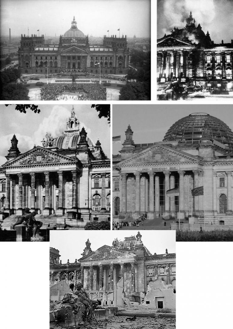
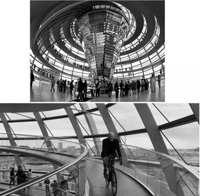
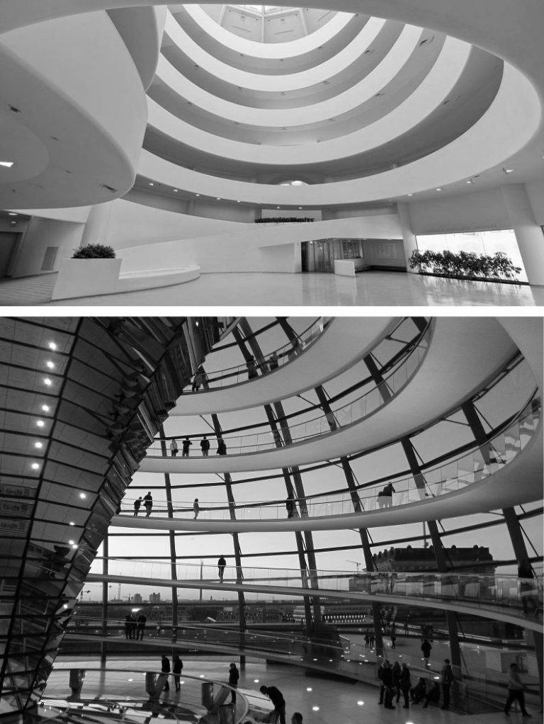
In sanctioning a modernistic retread of Paris’s near fire-destroyed cathedral Macron was effectively commissioning a Gallic equivalent of Berlin’s Norman Foster New Reichstag revamp which had left that historic parliament building shorn of its emphatic central vertical axis (Fig. 1 above) and turned into a skateboard-friendly tourist magnet with a larky dome that acts as a reverse lighthouse (Fig. 2 above).
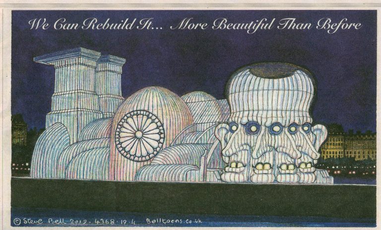
Perhaps Macron, who created his own political party to gain office, sees a potential monument to himself in a made-over Notre-Dame – as the Guardian cartoonist, Steve Bell, swiftly and brilliantly suggested (Fig. 3, above). We had flagged Macron’s Jupiter-complex in the November 2017 The Conservative, as below at Fig. 4.
ARBITRARY DEADLINES AND A DANGEROUS LEGAL PRECEDENT
Macron insists all work will be finished for the 2024 Paris Olympics – much as the UK Prime Minister, Gordon Brown, (vainly) promised the negligent restoration burnt-out tea clipper, the Cutty Sark, would be “brought back to its former glory” for the 2012 Olympics. A law drafted for the cathedral’s reconstruction would provide exceptionally and controversially high tax exemptions (up to 75%) for pledged donations from French billionaires like François Pinault (€100 million) and Bernard Arnault (€200 million). It would also give to the competition winner blanket exemption from all French building and environmental regulations. This hasty and cavalier double blank cheque triggered national and international condemnation. After two months not a penny of the billionaires promised money has arrived and it is now said to be conditional upon their approval of measures to be taken.
DEMOLISHING HERITAGE SAFEGUARDS
Alexandre Gady, president of the Association for the Defence of Heritage Sites and Monuments, said: “We are against the very principle of an exceptional law… There is no justification for this law, which takes the restoration of Notre Dame out of the normal framework. The use of orders and derogations sets a dangerous precedent, when we already know how to move quickly within the framework of existing law.”
As shown below, the dismantling of heritage safeguards was an essential prerequisite of Modernism’s phenomenal late twentieth century boom in Britain.
THE POST-INFERNO STRUCTURAL REALITIES
On 28 April, over a thousand experts petitioned Macron not to bypass expertise on an ill-advised arbitrary deadline: “Let us not erase the complexity of thought that must surround this building work with a display of efficiency.” For the inferno’s devastating effects on stone and glass, see “Notre Dame: former Met director Philippe de Montebello among 1,000 experts urging Macron not to rush restoration” and “Notre Dame: experts explain why Macron’s five-year restoration deadline is impossible”.
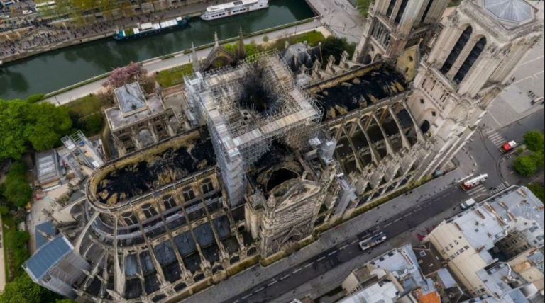
It is now known that structural reinforcements are needed (above, Fig. 5) to prevent the burnt-out building’s collapse in gale-force winds when previously the cathedral could withstand storm winds of 220km per hour.
A POLITICAL AND POPULAR SETBACK
The French President may already be rattled: his culture minister, Franck Riester, vows transparency and claims the people “will be able to express themselves” upon which “we will decide after a great debate and great consultation.” The people, however, had already decided without permission – more than twice as many (54%) called for a straight replacement over a modernist make-over (21%). On 27 May a Senate requirement that the restoration must include a traditional spire was added to the bill.
The Senate has effectively placed an immoveable object in front of a hitherto irresistible modernising tendency that is now said to be spearheaded by the Belgian artist Wim Delvoye and the UK firm Foster + Partners. The artist is unfazed: “I am confident that they will change their mind 100 times, and possibly bend towards my solution.” The Architect’s Newspaper reports that Senate members insist the cathedral must be repaired precisely to its “last known visual state” and use original materials (“French Senate declares Notre Dame must be rebuilt as it was before, quashing competition”). It remains to be seen how or whether the two houses in the French Parliament will square the circle. We might expect some resourcefully enhanced assertions of Modernity-as-the-New Tradition. Already modernist big guns are wheeling – the Gagosian Gallery’s Paris branch is running “An Exhibition for Notre-Dame” (June 11 through July 27) with proceeds to go to the initiative Friends of Notre-Dame de Paris and its affiliated French entity La Fondation Notre Dame.
THE MODERNISERS’ BEDROCK IDEOLOGICAL STANCE
Two days after the fire, the Daily Telegraph invited the design critic Stephen Bayley and Simon Thurley, the former head of English Heritage, to address the question: “Should Notre-Dame be rebuilt in the mould of the original or reimagined for the modern age?” Bayley contended not to modernise would travesty the cathedral, lose an opportunity and constitute: “a terrible failure of nerve”. Thurley predicted: “there will inevitably be some who will call for a new contemporary roof and condemn the idea of replicating the old one. Perhaps an enterprising and creative architect will suggest a glass roof with a viewing platform for the millions of tourists who come each year to see the cathedral. Another might design a gleaming aluminium spire to replace the burnt wooden one erected in the nineteenth century.”
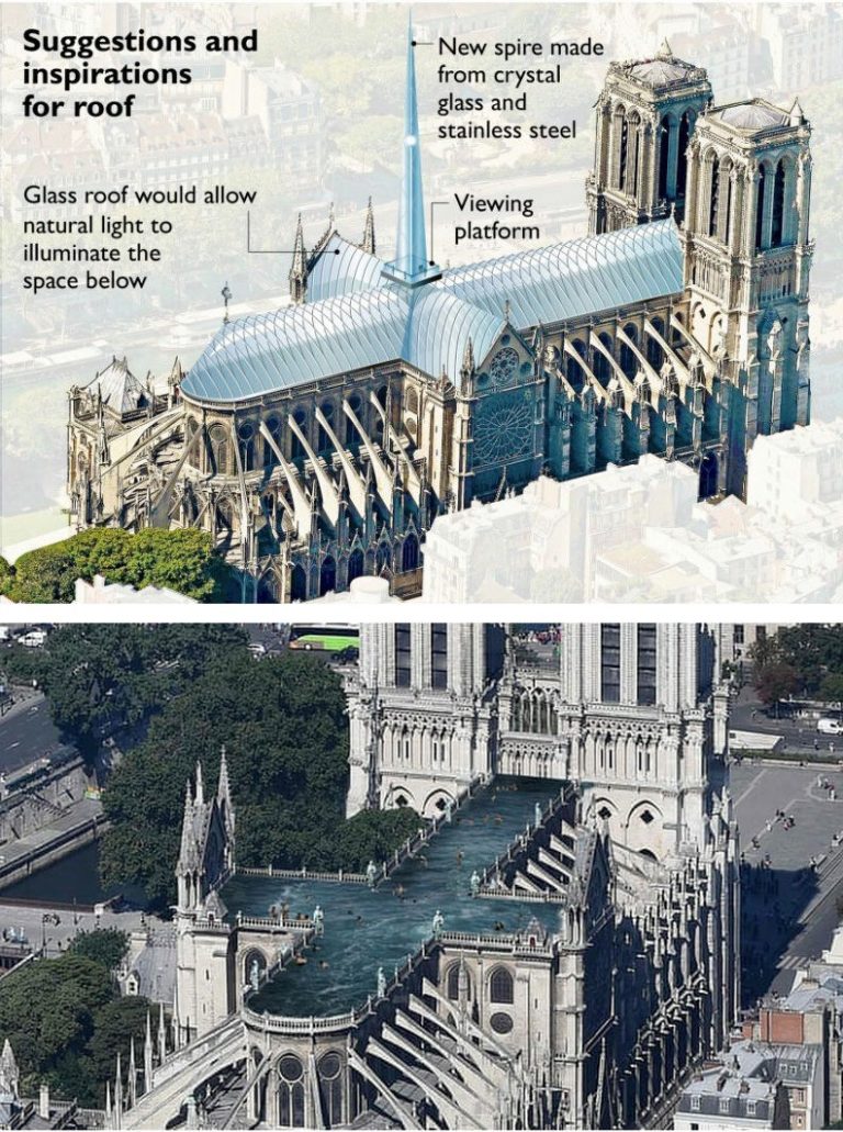
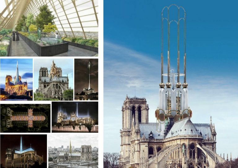
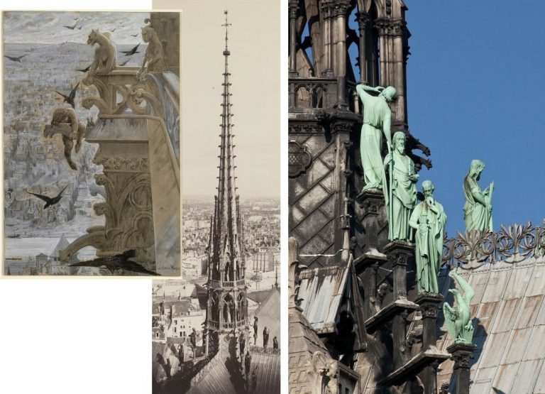
Whereupon, Norman Foster (aka Foster + Partners) proposed a new glass and steel-framed roof and a viewing platform and a new super-sleek, super-extended crystal glass and steel pyramid (above Fig. 6, top) in lieu of Viollet-le-Duc’s 1884 180-foot replacement spire for the unstable medieval spire removed in 1786 (see Fig. 8 below). Foster promises to use the “technology of the age” to “contemporary and very spiritual” ends when his proposed increase of daylight in the cathedral would diminish the force of the stained glass windows and assumes that light will bypass the cathedral’s stone-vaulted ceiling. (At the Reichstag, Foster funnelled light from his glass dome into the debating chamber below through a mirrored cone – Fig. 2, top). Other proposals (Fig. 6 above, and Fig.7 below) range from a swimming pool, a market garden, a gilded cast metal inferno, to legions of upward-thrusting night-time light effects.
THAT “TRADITION OF THE NEW”
In pressing his bid, Foster (Baron Foster of Thames Bank, OM, RA) patronised the French President: “The decision to hold a competition for the rebuilding of Notre Dame is to be applauded because it is an acknowledgment of that tradition of new interventions”. He had claimed all previous fire-destroyed cathedral roofs were rebuilt by modernisers using the most advanced technology of the age, when York Minster’s (part) fire-destroyed roof was rebuilt precisely as was. Reducing the weight of the roof might not be the smartest move: the roof’s weight had assisted the buttresses in stabilising the walls. Much as winds now threaten Notre-Dame for the first time, at the Basilica of San Francesco in Assisi, an ill-considered concrete replacement of a wood roof had the unintended consequence of increasing the building’s stiffness by an estimated factor of 200 and, thereby, resulted in unprecedented earthquake damage in 1997.
THE ANTI-HISTORY CASE FOR MODERNIST BOLT-ON ADULTERATIONS
Whether the current vogue for appending modernist elements to historic buildings constitutes a tradition or an indulged adulterating fad, by ignoring questions of style, Foster presents architecture as a succession of pioneering technical problems solved – and, inariably, with small green bonuses (insofar as entirely glassed-over big steel boxes or blobs can be nudged towards energy efficiency). At Notre-Dame, Foster would convert the entire roof into a vast greenhouse and instal trademark structures to whizz tourists to and from his viewing platform. Such aesthetically and historically disruptive built radicalism is being proposed when there is no need to “re-imagine” the roof because abundant photo-records and construction drawings exist (Fig. 8 above) and, as mentioned, most people and the French Senate wish it to be replaced as was. The modernisers are contriving a cause célèbre without a cause.
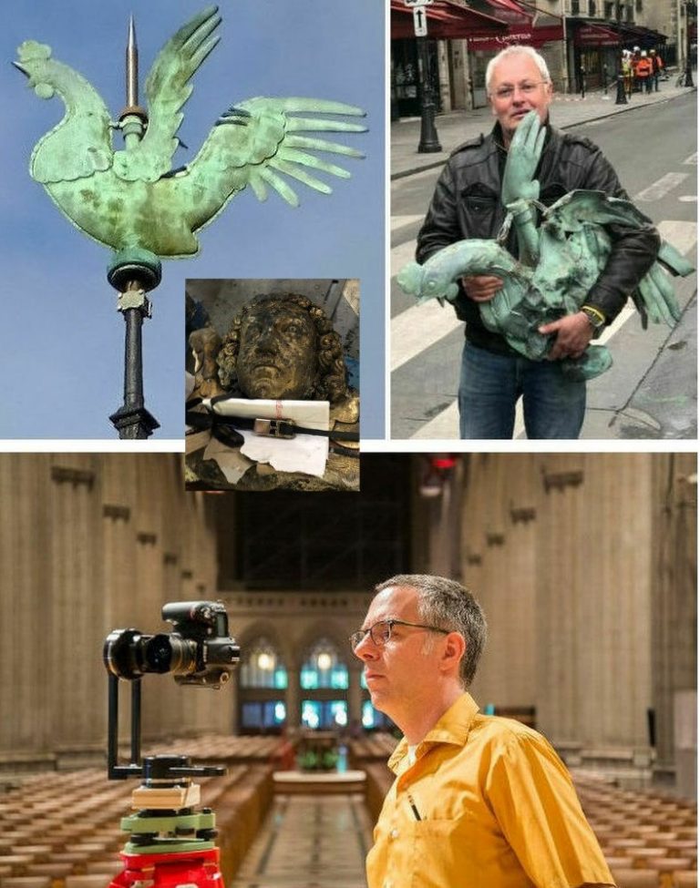
The spire’s weathervane cockerel and a gilded head of an angel was found in the rubble and the late American academic, Andrew Tallon, (above, Fig. 9), who founded the Friends of Notre-Dame de Paris when the French Ministry of Culture stopped financing repairs to the cathedral, had created a digital virtual replica of the cathedral through more than a billion points of measurement. See CNN’s “Four years ago, an art historian used lasers to digitally map Notre Dame Cathedral. His work could help save it.”
SHEDDING UNDAMAGED SCULPTURES AND FORGING A NEW VOCABULARY OF RESPECT
Macron’s iconoclastic bid to license a modernist makeover on an unstable historic building is as clear an abnegation of heritage responsibilities as could be imagined and where Foster promises “a respectful combination of the dominant old with the best of the new”, his own record with heritage buildings has repeatedly suggested otherwise – see below. The modernisers’ aspirations predicate the exclusion of the spire sculptures (Fig. 10, below) including that of the figure shown top right at Fig. 8 of St. Thomas, the patron saint of architects, which incorporated a likeness of Viollet-le-Duc (top, far right). Those sculptures were said to have “miraculously” escaped when removed from the roof in the days preceding the inferno. The French official overseeing their removal, Marie-Hélène Didier, described it as a “magical moment,” to see the statues close up for the first time since placed on the cathedral 135 years ago.
RESPECTING THE PAST, TELLING THE STORY OF A BUILDING
Pace Foster + Partners, what counts as respecting the past? Do we really better respect the past by updating it stylistically? Whatever differences archaeological purists might have with Viollet-le-Duc’s restoration philosophy, he held the restorer’s goal should be “to save in each part of the monument its own character, and yet to make it so that the united parts don’t conflict with each other…” Which is to say, he worked within the building’s own developed gothic style so as to maintain (and in his view, better realise) its coherence of language, this being a Gothic cathedral, not a Classical or Baroque – let alone Neo-Futurist – one. Of course, Viollet-le-Duc’s replacement spire and gingerly descending Apostles (above, Figs. 8 & 10) were not historically original but they were in the spirit in a way that no avowedly modernist production can be. They have long been part of the cathedral’s fabric and they have kept company with Quasimodo.
Cynthia Gamble, former Chairman of The Ruskin Society, and a writer on Proust and Ruskin cites the latter’s appreciation of a previously damaged Notre-Dame in a 19 January 1871 letter:
“As examples of Gothic, ranging from the twelfth to the fourteenth century, the cathedrals of Chartres, Rouen, Amiens, Rheims, and Bourges, form a kind of cinque-foil round Notre Dame of Paris, of which it is impossible to say which is the more precious petal; but any of those leaves would be worth a complete rose of any other country’s work except Italy’s. Nothing else in art, on the surface of the round earth, could represent any one of them, if destroyed, or be named as of any equivalent value.
Central among these, as in position, so in its school of sculpture; unequalled in that specialty but by the porch of the north transept of Rouen, and, in a somewhat later school, by the western porches of Bourges; absolutely unreplacable as a pure and lovely source of art instruction by any future energy or ingenuity, stands – perhaps, this morning, I ought rather to write, stood – Notre Dame of Paris.”
Ruskin, Gamble further notes: “did not remain in an ivory tower, but took practical action by establishing a fund-raising committee to assist the French. This great Victorian writer, campaigner and passionate advocate of Gothic, France and its cathedrals, was inspirational in Marcel Proust’s life and work. For Proust, who translated into French Ruskin’s The Bible of Amiens and Sesame and Lilies, he was his guiding star and ‘maître à penser’”.
VICTOR HUGO
Two years before the conflagration Richard Buday, an architect and broadcaster, held it is hard to separate Victor Hugo’s Notre-Dame de Paris from the cathedral itself:
“Novel and cathedral are so intertwined, so reinforcing of each other, they’ve become inseparable. It’s a magical relationship that architects would do well to study. Hugo wrapped a stealth of behavioural intervention inside a love story embedded in architecture. Like nested Russian dolls, Notre-Dame de Paris is a story within a story within a story. Outwardly, it’s save the girl. Inwardly, the hidden payload is save the building. Hugo wedded narrative to architecture and fermented intrinsically motivated behaviour change on a societal scale, turning local apathy into public action. Imagine what might have become of New York City’s Penn Station had Harper Lee or J.D. Salinger written a 1960 best-seller persuasively set in the great terminal.” See “How a Novel Saved Notre-Dame and Changed Perceptions of Gothic Architecture”. Re the reference to Penn Station, one of the most powerful laments on a barbarically destroyed building (one that today’s modernists might well dismiss as “pastiche”) was broadcast by Alistair Cooke, in his BBC Radio 4 “Letter from America” on 31 October, 2003. We carry the transcript below.
In the preservation of religious buildings even more than history and its stories are at issue. The Rev. Canon Michael Smith at York Minster (whom PBS broadcasters describe as “a traditionalist”) reminds us: “we have to acknowledge that places like here and places like Notre Dame are actually repositories of prayer. They hold the memory, they hold the joys and sorrows, the tears and the laughter, the questions, the doubts, the affirmations of faith of generations of people.”
One such now-embedded memory at Westminster Abbey is Earl Spencer’s throne-shaking funeral eulogy for his sister Princess Diana:
“…I would like to end by thanking God for the small mercies he has shown us at this dreadful time. For taking Diana at her most beautiful and radiant and when she had joy in her private life. Above all we give thanks for the life of a woman I am so proud to be able to call my sister, the unique, the complex, the extraordinary and irreplaceable Diana whose beauty, both internal and external, will never be extinguished from our minds.”
SAUCE FOR THE GOOSE
Where buildings capture, shape and nourish imaginations, Bayley holds that to rebuild “as was” is an affronting absurdity because “a great cathedral is a palimpsest established over time and it is quite impossible to establish exactly what ‘original’ means”. Replacing a recent discrete and well-recorded component part requires no philosophical/conceptual identification of an over-arching “originality” – there is nothing to be rethought or re-imagined because what is about to be replaced was there, just ten minutes ago and we know exactly how it was. Whereas, however, if such a philosophical obligation really did pertain, how might Foster clear that very hurdle so as to deliver his intended “respectful combination of the dominant old with the best of the new”?
PROLONGING LIFE IN OLD BUILDINGS
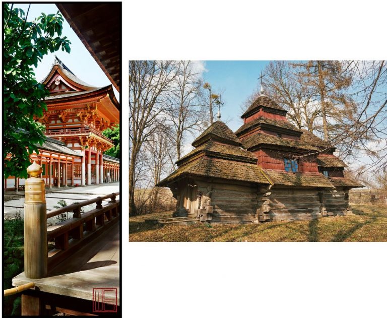
In the two buildings above at Fig. 11 we see, left, the gate portion of a shrine in Kyoto, Japan (as beautifully captured by the late William Corey). The building is 2,000 years old and has been maintained “as originally-was” throughout that period – which is to say, it has remained mint-fresh while becoming ancient. Is it now, therefore, a modern sham or pastiche? The building on the right, the Church of the Theophany (1693), Kuhayiv, Lviv Oblast in the Ukraine, is part of a tradition of wood-built churches that goes back to the 10th—11th centuries. It shows signs of age. Over 3,000 such churches survive in the Ukraine and eight were included in 2013 on UNESCO’s World Heritage List. Many are said to be in need of conservation. The Ukraine Weekly Digest reports a workshop being held in consideration of possible treatments (June 24 to July 6 2019).
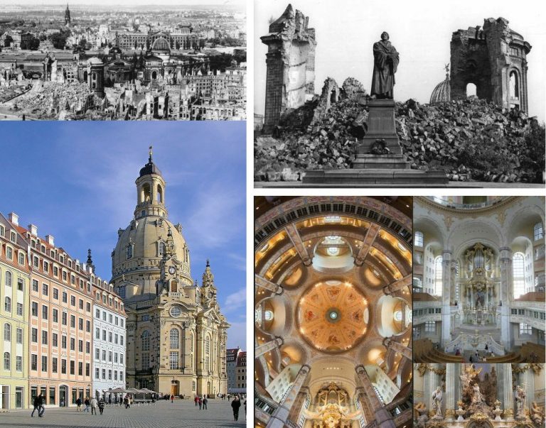
If either building above were to be part-destroyed by fire, would anyone insist that damaged portions be rethought and remade in a modernist manner with modern materials and techniques? As for Bayley’s “lost-opportunities”, an opportunity lost to a would-be insinuator of modernist motifs cannot be taken as the whole story. Was there a net loss when, in 1994-2004, Dresden rebuilt “as was” the magnificent 18th century Frauenkirche and surrounding square (Fig. 12 below) which had been destroyed in the Second World War?
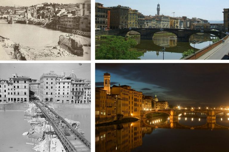
How many modernists visiting Florence protest: “fake”; “lazy replica”; “pastiche” or “lost opportunity”? Who contends that the city’s war damaged buildings and bridges would better have been replaced by early post-war (and now passé) modernists than by being remade from surviving drawn records, as Bernard Berenson successfully urged?
THE ART OF BUILDING BRIDGES
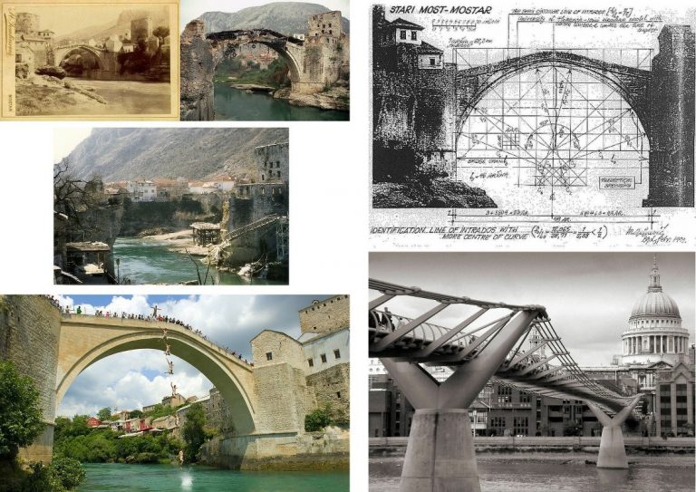
Florence’s Ponte Santa Trìnita bridge of 1567-1569 (above, Fig. 13), the oldest elliptical arched bridge in the world, was blown up in 1944 by retreating German troops. British troops built a temporary bridge and the original bridge was reconstructed in 1958 with surviving stones from the river Arno and new stone from the original quarry. (When Foster revamped the British Museum he used the wrong stone – French, not English.) In 1993, the old stone bridge at Mostar in Bosnia and Herzegovina was destroyed by Croat shelling having stood for 427 years (Fig. 14 below). Under UNESCO it was rebuilt, as was, using recovered stones and freshly quarried local stone, by 2004. The exercise discovered that under Islam knowledge of sophisticated geometrical methods of calculating, cutting and joining stones had survived that had been used on the Parthenon in Athens. Would Bayley have preferred the insertion of a technically ground-breaking shiny metal bridge into the ancient stone buildings that served as bulwarks to the stone bridge once considered a technological miracle of its day?
FOSTER + PARTNERS’ WOBBLY METAL BRIDGE AND THE WRONG KIND OF PEDESTRIANS
On 10 June 2000, The Millennium Bridge, above, right, Fig. 14, an £18.2m metal footbridge over the River Thames opened, two months late and £2.2M over budget. It closed two days later. It had been officially opened by the Queen in May, when behind schedule and only two thirds complete. It had been co-designed by Lord Foster, the sculptor Sir Anthony Caro, OM, and the engineers Ove Arup. It was closed because it wobbled when used by people. The co-designers fell into disarray. Foster reportedly caused great resentment when appearing to shrug off responsibility by describing the problem as “engineering led”. Caro blamed planners who had “cut down and trampled on the innovative designs” The project’s chief engineer blamed “unintentional synchronisation of walking [by people walking over the… footbridge]”.
“THE REAL WORLD” BITES BACK
The problems arose in attempt to create a novel bridge as a “blade of light”. Royal Fine Art Commission experts predicted problems with vibration and further fears were expressed when the new Pont de Solferino in Paris was closed because of vibrations. Tony Fitzpatrick, the engineer at Arup responsible for the bridge later admitted: “The real world produced a greater response than we had predicted. No one has effectively studied the effect of people on a horizontally moving surface.”
FOSTER’S “NOSTALGIA” SMEAR
Suspension bridges’ vulnerability to waves of vibration has long been known. The Albert Bridge in central London carries a sign stating that soldiers must break step when crossing the bridge – I recall being told in a school maths lesson that soldiers could not march in step on bridges. Fitzpatrick’s phrase “horizontally moving” is the key: the problem with the Millennium Bridge arose because it was not so much suspended (with its weight and downwards pull opposing lateral movement) as held near-horizontally on wide “Y” shaped supports in order to permit uninterrupted views. The “blade of light” more resembles a trampoline than a conventional suspension bridge. It was a technical invitation to wobble. Fixing its bounce and sway with “dampers” resulted in closure until January 2002 and a further £5million costs. Foster subsequently presented the debacle as midwife to a great technical advance and he averred: “Can you ever be over-ambitious? I would rather be accused of being over-ambitious than of being lily-livered and retreating into a nostalgic past that never existed.”
THE GODZILLA TENDENCY WITH ARCHITECTURAL HERITAGE
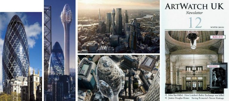
New buildings are inserted into historical contexts, that is, into “presents-with-pasts”. Foster’s latest addition to the City of London, a 1000-ft (305-metre) viewing tower (above, second left and centre, Fig. 15), has been politely dubbed the Tulip and derided as an architectural Freudian slip. It gained planning approval despite intense opposition, public mockery and Foster’s failure to attend the planning committee. It has been objected that it would fit better into Dubai than London; that there was no need for “this phallic-shaped attraction, with little aesthetic merit”; and, that the proposal “reeks of desperation in its straining after ostentatious effect”. It serves no purpose other than to harvest tourist revenues. With this building, Foster does to his own notorious “Gherkin” at 30 St Mary Axe (above, left) precisely what it had done to its neighbours – dwarfing and out-shouting them (above, second left).
In the above, top centre, computer representation the viewing tower stands directly in front of the Gherkin for which building the Baltic Exchange – a Grade II* listed building (its interior as above, right) the IRA attempted to destroy in 1992 – was demolished. Approval was given at a secret English Heritage planning meeting at which officers objected that the Gherkin would be “unduly dominant and assertive…damaging to [a long list of items including the] general skyline of the City of London…The setting of the Tower of London…part of a World Heritage site…” See “Clamps Off”, Mira Bar-Hillel, ArtWatch UK Journal 12, Winter 2001-2.
FALLING GLASS AND REMOVED PLANNING CLAMPS
On 26 April 2005 the Guardian reported that a large window had fallen out of an unoccupied floor of the Gherkin and smashed into the landscaped plaza that surrounds the building. It is possible that it had been pushed out by one of the ghosts of the Baltic Exchange after its listed 1922 memorial to members killed in the First World War was dismantled to make way for the Gherkin. Responsibility for English Heritage’s failure to protect that fine listed building and its contents was self-attributed to its departing Chairman, Sir Jocelyn Stevens (1992-2000) who had recently written that in the 1980s “I asked Richard Rogers and Norman Foster why they were not working in England. They replied that it was largely because of the planning procedures of English Heritage. Now Lords Foster and Rogers have approximately twenty schemes in London. English Heritage deserves some of the credit for this; it has helped that we have taken the clamps off.”
THE HEARST HEADQUARTERS TOWER, NEW YORK
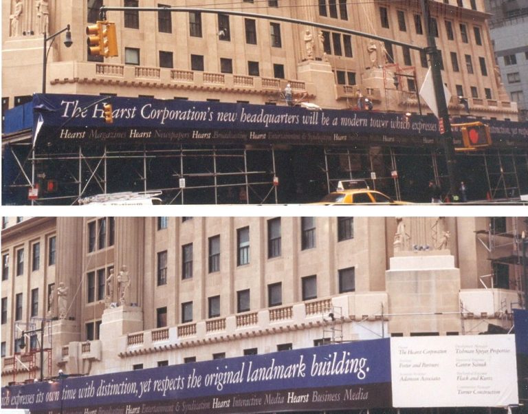
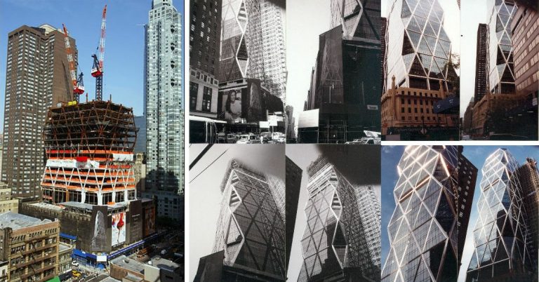
With regard to a possible outcome of a Foster intervention on Notre-Dame, over a number of years on New York visits I regularly passed (on Eighth Avenue, between Fifty-sixth and Fifty-seventh Streets) a stone building with richly dramatic sculptural decorations that provided unfailing delight. Then hoardings sprang (above, Fig. 16) announcing: “The Hearst Corporation’s new headquarters will be a modern tower which expresses its own time with distinction, yet respects the original landmark building”. Foster + Partners were to be the instrument of this respectful development and I would have an intermittent ringside seat.
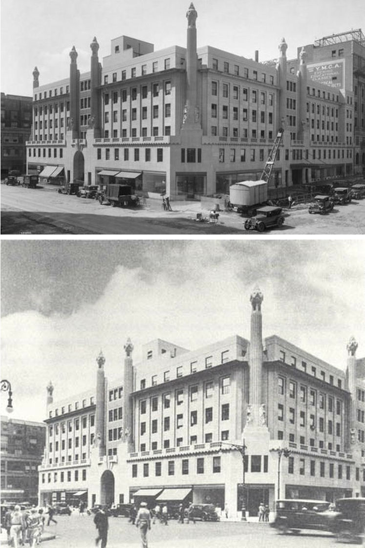
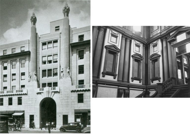
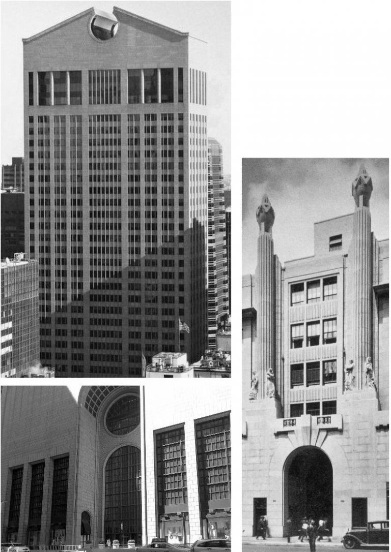
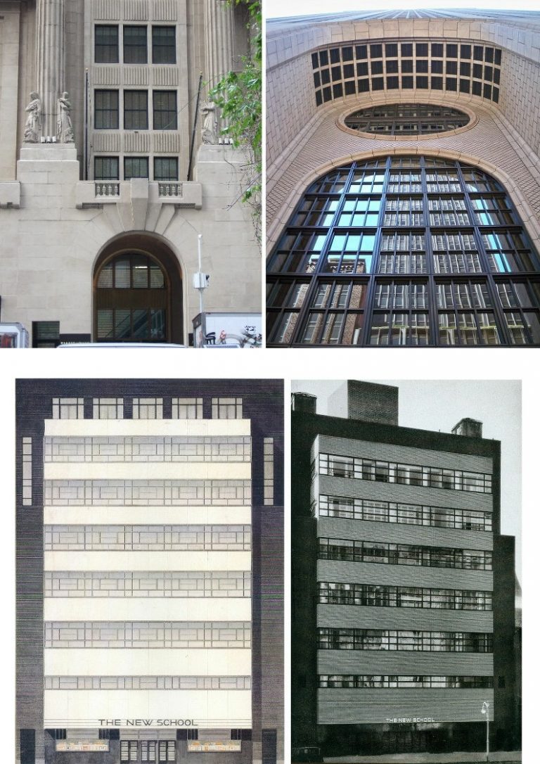
The building’s façades afford an animating interplay of horizontals, verticals, projections and recessions. The elevations link smoothly at the building’s base in broad two-storey corner chamfers above which tall triangular voids give space and home to dramatic fluted columns bearing archaistic Greek allegorical figures at their bases and geometrically decorated urns that break the skyline like minarets or pinnacles (above, Fig. 17). The central main entrance (as below, left, at Fig. 18) is a simple arch set flush with the smooth flat base apart from a progressive fanning projection of keystones supporting a balcony balustrade. Above, and stepped behind the balustrade, twin columns frame a central block of windows comprising a feast of advancing and receding shadow-casting surfaces. Notwithstanding the minimalist (Art Deco) vocabulary the whole recalled the sophisticated plastic/conceptual game-playing at the vestibule of Michelangelo’s Laurentian Library in Florence, as below, right.
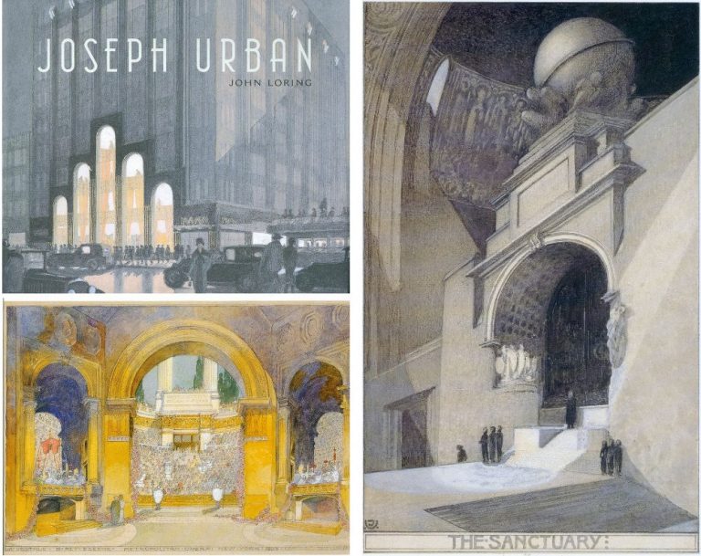
The 1927-8 building comprised the base of a planned skyscraper for William Randolph Hearst that was scuttled by the Great Depression. We now know – thanks to a fine and richly illustrated 2009 monograph by John Loring (design director for Tiffany & Co. from 1979-2010) that the architect was Joseph Urban, a brilliant and prolific designer of buildings, stores, ballrooms, theatre, film and opera sets who had studied architecture at the Academy of Fine Arts Vienna under Karl von Hasenauer. Urban moved to America in 1911 as an accomplished international architect, illustrator, theatre and cinema set designer (with over 50 productions from his home Vienna Royal Opera, the Champs Elysée Opera, and Covent Garden) and then to New York in 1914, becoming a stage designer for the Metropolitan Opera in 1917. He died at fifty-one in 1933 but his sets remained in the repertoire into the 1950s. In architecture he was an originator of the Art Deco style and, in his 1930 “New School” building at 66 West Twelfth Street (- a stone’s throw away from the great Strand Bookstore) at Fig. 33 below, he introduced the first international Modernist building in New York. The Hearst and the New School are Urban’s only surviving New York buildings.
What a richly stimulating challenge and responsibility had been granted to an architect who today would combine the “dominant” old with the best of the new at Notre-Dame Cathedral.
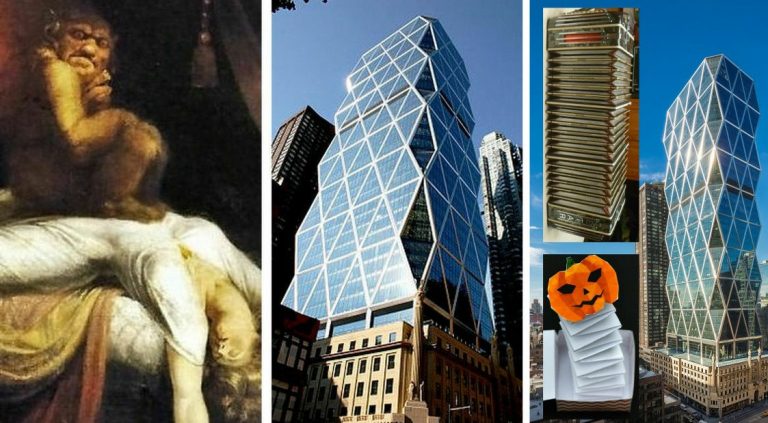
During subsequent trips I watched with dismay and disbelief as the sprouting New dominated the fixed Old to a shocking degree (above, Fig. 19). Lord Foster’s contribution burst from within the brutally hollowed Urban building and it progressively assumed (depending on viewpoint) the character of either an incubus or a jack-in-the-box, as below at Fig. 20. (Fuseli’s Nightmare, is shown as before a recent debilitating restoration.)
JOSEPH URBAN’S NEW YORK LEGACY
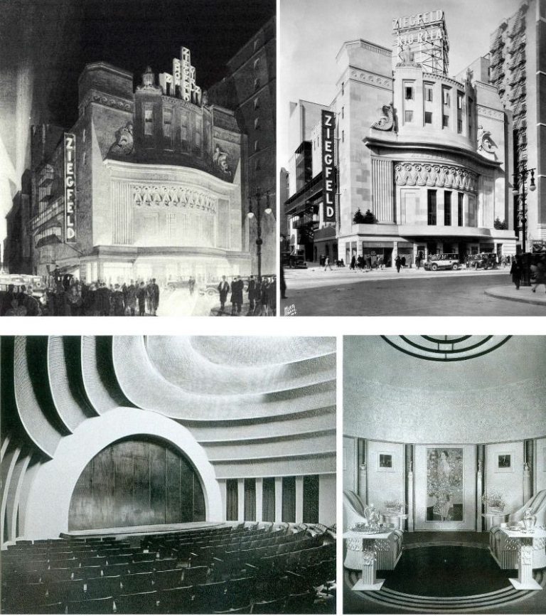
It is possible that had Loring’s book preceded the development of the Hearst Tower there might have been a more appropriately respectful and fitting treatment for the major surviving building of a prodigiously gifted culturally-enriching New York immigrant who was described by Fritz Kreisler as “the last Viennese”. Urban excelled equally in the plastic, graphic and pictorial arts. In Fig. 21 below, top, we see his 1926-27 Ziegfeld Theater in a wash presentation drawing, left, and in the flesh, right, at the northwest corner of Sixth Avenue and Fifty-fourth Street. Thus, in both anticipation and realisation, Urban delights in counterpointing a dead flat façade with richly sculptural decorations that collectively ripple in synchronised waves.
In Fig. 21 below, bottom left, we see the astonishingly audacious – and still surviving – auditorium of Urban’s New School of 1930 – in competition for which building he beat Frank Lloyd Wright (whom he had helped financially). Below, bottom right, we see Urban’s 1922 Wiener Werkstätte of America showroom. Visiting Vienna in 1919 Urban found many famous artist friends who were almost starving. He bought their works and displayed them in this exquisite setting – has any Klimt painting ever been displayed to greater and more sympathetic effect? Is it fanciful to see, in Fig. 22 below, echoes of Urban’s 1930 auditorium, respectively, in Frank Lloyd Wright’s 1959 Guggenheim Museum (top) and Norman Foster’s 1999 Berlin Reichstag dome?
FOSTER’S WAY WITH HISTORY
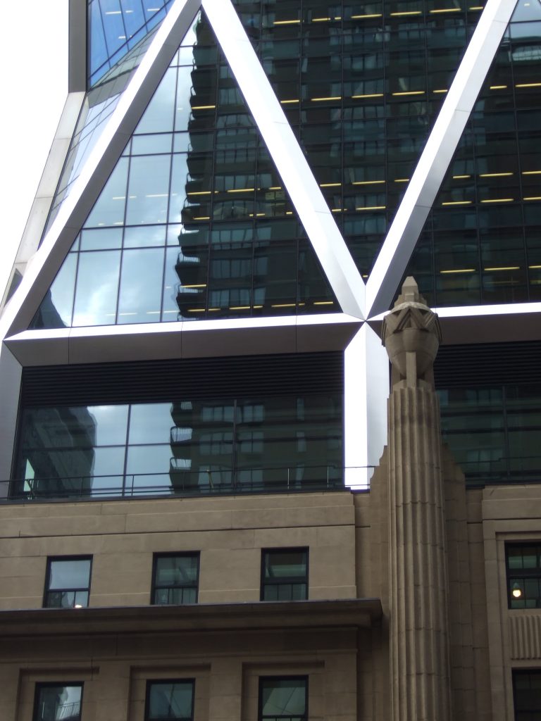
At the Hearst building, Urban’s façades survived only as a shell to a Giant’s Entrance Lobby. Immediately above Urban’s building, his inventively articulated decorations were swamped by the gargantuan leaps of scale on the tower’s glassed-over big steel box (above Fig. 20). Small was dwarfed; warmth was frosted out; variety, interplay and dramatic sculptural groupings were all eclipsed by gigantic shiny repetitively monotonous units (Fig. 35 below). Against old stone relief surfaces that absorbed light and cast ever-changing shadows, the grossly assertive inner New-Build Tower’s darkened glass and stainless steel trim facades bounce light straight back at the viewer. Before considering some of the less disrespectful forms a modern tower might have taken, we consider the Hearst Headquarter’s somewhat anomalous position within Foster’s oeuvre.
FOSTER’S OEUVRE AND BORROWED NOTIONS
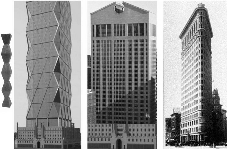
Foster’s buildings moved from a “bare-all” structure-determined crystalline geometry (first, second, third, fourth and seventh, above Fig. 23) to a curvilinear organic vocabulary (fifth, sixth and eighth above) that famously runs through the testicular towards the phallic. With the Hearst Tower (seventh in Fig. 23 above) the arc is disrupted by a regression to flat-faced geometries in what is one of Foster’s most manifestly indebted motifs. Even though the building was widely acclaimed as a novel and invigorating treatment of tower buildings in New York, its indebtednesses drew notice. In the 11 December 2005 New Yorker, Paul Goldberger (“Triangulation: Norman Foster’s thrilling addition to midtown Manhattan”) noted:
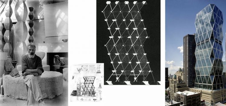
“In some ways, the Hearst tower calls to mind a famous unbuilt design from a heyday of modernism: a six-hundred-foot skyscraper in Philadelphia, proposed by Louis Kahn and Anne Tyng in 1957, which would have had a zigzag shape based on a framework of triangular supports. [Fig. 24 centre, below.] Kahn and Tyng weren’t the only designers to have understood that the triangle is an inherently strong and efficient structural form; Buckminster Fuller and the engineer Robert Le Ricolais made the same claim. Foster’s use of triangles is, in this sense, a borrowed notion.”
In the 7 October 2004 New York Times (“Hearst Tower Echoes Trade Center Plan”) David W. Dunlap suggested that the design had originated in Foster’s 2002 study for the new World Trade Center: “With its bold introduction of a quiltwork diagonal grid, or diagrid, into the relentlessly right-angled cityscape, the future headquarters of the Hearst Corporation gives some sense of what New York might have experienced in Lord Foster’s proposal for the trade center site.” Dunlap was disconcerted by the Tower’s most distinctive and novel innovation – its treatment of the vertical corners: “More disorienting than any other feature of the Hearst Tower are its crimped corners. They will slope inward at 75 degrees for four stories, then outward at 105 degrees for four stories, then inward, then outward, inward, outward, inward, outward, inward.”
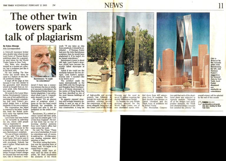
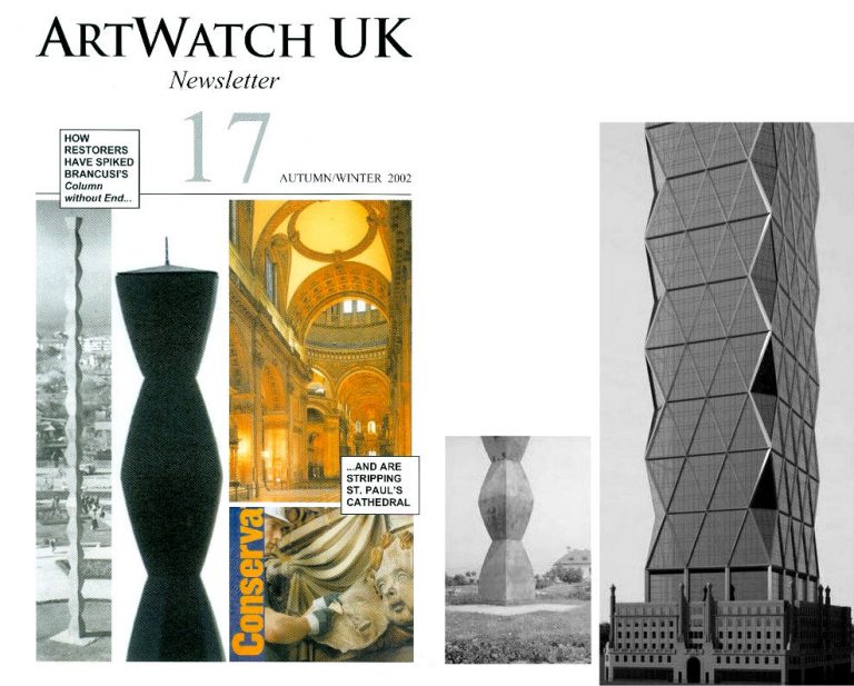
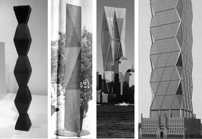
The consequence of those gigantic repeating angled incursions (which were likened by Foster to birds’ mouths) is that when the tower is viewed from three-quarters (so that the flat front face and one of the flat side faces are seen together) it bears strong resemblance to Brancusi’s Endless Column sculptures. There had been earlier discussion of a Brancusian indebtedness with Foster’s originally proposed 2002 Twin Tower replacement. A collector, Alec Biele, was struck by the Foster designs’ similarity with piece of sculpture he owned – an Ode to Brancusi by John Bartolomeo, a retired architect turned full-time artist. As Dalya Alberge reported in the 12 February 2003 Times (“The other twin towers spark talk of plagiarism” – Fig. 25 below), a letter of complaint by Biele to the Lower Manhattan Development Corporation went unanswered but Foster’s twin towers proposal (which had been considered the favourite) was eliminated.
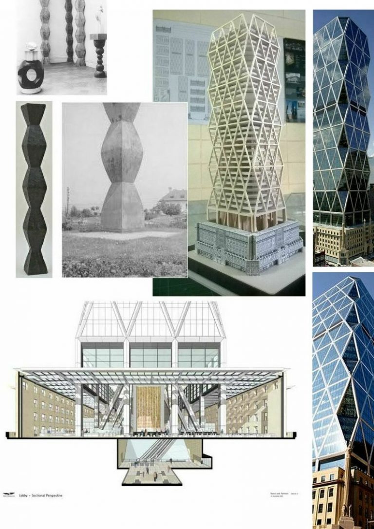
Watching the Hearst Tower development it soon became apparent that the promised integration of the old and the new was an exercise more of defiance than compliance. Moreover, the pronounced “disconnect” between the Urban base and the Foster tower is strikingly similar to that encountered in the monumental version of Brancusi’s Column without End at Târgu-Jiu in Romania (Fig. 26 above and Fig. 27 below left). In the giant sculpture the trapezoidal modules (plastically-speaking, each consisting of two conjoined and mirroring truncated square pyramids) were made individually in cast-iron and successively threaded onto a vertical steel central core which was integrated with a steel pyramid set below ground in a fifteen feet cubic concrete block. In the sculpture, when the bottom of the first module reaches its widest section, instead of narrowing it drops down vertically and seemingly sinks into the ground. That very treatment of termination is replicated in Foster’s tower – with the difference that his disappears from view on the outside but drops right through the roof of Urban’s now-gutted building and reappears within. Below the original base building’s roof level, the descending vertical columns receive diagonal buttressing (as in the cut-away drawing above and Fig. 36 below).
In the model of the Hearst Headquarters shown above right at Fig. 27, we can see most clearly the utterly dwarfing impact of the tower on Urban’s base: his building becomes Jack to the tower’s Beanstalk. This is not a marriage of old and new but the explosive emergence of a tower in transparent disregard of an immovable landmarked stylistic encumbrance at its feet.
MIGRATING MOTIFS – A CREATION, A HOMAGE, A BORROWING/COINCIDENCE, AND A RECAPITULATION
In Fig. 28 above, we see successively and chronologically: one of Constantin Brancusi’s endless column carvings; Bartolomeo’s steel sculpture, Ode to Brancusi, that had been published on its maker’s website; Foster’s submission to the competition to rebuild New York’s Twin Towers; a model showing the development of the Hearst Tower from within the surviving Landmarked Urban base for the Hearst building.
MODERNISM IN DENIAL
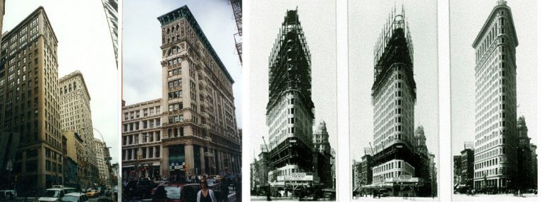
That Urban’s building had been planned as a base might have been taken as a helpful cue in designing the new tower. The word “base” nods towards the classical sub-divisions within a column: base; shaft; capital. As seen below (Fig. 29) even in almost nominal allusion such adopted and adapted schema variously lent charm and coherence to a thousand tall buildings in New York:
There is no more satisfying a high-rise structure in New York than the 1902 Flatiron Building, above right. The Flatiron’s construction began with a base from which a shaft sprang and, then, harmony and lucidity were achieved by completion of its “capital”. Given that Foster had been gifted a base – what force impelled him not to build on that implicit logic and in sympathy with New York’s own rich architectural precedents? If Foster can nod backwards to sculptural motifs, why not do so with comparably helpful/stimulating architectural paradigms? As it happens, there exists in New York a building of much more recent origin (1984) than the Flatiron that might almost have been taken as a template on which to achieve a happy and fruitful synthesis between the creations of Urban’s late 1920s and Foster’ early 2000s – see below.
ALTERNATIVE SOLUTIONS TO THE HEARST TOWER PROBLEM
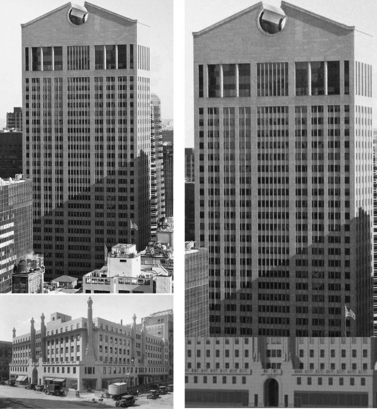
Arguably, the most pertinent and attractive post-war New York skyscraper was the revolutionary Philip Johnson and John Burgee 1984 AT&T Building – now the Sony Tower (Fig. 30 above). David Langdon in ArchDaily has fairly said of the building’s crowning open pediment: “It may be the single most important architectural detail of the last fifty years…[It] singlehandedly turned the architectural world on its head. This playful deployment of historical quotation explicitly contradicted modernist imperatives and heralded the mainstream arrival of an approach to design defined instead by a search for architectural meaning. The AT&T Building wasn’t the first of its type, but it was certainly the most high-profile, proudly announcing that architecture was experiencing the maturation of a new evolutionary phase: Postmodernism had officially arrived to the world scene.”
Unfortunately, while Postmodernism certainly identified modernism’s Achilles Heel (its self-impoverishing conviction that style is a by-product of correct applications of permanently advancing technical procedures), in practice it has served widely to license whimsy, incoherence, exhibitionism. The profound radicalism of the AT&T Building was its re-affirmation of the universal and perpetually invigorating force of classical architectural notions. This can be seen in the many affinities between the Johnson building and Urban’s Hearst building, even though the one was returning to classicism as the other was departing from it. As if oblivious, Foster, while happy to feast on an earlier sculptural modernism, missed the connection between Urban and Johnson and an opportunity to effect a bridge and synthesis across seven decades of architectural development.
AN EASY VISUAL ALIGNMENT
As can be seen above, at Fig. 31, it would be no insuperable task to marry the vocabularies of Urban and Johnson, so as to produce a harmonious/dynamic play of vertical and horizontal forces but Foster would seem blind, indifferent or hostile to any such stylistic resolutions. While properly enforced heritage laws meant Urban’s landmarked building had to remain in place, Foster retained only its shell to serve as an anomalous period raincoat to a pretentious over-sized futurist private “civic” square within. From within the Urban shell, Foster struck his own variation on a Brancusian theme, as below, second left at Fig. 32.
AN ARCHITECTURAL COMMUNION AND AN OPPORTUNITY MISSED
Urban and Johnson shook hands firmly in their doorways (above, top, Fig. 33). Urban’s progressively leaner, sparer – but always elegant – minimal modernism distilled his command of the riches of classical architecture as seen below at Fig. 35 in his designs for department stores, stage sets and, right, his 1919 plan for a World War I memorial that was never built.
SCALE ABUSES AND THE TYRANNY OF THE TRIANGE
In the detail above at Fig. 35 we see how there was no attempted mediation between the old and the new. To the contrary we see how (aside from dropping down a vertical face in echo of Brancusi’s Column without End at Târgu-Jiu) there was no attempted integration. Instead, there are massively abrupt shifts of scale, of vocabulary and of materials. Perhaps even more contemptuous than the inflicted giantism, is the imposition of an alien triangulated vocabulary on Urban’s interplay of horizontals and verticals. Two things might be noted: first, the visual deployment of the diagonals is essentially a wilful aesthetic contrivance not a product of some structural necessity. Although the massive diagonal structural elements sported on the glass facades permitted a lighter steel construction within, watching the erection of the building (Figs. 19 & 20) it was clear that this skscraper was, its nibbled corners aside, yet one more big steel box of office space to be clad entirely in energy wasteful glass. The diagonal structural elements did not in themselves dictate the contrived illusion of a giant concertina-ing of forms. Second, in mitigation, Foster was not so much imposing a private language as positioning himself in the van of an international vogue for the triangular and the pyramidal – a pronounced cultural infatuation that might be taken to betray a pathological desire to subvert and repudiate architecture’s classical architectural norms of stability and coherence through disorientation and derangement. This impulse is a pan-continental cultural manifestation – or zeitgeist – not a personal proclivity (see below).
AN INTERIOR GUTTED
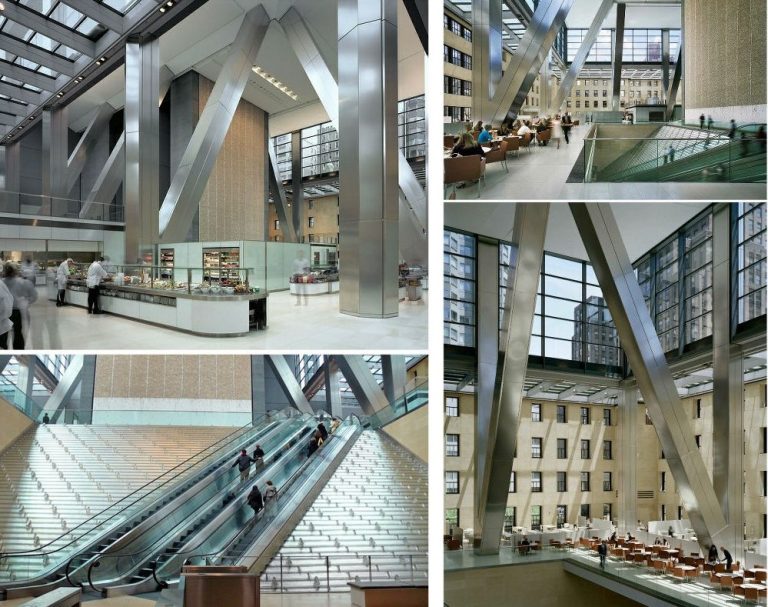
Who, looking at Urban’s outwardly still-standing building today could have inkling of what lies within? As seen above (Fig. 36), the whole has been gutted to create an antiseptic Foster quasi-public space. Triangulation is supreme. On the lower, entrance level, the escalators run diagonally so as to bisect the rising metal slope (that doubles as a waterfall) into triangular sub-divisions in concert with the shiny triangular buttresses of the tower that rises within. If not unique to Foster, from where might this triangulating impulse have originated? (A clue: it was not from a love of ancient Egyptian pyramids.)
MODERISM’S BRUTAL ANTECEDENTS
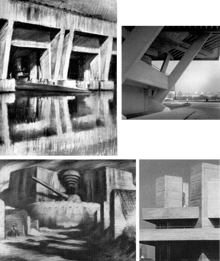
In our 2008 Journal No. 24 (on the fight to save the classical architecture of St Petersburg) we drew attention to certain stylistic similarities between the reinforced concrete U-Boat pens and gun emplacements of the German sea-board defences in the Second World War and the architecture of Denys Lasdun, as left and right above at Fig. 37 (“Modernism’s Secret Passion?” – Michael Daley.) How might such similarities of formal language have arisen? In the late 1960s Lasdun spoke of his source influences in a lecture at the Royal Academy Schools. They were wide-ranging: from African mud hut villages, through Palladio and Hawksmoor, but there had been no mention of German concrete defence installations. Lasdun’s attachment to concrete as a building material is generally said to have arisen in the 1930s at a time when international modernism was seen as a “counter-thesis to fascism” (which rising political movement was notoriously prone to appropriate classical vocabularies) but in 2003 Lasdun’s son, James, mentioned in a frank and illuminating memoir (The Master Builder) that his father had “crossed over on D-Day, built airstrips with the royal engineers and captured a German horse that was wondering around a gun emplacement filled with dead German officers.”
A 1994 monograph on Lasdun effectively drew a veil over his war-time experiences: “Lasdun’s formation… [was]…interrupted by the war…Lasdun remembers the technical headaches which they all encountered, but also his private fascination with using bulldozers to sculpt the landscape into platforms and mounds…all [his later] use of decks and bridges might seem to suggest some nautical preoccupation…but he is really more interested in things like ancient mounds, overgrown ruins or the breaks and cracks of rocks.” Really? Had such generated the structure’s of Lasdun’s National Theatre? Given his infatuation with Le Corbusier’s concrete (- and: “You know James, there’s something aphrodisiacal about the smell of wet concrete”), is it conceivable that first-hand encounters with German concrete defences left no impression; no memories; or, that throughout the six-year long war, the shapes, forms, edges and aspects of no warships or embattlements caught the architect’s eye or aroused his plastic/sculptural creative passions?
THE UBIQUITOUS TYRANNY OF TRIANGULATION PLUS GLASS
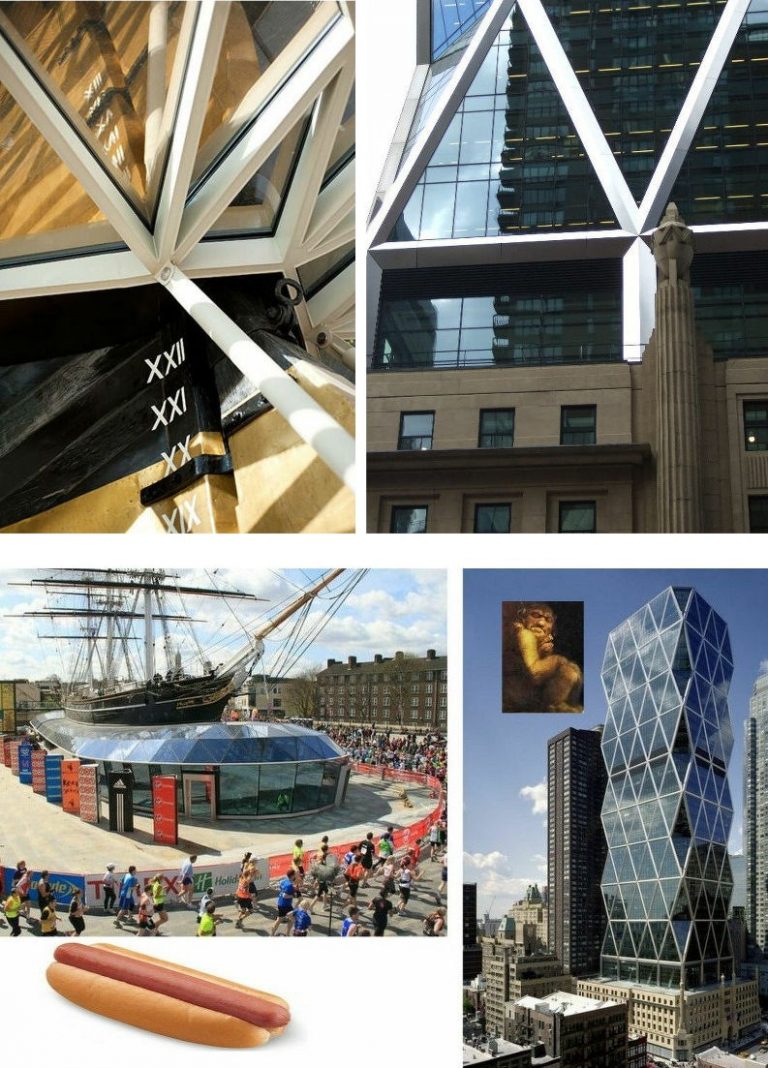
Whatever the antecedents, we have seen more recently that with computer-aided design, triangulation has provided a means of building almost anything to any design, as with the part-entombed Cutty Sark by Grimshaw Architects and the errupting Hearst Tower by Foster + Partners at Fig. 38 above. But suspicion persists of an underlying darker side to triangulation’s imperative appeal for so many architects. Consider the work of the esteemed late architect I. M. Pei.
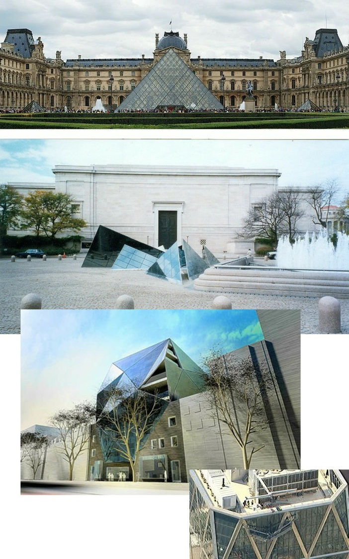
It was said in a recent obituary of Pei in the New Yorker (“The Impeccably Understated Modernism of I. M. Pei”) that he was: “… a consummate professional, one of the people who made modernism feel conservative and traditional. The East Building of the National Gallery, in Washington, D.C., married a sharp, trapezoidal construction with a monumental marble veneer. Here was a modern project that accommodated itself to the neoclassical ethos of the self-embalming American capital.” That is one way of looking at it. As in New York, we saw no accommodating marriage. We saw, in the forms, if not in the veneer, an assault on classicism inside and out through a disorientating arbitrary grouping of intersecting wedges that constitute one of the most uncongenial, art-contemplation unhelpful galleries to be found, the contrived manner and means of which is evident in the photographs and designs above left, Fig. 39. In the Marc Riboud/Magnum photograph of I. M. Pei ascending a stair in the East Building of the Washington National Gallery, above, right, the architect is perfectly pinpointed as the tip of one of his own contrived arrow head motifs.
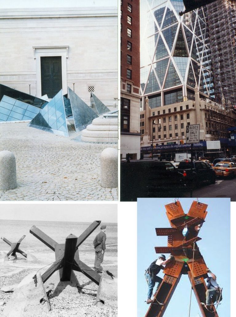
In Pei’s most famous pyramids, at the Louvre, as above, top, Fig. 40, the great formalism of the courtyard is echoed by the axis of the large central and two small symmetrically flanking pyramids. Nonetheless, the large pyramid sits smack in front of the face of the host building’s façade. No such respect is shown at the National Gallery, Washington, (above, centre), where Pei’s Pyramids are intrusively alien and arbitrarily grouped – almost as if a stealth bomber had crashed and part buried itself into the ground. Whether architects like Pei, Grimshaw and Foster appreciate or intend it, or not, their combined triangulations constitute a disruptive assault on, or deviation from, the built world’s near universal deployment of horizontal and vertical forms, sometimes mediated by circular, elliptical or pointed arches. Littering that universe’s rational and coherent public and civic spaces with appliqued artefacts as visually disruptive as tank traps (Fig. 41 below, bottom left) or crashed stealth bombers – as by Foster’s former associate, Ken Shuttleworth, third down, above – may guarantee attention and public notice but stealth-bomber chic should not be permitted to present itself as some classicism-of-our-times. Nor should it even be taken as a modernist expression of a building’s “frankly laid-bare” structural integrity. These contrived devices are best seen as a species of window dressing that confers easy spurious dynamism on maximised rentable spaces. Just how appliqued today’s façades can be is seen bottom right, above, where Foster’s “diagrid” structural logic does not constitute a structurally realised building top but, rather, a deceiving screen that conceals the roof’s bric-a-brac.
UNANTICIPATED EXTRA-TRIANGULATION
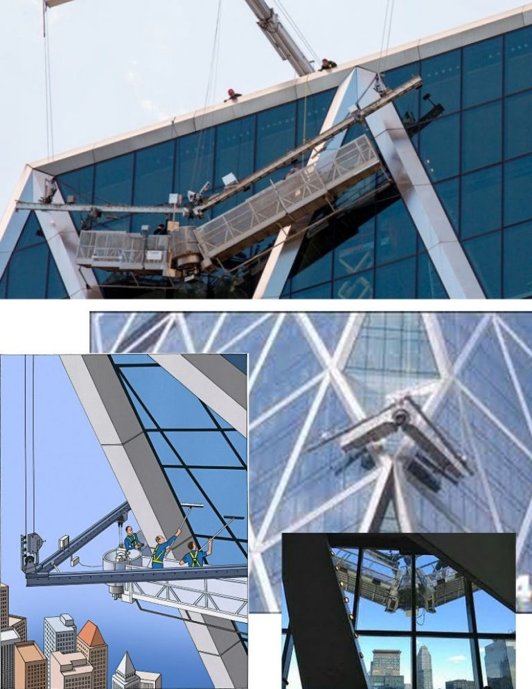
When Foster presented the designs for the Hearst Tower, the first question asked was “how will the windows on the corners be cleaned?” It was a good question. In 2002 Foster subcontracted the world’s largest builder of window-cleaning platforms, Tractel Swingstage, to provide the answer. The technical ingenuity of the solution is staggering (it took three years and cost $3 million) but technical ingenuity, in itself, is never the whole story. In this case it required a very long, centrally hinged, cleaning platform (to contain window cleaners) that could fold around corners – the story was well told and illustrated in The New Yorker (“Life at the top”, 27 January 2013). But just months later, in June 2013, two maintenance workers were left stranded for nearly two hours 500 feet above ground when the folding platform snapped in the hinged centre (see Fig.42 below).
They were rescued when fire-fighters took out a window. The New York Times reported that in 2008, Tractel was issued a notice of violation by the New York State Labor Department for failing properly to maintain a scaffold at the Solow Tower at 265 East 66th Street. The violation related to an accident in December 2007, in which two window cleaners fell 47 stories when cables on their mechanical platform, serviced by Tractel, failed. One worker was killed, and the other was gravely injured.
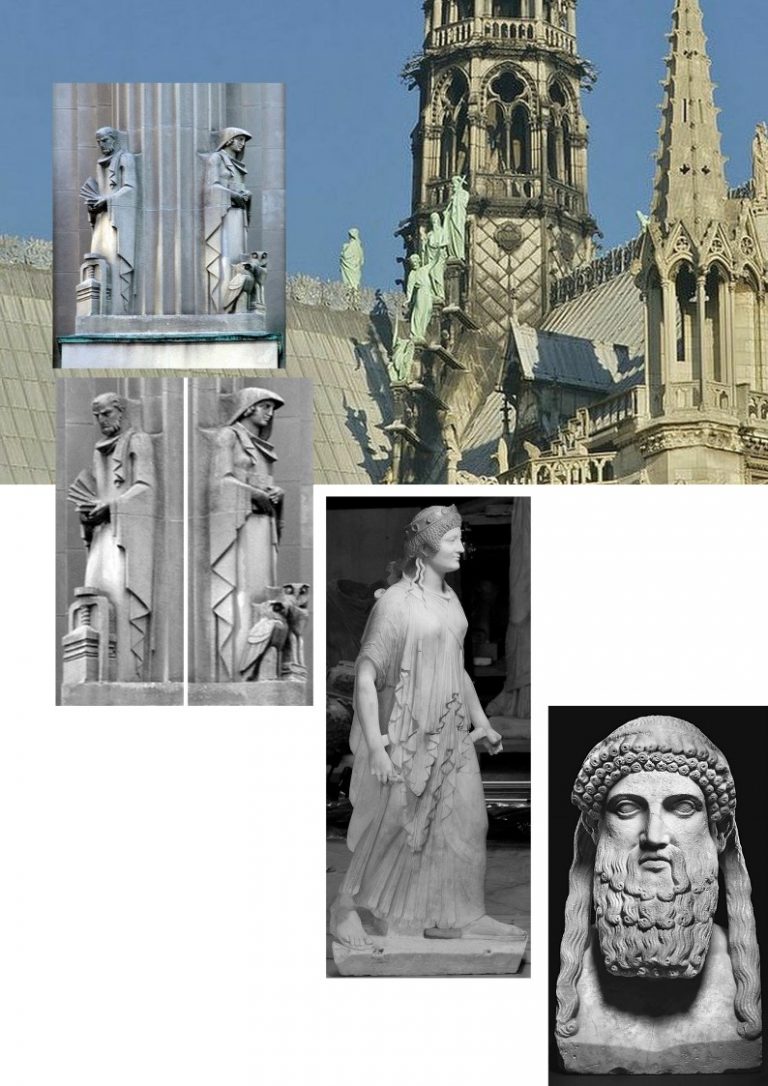
By virtue of New York’s heritage landmarking programme the above, nominally “Art Deco” – but, in truth, vigorous archaistic classical figures – at Fig. 43 survived on Joseph Urban’s building. They are thus able to maintain their conversations with earlier backward-looking and “constrained” archaistic sculptures made within Greek and Roman classicisms at the height of their developed sophistication. It is presently within our power to return Viollet-le-Duc’s “backward-looking” Apostles to their roof/spire setting at Notre-Dame and not confine them in some store room. The question is: will we be allowed to do so? Or will the negligent State that half-destroyed the cathedral now also instigate a programme of modernist stylistic subversion?
Michael Daley, 30 June 2019
CODA: Towering Glass and Steel – Alistair Cooke, BBC Radio 4 “Letter from America” 31 October, 2003:
Forty years ago last Monday morning, a gentle south-east wind carried up through Manhattan what many New Yorkers at first thought was a series of explosions of some kind.
Pretty soon there came on television what to most New Yorkers was an incomprehensible sight and sound.
The pictures showed jackhammers clawing away at the walls of a famous building and then at slow, rhythmic intervals a huge, airborne shining ball swung and crashed against the long stately Doric colonnade of – were they mad? – the Baths of Caracalla.
Well, yes – not of course the original but a superb recreation of a Roman architectural masterpiece.
Why were they doing this? And who were they?
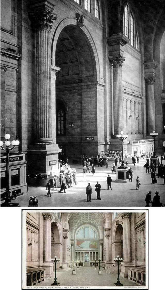
What we saw was America’s most famous railway station – the Pennsylvania Station [Fig. 44, below.]
It had been designed at the turn of the 19th-20th Centuries, during the finest hour of the new multimillionaires – especially the robber barons who had made their fortunes in coke, iron ore, railroads – a time when little old Andrew Carnegie was proclaiming the new age of steel.
Once such a man was a millionaire he became eager to advertise the grandeur of his social position by ordering up a new house, a mansion, as like as possible to the mansions not of the new rich of Europe but to the ancient houses of the old aristocracy, especially the nobles of France and Italy.
At that time Goethe had given an encouraging line to the poor or oppressed of Europe who emigrated to America: “Du hast es besser” – You have things better in America.
An American journalist, watching the robber barons fight each other to procure the old master paintings and the models of the old aristocrats’ houses, wrote: “Their motto was – they DO things better in Europe”.
Such was the temper of the time when the most fashionable architectural firm of the day had an idea beyond the dreams of the culture vulture robber barons.
McKim, Mead and White proposed to the owners of the Pennsylvania railroad that they would like to build, not a mansion for the chairman of the board, but a railroad station for the city.
And to do so they proposed to recreate a jewel of a building of ancient Rome.
Why not, they suggested to the railroad company, have the city’s new railroad station a recreation, if not an improvement, on the Baths of Caracalla, the masterpiece of Roman architecture as the Parthenon was the masterpiece of Greece?
Only Charles McKim or his dashing junior partner, Stanford White, would have the audacity and the skill to attempt such a thing.
It was done and in 1910 it was opened to the public who came in awestruck droves to gaze at the block long line of stately Doric columns, which led to the vast waiting room, which was indeed with its splendid vaulted ceiling a huge image of the Baths of Caracalla.
And from there you passed into the great concourse, where without catching breath, McKim had produced a creation of glass arches, domes and fan vaulting with the new steel – a breathtaking development of the glass and iron architecture of London’s Crystal Palace.
Americans who were not taking any train came to gaze and marvel at it. And so for a time did the European tourists.
But fashion in architecture, as in everything else, changes and can sometimes change drastically.
By the mid 20th Century the European intelligentsia came and looked at Pennsylvania Station and remained to chuckle and to sneer.
By that time America and American businessmen had been ordered to admire the revolutionary works of a German – Walter Gropius, a rebel against all classical romantic, all Victorian styles of architecture.
He invented what he called an international style.
By his time, certainly, a general reaction had set in against the gaudiness of the Victorian age, the fussiness, the writhing decoration, the lumpishness of furniture, the stuffiness which overtook everything from women’s clothes to lampshades.
When the Victorian style first came in the leading Regency architects of the day had called it ugly and barbaric.
And just a hundred years later, by the 1930s, it seems even the ordinary middle classes agreed with them.
And then came the fuehrer of the revolution – this new god of modern architecture, Walter Gropius.
He simply, earnestly, dogmatically reacted to everything that had gone before – from the Greeks on.
He invented the monolith – the large upright plank of concrete – or what an independent American pioneer, one Frank Lloyd Wright, called the new log cabin that misuses steel – “faceless, characterless, god-awful rectangles of concrete and steel”, leading, said Mr Wright, to its peak in the United Nations buildings which he called “an anthill for a thousand ants”.
Certainly the towering plank of glass and steel took over America’s cities.
And when the Second World War was over and building of everything from cottages to skyscrapers could begin again, Gropius, Mies van der Rohe – the so-called Bauhaus School – became almost compulsory for any city contemplating a new airport, a city hall, a big business about to bloom. The god himself ruled from his pulpit at Harvard.
Now, these tycoons didn’t have to like the style, it simply became essential to their social standing.
And so by the 1960s Tom Wolfe wrote: “There had never been a place on earth where so many people of wealth and power paid for, put up and moved into glass box office buildings they detested.”
By then every child went to school in a building that looks like a duplicating machine wholesale distribution warehouse.
In such an atmosphere there was only one thing more ridiculous than designing a Victorian or Georgian house and that was retaining the huge absurdity of a recreated Roman classical building.
Such is the hypocrisy of fashion that since the end of the Second War I don’t recall a visiting friend of tourist ever saying: “I must go down to 34th Street and look at Pennsylvania Station” as their successors would always obediently pad off to the Museum of Modern Art, the Guggenheim, the Whitney.
By that time nobody had heard of the Baths of Caracalla and nobody cared – except the board of directors of the Pennsylvania railroad, who decided in 1960 or thereabouts that their Roman station was an expensive burden and also something of an embarrassment.
They decided to destroy it. And so at 9am on 28 October 1963 the jackhammers clawed and the wrecking ball crashed down on the Doric pillars and soon would demolish what was the last reminder in New York of the grandeur that was Rome.
There had been no pre-emptive campaign of protest that I can remember.
It was only when the noisy fact of demolition assailed our eyes and ears that a collector or two, a startled author, and then the intelligentsia magazines woke up.
To its credit it was the New York Times that first sounded the protesting trumpet. On its editorial page it had a leader calling the demolition “a monumental act of vandalism”.
The little spurt of public shame and horror came of course too late. It took three years to destroy the station and on its ashes arose what the excellent blue guide to New York calls “the utterly graceless and unappealing Madison Square Garden” – a 20,000-seat arena in a pre-cast concrete drum, a movie theatre, a bowling alley and an office building.
However, out of this calamity, out of that ill October wind, there came one great and good thing.
In the last year of the demolition, when the long block at 34th Street began to look like a pre-vision of Ground Zero, a small clique of outraged artists, authors, art lovers, citizens, petitioned the mayor and then the city council and formed a body called The Landmarks Preservation Commission.
And since 1965 their agents have snooped around the city with the zeal of the FBI, ticketing period relics of every style of building to be preserved.
There was a big move in the 1970s on the part of the owners of the brilliant and majestic Grand Central Station to have it demolished and replaced by a 54-storied glass and steel Gropism.
The squabble was fierce and prolonged. Thanks however to the tenacity of two members of the Landmark Commission – one was man named Brandon Gill, a witty Irish American staff writer on the New Yorker magazine in its heyday, the other, the presidential widow Jacqueline Kennedy – the fight was taken all the way to the Supreme Court which upheld the protest and in 1978 decreed that Grand Central Station was to be immortal and never to be subject to the jackhammer and the wrecking ball.

