
Rodin and ancient Greek art – a personal view of a magnificent show
Last night we were bidden, as Sir Roy Strong might have put it, to the opening and reception of the joint British Museum and Rodin Museum exhibition “Rodin and the art of Greece”.
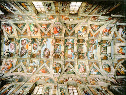
It proved an extraordinary and privileging occasion that was close to our heart in very many respects. Guests were ushered into a corner of the Great Court for drinks and canapés. In that dwarfing space the buzz of expectation among the small standing groups resembled a Royal Opera House opening of Verdi’s Un ballo in maschera. The company was illustrious. Among the many VIPs, journalistic aristocracy was present in Sir Simon Jenkins of the Guardian and Lord Gnome of Private Eye. The Two Greatest Living British Sculptors were represented by Sir Anthony Gormley R. A. (who sported some Palestinian headwear around his neck). The British Museum’s new director, Hartwig Fischer, opened the speeches well and graciously. The man from the generous sponsors, Bank of America, Merrill Lynch, followed and the French Ambassador opened the exhibition itself with certain ironical asides about the virtues of European cooperation. And we then poured into the exhibition.
As others have already indicated, this show, the combined product of a great dedicated artists’ museum and a great “universal” encyclopaedic museum, is simply stupendous. On entry, the shock of the space and its fabulous contents was also operatic: a beautifully lit elegantly constructed chip-board “set” snakes down the centre of the otherwise soul-less and dispiriting Lord Rogers’ black box, which, thankfully on this occasion, has been opened to disclose a courtyard. The continuous low plinth carries the larger, show-stopping sculptures and creates subsidiary spaces that house drawings and smaller works. Sparks fly between the works on display. The labels are good and the catalogue is exemplary. If the essential message of this engagement of a giant of modernism (Rodin) with a legendary classical artist (Phidias) – that to advance we must look back – seems subversively reactionary in today’s art world, so much the worse for us. But for this artist, the timing feels optimal: Modernism is a spent and disintegrating force. Its void is filling with assorted non-artistic activisms and relativisms.

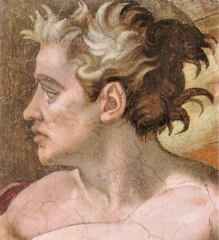
The show is welcome in other respects. It springs from the strengths of museum curators working to their departmental briefs, in this case that of Ian Jenkins, a very fine classical scholar, who himself, as it happens, has carved stone. Even before the show opened Jenkins was creating sparks of his own. He had noticed a distinct echo in Rodin’s “Thinker” of a convention for mourning figures in Greek classical art. Yesterday (24 April), a sculptor took issue with this suggestion in a letter to the Times (see below) claiming a likelier source to be present in Michelangelo’s sculpture and paintings.
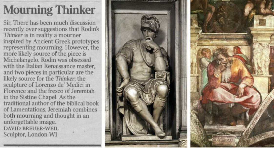
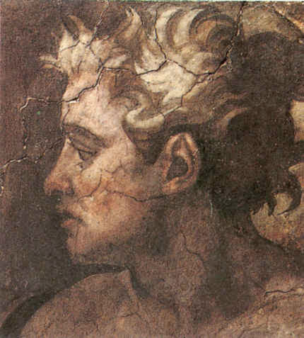
Certainly, Rodin’s awareness of and indebtedness to Michelangelo (who once said that he was never less alone than when alone with his own thoughts) was immense and, as David Breuer-Weil points out, there are strong figural resemblances. Nonetheless, Jenkins’ point was phrased with precision and he had elaborated it with striking eloquence on yesterday’s Radio 4 Today programme – this itself being a most welcome development: we have rather forgotten in recent years that museums are their curators. In the two cited Michelangelos the Lorenzo de’ Medici figure is thoughtful but imperious and unperturbed. His back is straight and his shoulders are held high. A forefinger touches his nose and lips but it has no structural function. In the painted prophet Jeremiah from the Sistine Chapel ceiling, while the figure slumps the lower legs are decorously crossed and bear little weight. It so happens, this is a figure with which we have engaged in the past and it is carried on the back of the current ArtWatch UK members’ Journal:
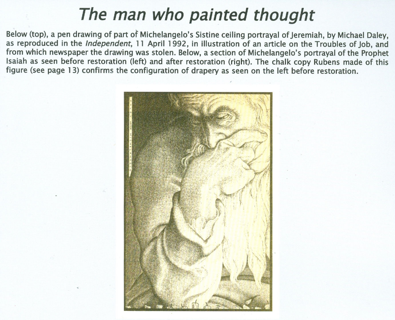
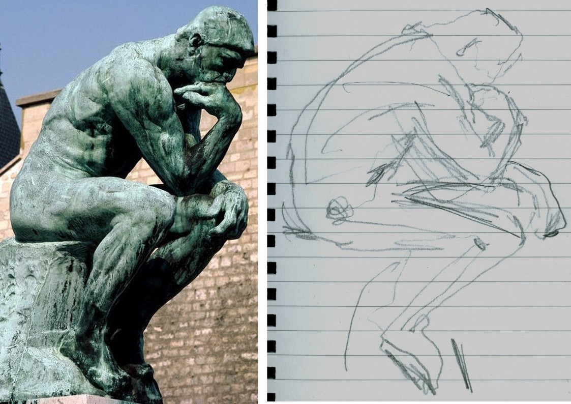
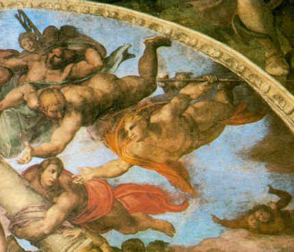
As seen in the Jeremiah detail we had adapted for a newspaper illustration (above), the head rests heavily on the hand which grips the lower face and entirely conceals the mouth – perhaps this near-universal indicator of thought stems from the source of speech being taken out of commission? There is a vital difference between the Thinker and the Jeremiah. In the former, the head rests heavily on the hand but the forearm/hand serves only as a prop or buttress. Indeed, the entire figure is a dynamic portrayal of weight, as we noted in graphic shorthand last night in the diagram below right. Even the legs are involved in buttressing the entire slumping figure who grips the very earth with his toes (photo. by promentary.net.au). Crucially, the hand does not engage directly or expressively with the face other than insofar as the upward buttressing force of the knuckles distorts the upper lip.
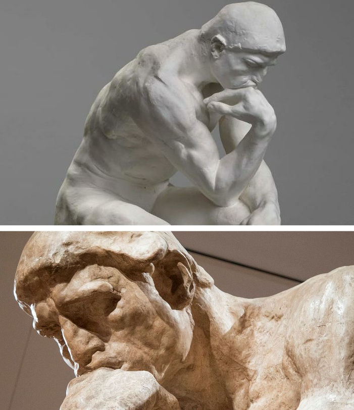
The face itself (above) is not simply thoughtful or absorbed but mournful, desolate. This head is as heavy as the heart within the figure. Jenkins seems vindicated on his observation. For artists and, particularly for sculptors, this show is, more than an invitation, a command to stop, look and draw. The British Museum has sensed as much and will be making drawing materials available to visitors. For our part, we would urge them not to be bashful and to seize the opportunity to draw unselfconsciously and purposively. Drawings are best seen not as a species of self-expression but as straightforward explanations. Draw to explain that which seems interesting significant or distinctive in a particular figure. There are no right answers here, just nice observations worthy of being made. Drawing regularly disciplines thinking and sharpens looking. (Degas once told a woman she had a beautifully drawn head. Draughtsmen know exactly what he meant.) Last night we snatched some drawings of the backs of figures, as below with Iris from the Parthenon whose flowing animalistic energy directly inspired Rodin to make an even more dynamically eroticised bronze.
RODIN’S METHOD ENCAPSULATED
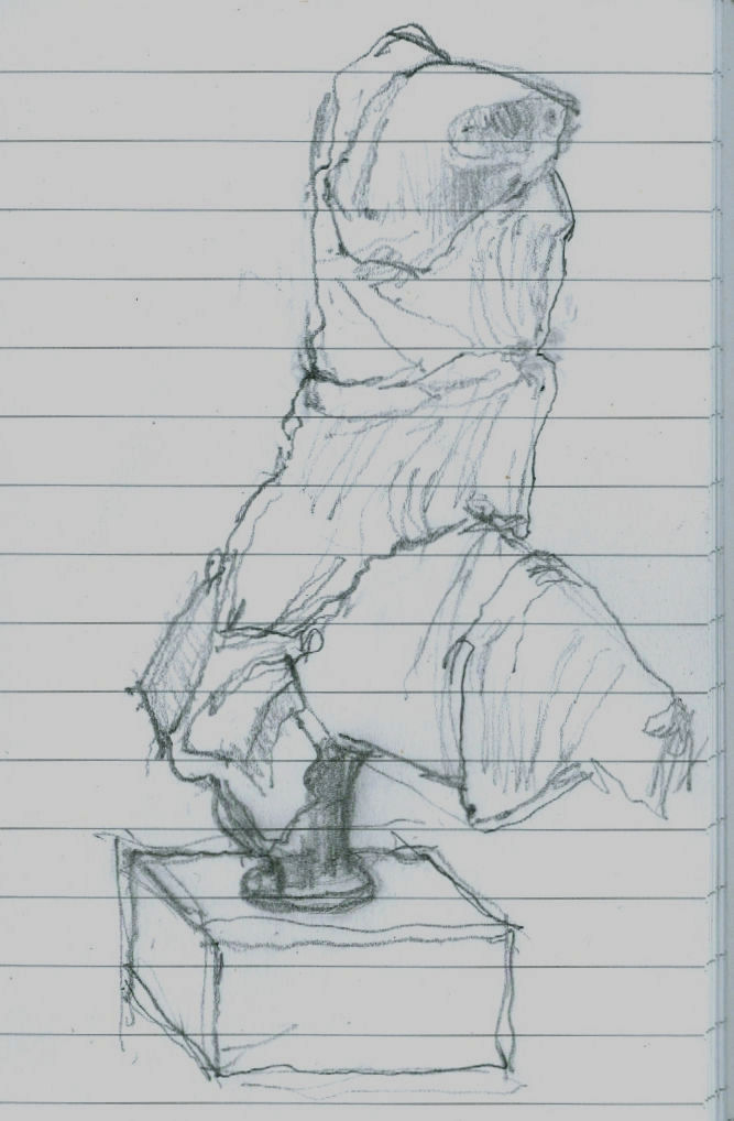
We would especially urge all visitors to take careful note of a little showcase at the far end of the gallery (next to a demonstration of plaster piece/mould casting). In it are two small modelled figures that constitute a summation of Rodin’s sculptural insights. The models were made to explain/demonstrate the differences between classical sculpture and Michelangelo’s figures. We wrote of Rodin’s understanding of differing figural conventions four years ago in the Jackdaw magazine.
The quoted Rodin comments in the article above came from the 1912 English version of Paul Gsell’s Art by Auguste Rodin. We supplement them here with a fuller account from the horse’s mouth:
“One Saturday evening Rodin said to me ‘Come and see me tomorrow morning at Meudon. We will talk of Phidias and of Michael Angelo and I will model statuettes for you on the principles of both. In that way you will quickly grasp the essential differences of the two inspirations, or, to express it better, the opposed characteristics which divide them’…Rolling balls of clay on the table, he began rapidly to model a figure talking at the same time. ‘This first figure will be founded on the conception of Phidias. When I pronounce that name I am really thinking of all Greek sculpture, which found its highest expression in Phidias.’
“The clay figure was taking shape. Rodin’s hands came and went, adding bits of clay; gathering it with in his large palms, with swift accurate movements; then the thumb and the fingers took part, turning a leg with a single pressure, rounding a hip, sloping a shoulder, turning the head, and all with incredible swiftness, almost as if he were performing a conjuring trick. Occasionally the master stopped a moment to consider his work, reflected, decided, and then rapidly executed his idea…Rodin’s statuette grew into life. It was full of rhythm, one hand on the hip, the other arm falling gracefully at her side and the head bent. ‘I am not [f]atuous enough believe that this quick sketch is as beautiful as an antique,’ the master said, laughing, ‘but don’t you find it gives you a dim idea of it? […]Well, then, let us examine and see from what this resemblance arises. My statuette offers, from head to feet, four planes which are alternatively opposed. The plane of the shoulders and chest leads to the left shoulder – the plane of the lower half of the body leads towards the right side – the plane of the knees leads again towards the left knee, for the knee of the right leg, which is bent, comes ahead of the other – and finally, the foot of this same right leg is back of the left foot. So, I repeat, you can note four directions in my figure which produce a very gentle undulation through the whole body.
‘This impression of tranquil charm is equally given by the balance of the figure. A plumb-line through the middle of the neck would fall on the inner ankle bone of the left foot, which bears all the weight of the body. The other leg, on the contrary, is free – only its toes touch the ground and so furnish a supplementary support; it could be lifted without disturbing the equilibrium. The pose is full of abandon and of grace.
‘There is another thing to notice. The upper part of the torso leans to the side of the leg which supports the body. The left shoulder is, thus, at a lower level than the other. But, as opposed to it, the left hip, which supports the whole pose, is raised and salient. So, on this side of the body, the shoulder is nearer the hip, while on the other side the right shoulder, which is raised, is separated from the right hip, which is lowered. This recalls the movement of an accordion which, closes on one side and opens on the other…Now look at my statuette in profile. It is bent backwards; the back is hollowed and the chest is slightly expanded. In a word, the figure is convex and has the form of a letter C. This form helps it to catch the light, which is distributed softly over the torso and the limbs and so adds to the general charm…Now translate this technical system into spiritual terms; you will then recognise that antique art signifies contentment, calm, grace, balance and reason…And now, by the way, an important truth. When the planes of a figure are well placed, with decision and intelligence, all is done, so to speak; the whole effect is obtained; the refinements which come after might please the spectator but they are almost superfluous. This science of the planes is common to all great epochs; it is almost ignored today.’”
And then, Gsell noted, Rodin turned to Michelangelo: “‘Now! Follow my explanation. Here, instead of four planes, you have only two; one for the upper half of the statuette and the other, opposed, for the lower half. This gives at once a sense of violence and constraint – and the result is a striking contrast to the calm of the antiques. Both legs are bent, and consequently the weight of the body is divided between the two instead of being borne exclusively by one. So there is no repose here, but work for both lower limbs…Nor is the torso less animated. Instead of resting quietly, as in the antique, on the most prominent hip, it, on the contrary, raises the shoulder on the same side so as to continue the movement of the hip. Now, note that the concentration of effort places the two limbs one against the other, and the two arms, one against the body and the other against the head. In this way there is no space left between the limbs and the body. You see none of those openings which, resulting from the freedom with which the arms and legs were placed, gave lightness to Greek sculpture. The art of Michelangelo created statues all of a size in a block. He said himself that only those statues were good which could be rolled from the top of a mountain without breaking; and in his opinion all that was broken off in such a fall was superfluous
‘His figures surely seem to be carved to meet this test; but it is certain not a single antique could have stood it; the greatest works of Phidias, of Praxiteles, of Polycletes, of Scopas and of Lysippus would have reached the foot of the hill in pieces. And this proves how a formula which may be profoundly true for one artistic school may be false for another.
‘A last important characteristic of my statuette is that it is in the form of a console; the knees constitute the lower protuberance; the retreating chest represents the concavity, the bent head the upper jutment of the console. The torso is thus arched forward instead of backward as in antique art. It is that which produces here such deep shadows in the hollow chest and beneath the legs. To sum it up, the greatest genius of modern times has celebrated the epic of shadow, while the ancients celebrated that of light. And if we now seek the spiritual significance of the technique of Michael Angelo, as we did that of the Greeks, we shall find that his sculpture expressed restless energy, the will to act without hope of success – in fine, the martyrdom of the creature tormented by unrealisable aspirations…To tell the truth, Michael Angelo does not, as is often contended, hold a unique place in art. He is the culmination of all Gothic thought…He is manifestly the descendant of the thirteenth and fourteenth centuries. You constantly find in the sculpture of the Middle Ages this form of the console to which I drew your attention. There you find this same restriction of the chest, these limbs glued to the body, and this attitude of effort. There you find above all a melancholy which regards life as a transitory thing to which you must not cling.’”
Clearly, Rodin would have no shortage of ideas if invited to deliver the Reith Lectures. We think we understand what political point Gormley wishes to make with his neckwear. The point of his sculptures is less apparent, as we complained in a letter to the Daily Telegraph (12 March 2008):

This Rodin/Phidias show has not been cost-free in terms of disruption and the further cleaning of the Parthenon sculptures but, leaving such aside, it is the most sculpturally engaging and instructive we have seen since the great 1972 Royal Academy and Victoria and Albert Museum exhibition “The Age of Neo-Classicism”.
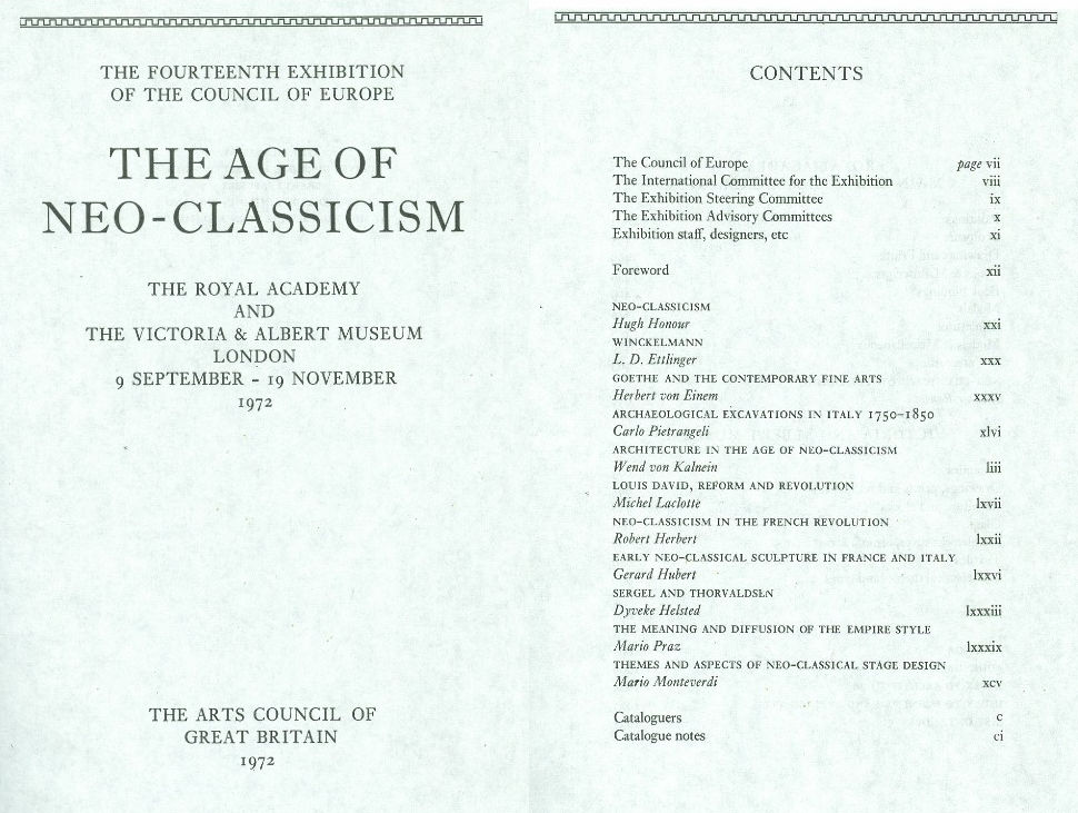
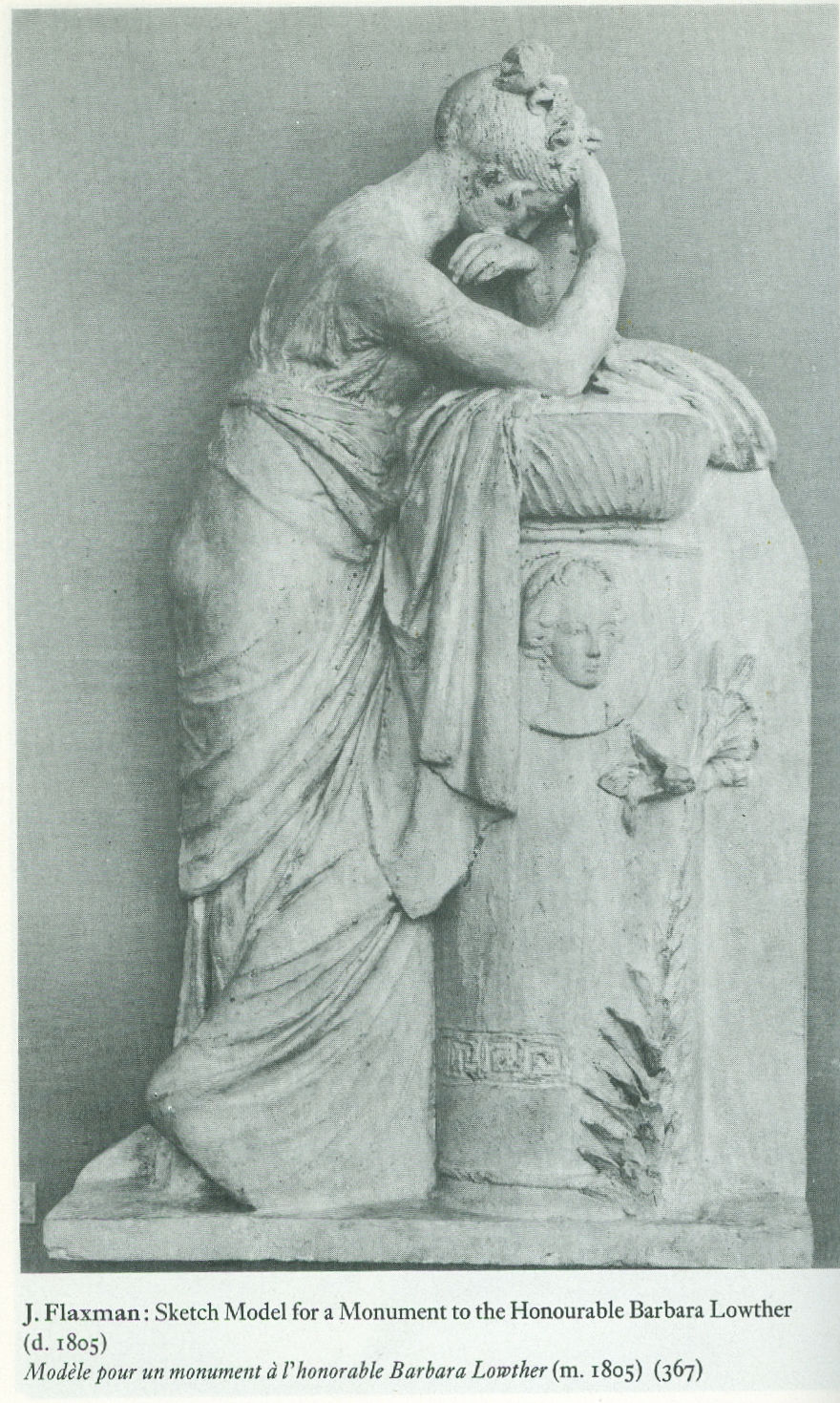
ArtWatch has no politics and, as mentioned, this is an entirely personal response to an exhibition but, nonetheless, we would respectfully point out to the French Ambassador that that earlier wonderful internationally cooperative Neo-classicism show – the fourteenth exhibition of the Council of Europe – was mounted two years before Britain voted to join what was presented to its electorate as a common market in goods. Culturally-speaking we were all Europeans then and we will remain so after Britain has exited the grand project (some believe great folly) that is the European Union. In or out of that organisation, Britain and France will continue to play roles in pan-European culture, just as did the two sculptors below, one being French, one British, whose work was included in the 1972 exhibition. The Briton, Flaxman, had earlier echoed the ancient convention of mourning that Ian Jenkins has so well spotted in Rodin. Art is a universal and welcoming, all-inclusive language. We should keep politics out of it at all costs.

Michael Daley, 25 April 2018
Sistina Progress and Tate Transgressions
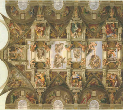
The tide continues to run against supporters of the Vatican’s 1980s and 1990s restorations of Michelangelo’s Sistine Chapel frescoes, but it looks as if the National Gallery’s technical conservation division might be about to attempt a last-stand defence of the proclaimed “Gloriously Recovered Colours” that were said to have resurrected a “New Michelangelo”. An exhibition at the Gallery, Making Colour (June 18 to September 17), is to examine the stuff of pigments, in the course of which… Michelangelo is to be enthroned among the great colourists Titian, Turner and Matisse. The manoeuvre shows signs of back-firing.
The Times’ art critic Rachel Campbell-Johnston was healthily wary and alert to art world conservation politics when previewing the exhibition (“True colours: from Titian to Turner”, The Times, 31 May 2014):
“It is wilfully provocative to put a sculptor most famous for his pallid stone carvings on a list of the world’s greatest colourists. But his Sistine Chapel paintings – coming together as they do to create the single greatest pictorial scheme of the Italian High Renaissance – are among the most vibrant works of western art ever created. And after a recent and highly controversial restoration in which solvents were used to strip away half a millennium’s worth of accrued candle smoke and grime – and with it, many argue, the artist’s own shadowy subtleties – Michelangelo is being reassessed. Every book on this artist will have to be rewritten declare historians who marvel at the newly revealed drama of vivid colour. Others, however, remain not just sceptical but deeply dismayed at the irreversible damage that the cleaning has done.”
Even the restoration-friendly Art Newspaper carries seditious words on conservation and the Sistine Chapel in its current (June) issue. The spat that we reported between Bendor Grosvenor (“Art historian, dealer and broadcaster”, of the Philip Mould and Company gallery), and Martin Myrone (“Lead curator, pre-1800 British art at Tate Britain”), at last month’s Mellon Centre conference on connoisseurship and educated eyes, is re-run in the Art Newspaper under the heading: “Do we need a return to connoisseurship?” Dr Grosvenor’s latest comments on restoration and connoisseurship are, however, almost cryptically condensed. They read in full:
“I despair at seeing a picture over-cleaned through a conservator’s misunderstanding of how an artist worked, and the removal of an original glaze in the belief that it is either dirt or over-paint (the Sistine Chapel is the most depressing example of this).”
For the record, Dr Grosvenor’s Mellon Centre mea culpa of May 2nd was delivered as follows:
“And to show why I think that connoisseurship has such a valuable role to play in conservation, let me mention what is – let me end with what is probably the most single important painting in Western art history: Michelangelo’s Sistine Chapel ceiling. I recently went to Rome and saw the ceiling for the first time, and as I was standing underneath it with my binoculars, being jostled this way and that by the crowds, I am afraid I got a terrible shock. I always used to think that critics of the Sistine Chapel restoration were being slightly myopic, or a little bit obsessive, and that trained restorers surely at this level were infallible, and couldn’t possibly damage pictures. But how wrong I was! The Sistine Chapel has been subjected to the most brutal over-cleaning imaginable. I don’t mean the exposure of the bright colours which we see looking so nice here, which most people fixate on, but the actual removal, through simple abrasion with solvents and a rough sponge, of the crucial darks and shadows which gave the ceiling so much meaning and form. Though we don’t have time to go into the debate here as to whether Michelangelo worked a secco on the ceiling or purely in fresco it seems to me that the whole approach to the cleaning of the ceiling was fundamentally misunderstood. But my contention is that if the restorers had, in fact, been real trained connoisseurs of Michelangelo’s work and were not just pure technicians and had a feeling and an eye for how Michelangelo intended his pictures to work they might not have made the same mistakes. And I don’t think I can really make a greater example of why connoisseurship matters. Thank you very much.”
The now linked battles over art restoration and connoisseurship are intensifying. (We are intrigued to know what Dr Grosvenor thinks of the Philip Mould gallery’s own picture cleaning methods. We do know that even when restorers aim to remove just “varnish”, real paint often comes off in the wash – as seen at Figs. 12 and 13. Would the risks not be all the greater when restorers are removing what they take to be “re-paints” from pictures in a hunt for better work underneath?) The museum world’s phoney “Culture Wars” between a supposed but now mythic Art Establishment (look at the recent membership of the Royal Academy and its Summer Show banner “Discover the new; discover the now”) and the Tate and State-pampered, edgy, head-banging contemporary art sensationalists is masking a fundamental art world schism that shows signs of turning ugly. Dr Grosvenor’s ideologically opposite number at both the Mellon Centre conference and the Art Newspaper forum, was Dr Martin Myrone – who happens to have hit the headlines. Tate Britain is mounting an exhibition of British folk art (see “Tate Britain rejects ‘elitist’ Old Masters as Turner makes way for thatched king”, the Times, 5 June 2014). Tate’s press release declared “British Folk Art will include surprising and diverse examples of British folk art, from rustic leather toby jugs to brightly coloured ships’ figureheads. The imposing larger than life-size thatched figure of King Alfred created by master thatcher, Jesse Maycock, in 1960 is one of the exhibition’s highlights.”
News of this exhibition almost caught us off-guard: when Tate spokespeople witter about “diverse” and “surprising” things, we instinctively reach for our cultural pistols, so to speak. But for once, the artefacts clearly are of interest (see Fig. 11) and worthy of attention. The bone cockerel shown in the Times is, in its wit, force and verve of plastic articulation, the superior of the over-sized blue cockerel presently occupying the fourth plinth in Trafalgar Square – which itself is the best of a very long, very bad bunch of occupants. The straw man, likewise is, with its subtle, ominously Germaine Richier-like weight-shifting presence, more than an expressive sculptural match for, say, Sir Anthony Gormley, R. A.’s turgid “Angel of the North”. In short, we have no problem with the subject of the exhibition: quality is, as quality is found. No problem, that is, except this: the Tate is not parking this exhibition in Tate Modern’s vast halls or spinning it as an overdue and welcome blast against the enfeebled self-indulgence of today’s decayed fine art tradition. Instead, it treats this folk art as vindication of that very sector (because Tracey sews and Grayson potters) and is using it as yet another way of denigrating and humiliating odious, elitist Old Masters. (One more sign, perhaps, of the un-wisdom of permitting one man an unbroken, guaranteed-for-life, twenty-six years long reign of tenure at the Tate?)
Insofar as Dr Myrone’s dense sub-Marxian jargon in the Art Newspaper permits appraisal, it would seem that his antipathy to the notion and practice of connoisseurship is deep and visceral. As he puts it in the Art Newspaper:
“…Instead, contriving the resuscitation of connoisseurship on the basis that its worth is self-evident may be retrogressive, obscuring the stakes and investments actually brought into play as the different parties involved (academics, curators, dealers and so forth) establish their relative authority and their claims to public attention…Arguably, the only thing that now distinguishes connoisseurship as such is the element of economic and social purposefulness, its specific role as a way of talking about art and asserting aesthetic merit in terms which are readily translatable into economic value. The language of connoisseurship is simply more compliant to the needs of the market than other forms of historical discussion, which may be more open-ended and questioning, less certain about the judgement of value.
“Moreover, allowing the issues of authenticity and authorship to overshadow all the other issues and questions around historical works of art risks impoverishing our understanding and enjoyment of art’s rich histories and our ability to communicate this in genuinely open-minded, engaging and thought-provoking ways. There is nothing, I think, radical or outrageous in pointing out that connoisseurship has served to reinforce social difference and further material interests over history.There are numerous studies which testify to this. What would be absurd would be to claim that this has somehow stopped in the present age and that connoisseurship is now absolutely removed from struggles over cultural authority…”
What is so sad and alarming is that art professionals working in the most elevated art institutions should be so antipathetic to art as art. As for lucre, they are happy to pursue careers and draw salaries working among art as long as it can be made instrumental – serve some “enlightened” progressivist, consciousness-altering, society-levelling social force. This is sad because it is philistine. It fails to respond directly, unashamedly, unapologetically to art itself. It is dangerous because should such blinkered aversions gain an absolute upper hand, cultural repression would result. Dr Myrone is clearly a conscientious man with the interests of the common weal at heart. But if we were to deny contemplation of the highest, the best, and the most life-enriching art to all, we would gain nothing and simply add cultural and personal impoverishment to existing social ills.
This antipathy to connoisseurship must be defused. First, let us recognise that it really doesn’t necessarily come with snooty baggage or an eye on the financial main chance. That, at heart, it is a perfectly simple, decent and desirable matter; that it is comprised of nothing more odious than an ability to discern qualities that are of value. Second, that every art school lecturer used to recognise “the hand” of every student. We say “used to” because artistic hands are only evident when common cultural purposes are pursued through limited artistic means (as when all art students drew and drew from the same casts or figures). If scrunching paper and blinking lights count as art today then connoisseurship is already dead – and Dr Myrone can chill. He may, on the other hand, already be halfway to connoisseurship himself – in the Art Newspaper, he also writes:
“It is perfectly possible to talk about technique, authorship, authenticity and quality without recourse to the rubric of connoisseurship. Moreover, the application of skill in these various matters is part of the every day work of the art historian and curator, tending in practice to be rather modest and mundane. It is just part of the job.”
Well, which is it to be? If connoisseurship is being done routinely, albeit under a different name, what is the problem? And why should we not talk about the doing of it, on the assumption that some may be doing it better than others?
In art practice itself, every proper artist is a connoisseur, not least of his own work. Every teacher forms preferences and will see more of value in the productions of one student over another. That is connoisseurship in action. Nothing to be ashamed about. When teaching in art schools it is not unheard of to encounter a student from Eton or from the Old Kent Road. Proper professional concern for quality and talent puts the Old Etonian on a level playing field and at risk of being outclassed by the greater talent of someone from nowhere. Dr Myrone complains, as reported in the Times, “We have rested much more on the idea of a canon of great masters, a Hogarth-to-Turner story…it is a fairly narrow kind of canon. A select few artists have been elevated, but there is a whole world of making and physical production which is really exciting.” And so there is – but what humbug: narrow canons? How many working illustrators, film animators or car designers win Turner Prizes or get elected to the Royal Academy? Is everything really of equal value to the Tate? Are all avant gardists of the same merit? On what basis, then, are the Turner Prizes awarded? If someone scrubs a painting and features come away, as was the case with the group of lads holding a ladder at the top of Fig’s. 7 and 8, would it be a good and desirable thing if art historians lacked the critical visual ability to notice – or the courage to speak out? Dr Grosvenor has at last cottoned on to the menace – is Dr Myrone still not up to it? Has he not yet come across the excellent post on Grumpy Art Historian which carries this helpfuly clarifying comment:
“Why cannot the art historian emulate [the archaeologist] and treat all images simply as artefacts of a given culture? I think the answer is simple. Such pretended scientific objectivity would rapidly lead to the suicide of our subject. On a purely practical level the archaeologist is saved from the agony of selection by the relative scarcity of his evidence. We are in a very different position. Once we decided not to make any distinctions between painting ceilings or, for that matter, assembly halls, we would be so swamped with material that Michelangelo’s or Wren’s creations would be lost in an ever-swelling card index”
Michael Daley
Comments may be left at: artwatch.uk@gmail.com


![]()