
Hollow Gods and Dangerous Beauty
With museum and gallery visits becoming ever-more crowded noisy expensive and denuded of works loaned, in needless restorations, or stored as directors play developers as well as impresarios, the appeal of small venues grows. Bury Street in St James’s is buzzing with two (free) exhibitions, one light on drawings, one rich.
A principal delight of the non-museum/gallery sector is un-trailed and unanticipated cross-fertilisation. Until 13 December, Hazlitt Holland-Hibbert is showing Eduardo Paolozzi (Hollow Gods – Sculpture and Collage from 1946-1960) and, hard after its “From Michelangelo to Matisse: Five Centuries of Drawing”, Colnaghi is running (until 24 January) a big and various show, “Dangerous Beauty” – dangerous because themed on “the seductive beauty of the female form” at a time when “women around the world are claiming back the right to be represented without male filters”.

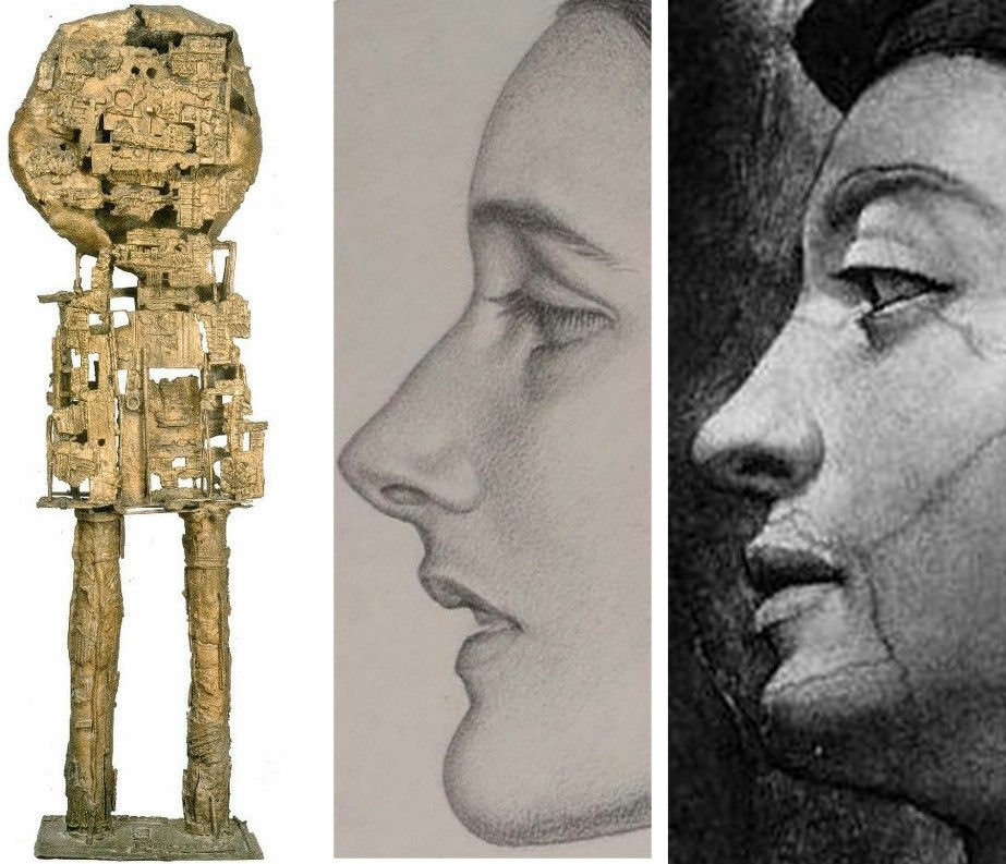
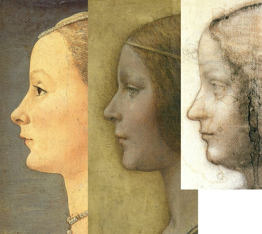
Above, Fig. 1: Left, Paolozzi’s 1947 Fragment einer Grabstele aus Lokris, detail; right, Colnaghi’s Karl Parsons 1933 pencil drawn Patricia.
Where the Paolozzi show is, as its title indicates, light on drawings, the Beauty Show is especially rich and the Parsons drawing itself constitutes a dangerous revelation in one rumbling art political context discussed below.
It was something of a shock to realise just how historic – and overdue – this (nicely catalogued) Paolozzi survey is. For nearly two decades after the Second World War the sculptor was quintessentially modish and acclaimed as an intellectually and formally invigorating force. Rich in friendships with rising modernist critics and architects, Paolozzi was unusually cosmopolitan being of Italian parents in Scotland, spending time in Paris imbibing Picasso, Klee, Giacometti, Dubuffet and admiring Francis Bacon, Willem de Kooning, Leon Golub, Germaine Richier, Richard Stankeiwicz and Alberto Burri. In due course he, like many British sculptors, became an art fashion casualty of the all-conquering hard-line “concrete” formalist vocabularies forged by the St Martins School which grouping was held for a while to comprise Britain’s Greatest Sculptors since the Middle Ages. The self-impoverishment of that school’s stance – effectively, that material bears its own message – left space for Paolozzi, like Henry Moore before him, to become the leading producer of Grand Civic Sculpture and, even, to uphold the figurative banner. The Hazlitt Holland-Hibbert show demonstrates how much was lost when Paolozzi abandoned his fugitive evocatively battered but upstanding early figurative explorations for more decorative printed graphics (- sometimes veering on the psychedelic), design and large-scale architectural productions.
Strictly-speaking, Paolozzi was neither a traditional draughtsman nor a traditional sculptor. He did not carve, model or even fabricate. Rather, he scavenged, appropriated and re-assembled. From childhood he had been an avid, omnivorous reader and collector of illustrated books, comics, advertisements, sports, health and technical manuals. Amidst the world’s plethora of reproduced images and mechanical objects he showed a distinct nose and sympathy for the paradigmatic force of classical sculpture’s now-fragmentary figures, busts, bases, pedestals and so forth. It is possible that he was alerted to classical art – as well as to badges, uniforms and aeroplanes – when sent by his father to summer in fascist youth camps in Italy.
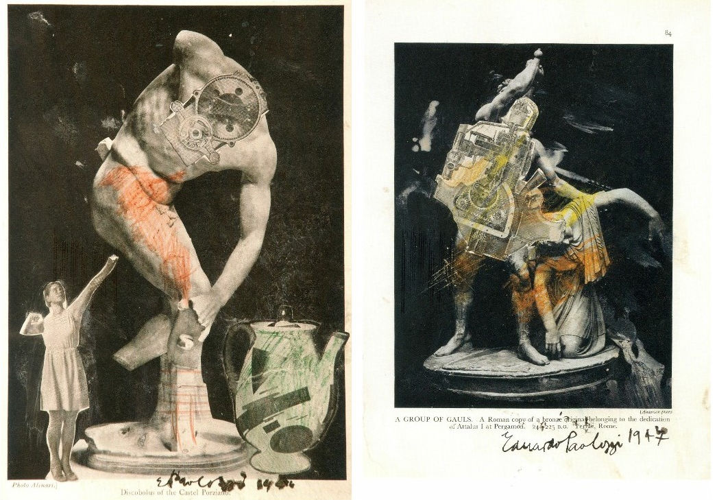
Above, Fig. 2: Left, A Group of Gauls, collage, pencil and wash, 1947; right, the Discobolus of the Castel Porziano, collage and ink wash, 1946.
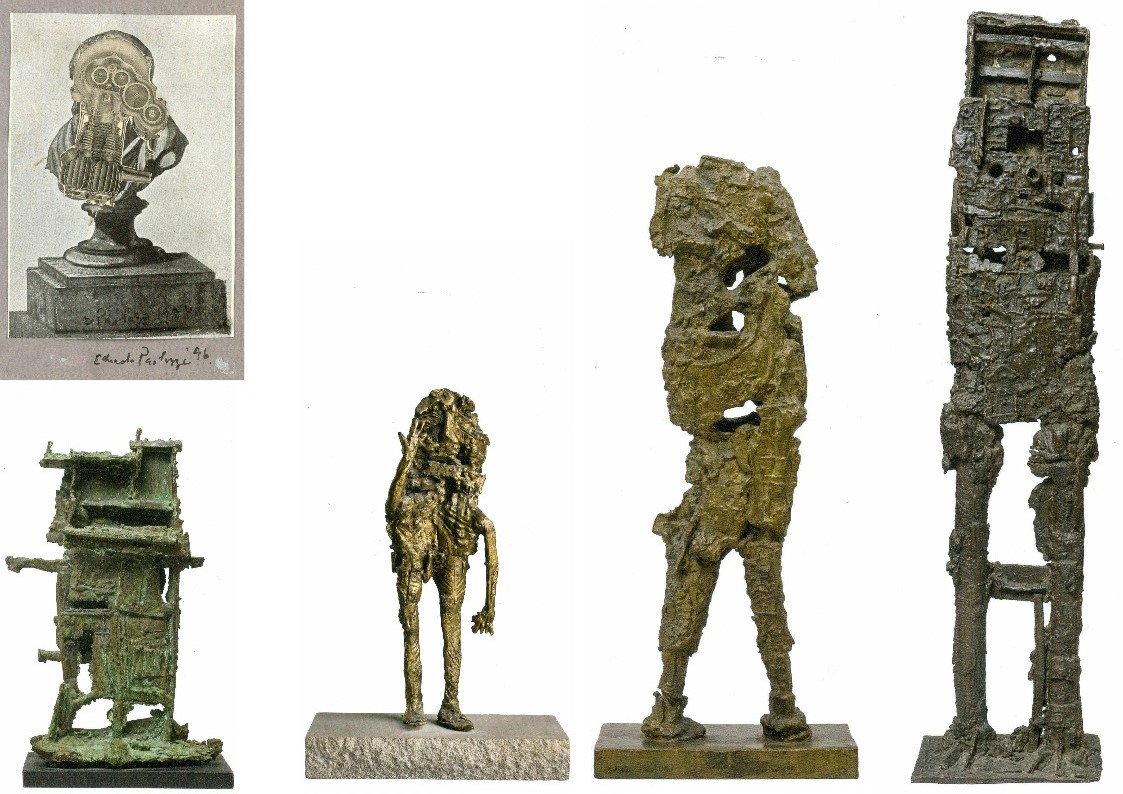
Above, Fig. 3: Left, top, Untitled, collage, 1946; above left, Small Monument, 1956, unique bronze, H 13 inches (33 cm); second left, Figure with Raised Arm, 1955, bronze, H 18 inches (46.5 cm); third left, Robot, bronze, H 19 inches (48.5 cm); right, Figure, 1957, bronze, H 48 inches (123 cm).
CUTTING AND ASSEMBLING
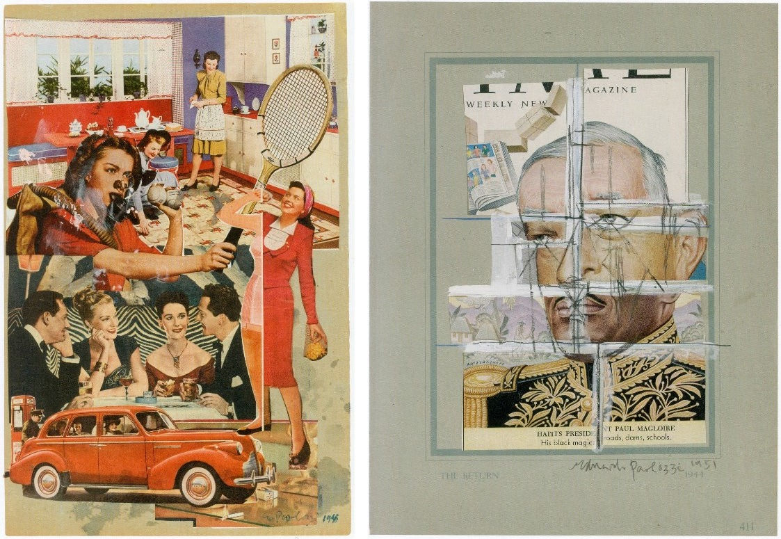
Above, Fig. 4: Left, Untitled, 1948, collage, 37 x 24 cm; right, The Return, 1954, collage, pencil and gouache, 13 x 10 inches.
Paolozzi’s witty mini-essay on monuments at Fig. 3 caught the eye of Henry Moore, who bought it. The collaged Untitled image above left might easily be taken today as a trenchant visual synopsis for the “Mad Men” TV series but in the UK’s impoverished food-rationed and punitively-taxed post-war years American affluence had yet to become a source of self-loathing shame and Paolozzi’s collaged image might better be seen as an innocent celebratory act of awe and wonderment. His affection for the United States famously (and influentially) extended to its popular culture and especially to its movies which he saw not as sources of harvestable imagery but as “direct experience” to be lived. Boris Karloff, The Mummy’s Hand and Frankenstein were, however, acknowledged to have “supplied a thread in his beat-up human image.”
As late as 1957, Paolozzi saw the United States as offering more to an artist than the Mediterranean. However, with The Return, above right (and other such graphic collages) a darker colder side emerges. Slicing up images – particularly images of faces – and reconfiguring them to misaligned satirical intent is not cuddly. Much later, in the 1980s, Paolozzi would carry the cutting and reconfiguring into grander more conventionally realised sculptures whose forms were clearly delineated by an otherwise continuous surface skin. Those late dismembering exercises seemed free of sadistic intent and to be deployed more to impart a formal dynamism than any expressive or symbolic purpose. Nonetheless, slicing up and recomposing images or effigies of human faces and heads is inherently unsettling and question-raising. Does the enlarged, flattish circular head of Paolozzi’s St Sebastian at Fig. 7 below allude to a sun/halo or an archer’s target board?
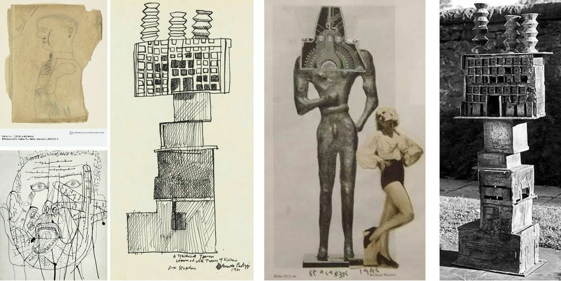
Above, Fig. 5: Left, top, a Paolozzi self-portrait made as an eleven-year old schoolchild; left, above, Paolozzi’s 1953 ink drawing Self-portrait; second left, a 1961 drawing for the sculpture Tyrannical Tower Crowned with Thorns of Violence – and as realised at the National Galleries of Scotland, above, far right; third left a photo-collage of 1946.
AUTHENTICITY IN AN ERA OF UNIVERSALLY HARVESTABLE AND REPLICABLE IMAGES

Above, Fig. 6: Above, top, Paolozzi’s 1947 photo-collage Fragment einer Grabstele aus Lokris shows the artist at full throttle. The limited means – just three “lifted” images – is classically restrained: a cheesecake pin-up of the kind that had recently graced millions of soldiers war-time lockers and kit bags; an eloquent fragment of antique carving speaking of lost civilisations; and, as representative of the future and increasing well-being, an item of machinery that perfectly mimics Western modernist artists self-consciously cultish appreciation of African masks. Today, we make what we may be permitted of this nicely triangulated homage but sparks still fly and engage with other art – as with the above famous 1926 Paris Vogue Man Ray portrait of Kiki de Montparnasse.
The Man Ray photograph had found echoes before Paolozzi, as above in the 1942 promotional/glamour photograph of Lana Turner by Eric Carpenter (which is preceded by Ingres’ pencil copy of Leonardo’s painted portrait known as La belle ferronnière ). In the 2000 Hollywood Portraits book by Roger Hicks and Christopher Nisperos, the authors raise questions of authenticity in photography-as-art. While Carpenter’s “chiaroscuro is striking”, they seem to complain, “there is much retouching in this picture. Most of what we see between the actress and the statue looks like airbrushing, particularly the shadow next to her cheek, but the keyline on the chin is genuine and beautifully executed – a reflection from the background…the profile is masterful, and the canting of the camera – a popular device at the time – is all but essential: it places the main subject’s face at a more attractive angle and greatly reduces the apparent mass of the statue, which otherwise might dominate the composition. The principal tricks in re-creating this picture are, first, the very careful control of the chiaroscuro; second, the angled camera; and third, diligent and extensive retouching…” (For Hicks and Nispero’s further views on the role and means of retouching, see “Coming to Life: Frankenweenie – A Black and White Michelangelo for Our Times” .)
With the many technical and professional advances in photography and cinema – not least digitalisation – and the widely indulged licence to tamper -the boundaries between art (where images are made) and photography (where images are taken) are clearly weakening. Practical problems follow: can steps be taken to prevent or even identify the illicit manufacture of perfectly deceiving facsimiles of bona fide works? As Dalya Alberge discloses, Man Ray’s iconic Kiki de Montparnasse image exists in more versions than should be the case – “Fake Man Ray prints are hanging on museum and collectors’ walls, leading specialist warns”.
CLASSICAL TENACITY
Above, Fig. 7: In this fast moving and problematic technical world, the simultaneous appearance within a hundred yards of Paolozzi’s 1957 bronze St Sebastian IV and Karl Parsons’ 1933 pencil drawn Patricia came as a jolt. We all well know of Paolozzi’s art but how many knew of Parsons’ society portrait drawings? The two works above left and centre might seem worlds and eons apart but where Paolozzi was thirty-three years old when he made his St Sebastian at a time when traditional art school practices were crumbling, he was nine years old when the forty-nine year old Parsons drew Patricia (in what would be the last year of his life). Parsons had attended some classes at the Central School of Arts & Crafts in London but essentially learned his craft in the doing – that is, in the time-honoured role of apprentice to a successful working master, in his case, to the leading Arts and Crafts Movement stained glass maker, Christopher Whall. Parsons went on to carry out major commissions for the windows of Canterbury, Gloucester, Cape Town and Johannesburg cathedrals. Beyond that rigorous training and high-level artistic practice, Parsons all the while had at his back centuries of tradition – it is not fanciful to see a direct line from Michelangelo’s monumental painted profile from the Sistine Chapel ceiling’s Erythraean Sibyl (here mirrored, above right) to Parson’s modest (15 by nearly 12 inches) monogrammed profile portrait in pencil on paper.
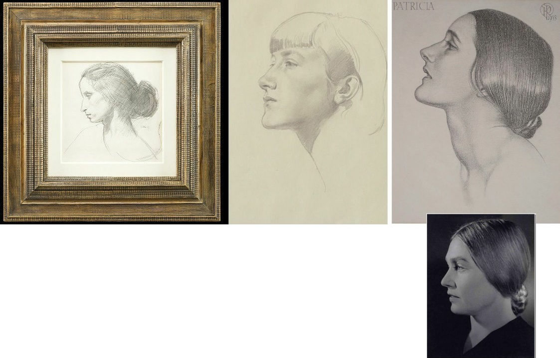
Above, Fig. 8: Colnaghi’s larger, mixed show happens to contain a mini-exhibition of modern (traditional) female profile portraits drawn on paper. First, above left, is Augustus John’s 1907 portrayal in black chalk of his mistress/muse/mother figure, Dorelia McNeill, who at sixteen had edited a magazine called The Idler. Second left, is Gerard Leslie Brockhurst’s pencil on paper portrayal, Anais. The Parsons drawing’s sitter is considered most likely to be Patricia Frances, Lady Strauss. A vintage National Portrait Gallery photograph of her (by Bert Sachsel), from the late 1930s or early 1940s, as above right, displays striking facial similarities, as well as the same hairstyle. Patricia, an author and politician who stood unsuccessfully for the Labour Party in Kensington South at the 1945 General Election, married George Strauss, MP, in 1932, and became Lady Strauss in 1979. A significant patron of both the performing and the visual arts, she led a campaign to persuade the government to use half a percent of the cost of all new buildings for works of art and pioneered the first international sculpture exhibition in Battersea Park. (In the 1963 Battersea sculpture show Paolozzi exhibited along with Henry Moore, Kenneth Armitage, Reg Butler, Lynn Chadwick, Geoffrey Clarke, Bernard Meadows, William Turnbull and others.)
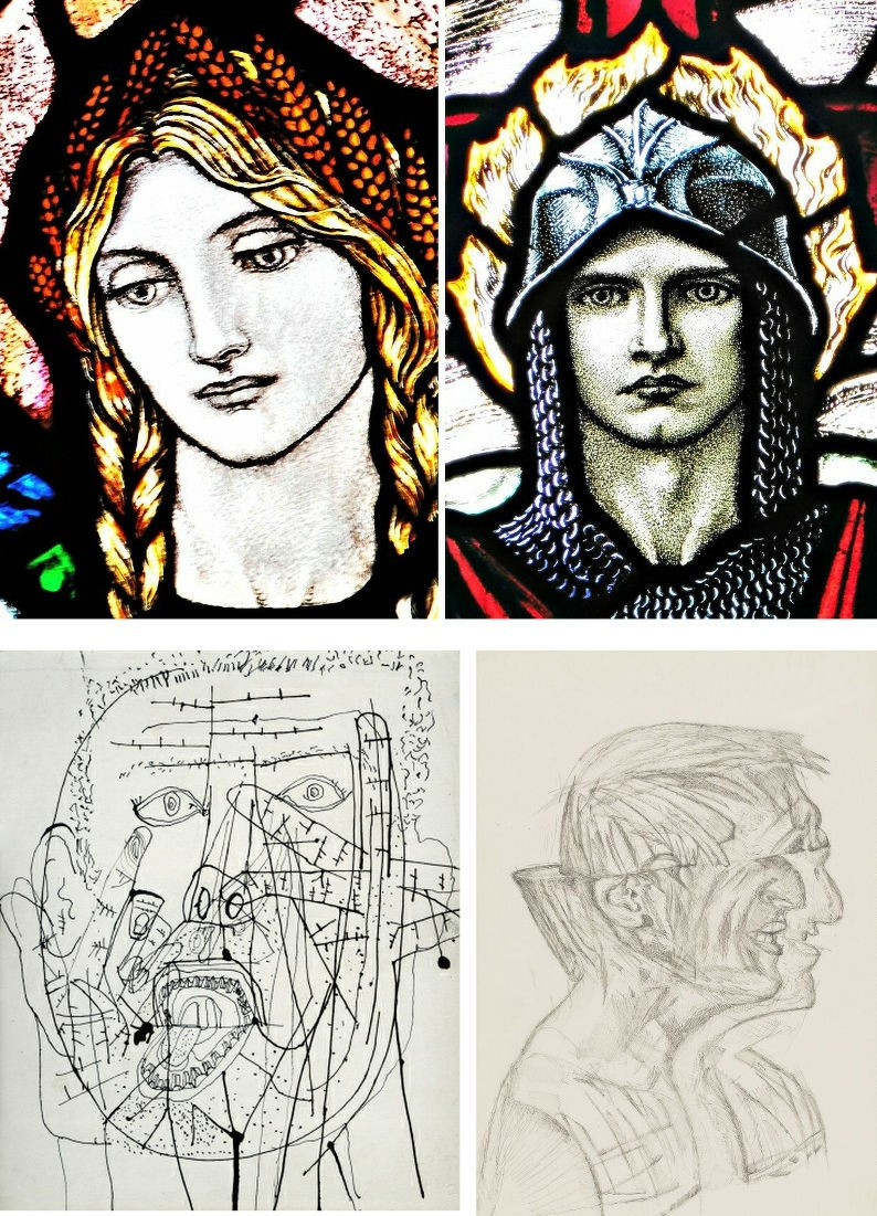
Above, Fig. 9: Top, two stained glass heads by Karl Parsons; above, left, Paolozzi’s 1953 self-portrait, and, above, right, one of his 1980s ink on tracing paper studies of the architect Richard, now Lord, Rogers. More than half a century and the Second World War stands between the above two pairs of images. The chasm of artistry and draughtsmanship between Parsons and Paolozzi in these works might seem painful to contemplate. Looking at these images today, who eclipsed whom artistically? The principal charge against Arts and Crafts depictions was of a perceived saccharine sweetness and sentimentality. Was the suppression of such traits best or necessarily made by evocations of psychic derangement and a drawn proposal for a combined scalping and splitting of an identifiable person’s effigy bust? Are we still forbidden to admire the remarkable artistry and sheer force of expression in Parsons public works?
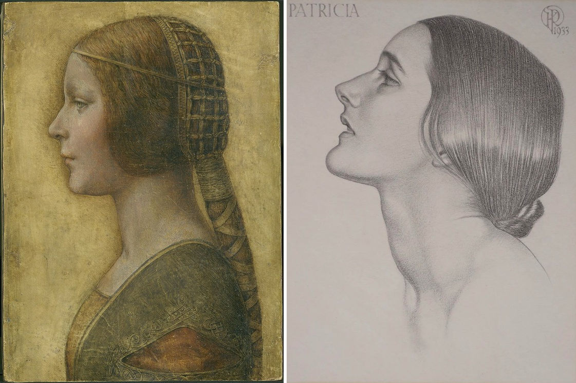
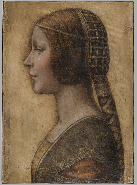
Above, Fig. 10: Left, “La Bella Principessa”, a mixed media drawing attributed to Leonardo; right, Karl Parson’s Patricia.
In the pairing above, we see either Parsons pitted against a newly discovered (that is, a claimed) Leonardo drawing of a princess, or – as we believe – two possibly near-contemporaneous twentieth century works. The emergence of Parson’s pencil-drawn Patricia (above right) coincides with a near decade-long campaign of advocacy on behalf of the (unsold) supposed-Leonardo portrait of a short-lived Milanese princess, Bianca Sforza (above left), that Professor Martin Kemp dubbed “La Bella Principessa”. The drawing was so attributed in knowledge that this profile portrait type has been assailed by modern forgeries: “Complications for the historian lie both in the fact that the subjects of most female portraits are no longer identifiable and that, because of their exceptional decorative and historical appeal, such portraits were highly sought after by later nineteenth- and early twentieth-century collectors, encouraging a market for copies, fakes and over-ambitious attributions” – Alison Wright, The Pollaiuolo Brothers, Yale University Press, 2005.
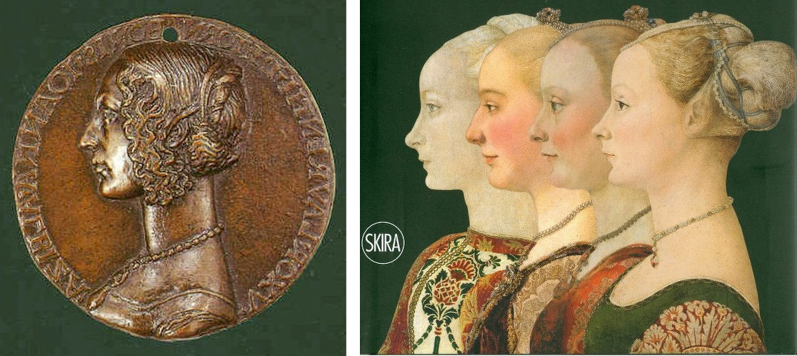
Above, Fig. 11: Left, the (mirrored) obverse of a bronze medal of c. 1486 attributed to Niccolo Fiorentino; right, four 15th century paintings judged most likely by the Polliauolo brothers, Antonio (figures 1 and 4) and Piero (figures 2 and 3). We mentioned a link between Parsons and Michelangelo. In truth, Parsons’ Patricia may intentionally have referenced the earlier (15th century) archaising profile portrait tradition with paintings made in emulation of classical relief portraits found on antique coins.
Since its first appearance as a prospective Leonardo drawing, we have suspected “La Bella Principessa” to be a work of the 20th century. The fakes-generating popularity of the profile-lady type of which Alison Wright spoke is attested in Fig. 12 above, where we see that in the early years of the 20th century, Antonio del Pollaiuolo’s Profile of a Woman seems to have enjoyed position as an exemplar of the 15th century profile portrait type wherein, as Ingres noted, “Never is a woman’s neck too long”.
TRUE TO TYPE?

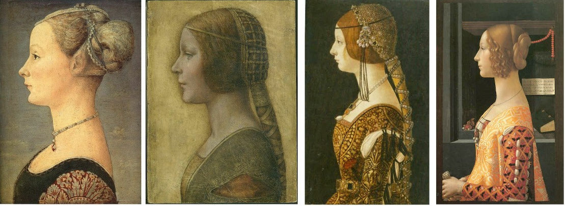
Above, Fig. 13: We take all three works in the top tier to be modern productions and all four works in the bottom row to be not only bona fide 15th century paintings but, in the case of Antonio Polliauolo’s Profile of a Woman in the Museo Poldi Pezzoli, Milan (as in the fourth and fifth images) the most popular version of a most popular type. For those wishing to make modern versions, Polliauolo’s Milan profile seems to have been taken almost as a template because of its great attractiveness and because its rather truncated composition greatly minimises the work needed properly to depict a richly and elaborately costumed torso (– as seen below at Fig. 14). The authors of all three versions in the top tier have taken short cuts and depicted implausible costumes.
The picture on the left was bought in 1936. The picture in the centre first appeared in 1998 – 502 years after its presently-claimed execution. The figure on the right was last seen in a book published in the 1940s. It then disappeared and its whereabouts are now unknown.
The first picture was bought by the Detroit Institute of Arts as by Andrea del Verrocchio or Leonardo da Vinci. It was recently exposed as an outright fake: it contains modern pigments and it was painted on top of a photograph – see “Art’s Toxic Assets and a Crisis of Connoisseurship ~ Part II: Paper (sometimes photographic) Fakes and the Demise of the Educated Eye”
The “La Bella Principessa” drawing emerged without provenance and anonymously as the property of a lady in 1998 at Christie’s, New York, where it was sold as a 19th century German work for $22, 850 to a dealer who sold it on in 2007 for $19,000 to its present owner. Its advocates have said of tests on the vellum: “This dating confirms that the portrait could well have been made in Leonardo’s lifetime, supporting Martin Kemp’s proposed date in the mid-1490s and virtually eliminating the possibility that it is a 19th century pastiche.” “Confirming” a “could well have been” is double-speak which itself rests on only a loose and wide overall estimation of probabilities. It was not acknowledged that within the overall figure, the probabilities had been greatly more precisely quantified. While the report states that there was a 68.2% probability that the sheet was made between 1470 and 1650, within that period there was only a 27.2% probability that the drawing was made between 1470 and 1530 – whereas there was an appreciably greater probability (41.0%) that the sheet was made some time between 1550 and 1650. Had the vellum been made at any point after 1496, when the work is claimed to have been executed by Leonardo, the attribution would sink. Moreover, even if the sheet had existed before 1496 that would not establish the date of the drawing’s execution: in The Art Forger’s Handbook Eric Hebborn explained that a prime source of old materials is obtained from blank end papers in books.
Above, Fig. 14: Left, Pollaiuolo’s Profile of a Woman; second left, “La Bella Principessa”; third left, Portrait of Bianca Maria Sforza, c. 1493, by Ambrogio de Predis, The National Gallery of Art, Washington; right, Domenico Ghirlandaio, Portrait of Giovanna Tornabuoni, (1488) Museo Thyssen-Bornemisza, Madrid.
It is striking in this comparison with three secure paintings how dull and underpowered the work is and how (relatively) impoverished is the appearance now-claimed subject, Bianca Sforza, the short-lived illegitimate daughter of Il Moro, the Duke of Milan. The subject third left is said to be Bianca Maria Sforza, Bianca Sforza’s cousin. In the catalogue to the (London) National Gallery’s 2011-12 Leonardo exhibition Arturo Galansino said of Bianca Maria’s portrait that the artist’s focus on the sumptuous clothes testified to the luxury of “the most opulent court in Italy”. How credible can it be that the strikingly impoverished, jewellery-free image of Bianca had been commissioned in celebration of the wedding of the Duke’s own daughter to a powerful ally? Martin Kemp has hedged against this implausibility with a suggestion that the portrait might, instead, have been a memorial record made after her death: “It may be that the restraint of her costume and the lack of jewellery indicate that the portrait was destined for a memorial rather than a matrimonial volume”.
Above, Fig. 15: Top, a detail of Leonardo’s portrait La belle ferronnière, the Louvre; above, a detail of “La Bella Principessa”.
DRAWN FROM LIFE OR MADE AFTER DEATH?
Above, Fig. 16: Left, Pollaiuolo’s Profile of a Woman; centre, “La Bella Principessa”; right, Leonardo’s Portrait of Isabella d’Este, of c. 1500 in the Louvre Museum (- here mirrored).
Forgers and pasticheurs alike are obliged to make their works resemble secure works of a given artist and period. On the hypothesis that “Bianca/La Bella Principessa” was likeliest a work of the late 19th, early 20th century, how might the present image have been generated? Making one that resembled Antonio del Pollaiuolo’s, Profile of a Woman in the Museo Poldi Pezzoli, Milan, as above left, would be sure to strike a reassuring stylistic and period chord. If the aim was to make a work of that archaising type that looked as if made by Leonardo, then a forger could also make use of one or other of the few female strict profile drawings that Leonardo made. If we place the face of “La Bella Principessa” between those of Pollaiuolo and Leonardo’s drawing of Isabella d’Este, as above, then a most striking hybrid emerges: feature by feature, “La Bella Principessa” hovers between the Pollaiuolo painting and the Leonardo drawing – as with, for example, a more upturned nose and pronounced “over-bite” projection at the upper lip than is seen in the Leonardo. A single feature only – the eye – does not conform to this two-way accommodation: “La Bella Principessa’s” eye is unlike either of those present in the other two works.
THE EYE IN THE OINTMENT

Above, Fig. 17: Left, a detail of “La Bella Principessa”; centre, a detail of the Karl Parsons Patricia; right, a drawing made by Michael Daley for the Independent newspaper (in illustration of the creation of a new rose).
In this comparison it can be seen clearly how “La Bella Principessa’s” eye breaks with the convention of classical profile portraits in which the eye is always shown looking straight ahead and never looking downwards or sideways. It should not be possible within the perspective conventions of the strictly profile face for the viewer to see the thickness of the lower eyelid. In the Daley rose drawing, the lower eyelid is also clearly visible but that is because a) the face is not seen in strict profile (both edges of the nasal channel are visible) and, b) the head is tipped downwards. As will be seen, the anomalous treatment of “La Bella Principessa’s” eye constitutes a disqualification.
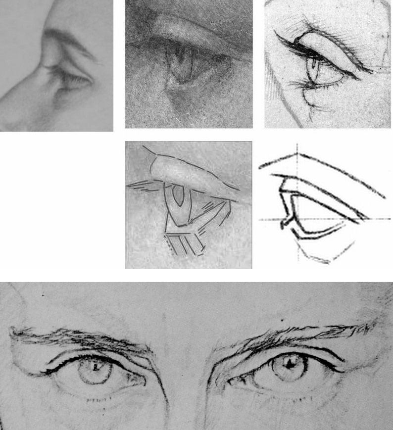
Above, Fig. 18. When Karl Parsons’ eye of Patricia is placed as above top left, we see distinct similarities of curvature and the same forward looking gaze with the eye drawn by Leonardo shown in the top right. Once again, in the company of Parsons and Leonardo, “La Bella’s” eye (top centre) is a glaring odd-one-out with its straight-edged, planar manner of drawing. That very manner was commonly inculcated among art students at the end of the 19th and beginning of the 20th century – as in the instructive published diagram seen above, centre right. Such an angular manner of drawing is nowhere to be found in Leonardo or his contemporaries, whereas, one can see distinct traces of that manner in the drawing of the male eyes above where features that would be drawn with curves by Leonardo are broken-down into short straight linked lines.
THE MARCHIGS
Above, Fig. 19: Left, a self-portrait drawn by Giannino Marchig in c. 1920 that was published in a journalist’s recent book on the “La Bella Principessa” drawing ( – see “Books on No-Hope Art Attributions”); right, an etching (mirrored) by Giannino Marchig of a lady, possibly his wife, Jeanne Marchig. Again, we see in the etching a draughtsman’s habitual favouring of angular, straight-edged and planar features. Additionally, we again encounter a profile portrait eye that is shown not convincingly set into the forms of the face.
As mentioned, the “La Bella Principessa” was sold anonymously at Christie’s, New York, in 1998. Twelve years later, Jeanne Marchig, the then widow of Giannino Marchig (who had worked as a restorer for Bernard Berenson and had restored a Leonardo painting), identified herself as the vendor in order to claim damages from Christie’s after sensational (but unfounded) reports that fingerprint evidence had proved the drawing to be by Leonardo and therefore to have been worth $100/150 million when sold in 1998.
However, and as we have reported, aside from the widow’s hearsay claims concerning the ownership of the drawing by the painter/restorer, the drawing possesses not a shred of recorded history in its supposed five centuries – and this is so despite prolonged searches made over the last nine years by specialist scholars and journalists. Giannino Marchig, initially a successful artist had hit hard times, became a restorer and an assistant to Bernard Berenson, had grown rich and acquired a collection of valuable historic works, but would not disclose – even to his wife – from whom, where or when he had acquired the drawing. Strenuous attempts by supporters of the Leonardo attribution to show that the drawing had been commissioned by the Duke of Milan for inclusion in a de luxe vellum book in 1496 have failed to find a single record of such a commission.
An early scholarly supporter of the drawing, Cristina Geddo, revealed that research made by penetrating imaging had disclosed that the back of this drawing (which cannot be seen by eye because the vellum sheet is glued onto an oak panel) carries “superimposed numbers…a written inscription…[and a] little winged dragon – at least that is what it seems.” No one has published those features; no one has offered a more detailed account of them or explained why they might have been present on what the drawing’s supporters claim (on no evidence) would have been a blank page in a luxury late 15th century commemorative book.
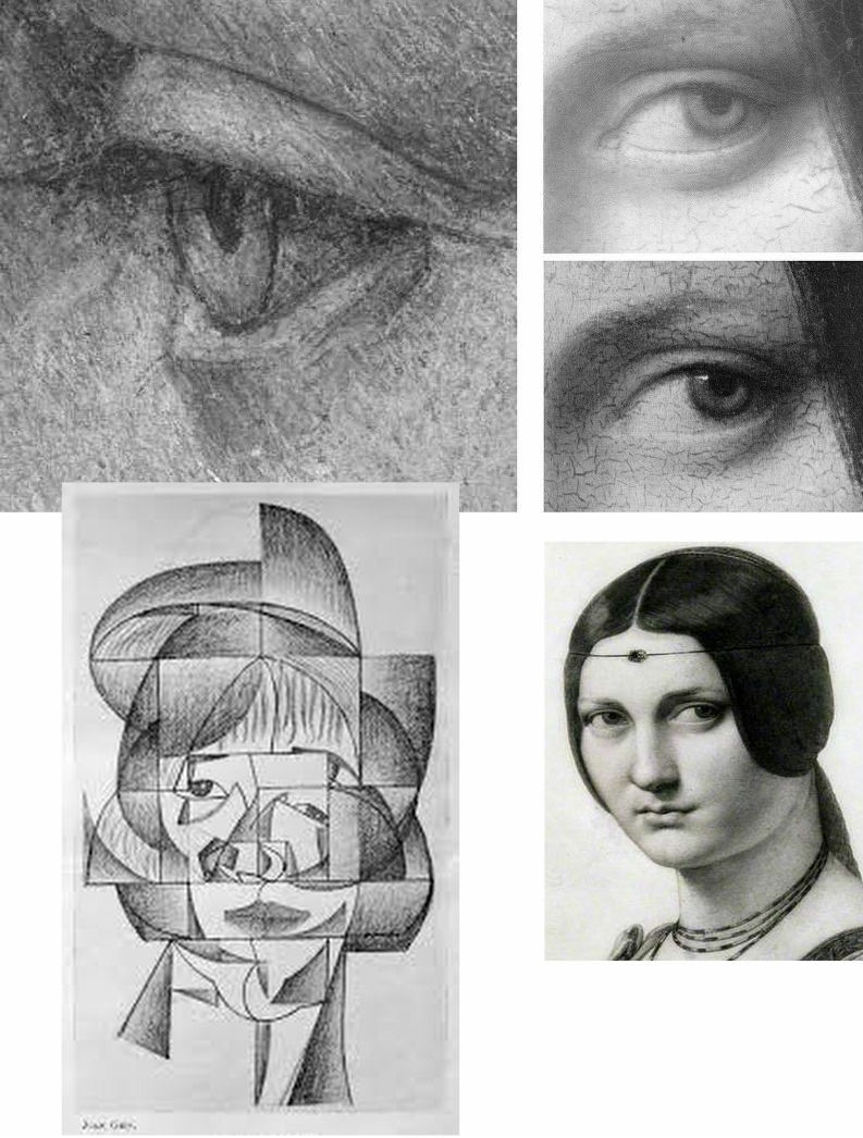
Above, Fig. 20: Top left, “La Bella Principessa’s” eye; top right, an eye from Leonardo’s painting La belle ferronnière, as seen, top, in an infra-red image that discloses the preparatory drawing for the curving, thin lower eyelid, and below it, the finished eye as painted by Leonardo. To a draughtsman, these eyes are as unlike as chalk and cheese and that of “La Bella Principessa” has nothing in common with any eye seen in Leonardo. It has greater affinities of style and means with the treatment of the eyes in the Juan Gris’ Cubist drawing, bottom left. Ingres’ pencil copy of La belle ferronnière shows how vividly dramatic and alive Leonardo’s eyes can be.
Scholars need not be draughtsmen but none would be harmed by practising drawing – and all would benefit by making copies of the works they address. An eye properly alert to stylistic traits is one capable of performing what we hold to be “forensic looking” (– see “Art forgers face new challenge from hi-tech authenticators”). Colnaghi has performed a service by unearthing Parsons’ Patricia. Unfashionable Arts and Crafts or no, Parsons merits attention, as his arresting portrayal of St. George at Fig. 21 below surely testifies?
Michael Daley, Director, 9 December 2019
Fake or Fortune: Hypotheses, Claims and Immutable Facts
We have received two communications on “La Bella Principessa”, which drawing some take to be by Leonardo da Vinci. One came from the work’s owner, the other from a disinterested scholar in confirmation that the work could not, for reasons of arithmetic and plain physical facts, have been made by Leonardo for inclusion in a book.
THE DRAWING
Above, Fig. 1: The full vellum sheet of the proposed Leonardo drawing “La Bella Principessa”.
THE DRAWING’S CLAIMED ORIGIN
This drawing was presented anonymously to the world in 1998 without authorial ascription and without an atom of provenance. When claims of autograph Leonardo authorship were made after barely a decade, it became necessary to fill a five-hundred years long void of records in order to dispel suspicions of forgery or pastiche. In 2010 Professor Martin Kemp bundled together what he held to be a “barrage of evidence – stylistic, historical or technical” that somehow provided collectively what no individual parts constituted: proof that Leonardo da Vinci was the author of what he (Kemp) dubbed “La Bella Principessa”. Thus, a collection of not-evidence was vested with quasi-evidential force on a circular, question-begging appeal to the claimed authority of a “sustained, collective sense that the portrait ‘belongs’ to Leonardo and contributes something new to the Leonardo we currently know.”
Although some scholars (chiefly Italian) were persuaded by the claims, for the consensual majority who did not see Leonardo’s hand in the drawing, Kemp’s methodological ju-ju gained no traction. His claims were advanced in a portmanteau book of collective advocacy, La Bella Principessa – The Story of the New Masterpiece by Leonardo da Vinci, which he co-wrote with Pascal Cotte of Lumiere Technology (the firm hired by the drawing’s owner, Peter Silverman, to conduct technical research) and which carried highly supportive contributions by Peter Paul Biro, Eva Schwan, Claudio Strinati and Nicholas Turner; London, 2010 (– see pp. 187-88).
THE THREE STITCH HOLES
During Pascal Cotte’s technical analysis of the drawing it was noticed that three holes are present on the left-hand edge. Cotte took these to “prove that it originally came from a book or a manuscript” (- Kemp/Cotte 2010, p. 113). Working with Mr Cotte, Prof. Kemp proposed that the hypothetical book might well have been a collection of celebratory poems of Bianca Sforza who had died in childhood and that “La Bella Principessa” had been made as an illustration to such a book.
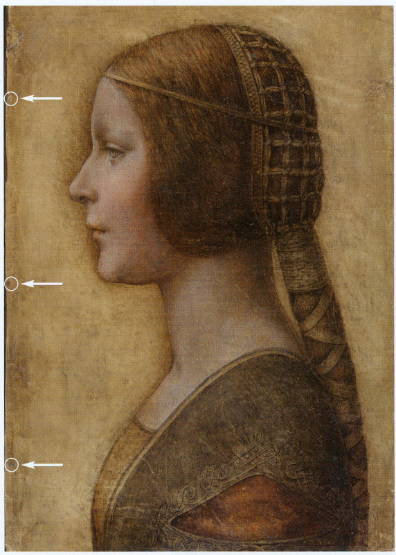
Above, Fig. 2: “La Bella Principessa” with Pascal Cotte’s indicated locations of the three supposed stitch holes.
Kemp’s elaborate hypothetical advocacy constituted a daisy-chain of improbabilities. This is a drawing made in the manner of a distinctive (and invariably painted) profile portrait type that is nowhere encountered in recorded Leonardos – and, indeed, this is the very type which Leonardo famously subverted with his own revolutionary plastically dynamic figural innovations. Within the rigorous constraints of the strict profile type, this drawing’s supposedly high-born subject is bereft of the customary/requisite opulence in clothing and jewellery. The eccentric iconography was made on an atypical support – vellum. It was drawn, Kemp holds, either directly from the subject in celebration of her wedding, or, as a commemorative portrayal after her death and thus made either in recollection or from some other depiction. No explanation was offered for how this single image might have resulted from two radically different circumstances of execution.
THE CLAIMED CORRESPONDENCE BETWEEN THE “LA BELLA PRINCIPESSA” DRAWING AND THE WARSAW SFORZIAD
On a suggestion from Professor David Wright, Kemp proposed that this from-life or post-death portrait had been made to be incorporated within a large, heavy book of the mid-1490s that is now housed in Poland, the so-called Warsaw Sforziad. In the wake of a great deal of (Kemp and Silverman-activated) archival research which found no mention of any work resembling “La Bella Principessa”, it can be seen that without this claimed Warsaw connection, the drawing would remain what it was on its 1998 debut: a stylistically untypical and unprecedented work without any history – the inclusion of which within Leonardo’s oeuvre would, in Prof. Kemp’s own advocacy, “contribute something new to the Leonardo we currently know” and “reveal a previously unknown dimension to the way in which he fulfilled his duties at the court of Duke Ludovico Sforza”. (Kemp/Cotte, 2010, p. 188.) Without history, that is to say, other than the time it is now said to have been in the possession of the restorer/painter Giannino Marchig, the late husband of the anonymous vendor in 1998.
It has been claimed many times that a ‘match’ exists between the drawing’s holes and the book’s stitches but, aside from the small format photo-diagram at Fig. 3, this has never been demonstrated or independently corroborated. Similarly, it has been said that carbon dating tests established that the vellum sheet on which the drawing was made is of an age securely consistent with a drawing being made by Leonardo in the mid-1490s. This claim is seriously misleading, as is shown below.
THE TESTIMONY OF HOLES
Before Prof. Wright’s suggestion, in 2010 Pascal Cotte regarded the three holes on the drawing’s left-hand edge as evidence that might identify incorporation within a specific book:
“It would be interesting to use the evidence of the nature and placement of these needle holes to look for other surviving quires from the same codex, which, with other physical clues, might shed further light on the provenance and original commission.”
(Kemp/Cotte, 2010, page 113.)
Cotte’s hope was reasonable but such testimony can cut both ways. Establishing a relationship between the drawing and a particular book requires an exact correspondence between the drawing’s holes and a book’s stitches. Two separate claims were made of a discovered fit with the Warsaw Sforziad, first by the drawing’s owner, Peter Silverman, and then jointly by Martin Kemp and Pascal Cotte. Both occasions were filmed by National Geographic but only the second was broadcast. In it, Kemp expressed himself as being 80% confident. The presently claimed location of the drawing is at the front of the Sforziad. Clearly, the credibility of what is now a 200 million euro-insured drawing that is stored in the Geneva Free Port depends greatly on confidence being maintained in this claimed connection.
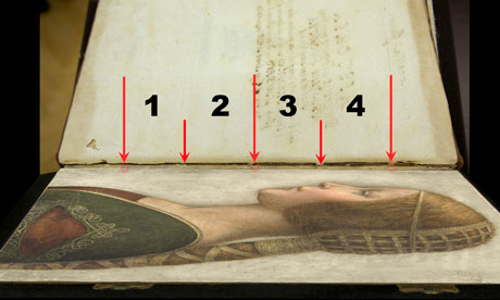
Above, Fig. 3: A facsimile of “La Bella Principessa” inserted into the Warsaw Sforziad with five arrows marking the
book’s stitches and three circles in which matches are claimed, but are not evident, between the drawing’s holes and
the book’s outer and central stitches. (The stitch marked by the right-hand arrow is shown in close-up below at Fig. 5.)
As previously shown, our colleague in ArtWatch, Dr Kasia Pisarek, has catalogued very many discrepancies between the drawing and the book, the most problematic being that the former has only three stitch holes, when the latter was bound with five stitches. To cope with this material/arithmetical incompatibility, Kemp and Cotte conjured two hypotheses.
The first was that the book had originally been bound with only three stitches and that at some undated point the drawing had been removed during a rebinding in which two extra stitches were added to the book. That (unsupported) contention was technically implausible: the book is too large and heavy to be supported by just three stitches – and
both of its sister volumes in London and Paris were bound with five stitches.
The second, and now preferred, hypothesis is that the book was indeed originally bound with five stitches and that, as
a part of this book, the drawing originally possessed the requisite five stitch holes, two of which had subsequently been cut off from the sheet. We demonstrated the impossibility of that claim in an earlier post. (To recap briefly: as Cotte had acknowledged in 2010, stitch holes are always made in a straight line along the crease in a group of folded sheets. Given that a central and two outer stitch holes are all present on the “La Bella Principessa” sheet, any original intermediary stitch holes would necessarily be found in alignment with the present three holes on the sheet as it is today.)
In addition to the absence of the two requisite stitch holes, the sheet itself is a mismatch in terms of colour, texture and size with the sheets in the book. Kasia Pisarek now adds a further mismatch:
“The follicles in the ‘La Bella Principessa’ vellum are tightly spaced, while those in the Sforziad vellum are widely spaced. This can be seen on the Polona website, where you can zoom in until you can see the follicles as dots. I remember seeing some pages where the dots were more apparent and they were definitely widely spaced.”
WHAT LIES BENEATH?
Yet another unaddressed difficulty concerns the back of the drawing. One of the earliest proponents of a Leonardo ascription, Dr Cristina Geddo, has described the presence on the reverse of the drawing of random lettering and an image of a dragon. Kemp and Cotte seem not to have offered an explanation for this content (which, presumably, was revealed by Cotte’s penetrative photography) even though they now claim that the back of the drawing would have faced the book’s beautiful and elaborately painted, symbolically-charged frontispiece. What conceivable iconographic function might such a melange have served in that strategic context of so important and precious a book? Dr Geddo has called for the vellum drawing to be removed from its (most unusual) oak panel support but the owner has declined to do so on grounds of safety. Some of the lettering is visible in an X-ray photograph published in the 2010 and 2012 English and Italian editions of the Kemp/Cotte joint book.
FIVE HOLES GOOD, THREE HOLES BAD
As we reported previously, with regard to the Three Holes v. Five Stitches conundrum, the problems for supporters of “La Bella Principessa” have now become insurmountable: Pisarek established on her second examination of the Warsaw Sforziad in the Polish National Library that while the drawing bears only three holes, the book itself was not only bound with five stitches but that each of those stitches passed through two holes that were two or three millimetres apart (see Figs. 6, 7 and 8 below). At a stroke, the previously claimed ‘fit’ between the drawing and the book is demolished: the drawing possesses only three single stitch holes when it should have five pairs of holes making ten in total. Even if it were to be conceded that two inner stitches might once have been present, today’s three single holes should be three pairs of holes, making six holes in total, not three.
AN OWNER’S RESPONSE
When we sent our previous “La Bella Principessa” post with the newly disqualifying physical/technical evidence to the drawing’s owner, Peter Silverman, (13 June), he dismissed the bearers of the information by alleging lack of expertise: “I leave the attribution question to serious and highly qualified experts!!!” In support of his professional slur, Silverman copied-in two messages to us. The first had been sent to him, at his request, by a costume expert, Elisabetta Gnigera. The second Silverman had sent to Jean Penicaut, the CEO of Lumiere Technology. It was evidently written in haste and heat:
“Dear Jean
I am sorry but we, as owners of the BP, are not to be told how and with whom to talk! I understand your frustration in dealing with Artwatch and Franck but i feel that Pisareks statement must not and cannot be left unchallenged! I therefore request you to rebut each and every point in this latest statement-most importantly of all i would like to see the INDISPUTABLE proof of the binding holes, in a first and separate email to me! Unfortunaley Martin has made statements which can be perverted by anyone in bad faith-equivocal statements quoted in the first part of the enclosed article!!
“I would like Elisabetta to comment on the costume questions.
And i would like YOU to extensively quote from the lab results of La Veneria*, which is very helpful to our cause! [*This is a reference the conservation laboratory “La Venaria Reale” which has conducted analysis of the drawing.]
“We cannot afford to lose the high ground’ in this battle-no matter the bad faith of our ennemy.
“To avoid your corresponding with them please send the rebuttal to me. I INSIST THAT THIS IS AN ABSOLUTE NECESSITY!!
Best, peter
http://artwatch.org.uk/problems-with-la-bella-principessa-part-iii-dr-pisarek-responds-to-prof-kemp/
“PS-the good news is that there is a very serious party interested in acquiring a share in the BP(highly confidential) and July 1 will be a decisive day!!!”
It would seem after more than a month that Lumiere Technology has not provided the owner with indisputable evidence of a connection between the drawing and the Warsaw book that would counter Pisarek’s account. On 14 June we replied to Mr Silverman:
“Speaking of clarification and your requests, I note the various requests from the ‘owners of the BP’ to your associates
to read our current post, and your talk of a prospective part-sale of the BP. Can I take it that the potential buyer of whom you speak has been similarly advised?
“Also, perhaps you might say how you will respond if Jean Penicaut advises you, as we would predict, that he can find
no ‘INDISPUTABLE proof of the binding holes’ that might enable you – or he on your behalf – ‘to rebut each and every point in this latest statement [in the then current AWUK post]’”?
Concerning the La Venaria Reale laboratory reports, we asked Mr Silverman on 15 June:
“On your technical ‘proofs-of-authenticity’ and our possible viewing of your Swiss-vaulted, soon-to-be part-sold drawing, might we not deal with both by: a) your sending to us all reports and data that have been made available to you; and, b) your bringing the drawing to either Paris or London so that we might arrange a group viewing by sceptics and rejecters?”
MISINTERPRETED REPORTS
After more than a month we have received no technical reports on “La Bella Principessa”. Lumiere Technology’s
apparent silence on the conflicting number of stitch holes seems remiss. In our experience it is valuable to see the reports themselves because evidence can sometimes be interpreted and presented in ways that might mislead. For example, it has been claimed (technically-speaking correctly) that carbon dating has established a 95.4% probability
that “La Bella Principessa” had been made at some point between 1440 and 1650. On that particular technical examination and very wide range of possible ages, Pascal Cotte (2010, p. 110) has claimed a number of things in a single sentence:
“This dating confirms that the portrait could well have been made in Leonardo’s lifetime, supporting Martin Kemp’s proposed date in the mid-1490s and virtually eliminating the possibility that it is a 19th century pastiche.”
This was all quite misleading. A confirmed “could well have” remains a “could have” and does not become a confirming “was”. A “virtually eliminated possibility” remains a possibility. Taken as a whole and properly appraised, the data itself cannot reasonably be said to support Kemp’s claimed date and authorship – in fact, it does the opposite.
Cotte’s claims rest on what is only a loose and very wide overall estimation of probability. While it is true to say there is a 95.4% chance that the sheet appeared at some point between 1440 and 1650, there is not a 95.4% probability that it appeared before the mid-1490s when the Sforziad was made. Even on that loose, overall range of possibilities, it would be more accurate to say that because we know (today) that the Warsaw book was made in the 1490s (and had known in 2010 that the proposed subject of “La Bella Principessa”, Bianca Sforza, had died in 1496), it is three times more likely that the “La Bella Principessa” sheet post-dated rather than predated the book. What has not been acknowledged is that within the overall figure, the probabilities had been greatly more precisely quantified.
It was said in the report, for example, that there was a 68.2% probability that the sheet was made between 1470 and 1650 and that, within this period (see Fig. 4 below), there was only a 27.2% probability that the drawing was made between 1470 and 1530 – and this was compared against the appreciably greater probability (41.0%) that the sheet was made some time between 1550 and 1650 – which would place the sheet altogether much later than Leonardo who died in 1519. Properly read, with a proposed date for the drawing set in the mid-1490s, the data shows that there was only a 13.6% probability that the “La Bella Principessa” sheet existed when the book was made. When the general 95.4% probability of an origin anywhere between 1470 and 1650 and the 13.6% probability of an origin between 1470 and 1495 are expressed as racing odds, it is seven times more likely that the sheet was made after the book than before it. And the odds of seven to one against pertain to the vellum sheet itself, not to the possible dates of execution for the drawing. Even if this sheet had once been present in that book, such a dating would indicate only the age of the material, not the date of the drawing’s execution. On this last, we should recall that Eric Hebborn advised in his The Art Forger’s Handbook that a prime source of old materials for forged drawings is obtained from blank end papers in books. Thieves cut valuable illuminated pages from books. Forgers crave blank pages but will make use of a blank side by gluing its reverse firmly to some impenetrable material.
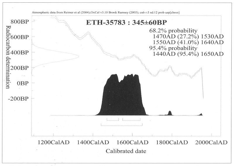
Above, Fig. 4: The carbon dating report on the “La Bella Principessa” sheet (as published by Kemp/Cotte, 2010, p. 110).
FOR THE RECORD
Where Mr Silverman declines to make reports available to us, and Pascal Cotte fails to demonstrate a fit between the drawing’s three stitch holes and the book’s ten stitch holes, we now present further visual proofs and documentary confirmation of the previously claimed mismatch to demonstrate precisely why “La Bella Principessa” could never have been part of the Warsaw Sforziad.
INSTITUTIONAL CORROBORATION
On 23 June 2016 Barbara Dzierzanowska, the Head of Department of Old Prints BN at the National Library of Poland, wrote to Kasia Pisarek:
“Dear Madam,
I would like to inform you that yesterday we entered the Treasury and re-examined the Sforziad, which has confirmed that the binding stitches are double and there are 10 holes.
Yours sincerely,
Barbara Dzierzanowska”
PHOTOGRAPHICALLY-RECORDED AND ELECTRONICALLY TRANSMITTED PROOF OF THE DOUBLE STITCHING OF THE WARSAW SFORZIAD
That the stitching of the Sforziad was made through double holes can be seen by eye on the book itself, as shown below at Fig. 5.
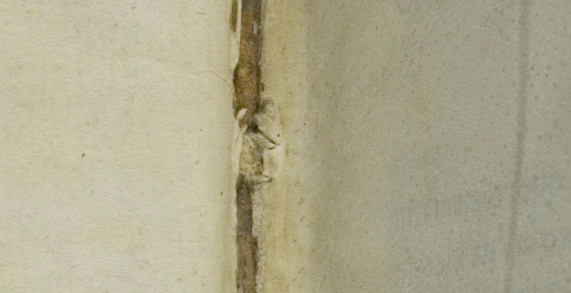
Above, Fig. 5: A stitch made through two holes, as seen on the numbered page 1 of the Warsaw Sforziad. In this photograph, the top stitch and the two flanking holes are shown but some of the other holes can also be seen on stitches below it. This stitch/holes configuration would have been evident when (as described above) a full-size facsimile of “La Bella Principessa” was inserted into the Sforziad at precisely this point. This evidence is also available online: our image was taken from the detailed record of the entire book that is carried on this site: Polona – La Sforziada.
ESTABLISHING THE TRUE DIMENSIONS
When Kasia Pisarek inspected the book for the second time, she asked that the dimensions of the pages and the relative positions of the stitch holes be marked along the edge of a piece of paper. This was done by the library’s books’ conservator in her presence and that of the chief librarian. Intervals between the stitch holes were marked in pencil along the two sides of the strip of paper and these are shown here at Figs. 6 and 7. When we marked off those measurements onto a separate sheet of paper, to prepare the diagram at Fig. 8, and then measured them on our sheet with a ruler, they were all exactly as given by Pisarek. We can be sure, therefore, that the dimensions and ratios between the stitch holes as shown below at Fig. 8 have been accurately established and physically transported to ArtWatch UK – and at practically zero-cost by means of sharp pencils and two pieces of paper.
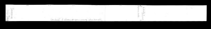
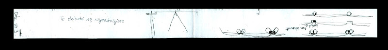
Above, Figs. 6 (top) and 7: The strip of paper on which the book’s page size and stitch holes were recorded, as described above.
The conservator explained to Pisarek that the present positions of the stitch holes were those of the original construction of the book and that, therefore, there was no possibility that the book had once been bound with only three stitches. She made diagrams on the strip showing (at Fig. 7) different ways of executing stitching with double holes.
THE DIMENSIONS OF THE INTERVALS BETWEEN THE STITCHES IN THE BOOK – A NOTE FROM KASIA PISAREK:
1) According to Kemp and Cotte, the dimensions of the vellum pages of the Sforziad vary from 33.0 to 33.4 cm in height, while the drawing is 33 cm high.
2) I have carefully checked the dimensions with the Librarian in March 2016. All the pages are at least 33.4 cm high and more, up to 33.7 cm. The size of 33 cm would be far too small for the book.
3) The 5 holes in the book are in fact all double holes. Each of the 5 holes is two small holes, between which a string passes. The distance between the two small holes is about 3 mm. The double holes were never mentioned by Kemp or Cotte.
4) According to the conservator who was present at the time of my last visit, this is the binding that follows the original binding as there is no damage of any kind. So in total there were as many as 10 small holes, not 3 single ones as in the drawing.
5) I measured the distances between the 3 holes that Kemp and Cotte measured in La Bella Principessa. The measurements were taken from the middle of the double holes.
6) The distance between the bottom hole and the middle hole is 11.35 cm in the Sforziad, while in the drawing it is 11.06 cm.
7) The distance between the middle hole and the top hole is 11.7 cm in the Sforziad, while in the drawing it is 11.44 cm.
THE MISMATCHED HOLES AND STITCHES
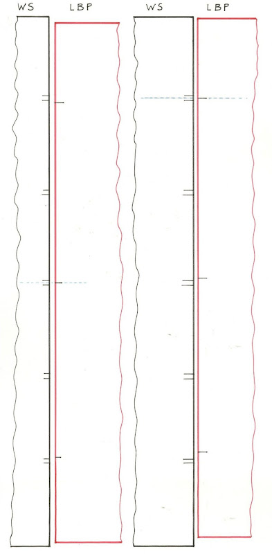
Above Fig. 8: We took the dimensions of the Sforziad’s page and stitch holes from the strip of paper marked by the Polish National Library’s books’ conservator (as shown at Figs. 6 and 7) and drew them in black, as above, and marked “WS”. We then drew in red the “La Bella Principessa” sheet (here marked “LBP”) and its stitch holes as given above by Pisarek.
As can be seen above, it is impossible to align the drawing’s single stitch holes with their claimed counterparts in the book. If the drawing’s centre hole is aligned with the centre of the two central holes in the book (as shown on the left here), its other two holes fall short of their claimed counterparts.
If the LBP drawing’s upper hole is aligned with the centre of book’s two upper holes, its central and lower holes fall progressively further short of their claimed counterparts on the book.
In short, there is no fit or match between the book and the drawing – and which drawing in all probability post-dated the book, for reasons indicated above.
Those who would continue to give this drawing to Leonardo must now find some other means of filling a five centuries absence of provenance and of squaring intractable technical circles. We will examine next the supposed left-handed execution of “La Bella Principessa”.
Michael Daley, 21 July 2016
Problems with “La Bella Principessa” – Part III: Dr. Pisarek responds to Prof. Kemp
In June 2015 Kasia Pisarek, an independent scholar (and a member of ArtWatch UK) published an article, “La Bella Principessa – Arguments against the Attribution to Leonardo”, in the Polish scholarly journal Artibus et Historiae.
In her article Dr Pisarek presented a number of interlocking historical, aesthetic and technical criticisms of the attribution to Leonardo of the drawing “La Bella Principessa”, as it has been made and advanced by Professor Martin Kemp. In response, Prof. Kemp produced an article (“Leonardo da Vinci La Bella Principessa: Errors, Misconceptions, and Allegations of Forgery”) which challenges Dr Pisarek’s account on grounds of what he claims and alleges to be: “mistakes, misconceptions and a series of false allegations”.
A TACTICAL RETREAT?
In his response Kemp says “I do not run an authentication service, but research items of special interest regardless of ownership.” More recently ( May 16) Kemp announced on his website that “After speaking at the Art in Authentication Congress in The Hague, I confirm that I am withdrawing the [unpaid – Ed.] ‘advice service’ I have been providing.”
A SIDEWAYS SWIPE
Kemp discloses that in responding to Pisarek’s article he also sought by “extension” to counter other un-identified challenges to his Leonardo attribution. When this multi-targeted professional defence was submitted to Artibus et Historiae, it was rejected, as Kemp acknowledges, and as the Art Newspaper reports (“La Bella Principessa: Still an Enigma”, Features, May 2016), because of its resemblance to “an errata list”. The article was subsequently carried on the Authentication in Art website to accompany a paper given by Kemp at the AiA’s May 2016 Congress. This non-profit organisation, on which Kemp serves as an advisor, was founded in 2012 at The Hague. On May 8th we made a formal request to the AiA for Kasia Pisarek’s Artibus et Historiae article also to be posted so that the congress speakers and attendees might see both of what Dr Pisarek’s compilation of evidence consisted and of what Prof. Kemp complained. We have yet to receive a reply. For Kasia Pisarek’s Artibus et Historiae article, “La Bella Principessa – Arguments against the Attribution to Leonardo” click here. For Martin Kemp’s response to it, see: “Leonardo da Vinci La Bella Principessa: Errors, Misconceptions, and Allegations of Forgery”.
A CONFERENCE AMBUSH
In December 2015 Kasia Pisarek delivered a paper based on her Artibus essay at the ArtWatch UK/LSE Law Department/Center for Art Law conference “Art, Law and Crises of Connoisseurship”. At this conference, an arts journalist, Simon Hewitt, delivered an attack from the floor on her article. He did so as a proxy for Kemp, by whom he had been briefed, and for the collector/dealer owner of “La Bella Principessa”, Peter Silverman, with whom he is co-writing a book on what Silverman describes to us as “various aspects of the art market, sometimes highlighted by others’ and my own discoveries”. A research assistant of Kemp’s, Kasia Wozniak, who had spent four years attempting to show that “La Bella Principessa” had once been part of a late 15th century book known as the Warsaw Sforziad, had also written to us in denigration of Pisarek’s article which we had forwarded to her at her request.
Earlier, both Professor Kemp, who had declined an invitation to speak at this conference, and Mr Silverman, had suggested that we invite Hewitt to speak at the conference. Silverman expressly requested that this be done so that Hewitt might “present his discoveries as a counterweight to Ms. Pisarek”. We carry Pisarek’s full reply to Kemp’s listed objections below but comment first on a crucial new aspect of this disputed attribution that has emerged in Kemp’s response to Pisarek.
NO HISTORY. NO PROVENANCE. WRONG HOLES. NO FIT.
Above, Fig. 1: A facsimile of the “La Bella Principessa” drawing being inserted into the Warsaw Sforziad (but showing only the relationship of the top of the facsimile to the top of the book and not the accompanying relationship of the facsimile and book at the bottom). Photo by courtesy of Lumiere Technology.
For many reasons, it is essential to Prof. Kemp’s Leonardo ascription that it be accepted that “La Bella Principessa” had originally been incorporated within the Warsaw Sforziad now held in the National Library, Poland. It has not been so accepted because, contrary to press releases claims and media coverage thereafter, nothing material or documentary has established such a relationship. No record of any connection between the drawing and the book has been found despite extensive searches by researchers such as Kasia Wozniak. Moreover, despite extensive searches of Berenson’s archives by Kemp and Silverman, no record of the supposed 15th century drawing in any context predates its only-recently acknowledged ownership by the late painter/restorer Giannino Marchig. This pictorially and graphically mongrel work remains without a history and, prior to September 2011, without any claim – even by its only known previous owner – that it might have been a work by Leonardo da Vinci.
Martin Kemp has challenged Kasia Pisarek’s measurements between the stitches in the book’s binding. He and Pascal Cotte (of Lumiere Technology) claim that three stitch holes are present on the left hand edge of the “La Bella Principessa” sheet and that these match three of the book’s five stitches. No confirming visual evidence has been produced in support of this claim. In addition to fresh evidence on dimensions provided below by Pisarek, it might be noted that the Kemp/Cotte claims of a match have been variously and only rarely unequivocally phrased. All emphases below are added:
“The stitch holes in the vellum of the portrait match those in the book” – “The Original Source of the New Leonardo Portrait Discovered”, a Martin Kemp press release, 27 September 2011.
“Three of the stitch marks, the ones that we can still see on the edge of the ‘Bella Principessa’, match as well as they conceivably could” – Martin Kemp, Artinfo interview, “The Da Vinci Detective: Art Historian Martin Kemp on Rediscovering Leonardo’s Tragic Portrait of a Renaissance Princess”, by Andrew M. Goldstein, 11 October 2011;
“During our studies at the National Library, we inserted a facsimile of the portrait into the relevant opening of the book where the size matched very closely” – Martin Kemp, item 14, “Leonardo da Vinci La Bella Principessa: Errors, Misconceptions, and Allegations of Forgery”, on the Authentication in Art website. See Fig.1, above;
“The current stitching of the volume involves five holes, whereas there are only three holes now visible along the left margin of the ‘La Bella Principessa’. However, these three holes correspond very closely to the corresponding ones in the book.” – Martin Kemp and Pascal Cotte, “La Bella Principessa and the Warsaw Sforziad”, Lumiere Technology website, September 2011.
FAILING TO GET THE MEASURE OF HOLES
With linear measurements a near-miss is as good as a mile. If a hole is two millimetres adrift of a stitch there is no match. Claiming “correspondences” and “close” matches between the three holes and the five stitches is problematic enough, but, as Kasia Pisarek has now re-confirmed, the three holes in the “La Bella Principessa” drawing do not correspond with three of the book’s five stitches. Moreover, Kemp’s imprecision came with a perplexing multiple caveat: “In measuring the distances between the holes and matching these distances in the book and the portrait we allowed for four potential sources of error” – Kemp/Cotte, item 13, “La Bella Principessa and the Warsaw Sforziad”, Lumiere Technology website.
If incorporating an allowance for one potential source of error would necessarily be weakening to the force of a claimed match, how might allowances have been made for four different sources of error? How were the different “potentials-for-error” calibrated and weighted one against the three others? With accounts of this attribution, too many features remain in flux. For example, explanations offered for the disparity between the drawing’s three stitch holes and the book’s five stitches have shifted. In 2011 Kemp/Cotte wrote:
“The second task was to see if the holes in the portrait and the stitching pattern in the book corresponds. There is an obvious difference. The current stitching of the volume involves five holes, whereas there are only three holes now visible along the left margin of “La Bella Principessa”. However, these three holes correspond very closely to the corresponding ones in the book…The different number of stitching holes may result from the untidy way the left margin of the portrait has been cut, or from two intermediate stitches being added when the book was later rebound in standard Zamoysky livery. The former explanation is more likely.” (Emphases added.)
The suggestion that the book might possibly have been bound originally with only three stitches seems to have been abandoned altogether. Martin Kemp now accepts in his response to Kasia Pisarek that the book always had five stitches but claims as a countering fact against this recognition that: “The irregularity and extensive damage along the left margin explains why two of the five stitch holes are no longer clearly discernible.”
NOT AN EXPLANATION
The posited stitch holes cannot be said to be “no longer discernible” because there is no evidence that they were ever present. Prof. Kemp here begs a question on which this attribution turns. The roughly cut edge cannot be taken to have explained these absences. What Kemp offers, in truth, is (an implausible) hypothesis that ignores the technical exigencies of book binding and the dimensional realities of the “La Bella Principessa” sheet. When books are being made, the stitches are inserted along the line of a fold made collectively to the small number of sheets that form one of the book’s sections or “quires”. In the case of the Warsaw Sforziad, Pascal Cotte established (by taking and combining 70 precisely-focussed macro-photographs) that each quire was composed of four sheets (folios) which, when folded and stitched, comprised sixteen numbered pages. The book binder’s craft requires that the stitching occurs precisely along the crease line of the folded sheets. This careful alignment is necessary if the pages are not to cockle and for the book to open easily.
The three holes on “La Bella Principessa” have been taken to relate (- more or less, but never exactly) to the book’s central and two outer stitches. Had the “La Bella Principessa” sheet been incorporated in the Warsaw Sforziad when it was made in the late 1490s, the two inner stitch holes would be expected to be present on the sheet, even as it is today, and notwithstanding its roughly cut left-hand edge.
At Fig. 2 below, we see the white arrows and circles with which Pascal Cotte identified what are said to be “La Bella Principessa’s” three stitch holes. On the image on the left, we have drawn in red the alignment of the present three holes and have indicated with arrows where the two hypothesized additional stitching holes would be expected to be located. Both holes would fall within the present sheet despite its roughly cut left-hand edge. In the image on the right of Fig. 2 we again indicate (in black) the alignment of the present three holes, but show in red how the alignment would be disrupted had the two hypothesized additional stitch holes been situated to the left of the present sheet, as Prof. Kemp now claims in “explanation” for their absence from the sheet itself. Such a positioning would have resulted in a zigzag, not a row, of stitch holes. It is impossible to envisage how four sheets of vellum might have been folded so as to produce a neatly zigzagging crease.
Aside from the above problem, any lingering hope that this “La Bella Principessa” sheet might once have formed part of the Warsaw Sforziad will have to be abandoned in the light of Kasia Pisarek’s latest findings described below on her second examination of the Warsaw Sforziad.
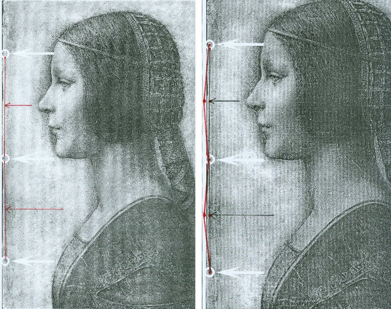
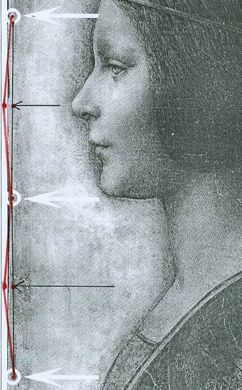
Above, Figs. 2 and 3. In Fig. 2 (top) we see, in the left and right images, the white arrows and circles with which Pascal Cotte located the “three holes showing that the image was once part of a codex or manuscript”. Given that the book (the Warsaw Sforziad) from which this sheet is said to have been cut was originally bound with five stitches, had the “La Bella Principessa” sheet once formed part of that book, it would today have five stitch holes, not the present three. In Figs. 2 and 3, we indicate with arrows (in red and then in black) where the missing two stitch holes would, for the reasons given above, be expected to have been located.
THE DOUBLE ‘DISCOVERY’ OF THE SUPPOSED POSITION OF LA BELLA PRINCIPESSA IN THE WARSAW SFORZIAD
When Andrew Goldstein asked Martin Kemp in an Artinfo interview in October 2011 what, on seeing the drawing, had convinced him it might be a Leonardo, he replied:
“So the initial connoisseur’s reaction merely tells you that something is worth looking at, but at any point one wrong thing can throw that all away — a later pigment, a bit of something that might come up about its history to indicate it was forged at some point, and so on. I was trained as a scientist, and if you have a scientific theory, you only need have one bit of the experiment that says, ‘this is not right,’ and the whole thing collapses. You always have to be looking for that one thing that is going to demolish the whole expectation that’s being set up.”
Kemp has given other grounds for caution when making attributions. On first encountering “La Bella Principessa”, he told Silverman, “I immediately saw it was in a different league from the others. But I was still very, very cautious. I didn’t want to jump at it because once you start believing you can summon up all the evidence you need.” (Peter Silverman, Leonardo’s Lost Princess: One Man’s Quest to Authenticate an Unknown Portrait by Leonardo da Vinci, 2012, p. 74.) Kemp had become a believer in the Leonardo attribution by 28 September 2011 when he issued a press release “The Original Source of the New Leonardo Portrait Discovered”. He added, “This (press release attached without the pics) should more or less settle the arguments – though probably not knowing the myopia of the art world.”
In 2011, after Kemp and Cotte had inserted their facsimile “La Bella Principessa” into the book, Kemp expressed himself 80 per cent confident of the drawing’s Leonardo attribution in a National Geographic film of the occasion. However, this was not the first time that a claimed “fit” between the facsimile and the book had been made and filmed by National Geographic. Peter Silverman describes in his book how, in December 2010, he had established a match in a different part of the book:
“We began by measuring the page size to see if it corresponded to “La Bella Principessa” and were gratified to see that it did, within a millimeter or two (a minute fraction of an inch)… Martin [Kemp] had surmised that the drawing would have been placed either at the very beginning or the very end of the book, but after careful examination we could find no trace of a cut page in either place. ‘May we turn each page?’ I asked. It was not a simple request. The book was nearly two hundred pages, and it would be a bit laborious for her [Anna Zawisza, the head of manuscripts] since utmost care had to be used so as not to damage the precious work in any way…It was apparent that the three pinholes where the binding had been sewn, noted earlier by Martin, which we had hoped would be a key to matching, would not be relevant, since the book had been rebound using five sutures…We slowly continued to turn each page, but there was no sign of a missing page…I had begun to abandon hope and to mentally prepare myself to return empty-handed. But then Zawisza turned page 161. There was a momentary beat of silence, and then she and I let out muffled cries. There, before our incredulous eyes, was what seemed to be the missing link, the element we longed to find: a remnant of a cut and extracted page of vellum that was the same darkish yellow as “La Bella Principessa”. We could barely contain our emotions. We measured the undulation of the remnant, and it corresponded exactly. Kathy [Silverman’s wife] and Kasia [Wozniak, art historian] came round to see for themselves, while David [Murdoch, National Geographic producer] filmed the historic moment. Even the armed guard was caught up in the excitement. Zawisza, who had carefully studied the book on past occasions, murmured how unhappy she was that she’d never noticed the missing page, now so glaringly obvious from the protruding remnant…”
That filmed historic moment was eclipsed by the moment in which Kemp and Cotte discovered a (preferred) location for the drawing at the front of the book. On her second examination of the Warsaw Sforziad, Dr Pisarek has learned that each of the five stitches in the book’s binding resulted in two holes, through which a string was passed. Thus, now that it is accepted that the book was originally bound with five stitches, each of which generated two holes, and that the “La Bella Principessa” sheet possesses only three of the necessary ten holes – and three where there should be six – there is no physical match between the drawing and the book, just as there is no documentary record of a Leonardo drawing having been bound within the book. Those who continue to see the hand of Leonardo in the drawing itself must now find an alternative history and another princess to accompany and bolster it.
Michael Daley 24 May 2016
Kasia Pisarek: A reply to Martin Kemp’s essay “Leonardo da Vinci La Bella Principessa. Errors, Misconceptions and Allegations of Forgery”
Professor Kemp has written an essay in response to my article “La Bella Principessa; Arguments against the Attribution to Leonardo”, Artibus et Historiae, No. 71, XXXVI, June 2015, pp. 61– 89.
In his essay, Prof. Kemp lists what he deems a series of errors and misconceptions in the Artibus article, but says he does not wish to address the issues of attribution I raised.
The purpose of his article is, however, an attempt to counter or undermine my findings.
I will answer his points in the order and with the numbered headings used by Kemp in his text.
[Martin Kemp] “1) Bibliographical”
[Kasia Pisarek] Martin Kemp says that most of my material is quoted from the internet and that I make only one reference to his book in my footnote 50.
This is incorrect. I make extensive reference to his book on the opening page and further references in footnotes 54, 57, 59 and 64. I have examined it as thoroughly as would be expected of any researcher. I also referred to many other books and articles which were accessed from libraries and not from the internet. These were:
M. Kemp and P. Cotte, The Story of the New Masterpiece by Leonardo da Vinci: La Bella Principessa, London, 2010; M. Kemp, Leonardo (rev. ed.), Oxford, 2004; P. Silverman, Leonardo’s Lost Princess: One Man’s Quest to Authenticate an Unknown Portrait by Leonardo Da Vinci, New Jersey, 2012; C. Geddo, ‘A “Pastel” by Leonardo da Vinci: His Newly Discovered Portrait of a Young Woman in Profile’, Artes, 2008–2009, pp. 67–87; C. C. Bambach, ‘Leonardo’s Notes on Pastel Drawing’, Mitteilungen des Kunsthistorischen Institutes in Florenz, vol. 52, 2008, no. 2/3 (Le tecniche del disegno rinascimentale: dai materiali allo stile. Atti del convegno internazionale, Firenze, 22–23 settembre 2008, ed. By M. Faietti, L. Melli, A. Nova), pp. 177–204; M. Gregori, ‘A Note on Leonardo’, Paragone, LXI, 2009, no. 723, pp. 3–4; D. Ekserdjian, ‘Leonardo da Vinci: “La Bella Principessa” – The Profile Portrait of a Milanese Woman’ (book review), Burlington Magazine, vol. 152, 2010, no. 1287, June (Attributions, copies, fakes), pp. 420–421; P. C. Marani, ‘Deux nouveaux Léonard?’, Dossier de l’art, 2012, no. 195, avril, pp. 58–63. Giannino Marchig, 1897–1983: paintings and drawings, exh. cat. London, 1988; Giannino Marchig, 1897–1983, exh. cat., Geneva, 1985; Giannino Marchig: 1897–1983: dipinti, disegni, incisioni, exh. cat. Florence, Gabinetto disegni e stampe degli Uffizi, 12 March – 5 June 1994 (Italian ed.); J. Cartwright (Mrs Henry Ady), Beatrice d’Este, Duchess of Milan, 1475–1497. A Study of the Renaissance, London, 1910; B. Horodyski, ‘Miniaturzysta Sforzów’, Biuletyn Historii Sztuki, 16, 1954, pp. 195–213; E. McGrath, ‘Ludovico il Moro and His Moors’, Journal of the Warburg and Courtauld Institutes, vol. 65, 2002, pp. 67–94; L. Syson with L. Keith, Leonardo da Vinci, Painter at the Court of Milan, exh. cat. National Gallery, London, 2011; Dizionario delle origini, invenzioni e scoperte nelle arti, nelle scienze…, Milan, 1831; B. Berenson, The Drawings of the Florentine Painters, vol. III, Chicago, 1938; Leonardo da Vinci, Master Draftsman, ed. by C. C. Bambach, exh. cat., The Metropolitan Museum of Art, New York, 2003; Z. Zygulski Jr, ‘Ze studiów nad Dama z gronostajem. Styl ubioru i wezly Leonarda’, in: Swiatla Stambulu, Warsaw, 1999 (first published in Biuletyn Historii Sztuki, vol. 31, 1969, no. 1, pp. 3–40).
The 2012 Italian version of Kemp/Cotte’s 2010 book is a translation from the English with the addition of the Sforziad hypothesis. The latter had already been published on the Lumiere Technology website and I discussed it at length.
Gnignera’s text was in Italian so I used Prof. Zygulski’s extensive knowledge of historic costume in general and coazzone in particular. The Monza catalogue (2015) was not published when I submitted my paper. The 2014 exhibition catalogue from the Galleria Nazionale in Urbino was also unavailable. To my knowledge these later publications have not yielded any conclusive evidence.
Prof. Kemp said that I have not addressed any of ‘the scientific evidence in the two books related to the lower layers of the image, the pentimenti or the condition and retouching in various media’ and goes on to say ‘contrary to Pisarek’s assertions, the interventions of restorers are documented in both books’. The latter sentence must refer to my ‘it is also strange that he did not consider that the drawing might have been retouched and repainted at a later time’ (p.79). Prof. Kemp has taken this out of context. I said that he did not mention the restorations in that particular passage of his book Leonardo (p. 210).
I not only analysed his art historical arguments in my text, but also the technical evidence presented by Cotte – which is to say:
– The trois crayons, pen and ink and bodycolour technique on vellum (unprecedented for Leonardo);
– The X-rays (inconclusive, in Cotte’s own words “did not yield significant new findings”, p. 154)
– The Carbon-14 dating of the vellum (wide-ranging 1440-1650, not constituting proof in itself as anyone could draw at any time on a blank folio removed from a manuscript)
– The quality of the vellum (rough; drawing on the hair-side; does not match the Sforziad’s smooth and well-prepared support; Birago’s illumination on the skin-side)
– The left-hand hatching (dry, timid and mechanical; on the outside of the contour of the profile, unlike in all Leonardo’s female portraits)
– The presence of three stitch holes (the Warsaw National Library Sforziad has five holes)
– The ‘knife marks’ when the folio was cut off (unnecessary, if the folio has been removed during rebinding).
– The retouchings of a later restorer (Marchig’s)
– The fingerprint evidence (no longer valid)
– The pentimenti, in the same place as in Leonardo’s Windsor portrait (a negative point, as La Bella Principessa could be based on that drawing).
At this point I would like to discuss some more scientific evidence:
On page 109:
“The support is probably the fine-grained skin of a calf”.
To the contrary, the images show an irregular grainy surface with visible follicles. Both Geddo and Turner described the support as “rough animal hide” and the surface of the vellum as being “pitted”.
“The portrait was drawn on the smooth ‘hair’ side”.
To the contrary, the hair-side has follicles so it is the rough side, not the smooth side.
Contrary to Prof. Kemp’s claim that I ignored Geddo’s contributions, I quoted her (p. 76), and she said exactly the opposite: “Besides the presence of the follicles, the rough unworked surface of the hide and its darkened, somewhat yellowish colour show that the portrait was made on the outer surface of the skin (formerly furcovered) and not on the inner one covering the flesh, which was aesthetically the superior of the two and commonly used as a support for written documents”.
I quoted extensively from Geddo’s article “A ‘Pastel’ by Leonardo da Vinci: His Newly Discovered Portrait of a Young Woman in Profile”, in Artes, 2008–2009, pp. 67–87, on my pages 62, 76 and 88.
On page 114:
The discovered “small area of pen marks along the left edge of the support” described by Cotte as Leonardo’s “pen trials”. This would surely have no place in a drawing destined for a luxury book presented as a gift to the Sforzas.
On page 154:
A problem with the X-rays:
‘Because white chalk (calcite or calcium carbonate) does not absorb X-rays to any great extent, the luminous zones of the sitter’s face ought to have appeared grey in the X-ray. On the contrary, however, they appear very white here, indicating the presence of a significant amount of dense material in the chalks area – which seems to contradict all the physical evidence considered so far.’
Cotte attributes this anomaly to the technician supposedly over-exposing the plate. This confirms his own observation that X-rays “are vulnerable to diverse interpretation”.
[MK] “2) PROVENANCE”
[KP] I did not say that the Marchigs were involved in forgery of any description. What I did say was that Giannino was familiar with Leonardo’s technique as a restorer and a “Leonardesque painter”. He was able to make such a drawing if he had wanted to, but clearly he had not tried to sell La Bella Principessa as a work by Leonardo.
Prof. Kemp does not explain, however, why the drawing had no provenance prior to Marchig’s ownership, and, as Michael Daley has recently pointed out, Professor Kemp and the drawing’s owner, Peter Silverman jointly trawled Berenson’s archive in hope of finding some pre-Marchig record but found none.
[MK] “3) The assertion that there is an ‘almost total absence of close comparisons with unimpeachable works by Leonardo.’”
[KP] The offending phrase above was written not by me but by David Ekserdjian in “Leonardo da Vinci: ‘La Bella Principessa’ – The Profile Portrait of a Milanese Woman”, The Burlington Magazine, vol. 152, 2010, no. 1287, June (Attributions, copies, fakes), pp. 420–421.
I used the same Leonardo comparisons as Prof. Kemp, but where he saw striking similarities, I saw possible imitation.
As to Cecilia Gallerani, although the structure of the eye looks comparable, it is round, soft and alive in Leonardo’s portrait, and dry, linear and lifeless in La Bella Principessa. The iris is drawn as a flat disc and the eyelid is marked with clear cut lines, unlike in nature.
Cotte states on p. 177: “Leonardo, for example, consistently made the bottom of the eye’s iris coincide exactly with the edge of the lower eyelid”.
This is not always the case. In Portrait of a Woman in Windsor or in La Belle Ferroniere the iris does not touch the lower eyelid, while in some works by Leonardo’s followers it does.
[MK] “4) The lack of records of Leonardo making the drawing”
[KP] Prof. Kemp wrote that all Leonardo’s known works are “unrecorded in his writings”. Leonardo does in fact mention two Madonnas in a sheet of sketches (Gabinetto Disegni e Stampe degi Uffizi, Florence, 446 E) inscribed: “…1478, I began the two Virgin Marys”, possibly referring to the Benois Madonna in St. Petersburg. He also mentions in a note his sculpture of the Sforza Horse (Ms. C, fol. 15v; R 720; B 44; V 53). And in an undated letter (about 1491-95), he writes together with De Predis about being underpaid for the Virgin of the Rocks.
The 16th century record in the Zamoyski collections Kemp refers to applies only to the Sforziad, not to the drawing, which was unrecorded there.
[MK] “5) ‘The entirely unusual for Leonardo medium of vellum commonly found in manuscripts led Prof. Kemp and his colleagues, including David Wright, Emeritus Professor of Art History at the University of South Florida, to search fifteenth-century codices for an excised illumination.’”
[KP] Prof. Kemp writes that “the author’s narrative of an extensive search is imaginary.”
But Dalya Alberge wrote in her article, “Is this portrait a lost Leonardo?” in The Guardian, on 27 September 2011:
“Earlier this year, he [Prof. Kemp] embarked on what he describes as a ‘needle-in-a-haystack’ search for a 15th-century volume with a missing sheet. […] Against the odds, Kemp tracked the volume down, to Poland’s National Library in Warsaw.”
[MK] “6) Forging a Leonardo?”
[KP] To be clear, I only said that the drawing could be a compilation of Leonardo’s works and other sources such as a bust by Cristoforo Romano.
[MK] “7) Pisarek’s reliance on Julia Cartwright”
Cartwright’s work is the only one specifically on Bianca Giovanna Sforza I could find in the English language. As there are no other secure portraits of Bianca Giovanna, the Principessa hypothesis is not supported by any evidence either.
Cartwright’s identification of The Musician as the portrait of Galeazzo Sanseverino, Bianca’s husband, looks convincing. The companion portrait in the Ambrosiana could then be showing his wife Bianca, but she looks very different to La Bella Principessa. Also Professor Carlo Pedretti in his Leonardo: The Portrait, 1999, called the Ambrosiana portrait (p. 23) “a probable portrait of Bianca Giovanna, the illegitimate daughter of Francesco Sforza.”
[MK] “8) Bianca Maria Sforza and earlier scholarship”
Even if the identification and dating of the portrait ‘pre-dates the research into the Sforziad’, as stated by Prof. Kemp, there is still the problem of the dating and the too ‘archaic’ style of the drawing.
Kemp does not explain why Vezzosi and Turner identified La Bella Principessa as Bianca Maria Sforza, even if she looks so different to her other known likenesses.
[MK] “9) Cutting out the portrait from the Sforziad in Warsaw”
[KP] There is no evidence that the folio was in the Sforziad and was removed during rebinding. But if it were so, there would be no need to cut out the folio, only to remove it as a complete sheet. A complete sheet (two folios) is indeed missing in the book, which would eliminate the need for excision.
If the folio had been removed during rebinding for its beauty or high value by the Zamoyskis, it would have been recorded in their collections, but there are no such records. Kasia Wozniak’s research has not found any evidence to this effect.
Her hypothesis that the drawing went to the Czartoryski collections in Pulawy where it was identified as by Leonardo is also so far unsubstantiated. There were no such records in the Czartoryski collections. The late Director of the Czartoryski Museum, Prof. Zygulski Jn. never mentioned the existence of a Leonardo drawing in their collections.
The Bona Sforza drawing listed in the 1815 inventory of the Temple of Sybil in Pulawy and mentioned by Wozniak as the possibly misidentified Bianca Giovanna Sforza, refers to a miniature watercolour on vellum illustrated in D. Dec and J. Walek’s, Czasy! Ludzie! Ich dziela. Teatr obrazów ksieznej Izabeli, listed as no. 99. ‘Polish, 16th century’.
There is no connection between my article in Artibus and the interests of the National Library in Warsaw.
[MK] “10) The foliation and inserted paper pages”
[KP] Prof. Kemp himself used the word ‘codex’ to describe the Sforziad in his book Leonardo: Revised edition, 2011, p. 256:
“this tender and refined formal portrait in ink and coloured chalks on vellum has been cut from a codex (a book), namely the copy of the Sforziada in Warsaw produced for Galeazzo Sanseverino.”
The three folios missing in the Warsaw Sforziad were originally left blank as in the other copies of the book in Paris or London.
Geddo described the drawing’s “apparent crudeness in the preparation of the parchment” and “the rough unworked surface of the hide” (A Pastel by Leonardo da Vinci… reprinted in P. Silverman, Leonardo’s Lost Princess, pp. 219-220). This is not true of the Sforziad’s parchment.
I have seen the Sforziad on two occasions. Once in the summer 2012 and more recently in March 2016; the parchment is finely grained and of high quality, as expected in a luxury book for the Sforzas.
My illustrations Fig. 7, 10 and 11 indeed show paper pages. Because they look so similar it is easy to mistake the paper pages for the vellum ones. My Fig. 6 and Fig. 8 are vellum and they look very similar in colour and texture.
Kemp states that I inaccurately said that his “reconstruction of the insertion of the drawing in the Warsaw Sforziad looks unrealistic, as it is facing a printed page”. He wrote that “The reconstruction shows that the portrait would have faced a blank page”. This is incorrect. His “Fig. 12 – ‘Hypothetical Reconstruction of La Bella Principessa as folio 6r” in the online article “La Bella Principessa and the Warsaw Sforziad” does face a printed page.
[MK] “11) Iconography”
[KP] According to Kemp, Horodyski’s pioneering research on the Sforziad I support ‘has been superseded in the light of more detailed knowledge of Sforza court iconography and analyses by later scholars, including Wright’.
Horodyski suggested Gian Galeazzo Sforza and his offspring, such as Bona Sforza, the later owner of the book in Warsaw as the recipient of the Sforziad.
But according to D.R.E. Wright in his article on the Lumiere Technology website (which has now been removed), M. L. Evans and E. McGrath, the Warsaw Sforziad was destined for Galeazzo Sanseverino, Bianca’s husband.
So why is Galeazzo Severino’s profile absent on the Warsaw frontispiece by Birago, where Ludovico’s is in London and Gian Galeazzo’s in Paris, the recipients of the other Sforziads?
Moreover, Galeazzo Sanseverino was not part of the Sforza dynasty and Bianca was illegitimate. All the copies of the Sforziad on vellum were dedicated to members of the Sforza family.
Horodyski’s reading of the symbolic content of the Birago frontispiece more logically pointed to the death of Gian Galeazzo: the lack of the recipient’s profile as emblem, the missing figure of Gian Galeazzo in the boat with Ludovico il Moro, the tears in the handkerchief, the sarcophagus, the broken shield with the initials GZ, the crest with one half with arms of Milan and the other of Aragon for Gian Galeazzo.
After my defence of Horodyski’s interpretation, an Italian scholar Carla Glori published online her very detailed new iconographic study of the illumination: ‘The Illumination by Birago in the Sforziad incunabulum in Warsaw: in defence of Horodyski’s thesis and a new hypothesis’. I am quoting her extensively below.
She said: “The incunabula with the illuminations now in London and Florence were the property of Ludovico il Moro, given the recurrence of the central upper figure of a moor, and the presence of the ensign of the Duke of Bari with his devices called “la scopetta” (the little broom) and “I due fanali” (the two beacons). The Paris and Warsaw incunabula were the property of Duke Gian Galeazzo Sforza and his family, because they are reproducing the devices of Gian Galeazzo himself and of his father, Galeazzo Maria.”
The sieve, which was said to be the emblem of Galeazzo Sanseverino, was Gian Galeazzo’s personal device (created by his father) called “il buratto” (a sieve held by two hands) with the motto TAL A TI QUAL A MI, as illustrated by the “Cassone dei tre Duchi”, Sforza Castle, Milan, 1479-1494.
Glori also added that the sieve device (“il buratto”) is duplicated in symmetrical position in the central area of the Warsaw illumination.
She concluded that “the Warsaw illumination was dedicated to the memory of the deceased Gian Galeazzo Sforza and his family, and that it was certainly dated after his death (1494)”.
Her argument against the Sanseverino coat of arms or imprese supposedly identified in the Birago’s illumination includes:
– The missing Aragonese “A” in the device of the “three intertwined rings with diamonds” appearing on the Warsaw illumination
– The missing Sanseverino NOSTRO È IL MESTIERE motto
– The fact that the hybrid coat of arms of the Warsaw illumination does not correspond to the coat of arms of the Sanseverino dynasty; it should be silver/white not gold/yellow. “Every armorial certifies that the field (“campo”) of the Sanseverino coat of arms was “SILVER” (white), while the field (“campo”) of the coat of arms in the illumination of Warsaw is “GOLD” (yellow)”. “According to Horodyski’s logical and symbolical interpretation, the emblem is an artistic fusion of the traditional emblem of the city of Milan with the yellow and red lines of the Aragona coat of arms.”
– The reference of the initials “GZ” (appearing in the ducal documents and iconography, also on the ‘Cassone dei Tre Duchi’) to the memory of the deceased dukes Galeazzo Maria and Gian Galeazzo, not Galeazzo Sanseverino.
– The absence of any reference to Galeazzo Sanseverino and his biography such as the tournament lance of the famous jouster, while the ducal arms on the “Cassone dei Tre Duchi” are present: the round shield, the quiver with arrows and the sword. The depicted starry armour on the left is not the typical armour of a jouster. It is empty as Gian Galeazzo is dead, and it is almost identical to the one worn by him in the Paris illumination.
– The presence of a body of heraldic devices celebrating the Visconti-Sforza dynasty and referable in particular to Galeazzo Maria Sforza and his son Gian Galeazzo such as the greyhound/the tree/the divine hand (Francesco Sforza); the “capitergium” device (a bandage with a knot) dedicated to Gian Galeazzo Visconti, the first Duke of Milan, celebrating the Visconti dynasty; the rising waves (“onde montanti”); the three intertwined rings with diamonds (“i tre anelli intrecciati con diamante), by Muzio Attendolo, the founder of the Sforza dynasty: it was probably given to him in 1409 by the Marquis of Ferrara Niccolò II d’Este after the conquest of Reggio Emilia. They are not emblems of Bianca Giovanna as was advanced, but of members of the Sforza family in general.
According to Glori, “we have no evidence that the incunabulum now in Warsaw was confiscated in Milan during the French invasion. In 1517 Antonio de Beatis saw some precious incunabula in the Royal Library of Blois, but he did not cite the Sforziad as being amongst them in his autograph manuscript XF28 of the National Library in Naples. It is plausible that the incunabulum now in Warsaw was a wedding gift to Bona Sforza from her mother Isabella; I propose also the hypothesis that she received the gift from her aunt Caterina Sforza, probably when she left Milan with Isabella after the downfall of Ludovico il Moro.”
[MK] “12) Betrothal and Marriage”
[KP] Although the word ‘betrothal’ might have been more appropriate than ‘marriage’ in the case of Bianca Sforza, others also wrote that her ‘wedding’ (or nuptials) took place in 1490 or late 1489.
Julia Cartwright in her Italian Gardens of the Renaissance and Other Studies, 1914, (reprint 2013) wrote p. 174: “On the 10th of January, 1490, the wedding [of Bianca and Galeazzo] was solemnised in due splendour in the Castello of Milan (…)”.
Edward McCurdy in The Mind of Leonardo da Vinci, New York, 2013, wrote “Bianca Sforza, a natural daughter of Ludovic who in 1489, while still a child, was married to the famous captain Galeazzo di Sanseverino.” p. 301.
Wikipedia entry for Galeazzo Sanseverino also says “He was married to Bianca, illegitimate daughter of Ludovico Sforza, in 1489.”
[MK] “13) The Technique”
[KP] It was Prof. Kemp himself who said that Leonardo never worked on vellum in his book The story of the new masterpiece… p. 35: “There are no other known works by Leonardo on vellum, but there is previously neglected evidence of his interest in making coloured images on prepared animal skin.”
Turner also wrote in his online Statement concerning the portrait on vellum by Leonardo, p.3: ‘Also apparently unprecedented [for Leonardo] is the use of vellum or parchment as a support for the new portrait.’
Geddo also wrote: “The use of parchment was until now unknown in the work of Leonardo (…)”, in P. Silverman, Leonardo’s… p. 226.
In reference to Jean Perréal and dry colouring, the quotation in full is as follows: “Piglia da Gian de Paris il modo di colorire a secco e’l modo del sale bianco e del fare le carte impastate, sole e in molti doppi, e la sua casetta de’colori”.
The translation for carte impastate as ‘paste-board’ is not anachronistic, as it was used as early as 1760 in Joseph Baretti’s, A dictionary of the English and Italian languages, Vol. 1: “Cartone [composto di piu carte impastate insieme] paste-board.”
I have only inspected the vellum of the Sforziad in Warsaw, not the vellum of the drawing, but both Geddo and Turner have described it as ‘rough animal hide’. This is most certainly not what you will find in the Sforziad in Warsaw.
[MK] “14) Dimensions”
[KP] According to Kemp and Cotte, the dimensions of the vellum pages of the Sforziad vary from 33.0 to 33.4 cm in height, while the drawing is 33 cm high.
I have carefully checked the dimensions with the Librarian in March 2016. All the pages are at least 33.4 cm high and more, up to 33.7 cm. The size of 33 cm would be far too small for the book.
The 5 holes in the book are in fact all double holes. Each of the 5 holes is two small holes, between which a string passes. The distance between the two small holes is about 3 mm. The double holes were never mentioned by Kemp or Cotte.
According to the conservator who was present at the time of my last visit, this is the binding that follows the original binding as there is no damage of any kind. So in total there were as many as 10 small holes, not 3 single ones as in the drawing.
I measured the distances between the 3 holes that Kemp and Cotte measured in La Bella Principessa. The measurements were taken from the middle of the double holes.
The distance between the bottom hole and the middle hole is 11.35 cm in the Sforziad, while in the drawing it is 11.06 cm.
The distance between the middle hole and the top hole is 11.7 cm in the Sforziad, while in the drawing it is 11.44 cm.
[MK] “15) The profile and the cartoon portrait of Isabella d’Este”
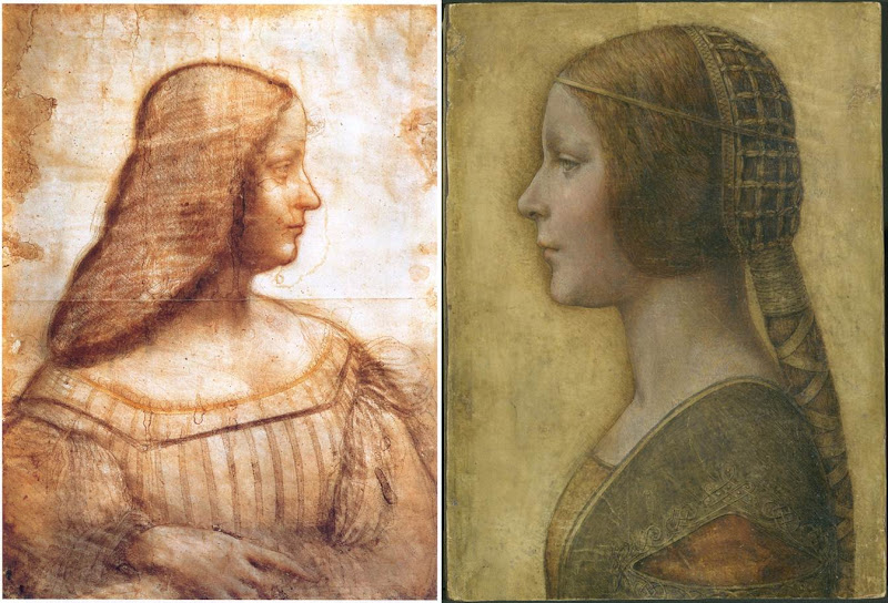
Above, Fig. 4: A comparison of La Bella Principessa with Leonardo da Vinci’s, Portrait of Isabella d’Este, c. 1499–1500, Paris, Musée du Louvre.
[KP] The portrait of Isabella d’Este shows the face in profile but the body in three-quarters, unlike La Bella Principessa. The former is also unfinished, rendered softly with the sfumato effect, fluid in execution, while the shading is on the inside of the profile.
La Bella Principessa is shown in full profile, highly finished, rigid and linear, while the shading is on the outside of the profile.
The similarities between the two profiles are only superficial.
The use of the word ‘repaint’ was an incorrect translation of the French word ‘repentir’, which means pentimento. I would like to mention that I have a good enough grasp of drawing techniques as I also trained as a copyist of Old Masters and an art restorer.
[MK] “16) Left-handedness”
[KP] I disagree that “the left-handed execution cannot undermine the attribution”, as it indicates the intention to imitate Leonardo. None of his collaborators or followers were left-handed, so the drawing is either by him or by an imitator/forger.
[MK] “17) The costume”
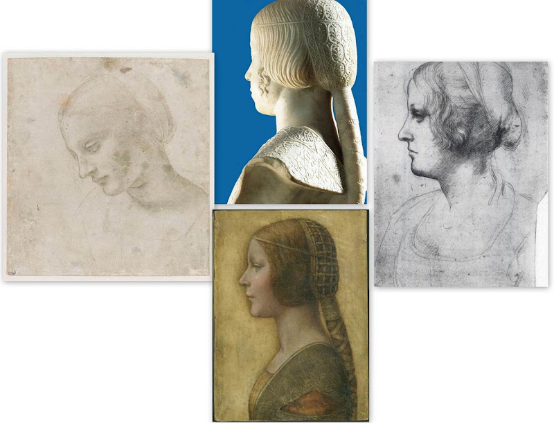
Above, Fig. 5: Comparisons of La Bella Principessa with Leonardo da Vinci’s, Head of a Woman, c. 1488–1490, National Gallery, Parma (left); Leonardo’s Portrait of a Woman in Profile, c. 1489–1490, Windsor Royal Collection (right); and, Gian Cristoforo Romano’s sculpture, Bust of Beatrice d’Este, c. 1491, Paris, Musée du Louvre (top).
[KP] The simplified and flatly rendered dress as well as the coazzone hairstyle do indeed show similarities with the sculpted busts by Gian Cristoforo Romano (Bust of Beatrice d’Este) and Francesco Laurana. But this could be a negative point, as the drawing could be based on one of these busts.
Incidentally, the opening in Laurana’s sculptures differs from that in La Bella Principessa. In the former it is a wide horizontal cut facilitating the movement of the arm, while in the drawing it is a triangular hole which doesn’t seem to play such a role.
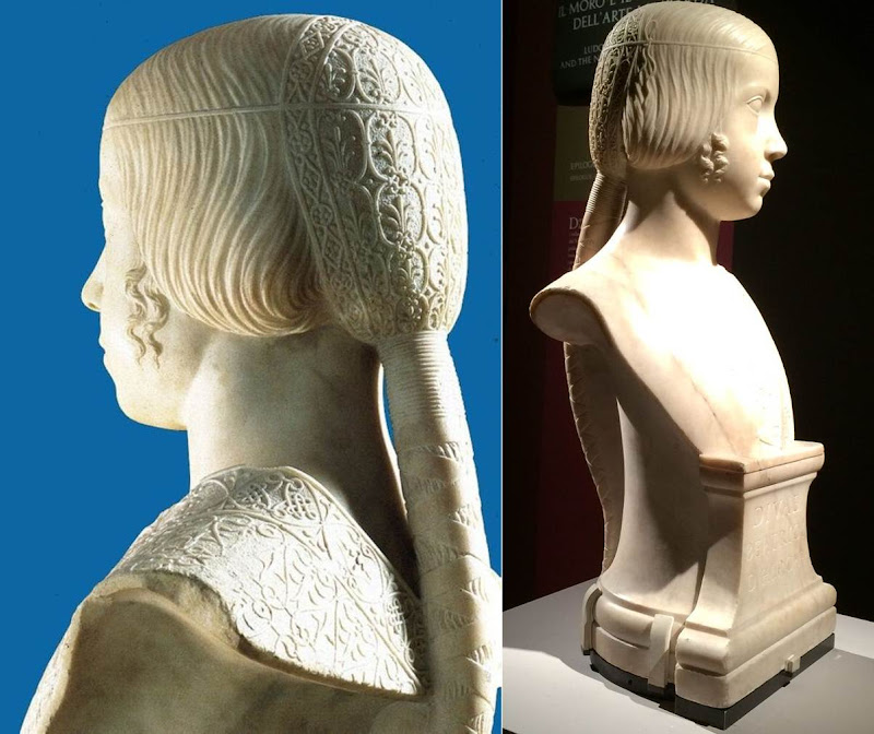
Above, Fig. 6: Gian Cristoforo Romano, Bust of Beatrice d’Este, c. 1491, Paris, Musée du Louvre.
Above, Fig. 7: A comparison of the knots on La Bella Principessa’s dress and Gian Cristoforo Romano’s Bust of Beatrice d’Este, c. 1491.
[MK] “18) The fingerprint”
[KP] The fingerprint evidence which was originally published in the book as “strongly supportive of Leonardo’s authorship” is now considered invalid.
It was not possible to compare the palm imprint to Leonardo’s other examples, and it was described as perhaps unintentional as it is single and isolated, unlike in the execution of Cecilia Gallerani, where many imprints were found where the blending of hues had taken place.
[MK] “19) On Method”
[KP] The “accumulative build-up of different types of evidence” against the attribution to Leonardo is strong, but, as mentioned above, my main arguments were not addressed by Prof. Kemp.
Why is the shading on the outside of the profile? What is the significance of the hand writing on the reverse of the drawing and why was it not investigated? Why is the profile of La Bella Principessa so similar to that in the sculptural Bust of Beatrice d’Este by Cristoforo Romano? Why is the knot on the dress similar to the one on the bust and unlike other Leonardo’s knots? Why are the proportions of the face flawed? Why the vellum of the drawing was described as ‘rough animal hide’ and could it be part of the luxury book of the Sforziad? Why Marchig’s friend the famous Renaissance expert Bernard Berenson had not attributed the drawing to Leonardo? Why there is no known provenance prior to Marchig’s in the 1950s?
In the field of attributions the level of inconsistencies and contradictions always undermine any evidence in favour of a proposed attribution.
[MK] “20) The damaging allegation in the opening to Pisarek’s article that the owner was to set up ‘non-profit-making foundation for multi-disciplinary Classical and Renaissance studies near Florence, to be headed by Professor Martin Kemp’.”
[KP] I made no such allegation. This was a quotation from an article by Simon Hewitt who supports the attribution to Leonardo. This information was published in an Antiques Trade Gazette article by Simon Hewitt in 2009. The article can be found here.
In my article I also wrote: “Prof. Kemp and his colleagues are no doubt genuinely convinced of the authenticity of the drawing, as well as highly enthusiastic about the rediscovery.” This shows that I in no way question Prof. Kemp’s integrity on this matter, only the methodology and the results of the proposed attribution.
Kasia Pisarek, 24 May 2016
Problems with “La Bella Principessa”~ Part I: The Look
The world famous drawing that was dubbed “La Bella Principessa” by Professor Martin Kemp is insured for $150 million and lives in a “secure vault in Zurich”. It is not a portrait of Bianca Sforza by Leonardo da Vinci, as has been claimed, but a twentieth century forged or pastiche Leonardo.
WHITHER “LA BELLA PRINCIPESSA”
In 1998 the now so-called “La Bella Principessa” appeared from nowhere at Christie’s, New York. A hybrid work made in mixed media that were never employed by Leonardo (three chalks, ink, “liquid colour”), on a support that was never used by Leonardo (vellum), and portraying a woman in a manner that is nowhere encountered in Leonardo, it was presented as “German School, early 19th century” and “the property of a lady”. It went for $22,850 to a New York dealer who sold it nine years later on a requested discount of 10 per cent for $19,000 to an art collector, Peter Silverman, who said he was buying on behalf of another (unidentified) collector whom he later described as one of “the richest men in Europe”. Thus, at that date, it was not known who owned the drawing or by whom it had been consigned to Christie’s and it remained entirely without provenance. In its nine years long life, no one – not even its new owner(s) – had taken it to be by Leonardo.
In a 2012 book (Lost Princess ~ One man’s quest to authenticate an unknown portrait by Leonardo da Vinci), Silverman claimed a successful upgrading to Leonardo and described how he had gained the support of distinguished scholars including Professor Martin Kemp who had formulated an elaborate hypothetical history in which the drawing was said to be a Leonardo portrait made either from a living subject in celebration of her wedding or in commemoration after her death in 1496.
Nonetheless, the drawing failed to gain a consensus of scholarly support and is rejected in centres like New York, London and Vienna. Carmen Bambach, the Metropolitan Museum’s Renaissance drawings authority dismissed “La Bella” on the grounds that “It does not look like a Leonardo”. Thomas Hoving, a former Metropolitan Museum director, held it to look “too sweet” to be Leonardo. ARTnews reported that the Albertina Museum’s director, Klaus Albrecht Schröder, had noted “No one is convinced it is a Leonardo”. In the Burlington Magazine Professor David Ekserdjian suspected it to be “counterfeit”.
THE LOOK OF “LA BELLA” AND THE COMPANY SHE BEST KEEPS
In matters of attribution the most important consideration is the look of a work. Many things can be appraised simultaneously but, conceptually, the “look” of a work might be broken down into two aspects: an initial at-a-glance response to a work’s effects and appraisal of its internal values and relationships; and, a comparison of the effects, relationships and values with those of bona fide productions of the attributed artist, or with those of the artist’s students, associates or followers. It can also be useful to compare the looks of works with those of copyists and known forgers. It might fairly be said that in connoisseurship, as in the evaluation of restorations, visual comparisons are of the essence. (In ArtWatch we take pride in the extent to which we seek out all possible comparative visual material and regret that some institutions still hinder our efforts in this regard.)
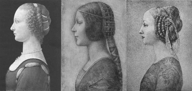
Above, Fig. 1. If we put aside questions of attribution and simply look at the group above, we find works of remarkably similar figural motifs and formats that clearly relate to and derive from a most distinctive type of 15th century Italian profile female portrait. These similar-looking works are similarly sized, being, respectively from left to right:
A Young Woman, 14 and 1/4 x 10 inches;
“La Bella Principessa”, 13 x 9 and 3/4 inches; and,
A Young Woman, 18 x 12 1/2 inches (here shown mirrored).
All show young women depicted in the strict early Renaissance profile convention made in emulation of antique relief portraits on coins and medals. Although very widely encountered (see Fig. 4), Leonardo side-stepped the type in order to intensify plastic and expressive values with sculpturally-purposive shading and axial shifts in the bodies and gazes of his portraits (see Fig. 6). The portrayals above are strikingly similar in their head/torso relationships; in their absences of background; in their highly elaborated coiffures which offset ‘sartorially’ skimped and unconvincing simplifications of costume; in their sparse or wholly absent depictions of jewellery; and, even, in their almost identically cropped motifs. Collectively they might be taken as a suite of variations on a simple theme. We take all three to be twentieth century Italian artefacts. At least two of them are linked to Bernard Berenson and the two on which reports have been published have unusual and problematic supports.
As mentioned below, the Detroit picture is painted on top of photographic paper. It is suspected that it might have been a photograph of the Frick sculpture to which the painting was initially related. The “La Bella Principessa” is drawn, exceptionally for Leonardo, on a sheet of vellum which appears to have been removed from a book and it is, most unusually, glued to an oak panel. The panel itself is a curiosity: although a number of “butterfly keys” have been inserted into its back, as if to restrain splitting, there is no evidence of splits in the panel and, if there were, the present four such keys in such a small panel might be considered restoration “over-kill”. If the panel had split while the vellum was glued to it, the drawing would have split with the panel. The fact that the vellum has been “copiously glued” to a (possibly pre-restored) oak panel makes it impossible to examine the back of the drawing which is said by one of its proponents, (Cristina Geddo, an expert in Leonardo’s students and Milanese “Leonardesques”) to bear “superimposed numbers…a written inscription…[and a] little winged dragon – at least that is what it seems.” For Geddo, this unexamined content is reassuring: “This feature, too, counts in favour of an attribution to Leonardo, who, even though he never to our knowledge used a parchment support in his work, was in the habit of re-using the paper on which he drew.”
(In reading the compendious literature on this proposed attribution, we have sometimes wondered what might be allowed by its supporters to count as evidence against the attribution.)
CONSIDER THE HISTORIES
The portrait on the left, A Young Woman, was bought in 1936 by the Detroit Institute of Arts as by Leonardo da Vinci or Andrea del Verrocchio. The institute’s director, W. D. Valentiner, made this attribution on the strength of clear correspondences with the curls in the hair of Leonardo’s painting Ginevra de’ Benci (see Fig. 6) in the National Gallery of Art, Washington, and with those found in the above-mentioned marble sculpture in the Frick Museum, A Young Woman, given to Andrea del Verrocchio. (Valentiner had made a study of Leonardo’s work in Verrocchio’s workshop.) In 1991 Piero Adorno, specifically identified the Detroit picture as Verrocchio’s lost portrait of Lucrezia Donati. Notwithstanding seeming correspondences with secure works, this picture is now relegated to “An Imitator of Verrochio” – and this is an extremely charitable formulation. In Virtue and Beauty, 2001, David Alan Brown described it as “a probable forgery by its anachronistic materials and unorthodox construction”. “Probable” [!] because: “after a recent technical examination, the picture turns out to have been painted on photographic paper applied to a wood panel that was repaired before it was readied for painting. And at least one of the pigments employed – zinc white – is modern…” Valentiner judged one of two Leonardo studio works of the Madonna with a Yarnwinder to be “more beautiful than the Mona Lisa”.
The portrait on the right, A Young Woman, was attributed to Piero Pollaiuolo by Berenson in 1945. While this figure is perhaps the most attractive of the above three, with its nicely constructed counterbalancing of the thrusts in the neck/head and torso, and its credibly proportioned arm, the work itself has, so far as we can ascertain, sunk without trace. In truth, this female profile portrait type has been assailed by forgeries. Alison Wright notes in her 2005 book The Pollaiuolo Brothers, that “Complications for the historian lie both in the fact that the subjects of most female portraits are no longer identifiable and that, because of their exceptional decorative and historical appeal, such portraits were highly sought after by later nineteenth- and early twentieth-century collectors, encouraging a market for copies, fakes and over-ambitious attributions.”
The portrait in the centre (“La Bella Principessa”) has been precisely attributed by Kemp to Leonardo as a book illustration portrait of Bianca Sforza of 1495-96.
DISTINGUISHING BETWEEN THE LOOKS OF THEN OF NOW
Above, Fig. 2. In My dear BB (an incalculably valuable new resource edited and annotated by Robert Cumming), we learn that in November 1930 Kenneth Clark’s wife, Jane, wrote to Berenson: “K has seen Lord Lee’s two new pictures…The Botticelli Madonna and Child you probably know too. K thinks the latter may be genuine about 1485 or rather part of it may be, but it is not a pretty picture…” A footnote discloses that Lee had bought The Madonna of the Veil, a tempera painting on panel in 1930 from an Italian dealer for a then huge sum of $25,000 (Fig. 3). It was widely accepted by scholars as autograph Botticelli and published by the Medici Society as a “superb composition of the greatest of all Florentine painters”. Clark, doubting the attribution on sight, objected that it had “something of the silent cinema star about it” – and he likened the Madonna to Jean Harlow (Fig. 3). Lee donated the picture to the Courtauld Institute Gallery in 1947. In June 2010 Juliet Chippendale (a National Gallery curatorial intern working in association with the Courtauld Institute MA course) disclosed that scientific examination had identified pigments not known before the 18th and 19th centuries and worm holes that had been produced by a drill. It is now designated a work of the forger Umberto Giunti (1886-1970), who taught at the Institute of Fine Art in Siena and forged fresco fragments.
ART HISTORICAL SILENCES
Four months later Clark wrote to Berenson: “Just in case Lee has sent you a photograph of his new Botticelli may I ask you to forget anything Jane may have reported me as having said of it. It is one of those pictures about which it is best to be silent: in fact I am coming to believe it is best for me to be silent about every picture. Did I tell you that my Leonardo book was a mare’s nest. The man had sent photographs of two drawings from the middle of the Codice Atlantico. They must have been early copies done with some fraudulent motive – perhaps the book really did belong to Leonardo – he certainly had read it – & some pupil thought to enhance its value.”
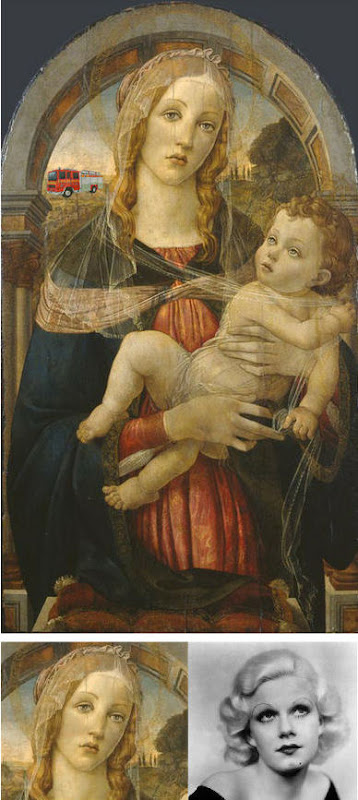
Above Fig. 3. The young Kenneth Clark (then twenty-seven years old) displayed an admirable “eye” by spotting a fraud on sight some eighty years ahead of the pack. Is it better for a connoisseur to see but not speak than it is not to see at all? Undoubtedly, it is. Would Clark have enjoyed his meteoric rise had he humiliated the mighty and exposed the big-time fraudsters of his day? (That question might be taken as self-answering.) If Clark bided his time on Berenson, eventually he delivered an unforgiving former-insider’s repudiation in 1977 by chronicling how Berenson had “sat on a pinnacle of corruption [and] for almost forty years after 1900… [done] practically nothing except authenticate pictures”
PRETTY – AND NOT SO PRETTY – WOMEN
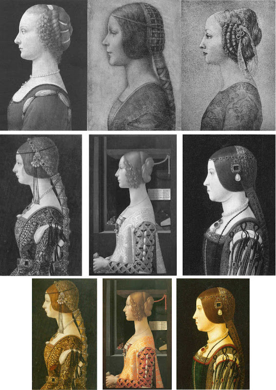
Above, Fig. 4. In the middle and bottom rows we see three bona fide works of the female profile type – respectively:
Portrait of Bianca Maria Sforza, c. 1493, by Ambrogio de Predis, The National Gallery of Art, Washington;
Domenico Ghirlandaio’s 1488-1490 Giovanna degli Albizzi Tornabuoni, Museo Thyssen-Bornemisza, Madrid; and,
a portrait of Beatrice d’Este tentatively attributed by Kemp to Ambrogio da Predis.
The differences between this trio and the works in the top row are pronounced and eloquent. The secure works are highly individuated and immensely richer in their effects. Collectively, they do not constitute an inadvertent suite. Individually, they are greatly more various compositionally. Collectively, they are markedly richer in jewellery and ostentatiously sumptuous costumes. The distinctive physiognomies of their subjects derive from living persons, not from other art or photographs of other art. Flattery and loving attention are channelled more into the costume and bling than into the facial features. In every respect the opposite is the case in the top row where prettiness has been held at a premium with an eye on the modern photographically-informed market.
LEONARDO BREAKS THE MOULD
Above, Fig. 5: As mentioned, “La Bella Principessa” and her two companions are of a piece, and of a type never followed by Leonardo whose female portraits (see below) pioneered an unprecedentedly complex and sophisticated evocation of real, sculpturally palpable women in tangible spaces or landscapes. To include the figurally impoverished and stylistically anachronistic “La Bella Principessa” in Leonardo’s oeuvre would disjunct his revolutionary arc of insights and innovations in portraiture. Such inescapably disruptive consequences have been ceded tacitly by Kemp, “La Bella Principessa’s” principle defender – some say advocate. In “La Bella Principessa ~ The Story of the New Masterpiece by Leonardo da Vinci” (Kemp’s 2010 book jointly written with Pascal Cotte of Lumiere Technology and including chapters by the drawings scholar Nicholas Turner and the recently discredited fingerpints expert Peter Paul Biro), Kemp converts an intractable problem into an asset by begging the essential question. That is, he underwrites “La Bella’s” credibility on an assertion that “Any important new work, to establish itself, must significantly affect the totality of Leonardo’s surviving legacy over the longer term.” Without question, the de-stabilising inclusion of “La Bella Principessa” would produce knock-on effects, but arguing backwards from that predictable disturbance to some endorsement of its source is patently unsound methodologically – the inclusion of any atypical work, whether bona fide or forged, into an oeuvre would affect its “legacy”.
LEONARDO’S ACCOMPLISHMENTS
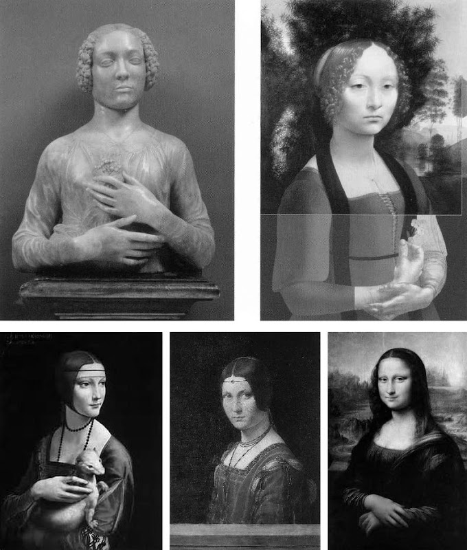
Above, top, Fig. 6: Left, Andrea del Verrocchio’s Lady with a Bunch of Flowers of c. 1475; and (right) Leonardo’s (hypothetically extended) Ginevra de’ Benci of c. 1474-1478.
Above, Fig. 7: Left, Leonardo’s The Lady With an Ermine of about 1489-90; centre, Leonardo’s La Belle Ferronnière of about 1495-96; right, Leonardo’s Mona Lisa (La Giaconda) of about 1503-06 onwards.
In the group above we see extraordinary development in Leonardo’s portraits of women over the last quarter of the fifteenth century as he strove to incorporate the entirety of sculptural, plastic, figural knowledge, and to surpass it by making it dance to an artistically purposive tune liberated from the happenstance, arbitrary lights of nature on which sculpture then necessarily depended. Some have attributed the Bargello sculpture, the Lady with a Bunch of Flowers, to Leonardo on the grounds that its subject was Ginevra de’ Benci, the subject of Leonardo’s painting. Others have seen Leonardo’s authorship of it in the beauty of the hands. In Leonardo da Vinci and the Art of Sculpture, 2010, Gary M. Radke holds that the two works show differences that emerged in the mid-1470s between the two artists. Against this, it has been suggested that the painting might originally have borne a closer relationship to the sculpture with a possible inclusion of hands in a fuller length treatment. A study of hands by Leonardo was incorporated in a hypothetical and digitally realised extension of the painting by David Alan Brown (Virtue and Beauty, 2001, p. 143). Frank Zollner sees the painting as marking the point (1478-1480) at which Leonardo broke away from “the profile view traditionally employed in Florence for portraits of women” in favour of the three-quarters view in order to impart “a pyschological dimension to his sitter – something that would become the hallmark of Renaissance portraiture”. Which is all to say that Leonardo had broken away from the profile convention some sixteen to eighteen years before, on Kemp’s hypothesis, he made a solitary and exceptional “return” to it.
Speaking of the reconstruction of Leonardo’s Ginevra de’ Benci painting, Brown writes:
“Ginevra’s portrait, the lower part of which was cut down after suffering some damage, may have included hands. A drawing of hands by Leonardo at Windsor Castle, assuming it is a preliminary study, aids in reconstructing the original format of the picture. As reconstructed, Leonardo’s portrait may be seen to have broken with the long-standing Florentine convention of portraying women in bust-length profile. In seeking an alternative to the static profile, Leonardo, like Botticelli, seems to have turned to Verrocchio’s Lady with a Bunch of Flowers in the Bargello, Florence. Because of the sitter’s beautiful hands which mark an advance over the earlier head-and-shoulders type of sculpted bust, the marble has even been attributed to Leonardo. But the highly innovative conception of the half-length portrait bust is surely Verrocchio’s achievement. What young Leonardo did was to was to translate this sculptural protype into a pictorial context, placing his sitter into a watery landscape shrouded in a bluish haze…”
A CASE CONSPICUOUSLY NOT MADE
For the owner and the art historical proponents of “La Bella Principessa”, the very chronology of Leonardo’s female portraits constitutes an obstacle. Given Leonardo’s famous eschewal of strict profile depictions of women, the onus is on those who would include “La Bella Principessa” (- albeit as a solitary and exceptional stylistic regression that was undertaken without ever attracting attention or comment) to make a double case.
First, they must show how and where “La Bella Principessa” might plausibly have fitted within the trajectory of Leonardo’s accepted works. Second, they must demonstrate by comparative visual means that “La Bella Principessa” is the artistic equal of the chronologically adjacent works within the oeuvre. Kemp has proposed the precise date of 1495-96 for the execution of “La Bella Principessa” but, conspicuously, has not presented direct, side-by-side visual comparisons with Leonardo’s paintings. Instead of comparing “La Bella Principessa” of 1495-6 directly with Leonardo’s La Belle Ferronnière of about 1495-6, Kemp writes:
“If the subject of Leonardo’s drawing is Bianca, it is likely to date from 1495-6. In style, it seems at first sight to belong with his earlier works rather than to the period of the Last Supper. However, Leonardo was a master of adapting style to subject. Just as his handwriting took on an earlier cast when he needed to adopt a formal script, so his drawing style could have reverted to a meticulous formality, appropriate for a precious set-piece portrait on vellum of a Sforza princess.”
“If”? “Could have”? “At first sight”? The pro-attribution literature is bedecked with daisy-chains of such tendentious and weasel words and terms. With which earlier works is “La Bella Pricipessa” deemed to be artistically comparable or compatible? With the Ginevra de’ Benci of c. 1474-1478? With The Lady With an Ermine of about 1489-90? Never mind the red herrings of handwriting and the giant, near-obliterated historical figures of the Last Supper, what of the relationship with Leonardo’s (supposedly) absolutely contemporaneous La Belle Ferronnière of 1495-96? (On this last we volunteer a pair of comparisons below.)
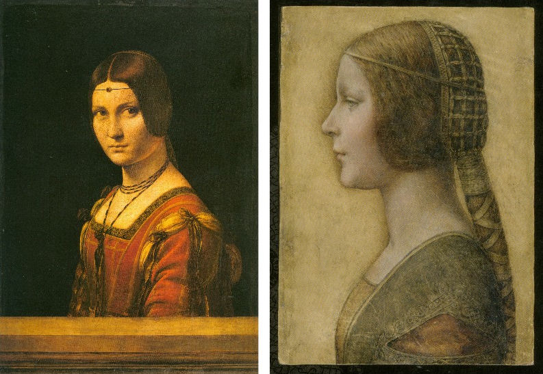

Above, Top, Fig. 8: Leonardo’s La Belle Ferronnière, left, and the “La Bella Principessa”.
Above, Fig. 9: Details of Leonardo’s La Belle Ferronnière, left, and the “La Bella Principessa”.
Kemp insists: “The Lady in profile [“La Bella Principessa”] is an important addition to Leonardo’s canon. It shows him utilizing a medium that has not previously been observed in his oeuvre…It testifies to his spectacular explosion and development of novel media, tackling each commission as a fresh technical challenge. It enriches our insights into his role at the Milanese court, most notably in his depiction of the Sforza ‘ladies’ – whether family members or mistresses. Above all, it is a work of extraordinary beauty.”
Even if we were to assume that for some reason Leonardo had opted to “revert” in 1496 to a type he had never employed, what might explain a pronounced indifference in “La Bella Principessa” to the detailed depiction of the “stuffs” of costume with which the artist was simultaneously engaged in La Belle Ferronnière? Given that Leonardo clearly appreciated and celebrated the fact that courtly costume required sleeves to be made as independent garments held decorously in place by ribbon bows so as to permit undergarments to peep through; and, given that Leonardo lovingly depicted not only the varying thicknesses of the costume materials but every individual twist in the threads of the elaborately embroidered band in La Belle Ferronnière, how could he possibly – when working for same ducal master, at the same time – have been so negligent and indifferent in the execution of “La Bella Principessa’s” costume? Kemp acknowledges and offers excuse for the distinct poverty of the costume: “It may be that the restraint of her costume and lack of celebratory jewellery indicates that the portrait was destined for a memorial rather than a matrimonial volume.” In so-saying, he jumps out of one frying pan into another.
If “La Bella Principessa” was made after Bianca Sforza’s death, from whence did the likeness derive? One reason why Kemp settled on Bianca as the preferred candidate subject for “La Bella Principessa” was that while (disqualifying) likenesses of the other Sforza princesses existed, none survives for her – she is an image-free figure. Kemp offers no indication of a possible means for Leonardo’s (hypothesised) post-death conjuring of Bianca’s supposed likeness other than to claim that “Leonardo has evoked the sitter’s living presence with an uncanny sense of vitality.” This again begs the crucial question and fails to consider any alternative explanations for the image’s qualities. (We will be showing how the profile of “La Bella Principessa” could well have been a “portmanteau” composite image assembled from one particular work of Leonardo’s and from that of another, unrelated painter.)
The most strikingly “Leonardesque” feature on the costume of “La Bella Principessa” – the knot patterning around the (implausible) triangular slash in the outer garment – is a source of further concern and constitutes evidence of forgery. First, the motif on which much effort will have been expended, is brutally cropped along the bottom edge of the sheet, as if by a careless designer laying a photograph into a book. Why would any Renaissance artist, let alone Leonardo, design a complicated feature so as to “run it off the page”? Further, the illusion of form (created by lights and shades) in the patterning is feeble in the extreme for Leonardo – as when compared with his treament of relief seen in the above embroidered passage in La Belle Ferronnière, for example. Leonardo probably better understood than any artist in history the vital connection between a thing made and a thing depicted. He took bodies and organs apart to understand their construction and he sought to create mental models that would make the otherwise terrifyingly arbitrary and capricious forces of nature graspable if not checkable. Most seriously of all, as our colleague Kasia Pisarek has noted and reported, while the patterning present on “La Bella Principessa” matches none found in any work of Leonardo’s, it more closely matches that found in a carved marble bust by Gian Cristoforo Romano in the Louvre – see “La Bella Principessa – Arguments against the Attribution to Leonardo”, Kasia Pisarek, artibus et historiae, no. 71, 2015. (To receive a pdf of Dr Pisarek’s article please write to: news.artwatchuk@gmail.com )
Michael Daley, 24 February 2012.
In Parts II and III we examine: the provenance of “La Bella Principessa” and the work’s problematic emergence from within the circle of Bernard Berenson; the claim by the forger Shaun Greenhalgh to have produced “La Bella Principessa” in Britain in the 1970s; the spurious “left-handed-ness” of “La Bella Principessa” and the low quality of, and the means by which the drawing was made…