
Problems with “La Bella Principessa” – Part III: Dr. Pisarek responds to Prof. Kemp
In June 2015 Kasia Pisarek, an independent scholar (and a member of ArtWatch UK) published an article, “La Bella Principessa – Arguments against the Attribution to Leonardo”, in the Polish scholarly journal Artibus et Historiae.
In her article Dr Pisarek presented a number of interlocking historical, aesthetic and technical criticisms of the attribution to Leonardo of the drawing “La Bella Principessa”, as it has been made and advanced by Professor Martin Kemp. In response, Prof. Kemp produced an article (“Leonardo da Vinci La Bella Principessa: Errors, Misconceptions, and Allegations of Forgery”) which challenges Dr Pisarek’s account on grounds of what he claims and alleges to be: “mistakes, misconceptions and a series of false allegations”.
A TACTICAL RETREAT?
In his response Kemp says “I do not run an authentication service, but research items of special interest regardless of ownership.” More recently ( May 16) Kemp announced on his website that “After speaking at the Art in Authentication Congress in The Hague, I confirm that I am withdrawing the [unpaid – Ed.] ‘advice service’ I have been providing.”
A SIDEWAYS SWIPE
Kemp discloses that in responding to Pisarek’s article he also sought by “extension” to counter other un-identified challenges to his Leonardo attribution. When this multi-targeted professional defence was submitted to Artibus et Historiae, it was rejected, as Kemp acknowledges, and as the Art Newspaper reports (“La Bella Principessa: Still an Enigma”, Features, May 2016), because of its resemblance to “an errata list”. The article was subsequently carried on the Authentication in Art website to accompany a paper given by Kemp at the AiA’s May 2016 Congress. This non-profit organisation, on which Kemp serves as an advisor, was founded in 2012 at The Hague. On May 8th we made a formal request to the AiA for Kasia Pisarek’s Artibus et Historiae article also to be posted so that the congress speakers and attendees might see both of what Dr Pisarek’s compilation of evidence consisted and of what Prof. Kemp complained. We have yet to receive a reply. For Kasia Pisarek’s Artibus et Historiae article, “La Bella Principessa – Arguments against the Attribution to Leonardo” click here. For Martin Kemp’s response to it, see: “Leonardo da Vinci La Bella Principessa: Errors, Misconceptions, and Allegations of Forgery”.
A CONFERENCE AMBUSH
In December 2015 Kasia Pisarek delivered a paper based on her Artibus essay at the ArtWatch UK/LSE Law Department/Center for Art Law conference “Art, Law and Crises of Connoisseurship”. At this conference, an arts journalist, Simon Hewitt, delivered an attack from the floor on her article. He did so as a proxy for Kemp, by whom he had been briefed, and for the collector/dealer owner of “La Bella Principessa”, Peter Silverman, with whom he is co-writing a book on what Silverman describes to us as “various aspects of the art market, sometimes highlighted by others’ and my own discoveries”. A research assistant of Kemp’s, Kasia Wozniak, who had spent four years attempting to show that “La Bella Principessa” had once been part of a late 15th century book known as the Warsaw Sforziad, had also written to us in denigration of Pisarek’s article which we had forwarded to her at her request.
Earlier, both Professor Kemp, who had declined an invitation to speak at this conference, and Mr Silverman, had suggested that we invite Hewitt to speak at the conference. Silverman expressly requested that this be done so that Hewitt might “present his discoveries as a counterweight to Ms. Pisarek”. We carry Pisarek’s full reply to Kemp’s listed objections below but comment first on a crucial new aspect of this disputed attribution that has emerged in Kemp’s response to Pisarek.
NO HISTORY. NO PROVENANCE. WRONG HOLES. NO FIT.
Above, Fig. 1: A facsimile of the “La Bella Principessa” drawing being inserted into the Warsaw Sforziad (but showing only the relationship of the top of the facsimile to the top of the book and not the accompanying relationship of the facsimile and book at the bottom). Photo by courtesy of Lumiere Technology.
For many reasons, it is essential to Prof. Kemp’s Leonardo ascription that it be accepted that “La Bella Principessa” had originally been incorporated within the Warsaw Sforziad now held in the National Library, Poland. It has not been so accepted because, contrary to press releases claims and media coverage thereafter, nothing material or documentary has established such a relationship. No record of any connection between the drawing and the book has been found despite extensive searches by researchers such as Kasia Wozniak. Moreover, despite extensive searches of Berenson’s archives by Kemp and Silverman, no record of the supposed 15th century drawing in any context predates its only-recently acknowledged ownership by the late painter/restorer Giannino Marchig. This pictorially and graphically mongrel work remains without a history and, prior to September 2011, without any claim – even by its only known previous owner – that it might have been a work by Leonardo da Vinci.
Martin Kemp has challenged Kasia Pisarek’s measurements between the stitches in the book’s binding. He and Pascal Cotte (of Lumiere Technology) claim that three stitch holes are present on the left hand edge of the “La Bella Principessa” sheet and that these match three of the book’s five stitches. No confirming visual evidence has been produced in support of this claim. In addition to fresh evidence on dimensions provided below by Pisarek, it might be noted that the Kemp/Cotte claims of a match have been variously and only rarely unequivocally phrased. All emphases below are added:
“The stitch holes in the vellum of the portrait match those in the book” – “The Original Source of the New Leonardo Portrait Discovered”, a Martin Kemp press release, 27 September 2011.
“Three of the stitch marks, the ones that we can still see on the edge of the ‘Bella Principessa’, match as well as they conceivably could” – Martin Kemp, Artinfo interview, “The Da Vinci Detective: Art Historian Martin Kemp on Rediscovering Leonardo’s Tragic Portrait of a Renaissance Princess”, by Andrew M. Goldstein, 11 October 2011;
“During our studies at the National Library, we inserted a facsimile of the portrait into the relevant opening of the book where the size matched very closely” – Martin Kemp, item 14, “Leonardo da Vinci La Bella Principessa: Errors, Misconceptions, and Allegations of Forgery”, on the Authentication in Art website. See Fig.1, above;
“The current stitching of the volume involves five holes, whereas there are only three holes now visible along the left margin of the ‘La Bella Principessa’. However, these three holes correspond very closely to the corresponding ones in the book.” – Martin Kemp and Pascal Cotte, “La Bella Principessa and the Warsaw Sforziad”, Lumiere Technology website, September 2011.
FAILING TO GET THE MEASURE OF HOLES
With linear measurements a near-miss is as good as a mile. If a hole is two millimetres adrift of a stitch there is no match. Claiming “correspondences” and “close” matches between the three holes and the five stitches is problematic enough, but, as Kasia Pisarek has now re-confirmed, the three holes in the “La Bella Principessa” drawing do not correspond with three of the book’s five stitches. Moreover, Kemp’s imprecision came with a perplexing multiple caveat: “In measuring the distances between the holes and matching these distances in the book and the portrait we allowed for four potential sources of error” – Kemp/Cotte, item 13, “La Bella Principessa and the Warsaw Sforziad”, Lumiere Technology website.
If incorporating an allowance for one potential source of error would necessarily be weakening to the force of a claimed match, how might allowances have been made for four different sources of error? How were the different “potentials-for-error” calibrated and weighted one against the three others? With accounts of this attribution, too many features remain in flux. For example, explanations offered for the disparity between the drawing’s three stitch holes and the book’s five stitches have shifted. In 2011 Kemp/Cotte wrote:
“The second task was to see if the holes in the portrait and the stitching pattern in the book corresponds. There is an obvious difference. The current stitching of the volume involves five holes, whereas there are only three holes now visible along the left margin of “La Bella Principessa”. However, these three holes correspond very closely to the corresponding ones in the book…The different number of stitching holes may result from the untidy way the left margin of the portrait has been cut, or from two intermediate stitches being added when the book was later rebound in standard Zamoysky livery. The former explanation is more likely.” (Emphases added.)
The suggestion that the book might possibly have been bound originally with only three stitches seems to have been abandoned altogether. Martin Kemp now accepts in his response to Kasia Pisarek that the book always had five stitches but claims as a countering fact against this recognition that: “The irregularity and extensive damage along the left margin explains why two of the five stitch holes are no longer clearly discernible.”
NOT AN EXPLANATION
The posited stitch holes cannot be said to be “no longer discernible” because there is no evidence that they were ever present. Prof. Kemp here begs a question on which this attribution turns. The roughly cut edge cannot be taken to have explained these absences. What Kemp offers, in truth, is (an implausible) hypothesis that ignores the technical exigencies of book binding and the dimensional realities of the “La Bella Principessa” sheet. When books are being made, the stitches are inserted along the line of a fold made collectively to the small number of sheets that form one of the book’s sections or “quires”. In the case of the Warsaw Sforziad, Pascal Cotte established (by taking and combining 70 precisely-focussed macro-photographs) that each quire was composed of four sheets (folios) which, when folded and stitched, comprised sixteen numbered pages. The book binder’s craft requires that the stitching occurs precisely along the crease line of the folded sheets. This careful alignment is necessary if the pages are not to cockle and for the book to open easily.
The three holes on “La Bella Principessa” have been taken to relate (- more or less, but never exactly) to the book’s central and two outer stitches. Had the “La Bella Principessa” sheet been incorporated in the Warsaw Sforziad when it was made in the late 1490s, the two inner stitch holes would be expected to be present on the sheet, even as it is today, and notwithstanding its roughly cut left-hand edge.
At Fig. 2 below, we see the white arrows and circles with which Pascal Cotte identified what are said to be “La Bella Principessa’s” three stitch holes. On the image on the left, we have drawn in red the alignment of the present three holes and have indicated with arrows where the two hypothesized additional stitching holes would be expected to be located. Both holes would fall within the present sheet despite its roughly cut left-hand edge. In the image on the right of Fig. 2 we again indicate (in black) the alignment of the present three holes, but show in red how the alignment would be disrupted had the two hypothesized additional stitch holes been situated to the left of the present sheet, as Prof. Kemp now claims in “explanation” for their absence from the sheet itself. Such a positioning would have resulted in a zigzag, not a row, of stitch holes. It is impossible to envisage how four sheets of vellum might have been folded so as to produce a neatly zigzagging crease.
Aside from the above problem, any lingering hope that this “La Bella Principessa” sheet might once have formed part of the Warsaw Sforziad will have to be abandoned in the light of Kasia Pisarek’s latest findings described below on her second examination of the Warsaw Sforziad.
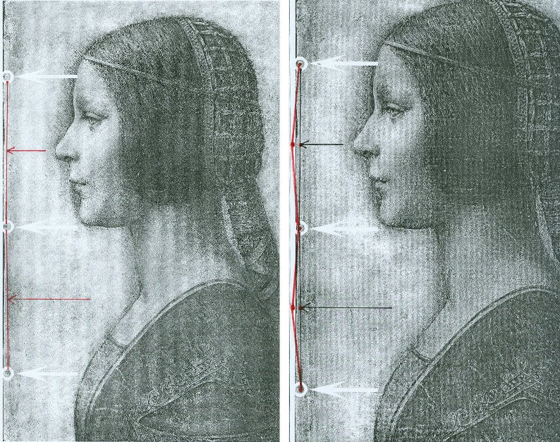
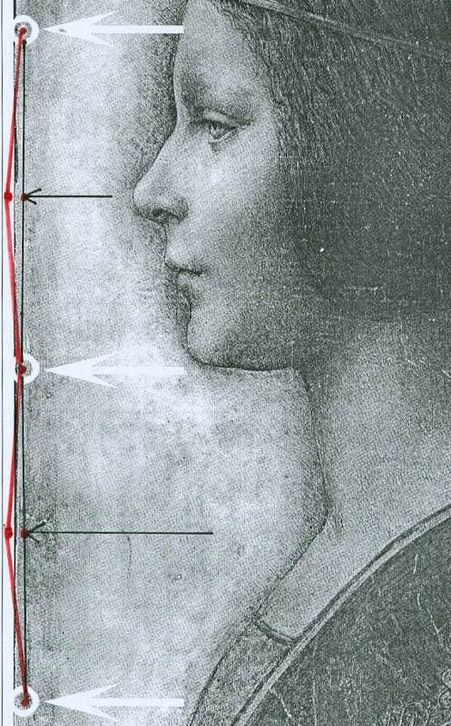
Above, Figs. 2 and 3. In Fig. 2 (top) we see, in the left and right images, the white arrows and circles with which Pascal Cotte located the “three holes showing that the image was once part of a codex or manuscript”. Given that the book (the Warsaw Sforziad) from which this sheet is said to have been cut was originally bound with five stitches, had the “La Bella Principessa” sheet once formed part of that book, it would today have five stitch holes, not the present three. In Figs. 2 and 3, we indicate with arrows (in red and then in black) where the missing two stitch holes would, for the reasons given above, be expected to have been located.
THE DOUBLE ‘DISCOVERY’ OF THE SUPPOSED POSITION OF LA BELLA PRINCIPESSA IN THE WARSAW SFORZIAD
When Andrew Goldstein asked Martin Kemp in an Artinfo interview in October 2011 what, on seeing the drawing, had convinced him it might be a Leonardo, he replied:
“So the initial connoisseur’s reaction merely tells you that something is worth looking at, but at any point one wrong thing can throw that all away — a later pigment, a bit of something that might come up about its history to indicate it was forged at some point, and so on. I was trained as a scientist, and if you have a scientific theory, you only need have one bit of the experiment that says, ‘this is not right,’ and the whole thing collapses. You always have to be looking for that one thing that is going to demolish the whole expectation that’s being set up.”
Kemp has given other grounds for caution when making attributions. On first encountering “La Bella Principessa”, he told Silverman, “I immediately saw it was in a different league from the others. But I was still very, very cautious. I didn’t want to jump at it because once you start believing you can summon up all the evidence you need.” (Peter Silverman, Leonardo’s Lost Princess: One Man’s Quest to Authenticate an Unknown Portrait by Leonardo da Vinci, 2012, p. 74.) Kemp had become a believer in the Leonardo attribution by 28 September 2011 when he issued a press release “The Original Source of the New Leonardo Portrait Discovered”. He added, “This (press release attached without the pics) should more or less settle the arguments – though probably not knowing the myopia of the art world.”
In 2011, after Kemp and Cotte had inserted their facsimile “La Bella Principessa” into the book, Kemp expressed himself 80 per cent confident of the drawing’s Leonardo attribution in a National Geographic film of the occasion. However, this was not the first time that a claimed “fit” between the facsimile and the book had been made and filmed by National Geographic. Peter Silverman describes in his book how, in December 2010, he had established a match in a different part of the book:
“We began by measuring the page size to see if it corresponded to “La Bella Principessa” and were gratified to see that it did, within a millimeter or two (a minute fraction of an inch)… Martin [Kemp] had surmised that the drawing would have been placed either at the very beginning or the very end of the book, but after careful examination we could find no trace of a cut page in either place. ‘May we turn each page?’ I asked. It was not a simple request. The book was nearly two hundred pages, and it would be a bit laborious for her [Anna Zawisza, the head of manuscripts] since utmost care had to be used so as not to damage the precious work in any way…It was apparent that the three pinholes where the binding had been sewn, noted earlier by Martin, which we had hoped would be a key to matching, would not be relevant, since the book had been rebound using five sutures…We slowly continued to turn each page, but there was no sign of a missing page…I had begun to abandon hope and to mentally prepare myself to return empty-handed. But then Zawisza turned page 161. There was a momentary beat of silence, and then she and I let out muffled cries. There, before our incredulous eyes, was what seemed to be the missing link, the element we longed to find: a remnant of a cut and extracted page of vellum that was the same darkish yellow as “La Bella Principessa”. We could barely contain our emotions. We measured the undulation of the remnant, and it corresponded exactly. Kathy [Silverman’s wife] and Kasia [Wozniak, art historian] came round to see for themselves, while David [Murdoch, National Geographic producer] filmed the historic moment. Even the armed guard was caught up in the excitement. Zawisza, who had carefully studied the book on past occasions, murmured how unhappy she was that she’d never noticed the missing page, now so glaringly obvious from the protruding remnant…”
That filmed historic moment was eclipsed by the moment in which Kemp and Cotte discovered a (preferred) location for the drawing at the front of the book. On her second examination of the Warsaw Sforziad, Dr Pisarek has learned that each of the five stitches in the book’s binding resulted in two holes, through which a string was passed. Thus, now that it is accepted that the book was originally bound with five stitches, each of which generated two holes, and that the “La Bella Principessa” sheet possesses only three of the necessary ten holes – and three where there should be six – there is no physical match between the drawing and the book, just as there is no documentary record of a Leonardo drawing having been bound within the book. Those who continue to see the hand of Leonardo in the drawing itself must now find an alternative history and another princess to accompany and bolster it.
Michael Daley 24 May 2016
Kasia Pisarek: A reply to Martin Kemp’s essay “Leonardo da Vinci La Bella Principessa. Errors, Misconceptions and Allegations of Forgery”
Professor Kemp has written an essay in response to my article “La Bella Principessa; Arguments against the Attribution to Leonardo”, Artibus et Historiae, No. 71, XXXVI, June 2015, pp. 61– 89.
In his essay, Prof. Kemp lists what he deems a series of errors and misconceptions in the Artibus article, but says he does not wish to address the issues of attribution I raised.
The purpose of his article is, however, an attempt to counter or undermine my findings.
I will answer his points in the order and with the numbered headings used by Kemp in his text.
[Martin Kemp] “1) Bibliographical”
[Kasia Pisarek] Martin Kemp says that most of my material is quoted from the internet and that I make only one reference to his book in my footnote 50.
This is incorrect. I make extensive reference to his book on the opening page and further references in footnotes 54, 57, 59 and 64. I have examined it as thoroughly as would be expected of any researcher. I also referred to many other books and articles which were accessed from libraries and not from the internet. These were:
M. Kemp and P. Cotte, The Story of the New Masterpiece by Leonardo da Vinci: La Bella Principessa, London, 2010; M. Kemp, Leonardo (rev. ed.), Oxford, 2004; P. Silverman, Leonardo’s Lost Princess: One Man’s Quest to Authenticate an Unknown Portrait by Leonardo Da Vinci, New Jersey, 2012; C. Geddo, ‘A “Pastel” by Leonardo da Vinci: His Newly Discovered Portrait of a Young Woman in Profile’, Artes, 2008–2009, pp. 67–87; C. C. Bambach, ‘Leonardo’s Notes on Pastel Drawing’, Mitteilungen des Kunsthistorischen Institutes in Florenz, vol. 52, 2008, no. 2/3 (Le tecniche del disegno rinascimentale: dai materiali allo stile. Atti del convegno internazionale, Firenze, 22–23 settembre 2008, ed. By M. Faietti, L. Melli, A. Nova), pp. 177–204; M. Gregori, ‘A Note on Leonardo’, Paragone, LXI, 2009, no. 723, pp. 3–4; D. Ekserdjian, ‘Leonardo da Vinci: “La Bella Principessa” – The Profile Portrait of a Milanese Woman’ (book review), Burlington Magazine, vol. 152, 2010, no. 1287, June (Attributions, copies, fakes), pp. 420–421; P. C. Marani, ‘Deux nouveaux Léonard?’, Dossier de l’art, 2012, no. 195, avril, pp. 58–63. Giannino Marchig, 1897–1983: paintings and drawings, exh. cat. London, 1988; Giannino Marchig, 1897–1983, exh. cat., Geneva, 1985; Giannino Marchig: 1897–1983: dipinti, disegni, incisioni, exh. cat. Florence, Gabinetto disegni e stampe degli Uffizi, 12 March – 5 June 1994 (Italian ed.); J. Cartwright (Mrs Henry Ady), Beatrice d’Este, Duchess of Milan, 1475–1497. A Study of the Renaissance, London, 1910; B. Horodyski, ‘Miniaturzysta Sforzów’, Biuletyn Historii Sztuki, 16, 1954, pp. 195–213; E. McGrath, ‘Ludovico il Moro and His Moors’, Journal of the Warburg and Courtauld Institutes, vol. 65, 2002, pp. 67–94; L. Syson with L. Keith, Leonardo da Vinci, Painter at the Court of Milan, exh. cat. National Gallery, London, 2011; Dizionario delle origini, invenzioni e scoperte nelle arti, nelle scienze…, Milan, 1831; B. Berenson, The Drawings of the Florentine Painters, vol. III, Chicago, 1938; Leonardo da Vinci, Master Draftsman, ed. by C. C. Bambach, exh. cat., The Metropolitan Museum of Art, New York, 2003; Z. Zygulski Jr, ‘Ze studiów nad Dama z gronostajem. Styl ubioru i wezly Leonarda’, in: Swiatla Stambulu, Warsaw, 1999 (first published in Biuletyn Historii Sztuki, vol. 31, 1969, no. 1, pp. 3–40).
The 2012 Italian version of Kemp/Cotte’s 2010 book is a translation from the English with the addition of the Sforziad hypothesis. The latter had already been published on the Lumiere Technology website and I discussed it at length.
Gnignera’s text was in Italian so I used Prof. Zygulski’s extensive knowledge of historic costume in general and coazzone in particular. The Monza catalogue (2015) was not published when I submitted my paper. The 2014 exhibition catalogue from the Galleria Nazionale in Urbino was also unavailable. To my knowledge these later publications have not yielded any conclusive evidence.
Prof. Kemp said that I have not addressed any of ‘the scientific evidence in the two books related to the lower layers of the image, the pentimenti or the condition and retouching in various media’ and goes on to say ‘contrary to Pisarek’s assertions, the interventions of restorers are documented in both books’. The latter sentence must refer to my ‘it is also strange that he did not consider that the drawing might have been retouched and repainted at a later time’ (p.79). Prof. Kemp has taken this out of context. I said that he did not mention the restorations in that particular passage of his book Leonardo (p. 210).
I not only analysed his art historical arguments in my text, but also the technical evidence presented by Cotte – which is to say:
– The trois crayons, pen and ink and bodycolour technique on vellum (unprecedented for Leonardo);
– The X-rays (inconclusive, in Cotte’s own words “did not yield significant new findings”, p. 154)
– The Carbon-14 dating of the vellum (wide-ranging 1440-1650, not constituting proof in itself as anyone could draw at any time on a blank folio removed from a manuscript)
– The quality of the vellum (rough; drawing on the hair-side; does not match the Sforziad’s smooth and well-prepared support; Birago’s illumination on the skin-side)
– The left-hand hatching (dry, timid and mechanical; on the outside of the contour of the profile, unlike in all Leonardo’s female portraits)
– The presence of three stitch holes (the Warsaw National Library Sforziad has five holes)
– The ‘knife marks’ when the folio was cut off (unnecessary, if the folio has been removed during rebinding).
– The retouchings of a later restorer (Marchig’s)
– The fingerprint evidence (no longer valid)
– The pentimenti, in the same place as in Leonardo’s Windsor portrait (a negative point, as La Bella Principessa could be based on that drawing).
At this point I would like to discuss some more scientific evidence:
On page 109:
“The support is probably the fine-grained skin of a calf”.
To the contrary, the images show an irregular grainy surface with visible follicles. Both Geddo and Turner described the support as “rough animal hide” and the surface of the vellum as being “pitted”.
“The portrait was drawn on the smooth ‘hair’ side”.
To the contrary, the hair-side has follicles so it is the rough side, not the smooth side.
Contrary to Prof. Kemp’s claim that I ignored Geddo’s contributions, I quoted her (p. 76), and she said exactly the opposite: “Besides the presence of the follicles, the rough unworked surface of the hide and its darkened, somewhat yellowish colour show that the portrait was made on the outer surface of the skin (formerly furcovered) and not on the inner one covering the flesh, which was aesthetically the superior of the two and commonly used as a support for written documents”.
I quoted extensively from Geddo’s article “A ‘Pastel’ by Leonardo da Vinci: His Newly Discovered Portrait of a Young Woman in Profile”, in Artes, 2008–2009, pp. 67–87, on my pages 62, 76 and 88.
On page 114:
The discovered “small area of pen marks along the left edge of the support” described by Cotte as Leonardo’s “pen trials”. This would surely have no place in a drawing destined for a luxury book presented as a gift to the Sforzas.
On page 154:
A problem with the X-rays:
‘Because white chalk (calcite or calcium carbonate) does not absorb X-rays to any great extent, the luminous zones of the sitter’s face ought to have appeared grey in the X-ray. On the contrary, however, they appear very white here, indicating the presence of a significant amount of dense material in the chalks area – which seems to contradict all the physical evidence considered so far.’
Cotte attributes this anomaly to the technician supposedly over-exposing the plate. This confirms his own observation that X-rays “are vulnerable to diverse interpretation”.
[MK] “2) PROVENANCE”
[KP] I did not say that the Marchigs were involved in forgery of any description. What I did say was that Giannino was familiar with Leonardo’s technique as a restorer and a “Leonardesque painter”. He was able to make such a drawing if he had wanted to, but clearly he had not tried to sell La Bella Principessa as a work by Leonardo.
Prof. Kemp does not explain, however, why the drawing had no provenance prior to Marchig’s ownership, and, as Michael Daley has recently pointed out, Professor Kemp and the drawing’s owner, Peter Silverman jointly trawled Berenson’s archive in hope of finding some pre-Marchig record but found none.
[MK] “3) The assertion that there is an ‘almost total absence of close comparisons with unimpeachable works by Leonardo.’”
[KP] The offending phrase above was written not by me but by David Ekserdjian in “Leonardo da Vinci: ‘La Bella Principessa’ – The Profile Portrait of a Milanese Woman”, The Burlington Magazine, vol. 152, 2010, no. 1287, June (Attributions, copies, fakes), pp. 420–421.
I used the same Leonardo comparisons as Prof. Kemp, but where he saw striking similarities, I saw possible imitation.
As to Cecilia Gallerani, although the structure of the eye looks comparable, it is round, soft and alive in Leonardo’s portrait, and dry, linear and lifeless in La Bella Principessa. The iris is drawn as a flat disc and the eyelid is marked with clear cut lines, unlike in nature.
Cotte states on p. 177: “Leonardo, for example, consistently made the bottom of the eye’s iris coincide exactly with the edge of the lower eyelid”.
This is not always the case. In Portrait of a Woman in Windsor or in La Belle Ferroniere the iris does not touch the lower eyelid, while in some works by Leonardo’s followers it does.
[MK] “4) The lack of records of Leonardo making the drawing”
[KP] Prof. Kemp wrote that all Leonardo’s known works are “unrecorded in his writings”. Leonardo does in fact mention two Madonnas in a sheet of sketches (Gabinetto Disegni e Stampe degi Uffizi, Florence, 446 E) inscribed: “…1478, I began the two Virgin Marys”, possibly referring to the Benois Madonna in St. Petersburg. He also mentions in a note his sculpture of the Sforza Horse (Ms. C, fol. 15v; R 720; B 44; V 53). And in an undated letter (about 1491-95), he writes together with De Predis about being underpaid for the Virgin of the Rocks.
The 16th century record in the Zamoyski collections Kemp refers to applies only to the Sforziad, not to the drawing, which was unrecorded there.
[MK] “5) ‘The entirely unusual for Leonardo medium of vellum commonly found in manuscripts led Prof. Kemp and his colleagues, including David Wright, Emeritus Professor of Art History at the University of South Florida, to search fifteenth-century codices for an excised illumination.’”
[KP] Prof. Kemp writes that “the author’s narrative of an extensive search is imaginary.”
But Dalya Alberge wrote in her article, “Is this portrait a lost Leonardo?” in The Guardian, on 27 September 2011:
“Earlier this year, he [Prof. Kemp] embarked on what he describes as a ‘needle-in-a-haystack’ search for a 15th-century volume with a missing sheet. […] Against the odds, Kemp tracked the volume down, to Poland’s National Library in Warsaw.”
[MK] “6) Forging a Leonardo?”
[KP] To be clear, I only said that the drawing could be a compilation of Leonardo’s works and other sources such as a bust by Cristoforo Romano.
[MK] “7) Pisarek’s reliance on Julia Cartwright”
Cartwright’s work is the only one specifically on Bianca Giovanna Sforza I could find in the English language. As there are no other secure portraits of Bianca Giovanna, the Principessa hypothesis is not supported by any evidence either.
Cartwright’s identification of The Musician as the portrait of Galeazzo Sanseverino, Bianca’s husband, looks convincing. The companion portrait in the Ambrosiana could then be showing his wife Bianca, but she looks very different to La Bella Principessa. Also Professor Carlo Pedretti in his Leonardo: The Portrait, 1999, called the Ambrosiana portrait (p. 23) “a probable portrait of Bianca Giovanna, the illegitimate daughter of Francesco Sforza.”
[MK] “8) Bianca Maria Sforza and earlier scholarship”
Even if the identification and dating of the portrait ‘pre-dates the research into the Sforziad’, as stated by Prof. Kemp, there is still the problem of the dating and the too ‘archaic’ style of the drawing.
Kemp does not explain why Vezzosi and Turner identified La Bella Principessa as Bianca Maria Sforza, even if she looks so different to her other known likenesses.
[MK] “9) Cutting out the portrait from the Sforziad in Warsaw”
[KP] There is no evidence that the folio was in the Sforziad and was removed during rebinding. But if it were so, there would be no need to cut out the folio, only to remove it as a complete sheet. A complete sheet (two folios) is indeed missing in the book, which would eliminate the need for excision.
If the folio had been removed during rebinding for its beauty or high value by the Zamoyskis, it would have been recorded in their collections, but there are no such records. Kasia Wozniak’s research has not found any evidence to this effect.
Her hypothesis that the drawing went to the Czartoryski collections in Pulawy where it was identified as by Leonardo is also so far unsubstantiated. There were no such records in the Czartoryski collections. The late Director of the Czartoryski Museum, Prof. Zygulski Jn. never mentioned the existence of a Leonardo drawing in their collections.
The Bona Sforza drawing listed in the 1815 inventory of the Temple of Sybil in Pulawy and mentioned by Wozniak as the possibly misidentified Bianca Giovanna Sforza, refers to a miniature watercolour on vellum illustrated in D. Dec and J. Walek’s, Czasy! Ludzie! Ich dziela. Teatr obrazów ksieznej Izabeli, listed as no. 99. ‘Polish, 16th century’.
There is no connection between my article in Artibus and the interests of the National Library in Warsaw.
[MK] “10) The foliation and inserted paper pages”
[KP] Prof. Kemp himself used the word ‘codex’ to describe the Sforziad in his book Leonardo: Revised edition, 2011, p. 256:
“this tender and refined formal portrait in ink and coloured chalks on vellum has been cut from a codex (a book), namely the copy of the Sforziada in Warsaw produced for Galeazzo Sanseverino.”
The three folios missing in the Warsaw Sforziad were originally left blank as in the other copies of the book in Paris or London.
Geddo described the drawing’s “apparent crudeness in the preparation of the parchment” and “the rough unworked surface of the hide” (A Pastel by Leonardo da Vinci… reprinted in P. Silverman, Leonardo’s Lost Princess, pp. 219-220). This is not true of the Sforziad’s parchment.
I have seen the Sforziad on two occasions. Once in the summer 2012 and more recently in March 2016; the parchment is finely grained and of high quality, as expected in a luxury book for the Sforzas.
My illustrations Fig. 7, 10 and 11 indeed show paper pages. Because they look so similar it is easy to mistake the paper pages for the vellum ones. My Fig. 6 and Fig. 8 are vellum and they look very similar in colour and texture.
Kemp states that I inaccurately said that his “reconstruction of the insertion of the drawing in the Warsaw Sforziad looks unrealistic, as it is facing a printed page”. He wrote that “The reconstruction shows that the portrait would have faced a blank page”. This is incorrect. His “Fig. 12 – ‘Hypothetical Reconstruction of La Bella Principessa as folio 6r” in the online article “La Bella Principessa and the Warsaw Sforziad” does face a printed page.
[MK] “11) Iconography”
[KP] According to Kemp, Horodyski’s pioneering research on the Sforziad I support ‘has been superseded in the light of more detailed knowledge of Sforza court iconography and analyses by later scholars, including Wright’.
Horodyski suggested Gian Galeazzo Sforza and his offspring, such as Bona Sforza, the later owner of the book in Warsaw as the recipient of the Sforziad.
But according to D.R.E. Wright in his article on the Lumiere Technology website (which has now been removed), M. L. Evans and E. McGrath, the Warsaw Sforziad was destined for Galeazzo Sanseverino, Bianca’s husband.
So why is Galeazzo Severino’s profile absent on the Warsaw frontispiece by Birago, where Ludovico’s is in London and Gian Galeazzo’s in Paris, the recipients of the other Sforziads?
Moreover, Galeazzo Sanseverino was not part of the Sforza dynasty and Bianca was illegitimate. All the copies of the Sforziad on vellum were dedicated to members of the Sforza family.
Horodyski’s reading of the symbolic content of the Birago frontispiece more logically pointed to the death of Gian Galeazzo: the lack of the recipient’s profile as emblem, the missing figure of Gian Galeazzo in the boat with Ludovico il Moro, the tears in the handkerchief, the sarcophagus, the broken shield with the initials GZ, the crest with one half with arms of Milan and the other of Aragon for Gian Galeazzo.
After my defence of Horodyski’s interpretation, an Italian scholar Carla Glori published online her very detailed new iconographic study of the illumination: ‘The Illumination by Birago in the Sforziad incunabulum in Warsaw: in defence of Horodyski’s thesis and a new hypothesis’. I am quoting her extensively below.
She said: “The incunabula with the illuminations now in London and Florence were the property of Ludovico il Moro, given the recurrence of the central upper figure of a moor, and the presence of the ensign of the Duke of Bari with his devices called “la scopetta” (the little broom) and “I due fanali” (the two beacons). The Paris and Warsaw incunabula were the property of Duke Gian Galeazzo Sforza and his family, because they are reproducing the devices of Gian Galeazzo himself and of his father, Galeazzo Maria.”
The sieve, which was said to be the emblem of Galeazzo Sanseverino, was Gian Galeazzo’s personal device (created by his father) called “il buratto” (a sieve held by two hands) with the motto TAL A TI QUAL A MI, as illustrated by the “Cassone dei tre Duchi”, Sforza Castle, Milan, 1479-1494.
Glori also added that the sieve device (“il buratto”) is duplicated in symmetrical position in the central area of the Warsaw illumination.
She concluded that “the Warsaw illumination was dedicated to the memory of the deceased Gian Galeazzo Sforza and his family, and that it was certainly dated after his death (1494)”.
Her argument against the Sanseverino coat of arms or imprese supposedly identified in the Birago’s illumination includes:
– The missing Aragonese “A” in the device of the “three intertwined rings with diamonds” appearing on the Warsaw illumination
– The missing Sanseverino NOSTRO È IL MESTIERE motto
– The fact that the hybrid coat of arms of the Warsaw illumination does not correspond to the coat of arms of the Sanseverino dynasty; it should be silver/white not gold/yellow. “Every armorial certifies that the field (“campo”) of the Sanseverino coat of arms was “SILVER” (white), while the field (“campo”) of the coat of arms in the illumination of Warsaw is “GOLD” (yellow)”. “According to Horodyski’s logical and symbolical interpretation, the emblem is an artistic fusion of the traditional emblem of the city of Milan with the yellow and red lines of the Aragona coat of arms.”
– The reference of the initials “GZ” (appearing in the ducal documents and iconography, also on the ‘Cassone dei Tre Duchi’) to the memory of the deceased dukes Galeazzo Maria and Gian Galeazzo, not Galeazzo Sanseverino.
– The absence of any reference to Galeazzo Sanseverino and his biography such as the tournament lance of the famous jouster, while the ducal arms on the “Cassone dei Tre Duchi” are present: the round shield, the quiver with arrows and the sword. The depicted starry armour on the left is not the typical armour of a jouster. It is empty as Gian Galeazzo is dead, and it is almost identical to the one worn by him in the Paris illumination.
– The presence of a body of heraldic devices celebrating the Visconti-Sforza dynasty and referable in particular to Galeazzo Maria Sforza and his son Gian Galeazzo such as the greyhound/the tree/the divine hand (Francesco Sforza); the “capitergium” device (a bandage with a knot) dedicated to Gian Galeazzo Visconti, the first Duke of Milan, celebrating the Visconti dynasty; the rising waves (“onde montanti”); the three intertwined rings with diamonds (“i tre anelli intrecciati con diamante), by Muzio Attendolo, the founder of the Sforza dynasty: it was probably given to him in 1409 by the Marquis of Ferrara Niccolò II d’Este after the conquest of Reggio Emilia. They are not emblems of Bianca Giovanna as was advanced, but of members of the Sforza family in general.
According to Glori, “we have no evidence that the incunabulum now in Warsaw was confiscated in Milan during the French invasion. In 1517 Antonio de Beatis saw some precious incunabula in the Royal Library of Blois, but he did not cite the Sforziad as being amongst them in his autograph manuscript XF28 of the National Library in Naples. It is plausible that the incunabulum now in Warsaw was a wedding gift to Bona Sforza from her mother Isabella; I propose also the hypothesis that she received the gift from her aunt Caterina Sforza, probably when she left Milan with Isabella after the downfall of Ludovico il Moro.”
[MK] “12) Betrothal and Marriage”
[KP] Although the word ‘betrothal’ might have been more appropriate than ‘marriage’ in the case of Bianca Sforza, others also wrote that her ‘wedding’ (or nuptials) took place in 1490 or late 1489.
Julia Cartwright in her Italian Gardens of the Renaissance and Other Studies, 1914, (reprint 2013) wrote p. 174: “On the 10th of January, 1490, the wedding [of Bianca and Galeazzo] was solemnised in due splendour in the Castello of Milan (…)”.
Edward McCurdy in The Mind of Leonardo da Vinci, New York, 2013, wrote “Bianca Sforza, a natural daughter of Ludovic who in 1489, while still a child, was married to the famous captain Galeazzo di Sanseverino.” p. 301.
Wikipedia entry for Galeazzo Sanseverino also says “He was married to Bianca, illegitimate daughter of Ludovico Sforza, in 1489.”
[MK] “13) The Technique”
[KP] It was Prof. Kemp himself who said that Leonardo never worked on vellum in his book The story of the new masterpiece… p. 35: “There are no other known works by Leonardo on vellum, but there is previously neglected evidence of his interest in making coloured images on prepared animal skin.”
Turner also wrote in his online Statement concerning the portrait on vellum by Leonardo, p.3: ‘Also apparently unprecedented [for Leonardo] is the use of vellum or parchment as a support for the new portrait.’
Geddo also wrote: “The use of parchment was until now unknown in the work of Leonardo (…)”, in P. Silverman, Leonardo’s… p. 226.
In reference to Jean Perréal and dry colouring, the quotation in full is as follows: “Piglia da Gian de Paris il modo di colorire a secco e’l modo del sale bianco e del fare le carte impastate, sole e in molti doppi, e la sua casetta de’colori”.
The translation for carte impastate as ‘paste-board’ is not anachronistic, as it was used as early as 1760 in Joseph Baretti’s, A dictionary of the English and Italian languages, Vol. 1: “Cartone [composto di piu carte impastate insieme] paste-board.”
I have only inspected the vellum of the Sforziad in Warsaw, not the vellum of the drawing, but both Geddo and Turner have described it as ‘rough animal hide’. This is most certainly not what you will find in the Sforziad in Warsaw.
[MK] “14) Dimensions”
[KP] According to Kemp and Cotte, the dimensions of the vellum pages of the Sforziad vary from 33.0 to 33.4 cm in height, while the drawing is 33 cm high.
I have carefully checked the dimensions with the Librarian in March 2016. All the pages are at least 33.4 cm high and more, up to 33.7 cm. The size of 33 cm would be far too small for the book.
The 5 holes in the book are in fact all double holes. Each of the 5 holes is two small holes, between which a string passes. The distance between the two small holes is about 3 mm. The double holes were never mentioned by Kemp or Cotte.
According to the conservator who was present at the time of my last visit, this is the binding that follows the original binding as there is no damage of any kind. So in total there were as many as 10 small holes, not 3 single ones as in the drawing.
I measured the distances between the 3 holes that Kemp and Cotte measured in La Bella Principessa. The measurements were taken from the middle of the double holes.
The distance between the bottom hole and the middle hole is 11.35 cm in the Sforziad, while in the drawing it is 11.06 cm.
The distance between the middle hole and the top hole is 11.7 cm in the Sforziad, while in the drawing it is 11.44 cm.
[MK] “15) The profile and the cartoon portrait of Isabella d’Este”
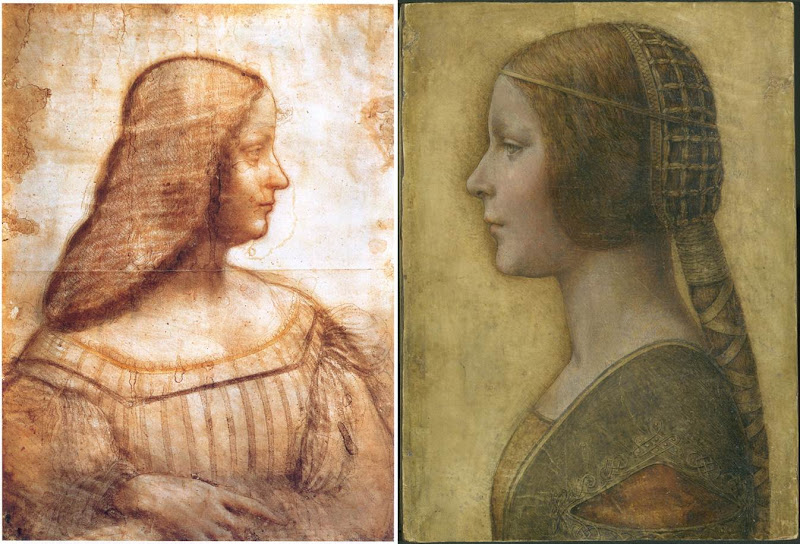
Above, Fig. 4: A comparison of La Bella Principessa with Leonardo da Vinci’s, Portrait of Isabella d’Este, c. 1499–1500, Paris, Musée du Louvre.
[KP] The portrait of Isabella d’Este shows the face in profile but the body in three-quarters, unlike La Bella Principessa. The former is also unfinished, rendered softly with the sfumato effect, fluid in execution, while the shading is on the inside of the profile.
La Bella Principessa is shown in full profile, highly finished, rigid and linear, while the shading is on the outside of the profile.
The similarities between the two profiles are only superficial.
The use of the word ‘repaint’ was an incorrect translation of the French word ‘repentir’, which means pentimento. I would like to mention that I have a good enough grasp of drawing techniques as I also trained as a copyist of Old Masters and an art restorer.
[MK] “16) Left-handedness”
[KP] I disagree that “the left-handed execution cannot undermine the attribution”, as it indicates the intention to imitate Leonardo. None of his collaborators or followers were left-handed, so the drawing is either by him or by an imitator/forger.
[MK] “17) The costume”
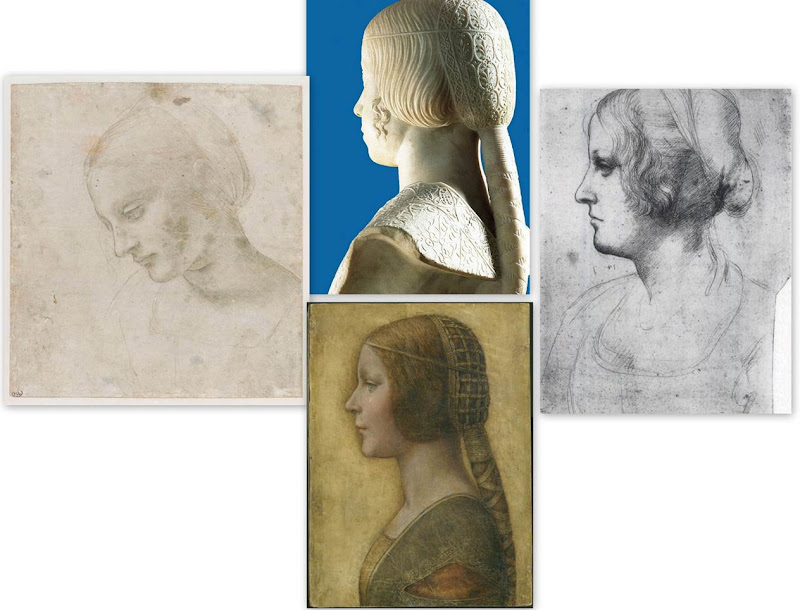
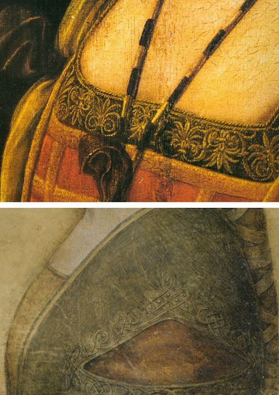
Above, Fig. 5: Comparisons of La Bella Principessa with Leonardo da Vinci’s, Head of a Woman, c. 1488–1490, National Gallery, Parma (left); Leonardo’s Portrait of a Woman in Profile, c. 1489–1490, Windsor Royal Collection (right); and, Gian Cristoforo Romano’s sculpture, Bust of Beatrice d’Este, c. 1491, Paris, Musée du Louvre (top).
[KP] The simplified and flatly rendered dress as well as the coazzone hairstyle do indeed show similarities with the sculpted busts by Gian Cristoforo Romano (Bust of Beatrice d’Este) and Francesco Laurana. But this could be a negative point, as the drawing could be based on one of these busts.
Incidentally, the opening in Laurana’s sculptures differs from that in La Bella Principessa. In the former it is a wide horizontal cut facilitating the movement of the arm, while in the drawing it is a triangular hole which doesn’t seem to play such a role.
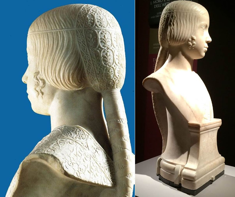
Above, Fig. 6: Gian Cristoforo Romano, Bust of Beatrice d’Este, c. 1491, Paris, Musée du Louvre.
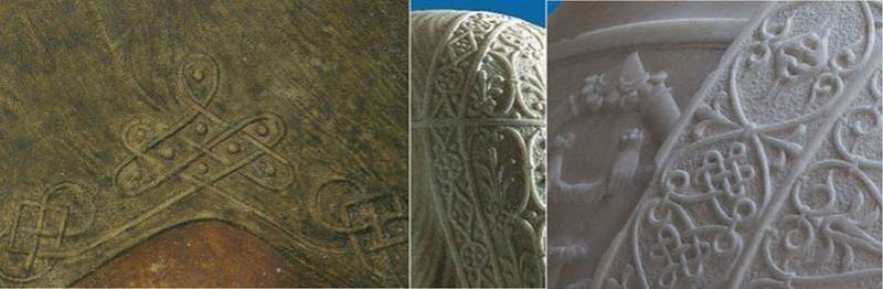
Above, Fig. 7: A comparison of the knots on La Bella Principessa’s dress and Gian Cristoforo Romano’s Bust of Beatrice d’Este, c. 1491.
[MK] “18) The fingerprint”
[KP] The fingerprint evidence which was originally published in the book as “strongly supportive of Leonardo’s authorship” is now considered invalid.
It was not possible to compare the palm imprint to Leonardo’s other examples, and it was described as perhaps unintentional as it is single and isolated, unlike in the execution of Cecilia Gallerani, where many imprints were found where the blending of hues had taken place.
[MK] “19) On Method”
[KP] The “accumulative build-up of different types of evidence” against the attribution to Leonardo is strong, but, as mentioned above, my main arguments were not addressed by Prof. Kemp.
Why is the shading on the outside of the profile? What is the significance of the hand writing on the reverse of the drawing and why was it not investigated? Why is the profile of La Bella Principessa so similar to that in the sculptural Bust of Beatrice d’Este by Cristoforo Romano? Why is the knot on the dress similar to the one on the bust and unlike other Leonardo’s knots? Why are the proportions of the face flawed? Why the vellum of the drawing was described as ‘rough animal hide’ and could it be part of the luxury book of the Sforziad? Why Marchig’s friend the famous Renaissance expert Bernard Berenson had not attributed the drawing to Leonardo? Why there is no known provenance prior to Marchig’s in the 1950s?
In the field of attributions the level of inconsistencies and contradictions always undermine any evidence in favour of a proposed attribution.
[MK] “20) The damaging allegation in the opening to Pisarek’s article that the owner was to set up ‘non-profit-making foundation for multi-disciplinary Classical and Renaissance studies near Florence, to be headed by Professor Martin Kemp’.”
[KP] I made no such allegation. This was a quotation from an article by Simon Hewitt who supports the attribution to Leonardo. This information was published in an Antiques Trade Gazette article by Simon Hewitt in 2009. The article can be found here.
In my article I also wrote: “Prof. Kemp and his colleagues are no doubt genuinely convinced of the authenticity of the drawing, as well as highly enthusiastic about the rediscovery.” This shows that I in no way question Prof. Kemp’s integrity on this matter, only the methodology and the results of the proposed attribution.
Kasia Pisarek, 24 May 2016
Problems with “La Bella Principessa”~ Part I: The Look
The world famous drawing that was dubbed “La Bella Principessa” by Professor Martin Kemp is insured for $150 million and lives in a “secure vault in Zurich”. It is not a portrait of Bianca Sforza by Leonardo da Vinci, as has been claimed, but a twentieth century forged or pastiche Leonardo.
WHITHER “LA BELLA PRINCIPESSA”
In 1998 the now so-called “La Bella Principessa” appeared from nowhere at Christie’s, New York. A hybrid work made in mixed media that were never employed by Leonardo (three chalks, ink, “liquid colour”), on a support that was never used by Leonardo (vellum), and portraying a woman in a manner that is nowhere encountered in Leonardo, it was presented as “German School, early 19th century” and “the property of a lady”. It went for $22,850 to a New York dealer who sold it nine years later on a requested discount of 10 per cent for $19,000 to an art collector, Peter Silverman, who said he was buying on behalf of another (unidentified) collector whom he later described as one of “the richest men in Europe”. Thus, at that date, it was not known who owned the drawing or by whom it had been consigned to Christie’s and it remained entirely without provenance. In its nine years long life, no one – not even its new owner(s) – had taken it to be by Leonardo.
In a 2012 book (Lost Princess ~ One man’s quest to authenticate an unknown portrait by Leonardo da Vinci), Silverman claimed a successful upgrading to Leonardo and described how he had gained the support of distinguished scholars including Professor Martin Kemp who had formulated an elaborate hypothetical history in which the drawing was said to be a Leonardo portrait made either from a living subject in celebration of her wedding or in commemoration after her death in 1496.
Nonetheless, the drawing failed to gain a consensus of scholarly support and is rejected in centres like New York, London and Vienna. Carmen Bambach, the Metropolitan Museum’s Renaissance drawings authority dismissed “La Bella” on the grounds that “It does not look like a Leonardo”. Thomas Hoving, a former Metropolitan Museum director, held it to look “too sweet” to be Leonardo. ARTnews reported that the Albertina Museum’s director, Klaus Albrecht Schröder, had noted “No one is convinced it is a Leonardo”. In the Burlington Magazine Professor David Ekserdjian suspected it to be “counterfeit”.
THE LOOK OF “LA BELLA” AND THE COMPANY SHE BEST KEEPS
In matters of attribution the most important consideration is the look of a work. Many things can be appraised simultaneously but, conceptually, the “look” of a work might be broken down into two aspects: an initial at-a-glance response to a work’s effects and appraisal of its internal values and relationships; and, a comparison of the effects, relationships and values with those of bona fide productions of the attributed artist, or with those of the artist’s students, associates or followers. It can also be useful to compare the looks of works with those of copyists and known forgers. It might fairly be said that in connoisseurship, as in the evaluation of restorations, visual comparisons are of the essence. (In ArtWatch we take pride in the extent to which we seek out all possible comparative visual material and regret that some institutions still hinder our efforts in this regard.)
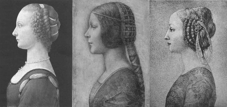
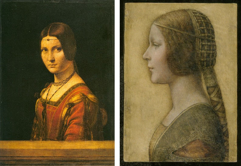
Above, Fig. 1. If we put aside questions of attribution and simply look at the group above, we find works of remarkably similar figural motifs and formats that clearly relate to and derive from a most distinctive type of 15th century Italian profile female portrait. These similar-looking works are similarly sized, being, respectively from left to right:
A Young Woman, 14 and 1/4 x 10 inches;
“La Bella Principessa”, 13 x 9 and 3/4 inches; and,
A Young Woman, 18 x 12 1/2 inches (here shown mirrored).
All show young women depicted in the strict early Renaissance profile convention made in emulation of antique relief portraits on coins and medals. Although very widely encountered (see Fig. 4), Leonardo side-stepped the type in order to intensify plastic and expressive values with sculpturally-purposive shading and axial shifts in the bodies and gazes of his portraits (see Fig. 6). The portrayals above are strikingly similar in their head/torso relationships; in their absences of background; in their highly elaborated coiffures which offset ‘sartorially’ skimped and unconvincing simplifications of costume; in their sparse or wholly absent depictions of jewellery; and, even, in their almost identically cropped motifs. Collectively they might be taken as a suite of variations on a simple theme. We take all three to be twentieth century Italian artefacts. At least two of them are linked to Bernard Berenson and the two on which reports have been published have unusual and problematic supports.
As mentioned below, the Detroit picture is painted on top of photographic paper. It is suspected that it might have been a photograph of the Frick sculpture to which the painting was initially related. The “La Bella Principessa” is drawn, exceptionally for Leonardo, on a sheet of vellum which appears to have been removed from a book and it is, most unusually, glued to an oak panel. The panel itself is a curiosity: although a number of “butterfly keys” have been inserted into its back, as if to restrain splitting, there is no evidence of splits in the panel and, if there were, the present four such keys in such a small panel might be considered restoration “over-kill”. If the panel had split while the vellum was glued to it, the drawing would have split with the panel. The fact that the vellum has been “copiously glued” to a (possibly pre-restored) oak panel makes it impossible to examine the back of the drawing which is said by one of its proponents, (Cristina Geddo, an expert in Leonardo’s students and Milanese “Leonardesques”) to bear “superimposed numbers…a written inscription…[and a] little winged dragon – at least that is what it seems.” For Geddo, this unexamined content is reassuring: “This feature, too, counts in favour of an attribution to Leonardo, who, even though he never to our knowledge used a parchment support in his work, was in the habit of re-using the paper on which he drew.”
(In reading the compendious literature on this proposed attribution, we have sometimes wondered what might be allowed by its supporters to count as evidence against the attribution.)
CONSIDER THE HISTORIES
The portrait on the left, A Young Woman, was bought in 1936 by the Detroit Institute of Arts as by Leonardo da Vinci or Andrea del Verrocchio. The institute’s director, W. D. Valentiner, made this attribution on the strength of clear correspondences with the curls in the hair of Leonardo’s painting Ginevra de’ Benci (see Fig. 6) in the National Gallery of Art, Washington, and with those found in the above-mentioned marble sculpture in the Frick Museum, A Young Woman, given to Andrea del Verrocchio. (Valentiner had made a study of Leonardo’s work in Verrocchio’s workshop.) In 1991 Piero Adorno, specifically identified the Detroit picture as Verrocchio’s lost portrait of Lucrezia Donati. Notwithstanding seeming correspondences with secure works, this picture is now relegated to “An Imitator of Verrochio” – and this is an extremely charitable formulation. In Virtue and Beauty, 2001, David Alan Brown described it as “a probable forgery by its anachronistic materials and unorthodox construction”. “Probable” [!] because: “after a recent technical examination, the picture turns out to have been painted on photographic paper applied to a wood panel that was repaired before it was readied for painting. And at least one of the pigments employed – zinc white – is modern…” Valentiner judged one of two Leonardo studio works of the Madonna with a Yarnwinder to be “more beautiful than the Mona Lisa”.
The portrait on the right, A Young Woman, was attributed to Piero Pollaiuolo by Berenson in 1945. While this figure is perhaps the most attractive of the above three, with its nicely constructed counterbalancing of the thrusts in the neck/head and torso, and its credibly proportioned arm, the work itself has, so far as we can ascertain, sunk without trace. In truth, this female profile portrait type has been assailed by forgeries. Alison Wright notes in her 2005 book The Pollaiuolo Brothers, that “Complications for the historian lie both in the fact that the subjects of most female portraits are no longer identifiable and that, because of their exceptional decorative and historical appeal, such portraits were highly sought after by later nineteenth- and early twentieth-century collectors, encouraging a market for copies, fakes and over-ambitious attributions.”
The portrait in the centre (“La Bella Principessa”) has been precisely attributed by Kemp to Leonardo as a book illustration portrait of Bianca Sforza of 1495-96.
DISTINGUISHING BETWEEN THE LOOKS OF THEN OF NOW
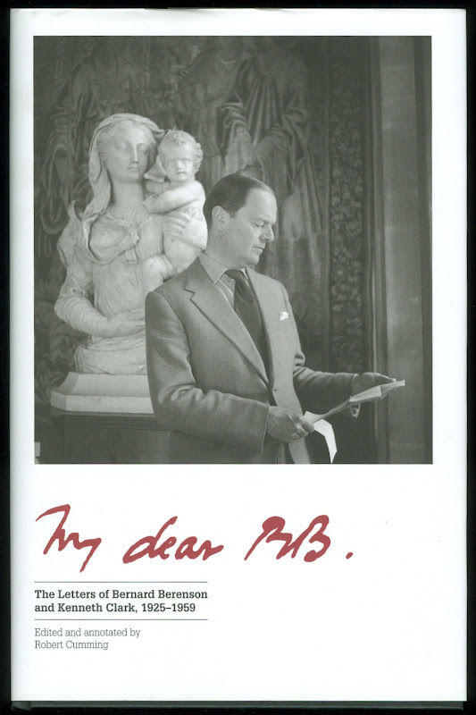
Above, Fig. 2. In My dear BB (an incalculably valuable new resource edited and annotated by Robert Cumming), we learn that in November 1930 Kenneth Clark’s wife, Jane, wrote to Berenson: “K has seen Lord Lee’s two new pictures…The Botticelli Madonna and Child you probably know too. K thinks the latter may be genuine about 1485 or rather part of it may be, but it is not a pretty picture…” A footnote discloses that Lee had bought The Madonna of the Veil, a tempera painting on panel in 1930 from an Italian dealer for a then huge sum of $25,000 (Fig. 3). It was widely accepted by scholars as autograph Botticelli and published by the Medici Society as a “superb composition of the greatest of all Florentine painters”. Clark, doubting the attribution on sight, objected that it had “something of the silent cinema star about it” – and he likened the Madonna to Jean Harlow (Fig. 3). Lee donated the picture to the Courtauld Institute Gallery in 1947. In June 2010 Juliet Chippendale (a National Gallery curatorial intern working in association with the Courtauld Institute MA course) disclosed that scientific examination had identified pigments not known before the 18th and 19th centuries and worm holes that had been produced by a drill. It is now designated a work of the forger Umberto Giunti (1886-1970), who taught at the Institute of Fine Art in Siena and forged fresco fragments.
ART HISTORICAL SILENCES
Four months later Clark wrote to Berenson: “Just in case Lee has sent you a photograph of his new Botticelli may I ask you to forget anything Jane may have reported me as having said of it. It is one of those pictures about which it is best to be silent: in fact I am coming to believe it is best for me to be silent about every picture. Did I tell you that my Leonardo book was a mare’s nest. The man had sent photographs of two drawings from the middle of the Codice Atlantico. They must have been early copies done with some fraudulent motive – perhaps the book really did belong to Leonardo – he certainly had read it – & some pupil thought to enhance its value.”
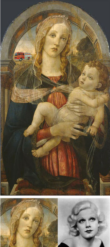
Above Fig. 3. The young Kenneth Clark (then twenty-seven years old) displayed an admirable “eye” by spotting a fraud on sight some eighty years ahead of the pack. Is it better for a connoisseur to see but not speak than it is not to see at all? Undoubtedly, it is. Would Clark have enjoyed his meteoric rise had he humiliated the mighty and exposed the big-time fraudsters of his day? (That question might be taken as self-answering.) If Clark bided his time on Berenson, eventually he delivered an unforgiving former-insider’s repudiation in 1977 by chronicling how Berenson had “sat on a pinnacle of corruption [and] for almost forty years after 1900… [done] practically nothing except authenticate pictures”
PRETTY – AND NOT SO PRETTY – WOMEN
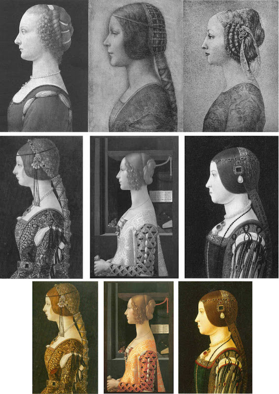
Above, Fig. 4. In the middle and bottom rows we see three bona fide works of the female profile type – respectively:
Portrait of Bianca Maria Sforza, c. 1493, by Ambrogio de Predis, The National Gallery of Art, Washington;
Domenico Ghirlandaio’s 1488-1490 Giovanna degli Albizzi Tornabuoni, Museo Thyssen-Bornemisza, Madrid; and,
a portrait of Beatrice d’Este tentatively attributed by Kemp to Ambrogio da Predis.
The differences between this trio and the works in the top row are pronounced and eloquent. The secure works are highly individuated and immensely richer in their effects. Collectively, they do not constitute an inadvertent suite. Individually, they are greatly more various compositionally. Collectively, they are markedly richer in jewellery and ostentatiously sumptuous costumes. The distinctive physiognomies of their subjects derive from living persons, not from other art or photographs of other art. Flattery and loving attention are channelled more into the costume and bling than into the facial features. In every respect the opposite is the case in the top row where prettiness has been held at a premium with an eye on the modern photographically-informed market.
LEONARDO BREAKS THE MOULD
Above, Fig. 5: As mentioned, “La Bella Principessa” and her two companions are of a piece, and of a type never followed by Leonardo whose female portraits (see below) pioneered an unprecedentedly complex and sophisticated evocation of real, sculpturally palpable women in tangible spaces or landscapes. To include the figurally impoverished and stylistically anachronistic “La Bella Principessa” in Leonardo’s oeuvre would disjunct his revolutionary arc of insights and innovations in portraiture. Such inescapably disruptive consequences have been ceded tacitly by Kemp, “La Bella Principessa’s” principle defender – some say advocate. In “La Bella Principessa ~ The Story of the New Masterpiece by Leonardo da Vinci” (Kemp’s 2010 book jointly written with Pascal Cotte of Lumiere Technology and including chapters by the drawings scholar Nicholas Turner and the recently discredited fingerpints expert Peter Paul Biro), Kemp converts an intractable problem into an asset by begging the essential question. That is, he underwrites “La Bella’s” credibility on an assertion that “Any important new work, to establish itself, must significantly affect the totality of Leonardo’s surviving legacy over the longer term.” Without question, the de-stabilising inclusion of “La Bella Principessa” would produce knock-on effects, but arguing backwards from that predictable disturbance to some endorsement of its source is patently unsound methodologically – the inclusion of any atypical work, whether bona fide or forged, into an oeuvre would affect its “legacy”.
LEONARDO’S ACCOMPLISHMENTS
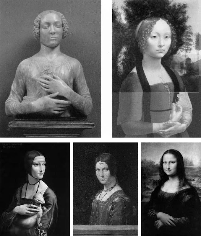
Above, top, Fig. 6: Left, Andrea del Verrocchio’s Lady with a Bunch of Flowers of c. 1475; and (right) Leonardo’s (hypothetically extended) Ginevra de’ Benci of c. 1474-1478.
Above, Fig. 7: Left, Leonardo’s The Lady With an Ermine of about 1489-90; centre, Leonardo’s La Belle Ferronnière of about 1495-96; right, Leonardo’s Mona Lisa (La Giaconda) of about 1503-06 onwards.
In the group above we see extraordinary development in Leonardo’s portraits of women over the last quarter of the fifteenth century as he strove to incorporate the entirety of sculptural, plastic, figural knowledge, and to surpass it by making it dance to an artistically purposive tune liberated from the happenstance, arbitrary lights of nature on which sculpture then necessarily depended. Some have attributed the Bargello sculpture, the Lady with a Bunch of Flowers, to Leonardo on the grounds that its subject was Ginevra de’ Benci, the subject of Leonardo’s painting. Others have seen Leonardo’s authorship of it in the beauty of the hands. In Leonardo da Vinci and the Art of Sculpture, 2010, Gary M. Radke holds that the two works show differences that emerged in the mid-1470s between the two artists. Against this, it has been suggested that the painting might originally have borne a closer relationship to the sculpture with a possible inclusion of hands in a fuller length treatment. A study of hands by Leonardo was incorporated in a hypothetical and digitally realised extension of the painting by David Alan Brown (Virtue and Beauty, 2001, p. 143). Frank Zollner sees the painting as marking the point (1478-1480) at which Leonardo broke away from “the profile view traditionally employed in Florence for portraits of women” in favour of the three-quarters view in order to impart “a pyschological dimension to his sitter – something that would become the hallmark of Renaissance portraiture”. Which is all to say that Leonardo had broken away from the profile convention some sixteen to eighteen years before, on Kemp’s hypothesis, he made a solitary and exceptional “return” to it.
Speaking of the reconstruction of Leonardo’s Ginevra de’ Benci painting, Brown writes:
“Ginevra’s portrait, the lower part of which was cut down after suffering some damage, may have included hands. A drawing of hands by Leonardo at Windsor Castle, assuming it is a preliminary study, aids in reconstructing the original format of the picture. As reconstructed, Leonardo’s portrait may be seen to have broken with the long-standing Florentine convention of portraying women in bust-length profile. In seeking an alternative to the static profile, Leonardo, like Botticelli, seems to have turned to Verrocchio’s Lady with a Bunch of Flowers in the Bargello, Florence. Because of the sitter’s beautiful hands which mark an advance over the earlier head-and-shoulders type of sculpted bust, the marble has even been attributed to Leonardo. But the highly innovative conception of the half-length portrait bust is surely Verrocchio’s achievement. What young Leonardo did was to was to translate this sculptural protype into a pictorial context, placing his sitter into a watery landscape shrouded in a bluish haze…”
A CASE CONSPICUOUSLY NOT MADE
For the owner and the art historical proponents of “La Bella Principessa”, the very chronology of Leonardo’s female portraits constitutes an obstacle. Given Leonardo’s famous eschewal of strict profile depictions of women, the onus is on those who would include “La Bella Principessa” (- albeit as a solitary and exceptional stylistic regression that was undertaken without ever attracting attention or comment) to make a double case.
First, they must show how and where “La Bella Principessa” might plausibly have fitted within the trajectory of Leonardo’s accepted works. Second, they must demonstrate by comparative visual means that “La Bella Principessa” is the artistic equal of the chronologically adjacent works within the oeuvre. Kemp has proposed the precise date of 1495-96 for the execution of “La Bella Principessa” but, conspicuously, has not presented direct, side-by-side visual comparisons with Leonardo’s paintings. Instead of comparing “La Bella Principessa” of 1495-6 directly with Leonardo’s La Belle Ferronnière of about 1495-6, Kemp writes:
“If the subject of Leonardo’s drawing is Bianca, it is likely to date from 1495-6. In style, it seems at first sight to belong with his earlier works rather than to the period of the Last Supper. However, Leonardo was a master of adapting style to subject. Just as his handwriting took on an earlier cast when he needed to adopt a formal script, so his drawing style could have reverted to a meticulous formality, appropriate for a precious set-piece portrait on vellum of a Sforza princess.”
“If”? “Could have”? “At first sight”? The pro-attribution literature is bedecked with daisy-chains of such tendentious and weasel words and terms. With which earlier works is “La Bella Pricipessa” deemed to be artistically comparable or compatible? With the Ginevra de’ Benci of c. 1474-1478? With The Lady With an Ermine of about 1489-90? Never mind the red herrings of handwriting and the giant, near-obliterated historical figures of the Last Supper, what of the relationship with Leonardo’s (supposedly) absolutely contemporaneous La Belle Ferronnière of 1495-96? (On this last we volunteer a pair of comparisons below.)
Above, Top, Fig. 8: Leonardo’s La Belle Ferronnière, left, and the “La Bella Principessa”.
Above, Fig. 9: Details of Leonardo’s La Belle Ferronnière, left, and the “La Bella Principessa”.
Kemp insists: “The Lady in profile [“La Bella Principessa”] is an important addition to Leonardo’s canon. It shows him utilizing a medium that has not previously been observed in his oeuvre…It testifies to his spectacular explosion and development of novel media, tackling each commission as a fresh technical challenge. It enriches our insights into his role at the Milanese court, most notably in his depiction of the Sforza ‘ladies’ – whether family members or mistresses. Above all, it is a work of extraordinary beauty.”
Even if we were to assume that for some reason Leonardo had opted to “revert” in 1496 to a type he had never employed, what might explain a pronounced indifference in “La Bella Principessa” to the detailed depiction of the “stuffs” of costume with which the artist was simultaneously engaged in La Belle Ferronnière? Given that Leonardo clearly appreciated and celebrated the fact that courtly costume required sleeves to be made as independent garments held decorously in place by ribbon bows so as to permit undergarments to peep through; and, given that Leonardo lovingly depicted not only the varying thicknesses of the costume materials but every individual twist in the threads of the elaborately embroidered band in La Belle Ferronnière, how could he possibly – when working for same ducal master, at the same time – have been so negligent and indifferent in the execution of “La Bella Principessa’s” costume? Kemp acknowledges and offers excuse for the distinct poverty of the costume: “It may be that the restraint of her costume and lack of celebratory jewellery indicates that the portrait was destined for a memorial rather than a matrimonial volume.” In so-saying, he jumps out of one frying pan into another.
If “La Bella Principessa” was made after Bianca Sforza’s death, from whence did the likeness derive? One reason why Kemp settled on Bianca as the preferred candidate subject for “La Bella Principessa” was that while (disqualifying) likenesses of the other Sforza princesses existed, none survives for her – she is an image-free figure. Kemp offers no indication of a possible means for Leonardo’s (hypothesised) post-death conjuring of Bianca’s supposed likeness other than to claim that “Leonardo has evoked the sitter’s living presence with an uncanny sense of vitality.” This again begs the crucial question and fails to consider any alternative explanations for the image’s qualities. (We will be showing how the profile of “La Bella Principessa” could well have been a “portmanteau” composite image assembled from one particular work of Leonardo’s and from that of another, unrelated painter.)
The most strikingly “Leonardesque” feature on the costume of “La Bella Principessa” – the knot patterning around the (implausible) triangular slash in the outer garment – is a source of further concern and constitutes evidence of forgery. First, the motif on which much effort will have been expended, is brutally cropped along the bottom edge of the sheet, as if by a careless designer laying a photograph into a book. Why would any Renaissance artist, let alone Leonardo, design a complicated feature so as to “run it off the page”? Further, the illusion of form (created by lights and shades) in the patterning is feeble in the extreme for Leonardo – as when compared with his treament of relief seen in the above embroidered passage in La Belle Ferronnière, for example. Leonardo probably better understood than any artist in history the vital connection between a thing made and a thing depicted. He took bodies and organs apart to understand their construction and he sought to create mental models that would make the otherwise terrifyingly arbitrary and capricious forces of nature graspable if not checkable. Most seriously of all, as our colleague Kasia Pisarek has noted and reported, while the patterning present on “La Bella Principessa” matches none found in any work of Leonardo’s, it more closely matches that found in a carved marble bust by Gian Cristoforo Romano in the Louvre – see “La Bella Principessa – Arguments against the Attribution to Leonardo”, Kasia Pisarek, artibus et historiae, no. 71, 2015. (To receive a pdf of Dr Pisarek’s article please write to: news.artwatchuk@gmail.com )
Michael Daley, 24 February 2012.
In Parts II and III we examine: the provenance of “La Bella Principessa” and the work’s problematic emergence from within the circle of Bernard Berenson; the claim by the forger Shaun Greenhalgh to have produced “La Bella Principessa” in Britain in the 1970s; the spurious “left-handed-ness” of “La Bella Principessa” and the low quality of, and the means by which the drawing was made…
The Sistine Chapel Restorations, Part III: Cutting Michelangelo Down to Size

“Judging by Past Experience, it is Perilous to Suggest Restoration…”
~ Charles Heath Wilson, 1881, “The Life and Works of Michelangelo Buonarroti”. Publisher: John Murray, London.
“I once barged into a correspondence in The Times when the National Gallery was under fire from the ‘anti-cleaners’. I was ticked off very severely by Lord Crawford, the Chairman of the Trustees. I had, mildly I thought, criticised the authorities for ignoring the sincerely held views of the opposition…I was later restored to favour in high places when I made it clear in an article in The Studio that I was convinced that our National Treasures were in the keeping of qualified responsible people.”
T. J. Honeyman, 1971, “Art and Audacity”. Publisher: Collins, London.
It is not widely appreciated how inherently dangerous art restoration practices remain, or how culturally deranging restoration changes can be. At the bottom end of the trade, restorers often advertise their services on a promise to leave pictures “as good as new – or better”. The restoration of Michelangelo’s Sistine Chapel ceiling was – on the accounts of its own restorers and initiators – the biggest, the best, the most scientifically advanced and “radically transforming” top-end restoration ever undertaken. This “Restoration of the Century” left one of the world’s greatest artistic accomplishments so profoundly unlike its former self that enthusiasts could announce the discovery of a “New Michelangelo” who was “very different from the one art experts thought they knew”. At the same time, the chief restorer thrilled in 1982 that the frescoes looked as good as new: “as though they were executed yesterday”. In the midst of this commonplace restorers’ confusion between “recoveries” and “discoveries” (or sometimes, “revelations”), some surprising expressions of support materialised. In 1987, a top-end art historian writing in the magazine Apollo [Endnote 1] announced the demolition of the “Darkness Fallacy and the Sculptural Fallacy” within Michelangelo scholarship, and predicted that the then concurrent restorations of the Sistine and Brancacci chapels would leave both Michelangelo and Masaccio as “less isolated geniuses” who would be “returned to their respective periods” (i.e. confined within designated art historical boxes). In 1991, a newspaper art critic exulted in the displacement of “doomy outpourings of religious angst” by colours as “bright as Opal Fruits” – which colours reflected the workings of a “much more rational mind” [2]. Unsurprisingly, such professional pleasure-taking in chemical transformations that could cut artistic Titans down to size alarmed those who had been happy with the surviving Michelangelo, and an enormous controversy arose. Unsurprisingly, the criticised characterised the criticisers as instances of “the magnitude of the shock to entrenched opinion” that had been unleashed by a triumphant restoration. (As will be seen, the expression of sincerely held citicisms can be harshly punished when substantial vested conservation interests are challenged.)
Behind this interpretive culture war, the effects of the restoration on Michelangelo’s art were material and aesthetic. Those changes are forever. Although bad scholarship can be remedied by good scholarship, the latter cannot undo damage to unique, historic works. What remains to be done, a third of a century after the restoration’s 1980 launch, is a proper, disinterested aesthetically informed analysis of the restoration-induced changes, item by item, figure by figure, photograph by photograph; and, a frank evaluation and acknowledgement of their cultural and art historical consequences. Had this restoration’s profound transformation been accepted without challenge, we would be in a world today where technicians enjoyed unfettered licence to rewrite (or as they sometimes prefer, “to re-present”) history itself. Even tacit endorsements of injurious restorations can damage scholarship and falsify history.
The restoration of Michelangelo’s Sistine Chapel ceiling was well and publicly defended from 1980 until the mid 1990s. At that period, a seismic shift occurred. What follows is an examination from a British perspective of the restoration’s defences up to 1995 (in which year implicit art historical support for the restoration resulted in a seriously misleading exhibition at the National Gallery); and, a further presentation of visual proofs of the restoration’s injurious consequences. We note here how many supporters have admitted entertaining doubts about the restoration’s probity.
A new cleaning method, and the selling of a “New Michelangelo”
In the 1980s, at the height of an international restoration mania, a supposedly “advanced” “scientific” cleaning material was used on Michelangelo’s Sistine Chapel ceiling. It was ferocious in its effects and mechanistic in its application which was expressly designed to thwart personal and allegedly “subjective” and “unscientific”, aesthetic appraisals. The most sophisticated imagery on an immensely important historic work of art was thus subjected to a “treatment” that derived not from the complexities of picture restoration and its necessary acts of discrimination and constant evaluation but, rather, from architectural stone cleaning techniques. This cleaning method altered the ceiling’s centuries old artistic/historic continuity to such a degree that the restorers and their supporters ventured that history would need to be rewritten. The changes, for sure, were dramatic: depictions of figures that had been archetypally and transcendentally alive were brightened, flattened, rendered more abstract, more “on the picture surface” and left with an altogether more modernist and imaginatively impoverished aspect. Contrary to official claims this (demonstrably) was not a liberation or recovery of the ceiling’s original condition and appearance – see, particularly, Figs. 1 and 60.
When Michelangelo’s ceiling was unveiled in 1512 the world was stunned by the grandeur, pictorial audacity and, above all, by figural inventions that had rendered the divine corporeal and vividly alive within our own space and time. Michelangelo had not so much made depictions-on-surfaces as conjured perceived spaces adjacent to the ceiling’s imperfect forms. His optically “sculpted” spaces – which opened vistas beyond the ceiling’s surfaces while simultaneously projecting figures in front of them – had been realised through powers of draughtsmanship and modelling with utter disregard for the “integrity” of the architectural surfaces. Seemingly palpable space was necessary to situate Michelangelo’s monumental programme of over three hundred figures – figures that ran from depicted carved stone sculptures (his architecture-adorning putti), through living, space-occupying young sculptural Adonis’s (his contorted, anxious ignudi) and, more prosaically, through the historical ancestors of Christ, to the divinely gifted Prophets and Sibyls, and finally to God Himself and his celestial supporters. This was immediately acclaimed as a dazzling artistic and illusionistic advance. Its eventual influence was to carry mural painting into the Baroque and beyond. Although artistic fashions and modes of description change constantly, for nearly five centuries this “stupendous” work’s vital relationships endured, as the many copies made throughout its existence testify (see Fig. 1b).
How Doubts became Denials
With the restoration of Michelangelo’s Sistine Chapel ceiling, while some art world players were galvanized into opposition, many others were excited and swept along by the presumptuous magnitude of the transformation. As mentioned, many of the supporters of the restoration have disclosed moments of doubt. We cited in our post of March 4th that the co-director and chief restorer of the ceiling, Gianluigi Colalucci, had said in 1990: “I must confess I harbour a lingering almost subconscious fear that someday someone will come, unexpectedly, with a really intelligent observation that will show all of us to have been blind.” The following year the Sunday Times art critic, Waldemar Januszczak, produced a celebratory book (“Sayonara Michelangelo”) in which he asked in the face of the transition:
“Who among us looking up for the first time at this new, bright, clear Sistine ceiling, perfectly rational, a light-filled work, was not tempted by the doubt: it can’t be so.”
This temptation was throttled by the sheer spectacle of the restoration as an art-changing performance:
“The thin and neat scaffolding bridge moved elegantly along the ceiling like a very slow windscreen wiper. In front of it lay the old Michelangelo, the great tragedian, all basso profundo and crescendo. Behind it the colourful new one, a lighter touch, a more inventive mind, a higher pitch, alto and diminuendo. It was being able to see both of them at once – Beethoven turning into Mozart before your eyes – that made this restoration such a memorable piece of theatre.”
Even the National Gallery’s thoughtful and scholarly (then) curator of Renaissance painting, Nicholas Penny, who recognised (“White Coats v. Bow Ties”, London Review of Books, 11 February 1993) that “The most terrifying thing about the restoration of old paintings and sculpture, as distinct from the editing of texts, is that something might be lost altogether”, swallowed his own moment of anxiety:
“But perhaps one should admit that something is lost however much is gained by any intervention – some possibility of interpretation if not some actual pigment or glaze or polish.” [Emphasis added.] With a seeming acceptance of such material and interpretive losses, the greater gains in the Sistine Chapel were said by Penny to have emerged as follows:
“Study of the ceiling now that it has been cleaned tends to distance Michelangelo from the art of recent centuries – and from the work of artists who were inspired by the ceiling – and reveals a far closer connection with the dazzling colours favoured by artists in his immediate following and also evident in some of the better-preserved 15-century Florentine panel paintings.”
Note the cultural role being served by “restoration” changes: even when their legitimacy is vehemently challenged, restorations facilitate through “study”, new interpretations and a certain re-shuffling of scholarly furniture. Scholars and restorers invariably say that they have duly considered and rejected the criticisms as ill-informed, but the fact remains that eventually all restorations themselves come to be rejected and undone by later restorers. Indeed the alleged need to undo previous restorations is one of the commonest justifications for a restoration. The net consequence of repeated restorations is not a return to an original condition each time, but a daisy chain of altered alterations, with each successive restoration leaving the given work looking unlike its previously “restored” state. With accumulating alterations, works get thinner and thinner. Insofar as such abraded appearances are acknowledged, they are attributed to previous “rubbing”, or other euphemisms. Losses of original material during restorations (as Penny conceded) are to some degree inevitable. This is because while painters work from supporting canvases or panels upwards, restorers work downwards with their solvents and abrasives towards or beyond pictures’ finished surfaces. Collisions are inevitable.
The “New Michelangelo”
The art historical revisionism that advanced with this restoration might have been plausible had changes of colouring been the only changes, and had any of Michelangelo’s contemporaries noted dazzling colours. By any properly visually alert appraisal, however, the changes were less ones of enhanced chromatic power than of debilitating losses to the ceiling’s initially celebrated dramatic modelling and lighting (see Fig. 60). Although Nicholas Penny acknowledged such objections to the received critical consensus, he nonetheless caricatured them:
“Polemics against the restoration appeal repeatedly to the ideas of chiaroscuro and harmony as artistic absolutes.” The implication that critics were in the grip of a fetishized false artistic consciousness was underscored: “It is painful but important to acknowledge that the inspiration one artist draws from another, earlier one is often inseparable from misunderstanding.” It is a common defence against critics to allege some “misunderstanding” of the “facts” because of ingrained or entrenched prejudices but with this restoration the objections stemmed not from misapprehensions or misplaced adherence to ahistorical idée fixes, but from the fact of the concrete, demonstrable and historically verifiable injuries to the painting.
Further Material Evidence of Injury
Having shown many directly comparative pairs of “before” and “after” restoration photographs as proofs of injury – we further present seven single photographs (Figs. 1 to 6 and 48b), each of which alone testifies to the destruction of the final stages of Michelangelo’s painting. To pinpoint the unsoundness of the restoration’s theoretical underpinning, we also show two other works, one drawn (Fig. 41), one painted (Fig. 47) that seem emblematic of serious critical neglect. It will be argued that insufficient respect for the artistic and documentary records (particularly in the form of graphic copies and related paintings) facilitated an initial misdiagnosis of Michelangelo’s painting methods. In addition, we examine the “macro” consequences in terms of changes to the previous relationships between the broad and differentiated zones of the Sistine Chapel’s consecutively decorated surfaces.
Selling the Restoration and Blocking the Critics
In December 1987 two articles that acknowledged the intensity of the controversy were published in Britain. One was a work of journalism by a leading cultural writer with strong interests in science, Brian Appleyard. The other was a full-blown and frankly declared Public Relations Apologia by Kathleen Weil-Garris Brandt, a professor of art history at New York University, a consultant member of the Vatican’s Scientific Advisory Committee on the restoration, and the Vatican’s spokesman on “scholarly and general information” for the public relations firm Arts and Communications Counsellors, which had been retained to handle the crisis.
To take the former first: on 20 December 1987 the Sunday Times magazine carried an article on the restoration – “Lost or Found?”. Its author, Brian Appleyard, acknowledged that he had been “carefully and elaborately briefed” by the co-directors of the restoration, Fabrizio Mancinelli, the curator of the Vatican Museums’ modern paintings, and Gianluigi Colalucci, the head restorer, and by Professor Carlo Pietrangeli, the director of the Vatican Museums, and that the next day he had been “scientifically persuaded” by the Vatican’s chemist, Nazzareno Gabrielli. Nonetheless, Appleyard gave a fair and balanced account, citing the arguments of James Beck, a professor of art history at Columbia University, New York. Even while recognising that “the vast majority of art historians are on the side of the Vatican”, Appleyard concluded “So far the Vatican have been troubled by Beck but have been secure behind the battery of art historians prepared to stand up and oppose him. But his fury and energy are beginning to pay off. More and more awkward questions are beginning to be asked and he warns of more home-grown opposition in Italy.”
An Artist Thwarted
The article itself prompted controversy in Britain by including directly comparative before and after restoration photographs of sections of the frescoes. To this artist’s eyes, those photo-comparisons showed instantly that the “cleaning” was damaging and that the protests were well founded (see Figs. 9 to 11b). Working then as the principal illustrator of the Independent, a new and fashionable newspaper with excellent arts coverage, I asked the arts editor if I might write a short article demonstrating the ways in which the ceiling was being damaged. He declined on grounds that the newspaper’s art critic, Andrew Graham Dixon, had (like Beck) visited the scaffolding, and had been persuaded (like many art historians and critics) that all was fine.
Thus, the first lesson in this controversy was that an artist who had trained for four years in a junior art school, for five years in a fine art college and for three post-graduate years at the Royal Academy Schools – and who afterwards had taught and practised drawing and sculpture for fifteen years – could be unvoiced in a debate about the treatment of a work of art in deference to the views of someone sixteen years younger who had read English at university and art history at the Courtauld Institute (- on which institution’s restorations see “Taking Renoir, Sterling and Francine Clark to the Cleaners”).
An Artist Heeded
When the Independent launched a Sunday edition in 1990, its arts editor invited an article on the Sistine Chapel restoration. In preparation, I contacted James Beck who put me in touch with many key critics. These included, in Italy, Professor Alessandro Conti, Venanzo Crocetti, the sculptor who had worked on the previous restoration of the Sistine ceiling in the 1930s, the restorer Mirella Simonetti; and, in the US, the critic and writer Alexander Eliot and the painter Frank Mason. From the Independent on Sunday I spoke directly to Professor Brandt, Dr Fabrizio Mancinelli, Professor John Shearman, (an advisor to the restoration who viciously attacked Beck on the record and then threatened to sue if I published his grossly defamatory comments), and wrote to Gianluigi Colalucci. The second lesson had thus been that critics of restorations, however prestigious, could find themselves victims of scurrilous attacks from professional peers.
Shooting the Messengers
When surveying the restoration’s then decade long literature, Brandt’s 1987 Apollo article emerged as a seminal document. Its declared purpose had precisely been to defend the “transformation of Michelangelo’s mysterious dark frescoes…into [the] blazing colouristic pyrotechnics that is attracting the most public attention and controversy” (this was despite the fact that Michelangelo had been praised at his own funeral for “the fleeting and sombre colours with which he had formed such rare and lofty shapes”). Most striking of all was Brandt’s assaults on the restoration’s critics, whether they were scholars, restorers, traditionalist artists or fashionably modish artists:
“But, a tiny, heterogeneous and vociferous cadre emerged with the dramatic charge that Vatican conservators are ruining one of the great icons of western civilisation. “Convinced of the urgency of their mission, the critics conducted their campaign in the international press and television and achieved a remarkable degree of public visibility. A letter by a well-meaning group of American master painters of the Pop generation, calling for a halt to the cleaning of the Sistina (as well as the Last Supper) was one index of their success. An interview with one of the American Sistina critics in People Magazine was, however, another… “To the ears of most art historians and conservation experts, however, the critics claims sounded more and more like the wild cries of some ferocious mutant of Chicken Little. Many believe that the critics, like that benighted bird, were misunderstanding insufficient evidence to draw mistaken conclusions to the alarm of the neighbours. Still the issue is a serious one. Are the critics merely opportunists, body-surfing on a wave of publicity they would never otherwise have enjoyed? Or should we be hearing in their polemics a warning that the cleaning of major works of art is another of those matters too important to be left to the experts?” “If the critics’ questions have such detailed answers, what is the continuing public fuss about? Why has the criticism been so remarkably vague, shifting and misinformed? Why have the critics been so reluctant to make the frequent visits to the Sistine Chapel scaffolding…Why does criticism remain invulnerable to the abundant available information. How could such a small group of people, none of whom is – in a professional sense – an expert on Michelangelo and conservation, attract so much publicity and even some well-intentioned adherents? (The original nucleus of nay-sayers consists of only five persons: two painters, one former art critic and two art historians, distributed in Italy and the USA; connexions between them exist but are hard to define.)”
In addition to an insinuation of some underlying conspiracy, Brandt appended an imputation of political motivations that served as platforms for personal opportunism:
“It is easy to see how any hint that the Vatican might be hurting Michelangelo could fuel political fires while providing a chance for professional power play among factions of the intellectual establishment.”
If political motivations combined with personal power play might exist among critics in Italy, Brandt maintained, the situation was different in the United States where:
“The continuing publicity has, of course, also become a phenomenon in itself with a life and fascination of its own. All the more significant that only one American scholar has been tempted to join the public furore. “None of this grandstanding matters much – although one doesn’t like to see an important issue distorted and people misled. I do not believe that a tenacious campaign of ill-informed criticism and personal attacks on the conservators will stop the careful cleaning of the Ceiling.”
Traditional Slurs
At this historical point Brandt’s past abuse of the critics might best be taken to have been self-answering. Her assurance that “the cleaning chemicals do not actually come into contact with the fresco surface” has not worn well and, besides, was at odds with the chief restorer’s earlier admission that if left on a minute too long the chemicals began devouring the fresco surface and Michelangelo’s shading with it. Similarly, her claim that the restoration had been “spurred by the alarming discovery that the glue layers were contracting as they aged , and were pulling flakes of plaster and pigment away from the surface of Michelangelo’s frescoes” proved an impermanent position. As was later reported in “Art Restoration, The Culture, the Business and the Scandal” (James Beck and Michael Daley, 1993), it had been claimed in 1986 (six years into the restoration) that “various checks [had] ascertained that in several places minute flecks of colour were lifting” and that this had “necessitated an immediate restoration.” In 1987 it was said that extensive areas of flaking were progressively worsening and threatening an imminently “uncontrollable situation”. By 1988 Vatican spokesmen were claiming that the weight of encrustations upon the paint surface was causing it to break away from its ground. By 1989 it was said that the glues had “shrunk and puckered” causing “scabs” to fall away “pulling pigment with them”. It was said that this “slow destruction by glue-pox” was “the Vatican’s principle motivation for cleaning the ceiling”. When we asked Brandt in 1990 how big the puckerings were, she replied “Oh! Some are as big as your hand.” Soon after, in 1991, the problem de-escalated: initial investigations were acknowledged, once more, to have encountered “minute desquamations and loss of pigment.”
Brandt’s patronising claim that “the so-called ‘controversy’ is not actually about facts and issues but is a reflection of culture shock” lamely echoed charges made in earlier restoration controversies. During the National Gallery cleaning controversy in London in the late 1940s the critics were said by the art critic, Eric Newton of the Daily Telegraph, to be suffering from the “shocked eye”, a condition which afflicted “the connoisseur and the artist – the visually sensitive man with a quick eye and profound reverence for what he had seen”. Just as at the Sistine Chapel, Newton’s dismissal of the expertise of creative players was made on the claimed authority of restoration “science”. Such generalised appeals to the authority of science often prove to be empty incantation and Newton volunteered no more than “The purely scientific and technical aspects of the process, however are too complex to describe here.”
In 1857 picture cleanings at the Louvre were defended on the grounds that “It is understandable that the romantic amateur loves the rust and the haze of the varnish, for it has become a veil behind which he can see whatever he desires” (Horsin Déon). One critic of the Louvre’s restorations, Edgar Degas, threatened to produce a pamphlet that would be “a bomb”. When Brandt dismissed the Sistine Chapel critics on the grounds that the controversy was “rather unreal since the arguments against cleaning are mainly nostalgically emotional [while] those on the other side are chemical and scientific” she presented her role as being to “dissolve some of the murky argument and preserve a few facts”. As will be seen, artists and art historians can have distinctly differing views as to what constitutes a “fact” and what a blind prejudice.
The Evidence of Restoration Injuries – and the Surprising Reactions To It
When the Independent on Sunday’s picture desk obtained high-quality colour transparencies from the Vatican in 1990 we examined the image of the Erythraean Sybil, part of which had been shown in Appleyard’s Sunday Times article, and encountered among many losses the restoration-mangled foot seen at Figs. 2 and 3. Those losses and losses to a figure on one of the lunettes were first published in the Independent on Sunday of 25 March 1990 (see Figs. 12, 13 and 14) and then later in the Independent of 20 March 1991, where the arguments against the restoration were put by Daley, Beck, Conti, Eliot and the art historian Bruce Boucher, and balanced by three counter arguments.
Of the latter, Ernst Gombrich was harshest on the critics: “No one is infallible, but I have not the slightest doubt that the overall impression and operation is right, and the critics talk absolute nonsense.” The Courtauld Institute-trained editor of The Art Newspaper, Anna Somers Cocks, condescended that some people liked things to look “romantic and old, and can’t cope with the clarity and brilliance of what the Sistine Chapel looks like now it has been cleaned”. The Courtauld Institute-trained Nicholas Penny said “It’s one of the great revelations of our time but the transformation is so absolutely amazing that it is bound to give some people a shock and I am sympathetic to them being shocked”.
Brandt’s 1987 Apollo account had fallen on well-worked ground in Britain where even art world players with strong track records of being critical of restorations had become supportive of this restoration. The Courtauld Institute-trained restorer Sarah Walden, who had implicitly criticised many of her peers and predecessors in her 1985 book “The Ravished Image ~ Or How to Ruin Masterpieces by Restoration”, was one such and she offered this (simplistic) technical distinction in defence of the restoration’s results:
“Unlike easel paintings, frescos are not a film of paint on a surface but impregnate their own support and need no varnish. Given an intact, dry wall, they are spared many of the rigours of restoration, except for the removal of dust and dirt. As the recent cleaning of Raphael’s Galatea in the Farnesina in Rome has shown, and as the present work on Michelangelo’s Sistine Chapel seems to confirm, this is one area where impressive results can be had with far less risk.”
As shown on 28 April 2012, the restorer Leonetto Tintori had discovered on examining the ceiling that it had been covered by what he termed “Michelangelo’s auxilliary techniques” which included not just glue or size painting but also oils. Walden, whose principle critical complaints had been against the “Anglo-Saxon” schools of restoration in Germany, Britain and the US, as opposed to the “Latin” restorations of France and Italy [3], had evidently accepted the restorers’ claims that Michelangelo had simply coloured successive patches of wet and drying plaster at great speed and thereafter accepted whatever disparities and inequalities of value emerged on drying without making any unifying or enriching interventions with glue-based painting a secco on his fresco surfaces when dry, as was customary and as had been noted by his contemporaries. She had further accepted the restorers’ (revisionist and unsupported) claims that the large amounts of glue-based material on Michelangelo’s frescoes had been applied by restorers as a “varnish” to a work which, on her own account, would have required no varnish, and despite the fact that previous Vatican restorers had attributed that very material to Michelangelo. Gombrich, who had played a prominent role in the post-war cleaning controversies at the National Gallery in London – and who had written the Foreword to Walden’s book – was similarly persuaded by the present Vatican restorers’ well disseminated technical account.
Gombrich’s Startling Lapse of Scholarship and Visual Acuity
In 1995 Gombrich presented an exhibition, “Shadows: The Depiction of Cast Shadows in Western Art”, at the National Gallery (London) on the thesis that an avoidance of cast shadows had been “widespread among painters of the High Renaissance”. He did so without reference to the paintings of Michelangelo or Raphael. (When pressed on these omissions he replied “I never meant [the catalogue] to be an encyclopaedia of all cast shadows, though some of my readers seem to assume so.” – Letter to Michael Daley, 10 June 1995.) As will be shown, in a curious fashion, Gombrich’s pictorial amnesia constituted the logical terminus of a more general denial by art historians of the distinctive artistic relationships that had survived on the pre-restoration ceiling, and of the connections between those relationships and the art forms of the period and immediately afterwards. Defending this restoration became an exercise in not-seeing what was and what had been. Gombrich’s position on this restoration was a great disappointment to us given his outstanding earlier contributions.
Gombrich on the Sanctity of Scholarship
In 1978 as the Vatican Museums’ curators, restorers and scientists were moving towards restoring the Sistine Chapel ceiling, Gombrich had discussed one of Michelangelo’s prophets – his Ezekiel – in the context of problems of art connoisseurship and medical practices (and with no reference to colour) [4]. He pointed out that just as with placebos “suggestibility plays a part in our response to works of art”. Demonstrating by a comparison between Jeremiah and Ezekiel that the latter was uncharacteristic of Michelangelo but characteristic of Raphael, he firmly attributed its execution to Raphael (see Fig. 25). Of all the prophets on the ceiling, he contended, this one alone lacked Michelangelo’s profound stylistic traits: “he always negates the picture plane. Jonah being the most famous example of this space-creating and surface-denying imagination, which so aroused the admiration of Renaissance writers.” How could it have been overlooked, Gombrich continued, that the Ezekiel, far from denying the picture plane, asserted it: “Instead of being self-enclosed it impetuously moves to the right, addressing an unseen partner in what looks like a violent argument. It is this implied movement which tears the cohesion to pieces and introduces a shrill note of drama entirely absent from the other creations. The composition is only superficially Michelangelesque…” Further, what the Ezekiel betrayed in its agitated gestures was Raphael’s own great indebtedness to Leonardo: “Indeed it is hardly too much to say that Ezekiel would fit comfortably into the groups of the apostles in the Last Supper of S. Maria delle Grazie.”
This was vintage Gombrich, learned, conceptually adroit, visually acute and boldly re-attributing a Michelangleo to Raphael through Leonardo. Except that here his elegant arguments and persuasive stylistic “evidence” amounted to no more than a plausible contrivance – a conceit that was, he confessed, an art connoisseur’s equivalent of the medical practitioner’s placebo. He hoped that connoisseurs “will not take offence and that the spirits of Michelangelo and Raphael will forgive me this harmless fabrication.” (Was that jest to become a maquette for a far greater and undisclosed prank on those two great artists seventeen years later?)
Gombrich and the Guardians of Memory
Two decades earlier, in a moving 1957 essay “Art and Scholarship”, Gombrich had championed the scholar as “the guardian of memories”. It seemed that he had been stung to do so by the painter Wyndham Lewis who had recently written:
“When I see a writer, a word man, among a number of painters, I shake my head. For I know he would not be there unless he was up to something. And I know that he will do them no good…”
Gombrich’s retort was: “Why should the artist bother about that spoilsport the scholar and his past? The brief answer to this question, I fear, may sound moralistic. Because truth is better than lies.”
Indeed it is – but this leaves his own later omissions in the National Gallery exhibition the more perplexing: How could so great a scholar make so seriously misleading and unfounded a claim in (seeming) defence of such an unsupportable restoration? Spicing this mystery is the fact, as shown below, that Gombrich’s faith in the Sistine ceiling restoration was not absolute and that he, too, like Colalucci, Januszczak and Penny, had once acknowledged a moment of doubt.
Gombrich’s Moment of Doubt
As mentioned, Gombrich was as one with the views of the restorer Sarah Walden on this restoration. Walden was to persist with her endorsement of the restoration until at least 2004 when, in a revised edition of her book (now titled “The Ravished Image ~ An Introduction to the Art of Picture Restoration & Its Risks”), she pressed Gombrich into a swipe at critics of the Sistine ceiling restoration:
“The subject of restoration tends to attract cranks and fanatics, but to suggest that the world’s foremost art historian was one of those would be absurd. He approved for example of the cleaning of the Sistine Chapel, and wrote to me about an Italian who opposed it and was seeking his support: ‘Of course he wants to use [my writings] as ammunition against the cleaning of the Sistine Chapel, but I do think the problems of cleaning are different…I have been up the scaffold…I have no doubt that the team are aware of the many problems…I am even fairly happy about the work on the Sistine ceiling.’” [Walden’s ellipses.]
While Walden tactfully refrained from identifying the Italian critic, by publishing a letter she received from Gombrich in 1987 in the revised book, she revealed an intriguingly confessional remark:
“Last week I was sent a book from Italy violently attacking the ‘cleaning’ of the Sistine ceiling. It may contain some exaggerations but it is still disquieting. Michelangelo e la Pittoria a Fresco, by Alessandro Conti (La Casa Usher, Florence 1986). If you read Italian and have a little time during the next few weeks I’ll gladly lend it to you to look at.”
That unsettling book was later described by Penny in the LRB as “the most sustained polemic against the restoration”. Charles Hope, an authority on Titian and then the Senior Lecturer in Renaissance Studies at the Warburg Institute, London, wrote (in a letter of 1994 to the restorer Helen Glanville – see below) that “The scholar who has done most to draw attention to the relevant texts is of course Conti; and whatever you think of his book (he is not a restorer, by the way), I am sure we can agree that it is obligatory reading for anyone interested in the controversy surrounding the ceiling. Yet […] and so on not only pass over his arguments in silence instead of addressing them, they seem never to cite his book at all…” Gombrich, too, would seem to have suppressed his own disquiet and passed over Conti’s arguments even though he must have appreciated that Conti was a very considerable authority on restoration having taught the History and Techniques of Restoration at the University of Bologna; the History of Modern Art at the state university in Milan; and, the History of Art Criticism at the University of Siena. In his 1988 “History of the Restoration and Conservation of Works of Art” (republished by Butterworth in a 2007 English translation by Helen Glanville) Conti spoke of the alien “material and chromatic robe” with which the Sistine ceiling paintings had been invested “during the present restoration” and identified “the various media” Michelangelo had used on the ceiling as “fresco, lime and secco”. (For Conti’s further comments in that book on Domenico Carnevale’s repairs to Michelangelo’s ceiling, see the caption at Figs. 48a and 48b. That his now very scarce Michelangelo e la Pittoria a Fresco has yet to be published in English might itself be thought something of a scandal.)
The Context of Gombrich’s National Gallery Exhibition
Gombrich’s 1995 exhibition came not just towards the end of his long and distinguished career but at the end of a brief period of intense discussions in Britain on the restorations at the Sistine Chapel and the National Gallery. We had been at pains to show that extreme as the Sistine Chapel restoration was, it was part of a wider radically transforming international assault by restorers acting on historic works of art in the name of their “conservation”. (Between 1990 and 1995, this author alone had published twenty-three times on those subjects – see Fig. 12.) Such discussions greatly accelerated with the publication of the 1993 Beck/Daley book “Art Restoration ~ The Culture, the Business and the Scandal” which, in addition to two chapters on the Sistine Chapel carried a chapter on the National Gallery’s restorations. Responses to the book were various and sometimes startling. They prompted an additional chapter, “The Establishment Counterattacks”, in the revised 1996 American paperback edition. We should acknowledge here that the National Gallery, under its present director, Nicholas Penny, as initially under its previous director, Charles Saumarez Smith, has given ArtWatch UK full and most generously helpful access to all conservation and archival records, and that we have drawn heavily on the compendious material on the Gallery’s conservation practices that is provided in the annual Technical Bulletins. Moreover, since 2012 the Gallery has placed much archival material online.
Responses to “Art Restoration, the Culture, the Business and the Scandal”
After his initially even-handed coverage, Brian Appleyard now characterised Beck in the Independent as being “litigious” – even though he had brought no legal actions but had been sued (unsuccessfully) for criminal slander by an Italian sculpture restorer and had faced a possible prison sentence of three years. Appleyard compared the Beck/Daley book unfavourably before its publication – and before he had read it – with Walden’s book of 1985, specifically dismissing its unseen chapters on the Sistine ceiling on a Waldenesque insistence that “The fact that it was largely pure fresco made the cleaning process straightforward.”
On 18 November 1993 the New York Review of Books carried an essay by Charles Hope, on “Art Restoration ~ The Culture, the Business and the Scandal”. Hope (who was later to become, as Gombrich had been, the director of the Warburg Institute), recalled that “like many other art historians” his initial response to the cleaning had been “entirely favourable”, but which confidence, he now confessed, had been “entirely misplaced”. Viewed in their entirety, the cleaned frescoes create “a decidedly disagreeable impression: the colours are gaudy…the figures look crude and often flat and the architecture seems insubstantial and pedantic.” In short, “Restrained grandeur has been replaced by garish confusion” and it was “difficult to believe that the right procedure was adopted.” Worse followed for the restoration establishment. “Restorers are not always particularly well-informed about the history of art nor especially interested in it”, while, for their part, art historians “seldom have the scientific training to judge the full implication of the courses of action proposed to them.”
Perhaps most disturbing to the Sistine Chapel restoration supporters was Hope’s acknowledgement that when “Talking to friends I find that my unease is widely shared; and it is certainly noticeable that the completion of the restoration has not attracted the kind of acclaim that greeted the unveiling of the lunettes.” After the publication of his review, Hope told Beck in a letter (20 November 1993) “You’ll be cheered to know that several art historians have told me, by letter or in person, how glad they were that I had said what I did.” This greatly amplified a note of caution that had already been present in Nicholas Penny’s observations in the LRB nine months earlier:
“I have met few art historians, even among those who are nervous about the cleaning of paintings, who believe that a mistake was made in cleaning the ceiling. Nevertheless, many art lovers were shaken by what has been published on the subject and some have been no less alarmed by what they have seen in the chapel itself.”
A Restorer’s Response
Temperatures rose after Hope’s review. The Art Newspaper allotted four pages in its May 1994 issue for the counter arguments of Helen Glanville, a Courtauld Institute-trained picture restorer who had read Modern Languages at Oxford. Like Brandt seven years earlier in Apollo, Glanville struck a combative tone and a tendentious note by producing accounts of our “Accusations” against which she provided lawyerish “Defences” written in consultation with the authorities. In 1963 Gombrich had complained “Nobody who criticizes the policy of a great institution expects such criticism to be accepted without further argument. What one has the right to expect, however, is that the answer should concern itself with the substance of the criticism.” In language eerily reminiscent of that used against Beck by Shearman, Glanville challenged not only our character but the judgement of those who had supported us: “The most disturbing aspect is that reviews of the book (including that by Charles Hope in the New York Review of Books of 18 November 1993) appear to indicate that even respected members of the art world accept Daley’s presentation of ‘facts’ at face value”.
Hope’s Riposte
Hope sent a letter to Glanville explaining that he had been “particularly careful not to take Daley at his word”, that he had checked what I had written on Sebastiano was in accordance with the monograph on the artist by Professor Michael Hirst (of the Courtauld Institute, and a member of the Vatican’s Pontifical Commission for the Restoration of the Sistine Chapel ceiling), and also with “the account of the [Sebastiano] restoration in the National Gallery’s Annual Report”. In further reproach, he added “I would have thought it was fairly obvious to anyone familiar with the recent literature that I had done my homework, not least because there are various arguments and texts used in the review which do not figure in the Beck-Daley book at all. [5] In my review I have tried very hard to be fair to both sides…Having read your article I see nothing that ought to be changed; indeed it would be difficult to see what you actually found objectionable in it…Before I began working on the review my scholarly sympathies were entirely on side of the defenders of the recent restoration, and I was hoping indeed expecting, to be persuaded that my unease at the present appearance of the ceiling was unjustified. But the reverse has happened, and not just because Beck and Daley produced such compelling arguments…” Hope then set out with great clarity the scholarly import of the material evidence we had supplied and which he had found persuasive:
“I was disappointed that you did not discuss directly what seemed to me the most important single type of evidence in the whole controversy, the drawing by Clovio of Jonah [see Fig. 1] and the one at Windsor showing the whole ceiling. Both of these, as you will remember, can be securely dated to no later than 1534, and they both show very specific, well-defined areas of shadow also recorded in the engravings of the sixteenth century and later, which have now disappeared. The important thing is that the drawings predate the engravings, that they were manifestly produced independently of one another, yet they are consistent. If they are misleading in the same way, we need to have some explanation of why this is so, because if Michelangelo did paint shadows of the kind they show, and in the places they show, then Beck and Daley would seem to be vindicated.”
Gombrich’s Denial of Historical Realities
Coming so soon after Hope’s generous and substantial support, Gombrich’s claim, as a scholar with an impeccable record as a critic of restorations, that cast shadows had popped out of existence for the duration of the High Renaissance might have seemed like manna to the National Gallery and the Vatican. Did his historical account not implicitly constitute a most authoritative rebuttal of the Beck-Daley, Hope-supported, central claim that the destruction of Michelangelo’s cast shadows had given historically corroborated proof of injury to the Sistine Chapel ceiling? In so doing, did he not also provide express relief to the restorers themselves? If the shadows had never existed during the High Renaissance, as he was claiming, how could they possibly have been harmed in restoration?
In May 1994 The Art Newspaper published my letter of reply to Glanville’s article. It concluded: “this concern [over restorations] is shared by others. The current director of the Prado, Calvo Serrraller, has condemned the Sistine Chapel restoration as a misguided ‘face-lift’. A restorer in St Petersburg complains of the ‘perniciousness of radical British restoration techniques’. A curator of New York’s Metropolitan Museum condemns the ‘strident tones’ produced by ‘the exuberant cleaning of paint surfaces, for which the National Gallery has unfortunately become famous’. It is a pity that the National Gallery staff are not prepared to debate these matters directly. It is a pity that discussion should be necessary at all when, to educated eyes, the evidence of injury contained in before and after cleaning photographs is so unmissable.” It would seem, (on Gombrich’s recollection – “In the shadow of the masters”, interview, The Art Newspaper, May 1995) that that very month, the National Gallery’s director, Neil MacGregor, approached Gombrich to ask whether he would do an exhibition in the “The Artist’s Eye” series (in which artists assembled and discussed selections of paintings made from within the Gallery’s collection).
Mr MacGregor’s Choice
Gombrich submitted five or six proposals from which, he said, MacGregor “selected shadows”. Thus the National Gallery had obtained an exhibition that purported to explain why the masters of the High Renaissance had opted to “show us a shadowless world”. If the content was helpful to the Gallery, the fact of Gombrich’s participation might have been a greater boon still. As a critic of the Gallery’s restorations during the 1950s and 1960s he had been a dangerous foe. Before becoming the National Gallery’s director, MacGregor, as editor of the Burlington Magazine, had himself been a partisan of restorations and was well aware of Gombrich’s standing in these disputes. In a Burlington editorial in January 1985, MacGregor had written:
“Cleaning controversies are probably the liveliest, and they are certainly the hardiest, of the art world’s perennial topics of discussion. Of course, thefts and exports make bigger headlines, but they lack conversational staying power, just as new record prices slip faster and faster from the memory. But debates on cleaning run and run, this Magazine having been the forum for one of the most celebrated jousts in the early 1960s.”
MacGregor then drew a distinction that marked a crucial advance that picture restorers had made by the 1980s: “Then the key question was how, or even whether, to clean. Now it is more likely to focus on what can be learnt through cleaning about the picture itself.” This rebranding of art restoration, despite all of its inherent risks, as an aid to scholarship had seemed a spectacular professional coup. By the late 1980s museum restorers had forged a common professional alliance with curators in which “discoveries” made in the course of a restoration could be presented to the world through professional journals, museum press releases, and newspaper/television interviews. The National Gallery laid claim for having pioneered the new hybrid discipline known as Technical Art History, in which curators, restorers and scientists pool efforts so as to fly in tight professional formations. In reality, museums and galleries had set themselves a trap – and Gombrich had chosen the worst possible moment to flip sides in the Great Restoration Battles: to talk about what has been learned/discovered requires the production of material, visual evidence and such evidence becomes fair game for examination.
Gombrich’s Case Against the National Gallery’s Restoration Methods
In 1950 Gombrich had drawn attention in a letter to the Burlington Magazine, to a passage in Pliny which described wondrous effects achieved by the legendary painter Apelles when he finished off his pictures with a thinly spread dark coating or “varnish”. How could we be sure, Gombrich asked, that no Renaissance masters had ever emulated the great painter of antiquity by applying similarly toned varnishes to their own works? He received no reply from the National Gallery. Ten years later, he put the question again in his book “Art and Illusion”, this time provoking Helmut Ruhemann, the Gallery’s pioneering exponent of “Total Cleaning”, into a categorical insistence that “there is no evidence for anything so inherently improbable as that a great old master should cover his whole picture with a ‘toning down layer.'”
Gombrich returned to the fray in 1962 in a Burlington Magazine article (“Dark varnishes – Variations on a Theme from Pliny”) contending that even a single instance of tinted overall varnish would undermine the philosophy of the Gallery’s intrusive restorers who presumed to discern and recover originally “intended” effects among the complex, variously degraded, many times altered material layers of old paintings. Gombrich had cited Pliny’s remarkable technically eloquent account of Apelles’ method: “He used to give his pictures when finished a dark coating so thinly spread that, by reflecting, it enhanced the brilliance of the colour while, at the same time, it afforded protection from dust and dirt and was not itself visible except at close quarters. One main purpose was to prevent the brilliance of the colours from offending the eye, since it gave the impression as if the beholder were seeing them through a window of talc, so that he gave from a distance an imperceptible touch of severity to excessively rich colours.” To the National Gallery the suggestion that colour might be suppressed in any degree by an artist was an affronting heresy, and the idea that a dark toning layer might simultaneously render colours individually more brilliant while collectively more unified was an oxymoron.
The Gallery’s then head of conservation science, Joyce Plesters, responded with a long, witheringly dismissive rebuttal in the Burlington (“Dark Varnishes – Some Further Comments”). Professor Gombrich, she insisted, lacked “technical knowledge” and his scholarship was incomplete and misinterpreted. The entire documented history technical history of art – much of which she appeared to quote – showed that “no convincing case” could be made for a single artist ever having emulated Apelles’ tinted varnish. The passage from Pliny, she sniffed, was but a matter of “academic rather than practical importance” – a charge that was echoed by the director, Philip Hendy, in the Gallery’s Annual Report where he disparaged technically ignorant “university art historians”. Plesters grandly offered to “sift” and “throw light” upon any further historical material that Gombrich or others might care to present in future directly to the National Gallery. Once again, a moment of high political danger for the Gallery’s restorers and curators passed: if no evidence existed of artists having used glazes and varnishes in the manner alleged by critics, how could restorers possibly be damaging them?
The controversy slowly subsided into isolated protests such as that of the painter Pietro Annigoni who painted “MURDERERS” onto the doors of the National Gallery, one night in 1970, in protest against what he had described in a 1956 letter to the Times as “atrocious results [that] reveal an incredible absence of sensibility”. But by 1977 it was “game-over”, so to speak. That year the National Gallery felt confident enough to launch its Technical Bulletin in which restoration methods would be described and illustrated. In it, Plesters mused complacently that “one or two readers may recall the furore when the cleaning of discoloured varnishes from paintings…began to find critics”. (On Plesters’ own technical incompetence, see our post of 27 January 2011.) In the same year a former director of the Gallery, Kenneth Clark, pronounced picture cleaning “a battle won” and claimed responsibility for the victory by having installed a “scientific department with all the latest apparatus” at the National Gallery. He had done so, he said, not because he believed in the “application of science to picture cleaning”, but rather because “until quite recently the cleaning of pictures used to arouse extraordinary public indignation, and it was therefore advisable to have in the background what purported to be scientific evidence to ‘prove’ that every precaution had been taken.”
Gombrich’s Vindication
Joyce Plesters died in October 1996. Earlier that year the National Gallery’s Technical Bulletin carried reports of the cleaning of two paintings by Leonardo’s follower Giampietrino. One, his Salome, had suffered the usual weakening of modelling and shading. The other, his Christ carrying his Cross (Fig. 45) had not. Intriguingly, the latter was said to enjoy both “intensity of colour” and a “restrained overall effect” – the very paradoxical effect the Gallery had dismissed as inherently improbable. Even more remarkably, Giampietrino had first built up an “illusion of relief” with “dark translucent glazes”, and then – just like Apelles – had deliberately “restricted his own range of values” with “a final extremely thin overall toning layer consisting of warm dark pigments and black [!] in a medium essentially of walnut oil with a little resin”. The “varnish” was thus virtually identical as a material to the painting itself – which may explain why it had survived for so long. Many, more soluble, resin varnishes with warm dark pigments had been judged to be earlier restorers’ attempt to impart a deceiving “old masters’ glow” after a harsh cleaning…and removed as alien disfigurements.
Conspicuously, the Technical Bulletin reports made no reference to the Burlington Magazine’s celebrated joust of the early 1960s. Had the Gallery privately informed its recently honoured guest exhibitor of his belated vindication, we wondered? It had not. When we informed Gombrich of this technical corroboration, he replied:
“Many thanks for your letter. I happen to have a birthday these days (87, alas!) and I could hardly have a nicer present than the information you sent me. I don’t ever see the N. G. Technical Bulletin and would have missed their final conversion to an obvious truth! Better late, than never. There is more joy in heaven (or Briardale gardens)…”
We published an account of the National Gallery’s remarkable discovery, and of Gombrich’s response to it, in the November 1998 Art Review (“The Unvarnished Truth”). Three years later in a prefatory remark for the revised 2004 edition of Walden’s book “The Ravished Image”, Gombrich announced: “It is now clear that the position I took forty nine years ago in this matter has been vindicated”. As, indeed, it had been, but curiously, Gombrich declined to mention the fact that an exact analogue of Apelles’ reported practice had been discovered on the work of an associate of Leonardo’s within the conservation studios of the Gallery which had originally dismissed his claims but recently honoured him with an “autograph” exhibition. Instead, he attributed his vindication to research reported five years later in a Burlington Magazine article of January 2001 on work conducted in the conservation studios of the Getty Museum. The article, “‘Amber Varnish’ and Orazio Gentileschi’s ‘Lot and His Daughters'”, by Mark Leonard, Narayan Khandekar and Dawson W. Carr, was certainly an important document. It reported that underneath a thick recent, disfiguring but easily soluble varnish, an older thinner much tougher (but still soluble) varnish “remained directly on the paint surface in many areas.” Examinations of paint samples established that “in some areas at least”, this varnish layer had been applied “very early in the life of the painting”, if not originally.
It had been found that in areas where sections of this early, possibly original varnish had been removed in earlier cleanings, the artistic consequences had been devastating: “One particularly prominent loss was in the neck of the daughter at the left. The older varnish remained intact throughout the face, yet at the line of the chin it had been broken through, and removed throughout the rest of the neck. To the naked eye, it looked as if the final layer of modelling in the neck had been ripped from the surface. Although the preparatory flesh tones were still intact, the carefully nuanced sculptural solidity found throughout the rest of the face was missing.” Although no one noticed it, this last remark echoed and corroborated Annigoni’s Times complaint of 1956 that restorers at the National Gallery pronounce “miracles” when “brilliant colours begin to appear“. Unfortunately, he continued, “what they have found are nothing but the preparative tones, sometimes even of the first sketch, on which the artist has worked carefully, giving the best that is in him, in preparation for the execution of the finished work.”
Welcome as such recent confirmations of longstanding claims by artist and art historian critics of restorations are, it should be noted to how great an extent they are arising after the horse had bolted. The National Gallery has yet to disown any of its post-war restorations – in which period it has restored and often re-restored almost its entire collection and often to seriously deleterious effects (see Figs. 55 to 59b by way of example). As the unwisdom of stripping off old varnishes finally begins to gain acceptance in restoration and curatorial circles, the fact remains that had artists’ testimony been heeded, not only would the ponderous and hugely expensive particle accelerators and other “diagnostic” apparatuses of modern museum conservation departments not have been needed, but that much of our visual cultural patrimony could far sooner have been spared mistreatment. Even before Gombrich’s first 1950 letter to the Burlington, in 1946, a painter, Laura Knight, had explained the intrinsic dangers of picture cleaning with perfectly calm “hands-on” knowledge and clarity in a letter to the Times (27 November):
“With the exception of direct painting, a comparatively modern method, a painter builds his pigment onto canvas or panel – always with the final effect in view. The actual surface of a picture is the picture as it leaves the artist’s hand. The varnish which finally covers the work for protection to a varying extent amalgamates with the paint underneath. Therefore drastic cleaning – the removal of the covering varnish – is bound to remove also this surface painting and should never be undertaken.”
Although Gombrich might well once again have been feeling that “There is more joy in heaven…” this early or original Getty Museum Varnish had not corroborated his Apelles’ thesis to the same degree as the National Gallery’s research on the Giampietrino. There, the surviving original “varnish” layer was not simply naturally discoloured but had been deliberately loaded with “warm dark pigments and black”.
Had Gombrich learned of his own vindication on this point a decade sooner, he might perhaps have been less censorious of those who claimed that Michelangelo, too, had toned down his own colours with black pigment on the Sistine Chapel ceiling. He might even have been less easily persuaded that Michelangelo had confined himself to painting into wet plaster with waterbound pigments. For that matter, even as late as 1993, had Gombrich heeded (as had done his successor at the Warburg Institute, Charles Hope), the hard evidence we presented in “Art Restoration” that the most massively extensive applications of original dark toning layers had occurred on the greatest masterpiece of the High Renaissance – Michelangelo’s Sistine Chapel ceiling – he might have enjoyed his sense of vindication sooner [6]. He might also then have appreciated that the very technical proof of the antiquity of the discoloured layer on the Orazio Gentileschi painting (the fact that this layer had not run into pre-existing age cracks) had been observed more than a century earlier on the surface of Michelangelo’s Sistine ceiling; that the ceiling’s controversially removed a secco passages had, in fact, precisely passed the Getty Cracks Test. As Charles Heath Wilson had discovered and reported when examining the ceiling within touching distance: “There can be no doubt that nearly all of this work is contemporary, and in one part only was there evidence of a later and incapable hand. The size colour has cracked as the plaster has cracked, but apart from this appearance of age, the retouchings have all the characteristics of original work.” Where Brandt had reported in her influential Apollo article that while the restorers had been on the lookout for “the famous secchi”… “they were surprised not find a secco passages”, Wilson had found it without any difficulty (and without any hi-tech apparatus) because: “Retouches in size-colour are easily recognised. Pure fresco has a metallic lustre, but the retouches are opaque. They are also necessarily painted differently from the fresco, have a sketchy appearance, with hard edges, or are hatched [see Fig. 34] where an attempt is made to graduate them.”
Perhaps, even after twenty further years of campaigning, we might need to re-emphasize that earlier testimony of Wilson’s: the size colour had cracked as the plaster had cracked. The glue/size had not run into any pre-existing cracks. That is to say, the size colour had been applied before the plaster had cracked. The plaster is known to have cracked before any restorers went near the ceiling. Ergo, the size colour could only have been applied when the ceiling was new – and therefore Michelangelo alone could have been the author of the secco painting that lay so clearly to view on the dry surface of his frescoes. This hard technical proof cross-links with the even earlier artistic corroboration of Michelangelo’s authorship of the shading and the cast shadows that was found in Clovio’s beautiful hand-drawn sketch of the Jonah shown at Fig. 1. Moreover, had Gombrich heeded our 1993 account, he would also have appreciated that Wilson had, a century earlier, precisely confirmed his Apelles’ dark toning thesis, insofar as Michelangelo’s extensive secco paintwork had been observed to have “consisted of a finely ground black, mixed with a size”.
By accepting Wilson’s firsthand testimony, Gombrich would further have appreciated, pace Mrs Walden, that Michelangelo had put this secco work to the following extensive artistic ends:
“The shadows of the draperies have been boldly and solidly retouched with this size colour, as well as the shadows on the backgrounds. This is the case not only in the groups of the Prophets and Sibyls, but also in the ancestors of Christ in the lunettes and the ornamental portions are retouched in the same way. The hair of the heads and the beards of many of the figures are finished in size colour, whilst the shadows are also thus strengthened, other parts are glazed with the same material, and even portions of the fresco are passed over with the size, without any admixture of colour, precisely as the force of watercolour drawings is increased with washes of gum…These retouchings, as usual with all the masters of the art at the time, constituted the finishing process or as Condivi expresses it, alluding to it in the history of these frescoes, ‘l’ultima mano’. They were evidently all done at the same time and therefore when the scaffold was in place.” And not only! He would have seen an anticipation of the Getty Museum Optical Identification of Aesthetic Injuries Method. That is, Wilson had testified precisely that the faces of the Prophets Daniel and Jeremiah had “undoubtedly been injured by rude hands, suggesting that glazing has been partially or entirely swept away”. Specifically: “The face of Jeremiah seems colourless and painted in black and white only: that the face of Daniel is blotched with brown marks.”
Gombrich had thus been magnificently vindicated twice over on his Apelles Thesis: once on the testimony of a close follower of Leonardo, and once on the testimony of the mighty Michelangelo. He had very graciously accepted news from us of the (lesser) confirmation from within the National Gallery. How sad it is that he had left himself unable to lay rightful claim to the vastly more substantial example of Michelangelo’s Sistine Chapel ceiling paintings. How sad, too, that in defending his error of judgement on Michelangelo, he should have obliged himself to unperson the artistic legacy of the twin giants Michelangelo and Raphael in order to mount an incoherent untenable shabby little exhibition at the National Gallery.
CODA:
Sad as this all is, even now, it is not yet the end of the tragedy. Art historians and their (reversible) tribulations aside, how terrifying it remains that the consequence of the destruction of the precious historic/artistic material that comprised the finishing stages of Michelangelo’s own paintings (and which had protected the fresco surfaces for hundreds of years) is that the remaining now stripped-bare surfaces have been left prey to a persisting polluted atmospheric stew for which no solution has been found by the Vatican’s technical and scientific wizards after two decades of assurances – and twenty-six years after Prof. Brandt disclosed in Apollo that “I have urged repeatedly that problems of climate and pollution control in the Sistine Chapel be given higher priority.” In our post of 21 January, “Setting the Scene, Packing Them In” we cited reports that as many as 20,000 visitors a day were being run through the Chapel. Already, we are outdated. More recent reports put the daily total as high as 30,000 – and report a new pestilence: pickpockets operating within the Pope’s private chapel.
Michael Daley
ENDNOTES:
1. “The Sistine ceiling and the Critics”, David Ekserdjian, December 1987. 2. Wldemar Januszczak, “Sayonara Michelangelo”, 1991. Publisher: Bloomsbury, London. 3. The force of this distinction masked certain inconsistencies. For example, even in Britain during the early post-war period when national schools or tendencies were most pronounced, two highly successful German restorers represented polar opposites in picture restoration’s “ideological” wars. While Helmut Ruhemann lead the controversial school of “Total Cleaning” from within the National Gallery, Johannes Hell championed the philosophy of gradualist and minimalist restorations in which an overall appraisal of the aesthetic consequences of cleaning was maintained at all times. Hell, whose work was admired by members of the Royal Academy, including its painter-president, Gerald Kelly, did so from a successful career within the private sector but his disciples were to gain influential positions in the US museum world. Today, the linkage of competing restoration philosophies to national practices has lost almost all force. All museums – like the Louvre, like the Getty – now sport increasingly powerful science departments and engage nationally and internationally in the kind of professional collaborations between restorers, scientists and curators that operate under the new umbrella discipline know as Technical Art History – and there is scarcely a Technical Art Historian today who would subscribe to a “Total Cleaning” philosophy. Virtually to a person, restorers nowadays declare themselves to be minimalists. 4. Originally published under the title “Rhétorique de l’attribution (Reductio ad absurdum)” in Revue de l’Art, 42, October 1978. Republished as “The rhetoric of attribution – a cautionary tale” in Reflections on the history of art, 1987. (We are indebted to Charles Hope for locating the sources of this vividly recalled but utterly misplaced text.) 5. Charles Hope wrote to Helen Glanville: “The Fichard passage, for example, was not mentioned by them, but by Mancinelli, and I had to consult to Repertorium für Kunstwissenschaft for 1891 to discover the full context; and it was Conti who drew attention to Michelangelo’s purchase of lake in 1508…” In the third James Beck Memorial Lecture, in London, June 2011, Hope discussed the Sistine Chapel ceiling restoration in the context of the National Gallery’s post-war restoration policies. He warned how misunderstandings of key art historical terms such as sfumato and colorito had carried grave and irreversible consequences for much art “as it did in the case of the Sistine ceiling”. Hope’s lecture has been published in full in the ArtWatch UK members’ Journal No. 28. (For membership subscription details, contact Helen Hulson, Membership and Events Secretary, ArtWatch UK, at: hahulson@googlemail.com) 6. …or, even sooner still, had he read Alexander Eliot’s essay “The Sistine Cleanup: Agony or Ecstasy” in the March 1987 Harvard Magazine. In an interview with Einav Zamir on the Artwatch International website (“Evidence of the Eyes”), Eliot recalls: “Frank Mason said ‘We’ve got to protest and stop the cleaning’ to which I responded ‘You can’t buck city hall, let alone the Vatican.’ Then Frank said, ‘Yes, but think of how awful you’ll feel if you don’t try,’ and so he recruited me. I then wrote a piece for Harvard Magazine on the subject, which Jim Beck told me helped persuade him to join us. At that point, the Vatican became noticeably upset.” For more of Eliot and Mason’s views on the Sistine Chapel ceiling restoration, see A Light in the Dark: The Art & Life of Frank Mason and “Divine Light”.
Comments may be left at: artwatch.uk@gmail.com

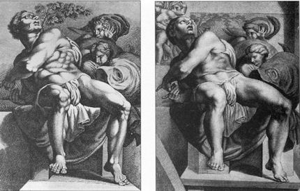
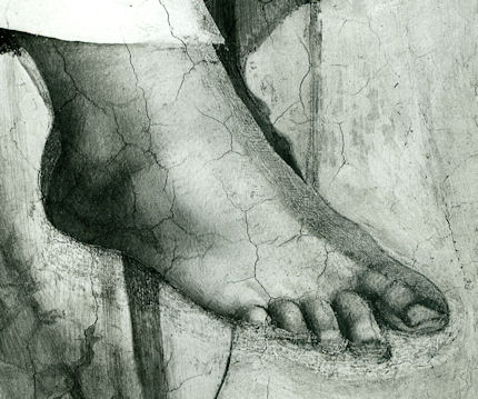


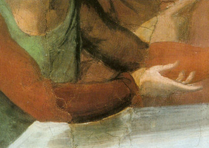

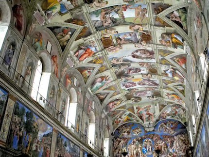


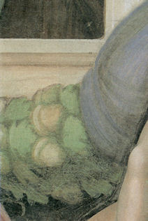

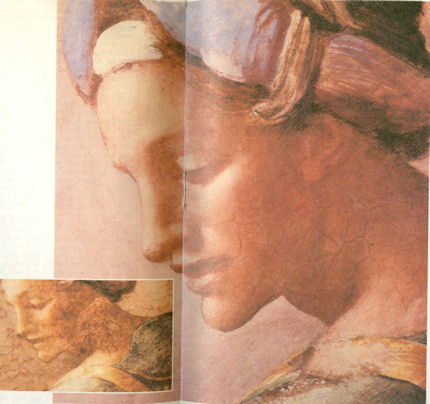


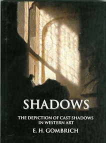
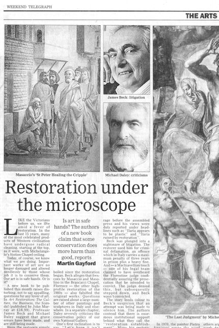


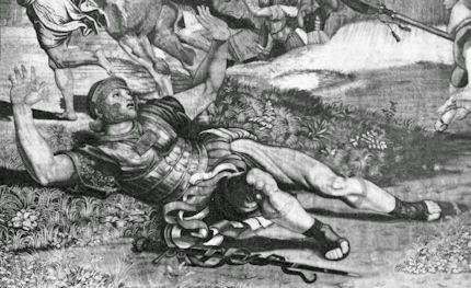

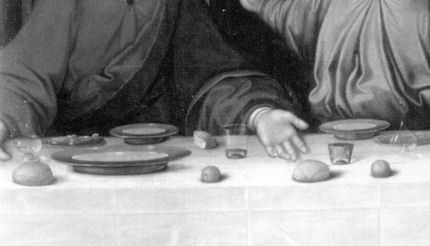


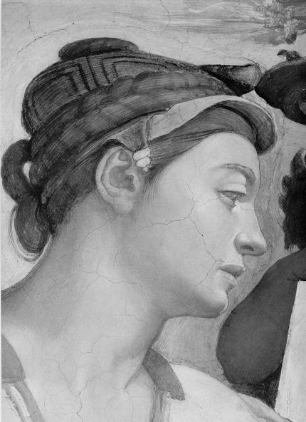


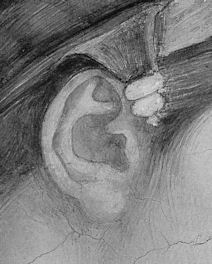
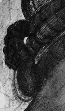


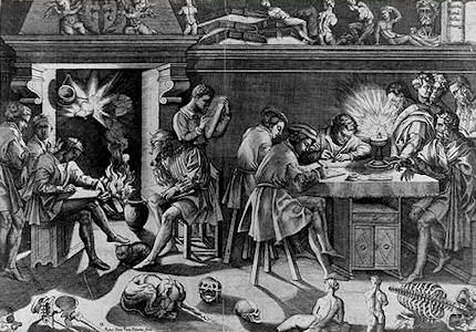
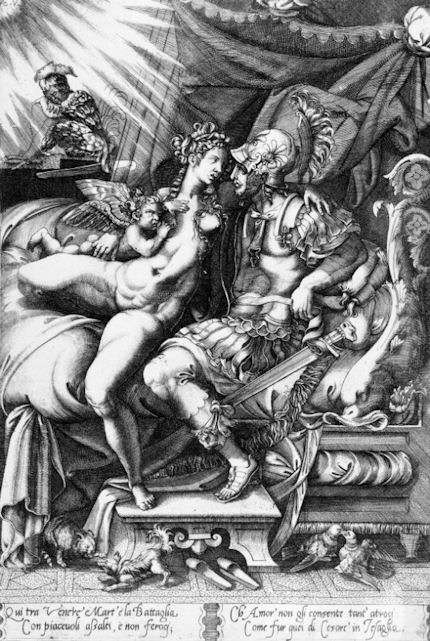

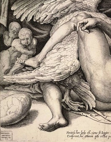
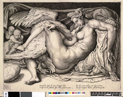
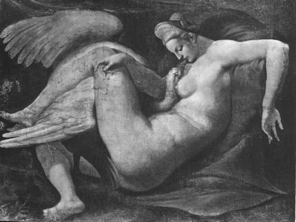

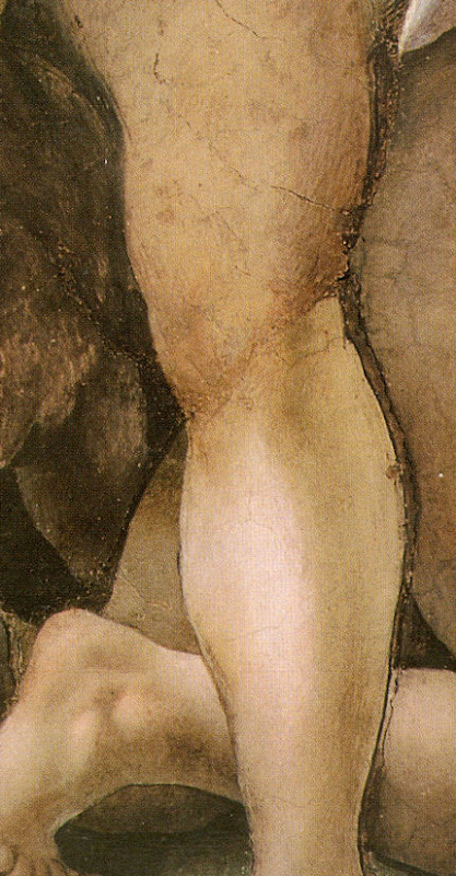

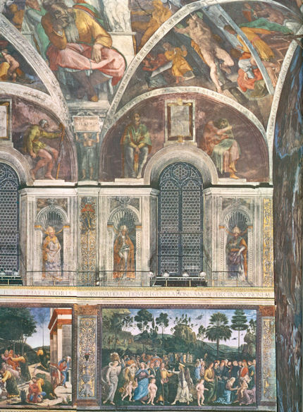
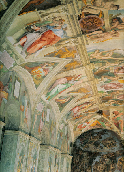


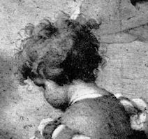
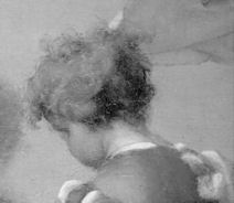
![]()