
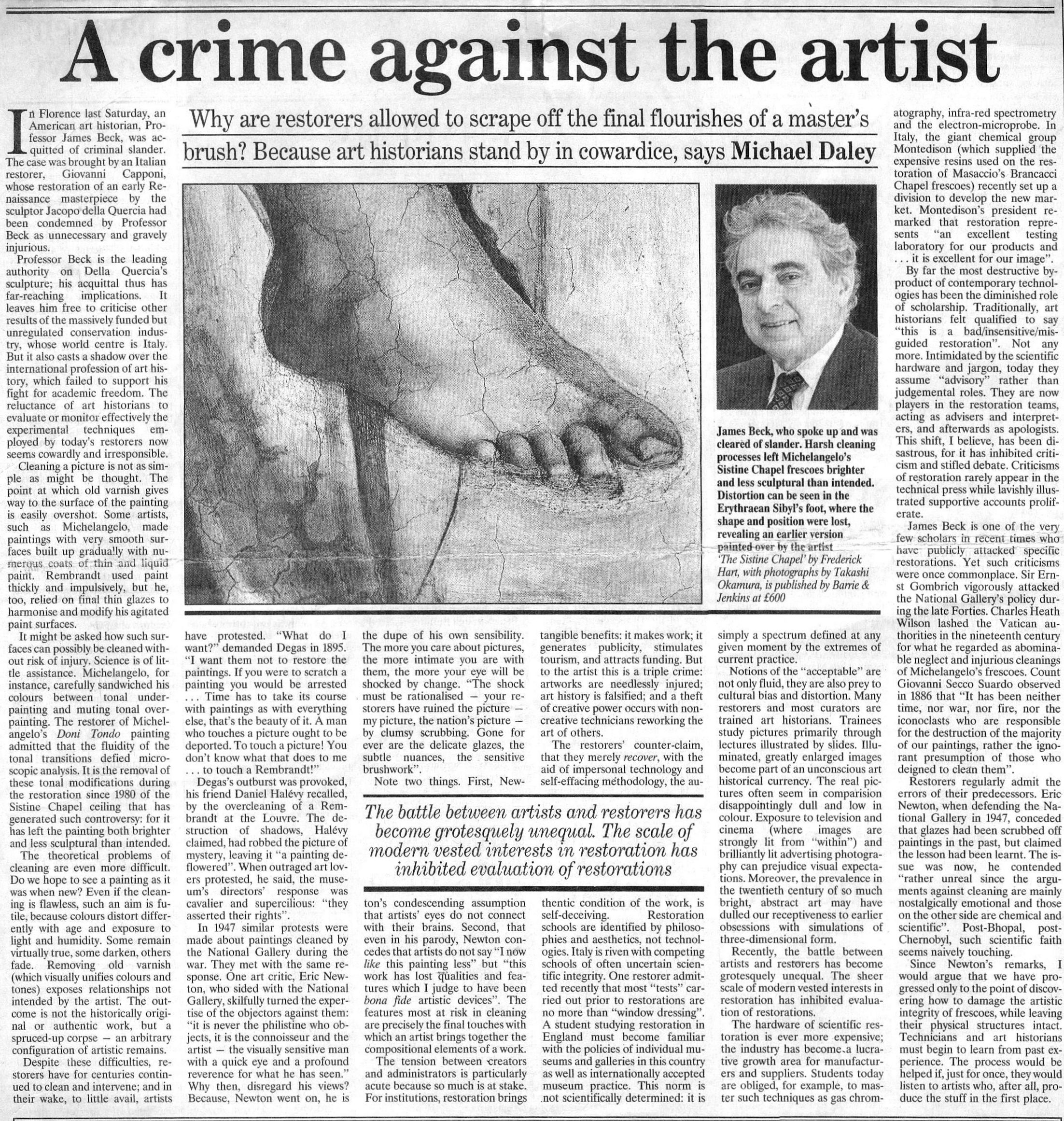
With the Sistine Chapel ceiling we know, but who wrecked Gustav Klimt’s Helene and Sonja portraits?

The restoration injuries on Klimt’s paintings now rival those seen on Michelangelo’s Sistine Chapel ceiling frescoes. Both cases testify to profession-wide failures to read pictures as art and to heed the testimony of photo-records – that is, they testify to the linked failures of restorers who inflict damage and of scholars who accommodate adulterated works within their narrative accounts.
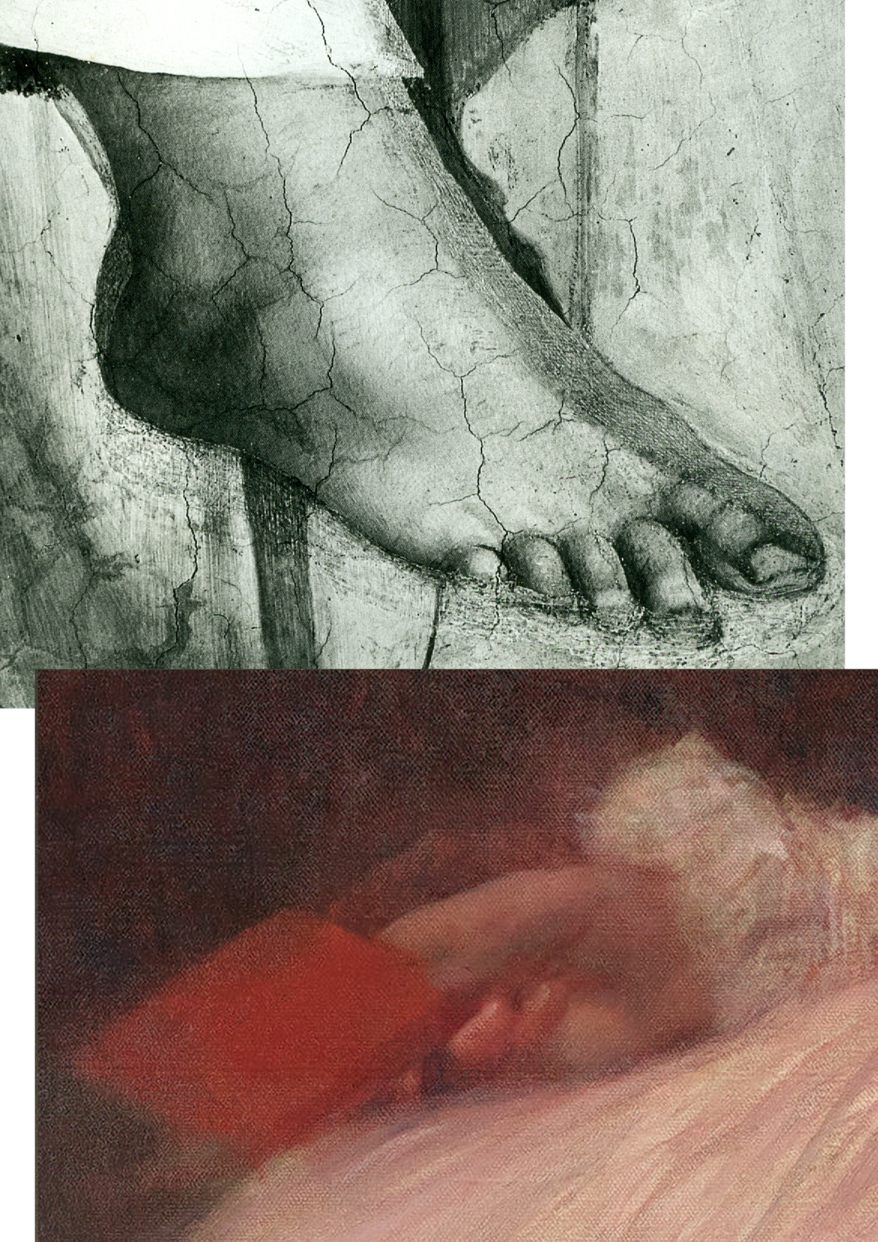
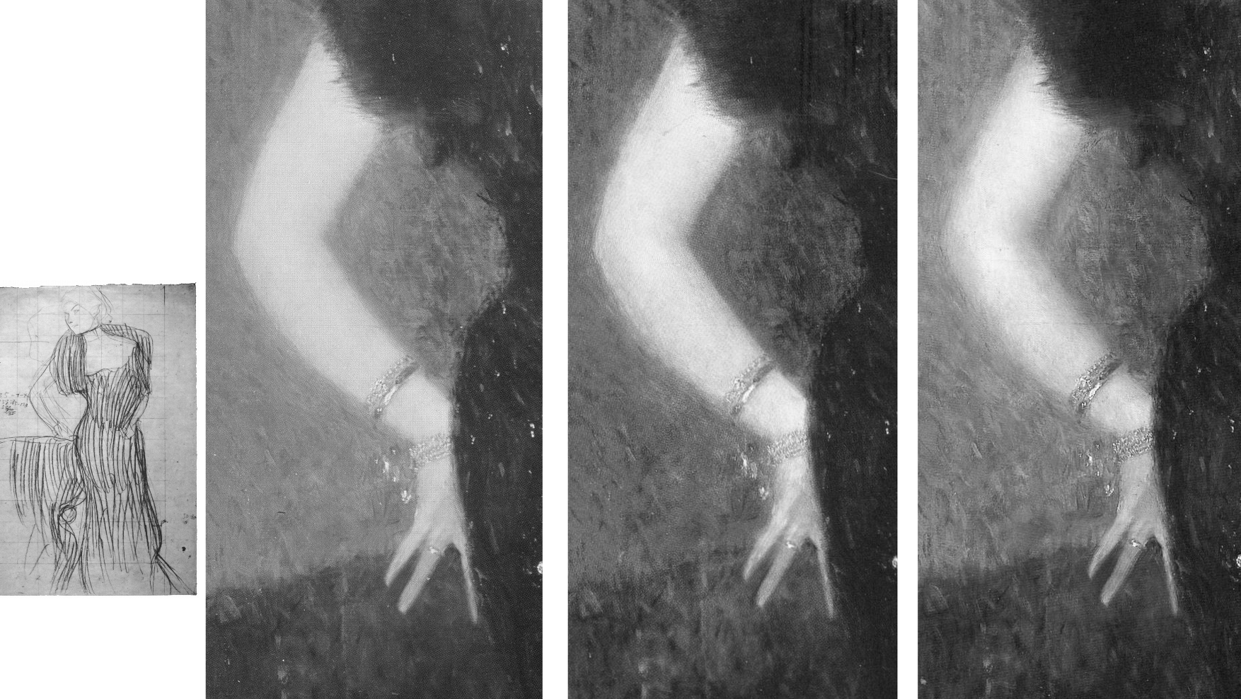
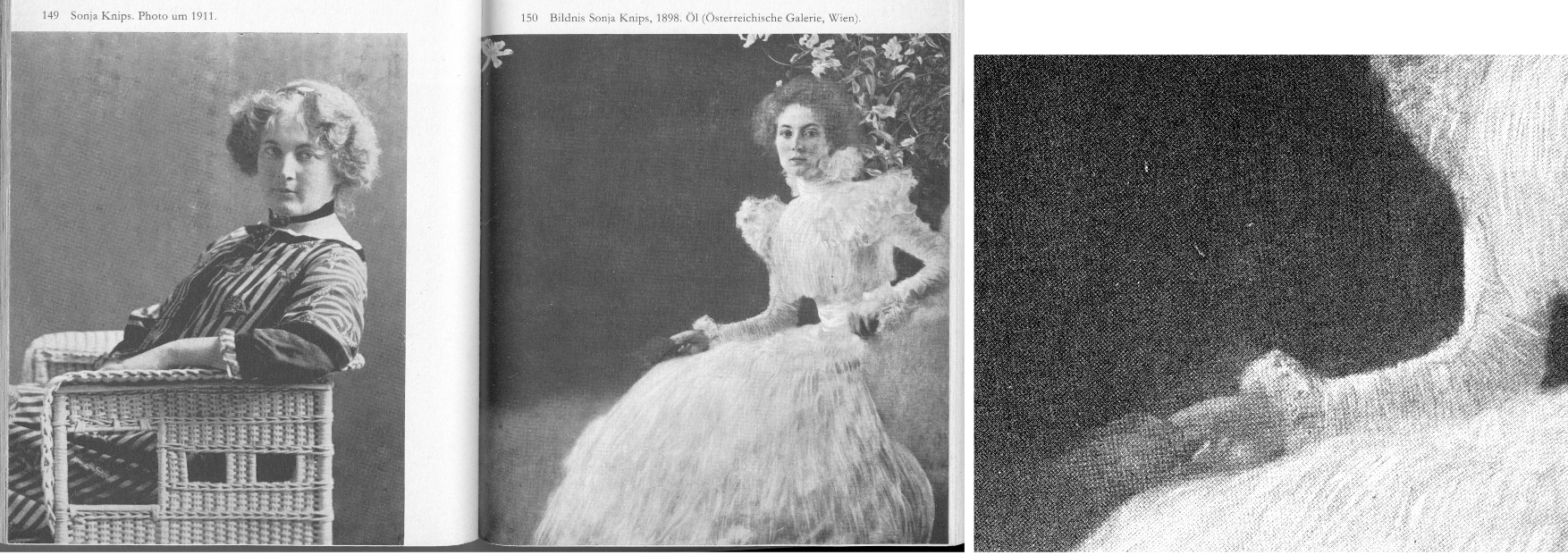
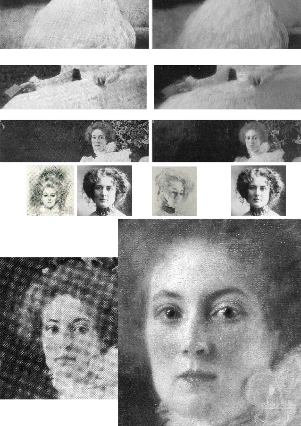
Above, Fig. 1: Top, the after-restoration right foot of Michelangelo’s monumental Erythraean Sibyl on the Sistine Chapel ceiling; below, the after-restoration right hand in Klimt’s 1898 Portrait of Sonja Knips, as seen today (in the Galerie Belvedere, Vienna).
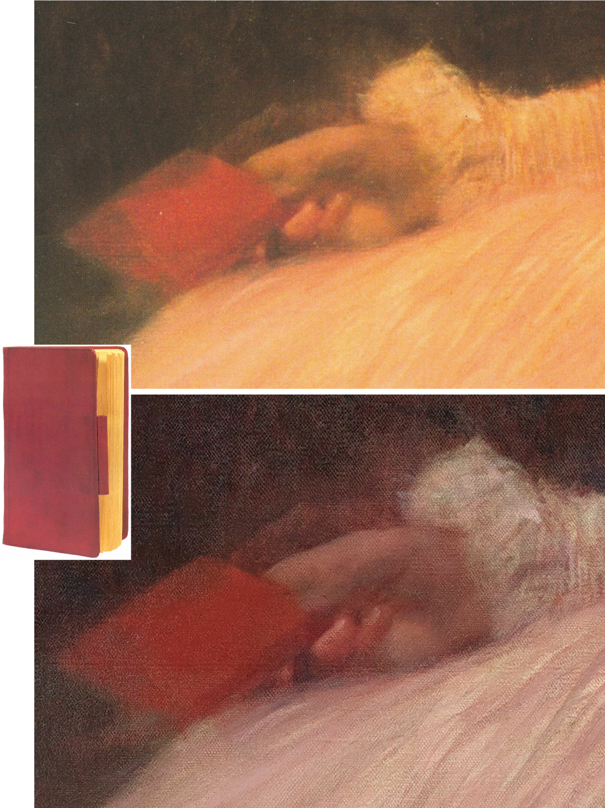
Above, Fig. 2: Top, the after-restoration right hand in Klimt’s Portrait of Sonja Knips, as in Christian M. Nebehay’s 1992 Gustav Klimt; above, the after-restoration right hand in the Portrait of Sonja Knips today. Inset, left, the book held by Sonja Knips in Klimt’s portrait.
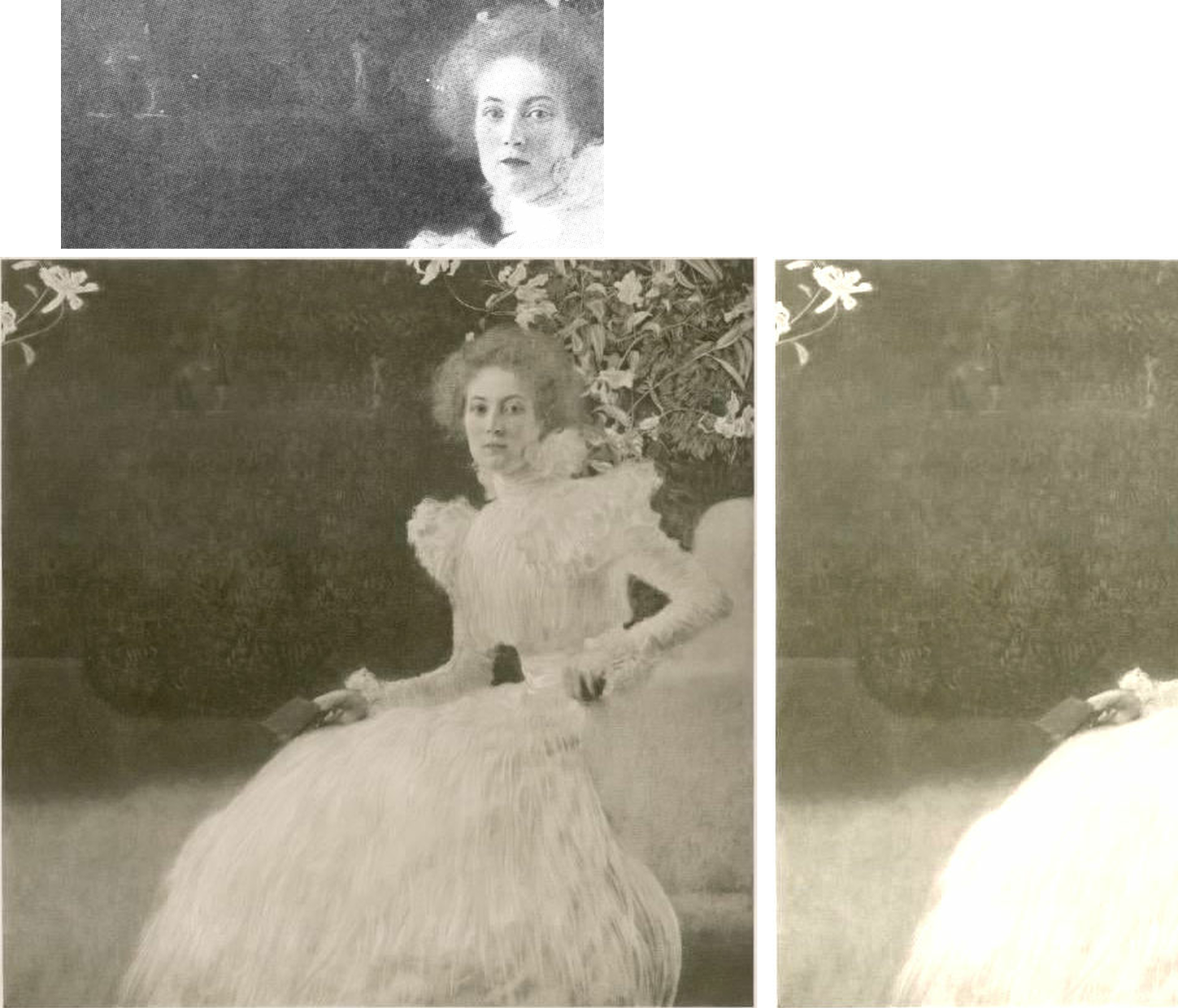
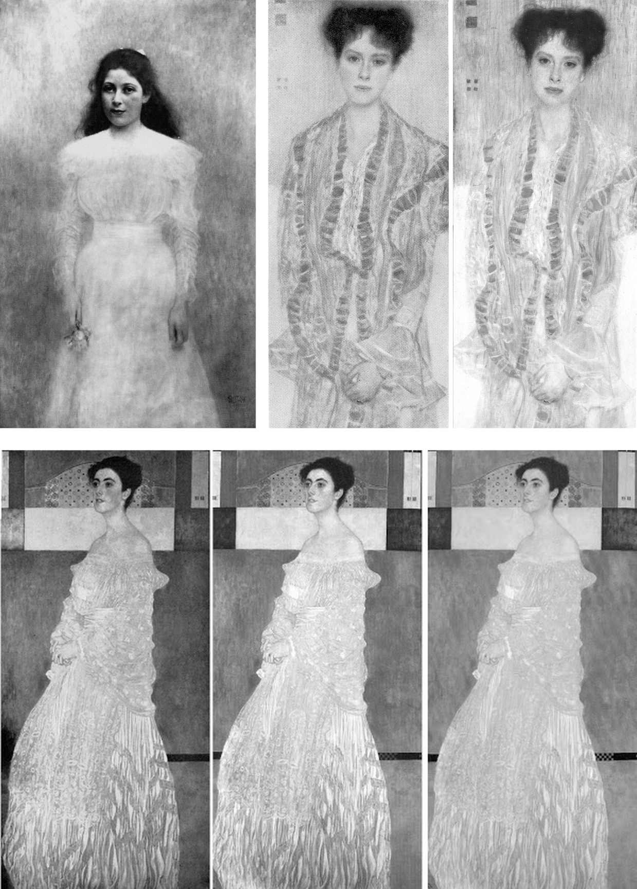
Above, Fig. 3: A detail of Klimt’s portrait of Helene Klimt as seen before restoration, left, in 1956 and after restoration, right, in 2012.
While the injuries to the two artists are comparable in magnitude, the means are quite unalike. With the Sistine Chapel, there is no mystery about the cause. Before the cleaning of the ceiling started (after the cleaning of Michelangelo’s lunettes on the chapel’s upper walls), leading Michelangelo scholars endorsed a Dan Brown-esque claim that self-declared New-Era restorers had uncovered a New Michelangelo whose true traits had gone unnoticed by all those who had, in the artist’s lifetime and for nearly half a millennium afterwards, copied and studied his work. The claim was preposterous, but the fact of the ceiling’s highly controversial and radically transformed appearance was acknowledged by all parties and is now on the historical record. Moreover, twenty-two years after the greatly contested restoration finished, the late chief restorer, Gianluigi Colalucci, admitted that his predecessor at the Vatican, Luigi Brandi, “the old chief restorer”, had warned him that Michelangelo had conducted much if not most of his painting with “pigments perhaps diluted with oil or resin or varnish” on the fresco surface.
What neither Colalucci nor the Vatican ever acknowledged was that in the late 1980s, as we had first reported in 1993, Leonetto Tintori, the restorer of Masaccio’s Trinity in the Santa Maria Novella, Florence, and a member of the international committee that investigated the controversial cleaning in the mid-1980s, had “urged the Sistine team privately to preserve what he termed ‘Michelangelo’s auxiliary techniques’ which in his view included oil painting as well as glue-based secco”.
Cleaning the ceiling had been thought impossible because of the complexity and vulnerability of Michelangelo’s method. To justify the use throughout the ceiling of a ferocious solvent gel that was robotically brushed on and washed off twice in twenty-fours like an oven cleaner in a pre-determined method devised to ensure a homogenous appearance, the restorers and curators claimed – against material and documentary evidence – that Michelangelo had not worked on top of his frescoes when dry. The Vatican never delivered a report on the restoration and now, with the death of Colalucci, never will. The photo-record, thanks to digitalisation and the web will endure.
With Klimt’s oeuvre, the debilitation occurred piecemeal in public and private collections over (roughly) half a century and on no overtly declared programme. Again, thanks to photography, there can be no long-term cover for mis-restorations because we know how Klimt left his works and can calibrate and demonstrate injuries to them, as with the two portraits of Sonja Knips and Helene Klimt.
Klimt’s instruction that those wishing to understand him need only look at his pictures is widely acknowledged but little comprehended. “I am convinced that I am not particularly interesting as a person”, he had written, “if anyone wants to find out about me – as an artist, the only capacity in which I am of any note – they should look carefully at my paintings and try to learn from them what I am and what I have tried to achieve.”
That is no longer possible. It no more occurred to Klimt that his works would cease to bear true witness than it had to Michelangelo that he would one day be hailed as the Matisse of the Renaissance by a restorer (see our “Maestro Colalucci: His Method and its Madness”, Jackdaw, May/June 2021, and “A crime against the artist”, The Independent, 22 November 1991, at Fig. 34 below.) Now, a century on from Klimt’s death and with scarcely a single picture true to its original self, the most charitable view of scholarly silences on injuries might be to assume that those who depend on access to Klimt’s works and records either know or fear they cannot afford professionally to embarrass private or institutional owners by citing past or recent injuries. However, Klimt scholarship and publications have exploded in recent years and it is now possible (through photo-illustrations) to make fair appraisals of the various changes his works have undergone at the hands of restorers – even though their actions remain almost nowhere acknowledged.
HELENE KLIMT: ASKING THE RIGHT QUESTIONS
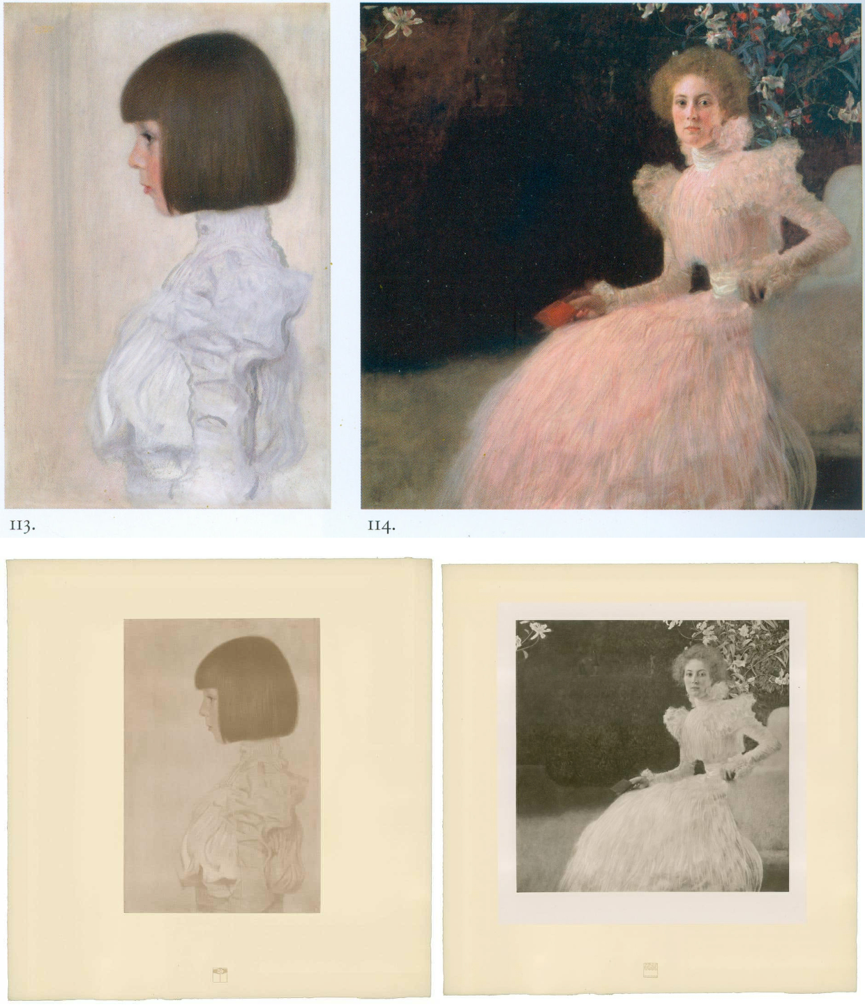
Fig. 4, above: Top, Klimt’s portraits of Helene Klimt and Sonja Knips, as bracketed in the precious and giant – it weighs 16 lbs – 2012 Taschen Gustav Klimt The Complete Paintings, Ed. Tobias G. Natter; above, the Klimt and Knips portraits as published with Klimt’s approval between 1908-14.
As Dr Natter hoped, the Taschen book is now a standard work of reference. His ambition to supplement updated “details about each work, its provenance, exhibition history and selected bibliographic references” with a picture of “how it was received in its day” proves richly informative. Notwithstanding such art historical diligence, no account is given of what restorers euphemise as pictures’ “conservation histories” and therefore this book, like all others in the field, fails to address how each work looked in its day and to estimate how much or how little it does so today. Seemingly failing to recognise that every work of visual art starts life as its own primary document, this ambitious book takes what restorers have left in their wake as synonymous with the art Klimt produced. As is customary in the field, Natter expresses deep and sincere gratitude to all owners and “in particular, the private owners” for their trust, helpfulness, and inspiring conversations.
ART HISTORICAL NARRATIVES
One of the book’s contributors, Susanna Partsch, (“Paintings of women”), sets the above two portraits as staging posts in a now prevalent art historical schema:
“The earliest portraits on display at that occasion [a 1903 Klimt exhibition] were the private ones of his young niece Helene Klimt and the Portrait of Sonja Knips both of which were completed in 1898. The some twenty portraits that Klimt produced between 1891 and 1898, most of them showing anonymous models, seem to have been finger exercises on the way to a new style.”
With the Portrait of Helene Klimt, the artist’s then six years old niece who became his ward on the death of his brother (Fig. 4, above left), Natter jumps straight into formalist art criticism:
“If Klimt’s portraits of the early 1890s had shown him dissolving line and blurring colour in a painterly manner, the artist here explores the harmony of the strict profile view. This is reinforced by the precision of the page-boy haircut, the neutral background and the high-necked blouse, its fabric interpreted and ennobled by the generosity of the execution. The dualism of mimesis and dissolution, of faithful reproduction and painterly openness, is already in evidence here as a stylistic means.” (Emphases added.)
Thus, the head is said to be painted in one manner and the blouse in a radically contrary one, but this supposed pictorial dichotomy rests on an assumption that the picture’s present traits are as when originally executed when the photo-record (at Fig. 3 and below) testifies that they are not. Natter cites but does not reproduce an early record of the Portrait of Helene Klimt: “A previously unheeded photograph published in the magazine Das Interieur in 1911 [that] shows the child’s portrait hanging in a bedroom in the Flöge sisters’ home in Ungargasse, Vienna (N.N. 1911).” Having brought photography to the table, Natter neglects to consider the testimony of the earliest published photographs of this painting including one above at Fig. 4 of 1908-14 which Klimt himself had carefully vetted and endorsed.
This profession-wide neglect of historical photo-records persists even as Klimt’s own use of photography attracts attention. In 2012 Prestel published Gustav Klimt & Emilie Flöge Photographs, edited by Agnes Husslein-Arco and Alfred Weidinger, the scientific director of the Linz Upper Austrian State Museum; former vice-president of the Belvedere in Vienna; and a digital and film photography specialist with a preference for black and white images. Agnes Husslein-Arco, a former figure skater and Sotheby’s Austrian director, was director of the Belvedere museum between 2007 and 2016 and is credited with transforming it into a major tourist attraction in Vienna. In the book’s preface, the then director said: “The product, a chronological presentation of photographs and snapshots, illustrates a biographical panoptic of these two personalities who were so influential in the fin-de-siècle art world…The following contribution by Alfred Weidinger provides information about Klimt’s relationship to photography and the use of the same in his artistic creations.” Weidinger wrote: “The reference to Klimt’s involvement with photography, only briefly sketched out here, is meant to offer a first look at a hitherto neglected area of Klimt research, and, at the same time, make evident the importance of this medium to the artist.”
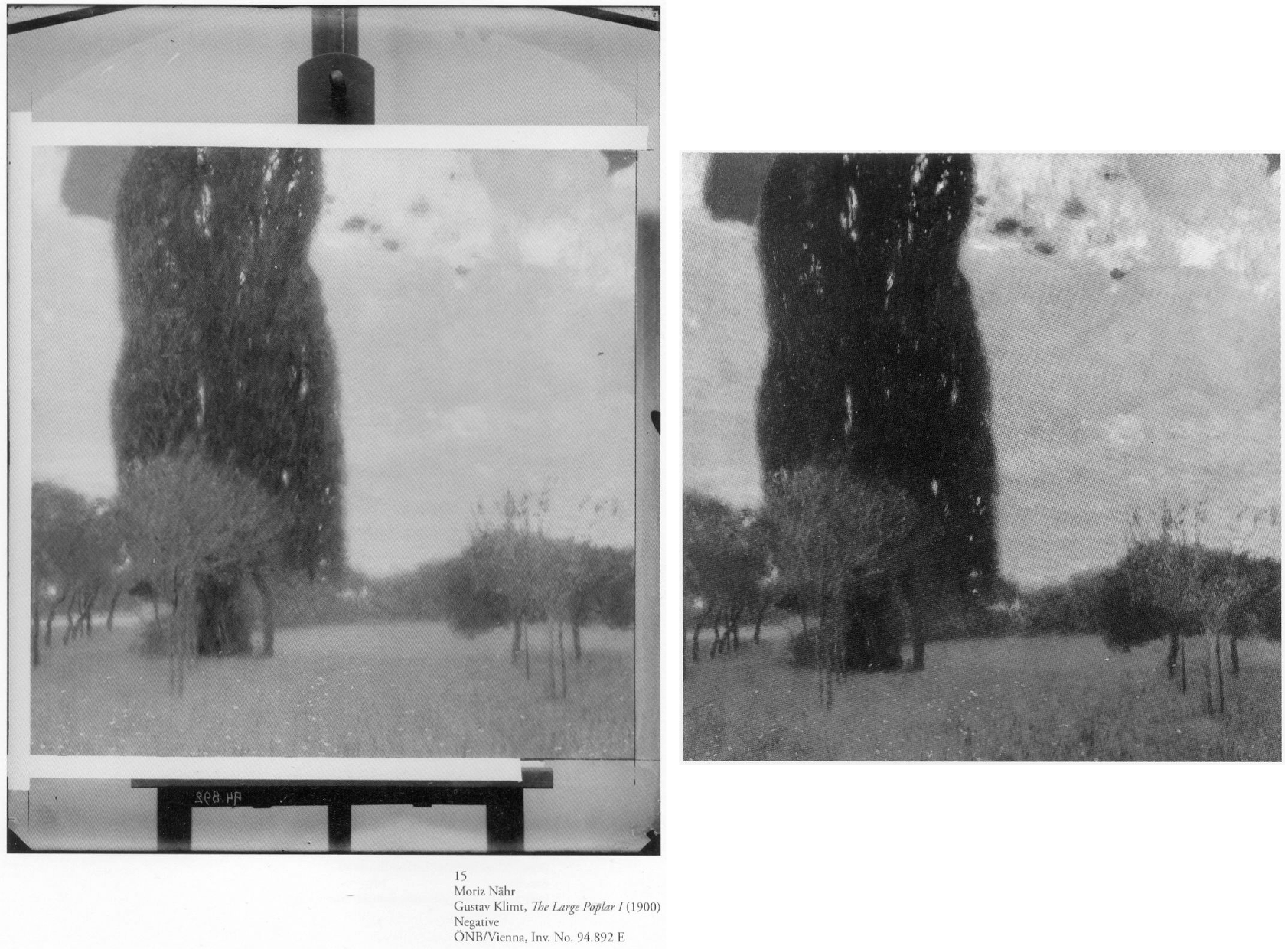
Above, Fig. 5: Left, one of a group of Moriz Nähr photographs acquired by the Austrian National Library in 1943 that recorded both Klimt himself and “revealing reproductions” of his paintings, as here above left with his 1900 The Large Poplar I. Above right, The Large Poplar I, as reproduced (with slightly trimmed edges) in Alfred Weidinger’s 2007 Prestel Gustav Klimt – an earlier massive and compendious complete catalogue with specialist essays which had weighed in at a respectable 10 lbs. Weidinger expressed the hope that the book, which offered a fundamentally new basis for research, “holds out an invitation to discover many new aspects of the life and work of the great painter whose artistic home is the Vienna Belvedere.” (We welcome and accept that invitation.)
A SECOND OPINION
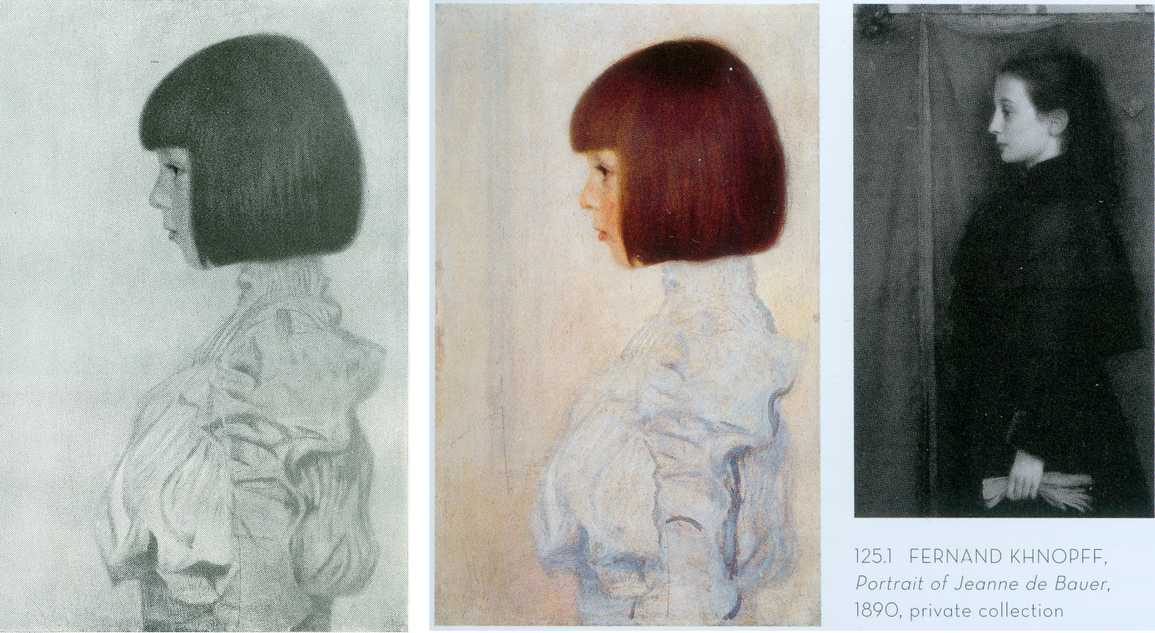
Above, Fig. 6: Left, Klimt’s 1898 portrait of his niece (and later ward), Helene Klimt, as published in Emil Pirchan’s pioneering 1942 and 1956 book Gustav Klimt and, centre and right, Helene, as paired with a Fernand Knopff profile portrait by Alfred Weidinger in his 2007 Gustav Klimt.
As with Dr Natter, Dr Weidinger’s catalogue entry on the Helene Klimt portrait made no reference to the Pirchan book’s photographic testimony. Instead, he drew attention to Klimt’s apparent indebtedness to an 1890 Fernand Knopff portrait in which “a severely profiled half-length portrait faces to the left, with an almost monochrome background which is divided into two areas by a thick brown vertical line.” Weidinger further notes that while Klimt “reduces his composition to the girl and the pale background we may detect a reminder of Knopff’s composition in the group of vertical lines in the front of Helene’s face, which in the Jeanne de Bauer portrait, functions as a special accent”. The stylistic comparison with Knopff is apt and fair but no mention is made of the photographically recorded fact that the lines to which Weidinger refers had not been visible in the picture in its 1908-14 and 1942-1956 photographs.
Weidinger takes pride that it had been “a major concern of ours to see, as far as possible, all Klimt’s pictures in the original and to take new photographs of them” and that their wishes had been met in the great majority of cases. That the lines in the portrait’s background had not previously been present must mean that they had emerged in a post-1956 restoration, which in turn suggests that a restorer had uncovered and left exposed a feature previously begun and then painted out by Klimt, perhaps because of second thoughts about introducing a parallel secondary motif that would have stood distractingly in competition with the picture’s subject.
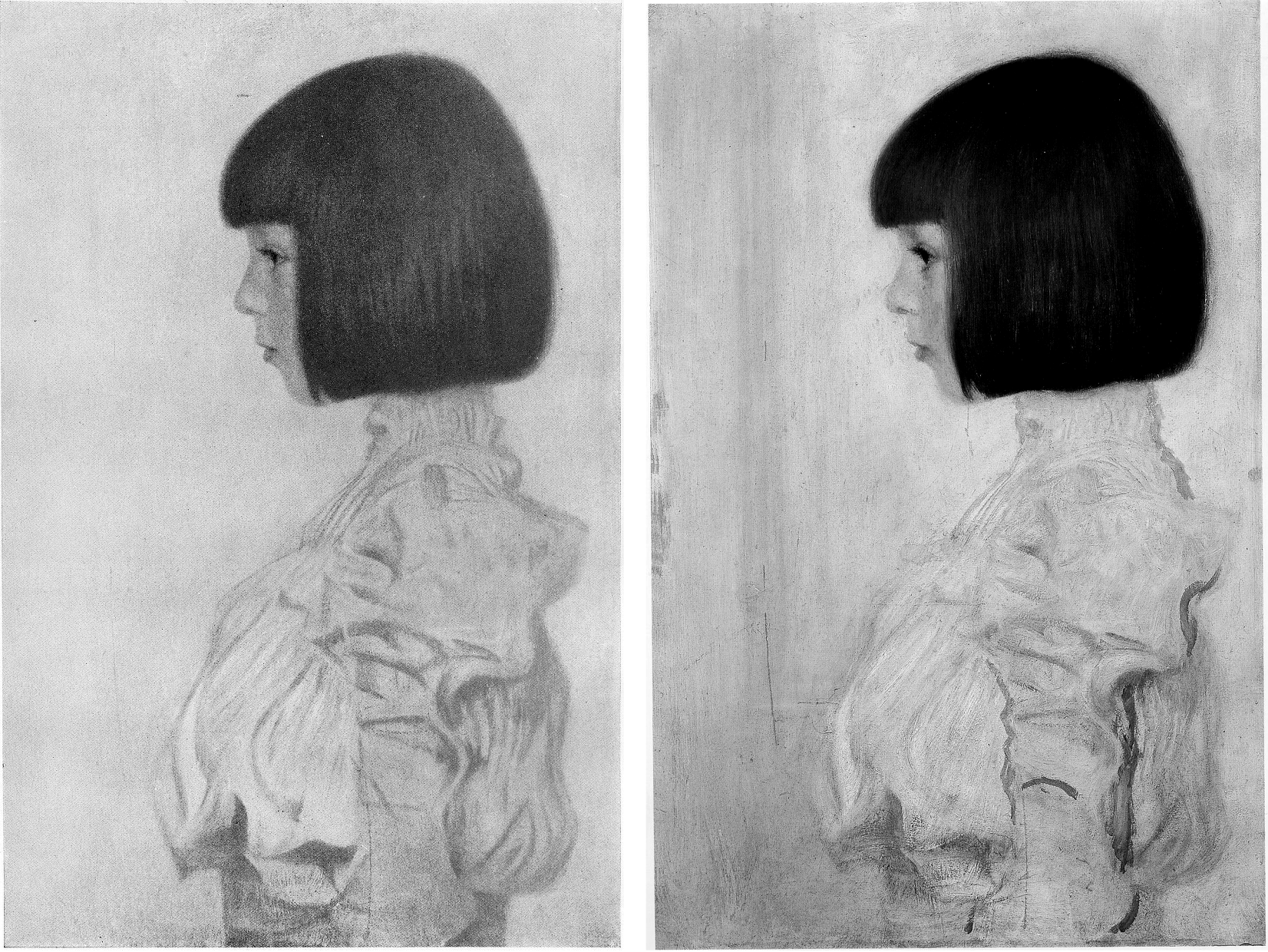
Above, Fig. 7: Left, Klimt’s portrait of Helene Klimt as recorded before 1956 in Pirchan; right, the portrait as reproduced by Weidinger in 2007.
Had Weidinger compared the above pair of images he would surely have noted not only the late emergence of the lines but also the many changes to the blouse – and perhaps have offered some account for them. Instead, and seemingly accepting the 2007 state as if Klimt’s own, he drew a stylistic distinction between the treatment of the undamaged head – “the fine brushstrokes with which Klimt renders her hairstyle and profile give a draughtsman-like character to the girl’s head” – and the body, where: “the treatment of the high necked, puff-sleeved blouse, which Klimt paints in cream and light blue tones, is sketchy.” In 2012, Natter saw more in the blouse than sketchiness – viz: “fabric interpreted and ennobled by the generosity of the execution”; and, in the now disrupted head/blouse relationship, “a dualism of mimesis and dissolution, of faithful reproduction and painterly openness”. The photo record shows that both scholars missed countless injuries and adulterations to the blouse – including superimpositions that crudely redrew the collar and the arm’s contours – all of which they took to comprise evidence of a significant step in the march of Klimt’s stylistic development of which Partsch spoke in 2012.
Had Weidinger addressed such a comparison as that above, he would likely have seen that the draughtsman-like character of the head had been no less evident in the economical but precise elegant treatment of blouse, too, and that viewed as a whole, the work had originally shown no great dichotomy of pictorial means and, rather, comprised a beautifully measured record of a young girl’s dutifully patient self-conscious expression and resolute little soldier-like stance.

Above, Fig. 8: Left, Klimt’s portrait of Helene Klimt as in Weidinger, 2007 and, right, as reproduced by Natter in 2012.
The above, same-size, greyscale, direct photo-comparison shows that the painting underwent further changes between 2007 and 2012: the long-invisible vertical lines that emerged in 2007 had by 2012 turned more clearly towards the child suggesting a framed picture on a parallel background wall; an area of damage in the centre of the picture’s left edge that was visible in 2007 has been touched out, as were several scratches of long-standing.
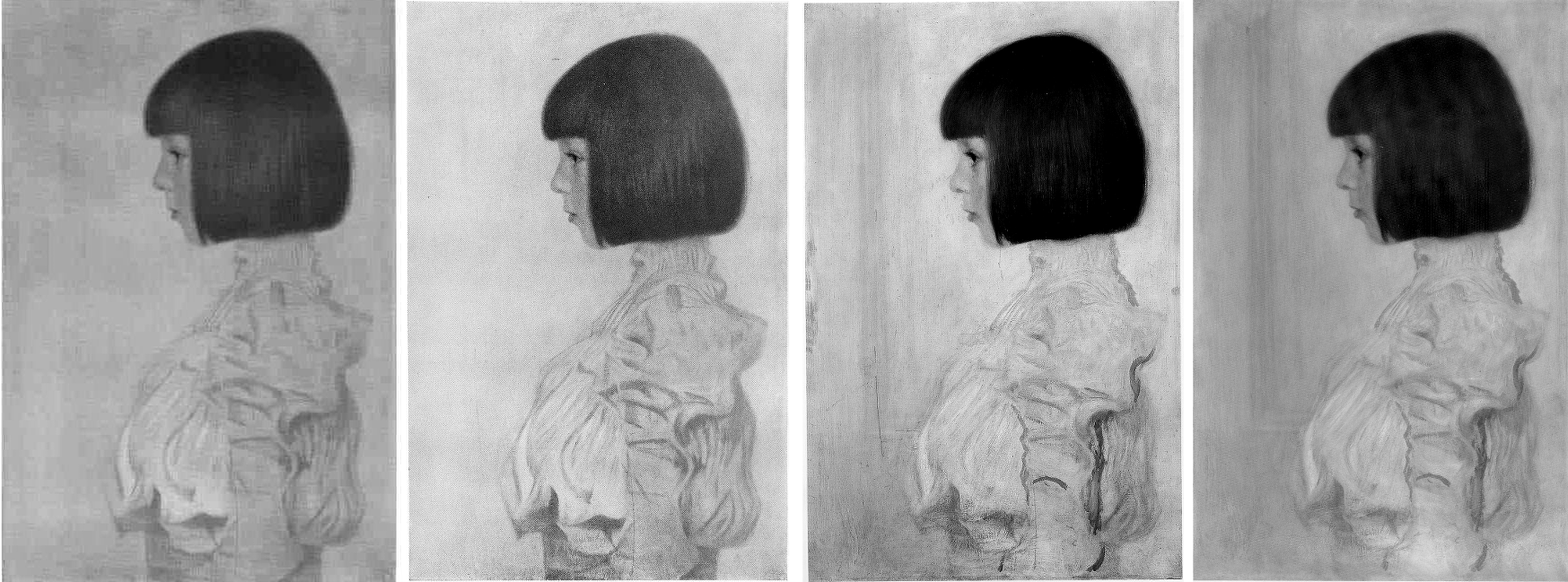
Above, Fig. 9: Klimt’s portrait of Helene Klimt as recorded, left, between 1908-14; as before 1956, second left; as by Weidinger in 2007, second right; right, as by Natter in 2012.
Comparing four same-size successive photographs above shows the first two records of the blouse (1908-14 and 1942-56) to be identical and radically different from the two in 2007 and 2012. The post-2007 traits that are now enshrined in the literature as “sketchy”, or an “ennoblement by generosity of execution” can be seen on a simple photo-comparison to be products of hands other than Klimt’s. The photographic record incontrovertibly shows that in this portrait, autograph features that survived until at least 1956 were subsequently weakened or erased, and that new and stylistically alien contours had been added in an evident attempt to simulate something of the then-botched blouse’s original coherence and richness of design. Thus, field-leading contemporary scholarship had failed to notice, acknowledge, or condemn a vandalising act of bowdlerisation. Instead, it has incorporated a restorer’s deformations into a celebratory narrative of a privately owned work that is on loan to a public museum (Berne, Kunstmuseum).

Above, Fig. 10: Top, left, Klimt’s Portrait of Helene Klimt in Pirchan, 1956; and, top right, in Weidinger’s 2007 Gustav Klimt. Above, left, Klimt’s 1894 Seated Young Girl; above, centre and right, a diagram showing first the 1956 Pirchan illustration with the then folds of the blouse outlined in black, and right, with what we take to be a post-1956 restorer’s superimpositions also identified in black.
Weidinger’s comments on Klimt’s indebtedness to Knopff (and to Whistler) are constructive and, in Klimt’s early Seated Young Girl, above left, he sees indebtedness to both Klimt’s brother, Ernst, and their joint master, the painter Hans Makart. Despite such fine-tuned stylistic discrimination, Weidinger seems to see no relation in the Seated Young Girl to Helene’s blouse. Had Natter addressed the losses and additions in the post-1956 blouse, would he have spoken of a “dualism of mimesis and dissolution, of faithful reproduction and painterly openness, [that] is already in evidence here as a stylistic means” in Klimt’s supposedly contrasting handling of the head and blouse? The blunt tuth is that, with Helene’s blouse, the dissolution was chemically and physically induced decades after Klimt’s death by an unidentified restorer on an unrecorded/undisclosed occasion.
SONJA KNIPS
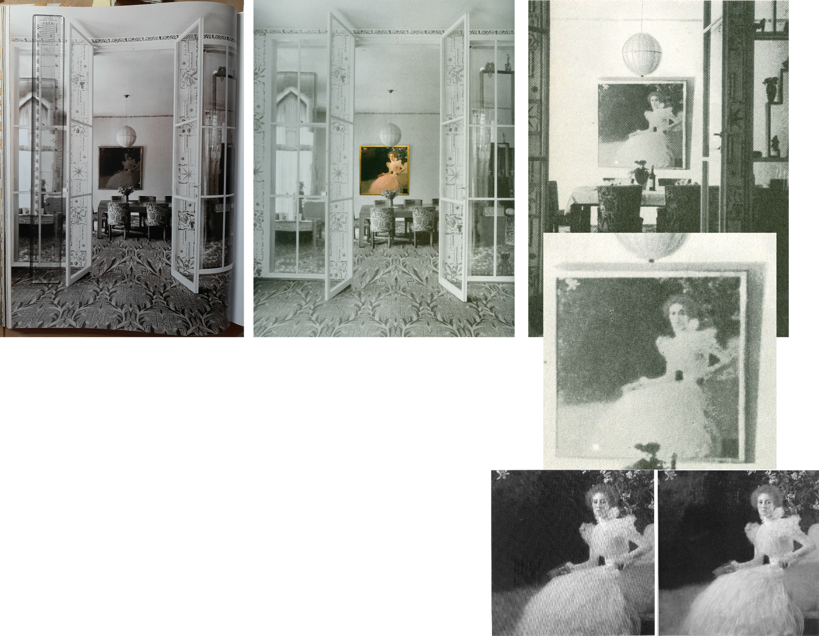
Above, Fig. 11: A 1915 photograph of the Sonja Knips portrait in the dining room of the Villa Knips, as in the giant 2012 Taschen book, left; as in the Neue Galerie’s, 2008 Gustav Klimt: The Ronald S. Lauder and Serge Sabasky Collections, Ed. Renée Price, where a modern colour photograph of the painting has been superimposed, centre; and right, top and centre, as in Christian M. Nebehay’s, 1976 Gustav Klimt; bottom right, Sonja Knips as published respectively in Weidinger, 2007, and Natter 2012.
Natter and Weidinger both carry historic photographs showing Klimt paintings in the background but without comment on their then appearances. The Nebehay image above, right and centre, is small and printed on poor paper but even at this level of reproduction, it gives indication of the picture’s tonal hierarchies and dispositions – the subject is brilliantly lit on the left and moves into shadow on the right of the picture.
Klimt’s paintings were much photographed in his lifetime (that is, before his death in 1918), many were seen in their exhibited environments, some were photographed before being first exhibited and then again after subsequent reworking. For all this, and even though both 1898 portraits at Fig. 4, top, have exceptionally long and secure photo-histories, their narratives have been written without regard to such evidence and in terms of constituting steps towards subsequent pictorial developments – which progressivist schema happens to provide perfect art historical cover for dramatically altered pictures.
Of the Portrait of Sonja Knips, Dr Natter summarises: “This graceful female portrait marks a turning point in Klimt’s portraiture and is rightly considered a prelude to his Secessionist works. The sitter is portrayed in life size, seated in an outdoor setting. The square format is new and represents a fundamental choice whose possibilities Klimt would explore over the next few years. New, too, is the corresponding juxtaposition of light and dark, foreground and background, fullness and void.” That account was more consistent with the picture’s 2012 published appearance, Fig. 4, top right, than when first recorded as at, Fig, 4, bottom right, where today’s “void” comprised distinctly articulated spaces, forms and, even, mini-figures.
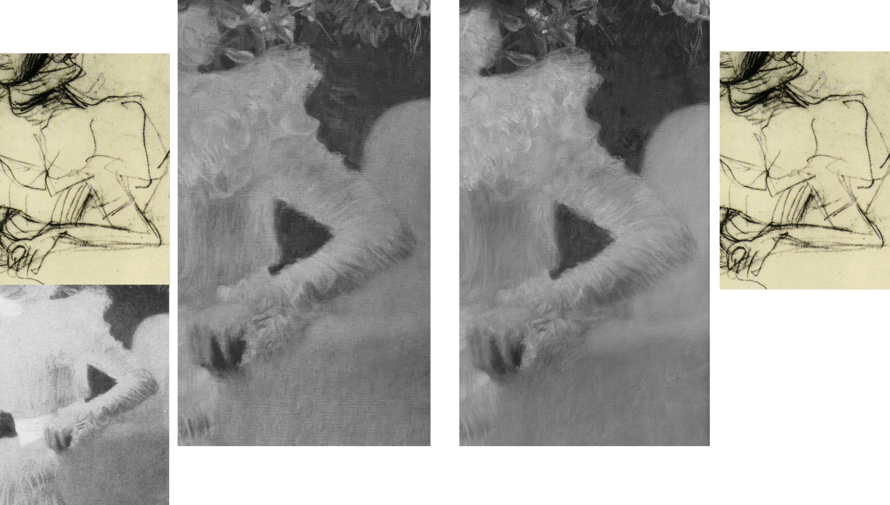
Of the painterly means, Natter adds: “Klimt employs a differentiated manner of painting, executing some areas of the portrait in a cursory fashion while focussing with great precision upon others. He thereby creates a fascinating contrast between the naturalistically modelled head of the sitter and the gauzy shimmer of her dress. This latter conceals a wealth of painterly effects and is infused with a rustling tension by a cascade of multiple parallel brushstrokes. Klimt at the same time camouflages the highly artificial nature of the arrangement as a snapshot.” In terms of a perceived stylistic dichotomy no mention is made of the picture’s former second carefully composed and precisely, naturalistically realised component – the now transformed and deranged small red sketchbook, as seen at Figs. 1 and 2.
AN AFFAIR – OR NOT?
With Klimt and his female subjects there is always a relationship issue and with this picture scholarly differences have arisen. Natter is agnostic: “Whether – as some suspect – Klimt and Sonja Knips enjoyed an intimate relationship, cannot be verified. But it is certainly the case that the painter presented her with one of his sketchbooks as a token of his particular affection.” He first speculates: “Whether he indeed pressed one such red leather-bound book into her hand during a sitting, because he felt the painting needed an accent of colour at that point remains conjecture”. (The reported source for this formalist reading had been the subject herself, as discussed below.) Natter takes the fact that such a scenario is conceivable to be “a clear reminder that Klimt, unlike the expressionists, continued to legitimize internal compositional requirements by cloaking them in external motifs.” Thus, a key question is begged: Whatever the relationship between the artist and the sitter, the book served an essentially formal pictorial purpose – the pink dress had “needed” on chromatic/pictorial grounds to be offset by a small red parallelogram of which just such an instance was conveniently to hand in a book of sketches Klimt had gifted to the picture’s beautiful subject whom he had known since her teenage years.
Thus was a formalist painterly purpose attributed to an immensely charged and fastidiously depicted small book, even after its – undiscussed – visually deranging transformation into the quasi-Cubist construct at Figs. 1 and 2.
TWO SCHOLARLY TAKES ON THE TWO PORTRAITS
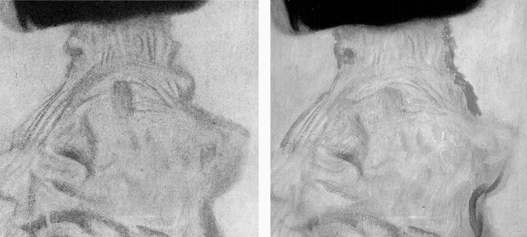
Above, Fig. 12: Top left, the infra-red image of the Sonja Knips portrait published by Weidinger in 2007; top right, the second oldest (1908-1914) photo-record of the painting; below, Klimt’s 1896 Girl in the Foliage as published, left, in Emil Pirchan’s 1942 Gustav Klimt, centre, in Johannes Dobai’s 1978 Klimt, and, right, by Weidinger in 2007.
Weidinger situates the Sonja Knips portrait in the same part of the oeuvre’s developmental arc but also within social artistic and fashion contexts:
“This portrait is considered a turning point in Klimt’s portrait painting…the beginning of a series of large format portraits of ladies, predominantly of the prosperous, Viennese upper-middle class…and their wish for prestigious portrayal…[Knips] was one of his few models from the circles of – albeit minor – nobility…Klimt portrayed Sonja Knips sitting in a chair. A portrait formula he had already tried out in small-format portraits of ladies of 1896-98. The diagonal division of the painting into two zones places the subject opposite an empty space in tones of dark brown – a motif also used in Whistler’s Arrangement of Grey and Black No 1: Portrait of the artist’s mother (1867-71) and already taken up by Klimt in his Lady in an Armchair (cat. 106) and Lady by the Fireplace (cat. 106)…”
While the social/professional account of Klimt’s developing career is of interest, the perceived dichotomy of subject and void better accords with the picture’s present appearance than that seen in the special reproduction of 1908-14 (Fig. 4, right). Weidinger’s “empty space” had been closer than Natter’s “void” to the picture’s original and distinctly articulated spaces and forms but, then, he brushed away all claims that Klimt had originally “painted figures, a pool, or even a horse in the background which he then overpainted” on the grounds that no figural elements can be identified in the infra-red image. Thus, the testimony of a single undated technically penetrating image trumps all the compendious photo-records that testify to the contrary.
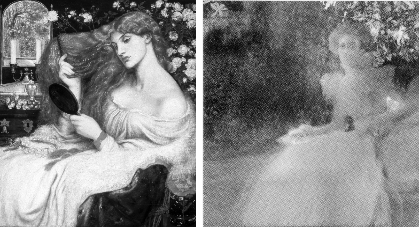
Above Fig. 13: Left, Dante Gabriel Rossetti’s 1868 Lady Lilith; right, the undated infra-red image of the Sonja Knips portrait made – presumably – at the Belvedere, Vienna.
In lieu of an evaluation of the infra-red image in the context of the picture’s full photo-history, Weidinger pursues stylistic antecedents and influences: “The all-over brushstrokes suggest a landscape of bushes and trees such as Klimt had already once depicted in his Girl in the Foliage”, as above Fig. 12. Further, “In the upper left-hand corner of the picture there is a recognisable view, accentuated by a flower. Since Sonja is presumably in a garden, as suggested by the lilies above her head, this may be a view of the landscape, similar to Rossetti”. (In the Rossetti above, the landscape view is a reflection in a framed mirror.)
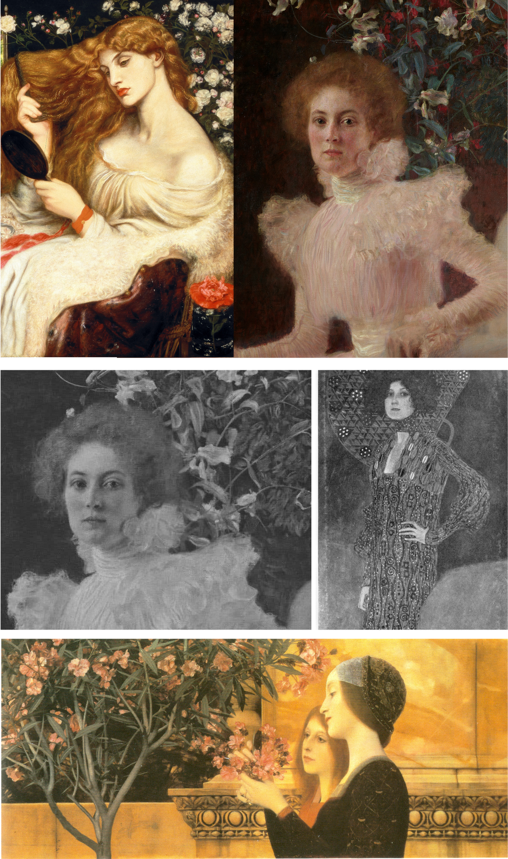
Above, Fig. 14: Above, Rossetti and Klimt details; centre, details, of Klimt’s Sonja Knips and Emilie Flöge portraits before restorations; below, Klimt’s Two Girls with Oleander.
Notwithstanding his reading of the infra-red testimony on foliage, Weidinger adds: “Admittedly, it is also possible that the setting is an interior room.” The picture’s present void may thus be read either as an ex-interior or an ex-garden or even a landscape – but which and how to decide? While the lilies above Sonja’s head might have been made in homage to Rossetti’s roses, in terms of Klimt’s stylistic development, they might also be considered to have anticipated his first placement of a decorative foil behind a portrait, which scholars have located in Klimt’s slightly later and more abstracted 1902 portrait of Emilie Flöge, as above, centre right. At the same time, Klimt might have been nodding back to his recent self’s 1890-92 counterpointing of closely adjacent flowers and young female subjects in the Wadsworth, Connecticut Two Girls with Oleander (as above, bottom) – which picture Weidinger nicely pairs with Alma Tadema’s deep-spaced 1893 Unconscious Rivals, at Bristol City Museum.
KLIMT’S CROPPING DEVICE
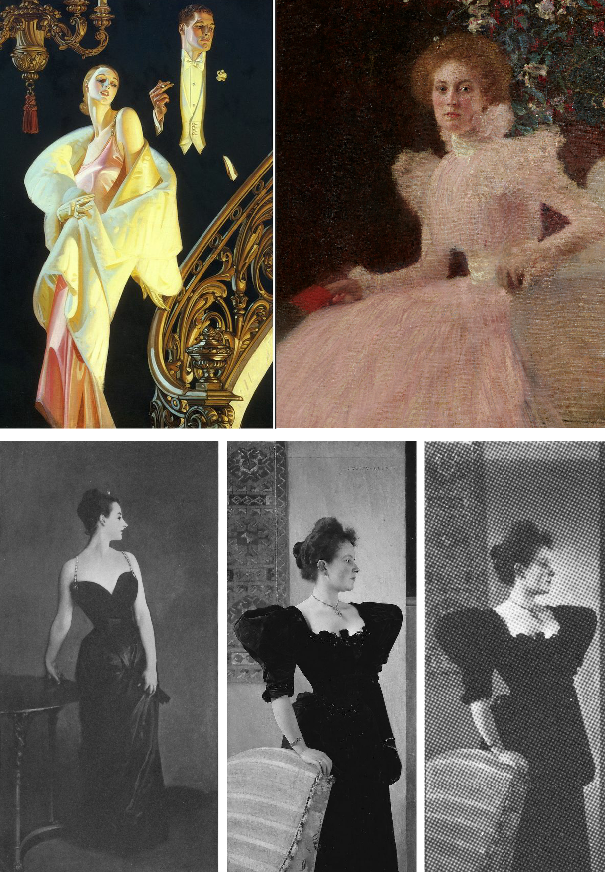
Above, Fig. 15: Top, left, J. C. Leyendeker, Couple Descending a Staircase, c. 1925; right a detail of Klimt’s Sonja Knips portrait; above, left, John Singer Sargent’s 1884 sensation-generating “Madame X”; centre, Klimt’s c.1894 Portrait of a Lady in Black as seen today; right, Klimt’s Lady in Black as shown in 1978.
Sonja Knips is shown wearing an elaborate evening dress and seated in a softly upholstered armchair. Her and the chair’s images are cropped by the bottom and right-hand edges of the picture and therefore are brought closer to the viewer while left without a clear relationship to a ground plane. Such cropping facilitates key modernist picture plane-asserting strategies – as evident in the above Sargent and Klimt portraits of a standing lady in a black costume. Sargent sets the whole figure in a dark enveloping but bounded space. The fused figure and (vertically, not horizontally, cropped) table are as securely placed on the floor as a linked piece of sculpture on a plinth. Adding to that palpable sense of the body, Sargent’s light picks up form-disclosing drapery configurations within the dress’s overall blackness. That mix of a theatrically lit figure and minimal but precisely realised furniture may have found echo in the American illustrator J. C. Leyendecker’s brilliant advertisement for Arrow Shirts (above, top left).
With the cropped chair and figure in Klimt’s lady-in-black, above centre, we are given fewer such lights and altogether less spatial orientation – except in narrow overlapping recessional relief: the chair overlaps the lady, who overlaps the hanging carpet and the wall, which overlaps a second parallel wall. While such treatment can be read as a staging post in a long march towards modernism, Klimt had shown fondness for precisely such compositional parallelisms and eschewing of deep spaces at the height of his neo-classical “historicist” period, as recapitulated in his Young Girls with Oleander at Fig. 14 above.
In any event, whether a recapitulation or an anticipation, in his lady-in-black, the emphatically extravagant shapes of the black dress pin the subject to the picture plane like a butterfly to a board. Or, rather, they do so in the picture’s present restored and buffed state. Originally, and as late as in its 1978 appearance as above right (in Johannes Dobai’s Klimt) when much of Klimt’s complex and nuanced hierarchy of values survived, the lighting was not uniformly bright but softer and more focussed, in a more Sargent-like theatrically light-animated space. Then, the décolleté was rendered both more brilliant and more plastic by adjacent as well as internal tonal values. A darker tone at the back of the neck/shoulder in combination with the more shadowed profile face and shoulder (offset by a spotlighted halo) bestowed a more columnar, sculptural neck.
Klimt was then disposing lights and shades imbibed from his classical training like a masterly cinematographer with his lamps. The great British cinematographer, Jack Cardiff, learnt his lighting in childhood from studying old masters in museums and his lighting was so skilful and flattering that great actresses of a certain age would only appear in films employing him. (One of Klimt’s sons, Gustav Ucicky, began a distinguished filmmaking career as a camera man in 1916, as Nebehay discussed in his 1992 Gustav Klimt: From Drawing to Painting.)
THE FULL PHOTO-RECORD
Weidinger’s inclusion of the Belvedere infra-red image raised awkward methodological questions. With a century old painting, can a “below-the-surface” view reliably locate a work’s original appearance? If infra-reds are admissible evidence, what grounds exist for excluding the testimony of all other photographic records?
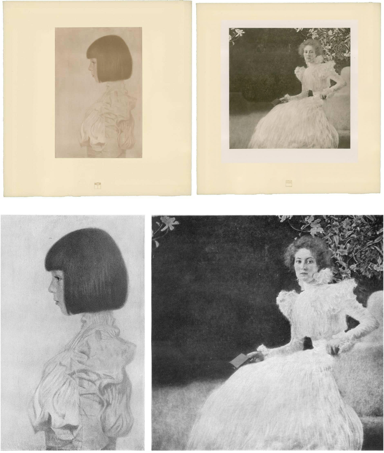
Above, Fig. 16: Top, Klimt’s Helene and Sonja portraits, as published between 1908-14 through the H. O. Miethke gallery in Vienna; and (above), the portraits as published in 1942 and 1956 in Emil Pirchan’s Gustav Klimt.
In Klimt’s portrait of Sonja Knips, the group of lilies shown above and close behind her head must be presumed to be either cut flowers in a hidden vase or some free-floating artistic/symbolic device. Presently (as at Fig. 11, bottom right), the subject herself aside, all is indeed darkly mysterious and serves effectively as a backdrop/foil to the brightly lit head and spectacular dress – almost as in Leyendecker (Fig. 15, top left) when the early photo-record shows Sonja set in an articulated and bounded space.
In 1908, Klimt and Galerie Miethke had collaborated on the publication of a group of collotypes marketed under the name Das Werk Gustav Klimts, a project aimed to distribute his work to a new type of collector. From 1908 to 1914, Klimt personally supervised the 50-print enterprise, which faithfully reproduced what he thought to be his most important paintings from 1898 to 1913 and he designed a unique signet for each print, which was placed beneath the image and impressed in gold ink. Emperor Franz Joseph I of Austria was the first to own the initial instalment.
Where some might sniff at the enterprise’s commercialism, Weidinger reminded us (2008, the Tate, “The master of erotic theatre” ) that: “Contrary to what people think and what has been written about the Secession, it was not a museum, but a gallery operation that generated cash. The artists had families and needed the money.” In the event, those limited edition ultra-high quality photographic reproductions generated a niche market as quasi-artworks. (See, for example, 1stDibs; Acquisitions of Fine Art and the Jason Jacques Gallery.)
If the art historical testimony of these images remains neglected, their role in the withdrawal of the Klimt group of artists from the Secession was reported in Nebehay, 1992:
“In the spring of 1905, after a difference of opinion regarding Carl Moll’s activities in the then leading gallery H. O. Miethke, the ‘Klimt group’ had left the Secession. This group, which comprised apart from Klimt, architects such as Josef Hoffmann and Otto Wagner and artisans such as Kolo Moser, was opposed by the so-called painter group, led by Jose Engelhart, who protested against Moll’s exhibition activities at Miethke’s which, they said (not without reason) were damaging to the Secession. When it came to a ballot, the opponents – having roped in one of their members then staying in Berlin – won by only one vote. Again, the real talents gathered around Klimt: the rest were mediocre. The eight wonderful years of the Vienna Art Spring were over: after the ‘Ver Sacrum’ came no mild summer, no fruitful autumn, no contemplative winter.”
A MOST ADVANCED METHOD OF PHOTOGRAPHIC REPRODUCTION
The following technically informative account of the role of the originally created portfolio of ten Klimt works is given by 1stDibs:
“…the folios of collotype prints published by H.O. Miethke in Vienna between 1908-1914 known as Das Werk Gustav Klimts, are important art documents worthy of as much consideration for the bold stand they take on established ways of thinking about artistic collaboration as they are for their breathtakingly striking images…Miethke’s pioneering art house had become Klimt’s exclusive art dealer and main promoter of his modernist vision. Paul Bacher and Carl Moll, a founding member with Klimt of the Vienna Secession, who all broke away during the rift in 1905, took stewardship of the gallery following the fallout with the Secession. Das Werk Gustav Klimts is a prime example of Miethke’s masterful and revolutionary approach to marketing art. Miethke’s innovative marketing strategy played to a penchant for exclusivity. The art gallery and publishing house utilized the press and art critics – such as Austria’s preeminent Art Historian, Hugo Haberfield, who became Director of the gallery in 1912 – as a means of gaining publicity as well as maintaining effective public relations. Miethke used the grand exposition format to extend the art gallery’s market reach, cultivating their product’s prestige by stroking the egos of current art patrons while simultaneously creating accessibility for newcomers and other avid collectors to share a relative proximity to other wealthy and respected members of the art collecting community… Between 1908 and 1914, H.O. Miethke published a total of 5 instalments of print folios of Klimt’s painted work, each comprising 10 prints. The series was limited in availability to 300 and purchase was arranged through subscription. Each issue was presented unbound in a gold embossed black paper folder…These folios were not comprehensive of Klimt’s work; but rather, they feature what he believed were his most important paintings from 1898-1913. Only 2 collotypes in each folio were multicolored…Alice Strobl’s scholarship on this subject confirms Klimt’s involvement throughout the 7-year production process. The Virgin, for example, which dates from c. 1912-1913, was created well after the portfolio was first conceived c. 1908. Its corresponding signet, therefore, could not have been created a priori [see Fig. 17 below] … Understanding the fragile nature of the collotype printing process also reinforces this project’s distinctive and ground-breaking characteristics. The fragile collotype plates could not be reused. As such, this necessitated the completion of a run on the first go and also dictated the limited production numbers such as the 300 pulled for Klimt’s Das Werk. Printed by hand, the collotypes required deft handling by the printer, k.k..Hof-und Staatsdruckerei. A complicated and lengthy process involving gelatin colloids mixed with dichromates, the creation of 16 color separation thin glass filters to achieve the light-sensitive internegative images which could faithfully capture all of the painting’s tonal gradations and colors, exposure to actinic light, and delicate chine collie papers which allowed for greater color saturation, the printer’s collaborative role in capturing and transmitting Klimt’s nuanced paint strokes is nothing short of remarkable. Ernst Ganglbauer, Director of kaiserlich-konigliche Hof-und Staatsdruckerei (1901-1917) was eager to promote art prints. An innovator, he elevated the Kaiser’s press to international renown by assembling the best of the best in technical and aesthetic advisors. This dream team of free-lance artists developed adaptive uses for the Staatsdruckerei’s existing equipment and, together with the printers there, perfected the multicolor print process for Miethke and Klimt’s Das Werk.
(Emphases added.)
Clearly, these early Klimt-approved images were as good as could be made at the time and might properly form the starting point for any comparative study of the two pictures’ photo-records. Their then technological sophistication was truly remarkable: in key respects, the multiple colour separations made to capture the exact tones and hues anticipated by a century the ground-breaking multi-spectral high-definition digital camera invented by the engineer/optician Pascal Cotte of Lumiere Technology.)
Other collotypes made and produced in limited-edition books today sell at eye-watering prices. In 1942 and again in 1956 the two portraits (along with many others) were published in Emil Pirchan’s book Gustav Klimt, as above at Fig. 16.
PHOTOGRAPHIC DEMONSTRATIONS OF RESTORATION INJURIES

Above, Fig. 17: Left, a collotype print of Klimt’s The Virgin published between 1908-14 through the H. O. Miethke gallery in Vienna, here overlapped by its Wiki image. The chromatic and tonal differences between the two records speak for themselves.

Above, Fig. 18: Top left, Klimt’s Sonja Knips portrait (a Miethke 1908-14 collotype); right, the left section of the Belvedere infra-red image published by Weidinger in 2007. Above left, the portrait as in 2007 and, above right, in 2012.
The above comparison of the testimony of the 1908-14 photo-record and the pre-2007 infra-red image, suggests that formalist accounts of a light v. dark triangular pictorial dualism are over-stated, space-denying simplifications. Note that almost half-way up the photo-record’s left-hand edge, the picture is bisected by a short horizontal tonal division between a darker upper area and a less dark, seemingly shadowed area of ground. That crisp horizontal division speaks not of a void but of a distinction between a wall and a ground plane. Such an architectural reading is further indicated in the top left-hand corner of the infra-red image by a seeming bottom corner of a window or aperture. On the combined evidence of the Klimt-approved Miethke collotype and the Weidinger infra-red image we can conclude – much as with the Helene portrait – that Klimt had toyed with the idea of inserting an implicit rectangular feature (a fragment of a window, or aperture) in the picture’s top left-hand corner which would have echoed the picture plane but that he had decided against it and painted it out. Having painted out the feature, Klimt then pulled that corner of the picture back towards the picture plane with the “echoing” parallelism of the flowers’ motif. (Had the superimposed fragmentary flowers not been in place, the restorers might well have semi-excavated the window aperture as with the frame behind Helene.)
With further regard to the Klimt-approved Miethke-recorded spaces and structures, if we read leftwards from the centre of Klimt’s strategically placed little red book, another tonal division runs horizontally before turning upwards diagonally to meet (almost) that of the wall/floor junction running in from the left edge. Above this lower division there are leaf-like formations that suggest a shrub or topiary that runs upwards and behind the lilies. However, on the infra-red image detail, above right, the leaf-like formations also run below the book and into the area that had read in 1908-14 as the shadowed section of the floor. That would indicate that Klimt had painted out the lower leaf-like forms to produce the ground plane as recorded in the Miethke gallery collotype. Today, as seen above in 2007 and 2012 (Fig. 18), the originally distinct tonal zones have been subsumed in the larger, undifferentiated dark zone that is now taken as a Klimt-intended emptiness or void. However, even today, within this supposed void, a seeming tableau of small figures and statuary can still be glimpsed despite having been ruled out on the supposed evidence of the sole infra-red image.
FIGURES IN THE BUSHES OF A TRULY EXCEPTIONAL PICTURE
In her 1989 Klimt, Life and Work, Susanna Partsch wrote of the Knips portrait:
“Sonja Knips is sitting in a park or garden, on the edge of a light-coloured chair…The light earth contrasts with the dark background, which has some red in it on the left. There is something mysterious about the dark, irregularly applied colour, which casts shadows on the light earth. There is the merest suggestion of a pond in the background. Against this background Sonja Knips sits in a sumptuous pink dress with high neck and ruffles, narrow waist and full skirt. The lower edge of the picture cuts off the bottom of the skirt, which is therefore not visible, any more than are the feet. With her left hand, Sonja Knips grips the armrest, as if she were just about to get up, and this impression is strengthened by the way she sits on the edge of the chair but is contradicted by her right hand, which rests quietly on her leg clasping a red booklet. Nor does the expression on her face suggest that she is about to move, she gazes straight ahead out of the picture, disquieting in her immobility. This portrait is the only one with a hint of landscape in the background. Klimt painted many landscapes and many people but kept the two distinct, which makes this portrait truly exceptional. It was painted at a time of upheaval, when Klimt had abandoned historicism but not yet found his own style. In the same year he painted his first landscape pictures. The orchids and the pond in the portrait represent a subdued symbolism, hinting at sumptuousness and mystery.”
That nicely observed account presumably preceded the picture’s restoration. Twenty-three years later in her 2012 Taschen essay “Paintings of women” Dr Partsch writes of the same picture:
“…She is sitting at the very front of the seat of a generously sized armchair and is leaning on the upholstered arm as if she were about to stand up. In her right hand she holds a small red book. With her body angled to the left, she has turned her head so that she is looking straight out the picture and fixes the viewer with her gaze. The curls of her hair are taken up in the ruffles of her dress, while her head is framed as a whole by a backdrop of flowers – lilies or orchids that are either growing in a garden or standing in a large vase on the floor. Beyond the top of the canvas, blooms and branches form an invisible arch that descends into the picture in the top left-hand corner in the shape of another flower. This left half of the picture consists of two planes clearly divided by their colour. The [lower] area of pale brown, in some places shot with green, in the lower left-hand corner barely distinguishes itself from the tender pink dress and forms a floor of some kind. The dominant field of blackish brown, which provides a foil to the flowers and the female sitter, contains several lighter patches. These have inspired numerous interpretations, with some authors suggesting that Klimt had painted over what was originally a garden setting. Infra-red photography has failed to confirm this theory and it thus remains unclear whether Sonja Knips is situated in a room or outdoors in a garden…”
The two accounts of the same picture by the same author differ – but what has changed if not the picture itself? A certain hardening of a feminist stance emerges. Sonja is now more assertively “looking straight out the picture” and “fixes the viewer with her gaze”. Partsch now complains generally that Klimt’s portraits of women “seldom reveal the individuality, character or abilities of the women they depict” and raps him over the knuckles for having reduced one female subject, his Rose von Rosthorn-Friedmann of 1901, “to a figure of elegance and sensualism” while neglecting to indicate that “she was a pioneering female alpinist who became the first woman to climb the East Face of Watzmann and Thurwieserspitze in the Ortler Alps”. The complaint seems something of an ideology-signalling contrivance: short of tying some rope, climbing boots and crampons around his subject’s neck, it is hard to see how Klimt might better have done justice to her than as below at Figs. 19 to 21.
A digression is merited on this female portrait: the charge of “reducing” his subject to elegance and sensualism – as if those two traits preclude all others – is unfounded. Klimt, who said of Alma Schindler “She is beautiful, she is clever and witty, she has everything that a fastidious man can expect from a woman”, did not rob the subjects of his commissioned female portraits of dignity, gravity or intelligence, any eroticising tendencies notwithstanding – and nor was he formulaic in his portrayals: every subject prompted a re-invention, and a re-invention that was preceded by multiple exploratory studies. Natter’s close attention to the receptions initially given to Klimt’s paintings is pertinent on Rosthorn-Friedmann: “her death, still relatively young, on 19 January 1919, prompted Hugo von Hoffmannsthal to write a letter to her widowed husband, in which he emphasized the striking beauty, intelligence and warmth of this exceptional woman.”
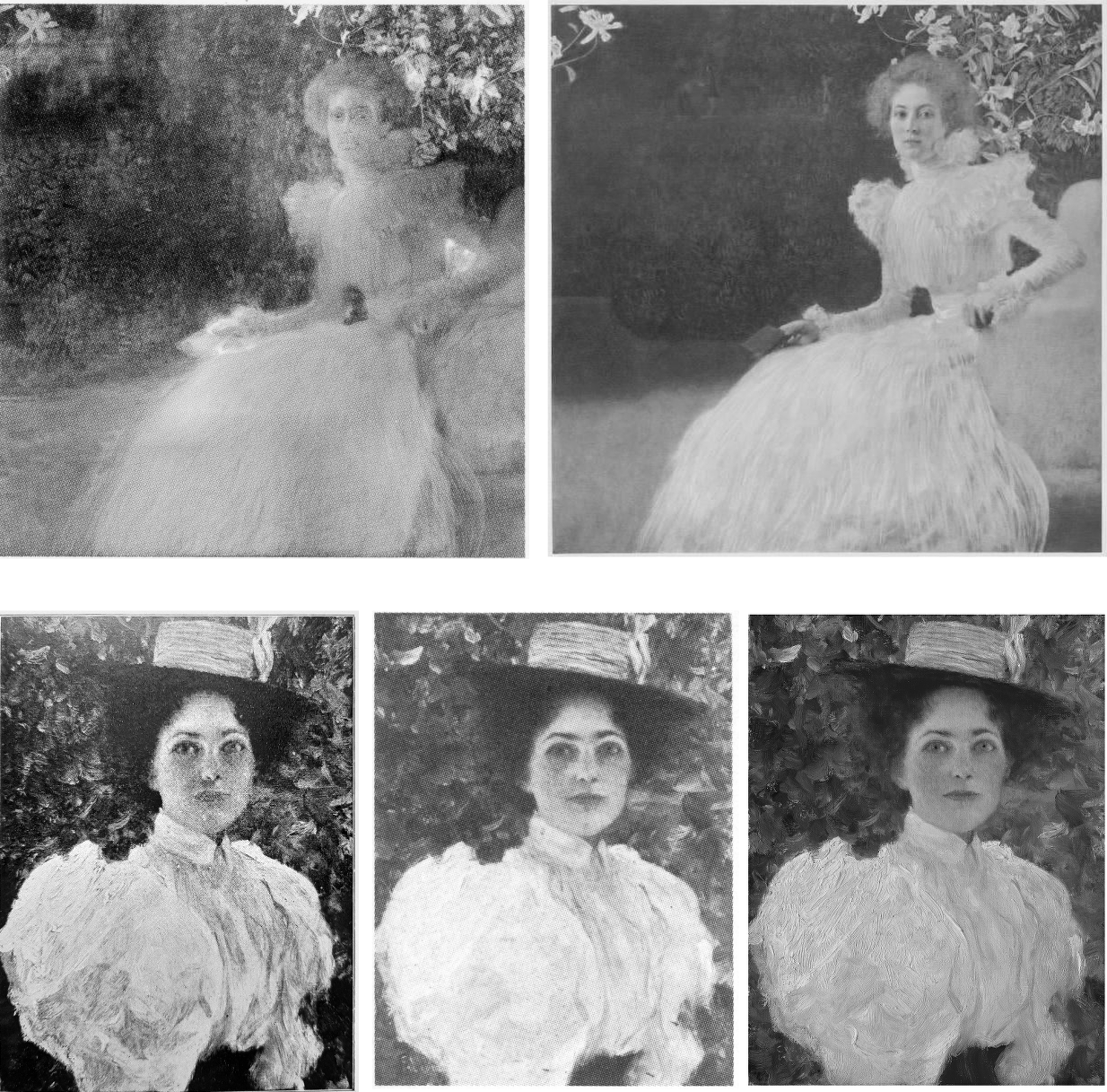
Above, Fig. 19: Left, Sargent’s “Madame X”; right, Klimt’s portrait of Rose von Rosthorn-Friedmann, as in Natter, et al, 2012.
In Rosthorn-Friedmann Klimt fused glamour athleticism and grit, if not steel (note the eyes; the pinched nostrils; the mouth and its bared teeth); not to mention the sinuous lightness of a delicately perched and coiled figure whose torsion more than vies with that of Sargent’s “Madame X”. With what is known of his subject, all would seem to be in order in Klimt’s painted account. Partsch casts doubt on Alma Schindler’s claim that Klimt had just begun an affair with his model, but Natter spells it out: “In her diary entry of 19 January 1900, Alma mentioned Klimt’s latest liaison: ‘What’s more, he’s just started an affair with Rose Friedmann, that old hag! He takes where he finds.”
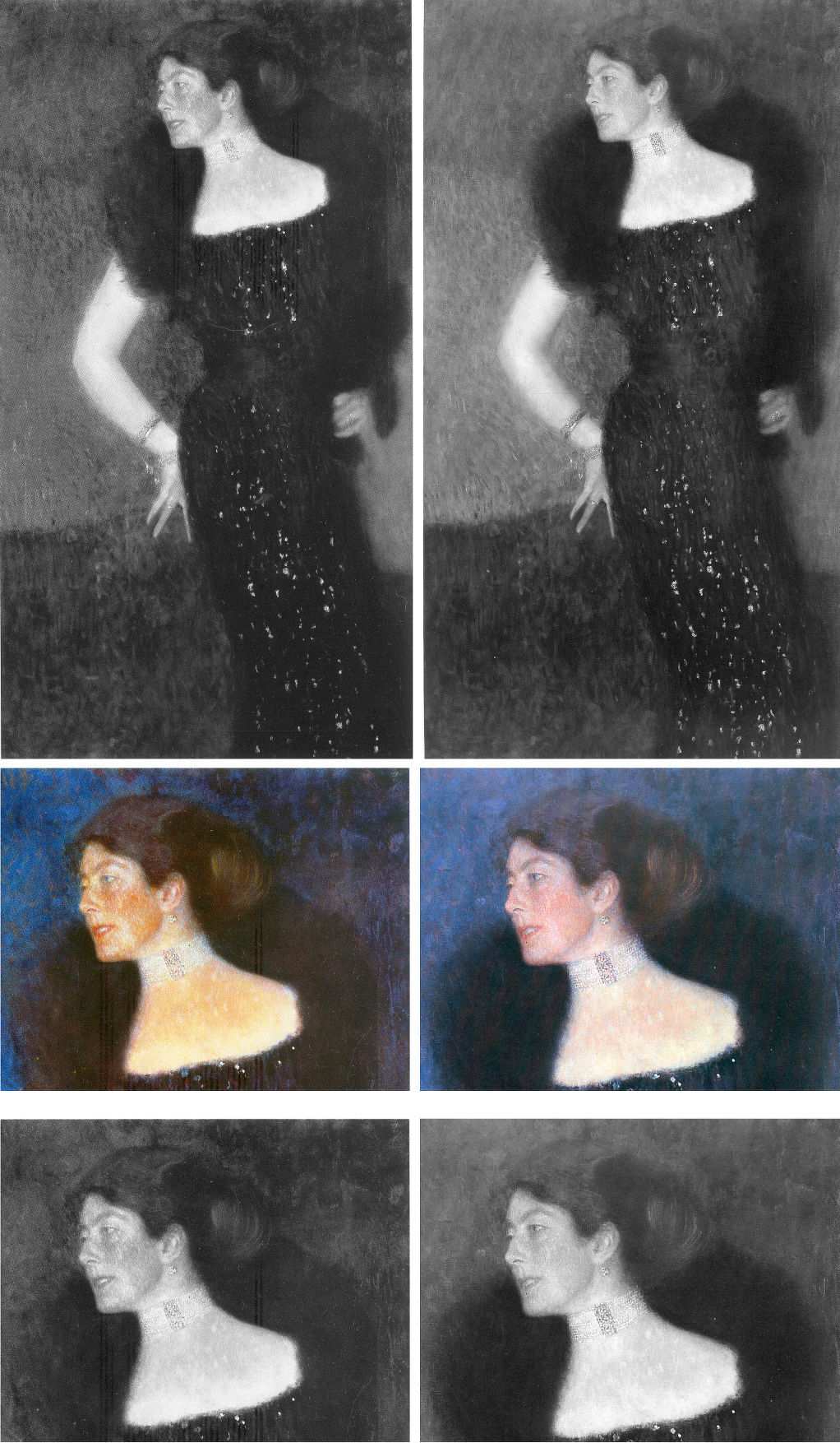
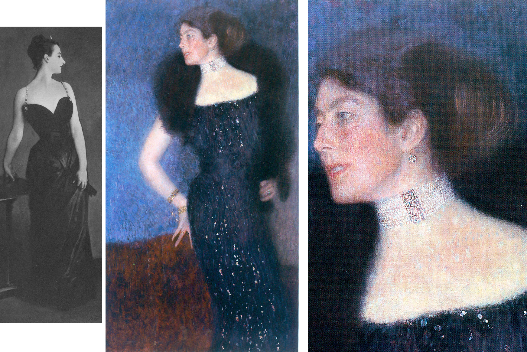
Above, Fig. 20: Klimt’s 1901 portrait of Rose von Rosthorn-Friedmann as seen in the two deluxe Klimt catalogues: that is, as in Weidinger, 2007 left; and as in Natter, 2012, right.
We cannot vouch for the veracity of the two books’ reproductions of the painting and both publishers take fair pride in their productions. Yet, as seen above, there are numerous chromatic and tonal differences in the respective photo-illustrations which, given the chronology, suggest a post-2007 restoration. Because Weidinger attempted to have every Klimt work re-photographed for the 2007 Prestel book’s catalogue we can, perhaps, safely take the images above left to be a fair record of the then state of the picture. So what might account for the general losses of tonal and chromatic vivacity as seen on the right in 2012? For example, Partsch notes (Taschen, 2012) that “her dark, coiffured hair is barely distinguishable from the blue of the background”. That indeed was the case, but it had not been so in the 2007 Weidinger reproduction as above left, centre, when the blues, blacks and whites were warmed and enriched by red. The evident weakening of the strong form and shape of the greatly more lustrous hair in 2007 is not an isolated incident within the picture. It had been accompanied in 2007 by a markedly sharper, darkly unified near-diamond shape of background enclosed by the arm and body.
WHICH IS THE REAL KLIMT?
Above, Fig. 21: Left, Klimt’s working drawing for the Rose von Rosthorn-Friedmann portrait (which picture is held in a private collection in Switzerland); right, a detail of the painting, as reproduced respectively in: 1988, Gabriella Belli, Gustav Klimt Masterpieces; 2007, Weidinger, et al; and in 2012, Natter, et al.
The picture had long been thought lost and was known only by a single photograph. Unfortunately, no one seems to have reproduced that early record. What is to be made of the above trio of details recorded consecutively in just twenty-four years? With the above detail, we see three successive states: 1988; 2007; 2012. With the second and third – which is to say, the two most recent states – we can dismiss the possibility of photo/reproduction variations because such could not be responsible for distinctly local changes, as with the dramatically and selectively darkened space between the little and the ring finger that occurred between 2007 and 2012. All three images are individually of a piece and speak of distinct appearances in the picture. Of the three states, the first (1988) is the one that is least like the others: its arm has two sharply defined contours and is slimmer than those in the other two photographs. To this photo-testimony, might anything be gleaned from what is known and what has been said about the picture?
Writing on the most recent (2012) state Natter speaks first of its reception and then of Klimt’s initial struggle: “Klimt wrestled long and hard with the composition and the standing motif, as his preliminary drawings testify… Only gradually did he arrive at the curvaceous, serpentine pose of the final portrait… Noteworthy is the dialogue between the figure and background…Such a permeability of natural forms and representations of the human figure is therefore thoroughly typical of Klimt…” (Emphasis added.)
Writing on the 2007 state, centre image above, Weidinger related the picture’s “erotic connotations” to Klimt’s “numerous snaky women who populate the symbolist paintings of 1898 to 1907” and held that, in this portrait, Klimt “emphasizes both line and area so as to produce a stylized rendering of the body such as manifested itself first in his Symbolist works…Instead of twisting three-dimensionally around her own axis, as do Mannerist figures [and Sargent’s “Madame X”] Rose von Rosthorn’s S-shaped body appears to be all on the same plane; the effect of this, coupled with the emphatic outlining, is to make the portrait seem curiously flat.”
There is a crucial difference in the two accounts. Where Natter speaks of the permeability evident in a dialogue between the figure and its background, he seems on safe ground with the borders of the extravagant fur stole and the lower body on the right, and with the division between the background and the assumed reddish chair, but there is no such permeability at the contour of the face and choker, or at the scissors-like fingers and chair back. Weidinger notes that the red of the armchair had been achieved with “the application of innumerable tiny brushstrokes, pointing in all directions at once” and that “the same method is used for the skin, although here the outcome is not so coarse”. The key difference in the two accounts lies in Weidinger’s recognition of Klimt’s deployment of both line and area. The line (which bounds impermeable shapes) is confined to the areas of bare flesh – the head neck and arm – where Klimt’s classically trained draughtsmanship asserts itself. In his commissioned portraits Klimt retained a respectful and more traditionally hierarchical attentiveness to the forms of heads and hands, whatever indulgence might have been given elsewhere to symbolism, pattern-making abstractions, and decorations.
The earliest photograph, above left is, by definition, the record that is temporally closest to the picture’s original appearance and it should, accordingly, be taken as a more reliable record than the two later states. Additionally, this 1988 state better accords with a vivid contemporary response to the painting. In contradiction of the present (post-2012) chilled blue background, Natter cites Frans Servaes’ captivation in 1901 with Klimt’s use of colour: “The shimmering violet of the background plays with tumultuous gentleness around the bare propped arm and the dark dress covered with spangles in the most wonderful fashion.” Today, one sees no violet against the arm in Figs. 19 and 20. A patch of background to the right of the dress might be thought of as violet but the larger cooler blue areas certainly could not. Might there have been earlier losses in the background as with those seen more recently in the hair? Natter also mentions that Ludwig Hevesi had been particularly struck by “Slender elastic lines having a singular swing, profile to the left…A slim pale arm supports itself on three fingertips on a piece of furniture; one realizes immediately that a figure such as this really does not need to support itself” – like that of an agile, super-fit rock climber, perhaps? Klimt’s final, working study, above left, had fixed the slim arm’s outer contour with deftness and precision. Such decisiveness of design in the arm is best seen here in the oldest record (1988) and is least evident in the most recent and most fumbled arm (2012) where the contours have succumbed to a havering state of permeability. To discount the 1988 photo-testimony in favour of the later states it would be necessary to claim that an earlier restorer had wrongly imposed an alien linearity on the arm and that in two successive restorations an original, fumbled and fatter arm had been recovered. The non-publication of the sole photograph by which this once lost painting was known is to be regretted.
VOID SPACE OR INTRIGUE?
To return to the Knips portrait, in both Figs. 16 above and 22 below it is possible to read miniature figures or statuary within the vegetation along a horizontal line to the left of Sonja Knips’ forehead.
Above, Fig. 22: Left, the 1908-14 collotype of Sonja Knips; right, a lightened section of the collotype’s left-hand area, in which the original two-tone ground/wall/shrubbery boundary is clearer. The above greyscale inset is a detail of a photograph carried in the October 1900 Figaro Illustré, as discussed by Emily Braun in the 2001 Gustav Klimt Modernism in the Making, Ed. Colin B. Bailey. In all three images the horizontal line of figures and a statue is discernible.
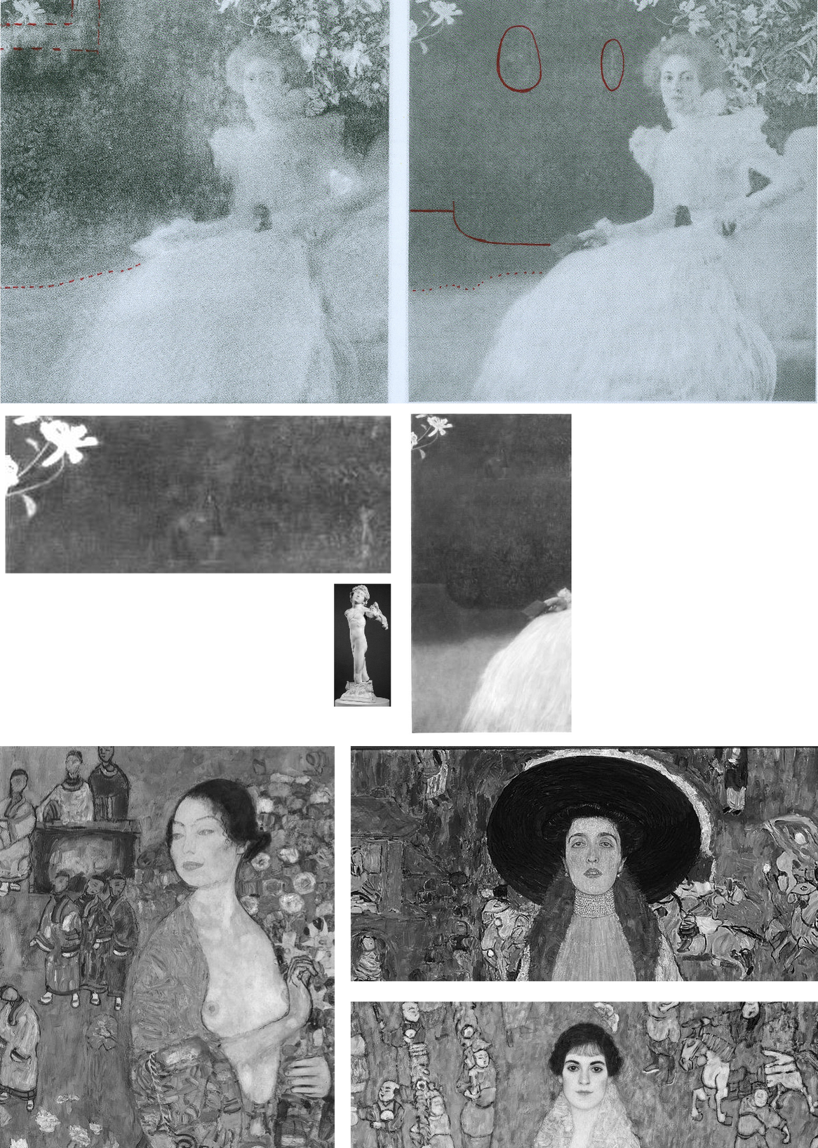
Above, Fig. 23: Top row, left, the 2007 Weidinger infra-red image; right, the 1908-14 Miethke collotype – in these, we indicate (in red) the moving ground/wall boundaries and the placement of the “window”. Below, in the centre group, we see how the reported figures had appeared in early photographs. In his 2007 rejection of earlier claims of perceptible figures in the picture’s upper half on the testimony of the infra-red image, Weidinger cites scholarly experts who had variously identified: “cupids and two figures…[a] pool and fish-like creatures… [and a] horse’s head…” Given such testimony – and the fact that discernible figures had registered in the dark background to the left of Sonja’s head in the Klimt-approved collotype and subsequent photographs to this day, as in Fig. 24, right below – those figures’ status might better have been resolved by the publication at high resolution of all the Belvedere’s photographs and technical records of the picture rather than with a dismissal by technical fiat on a single, out-of-context, difficult-to-read infra-red image.
The small, photographed free-standing Cupid sculpture in the centre group above is the former antiques shop find that has been upgraded and displayed at the Metropolitan Museum, New York, as an autograph early Michelangelo. If it might seem improbable that Klimt should have included secondary figures in a large and exceptional portrait, it could equally be held that the photographically-recorded figures in question were forerunners of the artist’s later incorporations of entire armies of people and horse riders – as in the above three later portraits of The Dancer (1916-17), left; Adele Bloch-Bauer II (1912), top; and Elisabeth Lederer (1914-16) bottom right.

Above, Fig. 24: The Portrait of Sonja Knips, as in 1908-14, left, and today, right, as seen in both colour and in greyscale.
THE DEMISE OF THE LILIES AND THE RISE OF “APPROPRIATE RESTORATION STRATEGIES” AT THE BELVEDERE
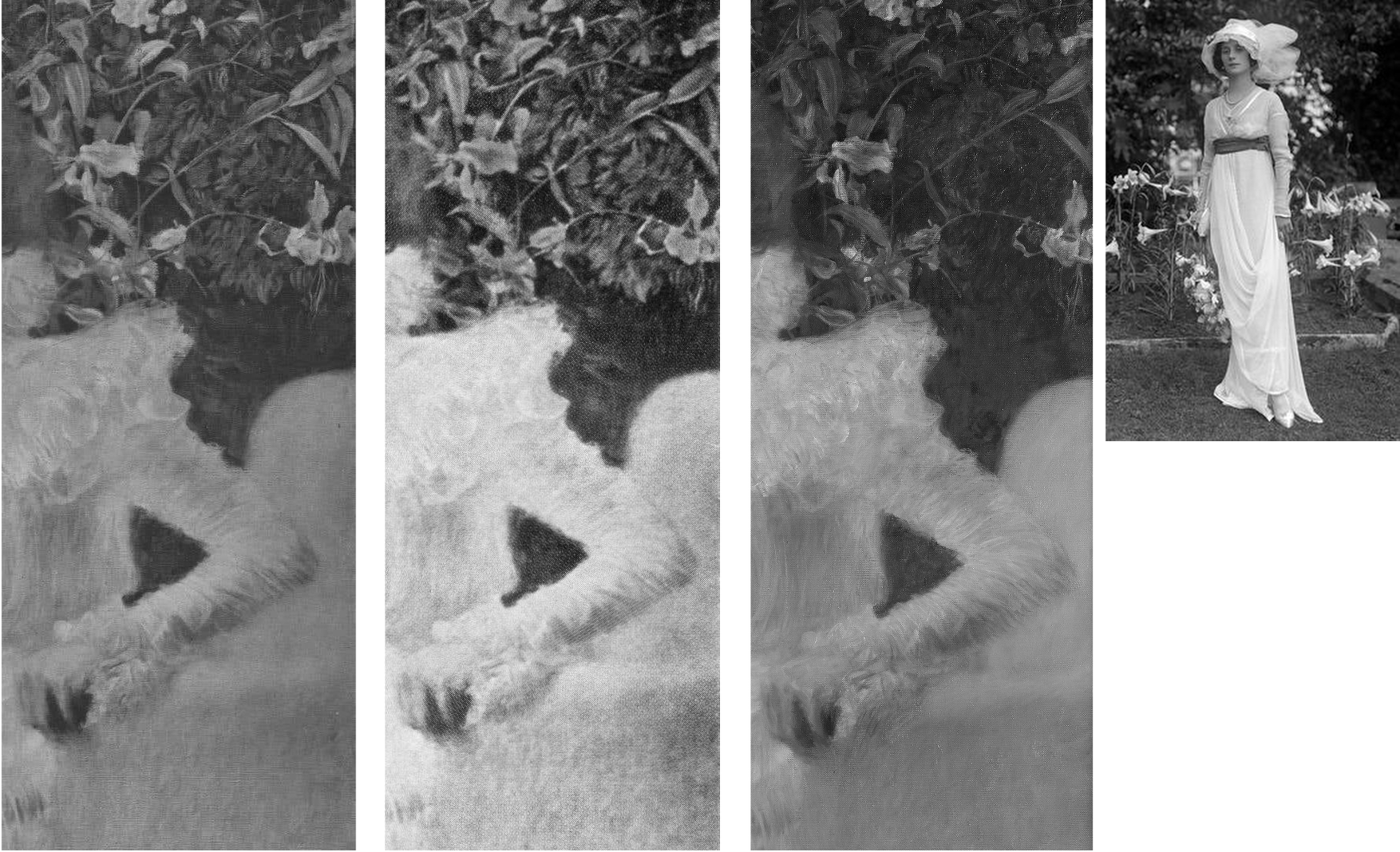
Above, Fig. 25: Three details of the lilies backdrop as recorded in: 1908-14, left; 1942-56, centre; today, right. In the inset, above right, a 1912 British Vogue fashion shot.
The differences seen above between 1908-14, left, and 1942-56, centre, are not substantial and might amount to little more than variations in reproduction values. The subsequent differences seen above, right, however, are of another magnitude and show outright losses of autograph material, as to the foliage between the upper arm and the back of the chair.
Above, Fig. 26: Left and centre, a two-page spread from Christian Nebehay’s 1969 Gustav Klimt, showing Sonia Knips in 2011 and her portrait when the hand/notebook motif was still intact; right, a detail from Johannes Dobai’s 1978 Klimt showing that by that date the hand/book had been injured and left incoherent. The offending restoration must, therefore, have taken place between 1969 and 1978. The picture itself was commissioned by Sonja Knips (1873-1959) and owned by her until 1950 when she was seventy-seven and it was bought by the Belvedere, Vienna. The museum says of its (manifestly hyperactive) conservation department:
“The Belvedere’s restoration and conservation department is dedicated to the preservation and care, restoration, and technological research into the art and cultural assets of the Belvedere’s collection, which ranges from the Middle Ages to contemporary art. Its mission is to record and preserve objects of historical and cultural significance. Conserving these irreplaceable originals requires a methodical and scientific approach in order to shed light on the historical, stylistic, iconographical, technological, and material aspects of the artworks. With this in mind, the Belvedere’s conservators devise appropriate strategies. On average, the department conserves and restores 150 paintings and frames each year, and frames and mounts between 100 and 150 graphic works.”
THE DECONSTRUCTION OF SONJA’S LITTLE RED BOOK

Above, Fig.27: The red leather-bound Klimt sketch book held by Sonja Knips, as seen, respectively in 1908-14, top; in 1956, centre; and today, above.
In this photo-sequence we see that crucial differences of appearance arose between 1956 and 2012 – in fact, on above evidence, between 1956 and 2007. Given the book’s changed appearances, Dr Natter’s claim that “The dualism of mimesis and dissolution, of faithful reproduction and painterly openness, is already in evidence here as a stylistic means” becomes problematic. Given that the once faithfully tight and precise book/right-hand had by then been left in a quasi-Cubist double image that resembles time-lapse photography, should it have been regarded as an instance of mimesis or dissolution? Natter’s view remains unknown because has not commented on the present condition. Such questions arise with other Klimt portrait pictures:
Above Fig. 28: Top, left, Klimt’s now lost 1900 portrait of the thirteen-years old Trude Steine (note the strong line of the shoulders); centre and right, a large detail of Klimt’s 1902 Portrait of Gertrud Loew, as in 1956 and today; above, a three-part chronological sequence of Klimt’s 1905 Portrait of Margaret Stonborough-Wittgenstein.
As a lost work, the Trudy Steine picture, will at least now never lose its great – photographically preserved – vivacity and force. Gertrud Loew disappeared when sent to Berlin in 1938. Her portrait survives but it has not been spared by restorers. Speaking to its condition today, as top right, Weidinger writes:
“Ludwig Hevesi [1902] referred to the portrait of Gertrud Loew – shown for the first time at the ‘Klimt Collective exhibition’ at the Secession in 1902 – as ‘the most fragrant lyric of which the painter’s palette is capable’. Like Serena Lederer the subject is clad in white. Colour accents are set by her long, downward cascading shawl with its lilac-coloured border. Klimt renders her pale skin in tones close to that of her dress, and only her red lips, blue eyes and dark hair supply the necessary contrasts. Her loosely flowing dress betrays no sense of corporeality. In this connection, Natter speaks of her ‘dematerialization’”. Weidinger adds that when exhibited in 1903 it had been said to possess “all the charm of radiant filminess” and “the gauziest lyricism of which the palette is capable.”
That was then. Restorers thought the filminess might be taken further and, to that end, simultaneously darkened the upper background and lightened the upper costume, thereby dematerializing the previously clear articulation of the subject’s shoulders. To add to the tonal mayhem, both the lower background and the lower dress have been lightened. This is no longer the picture Klimt painted of Loew. The Pirchan reproduction gives a truer account than the painting itself.
Above, Fig. 29: Main centre images: a detail of the picture as recorded in 1956 and today, in which sequence it is easy to identify the obliteration of leaves, multiple micro-losses of value in this dress and the loss/painting-over of the original foliage between the shoulder and the chair back; insets, a detail of one of Klimt’s preparatory studies for the painting; and (bottom left), a detail from a photograph of the portrait carried in the October 1900 Figaro Illustré (as discussed by Emily Braun in the 2001 Gustav Klimt Modernism in the Making, Ed. Colin B. Bailey).
Natter’s claim that Klimt camouflaged disparate pictorial means by simulating a photo snapshot holds fair insofar as Sonja grips the arm of chair firmly and (as others have noted) leans forward as if caught when about to rise, but the picture was no product of a snatched moment, as the many studies Klimt made of his subject when in costume and in the chair testify (see Fig. 30 below). It is also part-true that Klimt conjured a “fascinating contrast between the naturalistically modelled head of the sitter and the gauzy shimmer of her dress” (we are advised that the material was likely either very finely pleated silk chiffon or muslin) but, aside from the abundant skirt, there is no near-abandonment of corporeality: even in semi-repose this dress in animated and formed by the lithe, almost geometricized, body that was captured in Klimt’s preliminary studies.
Notwithstanding the abundance of small folds on the sleeves, the thin shapely taught-ness of the arm seen by Klimt and captured in the drawn studies had asserted itself in the painting. On comparing the above photographic sequence, it is evident that in the very earliest recorded state (1900, bottom left), the orchestrated collection of shadows at the bottom of the lower arm much better and more decisively “drew” the limb’s contour: at the turn of the sharply defined elbow there is first a discernible concavity and then a convexity that straightens as it runs down towards the wrist. That original taught-ness of form/anatomy and relative weight of shadow at the lower contour was also evident even in the small low-quality image from Nebehay’s, 1976 Gustav Klimt, shown above at Fig. 11, but, like so much in Klimt, it has subsequently been fuzzed and lost.
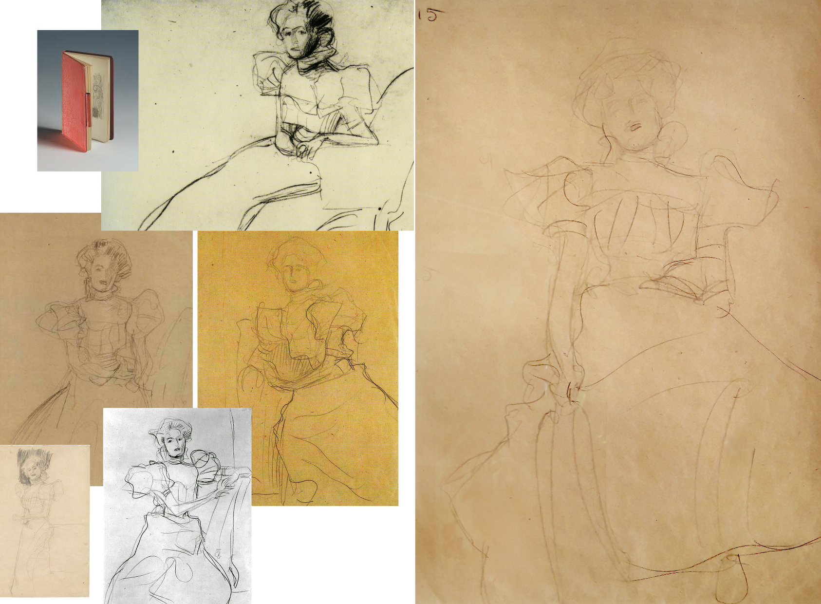
Above, Fig. 30: Some of Klimt’s many sketches for the Portrait of Sonja Knips, in every one of which the forms and the massing of the hair were noted in relation to the head.
Above, Fig. 31: Top, three photo-comparisons of details showing changes between 1956 and today; centre row, left, a drawing of Sonja Knips and a later photograph; right, a Klimt study for another painting; bottom row, Knips in 1956 and in 2007 (Weidinger).
More than a first foray into a new type, this arguably stands as one of Klimt’s best female portraits, its twenty-five years-old subject being utterly composed, beautiful, intelligent and with a resolute, if poignant gaze. As mentioned, having first seen Sonja to be gazing out of the picture, Susanna Partsch (“Paintings of Women”, Taschen, 2012) now sees a Gorgon-like demeanour with Sonja turning her head “so that she is looking out of the picture and fixes the viewer with her gaze”. That reading is not remiss on today’s appearance but in Pirchan’s 1956 image (here bottom left) the gaze seemed fractionally averted and the effect markedly more reflective than confrontational. Moreover, a comparison of the mouth’s two states shows that Sonja has received a fresh lipstick that no long conforms to the shapes and forms of her lips.
Partsch writes that “The curls of her hair are taken up in the ruffles of her dress” without noticing that the earlier softly disposed forms and luxuriance of the hair have been drained of form and vitality – as with the disappeared darkly accented shadow at the lower temple and cheek that formerly served to draw the contour of the face and drew attention to Knips’ right eye. Considering the importance of hair as a feminine adornment and how hard artists labour to do justice to its glories, it seems odd that clear injuries to it, as here and with Rose von Rosthorn-Friedmann alike, should generally go unremarked.
Above, Fig. 32: Left, Sonja Knips in 1911; centre, top, Evelyn Nesbit, the muse of the American illustrator Dana Gibson, left, and one of Gibson’s famous “Gibson Girl” drawings; right, a Klimt drawing of 1898-1900; centre above, a Gibson Girl left and Sonja Knips in 1911 in Japanese-style Reformklied, as carried in the Neue Galerie 2007 Gustav Klimt. (For live early film footage of American women sporting Gibson Girl hairdos, see “The Real Edwardian Gibson Girls of the USA” at Glamour Daze.)
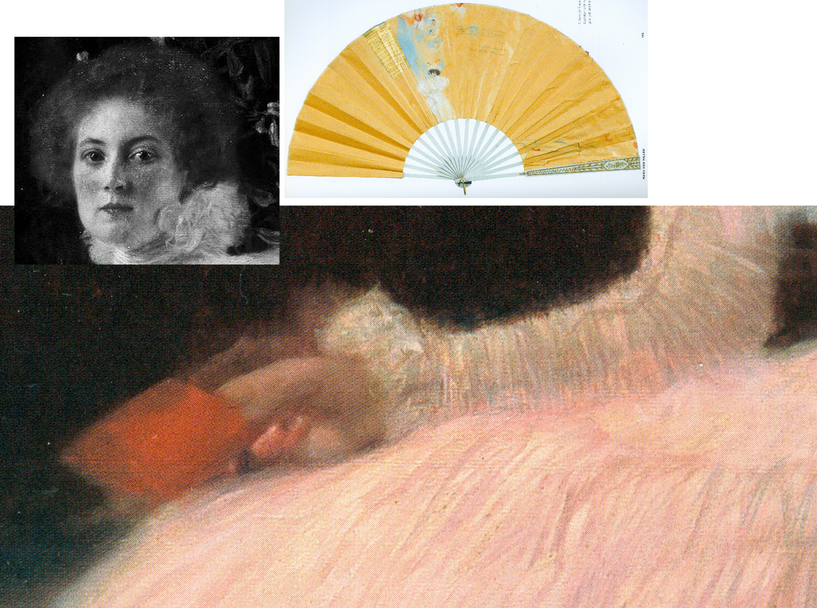
Above, Fig. 33: Main picture, the right hand of Sonja Knips; top left inset, Sonja Knips; above right, Sonja Knips’ fan, as decorated by Klimt.
Consensual views break down on Klimt’s and Sonja Knips’ relationship. In the 2007 Neue Galerie book, Knips’s granddaughter, Dr Manu von Miller, author of Sonja Knips Und Die Wiener Moderne, 2004, reports (“Embracing Modernism, Gustav Klimt and Sonja Knips”) that recently disclosed materials from the Knips family revealed much about Sonja and shed light on previously unknown aspects of Klimt’s life and person. Thus: Klimt’s Sonja portrait “likewise contains hints about the life of the artist” and that the two had had an affair years before it was painted, Klimt having known her since she was a teenager. Painting Sonja had released Klimt from his role as “a ‘decorative’ painter”, and he in turn enormously influenced Knips enabling her to “break free of the rigid bourgeois conventions of her time, and to create her own highly personal approach to aesthetics and collecting.” In 1896 Sonja married the industrial magnate Anton Knips – a mismatch, he not sharing her passions for socialising, modern art and young artists. Klimt’s relationship had, Dr Miller reported, “blossomed at some point into an amorous relationship. How long the affair lasted is not known but Gustav and Sonja’s romance is substantiated by notations on a paper fan found among Sonja Knips’s personal effects.” Those included a love poem dated 1895, the year before Sonja married Anton. A member of her family had told Miller the affair ended because Klimt was unwilling to marry her. The fan was thus “a love note and a farewell”, Klimt having ended another affair in the same manner…and given that Sonja sat for Klimt’s portrait scarcely a year after her wedding, Miller felt “It is hard to imagine that the painting could have been produced without their recent love affair being in the minds of both artist and sitter. She may have viewed the portrait as an enduring reminder of the relationship; it was noted by an acquaintance of Sonja’s that her eyes would light up when she was asked about the history of the painting’s creation.”
As mentioned, Sonja Knips kept the painting until her seventy-seventh year and, as Miller noted, she purchased Klimt’s unfinished (and highly erotic) Adam and Eve after his death and hung it “in the small boudoir next her bedroom”. Partsch will have none of Miller’s account, writing (Taschen, 2012): “On the basis of this fan and the decoration on the reverse side, Manu von Miller reconstructed a love affair between Gustav Klimt and Sonja Knips before her marriage and proposed that Klimt used the fan as a way of ending their relationship. Miller also suggests that Klimt may have done the same with a second fan destined for an unknown recipient and on that occasion carrying the German proverb… (‘Best to get unpleasant things over and done with’) … It is my view that the fan belonging to Sonja Knips points neither to a love affair between the artist and his model nor to a rupture between the two. Rather, it shows Klimt expressing his congratulations to Sonja Knips upon her engagement…”
What then, to make of the prominently displayed (- almost at the picture’s geometrical centre) little red book? In 1992 Nebehay wrote of “a small red notebook: a sketchbook that Klimt gave her.” It had been found in Sonja Knips’s estate and edited by Nebehay and was one of only three such surviving notebooks. It contained a small photograph of Klimt. Alice Strobl had dated Klimt sketches in it to between 1897 and 1899. Strobl had reported an eyewitness’s recollection of Klimt’s studio floor “strewn with thin red notebooks in which he jotted his artistic ideas down in shorthand, as it were.” Nebehay notes that Klimt was as disorderly with his notebooks as with his sketches which lay about in heaps on the floor.
On the book’s possible significance, Nebehay, like Partsch, leaned towards scepticism: “A married society woman would never have dared keep anything that was more than a souvenir” and, he went on, “Johannes Dobai reports that the lady [Knips] told him that the figures hidden in the foliage behind her had no symbolic meaning and as for the notebook in her hand, that was chosen for the colour effect.” Against that, Weidinger wrote in 2007:
“During his second series of studies, Klimt appears to have wanted to portray Rose von Rosthorn-Friedmann holding a rose in her right hand, but in the final version decided against this. The little sketchbook Sonja Knips is portrayed holding serves a similar purpose. Her claim that Klimt had merely wanted to add a shot of colour can be refuted on the grounds that the book appears in the studies for this work as well. Klimt is clearly using the book as an attribute which he considers apposite.”
Alma Schindler who so jealously and angrily cited Klimt’s affair with Rose had been delighted when Klimt preferred to make a new fan for her rather than contribute to a fan gifted by another man. Klimt pursued Alma as a teenager and was greatly distressed when prevented from initiating an affair with her. Klimt, as mentioned had known Sonja, too, as a teenager before her marriage. If the presence of the book is to be discounted, what of the picture’s part-hidden Cupid and figures and why have they been so uniformly dismissed on the sole testimony of a technically penetrating image?
Partsch contests an affair against much evidence and trusts an infra-red image: “The dominant field of blackish brown, which provides a foil to the flowers and the female sitter, contains several lighter patches. These have inspired numerous interpretations… [which infra-red photography] has failed to confirm…” In 2008 Rachel Barnes (Gustav Klimt) wrote: “There was a theory that Klimt painted a number of things in the background, including a horse. Subsequent infra-red examination has proved this was not the case.”
It is unfortunate on many levels that in modern times scholars turned from artists to restorers for guidance on technical and aesthetic matters when restorers have no technical means of analysing artistic values and, through their interventions, so repeatedly demonstrate inabilities even to recognise and respect them. It seems that nothing might arrest their long march through the world’s art – no matter how egregiously they mangle its images and, hence, meanings. We live in hope that owners and scholars will better defend the integrity and dignity of works of art but note that we first complained of restorers’ manifestly and indefensibly destructive actions – and of art historians’ effective complicity – in an article, “A crime against the artist”, in The Independent of 22 November 1991 as reproduced below at Fig. 34:
Michael Daley, Director, 29 April 2021
Fake or Fortune: Hypotheses, Claims and Immutable Facts
We have received two communications on “La Bella Principessa”, which drawing some take to be by Leonardo da Vinci. One came from the work’s owner, the other from a disinterested scholar in confirmation that the work could not, for reasons of arithmetic and plain physical facts, have been made by Leonardo for inclusion in a book.
THE DRAWING
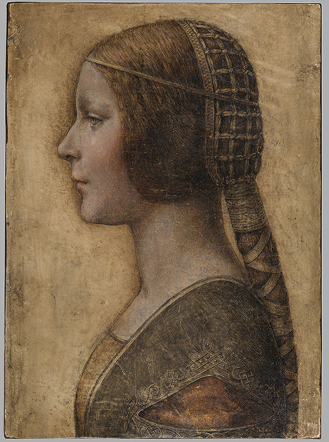
Above, Fig. 1: The full vellum sheet of the proposed Leonardo drawing “La Bella Principessa”.
THE DRAWING’S CLAIMED ORIGIN
This drawing was presented anonymously to the world in 1998 without authorial ascription and without an atom of provenance. When claims of autograph Leonardo authorship were made after barely a decade, it became necessary to fill a five-hundred years long void of records in order to dispel suspicions of forgery or pastiche. In 2010 Professor Martin Kemp bundled together what he held to be a “barrage of evidence – stylistic, historical or technical” that somehow provided collectively what no individual parts constituted: proof that Leonardo da Vinci was the author of what he (Kemp) dubbed “La Bella Principessa”. Thus, a collection of not-evidence was vested with quasi-evidential force on a circular, question-begging appeal to the claimed authority of a “sustained, collective sense that the portrait ‘belongs’ to Leonardo and contributes something new to the Leonardo we currently know.”
Although some scholars (chiefly Italian) were persuaded by the claims, for the consensual majority who did not see Leonardo’s hand in the drawing, Kemp’s methodological ju-ju gained no traction. His claims were advanced in a portmanteau book of collective advocacy, La Bella Principessa – The Story of the New Masterpiece by Leonardo da Vinci, which he co-wrote with Pascal Cotte of Lumiere Technology (the firm hired by the drawing’s owner, Peter Silverman, to conduct technical research) and which carried highly supportive contributions by Peter Paul Biro, Eva Schwan, Claudio Strinati and Nicholas Turner; London, 2010 (– see pp. 187-88).
THE THREE STITCH HOLES
During Pascal Cotte’s technical analysis of the drawing it was noticed that three holes are present on the left-hand edge. Cotte took these to “prove that it originally came from a book or a manuscript” (- Kemp/Cotte 2010, p. 113). Working with Mr Cotte, Prof. Kemp proposed that the hypothetical book might well have been a collection of celebratory poems of Bianca Sforza who had died in childhood and that “La Bella Principessa” had been made as an illustration to such a book.
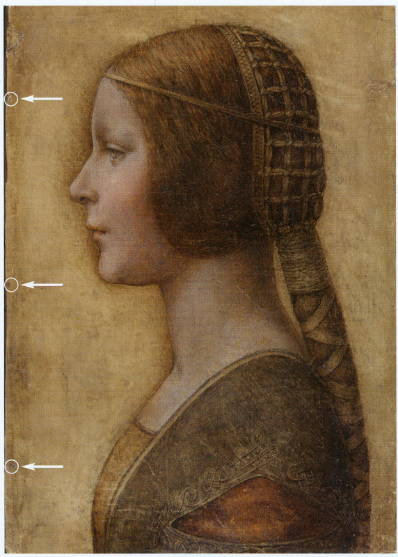
Above, Fig. 2: “La Bella Principessa” with Pascal Cotte’s indicated locations of the three supposed stitch holes.
Kemp’s elaborate hypothetical advocacy constituted a daisy-chain of improbabilities. This is a drawing made in the manner of a distinctive (and invariably painted) profile portrait type that is nowhere encountered in recorded Leonardos – and, indeed, this is the very type which Leonardo famously subverted with his own revolutionary plastically dynamic figural innovations. Within the rigorous constraints of the strict profile type, this drawing’s supposedly high-born subject is bereft of the customary/requisite opulence in clothing and jewellery. The eccentric iconography was made on an atypical support – vellum. It was drawn, Kemp holds, either directly from the subject in celebration of her wedding, or, as a commemorative portrayal after her death and thus made either in recollection or from some other depiction. No explanation was offered for how this single image might have resulted from two radically different circumstances of execution.
THE CLAIMED CORRESPONDENCE BETWEEN THE “LA BELLA PRINCIPESSA” DRAWING AND THE WARSAW SFORZIAD
On a suggestion from Professor David Wright, Kemp proposed that this from-life or post-death portrait had been made to be incorporated within a large, heavy book of the mid-1490s that is now housed in Poland, the so-called Warsaw Sforziad. In the wake of a great deal of (Kemp and Silverman-activated) archival research which found no mention of any work resembling “La Bella Principessa”, it can be seen that without this claimed Warsaw connection, the drawing would remain what it was on its 1998 debut: a stylistically untypical and unprecedented work without any history – the inclusion of which within Leonardo’s oeuvre would, in Prof. Kemp’s own advocacy, “contribute something new to the Leonardo we currently know” and “reveal a previously unknown dimension to the way in which he fulfilled his duties at the court of Duke Ludovico Sforza”. (Kemp/Cotte, 2010, p. 188.) Without history, that is to say, other than the time it is now said to have been in the possession of the restorer/painter Giannino Marchig, the late husband of the anonymous vendor in 1998.
It has been claimed many times that a ‘match’ exists between the drawing’s holes and the book’s stitches but, aside from the small format photo-diagram at Fig. 3, this has never been demonstrated or independently corroborated. Similarly, it has been said that carbon dating tests established that the vellum sheet on which the drawing was made is of an age securely consistent with a drawing being made by Leonardo in the mid-1490s. This claim is seriously misleading, as is shown below.
THE TESTIMONY OF HOLES
Before Prof. Wright’s suggestion, in 2010 Pascal Cotte regarded the three holes on the drawing’s left-hand edge as evidence that might identify incorporation within a specific book:
“It would be interesting to use the evidence of the nature and placement of these needle holes to look for other surviving quires from the same codex, which, with other physical clues, might shed further light on the provenance and original commission.”
(Kemp/Cotte, 2010, page 113.)
Cotte’s hope was reasonable but such testimony can cut both ways. Establishing a relationship between the drawing and a particular book requires an exact correspondence between the drawing’s holes and a book’s stitches. Two separate claims were made of a discovered fit with the Warsaw Sforziad, first by the drawing’s owner, Peter Silverman, and then jointly by Martin Kemp and Pascal Cotte. Both occasions were filmed by National Geographic but only the second was broadcast. In it, Kemp expressed himself as being 80% confident. The presently claimed location of the drawing is at the front of the Sforziad. Clearly, the credibility of what is now a 200 million euro-insured drawing that is stored in the Geneva Free Port depends greatly on confidence being maintained in this claimed connection.
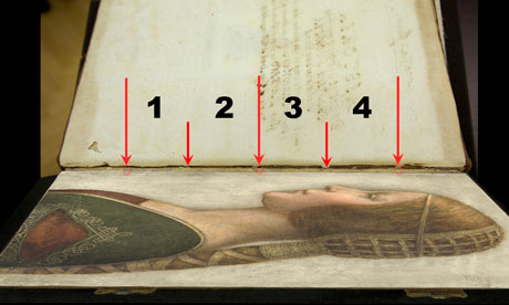
Above, Fig. 3: A facsimile of “La Bella Principessa” inserted into the Warsaw Sforziad with five arrows marking the
book’s stitches and three circles in which matches are claimed, but are not evident, between the drawing’s holes and
the book’s outer and central stitches. (The stitch marked by the right-hand arrow is shown in close-up below at Fig. 5.)
As previously shown, our colleague in ArtWatch, Dr Kasia Pisarek, has catalogued very many discrepancies between the drawing and the book, the most problematic being that the former has only three stitch holes, when the latter was bound with five stitches. To cope with this material/arithmetical incompatibility, Kemp and Cotte conjured two hypotheses.
The first was that the book had originally been bound with only three stitches and that at some undated point the drawing had been removed during a rebinding in which two extra stitches were added to the book. That (unsupported) contention was technically implausible: the book is too large and heavy to be supported by just three stitches – and
both of its sister volumes in London and Paris were bound with five stitches.
The second, and now preferred, hypothesis is that the book was indeed originally bound with five stitches and that, as
a part of this book, the drawing originally possessed the requisite five stitch holes, two of which had subsequently been cut off from the sheet. We demonstrated the impossibility of that claim in an earlier post. (To recap briefly: as Cotte had acknowledged in 2010, stitch holes are always made in a straight line along the crease in a group of folded sheets. Given that a central and two outer stitch holes are all present on the “La Bella Principessa” sheet, any original intermediary stitch holes would necessarily be found in alignment with the present three holes on the sheet as it is today.)
In addition to the absence of the two requisite stitch holes, the sheet itself is a mismatch in terms of colour, texture and size with the sheets in the book. Kasia Pisarek now adds a further mismatch:
“The follicles in the ‘La Bella Principessa’ vellum are tightly spaced, while those in the Sforziad vellum are widely spaced. This can be seen on the Polona website, where you can zoom in until you can see the follicles as dots. I remember seeing some pages where the dots were more apparent and they were definitely widely spaced.”
WHAT LIES BENEATH?
Yet another unaddressed difficulty concerns the back of the drawing. One of the earliest proponents of a Leonardo ascription, Dr Cristina Geddo, has described the presence on the reverse of the drawing of random lettering and an image of a dragon. Kemp and Cotte seem not to have offered an explanation for this content (which, presumably, was revealed by Cotte’s penetrative photography) even though they now claim that the back of the drawing would have faced the book’s beautiful and elaborately painted, symbolically-charged frontispiece. What conceivable iconographic function might such a melange have served in that strategic context of so important and precious a book? Dr Geddo has called for the vellum drawing to be removed from its (most unusual) oak panel support but the owner has declined to do so on grounds of safety. Some of the lettering is visible in an X-ray photograph published in the 2010 and 2012 English and Italian editions of the Kemp/Cotte joint book.
FIVE HOLES GOOD, THREE HOLES BAD
As we reported previously, with regard to the Three Holes v. Five Stitches conundrum, the problems for supporters of “La Bella Principessa” have now become insurmountable: Pisarek established on her second examination of the Warsaw Sforziad in the Polish National Library that while the drawing bears only three holes, the book itself was not only bound with five stitches but that each of those stitches passed through two holes that were two or three millimetres apart (see Figs. 6, 7 and 8 below). At a stroke, the previously claimed ‘fit’ between the drawing and the book is demolished: the drawing possesses only three single stitch holes when it should have five pairs of holes making ten in total. Even if it were to be conceded that two inner stitches might once have been present, today’s three single holes should be three pairs of holes, making six holes in total, not three.
AN OWNER’S RESPONSE
When we sent our previous “La Bella Principessa” post with the newly disqualifying physical/technical evidence to the drawing’s owner, Peter Silverman, (13 June), he dismissed the bearers of the information by alleging lack of expertise: “I leave the attribution question to serious and highly qualified experts!!!” In support of his professional slur, Silverman copied-in two messages to us. The first had been sent to him, at his request, by a costume expert, Elisabetta Gnigera. The second Silverman had sent to Jean Penicaut, the CEO of Lumiere Technology. It was evidently written in haste and heat:
“Dear Jean
I am sorry but we, as owners of the BP, are not to be told how and with whom to talk! I understand your frustration in dealing with Artwatch and Franck but i feel that Pisareks statement must not and cannot be left unchallenged! I therefore request you to rebut each and every point in this latest statement-most importantly of all i would like to see the INDISPUTABLE proof of the binding holes, in a first and separate email to me! Unfortunaley Martin has made statements which can be perverted by anyone in bad faith-equivocal statements quoted in the first part of the enclosed article!!
“I would like Elisabetta to comment on the costume questions.
And i would like YOU to extensively quote from the lab results of La Veneria*, which is very helpful to our cause! [*This is a reference the conservation laboratory “La Venaria Reale” which has conducted analysis of the drawing.]
“We cannot afford to lose the high ground’ in this battle-no matter the bad faith of our ennemy.
“To avoid your corresponding with them please send the rebuttal to me. I INSIST THAT THIS IS AN ABSOLUTE NECESSITY!!
Best, peter
http://artwatch.org.uk/problems-with-la-bella-principessa-part-iii-dr-pisarek-responds-to-prof-kemp/
“PS-the good news is that there is a very serious party interested in acquiring a share in the BP(highly confidential) and July 1 will be a decisive day!!!”
It would seem after more than a month that Lumiere Technology has not provided the owner with indisputable evidence of a connection between the drawing and the Warsaw book that would counter Pisarek’s account. On 14 June we replied to Mr Silverman:
“Speaking of clarification and your requests, I note the various requests from the ‘owners of the BP’ to your associates
to read our current post, and your talk of a prospective part-sale of the BP. Can I take it that the potential buyer of whom you speak has been similarly advised?
“Also, perhaps you might say how you will respond if Jean Penicaut advises you, as we would predict, that he can find
no ‘INDISPUTABLE proof of the binding holes’ that might enable you – or he on your behalf – ‘to rebut each and every point in this latest statement [in the then current AWUK post]’”?
Concerning the La Venaria Reale laboratory reports, we asked Mr Silverman on 15 June:
“On your technical ‘proofs-of-authenticity’ and our possible viewing of your Swiss-vaulted, soon-to-be part-sold drawing, might we not deal with both by: a) your sending to us all reports and data that have been made available to you; and, b) your bringing the drawing to either Paris or London so that we might arrange a group viewing by sceptics and rejecters?”
MISINTERPRETED REPORTS
After more than a month we have received no technical reports on “La Bella Principessa”. Lumiere Technology’s
apparent silence on the conflicting number of stitch holes seems remiss. In our experience it is valuable to see the reports themselves because evidence can sometimes be interpreted and presented in ways that might mislead. For example, it has been claimed (technically-speaking correctly) that carbon dating has established a 95.4% probability
that “La Bella Principessa” had been made at some point between 1440 and 1650. On that particular technical examination and very wide range of possible ages, Pascal Cotte (2010, p. 110) has claimed a number of things in a single sentence:
“This dating confirms that the portrait could well have been made in Leonardo’s lifetime, supporting Martin Kemp’s proposed date in the mid-1490s and virtually eliminating the possibility that it is a 19th century pastiche.”
This was all quite misleading. A confirmed “could well have” remains a “could have” and does not become a confirming “was”. A “virtually eliminated possibility” remains a possibility. Taken as a whole and properly appraised, the data itself cannot reasonably be said to support Kemp’s claimed date and authorship – in fact, it does the opposite.
Cotte’s claims rest on what is only a loose and very wide overall estimation of probability. While it is true to say there is a 95.4% chance that the sheet appeared at some point between 1440 and 1650, there is not a 95.4% probability that it appeared before the mid-1490s when the Sforziad was made. Even on that loose, overall range of possibilities, it would be more accurate to say that because we know (today) that the Warsaw book was made in the 1490s (and had known in 2010 that the proposed subject of “La Bella Principessa”, Bianca Sforza, had died in 1496), it is three times more likely that the “La Bella Principessa” sheet post-dated rather than predated the book. What has not been acknowledged is that within the overall figure, the probabilities had been greatly more precisely quantified.
It was said in the report, for example, that there was a 68.2% probability that the sheet was made between 1470 and 1650 and that, within this period (see Fig. 4 below), there was only a 27.2% probability that the drawing was made between 1470 and 1530 – and this was compared against the appreciably greater probability (41.0%) that the sheet was made some time between 1550 and 1650 – which would place the sheet altogether much later than Leonardo who died in 1519. Properly read, with a proposed date for the drawing set in the mid-1490s, the data shows that there was only a 13.6% probability that the “La Bella Principessa” sheet existed when the book was made. When the general 95.4% probability of an origin anywhere between 1470 and 1650 and the 13.6% probability of an origin between 1470 and 1495 are expressed as racing odds, it is seven times more likely that the sheet was made after the book than before it. And the odds of seven to one against pertain to the vellum sheet itself, not to the possible dates of execution for the drawing. Even if this sheet had once been present in that book, such a dating would indicate only the age of the material, not the date of the drawing’s execution. On this last, we should recall that Eric Hebborn advised in his The Art Forger’s Handbook that a prime source of old materials for forged drawings is obtained from blank end papers in books. Thieves cut valuable illuminated pages from books. Forgers crave blank pages but will make use of a blank side by gluing its reverse firmly to some impenetrable material.
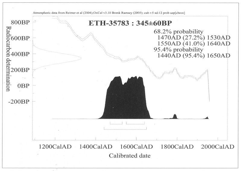
Above, Fig. 4: The carbon dating report on the “La Bella Principessa” sheet (as published by Kemp/Cotte, 2010, p. 110).
FOR THE RECORD
Where Mr Silverman declines to make reports available to us, and Pascal Cotte fails to demonstrate a fit between the drawing’s three stitch holes and the book’s ten stitch holes, we now present further visual proofs and documentary confirmation of the previously claimed mismatch to demonstrate precisely why “La Bella Principessa” could never have been part of the Warsaw Sforziad.
INSTITUTIONAL CORROBORATION
On 23 June 2016 Barbara Dzierzanowska, the Head of Department of Old Prints BN at the National Library of Poland, wrote to Kasia Pisarek:
“Dear Madam,
I would like to inform you that yesterday we entered the Treasury and re-examined the Sforziad, which has confirmed that the binding stitches are double and there are 10 holes.
Yours sincerely,
Barbara Dzierzanowska”
PHOTOGRAPHICALLY-RECORDED AND ELECTRONICALLY TRANSMITTED PROOF OF THE DOUBLE STITCHING OF THE WARSAW SFORZIAD
That the stitching of the Sforziad was made through double holes can be seen by eye on the book itself, as shown below at Fig. 5.
Above, Fig. 5: A stitch made through two holes, as seen on the numbered page 1 of the Warsaw Sforziad. In this photograph, the top stitch and the two flanking holes are shown but some of the other holes can also be seen on stitches below it. This stitch/holes configuration would have been evident when (as described above) a full-size facsimile of “La Bella Principessa” was inserted into the Sforziad at precisely this point. This evidence is also available online: our image was taken from the detailed record of the entire book that is carried on this site: Polona – La Sforziada.
ESTABLISHING THE TRUE DIMENSIONS
When Kasia Pisarek inspected the book for the second time, she asked that the dimensions of the pages and the relative positions of the stitch holes be marked along the edge of a piece of paper. This was done by the library’s books’ conservator in her presence and that of the chief librarian. Intervals between the stitch holes were marked in pencil along the two sides of the strip of paper and these are shown here at Figs. 6 and 7. When we marked off those measurements onto a separate sheet of paper, to prepare the diagram at Fig. 8, and then measured them on our sheet with a ruler, they were all exactly as given by Pisarek. We can be sure, therefore, that the dimensions and ratios between the stitch holes as shown below at Fig. 8 have been accurately established and physically transported to ArtWatch UK – and at practically zero-cost by means of sharp pencils and two pieces of paper.

Above, Figs. 6 (top) and 7: The strip of paper on which the book’s page size and stitch holes were recorded, as described above.
The conservator explained to Pisarek that the present positions of the stitch holes were those of the original construction of the book and that, therefore, there was no possibility that the book had once been bound with only three stitches. She made diagrams on the strip showing (at Fig. 7) different ways of executing stitching with double holes.
THE DIMENSIONS OF THE INTERVALS BETWEEN THE STITCHES IN THE BOOK – A NOTE FROM KASIA PISAREK:
1) According to Kemp and Cotte, the dimensions of the vellum pages of the Sforziad vary from 33.0 to 33.4 cm in height, while the drawing is 33 cm high.
2) I have carefully checked the dimensions with the Librarian in March 2016. All the pages are at least 33.4 cm high and more, up to 33.7 cm. The size of 33 cm would be far too small for the book.
3) The 5 holes in the book are in fact all double holes. Each of the 5 holes is two small holes, between which a string passes. The distance between the two small holes is about 3 mm. The double holes were never mentioned by Kemp or Cotte.
4) According to the conservator who was present at the time of my last visit, this is the binding that follows the original binding as there is no damage of any kind. So in total there were as many as 10 small holes, not 3 single ones as in the drawing.
5) I measured the distances between the 3 holes that Kemp and Cotte measured in La Bella Principessa. The measurements were taken from the middle of the double holes.
6) The distance between the bottom hole and the middle hole is 11.35 cm in the Sforziad, while in the drawing it is 11.06 cm.
7) The distance between the middle hole and the top hole is 11.7 cm in the Sforziad, while in the drawing it is 11.44 cm.
THE MISMATCHED HOLES AND STITCHES
Above Fig. 8: We took the dimensions of the Sforziad’s page and stitch holes from the strip of paper marked by the Polish National Library’s books’ conservator (as shown at Figs. 6 and 7) and drew them in black, as above, and marked “WS”. We then drew in red the “La Bella Principessa” sheet (here marked “LBP”) and its stitch holes as given above by Pisarek.
As can be seen above, it is impossible to align the drawing’s single stitch holes with their claimed counterparts in the book. If the drawing’s centre hole is aligned with the centre of the two central holes in the book (as shown on the left here), its other two holes fall short of their claimed counterparts.
If the LBP drawing’s upper hole is aligned with the centre of book’s two upper holes, its central and lower holes fall progressively further short of their claimed counterparts on the book.
In short, there is no fit or match between the book and the drawing – and which drawing in all probability post-dated the book, for reasons indicated above.
Those who would continue to give this drawing to Leonardo must now find some other means of filling a five centuries absence of provenance and of squaring intractable technical circles. We will examine next the supposed left-handed execution of “La Bella Principessa”.
Michael Daley, 21 July 2016
Problems with “La Bella Principessa” – Part II: Authentication Crisis
In Part I we discussed the look of the so-called “La Bella Principessa” drawing and showed that while it bears no comparison with Leonardo’s female portrait type, it sits comfortably among 20th century fakes (see Fig. 1). Here, we consider the singular campaign to have this work accepted as a Leonardo.
“LA BELLA PRINCIPESSA” AND THE (DECOROUS) COMPANY SHE BEST KEEPS
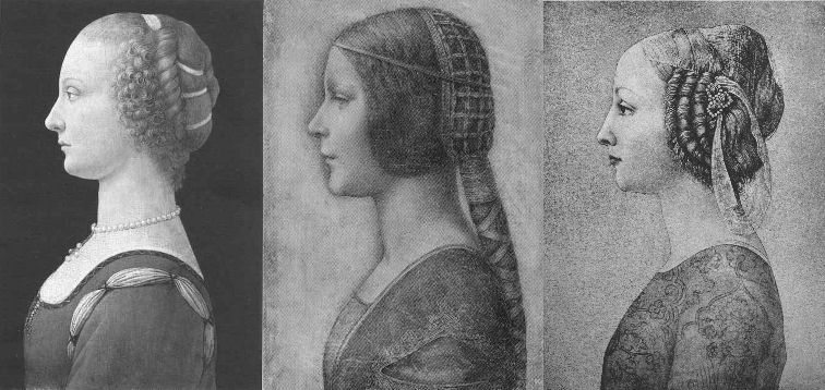
Above, Fig. 1: “La Bella Principessa” (centre) among 20th century fakes. For the drawing’s striking mismatch with secure Leonardo works – and with other bona fide associated works of the period – see Problems with “La Bella Principessa” – Part I: The Look.
A SINGULAR CAMPAIGN OF ATTRIBUTION
The nine years long campaign to have the drawing “La Bella Principessa” accepted as an autograph Leonardo da Vinci is faltering even before our series of examinations is completed. The leading proponent, Professor Martin Kemp, is said in the May 2016 Art Newspaper (Vincent Noce’s “La Bella Principessa: Still an Enigma”) to have his “reputation on the line” in the wake of our posts and an article “How reliable are today’s attributions in art? The case of ‘La Bella Principessa’ examined”, that was published in the Polish scholarly journal Artibus et Historiae, no. 71, 2015 (“La Bella Principessa – Arguments against the Attribution to Leonardo”) by Dr. Kasia Pisarek, an independent art historian (and ArtWatch member). In delayed response to our January 2014 suggestion that the disputed drawing’s author might have been the painter/restorer Gianinno Marchig (see Art’s Toxic Assets – Part II), Kemp now alleges on his blog that we are making “scurrilous and unsupported” attempts to “divert the argument into claiming that Jeanne Marchig lied profusely”. This is not the first such slur against us from that quarter. When Professor Kemp reviewed the James Beck/Michael Daley book Art Restoration: The Culture, the Business and the Scandal in 1994 he made similarly unfounded charges which we rebutted immediately. In recent years Kemp has cast his denunciations more widely and generally against his fellow scholars. (See below.)
Notwithstanding the “La Bella Principessa” campaigners’ belligerence towards doubters, and Professor Kemp’s own publicly bullish support for the attribution, his position on “La Bella Principessa” is untenable in terms of the work’s artistic properties and its emerging circumstances – as indeed is the methodological model for attributions that he hubristically offers to fellow scholars in connection with the Leonardo upgrades that he supports (see below).
Pace Kemp’s charge of evasion, it would be evasive not to consider Marchig’s role when appraising a drawing reportedly bought by a Panamean, Jersey-based company nine years ago at a requested discount for $19,000 but which now, as a claimed Leonardo, lives in a Swiss vault and is said to be insured for $150 million. We should all consider the circumstances and nature of this particular work and the assiduous, sometimes muscular campaign to upgrade it. The old masters market is fragile. The accelerating expanionism of recent years cannot be sustained. The market cannot afford to take in too many too-hopefully upgraded Leonardos, Michelangelos, Rubens’s, Van Dycks, Caravaggios and so forth. Aside from the resulting adulteration of scholarship, markets, as we all now appreciate, lose confidence and crash when too high a proportion of toxic assets is thought to have been bundled in among the bona fide.
PROMOTING THE DRAWING THAT CAME FROM NOWHERE
What is now presented as Leonardo’s “La Bella Principessa” of c. 1496 was sold anonymously at Christie’s, New York, in 1998 for $22,850 as a work without provenance. Twelve years later, Jeanne Marchig, the widow of the artist/restorer Giannino Marchig who had worked as a restorer for Bernard Berenson (who, Kenneth Clark said, sat on a pinnacle of corruption), identified herself as the vendor. She did so not in the disinterested cause of scholarship but to claim damages after sensational but unfounded and misleading media reports that fingerprint evidence had shown the drawing to be a Leonardo.
As we reported, aside from the widow’s hearsay claims concerning the ownership of the drawing by the painter/restorer, the drawing otherwise possesses not a shred of recorded history in its supposed five centuries. On the widow’s account (as variously reported by Kemp, by the drawing’s owner, Peter Silverman, and by a journalist selected by Silverman to promote the attribution, Simon Hewitt), Marchig, an unsuccessful artist who had grown rich and acquired a collection of valuable historic works, had declined to say even to his wife when or from whom he had acquired the framed drawing which he is said to have kept in a portfolio.
Jeanne Marchig dangled the possibility that he might have acquired it from Berenson, with whom he had grown close and for whom he had hidden paintings, photographs and documents during the war. Had he done so that would hardly dispel doubts and suspicions but even that possible lifeline to a past now seems unlikely: the drawing’s present owner and Kemp vainly trawled Berenson’s archives at I Tatti for any sign or mention of the drawing. The trail of this supposed Leonardo begins and ends with the Marchigs. Marchig, if his widow is reliable, said nowt and simply had. By coincidence, the widow was born in Warsaw where a book is housed that was later said (unpersuasively for reasons given by Dr Pisarek) to have contained the vellum sheet on which the drawing was made. Professor Kemp thinks the late Jeanne Marchig “a person of great credibility”. The journalist Simon Hewitt reported in the Huffington Post that:
“Jeanne Marchig was born Janina Paszkowska in Warsaw, into a family of doctors and lawyers. She was an only child: her father died in an accident before she was born. Her mother Elzbieta Chrostowska, an amateur wood-carver, took her to Sweden in 1939, where she grew up and married, became Janina Hama. The marriage didn’t last. She met the artist Giannino Marchig on a train between Stockholm and Florence, where he worked as a picture restorer. Berenson and Wildenstein were his top clients. Although a youthful exponent of racy nudes, Giannino was no lady’s man. He lived at home with his mother on the banks of the Arno. He was over 50. Jeanne was an art student. Their age-difference ran into decades. They married. People talked. Talked, too, about Giannino’s wealth. What had he done during the war? Helped hide Berenson’s collection from the Nazis, among other things. Did Berenson give him the Bianca portrait? Jeanne Marchig didn’t know. Or wasn’t saying. They moved to Switzerland. She morphed from a flirtatious livewire into a coquettish Miss Marple of unfluffy shrewdness. Giannino died in 1983. Jeanne published a sumptuous catalogue of her husband’s career and religiously kept the box of pastels he had used to restore the Leonardo.”
PROFESSOR KEMP’S EYE
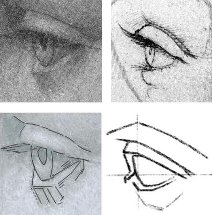
Above, Fig. 2: The eye of “La Bella Principessa”, top left, and above left (with a superimposed diagram). Top right, an eye drawn by Leonardo (reversed). Above right, an eye featured on a sheet of eyes drawn and reproduced as aids to students and artists in a famous drawing course published in the late 1860s – and later used by the young Picasso.
THE NUB OF CONNOISSEURSHIP DISPUTES IN THE VISUAL ARTS
Martin Kemp and I have recently discussed the eye in “La Bella Principessa” (top left) vis-à-vis the eye by Leonardo (top right) and I am grateful to him for this.
He believes that both eyes are drawn by Leonardo. I (a left-handed draughtsman) hold that the “La Bella Principessa” eye, with its pronounced, almost Cubist, angular and planar construction cannot conceivably have been drawn by Leonardo. There is simply nothing like it in Leonardo’s oeuvre. It is a construct of an alien, more modern kind. Kemp now admits that the unnaturally thick and angular lower lid is problematic but writes: “With the exception of the angularity of the lower lid, which is in an area of some damage, it is consistent (above all the amazingly delicate lashes) with the attached [the eye by Leonardo, top right]. Leonardo’s works of art are not anatomical demonstrations. It’s easy to find ‘anatomical erors’. I find the seizing on such things is to divert the arguments into issues of a peripheral nature in the face of evidence of a non-arbitrary kind.” This is a helpfully clarifying statement, but the suggestion that the eye might have been repaired is new.
In the 2010 Martin Kemp and Pascal Cotte book Leonardo da Vinci “La Bella Principessa” The Profile Portrait of a Milanese Woman, there is no indication given in Cotte’s map (Fig. 3) of repairs to “La bella Principessa” that the eye had been damaged, and Kemp, when comparing the eye with that of Leonardo’s Windsor Castle drawing Portrait of a Woman in Profile (Fig. 5), wrote of it “Even Boltraffio could not achieve this. The structure of the eyelids, the delicate flicks to create the lashes, and the translucent iris of the eye are extremely close on both portraits…” Pascal Cotte goes further, claiming a “distinct and identical logic” with the eye in Leonardo’s portrait of Cecilia Gallerani (The Lady with an Ermine, Fig. 4). Making no reference to injuries or repairs, Cotte specifically points in his diagram (Fig. 4) to the “The juxtaposition of the edge of the lower eyelid with the bottom of the iris”. Speaking generally of the analysed physical evidence of the drawing, Cotte adds “There have been some diplomatic retouchings over the years, but this has not affected the expression and physiognomy of the face to a significant degree or seriously affected the overall impact of the portrait.”
THE PRIMACY OF VISUAL EVIDENCE IN THE VISUAL ARTS
What Kemp sees as a peripheral issue that lacks “non-arbitrary” evidential value, I take to be of the essence in the evaluation and critical appraisal of (visual) works of art. In traditional connoisseurship – an area which Kemp frequently disparages on quasi-scientific professional and leftist political grounds – the test is not to identify similarities (which exist in abundance between authentic works, copies and forgeries) but to discern differences, to discriminate between products of the authentic autograph hand and closely related but variant artefacts.
Of course, Leonardo did not draw every eye as an anatomical demonstration, but nor did he ever draw an eye in ignorance of that crucial feature’s anatomical construction. The eyeball, being an orb, determines the shape and forms of the surrounding soft protective tissue of the lids. Leonardo’s eyes and lids are constructed with curves, not straight lines. With the four images above at Fig. 2, a connoisseur’s ‘eye’ should recognise that even when constructing an eye with straight and not curved lines (as in the lower right demonstration drawing) it is possible to render the visible part of the eyeball conceptually if not literally spherical. That schematic drawing displays greater sculptural and anatomical acuity than does the more laboured and “finished” “La Bella Principessa”. It recognises and describes with three (faint) straight lines, what Leonardo depicts with curves: the line(s) of collision between the bulging soft flesh of the lower eyelid (when the eye is open) and the more taught flesh that is stretched over the cheekbone. In the infrared image at Fig. 6 we can see with crystal clarity how Leonardo saw the structure of the lower eyelid and how he set out this structure in preliminary drawing form. While Leonardo gave fluent anatomically-informed account of eyes, Marchig was insecure in his treatment (see Art’s Toxic Assets – Part II). Had Leonardo complied – against everything else in his output – with an irresistible court demand for a strictly profile treatment of a female subject’s head and torso, as Kemp claims in defence of La Bella Principessa, he would have had the wit and the judgement to render the eye, too, in strict profile. “La Bella Principessa’s” eye – which is smaller – is not drawn in accord with that strict out-of-perspective formal convention. Rather, it strays into looking both outwards and downwards, imparting an insecure, wary, not proud air.
MAPPING THE “RESTORATIONS” OF “LA BELLA PRINCIPESSA”
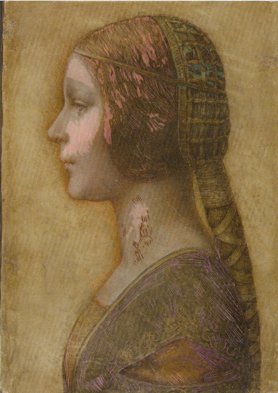
Above, Fig. 3: The colour coded map that is said to show areas of restoration in “La Bella Principessa”, as published on page 133 of the 2010 Kemp/Cotte book Leonardo da Vinci “La bella Principessa” The Profile Portrait of a Milanese Woman. It is striking how discretely localised are the areas of “restoration”, and how fortuitously the corresponding areas of injury had fallen in the least important parts of the image.
CONFOUNDING THE SIMILAR AND THE DISSIMILAR
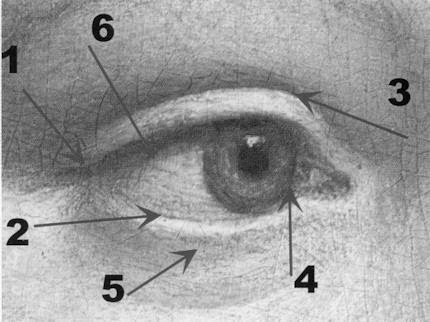
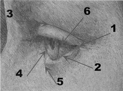
Above, Fig. 4: Top, the (true) right eye of The Lady with an Ermine. Above, the eye of “La Bella Principessa”. In this diagram Pascal Cotte, a brilliant engineer, sees confirmation of a common author – even at his arrowed point 2 where Leonardo’s curved demarcation between the eyeball and the lower lid is set against the form-denying straight demarcations in “La Bella Principessa”.
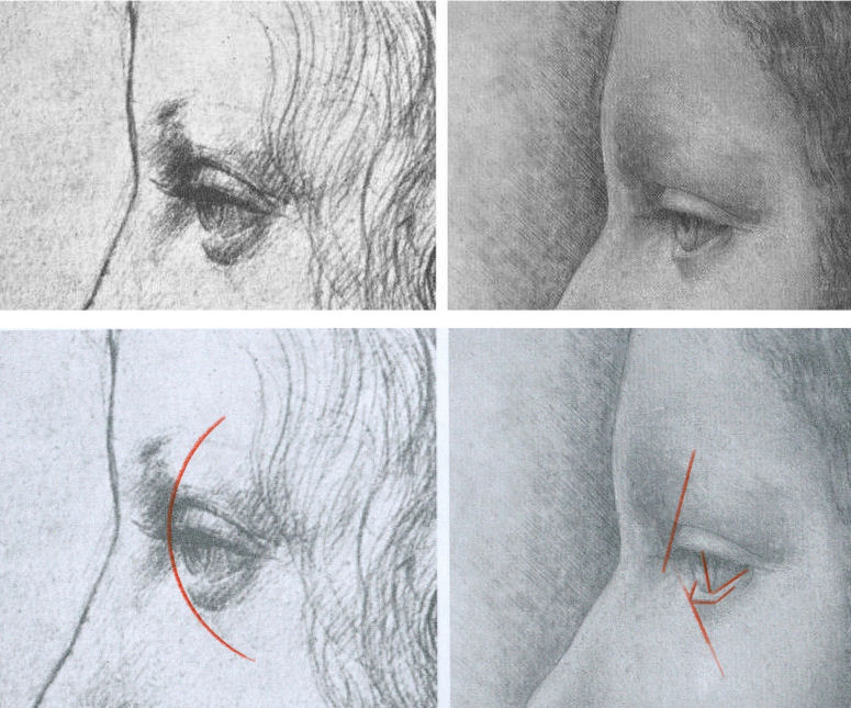
Above, Fig. 5: Left, the eye of Leonardo’s Windsor Castle Portrait of a Woman in Profile (reversed). Right, the smaller, more angular and more sunken eye of “La Bella Principessa”.
A common fault of copyists, pastiche-makers and forgers is to get details correct while missing the larger unified relationships which, collectively, they should constitute. The author of “La Bella Principessa” not only misses the cohering sense of the eye as a ball but even misconstrues the form and anatomical function of particular details. This error testifies to forgery rather than pastiche. We will be showing “La Bella Principessa” to be a “portmanteau work” composed from features drawn from a number of bona fide Leonardos. It can hardly seem a coincidence that the most disqualifying error of drawing in “La Bella Principessa” – the lower eyelid – occurs at the very point where damage is found in the (“prototype”) work which it is most closely said to resemble. At this point the drawing’s author has clearly been required to invent rather than copy or paraphrase. Indeed, in “La Bella Principessa’s” eye we find a progressive falling off of anatomical and artistic credibility from top to bottom: most plausible in “La Bella Principessa” is the somewhat simplifying paraphrase of the upper eyelid. Less plausible is the treatment of the more complex and elusive eyeball and iris. Least plausible of all is the fabricated lower eyelid. Martin Kemp’s claim that by drawing attention to such incompatibility we seek to divert the arguments “into issues of a peripheral nature in the face of evidence of a non-arbitrary kind” is not only unfounded – much material is in train on this attribution – it betrays a technically philistine misapprehension of sound scholarly method. Let us be clear: art, not the devil, lies in artistic detail and these details testify to authorship. We have the clearest possible understanding of how much Leonardo knew and how well he gave expression/record to what he knew/saw. It is for those who would count “La Bella Principessa” as a Leonardo to explain the disparity between its eye and that below at Figs. 7 & 8, which, on Kemp’s account, were both made at the same date.
SPOT THE ODD ONE OUT
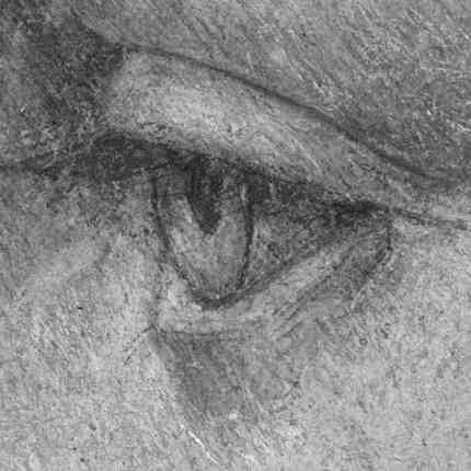
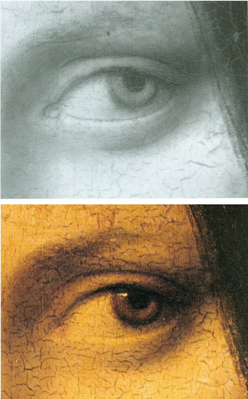
Above, Figs. 6, 7 & 8: Top, the eye of “La Bella Principessa”; Centre, the (true) left eye of Leonardo’s La Belle Ferronnière, as seen in an infrared reflectogram by E. Lambert for C2RMF as published in Leonardo’s Technical Practice, Paris, 2014; Above, the (true) left eye of Leonardo’s La Belle Ferronnière, as seen in Pietro Marani’s Leonardo da Vinci – The Complete Paintings, New York, 2000. It is, for reasons given here, inconceivable that both of these eyes could have been produced by Leonardo at the same time – c. 1496.
There is another sense in which Kemp’s espousal of “La Bella Principessa” exposes his art historical method. By drawing attention to “La Bella Principessa’s” many points of direct correspondence with the Windsor Castle profile portrait in terms of overall effects, pentimenti, anatomical details and so forth, the scholar strains credulity. The Windsor Castle portrait is clearly of a mature woman. It was made some 15 years earlier than the supposed portrait of Bianca Sforza who died when a child of fourteen. The Windsor drawing is made in another (and single) medium – silverpoint – in which Leonardo was effortlessly, supremely fluent. “La Bella Principessa”, however, was made in an unprecedented combination of materials on a never or extremely rarely encountered-in-Leonardo support. How likely, then, is it that Leonardo would produce an elaborately finished drawing in an un-encountered mix of graphic and pictorial media and of a type nowhere else encountered in his oeuvre, of a young girl who, on Kemp’s account, was drawn either directly from life or from some other unknown record of her appearance, in commemoration after her death, some fifteen years later, that would, when reversed, produce a near perfect coincidence of proportions, features and, even, pentimenti?
It would, of course, be entirely unremarkable for a forger or pastiche-maker to engineer a similar reversed coincidence of features and traits with a bona fide Leonardo work. A canny forger who happened to be a restorer of old masters – including Leonardo, as was the case with Marchig – would well appreciate the need for evidence of one or two reassuring “campaigns of restoration” in a supposed work of five centuries of age. Marchig’s widow has reportedly claimed that he had indeed conducted restorations on the front of the drawing and on the back of the oak panel to which it was – unprecedentedly and, it is now claimed, irreversibly – glued. Kemp has not discussed, as far as we know, technical evidence that has been discussed by another Leonardo scholar – Cristina Geddo – that the back of the vellum is not blank as it would surely have been had it ever faced the the elaborately illuminated frontispiece of a major book as Kemp claims. For Dr Geddo, it is reassuring that the back of “La Bella Principessa’s” vellum support bears “superimposed numbers…like others written in pen, such as a very pale inscription visible along the upper border of the sheet and the little winged dragon – at least this is what it seems – in the lower left corner. This feature, too, counts in favour of an attribution to Leonardo, who, even though he has never to our knowledge used a parchment support in his work, was in the habit of re-using the paper on which he wrote or drew.” Of course, forgers too re-use old material.
THE AiA: AN OPEN FORUM; A PROFESSIONAL TALKING SHOP; OR, A CONSERVATION-FRIENDLY CLOSED SHOP?
Nothing can bring greater benefit to the art world than free, frank discussions and debate. The annual three-day Hague Congress is organised by a body that addresses the subject of authenticity in art and is titled AUTHENTICATION IN ART. This year’s AiA congress (11-13 May) specifically addresses the voguish museum world hybrid discipline known as Technical Art History, the misapplied and anti-aesthetic scientism of which we have criticised since its earliest days (see, for example, the first post on this site The New Relativisms and the Death of “Authenticity”). Attendees at this year’s AiA congress comprise “art collectors, collection managers, directors of museums and galleries, art dealers, appraisers, connoisseurs, advisors, auctioneers, insurers, investors, lawyers, authors of catalogues raisonnés, restorers, conservators, material scientists and art historians.” This particular critic of Technical Art History will not be speaking even though our proposal for a paper was encouragingly received by a congress organiser who wrote:
“Dear Michael, Thank you. Very valuable to the whole set up of AiA 2016. Get back to you in the coming weeks.”
The proposal had opened:
“Technical Art History is presented as a multi-discipline, international museum-standard professional synthesis that eliminates error and delivers enlightenment when, in truth, it testifies to little more than the ascendency in museums of technicians over curator/connoisseurs. This putsch began with the creation of in-house museum restoration departments where staff restorers could no longer be sacked. The National Gallery in London claims pioneering authorship of the new hybrid discipline and it perfectly reflects the new pecking order.”
We were subsequently “dis-invited” through a form notification to unsuccessful applicants. Among this year’s speakers will be Professor Kemp, a member of the AiA’s advisory board, and Pascal Cotte, of Lumière Technology. Cotte was, as mentioned, co-author with Kemp of the 2010 and 2012 English and Italian editions of a book of advocacy, La Bella Principessa – The Story of the New Masterpiece by Leonardo da Vinci. (Kemp has been critical of Cotte’s recent, go-it-alone book Lumière on the Mona Lisa – Hidden Portraits.) A working group was set up to organise this year’s congress. It is comprised entirely of conservators or conservation scientists. Curators and connoisseurs are not represented. One member of this advisory group was David Bomford, who is presently the Chair of Conservation and Head of European Art at The Museum of Fine Arts, Houston. Formerly, as a senior restorer, Bomford was the architect of the National Gallery’s presently stated cleaning philosophy – which we had discussed in some detail in our proposed congress paper (“…The false assurances of Clark’s aesthetics/science sleight of hand haunt and deform the National Gallery. Its official conservation guide declares restorations to rest on individual restorer’s own aesthetic inclinations…”)
PROFESSOR KEMP’S ART HISTORICAL METHOD
In his 2014 AiA congress paper (“It Doesn’t Look Like Leonardo”) Kemp discussed two other Leonardo upgrading attributions with which he is associated. Namely, the two versions of the Madonna of the Yarnwinder (one of which was restored badly, Kemp once complained, by Marchig) and the massively restored wreck of a panel painting, the Salvator Mundi. His paper’s abstract ran:
“The state of methods and protocols used in attribution is a professional disgrace. Different kinds of evidence documentation, provenance, surrounding circumstances of contexts of varied kinds, scientific analysis, and judgement by eye are used and ignored opportunistically in ways that suit each advocate (who too frequently has undeclared interests). Scientific evidence is particularly abused in this respect. The status of different kinds of evidence is generally not acknowledged, particularly with respect to falsifiability… I will attempt to bring some systematic awareness into this area, which is a necessary first step in establishing some rational protocols. The case studies will be drawn from Leonardo.”
On reading this abstract with its scattergun slurs “opportunistically”, “disgrace” and “undeclared interests”, we laughed out loud. Partly because of the grandiose title – “The 2014 Hague Congress Authentication in Art – What happens when the painting you are buying, selling, investigating, exhibiting, insuring – Turns Out to be a Fake or a (Re)Discovery…” – chosen at a time when Kemp and others had failed to achieve a consensus of support for the drawing he had portentously dubbed “La Bella Principessa”. But also because, as mentioned, two decades earlier we had experienced Kemp’s invective and sneering distaste for traditional connoisseurs whom he sees as “a self-proclaimed (and often class-based) elite whose skills are insulated from systematic scrutiny”.
In his review of the James Beck/Michael Daley book Art Restoration – The Culture, the Business and the Scandal”, the authors – much as with Kemp’s peers today – were found professionally wanting and morally deficient: “…Their problem is that they seem unwilling to acknowledge the status of different kinds of evidence…The slanting of arguments, manipulation of quotations, and rigging of visual evidence may be effective journalism but it is poor history…” A more focussed barb was aimed at artists’ evaluations of conservation treatments: “Stalking throughout their book… is a very particular notion of ‘Art’ and its creators. ‘An Artist’ (ie What Beck and Daley understand as an artist in today’s terms) is adduced as the most important arbiter of the criteria for the treatment of our historical heritage. I am unclear about the identity of this archetypal beast.” Unclear indeed.
Kemp’s professional aversion to the views and judgements of artists is presented as a token of “higher”, more philosophically sophisticated notions of scholarly method and a scientist’s preference for non-judgemental, non-subjective “evidence” within it.
CRITICAL SILENCES
While some are cowed by Professor Kemp’s trademark abusive critical put-downs, others, like the blogger and art “sleeper” hunter, Bendor Grosvenor (21 April), openly admire them. We called Kemp’s bluff in a letter to the THES (2 May 1994):
“…he alleges… a misuse of historical and material evidence. Professor Kemp’s notions of misuse would seem to be singular: he complains, for example, that Professor James Beck and I accepted Charles Heath Wilson’s clear and detailed testimony that Michelangelo had extensively revised his frescoes with glue painting, ‘with unquestioning approval’. This is presented as proof of our ‘lack of discrimination’. But Wilson saw what he saw and said what he said… Does Kemp have any grounds for rejecting Wilson’s record?… Kemp is silent on this evidence. Why? The photographic evidence we supply of restoration-induced injuries is impugned by Kemp as ‘rigged’. It is nothing of the sort – most of it was provided by the restoration authorities themselves… Does Kemp wish to defend that restoration? Is he in possession of any photographs which tell a different story?”
No grounds for rejecting Wilson were offered in reply. No contra-testifying un-rigged photographs were ever produced.
For a fuller account of the spurious charges raised by art conservators and Kemp to Art Restoration, see “Why are picture restorers allergic to appraisal?”, Jackdaw, May/June 2016.
THE 2016 AUTHENTICATION-IN-ART CONGRESS AND ‘DISORDERLY’ SCHOLARSHIP
In this year’s AiA congress paper Kemp returns to his 2014 AiA congress attack on the shortcomings and abuses he perceives in the methodologies and behaviour of all other scholars in the field, albeit in muted form. Today his abstract reads:
“A speech on Technical Art History and the way he [Kemp] implements the research on Leonardo’s La Bella Principessa: the varieties of evidence and arguments, and how reactions to the attribution shed light on the disorderly nature of current methods”.
A clue to where he might be going can be found on his blogsite where he has published a “reworked” version of his 2014 paper that excludes his earlier linking remarks on other Leonardo attributions he supports – “Science and Judgement by Eye in the Historical Identification of Works of Art”.
The methodological schema Kemp outlines and censoriously offers to others seems little more than an overly complicated regurgitation of the tendentious, the self-evident and the true-by-definition. It leans heavily on and misapplies Karl Popper’s famously illuminating discussion of scientific knowledge and methods. Kemp seems to crave an aesthetic equivalent of the decisive Popperian test of scientific “falsifiability”. This is a vain, misdirected quest. Because of the profound differences between appraisal of works of art and the technical analysis of their constituent materials, Kemp is forever complicating and caveating his proposed model method. He compiles tables of hierarchies that are organised into polarising dualities. He is constantly extricating himself from fogs of his own making:
“In this and the following table, I am using the terms ‘scientific’ and ‘art historical’ in a conventional way without intending to signal that they can be isolated in the actual practice of attribution – and certainly not to suggest that the application of scientific analysis necessarily delivers more certainty than art historical evidence. In the actual practice of art history, its isolation from scientific analysis is all too common.”
Which? What? To help orientate us, Kemp devises a table of criteria that are more traditionally “art historical” with the “the most malleable [being] at the top.” But nothing ever comes to rest. Here, “I have added standard kinds of evidence relating to provenance and documentation that are highly constructive.” If baffled by the usage “constructive”, the reader must back-track to an earlier explanation that “The kinds of evidence and explanation that can be subject to various degrees of falsification can be grouped under two headings: constructive and permissive.” Thus, “By constructive I mean those that add positively and accumulatively to the case being made for a specific attribution. By permissive I am signalling those that present no obstacle to the attribution being made, i. e. they offer a nil obstat.”
JUDGEMENT BY EYE
When Picasso was asked what he thought of the philosophical discipline aesthetics, he replied: “Aesthetics is to the artist what ornithology is to birds.” In Kemp, everything is dunked in pseudo-philosophical terminology. Take the simple clear self-explanatory notion “judgement by eye” which he offers in preference to snobby, elitist, class-based etc “connoisseurship”:
“As we have seen, judgement by eye plays a key role in key scientific techniques. Although the most constructive of the kinds of art historical evidence, documentation and provenance, do not rely upon judgement by eye, it is common that this kind of evidence is not available or is less conclusive than we would wish. In many cases judgement by eye necessarily provides the actual starting point, before other kinds of investigation are undertaken. This is often the situation when a previously unknown or unrecognised work first emerges with specific claims attached to it. Let us try to formulate some propositions about judgement by eye in a somewhat Popperian manner”
Why, apart from intellectual snobbery, in a “Popperian” manner? Well, they help Kemp to conclude with the twin observations that “Judgement by eye is malleable in the light of multiple interests”, and “Judgement by eye is falsifiable only by factors outside of itself.” Kemp’s Popperian edifice is, as it were, a perniciously misleading red herring. In truth judgements by eye cannot be equated with falsifiable scientific propositions, they are a different beast – they are critical appraisals. As such they are gambits in a discussion. They can be countered by demonstrably superior, more percipient and persuasive judgements that accord better with the material circumstances and visual facts of a given work of art. Because Kemp sets the hard and “irrefutable facts” of material analysis (many of which, he acknowledges, require judgement by eye) against what he deems the “subjective”, “relative” and “malleable” act of appraisal of the (despised) connoisseur, he misrepresents what is indispensable to proper appraisals of art. Connoisseurship (the term should not frighten or repel us) cannot sensibly be treated as a natural science – properly, rigorously conducted it is an open, competitive adversarial system that is full of checks and balances wherein anything that is proposed may examined, challenged and deposed. Art world abuses certainly exist but they flourish best when legitimate criticisms and demonstrations are blocked and disqualified and critics are ruled out of court. Kemp, who despises the “class-based” connoisseur, does not respond well to criticism and prefers abuse and denigration to straightforward and healthy critical engagement. That is his loss, but also, he being a talented man, it is that of scholarship itself.
AN INTELLECTUALLY OPEN CONFERENCE
When ArtWatch UK, The Center for Art Law, and the London School of Economics Law Department, organised a conference on connoisseurship in London last December (“Art, Law and Crises of Connoisseurship”), one of the papers, “How reliable are today’s attributions in art? The case of ‘La Bella Principessa’ examined”, by Kasia Pisarek, presented a number of the interlocking art historical, aesthetic and technical criticisms she had recently published in the above mentioned Polish scholarly journal Artibus et Historiae.
Because this paper was a strong and detailed rejection of the attribution, we invited Martin Kemp to give a paper. He declined. We then invited Nicholas Turner, an independent scholar and drawings expert who had championed the “La Bella Principessa” drawing before Prof. Kemp. He, also, declined to speak. To represent the restoration-pro-active, attribution-making school of art dealers, we invited Philip Mould. Mr Mould, too, declined to speak. Shortly before the conference, Kemp, Silverman and a Polish art historian, Kasia Wozniak, all lobbied for the “balancing” inclusion in our conference proceedings of the journalist Simon Hewitt who is writing a book with the owner of La Bella Principessa, Peter Silverman – who tells us that the book is on “various aspects of the art market, sometimes highlighted by others’ and my own discoveries”. Hewitt attended the conference and, from the floor, launched an assault on Pisarek’s case – but did so, we later learned, on the borrowed authority of Kemp who had “prepped” him for the occasion on objections he had framed in response to Pisarek’s Artibus et Historiae article. Kemp later submitted his lengthy response to Artibus et Historiae for publication but it was turned down. This article has now been posted on the AiA Congress website. Perhaps, in the interests of scholarly balance, the AiA congress will now also post the article by Dr Pisarek which Professor Kemp aims to rebut? Perhaps the Congress might also consider posting our own initially valuable-to-proceedings but later rejected paper on Technical Art History?
Michael Daley, 3 May 2016
COMING SOON: The Salvator Mundi, Giannino Marchig, Left-handedness and “La Bella Principessa”
Connoisseurship in Action and in Peril
“WHEN THE FIRST catalogue of the Ashmolean Museum’s Sculpture collection (in three volumes) was undertaken more than twenty-five years ago, the present author decided to exclude works made before 1540…”
“…The decision was partly determined by the quantity of the material but also in recognition of the special attention that the finest of the small bronzes given and bequeathed by Charles Drury Fortnum deserved. It is indeed because of these that the Ashmolean’s sculpture collection is the most important in the United Kingdom after that of the Victoria and Albert Museum, London…”
Above and below: The ‘Fortnum Venus’, attributed to Francesco Francia or his circle. c. 1500-05. Bronze, 26.1 cm. high. (Ashmolean Museum, Oxford).
Above, detail of St Jerome, by Cosimo Tura. c.1470. Panel, 101 by 57.2 cm. (National Gallery, London).
“The first of Jeremy Warren’s three volumes under review here includes these very figures. One of them is the
exquisite Venus associated with the Bolognese painter and goldsmith Francesco Francia (cat. No.20). It is one of the earliest responses in the Renaissance to the antique female nude, and perhaps belonged to a narrative group for, as her drapery falls, her hand is cupped as if to receive the apple from Paris…”
“…In conclusion it should be noted that the cataloguing of the permanent collection is not now often considered an essential part of the curator’s job. Any museum director who is chiefly an impresario is inevitably attentive to fashionable ideas and taste, whereas the cataloguer of a permanent collection is bound to give his or her attention to neglected artists, and to works by artists in which they are not initially interested, but which beg the question as to why the appealed to their predecessors – collectors, scholars and curators long deceased. This provides an antidote not only to the narrow outlook of the popular exhibition machine, but to that of academic institutions where scholars, having achieved promotion by imitating their seniors, are obliged to compete in appealing to the young consumers upon
whose favour the prosperity of the institution depends.”
~ NICHOLAS PENNY: “Sculpture in the Ashmolean”, Burlington Magazine, January 2016. A review of Catalogue: Medieval and Renaissance Sculpture. A Catalogue of the Collection in the Ashmolean Museum, by JEREMY WARREN, 3 vols., continuously paginated, 1188 pp. incl. numerous col. + b. & w. ills. (Ashmolean Publications, Oxford, 2014, £395.)
“FIVE NEW YEAR BLOCKBUSTERS
“It’s a new dawn, it’s a new day… what new art exhibitions will make you feel good? Read our list of the top five shows opening this season to get inspired.
“Discover the enduring impact of Botticelli and Delacroix on the art world and prepare to be star struck at exhibitions celebrating 100 years of British Vogue and the incredible beauty of our Solar System.
“Need a second opinion? Watch art historian Jacky Klein’s guide to the season’s unmissable art exhibitions.”
~ THE ART FUND, a mailing, 8 December 2016.
PERMANENT EVOLUTION – A JOB FOR LIFE
“Museums have become places where we take part in social as well as learning activity. It is easy to be cynical about
the impact of the café, restaurant or shop spaces on the culture and character of museums, but such facilities have made museums less daunting, more welcoming and more open to general visitors. However, such [democratization] needs to go deeper than the provision of opportunities to purchase or to consume.”
NICHOLAS SEROTA, the director (- since 1988) of the Tate, at the Leeum Samsung Museum of Art in Seoul.
HOW ART HISTORIANS CAN BE FOOLED BY CONDITION
“One of the most influential books in the twentieth-century art history was Erwin Panofsky’s Studies in Iconology. In this seminal work, the very latest German approaches and method were presented to an Anglo-Saxon audience for the first time. One of the dazzlingly learned chapters was devoted to the figure of Cupid wearing a blindfold, and Panofsky showed how this theme could be traced back to the writings of the medieval moralists. For thinkers of this Christian stamp, lovers were metaphorically blind, since they were ‘without judgement or discrimination and guided by mere passion’. But later, in the Renaissance, ‘moralists and and humanists with Platonizing leanings’ contrasted the figure of the blindfold Cupid with another kind of…”
~ PAUL TAYLOR. Introduction, CONDITION The Ageing of Art, Paul Holberton Publishing, 2016. ISBN 978 1 907372 79 7
Illustration: Jean-Auguste-Dominique Ingres, The Composer Luigi Cherubini with the Muse of Lyric Poetry, 1842, detail.
“…Although Bode was extremely learned in many branches of art history and had his information always ready – he had little need of written notes and photographs – he was no scholar in the true sense. He was more fond of action than reflection, and was far from having a just and objective mind. Moreover, the distracting practice of uninterrupted daily work hindered a comprehensive synthesis of realization. The deepest motive of the scholar, namely, disinterested love of truth, could not function productively in a nature always resolutely aiming for effectiveness and visible results. Bode was utterly unphilosophical, he considered no affair from more than one side. He saw black or white, good or bad, advantageous or inimical; he knew no intermediary steps. To forsee obstacles, to fear, to guard against them was not his way. Consequently he became angry as soon as he encountered opposition. He made more mistakes by acting than by failing to act. He was a hunter, not an angler.”
~ Max J. Friedländer – Reminiscences and Reflections, Edited from the literary remains and with a foreword by
Rudolf M. Heilbrunn, 1969, New York.
“…Anyway, getting back to the book that was sent to me, its title was rather grand and pompous: La bella Principessa – the beautiful princess. Or, as I knew her, ‘Bossy Sally from the Co-op’. I’m a bit unsure of how to talk of this because the book was written by an eminent Oxford professor and must have been quite an effort. I don’t want to ruffle any feathers or cause problems but I nearly swallowed my tongue on reading its supposed value – £150 million! It would be crazy for a public body to pay such a sum. So I feel the need to say something about it.
“The drawing is thought by some to be a work by Leonardo da Vinci, but it does divide opinion and it wasn’t included in the National Gallery’s Leonardo show of 2011, a show which I thought was really well done except for it being staged ‘underground’ in the Sainsbury Wing basement…
“I drew this picture in 1978…It was done on vellum, quite a large piece to find unfolded and without crease lines. I did it on vellum because at that time I couldn’t make old paper yet…The first thing I had to do was sand off the writing with 600-grit wet and dry paper. That done, it looked too new for anything old to look right on it, so I turned it over and did the drawing on the other side. That is why the drawing is done on the hair side of the vellum instead of the much-preferred ‘flesh side’. The texture of the sanding should still seen on its reverse.
“As I said, the face is of 1970s vintage, and I think that shows in the drawing…The drawings of Leonardo and Holbein especially have always impressed me with their fineness of line and detail, and in my view they must have been done under some magnification…The vellum is mounted on an oak board…before drawing on it, the vellum was stuck to the backboard with cabinet maker’s pearl glue, so it needed to be under a weighted press for a while to allow the glue to go off without ‘cockling’ the vellum. ‘Cockling’ is the effect you see on paper when you try to paint a watercolour without soaking and stretching the paper first. On vellum the dampness looks like blisters or a cockle bed on the shore. It’s caused by the water content of the glue, so the thing needs to be under a heavy press to dry it flat.
“After a bit of experimentation, and just to prove a point to myself, I lightly traced the drawing I’d invented onto the vellum (I’m sure the graphite can still be detected) and started to draw the image in hard black chalk – carbon black in gum arabic – using a pair of jeweller’s magnifying glasses. It took some time to get used to working like that, and I had to go to back to practising on papper for a while so as not to bugger things up…
“It was done in just three colours – black white and red – all earth pigments based in gum arabic, with the carbon black mostly gone over with oak gall ink. To be a bit Leonardo-like or even Holbein-like – they were both left-handers – I put in a left-hander’s slant to it…The Leonardo book [“La Bella Principessa ~ The Story of the New Masterpiece by Leonardo da Vinci”, By Martin Kemp and Pascal Cotte, with contributions by Claudio Strinati, Nicholas Turner and Peter Paul Biro] seems to put great store by the apparent leftyness of the drawing, but it can be shown up very easily. With the face on the vellum facing left, just turn the drawing clockwise to face her skyward, and hatch strokes from profile outwards in the normal manner…Incidentally, the book points out a palm print on the neck area, just the spot a right-hander doing an impersonation of a left-hander might rest their hand whilst doing the background hatching.
“Although I am no Oxford professor, I could list umpteen reasons for not thinking this drawing to be by leonardo…
The book mentions several holes on one margin as evidence that it has been bound into a volume, and also mentions some later ‘restoration’. I did not do these things, and don’t know who did, or where it went on its later travels. Looking closely at the picture in the book, it looks to have had the left margin peeled back an inch or so and has been restuck, not very well, especially at the bottom left. Could this be from when the left margin was pierced and roughly re-cut by someone else?
“I sold it for less than the effort that went into it to a dealer in Harrogate in late 1978 – not as a fake, or by ever claiming it was something it wasn’t. I can’t really say any more on it. At least it may now be known for what it is.”
~ SHAUN GREENHALGH – A Forger’s Tale, Published by ZCZ Editions in 2015
In the past it was customary for scholars to advance claims of attribution for particular works of art in scholarly journals and then wait to see how peers and colleagues responded to their evidence and arguments. Increasingly, we are seeing co-ordinated promotional campaigns of advocacy by players and owners who eschew venues of debate and sometimes denigrate sceptics and opponents. We invited two of the leading advocates of “La Bella Principessa’s” Leonardo’s authorship – Martin Kemp and Nicholas Turner – to speak at our recent conference on connoisseurship. Both declined. Neither our post of January 2014 (“Art’s Toxic Assets and a Crisis of Connoisseurship ~ Part II: Paper – sometimes photographic – Fakes and the Demise of the Educated Eye”) nor our colleague Kasia Pisarek’s article “La Bella Principessa: Arguments against the attribution to Leonardo” that was published in the June 2015 issue of the scholarly journal artibus et historiae have been challenged in print.
(For a pdf copy of Kasia Pisarek’s article, please write to: news.artwatchuk@gmail.com. For our conference, see Art, Law and Crises of Connoisseurship and Recap of Art, Law and Crisis of Connoisseurship Conference.)
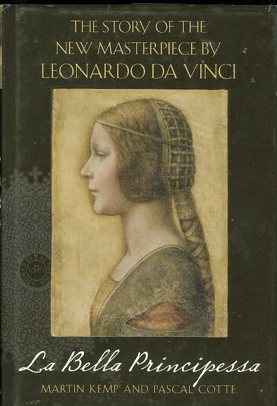
The da Vinci Detective: Art Historian Martin Kemp on Rediscovering Leonardo’s Tragic Portrait of a Renaissance Princess – an ARTINFO Interview by Andrew M. Goldstein, 17 October 2011. Extracts:
…[Andrew Goldstein] “They weren’t the only ones to differ on the attribution of the painting, and when you first announced that you believed it to be a Leonardo, a lot of people disagreed. One museum director even told the Telegraph’s Richard Dorment, anonymously, that it was a “screaming 20th century fake, and not even close to Leonardo himself.” Has there been any reversal since then?
[Martin Kemp] “I don’t know who this anonymous person was, but we carbon-dated the parchment and that eliminates it from being a screaming modern forgery. If it were a forgery, it used things that we’ve only recently discovered about Leonardo’s technique in the last 20, 30 years. The fact that it was owned by Giannino Marchig takes it outside the period when it could be a forgery, knowing what we know now, so that’s not an option. The ultra-violet turns up retouching, and it’s very clear it has been heavily restored, but most objects 500 years old, including the “Salvator Mundi”, which is the new picture being shown in the National Gallery.
[…] “One thing that critics of your ‘Principessa’ attribution tend to bring up is the involvement in your research of Peter Paul Biro, a fingerprint expert whose credibility was questioned. What is your opinion of him?
“Well, Biro I knew of as someone who’d specialized in fingerprints and paintings, so we asked him to look at the fingerprint that is in the upper left side of the ‘Bella Principessa.’ I had data on finger prints and finger marks in other Leonardo paintings, and he said one of these matched – not astoundingly, because it’s just the tip of a finger, and one doesn’t rely on fingerprints on vellum. It wouldn’t convict anybody in a court of law. You need more than that. So he did a limited job here, and we didn’t depend too much on that evidence. The press liked it, of course because it was cops and robbers stuff.
“I would not now probably say much about it at all, because on reflection I don’t think we have an adequate reference bank of Leonardo fingerprints. I’ve talked to fingerprint specialists, and they typically require a full set of reference prints. We don’t have that for Leonardo. My sense is – and this is Pascal’s sense, too – that it’s probably premature, given what we know about Leonardo’s fingerprints, to come up with matches at all. But the job Biro did was perfectly straightforward. There were no grounds for dishonesty. Peter Paul Biro is suing the New Yorker*, but I can’t comment at all upon the court case because that’s about things that I know nothing about, so it’d be totally improper. But he did work for us, which I now, let’s say, place less reliance on, simply because, on reflection, I think the fingerprint evidence is rather slippery.
“Because of the work you have done to bring the ‘Principessa’ into the fold of acknowledged Leonardos, some say you have crossed from the realm of scholarship to something more like advocacy. How do you explain your passion for the portrait?
“I would say that one of the differences between being a historian of art and being a scientist, as I was trained, is that you’re dealing with objects that are deliberately communicating with something other than just our intellect. So, for me, it’s not a dry process. You begin with the feeling it’s special, and if it stands up to the research, you end with the feeling that it’s special, and I make no apology for that. I’ve been critized as acting as an advocate for it, but if I’m writing, as I am in ‘Christ to Coke’, about the ‘Mona Lisa’, I’m an advocate for that too, because it’s a miraculous picture. Also, when I’m writing about the Coke bottle, I’m not an advocate for Coke as a drink. I hate it. But it’s one of the all-time great
bits of product design and I’m happy to say that.”
“*THE MARK OF A MASTERPIECE” by David Grann, The New Yorker, 12 July 2010 ~ Extracts:
[1] “But he [Martin Kemp] also relies on a more primal force. ‘The initial thing is just that immediate reaction, as when we’re recognizing the face of a friend in a crowd,’ he explains. ‘You can go on later and say “I recognize her face because the eyebrows are like this, and that is the right colour of her hair,” but, in effect, we don’t do it like that. It’s
the totality of the thing. It feels instantaneous.'”
[2] “Moreover, according to [the curator of Drawings at the Metropolitan Museum of Art, Carmen] Bambach, there was a more profound problem: after studying an image of the drawing [La Bella Principessa] – the same costume, the same features, the same strokes that Kemp examined – she had her own strong intuition. ‘It does not look like a Leonardo’, she said.”
[3] “When such a schism emerges among the most respected connoisseurs, a painting is often cast into purgatory. But in January, 2009, Kemp turned to a Canadian forensic art expert named Peter Paul Biro who, during the past several years has pioneered a radical new approach to authenticating pictures. He does not merely try to detect the artist’s invisible hand; he scours a painting for the artist’s fingerprints, impressed in the paint on the canvas. Treating each painting as a crime scene, in which an artist has left behind traces of evidence, Biro has tried to render objective what has historically been subjective. In the process he has shaken the priesthood of connoisseurship, raising questions about the nature of art, about the commodification of aesthetic beauty, about the very legitimacy of the art world.Biro’s research seems to confirm what many people have long suspected: that the system of authenticating art works can be arbitrary and, at times, a fraud.”
[4] “Biro asserted that he had uncovered the painting’s ‘forensic provenance,’ telling a reporter, ‘The science of fingerprint identification is a true science. There are no gray areas.’ Having developed what he advertised as a ‘rigorous methodology’ that followed ‘accepted police standards,’ he began to devote part of the family business to authenticating works of art with fingerprints—or, as he liked to say, to ‘placing an artist at the scene of the creation of a work.'”
[5] “But the International Foundation for Art Research, a nonprofit organization that is the primary authenticator of Pollock’s works, balked, saying that Biro’s method was not yet ‘universally’ accepted.
[6] “In 2009, Biro and Nicholas Eastaugh, a scientist known for his expertise on pigments, formed a company, Art Access and Research, which analyzes and authenticates paintings. Biro is its director of forensic studies. Clients include museums, private galleries, corporations, dealers, and major auction houses such as Sotheby’s. Biro was also enlisted by the Pigmentum Project, which is affiliated with Oxford University.”
[7] “Biro told me that the divide between connoisseurs and scientists was finally eroding. The best demonstration of this change, he added, was the fact that he had been commissioned to examine ‘La Bella Principessa’ and, possibly, help make one of the greatest discoveries in the history of art.”
[8] “After he first revealed his findings, last October, a prominent dealer estimated that the drawing [‘La Bella Principessa’] could be worth a hundred and fifty million dollars. (The unnamed ‘lady’ who had sold it at Christie’s for less than twenty-two thousand dollars came forward and identified herself as Jeanne Marchig, a Swedish animal-rights activist. Citing, among other things, the fingerprint evidence, she sued the auction house for ‘negligence’ and ‘breach of warranty’ for failing to attribute the drawing correctly.)”
[9] “Ellen Landau, the art historian, said that she was ‘absolutely convinced’ that the paintings were by Pollock. Biro was sent a photograph of a fingerprint impressed on the front of one picture. He identified six characteristics that corresponded with the fingerprint on the paint can in Pollock’s studio—strong evidence that the work was by Pollock. But, as more and more connoisseurs weighed in, they noticed patterns that seemed at odds with Pollock’s style. Meanwhile, in sixteen of twenty art works submitted for analysis, forensic scientists discovered pigments that were not patented until after Pollock’s death, in 1956. At a symposium three years ago, Pollock experts all but ruled out the pictures. Ronald D. Spencer, a lawyer who represents the Pollock-Krasner Foundation, told me, ‘Biro can find all the fingerprints he wants. But, in terms of the marketplace, the Matter paintings are done. They are finished.'”
[10] “Reporters work, in many ways, like authenticators. We encounter people, form intuitions about them, and then attempt to verify these impressions. I began to review Biro’s story; I spoke again with people I had already interviewed, and tracked down other associates. A woman who had once known him well told me, ‘Look deeper into his past. Look at his family business.’ As I probed further, I discovered an underpainting that I had never imagined.”
[11] “During the eighties and early nineties, more than a dozen civil lawsuits had been filed against Peter Paul Biro, his brother, his father, or their art businesses. Many of them stemmed from unpaid creditors. An owner of a picture-frame company alleged that the Biros had issued checks that bounced and had operated ‘under the cover’ of defunct companies ‘with the clear aim of confusing their creditors.’ (The matter was settled out of court.) As I sifted through the files, I found other cases that raised fundamental questions about Peter Paul Biro’s work as a restorer and an art dealer.
[12] “Biro refused, multiple times, to divulge where he had obtained either of the paintings. According to the Wises, Biro insisted that the person who sold him the paintings was in Europe, and that it was impossible to contact him.
[13] “Sand sought proof of a financial transaction—a check or a credit-card payment—between Biro and Pap. Biro, however, said that he had obtained them in exchange for two musical instruments: a Steinway piano and a cello.
[14] “Sand was incredulous: ‘Is Mr. Pap a music dealer or is he an art dealer?’ After Biro could not recall where he had originally purchased the cello, Sand suddenly asked him, ‘You ever been convicted of a criminal offense, sir?’
‘No.’
‘You are certain of that?’
‘Yes,’ Biro said.”
[15] “Throughout the trial, the Biros and their attorneys maintained that the two paintings sold to the Wises were authentic, but to make their case they presented an art expert who was not a specialist on Roberts, or even on Canadian art. On September 3, 1986, the court found in favor of the Wises, and ordered Peter Paul and Geza Biro to pay them the seventeen thousand dollars they had spent on the pictures, as well as interest.”
[16] “Lawsuits had piled up against Peter Paul Biro and his family business. In two instances, there were allegations that art works had vanished under mysterious circumstances while in the care of Peter Paul. In one of the cases, Serge Joyal, who is now a senator in Canada, told me that he left a nineteenth-century drawing with the Biros to be restored. Before he could pick it up, Peter Paul notified him that it had been stolen from his car and that there was no insurance. Biro, however, never filed a police report, and Joyal says that Biro pleaded with him to wait before going to the authorities. During their conversations, Joyal says, Peter Paul acted evasive and suspicious, and Joyal became convinced that Biro was lying about the theft. As Joyal put it, ‘There was something fishy.’ Though Peter Paul said that there was nothing ‘suspect’ about his behavior, and that he should not be held liable, the court awarded Joyal seven thousand dollars, plus interest.”
[17] “Within Montreal’s small art world, there were whispers about Peter Paul Biro and his father. But the lawsuits appear to have attracted virtually no public attention. In 1993, Peter Paul Biro filed for bankruptcy, and he never paid many of the judgments against him, including what he owed the Wises and Joyal. Lipsz’s lawyer said of Biro, ‘He oiled his way out of that whole thing. . . . He got away scot-free.'”
[18] “Biro was part of an effort to launch a venture named Provenance, which would provide, as he put it, the ‘clever strategy’ necessary to sell ‘orphaned’ paintings for tens of millions of dollars. According to a business prospectus, marked confidential, Provenance would acquire art works that had been forensically validated by Biro and several colleagues, and sell them in a gallery in New York City. The company chose a thumbprint for a logo.”
[19] “Provenance was cleverly tapping into the public’s desire to crack open the art world, offering the tantalizing dream that anyone could find a Pollock or a Leonardo or a Turner languishing in a basement or a thrift shop. The company combined the forensic triumphalism of ‘C.S.I.’ with the lottery ethos of ‘Antiques Roadshow.’ (An associate producer at ‘Roadshow’ had already sent Biro an e-mail about possibly doing a segment on the Parkers’ ‘unbelievable discovery.’)
[20] “Biro previously had been suspected of creating an investment scheme around a seemingly precious object, with the promise that it would eventually reap huge profits. In the late nineteen-nineties, he persuaded a Canadian financial adviser, Richard Lafferty, who is now dead, to invest in a venture to authenticate and sell a work purportedly by Raphael’s disciple Perino del Vaga. Three of Lafferty’s colleagues confirm the story, as do letters, memorandums, and other documents.”
[21] “By the fall of 2005, Ken Parker had begun to look into the people behind Provenance. It turned out that Tod Volpe, in the nineties, had defrauded his art clients, including Jack Nicholson, of nearly two million dollars, and had served two years in prison. Parker discovered that one of Volpe’s principal partners in Provenance was also an ex-con, who had done time for tax evasion and for running a drug-smuggling operation in the United States. (Volpe told me, ‘We all have skeletons in our past.’) Parker confronted Biro, who, in a subsequent e-mail, told Parker that he had ‘severed all communication with Volpe.’”
[22] “And only months after rescinding his request for money he asked the Parkers to fund another new project: a privately endowed department for him and a colleague at Oxford University. ‘Naturally it is 100% tax deductible,’ Biro wrote, in an e-mail. ‘Those who support the foundation of a bold and new department for us at Oxford will have their name on a plaque or have the department named after them such as “The Ken Parker Department for Forensic Art History.” Sounds cool?'”
[23] “When a forgery is exposed, people in the art world generally have the same reaction: how could anyone have ever been fooled by something so obviously phony, so artless? Few connoisseurs still think that Han van Meegeren’s paintings look at all like Vermeers, or even have any artistic value. Forgers usually succeed not because they are so talented but, rather, because they provide, at a moment in time, exactly what others desperately want to see. Conjurers as much as copyists, they fulfill a wish or a fantasy. And so the inconsistencies—crooked signatures, uncharacteristic brushstrokes—are ignored or explained away. “
[24] “In the case of ‘La Bella Principessa,’ Biro did not handle the drawing, and was sent multispectral images from another laboratory, which he then developed and enhanced. Martin Kemp, the Leonardo scholar, told me, ‘In terms of what Biro did for us, I have absolutely no problems with any potential ethical issues.’ He emphasized that his opinion of the drawing did not depend on the fingerprint evidence: ‘I’m entirely confident that it is by Leonardo.'”
[25] “A final verdict on whether ‘La Bella Principessa’ is genuine may not be reached for years, but more and more connoisseurs have voiced doubts. Skeptics express surprise that there is no apparent historical record for the drawing, given that Leonardo was one of Italy’s most famous painters during the Renaissance. They note that vellum lasts for centuries, and that it would be easy for a forger to obtain old sheets. Many of the critics share the view of the Met’s Carmen Bambach: it just doesn’t look like a Leonardo. ARTnews, which has reported on Wertheim’s findings, recently interviewed Klaus Albrecht Schröder, the director of the Albertina Museum, in Vienna. ‘No one is convinced it is a Leonardo,’ he said. David Ekserdjian, an expert on sixteenth-century Italian drawings, wrote in The Burlington Magazine that he ‘strongly suspects’ it is a ‘counterfeit.’ Other art critics have suggested that Kemp has succumbed to a fantasy.
[26] “Whereas Biro had once spoken of the absolute objectivity and infallibility of fingerprint analysis, he now sounded more like a connoisseur than like a scientist. ‘I’m trying to define, for example, what is the point that something becomes a matter of interpretation,’ he said. ‘In other words, where is that line? O.K., on the one hand, fingerprint practitioners state that fingerprint identification is a science. I’m more toward the other side, where I’m convinced by my own personal experience that it is very much like connoisseurship, because of . . . things I see they don’t.’”
[27] “I asked him whether he might have been wrong in suggesting that Leonardo had ever touched ‘La Bella Principessa.’ He looked up at the sky and said, ‘It’s possible. Yes.’”
In July 2011 ADWEEK reported that Biro had sued The New Yorker and David Grann for $2 million on twenty-four charges of false and malicious defamation – Forensic Art Expert Peter Paul Biro Sues New Yorker for Deformation. The action failed on every count (see “Art Authenticator Loses Defamation Suit Against The New Yorker“).
CODA: Faking A Picasso and a Provenance
In June last year, we and Martin Kemp were asked (separately) by the Daily Mail to comment on a claimed Picasso painting that supposedly had been found by an artist among his late mother’s belongings in an old suitcase in the loft – “Is this a long-lost Picasso? Painting that bears a strong resemblance to Cubist’s work is discovered rolled up in a battered suitcase that hasn’t been touched in 50 years” – the Mail reported:
“…Last month, a 1955 Picasso painting – Les Femmes d’Alger – broke auction records when it sold at Christie’s for a staggering £115 million.
“Art expert Michael Daley told MailOnline his first instinct was that the painting was not a Picasso. ‘The colours and all of that are right but I think there is too much incidental detail and not enough decisive interest or exploration. This is
all sharp edges and brown tones and what-have-you, but it doesn’t have the driving sense of Picasso getting at something, getting at a figure trying to see something about it. This is more decorative. It can be no more than an instinctive first impression, but to me it doesn’t look like a Picasso Cubist painting from that period.’
“Martin Kemp, emeritus professor of art history at Oxford University, was also skeptical. Prof Kemp said: ‘It’s pretty close to Picasso’s portrait of Daniel-Henry Kahnweiler, the dealer whom he painted in 1910 and is in the Art Institute of Chicago. This looks to be a relatively competent but not excellent near copy of it – the signature is very dodgy. Without doing a full art historical analysis – and I’m not a Picasso expert – I would say someone has made a variant of the Picasso portrait. Also the signature with the rounded S’s doesn’t seem to correspond to Picasso’s way of signing and thirdly the canvas doesn’t look quite right for Picasso of that period.
But I hope for the sake of the owner that I’m wrong.'”
On 6 July 2015 The Scotsman disclosed that the discovered ‘Picasso’ was a fake (“Picasso painting in Fife attic ‘a hoax’”). The faker, Dominic Currie, reportedly described his purported-Picasso (which had been about to be inspected by Christie’s) as “a piece of performance art [made] in order to raise awareness of the struggling artists in Scotland.” The fake is now being offered for sale on the website of a picture restoration business.
Michael Daley. 10 December 2016.
12 December 2016. Postscript: “Bode gave an opinion on art works from many fields, on Netherlandish painting of the seventeenth century, on Italian sculpture, Persian rugs, majolica, German wood sculpture, and many other things. His writings were for him always a means to an end, and were frequently controversial and advocatory. Almost always he judged correctly, and at the time he expressed them, his communications were of significance and infinitely enriched knowledge in many fields. But the tragic fate of the ‘connoisseur’ lies in the fact that yesterday’s new, strikingly accurate definitions are today’s common properties and banalities, that only the mistakes linger in the memory under the name of the originator.”
~ Max J. Friedländer on Wilhelm Bode – Reminiscences and Reflections.