
From Guido to Boccioni – The Liberation and Repudiation of Classicism

A fascinating and ground-breaking show – Umberto Boccioni: Recreating the Lost Sculptures – centres on four three-dimensional recreations of Boccioni’s lost plaster and mixed media sculptures. This exhibition – running at the Estorick Collection, London, until 22 December – prompts far-reaching technical, artistic and art historical questions.
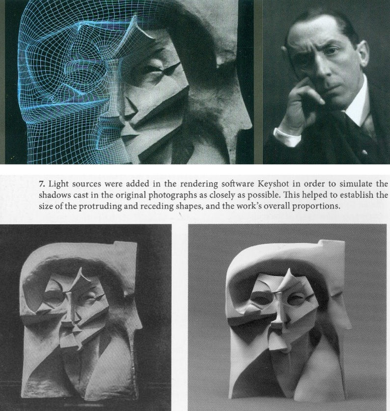
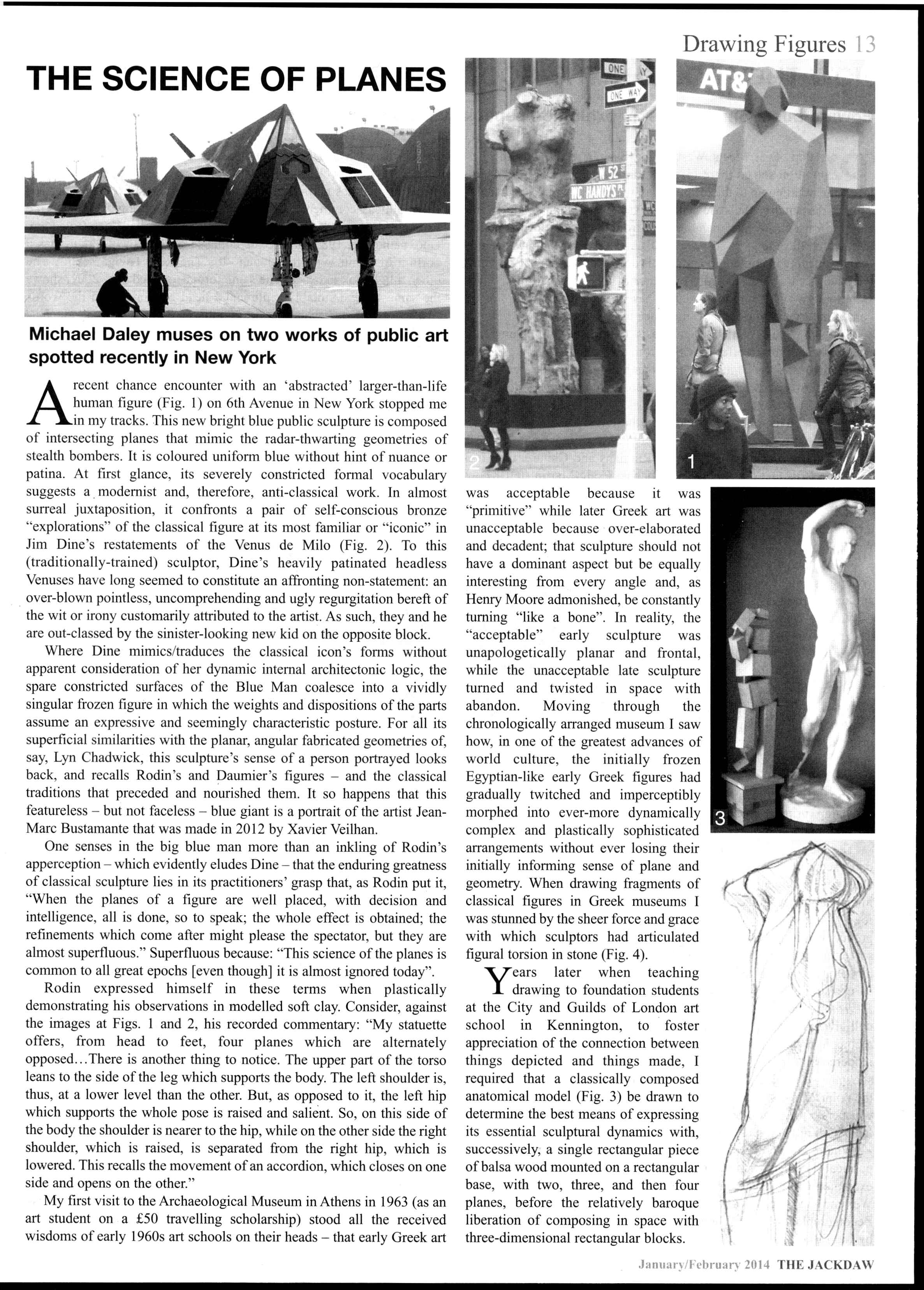
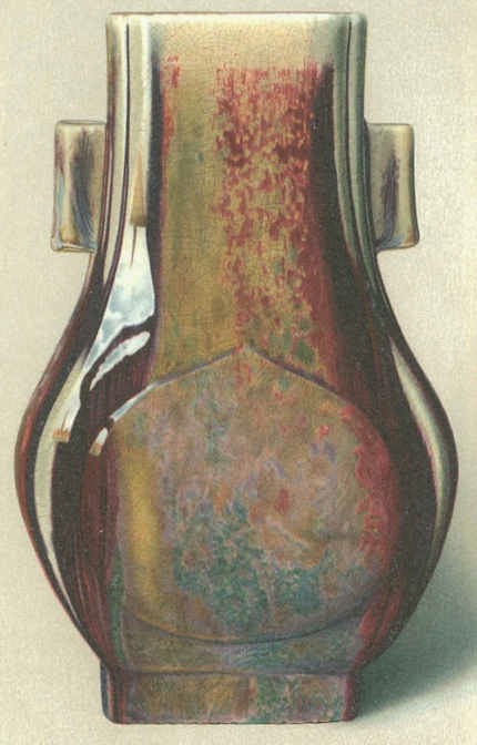
Above, Fig. 1: Top left, a detail of a 1913 photograph of a lost sculpture Empty and Full Abstracts of a Head with a superimposed reconstructed 3D mesh; top right, Umberto Boccioni, c. 1914; below, a note on the technical means of the presently exhibited recent recovery/replications.
THE TECHNICAL/INTERPRETIVE PROBLEMS
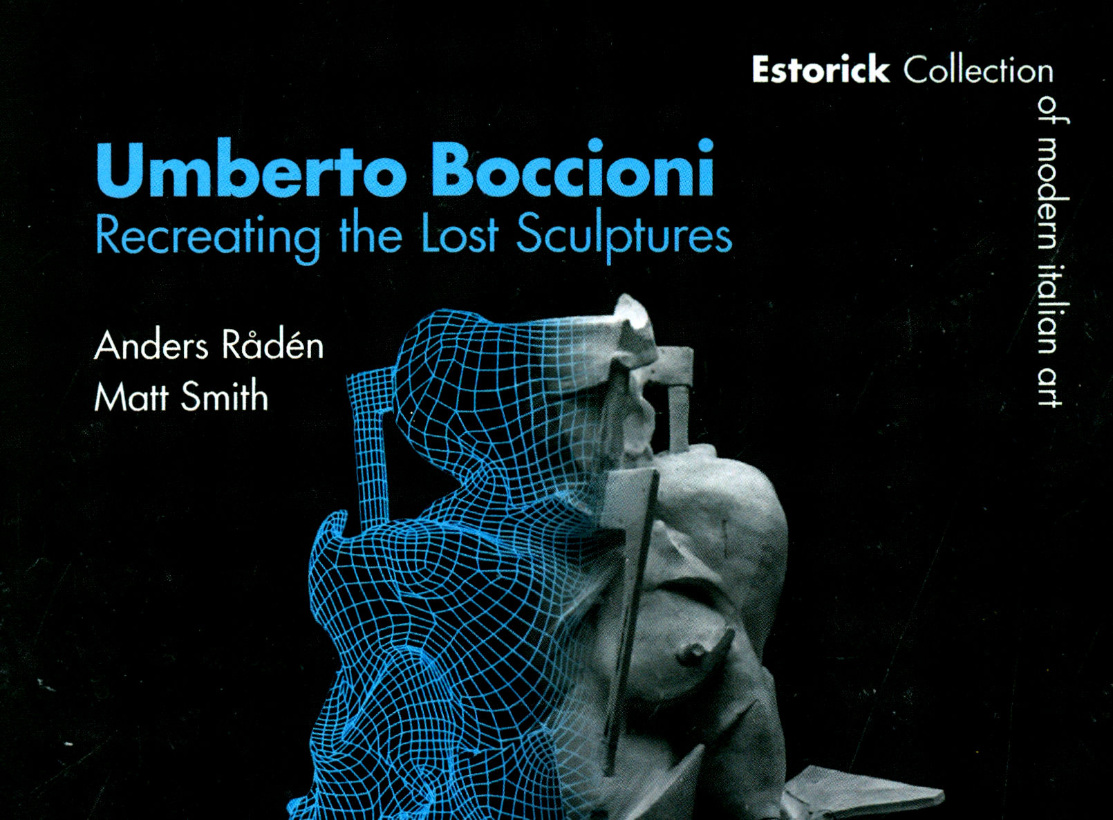
The wizardry whereby old photographic records of lost sculptures were aggregated to produce digitally “virtual”, in-the-round, simulations of sculptures to be printed out or milled in 3D is well-described in an excellent catalogue. This “recovery” or “recreation” of sculptures that were destroyed in 1927 was made by two digital artists and designers, Anders Rådén and Matt Smith.
Above, Fig. 2: Detail of the catalogue cover. Rådén and Smith acknowledge that technical difficulties required a degree of interpretation and creativity in what are necessarily provisional reconstructions: “the discovery of new or better photographs will always necessitate a rethinking of certain shapes”. Inconsistencies of surface finish and sometimes forms emerge between the new simulations and old photographic records – as was also the case with the bronze casts of plaster sculptures made after Boccioni’s death. Such notwithstanding, the authors’ hopes that fresh insights into Boccioni’s sculptural practice will offer new interpretive opportunities for specialists and the general public are not vain: accepted as what they are, even a part-hypothesized proximate and provisional physical recovery of four lost sculptures that were made at a crucial stage of Boccioni’s late development can assist appraisals of the oeuvre of a seminal figure who, personally and professionally speaking, remains problematic.
WHITHER BOCCIONI’S FUTURIST EYE?
Among early 20th century noisy proselytising art movements, Italian Futurists were obnoxious for their ultra-nationalistic, proto-Fascist fervour; their international cultural competitiveness and their affected cults of death and destruction. Speed and industrialization were glorified. War was hymned as the world’s “only true hygiene”. Explosions were likened to flowers. Past artistic glories were excoriated – museums were cemeteries and mausoleums; traditions were contaminations to be excised. Boccioni’s proclaimed terror of being crushed by past cultural attainments triggered his demand that everything had to go: “In the monuments and exhibitions of every European city, sculpture offers a spectacle of such pitiable barbarism, clumsiness and monotonous imitation that my Futurist eye recoils from it with profound disgust!” All nations, he held (Technical Manifesto of Futurist Sculpture, 1912), were being crushed by blind, foolish and cowardly adherence to past cultural attainments that ranged from Greece and Michelangelo to Slavic countries with their “archaic Greek and Nordic and Oriental monstrosities, a shapeless mass of influences that range from the excess of abstruse details deriving from Asia, to the childish and grotesque ingenuity of the Lapps and Eskimos.” Boccioni further complained of “Greek-ized Gothicism sweetened with effeminate care by German pedantry” and saw the public as “scum whom we must lead into slavery”.
This belligerent naughty movement par excellence was doubly parasitical and brazenly hypocritical. A century on, Boccioni’s position is assured. He is in the art history books. His works are in great museums and prosper on the market: on 12 November 2019 a bronze cast of his now iconic Unique Forms of Continuity in Space sold for $16.1 million – appreciably more than the $4.8 million achieved the following day by a recently discovered Artemisia Gentileschi Lucretia – albeit while dramatically less than Jeff Koons’ silvered bunny which made $91 million this year.
A MONUMENTALLY PROVOCATIVE AND MYSTIFYING PROSPECTUS
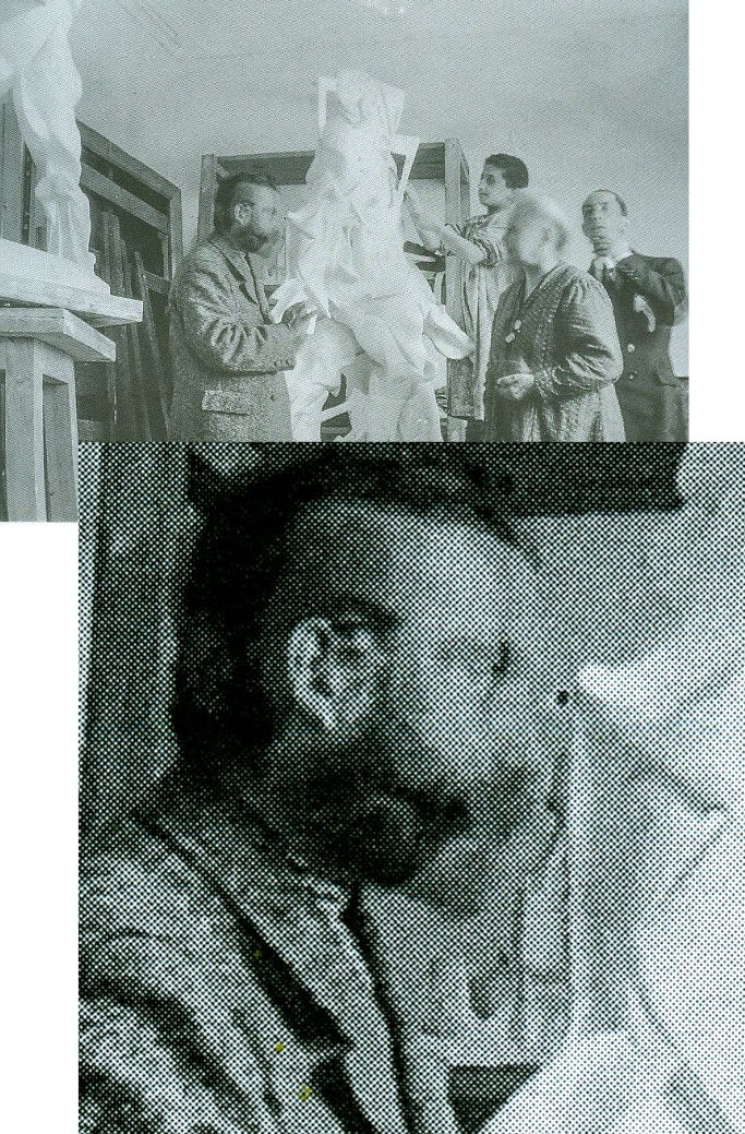
Above, Fig. 3: Top, Boccioni with his mother, an assistant and, left, Giacomo Balla; below, right, Balla’s head caught in double exposure. Boccioni was nothing if not philosophically and programmatically ambitious: the “means of achieving the complete renewal of this mummified art”, he insisted, would only be possible if “the essence [of Art] itself” were renewed. Constructing with elements drawn from Egypt, Greece, or Michelangelo was like “wanting to draw water from a dry well with a bottomless bucket”. At the same time he (initially and perhaps, even essentially, a painter) betrayed a lack of sculptural self-confidence – even if and when purged of historical contaminations, sculpture would remain subservient to painting which had “taken on a new life, profundity, and breadth through a study of the landscape and the environment, which are made to react simultaneously in relation to human figures or objects, reaching the point of our Futurist INTERPENETRATION OF THE PLANES [Technical Manifesto of Futurist Painting, 11 April 1910].” On that deferential prospectus, it was hoped that: “In the same way sculpture will find a new source of emotion, hence of style, extending its plastic quality to what our barbarous crudity has made us think of until now as subdivided, impalpable, and thus plastically inexpressible.”
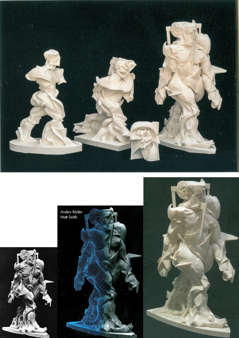
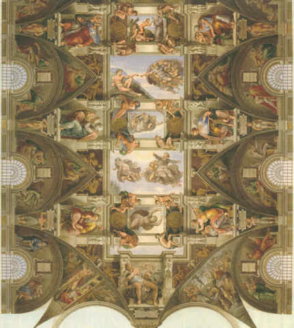
Above, Fig. 4: Top, the four digitally and plastically reconstituted sculptures, as printed in 1/4 scale, these being, from the left, top: Spiral Expansion of Muscles in Movement; Speeding Muscles; Empty and Full Abstracts of a Head, and Synthesis of Human Dynamism. Below them are: left, Boccioni’s sculpture Synthesis of Human Dynamism as photographed when first constructed in plaster; centre, as part-described in 3D mesh form and part as originally realised; and, right, as when wholly reconfigured by 3D printing.
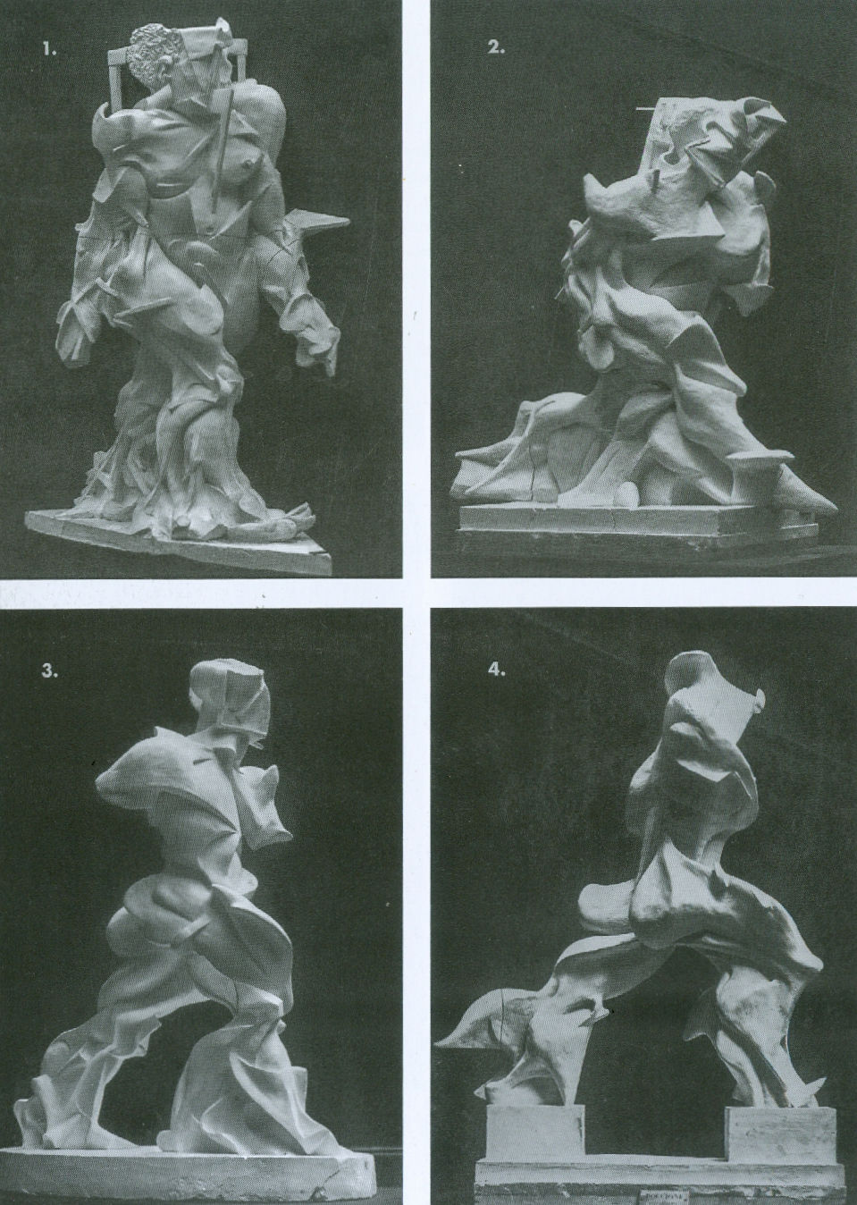
Above, Fig. 5: Rådén and Smith’s (persuasive) proposed chronological sequence of Boccioni’s four striding figures based on stylistic similarities and evolving shapes – showing, as from 1 to 4, Synthesis of Human Dynamism, Speeding Muscles, Spiral Expansion of Muscles in Movement and Unique Forms of Continuity in Space. This sequence bears witness to a dramatically critical “late period” development (1912-13) in the artist’s short life (he died in 1916 on a military exercise).
What might be said of this evolution? On his own programme, Boccioni sought not to construct sculptural bodies but three-dimensional records of “a body’s action”. He initially worked with multiple materials in an “architecture of the pyramid” which he abandoned for one of “the spiral”. He disclaimed any quasi-cinematographic freezing of discrete figural moments and any notion of an immobile body being set in motion. He expressly postulated an inherently dynamic body – “a truly mobile object, which is an absolutely new and original living reality. In order to represent a body in motion, I do not render its trajectory – that is to say, its passage of one state of rest to another – but strive to capture the form that expresses its continuity in space.” If such an aspiration is thought to have been realised in his Unique Forms of Continuity in Space, it followed much synthesizing of manifestly concrete realisations of forms and trajectories. The authors of this recent exercise in replication have performed great service by fleshing out the photo-record of what was, by any standards, a remarkably swift genesis of an arresting and encapsulating motif. Now that the entire sequence of those figures-in-movement can be comprehended in our own lived spaces, the question arises: What carried Boccioni so very swiftly from Figure 1 to the acclaimed and ambitiously conceived Figure 4?
In 1958 Marianne Martin lauded Boccioni’s Unique Forms of Continuity in Space as a summation of his endeavours and an embodiment of the Futurist ideal of the modern man: “…he is impersonal and unsentimental, clean, clear cut, and disciplined, intelligent but unphilosophical, masculine yet without sexual passion. His strength and capabilities are magnified a hundredfold through science which is conceived by him. He strides majestically and weightlessly on winged feet, forcing ‘the muscles… into streamlined shapes as if under the distorting pressures of supersonic speed’ [Alfred H. Barr Jr.].” Notwithstanding such heroising accounts, the arc of Boccioni’s artistic development betrays indebtednesses at every turn to both his contemporaries and artistic glories of the past against which he railed.
A RAPID STYLISTIC TRANSFORMATION
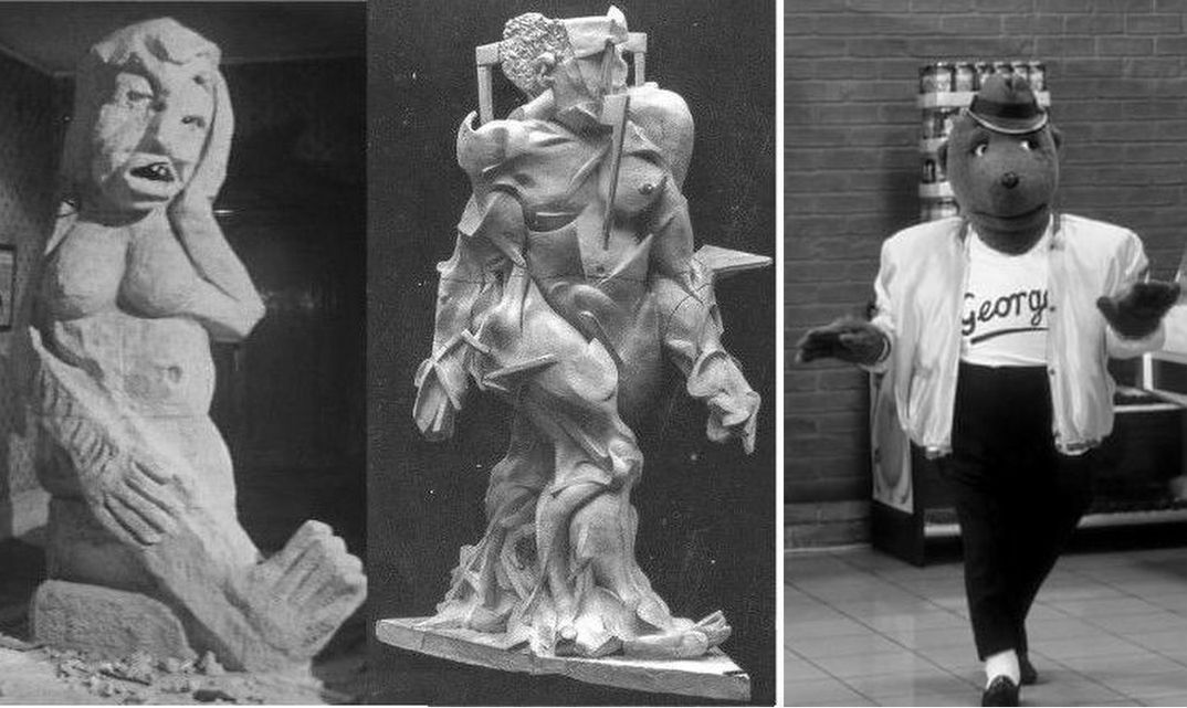
Above, Fig. 6: From left to right, Aphrodite at the Watering Hole, as featured in the 1961 film The Rebel; Boccioni’s Synthesis of Human Dynamism; George-the-Bear as featured in the 1980s advertising campaign for Hofmeister lager. Boccioni’s assumed “start of sequence” (No. 1) figure, Synthesis of Human Dynamism, is a near-incoherent seeming depiction of a lumbering, part-armoured, part-flayed human figure; a disturbing, mongrel conflation of the deconstructed and reconstructed peppered with penetrating symbolic and literal motifs/devices like a modern day secular St. Sebastian. Rådén and Smith tactfully compare this (and the assumed second figure) unfavourably with the last two figures on account of being: “characterised by a sense of heaviness and complexity of form that renders their ‘movement’ far more staccato” than the latter two in which are eliminated “those extraneous details…such as the hair, nipple and navel…and the architectural elements”. The emphatic navel and nipples and sharply upturned foot are precisely encountered in the 1961 film The Rebel’s spoof-modernist Aphrodite sculpture. Similarly, No. 1’s gait, with its line-ahead feet, see-sawing shoulders and balance-assisting hands anticipated George-the-Bear in the 1980s British Hofmeister beer advertisements.
Body No. 2 effects a huge transition from lumbering horror-film apparition to a racing figure: the head comes down to reduce wind resistance; the feet fly and the leading leg leaves a succession of “before” positions in a bridged supporting triangular wall. The hands and arms are drawn into the now compacted upper body which leans into the motion as if pulling and willing the legs that transport it. The former painfully impacted planes of window frames and such at No. 1 are being digested and incorporated within the body’s armoured architecture.
Quantum leaps occur at No.3. The arms are now as much implicit as sculpturally realised; the legs separate, articulating a wedge of space and with each leg becoming an individual powerhouse of accumulated replications of “musculature” and hard, bony or armoured forms (shin turning into snow plough); the combined forms of the lower legs suggest the pulling power of a dray horse; the figure proceeds in stately purposive fashion as if advising its predecessor “Less Haste, More Speed”. Paradoxically, the legs’ aggregated trajectories congeal into stolid pyramids that root the figure to its base thereby rendering it immobile, arrested and frozen in time. The double breakthrough of interpenetrating space, and a dramatically contracting torso came within a year of the exhibiting of Rodin’s The Walking Man and Archipenko’s six-feet high prepossessing and lucid carved Family Life – Fig. 7, below.
Boccioni’s final figure begins to take flight and vault chasms: the forms thin-down, like those of a carcase left shriven in the sun, and yet stretch, curve and bite on the air like propeller blades. The torso is further de-humanised: the arms are gone; the “head” becomes vestigial, hollowed and mask-like in one aspect. Where, in No. 3, the lower legs are rooted to the base, in No 4 the ‘feet’ are both greatly reduced and perched on blocks, with the resulting elevation implying an imminently airborne state. This figure’s posited/realised rush through the air has seemingly generated stringier, more fluid, less mechanised or armoured forms. Like a gazelle, speed has become its protector and its means of existence.
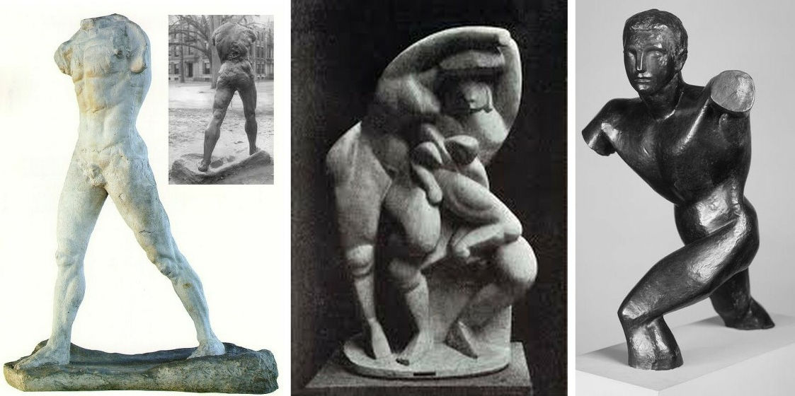
Above, Fig. 7: Left, Rodin’s The Walking Man; centre, Archipenko’s 1912 Family Life; right, Duchamp-Villon’s 2010 Torso of a Young Man. Although anatomically rooted, Rodin’s figure had been rendered partial and fragmentary, so as concentrate attention on the muscular dynamics of the act of walking – or, more accurately, striding. Where Henry Moore saw a self-conscious attempt to create a classicism-without-associations or historical baggage, Boccioni repudiated classicism outright and denied having taken assistance from other artists, living or dead or from time-sequence multiple images photographs (chronophotography). The supposedly coincidental near-simultaneous occurrence in both Rodin and then Boccioni of a decisively articulated wedge of space between the legs and a ruthless paring of the upper figure simply strains credulity. The Estorick exhibition’s authors and others have noted Boccioni’s eager exposure to the sculptures of Duchamp-Villon, Brancusi and Archipenko – whose superb essay in the unification of diversely scaled and finished rounded/facetted forms on an integral base (as above), could scarcely be thought to have left Boccioni indifferent or untouched. John Golding noted that Boccioni might well have seen his own work as an updating of Duchamp Villon’s 2010 Torso of a Young Man with its truncated limbs and forward-thrusting torso (above, right) but, even more, he had sensed in Boccioni a late-stage repentance and acceptance of an “indigenous Italian and ultimately classicising tradition”.
Certainly, the initial conceptual and plastic clumsiness of Boccioni’s attempted renderings of a purported scientifically-conceived distinctively modern notion of movement compared badly with the verve and lucidity of his more sculpturally competent and focussed contemporaries. If given classical movements can tire and lose their appeal, the extent to which classicism itself has repeatedly proved to be both intrinsically dynamic and irrepressibly enduring should not be overlooked. As will be seen in Part II, consideration of past Italian manifestations of that most long-lived and endlessly various cultural construct would not only likely have proved beneficial to Boccioni’s own formal ambitions, a careful reading of the now once again in-real-space plastic evolution of Boccioni’s “Flying Man” figures, suggests that his now iconic Unique Forms of Continuity in Space might itself better be seen as product and vindication of Classicism, not its avowedly intended Nemesis.
Michael Daley, 26 November 2019
Rodin and ancient Greek art – a personal view of a magnificent show
Last night we were bidden, as Sir Roy Strong might have put it, to the opening and reception of the joint British Museum and Rodin Museum exhibition “Rodin and the art of Greece”.
It proved an extraordinary and privileging occasion that was close to our heart in very many respects. Guests were ushered into a corner of the Great Court for drinks and canapés. In that dwarfing space the buzz of expectation among the small standing groups resembled a Royal Opera House opening of Verdi’s Un ballo in maschera. The company was illustrious. Among the many VIPs, journalistic aristocracy was present in Sir Simon Jenkins of the Guardian and Lord Gnome of Private Eye. The Two Greatest Living British Sculptors were represented by Sir Anthony Gormley R. A. (who sported some Palestinian headwear around his neck). The British Museum’s new director, Hartwig Fischer, opened the speeches well and graciously. The man from the generous sponsors, Bank of America, Merrill Lynch, followed and the French Ambassador opened the exhibition itself with certain ironical asides about the virtues of European cooperation. And we then poured into the exhibition.
As others have already indicated, this show, the combined product of a great dedicated artists’ museum and a great “universal” encyclopaedic museum, is simply stupendous. On entry, the shock of the space and its fabulous contents was also operatic: a beautifully lit elegantly constructed chip-board “set” snakes down the centre of the otherwise soul-less and dispiriting Lord Rogers’ black box, which, thankfully on this occasion, has been opened to disclose a courtyard. The continuous low plinth carries the larger, show-stopping sculptures and creates subsidiary spaces that house drawings and smaller works. Sparks fly between the works on display. The labels are good and the catalogue is exemplary. If the essential message of this engagement of a giant of modernism (Rodin) with a legendary classical artist (Phidias) – that to advance we must look back – seems subversively reactionary in today’s art world, so much the worse for us. But for this artist, the timing feels optimal: Modernism is a spent and disintegrating force. Its void is filling with assorted non-artistic activisms and relativisms.

The show is welcome in other respects. It springs from the strengths of museum curators working to their departmental briefs, in this case that of Ian Jenkins, a very fine classical scholar, who himself, as it happens, has carved stone. Even before the show opened Jenkins was creating sparks of his own. He had noticed a distinct echo in Rodin’s “Thinker” of a convention for mourning figures in Greek classical art. Yesterday (24 April), a sculptor took issue with this suggestion in a letter to the Times (see below) claiming a likelier source to be present in Michelangelo’s sculpture and paintings.
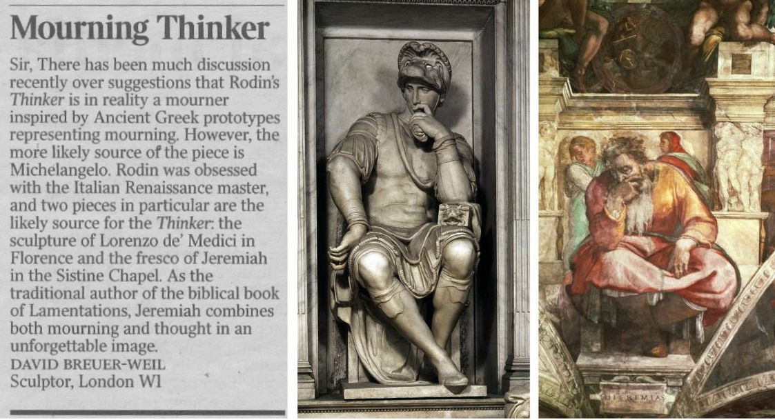
Certainly, Rodin’s awareness of and indebtedness to Michelangelo (who once said that he was never less alone than when alone with his own thoughts) was immense and, as David Breuer-Weil points out, there are strong figural resemblances. Nonetheless, Jenkins’ point was phrased with precision and he had elaborated it with striking eloquence on yesterday’s Radio 4 Today programme – this itself being a most welcome development: we have rather forgotten in recent years that museums are their curators. In the two cited Michelangelos the Lorenzo de’ Medici figure is thoughtful but imperious and unperturbed. His back is straight and his shoulders are held high. A forefinger touches his nose and lips but it has no structural function. In the painted prophet Jeremiah from the Sistine Chapel ceiling, while the figure slumps the lower legs are decorously crossed and bear little weight. It so happens, this is a figure with which we have engaged in the past and it is carried on the back of the current ArtWatch UK members’ Journal:
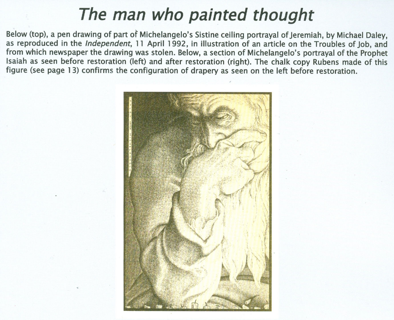
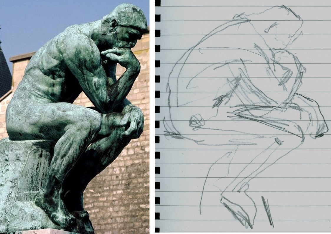
As seen in the Jeremiah detail we had adapted for a newspaper illustration (above), the head rests heavily on the hand which grips the lower face and entirely conceals the mouth – perhaps this near-universal indicator of thought stems from the source of speech being taken out of commission? There is a vital difference between the Thinker and the Jeremiah. In the former, the head rests heavily on the hand but the forearm/hand serves only as a prop or buttress. Indeed, the entire figure is a dynamic portrayal of weight, as we noted in graphic shorthand last night in the diagram below right. Even the legs are involved in buttressing the entire slumping figure who grips the very earth with his toes (photo. by promentary.net.au). Crucially, the hand does not engage directly or expressively with the face other than insofar as the upward buttressing force of the knuckles distorts the upper lip.
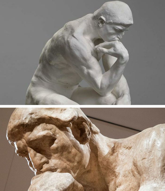
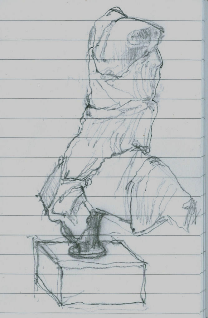
The face itself (above) is not simply thoughtful or absorbed but mournful, desolate. This head is as heavy as the heart within the figure. Jenkins seems vindicated on his observation. For artists and, particularly for sculptors, this show is, more than an invitation, a command to stop, look and draw. The British Museum has sensed as much and will be making drawing materials available to visitors. For our part, we would urge them not to be bashful and to seize the opportunity to draw unselfconsciously and purposively. Drawings are best seen not as a species of self-expression but as straightforward explanations. Draw to explain that which seems interesting significant or distinctive in a particular figure. There are no right answers here, just nice observations worthy of being made. Drawing regularly disciplines thinking and sharpens looking. (Degas once told a woman she had a beautifully drawn head. Draughtsmen know exactly what he meant.) Last night we snatched some drawings of the backs of figures, as below with Iris from the Parthenon whose flowing animalistic energy directly inspired Rodin to make an even more dynamically eroticised bronze.
RODIN’S METHOD ENCAPSULATED
We would especially urge all visitors to take careful note of a little showcase at the far end of the gallery (next to a demonstration of plaster piece/mould casting). In it are two small modelled figures that constitute a summation of Rodin’s sculptural insights. The models were made to explain/demonstrate the differences between classical sculpture and Michelangelo’s figures. We wrote of Rodin’s understanding of differing figural conventions four years ago in the Jackdaw magazine.
The quoted Rodin comments in the article above came from the 1912 English version of Paul Gsell’s Art by Auguste Rodin. We supplement them here with a fuller account from the horse’s mouth:
“One Saturday evening Rodin said to me ‘Come and see me tomorrow morning at Meudon. We will talk of Phidias and of Michael Angelo and I will model statuettes for you on the principles of both. In that way you will quickly grasp the essential differences of the two inspirations, or, to express it better, the opposed characteristics which divide them’…Rolling balls of clay on the table, he began rapidly to model a figure talking at the same time. ‘This first figure will be founded on the conception of Phidias. When I pronounce that name I am really thinking of all Greek sculpture, which found its highest expression in Phidias.’
“The clay figure was taking shape. Rodin’s hands came and went, adding bits of clay; gathering it with in his large palms, with swift accurate movements; then the thumb and the fingers took part, turning a leg with a single pressure, rounding a hip, sloping a shoulder, turning the head, and all with incredible swiftness, almost as if he were performing a conjuring trick. Occasionally the master stopped a moment to consider his work, reflected, decided, and then rapidly executed his idea…Rodin’s statuette grew into life. It was full of rhythm, one hand on the hip, the other arm falling gracefully at her side and the head bent. ‘I am not [f]atuous enough believe that this quick sketch is as beautiful as an antique,’ the master said, laughing, ‘but don’t you find it gives you a dim idea of it? […]Well, then, let us examine and see from what this resemblance arises. My statuette offers, from head to feet, four planes which are alternatively opposed. The plane of the shoulders and chest leads to the left shoulder – the plane of the lower half of the body leads towards the right side – the plane of the knees leads again towards the left knee, for the knee of the right leg, which is bent, comes ahead of the other – and finally, the foot of this same right leg is back of the left foot. So, I repeat, you can note four directions in my figure which produce a very gentle undulation through the whole body.
‘This impression of tranquil charm is equally given by the balance of the figure. A plumb-line through the middle of the neck would fall on the inner ankle bone of the left foot, which bears all the weight of the body. The other leg, on the contrary, is free – only its toes touch the ground and so furnish a supplementary support; it could be lifted without disturbing the equilibrium. The pose is full of abandon and of grace.
‘There is another thing to notice. The upper part of the torso leans to the side of the leg which supports the body. The left shoulder is, thus, at a lower level than the other. But, as opposed to it, the left hip, which supports the whole pose, is raised and salient. So, on this side of the body, the shoulder is nearer the hip, while on the other side the right shoulder, which is raised, is separated from the right hip, which is lowered. This recalls the movement of an accordion which, closes on one side and opens on the other…Now look at my statuette in profile. It is bent backwards; the back is hollowed and the chest is slightly expanded. In a word, the figure is convex and has the form of a letter C. This form helps it to catch the light, which is distributed softly over the torso and the limbs and so adds to the general charm…Now translate this technical system into spiritual terms; you will then recognise that antique art signifies contentment, calm, grace, balance and reason…And now, by the way, an important truth. When the planes of a figure are well placed, with decision and intelligence, all is done, so to speak; the whole effect is obtained; the refinements which come after might please the spectator but they are almost superfluous. This science of the planes is common to all great epochs; it is almost ignored today.’”
And then, Gsell noted, Rodin turned to Michelangelo: “‘Now! Follow my explanation. Here, instead of four planes, you have only two; one for the upper half of the statuette and the other, opposed, for the lower half. This gives at once a sense of violence and constraint – and the result is a striking contrast to the calm of the antiques. Both legs are bent, and consequently the weight of the body is divided between the two instead of being borne exclusively by one. So there is no repose here, but work for both lower limbs…Nor is the torso less animated. Instead of resting quietly, as in the antique, on the most prominent hip, it, on the contrary, raises the shoulder on the same side so as to continue the movement of the hip. Now, note that the concentration of effort places the two limbs one against the other, and the two arms, one against the body and the other against the head. In this way there is no space left between the limbs and the body. You see none of those openings which, resulting from the freedom with which the arms and legs were placed, gave lightness to Greek sculpture. The art of Michelangelo created statues all of a size in a block. He said himself that only those statues were good which could be rolled from the top of a mountain without breaking; and in his opinion all that was broken off in such a fall was superfluous
‘His figures surely seem to be carved to meet this test; but it is certain not a single antique could have stood it; the greatest works of Phidias, of Praxiteles, of Polycletes, of Scopas and of Lysippus would have reached the foot of the hill in pieces. And this proves how a formula which may be profoundly true for one artistic school may be false for another.
‘A last important characteristic of my statuette is that it is in the form of a console; the knees constitute the lower protuberance; the retreating chest represents the concavity, the bent head the upper jutment of the console. The torso is thus arched forward instead of backward as in antique art. It is that which produces here such deep shadows in the hollow chest and beneath the legs. To sum it up, the greatest genius of modern times has celebrated the epic of shadow, while the ancients celebrated that of light. And if we now seek the spiritual significance of the technique of Michael Angelo, as we did that of the Greeks, we shall find that his sculpture expressed restless energy, the will to act without hope of success – in fine, the martyrdom of the creature tormented by unrealisable aspirations…To tell the truth, Michael Angelo does not, as is often contended, hold a unique place in art. He is the culmination of all Gothic thought…He is manifestly the descendant of the thirteenth and fourteenth centuries. You constantly find in the sculpture of the Middle Ages this form of the console to which I drew your attention. There you find this same restriction of the chest, these limbs glued to the body, and this attitude of effort. There you find above all a melancholy which regards life as a transitory thing to which you must not cling.’”
Clearly, Rodin would have no shortage of ideas if invited to deliver the Reith Lectures. We think we understand what political point Gormley wishes to make with his neckwear. The point of his sculptures is less apparent, as we complained in a letter to the Daily Telegraph (12 March 2008):

This Rodin/Phidias show has not been cost-free in terms of disruption and the further cleaning of the Parthenon sculptures but, leaving such aside, it is the most sculpturally engaging and instructive we have seen since the great 1972 Royal Academy and Victoria and Albert Museum exhibition “The Age of Neo-Classicism”.
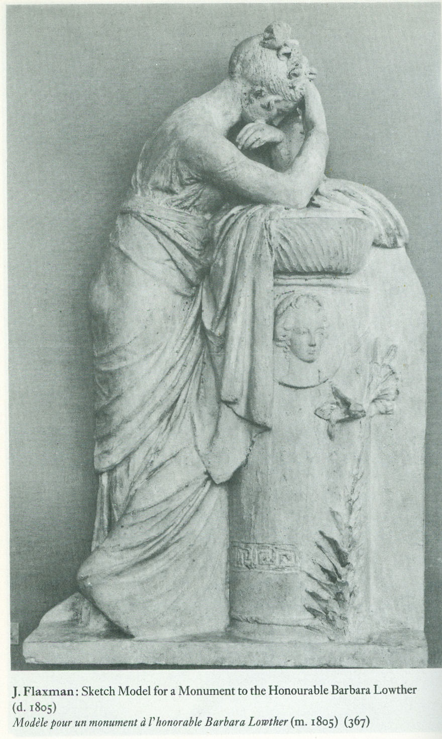
ArtWatch has no politics and, as mentioned, this is an entirely personal response to an exhibition but, nonetheless, we would respectfully point out to the French Ambassador that that earlier wonderful internationally cooperative Neo-classicism show – the fourteenth exhibition of the Council of Europe – was mounted two years before Britain voted to join what was presented to its electorate as a common market in goods. Culturally-speaking we were all Europeans then and we will remain so after Britain has exited the grand project (some believe great folly) that is the European Union. In or out of that organisation, Britain and France will continue to play roles in pan-European culture, just as did the two sculptors below, one being French, one British, whose work was included in the 1972 exhibition. The Briton, Flaxman, had earlier echoed the ancient convention of mourning that Ian Jenkins has so well spotted in Rodin. Art is a universal and welcoming, all-inclusive language. We should keep politics out of it at all costs.

Michael Daley, 25 April 2018
Ghosts in the Lecture Room: Connoisseurship and the Making, Appraising, Replicating and Undoing of Art’s Images

On the 3rd of May, the Mellon Centre hosted a lively conference on the divisive subject of art connoisseurship – “The Educated Eye?”, now available on Webinar (http://new.livestream.com/accounts/7709097/connoisseurshipnow). Yesterday, a three-day congress opened at the Hague on “Authentication in Art” (7-9 May) carrying the subtitle “What happens when the painting you are buying, selling, investigating, exhibiting, insuring – Turns Out to be a Fake or a (Re)Discovery…” A small ground-breaking exhibition with bearing on the two conferences (“Diverse Maniere: Piranesi, Fantasy and Excess” – see below and Figs. 1 and 2) is running at the Soane Museum until May 31st.
Curating the Future
The question mark in the Mellon Centre’s conference title, reflects persisting antipathies to connoisseurship, which practice/discipline/pose nonetheless shows signs of rehabilitation. The conference proved admirably even-handed “ideologically” but somewhat constricted in its composition and terms of engagement.
The first speaker, Dr Stephen Deuchar, a former director of Tate Britain who has followed a former chairman of the Tate’s board (David Verey) into the Art Fund’s management, might be taken to represent the official modernist/progressivist museum world establishment. In his paper, “Connoisseurship Now: Some Thoughts”, Dr Deuchar disclosed that the Art Fund no longer confines itself to helping museums buy great works of art that might otherwise be lost to the nation, and now, for example, has contributed “generously” towards something involving the conceptualist Martin Creed (who turns lights on and off), even though no object will be acquired. Gifting this munificence to the Tate required Deuchar (and, perhaps, his chairman?) to step aside from the trustees’ deliberations.
There were two problems with Deuchar’s position. First, in espousing a Connoisseurship of The New-and-the-Forthcoming, the curator effectively operates blind in bandit territory. As the National Gallery’s director, Nicholas Penny, has pointed out, it takes time to evaluate new art, we cannot yet know how it will compare with other art that will shortly follow, or with other yet-to-be-seen contemporary art. Second, his position is old hat and inadvisable: in the 1960s and the 1970s critics championed contemporary art not on quality but on the degree to which it “challenged” existing art practices. So-called “New Activities” were heavily promoted by such critics and curators as Richard Cork and Sir Nicholas Serota of the Museum of Modern Art, Oxford, the Whitechapel Gallery and, for the last twenty-six years, the Tate. With the dismantling of quality as the principal criterion of judgement, and with the aid of the state-funded, respectability-conferring Arts Council, new activities soon became official activities, leaving most fine art practices and practitioners marginalised. Few noticed that “fine art” had cut itself off from related design and craft activities, and from its own history, to become a cosseted licensed playground where rules were the property of “artists” who played by no rules.
Culturally determinist Marxist art historians (like John Berger and, for a while, Peter Fuller), had gone further; had become more mystical and taken to praising art that they judged to have “anticipated the future”. Insofar as art might ever be said to do such a thing, it could only be seen to have done so in retrospect. When asked to comment on the significance of the French Revolution, the connoisseur of history, Mao Tse Tung, replied, “It’s too soon to say”.
The New Art History
The Mellon conference pitted (trade) chalk against (museum) cheese with Dr Bendor Grosvenor of the Philip Mould gallery and Dr Martin Myrone, a Tate curator and champion of the New Art History which pursues the socially signifcant in favour of the aesthetically desirable (“The Limit of Connoisseurship”). In the course of his conceptually suave paper, “Why Connoisseurship Matters”, Dr Grosvenor made two startling disclosures. First, having just seen Michelangelo’s Sistine Chapel ceiling, he now appreciates that the critics he had held to be “myopic” – were right all along: Michelangelo’s work has indeed been ruined. Second, that he stands behind restorers to prevent them from destroying glazes on Van Dyck paintings. (See Figs. 12a to 15.)
Dr Myrone declared allegiance to the New Art History where the social has routed the aesthetic. The resulting knock-about reminded this observer of days on the New Left in the late 1960s when Kim Howells, a rebellious Hornsey College of Art student (but later a New Labour government junior minister), wanted all potentially saleable object-based art to be outlawed – unlike the “democratising” mass medium of TV in which he was dabbling. When we asked Howells how he regarded Goya’s Horrors of War etchings, he replied that, although in sympathy with the works’ politics, the fact that they were printed on paper, “which is a capitalist commodity”, meant that they, too, would have to go. Dr Howells later grew up artistically and, as a visiting minister to the Tate, left a rude comment on a Turner Prize exhibition. Soon after, he lost his place in government.
Parts and Wholes
The afternoon session paired Spike Bucklow, the Hamilton Kerr Institute’s Senior Research Scientist (“Connoisseurship, technical knowledge and conservation”), and the British Museum’s head of prints and drawings, Hugo Chapman (“Dodging the label connoisseur from Christie’s to the British Museum”). Mr Chapman told how, when working in trade (Christie’s), he had been advised to describe himself as “an expert” rather than a connoisseur. It seems that the public can more easily forgive mistakes made by the former. Chapman told a story about a librarian who once hid a key drawing from an artist’s box when showing it to a scholar, and then, when duly reviewing the scholar’s book, professed himself astonished that no mention had been made of the said drawing.
The Hamilton Kerr conservator opted to address small things because “fragments are easier than wholes”, while the embarrassed-connoisseur attempted (more sensibly) to make artistic sense of the whole effects of drawings, and to understand, thereby, how they were executed. Dr Bucklow first showed how eloquently cracks on paintings can testify to a picture’s age, medium, underlying support, country of origin and so on. Having thus demonstrated an evidently usefully diagnostic tool (a kind of Connoisseurship of Cracks), he dismantled his own edifice by demonstrating how the vagaries of individual works’ histories and compositions so complicate the system as to render it effectively useless.
Mr Chapman, while conceding the very great difficulties of making sensible identifications of authorship in drawings, described how he tried to establish Michelangelo’s authorship of a drawing by considering its overall relationships and effects. In a nod towards Myrone’s position, he conceded that because many works in collections are ephemera, it would be futile to attempt to establish authorship of every piece of paper, even though such works often have great social significance and interest.
Salvage Operation
In the final paper (“New Connoisseurship, Old Europe, and the Future of Art history”), Professor Liz Prettejohn, head of York University’s Department of Art History, made a spirited attempt to retain a still-vital discipline that might be free of the more toxic ingredients of past connoisseurship practices. Prof. Prettejohn’s credentials in this respect were well established by a demonstration of her undergraduate response to a formal analysis test set by an old-style connoisseur professor. Prettejohn showed a Rembrandt etching about which students who had been reared exclusively on the study of modern art had been able to volunteer only that it was “old” and “probably Victorian”.
A Missing Link
This constructive, even illuminating, conference had two constricting deficiencies. First, connoisseurship’s purpose was largely confined to determining authorship, with, Dr Grosvenor’s startling asides apart, no consideration given to the urgent need to appraise restorers’ often radically transforming changes – an unforgivable lapse given that unsound attributions can always be corrected, while bad restorations are forever. Second, no artists contributed to this conference. While all speakers addressed the problem of producing an Educated Eye, none seemed aware that nothing educates the eye faster than producing or copying art. With artists, critical faculties were developed in academies and art schools by doing rather than by reading about or simply looking at. Listening to conscientious people grappling with the difficulties of connoisseurship while seemingly indifferent to or ignorant of art practices and blasé about restoration injuries, left an impression of a profession viewing fundamental problems through the wrong end of a telescope.
It is no accident that artists have initiated most of the great picture-cleaning controversies. Those who create art best identify injuries to it. The present state might easily be corrected: it would take small resources to have student scholars make brief drawn copies of the works they study, thereby appreciating art’s vital mind/eye/hand connections. Appreciation and discrimination may be of the theoretical essence in connoisseurship, but taken alone, without knowledge of and engagement with art’s practices, they leave practitioners susceptible to the traditional charge of being pretentious poseurs.
Drawn to Distinguish
Hugo Chapman’s sound quest to grasp the logic of the whole triggered theoretical and practical thoughts. Drawing provides the best route into questions of connoisseurship, being the most private, direct and likely entirely autograph form of image-making. If trainee art historians were required to make different types of drawing, even for brief periods, it would be incalculably helpful in establishing connections between historical artefacts and their original purpose.
Students might, for example, practice drawing as Rodin did with his famous late quick figure studies – never taking their eyes off the model while enclosing a complete figure with a swift continuous contour. Rodin did so, he explained, to fix in his memory the unique total effect of the body – its gestalt – and to test his own grasp of the miracles he had observed. The means required for drawing are miniscule: an American newspaper illustrator who illustrated first night performances of plays concealed a small pad and a very short pencil in a jacket pocket so that he could make discretely drawn notes of the actors to use later to prepare his finished illustrations.
By helping to fix images in the mind, drawing is the very opposite of taking photographs, which practice can evade thought and appraisal. Rodin once reproached himself for having failed to appreciate that the most important part of a head lay not in any of its individual features but in the manner in which they were all fused into a whole. In perverse contrast, the decision to restore the entire cycle of Michelangelo’s Sistine Chapel frescoes was made not on any analysis of the whole and its internal relationships but on the basis of brief chemical tests made on a single lunette (the sections of wall above the arched windows in the Chapel) that happened to be within the reach of restorers who were working on minor frescoes. Misplaced faith in the validity of those “scientific” tests (of an insufficiently tested cleaning agent – it was later discovered to have etched the surfaces of stone, producing corrugations that scattered light, rather than to have cleaned them) permitted the Vatican’s curators and restorers to launch a cleaning programme on the entire fresco scheme with uniform and pre-determined applications of a single, ferocious stone-cleaning material (a soda, ammonia and detergent cocktail) even though, to those with eyes to see, the lunettes had played a subdued and subordinate role to the ceiling proper in Michelangelo’s grand scheme. (See Figs. 4 to 9.)
There is a another way
By all accounts, the finest, least controversial, most sensitive picture restorer working in Britain in the 20th century was the German émigré, Dr. Johannes Hell. His method was utterly respectful of the whole and overall effects of pictures. Dr Hell had trained first as a fine artist and then taken a doctorate on Rembrandt’s drawings. He deplored restorers’ practice of cutting “windows” through (assumed) dirt and varnish until bright colours and light tones are exposed (as at Fig. 7). He worked overall on the entire surface of a picture with the mildest solvents so that no optically and conceptually deranging relationships could emerge. His slow method was made slower by frequently “resting” a picture to give it time to air out, so that no corrosive solvents might accumulate within the paint layers. With Hell’s method in mind, it can be painful to consider the haste in which today’s restorers procede with their swabs, acetone, scalpels and “windows” when in pursuit of more authentic and original paint underneath a picture’s surface.
Connoisseurship in action
We take a degree of pride in the fact that the (proper) exercising of connoisseurship has been alive and flourishing within this organisation for over two decades. From its inception in 1992, Artwatch has deployed aesthetic discrimination and visual analysis in demonstrations of injuries made during “conservation treatments”. Specifically and in terms of methodology, we have done so by the correlation of photographic records of the pre and post-restoration states of works. (This website was custom-made to carry directly corresponding images side by side or in continuous vertical sequences so as to facilitate the most directly revealing visual comparisons.) In the Witt Library, we see photographic records that do not just assist the making of attributions but that also record the progressive debilitation of paintings over successive restorations. We notice that the difference between an authentic work and a close copy can be far smaller than that between an authentic work seen before and after a bad restoration. Dr Grosvenor really did not need to wait until he could join the scrum in the Sistine Chapel to appreciate that Michelangelo’s work has been ruined – he needed only to study the countless pre and post-restoration photographic records that we have carried on this site and had described earlier at length in the 1993 (James Beck and Michael Daley) book “Art Restoration ~ The Culture, the Business and the Scandal”.
The nature of evidence
Defenders of restorations often say that they cannot be judged on photographic evidence. In other regards, art dealers have great faith in the veracity of photographs – they will bid online on the strength of a single photograph. Bernard Berenson preferred to examine Michelangelo’s ceiling by looking at large photographs in books rather than by eye when craning his neck in the chapel. We should be clear on two points: there are no good grounds for disregarding photographic proofs of restoration injuries; the kind of evaluative test that Prof. Prettejohn’s old style connoisseur teacher devised for undergraduates might just as profitably be applied to analysing the differences between pre and post-restoration conditions. (See “An Old Style Connoisseur Test for Undergraduate Art Historians:” opposite.)
For all the social alertness of the New Art Historians, little comment has been made on the major organisational and “ideological” changes within the museum world over the last half century or so. In our view, the failure of scholars and curators to heed artists’ complaints stems from the fact that they have allowed themselves to become dependent on the technical expertise of the very many restorers who have become institutionally embedded throughout the museum world. It is now restorers not painters who pontificate on the making of paintings. It is they who insist that photographic records of their own “treatments” may not be held up and used in evidence against their actions.
Speaking generally, as an organisation, we are bemused by a profession that uses photographs for all manner of curatorial, scholarly and critical ends except for the indentification of restoration injuries. Scholars now routinely revise their own professional scholarly accounts in order to bring them into line with restorers’ latest, often radical, transformations. In the published accounts of restorers and curators alike, nothing ever counts as an injury – every change is presented with drum rolls as a “discovery”. Whole steamships, Vermeer necklaces and sheep can go missing without an art historical murmur or any ruffling of connoisseurs’ feathers. Even in terms of attributions, Artwatch has been pro-active on the connoisseurship front.
The misappliance of science and early calls for the the return of connoisseurship
While protesting since the early 1990s against the cult of “scientific” conservation and its disparagement of “subjective” aesthetic judgements, we have throughout commended a return to proper and rigorous applications of connoisseurship. In the October 1994 Art Review article “How to Make a Michelangelo”, we suggested that “The fact that our scholars and technical experts flit quite so promiscuously through time and space might suggest uncertainty of connoisseurship and ability to ‘read’ paintings”. Three years later, in connection with another National Gallery attribution, we wrote: “In recent years the art of connoisseurship has become entangled with the scientific analysis of paintings. Problems of attribution, once resolved by the educated ‘eyes’ of individuals, are increasingly seen as the property of interdisciplinary teams of curators, restorers and scientists who enjoy the technical, financial and professional support afforded by large museums. But how sound are the new proceedures – and how reliable are the published accounts given of them?” (Art Review, July/August 1997, “Is this really a Rubens?”).
In truth, it might fairly be said that the campaigning essence of Artwatch has been a constant assertion of the primary value of visual connoisseurship – see also, “Is Michelangelo’s Entombment in the National Gallery by Michelangelo?” by James Beck in the Gazette des Beaux Arts, CXXXVIII, 1996. We have devoted two entire ArtWatch UK journals to critiques, successively formulated and advanced by the painter/scholars Euphrosyne Doxiadis and Dr Kasia Pisarek, of the National Gallery’s Rubens “Samson and Delilah” attribution. The title of the last book (2006) by ArtWatch’s founder, the late Prof. James Beck, was “From Duccio to Raphael: Connoisseurship in Crisis”. It received few reviews – and no mention at the Mellon Centre conference.
A connoisseur of Ephemera
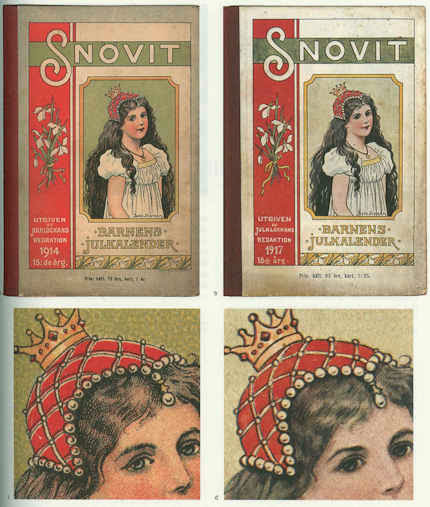
No mention was made, either, of a remarkable new work of scholarship published last year by the British Library and the Oak Knoll Press in the USA – Michael Twyman’s “A history of chromolithography ~ printed colour for all” – which we first encountered in the Institute of Conservation’s Chantry Library, Oxford. The ingenious lengths to which printers went in the pre-photographic era to replicate any image, and all things in the world, in reliable colour on multiple, co-ordinated slabs of stone is truly astonishing to behold (see Fig. 3). It is impossible to exaggerate either the illuminating usefulness of this major, beautifully produced book, or the sheer delightfulness of its immense pictorial riches. For those who might feel that a major tome on a history of a printing method might make for dull or excessively technical reading, we would urge, “think again”: here are to be found ephemera (printed bills, advertising cards and the likes) alongside early pioneering hand-drawn attempts faithfully to produce such elusive epically heroic fine art subjects as paintings by Turner and Michelangelo. The faithfulfulness of the attempts to replicate the values of the most hallowed artists summoned applications of great sensibility and powers of aesthetic discrimination. Here, the connoisseur, the scholar, the social historian, the technical historian and the lover of fine drawing and colouring might all feast together, in awe at the dedication, the talent, the artistic insight found in an unsung publishing trade.
We were delighted, for example, to find so full an account of the production of Robert Carrick’s 30 x 44 inches 1852 chromolithographic copy of Turner’s “ Rockets and Blue Lights…” made in no fewer than fourteen colour separations (see Fig. 9). That faithfully made, expensive and then state of the art record (“the only perfect reproduction of a picture ever issued” – as it was claimed to have been in 1900) testifies indisputably to the destruction of the principal boat in the painting on which we have commented a number of times, most recently on the obtuse (or brazen) presentation of this wrecked picture as a jewel in Turner’s crown – see “From Veronese to Turner, Celebrating Restoration-Wrecked Pictures”.
Even more importantly, there is also reproduced, in its entirety, a massive 1,027 x 470 mm (40 by 27 inches) faithful cartography-like, on-the-flat, full colour image of 1852-53, that simultaneously depicts the entire curving geometries of Michelangelo’s combined ceiling and upper walls decorations (see Figs. 4 to 8). We had never before seen this work in its entirety. It reproduces every single figure (there are over three hundred) and architectural motif Michelangelo depicted. Most preciously of all, this encyclopaedic record testifies to the hierarchy of values within which Michelangelo situated his images.
By capturing the tonal and chromatic logic of the whole, not the fragment, of Michelangelo’s murals, this hand-drawn lithograph corroborates precisely the written testimony of the painter Charles Heath Wilson who examined the ceiling on a special scaffold in the 19th century. All parts of this great pictorial ensemble were not equal in their treatment. The “outer” section (as here seen at Figs. 4 and 5) was the semi-circular sections of painting made around the windows on the upper walls (the lunettes). They were the darkest passages of painting. They contained in their illusionistic recesses (see Fig. 7) depictions of the ancestors of Christ. This dark band of human figures set Michelangelo’s work apart from the wall paintings below – as did his great escalation of scale in his figures. Far from being an arbitrary but precisely situated zone of dirt, as the Vatican authorities preposterously and against all scholarly records claimed, this dark zone served aesthetically and symbolically as a kind of visual plinth for the even more monumental figures and the Divine Events depicted above on the ceiling. The next row comprised an architectural screen against which Michelangelo’s stupendous giant prophets and sibyls were set and relieved in the brilliant cinematic, shadows-casting light we have previously described. Above them, set in the sky glimpsed through illusionistic apertures in ceiling’s architectural scheme are the biblical scenes and the depictions of God Himself – Whose restoration injuries we have also chronicled. Today, by the miracles of our technology, we can see and move around the entire, now restoration-ruined surfaces of the Sistine Chapel, but the Vatican will not release a TV film made in the 1960s of the pre-restored state. Recent technical advances have carried us into a world where it is possible to produce perfect facsimiles not only of images but of three-dimensional objects and, even architectural spaces and forms.
CODA
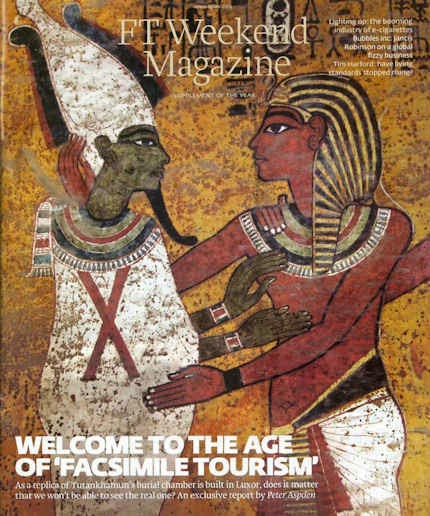
The small exhibition currently showing at the Soane Museum shows three-dimensional realisations of graphic inventions of Piranesi by the foundation Factum Arte. A full size replica made by the foundation of Tutankhamun’s tomb in Egypt was unveiled this week. It was reported by Peter Aspden in the Financial Times “Fit for a king: Tutankhamun’s replica burial chamber”(see Fig.). Such technical capacities for replication raise issues that we will explore in coming posts. This fertile new territory is one for which scholars and connoisseurs will be ill-prepared to assess for as long as they ignore the mistreatment of unique and historic art objects by technicians who transform them into synthetic, polished replications of their (assumed) original autograph states. This website launched in 2010 with a discussion on authenticity in art and music (“The New Relativisms and the Death of ‘Authenticity'”). It did so in response to a restorer’s imposition (in new but deceivingly aged and cracked paint) of a piece of computer-generated “virtual reality” onto Holbein’s The Ambassadors. Connoisseurship is more urgently needed today than ever.
Michael Daley
Comments may be left at: artwatch.uk@gmail.com


![]()
Coming to Life: Frankenweenie – A Black and White Michelangelo for Our Times

As an organisation with an essentially critical raison d’etre we get few opportunities to celebrate bona fide creative achievements. This post, in part, is an exception. Longer than usual, it is a tale of two separate but cross-linking events. One is the case of a dog that has not barked, the other is a story of a dog that has been brought back from the dead. To a surprising degree, the latter throws light on the former, which case we consider first.
The 500th anniversary of the completion in 1512 of Michelangelo’s Sistine Chapel ceiling paintings has gone almost entirely un-celebrated. On October 31st, in a small “in-house” service marking the 500th anniversary of Pope Julius II’s service celebrating the completion of the ceiling, Pope Benedict XVI asked a group of cardinals, Vatican employees and guests to imagine what it must have been like 500 years ago, adding that contemplating the frescoes renders them “more beautiful still, more authentic. They reveal all of their beauty. It is as if during the liturgy, all of this symphony of figures come to life, certainly in a spiritual sense, but inseparably also aesthetically.”
Apologists for the transforming 1980-90 restoration of the ceiling are nonplussed by the missed opportunity for a mega-beano half-millennium art celebration. In truth, it is not hard to see why this opportunity should have been foregone by the Vatican. Just two decades after completion of the most intensely controversial restoration of modern times, the state-of-the-art air-conditioning system installed to protect the chemically stripped-down plaster ceiling is failing to cope with the “unimaginable amounts of dirt” and massive atmospheric fluctuations caused by the Sistine Chapel’s throngs of paying visitors whose disrespectful raucous behaviour is a source of shame and censure within Italy. On November 1st it was reported that the Vatican has “no plans to try to limit tourists”. There is not a lot to celebrate here.
This latest failure of an “ultimate restoration” to anticipate and meet future conservation needs carries an implicit call for further urgent conservation but, with it, an indication of art restoration’s specious philosophy and too-frequently destructive consequences. When Art begets art there is pure gain, a life-giving gift. The old art remains to exert its own powers; the new brings fresh experiences and perspectives; running in tandem, each enriches the other as traditions are extended and invigorated (see Figs. 29 and 30). Restoration begetting restoration is another matter altogether.
Art restoration is not a bona fide life-conferring process. Because Art is self-renewing and self-extending, it does not follow that its historically rooted artefacts may be renewed endlessly, routinely, by technicians. To the contrary, in order to read Art’s trajectories it is imperative that its works remain unadulterated. Restorers, with their ever-more ambitious and presumptuous attempts to undo and redo earlier restorations and to reverse all evidence of age, leave old works of art as increasingly spurious impostors. It cannot be otherwise. This is not a question of finding the right “Professional Ethics”. Restorers cannot act outside of their own heads and times, which is why the most authentic old works of art remain those that are least restored. Nor can restorers submit to criticism and evaluation, as all bona fide creators must do. Their professional mystique must be preserved at all times. It rests on impenetrable screeds of pseudo-science and systems of technical “analysis” that preclude evaluation of the optical consequences of interventions on works of visual art.
In this depressing art cultural milieu it was startling and refreshing to encounter the recent stunningly brilliant black and white photographic stills promoting Tim Burton’s new animated film Frankenweenie (Figs. 1, 3, 10, 11, 12, 13, 14, 23 and 27). The wit and force of these images rewards examination. The technical key to what might otherwise seem an improbable (if not blasphemous) artistic connection between the unique theologically-charged high art enterprise of Michelanglo’s painting of the Sistine Chapel ceiling, and an animated horror film for children in which one reviewer detected an anti-creationism polemic, can be found in the film’s eschewing of colour, and in Michelangelo’s superimposition of black painting over his own frescoes.
A more general connection is that, for all the marketing hullabaloo of expensively made films, Frankenweenie proves to have been a remarkably art-driven and shaped enterprise (see Figs. 10 to 14). That the full-blown cinematic realisation of this film’s essentially personal and idiosyncratic vision required the specialised contributions of an enormous range of talents and expertises, links it organisationally to the ambitious artistic productions of the great Renaissance art studios.
In part, the power of Burton’s images stems from the simple optical fact that the contrast between a pure solid black and a clean white is the most potent tool in the visual box. But even more, it stems from the fact that between those graphic poles an effectively infinite but individually discernible continuum of values (tints and tones) can be run. An examination of the highly disciplined, imaginatively constructive deployment of such tone/values in Frankenweenie helps pinpoint the nature and the scale of the artistic losses suffered through the “restoration” of Michelangelo’s Sistine Chapel paintings (see Figs. 2, 8, 9, 19, 20, 21, 22, 31, 32, and 33).
Burton’s vivid black and white photographic imagery truly participates in one of modern Western art’s most distinguishing traits. From Alberti to Ruskin, artists have appreciated and explained how tonal gradations can magically conjure three-dimensional structures (form) on flat pictorial surfaces. Until the 1960s every art student learnt to manipulate tonal values in this fashion. Tragically, such conventions have been discarded in (most) fine art education and in much of today’s fine art practice. Fortunately, Cinema and Photography generally have sought (however awkwardly) to absorb those ancient empowering lessons, and in Burton’s hands they find singularly powerful expression.
To take Michelangelo first: he did not want the job of painting the Sistine Chapel ceiling. He wished to work on a massive carved marble tomb of sculpted figures. When compelled by the Pope (Julius II) to paint the ceiling as a novice frescoist, he attempted to get out of the job as soon as he encountered technical difficulties. He was made to continue after being instructed on avoiding future errors (by mixing plaster properly) and concealing existing ones (by applying transparent washes of glue/size). The onerous duty turned into a labour of love and on completion of his hurried, direct painting into the wet plaster of the ceiling, Michelangelo continued working on the dried fresco surface with dark pigments bound with glue or size – to the fury of an impatient Julius II. With those additional (or “auxilliary”) paints he added details and generally strengthened and revised his designs so as to make his pictorial effects more dramatically and unprecedentedly sculptural.
Between 1980 and 1990 the frescoes were transformed in a filmed restoration sponsored by NTV, the Nippon Television Corporation. The restorers contended that the paint applied on the dried frescoes’ surface was not Michelangelo’s and they removed it to artistically adverse and violently controversial effect (for a full account of which, see “Art Restoration ~ The Culture, the Business and the Scandal”, by James Beck and Michael Daley, chapters III and IV). With the work left less sculptural and more stridently coloured, the restorers pronounced the “discovery” of a New and True Michelanglo – an artist who, contrary to all previous understanding, was a brilliant colourist who had abandoned “traditional chiaroscuro modelling” in favour of vibrating “electic contrasts of hue and much irridescence”. This post hoc rationale defied both historical testimony and technical evidence.
It is a matter of record both that Michelangelo made sculptural models of the ceiling figures to study the shadows that their forms would cast (see Fig. 9), and that the shadows he had painted onto the dry ceiling were copied countless times from within his own lifetime until the time of the last restoration (see Figs. 19 to 22). When Michelangelo was compelled to stop painting, the world was astonished by his sculptural – not chromatic – effects. He had revolutionised mural painting by imposing upon the chapel’s curved ceiling the (inverted and paraphrased) monumental architectural tomb peopled by carved figures that he would have preferred to be executing. The restorers, having injured the material realisation of Michelangelo’s revolutionary pictorial conception, demanded a re-writing of art history. That so many scholars were intitially compliant might testify to a profession that writes more than it looks and that uses images as illustrations to theories or texts, rather than as records of the most primary of all sources – the works of art themselves.
Thus, the restorers and their art historical supporters jointly insisted, against hard evidence, that what had been taken for centuries to be carefully studied sculptural effects were deceiving byproducts of “candle smoke and still more of glues” applied by previous restorers. Their suggestion that such phenomena were responsible for “the kind of suggestive painting by shadows for which Michelangelo was admired until a few years ago” was patently absurd: how could gradual arbitrary accumulations have arranged themselves along Michelangelo’s designs so as to enhance his sculptural effects? Conversely, if those effects really had been products of gradual accidental accretions over the centuries, what might have deceived Michelangelo’s own contemporaries, biographers and copyists into believing that they already existed?
Consider further the very weight of the historical evidence. One of Michelangelo’s biographers, Giorgio Vasari, marvelled at his ability to conjure seemingly palpable bodies that had somehow wrested themselves from the surfaces on which they had been painted, into the (seemingly) real space of the artist’s invention:
“Then who is not filled with admiration and amazement at the awesome sight of Jonah…The vaulting [of the ceiling] naturally springs forward, following the curve of the masonry; but through the force of art it is apparently straightened out by the figure of Jonah, which bends in the opposite direction; and thus vanquished by the art of design with its lights and shades, the ceiling even appears to recede.”
Vasari’s testimony on Michelangelo’s deployment of “lights and shades” to sculptural effect was echoed in the short biography written by Ascanio Condivi, a student and assistant through whom Michelangelo is believed to have spoken by proxy. For Condivi, too, the figure of Jonah was:
“…most admirable of all…because contrary to the curve of the vault and owing to the play of light and shadow, the torso which is foreshortened backward is in the part nearest the eye, and the legs which project forward are in the part which is farthest.”
As a single instance of evidence, consider the copy of Jonah shown at Fig. 22. This ink and wash record was made by Giulio Clovio who was known as “the Michelangelo of small works” and recognised by Vasari as a most “excellent illuminator or painter of small things…who has far surpassed all others in this exercise”. His copy happens also to record a group of figures below Jonah. These figures had been painted by Michelangelo beteween 1508 and 1512 but were destroyed by him in 1535 when he prepared the altar wall to receive his single massive Last Judgement mural. Thus, we can see through Clovio’s copy of those long lost passages of Michelangelo painting that strong and cast shadows were decisively present when the painting was brand new. A nude youth then held the tablet bearing Jonah’s name. That figure and the tablet both cast shadows onto the very wall on which they were painted. Michelanglo had thus employed a trompe l’oeil pictorial device to deceive the eye into believing that the figure stood in front of the surface to which it adheres. On this testimony alone claims that Michelangelo’s “suggestive painting by shadows” was a product of “candle smoke and still more of glues” should never have been uttered.
Where the Vatican’s restorers cavalierly discarded Michelangelo’s shadows, in Frankenweenie, Tim Burton has laboured lovingly to produce his shadows. It is remarkable to how great an extent photography and film-making today have been informed and nourished by fine art conventions and the lessons of painting (see Fig. 16). On the influence of painting on the great cinematographer, Jack Cardiff, for example, see the tribute paid to him by Martin Scorcese in Fig. 15. On the early cinematic influences on Burton, see Figs. 4 and 5. It is also remarkable to how great an extent film-making has taken possession of the traditional humanly engaging story-telling and symbolic functions of art that contemporary museum and gallery “fine artists” have abandoned. With animated films, where the characters and their settings are drawn or modelled, distinctions between artistic and photographic media lose almost all force.
Burton’s own film – a remake of his earlier (1984) half-hour, live-action film of a boy who resurrects his pet dog after a fatal accident – was made on an acknowledged artistic impulse: “I’d look at the drawings I did originally, and there was a simplicity to them I wanted to get” (see Fig. 11). Where Michelangelo had completed his vast cycle of painting with hundreds of figures – and probably thousands of preparatory studies – in just four years, thirty modellers (led by puppet makers Ian Mackinnon and Pete Saunders and the animation director, Trey Thomas) each spent over a year working on Burton’s 86 minutes long film. Technically speaking, the film is a 3D black and white stop-motion animation. That is, models of characters are placed in model sets to be moved in tiny increments each of which is separately recorded in a process that is notoriously slow and laborious – a skilled animator might produce five seconds of footage in a week. Burton, a former Disney animator, opted for this method in preference to digital animation for a variety of reasons but, perhaps, primarily because “There’s an amazing amount of artistry in it”, as he told Mark Salisbury in the Daily Telegraph.
This is certainly the case. In the first instance the models for every character and prop are made by hand (see Fig. 10). Then they are then painted. Then they are arranged on sets. Then they are then lit. Finally they are animated and photographed. The models themselves exert great appeal to Burton who loves their handcrafted tactile feel. He loves the challenge of embedding characters in inanimate objects and then “bringing them to life” through motion and changing expressions and relationships. The tactility of the models is deliberately enhanced by showing the film in 3D: “…it’s the closest thing to walking on the set of stop-motion animated film, seeing what the artists have done, feeling those textures and feeling the dimensional quality you get when you are there.” (A delicious glimpse of the artistry evident in the sets by Rick Heinrichs can be found in the online animation magazine Skwigly.)
Capturing individual characters in the models was preceded by immense thought and study. For “Sparky”, Burton required the animators to visit dog shows, and to study and film dogs in the studio. This is very much in the Disney tradition: in Katherine and Richard Greene’s 1991 “The Man Behind the Magic”, a photograph shows no fewer than eighteen draughtsmen and an instructor, surrounding and drawing a live deer from every angle as preparation for the film Bambi. Disney is quoted as holding that “We cannot do fantastic things…unless we first know the real”. (Modern art schools notwithstanding, the Renaissance and its studio practices are not yet extinct.)
The beauty of Burton’s enterprise is that everything in it is given a value and every value serves an express purpose in terms of physical structure, characterisation, emotional force, and/or narrative development. When made, the models were painted in monochrome, in shades of black, white and grey (apart from grass, flowers, drapes and certain other items) because, for Burton “The black and white is very much part of the story, the character and the emotion of it. There’s something very pleasing about it, seeing this kind of animation this way, a certain depth, and the way things go in and out of shadows…” On which, let us further consider Michelangelo’s “suggestive painting by shadows”.
In Fig. 18 we see an apparently brilliant (but in truth deceivingly) “cinematic” photographic exploitation of cast shadows. In Fig. 19 we see (on the left) that before restoration Jonah’s left foot cast a strong shadow across the floor, which shadow merged with another dark shadow under the seat. The shadow under the seat “drew” a sharp, tonally contrasting vertical boundary between the lighter front-facing plane of the upright block that supports the seat and the receding (shaded) side face of that block. To the right of that block (and Jonah’s left leg) another, albeit less strong, shadowed zone threw the block’s right-hand edge into relief. After the restorers removed what they took to be dirt and disfigurement, the shadow cast by the foot disappeared (as seen on the right) – as also did much of the shadow under the bench, thereby exposing the previously hidden side of the upright block. The shadow to the right of the block was also weakened.
Mere dirt settling on a painting would weaken and blur outlines and edges. It would lighten dark sufaces and darken light ones, thereby compressing the range of values present. It is technically inconceivable that it might sharpen edges by intensifying contrasts. There is no dirt (or discoloured varnish) that is simultaneously capable of lightening already light surfaces while darkening dark ones. Had the shadows really been applied, as is claimed, by later restorers, the paint would have run into cracks in the plaster ceiling. And yet we know that it had not. We know that it had in fact cracked as the plaster had cracked. The paint was therefore applied when the plaster was smooth and new – because we also know that the plaster had cracked before any restorers went near it. Besides all of which, as we have seen, the shadows were recorded before 1535. The inescapable truth is that restorers removed painting that could only have been Michelangelo’s own.
Burton’s handcrafted models have an immediate engaging presence but the means of their humorous psychologically charged personalities are complex and artistically sophisticated. They display distinctly sculptural qualities and the satisfyingly palpable presences of diminutive figures in a real space that is continuous with our own. We are drawn into their world much as Michelangelo brought living old testament figures into ours. For force of cartoon-like effect and clarity, Burton’s heads are highly stylised and plastically simplified. Of Sparky, Burton explains: “Obviously he looks like a cartoon. It’s not like he’s an anatomically correct dog” (see Figs. 10 to 14).
Formally speaking, these sculptural simplifications might be related to the abstractions of 20th sculptors such as Brancusi who were in pursuit of “pure” or “significant” form (see Figs. 23, 24 and 25). However, plastic simplification is only part of the artistic/expressive equation with Burton’s Gothic characters who must be sentient engaged actors in intense psychologically-charged emotional dramas.
The chief expressive features of a face are the eyes and the mouth. Making the eyes large and the jaws small enhances childhood traits and vulnerabilities (see Figs. 1, 3, 14 and 27). The placement of the black pupils in the large wide-open eyes permits acute laser-like precision of gaze, as is seen to masterful effect at Fig. 14 in the affectionate twin-engagement of the boy and his beloved and devoted dog. The mouth is the most emotionally expressive feature of all, and although childhood-small in these characters, it becomes a vehicle of astonishingly subtle expressions (see Figs. 1, 3 and, especially, 27).
The antithesis of Brancusi’s plastic self-compression is Daumier’s cartoon-like sculptures where the imperatives of caricature pull the head this way and that with scant regard for any residual internal self-composure (Fig. 26). If the subject in Daumier has a bird-like personna, the nose may become a beak and the forehead may recede at an alarming rate. Burton’s compactly eloquent pebble-smooth but animated heads are a remarkably successful synthesis of these disparate sculptural traditions.
In terms of connections with Michelangelo’s painting, particular consideration should be given to the brilliantly combined effects of modelling and lighting in Frankenweenie. The boy’s head shown at Fig. 27 is articulated with seamless lucidity. It also happens to be exquisitely lit. Everyone knows the Impressionists to be painters of light but, then, light is fair game for painters who may produce their own (artistically, not literally). For the apprehension of form sculptors depend on actual light in the world. (Sculptors can, however, create an implicit light in their own graphic renderings of form, and may even depict forms that are lit as if from within, as seen at Fig. 28.) Cinematic model-making animators are advantaged: they make their own forms and may then provide their own expressively optimal actual light. The lessons of cinema, in this regard, are the more valuable because the relationship between sculptors’ forms and light may be insufficiently appreciated – certainly sculptures suffer terribly at the hands of exhibition designers. Rodin famously described sculpture as the art of the bump and the hollow – or, perhaps more accurately, as an art of hollows and projections: “de creux et de bosses”. He demonstrated this claim to Paul Gsell (“Art, by Auguste Rodin”, Paul Gsell, 1912) in the following manner:
“One late afternoon, when I was with Rodin in his atelier, darkness set in while we talked… He lighted a lamp as he spoke, took it in his hand, and led me towards a marble statue which stood upon a pedestal in a corner of the atelier. It was a delightful little antique copy of the Venus di Medici. Rodin kept it there to stimulate his own inspiration while he worked. ‘Come nearer,’ he said. ‘What do you notice?’ he asked. At the first glance I was extraordinarily struck by what was suddenly revealed to me. The light so directed, indeed, disclosed numbers of slight projections and depressions upon the surface of the marble which I should never have suspected…At the same time he slowly turned the moving stand which supported the Venus. As he turned, I still noticed in the general form of the body a multitude of almost imperceptible roughnesses. What had at first seemed simple was really of astonishing complexity. Rodin threw up his head smiling. ‘Is it not marvellous?’ he cried. ‘Confess that you did not expect to discover so much detail. Just look at the numberless undulations of the hollow which unites the body to the thigh…notice all the voluptuous curvings of the hip…And, now, here, the adorable dimples along the loins…You almost expect, when you touch this body, to find it warm…'”
Unfortunately, Rodin’s demonstrations were not recorded on film (as far as we know) – although a short film does exist of Henry Moore and Kenneth Clark making a nocturnal visit with a lamp to the British Museum’s Greek and Roman collection in order to re-enact Rodin’s lesson. In any event, in the case of Burton’s boy’s head, at Fig. 27, every depression and prominence finds beautiful expression in subtle tonal transitions that would have warmed Rodin’s heart. There is pictorial/plastic alchemy here, as there once was in Michelangelo’s frescoes. The softly continuous undulations of the head are gently disclosed within a dramatic over-arching artificiality of illumination that sets the relatively bright head off against a Great Gothic Darkness. Within the stridency of these clashing lights and darks, the subtlest emotional expression of the mouth is perfectly captured.
The expression of a mouth is controlled by the interplay of many facial muscles and it is notoriously difficult to capture, as even so great a portraitist as John Singer Sargent ruefully noted (“A portrait is a picture in which there is something not quite right about the mouth”). In this model the play of facial muscles at the mouth has given rise to a subtle but distinctive mini-topography of light-catching bosses and light-evading depressions that perfectly express the boy’s finely balanced state of delight and trepidation/wonderment. The artistry here is consumate – this is a mouth to rival Ingres’s or Holbein’s in the precision of its forms and its delicacy of expression. We see another living expression evoked in a painting at Figs. 29 and 30 where Picasso, in one of his greatest neo-classical inventions, has not modelled actual forms but evoked them by simulating an optimal play of light and shade on his imagined forms with a myriad of mosaic-like deftly placed and adjusted patches of tone.
In the Michelangelo head seen in Fig. 2, we see how (before restoration) the artist had expressed sculptural forms by drawing and by tonal manipulation. The tones disclose a three-dimensional head held in very specific and sculpturally revealing lighting. Long before cinema, in his painting, Michelangelo was simultaneously his own model-maker, lighting specialist and recording “camera man”. (This is not to claim that he, in any sense, invented or anticipated photography. Rather, it is to note the extent to which photography was a mechanically aided outgrowth of pre-existing artistic preoccupations.) Before discussing the specific lighting scheme Michelangelo deployed, it might be helpful to consider something of the great variety of lighting options that cinema and photography show to be available. Brilliant examples of lighting made for the purpose of specific and self-consciously artistic effects from the 1920s to the 1950s in the Kobal collection (see Figs. 6, 7 and 18) are illustrated and technically explained in the marvellously instructive book “Hollywood Portraits ~ Classic Shots and How to Take them” by Roger Hicks, a writer on photography, and Christopher Nisperos, a studio portrait photographer who specialises in Hollywood-style photographs (which subject he has studied for nearly thirty years).
In their examination of the photographs, the authors deduce from personal knowledge and the evidence of the images themselves, how many sources of light (lamps) were employed and where they were positioned in relation to the subject. With each photograph a diagram shows the likely positioning of the light sources. In the course of this highly instructive exercise, photography is seen to acknowledge great indebtedness to painting. Such technical analysis of photographic means has, we believe, direct application to the analysis of changes made by restorers to the artistic values of painters, as is discussed at Figs. 8, 19, 27 and 31-33.
In figs. 6 and 7 we see two heads of two beautiful women that have been expertly lit to very different expressive purposes. In the portrait of Ingrid Bergman (Fig. 6) the lighting is soft and greatly emphasises the invitingly tactile values of the wool clothing, the hair, and, above all, of the face itself, which is a perfect essay in the soft plastic undulations that Rodin so cherished in the “radiant appearance of living flesh” found in the finest sculptures of late antiquity. In the portrait of Lana Turner (Fig. 7), a more self-consciously sculptural purpose is evident as the beauty of the subject’s head is directly juxtaposed and equated with both a classical bust and a bouquet of flowers. This portrait is more intensely lit so as to contrast the planar divisions between the front face of the head and its shadowed sides, and to isolate the features of the eyes and mouth. The lights and the darks generally are placed with the utmost calculation, but to the end of a more chilling, marbled perfection – here, the groomed perfection of the coiffure extends no invitation to touch. Every part of the subject’s head and shoulders is drawn with the utmost Bronzino-like clarity by means of carefully adjusted tonal contrast: where the face is brightest there is a dark shadow. Where the blonde hair sinks into dark shadows there is a lighter background. However, these seeming photographically recorded artful placements of value have, the authors disclose, been achieved with the assistance of considerable photographic retouching, which practice was extensively prevalent in the portraits under examination (see comments at Fig. 7).
In Michelangelo’s (unrestored) head at Fig. 2 we see a treatment of background lighting that is, like that of the Lana Turner portrait, subservient to the clear plastic expression of form. Within the head, however, Michelangelo deployed a much wider range of half-tones. His head runs progressively from its brightly lit profile of the face to a very darkly shaded neck and shoulder. The bright profile is emphasised and thrown into relief by a shaded background, while the very dark back of the neck is set off against a light background. We see in Fig. 8, however, that after “restoration” the logic and the dispositions of the tones have been massively weakened and subverted: the dark ground at the face’s contour has been largely removed; the consistent form-disclosing tonal progression within the shading of the head (from brightest light on the upper right to the strongest darks on the left) has been horrendously undermined. This head now looks as if lit by a multiplicity of form-flattening lamps
But that is not all the damage. If one looks carefully at the left contour at the back of the head, it is evident that the very design of Michelanglo’s head has been changed. The forms have been reduced. The space, for example, between the body of the hair and the little plaited “pony tail” has grown larger. This feature of the coiffure has grown smaller and smoother. We have seen recently how a restorer at the National Galleries of Scotland promised to “improve Titian’s contours” with the assistance of his director. Who might have authorised this redrawing of Michelangelo’s contours? Or was the change simply not noticed? Whichever, the more closely one looks into the details of this restored work the more evident the losses of Michelangelo’s work become.
In Fig. 31 we see how, before restoration, the aperture of the nostril was larger. We see how shading that had made the corner of the mouth tuck more covincingly into the forms of the cheek has been sacrificed. We see how the background had been darkened by systematic parallel vertical strokes of black. The restorers deny that such work was Michelangelo’s own. Once again, they defy historical testimony. Giovanni Battista Armenino went to Rome in 1550 and stayed for seven years copying the “best Pictures”, including Michelangelo’s very recently painted Last Judgement (which was made between between 1536 and 1541). In 1587 Armenino produced a treatise on fresco painting in which he noted that, as frescoes begin to dry and no longer absorb pigments with same effectiveness, the painter must:
“…then finish it of with moist and dark shade tints…the muscles of the naked figures as being of greater difficulty, are painted by hatching them in different directions with very liquid shade tints, so that they appear of a texture like granite; and there are very brilliant examples of this painted by the hand of Michelangelo…they can be perfectly harmonized by retouching them in secco…in retouching the dark parts in this manner, there are some painters who make a watercolour tint of black and fine lake mixed together, with which they retouch the naked figures and produce a most beautiful effect, because they make the hatchings upon the painting, as is usual to do while drawing upon paper with black lead…Some persons temper these dark tints with gum, some with thin glue…this I affirm from what I have both seen and done and also what I have been told by the best painters.”
When the ceiling was examined in the 19th century by the painter and fresco expert, Charles Heath Wilson, he found that not only had Michelangelo’s ancient size painting cracked originally as the plaster had cracked but that it now melted readily to the touch of a wet finger. In accordance with Armenino, Wilson saw that the surface painting consisted of:
“…a finely ground black, mixed with size…The shadows of the draperies have been boldy and solidly reouched with this size colour, as well as the shadows on the backgrounds…other parts are glazed with same material, and even portions of the fresco are passed over with size, without any admixture of colour, precisely as the force of water colour drawings is increased with washes of gum. ..These retouchings, as usual with all the masters of the art at the time, constituted the finishing process or as Condivi expresses it, alluding to to it in the history of these frescoes, ‘l’ultima mano’. They were evidently done all at the same time and therefore when the scaffold was in place.”
All of that retouching has gone but record of it survives. In 1967/8 the writer, painter and former art critic of Time, Alexander Eliot and his film-maker wife, (now the late) Jane Winslow Eliot, spent over 500 hours on the scaffold making The Secret of Michelangelo, Every Man’s Dream, in the course of which film they noted that:
“With the exception of the previously restored Prophet Zachariah, almost everything we saw on the barrel vault came clearly from Michelangelo’s own inspired hand. There are passages of the finest, the most delicately incisive draughtsmanship imaginable.”
Someday, the Eliots’ film (made for ABC Television) might be re-shown, but meanwhile, Alexander Eliot’s testimony is now on the record in a new full-length film/DVD biography, A Light in the Dark: The Art and Life of Frank Mason, in which he and other early campaigners against the restoration (including the late painter, Frank Mason, and the late Professor James Beck) are given voice on the Sistine Chapel restoration. Not least of the delights among this film’s precious and historical footage, are Tom Wolfe’s account of his lessons in Frank Mason’s painting classes at the Art Students League, New York, and the sight of the former Metropolitan Museum of Art director, the late Thomas Hoving, belligerently boasting that he himself had helped sponge from the ceiling the “filth” that was in truth the last stages of Michelangelo’s painting.
Michael Daley
Comments may be left at: artwatch.uk@gmail.com


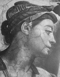
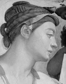


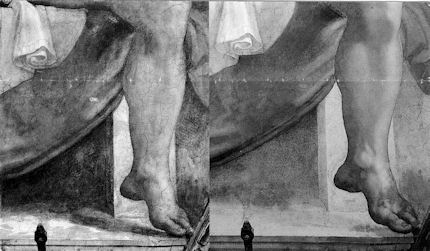

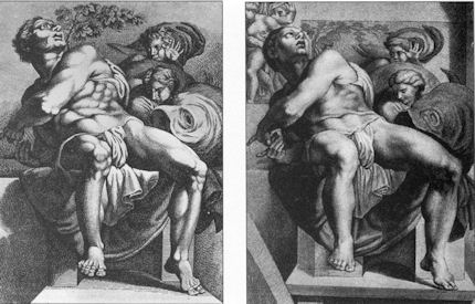


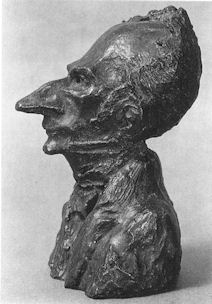


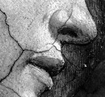


![]()
Vandalism and restoration ethics: The case of the Dutch “Thinker”

Art restoration is increasingly becoming a culture within a culture. After a century of modernism, the possession of personal artistic skills and of technical proficiency are considered disqualifications in much contemporary art teaching and practice. Today, the preference is for “ideas” and “attitudes” and, in this milieu, even a brazen appropriation of the artefacts and ideas of others is taken as proof of creative potency. Restorers, who have long pig-a-backed professionally on the bona fide creations of past artists and are now hailed as technical wizards vis-à-vis today’s artists, claim a “right” to determine personally how the art of the past should be “presented” to modern audiences. With the art world incapable of producing another Michelangelo or Rodin, restorers lay claim to powers of artistic transformation and resurrection. A “New Michelangelo” has been offered, the acceptance of which would require the rewriting of art history itself. Catastrophic art injuries provide restorers with further opportunities to deploy their embalmers’ “black arts” and theoretical premises – and, with a self-regard that verges on narcissism, celebrate/immortalise their own interventions in portentous television documentaries. An instance of such may have arisen in the Netherlands.
Maaike Dirkx writes:
The American industrialists William and Anna Singer (see Fig. 3) used their wealth to collect art. Their collection is located in four museums, two in Norway, one in the United States, and the Singer Museum in The Netherlands. The Singer Museum in Laren was founded in 1956 by Anna as a small private museum and concert hall. Its sculpture garden housed a fine collection of statues, with as its most prized exhibit a bronze cast of Rodin’s “Penseur” or “Thinker” and Anna Singer always considered this statue the crown jewel of her collection.
In January 2007 thieves broke into the museum grounds and stole “The Thinker” and six other bronze statues with the intent to melt them down for their bronze value. The bronze would have yielded 350 euros when the “Thinker” alone was valued at over one million euros. After a few anxious days the “Thinker” was recovered but it had been tragically mutilated (see Figs. 1, 7, 8 & 9). The six other statues had already been melted down. What had saved “The Thinker” was public exposure: its theft had been widely reported in the Dutch media and the thieves, who later stated they had never heard of Rodin, had panicked and had buried what was left of the statue.
POLEMICS AND CHOICES
Although all concerned agreed that the statue had become a wreck and that Rodin’s original intent and artistic achievement could never be recovered, the insurers were not convinced. They claimed that, after restoration, the statue could still fetch a few tons on the art market. Rob Scholten, Head of Sculpture of the Rijksmuseum, resigned from Singer’s management committee because he was opposed to restoration which, he said, could only be cosmetic.
Another option was to exhibit the ruined statue as “a forceful symbol of art vandalism” as was done at the Cleveland Museum of Art, where a cast of “The Thinker” was damaged by a bomb in 1970 (see Fig. 6). But the Singer case bore no relationship to a “tradition of iconoclasm” and the idea was dismissed. For a small museum such as the Singer there were insufficient funds to buy another cast should one appear on the art market and casting another statue from one of the surviving plaster models was a legal impossibility since the French government, owner of Rodin’s estate, had implemented laws specifying that only 12 casts could be made from each surviving plaster model to ensure the quality of the casts and to prevent the appearance of forgeries (in the form of cast copies taken either from present bronze casts or from plaster models) on the art market.
After twenty months of wrangling a decision was reached: the statue was to be restored. An advisory committee of independent experts* concluded that “by restoring the external shape of the statue, its symbolic function for the Singer Museum can be retained”. Invoking “general principles of restoration ethics”, the committee recommended a restoration method that could be largely reversible and which would restrict the number of interventions as much as it was possible.
PATCHING UP A RUIN
A major problem in the restoration was the missing right lower leg (see Fig. 7). Rodin’s bronzes were sand cast, an exacting method whereby a plaster model is pressed into sand which then retains the shape of the model. In complicated designs, a plaster model is cut into different parts that are cast separately and later joined together. The melted bronze is poured into the sand impression and after the bronze has cooled down, the sand casing is removed and the rough bronze figure is then chiseled, polished and treated to produce a specific patina. The plaster models could be re-used but they would deteriorate over time and through sand casting usage, reducing the quality of the casts.
The Musée Rodin possesses four original plasters for the studio-type “Thinker”. A team of Dutch digitalisation experts with their equipment travelled to Paris where the most likely plaster model used (identified by an abnormality on the big toe of the left foot and a “wart” on the back) was scanned in 3D images. The damaged Singer “Thinker” had also been scanned and by superimposing the two images, the details of the damages (such as the displacement of the left arm and skull) could be charted. The Musée Rodin gave permission to construct a plaster model of the Parisian right lower leg based on the scans, which was then cast by a Dutch casting firm and affixed to the statue.
The dislodged upper part of the head and left upper arm were manipulated back into shape at the Rijksmuseum Restoration Studio, a delicate operation (see Fig. 8). To determine how best to fill in the deep gashes made by the grinder, metallurgic analysis was conducted. The proposed epoxy resin saturated with bronze powder was approved by the consulting committee and Musée Rodin, as guardians of Rodin’s legacy.
It proved impossible to determine the exact composition of the patina: years of outdoor exposure meant that the patina on Singer’s “Thinker” had acquired different light and dark green copper sulphates. To retouch the original patina where this had disappeared as a result of aggressive grinding, a removable acrylic paint mixture was applied.
IS SINGER’S THINKER STILL A RODIN?
The question is a tantalizing one. For one thing, the statue was cast posthumously. Some 50 cast bronzes of this studio-size Thinker still exist in the world: are they mere copies or does each contain an intrinsic uniqueness?
Rodin worked with casters whom he trusted implicitly, such as father and son Rudier. It is believed that the latter, who cast at least five Rodin sculptures in the sculptor’s lifetime and was therefore fully aware of the sculptor’s intent and artistic demands, cast Singer’s impression of the “Thinker” around 1930. Anna Singer purchased the statue, with two other Rodin bronzes, possibly in 1937 when she visited the Musée Rodin.
Not only are plaster models different from each other (as we have seen, it was possible to identify with near certainty the plaster model used for Singer’s “Thinker” from the abnormalities in one particular model), but the casting process, too, yields a slightly different result each time and the applied patina will also be different in each case. It can therefore be argued that each of the fifty “Thinker” bronzes is itself unique in certain aspects or details. They are not uniquely original as works of art, but they are distinguishable and not mere identical copies.
Rodin himself modified the design during his lifetime: “The Thinker” in Melbourne, which is considered the first individual cast of the statue made by Rodin for the art collector Ionides in 1884, still wears the cap of the original “Thinker” on the Gates of Hell who represented Dante. Over the years, “The Thinker” became a synthesis of Dante, Victor Hugo and Baudelaire, representing the “artiste-poète” and later a man who, as Rilke writes in his biography of Rodin (1903) “… sits deep in thought, dumb, heavy with images and thoughts, and his entire strength (which is the strength of a man of action) thinks. His entire body has turned into skull and all the blood in his veins to brain.”
The cultural uniqueness of the Singer “Thinker” lies in the fact that it was bought by Anna Singer: that gave it its added emotional value for the museum she founded. Although the statue was severely damaged, it was still recognizable as the historical version that she had acquired. That it could, therefore, be reconstructed seemed obvious. But what are we left with? Is the sculpture, to all intents and purposes, still a Rodin or is it today more a patched up product of a restoration studio? The symbolic value for the museum and the memory of its founder have been retained and honoured, respectively, but the “restoration” itself convinces only on a superficial level.
*The “advisory committee” (Adviescommissie) consisted of: Drs. Annemarie Vels Hein, Chairman (Chairman of the Museum Committee of the Singer Museum in Laren and former director of the Presentation Department of the Rijksmuseum); Drs. Ineke Middag, Secretary (former director of “museum affairs” of the Singer Museum); Ysbrand Hummelen, senior researcher of the ICN (the Institute Collections of the Netherlands); Robert van Langh, Head of Conservation and Restoration of the Rijksmuseum (field of expertise restoration of metals); and, Dr Louk Tilanus, art historian, Art History Department of the University of Leiden (field of expertise Rodin).
When the restoration proper started, the advisory committee made way for an “accompanying committee” in which two of the above (Tilanus and van Langh) also participated.
Maaike Dirkx is a Dutch art historian and researcher.
Comments may be left at: artwatch.uk@gmail.com
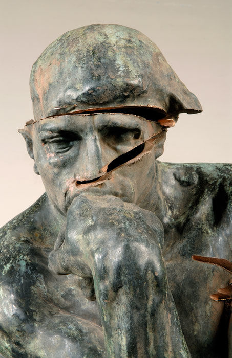

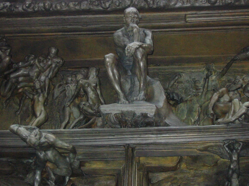


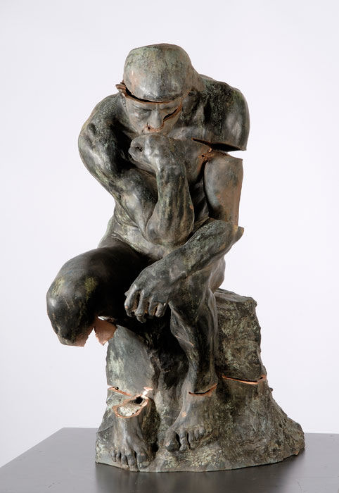

Below, Fig. 10: the “Thinker” after its (insurance company prompted) “restoration” with epoxy resins and “re-patination” with acrylic paints. Fearing – for good reasons – that their epoxy resin “in-fills” might well need replacement at some future date, the restorers made casts of them in tin. Those casts and a cd containing all the data, were placed/immortalised, time-capsule fashion…inside the patched-up and painted remains of Rodin’s sculpture.

![]()
The European Commission’s way of moving works of art around

In our February 2nd account of the European Commission’s desire to speed the “trafficking” (as it were) of art objects between European museums, through its project “Collections Mobility 2.0”, we addressed the current forms of this politically orchestrated campaign but neglected a rationale for it that had recently been offered by Androulla Vassiliou, the European Commissioner for Education, Culture, Multilingualism and Youth, in her introduction to Culture in Motion’s brochure The Culture Programme – 2007-2013:
“I am especially happy to highlight the importance of culture to the European Union’s objective of smart, sustainable and inclusive growth. At a time when many of our industries are facing difficulties, the cultural and creative industries have experienced unprecedented growth and offer the prospect of sustainable, future-oriented and fulfilling jobs.”
Michel Favre-Felix, President of ARIPA (Association Internationale pour le Respect de l’Intégrité du Patrimoine Artistique), has drawn our attention to his own study of the earlier and underlying stages of this policy. An account of those researches was published in his article of Nuances 40-41 (2009). We are deeply indebted to Mr Favre-Felix not only for conducting those initial studies so thoroughly and for demonstrating their unsatisfactory – if not sinister – character, but also for presenting them here in summary form.
Michel Favre-Felix writes:
Since 2003, the declared ambition of the European Commission has been to “facilitate”, “encourage”, “promote” and make “easy” the “mobility of art collections” within Europe. To this end, five conferences were held in Naples (2003), The Hague (2004), Manchester (2005), Helsinki (2006) and, Bremen (2007).
The initial premise rested on an arithmetical calculation: exhibitions of international character are presented by only 300 institutions out of 30,000 European museums. Recommendations were issued to stimulate exchanges and loans of works of art within Europe, in addition to existing international travelling exhibitions.
Apart from administrative simplifications, it was seen that the best means of encouraging loans lay in a reduction of costs. With insurance charges comprising on average 15% -20% of travelling exhibition budgets, savings in this area could be achieved by four means: by museums’ extended use of the non-insurance of cultural objects; by waiving certain risks; by waiving costs of depreciation; and by expanding the use of State guarantees.
In the latter, a State takes the responsibility of an insurer, at almost no cost to museums, for the largest part of the values engaged in the exhibition, loan, etc. The minimal part not guaranteed by states, or the “excess” part, is insured by private companies that remain responsible for covering “the first losses”. These are the more frequent and the most tangible (and not having covered these liabilities is the reason why States have had little to pay for damages up to now – which does not mean that accidents had not happened).
It should, however, be recognised that even commercial insurance does not cover all injuries: damages that are not discovered and declared within 48 hours are excluded: the universal rule of “nail to nail” further excludes any deteriorations that manifest themselves sometime after the return of a work. Nor does insurance always cover damages linked to the fragility of an art work in the environment of travel and exhibition as with regard to humidity, temperature, etc. The reasoning is that so-vulnerable art should not have been given permission to travel in the first place, and that the lender erred in permitting it. “Pre-existing fragilities” are specifically a possible exclusion argument. However, these companies do maintain in the process their strong concern with security risks.
A first-step European study, in 2004 specifically acknowledged that:
“Insurance costs serve as obstacles for projects that are doubtful in terms of conservation, for the reason that insurers are not willing to cover particularly high risks. From this point of view, insurance costs are a guarantee against ill-considered exhibition projects. […] Insurance companies have an influence on security measures taken in museums, thus helping prevent damage” [See endnote1].
Nevertheless, the same study and the later EU reports advocate the reduction of insurance and recommend that:
“Museum professionals agree to: -waive certain risks. -consider lending on a non-insurance basis, -cover only restoration of material damage and waive depreciation” [2]
On the possibility of “Non-insurance” the report contends that:
“Essentially, the question is: why take out insurance on objects lent abroad if the object is not insured when it remains on home ground?”
The purpose of the question is baffling: in 1991 the art insurer Hiscox stated that the risks involved were ten times higher for work on loan than when left at home. Sixteen years later, in 2007, in answer to our questions, Axa Art in France estimated the risks in loan venues to be about six times higher than in permanent residences.
Specific European suggestions that lenders should: “not insure works while they [are] at the exhibition venue” ignore the fact that most injuries occur during the time of the exhibition – and especially at moments of handling: mounting/dismounting, unpacking/repacking. In addition to which, environmental stress and risks have sometimes proved higher during exhibitions than during the travelling time.
The admonition to “waive depreciation” means that lenders should relinquish the loss of value after damage. This is a rationale from a mere financial strategy: mathematically, costs of depreciation comprise 80% of the money paid back by art insurance companies. But for ethical and cultural commitments, this strategy is most shocking. Apart from “money value”, waiving depreciation means to ignore, to deny the irreversible loss to the artistic integrity of the work of art when damaged.
Artistic integrity is totally written out of consideration when EU experts specifically advocate that:
“depreciation should not be insured because the value of an object is not important in collection mobility.”
According to this risks/damage management, depreciation should not be a concern, and neither should restoration be a problem, as we see in this incredible statement:
“in many cases, after the exhibits have been restored, only experts can assess the alteration resulting from the damage. The restored artworks can therefore be exhibited as they are.”
This rationale that an injured and then restored work has returned to its non-injured condition – or has returned “enough” to be “re-used”– is not only clearly fallacious, but represents a major fault in museum and conservation ethics. Because restorations may (temporarily) deceive the eyes of the uninformed, restoration is presented as a miraculous mean for wiping off responsibility and liabilities. So, too, may “restorations” that are unnecessary for a work of art in its location, be imposed in order “to enable it to travel”, to endure the constraint of transport and the stress of alien environments. Such thinking might rightly be considered a source of abusive treatments of art objects: because of hasty intervention to meet deadlines or because of losses of their integrity (i.e. by relinings). But EU papers only address this question in terms of financial charges – which are to be kept “to a minimum”.
A most shocking aspect is that there is never any request that the money saved through the proposed facilities be re-invested to enhance security measures. In this strategy of “keeping costs at minimum”, Museums are further counselled to moderate even their demands for increasing safety:
“Museums that are willing to waive insurance coverage of certain risks may want assurances that transport, display, security and climate control are of the highest standard. However, it would be counterproductive [sic] to impose additional demands that again increase costs, especially when the insurance waiver was intended to reduce such costs.”
The “Museum collections on the move workshop” in Naples 2003 advised lenders to “limit as far as possible” extra expenses, and to think twice before asking for accompaniment by a courier [3], although this has proved to be the most effective procedure to secure the object during its whole travel.
All the opposite – increasing the security and safety measures – should have been a central preoccupation of this European project, because, wishing to have more loans and more exhibitions (than those already conducted by the 300 major museums) would, necessarily mean involving a lot of small museums – which are less equipped – and borrowing art works from non-museum sources (i.e. city-owned or various communities collections). It is well known that when the lender is not an informed professional and is not well advised by a professional conservation team, his work of art would not likely receive the safest (more expensive) forms of care and protection. The tragically recurrent abuses of Signac’s largest painting should serve as a reminder. (See illustration and comments, right.) It should therefore be a priority to promote a reinforced ethical responsibility of the borrower, to protect the “little” lenders.
The last point that deserves urgent consideration is the very motivation for such movements of collections. There is a clear interest to gather works of a given artist (though preferably not the most commonly represented ones) on the benefit of this artist first, and of the public and the experts alike. Common sense and museum ethics too, consider that loans of works of art
“should only be granted to exhibitions abroad which are artistically or academically of high quality”. [4]
Specifically to be excluded should be loans assembled for the purpose of festivities, political celebrations, personal or group promotions, etc. European institutions might themselves be supposed to set a “best practice” example in this regard. How then, on what academic, artistic or scientific reasons, were the 27 nation members of the European Union asked to send “a treasure of their cultural heritage”, to be gathered in a single (over-crowded) room of the Palazzo Quirinal in Rome (from March 24th to May 20th 2007) in order to celebrate the 50th anniversary of the Treaty of Rome?
(1) Study No. 2003-4879 ordered by the European Commission to inventory national systems of public guarantees in 31 countries (June 2004) http://ec.europa.eu/culture/key-documents/doc915_en.htm
(2) Lending to Europe Recommendations on collection mobility for European museums (April 2005) http://www.nba.fi/mobility/background.htm
(3) The role of the courier is to act as representative of the lender in ensuring safe handling of the loan during transit, unpacking, packing and, if necessary, during installation and de-installation. Moreover, he would need the presence of an accredited supervisor (extra expense) to look after the loan all the way along to the plane holds on airport freight zones.
(4) General Principles on the Administration of Loans and Exchange of Works of Art between Institutions, Code of practice of the international group of organisers of large-scale exhibitions (Bizot Group).
Comments may be left at: artwatch.uk@gmail.com

The Inspector of Historical Monuments urged “to keep the painting where it is and not to attempt to have it sent again in various exhibitions”.
This was a waste of advice: the painting, although extremely fragile and large, was sent in 1997 to an exhibition in Paris… where it again arrived ripped, without any understanding of “how and when a shock could have hurt the painting while all the precautions have been taken [sic]”.
Who is to blame? The too-confident small city of Montreuil? Or, the self-confident Paris exhibition organizers – who might have declined the loan in view of the painting’s well-known fragility?


![]()