
In Memoriam: Tom Wolfe (1930 – 2018)
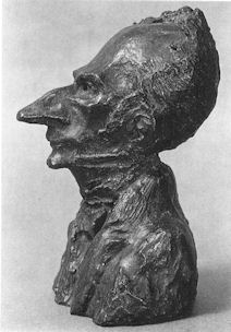
The journalist and writer Tom Wolfe died on 14 May aged 88. He is survived by his wife Sheila (Berger) Wolfe, a graphic designer and former art director of Harper’s Magazine, and their two children, Alexandra Wolfe, a reporter for The Wall Street Journal, and Tommy Wolfe, a sculptor and furniture designer.
The New York Times reports Tom Wolfe’s least-forgiven and most-wounding foray. In 1970 he mocked what he termed New York’s “radical-chic”. This had been prompted by a fund-raising party given for the Black Panthers by Leonard Bernstein, the conductor of the New York Philharmonic, and his wife, the Chilean actress Felicia Montealegre, in their 13-room Park Avenue penthouse. The guests were the Bernstein’s rich liberal and mostly famous friends. How very remarkably on-target that attack was – and how infectiously well and fast that chic travelled. At that period, across the pond in London, well-meaning pre-eminent thespians like Vanessa Redgrave rattled the revolutionists’ tin under the noses of artists like R. B. Kitaj. As the designer of UK New Left publications – first The Black Dwarf and then Idiot International – we, along with Jean Genet and a Parisian Leftist called Castro, attended a dinner given in the marble-floored, art-rich (Mondrians, Bellmers…) Paris apartment of the novelist, polemicist and publisher of L’Idiot International, Jean-Edern Hallier and his Italian heiress wife, Anna. The guests of honour were a group of visiting Black Panthers, lead by (the beautiful) Connie Matthews, who would later be killed in a police shoot-out in the United States. The books in the Halliers apartment had been rebound in white leather, with gold-tooled lettering and they were displayed on shelves made of polished black lignum vitae, the hardest, densest wood that makes the best truncheons, the most wind-resistant cricket balls and that is used as bearings for ships propeller shafts. This apartment, with its live-in servants was not, however, where “the real” Jean-Edern Hallier lived. He once told me that his true self was to be found in a small, occasionally used bed-sit furnished only with a single bed and a Che poster.

Above, Tom Wolfe as photographed in New York in 1968 by Sam Falk for The New York Times
Best known for his first novel, The Bonfire of the Vanities, Wolfe blew the whistle on pretentious ideas-led, art critics-sanctioned contemporary art in The Painted Word which was excerpted in Harpers Magazine. Incensed art world players responded with scurrilous/puerile abuse. One victim accused Wolfe of having written his devolution – i. e. reverse-evolution – of modern art (“In the beginning we got rid of nineteenth-century storybook realism. Then we got rid of representational objects. Then we got rid of the third dimension altogether and got really flat – Abstract Expressionism. Then we got rid of airiness, brushstrokes, most of the paint, and the last viruses of drawing and complicated designs”…) without ever “getting away from his typewriter and into the thick of his subject”. Not many people know this, but Tom Wolfe took classes at the Art Students League in New York with the painter, Frank Mason, the scourge of art-destroying picture restorers (and a founder member of ArtWatch International) who had blown the whistle in New York on the restoration of Michelangelo’s Sistine Chapel ceiling. At a memorial service on 18 October 2009, Wolfe delivered this tribute to Frank Mason who had died aged 88 on 16 June 2009:
“I’m not sure how many people here have seen Tom Stoppard’s wonderful play, Artist Descending the Staircase. Well, in that play one of the characters turns to the audience and says, ‘Imagination plus lack of skill, gives us no-hands art.’ Andy Warhol showing photographs of commercial products to his elves, and ping-pong shots from amusement arcades of famous people. Or, Jeff Koons, who sends photographs of himself slogging at it with an Italian prostitute of some fame, and sends these photographs off to elves in Switzerland who then convert the photographs into three-dimensional ceramic objects. Or, Richard Serra, who orders ten-foot high raw core tin steel walls from the foundry and has unionized elves to transport them to open spaces and prop them up. Or, Richard Prince, a self-elf who takes photographs of photographs and sells them for stunning sums to culturally anxious hedge fund managers.
“Now I have to confess that those examples were supplied by me. But, what Tom Stoppard has his character actually say is, ‘Imagination plus lack of skill, gives us modern art.’ So there has to be a corollary to that, and I think the corollary would be: imagination plus real skill gives us Michelangelo, Bernini, Tissot and Titian. And, Frank was known in his youth as the rebirth of Titian, the comparison was made consummate of Frank Mason and Titian. And both Titian and Tissot loved the deepest perspective a painting could possibly effect and one of my favorite Frank Mason paintings is of – I think it might be the Italian restaurant below his apartment on Broome Street – and it is of a group of people, many, many people, and no person in the background is neglected at all. Every head that appears in a Frank Mason painting is developed and is an individual who is distinct from every other. But, what particularly surprised me was that in the vast, vast deep Titianesque, Tissot-like perspective of that painting is the carving on wood work at the very back of the room. These are details that the naked eye can probably not see beyond six feet. In this painting they are about sixty feet away. What he did with them was absolutely marvelous, I can’t think of another painter who could do it better, perhaps not even Tissot or Titian.
“There’s also . . . his skill went across every possible category – still life, which, in a way, is the opposite of Titianesque painting of deep perspective. Earlier, before the [memorial] programme started on the screen here was Frank’s Silver Pitcher. A still life with the silver pitcher in the middle of it – and that silver pitcher is so much more real than an actual silver pitcher you just want to grab it and drink some of that New York tap water. You know, New York tap water is some of the best water in the country. It’s better than anything that comes in a bottle, I assure you. Now Frank was much more than a great artist. And to say that somebody is much more than a great artist (particularly John Varriano brought it out) is saying a great deal. Frank is what I think of as a life force. You know, Darwin once appeared before a class of students at a university in England, and you know the young will ask questions that the old do not dare ask. And he would explain how life had begun out of a cell and all that is before us came from that tiny origin. So one of the students says, ‘Well, where was it?’ And Darwin says, ‘Where was what?’ ‘The cell? Where was it?’ And he said, ‘Well I don’t know. It was probably in a warm pool of water somewhere’. And then another student said, ‘Yes, so then how did it get there?’ And he said, ‘Well, I don’t know where, and I don’t know if it’s terribly important.’ And then another student said, ‘Why does it want to divide? Why does it want to reproduce? Why?’ At this point Darwin reflected and said, ‘To tell the truth, no one knows where the life force comes from and perhaps no one will ever know. If they do it will be hundreds of years from now before we learn where the life force comes from. Isn’t it enough that I brought you all these plants and all these animals? How much do you want from me?’
“But, this life force – it is not a metaphor, it’s a concept. I always thought when I first came to New York my ambition as a youngster was to work in a newspaper in New York. It took me many years to get here but I finally did it. Unfortunately, my image of New York City had gone from books written in the 1920s and 1930s about people like Ben Hecht. So I was waiting to see Mark Twain walking up Broadway in a white linen suit. I was waiting to see Walter Winchell who at that time was on the radio saying, ‘Good evening Mr. and Mrs. America and all the ships at sea. Let’s go to press.’ To me that voice of Walter Winchill, that was that excitement, that earnestness, that was New York. Or, Henry Luce the great creator of Time magazine threatening to throw Harold Ross out the window of his apartment because Ross had run a profile of Luce in the form of a parody of the famous Time magazine style, particularly its inverted rhetoric. And the piece ended, ‘where it will all end knows not.’
“All of this to me was, this excitement, this was New York. So, when I arrived all I saw was men in stingy rim hats with the rims about this wide, crowns right down on top of their heads. And they had their chins hooked in their collarbones, scuffling down the street and they were muttering, ‘Aw Hell’. That’s what was actually here. But then, well incidentally at least they had hats.
“125-30 years ago, men – in the English-speaking world anyway – wore tall stiff hats known as toppers. That began to change, by 1900 they began to shrink a bit and get dents down the middle or in the sides. By the time I came to New York it was the stingy brim hats. But, at least they had them. Back in the 19th century women had these little pieces of cloth with lace around them called kerchiefs. Today, the men wear the kerchiefs – they’re known as baseball caps – while the women have all the testosterone. Look at the great party hats you see everywhere in fashion today. But I did find a flip side. People here, Clay Felker, who was my editor at New York magazine, Roger Straus – an indomitable publisher – and I finally began to realize that every age is the same, every age has had the mass equivalent of the guy shuffling along the sidewalk in the stingy brim hat. What has made New York exciting, what has given it the reputation of excitement, what makes it exciting today is really a relative handful of people who are motors. They’re motors in a ship that goes hurtling at an unbelievable speed, making reckless turns and we’re all invited to jump on board for the ride. And that’s what living in New York means, either they enjoy the ride or they just get out. And Frank Mason was one of those motors, extraordinary.
“But, I happened to have the privilege of seeing Frank work – I saw him giving instruction at the Art Students League. I can’t describe it quite as well as John [Varriano] did or as Peace [Sullivan] did, but I saw it and I saw this congestion of not only human beings, but easels – when you see easel fights and they go ‘- there’s room!’ Everyone trying to get into that room and to get into a position to see the model, which was in deep perspective way over there. It’s an astonishing spectacle.
“I also had the privilege of participating in some of those Tuesday night sessions on Broome Street. You know Frank and Anne moved to Broome Street I think 20 years before you had all these, ‘You have to live down there, you have to live below Houston Street or you weren’t real.’ These sessions were held in that great studio and apartment. And Frank was very indulgent with me because the only thing I cared about was getting the hands right. To this day that’s the first thing I look at in a painting – the hands, all the rest is not as – is secondary. Frank could do, absolutely, hands that you wanted to shake and you want to look up into those eyes. This sort of spirit is so rare, so precious – and everyone [speaking] today has described it accurately – the booming voice, the laughter. I never saw Frank in anything but a mood of enthusiasm and love of life. So, I made a rather rash prediction in 1976 that by the year 2020 what Frank Mason prophesized would have come true.
“Frank at one point said that modernism is dying a slow death. Not far away from that we will climb the mountain once again, because you cannot kill genius. And, today it’s almost 2010. I don’t see the art world, as we call the little village that controls prestige, I don’t see it calming down very much. I think it’s really more frantic than ever – ‘No-Hands’ Art sweeps the art village.
“Tenure art sweeps the art village. ‘Tenure Art’ is conceptual art that is happening which cannot possibly be bought or collected. But, one thing for the artist is to be hired by the faculty of a university, hang on for ten years and you’ve got tenure. You’ve got a salary until the end of your days and then a great pension plan. ‘No-Hands Art’ and ‘Tenure Art’. So, we’ve only got ten years, folks. But, I think now is the time to do it. Frank Mason was the beginning of a neo-Renaissance. A Renaissance – is a rebirth. A neo-Renaissance is a rebirth of what should not have died the first time. So I leave here with the sense that I – I’m paying homage to Frank Mason. And that I also feel that some-how, all of us – me with my hands and you with the rest of the things that you do – can bring Frank’s prediction alive. I leave here with tremendous hope.”
Today, there are only two years left for that predicted expiration of modernism and, on the face of it, all the signs are that means have been found to buoy its markets indefinitely. But, then, there are jitters that might yet prove portents: culturally anxious chump oligarchs now queue in such numbers to buy Koons’ balloons on the never-never that even that artist’s legion of elves cannot keep pace with the orders. A restorer who part-painted a half-billion dollars Salvator Mundi recently donated the brushes she had used to Columbia Museum of Art to help the museum’s mission to celebrate outstanding artistic creativity. Roll up! Roll-up! “Own a piece of art history!” the museum urged, “These seven paint brushes were used to restore Leonardo’s Salvator Mundi, which set a new record for the price of a work of art when it sold for $450 million in 2017.” The brushes found no taker – no one met the Ebay reserve of $1,000. At Columbia university, as Artnet reports, disgruntled students in the visual arts MFA program are demanding a refund for the current school year’s ($63,961) tuition fees, in part because the buildings are disintegrating; in part because too many tenured professors have gone on sabbaticals at the same time; in part because the students have not been able to work with—or even meet—some of the notable artists whose reputations drew them to the school in the first place. (See “Columbia University MFAs Share Stories of Dysfunctional Studios and Overworked Faculty”.) In the UK, a superannuated Lecturer in Fine Art at the University of Lincoln dismissed the teaching of life drawing as “a deeply conservative and reactionary position” in the November/December 2017 Jackdaw magazine. A “Curator of Interpretation” at the Tate has explained that anything dragged into a gallery can be considered to be fine art providing only that the dragger-in is an art school-accredited person. Anything can be art except art. Such cultural lunacy must end sometime.
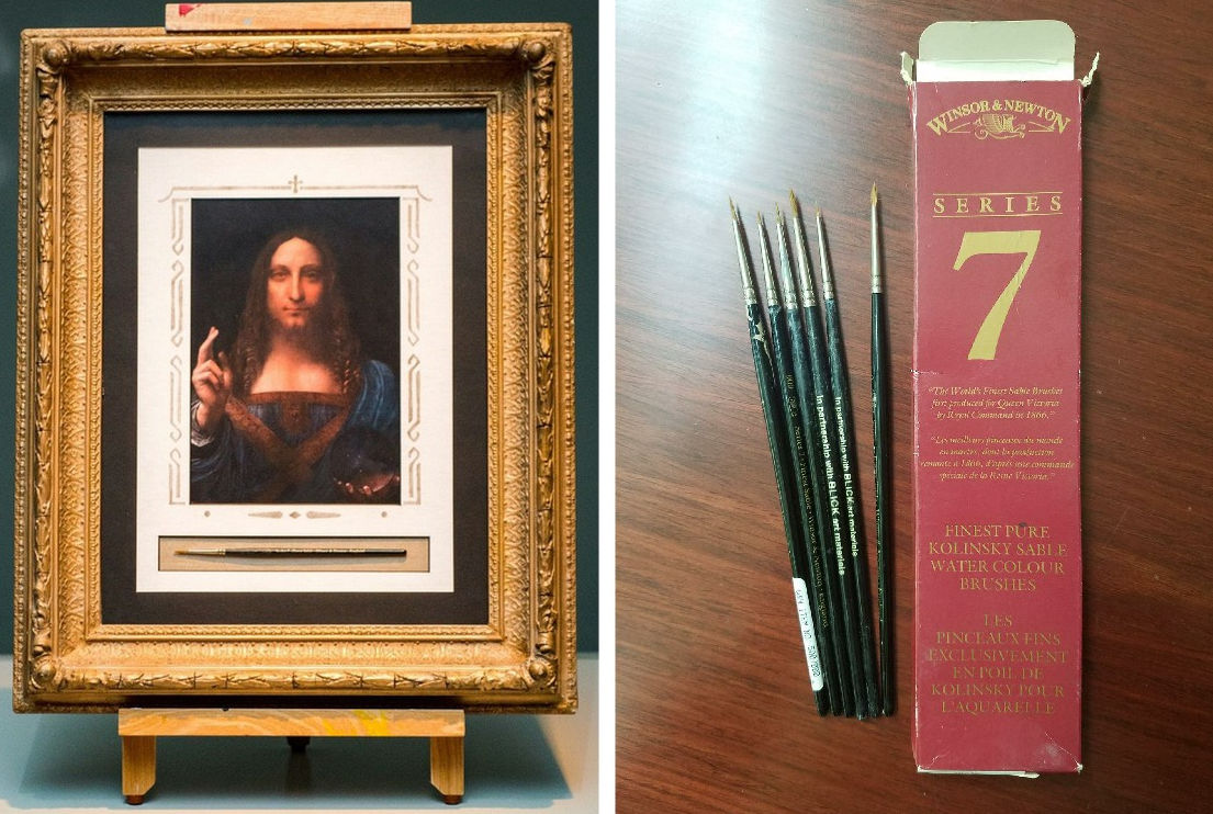
Above, the brushes that helped paint the $450m Salvator Mundi, as presented and offered for sale on Ebay. Below, a corner of Frank Mason’s Broome Street studio and a detail of his hurtling life-celebrating painting “Before the Storm, Nova Scotia”.

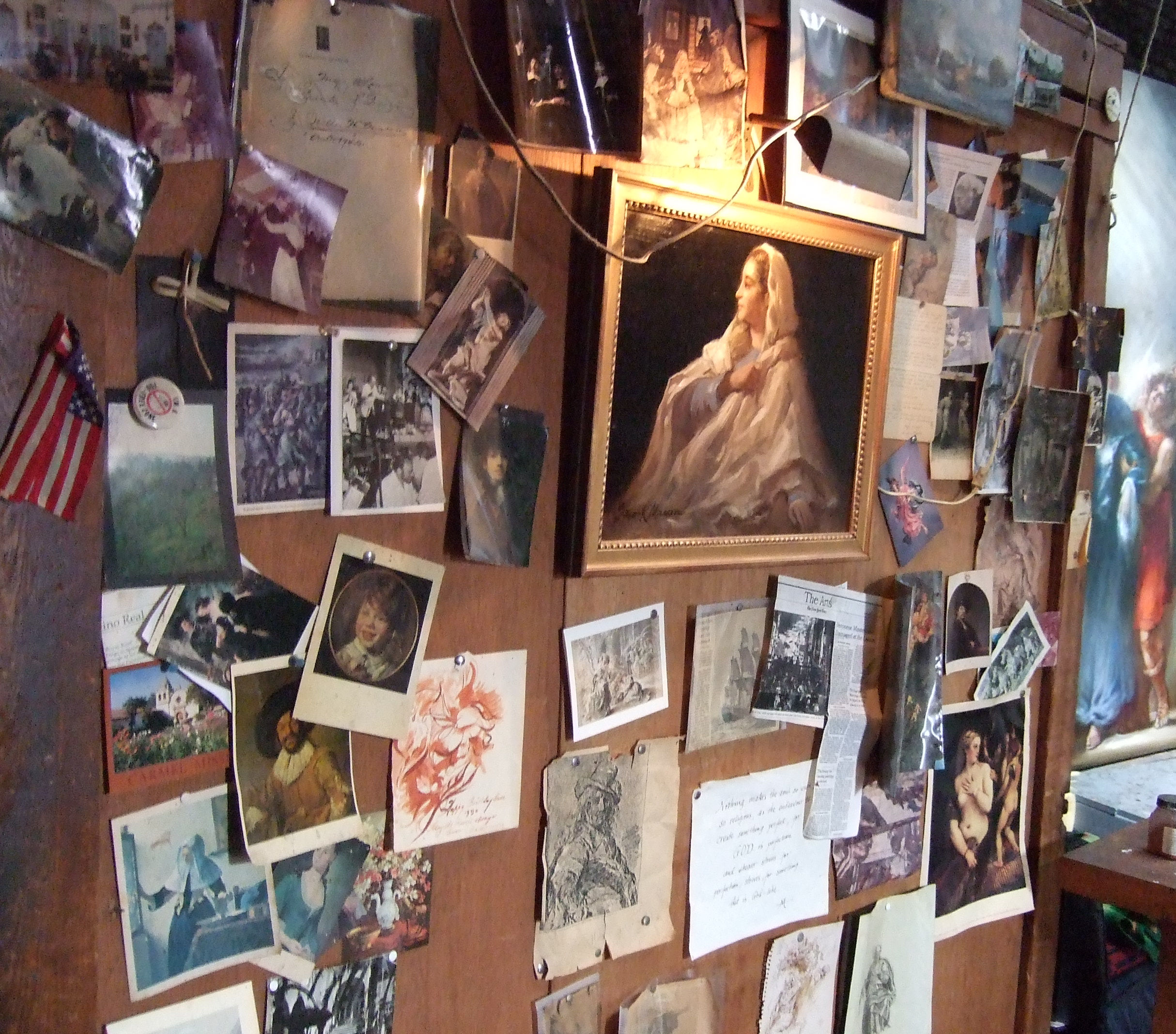
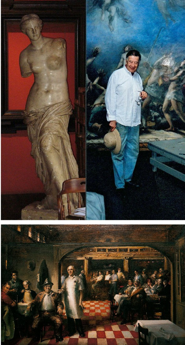
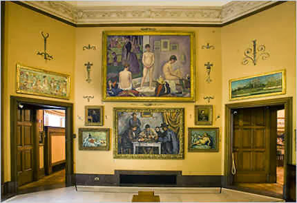
Above: Frank Mason in his studio; some of the plaster casts he had saved from destruction in a New York art school; and, his “Little Italy” mural, to which Tom Wolfe referred.
Anne Mason writes of Tom Wolfe’s death: “I hadn’t heard. Lovely person. We ran into Tom and Shiela on 5th Ave one night. Frank said, ‘What are you doing tonight?’ Tom answered, ‘Looking for you.’ A gentleman through and through. He was in Frank’s class at the ASL for a short while. Frank was so pleased to have him there. Don’t know if you knew that Frank painted Shiela’s portrait? It was a Christmas surprise for Tom. Nice memory. She carried it off. He had no idea. Thanks for telling me.”
Our thanks to Anne, and Frank and Tom Wolfe.
Michael Daley, 16 May 2018
Barnes, Burrell and a Beck Memorial Lecture: “Philippe Mercier Watteau’s English Follower” ~ by Martin Eidelberg

In 1991 a restorer brought Professor James Beck of Columbia University to trial in four Italian cities on charges of aggravated criminal slander. (Beck’s comments to one journalist had been carried in four regional newspapers.) Facing a possible three years jail sentence and ruinous, punitive damages – the restorer demanded 60 million lire for “material and moral damages” – Beck was exposed, vulnerable, alone. The restorer had sued Beck but not the four newspapers that had carried the allegedly damaging comments by the world’s leading authority on Jacopo della Quercia, whose famous marble carving in Lucca Cathedral, The Ilaria del Carretto, had been stripped of its ancient patina in a “conservation treatment” that included being blasted with particles to remove abrasions and scratches and saturated with penetrating oil to produce a homogeneously shiny surface (see Figs. 2 and 3). Despite the awfulness of the restoration everyone expected Beck to lose. One person who knew that he was going to lose – the trial judge in Florence – told the prosecuting lawyer as they left the court building together for lunch on the first day of the trial that he would find the scholar guilty: “Eh, but I shall convict him”.
Fortunately, that declared intention was overhead by an intern-lawyer and former policeman who happened to be working for Beck’s own lawyer. The judge and the lawyer disputed the attributed words but not the fact that they had left the court talking to each other about the case. Despite their joint denial, eventually, the judge was replaced and Beck was acquitted. (The story of that trial is told in the book “Art Restoration ~ The Culture, the Business and the Scandal” by James Beck and Michael Daley.) By then, Beck had resolved to set up an international organisation dedicated to speak and act on behalf of art against harmful practices and abusive or exploitative treatments. ArtWatch International was founded in 1992 to be that organisation.
When Beck died in 2007 we knew that the best way to honour his courageous stance was by continuing to campaign through ArtWatch. At the same time, to commemorate his achievements as a rigorous (Rudolph Wittkower-trained) scholar and highly popular teacher, we instigated an annual memorial lecture, alternating between London and New York, to be given by scholars of high esteem. We have been honoured by talks from Professors Hellmut Wohl and Charles Hope in London in 2009 and 2011, and by Professors Mark Zucker and David Freedberg in New York in 2010 and 2012.
The fifth lecture was given in London this year on September 30th by Professor Martin Eidelberg at the Society of Antiquaries of London in Burlington House. It was a sparkling and instructive occasion as Professor Eidelberg showed (through more than fifty PowerPoint slides) a succession of visual comparisons which deftly separated the subject of his talk, Watteau’s English follower, Philippe Mercier, from the many inferior works that had been attached to the artist as a kind of attributional flag of convenience, thereby exposing the intriguing conundrum of a painter of considerable quality who had remained a faithful pastichist of his chosen master, borrowing motifs at every step of his own career. An account of this elusive artistic entity will be carried in the next ArtWatch UK journal – just as the fourth lecture by Charles Hope (“The National Gallery Cleaning Controversy”) is carried in the current journal. Professor Eidelberg cites on his (excellent, as Selby Whittingham describes below) website, Watteau and His Circle, an anecdote about the friend of a colleague who responded to a general archaeology exam question with:
“an incredibly detailed answer about a minor type of Roman provincial pottery. The examiners were bowled over by this man’s extraordinary knowledge on such a minuscule topic, but then asked him why he had expended so much energy on a subject that only three or four people in the world knew anything about. His reply was ‘I realize that, but with them I have such interesting conversations.'”
Martin Eidelberg expresses the hope that his own essays will find a readership, encourage others’ research, lead to stimulating conversations on the art of Watteau and his circle. Certainly, his lecture on the 30th left the (distinguished) audience delighted and flattered to have been party to so discriminating and illuminating a conversation. Given the talk’s rarified subject it seemed appropriate to ask a specialist in the field, Selby Whittingham, who is Secretary of the Watteau Society, Donor Watch and The Independent Turner Society to offer a note on the speaker and his researches.
Dr Whittingham recalls:
“It is 29 years since I first met Martin Eidelberg at the colloquium at Paris to celebrate the tercentenary of Watteau’s birth, to which we both contributed, Martin on Watteau and his early master, Gillot. The speaker immediately preceding myself, Brian Allen, spoke about early imitators of Watteau in England, of whom “easily the most important” was Philip Mercier. Fifteen years earlier John Ingamells and the late Robert Raines, a founder member of the Watteau Society in 1984, held an exhibition on Mercier at York Art Gallery, followed by a catalogue of his works published fittingly by the Walpole Society (Horace Walpole having owned an actual Watteau, now at St Petersburg).
“As Martin’s conclusions will appear in his excellent Watteau blog, suffice it to say that he has once again challenged accepted views and causes us to revise our ideas about Watteau and his satellites. It was a rare privilege for a London audience to hear such an erudite talk, as the subject of Watteau long bypassed London, the blame for this being laid on the embargo put by Lady Wallace on the Wallace Collection from lending any of its pictures! However the accession of Christoph Vogtherr as its Director (successor but one to Ingamells) has now shown that need not be so, and that scholarly publications are not dependent on blockbuster loan exhibitions. On the other hand it is regrettable that an exhibition, mainly of photographs, on Watteau’s techniques held just after the tercentenary at Brussels never transferred, as its organisers had wished, to England, as the matter would have been of great interest to supporters of ArtWatch, some of whom will remember how a conservation mistake was shown by Martin Eidelberg at a previous meeting to have obliterated additions to a painting made by Watteau himself.”
The earlier ArtWatch talk to which Selby Whittingham refers was much appreciated by James Beck. As well as providing a platform for good talks, Artwatch soon discovered that people feel freer to approach and pass on intelligence to a dedicated organisation than to individuals. One of the first to do so was Nick Tinari, a young electrical engineer and devoted student at the Barnes Foundation in Merion, Pennsylvania. He brought news of an attempt to overturn a prohibition on loans of art works from the Barnes Foundation’s fabulous collection of modern paintings. This, indeed, was alarming: tours not only constitute greatly increased risks (six-fold in the judgement of one insurer) but too often serve also as pretexts for “conservation treatments”. With the Barnes collection (as with that of the Sterling and Francine Clark collection – see “Taking Renoir, Sterling and Francine Clark to the Cleaners”), the now-at-risk paintings were in the best, which is to say, least-restored conditions.
The justification for the proposed breach of a fabulously generous donor’s wishes and conditions was that money could be raised through a foreign tour of key works in the collection to make “conservation” improvements to the building in which the collection was housed. Alleged conservation needs provide morally-coercive cover for many professional expansions and building projects. Tinari saw the proposal as a ruse contemptuous of Barnes’ intentions and philosophy. Events proved him right – the assets of an institution were effectively hi-jacked and its educational purpose greatly subverted. The story of that heist has been well told (and see Tinari’s own comments below). Less sufficiently appreciated is Tinari’s own remarkable and tenacious defence of Barnes’ wishes and instructions against the hot-shot lawyers of the would-be institutional transformers. Those encounters so sharpened his awareness of and appetite for the law that he turned to law school himself and now works as a patents attorney.
Artwatch has always seen itself as something of a standard bearer and supporter of other worthy autonomous campaigns on Art’s behalf. James Beck had great fondness for courageous campaigning individuals and created a small prize which he named after the New York painter Frank Mason. Mason, a longstanding and popular traditionalist teacher at New York’s famous Art Students League (among his student/devotees was the great American satirist and author of “The Painted Word”, Tom Wolfe), was a pioneering anti-restoration figure in the US, leading marches of artists and students at the Art Students League to the Metropolitan Museum in protest at its picture restorations. In opposition to the cleaning of the Sistine Chapel ceiling he enlisted the engagement of the writer and former art critic of Time Magazine, Alexander Eliot. With the philosopher Thomas Molnar and the cultural historian Arcadi Nebolsine, Mason had founded The International Society for the Preservation of Art, which organisation was incorporated within ArtWatch International at its 1992 foundation.
At this year’s James Beck Memorial Lecture we awarded the 2013 Frank Mason Prize to Nick Tinari. He, like Selby Whittingham (the recipient of the 2011 Frank Mason Prize), has joined our campaign against Glasgow City Council’s attempt to have conditions of Sir William Burrell’s bequest overturned by the Scottish Parliament so as to permit foreign tours of works from the collection. The submissions to the Scottish Parliament made by Donor Watch, Nick Tinari, and ourselves, can be read at this site. Evidence given to the Parliamentary Committee by ArtWatch UK and others can be seen here.
Nick Tinari’s submission begins:
“I am a practicing attorney and an electrical engineer. I am also an alumnus of the education program of the Barnes Foundation in Merion, Pennsylvania. Like Mr. Burrell, the founder of the Barnes Foundation, Dr. Albert C. Barnes, made his gift of an extensive art collection including the stipulation in an Indenture of Trust that none of the works should be loaned. This stipulation was temporarily breached in the 1990s based on the argument that the foundation was lacking funds to maintain theMerion gallery and that a “once-in-a-lifetime” opportunity had opened for a tour of the artwork to Washington D.C., Paris and Tokyo, with the French and Japanese venues paying a total of $7 million for the loan. This was one of the earliest instances of outright rental of artwork for exhibition and at the time the largest sum ever paid for such a transaction. Since then, the practice has become commonplace…”
In view of this great familarity with the Barnes case and its clear relevance to present considerations of the private bill presently before the Scottish Parliament, we asked Nick Tinari if he might address that relationship when making his response to receiving the Frank Mason Prize.
Nick Tinari’s response:
“I want to thank everyone at ArtWatch for awarding me the Frank Mason prize this year. I’ve worked alongside ArtWatch for many years and they are doing important work that no one else is addressing, namely, protecting our artistic heritage for the long haul, not just for the next exhibition or next year, but for as long as we will continue to recognize artistic genius, which hopefully is a very, very long way out.
“In addition to being a remarkable artist and teacher, Frank Mason was an early voice against imprudent “restoration” of artwork. We are in the small club of those who organized protests at museums, his in the 1970s at the Metropolitan Museum and mine in the 1990s at the Washington National Gallery and Philadelphia Museum of Art.
“I met Jim Beck many years ago when I was trying to stop the dismantling of the Barnes Foundation in Merion Pennsylvania. One aspect of the plan to break the founder’s will was an international tour of 80 works from the collection. It was a story that is very similar to the current plans for the Burrell Collection in Glasgow. The trustees no longer had connections to the donor or his intent and they wanted to elevate their own agendas and “put the Barnes on the map,” which was, of course, ridiculous because the Barnes Foundation was world-renowned long before the arrival of new trustees.
“I asked Jim for help because the tour organizer, the Washington National Gallery of Art, wanted to remove varnish from many of the works, many of which came into the collection directly from the artists’ studios and thus were in pristine condition, even if not bright enough for the kinds of shows the National Gallery puts on.
“This was in the infancy of ArtWatch and Jim wrote some letters and we did press releases together and got some attention to the matter. In the end, the works were not touched for the tour, the rumor being that the French organizers objected to altering the paintings, although some of the same institutions have certainly made their own mistakes since then.
“Between 1993 and 1995, roughly 80 Barnes paintings did travel to Washington, Paris, Tokyo, Fort Worth, Toronto, Philadelphia and Munich. Because I did not believe the National Gallery’s officials’ promises about the supposedly careful transit conditions—they actually claimed the works would be safer on tour than in Merion—I examined the works myself in Washington, Paris, Fort Worth, Toronto and Philadelphia. Aided by the condition reports for the paintings prepared before the tour by the National Gallery and which I obtained through the Freedom of Information Act, I documented damage to several works as they were moved from city to city.
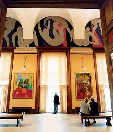
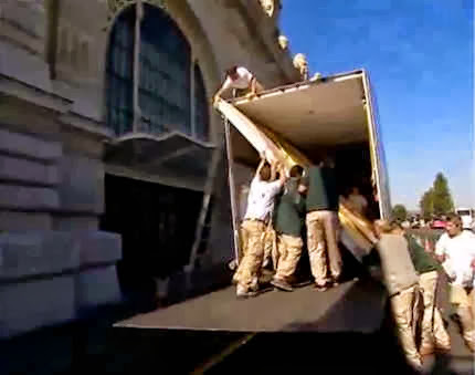
“The most dramatic damage that I saw was in the form of stretcher creases extending the width of one of the four-meter-wide canvas sections of Matisse’s la Danse [see Figs. 24 and 25], which Barnes commissioned for three lunettes in the central gallery at Merion [see Fig. 17]. Contrary to National Gallery testimony that climate-controlled trucks would be used, the large panels were shipped from Merion to Washington in open-air flat bed trucks in 40 degree Fahrenheit weather and then laid flat and rolled up to a special opening in a large window at the National Gallery [see Fig. 19]. I did not witness it, but presumably, a similar procedure was used to move the panels to the Musee d’Art Moderne in Paris. We have photos of the arrival of the panels at the Philadelphia Museum of Art, again on open trucks and again laid flat before being moved into the building.
“These photos [Figs. 24 and 25] show the damage as I recorded it at the Philadelphia Museum of Art, where the painting was on display while the remaining works traveled to other cities. The National Gallery’s incredible response was that they simply had not noted the stretcher creases on the original condition reports. This is belied by an earlier report prepared by chief conservator, Ross Merrill, prior to removal of the work from the Barnes’ walls. In the report, Merrill states that the panels were in “remarkably good condition . . . taught and in plane.” An independent conservator, Paul Himmelstein, testified that the stretcher creases were typical of damage caused by laying a work horizontal against its stretchers, especially during a period of change in relative humidity. That is exactly what one would expect in bringing the work from the heated gallery in Merion to an unheated ride down I95 to Washington and then to be laid flat on the ground there. Prior to this, the work had not been off the wall or out of vertical position since Matisse saw it installed in 1934.
“A second instance of National Gallery mendacity involved the large Seurat les Poseuses, which a previous conservator at the Barnes Foundation stated should not travel [see Fig. 23]. The National Gallery approved the Seurat’s travel but, remarkably, changed its mind after the work had been to Washington, Paris and Tokyo. The claim was that the painting was not damaged but just should not travel any further. Of course this makes no sense. Either the painting was in the exact physical condition that it was in when it left Merion and thus fit for continued travel or it had been degraded since Merion, which was why it was no longer fit for travel. I suppose the third option is that, as the earlier conservator observed, the work was never in condition to travel and the National Gallery, having now exhibited the rare work, was willing to reverse itself, while not admitting that the decision to allow travel was wrong from the start. At least for now, the painting has this helpful footnote in its record should the urge to tour it arise again, although, as in the case of the Matisse, it is pretty clear that Alice in Wonderland rules apply to statements from the National Gallery.
“The final affront to the Matisse occurred only recently when it was moved from Merion to a new gallery in Philadelphia. As it played out, the agenda to put the Barnes Foundation “on the map” did not mean on a map of Merion, Pennsylvania but five miles away in center city Philadelphia. Anyone interested in the full saga of the complete reversal of Barnes’ wishes that the collection remain in Merion as primarily a teaching collection should view the 2009 documentary The Art of the Steal or consult John Anderson’s recently-updated book Art Held Hostage. As for the Matisse, the architects and the Barnes trustees responsible for dismantling Barnes’ express mandate for the collection’s use and display did not recreate in Philadelphia the same building details that Matisse worked to. Rather, in keeping with the Modernist design of the new Philadelphia gallery, they eliminated oak moldings above three windows that Matisse clearly used as visual pediments supporting the figures in the mural [see Figs. 17 and 18]. In place of these visual anchors, there is now a wide strip of bare wall with the figures in the work now adrift. This stripping of the Merion details is so obvious a disturbance of Matisse’s harmonization of the mural to the Merion building that it displays the complete and utter ignorance of both the architects and the Barnes trustees, some of whom fancy themselves as “important” collectors, whose mediocre accretions are regularly exhibited with the connivance of the Philadelphia Museum of Art on whose board they also sit.
“The Barnes matter is unfortunately being replayed nearly verbatim in Glasgow at the Burrell Collection. The present stewards of the collection want to remove Burrell’s restriction against the works travelling outside of the UK. The premise is the same as it was in Merion, namely, there are insufficient funds to repair the gallery and touring the collection would raise funds, while the real motive, as with Barnes, is to use a tour of the artwork to put Glasgow “on the map.” ArtWatch has joined this present battle, and rightly so, because, collections like Barnes and Burrell are special islands of calm in a noisy field where art is now seen as a commercial enticement for tourist dollars. The conditions that Barnes and Burrell attached to their generous gifts should be observed not only because of the moral imperative, but because I think it is important to have at least some small part of the cultural heritage that is not subject to commercial pressures and dangers of endless tour schedules and inevitable damage and repair, not to mention the desire to brighten up works to suit viewers jaded by digital, LCD-lit images. Because Barnes had such restrictions on his collection, the works were not hastily cleaned when most museums were doing so. I fear that the rare condition of these works is now in jeopardy as they have now become part of Philadelphia’s self-declared “museum mile.”
“Jim Beck used to say that the experience between the artwork, and by extension the artist, and the viewer is a fragile one, an experience that cannot bear the weight of other agendas like blockbuster tours and “civic boosterism”. ArtWatch was founded to “speak for the art.” As the Barnes Foundation and Burrell Collection demonstrate, there will always be a need for that voice to be heard and I am glad to be a part of that effort.”
In his closing remarks Nick Tinari evoked one of James Beck’s greatest fears: that Art’s welfare is increasingly considered secondary to that of certain vested interests and professional groups. A key and modish contention employed by those who would overturn Burrell’s prohibition on foreign loans is that they wish to increase “access” to art – when art can only ever be in one place at a time and shuttling it around necessarily means that, in addition to being exposed to greatly increased risks, it becomes inaccessible to anyone except professional art handlers for long periods of time between venues, and entirely inaccessible in its home for what can be exremely long periods. A second contention (which we examine in a forthcoming post) is that shuffling art around facilitates scholarship. Many have complained that the scholarship connected with blockbuster exhibitions is often poor and meretricious. James Beck further held in the Art Review (“Facts and Fictions of Restoration”, January 1999), that the scholarly spin-off of such exhibitions constitutes a professional inducement to take risks:
“The ‘new’ interpretations of one artist or another which result from the blockbuster offer the art historian the opportunity to participate in the resulting symposia and international congresses. The same is true of following the restorations of well-known or important works. These too require a whole new apparatus. What art specialist would be willing to forego a role in these activities? This would mean being left out of the massive catalogues that usually accompany art spectaculars. For those who enjoy it, there also opportunities to participate in television interviews or appear on any CD-ROM merchandise. Each of these can involve substantial compensation.”
Michael Daley
Comments may be left at: artwatch.uk@gmail.com


![]()
Coming to Life: Frankenweenie – A Black and White Michelangelo for Our Times

As an organisation with an essentially critical raison d’etre we get few opportunities to celebrate bona fide creative achievements. This post, in part, is an exception. Longer than usual, it is a tale of two separate but cross-linking events. One is the case of a dog that has not barked, the other is a story of a dog that has been brought back from the dead. To a surprising degree, the latter throws light on the former, which case we consider first.
The 500th anniversary of the completion in 1512 of Michelangelo’s Sistine Chapel ceiling paintings has gone almost entirely un-celebrated. On October 31st, in a small “in-house” service marking the 500th anniversary of Pope Julius II’s service celebrating the completion of the ceiling, Pope Benedict XVI asked a group of cardinals, Vatican employees and guests to imagine what it must have been like 500 years ago, adding that contemplating the frescoes renders them “more beautiful still, more authentic. They reveal all of their beauty. It is as if during the liturgy, all of this symphony of figures come to life, certainly in a spiritual sense, but inseparably also aesthetically.”
Apologists for the transforming 1980-90 restoration of the ceiling are nonplussed by the missed opportunity for a mega-beano half-millennium art celebration. In truth, it is not hard to see why this opportunity should have been foregone by the Vatican. Just two decades after completion of the most intensely controversial restoration of modern times, the state-of-the-art air-conditioning system installed to protect the chemically stripped-down plaster ceiling is failing to cope with the “unimaginable amounts of dirt” and massive atmospheric fluctuations caused by the Sistine Chapel’s throngs of paying visitors whose disrespectful raucous behaviour is a source of shame and censure within Italy. On November 1st it was reported that the Vatican has “no plans to try to limit tourists”. There is not a lot to celebrate here.
This latest failure of an “ultimate restoration” to anticipate and meet future conservation needs carries an implicit call for further urgent conservation but, with it, an indication of art restoration’s specious philosophy and too-frequently destructive consequences. When Art begets art there is pure gain, a life-giving gift. The old art remains to exert its own powers; the new brings fresh experiences and perspectives; running in tandem, each enriches the other as traditions are extended and invigorated (see Figs. 29 and 30). Restoration begetting restoration is another matter altogether.
Art restoration is not a bona fide life-conferring process. Because Art is self-renewing and self-extending, it does not follow that its historically rooted artefacts may be renewed endlessly, routinely, by technicians. To the contrary, in order to read Art’s trajectories it is imperative that its works remain unadulterated. Restorers, with their ever-more ambitious and presumptuous attempts to undo and redo earlier restorations and to reverse all evidence of age, leave old works of art as increasingly spurious impostors. It cannot be otherwise. This is not a question of finding the right “Professional Ethics”. Restorers cannot act outside of their own heads and times, which is why the most authentic old works of art remain those that are least restored. Nor can restorers submit to criticism and evaluation, as all bona fide creators must do. Their professional mystique must be preserved at all times. It rests on impenetrable screeds of pseudo-science and systems of technical “analysis” that preclude evaluation of the optical consequences of interventions on works of visual art.
In this depressing art cultural milieu it was startling and refreshing to encounter the recent stunningly brilliant black and white photographic stills promoting Tim Burton’s new animated film Frankenweenie (Figs. 1, 3, 10, 11, 12, 13, 14, 23 and 27). The wit and force of these images rewards examination. The technical key to what might otherwise seem an improbable (if not blasphemous) artistic connection between the unique theologically-charged high art enterprise of Michelanglo’s painting of the Sistine Chapel ceiling, and an animated horror film for children in which one reviewer detected an anti-creationism polemic, can be found in the film’s eschewing of colour, and in Michelangelo’s superimposition of black painting over his own frescoes.
A more general connection is that, for all the marketing hullabaloo of expensively made films, Frankenweenie proves to have been a remarkably art-driven and shaped enterprise (see Figs. 10 to 14). That the full-blown cinematic realisation of this film’s essentially personal and idiosyncratic vision required the specialised contributions of an enormous range of talents and expertises, links it organisationally to the ambitious artistic productions of the great Renaissance art studios.
In part, the power of Burton’s images stems from the simple optical fact that the contrast between a pure solid black and a clean white is the most potent tool in the visual box. But even more, it stems from the fact that between those graphic poles an effectively infinite but individually discernible continuum of values (tints and tones) can be run. An examination of the highly disciplined, imaginatively constructive deployment of such tone/values in Frankenweenie helps pinpoint the nature and the scale of the artistic losses suffered through the “restoration” of Michelangelo’s Sistine Chapel paintings (see Figs. 2, 8, 9, 19, 20, 21, 22, 31, 32, and 33).
Burton’s vivid black and white photographic imagery truly participates in one of modern Western art’s most distinguishing traits. From Alberti to Ruskin, artists have appreciated and explained how tonal gradations can magically conjure three-dimensional structures (form) on flat pictorial surfaces. Until the 1960s every art student learnt to manipulate tonal values in this fashion. Tragically, such conventions have been discarded in (most) fine art education and in much of today’s fine art practice. Fortunately, Cinema and Photography generally have sought (however awkwardly) to absorb those ancient empowering lessons, and in Burton’s hands they find singularly powerful expression.
To take Michelangelo first: he did not want the job of painting the Sistine Chapel ceiling. He wished to work on a massive carved marble tomb of sculpted figures. When compelled by the Pope (Julius II) to paint the ceiling as a novice frescoist, he attempted to get out of the job as soon as he encountered technical difficulties. He was made to continue after being instructed on avoiding future errors (by mixing plaster properly) and concealing existing ones (by applying transparent washes of glue/size). The onerous duty turned into a labour of love and on completion of his hurried, direct painting into the wet plaster of the ceiling, Michelangelo continued working on the dried fresco surface with dark pigments bound with glue or size – to the fury of an impatient Julius II. With those additional (or “auxilliary”) paints he added details and generally strengthened and revised his designs so as to make his pictorial effects more dramatically and unprecedentedly sculptural.
Between 1980 and 1990 the frescoes were transformed in a filmed restoration sponsored by NTV, the Nippon Television Corporation. The restorers contended that the paint applied on the dried frescoes’ surface was not Michelangelo’s and they removed it to artistically adverse and violently controversial effect (for a full account of which, see “Art Restoration ~ The Culture, the Business and the Scandal”, by James Beck and Michael Daley, chapters III and IV). With the work left less sculptural and more stridently coloured, the restorers pronounced the “discovery” of a New and True Michelanglo – an artist who, contrary to all previous understanding, was a brilliant colourist who had abandoned “traditional chiaroscuro modelling” in favour of vibrating “electic contrasts of hue and much irridescence”. This post hoc rationale defied both historical testimony and technical evidence.
It is a matter of record both that Michelangelo made sculptural models of the ceiling figures to study the shadows that their forms would cast (see Fig. 9), and that the shadows he had painted onto the dry ceiling were copied countless times from within his own lifetime until the time of the last restoration (see Figs. 19 to 22). When Michelangelo was compelled to stop painting, the world was astonished by his sculptural – not chromatic – effects. He had revolutionised mural painting by imposing upon the chapel’s curved ceiling the (inverted and paraphrased) monumental architectural tomb peopled by carved figures that he would have preferred to be executing. The restorers, having injured the material realisation of Michelangelo’s revolutionary pictorial conception, demanded a re-writing of art history. That so many scholars were intitially compliant might testify to a profession that writes more than it looks and that uses images as illustrations to theories or texts, rather than as records of the most primary of all sources – the works of art themselves.
Thus, the restorers and their art historical supporters jointly insisted, against hard evidence, that what had been taken for centuries to be carefully studied sculptural effects were deceiving byproducts of “candle smoke and still more of glues” applied by previous restorers. Their suggestion that such phenomena were responsible for “the kind of suggestive painting by shadows for which Michelangelo was admired until a few years ago” was patently absurd: how could gradual arbitrary accumulations have arranged themselves along Michelangelo’s designs so as to enhance his sculptural effects? Conversely, if those effects really had been products of gradual accidental accretions over the centuries, what might have deceived Michelangelo’s own contemporaries, biographers and copyists into believing that they already existed?
Consider further the very weight of the historical evidence. One of Michelangelo’s biographers, Giorgio Vasari, marvelled at his ability to conjure seemingly palpable bodies that had somehow wrested themselves from the surfaces on which they had been painted, into the (seemingly) real space of the artist’s invention:
“Then who is not filled with admiration and amazement at the awesome sight of Jonah…The vaulting [of the ceiling] naturally springs forward, following the curve of the masonry; but through the force of art it is apparently straightened out by the figure of Jonah, which bends in the opposite direction; and thus vanquished by the art of design with its lights and shades, the ceiling even appears to recede.”
Vasari’s testimony on Michelangelo’s deployment of “lights and shades” to sculptural effect was echoed in the short biography written by Ascanio Condivi, a student and assistant through whom Michelangelo is believed to have spoken by proxy. For Condivi, too, the figure of Jonah was:
“…most admirable of all…because contrary to the curve of the vault and owing to the play of light and shadow, the torso which is foreshortened backward is in the part nearest the eye, and the legs which project forward are in the part which is farthest.”
As a single instance of evidence, consider the copy of Jonah shown at Fig. 22. This ink and wash record was made by Giulio Clovio who was known as “the Michelangelo of small works” and recognised by Vasari as a most “excellent illuminator or painter of small things…who has far surpassed all others in this exercise”. His copy happens also to record a group of figures below Jonah. These figures had been painted by Michelangelo beteween 1508 and 1512 but were destroyed by him in 1535 when he prepared the altar wall to receive his single massive Last Judgement mural. Thus, we can see through Clovio’s copy of those long lost passages of Michelangelo painting that strong and cast shadows were decisively present when the painting was brand new. A nude youth then held the tablet bearing Jonah’s name. That figure and the tablet both cast shadows onto the very wall on which they were painted. Michelanglo had thus employed a trompe l’oeil pictorial device to deceive the eye into believing that the figure stood in front of the surface to which it adheres. On this testimony alone claims that Michelangelo’s “suggestive painting by shadows” was a product of “candle smoke and still more of glues” should never have been uttered.
Where the Vatican’s restorers cavalierly discarded Michelangelo’s shadows, in Frankenweenie, Tim Burton has laboured lovingly to produce his shadows. It is remarkable to how great an extent photography and film-making today have been informed and nourished by fine art conventions and the lessons of painting (see Fig. 16). On the influence of painting on the great cinematographer, Jack Cardiff, for example, see the tribute paid to him by Martin Scorcese in Fig. 15. On the early cinematic influences on Burton, see Figs. 4 and 5. It is also remarkable to how great an extent film-making has taken possession of the traditional humanly engaging story-telling and symbolic functions of art that contemporary museum and gallery “fine artists” have abandoned. With animated films, where the characters and their settings are drawn or modelled, distinctions between artistic and photographic media lose almost all force.
Burton’s own film – a remake of his earlier (1984) half-hour, live-action film of a boy who resurrects his pet dog after a fatal accident – was made on an acknowledged artistic impulse: “I’d look at the drawings I did originally, and there was a simplicity to them I wanted to get” (see Fig. 11). Where Michelangelo had completed his vast cycle of painting with hundreds of figures – and probably thousands of preparatory studies – in just four years, thirty modellers (led by puppet makers Ian Mackinnon and Pete Saunders and the animation director, Trey Thomas) each spent over a year working on Burton’s 86 minutes long film. Technically speaking, the film is a 3D black and white stop-motion animation. That is, models of characters are placed in model sets to be moved in tiny increments each of which is separately recorded in a process that is notoriously slow and laborious – a skilled animator might produce five seconds of footage in a week. Burton, a former Disney animator, opted for this method in preference to digital animation for a variety of reasons but, perhaps, primarily because “There’s an amazing amount of artistry in it”, as he told Mark Salisbury in the Daily Telegraph.
This is certainly the case. In the first instance the models for every character and prop are made by hand (see Fig. 10). Then they are then painted. Then they are arranged on sets. Then they are then lit. Finally they are animated and photographed. The models themselves exert great appeal to Burton who loves their handcrafted tactile feel. He loves the challenge of embedding characters in inanimate objects and then “bringing them to life” through motion and changing expressions and relationships. The tactility of the models is deliberately enhanced by showing the film in 3D: “…it’s the closest thing to walking on the set of stop-motion animated film, seeing what the artists have done, feeling those textures and feeling the dimensional quality you get when you are there.” (A delicious glimpse of the artistry evident in the sets by Rick Heinrichs can be found in the online animation magazine Skwigly.)
Capturing individual characters in the models was preceded by immense thought and study. For “Sparky”, Burton required the animators to visit dog shows, and to study and film dogs in the studio. This is very much in the Disney tradition: in Katherine and Richard Greene’s 1991 “The Man Behind the Magic”, a photograph shows no fewer than eighteen draughtsmen and an instructor, surrounding and drawing a live deer from every angle as preparation for the film Bambi. Disney is quoted as holding that “We cannot do fantastic things…unless we first know the real”. (Modern art schools notwithstanding, the Renaissance and its studio practices are not yet extinct.)
The beauty of Burton’s enterprise is that everything in it is given a value and every value serves an express purpose in terms of physical structure, characterisation, emotional force, and/or narrative development. When made, the models were painted in monochrome, in shades of black, white and grey (apart from grass, flowers, drapes and certain other items) because, for Burton “The black and white is very much part of the story, the character and the emotion of it. There’s something very pleasing about it, seeing this kind of animation this way, a certain depth, and the way things go in and out of shadows…” On which, let us further consider Michelangelo’s “suggestive painting by shadows”.
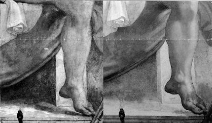
In Fig. 18 we see an apparently brilliant (but in truth deceivingly) “cinematic” photographic exploitation of cast shadows. In Fig. 19 we see (on the left) that before restoration Jonah’s left foot cast a strong shadow across the floor, which shadow merged with another dark shadow under the seat. The shadow under the seat “drew” a sharp, tonally contrasting vertical boundary between the lighter front-facing plane of the upright block that supports the seat and the receding (shaded) side face of that block. To the right of that block (and Jonah’s left leg) another, albeit less strong, shadowed zone threw the block’s right-hand edge into relief. After the restorers removed what they took to be dirt and disfigurement, the shadow cast by the foot disappeared (as seen on the right) – as also did much of the shadow under the bench, thereby exposing the previously hidden side of the upright block. The shadow to the right of the block was also weakened.
Mere dirt settling on a painting would weaken and blur outlines and edges. It would lighten dark sufaces and darken light ones, thereby compressing the range of values present. It is technically inconceivable that it might sharpen edges by intensifying contrasts. There is no dirt (or discoloured varnish) that is simultaneously capable of lightening already light surfaces while darkening dark ones. Had the shadows really been applied, as is claimed, by later restorers, the paint would have run into cracks in the plaster ceiling. And yet we know that it had not. We know that it had in fact cracked as the plaster had cracked. The paint was therefore applied when the plaster was smooth and new – because we also know that the plaster had cracked before any restorers went near it. Besides all of which, as we have seen, the shadows were recorded before 1535. The inescapable truth is that restorers removed painting that could only have been Michelangelo’s own.
Burton’s handcrafted models have an immediate engaging presence but the means of their humorous psychologically charged personalities are complex and artistically sophisticated. They display distinctly sculptural qualities and the satisfyingly palpable presences of diminutive figures in a real space that is continuous with our own. We are drawn into their world much as Michelangelo brought living old testament figures into ours. For force of cartoon-like effect and clarity, Burton’s heads are highly stylised and plastically simplified. Of Sparky, Burton explains: “Obviously he looks like a cartoon. It’s not like he’s an anatomically correct dog” (see Figs. 10 to 14).
Formally speaking, these sculptural simplifications might be related to the abstractions of 20th sculptors such as Brancusi who were in pursuit of “pure” or “significant” form (see Figs. 23, 24 and 25). However, plastic simplification is only part of the artistic/expressive equation with Burton’s Gothic characters who must be sentient engaged actors in intense psychologically-charged emotional dramas.
The chief expressive features of a face are the eyes and the mouth. Making the eyes large and the jaws small enhances childhood traits and vulnerabilities (see Figs. 1, 3, 14 and 27). The placement of the black pupils in the large wide-open eyes permits acute laser-like precision of gaze, as is seen to masterful effect at Fig. 14 in the affectionate twin-engagement of the boy and his beloved and devoted dog. The mouth is the most emotionally expressive feature of all, and although childhood-small in these characters, it becomes a vehicle of astonishingly subtle expressions (see Figs. 1, 3 and, especially, 27).
The antithesis of Brancusi’s plastic self-compression is Daumier’s cartoon-like sculptures where the imperatives of caricature pull the head this way and that with scant regard for any residual internal self-composure (Fig. 26). If the subject in Daumier has a bird-like personna, the nose may become a beak and the forehead may recede at an alarming rate. Burton’s compactly eloquent pebble-smooth but animated heads are a remarkably successful synthesis of these disparate sculptural traditions.
In terms of connections with Michelangelo’s painting, particular consideration should be given to the brilliantly combined effects of modelling and lighting in Frankenweenie. The boy’s head shown at Fig. 27 is articulated with seamless lucidity. It also happens to be exquisitely lit. Everyone knows the Impressionists to be painters of light but, then, light is fair game for painters who may produce their own (artistically, not literally). For the apprehension of form sculptors depend on actual light in the world. (Sculptors can, however, create an implicit light in their own graphic renderings of form, and may even depict forms that are lit as if from within, as seen at Fig. 28.) Cinematic model-making animators are advantaged: they make their own forms and may then provide their own expressively optimal actual light. The lessons of cinema, in this regard, are the more valuable because the relationship between sculptors’ forms and light may be insufficiently appreciated – certainly sculptures suffer terribly at the hands of exhibition designers. Rodin famously described sculpture as the art of the bump and the hollow – or, perhaps more accurately, as an art of hollows and projections: “de creux et de bosses”. He demonstrated this claim to Paul Gsell (“Art, by Auguste Rodin”, Paul Gsell, 1912) in the following manner:
“One late afternoon, when I was with Rodin in his atelier, darkness set in while we talked… He lighted a lamp as he spoke, took it in his hand, and led me towards a marble statue which stood upon a pedestal in a corner of the atelier. It was a delightful little antique copy of the Venus di Medici. Rodin kept it there to stimulate his own inspiration while he worked. ‘Come nearer,’ he said. ‘What do you notice?’ he asked. At the first glance I was extraordinarily struck by what was suddenly revealed to me. The light so directed, indeed, disclosed numbers of slight projections and depressions upon the surface of the marble which I should never have suspected…At the same time he slowly turned the moving stand which supported the Venus. As he turned, I still noticed in the general form of the body a multitude of almost imperceptible roughnesses. What had at first seemed simple was really of astonishing complexity. Rodin threw up his head smiling. ‘Is it not marvellous?’ he cried. ‘Confess that you did not expect to discover so much detail. Just look at the numberless undulations of the hollow which unites the body to the thigh…notice all the voluptuous curvings of the hip…And, now, here, the adorable dimples along the loins…You almost expect, when you touch this body, to find it warm…'”
Unfortunately, Rodin’s demonstrations were not recorded on film (as far as we know) – although a short film does exist of Henry Moore and Kenneth Clark making a nocturnal visit with a lamp to the British Museum’s Greek and Roman collection in order to re-enact Rodin’s lesson. In any event, in the case of Burton’s boy’s head, at Fig. 27, every depression and prominence finds beautiful expression in subtle tonal transitions that would have warmed Rodin’s heart. There is pictorial/plastic alchemy here, as there once was in Michelangelo’s frescoes. The softly continuous undulations of the head are gently disclosed within a dramatic over-arching artificiality of illumination that sets the relatively bright head off against a Great Gothic Darkness. Within the stridency of these clashing lights and darks, the subtlest emotional expression of the mouth is perfectly captured.
The expression of a mouth is controlled by the interplay of many facial muscles and it is notoriously difficult to capture, as even so great a portraitist as John Singer Sargent ruefully noted (“A portrait is a picture in which there is something not quite right about the mouth”). In this model the play of facial muscles at the mouth has given rise to a subtle but distinctive mini-topography of light-catching bosses and light-evading depressions that perfectly express the boy’s finely balanced state of delight and trepidation/wonderment. The artistry here is consumate – this is a mouth to rival Ingres’s or Holbein’s in the precision of its forms and its delicacy of expression. We see another living expression evoked in a painting at Figs. 29 and 30 where Picasso, in one of his greatest neo-classical inventions, has not modelled actual forms but evoked them by simulating an optimal play of light and shade on his imagined forms with a myriad of mosaic-like deftly placed and adjusted patches of tone.
In the Michelangelo head seen in Fig. 2, we see how (before restoration) the artist had expressed sculptural forms by drawing and by tonal manipulation. The tones disclose a three-dimensional head held in very specific and sculpturally revealing lighting. Long before cinema, in his painting, Michelangelo was simultaneously his own model-maker, lighting specialist and recording “camera man”. (This is not to claim that he, in any sense, invented or anticipated photography. Rather, it is to note the extent to which photography was a mechanically aided outgrowth of pre-existing artistic preoccupations.) Before discussing the specific lighting scheme Michelangelo deployed, it might be helpful to consider something of the great variety of lighting options that cinema and photography show to be available. Brilliant examples of lighting made for the purpose of specific and self-consciously artistic effects from the 1920s to the 1950s in the Kobal collection (see Figs. 6, 7 and 18) are illustrated and technically explained in the marvellously instructive book “Hollywood Portraits ~ Classic Shots and How to Take them” by Roger Hicks, a writer on photography, and Christopher Nisperos, a studio portrait photographer who specialises in Hollywood-style photographs (which subject he has studied for nearly thirty years).
In their examination of the photographs, the authors deduce from personal knowledge and the evidence of the images themselves, how many sources of light (lamps) were employed and where they were positioned in relation to the subject. With each photograph a diagram shows the likely positioning of the light sources. In the course of this highly instructive exercise, photography is seen to acknowledge great indebtedness to painting. Such technical analysis of photographic means has, we believe, direct application to the analysis of changes made by restorers to the artistic values of painters, as is discussed at Figs. 8, 19, 27 and 31-33.
In figs. 6 and 7 we see two heads of two beautiful women that have been expertly lit to very different expressive purposes. In the portrait of Ingrid Bergman (Fig. 6) the lighting is soft and greatly emphasises the invitingly tactile values of the wool clothing, the hair, and, above all, of the face itself, which is a perfect essay in the soft plastic undulations that Rodin so cherished in the “radiant appearance of living flesh” found in the finest sculptures of late antiquity. In the portrait of Lana Turner (Fig. 7), a more self-consciously sculptural purpose is evident as the beauty of the subject’s head is directly juxtaposed and equated with both a classical bust and a bouquet of flowers. This portrait is more intensely lit so as to contrast the planar divisions between the front face of the head and its shadowed sides, and to isolate the features of the eyes and mouth. The lights and the darks generally are placed with the utmost calculation, but to the end of a more chilling, marbled perfection – here, the groomed perfection of the coiffure extends no invitation to touch. Every part of the subject’s head and shoulders is drawn with the utmost Bronzino-like clarity by means of carefully adjusted tonal contrast: where the face is brightest there is a dark shadow. Where the blonde hair sinks into dark shadows there is a lighter background. However, these seeming photographically recorded artful placements of value have, the authors disclose, been achieved with the assistance of considerable photographic retouching, which practice was extensively prevalent in the portraits under examination (see comments at Fig. 7).
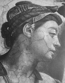
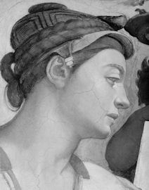
In Michelangelo’s (unrestored) head at Fig. 2 we see a treatment of background lighting that is, like that of the Lana Turner portrait, subservient to the clear plastic expression of form. Within the head, however, Michelangelo deployed a much wider range of half-tones. His head runs progressively from its brightly lit profile of the face to a very darkly shaded neck and shoulder. The bright profile is emphasised and thrown into relief by a shaded background, while the very dark back of the neck is set off against a light background. We see in Fig. 8, however, that after “restoration” the logic and the dispositions of the tones have been massively weakened and subverted: the dark ground at the face’s contour has been largely removed; the consistent form-disclosing tonal progression within the shading of the head (from brightest light on the upper right to the strongest darks on the left) has been horrendously undermined. This head now looks as if lit by a multiplicity of form-flattening lamps
But that is not all the damage. If one looks carefully at the left contour at the back of the head, it is evident that the very design of Michelanglo’s head has been changed. The forms have been reduced. The space, for example, between the body of the hair and the little plaited “pony tail” has grown larger. This feature of the coiffure has grown smaller and smoother. We have seen recently how a restorer at the National Galleries of Scotland promised to “improve Titian’s contours” with the assistance of his director. Who might have authorised this redrawing of Michelangelo’s contours? Or was the change simply not noticed? Whichever, the more closely one looks into the details of this restored work the more evident the losses of Michelangelo’s work become.
In Fig. 31 we see how, before restoration, the aperture of the nostril was larger. We see how shading that had made the corner of the mouth tuck more covincingly into the forms of the cheek has been sacrificed. We see how the background had been darkened by systematic parallel vertical strokes of black. The restorers deny that such work was Michelangelo’s own. Once again, they defy historical testimony. Giovanni Battista Armenino went to Rome in 1550 and stayed for seven years copying the “best Pictures”, including Michelangelo’s very recently painted Last Judgement (which was made between between 1536 and 1541). In 1587 Armenino produced a treatise on fresco painting in which he noted that, as frescoes begin to dry and no longer absorb pigments with same effectiveness, the painter must:
“…then finish it of with moist and dark shade tints…the muscles of the naked figures as being of greater difficulty, are painted by hatching them in different directions with very liquid shade tints, so that they appear of a texture like granite; and there are very brilliant examples of this painted by the hand of Michelangelo…they can be perfectly harmonized by retouching them in secco…in retouching the dark parts in this manner, there are some painters who make a watercolour tint of black and fine lake mixed together, with which they retouch the naked figures and produce a most beautiful effect, because they make the hatchings upon the painting, as is usual to do while drawing upon paper with black lead…Some persons temper these dark tints with gum, some with thin glue…this I affirm from what I have both seen and done and also what I have been told by the best painters.”
When the ceiling was examined in the 19th century by the painter and fresco expert, Charles Heath Wilson, he found that not only had Michelangelo’s ancient size painting cracked originally as the plaster had cracked but that it now melted readily to the touch of a wet finger. In accordance with Armenino, Wilson saw that the surface painting consisted of:
“…a finely ground black, mixed with size…The shadows of the draperies have been boldy and solidly reouched with this size colour, as well as the shadows on the backgrounds…other parts are glazed with same material, and even portions of the fresco are passed over with size, without any admixture of colour, precisely as the force of water colour drawings is increased with washes of gum. ..These retouchings, as usual with all the masters of the art at the time, constituted the finishing process or as Condivi expresses it, alluding to to it in the history of these frescoes, ‘l’ultima mano’. They were evidently done all at the same time and therefore when the scaffold was in place.”
All of that retouching has gone but record of it survives. In 1967/8 the writer, painter and former art critic of Time, Alexander Eliot and his film-maker wife, (now the late) Jane Winslow Eliot, spent over 500 hours on the scaffold making The Secret of Michelangelo, Every Man’s Dream, in the course of which film they noted that:
“With the exception of the previously restored Prophet Zachariah, almost everything we saw on the barrel vault came clearly from Michelangelo’s own inspired hand. There are passages of the finest, the most delicately incisive draughtsmanship imaginable.”
Someday, the Eliots’ film (made for ABC Television) might be re-shown, but meanwhile, Alexander Eliot’s testimony is now on the record in a new full-length film/DVD biography, A Light in the Dark: The Art and Life of Frank Mason, in which he and other early campaigners against the restoration (including the late painter, Frank Mason, and the late Professor James Beck) are given voice on the Sistine Chapel restoration. Not least of the delights among this film’s precious and historical footage, are Tom Wolfe’s account of his lessons in Frank Mason’s painting classes at the Art Students League, New York, and the sight of the former Metropolitan Museum of Art director, the late Thomas Hoving, belligerently boasting that he himself had helped sponge from the ceiling the “filth” that was in truth the last stages of Michelangelo’s painting.
Michael Daley
Comments may be left at: artwatch.uk@gmail.com


![]()