
Samson and Delilah: The Planting of an Attribution

Provenance, Dendrochronology, and the Collapse of a Faulted Construction
 1
1
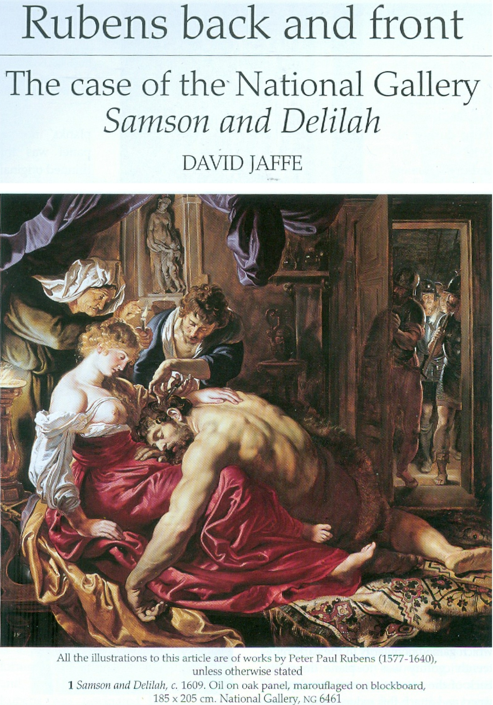
Above, Fig.1 – David Jaffe’s August 2000 Apollo Article*
[*In July 2000, journalists were called to a National Gallery press conference at which an officer declared that David Jaffe’s forthcoming article “will finally silence the critics for ever”.]
Jan Geschke is an art historian who studied with Meyer zur Capellen and Wilhelm Schlink and has recently been instrumental in correcting the consensus, ranging from Lucio Fontana’s fascist leanings to the real face of Raphael’s Madonna of the Pinks.
Since 1980, the National Gallery has presented a consistent account of the modern history of its painting Samson and Delilah. According to this account, the work was rediscovered in Paris in 1929 when the Berlin art dealer Curt Benedict unearthed it in the atelier of the restorer Gaston Lévi; it was subsequently authenticated by the Rubens specialist Ludwig Burchard and then acquired by the collector August Neuerburg. This sequence has since functioned as the painting’s point of entry into modern scholarship.
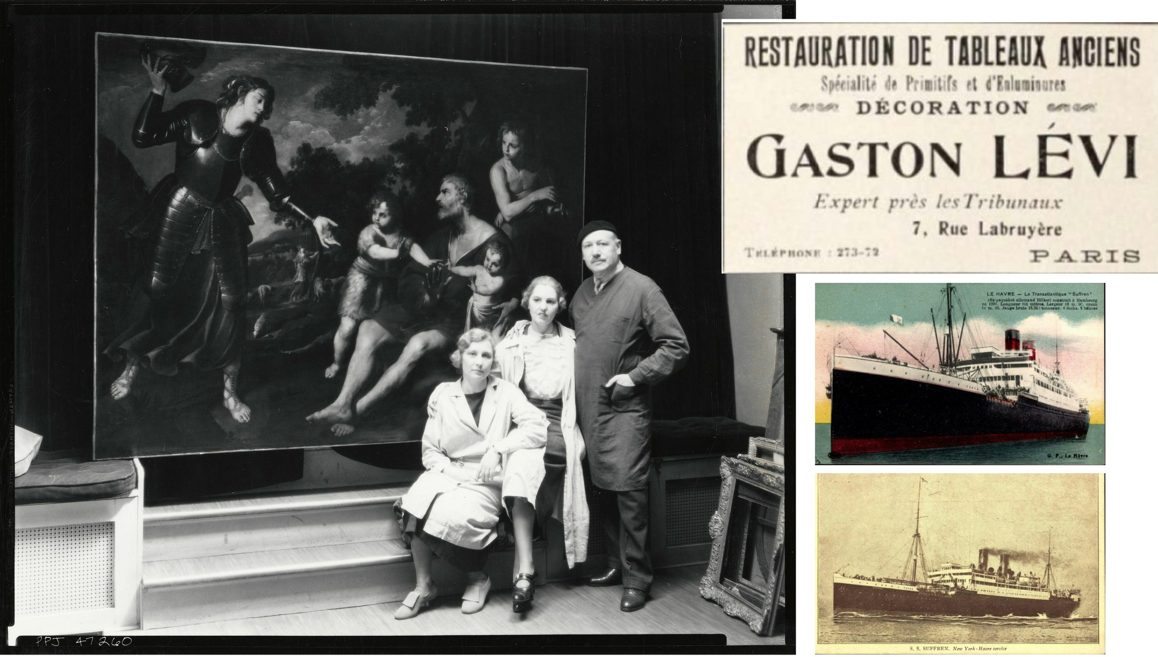
Above, Fig. 2 – Shepherding wealthy socialites in New York City instead of German art dealers in Paris – Gaston Lèvi himself after having left from Le Havre in Oct.27 on steamer SUFFREN, taking his business (here with an earlier advertisement) with him. The Vaccharo he restored ended up with the Lehman Loeb family.
The latest National Gallery narrative does not withstand factual scrutiny. Through joint research conducted by the art historians Jan Sammer (Mariánské Lázně / Marienbad) and Jan Hendrik Geschke (Hamburg), it has now been established that Gaston Lévi emigrated from France to the United States in 1927 aboard the SS Suffren as passenger no. 220 and did not return to Paris thereafter (Fig. 2 above). A discovery in Lévi’s Paris atelier in 1929 is therefore impossible. This removes the factual foundation on which the National Gallery’s post-1980 account rests.
The documentary material cited in support of that account proves equally problematic. The handwritten annotations frequently described as “Burchard notes” beneath a typed copy of Burchard’s certificate of authenticity are not in Ludwig Burchard’s hand, as established by Sammer and Geschke (Fig.3 below.) They do not date from around 1930 and they twice refer explicitly to Hans Gerhard Evers as an authority – an SA member later granted an honorary professorship by the Reich – and his Rubens-Book of 1942. These annotations therefore postdate the alleged rediscovery by at least a decade and cannot be regarded as contemporaneous evidence. No primary documentation from around 1929 substantiates the Paris atelier episode as has long been rehearsed.
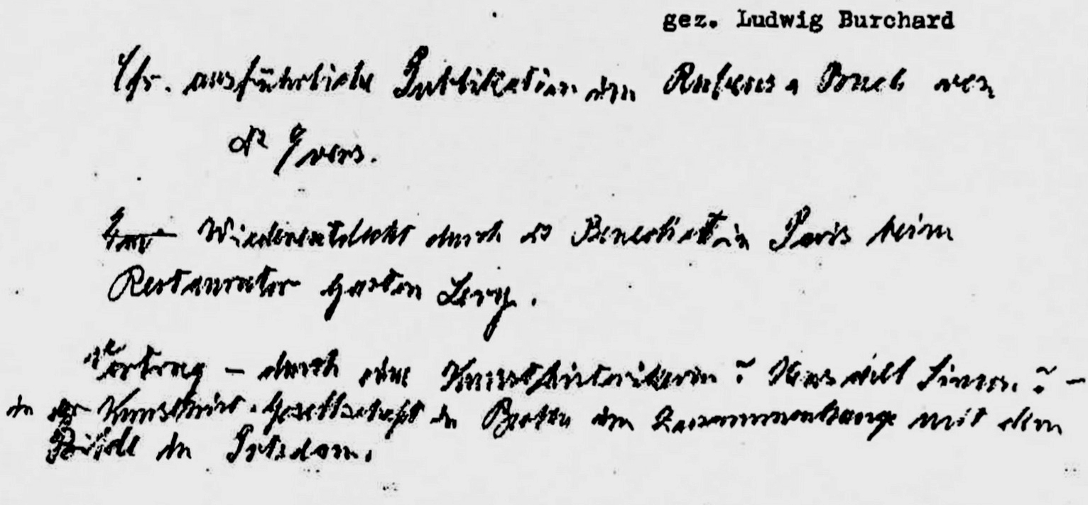
Above, Fig. 3 – Non-Burchard handwriting on a typed copy of his supposed authentification by an unknown
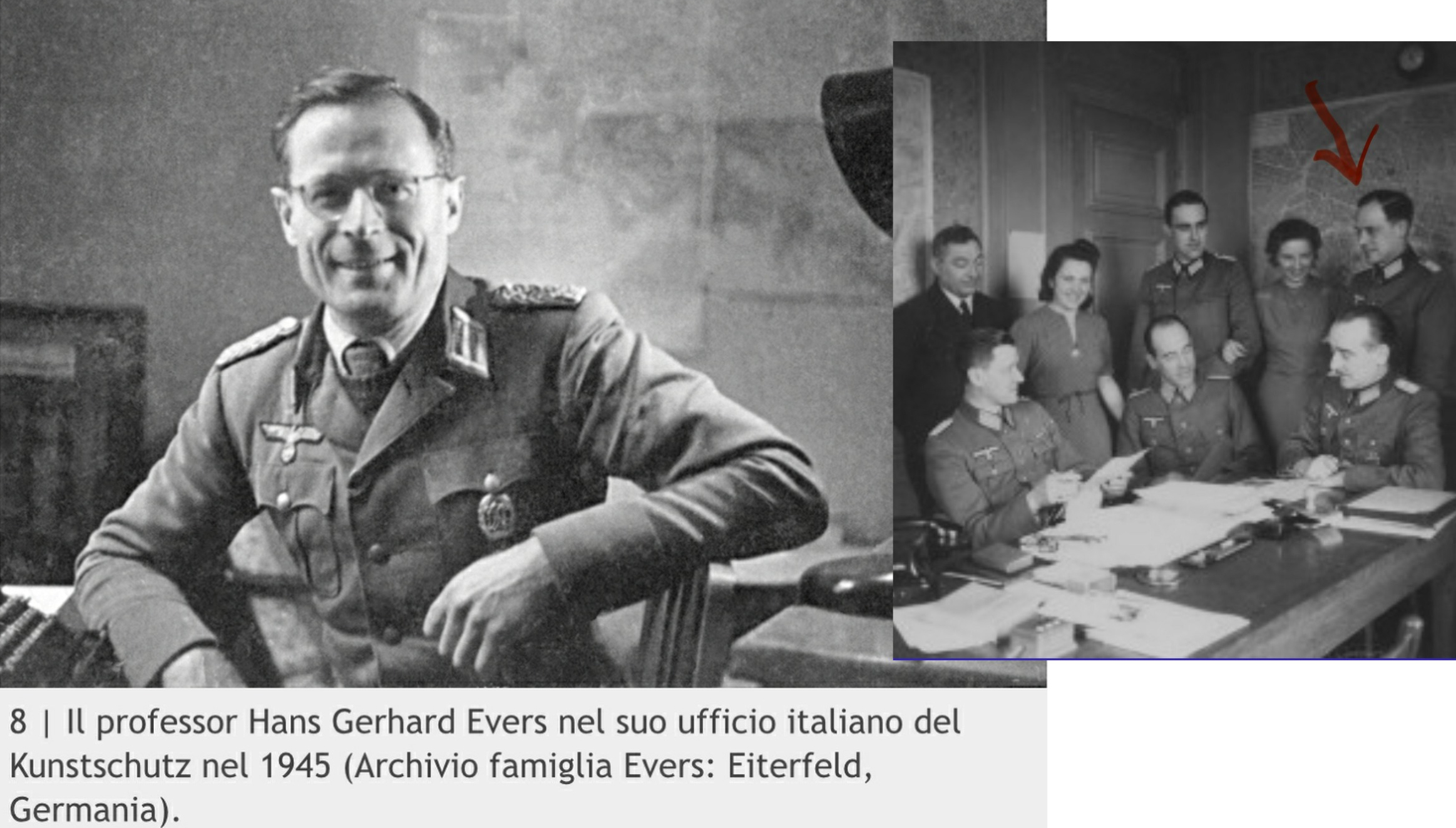
Above, Fig. 4 – Rubens-specialist Prof.h.c. Captain (art protection) Dr. Hans Gerhard Evers sacking Paris in 1941 (right) and Italy in 1944 (sic) as a Lieutenant-Colonel Prof.h.c.
Above, Fig. 5 – “Strong, hard woman” Delilah in Hans Gerhard Evers: Peter Paul Rubens (sic), Munich 1942, 525 p. “on the order of the High Command of the German Army” (foreword).
The painting enters the scholarly record as a Rubens attribution only in 1942, through a publication by Hans Gerhard Evers (Fig. 5, above). Issued within a National Socialist art-historical programme commissioned by the High Command of the Armed Forces, the text reframed Rubens as a Germanic painter of force, struggle, and bodily domination, celebrating the aestheticisation of violence. Evers’s role was not confined to interpretation. During the Second World War he held a Wehrmacht mandate as a captain in the “Kunstschutz“ – art protection (sic) – and was entrusted with the systematic seizure and forced transfer of artworks in Paris, Antwerp, and Italy. The first sustained presentation of Samson and Delilah as a Rubens thus belongs not to pre-war academic discourse but to an ideological wartime context shaped by cultural plunder.
The collecting environment in which the painting circulated at this stage is equally specific. August Neuerburg, based in Hamburg, controlled a near-monopolistic share of the German cigarette market—approximately 82 per cent during the war years. In this period, he was closely connected with Hermann Göring as both economic partner and fellow collector. Göring’s collecting of Rubens began only after assuming command of the Luftwaffe and gaining access to systematic plunder across occupied Europe. Neuerburg’s cigarette enterprise paid approximately 18 million Reichsmark to Göring during these years, coinciding with the latter’s rapid expansion as an art collector. A documented transaction further links the households: Neuerburg’s wife sold an early Dutch child portrait to Göring’s wife, Emmy Göring, on the occasion of the birth of the regime’s celebrated war-hero’s daughter.
The immediate scholarly point of reference for the present re-examination is a defence of the Rubens attribution published by David Jaffé, then Senior Curator of the Dutch and Flemish Schools at the National Gallery (Pic.1 above). In his article “Rubens back and front: the case of the National Gallery Samson and Delilah,” published in Apollo in 2000 (no. 462, vol. 152, pp. 21–25), Jaffé reaffirmed the attribution and grounded it in the same provenance narrative and documentary material, adding dendrochronological claims attributed to Professor Peter Klein of Hamburg University. The continuing authority of this article prompted renewed scrutiny.
Against this background, ArtWatch UK which had rejected Jaffe’s account in its 2006 Rubens Special Issue Journal, asked Geschke to examine the technical claims involved. On 4 January 2026, Geschke spoke directly with the dendrochronologist Peter Klein.
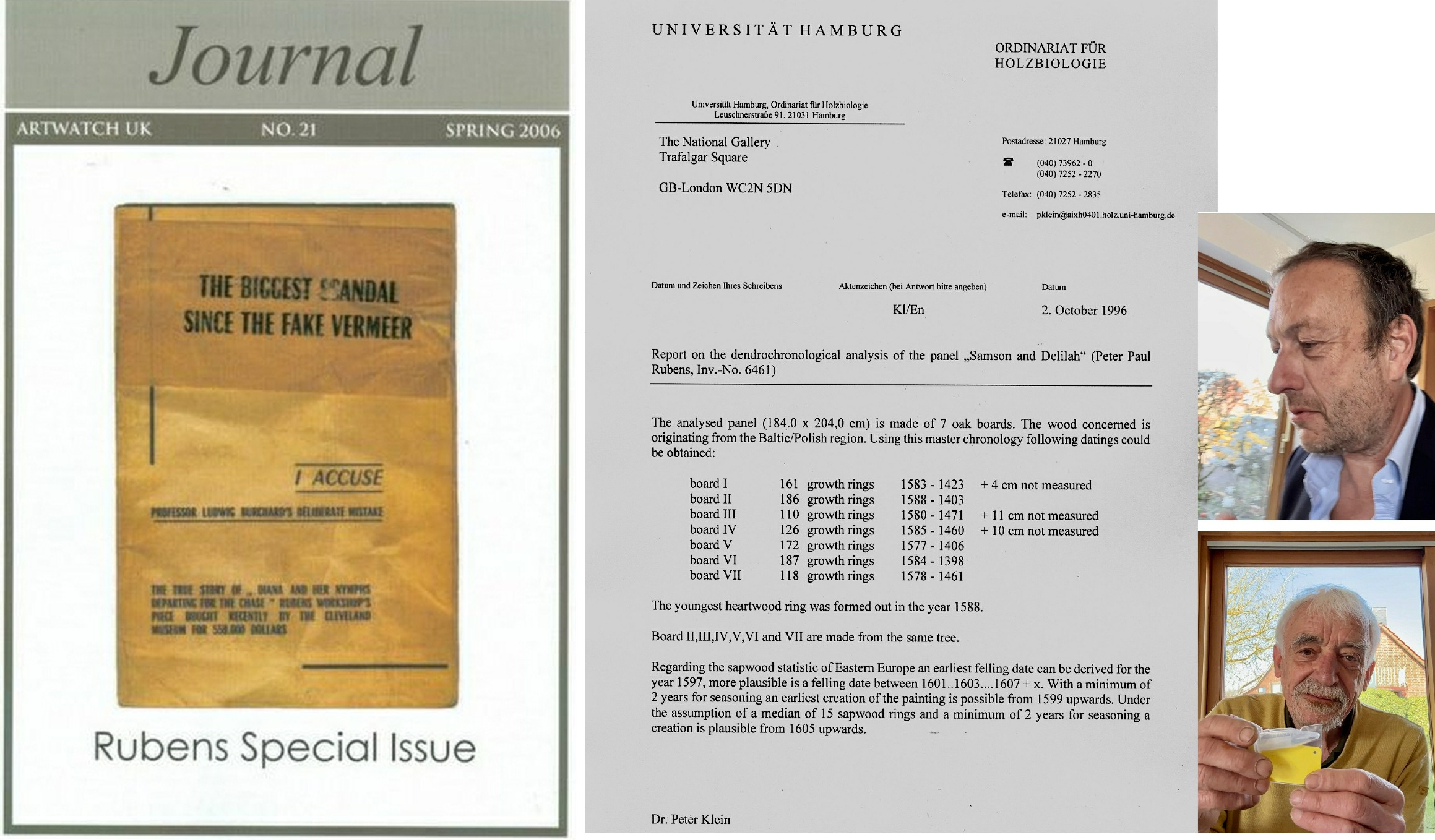
Above, Pic. 6 – Left, the second AWUK Rubens Special Journal; centre, Dr Peter Klein’s, 1996 Report on the National Gallery Samson and Delilah; right, top, Jan Geschke; below, Dr Peter Klein.
Klein’s position in Rubens studies is foundational. In 1985 he established that Rubens consistently used Baltic oak rather than locally sourced Belgian oak for his panels, based on fieldwork in Poland conducted with two colleagues and subsequently published. He has further emphasised that it is normal for Rubens panels to have numerous “siblings” from the same tree across different works, since Rubens purchased complete Baltic oaks. In a 1997 report for the Berlin State Museums, Klein documented such a family tree for the Rubens panel Isabella Brant, identifying wood from the same trees in no fewer than thirteen other Rubens paintings. Other works, by contrast, demonstrably combine boards from several different trees.
Against this material practice, Samson and Delilah is doubly anomalous. Klein stated that he has never said or written that the National Gallery’s painting is by Rubens and that authorship judgments fall outside the scope of dendrochronology. He also stated that he never wrote a letter to the National Gallery expressing opinions on the work, despite such a letter being cited by Jaffé with a specific date.
Klein further stated that he does not know when or where dendrochronological examinations of Samson and Delilah or the Antwerp Raising of the Cross were carried out by the dendrochronologist Vynckier; that he was never approached by that colleague; and, that no exchange of results took place. Most decisively, he addressed the claim that board 6 of Samson and Delilah derives from the same tree as panels of the Raising of the Cross. According to Klein, Boards 2–7 of Samson and Delilah derive from the same tree. On dendrochronological grounds, this means that either all of those boards would match another object at tree level, or none would. He stated this explicitly in writing to Geschke on 23 September 2025 and reiterated it in their telephone conversation of 4 January 2026.
Even more unsettling is his next observation: concerned that he had been cited incorrectly 25 years ago in a matter this important, he compared Samson and Delilah’s seven boards to all boards of all 400+ Rubens in his database. He could not find a single match. Which is another rare outlier in a case full of outliers, to say the least.
As Sammer and Geschke observe, a panel composed of six boards from one tree combined with a single board from another constitutes a marked anomaly within Rubens’s established working practice. For what reason, and at whatever stage in the painting’s history the upper board was added, remains an open question requiring scrutiny. The irony that a “Rubens” hidden in Hamburg’s biggest flak bunker from the RAF’s local efforts provoked by ardent collector Hermann’s earlier Blitz on London while Neuerburg-fag smoking V1 crews unsuccessfully tried to erase Trafalgar Square, is now being defended tooth and nail by the very institution these fans of the Flemish school set out to annihilate was until now hidden from the art loving British public.
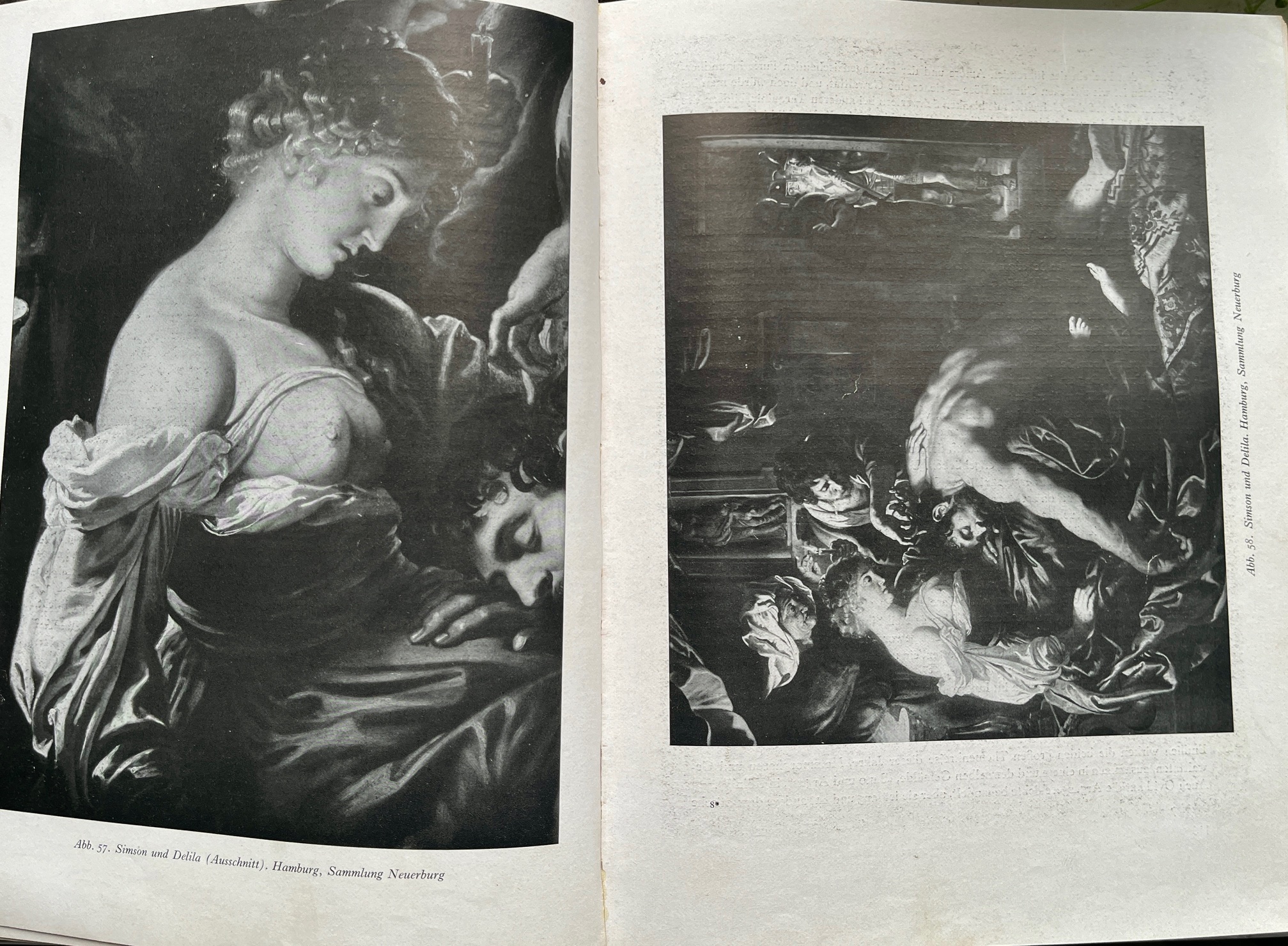
With the added board, the thusly altered format of the Evers-accredited picture became laterally constricted compositionally – as seen below – when compared with the lost original Rubens picture, as copied by F. Franken (below, top). The late-appearing picture (below, bottom) not only shed half of Samson’s foot, much of the crone/procuress’s body was also cropped. The engraved copies are consistent with Francken’s painted copy and not with the present pride of the National Gallery’s collection as shown below, bottom.
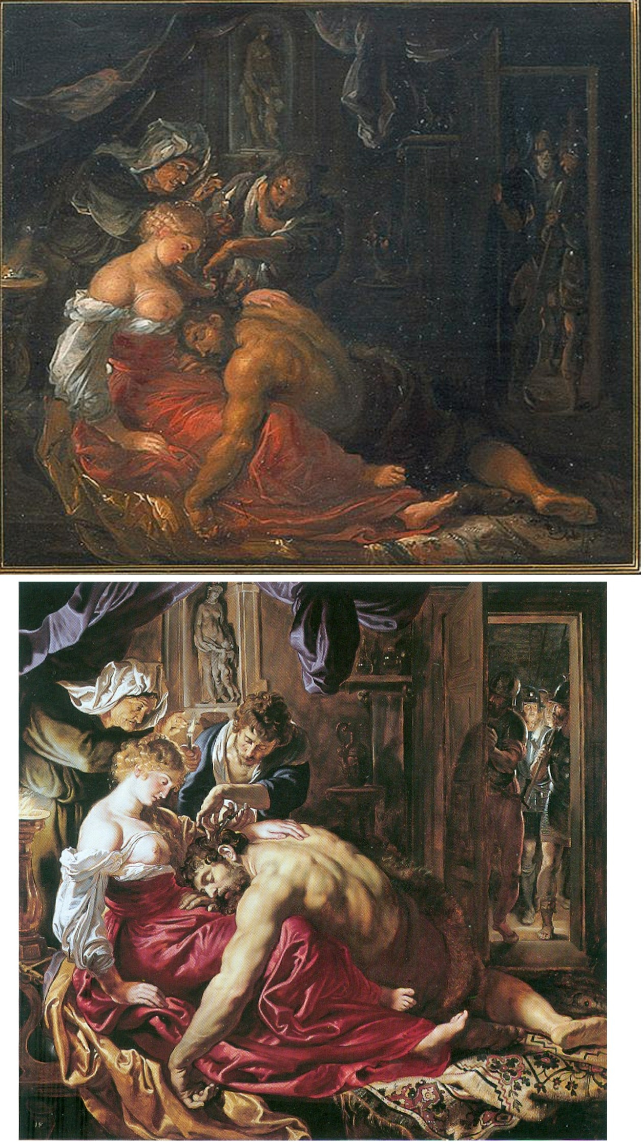
Above, Pic. 7 – The Frans Francken copy (top) vs. the National Gallery Samson (below). Note the different proportions of bodies and heads, the very different handling of space and some charming idiosyncrasies in foot handling and the ceiling vulva allusion’s position.
Jan Hendrik Geschke, 13 January 2026
Defending the Indefensible Part I: The National Gallery’s Tangled Rubens Web

1) “I know gossip about staff and trustees and stories connected with acquisitions I don’t think I’d better share.”
– Martin Wyld, the National Gallery’s retiring Head of Restoration in the January 2010 Museums Journal.
2) “Rubens’ Samson and Delilah is a large scale, early and entirely autograph painting of a kind the National Gallery previously lacked.”
– Michael Levey, the then-Director of the National Gallery, in the 1983 Rubens Acquisition in Focus exhibition catalogue.
3) “The Samson and Delilah was planed down to a thickness of about three millimetres and set into a new blockboard panel before it was acquired by the National Gallery in 1980 and so no trace of a panel maker’s mark can be found.”
– Christopher Brown, the National Gallery Senior Curator, Flemish Paintings, in his 1996-97 Esso-sponsored National Gallery “Making and Meaning” exhibition catalogue Rubens’s Landscapes“. (Emphasis added.)
4) “Rubens’ panels sometimes bear the branded or carved mark of the panel maker, an example in the National Gallery being the Portrait of Susanna Lunden… unfortunately, as David Bomford has described, the back of the panel of the Samson and Delilah had been planed-down to a thickness of only about 3 mm and then the whole set into [sic] blockboard before the picture was acquired by the National Gallery, so any such marks would have been eradicated.”
– Joyce Plesters, the then-Head of Science, in the 1983 National Gallery Technical Bulletin. (Emphases added.)
5) “The treatment of Cima’s Altarpiece carried out during the 1970s and 1980’s was a rare modern example of a process that was extensively practised (often unnecessarily) in the 18th and 19th centuries – the transfer of a painting to a new support. It is nowadays only carried out in the last resort, when all other attempts at treatment have proved unsuccessful.”
– David Bomford, National Gallery conservator and author, in his 1997 National Gallery Pocket Guide: Conservation of Paintings. (Emphasis added.)
6) “Questions have been raised about aspects of the physical state of Rubens’s Samson and Delilah since its purchase by the National Gallery at auction in 1980… Recent research, however, has yielded some answers to the questions of when and why the painting may have gained this alien backing.”
– David Jaffé Christopher Brown’s successor at the National Gallery, August 2000, Apollo ‘Rubens back and front’. (Emphasis added.)
FROM THE FIRST CRITIC:
7) “Jan Bosselaers had inspected NG6461 up-close in 1977, and then again in 1980. Given his familiarity with the painting, I asked him specifically about its back. Bosselaers grabbed a piece of paper and drew a grid of three vertical lines crossed by three horizontal ones. He looked at me. ‘A cradle!’ I gasped. ‘Yes’, he said, ‘it was a cradle.’”
– Euphrosyne Doxiadis: Painter/author, in her NG6461 The Fake National Gallery Rubens (p. 117. Emphasis added.)
MICHAEL DALEY WRITES:
PART I: A REFORMULATED SAMSON AND DELILAH ACCOUNT THAT STILL DOES NOT STACK UP
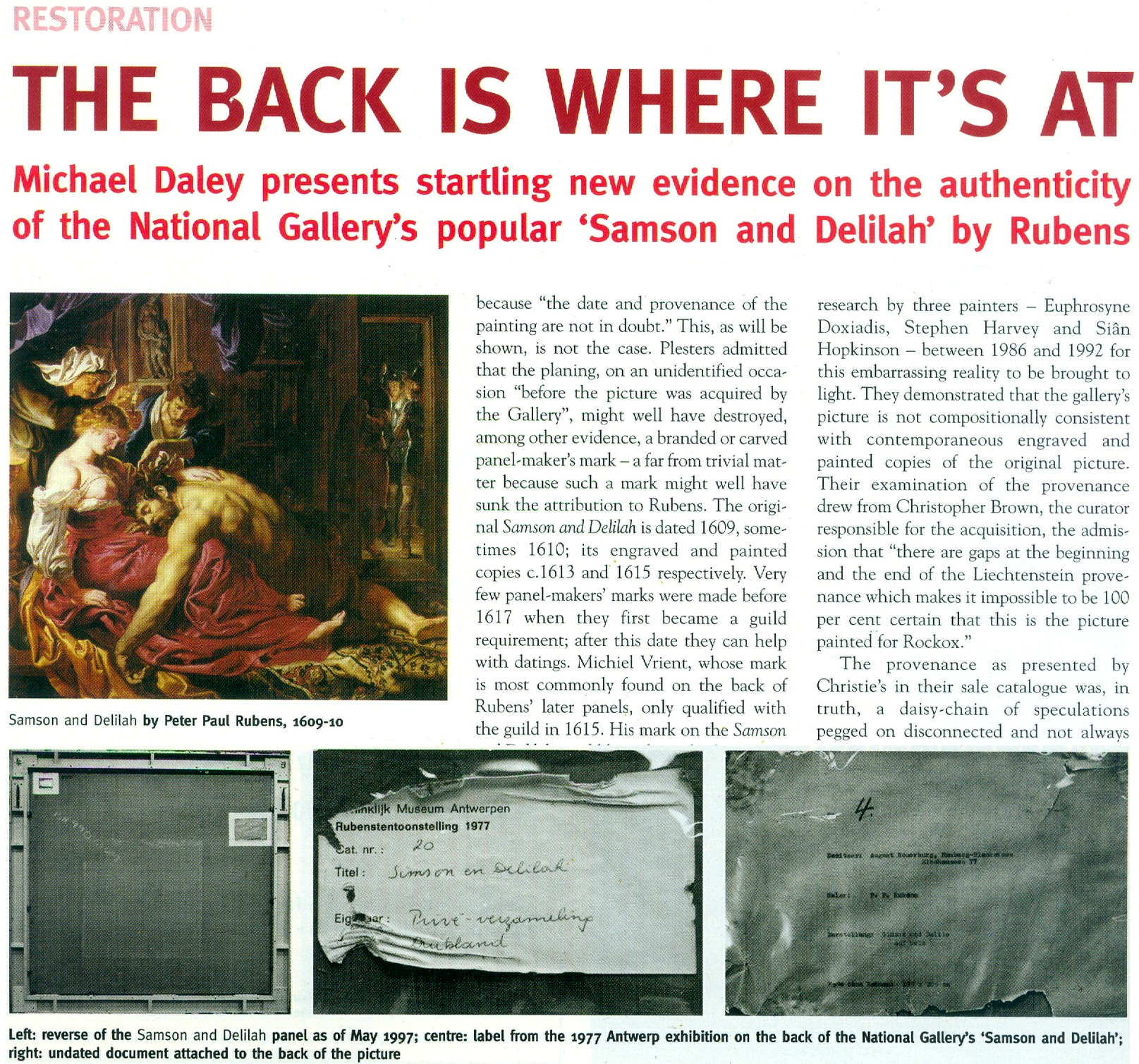
With expensive and massively hyped works bought by major public institutions it would seem that acknowledging errors is an art-political impossibility. Such institutional obduracy is longstanding. In 1966 the art dealer René Gimpel noted that “The museums are even more intent than the collectors on defending their fakes or their mistaken attributions” (- a 1929 entry in his Diary of an Art Dealer.) Today, with the Samson and Delilah, the National Gallery stands in triple jeopardy: its initial error of art historical judgement has been compounded by both an apparent falsification of material evidence and a decades-long withholding of contra-testimony in its possession.
The affair began in 1980 with a deceptive unanimity of assurances and a dearth of disclosures. Today, on interrogation of the picture’s traits, provenance and technical literature, a sleight of hand emerges: the back of its panel and the historical evidence it bore were removed by the Gallery and not by earlier, unknown others, as the Gallery has claimed since 1983 – and blatantly claimed despite its possession of flatly contrary key historic documents. (See Fig. 5 below.)
Thus, there are two cross-linked issues: whether the picture is the long-lost original Rubens painting of 1609-10; and, who planed down the back of its panel and mounted it on a larger sheet of modern blockboard (- and with it, of course, “Why?”). The first is a matter of judgement. The second is one of fact that should also be – but conspicuously is not – one of record. Dr David Jaffé’s August 2000 bid in Apollo (see below) to explain why the panel painting “might have” received its alien backing before being bought by the National Gallery was doomed by his failure to follow such records as exist within the Gallery and extrapolate from them the precise place and time at which the transformation had occurred.
On matters of fact, at Fig. 2 below, we note an item on the National Gallery’s recently updated online Samson and Delilah entry which itself supplies visual confirmation of past institutional culpability.
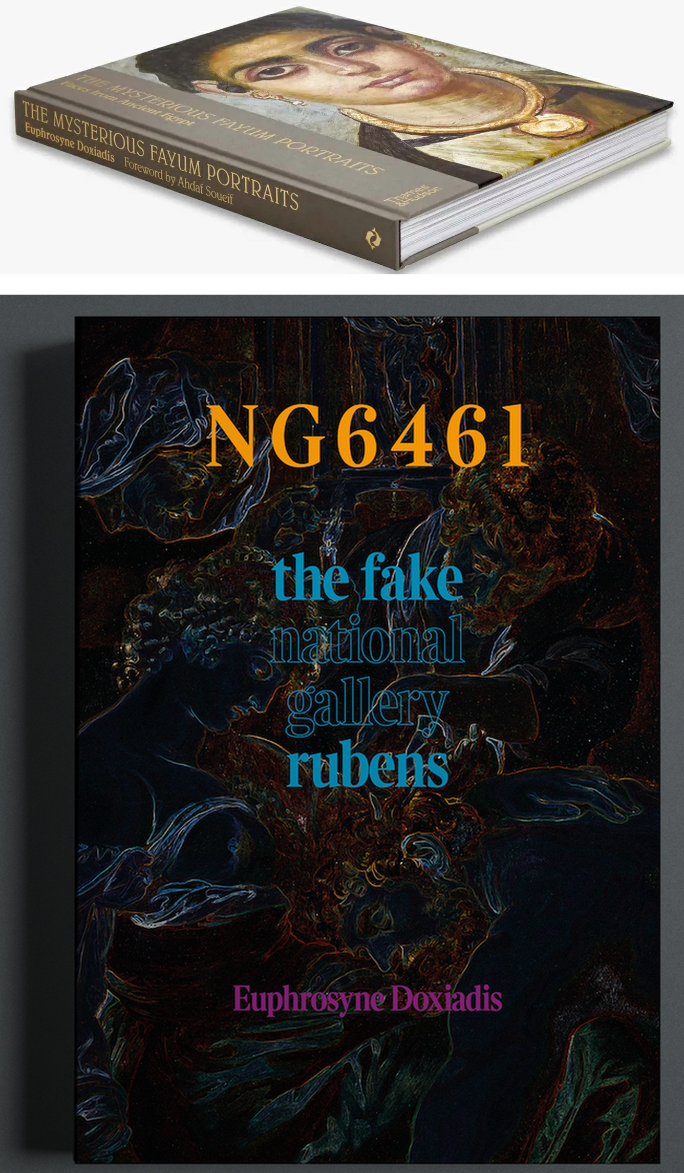
Above, Fig. 1: top, Euphrosyne Doxiadis’s (republished) award-winning 1995 study of the Fayum encaustic paintings; above, Doxiadis’s new book NG 6461 The Fake National Gallery Rubens – N.B. “NG6461” is the Gallery’s inventory number for its supposed Rubens Samson and Delilah.
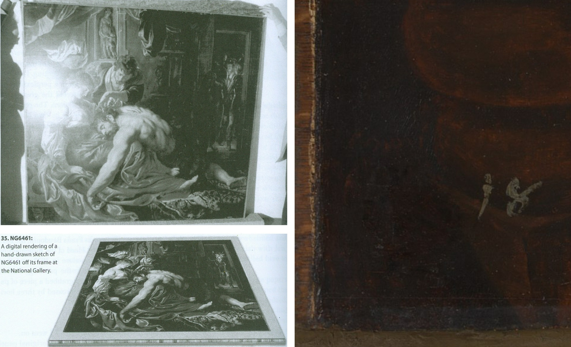
Above, Fig. 2: Top, left, The National Gallery Samson and Delilah, as seen in Antwerp in 1980 when it was about to be dispatched to Christie’s, London, and at which date the paint reached the top and bottom edges of its panel but not the side edges (to which slim battens had been attached – on which, see comment by Martin Wyld below). Above, left, Euphrosyne Doxiadis’s digital rendering of the Samson and Delilah panel on its blockboard mount, as seen by her when the picture was undergoing dendrochronological examination at the National Gallery on 25 September 1996. (Both images above are published in Doxiadis’s NG6461 The Fake National Gallery Rubens.)
Above, right, the bottom left corner of the National Gallery’s Samson and Delilah in which the picture’s post-1980 blockboard backing can now be seen running below the bottom of the painting. The Gallery’s online publication of this image’s visual corroboration of the panel’s post-1980 blockboard extension is intriguing. Wittingly or unwittingly it constitutes a tacit acknowledgement of institutional responsibility for the Gallery’s own (always previously denied) planing down of the panel and subsequent mounting of it on a larger blockboard sheet. (See Figs. 3 and 4 below.)
The Gallery’s online entry acknowledges – somewhat disparagingly – the existence of the Samson and Delilah picture’s “Naysayers” and cites some of their/our publications. Unfortunately, although it cites both issues of our Journal that were dedicated to the Samson and Delilah’s problems (see Fig. 7 below) it does not address their contents – as might be instanced in this pertinent item on the “Material Evidence” section in our Autumn 2000 Journal:
“…This conflict of testimony echoes one found within the Gallery in 1983 when the restorer David Bomford described the thinned panel as glued ‘onto’ the face of the blockboard while the Head of Science, Joyce Plesters, described it as ‘set into’ the blockboard. When I drew this discrepancy to [the then-Director] Neil MacGregor’s attention, he replied (letter 19th June 1997): ‘Incidentally, at the risk of being pedantic, into is the correct preposition, since the edges of the blockboard are flush with the [edge] surface of the panel. Onto would be correct if the panel had simply been glued to the blockboard and protruded above it.’ If this account is accurate, with the edges of the panel and blockboard being flush, there would be no place for the putty bevel encountered by Ms Doxiadis and Mr Norman [*1]. By the same token, had the edges of the panel and blockboard been flush, there could have been no grounds for Joyce Plesters’ 1983 [Technical Bulletin] claim that the treatment had ‘render[ed] the edges of the panel inaccessible’ for dendrochronological examination. A clear, focussed photograph of one of the picture’s corners might throw some light on the subject. Or better yet, permission to examine the panel in the flesh…”
(Emphasis added. Permission to examine the panel was never granted.)
On 14 February 2006, when examining the Samson and Delilah’s dossiers for a second time [*2], we noted photographs showing that the paintwork stopped short of the edges of the oak panel only on the vertical edges. In the present revised online Gallery entry, confirmation and possible explanation for this feature is given: “There is a narrow margin of unpainted wood at the sides of the oak panel which probably results from the support being held firm by grooved battens while the ground and then paint were applied; ‘6’ the ground and paint extend to the top and bottom edges.” The footnote ‘6’ reads: “The same can be seen on Rubens’s Judgement of Paris (NG6379). For this practice see, for example, Wadum 1998. The battens seem often to have been only along the shortest sides. A little of the unpainted margins may have been trimmed away since they are rather narrow.” With the Gallery’s Samson and Delilah, the photographic and documentary records of the restoration treatments are strikingly less complete than those of other Gallery panel paintings. For example, when writing on the restoration of the Altdorfer panel bought in 1980, Martin Wyld discusses the attachment of battens to the edges of panels: “Although some German panels of this period have channels at or near the end grain of the plank in order to accommodate battens which were fixed to the frames, the channels are seldom to be found on all four sides”.
[*1] Charles Norman, Director, The National Timber Trade Federation. As Dalya Alberge reported (The Times, 27 August 1997) on photographs supplied to us by Mr MacGregor, Mr Norman judged the back of the Samson and Delilah to be “a blockboard manufactured in the late 1970s or early 1980s”. It looked, he said, “like a manufactured item, machine-made rather than handmade”. Later, after being invited to see the picture at the National Gallery, Mr Norman amended his earlier observations. His subsequent description of the picture’s physical component parts (made by telephone, 18 & 19 September 1997 to Michael Daley) was a compromise between his original observation and Euphrosyne Doxiadis’ (above-illustrated) clear recollection of a substantial surround between the edges of the planed down panel and the blockboard support, and Mr MacGregor’s claim of flush panel and blockboard edges. That is, Mr Norman claimed that the blockboard was somewhat larger than the planed down panel but that the gap between the two had been filled by a wide putty bevel.
[*2] In 2006, under Charles Saumarez Smith’s directorship, we were given full access to the Collection’s photographic and documentary records – a privilege subsequently extended by Nicholas Penny and Gabriele Finaldi. (ArtWatch is greatly indebted to all three knights – as also to the Gallery’s kindly helpful archival and library staffs.)
With the Gallery’s present publication of the Fig. 2 photograph of the bottom left corner of the Samson and Delilah, two points should be noted. First, the Gallery’s 1997 claimed relationship between the panel and its blockboard backing was clearly unfounded. Second, the photograph of the bottom left corner is cropped and therefore does not show the full blockboard extension. Nonetheless, it does now show (MacGregor’s earlier claims notwithstanding) that, far from the edges of the panel and blockboard being flush, the latter can be seen to protrude beyond the bottom edge of the picture when, as seen above at Fig. 2, top left, it had not done so in 1980 when held by the banker, Jan Bosselaers, in Antwerp, shortly before it was sent to Christie’s. Today’s publication of that photographically-confirmed relationship has finally demonstrated that the blockboard backing must have been applied to the picture’s panel after 1980 and when in London.
CONFLICTED AND OPAQUE GALLERY ACCOUNTS – AND THE FIRST PUBLISHED APPEARANCE OF THE BLOCKBOARD BACKING
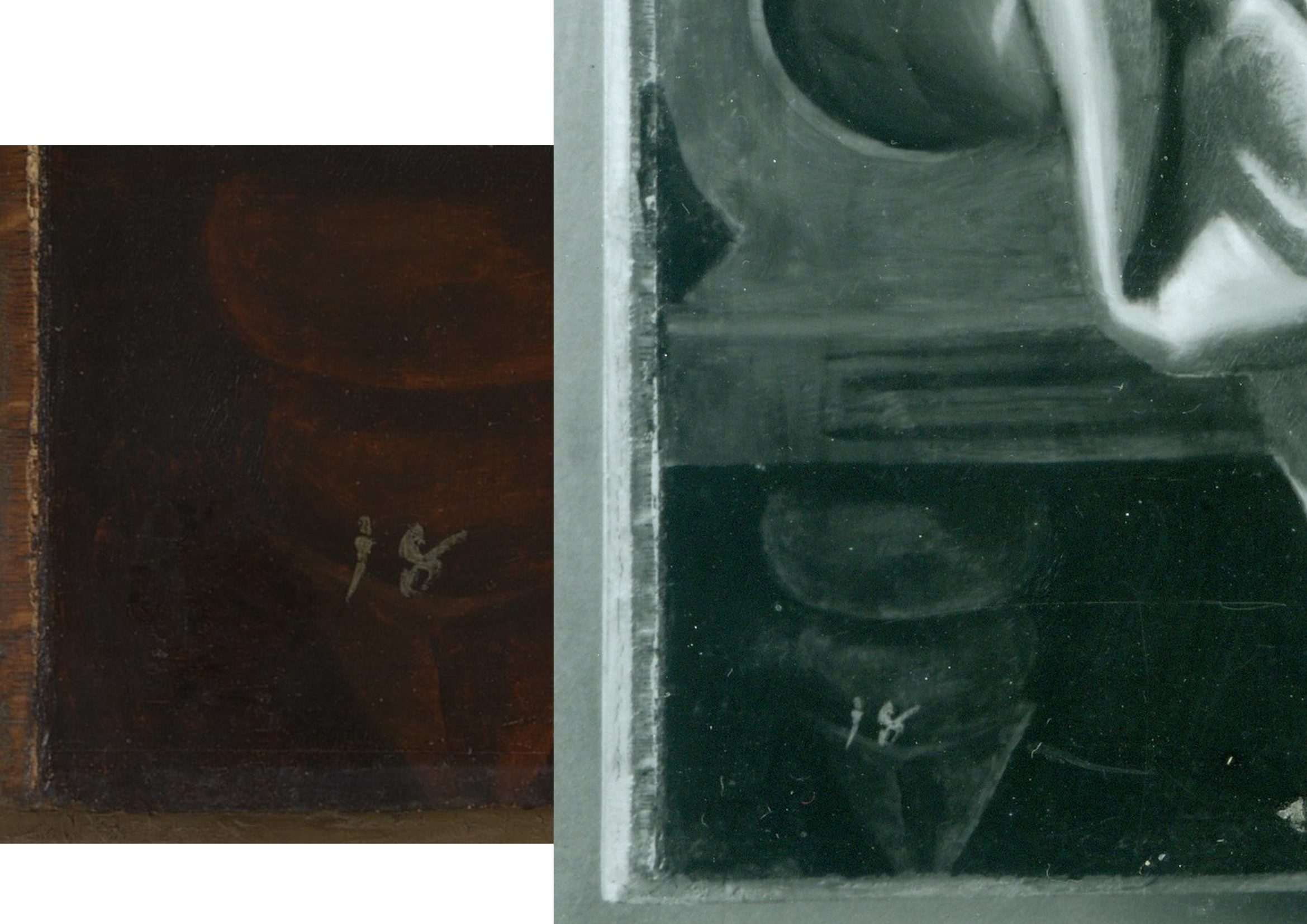
Above, Fig. 3: left, the National Gallery’s recently published online detail of the bottom left corner of the Samson and Delilah; right, a detail of the bottom left corner the Samson and Delilah in a National Gallery photograph taken on 10 August 1982 and designated: “After Cleaning, Before Restoration”.
Above, right, this – so far as we know – unpublished 10 August 1982 photograph, shows the then-present blockboard backing that protrudes not only beyond the bottom edge of the panel but also beyond its left vertical edge (which is not disclosed by the cropped image presently shown online). The date on the black and white photograph shows that the picture had then been in the Gallery’s possession for twenty-five months by which time the planing and mounting on blockboard had occurred (as had also the removal of the picture’s varnish, as shown below.) What the Gallery has never produced – and, we believe, could not ever produce – is a photograph showing the blockboard’s presence before the picture was acquired from Christie’s or when it had been loaned by Christie’s to the National Gallery ahead of the sale. In the absence of such important photographic testimony, the conclusion that the National Gallery itself planed down the panel for undisclosed reasons and mounted it onto a blockboard sheet, is inescapable. The formal authorisation for the picture’s restoration from the Board of Trustees came on May 16 1982 just three months before the above-right photograph was taken. Thus, on the available official records, the removal of the Samson and Delilah panel’s back and the subsequent mounting of it on blockboard had occurred at the National Gallery between 16 May and 10 August 1982. (It is not inconceivable, however, that the formal application for permission to restore the picture had in fact followed a commencement of work on it.)
Above, Fig. 4: The Samson and Delilah’s bottom left and bottom right corners, as respectively recorded at the Gallery on the 10th and 11th of August 1982, by which dates the visible blockboard extensions (which read as the whitish strips) all around the panel had materialised within the Gallery’s own photographic records for the first time – and indicated the extent to which the new blockboard backing extended beyond the planed-down remains of the original oak panel. Earlier, the National Gallery Board Minutes of 16 May 1982 had carried the following note:
“The treatment of No 6461, proposed for Mr Bomford, was recommended by Mr Brown, who explained that the painting was to be the subject of the second ‘Acquisition in Focus’ exhibition, opening in January 1983.” It added, matter-of-factly:
“The painting had a modern support of wood attached to the original panel which had been considerably reduced in thickness and this was considered adequately stable; the surface had probably been only partly cleaned in the recent past, and tests showed considerable discolouration.”
This above account made to the Board was the first-ever mention of a blockboard backing on the painting. It had not been so described by Christie’s and, as shown below, it was even at variance with an in-house National Gallery timber expert’s 1982 account of the painting when it was on exhibition in the Gallery and ahead of its restoration. Strictly speaking, the above statement was technically accurate: the picture had, by that date, been planed down and mounted on blockboard – but only very recently so. Even though the the Gallery had had sight of the picture since the beginning of July 1980 (and had taken photographs and Infra-Red images of it on July 2 1980 – ahead of the sale) it had not – as Mr MacGregor confirmed to us – made any photographic record of the picture’s back either after buying it, or earlier when it had been loaned ahead of the July 11 1980 Christie’s sale. This lacuna is, on our familiarity with the Gallery’s technical literature and dossier records, unprecedented. Indeed the Gallery’s restorers sometimes give the impression that they are more interested in working on pictures’ physical “supports” than on their painted surfaces – and by “working on”, we mean undoing and redoing them. (See Fig. 9 below.)
A TIMBER EXPERT’S ACCOUNT OF THE SAMSON AND DELILAH PANEL
In the 1982 National Gallery Technical Bulletin, Christopher Brown, Martin Wyld and the Gallery’s (now deceased) timber expert, Anthony Reeve (who was held by Mr MacGregor to have been the “supreme practitioner of his generation”) wrote on the cleaning and restoration of Rubens’ The Watering Place and, in doing so, made clear that no blockboard backing had been applied to the Samson and Delilah at that date. That is to say, when discussing the highly problematic construction of many Rubens’ panels, Reeve noted:
“Of all the pictures in the National Gallery, Rubens’ panels have been of greater concern, because of their condition, than any other part of the collection. The reason for this is well-known. Rubens frequently found it necessary to enlarge his pictures after he had started painting… Rubens’ oak panels, often enlarged in several different stages, are amongst the most inherently unstable supports used by any artist.”
However, in so saying, Reeve drew a distinction between “the oak supports which, although made up of many planks joined together, were not enlarged during the painting process, and those which were added to.” Of that former, relatively unproblematic type, Reeve cited just three examples:
“The Rape of the Sabine Women… The Judgement of Paris… Samson and Delilah… the panels of which are made up of six, five and seven oak planks respectively. The grain of every plank, and hence the joins, are horizontal and all the planks are roughly the same width.”
In consequence, Reeve continued, although “these large panels are sensitive to changes in relative humidity (RH), they provide a sound and permanent support if kept in a controlled environment and not exposed to sudden changes in RH.” Whatever reason subsequently led to the National Gallery’s decision to plane down the panel and mount it on blockboard, it was not one of conservation necessity. Curiously, as late as 1996 Christopher Brown was still extolling the the sound construction of the Samson and Delilah’s Panel: “In contrast to a panel like the Samson and Delilah, carefully made from a small number of planks in all of which the grain runs parallel, many of the panels on which Rubens’s landscapes are painted are extremely fragile and prone to splitting”.
Thus, two years after the Gallery had bought the Samson and Delilah for a then huge sum, the Gallery itself (- and, note, just months ahead of Christopher Brown’s 16 May 1982 Board Minute-ed claim of a supposedly long-present blockboard backing) had yet to begin describing the picture as being on a radically reduced panel glued onto a larger blockboard support.
On Reeve’s (nowhere contested) 1982 Technical Bulletin testimony, although the three pictures had been well and favourably constructed, all were at risk of potential injury through their exposed bare panel backs in the event of dramatic atmospheric fluctuations. Had the Samson and Delilah already been planed down to a thickness of just 3 millimetres and mounted on a larger sheet of blockboard, there would have been no such risk or concern – and a timber craftsman as expert as Reeve could not/would not have confounded all three pictures as equally soundly-made and still intact panels which retained their original backs and such information as they bore. This conflict of testimonies within the Gallery coincides with a marked lapse in the Gallery’s own – and frequently self-proclaimed – “customary” record-keeping. That is, no documentary or photographic evidence has ever been produced to support the Gallery’s post-1983 Technical Bulletin Bomford and Plesters’ claims that the Samson and Delilah had been bought on 11 July 1980 as a greatly reduced panel mounted on a blockboard backing sheet even though, as mentioned, other photographs of the picture had been taken when it was loaned to the Gallery ahead of the sale.
Had Brown been right and Reeve wrong on the picture’s then-condition, evidence for the former would normally have been found in the customary condition reports the Gallery makes on receipt of loaned works. Because (as shown below) the Gallery has not been able to produce any written and dated reports on this picture’s condition when loaned ahead of the sale, the most-recent condition report remains that prepared in 1980 by Frans Baudouin when the picture was still – as he had testified (see below) – a cradled panel of between 2.5 and 4 centimetres thickness. Curiously, when Brown later discussed the Samson and Delilah in his 1997 Rubens Landscapes exhibition catalogue, he described it as if it comprised two separate entities. First, in step with Reeve’s 1982 Technical Bulletin account, he held it to be: “A particularly fine panel…composed of six [sic] horizontal oak planks, carefully planed and jointed. The grain runs parallel in all six pieces, which are butt-jointed. The parallel grain ensures that when exposed to humidity the wood expands and contracts without restriction…etc.” But then he went on to hold that it “was planed down to a thickness of about three millimetres and set into [sic] a new blockboard panel before it was acquired by the National Gallery in 1980 and so, no trace of a panelmaker’s mark can be found.”
Perhaps in so reporting these two contrary states of the picture, Brown was simply recalling the two chronologically successive states of the picture as he had encountered it within the National Gallery.
THE PIVOTAL CERTIFICATE OF AUTHENTICITY TO WHICH NOBODY REFERRED

Above, Fig. 5: A photocopy of an undated typewritten sheet in German that had comprised Ludwig Burchard’s 1930 certificate of authenticity provided to the firm Van Diemen and Benedict, and which also carries handwritten Burchard notes on the path of the picture he had authenticated. The existence of this then seventy years-old document was first published by Michael Daley in June 2000 (see note [*3])
CUSTOMARY DOGS THAT DID NOT BARK
With two such expensively acquired old master pictures it might have been expected that the accounts of both would disclose the findings of the customary Gallery technical examinations made prior to works being presented to the Trustees when seeking their authorisation to purchase. However, with the Samson and Delilah no such disclosures were offered.
In 1997 the Gallery claimed to ArtWatch UK it had not kept written records of the picture’s state in 1980 when examined at the Gallery ahead of the purchase; and, therefore, it had not presented such customary reports to its Trustees when seeking authorisation to make the purchase. Indeed, the-then Director, Neil MacGregor, specifically confessed: “The National Gallery does not have any record, photographic or written, of the back of this picture before it was planed down”. The Gallery could supply only a photograph of the picture’s back “as it is today” (see Fig. 6, below, bottom left). The consequence is that while a records trail of an intact panel runs from 1930 to 1982 – when the picture was on display the National Gallery – it is said that no official record exists of its condition on arrival at the Gallery in 1980.
However, in the picture’s own dossiers (as I discovered on 14 Feb 2006) there exist two Infra-red images of the picture (one of them being of the whole picture when still in its frame; the other, a detail showing Samson. Both images were made on the second of July 1980 – that is, nine days before the Christie’s sale at which £2.53 million changed hands. Neither image was reproduced in the 1983 Technical Bulletin even though the report on the picture carried eight images of other paintings. Nonetheless, it was precisely customary for the Gallery’s “Keeper” to prepare a report on a prospective picture’s desirability and art historical importance and for the Head of Restoration to prepare a report on the picture’s condition and soundness. That requirement was expressly noted in 1986 by the Gallery’s then deputy director, Allan Braham: “Before any purchase is made by the Gallery a report on the painting and its desirability for the collection will be made to the Director by the member of the Keeper staff with responsibility for the relevant school of painting: the condition of the painting will be investigated by the Conservation Department.”
In the 1980-81 National Gallery Report, Michael Levey thanked Christie’s for their “co-operation in allowing the Trustees to see this painting in the Gallery before the sale and thus assess not only its powerful impact but also its major contribution to our representation of the painter.” And yet, a trustee in 1980 later recalled to Euphrosyne Doxiadis that no reports had been shown to the Board on the Samson and Delilah. In a letter of May 27th 1997, Mr MacGregor confirmed to us that the painting had been inspected “in the flesh” by the Trustees before the sale but, ambiguously, he added that Christopher Brown and Martin Wyld had conducted examinations and that both remembered “quite clearly that the panel was already set into [sic] blockboard, as do the Christie’s staff most directly involved in the sale.” The person most involved at Christie’s was Gregory Martin, the former National Gallery Flemish paintings specialist. Citing the recollections of Brown and Wyld seemed further to confirm they had not produced written reports on the painting’s condition and state – indeed MacGregor said that their accounts had been delivered “orally” to the Trustees. To repeat: all National Gallery claims that the back had been planed down before the picture arrived at Christie’s are contradicted by Baudouin’s 1980 condition report as commissioned by Bosselaers – and subsequently supplied to Euphrosyne Doxiadis. It had described the picture on 4 March 1980 as a “panel, 185 x 205 cms” that was “in good shape” and in a then conservation state that could be “called excellent”.
A TALE OF TWO NATIONAL GALLERY PANELS – AND THEIR RESPECTIVE PRESENTATIONS IN THE TECHNICAL LITERATURE
In 1980 the National Gallery bought two old master panel paintings for, respectively, just below and just above £2.5 million each. Both were put on immediate display. Both generated much interest. As is customary, both were soon restored by the Gallery. They were Altdorfer’s ‘Christ taking Leave of His Mother’ and the claimed Rubens Samson and Delilah. As is also customary, both restorations were reported in the Gallery’s 1983 Technical Bulletin, but the nature and manner of their accounts diverged dramatically.
THE ALTDORFER PANEL – A PLAIN AND UNPROBLEMATIC ACCOUNT
The Altdorfer was purchased by private treaty sale from the Wernher Estates, through Christie’s, with the aid of contributions from the National Heritage Memorial Fund [NHMF], the Pilgrim Trust and the National Art‐Collections Fund (Eugene Cremetti Fund). Today the NHMF says of the Altdorfer: “The acquisition of this painting strengthened the collection of German paintings at the National Gallery, then relatively under-represented. Works by Altdorfer are exceptionally rare: this painting and the Landscape with a Footbridge (Room 4) are the only two works by the artist in this country. The painting was bought for £2.45 million by the National Gallery in 1980 from the Wernher Collection at Luton Hoo, only months after the NHMF was founded. Without the intervention of the NHMF, which gave £825,000, the National Art Collections Fund (Eugene Cremetti) and the Pilgrim Trust, the painting would have been sold at auction, and almost certainly have been exported.”
THE RUBENS PANEL – A GRAVE ATTRIBUTIONAL MISFIRE
The NHMF has subsequently given much support to the National Gallery assisting it on the purchase of eleven pictures nine of which are shown online by the Gallery; but it had not done so with that of the Samson and Delilah, where Christie’s had given no price estimate in the sale catalogue and the underbidder’s identity remains unknown to this day. We had been given to understand there had been three bidders in the sale: Sir Geoffrey Agnew, acting for the National Gallery; Dr Reinhold Baumstark of the Liechtenstein Princely Collections; and, a bidder on behalf of the Rockox House Museum, who had dropped out at £1,300,000. Christopher Brown has claimed – and his successor at the National Gallery, David Jaffé, intimated in Apollo in 2000 – that Dr Baumstark had bid for the Liechtenstein Princely Collections. However, as Euphrosyne Doxiadis has reported, the then-Prince of Liechtenstein was not the underbidder, nor had he even taken part in the bidding. (See note [*4] below.)
The Samson and Delilah was bought by Agnews on behalf of the National Gallery at a Christie’s auction for a world record Rubens price of £2.53 million. The sale took place in the morning of 11 July 1980 and the picture was hung in a reserved space at the Gallery in the afternoon. A “Strictly Confidential” Gallery press release announcing the purchase had been prepared ahead of the sale. In 1983 the National Gallery Director, Michael Levey, wrote in the “Acquisition in Focus” Samson and Delilah exhibition catalogue: “…some people might have asked why the nation needed another Rubens. In the Collection at Trafalgar Square there were already twenty paintings by the artist… Rubens’ Samson and Delilah is a large scale, early and entirely autograph painting of a kind the National Gallery previously lacked.” (As shown below, Levey’s successor, Neil MacGregor, would be obliged to explain to the public why this “Rubens” looked like no other in the Gallery.)
By that date the picture had been restored and fitted with a new replica period frame made in imitation of the frame shown in Frans Francken’s copy of the original Rubens Samson and Delilah as installed in the house of its first owner, Nicholaas Rockox when its previous frame had been thought possibly original to the painting. The restoration that had immediately preceded the Gallery’ 1983 exhibition was lauded by Levey: “Its splendid colour and vigorous handling of paint can be all the better appreciated now that it appears cleaned in this exhibition.” Along with its world-record price, the Gallery had invested much scholarly/curatorial capital in this particular acquisition – on which its successive accounts would prove so unsatisfactory.
A RISE OF NON-CURATORIAL OPPOSITION THAT DREW IMMEDIATE BLOOD
There seems little question the purchase had been made in professional good faith. Since the picture’s 1929 emergence from nowhere – or, rather, from a restorer’s studio – and its 1930 upgrading by the leading (but subsequently discredited) Rubens scholar Ludwig Burchard, no Rubens specialists had demurred from the view that a well-recorded but long-lost Rubens masterpiece had been found. By the early 1990s, however, certain artist/scholars [*3] had rejected the Rubens ascription, initially, on essentially stylistic grounds and the picture’s manifest visual incompatibility with the testimony of two securely contemporaneous copies of the original painting. Although repeatedly denied by the Gallery, it would further transpire that, during its 1981-82 restoration at the Gallery, the Samson and Delilah panel underwent a covert physical transformation that left the picture at variance with all records of its condition and composition [*4]. As seen above, in 1980, when about to be sent to London, the panel retained its original and by then cradled back. When bought by the National Gallery in 1980 , Christie’s sale catalogue entry described it as being “on panel”. When on display at Christie’s, it was seen by many to have been a cradled panel – albeit one whose “bars did not slide”, as the former-Christie’s staffer, and the then Evening Standard art critic, Brian Sewell informed us.
[*3] In February 1992 a report from three art students challenging the attribution – Euphrosyne Doxiadis (author of the acclaimed The Mysterious Fayum Portraits from Ancient Egypt – see Fig. 1 above), Steven Harvey and Siân Hopkinson – was submitted to the National Gallery and placed in the Samson and Delilah’s dossiers. The Senior Curator, Christopher Brown, would later concede that “gaps at the beginning and end of the picture’s provenance” made it impossible to be 100 per cent sure this was the original Rubens Samson and Delilah of 1609-10.
[*4] That is, when upgraded from Honthorst to Rubens by Burchard, he had specifically enthused – contrary to subsequent official National Gallery claims – that the panel painting “even retains its original back”. (See Figs. 2-5.) I discovered Burchard’s nowhere acknowledged certificate of authenticity in April 2000 in a typed manuscript copy of 8 April 1930 held in the National Gallery’s own Samson and Delilah dossiers, it having presumably been passed on to the Gallery by Christie’s after the 1980 auction. When that discovery was published in the June 2000 Art Review I sent a copy to the Gallery’s Director, Neil MacGregor. The following day, the Gallery released an unsigned statement acknowledging for the first time that, contrary to the Gallery’s (Technical Bulletin) published claims of 1983, the panel of the Samson and Delilah could not have been planed down in the 19th century or in the 1920s “because it was recorded in its original state in 1930.” Nonetheless, at the same time, the unsigned statement claimed “the recent allegation” that the planing had occurred after 1980 was “false”.
Above, Fig. 6: Extracts from the June 2000 disclosures in the Art Review.
In June 2000, in response to press coverage of the Art Review article “The back is where it’s at” (Fig. 6, above), as in the Independent on Sunday (“Tell-tale sign that £40m Rubens could be a copy”), the Times and the Guardian, the National Gallery’s director, Neil MacGregor, had a notice placed in front of the picture to explain why it looked like no other Rubens in the Gallery. That notice drew attention to a fuller statement available at the information desk in which the Gallery denied our charge of its restorers having tampered with the panel. (That document was itself an “updated” version of one prepared and displayed in 1997 in response to press coverage of challenges made by Kasia Pisarek – see Figs. 7 and 8 below).

Above, Fig. 7: The Autumn 2000 and the Spring 2006 special issues of the ArtWatch UK Journal given over to discussions of the National Gallery Samson and Delilah.
NO ANSWERS GIVEN. DEBATE REPEATEDLY SHUT DOWN. A LOOP OF SILENCE CREATED.
The National Gallery later announced Christopher Brown would publish a scholarly article in the Burlington Magazine. It never came. The magazine’s editor told us none was submitted. An article by Kasia Pisarek was submitted. It was rejected by the Burlington Magazine – and, later, by Apollo (but see [*5]). In 1998 Dr Brown left the National Gallery to direct the Ashmolean Museum in Oxford. An article by his successor at the Gallery, David Jaffé, appeared in the August 2000 Apollo, but it was expressly intended to end, not launch, consideration of the evidence. Arts journalists summoned to a National Gallery press conference on the pending article were advised “it will finally silence the critics”. Our request to reply was rejected by Apollo’s editor, David Ekserdjian, a former staff member of Christie’s. He also rejected a letter from Michel Favre-Felix, a painter member of the Association Internationale pour le Respect de l’Integrite du Patrimonie Artistique – ARIPA. Christopher Brown’s departure from the National Gallery served to thwart subsequent inquiries into the Samson and Delilah’s acquisition and its subsequent unacknowledged treatment.
On 6 April 2002 (letter) we asked Neil MacGregor whether Dr Brown had been aware in 1982 of Burchard’s 1930 Certificate of Authenticity and its testimony on the then sound condition of the Samson and Delilah panel. He replied: “As I am sure you know, Christopher Brown left the National Gallery some years ago… I suggest you pursue the matter with him.” When Brown was asked by the US magazine Salon (December 2005) to comment on his past involvement in the controversy, he replied: “I am sorry but I don’t want to do this. Please address your questions to the National Gallery.” In 1983 Brown had reported: “Under the terms of Ludwig Burchard’s will, I had the privilege of consulting the manuscript notes on the Samson and Delilah. My visit to Antwerp was made possible by a grant through the Sir Martin Davies Travel Fund”. Had Burchard’s own notes held by the Rubenianum not contained a draft or other record of his 1930 certificate of authenticity, as is held in the National Gallery?
THE VALUE OF REPORTS
When, after we had published Burchard’s certificate of authenticity and Neil MacGregor had adjusted the Gallery’s position accordingly, Christopher Brown and his successor, David Jaffé, held that the Samson and Delilah had been planed down when in the collection of the German magnate, August Neuerberg, between 1930 and 1980. In doing so, they went against the testimony not only of Baudouin’s March 1980 condition report but also of a leading Rubens scholar and National Gallery benefactor who had gifted a Poussin – Christopher Norris. As first mentioned in our June 2000 Art Review, article, Norris had testified in a 1980 letter (held in the picture’s dossiers) to the director, Michael Levey, congratulating him on the Samson and Delilah’s acquisition, and adding that between 1930 and 1980, no change in the picture’s “amazing condition” had occurred, other than a toning down in its 1929 varnish, because “the owners had not touched it.”
Thus – and in addition to Baudouin’s 1980 condition report – we now know on Burchard’s and Norris’s joint written testimonies (both of which are held by – but neither of which had been disclosed by – the National Gallery) that the panel was intact, in good condition and had retained its original back from 1930 until 1980 when it was sent to Christie’s. Therefore, the only parties who might have planed-off the back are Christie’s and the National Gallery itself. Christie’s, who described and sold the picture as a panel and not as a reduced panel laid on board, or as a marouflaged panel, would hardly have so-profoundly and radically transformed someone else’s property (and someone, that is, who as the work’s sole known owner, had left the picture untouched for half a century) – or, for that matter, have had the time and the great technical means to do so. But even if Christie’s had done so, the National Gallery would then, in turn, have duly recorded that recently-altered state of the picture in its customary reports on works loaned to it ahead of sales. It had not done so (see below).
Ignoring the triangulated testimonies of Burchard, Baudouin and Norris, David Jaffé’s second tack had been a more personal charge: “Mr Daley does not seem be aware of the art historical convention whereby a painting on panel, even when thinned, is still called a panel”. He cited the following instance: on December 17th 1998, Sotheby’s auctioned Rubens’ Deluge as an “oil on oak panel” when in fact it was “on a marouflaged panel”.
But how had that been that known? It was so, Jaffé disclosed, “according to a condition report” made at the Gallery by its timber specialist/restorer, Anthony Reeve (which report is held in the Gallery’s exhibition file) when the picture was loaned to the National Gallery ahead of the sale. Why then, is no such report held and cited on the Samson and Delilah when it too had been loaned to the Gallery ahead of its 11 July 1980 sale at Christie’s?
HOW RELIABLE ARE LUDWIG BURCHARD’S ATTRIBUTIONS?
[*5] In an article published in the Spring 2006 Artwatch UK Journal (Fig. 7, above right), Kasia Pisarek (Katarzyna Krzyżagórska-Pisarek) wrote:
“While investigating Dr Ludwig Burchard’s ‘rediscovery’ [of the Samson and Delilah], I was surprised at some of the truly improbable attributions made in the past by him and other well-known experts such as G. Gluck, W. R. Valentiner, W. von Bode, A. Bredius or C. Hofstede de Groot, who all guaranteed their ‘discoveries’ with certificates of authenticity…” On Burchard, specifically, “I traced many of his attributions – he was not infallible in his judgement and changed his mind. Surprisingly, over sixty pictures attributed by Burchard were later downgraded (in Corpus Rubenianum) to studio works, copies or imitations…”
To date, Dr Pisarek has identified seventy-five fallen Burchard Rubens’ attributions. (The title of Pisarek’s 2009 Warsaw University dissertation was “Rubens and Connoisseurship: On the Problems of Attribution and Rediscovery in British and American Collections.”)
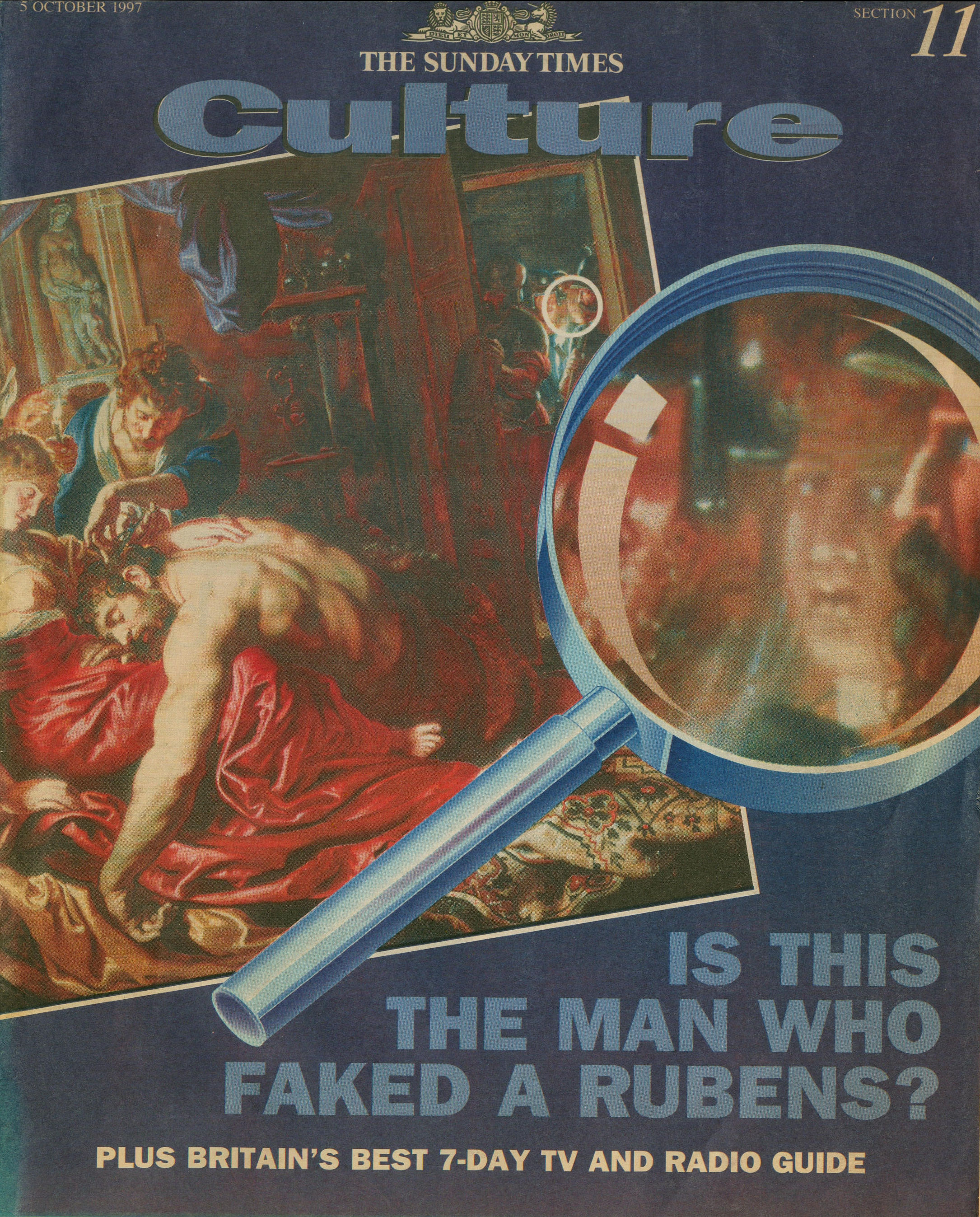
Above, Fig. 8: The Sunday Times’ 5 October 1997 coverage of Kasia Pisarek’s rejection of the Samson and Delilah’s Rubens ascription.
Certain suspicions seem to have arisen in Waldemar Januszczak’s mind as he (at that date) rejected the Samson and Delilah’s Rubens attribution in the above Culture Magazine feature and pressed the striking Whodunnit Mystery of the Disappeared Back:
“…I put this to the gallery’s chief conservator, Martin Wyld, who quips cheerfully that he was rather proud of having been accused; planing a 17th-century oak panel to wafer thinness and attaching it perfectly to blockboard while leaving its surface in pristine condition, is an exceptional feat of restoration. Nobody would or should do it today. Whoever did it earlier did a masterful job. Why did they do it at all? If a painting is in exceptionally good condition, why was there any need to hazard the transfer to block-board? A question neither the chief conservator nor MacGregor can answer. All I got from them both is the National Gallery version of: it wasn’t us, guv.”
Had Januszczak been a student of the National Gallery’s Technical Bulletins he might have recalled that accounts were given in the 1985 and 1986 issues of how Martin Wyld had chiselled away the entire wood panel of seven giant planks just under two metres long of Cima’s The Incredulity of St Thomas and that, in the first stage of this supposedly now verboten practice, the panel was reduced “from c. 5 cm to 1 cm” and in the second stage, the remaining 1 cm of wood was chiselled away entirely until the back of the original gesso coatings was exposed and ready to be attached for ever to its entirely new synthetic materials sandwich.
For a glimpse into the National Gallery’s subterranean Factory for Restoration and Attribution Rehabilitations, see:The National Gallery’s Made Just like Rubens Samson and Delilah with Cropped Toes
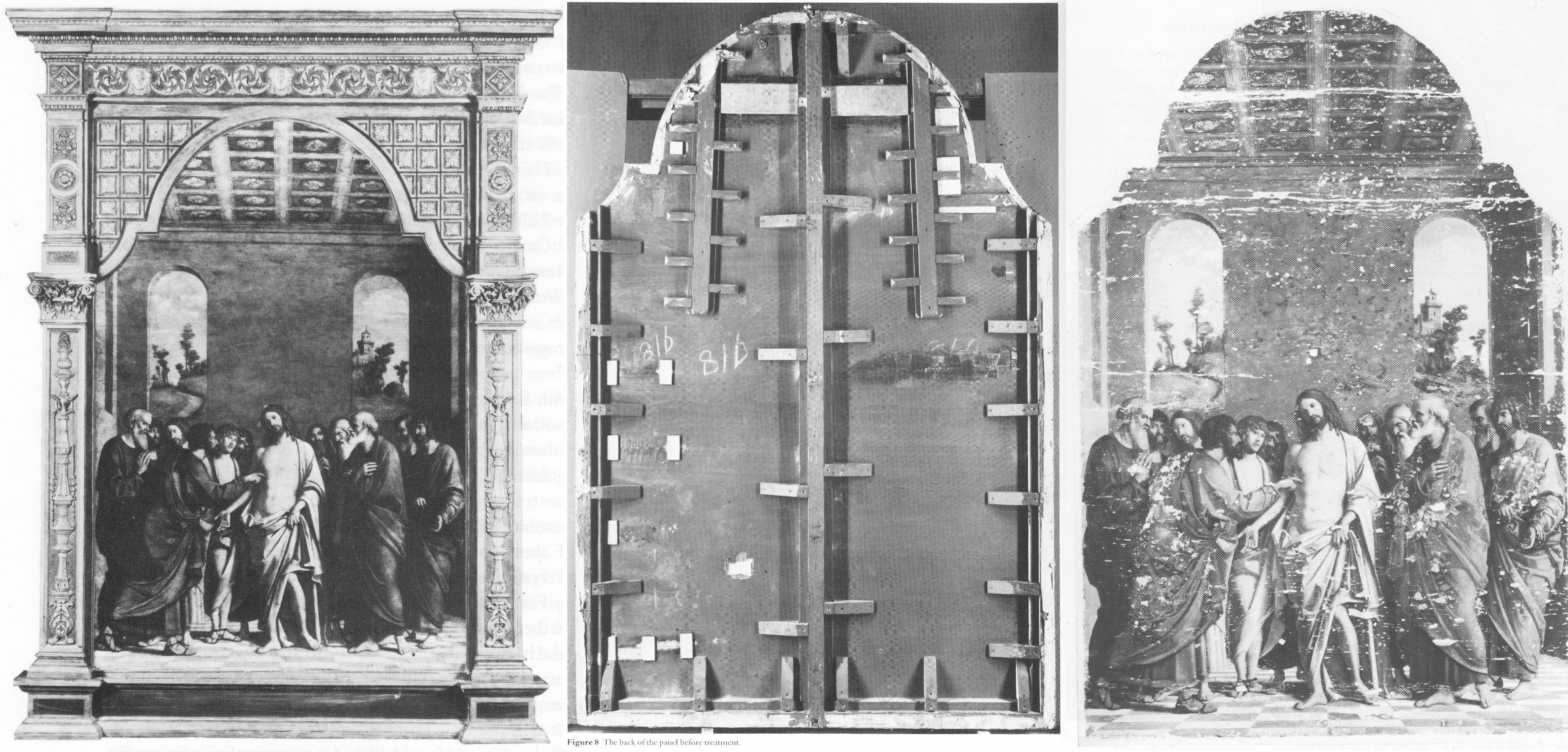
Above, Fig. 9: The National Gallery’s Cima da Conegliano altarpiece, The Incredulity of S. Thomas. Left, the altarpiece before restoration; Centre, the back of the panel, before its entire removal and replacement; Right, as seen after cleaning and before retouching – and after the transfer of the surviving gesso and paint film onto a multi-layered synthetic support.
RECORDS v RECOLLECTIONS AND BOY-GANGS IN ACTION
If the documentary record is to be trusted, it can be said with certainty that someone within the National Gallery covertly planed the Samson and Delilah panel. Notwithstanding his later Jaffé-flaunted recollection of August 2000, Frans Baudouin [*6] had, in his 1980 condition report prepared for the Samson and Delilah’s owner, Mrs Margaret Köser, solemnly testified on his (likely financially remunerated) professional oath (as the picture was about to be dispatched by the banker Jan Bosselaers from Antwerp to Christie’s in London), that it was a panel between 2.5 cms and 4 cms thick – and, therefore, had not-yet been planed down to a thickness of under 3 millimetres and cemented onto a sheet of modern blockboard. And yet, in the face of all such precisely documented facts between 1930 and 1980, David Bomford would, in his 1983 National Gallery Technical Bulletin account, backdate the planing to an unspecified time, place, and person – viz: “At some time, probably during the present century…” – and, when so-saying, would offer not one jot of supporting technical, photographic or documentary evidence in an institution that had long claimed exemplary record keeping practices.
[*6] Frans Baudouin was described in Codart on his death in 2005 as: “the doyen of Flemish art historians. He was the former director of the Rubenshuis and the driving force behind the founding of the Rubenianum, as well as an outstanding specialist in Rubens.” Nonetheless, he had declined to discuss the Samson and Delilah’s attribution with Euphrosyne Doxiadis (the first critic of the picture’s ascription and a co-author of the 1992 Report submitted to the National Gallery) whom he had met socially. In his August 2000 Apollo article, Dr. Jaffé, belatedly acknowledging Burchard’s certificate of authenticity record of the original panel, wrote: “Three Rubens experts – Dr. Frans Baudouin, Dr. Reinhold Baumstark and Dr. Hubert von Sonnenburg – who had been contacted by potential purchasers and therefore studied the painting with particular attention, all recall seeing it in its present condition just prior to its sale at auction on 11 July 1980.”
Powerful and triangulated testimony, it might well have been thought. However, one might also assume, for example, that Baudouin’s professional documents were likely more trustworthy than his twenty years-old recollections. In support of the former, the photograph (above, Fig. 2) of the Samson and Delilah when out of frame in 1980, and as supplied to Euphrosyne Doxiadis by Jan Bosselaers, along with Baudouin’s own 1980 certificate of condition for the Samson and Delilah might be cited. Further, as mentioned, in 2001 Doxiadis asked Baumstark’s successor at the Liechtenstein Princely Collections, Dr Uwe Wieszorek, if the then-Prince of Liechtenstein had been the underbidder at the 1980 Christie’s sale. In NG6461 she now reports: “He assured me categorically in two letters that as far as the Collections were aware, the Prince was not the underbidder, nor had he even taken part in the bidding.”
As for Dr. Hubert von Sonnenburg [*7], the then Head of Conservation for the Metropolitan Museum, might he be taken as the unsuccessful underbidder? When advising that museum on the possible purchase of the then-sublimely preserved Velázquez Juan de Pareja (which was bought for the Met. from Christie’s in 1971), Sonnenburg had strenuously advised the picture should under no circumstances be bought if its canvas had been relined. Would he likely have advised that great museum to buy a reduced panel laid on blockboard at a nowhere-recorded location and time? If he had, had the Met. attempted to buy the Samson and Delilah but been outbid for once by the National Gallery? Jaffé does not say – but where Christopher Brown had told Euphrosyne Doxiadis that the Prince of Lichtenstein had been the underbidder, for their part Christie’s had refused at the time of the sale to identify the (to this day, mysterious) underbidder, whose bids were said to have been relayed to the main sale room by telephone from an anteroom.
[*7] As we noted in a March 2011 post – Hubert von Sonnenburg was certainly an adept of art museum secrecy:
When, in 1971, the Met. snatched Velázquez’s Juan de Pareja from the British (who had owned it for centuries) Thomas Hoving, Ted Rousseau, von Sonnenburg and Everett Fahy had all flown to London, Madrid, and Rome – a sort of “boy-gang”, as they saw it, playing at spreading rumours like “the disinformation section of the KGB” – as Hoving (who later claimed to have discussed with Wildenstein’s how to “manipulate the art press and crank up the rumor mill” in a general strategy of “dissimulation and misleading rumors”) put it in his memoir. Even when successfully bought, the Velázquez was not paraded at the Met. but, rather, was “sneaked” into Wildenstein and Company “for secrecy”, partly because funds had been committed without the Board’s knowledge and also because, as Hoving put it, the Board had to remain longer in the dark as further “total secrecy” would be needed to “prepare our public relations stance” and to “have the time to clean it.” The deception of the public was to be absolute: for a short period before the restoration, the picture was exhibited to New Yorkers as if it were Wildenstein’s own property. Subsequently, the Met audiences only got to see the von Sonenburg-redone Juan de Pareja and not the miraculously well-preserved jewel that had, some time before, been taken to the New World by a triumphalist, dissimulating art world boy-gang.
In Part II – A TALE OF TWO ASCRIPTIONS AND THEIR RESPECTIVE TECHNICAL EXAMINATIONS – we examine the remarkable methodological discrepancies evident in the National Gallery’s own respective 1983 accounts of its two expensively bought 1980 panel paintings, and show why the Samson and Delilah should never have been presented from 1930 onwards as the long lost Rubens of 1609-10.
POSTSCRIPT: See Dalya Alberge’s disclosures in today’s Guardian:
A £2.5m dud? Fresh doubt cast on authenticity of National Gallery Rubens
15 June 2025
The Louvre’s Obsession with Remaking the Mona Lisa

A Notice of Alarm from Leonardo Specialist, Jacques Franck:
Dear Leonardo colleagues, dear Leonardo lovers,
I have recently learnt from first-hand (external + in-house) sources, that the Musée du Louvre intends to clean the Mona Lisa on the occasion of the masterpiece’s forthcoming move to a new subterranean room in the course of the planned expansion/renovation of the Museum which is to end by 2031.
The existence of such a project surprises me for the following reasons:
1) The panel is in a rare and exceptional condition for a work aged 500 years, a fact that I was able to check in 2003, 2004, 2005, 2009 and 2012 when I saw it out of its frame with the Louvre curators and scientists in the Salle des États where it is exhibited today. Bar the yellowed varnish which is skilfully neutralized by the specific lighting set inside the icon’s bullet-proof vitrine, the paint layer is intact: in other words, as anyone can see in the Louvre itself before the work; in documentary movies; or in photographs released by the Museum, the Mona Lisa still looks gorgeous and, obviously, doesn’t need any cleaning.

Above, Fig. 1: Leonardo da Vinci, the Mona Lisa, Paris, Musée du Louvre.
2) Following a large-scale press investigation about a possible cleaning of Leonardo’s enigmatic portrait published jointly by Il Giornale dell’arte, Le Journal des Arts and The Art Newspaper in 1998, Jean-Pierre Cuzin, the then Head of Paintings at the Louvre, had stated: “There is no question of undertaking conservation, of whatever nature, of the “Gioconda”. To be sure, the old varnishes make the picture yellow and affect its impact somewhat; but the varnish is very even, with no disturbing blotches. Besides, the work, which is painted on panel, is in superb condition and is regularly checked. Do I have to remind people that this painting is universally famous in its present state? I distrust on principle any conservation that might be considered “sensational” to the extent that it is not made necessary by the condition of the work itself” (The Art Newspaper, n° 84, September 1998 – see Fig. 2 below). Eighteen years later, on February 16, 2016, the new Head of Paintings, Sébastien Allard, expressed the same, unchanged position, in an email sent to me while confirmed to the press: “I learn of your worries following some statements spread in the press, whereby it was suggested that I intend to clean the Mona Lisa. But be reassured now: I have no intention whatsoever to proceed with the cleaning of the Mona Lisa. I have mentioned it very clearly during the press conference. The Louvre’s press service (which is copied into this email) has informed the concerned journalists accordingly” (author’s translation – and see note 1.)
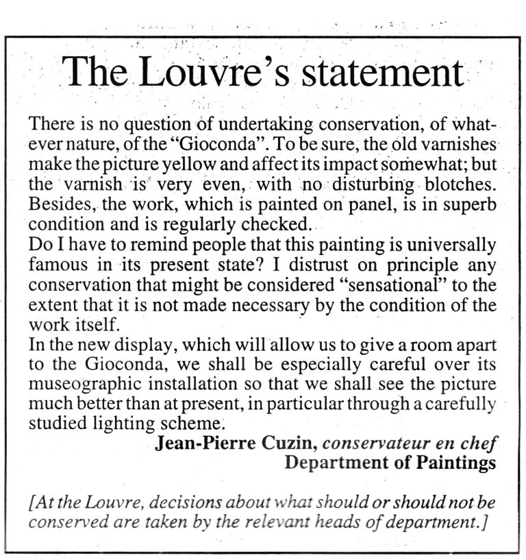
Above, Fig. 2: The Art Newspaper n° 84, September 1998, statement by Jean-Pierre Cuzin, then Head of Paintings at the Louvre
Given the preceding, I find it urgent to explain why, as a scholar and a Leonardo “critical copyist”, I think that the above cautious statements remain sound and pertinent. Many of you know that in 1993 I published an essay in Achademia Leonardi Vinci, vol. 6, titled “The Unrestorable Sfumato” which summarized my then thirty years-long research on Leonardo’s painting technique through the systematic, critical copy-work of his late paintings, namely, the Saint Anne and the Mona Lisa. This research was for me the way to “meet” Leonardo as an artist, to identify what belongs to him alone and, ipso facto, what doesn’t and, therefore, is unacquainted with his practice. The copies’ step by step confrontation with the original works were the experimental ground of this learning (see Fig. 3B below). As an academic trained painter, I had long suspected that the flesh technique used up to paroxysmal perfection in the Mona Lisa portrait had nothing to do with the traditional blending in of the tones, but something far more complex yet to be discovered. The result of my quest, ran through years of painstaking exercises – given Leonardo’s inaccessible genius -, has led me to formulate the theory of his complex blending technique well known to all of you now (see the attached bibliography). In addition, I am finishing a long-term research thesis for which I explored over twenty years huge amounts of historical documents and examined masses of laboratory tests results (including their scientific interpretation), with a view to check whether the latter supply or not data consistent with regard to traditional, well-informed studio practice and the inherent timeless artistic-technical gestures. This type of investigation has brought unexpected support to my insights and at the same time shown the astounding discrepancies that exist between the scientific approach to art and art in the real, a problem that scientists, connoisseurs and restorers are too often unaware of. Whatever the case, my theory about Leonardo’s sfumato technique employed in the Mona Lisa is now supported by both visual and scientific evidence (note 2). Regarding the latter publication, it is worth noting that the numerous superimposed veils of paint described by me in 1993 as an essential process in the making of my copies after Leonardo – the veils which I then thought were used in the Mona Lisa – would be detected in 2015 by Philippe Walter in the work’s flesh sections thanks to X-ray fluorescence spectroscopy (note 3). This considerable step forward is absolutely crucial in understanding the truly problematic nature of Leonardo’s late works in the event of any restoration. A fact sadly confirmed by what happened when the Louvre Leonardos were cleaned in the 2010-2016 conservation programme in which my expertise was involved as set out below (note 4).
Above, Fig. 3: A (left) Leonardo da Vinci, the Louvre Saint Anne (detail of head before cleaning); B (right) Jacques Franck, unfinished copy of A, c. 1986-1989 (author’s collection). Stage 1 of “critical copy work” (here in Caran d’Ache colour pencils: 3000 hours of work). Exercise intended for the author’s conservation students in 1983-1998: Such drawn copy/demonstrations are essential to prove that the restorer/copyist a) understands what he sees and b) can reproduce it. A more advanced stage of critical copying in oils involves experimenting with the technical gestures and the physical nature of the paint materials that are necessary to achieve the sfumato effects visible in the original. Such a step is necessary to ensure that the paint structure of the critical copy and that of the original match. It also helps to check whether a restoration hypothesis of the original work informed by material data observed in the “stage 2 copy” is relevant or not. Such a method proved successful: the author’s free copy in oils of the Saint Anne in the Burlington House cartoon (National Gallery, inv. 6337) shows a close analogy in X-rays with the X-radiographs of the Louvre Saint Anne and the Mona Lisa (cf. Franck, 2017, p. 18-21, figs. 5-9, and note 3 below).
The disappointing cleaning of the Saint Anne and of St John the Baptist
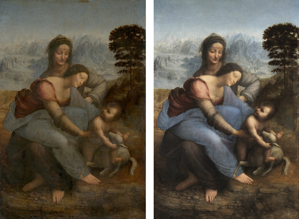
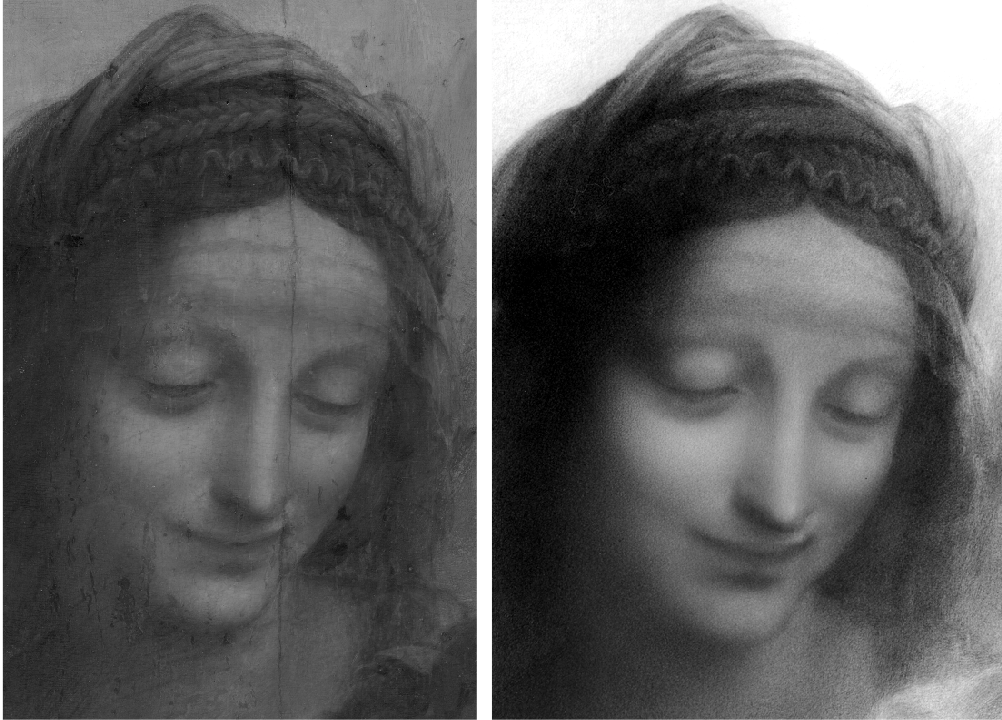
Above, Fig. 4: A (left) Leonardo da Vinci, the Louvre Saint Anne before cleaning; B (right), the Louvre Saint Anne after cleaning.
A – The Virgin and Child with Saint Anne (2010-2012). Long before the restoration project of the Saint Anne was decided I had warned the Louvre that Leonardo’s highly subtle technique using veils of paint in the flesh zones, made of “tinted varnishes”, required extreme caution, that is, thinning the obscured varnish down to 20 microns and not lower in Saint Anne’s head (which was cleaned last with 8 microns left only). Carlo Pedretti was instrumental in supporting my cautious position with Vincent Pomarède, who had succeeded Cuzin in 2003 as Head of Paintings (see Fig. 5 below and note 5). However, when the cleaning began it became clear that the paint surface was posing tricky problems in some sections, notably in the landscape, and more precisely in the brown rocky ground where the group stands.
Behind the Virgin’s back, the long rectilinear portion which separates the brown terrain and the frozen blueish lakes and mountains was first thought by some members of the scientific committee to be a large repaint (and so likely to be removed) until its material was analyzed by the Louvre’s lab and found “compatible with 16th century paint ingredients”. On the right hand-side of the composition, the same terrain (notably in the small space located inside Saint Anne’s bent left arm next to her body (unfortunately cleaned off in part – see Fig. 6 below) was suspected to be a late addition also because it appeared to be dissolved by cleaning solvents spontaneously.
That was the case as well with the hillock supporting the tree, its lower part, and, particularly, the roughed-out suckers around the trunk. A heated debate then arose among the committee as to whether the tree should be “purified” or not : it wasn’t accepted for two reasons : 1) the curator general Ségolène Bergeon Langle, said that an ancient paint’s solubility is no evidence that it isn’t original : some very old paints are proven dissolved by solvents at once despite the passing of time, 2) the copy of the Louvre Saint Anne by Raymond Balze (c. 1840) (Fig. 7 below) shows to some extent that today’s image of the painting existed 170 years ago already. Then, making the intervention even more difficult, another problem emerged, casting a dramatic atmosphere over the project: at an advanced stage of the Child’s cleaning, what looked like a blanched (= opacified) varnish reappeared, visually awkward.
While a simple technical operation can help recover the lost transparency of such a varnish, the unusual typology of the presumed blanching made Bergeon Langle and me suspect that it was in fact an original brown glaze, yet faded and gone white, put by Leonardo to strengthen the flesh modelling in the shadows of Christ’s figure. In other words, we both considered that it should be kept and regenerated.
To make the story short, no serious attention was paid to our request (based on unconvincing tests results, the Louvre’s lab dismissed our views): the so-called conservation varnish was removed during the Summer of 2011 when the committee was on holiday. This radical removal made Bergeon Langle resign from the committee together with Jean-Pierre Cuzin (the former Head of Paintings) (Fig. 8); I didn’t quit, however, assuming that I could be of help until the completion of the work and finally ratified the overall project although feeling very uncomfortable about its outcome. Madame Bergeon Langle (both an art historian and a chemist) later published a number of essays about the case, explaining the frequent confusion between blanched varnishes and opacified glazes, in particular regarding some lakes used in the past, made of vegetal colourants that fade off while leaving the substratum on which they once were fixed (note 6).
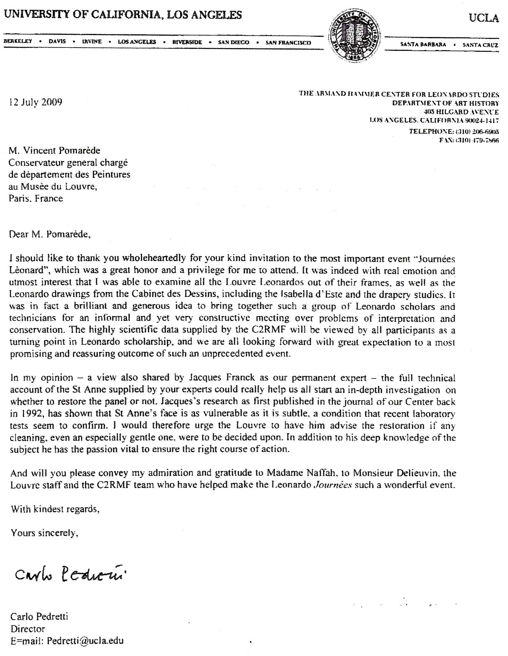
Above, Fig. 5: Letter of 12 July 2009 from Prof. Carlo Pedretti, Director of the Armand Hammer for Leonardo Studies at UCLA, to Vincent Pomarède, Head of Paintings at the Musée du Louvre (author’s archives).
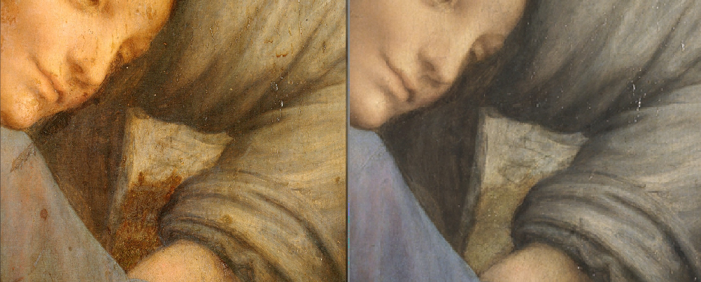
Above, Fig. 6: details of Fig. 4 showing the removed fragment of terrain at B (right) as compared with the uncleaned stage at A (left) – and, moreover, as had been copied in the 19th century work at Fig. 7 below.

Above, Fig. 7: Raymond Balze, copy of the Louvre Saint Anne, c. 1840.
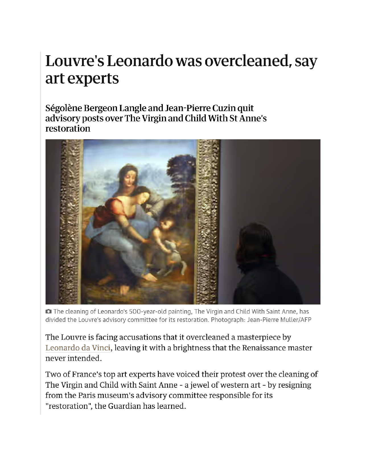
Fig. 8: The Guardian, “Louvre’s Leonardo was overcleaned, say art experts”, by Dalya Alberge, Wed. 28 Dec. 2011, 16.45 CET.
B – I shall not speak at length about the cleaning of the Belle Ferronnière (see figs. 9 A and 9 B below) which came next (2014) despite the fact that when that of the Saint Anne was over in 2012, Vincent Pomarède told me the Louvre would not clean another Leonardo before “five years at least”. Pomarède was leaving the Paintings dpt. at the time while Allard was taking over. Yet, being still an essential member of the restoration committee, Vincent named me his personal adviser on the new cleaning project (note 7). The atmosphere soon became heavier than that of the Saint Anne four years earlier: from in-house sources I had heard that both the parapet and the black background in the portrait were put into question as possibly inauthentic by some members in the committee. Knowing that this was utterly wrong (in the Libro di Pittura, Leonardo recommends painting portraits of people seen from outside sitting before their home’s entrance door – or possibly, though not mentioned, a large window with a parapet), and, that way, viewed detached in chiaroscuro against a dark background. In a most regrettable email sent to Allard I strongly criticized the presence in the committee of “incompetent restorers researching vainly through cleaning the true Leonardo while removing the master’s original paint”. This of course got no response, but a few months later, i. e., on 13 November 2014, my advice to practice a very gentle thinning of the varnish only was given to Pomarède before the Belle Ferronnière in the Louvre’s conservation studio, the which advice was accepted in early 2015 by Allard, who chaired the committee. The portrait now looks marvelous, has undergone no drastic surgery, but the members of the committee whose views weren’t approved still believe that the Belle Ferronnière needs a lot more cleaning.
Above, Fig. 9: A (left) Leonardo de Vinci, the Belle Ferronnière before cleaning, Paris, Musée du Louvre; B (right), the Belle Ferronnière after cleaning.
Above, Fig. 10: A (left) Leonardo da Vinci, Saint John the Baptist before cleaning, Paris, Musée du Louvre; B (right), Saint John the Baptist after cleaning.
C – In 2016, the Louvre selected Regina Moreira to clean Saint John the Baptist, a project which Allard invited me to attend as an external adviser (note 8). I had sent him before many letters expressing my concerns and worries about any action to be done on the work because, knowing only too well the difficulties that had arisen during the last cleanings I feared that the complexity of the case to be treated would lead to failure. Regina’s skills, however, were high enough to let me expect the calming of my doubts in the end, so, when I saw her preliminary work, a very tactful thinning of the varnish, I felt relieved and didn’t think it necessary to come to the Museum’s conservation studio again before the final stage of her task. I therefore was most astonished and distressed when I saw the restored Saint John (above, Fig.10 A and B): the Saint’s head had doubtless been treated gently and his fur cloak retrieved in full, but the figure’ s strongly lit right arm and upper part of the torso were certainly quite a problem now.
As appears conspicuously on Fig. 10B, the soft transitional values between the darkest shadow and the highlights in the arm have gone off to such an extent that the overall shape of the limb seems a perfect arc of a circle, while the lighted flesh, now deprived of both “roundness” and volume, looks flat and lifeless when compared to the pre-cleaning stage. I swiftly enquired about the cause of the mishap and soon found it: at an early stage, the advisers seem to have imagined that pinkish flesh colours were underlying the golden hues of the paint surface and, contrary to my belief, that Leonardo did not create a candlelit scene, but one in daylight. In the search for fresher, pink flesh tones, which were never retrieved, the cleaning went deep enough to harm the mellow modelling of the arm and of the upper part of the chest. Despite my long explanatory letters sent to Allard, no notice had been taken of my previous warnings, apparently – and yet, Leonardo’s late technique is made of superimposed veils of tinted varnishes, each of a different colour, and organized in such a way that they interact optically together, thus building up the form’s volume and hues progressively and in synchrony. This optical system responds to the same principle as that used by photographers when they place on the camera transparent tinted filters, one over another, so as to get the coloured effect hoped for in their image (yellow over blue = green, etc.) The glazing process in art is quite similar given that glazes are transparent coats of paint. In 1590 Lomazzo precisely reported that Leonardo’s technique was made of superimposed veils of paint (“veli sopra veli”) one item of historical testimony whereby my own research is confirmed.
Regarding what happened with the Louvre Saint John the Baptist, it is easy to understand that the cleaning action weakened and flattened the arm’s volume: as it went deeper and deeper, the optical function of the veils making the 3D effect decreased proportionally to the quantity of veils removed. It might be interesting to hypothesize why the search for pink hues was undertaken. The Ambrosiana in Milan keeps a Saint John the Baptist in a landscape (Inv. 98 – see Fig. 11) attributed to Leonardo’s favourite pupil, Salai. We are faced here with a diurnal scene and a free interpretation of the Louvre composition, in which the flesh contains pink tints (obtained by mixing vermilion and white pigments). However, the correct reading of Leonardo’s esoteric Saint John isn’t accessible to all: it may mislead inattentive onlookers insofar as the dark background there is crucial in rendering both the figure and the surrounding space, to which it is immovably attached (see attached bibliography, Franck, 2021/2, caption of Fig. 9 B) in my Further thoughts II essay of 2021). Not really intelligible at first glance, that singularity alone makes the work a finished product of the highest perfection revealing that Leonardo never conceived a diurnal scene at the outset. Those who think otherwise believe that workshop products like the Ambrosiana Saint John reproduce intermediate stages in which Leonardo’s originals were before their ultimate completion, the Louvre Saint John included, but this theory is unlikely with regard to how the master’s bottega would function in his late years. Very absorbed in the service of great patrons and other princes of his time then, he was often kept away from the workshop for long months. It is therefore more realistic to consider that he encouraged the production of numerous variants (and copies) of his works in order to provide for the constant and remunerative activity of the staff in his absence.

Above, Fig. 11: Salai, Saint John the Baptist in a landscape, Milan, Pinacoteca Ambrosiana
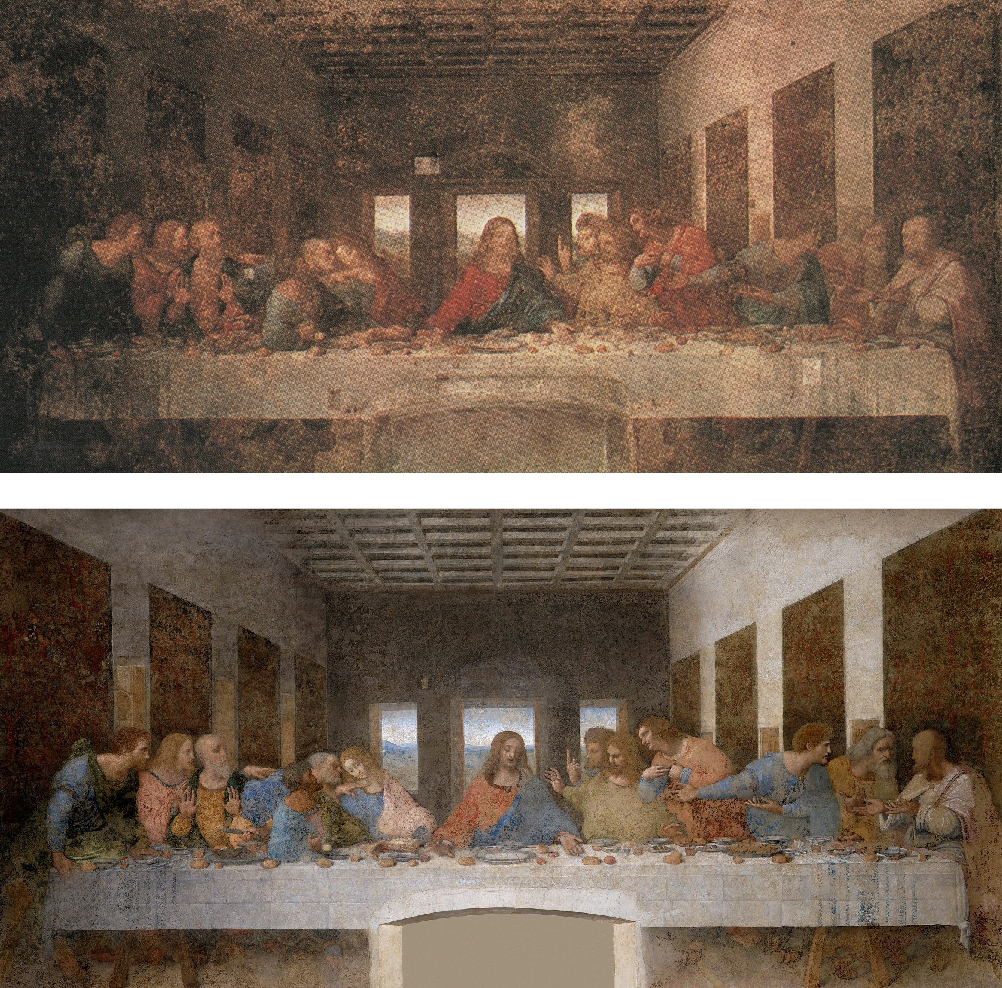
Above, Fig. 12: A (top) Leonardo da Vinci, the Last Supper before cleaning, Milan, Refectory of Santa Maria delle Grazie; B (bottom) the Last Supper after cleaning.
Other recent Leonardo restorations
A – The Last Supper (1978-1997) – see Fig. 12 A & B above. In 1997, Carlo Pedretti published in ALV, vol. 10 (note 9), my views about the long cleaning of Leonardo’s Last Supper in Milan. Pinin Brambilla’s meticulous conservation work, devoted to cleaning off the heavy repaints added to the mural through the centuries, recovered about 20% of the injured masterpiece. The missing 80% is lost – which means that it has been replaced by the same percentage of inpainting, executed in “water-colourish” reversible pigments so that it cannot be confused visually with the retrieved original fragments when viewed at close observation. Given the resulting huge proportion of retouching, we are now faced with a very pale image in which are floating the magnificent details that have survived, but from a distance it looks ghostly and modernistic because the strong contrasts between light and shade once created by Leonardo have disappeared. The flatness thus created corresponds more to early 20th century aesthetic concepts than to late Quattrocento ones. The Milanese Soprintendenza had the possibility to display the remaining fragments like archaeological remains, as seen in antique sites and museums in Italy and elsewhere in the world, but it did not. The end result is therefore both hybrid and deceptive: very few visitors can discern where Leonardo really exists in this reimagined composition since it can’t be seen up close.
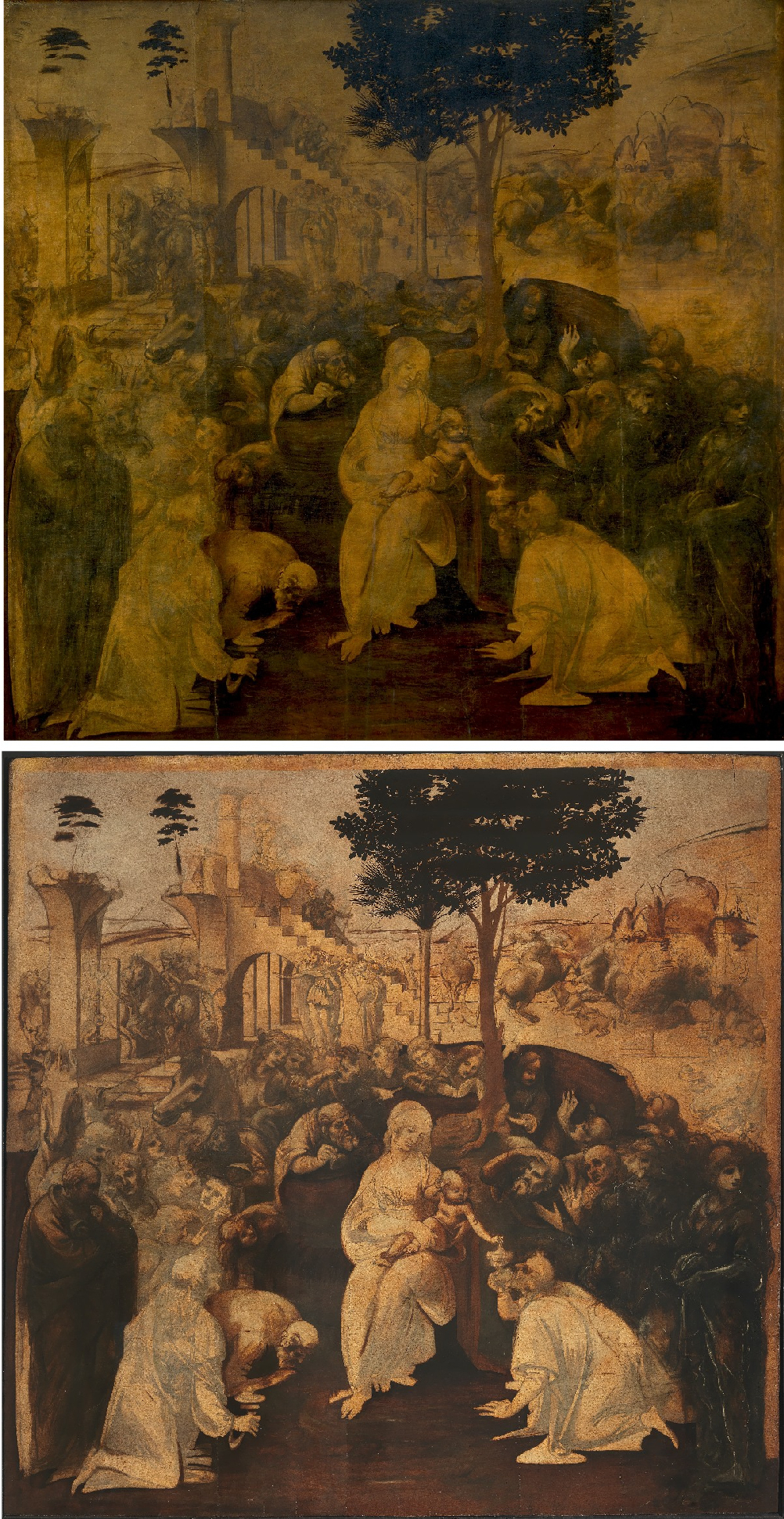
Above, Fig. 13: Leonardo da Vinci, the Adoration of the Magi, Florence, Uffizi Gallery, as seen before cleaning A (top) and after cleaning, B (above).
B – The Adoration of the Magi (2011-2017) – above Fig. 13. It is extremely strange that the damages suffered by the work during its recent restoration went unnoticed by the Italian Renaissance scholarship. Apparently, no voice has criticized publicly the new image as it appeared when the cleaning was finished. However, a careful study of the painting’s conservation records would have allowed the restoration team to avoid the errors that were made. The fact that something wrong had to be elucidated about the paint layer’s actual structure first came to the fore in 2006, when Maurizio Seracini’s scientific account of the tests carried out on the Uffizi Adoration under his (c. 2001) supervision was published. An odd situation had been noticed regarding the white lead priming that covers the preparatory drawing – namely : “in the cross-sections of the samples taken from the areas painted with brown pigment […] the priming layer is discontinuous, as if it had been harshly cleaned, and/or suffered a long deterioration over time […] In the areas where the priming is intact, the overpainting is imbedded in the drying cracks of the layers of sky or priming […] it is obvious that the paint layer over the priming is neither contemporary with the priming itself nor with the underlying preparatory drawing […] the layers of priming and sky are uniform and continuous, but they have slight vertical breaks from the natural drying process. The brown -coloured layers in the foliage […] seep into these cracks” (note 10). In other words, five years before the work’s cleaning by the Opificio delle Pietre Dure in Florence it was suspected that the overlayers in Leonardo’s Adoration of the Magi weren’t original. I was convinced of the opposite: the wonderful freedom of this brilliant oil sketch was misunderstood and, in my opinion, the key to the mystery would be discovered one day or another. On 26 October 2012 I was invited to see the preliminary cleaning stage of the Adoration at the Fortezza da Basso in Florence where the Opificio’s conservation studio is located : during the long exchange I had before the work with the late Soprintendente Marco Ciatti, I learnt that in 1914 it had been submitted to a radical treatment meant to regenerate the blanched varnish, a process invented by Max von Pettenkofer (a Bavarian chemist, 1818-1901), whereby blanched paintings are exposed to alcohol vapour and copaiba balsam.
In their article “Molecular Characterization of Copaiba Balsam in Painting Techniques and Restoration Procedures” (Studies in Conservation 45 (2000), p. 1-18), the authors state that “When used in restoration procedures, copaiba balsam is considered to cause the softening, swelling and darkening of some paint as well as the migration of compounds. The latter process causes intermingling of the different layers, as has been shown by careful studies on cross-sections” (note 11). Although in some paintings that have gone through the Pettenkofer process in the past no copaiba balsam can be detected, the initial damage it causes does not disappear. Seracini’s observations concerning the seeping of the brown, orange, etc., overlayers into the cracks of the Uffizi Adoration are indelible proven traces of such a treatment – identical traces of such seeping are shown by the Opificio in The restoration of Leonardo da Vinci’s Adoration of the Magi – Rediscovering a masterpiece, Florence, 2021, fig. 21, p. 271.
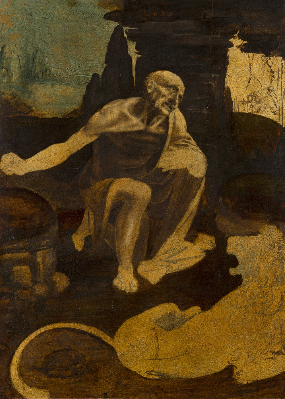
Above, Fig. 14: Leonardo da Vinci, Saint Jerome, Rome, Musei Vaticani.
The Pettenkofer varnish regeneration of 1914 is mentioned in E. D. Schmidt, M. Ciatti, M. V. Colonna Rimbotti, Il Cosmo Magico di Leonardo. L’Adorazione dei Magi restaurata, exh. cat., Florence, 2017, p. 55. The Uffizi Gallery began to be interested by this conservation treatment in the second half of the 19th century as testified by a ministerial report (n° LXXVII) of 12 December 1865 (see Gabriella Incerpi, Semplice e continue diligenze. Conservazione e restauro dei dipinti nelle Gallerie di Firenze nel Settecento e nell’Ottocento, Florence, 2011, p. 308-309). While knowing the dangerous treatment by copaiba balsam inflicted on the Adoration prior to 2011, no attempt was made by the Opificio’s conservation team to analyze significant cross-sections from the work in order to explain their clearly disturbed structure. Yet this was the essential action through which could be eliminated the doubts initially expressed by Seracini that the upper orange and brown layers were a late addition. Strangely, the Opificio didn’t examine either Leonardo’s unfinished Saint Jerome (see Fig. 14 above), another oil sketch on panel of the same period (c. 1480 – 1482) whose technical execution is similar to that of the Adoration of the Magi. To my knowledge, no published cross-sections of the Vatican Saint Jerome are available that would help compare those sampled from the Adoration by both Seracini and the Opificio. We therefore ignore whether the layering process in the Saint Jerome was exactly the same as exists in the Adoration (that is to say, was comprised of: a) gesso ground; b) preparatory drawing; c) lead white priming called imprimitura; d) second imprimitura layer of orange colour used as a base ground; and, e) oil sketch). In fact, while it is not sure that layer c could be found in the Saint Jerome also, a base ground of orange colour, quite identical to that cleaned off in the Adoration (some bits of it have been preserved as we shall see) can concretely be observed in the Vatican panel at the level of the d layer.

Above, Fig. 15: Leonardo da Vinci, the Adoration of the Magi, cleaned detail of a standing figure showing the orange base ground underlying the figure’s black drapery.
The fact that those two orange grounds were similarly meant to function as a base ground in both panels is proven materially: 1) in the Adoration, the standing figure on the right hand-side of the composition wears a black mantle whose lights of an orange colour underlie the surrounding black very visibly (that was done by Leonardo in such an inextricable way that it explains why the surviving orange layer there couldn’t be removed during the cleaning (Fig. 15), 2) in the Saint Jerome one can see at once that the blue paint sky and background landscape was applied on the orange underlying layer. (See Fig. 16, below.) More could be said of the injured composition, which post-restoration looks gloomy, harshly contrasted black and off-white, hence unsubtle, with here and there yellow/orangish remainders of the suppressed second imprimitura and losses of many lovely details (Fig. 13). The masterpiece’s basic narrative coherence has been compromised as well: anyone wanting to fully grasp Leonardo’s real intentions must now refer to the pre-cleaning stage reproduced faithfully in P. C. Marani, Leonardo da Vinci, Electa, Milano, 1994 (photographs by Antonio Quattrone).

Fig. 16: Leonardo da Vinci, Saint Jerome, detail showing the orange base ground underlying the azurite blue of the sky and the rocky landscape.
The audacious Solario restoration in the Louvre
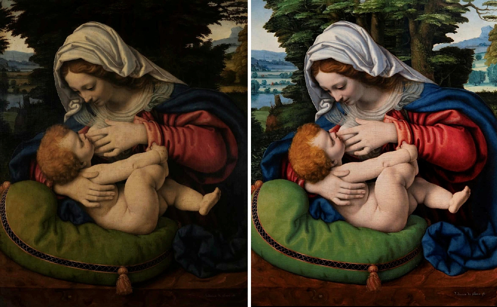
Above, Fig. 17: Andrea Solario, the Madonna with a green cushion, Paris, Musée du Louvre – before cleaning, A (left), after cleaning, B (right).
In December 2024 the Louvre returned to the walls, freshly cleaned by Cinzia Pasquali (the lady who restored the Sainte Anne), Andrea Solario’s Madonna with a green cushion (Fig. 17, A left, and B right), which is probably the Leonardesque artist’s most impressive – and famous – devotional painting (1507-1510).
The Museum’s online entry on the picture was available in full and with detailed information in January 2025 but no longer is, apparently. Not much was reported about the recent cleaning bar the radical change in the trees behind the Virgin, now making the background – left with far less foliage and a single central tree – an open one instead of a closed one directing the gaze on Mary’s intimacy with her baby exclusively (like the scene has been known for centuries). No reason for the removal of so much foliage is apparent given that the old etchings after the Solario Madonna, dating from the mid – 18th century and 1801-1804 testify to the composition as it was before the 2024 cleaning (see Figs. 18 A and B below).
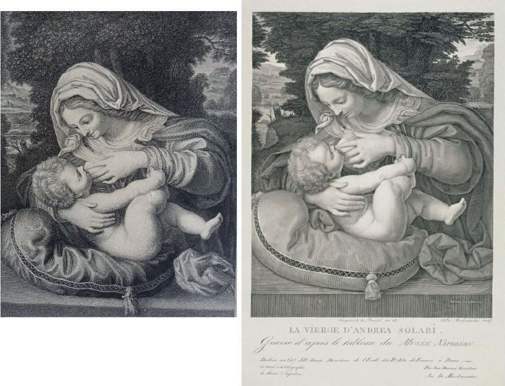
Above, Fig. 18: A (left), an anonymous mid-18th century artist’s (?) etching (here mirrored) after Solario’s Madonna with a green cushion. B (right), Joseph Charles de Meulemeester, etching after Solario’s Madonna with a green cushion, 1801-1804.
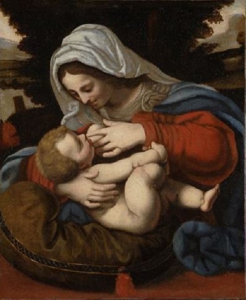
Above, Fig. 19: Jean Mosnier III, copy of Solario’s Madonna with a green cushion, c. 1617-1619.
The painting was popular in France in the beginning of the 17th century, thus inciting Queen Marie de Médicis, during her exile in Blois, to commission a copy by Jean Mosnier III around 1617-1619 (Fig. 19): it is the earliest known one, where the tree is reasonably larger and darker than what appeared post-cleaning in 2024; the 18th century engraved version (shown here mirrored). (Fig. 18 A) makes the latter feature very obvious. King Louis XV acquired the Solario in 1742 and it is quite likely how he saw it then, a legendary aspect still visible until recently. At this stage essential questions must be posed : 1) reverting to the Saint Anne cleaning, given that its traditional aspect visible in Raymond Balze’s copy of c. 1840 (Fig. 7) helped preserve the tree as it was in 2010-2012 in Leonardo’s painting, why, in the Solario, did the Louvre decide to remove the tree as it surely was in 1742 under King Louis XV’s reign (that is, more than 100 years before Balze’s copy)?, 2) are we really sure that the presumed “added foliage” was inauthentic ? The tree as it is today has far less charm than the cleaned off bush; it looks rigid, hard-edged as if cut out in a sheet of steel: if it really existed at the outset, could Solario have painted over it, as an afterthought, more mysterious and developed branches? In which case, if executed with copper resinate (green pigment), the revised tree would have become uniform dark through ageing, thus looking like its deleted version (that is why these darkened and confusing greens are never removed in careful cleanings), 3) the recovered landscape and its horizon have taken a flattened appearance totally incompatible with a 16th century painting by Solario : on the left hand-side of the composition, in total ignorance of aerial perspective, uniform horizontal stripes of bright colours now put on the same level the lake, the fields, the intermediate hedges and the far off mountains successively (Fig. 17 B). Out of respect for this magnificent painting, the least we can say is that such an anachronous situation urgently needs to be explained.
Conclusions
I) The above claims, all based on verifiable facts and a large quantity of documents, frame the questionable context in which the Musée du Louvre supposedly wants to restore its most precious treasure: Leonardo da Vinci’s Mona Lisa portrait. It is already very clear, however, that the previous sequential Leonardo cleanings undertaken by the French museum in 2010 – 2016 up to 2024 were, on close examination, far from successful, as can be seen on: a) the bit of terrain cleaned off next to Saint Anne’s left arm + strong doubts that the opacified material removed in the Child’s anatomy was not a blanched conservation varnish but an adulterated original glaze, b) the overcleaned bust and right arm of Saint John the Baptist, through which the soft transitional values between light and shade were lost, c) the bitter fight during which the Belle Ferronnière escaped disaster while being still threatened by a corrective cleaning, d) the Leonardesque Madonna with the green cushion‘s unjustified deletion of its historical background landscape, etc.
II) The situation is no better abroad: none of the above-mentioned restorations were based on artistic considerations although such are precisely what counts primarily in the making of a painting. What is the purpose of conservation if the actions taken do not preserve the work’s image as intended by its creator, an artist? To achieve that imperative outcome you need to be able to decipher a painting from an artistic angle – and even, before acting, to understand its underlying motives. Artistic blindness or indifference cannot produce any kind of artistic knowledge, and relying exclusively on scientific tests to understand art (as happened with the Adoration of the Magi) is an a priori very dangerous position (note 12). The fact that, in the Adoration of the Magi the interveners relied on science alone to act and, in so doing, had no expert artistic reading of their own was explicitly reported by the restorer:
“During cleaning […] certain difficulties about how to interpret and proceed did persist, both because of the lack of technical references and also because of the complexity of the painting. As cleaning advanced, it revealed all of its complex and at times chaotic articulation. The chromatic relationships of a finished artwork – the areas of the colour of the sky and earth, the flesh tones and the drapery, the special properties defined by the composition, the precision of the outlines, the qualities and carefulness of the painting itself – provide important guidelines for restoration. In our case, instead, these reference points were absent” (The restoration of Leonardo da Vinci’s Adoration of the Magi – Rediscovering a masterpiece, op. cit., p. 207 and 213).
That frank acknowledgement is in fact, nothing less than an admission of methodological/conceptual impotence: the restorer simply did not understand either the raison d’être for the technical function of the orange upper layer (the removed second imprimitura) or Leonardo’s own distinctive technical/artistic purposes. It is a well-known fact that this great master had intuited and formulated a painting method that excludes the representation of a form’s boundaries by the conventional use of precise outlines, which he says “do not exist in Nature”, his “only mistress”. For sure, such guidelines are indispensable at the stage of the preparatory drawing for tracing the overall shapes of a given composition. Thus, following the logic of his own conceptions, Leonardo applied thin translucent lead white priming over his preparatory drawing – a process that subdued the underlying outlines visually (they become pale grey instead of black) while still making them a usable guide for the subsequent stages of pictorial creation. Although he may or may not then complete the preparatory drawing perceivable over the white priming, as above-mentioned, he then adds an orange base ground on which he will build up a chiarioscuro thanks to the just-placement of his necessary brown and dark tints in relation to which his orange base ground serves for the basic light. That distinct and innovative process of shaping forms through contrasting lights and in preference to sharp outlines appeared very early in Leonardo’s graphic œuvre. It is connected also to his theory of componimento inculto (rough composition) whereby the depicted forms are embryonic and only suggestively realised. Little wonder, then, that an uninformed performer, used to clear-cut outlined shapes should not safely and un-destructively make his/her way through in such a pictorial thicket. (Fig. 20 below.)
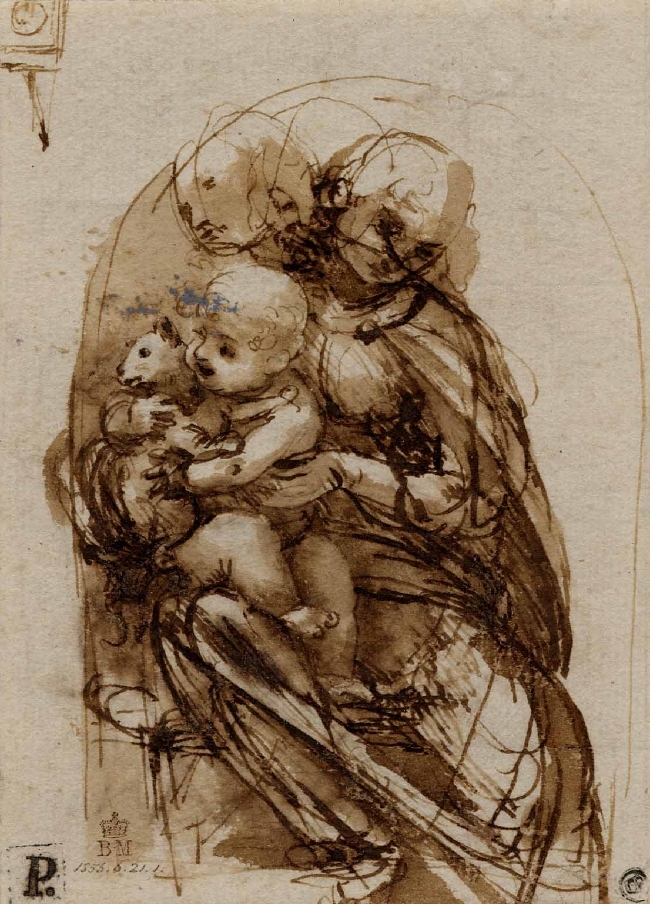
Fig. 20: Leonardo da Vinci, study for the Madonna and Child with a cat, c. 1478 -1480, pen and ink and wash, London, British Museum. This sheet is contemporary with the Uffizi Adoration whose principles of execution follow a similar line: here we see Leonardo’s graphic practice according to which the volume is obtained by opposing light and dark surfaces (chiaroscuro), thus avoiding the use of outlines to define the forms. The rough execution is related to the componimento inculto theory whereby from the formless sketch will emerge the idea of the final composition.”
III) Should we be surprised by recurrent “restoration” mishaps? No, not if we go back enough to recognize the situation in all its historical truth. At the end of World War II, in 1945, France and Italy agreed to implement a common policy for the conservation of paintings. It was established on both ethical and technical criteria thanks to which, during cleaning, for instance, a sufficient coat of old varnish would be left so that the penetration of the cleaning solvents into the original paint layer and its superficial glazing would be reduced. The Anglo-Saxon countries did not join and continued to develop controversial cleaning methods based on the belief that the use of solvents doesn’t harm the paint layer and for that reason leaving some old varnish over it is useless. The so-called Latin method was all the more difficult to perpetuate as it was based on complex protocols relying on the skill of restorer-artists who had been trained according to teachings of drawing and painting dating back to the Renaissance. Such requisite learning had trained their “eye” to the highest level and helped keep intact the Louvre’s prestigious collection of paintings, including Leonardo. Unfortunately – tragically – the Malraux reform of 1959, finally implemented in 1970, decreed the cessation of traditional teaching in art schools under State supervision. Within 40 years, the phenomenon became widespread throughout the world: less and less equipped with orthodox artistic knowledge and concrete references on the old master techniques, the restoration of paintings relied more and more on science, which we know from many examples cannot replace artistic judgement in matter of art conservation.
IV) The Malraux reform promoted modern art creation, the rise and ascendency of which was directly and inescapably detrimental to old master conservation: in the 20th century, from revolution to revolution – those of abstraction, kinetic art, minimal art, conceptual art and many other new creative expressions – all of which, whether we like it or not, has permeated the collective unconscious, and ipso facto the vision of the generations born during the years 1950-1980. It is indeed the artistic heritage that is most familiar to them, just as academic art was to the generations of the 1880s-1900s and their predecessors. As a result, despite the immense progress of art history supported by science, the painting techniques of the Renaissance, and even closer to us, of the 19th century, are no longer understood in their original specificity due to the time that has passed. The creative gestures, their rules and codes have radically changed: academic art proceeds from restrictive theoretical and practical data, requiring a long and painstaking apprenticeship, elements from which the art of our time has had to emancipate itself in order to exist and find its full freedom. In other words, as far as the artistic image is concerned, between classical art and the art born of the modern revolution, we no longer find ourselves faced with the same grammatical system. For that reason, notwithstanding its survival in vestiges that have come down to us, it is now possible to range art from the Renaissance among the defunct iconographic languages since today’s artistic images have shifted into an autonomous visual order that has imposed itself through forgetting the past and its means of expression. This could only have harmed the preservation of classic art, the technical access keys to which, being rational in their principle, were rather similar to musical theory. Common sense would dictate that we clean less and less these precious paintings while admitting that we do not understand their grammar anymore: by treating them as archaeological objects they would be protected from destruction.
V) Reverting to cleaning the Mona Lisa, the Louvre authorities are now faced with exactly the same situation as existed when the Grand Louvre was built up in 1989: to use or not to use the mythical icon’s restoration as a fantastic means of publicizing its planned expansion/renovation project to the antipodes. On this point we have at least the response of the directors of the time: they did not even think about it, knowing well, as is the case today, that the Mona Lisa doesn’t need to be cleaned, just to be better displayed and lighted, given that, bar the yellow varnish, its condition is absolutely perfect. After the failure of so many recent Leonardo cleanings, including that of the Saint Anne, it seems sensible to consider that the Museum has no interest in embarking on a risky adventure for so futile a reason as big noise about its forthcoming extension, when it has all the time it needs to envisage the safest possible intervention over the long term. As for the yellow varnish of the Mona Lisa, it is nothing new: this fact was reported already by Cassiano dal Pozzo when he saw the painting in the royal collections at Fontainebleau in 1625. It is now part of the myth of the famous portrait: as a consequence, wouldn’t the vast number of her admirers be able to feel that the Mona Lisa is no longer the Mona Lisa if it were cleaned?
Jacques Franck
Footnotes
(1) “[…] J’ai appris que vous auriez été inquiets de certains propos dans la presse où l’on laissait supposer que j’avais l’intention de restaurer la Joconde. Je vous rassure qu’il n’est nullement dans mes intentions de procéder à la restauration de la Joconde. Je l’ai dit très clairement à la conférence de presse. Le service de la Communication du Louvre (que je mets en copie) l’a d’ailleurs fait signalé [sic] aux journalistes concernés” (email of 16/02/2016, 13:25; author’s archives).
(2) Cf. Franck, 2014; Walter, 2015, p. 13-14.
(3) “[Paint] films as thin as two micrometers are measured at the beginning of glaze deposition. [Leonardo], therefore, had to multiply the deposits of this material to arrive at the final state of the painting, repeating his gesture probably fifteen times until obtaining the deepest shadows. These measures are in the same direction as the experiments of Jacques Franck already described”( “Des films aussi fins que deux micromètres environ sont mesurés au début du glacis. [Léonard] a donc dû multiplier les dépôts de cette matière pour arriver à l’état final du tableau, répéter son geste sans doute une quinzaine de fois, jusqu’à obtenir les ombres les plus profondes. Ces mesures vont dans le même sens que les expériences de Jacques Franck déjà décrites”. Cf. Walter, 2015, p. 14 (author’s translation).
(4) 1 – Letter (ref. MDL/DP/VP/AM/ CA4) of 30/04/2010 to the author from Vincent Pomarède, then Head of Paintings at the Musée du Louvre: invitation to participate as a member of the advising committee for the restoration of Leonardo’s the Virgin with Child, Saint Anne and a Lamb; 2 – email of 12/11/2014, 13:01 from Vincent Pomarède hiring the author as his “personal adviser” during the time of the restoration of Leonardo’s Belle Ferronnière; 3 – email from Sébastien Allard, Head of Paintings at the Musée du Louvre, allowing the author to see at leisure the planned restoration of Leonardo’s Saint John the Baptist, and asking for his advice on these occasions (last § in above-mentioned email, note 1). Author’s archives.
(5) The nomination of the author by the late Prof. Carlo Pedretti as “Permanent consulting expert to The Armand Hammer Center for Leonardo Studies at UCLA” was published in ALV, vol. 10, 1997, “Views & Previews”, p. 269.
(6) Cf. Bergeon Langle, 2017, p. 42-43 and p. 46-47.
(7) Cf. note 4 above.
(8) Cf. note 4 above.
(9) Cf. Franck, 1997.
(10) Cf. Seracini, 2006, p. 98.
(11) Cf. Van der Werf, van den Berg, Schmitt and Boon, 2000, p. 3.
(12) When it comes to providing clear answers about pictorial processes, science is generally unproductive because it doesn’t know what to look for and where. This deficiency can be resolved easily when scientists agree to consult artists and establish an interdisciplinary dialogue with them, which is far from common (see Franck, 2021/1, chapter VI).
Bibliographic References
– Bergeon Langle, 2017: Bergeon Langle, S., “L’appel à la science peut-il décevoir ?”/ “Can Science Deliver Its Promises to Art?”, in The Proceedings of the Art, Law and Crises of Connoisseurship Conference, held at the Society of Antiquaries of London, 1 December 2015, ArtWatch UK Journal, n° 31, 2017, p. 38-47.
– Ciatti, Frosinini et al., 2021: Ciatti, M., Frosinini, C., The restoration of Leonardo da Vinci’s Adoration of the Magi. Rediscovering a masterpiece, Florence, 2021.
– Florence, 2017: Il cosmo magico di Leonardo. L’Adorazione dei Magi restaurata, exh. cat., Florence, Galleria degli Uffizi, 28 March – 24 September 2017, Florence 2017.
– Franck, 1993: Franck, J., “The Unrestorable Sfumato”, Achademia Leonardi Vinci, vol. 6, 1993, p. 238-241.
– Franck, 1997: Franck, J., “The Last Supper, 1497-1997: The Moment of Truth”, Achademia Leonardi Vinci, vol. 10, 1997, p. 165-182.
– Franck, 2006: Franck, J. “L’invenzione dello sfumato”, in exh. cat. La mente di Leonardo. Nel laboratorio del Genio Universale, Florence, Galleria degli Uffizi, 28 March, 2006 – 7 January 2007, p. 338-357.
– Franck, 2010: Franck, J., Rapport à la Commission internationale de restauration (Réunion du 18 juin 2010 au C2RMF): La Vierge, l’Enfant Jésus et sainte Anne de Léonard de Vinci, Musée du Louvre, inv. 776. Manuscript document, Paris, 2010.
– Franck, 2014: Franck, J., “La pratique du ‘micro-divisionnisme’ dans l’atelier de Léonard de Vinci”, ArtItalies, Revue de l’Association des Historiens de l’Art Italien, n° 20, 2014, p. 4-16.
– Franck, 2017: Franck, J., “Why the Mona Lisa Might not survive Modern Day Conservation Treatment, in The Proceedings of the Art, Law and Crises of Connoisseurship Conference, held at The Society of Antiquaries of London, 1 December 2015, ArtWatch UK Journal, n° 31, 2017, p. 18-31.
– Franck, 2021/1: Franck, J., “Prologue to Further thoughts II”, article online, ArtWatch UK website, 25 November 2021.
– Franck, 2021/2: Franck, J., “Further Thoughts II”, article online, ArtWatch UK, website, 16 December 2021.
– Incerpi, 2011: Incerpi, G., Semplici e continue diligenze. Conservazione e restauro dei dipinti nelle Gallerie di Firenze nel Settecento e nell’Ottocento, Florence, 2011.
– Lomazzo, 1590: Lomazzo, G. P., Idea del tempio della pittura, Milan, 1590.
– Pedretti and Vecce, 1995: Pedretti, C., Vecce, C., Leonardo da Vinci, Libro di Pittura. Codice Urbinate lat. 1270 nella Biblioteca Apostolica Vaticana, 2 vol., Florence, 1995.
– Seracini, 2006: Seracini, M., “Indagini diagnostiche sulla Adorazione dei Magi di Leonardo”, in exh. cat. La mente di Leonardo. Nellaboratorio del Genio Universale, Florence, Galleria degli Uffizi, 28 March, 2006 – 7 January, 2007, p. 94-101.
-Van der Werf, van den Berg, Schmitt and Boon, 2000: Van der Werf, I. D., van den Berg, K.J., Schmitt, S., Boon, J.J., “Molecular Characterization of Copaiba Basalm as Used in Painting Techniques and Restoration Procedures”, Studies in Conservation 45 (2000), p. 1-18.
– Walter, 2015: Walter, P., “Peinture et chimie. Comprendre le geste du peintre dans son atelier. Approches croisées entre chimie et histoire de l’art”, Cont@cts, Bulletin de l’Association royale des ingénieurs diplômés de l’Institut Meurice, juillet-août-septembre 2015, p. 10-14, (www.ardim.be).
“I warmly thank Michael Daley, Director of ArtWatch UK, for having welcomed this message of mine on his organization’s website and for having adjusted its presentation most generously” – J. F.
ArtWatch UK – 9 April 2025
National Gallery Coverups: The Case of the Disappeared Panel – “Who Knew What, When?”

The National Gallery’s continuing silence on its removal of the oak panel support of the attributed Rubens Samson and Delilah increasingly resembles a tacit acknowledgement of institutional culpability.
Matters were recently brought to a head by Dalya Alberge’s explosive account (“Fresh doubt cast on authenticity of Rubens painting in National Gallery” ) of Euphrosyne Doxiadis’s book NG6461 – The Fake National Gallery Rubens. That account left both the National Gallery and Christie’s (from whom the gallery acquired the picture in 1980 for a then world record Rubens price) declining to offer a response.
This dispute was already of long standing in 2000 when Artwatch UK devoted an entire issue of its journal – the first of two – to the untenable nature of both the Rubens ascription and the National Gallery’s official accounts of its restoration, as published in its own Technical Bulletins – see the journal’s cover and introduction below:
SO, WHODUNNIT THEN?

Above, Pic 3: The 5 October 1997 Sunday Times Culture magazine in which its art critic Waldemar Januszczak supported critics of the Samson and Delilah’s Rubens attribution and suggested that the picture’s forger had included his own portrait among a group of soldiers. Januszczak subsequently endorsed the Rubens ascription but here he challenged the National Gallery to identify the persons responsible for planing down a cradled panel and attaching its greatly reduced (3 mm thick) structure to a sheet of modern blockboard. The restorer Martin Wyld expressed admiration for the undisclosed restorer’s skill by quipping he was rather proud of being accused but, like the gallery’s then director, Neil MacGregor, he too was at a loss to propose the restorer in question. (On Wyld’s own but not there-declared great familiarity with, and expertise on, planed-down panels at the National Gallery, see below.)
Below, an article published in The Jackdaw, March/April 2010<strong, on the retirement of a National Gallery restorer:
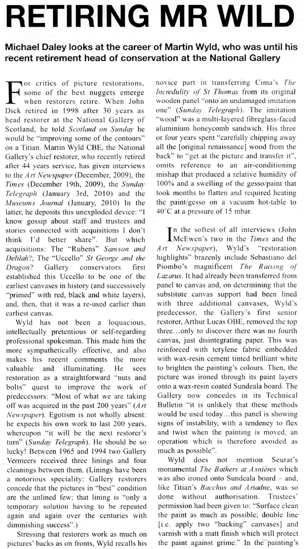

PEAK NATIONAL GALLERY RESTORATION TECHNO-ADVENTURISM:
After the National Gallery’s recurrent and bruising restoration controversies of the 1940s and 1960s, by 1980 the confidence, ambition and experimental zeal of its restorers and scientists was high and rising.
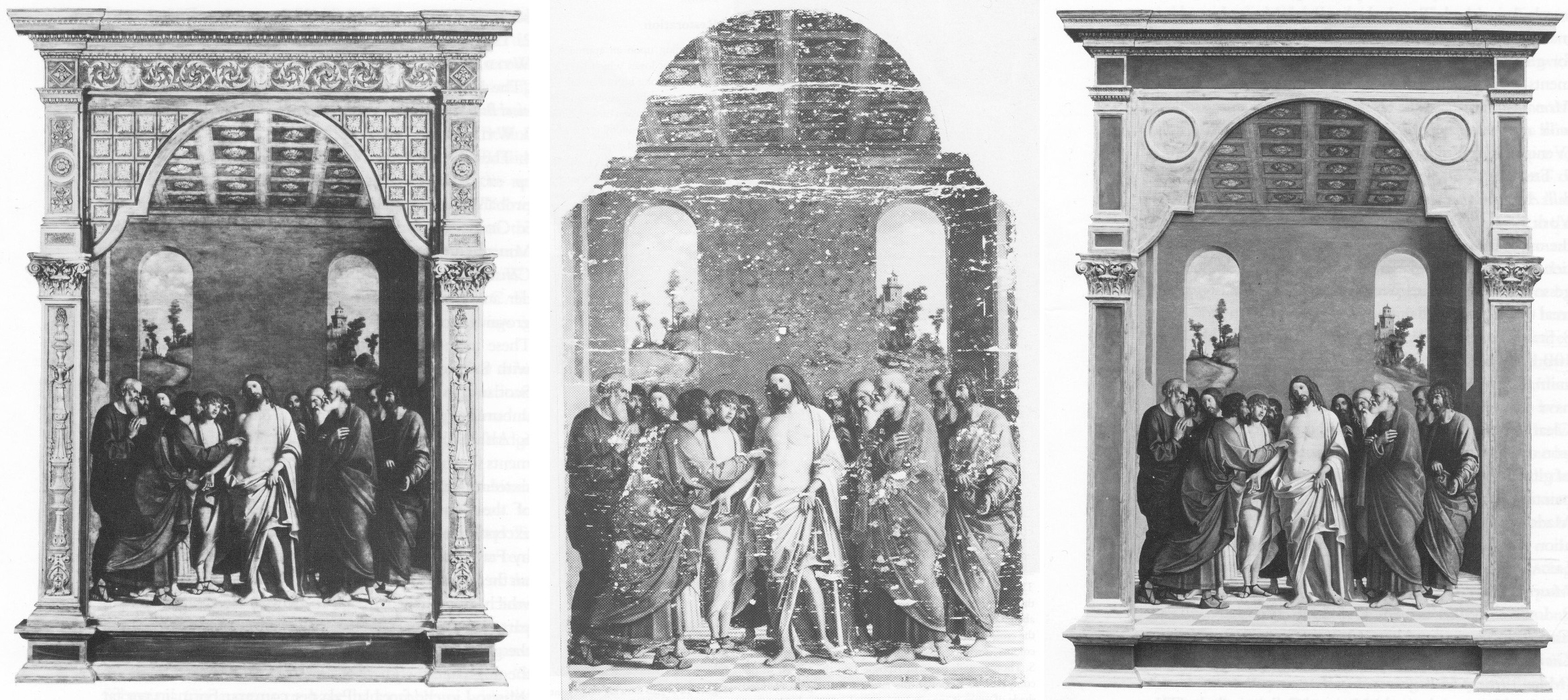
Above, Pic. 6: The National Gallery’s altarpiece panel painting The Incredulity of S. Thomas by Cima da Conegliano, as here seen (left) before restoration; after cleaning (centre); and (right), after repainting and remounting in its radically altered frame.
The Cima altarpiece underwent the most radical alterations on every component part: its panel; its frame; and, the painting itself. This was a totally made-over work. All aspects of its history-defying transformation were lovingly reported in the successive National Gallery Technical Bulletins of 1985 and 1986. Setting aside the profoundly radical pictorial alterations, of particular interest here is the elimination of the entire panel on which Cima’s painting had been made and its replacement by an extravagantly multi-layered sandwich of modern synthetic materials. The painting itself was left as flat as a dry-mounted photograph.
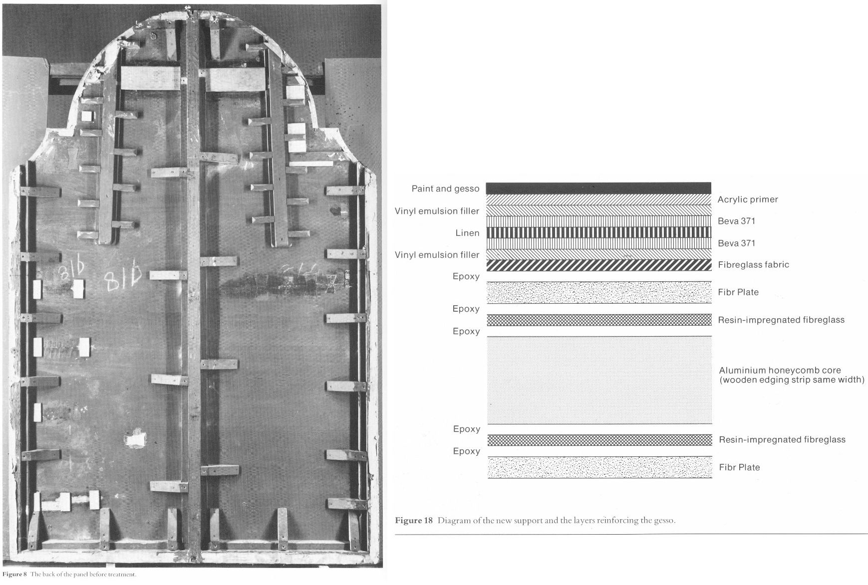
Above, Fig. 7, showing (left) the original giant reinforced panel of Cima’s altarpiece, and (right) a cross-section diagram showing the multiple layers of synthetic materials assembled in replacement of the picture’s original panel
HOW TO DISAPPEAR AN ENTIRE PANEL
Concerning Martin Wyld’s 2010 publicly declared knowledge of the locations of certain National Gallery skeletons – and the earlier comments he had made on the Samson and Delilah panel to Waldemar Januszczak, his account in the 1986 Technical Bulletin of his chiselling away of the entire wood panel of seven giant planks just under two metres long on this major Cima altarpiece becomes an item of historical and institutional interest. In the first stage, the picture was laid down with its painted surface face upwards and a temporary support was added to it – that is to say attached to the front of the painting itself. This support comprised, Wyld reported, first covering the painted surface with two layers of tissue fixed in place with a resin (and small amount of oil) coating and then a third added layer of tissue. Cheese cloth was then pasted over this layer. Then a paraffin wax layer was brushed on and then largely scraped off to leave a thin even layer. Then a substantial structure was added to provide a temporary support for the paint and gesso layers. This support consisted of a 1cm thick board of Sundeala board (soft, pinboard material) which was supported by a 5 cms deep paper honeycomb glued on to a hardboard layer. The painting was then turned over, exposing the original and by then reinforced panel and its entire removal was begun. In the first stage, the panel was reduced by Wyld “from c. 5 cm to 1 cm.” with entirely manual means – that is to say, to by chisels:
“Semi-circular 15 mm gouges were pushed along the grain, cutting channels 6-7 mm deep, and the ridges left between the channels were then cut down. Each plank was reduced by a similar amount, and the process repeated until the panel was reduced from c. 5 cm to 1 cm thickness…The removal of the first layers of wood is usually the easiest part of a transfer [of the paint layers]. The removal of the final layer of wood was complicated by several factors [principally, where previous repairs of the paint had left the original wood panel impregnated by waxes and glues] … Experience during earlier transfers had shown that the safest method of removing the last layer of wood was to cut a very shallow slope at a slight angle to the grain and to shave away the tapered edge of the wood with a small fish-tail chisel. The method proved impractical on the Cima. The parts of the panel affected by thick animal glue (of the consistency of carpenter’s glue) or putty filling the worm channels, by knots and by later or original inserts of wood obviously needed individual treatment. However, the remainder of the wood was so insecurely attached to the gesso that it was impossible to cut a shallow slope because strips broke away along the grain no matter how carefully the chisel was used. Strips of wood 10-12 cm long and 3-4 cm wide would become completely detached, but usually with a few small fragments of paint and gesso stuck to them. These fragments were laboriously cut off the wood and replaced… It was found that the safest method of removing the last layer of wood in the very loose areas was to cut it away at an angle of 30 degrees to the gesso, instead of across at the very shallow angle normally used, and to cut across rather than along the grain…”
Such thinning to the point of the complete removal of an entire panel, clearly, calls for impressively high levels of mechanical skill. By comparison, simply reducing the Samson and Delilah’s 2.5 cm to 4 cm panel to c. 3 mm and then glueing it on to a new sheet of blockboard must have seemed a piece of cake.
For more information on the National Gallery’s restoration treatments and curatorial appraisals – including a major structural accident that befell the Cima altarpiece – and National Gallery photographs showing the work in progress under the eye of the then Director, Michael Levey, see: The Demise of the National Gallery’s “made just like Rubens” Samson and Delilah with inexplicably cropped toes.
Michael Daley, Director, 1 April 2025
Buyer Beware

In Part II* of III, Michael Daley introduces the $45-50mn purchase of a panel attributed to the Father of the Sienese school of painting (*As published in the January/February 2009 issue of the The Jackdaw.)
Buy in haste, repent at leisure? The Metropolitan Museum of Art’s purchase in 2004 of the so-called Stoclet Duccio met near-universal acclaim in New York and was hyperbolically hailed by the museum itself as “a single supreme masterpiece of Western painting” and no less than “a turning point in art history”. The work is currently on show at the National Gallery in the “Siena – The Rise of Painting 1300-1350” exhibition. There, it is described as “the exquisite, small half-length Virgin and Child often referred to as the Stoclet Madonna now in the Metropolitan Museum of Art, New York.”
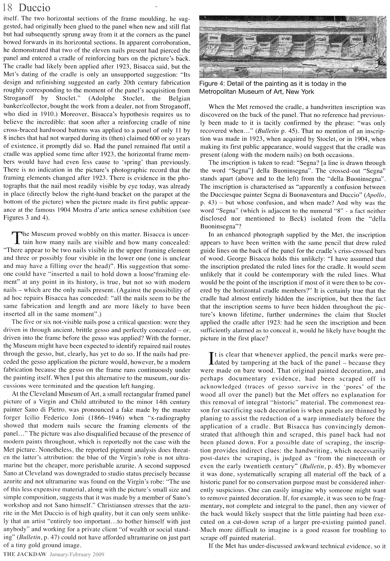
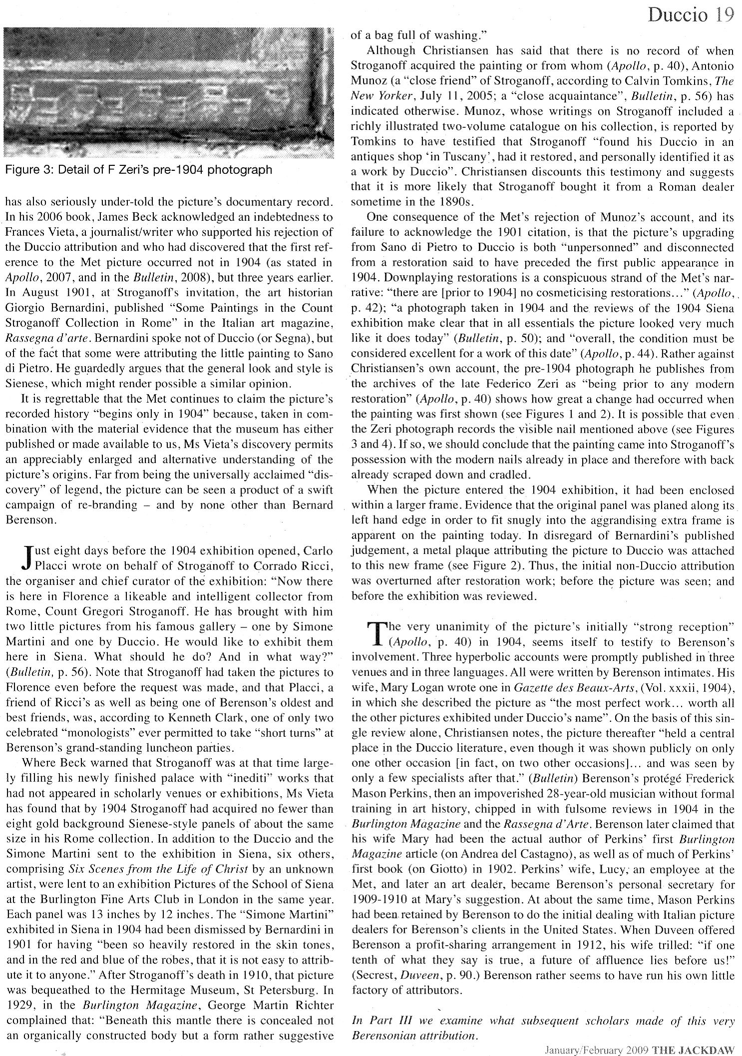
Coming next in Part III: “TOXIC ATTRIBUTIONS?”
To Criticise a Critic
An examination of certain pre-emptive scholarly/art market establishment strikes against a pending book that rejects the Rubens ascription of the National Gallery’s contested Samson and Delilah.
Michael Daley writes: Those who challenge art establishment scholars or institutions can suffer swift repudiation and denigration in lieu of frank and open debate, as I discovered when supporting Prof James Beck’s criticisms of the Sistine Chapel Ceiling restoration in the late 1980s. In the 1996 edition of the Beck/Daley Art Restoration – The Culture, The Business, And The Scandal, in a chapter headed “The Establishment Counter-attacks”, I noted:
“When criticized in this area, institutions react institutionally, which is to say, by deploying self-protecting mechanisms common to all establishments. The best and most favoured response is no response, implying that the criticism is inconsequential and deserves to be ignored. In those instances where a response is unavoidable, it is thought best to be made by proxy… When a direct defence is necessary, its tone becomes all important. By tradition, the tone ranges from amused disdain, through supercilious dismissiveness to outright disparagement and attempts to discredit personal or professional credentials.”
It seems little has changed and that responses to the imminent arrival of Euphrosyne Doxiadis’s book on the National Gallery’s supposed Rubens Samson and Delilah (NG6461 – The Fake National Gallery Rubens) have run true to institutional templates. As a case in point, take this even-handed Artnet account: “Is This Rubens Real? Inside the ‘Samson and Delilah’ Debate” by Jo Lawson-Tancred.
Lawson-Tancred reports an anonymous National Gallery spokesman’s claims that the picture “has long been accepted by Rubens scholars” and that the Gallery finds no cause to update its initial technical examination of the painting [as had been reported in its 1983 Technical Bulletin] and whose “findings remain valid.” The first part is true – Rubens scholars had so accepted the attribution. However, the insistence that the report on the then recently acquired, exhibited, and restored £2.53mn picture requires no updating disregards subsequent findings on this and other Rubens paintings.
To be precise, the Gallery claimed in 1983: “At some time, probably during the present century, the panel was planed-down to a thickness of 3mm and subsequently glued onto a sheet of blockboard”. As Doxiadis and we have established the picture had emerged as a panel in 1929 – albeit ascribed to Honthorst. Crucially, it had remained a panel when sent to Christie’s, London, for sale in 1980 as an autograph Rubens – indeed it was precisely so described in Christie’s 1980 catalogue (see Fig. 1 below.) The picture’s physical state as a panel had been disclosed to Doxiadis by a Belgian banker who had wished to buy the picture for the Rockox House museum in 1977 and who again held it in Antwerp for its owner in 1980 before sending it on her behalf to Christie’s, London. Beyond any question, it was still an intact panel at that date.
WHERE’S THE BEEF?
Fig. 1, above: Christie’s 1980 sale catalogue entry on the Rubens-attributed Samson and Delilah panel. Note how the entry comprises a daisy-chain of “probablys” and “possiblys” – and also its parenthetical disclosure that, throughout its claimed long stay in the Liechtenstein Collection, this Samson and Delilah had not been judged a Rubens.
Given that we informed the National Gallery a quarter of a century ago of the picture’s confirmed physical status as a bowed and cradled panel in good shape in 1980, its 1983 technical account has long needed correction because the planing had not taken place before 1980, let alone in the 19th century. And yet, that manifestly unfounded suggestion that the planing might have occurred before the 20th century had been endorsed by Joyce Plesters, the Gallery’s Head of Science in the 1983 Technical Bulletin: “Unfortunately, as David Bomford has described, the back of the panel had been planed down to a thickness of only about 3mm and then the whole set into blockboard before the picture was acquired by the National Gallery…” In truth, it had not been set into the blockboard, but rather, as Bomford had correctly reported, and Doxiadis would later discover, it had been glued onto a blockboard sheet larger than itself and fitted into a new purpose made frame.
On the combined records of 1929 and 1980 that Doxiadis and we had uncovered – and as on Christie’s own published catalogue description – it followed that the planing could only have occurred after the picture was sold to the Gallery for its then world record Rubens price of £2.53million in 1980. Our concerns were compounded when informed (by the National Gallery’s then director, Neil MacGregor) that the Gallery had not followed its own procedure of preparing written curatorial and restoration reports on the picture’s desirability and condition to assist the trustees when they examined the picture (which had been loaned to the Gallery ahead of the sale – see below) to consider an authorisation of the purchase.
AN APPEAL TO AUTHORITY
In view of Doxiadis’s recently reported disclosures on the picture’s physical condition in 1980 (Dalya Alberge “Fresh doubt cast on authenticity of Rubens painting in the National Gallery,” ) Lawson-Tancred might have questioned or challenged the National Gallery’s abiding stance. Instead, she reported:
“…despite the marginal but adamant voices of researchers like Doxiadis, top scholars in the field support Samson and Delilah’s authenticity unequivocally. Chief among these is Nils Büttner, chairman of the Centrum Rubenianum in Antwerp, who is working on the Corpus Rubenianum, the definitive catalogue raisonné for the Flemish Baroque painter. He has previously described the doubts about Samson and Delilah’s provenance as “conspiracy theories.” However, Lawson-Tancred also noted that “Büttner [had] declined to comment on Doxiadis’s book”. While Büttner, presumably, has not yet read the unpublished book, his assertions received immediate support from players in the art trade:
“Büttner’s position is backed by his peers like Adam Busiakiewicz, a lecturer and consultant on Old Master paintings for Sotheby’s. He pointed out to the Telegraph that Doxiadis is not a scholar of the period and has mostly published on Greco-Roman antiquities previously. Though she ‘had a hunch the quality of the picture wasn’t good enough’, he said, ‘I think there are some misunderstandings about the painting.’”
On misunderstandings, Busiakiewicz (who seems also to be employed by the art market “sleeper-hunter” and former Philip Mould assistant, Bendor Grosvenor, on the latter’s “Art History News” blog site), paraded just such in his reported burst of professional condescension to Doxiadis:
“Busiakiewicz explained that a comparison between Samson and Delilah and other paintings by Rubens are complicated, especially when they were made decades apart. ‘He’s an artist that changed his style throughout his career,’ he said. ‘Art historians who specialize in paintings like Rubens’ can track these changes.’ It is for this reason that the National Gallery painting has been connected to Rubens’s interest in the work of Caravaggio and other Renaissance masters whose work he had, at that time, recently encountered while traveling in Italy.”
While it is widely known that Rubens underwent changes of manner in his later paintings, Busiakiewicz failed to acknowledge (or appreciate?) that Doxiadis, we, and other critics of the attribution, such as Dr Kasia Pisarek, have for decades pointed out and demonstrated that the Samson and Delilah is glaringly unlike the bona fide Rubens paintings made precisely in that brief period when the artist had just returned from Italy.
Specifically, we had reminded readers in November 2021 that:
“In a pioneering 1992 report, the scholar/painter Euphrosyne Doxiadis and the painters Stephen Harvey and Siân Hopkinson, conducted a focussed survey of six Rubens paintings of 1609 and 1610 and demonstrated that “All these display a consistency and quality of style which is not shared by the Samson and Delilah”. That report – “Delilah cut off Samson’s hair, but who cut off his toes? The case against the National Gallery’s ‘Rubens’ Samson and Delilah” – was placed in the National Gallery’s Samson and Delilah dossiers and is published on the dedicated In Rubens Name website.”
WHITHER THE PANEL’S BACK
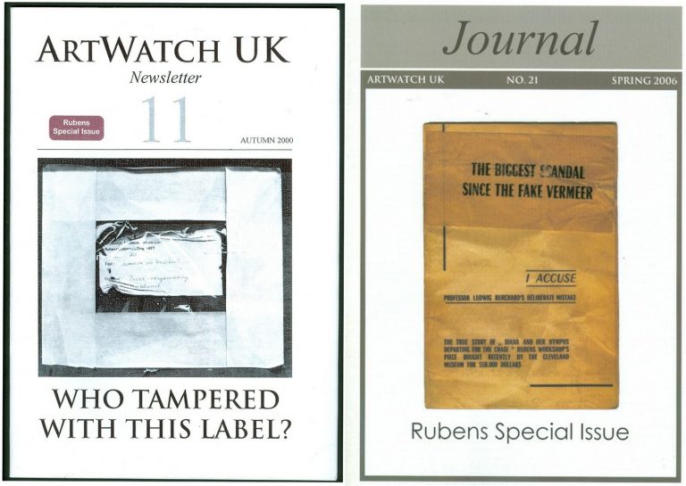
Above, Fig. 2: The covers of two ArtWatch UK journals given over to detailed accounts of the Samson and Delilah problems and shortcomings.
In issue 21 Kasia Pisarek wrote: “The Corpus Rubenianum project is based on the archive left by the late Dr Ludwig Burchard. Should it perhaps follow it less closely? Dr Burchard was an active Rubens attributionist in Berlin before the Second World War and in London afterwards. Several paintings formerly attributed to Rubens’s school or studio or even to another artist (such as Samson and Delilah), were reinstated by Burchard as by the master. I traced many of his attributions – he was not infallible in his judgement and changed his mind. Surprisingly, over sixty pictures* attributed to Rubens were later downgraded (in Corpus Rubenianum) to studio works, copies or imitations.” Pisarek adds: “they were, however, mostly portraits of small or medium dimensions.”
If a major work like Samson and Delilah might be considered something of an exception, Doxiadis supplies a possible explanation – Burchard was a relative of one of the owners of the dealing firm that had brought the supposed Honthorst to the marketplace.
*On the subsequent completion of her PhD thesis – Rubens and Connoisseurship: Problems of Attribution and Rediscovery in British and American Collections – Dr Pisarek remarked: “I traced many paintings attributed by Ludwig Burchard… At least seventy-five works he certified authentic were subsequently downgraded to studio works, copies, and imitations in the volumes of the Corpus Rubenianum, and the list is not complete… can we trust Burchard’s old rediscovery and attribution of the London Samson and Delilah?)
In issue No.11 we had written: “On December 17th 1998 Dr Jaffe [David Jaffé, then Senior Curator at the National Gallery] writes: ‘Sotheby’s auctioned Rubens Deluge as ‘oil on oak panel’ when, in fact, it was on a marouflaged panel’.” But how is this known? It was so, Jaffé discloses, “according to the condition report made in 1996-97 when the picture was loaned the National Gallery…” But no such condition report was made when the Samson and Delilah was loaned to the National Gallery by Christies ahead of the sale. That condition report on the Deluge had been prepared by the National Gallery’s timber specialist restorer, Anthony Reeve. As recently as 1982 Reeve had reported in the National Gallery’s Technical Bulletin (see Fig. 7) that the Samson and Delilah was “one of only three well-made straightforward Rubens panels in the collection” – which panels, he elaborated, required stable humidity because otherwise “The effect of wood shrinkage on the exposed backs of the panel…is for the front to become convex, and perhaps slightly corrugated”. Had the Samson and Delilah been planed-down and glued to blockboard at that date there would have been no possibility of its back being subjected to environmental hazards. It might be thought inconceivable that the National Gallery should have lost recollection of Reeve’s testimony by the following year and when writing in the same publication. As the National Gallery’s senior picture restorer Reeve was held after his death by Neil MacGregor to be the “supreme practitioner of his generation.”
There are yet further confirmations of the panel’s still-then exposed back. Doxiadis had obtained a Belgian condition report on the Samson and Delilah which began: “On arrival on 4 March 1980, about 14.30 hours the painting mentioned above (panel, 185 x 205 cms) was in good shape…” Doxiadis’s account squared with testimony supplied to ArtWatch by the art critic Brian Sewell (an ex-Christie’s man who took pride in having there identified an oil sketch as the modello for the Rubens Samson and Delilah), namely: that the panel had not been mounted on blockboard; that the back of the panel had been painted in a darkish matt colour and was criss-crossed with supporting bars of wood; that because Christie’s customary stencil number was made with dark paint it had been superimposed over a patch of white paint Christie’s had applied to the panel’s back.
Presumably Busiakiewicz has yet to access the 1992 Doxiadis/Harvey/Hopkinson report. For the record, the document I found in the National Gallery’s Samson and Delilah dossiers was a copy of the picture’s 1929 certificate of authenticity written by the great but subsequently discredited Rubens specialist Ludwig Burchard who had observed: “The picture is in a remarkably good state of preservation with even the back of the panel in its original condition”.
A CRITICAL FORMATION ASSEMBLES…
Where Busiakiewicz patronises Doxiadis on an allegedly insufficient familiarity with the Samson and Delilah literature, Nils Büttner has been joined in that disparagement by Bert Watteeuw, the director of the Antwerp Rubens House. As John Smith reports in the EuroWeekly:
“The latest suggestion that this is a 20th-century copy comes from Greek art historian Euphrosyne Doxiadis in her new book The Fake Rubens although this accusation finds little support from one of Belgium’s top Rubens experts Bert Watteeuw. Not only does he pour scorn on her status as a genuine expert, suggesting that anyone of any standard would have already checked with his Antwerp Rubens House and other specialist houses about the painting. In addition, he also said: ‘the provenance of this painting is very well known throughout the 17th, 18th and 19th centuries. A provenance that can be trusted is always crucial’…”
This implied claim of a trustworthy Rubens provenance was a brazen sleight of hand: what John Smith was not to know is that, as shown above, the provenance concerned at no point confirmed the painting as being by Rubens’ hand. Being thus kept in the dark, poor Smith could only but conclude: “Whilst the National Gallery has kept a dignified silence on the matter of the painting, it is no doubt delighted that one of the great Rubens scholars has come out publicly to dismiss the fake claim by Doxiadis which Watteeuw considers is purely invented to promote her book.”
Delighted as the National Gallery might be and while its Trappist silence might do yet further service as an institutionally imperative damage limitation exercise, it remains an untenable stance because, as one very distinguished former National Gallery trustee at the time of the Samson and Delilah purchase told Doxiadis, “the truth will come out – it always does”. As for Watteeuw, for a Rubens scholar at the supposed top of his professional tree to resort to professionally unfounded claims and personally directed abuse is as counterproductive as it is contemptible.
Moreover, in this regard, Watteeuw might be considered a serial offender: when apprised of negative AI findings on the Samson and Delilah panel he told another journalist, Colin Clapson (‘Fake Rubens in London’s National Gallery? This painting is genuine” counters Rubens House director Bert Watteeuw”) that Doxiadis’s soon-to-be-published book is “Complete nonsense and not based on facts. To begin with, I do not know this art historian and that is a sign. Most researchers on Rubens have passed by our Rubens House and the Rubenianium, the Rubens Library, in the search of sources and information,’ says Bert Watteeuw, the director of the Antwerp Rubens House. ‘Moreover, Doxiadis has an agenda of her own: to promote her book and that seems to be working well. In such cases conspiracies à la Dan Brown are more interesting than science.’ Whilst attacking its critic, Watteeuw gifts the National Gallery a clean bill of scholarly probity on its protracted silence: “‘The painting ‘Samson and Delilah’ in London is a genuine Rubens, a masterpiece. It is logical that the National Gallery does not want to comment or discuss its authenticity,’ he says.”
DISALLOWED TESTIMONY
In view of the above it might seem that among Rubens establishment scholars generally and for the National Gallery itself, nothing can be allowed to count as evidence against the challenged panel’s Rubens ascription. For example, in 2021, the brushwork of the Samson and Delilah was compared with that found in no fewer than 148 uncontested Rubens paintings. As Dalya Alberge noted in the Guardian (“Was famed Samson and Delilah really painted by Rubens? No, says AI”), “Its report concludes: ‘The AI System evaluates Samson and Delilah not to be an original artwork by Rubens with a probability of 91.78%.’ In contrast, the scientists’ analysis of another National Gallery Rubens – A View of Het Steen in the Early Morning – came out with a probability of 98.76% in favour of the artist.”
Such disinterested testimony is dismissed by the affronted – and perhaps professionally discomfited – scholarly grandees: “Watteeuw also dismisses AI research dating from a few years ago. ‘When that appeared, we engaged in extensive behind-the-scenes dialogue with that Swiss firm that had carried it out. AI can only work if you train it with an artist’s entire oeuvre. That was not the case at that time.’” (Watteeuw was here echoing Bendor Grosvenor’s mis-characterisation of the Swiss firm: “It is simply not possible to determine whether a painting is by Rubens by relying on poor quality images [sic] of not much more than half of his oeuvre…”) First, there is once again, as with Doxiadis, an implicit professional slur on the firm in question. Second, there is yet further evidence that logic is underemployed by many art establishment players: if, given the very great distinctiveness of Rubens’ style and painterly applications, you can find no visual correspondences when comparing the Samson and Delilah’s brushwork with a single one of 148 secure Rubens paintings, why would you be likely to find such correspondences in another batch of equally secure Rubens paintings? At this point, calling for yet more extensive AI tests on a vast oeuvre – and one with ever-shifting boundaries – is procrastination, the obliging sister of obdurate institutional silence.
CAN’T SEE – OR WON’T SEE?
Professor James Beck once remarked that too many of his peers “look with their ears” and that it is “only the artists who can see things clearly”. It so happens that all the principal critics of the Samson and Delilah picture – Doxiadis/Harvey/Hopkinson/Daley/Pisarek – happen to have trained as artists, as Beck himself had done. Doxiadis noticed what no Rubens scholar, so far as we know, had noticed: that while Rubens painted with round brushes, the shadowy author of the Samson and Delilah had deployed flat brushes.

Above, Fig. 3: Top, detail of the National Gallery’s Samson and Delilah; above, detail of Rubens’ The Raising of the Cross, Antwerp Cathedral. Where the former is claimed to be a lost picture Rubens painted in 1609-10, the latter was indisputably made by Rubens between 1610-11. Such pronounced differences in brushwork are inconceivable as that of two autograph paintings made at the same moment in Rubens’ oeuvre. Who, looking at this photo-comparison, could believe that Rubens had flitted between the ugly angular Cubist faceted feet in the Samson and Delilah statue (– try counting the toes and note the Art Deco zigzagging hem), and the superb plastic fluency, grace and anatomical fidelity seen throughout the Raising of the Cross?
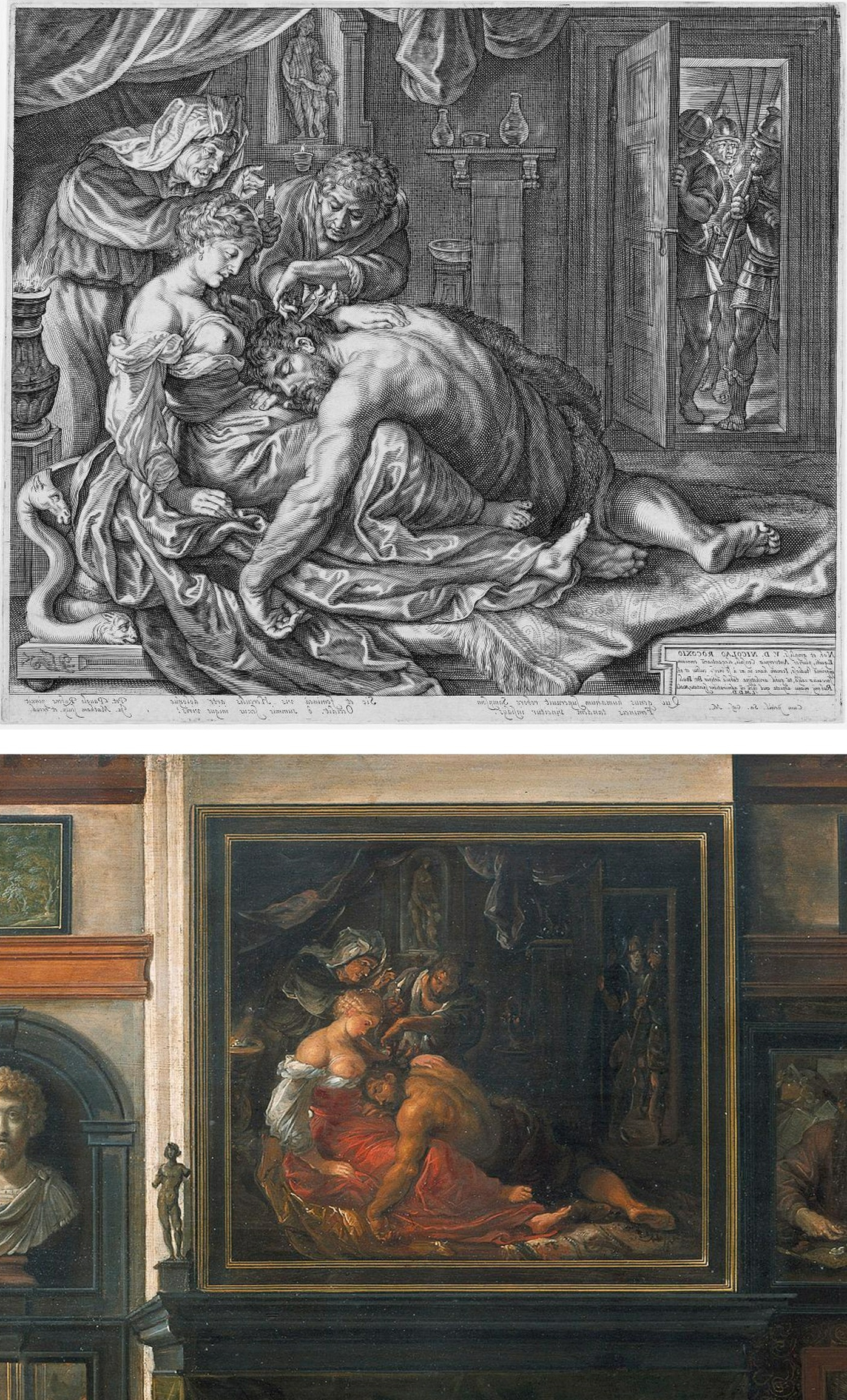
Above, Fig. 4: Two copies of the lost original Rubens Samson and Delilah – Top, Jacob Matham’s c. 1613 engraving (here reversed); bottom, Frans Francken II, a detail of his oil on copper depiction of the Grand Salon in Nicolaas Rockox’s House, made between 1615 and before 1640. Neither copy shows the cropped right foot found on the National Gallery picture. No one has cited a similarly cropped limb in any finished Rubens painting.
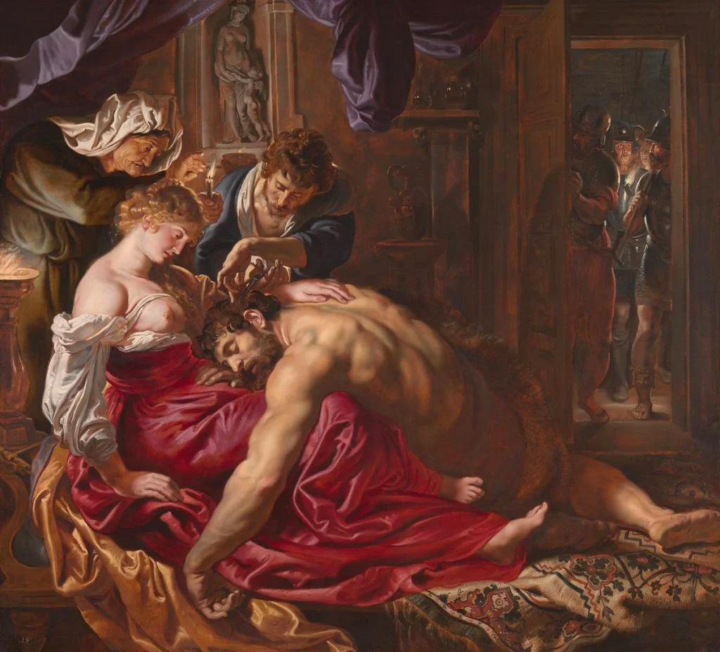
Above, Fig. 5: The National Gallery’s supposed Rubens Samson and Delilah painting.
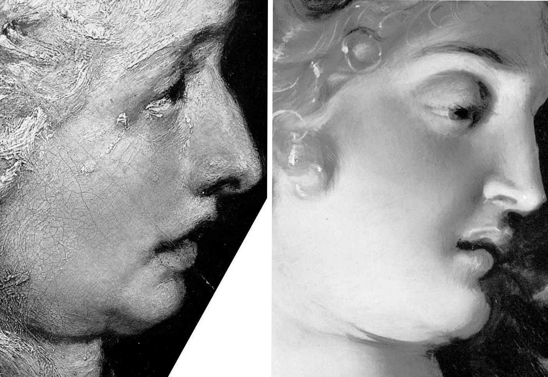
Above, Fig. 6: Left, a detail (from the left wing) of Rubens’ 1609-1610 The Raising of the Cross, Antwerp Cathedral. Right, a detail of the National Gallery’s Samson and Delilah which Christopher Brown (David Jaffe’s predecessor as Senior Curator at the National Gallery) dates at “c.1609” and Jaffé puts “about 1610”. Among the National Gallery picture’s countless visual disqualifications, we would cite: the thinness of the paint; the absence of a 17th century craquelure; the irresolute profile; the cinematic lighting of the head; and, the anatomical and perspectival travestying of Delilah’s nose/mouth/chin configuration.
For many more disqualifying photo-comparisons, see Abigail Buchanan’s “The National Gallery ‘masterpiece’ that’s probably a fake”.
TANGLED DOCUMENTARY WEBS…
Such clinching visual evidence, however, leaves Adam Busiakiewicz unmoved and unpersuaded. He tells the Daily Telegraph that the National Gallery Samson and Delilah could be in no one but Rubens’ hand – viz: “‘It is a really stonking great picture,’ he says. ‘The textures, the sumptuous drapery, the muscular back – no one except Rubens could have painted that.’” Each to his own art critical estimations, perhaps, but what happened to the Samson and Delilah when in the National Gallery’s restoration studios is – or should be – a matter of scrupulously recorded and reported facts. We are now faced by a major art institution that cannot/will not give a proper and credible account of its own actions; that effectively denies, even, the historical record of its own doings. Consider the recorded facts: (1) it is a matter of record that this painting emerged in 1929 as a sound panel and that it remained so in 1977 (when exhibited in Antwerp); (2) it is known that in 1980 the picture was a panel when it was dispatched to London; when it arrived in London; and, when it was sold in London to the National Gallery; (3) it is known that when in London and on exhibition at the National Gallery it remained a panel in 1982 (- see Fig. 7 below). However, it is also known that the following year the National Gallery claimed – after the picture had been restored at the Gallery – that it was not now a panel at all – and, indeed, that it had not been a panel for a very long time and possibly, even, into the 19th century or beyond. This extraordinary denial of the picture’s own documented historical record might seem inexplicable in a major national institution, but it is by no means unprecedented – and nor, for that matter, is the Gallery’s effective outsourcing of its own defence to obligingly helpful scholarly proxies.
Not the least consequence of misleading institutionally-official accounts is the corruption of subsequent scholarship and the making of monkeys out of good faith and technically trusting patrons. In part-defence against widespread and prolonged criticisms of its notoriously over-energetic techno-adventurist restorations, the National Gallery ran a series of didactic, so-called “Making and Meaning” exhibitions. One such in 1996-97 was Rubens’s Landscapes. It was organised jointly by the Gallery’s then senior curator, Christopher Brown, and by its senior restorer, Anthony Reeve. The exhibition was sponsored by Esso UK plc and its chairman and chief executive, K.H. Taylor, expressed pleasure in being associated with “the quality of research and scholarship that are the Gallery’s hallmarks”. In turn, the then National Gallery director, Neil MacGregor, expressed gratitude to Esso for its generosity, for year after year, in enabling the Gallery to “present to the public recent research on how and why the pictures were made”. In a section on the rigorously high standards of professional panel making in 17th century Antwerp it was noted that panels were marked with their makers’ monograms and that the panel back of Rubens’s “Chapeau de Paille” portrait bore Antwerp’s coat of arms and the carved initials of its maker, Michiel Vriendt. However, with the Samson and Delilah no such assurance was offered. Instead, the reader seemingly learns – with a nod to the contrary testimony of Reeve and Bomford/Plesters (see Fig. 7 below) that “A particularly fine panel made for Rubens by an Antwerp panelmaker is that for the Samson and Delilah, painted about 1609 for Nicolaas Rockox…” But then, after a section reprising Reeve’s own 1982 Technical Bulletin account of the risks posed to such fine panels by fluctuations in humidity, comes an abrupt claim that “The Samson and Delilah was planed down to a thickness of about three millimetres and set into [sic] a new blockboard panel before it was acquired by the National Gallery in 1980 and so no trace of a panelmaker’s mark can be found…”
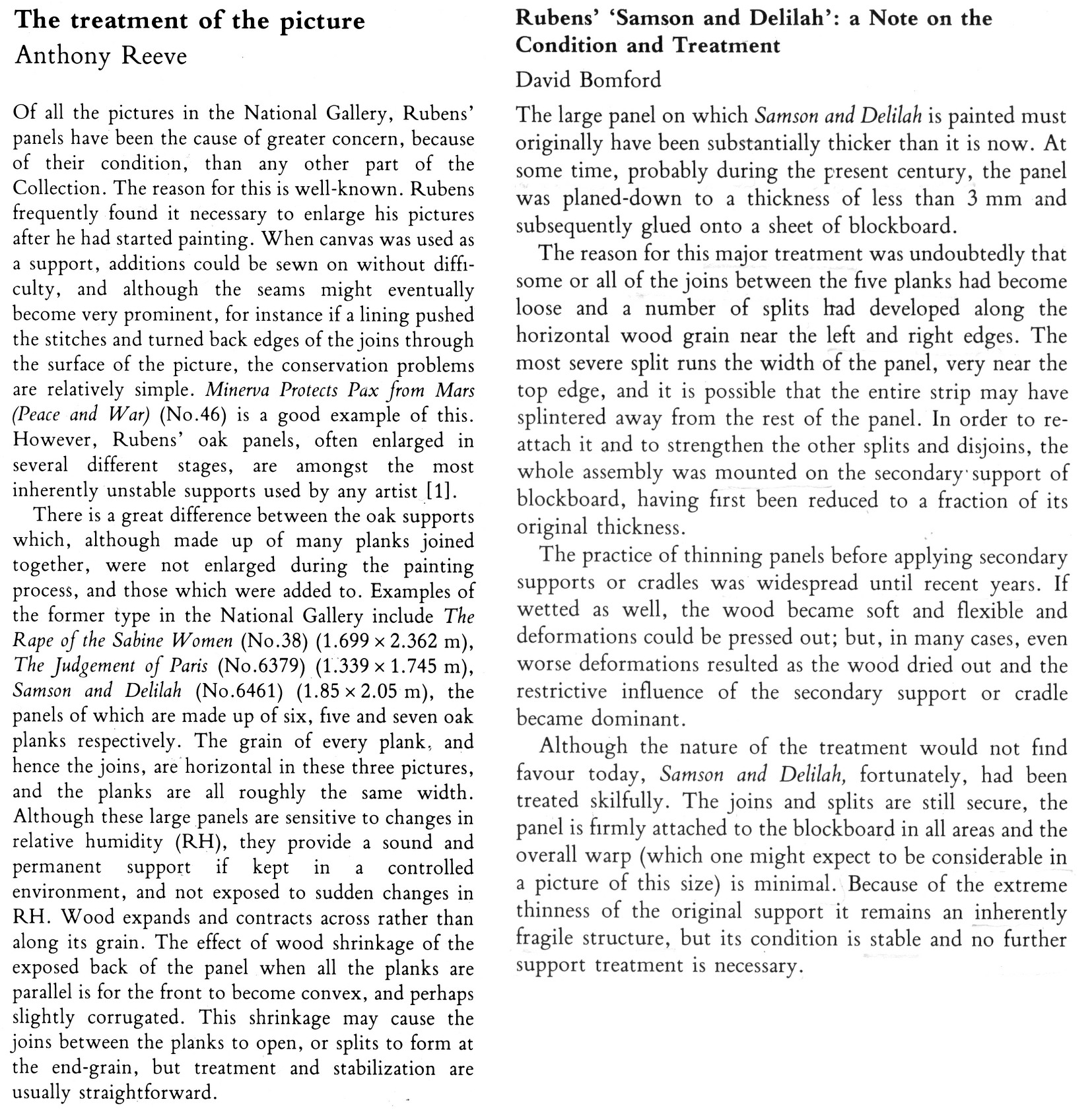
Now, in Fig. 7 above we see two incompatible accounts that were made and published just a year apart in successive National Gallery Technical Bulletins. Which of the contrary pair might be taken by the public and future scholars to be the more reliable and trustworthy record? Reeve’s account had preceded that of Bomford/Plesters – he had seen and reported what he saw and knew. Brown must therefore have found himself in the unenviable position of having to choose between Reeve’s earlier account and the later contrary one of Bomford/Plesters. That is, he had either to accept that the picture came into the Gallery after it had been planed down by some unknown party at an indeterminate date and that Reeve had imagined and chronicled an entirely fictional panel comprised of “six [sic] horizontal oak planks, carefully planed and jointed”, or, recognising that Reeve of all people was unlikely to have confounded a new sheet of blockboard with an early 17th century Flemish oak panel and extol its technical virtues even among Rubens’s panels, or… what? What could Brown say of the Bomford/Plesters account when he was aware that the picture’s own dossiers contained the already widely press-reported and potentially explosive 1992 Doxiadis/Harvey/Hopkinson report precisely challenging the Bomford/Plesters account? Could he go down the middle and say that while the picture had come into the gallery as a panel in good shape – as Reeve had testified – when subsequently taken into restoration, it had been planed down and glued onto (not “into”) a new sheet of blockboard – and do so without offering any explanation for such a radical and inescapably material and historical evidence-erasing procedure? In the event, Brown did neither. Rather, he fudged a technically-incoherent mongrel account even though he and Reeve were the exhibition’s joint authors. That is, on the one hand he spoke of the Samson and Delilah having been a “particularly fine panel made for Rubens by an Antwerp panelmaker” and then, leaving a gaping, mystifying narrative hole in his own account, jumped to “The Samson and Delilah panel was planed down to… etc. etc.” This was a curatorial equivalent of the old comic book cop-out gag “With one bound, Jack was free”. It is not easy to conclude other than that it had seemed institutionally imperative to dissemble rather than clarify.
8 March 2025.
Good buy Duccio?
In Part I* of III, Michael Daley introduces the [$45-50m.] purchase of a panel attributed to the father of the Siennese school of painting (*As published in the November/December 2008 issue of the Jackdaw).
Spending pots of money on works of art is rarely without risk. The Metropolitan Museum’s 2004 decision to pay between $45-$50m (- in a blind “treaty” sale conducted by Christie’s) for the “Stoclet” Duccio Madonna and Child, already seems a source of anxiety. That the acquisition breached the Met’s own “due process” requirements was initially flaunted. It is no more. Our own researches suggest (– as will be discussed in Part II) that the attribution may prove unsound.
Four years after the Met’s Board authorised payment (- after the event ) for this Duccio, the architects of the acquisition, Philippe de Montebello, who is retiring after thirty-one years as Director, and Keith Christiansen, the Museum’s curator of European Painting, now seem to be saying: “The Duccio remains a great acquisition – but it was his responsibility more than mine”.
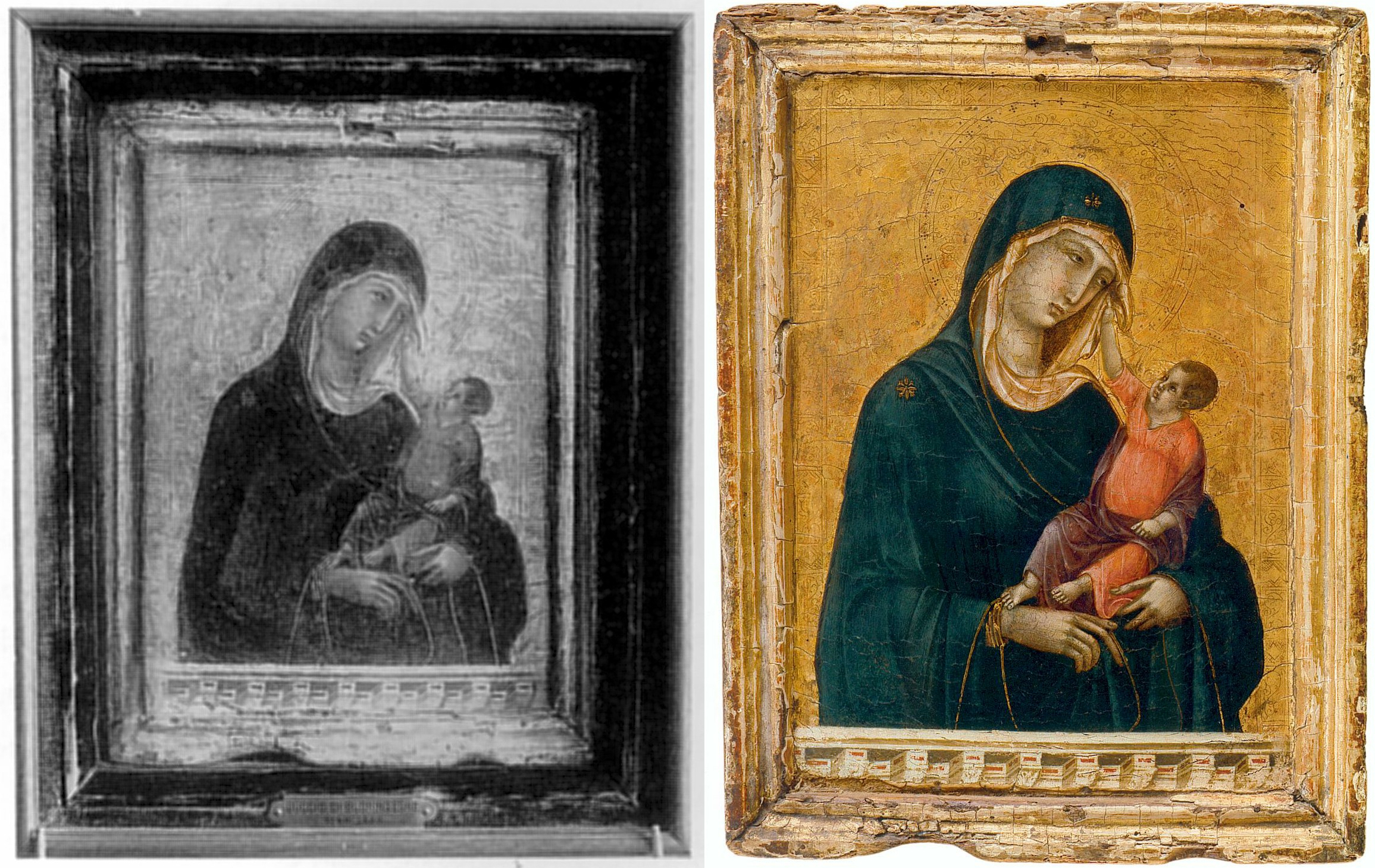
Above, the “Met Duccio” as it appears today (right) and as it appeared in 1904 (left) when it had recently emerged without provenance – that is: it was said to have been bought by a Russian collector from an antiques shop.
Christiansen gave detailed account of his role in Danny Danziger’s 2007 book Museum ~ Behind the scenes at the Metropolitan Museum of Art:
“…Nicholas Hall of Christie’s, with whom I have been friends for many years, phoned me up and said, ‘I would like you to have lunch with me; there is something I’d like to show you.’ During the meal he slipped me a transparency, and I looked at it.
It was a painting that had not been seen by any of the major Duccio specialists for fifty years; it had been in the hands of the Stoclet family and out of circulation. ‘Fantastic, how about the price?’ I asked. He told me. ‘OK,’ I said, ‘I will deal with that later.’ And then we finished our lunch.
…I waited for the director to come back from his vacation. And then I went into his office and said, ‘I am duty bound to show you this,’ and then I showed him the transparency. I casually said to him, ‘You know, Philippe, you deserve this picture. Tom Hoving had his Juan de Pareja [a stunning portrait by Velazquez, bought in 1970 for $5.5m], Rorimer had his Rembrandt [the majestic double portrait Aristotle with a Bust of Homer, bought in 1961 for $2.3m.]; I don’t see why you shouldn’t have this towards the end of your career’…”
De Montebello told Calvin Tomkins in the New Yorker (July 2005):
“I was just smitten by the transparency, as anyone would be, and I decided we had to go and look at this picture… It’s the single most important purchase during my twenty-eight years as director. It’s my Juan Parega, it’s my Aristotle with the bust of Homer… There was not an ounce of doubt in my mind about it… Technically I was not authorized to make an offer. I just took a chance that my trustees would go along.”
Christiansen had lauded this decisiveness in the New York Times on November 10 2004: “When I showed it to him, it took him about 30 seconds to say, ‘We really have to have this.’” But in a prefatory note to the Metropolitan Museum’s Summer 2008 Art Bulletin (which is given over to Christiansen’s: “Duccio and the Origins of Western Painting”), de Montebello now downplays his own role:
“…I wish simply to correct the misleading impression that in making an acquisition of this importance and expense, it was my response to the picture’s quality and art historical significance and my confidence in that response that was the determinative factor… recommending so large an expenditure to our Acquisitions Committee required more than just my response… It required that this response be reinforced by the assurance that comes from the trust I have learned to place in the curators and conservators in this great institution… As I held the picture in my hands, enraptured by its wonderful quality… I was treated all the while to Keith’s impassioned scholarship… it was particularly Keith’s precise and learned assessment of the picture that allowed me to consider the acquisition an imperative.”
In his own Bulletin foreword, Christiansen again admits this was a work known to scholars only by photographs; that it had very recently been withdrawn from a (comparative) exhibition on Duccio and his followers – despite being in the catalogue; that it had never undergone any modern scientific analysis; and, that in the normal course of events, it would have been sent to the Museum for examination and eventual presentation before the Acquisitions Committee, composed of members of the Board of trustees. He then tells how he and the Met’s restorer, Dorothy Mahon, travelled with the Director to Christie’s, London:
“We spent about two hours with the picture before calling the Christie’s representatives back into the room. I imagined that we were now about to embark on drawn-out discussions and negotiations, with intense pressure from other institutions. This assumption proved dead wrong. The Director seized the initiative and stated that he was prepared to make an offer for the painting. I don’t know who was more taken aback, the Christie’s representatives or Dorothy and I… On the return flight I noticed that the Director was bent over a list of what seemed to be various funds that might be applied to the purchase of the picture. ‘You must have worked out the mechanics for this even before we left to examine the picture,’ I observed. ‘Oh yes, this trip was to confirm that the picture was as extraordinary as it already seemed to me, and if it was, I had determined we were going to get it.’ Trustees still needed to be consulted and further funds identified, and weeks were to pass before a final deed of sale was signed. But the key step had been taken…”
Indeed it had.
Coming next in Part II: “BUYER BEWARE”
Why Greece Does Not Need the Elgin Marbles

An (unpublished) paper by Michael Daley, Director, ArtWatch UK, that was delivered at the Economist’s Athens Conference, 12 March 2003:
Lots of reasons have been put forward in support of the campaign to remove the so-called Elgin Marbles from the British Museum. Individually, these justifications rarely withstand scrutiny, but cumulatively, their repetition has left many in Britain with the impression that under all the smoke there must be both a fire and a wrong in need of righting.
I wish to suggest today that, to the contrary, there are good reasons for contending that the restitution campaign is itself wrongheaded, unjust and culturally dangerous.
The original removal of the sculptures from the Parthenon and the ground and the walls of the Acropolis by Lord Elgin has been presented as theft when the British Museum’s legal title is today accepted by all parties to the dispute. The removal has long been caricatured as vandalism and desecration when, demonstrably, it constituted an act of rescue and celebration. This fact, too, has now largely been accepted.
Faced with the legitimacy of the British Museum’s ownership, the would-be “restitutionists” have appealed above the rule of law to the forces of sentiment – and forces, often, of distinctly nationalistic sentiment. “These sculptures mean so much more to us than they ever could to you” it is said. And even more disconcertingly:
“Without these sculptures we are not complete as a nation, they comprise our very soul.”
It would be hard for anyone to resist such morally coercive appeals – and the British are constitutionally inclined to want to “do the right thing” but, as it happens, resistance is no longer necessary: Greek scholars have testified that although the Parthenon indeed was, for members of late 19th century Greek society, a sacred symbol of the nation, the rise in the 20th century of tourism and economic modernisation has “taken them out of their role as symbols and gradually turned them into social goods”.
Confirmation of this transition appeared with a recent announcement that Greece plans to replace low-spending tourists with high spending ones by “showcasing Greek cultural traditions”.
With the decline of appeals to nationalistic sentiments, the claims of an Urgent Aesthetic Imperative have been advanced. “It is a crime against art”, the argument goes, “not to allow the component parts of a glorious entity to be seen whole.”
The cult of the dismembered-whole-in-need-of-reintegration was launched in 1945 by Thomas Bodkin with his seminal book Dismembered Masterpieces – A plea for reconstruction by International Action. It certainly is sad when artistic ensembles are scattered by history but in the case of the Parthenon sculptures it is worth recalling Bodkin’s comments on them:
“It is abundantly clear that the statues from the pediments, the portions of the frieze and the metopes now in England should never be re-integrated on their original sites. Those few sculptures which Lord Elgin did not remove have in the intervening one hundred and forty-two years been allowed to deteriorate into utter wreckage, corroded by wind and rain and the fumes ascending from the factories of Piraeus”.
Bodkin of course did not know of the notorious Athenian pollution that would be in train from the 1960s. Greek scholars have testified to the devastating consequences for the Acropolis monuments of that further, later pollution.
In the view of many here and abroad, Greece’s own past neglect and mishandling of the Parthenon and its remaining sculptures constitutes one of the greatest 20th century art conservation tragedies. To those of us who are professionally dedicated to the survival and welfare of art, the vocal opposition of Greece’s own scholars and art lovers to today’s Government-led scramble for development is certainly heartening but it does also confirm that vital lessons have not yet been learnt. These developments compel the observation that a nation that is showing indifference to its own patrimony and is cavalier with even its most precious historical sites, does not need to take on more heritage responsibilities. To those who might feel such a judgement harsh, we cite a single plea. It came recently from the island of Paros.
“…We are therefore obliged to ask for the support of the international academic community, suggesting that our overseas friends mail letters of protest to the Greek Minister of Culture, underlining their concern about the deliberate destruction of monuments on Paros. How is it possible to demand the return of the Parthenon marbles, while allowing the ruthless destruction of other ancient temples by unqualified employees?”
In the face of this actual, ongoing destruction, British restitutionists and museum personnel have taken to fretting about a need for “context”. What context? Reuniting the Elgin sculptures with the decaying Parthenon building is now, as Bodkin could already see, impossible. The new sculptural ensemble being mooted for Athens is that of a wholly severed – and, in fact, distinctly out of context collection. That is, it would be indoors, not out. It would be off Acropolis, not on. Even if every museum presently holding Acropolis sculptures were to return their works, the new “entity” would still remain incomplete because of early losses.
More embarrassingly, if all the surviving sculptures were to be returned to Athens tomorrow, they could not be joined by Greece’s own west frieze sculptures, which were removed from the Parthenon ten years ago and still await a decision on possible conservation treatments to stabilise their pollution-damaged surfaces. Were this problem to be resolved, it would still be necessary, before any assembling of the survivors could take place, for the sculptures that presently remain united with the Parthenon, to be “dis-united” from it, as if in emulation of Lord Elgin’s long condemned original actions.
In truth, of course, the Parthenon sculptures can never be “shown in context” because their original context is so long gone. It might now be imagined but it can never be replicated. We do know, however, that the sculptures originally survived as symbolic adornments to a temple standing on a reinforced hill and not in a modernist museum, to be built on stilts, on an important archaeological site in an earthquake zone and in the teeth of opposition from national and international scholars. Far from there being plans to recreate the original on-Acropolis context, there are even plans to remove, what one leading restitutionist terms, “the litter of unclassified stones” from the Acropolis in order to make more footpaths for more tourists. This is a particularly alarming prospect if Professor Snodgrass’s claim that eighty per cent of the Parthenon building is believed to be still present, is correct. There is, however, something much more important at stake in this dispute than the preservation and the right displaying of historical artefacts.
As mentioned earlier, the present hectoring demand that sculptures be moved from one museum to another is unedifying and dangerous. For one thing it constitutes nothing less than a government-led assault on the very idea of the internationally comparative museum. Greece – of all countries – does not need to be party to such a regressive manoeuvre.
It jeopardises international scholarly cooperation. It gives encouragement to those members of the museum sector in Britain who seem only too eager to shed as much as possible of what they see as so much colonial loot. I do recognise that members of the Greek Government have shown themselves to be aware of some of these dangers and that they themselves insist that the Elgin Marbles are the only sculptures for which demands will pressed. But what politician was ever able to bind his successors? Who today could guarantee that the removal of the Elgin sculptures from the British Museum would not instantly and forever thereafter be taken as a precedent for copycat campaigns in Greece and elsewhere?
For this artist, what is most saddening about the present campaign is that by trading the universal for the local, it conspires against a proper recognition of the true nature and full extent of Greece’s patrimony. There is a lot of wonderful art in the world but the truth that is being lost in this squabble over particular material objects is that Greek classical art is like no other art – it has done what no other art has ever done: millennia after its birth, it has emerged from death and neglect to seize the imaginations and enlist the passions of other people in other places. Greek classicism has even vanquished, later, better-preserved classical offspring. It has done so not by conquest or politicking but solely on merit; by example; on the unrivalled authority of its inventions. It is unfashionable to say so, but these inventions stand uniquely transcendent and enduring, outside of time, original context and regardless of geography and ethnicity, as artistic paradigms and exemplars.
Even within the antique world, Plutarch had marvelled that the sculptures of Pericles’ time, far from dating, retained a time-defying freshness and newness – as masterpieces. In the 19th century Karl Marx was stymied by the sheer force of Greek Art – to which, as a scholar at the British Museum’s reading room, he was regularly exposed. Marx’s grand meta-system was to be elegance itself: the so-called cultural superstructures of societies stand on, and are determined by, their economic bases; by their technical means of production. The more advanced the means of production, the more advanced the cultural manifestations. Primitive, economically backward societies, he planned to demonstrate, produce primitive backward art. Classical Greek art, however, blew this premise. How could it be, Marx was forced to ask himself, that an ancient art should not only continue to afford us with pleasure but should persist beyond its own time as both a standard and an unobtainable goal? The best explanation he could offer was that Greek art remained eternally charming because it represents the “the historical childhood of humanity, where it had obtained its most beautiful development.” This condescension will not do.
Greek forms have gripped modern minds, in world superpowers like Britain and the United States, not by their charm but by their potency, and their living relevance. Colonialism exposed modern Europeans to the charms of very many competing aesthetic value systems, but the power of Greece’s artefacts has remained uniquely awesome and persuasive – wherever they have come to rest.
The Greek temple, for example, stands perennially iconic as motif. It remains unequalled for its combined lucidity of construction and elegance of articulation. Which is why, for example, it remains incorporated into the fabric of Britain’s premier motorcar, the Rolls Royce – and with a winged victory as mascot on its bonnet. The Greek temple – and not, say, the pagoda – is as deeply entrenched in the modern unconscious as any Jungian archetype. Simultaneously, it confers dignity and reassurance to banking and stands guardian to free speech and debate in our modern universities and seats of government. In London, next to the historic Tower of London, a temple provides home to the names of British merchant seamen who perished in the Atlantic and Mediterranean at the hands of German U-boats and bombers.
Given the chance, Greek sculpture is seen to stand supreme in all company, in whichever museum – the bigger the museum, the greater the victory. The grandly ambitious international museum is now coming under fire politically, but it has been both an expression of and an agent for the modern renaissance of Greek antiquity. It is barely half a century since an historian like Hans Tietze could describe the artistic individuality of great museums as themselves “spiritual entities, and not merely as fortuitous accumulations of art treasures.”
Under today’s rules of correct, multi-cultural, discourse, museums like the British Museum may no longer say that ancient Greek art stands as the world’s best, as the most attractive and most humanly affirmative. But nowhere is this trait more apparent than in Bloomsbury in London, in the British Museum. By Insisting on seeing international, multi-cultural museums as repositories of loot; by fetishising original architectural/social contexts and localities; and by fostering nationalistic sentiment, we risk losing sight of a fundamental artistic truth: the sheer stand-alone transcendent quality of Greek sculpture. Pericles was given to inviting his dinner guests to see the Parthenon sculptures as they were being carved. Everyone who passes through London today can dine for free at Pericles’ table in a splendid purpose-built neo-classical hall – and certainly not in a cellar or basement as British restitutionists too often allege. It would be a tragedy if these supreme ambassadors for the finest art of sculpture were to be wrenched out of the great world forum of cultural voices that the British Museum comprises and in which they excel. Greece truly does not need to be party to such a brutal, disruptive act. Greece thrives, looks her very best in such elevated and various company. She lives. She needs nothing. Her primacy is absolute and unassailable. Well should be left alone.

Above, Michael Daley, Director ArtWatch UK, at the Acropolis, Athens, 2003.
CODA
The Economist conference – and the campaigning contribution made by Lord (David) Owen – was reviewed in the Greek newspaper eKathimerini – as is today’s meeting of Prime Ministers Keir Starmer and Kyriakos Mitsotakis in London.
In August 1998 a correspondent in the Sunday Times’ books section wrote (under the heading “All Greek”):
“A more positive and generous list of the achievements of the ancient Greeks than Frederick Raphael’s more grudging one is given by the scholar F L Lucas: ‘Within seven centuries this race invented for itself epic, elergy, lyric, tragedy, comedy, opera, pastoral epigram, novel, democratic government, political and economic science, history, geography, philosophy, physics and biology; and made revolutionary advances in architecture, sculpture, painting, music, oratory, mathematics, astronomy, medicine, anatomy, engineering, law and war… a stupendous feat for a race… whose most brilliant state, Attica, was the size of Hertfordshire, with a free population (including children) of perhaps 160,000′!”
In February 2000 we wrote (in “Pheidias Albion”, Art Review):
And let no one believe that foreigners alone reject Greek demands or condemn Greek practices. A few years ago, The Times carried this plea from Mrs Magdala Delfas:
“When in 1967 I left Greece under the colonels’ rule, my visits to the British Museum brought me solace. I was able to keep in touch with my cultural heritage outside the geographical and political confines of Greece.
“Later, I discovered to my delight and amazement that apart from the perfect display of the Elgin Marbles in their special gallery, they are kept in a country where the study of Ancient Greece is kept alive, where Greek plays are performed either in the original or in English, and in the most erudite and scholarly fashion, like the Theban plays by the Royal Shakespeare Company in Stratford last season and in London this year.
“Schoolchildren, among them my own son, have the privilege and joy of reciting verse and studying Homer in the original. By contrast in Greece, the study of ancient Greek in schools has been stopped. The impoverished language of today has been cut off from its natural roots.
“Visitors to museums (including that on the Acropolis) are frustrated by restricted opening times and high admission charges. Moreover, a new gallery close to the Parthenon to house the marbles would violate the Acropolis.
“The advocates of the demand for the return of the Elgin marbles, which stems from empty nationalist zeal and socialist politics, should direct their zeal and support towards Cyprus. The marbles must remain where they are, in a country which cherishes the classical tradition.”
3 December 2024
Joshua Charow unveils the remaining spaces that helped foster New York City’s epicentral art world reputation

Scott Mason September 7, 2024
(All photography in this article courtesy of Joshua Charow.)
Joshua Charow used to jump from roof to roof to photograph New York City street scenes but it wasn’t until he stumbled into the protected habitats of NYC artists that he discovered a world of overlooked beauty. What began as a curiosity quickly developed into an obsession that has spanned three years and which has led to a photography book, Loft Law: The Last of New York City’s Original Artist Lofts (pub: Damiani Books) and a series of short documentaries that can be found on his instagram @joshuacharow.
Joshua Charow in Anne Mason’s Little Italy loft space. Murals by Frank Mason (1921-2009): Crucifixion (left) and Gloria in Excelsis Deo (right). Photo: Josh Curley.
Loft Law: The Last of New York City’s Original Artist Lofts is a tribute to the once affordable, now highly coveted, spaces in some of the city’s most desirable neighborhoods. Spacious live / work environments that would have surely been swept up in the money fever of urban development if not for a small group of activists with legal chutzpah. As one protected Loft Law tenant, turned legal expert, puts it, “People who are protected by the Loft Law belong in New York City, and they’re the real heart and soul of the city.”
In the ArtWatch interview, which took place over Zoom, Charow recounts his great joy listening to the stories of tried-and-true Gotham artists while explaining the legal actions required to protect these magical places.
Scott: As a photographer and a journalist what immediately struck you when you started to enter these unique loft spaces?
Joshua: The very first one that I got to photograph was Carmen Cicero, who at the time when I met him, was 94 and he was living on the top floor of a loft on the Bowery and he had these huge 6- to 8-foot-long paintings, and he had super tall tin ceilings and painted white wooden floors where the paint splattered. You could tell he had been living there for decades and it was better than the movies. His stories were incredible.
Carmen Cicero in his fifth-floor walkup loft on the Bowery.
He was in the first show at Frank Lloyd Wright’s Guggenheim, and I was immediately captured by his personality, his space, and the world that he created in his studio. And so, it just broke all these misconceptions I had of what’s possible in New York today. And while it’s true these people have been grandfathered in, it became a mission of mine to capture the spaces and the artists while they’re still part of the city, because getting to meet and spend time with all these people has truly been one of the best adventures and honors and joys of my life. I do really, really think that it’s an important thing for the city to have and it terrifies me that decades from now, there’s going to be very, very few of these spaces left.
Scott: You’re capturing the setting sun of these people’s prolific careers and lives. The stories that they tell are much different from those from emerging artists. Yet you yourself are an emerging artist.
Carolyn Oberst and Jeff Way in their Tribeca loft.
Joshua: A lot of artists when I first came into their lofts and photographed them said, I don’t think anyone will care about this. I don’t understand why you’re interested in these spaces or us. To me, I was baffled because this was the most interesting thing I’d ever come across. And I would imagine part of that is this intergenerational crossover in that Carolyn Oberst and Jeff Way, who are two fantastic painters who lived in Tribeca since 1975, they said this is just what everyone did in the 70s. Everyone had lofts like this. This isn’t anything unique. But, you know, when I moved to New York eight years ago, in my generation, no, I don’t know a single person who lives in a space like this or makes paintings like they do. So, I think the fact that we’re coming from different generations is what allowed this interest to bubble up in me.
Bob Petrucci, legal activist working in his midtown Manhattan loft.
Scott: Legal activist and loft law resident, Bob Petrucci, pointed out, “People who are protected by the Loft Law belong in New York City, and they’re the real heart and soul of the city.” What do you think he meant by that?
Joshua: The way someone described this to me that I absolutely love is if you’re visiting New York and you go sit down at a bar, who is the person that you want to meet next to you? And to me, it’s Carmen Cicero, it’s Anne Mason. It’s someone who has been deeply embedded in the cultural life of New York City for their entire life, who has these incredible stories and experiences and makes art and lives in an old factory. I mean, this is so fantastical, and it’s hard for me to even explain what makes it interesting because everything about it is interesting. I feel like my own life has been enriched and my perspective has widened from meeting all these artists, and I can only imagine how much of an effect they’ve had on the greater city as a whole, if they’ve made such an impact on just one person, me. All these people have such wide impact on the people they come across in their life in New York and they should be here. They are the lifeblood of the city.
Scott: Jennifer Charles, to quote another passage in your book, said “We’re an endangered breed, being an artist in New York.” Why was this project important to you as both an artist and, can we call you a preservationist in a way?
Joshua: I want to create and capture something that might not be around in ten years or 20 years or 30 years. That’s really a thread that runs through all of the films and photographs that I make. And so, will there always be artists in New York? I hope so. I believe so, I think it looks different if you’re a young artist moving to New York now. You probably have a lot of roommates and a very small room. And maybe you make your art on your computer…
Jennifer Charles in her Greenpoint loft, “We’re an endangered breed, being an artist in New York.”
…But this culture is what New York became famous for in the art world. This New York was the epicenter of the art world in the 60s and 70s. I wanted to capture it before it’s gone. I photographed multiple people who left, but yours was the only one that I saw empty compared to when I saw it filled with art. And you just see the life get sucked out of it. And unfortunately, that will be the fate for many of these other spaces I photographed.
Mason studio in Lower Manhattan with plaster cast copies of Greek sculptures before and after moving out.
Scott: What was perhaps the most valuable lesson you learned from meeting with all these dedicated and passionate artists?
Joshua: Getting to speak to an artist in their 90s you learn about the ebbs and flows of being an artist throughout your life and the good periods and the bad periods. And it’s made me have a bit more patience and have more perspective and take a longer look at how I want to approach what I create over my life.
Scott: Robert Frost said, “If you’re looking for something to be brave about, consider the fine arts”, which speaks volumes about how difficult it can be to succeed as an artist. And many of the artists you interview mentioned this in various ways. What keeps the artists so disciplined to try to maintain and preserve these types of spaces?
Chuck Delaney, founding member of the Lower Manhattan Loft Tenants.
Joshua: I asked Chuck Delaney about this, who was one of the founders of the Lower Manhattan loft tenants. I asked him why the majority are artists in these spaces, because what I found interesting was that the Loft Law, which protected most of the artists in the book, did not say you had to be an artist to qualify. All you had to do was be illegally living in one of these commercial and manufacturing zoned spaces. So, I think back in the 60s and 70s, right, these were completely raw spaces. For the people who were moving in for the first time after manufacturing had left, they didn’t have kitchens, they didn’t have showers. And so it took someone who was willing to rent a raw space who might have been crafty enough to install their own plumbing and electric. Someone who would want a huge space with tall ceilings, who would need big windows. And back in the 60s and 70s art was so big. So, just because of the nature of these spaces and because there were no manufacturing tenants on the horizon, artists seemed to be the biggest population that would actually want to pay money for these spaces. But to do this style of living, you needed a reason for it in your life and it seems like the only people that really had the reason were artists.
Scott: How has this mindset changed in our modern day in terms of spaces and how we use them?
Joshua: To me now, getting a space, especially in New York, is just whatever you can get for the best price you can get it for. And it’s a battle and it wasn’t always like that, right.
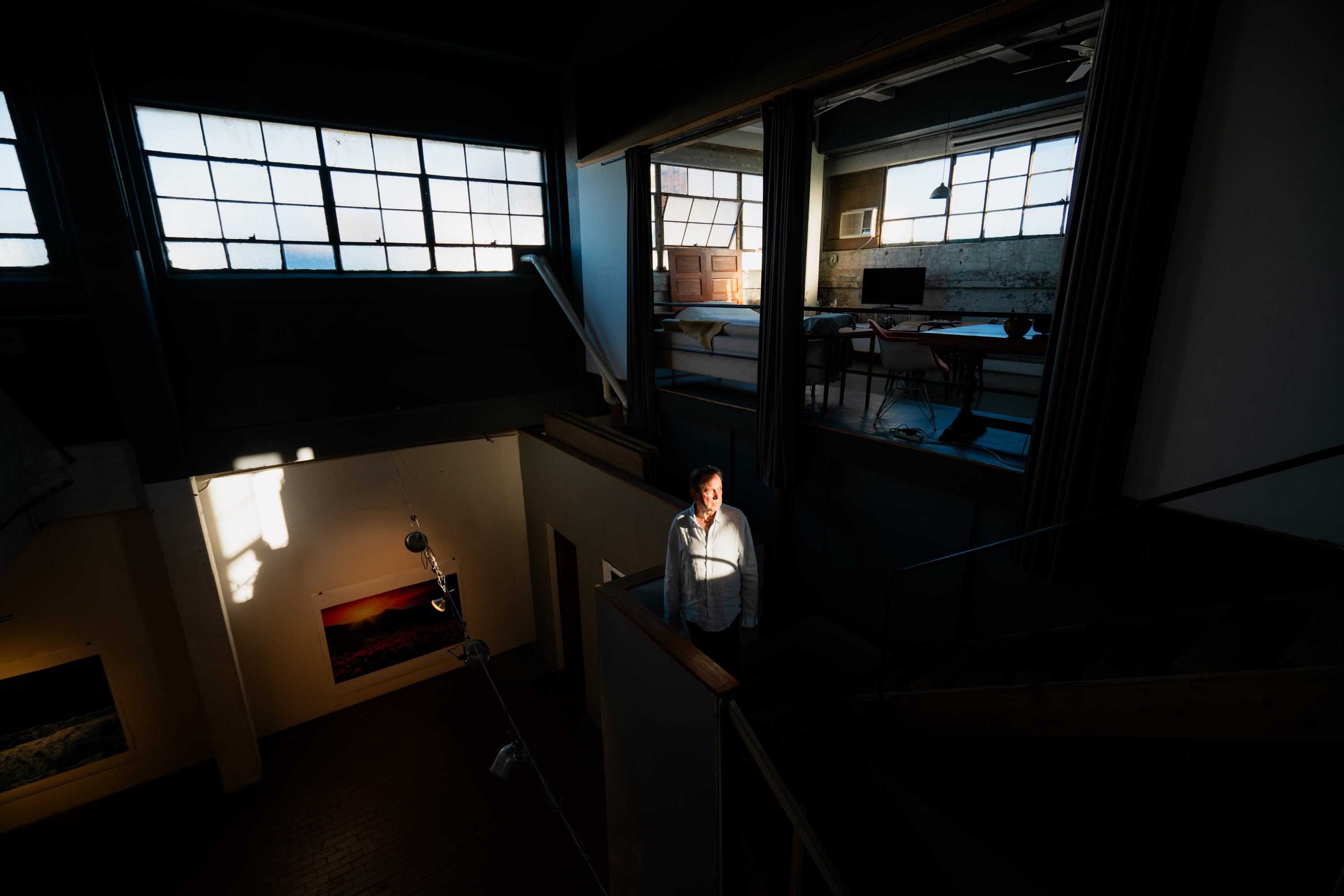
Curtis Mitchell in his Dumbo, Brooklyn loft space which was previously an ice cream factory.
There was one artist I spoke to who lives in Dumbo in an ice cream factory, and he said that, “I had complete freedom of whatever I wanted. And I spent a year looking, and I didn’t choose until I came here because this was perfect. I had never seen windows like this. This is exactly what I needed for myself.”
And so, these spaces really do have magical qualities, right? The ice cream factory has 36-foot ceilings, which is higher than I’ve ever seen in a residential space. Frank (Mason’s) studio had the north facing skylight, which gave you that beautiful soft light. And the raindrops were hitting it when I first came up.
I think as an artist, there are these dreams that you have of the conversation you can have between your work and your space, whether that’s from the windows, whether it’s from the high ceilings, the wood floors. And many artists that I interviewed do feel like they’ve built a relationship with these details in their lofts and studios. I wish we could have that now, but it’s just unless you’re rich, very, very rich, it’s not possible. Or unless you’re grandfathered in.
Scott: Is this the last generation of loft law protection for artists’ spaces?
Joshua: My conversations with the lawyers, they thought that there’s probably not going to be another ‘window of coverage’ and that’s what they call it. The first one was 1981 to 1982, and the last one was 2015 to 2016 to say, this is the year that I was living illegally in a commercially zoned space, the landlord knew about it, and there were three or more lofts in the building doing the same thing. Those are the qualifications that you needed, and you need those window periods in order to get coverage. And there’s likely to not be another window period. That’s mostly because the loft laws are reactionary law, and this phenomenon has stopped. All of this space has become so valuable that it’s either been bought up by developers and brought to residential code the legal way, and turned into luxury lofts, very expensive luxury lofts. Or they found commercial tenants and the buildings have just gone back to their original purpose.
So, the reason why it probably won’t extend is because landlords are no longer illegally renting manufacturing space to tenants to live in. That phenomenon has just stopped due to this increased demand in luxury lofts and in commercial spaces again.
I don’t think there is a future for newcomers, but there are buildings that are applying retroactively for the loft law right now. There are people in Brooklyn and the Bronx who do meet the standards but are currently going through the process of getting coverage during these last window periods so they can stay, and it will continue to protect the people who gain coverage under it, which I think is a great thing. And it can also be passed down to a child or a spouse. So hopefully it continues as long as possible.
Scott: ArtWatch’s mission is to act as a watchdog organization in the arena of cultural policy, protecting works of art and public interest from vested, private, and institutional interests. Is there anything through your Loft Law project that you believe aligns with this mission of ArtWatch and how there’ve been a group of people who are trying to protect these living, working spaces that are artwork in their own right?
Joshua: It was the result of a small group of very dedicated, very hard-working individuals in the late 1970s and early 1980s who made this possible. These people really dedicated their lives for a few years to passing this legislation, which then helped thousands of other artists. It’s really surreal talking to them because my project would not exist without them. A lot of the artwork that I got to photograph would probably not exist without them, because if these artists weren’t able to stay in their spaces with 14-foot ceilings, then the huge paintings also wouldn’t have been created and this part of the city might be gone.
Scott: How important was it that these activists were able to preserve these spaces to the point where they exist today?
Joshua: This is probably one of the best policies New York has ever passed for protecting artists. And there’s nothing in it that says you have to be an artist so it’s quite unique in that it protected and kept thousands of artists in New York City over decades, almost by accident on the city’s part – not on the loft tenants. They knew what they were doing, but I think it’s sort of a beautiful thing that happened. People have come into the gallery and told me that, “my city used to have so many of these spaces, and there was just nothing protecting them. And because of that, they’re gone now.” So, I think it’s great that New York passed this law that did help so many people. It still does.
Scott: What makes these previously ordinary spaces worth documenting is something I’m interested in and how that perspective has changed over time, and how space is so coveted now that everybody’s living in shoeboxes. What makes these spaces beautiful now compared to when they were considered undesirable, when they were industrial spaces?
Joshua: The most important reason why these spaces are beautiful or interesting and unique is because of the artists that have lived in them. If Frank didn’t live in that loft, there would not be an enormous, slanted skylight above the space. There would not be a 12-foot mural underneath the skylight glowing from that light. Honestly, I’ve spoken about Frank’s loft because I got to see what it looked like when there was art in it, and I got to see what it looked like after there wasn’t.
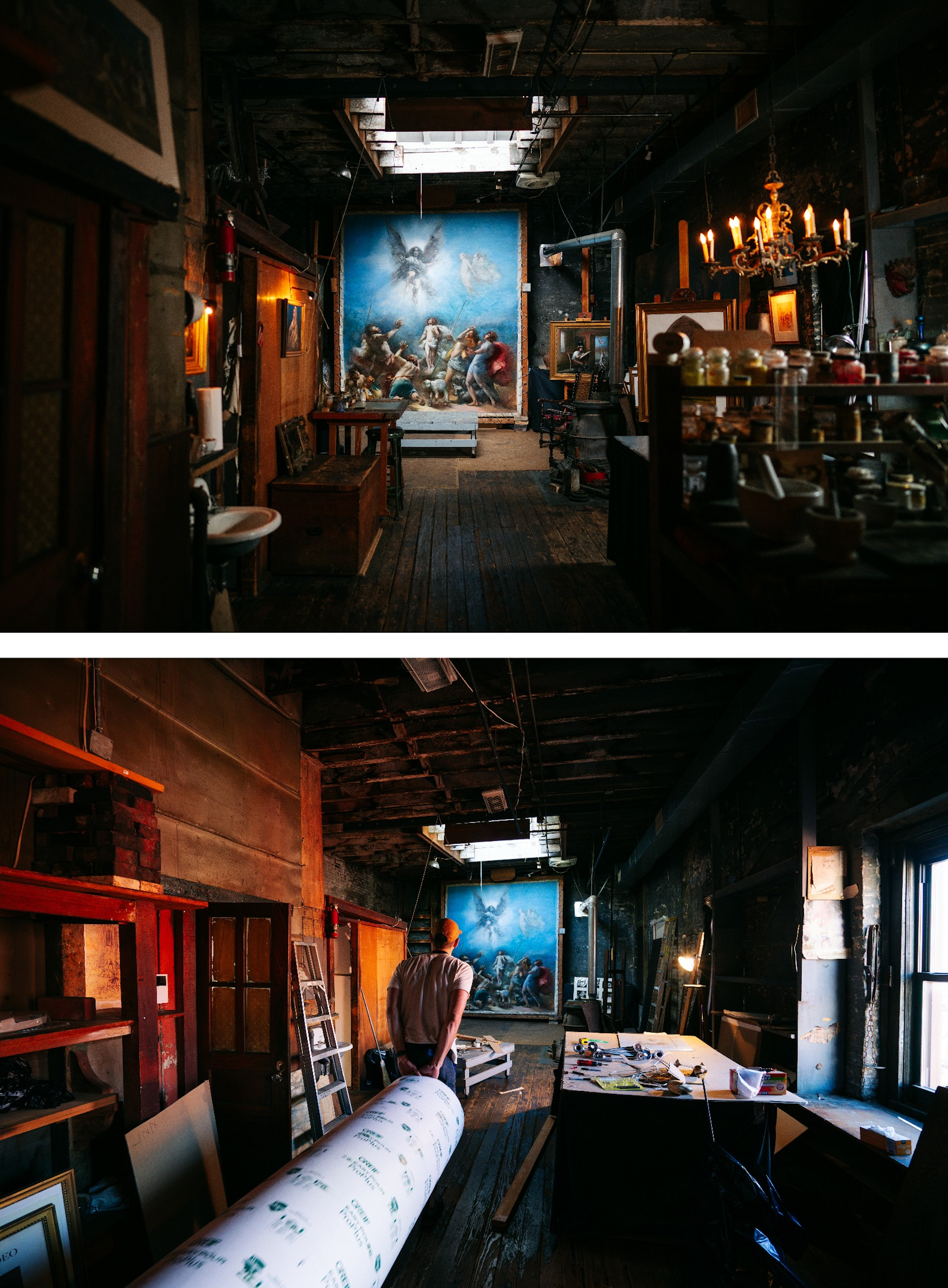
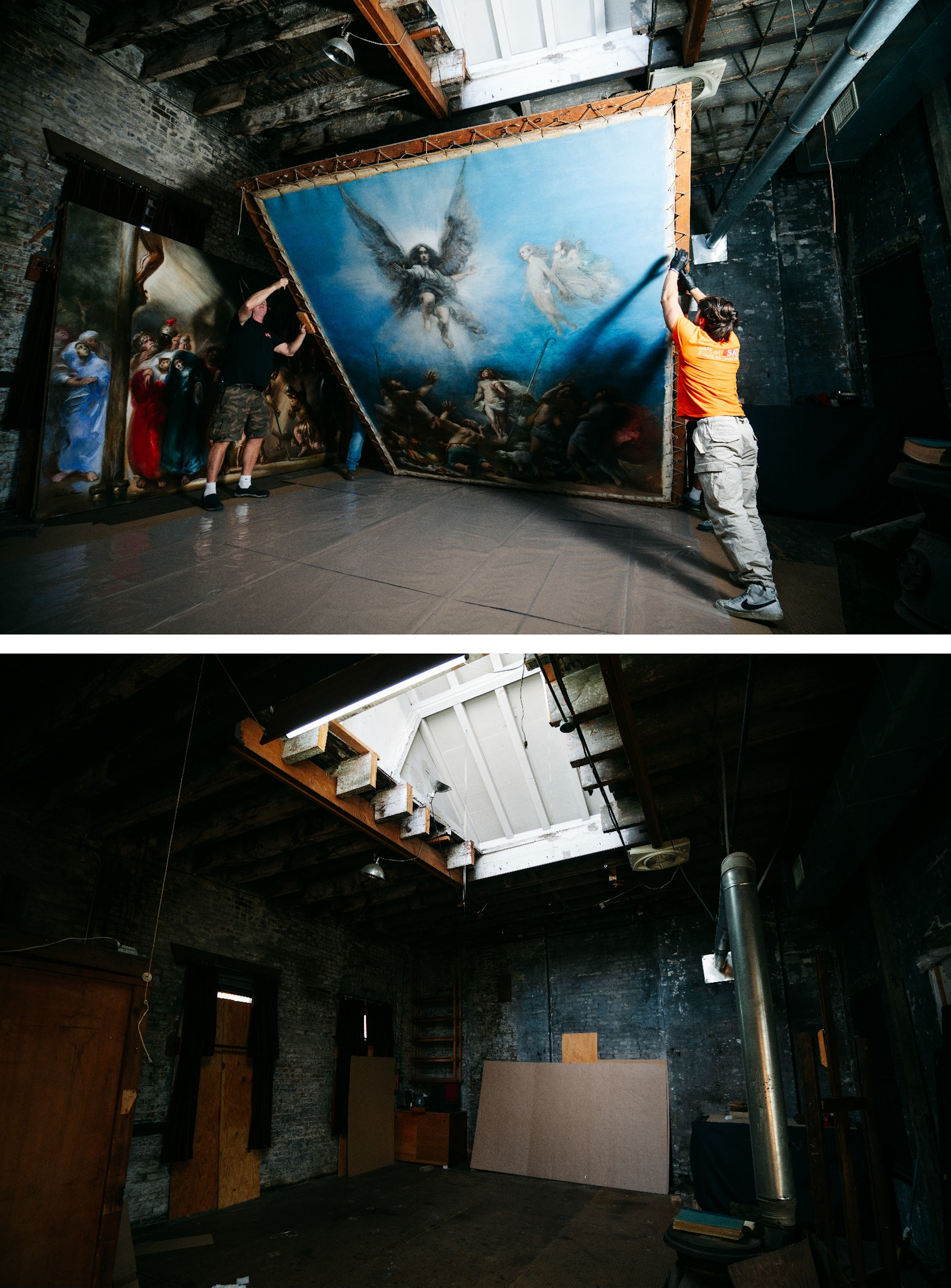
Frank Mason’s mural Gloria in Excelsis Deo removed from the Little Italy art studio where it was painted in 1973.
While there is still beauty in these architectural details – like, one of the interesting parts about the project is that whatever year you moved in, the architecture has been preserved from that time, unless you renovated it yourself, right? The landlord has no reason to go in and replace the floors or the ceiling. So, you do get to see the original state of a lot of these buildings. You get the original wooden floors, you get the original patchwork tin ceiling and the columns, the brick walls, which is very interesting. But without the modifications, without the art, without the configurations of the spaces that the artists have created, the magic is gone. The life is gone. It’s interesting seeing architecture, but without the artists, there’s no book. This project doesn’t exist. I like to really push that, you know. There are still some spaces like this that have been converted into luxury lofts, and you still get those architectural details, but they’re so much less interesting.
A unique thing about the Loft Law was that every tenant that I photographed was a renter. So any modification or change they made was not to increase the value of their apartment or their studio. Any modification they made was just to optimize their own life, optimize the way they create their artwork. And so because of that, you get all these incredible modifications, like a skylight that someone cut out of a ceiling
Jeff Way had rented the building after it was in a fire, and he left one of the burnt walls. He juxtaposes his vibrant, colourful masks against a burnt out wall that was from the 1970s when he moved in. And so, because there’s no financial incentive here to bring things into the modern world, you get all these funky, unique, beautiful ideas in the spaces that are very interesting.
Scott: What I loved about coming up to Frank’s studio for the first time when I moved to New York to start studying with him, was that there’s so much artwork that was his own. Whereas, say, someone has one of these beautiful Soho loft spaces and you see Ikea furniture, vases, and it’s just an assembly of everything that might represent their tastes and what they like, but doesn’t necessarily reflect their personal lives or creativity through decades of living in that same space. That’s something very powerful about your book. You capture it very well. Showing these people living in these kinds of capsules that represent themselves through their creative endeavors. And my hat’s off to you for being able to show that in such a very rich, vibrant, creative way, which leads me to my last question. When you first started on this path, doing this project, did you anticipate that your book and the ancillary short documentaries – are you surprised about the type of attention that they’ve garnered?
Joshua: Before I answer this, the last thing you said about artists and having their own work on the wall… I loved at the end of the documentary (A Light in the Dark: The Art and Life of Frank Mason), I got emotional hearing that Frank and Anne were like a living work of art. Beyond his paintings, it’s like their life became a work of art. And that is how I feel going into these spaces. I would imagine you feel the same way that Frank’s loft became a part of his story, and a part of who he is as an artist in such a deep way. When you spend decades there and your walls are covered in what you’ve created, it’s like it’s a reflection of yourself. It’s like a mirror of these lofts. That part was so beautiful in the film.
Scott: Thanks.
Joshua: Okay, I thought this was the most interesting thing in the universe while I was doing it for years. I was shocked that no one had done a project like it because of how amazing these spaces and these artists and these stories were. So, I’m not entirely shocked that others agree, but I am definitely shocked at how many people agree. You can never predict how people will react to something you put your time into and I’m happy that people are connecting with these stories and these spaces. And, you know, it speaks to the power of the artists and the work they create and the lives they’ve lived. I’m always a person who’s valued storytelling over aesthetics. I really tried to make this project about telling the stories and about the humans behind these spaces. I think that’s what’s cutting through and connecting with people.
I’ve spent a lot of time thinking about the reasons why people have connected with this and it’s all guesswork. But there are a few reasons that I can think of. I think for younger generations, like myself, this part of New York City has gained this mythical status and it feels like a fantasy. It feels like it’s something you never knew about. Something you’ve always maybe wondered but didn’t know was still all around you. So, in that way, I think it’s appealing to younger generations.
To a lot of older generations, people have sent me emails and messages from all over the place who experienced this same phenomenon in whatever city they lived in. So Berlin, Sydney, people who lived in a chocolate factory, who were sculptors or just all sorts of unique tales. Like what happened in New York but in places around the world as manufacturing left different metropolitan areas. I think it’s connected with a lot of people in that they see their own youth in this story, because this is what they lived, and they’re delighted to see that there are still artists in these spaces today.
That’s how I’ve been breaking it down – why people are interested. And at the end of the day, I think we’re all captured by a good story and all of these artists are such good storytellers. Like, you can really get roped in. I would listen for hours on end just hearing all of the experiences they’ve had. I mean, having a party for Salvador Dali, it’s like . . .
Scott: It baffles me when we did the documentary, that nobody took a single picture in the studio that night with Salvador Dali running around in his cape and all these interesting socialites in that space at one time. But that’s what it was back then. Nobody had a cell phone, right?
Joshua: Yeah. History can be exciting. And these artists have unintentionally become historians of the art world in New York City. And so, for someone who didn’t have a background in it, I have now learned the art history of New York City through my relationships with these artists. And I think hopefully that’s what’s happening to people who are finding it online or seeing the book.
Weirdly enough, I have photographed two people in the last month who are leaving, and I have two more that are leaving in August that I need to photograph. So, this does feel like some strange point in time where there are people deciding or having to leave after decades. Beyond it being a great joy and fun, I do think it is important to do it.
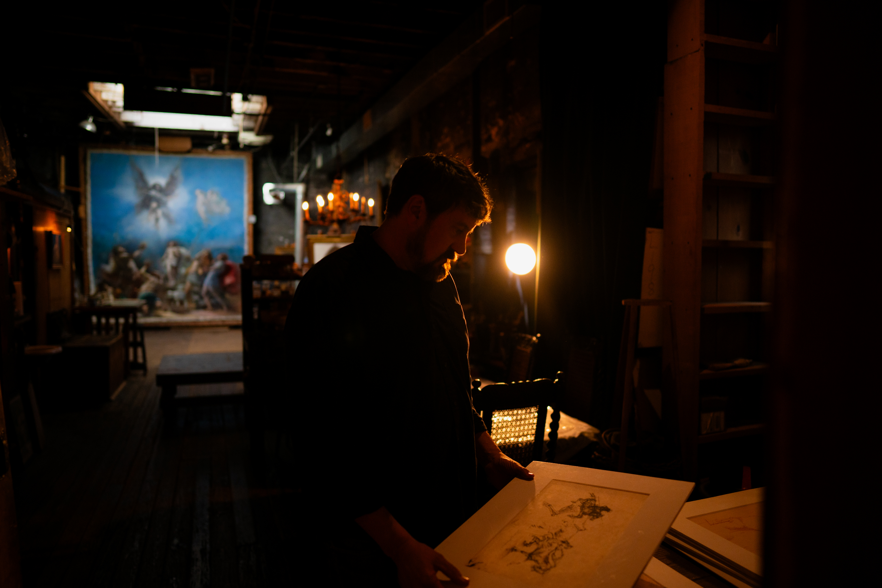
Scott Mason packing Frank Mason’s artwork in Anne Mason’s Little Italy, NYC studio.
Scott Mason is a NYC artist and filmmaker. He produced the feature length bio-doc, A Light in the Dark: The Art and Life of Frank Mason about his great uncle and mentor, painter Frank Mason, in collaboration with director Sonny Quinn. The artwork of Frank Mason can be found at: https://frankmason.org/.
Loft Law: The Last of New York City’s Original Artist Lofts published by Daniel Books can be purchased at https://www.joshuacharow.com/book/loftlaw
“The Fate of the Parthenon Sculptures before and after Elgin”
The abiding central contention in the Elgin Marbles dispute is that the acquisition of the sculptures was such a base and illegal act of plunder that it must be undone and righted. The charge is not only unfounded it masks subsequent Greek culpabilities on the preservation of its Acropolis monuments.
The Parthenon sculptures, which are considered by the British Museum to be the greatest material productions of mankind and which are, as such, superbly well and fittingly displayed, were rescued from an abominable neglect and desecration that persisted on the Acropolis after their removal. Because the Marbles were lawfully acquired over two centuries ago, would-be restitutionists are effectively demanding that today’s asserted moral rights be backdated to circumvent and trump the law.
An even-handed (if not entirely unpartisan) examination of such restitution demands has been given by Alexander Herman, the director of the Institute of Art and Law in his 2021 and 2023 books, Restitution and The Parthenon Marbles Dispute. In the former, while noting a general shift in favour of policies that “do justice for wrongs committed in the distant past” Herman concedes that much as the term “restitution” evokes notions of justice, equity, fairness and the righting of wrongs, “it is not, strictly speaking, a legal term”. But when acknowledging the intrinsically problematic nature of restitution (“it reveals a tension between the aspirations of those seeking justice for a cause and the tough reality of legal constraint and practical considerations”), he betrays exasperation on the ineffectuality of many would-be restitution claims with a counter plaint “Perhaps the usual arguments for retaining the treasures of another culture, be they legal or museological, are beginning to wear thin”.
That the “retentionist” case often proves undefeatable on argument or evidence* is testified by Herman’s resort to the counter authority of precedents: “those arguments are in need of being tested in the light of the many recent developments that have taken place” – the developments in question being the widescale returning of human remains and artefacts to indigenous descendants. Ironically, this appeal to precedent with the Elgin Marbles is made when the Greeks have long denied that their return to Athens would itself create a monumentally dangerous museum-emptying precedent even though, as Herman acknowledges, almost all “restitution stories trace their points of reference, one way or another, back to Greece’s claim over the Parthenon Marbles.”
[* Calls for the return of supposedly looted British Museum Chinese artefacts have spectacularly backfired with the publication of Prof. Justin M. Jacobs’ Plunder? How Museums Got Their Treasures. As Dalya Alberge reported in the Observer, research has established willing and enthusiastic Chinese assistance on their acquisition.
This book will very possibly prove a game-changer. It takes the current wave of restitutionist cant head-on… and thrashes it: “Neither Stein nor Elgin acquired these objects in a manner that could be described as military plunder… Lord Elgin was unarmed… he was in fact the flesh and blood embodiment of Great Britain’s military alliance with the Ottoman sultan against the French navy in the Mediterranean…and that gratitude came in the form of permission – both written and oral – to remove ancient Greek sculptures from the Parthenon in Athens…” He asks: “Can anyone truly speak on behalf of ancestors – literal or figurative – who lived four, five, or even ten generations ago?” He invokes the wisdom of David Lowenthal: “In 1985 the historian David Lowenthal published a book titled The Past Is a Foreign Country, a now classic study of how we humans constantly rework the heritage of past generations for new purposes in the present wholly unanticipated by our forebears. ‘The past is a foreign country’, I often tell my students. ‘They do things differently there.’” And he expresses the number of British Museum artefacts that can, technically speaking, be designated as plunder as a proportion of the entire collection – “0.000024 per cent”. ]
In The Parthenon Marbles Dispute, where he greatly expands his examination of the Marbles, Herman’s frustration at obdurate retentionist facts might seems evident: “whether we like it not, there is little in the way of impugning the legality of the permission given for the removal of the Marbles.” Such a grudging recognition that there was neither plunder nor theft, might have cued George – “There is a deal to be done” – Osborne, Chair of the British Museum’s Board of Trustees who, like Donald Trump, seemingly exults in his own deal-making capacities (- in which very respect, however, he has been charged with performing a disservice to the museum’s trustees by Lord Sumption, medieval historian and former Justice of the Supreme Court of the United Kingdom).
Recognising that Britain never occupied Greece and that, accordingly, “the claim for restitution is less clearcut”, Herman then shifts ground and temporal location to claim the issue is “less about the circumstances of the original removal and more about vulnerability felt by modern Greeks, especially when it comes to threats [?] from the outside, and the traditional inability of those on the British Museum side to show much empathy.” Aside from the Meghan Markle-like whine of an institution-wide empathy-deficit at the British Museum, Herman ignores the greatly more than empathetic roles played by the British in both Greece’s 19th century War of Independence and her subsequent liberation from Nazi-rule.
Precisely because there is neither a legal nor a compelling stand-alone moral case for “restitution”, Herman commends a deployment of the currently fashionable “conflict resolution” mediation procedures designed to bypass courts and their notorious costs and risks. On this stratagem he speaks of the role for a (somehow) mutually acceptable “mediator” – and goes so far as to float the prospects of the so-called “Parthenon Project”, an avowed restitution outfit led and funded by members of a single Greek family and which boasts on its website that “The Chair of the British Museum recently publicly confirmed that there is a deal to be done between the British Museum and Greece”. The site also carries a Financial Times report of a secret meeting at the Berkeley Hotel in November 2021 between Greece’s prime minister, Kyriakos Mitsotakis, and George Osborne:
“Osborne listened intently as Mitsotakis set out his case. He had barely given any thought to the Parthenon Sculptures during his career in British politics. He’s best known for his role as the country’s ‘chancellor’ after the global financial crash. But recently installed as chair of the world’s oldest public museum, Osborne saw a chance to show he is running an enlightened institution ready to engage in the debate about the repatriation of artefacts. He also saw a man across the table with whom he could do business. ‘Nobody has tried, well, ¬forever,’ Osborne has told colleagues… Osborne has declined to speak publicly about his talks with Mitsotakis, fearing that anything he says could be used against the prime minister, who is facing an election in the coming months.”
In the event Mitsotakis survived the election but, as we tweeted on 16 August, “in 2003, possibly encouraged by Lord Owen’s support, the [then] Greek Prime Minister said to Tony Blair ‘I have an election to fight next year – could you do something about the Marbles?’” That earlier request for political assistance is public knowledge only because, Herman discloses, it was picked up by TV cameras. It is not known whether the FT article was “sourced” by Mitsotakis or Osborne, or both.
Herman also reminds the reader that in 2019 the Institute of Art and Law gave training courses to members of the British Museum staff on museum-world laws and ethics but perhaps most valuably, he alerts us to the true dangers of a would-be Osborne-engineered “loan” deal by applauding the success of a past recovery from the British Museum of an indigenous Canadian artefact by the expedient manoeuvre of a perpetually renewed three-year loan: “The result may not be ideal. The mask is still effectively owned by the British Museum trustees. But no one could fault [Andrea] Stanborn calling the event a ‘repatriation’…the loan was once again renewed in 2020…” That de facto repatriation was only made possible, however, because the recipients acknowledged the museum’s ownership: “The British Museum did recall it for an exhibition in London in 2017, but then returned it…”
That there is no legal case against the B.M.’s ownership of the Elgin Marbles would now seem to be widely recognised. That being so, it should equally be recognised that there can be no countervailing moral or culturally compelling case for moving the Marbles after more than two centuries from one museum to another, either once and for all, or repeatedly at intervals with all the increased concomitant risks of injury. In their first secret meeting, Osborne and Mitsotakis proceeded so fast as to have identified possible loan “swaps” from Athens to London but at a later meeting the Greek prime minister told Osborne that he wanted the whole collection back permanently and not on loan. The present chair of the B.M.’s trustees is said still to believe “a deal is possible”.
As for the conspicuous moral lacuna in the persisting restitution claim for the Elgin Marbles, it can best be appreciated by examining the scale of neglect and desecration that Lord Elgin discovered and the magnitude of his act of cultural preservation and appreciation. Not only were so many sculptures removed to safety, but the craftsmen and artists Elgin employed had also made meticulous cast and drawn records of the then preservation-states of other sculptures which today testify to subsequent losses and erosions when in Greek hands. A due recognition of Elgin’s service to art requires no new instruments of law, no secret meetings between politicians and trustees, and no wordy mediated haggles but, rather, nothing more than the simple use of our own eyes. Abundant photographic and other visual evidence testifies to the scale of pre- and post-Elgin abuses and desecrations of Greece’s cultural legacy. In our Summer 2002 journal we carried an article by the independent scholar Ellis Tinios which chronicled the extent and the truly terrible artistic consequence of those losses. We were and remain grateful to him as we reproduce his illustrated account in full below.
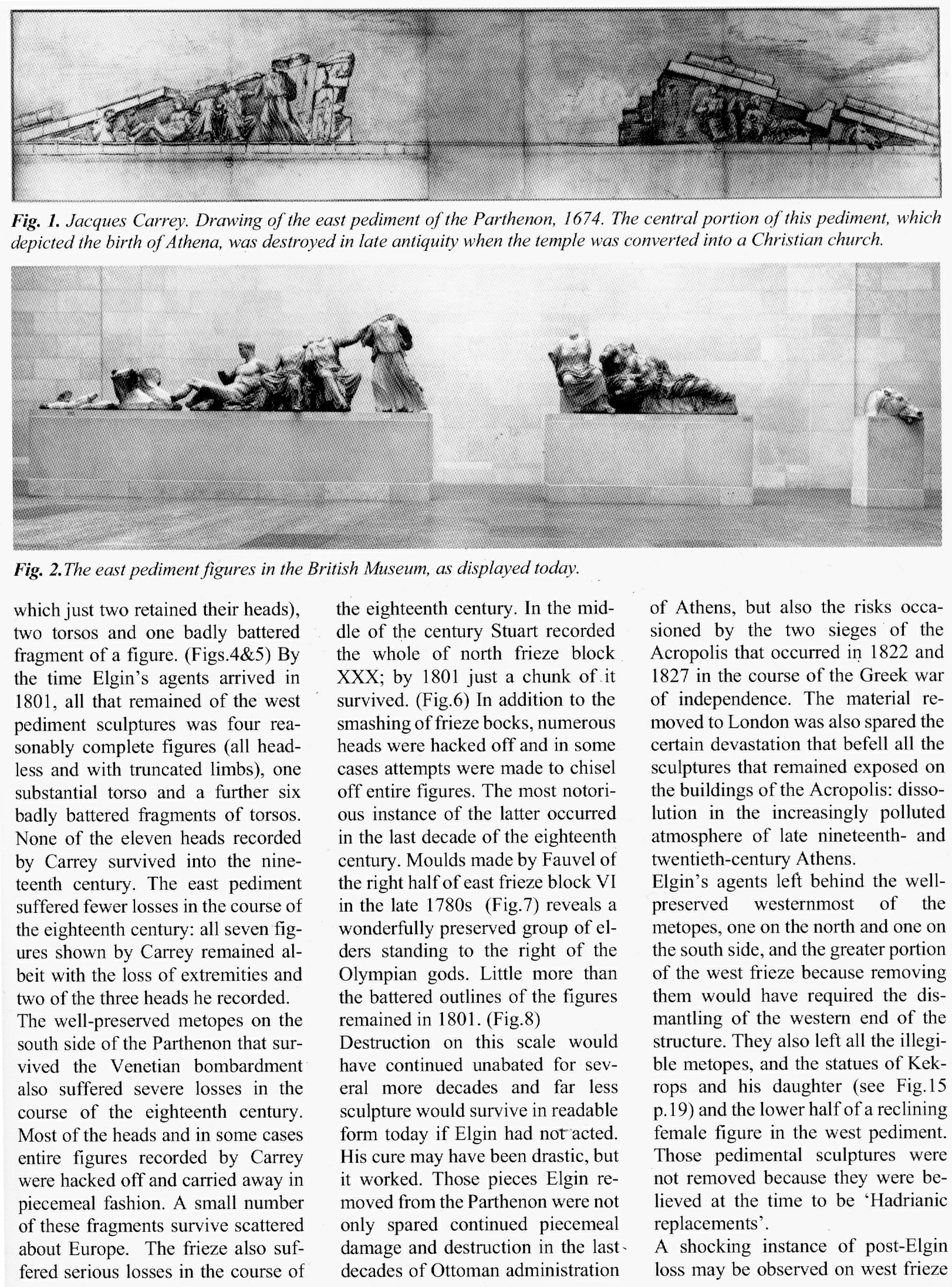
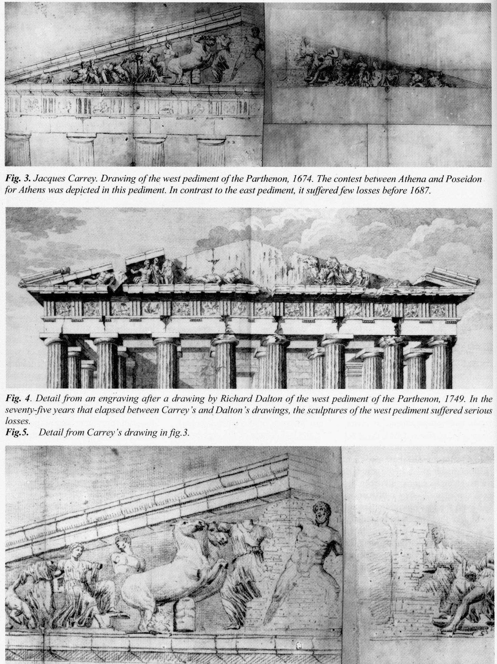
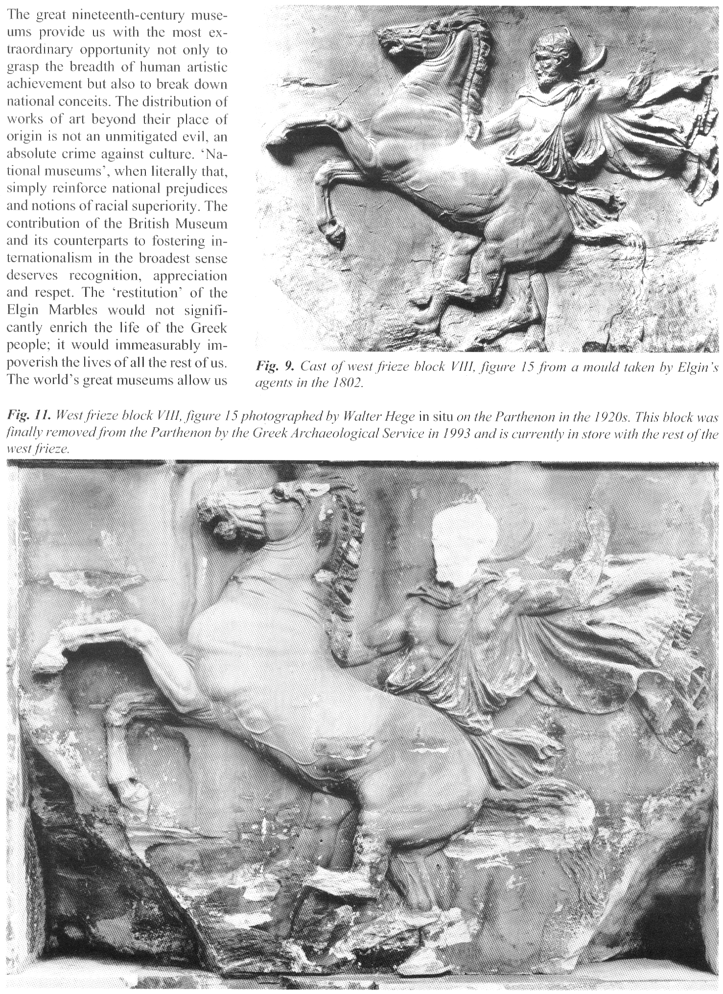
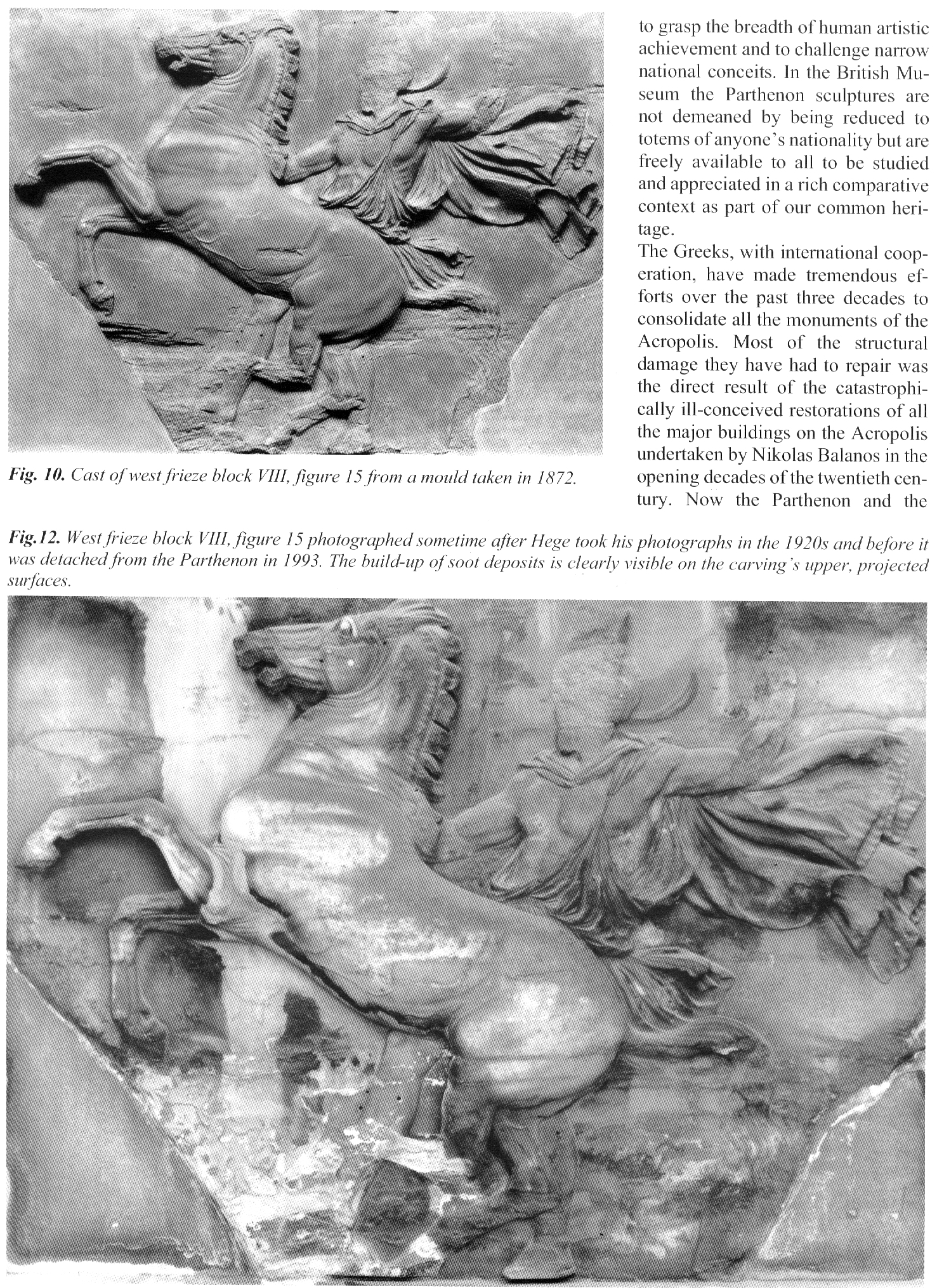
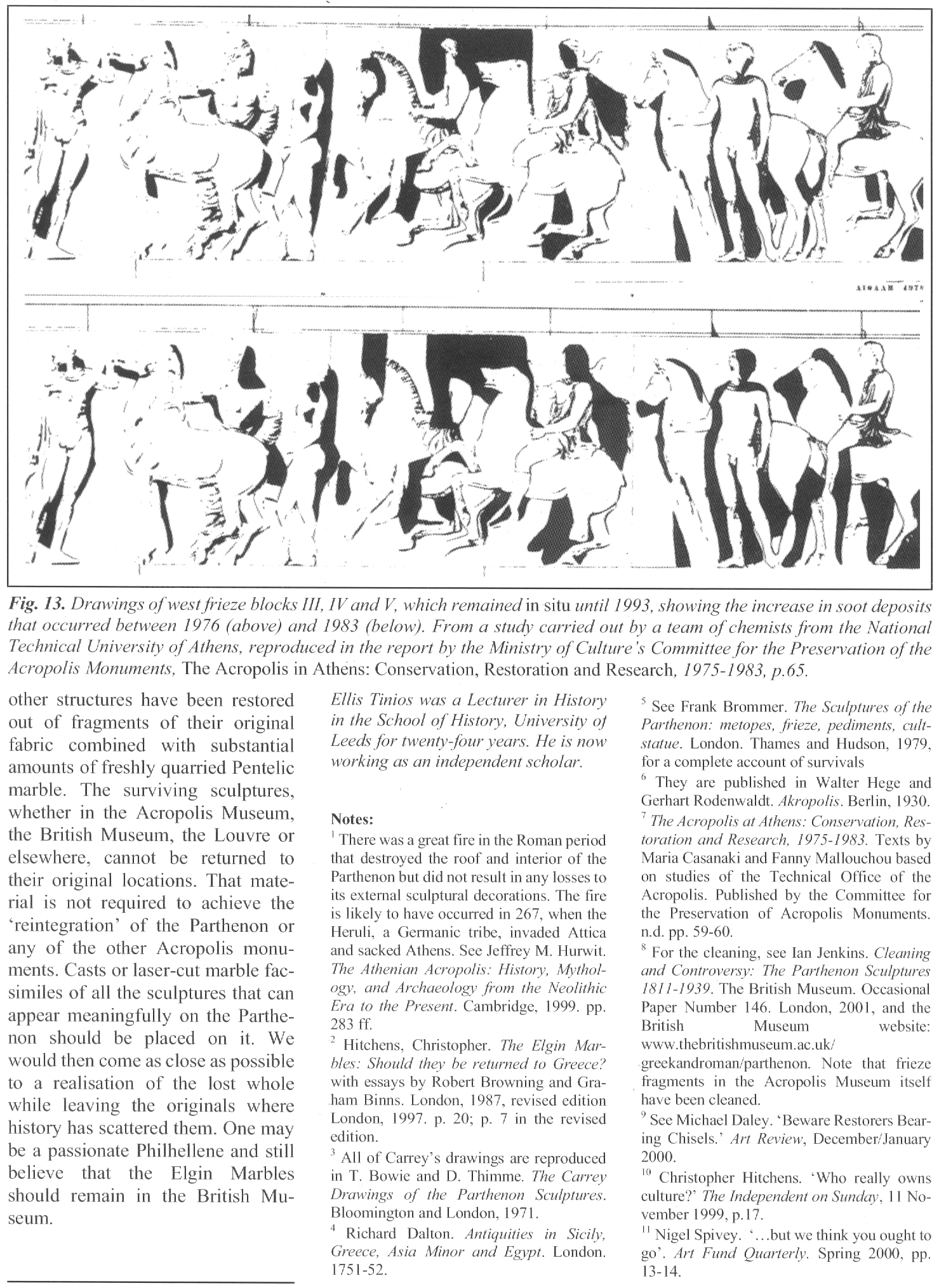
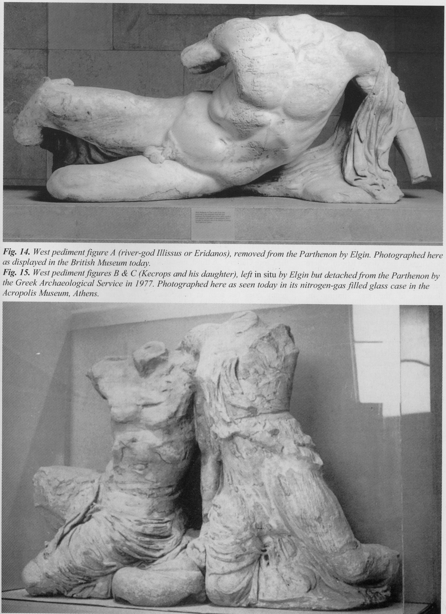
Michael Daley, Director: 20 August 2024
Holbein’s Anne Boleyns and the “Discovery” Trope
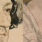
Art is made by artists to order, or for the market, or from personal compulsions. Thereafter its standing is determined by others – primarily scholars, curators, auctioneers, and dealers – who confirm or reject the authenticity of works and the identities of sitters within them. Such judgements are often presented not as expert, professional opinions on which scholarly discussions might proceed, but as discovered truths. Discoveries can be well-founded or spurious. In art restoration, where claimed “discoveries” so often mask bungled interventions, the proof of the pudding is in the looking (at comparative photo-records) and it should be considered so, too, with claimed art historical discoveries.
A CASE IN POINT: TWO HOLBEIN ANNE BOLEYN ASCRIPTIONS
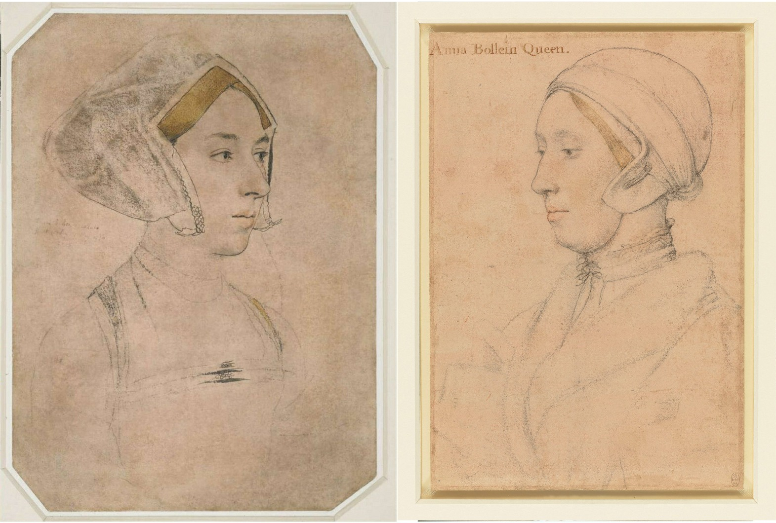
Above, Fig. 1: Left, the British Museum (formerly “Bradford”) Anne Boleyn-inscribed Holbein drawing; right, the Royal Collection Anne Boleyn-inscribed Holbein drawing.
Both of the above English Holbein portrait drawings are securely provenanced – both entered the Royal Collection on Holbein’s death. Both bear inscriptions identifying the portrayed sitter as Anne Boleyn. One or other of the drawings might be of Anne Boleyn but both cannot be so because, as all parties are agreed, the drawings depict two different people. In this case both sitters had been identified by the same respectable near-contemporary witness, Sir John Cheke, but for almost five centuries everyone had taken the (now) British Museum drawing to be the true record of Anne’s likeness. In the last half-century an overlapping succession of three people (an art historian, a Tudor historian and a modern historian) laboured for three decades to reverse that traditional identification. They all did so without offering a direct photo-comparison of the two drawings at issue. Effectively, this campaign was an anomalous images-light war of words.
We take the eventual success of that campaign as a prime case of a visually unsupported and spuriously claimed discovery, notwithstanding its seeming vindication in 2007 when the Royal Collection held that its Anne Boleyn-inscribed Holbein drawing bears the ill-fated queen’s likeness. Four years later that dramatic reversal was recalled/celebrated by Bendor Grosvenor in a 15 December 2011 Art History News post “Anne Boleyn regains her head”:
“This isn’t ‘news’ as such, but in a foray into the Tudor realms of Twitter last night I mentioned the drawing of Anne Boleyn by Holbein in the Royal Collection. I said that although in the past the identity was doubted by art historians, the sitter was now catalogued with certainty as ‘Anne Boleyn’, as you can see on the Royal Collection website…”
That claimed certainty of identification had rested on a three-stage campaign that ran between 1977 and 2007 and to which Grosvenor had contributed last. It proceeded as follows.
STAGE I: A REVISIONIST CHALLENGE
In 1977 John Rowlands, the deputy keeper of prints and drawings at the British Museum, challenged the traditional identification of Anne in the museum’s newly acquired landmark Holbein Anne Boleyn drawing. He did so in a commemorative article (“A portrait drawing by Hans Holbein the Younger”) carried in the British Museum YEARBOOK No. 2. The challenge rested on an objection that the drawing’s documentary records began in the 17th century (- see Part I: Sex, Trigonometry and Anne Boleyn’s Recovered Likeness.) Rowlands’ article carried just three photographs (Fig. 2, below) with none showing the Windsor Royal Library drawing being proposed as the true Anne Boleyn Likeness.
STAGE II: THE 1983 ROWLANDS/STARKEY COLLABORATION
Six years later, Rowlands co-authored an article with the Tudor historian David Starkey in the February 1983 Burlington Magazine (“An Old Tradition Reasserted: Holbein’s Portrait of Anne Boleyn”). Dr Starkey had scored a Bull’s Eye in a 1981 Burlington Magazine article (“Holbein’s Irish Sitter?”) by identifying a more plausible sitter in a Royal Collection Holbein drawing given to “Ormond”. As Jane Roberts put it in her 1993 National Galleries of Scotland Holbein and the Court of Henry VIII catalogue:
“The old identifying inscription, ‘Ormond’, has led to some confusion concerning the subject of this drawing. There were for a time two rival claimants to the Earldom of Ormond (or Ormonde): Thomas Boleyn (1477-1539) and James Butler (c. 1504-46). The former, the father of Anne Boleyn, was considered the most obvious candidate, although it was remarked that the drawing appeared to show someone younger than fifty (Thomas Boleyn’s age at the time of Holbein’s first visit to England.) David Starkey has plausibly suggested that the drawing instead represents James Butler, son of Piers Butler, the illegitimate kinsman of the 7th Earl of Ormond (died 1515) and claimant to his title and lands…”
As with Rowlands, Rowlands/Starkey gained no official acceptance. Recognition would only be obtained in 2007 when Starkey joined forces with the Philip Mould Gallery in an “identity discoveries” fest, some thirty years after Rowlands’ initial challenge (see below). Where Starkey’s independent professional historical elucidation of Ormond familial relationships had proved valuable to art historians, on his 1983 pairing with Rowlands he became a partisan/advocate to a historically unsupported and visually unexamined ascription. On this turkey of a case, Starkey’s professional juju failed.
Offering no visual argument, Rowlands/Starkey effectively attempted a verbal sleight of hand on a non sequitur by holding that because Sir John Cheke (the source of the English Holbein portrait drawings’ sitters identifications) might have been better placed to validate an Anne Boleyn inscription than had previously been appreciated, the Windsor drawing’s sitter therefore was the true Anne Boleyn likeness. Thus, the logical flaw of Rowlands’ initial 1977 essay remained: the more well-placed Cheke becomes as an identifier of sitters, the more reliable he becomes as the man who had also identified the sitter in the British Museum’s Anne Boleyn-ascribed Holbein drawing.
NO BEEF
The authors tacitly acknowledged the absence of corroborating evidence for the Windsor drawing’s sitter by contending that “In view of all the evidence accumulated here it seems likely at the least that Holbein was taken up by the Queen as well”. (Emphases added.) Even if such a relationship been established, it could not in itself have weighed in favour of one rival Anne Boleyn inscribed drawing over the other, for reasons given – but it had not been so established: a “likely” is not a “was” – and nor is a “likely was”. In an article cumulatively held together by a “could have”; a “would have”; a “must have”; a “could well have”; a “could have taken”; a “had every reason to take”; a “most likely”; and, a “we would guess,” the authors’ peroration itself comprised a further mini daisy-chain of question-begging speculations (emphases added):
“…his appointment as the King’s painter probably antedates it. And the likely responsibility rests with Anne Boleyn herself. For it may not be a coincidence that Holbein’s advancement at court… appears to have progressed largely through the favour of adherents to religious reform…”
That lame ending had followed a weak opening. The existence of the two rival Holbein Anne Boleyn drawings was acknowledged, as was the fact that they “clearly show different sitters”, but the drawings were not shown together side-by-side so as to permit a direct visual comparison – the authors’ claims had to be taken on trust. Similarly, it was claimed on no cited evidence that because Rowlands’ 1977 identification had “apparently” been “generally accepted” the case for the possible authenticity of the Windsor Anne Boleyn inscribed drawing “must be re-opened”.
ABSENCES OF EVIDENCE
Had Rowlands’ 1977 case been accepted, there would have been no cause to reopen it in 1983. Whether Rowlands’ original claims had been partly/largely accepted or not, the features on the two Anne Boleyn-ascribed drawings remained physically incompatible (see Figs. 1 & 3). Only one, therefore, might be a true likeness. Rowlands/Starkey conceded further absences of evidence for their position by (wrongly) claiming that no visually comparative means of adjudicating between the rival likenesses existed: “For such a re-examination there is no available visual evidence”. That assertion was made on the grounds that the only secure contemporary image of Anne is that on the damaged coronation medal of 1534. The damage on the medal is local and by no means robs the image of all testimonial capacity. When the authors published the medal and the Windsor drawing side-by-side, they claimed (rightly) that no correspondences exist between those two works, when, as can be seen at Fig. 2 below, there are clear correspondences with the British Museum drawing, the etched copy of it by Wenceslaus Hollar, and the National Portrait Gallery painting of Anne Boleyn.
Above, Fig. 2: Left, the three illustrations carried in Rowlands’ 1977 British Museum Year-Book II article “A portrait drawing by Hans Holbein the Younger”; right, the two illustrations carried in the Rowlands/Starkey February 1983 Burlington Magazine article “An Old Tradition Reasserted: Holbein’s Portrait of Anne Boleyn”.
As if aware that their “evidential” cupboard was bare, the authors continued “fortunately… there are other pointers”.
AN UNFORCED ERROR
The first Rowlands/Starkey “pointer” was that the sitter in the Windsor drawing shows, like Henry’s other queens, little signs of prettiness – “and certainly nothing to compare with the ‘Bradford’ lady’s charm, which could well explain why in the seventeenth century the latter was claimed to be the bewitching Queen”. By alleging a supposedly misleading power of influence to Anne’s appearance in the British Museum drawing, the authors tacitly conceded that it – and not the Windsor drawing – had for five centuries been taken as the true likeness and that it had informed the subsequent late sixteenth century Anne Boleyn paintings (see Figs. 10-13.) No iconographic legacy of any sort attaches to the Windsor “Anne”.
Against their own acknowledgement of the British Museum drawing’s historically influential artistic potency, the authors offered a subjective counterclaim that the Windsor portrait had given true expression to the “strong will and intelligence [of Anne Boleyn] that her contemporaries noted”. As shown above, below, and previously, the sleepy-eyed, older, fleshier, fair-haired not dark-haired sitter in the Windsor drawing does not look more charismatically strong-willed and intelligent than the British Museum drawing’s sitter. Had the authors’ estimation of the relative traits in the rival drawings been sound it would have helped their cause to demonstrate the relationship by showing the two likenesses together, as here below.
A PHOTO-COMPARISON THAT DID NOT SHOW ITS FACE
Above Fig. 3: Details of the British Museum Holbein Anne Boleyn-ascribed drawing, left, and, right, the Royal Collection Holbein Anne Boleyn-ascribed drawing.
POINTERS AND CONCRETE INDICATIONS
Evidently still fearful of the manifest weaknesses in their case and notwithstanding their own “pointers”, the authors cited certain “more concrete indications” of Anne Boleyn’s “appearance and dress”. These supposed concretely reliable indications were hearsay comments made in an acknowledged “anonymous and scurrilous French account” of Anne’s grandly ceremonial entry into London the day before her coronation. That is, Rowlands/Starkey presented as if concrete and corroborating evidence, the account of an unknown, manifestly malicious source who had described Anne as “scrofulous” (suffering from a form of tuberculosis and glandular swelling) and of having worn her dress fastened up very high on her throat to conceal a goitre. Thus, from Rowlands/Starkey: “In the [Windsor] drawing her double chin is so pronounced, as to suggest such a swelling of the throat glands, which is indeed partly hidden by a high neckline.”
There were so many problems with acceptance of that malicious account. First, the reported, supposedly goitre-concealing, garment worn by Anne was not her customary dress but what the Tudor historian Eric Ives described as “the traditional high-necked English coronation mantle”. Second, the Windsor drawing’s sitter was not wearing any form of day wear: “She wears some kind of under-cap and a furred nightgown over her chemise”. Third, the tied neck of the chemise did not conceal the double chin – only a very high turtle-necked garment might have done so. Fourth, the displaying of such “undress” for a likeness-recording artist, was held to constitute proof of regal identity because: “only a woman of the highest rank could have taken such a liberty in court circles.” Begging their own question, the authors added: “Several of Holbein’s male sitters appear in similar states of undress but Anne was the only woman to do so.” In this instance, a “could have” became a “was” in two breaths, with a seeming wish once again being the father of the deed.
Had Holbein drawn Henry’s second queen in such a state of undress, he would have put himself at risk of accompanying her and her alleged lovers to the executions. Had the fair-haired Windsor sitter been the mother of Holbein’s two English children, no suspicion of impropriety could have arisen. As it happens, downcast eyes and wistful expressions are common to the Windsor drawing and Holbein’s German wife, as depicted in his The Artist’s Wife and Children – detail below, left. (Also, as discussed below, the Windsor sitter bears certain facial similarities with another contested Holbein sitter in the Royal Collection.)
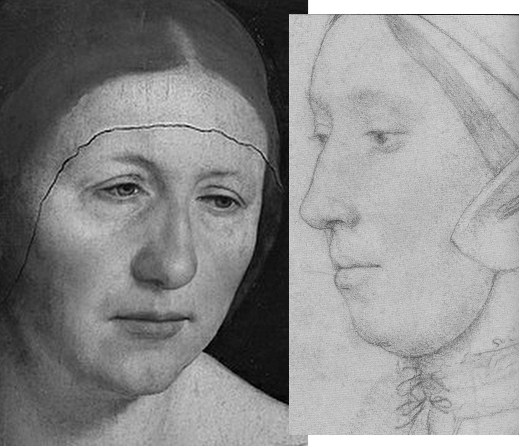
Above, Fig. 4: Left, detail, Holbein’s The Artist’s Wife and Children; right, a detail of the Royal Collection “Anne Boleyn” drawing.
THREE NOSTRILS AND TWO TRAPEZOIDS
While nothing is known of the mother of Holbein’s two English children, Anne Boleyn famously had a brother, George, three or four years her junior, and with whom she was alleged to have committed adultery. No Holbein drawing in the Royal Collection is identified as George, but as luck would have it, one of Holbein’s unidentified portraits in the collection happens to have been made from a closely similar viewpoint to that of the British Museum Anne. As shown below, an unmissably similar configuration of brows, eyes, and nose is present in the two drawings. The only significant difference in the features is the appreciably more masculine jaw in the – here proposed – George Boleyn likeness. Unlike the Windsor sitter’s nose, those of George and Anne both have deep nostril apertures.
Above, Fig. 5. From left to right: ArtWatch UK letter, the Times, 5 July 2023; an unidentified Royal Collection Holbein drawing which we take to be of George Boleyn, Viscount Rochford; the British Museum “Ann Boleyn”; the Royal Collection “Ann Boleyn”.
HOLBEIN’S “UNIDENTIFIED MAN”
The above Holbein male portrait is today described by the Royal Collection as “An unidentified man, c. 1532-43”. Sir Karl Parker, author of the seminal 1945 Holbein’s Drawings at Windsor Castle, described it as “A Gentleman: Unknown”. Given the many facial similarities in the two drawings we can, perhaps, take it that Sir John Cheke had either not known Anne’s brother or had failed to recall him.
Above, Fig. 6: Left, the proposed Holbein portrayal of George Boleyn; right, the five centuries long accepted British Museum Holbein drawing of Anne Boleyn. Does this “George” not seem a little younger – and perhaps sweeter – than this Anne Boleyn? For that matter, has Holbein ever drawn eyes that are more vividly alive and penetrating than those found in this Anne?
Above, Fig. 7: Left, the similarities between the British Museum Anne and a later painting, as shown in Part I; right, the similarities between the Windsor “George” and the British Museum Anne.
STAGE THREE: A CASE NOT MADE
As with Rowlands, so Rowlands/Starkey had failed to effect a switch of the sitters’ identities. It would take twenty-four more years for victory to be claimed. On 14 March 2007 the Daily Mail (“Finally historians can give Anne Boleyn her head back”) reported:
“A Holbein drawing has been revealed as the only portrait of Henry VIII’s second wife Anne Boleyn. The c.1530 picture carries Anne’s name but other evidence suggested this was an error. Now expert Bendor Grosvenor and historian David Starkey have traced the inscription to her contemporary Sir John Cheke, confirming she is indeed the subject.”
No evidence had been presented by Starkey/Grosvenor that Cheke had specifically and exclusively ascribed the Windsor drawing – or that he had not also so ascribed the British Museum drawing. On the reported claims to have “traced” the Windsor drawing’s identification to Cheke, see below. Nothing had been found and nothing had changed – except, that is, the 1983 Rowlands/Starkey Burlington Magazine thesis had been robustly challenged and rejected in 1986 by a major Tudor historian, Eric Ives, in his biography Anne Boleyn, which work was frequently reprinted until 1994 and later superseded in Ives’ highly acclaimed 2004 The Life and Death of Anne Boleyn ‘The Most Happy.’ Starkey, author of Six Wives: The Queens of Henry VIII and Elizabeth, had generously described Ives’ biography as “The best full-length life of Anne Boleyn and a monument to investigative scholarship”.
THE IVES INTERREGNUM
Prof. Ives’ challenge to Rowlands/Starkey in his books had also been developed separately in a major article for the July 1994 Apollo magazine “The Queen and the Painters – Anne Boleyn, Holbein and the Tudor Royal portraits”. Where Starkey/Rowlands had taken two and a half Burlington pages, which included just two photographs, Ives’ essay ran over ten pages and carried sixteen photographs. Although not all pages addressed the Holbein Anne Boleyn drawings, Ives’ substantial scholarly and visually supported account seemed to have trumped Rowlands/Starkey and put the lid on the Windsor sitter campaign. So far as we know, Starkey never added to his joint 1983 Burlington article contribution. When Rowlands returned to the Windsor drawing in 1988 on publishing the British Museum portrait (which was then described as “Portrait of a Lady, thought to be Anne Boleyn”) in his catalogue to the museum’s “The Age of Durer and Holbein” exhibition, he claimed no more against the British Museum Anne Boleyn drawing’s ascription than that the “circumstantial grounds in favour of the Windsor drawing are really very compelling, and one cannot necessarily cast aside Sir John Cheke’s authority for the identification merely because of the confusion over a sitter in the Windsor series being called by him in error ‘Mother Iak’”.
Ives had indeed challenged Cheke’s reliability, and Rowlands acknowledged that his own (somewhat defensive) stance had followed the publication of Ives’ 1986 Anne Boleyn biography:
“Its rejection by Ives in his brilliant historical study is based on a mistaken disregard of the widely varying value of the different supposed likenesses of the Queen; for it is not wise to rely too readily on inferior Elizabethan portraits to form a basis for establishing her appearance.”
Thus, in another attempt to bolster Cheke’s reliability, Rowlands again discounted the testimonies of the many later painted portraits of Anne, none of which, as mentioned, showed any indebtedness to or affinities with the Windsor drawing. As shown in Part I and below, the markedly contrasting degrees of connectedness of the two Anne Boleyn-ascribed Holbein drawings to the many subsequent portraits of the queen constitute the art critical nub of this dispute: How and why had the British Museum Anne – and not the Windsor Anne – come to be held the true likeness for five centuries? To be clear: the contrary case presented for the Windsor Anne rested on nothing more than a) an assertion of near-infallibility in Cheke’s identifications; and b) a systematic disparagement of the visual testimony found in the (near-forty?) subsequent surviving late sixteenth century painted portraits of Anne. Nonetheless, where Rowlands, and Rowlands/Starkey had failed in 1977 and 1983 respectively, Starkey plus Team Philip Mould Ltd would seemingly prevail in 2007. It happened as follows.
TURNING ART MARKET STORIES TO COMPETE WITH SEX SCANDALS AND WARS

Above, Fig. 8: The catalogue to the 2007 Philip Mould Ltd “Lost Faces – Identity & Discovery in Tudor Royal Portraiture” exhibition.
The Philip Mould catalogue’s editor, Dr Bendor Grosvenor, set out the contributors’ aims:
“This exhibition seeks to raise questions, stimulate debate, and, where appropriate, suggest answers. Its purpose is intentionally provocative. The authors are indebted to those who have researched and published in the field of Tudor portraiture before. We hope that in bringing fresh eyes to bear on the subject we do not offend, merely illuminate further this fascinating subject.”
ADDING COMMERCIAL VALUE AND ACADEMIC RESPECTABILITY
The commercial and historical importances of attaching faces to historical figures was set out frankly and with passion, respectively, by Philip Mould and David Starkey. Mould began in the Foreword:
“When, early last year, David Starkey mentioned he would like to collaborate with us on an exhibition highlighting some of the more interesting discoveries in the Tudor arena, I responded with what must have seemed unseemly enthusiasm. On one level it was naturally a very great privilege to work with such an esteemed historian and communicator – cause enough for celebration. However I was also personally delighted to have the opportunity to show how making and announcing art discoveries can have a more substantive purpose and legacy when set in the context of academic history.
“When we lurched into life as a business twenty years ago it was discoveries in a modest form that both paid the rent and paved the way for the future identity of the company. We found that the subject of revealing lost faces, with its inherent humanity and drama was something people liked to read about, and some years later, as a further response to this phenomenon, I wrote Sleepers, which was an account of some of the more sensational finds in the art business, combined with some insights into both the process and the people who make them.
“A discovery requires three elements to turn it into a story: a discoverer with whom the reader can identify; the recovery or disclosure of something that matters; and a writer or commentator who can authoritatively communicate the discovery’s significance. The reason that we get asked regularly by newspaper editors for any discoveries is that they are a valuable news commodity. But it goes both ways. Not only do they sell newspapers, they are also one of the few ways that history and antique art can compete with celebrity, sex scandal and world wars for news headlines. In other words it allows art and history a safe passage into the hearths of middle England…”
THE ENTRANCE OF DAVID STARKEY

Above, Fig. 9, an ink drawing (in the collection of Professor Edward Chaney) of David Starkey made by the author to illustrate a profile article, “The apoplectic academic”, by D. J. Taylor, in the Independent on Sunday, 9 November 2001.
The Independent profile had tracked Dr Starkey’s pathway to celebrityhood:
“In the absence of the late Sir Malcolm Bradbury, whom can we safely characterise as Britain’s foremost media don? …by far the most successful performer in this glitzy but exhausting medium, delight of both the set-tethered TV audience and the browsers of bookshop history shelves, is the engagingly self-styled ‘academic thug’, David Starkey. Strictly speaking, to mark down the Tudor bruiser as a media don is a technical inaccuracy. Dr Starkey no longer teaches professionally, and the Cambridge quadrangles and the senior common room of the LSE have yielded up to ‘private research’ and solitary archival jaunts…
“For a bright, academically inclined teenager, the path from the local grammar school could lead only south, in this case to Cambridge, where he took a first in history and became a protégé of the leading Tudor historian of the age, Professor Geoffrey Elton. Starkey quickly decided that Elton’s view of history was sharply opposed to his own. Elton’s magisterial analyses of Tudor government rested on ideas of bureaucratic improvement. Starkey, on the other hand, was a personality man, seduced by the thought of titanic egos in conflict, ante-room punch-ups and backstairs intrigue. His first book, The Reign of Henry VIII: politics and personalities, was among other things a spectacular debunking of the Elton line. Sir Geoffrey is supposed to have taken this intellectual throwing over very hard…”
THE ROLE AND IMPORTANCE OF VISUAL EVIDENCE
In the catalogue’s Introduction, Starkey spoke with verve to the great importance – and the rarity – of visual evidence in historical studies:
“‘Henry VIII’, the lecturer declared, ‘is the only king whose shape you remember’. He then proved his point with a quick blackboard sketch, which deconstructed Holbein’s great full-length portrait into its elements of almost Cubist geometry. He made the body a trapezium, the legs splayed columns, the arms triangles, the head and neck a single massive cylinder, and finished off with the hat, which he drew with a flourish as a short acute angle to the head.
“We all laughed, for once un-sycophantically, as back then we were unused to visual aids and the joke was rather a good one. The time was 1964; the place a Cambridge lecture theatre; and the lecturer G. R. Elton. Elton was already the doyen of Tudor studies, but he spoke more truly than even he knew. For without the Holbein painting, how would we have an image of Henry at all? And without an image, how could Henry be memorable let alone world-famous? Would even, that is to say, the upheavals of the Reformation and the magnificent storyline of Henry and his Six Wives be enough if we could not envisage so vividly the male lead, let alone the female co-stars?
“I think not. For, speaking now as a television presenter as much as an historian, seeing is more than half of believing and almost all of caring. This means that Holbein’s painting is more than ‘the most enduring of all Henry VIII’s portraits – perhaps indeed the most memorable image of any English monarch’, it is Henry. It is, more than anything else, the reason that he fascinates us and that we study him; it is, I would go further, the beginning of his biography and the key to his mind. Once, it was poets who had promised eternal fame; with the Renaissance, painters were able to offer a more certain and enduring pathway to celebrity.”
In the 2007 Mould catalogue Dr Starkey made no further claims for the Windsor Anne Boleyn likeness. Dr Grosvenor, the catalogue editor, took the reins – and, later, part-credit for its acceptance by the Royal Collection, as in his 15 December 2011 Art History News post “Anne Boleyn regains her head”:
“…There used to be an article online in The Times detailing how research by myself and David Starkey had helped confirm the identity. But it has now disappeared behind the paywall. So below the jump, and online for the first time, is the article I wrote for an exhibition at Philip Mould in 2006 [sic] called ‘Lost Faces – Identity & Discovery in Tudor Royal Portraiture’, which was guest curated by David. The article was in the context of a fine but posthumous portrait of Anne we had borrowed from Hever Castle, Anne’s childhood home [Fig. 10, below, left]. The Royal Collection have found all the evidence compelling enough to change their cataloguing of the drawing (saying ‘this is a rare surviving portrait of Anne’), which is very pleasing. Let me know if you agree (or disagree)!”
The Times (“Nightgown clue turns Holbein’s unknown lady into Anne Boleyn”, 14 March 2007) had reported:
“Academics have now traced the inscription to Boleyn’s contemporary, Sir John Cheke, who began his career at the court under her patronage, before becoming secretary to Edward VI. A document of 1590 notes that Sir John inscribed numerous Holbeins for the King, helping to identify faces of royals and courtiers. Bendor Grosvenor, who carried out the research with David Starkey, the Tudor Historian, said: ‘Cheke was one of the brightest brains of the Tudor court. He would have known most of Holbein’s sitters, if not on personal terms, then at least visually’…Mr Grosvenor, who works at Philip Mould Historical Portraits, London, said: “it is inconceivable that she did not sit at some point for her portrait…’ The drawing appears to be a most unqueenly portrait, as the sitter is wearing a nightgown. Mr Gosvenor said: ‘Only a woman of the highest rank would have taken such a liberty in court circles.’ …The Royal Collection accepted that the portrait was of Boleyn.”
Among respondents to Grosvenor’s 2011 Art history News post, the author Claire Ridgway said on her Anne Boleyn Files blog: “…it is a very interesting read when compared with the thoughts of Eric Ives and Roland Hui…”
In a January 2000 post (“A Reassessment of Queen Anne Boleyn’s Portraiture”), Hui had noted that:
“The confusion surrounding the portraiture of Anne Boleyn was addressed by the art historian E. W. Ives in his biography of the Queen in 1986…In regard to the [Windsor] Holbein sketch, John Rowlands and David Starkey have proposed that the sitter was indeed Anne Boleyn… She is seen in three-quarters profile dressed in a furred robe over a chemise laced at the throat, and wears a simple undercap…Rowlands and Starkey have argued that such ‘undress’ on the part of this ‘royal’ sitter was a novelty of sorts to ‘relax’ the dictates of court etiquette. However, it seems unlikely that Anne with her much commented upon sense of style would have permitted herself to be depicted as such…Since her early days at court Anne Boleyn had a reputation in fine dressing in fashion-setting. George Wyatt, the grandson of Anne’s admirer, the Celebrated poet Thomas Wyatt, wrote that in her attire ‘she excelled them all’. Even those hostile to Anne Boleyn, such as the Elizabethan Catholic Nicholas Sander, admitted to the Queen always being ‘well dressed, and every day made some change in the fashion of her garments’…”
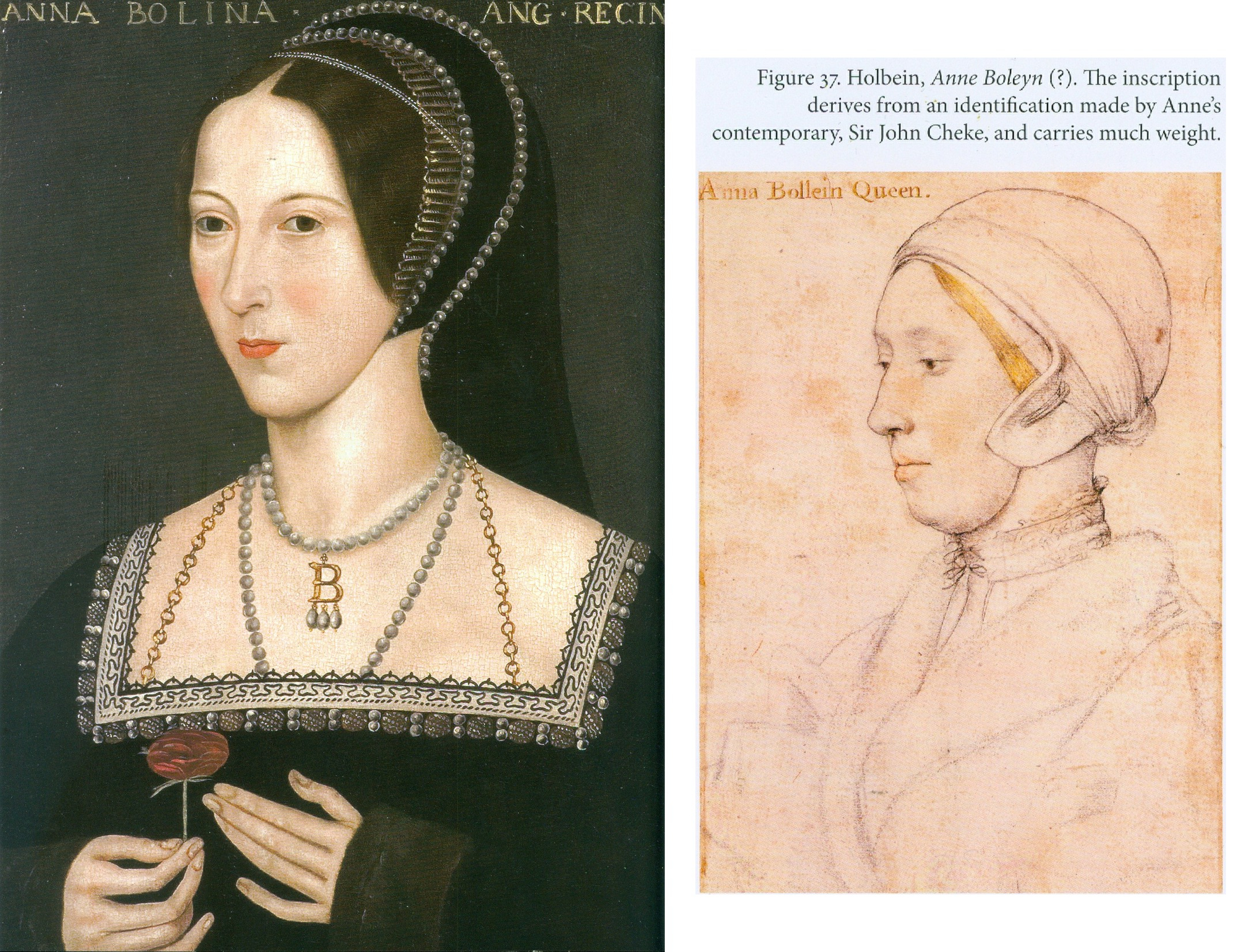
Above, Fig. 10: The photo-linkage that was carried across two pages of Anne Boleyn-ascribed works, as discussed by Grosvenor in the 2007 Philip Mould Gallery catalogue “Lost Faces – Identity & Discovery in Tudor Royal Portraiture”.
Note that, as seen above, in Grosvenor’s section of the 2007 Mould catalogue, the proposed Windsor sitter’s identification as Anne Boleyn carried a parenthetical question mark, and that nothing more was said of Cheke’s claimed identification of it than that it carried much weight – when, by the same token, so too must Cheke’s identification of the British Museum Anne – to repeat: because the two drawings’ sitters are, as everybody agrees, physically incompatible, if Cheke was right on one he had to be wrong on the other. In three decades of campaigning no one had established that Cheke had only endorsed the one drawing and not the other.
In “Lost Faces”, Grosvenor acknowledged his own restating of Rowlands/Starkey and strenuously endeavoured to show that Cheke had been proved right on almost every sitter’s identification. To two Ives-cited Cheke misidentifications he responded:
“We can surely forgive Cheke these errors, for the drawings date to Holbein’s first trip to England between 1526-8, well before Cheke came to Court.”
Ives had written:
“Most worrying of all, the portrait of Margaret Clements, More’s foster daughter, is identified as ‘Mother Jak’, Edward the VI’s nurse. Not only is it highly likely that Cheke knew Margaret – her husband John was erstwhile reader in Greek at Oxford, and Cheke was Regius Professor of Greek at Cambridge – but, as tutor to the future Edward VI, Cheke undoubtedly knew the real ‘Mother Jack’. Clearly, his authorship of the current [Anne Boleyn] identifications is highly questionable.”
CONCEALING GOITRES
Like Rowlands/Starkey, Grosvenor took the politically hostile witnesses’ accounts as firm corroborations of the Windsor drawing’s Anne. One such, Nicholas Sanders, alleged “a large wen under her chin” which she had attempted to conceal. Where Ives had rebutted Sanders’ testimony outright – “one can dismiss out of hand the arguments which seeks to link the [Windsor] sitter’s double chin and high collar with… a velvet mantle with a high collar to conceal a scrofulous neck” – Grosvenor countered: “We do know, however, from another contemporary source Sanders’ description of a swelling under her chin was probably correct.” A footnote to this claim cited Sir Roy Strong’s seminal work Tudor and Jacobean Portraits, but, as readers of Strong’s book will appreciate, while he had indeed identified a second observer (who claimed a grossly disfiguring wart and a swelling “resembling a goitre”), he, like Ives later, had dismissed both observers as hostile and, in Sanders’ case, of also being “too late to be taken as reliable evidence”.
DISCOUNTING AUTHORITIES
Although Grosvenor had cited both Strong and Ives in footnotes, on the former, he might have left an impression of support for his own position when Strong had not only dismissed the hostile witnesses’ reliability but had also noted that their accounts were incompatible (had failed to “harmonise very closely”) with the later painted pictures of Anne. Strong’s recognition of the testimonial value of the later paintings highlights the collective and abiding failure of the Windsor drawing’s successive champions to acknowledge and heed the evidential force of artistic images when, properly considered, such works of art themselves constitute primary documents as (truly) concrete manifestations of highly specific and personal artistic/intellectual productions. Grosvenor’s footnote on Ives’ 1994 Apollo article said no more of him than that he was one of the “authorities [who] have dismissed the validity of the [Windsor] ‘Anna Bollein’ inscription due to other inconsistencies and errors in the [Cheke] identifications.”
Ives had objected to more than the unreliability of Cheke’s identifications. He had made a methodologically rigorous visual and comparative appraisal of the available pictorial and graphic records that would have done a trained art historian proud. He rejected the two Holbein Anne Boleyn drawings as likenesses of Anne – but not equally so. While recognising that a case can be made for each, he pointed out that where the British Museum Anne looks the part – “The love of Henry VIII’s life should have looked like that” – against that, the “curious undress” of the Windsor sitter suggested that rather than being a queen, “A far more likely explanation of the implied intimacy would be a link between artist and sitter”. The combined facts that Hollar had chosen to engrave the now British Museum Anne and not the Windsor Anne, and the latter’s intimate garb “should make further discussion of the Windsor drawing unnecessary”.
Having disregarded an entire tranche of historically adjacent paintings of Anne Boleyn, Grosvenor, following Rowlands and Starkey, subscribed to the veracity of the widely recognised malice on alleged facial disfigurements as reliable corroborations of the double chinned, heavy jawed sitter with the (disqualifying) fair-not-famously-dark hair in the Windsor drawing: “The chin in the drawing is perhaps swollen, and would accord with Anne’s alleged misfortune” – and this, despite Ives’ objection that the Windsor drawing sitter’s “almost bovine impression” was “fatally contradicted by the medal’s long assertive neck and its total absence of a double chin.” (See Fig. 11, below.)
ROYAL HEADWEAR
Above, Fig. 11: Left, the British Museum-owned 1534 Coronation medal; centre, top, the British Museum “Anne Boleyn” Holbein drawing (mirrored) and, bottom, the Windsor “Anne Boleyn” Holbein drawing; right, the Hever Castle Anne Boleyn painting loaned to the 2007 Mould Gallery exhibition. Although the medal is certainly damaged, pace Rowlands/Starkey, it clearly shows Anne to be attired and be-jewelled, as in the B.M. drawing. The sitter in both wears a “gable hood” – which fashion would be superseded within Anne’s own reign by the “French Bonnet” fashion, as found in the Hever paintings. In the above formation of images, where the similarities of costume and composition arc from the medal through the British Museum Anne to the painting, the Windsor drawing, by contrast, acts as a circuit breaker between the medal and the painting.
Where Grosvenor made no comment on Strong’s recognition of the wider testimonial force of artistic depictions, on the testimony itself he faced both ways, declaring on the one hand that “The author does not believe that the [Windsor] likeness… is totally dissimilar to the later portraits of Anne, such as that exhibited here [the Hever Castle portrait at Fig. 11, above, right]”, while, on the other hand, dismissing the testimonial power of the later portraits en masse:
“As with all posthumous portraits, however, they are subject to the historical, political, and visual prejudices of those who created and commissioned them. They cannot give us an accurate picture of what Anne really looked like”.
THE PERILS OF DISAVOWING PICTORIAL TESTIMONY
Above, Fig. 12: Left, as shown in Part I, appraising and evaluating artistic productions is not a mystical or even an entirely subjective exercise. As seen above, left, while the Windsor sitter was shown in nightwear and sans jewellery, Holbein’s British Museum sitter was fully dressed and with indications of three rows of necklaces. Many paintings of Anne show her in precisely such dress and so be-jewelled – jewellery which often included her initial “B” as a suspended centrepiece. Elsewhere in the Mould catalogue, Grosvenor accepted the testimonial power of jewellery when defending Cheke’s reliability on a Holbein sitter that had been doubted – “The Lady Mary after Queen”:
“But the Holbein drawing certainly is Mary. A study of the jewellery allows a positive identification to be made…”
Above, right: with the British Museum Anne Boleyn drawing, not only does the indicated jewellery clinch the status of the drawing as the precursor to the paintings, it was (as previously shown) further possible to demonstrate the clear derivation of a particular painting (also at Hever Castle) from the drawing.
Above, Fig. 13: In the above sequence it is possible to see a morphing familial relationship in the faces in which, notwithstanding stylistic changes, a progressive sequencing of slight rotations of the head from the original near profile drawing (in which the nose fractionally overlapped the cheek contour and the edge of the gable hood) progresses towards a more frontal face in which the eyes in the second Hever Castle Anne painting (here mirrored) turn to confront the viewer.
DOUBLE CHINS AND CHEKE’S RELIABILITY
As shown in Part I, the features of the Windsor sitter markedly better resemble those of the ascribed Duchess of Suffolk (Fig. 14, below) than those of the British Museum drawing. As mentioned, when Starkey paired with Rowlands in the 1983 Burlington Magazine article hopes of a visually supported case for the Windsor “Anne Boleyn” were dashed, and again, with Starkey/Grosvenor, after three decades, no direct visual comparison of the rival Holbein drawings was offered to readers.
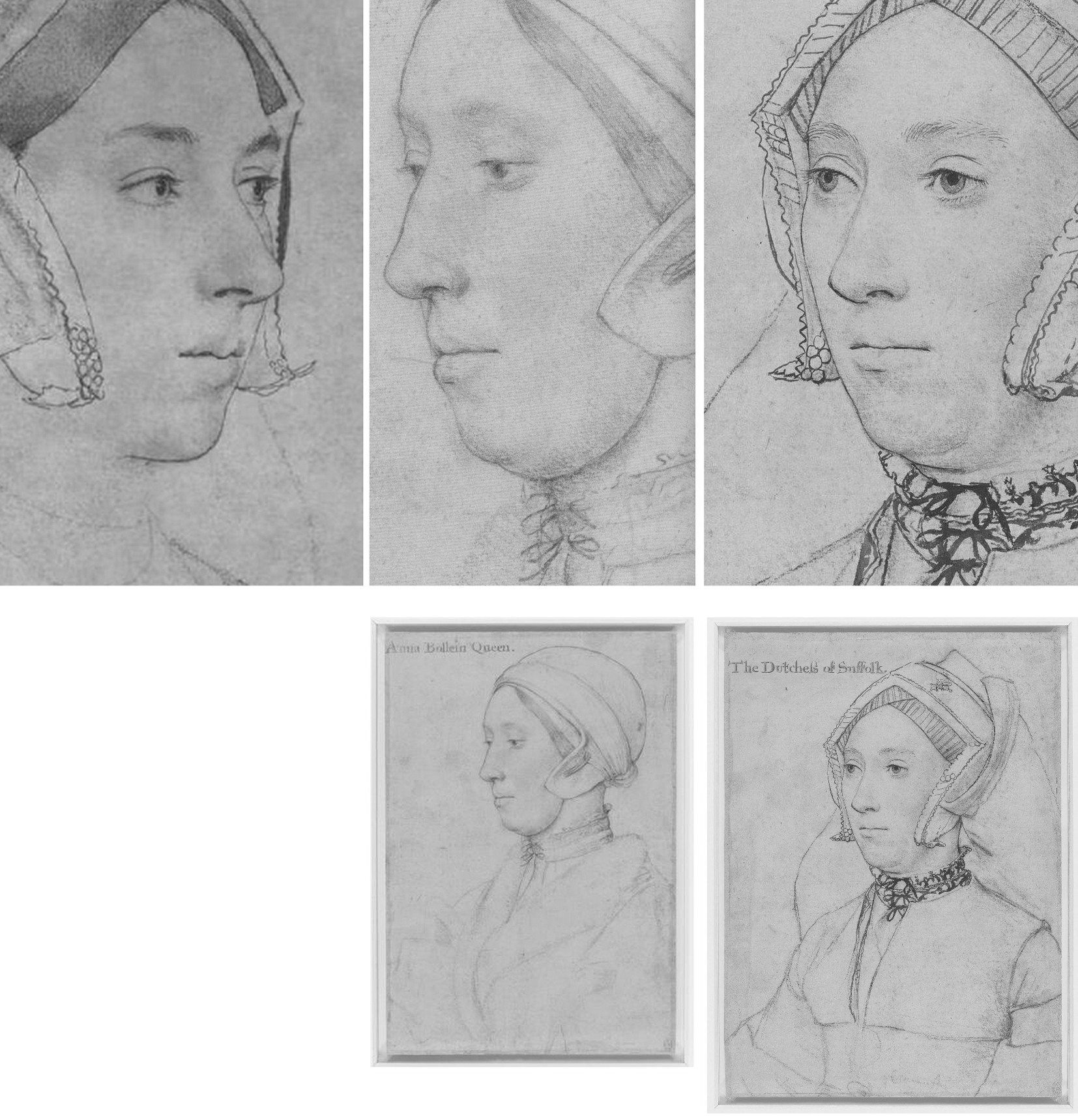
Above, Fig. 14: Left and centre, the British Museum and the Windsor Holbein “Anne Boleyn drawings; right, the Royal Library’s “The Dutchess of Suffolk”. Note, in the case of the British Museum Anne, a nostril that is markedly larger than the two similarly shaped nostrils on the other two drawings.
Collectively, Rowlands, Rowlands/Starkey, and Starkey/Grosvenor had all failed to acknowledge that the sitter in the Windsor drawing was not the only double-chinned, high cheek-boned lady wearing a (potentially) goitre concealing, neck-tied chemise in Holbein’s drawn portraits. As seen above, Holbein’s later inscribed portrayal of Katherine Brandon, the “Dutchess of Suffolk”, bears not only another double chin but an almost identically laced and tied high-necked garment. Were both sitters scrofulous? Or might they have been one and the same person?
CODA: AGE CUTS BOTH WAYS
Ironically, an unsuccessful attempt was made in the Lost Faces exhibition to re-assign the identity of the Duchess of Suffolk’s sitter to an earlier wife and to count the proposed switch as another Mould and co. “discovery”. Grosvenor raised the reliability of the ascribed Duchess of Suffolk sitter:
“…there has been some confusion about which ‘Dutchess of Suffolk’ Holbein shows, an issue raised below in some detail by Alisdair Hawkyard.”
Hawkyard, possibly in emulation of Starkey on “Ormond”, wrote:
“One of the drawings of a sitter whose identity has been doubted is inscribed ‘The Dutchess of Suffolk’. She has been identified as Catherine Willoughby born c. 1519 who in September 1533 married her guardian Charles Brandon, Duke of Suffolk. The woman depicted is more mature than Catherine would have been had she sat to Holbein before his death in 1543. The sitter’s greater maturity suggests that she was Suffolk’s third wife Mary who died on 25 June 1533. Mary, Henry viii’s younger surviving sister, had married Suffolk in 1515 while still in mourning for her recently deceased husband King Louis xii of France and without the consent of either her brother or the new King of France, Francis I. The physiognomy of the Duchess accords with what is known of her appearance…”
If Hawkyard’s objection seems a fair one, it would follow that the very similar-looking Windsor sitter is also too old to be Anne who, on Ives’ reckoning, was thirty-one when Holbein began his second visit to England and thirty-five when executed. Grosvenor dismissed the British Museum drawing’s sitter on grounds of age: “Alas, this pretty sitter is too young to be Anne”, adding, “The drawing has been convincingly discounted by, among others, John Rowlands”. (Which others? – the people who “apparently” had “generally accepted” Rowlands’ identification?) On Anne’s age, Margot Robbie, who played Barbie in the recent film, is thirty-three. Lily James is thirty-five. Had the Royal Collection accepted the Grosvenor/Mould Gallery’s proposed re-identification of the Duchess of Suffolk sitter, it would, of course, have spoken further against Cheke’s reliability.
Despite Grosvenor/Starkey’s reported claims to have “traced” the Windsor drawing’s provenance to Cheke and to have discovered a document of c. 1590 which noted that Cheke had inscribed “numerous Holbeins for the King”, as mentioned above, there had been no tracing or discoveries because the claims made had derived directly from (and added nothing to) Parker’s 1945 account. Viz:
“…The basis, of course, for all such inquiry is the evidence provided by the inscriptions on the drawings themselves, or to be more exact, by the inscriptions that appear on sixty-nine of the total of eighty-five, the further sixteen having remained nameless. At this point we must revert to the Lumley inventory of 1590, and complete the quotation of that vitally important entry with the further information that the names were ‘subscribed’ to the drawings by ‘Sir John Cheke, Secretary to the Edward the 6.’ One of the most learned men of his day, Cheke, then in his twenties, was summoned to Court in July, 1542, to succeed Richard Cox as tutor to Prince Edward. On the newcomer’s arrival, therefore, Holbein himself was still on the scene, and the circle of his more recent sitters still about him. That Cheke must have had personal contacts with many of them is beyond doubt. It follows that if the names now inscribed on the drawings correspond, as presumably they do, with Cheke’s identifications referred to in the inventory, they have abundant claim to interest and attention, though not, of course, to blind faith. It is demonstrable that their accuracy is not infallible, nor can the date of their recording have been otherwise than belated.”
Moreover, respectful as he had been of Cheke’s authority, Parker had rejected the Windsor drawing’s identification as a portrayal of Anne Boleyn:
“The inscription is certainly incorrect, the features showing no resemblance whatever with the well authenticated drawing of Anne Boleyn in Lord Bradford’s [now the British Museum’s] possession.”
SUGGESTIONS BECOME FACTS
Grosvenor’s counter to Parker’s dismissal of the Windsor “Anne” comprised nothing more than appeals to the authority of his predecessor-partisans’ authority:
“The present author, however, here restates an earlier suggestion that the sitter is, in fact, Anne Boleyn – Originally suggested by John Rowlands and David Starkey in ‘An Old Tradition Reasserted: Holbein’s portrait of Queen Anne Boleyn”, Burlington Magazine, CXXV (1983).”
Cheke was personally pressed into Grosvenor’s service:
“On simple probability alone, the chances of the [Windsor] inscription being erroneous are slim. And, as mentioned above, Anne is one of the sitters Cheke was least likely to get wrong.”
Grosvenor’s 2007 contention was thus, like that of Rowlands/Starkey in 1983, yet a further sleight of hand: Cheke cannot be held to have ascribed the Windsor drawing alone, because, on the same historical record, he had also ascribed the now British Museum drawing. The Royal Collection switched the Anne Boleyn identities in error and on a case lacking either scholarly merit or visual credibility – this truly was a spurious discovery.
Michael Daley, Director; 31 May 2024
Sex, Trigonometry and Anne Boleyn’s Recovered Likeness
Art can suffer many injuries and indignities. The worst of these, short of outright destruction – but also irreversible – is restoration damage. Misattributions corrupt and debilitate oeuvres and can mask restoration injuries – but they can be corrected. In portraiture depicted sitters can be misidentified but, again, these can be corrected. When presented to the world, injurious restorations, misattributions and misidentifications alike are commonly trumpeted as “discoveries”. Such discoveries, as in the misidentification examined here, can be claimed without supporting evidence or, even, against strong contra-evidence.
ANNE BOLEYN’S NEW HEAD
On 14 March 2007 the Daily Mail (“Finally historians can give Anne Boleyn her head back”) reported:
“A Holbein drawing has been revealed as the only portrait of Henry VIII’s second wife Anne Boleyn. The c.1530 picture carries Anne’s name but other evidence suggested this was an error. Now expert Bendor Grosvenor and historian David Starkey have traced the inscription to her contemporary Sir John Cheke, confirming she is indeed the subject.”
Four years later the claimed confirmation of the Royal Collection’s “Anne Boleyn” drawing graduated into “certainty” on Bendor Grosvenor’s 15 December 2011 Art History News post “Anne Boleyn regains her head”:
“This isn’t ‘news’ as such, but in a foray into the Tudor realms of Twitter last night I mentioned the drawing of Anne Boleyn by Holbein in the Royal Collection. I said that although in the past the identity was doubted by art historians, the sitter was now catalogued with certainty as ‘Anne Boleyn’, as you can see on the Royal Collection website…”
THE TRUE ANNE BOLEYN LIKENESS
Since 1977, the dispute over Anne Boleyn’s likeness has turned on two Holbein portrait drawings of equal artistic merit and provenance strength but of manifestly different sitters. One drawing is in the British Museum, the other is in the Royal Library at Windsor (see Fig. 1 below). While the Windsor drawing’s advocates claim “certainty” on their “Anne Boleyn” identification, both drawings bear written Anne Boleyn ascriptions derived from the same largely reliable historical source and the British Museum drawing had been considered the true likeness for many centuries. How, then, had the switch occurred? The now protracted Anne Boleyn Identity Literature discloses the Royal Collection’s acceptance of a campaign which had eschewed all use of the most illuminating art critical tool – the photo-comparison. In this switch of identities, Art had been denied its own voice as words trumped the intrinsic – and markedly contrary – visual testimony of images.
EYES, NOSES and MOUTHS: GIVING A VOICE TO HOLBEIN
In a letter to the Times (5 July 2023) we had hoped a forthcoming Holbein portrait drawings exhibition might address the drawn method by which Holbein unerringly fixed the characteristic trapezoidal relationships between a sitter’s eyes, nose, and mouth.
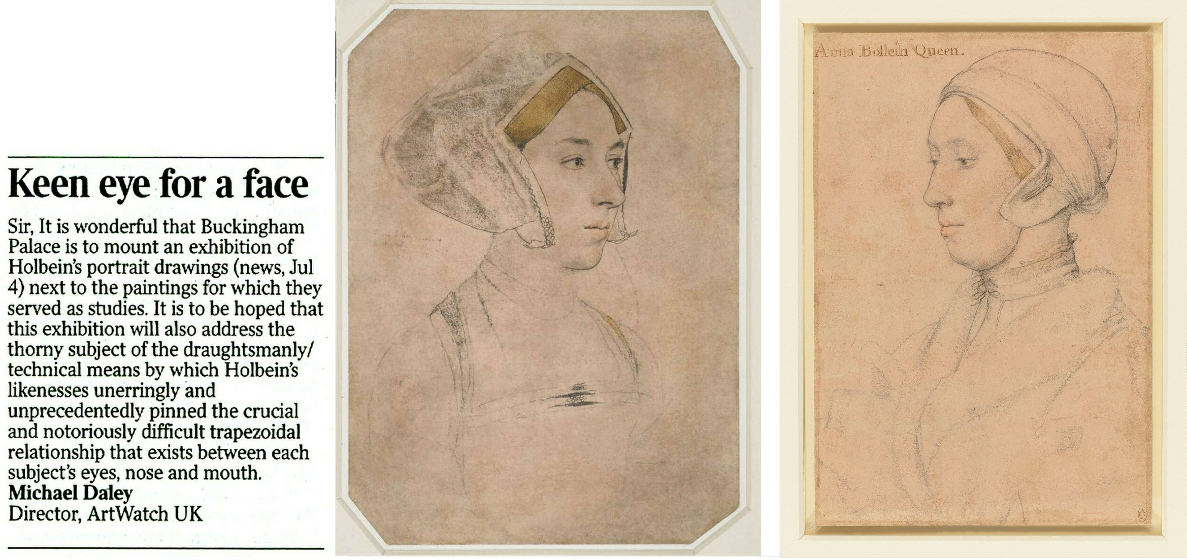
Above, Fig. 1: Left, ArtWatch UK letter; centre, the British Museum Holbein drawing formerly said to depict Anne Boleyn; right, the Royal Collection Holbein drawing now said to depict Anne Boleyn.
The British Museum Anne Boleyn drawing was not in the Buckingham Palace exhibition Holbein at the Tudor Court and therefore was not discussed. The Royal Collection Trust’s Senior Curator of Prints and Drawings, Kate Heard, speaks in the catalogue of Holbein’s “sensitive and life-like” depictions that “bring us face to face” with key Tudor players. The portraits are addressed in terms of social history and patterns of patronage, as in Holbein’s rise from foreign itinerant to court artist, and with Heard wondering whether, as the only artist of his day to possess a horse, Holbein travelled to his sitters, or they to him. His drawing method was discussed as “taking likenesses” and on the frequency with which his chalk drawings had been reinforced with ink in possible preparation for transfer as “patterns” for painted portraits.
Heard’s “taking likenesses” was a telling phrase because distinctions are commonly drawn between making drawings and taking photographs and because Holbein’s depicted facial features can seem as reliably fixed as in any photograph.
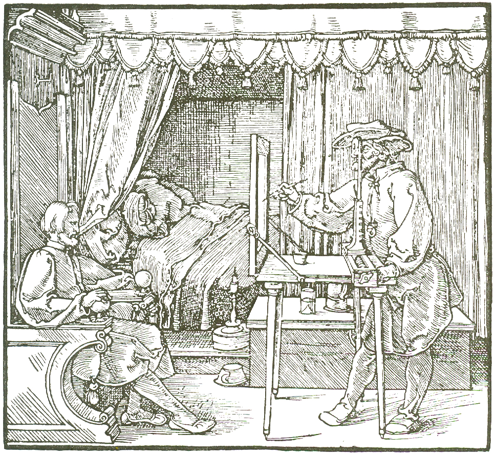
Above, Fig. 2: Durer’s depiction of a method of capturing traced outlines and features on a pane of glass.
The scholar who had held the formerly Bradford family, now British Museum, Holbein portrait of Anne Boleyn to be the true likeness (Fig. 1, above, centre) was K. T. Parker in his seminal 1945 book The Drawings of Hans Holbein in the Collection of His Majesty the King at Windsor Castle. Parker succeeded Kenneth Clark as Keeper of the Department of Fine Art in the Ashmolean Museum, Oxford, and was Keeper of the whole museum from 1945 until his retirement in 1962. His high reputation as a connoisseur is said to have been laid when working in the British Museum’s Department of Prints and Drawings with A. E. Popham and Campbell Dodgson.
THE RELIABILITY OF INSCRIPTIONS
In Parker’s book, the Windsor Royal Library drawing’s inscribed identification as “Anna Bollein Queen” (Fig. 1, above, right) was bluntly dispatched:
“The inscription is certainly incorrect, the features showing no resemblance whatever with the well authenticated drawing of Anne Boleyn in Lord Bradford’s possession”.
Parker drew a distinction between “two kinds” of evidence – “pictorial” and “literary” (or visual and documentary) and was duly alert to the importance of both. As will be examined separately, he also advanced a pictorially sophisticated hypothesis that Holbein, like Durer at Fig. 2 above, might have fixed the essential features of his sitters by tracing them onto a pane of glass and transferring the resulting image to paper. Here, we consider how and why visual records failed to receive due critical consideration when the Anne Boleyn sitters’ identities were switched.
A REVISIONIST CHALLENGE
In 1977 John Rowlands, the then deputy keeper of prints and drawings at the British Museum (and, later, Keeper from 1981 to 1991), challenged the Anne Boleyn identification in the Parker-endorsed drawing. The “demotion” was curiously, if not inappropriately executed. First, it was made not in a scholarly journal – which could have facilitated a correspondence – but in the museum’s own YEARBOOK No. 2 (“A portrait drawing by Hans Holbein the Younger”). Second, it was not advanced on its own merits but was slipped within a commemorative article on the British Museum’s recent acquisition from the Bradford family of its landmark Holbein drawn portrait. The article itself carried just three photographs (as shown below) and with none of the Royal Library drawing being espoused as the new, true Anne Boleyn likeness.
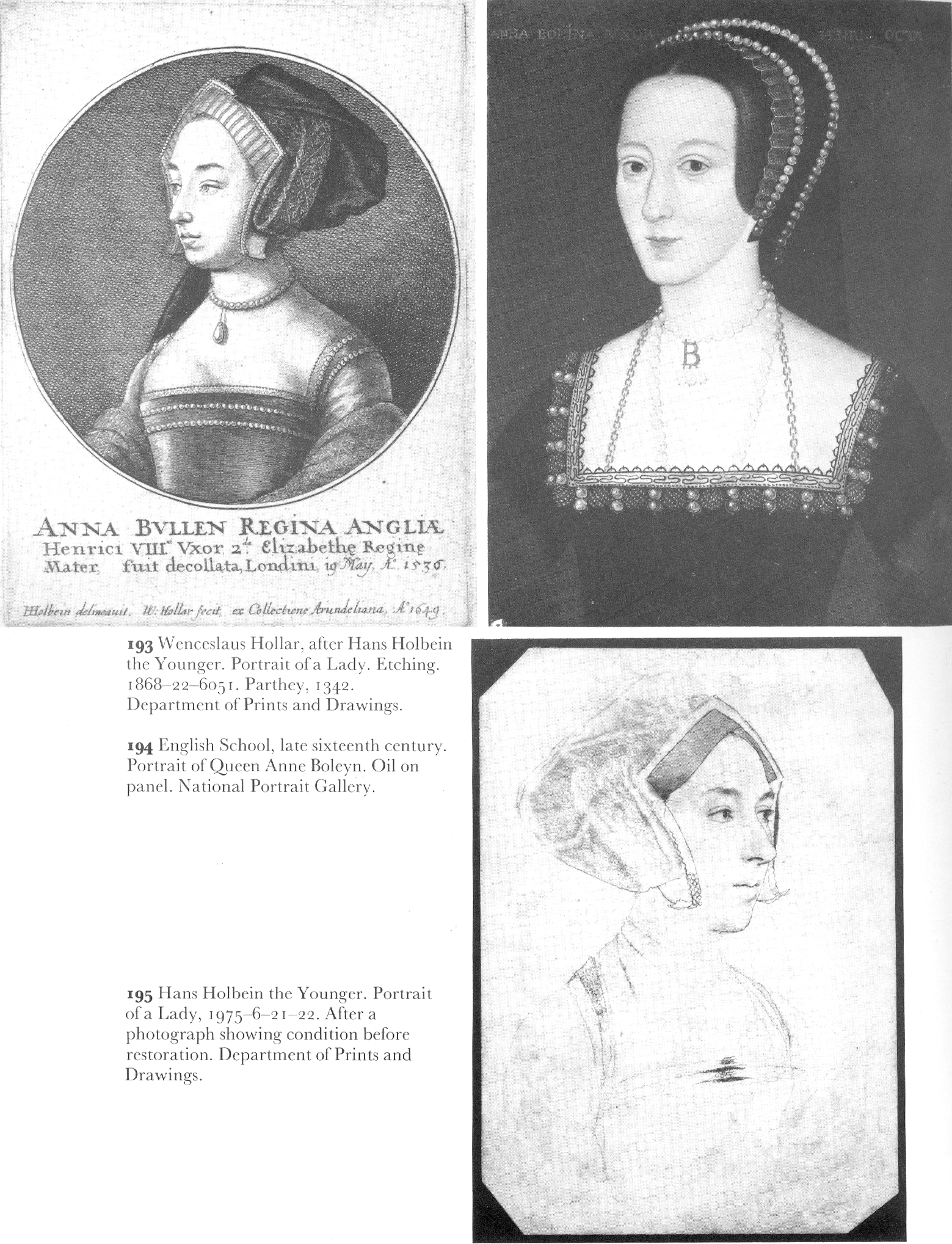
Above, Fig. 3: The three illustrations to Rowlands’ British Museum Year-Book II article. There was also a full colour plate of the newly acquired drawing.
Rowlands acknowledged the new acquisition as an outstanding drawing that had traditionally been held to be of Queen Anne Boleyn (Paul Ganz,1937; Karl Parker 1945). He offered no artistic grounds for his “de-identification” of the drawing’s sitter – indeed, as shown below, he celebrated the drawing’s supreme artistry – and he made no suggestion of another likely or possible sitter. The relative visual authority/plausibility of the two radically different depictions of the same historical figure was not examined. Rowlands’ sole objection to the British Museum’s own drawing was documentary – that its Anne Boleyn ascription could be traced no further back than 1649 when in the Earl of Arundel’s collection and where it was copied in Wenceslaus Hollar’s etching (Fig. 3 above, top left).
The objection seemed something of a pedantic contrivance: both the etching and the drawing bore an inscription which identified the sitter as Anne Boleyn and gave the date of her beheading – “Anna Bullen decollata fuit Londini 19 May 1536”. On the general authority of the inscriptions on Holbein’s drawings, Parker had reported that of the eighty-five Royal Collection Holbein drawings sixty-nine bore written inscriptions from an inventory made in 1590 to which the names of the identified sitters had been “subscribed” by “Sir John Cheke, Secretary to King Edward the 6th”. Cheke had died in 1557. The British Museum’s new drawing had been part of the Royal Collection’s Holbein holdings after the artist’s sudden death in 1543 from the plague. Most inscriptions on Holbein’s portraits thus originate from the turn of the sixteenth and seventeenth centuries. Parker held that because Cheke had had direct contact with many of the drawings’ sitters, his subscribed names enjoyed “abundant claim to interest and attention, though not, of course, to blind faith.” The eventual acceptance of Rowlands’ misidentification by the Royal Collection evidently rested on a claimed near-infallibility of Cheke’s recorded identifications – even though he had evidently given the same sitter to two incompatible drawn portraits.
IN AND OUT OF HISTORY
Rowlands, who would later be supported by two historians (David Starkey and Bendor Grosvenor) and opposed by a third (Eric Ives, author of an acclaimed Anne Boleyn biography), acknowledged “a strong likelihood” that the Bradford/BM drawing had been incorporated in the famous “Great Booke” of bound Holbein drawings and had subsequently been removed from it:
“How and when the ‘Anne Boleyn’ sheet became separated from the rest is unknown, but this probably occurred after the death of the earl of Arundel in 1646”.
Rowlands also held that although the British Museum drawing had been incorporated within the famous book, such incorporation was no guarantor of pedigree: the Windsor group “undoubtedly contains drawings which are not by Holbein”. Such a consideration would, of course, apply to all works bound in the book. Parker had said in 1945 that: “The Windsor series certainly contains extraneous matter, but the only drawing known to be incorporated at a later date is the so-called ‘Amelia of Cleves’…in the eighteenth century”. Rowlands spoke too of “extractions” from the book, with the first having probably begun “around 1630″. With the British Museum drawing, he said its date of extraction was unknown but had “probably occurred after the death of the Earl of Arundel in 1646” and “probably in the reign of Charles II [1660-1685]”.
A CLASH OF DATES AND AN ARISTOCRATIC VILLAIN
Against his own “probablys”, Rowlands cited and accepted a detailed account of how the now British Museum drawing had been stolen by the Bradford family when the great book was owned by Jonathan Richardson, senior. Rowlands quoted Richardson’s son’s account of the theft in full:
“The Original of this Drawing, by Holbein, of his finest style & most Capital, the Old E[arl] of Bradford cheated my father of Thus. When he was confined with gout, a little before his Death, He sent request to my F[ather] that he would lend him a Book of Drawings to Divert him; w[hi]ch my F[ather] compl’d with. The E[arl] sent him back the Book in a few Days, but without this Drawing. My F[ather] went immediately to wait on him, & found the Drawing hanging by the Bed side in which he lay, in a Frame & Glass. There was other Company in the Room, so my F[ather] could not claim it at that time; but look’d several times at ye Drawing, stedfastly, & lookd at my L[or]d. My L[or]d stood it, discoursing with him, quite unconcerned; & in two or three days failly sneak’d out of the world, & kept the Drawing. My F[ather] could not claim it afterwards of his Heir (L[or]d Torrington I think) without accusing Bradford of a most infamous piece of Villany, of which he had no witness.”
Rowlands thought the Earl was likely to have been Henry Newport who died in 1734 and added “since then this drawing has been in the possession of the Earl’s descendants”. Parker (whose Holbein scholarship is considered “exemplary” by Susan Foister) had stated that the great book was “broken up” in 1727 when back in royal possession and that by 1728 the drawings had been glazed, framed, and displayed at Richmond Lodge. The Bradford theft must therefore have occurred before the book returned to Royal ownership, the date of which Parker said remains unknown in a period “so full of problems”.
Rowlands acknowledged that after Hollar’s 1649 printed copy, “all representations of Anne Boleyn, whether they were painted or engraved, were based on the Bradford drawing, right through the next two centuries.” He did not ask why this had been so or wonder why no such comparable copies had been made from the Royal Collection “Anne Boleyn” drawing he was championing as the sole and true record of Anne Boleyn’s likeness. On Rowlands’ account, the theft of the drawing had clearly left the Richardson family highly aggrieved. At the time of the theft, Jonathan Richardson senior had owned both inscribed Anne Boleyn drawings and had made a pencil copy of the British Museum version (Fig. 13, below). Similarly, when the Earl of Bradford had both inscribed “Anne Boleyn” drawings bound in the (loaned) book before him, he stole the now British Museum version and not the one that returned to the Royal Collection. As Eric Ives would later point out, when Hollar had had the the option of copying either of the Anne Boleyn-inscribed Holbein drawings, he opted – or was instructed – to copy the now British Museum likeness.
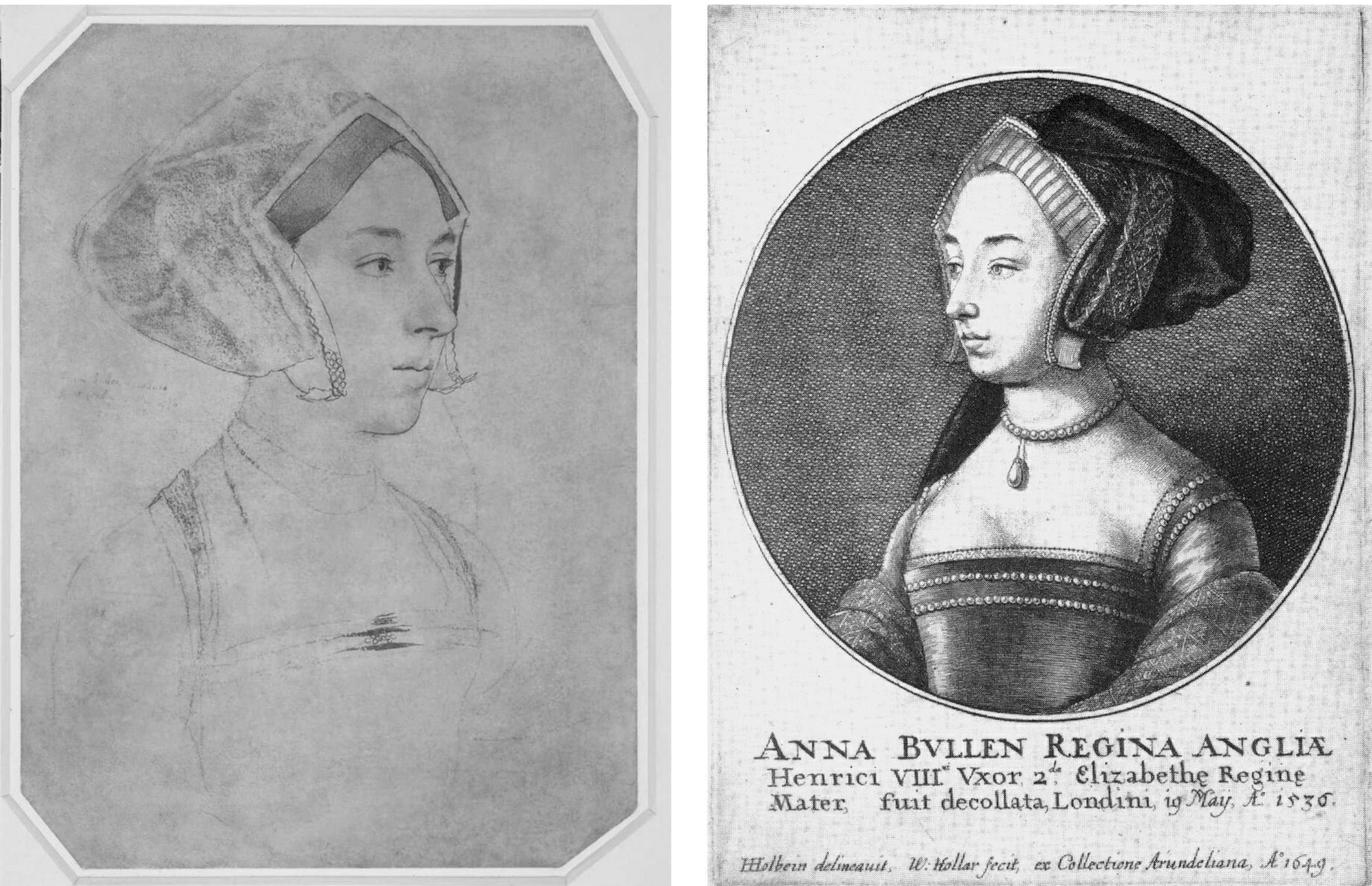
Above, Fig. 4: Left, the Bradford/BM Holbein Anne Boleyn drawing and, right, the Hollar copy of 1649. Hollar had of necessity resorted to a degree of invention with the costume and jewellery – and he showed only one of the three necklaces indicated on the Holbein drawing. His seemingly strengthened shading around the cheek, jaw and neck might indicate a subsequent loss of chalk shading on the drawing itself (see Fig. 13, below).
A SOLE RELIABLE RECORD
Rowlands noted that the only securely known contemporary likeness of Anne “is the medal struck to commemorate her coronation in 1533” but which, he said, is too worn to give any indication of her features (see Fig. 5 below). Given his unsteady and visually unsupported 1977 account, it might seem timely to consider the expanded and invigorated joint Rowlands/David Starkey 1983 Burlington Magazine article, but note should first be made of the methodological and visual shortcomings in Rowlands’ solo challenge to Parker – on the (slim) authority of which all subsequent accounts rested. Rowlands had not shown the drawing he was espousing. He had not shown the relationship between the two rival “Anne Boleyn” drawings. He had not shown how the two drawings respectively related to the medal’s likeness as the only securely dated contemporary image of Anne. Nor had he claimed any resemblance of the Windsor drawing to either the medal’s image of Anne Boleyn or any of the later painted portraits of her. His case comprised little more than a visually unsupported expression of a contrary professional opinion – an unsubstantiated glancing swipe, as it were, from a rising mid-career scholar to one who had retired fifteen years previously.
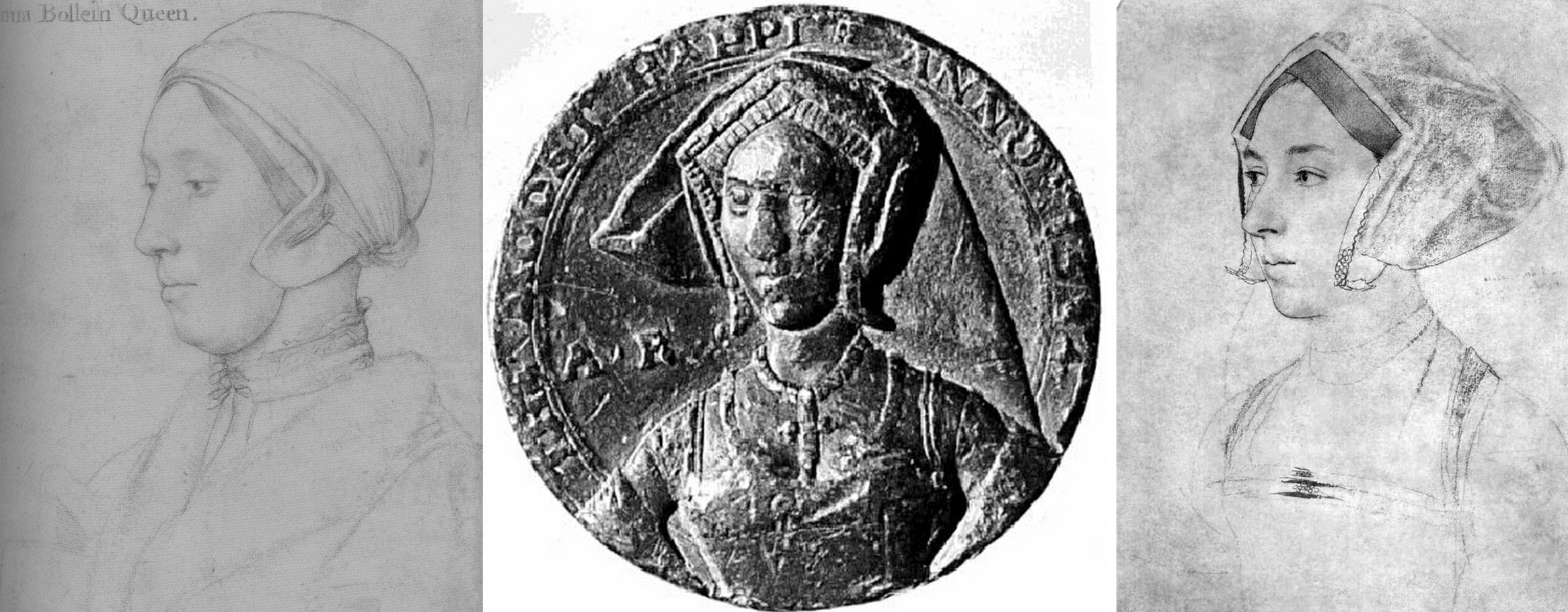
Fig. 5 above. When the Royal Collection drawing (left) and the Bradford/B.M. drawing (right, here mirrored) are seen with the medal it shows markedly more kinship with the latter drawing.
That scholarly prudence and diligence is required on these matters was recognised in Susan Foister’s 2004 Mellon Centre/Yale published monograph Holbein & England:
“There is every reason to suppose that Holbein might have painted Anne’s portrait, but no clear evidence that he did… No portraits of Anne Boleyn are mentioned as such in contemporary inventories, and official images of her are unlikely to have circulated after her execution…The only contemporary likeness of Anne appears to be that in a medal, showing her thin-faced and in a gable headdress; later painted portraits echo this image, and show her wearing jewellery with the initials A and AB…”
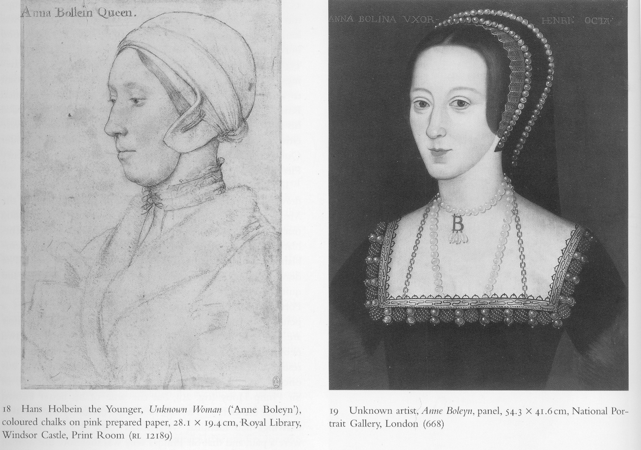
Above, Fig. 6: This photo-comparison, carried in Foister’s 2004 Holbein & England, showed the great discrepancy between the Rowlands-claimed Royal Library near-profile portrayal of Anne Boleyn (above left) and one of the many subsequently painted three-quarters view portraits like that in the National Portrait Gallery (above right) and at Hever Castle (as in Figs. 9, 10, and 13, below.)
THE WRONG HAIR COLOUR
Foister objected that the Windsor “Anne Boleyn” drawing (see Figs. 1, 14 & 18) “shows a sitter with fair hair and quite a different appearance to the [painted] portrait in the National Portrait Gallery in which the dark-haired sitter wears a pendant B.”
A seeming attempt to defuse problems arising from the Royal Collection’s acceptance of the fair-haired Windsor “Anne Boleyn” presently appears on its website:
“A portrait drawing of Anne Boleyn (c.1500-1536) on pink prepared paper. She is shown bust length in profile facing to the left. She wears a fur collar and linen cap… Although the identification of the sitter has been doubted, her informal dress and the presence of an inscription based on an identification made by Sir John Cheke have been cited as convincing evidence that the sitter is the queen (see, for example, John Rowlands and David Starkey in the Burlington Magazine, February 1983, pp. 90-2)…
“Abrasion has removed some pigment from the sitter’s hair meaning that it may now appear lighter than it did when the drawing was made. The sitter’s eyes are brown…”
Certainly, as Parker had noted, the “Windsor Holbeins have suffered in both ways from rubbing and reworking, and the fact has long been known and all too emphatically stressed.” The recorded superimposition of oiled paper for the purpose of making tracings (for engravings) can only have had deleterious effects on drawings made largely of chalks. Nonetheless, one must wonder what kind of precisely selective abrasion might have left a sitter’s eyes brown while turning her dark brown hair fair.
In her 2006 Tate Gallery catalogue Holbein in England, Foister cast doubts on both “Anne Boleyn” drawings – but not equally so. Of the British Museum drawing, and echoing Rowlands/Starkey: “The identification as Anne Boleyn arose when the drawing was in the Arundel collection and was etched by Hollar in 1649. It appears to have been based on a superficial similarity to portraits which have a reasonable claim to represent Anne… Whether Holbein portrayed Anne remains an open question: a drawing at Windsor (Parker 63) inscribed with her name shows a fair-haired woman whose appearance differs greatly from the painted portraits.” Of the British Museum drawing Foister said the dress is “similar to that of representations of those of the More family but also those of higher status: the jewels on her hood and on her bodice indicate that she might have been a member of a noble family…”
PICTORIAL TESTIMONY
What seems not to have been appreciated by any supporters of the Royal Collection drawing is that in the absence of a Holbein painted portrait of Anne – or an evidently intermediary work – adjudications between the two rival and incompatible “Anne Boleyn” drawings can only proceed on an examination of their respective correspondences with both the historically secure and dated medal and the many later painted depictions of Anne. With Anne long deceased, the later paintings had to have derived from something already painted or drawn, so the question is: which of the rival drawings is a better fit with the surviving Anne Boleyn depictions. Given the virtually complete concordance of design in Holbein’s portrait drawings and paintings (Figs. 10 and 11), appraising and comparing the now rival “Anne Boleyn” drawings with the medal and the depictions of Anne that followed her 1536 execution and the 1547 death of Henry VIII, is not only germane, it becomes, in the absence of “literary” records, of the pictorial essence – and thus is, pace Foister, a far from superficial exercise.
For example, the three rows of jewellery indicated in shorthand at the neck of Anne in the British Museum drawing are also found in completed form on the necks of both the National Portrait Gallery and Hever Castle paintings of Anne (see Figs. 7 and 11 below). Further, while this now officially discounted Holbein drawn likeness of Anne had either directly determined or – somehow – anticipated a crucially important and distinctive feature common to both types of the later painted portraits of Anne, the upgraded Royal Collection “Anne Boleyn” drawing found no echo in either type of the many later paintings.
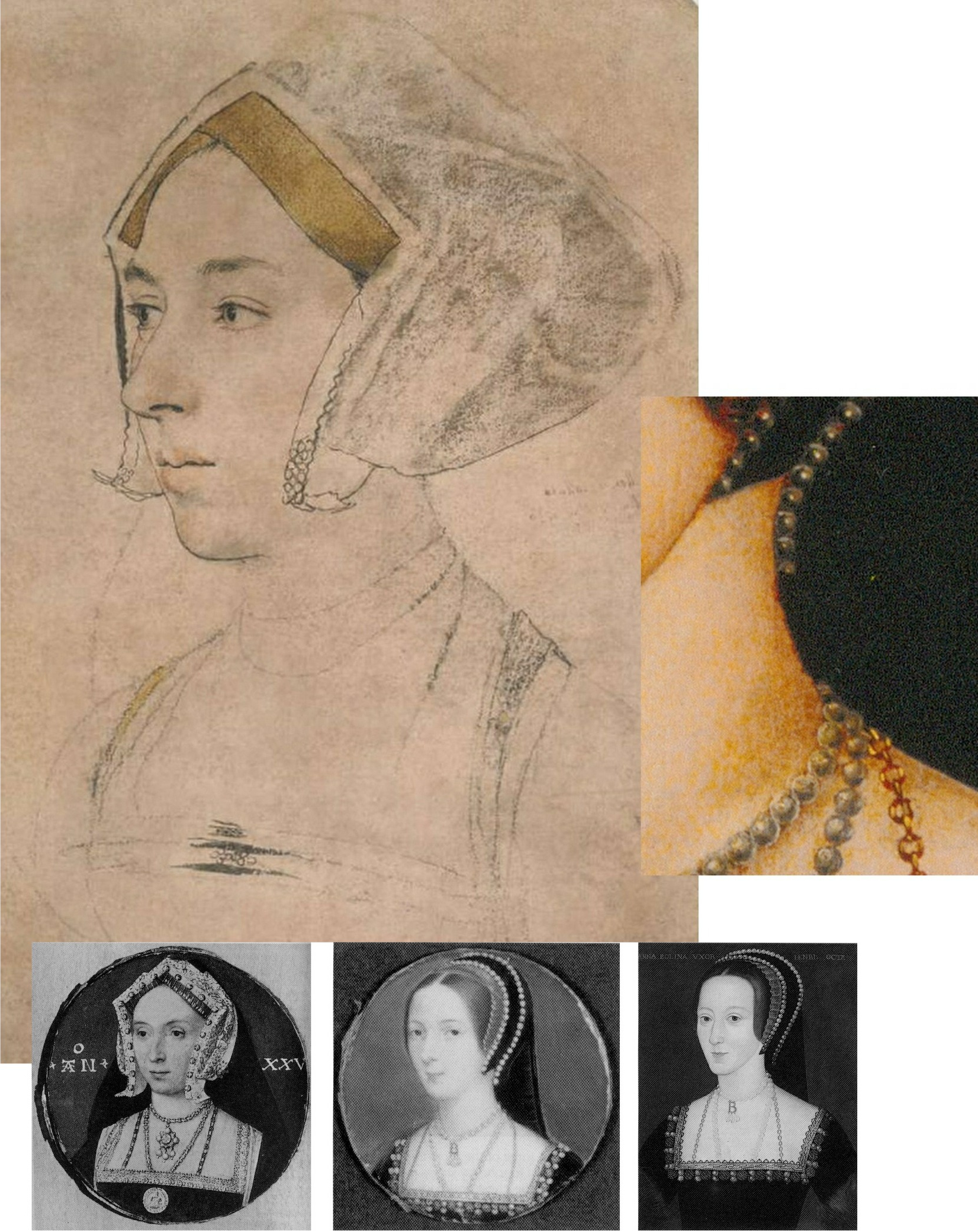
Above, Fig. 7: Top, the British Museum Anne Boleyn (mirrored); right, inset, a detail of the Hever Castle Anne Boleyn painting; bottom row, painted portraits of Anne by Lucas Horenbout (in the gable hood type) and (in the French bonnet type) by John Hoskins, and anonymous.
THE MEDAL IN THE ROOM
The only securely surviving – and dated – contemporary likeness of Anne is on the damaged 1534 commemorative medal. The medal itself, however, will have derived from a drawn design or model – but by whom? Given his designs for jewellery and other precious objects, might Holbein be considered in this regard?
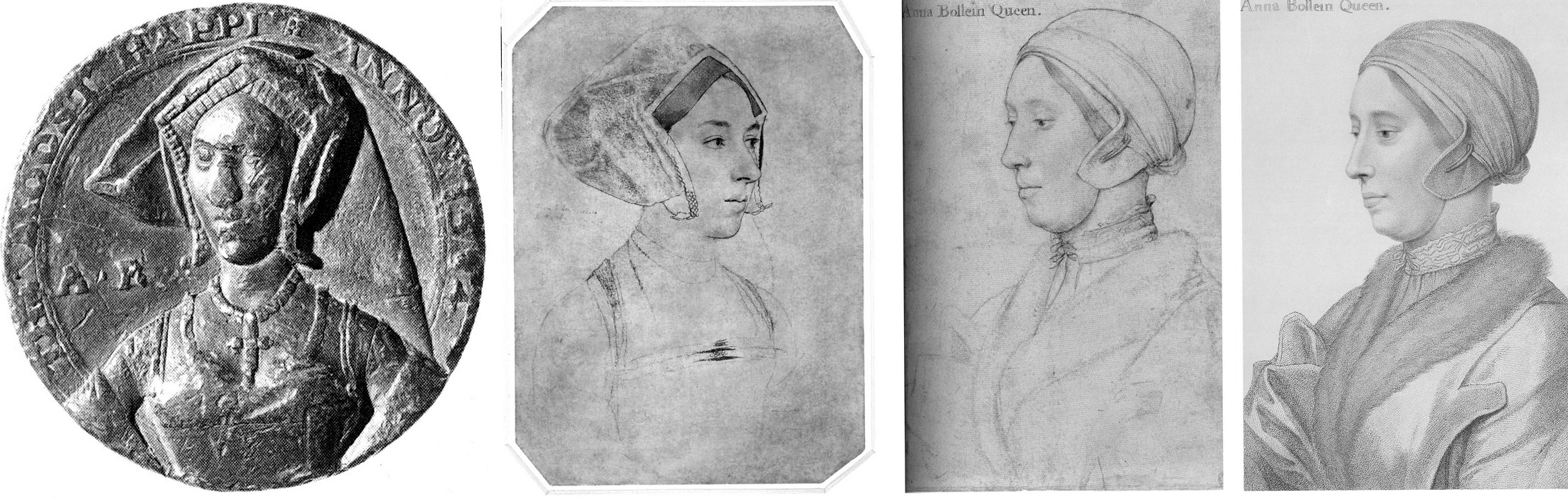
Above, Fig. 8: Left, the British Museum-owned 1534 medal; second and third left, respectively, the British Museum and the Windsor Holbein “Anne Boleyn” portraits; right an 18th century engraved copy by Francesco Bartolozzi of the Windsor “Anne Boleyn”. Prints of the Bartolozzi copy can be obtained from the National Portrait Gallery – where they are described as “Unknown woman, formerly known as Anne Boleyn”. Because of the Bradford family’s theft, there is no comparable Bartolozzi copy of the now British Museum Anne, but it might be noted that Bartolozzi showed the Windsor sitter to be fair- not dark-haired and, thus, any abrasion to the sitter’s hair must have preceded this record.
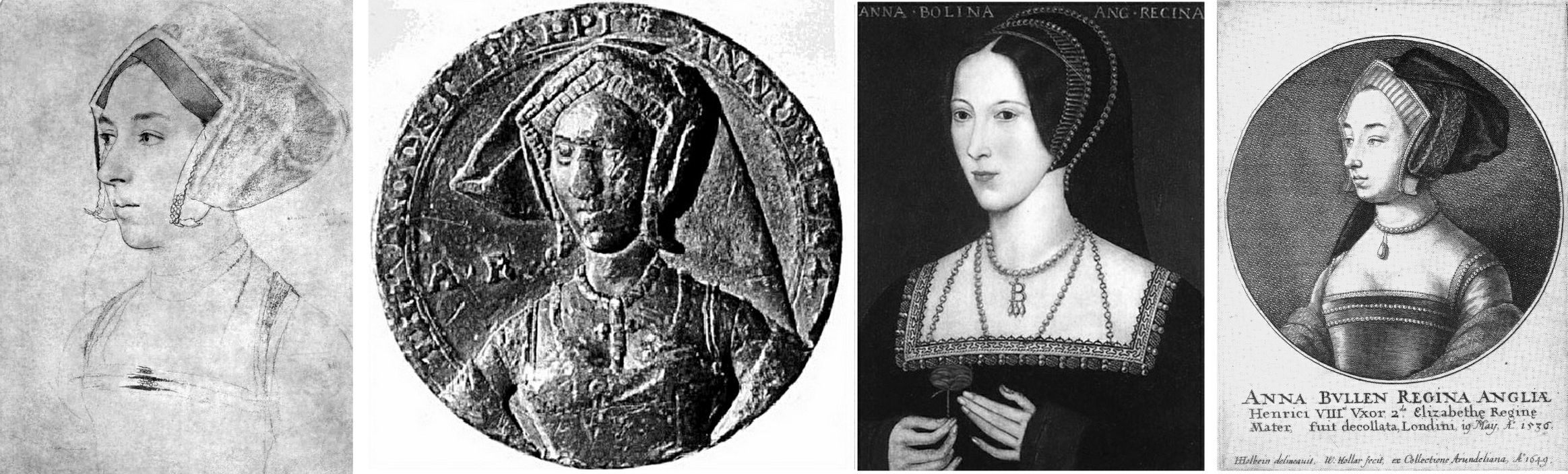
Above, Fig. 9: A possible chronological migratory sequence of depictions and motifs spanning one hundred and fifteen years. From left to right: the British Museum’s Cheke, Ganz, and Parker-ascribed Holbein drawing (here mirrored); the 1534 commemorative medal; third left, the Hever Castle, late 16th century English School oil-painted portrait of Anne Boleyn; right, the 1649 Hollar engraved copy of the British Museum drawing. It might be proposed that the British Museum drawing more likely predated the 1534 medal (struck just two years before Anne’s execution) and that it might, with its gable hood and indications of jewellery, have served in mirrored form as something of a guide to the medal maker.
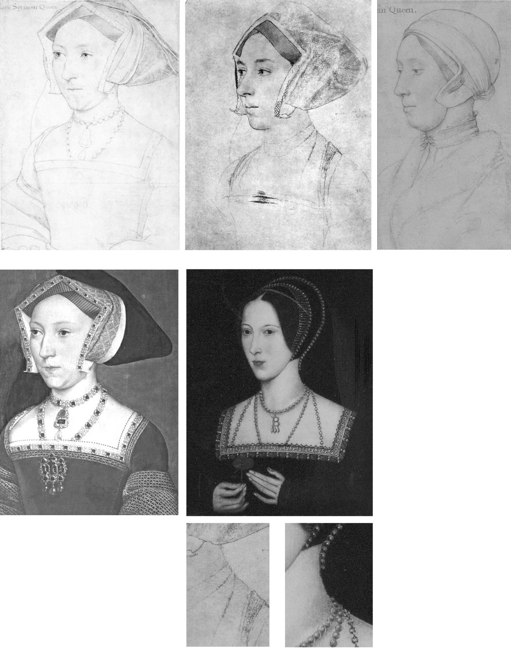
Above, Fig. 10: The extremely close design relationship between Holbein’s drawings and paintings can be seen (left column) in his drawn and painted portrayals of Jane Seymour. Such constancy would be expected also in a Holbein painting of Anne but, given either that one was never made or that none has survived, we must therefore consider from whence the (above, centre) Hever pattern of portraits might have sprung. Clearly, in terms of costume and physiognomy, it could not possibly have derived from the Windsor drawing – whereas, as seen at Fig. 7 and above here, the triple necklaces motif had migrated from the British Museum drawing to the later paintings while the Royal Collection linen cap and fur-collared nightwear costume would seem to have influenced no other work.
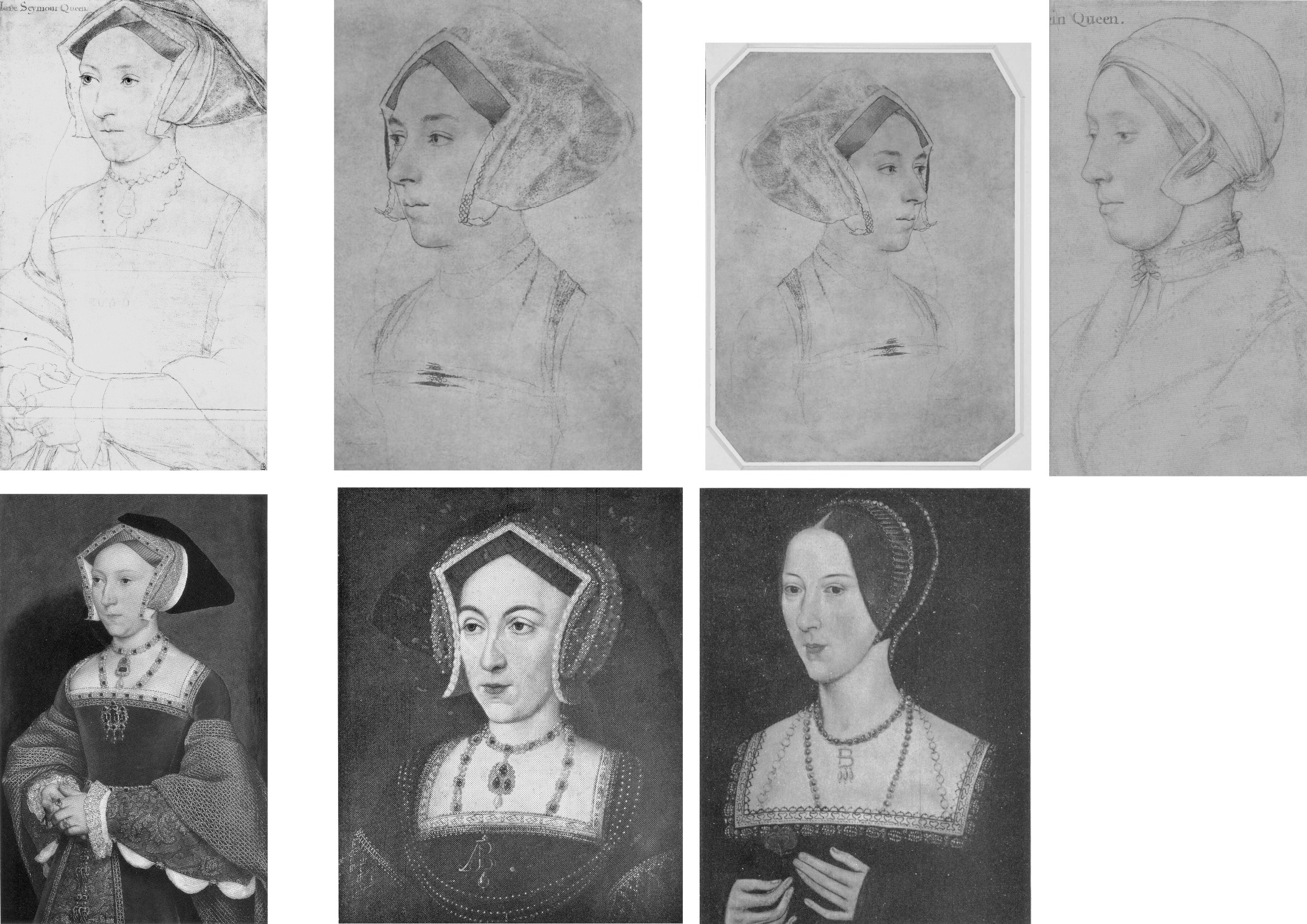
Above, Fig. 11: In the left-hand column we again see the absolute unity of design in Holbein’s drawing (top) and painting (bottom) of Jane Seymour. In the second and third columns we see degrees of kinship between Holbein’s British Museum portrait of Anne Boleyn (top row) and, below, with the two types of the later painted portraits, as found formerly at Nidd Hall, now privately owned, and at Hever Castle.

Above, Fig. 12. While all agree that the rival “Anne Boleyn” drawings (top, left and centre) could not have been made from the same person, it has not been remarked that with the Windsor “Anne Boleyn” (centre column), the general set of the face, the disqualifying double chin, and, the greater age of the sitter, find correspondences in the Royal Library’s “The Dutchess of Suffolk” (right hand column) – which include an almost identically tied, high-necked chemise. (An unsuccessful attempt was made to re-assign the identity of the Duchess of Suffolk’s sitter to an earlier wife and to count the proposed switch as a “discovery” in the 2007 Philip Mould Gallery Lost Faces exhibition.)
Fig. 13, above. In terms of likenesses, the late sixteenth century painted portrait at Hever Castle (above, top, centre) has common traits with the BM drawing (mirrored, above, top left) but none with the Windsor drawing (above, top, right) – other, that is, than a sharply drawn edge to the lower face caused, doubtlessly, by tied bonnets. As seen at bottom left, a (mirrored) pencil copy of the Bradford/BM drawing held in the Ashmolean Museum, Oxford, and now attributed to Jonathan Richardson senior, suggests that more supplementary chalk shading might formerly have articulated the head/neck relationship on the Bradford/BM drawing – and, as seen at bottom, centre, above, (and at Figs. 3 and 4), the Hollar copy of 1649 had indicated by tonal variations an implicitly continuous line of demarcation between the lower face/jaw and the neck.
HOLBEIN’S CAPTURED LIKENESSES AND THEIR ORIENTATIONS
Above, Fig. 14: Top, The British Museum and Royal Collection “Anne Boleyn” Holbein drawings; bottom, left, Holbein’s “Simon George”, which carries an inscription “S. George of Cornwall”; bottom, right, Holbein’s “Henry Howard, Earl of Surrey” (detail).
Holbein possessed a seemingly effortless ability to draw heads from any position – in one perspectival tour de force, John Poyntz (in the Royal Collection) was drawn from behind and below. Because the portraits are such vivid, compelling likenesses the artist’s remarkable spatial/plastic illusionistic facility can be underestimated. As shown below at Fig. 15, Holbein, like a sculptor, clearly appreciated that a head is an object, and that depicted faces constitute a record of the visible front of an object that is deeper than it is wide – and, therefore, that a face drawn full-on must find the graphic means to evoke the depths of a head (as was brilliantly achieved by Holbein in Henry Howard, above, right) by plastically nuanced tonal variations. So-saying is not to fail to recognise that for very good reasons and from infancy, human beings attend more to faces than to profiles – and nor is it to disregard Holbein’s own distinctive human engagement and psychological penetration*. It is simply to recognise the paradoxical ease with which viewers can safely make plastic/sculptural extrapolations from Holbein’s predominantly linear drawn likenesses. In this regard, Paul Ganz, spoke eloquently in his 1950 The Paintings of Hans Holbein: “…line was the means by which he rendered form, indicated movement and suggested expression. It remained the sure foundation even of his painting, and gave to his figure compositions, his portraits and even his decorative works an astonishing clarity and organically coherent solidity.” (*On Holbein’s emotional truthfulness, see Susan Foister’s fine “Holbein the Portraitist” in her 2004 Holbein & England.)
Above, Fig. 15: An ink-over-chalk study sheet in which Holbein simultaneously examines the plastic structures of heads; the expressive force of directional gazes; and – with a curving line in each head (except for the top right head where, being seen from the front, the profile registers as a straight line) – unfailingly locates and orientates the faces’ profiles. (Ӧffenliche Kunstsammlung, Basel, Kuperfestichkabinett.)
In all graphic, painted, and sculptural media, the profile of a head is the single most potent contour because the plastic entirety of a head is bounded by and articulated within it. Expressively speaking, the profile also fixes the distinctive “set” of a sitter’s head, as seen below and above at Fig. 14 with Holbein’s “Simon George” drawing.
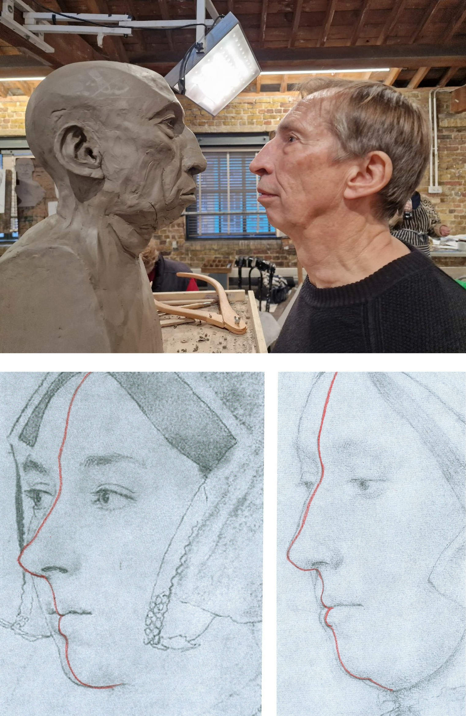
Above, Fig. 16: Top, a modelled head-in-progress and its sitter, at the Royal Drawing School; bottom, extrapolated lines indicating the location of the sitters’ profiles in the two contested “Anne Boleyn” portraits. While flesh might sag with age, the bony part of the nose does not continue to grow.
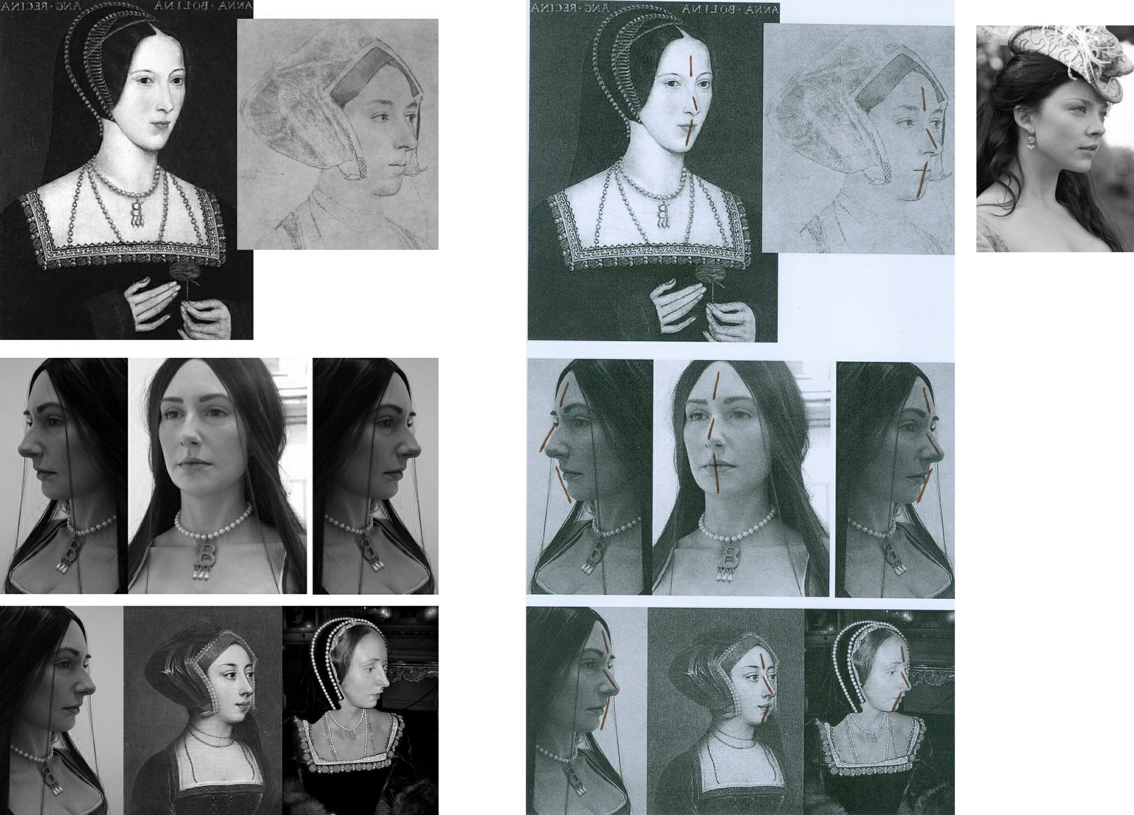
Above, Fig. 17: Top row, the Hever Castle Anne Boleyn painting (mirrored) and a detail of the British Museum Anne Boleyn drawing, far right, the actor Natalie Dormer in role as Anne Boleyn in the 2007-10 TV series The Tudors; centre row, views of an Anne Boleyn waxwork at Hever Castle modelled by Emma Pooley (– “I settled on Holbein’s sketch of Anne as it has always been my favourite, and is by far the most realistic reproduction, in terms of skill, of her image from around the time”); bottom row – the Pooley waxwork at Hever Castle; a painting of Anne Boleyn at Hever Castle; a waxwork of Anne Boleyn at Warwick castle.
All the above paintings and waxwork reconstructions of Anne Boleyn share a common and simple three-part dynamic in their profiles with that present in the British Museum drawing. That is, in each, from the top downwards: the forehead advances somewhat; the nose advances more rapidly; but then, from the base of the nose the profile moves into reverse and retreats appreciably down through the mouth and to the chin. The Royal Collection drawing’s profile has a different, flatter dynamic and for clear reasons of anatomy could not have been made from the same sitter.
WHO WAS ANNE BOLEYN?
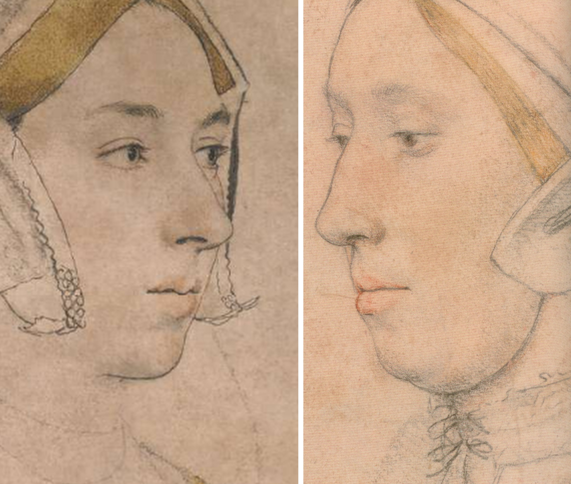
Above, Fig. 18: Left, the British Museum Holbein Anne Boleyn drawing (detail); right, the Royal Collection Anne Boleyn drawing (detail). Note the line that descends from the turned-up wing of the gable hood on the right of the BM drawing.
The sitter on the left is younger, slimmer, brighter-eyed (albeit with grey/blue eyes, not brown) and is shown to have dark hair and dark eyebrows. She has a sharper, less highly bridged and more upturned nose with markedly larger nostrils. Her eyes are focussed, attentive, seemingly purposive, certainly not downcast, or self-absorbed and reflective – or with a pronounced fold of flesh over the upper eyelids. She has a single, not a double chin. In this context, Anne’s recorded character and appearance might be considered. Eric Ives, author of the acclaimed 2004 The Life and Death of Anne Boleyn (which succeeded his 1986-1994 Anne Boleyn), wrote:
“Captivating to men, Anne was also sharp, assertive, subtle, calculating, vindictive, a power dresser and a power player, perhaps a figure to be more admired than liked…All reports agree that she was dark. As well as Sanuto’s ‘swarthy’, Thomas Wyatt gave her the poetic name, ‘Brunet’.”
Ives cited a host of contemporary descriptions:
“…beautiful with an elegant figure”; “very beautiful”; “very eloquent and gracious, and reasonably good looking”; “young and good looking”; “not one of the handsomest women in the world, she is of middling stature, swarthy complexion, long neck, wide mouth, a bosom not much raised, and eyes which are black and beautiful…” Ives summarised: “Looks only tolerable, but a splendid head of dark hair and fine eyes”. One observer expanded on Anne’s use of her eyes: “…eyes always most attractive Which she knew well how to use with effect, sometimes leaving them at rest, and at others sending a message to carry the secret witness of the heart. And truth to tell, such was their power That many surrendered to their obedience.” Ives remarked that Anne “…radiated sex”. Emma Pooley’s choice of source image was sound: no female sitter’s eyes in Holbein’s drawings better evoke such reported properties and powers than those found in the British Museum drawing of Anne Boleyn – and, on this emotionally charged correspondence, Rowlands had seemed almost to concur in 1977: “The eyes, of a rare beauty, the eyebrows and eyelashes are all marvellously drawn”.
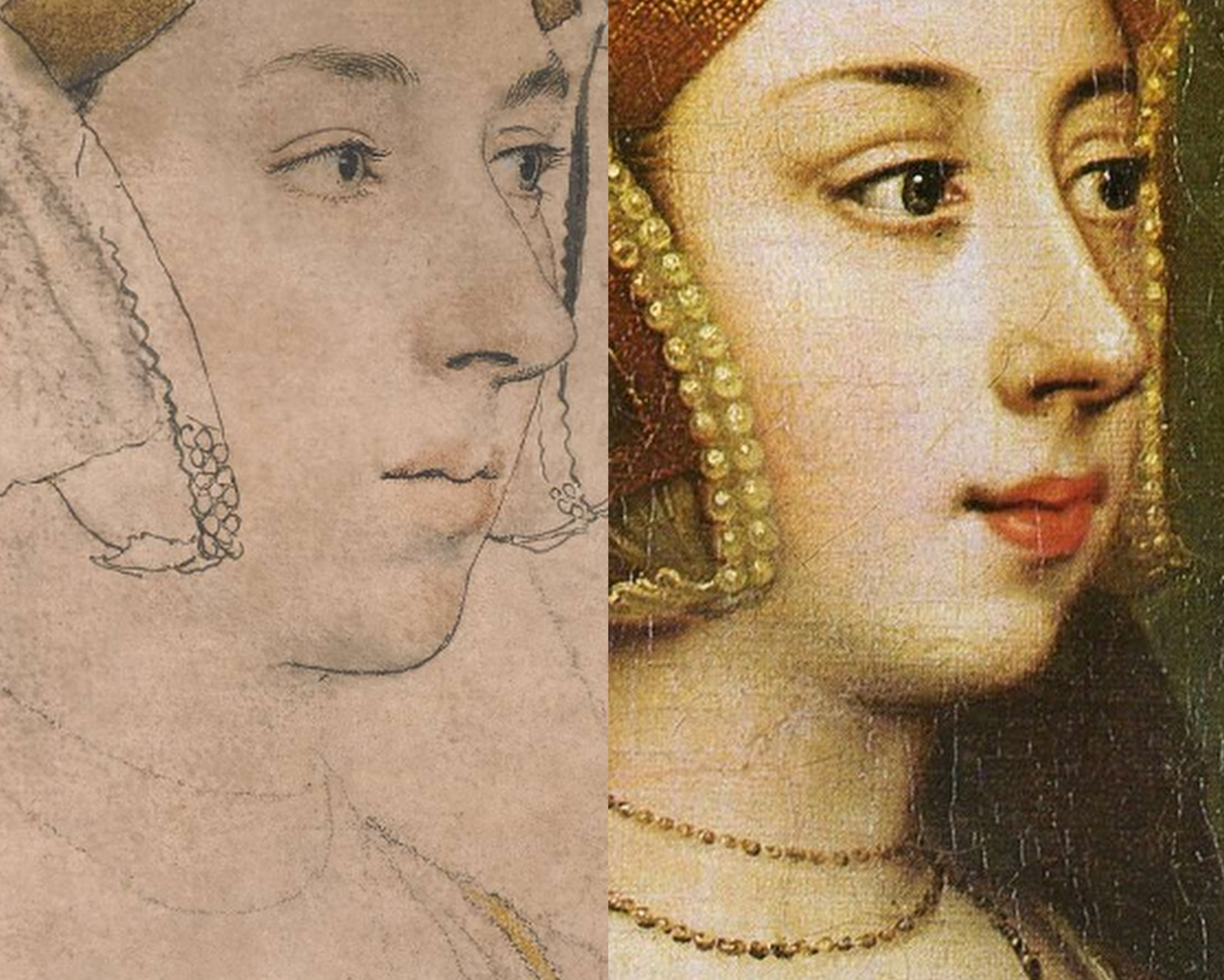
Above, Fig. 19: The arresting eyes, quivering nostril and sensuous mouth drawn by Holbein had migrated so faithfully and vividly to the (above right) later painted portrait at Hever Castle that there would scarcely seem space between them for an intermediary work. The line of the descending hood drapery in the bottom right corners of the above details departs from behind precisely the same points on the respective turned-over wings of the gable hood. Similarly, there is an almost perfect duplication in the painting of Holbein’s lightly indicated triple necklaces. Trigonometry (and see below) no less than sexual animation, testifies here to an almost identical and – surely – true likeness of Anne?
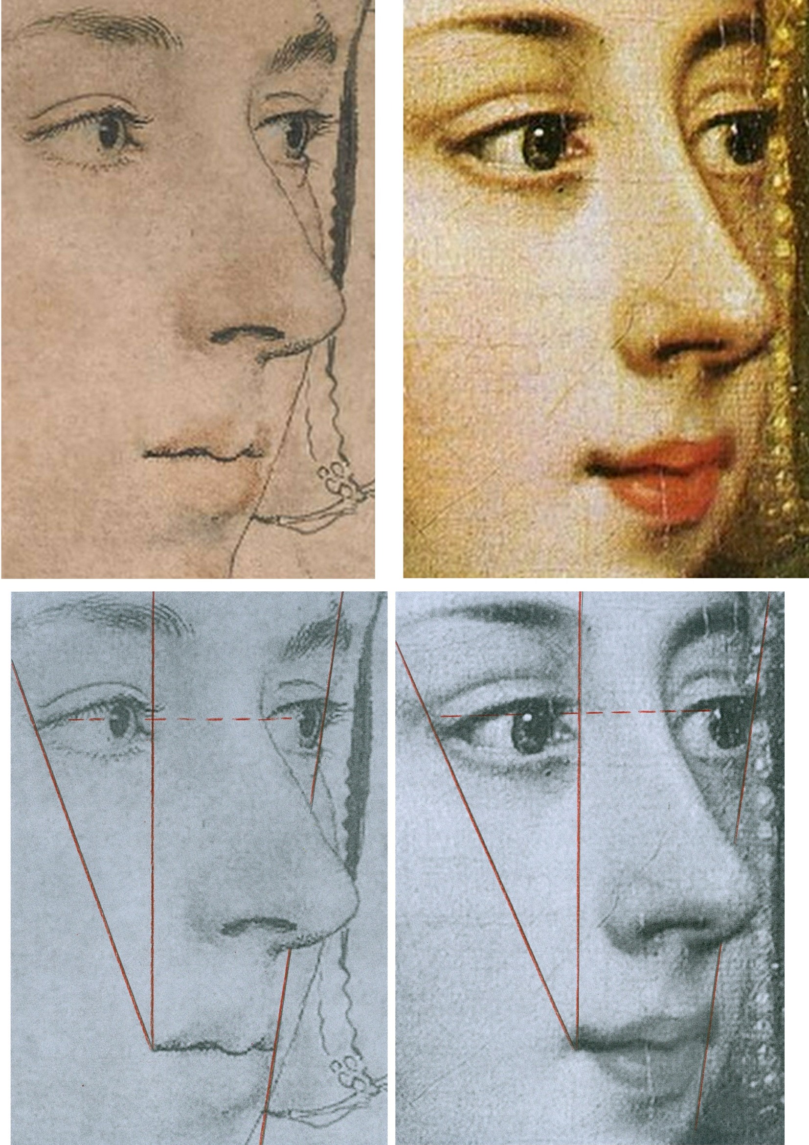
Above, Fig 20: There are differences sufficient between the drawn and painted images above to show that the painting was not made on a transposed tracing of the drawing, but the essential trigonometric relationships between the features make it inconceivable that the one image had not derived from the other – and with both describing the same sitter – even though the drawing is a more sparingly rendered account than that in the weightier, lusher and historically later oil painting. The immense odds against the reflected highlights in the eyes of two different works made decades apart and in different mediums coincidentally occurring in alignment, at the same latitude, and at the junctions of the pupils and irises, leave no option other than to conclude that what we have here is two near-identical heads that share a common light source because the one image derived from the other and both share the common sitter of Anne Boleyn.
The mouth in this Holbein drawing may be unique in the artist’s portraits. So far as we recall, Holbein invariably showed a single line of demarcation between his sitter’s upper and lower lips. On the mouths of both the drawing and painting above there seems to be a parting of the lips on the left. Ives mentions that the most hostile witness, the “Elizabethan recusant activist”, Nicholas Sander, claimed Anne had “a projecting tooth under the upper lip”. The same witness also testified that, nonetheless, as well as being handsome, Anne had “a pretty mouth”.
THE 1977 ROWLANDS CASE
On his methodologically flimsy and not duly illustrated account Rowlands had gingerly proposed in 1977 that “An implication of the rejection of the Bradford/BM portrait as a representation of Anne Boleyn, is that the drawing in the Royal Collection series with the inscription Anna Bollein Queen could in principle be once again a candidate for consideration as the Queen.” Having also admitted that the problem of the identity of his (not-shown) candidate Royal Collection drawing “must remain unsolved” for “want of less inconclusive evidence”, Rowland’s espousal in toto constituted little more than a-case-proposed-but-not-made. On occasions, Rowlands seemed bent on deconstructing his own case: when speaking of the British Museum drawing’s “precision” and “excellence” of outlining, for example, he well noted that “In addition to giving depth to the face, the brush-line of varying thickness defines the line of the wavy outer edge of the right-hand side of the headdress, and has enabled the artist to determine its position exactly in relation to the line of the cheek and the nose” – just as is shown in the close-up in Fig. 20, above, left. That so-careful and deft recording of the features, he ended, “is the hallmark of all Holbein’s portraiture, and it is particularly disappointing that the painting that would no doubt have been done from this drawing, should not have survived.” Disappointing indeed, but no reason to pivot towards an alternative drawing that had left no waves and triggered no echoes – not least because in regretting the likely destruction of Holbein painted version of this particular Anne Boleyn-ascribed drawing, Rowlands had overlooked the fact that the drawing itself had found a close and faithful painted expression in a second Hever Castle Anne Boleyn work, as shown above.
Six years later Rowlands would co-author an article with the Tudor historian David Starkey in the February 1983 Burlington Magazine – “An Old Tradition Reasserted: Holbein’s Portrait of Anne Boleyn”.
THE ENTRANCE OF DAVID STARKEY
Above, Fig. 21, an ink drawing (in the collection of Professor Edward Chaney) of David Starkey that was made by the author to illustrate a profile article, “The apoplectic academic”, by D. J. Taylor, in the Independent on Sunday, 9 November 2001.
In Part II, we examine how the Starkey-bolstered Rowlands’ Case came to persuade the Royal Collection that it now holds the true Anne Boleyn Likeness.
Michael Daley, Director; 18 April 2024
ArtWatch at Thirty, Part II: The Artful Promotion of the World’s Worst Restorations

15 APRIL 2023. MICHAEL DALEY WRITES:
In Part I we set the 1980-1994 cleaning of Michelangelo’s Sistine Chapel frescoes in the era’s ambitiously experimental and accident-prone restorations. Here, we examine the art-historically untenable scholarship that arose when Michelangelo’s debilitated frescoes were endorsed as if constituting revelations that merited a rewritten history of art. Three decades on, identifying and examining the polished art-political stratagems that draw so many scholars and art critics into supporting egregiously destructive restorations remains a matter of professional urgency.
Above, Fig. 1, Top: National Geographic’s iconic photo-record of the Sistine Chapel ceiling which captured the last moments of the most acclaimed late stage of Michelangelo’s painting, including his The Crucifixion of Haman, the Prophet Jonah, and the Libyan Sibyl. Above, the post-cleaning, LED-lit chapel. When unveiled in 1512, the then brilliantly lit and shaded figures set in deep architectural spaces were eulogised for having made surfaces which physically advanced towards the viewer recede optically through Michelangelo’s powers of design and unprecedented deployment of lights and shades. At the time, no one spoke of Michelangelo’s colour – “brilliant” or otherwise.
TWIN AND CROSS-LINKED ASSAULTS ON A CRITIC
On 8 October 1987, halfway through the cleaning of the Sistine Chapel Ceiling, the restoration’s leading scholarly critic, Professor James Beck, Chairman of Columbia University’s Art History and Archaeology Department, was branded the “most culpable of the critics” by Sir John Pope-Hennessy in the New York Review of Books (“Storm Over the Sistine Ceiling”). Two months later, that attack was followed by another in the December Apollo magazine by Kathleen Weil-Garris Brandt (“Twenty-five Questions about Michelangelo’s Sistine Ceiling”). Like Pope-Hennessy, Brandt was a professor of Renaissance art at New York University’s post-graduate art history school, The Institute of Fine Arts (which incorporates a Samuel H. Kress Program-sponsored conservation department), and she was considered a long-standing friend by him.
Brandt characterised the restoration’s critics as “a tiny, heterogenous and vociferous cadre”. She likened their arguments to “the wild cries of some ferocious mutant of Chicken Little” and added “Many believe that the critics, like that benighted bird, were misunderstanding insufficient evidence, to draw mistaken conclusions to the alarm and detriment of the neighbours.” She conceded the issue “is a serious one” but only the better to sting: “Are the critics merely opportunists, bodysurfing in a wave of publicity they would never otherwise have enjoyed?” In his 2016 memoir, Michelangelo and I, Gianluigi Colalucci, the restorer/co-director of the Sistine Chapel restorations, described Brandt as “sweet and gentle in appearance but with a character of steel” who, having “obtained her own office in the museum complex”, had “put just about everybody under pressure with her inflexible activity”.
“THINGS ARE NOT AS YOU THINK”
There were degrees of hypocrisy in both attacks. Pope-Hennessy’s charge of professional culpability had followed his invitation to Beck to serve on a Metropolitan Museum Advisory Committee. As Colalucci would later disclose, Brandt’s denigration was not made as the self-effacing and disinterested scholar she had implied in Apollo – “Like many Renaissance scholars, I have held a kind of informal watching brief for the cleaning operation since its inception in 1981 [sic] and I talk on the subject with groups and individuals of all kinds.” Formally speaking, Brandt had two dogs in this fight. First, she had obtained her Vatican office as the official spokesman on “Scholarly and General information” for Arts and Communications Counsellors, a division of the New York Public Relations firm Ruder and Finn Inc. which had been retained by the Vatican to handle the restoration crisis. Second, she was a member of a shadowy, secretive scientific advisory committee the Vatican had set up, ostensibly, to monitor the controversial restoration. On learning of that committee, Colalucci threatened to resign but was dissuaded by his restoration co-director, Fabrizio Mancinelli, who urged him to calm down because: “You’ll see that things are not as you think…” In due course, Colalucci recalled, “we were given to understand that the findings were positive”.
As will be shown in Part III, the ploy of an institutionally self-appointed, supposedly invigilating but intended exonerating body, had been honed at the National Gallery in 1947 and 1967. Given the importance of the greatest art, whenever major restorations are started, they must, of political necessity, be defended unequivocally for the duration and at length thereafter, for fear of triggering institutional melt-downs. When a restoration of sacred art in a sacred place is funded in advance by a foreign corporation in a commercial exchange for film and photography rights, any admission of error becomes doubly inconceivable. Little surprise therefore that, as Colalucci disclosed, the Vatican’s own scientific advisory committee remained in place as a supportive “working group” throughout the entire restoration of Michelangelo’s Sistine Chapel frescoes. Headed by André Chastel, this group’s members, in addition to Brandt, were:
“Carlo Bertelli of Lausanne University, initiator of the restoration of Leonardo’s Last Supper executed by Pinin Brambilla [See: The Perpetual Restoration of Leonardo’s Last Supper, Part I: The Law of Diminishing Returns]; Pierluigi De Vecchi, an expert on Michelangelo; Sydney J. Freedburg from Washington; Giovanni Urban[i] former director ICR [the Istituto Centrale di Restauro]; Luitpold Frommell and Matthias Winner, directors of the Bibliotecca Hertziana in Rome; Umberto Baldini, director of the ICR [and head of the Brancacci Chapel restoration]; Michael Hirst, an expert on Michelangelo’s drawings; John Shearman, an expert on Raphael and the Sistine Chapel…The restorers were Alfio Del Serra from Florence…and Paul Schwartzbaum from New York, head of the ICCROM school and projects in Rome. Norbert Baer from New York University was the only chemist.”
THE SAMUEL H. KRESS FOUNDATION INTERVENTION
Colalucci aired a secondary grievance concerning the advisory committee in 2016: “By express desire of Chastel and the other members, we were not allowed to inform the press of the work of this group of experts, even though it would have been of great benefit to us because” [the quasi-invigilators] “wished to keep a low profile and avoid the attention of the already overly excited public opinion”. However, “Shortly afterwards, Marilyn Perry, the pleasant and dynamic president of the Kress Foundation, set up another working group, this time consisting almost exclusively of restorers on her own initiative.”
“The members were Mario Modestini, the foremost restorer in America; John Brealey, director of the restoration department of the Metropolitan Museum of Art in New York; the young Dianne Dwyer, then assistant to John Brealey [see Fig. 11 below]; Andrea Rothe, director of the restoration department of the J. P. Getty Museum in Malibu; David Bull, director of the restoration department of the National Gallery in Washington [see Figs. 2 and 3 below]; and Leonetto Tintori, a highly skilled restorer from Florence [see Fig. 3 below].
“The group’s task was to monitor our work, give advice and put forward criticisms. The [single] meeting was very fruitful and ended positively with a report drawn up [by] the members of the group aimed in particular at public opinion in the United States.”
The resulting open letter from this committee to the American press executed its expressly intended effect to perfection. In April 1987, Time’s art critic, Robert Hughes, claimed:
“…most experts on Renaissance art, and on Michelangelo in particular, strongly endorse it and reject out of hand the anti’s allegation of haste or insufficient study…Last week a further vote of confidence came from the Samuel H. Kress Foundation, a long-established non-profit organisation concerned with the care and preservation of Italian art. Six of the world’s leading conservators… reported in an open letter that the ‘new freshness of the colours and the clarity of the forms on the Sistine Ceiling, totally in keeping with 16th century Italian painting, affirm the full majesty and splendor of Michelangelo’s creation’”
John Russell reported in the New York Times:
“An international Group of leading conservators of Italian paintings has given its unanimous and strongly enthusiastic approval to the current restoration of Michelangelo’s frescoes in the Sistine Chapel in Rome…Though not intended as a riposte to recent criticism of the restoration the report could be said to rebut the attacks that have been made upon it. Among those who have opposed the restoration are Prof. James Beck of Columbia, Alexander Eliot, formerly of Time Inc. and a group of 14 American artists who asked the Pope to halt the work…”
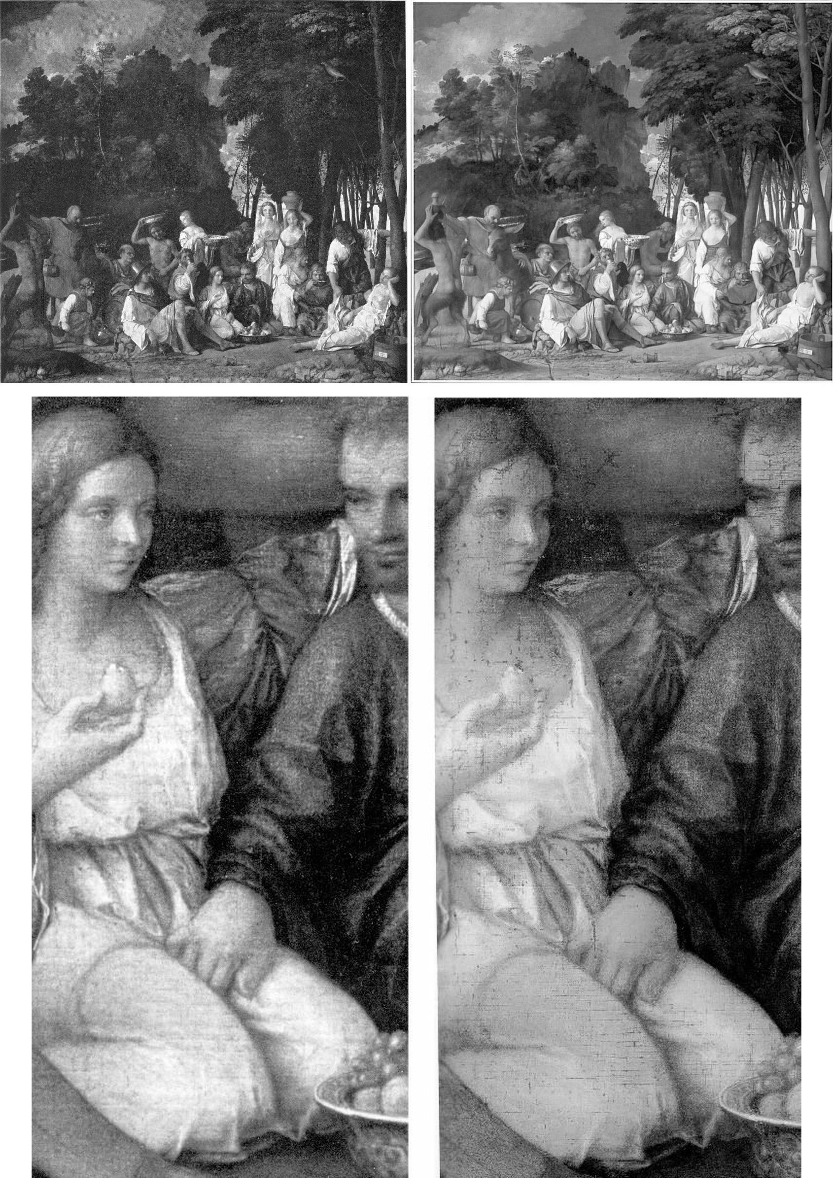
Above, Fig. 2: Top, the David Bull-restored Bellini/Titian Feast of the Gods, (before cleaning, left; after cleaning, right); below, a detail before cleaning, left, and immediately after cleaning, right. If Bull had simply removed a discoloured film of varnish, the previously discernible tonal values would have emerged enhanced – and not, as seen, diminished, compressed, and with a flattening of previously tangible forms. Such losses were Bull’s forte: when he restored Turner’s Rockets and Blue Lights (Fig. 3, below), one of the picture’s two distressed steamboats disappeared and its plume of once-black smoke was painted into a waterspout. (When that restorations-wrecked picture was sent to the UK on a tour, credulous British art critics took their lead from a Tate Gallery press release and gushingly proclaimed it “One of the stars of the show”.)
Above, Fig. 3: Left, Turner’s painting of two steamboats in distress, “Rockets and Blue Lights…” as seen in: 1896 (top); 1934 after restoration by William Suhr (centre); 2003 after restoration by David Bull (above). Right, Massacio’s Holy Trinity in the Santa Maria Novella, Florence, after restoration by Leonetto Tintori.
SUCKERED ART CRITICS
Where the Kress Committee’s open letter achieved immediate propagandistic effect, it took time for the claimed unanimity of its expert endorsement to dissolve. In a 28 April 2012 post we made the following (uncontested) disclosures:
“ArtWatch has been haunted for two decades by a nearly-but-not-made restoration disclosure. In the 1993 Beck/Daley account of the Nippon TV sponsored Sistine Chapel restoration (Art Restoration: The Culture, the Business and the Scandal), we reported that in the late 1980s Leonetto Tintori, the restorer of Masaccio’s Holy Trinity in the Santa Maria Novella, Florence [Fig. 3, above] and a member of the international committee that investigated the controversial cleaning, had urged the Sistine team privately to preserve what he termed ‘Michelangelo’s auxiliary techniques’ which in his view included oil painting as well as glue-based secco. What we had not been able to say was that Tintori (who died in 2000, aged 92) had prepared a dissenting minority report expressly opposing the radical and experimental cleaning method.
“Shortly before the press conference called to announce the committee’s findings, Tintori was persuaded by a (now-deceased) member [Fabrizio Mancinelli] of the Vatican not to go public with his views. He was assured that his judgement had been accepted and that what remained on the Sistine Chapel ceiling of Michelangelo’s finishing auxiliary secco painting would be protected during the cleaning. With a catastrophically embarrassing professional schism averted, the restoration continued and the rest of what Tintori judged to be Michelangelo’s own auxiliary and finishing stages of painting was eliminated. Without knowledge of Tintori’s highly expert dissenting professional testimony, the public was assured that despite intense and widespread opposition the cleaning had received unanimous expert endorsement. Critics of the restoration were left prey to disparagement and even vilification.”
Our 1993/2012 claims on the dissent within the international committee had been double-sourced by James Beck and the Florence-based art historian Richard Fremantle in conversations with Tintori (a member of ArtWatch). They became triple-sourced and document-backed on 8 June 2011 when the Titian expert and former director of the Warburg Institute, Professor Charles Hope, gave the following account when delivering the third James Beck Memorial Lecture (“The National Gallery Cleaning Controversy”) at the Society of Antiquaries, London:
“It would be unrealistic to suppose that those directly involved in the restoration would willingly concede that large areas of Michelangelo’s own work were removed. But even those who believe that the restorers did a good job ought to recognise that much of the controversy could have been avoided if a more careful assessment of the art-historical evidence had been carried out before the restoration began. But no serious investigation was made of the records of earlier restorations, the issues raised by Wilson were not addressed, and Vasari’s testimony was accepted as conclusive evidence that Michelangelo only used buon fresco, without any recognition of its problematic character (which was well understood in the nineteenth century) and without any discussion of the evidence of Armenini. In this context, one might also mention an article in the 1995 Revue de l’art by Leonetto Tintori, the most experienced restorer of Tuscan frescoes of his generation, who died in 2000 at the age of 92. Tintori was consulted about the desirability of restoring the ceiling, and I understand that he opposed it. The most important point in his article is that the technique supposedly used by Michelangelo on the ceiling, buon fresco alone, with only very small additions in secco, was entirely inconsistent with the practice of other painters in Tuscany, from Buffalmacco to Lippi and Sarto; and the same point was made by Eve Borsook [art historian and author of the 1960 and 1980 The Mural Painters of Italy] in the same journal. Tintori ended his article by deploring the modern practice of ever deeper cleaning, concluding, ‘This new orientation aimed at the total restitution of the original paint has had the paradoxical effect that the appearance of pure authenticity has become increasingly rare.’ Given his membership of the [Kress-assembled] committee that recommended, apparently against his own advice, the restoration of the ceiling, he could hardly have attacked the results explicitly, but it cannot be by chance that he chose to say what he did, a year after the publication of the [Vatican’s] final restoration report.
WHO HAD KNOWN OF TINTORI’S DISSENT?
In his 2016 memoir, Colalucci made no mention of Tintori’s opposition or his 1995 Revue de l’art views on the destructiveness of the Sistine Chapel restorations – his sole reference to the opposing restorer came in his above-cited composition of the Kress committee. Presumably, all other members of the working group – Modestini; Brealey; Dwyer [-Modestini]; Rothe and Bull had known of his opposition, as had Mancinelli. Perhaps Marilyn Perry and Colalucci had not known, but, certainly, Robert Hughes, John Russell, and very many other journalists were duped. Brandt gave no hint of Tintori’s opposition in Apollo but she stopped fractionally short of claiming unanimity:
“Everyone agrees with David Bull, Head of Paintings Conservation at Washington’s National Gallery of Art, that ‘the work being done on the frescoes should be meticulously watched, examined and questioned… (Fresco conservators seem not to be disturbed by the cleaning.)”
POPE-HENNESSY’S ATTACK ON BECK
When dubbing Beck the most culpable scholar/critic, Pope-Hennessy detached himself from his professional obligations:
“If you are an art historian, it is essential to free yourself from the fetters of your profession. The Sistine Ceiling is no more the property of art historians than the Ninth Symphony is the property of musicologists.”
The analogy was perversely inapt: in the Sistine Chapel, two recently appointed young officials – an art historian/curator and a quasi-scientific restorer – were rewriting a score they had ignorantly/wilfully misread in defiance of their predecessors’ views and reports and they were demanding that musical history be re-written to sanctify their systematic adulterations.
Pope-Hennessy was not alone in standing on such treacherous ground – he was running with a pack. His denunciation of Beck was made in a review of the 1986 book The Sistine Chapel: The Art, the History, and the Restoration (- published in the UK as The Sistine Chapel: Michelangelo Rediscovered). The book carried accounts from the three principal Vatican agents of the restoration: Professor Carlo Pietrangeli (Director General of the Vatican Museums); Dr Fabrizio Mancinelli (Curator of the Vatican Museums’ Byzantine, Medieval and Modern collections); and Gianluigi Colalucci (the Vatican’s Chief Restorer) – the latter two being the restoration’s co-directors. Their views were implicitly endorsed by accompanying scholarly essays from André Chastel, Pierluigi de Vecchi, Michael Hirst, John O’Malley, and John Shearman. The book was co-published by the Nippon Television Network Corporation which had sponsored the 1980-1994 restoration for $3million in exchange for all film and photography rights throughout each of the restoration’s three stages (the upper wall lunettes; the ceiling; and the Last Judgement altar wall) and for three years afterwards on each part.
INDEFENSIBLE METHODS
Pope-Hennessy appreciated that the restoration breached fundamental protocols by being conducted piecemeal on a narrow, enclosed platform when under intense film-set lighting that denied the restorers any means of appraising the actions and artistic effects of their radical, oven cleaner-like gelled cocktail of soda, ammonia, and detergents. (See Figs. 1 and 4.)
The cleaning paste, AB57, had been formulated to strip all historic organic materials from the plaster surface in two three-minute applications set twenty-four hours apart and removed each time with copious amounts of sponged water. The solvents-contaminated rinse water saturated the fresco plaster so completely that underdrawings on a lower plaster layer became visible. Empty assurances were given that a new air-conditioning system would protect the newly exposed bare plaster surfaces from the Chapel’s notoriously high levels of dirt, humidity, and fluctuating temperatures. Reports later emerged of secret night-time removals of white powder accumulations on the ceiling frescoes. By 2013 the ceiling had been lit to brighter and more colourful effect with powerful LED lights, when the chief defence of the restorers had been their supposed recovery of originally brilliant colours. See “The Twilight of a God: Virtual Reality in the Vatican” where we asked:
“Given this recent history, might Prof. Brandt – or any of the restoration’s supporters at that time – ever have imagined that within a couple of decades the Vatican would conclude that the chromatically brilliant ‘New Michelangelo’ would require artificial lighting ten times more powerful than that installed at the time of the restoration?”
In 2016, Colalucci blamed the chapel’s initially too-powerful levels of artificial lighting for the cleaning controversy itself:
“None of us had realized that after cleaning, these frescoes needed minimal lighting in order to be seen correctly. We should have considered the fact that, having been painted to be seen solely in light from the windows or candles and torches, they would look wrong in very brights lights such as television crews use.”
Despite the claim that the restoration had recovered an original intense chromaticism in Michelangelo’s painting that required low levels of lighting, the apparently natural light entering through the chapel’s windows was subsequently turbo-charged:
“…in the end the entire lighting system was revolutionized and moved outside with quartz lamps behind the window panes in accordance with a project devised by the technical department for a combination of natural and artificial light. Today with the new [LED] technologies, the Vatican Museums have installed a new lighting system with good results.”
THE STILL-UNSOLVED ATMOSPHERIC POLLUTION PROBLEM
On 10 January 2013 we reported:
“It is now clear that having first engineered a needless artistic calamity, the Vatican authorities have additionally contrived a situation in which the already adulterated remains of Michelangelo’s Sistine Chapel frescoes are presently in grave physical peril. On January 2nd 2012 Art Daily carried an Agence France-Presse report on the panic that has beset the Vatican authorities over the present and worsening environmental threat to the Chapel’s frescoes:
“The Vatican Museums’ chief warned that dust and polluting agents brought into the Sistine Chapel by thousands of tourists every-day risk one day endangering its priceless artworks. Antonio Paolucci told the newspaper La Repubblica in comments published last Thursday that in order to preserve Michelangelo’s Last Judgment and the other treasures in the Sistine Chapel, new tools to control temperature and humidity must be studied and implemented. Between 15,000 and 20,000 people a day, or over 4 million a year, visit the chapel where popes get elected, to admire its frescoes, floor mosaics and paintings. ‘In this chapel people often invoke the Holy Spirit. But the people who fill this room every day aren’t pure spirits,’ Paolucci told the newspaper. ‘Such a crowd… emanates sweat, breath, carbon dioxide, all sorts of dust,’ he said. ‘This deadly combination is moved around by winds and ends up on the walls, meaning on the artwork.’ Paolucci said better tools were necessary to avoid ‘serious damage’ to the chapel… The Sistine Chapel, featuring works by Michelangelo, Botticelli and Perugino, underwent a massive restoration that ended in the late 1990s. The restoration was controversial because some critics said the refurbishing made the colours brighter than originally intended.”
POPE-HENNESSY’S MANIFEST AMBIVALENCE
Without addressing the invasive actions of AB57 – the use of which had been condemned by restorers, scientists, artists, and art historians – or the abnormal film lighting – Pope-Hennessy did acknowledge some of their artistically disruptive consequences:
“On the other hand, it must be recognised that the effect made by any section of the fresco is contingent on the cleaning not only of that section but of the areas contiguous to it. The figure of God the Father in the Creation of the World could be cleaned faultlessly, but it would appear less dominant if the equation between the figure and the fictive moulding around it were disturbed. This has occurred in the first half of the ceiling…where the upper strip of the [fictive architectural] framing is now too light. If this happened in the second half of the ceiling, there would be protests that the Genesis scenes had been diminished or spoiled. The present width of the scaffolding is the equivalent roughly of one bay of the ceiling, and it is extremely difficult when standing on it to judge the relationship of the part of the ceiling that is within touching distance to the cleaned part beyond. I have repeatedly wondered whether it would not be prudent in the second half of the ceiling to employ a platform of double width, even at the cost of denying a larger area of the fresco to current visitors.” (Emphases added.)

Above, Fig. 4: The Sistine Chapel ceiling showing the restorers and film-makers’ platform approaching the most brilliant, deep-space final stages of Michelangelo’s painting.
“TO RESTORE OR NOT TO RESTORE” – COLALUCCI’S BREACH OF PROTOCOLS
Had Pope-Hennessy’s suggestion been made and accepted (thereby tacitly acknowledging an unsound seven-year long procedure) it would have had no effect. Colalucci had stipulated the pre-set, no variations, two three-minute AB57 applications precisely to prevent his restorers from making individual appraisals for fear of undermining his desired aesthetic homogeneity. As he put it in 2016: “I wanted to have every square centimetre under my control and was reluctant to expose others to the risk of failure or controversy.” We can now be clear that this restoration truly was one man’s folly. On his unwarranted and unfounded insistence that Michelangelo had not painted on the fresco surface, the restoration was reduced to the brutally simplistic and non-artistic goal of executing the most technically expeditious removal of all historic materials from the plaster surface – which, in truth, was to say, primarily, the last stages of Michelangelo’s own work. For this reason, even if the restorers had been able to compare the already cleaned fresco sections with the one being cleaned, they had no authority to depart from Colalucci’s twin, three-minutes AB57 applications procedure. Later, in self-exculpation at a Kress-organised conference in New York, Colalucci claimed that the heat and the brilliant film-set lighting had “fatigued the eyes” and made aesthetic appraisals impossible – when the decision to clean with AB57 had been taken before the deal with the Japanese film-makers had been struck.
On his own admission, Colalucci had sanctioned a procedure that breached the most fundamental restoration protocol of all – and one that had recently been stated by Professors Paolo and Laura Mora, the inventors of AB57 – that, at all times, the restorer and not the cleaning agent itself must assume responsibility for all the resulting changes of appearance in the work of art. The absence of declared support for the Sistine restorations by the Moras themselves is conspicuous. My (Leonardist) colleague, Jacques Franck, recalls – and may still possess – a 1980s Italian newspaper report in which it was claimed that the Moras had resigned from a Vatican committee because they had judged AB57 (which had been developed to remove traffic pollution from Rome’s marble buildings) unsuitable for Michelangelo’s frescoes. Had they been invited to serve on the Kress-assembled committee, along with Tintori – and if not, why not? Or on the Vatican’s own committee? Our researches had found a single enigmatic comment on the subject. In the Summer 1987 Art News (“Michelangelo Rediscovered”), M. Kirby Talley, Jr. wrote: “The decision to restore the Sistine frescoes was not taken lightly. ‘To restore, or not to restore, that’s the question you have to ask yourself every time you are confronted with a problem.’ cautioned Professor Laura Mora, restorer at the Istituto Centrale del Restauro and a leading authority on fresco conservation.” Talley continued: “This question was posed by the Vatican authorities, and the pros and cons were scrupulously weighed before the final go ahead was given”. No doubt they were, but the fact remains that contrary to the Kress-driven propaganda coup that may have turned Pope-Hennessy, three – and arguably, the top three – leading fresco authorities had not been on the scales. Brandt brought no clarification on the matter in Apollo with her gnomic observation “Fresco conservators seem not to be disturbed by the cleaning”.
SACRIFICING MICHELANGELO’S “COMMUNICATIVE POWER”
Above, Fig. 5, top: two engraved copies of the Libyan Sibyl, both of which showed the Sibyl’s left arm relieved by a tonally dark background; above, a detail of Michelangelo’s Libyan Sibyl before (left) and after (right) Colalucci’s cleaning and showing the profound and systematic losses of Michelangelo’s secco-extended tonal range of shading and aerial placements. As well as making broad-brush tonal adjustments, Michelangelo had – as Charles Heath Wilson had testified in the late nineteenth century (when very closely examining the ceiling from a special scaffolding) – also drawn secco revisions to contours and to many details such as hair and eyes. In the above photo-comparison, it can be seen that many lines which had clarified and reinforced details like the Sibyl’s thumb, lower jaw, the hair band, and the edges of the giant book, had all perished in Colalucci’s soda/ammonia/detergent double-washing. Further, Wilson had supplied an incontrovertible material/scientific proof that the secco painting was Michelangelo’s own: the secco painting had cracked as the plaster had cracked. The ceiling had begun cracking in Michelangelo’s own lifetime. Had the painting been applied centuries later by subsequent restorers, as the Vatican claimed on no evidence, it would have run into the cracks. It had not run into the cracks – but the world heard nothing of this: Wilson’s crucial, utterly subverting testimony on the secco painting had been air-brushed out by all players at the Vatican and, wittingly or unwittingly, by all of their art historical supporter/apologists.
For his part, Pope-Hennessy harboured and instanced futher (well-founded) aesthetic and historical anxieties:
“…you come in, as you have always done, through the little door under the Last Judgement and look up, speechless at the rebellious Jonah, the melancholy Jeremiah, and the Libyan Sibyl heroically supporting her colossal book [Fig. 5, above]. But about halfway down the chapel is a scaffolding resting on rails along the walls, covered with mustard-coloured fabric on which appear the shadows of ordinary mortals busily at work. [Fig. 4, above.] Beyond it you look towards the Zechariah, the Joel, and the Delphic Sibyl, suffused with light and seemingly the work of another, more lively, more decorative artist…Inevitably, judgement contains a strong subjective element, the more so as two kinds of verdict are involved, short-term judgement dominated by pleasure at the unwonted freshness of paint surface and long-term judgement in which one asks oneself whether the image has the same communicative power that it possessed before… Each time I go back to the chapel and sit, as I have so often sat, before the pitted surface of the Jeremiah, I feel concern that future generations may be denied an experience that raised the minds and formed the standards of so many earlier visitors. This is the basis of the claim of Beck and many others that the cleaning should be suspended at this point.” (Emphases added.)
Against all of which, he baldly insisted: “If there were the least reason to believe that the late frescoes would be overcleaned, this would be a valid view. But there is no evidence of overcleaning in the restored section of the chapel and there is no reason to suppose that the later frescoes will be treated less judiciously.”
THE WILFULLY DISREGARDED HISTORICAL VISUAL RECORD
On Pope-Hennesy’s own – albeit limited – admissions, there was every reason not to take the Vatican restorers’ methods on trust, not the least of these being the fact that, as any visually alert scholar should have appreciated, the many copies of the Ceiling made from Michelangelo’s day to our own, had all testified to his secco overpainting:
Above, Fig. 6: Top, left, the ink and wash copy of Michelangelo’s Sistine Ceiling figure Jonah, made between 1524 and 1534 by Giulio Clovio; top, right, a c. 1800 etched copy of Michelangelo’s Jonah by the Irish painter James Barry, R. A.; above, left, a detail of Michelangelo’s Jonah before Colalucci’s cleaning and showing the then surviving secco remains of the Clovio-copied dramatic shadow cast from the Prophet’s left foot; above, right, Jonah’s left foot after Colalucci’s elimination of the secco-enhanced shadows.
Disregarding all such historical visual testimony, the Vatican insisted that what had been understood since the 1512 unveiling to be Michelangelo’s own shadows, were arbitrary accumulations of soot trapped in “glue-varnishes” applied centuries later by successive restorers with sponges tied to thirty-feet long poles – poles of which, we established, no record existed and which, had they existed, would have stopped thirty-feet short of the ceiling. The phantom poles were summoned by Vatican officials in the absence – which we also established – of Vatican records of ceiling-high restoration scaffolding.
THE BOOK THAT WOULD HAVE BLOCKED THE SISTINE CHAPEL RESTORATION:
Above, Fig. 7: Left, the compendious 1990 book of historic copies of Michelangelo’s Sistine Chapel frescoes; centre, the book’s reproduction of Giulio Clovio’s Jonah drawing; right, the book’s reproduction of 19th century engravings (after lost copies) of the two lunettes Michelangelo had painted on the Chapel’s altar wall and would later destroy when preparing that wall for his Last Judgement.
Had the above book been published before 1980 and due consideration been given to Wilson’s account, a cleaning of the ceiling would have been stopped dead by the testimony of the above two images. The Clovio drawing alone constituted a proof positive that Michelangelo’s instantly-acclaimed lights and shadows had not only been present on the Ceiling but were also present on Michelangelo’s upper wall lunette frescoes – just as Colalucci’s Vatican restorer predecessors had reported. It did so because the two lunettes part-shown in its lower corners, were the very ones that Michelangelo destroyed to paint his Last Judgement. Thus, the sharply pronounced shadow that had been cast along the ground by Jonah’s left foot had been painted before any restorer had been near the frescoes. It could not, therefore, have been a freakishly artistic by-product of soot trapped within successive “glue varnishes” applied by restorers. Moreover, the glimpses of the shadows cast by Michelangelo’s lunette figures in Clovio were in turn confirmed by the etched copies of the two destroyed lunettes on the altar wall. Even the Clovio-recorded nude boy supporting Jonah’s name tablet had originally cast his own shadow on the wall before Michelangelo painted his Last Judgement.
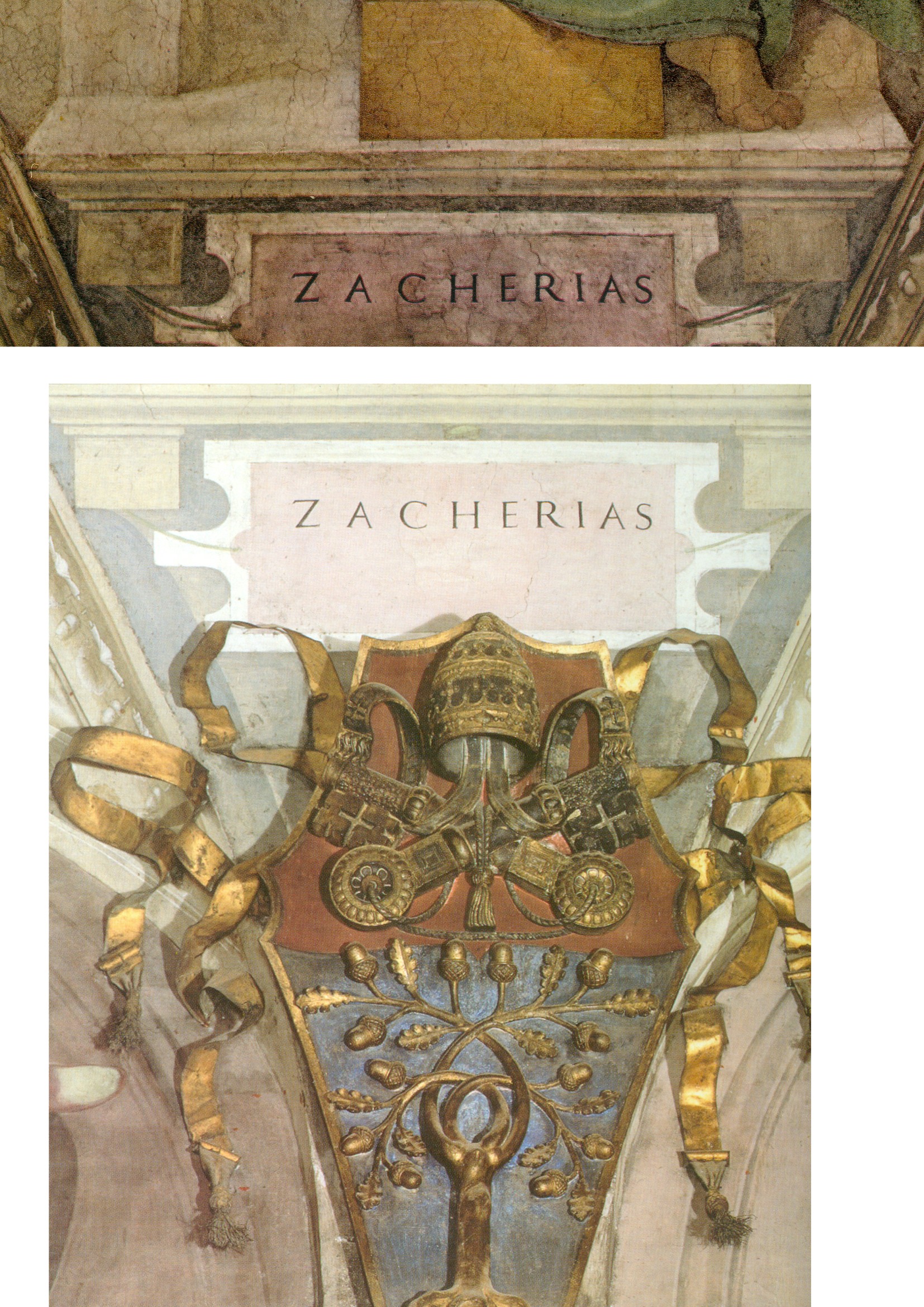
Above, Fig. 8: The name tablet for the Prophet Zacherias – top, before cleaning: above, after cleaning.
THE ELEPHANT ON THE CEILING
Michelangelo had not been the first artist to depict cast shadows. What stunned his contemporaries had been the thunderous force of spatial illusionism within which his figures had realised an unprecedentedly vivid sculptural presence-in-space. It was precisely in the wake of the illusionistic shading’s evisceration that Pope-Hennessy had (correctly) noted that where the name tablets had previously been “firmly integrated in the [real and fictive] architecture of the chapel…they [now] read like supertitles in an opera house” – see Fig. 8, above. To repeat: that tragically late-published book had shown beyond any dispute that there had been no break in the visual record of Michelangelo’s shadows from his day to ours – and, therefore, that the Vatican’s restorers had destroyed the finishing stages of Michelangelo’s own painting throughout the ceiling. In retrospect – and after all the account/demonstrations we have published (see, for example, Cutting Michelangelo Down to Size) – it might increasingly seem that this visually self-evident truth was a truth too big and too inconvenient in its implications ever to be ceded by the Vatican and the compliantly supportive art historical establishment it had garnered.
UNDERSTANDING POPE-HENNESSY’S SCHOLARLY BLANK CHEQUE
As a former director of both the Victoria and Albert Museum and the British Museum; a professor of art history at New York University’s post-graduate Institute of Fine Arts; and the very recently retired Chairman of European Paintings at the Metropolitan Museum of Art, Pope-Hennessy’s essay had effortless clout despite his self-subverting acknowledgements of both disturbing artistic results and – even – a wide distrust of the restoration among professionally sound peers. He opted to berate the critics while lauding the restorers, not on what they had done (on some of which he was critical) but on what he expected them to do next. Perhaps he had been privy to Mancinelli’s assurance to Tintori? He had certainly registered concern over of a group of cleaned Prophets and Sibyls:
“Optically, seen from the altar end of the chapel, they look a little smaller and less weighty than they did before. In the heads, a gain in definition is accompanied by a loss of ambiguity.”
Given that the visual arts work on and through their optical reception, how could Pope-Hennessy discount his own art historically informed, optically received, reading of diminished volumes and weights in Michelangelo’s figures? Perhaps he, like the art critics Hughes and Russell, had been swayed (or cowed) by the sheer authority of the supposedly unanimous Kress Foundation report? In any event, he wrote:
“…a gulf opened between those who adhered to the old concept of the ceiling and those who embraced the ceiling as it seemed originally to have been. The dispute was taken up in the American press, in largely polemical terms. There were demonstrations; and vociferous protests were made by both academic and non-figurative artists. The Vatican authorities went so far as to explain publicly, in two days of conferences in New York, the restoration program and the data on which it was based. Not unnaturally American criticism was reported throughout Italy, and had a disturbing, though not demoralizing, effect on the restorers involved. Arrangements, however, were made for a number of restorers of acknowledged excellence (three of them specialists in fresco decoration) to visit Rome, and they one and all endorsed the wisdom of what was being done.” (Emphases added.)
LEARNING TO LOOK
Aside from this explicit professional deference to a Higher Technical Authority in matters of aesthetic appraisal, other possible explanations for Pope-Hennessy’s stance emerged in his 1991 memoir, Learning to Look. This most distinguished scholar had a visual Achilles Heel – of time spent in an art school, he recalled “I disliked this too, and to this day I cannot draw.” Moreover, he had developed aversions to fellow art historians – and even (like Colalucci) to subjective judgements:
“One of the things about art history that I found puzzling from the first was that clever art historians (there were stupid ones too, of course, but a lot of them were really clever) should reach diametrically opposite conclusions on the basis of a tiny nucleus of evidence. The reason, so far as one could judge, was that the subjective element in art history was disproportionately large. If this were so, it was not only works of art that needed to be looked at in the original but art historians too, since their results were a projection of their personalities. So for some years, I made meeting art historians a secondary avocation.”
From the first, Pope-Hennessy had indeed made it his business to meet as many art historians as possible. When he left Balliol College, Oxford, with a second-class degree in history and an alumnus’s legendary “tranquil consciousness of an effortless superiority” (- in his case, specifically: “in the form of a self-confidence that sometimes verged on arrogance and a clear understanding of the difference between success and a succès d’estime”) he sold some inherited coconut islands off Borneo as income to be devoted “to travelling and to the preparation of a book” – and all this when, like Max Beerbohm’s Young Arnold Bennet, already having “a life plan in my mind.” During the Second World War he “found himself” in the Intelligence Department of the Air Ministry and there, for the first time, “met ordinary people” whom he considered “congenial and interesting”. In later life he expressed a preference for works of art over people of any kind:
“Objects mean more to me than people. It is not that I am frigid or reclusive, but that object-based relationships are more constant than human ones (they never change their nature and they do not pall).”
THE CHURNING “RAW MATERIAL” OF SCHOLARSHIP – AND A NEW SPECTATOR SPORT?
However, and despite his avowed attraction to the constancy of objects, as a self-made art historian, Pope-Hennessy came to welcome their radical alteration by restorers:
“People sometimes complain that there is nothing new to be said about Italian painting. They mean by this there are now monographs on many minor painters and that the works of great artists have been discussed in a large number of books. But the truth is that the raw material of Italian painting is in a constant state of flux. When paintings change through cleaning, our view of the artist who produced them changes as well.”
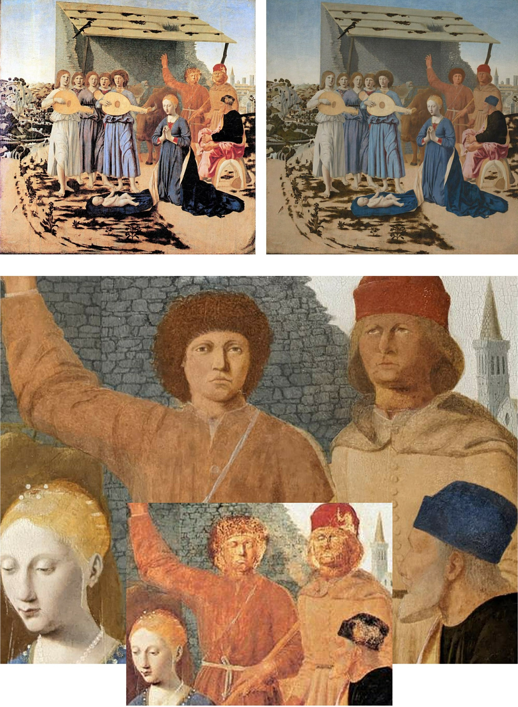
Above, Fig. 9: Top, the National Galley’s Piero della Francesca The Nativity before its latest restoration (left), and afterwards (right); above, a comparative detail showing the recently repainted shepherds and wall, with (inset) their previous state.
Like many of their scholarly peers, newspaper art critics have come to welcome the easy copy-generating potential of restorers’ alterations. In December 2022, Waldemar Januszczak of the Sunday Times, extolled the National Gallery’s controversially reconstructed Piero della Francesca Nativity (Fig. 9, above) and claimed that museums themselves now welcome “the inevitable brouhaha that follows any big restoration” because it “provokes interest and gets people through the door.” However, the art historian Giorgio Bonsanti deplored the intervention in IL GIORNALE DELL’ARTE and fears that such “controversies are destined not to subside but to remain and grow in future years, because the problem exists, and will remain evident to the millions of visitors to the National Gallery”. Scarcely less alarming to the Gallery must have been the Guardian critic, Jonathan Jones’, (earlier) assault on the repainted Nativity.
Jones had been the newspaper art critic of choice who was embedded within the Gallery’s conservation department during the restoration of its version of the Leonardo Virgin of the Rocks. The Evening Standard art critic, Brian Sewell, a student of Anthony Blunt at the Courtauld Institute, and a long-time scourge of National Gallery restorations, had been similarly co-opted within the restoration of Holbein’s The Ambassadors (Fig. 10, below). When so embedded, Jones predicted (wrongly) that “ArtWatch will attack the restoration”. On the Nativity, Januszczak similarly predicted: “There will be those, of course, who will howl at the changes – there always are.” In this case, at least three have now done so on the record – in addition to Jones and Bonsanti, in the March/April 2023 issue of the Jackdaw, its editor, David Lee (“Abbronzatura Solaire”), complained that aside from imposing complexions on the shepherds that are “more appropriate to Love Island than Bethlehem”, the Gallery has confounded a manifestly un-finished painting with a damaged finished painting.
Having previously studied the Nativity’s historic and restoration dossiers, we would add that this panel painting has likely suffered more accumulated restoration blunders than any other in the collection – with the possible exception, perhaps, of Giovanni Bellini’s Madonna of the Meadow. Both of those two pictures received disastrous “structural surgery” from a restorer (Richard D. Buck) who had been hired and brought over from America in 1948 by the National Gallery’s Director, Sir Philip Hendy, to introduce supposedly advanced conservation methods. Januszczak, who defends the Nativity’s recent repainting make-over on the grounds that “an active artwork that is doing what it is supposed to be doing must always trump a charming ruin”, begs the crucial question – “What is an historic picture supposed to do?” – and he clearly fails to appreciate that it is not Time and Neglect but, rather, restorers who, through their ceaseless Un-doing and Re-doing of pictures, create ruins. Where no auction house or dealer would dream of boasting that a picture on offer has had multiple restorations, museum pictures are treated today like so many bags on an airport carousel waiting to be picked up and done over on the whims and fancies of the next available restorer.
(Incidentally, Jones, Bonsanti, and Lee have by no means exhausted the many due criticisms of the Nativity’s latest restoration makeover. The ruined stone wall behind the repainted Shepherds, for example, has itself been repainted in a manner that robbed it of thickness and perspectival placement and left it running flatly across the picture plane, like so much stone-patterned wallpaper, to serve as a backdrop foil to the hypothetically reconstructed heads, as seen at Fig. 9.)
PROCLAIMED RESTORATION TRANSFORMATIONS – AND THINGS THAT CRITICS OVERLOOK
Where Pope-Hennessy had likened the Sistine Ceiling to Beethoven’s Ninth and noted that “another, more lively, more decorative artist” was emerging, Januszczak whooped at the spectacle of the transformation:
“The thin and neat scaffolding bridge moved elegantly along the ceiling like a very slow windscreen wiper. In front of it lay the old Michelangelo, the great tragedian, all basso profundo and crescendo. Behind it the colourful new one, a lighter touch, a more inventive mind, a higher pitch, alto and diminuendo. It was being able to see both of them at once – Beethoven turning into Mozart before your eyes – that made this restoration such a memorable piece of theatre.”
Unlike Januszczak, Pope-Hennessy had not always welcomed restoration-induced changes. In his 1970 book, Raphael, he observed: “But Raphael restored is Raphael interpreted; it is different from the real thing” – and in 1987 he would likely have known that a recent “Raphael restored” at the Vatican had proved disastrously different from the real thing. In 1982, Mancinelli had said of a bungled, chemically experimental restoration that required extensive repainting by Colalucci in Raphael’s Loggia, “It is the best demonstration that a restoration can also not go along well.” In 2016, Colalucci recalled that the Vatican had faced “a serious problem” when “a new inorganic substance that had not been sufficiently tried and tested” was used.
In 1991, as the Sistine Chapel restorations neared completion, Pope Hennessy reverted to his younger self’s restoration-critical stance and noted:
“In London since 1945 the National Gallery had been the target of ceaseless criticism. There had been intermittent controversies in the press over the cleaning of paintings, but successive directors had enjoyed the support of a passive, compliant board. The policy of Radical Cleaning had been espoused by Philip Hendy (who must have suffered from some retinal defect which made him see pictures as flat areas of colour) and had continued under his successors for so long that proof of the damage done to the collection over thirty years could be seen in almost every room.”
That judgement on National Gallery cleanings was sound and it constituted an international commonplace. Mario Modestini wept for half an hour at the sight the Gallery’s “flayed” restorations; in 1970 Pietro Annigoni painted “MURDERERS” on the National Gallery’s doors in protest; in March 1999 when I visited the Gallery with Professor Anatoly Alyoshin, head of the Repin Institute, St. Petersburg (Russia’s leading institute for the training of picture restorers), he was shocked by the paintings’ uniform brightness and seeming newness. Stopping between galleries, he swept his arm around and said “See! Everything in every school looks as if it was painted in the same studio at the same time.” In a sense, everything had been – after stripping paintings of all they judge extraneous, National Gallery restorers are permitted to this day to paint onto them whatever they take to have been an artist’s original intentions, even with pictures as old and venerated as Holbein’s The Ambassadors and Piero’s Nativity. Old masters are being treated like neglected scores awaiting the life-restoring interpretation of a would-be pictorial Furtwängler, von Karajan or Barenboim – but with the difference that where musical scores outlive their successive interpreters, a painting is its own score.
PURISM AND FAKISM: FALSE AGE CRACKS AND RE-INTERPRETATIONS ON RESTORED PAINTINGS
In the 1990s the National Gallery’s then head of restoration, Martin Wyld, contended: “The ‘Good Restorer’ is the one who ‘does the minimum necessary but not too little… we remove everything not put on by the artist and then use our judgement to get back to the original.” On 8 April 2023, the Financial Times (“Behind the seams at the museum”) reported that the present head of restoration, Larry Keith, said of his restoration of Parmigianino’s Saint Jerome’s vision of John the Baptist revealing the Virgin and Jesus, “We are editing, in a way. The work is informed by science and objective criteria, but there are decisions you take, which on some level are interpretive”. In an Esso-sponsored, BBC-filmed restoration of the Ambassadors (which has ceased to be available), Wyld was seen to have repainted much of the carpet to a new design on the authority of a “carpet expert”, and to have repainted much of Holbein’s famous anamorphic skull to a new and elongated design derived from a computer-distorted photograph of another skull. The Gallery’s defence of Wyld’s first-ever insertion of a Virtual Reality image into an old master painting was its claim that “modern imaging techniques” offered more “scope for exploring possible reconstructions” than the perspectival and optical conventions by which the skull had been produced. The pronounced differences between the Ambassadors’s old original paint and Wyld’s newly redesigned and presumptuously repainted parts of the skull, were concealed by his painting fake lines of cracking onto his own newly painted hypothetical reconstructions to match the real cracks on the real old paint.
Above, Fig. 10: Top, a detail of Holbein’s The Ambassadors, showing a section of redesigned and repainted carpet, before treatment (left) and after treatment (right); centre, the pre-restoration anamorphic skull in Holbein’s Ambassadors; above, the Wyld-extended, computer-generated skull in the Ambassadors.
PRODUCING “DIFFERENT, MORE POWERFUL” IMAGES
The New York restorer and Kress-appointed Sistine Chapel invigilator, Dianne Dwyer Modestini (formerly Clinical Professor, Kress Program in Paintings Conservation at NYU’s Institute of Fine Arts) – very extensively repainted and artificially distressed the much-damaged Leonardo School Salvator Mundi that fetched a world record $450 million in 2017 at Christie’s, New York – prompting Thomas Campbell, a former director of the Metropolitan Museum of Art, to ask: “450 million dollars?! Hope the buyer understands conservation issues – #readthesmallprint”. Dwyer Modestini had published this small-print report of an early intervention in her decade long undoing and redoing of the picture:
“The initial cleaning was promising especially where the verdigris had preserved the original layers. Unfortunately, in the upper parts of the background, the paint had been scraped down to the ground and in some cases to the wood itself. Whether or not I would have begun had I known, is a moot point. Since the putty and overpaint were quite thick I had no choice but to remove them completely. I repainted the large missing areas in the upper part of the painting with ivory black and a little cadmium red light, followed by a glaze of rich warm brown, then more black and vermilion. Between stages I distressed and then retouched the new paint to make it look antique. The new colour freed the head, which had been trapped in the muddy background, so close in tone to the hair, and made a different, altogether more powerful image. At close range and under a strong light the new background is obvious, but at only a slight remove, it closely mimics the original [paint work] … Most of the retouching was done with dry pigments bound with PVA AYAB. Translucent watercolours, mainly ivory black and raw siena, were used for final glazes and to draw [false age-] cracks…” (Emphasis added.)
Above, Fig. 11: Top, a section of drapery on the $450million Leonardo school Salvator Mundi, as seen in 2011-12 at the National Gallery (left), and (right) as when sold in October 2017 at Christie’s, New York; centre row, showing left, and second left, the picture detail, as when acquired in 2005 and taken to Modestini for restoration; third left, the Modestini-restored picture detail when shown as an autograph Leonardo in 2011-12 at the National Gallery; and, right, the Modestini re-modified feature, as sold in 2017 as an autograph Leonardo, at Christie’s, New York; bottom row, left, the Wenceslaus Hollar engraving that was said by the National Gallery to have been copied from the National Gallery-exhibited Salvator Mundi picture (bottom right) when in the collection of Charles I. That claim was subsequently disproved when the lost Charles I Salvator Mundi emerged in Moscow and was seen to be of an entirely different composition – at which point, the previous resemblance of the painting’s complex shoulder drapery folds to those in the Hollar etching had become more of a disqualification than a potential corroboration.
CHRISTIE’S RESPONSE
In December 2017, Christie’s was presented with photographic evidence (Fig. 11, above, top) assembled by Dr Martin Pracher, a lecturer in technical art history, that showed the changed states of the Salvator Mundi’s (true left) shoulder drapery between 2012, when exhibited at the National Gallery as an autograph Leonardo prototype painting, and 2017, immediately before the $450million October 2017 sale at Christie’s, New York, in which the picture was offered as a then different but supposedly still-autograph Leonardo prototype that enjoyed “an unusually strong consensus” of scholarly support. Under Press questioning (see Dalya Alberge in the Daily Mail) a Christie’s spokeswoman said Modestini had “partially cleaned the passage of paint in the shoulder and the dark streaks disappeared… To imply something incorrect has taken place would itself be incorrect”. Thus, it was insisted that the recently “disappeared” multiple folds, were not folds but mere “dark streaks” that had appeared during Modestini’s 2005-2010 restorations only to disappear under her 2017 ministrations.
INSTITUTIONALLY SEALED LIPS
Of whatever it consisted, Modestini’s last-minute intervention had been made under sworn secrecy at NYU’s Institute of Fine Arts conservation studios, as she disclosed in her 2018 memoir, Masterpieces: Based on a manuscript by Mario Modestini. That is, when the Salvator Mundi returned to New York in July 2017 ahead of Christie’s November sale, Modestini, was instructed “not to inform anyone” when the painting was “delivered to the Conservation Center under guard and in great secrecy”. Modestini further disclosed that a deal brokered by Christie’s ahead of the sale whereby the vendor would receive at least $100million had also been “successfully kept under wraps.”
THE NATIONAL GALLERY’S ABIDING INFLUENCE ON RESTORATION “REVELATIONS”
When Pope-Hennessy deviated in 1987 from his earlier soundness on transformative restorations, he bought into the National Gallery’s longstanding picture cleaning rationale by endorsing two of the 20th century’s most spectacularly controversial restorations:
“In its cleaned form the [Sistine] ceiling has become again what Michelangelo’s contemporaries considered it, one of the supreme achievements of mankind. With Titian, the revelation started in the National Gallery in London, when the Bacchus and Ariadne was freed of centuries of dirt and proved to be painted in an altogether different tonality from any that had previously been supposed.”
That there had been no “centuries of dirt” to remove from the Titian will be shown in Part III. A fuller understanding of Pope-Hennessy’s late-life restorations lapse and an appreciation of the methodological and promotional similarities between the two most controversially transformative restorations in the second half of the twentieth century will be tracked through the records of the two successive National Gallery directors from 1934 to 1967, Sir Kenneth [later Lord] Clark, and Sir Philip Hendy. By the 1980s, that pair’s polished formulations had come to serve as an internationally infectious template for the unbridled techno-experimentalism seen in the Brancacci and Sistine chapels during what, for Colalucci, had constituted the terminus of “the golden age of restoration in Italy, the halcyon era from the late 1940s to the mid-1990s.”
In Part III, we correlate the false scholarship that flowed from the Titian Bacchus and Ariadne and Michelangelo Sistine Chapel restorations, along with the artfully engineered professional endorsements both restorations received from the then highest authorities.
Michael Daley, Director; 15 April 2023
ArtWatch at Thirty, Part I: The Unstoppable, “Rapidly Filed Away” Sistine Chapel Restoration
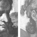
Michael Daley writes: November this year will mark ArtWatch International’s thirtieth anniversary and May 26th marks the fifteenth anniversary of the death of its founder, James Beck, Professor of Renaissance Art History at Columbia University. After facing down a possible three-year jail sentence and punitive damages on charges of criminal slander for condemning a restoration that had left Jacopo Della Quercia’s beautiful marble Ilaria del Carretto looking like oiled soap (Fig. 1), Beck created ArtWatch International in 1992 to speak for a proper and due stewardship of works of art. His “trials”, however, had begun half a decade earlier when he supported artist critics of the Nippon Television Corporation-sponsored and filmed restoration of Michelangelo’s Sistine Chapel frescoes – which act of artistic solidarity was taken by the restoration’s high-placed art historian apologists as an unforgiveable professional betrayal.
Throughout the famously contested* Sistine Chapel ceiling restoration it was politically impossible for the Vatican to admit error and halt the multi-million dollars NTV-filming. This obliged the authorities to permit nothing to count against the restoration. While disregarding and dismissing all contra-testimony, the Vatican’s restorers, curators, and art historical supporters claimed that things had occurred for which no evidence exists and denied the existence of things on which evidence abounded.
[* “The restoration of Michelangelo’s magnificent frescoes in the Vatican’s Sistine Chapel is perhaps the most controversial event in the art world in the past three decades” – Pierluigi De Vecchi and Gianluigi Colalucci in Michelangelo The Vatican Frescoes, the Vatican’s 1996 final account of the restoration.]
Above, Fig. 1: Top, centre, Prof James Beck (Photo: Lynn Catterson); Cartoons by Colin Wheeler; above, centre, the marble Ilaria del Carretto tomb sculpture before (top) and after the restoration in which it was both abraded and oiled.
AN ABIDING CULTURAL CONUNDRUM
Revisiting that momentous 1980-1994 battle after three decades – and when variously armed with the complete published Vatican restoration literature (see Endnote 1), the study of scores of conservation dossiers in major public institutions, and the preparation of countless visual arguments against mis-restorations and misattributions – it is now clearer than ever that much as the restoration of the Sistine Chapel ceiling was an artistic abomination it was not an aberration. It was not the only great fresco cycle to have been chemically assaulted, stripped to its bare plaster surface and left artistically debilitated, falsified, and looking as never previously seen.
The successive Sistine Chapel mis-restorations (- of the lunettes, the ceiling and the Last Judgement wall) occurred within a remorselessly expansionary nexus of lavishly sponsored conservation sensation-seeking* techno-adventurism in which the intervals between restorations on major works have now dwindled to… almost nothing. In effect, the fabric of art heritage has become host to a self-propelling, self-regarding, socially favoured, artistically and culturally impoverishing job-creation engine in which every generation of restorers works-over every major work of art as of right and in response to some conjured “conservation necessity”.
[* Restorers at the Sistine and Brancacci chapels revelled in anticipated scholarly upheavals that would attend their chemical radicalism. Some years ago, the British Museum and a newspaper arts journalist combined to run a course that coached restorers on planting promotional press coverage.]
A day does not pass without press reports of some solvents-armed heritage operative having painstakingly subtracted this while “discovering” that. Despite this omnipresent PR tide, no one ever says: “This work is in marvellous condition – it has been restored x times in the last fifty years.” Auctioneers boast of excellent condition with never, or little-restored works and the term “untouched” remains a bankable guarantor of retained authenticity. Deference to conservation’s artfully cultivated mystique rests on a double sleight of hand. Deemed “picture rats” in the nineteenth century, restorers rebranded themselves “picture-surgeons”, assumed quasi-medical airs and dubbed their research “diagnostic”, their actions “treatments”, their studios “laboratories”, and their students’ “interns”. Their greatest wheeze was adopting the morally coercive appellation “conservators” as a shield against interrogation and disinterested appraisal.
THE ANTI-CRITICAL IMPERATIVE
James Beck, a highly respected Renaissance art scholar, had trained first in fine art and then politics. He appreciated that no sphere of professional activity should be free from scrutiny and appraisal, not medicine, not aeronautical or civil engineering, not art administration or restoration. Every artist, actor or musician is subject to professional critical appraisal – why, then, should those who act on and alter art evade critical evaluation?
NEEDLESS INTERVENTIONS?
Above, Fig. 2: Left, a 1930 black and white photograph of Egon Schiele’s recently found early portrait – right, Schiele’s “Leopold Czihaczek at the Piano”.
To give a current example of the compulsions to “restore” works: on 5 May 22, Artnet reported that a lost early Egon Schiele portrait has been found and that, despite seeming to be in excellent condition (as above), it is to undergo restoration.
The picture has been loaned for five years to the Leopold Museum which wishes to buy it. Because the museum’s finances have been hit by the latest Chinese plague, a plan has reportedly been devised to created NFTs (non-fungible tokens) of the work in editions of 100, 10 and 2, for €500, €15,000 and €100,00 respectively, with the hoped-for proceeds total of €400,000 going “towards the cleaning and restoration of the painting”. “Towards”? And the “restoration” of what? The above comparison of the painting today with a 1930 photograph suggests no apparent visual deterioration.
The museum’s director, Hans-Peter Wipplinger, speaks frankly: “We start with the physical object, then we make a digital image and, if we can sell it, we can afford the painting.” Thus, a museum proposes to sell virtual reproductions of a likely never-restored painting as if in lieu of a slice of the painting itself but, if enough money is raised, will alter the painting by “restoring” it, which act will leave the NFTs standing in lieu of the picture’s disappeared earlier untouched state. A mere incanted proposal to restore seems to stand as a talismanic signifier of high moral and artistic purpose. This case is no aberration: on acquiring works in excellent condition museums routinely plunge them into restorers’ tanks to make them their own through restoration alteration and published “research findings”. See:
“An ominous silence at the Metropolitan Museum of Art, New York”; “Discovered Predictions: Secrecy and Unaccountability at the Metropolitan Museum of Art, New York”; and “Why is the Metropolitan Museum of Art afraid of public disclosures on its picture restorers’ cleaning materials?”
THE RISE AND DEMISE OF RADICAL ART CONSERVATION FADS
The 1980-1994 Sistine Chapel saga was launched on a whim with a new, aggressive, insufficiently tested cleaning agent at a moment when the discredited Italian mania for ripping frescoes from chapel walls was being replaced by fresh absolutist quests for intensified colour in ancient painting and for brilliant whiteness in ancient sculpture and buildings. For a massively falsifying modernist chemical imposition of intensified whiteness throughout a great cathedral, see: “Brighter than Right, Part 1: A Modernist Makeover at St Paul’s Cathedral” ; and, “Brighter than Right Part 2: Technical Problems of Protection, Health and Safety at St Paul’s Cathedral”.
For the most shameless and brazen art institutional PR glosses on catastrophic restoration injuries, see: “Hyping museum-restoration wrecks”; “And the world’s worst restoration is…”; and, “The world’s worst restoration and the death of authenticity”.
THE INSINUATION OF ALIEN AESTHETICS AND ANATOMICAL DEFORMITIES INTO OLD MASTERS’ PAINTINGS
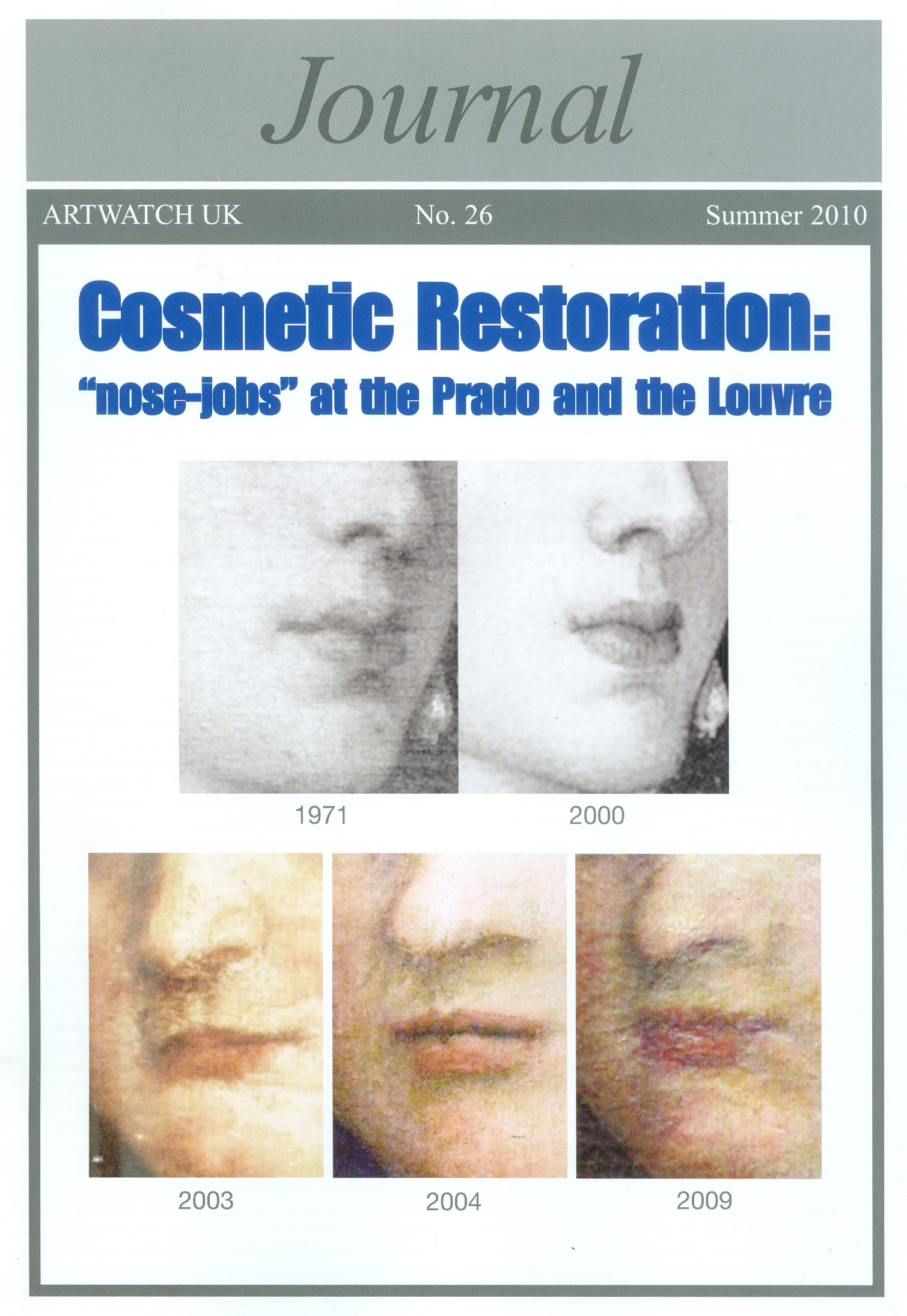
Above, Fig. 3: Mistreatments of a Titian at the Prado and a Veronese at the Louvre.
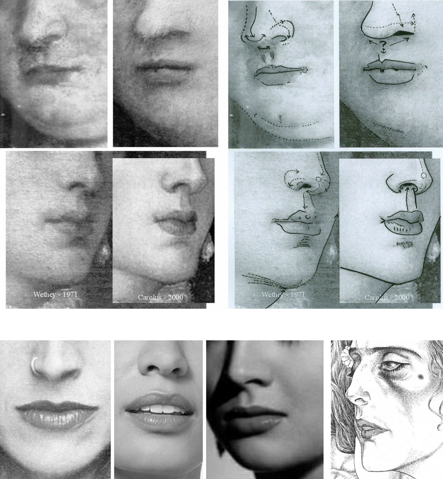
Above, Fig. 4: Left, top and centre, restoration changes made to facial features in Veronese’s Pilgrims of Emmaüs at the Louvre (top) and Titian’s Empress Isabella of Portugal at the Prado; right, top and centre, diagrams of the same illustrating unwarranted restoration changes of drawing and anatomy on works in major museums; above, three photographs of actual nose/mouth configurations and, right, a drawing (by the author) of the head of Klimt’s Judith II.
As seen above, the restorer of the Prado Titian greatly enlarged the nostril and moved the lower nose from the nasal groove and tucked it behind one of the two ridges that define the groove, as if in homage to Picasso-esque cubist contortions. As shown in the bottom row above, the base of the nose always sits centred above the top of the nasal groove. While necessarily following anatomical laws, individual mouth/nose configurations are highly distinctive and expressively mobile – which is why portrait painters pay the greatest attention to their precise depictions. Everybody is a connoisseur of mouths’ fluid and elusive expressions – hence John Singer Sargent’s rueful description of a portrait as “a picture in which there is always something not quite right about the mouth”. No power on earth can stop restorers from undoing and redoing that which they fail to comprehend.
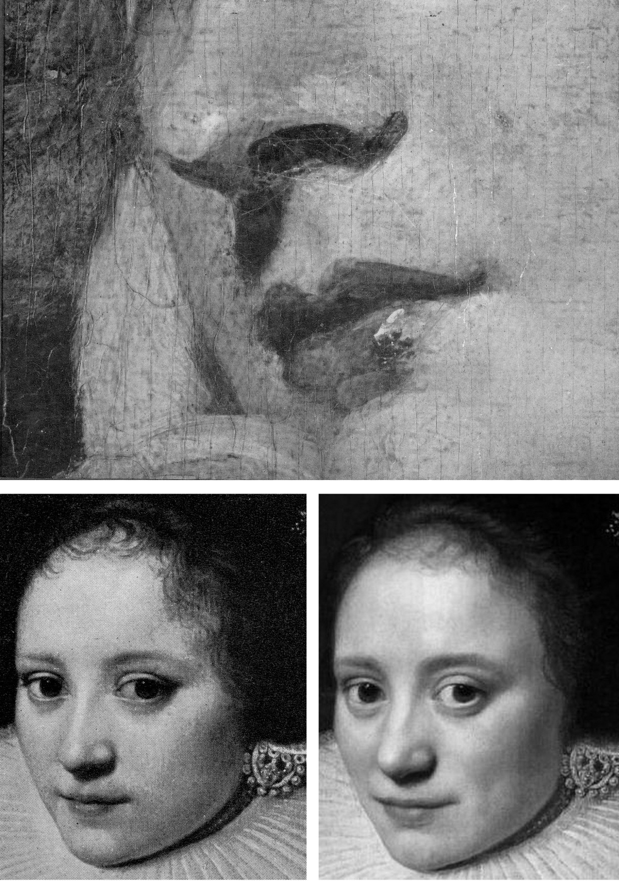
Above, Fig. 5: Top, a detail of Sir Joshua Reynolds’ Mrs Bradyll, as carried on the cover of the 1942 edition of Bertram Nicholls’ Painting in Oils; above, left, a detail of the Wallace Collection’s A Dutch Lady by Michiel Jansz Van Mierevelt; above, right, the same Dutch lady after a 1986 cleaning at the Wallace Collection in which all the features were coarsened, the hair was thinned, and the jewellery dimmed. Note, for example, the thickened edges of the lower eye lids; the expression-changing greatly widened (true left) upper eye lid; and how the nose’s former thin highlight has been widened and deflected by a new bump.
Above, Fig. 6: Top, nos. 1 to 4, a privately owned accredited Titian portrait (Laura de Dianti) after successive modern restorations; above, left (no. 6) a contemporary engraved copy of the original but now many-times changed portrait; above, right (no. 5) Picasso’s portrait of Gertrude Stein.
It is striking how greatly more sculptural and anatomically sound the head had been when rendered by light and shade in an early engraved copy than in any of the restored states of the painting. Successive restorations imposed a modernist mask-like aspect on a refined in-depth Renaissance conception. The engraved record of the subject’s up-turned nose highlights modern restorers’ arbitrary and anatomically ill-informed impositions on eyes, mouths, and noses. The arch of the nostril rises and falls in a succession of variations on a theme in which each restorer “corrects” the previous state without ever recovering the originally recorded state. The eyes fall out of alignment, focus and life, as in the Picasso portrait. On official, highest-level indulgences of cosmeticizing “picture surgeons”’ nose- and eye-jobs, see:
“Something Not Quite Right About Leonardo’s Mouth ~ The Rise and Rise of Cosmetically Altered Art” and “From Veronese to Turner, Celebrating Restoration-Wrecked Pictures”.
“SCRUBBED UP”
Above, Fig. 7: In the above Assorted-Mistreatments-of-a-Veronese-Face-at-the-Louvre, no. 8 shows the face before cleaning; no. 9 the face after cleaning and before restoration; no. 10 the face after cleaning and after restoration. That outcome was widely condemned and ridiculed: “A spectacular restoration own-goal…”. In response, the Louvre re-restored the face in an undocumented covert operation that spawned the fatter-lipped, sharper-nosed and more lopsided-mouth version seen at no. 11, thereby re-igniting the controversy – as was reported below at Fig. 8. Yet again, the restorers imposed a modernist aspect (as above right) by echoing Botero’s pufferfish-like spoof Mona Lisa.
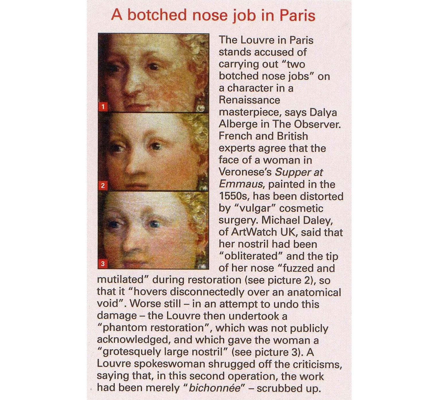
Above, Fig. 8: The UK news magazine, The Week carried the above condensed report on the controversy.
DOUBLE WHAMMY
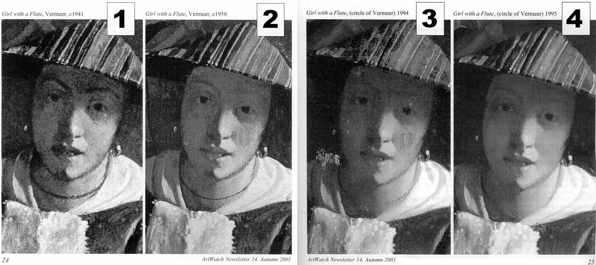
Above, Fig. 9: A former – implausibly – attributed Vermeer portrait, as seen after two modern restorations. In the first (at nos. 1 and 2), a great loss of material and shading occurred; an eyebrow disappeared; and the necklace was substantially thinned. After the next cleaning (nos. 3 and 4), the restorer lost the central section of the necklace and painted-out the surviving remnant on the right to minimise the glaring injury. The restorer also painted out an earlier striped disfigurement on the sitter’s left cheek, which action left the lit side of the face flatter and less tonally modulated than in 1941. When exhibited in a major Vermeer anniversary exhibition, no Vermeer scholar commented on its cumulative losses and alterations. The two dark stripes on the right-hand, lit side of the hat, as seen above left at no. 1, have disappeared. No one seems to have asked what kind of a striped fabric might have presented a series of parallel stripes when affixed to a cone-shaped hat.
WHAT COMES OFF IN CLEANINGS
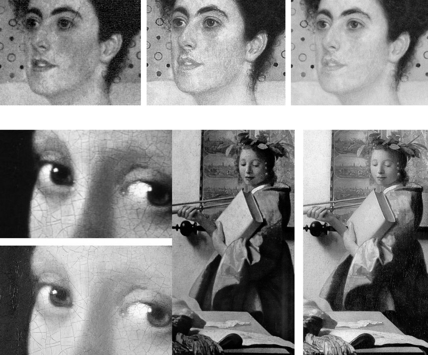
Above, Fig. 10: Top, a detail of Klimt’s 1905 Portrait of Margaret Stonborough-Wittgenstein after successive cleanings; above, two published before- and after-cleaning details of two important Vermeer paintings showing the small- and large-scale losses of value that routinely occur when pictures are cleaned with swabs and solvents. Note, in Vermeer’s portrayal of the artist’s muse (on the right) how the weakened shading in the face and the formerly relieving darker tones of the map behind the lit side of the face, again imparted a mask-like quality to a plastically weakened head.
PSEUDO-SCIENTIFIC CONCEITS AND CONVENIENT UNTRUTHS
Where scholars might once have protested such losses as those shown between Figs. 3 – 10, they increasingly hail newly lighter, brighter, and compressed relationships of tonal value as if on a conviction that an overall cleanliness is next to godliness. For their part, restorers take any natural ageing in a varnish as an alien disfigurement that licenses a full-scale and “investigative” restoration. When artists, the makers of art, object to restoration injuries and falsifications, they are dismissed as subjective, sentimental, unscientific. The late Head Restorer and co-director of the Sistine Chapel restorations, Gianluigi Colalucci, (who had not done well at school and who had had no art training) boasted in 1986 that:
“restoration has become a fully-fledged discipline with a strong philosophical basis eliminating all subjective and arbitrary elements and a precise technical and scientific approach formulation eliminating trial and error.”
In contrast with such naïve pseudo-scientific conceit, during a controversy over paintings secretly cleaned by the National Gallery in the Second World War, Laura Knight, speaking on the authority of hands-on knowledge of the craft of painting (much as Degas and Delacroix had done in earlier controversies at the Louvre), protested in a letter to the Times in 1946 that:
“With the exception of direct painting, a comparatively modern method, a painter builds his pigment on to canvas or panel – always with the final effect in view. The actual surface of a picture is the picture as it leaves the artist’s hand. The varnish which finally covers the work for protection to a varying extent amalgamates with the paint underneath. Therefore, drastic cleaning – removal of the covering varnish – is bound to remove also this surface painting and should never be undertaken.”
Clearly stated artistic truths weigh little in an art conservation world where claimed scientific verifications are of immense political utility. Kenneth Clark disclosed in his 1977 memoir The Other Half that he had set up a science department at the National Gallery in the 1930s “with all the latest apparatus” because “until quite recently the cleaning of pictures used to arouse extraordinary public indignation, and it was therefore advisable to have in the background what purported to be scientific evidence to ‘prove’ that every precaution had been taken.”
WHAT COMES OFF IN THE WASH
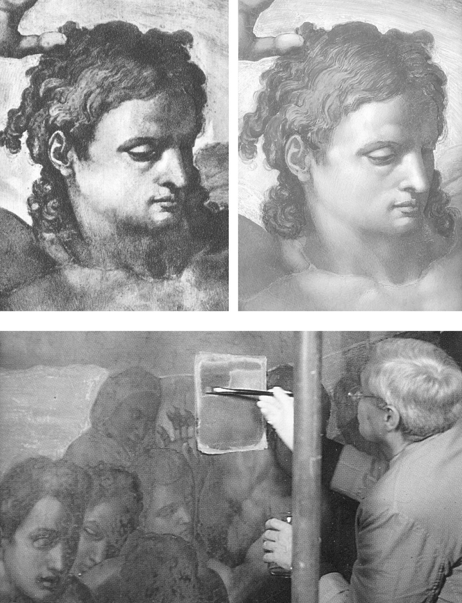
Above, Fig. 11: Top, the head of “Christ the Judge” before and after cleaning; above, Colalucci applying solvents to the Last Judgement through a paper foil.
When Colalucci cleaned the head of “Christ the Judge” (to applause from assembled restorers, one of whom filmed the event with Colalucci’s own camera, computer operators, journalists, co-director Fabrizio Mancinelli, a cleaner and the ever-present ten NTV film crew members), he applied the solvents through “a special Japanese paper” and waited for the rigidly pre-set time of fifteen minutes before removing the paper. Normally the sheets were dropped on to the floor but this time a brother restorer, Bruno Barratti, who kept a diary throughout, noted that Colalucci had “placed the sheets almost with care, crumpled though they are, in a corner of the platform.” The scaffolding cleaner whispered to the restorers as the NTV film was running “look, boys, those sheets are mine…don’t try anything on.”
If, as Colalucci maintained, his solvents had removed nothing but dirt, grease, soot and ancient glue-varnishes, the sheets would have borne no intelligible after-image. However, had he removed a secco adjustments to the head (as we believe was the case), a ghostly Turin Shroud-like image would have been captured on paper (and might still be if the sheets were not subsequently consumed by the solvents). Certainly, something was considered covetable and, as seen above at Fig. 11, the differences between the pre- and post-cleaned heads were pronounced. A photograph of those removed sheets would be of considerable evidential value today – as would be the filmed record made on Colalucci’s camera – in the absence of an official Vatican report on the restorations, which absence Colalucci attributed in 2016 to the early death in 1994 of his co-director of the restoration, Fabrizio Mancinelli, the curator of the Vatican Museums:
“This is the cause of the void created in the post-restoration studies and elsewhere. His death and the subsequent death of Pietrangeli, which was more foreseeable due to his age, led to a break in continuity of the management of the Vatican Museums that led in turn to the historic restoration being rapidly filed away as finished business.”
ART RESTORATION’S HABITUAL TECHNICAL OVER-REACHES
In the Times Educational Supplement (“As good as new?” 18 January 1991) I had written:
“The justification for the ultimate dismissal of artists’ expertise is that they are ‘unscientific’… [when] In matters of artistic controversy, artistic criteria must be sovereign – art operates by persuasion, not by proof. Much of the scientific validity of conservation is a sham. Conservation’s record in recent years comprises anything but a sure-footed march towards truth. In the fifties and sixties, there was a fashion, encouraged by art historians and museum curators, for removing frescoes from their surroundings, remounting them as panel pictures (thereby flattening the irregularities of the original plaster surface) and exhibiting them in museums. Much acclaimed at first, the strappo technique is now thoroughly discredited*. It damaged the walls of the buildings as well as the frescoes themselves. And, of course, it irreversibly falsified the paintings by severing them from their architectural contexts, leaving the buildings denuded and impoverished. To this day, many frescoes wrenched from their homes lie rolled unseen and unmounted in museum basements.
“A succession of cleaning solvents has been devised and used on frescoes only to be abandoned. The director of one project [the Vatican’s late Fabrizio Mancinelli, co-director with Gianluigi Colalucci of the Sistine Chapel restorations] which so damaged works of Raphael’s that they required repainting, remarked ‘what was damaged cannot be undamaged’. Frescoes recently stripped of varnish protection have been left exposed to high levels of atmospheric pollution. Synthetic resins which it was hoped offer protection have been abandoned. Air conditioning units which were also thought to be a solution are to be installed even though no one can be sure what the ideal temperature and humidity settings are and even though malfunctions by these units might result in gross damage (as happened to a major Renaissance picture being restored at the National Gallery a few years ago)…”
[* By 2003 the International Council of Monuments and Sites – ICOMOS – had warned that:
“Detachment and transfer [of frescoes] are dangerous, drastic and irreversible operations that severely affect the physical composition, material structure and aesthetic characteristics of wall paintings. These operations are, therefore, only justifiable in extreme cases when all options of in situ treatment are not viable. Should such situations occur, decisions involving detachment and transfer should always be taken by a team of professionals, rather than by the individual who is carrying out the conservation work. Detached paintings should be replaced in their original location whenever possible. Special measures should be taken for the protection and maintenance of detached paintings, and for the prevention of their theft and dispersion.”]
“OFF YOU COME!”
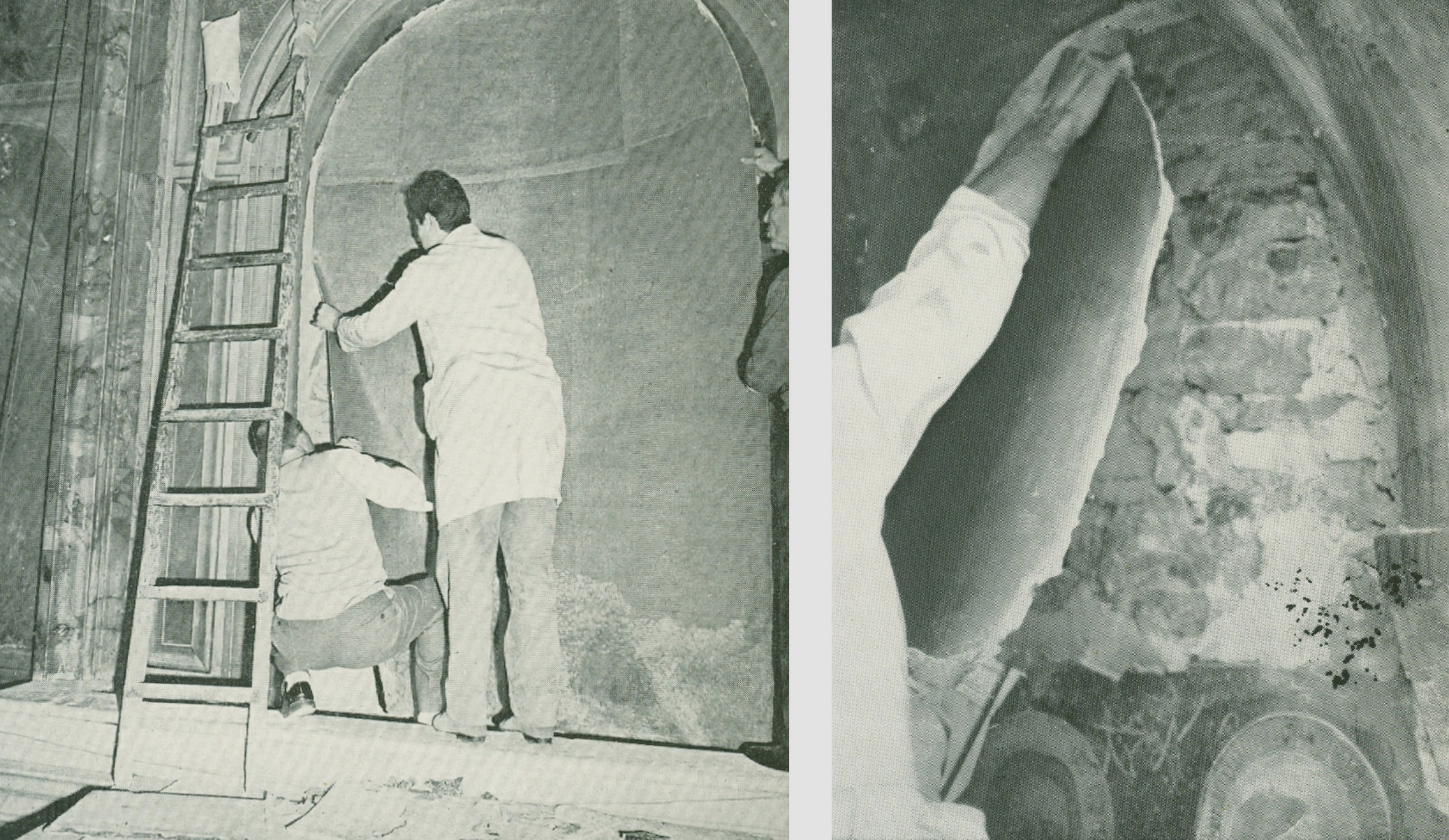
Above, Fig. 12: Left, “Detachment of a fresco by the strappo method.” right, “Detachment of a fresco by the stacco method.”
Both photo-illustrations above were carried in the 1968 catalogue to the Great Ages of Fresco, Giotto to Pontormo exhibition at the Metropolitan Museum of Art, New York. In an introductory note on fresco techniques and their detachment from walls Professor Ugo Procacci explained the two methods:
“Stacco. The process of detaching a fresco painting from the wall by removing the pigment layer and a layer of intonaco [the final smooth thin layer of plaster which receives the artist’s painting]. Usually an animal glue is applied to the painted surface and then two layers of cloth (calico and canvas) are applied, left to dry, and later stripped off the wall, pulling the fresco with them. It is taken to a laboratory [a scientifically coercive word for a studio] where excess plaster is scraped away and another cloth is attached to its back. Finally the cloths on the face of the fresco are carefully removed. The fresco is then ready to be mounted on a new support.”
“Strappo. The process by which a fresco painting is detached when the plaster on which it is painted is greatly deteriorated. Strappo is the process of ripping off only the colour layer without removing excessive amounts of plaster. It is effected by the use of a glue considerably stronger than that used in the stacco technique. The procedure which follows is identical with that in the stacco operation. It should be noted, however, that after certain frescoes are removed by means of strappo, a coloured imprint may still be seen on the plaster remaining on the wall. This is evidence of the depth to which the pigment penetrated the plaster. These traces of colour are often removed by a second strappo operation on the same wall.”
CHEMICALLY-STRIPPING FRESCOES: 1) THE SISTINE CHAPEL
There are many dis-proofs of Colalucci’s claim that only soot and earlier restorers’ discoloured glue-varnishes were removed from the Sistine Chapel ceiling. To cite one: the loss of artistic values that had been recorded by copyists both in Michelangelo’s own lifetime and for centuries afterwards – as with Giorgio Ghisi’s engraving below of c. 1570, which was thus made long before any restorers had worked on the ceiling.
Above, Fig. 13: Top and right, details of Michelangelo’s Sistine Chapel ceiling figure the Erythraean Sibyl, before and after the cleaning in which, for example, relieving shading to the right of the face’s profile was stripped away, as was internal shading on the head and neck. It was always beyond inconceivable that any naturally accruing films like soot could have organised themselves to reinforce the modelling within the contours of Michelangelo’s figures.
CHEMICALLY-STRIPPING FRESCOES: 2) THE BRANCACCI CHAPEL
“The history of restoration clearly shows that with the passage of time, nearly all restorations have proven to be negative…We cannot be certain that the work we’ve done here [at the Brancacci chapel] has been positive.”
So said one of the Brancacci Chapel restorers, Marcello Chemeri, in an interview carried in Ken Shulman’s invaluable 1991 book on the Olivetti-sponsored restoration, Anatomy of a Restoration – The Brancacci Chapel. “Invaluable” because although Shulman was generally parti pris with the restorations of both the Sistine and the Brancacci chapels, he drew out full first-hand accounts from the key Brancacci players – and, also, most unusually, from across the board in their assembled team – as with Chemeri.
Thus, we learned from Shulman that Chemeri had hoped to be a painter from his early teens; that he still painted in his spare time; that as a boy he was always drawing or experimenting with colours; that he had [only] gone into restoration because he needed a job when he left art school. That he had been reluctant to give an interview. From another restorer, reluctant even to be identified, we were urged:
“Let’s be honest and admit what all restoration directors will say in private. At the beginning of any restoration, you order as many tests as you can imagine, fully aware that only about five per cent of them will be of any use during the project. The rest of them are merely window dressing.”
Shulman further explained that:
“This competition among historians to link their names to a specific method or restoration is both inevitable and understandable. With the meagre monetary remuneration usually afforded to historians and restorers, restoration professionals are usually left to vie for the various badges of merit and prestige. The Brancacci Chapel was the most prestigious jewel in the block – perhaps even more prestigious than the concurrent Sistine Chapel restoration because of the mystery surrounding the Brancacci and its history – and Baldini had it in his pocket. There were many interests involved here – the enormous artistic importance of the work, the contention between Florence and Rome, the jostling among scientists, industry, and government for the honour of participating in the project, and Baldini’s own noted ambition. Given all these, it was unthinkable that Baldini would allow the long-awaited restoration to deteriorate in the public eye into what might appear an unglamorous, methodical, albeit thoroughly effective cleaning.”
EXTREME AESTHETIC CLEANSING:
Chemeri, the most artist-like of the Brancacci restorers, had put his finger on the nub of the problem with both of the period’s major and controversial fresco restorations – which is to say, on the unwavering absolutist assertion that the original artist authors of the Brancacci and the Sistina murals had entirely confined their work to painting directly into the plaster while wet and had not made any revisions or embellishments with a secco painting. As will be shown, the restorers in both chapels had – wittingly or unwittingly – demonstrably misdiagnosed the material which they removed entirely and to artistically disastrous effects. Had they fully acknowledged and correctly addressed the known histories and circumstances of both chapels’ frescoes, the complexity and subtlety of their tasks would have leapt exponentially, and every inch of the cleaning would have been dependent on more problematically (for restorers) aesthetic and artistic appraisals and not on the proffered simplistic “brush it in on, wait a bit, wash it off” chemical solution procedures.
A PHOTO-COMPARISON WORTH A THOUSAND WORDS
Here, a single before and after- greyscale photo-comparison will suffice, as below at Fig. 14, to demonstrate the artistic debilitation of Masaccio’s work:
Above, Fig. 14: Top, Masaccio’s wall scene, “The Tribute Money”, as published in the 1981 edition of the 1968 Masaccio (in the series L’opera complete di); centre, the same scene after restoration, as published in the 1992 edition English-language edition of The Brancacci Chapel Frescoes by Umberto Baldini and Ornella Casazza; above, the post-restoration scene in colour and before the conversion into greyscale shown above it.
The above photo-comparisons show precisely how the Brancacci Chapel restoration had damaged Masaccio’s then-revolutionary painting. As with the Sistine Chapel ceiling, it does so on the restorers’ own accounts: if the paintings really had simply been obscured by centuries-worth of filth, decaying restorations, decaying varnishes and such, then, on the laws of optics, at their removal by the restorers, the visual values and relationships that previously had been evident through the dimming and obscuring film would have emerged with hugely increased vivacity – the darks would be darker and the lights lighter; the tonal relationships would span greater ranges and so on. Instead, after stripping the frescoes of all supposedly alien “accretions” the painting emerged a pale shadow of its former supposedly badly obscured but in truth greatly more vivacious earlier self. How could that be? Why should the removal of a disfiguring film of organic material have reduced the aerial depths and space, the tonal dynamism, the previously legendary sculptural corporeality of the figures and their dramatically orchestrated narrative lucidity?
The restorers, content with their new, all-on-the-picture-surface litter of clean pastel-ised colours, made no attempt to explain the phenomenon. They declined, even, to offer direct photographic comparisons of the pre- and post-cleaning states despite having boasted of “investigating” the murals with every conceivable type of photography – viz: “1) photographic documentation using direct lighting before the restoration of the frescoed sections; 2) photographic documentation using close lighting before the restoration of the frescoed sections; 3) examination of ultraviolet fluorescence…”
In a sponsor’s note to the 1992 book on the restoration, Carlo De Benedetti, President of the Olivetti Corporation (the sponsors of the travelling fresco exhibitions), said it would be followed by a second book “containing the documentation of the analyses, studies and technical and scientific operational interventions in preparation for and during the course of the work…” So far as we know, that promised second volume – like the report on the Sistine Chapel restorations – never materialised. A condensed version of the 1992 book issued as The Brancacci Chapel in the Electa Art Guides series, carried a note on the “The Restoration: Research and Method”. It listed no fewer than fifteen methods of investigation from “photographic documentation” (1) to “designing a system to continually de-pollute the interior in ‘real time’ so as to prevent the arrival of harmful agents in the chapel’s atmosphere, especially when visitors are present” (15). Number 14 laid bare the methodological heart of the restoration’s core purpose, by seeking the:
“…development of an appropriate cleaning technique which did not alter the pigments or the surface of the frescoes in any way while chemically removing the traces of organic substances, including the residues of earlier attempts at restoration…” (Emphasis added.)
The conceptual and methodological flaws in this restoration slip out: if the frescoes, as liberated by Baldini/Casazza, have survived intact, why would earlier restorers have needed to restore them? However, if Masaccio had embellished and completed his work with a secco painting on the plaster surface, such overlaid painting would have been susceptible to decay or injury through cleaning…and therefore more likely to have been repaired or replaced by restorers. The so-called “traces” were more frequently disparagingly described as “beverone” – a veritable soup of organic material found to be comprised of egg or animal glues, both of which are well-known binders for pigments. As Shulman put it, an earlier painter/restorer called Sacconi was said to have “basted the surface of the frescoes with an egg-based protective layer which also gave the paintings a temporary transparent clarity.”
The overall assertion of absolute safety and confidence in the entirely extraneous and alien nature of everything that lay on the fresco surface was precisely that of the Vatican’s team. In 1988 Colalucci told Shulman that his cleaning technique on the ceiling:
“cannot harm the materials used in fresco, as the chemicals in the AB57 solution only react with organic matter. All we are removing are the layers of glue and wine and dust which have accumulated over the centuries.”
Like Baldini/Casazza, Colalucci appealed to the authority of “preliminary” technical analysis but, in his case, the supposedly decisive analysis had been undertaken only “on the Eleazar and Mathan lunette” at the conclusion of which, it was claimed, “Michelangelo’s use of buon fresco was unequivocably vindicated” throughout the lunettes and the (then unexamined) ceiling.
Thus, both sets of restorers had felt licensed by their own research to undertake the most profoundly radical “conservation” measures by stripping everything off the surfaces of fresco cycles that were, respectively five and a half, and more than four and half centuries old – and all of this techno-buccaneering took place as the earlier fresco-stripping infatuation (in which key restorers in Florence played most prominent roles, as shown below) had fallen into disrepute.
THE FRESCO-STRIPPING MANIA
The Great Travelling Fresco Exhibitions – the 1968-69 “The Great Age of Fresco – Giotto to Pontormo” at the Metropolitan Museum of Art and the Rijksmuseum, and the 1969 “Frescoes from Florence” exhibition at the Arts Council’s Hayward Gallery, London – had, like the Sistine Chapel restorations, attracted enthusiastic groupthink support among the highest art historical echelons. That support was trumpeted in the catalogues’ inflated “Committees-of-Honour” lists shown below at Figs. 15 to 18. In the herd-like stampede to strip, no thought was given to the risks and long-term consequences of detachment or, indeed, to the risks of sending them on tours.
Seventy of “the finest fresco paintings from Tuscany” were transported across the Mediterranean and the Atlantic Ocean to New York in a single ship, the Cristofo Columbus – much as Mussolini had dispatched Italy’s greatest art treasures forty years earlier on the SS Leonardo da Vinci, with a back-up tug, in December 1929 from Genoa to London via a storm, in which ships were lost, off Cape Finisterre, Spain, to the legendary 1930 Royal Academy Italian Art show. The detached Tuscan frescoes show in New York was hubristically hailed:
“Birnham Wood has come to Dunsinane. What was rooted in Florence, what was bound to the walls of churches and town halls, has been freed by newly refined techniques and brought to New York for display in the galleries of the Metropolitan Museum of Art.”
A FLAGSHIP MODERN CONSERVATION CAMPAIGN’S “PRACTICALLY NEGLIBLE” LOSSES…
Lavish credit was conferred in the catalogue:
“Almost all the sinopia (or preparatory drawings in red earth), concealed by the overlying frescoes since they were made, have been uncovered in the great modern campaign to conserve the surviving examples of this art. The campaign has been led with extraordinary knowledge and enthusiasm by Professor Ugo Procacci, aided in recent years by Professor Umberto Baldini, and it has been conducted with consummate skill by the specialists Leonetto Tintori, Dino Dini, Giuseppe Rossi and Alfio Del Serra*. These men have so refined the techniques of detachment that the loss to the fresco and underlying sinopia is practically neglible.”
A restorer at the Museum of Modern Art, New York, has claimed there is a working professional concept of “acceptable potential loss” with loaned museum works – see “Protecting the Burrell Collection ~ A Blast against Risk-Deniers”.
[* Baldini, Alfio Del Serra, and Tintori would later formally underwrite Colalucci’s treatments of the Sistine Ceiling but, on Tintori’s contrary, privately expressed views and withheld minority report, see “Rocking the Louvre: the Bergeon Langle Disclosures on Leonardo da Vinci” – viz:
“Without knowledge of Tintori’s highly expert dissenting professional testimony, the public was assured that despite intense and widespread opposition the cleaning had received unanimous expert endorsement. Critics of the restoration were left prey to disparagement and even vilification.”]
In his 2016 memoir Michelangelo and I – Facts, People, Surprises and Discoveries, Colalucci listed the membership of two invigilating committees set up under the jurisdictions of the Vatican and the Kress Foundation – the latter being administered by Professor Kathleen Weil-Garris Brandt, of New York University, who became a spokesman for the Sistine Chapel restorations and moved to Rome for a year to organise a celebratory exhibition and conference on the completion of restoration of the ceiling and the studies for the Last Judgement restoration. The membership of these bodies of scholars, restorers and scientists comprised:
André Chastel; Sidney J. Freedberg; Carlo Bertelli (the initiator of the 1977- 1999 re-restoration of Leonardo’s Last Supper which had been executed only twenty-three years earlier in 1947-1954 and to acclaim from Bernard Berenson); Pierluigi De Vecchi; Giovanni Urbani; Luitpold Frommel; Matthias Winner; Umberto Baldini; Michael Hirst; John Shearman; Kathleen Weil Garris Brandt; Alfio Del Serra; Paul Schwartzbaum; Norbert Baer; Mario Modestini; John Brealey; Dianne Dwyer (then Brealey’s assistant at the Metropolitan Museum, New York, who later married Mario Modestini and famously repainted and artificially distressed much of the $450million Leonardo school Salvator Mundi); Andrea Rothe; David Bull; and Leonetto Tintori.
THE GREAT, THE GOOD AND THE SPONSOR
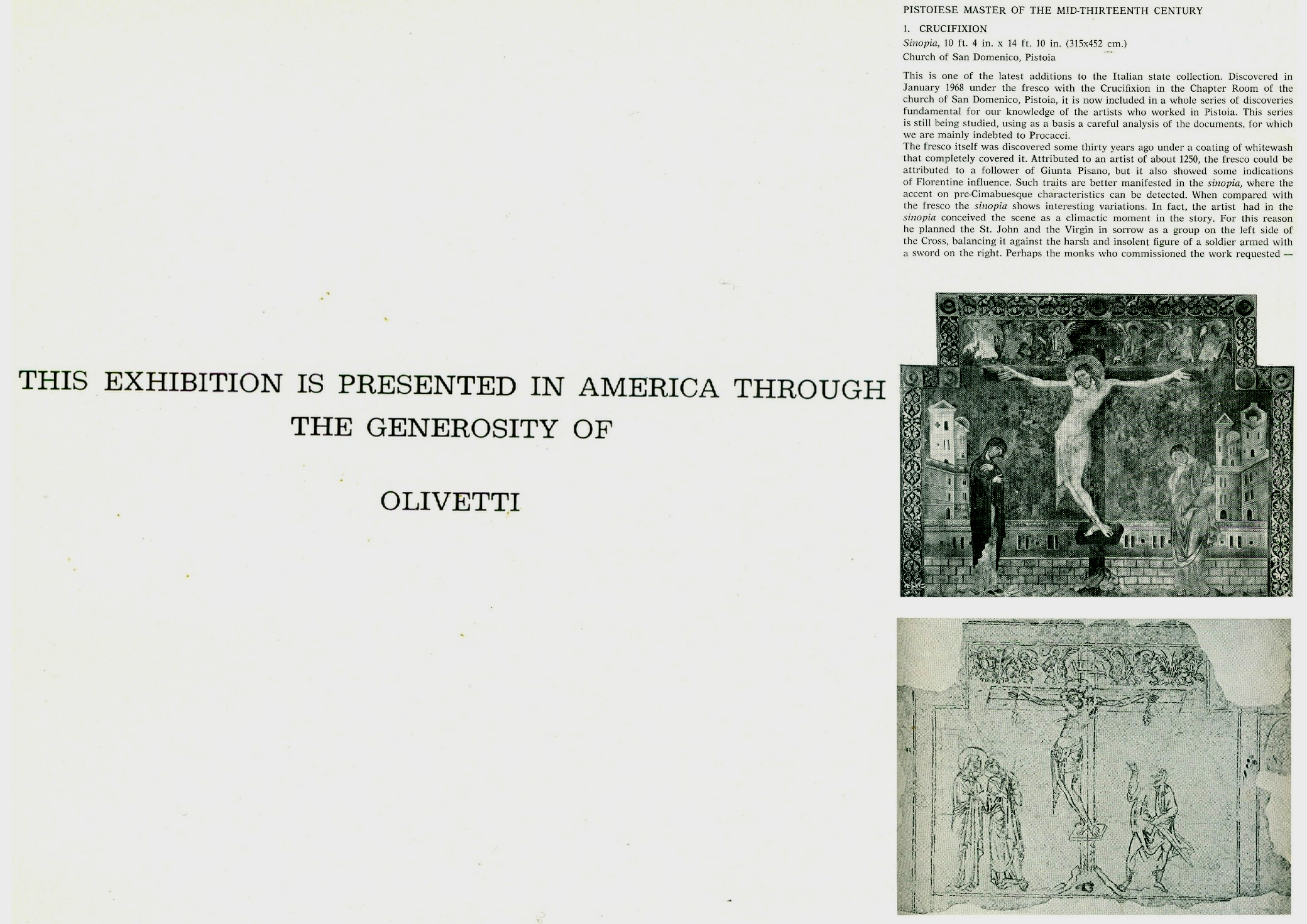
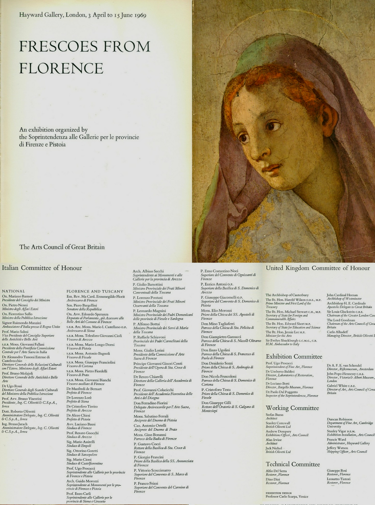
Above, Figs. 15 to 18, showing the committees of honour who had endorsed the stripping of frescoes from walls.
INSATIABLE, RISKY APPETITES FOR TRAVELLING ART LOANS
In 2014 the Metropolitan Museum mounted an exhibition of six entire windows removed from Canterbury Cathedral (in the course of “restoration”). See “How the Metropolitan Museum of Art Gets hold of the world’s most precious and vulnerable treasures”.
In 2016 we reported that, as with Canterbury, plans were underway to fly restored windows at Chartres Cathedral to the United States: “Chartres’ Flying Windows”. (In the event, and following interrogation from Florence Hallett, author of the post, the authorities decided that the risks were not worth taking and the windows stayed in France.)
Most inexplicably of all (as reported in the ArtWatch UK Journal No. 29), in December 2014 the British Museum’s Courtauld Institute-trained director, Neil MacGregor, had gratuitously conferred a museological vote of confidence in Putin’s Russia by recklessly – and, to Greece, provocatively – sending one of the most precious Parthenon sculptures on a roundabout route that avoided EU airspace to the Hermitage Museum, St Petersburg. The flights occurred just months after Russian troops had annexed part of Ukraine and Russian-armed separatists in eastern Ukraine had brought down a Malaysian Airlines Boeing with a loss of 298 lives including around 100 children. The British Museum loan, which enjoyed no conservation pretext and which replicated the Hermitage’s own fine early plaster cast of the sculpture made by Lord Elgin, was conducted in an act of secrecy that blindsided the UK Government at a time when economic sanctions had been imposed on Russia in response to its annexation of Crimea.
Above, Fig. 19: The cover of the ArtWatch UK Journal No. 29, Spring 2015 showing the directors of the Hermitage and the British Museum, Mikhail Piotrovsky and Neil MacGregor; right, ArtWatch UK Letter, The Times, 9 December 2014.
THE SISTINA RESTORATION’S COSTS AND CONSEQUENCES
In his highly informative exhibition catalogue essay to the Tuscan Frescoes exhibitions, Professor Ugo Procacci set the “great mural paintings of golden age of Italian paintings” from Cimabue to Michelangelo as an interval of “true frescoes”. That common but misleading characterisation of Michelangelo’s Sistine Chapel painting methods served as cover for the Sistine Chapel restorers’ overall applications of the oven-cleaner-like new agent AB57 which had been designed to remove pollution-encrusted salt efflorescence from marble and not for removing a secco paint or supposed glue-varnishes. It made mincemeat of the Sistine Chapel frescoes’ highly distinctive a secco features, including those shown above which had been copied by Michelangelo’s contemporaries and by subsequent artists for centuries thereafter. Procacci and Baldini had shared Colalucci’s and Mancinelli’s desire to intensify chromatic values by making a complete removal of all material on the plaster fresco surfaces of the Brancacci Chapel. In both cases this radical aesthetic cleansing subverted the “sculptural” and “aerial” roles that tonal relationships had played within the two artists’ famous murals as shown above at Figs. 13 and 14 above.
CAUGHT ON THE HOP AND IN THE ACT
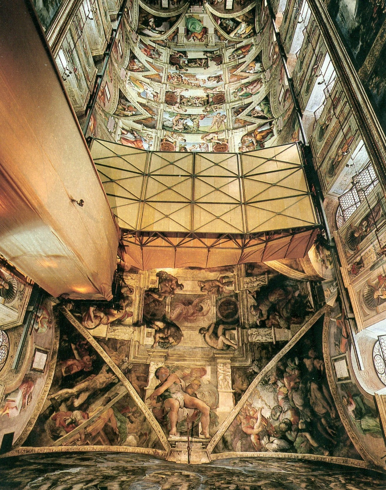
Above, Fig. 20: National Geographic’s iconic photo-record of the Sistine Chapel ceiling showing the last moments of the unrestored and most brilliant final stages of Michelangelo’s ceiling painting – which included his acclaimed portrayals of the Crucifixion of Haman, the Prophet Jonah and the Libyan Sibyl, all set in their deep and darkened spatial dramas within the forcefully articulating projections of Michelangelo’s fictive architecture.
To preserve a lucrative Vatican revenue stream from paying visitors, the chapel remained open throughout the restoration but at the cost and consequence of enabling viewers to see and compare the cleaned and not-yet-cleaned frescoes simultaneously – as above at Fig. 20. That unprecedented directly comparative opportunity drew instant criticisms and forged an unusually strong alliance of artist/critics and scholar/critics. When the art historical establishment looked the other way as Beck, a leading Renaissance scholar/critic, was put at very great personal and professional risk in the Italian courts for his critical view on the restoration of a sculpture by the artist on whom he was the world authority – and on which particular sculpture he had written a commemorative book (Fig. 22) – immense media and publishing interest was aroused. That in turn lead to the publication of the 1993 and 1996 James Beck, Michael Daley, book Art Restoration: The Culture, the Business and the Scandal.
THE SHARPENING OF HOSTILITIES AND DENIALS OF EVIDENCE
Above, Fig. 21: Above, an article carried in the 22 November 1991 Independent when Professor James Beck had been acquitted of criminal slander charges brought by the restorer of Jacopo Della Quercia’s marble Illaria del Carretto tomb monument in Lucca’s Duomo (Fig. 22); right, the 1993, London, and 1996, New York, editions of Art Restoration, The Culture, the Business and the Scandal.
PRAISE, WHERE DUE…
Above, Fig. 22: Top left, the 1988 James Beck and Aurelio Amendola book ILARIA DEL CARRETTO di Jacopo Della Quercia; top right, the 1993 book Michelangelo: The Medici Chapel by James Beck, Antonio Paolucci, Bruno Santi – and with notes on the chapel’s restoration by the restorers Agnese Parronchi and Francesco Panichi; above, the team of restorers who spent eight years between 2013 and 2021 re-restoring the Medici Chapel with a “top secret” bacteria-infused gel, as reported in the Guardian and the New York Times (Photo. by Gianni Cipriano.)
In Art Restoration Beck had noted that while nothing was more demoralizing than being obliged to respond negatively to the vast majority of restorations, there had happily been some notable successes:
“The cleaning of Michelangelo’s sculpture for the Medici tombs in the New Sacristy of San Lorenzo, in Florence, was completed in mid-1991, and it was done with noteworthy sensitivity. Since the work was executed more or less at the same time as the Ilaria and since both were of fine-quality marble, I am enormously relieved to be able to speak enthusiastically about it. What is extraordinary about the cleaning which, again like the Ilaria, involved sculpture that was housed indoors, was that no harsh chemicals were used, no mechanical means employed, no oil applied to the surface. The dust and the dirt were gently removed with cotton wads and distilled water. What is more, the cleaning was conducted by an artistically oriented and enlightened young woman, Agnese Parronchi, who had trained a decade earlier at the Opificio. The money was supplied by a private sponsor, a foundation whose director showed the deepest respect for the works of art, while the superintendent in charge was extremely well-informed and co-operative. In other words, this restoration, together with one by the same restorer conducted on Michelangelo’s Battle of the Lapiths and Centaurs relief located in the Casa Buonarroti, has provided encouraging proof that sensitive cleanings are indeed possible.”
That optimistic note was carried in both the 1993 and 1996 editions of Art Restoration. Perhaps Beck’s approval was considered a provocation by the restoration establishment. Perhaps with a change of superintendent in 1992 it was soon forgotten that the chapel had been restored to acclaim. Perhaps new donors presented themselves. In any event, as the New York Times recently splashed:
“Send in the Bugs. The Michelangelos Need Cleaning.
“Last fall, with the Medici Chapel in Florence operating on reduced hours because of Covid-19, scientists and restorers completed a secret experiment: They unleashed grime-eating bacteria on the artist’s masterpiece marbles…Nearly a decade of restorations removed most of the blemishes…In November 2019, the museum brought in Italy’s National Research Council, which used infrared spectroscopy that revealed calcite, silicate and other more organic, remnants on the sculptures and two tombs that face one another across the New Sacristy. That provided a key blueprint for Anna Rosa Sprocati, a biologist at the Italian National Agency for New Technologies, to choose the most appropriate bacteria from a collection of nearly 1000 strains, usually used to break down petroleum in oil spills or to reduce the toxity of heavy metals. Some of the bugs in her lab ate phosphates and proteins, but also the Carrara marble preferred by Michelangelo. ‘We didn’t pick those’, said Bietti…”
Above, Fig. 23: Michelangelo’s Medici Chapel portrayal of Night as respectively seen in: (top) the 1986 edition of Ludwig Goldscheider’s Michelangelo: Paintings, Sculpture, Architecture; (centre) the 1993 Michelangelo: The Medici Chapel by James Beck, Antonio Paolucci, Bruno Santi; (above) in recent press reports. The interval between the two last and prolonged restorations had barely been two decades. As can be seen above, the figure of Night is greatly more highly polished and the former pronounced tonal difference between the figure and its supporting accoutrements – the owl, the mask, draperies – has been greratly diminished.
Above, Fig. 24: Top left, the head of Jacopo Della Quercia’s Ilaria del Carretto Tomb Monument, as seen before and after its last restoration; top right, a detail of Michelangelo’s Night as seen in 1993 and today; above, Michelangelo’s carving Moses in the church of San Pietro in Vincoli, as seen (left) in an old post card and (right) after a restoration that began in 2001 and that was jointly funded by the firm Lottomatica and the Italian Ministry of Culture.
The gambling company Lottomatica was acquired for over a billion euros in 2021 by the Gamenet Group. A webcam was set up at the church in Vincoli to broadcast the restoration process in real time. The restoration itself thus became part of a multimedia event which included a series of photographs by the German photographer Helmut Newton and a concert by the British composer Michael Nyman. The restorer, Antonio Forcellino, fairly acknowledged that the sculpture “will never be as it was when Michelangelo made it” and that to take out the stains made when replicas were made from the carving was so risky that “we’ll limit ourselves to lower the tone of the stains themselves.” Nonetheless, the push towards a perfectly white shininess that hinders appraisals of sculptural forms and makes old stone resemble new plastic, had made a quantum leap.
FORM: ITS REALISATIONS, ITS FINISHES AND ITS READINGS
Above, Fig. 25: Top, left, an etching of 1638 by Franҫois Perrier after Michelangelo’s Moses; top, centre, Moses before its last restoration; top, right, Michelangelo’s “Christ the Judge” (mirrored); above, left, a marble carving of Psyche by Albert-Ernest Carrier-Belleuse; above, centre, a portrait by Gerald Brockhurst; above, right, Brockhurst’s etching The Artist and the Muse.
Before it becomes a thing, sculpture is an idea. Ideas can be given verbal, written, graphic, pictorial or plastic – or other – expression. A sculptural idea can be realised as a piece of sculpture – at which point it becomes a real thing-in-the-world and is subjected to any number and direction of external light sources – or, it can be given expression in graphic or pictorial form. Ideas realised as things i. e., as sculptures, are bounded by their surfaces, unlike graphic or pictorial works in which sculptural ideas find expression as depictions-on-surfaces. Although a sculptural idea expressed pictorially is generally confined to a form as perceived from a single position (as in the Brockhurst etching above – albeit where a craftily deployed mirror affords a second viewpoint) the image can carry implicit suggestions of how objects would appear from a different viewpoint. But it is never possible (not even for Picasso in full cubist mode) for a depiction to match the infinite multiplicity of indivisibly linked aspects that a given sculpture presents to a viewer when seen “in the flesh” and “in the round”. The great drawback with sculpture is that it is much slower to make and finish a thing than to depict one. When Michelangelo was compelled to stop making the figures he had planned to join his Moses he executed over three hundred figures on the Sistine ceiling alone including his suite of monumental seated Prophets and Sibyls. His “Christ the Judge” deployed every ounce of sculptural know-how but with the advantage of containing its own optimalised light-source to maximise by the play of its lights, darks and in-betweens, the greatest possible plastic vivacity.
The surface “finish” of a sculpture is an intrinsically problematic notion and an aspect of sculptural practice which is subject to personal and/or cultural preferences as well as to the nature of (sometimes) stipulated materials of construction.
A sculpture made with clay (which needs to be kept moist while being worked) will have a pleasant sheen which results in highlights and gradated shadows as the surfaces of forms turn away from the light source. If the clay is kept hollow and allowed to dry out completely, the sculpture can be fired in a kiln to varying degrees of hardness and finish, but it will emerge with a matt light-absorbing surface which most sculptors find unsatisfactory and visually deadening. If the clay sculpture is supported by an armature, it will not be able to dry out without cracking. In such cases, to preserve the form, the clay must either be kept wet indefinitely, or a “negative” cast be made from it with fine plaster. That plaster cast negative surface (the mould) can then be filled with other substances but, most commonly, this would be with reinforced plaster. The outer original cast mould can then be chiselled away to expose a hard durable positive facsimile of the originally modelled soft and wet clay. The initial surfaces of plaster casts, however, are also matt and sculpturally deadening in their highly light-absorbing capacities. Sculptors can go to considerable and resourceful lengths to work up a desired degree and nature of surface finish. There is a fascinating and eloquent video here on the “restoration” of a large Henry Moore painted plaster sculpture protype for a bronze cast as it was being “prepared” for inclusion in an exhibition by being given a “re-activated” and as if freshly worked surface.
In the case of Michelangelo’s New Sacristy sculptures, the last-but-one restoration team, Parronchi and Panichi, set out the issues raised for would-be restorers by Michelangelo’s own famously varied levels of sculptural finish. The restorers first described the approach of their own programme in general terms:
“The recent restoration of Michelangelo’s marble sculptures in the New Sacristy was the first of this century. They have been superficially cleaned from time to time, but this was the first true restoration scheme. At the beginning of the programme, it appeared that the tombs and seven statues, together with those of Saints Cosmas and Damian, had been kept in almost ideal conditions. The level of relative humidity inside the Sacristy is not very high (70% approx). The light is gently filtered through large, high windows, and for most of the day the Chapel is bathed in a glowing half-light which is accentuated by the reflection from the marble surfaces, A brilliant but soft light from the lantern is diffused inside the cupola before shining down onto the tombs, which are not subject to the full glare of direct rays. The micro-climate does not vary with the seasons, but the extreme heat of summer is alleviated by the solidity of the structure. In winter the attendants have to show a certain spartan toughness.
“In spite of this, the statues had a dull appearance. They were covered with a layer of dust beneath which thicker deposits, some sticking to the substratum, were found. They were irregularly distributed over the surfaces of the statues and were found in greater or lesser concentrations according to the angle and working of the surface, and the form, outline and position of the sculpture. It was important to establish which of the many waxes found were of animal origin and therefore particularly sensitive to climatic and atmospheric influences. They also react to light as well as to relative humidity and extremes of temperature. Restoration work is justified (one should always ask whether it is really necessary) by the presence of obvious accumulations of atmospheric particles which block the surfaces, alter their precarious balance of interacting elements, and even blur them to the point where it is no longer possible to see them accurately. At this point, in order to put the case for the critics of ‘patina’, it is appropriate to try to explain how much was removed, how much was left in place, and the reasons. We shall therefore begin by describing and analysing the factors that cause an acceleration in the natural aging process, and lead inevitably to permanent deterioration in a work of art…”
The restorers’ alertness to artistic considerations of which Beck spoke was particularly evident in this passage:
“If, as art historians maintain, Michelangelo’s sculpture was born mature, it is impossible to doubt that the finish he gave to the surfaces of Night was deliberate, as was the working of Day, which is blocked out with the subbia [a pointed heavy tool] and slightly smoothed on the face with the gradina [a sharp-toothed chisel] and is a perfect example of what is known as non-finito. After the restoration of Dusk, the way in which the gradina has been used to smooth the face and create an effect of chiaroscuro between the head and the finely polished upper body, can clearly be appreciated. This technique is even more obvious on the right shin, where the lower part is smoothed, but the upper part where the light falls, is finely polished, creating an effect of both softness and movement, and light and shade. The symbolic figure of Night is the most finito, the most lustrous of Michelangelo’s seven statues. After restoration it glows with the radiance of a moonlit night, in an obvious metaphorical and tonal contrast with the other three allegorical figures which, as the restoration has revealed have a warmer and more misty colour range…
The restorers concluded with a summary of the methods adopted and the materials used in the restoration:
“Six thousand man hours, hundreds of photographs taken by us, and thousands sent in by visitors from all over the world, litres of de-ionized water, several kilograms of cotton, cottonbuds, and volatile turpentine essence. Using these materials we tried to maintain a balance between sensitivity and research, so that art would not be destroyed by science. One hundred square metres of marble surface were restored without, of course, using any waxes or protective coatings that might create new ‘patina’…We must ask ourselves, and above all ask all art historians, and everyone to whom culture matters, whether this masterpiece bequeathed to us by the artist will survive the overweening attentions of the high priests of gleaming whiteness; whether this accumulation of technique, art, feeling and culture should be lost, or through restoration be given back to us.”
Sadly, we already now know the answer to that question: the serried, bug-happy, high priestesses of “gleaming whiteness” have had their swift revenge. We can only await their published report. It is a small consolation, but the 1993 Beck et al book and its superb Aurelio Amendola photographs was a jewel of publishing in its day, and it must now do further and extra service as a sumptuous elegiac record of what so briefly was allowed to be – as can be appreciated below in the two Amendola shots of the back of Michelangelo’s Day and that of the face of Night:
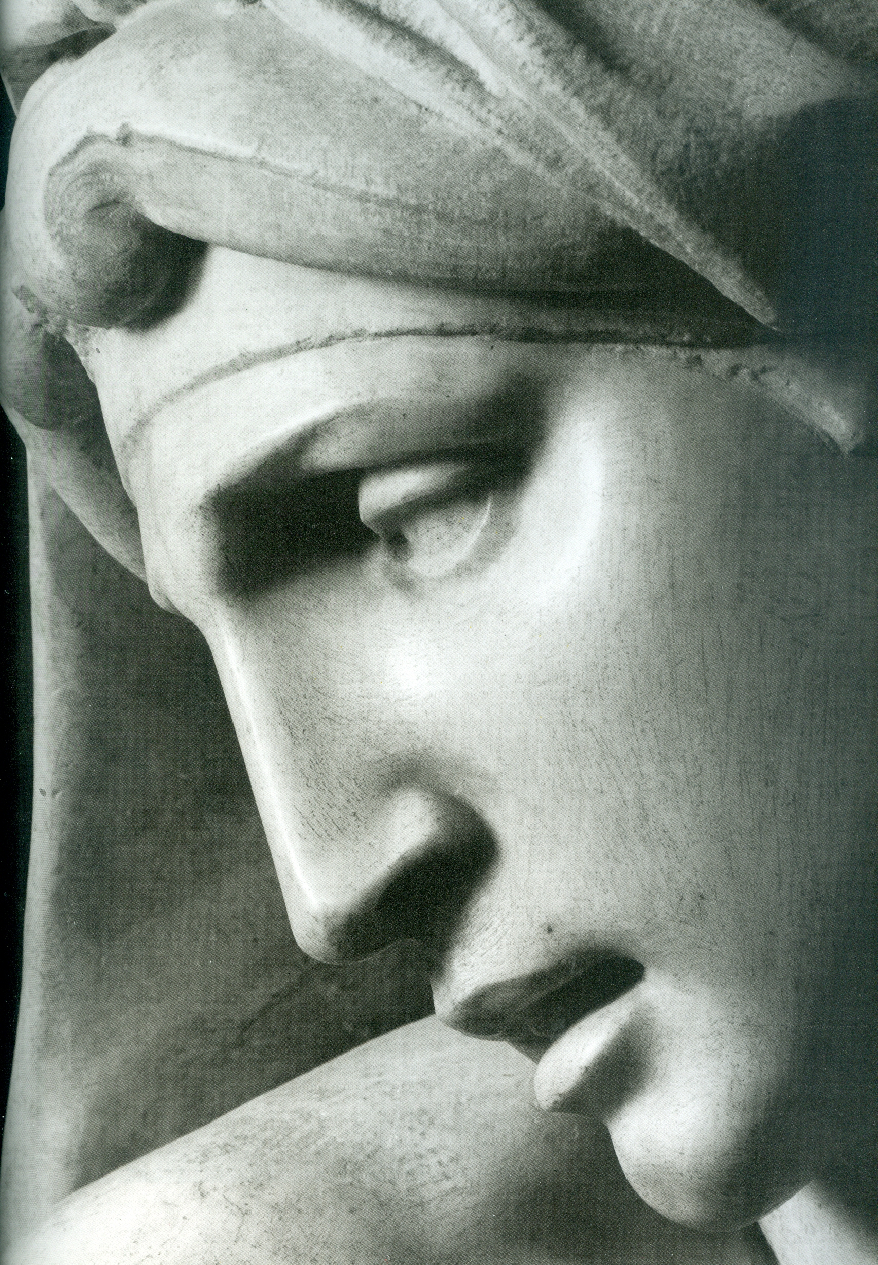
In Part II we examine how the twin Sistine and Brancacci Chapels colourisation projects came into being.
Michael Daley, Director, ArtWatch UK, 26 May 2021
ENDNOTE:
The Vatican’s complete official account is carried in this sequence of books:
1986: The Sistine Chapel: Michelangelo Rediscovered – featuring Carlo Pietrangeli, Fabrizio Mancinelli, Gianluigi Colalalucci, John Shearman, John O’Malley, S. J., Pierluigi de Vecchi, Michael Hirst.
1987: The Conservation of Wall Paintings Getty/Courtauld Symposium, Fabrizio Mancinelli – “The Frescoes of Michelangelo the Vault of the Sistine Chapel: Conservation Methodology, Problems, and Results”, and Gianluigi Colalucci – “The Frescoes of Michelangelo on the Vault of the Sistine Chapel: Original Technique and Conservation”.
1991: The Sistine Chapel (2 Vols., Edition 500) – featuring Frederick Hart, Gianluigi Colalucci, Fabrio Mancinelli.
1992: The Sistine Chapel ~ A Glorious Restoration – featuring Carlo Pietrangeli, Fabrizio Mancinelli, Gianluigi Colalucci, Nazzereno Gabrielli, Michael Hirst, John Shearman, Matthias Winner, Edward Maeder, Pierluigi de Vecchi, Piernicola Pagliara.
1992: The Art of the Conservator, Ed. Andrew Oddy (British Museum Press), Fabrizio Mancinelli – “Michelangelo’s Frescoes in the Sistine Chapel”.
1996: Michelangelo: The Vatican Frescoes – featuring Pierluigi de Vecchi and Gianluigi Colalucci.
1997: Michelangelo: The Last Judgement – featuring Dr Francesco Buranelli, acting Director General Papal Monuments, and Galleries, Loren Partridge, Fabrizio Mancinelli, Gianluigi Colalucci.
2013: La Capella Paolina – Featuring Anonio Paolucci, Arnold Nesselrath, Paolo Nicolini.
Additionally, for technical, methodological, and philosophical fresco conservation matters, see:
1984 Conservation of Wall Paintings (Butterworth) – by Paolo Mora, Laura Mora, Paul Phillipot (see Fig. 11 above).
And, for the chief restorer’s own account:
2016: Michelangelo and I ~ Facts, People, Surprises and Discoveries in the Restoration of the Sistine Chapel – Gianluigi Colalucci.
Further Thoughts II: The less and less Leonardo ex-Cook collection Salvator Mundi
Jacques Franck here concludes his three-part demolition of the once attributed but now deposed, $450m New York/Russian/Saudi Leonardo da Vinci Salvator Mundi picture’s supposed stylistic, artistic and technical credentials.
Jacques Franck writes: Many events have occurred since the publication here of my August 2020 essay on the “New York Salvator Mundi” and it seems timely to update and close the subject in the light of recently emerged technical data on the controversial painting. To grasp the present situation, a reprise of recent key events is necessary.

Above, Fig. 1: Workshop of Leonardo da Vinci (Salai with the assistance of. G. A. Boltraffio?), Christ as Salvator Mundi (“the Cook version of Salvator Mundi“), c. 1506/1508-1513, oil on walnut, 65.5 x 45.1 cm (Private Collection), as seen in 2011-12.
The Louvre’s junked book: a contradiction that does not exist
It cannot be doubted that months before the Louvre’s major Leonardo da Vinci exhibition opened in Paris in Autumn 2019 the museum still believed that the Salvator Mundi was an autograph work of Leonardo. This is testified by the fact that the initial version of the Louvre’s Leonardo exhibition catalogue was printed with the (former New York, now Saudi) painting labelled as an indisputably true da Vinci picture. Shortly afterwards, that first version of the catalogue was suppressed and a new version was printed with a radically revised attribution. In it, the work – which itself was not included in the exhibition – was simply reproduced and listed as “Fig. 103 bis. Salvator Mundi version Cook” (meaning a “studio work” with a status analogous to that of another well-known Leonardo studio Salvator Mundi, called the “Ganay version”) (Fig. 2 below). Whatever reasons precipitated this sudden change, the new designation definitively constituted the Museum’s then – and still – estimation of the former New York and now “Saudi Salvator Mundi”. At this stage, that judgement is, of course, irreversible.
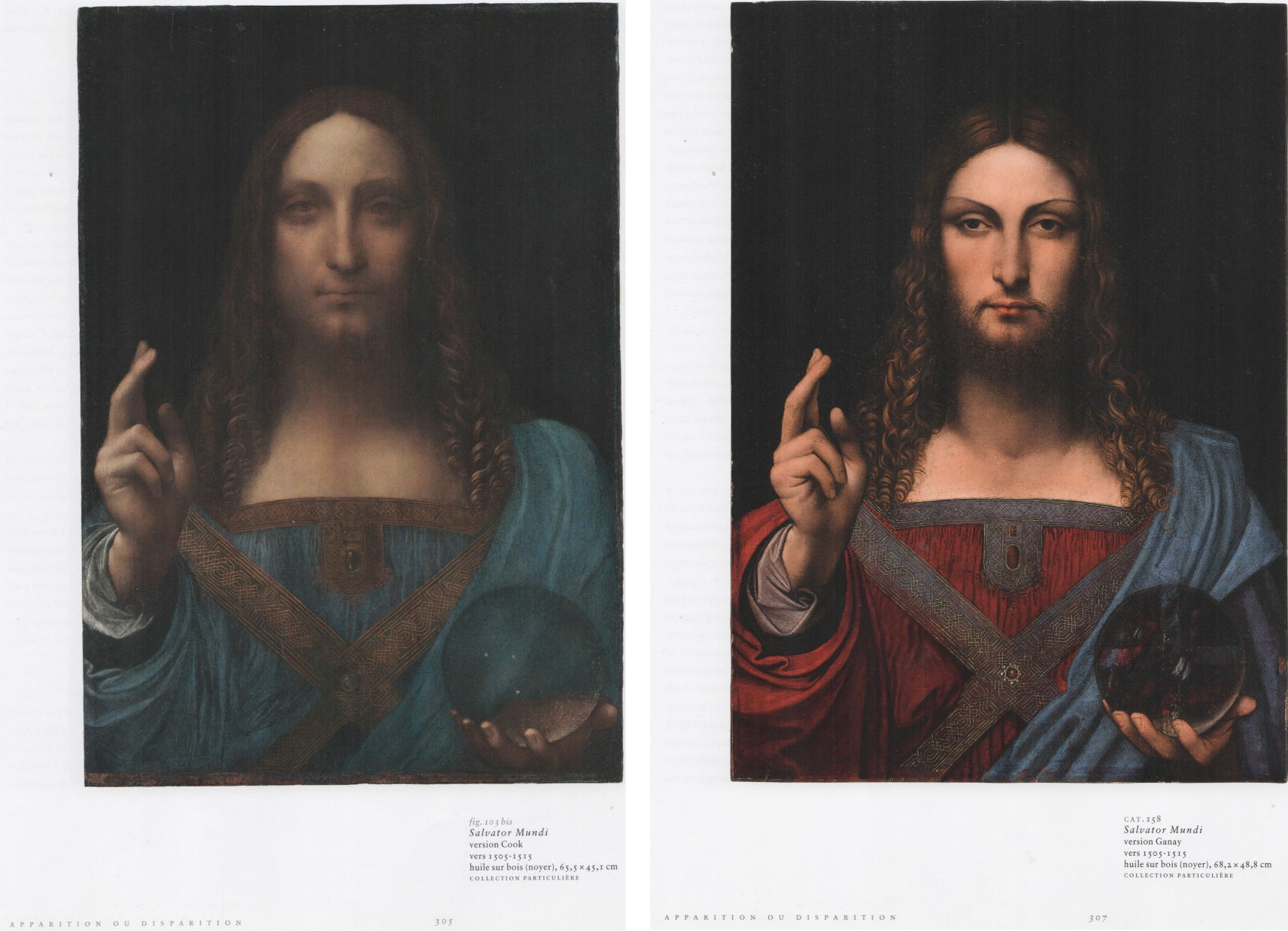
Above, Fig. 2: Left, Léonard de Vinci, exhibition catalogue, Louvre éditions, Paris, 2019, p. 305 (Cook Salvator Mundi); right, Léonard de Vinci, exhibition catalogue, Louvre éditions, Paris, 2019, p. 307 (Ganay Salvator Mundi).
The Disappeared Louvre Technical Book – aka the “would-be-decisive-scientific-examination-of-short-lived-appearance” of December 2019
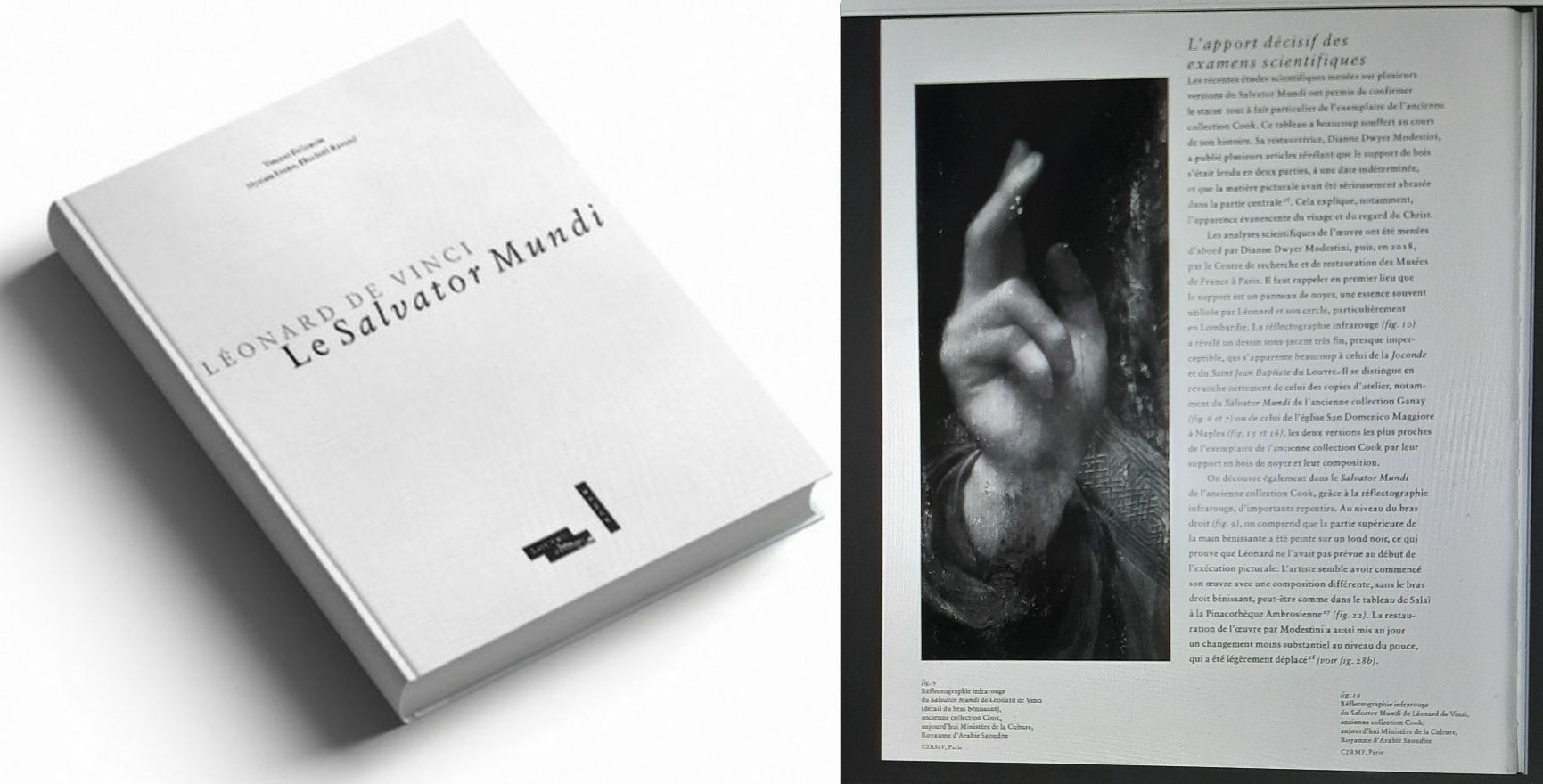
Above, Fig. 3: Left, Vincent Delieuvin, Myriam Eveno, Élisabeth Ravaud, Léonard de Vinci, Salvator Mundi, Louvre éditions – Hazan, Paris 2019, (as published in The Art Newspaper); right, a page taken from Vincent Delieuvin, Élisabeth Ravaud, Léonard de Vinci. Le Salvator Mundi, Louvre éditions – Hazan, Paris, 2019.
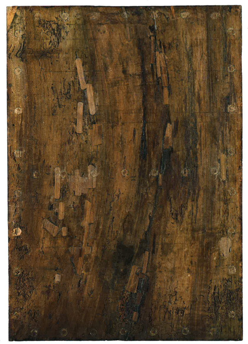
Above, Fig. 4: Workshop of Leonardo da Vinci, the Cook version of Salvator Mundi, back of the wood panel.
Quite strangely, a 46-page booklet titled “Léonard de Vinci. Le Salvator Mundi” was published jointly by the Louvre and its laboratory (C2RMF) six weeks after the exhibition’s 24 October 2019 opening at the Louvre (Fig. 3, above). On no official announcement or evident sanction, the booklet is said to have made a very brief and accidental appearance in the Museum’s bookshop in December 2019. Its authors, Vincent Delieuvin (Leonardo curator at the Louvre), Myriam Eveno and Élisabeth Ravaud (Louvre’s laboratory C2RMF scientists), had considered and contended that the New York Salvator Mundi is an authentic Leonardo. Thus, their historical and scientific essays radically opposed the picture’s studio attribution as stated in the official exhibition catalogue. Unsurprisingly, the dissenting publication was swiftly withdrawn and the museum itself neither recognized the book’s existence nor its embarrassing contents.
With the reasons for the booklet’s leak still remaining obscure, it would be risky indeed to accept a theory in circulation whereby the pro-Leonardo version of the catalogue had been printed together with the scientific booklet in the event of the Salvator Mundi being exhibited, while another entire catalogue, in which the picture was downgraded, had also been printed simultaneously on the possibility that a loan of the picture might be refused. Such a scenario does not accord with the fact that the junked booklet was printed in December 2019 – which is to say, after the exhibition had opened – while both versions of the exhibition catalogue, one of which was abandoned, had been printed two months earlier in October. Such a theory would thus suggest that Louvre Museum staffs’ scientific investigations are determined not by matters of hard material evidence and duly considered professional judgements but, rather, according to political expediencies such as whether or not a loan request might be granted. Who could believe such a tale? Science is science and it is certainly not a discipline with one rule for one political eventuality and one rule for another. Museum laboratory researchers certainly do not draft contrary and rival test results from a single investigation so that they might comply with an institution’s future stance. Moreover, while the phantom book’s existence was known to the small circle of the Leonardo specialists after its short-lived bookshop appearance, for a long time, nobody was fully apprised of its actual contents (bar rare circulating scanned pages).
The problematic ‘‘Mona Lisa‘s male alter ego’’
While the Salvator Mundi‘s standing was not intended to remain unresolved indefinitely, its intrinsic mystery deepened with certain revelations disclosed in an April 2021 French documentary film “The Saviour For Sale. The Story of Salvator Mundi” by Antoine Vitkine on the picture’s various stages of upgrading as a retrieved Leonardo masterpiece which culminated in November 2017 when sold as such at Christie’s, New York, for $450m. Besides the sensational episodes of the work’s thriller-like route to financial success, the film addressed the long-expected loan to the Louvre and the consequent stumbling negotiations between the museum and the Salvator Mundi‘s owner, the Saudi prince Mohammad bin Salman, nicknamed MBS. Thus, we first learn that in June 2018 the panel painting was sent to the Louvre to be examined at length closely in the Museum’s laboratory and that the results of this survey, confirming the Leonardo attribution, are those recorded and discussed in the withdrawn booklet (Fig. 3 above); but then, that shortly before the blockbuster’s inauguration, the Louvre invited several Leonardo specialists to examine the painting before finalizing a loan process with MBS. At that date in 2019, the scholars’ opinion was not as favourable as that of the C2RMF scientists in 2018 and the work was downgraded to being by Leonardo in part only. The film also reports that MBS (quite understandably) resisted his property’s lowered artistic status and made clear that unless the Salvator Mundi was exhibited next to the Mona Lisa (thereby underscoring its originally claimed status when promoted by Christie’s as a “Male Mona Lisa” ahead of its November 2017 sale) the loan would be refused. Misinterpreting this imbroglio, certain parties today claim that the 2019 downgrading had prompted the Prince’s exorbitant clause. In any event, the subsequent insistence that the Salvator Mundi be shown in the exhibition as the ‘‘Mona Lisa‘s male alter ego’’, side by side, was one the Louvre could not accept for security reasons quite aside from the work’s recently lowered artistic status.
The revelations of the Vitkine film precipitated an art world earthquake: the long-running suspense from the moment the Louvre requested the loan from the owner shortly after the November 2017 New York sale, until the very day of the Leonardo exhibition opening in Paris, two years later, had been the consequence of a tumultuous negotiation over the artistic status and attribution of the painting that terminated in a late and drastic 2019 reappraisal. The unexpected downgrading by the museum that holds the most important collection of Leonardo masterpieces in the world, including the legendary Mona Lisa, constituted the strongest possible reversal and disavowal to the accrued federation of parties that had fervently and assiduously promoted the work as a Leonardo for over a decade.
Needless to say, the recent leaking of the contents of the withdrawn booklet – “the book that doesn’t exist” as many have called it – by Leonardo upgrade partisans has considerably increased the saga’s fog of ambiguity and even restored hope among the True Leonardo Believers that their icon may yet be crowned as an autograph work of the master. Nevertheless, given that the Salvator Mundi picture concerned cannot be both a true Leonardo and a studio work, the staggering contradiction between the Louvre’s present (and official attribution, as advised by leading specialists) and the C2RMF’s earlier scientific investigation of 2018, has yet to be resolved. For that reason, checking the internal scientific consistency of the “no book” now seems both essential and urgent.
Like many Leonardo scholars I have been supplied a PDF of the book “for information”, so to speak. Since, with its now international circulation, the book’s contents are no longer a guarded secret and given that many of its issues are at the heart of my own researches there are no reasons for me not to make public my observations on the mystery book’s contents and postulates. The task is made easier because the C2RMF 2018 investigation has been supplemented by other earlier and institutionally separate investigations conducted over a number of years before and after the 2017 New York sale, notably in the USA.
The assorted technical analyses of the Cook version of Salvator Mundi
The phantom Louvre booklet displays two essays: Vincent Delieuvin’s historical account of the undocumented creation of a Salvator Mundi by Leonardo (hereafter referred to as Delieuvin, 2019); and a detailed technical report by Myriam Eveno and Élisabeth Ravaud, both C2RMF scientists (hereafter referred to as Eveno and Ravaud, 2019). I shall mainly review this latter essay (albeit with some forays into Delieuvin’s piece) because its material addresses the factual aspects of the picture – that is, its physical structure and the specific components used for its execution. When necessary, I shall also refer to an American scientific investigation whose last stage was published on 20 April 2020 in Heritage Science by Nica Gutman Rieppi, Beth A. Price, Ken Sutherland, Andrew P. Lins, Richard Newman, Pen Wang, Tin Wang and Thomas J. Tague Jr. (hereafter, Rieppi, Price, Sutherland et al., 2020) [1]. Some of the latter’s work was delivered by Dianne Modestini in 2014 [2].
Delieuvin’s optimistic tone contrasts with the tests themselves, which are far from conclusive, as we shall see (“The decisive contribution of the scientific examination”, Delieuvin, 2019, p. 14, my translation – unless specified, all translations are mine). My astonishment was pronounced when, having noticed the poorly significant elements actually observed by Eveno and Ravaud, I encountered the conclusion: “[In our opinion] the examination of the Salvator Mundi seems to demonstrate that Leonardo has executed the work indeed” (Eveno and Ravaud, p. 38). That latter statement was audacious: although the scientific investigation of paintings is inescapable as a rational means to understand both their structures and techniques – and as such, is of crucial assistance to art historians – it can never prove whether a painting is by one hand or another, here being that of Leonardo.
From misinterpreted observations to rushed conclusions (why the C2RMF’s 2018 scientific investigation was not to be made public)
Let us now consider a number of points which explicitly reveal why the two questionable Louvre essays, which bear conclusions extrapolated from shaky grounds, were – rightly – not meant to be published by the Louvre.
I: Panel preparation
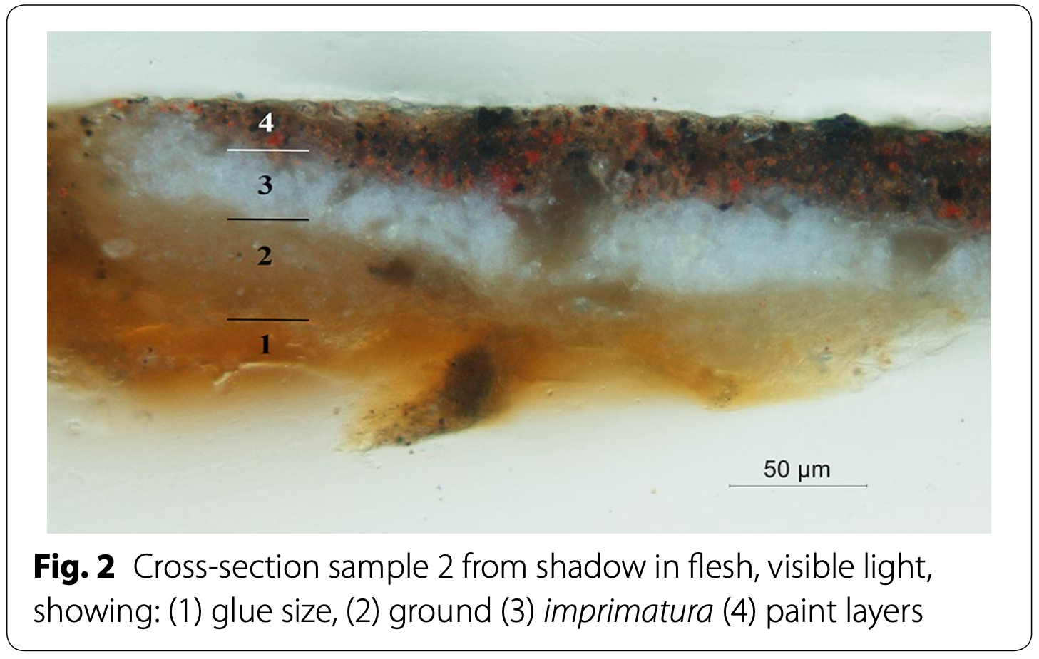
Above, Fig. 5 [after Rieppi, Price, Sutherland, et al., 2020, Fig. 2]: Workshop of Leonardo da Vinci, the Cook version of Salvator Mundi, a cross section sample from shadow in flesh, visible light, showing: (1) glue size, (2) ground, (3) imprimitura, (4) paint layers.

Above, Fig. 6: Ambrogio de’ Predis (?), Portrait of a Man aged 20 (“The Archinto Portrait”), 1494, oil on walnut, 54.4 x 38.4 cm (panel), London, National Gallery.
Unlike most Leonardos (aside from the Belle Ferronnière and Saint John the Baptist), the (NY/Saudi) Salvator Mundi was painted on a walnut panel prepared with a white ground applied over the wood, which had first been coated with an unpigmented size layer (Rieppi, Price, Sutherland et al. 2020, p. 9, fig. 2) (Figs. 4 and 5, above). The traditional calcium sulphate gesso is, however, mainly encountered in numerous Leonardos like the Adoration of the Magi, the Louvre version of The Virgin of the Rocks or the Saint Anne. With those, the white ground layer was followed by a thinner off-white priming layer called imprimitura; both layers contain a lead white pigment presumably bound in oil, while a small amount of a lead-tin yellow was found in the thinner second layer. These ground layers also contain glass particles of variable dimensions (consistent with manganese-containing soda-lime glass) of a type commonly encountered in Italian paintings (Rieppi, Price, Sutherland et al., 2020, p. 10-12).
Eveno and Ravaud admit that the panel preparation (with the ground layers laid directly over the sized wood) of the then New York picture is unusual for Leonardo. Against that, they contend that it is found also in works like the Lady with an Ermine, the Belle Ferronnière and the Mona Lisa (Eveno and Ravaud, 2019, p. 37). While this preparatory configuration is an established fact concerning the (now) Saudi Salvator Mundi, as testified by the cross-sections published under Modestini’s direction, to my knowledge no samples (except one in the Lady with an Ermine in 1960, which is yet to be re-examined in the light of modern-day scientific methods) have been taken from the above-mentioned Leonardos. As a result, this technique of preparation is simply presumed in their case despite the researches published by the same C2RMF team in 2014 [3]. Additionally, from the latter publication we learn that this same panel preparation (ground layers of lead white applied on a walnut wood board) has been identified in Leonardo’s circle’s panel paintings, notably in the Portrait of Bernardo di Salla by Giovanni Francesco Caroto (Louvre), in a Salvator Mundi privately owned (Leonardo school) and, quite interestingly, in the Archinto Portrait attributed – notably – to either Ambrogio de ‘Predis or Marco d’Oggiono (both Leonardo’s main assistants) kept in the National Gallery in London (Ravaud and Eveno, 2014, p. 135 sq.) (Fig. 6, above). In other words, no striking evidence exists that might prove that the panel preparation in the Salvator Mundi is clearly and uniquely specific to Leonardo’s own usage, or indeed confirms that, thanks to this technical feature – as stated by the two C2RMF scientists – the possibility of its being a studio work can be automatically rejected.
Furthermore, and as if in lieu of any technical confirmation, the authors hold the preparation’s peculiarity (never observed in any of Leonardo’s own works) as strong evidence per se, on the grounds that “it accords well with Leonardo’s inventive mind, who constantly experiments new recipes, as testified by the great variety of the preparatory processes [he] employed throughout his career” (Eveno and Ravaud, 2019, p. 37). And this hypothesis is offered despite the fact that the addition of grained and powdered glass particles to the two ground layers is itself another peculiarity, never encountered in Leonardo paintings either (idem) while, conversely, it has been identified in the priming layer (called imprimitura) laid over the gesso preparation in works by such artists as Lorenzo Costa, Perugino, Vincenzo Foppa, and, regularly from 1501 onwards, by Michelangelo (idem) (see infra, Fig. 12, right, backscattered electron [SEM-BSE] image).
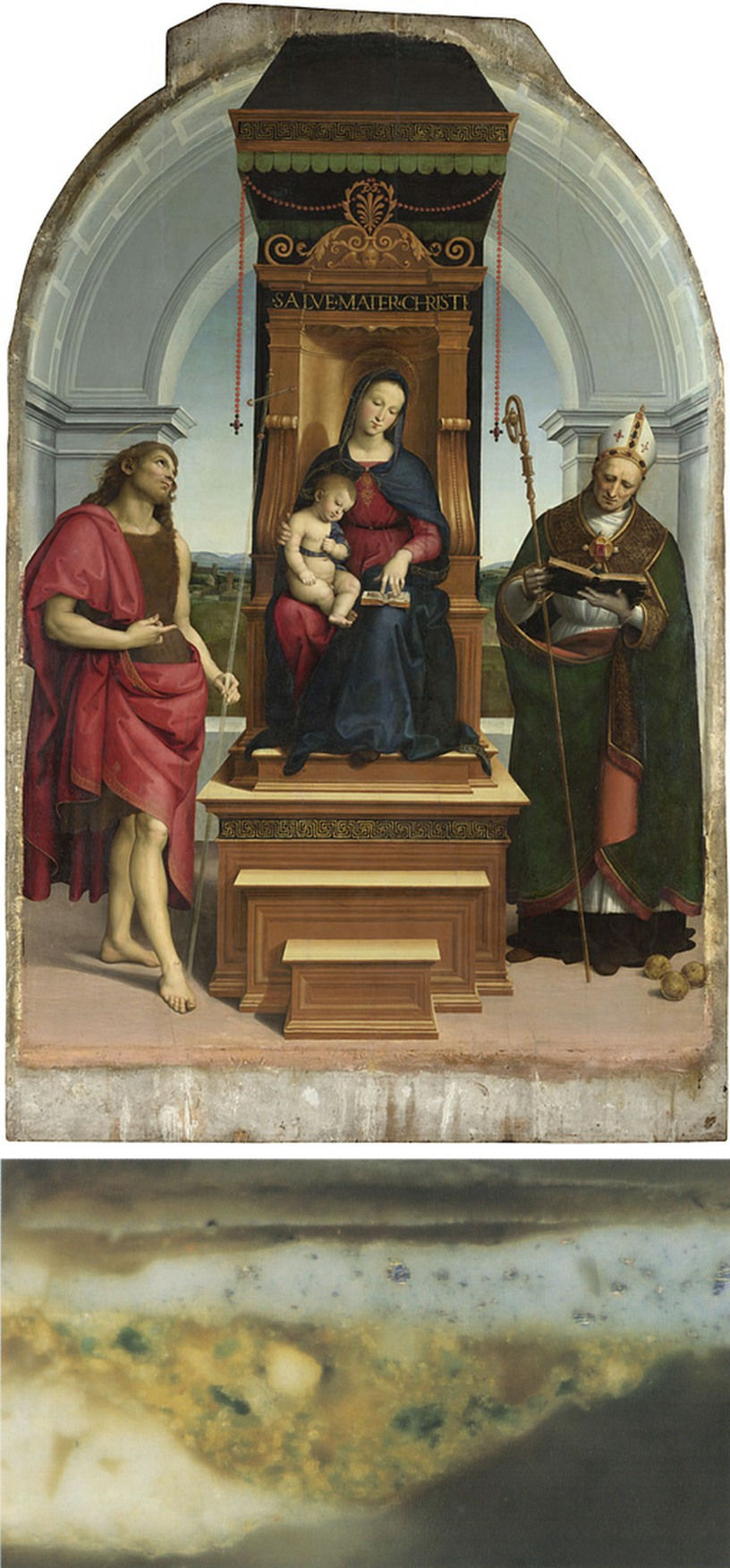
Above, Fig. 7: top, Raphael, The Madonna and Child with Saint John the Baptist and Saint Nicholas of Bari (“The Ansidei Madonna”), dated 1505, oil on poplar, 245 x 157 cm (painted area 216.8 x 147.6 cm), London, National Gallery; above, The Ansidei Madonna, a cross-section from the grey paint of the architecture in which particles of glass are visible in the pale yellow imprimitura.
Given that this observation is strange to Leonardo’s known practice and corresponds much more to that of other painters, including Raphael (not cited in Eveno’s and Ravaud’s 2019 essay) (Fig. 7, above) – and, presumably, to their circles – one wonders how the two C2RMF researchers came to take it as a distinctive sign of his technique. Moreover, they are further at risk when positing themselves firmly on a specific role of the glass in the ground layers: “its use, even in the preparation, appears to us as being a distinctive characteristic of Leonardo’s quest for transparency” (Eveno and Ravaud, 2019 p. 38). It is true that the use of glass in paintings may be a means to improve the translucency of the paint layer, according to specific conditions, in which the refraction index of the glass and the layers where it will be introduced. In fact, the ground layers are not the level in the paint film where Leonardo would need transparency, but are where he might want to secure the proper drying of the paint, hence the American researchers’ acknowledging statement: “Glass may alternatively have been used for aesthetic effect by enhancing the translucency of the paint, but in the case of the Salvator Mundi, the glass in the lower ground and imprimitura layers more likely functioned as a siccative since these layers are not visible in the final painting image. It is also possible that the glass was added to adjust the handling and textural properties of the panel preparation materials” (Rieppi, Price, Sutherland et al., 2020, p. 13) [4].
II: The underdrawing and the partial use of the infrared reflectograms
Infrared reflectography helps to detect underdrawings in paintings: infrared rays traverse the paint surface and reveal the underlying lines and wash techniques used to draw and sketch out the overall composition when they are constituted, in particular, of carbonaceous materials such as charcoal, bone black, or soot (lampblack) containing inks. Once again, Delieuvin expresses astounding optimistic views regarding the underdrawing found in the Cook Salvator Mundi: “Infrared reflectography has revealed a very thin and imperceptible underdrawing which much resembles that of the Mona Lisa and of the Saint John the Baptist in the Louvre” (Delieuvin, 2019, p. 14). This is not exactly what can be understood from Eveno’s and Ravaud’s report in the same book: “[Infrared examination has revealed] some rare thin lines absorbing infrared rays, therefore of an a priori carbonaceous nature. They delimit in particular the left eye’s iris. One notices the presence of a double contour line on a well-preserved fragment of the upper lip, although no spolvero dots can be distinguished. The other lines of the composition’s implementation have seemingly been executed in the course of the painting process” (Eveno and Ravaud, 2019, p. 31).
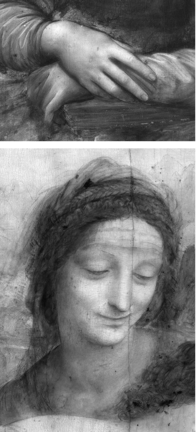
Above, Fig. 8: top, Leonardo, The Mona Lisa, oil on poplar, 77 x 53 cm, c. 1501-1517, Paris, musée du Louvre, detail of hands (infrared reflectogram hereafter referred to as IRR); below, Leonardo, The Virgin and Child with Saint Anne (“The Saint Anne”), 1501-1517, oil on poplar, 168.4 x 113 cm, Paris, musée du Louvre, detail of Saint Anne (IRR). In Lisa’s proper right hand, delicate contour lines have been traced to define further a now imperceptible drawing transferred from a cartoon. Thanks to tiny spolvero dots appearing on some contour lines, the use of a pricked cartoon to transfer the composition is identified in the Louvre Sainte Anne distinctly, in particular in the Saint’s proper left eyelid. The scarce and very small fragments of underdrawing in the New York Salvator Mundi are not decisive towards Leonardo’s authorship given that they don’t compare the typology of the artist’s original underdrawings. Besides, the artistic level of the painting does not match that seen in visible light in the above masterpieces.
These observations are, of course, far too slight to help one figure out whether or not the Salvator Mundi‘s underdrawing compares directly with those of the late Leonardos, like the one faintly discernible, and so, just partly, in the Mona Lisa, or the one in the Louvre Saint Anne, which, conversely, is far more substantial and legible (Fig. 8, above). As already mentioned, while an excessive interpretation is drawn by Delieuvin from a barely significant item of technical information, what really matters in the infrared tests of the painting – and is therefore of far greater importance – is blatantly ignored by the three authors of the “no book”. There is a clear reason to this: the C2RMF’s infrared image is that of the restored picture, in which what is of interest does not show because the infrared rays’ deep penetration through the paint layer is stopped by the modern materials used by Modestini to reconstitute the background visually (Fig. 9, below). Fortunately, another image does exist (Fig. 10, below): it was made in 2007, before what subsists of the dark background was restored, heavily in my opinion, thus masking what is so essential in the infrared tests of the Saudi painting, that is the thick emphatic black contours of Christ’s head, shoulders and face. This crucial visual document is missing in both the withdrawn Louvre/C2RMF 2019 book and in the excellent American survey of April 2020. The significance of that image had been published in my interview in Beaux-Arts Magazine in January 2018 and for that reason, it has been known to all the parties involved closely in the Salvator Mundi‘s scientific expertise. Nonetheless, this very image does not appear either, in full at least, in Dianne Modestini’s own post-cleaning essay of 2014 on the controversial work [5]. Some details, however, especially the so fascinating one of Christ’s head, are reproduced. As the reader knows from my “Further thoughts I” posted here last year, the infrared reflectogram (IRR) of the Salvator Mundi’s background free of any inpainting reveals the amazing analogy that exists between the thick black contours of Christ’s head (a sketching-out technique never practiced by Leonardo) and those observed in a signed and dated Head of Christ, painted in 1511 by the Master’s favourite pupil and collaborator, Gian Giacomo Caprotti, called Salai (see “Further Thoughts I”, Figs. 7-11) [6]. To date, my discovery has not been commented on by those it concerns most, i. e., the various adepts at the Leonardo attribution, but it will not be kept in the background for ever.
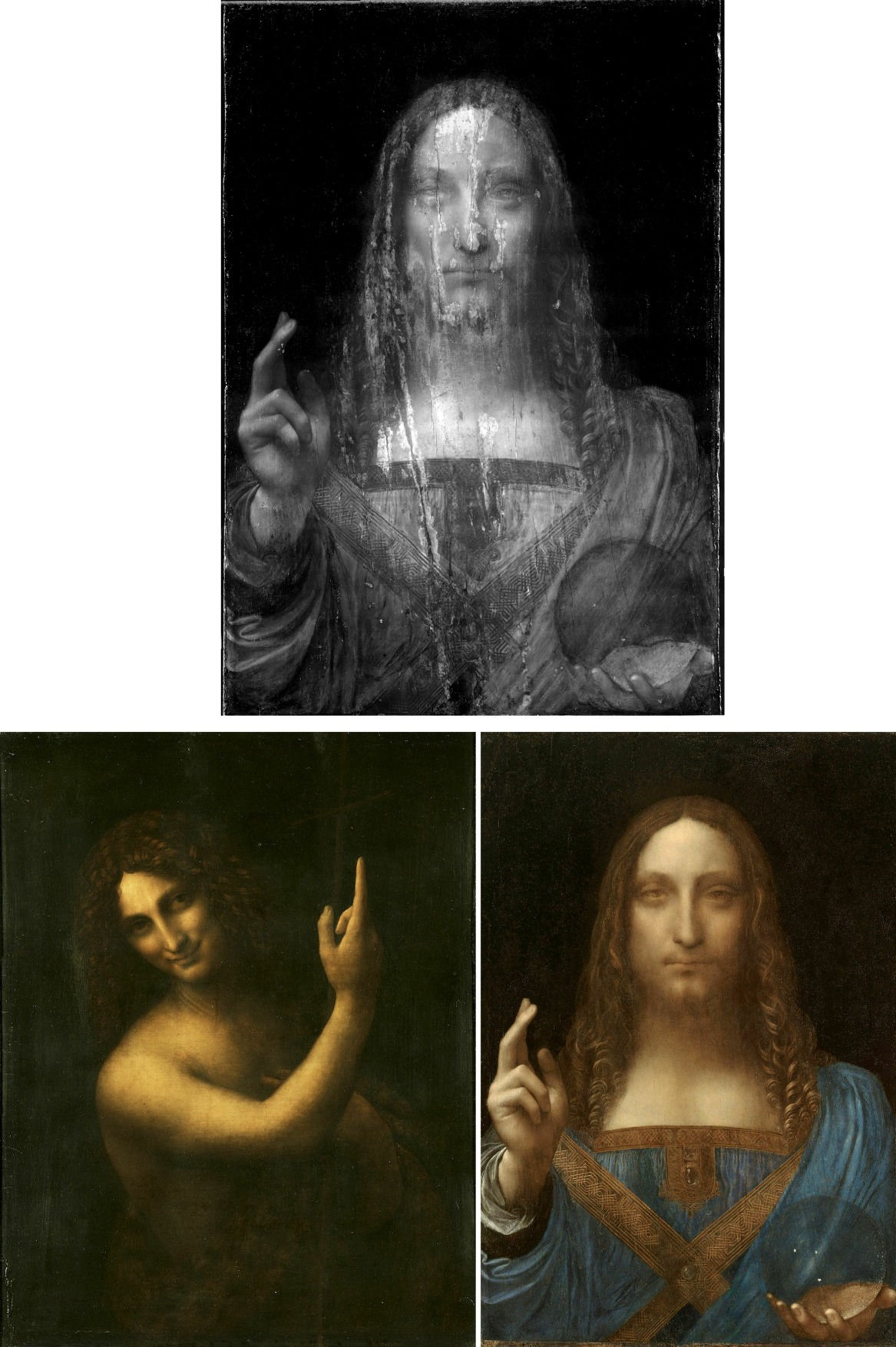
Above, Figs. 9 A, B, and C: [A] top, workshop of Leonardo da Vinci (Salai with the assistance of G. A. Boltraffio?), the Cook version of Salvator Mundi (IIR scan with restored background concealing the sketching out contours of Christ’s head, face, neck and shoulders); [B] below left, Leonardo, Saint John the Baptist (before the last cleaning), oil on wood, c. 1510-1517, Paris, musée du Louvre; [C] below right, The Cook version of Salvator Mundi in visible light (as in Fig. 1 above). The problem with the Modestini heavily retouched background is revealed in a clear-cut fashion when the restored stage (here, that of 2011-12, when exhibited at the National Gallery, and not yet that of 2017 when sold at Christie’s, New York) is compared visually with Leonardo’s Saint John the Baptist in the Louvre. In the latter, there is no distinct separation between light and shade. No background exists, so to speak, just an invasive obscure space within which the figure of St. John is defined thanks to the lighted zones and the transitional shading, thus resulting in an impalpable image in strict accordance with Leonardo’s quest for spatial unity between the forms and their environment, a process in which that duality is subdued extensively. In technical terms, therefore, the shadows in the background and in the foreground of the Louvre picture appear to be of the same value and “mysterious” quality. That is not the case in the Saudi Salvator Mundi: Christ’s figure is far more defined than that of St. John and clearly stands against a dark background, the shapes still have boundaries and do not float within an obscure, indefinable space like in the Louvre picture: it is an unsubtle characteristic corresponding much more to the studio’s aesthetic options observed during Leonardo’s Milanese periods of 1482-1499 and 1506/08 -1513 and for a long time after his death.
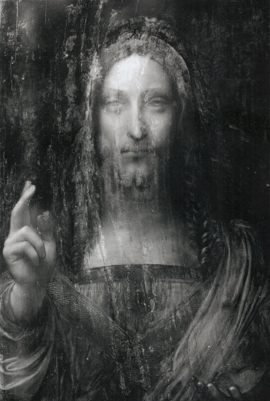
Above, Fig. 10: Workshop of Leonardo da Vinci (Salai with the assistance of G. A. Boltraffio?), the Cook version of Salvator Mundi (IIR scan, 2007), before restoration, showing the heavy outlines of the underlying sketching out – unlike Leonardo’s own practice – of Christ’s head, face, neck and shoulders.
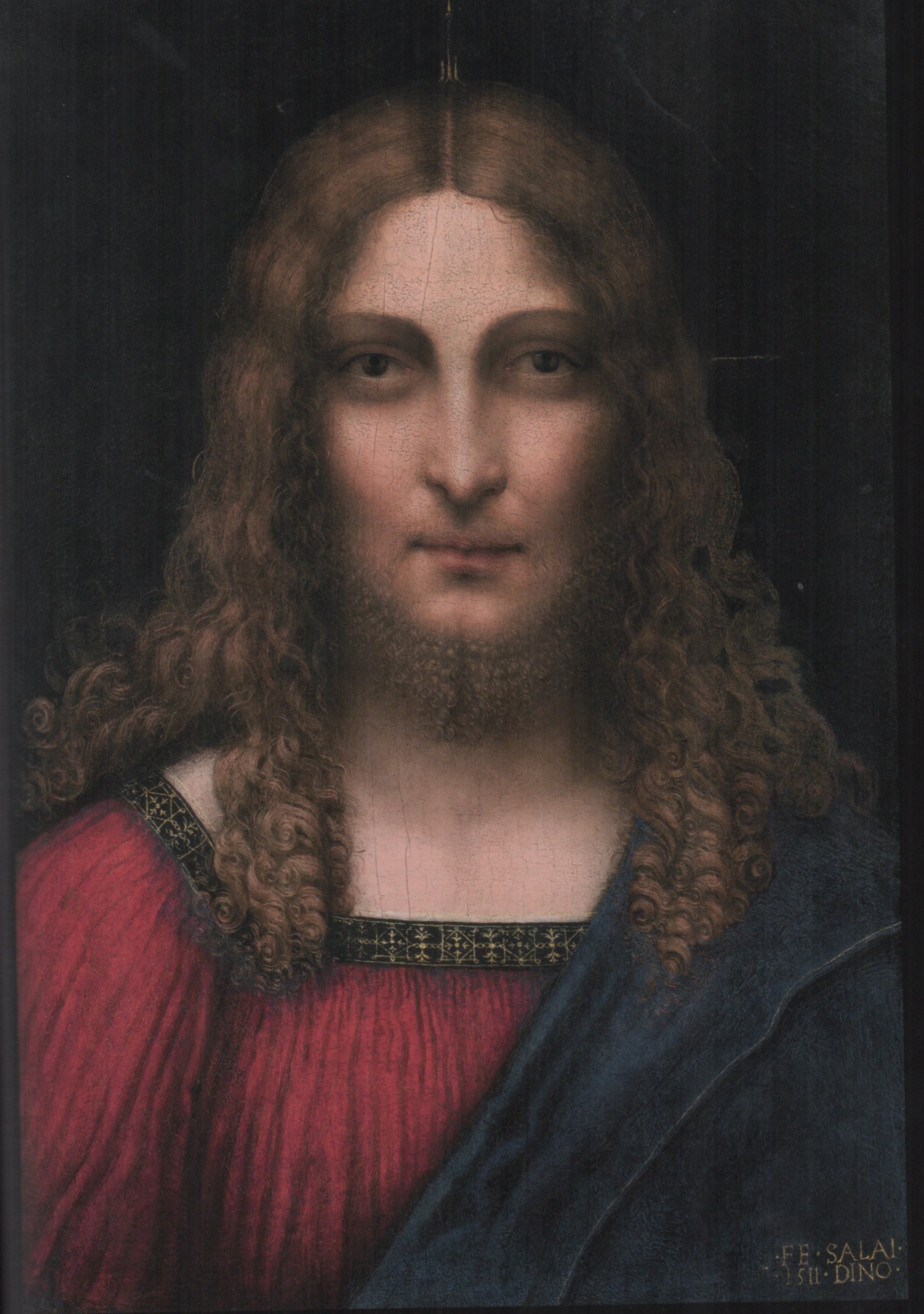
Above, Fig. 11: Gian Giacomo Caprotti, called “Salai”, Head of Christ, oil on wood, signed and dated 1511, 53 x 37.5 cm, Milan, Pinacoteca Ambrosiana.
III: The blessing hand
The blessing hand is another flagrant case of extrapolated interpretation by the authors of the junked book: the elements now observed by both the C2RMF scientific team and the American one cast definitive doubt over Leonardo’s presumed contribution to the work’s execution. Still following his own line very quietly, Delieuvin seems to consider that what science reveals on that hand’s making is nothing to worry about: “Thanks to infrared reflectography, important pentimenti [autograph revisions made during the painting process] are discovered in the former Cook collection Salvator Mundi. In the proper right arm one can understand that the upper part of the blessing hand has been painted over a black background, thus proving that Leonardo had not planned it at the beginning of the execution. It seems that the artist had started working on a different composition, with no blessing arm, possibly like in Salai’s [Head of Christ] in the Ambrosiana” (Delieuvin, 2019, p. 14), (Figs. 11, 12 and 13.)
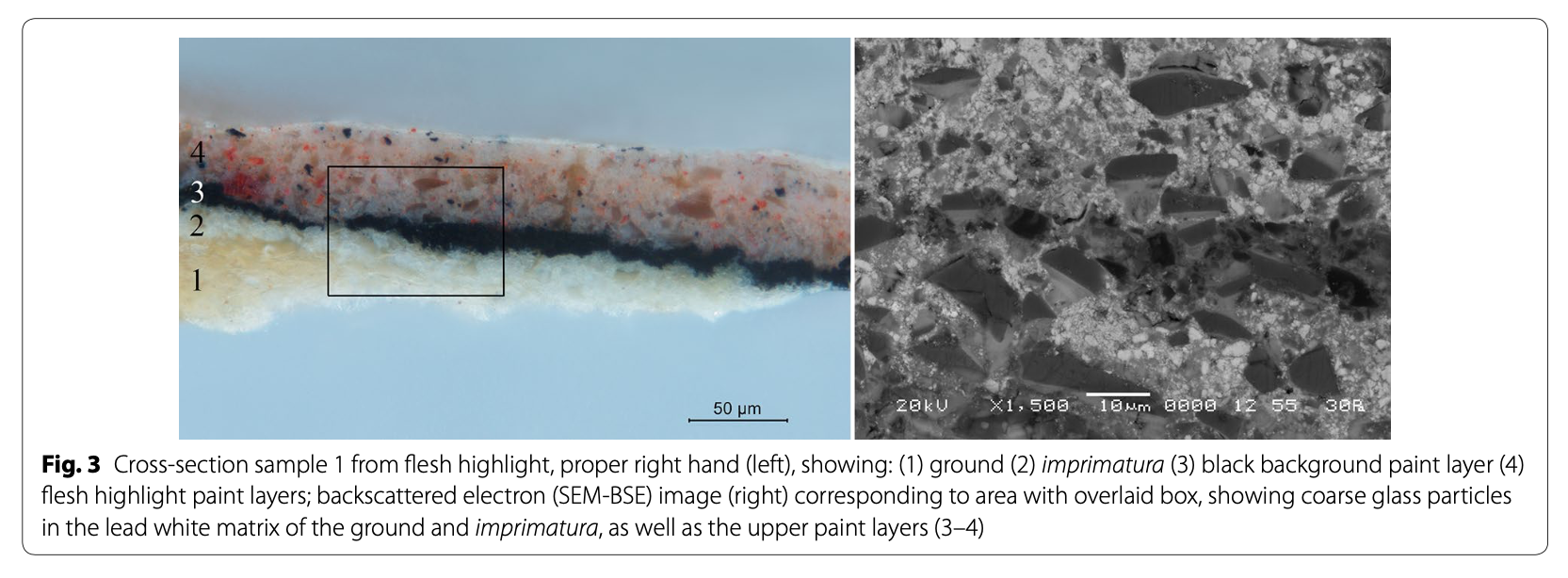
Above, Fig. 12 [after Rieppi, Price, Sutherland et al., 2020, Fig. 3]: Workshop of Leonardo da Vinci (Salai with the assistance of G. A. Boltraffio?), the Cook version of Salvator Mundi, cross-section sample from flesh highlight showing, left: (1) ground, (2) imprimitura, (3) black background paint layer, (4) flesh highlight paint layers. The backscattered electron (SEM-BSE) image – right – shows coarse glass particles in layers 1-4. The black background paint layer underlying the flesh highlight is clearly visible here: it does not correspond to any recorded Leonardo practice.
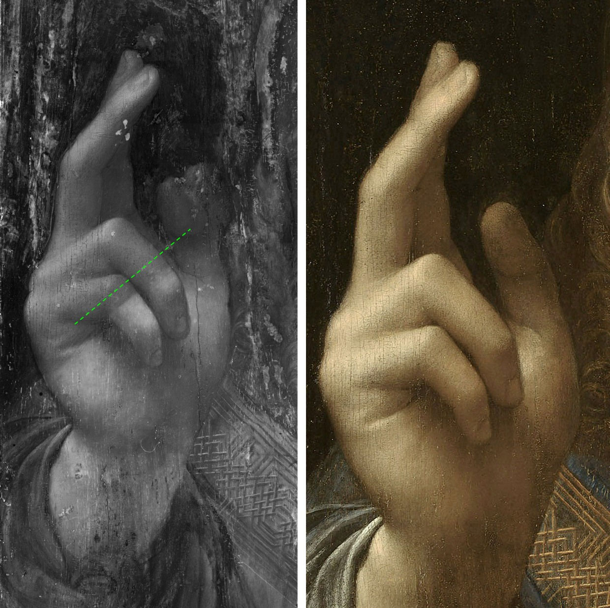
Above, Fig. 13: left, Workshop of Leonardo da Vinci (Salai with the assistance of G. A. Boltraffio?), the Cook version of Salvator Mundi, detail: IRR scan image showing the black background seen through the translucent flesh paint of Christ’s right proper hand (along green dotted line); right, the proper right hand, after restoration and in visible light.
That, of course, is not the interpretation that should be drawn from this extraordinary discovery in order to respect both technical and historical accuracy: a pentimento, a word meaning “repentance” or “regret” in Italian, is an action, while being an adjustment or correction, that is consistent with the composition as it was conceived by the artist at the outset. From this standpoint, Delieuvin is right in considering that the initial composition of the Cook Salvator Mundi was identical to that of Salai’s Head of Christ in the Ambrosiana: it is the more certain as the black background was, if not finished, largely painted around the Saviour’s head and down his proper right shoulder when the blessing hand was added (as shown on the infrared documents and the cross-section sample reproduced here (Figs. 10, 12 and 13, above). We are therefore faced with a change stricto sensu, because, in chronological terms the pentimento is executed during the painting sessions inherent of the initial creation, thus within one and the same artistic logic of forms that were born together, whereas a change – or transformation – of composition and iconography is not: it radically modifies the initial composition’s outward appearance and can occur at any time, whether early or late, after that composition was left as it first was. In many cases, it may well be an autograph move and, consequently, not necessarily the sign of a late, apocryphal addition, yet in that of the controversial Salvator Mundi, its authenticity can be doubted insofar as the blessing hand’s gesture, anatomy and perspective are so wrong that Leonardo’s authorship seems improbable. What cannot be established, however, is the moment when the change took place, despite the C2RMF’s attempt to prove (on unconvincing grounds) that it is in Leonardo’s hand and soon followed the abandoned original idea (Eveno and Ravaud, 2019, p. 32). Also, it is worth of note that, interestingly, while Christ’s tunic and proper left sleeve are drawn carefully in the Windsor studies RL 12524 and 12525 (see “Further thoughts I”, figs. 2 and 3), no hand was conceived by Leonardo, whether sketchily or not on the latter sheets, or even traced on a separate one. The hand holding the orb has not been projected either. It strengthens my feeling that those projects were meant for the studio as a guideline for the figure’s clothing alone, and so without reaching a stage including the hands, thus suggesting that the assistants were left on their own for the execution of the whole painting (hence the stiffness observed in most parts of the drapery work and the weak, ill-depicted anatomy of the hands).
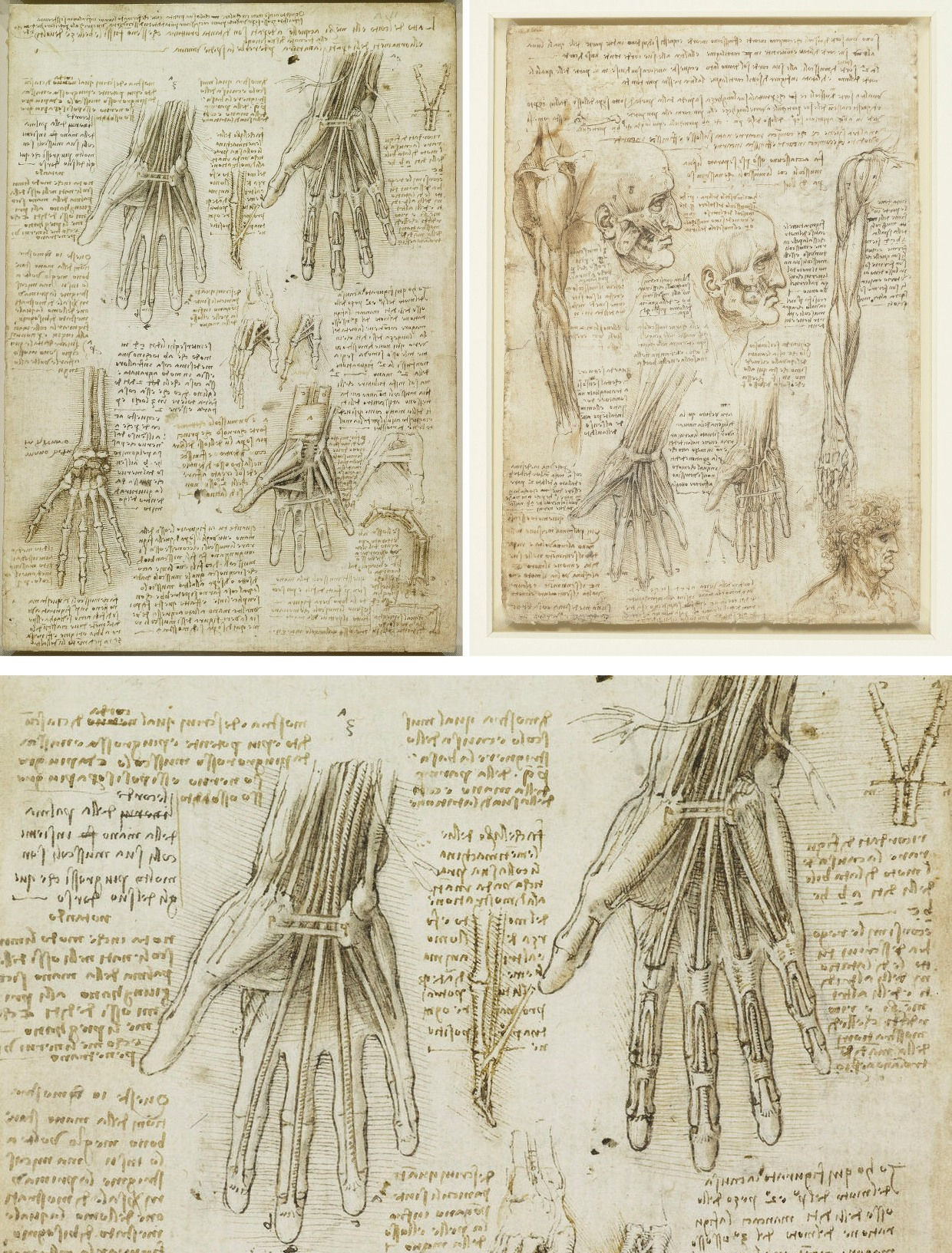
Above, Fig. 14: top, left, Leonardo, The bones, muscles and tendons of the hand, c. 1510-1511, pen and ink with wash, over black chalk, 28.8 x 20.2 cm, Windsor Castle, Royal Library, RL 19009r; top right and, above, detail, Leonardo, The muscles of the face and arm, and the nerves and veins of the hand, c. 1510-1511, pen and ink with wash, over black chalk, 28.8 x 20 cm, Windsor Castle, Royal Library, RL 19012v.
At this stage, it seems helpful to provide historical elements demonstrating Leonardo’s incredibly deep knowledge of the human hand, of its anatomy and functioning. As the reader will see, acknowledging the mass of work and the so pertinent observations contained in the artist’s research on this issue alone, is the best way to realize that the Cook Salvator Mundi’s blessing hand does not accord with Leonardo’s anatomical concepts and depictions: “The principal movements of the hand are 10; that is, forwards, backwards, to right and to left, in a circular motion, up or down, to close and to open, and to spread the fingers or to press them together” (Codex Atlanticus, folio 124v (45v-a), Richter, § 353, c. 1515- 1516). And again: “[Of the motions of the fingers] The movements of the fingers principally consist in extending and bending them. This extension and bending vary in manner; that is, sometimes, they bend altogether at the first joint; sometimes they bend, or extend, halfway, at the 2nd joint; and sometimes they bend in their whole length and in all the three joints at once. If the 2 first joints are hindered from bending, then the 3rd joint can be bent with greater ease than before; it can never bend of itself, if the other joints are free, unless all three joints are bent. Besides all these movements there are 4 other principal motions of which 2 are up and down, the two others from side to side; and each of these is effected by a single tendon. From these there follow an infinite number of other movements always effected by two tendons; one tendon ceasing to act, the other takes up the movement. The tendons are made thick inside the fingers and thin outside; and the tendons inside are attached to every joint but outside they are not” (Codex Atlanticus, folio 273a recto (99 v-a), Richter, §354, c. 1510).
As one can see, Leonardo’s disquisition on finger movements rules out anything other than bending along a plane for each finger and provides no rotary option for any of them. To perfect the Master’s own demonstration, I have reproduced here (Fig. 14, above) two magnificent drawings of the anatomy of the hand kept in the Royal Library at Windsor Castle: beyond any discussion they prove that the artist who painted Christ’s blessing hand with something like a broken raised finger (it rotates clockwise, thus suggesting such a traumatic pathology) in the Cook Salvator Mundi cannot be the one who drew the genius sheets in Windsor. But why then such a hand? Although it is difficult to answer that question, I have long suspected that its overall concept and shape does not have an origin in Leonardo’s bottega and that its pattern, more precisely that of the “broken finger”, seems to correspond to an archaic style, thus medieval, and possibly to a Northern school artist. Whether right or not, this presumption is somehow confirmed by the right proper hand of Saint John the Evangelist in Jan van Eyck’s polyptych of the Mystic Lamb (1432), a grisaille painting at the back of a shutter of the work, where appears the same anomalous raised finger as seen in the Cook Salvator Mundi and in its numerous variants (Fig. 15, below). Neither Leonardo nor any of his close collaborators ever saw the Ghent altarpiece but this hand could well be a prototype copied from model-books by travelling artists who had circulated in Europe throughout the 15th century and had brought it to Italy at some unspecified moment. At the time the Cook Salvator Mundi was painted (c. 1510?), Leonardo was far too skilled an anatomist and an innovator to have taken any notice of such a model, but it might have been imitated while modernized by a less brilliant artist like Salai, who had spent his life in the Master’s orbit and never created anything of his own. Once again, this issue cannot be considered supportive of the Leonardo attribution. Moreover, as we shall now see, other disqualifying archaisms exist in the painting.
Above, Fig. 15: left, and centre, Jan van Eyck, The Ghent Altarpiece (The Adoration of the Mystic Lamb),1432, oil on wood panels, 3.4 m x 4.6m, Ghent, St Bavo’s Cathedral, showing Saint John the Evangelist, 148. 7 x 55. 3 cm, and in detail, the blessing hand; right, the restored hand in the Workshop of Leonardo da Vinci (Salai with the assistance of G. A. Boltraffio?), the Cook version of Salvator Mundi. In truth, Van Eyck’s raised middle finger is less twisted, and hence less faulty, than that in the Saudi Salvator Mundi, but its perspective is nevertheless wrong: the nail should not show so much and be in full profile instead, if at all. Also, the lower part of the finger tip should be seen more from underneath.
IV: (A) X-ray testimony, (B) Christ’s curls
Another case in point is the typology of the X-radiograph image of the panel painting, which is also described in a tendentious manner that would leave no doubt about the work’s authenticity: “The X-radiograph of the picture displays the same ghostly image as is seen in the Saint Anne, the Mona Lisa and Saint John-the-Baptist, which is a typical feature of Leonardo’s works after 1500” (Eveno and Ravaud, 2019, p. 38).
(A) – Once again, the reader is supplied with no contextual information that would otherwise disclose its arbitrariness. To my knowledge, no systematic and critical survey has been undertaken until now on the X-ray images of the Leonardos of that period with regard to X-rays of the studio’s productions, which exercise proves highly instructive (see below). Besides, the X-ray images of Leonardo’s own paintings, whatever the period of their creation, show a great variety of aspects depending, firstly, on the nature of the preparation, and secondly, on the particular technique used in the coloured layers of the paint film, and this is most especially the case in the flesh sections. For example, from roughly 1500 onwards Leonardo uses less and less lead white in the flesh paints of his figures, which abstemiousness results in the pictures’ ghostly looking radiographs whose aspect is very different from those of earlier works like the Lady with an Ermine (c. 1490) or the Belle Ferronnière (c. 1495). In the latter, the use of lead white was substantial. However, in Leonardo’s case such matters should not be simplified according to his oeuvre’s chronology : unexpectedly, one can see a marked similarity between the blurred, practically illegible X-radiograph of the head of Leonardo’s Angel in the Baptism of Christ (1472-1475) and that of Saint Anne in the Louvre’s Virgin and Child with Saint Anne painted thirty years later (c. 1501-1517), (Fig. 16, below).
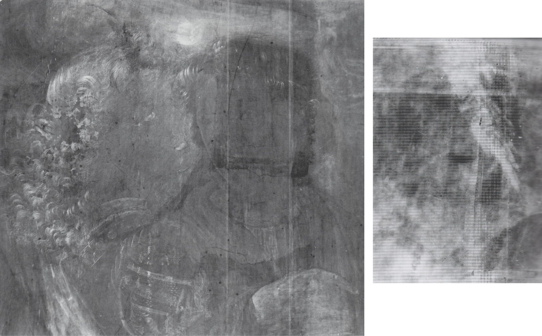
Above, Fig. 16: left, Verrocchio and Leonardo, The Baptism of Christ, before 1470/ 1472 -1476 (?), tempera and oil on poplar, 177 x 151 cm, Florence, Galleria degli Uffizi, X-radiograph of Leonardo’s Angel’s head (painted in oils); right, Leonardo, The Virgin and Child with Saint Anne, oil on poplar, 168 x 130 cm, Paris, musée du Louvre, X-radiograph of Saint Anne’s head.

Above, Fig. 17: left, Workshop of Leonardo da Vinci (Salai with the assistance of G. A. Boltraffio?), the Cook version of Salvator Mundi, X-radiograph; right, Leonardo and studio (including G.A. Boltraffio), The Virgin of the Rocks, c. 1493-1499 (?)/1506-1508, oil on poplar, London, National Gallery, 189.5 x 120 cm, X-radiograph of the Infant Saint John.
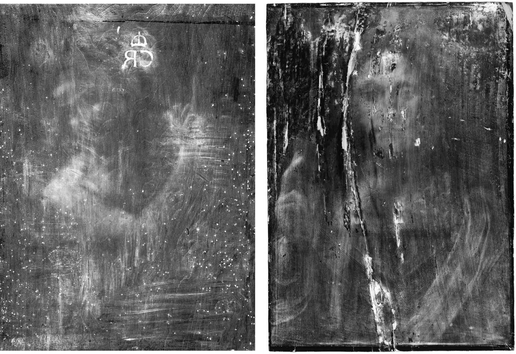
Above, Fig. 18: left, Leonardo, Saint John the Baptist, c. 1510-1517, oil on walnut p, 69 x 57 cm, Paris, musée du Louvre, X-radiograph; right, Workshop of Leonardo da Vinci (Salai with the assistance of G. A. Boltraffio?), the Cook version of Salvator Mundi, X-radiograph. In the X-radiograph of the Louvre Saint John the Baptist, one’s eye can grasp but few elements of the composition as seen in visible light (the pointing hand is illegible and the Saint’s austere garment doesn’t show at all), whereas Salvator Mundi’s X-ray image is much more consistent with the work’s aspect in visible light.
As just suggested, unless it were to be studied in the future by a cross-disciplinary team closely and rationally, this X-ray issue remains unclear and susceptible to misinterpretation. For myself, I have noticed through years of examination of the X-radiographs of Leonardo’s original paintings in the Louvre that none of them displays an image entirely consistent with that seen in direct light: when one or more details of the work can be identified on the radiograph without problem, the rest is not. In other words, the relating compositions are at best partly legible, not more. This is not the case with the Cook Salvator Mundi, whose X-ray image is misty indeed, yet reasonably consistent with what the painting looks like in day light, a legible aspect due to a very regular and even distribution of lead white over the whole composition, used for shaping and modelling in a conventional, unimaginative fashion. This resembles the use of lead white encountered in what is considered to be Boltraffio’s brush in the London National Gallery’s Virgin of the Rocks (Fig. 17, above). In contrast, in Leonardo’s X-rayed brushwork the use of lead white appears both spontaneous and random, with no lead white where one would otherwise expect it. To me this is exactly where stands the subtle, yet distinct border between the Master and his assistant(s) (Fig. 18, above).
Adding a touch of complexity to this appeal for caution with regard to the interpretation of X-ray documents close to Leonardo and his circle, the noteworthy fact stands that, in terms of typology, the X-radiographs of Salai’s Head of Christ and that of the Ganay version of Salvator Mundi are not legible at all and, in some ways, resemble the X-radiograph of the Louvre Saint Anne (Fig. 19, below).
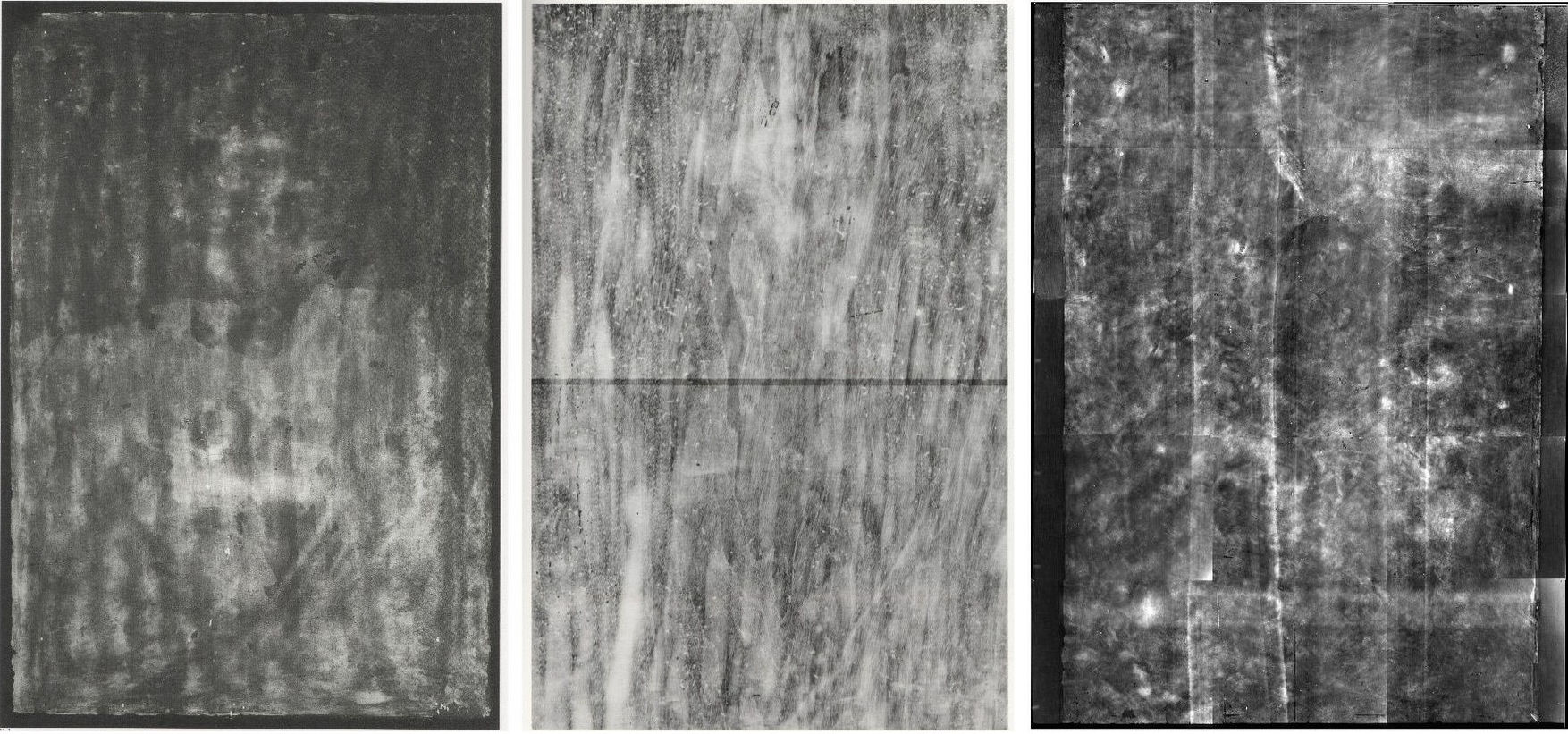
Above, Fig. 19: left, Gian Giacomo Caprotti, called “Salai”, Head of Christ, Milan, Pinacoteca Ambrosiana, X-radiograph; centre, Workshop of Leonardo da Vinci, the Ganay version of Salvator Mundi, oil on walnut, 68. 2 x 48.2 cm, Private Collection, X-radiograph; right, Leonardo, The Virgin and Child with Saint Anne, Paris, musée du Louvre, X-radiograph.
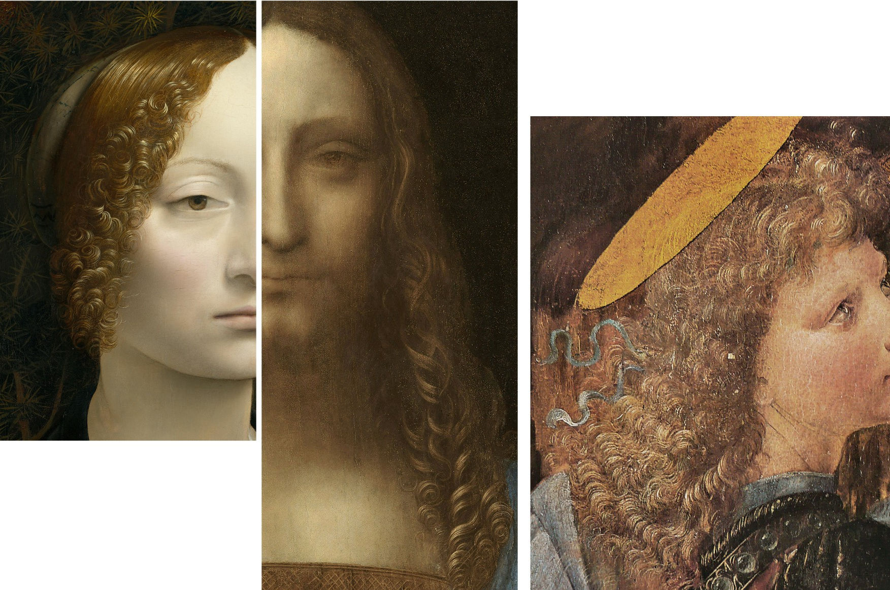
Above, Fig. 20: details, left, Leonardo, Portrait of Ginevra de’ Benci, c. 1474-1475, tempera and oil on poplar, 38.8 x 36.7 cm, Washington, National Gallery of Art, detail of hair; centre, Workshop of Leonardo da Vinci (Salai with the assistance of G. A. Boltraffio?), the Cook version of Salvator Mundi, detail of hair; right, Verrocchio and Leonardo, The Baptism of Christ, Florence, tempera and oil on poplar, c. 1468 – 1470/ 1472 – 1475 (?), 177 x 151cm, Uffizi Gallery, detail of Leonardo’s Angel’s hair.
(B) – The book’s authors’ espousal of Christ’s ringlets – which they compare to Leonardo’s superb hair in the Louvre Saint John the Baptist – is also disconcerting for many reasons. “The curls falling on [Christ’s] proper left shoulder are rendered lavishly (…) Their technique is reminiscent of those of Saint John-the-Baptist in the Louvre.” (Delieuvin, 2019 p. 16) “The hair is partly damaged and the best-preserved zones are the curls falling on the proper left side of Christ’s face (…) The very fine execution of these curls is remarkable and is reminiscent of [Leonardo’s] Saint John the Baptist’s magnificent curls” (Eveno and Ravaud, 2019 p. 34 -36).
The curls in question are certainly painted with extreme delicacy but are they really reminiscent of the Saint’s hair in the Louvre Saint John? Not really, in my opinion, for the style of these ringlets, not only does not resemble the hair executed by Leonardo in his late period, it is nowhere seen in any of his paintings except, perhaps, for a slight resemblance to the permed ringlets in the Portrait of Ginevra de Benci, which picture, however, dates to c. 1475 (Fig. 20). Such a period rules out the possibility that Leonardo would have gone back to his early Florentine style, as best perceived in his Angel in the Baptism of Christ, to paint the Cook Salvator Mundi’s ringlets of c. 1505-1510. The latter’s otherwise systematic and careful treatment (in the fine passages) induces my feeling that Boltraffio’s brush is not strange to their precious chiselling (Fig. 21, below), which, oddly, resembles an earlier style in the treatment of hair, such as that executed in a somehow close technique in Antonello’s Ecce Homo of 1475 in Piacenza, as at Fig. 22, below.
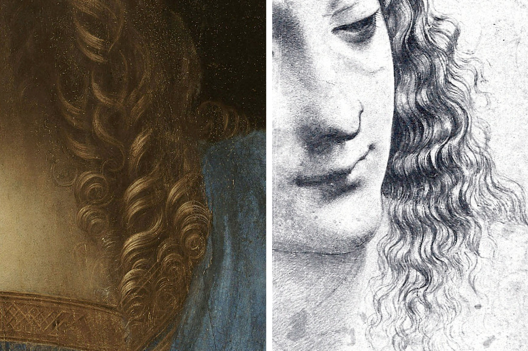
Above, Fig. 21: left, Workshop of Leonardo da Vinci (Salai with the assistance of G. A. Boltraffio?), the Cook version of Salvator Mundi, detail of hair; right, G. A. Boltraffio, Study for the heads of a Madonna and Child, silverpoint on paper, 29. 7 x 22 cm, Chatsworth, Duke of Devonshire and Trustees of the Chatsworth Settlement, detail of Madonna’s hair.
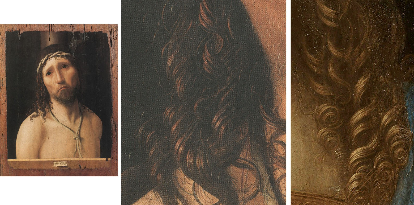
Above, Fig. 22: left, Antonello da Messina, Ecce Homo, 1475, oil on wood (oak?), 48.5 x 38 cm (painted area 43 x 32. 4 cm), Piacenza, Collegio Alberoni; centre, Antonello da Messina, Ecce Homo, detail of hair; right, detail of hair from the Cook version of Salvator Mundi. The painting technique employed in Salvator Mundi’s hair by Leonardo’s assistants c. 1510 is close to that of curly hairs executed by Antonello thirty-five years earlier.
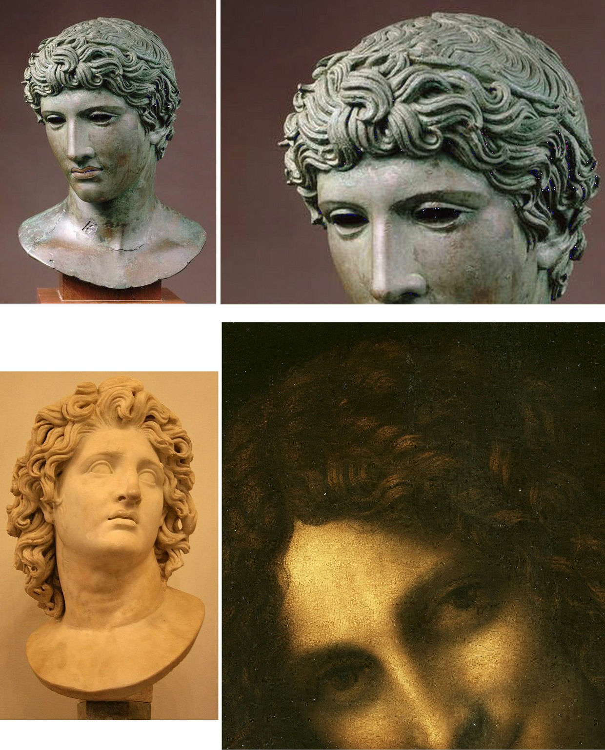
Above, Fig. 23: top left and right, Herculaneum, Campania (Southern Italy), Head of a Youth (“The Benevento Head”), 50 BC, hollow-cast bronze with red copper veneer and inlaying, H. 33cm, Paris, musée du Louvre; below left, Alexander the Great as Helios, marble, Roman copy after an Hellenistic original from 300-200 BC, H. 58. 3 cm, Rome, Musei Capitolini. Below right: Leonardo, Saint John the Baptist, musée du Louvre, detail of hair.
In truth, the overall conception of Saint John the Baptist’s hair is far stronger and more masterly than that in the Salvator Mundi: its interweaving of the locks in complex snake-like waves is of a breath-taking beauty, and its originality, nowhere else then seen in Western art, testifies unquestionably to Leonardo’s close study of the Antique. Effectively, among many examples that could prove my point, The Benevento Head (c. 50 BC, Louvre) – as above at Fig. 23, top – or Alexander the Great as Helios in Rome (a marble copy apparently executed under the reign of emperor Hadrian) as above at Fig. 23, below left, both give an idea of the artist’s concerns with the Hellenistic and Roman sources determining his late style, although their perfect assimilation results in a formula entirely detached from any plagiarism. It is therefore evident that the somehow late Gothic touch that still survives in the Salvator Mundi’s well-arranged curls is symptomatic of a Leonardo imitator from his close circle.
Above, Fig. 24: top, Workshop of Leonardo da Vinci (Salai with the assistance of G. A. Boltraffio?), the Cook version of Salvator Mundi, detail of hair viewed under optical microscope; above, Leonardo, Saint John the Baptist, Paris, musée du Louvre, detail of hair viewed under optical microscope.
Finally, one wonders why Eveno and Ravaud have taken the trouble to compare some selected but unfortunately too small details of the paint’s crazing network viewed under an optical microscope in the curls in both pictures (Fig. 24, above), thus trying to prove that Leonardo’s brush is identically discernible in the Salvator Mundi’s hair and in that of the Louvre Saint John. Too many unsafe parameters are involved here to make one comfortable with such a demonstration, and, additionally, it can be suspected that a studio work to which contributed, as I believe, Leonardo’s closest assistants, contains many materials employed by the Master also which, in his own works and in a studio item, would have aged through time practically in the same way. The authors’ position would be of greater interest if cross-section samples taken from both paintings might have demonstrated that the compared details’ layer structures and pigment compositions were reasonably analogous, which, apparently, is not the case.
V: Flesh paint
Above, Fig. 25: left, Workshop of Leonardo da Vinci (Salai?) “The Prado Mona Lisa”, c. 1501-1510, oil on walnut, 76. 3 x 57 cm, Madrid, Museo Nacional del Prado; right, Workshop of Leonardo da Vinci (Salai?), The Virgin and Child with Saint Anne (“The Hammer Saint Anne”), c. 1508-1513, oil on poplar, 178. 5 x 115. 3 cm, Los Angeles, University of California, Hammer Museum, Willits J. Hole Art Collection.
Neither essay deals as it should with the important issue of the flesh technique used in the Cook Salvator Mundi as one might especially expect. Delieuvin does not address the subject directly. He (unfavourably) likens the flesh rendering in the Ganay version of Salvator Mundi (Fig. 2, right) to that observed in two other studio paintings (The Prado Mona Lisa and the Hammer Saint Anne in Los Angeles, Fig. 25, above) so as to suggest that no match exists between the flesh paint in the latter works and in the Saudi painting: “The rosy flesh tints [in the Ganay version], made of thin red hatches, are similarly encountered in the Prado Mona Lisa and in the Saint Anne in Los Angeles (…) With regard to Leonardo’s original works, nowhere is found in them the elaborate sfumato effect and the soft transitions from light to shade giving the paint materials a vibrant looking aspect” (Delieuvin, 2019, p.18). In fact, with regard to technique, no sound comparison can be made between the flesh paint in the Hammer Saint Anne and that in the Prado Mona Lisa unless one understands, which Delieuvin regrettably does not, that it is one and the same process in different stages (Figs. 26, 27 and 29).

Above, Fig. 26: left, Workshop of Leonardo da Vinci, “The Hammer Saint Anne”, detail of flesh paint in Saint Anne’s face showing thin parallel hatching (initial stage of the “complex blending” technique), right, Workshop of Leonardo da Vinci, “The Hammer Saint Anne”, IRR of detail in Fig. 26, left, showing underlying thin parallel hatching (initial stage of the “complex blending” technique, whose full development can be observed in the Prado Mona Lisa, Fig. 27, below).
Above, Fig. 27: Workshop of Leonardo da Vinci, “The Prado Mona Lisa”, detail showing intermingled tiny brushstrokes of the advanced, yet unfinished, soft-focus modelling of the flesh using the “complex blending” technique. That process’ initial stage always uses hatches (see Fig. 29, below); the overall fuzzy effect is due to an impalpable coating of translucent paint laid by the artist, after each painting session, over the dried network of brushstrokes (tiny hatches and dots).
Nor is the C2RMF’s scientific investigation explicit about what is essential in the painting process of the Cook Salvator Mundi: the chronology and typology of the successive technical gestures that served for the artist’s creation. “The flesh sections have been built up in several stages. A rosy to dark beige underlayer is laid over the white ground preparation. Composed of lead white and ochres it substantially contains red [pigment] grains of vermilion as is revealed by mercury mapping and microscope examination. The superficial very thin layers strengthen the initial modelling [while] thin whitish glazes [sic] increase the clarity of the highlights [7]. Conversely, the shadows are deepened thanks to dark thin layers containing a substantial quantity of black [pigment] grains (…) but containing also a substantial quantity of [pigment] grains of vermilion. The relationship between shadow and vermilion shows in particular through mercury mapping in the well-preserved right hand. Calcium mapping shows this element’s significant concentration in the shaded flesh sections, thus suggesting that bone black was employed by the artist” (Eveno and Ravaud, 2019, p. 36).
Once more it is very astonishing that the data provided here by Eveno and Ravaud have been considered decisive enough to attribute the Cook Salvator Mundi to Leonardo: all the pigments (and their specific tone), whether mineral (natural and artificial) or organic (natural and synthetic), mentioned in the quoted paragraph have been used by artists in the flesh paints in variable ways at all times since the Renaissance to our day. Despite the real interest of their pigment identification, no novelty emerges from that survey: any academically trained painter well knows that the flesh paint results from a traditional mixture of white, with a quantity of vermilion and some ochre, with a slight touch of black, the which mixture produces a beige hue that is first laid over the ground preparation and modelled so that the basic volume is rendered.
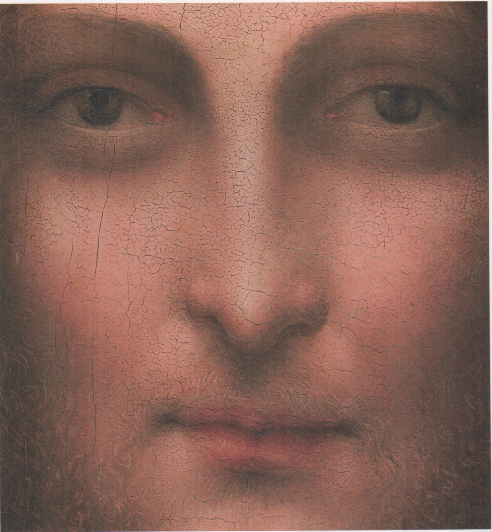
Above, Fig. 28: Gian Giacomo Caprotti, called “Salai”, Head of Christ, Milan, Pinacoteca Ambrosiana, detail of the very subtle warm pink modelling in Christ’s face, susceptible to contain vermilion pigment as traditionally employed in flesh paints by Italian artists of the Renaissance like Leonardo and his studio (compare the flesh tints in the Prado Mona Lisa at Fig. 27 above).
When this underlayer is dry, the shading can be executed carefully using either a wide range of terras or, instead, given that the handling of these mineral pigments is somehow uneasy, a mixture of vermilion (mercury sulphide) and bone black, giving superb browns (according to the proportion of each colour): that mixture being more stable and very reliable in terms of handling, notably when highly diluted. For sure, the same or very similar pigment composition – by no means specific to Leonardo – would be detected in many paintings of his studio (to limit such an eventual research to that scope of Italian Renaissance paintings), and very probably in Salai’s Head of Christ of 1511 (Fig. 28, above), in which much of the volume is very finely modelled with vermilion red and possibly black containing warm browns. In this respect mercury or calcium mappings are not meaningful exercises unless extended to a number of studio paintings for comparison, which is not the case here. And even if it were so, the problem is less one of pigment identification (and in which proportions) in the Cook Salvator Mundi than how they have been handled during the successive stages of its creation so that the work might be ascribed to Leonardo – or not. Laboratory tests, however useful they are for dating, cannot stand in lieu of the indispensable visual assessment of the work’s intrinsic qualities as a work of art so as to support a plausible and unproblematic attribution to Leonardo

Above, Fig. 29: Theoretical cross-section showing Leonardo’s “complex blending” sfumato process. Diagram after Ségolène Bergeon Langle and Pierre Curie’s 2 vol. dictionary of art terms and techniques Peinture & Dessin, Principes d’analyse scientifique, Centre des Monuments Nationaux/ C2RMF ed., Paris, 2009, vol 1, p. 55.: 1 (bottom to top) : ground preparation, imprimitura, large hatches, medium size and thin hatches, interspersed layers of thin veils of translucent paint, micro-dots, 2 diagram of the end result: the interstices of the hatches and the micro-dots have been filled in by the paint materials of the veils (see fig. 27, above). The authors’diagram was established after my own ones published many times from 1997 onwards.
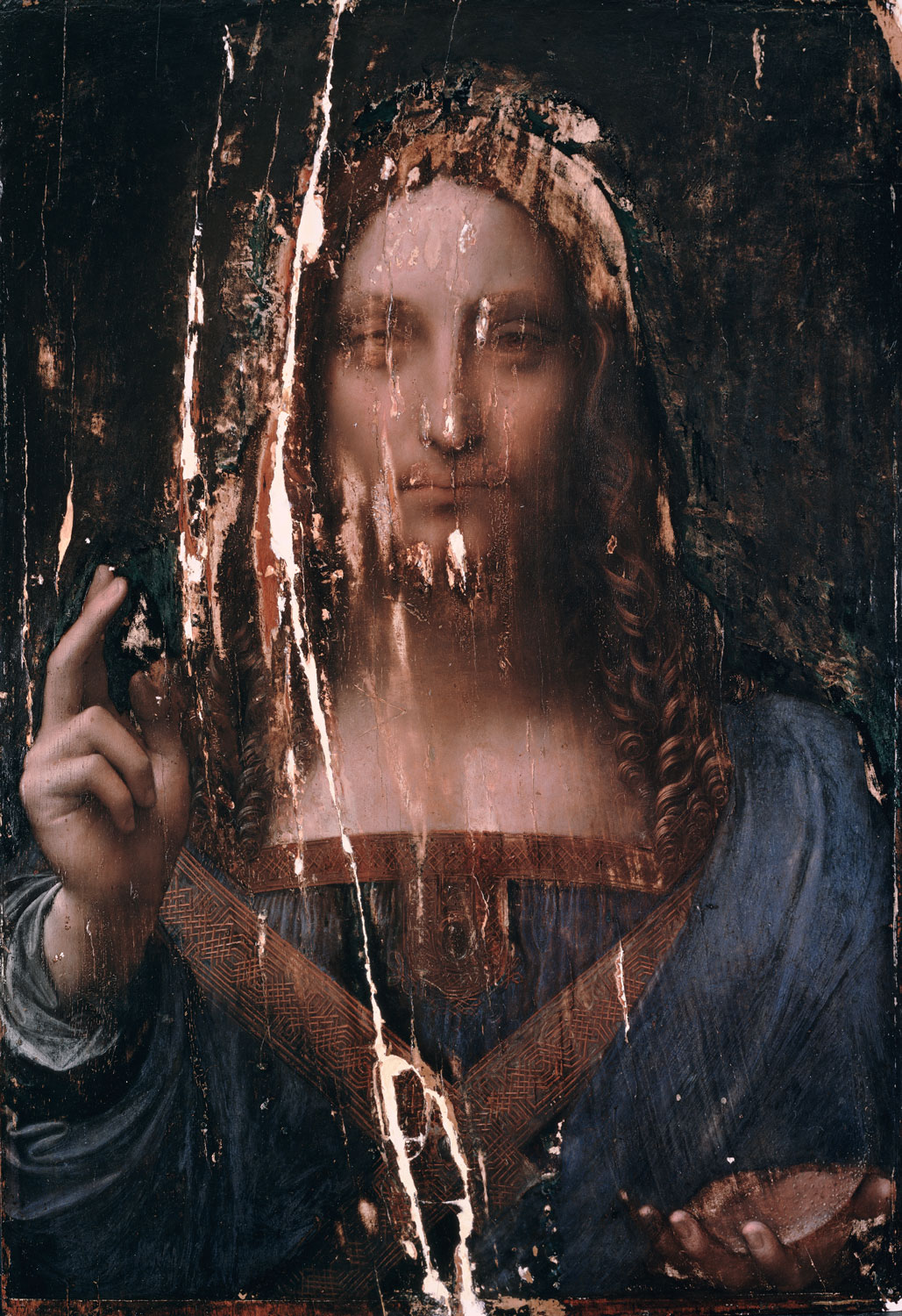
Above, Fig. 30: Workshop of Leonardo da Vinci (Salai with assistance of G. A. Boltraffio?), the Cook version of Salvator Mundi, photograph in visible light (2006) before the Modestini restoration. This well-known reproduction of the Cook Salvator Mundi as it stands without the Modestini’s restoration inpainting displays a pinkish-brownish acid tone and a sfumato treatment departing from Leonardo’s paradoxical effects of simultaneous haziness and preciseness of the form.
To revert to Delieuvin’s brief analysis of the painting process: his imprecision merits further comment. The Louvre curator mentions the fine hatching observed in Saint Anne’s face in the Hammer Saint Anne in Los Angeles and in the Prado Mona Lisa as if the technique used for the flesh modelling in both paintings was fully completed in each case, thus likely to be compared. This interpretation’s inadequacy and ambiguity calls for precision (Figs. 25, 26 and 27). In those two studio works one can observe that the flesh modelling results from a process whereby the volume is built up thanks to a network of hatches; long rather thick ones first; then shorter and thinner ones; thus testifying to the very traditional construction of three-dimensional effects, whether drawn with a pen or a brush. Then comes a more complex stage in which the medium size hatches cannot be used, and so for mechanical reasons, to render with utmost accuracy the softest subtleties encountered in the flesh sections, especially in a face, for these subtleties take up very small areas, even microscopic ones, hence the use of appropriate hatches, necessarily thinner and shorter, and so on and on, up to a stage in which the tiniest hatches become practically imperceptible dots (Fig. 29). In fact, contrary to misinformed theories one cannot paint details smaller than the tip of the brush used [8].
When each working session is completed, ultra-thin unifying veils of translucent paint are laid over the dry underlayer by the artist in order to conceal the tiny strokes, still visible, and, thus, to make the flesh look smooth and even. It is the technique employed in the Mona Lisa at an unprecedented level of refinement, which I call Leonardo’s “complex blending” as opposed to his “simple blending”, that is the traditional way of obtaining soft-focus effects (see my above Prologue) (Fig. 29). Taught by Leonardo himself to his pupils and collaborators, this global process is observed in the Hammer Saint Anne, where the network of hatches, mostly visible in the underlying layers thanks to IRR imaging, has not reached the stage of tiny strokes which is otherwise observed very conspicuously in the Prado Mona Lisa (Figs. 26 and 27). In this painting, advised by Leonardo in all certainty and copied next to the original from start to finish (by Salai very likely) the full deployment of the various hatches – long, medium, very small or microscopic – is observable. The fact that all these different paint strokes are seen to coexist in the Prado Mona Lisa is a clear sign that the copy is unfinished. It is, therefore, technically and historically wrong to describe the technique used as hatching because, properly speaking, the technique present must accommodate that encountered in the more finished areas – the section around the chin and the sitter’s lower proper left cheek – where the full complex blending process is distinctly discernible. Properly appraised, the Prado copy constitutes a most precious document, because its only partial completion discloses the preceding means by which the highly polished and flawlessly transitioning flesh paint in the Louvre Mona Lisa had been obtained [9].
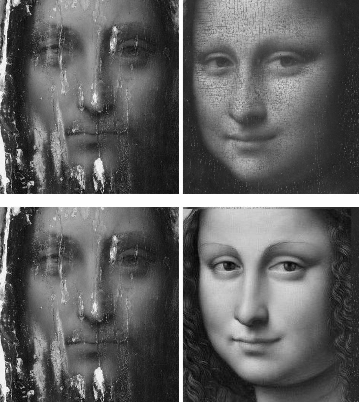
Above, Fig. 31: top left, Workshop of Leonardo da Vinci (Salai with assistance of G. A. Boltraffio?), the Cook version of Salvator Mundi, photograph in visible light (2006) before the Modestini restoration, detail of head; top right, Leonardo, The Mona Lisa, Paris, musée du Louvre, detail of head [s.]; below left (as in top left); below right, Workshop of Leonardo da Vinci (Salai?), The Prado Mona Lisa, detail of head. Bar the damage in the Cook Salvator Mundi, the neatness of the sfumato making is close to that observed in The Prado Mona Lisa. Da Vinci’s overall soft-focus effect is imitated well but not the supremely refined, yet just allusive, anatomical precision and the staggering rendering to the life which belong to Leonardo alone. One can well see that the overall drawing and the sfumato modelling are highly perfect in the Louvre Mona Lisa and that they are limp in both the Prado copy and the Cook Salvator Mundi (presumed to be by the same artist, Salai).
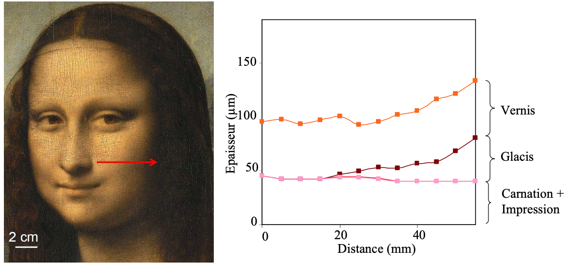
Above, Fig. 32: After Laurence de Viguerie, Propriétés physico-chimiques et caractérisation des matériaux du sfumato (Doctorate of Science, 2009), fig. 99 p. 241. X-fluorescence cross-section reckoning alongside The Mona Lisa’s face (my provisional translation). The modelled shadow (“glacis” = glaze) is laid over the pale, lead white containing, flesh paint underlayer, spared in the lights.
In any event, the technique used in the Cook Salvator Mundi had not given the flesh zones the vibrant aspect which Delieuvin both attributes to it and holds to be itself typical of Leonardo’s own flesh painting. To fully understand my objection, one should examine the photograph of the Cook panel painting as it stood before Modestini’s restoration inpainting, as is encountered in a document which has now been publicized world-wide (Fig. 30). When I first examined that state from a large reproduction, it was possible to read and mentally reconstruct the work’s overall image in spite of the enormous damage lying beneath the recent repaints. Then, I could see more clearly what is foreign to Leonardo’s method in the execution and, for that reason, what is much closer to his assistants. Contrary to what the Cook picture’s advocates claim, its sfumato effects are not identical to those seen in the Louvre’s autograph Leonardo paintings. Specifically, in the illuminated parts, the Cook picture’s flesh displays a pinkish-brownish acid tone and a milky/chalky texture that is never to be encountered in any Leonardo that I know. In addition, even where it is handled finely in the better-preserved sections, the soft-focus effect has too much evenness and continuity – which is to say, a formulaic simplification – to be really faithful to Leonardo’s supreme art, wherein, no detail, either anatomical or of any other kind, is “eaten up” and lost within the mistiness of the sfumato treatment. To the contrary, in Leonardo, each and every detail’s realism and veracity is respected, the more so as through the overall smoky veiling one can feel the presence – more than actually see – of, here, a faintly contracted cheek muscle, elsewhere, of the orbital and cheekbone construction, or of the elasticity of the flesh in movement in a face (Fig. 31).
To my knowledge, the difference in aspect between the Salvator Mundi and the Mona Lisa, for instance, lies in the nature of the making and this might now be explained thanks to the joint researches of Laurence de Viguerie and Philippe Walter (former C2RMF scientists) on Leonardo’s sfumato technique and materials [10]. As observed in the diagram above, taken from Viguerie’s doctorate of science (2009), it is clear that Leonardo builds up the shadow on a pre-existing lead white containing underlayer serving partly as a base for creating the illuminated flesh sections. In effect, while starting at the underlayer level, the shadow’s own layer rises as it extends toward the deepest darkness, as opposed to the exposed parts of underlayer which have been left intact to serve for the lights (Fig. 32). Thus, apart from the highlights of lead white added at more advanced stages, it can be recognised that little of this pigment will be really needed to achieve the less luminous surrounding flesh tints. Finally, and in marked contradistinction, we know from the work’s X-ray image that the use of lead white in the Cook Salvator Mundi is substantial and that this usage explains the milky-chalky aspect of the flesh (in strictly technical terms, that this is due to the pigment’s marked opacity with a refraction index running from 1, 94 to 2, 09, in modern pigments), an aspect not seen in the Mona Lisa, whose paint surface is more evanescent and transparent.
Conclusion: “studio work” is what science really says
The reader surely understands now why it was necessary and urgent to demystify the severe misinformation that has circulated in the international press in the past months in the form of claims that the Louvre actually holds the Cook Salvator Mundi to be an authentic Leonardo while refusing to declare its true position. That most paradoxical conspiracy theory must be rejected on its own absurd implications. We are asked to believe that the Museum had required the loan of a Leonardo painting, whose authenticity was confirmed by the institution’s in-house laboratory (C2RMF) but, despite this positive verdict, the curators of the 2019 Leonardo exhibition had, on no justification, not only not shown the work but had also downgraded its artistic status in the catalogue. Of necessity, the real story is more straightforward: the Louvre Museum had no objective reason to be so discourteous to the owner, otherwise respectable and prestigious, who, in addition, had most obligingly put the picture at its disposal for many months, in order that it be examined thoroughly by the C2RMF scientists and researchers.
Far more credible and likely is the explanation given in the Vitkine film. Before the growing contestation of the Leonardo authorship that had amplified from 2018 onwards universally, and reached its highest peak in April 2019 following the publication of Ben Lewis’ book of journalistic investigation The last Leonardo (in which it was revealed that, contrary to what had been stated urbi et orbi in the media coverage preceding the New York sale in November 2017, no real scholarly consensus had ever existed over the attribution of the Cook Salvator Mundi to Leonardo), the Louvre could not but feel ill at ease. Da Vinci is not just any name; the French Government had all the reasons, in the Summer of 2019, to require that the painting be further examined and tested in-depth before appearing as the guest star in the blockbuster show then in preparation at the Louvre. Much was at stake in terms of national prestige. The Louvre could not afford to declare and label a work as a restoration-retrieved Leonardo masterpiece without a scholarly unanimity strong enough to silence all dissenting voices. It cannot be doubted, therefore, that the Louvre’s own earlier scientific tests were peer checked according to a sole crucial criterion: does unquestionable evidence exist that the Cook Salvator Mundi was painted by Leonardo in person? In the light of what has previously been discussed here in many points, the answer, which would jump to any serious physicist and chemist’s eyes at first glance, is of course “NO”, because the material gathered from the tests (not to speak of the arguable methodology of approach) was of too little weight to urge the Louvre to risk anything beyond a studio attribution [11].
All else is just like Hamlet’s famous response to Polonius’ question: “Words, words, words” (Act II, scene II) and it might well continue vainly like this for some time in the media and the academic literature. The problem must be addressed serenely: no trick, no magic wand will disperse it and make the Cook Salvator Mundi become one day or another what it is not and never was. The reality is immutable.
CODA:
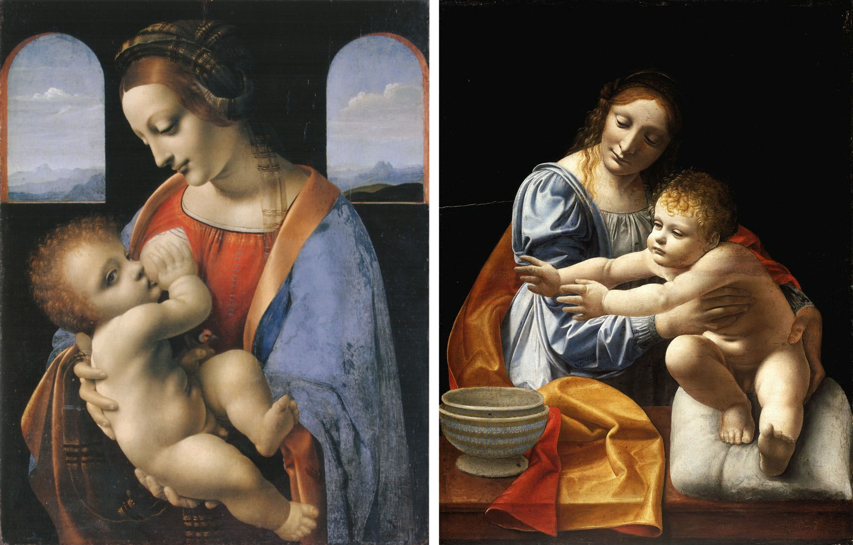
Above, Fig. 33: Left, Giovanni Antonio Boltraffio, The Madonna Litta, c. 1491-1495, tempera on wood transferred to canvas, 42 x 33 cm, St Petersburg, The State Hermitage; right, Giovanni Antonio Boltraffio, The Virgin and Child, c. 1495-1497, Budapest, Szépmüvészeti Múzeum.
It will be profitable to compare the Madonna Litta, to date attributed to Boltraffio rightly, and his Esterhazy Virgin and Child in Budapest, both painted in the years Giovanni Antonio spent with Leonardo. Not only has Boltraffio assimilated da Vinci’s manner in a brilliant – yet secca – fashion, as above, Fig. 33, one can well see the resemblance of the sfumato modelling, in particular in the Infant’s anatomies and also in what remains of the Cook Salvator Mundi, as above in Figs. 30 and 31. Adding mentally to the latter work Salai’s contribution, whose own style is mellow and misty in the flesh sections, as proven by his Head of Christ in the Ambrosiana (Figs. 11 and 28), the Saudi painting emerges as a hybrid item meant to simulate a “fully by Leonardo” devotional composition, much like the Madonna Litta, yet without the Master’s contribution to the actual making. If not this, then new theories will have to deal with the thick sketching-out contour lines seen identically and successively in Salai’s Head of Christ, in the Cook version of Salvator Mundi, in the Ganay version of Salvator Mundi, and bring contrary supporting scientific evidence and demonstrations [12].
I wish to thank Michael Daley warmly for welcoming this second contribution of mine on the ArtWatch UK website and for having adjusted its presentation with the utmost care and kindness.
Jacques Franck, 16th December 2021
ENDNOTES:
1 This survey has been published online before (a couple of years ago), in part at least, and had not reached then the neutrality observed to date. I might quote the previous version here if necessary in a future revision.
2 Cf. Dianne Dwyer Modestini, “The Salvator Mundi by Leonardo da Vinci rediscovered. History, technique and condition”, in Leonardo da Vinci’s Technical Practice, Paintings, Drawings and Influence, Michel Menu editor, Paris, 2014, p. 139-151.
3 Cf. Elisabeth Ravaud and Myriam Eveno, “La Belle Ferronnière: a non-invasive technical examination”, in Michel Menu, op. cit. supra, note 2, p. 126-138. Scientific tests have been carried out on the Lady with an Ermine in 2012 by scientists from the National Museum in Kracow jointly with several specialists, in particular from the Getty Conservation Institute and Yale University. In that essay, nowhere is stated that the paint sample taken in 1960 has been reexamined in 2012. While glass particles are not mentioned either, a small part of the preparatory layer has been analysed using X-ray fluorescence spectroscopy: a thin layer of lead white has seemingly been laid on the whole surface of the panel, an observation needing confirmation. In effect, the latter technical method is a non-invasive one, thus far less reliable and conclusive than the analysis of cross-sections of paint materials taken from original works (see the above Prologue on that very issue regarding burnt umber in the Mona Lisa). Cf. Lukasz Bradasz, Michal Lukomski, Johanna Sobczyk et al., “Leonardo da Vinci Lady with an Ermine – The latest research into the artist’s painting technique and the state of preservation of the painting”. (Checked on 4 November 2021.)
4 For colourless powdered glass as paint additive and drying agent “much used in Italy”, see Marika Spring, “New insights into the materials of fifteenth-and sixteenth century Netherlandish paintings in the National Gallery, London”, Heritage Science 5, 40 (2017).
5 Cf. Diane Dwyer Modestini, in Michel Menu op. cit. supra, note 2.
6 In fact, the IRR of the Cook Salvator Mundi published in Beaux-Arts Magazine (Daphné Bétard, “Salvator Mundi, les dessous de la vente du siècle”, BAM 403, January 2018, p. 100-105) was the late one of the restored stage with the black illegible background. It was the only full IRR document available then. Just a detail of the full IRR scan before the inpainting process was to be seen in Modestini’s article cited supra note 2 (fig. 9, p. 147); the full document will be released on the American restorer’s website in August 2020 (see “Further thoughts I”, caption to Fig. 9).
7 No stricto sensu glazing can be made with lead white, which is an opaque pigment having a high refraction index. Glazes are made with pigments like red lakes, copper resinate (green), etc., whose refraction index is low enough to be close to that of the oil binder. The authors therefore allude to thin whitish translucent veils of paint in the highlights.
8 The publication in 1969 of Thomas Brachert’s fundamental investigation into Leonardo’s “handprint” painting technique, while being fascinating, has created much confusion about the exact context of this technique’s utilization in the Master’s works. It is true that Leonardo has used his fingers for swiping and dabbing the film paint, either in the early creating process of his works, as seen in the unfinished ones like The Adoration of the Magi and Saint Jerome, or in the more finished ones like the Portrait of Ginevra de’ Benci, The Lady with an Ermine or The Virgin of the Rocks in London. Yet except mine (in preparation), no critical research has been undertaken until now in order to clarify and explain technically, among a variety of handprint gestures, which specific ones served for what and how. It is clear, however, that microscopic details of modelling like those seen in The Mona Lisa’s face could never have been achieved with the palm of the hand, a thumb or the tip of the artist’s little finger. A painting instrument, whether a brush or a “digital instrument”, whose surface is 50 to 100 times larger than that of the detail to reproduce, is certainly not of any help in such making (see Prologue above). That seems sensible and obvious mechanically, but the Leonardo scholarly literature is full of misrepresentations of this kind regarding Leonardo’s “handprint” painting technique. Cf. Thomas Brachert, “A Distinctive Aspect in the painting Technique of the “Ginevra de’ Benci” and of Leonardo’s Early Works”, Report and Studies in the History of Art, National Gallery of Art, Washington,1969, p. 84-104; Jacques Franck, “Fondu simple ou fondu complexe? Le geste technique dans le cas du sfumato de Léonard de Vinci: ses paramètres”, Résumés des interventions, 3e Congrès de la Société française d’histoire des sciences et des techniques, École Normale Supérieure, Paris, 4-6 septembre 2008, p. 8-10; Jacques Franck, Léonard de Vinci: la technique picturale, histoire, concept et structure du sfumato, Thesis, Diplôme de l’École Pratique des Hautes Études (Paris, IVe Section, Sciences historiques et philologiques). In preparation.
9 This particular aspect is an essential one to understand my point. Specialists who do not practice traditional art and, specifically, copy-work, produce inevitably wrong interpretations of old master painting techniques. Having no such experience, although their eye might be, at best, a good one, in their mind they visualize neither the creative making as if it were being processed before them, nor its overall technical sequencing : that is why they never describe and explain it consistently. A paint layer is like a musical score which musicians alone can decipher as it should, and so is the case with (specialized) painters examining a painting (see Prologue above).
10 Cf. Laurence de Viguerie, Propriétés physico-chimiques et caractérisation des matériaux du sfumato, thèse de doctorat de sciences de l’université Pierre et Marie Curie, C2RMF, Paris, 2009; Philippe Walter, Laurence de Viguerie, Jacques Castaing, “Appareils portables pour l’analyse des œuvres d’art aux rayons X”, Images de la physique, CNRS, 2011/2012, p. 79-85; Philippe Walter, “Peinture et chimie. Comprendre le geste du peintre dans son atelier. Approches croisées entre chimie et histoire de l’art”, Cont@cts, Bulletin de l’Association royale des ingénieurs diplômés de l’Institut Meurice, juillet-août-septembre 2015, p. 10-14, (www.ardim.be: checked 16 December 2021).
11 The art market has been constantly agitated over the Salvator Mundi saga since the 2017 Christie’s sale of the picture in New York with new developments and feverish speculations about its attribution and fate every now and again. The art journalist Ben Lewis, not specifically specialized in Leonardo scholarship, just well-known for his book, The last Leonardo (2019), now bravely treads on dangerous grounds, i. e., painting technique, yet while ignoring established facts (the scientific, artistic and contextual evidence pointing to Salai and Boltraffio), and without any critical demonstration or scientific support, attributes boldly the Cook Salvator Mundi to Cesare da Sesto (1477-1523), based on Cesare’s St Jerome of c. 1520, a painting strange to Leonardo’s style and technique produced after the Master’s death in France in 1519, which, therefore, was clearly not executed under his direct supervision or influence. Cf. Ben Lewis, “Searching for the smoking thumb: a Salvator Mundi Paragone”, in Paragone. Leonardo in Comparison (Studien zur internationalen Architektur), Johannes Gebhardt and Frank Zöllner eds., Petersberg (Germany), 2021, p. 20 – 41. The same author states p. 38 that, in my opinion, the heads in the Saudi Salvator Mundi and in Salai’s Head of Christ (Milan, Pinacoteca Ambrosiana) are in analogous proportions but I do not think so and have never written any such consideration: if it were the case, it would not change the identical sketching-out technique showing thick, emphatic contour lines on the IRR scans of both paintings. Mr. Lewis also doubts (p. 39) that the Cook Salvator Mundi painting could have been executed by two artists jointly (as was, nevertheless, so often the case in Italian Renaissance botteghe), but the recent scientific confirmation that the blessing hand was a change – stricto sensu – and not a pentimento, is a clear sign of the work’s heterogeneous execution and further supports the pertinence of my above-mentioned theory.
12 Seemingly, however, the tide is turning. In its November, 2021 issue, The Art Newspaper disclosed: “The Salvator Mundi which sold for $450m at Christie’s as a fully authenticated Leonardo, has been downgraded by curators at the Prado (…) The downgrading comes in the catalogue exhibition Leonardo and the copy of the Mona Lisa which runs in Madrid until January 2022. Although individual specialists have questioned the status of the Gulf Salvator Mundi, the Prado decision represents the most critical response from a leading museum since the Christie’s sale (…) The opening essay of the Prado catalogue is by Vincent Delieuvin, curator of the Musée du Louvre’s important 2019 Leonardo retrospective. He discusses the various views on the Gulf Salvator Mundi without giving much of his opinion, although he does refer to ‘details of surprisingly poor quality'”. Delieuvin’s unexpected comments on the painting are certainly an astonishing novelty: let us observe that those clumsy details were from the beginning the very reason why so many objections were raised by international specialists, and, therefore, why the Saudi Salvator Mundi never was and never will be a Leonardo.
It should be pointed out that in both the withdrawn first version of the exhibition catalogue (of the 2019 Leonardo show at the Louvre) and the Louvre’s junked scientific booklet issued in December of the same year, the Cook Salvator Mundi‘s then owner was stated as: ” Ministère de la Culture, Royaume d’Arabie Saoudite” (Ministry of Culture, Saudi Arabia Kingdom). In the reprinted and final version of the catalogue of that exhibition, the owner of the reproduced Cook Salvator Mundi (as in above Fig. 2, left) had become “Collection privée” (Private Collection). [Note, 26 December 2021] Following the publication of “Further thoughts II”, some objections have been raised here and there whereby the Louvre had not downgraded the Saudi painting in the final version of the 2019 exhibition catalogue but merely changed its mode of presentation in order to conform to the rule in force in the French museums, according to which works from private owners that are not loaned – thus not exhibited – cannot be authenticated in the latter institutions’ publications, notably when they are reproduced. While I shall not discuss why the owner in the withdrawn books differs from that in the above-mentioned catalogue of the 2019 Leonardo exhibition, it must be stressed that the Louvre Museum’s intentional downgrading cannot be doubted in the least way. In effect, the Saudi painting’s artistic status (“Cook version of Salvator Mundi“) was put at the same level as that of notorious studio versions, like the “Ganay version of Salvator Mundi”, and also, quite drastically, like the “Naples version of Salvator Mundi” (Naples, San Domenico Maggiore, exh. cat. Paris, Louvre, 2019, Fig. 103, p. 304): that very version is, of necessity a studio item, because its artistic quality is so low that Leonardo’s contribution is excluded automatically. Had the Louvre not meant to downgrade the work, why then reproduce side by side the Cook version and the Naples version in the 2019 catalogue in question with an identical status (p. 304-305)?
PROLOGUE TO FURTHER THOUGHTS II
Jacques Franck, painter/draughtsman and art historian specialist in Leonardo da Vinci’s evolved painting techniques, explores the conceptual limitations and the resulting adverse consequences (i. e. damaging restorations and mis-attributed works) of art historical studies and scientific essays that are today being made without duly informed consideration of actual historical artistic practices.
Old master technical studies. The impact of artistic-technical ignorance on the works’ attribution and restoration
I – Common confusion between connoisseurship and the knowledge of art acquired through practice
When a painter trained in the academic/classical tradition – and being, therefore, an experienced and skilled copyist – visually examines an old master painting, a mental engagement occurs which instantaneously brings to mind sequenced images representing the artistic and technical process followed by the creator, a process that can easily be identified because of a familiarity gained through years of practice. A similar phenomenon occurs when musicians read a score without playing it: they can “hear” the written sounds and melodies while visualizing the technical and musical means necessary to their own performances. However, although they usually deal with old master expertise, neither art historians nor scientists practice the arts of drawing and painting, bar in exceptional cases. For that reason, their visual appraisal of the specifically technical elements presented in a painting are formulated on no sure and practical knowledge of the various artistic and technical gestures whereby they were produced. Such experts, being so remote from the creative process, can only grasp artistic, technical and material realities through their imagination and whatever objective data might have been supplied by scientific imaging and laboratory tests. In other words, such specialists are strangers to what is at the heart of creation, to its intimacies, shall we say, and they cannot but confound their own imagined and partial perceptions with the realities of the creative process itself. That so very few art historians or museum scientists recognise the impossibility of knowing what art is really about without having engaged in making it is exclusive to the visual arts today. Such handicaps could never arise in the world of music because no sensible person thinks serious musical knowledge can be obtained without years of training and the steady practice of a specific instrument. In the visual arts this extraordinary shortcoming creates maximal risks of errors: in matters of art attribution, the vital distinctions between one creative hand and another are too subtle; in matters of conservation, the master’s art and techniques are commonly misunderstood – and nowhere more so than with that of Leonardo da Vinci. In no small measure, the modern-day visual art malaise is product of a system in which the artist – the party holding a unique expertise and insight – is granted no institutional recognition when precisely such knowledge, purely factual and not theoretical, is irreplaceable in art expertise.
That is why, as early as 1998 in my essay on artistic training published in Coré, a conservation review edited by the French section of the IIC, I recommended that students in art history should be trained in art and acquainted with the elementary notions of both traditional drawing and painting in order that their approach to the discipline lies on pragmatic specialized grounds rather than on vague, unverified concepts in matters of art making, as are exemplified below [ 1].
II – Disturbing ignorance
There of course exist a number of art specialists whose visual acuity and methodology of research are excellent, but they are getting fewer and fewer (for reasons not examined here). Sadly, tangible evidence exists also of the ignorance of some leading experts regarding the elementary grounds of traditional painting techniques inherited from the Renaissance, to which Leonardo’s art practice belongs. On that particular issue, for instance, in a 2019 documentary movie broadcast world-wide, an otherwise well-meaning Louvre Museum curator interviewed about Leonardo’s sfumato technique provided a staggering explanation that revealed an ignorance of the fact that, in the oil process, when it is laid on the support (canvas or wood typically), the paint material itself (pigments + binder) should first be diluted to a suitable degree with a fluxing agent – i.e. a solvent (turpentine in the case in point) [2]. The presented extravagant hypothesis in question was addressing the ravishing, subtle, flesh sections in Leonardo’s Louvre St. Anne and the Mona Lisa, on a conviction that pigments and oil alone were used. In terms of practice, it amounts to an insolvable technical problem inasmuch as the rheology of the presumed material to be handled for achieving impalpable effects like those seen in the Louvre Leonardos is a major impediment: such a sticky and oily paint is, structurally, far too unruly to be appropriate for that kind of ultra-delicate work. Thanks to my own researches – now confirmed by Philippe Walter and Laurence de Viguerie (see Further Thoughts II) – it is an established fact that Leonardo used to superimpose in the flesh sections of the above-mentioned works numerous microlayers of very liquid paint according to material principles close to the watercolour technique, except for the fact that, in this particular case, the fluxing agent was turpentine and not water. In truth, our museum curator should have known better: it is an obvious fact, noticeable by any ordinary museum visitor, that, during the Renaissance until the late 19th century, the most part of paintings was executed using diluted paint as testified by the flat, even sections still observable in them to date. The zones of the compositions, however limited in terms of surface, in which pure oil was added to the paint are the glazed ones, and the sections where non diluted, thick pasty paint, is encountered are those ones executed in impasto, a technical process which was notably employed for the treatment of highlights and for the demonstration of the spontaneity and virtuosic quality of the artist’s brush. To be more precise, it should be added that no stricto sensu glazes (transparent layers) were used then for modelling in the flesh sections, but, instead, thin veils of translucent paint [3]. Misinterpretations regarding art practice such as reported here are commonplace in the field of connoisseurship and, in themselves, have no a priori serious importance. Yet, in the case of Leonardo’s late works it has one indeed because, in the event of cleaning, their very low oil-content paint film is at far greater risk under solvent action. [4]. It certainly is not advisable, therefore, that misleading information should be in circulation in the international museum sphere about the technique used for the making of such universal masterpieces. Erroneous preconceived views should never sanction or influence restorations.
III – Scientists can be wrong
Although nobody can reasonably contest the necessity and global efficiency of laboratory tests in matter of old master expertise, it must be admitted that science cannot resolve all the problems raised by this discipline, and especially so when studying aspects in connection with the creative technical gestures. In effect, except for rare cases, the relating researches are made without any advice from an experimented painter, who, alone, can help to spot the data needing specific investigations and likely to let emerge significant observations worth in-depth examination and susceptible, also, to be ultimately interpreted correctly. For example, the highly artistic value of Leonardo’s paintings forbids any material sampling in crucial sections such as the flesh areas. If, nevertheless, some sampling is done, the paint materials can but come from sections of lesser importance: the information thus obtained will therefore testify to a local situation and should not serve, as is so often encountered in various technical essays, to describe the work’s global flesh technique (which can vary considerably from one area to another) [5].
The recent evolution of the scientific methods of investigation now allows the analysis of paint films without removing any material from the works and without any destruction of the pigments either. It is, in particular, the case with X-ray fluorescence (XRF) and the spectrophotometric approach to colour. However, the data obtained with such means are far from being 100% reliable. The Louvre’s laboratory (C2RMF) recently – albeit discretely – admitted the fact regarding the XRF analysis points checked off on the Mona Lisa in 2004-2006: the scientists had detected the presence of burnt umber in Mona Lisa’s face [6] (Figs. 1 and 2). I was very astonished by the unseemliness of this observation, for the use of burnt umber and of that pigment quite specially, is most improbable in the flesh sections of a Leonardo painting. It overruns the places where it is used, notably the modelled fresh hues making the lovely transitions between light and shade in a face; it produces as well a dirty looking greyish-bluish tone when mixed with lead white (a basic pigment in flesh painting) and cannot be suppressed easily since it still comes up visually to some extent when an opaque layer is laid over it. This pigment is definitely unusable in the very subtly depicted flesh tints and, consequently, when it is employed, it is strictly reserved for the darkest shadows close to black. Whatever the case, in 2004-2006 it was said to have been “found” by XRF analysis in areas such as the “light flesh tint, and in the left cheek”, the “strong flesh tint in the left cheek”, the “very dark flesh tint in the left cheek”, the “darkest flesh tint in the left cheek, just before the hair” [7] (Figs. 1 and 2). In the same book, while not very clear in hypothesizing the presence of burnt umber, the spectrophotometry approach to colour states that “it seems likely that [burnt umber] was the basis of the sfumato effect that Leonardo used in the Mona Lisa’s flesh tints in order to suggest the relief by softening the contours and creating subtle chromatic transitions” [8]. Such a pigment composition was formally denied thirteen years later by the same laboratory in an essay published in the catalogue of the commemorative Leonardo exhibition held at the Louvre in October 2019: “the latter pigment has been mentioned many times [by the C2RMF in 2004-2006] based on an elliptic interpretation of XRF test results. Nevertheless, no mention of burnt umber has been found in [Leonardo’s manuscripts] and no explicit identification of this pigment has been obtained [by us] until now in the analysis of the flesh zones of the [Louvre Leonardos]” [9]. It is worth noting that the book containing those wrong observations, despite the bold title of the French edition – which translates “Inside The Mona Lisa. Leonardo da Vinci decoded ” (“Au coeur de La Joconde. Léonard de Vinci décodé”) – has been spread and cited world-wide since 2006.

Above, Fig. 1: [After Paris, 2006, Fig. 146, p. 88] Areas analysed by X-ray fluorescence (see Fig. 148, p. 89 below), detail showing the areas said to contain burnt umber.
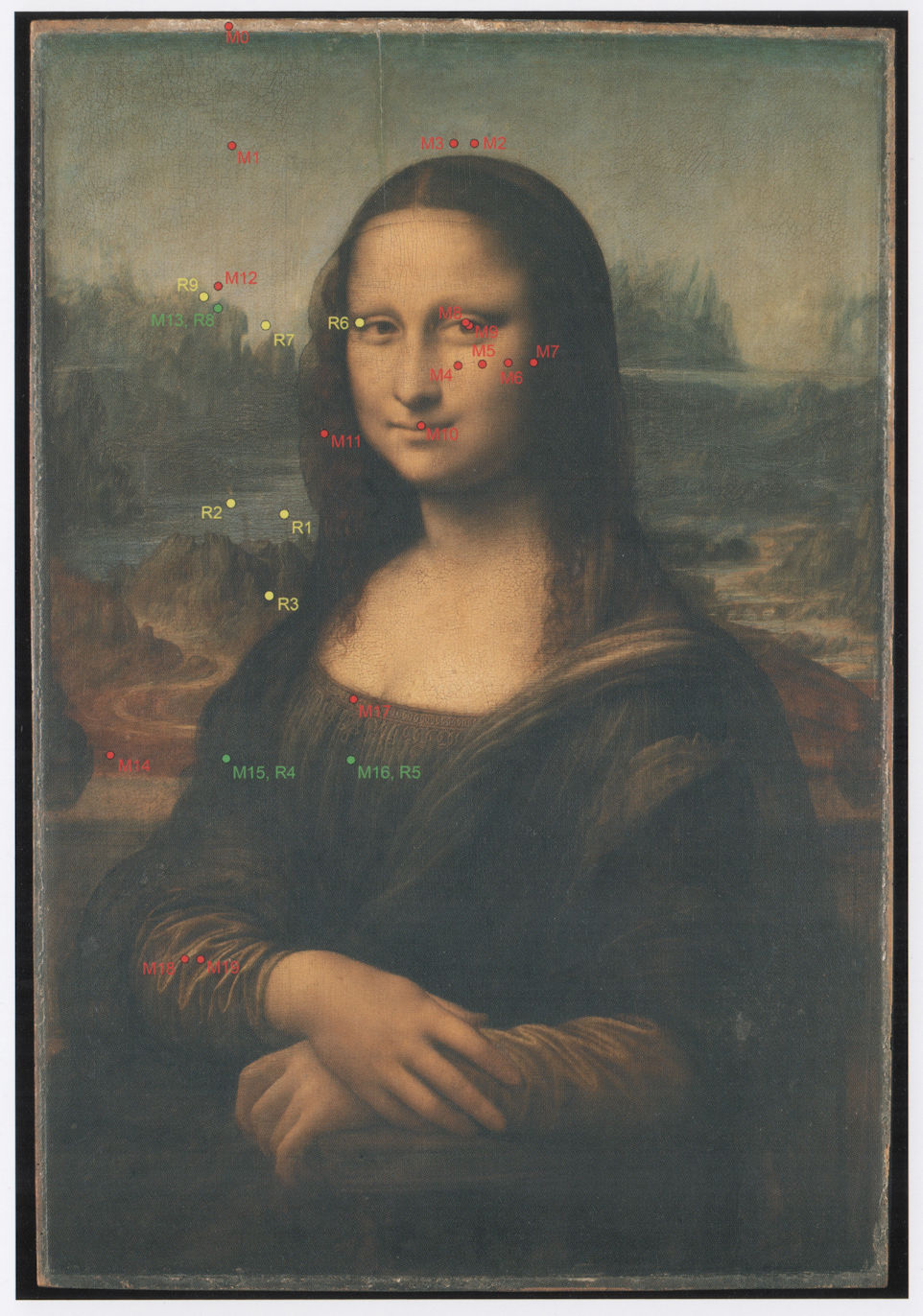
Above, Fig. 2: [After Paris, 2006, Fig. 148, p. 89] The Mona Lisa: location of areas (in red) said to contain burnt umber, analysed by X-ray fluorescence (XRF).
Burnt umber was not only said to have been “found” in the Mona Lisa in these years by XRF and by the spectrophotometry approach to colour but also by another non-destructive type of research of 2008 using a multispectral camera and a calculation system called the “radiative transfer equation” [10]. Those conclusions were so simplistic with regard to the complexity of Leonardo’s flesh technique in the legendary masterpiece that I contested their pertinence in a note to the authors and I exchanged directly with one of them (the engineer, Pascal Cotte) about the dubious claimed presence of burnt umber in those sections of the painting [11] (Fig. 3). Thus, there would be sufficient reasons to try and understand the enigma whereby burnt umber was wrongly detected through different methods of approach insofar as another, much deeper investigation on the materials used by da Vinci in the Louvre Leonardos, had been produced by the then C2RMF scientists Philippe Walter and Laurence de Viguerie (see Further Thoughts II), and had identified this pigment not only in the Mona Lisa but in the Saint Anne and the St. John the Baptist also (2009). Fortunately, their investigation, while admitting a certain percentage of error, is not strictly based on the material constituents of the paint layers exclusively, but, at the same time, on their structural layering organization and physical specificity. This otherwise very interesting survey, quite obviously, has included a sophisticated software in its calculation system in which the possible types of binders corresponding to Leonardo’s practice have been taken into account (which is not the case with the above-mentioned other surveys, apparently). As a result, we shall see soon (in Further Thoughts II), that much information can be exploited from this still novel investigation and compared satisfactorily with my own observations tested out through practice in an attempt to make “critical reconstitutions” of Leonardo’s sfumato technique.
From the latter examples, the reader should appreciate that what is presented as fact by scientists can only be taken as perfectly solid evidence if the method of investigation can itself unquestionably be taken as being beyond any shadow of doubt. In 2006, the results claimed from XRF tests and from the spectrophotometric approach to colour were held to be Gospel truth. At the time, nobody but myself would have dared to doubt them: I had reacted instantaneously as being both a Leonardo scholar and an artist, thus accordingly informed on what should be known on burnt umber after “reconstituting” through copy-work the techniques of Leonardo’s flesh paint and that of his contemporary associates. In other words, unreserved, blind adherence to the test results of the scientific analyses of old masters is a trap to the unwary and the best way to guard against it is to keep a default critical attitude while, at the same time, consulting the right art experts in matter of technique – which is to say, properly trained and knowledgeable artists. Being without such professional experience, art historians and scientist cannot reliably or objectively arbitrate on artistic-technical issues that are strangers to their own field of competence.
Above, Fig. 3: [After Mady Elias and Pascal Cotte, Applied Optics, vol. 47, n° 16, 1 June 2008, Fig. 6, p. 6] “(Color online) Colorimetric variations in the chroma C* and Lightness L* planes of the CIE-Lab space, deduced from the modelling of an umber glaze (solid line) from 1-13 layers (number in parentheses) and applied on a mixture of 1% vermilion and 99% lead white. The (coordinates of a pure dry lead white (L), a dry umber (U), and a dry mixture (M) of 1% vermilion and 99% lead white pigments have been added”.
IV – The original work is a stricto sensu document prevailing over any other one
Although the visual examination of paintings is an absolute necessity to any basic, sound, exercise of connoisseurship, it is striking that their specific importance as both essential material documents and, through their identities as works of art – to be primary subjects of study and appraisal, too often attracts the least consideration by today’s professional experts. The present trend of art historians and technical specialists seems to be one of deference to the academic community’s consensual opinion about the works – as if today’s art history constitutes a reliably and authoritatively prescriptive discipline that is unlikely to evolve and change or improve its methods and that, therefore, one that effectively precludes the possibility of ground-breaking discoveries being made elsewhere. Such a narrow-minded attitude opposes the basic research spirit whereby major finds are often of an unexpected nature. In accord with this new established hegemony, opinions are commonly placed before facts, supplanting the spiritual essence and materiality of works of art by disregarding the specific visual signs of their true identities. Depending on their author’s scholarly rank and fame, such constricted stances can attain a “sacred” status to the point that it becomes impossible – because considered ill-mannered – to express any challenge to all this learned verbosity that constricts the work of art’s potential to “speak” for itself. This is indeed symptomatic of the chronical incapacity – so frequent in the élites of our time – to accept and comment on the truth as it stands when it is disturbing. Hence Michael Daley’s sensible depiction of the situation with regard to visual analysis and expertise in art: “In the visual arts the visual should remain paramount – what you see is what the work is about. Art loving viewers and professional art experts alike might be said to have duties of appropriate response to art itself and not to its shadows and encumbrances. It is the optically perceived quality of artists’ artefacts that drives reputations and market values. Understanding art is not the same thing as poking and poring over the components parts of its fabric (…) what matters is what you see, not what might be said”. And again: “Artists paint pictures by eye to be viewed by eye. Trained eyes can detect visual differences with an acuity approaching that of the noses of dogs trained to sniff illegal substances or missing persons”. In other words, the historical and scientific truth of a painting’s image cannot stand detached from its fully embraced artistic reality, which is of a visual order [12]. Naturally, we are here in a “the-king-hasn’t-got-anything-on” logic, and few specialists accept with professional fair-play to recognize that they do not grasp the artistic-technical mechanisms of what they see in old masters fully, because they are neither creators or copyists and, naively – when these artists have long ceased to live – think themselves allowed to speak in their place on matters they do not know, or know very little, but that nobody in their close sphere will ever dare to contest, even the rare ones of a better informed level (see § VII below). The case in point is of course what matters essentially in a painting (and should be highly respected when it is attributable to a great artist or a genius the size of Leonardo), which is – or, rather, was – taught in art schools in earlier times (yet still is taught in some very specialized institutions): the basic rules of drawing, perspective, anatomy, how to balance the scale of values between light and shade, the art of composition, the complex subtleties of colour, and so on. In other words, the latter elements are the very ones which, put into practice, have given birth to that painting and, unless read correctly, leave its true identity mostly undeciphered.
It is true that not all connoisseurs are deprived of an instinctive knowledge of art, of a sharp eye and of sufficient intuition to perceive where the truth really stands – but this makes it all the more distressing to see that so accomplished a scholar as Maria Teresa Fiorio has to appeal to her colleagues of the London National Gallery’s bon sens to make them accept – which they do not – that the Archinto Portrait (National Gallery, London) and the Portrait of a young Man (Milan, Pinacoteca di Brera) are of one and the same hand, as is strikingly evident when both paintings are examined closely (Figs. 4 and 5). Bravely resisting various far-fetched scholarly and technical arguments (notably about the underdrawings that differ – but is this always a decisive draw-back?) Fiorio dismisses the Gallery’s ascription of the Archinto Portrait to Marco and that of the Brera Portrait of a young Man to Boltraffio, by diplomatically giving both works to a hypothetical “Master of the Archinto Portrait”, when she thinks, apparently, that its former attribution to Ambrogio de’ Predis was right. More audacity might have been welcome given that stylistic and technical evidence was convincing enough to support the scholar’s initial position in favour of Leonardo’s collaborator to the Virgin of the Rocks. The two portraits were exhibited side by side at the Louvre in 2019, thereby conspicuously displaying their great similarity while awkwardly retaining their respective 2011 National Gallery attributions to Marco d’Oggiono and to Boltraffio [13].
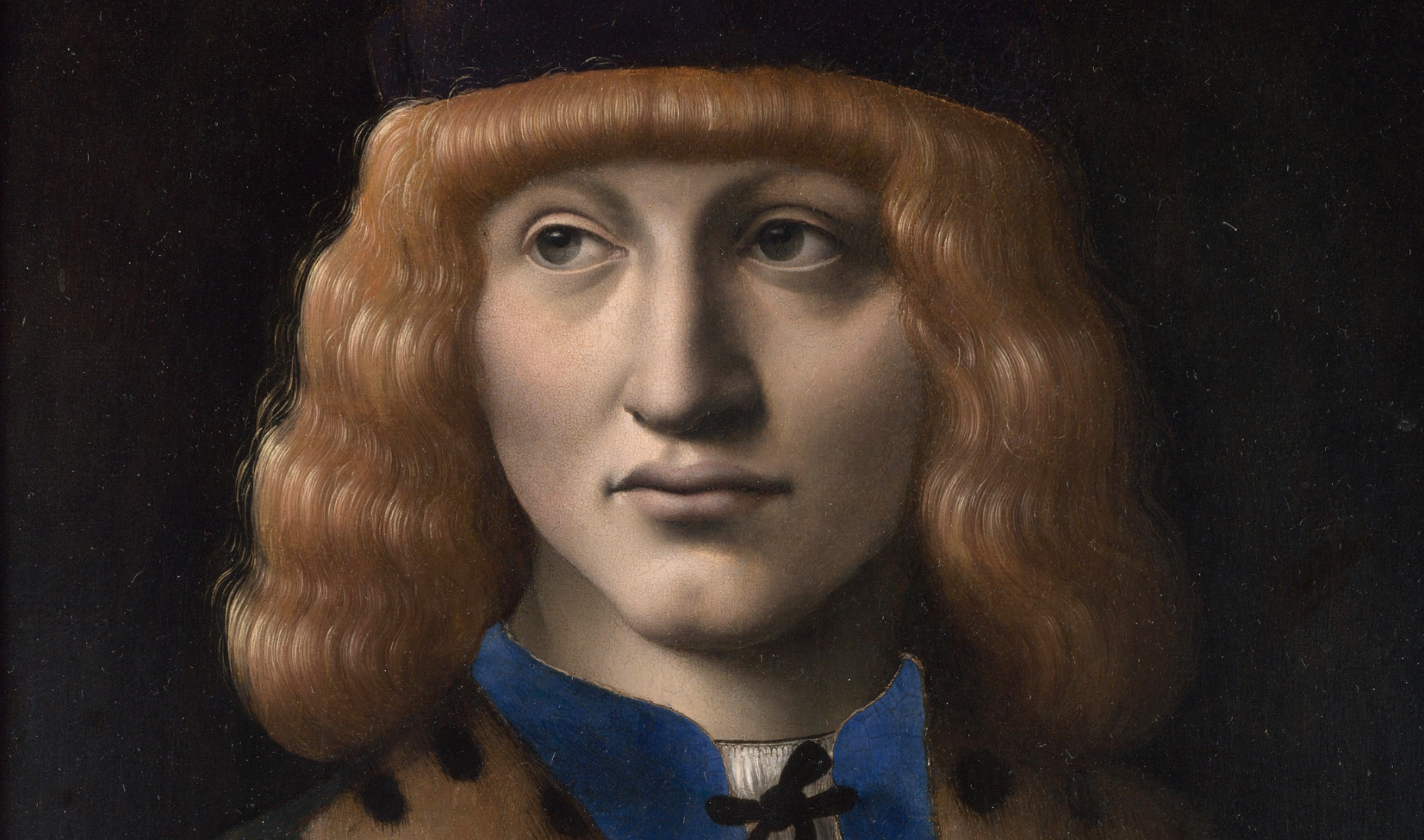
Above, Fig. 4: Milanese artist of the late 15th century (Ambrogio de’ Predis?), Portrait of a Man aged 20 (The Archinto portrait), dated 1494, detail, London, National Gallery.
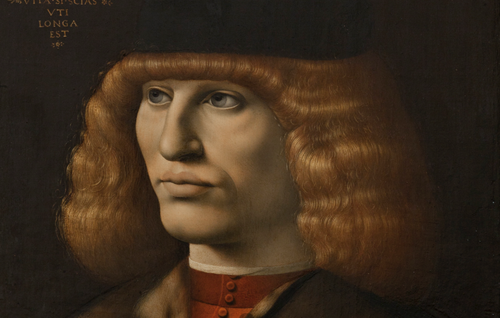
Above, Fig. 5: Milanese artist of the late 15th century (Ambrogio de’ Predis?), Portrait of a young man, c. 1490-1492, detail, Milan, Pinacoteca di Brera. Compare the hair with that in Fig. 4 above, whose aspect and technical rendering is strikingly analogous. The present attribution of the two portraits to two different artists is an enigma.
Like the Mona Lisa, the Louvre Saint Anne (Fig. 6) exemplifies perfectly the fact that its intrinsic artistic contents make it a visual document that is as much an explicit and legible one as is an actual archival piece. I have experimented this while sitting on the international scientific committee for the masterpiece’s restoration in 2010-2012 at the Louvre. At an early stage of the obscured varnish’s thinning, it appeared that the Child’s anatomy was blanched (or supposedly so) and the typology of this adulteration immediately struck me as very unusual: there were obvious visual signs that the varnish had not been laid evenly in that section – as commonly practiced by restorers – but exactly like a glaze meant to model the forms of the torso where light and shade display impalpable transitions, notably on Christ’s proper right shoulder. For that reason, a long debate soon started in the committee as to whether the white opacified varnish was an actual chanci (blanched varnish in French) or an original discoloured brown glaze worth being accepted and preserved as such: despite the ambiguous and inconclusive test results supplied by the Louvre’s laboratory (which had seemingly identified a late conservation varnish) the controversial layer was very regrettably removed without further debate. Four years later, Ségolène Bergeon Langle, the former (legendary) head of the Louvre’s conservation studio, who had resigned from the committee in protest against the arbitrary cleaning line followed by the restoration team, charged me to read in her place a paper at an Artwatch Conference of 2015 which she could not attend physically and in which convincing technical arguments explaining how and why some glazes discolour through time, made evident that the suppressed film was very likely an original glaze [14]. To make a long story short, the visual signs that, as an experimented Leonardo copyist, I had detected on the Child’s torso, had provoked no concern in the committee about the importance of its correct identification, given that no member, except for Bergeon Langle and myself, had, based on a good knowledge of studio practice, established a link between the blanched layer’s most unusual typology and the possibility that it be a deteriorated glaze.
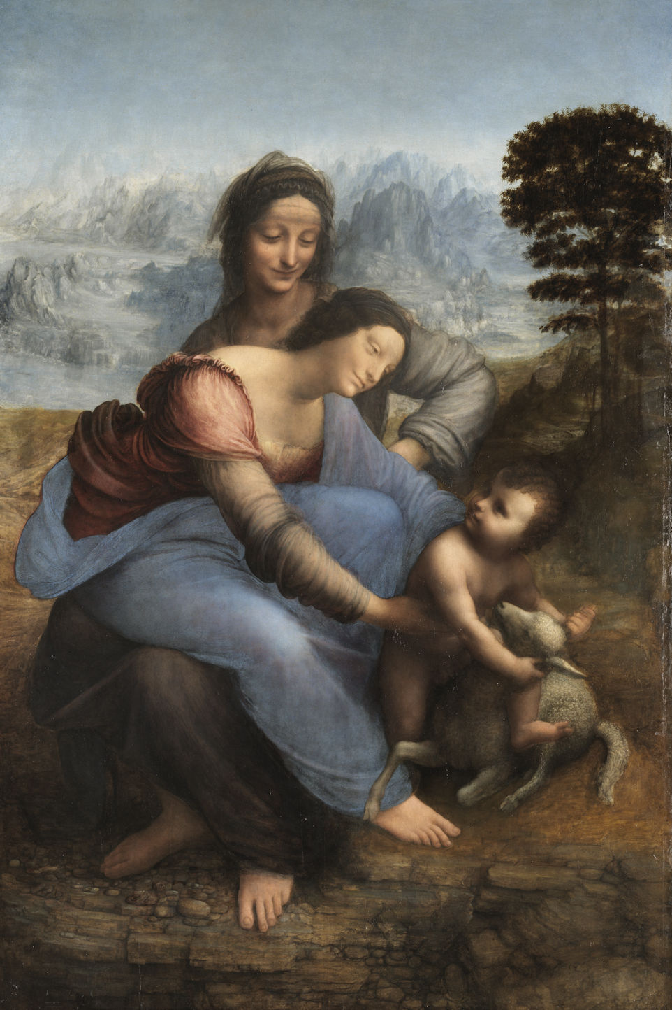
C2RMF-F5950 Jean-Louis BELLEC ; lumiere blanche par reflexion; vue d’ensemble;
Above, Fig. 6: Leonardo, The Virgin and Child with St Anne, Paris, musée du Louvre.
Another technical-artistic point reveals the potential of Leonardo’s Saint Anne standing as a historical document which bears the story of its own making. From a famous letter of April 1501, written to the then marchioness of Mantua, Isabella d’Este, by her emissary in Florence, Fra Pietro da Novellara, we know that Leonardo was executing a (lost) cartoon of St. Anne which, bar some details in the Saint’s gesture, corresponded to the composition now kept in the Louvre (see Further Thoughts I, Fig. 4). In 1929, the German Leonardo scholar Wilhelm Suida found a closer resemblance between Novellara’s description of the cartoon and a narrative on the same theme kept in Berlin (lost or destroyed during World War II), painted by a minor artist, Andrea del Brescianino: while reversed with regard to the Louvre composition, the Berlin panel seemed, in effect, better accorded to Novellara’s testimony (Fig. 7). It was then assumed that Leonardo had drawn a lost cartoon of Saint Anne, copied c. 1515-1525 by Brescianino, of which the Louvre version was the later mirrored image’s development. This scenario seemed to be confirmed when Carlo Pedretti published in 1979 a small anonymous drawing of Saint Anne (then in a private collection in Geneva) matching the Brescianino painting entirely (Fig. 8). All of which made me feel uneasy when I first examined the case in 1993: not only were both the lost Brescianino panel (its faithful replica is kept in the Prado in Madrid) and the small drawing of a very low artistic level – and the Geneva sheet particularly so – but, technically, there existed no sound reason for Leonardo to have executed two cartoons displaying a practically identical organization of the group. In truth, when, following a number of preparatory studies, an artist has retained a given composition and drawn a full cartoon of it, it is a very easy technical move to use a calco (tracing paper) to first copy the outlines from the original cartoon, then to turn up the calco and transfer the mirrored outlines onto a panel or on whatever other support for oil painting: drawing another cartoon would simply not be needed. I therefore presumed that the strange scenario deriving from Suida’s and Pedretti’s hypotheses, was a mere intellectual, imaginary elaboration of the creative process resulting from an evident misconception of studio practice. Through further investigation I finally discovered that another cartoon from Leonardo’s studio (lost during World War II but known from good photographs), once in the Esterhazy collection in Budapest, was a key element to understand the discrepancy between Novellara’s description and St. Anne’s gesture in the Louvre panel (Fig. 9). Novellara’s report states that in Leonardo’s cartoon of 1501, St. Anne tries to hold back Mary’s movement attempting to stop Jesus from getting astride the lamb (a clear symbol of His future Holy Sacrifice) but no such movement appears in the Louvre picture (Fig. 6), in which St. Anne’s proper right hand is not visible. However, one such hand is discernible in the Esterhazy cartoon, where the raised fingers of St. Anne, placed amid the upper folds in the back of Mary’s ample cloak, express Anne’s reaction of reserve, if not of anxiety, in watching her daughter’s un-resigned attitude before the symbol of Christ’s Passion (Fig. 10). That was a distinct trace of Leonardo’s initial idea, still extant when the studio had copied the Esterhazy cartoon after the lost original one of 1501, a composition that is replicated and varied in a Saint Anne of c. 1540-1550 by Bernardino Lanino (Fig. 11). The story was elucidated at last: the Esterhazy cartoon was in fact the faithful copy of Leonardo’s cartoon of 1501, in which appeared both St. Anne’s right proper hand and the first version of the Virgin’s cloak, far fuller then than that painted in the Louvre panel ultimately. Therefore, while reducing the cloak’s shape and size when the outlines of the cartoon were transferred onto the panel, Leonardo abandoned St. Anne’s hand, thus choosing to introduce a change in the theological meaning of her movement. The infrared reflectogram of the Saint Anne reveals where the Saint’s hand once was (Fig. 12). For unexplained reasons, the Louvre’s laboratory (C2RMF) had never noticed it before my discovery, but one can see on the document scribbled fingers drawn exactly where Leonardo had once intended to paint them (in a lower section alongside the cloak) but, then, finally did not, after he had removed the large folds on which the first version of St. Anne’s hand had been traced at the outset (Figs. 13 and 14). In conclusion, despite Suida’s and Pedretti’s astute hypothesis, otherwise granted quasi unanimous consideration by the Leonardo scholarship from 1929 onwards, the intermediate Saint Anne cartoon presumed to have been copied by Brescianino had never existed [15].
Above, Fig. 7: Andrea del Brescianino (?), The Virgin and Child with St Anne, c. 1515-1525, oil on wood panel formerly in the Kaiser-Friedrich-Museum, Berlin, destroyed in 1945.
Above, Fig. 8: Post-1887 anonymous artist after Leonardo (?), The Virgin and Child with St Anne, Art market.
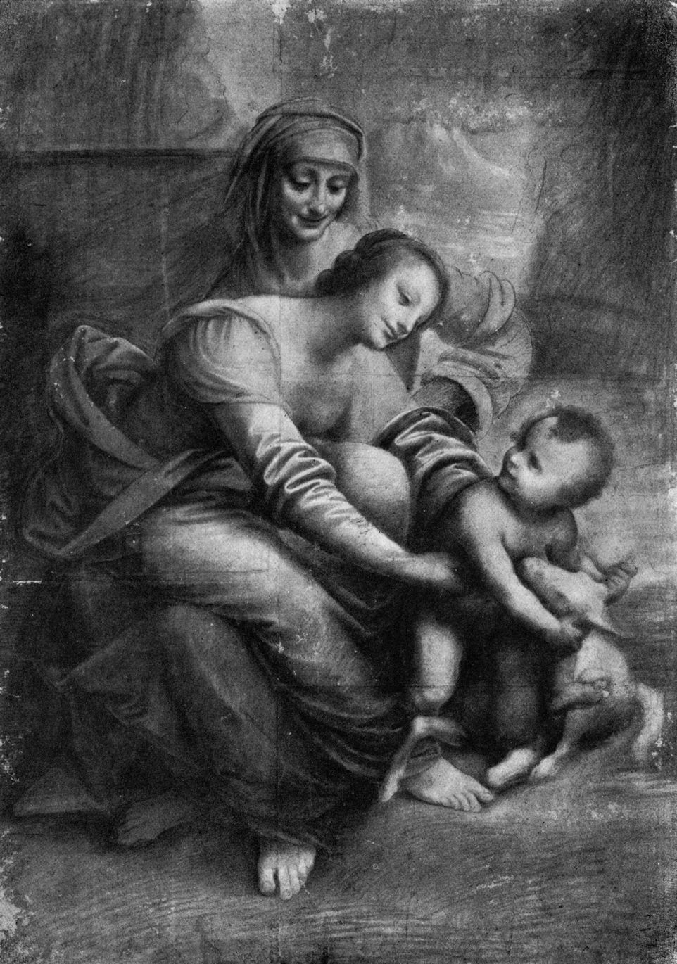
Above, Fig. 9: Leonardo’s workshop (Cesare da Sesto?), The Virgin and Child with St. Anne, The Esterhazy Cartoon, c. 1508-1513, lost or destroyed in Budapest during World War II.
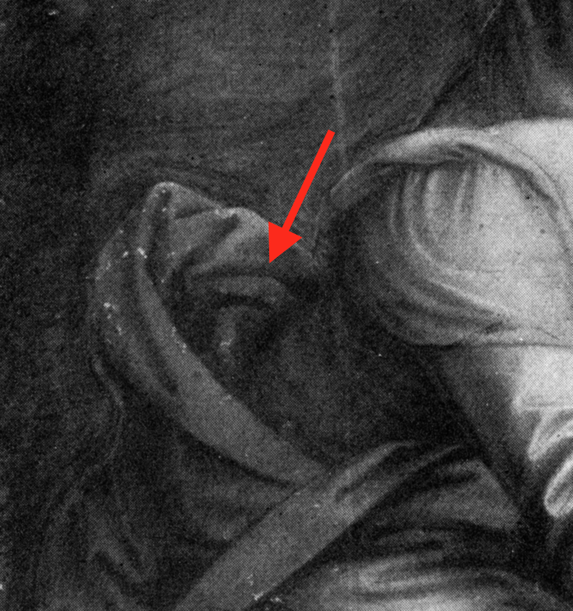
Above, Fig. 10: The Esterhazy Cartoon, detail of Virgin’s drapery with raised fingers of St. Anne’s proper right hand.
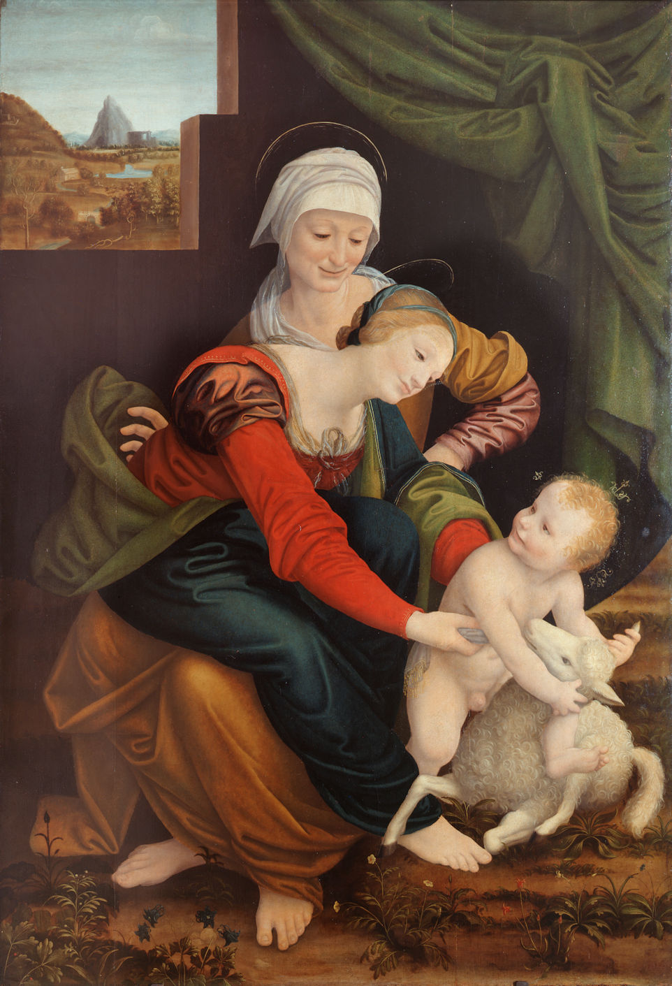
Above, Fig. 11: Bernardino Lanino (attr.), The Virgin and Child with St. Anne, c. 1540-1550 (?), Milan, Pinacoteca di Brera.

Above, Fig. 12: Leonardo, The Virgin and Child with St. Anne, Infrared reflectogram, detail of the modified section where St. Anne’s right proper hand, as initially conceived, has been suppressed by Leonardo when revising the fullness of the Virgin’s mantle (the ellipsoidal folds of the red dress in Mary’s back are where Anne’s fingers once were, see also Fig. 6). The whitish zone on the IRR corresponds to the former shape of the mantle (as seen in Figs. 9, 10 and 11, above), which, possibly, never reached the painting stage. Alongside that zone at bottom left are discerned sketched fingers testifying to Leonardo’s second change of mind about St. Anne’s right hand (see Figs. 11 and 13).
Above, Fig. 13: Leonardo, The Virgin and Child with St. Anne, Infrared reflectogram, a detail of the never-painted foreshortened fingers drawn alongside the Virgin’s mantle in the modified section. The fingers compare well those seen in an ealier preparatory sketch for the Adoration of the Magi in the Uffizi (see Figs. 12 and 14).
Wallraf-Richartz-Museum & Fondation Corboud, WRM, Z 02003, Leonardo da Vinci, Feder in Braun über Spuren von Silberstift, 22,2 x 18,4 cm
Above, Fig. 14: Leonardo, Study of figures for The Adoration of the Magi, detail of scribbled hand, Köln, Wallraf-Richartz Museum (see Fig. 13).
A last example of the usefulness for an art historian to be familiar with art practice seems necessary here although it is one about a cleaning tragedy. When the world-wide restoration controversy concerning the cleaned Michelangelo ceiling in the Sistine Chapel started in the late 1980s, I had doubts about the full pertinence of James Beck’s position: his objection was that the retrieved fresh and acid hues underlying the dirt and the glues laid in the course of time over the masterpiece’s surface were not what Buonarroti had wanted, and so, that he had toned them down and modelled the forms’ volume a secco with added layers of black bound in animal glue (Fig. 15A and B). Whether this was the case or not, the rather brownish and dark aspect of the frescoes before the intervention, which I had first seen as it stood in 1966, could be accepted as a likely hypothesis. Nevertheless, Michelangelo’s vivid palette’s range of colours was a well-known one, firstly because the Tondo Doni (Florence, Uffizi), cleaned c. 1993 – and so, gently – shows colours in full accordance with the Sistine Chapel ceiling, secondly, because, to some extent, they are close also to those of Domenico Ghirlandaio, Michelangelo’s master, a fact notably testified by Domenico’s fresco cycles in the Palazzo Vecchio (Sala dei Gigli) and in Santa Maria Novella (Tornabuoni Chapel) in Florence [Fig. 16 A and B]. Given that the debate was far too hot and complex I long stood off it, while strongly doubting the pro-cleaning camp’s theory whereby Michelangelo would never have made any a secco adjustments in the ceiling. For many reasons, that was indeed a bold and questionable argument in the light of art practice: no artist, even such an outstanding genius fresco painter like Michelangelo, could ever manage to cover a surface of 1200 square metres – the approximate size of the Sistine Chapel ceiling – with paintings without having to adjust part of his work here and there a posteriori. It definitely is an inconceivable material and human achievement and the impossibility of carrying out such a mythical feat is alone, of necessity, the strongest argument in favour of James Beck’s and Michael Daley’s position. Since the publication of both authors’ book, Art Restoration – The Culture, the Business and the Scandal, in 1993 and in 1996, and Prof. Beck’s death in 2007, Daley has step by step further developed his original reflections on the issue (as first published in The Independent on Sunday – “Michelangelo: Found or Lost?” – 25 March 1990, and the Independent – “A crime against the artist” – 22 November 1991), using visual demonstrations that leave no doubt about the unfortunate suppression of Michelangelo’s a secco retouching, whether it be, here, cast shadows, elsewhere, strengthening in the volumetric modelling of the biblical figure’s monumental anatomies and draperies (- see “Misreading visual evidence – No 2: Michelangelo’s Sistine Chapel Ceiling”). The fact that the restoration team “discovered” later on that Michelangelo has practiced a secco painting in the Last Judgement, and strangely not in the ceiling, although the same buon fresco technique and process was followed, makes it an open and shut case of the entire cleaning project’s technical misconception and miscarriage. [16]
Above, Fig. 15: A (left), Michelangelo, The Sistine Chapel ceiling before cleaning; B (right), Michelangelo, The Sistine Chapel ceiling after cleaning.
Above, Fig. 16: A (top), Michelangelo, The Holy Family (The Tondo Doni), c. 1504, Florence, Galleria degli Uffizi; B (above), Domenico Ghirlandaio, The Marriage of the Virgin, 1486, Florence, Santa Maria Novella, Cappella Maggiore.
Above, Fig. 17: A (top left), Michelangelo, detail of Jonah on the Sistine Chapel ceiling (before cleaning), B (top right), Michelangelo, detail of Jonah on the Sistine Chapel ceiling (after cleaning). The cast shadow of the Prophet’s left foot has been practically cleaned off during the restoration. The putti in trompe- l’oeil sculpture supporting the fictitious cornice have also lost much modeling and volume through that regrettable intervention. C (above), Giorgio Giulio Clovio (1498-1578), Copy of Michelangelo’s Prophet Jonah in the Sistine Chapel, Rugby Museum of Art, Rugby, England. This contemporary drawn record of Michelangelos frescoes, proves that the cast shadow attached to Jonah’s left foot had indeed been present from the beginning. It was also recorded in the subsequent copies of the Jonah that were made from the 16th century onwards [see The Sistine Chapel Restorations, Part III: Cutting Michelangelo Down to Size.
V – The still missing artistic-technical critical edition of Leonardo’s Trattato della Pittura
Leonardo had intended c. 1490 to write a treatise on painting which he sketched out in the Manuscript A kept in the Institut de France. This enormous book of various texts and themes of research, illustrated with original drawings, was never published in his lifetime, but his pupil and assistant Francesco Melzi (c.1491- c.1570), who had inherited all the master’s manuscripts and drawings in 1519, compiled the material c. 1530 from eighteen of the manuscripts in order to prepare the publication of Leonardo’s Trattato. This did not occur in Melzi’s lifetime either but the earliest compilation in existence, the Codex Vaticanus Urbinas Lat. 1270, also called the “Codex Urbinas” or “Libro di Pittura”, is kept in the Biblioteca Vaticana in Rome since c. 1640 [Fig. 18]. Its full text was first published in Rome by Guglielmo Manzani in 1817 while the first critical edition was published by Heinrich Ludwig in Vienna in 1882. Since then, many critical and facsimile editions have been issued, one still recent being the joint work of Carlo Pedretti and Carlo Vecce (Florence, 1995). As is the case for such specialized editions, the authors have focussed on the restitution of the full text through an effort of strict paleographic/ philological/ lexical accuracy, with the necessary reference to Leonardo’s original manuscripts from which these texts were compiled, and to critical editions such as Ludwig, 1882, the facsimile McMahon edition with English translation (1956), or Pedretti’ s “Leonardo’s Lost Book (Libro A)” of 1964 [17]. When I started consulting the Codex Urbinas for my research systematically, I soon realized that another type of critical apparatus was missing, the more so as the book is a treatise on painting, that of a technical commentary of all the specific matters dealt with by Leonardo in the Trattato. I do not mean just literary, theoretical and contextualized views on those matters but ones enriched with pragmatic observations tested out in practice and checked by experimented art teachers, chemists, opticians, etc. of our day. This was no unrealistic expectation on my part: not to speak of Pedretti’s critical comment of Leonardo’s sheets of Anatomy published jointly with a physician, Dr Kenneth Keele in 1978-1980, such a type of edition exists for Cennino Cennini’s Il libro dell’arte, more precisely the Neri Pozza one (Vicenza, 1971 and 1982), which is annotated by Franco Brunello, a chemist specialized in pigments and dyes [18].
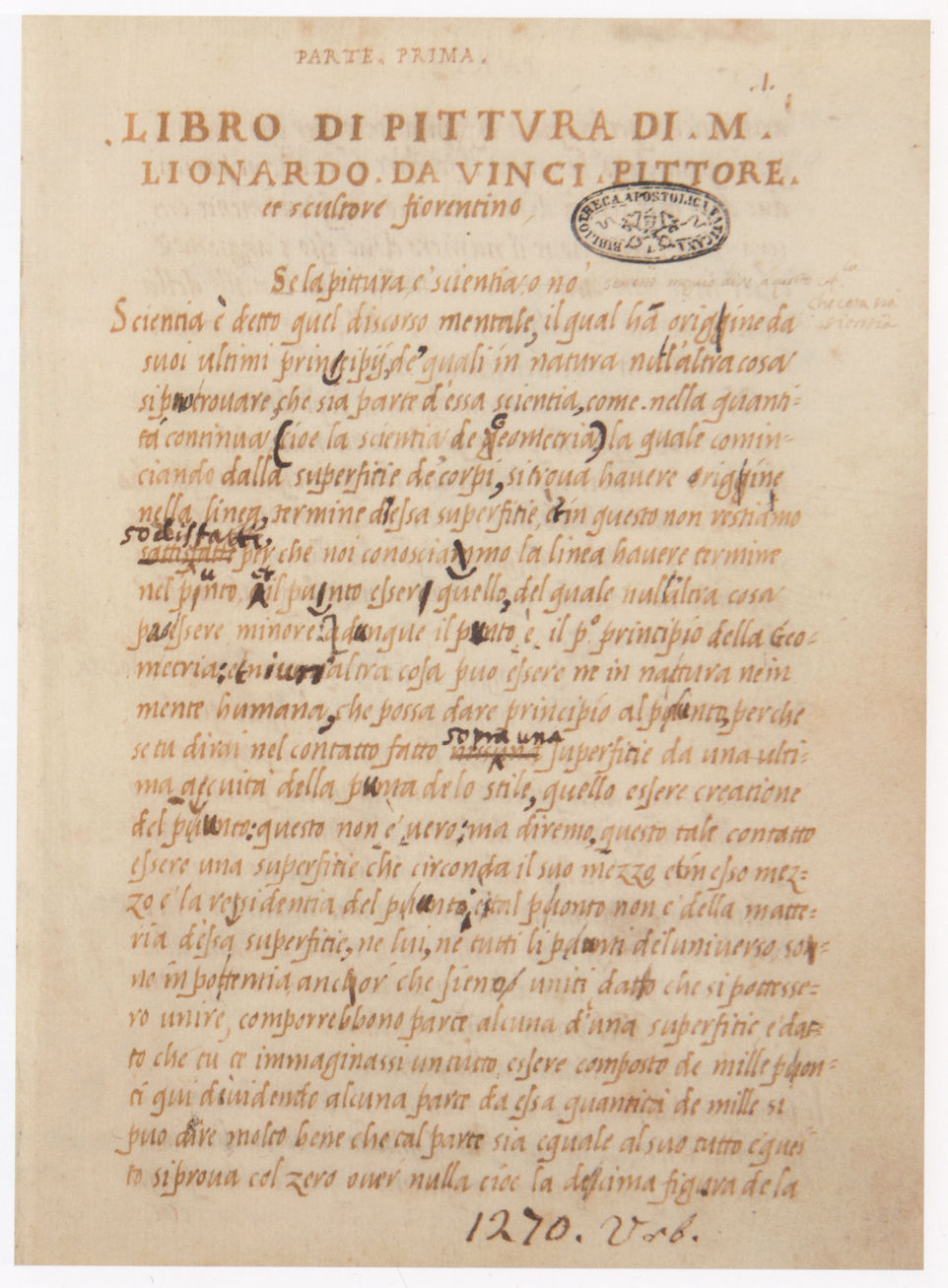
Above, Fig. 18: The Codex Urbinas lat. 1270, Rome, Biblioteca apostolica vaticana.
The necessity for this technical edition of Leonardo’s Trattato had appeared to me when I came across a well-known – yet supposedly enigmatic – case of perspective analysed by Leonardo that has been debated over many years, roughly since 1927 up to 1978 and later, with the involvement of such specialists as Irwin Panofsky, Irma. A. Richter, John White, André Chastel, Carlo Pedretti and James S. Ackerman, in particular. The case in question implies the distance of the artist’s viewpoint from the represented object, a problem that the painter must settle with care because linear perspective generates lateral distortions (should the object’s shape be a long horizontal one, for instance) when the viewpoint is too close and exceeds a visual angle of 90°. [Fig. 19] As demonstrated by both Pedretti (1963) and Ackerman (1978), Leonardo was aware of it, specifies which viewing position is the ideal one, and, consequently, has never invented a mysterious – and convenient system (“curvilinear” perspective is evoked in the debate) – specially intended for solving the case. Yet the long lasting disputa over the issue could have been avoided thanks to some basic investigation into the drawing-from-life techniques still taught in fine art schools when the debate took place: like Leonardo before them, and so from a multi-secular tradition, all the art teachers of the period knew the rule to be respected in this connection.
Above, Fig. 19: [After Didier Bessot “Léonard de Vinci et les distorsions perspectives”, Léonard de Vinci entre France et Italie ‘miroir profond et sombre’, Caen, 1999, p. 37-54, Fig. 1, p. 41]. Piero della Francesca, De prospectiva pingendi, libro 1, proposition XXX. The problem of the viewing angle (LM > L- 21 = LK and LM, image of KL > 21-F, image of 21 – B) dealt with by Piero : in order to avoid lateral distorsions, the viewing angle in a perspective construction should not exceed 90°.
Another drawback, so to speak, is the fact that the various technical topics contained in the critical editions of Leonardo’s Trattato are thought to be utterly comprehensive, their artistic sense and function included, whereas what is clarified in this particular field is at best of literary order (etymological, etc.) and not their factual role within a given creative process, thus allowing a shift in meaning that will necessarily distort the historical veracity of the literary source and the correct understanding of the evoked techniques. That is the case with sfumato, meaning “smoky” or “misty” – more precisely a vaporous looking pictorial effect having no distinct boundaries. It is a nominalized past participle of the Italian verb sfumare (to smoke) which studio vocabulary has made become a noun through the centuries; sfumato is now commonly used to describe, not only Leonardo’s soft-focus effects as observed in the Mona Lisa and his late paintings, but the relating technique also. In my essay of 2014 about technical practice in Leonardo’s workshop, I have signalled that sfumare, utilized many times by Leonardo to describe this otherwise ageless technique (that of blending the tones to achieve impalpable, blurred, gradations between light and shade), was employed already in the late 14th century Italy, by Cennino Cennini [19]. Picking up the concerned passage in my above-mentioned peer checked essay, yet with no mention of my name although I had sent him a copy of the academic review in which it was published, Martin Kemp now attempts to demonstrate that sfumato is not a suitable term, historically, to evoke the various concepts underlying Leonardo’s blurred effects and the relating technique of execution [20]. I naturally disagree, because what prevails in such a case is usage – and particularly so when a very ancient one. In old master tradition and workshops the terms used referred to precise artistic-technical data (here a painting process), whose specific meaning is grasped correctly by artists alone, like a musical code or of any other sort, for it is a specialized lexis. Searching a ready-made academic sense within traditional workshop usages and terminology – as if for some catch-all mathematical formula – is therefore pointless and a mix of genres. In this arena, unspecialized parties, inevitably, cannot but misinterpret the highly technical data inherent of studio practice recorded in ancient literature, which, naturally, need instead the methodical examination/interpretation and eventual testing out in practice by truly experimented practitioners – which Kemp is not – to be explained properly (hence the scholar’s missing crucial information borne in the texts quoted either in his own essay on sfumato, or from Leonardo on technique, as we shall see below). Whatever the case, given its long existence, the ancient usage of sfumare and of its derived terms (including sfumato) in art is nothing to be rejected: we can well see that that verb’s technical sense, a generic one when it applies to the art of painting, is the same when it is used by Cennini, by Leonardo and by Filippo Baldinucci (c. 1624-1696) indifferently over a period of four centuries. And since Leonardo, writing about technique in the Trattato della Pittura, describes a method of melting the tones to make them look smoky, one can hardly imagine that the words employed do not mean both the rendered effect and its technical process, as is evident in this eloquent – and most famous – passage of the Codex Urbinas (Pedretti/Vecce edition, op. cit. supra note 17, § 514): “and when the flesh paint is wet, [using soft brushes] you will make the shadow smoky as you please (…) When your sfumato is made, let it dry” [21].
This well-known text clearly shows that we are faced here with a sfumato process which I call “the simple blending of tones” or “the simple fusion of colours” [22]. In effect, Melzi’s transcript of Leonardo’s recipe informs that the paint material to be made look fumoso (misty, blurred, etc.) is “wet” and that it is handled with “soft brushes”. It is precisely the state in which the paint material should be so that such a process can be performed while a soft brush will allow its adequate achievement. Called blaireautage in French, it is, as we now know, an ageless technique in which the paint film is gently “blended in” in the sections to be unified visually, in particular where the impalpable transitions between light and shade must be depicted [23]. The simple blending, however, is not by far Leonardo’s most subtle sfumato technique, because the specific technical gestures involved cannot produce microscopic transitions on very short distances, measurable in tenths of millimeters, like those seen in the Mona Lisa, for example [24]. In that particular case, the soft brushes used for the blaireautage (simple blending of tones) are far too large and inadequately shaped: painters necessarily employ brushes and paint strokes whose dimensions and shapes conform to the scale of the details to be reproduced. Consequently, the technical problem examined here is a clear-cut one: while soft, rather large and flat brushes are used to achieve the blaireautage (type 1 sfumato effect), very fine brushes with a sharp tip alone are required to achieve the “complex blending” (type 2 sfumato effect). In other words, neither of those distinctly sized and shaped brushes can replace the one meant for its specific technical purpose, whether it be for the sfumato effects type 1 or type 2. One can now understand why art historians strange to practice, unless properly informed, should not speculate on painting techniques as complex as that of Leonardo, given their deep ignorance of how artistic craftsmanship functions in the real. Except specialized artists, not many people can discern visually the important difference of refinement, hence of technique, regarding those micro-distances when examining the Leonardo works, notably the Mona Lisa, in which either type of sfumato process was followed: to some eyes, obviously untrained, all blurred effects seem to correspond to one and a same one, apparently.

Above, Fig. 20: Leonardo, The Lady with an Ermine, c. 1489- 1490, Cracow, National Museum.
Leonardo has practiced the simple blending in works like the Lady with an Ermine (Fig. 20) or the London Virgin of the Rocks, a process that X-radiographs reveal distinctly due to the amount of lead white (an X-ray proof pigment located very distinctly on them) needed for the lights in this technique (see Further Thoughts I, Fig. 27a and b). Despite this telling example, Kemp insists: “we should be aware that the term [sfumato] is an artefact of art history not a quotation from Leonardo [25]. Furthermore, quoting Baldinucci’s Vocabolario (1681) to make his point, he seemingly is unaware of the fact that this author contradicts it. In effect, Baldinucci’s text describes the standard sfumato technique, or blaireautage, used in his time, not the very complex and spectacular one handled by Leonardo in the Mona Lisa and the Sainte Anne (see Further Thoughts II), which, as we know, is an entirely different one in terms of making process. The 17th century Florentine biographer of artists actually says: “[sfumare, To unify colours] (…) after having put the colour in its place on the canvas or panel, in order to remove all crudeness of the touches, sweetly mingling the light tint with the middle tint or the middle tint with the dark, so that the passage from one to the other is made with such gradation that even from close the painting appears without brushstrokes” [26]. The choice of Baldinucci’s text is therefore of little pertinence here with regard to that of Leonardo’s extant ones on technique, or compiled by Melzi: it was published in the late 17th century, 162 years after Leonardo’s death and does not describe his technique as such in the least way, but, rather, the generic artistic gesture of sfumare as executed then (thus implying slight variations from the early 16th century practice of that technique) in order to unify visually the raw effect first obtained in the execution, and to smooth down the paint surface at the same time. Although Kemp asserts authoritatively that “Baldinucci sets the right tone” [27], his credibility is nonetheless at risk when hypothesizing without any evidence or reliable experience of practice that it was the technique used in the Mona Lisa. For Baldinucci’s description also informs that fresh paint is handled, which necessarily implies the practice of blaireautage or “simple blending”, in which the fresh paint strokes are mingled and smoothed down in a sort of delicate back and forth sweeping movement done with a soft brush. All of which is far too simple, technically, to explain anything as prodigiously complex as what is seen in the Louvre’s iconic picture: as now proven by X-ray fluorescence and visual observation (see Further Thoughts II), what is typical of Leonardo’s flesh technique in the Mona Lisa (the “complex blending of tones”) is that it needs a dry underpaint and not a wet one to be proceeded with: it is therefore, basically, a dual operation and not a single one. The visual abolition of the touches (hatches, strokes, etc.) is far more gradual in the complex blending: thin veils of liquid translucent paint are laid over each painting session when it is dry until the paint surface appears perfectly smooth and even. About twenty of such veils have been detected in the Mona Lisa thanks to X-ray fluorescence tests, thus revealing an extremely elaborate and subtle making that justifies my description of two distinct procedures in Leonardo’s sfumato technique (see Further Thoughts II). While the term sfumare is fully appropriate to the first one, the second one’s complexity results from the systematic superimposition of veils (whose nature and typology vary greatly): velare (to veil or glaze/soften the rawness of tones in Italian) has therefore all the reasons to be employed in that case instead of sfumare. A century before Baldinucci, or nearly so, it is presumably why Giovanni Paolo Lomazzo (1538-1592), who had met Francesco Melzi (Leonardo’s closest pupil) and gathered then precious information about Leonardo, described in 1590 the master’s sfumato technique as “veli sopra veli” (superimposed veils), a better designation than sfumare with regard to the overall line of making observed in the Mona Lisa [28]. Additionally, the complex blending observed in the Mona Lisa corresponds without contest to Vasari’s report on the portrait (who never saw it but its description was obviously borrowed from Melzi): “Leonardo undertook to execute, for Francesco del Giocondo, the portrait of Monna Lisa, his wife, and after toiling over it for four years, he left it unfinished (…) in it were counterfeited all the minutenesses that with subtlety are able to be painted” [29]. Should Leonardo have employed the blaireautage process, an easy and quick one, the end result would be far less subtle and, for that reason, the work would have been finished within four to six months at the very most: applied to the Mona Lisa, that technical interpretation has therefore, I am afraid, no historical likelihood.
Reverting to the arbitration of practice, which is the best means for checking the pertinence of theories in matter of painting techniques, the reader must know that no copy resembling the Mona Lisa very closely (which would be evidence of the appropriateness of the technique used), could ever be produced employing Baldinucci’s recipe, and, knowing the subject extremely well from decades of experimentation, I defy any skilled artist to perform such a challenge [30]. Finally, the fact that Leonardo’s sfumato lies on optical concepts more particularly than that of other artists is no evidence of the term’s historical inaccuracy with regard to the Master’s blurred effects and correlated technique. And unless the texts compiled in the Codex Urbinas were proven in future not to come from Leonardo – a very unlikely eventuality – it can reasonably be admitted that sfumato was indeed a term used by him and his studio, whether occasionally or not.
VI – Interdisciplinary work: a salutary concept
Given the transverse (multidisciplinary) character of old master expertise, nobody would expect that one and a same specialist be simultaneously familiar with archival research, well versed in academic art practice, in restoration techniques, and that the physics and chemistry of paints hold no secrets for him. Yet, the entire knowledge contained in those distinct disciplines is necessary to approach adequately the works’ full facets, whether historical, artistic or material. As explained in the first chapter of this essay, specialized artists, unless they are conservators, have no recognition as art experts, and, although it is unjustified, since illogical, aesthetic-technical matters are assessed nowadays by parties (art historians and scientists) who are no specific experts in this field. In the past, about eighty years ago, conservators were most of the time academic artists who could not make a living out of their activity and had taken up restoration to secure themselves an income. This was notably the case with Jean-Gabriel Goulinat (1883-1972), seriously trained in the Paris national Ecole des Beaux-Arts, and Jacques Maroger (1884-1962), who made careers in 1930-1960 at the Louvre (Maroger in part only): it was a blessed period during which, the then head curator of Paintings, René Huyghe (1906-1997), had, jointly with Cesare Brandi (1906-1988) – the world reputed Italian theorist of conservation – defined a highly tactful conservation policy for the restoration of France’s and Italy’s old master heritage [31]. At that time, the restorers were fully trained artists who were able to advise on the Louvre’s restoration committees and, eventually, point out to aesthetic-technical data that would contribute decisively towards the successful outcome of conservation projects. Significantly, the Louvre Leonardos had hardly been touched up, with the exception in the late forties-early fifties of the Sainte Anne, whose conservation report is very telling on the discreet cleanings undertaken in those days. Progressively, this way of proceeding was thought outdated and, worse, by the late seventies, in university and museum circles in France and elsewhere, it came to be considered that artistic advice on restorations was subjective, inadequate, and that scientific analysis and art historians alone could determine safely where the authenticity of paintings lies. In these times the work of art ceased to be the pre-eminent, intrinsic per se source of information on significant artistic and technical data about itself, in the way that musical scores were – and still are – regarded by musicians. Thus works of art became objects of unclear identity and quite divorced from the traditional artistic criteria that had remained in force from the Renaissance until our own times. In consequence, anarchic views prevail to date on the authentication and destiny of works of art.
In 1983, I was hired by a private conservation institute in Paris (Institut d’Art Conservation et Couleur) which was run by both the then leading Louvre conservator Sylvaine Brans and Prof. François Parra, an international State authority on Optics and the physics of colour [32]: the institute was training student restorers and my role was to instruct them on old master techniques because, while their technical capacity to preserve and repair paintings materially was satisfactory, practically none of them had ever learnt to draw and paint and, therefore, knew much, to say the least, about the aesthetic-technical side of art. In 1986, I pursued a similar teaching job to student restorers for fifteen years within another professional framework: many of them intended to access international schools of restoration (IRPA in Brussels, IFROA in Paris, ICR in Rome, etc.). From this experience I am ipso facto closely acquainted with the ins and outs of painting conservation (artistic aspects) and, more specially, with the fact that – bar exceptional cases – the majority of today’s restorers cannot face the complexities inherent of this discipline where properly speaking artistic matters bringing up any difficulty are concerned. Although I ignore whether it was and has been the case with leading museums in the world at all times, the Louvre was certainly aware of this problem in the mid-eighties when my research first got some marked support from René Huyghe, then still chairing the Museum’s national committee for restoration and from Alain Erlande-Brandenbourg, the then main assistant to the Head of the French museums (DMF).The team in charge of the Louvre’s conservation studio was a brilliant one in those years, notably under the heading of Gilberte Emile-Mâle and that of her successor, Curator Ségolène Bergeon, a disciple of Prof. Paul Philippot (1925-2016), who, himself, was a reputed theorist of conservation, a university professor in Brussels and the head of the Rome ICCROM. Both an art historian, a scientist and an IIC Fellow, Bergeon had long understood that painting restoration is a transverse discipline calling for a combined, qualified and joint expertise drawn from art history and academic artistry applied to conservation, and, of course, science, the ideal objective hereupon being to limit as much as possible the subjectivity of such an action in order to better preserve the work’s material and spiritual integrity. Hence Bergeon’s early commitment in favour of interdisciplinary (or crossdisciplinarity) work in conservation, an early 19th century concept revived by both Brandi and Philippot – and later theorized by Madeleine Grawitz definitively – [33], advocating that the “threefold” expertise (history + art + science) needed to restore a work of art be practiced as a constant and mutual collaboration between the different professional parties dealing with the work’s conservation treatment. And this, unlike pluridisciplinarity, in which the concerned experts advise the restoration project separately, thus risking eventual conflicts between each individual position, no profitable dialogue over the problems raised in the course of the intervention and, as a consequence, that less or no attention is given to what the work really needs [34] (Fig. 21). Such a practice as interdisciplinary collaboration is demanding in terms of self-discipline, for it implies a humble attitude and the eventual renunciation to one’s feeling of professional superiority towards a given essential partner in the team as well as a sincere open-minded disposition to exchange with others for the sake of the work’s preservation. Unfortunately, such a disinterested and humanistic conception of a group’s working program is far from being an ideal shared in the museum world broadly. I once attended a Bergeon lecture on interdisciplinary work in 2003 at the Association des Historiens de l’Art Italien (AHAI) in Paris and was sitting next to a specialist of scientific imaging in the Louvre’s laboratory (C2RMF), an otherwise urbane and pleasant person who has left this institution long ago. When Bergeon’s intervention ended, Mr. X whispered in my ear this irritated comment: “For sure it’s not a line we shall ever bother to follow in our lab!”
Above, Fig. 21: [After Ségolène Bergeon Langle and Georges Brunel, La restauration des oeuvres d’art, Vadem-mecum en quelques mots, Paris, p. 205, Interdisciplinarity and pluridisciplinarity].
Diagrams showing each discipline with a specific colour (1 blue = physics, 2 yellow = artistic/technical-craft, 3 red = human sciences). In the case of interdisciplinarity (in the context of a conservation project), the three disciplines are in constant mutual dialogue and the end result is a fully informed product. In the case of pluridisciplinarity, the juxtaposition of partial actions from distinct specialists (physics, artistic/technical-craft, human sciences) does not deliver a unique and fully integrated product.
VII – By way of conclusion
Although what precedes remains schematic and incomplete, it is obvious that the artist’s place and of everything that is intrinsic to the artistic, creative phenomenon, is not at the heart of art expertise and conservation any longer, a situation which has been lasting for several decades now to the point of having become a de facto tradition. The causes of this are many: one of them is the decline, if not outright abandonment, of teaching the multi-secular academic rules of drawing and painting in the European fine art schools as from the sixties onwards; another being the nonsensical, demagogic belief that has developed in parallel worldwide under the influence of the various trends of modern and contemporary art whereby anybody can be an artist – an idea open to discussion, perhaps, with regard to today’s creative concepts, but one which cannot sensibly be backdated so as to apply to classic art, whether historically, conceptually or technically. Such a global cultural development has necessarily lowered art’s spiritual level down to criteria that oppose its fundamental identity which cannot be dissociated from its traditional, long-prevalent art practices in an attempt to convert it into what it is not and has never been. In such a confused cultural context, the situation has, in the mind of some scholars, so evolved in the last twenty years as to dissolve any distinction between art history as a discipline, which is a branch of history, nothing else, and art practice itself. A number of art critics occasionally seem to believe (see Further Thoughts II ), that their own self-contained (i. e. divorced from artistic practice) visual appraisals of a painting visually are sufficient to understand it thoroughly – including the various processes of its making – as if they themselves had painted it. I have come across a number of such cases in the museum world recently, in three of whom the self-delusion, if not pathological, had reached such a paroxysm that no evidence of any sort, either visual or scientific, proving the inconsistency of their position, could bring them back to reality. They just could not accept it. The origin of this alarming emerging syndrome of “virtual” or “imaginary scholar-painters” lies in the dogmatic conviction that a given qualification in art history sanctioned by some power, either scholarly or curatorial, confers both infallibility and an automatic access to the full knowledge of art and to what its creative methods consist in. There is here an abusive appropriation of the authority traditionally and rightfully conferred to artists through their demonstrable mastery of the creative process, a field strange to both art history and science. In other words, to some extent and more than symbolically, art is not in the hands of art any more but in those of institutional parties having no direct experience of it, who cannot but transliterate it in a language of their own presented as the truth, whether rightfully or not according to circumstances (see § V above).
Sense and reason help to grasp the point in case clearly: the best way to know anything sound and factual about art is to draw, paint or sculpt. And the best way to penetrate into the aesthetic-technical creative intimacy of an old master painting is to make a faithful copy of it, and eventually one whose appearance is practically analogous to that of the original. In so doing it is possible that the making process will not be the very one followed by the creator himself, whether it be Rembrandt or Rubens, etc., but it might well be the case indeed, as I have succeeded to prove with Leonardo’s sfumato technique through decades of painstaking research and thanks to critical copy-work in particular (see Further Thoughts II). In addition, when a copy resembles the original closely, the copyist has at least demonstrated his (her) direct, tangible – and not imaginary – experience of the essential aesthetic-technical data constituting the original work’s appearance: nobody can in good faith deny that this is a priceless knowledge, a reality that no virtually informed speculation on technique will ever match or challenge. Because what decides between opinions here, i. e., one strictly conceptual and immaterial, and another one tangibly visual and material, is, in the latter case, evidence of art as opposed to theoretical verbiage about it [35].

Above, Fig. 22: A, left and right – Jacques Franck, critical reconstruction in four stages of the Mona Lisa’s left proper eye; B – Jacques Franck, free copy in oils after the St. Anne in the Burlington House Cartoon (London, National Gallery).
This very point explains why my research on Leonardo’s painting technique has been so reluctantly accepted, if at all, in those circles: notwithstanding the providential support from specialists of an unsurpassed competence such as René Huyghe, Carlo Pedretti, Federico Zeri, Ségolène Bergeon Langle or Jacques Roire (physicist and chemist), the issue of Leonardo, effectively, is considered their exclusive property, so to speak, and therefore one “forbidden” to an independent scholar’s artistic research like mine, regardless of the deployed skills and of the related visual demonstrations of scientifically proven pertinence (Fig. 22 A and B). By the same token are explained also the attacks that have suddenly flourished in my back from the very moment I opposed the attribution of questionable graphic compositions to Leonardo and the serial restorations of the Louvre Leonardos and, in particular, campaigned against the participation of the originally New York, then Russian, now Saudi Salvator Mundi in the Louvre Museum’s 2019 blockbuster exhibition as an authentic da Vinci painting [36] (Figs. 23 and 24).
To sum up, the Establishment’s disregarding of and opposition to any, properly-speaking, artistic and pragmatic means of research concerning the technical issues requiring elucidation in the art of painting is a clear sign of our society’s weakened understanding and loss of respect of the meaning of art, whether or not it is the remote consequence of Dada, “art brut”, relativist theories, art negativism, the postulate whereby anybody is a potential artist or, worse, of the sophist claim that “science can explain art”. Assessing the innumerable PhDs produced by the history of art scholarship each year, one can easily notice that, more often than not, it is becoming a strictly speaking literary activity in which the art work serves to support questionable theories, intellectual elaborations substituting their virtual reality for its own, factual one. Statistically, little archival research is made, which explains why so few documents about Leonardo have emerged in the past century. Concerning Leonardo studies, beside the “classics” (including Frank Zöllner’s catalogue raisonné), what remains and catches attention are of course the comprehensive publications on different topics from scholars like Carmen Bambach, Alessandro Ballarin, Carlo Vecce, Edoardo Villata, or more specialized ones, notably in matter of Leonardian bibliography (I cannot but mention the brilliant Silvia Fabrizio-Costa in this respect) [37], which are references constantly used for working on a subject like technique, an issue needing solid historical documentation. Yet, in some of those works, when the pictorial techniques are evoked, the painter’s viewpoint is skimmed over, while nobody, to my knowledge, manages to achieve any appropriate art critical distance from the end results of restorations like that of the disappointing Last Supper in Milan, for example. [38] (Figs. 25, 26 A, 26 B and 27). Naturally, given the hot nature of the polemics over questionable restorations, were they brought back to serene, scholarly debates and exchanges, these projects being mostly under State control, no museum curator or university official – or very seldom – will accept to speak out in the open to express objections. But then, who will want to save and rescue the Art Planet, if these powerful VIPs won’t point out to what they know should be contested in order to help salvage the world’s Heritage?
Many years ago James Beck and Michael Daley, in Art Restoration – The Culture, the Business and the Scandal (1993, 1996), denounced the progressive disintegration of the ethical standards and morals in the art world whereby the artistic treasures of the universal Heritage are commercially exploited against their basic spiritual and physical interests through vicious cycles of money making exhibitions and/or needlessly risky restoration projects that have become a self-perpetuating world-wide industry. Such attacks on the most essential icons of our civilization’s very soul run in strict parallel with and proceed from the same logic of the frames of mind that cause the attacks on Environment which, inexorably, are destroying the planet. More recently, Ben Lewis’s book The Last Leonardo, and two documentary films about the shattering saga of the Saudi Salvator Mundi have sadly proven that Beck’s and Daley’s voices of 1993 have been little heeded. Arguably, the toxicity of the art world has worsened in the last twenty years as an escalating abundance of unjustifiably upgraded works, whether paintings, drawings or sculptures, are presented as lost or misattributed Botticellis, Raphaels, Leonardos or Michelangelos, etc. when, in truth they are at best studio works or late school items – and sometimes outright fakes, as was the case with a notoriously freshly imitated “Frans Hals” lately [39]. The curatorial obsessions of museums regarding the “cleanness” of the privately loaned works exhibited in the international shows provoke severe – yet too rare – admonitions from museum figures who have retained an inflexible sense of ethics. In the documentary The Lost Leonardo, reporting on the London National Gallery’s role in the tangled story of how the (New York to Saudi) Salvator Mundi emerged from obscurity before being sold for $450m, Professor Bernd Lindmann, the then director of the Gemäldegalerie in Berlin, tells Andreas Koefoed (the co-film maker): “I was surprised to see the painting in the [2011 Leonardo] exhibition at the National Gallery. It is a problematic painting and I think it’s not the role of serious museums to present a painting which is so heavily discussed”.

Above, Fig. 23: [After Achademia Leonardi Vinci, Vol. X, 1997, p. 269]. Nomination of Jacques Franck as Consulting expert to the Armand Hammer Center for Leonardo Studies at UCLA by Carlo Pedretti (see note 36 below ).
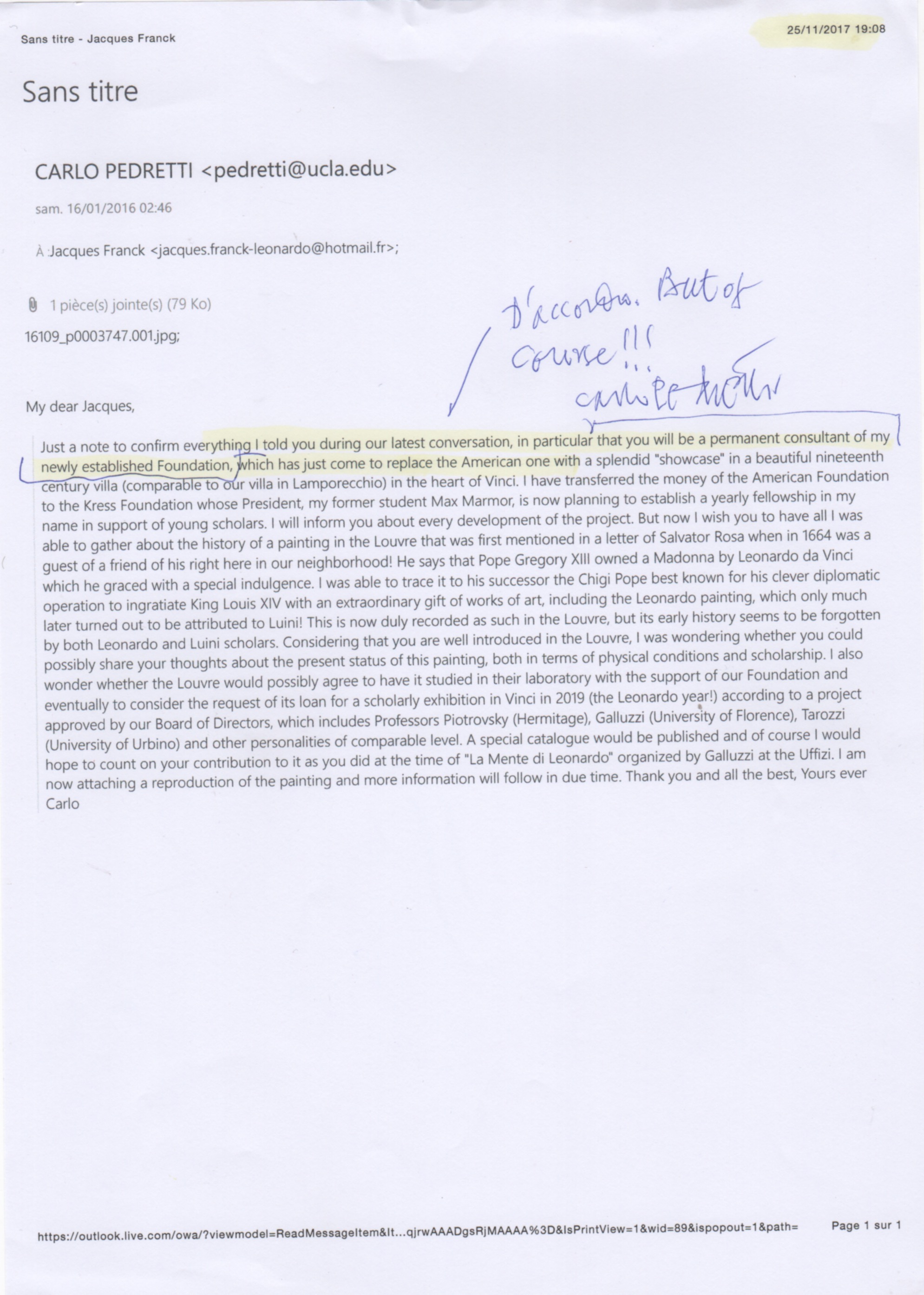
Above, Fig. 24: Email from Carlo Pedretti of 16 January 2016 expressing his will that Jacques Franck be Permanent consultant of his newly established Foundation. A printed version of which (here) was confirmed again by Pedretti’s signed and annotated approval of 27 November 2017, six weeks before the great Leonardo scholar’s decease on 5 January 2018 (see note 36 below).
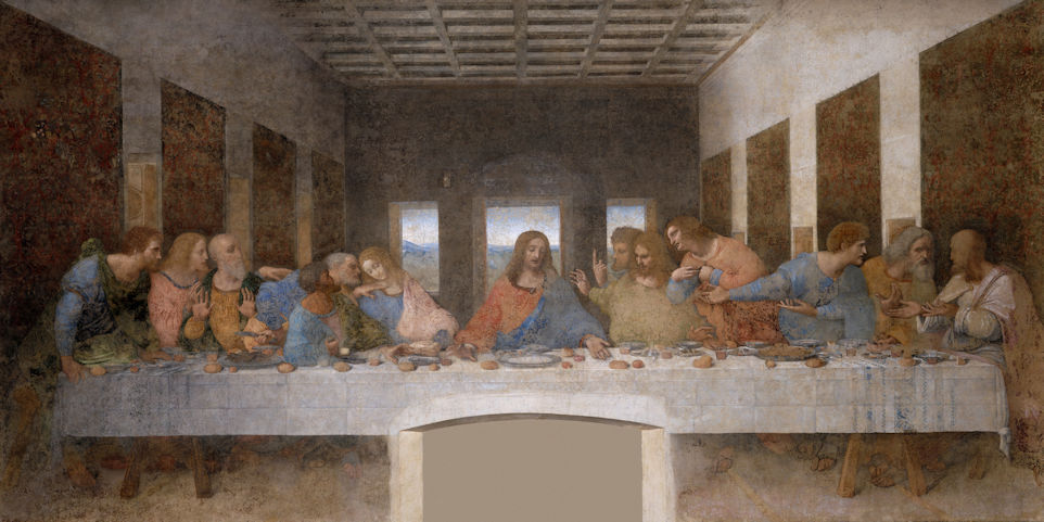
Above, Fig. 25: Leonardo, The Last Supper, 1497, Milan, Santa Maria delle Grazie.
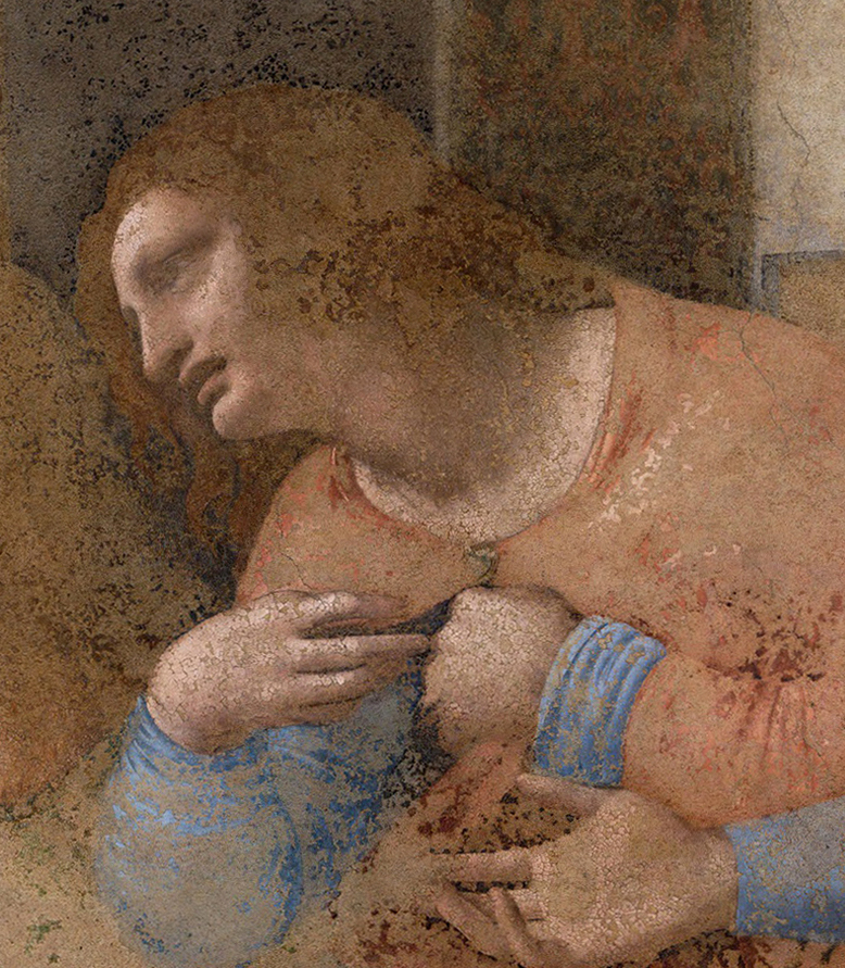
Above, Fig. 26 A: Leonardo, The Last Supper, detail of St. Philip. All that remains of the original work are small scales of colour appearing the more saturated ones on this image of St. Philip – which is possibly the best preserved figure in the mural. Surrounding the surviving shards of paint, whether red, flesh pink, blue, brown, or black, the paler tones constitute the considerable retouching (called “inpainting”and compensating for the lacunae), that was necessary to make the composition both visually consistent and fit to be seen by the public of visitors. The missing original paint can therefore be assessed around 60 to 80% in Leonardo’s Last Supper.

Above, Fig. 26B: Leonardo, The Last Supper, detail of St. Philip. This close-up on the apostle’s head shows distinctly the huge areas where the original paint is missing. Compare with Fig. 27 below.
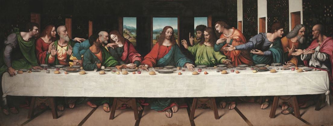
Above, Fig. 27: Giovanni Pietro Rizzoli, called Giampietrino, copy of The Last Supper, c. 1520, The Royal Academy of Arts, London.
It is in this context of the Art Planet, clouded by the constant emergence of disputable, opaque, interests, that I publish my recent investigation of the “no book” titled Léonard de Vinci. Le Salvator Mundi, published by the Louvre in December 2019, while withdrawn immediately from the Museum’s bookshop without any explanation, but of which photocopies have circulated in the Leonardo scholarly “microcosm” and in the international press earlier this year. An essay presenting the Saudi Salvator Mundi as a work fully painted by Leonardo based on scientific arguments which, in my opinion, are anything but acceptable; I therefore have thought it my duty for the truth’s sake to discuss them in-depth and openly below, so that the reader can understand why the French government has considered it essential not to publish them and, as a consequence, not to support the work’s attribution to Leonardo either.
Jacques Franck, November 2021.
ENDNOTES:
Note 1: Cf. Jacques Franck, “De la formation artistique en conservation-restauration des peintures anciennes: évoluer, pourquoi, comment”, Coré, n° 4, avril 1998, p. 53-59.
Note 2: Cf. Léonard de Vinci, le chef-d’œuvre redécouvert, documentary movie broadcast on the French/German TV channel Arte on 13 November 2019. The title of this movie is interesting inasmuch as the rediscovered “chef-d’œuvre” in question (“masterpiece” in English) is in fact the American version of The Madonna of the yarnwinder of c. 1501-1510 (New York, private collection), a well-known Leonardesque painting, here ambiguously upgraded as by Leonardo himself following its recent cleaning, yet still deserving the traditional attribution to a Milanese pupil since it doesn’t comply with the artistic standards usually encountered in original Leonardos.
Note 3: Stricto sensu glazes are perfectly transparent layers of tinted paint, mostly used to brighten or deepen the tone of the underlying layer or to modify it: a bright transparent blue glaze laid over a yellow underlayer will thus create a green visually. Given that the flesh tones cover a range of pale, opalescent pinks, some white and added touches of relatively opaque pigments must be employed instead of transparent ones – while much diluted – in the meticulous oil techniques encountered in the late 15th century Italian schools, the result of which is a translucent, thin veil-like paint film, hence the term of velatura (veil) in Italian. For the physics of glazes, see Ségolène Bergeon and Pierre Curie, Peinture & dessin, vocabulaire typologique et technique, 2 vols., Paris, 2009, vol. 2, p. 738.
Note 4: Cf., successively, my following articles addressing this particular issue: “The Unrestorable Sfumato“, Achademia Leonardi Vinci, vol. VI, 1993, p. 238-241; “L’analyse esthético-technique des peintures de chevalet anciennes”, Science et Technologie de la Conservation et de la restauration des oeuvres d’art et du patrimoine, n° 3, septembre 1993, p. 5-50, p. 33-41; “Vinci au Louvre. Restauration de la Sainte Anne: suspension du chantier”, Double Liaison, physique, chimie et économie des peintures et adhésifs, t. XLII, n° 467-468, 1995, p. 29-33; “The Mona Lisa: Should a Myth be Restored?”, Achademia Leonardi Vinci, vol. VIII, 1995, p. 232-236; “Pourquoi il ne faut pas restaurer La Joconde“, L’Estampille-L’Objet d’art, n° 328, octobre 1998, p. 26-33; “Why the Mona Lisa Might Not Survive Modern Day Conservation Treatment”, The Proceedings of the Art, Law and Crises of Connoisseurship Conference, held at the Society of Antiquaries of London, 1 December, 2015, ArtWatch UK Journal, n° 31, 2017, p. 18-31 (hereafter ArtWatch Conference, 2015).
Note 5: This is notably the case in the Louvre’s Virgin and Child with Saint Anne (the Saint Anne), in which St. Anne’s face, displaying subtle transitions between light and shade comparing the impalpable effects in the Mona Lisa, betrays the presence of Leonardo’s “complex blending”, thus explaining the very thin, flat and translucent paint layer in that section where very poor quantities of lead white were used (unless in very small quantity, the latter pigment is inappropriate to this type of technique). Conversely, the Child’s face contains lead white in the lights substantially, and so in accordance with the far less complex, traditional blending of tones (see below chapter V, the passage about Leonardo’s sfumato technique).
Note 6: Cf. respectively, Léonard de Vinci, Paris, musée du Louvre, 24 October 2019 – 24 February 2020, catalogue by Vincent Delieuvin and Louis Frank (hereafter Paris, 2019-2020); Jean-Pierre Mohen, Michel Menu, Bruno Mottin et al., Mona Lisa. Inside the painting, English. ed., Paris, 2006 (hereafter Paris, 2006).
Note 7: Cf. Paris, 2006, p. 88-89, figs. 146 and 148.
Note 8: Cf. Paris, 2006, p. 90.
Note 9: Cf. Paris, 2019-2020, p. 368.
Note 10: Cf. Mady Elias and Pascal Cotte, “Multispectral camera and radiative transfer equation used to depict Leonardo’s sfumato in Mona Lisa”, Applied Optics, vol. 47, n° 16, June 2008, p. 1-8. The conclusion of the essay states that “The diffuse reflectance spectra recorded by a multispectral camera after a virtual varnish removal prove that the sfumato of Mona Lisa is made of a single pigment with a small volume concentration, an umber, very common in Italy in the 16th century” (p. 8).
Note 11: Besides the note sent to the authors in June 2008, much dialogue occurred on the subject with Engineer Pascal Cotte when the latter was co-heading the French scientific laboratory Lumière Technology and, more recently, in emails exchanged with him on November 1st and December 1st, 2020.
Note 12: Cf. Michael Daley, “Art’s Toxic Assets and a Crisis of Connoisseurship”, ArtWatch online, 30 September 2014; Michael Daley, “Bertram Nicholls: Doing and Saying”, Jackdaw, March-April 2021, p. 16-19 (p. 18).
Note 13: Cf. Maria Teresa Fiorio, “Leonardo’s Portrait of a Musician and some reflections on his Milanese Workshop”, Leonardo da Vinci’s Technical Practice, Michel Menu editor, Paris, 2015, p. 153-161 (hereafter Menu et al., 2014).
Note 14: Cf. Ségolène Bergeon Langle, “L’appel à la science peut-il décevoir ?”/ “Can Science Deliver Its Promises To Art ?”, ArtWatch Conference, 2015, p. 38-47 (p. 42-43 and p. 46-47).
Note 15: Cf. Jacques Franck, “Léonard de Vinci. De la Sainte Anne de Londres à la Sainte Anne du Louvre: le véritable déroulement d’une création”, ArtItalies, revue de l’Association des Historiens de l’Art Italien, n° 25, 2019, p. 122-138, Introduction by Ségolène Bergeon Langle. Available on https:/www.academia.edu
Note 16: Cf. James Beck with Michael Daley, Art Restoration. The Culture, the Business, and the Scandal, 1st ed., London, 1993, 2nd ed. New York and London, 1996.
Note 17: Cf. Carlo Pedretti and Carlo Vecce, Leonardo da Vinci. Libro di Pittura. Codice Urbinate lat. 1270 nella Biblioteca Apostolica Vaticana, 2 vol., Florence, 1995; Carlo Pedretti, Leonardo da Vinci on Painting. A Lost Book (Libro A) reassembled from the Codex Vaticanus Urbinas 1270 and from the Codex Leicester, Berkeley and Los Angeles, 1964 (hereafter Pedretti and Vecce, 1995).
Note 18: Cf. Franco Brunello: Cennino Cennini, il libro dell’arte, annotato e commentato da Franco Brunello…, Vicenza, Neri Pozza publisher, 1971, reed., 1982.The problem raised here is a crucial one. Many essays dealing with Leonardo on painting (perspective as applied to art, colour theory, etc.) have been published in the course of years, a leading one being John Shearman’s “Leonardo’s colour and chiaroscuro” (Zeitschrift für Kunstgeschichte, 25, 1962, p. 13-47). While of great interest, these researches cannot but stand as strictly theoretical for want of methodical comparison with pragmatic data relating to traditional practice, to the secure interpretation of ancient texts on technique (see below the passage on Leonardo’s sfumato technique in the light of Baldinucci’s Vocabolario and Lomazzo’s Tempio), or to significant scientific – and indisputable – evidence.
Note 19: About sfumato, sfumare, fumosa, fummo ben sfumate, etc., see Jacques Franck, “La pratique du “micro-divisionnisme” dans l’atelier de Léonard de Vinci”, ArtItalies, revue de l’Association des Historiens de l’Art Italien, n° 20, 2014, p. 4-16, Introduction by Ségolène Bergeon Langle, p. 5-6, notes 6-8 included (hereafter Franck, 2014). Available on https:/www.academia.edu
Note 20: Cf. Martin Kemp, “Leonardo and Sfumare. More than Meets the Eye”, Paragone. Leonardo in Comparison, Johannes Gebbhardt/Frank Zöllner (Eds.), Petersberg (Germany), 2021, p. 155 -161(hereafter Kemp, 2021).
Note 21: “[Modo di colorire in tela] e dà l’incarnazioni con penelli di setole, e cosi fresche farai l’ombra sfumata a tuo modo (…) Sfumato che tu hai, lascia seccare”; C. U., fol. 161v, after a lost original c. 1490-1495; my translation.
Note 22: Cf. Jacques Franck, “The invention of ‘sfumato'” in exh. catalogue The Mind of Leonardo. The Universal Genius at work, ed. Paolo Galluzzi, Uffizi Gallery, Florence 2006-2007, p. 338-357 (p. 346 on “the simple fusion of colours”) (hereafter, Franck, 2006-2007); Franck, 2014, p. 6.
Note 23: cf. Franck, 2014, p. 5, note 8 included (blaireautage).
Note 24: cf. Franck, 2006-2007, p. 347 (“the complex fusion of colours”).
Note 25: Cf. Kemp, 2021, p. 161.
Note 26: Cf. Filippo Baldinucci, Vocabolario toscano dell’arte del disegno, nel quale si esplicano i propri termini e voci, non solo della Pittura, Scultura & Architettura; ma ancora di altre Arti a quelle subordinate, e che abbiano per fondamento il Disegno, Florence, 1681, p. 151 (facsimile ed. S.P.E.S., Florence, July 1985). For the English translation of Baldinucci’s full text on sfumare, see Kemp, 2021, p. 160.
Note 27: Cf. Kemp, 2021, p. 159.
Note 28: “Colorare di Lionardo] [dipingeva la forma umana] con una nobil furia di colorito (…) dandogli le ombre, & i lumi variatamente, con veli sopra veli” (“he painted [in the human form] the shades and lights in diverse ways with noble and impetuous colours, placing veils over veils”), my translation. Cf. Giovanni Paolo Lomazzo, Idea del Tempio della Pittura di Gio. Paolo Lomazzo pittore. Nella quale egli discorre dell’origine, e fondamento delle cose contenute nel suo trattato dell’arte della pittura, Milan, 1590, p. 49-50. Strangely enough, in the same essay (Kemp 2021) the author says (p. 160, note 24) that all the necessary analyses of Leonardo’s glazing (hence sfumato) techniques are presented in Leonardo da Vinci’s Technical Practice: Paintings, Drawings and Influence/ La pratique technique de Léonard de Vinci : Peintures, Dessins et Influence, ed. by Michel Menu, Paris, 2014, but despite excellent papers from serious specialists, among whom Elizabeth Walmsley (on the Portrait of Ginevra de’ Benci), Carmen Bambach (on scientific evidence in the study of Leonardo’s drawings), or Alan Donnithorne and Joanna Russel (on the “faded” metal point drawings in the Royal Collection), nowhere is found any such study in that publication.
Note 29: Cf. Giorgio Vasari, Lives of the Most Eminent Painters, Sculptors and Architects, Translated by Gaston Du C. de Vere, Introduction by Kenneth Clark, 3 vol., New York, 1979, vol. 2, p. 789.
Note 30: What precedes reveals the persistent conflict in art history between critical observation and, notably, the questionable belief that, in factual matters like technique, information from ancient treatises or documents can be deciphered effortlessly, theorized thanks to improvised rationales (i. e., strange to studio traditional practices) and then delivered to the academic world as sound, reliable truths without any experimental testing out – thus proving both whimsical and the obvious negation of methodical research.
Note 31: Cf. René Huyghe, “Le nettoyage des peintures”, Museum, vol. 3, 1950; René Huyghe, “le nettoyage et la restauration des peintures anciennes: position du problème”, Alumni, vol. XIX, 1950; René Huyghe, “Le problème du dévernissage des peintures anciennes et le Musée du Louvre”, Musées et Monuments, Unesco, Paris, tome II, 1951; Cesare Brandi, “Il Ristabilimento dell’ unità potenziale dell’ opera dell’ arte”, Bolletino dell ‘Istituto Centrale del Restauro, n° 2, 1950; Cesare Brandi, “Il restauro dell’opera d’arte secondo l’istanzia estetica o dell’ artisticità”, Bolletino dell’ Istituto Centrale di Restauro, 13, 1953; Cesare Brandi, Teoria del restauro, Edizioni di Storia e Letteratura, Rome, 1963.
Note 32: More specifically Prof. Parra specialized in the differential vision of colour.
Note 33: Cf. Madeleine Grawitz, Méthode des sciences sociales, Paris, 1975, 9th ed. 1993, p. 290-293.
Note 34: Cf. Ségolène Bergeon Langle et Georges Brunel, La restauration des oeuvres d’Art. Vade-mecum en quelques mots, Paris, 2014, p. 204-206 (Interdisciplinarité).
Note 35: On the matter of experience prevailing over whimsical theory, see Leonardo’s severe admonition to his contemporaries in the Codex Atlanticus, fol. 327 v (119 v-a), which roughly states that his works are “the issue of pure and simple experience, who is the one true mistress [whose rules] are sufficient to enable you to know the true from the false”, thus blaming “the authority of certain men held in the highest reverence by their inexperienced judgements”. Cf. Jean Paul Richter, The Literary works of Leonardo da Vinci. Compiled & Edited from the Original Manuscripts by Jean Paul Richter, 1st ed. London, 1883, revised ed. Oxford, 1939, paperback ed. New York, 1970, § 12.
Note 36: A noxious rumour circulated from 2012 onwards concerning my title and standing as a permanent consulting expert to the Armand Hammer Center for Leonardo Studies at UCLA (which title Carlo Pedretti conferred in 1997 and published in Achademia Leonardi Vinci, vol. X – see Fig. 23). The objections carried a baseless insinuation that I had purported to be a member of staff at the University of California, Los Angeles at a time when Pedretti still lived in California but had become a professor emeritus. In truth, the Armand Hammer Center’s postal address remained at UCLA until Pedretti moved back to Italy and our Center transferred to the University of Urbino, at which point, I received precise written guidance from him for the appropriate change and designation of my title. Although the Center had been associated to UCLA, neither Pedretti nor I ever contended that my expertise had been hired by the University itself when I was appointed in 1997. In early 2016, Carlo manifested his intention of granting me the same position in the then projected Pedretti Foundation, an intention which he confirmed in a signed document six weeks before his death on 5 January 2018 (Fig. 24). Regardless of offensive personal attacks, I will continue to denounce the artistically perverse attempted upgradings and disastrously damaging Leonardo restorations that noted interested parties boldly present as “miraculous recoveries of the original”.
Note 37: Note 37: Cf. Silvia Costa-Brizio, “Autour de G. Manzani, éditeur du Traité de la Peinture (1817)”, Léonard de Vinci entre France et Italie “miroir profond et sombre”, Actes du Colloque International de l’Université de Caen, 3-4 octobre 1996, Silvia Fabrizio-Costa and Jean-Pierre Le Goff eds., Caen 1999, p. 193-211.
Note 38: The outcome of the cleaning project of the Last Supper was to result unavoidably bad for one essential reason: the enormous portion of missing original material, possibly 60 to 80%. From close up photographs one can see the extent to which the mural was wrecked; in many places it amounts to several square meters, where just the blank wall is left. The lacunary areas being proportionally far more important than those of the retrieved original vestiges (some of them, nevertheless, are strikingly beautiful), planning the resurrection of the true image of Leonardo’s masterpiece made it a vain challenge right at the outset. The repainting, however tactful the way it has been processed, is now what mostly constitutes the mural’s image, which, of necessity, is nothing but a skilled, yet deceptive, modern reconstruction. The faithful representation of what the Last Supper once was lies in the best copies of the work executed by Leonardo’s disciples or followers, in particular those kept in the Royal Academy of Arts in London (by Giampietrino) and in Tongerlo Abbey in Belgium (by Solario?). Cf. Jacques Franck, “The Last Supper, 1497-1997: The Moment of Truth”, Achademia Leonardi Vinci, vol. X, p. 165-182; Pinin Brambilla Barcilon and Pietro C. Marani, Leonardo. The Last Supper, London, 2001.
Note 39: Cf. BBC News, Entertainment and Arts,” Sotheby’s declares ‘Frans Hals’ work a forgery, 6 October 2016. The painting had been sold for £ 8.5m in 2011 and had been classified “national treasure” by the French Ministry of Culture in 2008 following a favourable advice from the Louvre Museum in Paris (on the latter point, cf. Quentin Buvelot and Blaise Ducos, “A Rediscovered Portrait by Frans Hals”, The Burlington Magazine, February 2014, vol. 156, n° 1331 p. 102-103
The Demise of the National Gallery’s “made just like Rubens” Samson and Delilah with inexplicably cropped toes

Michael Daley writes: In a bombshell article (Observer, 26 September 2021), Dalya Alberge reported on a series of Artificial Intelligence comparisons of the Samson and Delilah’s brushwork with that on 148 uncontested Rubens paintings. The exercise had produced a negative result of such magnitude that the Swiss company, Art Recognition, disbelieved its own findings and ran the tests a second time. The results were identical: an unprecedentedly crushing 91% probability that the picture was not painted by Rubens:
“…Critics have long suggested that the painting is not by Rubens. And now a series of scientific tests employing groundbreaking AI technology have concluded that the 17th-century Flemish master could never have painted it. ‘The results are quite astonishing’, Dr Carina Popavici, the scientist who carried out the study, told the Observer… ‘I was so shocked…Every patch, every single square came out as fake, with more than 90% probability.’”
ArtWatch UK was cited as observing that “coming so soon after its ill-advised espousal of the now-rejected and disappeared $450m Salvator Mundi, these results are a calamity for the National Gallery” [see POSTSCRIPT, below]. A spokesman said: “The gallery always takes note of new research. We await its publication in full so that any evidence can be properly assessed. Until such time it will not be possible to comment further.” That was a far cry from its response in the 21 May 2000 Independent on Sunday: “We have absolutely no doubts about the authenticity of the picture and nor do most experts on Rubens”.
Doubts or not, the Samson and Delilah, which is promoted by the gallery as one its top thirty stars – and therefore as the best of its twenty odd Rubens’ paintings – is now a three-times disabled attribution: it had no provenance as a Rubens before a notoriously unreliable scholar’s 1929 upgrade; stylistically, it has long been shown to be untenable as a Rubens and to be compositionally incompatible with the copies made of the lost original Rubens Samson and Delilah ; and now, on multiple close technical comparisons, its brushwork finds no match with that in secure Rubens’ pictures. How the gallery comes to terms with this latest source of disqualification will test the mettle of its director and trustees, none of whom was party to the picture’s 1980 acquisition.
AN ATTACK ON THE MESSAGE
Alberge’s disclosure has been greeted by a thunderous silence of the Rubens experts – but the art history blogger, auctioneer and film-maker, Bendor Grosvenor, tweeted an immediate blanket dismissal of the findings:
“The only thing this tale should tell us is that computers still don’t understand how artists worked. And probably never will.” And “If you like a bit of science with your art history, it’s still hard to beat the National Gallery’s 1983 technical bulletin for showing the picture is indeed by Rubens.”
Grosvenor’s unsupported assertion bolstered by an appeal to the authority of an old and profoundly unsatisfactory National Gallery report gained tweeted support from the Sunday Times’ art critic, Waldemar Januszczak. In crucial respects the erratic art critical volatility of this pair of commentators (who conduct joint “Waldy and Bendy” podcasts on Januszczak’s ZCZFilms website), exacerbates the National Gallery’s now perilously exposed position. Holding Plesters’ report aloft as a standard may have been thought unhelpful by the gallery – the link Grosvenor provided to it now produces this message: “Page not found – Sorry, the page you requested has been removed or the link was incorrect.”
Above, Fig. 1: Left, the National Gallery’s attributed Rubens Samson and Delilah; second left, the Grosvenor-attributed fragmentary “Raphael” of a Madonna at Haddo House, Scotland; third left, the disappeared and demoted “Leonardo” Salvator Mundi; right, a Colin Wheeler cartoon.
Grosvenor’s appeal to the authority of National Gallery expertise was rich: when, after long examinations, that gallery’s experts recently judged his would-be “Raphael” painted fragment of a Madonna in an all’antica cross-over dress (Figs. 1 and 3) to be no more than a “possible 18th century work” he crossly rejected their findings and called for yet further tests. Where Januszczak now supports the Samson and Delilah’s Rubens attribution he does so in flat repudiation of his 1997 younger self’s rumbustious denouncement of it (Fig. 2). With their joint appeal to the authority of the National Gallery conservation staff’s record, Grosvenor and Januszczak have opened the door to the gallery’s skeleton cupboard.

Above, Fig. 2: The cover of the 5 October 1997 Sunday Times Culture Magazine which trailed Waldemar Januszczak’s article “A Rubens or a costly copy”
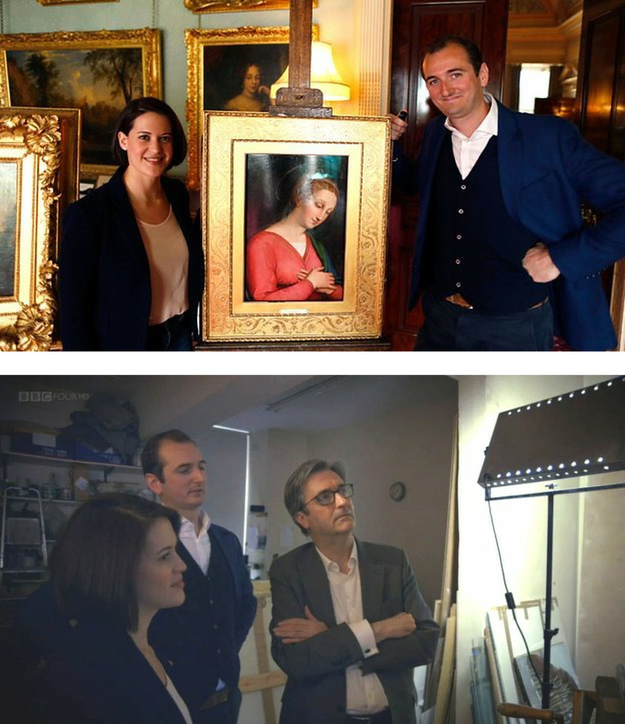
Above, Fig. 3: Top, BBC4 Factual Report, 03. 10, 2016: “Britain’s Lost Masterpieces discovers hidden painting believed to be by Raphael. ‘Finding a potential Raphael is about as exciting as it gets. At first I couldn’t quite believe it might be possible, but gradually the evidence began to all point in the right direction.’ Dr Bendor Grosvenor”. So reported the art-credulous BBC with a photograph (top) of the programme’s co-presenters, art historian Jacky Klein and Bendor Grosvenor, with the putative Haddo House Raphael; above, the presenters consider the “Raphael” on the Lost Masterpieces programme with the former director of the National Gallery, Sir Nicholas Penny.
Invited to pass judgement on the attempted upgrade, Sir Nicholas (whose proselytising on behalf of the $450m Salvator Mundi had been defended by Grosvenor in the 9 October 2011 Sunday Times – “They are taking a risk and I can’t applaud them enough for it”) said that he would place the painting somewhere between “probably by Raphael” and “by Raphael” and that with a “little more time and courage” he might well go the whole hog. That stylishly diplomatic locution was of limited utility – rather like informing a woman that she is somewhere between probably pregnant and pregnant. The pity is that aside from his defences of National Gallery restorations and championing of a not-Raphael and a not-Leonardo, Penny proved the gallery’s most unapologetically serious scholar/director in recent times – as instanced in an excellent Financial Times interview.
ROLL UP
In another Financial Times interview, Simon Gillespie, the restorer who works with Grosvenor on the BBC’s Britain’s Lost Masterpieces programme, disclosed that he, too, believes that he might own yet another Raphael. Gillespie is believed to be the owner of a claimed Lely copy of the £10m “Last Van Dyck Self-portrait” that was sold by the Mould Gallery to the National Portrait Gallery for £10m on 1 May 2014.
DEFENDING INSTITUTIONS AND ATTACKING JOURNALISTIC MESSENGERS
Grosvenor frequently tilts at journalists whose stories embarrass art institutions. In a February 2019 Art History News blog post (“Salvator Mundi & the Louvre”) he berated Sunday Telegraph and Mailonline reports that the Louvre would not be showing the $450m supposed-Leonardo Salvator Mundi in a forthcoming Leonardo exhibition. That story, he sniffed, “is based on the opinion of one Jacques Franck.” It was. Franck’s judgements as the world authority on Leonardo’s painting technique have institutional clout (- and often the ear of French presidents). Franck’s prediction proved precisely correct: the Salvator Mundi was not included in the Louvre exhibition, and it was described in the exhibition catalogue as what it is and what it has remained despite successive restoration makeovers and intense global marketing razzamatazz (- which marketing Grosvenor lauded as the best ever seen) namely, the Leonardo studio work that entered the Cook Collection in 1900, viz: “Salvator Mundi, version Cook, vers 1505-1515″. (See “The Louvre Museum’s bizarre charge of “fake information” on the $450 million Salvator Mundi”.) The Art Newspaper has reported (November 2021, “Prado downgrades $450m Leonardo Salvator Mundi”) that the Prado, too, has demoted the Salvator Mundi to its original standing as the Cook version: “The Prado curator Ana Gonzáles Mozo comments in her catalogue essay that ‘some specialists consider that there was a lost prototype [of Leonardo’s Salvator Mundi] while others think that the much debated Cook version is the original’ However, she suggests ‘there is no painted prototype by Leonardo’.”
(For the latest observations on the $450m Salvator Mundi, see Jacques Franck’s “Further thoughts about the ex-Cook Collection” and ArtWatch UK’s “The Disappeared Salvator Mundi’s endgame: Part I – Altered States and a Disappeared Book”. For ArtWatch UK’s first objections to the Salvator Mundi upgrade, ahead of Christie’s November 2017 $450m sale, see: Dalya Alberge, 19 October 2017: “Mystery over Christ’s orb in $100m Leonardo da Vinci painting” and, “Problems with the New York Leonardo Salvator Mundi Part I: Provenance and Presentation”.)
THE RAMIFICATIONS
The Rubens and the Leonardo attributions are items of considerable public policy interest. Both works achieved world record prices. Both received major and controversial modifications at the hands of restorers. Both upgrades have now collapsed. Both had been championed by National Gallery directors – Michael Levey with the Samson and Delilah and Nicholas Penny with the Salvator Mundi. While Waldy and Bendy both now support the Samson and Delilah, Waldy rejected the Salvator Mundi (which Bendy supports) because: “It resembles nothing else Leonardo painted”; and, because Christie’s claimed resemblance of it to the Mona Lisa “had me laughing out loud”.
THE NATIONAL GALLEY’S WOBBLY DEFENCES
The Art Recognition findings are not, as Grosvenor would imply, off-the-wall. In June 1997 the National Gallery issued a notice claiming that the reason why the Samson and Delilah looked like no other Rubens in the gallery was because it had been painted at a special and very brief moment when Rubens had just returned from Italy and was keen to show off newly acquired Caravaggist traits. That apologia was not credible.
In a pioneering 1992 report, the scholar/painter Euphrosyne Doxiadis and the painters Stephen Harvey and Siân Hopkinson, conducted a focussed survey of six Rubens paintings of 1609 and 1610 and demonstrated that “All these display a consistency and quality of style which is not shared by the Samson and Delilah”. That report – “Delilah cut off Samson’s hair, but who cut off his toes? The case against the National Gallery’s ‘Rubens’ Samson and Delilah” – was placed in the National Gallery’s Samson and Delilah dossiers and is published on the dedicated In Rubens Name website.
THE ART RECOGNITION REPORT
We are very pleased to publish here the full Art Recognition report on the Samson and Delilah, as below, and would urge all to study it along with the pioneering, methodologically exemplary Doxiadis/Harvey/Hopkinson report.
REPORT_Samson_Delilah_Rubens_encr
With no match to be found for the picture among a score of National Gallery Rubens paintings or among six bona fide Rubens’ works of the precise (claimed) historical moment, why should it come as an affronting surprise that none was found by Art Recognition among 148 secure paintings? Just as Grosvenor demanded more tests on his wannabe Raphael, so he would seem to want the Samson and Delilah compared with every single picture in the oeuvre. On September 30th he complained: “To claim a judgement on the Samson & Delilah based only on scans of 400 [sic] works (and at what resolution? We are not told) out of an oeuvre of over 1000 works seems to me optimistic.” Rather than pressing for every work in the oeuvre to be tested, he might prefer to cite and photographically demonstrate a single other painting with brushstrokes that, to his eye, match those of the Samson and Delilah.
The National Gallery has long been unable to cite a single report or record that shows the Samson and Delilah to have been planed-down and mounted on blockboard before it was bought for a world record Rubens price in 1980. In place of evidence, the gallery, too, falls back on appeals to authority, claiming, for example, in a 23 May 2000 press statement, that “…a large number of distinguished scholars who have devoted their careers to the study of Rubens unanimously agreed that the painting was one of the artist’s masterpieces”.
Such appeals cut little ice: every restoration or attribution ArtWatch has challenged in the last thirty years had been supported by a bevy of art historical bigwigs – from the Sistine Chapel ceiling to the recent so-called Leonardo “Male Mona Lisa” (Fig. 1 above). Moreover, of all scholarship, that on Rubens remains the most problematic and herd-like, its key players being uniquely obligated by a family bequest to defer to the scholarship and judgements of the long deceased (and now discredited) scholar Ludwig Burchard.
ARTISTS KNOW
The challenge to that art historical authority has come principally from artist/scholars who are freer agents and arrive armed with hands-on knowledge of art’s practices – knowing, for example, how to put brush to paint and paint to surface. A quarter of a century ago Euphrosyne Doxiadis neatly encapsulated the now technically confirmed deficiencies of the picture’s brushwork in an interview:
“This picture is betrayed by brush strokes which are almost staccato and broken up, rather than having been done with one stroke of the wrist, which you see in all Rubenses. There is an absence of Rubens’ vibrant, pulsating-with-life strokes. In actual Rubenses, each stroke is a tour-de-force. This is clumsy and awkward.” (Dalya Alberge, “Expert denounces National Gallery’s Rubens”, The Times, 25 November 1996.)
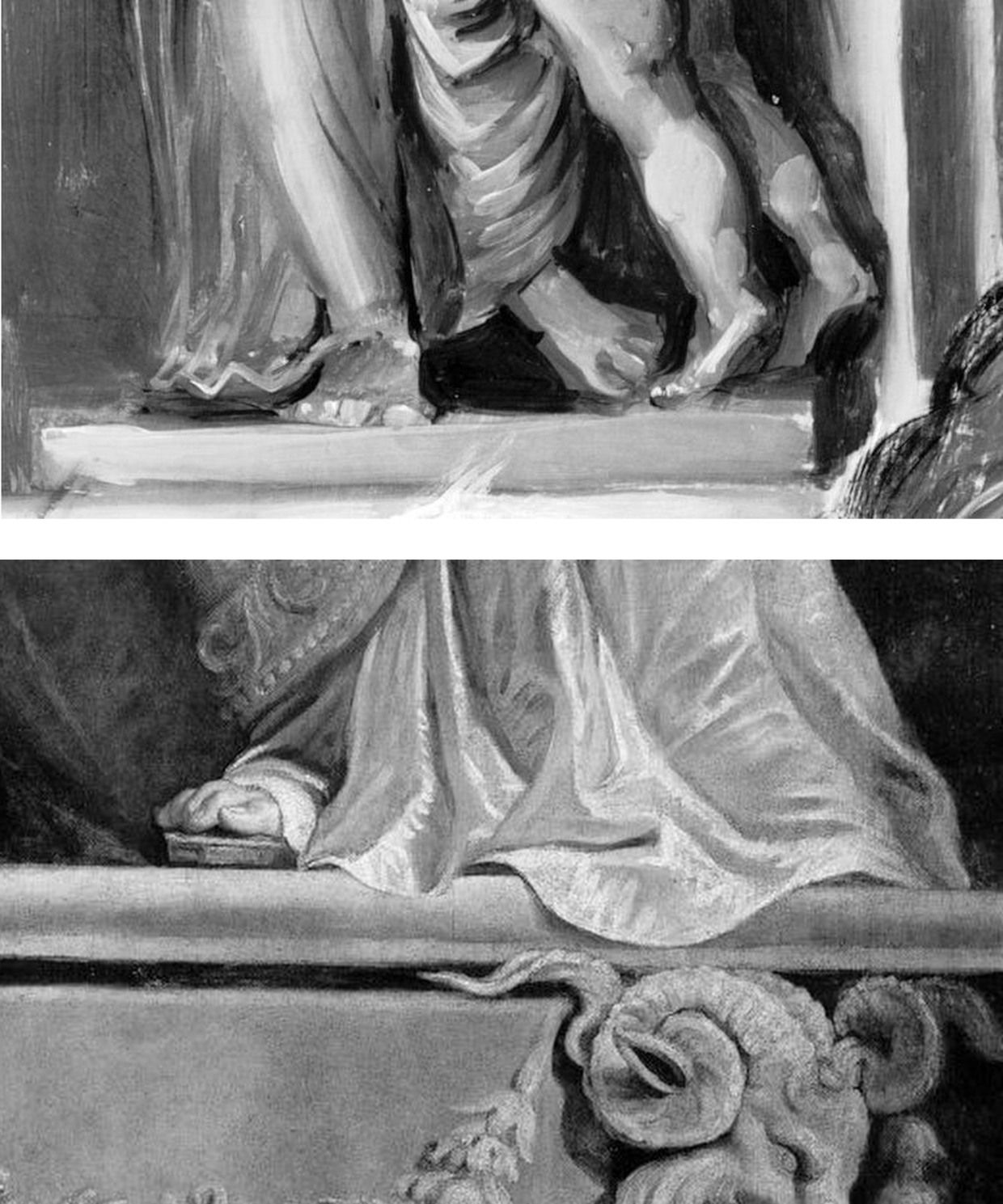
Above, Fig. 4: Top, details of the National Gallery’s Samson and Delilah; above, Rubens’ The Raising of the Cross, Antwerp Cathedral. Where the former is claimed to be a lost picture Rubens painted in 1609-10, the latter was indisputably made by Rubens between 1610-11. Such pronounced differences in brushwork are inconceivable as that of two autograph paintings made at the same moment in Rubens’ oeuvre. Who, looking at this photo-comparison, could believe that Rubens had flitted between the ugly angular Cubist faceted feet in the Samson and Delilah statue (– try counting the toes and note the Art Deco zigzagging hem), and the superb fluency, grace and anatomical fidelity seen in the Raising of the Cross?
THE TESTIMONY OF NATIONAL GALLERY TECHNICAL BULLETINS
When Tweeting support for Grosvenor, Waldemar Januszczak, had seemingly forgotten his own 5 October 1997 Sunday Times article headed: “One of the World’s most valuable paintings hangs in the National Gallery. But Samson and Delilah, widely assumed to be by Rubens, is not by him but is a copy, argues Waldemar Januszczak. Who then did paint it?” Januszczak had ended with this ringing declaration: “The one thing we doubters all agree on is that the painting bought by the gallery for a staggering sum in 1980 is not by Rubens.” What has changed to un-doubt Januszczak? Under challenge on Twitter, Grosvenor admitted that he too had once entertained doubts about the Rubens ascription.
Joyce Plesters’ 1983 Technical Bulletin account was tendentious and error prone. She had counted six planks in the Samson and Delilah panel when the picture’s restorer, David Bomford, made it five and the gallery’s panel specialist, Anthony Reeve, counted seven – as would a dendrochronologist in 1996. Plesters thought the National Gallery’s attributed Michelangelo Entombment of Christ had been painted on a single giant plank when the panel is comprised of three butterfly-keyed planks. The senior curator, Christopher Brown, accepted Plesters’ six planks in the catalogue to the National Gallery’s 1983 “Acquisition in Focus” celebratory exhibition of the restored Samson and Delilah. In 1997 Januszczak poked fun at the conservation department’s shambolic technical reporting:
“I am shown these authoritative-looking documents and, on the first page, the information that the Samson is painted on five planks has been crossed out and changed to seven planks. In the published technical report we are told there are six planks. A conservation report that cannot count the number of bits of wood the gallery’s most expensive painting was done on hardly inspires confidence.”
One of the painting dossiers that I later I examined at the National Gallery (under the directorships of Charles Saumarez Smith and Nicholas Penny) disclosed that a large and important picture had been mounted on “Sundeala” boards with a honeycomb paper core. The disclosure had not been made in the report itself but had been written on an attached yellow post-it note. Plesters’ haplessness was more than arithmetical. The year before Januszczak’s tease she had suffered a mortifying professional reverse. In the 1960s, when scholars like Ernst Gombrich and Otto Kurz warned Gallery restorers against removing all-over tinted varnishes from Renaissance paintings, she insisted that the entire documented technical history of art showed “no convincing case” for any artist having emulated Apelles’ legendary dark varnishes and that the famous passage from Pliny was of “academic rather than practical importance”. She even offered to “sift” and “throw light upon” on any future historical material that Professor Gombrich might uncover.
A BURIED INCONVENIENT TRUTH
In 1977, in the National Gallery’s first Technical Bulletin, Joyce Plesters had mused complacently “one or two readers may recall the furore when the cleaning of discoloured varnishes from paintings…began to find critics.” In that year the scarcely less complacent former National Gallery director Kenneth (Lord) Clark pronounced picture cleaning “a battle won”. A third of a century after the original controversy, the practical import of Pliny’s testimony emerged in a 1996 Technical Bulletin disclosure that a Leonardo assistant, Giampietrino, had toned down his colours with a final dark “varnish” layer of oil with black and warm earth pigments.
Had those pigments been bound in a resin it would have been deemed an earlier restorer’s attempt to impart a spurious “old masters’ glow” and removed. However, Giampietrino’s dark overall toning was identical to the oil medium of the painting itself and any solvent that would dissolve the one would dissolve the other. The gallery had to leave the coating in place. Shamefully, it stifled any acknowledgement of its momentous art historical significance – and it even neglected to inform Gombrich of the corroboration of his earlier claims, despite the fact that the gallery’s then director, Neil MacGregor, held the 1960s dispute to have been “one of the most celebrated jousts” in modern art history.
When ArtWatch UK informed Gombrich of his vindication he was approaching his 87th birthday and responded: “I could hardly have a nicer present than the information you sent me. I don’t see the National Gallery’s Technical Bulletin and would have missed their final conversion to an obvious truth. There is more joy in heaven (or Briardale Gardens…)” Two years later he observed: “I believe it was Francis Bacon who said that ‘knowledge is power’. I had to learn the hard way that power can also masquerade as knowledge, and since there are very few people able to judge these issues, they very easily get away with it.” (See “How the National Gallery belatedly vindicated the restoration criticisms of Sir Ernst Gombrich”.)
THE MISSING BACK, A LEGAL CHALLENGE, AND OTHER SAMSON AND DELILAH PROBLEMS

Above, Fig. 5: Two special issues of the ArtWatch UK Journal that examined the Samson and Deliah’s credentials as a Rubens.
In Journal No. 21, Kasia Pisarek wrote:
“I am in possession of a privately printed pamphlet entitled The Biggest Scandal since the Fake Vermeer written in 1960 by a well-known French art dealer Jean Neger. In it, he openly denounced Dr. Ludwig Burchard as being a dishonest man writing a certificate of authenticity for a painting that he knew was a copy. The picture in question was Diana departing for the Hunt, a large oil on canvas, sold in 1960 as a Rubens for a huge amount of money to the Cleveland Museum in America. It first appeared in an Amsterdam sale (Valkenier family) in 1796, in fact as late as 180 years after its supposed creation c.1615. Neger accused Burchard of ‘defrauding the American state of 550.000 dollars’.
“In his highly dramatic pamphlet he declared that Dr. Burchard wrote the certificate of authenticity in 1958, even though he knew that another, nearly identical version (his own) of the painting existed, and had a considerably better provenance, going back to 1655 and the prestigious Spanish collection of the marquis de Leganes, a friend of Rubens. This was the most important collection in Spain, aside from that of the King Philip IV. Leganes probably owned more paintings attributed to Rubens than any other aristocratic collector in Spain, with the possible exception of Gaspar de Haro. After researching his painting, Neger discovered that the number 214 in white paint present on his canvas was the corresponding Leganes inventory number. Moreover, his version of Diana had a lot of pentimenti visible even to the naked eye, which would indicate that it was an original, not a copy.
“According to Neger, Burchard has tried to avoid him on many occasions and has refused to see or to certify his version because he had already certified the other one as the original. When approached, he tried to ‘compromise’ by saying that he would state that Neger’s version was the first one, which Rubens had sketched and abandoned, and that he had then painted a second version, the one from Cleveland. Later, he took up Neger’s picture again, corrected it and completed it. That solution was satisfactory to Neger and yet, Dr. Burchard changed his mind again, and refused to certify Neger’s painting at all. Subsequently, he chose not to reply to Neger’s allegations which appeared to be his usual attitude in such situations.”
Dr. Pisarek concluded:
“I verified most of Neger’s statements, which on the whole appear to be true. I traced both pictures: one is in the Cleveland Museum, effectively considered to be the original by Rubens; the other is in The Getty Museum in Malibu, as ‘a workshop copy’. And yet, the Getty picture (ex-Neger’s) has better chances of being the original: it is the larger of the two versions; it has a superior and older provenance (1655 as compared to 1796); it agrees in most details (presence of sandals, lack of birds in the sky, missing tiger’s skin, background landscape) with an old copy in Cassel which provenance (1756) predates that of the alleged Cleveland’s ‘original’.”
Pisarek discussed the merits of these two pictures in the third chapter – “The two versions of Rubens’s Diana Departing for the Hunt: an American cause célèbre” – of her doctoral thesis, Rubens and Connoisseurship. On the problems of attribution and rediscovery in British and American collections, University of Warsaw, 2009, and there concluded that both the Cleveland and Getty pictures are mostly products of Rubens’s workshop.
DEFENDING MUSEUM FAKES I
On 4 March 1929, the year that Ludwig Burchard found and upgraded the Honthorst painting then owned by van Diemen and Benedict (who had bought it, Doxiadis disclosed, from a painter/restorer) and that is today the National Gallery Samson and Delilah, Rene Gimpel, author of the 1996 Diary of an art dealer, wrote:
“The Italians have sold Americans $2m worth of marbles done by Dossena (a faker). A laughable sum compared with the amounts obtained by means of certificates given daily by German experts to German dealers. Just as there were paper marks, so there are paper canvases, an easy way of bringing dollars into Germany. I went this morning to the Van Diemen gallery, which has an exhibition of sixteen Venetians. Three pictures are good, apart from the Guardis and perhaps the Longhi. Last Sunday’s Times devoted an entire page reproducing this scandalous exhibition, which gives only a faint idea of what is brought in. Bode, the director of the Berlin Museum died two or three days ago. The king is dead long live the king! The Mayers, the Gronau will replace him. The German title of Doktor impresses the Americans. The museums are even more intent than the collectors on defending their fakes or their mistaken attributions.”
WHAT LIES BEHIND
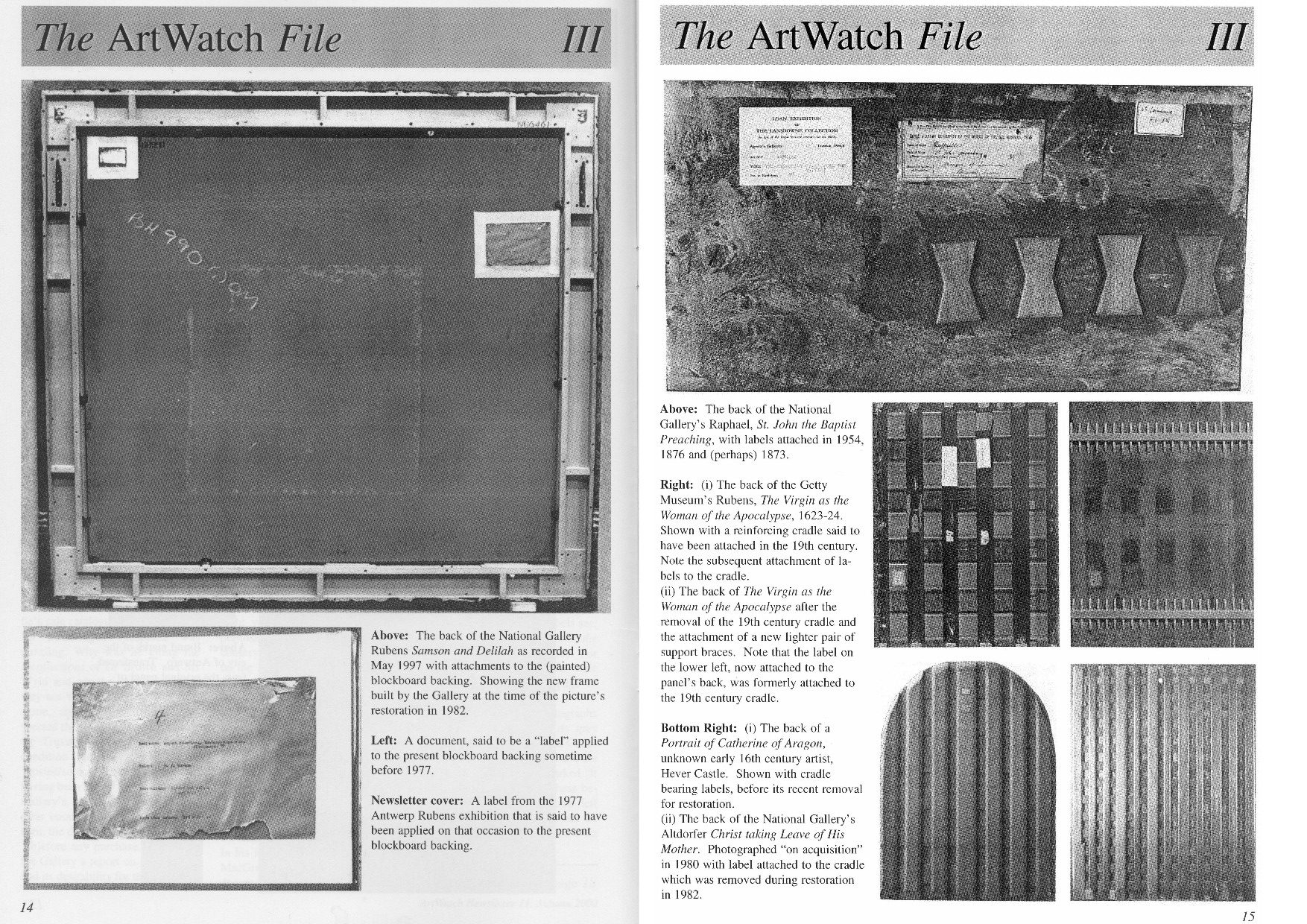
Above, Fig. 6: A spread of pages from ArtWatch UK Journal No. 11 contrasting the Samson and Delilah’s present back with the labelled and cradled backs of comparable period panel paintings.
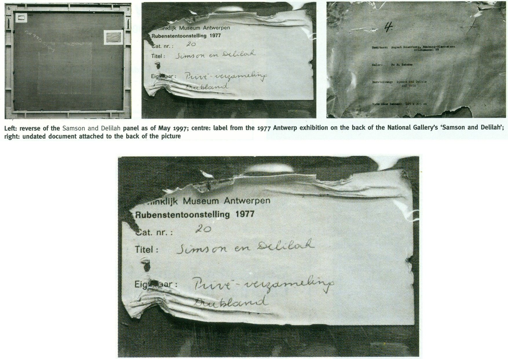
Above, Fig. 7: Illustrations of the back of the Samson Delilah picture as supplied by the National Gallery and as published in the June 2000 Art Review (“The Back is Where It’s At”) where we showed the back of the Samson and Delilah and its attachments, as recorded in 1997. Our detailed technical and art historical case against the Rubens attribution in the Art Review ran, in full, as follows:
“Last month I referred to a National Gallery picture which lacks a back or a record of a back but on the back of which an incomplete provenance depends. This bizarre, paradoxical case arose as follows.
“On 11 July 1980, the National Gallery paid £2.53m (through Agnew’s at a Christie’s auction) for a large picture, Samson and Delilah, that was said to be an ‘entirely autograph’ Rubens, probably in its original frame. The price was a world record for the artist and, at the time, the second highest for any painting bought at auction. The acquisition was presented to the world with great fanfare, orchestrated as much by the gallery as by the auctioneers. In 1982 the picture was cleaned, restored and reframed in preparation for a special ‘Acquisition in Focus’ exhibition to be held the following year. So far, so straightforward.
“In 1983, two accounts of the restoration were published in the National Gallery’s Technical Bulletin by David Bomford, restorer, and Joyce Plesters, head of science. At this point the painting, which hitherto had always been described as a panel, begins to be described in different terms. Namely, as a planed-down sliver of a panel mounted on a modern laminate sheet of blockboard. As Bomford put it, ‘the large panel on which Samson and Delilah is painted must originally have been substantially thicker than it is now. At some point, probably during the present century, the panel was planed down to a thickness of less than 3 mm and subsequently glued on to a sheet of blockboard.’ This seems in strict, factual terms to be correct, but the word ‘probably’ later came to be questionable.
“Plesters’ account was seriously misleading. She claimed that the planed-down panel had been set not onto but ‘into’ (which it had not) the sheet of blockboard, which supposed placement prevented its edges from being examined for tree-ring dating purposes – which it did not. She insisted that this phantom relationship was of no consequence because ‘the date and provenance of the painting are not in doubt.’ Which claim, as will be shown, was not the case. Plesters admitted that the planing, on an unidentified occasion ‘before the picture was acquired by the Gallery’, might well have destroyed, among other evidence, a branded or carved panel-maker’s mark – a far from trivial matter because such a mark might have sunk the attribution to Rubens. The original Samson and Delilah is dated 1609, sometimes 1610; its engraved and painted copies to c. 1613 and 1615 [sic – 1625-35] respectively. Very few panel-makers marks were made before 1617 when they first became a guild requirement; after this date they can help with datings. Michiel Vrient, whose mark is most commonly found on the back of Rubens’ later panels, only qualified in 1615. His mark on the Samson and Delilah would have been fatal.
“Clearly, establishing when, by whom, and for what purpose a planing was carried out – and what records were kept of the original back – would under any circumstance be a matter of urgency and a test of propriety. In this instance it became greatly more so when, in 1997, a number of eye witnesses reported to ArtWatch UK that the picture had retained its original, label-bearing and ‘cradled’ back immediately prior to and during its auction at Christie’s in 1980. When informed of this, Neil MacGregor, the gallery’s director, dismissed the testimony as ‘mistaken’ (letter 7 April 1997). He later said (9 April) ‘the National Gallery does not have any record, photographic or written, of the back of this picture before it was planed down.’
“This year [2000], in compliance with its ‘Code of Openness’, adopted in anticipation of Government legislation on freedom of information, the gallery reversed an eight-year-old decision and allowed me to examine the dossiers held on the picture and its treatments. I have been assured that the dossiers were complete and that no material was withheld. I am forced to report that the records are therefore lamentably incomplete. This is the more disturbing because, contrary to assurances, the picture’s provenance is extremely insecure. It is not to the gallery’s credit that it took six years of assiduous research by three painters – Euphrosyne Doxiadis, Stephen Harvey and Siân Hopkinson – between 1986 and 1992 – for this embarrassing reality to be brought to light. They demonstrated that the picture is not compositionally consistent with contemporaneous engraved and painted copies of the original picture. Their examination drew from Christopher Brown, the curator responsible for the acquisition, the admission that ‘there are gaps at the beginning and the end of the Liechtenstein provenance which makes it impossible to be 100 per cent certain that this is the picture painted for Rockox.’
“The provenance as presented by Christie’s in their sale catalogue was a daisy-chain of speculations pegged on disconnected and not always accurate citations. It was claimed in the first instance that the picture was ‘probably’ the one known to have been painted in 1609-10 for Nicolaas Rockox’s house. It was said to have ‘perhaps’ been in the possession of the painter Jeremias Wildens (albeit only as a ‘Samson’ and not as Samson and Delilah) before 1653. It was further said to have ‘perhaps’ been in the possession of a ‘Guill Potteau’ before 1692. It was then said to have passed into the hands of the Prince of Liechtenstein on 30 May 1700. The second, third and fourth suggestions are all dependent on an event having taken place for which there is no evidence whatsoever: that the original painting left Rockox’s house at his death in 1640.
“As Euphrosyne Doxiadis established (and as Dalya Alberge reported in The Times of 25 November 1996), the records show that Rockox’s collection remained in his house until its sale in 1714 after the death of Rockox’s last descendant in 1712. The house in Antwerp survives and was restored in 1977 as a museum to Rockox. A booklet produced that year by the museum acknowledged with regret that it had been impossible to reassemble the whole of the original collection which had been dispersed by a public auction in 1715. Knowledge of this sequence of events seems rapidly to have slipped from official art historical consciousness
“By coincidence, the National Gallery’s picture (then in a private German collection) was exhibited in Antwerp in 1977 in a large exhibition celebrating the 400th anniversary of Rubens’ birth. In the catalogue Frans Baudoin described it as a ‘panel’. In the same year, in his book Nicolaas Rockox: ‘Friend and Patron’ of Peter Paul Rubens, Baudoin said the panel was ‘excellently preserved’. He also reported that the picture had been ‘rediscovered’ (when owned by a dealer as a Gerit van Honthorst) in 1929 by Ludwig Burchard, on whose advice, the German magnate August Neuerburg bought it in 1930 (along with another Burchard ‘Rubens’, since de-attributed).
“Burchard’s ‘rediscovery’ closed the second gap in the provenance to which Christopher Brown referred. Samson and Delilah is said to have disappeared after being sold by the Liechtenstein collection in 1880. In addition to the ‘gaps’ of 60 and 50 years at either end of the Liechtenstein provenance there are two further problems. First, the Samson and Delilah was described in every Liechtenstein inventory as a copy. Even the dealers who sold it to the collection thought it not to be by Rubens and to be greatly inferior to a work by Van Dyck. Second, every painting in the Liechtenstein collection was marked with a seal on its front or back. The National Gallery’s picture has no seal on the front. If it had one on its back, what happened to it? What possible reason could there be for removing and destroying such an important feature of a picture’s pedigree?
“When pressed on such specifics, the National Gallery summons the fogs of time. Bomford thought the planing might have taken place in the 19th century. His director, MacGregor, suggested that it was ‘possibly done this century, perhaps when the painting was in the hands of the art trade in the 1920s’ (Letter 9 April 1997.) This really will not do. The dossiers contain, I discovered, an undated sheet of typescript by Burchard (which the gallery’s archivist tells me is part of a letter dated 8 April 1930, but which contains a handwritten postscript referring to an article of 1942) which not only describes the picture as being ‘in a remarkably good state of preservation’ but, crucially, testifies that ‘even the back of the panel is still in its original condition.’ Given Burchard’s testimony, and bearing in mind that Christopher Brown made a special study of Burchard’s manuscript notes on the painting (which we have not been allowed to see) prior to the 1983 ‘Acquisition in Focus’ exhibition, how could the gallery have believed that the planing might have taken place before the last [the 20th] century or when the picture was in French hands?
“These questions are the more perplexing because, after Burchard’s testimony, every single reference to the picture describes it as a ‘panel’ in good – or better – condition. A further document in the [National Gallery] dossier that throws light on the picture’s condition also seems to have been overlooked. Christopher Norris, a benefactor of the gallery, sent a letter of congratulations to Michael Levey, the director, the day after the sale at Christie’s. Norris attributed the picture’s still ‘amazing condition’ to the fact that the German owners [between 1930 and 1980] had not touched it. It still retained, he noted, the varnish applied during its stay in France in 1929. The only change that had occurred during Norris’s forty-seven years’ acquaintance with the picture was that the varnish had toned down. (In 1983 Bomford cited the picture’s ‘thick, considerably yellowed varnish’ as the ‘principal reason’ for cleaning.)
“In 1977, Gregory Martin, the author of Christie’s catalogue entry, reviewed the Antwerp Rubens exhibition. He observed with relief that the Samson and Delilah was one of two ‘great works…on panel’ that were ‘none the worse for their journeys’ to Antwerp. (In 1982, the picture was described in the National Gallery’s Technical Bulletin as one of only three well-made and untroublesome panels in the collection.) Three years later the picture again left Germany when it was sent, on offer of sale, to a Belgian museum. On its arrival, a condition report (dated 4 March 1980) was prepared by a leading Rubens expert. He described the picture as a ‘panel…in good shape’ with painting in a condition ‘which can be called excellent’. The panel remained for several months at the museum before being dispatched directly to Christie’s. During its stay at the museum, the picture was seen to be an old, thick, somewhat bowed, label-bearing and cross-battened panel. Brian Sewell (who had discovered the Samson and Delilah modello some years earlier at Christie’s) recalls that the picture, when at Christie’s, was an intact, cross-battened panel with a blackish painted back on which the Christie’s number [as given to every work on arrival] was stencilled in white paint.
“On 27 May 1997, Neil MacGregor sent me photographs of the picture’s back ‘as it is now’. He drew attention to the Christie’s number (chalked and stencilled in black paint) and to ‘two labels attached to the back of the blockboard’ (see illustrations). One, he said, is from the Antwerp exhibition of 1977, the other ‘rather older, from the Neuerburg Collection’. It was, he said, ‘hard to imagine any of these being put on after the picture left Christie’s.’ It is not. Neither document – only one of which appears to be a label – would seem to be glued or pasted to the blockboard. Both appear to be held in place, identically, with cellophane fixed by clean masking tape. Both documents are clearly proud of the surface and are seen to cast shadows on it. The 1977 Antwerp label shows clear signs of having been attacked with a scraper. Why? When? And by whom? After receiving these photographs, I asked to see the back on an occasion when the picture had been removed from its frame. So far, I have not been permitted to do so, and two requests to government ministers for an inquiry have been turned down.”
THE DIFFERENCE A MISPLACED HISTORICAL WORD CAN MAKE IN AN AUCTION CATALOGUE
Today, given the Samson and Delilah’s recent further disqualification on a technical analysis of its brushwork, the National Gallery’s continuing claim of a Rubens authorship runs increased risks.
First: That espousal continues to fly in the face of historical documentary evidence that the picture cannot safely be ascribed to Rubens – evidence that had emerged and was published twenty-five years ago by Dalya Alberge (“Artists raise fresh doubts on gallery’s Rubens masterpiece” 26 September 1996, the Times”):
“ARTISTS challenging the attribution of Rubens’s Samson and Delilah in the National Gallery believe that evidence presented in an auction house’s catalogue was mistaken. The artists also allege that the gallery refuses to acknowledge historical facts that cast doubt on the picture being by the 17th-century master. The National Gallery acquired the painting from Christie’s in 1980 for £2.5 million, equivalent to £6 million today. The auction catalogue referred to a 1653 inventory which described the painting as ‘Eenen Samson van Rubens’, which would mean ‘by Mr Rubens’. But a Flemish genealogist who has studied the inventory said that it read ‘Eenen Samson naer Rubens’: ‘naer’ is translated as ‘made just like Rubens’ or ‘after Mr Rubens’. Another inventory, dated 1692, lists it as ‘copye’ – a copy.
“Euphrosyne Doxiadis, an artist and scholar, and the painters Steven Harvey and Siân Hopkinson believe that the genealogist’s finding backs the stylistic evidence against the picture being by Rubens… It was only as recently as 1929 that the painting was hailed as a long-lost Rubens. For 180 years it was in the collection of the Princes of Liechtenstein and inventories in 1767, 1780 and 1873 attributed it to a minor hand, Jan Van Den Hoecke…”
THE SHIFTING TESTIMONY OF LUDWIG BURCHARD
Second: With this picture never having been thought an autograph Rubens before Burchard’s 1929 upgrade, everything rests on that scholar’s tarnished standing. Aside from the Neger scandal, Pisarek noted in the Spring 2006 ArtWatch UK Journal (No. 21, “The ‘Samson and Delilah’ – a question of attribution”) that over 60 pictures, albeit mainly small works, attributed by Burchard to Rubens had been down-graded in Corpus Rubenianum to studio works, copies or imitations. In a 1950 letter to a fellow art historian, Burchard had said of a painting now in the North Carolina Museum of Art: “The Rubens-like painting was once shown to me. I missed the transparency of the shadows, which one would expect at least in places. The picture seemed to me like a compilation by a contemporary of Rubens.” However, in 1954 he had said of the same painting in a certificate of 28 May addressed to the D. M. Koetser Gallery, London: “the vigour of the design, the brilliance of the vivid colours, the concentration of movement are comparable in several details to the painter’s Defeat of Sennacherib c. 1612…”
THE FIXED TESTIMONY OF PAINTWORK
Third: As mentioned, the 1992 Doxiadis/Harvey/Hopkinson Report had anticipated and thereby now effectively corroborates the Art Recognition findings in its section on Rubens’ painterly technique:
“We have now studied the technical deficiencies in the execution of the National Gallery Painting; we have collected a very comprehensive catalogue of faults which are demonstrated by comparison with works of that period. This can be done when visual material is included…
“It is totally out of character for Rubens to use what the National Gallery calls ‘bold’ handling over the entire surface of a painting. In all his other works, areas of beautiful and infinitely detailed work appear, in addition to areas which have been handled boldly – a woman’s jewellery, for instance, the lace on a ruff, or a flower in the foreground. On the whole, the great downfall of the National Gallery’s picture is the crudeness with which it has been painted. Quite apart from the unsubtle transitions from tone to tone and from colour to colour (look for example on the Venus statue in the background [here, Fig. 4, above], or at Samson’s ear [Fig. 24, below], compared with his own ear in the self portrait of Rubens and Isabella Brant in the Honeysuckle Bower painted in the same year) there are two enormous drips of paint on the surface of the work, which no painter with even the most basic training would have allowed himself to do at that period….
“Looking closely at Samson and Delilah one misses the vibrant, twisting nature of the brushstrokes themselves. The shapeless, unanimated strokes in this painting seem flat and unexciting when compared with Rubens’ usual virtuosity.”
SO, ONCE AGAIN, WHO PLANED THE BACK OFF THE SAMSON AND DELILAH PANEL?
Fourth: The Samson and Delilah picture retains an abiding technical mystery: at what date and by whom was the panel planed down and attached to a modern laminate sheet of blockboard?
It should always be appreciated that no reference had ever been made to a planing and a blockboard backing before the Plesters/Bomford accounts of 1983, and that the National Gallery’s accounts are inconsistent, shifting and full of holes. As seen, some have said the planing may have occurred in the 19th century or early 20th century, others that it took place between 1930 and 1980. The gallery claims to have kept no records of the picture’s state in 1980 when purchased and, even, to have prepared no reports for its trustees when seeking authorisation to make a then massive purchase that would consume most of the gallery’s annual purchases grant. A director, Neil MacGregor, expressly admitted (in a 1997 letter to ArtWatch UK) that “The National Gallery does not have any record, photographic or written, of the back of this picture before it was planed down” – which, as indicated above and as is further shown below, was not the case.
When the senior curator at the time of the 1980 acquisition, Christopher Brown, and his successor, David Jaffé, both held that it was planed down when in the collection of the German magnate, August Neuerberg, between 1930 and 1980, they did so against the testimony of the National Gallery benefactor (who had gifted a Poussin), Christopher Norris. As first mentioned in the 2000 Art Review, Norris testified in a letter to the director in 1980, Michael Levey, that between 1929 and 1980, no change of condition had occurred in the painting, other than a toning down in its 1929 varnish, because the owners had not touched it. Thus, because we know, on Burchard’s (written) testimony held by the National Gallery, that the panel was intact in 1929 when sold to Neuerburg and, on Norris’s (written) testimony, held by the National Gallery, that the owner had never touched the picture, the only parties who might have planed-off the back are Christie’s and the National Gallery. Christie’s, who described and sold the picture as a panel – not as a reduced or marouflaged panel – are hardly likely to have so-transformed someone else’s property – or even to have had the time and means of doing so. On currently available records, the National Gallery, becomes, willy-nilly, the sole candidate, having itself never once described the picture as a planed-down panel before 1983 – and because its own published records testify that the work was an intact panel up to 1982.
REDUCTIO AD ABSURDUM: THE CASE OF A TOTALLY DISAPPEARED NATIONAL GALLERY ALTARPIECE PANEL
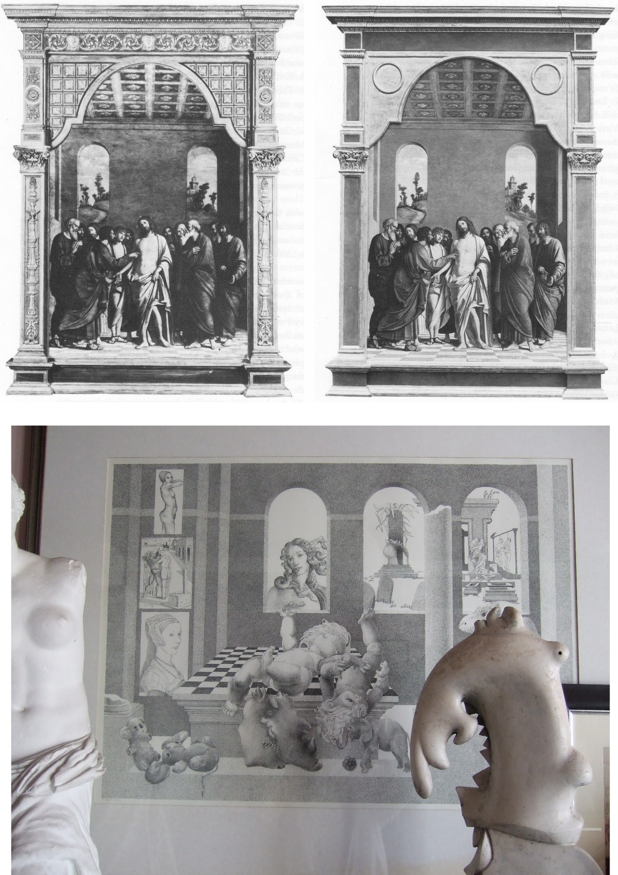
Above, Fig. 8: Top, the National Gallery’s 1504 altarpiece The Incredulity of S. Thomas by Cima da Conegliano, as seen before and after an utterly transforming campaign of restoration in which a modern synthetic composite support was substituted for the original giant poplar panel and a new frame was built to replace the gallery’s own 19th century frame; above, a 1978 pen and ink drawing, “The Ages of Woman”, by the author.
As can be seen above, top, the cleaning and subsequent retouching of the picture surface left a tonally and perspectivally altered appearance: what had been dark and tonally relieving (the back wall) became lighter; what had been contrasted became equalised (the wall and ceiling); what had been dramatically central and axially assertive (the “spotlighted” figure of Christ) became quietened and subsumed within a group. The reduced ornamentation on the new frame left two architecturally assertive raised circles that now vie for attention with the picture’s own depicted half-round windows – which features, the lightening of the wall has brought closer to the picture plane and, therefore, closer also to the new more abstractly assertive frame. The net effect of the physical and pictorial transformations this altarpiece underwent was to leave a painted image surface that is now as flat, de-natured and ahistorical as a giclée print. Above, to a draughtsman (who necessarily commences work on a sheet of – initially – “no-values” to a gradually built-up and considered disposition of “values”, the alterations that are routinely made by restorers during “cleanings” and “restorations” to other artists’ works are as un-missable as they are perplexing and artistically impoverishing.

Above, Fig. 9: Left, the back of the altarpiece panel which was totally removed (i. e. destroyed) and replaced by a multi-layered fibreglass and aluminium board – the long-term stability of which is unknown – during restoration. Right, the diagram of the new, entirely synthetic glass fibre and aluminium support in cross-section, as published in the gallery’s 1985 Technical Bulletin.

Above, Fig. 10: The Cima altarpiece, as published in the 1986 Technical Bulletin with the caption: “The picture after cleaning and transfer, before restoration.”
A MASTERFUL JOB
When Waldemar Januszczak was in art critically doubting mode on the Samson and Delilah’s attribution in October 1997, he addressed the persisting Whodunnit Mystery of the Disappeared Back:
“I put this to the gallery’s chief conservator, Martin Wyld, who quips cheerfully that he was rather proud of having been accused; planing a 17th-century oak panel to wafer thinness and attaching it perfectly to blockboard while leaving its surface in pristine condition, is an exceptional feat of restoration. Nobody would or should do it today. Whoever did it earlier did a masterful job. Why did they do it at all? If a painting is in exceptionally good condition, why was there any need to hazard the transfer to blockboard? A question neither the chief conservator nor MacGregor can answer. All I got them from both is the National Gallery version of: it wasn’t us, guv.”
If stunned by Januszczak’s question, Wyld and MacGregor can hardly have been caught unawares. In a then recent letter in the Daily Telegraph (“Doubts about gallery’s Rubens”, 16 August 1997) we had written on that very question:
“…More disturbingly, crucial technical and documentary evidence concerning the picture’s weak provenance was destroyed when the back of its oak panel was planed away in a mysterious intervention for which no one accepts responsibility and during which no records were kept. The National Gallery claims the planing took place before the picture was bought at Christie’s for a record £2.5 million in 1980. If this was so, two questions arise. Why did the gallery’s trustees authorise the acquisition of a picture with no back (the planed-down remains having been glued on to a sheet of blockboard) and with no documented history of a back? And why did the gallery not ask the vendors, who had owned the painting for 50 years, for an account of the planing and a record of the pre-planed back?… Answers to all these questions lie in the reports that were prepared by the gallery staff for the trustees prior to the 1980 purchase and prior to the gallery’s 1982 cleaning and restoration of the picture. The gallery has not responded to requests that these reports be made available for inspection. Nor is it prepared to produce photographs of the picture’s back, as taken by Christie’s staff before the sale, or by gallery staff before the restoration.”
Unable to answer those questions, the head restorer had clearly been ‘avin a larf when he suggested to the Sunday Times’ art critic that planing a panel down to 3 mm and gluing it onto a sheet of block board was an exceptional feat far beyond anyone’s capacities at the National Gallery. Back then in 1997, a reading of recent National Gallery Technical Bulletins would soon have disclosed the gallery’s great pride in its radical substitutions of modern synthetic composite backings for old pictures’ historic (wood or canvas) supports. We had complained in the 1993 and 1996 James Beck and Michael Daley book Art Restoration: The Culture; the Business and the Scandal of the gallery’s use of the compressed paper “Sundeala” boards on to which Titian’s Bacchus and Ariadne, Seurat’s The Bathers and Sebastiano’s The Raising of Lazarus had been affixed.
The spectacularly gung-ho treatment of the latter picture – the largest in the Gallery’s collection – epitomised the artistic presumption and techno-adventurism of the gallery’s restorers. The deleterious consequences of that intervention began to be conceded by the gallery’s restorers in its 2009 Technical Bulletin:
“…eventually it was decided to brush on multiple thin layers of warm wax-resin dissolved in white spirit, embedding a layer of inert terylene net fabric [-“Terylene is a specific form of polyester, more specifically polyethylene terephthalate. It is created via the extraction and mixing of ethylene glycol and terephthalic acid. When turned into a fiber with dyes and other treatments, it becomes a great synthetic with a lot of potential in different sectors” ] within the layers as they solidified. Although the discoloured varnishes had yet to be removed from the paint surface, the appearance of the picture was considered to be darker than intended as a result of lack of reflectance from the ground and so titanium white (titanium dioxide) was added to the wax cement…Once the wax and titanium white layers had been built up to a sufficient thickness the painting could then be mounted on a solid new support. This had previously been coated with wax-resin allowing a bond to be achieved by ironing with a thermostatically controlled iron to soften the wax-resin layers which then fused as they cooled. Although it is unlikely that these methods and materials would be used nowadays, the treatment can be judged a success in that there has been no further flaking of the paint layers. Unfortunately, the work took place before the introduction of lightweight and stable panels made from glass fibre with aluminium honeycomb cores. The painting is mounted, therefore, on a support constructed with a ‘sundeala’ composite board outer faces and a core of paper honeycomb. In spite of its wooden edges and an internal wooden framework this panel is now showing signs of instability, with a tendency to flex and twist when the painting is moved, an operation which is therefore avoided as far as possible.” Emphasis added.

Above, Fig. 11: Staff in the National Gallery’s restoration studio at work on the remains of Cima da Conegliano’s altarpiece, The Incredulity of S. Thomas, after the complete removal of its giant poplar panel and before its transfer onto a multi-layered synthetic support – as shown in the NG’s 1985 Technical Bulletin.
A reading of the 1985 and 1986 Technical Bulletins would have disclosed how gallery restorers had chiselled away the entire wood panel of seven giant planks just under two metres long of Cima’s altarpiece The Incredulity of St Thomas (Figs. 8-10). In the first stage, the panel was reduced “from c. 5 cm to 1 cm.” In the second, the remaining 1 cm of wood was chiselled away entirely until the back of the original gesso coatings was exposed. In the 1985 Technical Bulletin, Martin Wyld described the means and the tools of that perilous operation:
“The removal of the wood then commenced. The techniques used were entirely manual. Though mechanical routers and planes are often used with success in transfer, there is a danger of a power tool, however carefully handled, snagging on knots in the wood or on the bent nails which are mysteriously but commonly found in old panels, and ripping up far more wood than is intended. Semi-circular 15 mm gouges were pushed along the grain, cutting channels 6-7 mm deep, and the ridges left between the channels were then cut down. Each plank was reduced by a similar amount, and the process repeated until the panel had been reduced from c 5 cm to 1 cm in thickness. Many nails were found embedded in the panel and several knots were also cut out.
“The removal of the first layers of wood is usually the easiest part of a transfer [of a paint film to a new support]. The removal of the final layer of wood was complicated by several factors. Many different blister-laying adhesives had been used on the Cima, often in very large quantities. Fig. 6 shows a detail of the Apostles’ heads on the right; the lines of white dots are holes of a syringe in order to inject animal glue under the gesso. Much of this glue, which must have been considerably diluted with water in order to be used in a syringe, had run into the worm channels and soaked into the wood, making the panel surface more brittle…Areas where wax had been used for blister-laying presented less difficulty.
“Experience during earlier transfers had shown that the safest method of removing the last layer of wood was to cut a very shallow slope at a slight angle to the direction of the grain and to shave away the tapered edge of the wood with a small fish-tail chisel. The method proved to be impractical on the Cima. The parts of the panel affected by thick animal glue (of the consistency of carpenter’s glue) or putty filling the worm channels, by knots and by later or original inserts of wood obviously needed individual treatment. However, the remainder of the wood was so insecurely attached to the gesso that it was impossible to cut a shallow slope because strips broke away along the grain no matter how carefully the chisel was used. Strips of wood 10-12 cm long and 3-4 cm wide would become completely detached, but usually with a few small fragments of paint and gesso stuck to them. These fragments were laboriously cut off the wood and replaced… It was found that the safest method of removing the last layer of wood in the very loose areas was to cut it away at an angle of 30 ? to the gesso, instead of across at the very shallow angle normally used, and to cut across rather than along the grain…”
Above, Fig. 12: Top, the director, Michael Levey, and the head restorer, Martin Wyld (top left), watching four restorers in the National Gallery’s basement restoration studios attaching the pictorial remains of Cima da Conegliano’s altarpiece, The Incredulity of S. Thomas, to a linen interleaf on the hot-table after the complete removal of its giant poplar panel and before its transfer onto a multi-layered synthetic support – as shown in the NG’s 1985 Technical Bulletin. Above, the exposed and buckled gesso months after the Cima panel had been chiselled away entirely and the air-conditioning system had malfunctioned.
AN OVERNIGHT MALFUNCTION
Note Wyld’s own account of the “conservation treatment” of the Cima altarpiece:
“Fig. 13 [here, “Fig. 12, above”] shows the arched top of the picture, where the removal of the final layer of wood had started. The panel and gesso had been carefully covered with Melinex and heavy rubber mats all through the transfer, but the gesso had absorbed some moisture from the atmosphere and swollen slightly. An air-conditioning malfunction, which produced RH of 100% for several hours one night, led to pronounced swelling and buckling of the gesso [and the paint layers attached to it] which can be seen in this photograph taken months later.”
Wyld further reported:
“Fig. 13 shows the severe buckling of the top of the picture due to the gesso having absorbed moisture from the atmosphere. Less pronounced buckling had affected some of the lower half of the picture as well. The facing layers had moved with the gesso, and were still secure. The picture was detached from the temporary support and slid face-down onto the Melinex covered hot-table, sealed with a membrane and heated to 40 ? C at a pressure of 15 mbar (1.5 kPa) for an hour. The buckling slowly reduced until the picture was almost flat and relaxed, and the same low pressure, which prevented any alteration of the surface texture, was maintained while the hot-table cooled.”
ALAS, POOR HOLBEIN
The apogee of the white heat of technically transforming restorations was eventually reached in Wyld’s luxuriously long, Esso-sponsored, BBC-televised 1993-96 swank-restoration of Holbein’s The Ambassadors. There, the gallery’s head of restoration produced the world’s first painted insinuation of “virtual reality” into an old master painting by reconstructing the picture’s famous (but damaged) anamorphic skull not according to the laws of perspective by which it had been constructed but from a gallery-generated computer manipulation of a photograph of a medical model of a skull. That operation was defended by the then director, Neil MacGregor on the grounds that “We believe it is our duty to try to present to the public, as much as we can, what the artist intended them to see.” Wyld went further, re-painting a section of the rug to a new design on the authority of a rug expert and painting false and camouflaging “age cracks” onto his own new painting.
And yet, notwithstanding Wyld’s publicly paraded technical expertise, he would have had Waldemar Januszczak believe that the National Gallery’s restorers lacked the wherewithal to reduce a panel to a thickness of c 3 mm and glue it onto a sheet of blockboard.
In the absence of any prior record of a planing, the National Gallery’s last resort defence against suspicions of having carried out the operation has rested on what might seem to be a confession of exceptional negligence – rather as if saying: “With this picture, which we considered a pre-eminent masterpiece within Rubens’ oeuvre and for which we had paid a fortune, we failed to follow our customary procedures and safeguards. We made no records; we took no photographs, neither when we bought it for a world record Rubens price nor earlier, ahead of the sale at Christie’s, when we had borrowed it and were seeking our trustees’ permission to buy it”.
AN OPEN GOAL?
Januszczak might have pressed his point harder. On the absence of records, we had recently reported (“Is this really a Rubens?” The Art Review, July/August 1997) that:
“In the 1980/81 Annual Report the then director, Michael Levey, thanked Christie’s for ‘allowing the trustees to see this painting in the gallery before the sale.’ A trustee at the time has disclosed that in all such purchases curators present a case for the purchase to the trustees who then examine the work ‘in the flesh’. A former Keeper and Deputy Director, Allan Braham, has disclosed that reports on the desirability and condition are prepared by curatorial and conservation staffs for the director before any major purchase…”
A TALE OF TWO OLD PANELS BOUGHT BY THE NATIONAL GALLERY IN 1980
The Gallery’s seeming failure to record and investigate this single work is the more perplexing because the director, Michael Levey, had truly nailed his professional and managerial colours to the painting. He had announced in 1979 that, having reassessed the National Gallery’s holdings of Rubens, he had concluded that it lacked a monumental figurative composition and that he intended to pass this information on to the Trustees at their next Meeting with a recommendation that they should look to acquiring one at the first opportunity. He did not have long to wait for the emergence at Christie’s of the Burchard Samson and Delilah – which might have seemed like a prayer answered. Notwithstanding the eventual very high cost, Levey’s enthusiasm for the picture seemed unbounded. In his foreword to the 1983 “Acquisition in Focus” exhibition, he wrote:
“When on Friday 11th July 1980 the National Gallery acquired at auction in London a Rubens painting of Samson and Delilah – at a cost of over two million pounds – some people might have asked why the nation needed another Rubens. In the Collection at Trafalgar Square there were already twenty paintings by the artist.
“This exhibition, the second in our ‘Acquisition in Focus’ series, will serve as a striking demonstration, I believe, that the painting was indeed needed and will confirm that a crude numbers game in matters of great painters and great paintings is no less obtuse than asking how a piece of canvas [?] can ‘be worth’ so many million pounds. An odd aspect of such questions is that they are rarely directed to areas of national expenditure outside the arts.
“Rubens’ Samson and Delilah is a large scale, early and entirely autograph painting of a kind the National Gallery previously lacked. Its splendid colour and vigorous handling of paint can all the better be appreciated now that it appears cleaned in this exhibition…”
ATTRIBUTIONAL TURBULENCE
If a whiff of defensiveness about the cost of the acquisition might be sensed, it would be understandable: a ferocious dispute was running in the early 1980s between Rubens scholars over the famous paper cartoons-for-tapestries that had been bought for the National Museum Cardiff as by Rubens – and Levey was in the thick of it, having sided with Julius Held who had dissed his arch rival Michael Jaffé’s attribution of the cartoons to Rubens. This would have been the very worst of times for another museum to have been thought to have acquired a dud “Rubens” – and, indeed, for Levey to have been its principal begetter.
In that context, it must be said that the self-declared failure to keep customary (if not statutory) records on the Samson and Delilah stands in bewilderingly sharp contrast with the abundance of prior investigations and records kept and published on another old panel picture bought by the gallery in 1980, (for an undisclosed sum made with contributions from The Art Fund, The Pilgrim Trust and the National Heritage Memorial Fund) – namely, Altdorfer’s Christ taking Leave of His Mother. That purchase was also discussed in the 1983 Technical Bulletin. In Wyld’s report on the treatment of that picture, the first note is headed “The condition on acquisition”. It begins:
“Altdorfer’s Christ taking Leave of his Mother (No. 6463) was examined by the National Gallery Conservation Department before its acquisition in October 1980. As is customary, X-radiographs and infra-red photographs were taken and the picture was studied with infra-red vidicon system and under ultra-violet light…” By those and other examinations it was established ahead of the purchase that the panel was composed of six planks joined vertically and that these had been planed-down to about 6 – 8 mm and cradled. In a section on the subsequent treatment of the panel, Wyld notes of one photograph, “Fig. 5 shows the back of the panel as it was on acquisition…” (Emphasis added.) No such photograph has ever been produced of the Samson and Delilah.
LOOP OF SILENCE
When, on 6 April 2002 (letter), we asked the National Gallery’s then director, Neil MacGregor, whether Dr. Brown had been aware in 1982 of Burchard’s 1930 testimony on the condition of the Samson and Delilah, he replied (letter, 9 April 2002): “As I am sure you know, Christopher Brown left the National Gallery some years ago…I suggest you pursue the matter with him.” When Brown was asked (December 2005) by the US magazine, Salon to comment on his past involvement in the controversy surrounding Samson and Delilah, he replied: “I am sorry but I don’t want to do this. Please address your questions to the National Gallery.” And so, a great silence fell.
On re-visiting the Technical Bulletins today, the mystery of the disappeared picture back deepens. Not only had no one ever spoken of a planing and mounting on blockboard before the picture was acquired in 1980 but no one at the gallery had done so in the two years before the 1983 Plesters/Bomford report. Quite to the contrary, in the 1982 Technical Bulletin, Christopher Brown, Martin Wyld and the gallery’s (now deceased) timber specialist, Anthony Reeve (who was described by Mr MacGregor as the “supreme practitioner of his generation”), wrote on the cleaning and restoration of Rubens’ The Watering Place. In discussing the highly problematic construction of many Rubens’ panels, Reeve wrote:
“Of all the pictures in the National Gallery, Rubens’ panels have been of greater concern, because of their condition, than any other part of the collection. The reason for this is well-known. Rubens frequently found it necessary to enlarge his pictures after he had started painting…Rubens’ oak panels, often enlarged in several different stages, are amongst the most inherently unstable supports used by any artist.”
However, Reeve drew a distinction between “the oak supports which, although made up of many planks joined together, were not enlarged during the painting process, and those which were added to.” On that former, unproblematic, type, Reeve cited just three examples:
“The Rape of the Sabine Women (No. 38) (1.699 x 2.362 m), The Judgement of Paris (No. 6379) (1.339 x 1.1.74 m); Samson and Delilah (No 6461) (1.85 x 2.05 m), the panels of which are made up of six, five and seven oak planks respectively. The grain of every plank, and hence the joins, are horizontal and all the planks are roughly the same width.”
In consequence, Reeve continued, although “these large panels are sensitive to changes in relative humidity (RH), they provide a sound and permanent support if kept in a controlled environment and not exposed to sudden changes in RH.” Conspicuously, he made no mention of the Samson and Delilah as being then a radically reduced panel that had been glued onto a larger blockboard support (Doxiadis reported seeing something like a four inches wide surround of pinkish blockboard when the picture was out of its frame and flat on its back). Of those three fortunate panels Reeve wrote:
“Wood expands and contracts across rather than along its grain. The effect of wood shrinkage of the exposed back [emphasis added] when all the planks are parallel is for the front to become convex, and perhaps slightly corrugated. This shrinkage may cause the joins between the planks to open, or splits to form at the end grain, but treatment and stabilisation are usually straightforward.”
In other words, although all three pictures had been well and favourably constructed, all three were at potential risk of injury through their exposed backs in the event of atmospheric fluctuations – not to mention air-conditioning malfunctions. That was said in 1982. Had the Samson and Delilah already been planed-down to 3 mm and glued or cemented to a larger blockboard panel at that date, a timber craftsman so expert and informed as Reeve could not have bracketed the three panels as being at equal risk of atmospheric changes through their exposed backs.
The planed-down and mounted-on-panel Samson and Delilah artefact described by Plesters and Bomford in 1983 was no longer exposed to fluctuations of humidity: its front was protected by priming, painting and varnish; its back was sealed by its fixture to the blockboard; even its slender 3 mm edges were sealed and protected by putty. Indeed, as Bomford put it in 1983: “Although the nature of this treatment would not find favour today, Samson and Delilah, fortunately, had been treated skilfully. The joins and splits are still secure, the panel is firmly attached to blockboard in all areas and the overall warp (which one might expect to be considerable in a picture of this size) is minimal”. Bomford noted, “no further support treatment is necessary.”
How to account for the two restorers’ discrepancies of accounts between 1982 and 1983? Mr MacGregor once suggested that Burchard might have mistaken a planed-down panel laid on blockboard for an original and intact early 17th century oak panel, but after three decades of removing cradles and reducing panels, Reeve was even less likely to have mistaken a modern blockboard for a 17th century oak panel. He knew the differences well and had noted in the 1981 Technical Bulletin that:
“A very large number of the fifteenth and early sixteenth century Italian panels made of poplar have been planed-down and cradled before they came to the National Gallery collection. This form of panel treatment seems to have been very common in England in the 19th century. The problems caused by the planing-down and cradling vary from panel to panel, but it leaves almost all the panels vulnerable in that they are liable to splitting. Thirty years of experience removing cradles, rejoining splits in the panels and securing them by the method described above has shown that, providing the pictures are then kept in a reasonably well-controlled environment, the panels will remain stable.”
If Burchard truly had mistaken a planed-down panel on blockboard for an original early 17th century, it was a mistake made by everyone else who ever encountered the panel up until the moment it was restored at the National Gallery. Proceeding on the testimony of all the available records, the question might now sensibly be narrowed: who, between 1982 and 1983, planed down the panel and mounted it on blockboard – and who authorised the action?
THE MUTE, ELOQUENT TESTIMONY OF PHOTOGRAPHED BRUSHWORK
While past and present National Gallery players have yet to comment on the Art Recognition findings, eloquent witnesses remain in the Samson and Delilah’s own brushstrokes. Grosvenor’s snap dismissal that computers do not and cannot understand art mis-states the issue: computer programmes do not have to possess all human capacities and levels of understanding to perform otherwise immensely laborious but valuable visual tasks with unerring reliability. To give a commonplace example: for graphic artists who work on A3 or larger sheets, it is prohibitively expensive and space consuming to acquire scanners of corresponding size and capacity; in practice, it not necessary to have such equipment because there are now many computer programmes capable of seamlessly “stitching” overlapping part-scans of large images – as was done with this author’s drawing below at Fig. 13.

Above, Fig. 13: The author’s drawing of Donald Trump’s Relationship with the Republican Party, as published in The Conservative, September 2017.
The earlier revolution of photographic reproduction facilitated all manner of handmade graphic inventions by collage and montage but absolutely seamless conjoining was not possible – the sharpest scalpel cutting through paper cannot do other than leave a trace of its actions. It has taken digitalised computer power to accomplish seamless and effortless manipulations of images and, even, with the advent of AI, of videos. Just as it is not necessary to understand the programming means by which part-images can be invisibly joined, so it is not necessary to envisage the mechanisms whereby a programme might successfully identify distinguishing traits within individual artists’ brushstrokes. Pace Grosvenor, such a programme cannot be deemed theoretically inconceivable for the simple reason that we can already see for ourselves precisely such autographically distinguishing characteristics in paintings – were they not already present and discernible, how would any connoisseur identify any work’s author by eye?
THE NEGLECT OF PHOTOGRAPHIC AIDS TO CONNOISSEURSHIP
Far from being an incredible prospect, the study and evaluation of distinctive brushwork through magnified photographic examination has been around as a diagnostic aid for nearly a century. Despite their proven and demonstrable usefulness, the studies in question and their potential applications have been greatly and perhaps wilfully neglected in subsequent art world practices which have favoured the technical analysis of art’s material components rather than the patterns of artistry which are realised through them.

Above, Fig. 14: An image reproduced in our Journal No. 21 with the following caption:
“This illustration is a photomicrograph of the highlight on the shoulder of [Rembrandt’s] Woman Bathing, National Gallery, No. 54. The patch is pasted on from a photomicrograph of a picture whose attribution had to be tested. It will be seen that the brushwork is identical in both cases. It is possible for a skilful forger to imitate a signature, but it is quite impossible to combine the quality of the paint, the nature of the brush, and the handling of the paint by the painter, so as to reproduce this complete identity.”
So said A. P. Laurie, Professor of Chemistry to the Royal Academy of Arts, in his 1949 book The Techniques of the Great Painters. Would anyone, looking at the above photographic splicing of two brushstrokes from two paintings doubt that both brushstrokes were products of the same author? Professor Laurie was also the author of the invaluable pioneering The Brushwork of Rembrandt and his School (1932), New Light on Old Masters (1935), and, The Painter’s Methods and Materials (1960). Fascinated by scientific means of examining art, Laurie was firm in his conviction that we cannot separate the history of style from the history of artistic technique. Unfortunately, the lesson of Laurie’s penetrating and helpfully clarifying studies were displaced by more clamorous and institutionally self-serving appliances of science – and photography – and in Britain the principal villain had been an earlier director of the National Gallery.
THE PURPORTED SCIENCE OF THE NATIONAL GALLERY
As a very young (and Lord Duveen-engineered) director of the National Gallery, Kenneth Clark, whose picture cleanings produced fury among artists, set up a scientific department so as, as he put it in his 1977 autobiography, to “have in the background what purported to be scientific evidence to ‘prove’ that every precaution had been taken [by the gallery’s restorers and curators].” In pronounced contrast, Laurie’s impeccably disinterested and transparent method was conducted in good faith.
First, he explained, by magnifying details of paintings: “…we isolate the drawing with the brush: we magnify the individual strokes, and, owing to the dark varnish lying in the hollows of the paint, reveal every stroke of the brush with the utmost definiteness.” Second, “If we now proceed to take silver prints of the magnified photographs of two pictures, one known and the other unknown, and cutting up the one, put a portion of the other print so adjusted that the strokes of the brush follow on, we have an infallible method of identification.”
Thus, Laurie appreciated, the marks of brushes left in paint can be as “forensically” helpful as the rifling marks on a bullet. Unlike Plesters, Laurie combined technical ingenuity with artistic perspicacity. On his schema, great precision of identifications of authorship might indeed be attained by almost anyone – and therein may lie the rub and an explanation of institutional resistance and exclusion: his method demystified the mumbo-jumbo of pseudo-scientific museum world “conservation”.
On the certainly pertinent and potential tripwire question “Can we be sure that artists brushstrokes do not evolve to the point of transformation?” Laurie answered in the affirmative: “As in writing, once a painter has formed his style of brushwork, it is curiously persistent. His pictures may alter with the years: they may develop a greater depth of meaning and a richer quality, as we find with Rembrandt, but the brushwork remains the same.” Laurie, who claimed nothing that he was unable to demonstrate for all to see, continued: “Now take a jump from 1633 to about 1660 and examine through a lens the impasto of the portrait of himself (No. 221 in the National Gallery). You will recognise the same impasto, though with a more stiffly ground paint. Or again, the lens will reveal same impasto as in the portrait of Titus in the Wallace Collection. [See Fig. 15 below] A study of these three painters, Velazquez, Rembrandt and Frans Hals will soon convince the reader of the truth of what has been said above. If then we can emphasise this characteristic, we have a powerful weapon to assist in the attribution of painters.”
Above, Fig. 15: Top, in this juxtaposition of the eye in the Wallace Collection portrait of Titus, (the condition of which Laurie described as above in his ground-breaking 1932 study of Rembrandt’s brushwork) and, above, the eye in the National Gallery self-portrait (of which picture’s condition Laurie noted “This, except for the coarse repairs in the corner of the eye and on the upper lip, is in excellent condition and is the best example of his latest manner I have seen which has not been injured by the restorer”), it can be seen that Rembrandt’s brushwork could swish without change through time.
The test of Laurie was truly in the looking: he published comparative details of artists brushwork in which authorial differences were manifest and indisputable – see Figs. 16-19 below. He squarely addressed all potential practical/theoretical/methodological difficulties: “In order to apply this method in a thorough way it is necessary to study a painter through his whole career, and also to study the work of his pupils and imitators, so as to prepare a complete dossier for reference. I have been able to make some approach to doing this for Rembrandt and his school, for which thanks are due to the Duke of Westminster, and the results of the inquiry have been published as The Brushwork of Rembrandt and his School.” As is perfectly demonstrated at the photo-comparison at Fig. 15 above, the signature brushwork patterns of Rembrandt do indeed straddle his early and late works with complete consistency and a seeming interchangeability.

Above, Fig. 16: Laurie’s photomicrograph of the moustache in the Frans Hals portrait of Verdonck (National Gallery of Scotland).
Above, Fig. 17: Laurie’s photomicrograph of the eye in the Frans Hals portrait of Verdonck (National Gallery of Scotland).
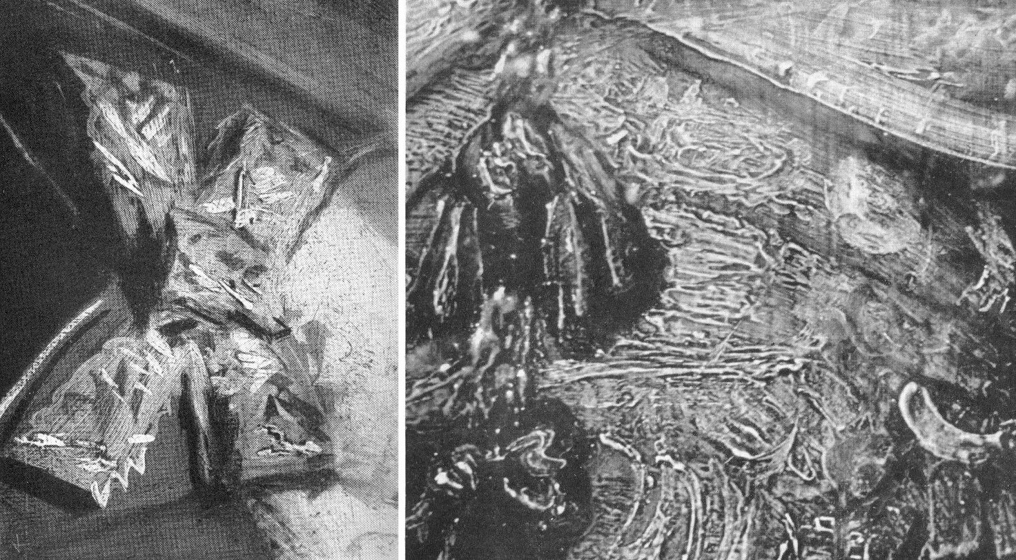
Above, Fig. 18: Left, a photomicrograph of a bow in the Frans Hals Portrait of a Lady (National Gallery of Scotland); right, a detail of the tassel on the shoulder of Rembrandt’s Saskia Laughing, Dresden Gallery. On such a photo-comparison, a child of six would be unlikely to confound the one author with the other.
If perceived in some quarters to constitute a professional threat to vested interests, Laurie acknowledged a personal indebtedness to the London art trade, reporting that his own interests had been aroused by the late Mr Vicars of Bond Street:
“We were all engaged in the famous Romney trial and he took me to see a perfect gallery of the English portrait school belonging to a well-known London banker. ‘We dealers’, he told me, ‘go by brushwork, that is the artist’s true signature which nobody can forge.’ Going up to a Reynolds he said, ‘Do you see how Reynolds has put in that touch there?’ ‘Now come here and see how Romney does it; this is Gainsborough’s touch.’ After we had studied the English portrait school from this point of view, I said to him, ‘I have learnt more from you than from all the art connoisseurs’. He turned to me and said, ‘My boy, we’ve got to know, we risk our money on it!’”
DEFENDING MUSEUM FAKES II
Above, Fig. 19: Top, Laurie’s detail of the Hals moustache; above, a section of a half-page detail of the National Gallery’s du Jardin Portrait of a Young Man, as published in the Technical Bulletin of 1982.
The caption to the Technical Bulletin photograph reads:
“Detail after cleaning, before restoration. The unusually large pigment particles, including those from the lower layer of the ground, can be seen. The paint film is slightly worn so that small areas of grey priming have been exposed, especially to the right of the mouth.”
Thus, as can be seen with this detail of du Jardin’s Portrait of a Young Man, the National Gallery certainly had the means in 1982 to provide Laurie-style detailed photo-comparisons that might have shown, for example, the consequences of its cleaning methods (see Fig. 8 above), or the stylistic correspondences or otherwise between works attributed to a given author. The Gallery had accepted Laurie’s comparative photo-demonstration (as at Fig. 14) that a challenged work was an autograph Rembrandt, but it has commissioned no detailed photo-comparisons of the Samson and Delilah brushwork with that of its own uncontested Rubens pictures (see Fig. 22). Instead of better studying the creative handiwork of artists, the gallery has photographed a million microscopically minute samples of paint ground down so as to reveal paint in stratigraphic cross-sections. In the 1993, 1996 Art Restoration, we complained that the National Gallery’s restorers and scientists were more interested to learn of the chemical constituents of paint than to understand the artistic uses to which artists put their paint, viz:
“…the green earth pigment consisted of ‘glauconite and celadonite [which] have closely similar constitutions, although their primary origins differ: the former is present in certain marine sedimentary deposits, while the latter occurs as inclusions in igneous rocks such as basalt. They are difficult to distinguish by XRD. Both types are layered silicate materials containing FE(II) and FE(III); also characteristic is a content of aluminium, silicon, potassium and sometimes magnesium…” Does this have a point, we asked, or is it swank? Was Rubens handicapped when painting in ignorance of such chemical constituencies?
Laurie encountered hostility from institutions wishing to defend their attributions. He warned: “I suggest a voyage of discovery to some young student with a magnifying camera through the galleries of Europe, but he must be careful to conceal his real object or he will never return alive. I have never forgotten the rage of the Director of a famous continental gallery when he thought I was suggesting that one of his pictures was not by Rembrandt. ‘Nonsense, nonsense’ he shouted, ‘one of the finest Rembrandts in the world’. I hurried to explain that I was referring to a Rembrandt in another Gallery, he smiled sweetly and said, ‘You are probably quite right’.”
TIMES CHANGE
In conclusion, and in Laurie’s inquiring spirit, we consider some close photographic comparisons of the National Gallery’s version of the 1609-10 Samson and Delilah with a bona fide Rubens painting which has retained its back – Rubens’ The Raising of the Cross of 1609-11, Antwerp Cathedral. As with that comparison at Fig. 4, above, the successive comparative details from Fig. 20 to Fig. 25 below are of two works of the same supposed historical moment and stage of development within the oeuvre. Great differences of brushwork might hardly, therefore, be expected. Matches are not to be found.
“SMOOTHLY BRUSHED, THINLY APPLIED”
Above, Fig. 20: Top, a section of Delilah’s flesh; above; a detail from Rubens’ The Raising of the Cross.
The astonishing contrast above, is of an apparently phenomenally well-preserved smoothness and absence of age cracks in the Delilah, and the entirely characteristic four centuries old painting of flesh on The Raising of the Cross. Plesters, convinced of the picture’s authenticity, perceived no stylistic discrepancies and remarked on the Samson and Delilah’s seemingly youthful paint: “The flesh of Delilah was in such perfect condition that no small damage could be found from which to take a [microscopically tiny] sample, but viewed under the stereoscopic binocular microscope at low magnification the pale parts of the flesh appear to consist of lead white tinted with a little vermilion, a mixture which results in a clear rosy pink. The transition between the white, pinkish and more creamy tones (probably lead white with a little yellow earth colour) are smoothly brushed apparently in a single paint layer.” Moreover, “Apart from the strongest highlights the flesh paint is quite thin, so much so that in parts the striped pattern of the yellowish imprimatura below is visible lending a pearly translucent effect which Rubens may have calculated…”
As if inoculated against all visual anomalies, Plesters deemed it interesting to find that “in the full-scale version of Samson and Delilah the striped imprimatura, so characteristic of his preparatory and exploratory oil sketches on panel, has been used.” Without her conviction that what she was examining what was unquestionably Rubens’ handiwork, Plesters might have found the exposed imprimatura in a major painting, commissioned by a friend and patron, surprising and incongruous. Perhaps she did sense danger: “…it could of course, in this case, be the accidental result of [unusual] speed and boldness in painting.”

Above, Fig. 21: Two faces of the Rubens “beautiful young blond woman” type. Again, the same striking differences of paint film properties are apparent (thick v. thin; smooth v. textured) but note also how in the secure Rubens picture the “drawing” of the subject’s profile has been realised by modelling the features (brow, nose, lips and chin) over a darker background. In the National Gallery picture the drawing of the profile is weaker, sharper, anatomically inferior and has been realised principally by the encroachment of a superimposed dark background which, at the nose, results in flat, angular edges like cut-out paper that bear no relation to the form of the nose (which, anyway, is itself plastically and anatomically ill-conceived) and with no illusion of aerial recession beyond the figure.

Above, Fig. 22: Top, in the Samson and Delilah the forms of the lips are chaotically and messily unresolved. The upper lip is drawn as if from a three-quarters and above viewpoint, but the lower lip is drawn as if seen sideways on and with no hint of interconnecting flesh. By comparison, in the proper-Rubens head all the surfaces turn, move, and cohere convincingly, as if placed on a piece of sculpture.
Above, Fig. 23: In these portrayals of hands, the superbly realised expressive resolutions within the one, disqualify the crass and clumsy shorthand treatments seen in the other.
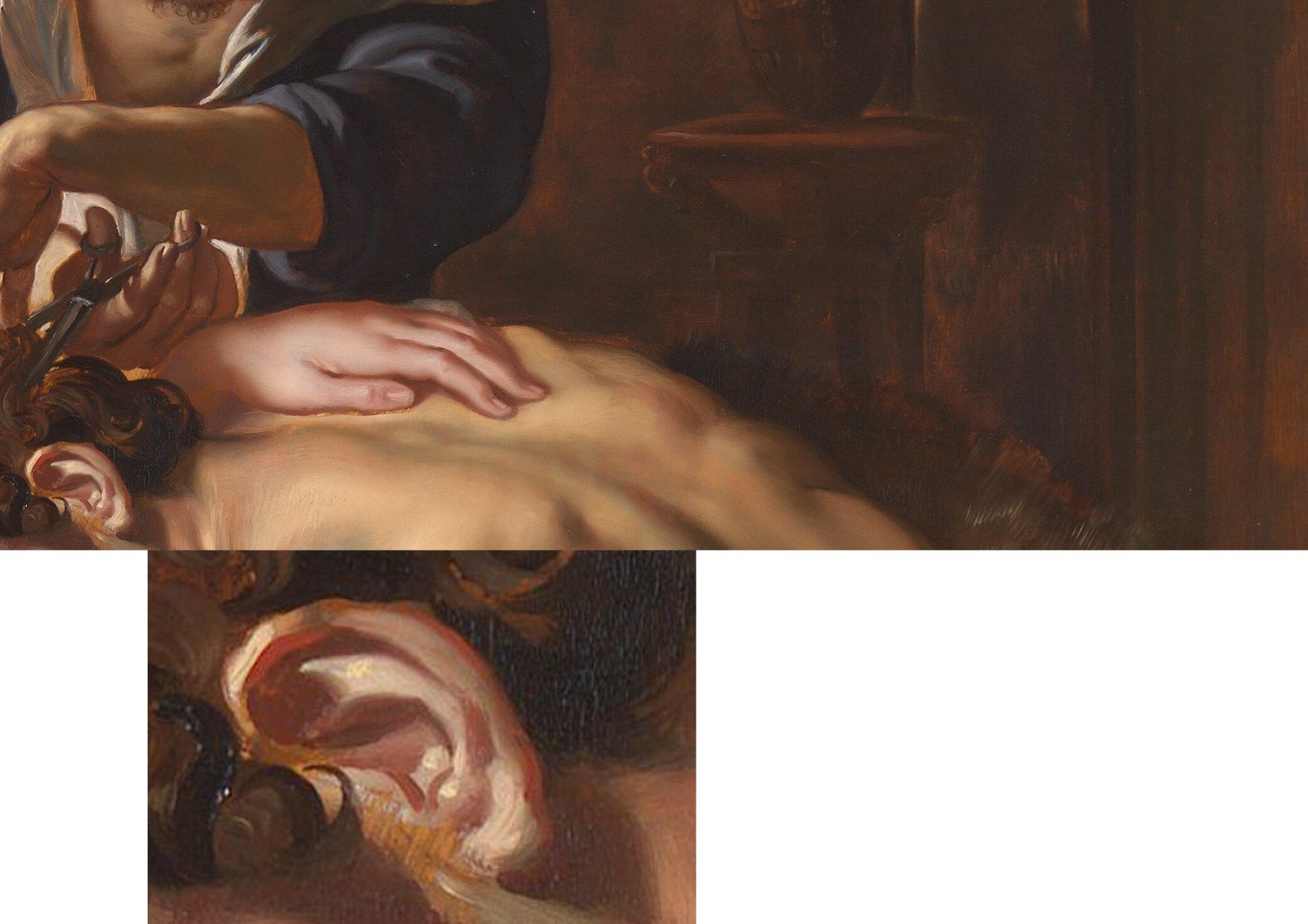
Above, Fig. 24: In these two details on the Burchard/National Gallery painting, the scant, near-void-like treatment of the background is accompanied by a flabby musculature in Samson’s back. The enlarged detail of the ear discloses an angular, almost Cubist treatment of the forms laid hastily over the stripy sketch-like imprimatura.
A TRIPLE COMPARISON AND A SECOND, “TWINNED” RUBENS UPGRADE
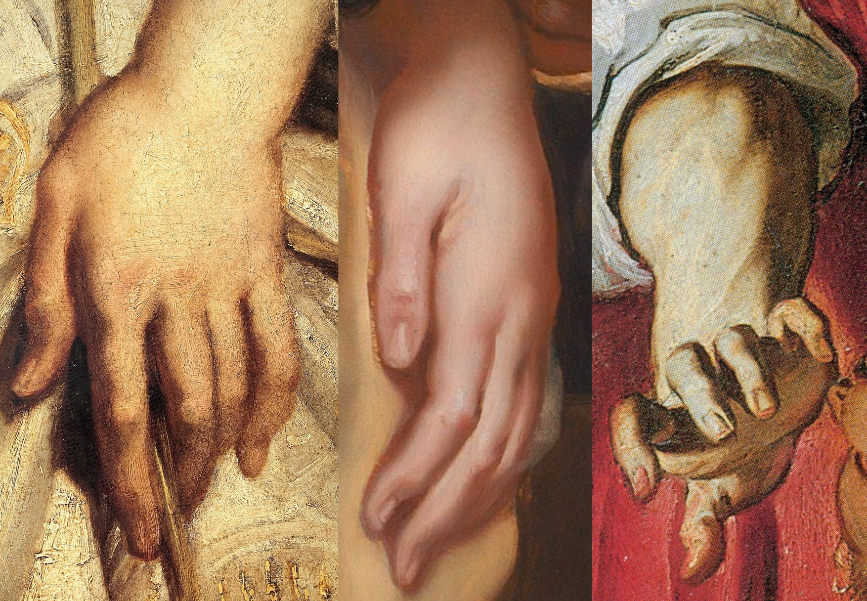
Above, Fig. 25: In this comparison we show three very different treatments of female hands which pose the question: Did Rubens paint female hands so variously in 1609-11?
On the left, we see that encountered in the secure Raising of the Cross in Antwerp cathedral. In the centre we see the Delilah hand from the National Gallery. On the right, we see a hand from the (presently) most-expensive “Rubens” painting, The Massacre of the Innocents which realised £49.5m at Sotheby’s on 10 July 2002. The latter, like the Samson and Delilah, had been regarded as a follower’s copy for centuries. Where our eyes can only tell us that these three hands were executed by different artists, the official Rubens Art Scholarship World insists that all three had been painted almost simultaneously by Rubens. The hand in the centre is an anaemic semblance of a Rubens hand. That on the right is a stridently caricatured – almost comic book-like – derivative.
GROWING OEUVRES DESPITE THE EVIDENCE OF TREE RINGS
When misattributed works are accepted within oeuvres, they immediately exert a toxic influence – if “X Mark I”, then why not also a matching “X Mark II”? And so on, ad infinitum…until an inevitable eventual crisis of confidence arises.
Up to December 2001 the Massacre (Fig. 30, below), like the Samson and Delilah, had for centuries been regarded as a follower’s copy. The upgrading was said to have been made by five experts, only three of whom were named – Paul Huvenne, Arnout Balis and Elizabeth McGrath (the other two were believed to be National Gallery staffers). In the 2006 AWUK Journal No. 21 we reported that Dr. McGrath had corresponded with the National Gallery about Jan van den Hoecke, whom she believed had worked with Rubens in his studio and had possibly collaborated with him on a Rubens temporarily loaned to the National Gallery. She had expressed a fear to the Gallery that if her material were to be passed to the press, she might be thought to be propounding her own theories.
Some of the five experts thought the Massacre had been painted before the Samson and Delilah, some, after it. Of all Rubens paintings of the period under consideration – 1609-11, the National Gallery picture – and not, for example, the absolutely secure Raising of the Cross – was taken by Sotheby’s and the experts to be the “benchmark” picture in making this new Rubens ascription even though both the Samson and Delilah and the Massacre had spent many years together in the Liechtenstein Collection not as Rubens’s but as Jan van den Hoecke copies of Rubens pictures. The Massacre had Liechtenstein seals on the back and front of its panel which, just like the Samson and Delilah in 1929, was said to be original and in excellent condition.
BURYING REPORTS
Sotheby’s had commissioned detailed technical reports which were not carried in the sale catalogue but which were there said to be available on request in a separate volume. The reports carried much material that was injurious to the Rubens ascription, as we reported in the October 2002 Jackdaw (“Is this £49.5 million painting by Rubens?”). The Independent’s financial correspondent William Kay, had advised on 20 July 2002 (“A little detective work can pay off”): “Don’t look at a company’s profits-and-loss account – start at the back of the accounts, where the notes are, not at the front where the chairman puts a gloss on the numbers.”
Turning quickly from the first page of Sotheby’s commissioned reports on the Massacre (- which page carried the disclaimer “The independent reports contained in this document are provided for prospective bidders’ information only and without warranty by Sotheby’s or the seller”) to the very last page, I discovered that the two last lines of a dendrochronological report by Peter Klein on the picture’s oak panel (dated 2 April 2002) read:
“Under an assumption of a median of 15 sapwood rings and 2 years for seasoning a creation is plausible from 1615 upwards.”
That meant the Massacre’s proposed Rubens upgrade as “a just-returned-from-Italy” work of 1609-11 was toast. On the tree ring evidence, this panel could only be considered to have been painted at least four years afters after its claimed date of execution. When Dr Klein examined the wood of the Samson and Delilah in 1996 his technical findings were said by the National Gallery to have corroborated the claimed 1609-10 date of execution. That claim, however, had rested not on the data but on the authority of a Klein covering letter which stated: “The felling date [of the tree] corresponds very well with the art historian attribution” and that a date of execution for the painting “is plausible from 1605 upwards”.
Two British dendrochronologists held that Klein’s summary characterisation of tree ring data was misleading. One said: “it is unsafe to say 1609 is any more likely than a later date of 1620.” Another observed “All Klein should be saying is that the range is 1597 to 1630”. The forces that were desirous of the Massacre being taken as a bona fide Rubens were unmoved by the earlier Samson and Delilah controversy and warnings – and the marketing enterprise rolled on despite the presence of much other disqualifying evidence in the volume of reports. As we reported in the Jackdaw:
“Preliminaries studies failed to link the Massacre’s wood with that found in any of Rubens’ panel. As well as being too late, the Massacre contains the wrong materials. A pigment, orpiment, that is found in no Rubens painting is present here. A second pigment, smalt, said to have been in use ‘mainly in the mid-seventeenth century’ and which seems only to be found in Rubens’ later works is also present. The orpiment yellow is anomalous not only in its presence but in its manner of application – it is mixed with lead tin yellow. Such a combination is said to be “unusual since it was considered unstable” and, even, to be a practice ‘not encountered in 17th century works’…Speaking of Rubens’ debt to classical sources, the anonymous author of the catalogue entry correctly concedes, ‘one of the background figures appears to derive from the Borghese Gladiator…[which] was not excavated until late in 1611’…”
The absence of under-drawing and pentimenti has been remarked in both works. No less anomalous is that both also betrayed an uncharacteristically stinting use of lead white pigment. Plesters, convinced at every turn that a Rubens ascription was beyond question, noted: “The striking feature of the composite X-radiograph is how comparatively sparingly and how subtly Rubens has used lead white, reserving the strongest touches for the brightest highlights and tapering the thickness of the white highlight to almost nothing. This system of painting which uses the light-coloured ground showing through thin translucent paint layers for the middle tones, particularly of flesh, is similar to that used by early Netherlandish painters who also used a chalk ground on oak panel.”
Where Plesters had attempted to explain the absence of underdrawing on the Samson and Delilah by claiming there had been no need to make any because the (anomalously complete) oil sketch for the painting had resolved all matters, in Sotheby’s reports it was more frankly acknowledged that such absences of under-drawing and pentimenti in the Massacre are consistent with pictures originating in Rubens’ workshop:
“…we can identify the use of minor but significant applications of paint to modify the outline and define the shape of the elements in the composition. These can be seen as strongly contrasting additions, frequently following the line of a limb or suchlike. Wadum [J] has effectively argued that these features represent Rubens’ studio control, and that he was in the habit of inspecting works before they left the workshop and making corrections.”
Clearly, had Rubens painted the Massacre with his customary perpetual revisions (as are to be seen on the Raising of the Cross), he would not have needed to make last-minute corrections with ‘brushstrokes of paint containing carbon black’ to his own work.
SCHOLARLY ACCOUNTABILITY
We asked in the 2002 Jackdaw: “Can it be right that we are all asked to take this leap of faith when the [five] experts, displaying a seeming ignorance of – or disregard for – so much germane material evidence, have yet to publish accounts of their verbal endorsements.”
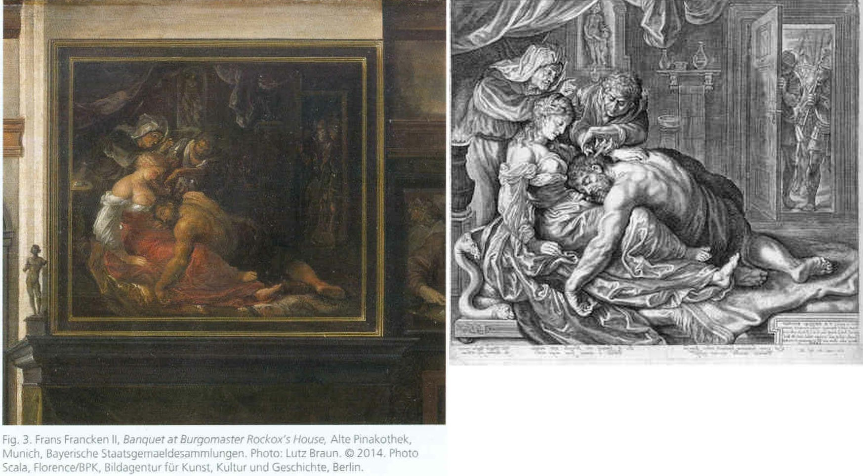
Above, Fig. 26: The two copies made respectively of the original (and subsequently lost) Rubens Samson and Delilah in 1625-35 by Frans Francken (left), and in 1613 by Jacob Mathan (right) in both of which Rubens can be seen to have painted the whole of Samson’s right foot and space beyond.
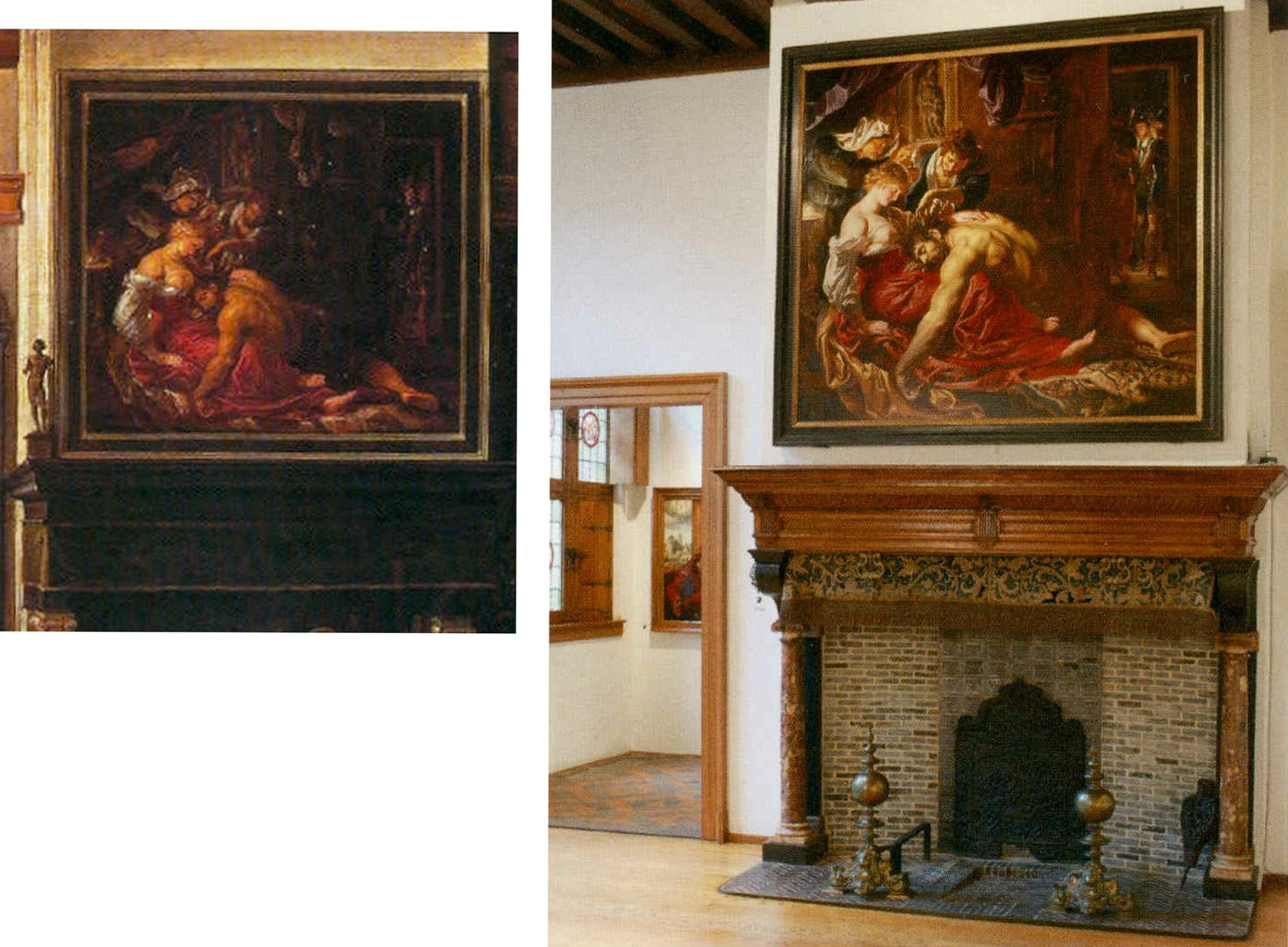
Above, Fig. 27: Left, detail of the Frans Francken painting showing the original Rubens’ Samson and Delilah; right, the National Gallery Samson and Delilah, as exhibited in 1983 in its then new, post-restoration, frame and above a mock-up of the grand fireplace in Nicolaas Rockox’s house. The recorded positioning of Samson’s right foot in the Franken copy testifies to a compositionally taught bisecting of the picture on a descending diagonal. In contrast, the foot is not only cropped in the National Gallery picture, but it first wanders up the edge of the painting leaving a broken-looking leg.
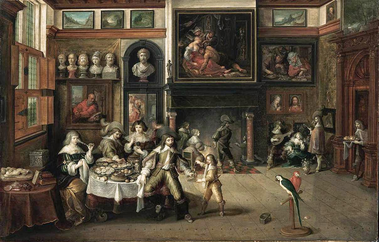
Above, Fig. 28: The whole of Frans Francken’s copy of the original Rubens Samson Delilah enjoying pride of place in Nicolaas Rockox’s house.
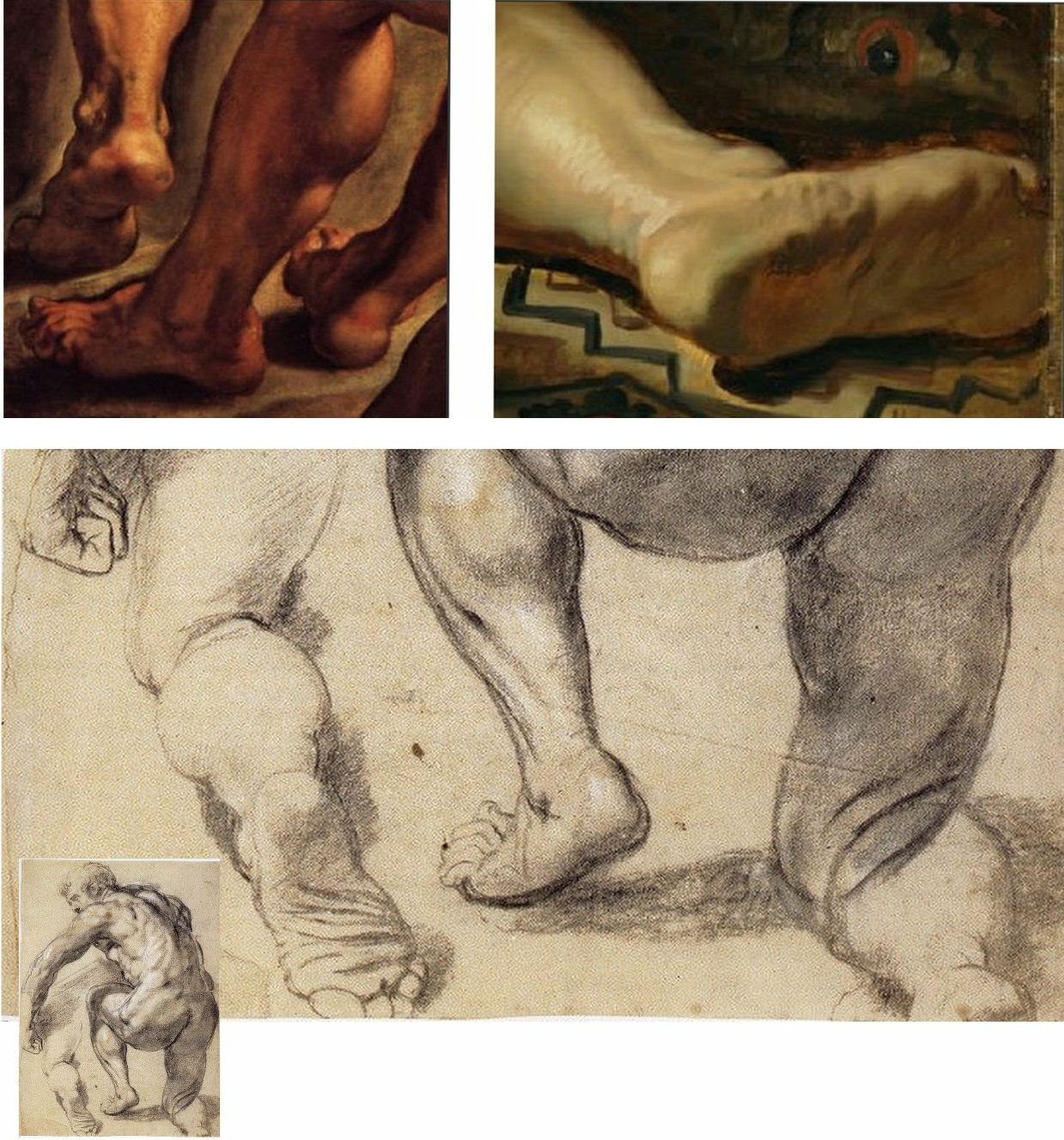
Above, Fig. 29: Top left, detail of feet on Rubens’ The Raising of the Cross; top right, the cropped foot in the National Gallery Samson and Delilah; above, a Rubens chalk figure study for The Raising of the Cross showing how Rubens drew separately on the sheet a cropped leg.
The most visibly disturbing disqualification in the National Gallery picture – as Doxiadis, Harvey and Hopkinson immediately flagged in their 1992 Report – was the fact that the toes of Samson had been cut off at the edge of the painted area on the panel when both copyists of the original painting in Rockox’s house had recorded an intact foot set well away from the edge of the painting in a more reassuringly “Rubensesque” treatment.
The cropping in the National Gallery version is itself disqualifying on two counts. First, few painters have been more attentive to their depicted subjects’ digits than Rubens. When a foot was not included in a large swiftly drawn figure study, as above at Fig. 29, Rubens drew it separately on the sheet so as to have a record of the entire figure. Second, as we have examined previously, copyists frequently produce truncated versions of master works and the £49.5 million Massacre of the Innocents which is now in the Ontaria Museum is – just like the Samson and Delilah – a compositionally cut-down version of a larger composition that is found in a School of Rubens Massacre in the Royal Museum of Fine Arts Belgium as seen below in Figs. 30 and 31.

Above, Fig. 30: Left, a detail of a Rubens School work in the Museum of Fine Arts, Belgium; centre, the former Jan van den Hoecke copy that became the £49.5 million Massacre of the Innocents and now lives in the Ontario Museum; right, the Francken copy of the (lost) original Rubens Samson and Delilah.
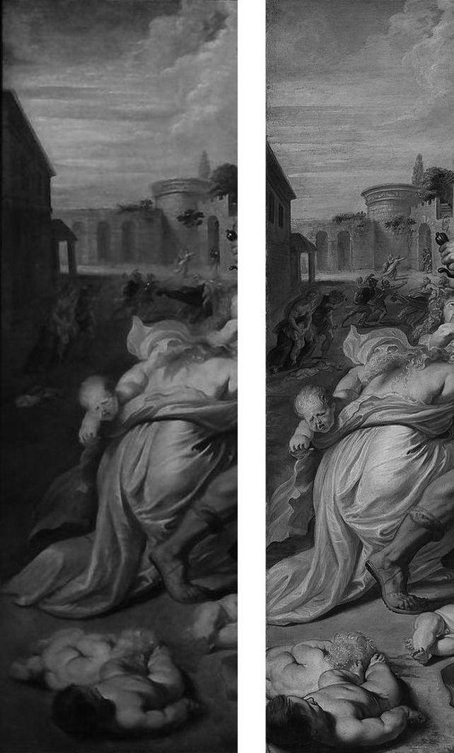
Above, Fig. 31: The left-hand sections showing the pair of murdered babies in the bottom left corner of two versions of Rubens’ Massacre – that in the Royal Museum of Fine Arts, Belgium version, left, and, right, that in the cropped £49.5m Ontario Museum, former Jan van den Hoeke version.
On the fact of the 1980 and 2002 upgrades, must we now believe that Rubens had cropped the compositions and subjects in both his Samson and Delilah and his Massacre of the Innocents pictures so disturbingly as to prompt copyists of both works to expand the pictures to more comfortably and characteristically Rubens-like compositions?
How many allowances may be made, how many disqualifications disregarded, to uphold a single troubled attribution? In our experience, it is very often the case that when one thing is wrong with an attribution, everything else is.
Michael Daley, Director, 5 November 2021
POSTSCRIPT: On 12 November 2021, Eric Biétry-Rivierre reported in LE FIGARO (“A Salvator Mundi still record but less and less credible”):
For the Prado Museum, the most expensive painting in the world is not by Leonardo da Vinci. Rather, it is the work of an assistant or follower.
In the catalogue of this exhibition running until 23 January 2022 and relating to an old copy of The Mona Lisa which it preserves, the Prado does not attribute to Leonardo da Vinci the Salvator Mundi of the Crown Prince of Saudi Arabia. According to the Madrid Museum, this version called “Cook” (named after a former owner because there are no fewer than 22 paintings in the world in the Leonardesque style and representing Christ in the manner of a God the Father) belongs to a close assistant or follower. This further darkens the episode of the highly marketed and hypermediatized sale, organized by Christie’s New York in 2017. And it justifies less the $ 450.3 million disbursed by Mohammed Bin Salman.
The curator Ana Gonzalez Mozo even suggests that a prototype made by the master may never have existed. As for which would be the oldest version, she leans towards another Salvator Mundi: the so-called “Ganay” version, also in private hands. Its pedigree, admittedly incomplete, being much less incomplete. It was already this oil painting that, although less beautiful and less well restored, had the preference of the specialists of the Louvre during the retrospective organized at the end of 2019 on the occasion of the 500th anniversary of the death of the master.
After much debate, hesitation, and even the publication of a scientific brochure validating the “Cook” was finally discarded, the “Ganay” completed its exceptional journey. And this not only because the Gulf panel painting was missing (MBS would have conditioned his loan to a hanging near Mona Lisa, which would, de facto, have “consecrated” the work as an authentic Leonardo).
The “Cook” version was also weakened by a recent documentary by Antoine Vitkine. In his Salvator Mundi: the astonishing case of the last Vinci, the main supporter among international “Leonardologists”, the Englishman Martin Kemp, appears less affirmative. As for Luke Syson, the present director of the Fitzwilliam Museum, Cambridge, who in 2011 was the unconditionally supportive curator/architect of the first public presentation of the work at the London National Gallery, he is more and more among peers who denounce his recklessness.
Bernd Lindemann is one of them. In another documentary on the Salvator Mundi, by Andreas Koefoed, Lindemann, director of the Gemäldegalerie in Berlin, says: “It’s not the role of serious museums to present such a controversial painting.” Thus is the reputation of the great British museum damaged. This is bad at a time when its Samson and Delilah, bought at a golden price for a Rubens forty years ago is seriously questioned.
On 14 November 2021 The Times of Israel reported that the $450m Salvator Mundi has been deemed not a Leonardo:
“Sold for $450m to Saudi prince, ‘Salvator Mundi’”
“The Prado catalogue also contains an opening essay by Vincent Delieuvin curator of Paris’s Musée du Louvre’s 2019 retrospective of works by the artist. He discusses the Saudi-owned painting, referring to ‘details of surprisingly poor quality’. Delieuvin concluded, ‘It is to be hoped that a future permanent display of the work will allow it to be reanalyzed with greater objectivity’…”
The initial near-universal hyperbolic analysis has indeed been found wanting but Waldy and Bendy are not the only fleet of foot art critics. As Jacques Franck notes:
“This is interesting news indeed, but it is not how the real story ran when it started in 2016. Delieuvin, no less than Penny and Syson at the National Gallery, had been convinced all along that the Cook Salvator Mundi was by Leonardo, there can be no possible doubt about that. Aside from the strong support Delieuvin gave the painting on the occasion of the Leonardo exhibition he curated at the Italian Embassy in Paris in September 2016, he had long planned to include the work as the guest star in the blockbuster Leonardo show which he co-organised with curator Louis Frank at the Louvre in October 2019. This is testified by the first version of the catalogue which reproduced the Cook Salvator Mundi on the front cover, wherein one could read that it was attributed to Leonardo himself and had been listed as such at no. 157 in the show. That first version was junked for undisclosed reasons and the whole catalogue was reprinted. What is known is that the loan of the Saudi picture was not granted by the owner; that the picture was not exhibited; and, that the non-appearing picture was simply reproduced in the new catalogue as “Salvator Mundi version Cook”, fig. 103 bis, p. 303 thus meaning “studio work”. (See Fig. 32 below.) In December 2019, six weeks after the late October opening of the above-mentioned Leonardo exhibition, a book titled Léonard de Vinci. Le Salvator Mundi by Vincent Delieuvin (Louvre curator), Myriam Eveno and Elisabeth Ravaud (both Louvre laboratory scientists) was put on sale in the Louvre’s bookshop and swiftly withdrawn. However, some copies or photocopies of the latter book have nevertheless circulated around the world and are now in the hands of many Leonardo scholars, like me. In that notoriously disappeared book, the authors concluded enthusiastically (p. 14) that the work had been shown by “decisive scientific tests” in 2018 to be by Leonardo. That is the true story and there exists no other”.
In the December 2021 Art Newspaper, Bendor Grosvenor, over-looking the annual Apollo magazine awards, complained of an absence of art world annual awards and launched a self-styled “Diary of an Art Historian awards”. Two especially rich items caught the eye. His book of the year award was given not to a book but to an online catalogue raisonné, which he contends “might not yet have the kudos of a book published by Yale priced at £150, but it will have a thousand times more readers, and just as impressive a legacy. (Readers might recall Grosvenor’s own recent unsuccessful joint bid with the dealer Philip Mould (who has a degree in art history) to replace the four specialist scholars-authored, Yale-published, 2004 catalogue raisonné Van Dyck A Complete catalogue of the Paintings – see Art-Trading, Connoisseurship and the Van Dyck Bonanza.) Richer still, perhaps, was Grosvenor’s award for “Auction Consignment of the Year to whoever had the imagination to capitalise on Leonardo-mania by buying a humdrum 20th-century copy of the Mona Lisa on eBay for £2,750 and swiftly consigning it to Sotheby’s Old Master Sale in London, where it made £378,000″ – a small beer hike compared with the conversion of a recent, repeatedly restored, one thousand-dollar wreck into the $450m pretendy and now-disappeared Leonardo Salvator Mundi. On the night of that notorious Christie’s, New York, sale Grosvenor swooned: “Christie’s just did something that re-writes the history of auctioneering. They took a big gamble with their brand, their strategy to sell the picture, and not to mention the reputations of their leadership team, and they pulled it off – the best piece of marketing I’ve ever seen. Above all, they had absolute faith in the picture. AHN [Art History News] congratulates them all.”
Review: Peter Freeth RA – 40 Years of Aquatints
A remarkable show of haunting monochromatic prints is running at the Art Space Gallery (until 8 October). As can be seen in a short film made by the gallery’s director, Michael Richardson, Peter Freeth, who works without technical assistance or commercial collaboration, has devised a novel form of printing in which all parts of the plate are bitten simultaneously in the acid bath.
Each printed plate constitutes a richly allusive distillation of twinned reflections on some aspect of life and art. The catalogue includes two essays on Freeth’s method and production by fellow Royal Academician print-makers Anne Desmet and Michael Sandle. The latter notes that, precisely because of the non-participation of technical print-makers, Freeth’s etchings offer a view into the artist’s soul. The former discloses that despite his Slade painting school training, Freeth’s motifs derive not so much from life dutifully observed but from acts of “imagination, from notes and swift sketches, plays and poetry – Shakespeare and William Blake – and the Bible”.
For sure, the prints now hang before the viewer, immobile, as fixed and frozen at their precise moment of manufacture but, far from being pinned like butterflies to a board, the resulting images seep out of the paper and into our consciousness, drawing/commanding the viewer into engaged participation. A prone, injured man grips our attention not a jot less than it does that of the depicted passers-by and the Good Samaritan and his donkey (see Freeth’s Study for the Good Samaritan, Fig. 1, below) – we see the scene and by courtesy of an awesome artistic alchemy become players within its great drama. Is Freeth’s monumental The Big Black Bird Again – with beak as strong as a bolt-cropper (Fig. 2, below) – a sentinel or a menace to us? It is no pet.
Above, Fig, 1: Freeth’s Study for the Good Samaritan – 14 × 15 cm. Edition of 30

Above, Fig. 2: Top, The Big Black Bird Again – 80 x 42cm. Edition of 30; above, Horse – 48 × 60 cm. Edition of 30
There are no fewer than seventy-six such works of varying sizes but constant, unsettling power in this show (– we show five more below). Every single one is monumental regardless of size. All reward and merit full and intense contemplation.
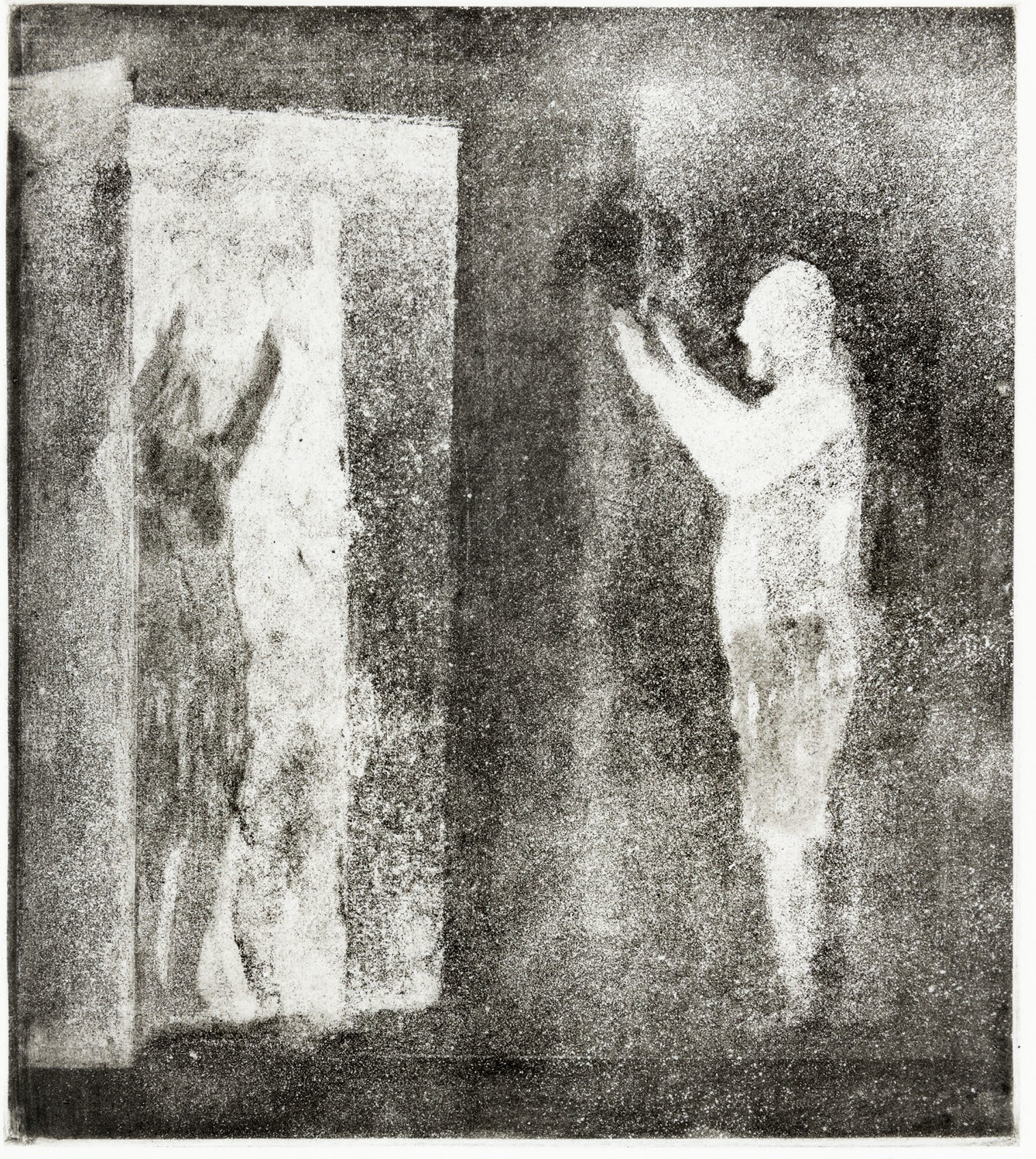
Above, Fig. 3: Mr Parkinson Practices his Surrender – 26 × 23 cm. Edition of 45
Above, Fig. 4: Would You Adam’n Eve it? 11 × 17 cm. Edition of 30
Above, Fig. 5: A Glimpse of the Tempest – 42 × 60 cm. Edition of 30
Above, Fig. 6: Dreaming of Babylon – 42 × 33 cm. Edition of 18

Above, Fig. 7: Divided City with Broken Aqueduct – 43 × 64 cm. Edition of 30
Michael Daley, 28 September 21
An Appliance of Science in Art Historical Studies
A slim but eloquent and persuasive study of the assorted depictions of rock in Leonardo’s The Virgin and Child with St. Anne examines the pictorial means of the most perplexing figural invention in the artist’s oeuvre.
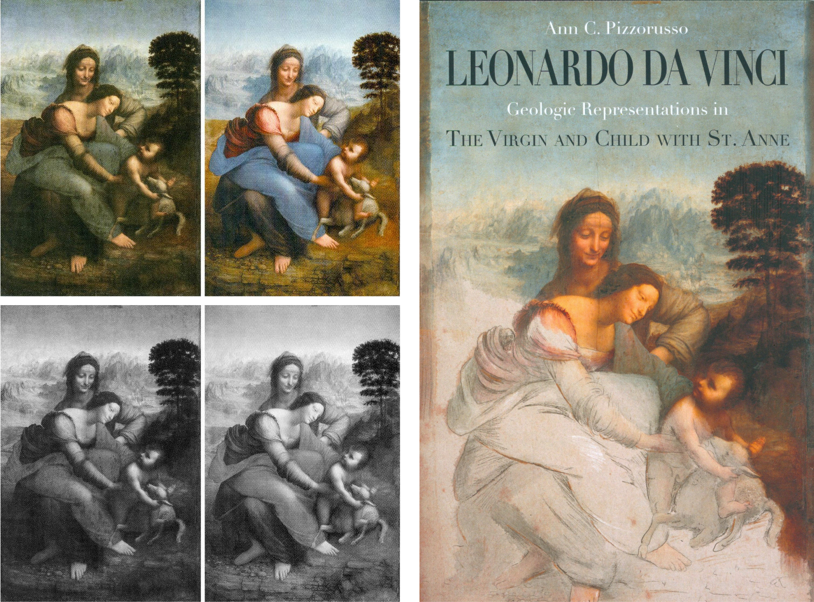
Above, Fig. 1: Left, Leonardo’s The Virgin and Child with St. Anne as seen before after its recent controversial cleaning at the Louvre; right, Ann Pizzorusso’s latest book – Cover design: Francesco Filippini.
This volume is slim because its material is handled with deft and engaging concision. Whether a bright child, a lay adult, or a professional art historian, the reader will enjoy and profit from this vivid journey through time and Italy – its geography; its mountains; its fauna, and, its most famous, multi-talented artist. As one Leonardo specialist puts it:
“The thrilling focus put by Ann Pizzorusso’s researches on the geology of Leonardo’s landscapes in works such as the Virgin of the Rocks and the Louvre’s The Virgin and Child with St. Anne is of foremost importance. Pizzorusso’s analyses and synthetic, clear explanations, help us better to understand Leonardo’s amazing attachment to a truthful, scientific-like, investigation into the world in which we live. Retrospectively, it also helps to see the Master at work concretely in his quest for perfection.” – Jacques Franck
(Ann Pizzorusso‘s work was cited extensively in the geology sections of Walter Isaacson’s biography of Leonardo, Leonardo da Vinci – see Fig. 5, below.)


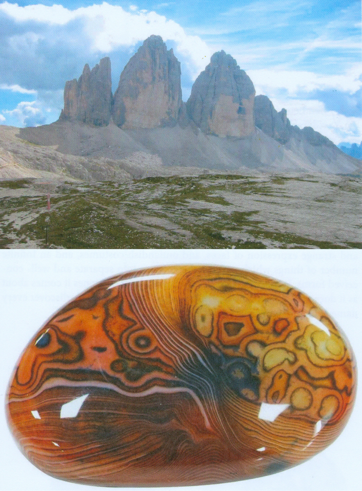
Above, Figs. 2, 3 and 4: A section of Pizzorusso’s focussed geological and botanical illustrations that run from the general to the very particular.
In current Leonardo art scholarship there are two practitioners who lay claim to direct scientific expertise. The first, Professor Martin Kemp, studied natural science at Downing College, Cambridge, with the aim of becoming a biologist but then, as he put it in his 2018 memoir Living with Leonardo, “steadily lost impetus in my studies of science” and “was drawn” into film, the visual arts and music. The second, Ann C. Pizzorusso, trained all the way through to qualifying and practicing as a geologist – but then, in the mid-1990s, “After many years of doing virtually everything in the world of geology – drilling for oil, hunting for gems, cleaning up pollution in soil and groundwater…” turned her skills towards Leonardo. Her debut article, “Leonardo’s Geology: The Authenticity of the Virgin of the Rocks” (Leonardo Magazine, Vol. 29, No, 1996, pp. 197-200 – Leonardo is a peer-reviewed academic journal published by the MIT Press) was a bomb that still reverberates.
THE TWO VIRGIN OF THE ROCKS PAINTINGS

Pizzorusso’s game-changing contention that shortcomings of scientific understanding evident in the geological and botanical descriptions in the National Gallery version of the Virgin of the Rocks were disqualifying, was well summarized and illustrated in the Guardian in 2014 (“The daffodil code: doubts revived over Leonardo’s Virgin of the Rocks in London”).
In her essay, Pizzorusso said of the National Gallery version:
“An observer with some knowledge of geology would find that the rock formations…do not correspond to nature; most of Leonardo’s drawings and paintings do. It seems unlikely that Leonardo would have violated his knowledge of geology in favour of abstract representation, considering that he executed an even more geologically complex picture – the “Virgin and St. Anne” (1510) – after he had completed the National Gallery painting.”
In so claiming, Pizzorusso lent belated technical support to Kenneth Clark, whose aesthetically appraised views on the authorship of the National Gallery’s second and later version of the Virgin of the Rocks had been carried in the 1938 book One Hundred details of Pictures in the National Gallery when Clark was the gallery’s director. His views on the picture’s (contested) authenticity were expressed as follows:
“There is no longer any doubt that the National Gallery’s Virgin of the Rocks is a second version of the subject undertaken by Leonardo some twenty years after the picture in the Louvre… It is uncertain how much of this replica he executed with his own hand, and this head of the Virgin is the most difficult part of the problem. It is too heavy and lifeless for Leonardo and the actual type is un-Leonardoesque [see Fig. 6 below, top left]; yet it seems to be painted in exactly the same technique as the angel’s head in the same picture [Fig. 6 bottom, centre]; and that is so perfect that surely Leonardo must have had a hand in it. Both show curious marks of palm and thumb (they are visible in this detail on the bridge of the Virgin’s nose) made when the paint was wet and no doubt covered by glazes long since removed [by restorers]. This perhaps is a clue to the problem. A pupil did the main work of drawing and modelling, and before his paint was dry Leonardo put in the finishing touches. Most of these have been removed from the Virgin’s face but remain in the angel’s, where perhaps they were always more numerous”
In 1990 the National Gallery republished Clark’s book with new photographs. The then director, Neil MacGregor, made two memorable comments in his foreword. The first concerned the testimony of photographs. Clark, MacGregor acknowledged, had been “fearful of what might be found if the golden veils of dirt and varnish were ever to be removed. In the years since, many have been…The reader who can compare the earlier edition with this one will decide how much is gain, how much loss.” (Emphasis added – that was the last time National Gallery staff admitted the indispensable value of photo-testimony in appraisals of restorations.) In a 1990 edition footnote, it was further conceded on the differences Clark had described between the Virgin’s and the angel’s head that: “As a result of the cleaning of the altarpiece in 1949 the differences between the heads are perhaps less apparent.” That tacit confession that such work as had recently testified to Leonardo’s partial/minimal involvement in the picture had perished in the restoration, did nothing to dissuade the gallery from further restoring the painting just eighteen years later.
Clark had seen no evidence whatsoever of Leonardo’s hand in the handling of the rocks and the plants, and Pizzorusso’s (above) charge highlights the fact that the handling of those subjects in this painting was markedly sloppier than in both Leonardo’s earlier and later outputs, as seen, respectively, in the Paris Virgin of the Rocks and the Paris Virgin and Child with St. Anne. For its part, the National Gallery perseveres with a conviction that its second (2008-9) restoration in barely more than half a century had dug sufficiently deep to uncover an entirely autograph Leonardo painting.
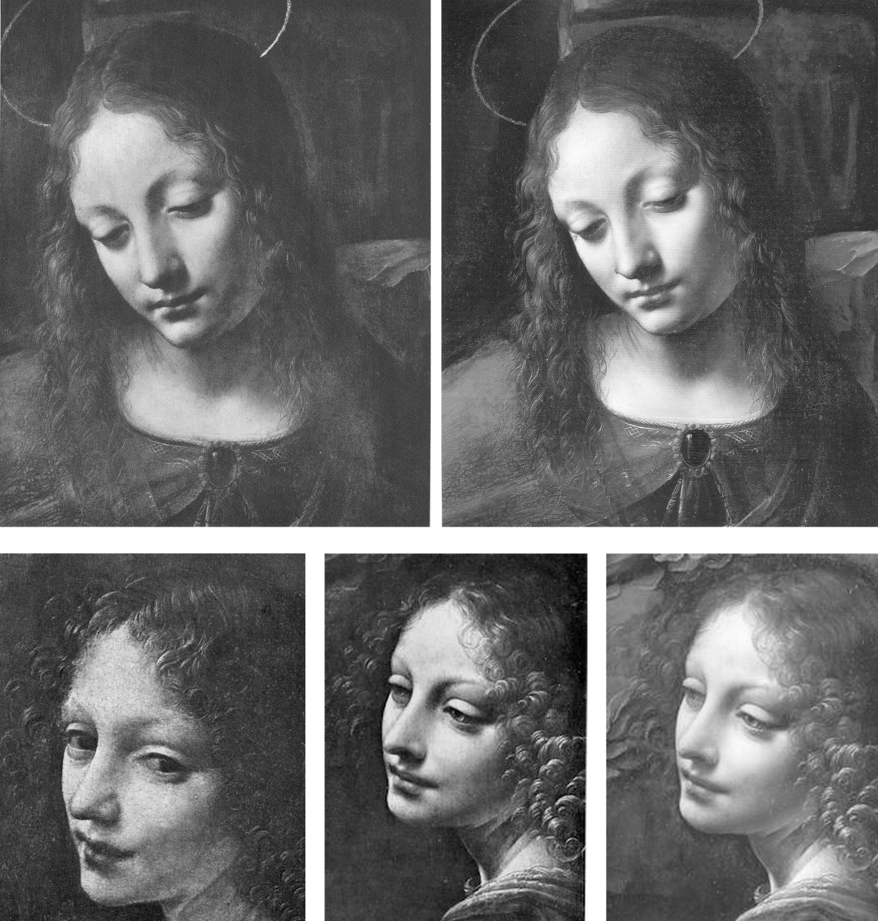
Above, Fig. 6: Top, the Virgin in the London Virgin of the Rocks as seen (left) in 1938 and (right) in 1990; above, left, the angel in Leonardo’s Virgin of the Rocks in the Louvre; centre and right, the angel in the National Gallery’s version, as seen in 1938 (centre) and (right) in 1990 and after its 1949 restoration.
MAPPING THE WORLD
In her Leonardo da Vinci cartographer and Inventor of the Google Map, Pizzorusso holds that:
“We can access any location on Earth with a simple click on our computer or cell phone. This wasn’t always the case, but it was always a desire, for man has continually sought to understand the extent of the Earth and his place on it. While this is not a treatise on the history of cartography, it will serve to show the vital importance of maps and the little known, but extraordinary accomplishments of Leonardo da Vinci as a Renaissance cartographer. Since many examples of his maps survive today, (with an extensive collection in the Royal Collection Library at Windsor Castle), we can appreciate not only his skill, but the instruments he invented to achieve nearly perfect accuracy in his measurements. He melded his knowledge of geology, engineering, surveying, hydrology, and of course art to revolutionize cartography. We can see his innovations on every map we use today and can even name him the inventor of the Google Map.”
A NOTORIOUSLY PRECARIOUS GROUPING
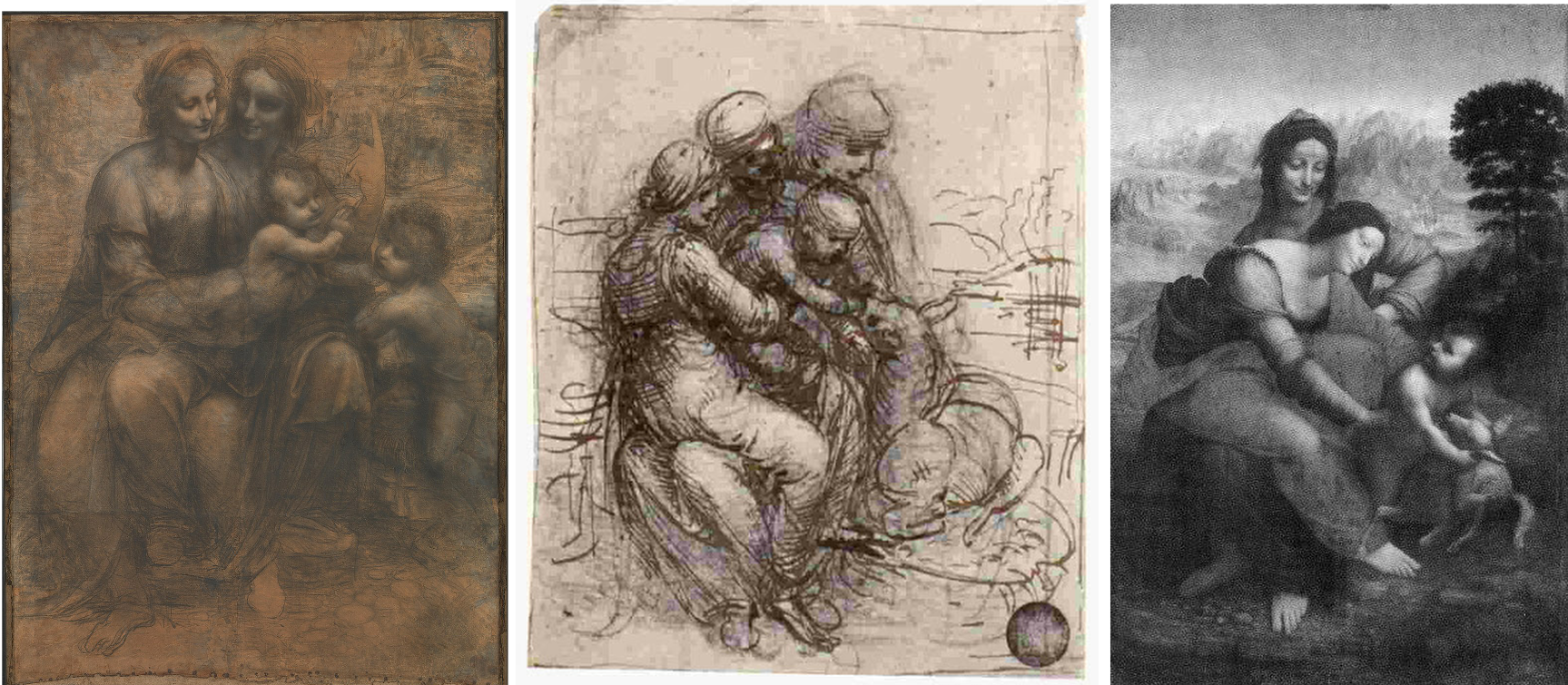
Above, Fig. 7: Left, Leonardo’s The Virgin and Child with St Anne drawing (the Burlington House Cartoon); centre, Leonardo’s (Venice – Gallerie dell’Accademia) study for The Virgin and Child with St Anne,;right, the Louvre’s Virgin and Child with St Anne before its recent restoration – see Pizzorusso’s 12 June 2012 “Could the Louvre’s ‘Virgin and St. Anne’ provide the proof that the (London) National Gallery’s ‘Virgin of the Rocks’ is not by Leonardo da Vinci?
In her latest book, Leonardo da Vinci – Geologic Representations in The Virgin and Child with St. Anne, Pizzorusso presses an appreciation of Leonardo’s understanding of geology and botany into an examination of the vexing figural complexities of Leonardo’s Virgin and St. Anne:
“In discussing the figure of the Virgin, Carlo Pedretti states that ‘Critics have often wondered why Leonardo should have abandoned the most satisfactory Classical sense of balance achieved in the London Burlington House Cartoon in favour of a pose that has always been taken as conveying a sense of uneasiness’. Bernard Berenson summarized his dismay with Leonardo’s treatment of St Anne as follows; ‘Seated on no visible or inferable support, she (St. Anne) in turn on her left knee sustained the restless weight of a daughter as heavy as herself.’”
And the resolution of the conundrum? It begins: “Had Berenson known his geology, he would have seen that…” The that is for the reader to discover.
The book is available worldwide, both in Kindle ebook form and in Paperback at Amazon UK and Amazon US Pizzorusso’s website is: Ann Pizzorusso – annpizzorusso.com .
Michael Daley, 12 May 2021
With the Sistine Chapel ceiling we know, but who wrecked Gustav Klimt’s Helene and Sonja portraits?

The restoration injuries on Klimt’s paintings now rival those seen on Michelangelo’s Sistine Chapel ceiling frescoes. Both cases testify to profession-wide failures to read pictures as art and to heed the testimony of photo-records – that is, they testify to the linked failures of restorers who inflict damage and of scholars who accommodate adulterated works within their narrative accounts.
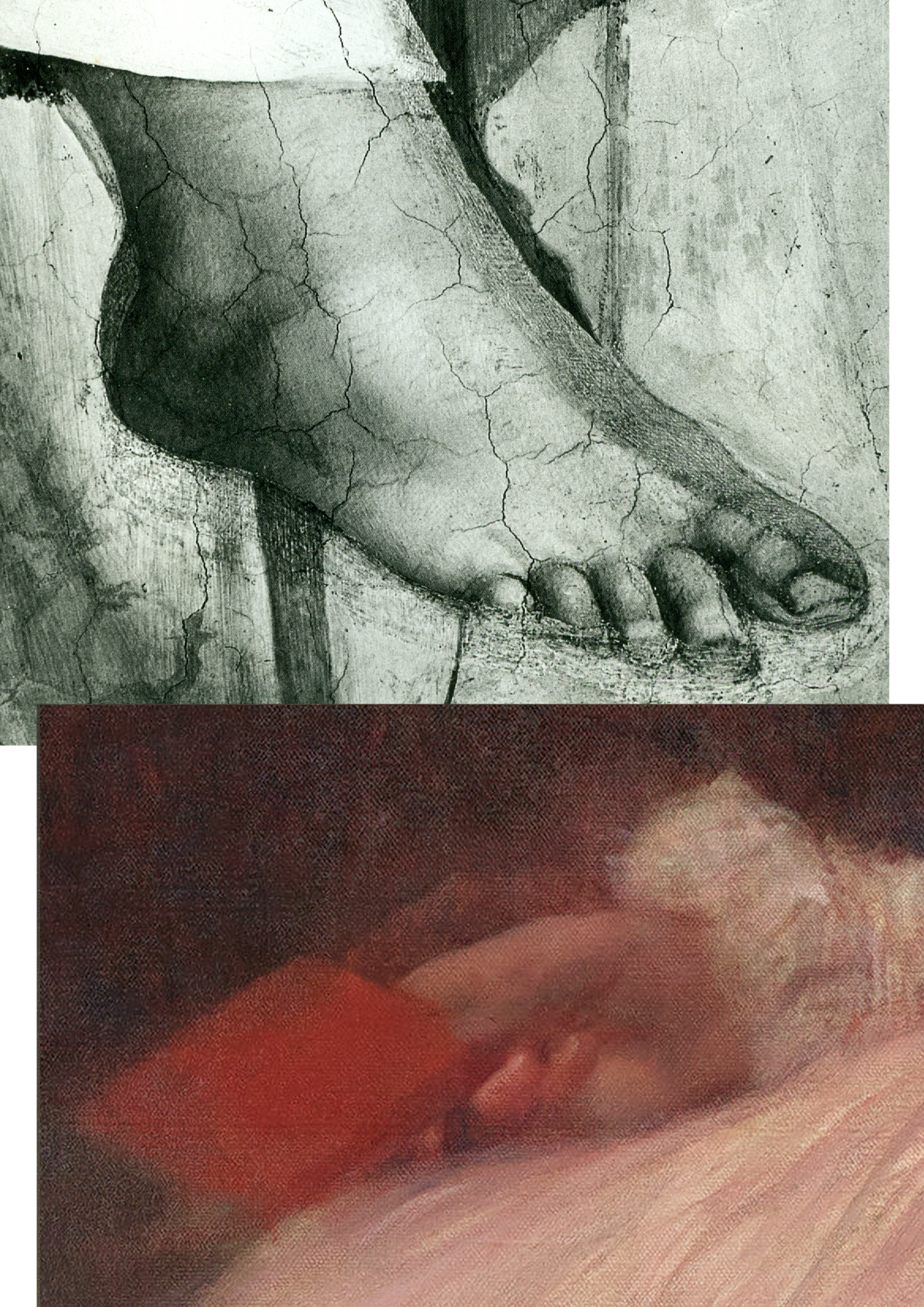
Above, Fig. 1: Top, the after-restoration right foot of Michelangelo’s monumental Erythraean Sibyl on the Sistine Chapel ceiling; below, the after-restoration right hand in Klimt’s 1898 Portrait of Sonja Knips, as seen today (in the Galerie Belvedere, Vienna).
Above, Fig. 2: Top, the after-restoration right hand in Klimt’s Portrait of Sonja Knips, as in Christian M. Nebehay’s 1992 Gustav Klimt; above, the after-restoration right hand in the Portrait of Sonja Knips today. Inset, left, the book held by Sonja Knips in Klimt’s portrait.
Above, Fig. 3: A detail of Klimt’s portrait of Helene Klimt as seen before restoration, left, in 1956 and after restoration, right, in 2012.
While the injuries to the two artists are comparable in magnitude, the means are quite unalike. With the Sistine Chapel, there is no mystery about the cause. Before the cleaning of the ceiling started (after the cleaning of Michelangelo’s lunettes on the chapel’s upper walls), leading Michelangelo scholars endorsed a Dan Brown-esque claim that self-declared New-Era restorers had uncovered a New Michelangelo whose true traits had gone unnoticed by all those who had, in the artist’s lifetime and for nearly half a millennium afterwards, copied and studied his work. The claim was preposterous, but the fact of the ceiling’s highly controversial and radically transformed appearance was acknowledged by all parties and is now on the historical record. Moreover, twenty-two years after the greatly contested restoration finished, the late chief restorer, Gianluigi Colalucci, admitted that his predecessor at the Vatican, Luigi Brandi, “the old chief restorer”, had warned him that Michelangelo had conducted much if not most of his painting with “pigments perhaps diluted with oil or resin or varnish” on the fresco surface.
What neither Colalucci nor the Vatican ever acknowledged was that in the late 1980s, as we had first reported in 1993, Leonetto Tintori, the restorer of Masaccio’s Trinity in the Santa Maria Novella, Florence, and a member of the international committee that investigated the controversial cleaning in the mid-1980s, had “urged the Sistine team privately to preserve what he termed ‘Michelangelo’s auxiliary techniques’ which in his view included oil painting as well as glue-based secco”.
Cleaning the ceiling had been thought impossible because of the complexity and vulnerability of Michelangelo’s method. To justify the use throughout the ceiling of a ferocious solvent gel that was robotically brushed on and washed off twice in twenty-fours like an oven cleaner in a pre-determined method devised to ensure a homogenous appearance, the restorers and curators claimed – against material and documentary evidence – that Michelangelo had not worked on top of his frescoes when dry. The Vatican never delivered a report on the restoration and now, with the death of Colalucci, never will. The photo-record, thanks to digitalisation and the web will endure.
With Klimt’s oeuvre, the debilitation occurred piecemeal in public and private collections over (roughly) half a century and on no overtly declared programme. Again, thanks to photography, there can be no long-term cover for mis-restorations because we know how Klimt left his works and can calibrate and demonstrate injuries to them, as with the two portraits of Sonja Knips and Helene Klimt.
Klimt’s instruction that those wishing to understand him need only look at his pictures is widely acknowledged but little comprehended. “I am convinced that I am not particularly interesting as a person”, he had written, “if anyone wants to find out about me – as an artist, the only capacity in which I am of any note – they should look carefully at my paintings and try to learn from them what I am and what I have tried to achieve.”
That is no longer possible. It no more occurred to Klimt that his works would cease to bear true witness than it had to Michelangelo that he would one day be hailed as the Matisse of the Renaissance by a restorer (see our “Maestro Colalucci: His Method and its Madness”, Jackdaw, May/June 2021, and “A crime against the artist”, The Independent, 22 November 1991, at Fig. 34 below.) Now, a century on from Klimt’s death and with scarcely a single picture true to its original self, the most charitable view of scholarly silences on injuries might be to assume that those who depend on access to Klimt’s works and records either know or fear they cannot afford professionally to embarrass private or institutional owners by citing past or recent injuries. However, Klimt scholarship and publications have exploded in recent years and it is now possible (through photo-illustrations) to make fair appraisals of the various changes his works have undergone at the hands of restorers – even though their actions remain almost nowhere acknowledged.
HELENE KLIMT: ASKING THE RIGHT QUESTIONS
Fig. 4, above: Top, Klimt’s portraits of Helene Klimt and Sonja Knips, as bracketed in the precious and giant – it weighs 16 lbs – 2012 Taschen Gustav Klimt The Complete Paintings, Ed. Tobias G. Natter; above, the Klimt and Knips portraits as published with Klimt’s approval between 1908-14.
As Dr Natter hoped, the Taschen book is now a standard work of reference. His ambition to supplement updated “details about each work, its provenance, exhibition history and selected bibliographic references” with a picture of “how it was received in its day” proves richly informative. Notwithstanding such art historical diligence, no account is given of what restorers euphemise as pictures’ “conservation histories” and therefore this book, like all others in the field, fails to address how each work looked in its day and to estimate how much or how little it does so today. Seemingly failing to recognise that every work of visual art starts life as its own primary document, this ambitious book takes what restorers have left in their wake as synonymous with the art Klimt produced. As is customary in the field, Natter expresses deep and sincere gratitude to all owners and “in particular, the private owners” for their trust, helpfulness, and inspiring conversations.
ART HISTORICAL NARRATIVES
One of the book’s contributors, Susanna Partsch, (“Paintings of women”), sets the above two portraits as staging posts in a now prevalent art historical schema:
“The earliest portraits on display at that occasion [a 1903 Klimt exhibition] were the private ones of his young niece Helene Klimt and the Portrait of Sonja Knips both of which were completed in 1898. The some twenty portraits that Klimt produced between 1891 and 1898, most of them showing anonymous models, seem to have been finger exercises on the way to a new style.”
With the Portrait of Helene Klimt, the artist’s then six years old niece who became his ward on the death of his brother (Fig. 4, above left), Natter jumps straight into formalist art criticism:
“If Klimt’s portraits of the early 1890s had shown him dissolving line and blurring colour in a painterly manner, the artist here explores the harmony of the strict profile view. This is reinforced by the precision of the page-boy haircut, the neutral background and the high-necked blouse, its fabric interpreted and ennobled by the generosity of the execution. The dualism of mimesis and dissolution, of faithful reproduction and painterly openness, is already in evidence here as a stylistic means.” (Emphases added.)
Thus, the head is said to be painted in one manner and the blouse in a radically contrary one, but this supposed pictorial dichotomy rests on an assumption that the picture’s present traits are as when originally executed when the photo-record (at Fig. 3 and below) testifies that they are not. Natter cites but does not reproduce an early record of the Portrait of Helene Klimt: “A previously unheeded photograph published in the magazine Das Interieur in 1911 [that] shows the child’s portrait hanging in a bedroom in the Flöge sisters’ home in Ungargasse, Vienna (N.N. 1911).” Having brought photography to the table, Natter neglects to consider the testimony of the earliest published photographs of this painting including one above at Fig. 4 of 1908-14 which Klimt himself had carefully vetted and endorsed.
This profession-wide neglect of historical photo-records persists even as Klimt’s own use of photography attracts attention. In 2012 Prestel published Gustav Klimt & Emilie Flöge Photographs, edited by Agnes Husslein-Arco and Alfred Weidinger, the scientific director of the Linz Upper Austrian State Museum; former vice-president of the Belvedere in Vienna; and a digital and film photography specialist with a preference for black and white images. Agnes Husslein-Arco, a former figure skater and Sotheby’s Austrian director, was director of the Belvedere museum between 2007 and 2016 and is credited with transforming it into a major tourist attraction in Vienna. In the book’s preface, the then director said: “The product, a chronological presentation of photographs and snapshots, illustrates a biographical panoptic of these two personalities who were so influential in the fin-de-siècle art world…The following contribution by Alfred Weidinger provides information about Klimt’s relationship to photography and the use of the same in his artistic creations.” Weidinger wrote: “The reference to Klimt’s involvement with photography, only briefly sketched out here, is meant to offer a first look at a hitherto neglected area of Klimt research, and, at the same time, make evident the importance of this medium to the artist.”
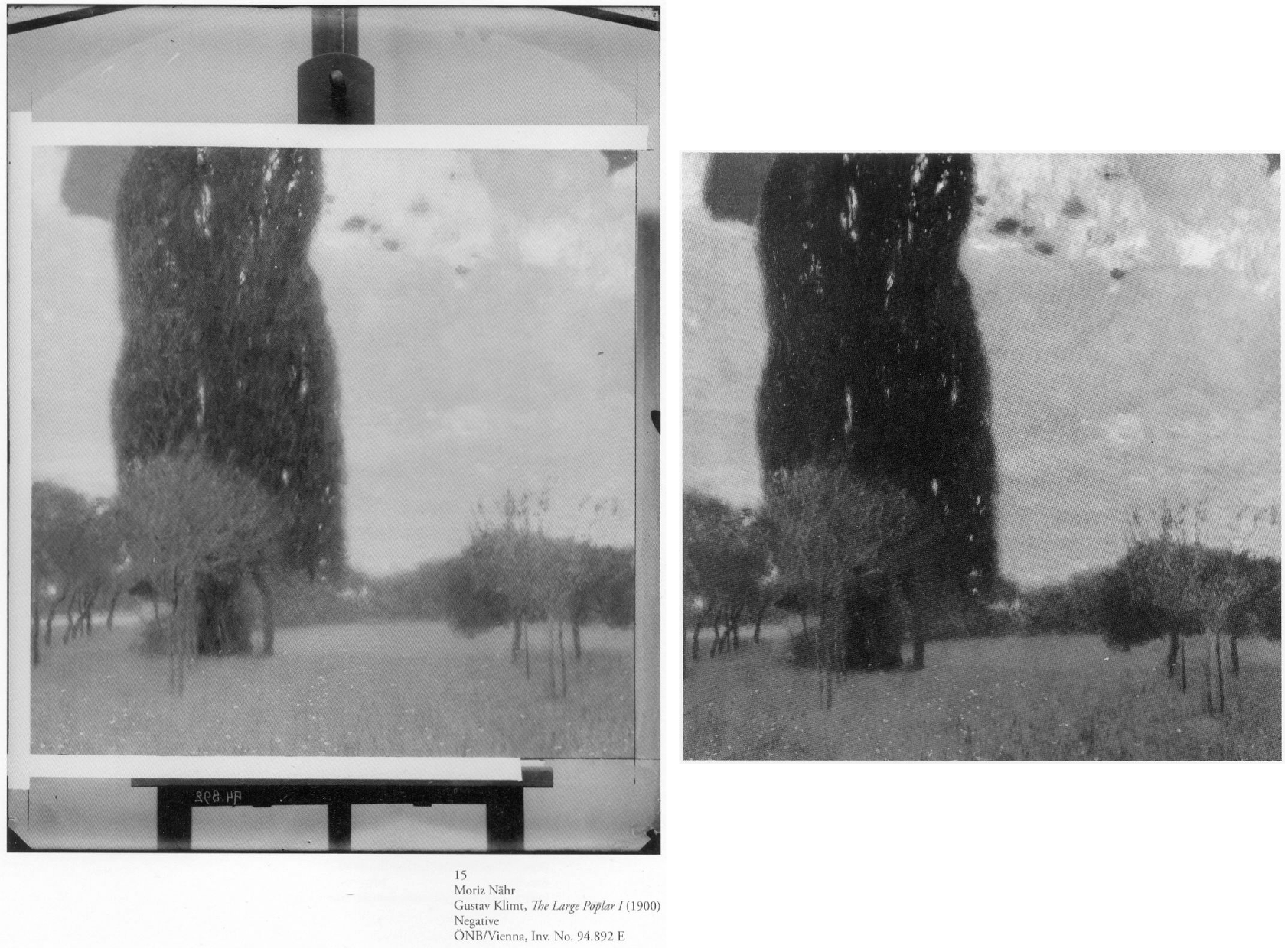
Above, Fig. 5: Left, one of a group of Moriz Nähr photographs acquired by the Austrian National Library in 1943 that recorded both Klimt himself and “revealing reproductions” of his paintings, as here above left with his 1900 The Large Poplar I. Above right, The Large Poplar I, as reproduced (with slightly trimmed edges) in Alfred Weidinger’s 2007 Prestel Gustav Klimt – an earlier massive and compendious complete catalogue with specialist essays which had weighed in at a respectable 10 lbs. Weidinger expressed the hope that the book, which offered a fundamentally new basis for research, “holds out an invitation to discover many new aspects of the life and work of the great painter whose artistic home is the Vienna Belvedere.” (We welcome and accept that invitation.)
A SECOND OPINION
Above, Fig. 6: Left, Klimt’s 1898 portrait of his niece (and later ward), Helene Klimt, as published in Emil Pirchan’s pioneering 1942 and 1956 book Gustav Klimt and, centre and right, Helene, as paired with a Fernand Knopff profile portrait by Alfred Weidinger in his 2007 Gustav Klimt.
As with Dr Natter, Dr Weidinger’s catalogue entry on the Helene Klimt portrait made no reference to the Pirchan book’s photographic testimony. Instead, he drew attention to Klimt’s apparent indebtedness to an 1890 Fernand Knopff portrait in which “a severely profiled half-length portrait faces to the left, with an almost monochrome background which is divided into two areas by a thick brown vertical line.” Weidinger further notes that while Klimt “reduces his composition to the girl and the pale background we may detect a reminder of Knopff’s composition in the group of vertical lines in the front of Helene’s face, which in the Jeanne de Bauer portrait, functions as a special accent”. The stylistic comparison with Knopff is apt and fair but no mention is made of the photographically recorded fact that the lines to which Weidinger refers had not been visible in the picture in its 1908-14 and 1942-1956 photographs.
Weidinger takes pride that it had been “a major concern of ours to see, as far as possible, all Klimt’s pictures in the original and to take new photographs of them” and that their wishes had been met in the great majority of cases. That the lines in the portrait’s background had not previously been present must mean that they had emerged in a post-1956 restoration, which in turn suggests that a restorer had uncovered and left exposed a feature previously begun and then painted out by Klimt, perhaps because of second thoughts about introducing a parallel secondary motif that would have stood distractingly in competition with the picture’s subject.
Above, Fig. 7: Left, Klimt’s portrait of Helene Klimt as recorded before 1956 in Pirchan; right, the portrait as reproduced by Weidinger in 2007.
Had Weidinger compared the above pair of images he would surely have noted not only the late emergence of the lines but also the many changes to the blouse – and perhaps have offered some account for them. Instead, and seemingly accepting the 2007 state as if Klimt’s own, he drew a stylistic distinction between the treatment of the undamaged head – “the fine brushstrokes with which Klimt renders her hairstyle and profile give a draughtsman-like character to the girl’s head” – and the body, where: “the treatment of the high necked, puff-sleeved blouse, which Klimt paints in cream and light blue tones, is sketchy.” In 2012, Natter saw more in the blouse than sketchiness – viz: “fabric interpreted and ennobled by the generosity of the execution”; and, in the now disrupted head/blouse relationship, “a dualism of mimesis and dissolution, of faithful reproduction and painterly openness”. The photo record shows that both scholars missed countless injuries and adulterations to the blouse – including superimpositions that crudely redrew the collar and the arm’s contours – all of which they took to comprise evidence of a significant step in the march of Klimt’s stylistic development of which Partsch spoke in 2012.
Had Weidinger addressed such a comparison as that above, he would likely have seen that the draughtsman-like character of the head had been no less evident in the economical but precise elegant treatment of blouse, too, and that viewed as a whole, the work had originally shown no great dichotomy of pictorial means and, rather, comprised a beautifully measured record of a young girl’s dutifully patient self-conscious expression and resolute little soldier-like stance.

Above, Fig. 8: Left, Klimt’s portrait of Helene Klimt as in Weidinger, 2007 and, right, as reproduced by Natter in 2012.
The above, same-size, greyscale, direct photo-comparison shows that the painting underwent further changes between 2007 and 2012: the long-invisible vertical lines that emerged in 2007 had by 2012 turned more clearly towards the child suggesting a framed picture on a parallel background wall; an area of damage in the centre of the picture’s left edge that was visible in 2007 has been touched out, as were several scratches of long-standing.
Above, Fig. 9: Klimt’s portrait of Helene Klimt as recorded, left, between 1908-14; as before 1956, second left; as by Weidinger in 2007, second right; right, as by Natter in 2012.
Comparing four same-size successive photographs above shows the first two records of the blouse (1908-14 and 1942-56) to be identical and radically different from the two in 2007 and 2012. The post-2007 traits that are now enshrined in the literature as “sketchy”, or an “ennoblement by generosity of execution” can be seen on a simple photo-comparison to be products of hands other than Klimt’s. The photographic record incontrovertibly shows that in this portrait, autograph features that survived until at least 1956 were subsequently weakened or erased, and that new and stylistically alien contours had been added in an evident attempt to simulate something of the then-botched blouse’s original coherence and richness of design. Thus, field-leading contemporary scholarship had failed to notice, acknowledge, or condemn a vandalising act of bowdlerisation. Instead, it has incorporated a restorer’s deformations into a celebratory narrative of a privately owned work that is on loan to a public museum (Berne, Kunstmuseum).

Above, Fig. 10: Top, left, Klimt’s Portrait of Helene Klimt in Pirchan, 1956; and, top right, in Weidinger’s 2007 Gustav Klimt. Above, left, Klimt’s 1894 Seated Young Girl; above, centre and right, a diagram showing first the 1956 Pirchan illustration with the then folds of the blouse outlined in black, and right, with what we take to be a post-1956 restorer’s superimpositions also identified in black.
Weidinger’s comments on Klimt’s indebtedness to Knopff (and to Whistler) are constructive and, in Klimt’s early Seated Young Girl, above left, he sees indebtedness to both Klimt’s brother, Ernst, and their joint master, the painter Hans Makart. Despite such fine-tuned stylistic discrimination, Weidinger seems to see no relation in the Seated Young Girl to Helene’s blouse. Had Natter addressed the losses and additions in the post-1956 blouse, would he have spoken of a “dualism of mimesis and dissolution, of faithful reproduction and painterly openness, [that] is already in evidence here as a stylistic means” in Klimt’s supposedly contrasting handling of the head and blouse? The blunt tuth is that, with Helene’s blouse, the dissolution was chemically and physically induced decades after Klimt’s death by an unidentified restorer on an unrecorded/undisclosed occasion.
SONJA KNIPS
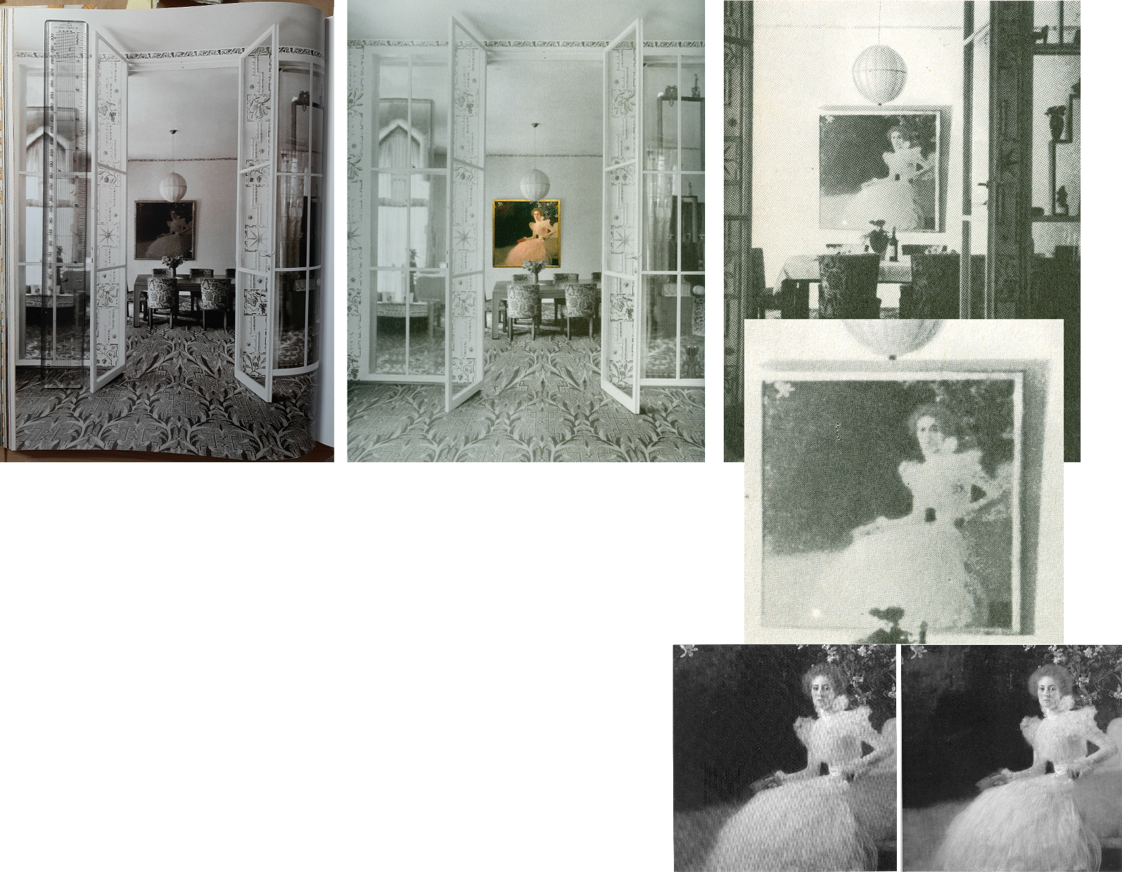
Above, Fig. 11: A 1915 photograph of the Sonja Knips portrait in the dining room of the Villa Knips, as in the giant 2012 Taschen book, left; as in the Neue Galerie’s, 2008 Gustav Klimt: The Ronald S. Lauder and Serge Sabasky Collections, Ed. Renée Price, where a modern colour photograph of the painting has been superimposed, centre; and right, top and centre, as in Christian M. Nebehay’s, 1976 Gustav Klimt; bottom right, Sonja Knips as published respectively in Weidinger, 2007, and Natter 2012.
Natter and Weidinger both carry historic photographs showing Klimt paintings in the background but without comment on their then appearances. The Nebehay image above, right and centre, is small and printed on poor paper but even at this level of reproduction, it gives indication of the picture’s tonal hierarchies and dispositions – the subject is brilliantly lit on the left and moves into shadow on the right of the picture.
Klimt’s paintings were much photographed in his lifetime (that is, before his death in 1918), many were seen in their exhibited environments, some were photographed before being first exhibited and then again after subsequent reworking. For all this, and even though both 1898 portraits at Fig. 4, top, have exceptionally long and secure photo-histories, their narratives have been written without regard to such evidence and in terms of constituting steps towards subsequent pictorial developments – which progressivist schema happens to provide perfect art historical cover for dramatically altered pictures.
Of the Portrait of Sonja Knips, Dr Natter summarises: “This graceful female portrait marks a turning point in Klimt’s portraiture and is rightly considered a prelude to his Secessionist works. The sitter is portrayed in life size, seated in an outdoor setting. The square format is new and represents a fundamental choice whose possibilities Klimt would explore over the next few years. New, too, is the corresponding juxtaposition of light and dark, foreground and background, fullness and void.” That account was more consistent with the picture’s 2012 published appearance, Fig. 4, top right, than when first recorded as at, Fig, 4, bottom right, where today’s “void” comprised distinctly articulated spaces, forms and, even, mini-figures.
Of the painterly means, Natter adds: “Klimt employs a differentiated manner of painting, executing some areas of the portrait in a cursory fashion while focussing with great precision upon others. He thereby creates a fascinating contrast between the naturalistically modelled head of the sitter and the gauzy shimmer of her dress. This latter conceals a wealth of painterly effects and is infused with a rustling tension by a cascade of multiple parallel brushstrokes. Klimt at the same time camouflages the highly artificial nature of the arrangement as a snapshot.” In terms of a perceived stylistic dichotomy no mention is made of the picture’s former second carefully composed and precisely, naturalistically realised component – the now transformed and deranged small red sketchbook, as seen at Figs. 1 and 2.
AN AFFAIR – OR NOT?
With Klimt and his female subjects there is always a relationship issue and with this picture scholarly differences have arisen. Natter is agnostic: “Whether – as some suspect – Klimt and Sonja Knips enjoyed an intimate relationship, cannot be verified. But it is certainly the case that the painter presented her with one of his sketchbooks as a token of his particular affection.” He first speculates: “Whether he indeed pressed one such red leather-bound book into her hand during a sitting, because he felt the painting needed an accent of colour at that point remains conjecture”. (The reported source for this formalist reading had been the subject herself, as discussed below.) Natter takes the fact that such a scenario is conceivable to be “a clear reminder that Klimt, unlike the expressionists, continued to legitimize internal compositional requirements by cloaking them in external motifs.” Thus, a key question is begged: Whatever the relationship between the artist and the sitter, the book served an essentially formal pictorial purpose – the pink dress had “needed” on chromatic/pictorial grounds to be offset by a small red parallelogram of which just such an instance was conveniently to hand in a book of sketches Klimt had gifted to the picture’s beautiful subject whom he had known since her teenage years.
Thus was a formalist painterly purpose attributed to an immensely charged and fastidiously depicted small book, even after its – undiscussed – visually deranging transformation into the quasi-Cubist construct at Figs. 1 and 2.
TWO SCHOLARLY TAKES ON THE TWO PORTRAITS
Above, Fig. 12: Top left, the infra-red image of the Sonja Knips portrait published by Weidinger in 2007; top right, the second oldest (1908-1914) photo-record of the painting; below, Klimt’s 1896 Girl in the Foliage as published, left, in Emil Pirchan’s 1942 Gustav Klimt, centre, in Johannes Dobai’s 1978 Klimt, and, right, by Weidinger in 2007.
Weidinger situates the Sonja Knips portrait in the same part of the oeuvre’s developmental arc but also within social artistic and fashion contexts:
“This portrait is considered a turning point in Klimt’s portrait painting…the beginning of a series of large format portraits of ladies, predominantly of the prosperous, Viennese upper-middle class…and their wish for prestigious portrayal…[Knips] was one of his few models from the circles of – albeit minor – nobility…Klimt portrayed Sonja Knips sitting in a chair. A portrait formula he had already tried out in small-format portraits of ladies of 1896-98. The diagonal division of the painting into two zones places the subject opposite an empty space in tones of dark brown – a motif also used in Whistler’s Arrangement of Grey and Black No 1: Portrait of the artist’s mother (1867-71) and already taken up by Klimt in his Lady in an Armchair (cat. 106) and Lady by the Fireplace (cat. 106)…”
While the social/professional account of Klimt’s developing career is of interest, the perceived dichotomy of subject and void better accords with the picture’s present appearance than that seen in the special reproduction of 1908-14 (Fig. 4, right). Weidinger’s “empty space” had been closer than Natter’s “void” to the picture’s original and distinctly articulated spaces and forms but, then, he brushed away all claims that Klimt had originally “painted figures, a pool, or even a horse in the background which he then overpainted” on the grounds that no figural elements can be identified in the infra-red image. Thus, the testimony of a single undated technically penetrating image trumps all the compendious photo-records that testify to the contrary.
Above Fig. 13: Left, Dante Gabriel Rossetti’s 1868 Lady Lilith; right, the undated infra-red image of the Sonja Knips portrait made – presumably – at the Belvedere, Vienna.
In lieu of an evaluation of the infra-red image in the context of the picture’s full photo-history, Weidinger pursues stylistic antecedents and influences: “The all-over brushstrokes suggest a landscape of bushes and trees such as Klimt had already once depicted in his Girl in the Foliage”, as above Fig. 12. Further, “In the upper left-hand corner of the picture there is a recognisable view, accentuated by a flower. Since Sonja is presumably in a garden, as suggested by the lilies above her head, this may be a view of the landscape, similar to Rossetti”. (In the Rossetti above, the landscape view is a reflection in a framed mirror.)
Above, Fig. 14: Above, Rossetti and Klimt details; centre, details, of Klimt’s Sonja Knips and Emilie Flöge portraits before restorations; below, Klimt’s Two Girls with Oleander.
Notwithstanding his reading of the infra-red testimony on foliage, Weidinger adds: “Admittedly, it is also possible that the setting is an interior room.” The picture’s present void may thus be read either as an ex-interior or an ex-garden or even a landscape – but which and how to decide? While the lilies above Sonja’s head might have been made in homage to Rossetti’s roses, in terms of Klimt’s stylistic development, they might also be considered to have anticipated his first placement of a decorative foil behind a portrait, which scholars have located in Klimt’s slightly later and more abstracted 1902 portrait of Emilie Flöge, as above, centre right. At the same time, Klimt might have been nodding back to his recent self’s 1890-92 counterpointing of closely adjacent flowers and young female subjects in the Wadsworth, Connecticut Two Girls with Oleander (as above, bottom) – which picture Weidinger nicely pairs with Alma Tadema’s deep-spaced 1893 Unconscious Rivals, at Bristol City Museum.
KLIMT’S CROPPING DEVICE
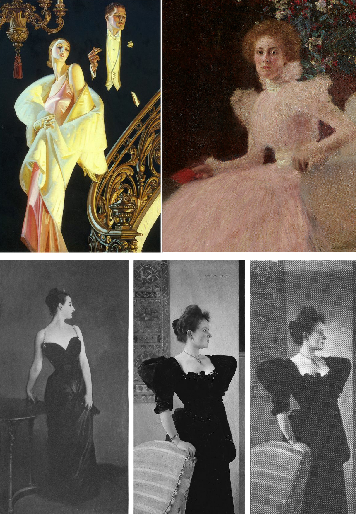
Above, Fig. 15: Top, left, J. C. Leyendeker, Couple Descending a Staircase, c. 1925; right a detail of Klimt’s Sonja Knips portrait; above, left, John Singer Sargent’s 1884 sensation-generating “Madame X”; centre, Klimt’s c.1894 Portrait of a Lady in Black as seen today; right, Klimt’s Lady in Black as shown in 1978.
Sonja Knips is shown wearing an elaborate evening dress and seated in a softly upholstered armchair. Her and the chair’s images are cropped by the bottom and right-hand edges of the picture and therefore are brought closer to the viewer while left without a clear relationship to a ground plane. Such cropping facilitates key modernist picture plane-asserting strategies – as evident in the above Sargent and Klimt portraits of a standing lady in a black costume. Sargent sets the whole figure in a dark enveloping but bounded space. The fused figure and (vertically, not horizontally, cropped) table are as securely placed on the floor as a linked piece of sculpture on a plinth. Adding to that palpable sense of the body, Sargent’s light picks up form-disclosing drapery configurations within the dress’s overall blackness. That mix of a theatrically lit figure and minimal but precisely realised furniture may have found echo in the American illustrator J. C. Leyendecker’s brilliant advertisement for Arrow Shirts (above, top left).
With the cropped chair and figure in Klimt’s lady-in-black, above centre, we are given fewer such lights and altogether less spatial orientation – except in narrow overlapping recessional relief: the chair overlaps the lady, who overlaps the hanging carpet and the wall, which overlaps a second parallel wall. While such treatment can be read as a staging post in a long march towards modernism, Klimt had shown fondness for precisely such compositional parallelisms and eschewing of deep spaces at the height of his neo-classical “historicist” period, as recapitulated in his Young Girls with Oleander at Fig. 14 above.
In any event, whether a recapitulation or an anticipation, in his lady-in-black, the emphatically extravagant shapes of the black dress pin the subject to the picture plane like a butterfly to a board. Or, rather, they do so in the picture’s present restored and buffed state. Originally, and as late as in its 1978 appearance as above right (in Johannes Dobai’s Klimt) when much of Klimt’s complex and nuanced hierarchy of values survived, the lighting was not uniformly bright but softer and more focussed, in a more Sargent-like theatrically light-animated space. Then, the décolleté was rendered both more brilliant and more plastic by adjacent as well as internal tonal values. A darker tone at the back of the neck/shoulder in combination with the more shadowed profile face and shoulder (offset by a spotlighted halo) bestowed a more columnar, sculptural neck.
Klimt was then disposing lights and shades imbibed from his classical training like a masterly cinematographer with his lamps. The great British cinematographer, Jack Cardiff, learnt his lighting in childhood from studying old masters in museums and his lighting was so skilful and flattering that great actresses of a certain age would only appear in films employing him. (One of Klimt’s sons, Gustav Ucicky, began a distinguished filmmaking career as a camera man in 1916, as Nebehay discussed in his 1992 Gustav Klimt: From Drawing to Painting.)
THE FULL PHOTO-RECORD
Weidinger’s inclusion of the Belvedere infra-red image raised awkward methodological questions. With a century old painting, can a “below-the-surface” view reliably locate a work’s original appearance? If infra-reds are admissible evidence, what grounds exist for excluding the testimony of all other photographic records?
Above, Fig. 16: Top, Klimt’s Helene and Sonja portraits, as published between 1908-14 through the H. O. Miethke gallery in Vienna; and (above), the portraits as published in 1942 and 1956 in Emil Pirchan’s Gustav Klimt.
In Klimt’s portrait of Sonja Knips, the group of lilies shown above and close behind her head must be presumed to be either cut flowers in a hidden vase or some free-floating artistic/symbolic device. Presently (as at Fig. 11, bottom right), the subject herself aside, all is indeed darkly mysterious and serves effectively as a backdrop/foil to the brightly lit head and spectacular dress – almost as in Leyendecker (Fig. 15, top left) when the early photo-record shows Sonja set in an articulated and bounded space.
In 1908, Klimt and Galerie Miethke had collaborated on the publication of a group of collotypes marketed under the name Das Werk Gustav Klimts, a project aimed to distribute his work to a new type of collector. From 1908 to 1914, Klimt personally supervised the 50-print enterprise, which faithfully reproduced what he thought to be his most important paintings from 1898 to 1913 and he designed a unique signet for each print, which was placed beneath the image and impressed in gold ink. Emperor Franz Joseph I of Austria was the first to own the initial instalment.
Where some might sniff at the enterprise’s commercialism, Weidinger reminded us (2008, the Tate, “The master of erotic theatre” ) that: “Contrary to what people think and what has been written about the Secession, it was not a museum, but a gallery operation that generated cash. The artists had families and needed the money.” In the event, those limited edition ultra-high quality photographic reproductions generated a niche market as quasi-artworks. (See, for example, 1stDibs; Acquisitions of Fine Art and the Jason Jacques Gallery.)
If the art historical testimony of these images remains neglected, their role in the withdrawal of the Klimt group of artists from the Secession was reported in Nebehay, 1992:
“In the spring of 1905, after a difference of opinion regarding Carl Moll’s activities in the then leading gallery H. O. Miethke, the ‘Klimt group’ had left the Secession. This group, which comprised apart from Klimt, architects such as Josef Hoffmann and Otto Wagner and artisans such as Kolo Moser, was opposed by the so-called painter group, led by Jose Engelhart, who protested against Moll’s exhibition activities at Miethke’s which, they said (not without reason) were damaging to the Secession. When it came to a ballot, the opponents – having roped in one of their members then staying in Berlin – won by only one vote. Again, the real talents gathered around Klimt: the rest were mediocre. The eight wonderful years of the Vienna Art Spring were over: after the ‘Ver Sacrum’ came no mild summer, no fruitful autumn, no contemplative winter.”
A MOST ADVANCED METHOD OF PHOTOGRAPHIC REPRODUCTION
The following technically informative account of the role of the originally created portfolio of ten Klimt works is given by 1stDibs:
“…the folios of collotype prints published by H.O. Miethke in Vienna between 1908-1914 known as Das Werk Gustav Klimts, are important art documents worthy of as much consideration for the bold stand they take on established ways of thinking about artistic collaboration as they are for their breathtakingly striking images…Miethke’s pioneering art house had become Klimt’s exclusive art dealer and main promoter of his modernist vision. Paul Bacher and Carl Moll, a founding member with Klimt of the Vienna Secession, who all broke away during the rift in 1905, took stewardship of the gallery following the fallout with the Secession. Das Werk Gustav Klimts is a prime example of Miethke’s masterful and revolutionary approach to marketing art. Miethke’s innovative marketing strategy played to a penchant for exclusivity. The art gallery and publishing house utilized the press and art critics – such as Austria’s preeminent Art Historian, Hugo Haberfield, who became Director of the gallery in 1912 – as a means of gaining publicity as well as maintaining effective public relations. Miethke used the grand exposition format to extend the art gallery’s market reach, cultivating their product’s prestige by stroking the egos of current art patrons while simultaneously creating accessibility for newcomers and other avid collectors to share a relative proximity to other wealthy and respected members of the art collecting community… Between 1908 and 1914, H.O. Miethke published a total of 5 instalments of print folios of Klimt’s painted work, each comprising 10 prints. The series was limited in availability to 300 and purchase was arranged through subscription. Each issue was presented unbound in a gold embossed black paper folder…These folios were not comprehensive of Klimt’s work; but rather, they feature what he believed were his most important paintings from 1898-1913. Only 2 collotypes in each folio were multicolored…Alice Strobl’s scholarship on this subject confirms Klimt’s involvement throughout the 7-year production process. The Virgin, for example, which dates from c. 1912-1913, was created well after the portfolio was first conceived c. 1908. Its corresponding signet, therefore, could not have been created a priori [see Fig. 17 below] … Understanding the fragile nature of the collotype printing process also reinforces this project’s distinctive and ground-breaking characteristics. The fragile collotype plates could not be reused. As such, this necessitated the completion of a run on the first go and also dictated the limited production numbers such as the 300 pulled for Klimt’s Das Werk. Printed by hand, the collotypes required deft handling by the printer, k.k..Hof-und Staatsdruckerei. A complicated and lengthy process involving gelatin colloids mixed with dichromates, the creation of 16 color separation thin glass filters to achieve the light-sensitive internegative images which could faithfully capture all of the painting’s tonal gradations and colors, exposure to actinic light, and delicate chine collie papers which allowed for greater color saturation, the printer’s collaborative role in capturing and transmitting Klimt’s nuanced paint strokes is nothing short of remarkable. Ernst Ganglbauer, Director of kaiserlich-konigliche Hof-und Staatsdruckerei (1901-1917) was eager to promote art prints. An innovator, he elevated the Kaiser’s press to international renown by assembling the best of the best in technical and aesthetic advisors. This dream team of free-lance artists developed adaptive uses for the Staatsdruckerei’s existing equipment and, together with the printers there, perfected the multicolor print process for Miethke and Klimt’s Das Werk.
(Emphases added.)
Clearly, these early Klimt-approved images were as good as could be made at the time and might properly form the starting point for any comparative study of the two pictures’ photo-records. Their then technological sophistication was truly remarkable: in key respects, the multiple colour separations made to capture the exact tones and hues anticipated by a century the ground-breaking multi-spectral high-definition digital camera invented by the engineer/optician Pascal Cotte of Lumiere Technology.)
Other collotypes made and produced in limited-edition books today sell at eye-watering prices. In 1942 and again in 1956 the two portraits (along with many others) were published in Emil Pirchan’s book Gustav Klimt, as above at Fig. 16.
PHOTOGRAPHIC DEMONSTRATIONS OF RESTORATION INJURIES

Above, Fig. 17: Left, a collotype print of Klimt’s The Virgin published between 1908-14 through the H. O. Miethke gallery in Vienna, here overlapped by its Wiki image. The chromatic and tonal differences between the two records speak for themselves.

Above, Fig. 18: Top left, Klimt’s Sonja Knips portrait (a Miethke 1908-14 collotype); right, the left section of the Belvedere infra-red image published by Weidinger in 2007. Above left, the portrait as in 2007 and, above right, in 2012.
The above comparison of the testimony of the 1908-14 photo-record and the pre-2007 infra-red image, suggests that formalist accounts of a light v. dark triangular pictorial dualism are over-stated, space-denying simplifications. Note that almost half-way up the photo-record’s left-hand edge, the picture is bisected by a short horizontal tonal division between a darker upper area and a less dark, seemingly shadowed area of ground. That crisp horizontal division speaks not of a void but of a distinction between a wall and a ground plane. Such an architectural reading is further indicated in the top left-hand corner of the infra-red image by a seeming bottom corner of a window or aperture. On the combined evidence of the Klimt-approved Miethke collotype and the Weidinger infra-red image we can conclude – much as with the Helene portrait – that Klimt had toyed with the idea of inserting an implicit rectangular feature (a fragment of a window, or aperture) in the picture’s top left-hand corner which would have echoed the picture plane but that he had decided against it and painted it out. Having painted out the feature, Klimt then pulled that corner of the picture back towards the picture plane with the “echoing” parallelism of the flowers’ motif. (Had the superimposed fragmentary flowers not been in place, the restorers might well have semi-excavated the window aperture as with the frame behind Helene.)
With further regard to the Klimt-approved Miethke-recorded spaces and structures, if we read leftwards from the centre of Klimt’s strategically placed little red book, another tonal division runs horizontally before turning upwards diagonally to meet (almost) that of the wall/floor junction running in from the left edge. Above this lower division there are leaf-like formations that suggest a shrub or topiary that runs upwards and behind the lilies. However, on the infra-red image detail, above right, the leaf-like formations also run below the book and into the area that had read in 1908-14 as the shadowed section of the floor. That would indicate that Klimt had painted out the lower leaf-like forms to produce the ground plane as recorded in the Miethke gallery collotype. Today, as seen above in 2007 and 2012 (Fig. 18), the originally distinct tonal zones have been subsumed in the larger, undifferentiated dark zone that is now taken as a Klimt-intended emptiness or void. However, even today, within this supposed void, a seeming tableau of small figures and statuary can still be glimpsed despite having been ruled out on the supposed evidence of the sole infra-red image.
FIGURES IN THE BUSHES OF A TRULY EXCEPTIONAL PICTURE
In her 1989 Klimt, Life and Work, Susanna Partsch wrote of the Knips portrait:
“Sonja Knips is sitting in a park or garden, on the edge of a light-coloured chair…The light earth contrasts with the dark background, which has some red in it on the left. There is something mysterious about the dark, irregularly applied colour, which casts shadows on the light earth. There is the merest suggestion of a pond in the background. Against this background Sonja Knips sits in a sumptuous pink dress with high neck and ruffles, narrow waist and full skirt. The lower edge of the picture cuts off the bottom of the skirt, which is therefore not visible, any more than are the feet. With her left hand, Sonja Knips grips the armrest, as if she were just about to get up, and this impression is strengthened by the way she sits on the edge of the chair but is contradicted by her right hand, which rests quietly on her leg clasping a red booklet. Nor does the expression on her face suggest that she is about to move, she gazes straight ahead out of the picture, disquieting in her immobility. This portrait is the only one with a hint of landscape in the background. Klimt painted many landscapes and many people but kept the two distinct, which makes this portrait truly exceptional. It was painted at a time of upheaval, when Klimt had abandoned historicism but not yet found his own style. In the same year he painted his first landscape pictures. The orchids and the pond in the portrait represent a subdued symbolism, hinting at sumptuousness and mystery.”
That nicely observed account presumably preceded the picture’s restoration. Twenty-three years later in her 2012 Taschen essay “Paintings of women” Dr Partsch writes of the same picture:
“…She is sitting at the very front of the seat of a generously sized armchair and is leaning on the upholstered arm as if she were about to stand up. In her right hand she holds a small red book. With her body angled to the left, she has turned her head so that she is looking straight out the picture and fixes the viewer with her gaze. The curls of her hair are taken up in the ruffles of her dress, while her head is framed as a whole by a backdrop of flowers – lilies or orchids that are either growing in a garden or standing in a large vase on the floor. Beyond the top of the canvas, blooms and branches form an invisible arch that descends into the picture in the top left-hand corner in the shape of another flower. This left half of the picture consists of two planes clearly divided by their colour. The [lower] area of pale brown, in some places shot with green, in the lower left-hand corner barely distinguishes itself from the tender pink dress and forms a floor of some kind. The dominant field of blackish brown, which provides a foil to the flowers and the female sitter, contains several lighter patches. These have inspired numerous interpretations, with some authors suggesting that Klimt had painted over what was originally a garden setting. Infra-red photography has failed to confirm this theory and it thus remains unclear whether Sonja Knips is situated in a room or outdoors in a garden…”
The two accounts of the same picture by the same author differ – but what has changed if not the picture itself? A certain hardening of a feminist stance emerges. Sonja is now more assertively “looking straight out the picture” and “fixes the viewer with her gaze”. Partsch now complains generally that Klimt’s portraits of women “seldom reveal the individuality, character or abilities of the women they depict” and raps him over the knuckles for having reduced one female subject, his Rose von Rosthorn-Friedmann of 1901, “to a figure of elegance and sensualism” while neglecting to indicate that “she was a pioneering female alpinist who became the first woman to climb the East Face of Watzmann and Thurwieserspitze in the Ortler Alps”. The complaint seems something of an ideology-signalling contrivance: short of tying some rope, climbing boots and crampons around his subject’s neck, it is hard to see how Klimt might better have done justice to her than as below at Figs. 19 to 21.
A digression is merited on this female portrait: the charge of “reducing” his subject to elegance and sensualism – as if those two traits preclude all others – is unfounded. Klimt, who said of Alma Schindler “She is beautiful, she is clever and witty, she has everything that a fastidious man can expect from a woman”, did not rob the subjects of his commissioned female portraits of dignity, gravity or intelligence, any eroticising tendencies notwithstanding – and nor was he formulaic in his portrayals: every subject prompted a re-invention, and a re-invention that was preceded by multiple exploratory studies. Natter’s close attention to the receptions initially given to Klimt’s paintings is pertinent on Rosthorn-Friedmann: “her death, still relatively young, on 19 January 1919, prompted Hugo von Hoffmannsthal to write a letter to her widowed husband, in which he emphasized the striking beauty, intelligence and warmth of this exceptional woman.”
Above, Fig. 19: Left, Sargent’s “Madame X”; right, Klimt’s portrait of Rose von Rosthorn-Friedmann, as in Natter, et al, 2012.
In Rosthorn-Friedmann Klimt fused glamour athleticism and grit, if not steel (note the eyes; the pinched nostrils; the mouth and its bared teeth); not to mention the sinuous lightness of a delicately perched and coiled figure whose torsion more than vies with that of Sargent’s “Madame X”. With what is known of his subject, all would seem to be in order in Klimt’s painted account. Partsch casts doubt on Alma Schindler’s claim that Klimt had just begun an affair with his model, but Natter spells it out: “In her diary entry of 19 January 1900, Alma mentioned Klimt’s latest liaison: ‘What’s more, he’s just started an affair with Rose Friedmann, that old hag! He takes where he finds.”
Above, Fig. 20: Klimt’s 1901 portrait of Rose von Rosthorn-Friedmann as seen in the two deluxe Klimt catalogues: that is, as in Weidinger, 2007 left; and as in Natter, 2012, right.
We cannot vouch for the veracity of the two books’ reproductions of the painting and both publishers take fair pride in their productions. Yet, as seen above, there are numerous chromatic and tonal differences in the respective photo-illustrations which, given the chronology, suggest a post-2007 restoration. Because Weidinger attempted to have every Klimt work re-photographed for the 2007 Prestel book’s catalogue we can, perhaps, safely take the images above left to be a fair record of the then state of the picture. So what might account for the general losses of tonal and chromatic vivacity as seen on the right in 2012? For example, Partsch notes (Taschen, 2012) that “her dark, coiffured hair is barely distinguishable from the blue of the background”. That indeed was the case, but it had not been so in the 2007 Weidinger reproduction as above left, centre, when the blues, blacks and whites were warmed and enriched by red. The evident weakening of the strong form and shape of the greatly more lustrous hair in 2007 is not an isolated incident within the picture. It had been accompanied in 2007 by a markedly sharper, darkly unified near-diamond shape of background enclosed by the arm and body.
WHICH IS THE REAL KLIMT?
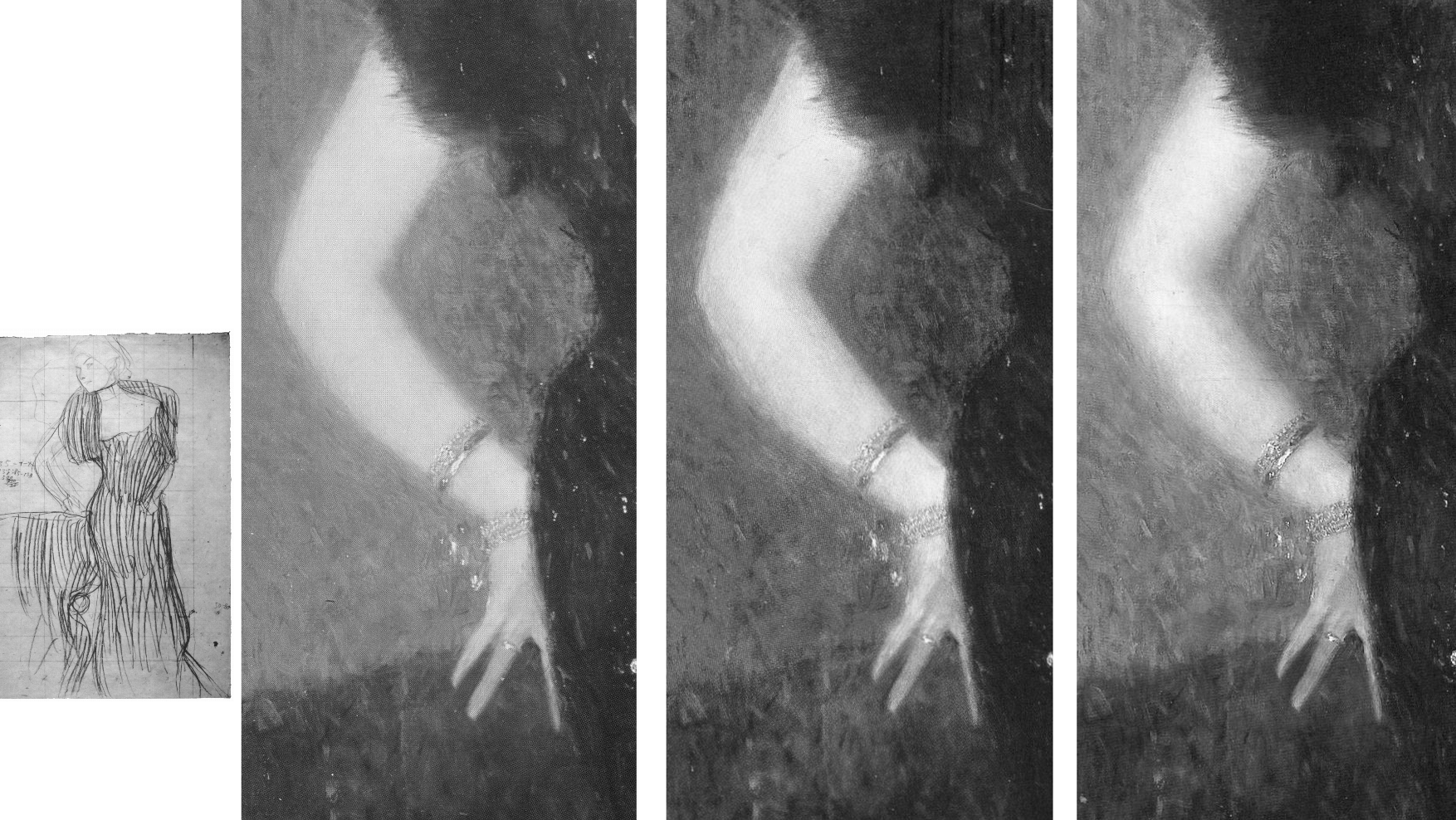
Above, Fig. 21: Left, Klimt’s working drawing for the Rose von Rosthorn-Friedmann portrait (which picture is held in a private collection in Switzerland); right, a detail of the painting, as reproduced respectively in: 1988, Gabriella Belli, Gustav Klimt Masterpieces; 2007, Weidinger, et al; and in 2012, Natter, et al.
The picture had long been thought lost and was known only by a single photograph. Unfortunately, no one seems to have reproduced that early record. What is to be made of the above trio of details recorded consecutively in just twenty-four years? With the above detail, we see three successive states: 1988; 2007; 2012. With the second and third – which is to say, the two most recent states – we can dismiss the possibility of photo/reproduction variations because such could not be responsible for distinctly local changes, as with the dramatically and selectively darkened space between the little and the ring finger that occurred between 2007 and 2012. All three images are individually of a piece and speak of distinct appearances in the picture. Of the three states, the first (1988) is the one that is least like the others: its arm has two sharply defined contours and is slimmer than those in the other two photographs. To this photo-testimony, might anything be gleaned from what is known and what has been said about the picture?
Writing on the most recent (2012) state Natter speaks first of its reception and then of Klimt’s initial struggle: “Klimt wrestled long and hard with the composition and the standing motif, as his preliminary drawings testify… Only gradually did he arrive at the curvaceous, serpentine pose of the final portrait… Noteworthy is the dialogue between the figure and background…Such a permeability of natural forms and representations of the human figure is therefore thoroughly typical of Klimt…” (Emphasis added.)
Writing on the 2007 state, centre image above, Weidinger related the picture’s “erotic connotations” to Klimt’s “numerous snaky women who populate the symbolist paintings of 1898 to 1907” and held that, in this portrait, Klimt “emphasizes both line and area so as to produce a stylized rendering of the body such as manifested itself first in his Symbolist works…Instead of twisting three-dimensionally around her own axis, as do Mannerist figures [and Sargent’s “Madame X”] Rose von Rosthorn’s S-shaped body appears to be all on the same plane; the effect of this, coupled with the emphatic outlining, is to make the portrait seem curiously flat.”
There is a crucial difference in the two accounts. Where Natter speaks of the permeability evident in a dialogue between the figure and its background, he seems on safe ground with the borders of the extravagant fur stole and the lower body on the right, and with the division between the background and the assumed reddish chair, but there is no such permeability at the contour of the face and choker, or at the scissors-like fingers and chair back. Weidinger notes that the red of the armchair had been achieved with “the application of innumerable tiny brushstrokes, pointing in all directions at once” and that “the same method is used for the skin, although here the outcome is not so coarse”. The key difference in the two accounts lies in Weidinger’s recognition of Klimt’s deployment of both line and area. The line (which bounds impermeable shapes) is confined to the areas of bare flesh – the head neck and arm – where Klimt’s classically trained draughtsmanship asserts itself. In his commissioned portraits Klimt retained a respectful and more traditionally hierarchical attentiveness to the forms of heads and hands, whatever indulgence might have been given elsewhere to symbolism, pattern-making abstractions, and decorations.
The earliest photograph, above left is, by definition, the record that is temporally closest to the picture’s original appearance and it should, accordingly, be taken as a more reliable record than the two later states. Additionally, this 1988 state better accords with a vivid contemporary response to the painting. In contradiction of the present (post-2012) chilled blue background, Natter cites Frans Servaes’ captivation in 1901 with Klimt’s use of colour: “The shimmering violet of the background plays with tumultuous gentleness around the bare propped arm and the dark dress covered with spangles in the most wonderful fashion.” Today, one sees no violet against the arm in Figs. 19 and 20. A patch of background to the right of the dress might be thought of as violet but the larger cooler blue areas certainly could not. Might there have been earlier losses in the background as with those seen more recently in the hair? Natter also mentions that Ludwig Hevesi had been particularly struck by “Slender elastic lines having a singular swing, profile to the left…A slim pale arm supports itself on three fingertips on a piece of furniture; one realizes immediately that a figure such as this really does not need to support itself” – like that of an agile, super-fit rock climber, perhaps? Klimt’s final, working study, above left, had fixed the slim arm’s outer contour with deftness and precision. Such decisiveness of design in the arm is best seen here in the oldest record (1988) and is least evident in the most recent and most fumbled arm (2012) where the contours have succumbed to a havering state of permeability. To discount the 1988 photo-testimony in favour of the later states it would be necessary to claim that an earlier restorer had wrongly imposed an alien linearity on the arm and that in two successive restorations an original, fumbled and fatter arm had been recovered. The non-publication of the sole photograph by which this once lost painting was known is to be regretted.
VOID SPACE OR INTRIGUE?
To return to the Knips portrait, in both Figs. 16 above and 22 below it is possible to read miniature figures or statuary within the vegetation along a horizontal line to the left of Sonja Knips’ forehead.
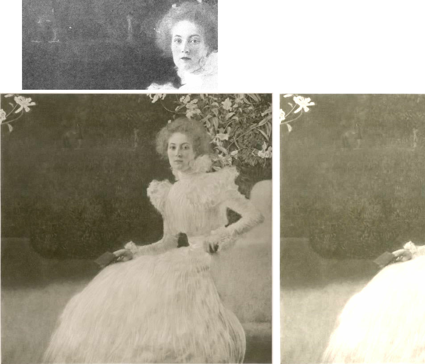
Above, Fig. 22: Left, the 1908-14 collotype of Sonja Knips; right, a lightened section of the collotype’s left-hand area, in which the original two-tone ground/wall/shrubbery boundary is clearer. The above greyscale inset is a detail of a photograph carried in the October 1900 Figaro Illustré, as discussed by Emily Braun in the 2001 Gustav Klimt Modernism in the Making, Ed. Colin B. Bailey. In all three images the horizontal line of figures and a statue is discernible.
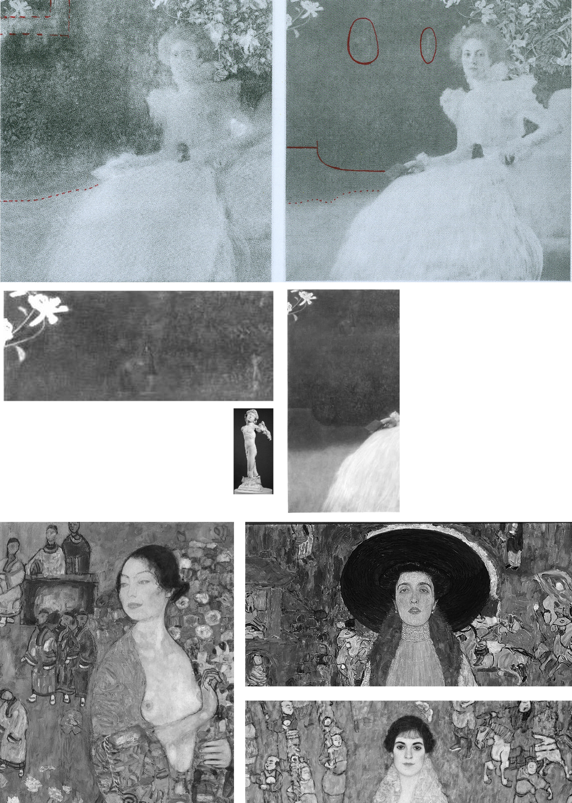
Above, Fig. 23: Top row, left, the 2007 Weidinger infra-red image; right, the 1908-14 Miethke collotype – in these, we indicate (in red) the moving ground/wall boundaries and the placement of the “window”. Below, in the centre group, we see how the reported figures had appeared in early photographs. In his 2007 rejection of earlier claims of perceptible figures in the picture’s upper half on the testimony of the infra-red image, Weidinger cites scholarly experts who had variously identified: “cupids and two figures…[a] pool and fish-like creatures… [and a] horse’s head…” Given such testimony – and the fact that discernible figures had registered in the dark background to the left of Sonja’s head in the Klimt-approved collotype and subsequent photographs to this day, as in Fig. 24, right below – those figures’ status might better have been resolved by the publication at high resolution of all the Belvedere’s photographs and technical records of the picture rather than with a dismissal by technical fiat on a single, out-of-context, difficult-to-read infra-red image.
The small, photographed free-standing Cupid sculpture in the centre group above is the former antiques shop find that has been upgraded and displayed at the Metropolitan Museum, New York, as an autograph early Michelangelo. If it might seem improbable that Klimt should have included secondary figures in a large and exceptional portrait, it could equally be held that the photographically-recorded figures in question were forerunners of the artist’s later incorporations of entire armies of people and horse riders – as in the above three later portraits of The Dancer (1916-17), left; Adele Bloch-Bauer II (1912), top; and Elisabeth Lederer (1914-16) bottom right.

Above, Fig. 24: The Portrait of Sonja Knips, as in 1908-14, left, and today, right, as seen in both colour and in greyscale.
THE DEMISE OF THE LILIES AND THE RISE OF “APPROPRIATE RESTORATION STRATEGIES” AT THE BELVEDERE
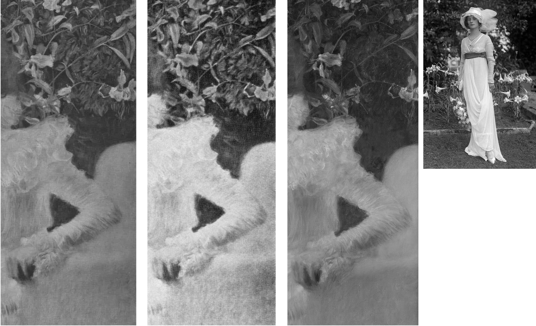
Above, Fig. 25: Three details of the lilies backdrop as recorded in: 1908-14, left; 1942-56, centre; today, right. In the inset, above right, a 1912 British Vogue fashion shot.
The differences seen above between 1908-14, left, and 1942-56, centre, are not substantial and might amount to little more than variations in reproduction values. The subsequent differences seen above, right, however, are of another magnitude and show outright losses of autograph material, as to the foliage between the upper arm and the back of the chair.
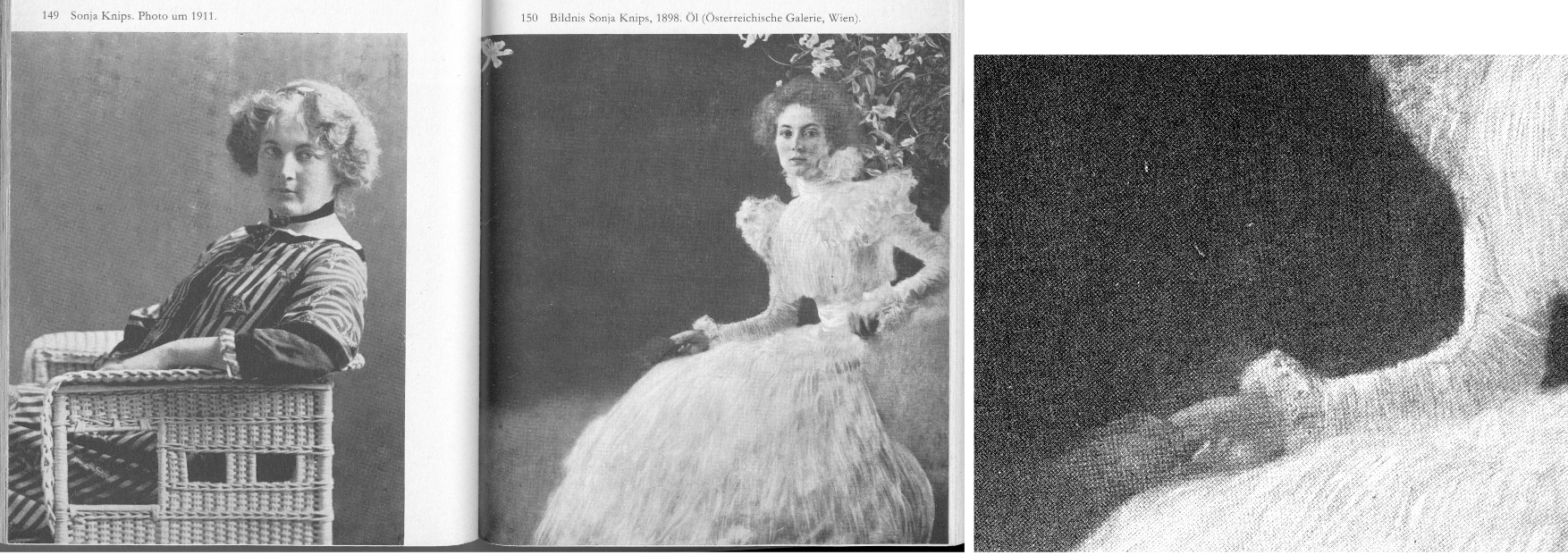
Above, Fig. 26: Left and centre, a two-page spread from Christian Nebehay’s 1969 Gustav Klimt, showing Sonia Knips in 2011 and her portrait when the hand/notebook motif was still intact; right, a detail from Johannes Dobai’s 1978 Klimt showing that by that date the hand/book had been injured and left incoherent. The offending restoration must, therefore, have taken place between 1969 and 1978. The picture itself was commissioned by Sonja Knips (1873-1959) and owned by her until 1950 when she was seventy-seven and it was bought by the Belvedere, Vienna. The museum says of its (manifestly hyperactive) conservation department:
“The Belvedere’s restoration and conservation department is dedicated to the preservation and care, restoration, and technological research into the art and cultural assets of the Belvedere’s collection, which ranges from the Middle Ages to contemporary art. Its mission is to record and preserve objects of historical and cultural significance. Conserving these irreplaceable originals requires a methodical and scientific approach in order to shed light on the historical, stylistic, iconographical, technological, and material aspects of the artworks. With this in mind, the Belvedere’s conservators devise appropriate strategies. On average, the department conserves and restores 150 paintings and frames each year, and frames and mounts between 100 and 150 graphic works.”
THE DECONSTRUCTION OF SONJA’S LITTLE RED BOOK

Above, Fig.27: The red leather-bound Klimt sketch book held by Sonja Knips, as seen, respectively in 1908-14, top; in 1956, centre; and today, above.
In this photo-sequence we see that crucial differences of appearance arose between 1956 and 2012 – in fact, on above evidence, between 1956 and 2007. Given the book’s changed appearances, Dr Natter’s claim that “The dualism of mimesis and dissolution, of faithful reproduction and painterly openness, is already in evidence here as a stylistic means” becomes problematic. Given that the once faithfully tight and precise book/right-hand had by then been left in a quasi-Cubist double image that resembles time-lapse photography, should it have been regarded as an instance of mimesis or dissolution? Natter’s view remains unknown because has not commented on the present condition. Such questions arise with other Klimt portrait pictures:
Above Fig. 28: Top, left, Klimt’s now lost 1900 portrait of the thirteen-years old Trude Steine (note the strong line of the shoulders); centre and right, a large detail of Klimt’s 1902 Portrait of Gertrud Loew, as in 1956 and today; above, a three-part chronological sequence of Klimt’s 1905 Portrait of Margaret Stonborough-Wittgenstein.
As a lost work, the Trudy Steine picture, will at least now never lose its great – photographically preserved – vivacity and force. Gertrud Loew disappeared when sent to Berlin in 1938. Her portrait survives but it has not been spared by restorers. Speaking to its condition today, as top right, Weidinger writes:
“Ludwig Hevesi [1902] referred to the portrait of Gertrud Loew – shown for the first time at the ‘Klimt Collective exhibition’ at the Secession in 1902 – as ‘the most fragrant lyric of which the painter’s palette is capable’. Like Serena Lederer the subject is clad in white. Colour accents are set by her long, downward cascading shawl with its lilac-coloured border. Klimt renders her pale skin in tones close to that of her dress, and only her red lips, blue eyes and dark hair supply the necessary contrasts. Her loosely flowing dress betrays no sense of corporeality. In this connection, Natter speaks of her ‘dematerialization’”. Weidinger adds that when exhibited in 1903 it had been said to possess “all the charm of radiant filminess” and “the gauziest lyricism of which the palette is capable.”
That was then. Restorers thought the filminess might be taken further and, to that end, simultaneously darkened the upper background and lightened the upper costume, thereby dematerializing the previously clear articulation of the subject’s shoulders. To add to the tonal mayhem, both the lower background and the lower dress have been lightened. This is no longer the picture Klimt painted of Loew. The Pirchan reproduction gives a truer account than the painting itself.
Above, Fig. 29: Main centre images: a detail of the picture as recorded in 1956 and today, in which sequence it is easy to identify the obliteration of leaves, multiple micro-losses of value in this dress and the loss/painting-over of the original foliage between the shoulder and the chair back; insets, a detail of one of Klimt’s preparatory studies for the painting; and (bottom left), a detail from a photograph of the portrait carried in the October 1900 Figaro Illustré (as discussed by Emily Braun in the 2001 Gustav Klimt Modernism in the Making, Ed. Colin B. Bailey).
Natter’s claim that Klimt camouflaged disparate pictorial means by simulating a photo snapshot holds fair insofar as Sonja grips the arm of chair firmly and (as others have noted) leans forward as if caught when about to rise, but the picture was no product of a snatched moment, as the many studies Klimt made of his subject when in costume and in the chair testify (see Fig. 30 below). It is also part-true that Klimt conjured a “fascinating contrast between the naturalistically modelled head of the sitter and the gauzy shimmer of her dress” (we are advised that the material was likely either very finely pleated silk chiffon or muslin) but, aside from the abundant skirt, there is no near-abandonment of corporeality: even in semi-repose this dress in animated and formed by the lithe, almost geometricized, body that was captured in Klimt’s preliminary studies.
Notwithstanding the abundance of small folds on the sleeves, the thin shapely taught-ness of the arm seen by Klimt and captured in the drawn studies had asserted itself in the painting. On comparing the above photographic sequence, it is evident that in the very earliest recorded state (1900, bottom left), the orchestrated collection of shadows at the bottom of the lower arm much better and more decisively “drew” the limb’s contour: at the turn of the sharply defined elbow there is first a discernible concavity and then a convexity that straightens as it runs down towards the wrist. That original taught-ness of form/anatomy and relative weight of shadow at the lower contour was also evident even in the small low-quality image from Nebehay’s, 1976 Gustav Klimt, shown above at Fig. 11, but, like so much in Klimt, it has subsequently been fuzzed and lost.
Above, Fig. 30: Some of Klimt’s many sketches for the Portrait of Sonja Knips, in every one of which the forms and the massing of the hair were noted in relation to the head.
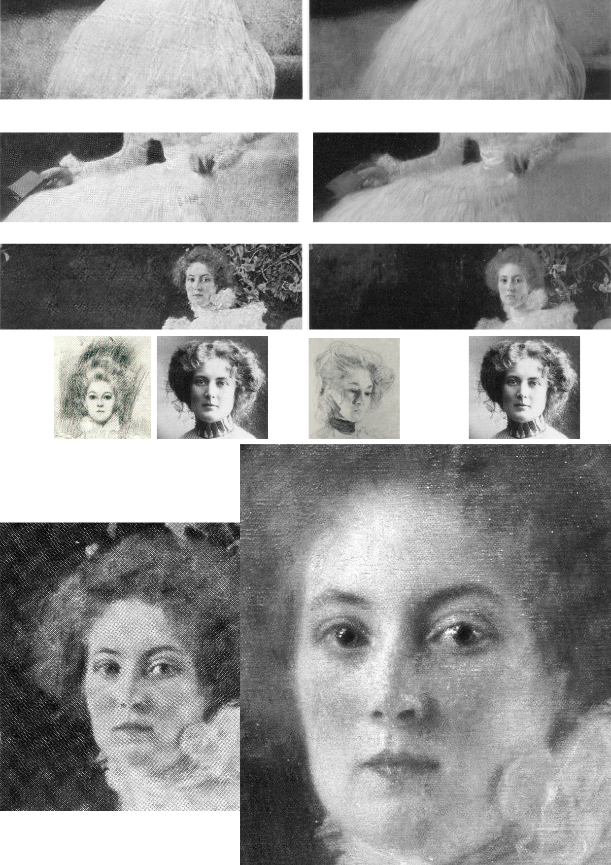
Above, Fig. 31: Top, three photo-comparisons of details showing changes between 1956 and today; centre row, left, a drawing of Sonja Knips and a later photograph; right, a Klimt study for another painting; bottom row, Knips in 1956 and in 2007 (Weidinger).
More than a first foray into a new type, this arguably stands as one of Klimt’s best female portraits, its twenty-five years-old subject being utterly composed, beautiful, intelligent and with a resolute, if poignant gaze. As mentioned, having first seen Sonja to be gazing out of the picture, Susanna Partsch (“Paintings of Women”, Taschen, 2012) now sees a Gorgon-like demeanour with Sonja turning her head “so that she is looking out of the picture and fixes the viewer with her gaze”. That reading is not remiss on today’s appearance but in Pirchan’s 1956 image (here bottom left) the gaze seemed fractionally averted and the effect markedly more reflective than confrontational. Moreover, a comparison of the mouth’s two states shows that Sonja has received a fresh lipstick that no long conforms to the shapes and forms of her lips.
Partsch writes that “The curls of her hair are taken up in the ruffles of her dress” without noticing that the earlier softly disposed forms and luxuriance of the hair have been drained of form and vitality – as with the disappeared darkly accented shadow at the lower temple and cheek that formerly served to draw the contour of the face and drew attention to Knips’ right eye. Considering the importance of hair as a feminine adornment and how hard artists labour to do justice to its glories, it seems odd that clear injuries to it, as here and with Rose von Rosthorn-Friedmann alike, should generally go unremarked.
Above, Fig. 32: Left, Sonja Knips in 1911; centre, top, Evelyn Nesbit, the muse of the American illustrator Dana Gibson, left, and one of Gibson’s famous “Gibson Girl” drawings; right, a Klimt drawing of 1898-1900; centre above, a Gibson Girl left and Sonja Knips in 1911 in Japanese-style Reformklied, as carried in the Neue Galerie 2007 Gustav Klimt. (For live early film footage of American women sporting Gibson Girl hairdos, see “The Real Edwardian Gibson Girls of the USA” at Glamour Daze.)
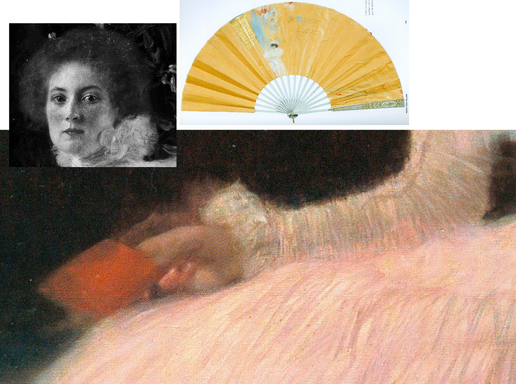
Above, Fig. 33: Main picture, the right hand of Sonja Knips; top left inset, Sonja Knips; above right, Sonja Knips’ fan, as decorated by Klimt.
Consensual views break down on Klimt’s and Sonja Knips’ relationship. In the 2007 Neue Galerie book, Knips’s granddaughter, Dr Manu von Miller, author of Sonja Knips Und Die Wiener Moderne, 2004, reports (“Embracing Modernism, Gustav Klimt and Sonja Knips”) that recently disclosed materials from the Knips family revealed much about Sonja and shed light on previously unknown aspects of Klimt’s life and person. Thus: Klimt’s Sonja portrait “likewise contains hints about the life of the artist” and that the two had had an affair years before it was painted, Klimt having known her since she was a teenager. Painting Sonja had released Klimt from his role as “a ‘decorative’ painter”, and he in turn enormously influenced Knips enabling her to “break free of the rigid bourgeois conventions of her time, and to create her own highly personal approach to aesthetics and collecting.” In 1896 Sonja married the industrial magnate Anton Knips – a mismatch, he not sharing her passions for socialising, modern art and young artists. Klimt’s relationship had, Dr Miller reported, “blossomed at some point into an amorous relationship. How long the affair lasted is not known but Gustav and Sonja’s romance is substantiated by notations on a paper fan found among Sonja Knips’s personal effects.” Those included a love poem dated 1895, the year before Sonja married Anton. A member of her family had told Miller the affair ended because Klimt was unwilling to marry her. The fan was thus “a love note and a farewell”, Klimt having ended another affair in the same manner…and given that Sonja sat for Klimt’s portrait scarcely a year after her wedding, Miller felt “It is hard to imagine that the painting could have been produced without their recent love affair being in the minds of both artist and sitter. She may have viewed the portrait as an enduring reminder of the relationship; it was noted by an acquaintance of Sonja’s that her eyes would light up when she was asked about the history of the painting’s creation.”
As mentioned, Sonja Knips kept the painting until her seventy-seventh year and, as Miller noted, she purchased Klimt’s unfinished (and highly erotic) Adam and Eve after his death and hung it “in the small boudoir next her bedroom”. Partsch will have none of Miller’s account, writing (Taschen, 2012): “On the basis of this fan and the decoration on the reverse side, Manu von Miller reconstructed a love affair between Gustav Klimt and Sonja Knips before her marriage and proposed that Klimt used the fan as a way of ending their relationship. Miller also suggests that Klimt may have done the same with a second fan destined for an unknown recipient and on that occasion carrying the German proverb… (‘Best to get unpleasant things over and done with’) … It is my view that the fan belonging to Sonja Knips points neither to a love affair between the artist and his model nor to a rupture between the two. Rather, it shows Klimt expressing his congratulations to Sonja Knips upon her engagement…”
What then, to make of the prominently displayed (- almost at the picture’s geometrical centre) little red book? In 1992 Nebehay wrote of “a small red notebook: a sketchbook that Klimt gave her.” It had been found in Sonja Knips’s estate and edited by Nebehay and was one of only three such surviving notebooks. It contained a small photograph of Klimt. Alice Strobl had dated Klimt sketches in it to between 1897 and 1899. Strobl had reported an eyewitness’s recollection of Klimt’s studio floor “strewn with thin red notebooks in which he jotted his artistic ideas down in shorthand, as it were.” Nebehay notes that Klimt was as disorderly with his notebooks as with his sketches which lay about in heaps on the floor.
On the book’s possible significance, Nebehay, like Partsch, leaned towards scepticism: “A married society woman would never have dared keep anything that was more than a souvenir” and, he went on, “Johannes Dobai reports that the lady [Knips] told him that the figures hidden in the foliage behind her had no symbolic meaning and as for the notebook in her hand, that was chosen for the colour effect.” Against that, Weidinger wrote in 2007:
“During his second series of studies, Klimt appears to have wanted to portray Rose von Rosthorn-Friedmann holding a rose in her right hand, but in the final version decided against this. The little sketchbook Sonja Knips is portrayed holding serves a similar purpose. Her claim that Klimt had merely wanted to add a shot of colour can be refuted on the grounds that the book appears in the studies for this work as well. Klimt is clearly using the book as an attribute which he considers apposite.”
Alma Schindler who so jealously and angrily cited Klimt’s affair with Rose had been delighted when Klimt preferred to make a new fan for her rather than contribute to a fan gifted by another man. Klimt pursued Alma as a teenager and was greatly distressed when prevented from initiating an affair with her. Klimt, as mentioned had known Sonja, too, as a teenager before her marriage. If the presence of the book is to be discounted, what of the picture’s part-hidden Cupid and figures and why have they been so uniformly dismissed on the sole testimony of a technically penetrating image?
Partsch contests an affair against much evidence and trusts an infra-red image: “The dominant field of blackish brown, which provides a foil to the flowers and the female sitter, contains several lighter patches. These have inspired numerous interpretations… [which infra-red photography] has failed to confirm…” In 2008 Rachel Barnes (Gustav Klimt) wrote: “There was a theory that Klimt painted a number of things in the background, including a horse. Subsequent infra-red examination has proved this was not the case.”
It is unfortunate on many levels that in modern times scholars turned from artists to restorers for guidance on technical and aesthetic matters when restorers have no technical means of analysing artistic values and, through their interventions, so repeatedly demonstrate inabilities even to recognise and respect them. It seems that nothing might arrest their long march through the world’s art – no matter how egregiously they mangle its images and, hence, meanings. We live in hope that owners and scholars will better defend the integrity and dignity of works of art but note that we first complained of restorers’ manifestly and indefensibly destructive actions – and of art historians’ effective complicity – in an article, “A crime against the artist”, in The Independent of 22 November 1991 as reproduced below at Fig. 34:
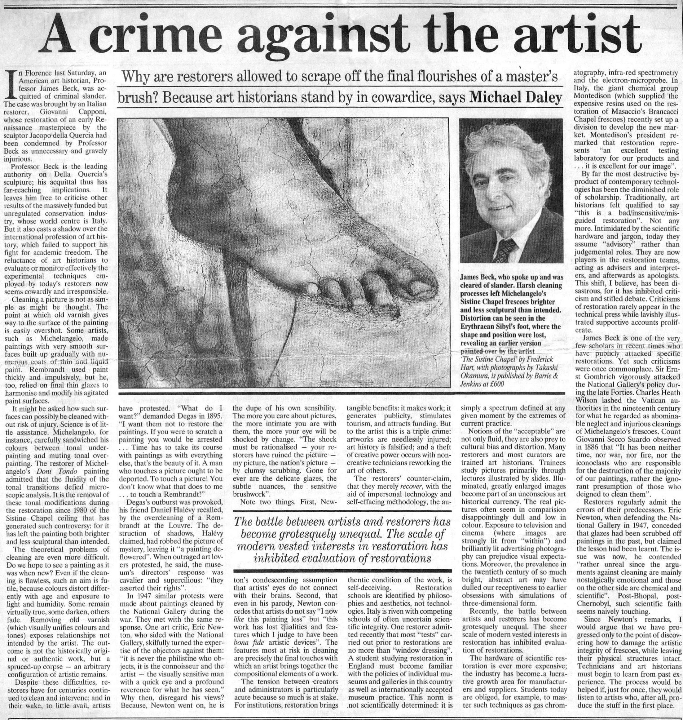
Michael Daley, Director, 29 April 2021
Art-Trading, Connoisseurship and the Van Dyck Bonanza
There are now two upgraded paintings in two museums that have been claimed as “The Last Van Dyck Self-Portrait” and an upgraded third painting has been presented in a third museum as a lost, earlier Van Dyck self-portrait – see Fig. 1 below. This acceptance by three museums of three self-portraits in six years has coincided with a spate of exposed forgeries and restoration-led upgraded “discoveries”. The opaque means by which three problematic pictures found their separate ways into three museums as upgraded autograph Van Dycks are items of cultural/art-political concern.
This triple elevation has spotlighted levels of scholarship and transparency within the cross-linked spheres of connoisseurship, ownership, restoration, promotion and sales in the wake of the spectacular rise and demise of the now downgraded and disappeared $450m Leonardo School Salvator Mundi that had been bought for barely a thousand dollars and somehow netted nearly two thirds of a billion dollars through three sales in five years on an implausible provenance. The institutionally sensitive roles of upgraded old master paintings serving as conduits for financial exchanges and investment are attracting attention as never before. The Van Dyck bonanza has prompted public challenges on both the artistic status of the pictures being traded and the means and manner by which public and private monies pass hands.
THREE UPGRADED VAN DYCK SELF-PORTRAITS
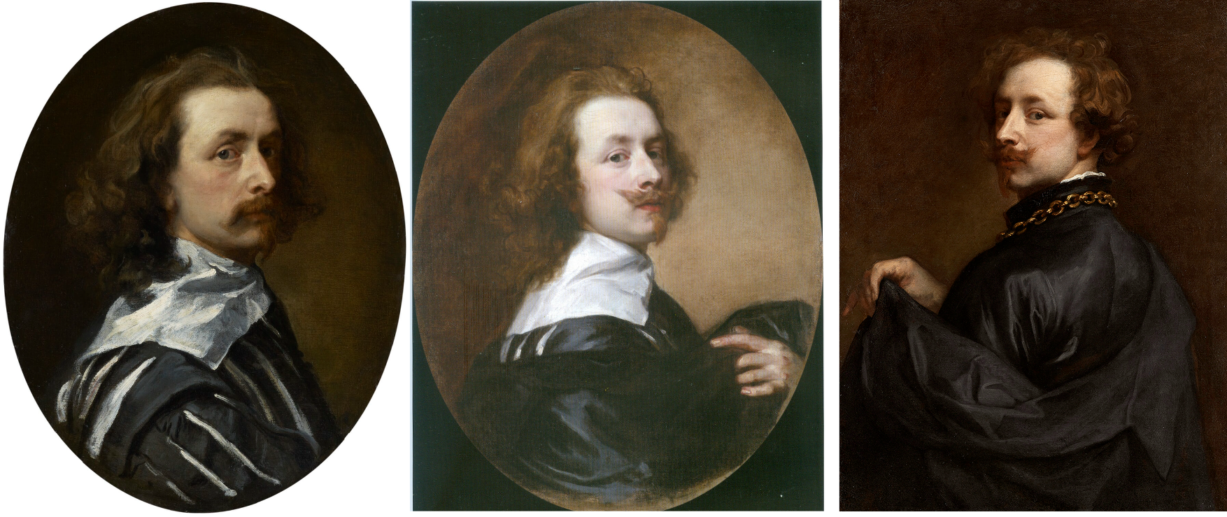
Above, Fig. 1: Left, the National Portrait Gallery’s “Last Van Dyck Self-Portrait”; centre, the new Bendor Grosvenor-accredited (and owned) “Last Van Dyck Self-Portrait”, as loaned to the Rubenshuis Museum, Antwerp; right, the Philip Mould/Grosvenor accredited, privately owned painting that has been loaned as an autograph Van Dyck self-portrait to the Minneapolis Institute of Arts, Minnesota.
All three of the above self-portraits changed hands recently as autograph Van Dyck self-portraits with the first two both now claimed to be the last Van Dyck self-portrait. All three have undergone modern or recent restorations. The two on the right were transformed within the last decade (and possibly by the same restorer). The picture on the left – an undeclared, covert upgrade – was bought by the National Portrait Gallery in 2014 for £10m.
Above, Fig. 2: Left, the “Last Van Dyck Self-Portrait” that was published in 1941 by Gustav Glück in The Burlington Magazine (“Reflections on Van Dyck’s early death”); right, the “Last Van Dyck Self-Portrait” that was sold to the National Portrait Gallery in 2014.
Above, Fig. 3: Left, the “Last Van Dyck Self-Portrait” as published by Glück in 1941; centre, the “Last Van Dyck Self-Portrait” as sold to the National Portrait Gallery in 2014; right the painting published by Glück in 1941 as a copy by Sir Peter Lely of the Glück claimed last Van Dyck self-portrait shown left, here.
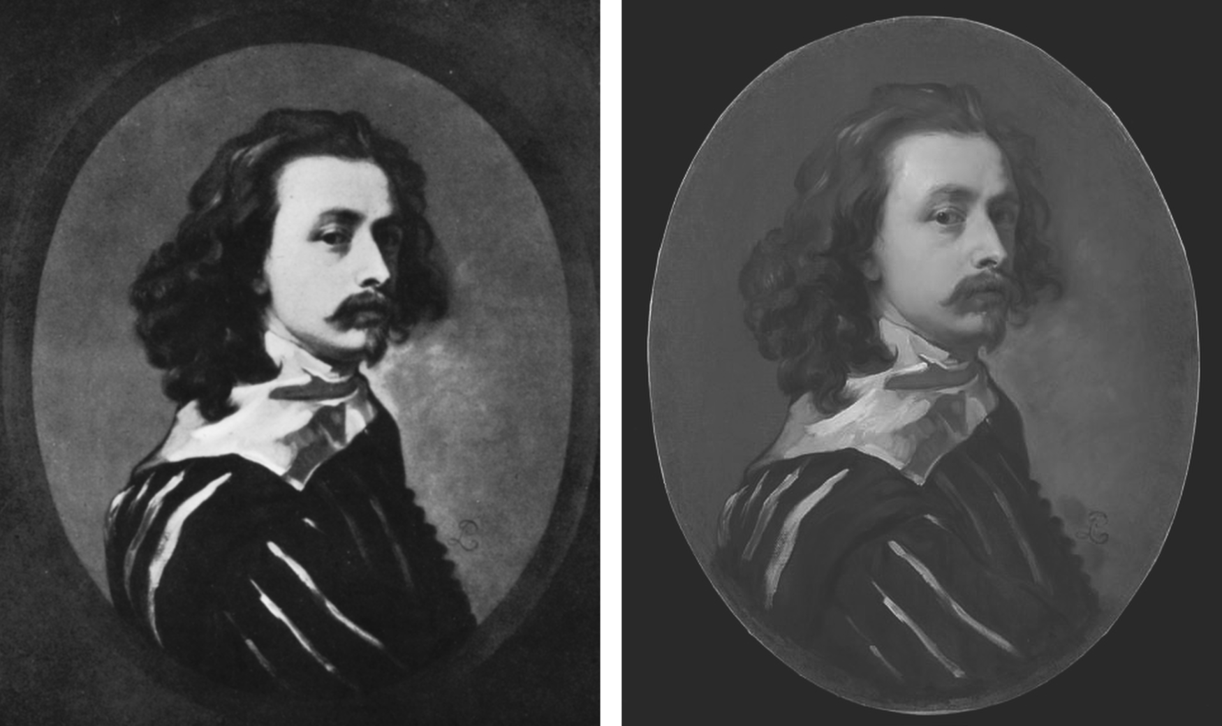
Above, Fig. 4: Left, the painting published by Glück in 1941 as a copy by Sir Peter Lely of the then-claimed last Van Dyck self-portrait shown above left at Fig. 3; right, the painting published in 2011 as a copy by Sir Peter Lely of the then-claimed last Van Dyck self-portrait at Fig. 1, left, which was sold to the NPG in 2014.
MILLAR’S WARNINGS
The notoriously vexing challenge of identifying autograph Van Dycks was set out with frankness and high expertise by Sir Oliver Millar, a former Surveyor of the Queen’s Pictures, in his contribution to the 2004 catalogue raisonné Van Dyck – A Complete Catalogue of the Paintings, by Susan Barnes, Nora De Poorter, Oliver Millar and Horst Vey and published by the Paul Mellon Centre, London, the educational charity committed to supporting original research into the history of British art and architecture of all periods.
Covering Van Dyck’s last English period from 1632 to 1641, Millar listed 264 works and added an appendix of 37 works that comprise records of lost original paintings. Taken together they would average more than thirty-three paintings a year, including many double and very grand group portraits with brilliant elaborate costumes, accoutrements, settings, animals and part-landscapes but the work rate was even higher because of Van Dyck’s many and often long absences and periods of illness – he spent more than a year abroad in 1634-5 and suffered increasing pain in his painting hand. His employment of assistants caused some patrons to complain of work that was not autograph.
Millar assumed that Van Dyck had emulated the practices and “distribution of responsibilities as organised in Rubens’s studio” when setting up his own studio in London and he could hardly have spoken more bluntly of the artistic consequences of such production systems. A great deal of work “especially towards the end of his life”, he noted, “was assigned to Van Dyck’s assistants, and there was a heavy demand for repetitions, whether replicas, part replicas, variants or copies […] Sometimes Van Dyck would himself paint a new detail in a repetition otherwise painted entirely by an assistant”, whereas his “finest English portraits are painted…noticeably with a greater variety of touch.” A pronounced monotony of touch might itself, therefore, ring authorial alarms.
NEW EXPERTS ARE GROWING THE VAN DYCK MARKET
The art market correspondent, Colin Gleadell, restated the attribution problem in relation to current market expansionism, in the Telegraph (28 April 2018):
“Interestingly, Van Dyck has had more re-attributions than any other Old Master in recent times. Philip Mould, presenter of the BBC’s Fake or Fortune, traces this phenomenon to the publication of the first reliable catalogue raisonné in 2004, which allowed for detailed study of nearly 800 examples of the artist’s work.
“Of the catalogue’s four original scholars, only two are still alive, and a number of former museum directors have offered their views on attribution since. It’s differences in opinion that have allowed additional works to be added to the recognised Van Dyck corpus.
“Because Van Dyck was prolific and used studio assistants in his work, it can be tricky to unravel how much of a painting is solely by the master. Consequently, the number of works attributed to him, his studio and his many followers is plentiful. Around 300 have come up for auction in the last four years, with dozens subsequently upgraded with a full attribution.
“Taking some credit for the change in status was Mould’s researcher, Bendor Grosvenor, now a TV presenter in his own right and also a Van Dyck connoisseur, who has been quietly accumulating a small collection of discoveries of his own.
“But while Grosvenor prefers to keep his finds, his friend, Fergus Hall, is in the business of selling, his trained eye capable of recognising Van Dyck’s touch even through centuries of dirt, degraded varnish and additional paint. It is only after painstaking cleaning, though, that the full picture emerges…”
MAGICIANS ANNOINT SECOND-STRING WORKS
There exists an aggravating sub-phenomenon whereby venerable scholar/connoisseurs effectively acquire powers to elevate best available copies to autograph status. Some, like the late Sir Denis Mahon, have been known to elevate more than one such work to a single “vacancy”. (See “Art’s Toxic Assets and a Crisis of Connoisseurship”.) Occasional misattributions are inevitable (and correctable) in a field that necessarily rests on fine judgements, but wholesale upgrades risk diluting and adulterating oeuvres to the point of jeopardising market confidence. Risk is compounded when upgrades are products of prolonged restorations in which paint is subtracted and added to the surviving carcasses of pictures on singular, sometimes optimistic, readings of authorship.
BENDOR GROSVENOR’S ASSORTED CONTRIBUTIONS
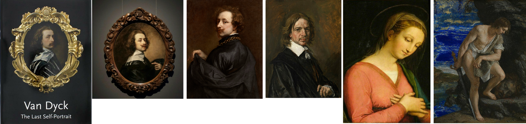
Above, Fig. 5: All six works above have been supported by Bendor Grosvenor.
The three recently and problematically upgraded Van Dyck self-portraits above left were all researched and espoused by Grosvenor. All three works on the right are manifest fakes. The Hals and the Gentileschi were initially accepted by Grosvenor and the “Raphael” attribution was made by him on television.
Respectively, the six are: left, the National Portrait Gallery’s “Last Van Dyck Self-Portrait”, as shown on the gallery’s 2015 celebratory book on the painting; second left, Grosvenor’s own and self-upgraded “Last Van Dyck Self-Portrait”, as loaned by him to the Rubenshuis Museum; third left, the privately owned, Grosvenor/Mould-attributed Van Dyck “Portrait of the Artist” that is now on loan to the Minneapolis Institute of Arts; third right, the now notorious “Frans Hals” (which Grosvenor, the Louvre Museum and a London dealer took to be authentic before Sotheby’s proved by technical analysis that it was a modern paints-riddled fake and fully refunded its buyer ); second right, the self-contained painted fragment of a figure that Grosvenor held to be part of a larger Raphael panel on his BBC4 Britain’s Lost Masterpieces programme (5 October 2016) with near-unequivocal support from the National Gallery’s then director, Sir Nicholas Penny. (The “Raphael” was subsequently rejected and deemed possibly 18th century by the National Gallery in August 2019 following lengthy examinations, but Grosvenor still insists that Raphael had painted this fragment of a “Madonna in a Cross-over Dress” even though it had been painted inside the edges of a piece of wood and therefore could never have been part of a full panel painting); right, the fake Orazio Gentileschi David and Goliath painted on a lapis lazuli slab and which had been exhibited as authentic at the National Gallery when loaned by an anonymous private collector who had bought it from the dealer who had sold on the fake Hals through Sotheby’s.
RESTORATION “SCIENCE” AND THE DETECTION OF AUTHENTICITY
Even before Millar’s warnings, a non-art market exercise had confirmed the problem of identifying studio contributions in 1999 when, in the National Gallery’s Technical Bulletin, the restorer Larry Keith reported that a recent restoration of the Rubens studio work Drunken Silenus supported by Satyrs (Fig. 6 below) had “allowed the opportunity to consider the questions around its authorship and execution afresh in the context of a collaborative technical investigation with the scientific department”. Despite the gallery’s advanced scientific apparatuses and its staffs’ best efforts, it was recognised that “The very nature of the Rubens studio, with its streamlined production and group participation, meant that the painting techniques and materials were also largely uniform, which inevitably limits the ability of technical study to inform specific attributional problems.” In the absence of documentation and relying “heavily on traditional style-based Morellian connoisseurship” the gallery attributed the picture to Van Dyck on a traditional appraisal by eye.

Above, Fig. 6: Above, top left and centre, photographs of a part of the National Gallery’s Rubens studio work Drunken Silenus supported by Satyrs, showing the work before restoration (left), after restoration (centre) and (right) as digitally presented today; below, a detail of a face before and after restoration.
As seen above, the pre- and the post-restoration states are artistically different in their tonal values and relationships. We have examined the National Gallery’s dossiers on the painting and the gallery kindly supplied the two good, hard-copy directly comparative photographs above, top. Where Gleadell shared the sleeper hunters’ proclaimed view of restoration as a benign and “enabling” process, careful comparison of the above detail of a face and its relationship to the foil of a background/sky before and after a single restoration show the debilitating disruptions of values and relationships (relative values) that can occur during a single restoration. Given that what comes off first under restorers’ swabs is what went on last with the artist’s brush, and that highly successful painters like Rubens and Van Dyck often touched up and finished off works that had been largely executed by assistants, it is not hard to appreciate how such subtractions through cleaning followed by painted additions can aggravate difficulties of attribution.
MADE-OVER UPGRADES
The principal instrument in art market upgrades is a long, supposedly “diagnostic”, visually transforming restoration. With dramatically altered pictures, scholars can more easily be chivvied to endorse new and elevating ascriptions. Few restorations give rise to downgrades. Sleeper hunters invariably swear by the brilliance and moderation of their favourite restorers and impute scientific veracity to their methods. In naïve non-specialist circles like the BBC, there exists an unexamined conviction that because today’s technologies are more advanced than earlier ones, aesthetic judgements are now scientifically validated. For example, in short £540 weekend courses at the Royal Academy (with light refreshments, an evening reception and a certificate thrown in), Philip Mould’s former apprentice, Bendor Grosvenor, (who read modern – not art – history and now works as a BBC television arts programme maker, art history blogger, occasional journalist, auction house director, a self-declared ex-dealer collector and, most recently, a picture restorer – see below), promises that “The theory and history of connoisseurship will also be explored, along with the latest scientific techniques for assessing attribution”.
There are no such techniques – science cannot appraise authorship. No matter how technically sophisticated “non-invasive” images might be, they still need to be read for significance. While the “scientific” technical analysis of pictures’ material components can readily disqualify attributed old master works that have been liberally constructed with modern materials, there are no scientific means of assessing authorship, per se.
VISUAL APPRAISALS
Painters make pictures by eye to be viewed by eye and appraisals must also be made by eye, as the National Gallery recognised with its Rubens school picture. When Berenson praised the “seeing eye” and “active not passive eyes” he meant eyes employed “with all the faculties co-operating” but in so-saying he spoke a (self-confessed) part-truth: “As a consumer of the art product I have the right to do all that. As I am neither figure artist nor architect, nor musician, I have no certain right to speak of the producer. I am in the position of most critics, philosophers and scholars. We have enjoyed experiencing the creative process in the art of words only with the logical result that writers on art seldom have in mind any of the arts except the verbal ones.”
Faculties, however refined and words however eloquent, are not the whole story. Too often overlooked is the extent to which for art-practitioners (artists) the powers of the eye are drilled into being both constructive and critical through the marriage of looking and doing that comprises artistic practice. Strictly speaking, that sequence should read: thinking, looking; doing; appraising; looking… Those who see-through-doing are best placed to recognise what counts as undoing and redoing in art. Best-placed but holding no monopoly – Millar fully recognised that restoration alterations handicap appraisals: “…the treatment it may have undergone in the past may also make it impossible to be entirely confident about its quality”. In this regard and for good reasons auctioneers place high premiums on little- or never-restored pictures.
TWO PUBLICATIONS FOUR YEARS APART AND TWO OVERLAPPING CAMPAIGNS OF ATTRIBUTION
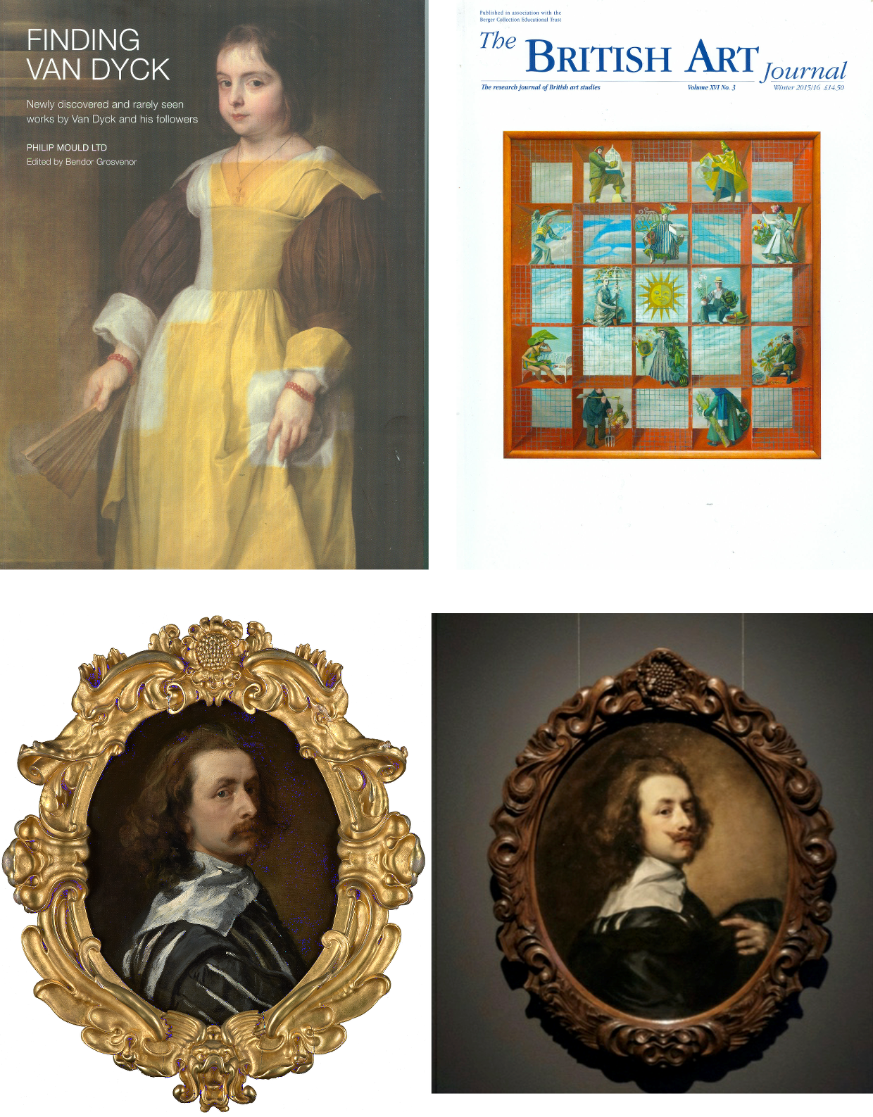
Above, Fig.7: Top, left, the 80 pp full colour catalogue FINDING VAN DYCK , pub. PHILIP MOULD LTD, June/July 2011; top right, the Winter 2015/16 British Art Journal, which carried Bendor Grosvenor’s article “A Self-portrait by Sir Anthony van Dyck (1599-1641) from the collection of Charles I”; above, left, the £10m National Portrait Gallery “Last Van Dyck Self-Portrait”; above, right, the Grosvenor-owned, Rubenshuis Museum exhibited, “Last Van Dyck Self-Portrait”.
SHARED EXCITEMENTS, RISKS, AND AVOIDANCE OF SIN
In 2011 Grosvenor, then an employee of the Philip Mould gallery, lauded the gallery’s (and later the National Portrait Gallery’s) “Last Van Dyck Self-Portrait” picture in the FINDING VAN DYCK catalogue shown above, top left:
“Our first exhibit, Cat. 1, is Van Dyck’s last self-portrait. It was acquired by this gallery in partnership with Dr Alfred Bader in December 2009 for £8.3m at Sotheby’s in London, a record for the artist at auction. Self-portraits tend to stand out among a painter’s oeuvre as some of their most compelling works, and as an instructive connoisseurial guide in what an unquestionably genuine and pre-eminent Van Dyck looks like, Cat. 1 takes some beating.” (Emphases added.)
As fulsome advocacy the entry itself takes some beating. The FINDING VAN DYCK exhibition celebrated recently claimed works of or after Van Dyck and it constituted the high-water mark of Van Dyck sleeper-hunting at Philip Mould Ltd which became Philip Mould and Co. from which Grosvenor would depart in 2014 with a (rumoured) £1m settlement. Grosvenor seemed unaware that the Cat. 1 picture, then unsold after eighteen months in the Mould gallery, was a recent upgrade made by stealth and without due scholarly interrogation – see below.
The catalogue bore the gnomic dedication “For Dr Alfred Bader CBE. A distinguished progenitor of adventure in old masters”. Bader, an industrialist, philanthropist as well as an “inveterate collector”, as he once put it, died in December 2018 but he had been a key player in the Mould gallery’s acquisition of the “Last Van Dyck Self-Portrait” and its subsequent sale to the NPG. Bader and Mould seemed not to – but should – have appreciated how recently the painting had been upgraded. The NPG might not have been aware when buying the £10m painting as Van Dyck’s Last Self-Portrait that it was one of three Van Dyck self-portraits then being processed by the Mould gallery, one of which would shortly be presented as being both the true Last Van Dyck Self-Portrait and one with a better provenance, to boot.
LOVE IS ALL YOU NEED
In the catalogue’s foreword, Mould held that “every time a work of art is bought for reasons of love it is a discovery of sorts, albeit of a personal regard or strong emotional connection that has been visually crystallised” and that by “getting to know the signature strokes and habits of a great master, the characteristics of age, restoration and degradation, the [professional sleeper-hunter’s] eye becomes attuned, and even though there may not be many others around who can see it as you do, it can appear little short of sinful not to express the excitement of it all.” A note of anxiety crept into the self-exultation: the exercise of discovering, proclaiming, and selling lost masterpieces “involves excavation, science, observation and research – as well as a fair degree of sometimes hair-raising financial risk”. The precise burdens of risk and divisions of ownership are rarely disclosed.
WHO FUNDS ATTRIBUTION UPGRADES?
Clarity on ownership is occasionally achieved in the courts. Recent London Court of Appeal proceedings revealed that the fake Frans Hals (Figs. 5 and 9) had been bought jointly by a London-based dealer, Mark Weiss Gallery in Paris, and an investment company, Fairlight Art Ventures, for €3m in 2010 from the prime suspect in a French criminal investigation into a huge group of suspected fake Old Masters. The painting was sold in 2011 by private treaty through Sotheby’s (on a 5% commission) to the Seattle collector Richard Hedreen, for $10.75m. Weiss and Fairlight were shown to have taken an equal share of the benefit. See “’The law has to fall on someone’: Seller of allegedly fake Frans Hals must pay Sotheby’s $5.3m for cancelled sale, judge insists”, The Art Newspaper, 29 November 2020.
After discovering the fraud, reimbursing the buyer, and establishing a technical analysis department, Sotheby’s pursued the dealer, who settled first, and the investment company in protracted legal actions which were only resolved last November. In 2013 the now disappeared and Louvre Museum de-attributed $450m Leonardo School Salvator Mundi was sold by a consortium of New York dealers through Sotheby’s in a private treaty sale. The immediate flipping of the picture from $80m into $127m to a Russian oligarch triggered still-running legal proceedings. The London Court of Appeal held that at the time of the Hals sale there was “no general accepted view of the authenticity” of a “newly discovered painting which had no proper provenance, had not been published and had never been in an exhibition”.
NO FAKE-BUSTER, THIS ATTRIBUTION-MAKER
On 21 March 2016 Grosvenor reported that the London art dealer Mark Weiss had bought and sold-on the fake Orazio Gentileschi that deceived the National Gallery (Figs. 5 & 9). He also provided a (now inactive) link to Weiss’s catalogue note on the Gentileschi and asked: “Is the Gentileschi genuine? I suspect it is, but again I’m not a Gentileschi expert, and nor am I much good with late 17th Century Italian art anyway. My conviction about the painting, such as it is, must be led in part by the fact that greater minds and eyes than mine (not least at the National Gallery) have declared the picture not only period, but genuine… My best guess at this stage, working mainly from photos, is that these pictures are not all fakes.” In truth photographs should have sufficed and would have saved time expense and error. Grosvenor later wrote: “For what it’s worth, I believe it is a forgery. But it took me a long time, and a flight to Berlin to see an undisputed original Gentileschi for comparison, to figure it out.”
Unlike Berenson, Grosvenor has evident difficulty reading photographic testimony: he spent decades believing that critics of the Sistine Capel ceiling restoration were “myopic” until a trip to Rome and sight of the chapel itself disabused him. But how so? What is left on the ceiling is still Michelangelo, and retains its magnificent – abeit less sculpturally enhanced – designs. Today, the restoration injuries can only be identified by recollection of how it once was or, less subjectively, through comparative photo-records of its pre- and post-cleaning states.
Richard Feigen, a New York Old Master art dealer and the author of Tales from the Art Crypt, called the recent fakes affair “one of the biggest scandals in my memory”, and one which should make institutions “very wary about things they are offered and the sources of those things”. Grosvenor reportedly expressed a sneaking admiration for the Moriarty of the Old Masters: “Whoever has been making them is an artist of extraordinary skill. Equally skilful is the ability to age these modern creations in such a way as to make them look centuries old. Sadly, we don’t yet know who this genius is.”
Above, Fig. 8: Patrick Chappatte’s 2017 take on the Salvator Mundi sale/attribution for the New York Times.
On 16 November 2017 Grosvenor responded immediately to the auction of the then attributed Leonardo Salvator Mundi on his Art History News website:
“…Christie’s just did something that re-writes the history of auctioneering. They took a big gamble with their brand, their strategy to sell the picture, and not to mention the reputations of their leadership team, and they pulled it off. They marketed the picture brilliantly – the best piece of art marketing I’ve ever seen… AHN congratulates them all… I was sure the picture would sell, but never imagined it would make this much… We must all now wonder where the picture is going to end up next… Will the sale prompt people to now look anew at Old Masters? Maybe. It will surely end for good now the tired clicheé [sic] that the Old Master market is dead.”
Feigen, who had been offered the “Cranach”, passed on it, and reportedly noted: “We’ve got to know the background and provenance of each object, and be more demanding for sources.”
PHOTO-TESTIMONY AND “ESSENTIAL JUXTAPOSITIONS”
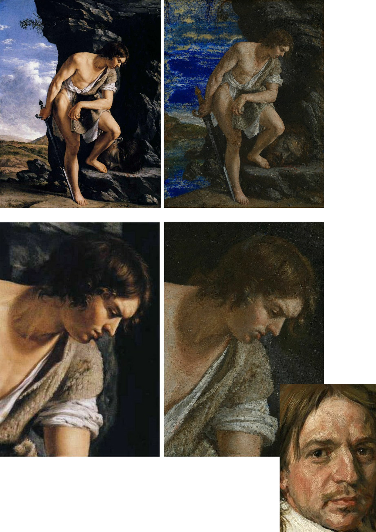
Above, Fig. 9: Here, left, we see the real Orazio Gentileschi David and Goliath (in the Galleria Spada, Rome) and, right, the loaned fake accepted as authentic by the National Gallery. Bottom right corner, the face of the fake Frans Hals portrait.
If, instead of whatever technical and art historical examinations were carried out, the National Gallery had run a few simple photo-comparison checks, as above at Fig. 9, it would have been apparent that the bona fide picture on the left had served as the model for the markedly inferior modern-looking version on the right. Had the fake Hals also been brought into comparison, as above, it would have disclosed a common authorial fondness – in two ostensibly historically disparate pictures – for arbitrary superimposed streaky white smears on the faces. In many respects, photo-comparisons are more helpful to appraisals than ones made from present and recollected pictures. First, there is a chronic logistical problem that Millar put well in 2004:
“…Although in tackling this particular problem it is more than ever essential to see the works in the original, it is difficult to compare works which are closely related but hundreds of miles apart, if not in different hemispheres. In spite of the legendary kindness of their owners these pictures often hang in inaccessible positions and never in ‘museum conditions’. Essential juxtapositions can hardly ever be made. The present state of the picture and the treatment it may have undergone in the past may also make it impossible to be entirely confident about its quality…”
Millar’s alertness to restoration-induced deformations may have been more evident in private than in public: in a letter held in a dossier at the Royal Collection he complained angrily of damage done to a Vermeer. As for his recognition of the need to effect ideal juxtapositions for comparative purposes, today’s sleeper-hunters might heed artists’ examples: when drawing or painting from nature they invariably align their sheet or canvas as closely as possible to their view of the subject, so that their eyes can either flick continuously upwards and downwards or sideways and thereby maintain a stream of direct visual comparisons between the subject and its evolving depiction. Such vital visual comparisons cannot be achieved with pictures in different locations and restorations can only be judged by before- and after treatment photo-comparisons because pre-restoration states disappear in restoration.
THE TWO PRETENDERS?
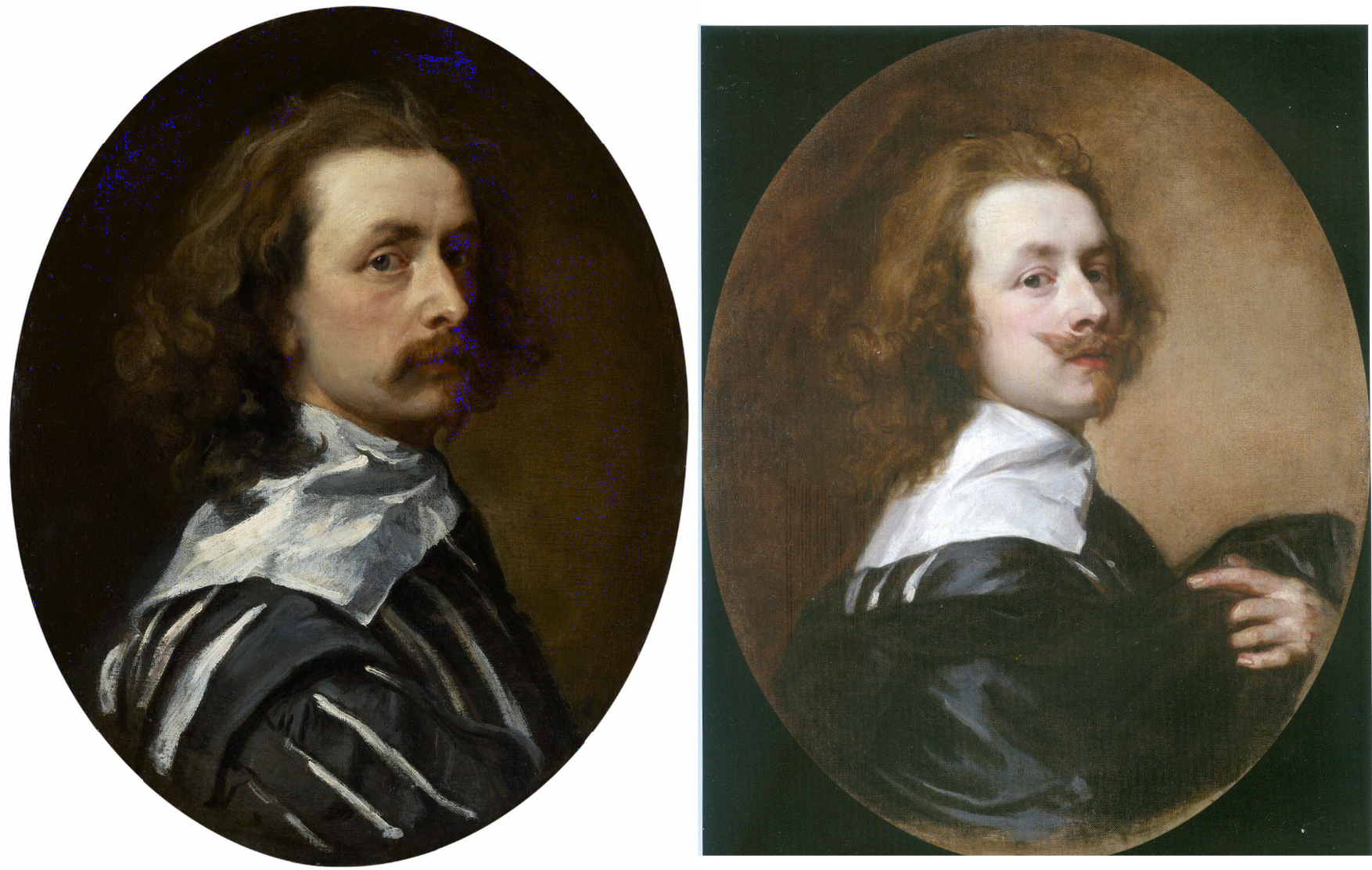
Above, Fig. 10: Left, the NPG “Last Van Dyck Self-Portrait”; right, the newly-restored, red-lipped and Grosvenor-accredited (and owned) “Last Van Dyck Self-Portrait”, as loaned to the Rubenshuis Museum, Antwerp.
When Grosvenor was about to unleash his own “Last Van Dyck Self-Portrait” in 2015 (above right), the NPG’s formerly “unquestionably genuine, pre-eminent, Van Dyck” £10m world-record price “Last Van Dyck Self-Portrait” (above left) constituted an intrinsic threat: any closely attentive aesthetic appraisal and comparison of the now two rival supposed last self-portraits risked injury to the standing of one or the other. Although many other unresolved problems were attached to Grosvenor’s newly upgraded work (see below), it can sometimes seem that nothing ever counts against an on-the-market potential upgrade – as with the evident discounting of the NPG picture’s utterly out-of-character, out-of-period, anomalous droopy Mexican Bandit-style moustache seen above and below.
Above, Fig. 11: Top, detail of the National Portrait Gallery “Last Van Dyck Self-Portrait”; above, detail of the 2015 rosy-lipped Grosvenor-proposed “Last Van Dyck Self-Portrait”.
THE ANOMALOUS MOUSTACHE PROBLEM, PART I: GROSVENOR
Grosvenor has proposed that the NPG picture was a study for his own picture despite their numerous differences (see below). The most inexplicable difference is found in the two pictures’ moustaches, one of which is swept up, the other down. This divergence is presented with some ingenuity as a purposive species of social semaphore. Thus, within the NPG picture, which Grosvenor has reassigned to the role of a “study…[a] first attempt at the creation of a new type of self-portrait”, the moustache droops, where, in his own picture, the “moustache is raised, allowing not only for a more formal look perhaps appropriate to court appearance…” but also to illustrate the “difference between Van Dyck’s public and private faces…” Are we to understand, on the sole testimony of this (covertly upgraded) picture, that Van Dyck brushed his moustache down when going about his house and studio and brushed it up to attention whenever he thought he might be being observed?
While prompting incredulity, such a notion also defies artistic logic: given that works of art are made to a purpose within an artist’s practice, how can the same work be held a magnificent, self-sufficient masterpiece one minute and, in the next, to have been a study for another work of a different composition that would present a different aspect of the artist’s self-image to the world? In 2011 Grosvenor held that “the care and finesse of the brushwork in the face [of the NPG picture] is particularly assured” and that the whole was finished off with “more delicate and transparent glazes”. If Van Dyck really had been rehearsing the frigidly swanky public self-display found in Grosvenor’s painting, why would he have produced a highly resolved head which is not cocked back; where the artist does not look down his nose at the viewer; where he does not sport a cloak; where he does not hold a hand to his breast; or, even, where he does not wear a plausible collar that emerges from within his doublet?
THE ANOMALOUS MOUSTACHE PROBLEM, PART II: GLÜCK
Curiously, the problem of accounting for a rogue occurence within the oeuvre was not a new one. In 1941 Gustav Glück had addressed the same problem when he proposed yet another “Last Van Dyck Self-Portrait” version [*] to be Van Dyck’s last self-portrait (as at Figs. 2 and 3 above and 12 below). Describing his Self-portrait (which he had discovered a few years earlier “in a London private collection”) as a much more realistic and therefore interesting version than the Duke of Westminster’s sunflower self-portrait (then regarded as the last), Glück held it to constitute “authoritative evidence of the master’s appearance a short time before his death”, with features “still energetic and expressive, though lean and almost emaciated” – as at Fig. 12 below. The face looked, he felt, almost “spiritualised, and the melancholy character of the expression is enhanced by the ends of the moustaches being turned down instead of showing the upward twist they have in all of Van Dyck’s portraits”. No doubt yet other rationalisations could be made for this unique depiction.
[* We thus encounter two pairs of pictures, each comprised of a supposed Last Van Dyck Self-portrait and a supposed Lely copy of itself. In pressing his two discoveries, Glück acknowledged that “As is the case with most of Van Dyck’s works, several replicas and copies are known of this Self-portrait.” He recalls seeing the [later Mould/Bader/NPG] version and a head and collar copy (“near Matlock”) and a miniature. In 2011, Grosvenor, in contrast, simply accepted the then Mould/Bader picture as an indisputable autograph Van Dyck masterpiece on the authority of Sotheby’s (misleading) provenance and, perhaps, on the strength of it having recently been bought as such for the world record £8.3m by his employer and an investor.
Conspicuously, Grosvenor did not engage with Millar’s estimation of the picture – “The best surviving version of (probably) the last Self-portrait”. Instead, he gushes over the then-loaned privately-owned supposed Lely copy shown at Figs. 4, 12 and 13, as an “exceptionally good copy of a Van Dyck” which “must show that Lely had owned Cat. 1” – the then Mould/Bader picture. But why “must show?” when, as he further reports, the picture’s owners had “contacted us to say that they had a copy of our painting ascribed to Sir Peter Lely, but doubted by some to be by him…the monogram ‘PL’ was not of a type usually seen on Lely’s English portraits, and was thought to be false.” Grosvenor continued “We were immediately interested in researching Cat.4 further, for if it was indeed owned by Lely, it would help confirm that Lely owned Van Dyck’s last self-portrait, a theory much speculated on but unproven.”]
MOVEABLE FEASTS: THE NEW LAST VAN DYCK SELF-PORTRAIT
Above, Fig. 12: Top, left and top right, a detail of Van Dyck’s post-1633 Portrait of the Artist with a Sunflower; second left, the 1941 Glück-claimed “Last Van Dyck Self-Portrait”; third left, the National Portrait Gallery “Last Van Dyck Self-Portrait”. Above, left, a detail of the 1941 Glück-claimed Sir Peter Lely copy of the above claimed Van Dyck self-portrait; right, the Mould/Bader-claimed Sir Peter Lely copy of the NPG self-portrait (as published in the 2011 Mould gallery exhibition and catalogue as Cat.4).
In defence of his own Rubenshuis Museum-loaned “Last Van Dyck Self-Portrait” (above, Fig. 10, right), Grosvenor cheekily suggested “the dating of the National Portrait Gallery picture, currently thought to be c.1640 may need to be reconsidered, to perhaps between c.1637-39.” But why so – and on what stylistic basis is such chronological fine-tuning estimated? Not only had the NPG picture’s properties, appearance and relationship to other pictures not changed, only four years earlier Grosvenor had endorsed its late dating by “most scholars” to about 1640-1 – and on that late estimation he, like Glück (on another picture), had perceived a “faint air of melancholy” that added poignancy amidst the origins of the civil war about to erupt in London when the artist was “all the while plagued by the ill health that would shortly cause his death.”
It might seem that such recent perceptions notwithstanding, the NPG picture’s previous dating and estimation had to be jettisoned because Grosvenor was now seeking to attach his own painting to a “vacant” entry for a Van Dyck oval self-portrait, painted to the shoulders and with a hand to the breast, in an inventory of Charles I’s collection. If successfully attached, that entry would constitute a provenance jewel beyond price. But, most awkwardly, the original long-missing self-portrait had been recorded in the collection between 1637-39 and, therefore, Grosvenor’s newly upgraded candidate picture could not be said to have post-dated 1639. However, if so dated, and if the NPG picture were to be left in place at c.1640-1, the latter, with its pronounced differences from Grosvenor’s picture, would not only invite potentially damaging qualitative comparisons, it would retain the prized romantic cache on which it had been heavily promoted as Van Dyck’s last and most “modern” personal free-flowing etc., etc. depiction of himself.
Thus, and seemingly as if in protection of his own picture/investment, Grosvenor contended that the NPG picture, may no longer be considered the magnificent self-sufficient masterpiece that had commanded £1.7m on top of its world record £8.3m when sold to the NPG, and must now be moved back in time so as to do fresh duty as a study for his own picture – and therefore to predate his own picture which would become the new “Last Van Dyck Self-Portrait”, albeit at a somewhat earlier dating.
Although Millar had judged Grosvenor’s picture to be a copy of the lost picture that had been recorded in the Charles I collection, Grosvenor’s redating manoeuvre may have intimidated the NPG. Where it had held in its 2015 celebratory book Van Dyck – The Last Self-Portrait, that “Van Dyck’s self-portrait, now in the collection of the National Portrait Gallery… is probably the last and arguably the finest…” it now claims only that its picture is “one of three known self-portraits painted by van Dyck when he was in England, and it probably dates from the last years of his life”.
GROWING THE PROVENANCE
As seen, where Sotheby’s had claimed only that the [NPG] picture was “Possibly in the collection of Sir Peter Lely, d. 1680” and “possibly” in the 18th April 1682 sale of Lely’s estate, Grosvenor held in the 2011 FINDING VAN DYCK catalogue that his Cat. 4 (supposed) Sir Peter Lely copy of the NPG picture, “must therefore confirm that Lely owned [the then Mould/Bader picture and later NPG picture] and that it was sold from his [Lely’s estate] sale in 1682.” Again, why must it so confirm when the justification was especially feeble: “It is quite possible the self-portrait in Van Dyck’s possession at his death in 1641 was his last […] and that it passed into Lely’s possession at some point…Lely may have acquired it in a number of ways…Or, it may be that the painter and art dealer George Geldorp, for whom Lely worked when he first to came to London, was involved…” (Emphases added.)
In other words, Grosvenor had not added an atom of evidence that Lely had owned and copied the now NPG picture. He had not established when Lely first came to London or whether he had ever met Van Dyck: “Frustratingly, we do not know exactly when Lely first arrived in England, and [or?] the extent to which he knew of Van Dyck or knew of his estate. His early biographer Richard Graham, writing in 1695, said that Lely came over in 1641 (the year of Van Dyck’s death), whilst the art historian Arnoult Houbraken gives a date of 1643. It is perhaps most likely that the ambitious young Lely came to London in response to Van Dyck’s death thus ruling out any possible direct connection.” (Emphases added.) Nothing learned, no value added.
Not only had Grosvenor produced no evidence, he had disclosed in 2011 that the self-portrait in Van Dyck’s estate had not been rated highly by the artist’s contemporaries; and, that while the then Mould/Bader picture “now holds the world record for a work by Van Dyck” the painting in Van Dyck’s estate “had little value placed upon it” – to be precise, it was valued at 6s 8d, a fifteenth of a Van Dyck of Charles I in armour, and a sixtieth of Titian’s Perseus and Andromeda now in the Wallace Collection.
“IT IS, IF I SAY SO”
Lacking evidence that Lely had owned and copied the Bader/Mould self-portrait, Grosvenor, too, betrayed a note of anxiety in the 2011 catalogue: “The pictures after Van Dyck demonstrate that for the Van Dyck hunter the quantity and sometimes the quality of such copies can present potential danger.” In the absence of documentary evidence, Grosvenor played a bold card by appealing to the authority of his own eye: “…the first and most important skill you need to find a Van Dyck is simply the ability to spot a painting of the highest quality. If a painting is truly exceptional, the chances are it is by a truly exceptional artist.” Chance might be a fine thing, but its prospect is not a proof or a demonstration in the here and now.
THE SUPPOSED LELY COPIES OF THE SUPPOSED LAST VAN DYCK SELF-PORTRAITS
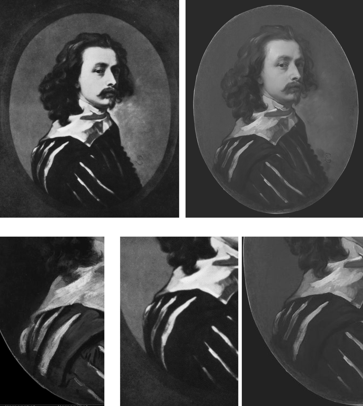
Above, Fig. 13: Top left, the attributed Sir Peter Lely copy, as published in 1941 by Glück; top right, the supposed Sir Peter Lely copy of the NPG self-portrait, as published in the 2011 Mould gallery exhibition catalogue. Above, details of costume from, respectively: the NPG self-portrait; the 1941 Glück-attributed Lely copy; the 2011 Mould/Grosvenor attributed Lely copy of the NPG picture.
Which of the two above versions is the more plausible Lely copy? Where is the Glück version today? Had it fallen by the wayside, much as had his 1934 espousal of what is now the Grosvenor/Rubenshuis last self-portrait (see below)? When did the Grosvenor/Mould-endorsed version of a supposed Lely copy first appear? Was it anywhere recorded before being taken to the Mould gallery? Do early photographs of it exist showing its reported appearance when enlarged onto a rectangular canvas? Did either of the canvases carry any historic material? Who owns it today?
It is said that when this unsettling mystery painting was brought to the Mould Gallery in 2010 shortly after the much-publicised acquisition of the £8.3m Sotheby’s self-portrait, it was “quite dirty and masked by a thick and substantially discoloured varnish.” The cleaning and researching were carried out by the Mould Gallery. Grosvenor claimed they had confirmed Lely’s authorship on the following grounds: [1] that after cleaning and restoration “there is no reason to doubt” it; [2] that “it is in fact by Lely”; and [3] that this is “a rare example of him copying another artist’s work”. The third claim weighed against it being a copy by Lely. The first statement was bluster – “there is no reason to doubt it”. The second contention was a non sequitur – Grosvenor asserted as fact something which had not been established.
SPOT THE DIFFERENCES
Grosvenor declined to address the discrepancies between the supposed Lely copy that had presented itself through an unidentified party to the Mould gallery from nowhere in 2010 or early 2011, and the supposed self-same Lely copy picture that had been published in December 1941 by Gustav Glück in The Burlington Magazine, “Reflections on Van Dyck’s early death” pp 172, 193, 195 and 199 (Fig. 12 above). There is a clear problem here: there are now two rival supposed versions of Van Dyck’s last self-portrait and each has its own supposed copy by Lely. Both pairs cannot be right. Where are the Glück ascribed pictures today? Have they been dismissed? Have they ever been compared with the two published Mould/Bader pictures?
A COVERT UPGRADE
In 2004, the now NPG picture had been described by Millar as:
“the best surviving version of (probably) the last Self-portrait, painted towards the end of Van Dyck’s years in London. The face is delicately modelled. The costume is handled very swiftly and in rough dry paint. There are some alterations made in the painting and it may be partly unfinished.”
In 2009 when included in the Tate’s “Van Dyck in Britain” exhibition, it was described in the catalogue on the (misleading) cited authority of Millar, as “thought to be Van Dyck’s last self-portrait”. Having died in 2007, Millar could not demur over the disappeared qualifier “after”.
On 9 December 2009, on the strength of that very recent Tate show and catalogue, Sotheby’s unequivocally presented what five years earlier had been no more than Millar’s “best surviving version” as an absolutely secure and precisely dated “Sir Anthony Van Dyck” – albeit on a provenance that began with two “Possiblys” – the first being “Possibly in the collection of Sir Peter Lely, d. 1680”. Sotheby’s declaimed:
“An outstanding self portrait by Sir Anthony van Dyck (1599-1641) – one of the most important Continental European artists to have worked in England – comes to auction with exemplary provenance[*] and an estimate of £2-3 million. The masterpiece, which is the artist’s last portrait of himself, was painted in London in 1641 in the final months of his life. It is one of only three self portraits that he painted in England and this, his last, captures him grandly attired in a black and white slashed silk doublet. The painting epitomises the elegant poise and relaxed informality that van Dyck brought to the art of portraiture in Britain and it undoubtedly ranks among the most important works by the artist ever to come to the auction market.” (Emphases added.)
[* On the accuracy of this estimation of the provenance, see Susan Grundy, below.]
THE “POSSIBLYS” AND “PROBABLYS” PLAGUE
A distinguishing characteristic of the upgrades stampede is the parading of superlatives and the drafting of fanciful provenances linked in daisy-chains of “possiblys” or “probablys”. This method was deployed to the most spectacular effect ever by Christie’s, New York, (albeit on the borrowed authority of the National Gallery which had earlier lifted it from a young art historian’s failed attempt to upgrade another and closely related Leonardo School Salvator Mundi) in their November 2017 sale provenance for the Louvre Museum-demoted $450m disappeared Leonardo School Salvator Mundi. It carried no fewer than three “possiblys” in the first item:
“(Possibly) Commissioned after 1500 by King Louis XII of France (1462-1515) and his wife, Anne of Brittany (1477-1514), following the conquest of Milan and Genoa, and possibly by descent to Henrietta Maria of France (1609-1669), by whom possibly brought to England in 1625 upon her marriage to King Charles I of England (1600-1649), Greenwich…”
In 1980, in Christie’s (London) sale of the now-National Gallery “Rubens” Samson and Delilah, the provenance began with three items prefaced: “Probably”; “Perhaps”; and “Perhaps”. The “Probably” – “Probably painted for Nicolaas Rockox” – was an own goal: if autograph, the work had to have been painted for Rockox because he was known to have commissioned Rubens to paint the subject. It was also known that two contemporary copies had been made from the subsequently lost Rockox Rubens original. They had survived. Both depart compositionally in the same manner from the National Gallery picture. In another Christie’s provenance item, the NG picture was said to be “perhaps” that recorded in an inventory of 1653 as a Samson (not a Samson and Delilah) by Rubens. There are two entries in that inventory, one to a Samson by Rubens, another to a Samson after Rubens…If those Samsons had been shorthand for Samson and Delilah, then the subject existed in two versions by 1653, one by Rubens and one after Rubens.
OVERTURNING AN INSTITUTIONAL APPLE CART
When, eventually, the Mould/Bader/Grosvenor campaign succeeded and the “Last Van Dyck Self-Portrait” was acquired by the NPG acquired in late 2014 many were happy: this was deemed a picture at the very top of the tree and Philip Mould’s apprentice, Grosvenor, had claimed no little credit for making it so (see below). However, some had seen matters differently: the means and manner of this particular upgrade attracted censure in a succession of expert warnings. In the May/June 2014 issue of the Jackdaw, its editor, David Lee, noted both disregarded expert opinion and a seeming over-eagerness to sell the picture – as seen below at Fig. 14:
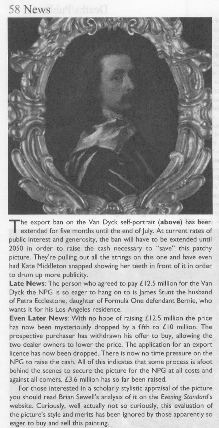
On 23 January 2014 the Evening Standard’s art critic, Brian Sewell, had written of what was about to become the NPG picture:
“…Van Dyck looks wistful, apprehensive and uncertain; he has not flattered himself and his image is the more compelling for its melancholy, yet this careful self-analysis is set on a bust painted with almost vulgar bravura, a rumpled collar of white lawn over a black doublet slashed with white. Not since he painted himself in Italy in black and white has there been such impetuous painting — and not nearly with so loaded a brush.
“I sense dissonance between the face and the costume, as though two quite opposing aesthetics are at work. Does the head sit easily on the bust, the shoulder more brilliantly lit than the face? What exactly is the form of the wide collar and how is it related to the neck? Has the hair been extended over the collar to disguise this awkwardness? It is of a darker tone and subdued definition.
“One question leads to another. Is it possible that Van Dyck painted no more than his face and rather shorter hair, and left posterity an unfinished portrait, to be completed by another painter?”
FOLLOW THE MONEY
Sewell’s doubts had been elicited more colourfully by the MailOnline on 7 December 2013 (“Petra Ecclestone’s husband hopes fight to keep £12.5m Van Dyck in Britain will fail as he snaps it up for their £55m palace of bling in LA”):
“Mr Sewell said: ‘The painting must have been as important in 2009 as it is now. Why did we not buy it then? They [the NPG] didn’t try.[*] They said they put their heads together with Tate Britain to see whether they could do a joint purchase, but they didn’t say a word in public. There was no question of raising funds from the public. But now they’re perfectly happy to start a fundraising campaign at £12.5m. The logic of it completely escapes me…If the picture is as important as everyone’s saying it is, it should have been bought at £8.3m. Now that it hasn’t, they’re putting £4m in the pockets of Philip Mould.”
[* What was not disclosed at the time was that the National Heritage Lottery Fund and the National Heritage Memorial Fund had told the Tate and the National Portrait Gallery, in terms, that they would not get a grant towards the picture’s purchase because of the great drain on those funds for the 2012 Olympics. That unexpected arts funding shortfall had killed off any chance that might have been hoped to exist to make a quick-flip profit on the world record £8.3m Van Dyck by selling it on to the NPG.]
On 9 December 2013, Grosvenor responded in a blog post (on his Art History News site) to Sewell’s criticisms with a double slur: “This is, of course, only the latest salvo in Brian’s apparent campaign against the painting, which can only, I presume, benefit the overseas buyer… His remarks are a good example of that unattractive British habit of demeaning anyone who happens to be successful. Sewell sniffed at something Mr Stunt may or may not have said about his collection (which is already one of the best for 17th C English portraits), when as a lover of art he should applaud the fact that a successful British businessman under the age of 30 not only cares about ‘old’ British art, but also supports, very strongly, exhibitions, publications, loans and research.” (Had Stunt supported the Mould Gallery’s FINDING VAN DYCK exhibition and its 80 pp catalogue? On his support for other Mould/Grosvenor research, see below.) Sewell’s remarks had been given in response to this MailOnline quote from Stunt:
“All my Lelys are important. In Althorp, the Earl of Spencer has the Windsor Beauties, which is a very famous group of pictures by the artist. I’ve been trying to rival the Windsor Beauties. I have more, I think, than him, and I’m just five off the Royal Collection.”
That does not sound made-up. Sewell had responded: “Oh dear. I don’t know him but if he’s setting out to rival Althorp and Buckingham Palace, that’s hardly a meritorious way of collecting. It’s cigarette cards.” Snobby, perhaps, but not without force and humour. Of course, there is nothing wrong with successful businessmen buying art – if: a) they have the means and really are buying; and b) they buy judiciously and not as if from some competitive, vainglorious shopping list. Stunt’s taste for old masters was entirely worthy.
SOME SERIOUSLY AWKWARD CONNECTIONS
The NPG picture’s standing had been again and more radically challenged by Susan Grundy on its authorship, condition, and circumstances. She has shown that both Sotheby’s and the Mould gallery’s citations of the scholarly literature had implied high scholarly support for a Van Dyck ascription that was simply not present. As mentioned, Gustav Glück had seen the now NPG self-portrait picture in 1941 but, then, he had judged it a copy – as had Eric Larsen in 1980 and 1988, and, as seen above, Oliver Millar in 2004. There had been no major scholarly support for the picture as an autograph Van Dyck.
On 26 April 2020 the Mail-on-Sunday reported Grundy’s further startling investigations: “Is the £10m Anthony Van Dyck ‘selfie’ that Kate Middleton helped save for the nation a cheap copy?”
Specifically, Grundy had said: “Philip Mould, the dealer who brokered the sale at such a handsome price, is one of Britain’s most recognisable art experts. He makes regular appearances on the Antiques Roadshow [he also fronts, with Fiona Bruce, the BBC’s Fake or Fortune] and is known as something of an authority on Van Dyck. But this story also involves the unlikely figure of Petra Ecclestone’s ex-husband James Stunt, who once described himself as a billionaire art collector, but is today known as a shambolic, foul-mouthed bankrupt. The Mail-on-Sunday has previously revealed that Stunt lent a number of fake paintings to Prince Charles’s charity at Dumfries House in Scotland where, embarrassingly, they were put on public display. And that attempts had then been made by intermediaries to use the fakes as collateral for millions of pounds worth of loans. The paintings have now been taken down from public view, although Stunt still maintains they are originals. But the businessman’s reputation was intact back in 2013 when, while still married to Formula 1 heiress Petra, he was looking to add to a vast and rapidly expanding collection of masterpieces and agreed to buy the Van Dyck from Mould’s client, Canadian industrialist Alfred Bader.”
In Grundy’s account “agreed to buy” is both the operative and a problematic term. “Client”, too, is problematic: confusion over the 2009 £8.3m purchase at Sotheby’s abounds. It was rumoured that Mould had bought with money loaned by Bader; some expressed surprise that Stunt should have bought it at all at £12.5m, because his purchases rarely exceeded six figures. Many reports referred to a joint Mould/Bader sale to Stunt but those were ambiguously phrased, and it is nowhere confirmed that Stunt had paid £12.5m, taken title of the picture and was about to remove it to the U.S. The Heritage Fund claimed the picture “was sold to a private collector who wished to take it abroad” but the Art Fund disclosed that the picture was bought by the NPG not from Stunt – or Mould – but from “Alfred Bader Fine Arts”, which, if correct, would necessarily mean that that picture had not been sold to Stunt and, therefore, that public monies had been given to block a supposed but phantom pending removal of the picture from the country.
WHEN WAS THE GROSVENOR “LAST VAN DYCK SELF-PORTRAIT MARK II” BOUGHT?
Establishing the point at which Grosvenor acquired his own supposedly superior and historically more significant “Last Van Dyck Self-Portrait” is of interest re both his claimed value-adding role in the promotion of the NPG picture and his subsequent cheerleading role for the public fundraising campaign to secure the picture’s entry into the NPG in 2014. In 2015 Grosvenor disclosed that a restoration of his own picture (Figs. 7 and 10) had taken place “over the last few years”. See below. He also declared that it was only when “all the overpaint and dirt” had been removed, that the very “possibility of a full attribution to Van Dyck [had become] worth pursuing further”.
The “I-had-no-idea-at-first” dealers’ trope was also encountered with the now-famous consortium of New York dealers who had never suspected that their manifest Leonardo School Salvator Mundi might be an autograph Leonardo prototype painting until a certain pentimento on a thumb emerged during restoration. Grosvenor, too, reports a pentimento-on-the-thumb that he, similarly, holds to confirm autograph Van Dyck status on his own picture. However, hands are notoriously difficult to draw even when making a copy – and, as Jacques Franck has demonstrated here, if such thumb pentimenti are to be taken as proofs of autograph states, the Salai copy of Leonardo’s St. John the Baptist would now be considered a second autograph Leonardo St. John the Baptist.
Intriguingly, Grosvenor disclosed that the (eventual) NPG self-portrait had been joined during its near five-year long residence in the Mould gallery by other Van Dyck finds. Of one such, the privately owned picture now on loan to the Minneapolis Institute (Figs. 1, 15 and 19), Grosvenor disclosed on 5 March 2015: “What a pleasure it was to work with Philip Mould in his gallery with it [the now Minneapolis picture] – sometimes we would treat ourselves and hang it next to the later Van Dyck self-portrait we also had in the gallery (the one which was bought by the National Portrait Gallery last year).” But what of the Grosvenor-owned picture which was loaned to the Rubenshuis Museum on 8 March 2016? Had that picture, too, been hung next to the hard-to-shift self-portrait that would enter the NPG in 2014?
A HANDY SOURCE OF POTENTIAL VAN DYCK SELF-PORTRAIT UPGRADES
For those wondering how quite so many Van Dyck self-portraits could turn up in one place in such short time there is a simple explanation: Grosvenor and Mould, like many of us, are avid students of the 2004 catalogue raisonné.

Above, Fig.15: Top row, three “self-portraits” as published in an appendix of copies by Oliver Millar in his contribution to the 2004 Van Dyck catalogue. Bottom row: the three recently upgraded former Millar self-portrait copies, as they presently appear, and the not-for-sale Indianapolis picture.
In this one small section of that invaluable and indispensable account of Van Dyck’s English period, Millar had unwittingly compiled a sort of sleeper-hunters’ treasure chest. Grosvenor has now upgraded the first two of Millar’s three Van Dyck self-portrait copies – and acquired one – both having been privately owned. Only Millar’s third self-portrait copy (above, top right) which cannot turn a penny because it is already in a museum – The Clowes Fund Collection, Indianapolis Museum of Art – remains on the upgrades shelf.
Thus, in the bottom row at Fig. 15 we see: left, the NPG picture judged by Millar to be “The best surviving version of (probably) the last Self-portrait, painted towards the end of Van Dyck’s years in London”; second left, the privately owned, Grosvenor/Mould upgraded self-portrait, now loaned to the Minneapolis Institute; second right, the Grosvenor-owned, restored and new “Last Van Dyck Self-Portrait” that Millar judged a copy of an unknown work recorded in the collection of Charles I; right, the Indianapolis picture with a fine gold chain – for excellent close-up photos, see here – that Millar judged the best-surviving version of an informal Van Dyck self-portrait of c.1634. It might be noted that in this informal attire and unhaughty demeanour, the artist’s moustache had not drooped or turned down.
VAN DYCK’S NOW TWO “LAST SELF-PORTRAITS”
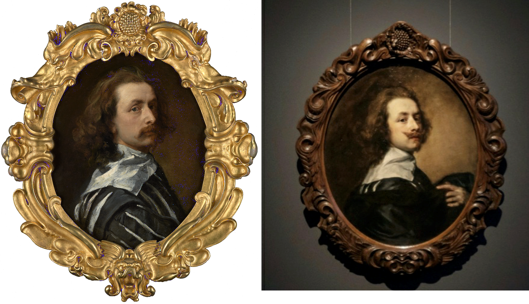
Above, Fig. 16: Left, the National Portrait Gallery’s “Last Van Dyck Self-Portrait”; right, the Grosvenor/Rubenshuis Museum “Last Van Dyck Self-Portrait”.
So, to return to Grosvenor’s second and Rubenshuis loaned “Last Van Dyck Self-Portrait”, there are, as he acknowledges in his 2015-6 British Art Journal account, many outstanding problems of provenance: 1) “We cannot currently draw a direct documentary link from the painting today back to the royal collection”; 2) “there is no record of a payment by Charles I for the picture”; 3) the picture “was first certainly recorded in 1854 when accepted by Gustav Glück” [- sic Glück was born in 1871*]; 4) had the picture been the one owned by Charles I, it would most likely bear the royal monogram (the letters “CR” capped by a crown) on the back of the canvas – but it does not – see Fig. 18 below; and, 5), that the “somewhat loose, rapid handling of the Self-portrait is unlike the high degree of finish and detail that Van Dyck normally produced for Charles I”.
The last admission might seem particularly damaging given Grosvenor’s claim that the (in part) highly wrought NPG picture had been executed as a dress rehearsal for his own picture. Indeed, the NPG’s 2015 book had made a somewhat fanciful virtue of its picture’s stylistically incongruous execution: “The broad, rapid, virtuoso handling of the costume contrasts with the exquisitely fine painting in the face. The relative lack of finish in the costume draws attention to the act of painting that has produced this portrait, perhaps even suggesting that the artist is still in the process of creating it, while we, as viewers, watch him. It may be that Van Dyck was working in a more experimental way in this part of the painting, or it may simply be that it was left unfinished.” (Emphasis added.)
Which, then, might have been the case? The NPG, understandably, was at a loss because: “Nothing is known of the circumstances in which this portrait was produced: whether it was a gift for, or a commission from, a friend, relative or patron, or whether the artist had painted it for himself…” The work is therefore, an orphaned “one-off” or unicum – that intrinsically problematic art historical creature of which Professor James Beck warned his students at Columbia University always to beware. (He also cautioned students to address “what we know about this artist before what has been said or written”.)
[* Grosvenor effectively self-corrects the above slip in his BAJ footnote no. 27, when he cites the earlier and intended Gustav – Gustav Waagen – and his 1854 three-volume Treasures of Art in Great Britain [**]. Although Grosvenor gives the page number, he does not disclose how Waagen had referred to the painting. Had he said something flattering or simply cited an inventory? Grosvenor notes that Gustav Glück had later identified the picture as that in the collection of Charles I and that he had done so not on the grounds of stylistic analysis but of a contingent availability:
“As no other self-portrait answering to the same description is known, there can be no doubt that the picture…once belonged to the royal friend and warm supporter of Van Dyck.” Glück was playing the above-mentioned Denis Mahon Manoeuvre – conferring autograph status on the best available picture. In this case, Glück conferred it to the only possible surviving candidate. With his own (Rubenshuis) self-portrait picture, Grosvenor seems to follow the Gluck/Mahon practice even though he has also identified a second version of the picture that is of similar size and composition. Without addressing the possibility that both versions might have been copies of a lost autograph prototype, as Millar had concluded at the end of a long and distinguished career, Grosvenor holds the newly discovered version (below, Fig. 17, top left) to be a later copy of his own picture, and thereby elevates his own picture from Millar’s copy of a lost original to the original Van Dyck painting.]

Above, Fig. 17: Top row, left a copy of a Van Dyck self-portrait attributed by Bendor Grosvenor to Charles Jervas (1675-1739); the Grosvenor attributed Van Dyck self-portrait before its two-year long restoration; the Grosvenor attributed Van Dyck self-portrait after its restoration. Bottom row: left, the NPG “Last Van Dyck Self-Portrait”; centre, the Grosvenor, Rubenshuis “Last Van Dyck Self-Portrait” before restoration; centre and right, the Grosvenor, Rubenshuis “Last Van Dyck Self-portrait”, as before and after restoration.
In the above-cited Mahon case, it took fifty years for the now accepted original version (at the Prado) to emerge and show Mahon’s claimed “autograph original” to have been a copy – which should have been recognised all along because it, just as with the National Gallery “Rubens” Samson and Delilah, was known from an etched copy to be a compositionally truncated version of a lost original. Where Millar resisted temptation to play the Glück/Mahon/Grosvenor gambit and judged what is now Grosvenor’s picture (above, Fig. 17, top right) to be no more than an early copy of a missing painting, Grosvenor has followed Glück’s earlier “opportunist” elevation (of what is now his own painting) even though it had not gained critical acceptance on Glück’s ascription and had been sold in 1969 for $350 as “after Van Dyck” and for $3,120 in 2006 as “after Van Dyck” (- when possibly bought by Grosvenor). As Millar appreciated, being the only available candidate is not a sufficient qualification for a painting to be accepted as autograph.]
[** As for Waagen’s cited but not quoted observation of Grosvenor’s picture, it too might best be treated with caution. When Nicholas Penny upgraded the Duke of Northumberland’s “Madonna of the Pinks” to Raphael in the February 1992 (Burlington Magazine – “Raphael’s Madonna dei garofnai rediscovered”), he quoted Waagen’s fulsome comment: “on occasion of my visit to England in 1854 I had the privilege of spending a day at Alnwick castle as his Grace’s guest…It is well known that the charming composition is by Raphael and of all the numerous specimens of the picture that I have seen, none appears to me so well entitled to be attributed to his hand as this.” High praise, certainly, but there were three overlooked dangers. First, gushing hyperbole in ascriptions might seem a required social obligation for guests of Dukes – Bernard Berenson and his wife were thrown out of a Scottish Duke’s lair late on a stormy evening when the scholar advised that his Grace’s “Leonardo” was no such thing. Second, Waagen had spoken twice on the Northumberland picture and both of his comments should have been addressed together. Waagen’s helpful-to-Penny’s-cause, praise appeared in the fourth and supplementary 1857 volume to his three-volume 1854 Treasures of Art in Great Britain. In the 1854 Vol. III, p. 253, Waagen, who had yet to enjoy the Duke’s hospitality, had dismissed the Northumberland picture (that would, like the NPG Last Self-portrait be Saved the for The Nation at £22m as the National Gallery’s Raphael “Madonna of the Pinks“): “the small picture in the Camuccini collection at Rome which I do not consider to be original. The tone of the flesh has something insipid and heavy. The treatment makes me suspect a Netherlandish hand.” Third, Waagen’s later fulsome revised comments were written in the knowledge that the whole Camuccini collection was to come to Alnwick Castle, having been bought by the Duke in 1856 (- as James Beck disclosed in his posthumously published 2007 book From Duccio to Raphael: Connoisseurship in Crisis, three chapters of which anatomised the untenability of the National Gallery picture’s Raphael ascription). Had Waagen stuck in 1857 to his earlier scholarly/critical guns, a Duke would likely have been mightily displeased, and Italy’s already lucrative “old masters” export industry would have been thrown into question if not crisis. However, of the two Waagen accounts that of the slightly younger, more disinterested c.1854 self better withstood the test of time: as with the Glück-ascribed now Grosvenor last self-portrait, the Duke’s picture duly came to be seen as a version of a lost Raphael autograph prototype painting – as Penny himself described it, as one of “numerous versions” with none being “generally acknowledged as an original work by Raphael”. It was only on Penny’s 1992 advocacy resting on the authority of the slightly older Waagen’s 1857 obsequious effusion that the scholar’s own earlier, sounder appraisal was eclipsed. When Penny stayed at Alnwick Castle – the second greatest castle in Britain – in the early nineteen-nineties (“The author is grateful to the Duke of Northumberland, the Duchess of Northumberland and Lady Victoria Cuthbert for their hospitality and encouragement”) the potential “oven-ready” upgrade in the form of the ex-Camuccini picture remained lurking-in-residence in its elaborate 19th century frame bearing the proud ascription “Raphael”, patiently awaiting a new scholarly response.]
THE MISSING MONOGRAM ON A GROSVENOR UPGRADE
Above, Fig. 18: Left, the back of the Pushkin Museum’s Salvator Mundi by Giampietrino which carries the Charles I monogram, at which period the picture had been attributed to Leonardo; centre, the Charles I monogram found on the back of the Van Dyck painting of Mary Villiers; right, Van Dyck’s Mary Villiers portrait
The presence of a monogram confirming ownership by Charles I adds very considerable value. In 2002 the Mould gallery discovered one (above, centre) on a Van Dyck portrait of Mary Villiers (above, right) that had been bought for £437,587. On discovery of the monogram (made, as with Grosvenor’s picture, during the traumatic act of stripping off and replacing a backing canvas) the Mould picture’s asking price leapt almost fourfold to £1.6m. It follows that Grosvenor’s Rubenshuis Van Dyck will likely be worth a quarter of what it might otherwise have beeen, had it been in Charles I’s collection and duly stamped with the royal monogram.
OUT OF THE FRYING PAN…
Lacking evidence that his picture had been in Charles I’s collection, Grosvenor addressed the absent record of a payment with an initial surmise that the picture had been presented by Van Dyck as a gift to the King. He then added: “Of course, the presumption that the self-portrait was originally presented to Charles I may be incorrect, and if it was part of the collection of Henrietta Maria instead (whose collection was looked after by Daniel Soreau of whom we know little), we would not expect to find a cypher [monogram] on the back.” (Emphases added.)
A neat swerve, but an expectation of an absence of evidence that rests on an unsupported supposition cannot be rolled together and taken to constitute evidence of any kind. If the picture lacks a monogram it lacks a monogram and that tells against it having been in the collection. If it lacks both a monogram and a record of payment, there is certainly no ground for concluding that it must therefore have been gifted by Van Dyck to the King’s wife, because that blatantly begs the question. Grosvenor reports that after the king’s execution the Van Dyck self-portrait that had been in the collection had been bought by the artist’s former assistant and copyist, Remigius van Leemput – and he says so on the cited authority of Oliver Millar, who judged the now-Grosvenor picture…to be a copy of that lost, formerly Charles I Van Dyck self-portrait.
The escape clause possibility of the picture having been owned by Henrietta Maria was suggested to Grosvenor by Margaret Dalivalle who had attempted to underpin the claimed double royal pedigree of the (now-disappeared and Louvre Museum-downgraded) $450m Leonardo school Salvator Mundi with a speculative suggestion that the painting might have been brought to England from the French royal collection by Henrietta Maria. It was also being claimed that the (then New York) Leonardo-attributed Salvator Mundi was the Leonardo Salvator Mundi that had been recorded in the Charles I collection. No evidence supported that claim and in 2018 another picture – the one that really had been attributed to Leonardo when in the collection of Charles I and the one which really does bear the royal monogram (above left, Fig. 18) had emerged in the Pushkin Museum, Moscow. However, that Salvator Mundi is of a different composition and, besides, it had been downgraded to Leonardo’s assistant Giampietrino. Thus, the painting that had been in Charles I’s collection as a Leonardo was not a Leonardo, regardless of whether or not it had been brought from the French royal collection, which it hadn’t: after years of trawling archives, Dalivalle admitted that she had found no evidence that Henrietta Maria had brought the painting from France and had abandoned her search.
A SERIALLY BEGGED QUESTION
In the absence of material or documentary evidence on his Last Van Dyck self-portrait, Grosvenor again appeals in circular fashion to the authority of his own judgement-by-eye on the picture’s artistic merits, which judgement he again confounds with hard evidence: “There is however, other evidence to suggest that this painting did indeed hang at Whitehall, in addition to the fact of its overall quality, and the fact that it certainly appears to be an original work by Van Dyck.” Having conflated his own impressions and judgements with facts, Grosvenor proceeds to add that Van Dyck, “is unlikely to have presented his patron with a second version or a studio replica” when he has not established that the (formerly $350) picture which he owns had been presented to Charles at all. (All emphases added.) Once again, “evidence” that “suggests” that something had happened of which there is no evidence, is not evidence, it is simply wishful thinking. Grosvenor’s painting could not have whispered in the Mould gallery (- had it ever been presented there) that it had once hung somewhere else in London.
If proof were ever to emerge that Van Dyck had gifted an unrecorded portrait of himself to the king’s wife, it would immediately beget another sleeper-hunting opportunity: Where is the Van Dyck self-portrait that was listed in the king’s collection and that would be expected to bear the royal monogram? Were such a monogrammed Van Dyck self-portrait to turn up tomorrow, we would then have two self-portraits gifted by Van Dyck to the royal couple (one to each), just as we now have two claimed last Van Dyck self-portraits in the NPG and Rubenshuis pictures.
BOUNCING THE NPG?
Whatever the exact relationship in this recent Mould and Bader “adventure in old masters”, two things are clear. First, an initial attempt to sell the £8.3m picture to the NPG failed. When the Philip Mould enterprise found no buyer for the picture between 2009 and 2013, the £8.3m purchase at Sotheby’s must indeed have seemed a hair-raising liability. Second, that although James Stunt’s much-reported purchase of the painting for £12.5m never materialised, his repeated and noisily declared intention to remove the painting from Britain greatly assisted the picture’s eventual sale to the NPG.
On the picture’s true or fair value between 2009 and 2014, there is no evidence that the already world record £8.3m Van Dyck had been sold for £12.5m to Stunt, a well-known collector of six-figure Lely paintings. Waldemar Januszczak mused in the Sunday Times: “Why Stunt has chosen to go for the Van Dyck now, when it has been hanging in Mould’s gallery for three years I do not know.”
HYPING A TOP-PRICE WORK
Putting Stunt’s involvement to one side, it might also be asked how the NPG’s £10m purchase of a picture that had been stealthily offered as a safely autograph work (on no scholar’s published account) in 2009 and on a £2-3 million estimate at Sotheby’s, came to be taken as a matter of Very Great National Concern. On 8 December 2013, Richard Brooks rebuked the NPG for dilatoriness over the purchase (Sunday Times “£3m bungle over Van Dyck selfie”): “…the gallery had the chance to buy it four years ago for at least £3m less than it will now have to pay”. If Brooks had meant that had the gallery bid directly at Sotheby’s 9 December 2009 auction it could have got the picture for the £8.3m paid by Mould/Bader, Grosvenor has countered: “we were delighted to acquire it in partnership with Alfred Bader for £8.3m. In fact, we had been prepared to bid much higher, and were slightly surprised when the hammer came down.”
Brooks continued: “In fact it [the NPG] missed the opportunity to buy the painting not once but twice…The gallery had in fact been tipped off by the auctioneer, Sotheby’s, that the painting was coming up for sale four months earlier, in August 2009, when one of its staff went to see Sandy Nairne, the director of the Gallery. ‘It was a heads-up for them to see if they could buy,’ said Sotheby’s last week. Nairne decided not to bid. Last week Nairne confirmed that the approach had been made but said he had worried about the ‘uncertainty’ of buying at auction. It was also thought that the earl [of Jersey] did not seem interested in selling privately to the gallery.” This last was likely the case – Grundy established that the earl had put his own family pile on the market at c.£10m, so he was not likely in financial self-sacrifice mode.
Having bought the picture for £8.3 million at auction, Brooks continued, “Mould and Bader offered the gallery another chance to buy it, this time from them. Initially they asked for £10 million but this was subsequently dropped to £9.5 million…” Those successive reductions might have been public-spirited generosity towards a national institution, but they could also have been hard-nosed commercial realism: the picture was proving impossible to shift. Four other parties, including two non-UK museums, were said to have driven the auction price to £8.3m but having dropped out at that price they were unlikely to re-enter at £10m, £9.5m or £12.5m – as indeed had resoundingly proved to be the case by 2013 when the work remained unsold. All in all, Brooks seemed rather cross that the NPG was not playing ball with a gallery that had failed to shift a picture bought three years earlier at a world record price with the assistance of an industrialist/collector.
HOW SOLID WAS STUNT’S OFFER TO BUY AT £12.5m?
Januszczak appreciated that: “the timing [of Stunt’s late-buying and declared intention to remove from the country] has forced the NPG and the government into action” – which action he and Grosvenor supported. As for Stunt’s declared intention to remove the picture from the country, had he bought it earlier for less and immediately applied for an export licence, there would, Grosvenor has claimed, have been no opposition and the picture would certainly “have left the country”. Instead of quietly buying it for £9.5m and removing it unopposed from the country, Stunt waited until the end of 2013 to declare an intention to buy the picture at the then full Mould/Bader £12.5m asking price and, simultaneously, to remove it from the country. For sure, that last declaration prompted the picture’s supporters to seek and obtain a three-month government export ban in November 2013. Stunt then amplified his Threat-to-Remove by saying that although he well understood the move to block his purchase from Mould, he still hoped he would be able to “take it to his home in Los Angeles and enjoy it.” Thus, without costing Stunt a penny, his noisy public stance greatly facilitated the Mould/Bader sale to the NPG when no other buyer was in sight.
A MAN OF SEVERAL HATS
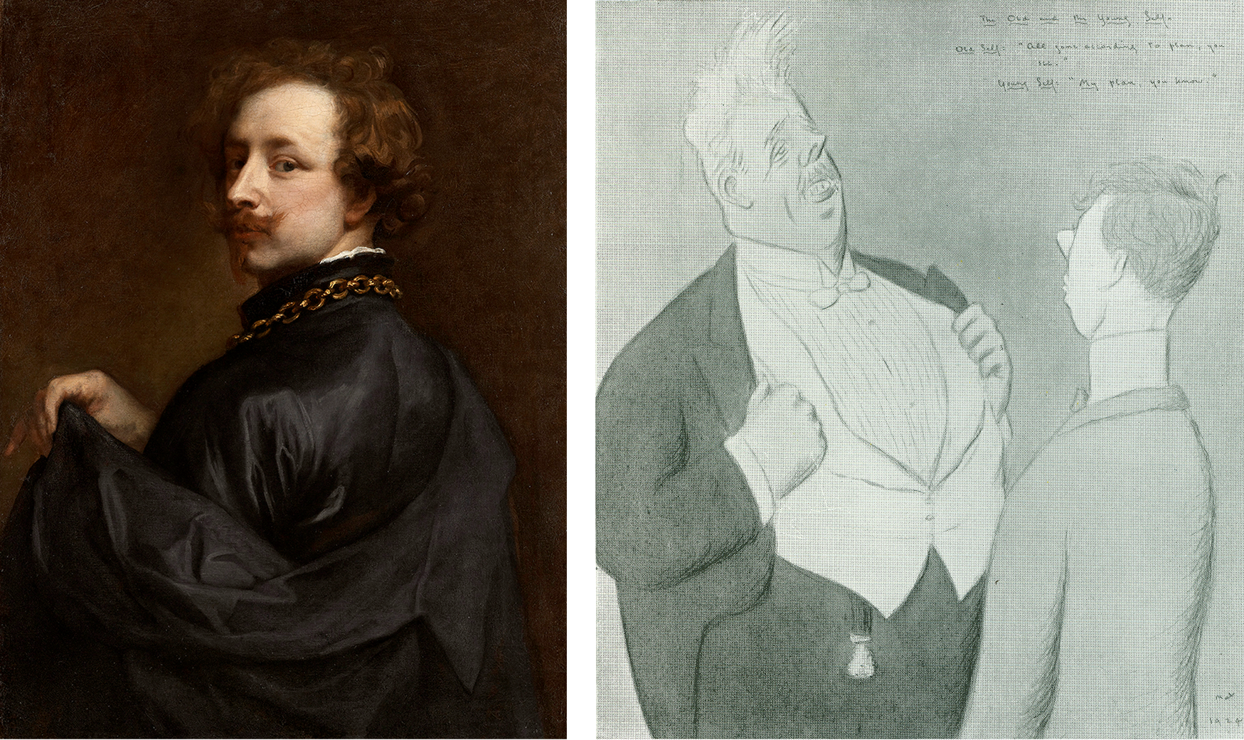
Above, Fig. 19: Left, the newly attributed Van Dyck self-portrait on loan to the Minneapolis Institute of Arts (as discussed below); right, a 1925 Max Beerbohm cartoon in his “The Old and the Young Self” series. (Caption: Mr Arnold Bennett – Old Self: “All gone according to plan, you see.” Young Self: “My plan, you know.”)
Grosvenor’s role as a Mould employee becomes a greater matter of interest given his possibly overlapping role as a private, stand-alone collector/connoisseur. On 14 November 2013 he posted a blog saying that the picture had been sold to an overseas buyer [Stunt] and added: “For the art dealing day-jobber in me, this has to be seen as a Good Thing. We [at Philip Mould] bought the picture (in the thick of the global downturn) because we believed in it, and had the aim of adding value and selling it on. And I believe we have done that… However, for the Van Dyck fan, it obviously pains me that the picture might leave the UK. And it doubly pains me that I might in some small way be responsible for that!”
How so? In addition to his value-adding obligations as a Mould gallery employee, Grosvenor had attended a Government Export Licence Review “as a representative of the picture’s buyer [Stunt]”. It is not clear whether Grosvenor had spoken in support of, or against, Stunt’s declared intentions to remove the picture, at the Review – or whether, whichever line he adopted on that occasion, Stunt had known of it. It is possible that Grosvenor confined his remarks to underlining the seriousness of Stunt’s threat to remove the picture from the country but on 14 November 2013 he hinted that he had opposed the Mould gallery client’s declared intentions:
“A month or so ago we attended the UK government’s Export Licence Reviewing Committee – as representatives of the picture’s buyer – at the Arts Council’s new office… [and the picture] was temporarily blocked for export by the committee on all three ‘Waverley’ criteria (which is unusual). I felt a strange pride in Sir Anthony for pulling that off.” For “Sir Anthony”, we can only read “Dr Grosvenor” and further assume that Stunt was happy to have his by then doubly expressed determination to remove the picture from the country thwarted by a Mould gallery employee. Grosvenor asked: “Will a UK institution [now] be able to raise the funds to stop the sale?” With his gallery salesman’s hat on, he helpfully volunteered: “The price is £12.5m (about 1/3 of a Koons Orange Dog).”
Eleven days later (25 November 2013) Grosvenor reported: “I went to the launch this morning of the National Portrait Gallery’s campaign to save Van Dyck’s last self-portrait for the nation. The picture has been sold to an overseas buyer, and the NPG has 8 months to try and raise £12.5m to keep the painting in the UK. It’s the largest such campaign ever mounted by the NPG… Regular readers will know that I work for the company which has sold the picture, so I’m in something of a predicament. But of course, the Van Dyck fan in me (he’s my favourite artist) wants to see the picture remain on public display in the UK. A large part of whether the campaign to save the picture succeeds will come down to how the public reacts…” (All emphases added.) On the face of it, Grosvenor was openly campaigning against the interest of a Mould/Bader client who, reportedly, had already paid £12.5m and delivered a £4.2m profit to Mould/Bader on an £8.3m picture, and yet, at the same time, he was commanding the country to come to the aid of a public institution so as to help it buy the picture for £12.5m from a dealer and his “progenitor of adventures in old masters” partner/backer.
“ULTIMATE BUYERS”
Again, concerning the price, in his 25 November 2013 post, when scolding Sewell for challenging the attribution and for claiming the NPG could have bought for less than £12.5m had it acted sooner, Grosvenor retorted: “How does Brian know where we, as the ultimate buyers (in partnership with Alfred Bader fine arts) would have stopped bidding? I can tell you now that the NPG would not have got it at auction for less than the asking price today.” Thus, we learn that the Bader-backed Mould gallery had been prepared to buy the supposed Last Van Dyck Self-Portrait for very appreciably more than £12.5m. Having already routed all opposition in 2009 with an £8.3m bid, who – other than the NPG – might have been expected to buy the picture after four years of no-sale? We say “no-sale” because if the picture had belonged to Stunt it would have been reputationally reckless behaviour for the vendor, after taking payment, to seek to block the buyer.
In November 2013 Grosvenor complained “Waldemar [Janusczcak] is mounting a one-man campaign to have my employer donate the picture to the NPG…” – which tacitly disclosed that Mould/Bader were still the owners. An anonymous, but evidently well-informed reader commented on Grosvenor’s website: “…Mould and co are entitled to profit from 1) saving the Van Dyck four years ago by taking the risk of purchasing it at auction during a very difficult period 2) holding the painting for four years with a lot of someone’s capital in it 3) researching the picture to add to its value all that is now known about it.”
THE PRESS WEIGHS IN
When Stunt’s reported bid to remove the picture spurred the NPG’s attempt to retain the picture in Britain at £12.5m, many journalists urged the public to contribute to the “Save-the-Picture” fund. In the Times Ben Macintyre hailed Van Dyck as an exemplary immigrant who had enriched his adopted home – a mongrel nation avidly open and welcoming to foreign talents, in which he was knighted, married into the aristocracy, buried in St Paul’s and had left as his legacy a transformed British school of painting that, having passed through Gainsborough and Reynolds to Singer Sargent, “is still felt nearly four centuries later”. That was a perfectly fair and attractive (if by no means original) analysis. Van Dyck’s last and greatest of all self-portraits, Macintyre assured readers, depicts a man who has found his home from home, “and that is where he should stay.” Against that somewhat sentimental reading, evidence suggests that, ahead of the end of Charles I’s reign, Van Dyck was looking to jump national ships.
Jonathan Jones in the Guardian asked “£12.5m for a self-portrait by Anthony van Dyck? That’s what the National Portrait Gallery and the Art Fund are trying to raise in an appeal launched today. Is it worth it?” Sporting hyperbolic philistinism, he self-answered: “Absolutely. I think this is one of the most worthwhile campaigns in years to ‘save’ a work of art for the nation. Van Dyck’s Self-Portrait would make a spectacular addition to the National Portrait Gallery. Quite frankly, it could make the place. It would give a gallery stuffed with pictures of primarily historical interest a true artistic masterpiece, by the man from Antwerp who gave birth to British art.”
In the Spectator the historian Andrew Roberts wrote: “Of all the great British portrait painters, Van Dyck is by far the most important not to be represented by his own portrait in one of the great British public collections, considering how central he is to the history of the British school of painting and how his influence has grown over the centuries. ‘We are all going to heaven’, Gainsborough said on his deathbed, ‘and Van Dyck is of the company.’ For the National Portrait Gallery, the story of Britain that it attempts to tell through portraiture is simply incomplete without a portrait of Van Dyck, which has long been identified as one of the major lacunae in its otherwise superb collection. This is the only chance a museum or a gallery in the United Kingdom has of acquiring the masterpiece and it’s the only portrait of the artist ever likely to be made available for acquisition by a British public collection…”
Grosvenor purred on his 28 November 2013 post: “excellent piece by historian Andrew Roberts in the Spectator on the NPG’s campaign” without disclosing that since May 2013 Roberts had been an NPG trustee. Nor did he demur when Roberts assured the public that this was “the only chance” of acquiring what was the “only portrait of the artist ever likely to be made available for acquisition”. Not the slightest hint was given that three Van Dyck self-portraits were in the offing and on 8 December 2013, the Sunday Times prodded laggards: “James Stunt, who is married to Bernie Ecclestone’s younger daughter Petra, has already put in an offer of £12.5m and hopes to hang the piece in his Los Angeles mansion.”
A PROLONGED STRUGGLE TO RAISE THE READIES…
On 17 February 2014 Grosvenor announced:
“The National Portrait Gallery has successfully argued for an extension to the export bar on Van Dyck’s c. 1640 Self-Portrait. This means they have another 5 months to try and raise £12.5m, which is the sum required to match the picture’s sale price. The NPG has already raised a quarter of that amount, from bodies such as the Art Fund, the Monuments Trust, and also (impressively) nearly a million from smaller donations made by members of the public…” That left some £8.2-3m to find – effectively the full original world record price paid at auction. Once again, Grosvenor reminded his readers: “I’m in something of a quandry [sic] on this one, given that Philip Mould & Co., for which I work, sold the picture to an overseas buyer.” (Emphasis added.)
AN EMPLOYEE HELPS BROKER A NEW CUT-PRICE MYSTERY DEAL
On 26 March 2014 Grosvenor announced he had been working on “a new deal to help the National Portrait Gallery’s campaign to acquire Van Dyck’s final Self-Portrait” and that the target price “has now been reduced from £12.5m to £10m.” Who exactly was working with whom – and how – on this deal? What role had Grosvenor played? Stunt, he reported, had issued a statement: “When I agreed to buy [not when I bought] this great portrait I didn’t expect the huge swell of public opinion and strength of emotion its export would generate…I have reconsidered my position and have decided, with Dr Bader and Mr Mould’s agreement, to withdraw from the process.” Had Stunt owned the painting he would neither have been able to withdraw from a process, nor have required the agreement of Bader and Mould to sell his own picture to the NPG at a supposed-billionaire’s public-spirited £2.5 million loss, should he have wished. Presumably, Stunt meant only that he was withdrawing both an earlier undertaking to purchase and a declared threat to remove the painting on purchase.
Had Stunt feared opprobrium on removing the picture from the country, he could have bought it on an agreement not to remove it – he had three homes in London at that time. Given that, for whatever reason, the well-publicised Stunt purchase had vaporised, and that Mould/Bader still had no buyer in view – other than the NPG which was clearly struggling to match the reported sale at £12.5m – why did they not revert to their earlier £9.5m offer to the gallery?
At that price, Mould/Bader would still have made £1.2m profit on their £8.3m purchase – almost as much as the £1.4m contributed by the donations of 10,000 members of the public – while earning kudos for contributing to the public weal. Grosvenor reported that Mould and Bader had responded separately. Mould had said: “I am delighted to be able to help the National Portrait Gallery’s campaign in this way”. In what way had he helped? Had he volunteered a £2.5 million cut on a painting he (or he and Bader) still owned but could not sell? Or, had the elderly Bader been the near- or actual owner, with Mould and Grosvenor having acted as his agents in an attempt to flip a £8.3m painting to the National Portrait Gallery?
A CHEERLEADER CONSTRAINED
“And, for what it’s worth”, Grosvenor continued, on 26 March 2014, “here’s what I have to say. Regular readers will know that previously I’ve had to tread carefully when it came to the NPG’s campaign. Van Dyck is my favourite artist, and I’d naturally like to see his final Self-Portrait stay in the UK and on public display. But my responsibilities towards our clients meant that I couldn’t be as much of a cheerleader for the [fund-raising] campaign as I’d liked. Now that Mr Stunt is no longer buying the picture, and Dr Baders [sic] and Philip Mould have agreed this new plan in favour of the NPG, however, all efforts can be focused on the Gallery’s fundraising. I’m pleased with the outcome.” (All emphases added.)
Ostensibly, that was inscrutable: Grosvenor talks of clients when only Stunt had reportedly been in the picture; Stunt is now not buying and therefore, contrary to all previous claims, he had not bought. How real, then, had been the threat to remove the picture from the country? Had it become apparent to Mould/Bader that even with the extended leave to raise funds, the NPG was unlikely to raise the necessary £12.5m? Was it not the case that no one was interested in buying the picture and that to be sure of a sale, the high asking price to the NPG would have to be slashed; that having paid £8.3m for a stealthily upgraded former copy, Mould/Bader had simply bitten off more than they could chew?
As for who was making the twenty per cent price reduction, Bader made no comment. His family responded: “Alfred Bader CBE, an established philanthropist on both sides of the Atlantic, has been impressed by the public’s response to the painting, and the efforts that both the Art Fund and the National Portrait Gallery have made to keep the picture on public display. He very much hopes that the National Portrait Gallery is able to complete the rest of its fundraising challenge.” That would fit with the view some held at the time that (the then ailing) Bader and his family were impatiently seeking the return of his undisclosed investment/stake in the picture.
THE SECOND “LAST VAN DYCK SELF-PORTRAIT”
In the light of a £2.5m reduction after four years of no-sale, it might again be wondered at what point the now Grosvenor-owned True “Last Van Dyck Self-Portrait” that today hangs in the Rubenshuis Museum had emerged. In his December 2015 BAJ article, Grosvenor disclosed that his painting had undergone a long and “sensitive conservation, leaving us with the picture we see today”. Skipping an owner’s obligatory guff on “sensitive conservation”, for how long was it in restoration? Answer: “over the last few years”. That is a lot of sensitivity on a modest painting and it suggests that Grosvenor might have acquired the picture no later than c.2013. [*] Had he at any point advised his employer or the National Portrait Gallery that he had single-handedly acquired a supposedly artistically superior Van Dyck self-portrait with a supposed royal provenance that he would shortly publish and lend to a foreign museum as the True Last Van Dyck Self-portrait? For that matter, had Mould and Grosvenor jointly advised the National Portrait Gallery when the third Van Dyck self-portrait (Figs. 1, 15, 19 and 20) – that would be sold privately and thereafter loaned to the Minnesota Institute of Arts – first came to their attention?
[* Although Grosvenor gives no indication of when or where he acquired the picture, he does track its history as far as 2006 when it fetched $3,120 at Christie’s, NY, in a 6 June sale, as lot 40, ‘After Van Dyck’.]
A RESEARCH AND ADVOCACY-LED BREAK-THROUGH
“Well, hurrah”, Grosvenor had cheered on 1 May 2014, “the National Portrait Gallery in London has successfully raised £10m to buy Van Dyck’s late ‘Self-Portrait’” – but note Grosvenor’s new description of the soon-to-become National Portrait Gallery picture: “Van Dyck’s “late ‘Self-Portrait’”. Why late and no longer last?
“I may write more about the acquisition process later”, Grosvenor went on, “but I’m quite proud to have been involved in both that and the process of research and advocacy that has resulted in the [NPG] portrait becoming what it is today. It’s certainly been a privilege to have handled the picture here at the Philip Mould Gallery. Seeing Sir Anthony in our offices every day made it feel as if he was part of the family. I don’t mind admitting that most days I would greet him with a quiet ‘Morning Ant’, and if I was the first in I’d positively shout it, and even give him a wave. He never waved back of course, but that vivid, knowing expression made it seem as if he was reciprocating in some way. And then there was the strange feeling of having Van Dyck look over us as we made the occasional discovery of a new work by him. These have included – if you’ll forgive the boast – the Portrait of Olivia Porter in the Bowes Museum, the Portrait of a Young Girl now hanging at the Ashmolean, two male full-length portraits painted by Van Dyck while he was in Italy, a Holy Family painted in Sicily, three important head studies, and his last Portrait of Queen Henrietta Maria as St Catherine. There are others which unfortunately I can’t tell you about – at least, not yet. I hope, now that he’s left us, the discoveries don’t dry up.”
THE THIRD VAN DYCK SELF PORTRAIT
Above, Fig. 20: Left, a photo accompanying Grosvenor’s 5 March 2015 post on a painting loaned as an autograph Van Dyck self-portrait to the Minneapolis Institute of Arts, Minnesota; right, a Grosvenor photo carried on 31 March 2015 with the caption: “Wanted – good homes for second-hand picture crates.”
So, yet other Van Dyck Discoveries-in-Waiting – but which would emerge next? Well, the one now hanging in the Rubenshuis museum had first been written up by Grosvenor in the December 2015 British Art Journal but, in 2018, Gleadell had reported in the Telegraph that Mould’s favourite Van Dyck upgrade “is a self-portrait that he found at auction in Germany, in 2012. Thought to be a copy and with a €30,000 estimate, he bought it for €572,000. By 2015 he had sold it on privately, since it appeared at the Minneapolis Institute of Art on loan from the American investment financier, Scott Minerd. Taking some credit for the change in status was Mould’s researcher, Bendor Grosvenor, now a TV presenter [etc….]” Presumably, with Mould having bought for only half a million, Minerd will have paid very considerably less for his attributed Van Dyck self-portrait than had the NPG for its now Grosvenor-shunted former “Last Van Dyck Self-Portrait”?
KNOCKING SIR OLIVER MILLER
Grosvenor had claimed his own credit on the upgrading of the Mould-to-Minerd self-portrait on 5 March 2015:
“The Art Newspaper seems to have scooped a story I’ve been dying to tell you about for some time; the re-discovery of an important self-portrait by Van Dyck. The picture was one of the last important portraits I worked on with Philip Mould in London.” Grosvenor then cited Martin Bailey’s Art Newspaper coverage:
“Martin Bailey writes: ‘A self-portrait by Van Dyck that was dismissed a decade ago as a copy is now hanging in the Minneapolis Institute of Arts, Minnesota, as an original work. The painting which has been authenticated by experts, was quietly put on display in February…An unpublished paper on the self-portrait, prepared for the owner, dates the work to around 1629 and states that this attribution is accepted by four key experts: Susan Barnes, a co-author [one of four] of the 2004 Van Dyck catalogue raisonné, Christopher Brown [*], the former director of the Ashmolean Museum in Oxford, David Jaffé [**], a former senior curator at the National Gallery in London, and Malcolm Rogers, the outgoing director of the Museum of Fine Arts Boston. The attribution is also accepted by Patrick Noon, the head of paintings at the Minneapolis Museum…The late Oliver Millar, another co-author of the 2004 catalogue raisonné, dismissed the work as ‘possibly a very early copy’. He assumed that the original painting was missing…’”
[* As senior curator at the National Gallery in 1982, Christopher Brown had been instrumental in the gallery’s £2.5m 1980 purchase of the Rubens Samson and Delilah. **David Jaffé, a successor as senior curator, strongly defended the picture’s acquisition and in 2005-6 organised the National Gallery exhibition, Rubens: A Master in the Making that showcased the Samson and Delilah. Conspicuously, neither of the contemporary copies of the original lost Rubens Samson and Delilah – which, as mentioned, had both testified to a wider composition in which Samson’s toes had not been cut off at the edge of the painting – were brought to the exhibition.]
Grosvenor continued: “The unpublished paper referred to above was written by me, and I’ll share further details with you soon. There’s a great deal to discuss. I think the picture was probably painted in late 1628. A few quick additional points: The Art Newspaper mentions that the late Sir Oliver Millar ‘dismissed the work’ – but in fact when he saw it at an Agnews exhibition in 1968 he pretty much accepted it. [Source?] Indeed, although the picture was little known and only exhibited once, it was continuously published as ‘a Van Dyck’ right up until 1999, and it was only in the 2004 Catalogue Raisonné co-written by Sir Oliver Millar that the picture was first doubted. I’m not sure why Sir Oliver changed his mind, but it was probaby [sic] due its pre-conservation condition; it had been substantially over-painted, and was also really quite dirty under old varnish. I believe Sir Oliver was perhaps also misled by the gold chain, thinking that chain was that given to Van Dyck by King Charles I, and that the portrait must therefore be an English-period work (that is, in the section of the catalogue that he was responsible for), dating to after 1632 – when Van Dyck’s technique was rather different. In fact, I linked hte [sic] portrait to a a [sic] gold chain Van Dyck was given earlier, in 1628 by the Archduchess Isabella in Brussels, when she appointed him her court painter…”
The paper for which Grosvenor claimed credit may well have formed the whole or part of this entry in the Mould gallery’s Historical Portraits Picture Library.
The Minneapolis picture, too, Mould reports, had gone into restoration. Had that been in London and, perhaps by the same restorer who sensitively “retrieved” the now Rubenshuis picture over a couple of years? Given that Grosvenor had researched this second, 2012 acquired, rival Van Dyck self-portrait and prepared a scholarly paper on it for the Mould Gallery, had either sleeper hunter informed the NPG of its presence in London before the gallery paid £10m for it’s then – but now Grosvenor-demoted “Last Van Dyck Self-portrait”?
If it might be thought a remarkable coup for all three Mould/Grosvenor Van Dyck self-portraits to have found homes in museums – the NPG, the Rubenshuis and Minneapolis – on this aspect, Grosvenor has shown a certain professional diffidence. Writing in the Financial Times of 3-4 March 2018 on the subject of collectors lending works to museums, he weighed the pros and cons of collectors lending and held: “Critics claim that museums are being used by lenders to enhance the value of their work…It is true that in some circumstances a period on loan can make an artwork better known, and thus more saleable. And there are other benefits to lending, too; the former National Gallery director Sir Nicholas Penny points out that museums can offer collectors the ‘double service of a free safety deposit with a shop window.’” Grosvenor hastened to add: “But the suggestion that a period of display can transform an artwork’s value is overblown…And while there undoubtedly are unscrupulous art owners, most collectors are driven not just by a passion for art, but by a passion to share it, too (disclaimer, this includes me; I have lent works anonymously since I started collecting over a decade ago)…at the Rubenshuis museum in Antwerp, which has only a small collection of its own and an even smaller budget, the well-publicised loan of a Tintoretto that once belonged to David Bowie helped increase visitor numbers by 30 per cent…It is time for museums to become the liggers of the art world, and borrow as much as they can. There’s a good chance they’ll get to keep it.” Grosvenor made no mention of his own loaned Last Van Dyck Self-Portrait, but we all get the picture, so to speak.
“CALL THE CONNOISSEURS!” – MOULD, GROSVENOR AND STUNT BID TO PRODUCE A NEW VAN DYCK CATALOGUE RAISONNÉ

Above, Fig. 21: Top, the entrance to the Paul Mellon Centre, London. Above, left, Bendor Grosvenor; centre, James Stunt; right, Philip Mould.
Leaving the Minneapolis Museum picture aside for Part II, we can now disclose that in 2014, Grosvenor and Mould jointly sought support from the Paul Mellon Centre to write a new catalogue raisonné on Van Dyck – and, also, that James Stunt had presented himself to the centre in support of the two dealers’ proposal with an offer to fund the costs of their proposed venture. It was a combined offer and proposal that could not be accepted, a) because the above-mentioned major catalogue – written by the four specialist Van Dyck authorities, Susan J. Barnes, Nora De Poorter, Oliver Millar, and Horst Vey – had been published by the Mellon Centre in 2004 and which work was then, as it remains today, widely regarded as an indispensable reference source; and, b) because the two would-be revisers were considered to have no real scholarly credentials to conduct such a massive and monumentally important art historical project.
When Mould and Grosvenor parted company (the latter with the rumoured £1m payoff) Waldemar Januszczak declared support for Grosvenor – and the pair now give joint podcasts (“WALDY AND BENDY’S ADVENTURES IN ART” on the Sunday Times’ fire-walled website.)

At 9.44 on 10 January 2021 Grosvenor tweeted the above “in-restauro” picture with this comment: “Ever fancied a go at cleaning a painting. In this week’s #WaldyandBendy we talk conservation and I have a go myself. It’s easy!”
GROSVENOR’S PROLONGED CALLS FOR A NEW VAN DYCK CATALOGUE RAISONNÉ
In August 2014 Grosvenor began disparaging past catalogues of Van Dyck’s work. Thus, of one painting on 19 August: “The above picture has recently gone on display at the Courtauld Gallery in London. It’s currently catalogued as ‘Van Dyck’. I think it was last published by the late Erik Larsen (whose Van Dyck catalogue raisonné is, alas, probably the worst single demonstration of connoisseurship ever published).” Ten days later in another post: “Surely, the most important pre-requisite in compiling a catalogue raisonné is not a degree in art history[*], but the confidence that you will be able to know for certain that your chosen artist really did paint the picture that some label/institution/scholar says they did…Now, I haven’t written a catalogue raisonné[**], but I have (and I hope this doesn’t sound too much like boasting, but there’s no other way of saying it) a proven track record of having a good ‘eye’. So for the benefit of any budding connoisseurs out there, I would add the following three crucial tips (obviously, this is all mostly relevant to Old Masters, and not modern and contemporary catalogues)…”
[* Although Grosvenor does not possess a degree in art history, having read modern history, his PhD dissertation on “The Politics of Foreign Policy: Lord Derby and the Eastern Crisis, 1875-8” might well have developed the usefully transferable research skills that were sometimes in evidence on the BBC’s Fake or Fortune programme. For sure, such desirable skills are not always inculcated within today’s university art history departments, so many of which prefer to fry almost any fish other than those of art and its history, but, as mentioned, Grosvenor has gone further and contended (AHN post, 29 August 2014) that “Actually, I’d be tempted to argue that a degree in history is more useful, as it gives a better training in how to evaluate evidence.”]
[** Tantalisingly, in a footnote, Grosvenor added: “Though that might be about to change!” But then… no further dangled hints of a new Grosvenor Van Dyck catalogue raisonné. As for Grosvenor’s not wishing to boast, some might chuckle – before relinquishing his career as a dealer and when temporarily shutting down his own website, he likened what he described as his “enemies” within the art trade to Salieris. As boasts go, likening oneself to Mozart might take some beating.]
FRUSTRATION AND IMPATIENCE WITH ACADEMIC IMPARTIALITY
Perhaps Grosvenor’s fullest expression of dissatisfaction with art historical scholarly expertise came in a March 2015 Art Newspaper piece (“Spare us the so-called experts and call for the connoisseurs”) which carried another Larsen-was-rubbish diatribe with an added slur: “The late Eric Larsen was a hopeless ‘expert’ on Van Dyck, and (it is said) took cash for attributions…Larsen’s example demonstrates two things. First, that it is dangerously easy to become ‘an expert’: all you need is a publishing contract. And second, that the art world – especially the art market – believes that if a painting is published in the latest book, it must be authentic no matter how bad or good that book is…In the quest for academic impartiality, however, we often ignore actual ability. True attributional expertise…can only be gained through years of experience…”
When Gleadell reported in 2018 that Grosvenor now prefers to keep his finds and is “quietly accumulating a small collection of discoveries of his own”, he added: “At this rate, the 2004 [Van Dyck] catalogue raisonné is going to need updating fairly soon – if everyone can agree on things, that is.” Perhaps Mould and Grosvenor have not altogether abandoned hopes of pulling off The Great Connoisseurship Double of being the art trade’s most proactive sleeper hunters and the arbiters of their own field?
In Part II we consider the Two Last Van Dyck Self-portraits on their relative artistic merits.
Michael Daley, 27 January 2021
A National Gallery restoration that repudiates earlier National Gallery restorations

When major museums acquire major pictures, they invariably take additional technical and artistic possession of them through restorations. By transforming pictures’ appearances, museum staffs lay claim to an exclusive up-to-the-minute knowledge of a picture’s material and artistic traits that renders all earlier studies obsolete and activates use of the possessive “our” – as in “our Duccio” or “our Artemisia Gentileschi”. For much-criticised museums like the National Gallery and the Metropolitan Museum of Art, New York, the introduction of a well-preserved picture within a collection risks spotlighting in-house restoration damage – as might well have happened, for example, had the Met exhibited its newly acquired, fabulously well-preserved Velazquez portrait Juan de Pareja and its Perino del Vaga The Holy Family with the Infant St John the Baptist before restoring them. Today, the National Gallery seeks to counter long-standing criticisms by allowing its restorers to present their own interventions and purposes through broadcast social media. In a press release of 2 August 2019, the gallery’s Director of Collections and Research, Caroline Campbell, said of a restored panel painting:
“The National Gallery is one of just a handful of institutions across the world that is able to carry out painting conservation of this complexity. As this work has been carried out behind closed doors, this display is an opportunity to share this expertise with the public and also to celebrate our conservation skills, in a similar way to how we shared the conservation of our Artemisia Gentileschi self-portrait via a series of films.”
Such hubristic public relations manoeuvres are risky. As Michel Favre-Felix, painter and President of ARIPA (Association Internationale pour le Respect de l’Intégrité du Patrimoine Artistique), demonstrates below, restoration errors are still to be encountered among the nation’s pictures and the restorers’ own explanations leave conspicuously unaddressed questions. [M.D.]

Above, Fig. 1: Left, the National Gallery’s Artemisia Gentileschi Self-portrait as Saint Catherine of Alexandria, as presented by the Paris-based auctioneer Christophe Joron-Derem for the 19 December 2017 auction; right, as subsequently restored by the National Gallery.
Michel Favre-Felix writes:
Artemisia Gentileschi’s Self-portrait as Saint Catherine of Alexandria, which was acquired two years ago for £3.6 million (a record for the artist), has already become a new iconic painting of the National Gallery. To the appeal of a self-portrait by the most celebrated female painter of the 17th century, the picture (above, Fig. 1) adds a telling symbolic aura. Commentators have not failed to underline that this martyred saint Catherine, holding the instrument of her ordeal – the miraculously broken spiked wheel – persevering in her faith in the midst of persecution and rewarded with eternal salvation, mirrors the shattering life-story of Artemisia herself, young victim of a rape, maintaining her testimony under torture and finally triumphing in her female artist career. This emblematic portrait is the central feature in the present major exhibition of her work – the first ever in UK – “Artemisia”, National Gallery, London WC2, until 24 January 2021.
Just two weeks after announcing the purchase, in July 2018, the National Gallery began posting on YouTube the first of what became a long series of videos of the restoration in progress (see the list at the end of this article). No fewer than four of them deal with the picture’s cleaning – the need for it (which will be discussed below); the expected effects; its progress and its results.
Such a pedagogic/celebratory (to re-use Caroline Campbell’s expression) public programme is unprecedented. Hitherto, if the Gallery decided to communicate an account of one of its restorations it usually appeared in its scholarly Technical Bulletin, with a strong emphasis on the scientific analysis of the picture’s material structure and a minimal part, if any, given to the hands-on cleaning process itself. The set of YouTube videos exactly reverses that relationship.
As in political discourses, vocabulary plays a key role and carries far-reaching meanings. Old traditional terms might surface, as when the curator, Letizia Treves, observes rather innocently that ‘the picture is quite dirty’, expressing her expectations from its forthcoming cleaning (in Who was… 4:18). ‘Dirty’ is the customary loaded codeword used to justify a total varnish removal. It leaves no room for investigations or nuances: ‘dirt’ cannot reasonably be even partially kept on a painting; it must be entirely wiped out. (See Fig. 1, above, left, for the pre-restoration condition.)
Larry Keith’s expressions are purposefully different. He not only restrains himself from using the loaded and derogatory, non-scientific term ‘dirt’ to describe what is in reality a coat of old varnishes, but he takes care to amend the ambiguous twin-word of ‘cleaning’, by changing its sense, at the start of his talk (in Cleaning… 0:25): ‘Cleaning meaning the… [short pause] …reduction of the old discoloured degraded varnishes’ (“reduction” being the operative word). This singular short pause in his otherwise fluent and dynamic speech is eloquent.
A closer look shows that this change of definition has matured over several years. The cleaning of the Virgin of the Rocks, in 2009/2010, was already presented as a ‘reduction’ [Endnote 1], although this peculiar aspect went rather unnoticed at the time [2]. Earlier, when commenting on the restoration of Guido Reni’s The Adoration of the Shepherds in 2007, Larry Keith mentioned that to clean might be ‘to remove or reduce the old discoloured varnishes’ [3]. If cleaning now means a reduction rather than an elimination, this new position has generated a number of unaddressed questions.
1) First, what does this policy change reveal about the systematic total cleanings made in the past? What happened to the previous certainties on which the gallery’s conservation policy was grounded and which had served to authorise its restorations? Since the post-Second World War ‘Great Picture Cleaning Controversy’, the gallery’s conservation department maintained, against its national and international critics, that a complete removal of varnish was the only way to establish the true, objective, unfalsified state of a painting, and to recover as closely as possible its original appearance as created by the artist. This was not held to be one option among others. It was the inescapable and inevitable conclusion of methodical reasoning itself. The leading proponent of this policy, the de facto chief restorer, Helmut Ruhemann, went so far as to list nine ‘main Arguments against Part Cleaning’ in a crucial chapter of his 1968 book The Cleaning of Paintings (pp. 214-217), which had set the Gallery’s official institutional methodology for more than half a century – and still exerts an influence.
Part-cleaning was not only ruled out in theory but was held to be both unfeasible and deceiving in practice. Ruhemann’s strongest and most persuasive arguments were technical ones. Using the authority of the practitioner, he asserted that a reduction of the varnishes regularly produces an uneven result leaving disruptive and disfiguring ‘patches’ scattered all over the paint. He claimed that a half-way cleaning was arbitrary and inevitably imprecise, the restorer being ‘condemned to groping in the dark’. He stressed that, if there was some old varnish left, it would be impossible to suppress all the faulty and distorting old retouching that might lie underneath. Moreover, he added that the new retouches would never correctly match the still imperfectly cleaned paint.
This argumentation, unchallenged for decades, happens to have been refuted by Larry Keith’s recent practical demonstration. Although Keith used traditional means (no revolution in tools or solvents or monitoring is used in the Gallery) his ‘reduction’ did not generate the Ruhemann-predicted failures: it neither failed to suppress the old retouches nor to avoid uneven ‘patches’ – nor even failed to achieve perfectly matching indiscernible new retouches.
2) What is the reason for adopting partial cleaning today? On the one hand, in hindsight, we can see that the previous policy of total cleaning was based on spurious arguments but, on the other, it is striking that no revised or new justification is provided in support of the present policy.
Why is it now considered to be appropriate, required – or even essential – to keep a part of the old so-called ‘degraded and discoloured’ varnishes on this painting? Is it to serve as a guarantee for the safety of the paint and possible original glazes underneath when subjected to the cleaning with solvents? Does this last layer of old varnish bear a meaningful aesthetic and/or historic value that ought to be preserved? Does the remnant of the surface coating constitute part of the artistic authenticity of the work of art? Keith provides no indication at all. A full range of arguments in favour of part-way cleaning have been put forward elsewhere since the 1950s by connoisseurs, critics and art historians but Keith refers to none.
In reality these questions concern a majority of works because this portrait is not at all an exceptional case. It was, at the time of its acquisition, in a ‘standard’ condition that is common to so many paintings from past centuries that have been subjected to restorations: from the Gallery’s report it turns out that its surface bore the usual old retouching, and its canvas, already relined as was customary in the past, had since suffered a small tear and will be relined anew.
Acknowledging the ‘reduction’ of the varnishes as the best possible care for this painting implies/concedes that it should have been similarly prescribed and applied successfully to so many comparable paintings, affected by the same usual damages, but which were radically cleaned at the National Gallery.
3) Larry Keith never explains in his videos why he chooses to thin rather than to remove the coat of ‘degraded’ varnish, as was the rule before. He simply strives to show why the old varnish needed a treatment and to demonstrate that he achieved ‘key improvements’ on the test areas where it has been reduced.
About the state of the varnish he draws a distinction, not without reason, between two effects: ‘these old varnishes when they degrade, they turn yellow and they turn foggy…’
That is true in a general way, but it is precisely from there that reflections should begin, because while the first is the natural, predictable, regular evolution of traditional materials, the latter is an unfortunate degradation that preventive care could avoid.
Above, Fig. 2: Screen capture from the video “Cleaning…” – See the full linked-list of videos below.
On this first issue, that of yellowing, the explanations are especially puzzling:
[in Cleaning… 1:27] “You see that where the varnishes have been reduced, the overall tonalities of the picture are much less yellow. The fingers [on the left] are emerging rather pink, instead of this kind of yellow colour [on the right] and I am sure that will become more evident as we move across the picture…”
These comments are puzzling because they hardly fit with what is shown. The old varnish did not turn the skin tonalities markedly and disturbingly yellow (compare the back of the hand on the right with the old varnish on, to the ‘reduced’ one on the fingers on the left at Fig. 2 above), and it is indeed anything but ‘evident’ that it distorted the perception of the colours. It may be recalled that in December 2017, during the presentation of the painting before its auction in Paris, the expert Eric Turquin praised the ‘subtle pinks’ – in his own words – he had no trouble distinguishing in the flesh tones of the portrait with the old varnish on [4].
Above, Fig. 3: Photograph (detail) from the Hyperallergic site, 12 July 2018, showing the “Artemisia” exhibition curator, Letizia Treves, facing the self-portrait before cleaning began. Although top lighting caused a pale reflection on the canvas, lightening the dark tones, it can be seen here that Artemisia’s flesh tones are not so much yellowish as close in their pinkness to the curator’s own natural colouring.
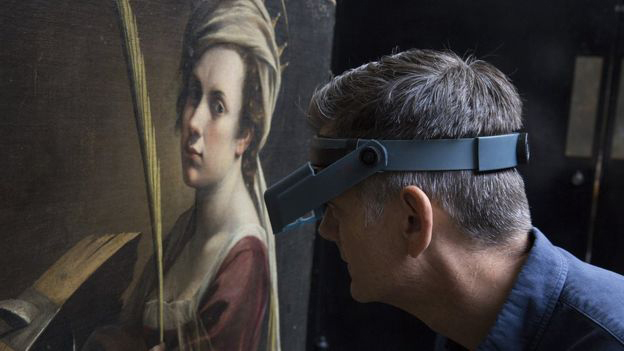
Above, Fig. 4: The restorer Larry Keith, examining the painting before cleaning began, as shown on BBC News 6 July 2018.
The above photos published in July 2018, at the very start of the intervention, in which spectators are present confirm that the variety of colours in the painting was clearly perceptible: the shades of pink of the face, the cream tone of the headscarf, the Naples yellow of the palm leaf or the ochre of the wood read easily and naturally. One can observe that there was no oppressing monochrome veil distorting the shades of the portrait, which were quite close to the natural skin tones of the viewers, as the photographs testify (Figs. 3 and 4).
Surprisingly, if not tendentiously, Keith even evokes an ‘accumulation of varnishes’, which he ventures would result from ‘many restorations that have probably occurred’ in the past (in Cleaning… 4:35). ‘Many’ is merely hypothetical since the history of this painting is totally unknown between the years of its creation, circa 1615-1617, and the 1940s when it resurfaced, only to be quietly kept in a French family (Pes, J. 2018).
Looking at the photographs of the initial state, it is difficult to deduce a superimposition of many added layers. Fortunately, this will be checked since Keith has announced that ‘minuscule samples [will] help us understand the layers structure of the accumulation of varnishes’ (in Cleaning… 4:35). Fine. It will be of great interest for the public and the experts that the result of this investigation by the laboratory be disclosed: how many layers of old varnishes? To what total thickness? Until these results are established and cited the idea of an ‘accumulation’ of layers of varnish will remain a puzzling assumption.
4) Beside the issue of yellowing – that he admitted not to be ‘evident’ – Keith places a greater emphasize on the second, undisputable, aspect of the picture condition, that of the varnish getting foggy. This loss of its transparency is, by contrast, plainly documented.
Even during the presentation at the 2017 auction in Paris, while the subtlety of the colours was praised, the ‘dullness of the varnish’ was nonetheless underlined and attributed to the fact that the painting had remained in the same family for several generations.
The video illustrates the consequences of this phenomenon (in Cleaning… from 1:40):
“… where [the foggy varnishes] are over the darker tones, the darker tones become quite a bit lighter. You can see that here, with that sort of hazy presence. And whereas down here where I started reducing the old varnishes, you can see the darker colours are much darker and the range from light to dark is much enhanced. And I think this helps you understand how [Artemisia] has laid out the folds, and helps you understand what is in front of what.
“…I think the thing here [in the ‘reduction’ in progress] that is most significant and really very rewarding is to see now the range from light to dark, which [Artemisia] has used, and her modelling of forms, which gives this sculptural presence.”
Indeed, Artemisia’s artistic expression rests on the illusion of spatial depth and on the convincing impression of three-dimensional figures. And this pictorial achievement is only displayed when the half-tones, dark values and contrasts have their full effect, which requires a good transparency of the varnish final layer.
It is hence plainly justified to try to regain this fundamental quality. However, in the case of this painting, such faint cloudiness is a common and rather benign alteration caused by humidity (that is to say, by a lack of prevention from its keepers). Physically, this phenomenon results from the scattering of light – not exactly on the ‘varnish’s own kind of fine cracks’ as it is said rather simplistically in the video – but on a multitude of micro-fissures, much smaller than usual cracks, that have developed within the varnish film at a microscopic scale that is invisible to the naked eye.
Above, Fig. 5: Above, Fig. 5: detail of Artemisia’s arm, showing un-thinned (slightly dull) varnish on the right and thinned varnish on the left.
As can be seen on the video, the thinning of the varnish has cleared the cloudy effect and has thus enhanced saturation and contrasts [above, Fig. 5]. Yet, the cause/effect relationship is not that simple. The dissipation of the hazy opacity is the result of a specific physical process: it comes from the ‘closing’ of the micro-fissures, which is obtained through the momentary softening and swelling of the varnish film when suitable solvents are applied to it. Once the solvent has evaporated, the micro-fissures have closed and so, vanished. Since the ‘reduction’ was done with solvents, their penetration into the varnish film provoked the swelling/closing result. Thus, this was a linked side-effect and it would not have been necessary to thin the entire varnish layer for that to happen. For this kind of light haziness, a simple exposure of a varnish surface to an appropriate solvent, at much lower levels – i.e. ethanol in form of vapours – without any ‘reduction’, could have produced the same positive result (Pfister, P. 2011, Demuth, P. 2001): the saturation of colours; the in-depth setting of the figure; the sculptural modelling created by Artemisia, would all have been recovered.
Of course, when such a minimal treatment is chosen, the tonality of the varnish remains unchanged, since its thickness is undisturbed even as its transparency is regained.
Knowing this, we realize that there is confusion between the two results. In truth, a physical reduction was not essential to recover the range of values from light to dark and modelling of forms intended by the artist, which could have been achieved otherwise. Essentially, the thinning of the varnish was used principally and specifically to obtain the ‘much less yellow’ overall tone. This result is held – in Larry Keith’s account – to be such an obvious improvement as to require no further justification. Yet, it does – and we see below why it needs questioning.
5) The transparency is a basic undisputed requirement for this varnish (as for any other). But what is the justification for making it ‘much less yellow’?
When we leave aside our own era’s cultural preferences and consider the materials and varnishing practices that prevailed in the XVIIth century, we realize that the (disparaged) ‘old varnish’ found on this painting had the best chance of resembling the original finished appearance as made by Artemisia herself.
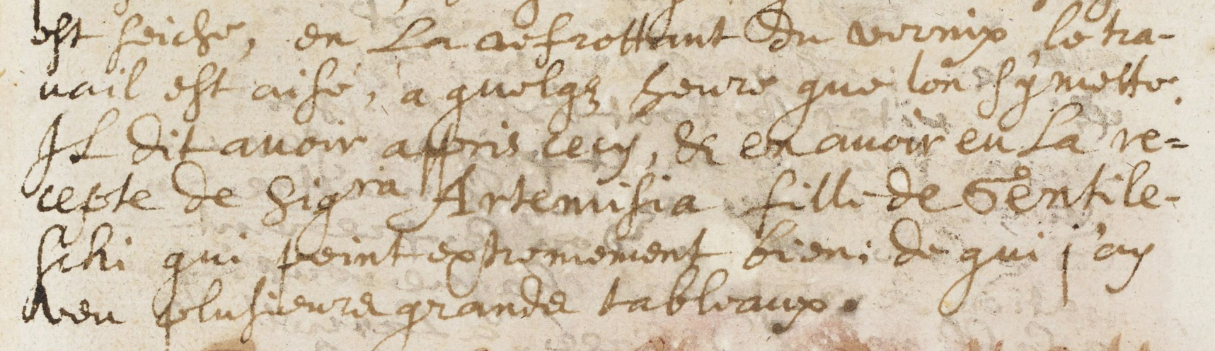
Above, Fig. 6: A section of de Mayerne’s text (Folio 151r) mentioning Artemisia Gentileschi and her varnish.
Throughout these supposedly informative and instructive videos it is striking that no reference is ever made to the kind of varnish that would have been used by the artist herself, or, even, to those that were common in her circle and time in Italy. This omission is hard to justify since relevant historical and technical references have survived and are accessible. For example, Turquet de Mayerne’s manuscript notebook (written between 1620 and 1646), which is the main historic testimony and source of information on the painting techniques of this period, contains a famous reference to an ‘amber varnish’ [5], ascribed to both Artemisia (active c. 1610-1653) and her father Orazio Gentileschi (active c. 1587 -1639) – see Fig. 6, above. De Mayerne specifies that this varnish had a strong reddish tone and was used by the instrument makers to varnish lutes [6].
It should be borne in mind that, at that time, in the absence of precise identification, the term ‘amber’ (otherwise called ‘c(h)arabe’) encompassed a group of resins that were close by their consistency, colour, workability and effect – and among which were chiefly the different semi-fossil resins that we now classify as copals, which range from semi-hard to hard and are easier to dissolve than true fossilized amber (Leonard et al. 2001, Holmes, M. 1999).
Furthermore, the expression amber varnish ‘coming from Venice, with which they varnish lutes’, added in the passage on Orazio (Folio 9v), most probably indicates a ready-made product. At that time in Italy many varnish formulations were no longer made in the artists workshops but prepared and sold by colours merchants. The painter Gian Battista Volpato quotes the ‘amber varnish’ as one of them [7]. De Mayerne states that a so-called ‘Oil of Amber from Venice’ (that is, a fat varnish made of ‘amber’ dissolved in a possibly larger proportion of oil), which he supposes to be the one used by Orazio, was sold in every Italian colour shop [8]. The main point is that these prepared varnishes formed a dry film that approached the legendary hardness of amber and had a similar golden-brassy colour. Some rosin (colophony) could be added, which was useful for improving the working properties of the mixtures (Leonard et al. 2001). Its marked orange hue would also increase the warm tonality of the whole – see Fig. 7 below.

Above, Fig. 7: Colophony (or rosin, resinous part remaining after the essential oil has been extracted from the balsam of Pinus maritima Lamb. by distillation.)
It is mentioned that Artemisia mixed her ‘amber’ varnish with oil and spread the blend as an intermediary layer upon the already dried parts of her work in progress, before continuing to paint (Folio 151r). This method, commonly called ‘oiling-out’, has three benefits for reworking: it brings back the initial saturation of the first colours that might have turned dull when drying; it enables a fluent application of the later colours; and, it promotes their physical adhesion to the ones beneath.
Concerning Orazio, de Mayerne notes that he used to add a drop of ‘amber’ varnish directly to his colours on his palette – especially to the ones of the flesh tones – in order to make them more ductile and quicker to dry (Folio 9v).
Was it also chosen as final varnish? The use of the same compound for mixing with colours, for intermediary ‘oiling-out’ and for final varnishing is indeed consistent with what is known of painters’ practices at the time. Examinations of paintings by Caravaggio (of whom Orazio was a disciple) have shown that remains of his final varnish – resin in oil – were similar to the ‘oiling-out’ layers found in his paint structure (Arciprete, B. 2004).On the same folio (151r) where de Mayern mentions Artemisia’s oiling-out method, he reports on another ‘charabe’ varnish, which can be used ‘for varnishing and for mixing on the palette with the colours’ [9].
Moreover, a discovery made by the Getty Conservation Institute in 2000 confirms that Orazio also adopted an ‘amber type’ varnish of his final coating. Found on one of his painting (Lot and his Daughters, J. Paul Getty Museum, Los Angeles) executed about 1622, this rare original varnish proved to be composed of Manilla copal and rosin, precisely (Leonard et al. 2001) [Figs. 7 and 8].

Above, Fig. 8: Manilla Copal (from Agathis dammara Lamb.)
This tangible historical/material evidence of what was an ‘amber-like’ formulation provides a precious testimony of its visual effect on the picture: it displayed a notable warm golden tone over the parts where it was still present (see Figs. 9 and 10 below). Given that Artemisia learnt to paint in her father’s studio, it is beyond doubt that Orazio would have shared both his materials and his practices with his daughter.

Above, Fig. 9: The effect of Orazio’s varnish on the sky of his Lot and his Daughters (in The Burlington Magazine’s article, Vol CXLII n°1174, p.5.)
Above, Fig. 10: Macro-photograph of the varnished sky. Note the bright blue colour of the paint that appears in some spots where the ‘amber-like’ varnish is missing (from the same Burlington Magazine article, p.9.)
In addition to those clues, there is the certainty that Artemisia’s varnish could only have been composed with resins among those of her time (the end of 16th/ first half of 17th centuries): sandarac; oleoresins balsams from the silver fir, the larch or the spruce; colophony; mastic; copals, with or without oil [10] (Figs. 7, 8, 11 and 12). Reconstructions of historical recipes with such ingredients, prepared and applied following traditional methods are converging to show that they provided a natural warm tone – a ‘golden glow’ – that moreover increased surprisingly quickly (Favre-Félix, M. 2017, Carlyle, L. 2005, CCI 1994) (Fig. 13).

Above, Fig. 11: Strasbourg turpentine (balsam – oleoresine – of the silver fir, Abies pectinata DC. – from Kremer Pigmente.)
Above, Fig. 12: Sandarac (from Tetraclinis articulata Mast.)
Above, Fig. 13:As an example, the reconstruction of an historical recipe, using one resin and one oleoresin – a type that became increasingly prevalent from the end of the 16th and throughout the 17th centuries – showed a notable increase of its natural coloration within a short time.
Thus, there lies a major contradiction of modern restoration: the profession asserts a strict adherence to the scientific study of the artists’ materials and techniques, but continues to ignore the technical characteristics of the varnishes that are known to have been used in those centuries. Further, while it aims to present paintings as close as possible to the artists’ conception it still declines to take into account how their paintings had once looked with their original final layer on, and it persists in eliminating the ‘yellow tone’ of any varnish encountered on old master paintings.
CODA:
A last video deals with the significant choice of a frame for Artemisia’s self-portrait. The Head of Framing, Peter Schade, points out that an authentic frame from the 16th century – wood-carved, painted or gilded – will always surpass any copy of it, even those that look to be perfect reproductions. He makes the following crucial remark [Choosing… 8:45]: “We always carry the baggage of modernity, of our time… And that gets always in some way transferred into reproduction frames. Usually, we don’t see it now but you can look it back at the history of frame reproductions, in the gallery as well, and [see that with] most reproduction frames, after twenty, thirty years they don’t match up to originals.”
Larry Keith had then to admit – albeit in carefully chosen words – that the same rule of unwilling, modern distortion applies to restoration:
“[9:12] …It is the same thing about how we… decisions we make about restoration itself, you know. We think we try to be… I guess what we can say now, is that we are very transparent about the decision-making process but it’s definitely an interpretation all the way down the line”.
Restoration being a contemporary “interpretation” of the work of the past, transparency is essential, and transparency implies clear explanations for the present and for the older interventions. But, strikingly, Larry Keith has not explained in any way the main justification for reducing rather than eliminating surviving varnishes. With regard to the use of retouching – e.g. in the reconstruction of the cropped top of the crown – his presentation and discussions are fair (see Reconstructing… and Retouching…) But on matters of cleaning and varnish this essay’s conspicuous technical, aesthetic and historical documentary omissions testify to an enduring institutional avoidance of transparency on the most vital artistic questions of art conservation at the National Gallery.
Above, Fig. 14: Artemisia’s Self-portrait, left, as in 2017 at auction; centre, same state but as provided by the National Gallery to the press in July 2018, before cleaning; and, right, as at the end of 2018 at the National Gallery, after cleaning and restoration.
Michel Favre-Felix, 9 October 2020.
THE NATIONAL GALLERY RESTORATION VIDEOS:
1) Starting the restoration of Artemisia Gentileschi’s ‘Self Portrait’ – Now entitled: “The art restoration plan for Artemisia Gentileschi’s ‘Self Portrait'” – as posted on the 20th of July 2018.
2) Cleaning Artemisia Gentileschi’s ‘Self Portrait’ – as posted on the 27th of July 2018.
3) ‘It’s such a 17th century thing to do’ | Cleaning Artemisia Gentileschi’s ‘Self Portrait’ – as posted on the 3rd of August 2018.
4) Who was Artemisia Gentileschi? – as posted on the 20th of August 2018.
5) Finishing the cleaning | Cleaning Artemisia’s ‘Self Portrait’ – as posted on the 30th of August 2018.
6) Repairing a 17th century canvas – as posted on the 10th of September 2018.
7) Applying the moisture treatment – as posted on the 21st of September 2018.
8) Finishing the relining – as posted on the 2nd of October 2018.
9) Reconstructing the unusual composition of Artemisia’s ‘Self Portrait’ – as posted on the 9th of October 2018.
10) Retouching a 17th century painting – as posted on the 13th of November 2018.
11) Choosing a frame – as posted on the 26th of November 2018.
12) Framing Artemisia – as posted on the 14th of December 2018.
ENDNOTES:
[1] “Indeed not all the old varnish was removed – it was simply reduced to a level which helps us to fully appreciate the painting.” (Larry Keith – Restoring Leonardo, National Gallery website.)
[2] “By removing the ugly varnish…” Jonathan Jones commenting on this cleaning in The Guardian, 13 July 2010. When reviewing the National Gallery’s restoration of its Leonardo Virgin of the Rocks, Jones expressed delight that the painting had been “freed from an amber prison”.
[3] National Gallery Podcast: Restoring Reni’s ‘Adoration of the Shepherds’, 1 :48.
[4] ARTECENTRO – Artemisia Gentileschi, Sainte Catherine d’Alexandrie, vente le 19 décembre 2017. Time 2: 47.
[5] ‘Vernix d’Ambre venant de Venise’ (Sloane MS 2052 Folio 9v).
[6] ‘Ce Vernix est fort rouge & est celuy des faiseurs de Luths’ (Sloane MS 2052 Folio 150 v).
[7] ‘quella d’ambra si compra, quella di mastice la facio io’ (Merrrifield, M.P, p. 743).
[8] ‘Chés touts les vendeurs de couleurs en Italie on vend une huile espaisse, qu’ils appellent Huile d’Ambre de Venise […] Je croy que c’est ceste huyle dont m’a parlé & se sert Gentileschij ’ (Sloane MS 2052 folio 146v).
[9] ‘Et pour vernir: & pour mesler sur la palette avec les couleurs’ (Sloane MS 2052 folio 151r).
[10] Such a choice of resins for varnishes is also noted by Van Dyck, at the same period, on a folio of a sketchbook: fir balsam, colophony, unspecified ‘vernizia’ and amber varnish (Kirby, J. 1999, p. 13).
BIBLIOGRAPHY:
Arciprete, B. (2004), ‘Il restauro’, La Flagellazione di Caravaggio, il Restauro, Electa Napoli.
Carlyle, L. (2005) ‘Representing authentic surfaces for oil paintings: experiments with 18th and 19th-century varnish recipes’, Art of the Past, Sources and Reconstructions. Proceedings of the first symposium of the Art Technological Source Research study group. Archetype Publications.
CCI (1994) Varnishes: Authenticity and Permanence Workshop, Canadian Conservation Institute, (Reviewed by Neil Cockerline).
Christiansen, K., Mann, J. W. (2001) Orazio and Artemisia Gentileschi – New York Metropolitan Museum of Art, Yale University Press, New Haven.
De Mayerne, T. Turquet, (1620) Pictoria Sculptoria & quae subalternarum artium, British Library, Sloane MS 2052. Trancription in Berger, E. (1901) Quellen für Maltechnik Während der Renaissance und Deren Folgezeit (XVI.-XVIII. Jahrhundert), München.
Demuth, P. (2001) ‘Regeneration of blanched natural resin varnishes with solvent vapour’ Hochschule für Bildende Künste – Dresden/ The ENCoRE Symposium: Recent development in conservation-restoration research 19-21 June 2001.
Eastlake, C. L., (1847) Methods and Materials of Painting, Dover Publications, New York (2001)
Favre-Félix, M. ‘On the recipe for a varnish used by El Greco’, Conservar Património 26 (2017) pp. 37-49 – ARP – Associação Profissional de Conservadores-Restauradores de Portugal http://revista.arp.org.pt/pdf/2016023.pdf
Holmes, M. (1999), ‘Amber Varnish and the Technique of the Gentileschi’, in Artemisia Gentileschi and the Authority of Art: critical reading and catalogue raisonné, R. Ward Bissel, Pennsylvania State University Press, pp. 169-182.
Kirby, J. (1999) ‘The Painter’s Trade in the Seventeenth Century: Theory and Practice’- National Gallery Technical Bulletin, Vol 20.
Leonard M., Khandekar N., Carr D.W. (2001) ‘Amber Varnish and Orazio Gentileschi’s Lot and his Daughters ’, The Burlington Magazine Vol. CXLIII, pp. 4-10
Merrifield, M. P. (1849) Medieval and Renaissance Treatises on the Arts of Painting, Dover Publications, New York (1999).
Pes, J. (2018) ‘The National Gallery’s New Artemisia Gentileschi Should Be a Triumph – But Clouds Are Forming Over Its Ownership During WWII’, December 12, 2018, News-artnet.com.
Pfister, P. (2011) ‘Régénération : l’emploi des vapeurs d’alcool et les dangers des alcools liquides’ / Kunsthaus – Zürich / Nuances 42/43, pp. 24-29.
Ruhemann, H. (1968) The Cleaning of Paintings. Problems & Potentialities. Praeger Publishers.
The Disappeared Salvator Mundi’s endgame: Part I: Altered States and a Disappeared Book

Michael Daley writes: As the world reels from China’s latest plague, the fifteen-year Salvator Mundi Saga has slipped into never-never land. The famously disappeared picture has been likened to an opera by its instigators and is set to become a musical in 2022 in which “artistic liberties will be freely taken to make an enlightening and entertaining experience”. Amazon is offering T-Shirts that carry the Salvator Mundi not as it looked in 2017 when it disappeared but as it looked in 2011 when first presented as a Leonardo at the National Gallery (see below, Fig. 3). The restorer’s own paintbrushes (which had been used to produce three distinctly different states or appearances) were auctioned on eBay with a $1,000 reserve. No bid was received. Back in the real world, before considering the rise and demise of a perpetually morphing disappeared picture’s attribution upgrade that netted $80 million, $127 million and $450 million in two restoration guises over four years on a $1,000 purchase that was overstated tenfold by its owners, we note three further bizarre developments, including a disappeared book of technical analysis and a disappeared Louvre catalogue.
1 – THE LOUVRE’S DISAPPEARED BOOK OF TECHNICAL DATA FOR A DISAPPEARED PAINTING
Above, Fig. 1: Left, a disappeared book; right, a disappeared ascription.
On 30 March, the Art Newspaper disclosed that last year the Louvre vaporised a 45-page book of technical examinations made in 2018 on the disappeared Salvator Mundi painting by C2RMF (Centre for Research and Restorations of the Museums of France). The Editions Hazan book, Léonard de Vinci: Le Salvator Mundi (Fig. 1, above, left), had been produced for the October 2019 opening of Léonard de Vinci, the Louvre’s major exhibition marking the 500th anniversary of Leonardo’s death, but it was withdrawn shortly before the opening even though the authors reportedly considered their examinations “to have demonstrated that the work was executed by Leonardo”. (The claim, of course, is implausible: technical examinations can sometimes disprove an attribution but can never establish artistic authorship.)
A Louvre spokesman said the book, written by the Louvre curator Vincent Delieuvin and C2RMF’s Myriam Eveno and Elisabeth Ravaud, had been “a project in case the Louvre got the chance to exhibit the painting” and that because this had not happened “it is not going to be published” – which seems tantamount to saying “If we can borrow it, it’s a technically-supported Leonardo; if we cannot, it’s not”. A copy of the disappeared book has been seen by Dianne Dwyer Modestini, who had restored the picture between 2005 and 2017. Modestini feels the conclusions confirm her own, earlier, judgements, even though they “do not reveal anything I did not already know about the materials and techniques…”
2 – THE LOUVRE’S DISAPPEARED CATALOGUE WITH A NON-APPEARING, NOW DISAPPEARED PAINTING
Second, to the embarrassment of a disappeared book of technical examinations, we disclose another disappeared Louvre publication: the catalogue for the museum’s 2019-20 Léonard de Vinci exhibition was also junked and replaced shortly before the opening. The two editions of the catalogue were identical except for one detail. In the first, the disappeared painting was splashed on the front cover as by Leonardo – “Front cover: Leonardo da Vinci, Salvator Mundi (detail of cat. 157), Ministry of Culture, Saudi Arabia Kingdom”. (See Fig. 1, above, right.) The author of that endorsing entry was Vincent Delieuvin, who co-curated the exhibition with Louis Frank. Delieuvin’s public commitment to the Leonardo attribution was made in the catalogue of a small 2016 Leonardo exhibition at the Italian Embassy titled: Léonard en France. Le maître et ses élèves 500 ans après la traversée des Alpes, 1516-2016 (Leonardo in France. The master and his pupils 500 years after the crossing of the Alps, 1516-2016). There, Delieuvin ventured of the now-disappeared picture “…Leonardo da Vinci’s Salvator Mundi whose autograph version seems to have reappeared very recently, unfortunately in very bad condition. The circumstances of the creation of this work are unfortunately not known.”
In the second printed catalogue, Delieuvin – with no explanation for the volte-face – correctly describes the Salvator Mundi as the Leonardo studio work that entered the Cook Collection in 1900 (on no provenance and that was later sold for £45) – namely: “Salvator Mundi, version Cook, vers 1505-1515″. A second Leonardo studio version, the de Ganay Salvator Mundi, was included in the Louvre exhibition as catalogue no. 158: “Salvator Mundi, version Ganay”. The choice of substitute may have been pointed: the Ganay picture had flopped when proposed in 1978 and 1982 as the supposedly lost autograph Leonardo prototype Salvator Mundi painting of which no record exists. Such notwithstanding, provenance claims made on behalf of that candidate were adopted and merged with those made on behalf of the Cook version. Because of the non-appearance of the disappeared Cook version, originally no. 157 in the catalogue, there is now a gap in the published catalogue between cat. 156 and cat. 158. That numerical lacuna testifies to the fateful loss of institutional support for the second would-be autograph Leonardo Salvator Mundi in forty years. (See Fig. 1, above, right.)
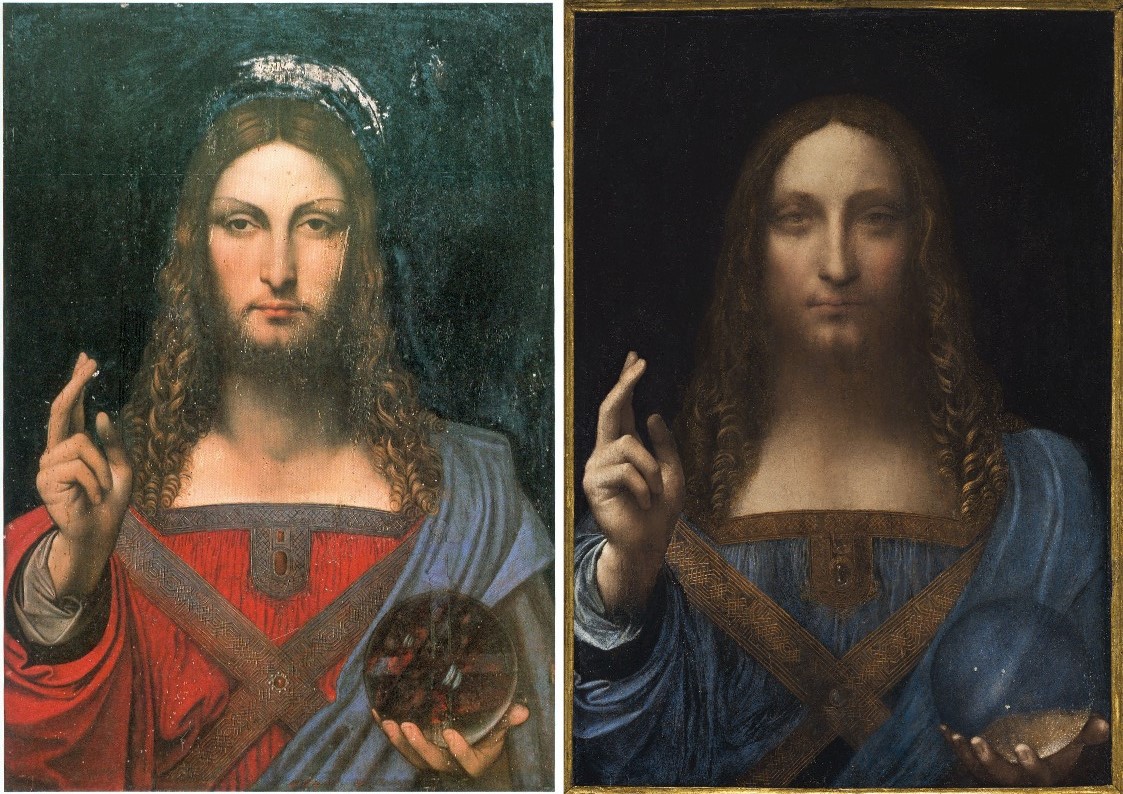
Above, Fig. 2: Left, the de Ganay Salvator Mundi which, in 1978 and 1982, had been proposed as a long-lost Leonardo prototype painting; right, the more heavily damaged and made-over ex-Cook Collection Salvator Mundi, which was presented as a long-lost Leonardo prototype painting at the National Gallery in November 2011.
3 – SOME DAY, MAYBE, NEVER…
After fetching $450 million in 2017 at Christie’s, New York, as Leonardo’s (supposedly) autograph, (supposedly) long-lost, (supposedly) iconic male equivalent of the Mona Lisa, the painting (really did) disappear without a trace, leaving the world bemused and the picture’s briefly “vindicated” advocates to play blame games. It was promised the painting would be launched as a Leonardo at the official opening of the United Arab Emirates spanking new Abu Dhabi Louvre Museum in 2018. That did not happen. It was said the painting would star as A Discovered Leonardo at the Paris Louvre’s grand 2019 Leonardo blockbuster. That did not happen either, just as we had predicted. The Wall Street Journal has reported that Saudi Arabia’s Ministry of Culture has possession of the disappeared painting and plans to store it while deciding whether or not to build an exclusively Western art museum to house this once again officially-deemed Leonardo school Christian image (“Saudi Arabia’s Secret Plans to Unveil Its Hidden da Vinci-and Become an Art-World Heavyweight”, 6 June 2020).
A MUSEUM FOR A PICTURE NO MUSEUM WANTED
It might seem unlikely that the disappeared former Leonardo Salvator Mundi will reappear in a purpose-built museum of Western art in Arabia when it is now well known (thanks to Ben Lewis’s 2019 lid-lifting book The Last Leonardo) that the picture had been offered to, and rejected by: the Getty Museum; the Hermitage; the Museum of Fine Arts, Boston; the Vatican; the Dallas Museum; a German auction house; Berlin’s Gemäldegalerie, and even, at a knock-down $80 million, to the Qatari royal family.
WHY DID THE BIG WESTERN MUSUMS BACK OFF?
The National Gallery launched the Leonardo attribution in its 2011-2012 Leonardo blockbuster, Leonardo da Vinci: Painter at the Court of Milan, after covertly helping to assemble its proclaimed “Unusually Uniform Scholarly Consensus”. The gallery made no attempt, however, to buy the Salvator Mundi. Similarly, and notwithstanding National Gallery claims of blanket endorsement by the Metropolitan Museum’s curators of pictures and drawings, the Met, too, did not buy what Christie’s dubbed “The Last Leonardo”. Despite publicly avowing support for the Leonardo ascription, the Met’s Chairman of European Paintings, Keith Christiansen, has (so far as we know) written nothing in its support – in marked contrast to his decisive role in the museum’s 2004 purchase of the tiny Madonna and Child that Christie’s offered as the “The Last Duccio”. Where the Met’s director, Philippe de Montebello, shuffled financial mountains to acquire the Duccio at Christiansen’s behest, Thomas Campbell, de Montebello’s successor from 2009 to 2017, tweeted after the 2017 $450 million Salvator Mundi sale that he hoped the mystery buyer “understands conservation issues” and had “read the small print”. Many were sickened by Christie’s globally-hyped removal of a sixteenth century painting from an old masters’ sale context to offer it (buttressed by cross-linked and mutually assured sale guarantees) among trophy modernist “icons” – and all on a picture Christie’s had passed over when it was offered in 2005.
“SALVATOR MUNDI IS A PAINTING OF THE MOST ICONIC FIGURE IN THE WORLD BY THE MOST IMPORTANT ARTIST OF ALL TIME” – LOÏC GOUZER

Above, Fig. 3: Left, Loïc Gouzer, Christie’s former co-chairman of Americas post-war and contemporary art, next to Jean-Michel Basquiat’s Untitled at a press preview; centre, the Salvator Mundi as when sold as a Leonardo at Christie’s, New York, on 15 November 2017; right, the Amazon T-Shirt sporting the Salvator Mundi as it appeared at the National Gallery in 2011 with many more folds visible in the drapery at Christ’s (true) left shoulder – see below, Figs. 8, 9 and 10.
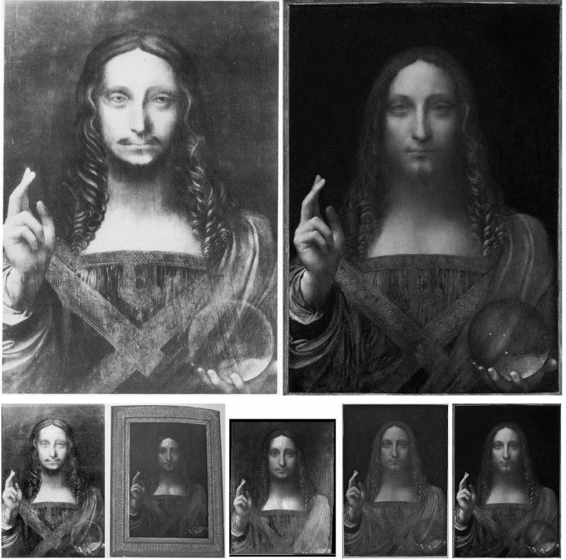
Above, Fig. 4, top row: Left, a c. 1913 photograph of the Salvator Mundi when in the Cook Collection, England; right, the Salvator Mundi as when sold at Christie’s in November 2017. Bottom row: the same time-line changes with three intermediary states from 2005; 2005; and 2011-2012 (when exhibited as a Leonardo at the National Gallery).
THE INTENSIFYING CRISIS OF ART MARKET CONNOISSEURSHIP
The epically long Salvator Debacle has put the abiding old masters’ connoisseurship crisis centre stage. To restate the intractable root problem: supply is finite – the old masters aren’t working any-more; most big-name works are already in museums; and infinite new global money craves art that bestows cachet and respectability. In February 2018, Guillame Cerutti, Christie’s CEO, purred: “our major clients are looking for trophies. They want quality and rarity in any field. This painting had both aspects, it ticked all the boxes”. Such a global trophy-hungry market can only be grown with dramatically upgraded art trade “sleepers” or outright forgeries. Both stand on restorers’ transforming skills which, along with claimed technical discoveries, licence scholars’ elevation of formerly nondescript works to revered Lost Masterpiece status.
MUSEUMS BEWARE
For Big-Name buyers, risks are high and can trip the grandest museums. The Metropolitan Museum’s David was one of its most popular paintings… until it wasn’t a “David” anymore. In 2004 the Met’s director, Philippe de Montebello, spoke of the “Stoclet Duccio” Madonna and Child as “Filling a gap in our Renaissance collection that even the Metropolitan had scant hopes of ever closing, the addition of a Duccio will enable visitors for the first time to follow the entire trajectory of European painting from its beginnings to the present. Moreover, the Duccio Madonna and Child is a work of sublime beauty. This was a unique opportunity to not only to add a masterpiece to the Museum’s holdings but to give its collections a new dimension.”
The institutional gush was infectious: “The Stoclet Duccio – we can now proudly call it ‘the Metropolitan Duccio’ – is an astonishing achievement”, wrote the New York restorer/some-time dealer, Marco Grassi, who likened the picture’s emergence to a discovered Mozart quartet. The disappeared Salvator Mundi is now likened by its original owners/supporters to the discovery of a new planet: “Paintings by the master are as significant culturally as the planets are celestially”. (It must seem cruel to have discovered and lost a planet in six short years.) Circumspection would have been prudent for Grassi and de Montebello: the Stoclet vendors had prepared a “four-inch thick” legal contract document and refused to allow the picture to be examined technically by the three big museums (the Met, the Getty and the Louvre) selected by Christie’s to bid in a private treaty sale. In 2003, the vendors had withdrawn the picture at the last moment from a big Duccio exhibition in Siena at which specialists would have had the first opportunity since 1935 to examine the picture – not one of the four Duccio scholars who had published monographic studies since 1951 had ever seen the picture which was known only by an old black and white photograph.
MARKETING “A LAST DUCCIO” AND “A LAST LEONARDO” AT CHRISTIE’S, NEW YORK
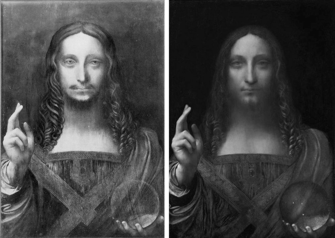
Above, top, Fig. 5: The Met Duccio as first photographed before 1904 (left); and as seen when sold in 2004.
Above, Fig.6: The disappeared $450 million Salvator Mundi as seen in c. 1913 (left); and as seen when sold at Christie’s, New York, in 2017.
In 1901 no one thought the tiny Madonna and Child (Fig. 5, above, left) a Duccio. Some thought it a Sano di Pietro. The picture had emerged after 1900 and, just like the Salvator Mundi (above, Fig. 6), it did so without provenance. It was said to have been found in a Tuscan antiques shop by Count Stroganoff, a Russian friend of Bernard Berenson and a big collector of “inediti” works that had not appeared in scholarly publications or exhibitions. Stroganoff had it restored and cradled. When, after buying it, Met conservators removed the cradle in 2005 (the year the Salvator Mundi was bought in a provincial U.S. sale for less than the low estimate of $1,200 – for $1,000 plus a $175 charge – it, as mentioned, having been turned down by Christie’s), they found that the panel’s originally gesso-ed back had been scraped down to the bare wood which bore a pencilled ascription to “Segna della Buoninsegna”, an apparent confusion between the Ducciesque painter Segna di Buonaventura and Duccio. In 1904 the head of the Uffizi Gallery judged it “in the manner of Duccio”. When an exhibition of early Sienese painting was held in 1904, a friend of Berenson’s, Carlo Placci, commended a late inclusion of Stroganoff’s recently restored picture which by then was incorporated within a larger frame bearing a metal plaque announcing a Duccio. Stroganoff had attributed his own antique shop purchase. Berenson’s circle would usher it into stardom at a time of considerable intellectual and financial crisis for the scholar – his principal source of income had dried; finding part-replacements for it were proving elusive; he had stopped writing. (Ironically, Berenson had held hopes until 1904 of finding employment as an advisor on Italian purchases at the Metropolitan Museum of Art.)
By 1904, as Frances Vieta discovered, Stroganoff had no fewer than eight similarly small gold background Sienese style panels, one of which was ascribed to Duccio’s follower Simone Martini and later bequeathed to the Hermitage in St. Petersburg. The “Simone Martini” had been dismissed in 1901 by the art historian Giorgio Bernardini as “so heavily restored in the skin tones, and in the red and blue robes, that it is not easy to attribute to anyone.” After seeing it at the Hermitage in 1929, George Martin Richter complained (Burlington Magazine): “Beneath this mantle there is concealed not an organically constructed body but a form rather suggestive of a bag full of washing.”
For all the Christie’s Hype, the Met had bought a Berenson Family-accredited pig in a poke. The museum came under challenge. In 1984 the now c. $50 million picture had been rejected by one of the Big Three Duccio Specialists, Florens Deuchler. ArtWatch International’s founder, Professor James Beck, wrote to the Met’s Chairman, calling for an inquiry and advising the museum to ask for its money back (see Beck’s, From Duccio to Raphael – Connoisseurship in Crisis, 2006, Italy, chapter 6 and Addendum). The Duccio pedigree, like that of the Salvator Mundi, is short, modern and precarious. The Salvator Mundi had no pre-20th century history. The Met’s official history of the Duccio begins not in 1901, when no-one considered it a Duccio, but in 1904 after it had been attributed by Bernard Berenson’s wife, Mary Logan (once), and (twice) by Berenson’s protégé, Frederick Mason Perkins, who trained in music, not art history. Christiansen elaborated: “from that point on the picture has held a central place in the Duccio literature”. Central, but with an unseen and unexamined work that had been dismissed by scholars on its six centuries-late emergence. The then 28-year old Perkins, is cast by Christiansen as a leading specialist in Sienese painting when Logan had written his first article and most of his first book.
Worse, as Vieta further established, Perkins was a fount of lucrative attributional errors. In 1923, he advised Helen Frick (then creating the incredible scholarly resource that is today’s Frick Research Library) to buy two huge marble sculptures from an antiques dealer for $150,000. He attributed these “wonderful” sculptural “masterpieces” to Duccio’s heir, Simone Martini. They had recently been made by the sculptor/forger, Alceo Dossena. Perkins’s fee was ten per cent. In 1933 he attributed an unpublished Madonna and Child surrounded by Angels to Duccio in an article carried in La Diana. The Belgian collector Adolphe Stoclet, the then owner of the now-Met Duccio, bought that second “Perkins Duccio”. In 1989 it was loaned to the Cleveland Museum of Art and there identified by Gianni Mazzoni, an Italian scholar of Sienese art and its forgers, as by the forger Icilio Federico Joni – which experience might have chilled the Stoclet family. Joni is known to have run a little factory of forgers whose works were put onto the market by middlemen, one of whom was Perkins himself. The lynchpin of Christiansen’s case for the “Met Duccio” is Berenson’s subsequent (private) hymning of the Stoclet picture as the loveliest and most characteristic thing Duccio ever did to the Duveen firm which paid him ten per cent on Italian purchases. Despite Berenson’s effusions, Duveen would not touch the “very small and ineffective” picture with a “nearly black” robe.
AN UNPUBLISHED TECHNICAL EXAMINATION AT THE MET
A top-secret post-purchase technical examination of the Duccio was carried out at the Metropolitan Museum. Staff were forbidden to talk to the press. No reports were published. The findings were discussed by Christiansen in the February 2007 Apollo. That article carried an x-ray of the painting showing modern, round-headed, wire nails underneath the picture’s ancient, badly distressed, “candles-burnt” gesso-ed frame. That hard, subversive material fact drew no comment (- other than ours in three consecutive issues of The Jackdaw, in 2008-09, as reprised in this post.) No comment was made, either, about the Met Duccio’s eccentric and pronounced craquelure. Scarcely less remiss than these “material” silences was the Met’s failure to acknowledge and address the uncharacteristically sloppy drawing of the figures, as revealed by infra-red imaging (see Fig. 7, below, centre).
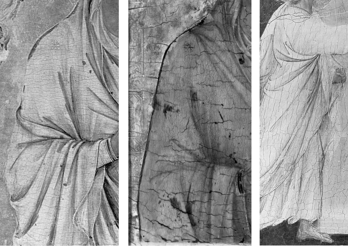
Above, Fig. 7: Left, an infra-red image of the National Gallery’s Duccio triptych (detail); centre, an infra-red image of the Met Duccio (detail); right, an infra-red image of the National Gallery’s indisputably Duccio panel, The Annunciation.
De Montebello, Christiansen and the Met picture restorer Dorothy Mahon travelled to London in autumn 2004 to view the Duccio at Christie’s. They were buying “blind” (unable to conduct technical examinations of the kind made on the other Stoclet/Perkins Duccio) and in knowledge that “the Louvre was working on trying to get the money together”. They spent an hour and a half at Christie’s where “The director made an offer for it on the spot”, and they all then went to see the National Gallery’s “rare and very beautiful Duccio triptych” – “a touchstone of Duccio’s work” (detail, above, left) so that the director “might assure himself that the two works were equivalent”. It would have been better to have gone to the National Gallery first, not only to see the triptych but to study its historical and technical dossiers, and those of the gallery’s absolutely secure Duccio Annunciation. Having bought the picture, all three “felt ‘ours’ was every bit as fine and in some respects more intimate and direct” than the triptych and was “a painting that represented the artist at the very height of his powers”. Two Duccio specialists, Deuchler and James Stubblebine, thought the NG triptych “Shop of Duccio: Simone Martini”.
Having thus bought very expensively without a trace of “buyer’s remorse”, other possible grounds for concern may have been overlooked. For example, Christie’s had won the right to conduct its private, three-museum sale by putting “a significantly higher valuation on the painting than anyone else – by multiples”, as Nicholas Hall, the international director of Christie’s Old Masters department, later told the New Yorker (Calvin Tomkins, “The Missing Madonna”, 11 July 2005). When Hall invited Christiansen (an old friend) to lunch to show him a recent transparency of the Stoclet Madonna, he was immediately smitten and proactive. As he later recalled: “‘Fantastic, how about the price?’ I asked. He told me. ‘OK,’ I said, ‘I will deal with that later,’ and then we finished our lunch.” (Danny Danziger, Museum – Behind the Scenes at the Metropolitan Museum of Art, New York, 2007.)
Had the Met officers opted to compare the under-drawing of the three works, as above, Fig. 7, before buying, they might have seen that on the quality of drawing one of the three was the other two’s inferior. If we think of the three images as a triptych, it is striking how much more fully and vividly realised the draperies and figures are as form in the two “wings”. Consider the left and centre under-drawing: in the outer image the drapery folds are not notionally indicated with lines that converge, as on the Met picture, but are realised, in anticipation, as autonomous three-dimensional folds and hollows that move over and around the implicit body within – one senses, for example, precisely where the unseen elbow is located, this being no “bag of washing”. The contour on the National Gallery Madonna’s outer edge is not depicted, as is the case in the Met picture, with a long un-lovely single continuous unbroken line of few deviations along which it is impossible to sense the elbow’s location. Rather, it is conceived and shown as a record of the points at which the forms and undulations of the cloth turn away from the viewer. Such differences of drawing speak of radically differing degrees of plastic/sculptural sensibility and comprehension. That on the left is greatly and decisively more sculptural, dynamically expressive, and plausible as a figure adjusting itself to support the weight of a child. Drawing has rightly been described as the probity of art and, as such, its study and evaluation must be considered one of the most pertinent and indispensable tools of critical analysis.
In the face of artistic weaknesses Christiansen blusters: “The drapery of the Virgin is astonishingly three-dimensional in the way it falls over the arm; it’s like a Roman sculpture.” All style judgements are relative: this is more, or less, or identical with, that. When drawing is weak, associated aspects often prove deficient. Viewing the triptych immediately after the Christie’s Duccio, Christiansen noted the former “struck a slightly different key than the picture we had been examining.” That difference, as the Met’s subsequent examinations disclosed, had a material basis. Ultramarine pigment was used in the triptych as opposed to the Met picture’s cheaper azurite. Moreover, the painted relief of the triptych’s ultramarine blue drapery was modelled not so much by progressive (and chromatically-debilitating – as Duveen had complained) dilution with white pigment, but by the addition of carbon black shading enriched by a red glaze – a tri-partite finish made with the best materials – and one that was emulated by Modestini on the background of the Salvator Mundi. Modestini has given two accounts of her actions. They both merit attention, because both are more detailed, and frank, than is commonly encountered in restoration reports.
REPLICATING HISTORICAL AUTHENTICITY TO PRODUCE A “DIFFERENT, ALTOGETHER MORE POWERFUL IMAGE”
Writing in a 2012 conservation report (see below), Modestini recalled:
“There were actually two stages of the current restoration. In 2008 when it went to London to be studied by several Leonardo experts, there was less retouching: I hadn’t replaced the glazes on the orb, finished the eyes, suppressed the pentimenti of the thumb and stole, and several other small details, but, chiefly the painting still had the mud-coloured modern background that was close in tone to the hair. Two years later I was troubled by the way the background encroached upon the head, trapping it in the same plane as the background. Having seen the richness of the well-preserved browns and blacks in the London Virgin of the Rocks”, and based on the fragments of black background which had not been covered up by the repainting, I suggested to the [then two] owners that it might be worthwhile to try to recover the original background and finish the incomplete restoration.
“I began to remove the overpaint mechanically under the microscope. Where it had been protected by the Verdigris [layer, that had been scraped off “at an unknown date and replaced by a mud-coloured background”], the original background was intact, and much of it survived under messily applied fill material. The difference between the original black and the modern brown was dramatic.
“The initial cleaning was promising especially where the Verdigris had preserved [because applied soon after?] the original layers. Unfortunately, in the upper parts of the background, the paint had been scraped down to the wood and in some cases to the wood itself. Whether or not I would have begun had I known, is a moot point. Since the putty and overpaint were quite thick I had no choice but to remove them completely. I repainted the large missing areas in the upper part of the painting with ivory black and a little cadmium light, followed by a glaze of rich warm brown, then more black and vermilion. Between stages I distressed and then retouched the new paint to make it look antique. The new colour freed the head, which had been trapped in the muddy background, so close in tone to the hair, and made a different, altogether more powerful image. At close range and under strong light the new background paint is obvious, but at only a slight remove it closely mimics the original.
“The retouching was done with time-tested materials.” Viz: “with dry pigments bound with PVA AYAB. Translucent water colours, mainly ivory black and raw siena, were used for final glazes and to draw [fake age] cracks. For the black background both AYAB and Maimeri Colori per restauro were used. Except for the background, I mainly used treble 0 sable watercolor brushes in a series of vertical passes until the area of loss matched the surrounding material.”
RESTORATIONS BEGET RESTORATIONS
In her 2018 memoir, Masterpieces, Modestini recalled:
“When the painting returned [in 2008 from London] to New York, I saw it on many occasions and became increasingly dissatisfied with my hastily concluded restoration. This is inevitable, especially when the painting is a damaged work by a great artist. Although I was aware of this, I itched to have it back. Leonardo’s [sic] Virgin of the Rocks in London had just been cleaned, and I made an appointment to see it. It is relatively well-preserved and, at that time, the only Leonardo that was not encumbered with centuries-old, thick, yellow, decayed coats of varnish like the Mona Lisa and the St John the Baptist in the Louvre. When I saw it, I was struck by the richness and depth of Leonardo’s blacks and realized that the principal problem of the Salvator Mundi was that the image was imprisoned by the nineteenth-century, sludge-colored repaint of the background. In a few areas, mostly around the contours of the figure, the original deep black was visible, and I knew from one [!] of the cross sections that Leonardo had paid great attention to it, building it up with four layers consisting of two different blacks, and black mixed with vermilion. I explained this to Robert [Simon], who immediately understood.
“For retouching [aka repainting] I use high-quality dry pigments, and I had a number of different blacks to work with – bone black, which Leonardo was known to favor, and a sixty-year-old tin of finely ground, pure ivory black that I had inherited from Mario [Modestini], which is no longer made. I had never used it but suddenly remembered Mario talking about how special it was…After I had polished and distressed my new paint, the result was reasonably satisfactory, at least when compared to the previous iteration. The difference it made to the painting was astounding: the great head surged forward and became much more powerful. I allowed myself to think that the decision I had taken was not so terrible after all. With the figure now more prominent and three-dimensional, some minor areas of loss and wear began to clamor for attention. This sequence is an essential part of the process of restoring a damaged painting.
“Luke Syson, the curator of the National Gallery’s Leonardo exhibition, asked to borrow the painting, notwithstanding some cavilling from colleagues about exhibiting a work that was on the market…”
Where Modestini was licensed by the owners to act as a painter-in-arms with Leonardo, Christiansen downplayed the triptych’s greater richness of effects and materials by deeming it “Obviously…a deluxe object” made for a rich client as opposed to “the first owner of the Metropolitan’s [who] was also someone of wealth or social standing”. If the force of that distinction is not immediately apparent, there are other, no less telling, differences where cost is immaterial: the triptych’s under-drawing was made with a quill pen – the instrument said to be Duccio’s favourite. That of the Met painting was made with brush… Making repeated allowances for atypical traits is never reassuring. Modestini has disclosed that although the all-blue draperies of the disappeared ex-Cook Collection Salvator Mundi are of ultramarine, it is of low grade – as was the panel on which it was painted. (In 2019 Simon reported that the ultramarine had not undergone full purification and had retained large particles of quartz.) It has been claimed, as described below, that by some technical quirk, whenever the restored Salvator Mundi is re-varnished, the forms of the true left shoulder draperies expand or contract in numbers (see Fig. 8, below) precisely as occurred between 2011 when the picture was at the National Gallery, and 2017, when it was on offer at Christie’s.
ART WORLD CLOAK AND DAGGER

Above, Fig. 8: Left, top, and detail below left, the Salvator Mundi when exhibited at the National Gallery in 2011-12 as a long-lost autograph Leonardo painted prototype Salvator Mundi; right, top, and detail below right, the (disappeared) Salvator Mundi when offered in 2017 at Christie’s, New York, as a long-lost autograph Leonardo painted prototype Salvator Mundi with “an unusually strong consensus”.
In her 2018 memoir, Masterpieces, Modestini describes how the painting was brought to her place of work at New York University’s Institute of Fine Arts’ Conservation Center in 2017:
“…I called [the Sandy Heller Group] immediately and was told the Salvator Mundi would be arriving in New York shortly and I was not to inform anyone. On Wednesday evening, July 19, the painting was delivered to the Conservation Center under guard and in great secrecy and was stored in the vault.”
Why? Does Christie’s lack safe storage facilities? Modestini seems to have made preparations for the picture to be sent on its whistle-stop global promotional tour even though she does not approve of such risks being taken: “I had some concerns…A museum would not have agreed to this but the painting was on the market, and I realized that it was essential that prospective buyers in far-flung locations could examine it in person.” With a colleague, she “supervised the reframing and packing at Christie’s.” Why, and on whose authority was it sent to an academic institution, under guard and in great secrecy before being dispatched on its global tour? And, what happened to the painting between being stored in the Conservation Center’s vault and its being prepared for that world tour by Modestini, at Christie’s, New York? For Christie’s explanation of this episode, see Dalya Alberge’s “Auctioneers Christie’s admit Leonardo Da Vinci painting which became world’s most expensive artwork when it sold for £340m has been retouched in last five years”. The Christie’s spokeswoman said to Alberge: “Prior to its presentation for sale at Christie’s, Modestini partially cleaned the passage of paint in the shoulder and the dark streaks disappeared”. So, to disappearing books and catalogues, and paintings, must be added disappearing features within a disappeared painting. It is a pity that Modestini, while describing the manner in which the Salvator Mundi painting returned to her safe-keeping in NYU’s Institute of Fine Arts, drew a veil over her own actions therein when writing her 2018 memoir Masterpieces. There are so many questions now dangling: “Why did a small painting that was cleaned in a day and had then undergone several campaigns of restoration over six-years between 2005 and 2011, receive further, covert, treatment just six years later? When Modestini first worked on the painting its varnish was “sticky”. Was it sticky once-more when sold for nearly half a billion dollars in 2017? The disappearances within the painting are one concern. Another is the differences between the picture’s appearance in 2011 when launched at the National Gallery as by Leonardo and its appearance in 2017 when offered to the world in a different guise at Christie’s, New York, as a National Gallery-endorsed miraculously discovered and recovered Leonardo. Those unexplained differences might seem encapsulated in our early split-halves composite image of Christ’s face (as shown below at Fig. 10) where there is a mismatch between the two halves. This Christ has had two faces in our times, the later one with more colour in the cheeks and more focussed eyes. Clearly, both cannot be taken as recovered authentic faces, so the real and urgent question is: Should either of them ever have been presented as Leonardo’s own work?
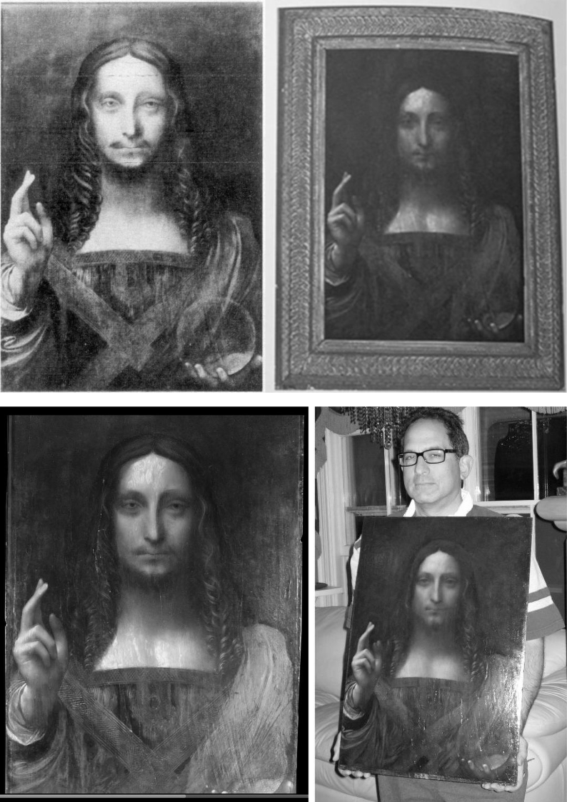
Above, Fig. 9: Top, left, the Salvator Mundi, c. 1913, when in the Cook Collection; top right, the Salvator Mundi as catalogued by the St Charles Gallery, New Orleans, as “After Leonardo da Vinci” for the April 9-10 2005 sale. Above, left, the Salvator Mundi as taken to the restorer, Dianne Modestini in April 2005 (with a still sticky varnish); right, the picture in May 2008 when about to be taken by Robert Simon (as above) to the National Gallery for a (confidential) examination by a small and select group of Leonardo scholars, after the first stage (as described above) of Modestini’s restorations .
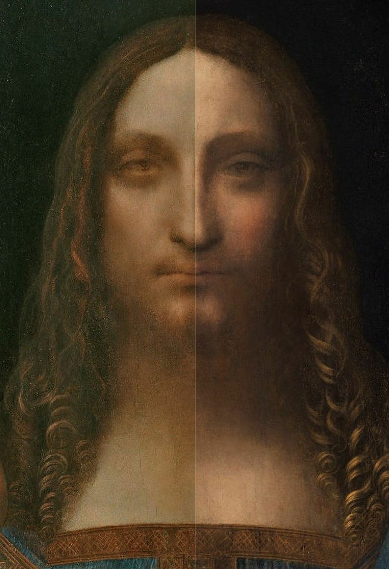
Above, Fig. 10: Left, the ex-Cook Collection Salvator Mundi face, as exhibited in 2011 at the National Gallery; right, the ex-Cook Collection Salvator Mundi face, as offered at Christie’s, New York, in 2017.
A POST HOC SALVATOR MUNDI LITERATURE
As will be examined in Part II, our challenges to the perpetually mutating and “improving” Salvator Mundi were made: a) within days of its November 2011 launch at the National Gallery; b) nearly a month before Christie’s November 2017 sale; c) five days before Christie’s 2017 sale; d) the day before Christie’s sale; and, subsequently, e) in nearly a score of posts – see Endnote below. The undisclosed identity of the original owners was only uncovered in September 2018 (by The Washington Post). Until that date and disclosure, the true purchase price in 2005 was exaggerated ten-fold by both the original owners and the painting’s advocates -and therefore in all press reports over a thirteen-year period. The publication of researches that had been promised in 2011 by the owners and by the National Gallery did not occur until 2019 and, even then, it was not in full.
Four recently published books now comprise a small, belated literature on the rise and demise of the long-unloved Leonardo School work that morphed into the world’s most expensive and least visible picture. They were: Living With Leonardo – Fifty Years of Sanity and Insanity in the Art World and Beyond, by Professor Martin Kemp, London, 2018; Masterpieces (“Based on a manuscript by Mario Modestini” and with informative chapters on: the Salvator Mundi; Cleaning Controversies; and, Misattributions, Studio Replicas and Repainted Originals) by Dianne Dwyer Modestini, Italy, 2018; The Last Leonardo – The Secret Lives of the World’s Most Expensive Painting, by Ben Lewis, London, 2019; and, Leonardo’s Salvator Mundi & The Collecting of Leonardo in the Stuart Courts, by Margaret Dalivalle, Martin Kemp, & Robert B. Simon, Oxford, 2019.
Until those four works appeared, the literature consisted of the catalogue entry “Christ as Salvator Mundi, about 1499 onwards” in the National Gallery’s 2011-12 Leonardo exhibition catalogue by its curator, Luke Syson; and, Dianne Modestini’s account of the Salvator Mundi’s restoration and art historical credentials that was delivered in January 2012 at a National Gallery conference and published in 2014 as “The Salvator Mundi by Leonardo da Vinci rediscovered History technique and condition” in Leonardo da Vinci’s Technical Practice, Paintings, Drawings and Influence, Ed. Michel Menu, Paris. Both Syson’s and Modestini’s accounts acknowledged indebtedness to the private researches of one of the picture’s owners, the New York dealer, Robert Simon.
Specifically, Syson declared in 2011: “This discussion anticipates the more detailed publication of this picture by Robert Simon and others. I am grateful to Robert Simon for making available his research and that of Dianne Dwyer Modestini, Nica Gutman Rieppi and, (for the picture’s provenance) Margaret Dalivalle, all to be published in a forthcoming book.” In 2014 Modestini acknowledged having benefited from “…the knowledge and good eyes of Robert Simon with whom I worked closely on the restoration for six years and who generously shared with me the results of his research for this paper. I am especially indebted to Nica Gutman Rieppi, Associate Conservator in the Kress Program at the Conservation Center of the Institute of Fine Arts, New York University, who took the samples, made the cross-sections and coordinated the analytic work which was carried out with great thoroughness, precision and dedication by Beth Price and Kenneth Sunderland, research scientists at the Philadelphia Museum of Art, with the help of Dr Thomas J. Tague of Broker, Billerica, Massachusetts who carried out the ATR FTIR analysis of the sizing.”
That research had still not been published in 2013 when the picture was sold privately and under (Simon has revealed) a non-disclosure agreement through Sotheby’s for $80 million. The research had not been published by 2017, when Alan Wintermute of Christie’s wrote (in “Leonardo’s Salvator Mundi”, one among other endorsing/bolstering essays by Frances Russell, Dianne Modestini, David Franklin and David Ekserdjian, in the auction house’s 2017 Salvator Mundi book/catalogue): “The reasons for the unusually uniform scholarly consensus that the painting is an autograph work by Leonardo are several… The present painting, although only recently discovered, has already been extensively studied, with a remarkable campaign of research lead by Dr. Robert Simon. The most insightful and broad-ranging examination of the painting was presented by Luke Syson in the 2011 catalogue of the Leonardo exhibition in London. The following discussion depends heavily on Dr. Syson’s entry, which itself drew on the unpublished research made available to him by Robert Simon, Dianne Dwyer Modestini, Nica Gutman Rieppi, Martin Kemp and, for the picture’s provenance, Margaret Dalivalle…” Having thus drawn the scholarly research wagons around the picture (and the auction house) Wintermute disclosed that the still-unpublished researches by Dalivalle, Kemp and Simon would not be published until 2018 – which was to say, a full seven years after the painting had been declared and exhibited as a Leonardo, at the National Gallery. In the event, and even with its pared-down authorship (see below), the book would be further delayed until 2019, by which date the mystery over the subsequently disappeared picture’s ownership and whereabouts had deepened yet further.
The Simon Researches had originally been earmarked for a book of essays to be published by Yale University Press and sold at the National Gallery’s “Leonardo da Vinci: Painter at the Court of Milan” exhibition. That book proved to be the first on this Salvator Mundi picture that failed to materialise. Reasons for its demise were volunteered by Professor Martin Kemp in his Living with Leonardo:
“Robert [Simon] thought it was a good idea to publish a book of essays by various authors, including Margaret Dalivalle and myself. Yale University Press, which does not normally publish monographs on single paintings, was signed up as publisher. I was happy to go along with this, while expressing reservations about a volume with multiple authors being finished on time. Academics are notably adept at missing deadlines, and I was unconvinced that all the authors actually had anything new to say… In the event the complete book was not delivered and, deprived of the rationale of selling a good number of books at the time of the show, Yale withdrew.”
A GOOD SHEPHERD, AN UTTERLY FANTASTIC CONSENSUS AND A DONE-DEAL
The long-promised book of essays emerged in 2019 (through Oxford University Press) as the Dalivalle/Kemp/Simon compilation – but without a proper technical account of the picture’s campaigns of restoration and technical examination. Simon presents the book as “the first to treat the subject monographically” and “the first complete analysis of this essential addition to Leonardo’s oeuvre”. The authors liken their authorially-trimmed exercise to a three-act opera with each act constituting an in-depth facet of the story while “necessarily bypassing many ancillary issues”. The first act is said to chronicle the painting’s “journey from anonymity in America, with no provenance and in severely compromised condition, to its public revelation as a work by Leonardo at the exhibition in London. The six-year process of research and conservation is related by Robert Simon, who shepherded the Salvator Mundi on this remarkable journey…” When Simon took the painting to London in May 2008 (Fig. 9, above) to show it to a select group of Leonardo scholars assembled at the National Gallery, he made a good and lasting impression on Martin Kemp who, in his 2018 memoir, underscored Simon’s decisive role in the institutionally and ethically problematic attribution upgrade:
“…A general discussion followed. Robert Simon, the custodian of the picture (whom I later learned was its co-owner), outlined something of its history and its restoration. He seemed sincere, straightforward and judiciously restrained, as proved to be the case in all our subsequent contacts. We looked, we talked and we looked again. It was a remarkable occasion. By the time I left, I was determined to research every aspect of the Salvator Mundi. It seemed at first sight to resonate deeply with key aspects of Leonardo’s science of art, and his views of the role of God in the cosmos.
“I remained in touch with Robert Simon who is strongly committed to scholarly research. I learned that the eloquent painting we had viewed was in fact one of the known versions of the Salvator Mundi, formerly in the Cook Collection – previously heavily overpainted, it had now been cleaned and retouched. It had never before received serious attention; we had paid only passing attention to the black and white photograph of it [Fig. 6] that had occasionally been used as an illustration…
“All of the witnesses in the gallery’s conservation studio were sworn to confidentiality [by whom?] and the painting travelled back to New York with Robert. It was becoming ‘a Leonardo’ […and later: ‘Robert quietly introduced the Salvator Mundi to a judicious selection of experts, who – remarkably, given the usual leakiness of the art world – kept their counsel for three years. By the time the painting emerged in public there was a critical mass of influential voices who would speak in the painting’s favour.’]
“…Was it on the market? Would exhibiting it mean that the National Gallery was tacitly involved in a huge act of commercial promotion? It seemed highly likely that it was also ‘in the trade’. All I knew at this stage was that it was being represented by Robert Simon. He told me that it was in the hands of a ‘good owner’ who intended to do the right thing by it, and I did not enquire further. I was keen to consider the painting in its own right, not in relation to ownership. I speculated, of course, that Robert might have a financial interest, perhaps a share in its ownership, and I assumed he was gaining some kind of legitimate income from his work on the picture’s behalf…
“It was, however, a great surprise to find that the Salvator was to be sold at Christie’s in New York on 15 November 2017 in a mega-auction of celebrity works of art from the modern era. The auctioneers sent the painting on a glamorous marketing tour of Hong Kong, San Francisco and London. I was approached by the auctioneers to confirm my research and agreed to record a video interview to combat the misinformation appearing in the press – providing I was not drawn into the actual sale process.”
TIGHT LIPS
The anonymity of which Simon spoke was a self-imposed, prolonged tactical ploy. In 2013, the three art dealing co-owners, Alexander Parish, Robert Simon and Warren Adelson (who in 2010 bought a one-third share for $10 million, thereby giving Simon and Parish a ten-thousand-fold return in five years on their $1,000 purchase), realised that because it was known within the opaque but gossipy art trade that the picture was being offered to museums, it would be too risky to put it to public auction: “there’s not a deader-in-the-water [thing] than a picture which you put up for auction and which then bombs”, Parish told Ben Lewis: “Supposing we had put a pretty reasonable price on the Salvator Mundi – let’s say we put a $100 million reserve on it – and it tanked, where do you go from there? Absolutely dead.”
The unidentified consortium of owners had other needs for opacity. Again, Parish to Lewis: “We’re a little opaque as to the date and location of acquisition. We purposefully have never corroborated Louisiana as the place where we bought it. And I’m not going to now. Why? Because some grandson of whoever these people are who sold it is going to decide, ‘Oh, that’s my $450 million picture. Who can I sue?’” Parish identified a third danger in professional transparency: “Part of the reason for the secrecy was the mechanics, if you will, that Bob [Simon] had to employ to get the utterly fantastic consensus that he compiled. Because in academic realms, if A says yes, B’s going to say no, just to be a dick. It’s not unheard of that certain experts are contrarian just because an opposing expert has said something else.” That last may sometimes occur but witnessing such spats enables the scholarly and art market communities to gauge the relative strengths of competing or conflicted argument and evidence. In art attributions and art restorations, as in law and in politics, things work better when propositions, expertise and evidence are subject to open appraisal and interrogation. Syson’s exclusion from the May 2008 National Gallery examination of the two leading Leonardo specialists most likely to respond negatively to the picture drew Lewis’s attention and is discussed below. The National Gallery’s preference for a select group of experts was disclosed by Kemp in 2018 when he published his March 2008 invitation to the event from the National Gallery’s new director, Nicholas Penny:
“I would like to invite you to examine a damaged old painting of Christ as Salvator Mundi which is in private hands in New York. Now it has been cleaned, Luke Syson and I, together with our colleagues in both painting and drawings in the Met, are convinced that it is Leonardo’s original version, although some of us consider that there may be [parts] which are by the workshop. We hope to have the painting in the National Gallery sometime later March or in April so that it can be examined next to our version of the Virgin of the Rocks. The best-preserved passages in the Salvator Mundi are very similar to parts of the latter painting. Would you be free to come to London at any time in this period? We are only inviting two or three scholars.”
TWO OF A KIND
Note: the claimed similarities between the two supposed autograph Leonardo pictures would once have weighed heavily against the Salvator Mundi. A former director of the National Gallery and a Leonardo specialist, Kenneth Clark, had said of the gallery’s version of the Virgin of the Rocks “A pupil did the main work of drawing and modelling, and before his paint was dry, Leonardo put in the finishing touches. Most of these have been removed from the Virgin’s face but remain in the angel’s, where perhaps they were always more numerous” – see “The National Gallery’s £1.5 Billion Leonardo Restoration”. As for claims of the Cook Salvator Mundi being a long-lost prototype-for-all-other-versions, Clark judged it “one of the versions ‘less close to the [presumed] original’”. He attended the 1958 sale at Sotheby’s where this very Salvator Mundi version limped away for £45 to the United States, and hence, eventually, to Louisiana in 2005, where it would draw just two bids and fetch its $1,000 plus $175 charges – thus, below the picture’s low estimate of $1,200. Even with the overheads of a castle to find, Clark had money to spend on art. As he reported to Bernard Berenson: “In a fit of madness I even bought some pictures at the sale of the remnants of the Cook Collection, including a very beautiful Alonso Cano of Tobias and the Angel, and a Giulio Romano; also a splendid Granet. They were sold for the price of a small Cézanne pencil drawing…” (Letter, 14 July 1958, in My dear B. B. The Letters of Bernard Berenson and Kenneth Clark, 1925-1959, ed. Robert Cumming, Yale University Press, New Haven and London.)
THE NATIONAL GALLERY’S SHOW-CASING WITH EXTRA OOMPH
Four months before its 2011-12 Leonardo exhibition the National Gallery defended its decision to include the undocumented privately-owned painting as “an important opportunity to test this new attribution”. Had the painting been included on precisely those terms and shown when cleaned and not-yet restored few would have complained at an opportunity to see a recently discovered version of the Leonardo school Salvator Mundi. That did not happen. It did not happen because Penny had become an instant partisan of the proposed upgrade and was advising Simon on building a necessary consensus of scholarly support for the picture when, all the while, the picture was undergoing transforming campaigns of restoration in accordance with Simon’s (anthropomorphising) conviction that the picture should be allowed to “live once again as a work of art”. Instead of a disinterested display of the work “as-was” after cleaning and before restoration, the Gallery exhibited it after multiple bouts of restoration, the second of which was made in declared emulation of the National Gallery’s own (questionable) version of The Virgin of the Rocks, as a miraculously recovered and, supposedly “long-lost” Leonardo. Begging a monumentally large question of attribution in this manner was a plain abuse of institutional authority and – given the picture’s fanciful and preposterously bloated provenance – a gross misrepresentation of the historical record to boot.
When Ben Lewis asked Luke Syson why the work had been catalogued unequivocally as a Leonardo, he replied: “I catalogued it more firmly in the exhibition as a Leonardo because my feeling at that point was that I was making a proposal and I could make it cautiously or with some degree of scholarly oomph. It is important not to float an idea without saying where you yourself stand on it.” Syson was standing on a house of (double-borrowed) cards. When the exhibition opened on 9 November 2011 our first objection was published within days – see Figs. 11 and 12 below.
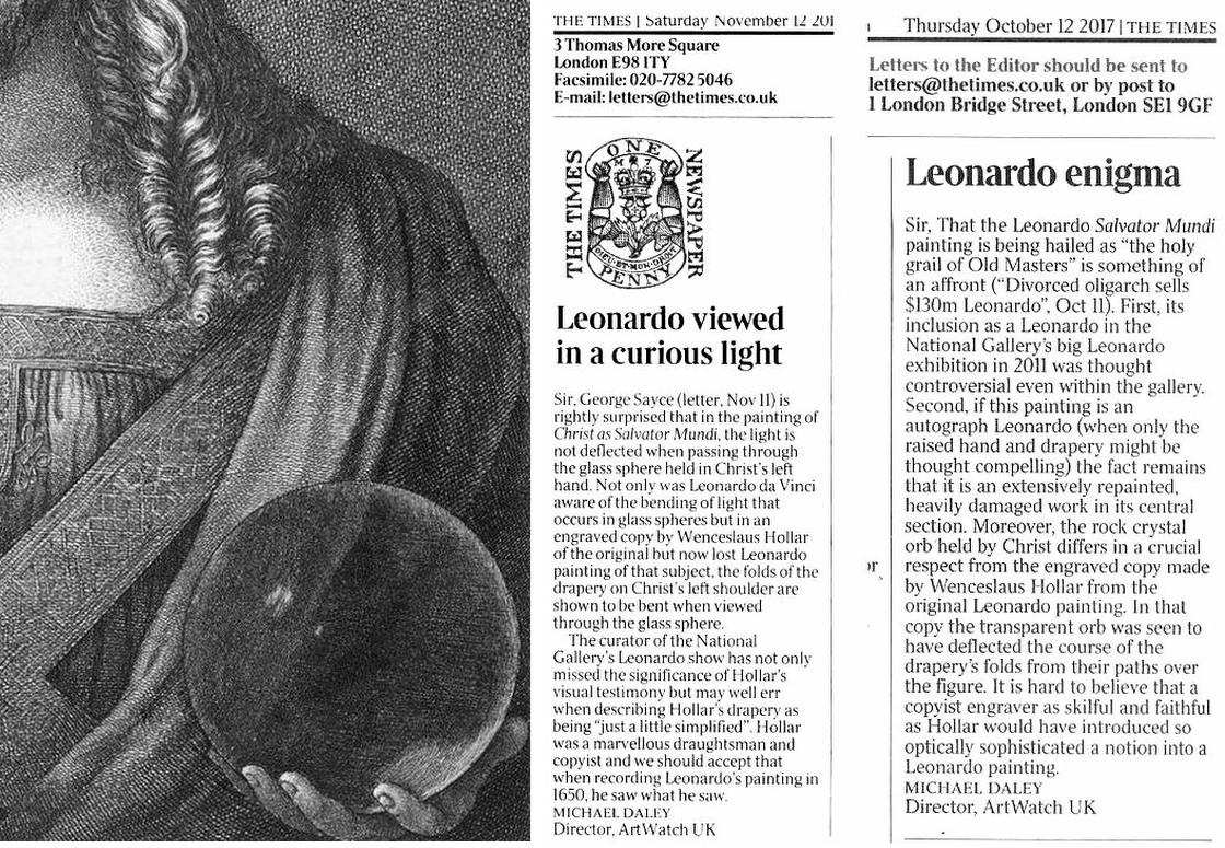
Above, Fig. 11: Left, a detail of 1650 etched copy by Wenceslaus Hollar of a painting then attributed to Leonardo that was being claimed to be a record of the Salvator Mundi version in the National Gallery; right, ArtWatch UK letters contesting the attribution on the absence within the painting of optical features recorded by Hollar.
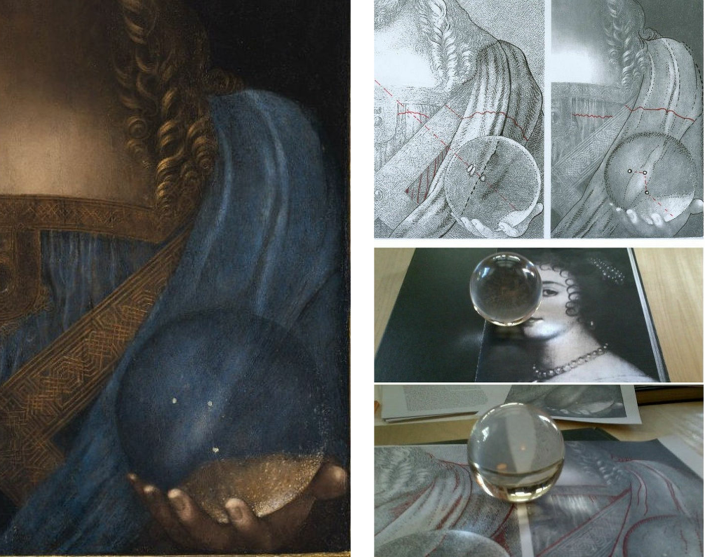
Above, Fig. 12: Left, a detail of the Salvator Mundi as it was immediately before its disappearance in 2017; right, top, AWUK diagrams highlighting many optical differences between the Hollar copy and the painting exhibited at the National Gallery.
SCHOLARLY RESPONSES TO THE NATIONAL GALLERY’S LEONARDO ATTRIBUTION
In the event, the Leonardo attribution was publicly challenged by at least four scholars in reviews of the 2011-12 National Gallery exhibition. Carmen Bambach, of the Metropolitan Museum and author of the major 2019 four-volumes Leonardo da Vinci Rediscovered, rejected the Leonardo attribution in a 2012 Apollo review of the National Gallery exhibition and gave the painting to Leonardo’s student Boltraffio (with possible modifying touches by Leonardo). Frank Zöllner of Leipzig University and author of the Leonardo catalogue raisonné, Leonardo da Vinci – The Complete Paintings (Bibliotheca Universalis) had said ahead of the exhibition that the proportions of the nose were “too long” for such a perfectionist as Leonardo and were more likely to have been painted by a talented follower. When the late husband of the restorer, Mario Modestini, first saw the Salvator Mundi he thought it by a very great artist a generation after Leonardo.
Later, in the revised 2017 edition of his book, Zöllner said of the ex-Cook Salvator Mundi that while it surpasses the other known versions in terms of quality, it: “also exhibits a number of weaknesses. The flesh tones of the blessing hand, for example, appear pallid and waxen, as in a number of workshop paintings. Christ’s ringlets also seem to me too schematic in their execution [Fig. 6, above], the larger drapery folds too undifferentiated, especially on the right-hand side [Fig. 8, above]. They do not begin to bear comparison with the Mona Lisa, for example. It is therefore not surprising that a number of reviewers of the London Leonardo exhibition initially adopted a sceptical stance (Bambach 2012; Hope 2012; Robertson 2012; Zöllner 2012). In view of the arguments put forward to date and the above-mentioned weaknesses, we might sooner see the Salvator Mundi as a high-quality product of Leonardo’s workshop, painted only after 1507, on whose execution Leonardo was substantially involved. It will probably only be possible to arrive at a more informed verdict on this question after the results of the painting’s technical analyses have been published in full (Dalivalle/Kemp/Simon 2017).”
As seen, the Dalivalle/Kemp/Simon account did not materialise until 2019. Recently, Professor Charles Hope, former director of the Warburg Institute, pinned the scholarly nub in the London Review of Books (“A Peece of Christ”):
“Many of those who specialise in making such attributions have great confidence in their own judgment, even when this has proved fallible, and they tend to discount or give a tendentious spin to documentary evidence and information about provenance that does not fit with their theories.”
In 2017, Christie’s, New York, cited fifteen scholars as supporters of the Salvator Mundi’s Leonardo ascription. They were:
Mina Gregori, Nicholas Penny, Dianne Dwyer Modestini, Carmen Bambach, Andrea Bayer, Keith Christiansen, Everett Fahy, Michael Gallagher – the Met’s head of picture restoration, David Allan Brown, Maria Teresa Fiorio, Martin Kemp, Pietro C. Marani, Luke Syson, David Ekserdjian and Vincent Delieuvin.
One, Carmen Bambach, as seen above, had rejected the ascription in 2011. As also seen above, another, Delieuvin, has now downgraded the picture to a school work. Crucially, none had supported the attribution in a scholarly publication or forum, and several would disavow their inclusion in this list. When Lewis spoke to the select and confidential group of five Leonardo scholars invited to see the Salvator Mundi at the National Gallery (Pietro Marani, Maria Teresa Fiorio, Carmen Bambach, David Alan Brown and Martin Kemp), he discovered that only two had committed to a Leonardo attribution; two had declined to express an opinion; and one had rejected it.
Moreover, Lewis noted two striking omissions from the event that would likely have tipped the balance. One was our colleague, Jacques Franck, a Leonardo expert who had advised Syson on the restoration of the National Gallery’s version of the Virgin of the Rocks – much as he had done at the Louvre with its Leonardo restorations. Like others, Franck identifies two authorial hands in the Salvator Mundi picture, but he sees no participation by Leonardo in the painting – see his “Further thoughts about the ex-Cook Collection Salvator Mundi” and our “The Louvre Museum’s bizarre charge of ‘fake information’ on the $450 million Salvator Mundi”.
The second was Frank Zöllner, who then had recently written within his catalogue raisonné of Leonardo’s paintings: “In conclusion, mention must be made of the increasing attempts, above all in recent years, to attribute second- and third-class paintings to Leonardo’s hand. In this context it should be noted that the catalogue of paintings presented here is definitive. While there may be works circulating in the fine art trade that stem from Leonardo’s pupils, the likelihood of an original by the master himself ever making a new appearance is extremely small.”
Syson admitted to Lewis that Zöllner’s omission had been a mistake but justified Franck’s exclusion on the grounds that as a trained painter he was “too far outside the world of academic and institutional art history to be invited in to this project”.
Michael Daley, Director, 12 (& 24) August 2020
In Part II, we outline reasons why it might sometimes be of assistance to scholars and curators to heed the views of artists.
Endnote: ArtWatch UK Posts on the Salvator Mundi:
14 November 2017, “Problems With the New York Leonardo Salvator Mundi, Part I: Provenance and Presentation”
1 January 2018, “The $450m New York Leonardo Salvator Mundi, Part II: It Restores, It Sells, Therefore It Is”
20 February 2018, “A Day in the Life of the New Louvre Abu Dhabi Annexe’s Pricey New Leonardo Salvator Mundi”
27 February 2018, “Nouveau Riche? Welcome to the Club!”
11 March 2018, “In Their Own Words: No. 3 – The Reception of the First Version of the Leonardo Salvator Mundi”
29 March 2018, “Startling Disclosures on the Re-re-restored Leonardo Salvator Mundi”
10 April 2018, “The Leonardo Salvator Mundi Saga: Three Developments”
9 August 2018, “Leonardo Scholar Challenges Attribution of $450m Painting”
18 September 2019, “How the Louvre Abu Dhabi Salvator Mundi became a Leonardo-from-Nowhere”
11 October 2018, “Two Developments in the No-Show Louvre Abu Dhabi Leonardo Salvator Mundi Saga”
12 November 2018, “The Pear-Shaped Salvator Mundi”
6 February 2019, “The Leonardo Salvator Mundi Part I: Not ‘Pear-Shaped’ – ‘Dead-in-the Water’”
22 February 2019, “The Louvre Museum’s Bizarre Charge of ‘Fake Information on the $450 million Salvator Mundi’”
4 July 2019, “Salvator Grumpi – updated”
20 September 2019, “Forthcoming events: The Ben Lewis Salvator Mundi Lecture and the new ArtWatch UK Journal”
28 October 2019, “The non-appearing, disappeared, $450million, now officially not-Leonardo, Salvator Mundi”
15 November 2019, “Books on No-Hope Art Attributions”
5 & 11 February 2020, “The Saviour and a Stealth-Attribution”
3 August 2020, “Further thoughts about the ex-Cook Collection Salvator Mundi”
Further thoughts about the ex-Cook Collection Salvator Mundi*
The Leonardo Salvator Mundi controversy turns on which artist’s hand is – or which artists’ hands are – present on the painting. Many scholars agree that more than one hand is present. Here, it is demonstrated that while two hands are present, neither belongs to Leonardo. [M.D.]
Jacques Franck, an art historian and a painter trained in Old Master techniques, was a curator/exhibitor in the Uffizi Gallery’s exhibition “La Mente di Leonardo” (2006) and served on the International scientific committee advising the restoration of Leonardo’s St Anne in the Louvre (2010-2012), where he also advised the restoration of Leonardo’s Belle Ferronnière (2014-2015) and that of Leonardo’s St John- the- Baptist (2016). A regular contributor to scientific journals, he is completing a research thesis on Leonardo’s sfumato technique at the Ecole Pratique des Hautes Etudes in Paris.
It is commonly believed in the art market that the more you argue and produce literature to defend a work’s authenticity, the less authentic it probably is. The Mona Lisa does not need any support to impose its genuineness as a heavenly Leonardo masterpiece and as such nobody has ever doubted it through the centuries, for it would appear nonsensical to any reasonable art historian. This is far from being the case with the Cook/New York version of the Leonardesque Salvator Mundi (Fig. 1, below) about which doubts have arisen all over the planet shortly after its first appearance as a newly-born Leonardo in London in 2011 at the National Gallery. Suspicion has reached such a point recently, that the work’s earliest supporters, Martin Kemp, Margaret Dalivalle and Robert Simon considered it necessary to publish in late 2019 a substantial three-part essay in defence of the painting – Leonardo’s Salvator Mundi & The Collecting of Leonardo in the Stuart Courts – that had originally been promised 2011. The following lines are by no means an attempt to discuss any of the latter authors’ positions, but are just an afterthought about what struck me most in the controversial panel when I first saw it several years ago. Given the existence of two drapery studies in Leonardo’s hand, kept at the Royal Library in Windsor Castle (Figs. 2 and 3, below) and close to the Leonardesque sequence of Salvator Mundi, no critic, among those less convinced of the master’s effective contribution to the actual making of the ex-Cook/New York Salvator Mundi has gone as far as doubting it completely. This must however be envisaged on serious material grounds and it would mean, as we shall see, a step forward in understanding studio practice in the master’s bottega. Besides the firm attribution to Leonardo himself by Kemp and others, three authors’ names have been suggested until now: those of Luini, by Matthew Landrus; Boltraffio, by Carmen Bambach; and Salai by Franck. Yet, except myself – on further thinking – none of the latter experts exclude, even as a minor share, the presence of Leonardo’s brushwork in various details of the composition. Consideration of these very different views, although seemingly paradoxical, might in part help solve the enigma concerning the organisation and mode of functioning of Leonardo’s studio.
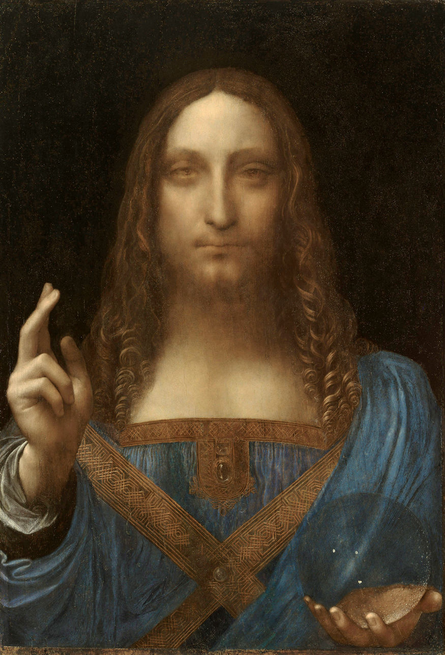
Above, Fig. 1: Workshop of Leonardo da Vinci (Salai with the assistance of G. A. Boltraffio or B. Luini?), Christ as Salvator Mundi, c. 1506/8-1513, oil on wood panel, 65. 5 x 45.1 cm (private collection).
Above, Fig. 2: Leonardo da Vinci, Drapery study, c. 1506/8-1510, red chalk on prepared paper, 22 x 13.9 cm, Windsor Castle, Royal Library n° 12524.
Fig. 3: Leonardo da Vinci, Drapery studies, c. 1506/8-1510, red chalk on paper, 16.4 x 15.8 cm, Windsor Castle, Royal Library n° 12525.
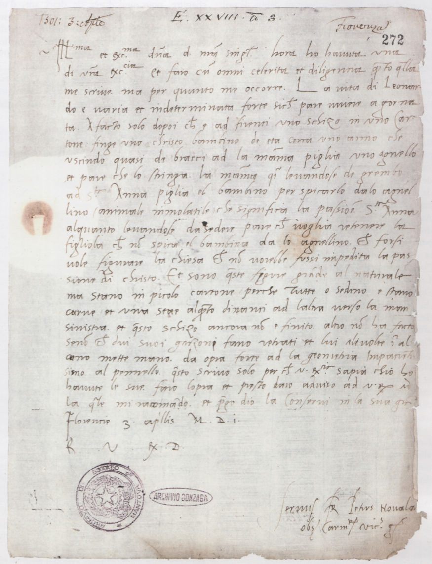
Above, Fig. 4: Pietro da Novellara, Letter of 3rd April 1501 to Isabella d’Este, marchioness of Mantua, Mantua, Archivio di Stato.
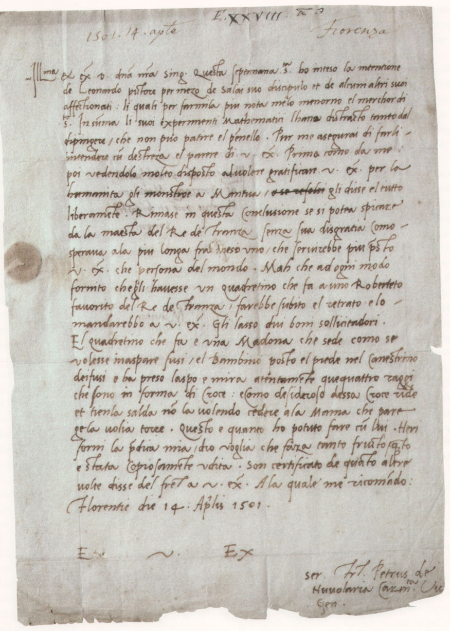
Above, Fig. 5: Pietro da Novellara, Letter of 14th April 1501 to Isabella d’Este, marchioness of Mantua, New York, private collection.

Above, Fig. 6: Leonardo da Vinci, Portrait of Isabella d’Este, 1500, black chalk, red chalk and ochre chalk on paper, 61.1 x 46.5 cm, Paris, Musée du Louvre.
The situation can be summed up as follows: we know from two letters (Figs. 4 and 5, above) sent on 3 and 14 April 1501 by Pietro da Novellara, Isabella d’Este’s emissary in Florence, that Leonardo was overworked in those days, being involved in many projects while committed to the French King and his Court. Nevertheless, now and again the master – as is customary in art studios at all times – would retouch his assistant’s copies (or variants) after his works. Also, Salai, then twenty-one, appears to have become someone essential, holding a position of trust in the studio’s organisation (he was, for instance, instrumental in Novellara’s meeting with Leonardo). At this stage, he might well have taken over some commissions from Leonardo who, as we know, could not cope with the lesser ones not from the leading political powers – no painted portrait of Isabella or pictures meant for sacred purposes (i. e. any specific commission for an altarpiece) followed Leonardo’s drawn portrait of her (Fig. 6, above). Whatever the case, when comparing the infrared reflectograms of the New York Salvator Mundi and of Salai’s Head of Christ in the Ambrosiana (two works that bear numerous distinct material and aesthetic similarities that are strange to Leonardo’s own style and technique), evidence that Salai’s contribution to the New York panel was crucial cannot be discarded: the latter picture’s preliminary sketching out technique is without any doubt close to Salai’s own very recognizable practice, as observed in infrared light in his Head of Christ and other attributed works. The rarity of such a resemblance cannot be considered coincidental with paintings produced by one and the same studio (Figs. 7, 8, 9, 10, 11, 12, 13, 14 and 15, below).

Above, Fig. 7: Salai, Head of Christ, 1511, oil on wood panel, 55 x 37. 5 cm, Milan, Pinacoteca Ambrosiana. Salai’s Head of Christ (obviously deriving from a workshop Salvator Mundi prototype) testifies to what Christ’s face in the Cook/New York version of Salvator Mundi, now greatly damaged, including the eyes, probably looked like at the outset. The staring eyes with a ‘metaphysical’ expression were necessarily quite different when the now missing dark brown pigments forming the iris were still unimpaired.
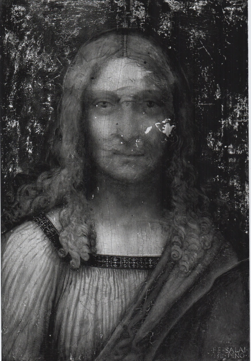
Above, Fig. 8: Infrared scan of Salai’s Head of Christ. The infrared image of the panel reveals the underlying heavy, systematic and unmodelled dark contours outlining the shape of the head down to the shoulders and that of the face and neck.
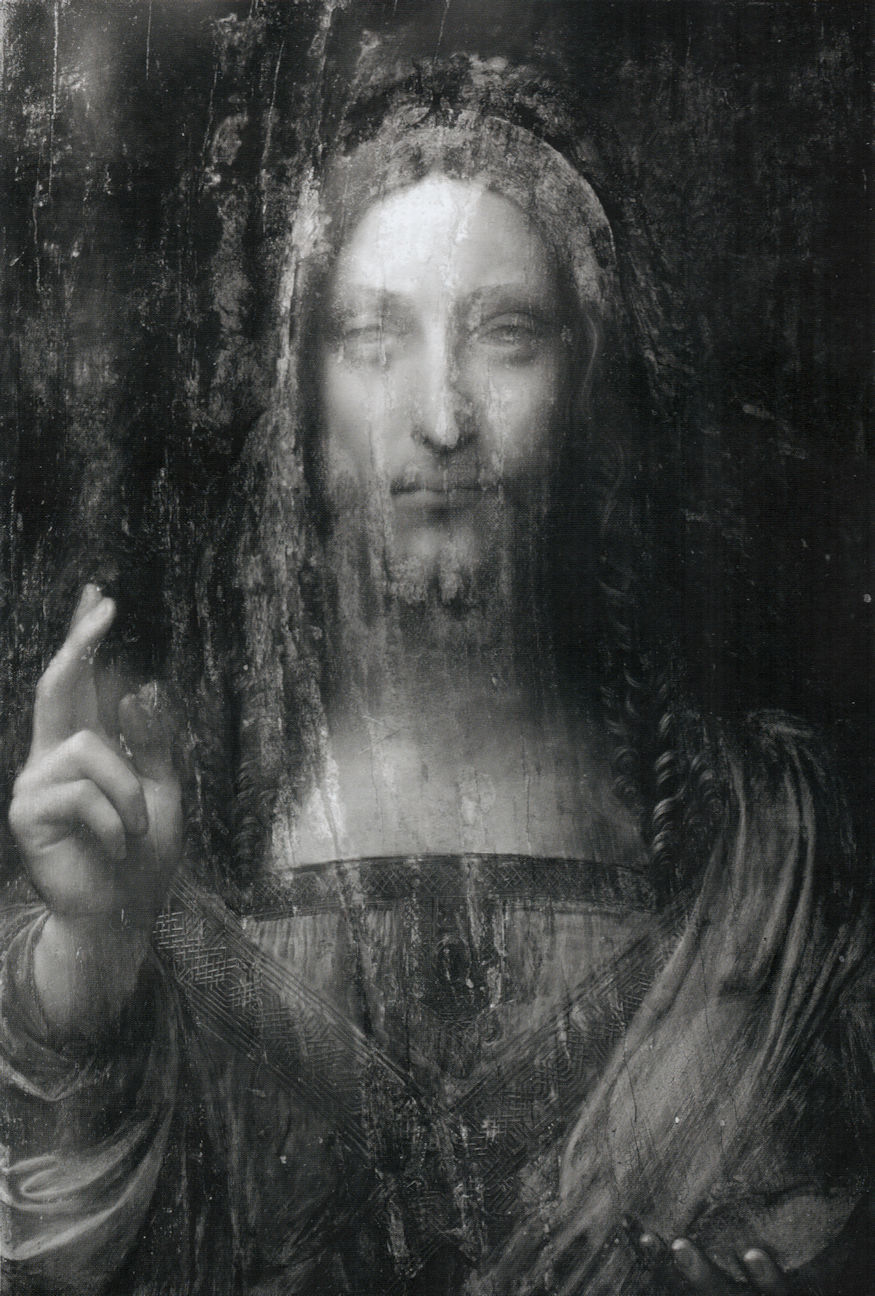
Above, Fig. 9: Infrared scan of the New York Salvator Mundi (a document of September 2007 that was not released on Dianne Modestini’s website, salvatormundirevisited.com, before 14 August 2020 (10 days after the present post’s release): the only IR scan reproduced there until then, still shown to date, was a later one made of the picture during the restoration process when the background was already repainted, hence the dark, blocked image in that section). Better preserved than the other zones of the composition, the oversimplified, thick and sharp outlining of the head (see upper right and top) compares well what is observed in Fig. 8, above: the sketching out work seems in the same hand. See also Fig. 11, below.
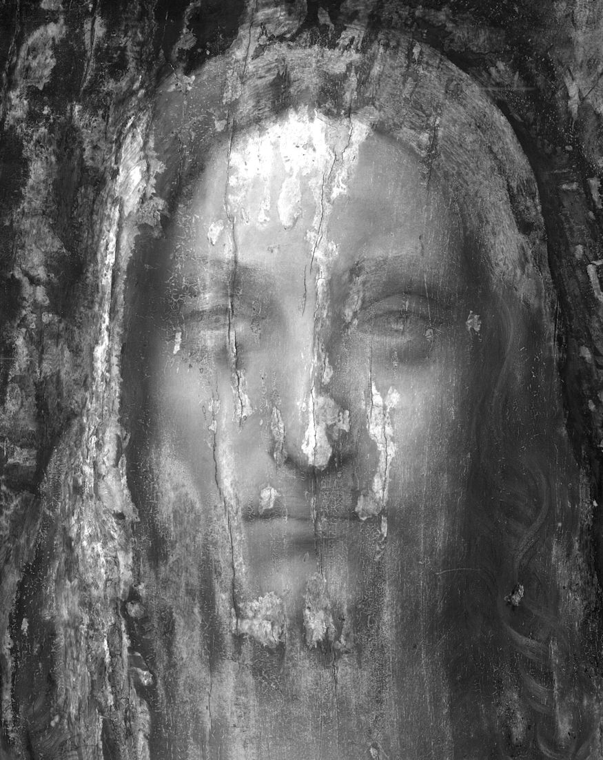
Above, Fig. 10: Infrared scan of the New York Salvator Mundi (detail of head).

Above, Fig. 11: Photograph in visible light of the New York Salvator Mundi before restoration (2006). Despite the heavy damage and paint losses, the thick outlining of the head, face and neck is still visible here on the right hand-side of the panel. Also, the intense sfumato effect in the face and neck now seen in the restored panel doesn’t show in the 2006 photograph. The recent conservation treatment seems to have introduced an inappropriate evanescence resembling Leonardo’s style of his late years. As revealed by the 2006 photograph, this section’s modelling was in fact firmer and the shapes better defined, thus much more consistent with the Ganay version (Fig. 24, below).

Above, Fig. 12: Infrared reflectogram of Leonardo’s Saint Anne in the Louvre (detail). No heavy outlining appears in the underdrawing of the head of Leonardo’s Saint Anne in the Louvre. The contours and undermodelling are light and subtle.
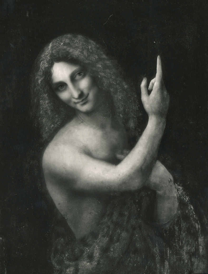
Above, Fig. 13: Infrared reflectogram of Leonardo’s Saint John-the-Baptist in the Louvre. Strong dark shadowing defines here the shape of the face and that of the neck. Yet, its treatment is not systematic, just softly blended and evanescent, contrary to the sharpness seen in most parts of Figs. 8, 9, 10 and 11, above.
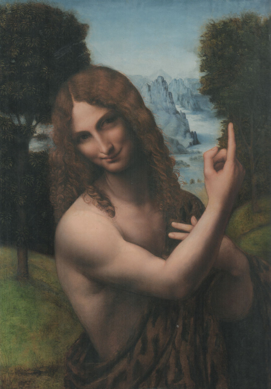
Above, Fig. 14: Attributed to Salai, Saint John-the-Baptist in a landscape, c. 1508-1515 (?), oil on wood panel, 73 x 50. 9 cm, Milan, Pinacoteca Ambrosiana.

Above, Fig. 15: Infrared reflectogram of Salai’s Saint John-the-Baptist in a landscape in the Ambrosiana. Another work after Leonardo traditionally attributed to Salai. Compare Figs. 8, 9 and 10, above: Salai’s heavy and very dark sketching out does not match Leonardo’s grace and subtlety perceivable even in the preliminary graphic stages of his own works (Figs. 12 and 13, above). No thick dark contour outlines the top of the Saint’s head because the background is a very luminous one here.
However, taking into account Novellara’s testimony regarding Leonardo’s occasional retouchings of his assistant’s copies, and, at the same time the existence of original red chalk drapery studies in close relation with the Salvator Mundi workshop sequence it has been assumed, yet without further development, that Leonardo acted in the making of the best parts of the 2017 New York sale picture – specifically, in Christ’s face and blessing hand. Within a standard scholarly rationale, such a scenario might well be considered acceptable, but it cannot be so considered from an experimentally and artistically informed perspective. Effectively, when addressing the pragmatic aspects of painting that are necessarily implied when assessing which part of a given work is attributable to one hand or another, historical research cannot sensibly proceed without investigating, as much as possible, the practical context of Renaissance art studios, in which sphere scholars often underestimate the highly informative potentials of artistic technical issues. In this regard, enough technical evidence of practice is displayed in the New York Salvator Mundi visually to help us grasp some basic information. Firstly, taking Leonardo’s original productions (both paintings and drawings) as a means of comparison, nowhere can be seen in his oeuvre as many inconsistencies as displayed here. Among them, the oddly long and thin nose, the simplified mouth, the over shadowy neck (with hardly any correctly defined anatomical detail in this large dark section), the stiff blue drapery, the mechanical hair ringlets, the childishly conceived left hand, the flat orb, and, above all, despite their neat finish, the wrongly raised fingers in the blessing hand, a quite inconceivable depiction from a brilliant artist like Leonardo. Secondly, what matters most is not this amount of clumsily painted details, because, while clumsy, they are still globally right, and thus plausible with regard to real life.
Much more preoccupying are the raised fingers, one of which rotates clockwise, displaying to the onlooker a full view of its nail, a detail that would be practically out of sight here should the rules of perspective be dealt with properly (Fig. 16a and 16b, below). Any academic art student well knows no teacher worthy of the name will accept anatomical inconsistency: it represents vis-à-vis classic art practice a fundamental transgression, much like false notes or rhythmical inaccuracy in classical music and must be deleted. Good art teachers always want that their students’ faulty anatomical forms be redrawn correctly. With Leonardo, a leading teacher and one of the greatest anatomists ever, there is little chance that he might have painted the faulty fingers, and hardly any possibility, either, that this anomalous detail be validated in one of his studio’s productions without a good reason. If anyone were to doubt this, it must be reminded that the Florentine artist had studied the movement of the hand and fingers extensively as appears notably in the Codex Atlanticus (fol. 124 verso (45 v-a) and fol. 273 a recto (99 v-a); J. P. Richter’s anthology, §§ 353-354). In addition, it should be noted that in various Christ Blessing painted by the Leonardesques in the same period (except for the studio Salvator Mundi copies in which the blessing hand is faithful to that in the Cook version – see Fig. 17, below -, following the master’s exemplary lesson (Fig. 16b, below), the finger movement of the blessing hand is perfectly correct (Figs. 18 and 19, below). Therefore, it is far from proven that the master, contrary to his own well-established concepts and practice, could have suddenly changed his mind about the orthodox representation of a human hand in a single picture and nowhere else in his other paintings.
Above, Fig. 16: [a] The New York Salvator Mundi (detail of blessing hand); [b] Leonardo da Vinci, the Annunciation, Florence, Uffizi Gallery, detail of the Virgin’s proper left hand (mirrored image showing the young Leonardo’s perfect treatment of a hand gesture close to the New York Salvator Mundi’s blessing hand).

Above, Fig. 17: A sequence of 16th century variations after a Salvator Mundi prototype produced by Leonardo da Vinci’s main assistants c. 1506/8-1513. Compare the blessing hand in Figs. 1 and 16a, above.
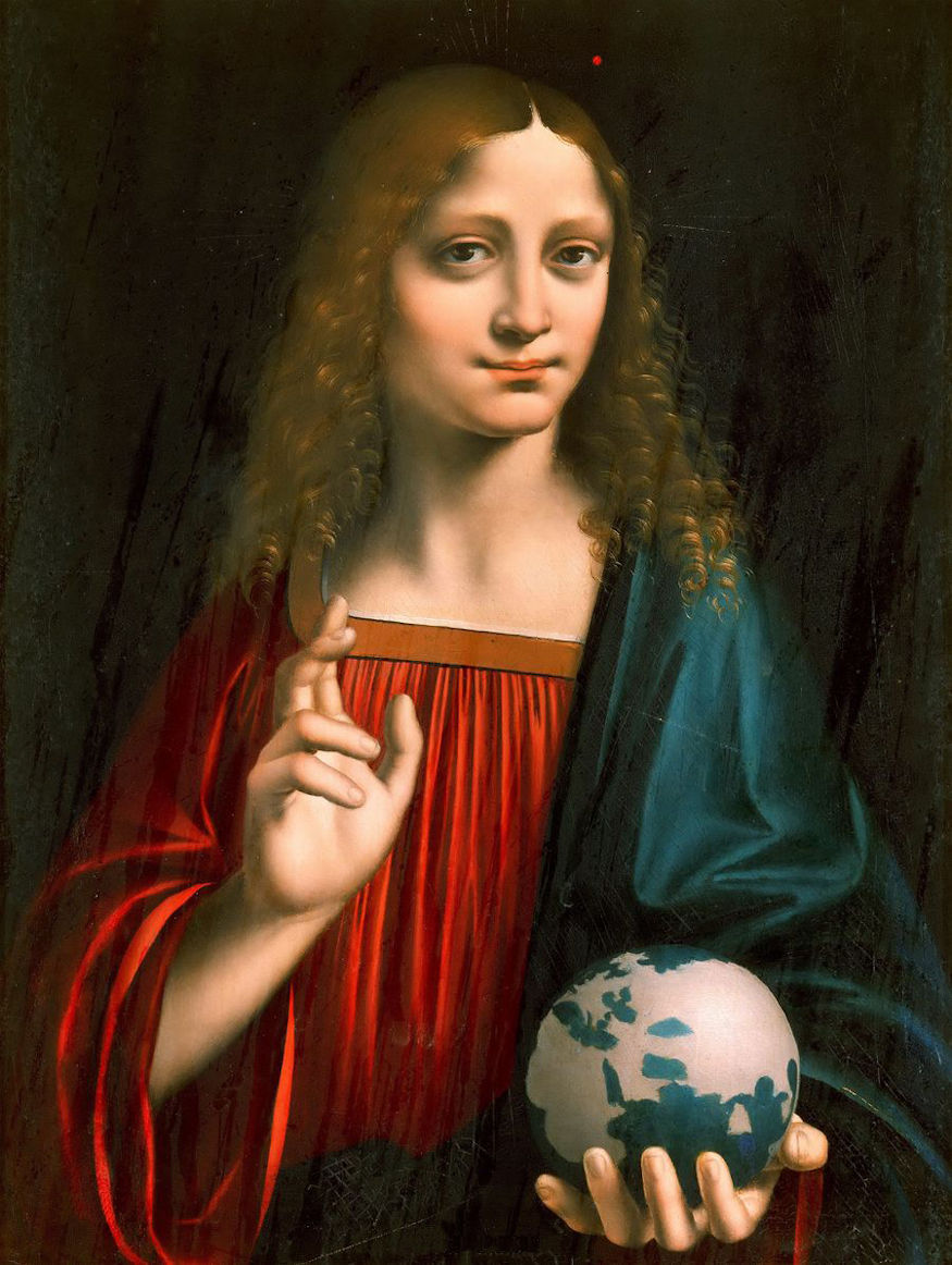
Above, Fig. 18: Marco d’Oggiono, Young Christ Blessing, early 16th century, oil on wood panel, 35 x 26 cm, Rome, Borghese Gallery.
But if Leonardo had little to do with the New York Salvator Mundi beyond the Windsor sheets, who else might have improved the blessing hand to the point where its disputable anatomy and movement went unnoticed by many respectable scholars? The response lies explicitly in the fact that long before leaving Milan for several years in late 1499, Leonardo was in charge of an important studio and had to run it so as to have enough availability to face his very many and demanding activities as a military engineer, architect, cartographer, hydrologist, etc., and, at the same time, to honour various other commitments (in particular regarding the huge Sforza cavallo), or to organise festive Court celebrations inherent to Duke Ludovico Sforza’s service. It is therefore clear that his studio was assisted by excellent painters like Boltraffio, Marco d’Oggiono, Ambrogio De’ Predis and possibly other skilled, yet unrecorded artists, well before his return to Florence in 1500 after Ludovico’s fall. It must also be considered that, because he had the human and artistic means to perform such a challenge, in other words a well-trained team, Leonardo in person not only accepted but actually encouraged his best assistants to imitate his art to such a degree that no unspecialized onlooker would detect a difference. This was necessarily the case when the Cook version of the Salvator Mundi was painted (c. 1506/8-1513?), especially between 1506-1508 when, in Milan again, Leonardo was legally obliged to complete the Virgin of the Rocks, probably by then the London version (Fig. 20, below). In effect, rather than discern distinctly, one can guess in the altarpiece the presence of Boltraffio’s brush among other ones: the homogenous result of these intermingled contributions produces visually a global ‘Leonardo effect’ most difficult to dissect into recognizable individual styles. This aspect is particularly well illustrated with the Madonna Litta, to which Leonardo and Boltraffio had so tightly collaborated many years before, around 1490, that it is almost impossible to know who did what and where in the panel (Fig. 21, below). Later on, c. 1507/8-1513, another assistant and fully trained maestro, Bernardino Luini, whose presence in Leonardo’s bottega is not formally documented, just probable, would demonstrate his great ability to assimilate Leonardo’s style and technique. Many of his works betray this outstanding mimetic facility, in particular the handsome Christ Inv. 80 kept in the Ambrosiana in Milan (Fig. 22, below), whose blessing hand is strangely close to that seen in the Cook version of the Salvator Mundi, although Luini’s Christ’s correctly drawn limb doesn’t display the perspective and anatomical inconsistencies observable in the New York sale picture.
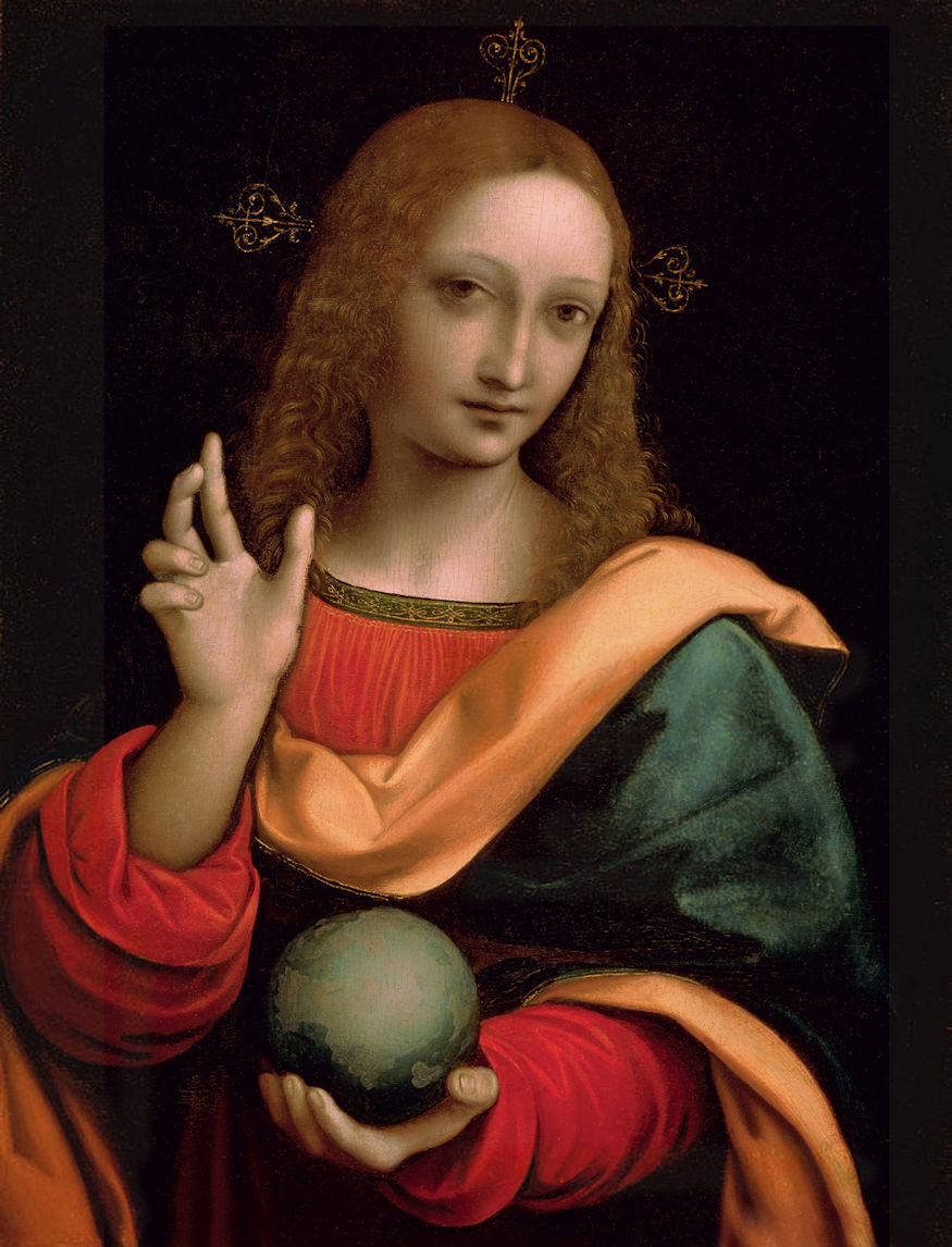
Above, Fig. 19: Giampietrino, Salvator Mundi, c. 1530 (?), tempera on wood panel, 50 x 39 cm, Moscow, Pushkin Museum.
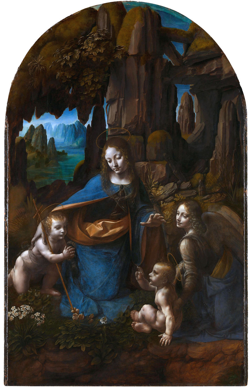
Above, Fig. 20: Leonardo da Vinci and workshop, the Virgin of the Rocks, c. 1493/95-1508, oil on wood panel, 189.5 x 120 cm, London, National Gallery.

Above, Fig. 21: Giovanni Antonio Boltraffio under Leonardo’s supervision, the Madonna Litta, c. 1491-1495, tempera on wood panel transferred to canvas, 42 x 33 cm, St Petersburg, The State Hermitage. This small devotional painting has long been thought a genuine Leonardo until two preparatory studies in Boltraffio’s hand, completing Leonardo’s own project but paid little attention before 1990, were properly linked to the panel by D. A. Brown and M. T. Fiorio, thus proving that Boltraffio’s contribution was extensive. The particularly meticulous execution of the smooth and waxy sfumato in the flesh zones is very close here to the modelling encountered in the Salvator Mundi’s blessing hand (Cook/New York version, Fig. 16a, above).
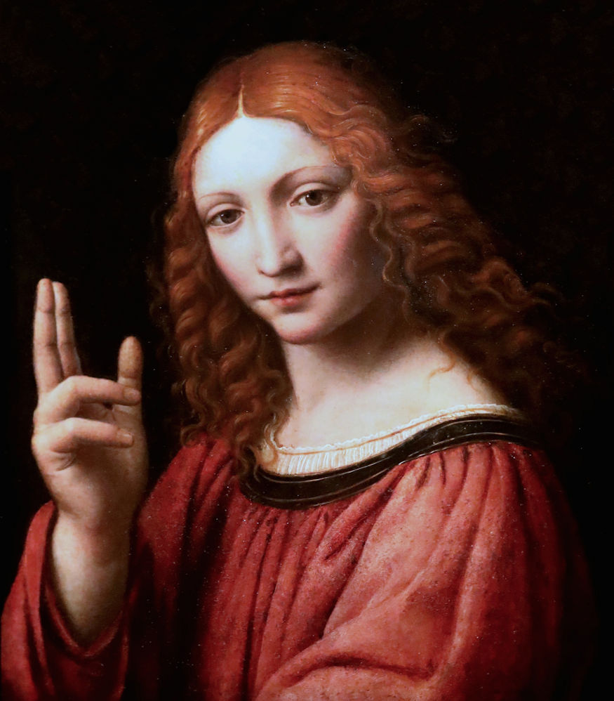
Above, Fig. 22: Bernardino Luini, Christ Blessing, c. 1525 (?), tempera and oil on wood panel, 43 x 37cm, Milan, Pinacoteca Ambrosiana.
Salai had of course never reached that level of accomplishment although by 1500-1510 he was probably in charge of the lesser commissions which Leonardo could not execute for want of time (some of the copies after the Louvre Saint Anne might testify to his specific involvement in the studio’s activity (Fig. 23, below). In my eyes it is doubtless that right at the outset Salai’s share in the New York Salvator Mundi prevailed and that Leonardo had practically none, because nothing that is absolutely typical of his own manner of making appears in the work. For example, on close examination it is obvious that the swirling folds in the sleeve of Christ’s blessing hand, a detail in which some specialists recognize Leonardo’s own hand, is in fact a very simplified motif taken from the far more complex Windsor drapery studies: any skilled collaborator could execute this passage with brio (Figs. 1, 2 and 3, above). However, given that the typology of the underlying layers in the New York panel so greatly resembles that encountered in Salai’s Head of Christ of 1511 in the Ambrosiana and – as noticed by me while completing this essay – in the Ganay version also (one, moreover, in which the design of the Saviour’s face strangely resembles Salai’s own Christ (Figs. 7, above, and 24, below), the debate can only waver over who handled the improvements and ‘finishings’ in the painting in attempt to make it as close to Leonardo as was the case with the Madonna Litta (albeit with Boltraffio’s involvement being far more important in the latter picture). Also, according to when the Cook version of the Salvator Mundi might be considered to have been painted, the name of Salai’s collaborator will emerge more conspicuously: Boltraffio is a likely candidate by, say, 1508, at the time he was perhaps helping Leonardo terminate the London Virgin of the Rocks, and Luini before Leonardo’s voyage to Rome in 1513. I would personally favour Boltraffio’s contribution because his assimilation of Leonardo’s style was perhaps even deeper than that of Luini – besides, he had known Salai for a long time and, for that reason, might have accepted to improve the blessing hand as a friendly move towards Leonardo’s protégé, hence the pentimento in the thumb. Boltraffio, for sure, was a great artist and no anatomical mistakes like that in the Salvator Mundi’s blessing hand are seen in his paintings. While the making process of the New York Salvator Mundi’s blessing hand and those in the Mona Lisa (Figs. 25 and 26, below) look roughly similar, the likeness is superficial and deceptive for a clear distinction exists both in terms of their technical executions and their visual effects. While the technique used in the Mona Lisa is much more evanescent and allusive to the tiniest detail, thus producing an impressive feeling of both real life and mystery, the careful, waxy modelling of the Salvator Mundi‘s blessing hand appears schoolish by comparison, with a touch of prettiness that is uncharacteristic of Leonardo’s usual vigour. Worthy of note, in the same zone, is the marked use of lead white as seen in the London Virgin of the Rocks, in which Boltraffio’s contribution can hardly be doubted (Fig. 27, below). The X-radiographs of both the New York Salvator Mundi and the Mona Lisa are most revealing about the different ways each artist followed to create the hands (Fig. 28 a and b, below).
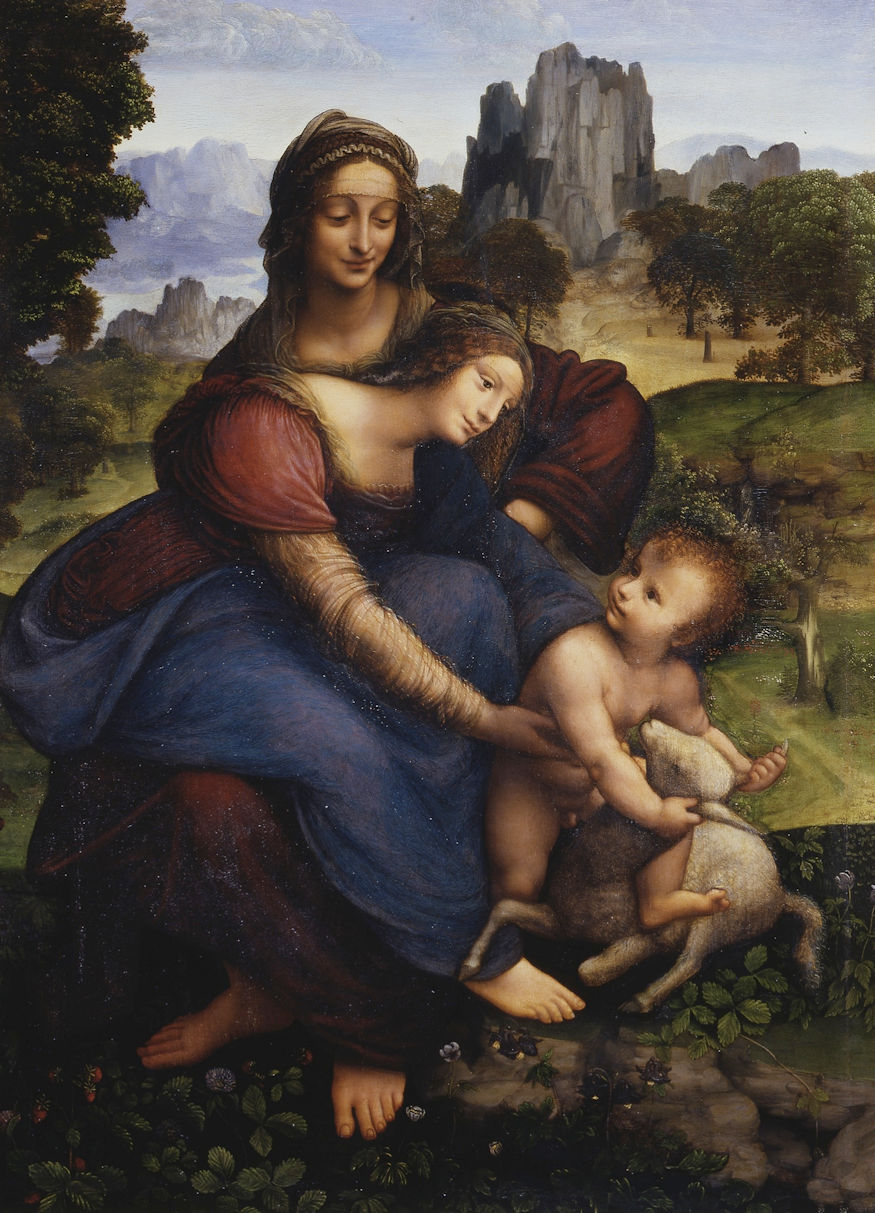
Above, Fig. 23: Workshop of Leonardo da Vinci (Salai?), the Virgin and Child with Saint Anne and a lamb, c. 1508-1515 ?, oil on wood panel, 104.8 x 75.5 cm, Florence, Uffizi Gallery.
Above, Fig. 24: The Ganay Salvator Mundi (Leonardo’s workshop), unrestored, viewed in daylight (detail of head). Compare the thickish dark uneven curved outlining of the head (not to confuse with the perfect arc traced just above) as seen in infrared light in the New York Salvator Mundi (Figs. 9 and 10, above) and in Salai’s Head of Christ in infrared light also (Fig. 8, above). The similarity of the facial features in Salai’s Head of Christ and in the Ganay Salvator Mundi (especially the noses with a same shape and curvature) is striking. The obvious artistic/technical interrelation of both pictures with the Cook version of the Salvator Mundi tends to prove that Salai, beyond his own Christ, had a crucial part in the two other works probably jointly with a different artist each time. A very likely scenario since, in addition, the X-radiographs of both Salai’s Head of Christ and that of the Ganay version display global similarities, thus increasing the presumption of the three paintings’ mutual relation.
Above, Fig. 25: The New York Salvator Mundi (detail of blessing hand as in Fig. 16a, above). The sfumato effect here is very analogous to that in the Madonna Litta (Fig. 21, above), in the London version of the Virgin of the Rocks (Figs. 27a and b, below), in which Boltraffio’s noteworthy contribution is presumed, and also, to some extent, in Luini’s Christ blessing (Fig. 22, above). The sweet chalky flesh tones are due to the substantial use of lead white, a pigment producing a white image in X-radiographs.
Above, Fig. 26: Leonardo da Vinci, the Mona Lisa, c. 1501- 1510/15, oil on poplar, 77 x 53 cm, Paris, Musée du Louvre (detail of hands).
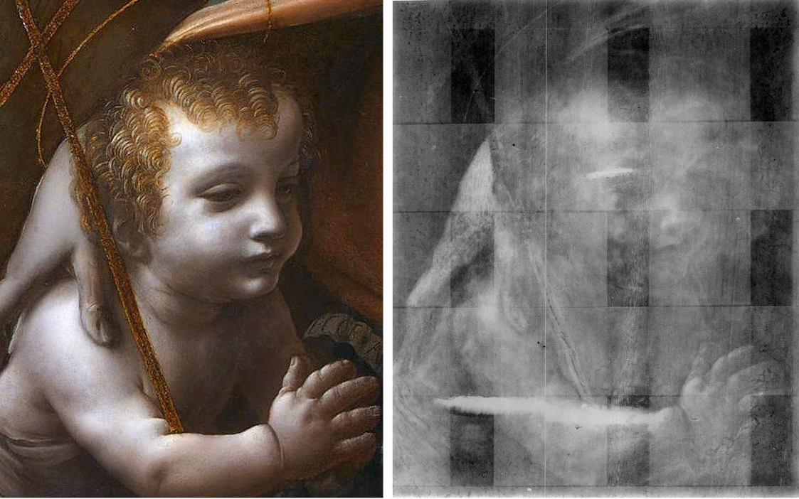
Above, Fig. 27: Leonardo da Vinci and workshop, the Virgin of the Rocks, c. 1493/95-1508; detail of St John: [a] = In direct light, [b] = X-radiograph). [b] shows a white image in the sections containing a substantial quantity of lead white.
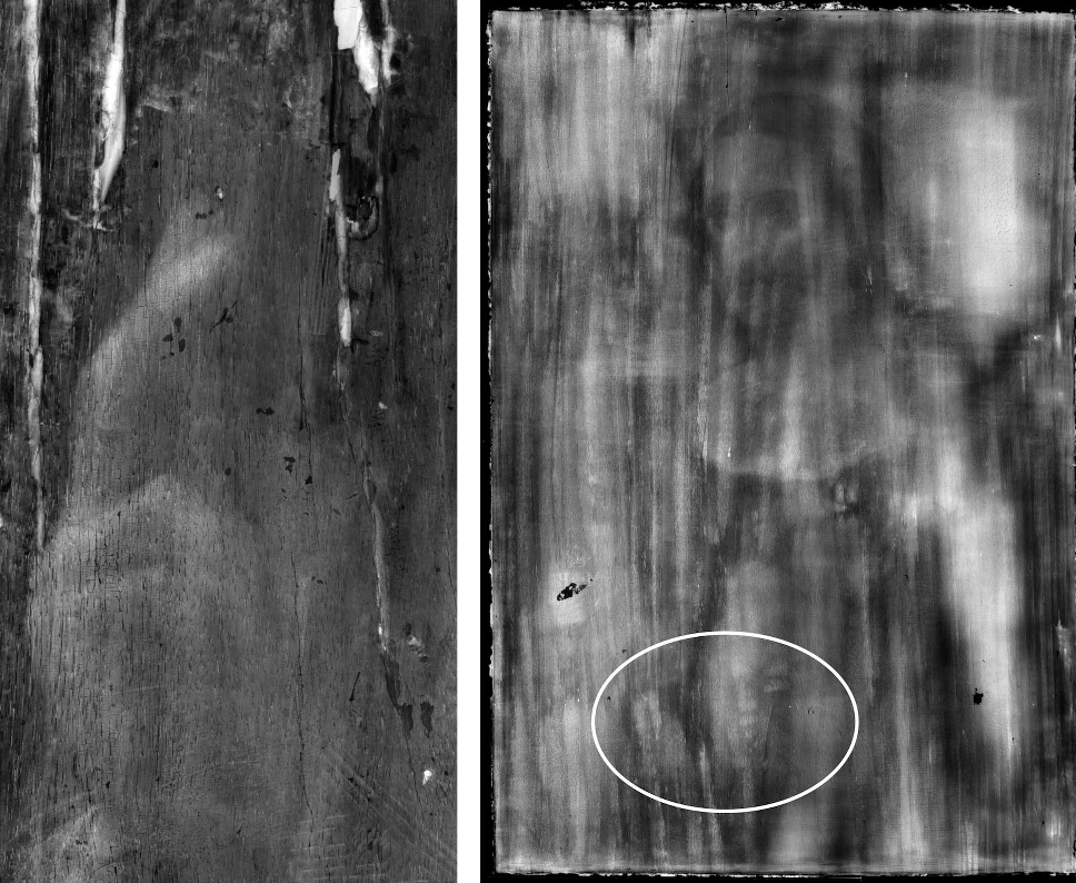
Above, Fig. 28: [a] = X-radiograph of the New York Salvator Mundi (detail of blessing hand), [b] = X-radiograph of the Mona Lisa (detail of hands section located by a white oval outlining). It is now an established fact that Leonardo uses less and less lead white in the flesh paint of his fully autograph paintings as his technique develops in subtlety, in particular from 1500 onwards. The X-ray characteristic densely white image revealing the use of lead white in paintings does not appear in the hands of the Mona Lisa, whose forms are not discernible here; conversely, the technique used in the blessing hand of the New York Salvator Mundi is proven very different by X-ray imaging, where the limb’s shape is distinguished clearly. While the latter work is contemporary with the Louvre masterpiece, its execution compares well that of the London version of the Virgin of the Rocks, from the same period also, a studio altarpiece in which Boltraffio’s contribution was very probable and the substantial use of lead white evident (Figs. 20, 27a and 27b, above).
Incidentally, it has sometimes been hypothesized that Leonardo painted Christ’s face on the Salvator Mundi in an “out-of-focus” fashion, thus misty and blurred, in order to mark the spatial distance separating the face and the blessing hand and, thanks to this stylistic trick, suggest visually that the more distinctly shaped limb comes forward like in a real life 3-D effect. Yet, despite the ruined state of the picture when observed without any repaint, either old or recent, no such presumed artistic device can be seen in the otherwise unlike-Leonardo, heavy modelling of what subsists of the face: the overall treatment and definition of the values of light, shade and tone is exactly the same in both Christ’s face and blessing hand (Figs. 1 and 11, above). Whatever the case, a very interesting document appears to support the final supervision of the Cook version of the Salvator Mundi by Boltraffio: the impressive Study for the heads of the Madonna and Child in metal point kept in Chatsworth (Fig. 29, below) shows the extent to which Giovanni Antonio mimics Leonardo’s style (with slight departures that make a big difference) while displaying an unspontaneous, yet brilliant treatment of the Virgin’s hair in a graphic ‘hard-edge’ spirit close to Christ’s somehow systematic curls falling on His proper left shoulder (Figs. 30 and 31, below). A feature that is strikingly at variance with Leonardo’s usual treatment of curled hairs in his late years – as clearly appears in the Angel’s more evanescent and fluffy curls in the London version of the Virgin of the Rocks (the latter figure’s autograph status has always been accepted contrary to the rest of the Holy group) (Fig. 32, below). In fact, cork-screwing curled hairlocks are frequently seen in compositions not by Leonardo like, for instance, the Prado Mona Lisa, and the two studio productions of the Madonna of the Yarnwinder, one belonging to the Duke of Buccleuch, another kept in a private collection in New York (Figs. 33, 34a and b, 35a and b, below). More might be said on the inconsistencies in the New York Salvator Mundi panel, notably Christ’s proper left hand holding the crystal orb where the fingers are arranged in a strictly regular and unnatural sequence that somehow evokes the ribs of a small upturned umbrella (Fig. 36 a and b, below). Needless to say, such a solecism cannot denote Leonardo’s presence in that section – whereas, an additional pointer finally reveals that, if not Boltraffio in Leonardo’s studio, some other talented artist could have coped with the blessing hand without problem so as to make it closer to the master’s spirit: the remarkable Study of a hand in the Ambrosiana, sometimes attributed to Ambrogio De’Predis or to Marco d’Oggiono, is more eloquent than any words in this connection (Fig. 37, below).
Before ending, another oddity of the blessing hand should be mentioned, given its prime importance. Thanks to their precision, some remarkable visual documents reveal that the pentimento in the thumb increases the suspicion that Leonardo had little to do, if anything at all, in the making of the New York Salvator Mundi (Figs. 38a and 38b, below) . Interestingly, the Modestini cleaning has let emerge the initial form of the thumb, which, in fact, was shapeless and ill-defined at the outset, with two thumbs instead of one. Apparently, both were executed during the same painting session and not successively as is often thought. It might be considered that, following Leonardo’s well-known theory of componimento inculto (shapeless rough), the artist had sketched out two thumbs with a view to ultimately select the one best suiting his intentions. But this scenario is hardly acceptable: none of the initially elaborated thumbs is right in terms of anatomy and perspective. Both fingers have in fact been executed on the warm underpaint that served to make the brighter flesh tones, over which layer some basic modelling was painted with darker hues, yet, in each case the thumb was wrong. The more elaborate one, finally shaped as is seen today thanks to Boltraffio’s retouching (or whoever else did it save Leonardo), was seemingly meant to show the thumb’s first phalanx bent and not raised – while nearly in profile, a difficult angle to depict accurately even by a skilled artist. This was not really consistent with the position of the hand – already rather awkward – and this is why the wiser and easer solution was to show the inside of the thumb in front view, now raised and not bent anymore (but still wrong because not defined clearly, thus departing from the orthodox anatomy and movement of any human hand). The abandoned thumb was far too detached from the metacarpal bone to express what characterizes a natural hand gesture (a rough black outline along the right hand-side of that thumb could be an attempt to correct its faulty axis). Should any doubt subsist about Salai’s main authorship in the ex-Cook Collection Salvator Mundi, a further pointer would seem to contradict it doggedly: the confrontation of the unrestored blessing hand ( Fig. 38b, below) with the reversed infrared image of the Ambrosiana’s St John-the-Baptist (attributed to Salai, Figs. 14 and 15 above) reveals the strange similarity of the thumbs in each painting, including the hesitant positioning of the finger, a singular feature seen in both equally (Figs. 39a and b, below ). Under such circumstances, it is difficult to imagine that Leonardo contributed in this project materially, except for advocating the sensible, yet unsatisfactory, solution retained ultimately.

Above, Fig. 29: Giovanni Antonio Boltraffio, Study for the heads of the Madonna and Child, c. 1498-1500, silverpoint on paper, 29.7 x 22 cm, Chatsworth, Duke of Devonshire and Trustees of the Chatsworth Settlement.
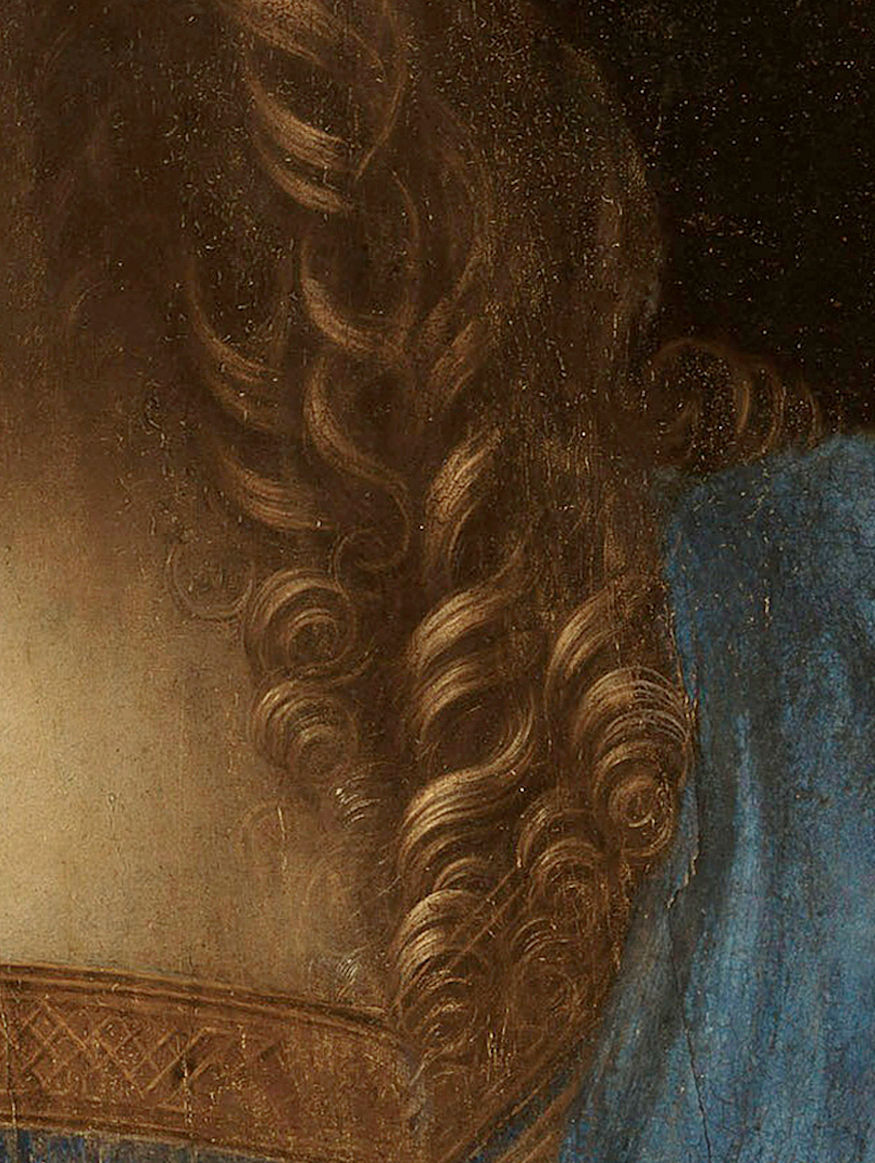
Above, Fig. 30: The New York Salvator Mundi (detail of Christ’s ringlets).
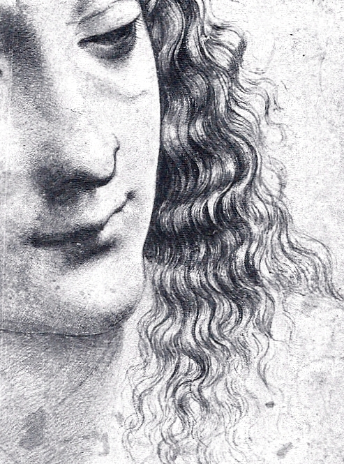
Above, Fig. 31: Giovanni Antonio Boltraffio, Study for the heads of the Madonna and Child (detail of the Virgin’s hair).
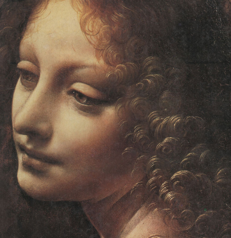
Above, Fig. 32: Leonardo da Vinci and workshop, the Virgin of the Rocks (detail of Angel’s hair).
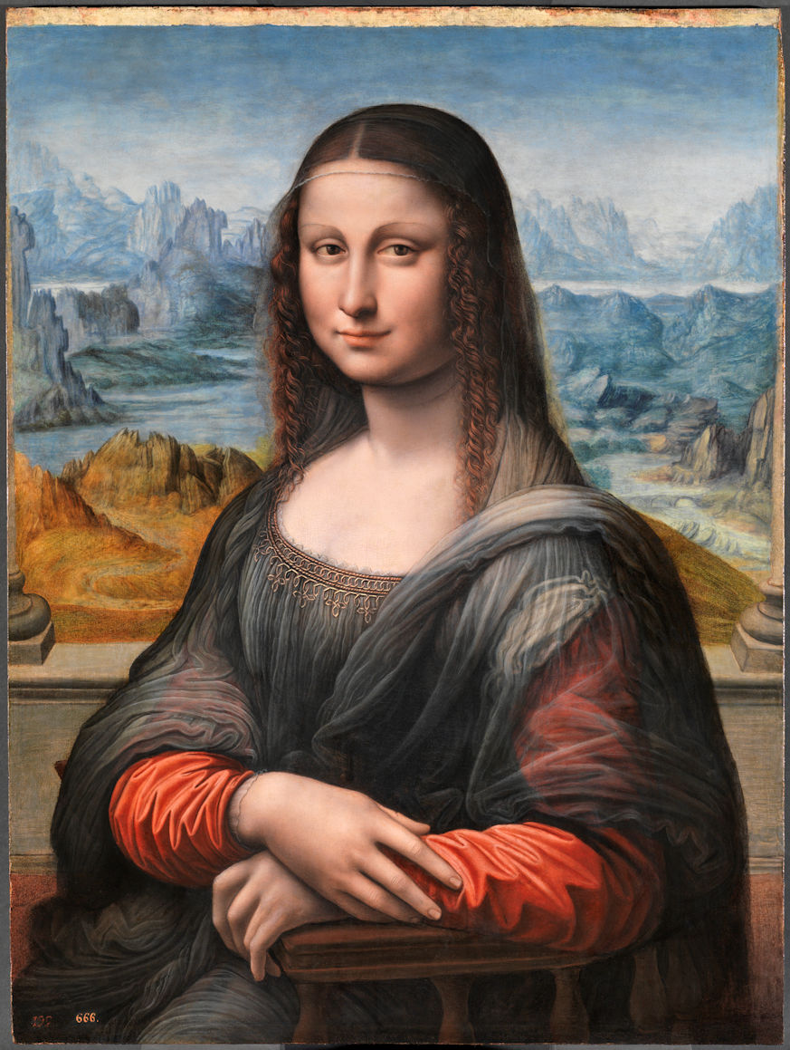
Above, Fig. 33: Workshop of Leonardo da Vinci (Salai?), the Mona Lisa, c. 1501-1515, oil on wood panel, 76. 3 x 53 cm, Madrid, Prado Museum.

Above, Fig. 34: [a] = Detail of curls in Leonardo’s Mona Lisa in the Louvre, [b] = Detail of curls in the Prado Mona Lisa. [a] displays Leonardo’s extremely natural depiction of the sitter’s hair curls in the legendary portrait while [b] reveals the studio’s mechanical treatment of the same detail.
Above, Fig. 35: 35) [a] = Workshop of Leonardo da Vinci, the Madonna of the Yarnwinder, c. 1501 (?), oil on wood panel transferred to canvas, 50.2 x 36.4 cm, New York, Private Collection, [b] = Detail of Madonna’s hair.
Above, Fig. 36: [a] = The New York Salvator Mundi (detail of Christ’s proper left hand), [b] = Umbrella pattern comparing the New York Salvator Mundi’s proper left hand.

Above, Fig. 37: Workshop of Leonardo da Vinci (Ambrogio De’Predis or Marco d’Oggiono?), c. 1495 (?), Study of hand, metal point and white highlights on light blue paper, 13 x 12.9 cm, Milan, Biblioteca Ambrosiana.
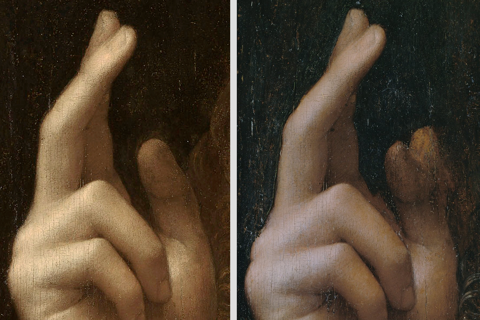
Above, Fig. 38: [a] The New York Salvator Mundi (detail of blessing hand, restored stage); [b] The New York Salvator Mundi (detail of blessing hand rid of old repaints – see Fig. 11, above). As appears in [b], the dual, hesitant construction of the thumb reveals that its author was not very familiar with human anatomy. Quite obviously, Leonardo’s rigorous precepts to the painter in this field did not apply in any making stage of what stands here as a ‘theoretical hand’ and not one faithful to nature.
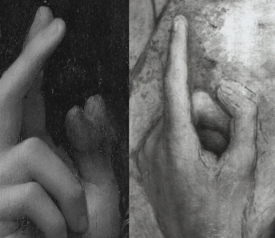
Above, Fig. 39: [a] The New York Salvator Mundi (detail of blessing hand rid of old repaints, like in Fig. 38b, above); [b] detail pasted from the reversed infrared image of Salai’s attributed St John-the-Baptist in the Ambrosiana (Figs. 14 and 15, above). A worthwhile comparison insofar as it helps to better situate Salai as an artist and his particular role in Leonardo’s bottega.
Above, Fig. 40: Extract from Salai’s posthumous inventory of the estate of 21st April 1525 (typed transcription).
Given the preceding, and contrary to the generally accepted idea, no determining fact or document proves that the studio productions deriving from Leonardo’s original compositions, whether painted or just sketched out graphically, were inevitably supervised and retouched in all cases by the master in person. And even if it were so, how much of Leonardo’s own work could be quantified in the New York panel as it stood before the recent conservation treatment? On visual examination of the relating technical image (Fig. 11, above), no essential detail suggests that Boltraffio would not have executed it jointly with Salai, especially as what has survived of the original paint layer, notably in Christ’s face and blessing hand, brings enough information to see that Leonardo’s faultless and easily recognizable brushwork must have vanished if the master ever contributed to the work’s execution significantly, because it is indistinguishable, thus missing entirely in the composition as it appears without the Modestini restoration, and so to the point that no claim of its hypothetical former existence can be sustained on sensible, scientific grounds. Against this absence of evidence of Leonardo’s hand on the Cook version of the Leonardesque Salvator Mundi, much solid material exists to propose another attribution that is entirely consistent with what the work really looks like – namely, Salai, jointly with Boltraffio. Such a conclusion, I believe, offers a better understanding of the studio works, which were produced by various permutations of collaboration, in which the master is close spiritually, yet not quite there. It should be noted, additionally, that beyond the above-mentioned artistic and technical flaws, doubts about Leonardo’s authorship are the more justified as a Salvator Mundi painting is recorded and priced 25 scudi in Salai’s posthumous inventory of the estate established on 21 April 1525: “Uno Christo in modo de uno Dio padre”, which was the then designation of such a visual representation of Christ (Fig. 40). Therefore, despite that concise – yet very clear – mention, no objective element opposes the identification of the ex-Cook Collection Salvator Mundi with the recorded Christo since, 1) the New York sale’s IR imaging displays technical features consistent with Salai’s sketching out practice, 2) no documented eventual provenance of this kind has been connected to Leonardo himself by far until now.** (A and B.)
Finally, because Leonardo stands among the greatest artists that ever existed, it is always tempting to increase his very restricted pictorial corpus with works that fall short doing it full justice. Yet, art at this level of accomplishment cannot be speculated about without the necessary critical approach and minimum knowledge of how Renaissance painters used to proceed in their creation, – mostly founded on perfect drawing – especially as in Leonardo’s case, his Treatise on Painting delivers crystal clear data to the researcher regarding its authors’ supremely elevated standards. We must therefore face the truth: this latest case of an upgraded studio item does no justice to Leonardo’s genius; it does not correspond to the highest standards encountered in his original autograph works and theoretical writings on painting. As such, its attribution to Leonardo himself must be rejected and given now, more appropriately, to his close circle of collaborators working on their own while still depending from the master’s occasional suggestions, whether drawn or verbal***.
* I wish to thank Michael Daley warmly for welcoming the present contribution of mine on the ArtWatch UK website and for having adjusted its presentation with the utmost care and kindness.
**A: On this point see in particular, G. Bora, D. A. Brown, M. Carminati, M. T. Fiorio, P. C. Marani, J. Shell, The Legacy of Leonardo. Painters in Lombardy 1490-1530, Skira Editore, Milan, 1998.
**B: See J. Shell and G. Sironi, “Salai and Leonardo’s Legacy”, in The Burlington Magazine,, CXXXIII, no. 1055, pp. 95-108.On Salai’s own pictorial production listed on the 1525 posthumous inventory and the original Leonardo paintings (including the Mona Lisa) which he sold to king Francis I in 1517-1518, see B. Jestaz, “François 1er, Salaï et les tableaux de Léonard”, Revue de l’Art, no. 126, 1999-4, p. 68-72.” On a specific agreement between Leonardo and Ambrogio de’ Predis about the master’s moral rights over the copy of the Virgin of the Rocks, see Grazioso Sironi, Nuovi documenti riguardanti la ‘Vergine delle rocce’ di Leonardo da Vinci, Giunti Barberà, Florence, 1981, p. 23-25 (document VII of 18 August 1508).
*** The recent cleaning of the Louvre’s Bacchus (initially painted as St John in the Wilderness) has revealed that this workshop composition of a higher artistic status than that of the Cook Salvator Mundi did not include the master’s material contribution although he had drawn an elaborate preparatory red chalk study for it (whereabouts unknown since 1973).
Jacques Franck, 3 (& 24) August 2020.