
Hollow Gods and Dangerous Beauty
With museum and gallery visits becoming ever-more crowded noisy expensive and denuded of works loaned, in needless restorations, or stored as directors play developers as well as impresarios, the appeal of small venues grows. Bury Street in St James’s is buzzing with two (free) exhibitions, one light on drawings, one rich.
A principal delight of the non-museum/gallery sector is un-trailed and unanticipated cross-fertilisation. Until 13 December, Hazlitt Holland-Hibbert is showing Eduardo Paolozzi (Hollow Gods – Sculpture and Collage from 1946-1960) and, hard after its “From Michelangelo to Matisse: Five Centuries of Drawing”, Colnaghi is running (until 24 January) a big and various show, “Dangerous Beauty” – dangerous because themed on “the seductive beauty of the female form” at a time when “women around the world are claiming back the right to be represented without male filters”.

Above, Fig. 1: Left, Paolozzi’s 1947 Fragment einer Grabstele aus Lokris, detail; right, Colnaghi’s Karl Parsons 1933 pencil drawn Patricia.
Where the Paolozzi show is, as its title indicates, light on drawings, the Beauty Show is especially rich and the Parsons drawing itself constitutes a dangerous revelation in one rumbling art political context discussed below.
It was something of a shock to realise just how historic – and overdue – this (nicely catalogued) Paolozzi survey is. For nearly two decades after the Second World War the sculptor was quintessentially modish and acclaimed as an intellectually and formally invigorating force. Rich in friendships with rising modernist critics and architects, Paolozzi was unusually cosmopolitan being of Italian parents in Scotland, spending time in Paris imbibing Picasso, Klee, Giacometti, Dubuffet and admiring Francis Bacon, Willem de Kooning, Leon Golub, Germaine Richier, Richard Stankeiwicz and Alberto Burri. In due course he, like many British sculptors, became an art fashion casualty of the all-conquering hard-line “concrete” formalist vocabularies forged by the St Martins School which grouping was held for a while to comprise Britain’s Greatest Sculptors since the Middle Ages. The self-impoverishment of that school’s stance – effectively, that material bears its own message – left space for Paolozzi, like Henry Moore before him, to become the leading producer of Grand Civic Sculpture and, even, to uphold the figurative banner. The Hazlitt Holland-Hibbert show demonstrates how much was lost when Paolozzi abandoned his fugitive evocatively battered but upstanding early figurative explorations for more decorative printed graphics (- sometimes veering on the psychedelic), design and large-scale architectural productions.
Strictly-speaking, Paolozzi was neither a traditional draughtsman nor a traditional sculptor. He did not carve, model or even fabricate. Rather, he scavenged, appropriated and re-assembled. From childhood he had been an avid, omnivorous reader and collector of illustrated books, comics, advertisements, sports, health and technical manuals. Amidst the world’s plethora of reproduced images and mechanical objects he showed a distinct nose and sympathy for the paradigmatic force of classical sculpture’s now-fragmentary figures, busts, bases, pedestals and so forth. It is possible that he was alerted to classical art – as well as to badges, uniforms and aeroplanes – when sent by his father to summer in fascist youth camps in Italy.
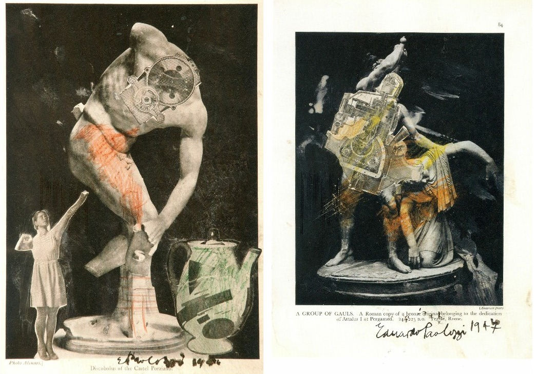
Above, Fig. 2: Left, A Group of Gauls, collage, pencil and wash, 1947; right, the Discobolus of the Castel Porziano, collage and ink wash, 1946.
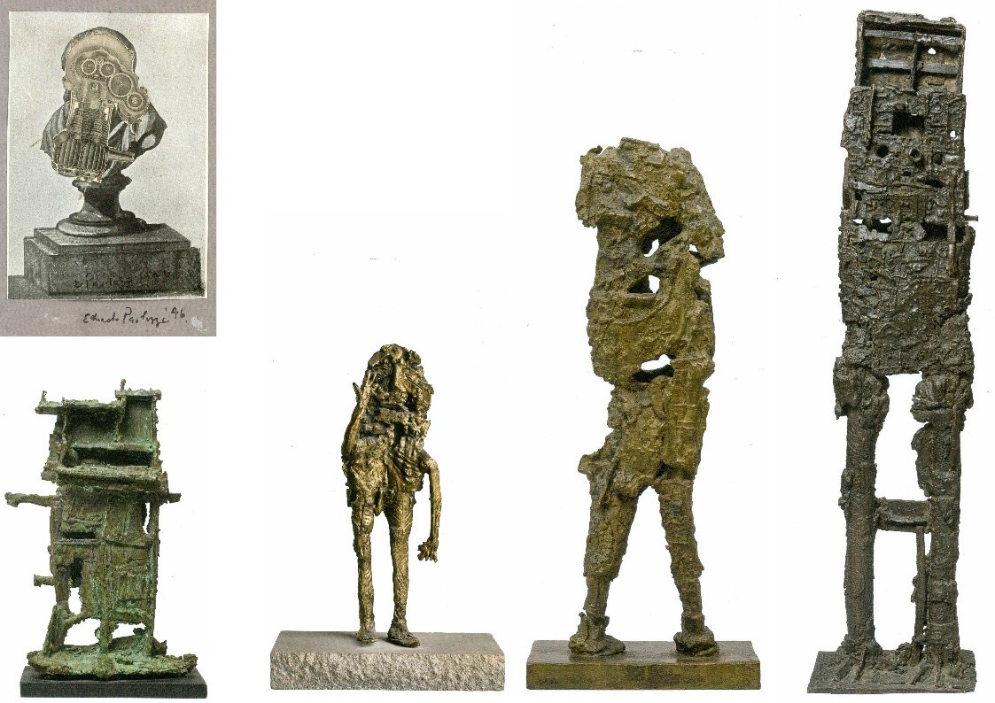
Above, Fig. 3: Left, top, Untitled, collage, 1946; above left, Small Monument, 1956, unique bronze, H 13 inches (33 cm); second left, Figure with Raised Arm, 1955, bronze, H 18 inches (46.5 cm); third left, Robot, bronze, H 19 inches (48.5 cm); right, Figure, 1957, bronze, H 48 inches (123 cm).
CUTTING AND ASSEMBLING
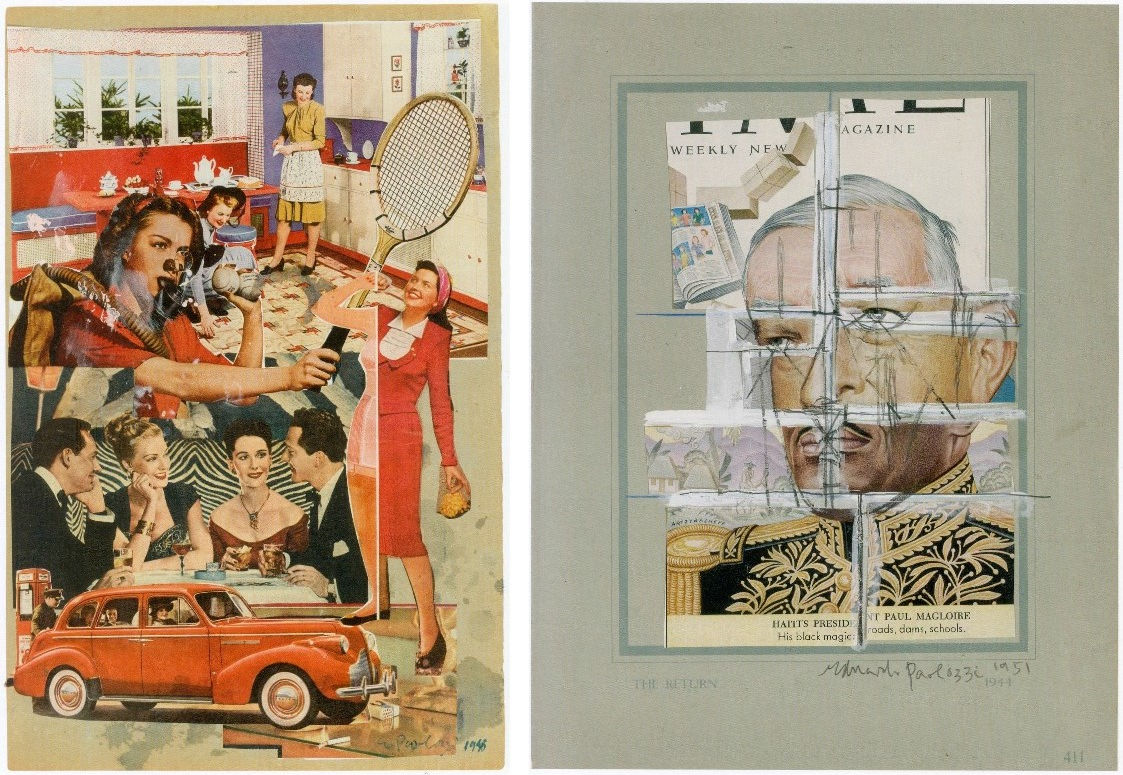
Above, Fig. 4: Left, Untitled, 1948, collage, 37 x 24 cm; right, The Return, 1954, collage, pencil and gouache, 13 x 10 inches.
Paolozzi’s witty mini-essay on monuments at Fig. 3 caught the eye of Henry Moore, who bought it. The collaged Untitled image above left might easily be taken today as a trenchant visual synopsis for the “Mad Men” TV series but in the UK’s impoverished food-rationed and punitively-taxed post-war years American affluence had yet to become a source of self-loathing shame and Paolozzi’s collaged image might better be seen as an innocent celebratory act of awe and wonderment. His affection for the United States famously (and influentially) extended to its popular culture and especially to its movies which he saw not as sources of harvestable imagery but as “direct experience” to be lived. Boris Karloff, The Mummy’s Hand and Frankenstein were, however, acknowledged to have “supplied a thread in his beat-up human image.”
As late as 1957, Paolozzi saw the United States as offering more to an artist than the Mediterranean. However, with The Return, above right (and other such graphic collages) a darker colder side emerges. Slicing up images – particularly images of faces – and reconfiguring them to misaligned satirical intent is not cuddly. Much later, in the 1980s, Paolozzi would carry the cutting and reconfiguring into grander more conventionally realised sculptures whose forms were clearly delineated by an otherwise continuous surface skin. Those late dismembering exercises seemed free of sadistic intent and to be deployed more to impart a formal dynamism than any expressive or symbolic purpose. Nonetheless, slicing up and recomposing images or effigies of human faces and heads is inherently unsettling and question-raising. Does the enlarged, flattish circular head of Paolozzi’s St Sebastian at Fig. 7 below allude to a sun/halo or an archer’s target board?
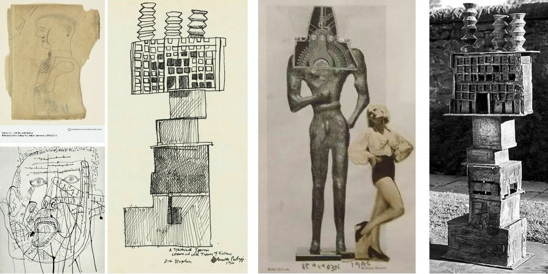
Above, Fig. 5: Left, top, a Paolozzi self-portrait made as an eleven-year old schoolchild; left, above, Paolozzi’s 1953 ink drawing Self-portrait; second left, a 1961 drawing for the sculpture Tyrannical Tower Crowned with Thorns of Violence – and as realised at the National Galleries of Scotland, above, far right; third left a photo-collage of 1946.
AUTHENTICITY IN AN ERA OF UNIVERSALLY HARVESTABLE AND REPLICABLE IMAGES

Above, Fig. 6: Above, top, Paolozzi’s 1947 photo-collage Fragment einer Grabstele aus Lokris shows the artist at full throttle. The limited means – just three “lifted” images – is classically restrained: a cheesecake pin-up of the kind that had recently graced millions of soldiers war-time lockers and kit bags; an eloquent fragment of antique carving speaking of lost civilisations; and, as representative of the future and increasing well-being, an item of machinery that perfectly mimics Western modernist artists self-consciously cultish appreciation of African masks. Today, we make what we may be permitted of this nicely triangulated homage but sparks still fly and engage with other art – as with the above famous 1926 Paris Vogue Man Ray portrait of Kiki de Montparnasse.
The Man Ray photograph had found echoes before Paolozzi, as above in the 1942 promotional/glamour photograph of Lana Turner by Eric Carpenter (which is preceded by Ingres’ pencil copy of Leonardo’s painted portrait known as La belle ferronnière ). In the 2000 Hollywood Portraits book by Roger Hicks and Christopher Nisperos, the authors raise questions of authenticity in photography-as-art. While Carpenter’s “chiaroscuro is striking”, they seem to complain, “there is much retouching in this picture. Most of what we see between the actress and the statue looks like airbrushing, particularly the shadow next to her cheek, but the keyline on the chin is genuine and beautifully executed – a reflection from the background…the profile is masterful, and the canting of the camera – a popular device at the time – is all but essential: it places the main subject’s face at a more attractive angle and greatly reduces the apparent mass of the statue, which otherwise might dominate the composition. The principal tricks in re-creating this picture are, first, the very careful control of the chiaroscuro; second, the angled camera; and third, diligent and extensive retouching…” (For Hicks and Nispero’s further views on the role and means of retouching, see “Coming to Life: Frankenweenie – A Black and White Michelangelo for Our Times” .)
With the many technical and professional advances in photography and cinema – not least digitalisation – and the widely indulged licence to tamper -the boundaries between art (where images are made) and photography (where images are taken) are clearly weakening. Practical problems follow: can steps be taken to prevent or even identify the illicit manufacture of perfectly deceiving facsimiles of bona fide works? As Dalya Alberge discloses, Man Ray’s iconic Kiki de Montparnasse image exists in more versions than should be the case – “Fake Man Ray prints are hanging on museum and collectors’ walls, leading specialist warns”.
CLASSICAL TENACITY
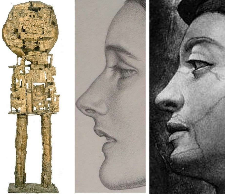
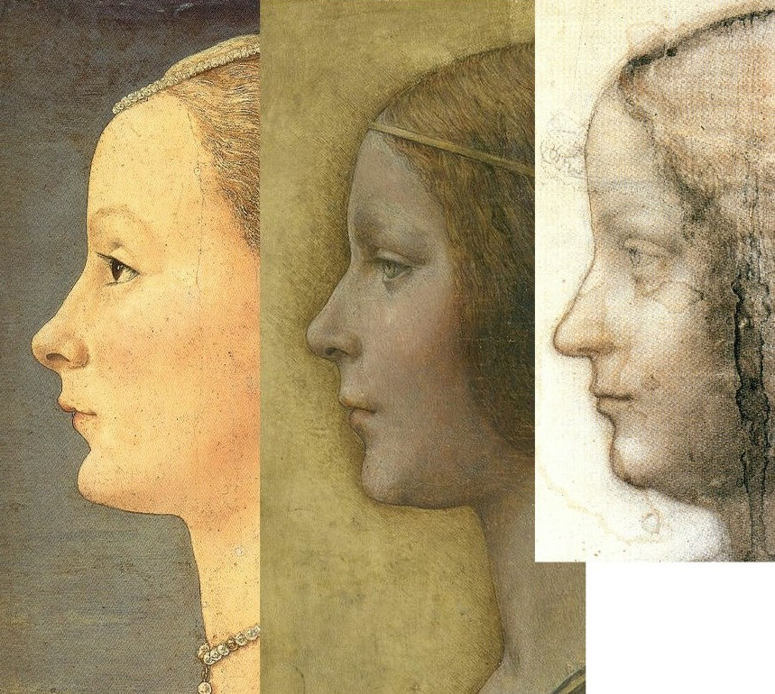
Above, Fig. 7: In this fast moving and problematic technical world, the simultaneous appearance within a hundred yards of Paolozzi’s 1957 bronze St Sebastian IV and Karl Parsons’ 1933 pencil drawn Patricia came as a jolt. We all well know of Paolozzi’s art but how many knew of Parsons’ society portrait drawings? The two works above left and centre might seem worlds and eons apart but where Paolozzi was thirty-three years old when he made his St Sebastian at a time when traditional art school practices were crumbling, he was nine years old when the forty-nine year old Parsons drew Patricia (in what would be the last year of his life). Parsons had attended some classes at the Central School of Arts & Crafts in London but essentially learned his craft in the doing – that is, in the time-honoured role of apprentice to a successful working master, in his case, to the leading Arts and Crafts Movement stained glass maker, Christopher Whall. Parsons went on to carry out major commissions for the windows of Canterbury, Gloucester, Cape Town and Johannesburg cathedrals. Beyond that rigorous training and high-level artistic practice, Parsons all the while had at his back centuries of tradition – it is not fanciful to see a direct line from Michelangelo’s monumental painted profile from the Sistine Chapel ceiling’s Erythraean Sibyl (here mirrored, above right) to Parson’s modest (15 by nearly 12 inches) monogrammed profile portrait in pencil on paper.
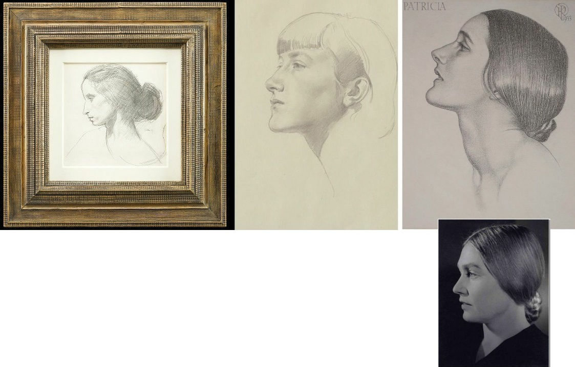
Above, Fig. 8: Colnaghi’s larger, mixed show happens to contain a mini-exhibition of modern (traditional) female profile portraits drawn on paper. First, above left, is Augustus John’s 1907 portrayal in black chalk of his mistress/muse/mother figure, Dorelia McNeill, who at sixteen had edited a magazine called The Idler. Second left, is Gerard Leslie Brockhurst’s pencil on paper portrayal, Anais. The Parsons drawing’s sitter is considered most likely to be Patricia Frances, Lady Strauss. A vintage National Portrait Gallery photograph of her (by Bert Sachsel), from the late 1930s or early 1940s, as above right, displays striking facial similarities, as well as the same hairstyle. Patricia, an author and politician who stood unsuccessfully for the Labour Party in Kensington South at the 1945 General Election, married George Strauss, MP, in 1932, and became Lady Strauss in 1979. A significant patron of both the performing and the visual arts, she led a campaign to persuade the government to use half a percent of the cost of all new buildings for works of art and pioneered the first international sculpture exhibition in Battersea Park. (In the 1963 Battersea sculpture show Paolozzi exhibited along with Henry Moore, Kenneth Armitage, Reg Butler, Lynn Chadwick, Geoffrey Clarke, Bernard Meadows, William Turnbull and others.)
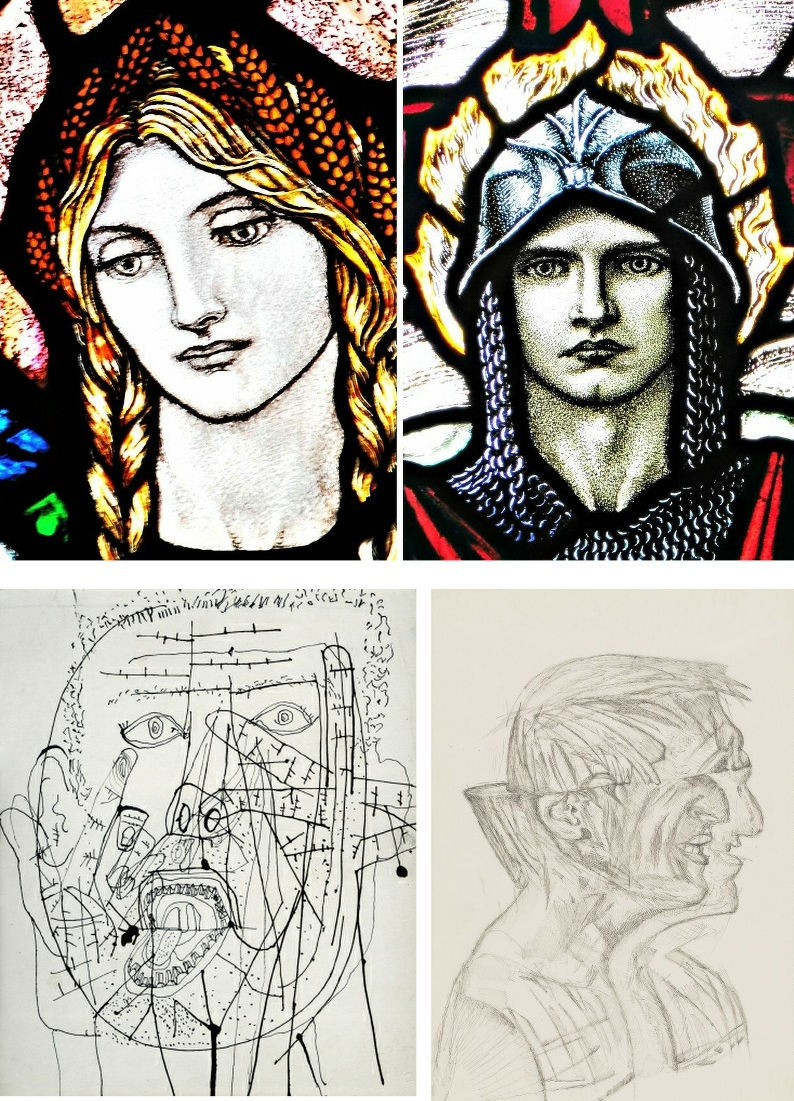
Above, Fig. 9: Top, two stained glass heads by Karl Parsons; above, left, Paolozzi’s 1953 self-portrait, and, above, right, one of his 1980s ink on tracing paper studies of the architect Richard, now Lord, Rogers. More than half a century and the Second World War stands between the above two pairs of images. The chasm of artistry and draughtsmanship between Parsons and Paolozzi in these works might seem painful to contemplate. Looking at these images today, who eclipsed whom artistically? The principal charge against Arts and Crafts depictions was of a perceived saccharine sweetness and sentimentality. Was the suppression of such traits best or necessarily made by evocations of psychic derangement and a drawn proposal for a combined scalping and splitting of an identifiable person’s effigy bust? Are we still forbidden to admire the remarkable artistry and sheer force of expression in Parsons public works?
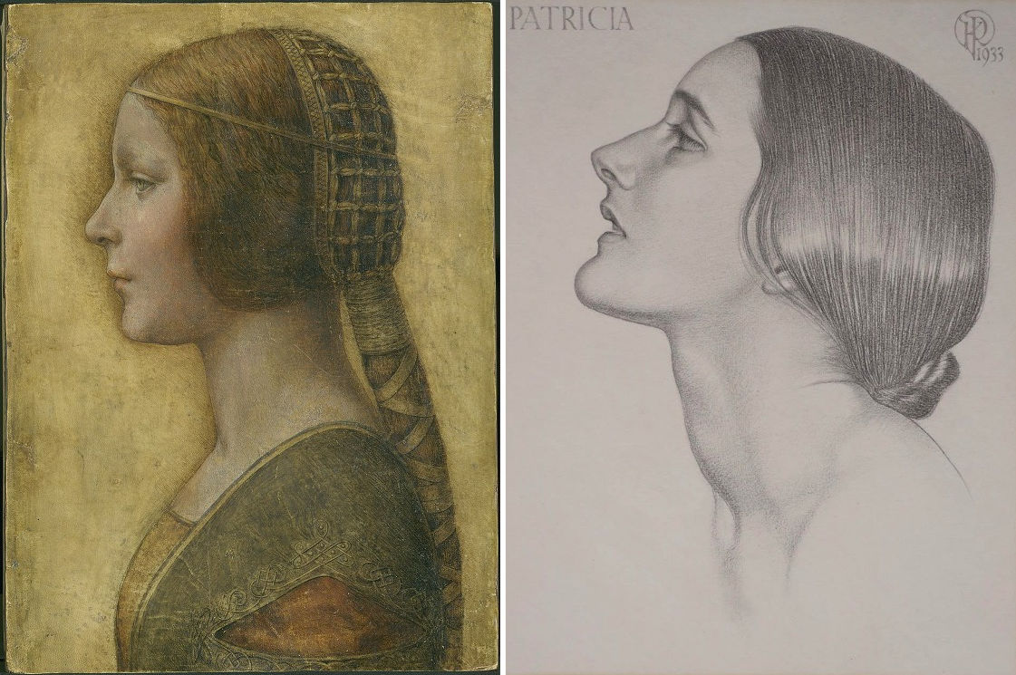
Above, Fig. 10: Left, “La Bella Principessa”, a mixed media drawing attributed to Leonardo; right, Karl Parson’s Patricia.
In the pairing above, we see either Parsons pitted against a newly discovered (that is, a claimed) Leonardo drawing of a princess, or – as we believe – two possibly near-contemporaneous twentieth century works. The emergence of Parson’s pencil-drawn Patricia (above right) coincides with a near decade-long campaign of advocacy on behalf of the (unsold) supposed-Leonardo portrait of a short-lived Milanese princess, Bianca Sforza (above left), that Professor Martin Kemp dubbed “La Bella Principessa”. The drawing was so attributed in knowledge that this profile portrait type has been assailed by modern forgeries: “Complications for the historian lie both in the fact that the subjects of most female portraits are no longer identifiable and that, because of their exceptional decorative and historical appeal, such portraits were highly sought after by later nineteenth- and early twentieth-century collectors, encouraging a market for copies, fakes and over-ambitious attributions” – Alison Wright, The Pollaiuolo Brothers, Yale University Press, 2005.
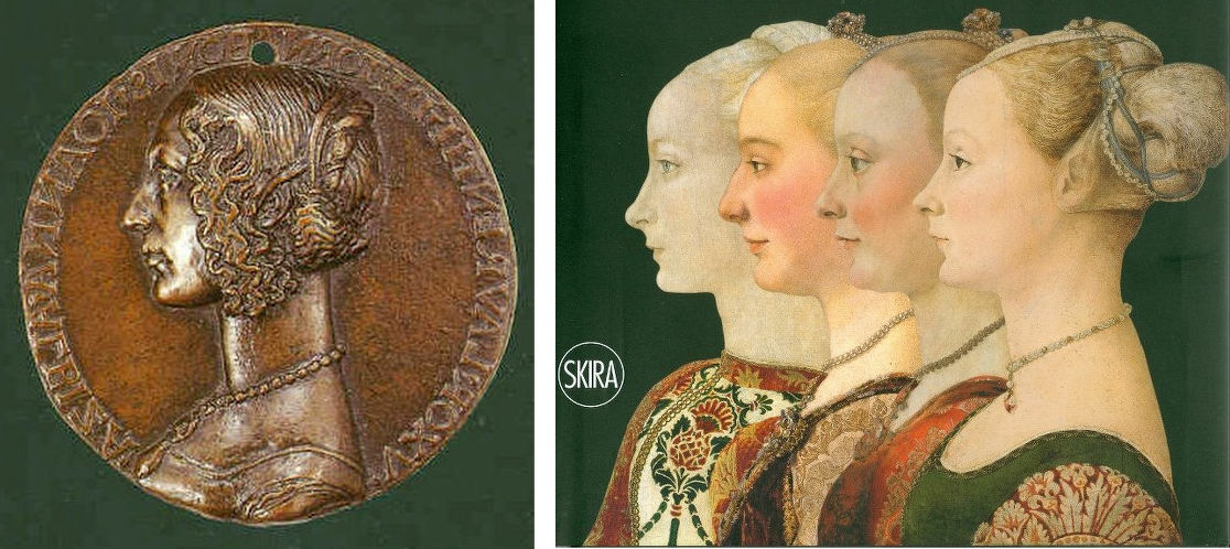
Above, Fig. 11: Left, the (mirrored) obverse of a bronze medal of c. 1486 attributed to Niccolo Fiorentino; right, four 15th century paintings judged most likely by the Polliauolo brothers, Antonio (figures 1 and 4) and Piero (figures 2 and 3). We mentioned a link between Parsons and Michelangelo. In truth, Parsons’ Patricia may intentionally have referenced the earlier (15th century) archaising profile portrait tradition with paintings made in emulation of classical relief portraits found on antique coins.
Since its first appearance as a prospective Leonardo drawing, we have suspected “La Bella Principessa” to be a work of the 20th century. The fakes-generating popularity of the profile-lady type of which Alison Wright spoke is attested in Fig. 12 above, where we see that in the early years of the 20th century, Antonio del Pollaiuolo’s Profile of a Woman seems to have enjoyed position as an exemplar of the 15th century profile portrait type wherein, as Ingres noted, “Never is a woman’s neck too long”.
TRUE TO TYPE?

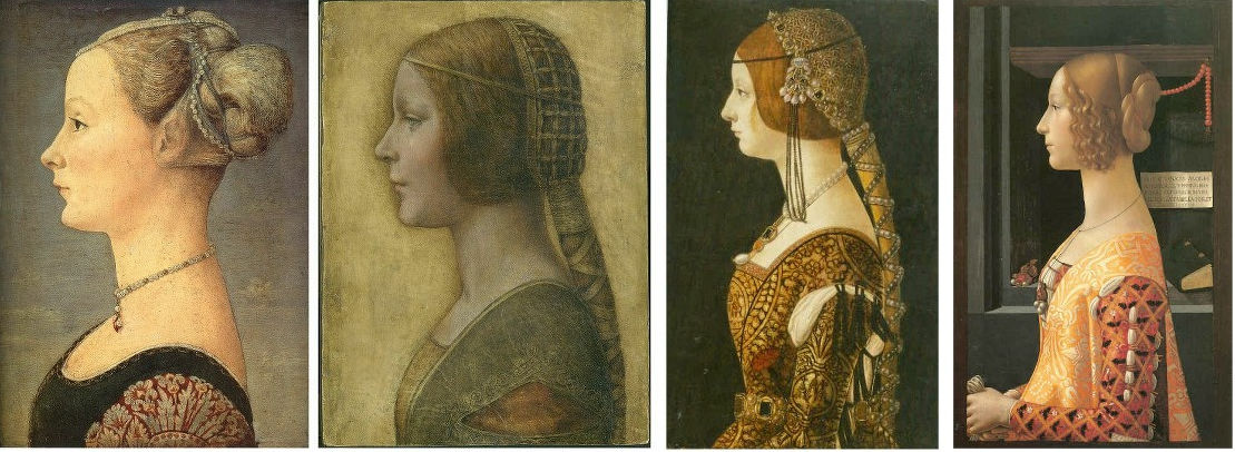
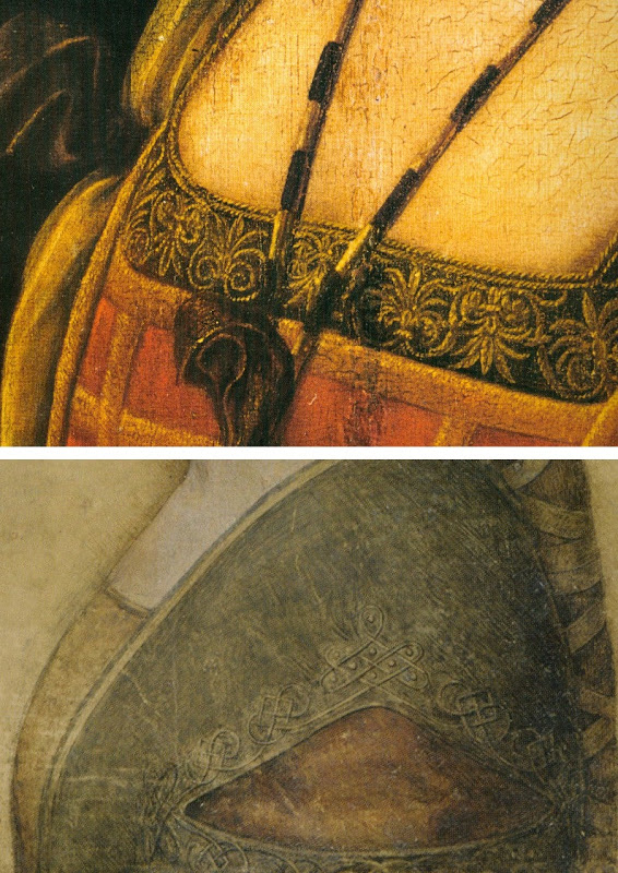
Above, Fig. 13: We take all three works in the top tier to be modern productions and all four works in the bottom row to be not only bona fide 15th century paintings but, in the case of Antonio Polliauolo’s Profile of a Woman in the Museo Poldi Pezzoli, Milan (as in the fourth and fifth images) the most popular version of a most popular type. For those wishing to make modern versions, Polliauolo’s Milan profile seems to have been taken almost as a template because of its great attractiveness and because its rather truncated composition greatly minimises the work needed properly to depict a richly and elaborately costumed torso (– as seen below at Fig. 14). The authors of all three versions in the top tier have taken short cuts and depicted implausible costumes.
The picture on the left was bought in 1936. The picture in the centre first appeared in 1998 – 502 years after its presently-claimed execution. The figure on the right was last seen in a book published in the 1940s. It then disappeared and its whereabouts are now unknown.
The first picture was bought by the Detroit Institute of Arts as by Andrea del Verrocchio or Leonardo da Vinci. It was recently exposed as an outright fake: it contains modern pigments and it was painted on top of a photograph – see “Art’s Toxic Assets and a Crisis of Connoisseurship ~ Part II: Paper (sometimes photographic) Fakes and the Demise of the Educated Eye”
The “La Bella Principessa” drawing emerged without provenance and anonymously as the property of a lady in 1998 at Christie’s, New York, where it was sold as a 19th century German work for $22, 850 to a dealer who sold it on in 2007 for $19,000 to its present owner. Its advocates have said of tests on the vellum: “This dating confirms that the portrait could well have been made in Leonardo’s lifetime, supporting Martin Kemp’s proposed date in the mid-1490s and virtually eliminating the possibility that it is a 19th century pastiche.” “Confirming” a “could well have been” is double-speak which itself rests on only a loose and wide overall estimation of probabilities. It was not acknowledged that within the overall figure, the probabilities had been greatly more precisely quantified. While the report states that there was a 68.2% probability that the sheet was made between 1470 and 1650, within that period there was only a 27.2% probability that the drawing was made between 1470 and 1530 – whereas there was an appreciably greater probability (41.0%) that the sheet was made some time between 1550 and 1650. Had the vellum been made at any point after 1496, when the work is claimed to have been executed by Leonardo, the attribution would sink. Moreover, even if the sheet had existed before 1496 that would not establish the date of the drawing’s execution: in The Art Forger’s Handbook Eric Hebborn explained that a prime source of old materials is obtained from blank end papers in books.
Above, Fig. 14: Left, Pollaiuolo’s Profile of a Woman; second left, “La Bella Principessa”; third left, Portrait of Bianca Maria Sforza, c. 1493, by Ambrogio de Predis, The National Gallery of Art, Washington; right, Domenico Ghirlandaio, Portrait of Giovanna Tornabuoni, (1488) Museo Thyssen-Bornemisza, Madrid.
It is striking in this comparison with three secure paintings how dull and underpowered the work is and how (relatively) impoverished is the appearance now-claimed subject, Bianca Sforza, the short-lived illegitimate daughter of Il Moro, the Duke of Milan. The subject third left is said to be Bianca Maria Sforza, Bianca Sforza’s cousin. In the catalogue to the (London) National Gallery’s 2011-12 Leonardo exhibition Arturo Galansino said of Bianca Maria’s portrait that the artist’s focus on the sumptuous clothes testified to the luxury of “the most opulent court in Italy”. How credible can it be that the strikingly impoverished, jewellery-free image of Bianca had been commissioned in celebration of the wedding of the Duke’s own daughter to a powerful ally? Martin Kemp has hedged against this implausibility with a suggestion that the portrait might, instead, have been a memorial record made after her death: “It may be that the restraint of her costume and the lack of jewellery indicate that the portrait was destined for a memorial rather than a matrimonial volume”.
Above, Fig. 15: Top, a detail of Leonardo’s portrait La belle ferronnière, the Louvre; above, a detail of “La Bella Principessa”.
DRAWN FROM LIFE OR MADE AFTER DEATH?
Above, Fig. 16: Left, Pollaiuolo’s Profile of a Woman; centre, “La Bella Principessa”; right, Leonardo’s Portrait of Isabella d’Este, of c. 1500 in the Louvre Museum (- here mirrored).
Forgers and pasticheurs alike are obliged to make their works resemble secure works of a given artist and period. On the hypothesis that “Bianca/La Bella Principessa” was likeliest a work of the late 19th, early 20th century, how might the present image have been generated? Making one that resembled Antonio del Pollaiuolo’s, Profile of a Woman in the Museo Poldi Pezzoli, Milan, as above left, would be sure to strike a reassuring stylistic and period chord. If the aim was to make a work of that archaising type that looked as if made by Leonardo, then a forger could also make use of one or other of the few female strict profile drawings that Leonardo made. If we place the face of “La Bella Principessa” between those of Pollaiuolo and Leonardo’s drawing of Isabella d’Este, as above, then a most striking hybrid emerges: feature by feature, “La Bella Principessa” hovers between the Pollaiuolo painting and the Leonardo drawing – as with, for example, a more upturned nose and pronounced “over-bite” projection at the upper lip than is seen in the Leonardo. A single feature only – the eye – does not conform to this two-way accommodation: “La Bella Principessa’s” eye is unlike either of those present in the other two works.
THE EYE IN THE OINTMENT

Above, Fig. 17: Left, a detail of “La Bella Principessa”; centre, a detail of the Karl Parsons Patricia; right, a drawing made by Michael Daley for the Independent newspaper (in illustration of the creation of a new rose).
In this comparison it can be seen clearly how “La Bella Principessa’s” eye breaks with the convention of classical profile portraits in which the eye is always shown looking straight ahead and never looking downwards or sideways. It should not be possible within the perspective conventions of the strictly profile face for the viewer to see the thickness of the lower eyelid. In the Daley rose drawing, the lower eyelid is also clearly visible but that is because a) the face is not seen in strict profile (both edges of the nasal channel are visible) and, b) the head is tipped downwards. As will be seen, the anomalous treatment of “La Bella Principessa’s” eye constitutes a disqualification.
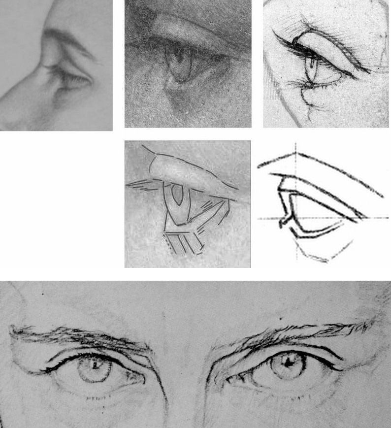
Above, Fig. 18. When Karl Parsons’ eye of Patricia is placed as above top left, we see distinct similarities of curvature and the same forward looking gaze with the eye drawn by Leonardo shown in the top right. Once again, in the company of Parsons and Leonardo, “La Bella’s” eye (top centre) is a glaring odd-one-out with its straight-edged, planar manner of drawing. That very manner was commonly inculcated among art students at the end of the 19th and beginning of the 20th century – as in the instructive published diagram seen above, centre right. Such an angular manner of drawing is nowhere to be found in Leonardo or his contemporaries, whereas, one can see distinct traces of that manner in the drawing of the male eyes above where features that would be drawn with curves by Leonardo are broken-down into short straight linked lines.
THE MARCHIGS
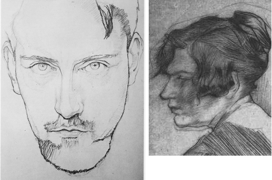
Above, Fig. 19: Left, a self-portrait drawn by Giannino Marchig in c. 1920 that was published in a journalist’s recent book on the “La Bella Principessa” drawing ( – see “Books on No-Hope Art Attributions”); right, an etching (mirrored) by Giannino Marchig of a lady, possibly his wife, Jeanne Marchig. Again, we see in the etching a draughtsman’s habitual favouring of angular, straight-edged and planar features. Additionally, we again encounter a profile portrait eye that is shown not convincingly set into the forms of the face.
As mentioned, the “La Bella Principessa” was sold anonymously at Christie’s, New York, in 1998. Twelve years later, Jeanne Marchig, the then widow of Giannino Marchig (who had worked as a restorer for Bernard Berenson and had restored a Leonardo painting), identified herself as the vendor in order to claim damages from Christie’s after sensational (but unfounded) reports that fingerprint evidence had proved the drawing to be by Leonardo and therefore to have been worth $100/150 million when sold in 1998.
However, and as we have reported, aside from the widow’s hearsay claims concerning the ownership of the drawing by the painter/restorer, the drawing possesses not a shred of recorded history in its supposed five centuries – and this is so despite prolonged searches made over the last nine years by specialist scholars and journalists. Giannino Marchig, initially a successful artist had hit hard times, became a restorer and an assistant to Bernard Berenson, had grown rich and acquired a collection of valuable historic works, but would not disclose – even to his wife – from whom, where or when he had acquired the drawing. Strenuous attempts by supporters of the Leonardo attribution to show that the drawing had been commissioned by the Duke of Milan for inclusion in a de luxe vellum book in 1496 have failed to find a single record of such a commission.
An early scholarly supporter of the drawing, Cristina Geddo, revealed that research made by penetrating imaging had disclosed that the back of this drawing (which cannot be seen by eye because the vellum sheet is glued onto an oak panel) carries “superimposed numbers…a written inscription…[and a] little winged dragon – at least that is what it seems.” No one has published those features; no one has offered a more detailed account of them or explained why they might have been present on what the drawing’s supporters claim (on no evidence) would have been a blank page in a luxury late 15th century commemorative book.
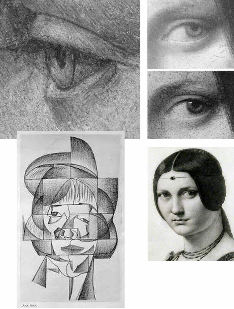
Above, Fig. 20: Top left, “La Bella Principessa’s” eye; top right, an eye from Leonardo’s painting La belle ferronnière, as seen, top, in an infra-red image that discloses the preparatory drawing for the curving, thin lower eyelid, and below it, the finished eye as painted by Leonardo. To a draughtsman, these eyes are as unlike as chalk and cheese and that of “La Bella Principessa” has nothing in common with any eye seen in Leonardo. It has greater affinities of style and means with the treatment of the eyes in the Juan Gris’ Cubist drawing, bottom left. Ingres’ pencil copy of La belle ferronnière shows how vividly dramatic and alive Leonardo’s eyes can be.
Scholars need not be draughtsmen but none would be harmed by practising drawing – and all would benefit by making copies of the works they address. An eye properly alert to stylistic traits is one capable of performing what we hold to be “forensic looking” (– see “Art forgers face new challenge from hi-tech authenticators”). Colnaghi has performed a service by unearthing Parsons’ Patricia. Unfashionable Arts and Crafts or no, Parsons merits attention, as his arresting portrayal of St. George at Fig. 21 below surely testifies?
Michael Daley, Director, 9 December 2019

Trouble at Yale University Press London
This week Yale University Press published Art History and Emergency, a book of essays assessing art history’s role and responsibilities in what has been described as today’s “humanities crisis”. It explores how artists, art historians and related professionals respond to pressures and demonstrate worth.
It considers how it might be possible to think deeply about art objects and images without losing the intellectual intensity of the best works being studied. (We are tempted to hold that a clear distinction should always be drawn between making and appraising art. Fuseli held it desirable to maintain such a division even within the production of art when he advised artists to conceive with fire but to execute with phlegm.)
The content and timing of Art History and Emergency must coincide embarrassingly for its publisher with the profound collapse of scholarly confidence triggered by a radical restructuring of Yale University Press’s own art historical programme. There is also irony in the fact that this particular examination of the “humanities crisis” is published in the “Clark Studies in the Visual Arts” series. ArtWatchers will be familiar with the Clark Institute’s own contribution to that crisis through mistreatment of paintings and breaches of its founder’s terms of bequest. (See “Taking Renoir, Sterling and Francine Clark to the Cleaners” and “From Veronese to Turner, Celebrating Restoration-Wrecked Pictures”.)
Art is perpetually vulnerable to wrong-headed, impetuous and destructive administrative impulses. Its traditions are slow to build but all too easy to dismantle – an architect in revolutionary France devised a way of destroying Gothic churches in an afternoon. When Sterling Clark’s widow died the Institute’s staff rushed to “restore” paintings against Clark’s explicit terms and despite the fact that he had carefully bought un-restored works in excellent condition. Paintings are not the only victims of administrators wishing to make their mark.
A LETTER OF MASS PROTEST BY SCHOLARS
On 8 July a letter signed by more than 290 scholars from 77 universities, and 30 museums and institutions in 9 countries, was sent to Peter Salovey, the President of Yale University; Susan Gibbons, the Librarian and Deputy Provost for libraries and scholarly communications, Yale University; and John Donatich, the Director of Yale University Press. The letter had been framed by two scholars, Professor Andrew Saint and Professor Jules Lubbock, in protest against what has been widely taken to be:
“[A] grave threat to the future of excellence in publishing books on art, architecture and design in Britain, the United States and around the world.”
This threat is seen to come from a “restructuring” of the Yale University Press (London)’s art books under the Managing Director, Heather McCallum, whose actions are supported by the (interlocking) directors and trustees.
Over the past forty years this university press is widely regarded as having built an unparalleled record for first-class, good-looking and scholarly books on the visual arts. This much-admired tradition was established by John Nicoll in the early 1970s and has continued under two outstanding editors, Gillian Malpass and Sally Salvesen, whose experience, scholarship and eye for design earned international acclaim, the gratitude of many eminent authors, and many awards.
Malpass and Salvesen are being sacked to make way for an editorial director (on whom, see below). This restructuring – for which no financial requirement or other necessity has been demonstrated – has caught the art world unawares. No one had been consulted in London – not even The Paul Mellon Centre in London whose generous financial support, together with that of The Yale Centre for British Art, lies behind much of this outstanding publishing. Although the top-down restructuring operation was hatched in secrecy and executed by fiat, its intended means and underlying rationale had peeped out two years ago.
A BAD IDEA IN THE MAKING
In the absence of consultation and transparent policy-making, institutional players put the spotlight on their own standing and tastes. At a conference in Berlin in 2014, Francis Bennett, the deputy chairman of Yale University Press, issued a “Positioning statement” that was both portentous and alarming. (It is to be found in full here.) Mr Bennett’s c.v. seemed to have run into the sand when, after a mixed career in publishing (“My first managing directorship [was] an unhappy time at WH Allen, but I learned to run a company”), he became an electronic publisher and set up a company, Book Data, that was sold in 2002.
Today, as deputy chairman of Yale University Press, Mr Bennet’s views and his declared “vision for the future of academic publishing (2020)” merit close examination. He prides himself on a commitment to professionalism and “a questioning of orthodoxies” when his own views betray prevalent patterns of banal management-speak and received wisdom. He fixates on “trends which will force change on university presses” when Yale University Press is anything but a run of the mill university press. He sees university education as “becoming a global trading commodity, aka the knowledge economy”.
In other generations such over-heating and simplistic techno-Futurist visions might well have been taken as disqualifications for a leading role in venerable and high-minded cultural institutions. Mr Bennett thrills that “Communication is instant” and that “Market expectations are immediate”, seemingly without awareness that current trends are never irreversible escalators to the future and that the chief distinguishing traits of markets are volatility and unpredictability. As for the supposedly irresistible force of techno-determinism, far from knocking out hard-copy books, e-book tablet sales have already levelled off. Television did not kill off cinema or radio. The world, for the imaginative and the enterprising, remains full of niches and opportunities, and books remain phenomenally attractive and enduringly user-friendly artefacts.
BRAVE NEW ACADEMIC WORLD AND THE DEMISE OF PEER REVIEW
Mr Bennett betrays a strikingly short term view of the future and confidently predicts that within four years we will occupy “A new academic publishing world” in which the printed book with a high price and a small market will have vanished. Peer review will also have gone on grounds of being too slow. To survive at all, university presses must now accept that their “traditional methods must change”. Under the Bennett Prescription, change means becoming “brands” that support the “extended reach of their owners”. One word is absent in Bennett’s programme. It is scholarship.
On the internal evidence of this particular positioning statement it might seem that the lacuna is the product of a personal aversion as much as a reflection of institutional policy. The deputy chairman of Yale University Press came from an academically distinguished family. His father was a Cambridge don. His mother was an author of biographies. An aunt was principal of St Hilda’s Oxford. One uncle was a don and then a civil servant; another was a don and then the Astronomer Royal. This Bennett confesses that he “couldn’t compete, so became a publisher.” Also absent is the term “charitable mission” which notion is central to Yale University purposes and is stated like this:
“Yale is committed to improving the world today and for future generations through outstanding research and scholarship, education, preservation, and practice. Yale educates aspiring leaders worldwide who serve all sectors of society. We carry out this mission through the free exchange of ideas in an ethical, interdependent, and diverse community of faculty, staff, students, and alumni.”
For Mr Bennett the future is pre-ordained and it’s anticipated imminent impositions are relished in business-speak:
“The academic publishing process must respond by creating a new model. The present system is too slow at experimenting and adopting new models – and will be left behind if it doesn’t change.”
Left behind what? The publishing world is various and serves many purposes well and simultaneously. What law says that academic publishing must travel in tandem with cut-throat commercial publishing where economies can be made through skilful mass-marketing? Why must great, richly-endowed and tax-favoured universities cease to give succour to scholars?
YALE UNIVERSITY’S MISSION
Yale University Press happens to have its own mission. Its purpose is to play a key role in the university’s core mission of “improving the world today and for future generations through outstanding research and scholarship, education, preservation, and practice” and, specifically, to do so by publishing “books and other materials that further scholarly investigation, advance interdisciplinary inquiry, stimulate public debate, educate both within and outside the classroom, and enhance cultural life.”
AN EGREGIOUS REPLY
How, then, did this month’s appeal from Professors Lubbock and Saint and their many scholarly associates go down when sent to Salovey, Gibbons and Donatich? The reply came only from John Donatich, who is both the Director of Yale University Press and the Chairman of the Board of Trustees, Yale University Press London, and Heather McCallum, the Managing Editor of Yale University Press London.
John Donatich’s appointment in 2003 was highly welcomed. He arrived as the departing publisher and vice president of Basic Books, having previously served at HarperCollins from 1992-1996 and before that from 1989-1992 as the director of national accounts for the Putnam Publishing Group. All was auspicious in that now long ago-seeming world. Anthony Kronman, the dean of Yale Law School and the chair of the search committee, said of him: “John has a scholar’s taste, an editor’s eye and bookseller’s experience and judgment,” and, “He possesses just the combination of qualities we sought when we began our search and he brings to the Press great vitality, high idealism and a profound love of books.” Mr Donatich responded graciously and fittingly:
“I am thrilled to be joining this prestigious press and invited to help shape its future. Yale University Press commands a unique and leading position among university presses. I can’t imagine a better place for scholars and intellectuals to publish books.”
Quite so – but today Donatich’s and McCallum’s (seemingly “lawyered”) joint reply to the anxious scholars insults their intelligence. It describes their anxieties as products of (a mass) confusion. It contends that, on the one hand, they have nothing to fear, and that on the other, they can do nothing to reverse the done deal. In a torrent of blather about seeking to help YUPL to “flourish and lead in the years ahead” by a reorganisation that “is by no means confined to the Art department [because] it is part of a company-wide initiative” the pair insist that the restructuring “was thoroughly researched and discussed at great length” and, besides, that “it has the full support of the YUPL Trustees, Yale University Press and Yale University leadership”. On the nature and purpose of the restructuring, we find echo of Bennett: “However, in the context of the ever-changing publishing arena, maintaining these standards requires a fundamental reappraisal of YUPL’s entire operation”.
Logic escapes the twin authors who insist that the restructuring has been discussed at great length while justifying their own secrecy about it and its consequences: “As we hope you will appreciate, a complex company-wide restructure of this magnitude is a confidential process and it would not be appropriate for us to enter into discussions about individual members of staff.” At the same time there is a brass-faced insistence that “We have fully apprised both the Yale Centre for British Art and the Paul Mellon Centre about the reorganisation of YUPL and have regularly informed them about the changes of personnel that have followed…”
The facts must speak for themselves. Two principal and outstanding editors at Yale University Press (London), Gillian Malpass and Sally Salvesen – who have established the very qualities at issue – are to be replaced by an Editorial Director for Art and Architecture, Mark Eastment, under whose direction “we will develop exciting and innovative books which lead agendas…” When asked last year what he most enjoyed about his job as director of publishing at the V&A, Mr Eastment replied “the challenge of balancing the financial expectations of the museum, by generating as much revenue as possible (all our end-year profits are given back to the museum) along with the academic wishes of curators.”
It would thus seem that proven and acclaimed excellence is being put at risk on an opaque, non-discussable promise of changes being made within some vaguely perceived “ever-changing” and economically-menacing publishing arena. On such an inadequate prospectus, scholars have very clear cause for alarm. To indicate the potential loss we now face under an apparently panicked and insecure Yale Administration, we cite an earlier demonstration that serious scholarship is a collective, slow-running cumulative process. (See Art’s Toxic Assets and a Crisis of Connoisseurship ~ Part II: Paper (sometimes photographic) Fakes and the Demise of the Educated Eye.)
HOW SCHOLARSHIP WORKS
In her magnificent 2005 Yale University Press monograph The Pollaiuolo Brothers – The Arts of Florence and Rome, Alison Wright describes a particularly vexing “market for copies, fakes and over-ambitious attributions” but gives gratitude for the fact that she need not re-invent a particular wheel by sifting it all afresh. Instead, she cites Professor Hellmut Wohl’s 1980 New York University monograph The Paintings of Domenico Veneziano – A Study in Florentine Art of the Early Renaissance in which he had, as Dr Wright acknowledges, “listed the myriad attributions under which surviving Florentine female profiles have passed…” Writing a full generation on, she gives specific thanks that “Wohl’s study absolves me from a repetition of this unrewarding task.” Prof. Wohl had taught art history at Yale University before his Professorship at Boston University and he had studied Domenico for three decades. Dr Wright is Reader in the History of Art at University College, London. Such books as theirs are bricks in civilisation’s walls. They should be cherished, not implicitly slighted – and other scholars should not be denied the opportunity to produce such books through a major university’s press.
The President of Yale University, Peter Salovey, may prove wise not to have attached his own name to so egregious and unsatisfactory a reply as that sent by two of his officers to an esteemed body of appropriately anxious scholars. Evidence is everywhere to be seen that Yale University Press have created a self-fulfilling prophesy without the crisis that might have triggered it.
Michael Daley ~ 28 July 2016