
Whiter than right

Robin Simon, editor of the British Art Journal and Honorary Professor of English at University College, London, has visited Chartres Cathedral and condemned its present restoration on a Facebook post and in a tweet:
“Just visited Chartres and I am appalled at the misguided ‘restoration’ that is covering the old stone walls in paint, with false pointing, creating a bland and uniform interior where the articulation of the architecture is crudely diminished. The history of the walls, of the building itself, is lost beneath a futile attempt to return the building to some imagined date in the distant past. What makes it much, much worse is the presence of bright electric lighting at crossing, choir and east end that destroys the effect of the greatest stained glass ever made, which used to cast the most wonderful haunting blue light throughout what was a uniquely ethereal interior. The magnificent chiefly 17th-century carved choir screen that wraps around the high altar end is also being whitewashed and the figures painted white, which is diminishing the three-dimensionality of these dramatic groups fully carved in the round. They now, remarkably, look flat, and have a smooth slimy surface with much of the miraculous crispness of the carving and detail lost.”
Robin Simon @robinsimonbaj:
“Just seen #Chartres #cathedral shocking #restoration. Walls painted, false pointing, glaring lights ruining blue light of glass, 17C carved choir screen flattened by white paint. State vandalism, arrogant architects, wrong-headed’experts’. Sign the petition https://bit.ly/2AmSRmN”
10:15 AM – 22 Oct 2018
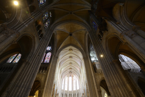
Above, Fig. 1: Chartres Cathedral, with repainted vaulting in the choir contrasting with the existing nave and transepts in the foreground, Chartres, France, as published on July 11, 2012 in the New York Review (Photo: Hubert Fanthomme/Paris Match via Getty Images)
We have repeatedly attacked this restoration and on 16 December 2014 (“Chartres Cathedral Make-Work Scheme”) reported that this restoration had first been challenged in May 2012 by Alasdair Palmer in the Spectator – see his “Restoration tragedy” which began:
“Should old buildings look old? Or should they be restored to a condition where they look as if they could have been put up yesterday? Those questions are raised in a particularly pertinent form by the work going on at one of the most beautiful and inspiring of all old buildings: Chartres cathedral in France.
“Most of Chartres cathedral dates from between 1194 and 1230, when the bulk of the colossal stone structure, with its nearly 200 stained-glass windows and thousands of sculptures, was built. The extraordinary speed of its construction means that Chartres has an architectural and decorative unity that is unique among surviving cathedrals, most of which took a hundred years or more to complete, and were then altered drastically over the succeeding centuries.
“Chartres has suffered from the inevitable indignities inflicted by time. The paint with which the medieval artists originally covered the statues and the walls faded and flaked off within a few generations. Centuries of burning wax candles covered the interior with a thick layer of black soot. But Chartres remains far closer to the original building than almost any other medieval cathedral. The biggest effect of the intervening centuries since 1230 has been the accretion of the patina of age. A sense of the passing of time is part of the experience of looking at Chartres. The stone, the glass, the sculpture — it all looks very old, and its age is part of its fascination and its mystery.
“Or at least, it is in those parts of Chartres cathedral that have not yet been cleaned by the latest restoration project. It isn’t in those parts where the restorers have finished their work, for they look brand-new. There’s no patina of age here: there are only clean and bright surfaces.
“Is that an improvement? The restorers insist that it is…”
On 14 December 2014 Martin Filler, an architectural historian of Columbia University, New York, protested against the aims and consequences of such restorations in the New York Review (“A Scandalous Makeover at Chartres”):
“In 2009, amid a rising wave of other refurbishments of medieval buildings, the French Ministry of Culture’s Monuments Historiques division embarked on a drastic, $18.5 million overhaul of the eight-hundred-year-old cathedral. Though little is specifically known about the church’s original appearance—despite small traces of pigment at many points throughout the interior stonework—the project’s leaders, apparently with the full support of the French state, have set out to do no less than repaint the entire interior in bright whites and garish colors that are intended to return the sanctuary to its medieval state. This sweeping program to ‘reclaim’ Chartres from its allegedly anachronistic gloom is supposed to be completed in 2017.
“The belief that a heavy-duty reworking can allow us see the cathedral as its makers did is not only magical thinking but also a foolhardy concept that makes authentic artifacts look fake. To cite only one obvious solecism, the artificial lighting inside the present-day cathedral—which no one has suggested removing—already makes the interiors far brighter than they were during the Middle Ages, and thus we can be sure that the painted walls look nothing like they would have before the advent of electricity.”
Although the Chartres interior had initially been painted Filler noted that:
“…the exact chemical components of the medieval pigments remain unknown. The original paint is thought to have flaked off within a few generations and not been replaced, so for most of the building’s eight-century history it has not been experienced with painted surfaces. The emerging color scheme now allows a direct, and deeply disheartening, before-and-after comparison.”
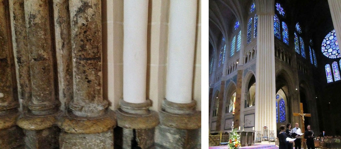
Above, Fig. 2: left, Chartres cathedral stone work in its pre- and post-restoration conditions; right, the view looking SE in Chartres cathedral showing painted and unpainted areas adjacent to each other.
THWARTING A THREAT TO CHARTRES CATHEDRAL’S STAINED GLASS WINDOWS
As well as making a historically falsifying transformation of the interior, the funding of the restoration was itself exposing the ancient stained glass windows to needless risks. On 18 February 2016, Florence Hallett (“Chartres’ Flying Windows”) protested against plans to fly part of the cathedral’s stained glass to the United States as a fund-raising quid pro quo for support given by the American Friends of Chartres:
“While the cost of the controversial repainting of the cathedral’s interior has been met by the French state and donors including Crédit Agricole, Caisse Val de France et Fondation, and MMA assurances, the restoration of the cathedral’s famous glass has been funded in part by the American Friends of Chartres (AFC), an organisation that works ‘to raise awareness in the United States of Chartres Cathedral and its unique history, sculpture, stained glass, and architecture and their conservation needs.’
“Based in Washington, the AFC has ambitious plans to fund the restoration of the cathedral’s windows and sculptures. In 2013 it announced on its own site, and via the crowd-funding website razoo.com, that in return for funding the restoration of the Bakers’ Window (two lancets and a rose in the nave), the 13th-century glass would travel to a US museum. Indeed, the still extant webpage makes explicit the nature of the exchange, proclaiming: ‘American Friends of Chartres INVITES YOU to Restore and Bring to the United States a 13th-Century Stained Glass Window for Museum Exhibit’.”
Hallett’s specific challenge to the American Friends on the foolhardy plan to fly ancient stained glass windows to the United States seemed to have proved a successful deterrent. As we reported in a footnote:
“STOP PRESS: At 17.33 today, in answer to an email of 14 February, Florence Hallett was notified by the American Friends of Chartres that:
‘The exhibit of Bay 140 which had been envisaged will not take place because of cost reasons. And, to answer your question, of course all the proper authorizations from the French Ministry of Culture and other authorities had been secured by the DRAC-Centre Val de Loire, which had been nominated by the Ministry of Culture to execute the project. All the arrangements for the exhibit of Bay 140 would have been contractually arranged between the DRAC on behalf of the French authorities and the cultural institution that would have exhibited the window. American Friends of Chartres would not have been part of these contractual arrangements.’ ”
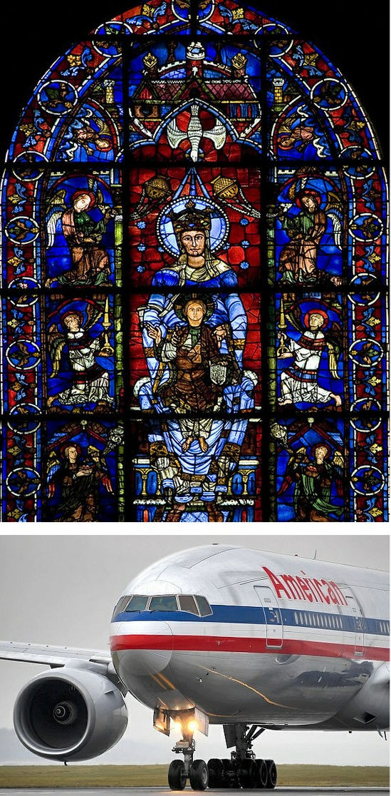
Above, Fig. 3: Top, a section of the Belle Verrière windows at Chartres. Above, a potential means of transport for early 13th century glass
If you owned or were the guardian of such ancient precious glass painting, would you pack it onto an aeroplane and dispatch it across an ocean to another continent? If “yes” you would be able to claim precedents: the ecclesiastical authorities at Canterbury cathedral sent the entire surviving six parts of an original cycle of eighty-six ancestors of Christ, once one of the most comprehensive stained-glass cycles known in art history, on a museum tour around the United States. (See “How the Metropolitan Museum of Art gets hold of the world’s most precious and vulnerable treasures”. )
Florence Hallett is the architecture and monuments correspondent at ArtWatch UK and visual arts editor at theartsdesk.com
Robin Simon gave the ninth annual ArtWatch International James Beck Memorial Lecture – “Never trust the teller trust the tale” – on 7 November 2017 at the Society of Antiquaries of London, in Burlington House, Piccadilly, London.
Alasdair Palmer has written frequently on art restoration for the Spectator and the Sunday Telegraph – see “Restoration tragedies” 26 August 2012.
Martin Filler is a prominent American architecture critic and a fellow of the American Academy of Arts and Sciences.
WHO PROFITS?
The various strongly made cases against the Chartres Cathedral restoration project, rest in essence on the folly of attempting to replicate a speculative incompletely-informed notion of how an interior might have appeared many centuries ago when brand new. At Chartres this particular exercise is not only wrong-headed, it is, as Alasdair Palmer pointed out five and a half years ago, especially egregious: this attempted replication of an original state is inflicting a peculiarly brutal and unforgivable expunging of an ancient building’s historically lived evolving appearance. “Brutal”, because having been uniquely executed as a distinct artistically integrated whole this cathedral’s precious fabric had thereafter survived in uniquely unmolested form. Here was a building whose monumental lucidity might be considered a match for the timeless Parthenon. Here was a building which, unlike the Parthenon today, had not become a cadaver on a test bed for aggressively invasive conservation methods; which retained its forms and, even, an especial ancient illumination – one that, as Robin Simon attests, had once “cast the most wonderful haunting blue light throughout what was a uniquely ethereal interior”. Gone. And all in exchange for an $18million building contract that is already running over schedule and will, no doubt, end over budget.
When faced with incomprehensibly barbaric mistreatments of old art and monuments we must ask not only “why?” but “who profits?” The last is no slur. It is a necessary step towards explanations for otherwise inexplicably perverse cultural actions. It is indisputably the case that such high-prestige art and architecture restorations generate much employment, purchases of materials, scaffolding etc. – and that they can greatly enhance professional reputations. None of those consequences is necessarily wrong or bad in itself but due acknowledgement of them should constitute a component part of any calculus of appraisal of restorations or proposed restoration campaigns. It is concerning that in today’s rapidly accelerating restoration boom, material/professional interests are looming ever-larger as it proves increasingly easy to raise funds for large-scale building projects made on the back of the culturally-loaded, ethically coercive, names of “conservation” and “restoration”.
We have shown that it is European Union policy to increase activity in the arts sphere as a means of generating jobs in compensation for those being lost to less moribund economies: “I am especially happy to highlight the importance of culture to the European Union’s objective of smart, sustainable and inclusive growth. At a time when many of our industries are facing difficulties, the cultural and creative industries have experienced unprecedented growth and offer the prospect of sustainable, future-oriented and fulfilling jobs.” See “Why is the European Commission instructing museums to incur more risks by lending more art?” and “The European Commission’s way of moving works of art around”.)
We know that the Chartres project has been part funded by the French Government. In this climate, greatly more vigilance and disclosure are now urgently required. No such project should ever be sprung on the world again. Monumentally dramatic proposals should be examined widely publicly and well in advance of the scaffolders moving in.
ASSORTED CONSERVATION RATIONALES
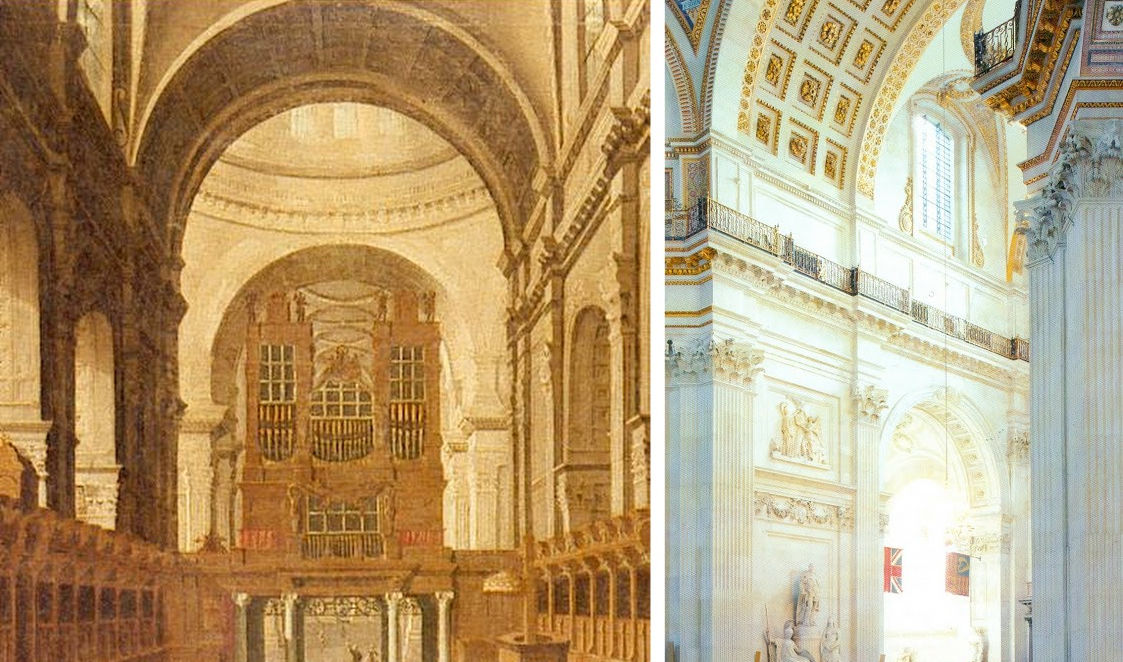
Above, Fig. 4: Left, the original interior of St Paul’s Cathedral as recorded in an undated but apparently 18th century painting that is owned by The Worshipful Company of Goldsmiths, at which date Sir Christopher Wren’s original painted finish comprised of three coats of warmly tinted oil paint that had been stipulated, according to Wren’s son, “not just for beautifying, but to preserve and harden the stone” still survived.
It was only disclosed during the recent under-researched stripping of the interior of St. Paul’s that Wren’s oil painted surface had contained lead white, ochre and black pigments so as to produce precisely the warm “stone colour” found in other Wren churches. Above, right, we see the new dazzling white surfaces of the building’s interior and its sculptures when illuminated by one of new electric chandeliers installed during the restoration because, as Martin Stancliffe, the cathedral’s then 17th Surveyor to the Fabric, put it, “the heart of my vision for the interior [was] to clean it and relight it”.
It is striking not only how frequently programmes have proceeded on artistically/art-historically injurious premises, but also how very contrary the aims of those various programmes can be. Where at Chartres cathedral attempt is being made to replicate a far-distant hypothesized original decorative scheme, at St Paul’s Cathedral, London, as Florence Hallett established, a major project to transform an interior was made on a reverse (and equally perverse) artistic/historical agenda. At St Paul’s, with a much more modern documented and visually recorded building, a programme was implemented to expunge the last traces of the original architect’s initial (and easily replicable) decorative programme with aesthetically falsifying – and, in the event, health-threatening – consequences even though the originally applied tinted oil paint was a known quantity, having survived intact in protected places.
In London too, much money was quickly raised but here it was spent stripping an interior down (with chemically-invasive materials never before used inside an occupied, still functioning cathedral) to create an a-historical modernist whiteness rather than to retain surviving traces or fully replicate the known original historic surface decoration. In consequence, not only has a powdery surface of stripped-down raw stone been exposed, but an already misleading appearance was subjected to the very greatly amplified artificial lighting that is shown above and was first established by Florence Hallett’s investigations: “Cleaning St. Paul’s Cathedral”, ArtWatch UK Journal 17, Winter, 2002; and “The supposedly ‘model’ restoration of St. Paul’s Cathedral”, ArtWatch UK Journal 18, Spring/summer 2003. Online, see Michael Daley: “Brighter than Right, Part 1: A Modernist Makeover at St Paul’s Cathedral” (1 June 2011) and “Brighter than Right, Part 2: Technical Problems of Protection, Health and Safety at St Paul’s Cathedral” (5 July 2011).
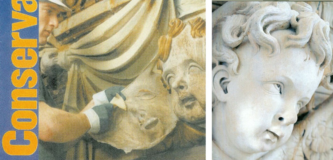
Above, Fig. 5: Left, a conservator removing a latex “cleansing pack” from a carved head at St Paul’s Cathedral, as published on the cover of Conservation News in May 2002. The journal reported that the latex was left on the surface for “one to four days” and that after its removal the stone was cleaned with “damp sponges and bristle brushes”. Right, a carved head at St Paul’s after being cleaned with water and bristle brushes. (Photography by Peter Smith/Jarrold Publishing.)
The chemical stripping-down of the cathedral’s interior surfaces to a novel whiteness was in accordance with an idée fixe of the 17th Surveyor to the Fabric, not of Sir Christopher Wren. In a 2005 programme note to a service held in honour of the restoration’s donors (“How the glory of St Paul’s was restored”), Mr Stancliffe declared that “the heart of my vision for the interior [was] to clean it and relight it”. In the Times of 10 June 2004 he announced his “pretty controversial” intention to introduce “six huge chandeliers” to flood the interior with artificial light. A year later he told the Guardian “we have installed new chandeliers and more lights” and expressed specific satisfaction on “seeing our initial vision gloriously realised.”


Above, Figs. 6 and 7: Top, the blotchy appearance of the stripped-down stone surfaces. Above, a simple, quick demonstration of the present dangerously powdery surfaces.
The brightness of this “restoration” was achieved at great aesthetic and material cost. As shown above, the surfaces have been left without patina and remain disfiguringly blotchy even after cosmetic attempts to mitigate the grosser consequences of the standardised indiscriminate cleaning method (see below). As for the supposed “conservation” purposes of this multi-million pounds programme, the interior’s now powdery surfaces are more vulnerable to environmental pollution and fluctuations of temperature and humidity than at any time in the building’s history. That the originally oil-paint protected surface of this limestone has been left as powdery as chalk was easily demonstrated by brushing the above sleeve against it.
CHECKS? BALANCES? TOOTHLESS WATCHDOGS?
Approval for the use of an experimental cleaning method on the interior of a publicly occupied and in-service cathedral had been given by The Cathedrals Fabric Commission for England in November 1999 following (claimed) earlier approvals by a bevy of heritage watchdogs: English Heritage; SPAB (The Society for the Protection of Ancient Buildings); The Victorian Society; and The Georgian Group. It is not possible to establish the precise chemical basis on which formal approval was given by the Cathedrals Fabric Commission for England because, in breach of good conservation practices, the three technical parts of the eight part submission document were withheld on grounds of commercial confidentiality. For information on technical matters we had to rely on the cathedral’s own fluctuating (and often self-contradicting) accounts; on our correspondence with the 17th Surveyor to the Fabric, which he terminated in March 2003; and on documents obtained by cathedral employees whose health was adversely affected by the restoration.
The cleaning agent used on St Paul’s interior was an experimental, technically undisclosed, adaptation of a commercial product. In both its composition and effects, it earned censure from leading conservation experts (see below). It was a commercially available, latex rubber poultice laced with a mix of chemicals that were said to comprise an agent specifically tailored to be similar to the mild alkalinity of St. Paul’s Portland stone – that is, it was a special version of the “Arte Mundit” water-based paste manufactured by the Belgian company FTB Restoration. The instigator/director of the restoration, the architect and the 17th Surveyor to the Fabric at St Paul’s Cathedral, admitted (at a lecture on October 21st 2003) to having slim knowledge of matters chemical and of having devolved – “entrusted” – responsibility for the application of the new paste to the conservators of the firm Nimbus who themselves were learning on the job while the cathedral remained in full commercial and ecclesiastical use.
Professor Richard Wolbers, conservation scientist and solvents expert at the Winterthur Museum and Gardens, University of Delaware Art Conservation Department, was highly critical of a number of technical features of the programme and reiterated his fear that the authors “seem to have taken a poorly characterised material, a latex paste, and modified it with the addition of a considerable amount of EDTA – largely as an adaption in their minds, I suppose, of one of the main ingredients in the Mora’s AB57 cleaning system.”
(The Mora AB57 method was the notorious cocktail of EDTA, sodium and ammonium, detergent and other ingredients in a paste that was twice applied and twice washed off Michelangelo’s Sistine Chapel ceiling paintings. We have chronicled the artistically disastrous consequence of stripping all organic material from the ceiling plaster. Within a generation the newly-exposed bare plaster had been secretly re-restored to remove powdering of the plaster, and then, in part-compensation, it was massively relit with coloured LED lights – see “The Sistine Chapel Restorations: Part I ~ Setting the Scene, Packing Them In” and “The Twilight of a God: Virtual Reality in the Vatican”.)
John Larson, the then Head of Sculpture and Inorganic Conservation at the Conservation Centre, National Museums and Galleries on Merseyside, said that applications of moulding materials had contributed so much damage over the past 200 years that museums around the world “have now banned” their use, and that the application of liquid latex by brush or spray “has a dramatic effect on porous material such as stone…as it dries latex shrinks and clings tenaciously to the surface.” The effect of pulling it off the stone “exerts strong mechanical forces on the surfaces when the stone is carved and deeply undercut, as shown on the cover of Conservation News.” (See Figs. 5, 6 and 7 above.)
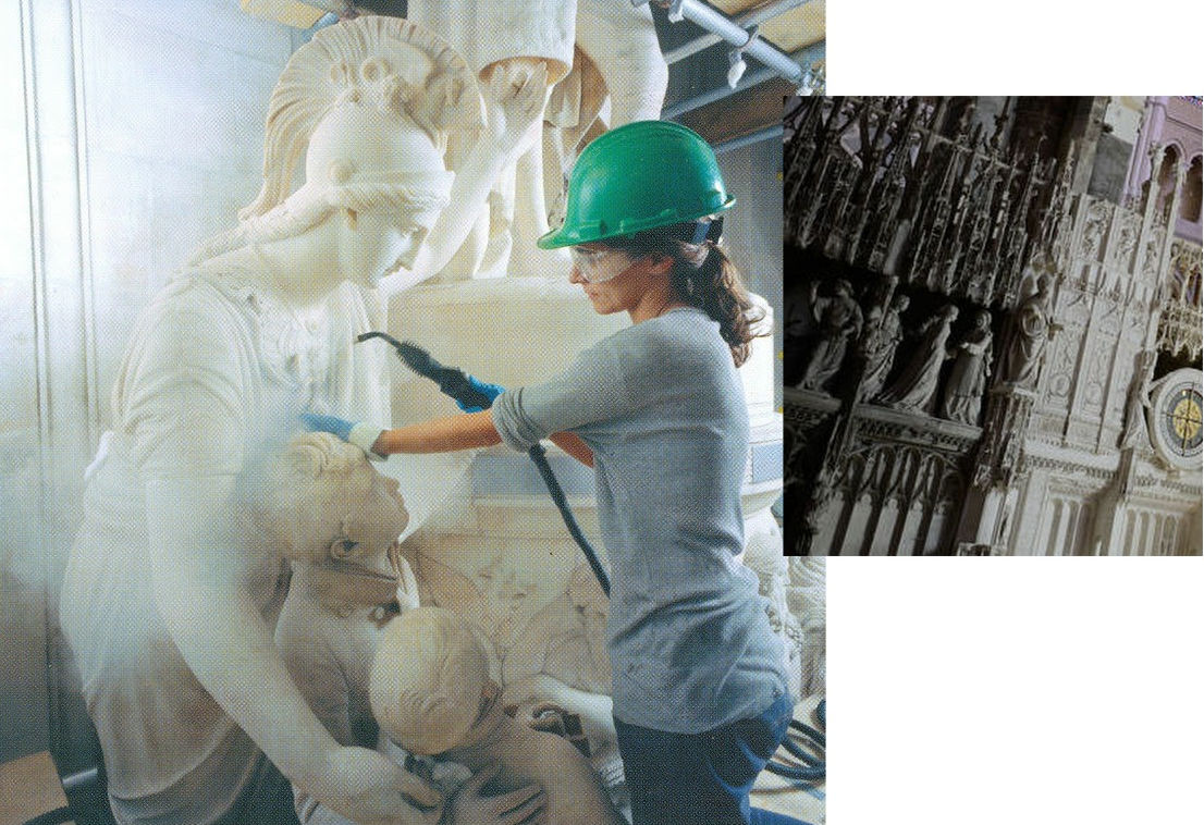
Above, Fig. 8: Left, sculptures at St. Paul’s being cleaned by steam jets; right, a detail showing the sculptures in the ambulatory of Chartres Cathedral on 11 July 2012. (Photograph by courtesy of Hubert Fanthomme/Getty Images.)
All horrible restorations are horrible in their own ways. Steam cleaning sculpture is considered an acceptable “conservation technique” even though it is visually deadening and leaves marble surfaces resembling white granular sugar and greatly more exposed to environmental pollution and fluctuations of humidity and temperature. We have witnessed conservators at the Metropolitan Museum of Art, New York, painting dead white steam-cleaned Greek marble carvings with water colours. One, when asked what he was doing, replied that he was “putting back the patina” destroyed by the cleaning. That, presumably, is why the Greek sculptures at the MET now sport a uniformly tasteful biscuit-coloured “patina” regardless of their age and geographical origins. As seen above, at St Paul’s Cathedral the all-white, sans-patina effect found favour and sculptures were left as raw-white as the building itself. At Chartres, however, the new visually deadening whiteness of the sculptures is the product of yet another method and philosophy. The sculptures are not being stripped down to the innate interior whiteness of the stone but are having a white skin of paint superimposed – before also being further brightened by artificial lights. The aesthetic, psychological and spiritual consequences of this practice at Chartres can be seen above right where just a few years ago the not-yet “restored” figures in the ambulatory still shared our common spaces. There, among us, touchable and as if alive, they had for centuries acted their roles in a drama greater than Shakespeare’s – one that, millennia ago, had been played for real on earth and, for believers, at God’s will for our benefit. Their once miraculously constructed living tableaus and endlessly changing chiaroscuro are now, as Robin Simon has so poignantly described, flattened and left with “a smooth slimy surface with much of the miraculous crispness of the carving and detail lost.”
Even now, it is not too late to save an unmolested portion of this cathedral for future generations who would otherwise never be aware of the loss and adulteration: a petition – and an invitation to comment – beckons at a touch.
Michael Daley, 30 April 2018
CODA:
Today, 30 April 2018, Electronics Weekly reports that the lighting firm Osram has announced it has won a contract to light St. Peter’s in Rome: “‘We won worldwide recognition for the LED lighting system we installed in the Sistine Chapel’, said Osram Licht CEO Olaf Berlien. ‘We are very excited about this new opportunity to demonstrate our skills as a provider of complex, large-scale lighting solutions by conducting the lighting project in St. Peter’s.’” The report does not say how much Osram will be paid to light St. Peter’s (and, thereby, showcase its own products) but it does give further information on the lighting installed in the Sistine Chapel “The aim was to light the paintings so they appear to be lit by sunlight…Researchers went so far as to incorporate the current thinking of historians – that Michelangelo mixed paints in daylight rather than under candlelight or the light of torches, and therefore needed a cooler over-all colour temperature to get the best view of them today”. Michelangelo, of course, painted in the light of the chapel and for the chapel’s then sources of lighting. Indeed, when the ceiling was stripped down with the Moras’ AB57 chemical cocktail, art historian apologists for the garish colours that emerged contended that Michelangelo had had to make his colours so intense in order for his painting to read through the gloom of the chapel. As Professor Kathleen Weil-Garris Brandt of New York University and a Vatican spokesman for the restoration, put it in Apollo in December 1987: “Michelangelo…painted the ceiling in the knowledge that his forms would have to carry in the daylight or in the golden glow of candles and oil lamps. That’s one reason why his [restored] colours are so bright. Now that they are being revealed, the anachronistic spotlights only distort the appearance of the frescoes. In fact, the strong artificial lighting of cleaned areas of the Ceiling originally contributed to the false impression which disturbed critics of the conservation project.” In other words, now that the original colours of Michelangelo had been recovered, the chapel’s strong artificial lighting was surplus to aesthetic requirements. Why, then, was Osram recently invited to create a system of lighting for those (controversially) restoration-intensified colours that mimics the power of direct sunlight? For St Peter’s, Osram have a different agenda: “the lighting will be adjustable to suit different occasions, and will ‘accentuate the properties of the materials used and the building itself, highlighting the plasticity of the structure, its marbles and its architecture.'”
The Samson and Delilah ink sketch – cutting Rubens to the quick

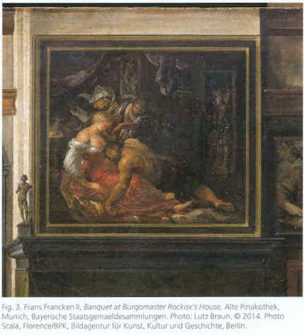
Today, in a sale of old master drawings (and on an estimate of £1.5m -£2.5m), Christie’s is offering large claims for the artistic and historical significance of a small (roughly 16cms square and shown here at Fig. 1) pen and brown ink drawing:
“This is the only known preparatory drawing for Rubens’s Samson and Delilah in the National Gallery, London (inv. NG 6461), and it was followed by a modello oil sketch now in the Cincinnati Art Museum (inv. 1972.459). Commissioned by Nicolaas Rockox (1560-1640), who was Rubens’s most important early patron, this powerful composition dates from shortly after the artist’s return to Antwerp from Italy, where he had been from 1600 until 1608, and provides a valuable insight into his developing style and preparatory processes.”
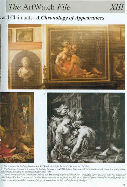
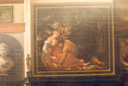
This account is conventional but, nonetheless, contentious. No hint is given that the relationships between these three linked works are highly problematic or that all three have suffered cuts or thinning. The authorship of this group has been contested for over two decades. On February 19 2004 the Daily Telegraph published a letter from ArtWatch on the painting’s problems (“Is the National Gallery’s Samson and Delilah another copy?) We have published two special issues of the Artwatch UK Journal mounting challenges (Figs. 2 and 3) and have written a number of articles on the subject for the Art Review. The principal challenges to the attribution came from two artist/scholars, initially, Euphrosyne Doxiadis, whose findings (made with fellow artist Steven Harvey and Siân Hopkinson) were compiled in a report (see this website) that was submitted to the National Gallery in 1992 and later covered in the Times and the Independent. In 1997 researches by Kasia Pisarek, prompted two articles by the Sunday Times’ art critic, Waldemar Januszczak (“A Rubens or a costly copy?” and “National’s £40m Rubens could be fake”). In the latter article, the then director of the National Gallery, Neil MacGregor, conceded that the evidence “is respectable, and the scholar raises some serious questions that I cannot easily answer”. Those questions have never been answered. In October 1997 the National Gallery issued a press release in which it was said that:
“Debates of this sort require patient consideration of different sorts of evidence. The best format is for this evidence to be presented at some length for public discussion – and the National Gallery will be arranging such a lecture and debate over the next few months.”
A debate that has yet to take place
Within a few days the commitment was dropped when the press release was re-issued and the debate never took place. To this day there remains an enormous accumulation of problems with the National Gallery’s “Rubens” Samson and Delilah and, therefore, with its two closely associated works – the ink drawing and the oil sketch. All three works, which are dated to 1609-10, have unusual and anomalous features – and all appeared only in the 20th century. The modello arrived last without name or history in 1966 and was upgraded by Christie’s to Rubens even though it is painted on a soft wood and not the oak which Rubens invariably used.
Ludwig Burchard’s cunning plan?
Behind the successful 20th century elevation of this trio, is the fact that both the drawing and the large finished painting in the National Gallery were attributed to Rubens barely two years apart by the same man, Ludwig Burchard. Burchard was a great authority on Rubens who, notoriously, was unable to publish his life-long Great Work on the Artist for fear of having to de-attribute very many paintings for which he had supplied unwarranted certificates of authenticity. In the ArtWatch UK Journal No. 21(Spring 2006) Kasia Pisarek, whose PhD Dissertation was on Rubens and Connoisseurship, identified over sixty Burchard Rubens attributions that had subsequently been demoted in the Corpus Rubenianum itself.
Dr Pisarek felt that the year of launch for the picture now in the National Gallery might be signicant. As she put it:
“That year 1929 was not free of strange coincidences. By a bizarre stroke of luck, the painting re-emerged 48 years after its disposal by the Prince of Liechtenstein in Paris in 1881 (not 1880, as is commonly said), the exact same year as the deaths of the Prince Johannes II, the previous owner of the painting, and of his picture adviser Wilhelm von Bode, the then General Director of the Berlin Museums. The former died in February 1929, the latter a month later, in March. Moreover, we know that the Prince himself had weeded out a considerable number of pictures, Samson and Delilah included. He also financed many research projects, and the collection was accessible to scholars. The art historian Wilhelm von Bode published (in 1896) the first comprehensive and illustrated book on the Liechtenstein collection, so he could have been aware of the Samson and Delilah’s disposal. Why didn’t he identify the picture as the long lost Rubens if he was also a Rubens expert and had even co-signed certificates of authenticity with Ludwig Burchard?
In 1927 the drawing was bought from a private collector by a scholar of drawings and prints, I.Q. van Regteren Altena, for 26 guilders as a Van Dyck (whose initials it still bears). It was promptly upgraded to Rubens by Burchard, who then cited it as such in his 1930 certificate of authenticity for the Honthorst on offer by a Berlin dealer that is now in the National Gallery as an entirely autograph Rubens.
A precursor or a successor – or both?
It is claimed that Rubens’ characteristic stylistic development through stages of work is evident in the three works’ sequence, when the essential motif remains remarkably constant throughout. In fact, the modello (see Figs. 5 and 7) is so like the finished work that one supporter of the attribution, the former senior curator of the National Gallery, David Jaffe, has suggested that this oil sketch might be a ricordo – a record of the finished painting[!] However, if the presently accepted 1, 2 and 3 sequence of drawing, oil sketch, finished painting were to become 1, 3 and 2, it would make nonsense of the National Gallery’s technical reports which stated that the finished picture’s uncharacteristic thin, swift and little-revised paint work – paint work which today remains preternaturally fresh and unblemished (see Figs. 10 and 11) – was a product of the fact that Rubens had made such an unusually complete and resolved oil sketch that he had been able to paint the larger panel (which, the gallery claims, itself resembles a large sketch) out of his head and at a stroke and without any need for his customary revisions. Then again, the ricordo suggestion constitutes, perhaps, a kind of insurance policy, a way of covering against the possible outcomes of an eventual debate and presentation of evidence? If so, the sequence 1, 2, 3 and 2 again, would make a kind of institutional sense? This might indeed constitute a veritable “belt and braces” insurance: given that the gallery has admitted that its large finished panel is so very swift and sure-footed in its execution (or uncharacteristically sloppy and out-of-character to its critics), that it is itself but an over-blown sketch, the formulation 1, 2/4, 3/2 and 2 might serve perfectly to cover all eventualities.
The evidence of our eyes
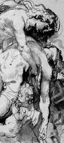
The Samson and Delilah ink sketch, as a drawing, lacks the customary force, focus and eloquence of design seen in Rubens’ initial compositional ideas (- see Figs. 8b, 9a and 16). This supposed preliminary study has a curiously finished, pictorial air. Iconographically it has a pronounced “portmanteau” quality, showing, for example, Delilah’s draped right leg as seen in the secure Rubens oil sketch of 1609-10, The Taking of Samson in Chicago, while her draped left leg is as seen in the insecure National Gallery picture. Most disturbingly (to this draughtsman, at least) is that fact that when looking at the drawing in the flesh it is impossible to read an order or purpose to which its many and various components might have been made or to locate the essential, determining compositional and figural point at which Rubens always and brilliantly drove (see Figs. 8b and 16).
A ruled ink border surrounds and compositionally confines the ink and wash drawing (Fig. 1). When seen in reproduction, this border gives an impression that Rubens designed a format from the outset precisely in order to achieve an effect that is the single most problematic feature of the finished painting – the fact that the toes on Samson’s right foot were cropped at the edge of the painting. The border, like the drawing, is drawn in brown ink but clearly, as Christie’s describes, it can be seen by eye to comprise later framing lines. However, while this usage is seen to be common in the collection where the drawing has lived since 1927 – and while the border lines themselves can be seen to pass over a number of tiny losses on the edges of the sheet – the particular placement of the border is disquieting because the sheet on which the drawing was made has been trimmed at either the outside edges of the border or even within the border lines themselves. Why and when was this done? While some of the ink lines of the drawing can be seen by eye to run into the ruled borders, we cannot calculate where they might have terminated because of the severity of the sheet’s cropping. For whatever reason, this is now an artificially constrained and possibly edited image.
Flouting historical evidence
While the toes on Samson’s right foot are cropped at the edge of the National Gallery painting (Fig. 12), both of the contemporary copies that were made of the original Rubens painting show the foot, as painted by Rubens, to have been both whole and set well within the right-hand edge of the painting (see Figs. 4, 5 and 6). It is hard to see on what grounds this testimony might be disregarded: the first copy, an engraving (see Fig. 14), was made in c 1613 and very possibly under Rubens’ instruction. The second was a painting in oil commissioned by Rockox to show off his collection of paintings in the grand salon of his home (see Figs. 6 and 13). Is it conceivable that he – and Rubens, who was still alive – would have permitted a man famous for the accuracy of his records, to make a gratuitous, out-of-character “improvement” to the Rubens painting that occupied pride of place above the mantelpiece? Because of the inked box and the trimmed sheet it is not possible to determine whether the drawing’s author might originally have drawn the foot whole.
The panel support of the modello, as reproduced in the catalogue (see Fig. 7), is seen to have been cropped on its vertical edges since being sold to the Cincinnati Art Museum by the removal of two strips of wood, thereby conferring a clear crop onto Samson’s foot and bringing it into accord with the foot seen in both the National Gallery picture and the ink drawing. At one point the Cincinnati Museum claimed that the oil sketch’s panel was made of oak. When the picture was loaned to the National Gallery we asked if the panel was oak or softwood. It was not possible to say, we were told, because the back of the frame was enclosed and the gallery was not permitted to remove it. The museum today ducks the issue by saying that its painting is “on panel”.
The National Gallery’s picture was doctored at some undisclosed point by planing rather than cutting. The gallery restored the picture after purchasing it and reported that the panel had been planed down to a thickness of 2-3mm and set into a sheet of block-board. We knew for technical reasons that that was most unlikely: block-board is held together by its outer veneer layers and cutting one of them away would have had catastrophic structural consequences. When pressed, the gallery acknowledged that the planed-down panel had in fact been glued onto, and not set into, a larger sheet of block-board, with its edges being concealed by a bevelled putty. The restorer, David Bomford (now of the Museum of Fine Arts, Houston), said in his report, that the planing had taken place at some point in the early twentieth, or possibly during the late 19th century. That, too struck us as improbable: could there be no record of the back of a panel bought for a world record price (£2.5m) for a Rubens? Had the gallery not made a record of condition when the picture was loaned to it before the sale at Christie’s? We asked Neil MacGregor, if the gallery had any record of the back – and he said not. We asked if we might see picture’s conservation dossiers and there found Burchard’s 1930 certificate of authenticity, which described the panel as being intact and in excellent health.
At Christie’s we asked, and were kindly permitted, to examine the back of the drawing which is said to bear other drawings. A little (unintelligible) drawing is present but most of the surface bears the remains of a second sheet of paper to which the ink sketch had once been pasted. Effectively, the drawing’s verso is invisible – just as is the back of the National Gallery’s picture, any evidence on which has ceased to exist.
As for the contention – made against the evidence of the contemporary copies – that Rubens deliberately cropped Samson’s toes at every stage of the work, we know that he was very attentive to his toes. When drawing one of Michelangelo’s ignudi in the Sistine Chapel, he ran out of room on the paper for the toes on one of the feet and then drew them separately elsewhere on the sheet. On his return from Italy, and virtually simultaneously with working on the Samson and Delilah, Rubens made the magnificent Michelangelesque study of a nude man kneeling shown at Fig. 17. On that sheet, the right foot was truncated by the edge of the paper and, again, Rubens redrew the whole lower leg so as to include the foot and toes.
What kind of artist was Rubens?
The National Gallery has admitted that its painting is not typical of Rubens’s oeuvre, which fact it attempts to explain by claiming that immediately after his return to Antwerp from a long stay in Italy, Rubens was working “experimentally”. Unfortunately, it so happens that at the date of the Samson and Delilah’s execution, Rubens was also working on the very large altarpiece The Raising of the Cross (see Fig. 10). No one has ever suggested that that great work occupied a position in some experimental mode. To the bizarre and unsupported suggestion that Rubens, on his return from Italy, simultaneously worked experimentally and not-experimentally within the same brief period, Christie’s lend support with a contention that:
“The exact date of Samson and Delilah is unclear, partly because Rubens experimented with two very different approaches to the same subject in these post-Italian years.”
The truth is that attempts to keep this Burchard-initiated show on the road require that everything today be considered part of a moveable feast. It is neither a satisfactory situation nor a tenable position. Attribution is a difficult and taxing activity at the best of times and there is no shame in admitting error – and least of all with Rubens. As we put it in the 2006 Spring Journal:
“The upgrading of copies or studio works to autograph status frequently flouts the most elementary visual and methodological safeguards. Identification of the autograph hand of a master requires a ‘good eye’, sound method, and a recognition that comparisons are of the essence, that like should be compared with like. Procedural fastidiousness and visual acuity are nowhere more essential than with Rubens, who not only ran a large studio of highly talented assistant/followers but who famously placed a very high premium on studio works that had been modified or finished off by his own hand. When wishing to claim unreserved autograph status for a ‘Rubens’, it would seem imperative that some plausible connection between the aspirant and an unquestionably secure work be established. With the National Gallery’s Samson and Delilah, exemption is claimed on grounds that this work was special product of a peculiar moment in the artist’s career. Unfortunately for the attribution – and the picture’s supporters – this special ‘moment’ coincides precisely with a work of bedrock security – The Raising of the Cross of 1609-1610. An artist’s designs and motifs are easily replicated – and with Rubens, were often intended to be so ‘in house’. Pronounced similarities of subject matter or motif, therefore, are no guarantors of authenticity. What is most distinctive to a master and impossible to replicate – even by close associates within his own studio – is what is termed his touch, his individual, characteristic manner and speed of execution. Artistic mastery lies in some particular combination of technical fluency and commanding thought. The quality of an artist’s thoughts and his authorial ‘fingerprints’ are certainly made manifest in and through material – it cannot be otherwise – but only in material as handled, not in terms of its intrinsic, chemically analysable composition. A flat-footed analysis of the material components of pictures can no more corroborate authorship than they can validate a restoration. There are no material tests for authenticity…”
Update:
16.00, 10-07-14. The editor of Jackdaw, David Lee, writes to point out that, R W P de Vries, the person who sold the Samson and Delilah ink sketch produces this note, when Googled:
“Reinier Willem Petrus de Vries Jr. (Amsterdam , March 3, 1874 – Hilversum , 27 May 1953 ) was a Dutch artist. He was a painter , illustrator , book cover designer , and made ??etchings and woodcuts . He was a student at the State Normal School in Amsterdam, obtained his MO drawing. From 1913 to 1935 he was a teacher at a secondary school in Hilversum.”
The Jackdaw’s distinguished editor reflects: “An artist and secondary school teacher who flogs drawings. Not exactly what you’d expect…” No, indeed, but precisely the kind of thing about which we have learned not to expect to be given information.
Michael Daley
Comments may be left at: artwatch.uk@gmail.com


![]()
Protecting the Burrell Collection ~ A Blast against Risk-Deniers

In a remarkable development the National Gallery’s director, Nicholas Penny, has served notice to the trustees of the Burrell Collection of the grave risks they would be undertaking if they were to loan the collection abroad against the terms of Sir William Burrell’s magnificent 1944 bequest to the city of Glasgow.
As the Herald Scotland reports (6 September), Dr Penny has attacked the “deplorable tendency” for museum staffs to deny the grave risks that are run when works of art are transported around the world. In his submission to the Scottish Parliament committee now considering the bill to overturn the terms of Burrell’s bequest and his specific prohibition on overseas loans (to which committee we will be appearing as a witness this month), Penny, who has had knowledge of 10 major accidents during his career in museums and galleries in Britain and the US, offered to give details of the cases, in confidence to a trustworthy individual to be nominated by the Scottish Government. News of this offer and of Penny’s views broke when Herald Scotland spotted an accidental posting of his submission on the Scottish Parliament’s website.
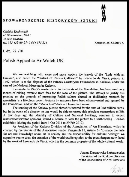
Unsurprisingly, Penny’s bombshell has caused consternation among those wishing to send the collection on tour during a refurbishment of the building in Pollok Park which is expected to take four years and cost £40m. (We have have expressed bemusement in the past at the nicely rounded figures of building restoration costs which so often come in at sums like… £40m.)
The body “Glasgow Life” which runs Glasgow’s museums is reported to have been “flabbergasted by this”. If it is surprising that a museum director should be outspoken on this sensitive subject which involves a number of art world vested interests, there can be no surprise to readers of this site about the reality of the risks and the adverse material consequences of which Penny complains. In honour of Artwatch International’s founder, the late Professor James Beck, the Autumn 2007 ArtWatch UK Journal (No 22) carried a thirteen pages long report on the dangers of art loans – “Blockbuster Exhibitions: the Hidden Costs and Perils”, by Michael Daley and Michael Savage. For the full text of the report, click on this PDF. (Michael Savage has posted a response to Penny’s intervention on his Grumpy Art Historian blog.) On 13 December 2010, in response to an appeal from Polish curators and conservators to help halt a further loan of Leonardo’s Lady with an Ermine (“An Appeal from Poland”), we disclosed the extent of an injury to a panel painting by Beccafumi that was dropped and smashed when being dismantled from a temporary exhibition at the National Gallery (see top, right). That photograph (and an internal report on the incident) had been given to Artwatch by Dr Penny when we commented in our Journal on news of the incident carried on the National Gallery’s website.
On 11 July 2011 we reported (“Questions and Grey Answers on the Tate Gallery’s recovered Turners”) on how the Tate had paid a £3.5m ransom to Serbian gangsters in order to recover two Turner paintings that had been stolen when sent (without a Tate courier) to a small, badly protected German gallery.
The Herald Scotland reports that Glasgow Life is proud to have “formed a partnership with the British Museum, one of the leading authorities on loaning items, to benefit from its expertise”.
It is true that under its present director, Neil MacGregor, the British Museum is a hyper-active dispatcher of art around the globe (- over 4,000 objects in 2006 alone). It should be appreciated, however, that practice does not make perfect in this hazardous arena. As described in our Journal 22 report, when the British Museum packed the peerless, desperately fragile Nimrud Palace alabaster relief carvings and sent them all to Shanghai in two cargo Jets (which broke their 16 hours flights with a stopover in Azerbaijan), it was discovered on arrival that the recipient museum’s low doorways were too low. No one, presumably, had thought to measure them first. It was further discovered that the host museum’s lifts were inadequate. In consequence, the crated carvings had to be “rolled in through the front door – which meant that we had to get a mobile crane to get them up the stairs”, the British Museum’s senior heavy-objects handler, Darren Day, explained in one of the museum’s self-promotional television programmes. When the collection was finally unpacked it was found that “a few little conservation things had to be done.” When crated Chinese terra cotta warriors arrived on loan at the British Museum, they, too, would not pass through the door of the reading room, even when the door’s frame was removed – some expertise?
A restorer in the Museum of Modern Art, New York, has claimed that there is a professional concept of “acceptable potential loss” with regard to loans. As described in our 8 February 2011 post (“The European Commission’s way of moving works of art around”), since 2003 it has been a declared ambition of the European Commission to “facilitate”, “encourage”, “promote” and make “easy” the “mobility of art collections” within Europe. To this end, the EU urges that loaned works of art not be insured, on the extraordinary conviction that accidents can always be remedied: “in many cases, after the exhibits have been restored, only experts can assess the alteration resulting from the damage. The restored artworks can therefore be exhibited as they are.”
The simpliste Eurocratic view of restoration is the more alarming because, travel accidents aside, with increased volumes and velocities of loans come an explosion of needless, often themselves destructive, conservation and restoration “treatments” that are undertaken prior to loan exhibitions as lenders seek to protect themselves by having their works “put in condition” for travel. This is done in order to be able to identify and establish (for insurance or blame-allocation purposes) the origin of subsequent injuries. Unfortunately, putting works into restorers hands in such bids to attain supposedly optimally secure condition for travelling itself presents hazards. We discussed one of the most spectacular examples of needless injury in our post of 8 January 2011. On that occasion an owner put his prized and beloved Renoir into the hands of a pair of leading restorers simply to lay a couple of small blisters and then to dispatch the picture from Washington to Paris. The restorers, without any authorisation, presumed to clean, reline (and wreck) the painting, Renoir’s Luncheon of the Boating Party, as the distraught owner, Duncan Phillips, later confessed. On arrival in Paris, the newly restored Renoir was at first rejected as a Renoir. Having long enjoyed pride of place in the home of the great collector, Phillips moved it on its return from Paris into an anteroom. Today it enjoys pride of a place in a hideous over-scaled modern extension to the delightful period house that Phillips bequeathed, along with his collection. The present administrators of the museum have refused all requests to inspect the records of treatment on that painting, and, generally seem rather more animated by mounting their own special exhibitions than in ministering to the original and perfectly self-sufficient collection:
“Intersections is a series of contemporary art projects that explores —as the title suggests— the intriguing intersections between old and new traditions, modern and contemporary art practices, and museum spaces and artistic interventions. Whether engaging with the permanent collection or diverse spaces in the museum, the projects suggest new relationships with their own surprises. “Many of the projects also riff on the nontraditional nature of the museum’s galleries, sometimes activating spaces that are not typical exhibition areas with art produced specifically for those locations.”
Burrell be warned. Awful as recent “developments” at the Phillips have been, the United States has witnessed an even greater betrayal of a bequest: the wresting of the entire contents of the Barnes Collection from its, also bequested, delightful purpose-built original home and grounds, in order to place it in a worse than awful modernist pile a few miles away, hard by a noisy polluting freeway in the centre of Philadelphia. The denouement of the Barnes Bequest hike began (as is proposed at the Burrell) with a vast international travelling exhibition. At the Barnes, as now at the Burrell, the jaunt was premised on the morally-coercive “conservation” justification of putting the building itself “into condition” on behalf of the great collection of works. Humbug has rarely appeared so rank. The specially commissioned “site specific” Matisse mural was detached from the walls of the museum, packed on a flat-bed, open truck – against all reassuring conservation-compatible promises – and carried at an angle (see photographs, right) to Washington. Nick Tinari, who is to submit testimony to the Burrell Inquiry, has informed ArtWatch “I can state unequivocally that damage was done on the tour to the Matisse mural, the Seurat Models and a Picasso. I have documentation for all three.” Tinari further points out that, as with the intended Burrell tour, the Barnes tour – which netted $7m – breached the benefactor’s express prohibition on foreign loans. Far from serving to make the collection safe, that earlier exercise paved the way to a full takeover. More generally, it served as a template for trustees everywhere who might wish to harvest cash value that is otherwise locked into permanently housed works of art.
Clearly, Dr Penny’s intervention addresses much more than the welfare of the Burrell Collection, precious and vulnerable though it is. It is greatly to Penny’s credit that he should have spoken in such frank (and brave) terms. It is also greatly to the credit of the Scottish Parliament that it should be engaging in such an open exercise before another art world horse may be induced to bolt.
Michael Daley
ADDENDUM
On 7 September, Herald Scotland reported the submission of written evidence made by Dr Selby Whittingham of Donor Watch:
“Dr Selby Whittingham, of Donor Watch, says in his submission: ‘There can be a case for departing from the terms of a bequest when those are incapable of being carried out wholly or safely … but that does not apply in the Burrell case in this instance.
‘This bill is a consequence of the current vogue for loan exhibitions and for using outward loans as barter for inward loans. This vogue is not wholly benign. It deprives visitors to a museum of works which they may expect to see. And we are not convinced that the transport of works of art is as free from hazard as the advocates of this measure optimistically maintain…'”
Comments may be left at: artwatch.uk@gmail.com


![]()
Destroying archives

Technological advances are often over-sold and deployed in haste. As Nicholson Baker famously showed in his book Double Fold ~ Libraries and the Assault on Paper, countless books, magazines and newspapers were destroyed when microfilm seemed (falsely) to be a better, more durable, more economical means of storing their “information”. The BBC discarded much irreplaceable historic material which, having been shot in black and white, was held technically obsolete on the arrival of colour productions. As we reported on February 28, 2012 (“Shedding archival records at the Tate and the Victoria and Albert Museum”), the Paul Mellon Centre for Studies in British Art had recently received a phone call from a Tate employee who said “you might like the curatorial photo archive because we’re about to throw it on to a skip”. We subsequently learnt that the threat to archival material was more widespread and that it was being strongly resisted. Technical advances and their attendant risks are not abating. Here, the painter and ArtWatch UK Journal’s picture/photography analyst, Gareth Hawker (- see his post of 10 January 2011 on photography in museums), discusses some of the dangers posed to archives by breath-taking but commercially driven and insufficiently examined technical developments in digital photography.
Gareth Hawker writes:
The benefits of digitising archives can seem immense: the archives become easier to index and retrieve than the original documents, and copies may be sent anywhere in the world almost instantly. These advantages can appear so dazzling that the risks of digitising may be disregarded, especially by institutions which lack the funding and the expertise which the major museums can call upon. For those with low budgets and little experience in digitising their archives, several groups have issued guidelines – the “Western States Digital Imaging Best Practices” [Endnote 1] being among the best known. These practices have been taken as the basis for a number of instruction manuals, notably one written by Jim Kennedy [2]. He provides plenty of useful advice but, while he does mention the risks involved, the bulk of his manual describes ways in which an image may be manipulated. An inexperienced archivist may get immersed in this part of the book and, in his enthusiasm for manipulation, throw away the original file.
It is true that the original archive file may not be suitable for all uses, for example a publisher may wish to enhance the image – perhaps by increasing contrast and removing blemishes – so that it would look better in a book or on the Internet. The resulting picture can look quite different from the archive image, but a researcher should always be able to track back to the unaltered original and check through any changes that may have been made. Ensuring that this is possible is known as maintaining image integrity. Digital images are intrinsically more proof against tampering than analogue images, but only if they are stored with the audit trail which records the changes, if any, which have been made to the original digital file. The construction of an audit trail is described in the Adobe document, “Digital Image Integrity” [3]. However, among the procedures which the “Western States Digital Imaging Best Practices” document lists as ‘best practice’ it includes deleting the original file, and keeping only the manipulated version as a ‘master-file’. This invalidates the file as an archive, especially if the original photographic print or transparency has also been thrown away.
Jim Kennedy writes:
“Best practice is:
(a) to make a master image that has tone and color carefully adjusted to correct fading and exposure, or (b) to make a master image that represents the tone and color for the physical condition of the item at the time of digitization without correction of fading or exposure. The choice depends upon the goals and resources for the project, with the second option requiring more extensive resources to create and maintain large files that may never be used and include reference targets when possible.
Both types of master images could be included in an archive. …”
Clearly choosing option (b) is vital for a serious image archive. Relative to the cost of time spent in scanning and filing, the cost of storage on a disc or drive is tiny; but throwing out the original file can cause confusion for ever after. The archivist who is pressed for time need not make any of the manipulations which the guidelines suggest. These could be postponed until someone wanted to adjust a copy of the archive file for a specific purpose, leaving the original untouched.
The task of preserving the new digital records presents new problems. Hard drives and discs become corrupt with the passage of time, so the data on them needs to be transferred to a new set of drives or discs before it is lost. The entire archive needs to be transferred frequently – every two to four years according to some authorities. There is a danger that someone may forget to transfer the data and that it will all be lost. This is a good argument for keeping the original, non-digital documents, but one which is sometimes overlooked. For anyone thinking of digitising a collection, David Saunders’ chapter on the subject of preserving records, “Image Documentation for Paintings Conservation” in Conservation of Easel Paintings (Eds. Stoner and Rushfield), provides a summary of this and other considerations which would be worth bearing in mind.
One consideration is the quality of the digital files themselves. The resolution of a digital photograph or scan is likely to be far lower than that of an old-fashioned photographic print – even one of poor quality. The amount of data lost if the original print or transparency is thrown away is incalculable. In addition, new techniques may be able to retrieve even more data from the originals than was ever imagined. Destroying the original documents will close off this possibility forever. Keeping the print-out of a digital document (‘hard copy’) may be advisable, but is an inadequate substitute for keeping the original, pre-digital document.
As an indication of the types of falsification that the writers of the ‘Western States Digital Imaging Best Practices’ consider acceptable, see the examples at right. A researcher looking at a ‘master image’ would have no way of distinguishing between what was a true record, and what had been doctored.
These doctoring procedures would invalidate photography as a means by which to examine how paintings had changed over time. This would represent a disaster for historians, and a blessed relief to any restorer who wanted his blunders to be forgotten. Restorers themselves rarely seem to look critically at ‘before’ and ‘after ‘photographs of the paintings that they work on, while museums often keep only haphazard photographic records of the works in their collections. The Rembrandt [4] and Raphael [5] databases give some idea of how incomplete these records may be. Perhaps this directionless attitude to record-keeping derives partly from the restorers themselves, who do not often attach much importance to comparing ‘before’ and ‘after’ photographs. Most restorers prefer to monitor their own work according to what they see through the microscope, informed by their own experience and training – but without any objective standard against which to measure the result of their actions. Few restorers outside the major museums take high-resolution ‘before’ and ‘after’ photographs of the paintings they work on, though they may take snapshots which are low in resolution, unevenly lit, and inaccurate in colour. Not having accurate ‘before’ and ‘after’ photographs available – and, when they are available, not being practised at examining them – most restorers have little opportunity to assess the extent to which their work has damaged a painting.
Thus the importance of photographs may be underestimated, and the contribution of the archivist undervalued. It is essential that the best possible photographic records be made and maintained if any objective assessment of changes to a painting’s appearance is to be undertaken. An archivist may do well to consider keeping original, pre-digital documents, and resisting the temptation to become completely dependant on the computer.
Gareth Hawker
Endnotes:
1 http://www.mndigital.org/digitizing/standards/imaging.pdf
2 http://archivehistory.jeksite.org/index.htm
3 http://www.adobe.com/digitalimag/pdfs/phscs2ip_digintegr.pdf
4 http://www.rembrandtdatabase.org/Rembrandt/explore-paintings
5 http://cima.ng-london.org.uk/documentation/index.php
Comments may be left at: artwatch.uk@gmail.com


![]()
ArtWatch Stock-taking and the Sistine Chapel Conservation Debacle

ArtWatch is entering its twenty-first campaigning year with strengthening critical bite. The new ArtWatch UK website greatly extended the published reach of our Journal (see Figs. 1-4), attracting 22,000 visits in its first year and 52,000 visits last year, half coming from the UK and the USA and the rest from 139 other countries. With this post our archive comprises 59 articles by 8 authors. In New York the ArtWatch International site has been revivified under its new director, Einav Zamir. In France our colleagues in the Association Internationale pour le Respect de l’Intégrité du Patrimoine Artistique (ARIPA) have re-structured their website which now carries much of the contents of their excellent, rigorous journal, Nuances. Our efforts now attract fewer hostile and more respectful responses. We enjoy (sotto voce) support at high levels in many quarters – including among some conservators – and we sometimes earn outright vindication, as shown below. International and national press interest in our campaigns remains high. Unfortunately, in the art world itself many players remain in official denial on the subject of restoration injuries. They can see and admit that this is wrong and that that is wrong, but not that pictures are still being injured in restoration.
Our debut post on 12 December 2010, “The New Relativisms and the Death of ‘Authenticity’”, contrasted the consequences of musical and pictorial reconstructions. Last May, in a fascinating talk (“The Pursuit of Excellence: A Call to Arms”) at the 4th annual Lufthansa Lecture, at St John’s Smith Square, London, Andrew Manze, a former baroque violinist and Artistic Director of the English Concert and now Principal Conductor and Artistic Director of the Helsingborg Symphony Orchestra, noted: “Musicians are lucky that they can do no permanent harm to their material compared to the irreversible damage inflicted on the plastic arts, as reported by the ArtWatch organization for example…”
Our second post on the 13 December 2010 (“An Appeal from Poland”) drew an immediate response. Distinguished scholars, curators and conservators in Poland had asked ArtWatch UK to support their opposition to a proposed loan of Leonardo’s “Lady with an Ermine” to the National Gallery (see “The National Gallery’s £1.5bn Leonardo restoration”). We were then attacked in Poland – abusively – by Count Adam Zamoyski, chairman of the Princes Czartoryski Foundation which had agreed to loan the many-times borrowed Leonardo for a substantial fee. It was later reported from Poland that: “In order to improve the functioning of the Foundation of the Czartoryski Princes and to assure the correct collaboration with the National Museum in Krakow”, Prince Adam Karol Czartoryski of the Czartoryski Museum had dismissed the entire board and its chairman, his cousin, Count Adam Zamoyski. Although the contracted loan went ahead it was announced that the fragile panel painting would not travel again for at least a decade.
Our posts of 8 February and 14 March 2012 produced evidence of a mis-reconstructed sleeve of Christ in Leonardo da Vinci’s “Last Supper”. This was reported in the Independent of 14 March 2012. In the National Geographic special issue “Exploring History” it is said that: “Generally lauded by art historians and appreciators, the restored work has aroused controversy. Some say too little of Leonardo’s paint is left, or cavil about the mural’s altered forms…As the debate wears on, we at least – and at last – have a legible ‘Last Supper’ to savor.” “Legible-but-false” could stand as a motto in those museum conservation departments where restorers paint photographically manipulated “virtual realities” onto old master pictures.
Last week our November 12 post on a Black and White Michelangelo drew an artistically perceptive endorsement from the painter and art critic, Gerry Bell. ArtWatch’s genesis was rooted in the tumultuous battles over the 1980-1990s Sistine Chapel restoration battles. That controversy has recently re-combusted – and in precisely the manner we had anticipated two decades ago in the 1993 James Beck/Michael Daley book “Art Restoration: The Culture, the Business and the Scandal”. It is now clear that having first engineered a needless artistic calamity, the Vatican authorities have additionally contrived a situation in which the already adulterated remains of Michelangelo’s Sistine Chapel frescoes are also presently in grave physical peril. On January 2nd 2012 Art Daily carried an Agence France-Presse report on the panic that has beset the Vatican authorities over the present and worsening environmental threat to the Chapel’s frescoes:
“The Vatican Museums chief warned that dust and polluting agents brought into the Sistine Chapel by thousands of tourists every day risk one day endangering its priceless artworks. Antonio Paolucci told the newspaper La Repubblica in comments published Thursday that in order to preserve Michelangelo’s Last Judgment and the other treasures in the Sistine Chapel, new tools to control temperature and humidity must be studied and implemented. Between 15,000 and 20,000 people a day, or over 4 million a year, visit the chapel where popes get elected, to admire its frescoes, floor mosaics and paintings. ‘In this chapel people often invoke the Holy Spirit. But the people who fill this room every day aren’t pure spirits,’ Paolucci told the newspaper. ‘Such a crowd … emanates sweat, breath, carbon dioxide, all sorts of dust,’ he said. ‘This deadly combination is moved around by winds and ends up on the walls, meaning on the artwork.’ Paolucci said better tools were necessary to avoid ‘serious damage’ to the chapel. Visitors who want to see Leonardo da Vinci’s “The Last Supper” in Milan must go through a filtration system to help reduce the work’s exposure to dust and pollutants. This has made seeing da Vinci’s masterpiece more difficult: 25 visitors are admitted every 15 minutes. The Sistine Chapel, featuring works by Michelangelo, Botticelli and Perugino, underwent a massive restoration that ended in the late 1990s. The restoration was controversial because some critics said the refurbishing made the colors brighter than originally intended.”
In our next post we examine the consequences of the last restoration and its contributory role in the present crisis – a crisis for which the blame is brazenly being shifted by the authorities from the authorities and on to the (paying) visitors.
Michael Daley
Comments may be left at: artwatch.uk@gmail.com


![]()
Could the Louvre’s “Virgin and St. Anne” provide the proof that the (London) National Gallery’s “Virgin of the Rocks” is not by Leonardo da Vinci?

When the National Gallery’s restored “Virgin of the Rocks” was pronounced an entirely autograph Leonardo we were left reeling with incredulity. Picture restorers rarely decline opportunities to claim “discoveries” but could they really be claiming an ability to make a picture an autograph Leonardo simply by thinning its varnish? During the media frenzy of the National Gallery’s £1.5bn Leonardo blockbuster, its chief restorer, Larry Keith, was asked if a distinctive Leonardo brushstroke had emerged. “No”, he said, proof of authenticity lay in the picture’s internal relationships. Given that those relationships differ markedly from the ones present in the Louvre’s unquestionably autograph “Virgin of the Rocks”, what accounted for the discrepancies? The then curator, Luke Syson, replied that Leonardo’s style had, in the London copy, become abstracted, less naturalistic and more “metaphysical”. This seemed fanciful: had not all of Leonardo’s pictures carried a beguiling air of the metaphysical – and had this quality not derived from the artist’s preternaturally intense engagement with natural phenomena and the mysterious powers which operate through them? Had a new corroborating body of drawn studies emerged? The Gallery admits that not only is there no identifiable Leonardo brushwork but that the picture itself is “manifestly uneven in finish and execution” and that there has been “a good deal of agreement that Leonardo himself painted little or none of it”. When we asked if any securely autograph Leonardo paintings shared these newly claimed characteristics, Syson said that they were also found in the “Last Supper”, when only 20% of that large, fragmented, degraded, many-times restored, de-restored and re-restored mural survives – and when its recent restorers “discovered” that it had originally been choc-full of tiny naturalistic details (curtain hooks, slices of lemon, reflections on glassware, tablecloth patterns and so forth). Above all, the National Gallery’s latest upgrade flew in the face of – and seemingly sought to circumnavigate – a landmark 1996 article by a geologist (and now art historian), Ann Pizzorusso, who has shown that while the rock configurations in the Louvre version were entirely consistent with precise formations found in nature and in Leonardo’s own studies, those seen in the London version were found in neither. (See Pizzorusso, “Leonardo’s Geology: The Authenticity of the Virgin of the Rocks”, The MIT Press, Vol. 29, No. 3, and “Leonardo’s Geology: The Authenticity of the Virgin of the Rocks”, in Leonardo Magazine, Vol. 29. No. 3, 1996, pp. 197-200.) Here, Pizzorusso presents further elegant demonstrations of the London picture’s non-autograph status that are manifest in the (recently restored) late Leonardo masterpiece, “The Virgin and Child with St Anne”.
Ann Pizzorusso writes:
London’s National Gallery recently announced that its version of the “Virgin of the Rocks”, previously attributed to various artists who worked in Milan, was now, after being cleaned, solely the work of Leonardo da Vinci. The National Gallery supports its claims by stating that the work represents a change in style and that the geology in the picture is rendered in a more abstract, monumental style (see Appendix A).
While art historians have long discounted the National Gallery’s version as one by Leonardo, the Gallery has now discounted centuries of scholarship with their new interpretation and subsequent attribution of the painting to Leonardo. What is most ironic and troubling about the National Gallery’s position is that there are reams of contractual documents which still exist today documenting a 25 years long lawsuit concerning the two versions of the painting and which show, unequivocally, that Leonardo did not paint the version in the National Gallery. Prof. Charles Hope, a former director of the Warburg Institute, London, and an expert in notarial Latin states that there is no doubt that Leonardo painted the first version and not the second (New York Review, 9 February 2012).
While we may be able to forgive the National Gallery for not being up on notarial Latin, there is no excuse for their proposal that Leonardo changed his style. In the decades in which I have studied Leonardo from all aspects (we must remember, Leonardo did not consider himself primarily a painter) one thing stands out in all his works—a fidelity to nature and a lifelong effort to depict natural objects as realistically as possible.
The father of Leonardo studies, Carlo Pedretti, in his book analyzing Leonardo’s nature drawings, “Leonardo da Vinci Nature Studies from the Royal Library at Windsor Castle” (with a forward written by Kenneth Clark, a former director of the National Gallery in London), devotes the entire volume to discussing Leonardo’s preoccupation with natural objects and his fanaticism in attempting to depict them as realistically as possible. This passion was imparted to his students, Francesco Melzi, Cesare da Sesto, Giovanni Boltraffio and Marco d’Oggiono. So much so that a drawing of a Tree (RL 12417), long thought to be by Leonardo, was later attributed to Cesare da Sesto and a view of Amboise (RL 12727) to Francesco Melzi. In analyzing the works of Leonardo’s students one can see that they have followed Leonardo’s technique and depicted natural objects as realistically as possible. They had obviously heard quite a bit of ranting by Leonardo about “Botticelli’s bad landscapes” (see Appendix B).
Another reason why Leonardo’s approach is reflected in his art is that he was born in the transitional era of the late Middle Ages, an age still filled with superstition and fear, especially about such things as mountains, natural catastrophes and death. He grew up leading the way into the Renaissance, faced all these fears, and debunked them. He travelled extensively in the Alps outside of Milan taking note of nature and geology. He noted landslides and torrential flooding with its associated damage (see Figs. 3 & 4), he dissected corpses to provide the most accurate depiction of human anatomy we have ever had until relatively recent times. His work as engineer, geologist, botanist and astronomer cannot be disconnected from his work as an artist (see Figs. 8 & 9). To understand Leonardo, one must understand him completely. And to understand him completely is not difficult. He has written everything down. He was faithful to nature. If one applies just that one rule to Leonardo da Vinci, looking at his work from a scientific standpoint, the answer is crystal clear: fidelity to nature is a Leonardo trademark that can be used to determine the authenticity of his work.
Now that we have seen that the National Gallery has preferred not to acknowledge the work of many esteemed Leonardo scholars, maybe looking at the recently cleaned “Virgin and Child with St. Anne” in the Louvre will change its mind (see Figs. 1, 7, 10, 11, 14, 17, & 21). The “Virgin and Child with St. Anne”, dated to about 1510, came later than the National Gallery version of the “Virgin of the Rocks”. We do not know how much later, as the National Gallery has now dated the initiation of its version of the “Virgin of the Rocks” as 1491/2-9 and its completion to 1506-08. Professor Hope, in his review of the notarial documents regarding the lawsuit states that the National Gallery version of the “Virgin of the Rocks” could not have been painted before 1508.
If we use the 17 year time period (1491-1508) which the National Gallery cites for its “Virgin of the Rocks”, it would mean Leonardo was painting the “Last Supper” (1492-7/8), completing the Burlington Cartoon (1499-1500 or 1506-08) and the “Virgin of the Rocks” at the same time. On page 96 of Kenneth Clark’s book entitled “Leonardo da Vinci” he indicates that Leonardo was exceptionally busy. Apart from the first “Virgin of the Rocks” his time was taken up with work for the court. He was the court limner and also painted two portraits of the Duke’s mistresses Cecilia Gallerani and Lucrezia Crivelli. With these portraits, we would be up to five major works in progress by Leonardo if we include the National Gallery’s “Virgin of the Rocks”.
This being said, all of these works being done at nearly the same time gives us the perfect opportunity to appraise, determine and evaluate the stylistic traits of the artist at that period of his career. In looking at the Burlington Cartoon and the “Virgin and St. Anne”, both are rich with geologic detail and accuracy. Leonardo has risen to new heights in his portrayal of landscape elements. His talent and passion are vividly displayed in the Burlington Cartoon and he reaches a level of sophistication, subtlety and accuracy in rendering the geology in the “Virgin and St. Anne” which had never been seen before (see Appendix C).
The St. Anne is a geologic tour-de-force. In fact, Leonardo experimented extensively on developing paints and a technique for depicting the pebbles of agate, chalcedony and marble at the feet of the Virgin and St. Anne (see in particular, Figs. 1 & 21). Leonardo writes in his notebooks about his efforts and how satisfied he was to have developed an approach to rendering the pebbles in such a realistic fashion. In fact the entire painting is one geologic treat after another. He had spent years in the Alps so he knew the landscape and geology exactly. With his newly developed technique for painting marbleized pebbles he was delighted (- see Appendix D).
Using a date of 1510 for the “Virgin and St. Anne” and a date of 1483-86 for the “Virgin of the Rocks”, both in the Louvre, we have proof that Leonardo did not change his style, and that, if anything, he became more fanatical in his quest for geologic accuracy, developing new paints and techniques for natural depiction and driving his students to deliver the most accurate depiction of nature in their own works.
So we must ask the question “How and why could Leonardo have changed his style to produce a work so lacking in geological and botanical accuracy as the ‘Virgin of the Rocks’ in the National Gallery in London?” There is no evidence Leonardo changed his style and now, with the recently cleaned “Virgin and St. Anne”, we have that proof. We also know that his students were inculcated with his passion for accurate depiction of natural objects so we must also exclude his students as authors of the National Gallery work.
It would be best for the National Gallery to reopen the case for the attribution of the work to Leonardo. Hundreds of years of scholarship by Leonardo critics as well as the words and the works by Leonardo himself should not be discounted. The National Gallery does a disservice to those who have worked so hard to come up with incontrovertible evidence regarding the attribution of this work and most of all the National Gallery does a disservice to Leonardo himself.
Ann Pizzorusso
Appendix A
The National Gallery’s claimed shift within Leonardo’s oeuvre
“We know that Leonardo’s painting technique gave priority to the figures. The Virgin is designed first, as she is in so many of his drawings, and the landscape seems to flow from her. Since Leonardo saw the painter’s acts of creation as analogous to God’s, his generation of the landscape in the Virgin of the Rocks and the absolute, unalterable perfection of the Madonna at the center could be understood as precisely connected with the doctrine of the Immaculate Conception. But the appearance of the Virgin and her companions, and of the plants and rocks, are different, in the two versions: the theological meaning of his stylistic choices has shifted slightly. In the Louvre picture Leonardo relies on entirely naturalistic tactics to give the picture its spiritual flavor: the sinless beauty of the Virgin becomes the same kind of truth as the natural beauty of the irises nearby. But in the London Virgin of the Rocks, the Virgin and Christ are supernatural, the world around rendered notably less naturalistically, the rocks are straightened to become great columns; the flowers appear to be ideal composites of the leaves and petals of real plants. Tackling the theme for a second time, Leonardo chose to show the viewer not just a vision of the Virgin Mary, but Gods’ perfect ideas for everything around her. What we are shown here is an ideal world made before the physical creation of our own imperfect cosmos, before the need for humankind’s salvation.”
The National Gallery catalogue, “Leonardo da Vinci, Painter at the Court of Milan”, page 174.
Appendix B
Leonardo on Botticelli’s bad landscapes
“He is not universal who does not love equally all the elements in painting, as when one who does not like landscapes holds them to be a subject for cursory and straightforward investigation-just as our Botticelli said such study was of no use because by merely throwing a sponge soaked in a variety of colours at a wall there would be left on the wall a stain in which could be seen a beautiful landscape.”
Leonardo da Vinci, from: “Treatise on Painting”, the chapter on Criteria and Judgments, the subsection “How a painter is not worthy of praise unless he is universal”.
Appendix C
Walter Pater
“Saint Anne–that delicate place, where the wind passes like the hand of some fine etcher over the surface, and the untorn shells are lying thick upon the sand, and the tops of the rocks, to which the waves never rise, are green with grass, grown fine as hair. It is the landscape, not of dreams or of fancy, but of places far withdrawn, and hours selected from a thousand with a miracle of finesse. Through Leonardo’s strange veil of sight things reach him so; in no ordinary night or day, but as in faint light of eclipse, or in some brief interval of falling rain at daybreak, or through deep water.”
Walter Horatio Pater, “The Renaissance, Studies in Art and Poetry”, The Echo Library 2006, page 54.
Appendix D
Carlo Pedretti
“The movement of the fifteenth century was twofold; partly the Renaissance, partly also the coming of what is called the ‘modern spirit’, with its realism, its appeal to experience. It comprehended a return to antiquity, and a return to nature. Raphael represents the return to antiquity, and Leonardo the return to nature. In this return to nature, he was seeking to satisfy a boundless curiosity by her perpetual surprises, a microscopic sense of finish by her finesse, or delicacy of operation, that subtilitas naturae which Bacon notices. So we find him often in intimate relations with men of science – with Fra Luca Paccioli the mathematician, and the anatomist Marc Antonio della Torre. His observations and experiments fill thirteen volumes of manuscript; and those who can judge describe him as anticipating long before, by rapid intuition, the later ideas of science. He explained the obscure light of the un-illuminated part of the moon, knew that the sea had once covered the mountains which contain shells, and of the gathering of the equatorial waters above the polar.
“Notebooks and sheets of about 1508 contain a number of notes on ‘mistioni’ (mixtures), a plastic material of his own invention with which he aimed at imitating the colour and design of semi-precious stones. He describes his production process and how, once the objects were thus produced, he spent much time finishing them with his own hand to a smooth and glossy surface…At the same time he was much taken by anatomical studies, so that when he described the production process of his ‘mistioni’ he came to specify the effect that was to be achieved: ‘…then you will dress it with peels of various colours, which will look like the mesentery of an animal’.
“In 1502, Francesco Malatesta wrote Isabella d’Este that Leonardo had looked at many of the Medici gems and objets d’art made of stone. Leonardo praised ‘the one of amythyst or jasper as Leonardo baptized it, because of the admirable variety of its colours’”.
Carlo Pedretti, Leonardo, A study in Chronology and Style, London, 1974, pages 132-137.
Ann Pizzorusso
For an in-depth comparison of the two versions of the Virgin of the Rocks see:
Comments may be left at: artwatch.uk@gmail.com


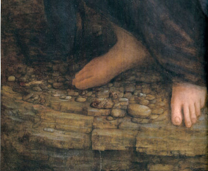
![]()
Brighter than Right, Part 1: A Modernist Makeover at St Paul’s Cathedral

“I’m the 17th surveyor to the fabric after Sir Christopher Wren and am responsible to the Dean and Chapter for the care and conservation of the cathedral”, the architect Martin Stancliffe told Fiona Campbell of the Financial Times Magazine (“Lord of all he surveys” January 10th 2004) and, he added, “If there was anything I could ask Sir Christopher Wren it would have to be what his intentions were for the interior of the building.”
We were startled by this apparent admission of ignorance about the original condition of the interior at a time when the cathedral authorities were over three years into a most radical and experimental restoration of it. Two years earlier the stripped stonework of the cathedral’s newly cleaned south transept had been presented to the press (and widely accepted) as a “recovery” of Wren’s proper original condition. It had specifically been claimed in a press release (“Restoring the glory”) and press interviews that by “returning” the interior stone to its natural state, Wren’s intentions were being shown “for the first time”. (For the post-cleaning state of the stone, see Figs. 4 & 5.)
As the final stage of the building of St. Paul’s was reached in 1709, Wren ordered the interior to be coated three times with oil paint. His son later said that this was not just “for beautifying, but to preserve and harden the stone”. That there is much evidence for what Wren had considered to be beautifying was shown by the art historian Florence Hallett in two articles in the ArtWatch UK Journal (“Cleaning St Paul’s Cathedral”, No. 17, Autumn/Winter 2002, and “The supposedly ‘model’ restoration of St. Paul’s Cathedral”, No. 18, Spring/Summer 2003). In essence, Wren’s aesthetic purpose had been to unify the interior surfaces by suppressing all arbitrary blemishes and irregularities (see Figs. 4 and 5) that had arisen during the building’s thirty-five years long construction, so that his own finely adjusted architectural forms and decorations would read at their best.
Analysis of surviving sections of Wren’s paint was only undertaken – we discovered – after the stripping began. It had established that, in addition to lead white, ochre and black pigments had been included to produce a warm “stone colour” and not a pure white finish. This was precisely the warm effect found in other Wren churches and the effect recorded in early paintings of St. Paul’s’ interior (see Fig. 1). Had these findings been available before the cleaning programme began, would its aims and methods have been different?
Mr Stancliffe has disclosed that prior to 1999 a “comprehensive repainting of the interior” had been considered in order to return it to the true state at which Wren left it, and “to unify the interior”. This was rejected on two grounds. First, it would “result in a finish which, to modern eyes, would seem bland and perhaps inappropriate”. (Perhaps this trumping of historical authenticity by modernist aesthetic sensibilities had been a hangover from Mr Stancliffe’s own early career spent with the modernist firm Powell & Moya?) Secondly, because it would “undo the work so carefully and laboriously executed in the 1870s to strip Wren’s paintwork”.
One might have thought that an architect charged in the 21st century with protecting the fabric and artistic integrity of an ancient cathedral would have felt more loyalty to the original architect’s (painted) creation than to a 19th century predecessor Surveyor’s misguided and botched attempt to undo it. There are grounds for concluding that, as with 19th century church-stripping restorers before him, imposing whiteness and brightness on an originally coloured decorative scheme was Mr Stancliffe’s own and primary objective in this restoration. After stripping the interior, he told the Guardian (“Interior of St Paul’s – brighter than even Wren saw it”, June 10th 2005) that: “During the 35 years of its original building the architect had the Portland stone painted in several thick layers of oil and paint to protect it from the elements before the roof was put on, so it never was as white as now.”
This was misleading. While it was true that no one had ever seen all the stones in the cathedral as if simultaneously quarried and dressed, this was because by the time the construction of the cathedral was finished, the first laid stones had been exposed to the elements and London’s pollution for over a third of a century. Wren’s 1709 instruction to have the interior painted “3 times in oyle” was made 34 years into the construction when the roof was in place and it was far too late for the paint to act as weatherproofing. Moreover, in the cathedral’s own1999 proposal for treatment, it had been tacitly acknowledged that Wren’s paint served aesthetic not weatherproofing purposes because it had been applied late to “cover the uneven effects of the new stone inserted where the supports to the dome had cracked” and to “unite and brighten” the whole interior.
To unite, certainly, but brightening, we should be clear, was Mr Stancliffe’s idée fixe not Sir Christopher Wren’s. In a programme note (“How the glory of St Paul’s was restored”) to a service held at the cathedral on June 1st 2005 in honour of the restoration’s donors, Mr Stancliffe declared that “the heart of my vision for the interior [was] to clean it and relight it” – even though Wren had not brightened the interior to a state of whiteness and the cathedral was not being “relit” to original levels but lit to unprecedentedly high ones. Further, Mr Stancliffe had specifically boasted in the Times of June 10th 2004, of his own “pretty controversial” intention to introduce “six huge chandeliers” to flood the interior with artificial light. A year later he told the Guardian “we have installed new chandeliers and more lights”. Also in 2005, Mr Stancliffe expressed satisfaction on “seeing our initial vision gloriously realised.”
Thus, by courtesy of the banker Robin Fleming’s generosity, the cathedral’s 17th surveyor has been permitted by the church authorities (and by architectural heritage watchdog bodies) to have his own way with Wren’s great, once-painted interior, which now resembles a plaster cast of itself that is lit to department store levels (see Fig. 3, right). As well as being historically false and aesthetically/spiritually inappropriate, the present vulgar fix of whiteness will prove transitory. No surface is harder to maintain and keep free of dust, grime and finger marks than a white, porous, (and now) highly chemically reactive one in the fluctuating environment of a tourist thronged building.
Coda: Mr Stancliffe had sought an even whiter finish. It was his intention to lime-wash the stripped stone surfaces. Ironically – and much as critics among conservationists had predicted – his chemically invasive cleaning method has left the now exposed raw stonework chemically vulnerable. Trial applications of lime-wash kept turning brown. Research that is reported in the conservators’ own house organ, ICON NEWS, (May 2011 issue, p. 30) discovered that humic acids within the stone were being drawn to the surface by the water-based lime applications. For centuries Wren’s oil paint had rendered the stone surfaces hard and impervious and thereby provided a barrier against disfiguring chemical interactions and migrations. Mr Stancliffe has been hoist with his own petard.
In part two, we will examine the controversial and health-threatening chemical means by which Mr Stancliffe’s whiteness and brightness were achieved.
Michael Daley
Comments may be left at: artwatch.uk@gmail.com


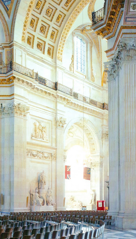


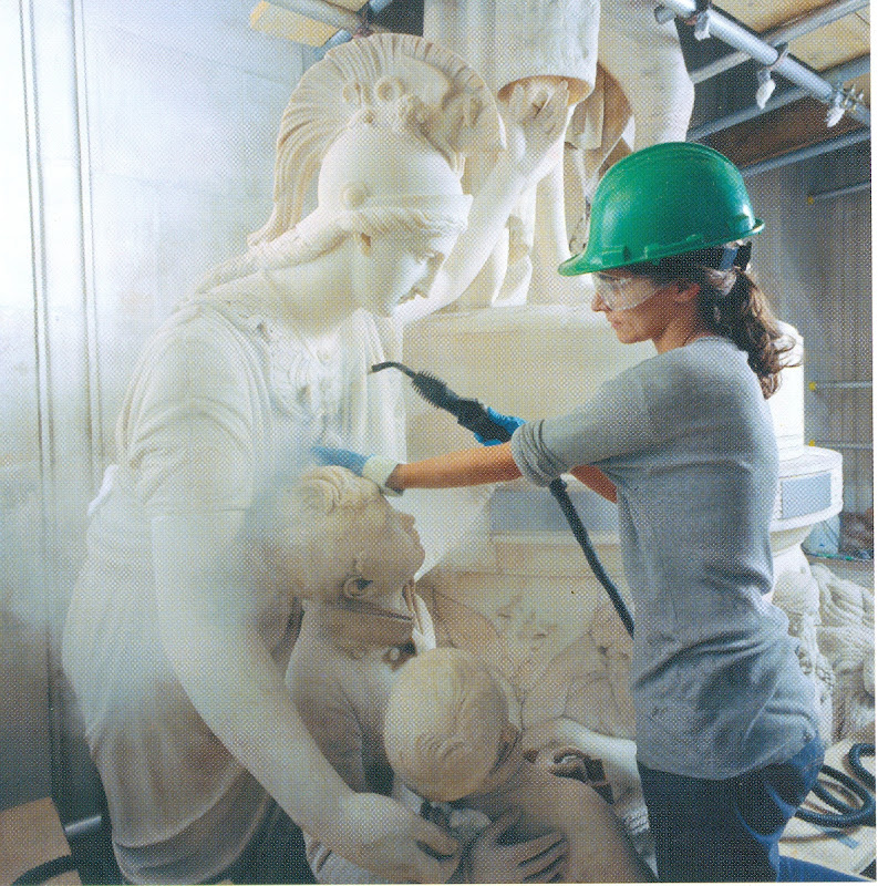
![]()