
“Pick Up A Pencil”
The theme of the new ArtWatch UK members’ Journal (see right) is “The Primacy of the Visual”. Failures to acknowledge, address, or even recognise visual evidence are examined. The text of Charles Hope’s 2011 James Beck Memorial Lecture is carried in full. Professor Hope cites failures of the National Gallery’s curators and restorers to address opponents’ arguments or to recognise the import of key historical documents on artistic practice. When Professor James Beck, the late founder of ArtWatch International, lent support to artist-critics of the Sistine Chapel restoration he came under vicious attacks from some scholarly peers – for all the world as if he had betrayed a priesthood of the visually ignorant. Prof Hope cites a letter of that kind. If artists do sometimes discomfort scholars, it is no presumption: knowing how art is made they are precisely the best qualified to detect its un-making. Here, the painter (and photographer) Gareth Hawker discusses both fundamental differences between painting and photography and the widespread failures to recognise these differences. His demonstration is timely. If (as we have argued elsewhere), art schools have given up the ghost with regard to teaching the traditional skills that formerly equipped artists to recognise restoration blunders, in the wider world of commercial film-making there are signs – notwithstanding giant leaps in the powers of digitalised image-making – of a renaissance in traditional art practices. We discussed this paradoxical relationship in connection with the extraordinary accomplishment of the hand-crafted animated film Frankenweenie. Another such heartening case is discussed opposite. [M. D.]
A Photograph is a Copy, not a Creation, Gareth Hawker writes:
“…we have realised that we should give more attention to photography”. So wrote the Director of the National Gallery, Nicholas Penny, in his introduction to the current exhibition, Seduced by Art: Photography Past and Present [1]. Several reviewers seem to agree. Tabish Khan wrote that, “…photography is a contemporary art form that can be just as inspiring and impressive as painting” [2]. But photographs do not incorporate the high-level thinking that paintings do. It would be misleading to put them in the same category.
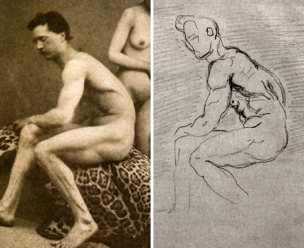
The difference between painting and photography is frequently glossed over. For example, many people suggest that the camera is a tool just like brushes and pencils. At first sight, this may appear to make sense. The photographer decides what to include in the picture, in the same way that a painter often does. He chooses where to place the camera; in which direction to point it; how far to zoom in on a subject; and when to press the shutter. He may select models, costumes, and arrange lighting. All these factors contribute to what is called the ‘scene’ – the image in the viewfinder. The ‘scene’ may be recorded by a photographer just as well as by a painter, so the argument goes: they just use different tools in order to complete the same task. However this is to ignore what the tools are used for. The camera is used to record the scene, while the brushes and pencils are used to analyse it. The importance of this analysis is often overlooked.
Photographers who have wanted to claim equal status with painters have made various approaches, all ignoring this analytical element. At first they blurred and smudged photographs in order to make them look like paintings. Then photographers claimed that theirs was a totally separate art form, a pure record of the scene. Some argued against this, saying that if a photograph were pure, it could not be artistic. Before this issue could be resolved, some writers swept it aside. They suggested that what mattered was, “conceiving an image in the brain and finding some way of expressing it” [3]. What counted was the viewer’s response – whether a work, “spoke” to the viewer [4]. This disregarded a significant factor: people do not respond to paintings in the same way as they do to photographs, especially if they can see that a painting provides evidence of thinking, in a way that a photograph does not.
Paintings look different from photographs because they are made differently. A painting is constructed from brushstrokes; each stroke the result of a decision. A painting may represent a scene, or it may represent nothing at all. A painting is an independent creation, whereas a photograph is dependant on the scene. A photograph can be made only if there is a scene to be copied.
A representational painting may be compared to the summary at the beginning of a scientific paper – the paragraph which is entitled, “Abstract”. Its writer makes a personal judgment about which are the most important topics dealt with in the paper, and writes a brief account of his own. The “Abstract” is a new and independent piece of writing, just as a representational painting is a new and independent analysis of the scene. In contrast, a photograph is like a photocopy of the whole scientific paper. The photocopy shows no analysis, and no judgment.
Brushstrokes are only the most basic way in which a painter’s analysis or abstraction may be seen. Another is in the simplification of the human figure – in its reconstruction in terms of geometrical solids, such as eggs and cylinders. Even a simple tracing – the lowest form of analysis – shows which lines the painter has considered to be more important than others.
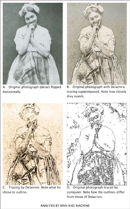
To give a computing analogy: a photograph is like a bitmap image (which records only pixels – spots of colour), but a painting is like a vector image (which records instructions about where lines are to go). A tracing programme can convert a bitmap file into a vector file. The computer makes a simplification which looks similar to a paint-by-numbers drawing. This computer drawing may be thought of as the beginning of an attempt to imitate human analysis – a type of artificial intelligence – though the computer has a long way to go before it catches up with the human brain in this respect (Fig. 1). If anything may be thought of as being a tool comparable with brushes and pencils, it is a tracing programme (which helps to analyse), not a camera (which does not).
To express the difference in another way: Scene = Photograph (Scene = Photograph) × Analysis = Painting
Analysis is an essential part of what makes a representational painting interesting to look at; whereas what makes a photograph interesting to look at is the scene, not its treatment.
Analysis demands abstract thinking – whether it is done well or done badly. What distinguishes the great painter from the mediocrity is the quality of this thinking, not any manual skill. Anyone who can sign his name, already has enough manual skill to make a great drawing. (This includes drawing in its wider sense: deciding where to place marks made by the pencil or the brush, even when no outlines may be involved).
The modern digital camera provides the most effective means for recording the scene that has ever been devised. Strangely, many photographers want to use it for a different purpose, to express an interpretation – a purpose for which it is singularly unsuited. Some photographers deliberately introduce all sorts of inaccuracies which mean that the result is neither a pure substitute for the scene, nor an independent creation.
The classical case for photography’s status as an equal to painting was put forward by the man who was perhaps, “the most important figure in the history of the visual arts in America” – Alfred Stieglitz (1864-1946) [5]. In his usage, the word ‘artist’ meant someone who, “got the spirit of the truth” [6]. He held that only 0.1% of painters were artists, and only 0.1% of photographers were artists. But not everyone takes such an exalted view. For example, a tax inspector wants to know whether a painter is a house-painter or an artist, not whether he has, “got the spirit of the truth”. So when a painter says that he is an artist, he is simply describing his activity. He is not claiming to be either good or bad at his job: that is for others to decide. But when a photographer says that he is an artist he is claiming to be in the top 0.1% of his profession: he is pushing others to accept the valuation he has placed on his own work.
By using the word ‘artist’ in this way, Stieglitz moved attention away from a vital distinction; that between creating something new (a painting) and making a copy (a photograph). He persuaded many viewers to ignore analysis, and to concentrate on the selection and arrangement of a scene – on pointing and shooting.
Stieglitz’s advocacy, along with that of other theorists, seems to have desensitised many viewers. They see only the subject which has been represented. They fail to notice that a painting exhibits the working of a mind – not just in the choice of subject, but in every single stroke. One consequence of this desensitisation became apparent when the Sistine ceiling was treated by restorers, and much of the best painting ever produced was wiped off. The picture of a man looks like a man, whether it is drawn well or drawn badly. Most historians were satisfied with what remained after the paint-stripping because they could still identify the subjects which had been depicted. Very few noticed how drastically the quality of the drawing had been reduced.
Many people were better informed about these issues in the days when Michelangelo painted his great work. Contemporaries who saw it for the for the first time commented at least as much on the power of its drawing, as on its subject matter [7]. The way in which influential men looked at nudes in those days may be compared with the way in which they look at motor cars now: with an appreciation of the beauty of engineering and construction – an appreciation which derives in part from an understanding of how all the parts connect together.
The paint-stripping made nonsense of some of the connections in Michelangelo’s nudes. His contemporaries would have been appalled, but most of today’s historians and television presenters do not even notice. They focus on the imagery and the iconography, not on the drawing. It is as if they were waiting for the work to ‘speak’ to them – for the artistic content to make itself felt. But, being sensitive only to subject-matter, that is all that they are able to see. Such narrowly prepared minds will respond only to the crudest visual stimulus (the colours looking brighter after the top layer of paint has been removed, for example).
Just as the critical response to painting has become limited, so the meaning of the word Art has expanded – to such a degree that almost anything seems to be embraced by it, including photography. However painting remains distinct: it is a creation which is independent, and which can embody the kind of analysis described above. This is why painting may be categorised with the higher expressions of the human mind, along with poetry and philosophy. Photography does not fit into this category because it cannot display abstract thinking.
But painting is now so little appreciated that, to many people, it seems comparable with photography. This has allowed photography to be called Art, and so to enter the National Gallery. Arguably this is the same lack of discrimination that has allowed paint-stripping to take place, not only on the Sistine ceiling, but on almost all the great works of painting in the Western World, including those in the National Gallery.
“Giving more attention to photography”, seems to be one more example of this downward trend, but perhaps there is a glimmer of hope. When a great artist’s paint has been removed from a picture, the decline in its artistic quality is irreversible; but a decline in critical awareness is different: it can be reversed. At present, many people are only distantly aware that, in every brushstroke, a representational painting gives evidence of analytical thinking. Perhaps the exhibition at the National Gallery will help to promote this awareness. If so, it will have served a very useful purpose.
ENDNOTES:
1 The National Gallery, Seduced by Art: Photography Past and Present, Yale University Press (9 Oct 2012), ISBN-10: 1857095456, ISBN-13: 978-1857095456 The exhibition runs from 31 October 2012 to 20 January 2013 2 londonist. Art-review-seduced-by-art-photography-national-gallery. Retrieved 8 November 2012 3 Gerry Badger. Collecting Photography. London: Mitchell Beazley, 2003. ISBN 1-84000-726-5 p23 4 Gerry Badger. Collecting Photography. London: Mitchell Beazley, 2003. ISBN 1-84000-726-5 p24 5 Richard Whelan, Stieglitz on Photography, Aperture, 2000, p ix 6 Alfred Stieglitz, Is Photography a Failure?, The Sun, New York, March 14, 1922 – reprinted in, Richard Whelan, Stieglitz on Photography, Aperture, 2000, p 229 7 http://artwatchuk.wordpress.com/2012/10/01/12th-november-2012/ Retrieved 12 November 2012
Gareth Hawker
Comments may be left at: artwatch.uk@gmail.com


![]()
Review: Stone-washed Renoirs and the Shock of the Undone

We knew at a glance that something was amiss. On June 16th, a newspaper photograph trailed an imminent auction sale of Renoir’s “Baigneuse” of 1888. Even on the evidence of that single de-saturated newsprint reproduction (right, Fig. 1) it seemed clear that the privately owned masterpiece had gone through the picture restoration wash cycle a time (or two) too often. A comparison of Christie’s pre-sale zoom-able online photograph with historic photographs of the painting further suggested that picture conservation’s would-be beauticians had been at work with swab and solvent: Renoir’s bather had been left (Fig. 2) a paler sugar-smooth pictorially and plastically enfeebled version of her original self. (For the picture’s appearance and condition in 1944, see Figs. 7 and 9.)
Just as museum curators who organise splashy temporary exhibitions rarely broadcast the “conservation” injuries borne by works loaned from sister institutions, so auction houses, which of necessity must act primarily as agents for owners, can seem no less reticent on this fraught subject. In practice, we find that in of both of these art spheres, the “now” is often implicitly presented as the “originally-was” and “always-has-been”, thereby thwarting what would be the greatest inducement to halt needless adulterations of unique historically-rooted artefacts: a full public disclosure of “conservation” treatments and frank art-critical discussion of their material and artistic consequences. By coincidence, recent museum and saleroom activities have brought to London a slew of little-seen examples of Renoir’s oeuvre. As cases in point of Renoir’s vulnerability, we examine here treatments of his “Baigneuse” of 1888 and the Washington National Gallery’s “The Dancer” of 1874.
Renoir’s “Baigneuse” was given star billing (on a £12/18m estimate) at Christie’s June 20th Impressionist/Modern sale, for the catalogue of which it provided the cover illustration (Fig. 2). While much was made in the eight pages long catalogue entry of an impeccable and unbroken provenance through ten successive owners, not a word was said about any restorations of the painting, and although many early photographs are identified in the picture’s literature, none is reproduced. It is disclosed that this Renoir is to be included in the forthcoming “catalogue critique” of the artist’s work being prepared by the Wildenstein Institute from the Archives of François Daulte, Durand-Ruel, Venturi, Vollard and Wildenstein. (Perhaps the present condition of the picture will be discussed in that publication?)
On the night of the sale, an announcement that the picture had been withdrawn drew gasps of surprise. Artinfo reported that the vendor had accepted a private offer from an unidentified buyer for an undisclosed sum somewhere within the estimate. Trade and press eyebrows have been raised at such secretive, pre-auction sales and the withdrawal was the more confounding because expectations of a big auction house “event” had been raised by extensive (and quite stunningly fetching) pre-sale press coverage with photographs of the painting enlivened by the seemingly routine inclusion of beautiful young female staff members.
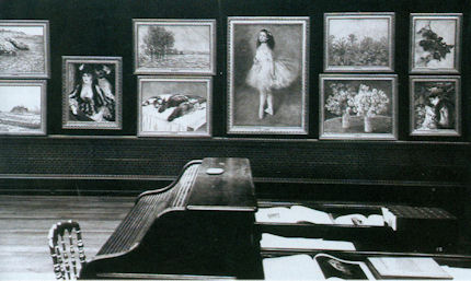
With modern paintings, the starting point for any appraisal should be the earliest known photograph. Old photographs are historic records. Historic records should never be ignored. Old photographs of pictures assembled in homes or exhibition galleries are especially precious and instructive. The photograph of Renoir’s 1905 exhibition at the Grafton Gallery (Fig. 3) testifies not only to the then generally more vivacious relative values within individual works but to the striking variety of pictorial effects and painterly means deployed within Renoir’s oeuvre.
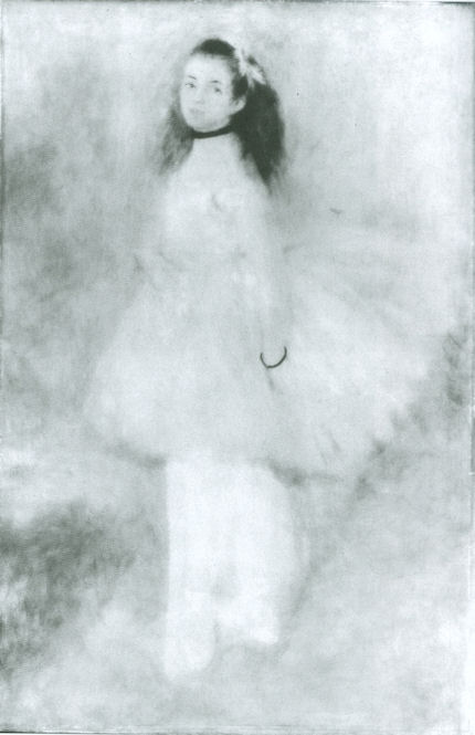
With regard to the photographic testimony of the original appearances of individual pictures, consider first the large, near-central painting in the 1905 Grafton Gallery photograph – Renoir’s “The Dancer”. This picture, now at the National Gallery, Washington, is 138 years old but was then only 31 years old and unrestored. Then, the background was disposed in distinct but linked quadrants (top-left; top-right; bottom right; bottom left). These were not so much naturalistic renderings of an actual space as subservient pictorial devices spotlighting the central bow-tight figure of a child trainee who, through balletic discipline and artistry, had assumed a commanding Velazquez-worthy sideways-on viewer-confronting presence.
To that expressive end Renoir had welded the dramatically contra-directional lower legs into unity by a pronounced dark shadow in the vertical triangular space they bounded. That shadow sprang also from the heel of the (right) weight-supporting foot backwards and upwards in space, thereby throwing the bottom edges of the trailed skirts into relief. This dark zone in the lower-right counterbalanced another in the upper-left, which had in turn emphasised and thrown into relief the front edge of the costume, withdrawing only to leave a lighter, again relieving, tone at the dancer’s dark hair. The progressive loss through restorations of those artful dispositions (as seen in Figs. 4 & 5) and the picture’s general descent towards an inchoate, arbitrary pictorial froth that increasingly resembles the underlying condition seen today in its own infra-red imaging (see Fig. 6), is heart-breaking. Renoir had here been a sculptor before he became a sculptor, playing off forms that asserted his picture plane with others that ran sharply away from or towards it (rather as Michelangelo had famously done in his crucifixion of Haman). Degas, who spoke of Renoir’s “sharpness of tones”, had chided himself for constructing his own drawings of standing dancers from the head down instead of from the feet up. Renoir had here given a masterclass in how to project a standing figure upwards from the floor. These things artists know and appreciate.
Compendious photographic evidence suggests that restorers (frequently working myopically through head-mounted magnifying eyepieces) have consistently confounded dirt or discoloured varnish with the shiftingly elusive dark grounds used by artists to set off light-toned figures. As seen in our post of June 1st, Klimt’s portrait of Serena Lederer (which was acquired by the Metropolitan Museum of Art, New York, in 1980) has suffered in just such a manner. In the same post we saw also how Renoir’s deployment of a dark background zone in the upper left quadrant of background and a secondary but counter-balancing dark zone in the lower right quadrant of his “Dance in the City” had also been undone by successive restorers.
By courtesy of the 1905 photograph of the dancer we can now see that by 1944 the picture’s decisive tonal orchestration had already been subverted (see Fig. 3 and caption at Fig. 6). By the time of the picture’s appearance at the 2012 Frick show of Renoir’s full-length portraits (which was reviewed in our post of June 1st), the original dark tones in the lower right quadrant had effectively disappeared, leaving two odd arbitrarily truncated dark attachments to the right heel (Fig. 5). Cumulatively, this painting has suffered needless artistic vandalism of which no one speaks. The fact that graphite underdrawing is now visible on the painting has been mentioned but without any hint of alarm or censure.
With Renoir’s “Baigneuse” of 1888, the earliest photograph in our own records (- donations to ArtWatch of old photographs or postcards are always most gratefully received) is that published in 1944 when the painting was 56 years old, as seen here in greyscale at Fig. 7 (left) and at Fig. 9. Six years later, by 1950, the painting had been radically transformed, as seen at Fig. 7 (right, in greyscale) and Fig. 8 (left, in colour). The differences that emerged between 1944 and 1950 were compounded by further changes between the picture’s 1950 state (seen in colour at Fig. 8, left) and its 2012 state (seen in colour at Fig. 8, right). However many times and by whomever this painting might have been “restored”, it is clear that the resulting interventions have profoundly altered its constructional and pictorial rationales. The total extent of the alterations that occurred between 1944 and 2012 are examined right in greyscale details in Figs. 11-18. The differences between the 1950 and 2012 states are examined in colour details at Figs. 19, 20 and 21.
By 1888 Renoir had visited Algiers and Italy, come to admire Cezanne as well as Delacroix, discovered Italian painting and read Cennino Cennini’s Treatise on Painting. He had just completed an intense series of classically inspired, Ingresque female nudes, culminating in that declared trial for decorative painting, the Philadelphia Museum’s great “Bathers” of 1887, by which date he held the nude to be one of the most “essential forms of art”.
Compared with Fantin-Latour’s palpable but fluidly allegorical figure at Fig. 10, Renoir’s “Baigneuse” has, in its 1944 state, a markedly more stolid, out-of-Courbet corporeality. For all its spirited brushwork and sparkling colour, plastically, it constitutes an essay in composure, stability and parallelism. The torso seemingly rests on its own base of compressed and spreading buttocks and thighs. The thighs, knees and lower legs are held together in a manner more primly archaic (Egyptian) than classical. Movement is confined to the bather’s right hand which dries the left side of the waist. This action has enlivening consequences. The upper torso is pulled round by the right arm and the head is turned leftwards and downwards as if to contemplate the drying action of the towel. The left arm is required to be held aloft to free the left side of the figure, and, flexing at the elbow as the left hand draws across the face, it first echoes the thighs but then curls gracefully, weightlessly away in space.
What, then, explains the differences between the picture’s previous and its present condition? In such cases it is always possible to play the “Sistine Chapel Ceiling Restoration Defence” and claim that in 1944 the then 56 years old picture was very dirty and that the removal of this dirt has liberated the forms and the colours of the painting to a hitherto unsuspected degree. But the pattern of relationships that is visible, even under dirt, should not change character during a cleaning. Rather, it should emerge enhanced, with the lights lighter and the darks darker – and all individual values holding their previous positions. This has not happened – the picture has got progressively lighter with successive cleanings instead of returning to its previously cleaned state. If it really had been left by Renoir in today’s state, how could the previous but now lost artistically constructive values ever have arisen? If left untouched for the next 56 years, would anyone expect the painting to return to its 1944 appearance with the stripes on the towel and the shading of the fingers regaining strength? Would a general shading and enhancement of forms once more helpfully tuck the left hand behind the head? How might dirt have drawn more clearly and repositioned the left shoulder? How might it have more emphatically shaded the right, distant side of the face?
If we consider the difference between the 1950 and 2012 colour plates (shown at Figs. 8, 19, 20 & 21), what might account for the loss of orange coloured modelling in the left cheek, and of individual brushstrokes depicting the hair? Is it possible to claim on the evidence of these photographs that there has been a build-up of dirt on the picture over the last 62 years?
When examining the bather’s face in close-up today, as shown at Fig. 21, can we have any confidence that the paint presently surviving in that section is just as it was when left by Renoir in 1888? What kind of brush or paint might he have used that would have resulted in the present fragmentary, seemingly abraded, scattering of orange paint that lies over the blue background between the hand, the face and the shoulder?
In the next post we examine the conservation fate of more than a score of Renoirs that have been loaned from the Sterling and Francine Clark Art Institute in Williamstown, Massachusetts to the Royal Academy. We shall see how Sterling Clark learned the hard way not to trust art experts on matters of condition in paintings when, having been assured that Domenico Ghirlandaio’s “Portrait of a Lady” had never been repainted, he bought it, only to discover, very shortly afterwards, a postcard of the painting showing it in an earlier and quite different state.
Michael Daley
Comments may be left at: artwatch.uk@gmail.com


![]()
Black is a Colour

We reported in an early Journal that Anna Somers Cocks, when editor of The Art Newspaper, had observed that Frans Hals employed as many as six tones of black and that these were “too often deadened by bad cleaning”. This prompted a response from a painter colleague.
Iain Walker wrote:
Anna Somers Cocks’ observation that Frans Hals painted with up to six tones of black reminded me of another appraisal made some years ago when Hals was being shown at the Royal Academy. An eminent art critic noted in his review of the exhibition that Vincent van Gogh had claimed to have counted no fewer than 28 different blacks in a Hals painting. The observation, the critic accepted, may have indicated Vincent’s preoccupation with the picture but it could not have been so because research had revealed that at that date there were only six blacks in production. Many readers may have concluded that poor Vincent had got it wrong again, and that this was a critic who did his homework.
At the time of this review, a project exploring the nature of black and the assumptions we have of it, was being conducted with the first year students at the City and Guilds of London Art School in Kennington. To this end, one side of the studio had been painted black throughout and filled with black objects and materials: black cottons, velvets and silks, as well as a numerous household objects that were painted or sprayed with matt or gloss paint. Coal and soot were also used.
The task given to the students was to make a perceptually accurate painting of a section of the studio without using any black paints. They met this requirement by mixing their own blacks from the colours contained in their paint kits. It was pointed out that Francis Bacon often produced a black by mixing sap green with alizarin crimson. The students also made use of Prussian blue, cobalt, burnt umber, violet etc. Their studies swiftly established that it was entirely possible to make an optically accurate transcription of a black set-up containing many black objects without ever having recourse to any commercially available black paint.
In painting, all colours and tones are relative. Margaret Meade cites the Eskimos as having 17 words for white. When confronting an all black set-up, it soon becomes apparent that there are greenish blacks, reddish blacks, bluish blacks and so forth. Theoretically, there may be a black which absorbs all incident radiation but even a material as black as soot apparently reflects 3% of incident light. Couple this fact with the effect of “simultaneous contrast” and it is hardly surprising that most painters think of black – and white – as colours in their own right and not just as means of creating a tonal range in a painting, as there other ways to do this.
I recall the above as a demonstration of how well-meaning academic research, although possibly correct in one way, can also be misleading and harmful when applied to painterly practice.
Comments may be left at: artwatch.uk@gmail.com


![]()