
Defending the Indefensible Part I: The National Gallery’s Tangled Rubens Web
1) “I know gossip about staff and trustees and stories connected with acquisitions I don’t think I’d better share.”
– Martin Wyld, the National Gallery’s retiring Head of Restoration in the January 2010 Museums Journal.
2) “Rubens’ Samson and Delilah is a large scale, early and entirely autograph painting of a kind the National Gallery previously lacked.”
– Michael Levey, the then-Director of the National Gallery, in the 1983 Rubens Acquisition in Focus exhibition catalogue.
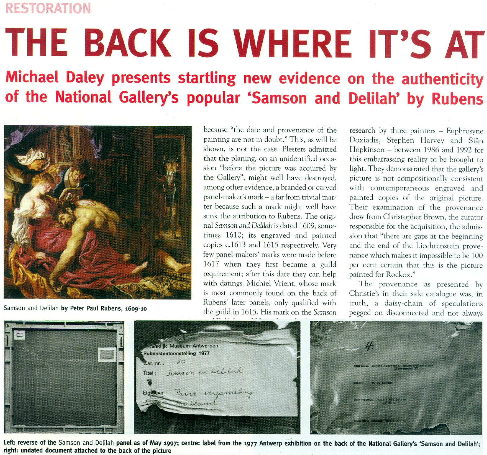
3) “The Samson and Delilah was planed down to a thickness of about three millimetres and set into a new blockboard panel before it was acquired by the National Gallery in 1980 and so no trace of a panel maker’s mark can be found.”
– Christopher Brown, the National Gallery Senior Curator, Flemish Paintings, in his 1996-97 Esso-sponsored National Gallery “Making and Meaning” exhibition catalogue Rubens’s Landscapes“. (Emphasis added.)
4) “Rubens’ panels sometimes bear the branded or carved mark of the panel maker, an example in the National Gallery being the Portrait of Susanna Lunden… unfortunately, as David Bomford has described, the back of the panel of the Samson and Delilah had been planed-down to a thickness of only about 3 mm and then the whole set into [sic] blockboard before the picture was acquired by the National Gallery, so any such marks would have been eradicated.”
– Joyce Plesters, the then-Head of Science, in the 1983 National Gallery Technical Bulletin. (Emphases added.)
5) “The treatment of Cima’s Altarpiece carried out during the 1970s and 1980’s was a rare modern example of a process that was extensively practised (often unnecessarily) in the 18th and 19th centuries – the transfer of a painting to a new support. It is nowadays only carried out in the last resort, when all other attempts at treatment have proved unsuccessful.”
– David Bomford, National Gallery conservator and author, in his 1997 National Gallery Pocket Guide: Conservation of Paintings. (Emphasis added.)
6) “Questions have been raised about aspects of the physical state of Rubens’s Samson and Delilah since its purchase by the National Gallery at auction in 1980… Recent research, however, has yielded some answers to the questions of when and why the painting may have gained this alien backing.”
– David Jaffé Christopher Brown’s successor at the National Gallery, August 2000, Apollo ‘Rubens back and front’. (Emphasis added.)
FROM THE FIRST CRITIC:
7) “Jan Bosselaers had inspected NG6461 up-close in 1977, and then again in 1980. Given his familiarity with the painting, I asked him specifically about its back. Bosselaers grabbed a piece of paper and drew a grid of three vertical lines crossed by three horizontal ones. He looked at me. ‘A cradle!’ I gasped. ‘Yes’, he said, ‘it was a cradle.’”
– Euphrosyne Doxiadis: Painter/author, in her NG6461 The Fake National Gallery Rubens (p. 117. Emphasis added.)
MICHAEL DALEY WRITES:
PART I: A REFORMULATED SAMSON AND DELILAH ACCOUNT THAT STILL DOES NOT STACK UP
With expensive and massively hyped works bought by major public institutions it would seem that acknowledging errors is an art-political impossibility. Such institutional obduracy is longstanding. In 1966 the art dealer René Gimpel noted that “The museums are even more intent than the collectors on defending their fakes or their mistaken attributions” (- a 1929 entry in his Diary of an Art Dealer.) Today, with the Samson and Delilah, the National Gallery stands in triple jeopardy: its initial error of art historical judgement has been compounded by both an apparent falsification of material evidence and a decades-long withholding of contra-testimony in its possession.
The affair began in 1980 with a deceptive unanimity of assurances and a dearth of disclosures. Today, on interrogation of the picture’s traits, provenance and technical literature, a sleight of hand emerges: the back of its panel and the historical evidence it bore were removed by the Gallery and not by earlier, unknown others, as the Gallery has claimed since 1983 – and blatantly claimed despite its possession of flatly contrary key historic documents. (See Fig. 5 below.)
Thus, there are two cross-linked issues: whether the picture is the long-lost original Rubens painting of 1609-10; and, who planed down the back of its panel and mounted it on a larger sheet of modern blockboard (- and with it, of course, “Why?”). The first is a matter of judgement. The second is one of fact that should also be – but conspicuously is not – one of record. Dr David Jaffé’s August 2000 bid in Apollo (see below) to explain why the panel painting “might have” received its alien backing before being bought by the National Gallery was doomed by his failure to follow such records as exist within the Gallery and extrapolate from them the precise place and time at which the transformation had occurred.
On matters of fact, at Fig. 2 below, we note an item on the National Gallery’s recently updated online Samson and Delilah entry which itself supplies visual confirmation of past institutional culpability.
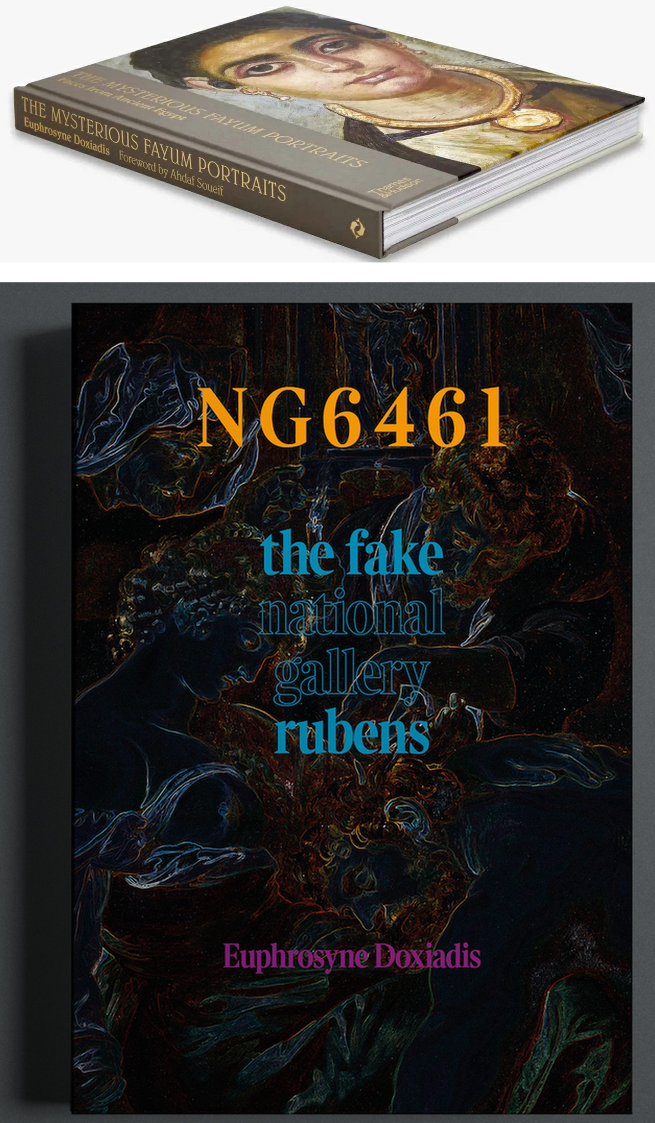
Above, Fig. 1: top, Euphrosyne Doxiadis’s (republished) award-winning 1995 study of the Fayum encaustic paintings; above, Doxiadis’s new book NG 6461 The Fake National Gallery Rubens – N.B. “NG6461” is the Gallery’s inventory number for its supposed Rubens Samson and Delilah.
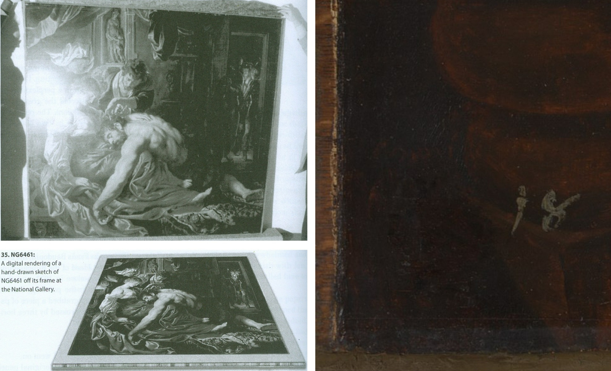
Above, Fig. 2: Top, left, The National Gallery Samson and Delilah, as seen in Antwerp in 1980 when it was about to be dispatched to Christie’s, London, and at which date the paint reached the top and bottom edges of its panel but not the side edges (to which slim battens had been attached – on which, see comment by Martin Wyld below). Above, left, Euphrosyne Doxiadis’s digital rendering of the Samson and Delilah panel on its blockboard mount, as seen by her when the picture was undergoing dendrochronological examination at the National Gallery on 25 September 1996. (Both images above are published in Doxiadis’s NG6461 The Fake National Gallery Rubens.)
Above, right, the bottom left corner of the National Gallery’s Samson and Delilah in which the picture’s post-1980 blockboard backing can now be seen running below the bottom of the painting. The Gallery’s online publication of this image’s visual corroboration of the panel’s post-1980 blockboard extension is intriguing. Wittingly or unwittingly it constitutes a tacit acknowledgement of institutional responsibility for the Gallery’s own (always previously denied) planing down of the panel and subsequent mounting of it on a larger blockboard sheet. (See Figs. 3 and 4 below.)
The Gallery’s online entry acknowledges – somewhat disparagingly – the existence of the Samson and Delilah picture’s “Naysayers” and cites some of their/our publications. Unfortunately, although it cites both issues of our Journal that were dedicated to the Samson and Delilah’s problems (see Fig. 7 below) it does not address their contents – as might be instanced in this pertinent item on the “Material Evidence” section in our Autumn 2000 Journal:
“…This conflict of testimony echoes one found within the Gallery in 1983 when the restorer David Bomford described the thinned panel as glued ‘onto’ the face of the blockboard while the Head of Science, Joyce Plesters, described it as ‘set into’ the blockboard. When I drew this discrepancy to [the then-Director] Neil MacGregor’s attention, he replied (letter 19th June 1997): ‘Incidentally, at the risk of being pedantic, into is the correct preposition, since the edges of the blockboard are flush with the [edge] surface of the panel. Onto would be correct if the panel had simply been glued to the blockboard and protruded above it.’ If this account is accurate, with the edges of the panel and blockboard being flush, there would be no place for the putty bevel encountered by Ms Doxiadis and Mr Norman [*1]. By the same token, had the edges of the panel and blockboard been flush, there could have been no grounds for Joyce Plesters’ 1983 [Technical Bulletin] claim that the treatment had ‘render[ed] the edges of the panel inaccessible’ for dendrochronological examination. A clear, focussed photograph of one of the picture’s corners might throw some light on the subject. Or better yet, permission to examine the panel in the flesh…”
(Emphasis added. Permission to examine the panel was never granted.)
On 14 February 2006, when examining the Samson and Delilah’s dossiers for a second time [*2], we noted photographs showing that the paintwork stopped short of the edges of the oak panel only on the vertical edges. In the present revised online Gallery entry, confirmation and possible explanation for this feature is given: “There is a narrow margin of unpainted wood at the sides of the oak panel which probably results from the support being held firm by grooved battens while the ground and then paint were applied; ‘6’ the ground and paint extend to the top and bottom edges.” The footnote ‘6’ reads: “The same can be seen on Rubens’s Judgement of Paris (NG6379). For this practice see, for example, Wadum 1998. The battens seem often to have been only along the shortest sides. A little of the unpainted margins may have been trimmed away since they are rather narrow.” With the Gallery’s Samson and Delilah, the photographic and documentary records of the restoration treatments are strikingly less complete than those of other Gallery panel paintings. For example, when writing on the restoration of the Altdorfer panel bought in 1980, Martin Wyld discusses the attachment of battens to the edges of panels: “Although some German panels of this period have channels at or near the end grain of the plank in order to accommodate battens which were fixed to the frames, the channels are seldom to be found on all four sides”.
[*1] Charles Norman, Director, The National Timber Trade Federation. As Dalya Alberge reported (The Times, 27 August 1997) on photographs supplied to us by Mr MacGregor, Mr Norman judged the back of the Samson and Delilah to be “a blockboard manufactured in the late 1970s or early 1980s”. It looked, he said, “like a manufactured item, machine-made rather than handmade”. Later, after being invited to see the picture at the National Gallery, Mr Norman amended his earlier observations. His subsequent description of the picture’s physical component parts (made by telephone, 18 & 19 September 1997 to Michael Daley) was a compromise between his original observation and Euphrosyne Doxiadis’ (above-illustrated) clear recollection of a substantial surround between the edges of the planed down panel and the blockboard support, and Mr MacGregor’s claim of flush panel and blockboard edges. That is, Mr Norman claimed that the blockboard was somewhat larger than the planed down panel but that the gap between the two had been filled by a wide putty bevel.
[*2] In 2006, under Charles Saumarez Smith’s directorship, we were given full access to the Collection’s photographic and documentary records – a privilege subsequently extended by Nicholas Penny and Gabriele Finaldi. (ArtWatch is greatly indebted to all three knights – as also to the Gallery’s kindly helpful archival and library staffs.)
With the Gallery’s present publication of the Fig. 2 photograph of the bottom left corner of the Samson and Delilah, two points should be noted. First, the Gallery’s 1997 claimed relationship between the panel and its blockboard backing was clearly unfounded. Second, the photograph of the bottom left corner is cropped and therefore does not show the full blockboard extension. Nonetheless, it does now show (MacGregor’s earlier claims notwithstanding) that, far from the edges of the panel and blockboard being flush, the latter can be seen to protrude beyond the bottom edge of the picture when, as seen above at Fig. 2, top left, it had not done so in 1980 when held by the banker, Jan Bosselaers, in Antwerp, shortly before it was sent to Christie’s. Today’s publication of that photographically-confirmed relationship has finally demonstrated that the blockboard backing must have been applied to the picture’s panel after 1980 and when in London.
CONFLICTED AND OPAQUE GALLERY ACCOUNTS – AND THE FIRST PUBLISHED APPEARANCE OF THE BLOCKBOARD BACKING
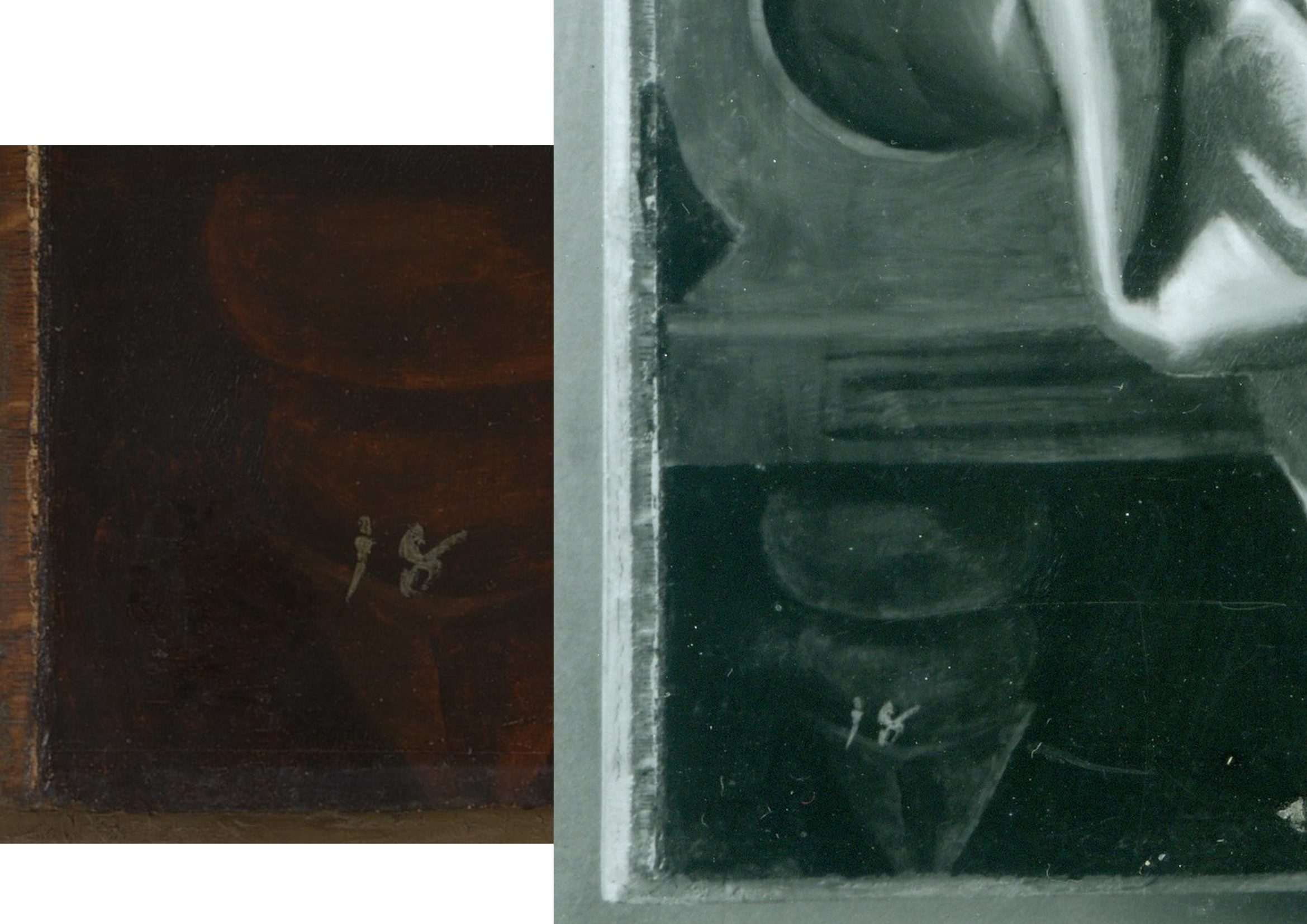
Above, Fig. 3: left, the National Gallery’s recently published online detail of the bottom left corner of the Samson and Delilah; right, a detail of the bottom left corner the Samson and Delilah in a National Gallery photograph taken on 10 August 1982 and designated: “After Cleaning, Before Restoration”.
Above, right, this – so far as we know – unpublished 10 August 1982 photograph, shows the then-present blockboard backing that protrudes not only beyond the bottom edge of the panel but also beyond its left vertical edge (which is not disclosed by the cropped image presently shown online). The date on the black and white photograph shows that the picture had then been in the Gallery’s possession for twenty-five months by which time the planing and mounting on blockboard had occurred (as had also the removal of the picture’s varnish, as shown below.) What the Gallery has never produced – and, we believe, could not ever produce – is a photograph showing the blockboard’s presence before the picture was acquired from Christie’s or when it had been loaned by Christie’s to the National Gallery ahead of the sale. In the absence of such important photographic testimony, the conclusion that the National Gallery itself planed down the panel for undisclosed reasons and mounted it onto a blockboard sheet, is inescapable. The formal authorisation for the picture’s restoration from the Board of Trustees came on May 16 1982 just three months before the above-right photograph was taken. Thus, on the available official records, the removal of the Samson and Delilah panel’s back and the subsequent mounting of it on blockboard had occurred at the National Gallery between 16 May and 10 August 1982. (It is not inconceivable, however, that the formal application for permission to restore the picture had in fact followed a commencement of work on it.)
Above, Fig. 4: The Samson and Delilah’s bottom left and bottom right corners, as respectively recorded at the Gallery on the 10th and 11th of August 1982, by which dates the visible blockboard extensions (which read as the whitish strips) all around the panel had materialised within the Gallery’s own photographic records for the first time – and indicated the extent to which the new blockboard backing extended beyond the planed-down remains of the original oak panel. Earlier, the National Gallery Board Minutes of 16 May 1982 had carried the following note:
“The treatment of No 6461, proposed for Mr Bomford, was recommended by Mr Brown, who explained that the painting was to be the subject of the second ‘Acquisition in Focus’ exhibition, opening in January 1983.” It added, matter-of-factly:
“The painting had a modern support of wood attached to the original panel which had been considerably reduced in thickness and this was considered adequately stable; the surface had probably been only partly cleaned in the recent past, and tests showed considerable discolouration.”
This above account made to the Board was the first-ever mention of a blockboard backing on the painting. It had not been so described by Christie’s and, as shown below, it was even at variance with an in-house National Gallery timber expert’s 1982 account of the painting when it was on exhibition in the Gallery and ahead of its restoration. Strictly speaking, the above statement was technically accurate: the picture had, by that date, been planed down and mounted on blockboard – but only very recently so. Even though the the Gallery had had sight of the picture since the beginning of July 1980 (and had taken photographs and Infra-Red images of it on July 2 1980 – ahead of the sale) it had not – as Mr MacGregor confirmed to us – made any photographic record of the picture’s back either after buying it, or earlier when it had been loaned ahead of the July 11 1980 Christie’s sale. This lacuna is, on our familiarity with the Gallery’s technical literature and dossier records, unprecedented. Indeed the Gallery’s restorers sometimes give the impression that they are more interested in working on pictures’ physical “supports” than on their painted surfaces – and by “working on”, we mean undoing and redoing them. (See Fig. 9 below.)
A TIMBER EXPERT’S ACCOUNT OF THE SAMSON AND DELILAH PANEL
In the 1982 National Gallery Technical Bulletin, Christopher Brown, Martin Wyld and the Gallery’s (now deceased) timber expert, Anthony Reeve (who was held by Mr MacGregor to have been the “supreme practitioner of his generation”) wrote on the cleaning and restoration of Rubens’ The Watering Place and, in doing so, made clear that no blockboard backing had been applied to the Samson and Delilah at that date. That is to say, when discussing the highly problematic construction of many Rubens’ panels, Reeve noted:
“Of all the pictures in the National Gallery, Rubens’ panels have been of greater concern, because of their condition, than any other part of the collection. The reason for this is well-known. Rubens frequently found it necessary to enlarge his pictures after he had started painting… Rubens’ oak panels, often enlarged in several different stages, are amongst the most inherently unstable supports used by any artist.”
However, in so saying, Reeve drew a distinction between “the oak supports which, although made up of many planks joined together, were not enlarged during the painting process, and those which were added to.” Of that former, relatively unproblematic type, Reeve cited just three examples:
“The Rape of the Sabine Women… The Judgement of Paris… Samson and Delilah… the panels of which are made up of six, five and seven oak planks respectively. The grain of every plank, and hence the joins, are horizontal and all the planks are roughly the same width.”
In consequence, Reeve continued, although “these large panels are sensitive to changes in relative humidity (RH), they provide a sound and permanent support if kept in a controlled environment and not exposed to sudden changes in RH.” Whatever reason subsequently led to the National Gallery’s decision to plane down the panel and mount it on blockboard, it was not one of conservation necessity. Curiously, as late as 1996 Christopher Brown was still extolling the the sound construction of the Samson and Delilah’s Panel: “In contrast to a panel like the Samson and Delilah, carefully made from a small number of planks in all of which the grain runs parallel, many of the panels on which Rubens’s landscapes are painted are extremely fragile and prone to splitting”.
Thus, two years after the Gallery had bought the Samson and Delilah for a then huge sum, the Gallery itself (- and, note, just months ahead of Christopher Brown’s 16 May 1982 Board Minute-ed claim of a supposedly long-present blockboard backing) had yet to begin describing the picture as being on a radically reduced panel glued onto a larger blockboard support.
On Reeve’s (nowhere contested) 1982 Technical Bulletin testimony, although the three pictures had been well and favourably constructed, all were at risk of potential injury through their exposed bare panel backs in the event of dramatic atmospheric fluctuations. Had the Samson and Delilah already been planed down to a thickness of just 3 millimetres and mounted on a larger sheet of blockboard, there would have been no such risk or concern – and a timber craftsman as expert as Reeve could not/would not have confounded all three pictures as equally soundly-made and still intact panels which retained their original backs and such information as they bore. This conflict of testimonies within the Gallery coincides with a marked lapse in the Gallery’s own – and frequently self-proclaimed – “customary” record-keeping. That is, no documentary or photographic evidence has ever been produced to support the Gallery’s post-1983 Technical Bulletin Bomford and Plesters’ claims that the Samson and Delilah had been bought on 11 July 1980 as a greatly reduced panel mounted on a blockboard backing sheet even though, as mentioned, other photographs of the picture had been taken when it was loaned to the Gallery ahead of the sale.
Had Brown been right and Reeve wrong on the picture’s then-condition, evidence for the former would normally have been found in the customary condition reports the Gallery makes on receipt of loaned works. Because (as shown below) the Gallery has not been able to produce any written and dated reports on this picture’s condition when loaned ahead of the sale, the most-recent condition report remains that prepared in 1980 by Frans Baudouin when the picture was still – as he had testified (see below) – a cradled panel of between 2.5 and 4 centimetres thickness. Curiously, when Brown later discussed the Samson and Delilah in his 1997 Rubens Landscapes exhibition catalogue, he described it as if it comprised two separate entities. First, in step with Reeve’s 1982 Technical Bulletin account, he held it to be: “A particularly fine panel…composed of six [sic] horizontal oak planks, carefully planed and jointed. The grain runs parallel in all six pieces, which are butt-jointed. The parallel grain ensures that when exposed to humidity the wood expands and contracts without restriction…etc.” But then he went on to hold that it “was planed down to a thickness of about three millimetres and set into [sic] a new blockboard panel before it was acquired by the National Gallery in 1980 and so, no trace of a panelmaker’s mark can be found.”
Perhaps in so reporting these two contrary states of the picture, Brown was simply recalling the two chronologically successive states of the picture as he had encountered it within the National Gallery.
THE PIVOTAL CERTIFICATE OF AUTHENTICITY TO WHICH NOBODY REFERRED

Above, Fig. 5: A photocopy of an undated typewritten sheet in German that had comprised Ludwig Burchard’s 1930 certificate of authenticity provided to the firm Van Diemen and Benedict, and which also carries handwritten Burchard notes on the path of the picture he had authenticated. The existence of this then seventy years-old document was first published by Michael Daley in June 2000 (see note [*3])
CUSTOMARY DOGS THAT DID NOT BARK
With two such expensively acquired old master pictures it might have been expected that the accounts of both would disclose the findings of the customary Gallery technical examinations made prior to works being presented to the Trustees when seeking their authorisation to purchase. However, with the Samson and Delilah no such disclosures were offered.
In 1997 the Gallery claimed to ArtWatch UK it had not kept written records of the picture’s state in 1980 when examined at the Gallery ahead of the purchase; and, therefore, it had not presented such customary reports to its Trustees when seeking authorisation to make the purchase. Indeed, the-then Director, Neil MacGregor, specifically confessed: “The National Gallery does not have any record, photographic or written, of the back of this picture before it was planed down”. The Gallery could supply only a photograph of the picture’s back “as it is today” (see Fig. 6, below, bottom left). The consequence is that while a records trail of an intact panel runs from 1930 to 1982 – when the picture was on display the National Gallery – it is said that no official record exists of its condition on arrival at the Gallery in 1980.
However, in the picture’s own dossiers (as I discovered on 14 Feb 2006) there exist two Infra-red images of the picture (one of them being of the whole picture when still in its frame; the other, a detail showing Samson. Both images were made on the second of July 1980 – that is, nine days before the Christie’s sale at which £2.53 million changed hands. Neither image was reproduced in the 1983 Technical Bulletin even though the report on the picture carried eight images of other paintings. Nonetheless, it was precisely customary for the Gallery’s “Keeper” to prepare a report on a prospective picture’s desirability and art historical importance and for the Head of Restoration to prepare a report on the picture’s condition and soundness. That requirement was expressly noted in 1986 by the Gallery’s then deputy director, Allan Braham: “Before any purchase is made by the Gallery a report on the painting and its desirability for the collection will be made to the Director by the member of the Keeper staff with responsibility for the relevant school of painting: the condition of the painting will be investigated by the Conservation Department.”
In the 1980-81 National Gallery Report, Michael Levey thanked Christie’s for their “co-operation in allowing the Trustees to see this painting in the Gallery before the sale and thus assess not only its powerful impact but also its major contribution to our representation of the painter.” And yet, a trustee in 1980 later recalled to Euphrosyne Doxiadis that no reports had been shown to the Board on the Samson and Delilah. In a letter of May 27th 1997, Mr MacGregor confirmed to us that the painting had been inspected “in the flesh” by the Trustees before the sale but, ambiguously, he added that Christopher Brown and Martin Wyld had conducted examinations and that both remembered “quite clearly that the panel was already set into [sic] blockboard, as do the Christie’s staff most directly involved in the sale.” The person most involved at Christie’s was Gregory Martin, the former National Gallery Flemish paintings specialist. Citing the recollections of Brown and Wyld seemed further to confirm they had not produced written reports on the painting’s condition and state – indeed MacGregor said that their accounts had been delivered “orally” to the Trustees. To repeat: all National Gallery claims that the back had been planed down before the picture arrived at Christie’s are contradicted by Baudouin’s 1980 condition report as commissioned by Bosselaers – and subsequently supplied to Euphrosyne Doxiadis. It had described the picture on 4 March 1980 as a “panel, 185 x 205 cms” that was “in good shape” and in a then conservation state that could be “called excellent”.
A TALE OF TWO NATIONAL GALLERY PANELS – AND THEIR RESPECTIVE PRESENTATIONS IN THE TECHNICAL LITERATURE
In 1980 the National Gallery bought two old master panel paintings for, respectively, just below and just above £2.5 million each. Both were put on immediate display. Both generated much interest. As is customary, both were soon restored by the Gallery. They were Altdorfer’s ‘Christ taking Leave of His Mother’ and the claimed Rubens Samson and Delilah. As is also customary, both restorations were reported in the Gallery’s 1983 Technical Bulletin, but the nature and manner of their accounts diverged dramatically.
THE ALTDORFER PANEL – A PLAIN AND UNPROBLEMATIC ACCOUNT
The Altdorfer was purchased by private treaty sale from the Wernher Estates, through Christie’s, with the aid of contributions from the National Heritage Memorial Fund [NHMF], the Pilgrim Trust and the National Art‐Collections Fund (Eugene Cremetti Fund). Today the NHMF says of the Altdorfer: “The acquisition of this painting strengthened the collection of German paintings at the National Gallery, then relatively under-represented. Works by Altdorfer are exceptionally rare: this painting and the Landscape with a Footbridge (Room 4) are the only two works by the artist in this country. The painting was bought for £2.45 million by the National Gallery in 1980 from the Wernher Collection at Luton Hoo, only months after the NHMF was founded. Without the intervention of the NHMF, which gave £825,000, the National Art Collections Fund (Eugene Cremetti) and the Pilgrim Trust, the painting would have been sold at auction, and almost certainly have been exported.”
THE RUBENS PANEL – A GRAVE ATTRIBUTIONAL MISFIRE
The NHMF has subsequently given much support to the National Gallery assisting it on the purchase of eleven pictures nine of which are shown online by the Gallery; but it had not done so with that of the Samson and Delilah, where Christie’s had given no price estimate in the sale catalogue and the underbidder’s identity remains unknown to this day. We had been given to understand there had been three bidders in the sale: Sir Geoffrey Agnew, acting for the National Gallery; Dr Reinhold Baumstark of the Liechtenstein Princely Collections; and, a bidder on behalf of the Rockox House Museum, who had dropped out at £1,300,000. Christopher Brown has claimed – and his successor at the National Gallery, David Jaffé, intimated in Apollo in 2000 – that Dr Baumstark had bid for the Liechtenstein Princely Collections. However, as Euphrosyne Doxiadis has reported, the then-Prince of Liechtenstein was not the underbidder, nor had he even taken part in the bidding. (See note [*4] below.)
The Samson and Delilah was bought by Agnews on behalf of the National Gallery at a Christie’s auction for a world record Rubens price of £2.53 million. The sale took place in the morning of 11 July 1980 and the picture was hung in a reserved space at the Gallery in the afternoon. A “Strictly Confidential” Gallery press release announcing the purchase had been prepared ahead of the sale. In 1983 the National Gallery Director, Michael Levey, wrote in the “Acquisition in Focus” Samson and Delilah exhibition catalogue: “…some people might have asked why the nation needed another Rubens. In the Collection at Trafalgar Square there were already twenty paintings by the artist… Rubens’ Samson and Delilah is a large scale, early and entirely autograph painting of a kind the National Gallery previously lacked.” (As shown below, Levey’s successor, Neil MacGregor, would be obliged to explain to the public why this “Rubens” looked like no other in the Gallery.)
By that date the picture had been restored and fitted with a new replica period frame made in imitation of the frame shown in Frans Francken’s copy of the original Rubens Samson and Delilah as installed in the house of its first owner, Nicholaas Rockox when its previous frame had been thought possibly original to the painting. The restoration that had immediately preceded the Gallery’ 1983 exhibition was lauded by Levey: “Its splendid colour and vigorous handling of paint can be all the better appreciated now that it appears cleaned in this exhibition.” Along with its world-record price, the Gallery had invested much scholarly/curatorial capital in this particular acquisition – on which its successive accounts would prove so unsatisfactory.
A RISE OF NON-CURATORIAL OPPOSITION THAT DREW IMMEDIATE BLOOD
There seems little question the purchase had been made in professional good faith. Since the picture’s 1929 emergence from nowhere – or, rather, from a restorer’s studio – and its 1930 upgrading by the leading (but subsequently discredited) Rubens scholar Ludwig Burchard, no Rubens specialists had demurred from the view that a well-recorded but long-lost Rubens masterpiece had been found. By the early 1990s, however, certain artist/scholars [*3] had rejected the Rubens ascription, initially, on essentially stylistic grounds and the picture’s manifest visual incompatibility with the testimony of two securely contemporaneous copies of the original painting. Although repeatedly denied by the Gallery, it would further transpire that, during its 1981-82 restoration at the Gallery, the Samson and Delilah panel underwent a covert physical transformation that left the picture at variance with all records of its condition and composition [*4]. As seen above, in 1980, when about to be sent to London, the panel retained its original and by then cradled back. When bought by the National Gallery in 1980 , Christie’s sale catalogue entry described it as being “on panel”. When on display at Christie’s, it was seen by many to have been a cradled panel – albeit one whose “bars did not slide”, as the former-Christie’s staffer, and the then Evening Standard art critic, Brian Sewell informed us.
[*3] In February 1992 a report from three art students challenging the attribution – Euphrosyne Doxiadis (author of the acclaimed The Mysterious Fayum Portraits from Ancient Egypt – see Fig. 1 above), Steven Harvey and Siân Hopkinson – was submitted to the National Gallery and placed in the Samson and Delilah’s dossiers. The Senior Curator, Christopher Brown, would later concede that “gaps at the beginning and end of the picture’s provenance” made it impossible to be 100 per cent sure this was the original Rubens Samson and Delilah of 1609-10.
[*4] That is, when upgraded from Honthorst to Rubens by Burchard, he had specifically enthused – contrary to subsequent official National Gallery claims – that the panel painting “even retains its original back”. (See Figs. 2-5.) I discovered Burchard’s nowhere acknowledged certificate of authenticity in April 2000 in a typed manuscript copy of 8 April 1930 held in the National Gallery’s own Samson and Delilah dossiers, it having presumably been passed on to the Gallery by Christie’s after the 1980 auction. When that discovery was published in the June 2000 Art Review I sent a copy to the Gallery’s Director, Neil MacGregor. The following day, the Gallery released an unsigned statement acknowledging for the first time that, contrary to the Gallery’s (Technical Bulletin) published claims of 1983, the panel of the Samson and Delilah could not have been planed down in the 19th century or in the 1920s “because it was recorded in its original state in 1930.” Nonetheless, at the same time, the unsigned statement claimed “the recent allegation” that the planing had occurred after 1980 was “false”.
Above, Fig. 6: Extracts from the June 2000 disclosures in the Art Review.
In June 2000, in response to press coverage of the Art Review article “The back is where it’s at” (Fig. 6, above), as in the Independent on Sunday (“Tell-tale sign that £40m Rubens could be a copy”), the Times and the Guardian, the National Gallery’s director, Neil MacGregor, had a notice placed in front of the picture to explain why it looked like no other Rubens in the Gallery. That notice drew attention to a fuller statement available at the information desk in which the Gallery denied our charge of its restorers having tampered with the panel. (That document was itself an “updated” version of one prepared and displayed in 1997 in response to press coverage of challenges made by Kasia Pisarek – see Figs. 7 and 8 below).

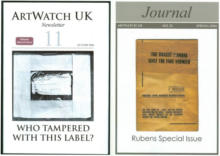
Above, Fig. 7: The Autumn 2000 and the Spring 2006 special issues of the ArtWatch UK Journal given over to discussions of the National Gallery Samson and Delilah.
NO ANSWERS GIVEN. DEBATE REPEATEDLY SHUT DOWN. A LOOP OF SILENCE CREATED.
The National Gallery later announced Christopher Brown would publish a scholarly article in the Burlington Magazine. It never came. The magazine’s editor told us none was submitted. An article by Kasia Pisarek was submitted. It was rejected by the Burlington Magazine – and, later, by Apollo (but see [*5]). In 1998 Dr Brown left the National Gallery to direct the Ashmolean Museum in Oxford. An article by his successor at the Gallery, David Jaffé, appeared in the August 2000 Apollo, but it was expressly intended to end, not launch, consideration of the evidence. Arts journalists summoned to a National Gallery press conference on the pending article were advised “it will finally silence the critics”. Our request to reply was rejected by Apollo’s editor, David Ekserdjian, a former staff member of Christie’s. He also rejected a letter from Michel Favre-Felix, a painter member of the Association Internationale pour le Respect de l’Integrite du Patrimonie Artistique – ARIPA. Christopher Brown’s departure from the National Gallery served to thwart subsequent inquiries into the Samson and Delilah’s acquisition and its subsequent unacknowledged treatment.
On 6 April 2002 (letter) we asked Neil MacGregor whether Dr Brown had been aware in 1982 of Burchard’s 1930 Certificate of Authenticity and its testimony on the then sound condition of the Samson and Delilah panel. He replied: “As I am sure you know, Christopher Brown left the National Gallery some years ago… I suggest you pursue the matter with him.” When Brown was asked by the US magazine Salon (December 2005) to comment on his past involvement in the controversy, he replied: “I am sorry but I don’t want to do this. Please address your questions to the National Gallery.” In 1983 Brown had reported: “Under the terms of Ludwig Burchard’s will, I had the privilege of consulting the manuscript notes on the Samson and Delilah. My visit to Antwerp was made possible by a grant through the Sir Martin Davies Travel Fund”. Had Burchard’s own notes held by the Rubenianum not contained a draft or other record of his 1930 certificate of authenticity, as is held in the National Gallery?
THE VALUE OF REPORTS
When, after we had published Burchard’s certificate of authenticity and Neil MacGregor had adjusted the Gallery’s position accordingly, Christopher Brown and his successor, David Jaffé, held that the Samson and Delilah had been planed down when in the collection of the German magnate, August Neuerberg, between 1930 and 1980. In doing so, they went against the testimony not only of Baudouin’s March 1980 condition report but also of a leading Rubens scholar and National Gallery benefactor who had gifted a Poussin – Christopher Norris. As first mentioned in our June 2000 Art Review, article, Norris had testified in a 1980 letter (held in the picture’s dossiers) to the director, Michael Levey, congratulating him on the Samson and Delilah’s acquisition, and adding that between 1930 and 1980, no change in the picture’s “amazing condition” had occurred, other than a toning down in its 1929 varnish, because “the owners had not touched it.”
Thus – and in addition to Baudouin’s 1980 condition report – we now know on Burchard’s and Norris’s joint written testimonies (both of which are held by – but neither of which had been disclosed by – the National Gallery) that the panel was intact, in good condition and had retained its original back from 1930 until 1980 when it was sent to Christie’s. Therefore, the only parties who might have planed-off the back are Christie’s and the National Gallery itself. Christie’s, who described and sold the picture as a panel and not as a reduced panel laid on board, or as a marouflaged panel, would hardly have so-profoundly and radically transformed someone else’s property (and someone, that is, who as the work’s sole known owner, had left the picture untouched for half a century) – or, for that matter, have had the time and the great technical means to do so. But even if Christie’s had done so, the National Gallery would then, in turn, have duly recorded that recently-altered state of the picture in its customary reports on works loaned to it ahead of sales. It had not done so (see below).
Ignoring the triangulated testimonies of Burchard, Baudouin and Norris, David Jaffé’s second tack had been a more personal charge: “Mr Daley does not seem be aware of the art historical convention whereby a painting on panel, even when thinned, is still called a panel”. He cited the following instance: on December 17th 1998, Sotheby’s auctioned Rubens’ Deluge as an “oil on oak panel” when in fact it was “on a marouflaged panel”.
But how had that been that known? It was so, Jaffé disclosed, “according to a condition report” made at the Gallery by its timber specialist/restorer, Anthony Reeve (which report is held in the Gallery’s exhibition file) when the picture was loaned to the National Gallery ahead of the sale. Why then, is no such report held and cited on the Samson and Delilah when it too had been loaned to the Gallery ahead of its 11 July 1980 sale at Christie’s?
HOW RELIABLE ARE LUDWIG BURCHARD’S ATTRIBUTIONS?
[*5] In an article published in the Spring 2006 Artwatch UK Journal (Fig. 7, above right), Kasia Pisarek (Katarzyna Krzyżagórska-Pisarek) wrote:
“While investigating Dr Ludwig Burchard’s ‘rediscovery’ [of the Samson and Delilah], I was surprised at some of the truly improbable attributions made in the past by him and other well-known experts such as G. Gluck, W. R. Valentiner, W. von Bode, A. Bredius or C. Hofstede de Groot, who all guaranteed their ‘discoveries’ with certificates of authenticity…” On Burchard, specifically, “I traced many of his attributions – he was not infallible in his judgement and changed his mind. Surprisingly, over sixty pictures attributed by Burchard were later downgraded (in Corpus Rubenianum) to studio works, copies or imitations…”
To date, Dr Pisarek has identified seventy-five fallen Burchard Rubens’ attributions. (The title of Pisarek’s 2009 Warsaw University dissertation was “Rubens and Connoisseurship: On the Problems of Attribution and Rediscovery in British and American Collections.”)
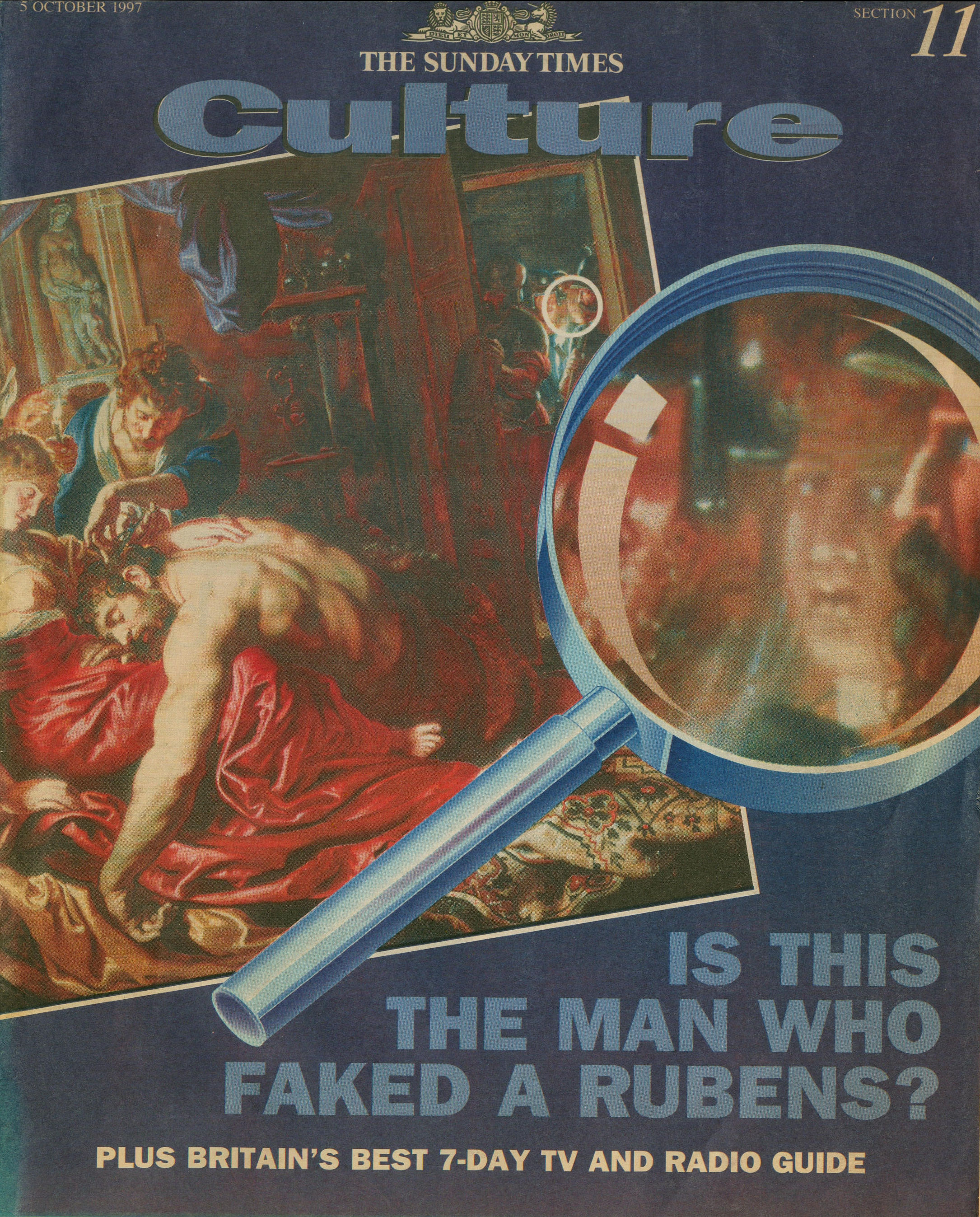
Above, Fig. 8: The Sunday Times’ 5 October 1997 coverage of Kasia Pisarek’s rejection of the Samson and Delilah’s Rubens ascription.
Certain suspicions seem to have arisen in Waldemar Januszczak’s mind as he (at that date) rejected the Samson and Delilah’s Rubens attribution in the above Culture Magazine feature and pressed the striking Whodunnit Mystery of the Disappeared Back:
“…I put this to the gallery’s chief conservator, Martin Wyld, who quips cheerfully that he was rather proud of having been accused; planing a 17th-century oak panel to wafer thinness and attaching it perfectly to blockboard while leaving its surface in pristine condition, is an exceptional feat of restoration. Nobody would or should do it today. Whoever did it earlier did a masterful job. Why did they do it at all? If a painting is in exceptionally good condition, why was there any need to hazard the transfer to block-board? A question neither the chief conservator nor MacGregor can answer. All I got from them both is the National Gallery version of: it wasn’t us, guv.”
Had Januszczak been a student of the National Gallery’s Technical Bulletins he might have recalled that accounts were given in the 1985 and 1986 issues of how Martin Wyld had chiselled away the entire wood panel of seven giant planks just under two metres long of Cima’s The Incredulity of St Thomas and that, in the first stage of this supposedly now verboten practice, the panel was reduced “from c. 5 cm to 1 cm” and in the second stage, the remaining 1 cm of wood was chiselled away entirely until the back of the original gesso coatings was exposed and ready to be attached for ever to its entirely new synthetic materials sandwich.
For a glimpse into the National Gallery’s subterranean Factory for Restoration and Attribution Rehabilitations, see:The National Gallery’s Made Just like Rubens Samson and Delilah with Cropped Toes
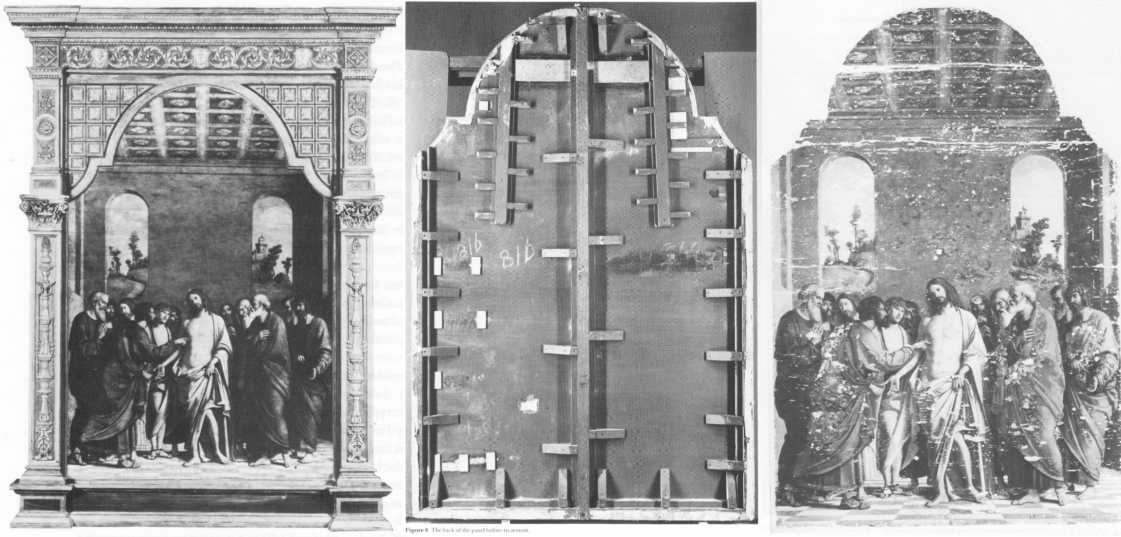
Above, Fig. 9: The National Gallery’s Cima da Conegliano altarpiece, The Incredulity of S. Thomas. Left, the altarpiece before restoration; Centre, the back of the panel, before its entire removal and replacement; Right, as seen after cleaning and before retouching – and after the transfer of the surviving gesso and paint film onto a multi-layered synthetic support.
RECORDS v RECOLLECTIONS AND BOY-GANGS IN ACTION
If the documentary record is to be trusted, it can be said with certainty that someone within the National Gallery covertly planed the Samson and Delilah panel. Notwithstanding his later Jaffé-flaunted recollection of August 2000, Frans Baudouin [*6] had, in his 1980 condition report prepared for the Samson and Delilah’s owner, Mrs Margaret Köser, solemnly testified on his (likely financially remunerated) professional oath (as the picture was about to be dispatched by the banker Jan Bosselaers from Antwerp to Christie’s in London), that it was a panel between 2.5 cms and 4 cms thick – and, therefore, had not-yet been planed down to a thickness of under 3 millimetres and cemented onto a sheet of modern blockboard. And yet, in the face of all such precisely documented facts between 1930 and 1980, David Bomford would, in his 1983 National Gallery Technical Bulletin account, backdate the planing to an unspecified time, place, and person – viz: “At some time, probably during the present century…” – and, when so-saying, would offer not one jot of supporting technical, photographic or documentary evidence in an institution that had long claimed exemplary record keeping practices.
[*6] Frans Baudouin was described in Codart on his death in 2005 as: “the doyen of Flemish art historians. He was the former director of the Rubenshuis and the driving force behind the founding of the Rubenianum, as well as an outstanding specialist in Rubens.” Nonetheless, he had declined to discuss the Samson and Delilah’s attribution with Euphrosyne Doxiadis (the first critic of the picture’s ascription and a co-author of the 1992 Report submitted to the National Gallery) whom he had met socially. In his August 2000 Apollo article, Dr. Jaffé, belatedly acknowledging Burchard’s certificate of authenticity record of the original panel, wrote: “Three Rubens experts – Dr. Frans Baudouin, Dr. Reinhold Baumstark and Dr. Hubert von Sonnenburg – who had been contacted by potential purchasers and therefore studied the painting with particular attention, all recall seeing it in its present condition just prior to its sale at auction on 11 July 1980.”
Powerful and triangulated testimony, it might well have been thought. However, one might also assume, for example, that Baudouin’s professional documents were likely more trustworthy than his twenty years-old recollections. In support of the former, the photograph (above, Fig. 2) of the Samson and Delilah when out of frame in 1980, and as supplied to Euphrosyne Doxiadis by Jan Bosselaers, along with Baudouin’s own 1980 certificate of condition for the Samson and Delilah might be cited. Further, as mentioned, in 2001 Doxiadis asked Baumstark’s successor at the Liechtenstein Princely Collections, Dr Uwe Wieszorek, if the then-Prince of Liechtenstein had been the underbidder at the 1980 Christie’s sale. In NG6461 she now reports: “He assured me categorically in two letters that as far as the Collections were aware, the Prince was not the underbidder, nor had he even taken part in the bidding.”
As for Dr. Hubert von Sonnenburg [*7], the then Head of Conservation for the Metropolitan Museum, might he be taken as the unsuccessful underbidder? When advising that museum on the possible purchase of the then-sublimely preserved Velázquez Juan de Pareja (which was bought for the Met. from Christie’s in 1971), Sonnenburg had strenuously advised the picture should under no circumstances be bought if its canvas had been relined. Would he likely have advised that great museum to buy a reduced panel laid on blockboard at a nowhere-recorded location and time? If he had, had the Met. attempted to buy the Samson and Delilah but been outbid for once by the National Gallery? Jaffé does not say – but where Christopher Brown had told Euphrosyne Doxiadis that the Prince of Lichtenstein had been the underbidder, for their part Christie’s had refused at the time of the sale to identify the (to this day, mysterious) underbidder, whose bids were said to have been relayed to the main sale room by telephone from an anteroom.
[*7] As we noted in a March 2011 post – Hubert von Sonnenburg was certainly an adept of art museum secrecy:
When, in 1971, the Met. snatched Velázquez’s Juan de Pareja from the British (who had owned it for centuries) Thomas Hoving, Ted Rousseau, von Sonnenburg and Everett Fahy had all flown to London, Madrid, and Rome – a sort of “boy-gang”, as they saw it, playing at spreading rumours like “the disinformation section of the KGB” – as Hoving (who later claimed to have discussed with Wildenstein’s how to “manipulate the art press and crank up the rumor mill” in a general strategy of “dissimulation and misleading rumors”) put it in his memoir. Even when successfully bought, the Velázquez was not paraded at the Met. but, rather, was “sneaked” into Wildenstein and Company “for secrecy”, partly because funds had been committed without the Board’s knowledge and also because, as Hoving put it, the Board had to remain longer in the dark as further “total secrecy” would be needed to “prepare our public relations stance” and to “have the time to clean it.” The deception of the public was to be absolute: for a short period before the restoration, the picture was exhibited to New Yorkers as if it were Wildenstein’s own property. Subsequently, the Met audiences only got to see the von Sonenburg-redone Juan de Pareja and not the miraculously well-preserved jewel that had, some time before, been taken to the New World by a triumphalist, dissimulating art world boy-gang.
In Part II – A TALE OF TWO ASCRIPTIONS AND THEIR RESPECTIVE TECHNICAL EXAMINATIONS – we examine the remarkable methodological discrepancies evident in the National Gallery’s own respective 1983 accounts of its two expensively bought 1980 panel paintings, and show why the Samson and Delilah should never have been presented from 1930 onwards as the long lost Rubens of 1609-10.
POSTSCRIPT: See Dalya Alberge’s disclosures in today’s Guardian:
A £2.5m dud? Fresh doubt cast on authenticity of National Gallery Rubens
15 June 2025
To Criticise a Critic
An examination of certain pre-emptive scholarly/art market establishment strikes against a pending book that rejects the Rubens ascription of the National Gallery’s contested Samson and Delilah.
Michael Daley writes: Those who challenge art establishment scholars or institutions can suffer swift repudiation and denigration in lieu of frank and open debate, as I discovered when supporting Prof James Beck’s criticisms of the Sistine Chapel Ceiling restoration in the late 1980s. In the 1996 edition of the Beck/Daley Art Restoration – The Culture, The Business, And The Scandal, in a chapter headed “The Establishment Counter-attacks”, I noted:
“When criticized in this area, institutions react institutionally, which is to say, by deploying self-protecting mechanisms common to all establishments. The best and most favoured response is no response, implying that the criticism is inconsequential and deserves to be ignored. In those instances where a response is unavoidable, it is thought best to be made by proxy… When a direct defence is necessary, its tone becomes all important. By tradition, the tone ranges from amused disdain, through supercilious dismissiveness to outright disparagement and attempts to discredit personal or professional credentials.”
It seems little has changed and that responses to the imminent arrival of Euphrosyne Doxiadis’s book on the National Gallery’s supposed Rubens Samson and Delilah (NG6461 – The Fake National Gallery Rubens) have run true to institutional templates. As a case in point, take this even-handed Artnet account: “Is This Rubens Real? Inside the ‘Samson and Delilah’ Debate” by Jo Lawson-Tancred.
Lawson-Tancred reports an anonymous National Gallery spokesman’s claims that the picture “has long been accepted by Rubens scholars” and that the Gallery finds no cause to update its initial technical examination of the painting [as had been reported in its 1983 Technical Bulletin] and whose “findings remain valid.” The first part is true – Rubens scholars had so accepted the attribution. However, the insistence that the report on the then recently acquired, exhibited, and restored £2.53mn picture requires no updating disregards subsequent findings on this and other Rubens paintings.
To be precise, the Gallery claimed in 1983: “At some time, probably during the present century, the panel was planed-down to a thickness of 3mm and subsequently glued onto a sheet of blockboard”. As Doxiadis and we have established the picture had emerged as a panel in 1929 – albeit ascribed to Honthorst. Crucially, it had remained a panel when sent to Christie’s, London, for sale in 1980 as an autograph Rubens – indeed it was precisely so described in Christie’s 1980 catalogue (see Fig. 1 below.) The picture’s physical state as a panel had been disclosed to Doxiadis by a Belgian banker who had wished to buy the picture for the Rockox House museum in 1977 and who again held it in Antwerp for its owner in 1980 before sending it on her behalf to Christie’s, London. Beyond any question, it was still an intact panel at that date.
WHERE’S THE BEEF?
Fig. 1, above: Christie’s 1980 sale catalogue entry on the Rubens-attributed Samson and Delilah panel. Note how the entry comprises a daisy-chain of “probablys” and “possiblys” – and also its parenthetical disclosure that, throughout its claimed long stay in the Liechtenstein Collection, this Samson and Delilah had not been judged a Rubens.
Given that we informed the National Gallery a quarter of a century ago of the picture’s confirmed physical status as a bowed and cradled panel in good shape in 1980, its 1983 technical account has long needed correction because the planing had not taken place before 1980, let alone in the 19th century. And yet, that manifestly unfounded suggestion that the planing might have occurred before the 20th century had been endorsed by Joyce Plesters, the Gallery’s Head of Science in the 1983 Technical Bulletin: “Unfortunately, as David Bomford has described, the back of the panel had been planed down to a thickness of only about 3mm and then the whole set into blockboard before the picture was acquired by the National Gallery…” In truth, it had not been set into the blockboard, but rather, as Bomford had correctly reported, and Doxiadis would later discover, it had been glued onto a blockboard sheet larger than itself and fitted into a new purpose made frame.
On the combined records of 1929 and 1980 that Doxiadis and we had uncovered – and as on Christie’s own published catalogue description – it followed that the planing could only have occurred after the picture was sold to the Gallery for its then world record Rubens price of £2.53million in 1980. Our concerns were compounded when informed (by the National Gallery’s then director, Neil MacGregor) that the Gallery had not followed its own procedure of preparing written curatorial and restoration reports on the picture’s desirability and condition to assist the trustees when they examined the picture (which had been loaned to the Gallery ahead of the sale – see below) to consider an authorisation of the purchase.
AN APPEAL TO AUTHORITY
In view of Doxiadis’s recently reported disclosures on the picture’s physical condition in 1980 (Dalya Alberge “Fresh doubt cast on authenticity of Rubens painting in the National Gallery,” ) Lawson-Tancred might have questioned or challenged the National Gallery’s abiding stance. Instead, she reported:
“…despite the marginal but adamant voices of researchers like Doxiadis, top scholars in the field support Samson and Delilah’s authenticity unequivocally. Chief among these is Nils Büttner, chairman of the Centrum Rubenianum in Antwerp, who is working on the Corpus Rubenianum, the definitive catalogue raisonné for the Flemish Baroque painter. He has previously described the doubts about Samson and Delilah’s provenance as “conspiracy theories.” However, Lawson-Tancred also noted that “Büttner [had] declined to comment on Doxiadis’s book”. While Büttner, presumably, has not yet read the unpublished book, his assertions received immediate support from players in the art trade:
“Büttner’s position is backed by his peers like Adam Busiakiewicz, a lecturer and consultant on Old Master paintings for Sotheby’s. He pointed out to the Telegraph that Doxiadis is not a scholar of the period and has mostly published on Greco-Roman antiquities previously. Though she ‘had a hunch the quality of the picture wasn’t good enough’, he said, ‘I think there are some misunderstandings about the painting.’”
On misunderstandings, Busiakiewicz (who seems also to be employed by the art market “sleeper-hunter” and former Philip Mould assistant, Bendor Grosvenor, on the latter’s “Art History News” blog site), paraded just such in his reported burst of professional condescension to Doxiadis:
“Busiakiewicz explained that a comparison between Samson and Delilah and other paintings by Rubens are complicated, especially when they were made decades apart. ‘He’s an artist that changed his style throughout his career,’ he said. ‘Art historians who specialize in paintings like Rubens’ can track these changes.’ It is for this reason that the National Gallery painting has been connected to Rubens’s interest in the work of Caravaggio and other Renaissance masters whose work he had, at that time, recently encountered while traveling in Italy.”
While it is widely known that Rubens underwent changes of manner in his later paintings, Busiakiewicz failed to acknowledge (or appreciate?) that Doxiadis, we, and other critics of the attribution, such as Dr Kasia Pisarek, have for decades pointed out and demonstrated that the Samson and Delilah is glaringly unlike the bona fide Rubens paintings made precisely in that brief period when the artist had just returned from Italy.
Specifically, we had reminded readers in November 2021 that:
“In a pioneering 1992 report, the scholar/painter Euphrosyne Doxiadis and the painters Stephen Harvey and Siân Hopkinson, conducted a focussed survey of six Rubens paintings of 1609 and 1610 and demonstrated that “All these display a consistency and quality of style which is not shared by the Samson and Delilah”. That report – “Delilah cut off Samson’s hair, but who cut off his toes? The case against the National Gallery’s ‘Rubens’ Samson and Delilah” – was placed in the National Gallery’s Samson and Delilah dossiers and is published on the dedicated In Rubens Name website.”
WHITHER THE PANEL’S BACK
Above, Fig. 2: The covers of two ArtWatch UK journals given over to detailed accounts of the Samson and Delilah problems and shortcomings.
In issue 21 Kasia Pisarek wrote: “The Corpus Rubenianum project is based on the archive left by the late Dr Ludwig Burchard. Should it perhaps follow it less closely? Dr Burchard was an active Rubens attributionist in Berlin before the Second World War and in London afterwards. Several paintings formerly attributed to Rubens’s school or studio or even to another artist (such as Samson and Delilah), were reinstated by Burchard as by the master. I traced many of his attributions – he was not infallible in his judgement and changed his mind. Surprisingly, over sixty pictures* attributed to Rubens were later downgraded (in Corpus Rubenianum) to studio works, copies or imitations.” Pisarek adds: “they were, however, mostly portraits of small or medium dimensions.”
If a major work like Samson and Delilah might be considered something of an exception, Doxiadis supplies a possible explanation – Burchard was a relative of one of the owners of the dealing firm that had brought the supposed Honthorst to the marketplace.
*On the subsequent completion of her PhD thesis – Rubens and Connoisseurship: Problems of Attribution and Rediscovery in British and American Collections – Dr Pisarek remarked: “I traced many paintings attributed by Ludwig Burchard… At least seventy-five works he certified authentic were subsequently downgraded to studio works, copies, and imitations in the volumes of the Corpus Rubenianum, and the list is not complete… can we trust Burchard’s old rediscovery and attribution of the London Samson and Delilah?)
In issue No.11 we had written: “On December 17th 1998 Dr Jaffe [David Jaffé, then Senior Curator at the National Gallery] writes: ‘Sotheby’s auctioned Rubens Deluge as ‘oil on oak panel’ when, in fact, it was on a marouflaged panel’.” But how is this known? It was so, Jaffé discloses, “according to the condition report made in 1996-97 when the picture was loaned the National Gallery…” But no such condition report was made when the Samson and Delilah was loaned to the National Gallery by Christies ahead of the sale. That condition report on the Deluge had been prepared by the National Gallery’s timber specialist restorer, Anthony Reeve. As recently as 1982 Reeve had reported in the National Gallery’s Technical Bulletin (see Fig. 7) that the Samson and Delilah was “one of only three well-made straightforward Rubens panels in the collection” – which panels, he elaborated, required stable humidity because otherwise “The effect of wood shrinkage on the exposed backs of the panel…is for the front to become convex, and perhaps slightly corrugated”. Had the Samson and Delilah been planed-down and glued to blockboard at that date there would have been no possibility of its back being subjected to environmental hazards. It might be thought inconceivable that the National Gallery should have lost recollection of Reeve’s testimony by the following year and when writing in the same publication. As the National Gallery’s senior picture restorer Reeve was held after his death by Neil MacGregor to be the “supreme practitioner of his generation.”
There are yet further confirmations of the panel’s still-then exposed back. Doxiadis had obtained a Belgian condition report on the Samson and Delilah which began: “On arrival on 4 March 1980, about 14.30 hours the painting mentioned above (panel, 185 x 205 cms) was in good shape…” Doxiadis’s account squared with testimony supplied to ArtWatch by the art critic Brian Sewell (an ex-Christie’s man who took pride in having there identified an oil sketch as the modello for the Rubens Samson and Delilah), namely: that the panel had not been mounted on blockboard; that the back of the panel had been painted in a darkish matt colour and was criss-crossed with supporting bars of wood; that because Christie’s customary stencil number was made with dark paint it had been superimposed over a patch of white paint Christie’s had applied to the panel’s back.
Presumably Busiakiewicz has yet to access the 1992 Doxiadis/Harvey/Hopkinson report. For the record, the document I found in the National Gallery’s Samson and Delilah dossiers was a copy of the picture’s 1929 certificate of authenticity written by the great but subsequently discredited Rubens specialist Ludwig Burchard who had observed: “The picture is in a remarkably good state of preservation with even the back of the panel in its original condition”.
A CRITICAL FORMATION ASSEMBLES…
Where Busiakiewicz patronises Doxiadis on an allegedly insufficient familiarity with the Samson and Delilah literature, Nils Büttner has been joined in that disparagement by Bert Watteeuw, the director of the Antwerp Rubens House. As John Smith reports in the EuroWeekly:
“The latest suggestion that this is a 20th-century copy comes from Greek art historian Euphrosyne Doxiadis in her new book The Fake Rubens although this accusation finds little support from one of Belgium’s top Rubens experts Bert Watteeuw. Not only does he pour scorn on her status as a genuine expert, suggesting that anyone of any standard would have already checked with his Antwerp Rubens House and other specialist houses about the painting. In addition, he also said: ‘the provenance of this painting is very well known throughout the 17th, 18th and 19th centuries. A provenance that can be trusted is always crucial’…”
This implied claim of a trustworthy Rubens provenance was a brazen sleight of hand: what John Smith was not to know is that, as shown above, the provenance concerned at no point confirmed the painting as being by Rubens’ hand. Being thus kept in the dark, poor Smith could only but conclude: “Whilst the National Gallery has kept a dignified silence on the matter of the painting, it is no doubt delighted that one of the great Rubens scholars has come out publicly to dismiss the fake claim by Doxiadis which Watteeuw considers is purely invented to promote her book.”
Delighted as the National Gallery might be and while its Trappist silence might do yet further service as an institutionally imperative damage limitation exercise, it remains an untenable stance because, as one very distinguished former National Gallery trustee at the time of the Samson and Delilah purchase told Doxiadis, “the truth will come out – it always does”. As for Watteeuw, for a Rubens scholar at the supposed top of his professional tree to resort to professionally unfounded claims and personally directed abuse is as counterproductive as it is contemptible.
Moreover, in this regard, Watteeuw might be considered a serial offender: when apprised of negative AI findings on the Samson and Delilah panel he told another journalist, Colin Clapson (‘Fake Rubens in London’s National Gallery? This painting is genuine” counters Rubens House director Bert Watteeuw”) that Doxiadis’s soon-to-be-published book is “Complete nonsense and not based on facts. To begin with, I do not know this art historian and that is a sign. Most researchers on Rubens have passed by our Rubens House and the Rubenianium, the Rubens Library, in the search of sources and information,’ says Bert Watteeuw, the director of the Antwerp Rubens House. ‘Moreover, Doxiadis has an agenda of her own: to promote her book and that seems to be working well. In such cases conspiracies à la Dan Brown are more interesting than science.’ Whilst attacking its critic, Watteeuw gifts the National Gallery a clean bill of scholarly probity on its protracted silence: “‘The painting ‘Samson and Delilah’ in London is a genuine Rubens, a masterpiece. It is logical that the National Gallery does not want to comment or discuss its authenticity,’ he says.”
DISALLOWED TESTIMONY
In view of the above it might seem that among Rubens establishment scholars generally and for the National Gallery itself, nothing can be allowed to count as evidence against the challenged panel’s Rubens ascription. For example, in 2021, the brushwork of the Samson and Delilah was compared with that found in no fewer than 148 uncontested Rubens paintings. As Dalya Alberge noted in the Guardian (“Was famed Samson and Delilah really painted by Rubens? No, says AI”), “Its report concludes: ‘The AI System evaluates Samson and Delilah not to be an original artwork by Rubens with a probability of 91.78%.’ In contrast, the scientists’ analysis of another National Gallery Rubens – A View of Het Steen in the Early Morning – came out with a probability of 98.76% in favour of the artist.”
Such disinterested testimony is dismissed by the affronted – and perhaps professionally discomfited – scholarly grandees: “Watteeuw also dismisses AI research dating from a few years ago. ‘When that appeared, we engaged in extensive behind-the-scenes dialogue with that Swiss firm that had carried it out. AI can only work if you train it with an artist’s entire oeuvre. That was not the case at that time.’” (Watteeuw was here echoing Bendor Grosvenor’s mis-characterisation of the Swiss firm: “It is simply not possible to determine whether a painting is by Rubens by relying on poor quality images [sic] of not much more than half of his oeuvre…”) First, there is once again, as with Doxiadis, an implicit professional slur on the firm in question. Second, there is yet further evidence that logic is underemployed by many art establishment players: if, given the very great distinctiveness of Rubens’ style and painterly applications, you can find no visual correspondences when comparing the Samson and Delilah’s brushwork with a single one of 148 secure Rubens paintings, why would you be likely to find such correspondences in another batch of equally secure Rubens paintings? At this point, calling for yet more extensive AI tests on a vast oeuvre – and one with ever-shifting boundaries – is procrastination, the obliging sister of obdurate institutional silence.
CAN’T SEE – OR WON’T SEE?
Professor James Beck once remarked that too many of his peers “look with their ears” and that it is “only the artists who can see things clearly”. It so happens that all the principal critics of the Samson and Delilah picture – Doxiadis/Harvey/Hopkinson/Daley/Pisarek – happen to have trained as artists, as Beck himself had done. Doxiadis noticed what no Rubens scholar, so far as we know, had noticed: that while Rubens painted with round brushes, the shadowy author of the Samson and Delilah had deployed flat brushes.
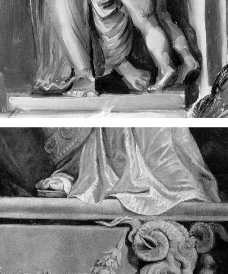
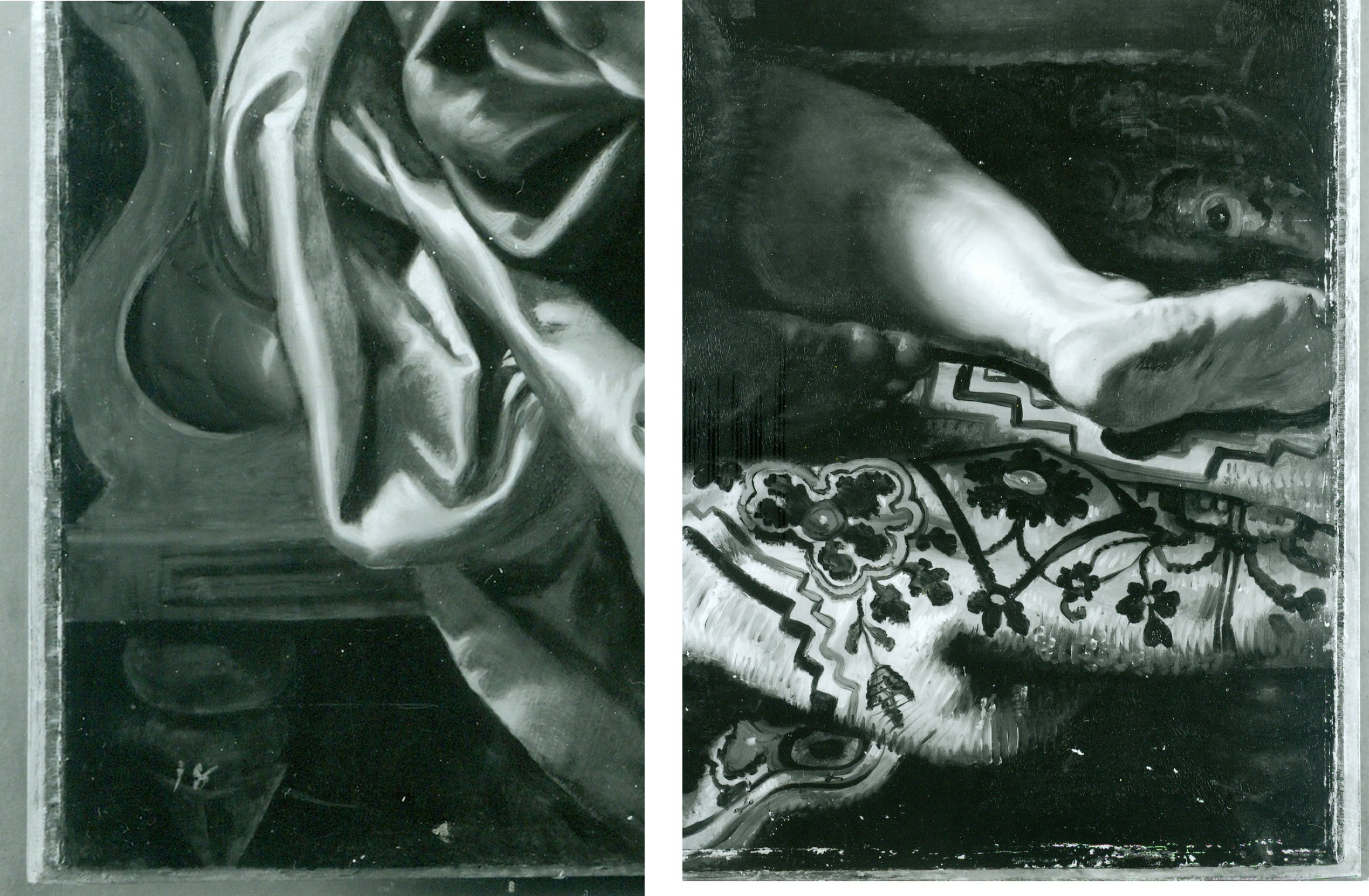
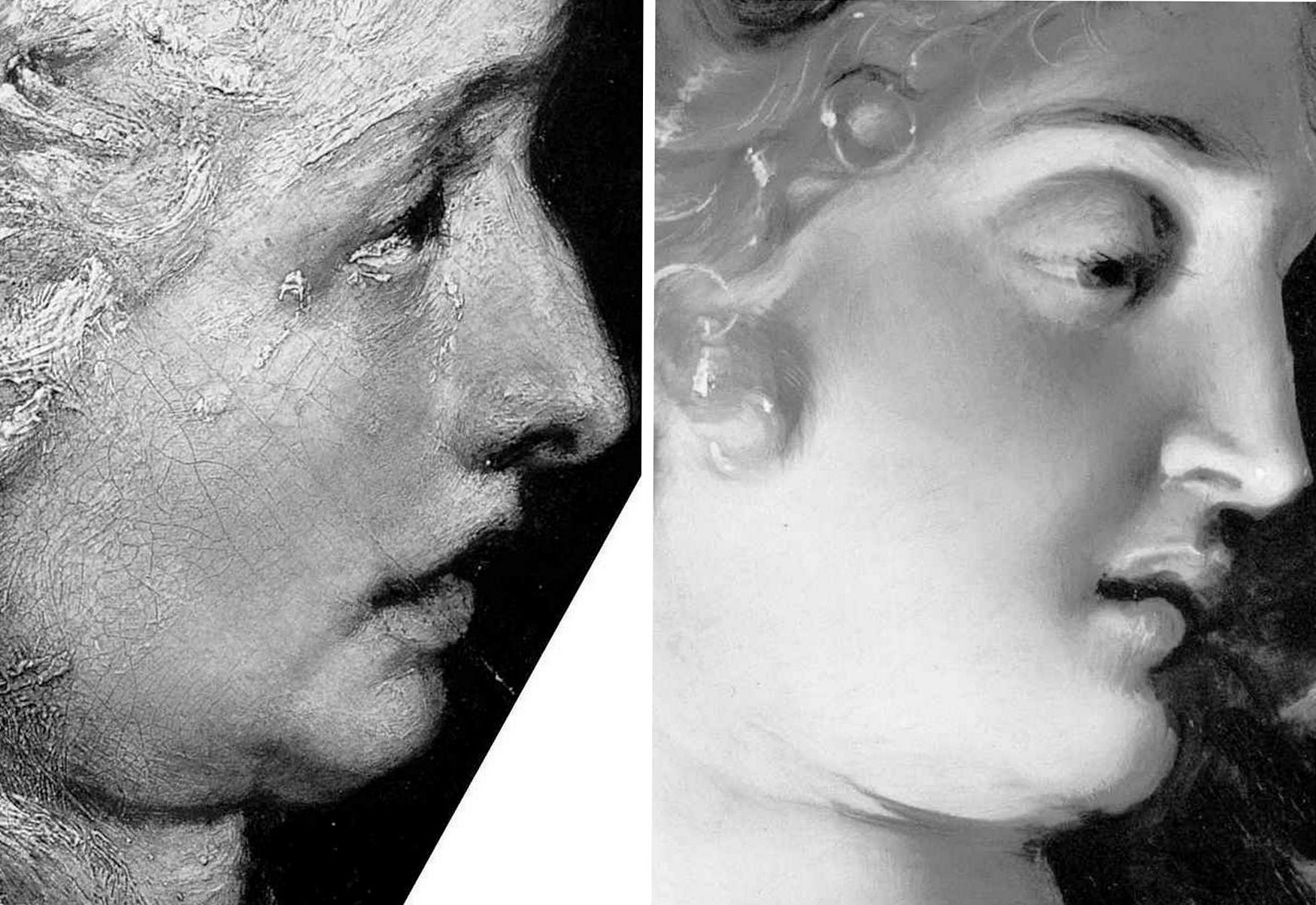
Above, Fig. 3: Top, detail of the National Gallery’s Samson and Delilah; above, detail of Rubens’ The Raising of the Cross, Antwerp Cathedral. Where the former is claimed to be a lost picture Rubens painted in 1609-10, the latter was indisputably made by Rubens between 1610-11. Such pronounced differences in brushwork are inconceivable as that of two autograph paintings made at the same moment in Rubens’ oeuvre. Who, looking at this photo-comparison, could believe that Rubens had flitted between the ugly angular Cubist faceted feet in the Samson and Delilah statue (– try counting the toes and note the Art Deco zigzagging hem), and the superb plastic fluency, grace and anatomical fidelity seen throughout the Raising of the Cross?
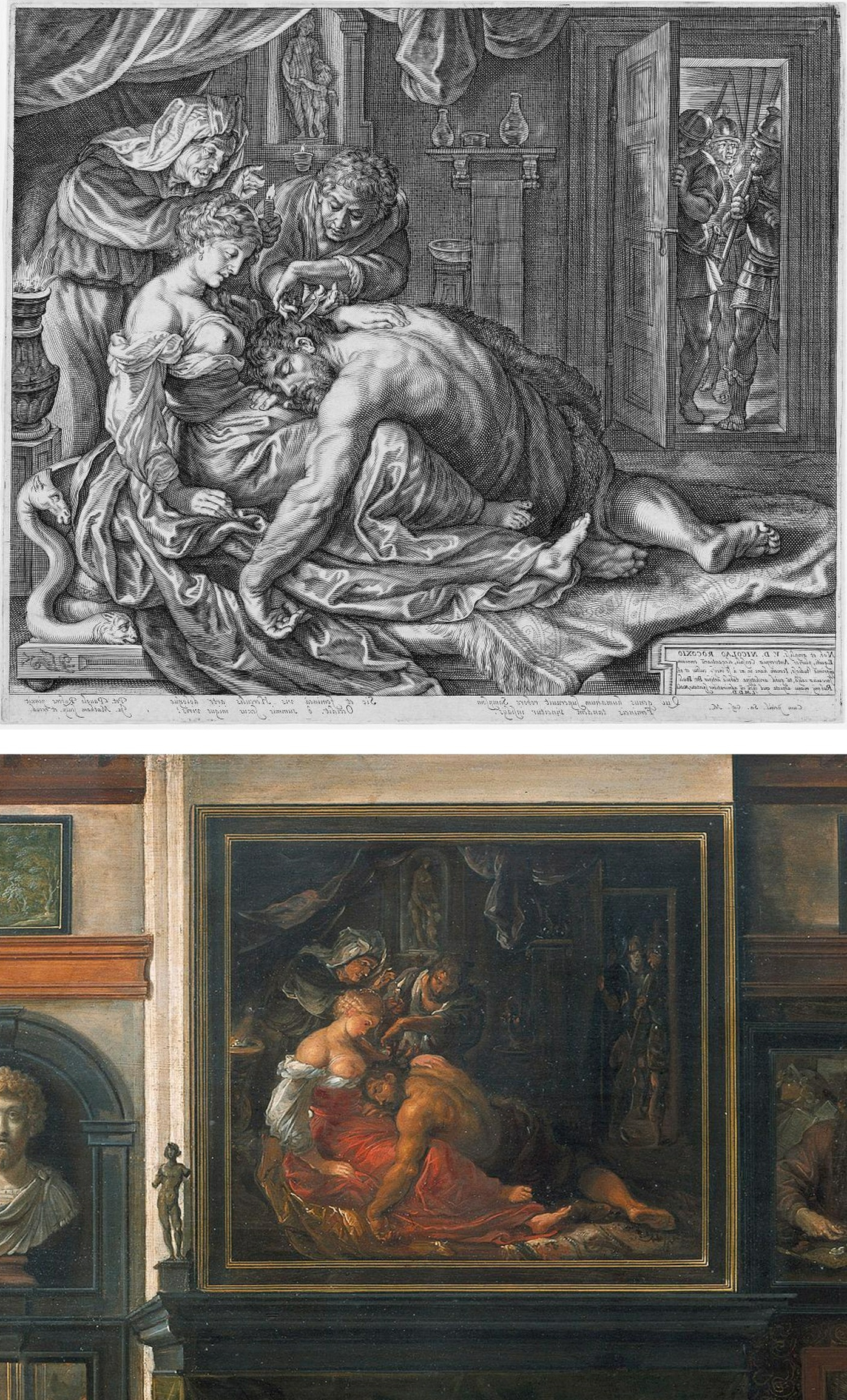
Above, Fig. 4: Two copies of the lost original Rubens Samson and Delilah – Top, Jacob Matham’s c. 1613 engraving (here reversed); bottom, Frans Francken II, a detail of his oil on copper depiction of the Grand Salon in Nicolaas Rockox’s House, made between 1615 and before 1640. Neither copy shows the cropped right foot found on the National Gallery picture. No one has cited a similarly cropped limb in any finished Rubens painting.
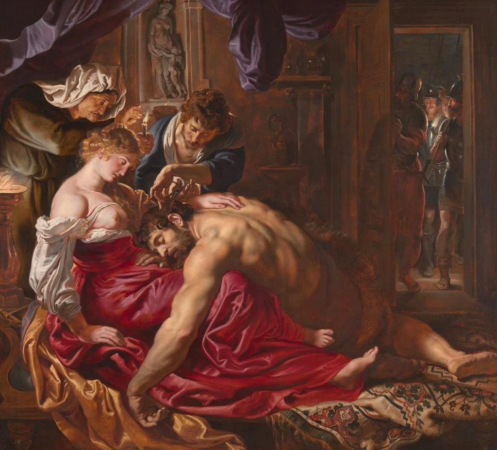
Above, Fig. 5: The National Gallery’s supposed Rubens Samson and Delilah painting.
Above, Fig. 6: Left, a detail (from the left wing) of Rubens’ 1609-1610 The Raising of the Cross, Antwerp Cathedral. Right, a detail of the National Gallery’s Samson and Delilah which Christopher Brown (David Jaffe’s predecessor as Senior Curator at the National Gallery) dates at “c.1609” and Jaffé puts “about 1610”. Among the National Gallery picture’s countless visual disqualifications, we would cite: the thinness of the paint; the absence of a 17th century craquelure; the irresolute profile; the cinematic lighting of the head; and, the anatomical and perspectival travestying of Delilah’s nose/mouth/chin configuration.
For many more disqualifying photo-comparisons, see Abigail Buchanan’s “The National Gallery ‘masterpiece’ that’s probably a fake”.
TANGLED DOCUMENTARY WEBS…
Such clinching visual evidence, however, leaves Adam Busiakiewicz unmoved and unpersuaded. He tells the Daily Telegraph that the National Gallery Samson and Delilah could be in no one but Rubens’ hand – viz: “‘It is a really stonking great picture,’ he says. ‘The textures, the sumptuous drapery, the muscular back – no one except Rubens could have painted that.’” Each to his own art critical estimations, perhaps, but what happened to the Samson and Delilah when in the National Gallery’s restoration studios is – or should be – a matter of scrupulously recorded and reported facts. We are now faced by a major art institution that cannot/will not give a proper and credible account of its own actions; that effectively denies, even, the historical record of its own doings. Consider the recorded facts: (1) it is a matter of record that this painting emerged in 1929 as a sound panel and that it remained so in 1977 (when exhibited in Antwerp); (2) it is known that in 1980 the picture was a panel when it was dispatched to London; when it arrived in London; and, when it was sold in London to the National Gallery; (3) it is known that when in London and on exhibition at the National Gallery it remained a panel in 1982 (- see Fig. 7 below). However, it is also known that the following year the National Gallery claimed – after the picture had been restored at the Gallery – that it was not now a panel at all – and, indeed, that it had not been a panel for a very long time and possibly, even, into the 19th century or beyond. This extraordinary denial of the picture’s own documented historical record might seem inexplicable in a major national institution, but it is by no means unprecedented – and nor, for that matter, is the Gallery’s effective outsourcing of its own defence to obligingly helpful scholarly proxies.
Not the least consequence of misleading institutionally-official accounts is the corruption of subsequent scholarship and the making of monkeys out of good faith and technically trusting patrons. In part-defence against widespread and prolonged criticisms of its notoriously over-energetic techno-adventurist restorations, the National Gallery ran a series of didactic, so-called “Making and Meaning” exhibitions. One such in 1996-97 was Rubens’s Landscapes. It was organised jointly by the Gallery’s then senior curator, Christopher Brown, and by its senior restorer, Anthony Reeve. The exhibition was sponsored by Esso UK plc and its chairman and chief executive, K.H. Taylor, expressed pleasure in being associated with “the quality of research and scholarship that are the Gallery’s hallmarks”. In turn, the then National Gallery director, Neil MacGregor, expressed gratitude to Esso for its generosity, for year after year, in enabling the Gallery to “present to the public recent research on how and why the pictures were made”. In a section on the rigorously high standards of professional panel making in 17th century Antwerp it was noted that panels were marked with their makers’ monograms and that the panel back of Rubens’s “Chapeau de Paille” portrait bore Antwerp’s coat of arms and the carved initials of its maker, Michiel Vriendt. However, with the Samson and Delilah no such assurance was offered. Instead, the reader seemingly learns – with a nod to the contrary testimony of Reeve and Bomford/Plesters (see Fig. 7 below) that “A particularly fine panel made for Rubens by an Antwerp panelmaker is that for the Samson and Delilah, painted about 1609 for Nicolaas Rockox…” But then, after a section reprising Reeve’s own 1982 Technical Bulletin account of the risks posed to such fine panels by fluctuations in humidity, comes an abrupt claim that “The Samson and Delilah was planed down to a thickness of about three millimetres and set into [sic] a new blockboard panel before it was acquired by the National Gallery in 1980 and so no trace of a panelmaker’s mark can be found…”
Now, in Fig. 7 above we see two incompatible accounts that were made and published just a year apart in successive National Gallery Technical Bulletins. Which of the contrary pair might be taken by the public and future scholars to be the more reliable and trustworthy record? Reeve’s account had preceded that of Bomford/Plesters – he had seen and reported what he saw and knew. Brown must therefore have found himself in the unenviable position of having to choose between Reeve’s earlier account and the later contrary one of Bomford/Plesters. That is, he had either to accept that the picture came into the Gallery after it had been planed down by some unknown party at an indeterminate date and that Reeve had imagined and chronicled an entirely fictional panel comprised of “six [sic] horizontal oak planks, carefully planed and jointed”, or, recognising that Reeve of all people was unlikely to have confounded a new sheet of blockboard with an early 17th century Flemish oak panel and extol its technical virtues even among Rubens’s panels, or… what? What could Brown say of the Bomford/Plesters account when he was aware that the picture’s own dossiers contained the already widely press-reported and potentially explosive 1992 Doxiadis/Harvey/Hopkinson report precisely challenging the Bomford/Plesters account? Could he go down the middle and say that while the picture had come into the gallery as a panel in good shape – as Reeve had testified – when subsequently taken into restoration, it had been planed down and glued onto (not “into”) a new sheet of blockboard – and do so without offering any explanation for such a radical and inescapably material and historical evidence-erasing procedure? In the event, Brown did neither. Rather, he fudged a technically-incoherent mongrel account even though he and Reeve were the exhibition’s joint authors. That is, on the one hand he spoke of the Samson and Delilah having been a “particularly fine panel made for Rubens by an Antwerp panelmaker” and then, leaving a gaping, mystifying narrative hole in his own account, jumped to “The Samson and Delilah panel was planed down to… etc. etc.” This was a curatorial equivalent of the old comic book cop-out gag “With one bound, Jack was free”. It is not easy to conclude other than that it had seemed institutionally imperative to dissemble rather than clarify.
8 March 2025.
Connoisseurship: Examinations, Debates and Snap Visual Responses
The rising tide of old master “sleepers” and “discoveries” carries great dangers and demands snap judgements. Some candidates for upgrades intrigue, some look dubious, some scream “Fake!” Last week two cases caught our eye.
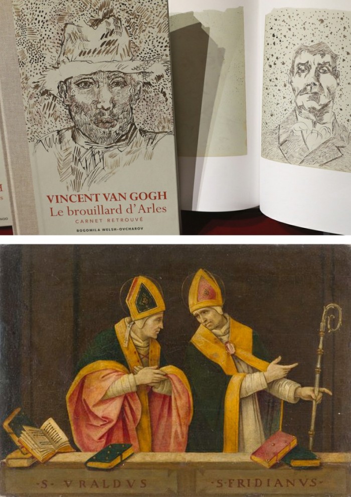
Fig. 1, above. Fig. 2, below. The newly discovered “Lost” Van Gogh sketchbook (above, top) rang our and many other fake bells. Then came a report that a small “Florentine School” painting on a €3-4k estimate fetched €375k at auction as a sleeping Filippino Lippi (above, Fig. 1). A link to another small work attributed to the artist at the North Carolina Museum of Art (Fig. 2, below) showed pronounced, seemingly reassuring correspondences, but something jarred.
On connoisseurship we hold that every claimant work should be rigorously “interrogated” in three crucial respects. Technically, in its physical composition; by documentation on its known or claimed histories (provenance); and, above all, by visual analysis because, in the visual arts, every picture is its own prime historical document and its inbuilt historically-generated artistic relationships constitute the primary subject of art critical appraisal and evaluation.
Failure to excise bad attributions deceives the public and corrupts oeuvres. A good picture has nothing to fear from challenges. No amount of scrutiny constitutes a threat as good pictures outlive their doubters and can fight another day. Argument is healthy and a successfully repulsed challenge can increase understanding and enhance a good picture’s lustre.
Vincent van Gogh: The Lost Arles Sketchbook
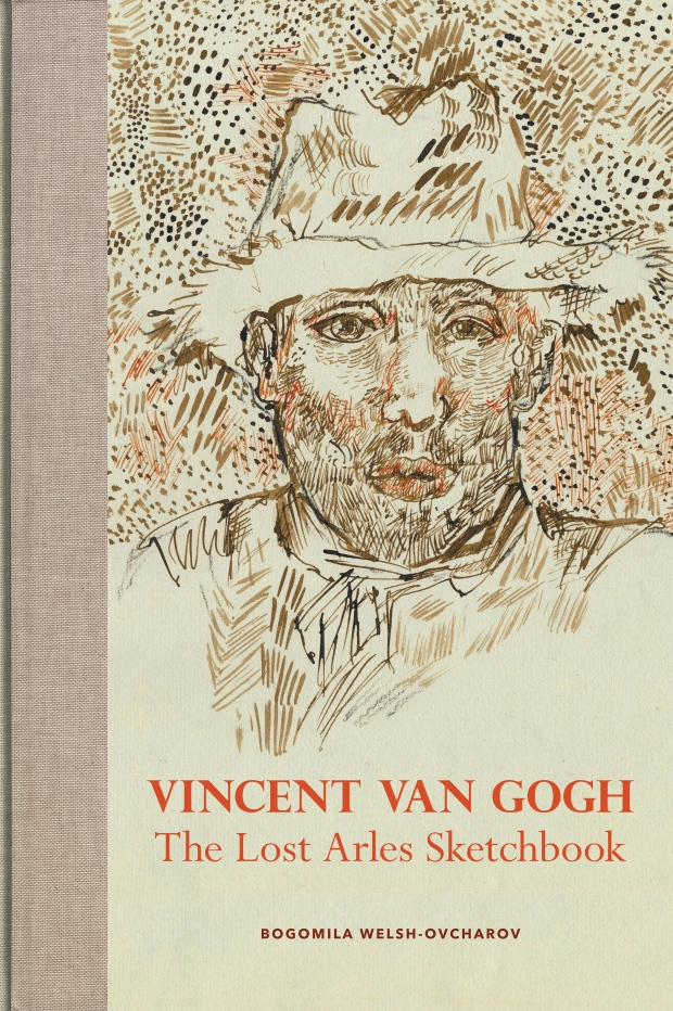
Above, Fig. 3. The controversial lost-but-now-found Van Gogh sketch book above is by Professor Bogomila Welsh-Ovcharov, a Van Gogh authority whose claims of authenticity are supported by Ronald Pickvance, author of Van Gogh in Arles, but the cover’s supposed Van Gogh ink self-portrait announces itself as a draughtsman’s pastiche, as Mark Hudson noted in the Daily Telegraph (“A romantic story but can it really live up to its promise?”, 16 November 2016).
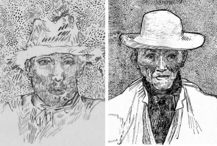
Above, Fig. 4. Simply by placing the supposed Van Gogh self-portrait next to an autograph portrait, immense and glaring differences become apparent: the author of the “discovered” drawing has abandoned symmetry with eyes of radically different sizes and a nose that seems product of a car crash. Throughout, the author mimics Van Gogh’s pen marks without comprehension of his form, power of design, and psychological acuity.
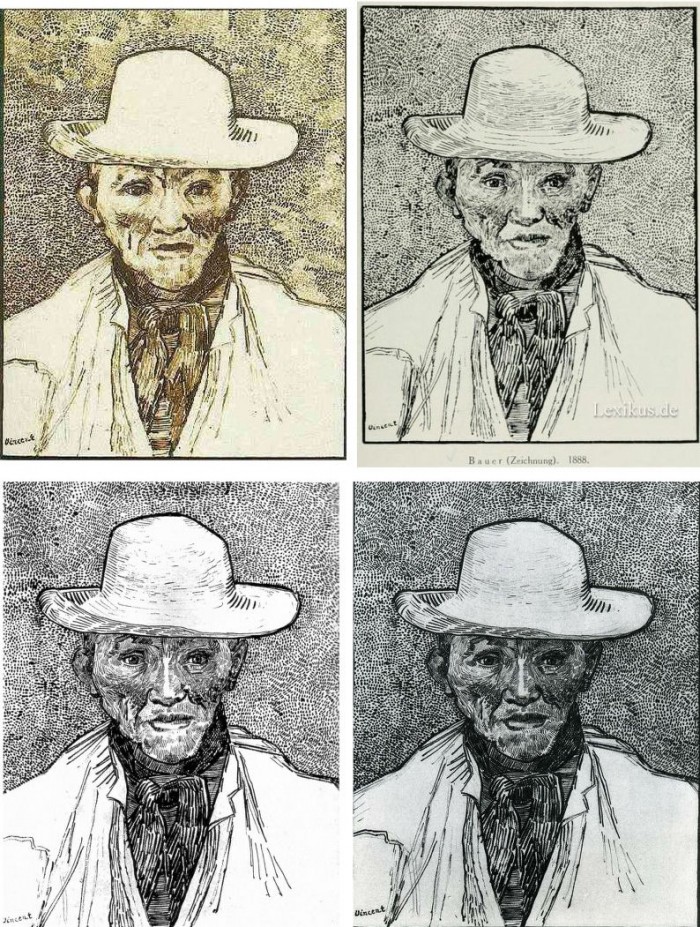
Above, Fig. 5. Instead of a form-camouflaging jumble of marks, the bona fide Van Gogh disports five graphically discrete component parts: a light-coloured jacket; a dark shirt and scarf; a varied but, on aggregate, mid-toned face; a light-toned hat with some mid and dark-toned form articulating shading; and, throwing all other values into relief, an agitated but tonally cohering background. Each of these spheres is allotted its own graphically purposive notations. The four images we show above for comparison are easily found online in historically successive reproductions. While these reproductions vary considerably, the force and artistic coherence of Van Gogh’s graphic intent and method shines through all.
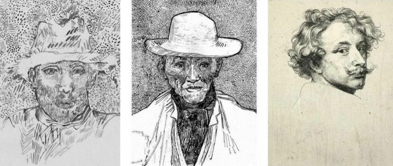
Above, Fig. 6. If we place the bona fide Van Gogh between the clumsy mimicking newcomer and a masterpiece of the greatest graphic brilliance – van Dyck’s etched self-portrait – it is clear that the Van Gogh has more kinship with the latter than with the former.
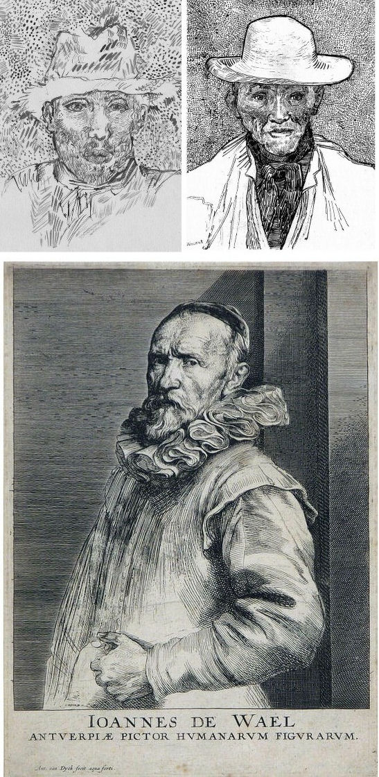
Above, Fig. 7. And if we compare the Van Gogh with an entirely autograph van Dyck etched state of a figure we find a common use of a toned background that throws both subjects’ flickeringly brilliant lights and darks into relief.
The Van Gogh Museum’s objections to the “Lost Arles Sketchbook” and its track record on Van Gogh attributions
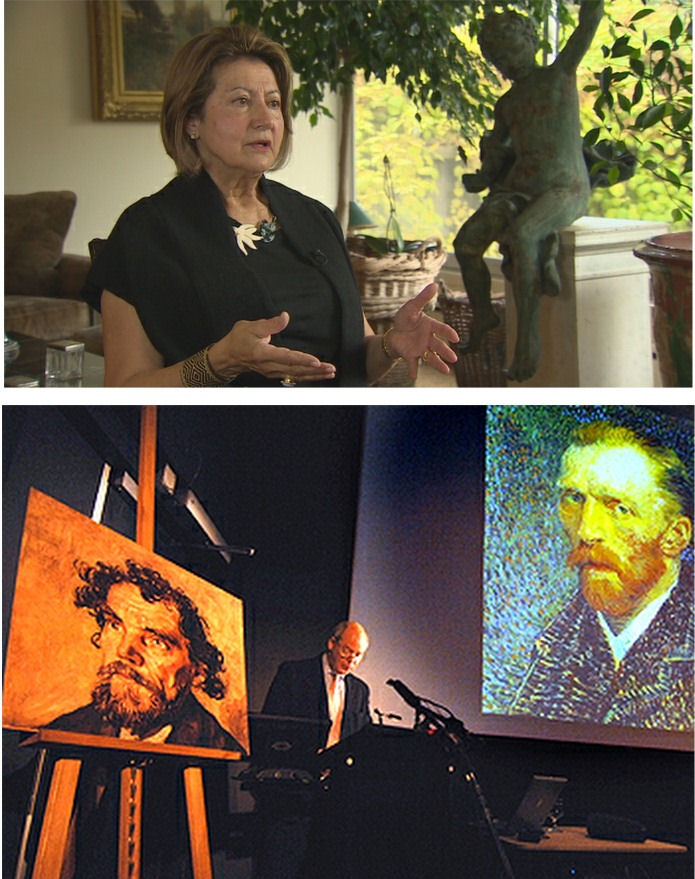
Above, Fig. 8. Prof. Welsh-Ovcharov (top) has responded to the Van Gogh Museum’s dismissal of the drawings with a rebuttal and a challenge to debate – thereby showing conviction and good faith. Her publisher reportedly characterises the proposed debate as “an opportunity to shed light on the conditions under which the Van Gogh Museum is claiming the de facto right to a monopoly of attribution.” This is a common plaint against authorities that block would-be, high-value attributions but our impression of the museum’s judgements is favourable.
In 2006 a Van Gogh – The “Head of a Man” owned by the National Gallery of Victoria in Australia (above left, on an easel) – was challenged by the art historian and Sunday Times art critic Frank Whitford when the portrait was loaned to an exhibition in Edinburgh. The newspaper asked our opinion and, when we demurred, sent a (revelatory) high resolution full colour compilation of all of Van Gogh’s painted portraits. We supported Whitford, saying to the newspaper (as reported in ArtWatch UK Journal, Spring 2008):
“The specific warning signs that should have alerted the buyer are:
“1] It is unique in Van Gogh’s portrait oeuvre
“2] It does not fit in the stylistic chronology that exists within that oeuvre. Compare it for example with the brushwork, colours and ‘attack’ of the Old Man with Beard, painted the year before that is in the Van Gogh Museum, and the Portrait of Camille Roulin painted a year or so later and that is also in the museum. There is an enormous but clear and logical development between those two pictures, from thick, laboured, relatively coarse brushwork to much more refined and ‘decorative’ marks – but both are entirely consistent and ‘all-over’ in their treatment.
“3] If its provenance goes back no further than Germany in the late 20s or early 30s, that is particularly unfortunate. Germany at the time was notorious for the certification by scholars (for a fee or sales cut) of dud works. The dealer René Gimpel has referred to the scandalous ‘amounts obtained by means of certificates given daily by German experts to German dealers. Just as there were paper marks, so there are paper canvases, an easy way of bringing dollars into Germany…The German title of Doktor impresses the Americans. The museums are even more intent than the collectors on defending their fakes or their mistaken attributions….’ By coincidence, in the current ArtWatch Journal [No 21], Kasia Pisarek cites the case of the great Rubens scholar Ludwig Burchard who issued so many optimistic certificates that he was unable ever to write his definitive book on the artist…She has identified over 60 Burchard attributions that have subsequently fallen. It was Burchard who first upgraded to Rubens the Samson and Delilah that is now in the National Gallery.
“I would add that the fact that it seems to be admitted that it is a cut-down canvas that was glued onto a panel compounds suspicions… Why should a (presumably) then only forty years old canvas, have needed gluing onto a secondary support? It might be worth asking the Gallery curators if any scholar has questioned the picture publicly or privately.
“It may be coincidence, but two of the pictures that ArtWatch has challenged in our own National Gallery, the Rubens Samson and Delilah and the Raphael Madonna of the Pinks, no longer retain their original backs. The former was planed down to 2 or 3mm thickness and glued onto a sheet of blockboard; with the latter, the family of restorers who sold the picture in the 19th century had (most unusually) polished the back of the panel thereby removing all historical evidence.”
As we have seen more recently, the claimed lost Leonardo drawing “La Bella Principessa” that emerged anonymously in 1998 had been glued to an old oak panel. Gluing canvases or drawings onto boards conceals half the material evidence. On 3 August 2007 Andrew Bolt reported in the Australian Herald Sun:
“The curious thing about the National Gallery of Victoria’s fake van Gogh is how easily it was spotted as phoney once it went on tour…. For more than 60 years this painting hung in the NGV without anyone screaming ‘Fake!’ True, a few experts now say they had their doubts, but it was only when the NGV proudly loaned its ‘van Gogh’ to Scotland’s Dean Gallery last year that the painting was denounced. Three British critics took one look at it and snorted… Even then, there were some back in Melbourne who couldn’t accept the evidence of their own eyes, as ABC Television’s 7.30 Report found:
“‘Two of the critics include Michael Daley from ArtWatch UK and Times art critic Frank Whitford. But Robyn Sloggett [an art authentication expert at Melbourne University] has questioned their expertise. ROBYN SLOGGETT: I don’t think either of them are Van Gogh experts, certainly not known to be such…[Director of the National Gallery of Victoria] DR GERARD VAUGHAN: It is a slightly offbeat picture. It doesn’t fit into the natural progression of Van Gogh’s work at that time because it was a moment in late ’86 and into early 1887 where he was experimenting with two or three different styles. In many ways, this is slipping back into his earlier realist style of the mid 1880s where he concentrates and uses these earthier ochre colours. It is a transitional picture.’”
“Conceived at special moments” and “sometimes repeating, sometimes anticipating themselves” are commonplace apologias for disqualifying incongruities in upgrades. In 1997 and 2000 the National Gallery claimed its Rubens Samson and Delilah did not look like any other Rubens in the gallery because it was “the only work in this collection typical of the artist when he had returned from Italy in 1608”. In truth the painting was unlike the (secure) one that immediately preceded it and unlike the (secure) one that immediately followed. If a Rubens, it would be the only one on which he employed flat brushes and painted finger tips with rectangular highlights. During ABC Television’s 7 August 2006 programme (“NGV’s Van Gogh Labelled a fake”), James Mollison, a former NGV director said: “This picture has been doubted by people very often.”
The upshot of the controversy was that the NGV director announced that such was the gallery’s confidence that the painting would be submitted (voluntarily) to full technical examination at the Van Gogh Museum. A year later the Herald Sun reported the attribution’s demise at the Van Gogh Museum:
“The Dutch team used X-radiograph, digital photographs, light microscopy and paint and thread analysis. Among conclusions were: THE work’s ground layer of white paint is not found in Van Gogh’s Antwerp and Paris works. ITS use of pure ochre is not found in other Van Gogh work. THE portrait shows just the top of the man’s shoulders. Van Gogh usually showed more of the clothes. “A COMBINATION of a fairly coarse and detailed painting style”, with more detail in the mouth, eyes, skin and beard than Van Gogh used. NO reference to the portrait or the sitter in Van Gogh’s extensive letters. The experts also noted no record of the work could be found before 1928, when it appeared at Berlin’s Galerie Goldschmidt and Co.”
The Rubens Samson and Delilah emerged in Germany the following year at Van Diemen and Benedict where it was offered as a Honthorst before being upgraded by Ludwig Burchard. Previously it had been attributed to Jan van den Hoecke, a follower of Rubens. Burchard had recently upgraded the supposed Rubens ink sketch design for the Samson and Delilah (see Art’s Toxic Assets and a Crisis of Connoisseurship ~ Part II: Paper – sometimes photographic – Fakes and the Demise of the Educated Eye ).
The Newly Upgraded Filippino Lippi
Above, Fig. 9. At first glance the awakened “Filippino Lippi” (above right) seems more plausible than the new Van Gogh drawings – especially when linked to a work attributed to the painter at the North Carolina Museum of Art (above left). In terms of palette, condition and design the two seem as peas in a pod but this closely related pair triggers no recollections of anything similar in the artist’s oeuvre. If their strikingly common format suggests original incorporation in a larger work, disjunctive variations in their parapet walls and stone inscription tablets dispels the possibility. Most inexplicably of all, the new upgrade is incongruously modernist in its emphatic planar and ‘on-the-picture-surface’ geometrical vocabulary.
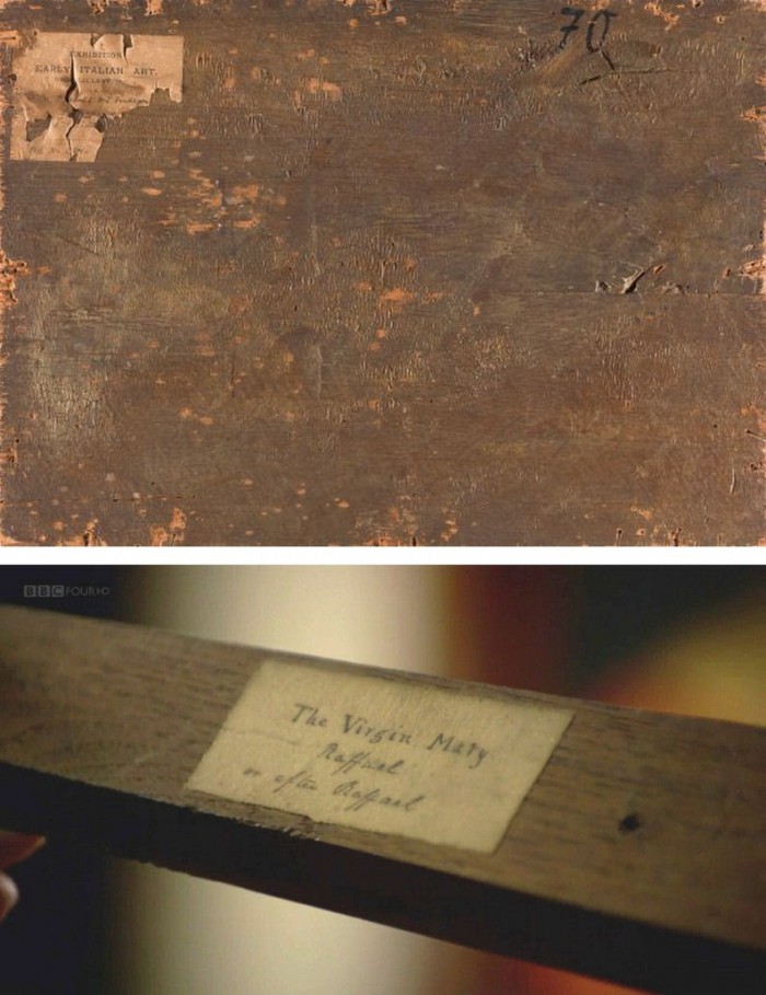
Above, Fig. 10. In 1901 the painting of Saints Uraldus and Fridianus was sold (not as a Philippino Lippi but as a Masaccio) to an English aristocrat, the Earl of Ashburnham. As with the recently proposed Haddo House Raphael (Fig. 10 above), there is little on the panel’s back other than a label in English for an exhibition of “Early Italian Art” (Fig. 10 top). For the Carolina Saint Donatus, the museum offers only a date – “circa 1490” – and the identity of the picture’s donor, the Samuel H. Kress Foundation. Such lacunae are perplexing because Filippino Lippi is a well-chronicled artist whose securely attributed works might easily be brought into direct comparison with the two more recent attributions.
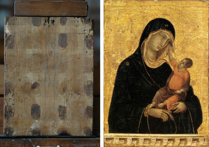
Above, Fig. 11. The backs of attribution upgrades often prove problematic, and none was more so than the small panel “discovered” as a Duccio Madonna and Child (above right) in 1904 after having been bought in an antiques shop in Italy. It was then rarely seen until bought with fanfare (but no technical examinations) for $50m in 2004 by the Metropolitan Museum of Art, New York, in a blind “treaty” sale conducted by an auction house among a few leading museums shortly after the picture was withdrawn from an imminent comparative exhibition of Duccio and his followers that would have introduced the painting to many scholars for the first time and in an instructive context. That withdrawal – despite the painting’s inclusion in the catalogue – might have been made out of fear of repeating the demise of the owners’ second Duccio, as described below.
The back of the tiny picture had been cradled with no fewer than eight mahogany bars and when these were later removed at the Met. a hand-written ascription to Duccio’s pupil “Segna” was found on the bare poplar wood from which painted work had been stripped. The Met Duccio contained modern wire nails, a fact not acknowledged in the museum’s post-purchase technical examination reports. When we asked after the antiquity of the nails the museum claimed they had been inserted as repairs after the panel had been cradled in the 1930s. As “proof” of that unsupported chronology it was said that one of the nails had entered one of the mahogany bars. However, as we pointed out, the head of that particular nail had been visible on the front of the frame throughout all of picture’s photographically recorded history and, while some nail heads were visible most were not and therefore had been applied before the (now heavily distressed) frame was gessoed and gilded. Thus, the panel arrived in the world at the beginning of the 20th century with modern nails intersecting a cradle that concealed an awkward ascription on a stripped-down back.
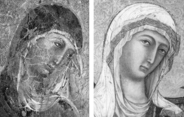
Above, Fig 12. A face painted in the 14th century by a follower of Duccio (identified by Pèleo Bacci as Segna) is shown above to the right of the face of the Met’s Duccio as it was before restorations established the blue of the Virgin’s mantle to be azurite, not the requisite ultramarine. No one ever suggested that the painting on the right was by Duccio and no one judged the Met’s picture an autograph Duccio before Bernard Berenson’s wife (Mary) in 1904 with the support of Berenson’s protégé Frederic Mason Perkins. An earlier suggestion had been that it was a work of Sano di Pietro, as Frances Vieta discovered in researches at the Frick Library, New York, that were kindly made available to us.
In 1933 Perkins attributed a second Madonna and Child to Duccio and persuaded the then owner of the Met.’s Ducio (the Belgian collector, Adolphe Stoclet) to buy it. In 1989 that Duccio was loaned to the Cleveland Museum of Art and was there identified on technical examination by Gianni Mazzoni as a fake by Icilio Federico Joni who ran a forgery factory fronted by middlemen, one of whom was Berenson’s protégé Frederic Mason Perkins.
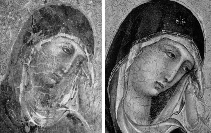
Above, Fig. 13. A cult of Supreme Art Historical Importance was activated around the Met. Duccio and part of this mythology rested on the picture’s supposedly miraculously well-preserved, little-restored, condition. Comparison of the photographs above showing its present state (right) and an earlier state (left) discloses how extensively the work has been repainted – note the altered design of the dominant eye, and the extensive reworking of the veil. The potentially falsifying nature of restorations when determining attributions remains a conspicuously under-examined area – as does the extent and nature of repainting on stripped-down “sleepers”. (But see “A restorer’s aim – The fine line between retouching and forgery”. For a fuller account of the Met.’s Duccio difficulties, see Michael Daley: “Buyer Beware”; “Good Buy Duccio?” and “Toxic Attributions?” in the Jackdaw magazine issues of Nov/Dec. 2008, Jan/Feb. 2009, and March/April 2009.)
The Newly Upgraded Filippino Lippi (continued)
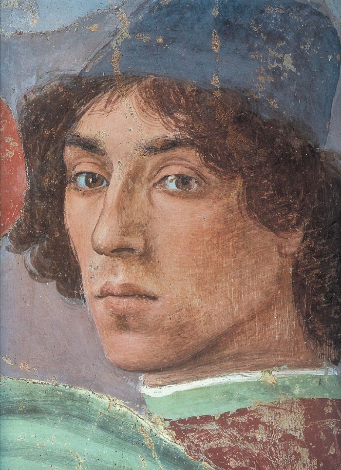
Above, Fig. 14. With the two small “Filippino Lippi” pictures at Fig. 9 and below, top, said to have been painted between 1490 to 1494, precise stylistic comparisons can be made with securely attributed works in the oeuvre. What is believed to be Filippino Lippi’s self-portrait above was executed by the artist in 1481-1482 in the Brancacci Chapel, Santa Maria del Carmine, Florence.

Above, Fig. 15. Filippino Lippi’s Apparition of the Virgin to St Bernard of 1480-86 was said by Bernard Berenson (in his 1938 revised Drawings of the Florentine Painters) to comprise “Filippino’s masterpiece, the last picture in which he is still a pure Quattrocentist, in which there is no sense of the Baroque.” Is it conceivable that some years later this artist painted the two small pictures shown here above the Apparition? Berenson reports that Filippino went on to betray excesses, not to purge and severely abstract his pictorial vocabulary: “Filippino’s Baroque, however had little in common with the qualities of the genuine [Baroque] style, and much with its worst vices. These were the sins of extravagance, of wantonness – the vulgarity of the newly enriched, who feel life is enhanced by the mere act of showy spending.”
Above, Fig. 16. At the top we see how Filippino Lippi painted books before 1486 in his Apparition of the Virgin to St Bernard and before his lapse into Baroque excesses. In this secure work we not only see great technical accomplishment but a fascination with the very means by which books were stitched together in assembled folded sections. Is it conceivable that after this tour de force celebration of the book binder’s craft skills Filippino should have been satisfied with the out-of-perspective simplifications of books in the Saint Uraldus? While the opened book has been painted in utter ignorance of book binding methods, the ochre coloured book at the bottom left of the pile has managed to anticipate to a remarkable degree the appearance of a neat modern machine-bound book.
Above, Fig. 17. Again, does the chasm of technique and sophistication in this further comparison from the Apparition and the Saint Uraldus not strain credulity at claims of a common author?
Above, Fig. 18. By 1493-94 the artist had completed his Madonna and Child with St Catherine of Alexandria and St Martin of Tours as above and we see precisely the over-elaboration Berenson castigated as Filippino’s squandering “like a nabob with a heady disorderliness all the decorative motives which the heritage of antiquity, the hard earnings of his precursors, and his own fancy had put into his hands.”
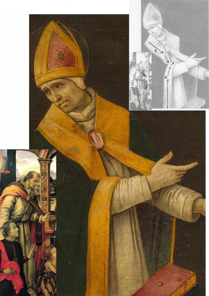
Above, Fig. 19. How conceivable is it that Filippino might, at the same short period, have made two so diverse treatments of a man parting drapery with an advancing left arm as in these two paintings? In the one the “Blanket-like drapery dear to Filippino” (in Berenson’s term), curves, twists and folds naturally across the body, while in the other it moves as if fabricated by a former sheet metal worker with little regard for any underlying body, or even for the means by which the glimpsed parts of the (wildly varying) decorative border of the cope might ever have been united as woven material. Why the arbitrary, asymmetrical placement of indeterminate embroidered decorations on the cope’s border? What holds the cope together? Is it a giant garnet or ruby, or a small tambourine? Where else in Filippino might we encounter such flattening abstractions and lax indeterminacy of depiction?
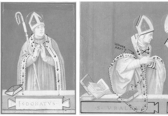
Above, Fig. 20. If the logic and treatment of Saint Donatus’ cope border (above, left) seems plausible and suitably understated, what might have carried the same artist to the Byzantine and conceptually irresolvable twin conundrums of the cope border as encountered on Saint Uraldus (above right)? What accounts for the very different depictions of the inscribed tablets on the parapet wall? If that of Saint Donatus is somewhat overly monumental and set uncomfortably close to the top of the parapet, at least it is sculpturally resolved and satisfactorily symmetrical along its horizontal axis with its twin decorative “butterfly wings” termini. Why, then, would the twinned tablets of Saints Uraldus and Fridianus meet in the middle with single butterfly-wing termini while leaving blank endings at the outer edges of the picture’s composition? Why are these two inscribed tablets skimped and devoid of projection when the saints above are greatly more dynamic and humanly engaged – almost as if in anticipation of Raphael’s later depicted dialogue between Aristotle and Plato?
Below, Fig. 21. What theological reading of Saint Uraldus’ life prompted the vast frilled neck lizard-like display of the cope’s pink lining below? If intentionally “Baroque” in its explosive ostentation and theatrical impact, why, then, its implausible combining with a geometric severity of draperies that are more snapped than folded?
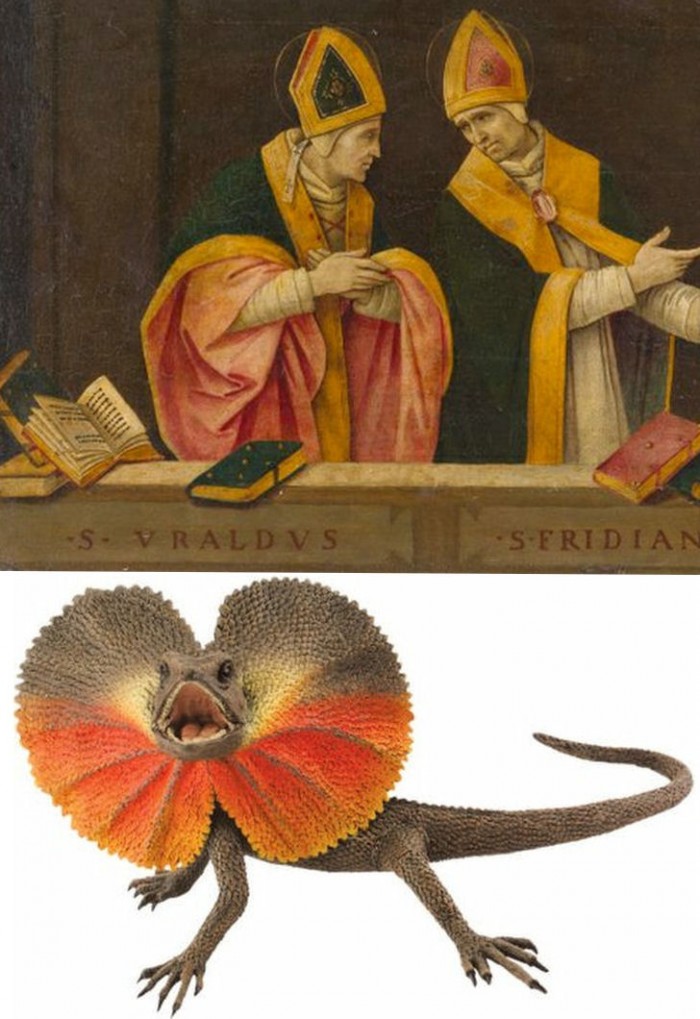
With such bizarrely anomalous visual constructs, might it not be prudent to consider the waking “Filippino Lippi” sleeper as a possible product of the late 19th and early 20th century Italian forgeries boom that was tailor-made for British and American collectors? We know that many skilful artists were employed in that trade because when the Italian Government proposed stringent export taxes in 1903 to stem the country’s out-flow of art treasures, the Florentine art dealers association petitioned that the new laws would throttle the large and thriving trade in forged art and antiquities for foreign collectors. (Where did all those often excellent works go?)
At the December 2015 ArtWatch UK/LSE Law/NY Center for Art Law conference Art, Law and Crises of Connoisseurship (the proceedings of which will be published shortly), Professor Charles Hope pointed out how effectively 20th century scholarship had winnowed previously overblown numbers of Titians, Raphaels and such. Markets are good things and the London art market has long been a very good (much envied in Europe) force for Britain, but there are developing dangers. If perceptions were to grow that previously downgraded works are being systematically rehabilitated through “sleeper-discovery” mechanisms at a time when leading houses are fighting to the death for pole position on market share, confidence in the lots on offer might evaporate. Already, certain external structural changes are weakening the London market’s traditional and much-valued symbiotic relationship with disinterested scholarship. Increasing litigation by owners against dissenting independent scholars suppresses debate and frank expert appraisal. In a paper at our conference (“Throwing the baby out with the bath water – the Demise of Connoisseurship since the 1980s”), Brian Allen, former director of studies at the Mellon Centre, warned that recent changes of philosophy and views on connoisseurship in the academic world are greatly reducing the traditionally available body of disinterested academic expertise that counterbalances purely commercial interests:
“In my own field of British art the number of so-called ‘experts’ has now diminished alarmingly as the older generation dies off not to be replaced. It seems extraordinary to me that major artists such as Stubbs, Wright of Derby and Sir Thomas Lawrence, to name but three, don’t have an acknowledged expert to whom one can turn for a reasonably reliable, independent opinion. And this has also certainly happened in other specialist fields… Younger scholars nowadays, especially those in the universities, have almost no contact whatsoever with the art trade compared to fifty years ago. Yet for many years it was perfectly possible for the two worlds to co-exist harmoniously.”
Michael Daley 23 November 2016
Art’s Toxic Assets and a Crisis of Connoisseurship
“Buy land”, Mark Twain advised, “they’re not making it anymore”. This logic ought to apply to the old masters but does not. Land makes sound investment not only because of its scarcity and its potential for development but because, in law-abiding societies, it comes fixed with legally defendable boundaries. Karl Marx, plundering English classical economists, held that all value is unlocked by human labour – but all labour does not generate equal values. In given periods and places all painters work pretty much with the same materials but their artistic transformations of those materials are various and unequal in accomplishment and merit. Such differences drive reputations and hence the market value of artists’ works but they do so in ways that are intrinsically problematic.
Artists’ reputations may or may not endure. With many surviving works the identities of authors are either not securely established or entirely unknown. In such cases paintings are appraised and then attributed to particular artists or schools. Attributions, however, are neither guaranteed nor immutable. They are made on mixtures of professional judgement, artistic appraisal, art critical conjecture and, sometimes, wishful thinking or deceiving intent. They remain open to revision, challenge, manipulation or abuse. The experts who make attributions exist in professional rivalry with one another (sometimes with vehemence) and while their disagreements are signs of art critical health, a consequence is that legal guarantees for attributions are untenable and non-existent, as some buyers later discover to their costs. Buyers are advised in the small print to beware and to proceed on their own judgement. With art, as we recently pointed out (see Endnote 1) it can be safer to buy a second-hand car than an old master painting (- and few people would dream of buying a house without legal searches and a structural survey.)
“Scientific” red herrings
In recent years attempts have been made to impart quasi-legal assurances to attributions by appealing to the authority of supposedly “scientifically verifiable” technical proofs. The exercise is vain and, technically, philistine: by its very nature, art is not reducible to scientifically quantifiable component parts. The technical evidence cult reflects a collapse of confidence in powers of connoisseurship on the one hand and a grab for cultural and institutional power by technocrats and bureaucrats on the other. The new hybrid discipline “Technical Art History” in which restorers, conservation scientists and curators pool expertises in attempt to arrive at professionally impregnable positions, has proved pernicious. Art-politically, this united front seeks to neutralise all charges of art critical and methodological failure with professional mystification and displacement activities – by fostering a “closed-shop” mentality and claiming that its mysteries are beyond the reach of any outsiders [2]. The new technocrats insufficiently appreciate that paintings are no more and no less than the products of artists who, working by brain, eye and hand, fix values and the relationships between values so as to produce specific and unique artistic effects that can be comprehended by others using eyes and minds in response. In the visual arts the visual should remain paramount – what you see is what it is about. Art loving viewers and professional art experts alike might be said to have duties of appropriate response to art itself and not to its shadows and encumbrances. It is the optically perceived quality of artists’ artefacts that drives reputations and market values. Understanding art is not the same thing as poking and poring over the component parts of its fabric – let alone presuming, as “restorers” (or now, “conservators”) perpetually do, to undo and redo its features at regular intervals. What matters is what you see, not what might be said or thought to lie under the surface.
Managing lapses of connoisseurship
This is not, of course, to say that technical examinations can serve no purposes. Rather, it is to say that in matters of art attribution and appreciation technical examinations of the physical composition of works might supplement informed visual appraisals but they cannot stand in lieu of them. Nor can the supposedly disinterested and neutral character of technical examinations themselves be taken at face value. In practice, with every technical investigation and its resulting “findings”, someone, some institution, some interest group, has commissioned/conducted the exercise and controlled its dissemination. Paintings in powerful institutionally-protected locations (particularly major museum) can be afforded dispensations from otherwise injurious findings [2]. It sometimes seems that just as banks are now too big to be allowed to fail, so big museum attributions cannot be allowed to fall, whatever evidence and arguments accumulate against them [3], for fear of undermining public, political and art market confidence.
Follow the money and look at the drawings
Concerning the frequency of art world upgrades, it would seem easier to grow old master drawings than paintings. Where only 250 sheets of drawings were attributed to Michelangelo in the 1960s, today that oeuvre has been expanded to over 600 sheets. Although drawings do not command the high prices of paintings they can greatly assist their attributions. In the late 1920s a firm of antiquarian dealers in Holland, R.W.P. de Vries of Amsterdam, sold a number of old master drawings some of which have ended in museums, and two of which concern us here (Figs. 1 and 2). Neither of these had a provenance (i.e. a proven history of previous ownership). Both had simply materialised in the dealers’ hands with old master attributions. The first sold in 1927 for 26 florins (guilders), some € 235.80 at today’s values. The second sold two years later for 750 florins, some €6,801.91 today. The first was attributed to van Dyck, the second to Veronese. Neither attribution survived and the original perplexing ratio of value between them (which approached thirty to one) has reversed dramatically.
The Veronese attribution crashed in 1984 when Richard Cocke published his catalogue raisonné Veronese’s Drawings and dismissed the drawing with the single (apt) sentence: “The heavy forceful cross-hatching in the drapery and the forms of the head and hands have nothing to do with Veronese.” That drawing sold in 1991 at Christie’s for £7,000 as “attributed to Agostino Carracci”. In contrast, the former van Dyck drawing morphed into the work that sold at Christie’s on July 10th as an autograph Rubens ink sketch for a world record Rubens drawing price of £3,218,500. The former “van Dyck” has thus enjoyed a 14,000-fold increase of value since 1927.
The extraordinary success of the van Dyck that is now a Rubens was due only in part to Christie’s masterful promotion. It was very much on the strength of its current art-historical position that the drawing was drum-rolled as the starred lot in a sale of part of the prestigious I. Q. van Regteren Altena drawings collection. Most helpfully of all, the drawing was precisely characterised as Rubens’s “first thought” preparatory ink sketch for the National Gallery’s Samson and Delilah painting (Fig. 4). Notwithstanding its anomalous traits (see our previous post), its artistic shortcomings and its dubious provenance, the drawing remains bolstered by its crucial allotted role in a sequence of three Samson and Delilahs, two of which have been acquired by museums (Figs. 3 & 4). Although Christie’s July 10 sale realised more than twice its highest estimates and broke many records for individual artists, only one of the top ten works went to an art gallery or museum. Two were sold on to the trade. Seven, including the Samson and Delilah drawing, went to anonymous individuals.
Making four Rubens’s
Christie’s catalogue entry burnishes the drawing’s pedigree with upbeat optimism. It is said for example: “When I. Q. van Regteren Altena bought the drawing in 1927, he listed it in his inventory under its traditional attribution to Sir Anthony van Dyck (1599-1641). That attribution also accounts for an earlier owner’s inscription of the letters ‘V.D.’ in the lower left corner.” What traditional attribution? Which earlier owners? Christie’s account of the provenance begins: “with R.W.P. de Vries Amsterdam; from whom purchased by I.Q. van Regteren Altena on 20 December 1927 for 26 guilders (‘387.t. A. v. Dijck. Samson & Delilah’)”. And that is all. There had been no previous owners and no evidence exists of any “traditional” reception as a van Dyck – or anything. Any suppositions aside, all that can safely be said is that this drawing emerged from nowhere at a time when forgery was rife and the art world suffered from what Bernard Berenson [!] described as “the universal tendency to ascribe a given work of art to the greatest artist to whom wishful thinking and excited imagination can ascribe it.” (“Essays in Appreciation”, 1958, p. 95.)
Christie’s entry continues: “With the emergence of the finished painting and the connected oil sketch the drawing’s significance rapidly became apparent.” There was no rapidity and the claimed significance is mythic. The supposed second stage oil sketch or modello did not appear until 1966. The claim that, “The picture of Samson and Delilah was only rediscovered in 1929”, also misleads. The painting was not “rediscovered” as a Rubens. It had never been a Rubens. When it appeared in 1929 it was, just like the ink drawing three years earlier, without provenance and it was not judged a Rubens by its German dealers, Van Diemen and Benedict, who were offering it as a Honthorst. It was later upgraded to Rubens in a certificate of authenticity by Dr Ludwig Burchard and it then sold in 1930 to August Neurburg, a German tobacco magnate.
Burchard was a leading Rubens scholar, but today his attributions have a notoriously poor record [4]. Far from the ink drawing being corroborated as a first stage sketch by the arrival of the painting, Burchard had upgraded the painting on the authority of the drawing which he had himself upgraded to Rubens in 1926. In Christie’s catalogue the drawing’s “Literature” begins with Burchard’s attribution: “L. Burchard, ‘Die Skizzen des jungen Rubens’ in Sitzungsberichte der Kunstgeschichtlichen Gesellschaft, Berlin, 8 October 1926, p. 30, no. 2.” At that date no one had previously owned or discussed the work. Burchard thus upgraded a drawing that had never been exhibited and was in a dealer’s hands without any provenance. Notwithstanding his claims on behalf of the drawing, in 1927 both the dealer selling and the collector buying still held it to be a van Dyck.
When the modello eventually appeared in 1966 it had no provenance. Its history consisted of a hearsay account (from the anonymous lady vendor) of an ancestor said to have bought the work for a few shillings in an antique shop in York during the 1930s because she liked the frame. This supposed Rubens oil sketch had been painted on a support that is found in none of the artist’s oil sketches – on a soft, conifer wood, not on his customary oak panel. Its appearance was, for a Rubens oil sketch, disturbingly close in design and effects to those of both the ink drawing and the finished painting (see Figs. 2, 3 and 4). Its arrival completed an unicum in Rubens’ oeuvre: a suite of stages of work without evidence of development. Notwithstanding that problem, the modello on the wrong wood was given to Rubens by Christie’s themselves, to join the company of a panel painting whose back, it later emerged, had disappeared in an operation for which no one acknowledged responsibility, and a drawing whose back was concealed by being pasted onto a second sheet even though it bore drawing itself. The modello sold to a London gallery for £24,000, going to a private collector before passing through Agnews to the Cincinnati Art Museum in 1972. The last of the trio to emerge, this technically problematic work-without-provenance was the first to achieve museum status. At some point, pieces of wood were removed from its sides (creating a closer compositional alignment with what is now the National Gallery painting) and, at another, the Cincinnati museum claimed the panel to be oak. Presently the wood is not identified, the work being described as on “panel”.
Why? Why? Why? Delilah?
In July 1980, the supposed third stage, the Samson and Delilah painting, was sold by Neurburg’s heirs through Christie’s to Agnews, acting on behalf of the National Gallery, for a then Rubens world record price of £2.53m. In 2002, with two parts of the Samson and Delilah trio now secure in museums and the third in a respected private collection, Sotheby’s sold a painting, The Massacre of the Innocents (see Fig. 13), as an autograph Rubens on the back of its perceived shared characteristics and collections history with the National Gallery’s Samson and Delilah for £49.5m, to Lord (Kenneth) Thompson. Even though those paintings are riddled with problems (see “Is this really a Rubens?” Michael Daley, Art Review, July/August 1997, and “Is this a Rubens?” Michael Daley, Jackdaw, October 2002), and the Samson and Delilah had been challenged for over a decade [5], the price was an outright old masters’ world record. Thompson loaned the Massacre to the National Gallery and then bequeathed it to the Art Gallery of Ontario, Toronto, thereby making it publicly available and greatly enhancing its pedigree. Thus, today, three high valued well-placed but individually problematic museum Rubens’s owe their positions to a belated acceptance of Burchard’s initial attribution of what is still a privately (but now anonymously) owned ink drawing.
Who cut Samson’s toes?
The reason why all of these subsequent Rubens upgrades rest on the authority of this ink drawing is because of a glaringly anomalous feature in the National Gallery painting – the fact that the toes of Samson’s right foot are cropped by the edge of the picture. This was not because the panel had been trimmed at some point. Rather, it is because the painting simply stops disturbingly, inexplicably, at the beginning of the toes. Thus, without the drawing’s seeming testimony that Rubens had planned to crop Samson’s toes by cropping his own initial design within a precisely drawn ruled box that anticipated (even before he had executed an oil sketch) the final format of what is now the National Gallery painting, that painting could never have been attributed to him. This is so for reasons that are implicit in Burchard’s 1930 certificate of authenticity. It read:
“The photographed painting on the other page is one of Peter Paul Rubens’ major works from the time of the master’s return from Italy. It must have been painted in 1609 or 1610. With Rubens’ agreement, Jacob Matham reproduced the painting with a copper engraving around 1615. As witnessed by the inscription of the painting, the picture at that time was in the possession of Antwerp mayor Nicolas Rockox. Indeed, the inventory of Nic. Rockox’ estate, dated 19 Dec. 1640, lists the picture as “Eene schilderne…(Annales de l’Academie d’Archaeologie de Belgique, Anvers 1881, p. 437). On pp. 143-44 in vol. I of 1886, the five-volume catalogue of Rubens’ work by Max Rooses, the painting is described in detail as number 115, based on the Matham engraving and mentioning the Rockox inventory. The picture itself remained as unknown to Rooses as to all literature since. It is further notable that a picture of an interior by Frans Francken (Pinakothek Munchen No 720), which appeared to be of mayor Rockox’s living room, showing the painting in pride of place above the mantelpiece, while in an adjoining room is the picture of the “Doubting Thomas” which we know Rubens painted for Rockox. According to S. Hartveld of Antwerp, the room with the mantelpiece exists even today in the Kaiserstraat in Antwerp where Frau Gruter-Van der Linden now lives in the Rockox house. A sketch for the Samson picture (pen, varnished, 16.4 x 16.2) is in Amsterdam in the collection of Mr J.Q. Regteren, Altena. The picture is in a remarkably good state of preservation, with even the back of the panel in its original condition.” [By courtesy of the National Gallery Archives Department.]
Note, even as Burchard asserts that this is the original painting of the subject that Rubens is known to have made shortly after 1608, he acknowledges that the original painting itself had universally been understood to have been lost since 1641. (To this day, despite detailed and sustained searches, nothing connects the present version to the original painting.) Crucially, Burchard also acknowledges that the appearance of the original Samson and Delilah had been recorded in two contemporary copies, one of which had been supervised by Rubens. Both of these copies by two artists who likely worked decades apart, testify that Samson’s original right foot had not been (improbably) cropped at the toes, as in the National Gallery version, but had originally been painted intact and set comfortably inside the composition and consistently with the artist’s known manner. See, for example, the almost contemporary, probably pendant (and near mirror-image compositional group) Cimon and Pero – “Roman Charity”, at Fig. 9.
A perplexing silence
It was in defiance of such hard historical testimony that Burchard claimed his own upgraded ink drawing to be not only by Rubens but, specifically, to be his preliminary sketch for the former Honthorst painting that is now in the National Gallery. When attributing that painting to Rubens Burchard executed a sleight of hand by implying but not stating that the ink drawing (which had only recently been sold as a van Dyck) was by Rubens. The truth is this ink drawing-from-nowhere and without-history had needed to exist if the Berlin Honthorst were to be presented remotely credibly as a Rubens. Had Burchard sincerely believed that the cropped-foot drawing was Rubens’ original ink sketch, he would have felt himself the agent of a remarkable double art historical coup: first, for having identified a famous masterpiece that had been lost for 289 years; second, for having further established that both of the contemporary copies of that original Rubens’ painting (through which it had been known for centuries), had been compositionally misleading in identical manners.
Conspicuously, Burchard trumpeted neither of these “discoveries” [6]. His diffidence contrasts markedly with the reaction of the day’s leading Vermeer scholar, Dr. Abraham Bredius, who believed in 1937 that he had found an unknown Vermeer (in what was the first of a stream of Han van Meegeren fakes). Firstly, Bredius’ certificate of authenticity was ecstatically and unreservedly fulsome: “…I found it hard to contain my emotions when this masterpiece was first shown to me and many will feel the same who have the privilege of beholding it. Composition, expression, colour – all combine to an unity of the highest art, the highest beauty”. Secondly, he rushed news of his discovery onto the scholarly record via the Burlington Magazine (“A New Vermeer”, November 1937).
If Bredius betrayed credulousness as an eighty-two year old scholar, what of Burchard’s manoeuvres as a forty-four year old at the peak of his powers? It can only be said that suspicions are in order. When, shortly after the First World War, the great German scholar, Wilhelm von Bode, was reproached for having certificated an implausible Petrus Christus, he replied, “You don’t understand the intricacies of the German language. After a brief description of the subject I say ‘I have never seen a Petrus Christus like this!'” (- “The Partnership”, Colin Simpson, 1987, p. 240). One must suspect that Burchard’s twinned and circular Rubens attributions were made sotto voce out of fear that his “attributional” heist might be exposed by anyone with an alert eye who appreciated that it is surprisingly common for later copies of original works to be cruder compositionally cut-down and abridged versions – and who would, therefore, recognise the “Honthorst” as a prime member of that type.
We have found that not only are such insensitively truncated pictures frequently encountered (in Rubens twice-over with the Samson and Delilah and the Ontario Massacre, and in artists like Leonardo, Raphael, Caravaggio and Annibale Carracci – see opposite) but, also, that with a little effort they can in almost every instance be shown to post-date the superior models and prototypes from which they derive. As shown opposite, in copyists’ hands, no part of an original composition can be considered sacrosanct. As well as toes, dogs’ noses and cupids’ wings, even portions of dead infants have been cropped to fit pre-existing images to new supports and formats. Mistaking a copy for an absent original is one thing. Disregarding clear and contrary historical evidence, as Burchard would seem to have done, is another altogether. Knowingly elevating adulterated versions to a master’s oeuvre pollutes the well of scholarship and ultimately threatens the credibility of the field.
Such lapses of critical judgement are as common in appraisals of restorations as they are in the making of attributions. How much or little of an original surface has survived the vicissitudes of time and “conservators” attentions might seem a lesser matter but it is not. Professional art critical failures to spot the tell-tale differences between autograph and studio works are the twins of failures to recognise restoration-induced injuries. The differences of states within individual works can be as pronounced as the differences between autograph and studio works (see Figs. 28a, 28b, 29 and 30). Failures of judgement in both areas are frequently found in even the most high-ranking individual scholars.
Making two Caravaggios in one decade
Within little more than a decade the late Sir Denis Mahon upgraded two pictures to autograph Caravaggio status. This might seem unremarkable given that Mahon was a prolific finder/maker of old masters. What is remarkable is that he did so with two versions (of more than a dozen) of the same painting – Caravaggio’s The Taking of Christ. This Caravaggio survives in two formats, one being a truncated version of the other. Mahon managed to endorse one version of each type, doing so in the wake of two “investigative” restorations in which each team claimed revealed authenticity on the basis of its own “discoveries”. (Mahon had serious form in the double attributions stakes – we discuss opposite a painting of Annibale Carracci where he authenticated one version and later suavely switched to another, less abridged, picture. See Figs. 25-30.)
During the first restoration in 1993 in Dublin, a long-attributed Honthorst copy was found to have been made largely without revisions and it was declared the original autograph Caravaggio by Mahon precisely by virtue of its revisions-light painterly fluency. This version was of the truncated type. In Rome in 2004 Mahon conferred autograph Caravaggio status on a work from Florence (where acquired from the Sannini family) that was found to have been made with many and major revisions taken to be “serious afterthoughts as was Caravaggio’s wont”. This version was composed in the larger format and Mahon reportedly said he had “no doubt that this was now the original work”. Dublin was not best pleased and Mahon promptly rowed his position back and claimed that both versions were now original but that one was rather more so than the other. (See “New twist in the tale of two Caravaggios”, Daily Telegraph, 17 February 2004; “A dangerous business”, Michael Daley, letter, Daily Telegraph, 19 February 2004; and, “The real Caravaggio is . . . both of them” Daily Telegraph, 20 February 2004.)
Like the two R.W.P. de Vries of Amsterdam drawings, the two “autograph” Mahon Caravaggios have enjoyed unequal fortunes. In 1993 the (revisions-light) Dublin Caravaggio was loaned to the National Gallery in London and then, permanently, to the National Gallery in Dublin. The later 2004 Florence/Rome Caravaggio with numerous major revisions and other “cast iron” technical proofs enjoyed no institutional protection, being still in private hands. Its cause seems to have fallen into abeyance following legal disputes over ownership. In 2005 the initial 1993 “discovery” of the now institutionally protected Dublin Caravaggio (Mahon enjoyed a long-standing relationship with the National Gallery in London, as a trustee and as a generous benefactor-in-waiting) became the subject of an illuminating, if somewhat parti pris book, “The Lost Painting”, by Jonathan Harr.
In an epilogue, Harr has described a falling-out over the ownership of the Florence/Rome version. Technical examinations of the painting were ordered by court prosecutors without the knowledge of the owners. They were carried out by Maurizio Seracini, a leading private technical diagnostician who has examined something like half of Caravaggio’s output. The pigment Naples Yellow, which contains the metal antinomy, was found. Because that pigment is presently said not to have been used on paintings before 1630 (or “from around 1620”, according to Wikipedia), and therefore twenty years after Caravaggio’s death in 1610, Seracini held the painting inauthentic. Harr accepts the force of this technical testimony and, concluding that Mahon had demonstrably blundered in his support for the Rome/Florence painting, imagines that that old scholar’s long-time adversary, Roberto Longhi, might now be enjoying “a mirthless laugh” over Mahon’s discomfiture. The conclusion was hasty and perhaps too trusting of technical testimony.
It is certainly the case that the presence of a modern, manufactured pigment within the fabric of a supposedly old painting can safely be considered fatal to an attribution. However, Naples Yellow is not a product of a known and precisely dated modern manufacture – such as Prussian Blue of 1704 – it is ancient and greatly pre-dates Christ. Harr acknowledges that the pigment is found on a painting of 1615 by Orazio Gentileschi – just five years after Caravaggio’s death. Harr further reports that traces of this pigment had been found on another Caravaggio, his Martydom of St Ursula, which is owned by Banca Intesta in the Palazzo Zevallos, Naples. He reports a suggestion that the offending material might have come from an 18th century restoration that had subsequently been removed. Such hypothetical exculpation would only be necessary if claims that Naples Yellow could not have been used by anyone before 1630 were Gospel and if the painting’s attribution was insecure. Neither is the case. The Martyrdom is one of Caravaggio’s most reliably and completely documented works so there can be no question about its authenticity. Further, it was almost certainly his last work. It was recorded as still being wet in May 1610. If this painting contains antimony, and unless evidence exists to support the former existence of a now entirely disappeared 18th century restoration, we should accept that this material has now been found in two Caravaggio paintings and adjust the technical literature chronologies accordingly.
In this episode, we see that negative hard “scientific evidence” can be discounted on the basis of assumptions, hunches, and suspicions. We also see that the claimed chronologies of materials within the literature of technical analysis are moveable and, only ever, provisional feasts. (For such chronologies to be considered reliable it would be necessary for every painting in the world to be analysed at the same time by the most advanced technologies – and even then, subsequent technical advances would require further examinations: it is common for old formerly “advanced” tests to be re-run in conservation departments when new and improved apparatus become available.) We have asked Seracini, in the light of Harr’s comments, if “it is still the case that the presence of antimony is considered an absolute technical disqualification in paintings made before 1630?” Meanwhile, Jacques Franck, the Consulting Expert to The Armand Hammer Center for Leonardo Studies at The University of California, Los Angeles, advises that:
“The best scientific bibliographic reference concerning the history and chemistry of pigments over here is: J. Petit, J. Roire, H. Valot, “Des liants et des couleurs pour servir aux artistes peintres et aux restaurateurs”, EREC éditeur, Puteaux, 1995. Regarding Naples yellow, it says: ‘(Lead antimonate yellow) was rediscovered in Europe at the end of the Middle-Ages and was later mentioned in a document dating from 1540, “Pirotechnia”. The oldest recipes, written in 1556-1559, were supplied by Cipriano Piccolpaso…who was a painter of ceramics”
Although those recipes were indeed written primarily in connection with ceramics, given that they existed before Caravaggio’s birth (1571) it should never have been insisted that knowledge of them could not have been obtained by contemporary painters. As it happens, a study on Lorenzo Lotto’s pigments was made in connection with the exhibition “Lorenzo Lotto” (Venezia, 1480 – Loreto, 1556-57) at the Scuderie del Quirinale in Rome in spring 2011. On that occasion, more than fifty Lotto paintings spanning from 1505 to around 1556 were studied using non-invasive techniques by Maria Letizia Amadori, Pietro Baraldi, Sara Barcelli and Gianluca Poldi. The authors’ report (pages 2 and 19):
“About yellows, he uses both lead-tin and lead-antimony (Naples yellow) pigments, the latter found by XRF, in works starting from 1530 to the last years: it can be related to the ‘zalolin da vasarj’ cited by Lotto in 1541 in his account book (Libro di spese diverse)”, and, “As XRF analyses show, in some works, starting from 1530 to the last years of the century, also lead-antimony (Naples yellow) pigments, can be found, together with the previous yellow or almost alone: they can be related to the “zalolin da vasarj” cited by Lotto in 1541 in his account book (Libro di spese diverse).”
Thus, the presence of antimony would seem not to have given grounds for dismissing the Florence/Rome version of the Taking in the courts. Perhaps we can see that it might have been more to the point for the courts to require the production of the best possible photographs of as many of the versions as possible to permit visual comparisons of the two rival versions. There are many indications of the limitations of modern conservation practices to be had in Harr’s fascinating account. On page 169 he describes an encounter between the Dublin National Gallery of Art’s two picture restorers, Andrew O’Connor and Sergio Benedetti (who had re-attributed the Hontorst Taking to Caravaggio, and who had experienced “a fleeting moment of doubt” about his attribution while cutting ever larger ‘windows’ through the painting’s varnish):
“One day, about three weeks after the painting’s arrival, O’Connor and Benedetti crossed paths in the studio. Benedetti was staring at the painting. He stood with his arms crossed, his eyes narrowed in concentration, his mouth compressed into a frown. ‘Look at the arm of Judas’, Benedetti said to O’Connor. ‘What do you think?’ O’Connor studied the painting. ‘What are you getting at?’ he asked. ‘It seems too short, doesn’t it?’ said Benedetti. It did…O’Connor realised that Benedetti was wrestling with his doubts. ‘Well’, said Benedetti finally, ‘he wasn’t a perfect anatomist. He made other errors like this. In the Supper at Emmaus, the apostle’s hand is too large.’”
In this recollection we might be witness to a double failure of art critical methodology. Given his doubts, Benedetti might have assembled all available photographs of the many versions of this painting to determine whether or not the short-coming that concerned him was unique or common to (some or all) other versions. A greater lapse may be evident in the fact that while Benedetti expressed anxiety over the arm of Judas, he seems not to have done so over the compositionally and emotionally more important advancing left arm of the fleeing St John who is seen behind Christ and Judas. In the Dublin version, the arm of St John is cropped above the elbow and not above the wrist as it is in the Florence/Rome version. (On the compositional function of the arm in the Florence/Rome version, see comments at Figs. 21 and 22.)
To repeat what should be self-evident: pictures are made to be looked at. When, as with this Caravaggio, multiple versions exist we should make hard detailed visual comparisons of each against the others, if necessary (and it could hardly be otherwise when so many versions exist) by photographic means. When later copies or engravings exist we should make careful comparative estimations of their relationships to the various contenders. Whenever there are cut-down versions of more expansive compositions, we should always consider which state is likelier to have been the primary and which the secondary one. Visual comparisons in attributions, as in restorations, are of the essence. They should never be neglected, let alone discounted, on the authority of some technical evidence that may or may not be soundly framed; that may or may not be selective or loaded in its presentation; and, that will, in any event, soon be rendered obsolete by more up-to-date equipment. The informed human eye is our best “diagnostic tool” in the study of art and will remain so no matter how much money and resources might be thrown into technical studies. It remains the greatest tragedy that Bernard Berenson so badly debased his own critical currency with his shady Duveen dealings. On the primacy of the visual in visual art forms he was peerless:
“I am here concerned with names in painting. When I pronounce the words Giotto, Michelangelo, Leonardo, Giorgione, Durer, Velazquez, Vermeer, Ingres, Manet, Degas and hundreds of others, each stands for certain qualities which I expect to find in a painting ascribed to them. If the expectation fails, then no argument, no documentary evidence, be it biographical, historical, psycho-analytical, or radiological and chemical will persuade me.”
That was and is how it should be.
Michael Daley
ENDNOTES:
1 The Times, letter, 13 August 2014:
“Sir, Gerald Fitzgerald (letter, Aug 12), misses an important point when calling for a tiny levy on art sales to fund an independent centre for provenance research. Although such a levy might cost only .05 per cent of annual art sales, currently standing at some $60 billion, if effective, such a centre would reduce the supply of works on the market by something like 40 per cent – at least in the view of the late Thomas Hoving, a former director of the Metropolitan Museum of Art, New York. The art world is very quick on its feet: when calls were made in the 1930s for an independent centre of art restoration research, then director of the National Gallery in London, Kenneth Clark, promptly established a department of conservation science in order, as he later confessed, to ‘have in the background what purported to be scientific evidence to “prove” that every precaution had been taken’. Although self-policing may be an unrealistic ambition, governments could help considerably and at little cost by making it a statutory requirement that vendors should disclose all that is known and recorded about the provenance and the restoration treatments of works of art. As things stand, it can be safer to buy a second-hand car than an old master painting.”
Michael Daley, Director, ArtWatch UK, London
2 The Massacre of the Innocents which came up at Sotheby’s on 10 July 2002 as a very recent Rubens upgrade is a case in point of misleading assurances and over-ridden technical evidence. In a long sale catalogue entry it was said that technical analyses and condition reports had been commissioned and that these were available on request. The implication was clear: we have exercised all possible due diligence and this painting has emerged with flying colours. That implicit reassurance evaporated on a close reading of the material – as we reported in the October 2002 Jackdaw (“Is this £49.5 million painting by Rubens?”). The reports were, by their nature dense and couched in technical language. Nonetheless they clearly contained information that was highly injurious to the attribution and to the picture’s claimed early dating of c. 1609-11. One technical fact alone should have sunk the attribution. It was found in the last paragraph of the last report. As we put it: “The author of a report on the tree-ring dating…concludes that a date of execution for the picture only becomes ‘plausible from 1615 upwards’.” In other words, the panel on which this picture was painted could not have been manufactured at the time the picture is said to have been painted – and this dating could not be amended because, like the Samson and Delilah, the picture was only remotely credible on stylistic grounds if seen as the product of a (fancifully claimed) brief stylistic abberation in Rubens’ oeuvre said to have occurred on his immediate return from Italy in 1608. As well as being on wood that was too recent, the picture contained the wrong materials: “A pigment, orpiment, that is found in no Rubens is present here. A second pigment, smalt, said to have been in use ‘mainly in the mid-seventeenth century’ and which seems only to be found in Rubens’ later works is also present. The orpiment yellow is anomalous not only in its presence but in its manner of application – it is mixed with lead-tin yellow. Such a combination is said to be ‘unusual since it was considered unstable’ and, even, to be a practice ‘not encountered in 17th century works’”. This was not just a twice-over dead attribution: “Speaking of Rubens’ debt to classical sources, the anonymous author of the catalogue entry correctly concedes, ‘one of the background figures appears to derive from the Borghese Gladiator’. There follows immediate self-disavowal: ‘it cannot’ so derive, he/she contends, because ‘though famous in subsequent centuries, the Borghese Gladiator was not excavated until late in 1611”. This painting on the wrong (too recent) wood, with what would normally be considered disqualifying (out of period)materials, and which contained a miraculous allusion to a future event, was presented to the world as a major art historical discovery. That “discovery” had taken place very shortly before the sale. The upgrading of this centuries old studio work had been made by just five experts only three of whom were identified. We put the question: “Can it be right that we are all being asked to share this leap of faith when the experts, displaying a seeming ignorance of – or disregard for – so much germane material evidence, have yet to declare their hands or publish accounts of their vital endorsements?”
3 Jonathan Harr reports in his 2005 account of the upgrading of a Honthorst to Caravaggio (“The Lost Painting” p. 222) that when the picture, The Taking of Christ, was examined at the National Gallery in London it was found that its ground (priming layer) was anomalous: Ashok Roy, the head of science, observed, as Harr reports, that “the composition of this particular ground was strange – ‘bizarre’ was the word used. It contained reds and yellows and large grains of green earth, a pigment composed of iron and magnesium. Grounds usually contained lead-based pigments and calcium, which dry quickly. Green earth dries slowly. This primer looked to Roy like a ‘palette-scraping’ ground – the painter had simply recycled leftover paints from his palette board to make the priming layer.” Well, yes, someone evidently had – but what in Roy’s detailed technical analysis of the ground might have suggested that on this occasion Caravaggio had departed from his own habits in order to do so? When the painting was exhibited in a special exhibition (“Caravaggio ~ The Master Revealed”) at the National Gallery of Ireland in 1993, the catalogue gave a different spin to Roy’s research: “Analyses have shown that the ground is composed of a brown pigment, heterogeneous and unevenly applied. Several pigments were mixed with it: lead white, red and yellow ochre, umber and large granuli of green earth.” On a casual reading: impressive and reassuring technical detail and expertise. No mention of bizarreness. No acknowledgement of what was for Dr. Roy, a perplexing departure from Caravaggio’s known practices. On page 160 Harr reports that Sergio Benedetti (the Dublin National Gallery of Art restorer who first made the attribution)“saw immediately that the painting had been relined at least once before” and judged the present lining canvas to be at least a hundred years old. In the National Gallery catalogue Benedetti reported that “the picture has undergone at least three interventions, probably accompanied each time by a relining of the canvas. One of these linings caused a shrinking of the surface in some limited areas.” What is not said is that Benedetti two of the three-plus hypothecated linings had been made by Benedetti himself the first having caused cracking. Harr reports that after the first lining “There is much dispute about what happened next. For Benedetti, restoring the Taking of Christ was the greatest moment in his professional career, and to this day he adamantly denies that he had any problem relining the painting. O’Connor and others at the gallery, however, tell a very different story. According to them, he came close to ruining the painting.” Andrew O’Connor, the Gallery’s chief restorer, said that Benedetti had elected to use a densely-woven Irish canvas rather than wait for an appropriately matching loose-weave canvas to arrive from Italy. When Michael O’Olohan, the gallery’s photographer, who had made detailed photographic records of every inch of the picture’s surface, saw the painting immediately after its first relining, he could not believe his eyes and recalled “There were areas that had hairline cracks, like a sheet of ice that has started to melt, a flash of cracks all over it. I was shocked. I couldn’t believe it.” O’Connor explained that because the Irish canvas was densely woven, “it did not absorb the [water-based] glue at the same rate as the old Italian canvas. It had not dried properly and had contracted, pulling with it the Italian canvas and raising ridges, small corrugations, in the paint surface. Along these corrugations, the paint layer had cracked and lifted.”
4 In the ArtWatch UK Journal No. 21, (“The ‘Samson and Delilah’ ~ a question of attribution”), Kasia Pisarek wrote: “Dr. Ludwig Burchard was an active Rubens attributionist in Berlin before the Second World War and in London afterwards. Several paintings formerly attributed to Rubens’s school or studio or even to another artist (such as Sampson and Delilah), were reinstated by Burchard as by the master. I traced many of his attributions – he was not infallible in his judgement and changed his mind. Surprisingly, over 60 pictures attributed by Burchard to Rubens were later down-graded (in Corpus Rubenianum) to studio works, copies or imitations.”
5 The principal challenges to the attribution came from two artist/scholars, Euphrosyne Doxiadis, author of the award-winning 1995 book “The Mysterious Fayum Portraits: Faces from Ancient Egypt”, and Kasia Pisarek whose 2009 doctorate dissertation was entitled “Rubens and Connoisseurship ~ On the problems of attribution and rediscovery in the British and American collections (late XIX – XX c.)”. In 1986 Euphrosyne Doxiadis began researching the painting’s credentials with fellow art students Steven Harvey and Siân Hopkinson. Their findings were compiled in a report submitted to the National Gallery in 1992 and which is now held in the painting’s dossiers. (It is also available online at this site: www.afterrubens.org.) Their challenges to the attribution were covered in reports in the Times (“Artists raise fresh doubts on gallery’s Rubens masterpiece”, 22 September 1996, and “Expert denounces National Gallery’s Rubens”, 25 November 1996), and in The Independent on Sunday (“Tell-tale sign that £40m Rubens could be a copy”, 21 May 2000). Researches begun in 1990 by Kasia Pisarek prompted two articles on 5 October 1997 by the Sunday Times’ art critic, Waldemar Januszczak (“A Rubens or a costly copy?” and “National’s £40m Rubens could be fake”). In the latter article, the then director of the National Gallery, Neil MacGregor, conceded that “the scholar raises some serious questions that I cannot easily answer”.
6 As Dr. Pisarek put it in the ArtWatch UK Journal 21 (“The ‘Samson and Delilah’ ~ a question of attribution”): “Both the rediscovery and the sale of this early Rubens masterpiece should have been well publicised in the press, yet there are no records of it in any art magazine (I checked most art journals published in 1929-30). However, other, even minor, Rubens discoveries could easily be traced (‘Forgotten Rubens found in Austria’ – Art News, 1930; ‘Van Diemen sells notable Rubens’ – Art News, 1931 etc.) Strangely, the Samson and Delilah was not even included in Valentiner’s ‘Unknown Masterpieces’, co-edited with Burchard, and published in 1930, which presented important little-known and rediscovered paintings. Dr. Burchard only wrote about it briefly in 1933, and only in a short note.”
Comments may be left at: artwatch.uk@gmail.com
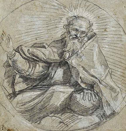


![]()
The Samson and Delilah ink sketch – cutting Rubens to the quick

Today, in a sale of old master drawings (and on an estimate of £1.5m -£2.5m), Christie’s is offering large claims for the artistic and historical significance of a small (roughly 16cms square and shown here at Fig. 1) pen and brown ink drawing:
“This is the only known preparatory drawing for Rubens’s Samson and Delilah in the National Gallery, London (inv. NG 6461), and it was followed by a modello oil sketch now in the Cincinnati Art Museum (inv. 1972.459). Commissioned by Nicolaas Rockox (1560-1640), who was Rubens’s most important early patron, this powerful composition dates from shortly after the artist’s return to Antwerp from Italy, where he had been from 1600 until 1608, and provides a valuable insight into his developing style and preparatory processes.”
This account is conventional but, nonetheless, contentious. No hint is given that the relationships between these three linked works are highly problematic or that all three have suffered cuts or thinning. The authorship of this group has been contested for over two decades. On February 19 2004 the Daily Telegraph published a letter from ArtWatch on the painting’s problems (“Is the National Gallery’s Samson and Delilah another copy?) We have published two special issues of the Artwatch UK Journal mounting challenges (Figs. 2 and 3) and have written a number of articles on the subject for the Art Review. The principal challenges to the attribution came from two artist/scholars, initially, Euphrosyne Doxiadis, whose findings (made with fellow artist Steven Harvey and Siân Hopkinson) were compiled in a report (see this website) that was submitted to the National Gallery in 1992 and later covered in the Times and the Independent. In 1997 researches by Kasia Pisarek, prompted two articles by the Sunday Times’ art critic, Waldemar Januszczak (“A Rubens or a costly copy?” and “National’s £40m Rubens could be fake”). In the latter article, the then director of the National Gallery, Neil MacGregor, conceded that the evidence “is respectable, and the scholar raises some serious questions that I cannot easily answer”. Those questions have never been answered. In October 1997 the National Gallery issued a press release in which it was said that:
“Debates of this sort require patient consideration of different sorts of evidence. The best format is for this evidence to be presented at some length for public discussion – and the National Gallery will be arranging such a lecture and debate over the next few months.”
A debate that has yet to take place
Within a few days the commitment was dropped when the press release was re-issued and the debate never took place. To this day there remains an enormous accumulation of problems with the National Gallery’s “Rubens” Samson and Delilah and, therefore, with its two closely associated works – the ink drawing and the oil sketch. All three works, which are dated to 1609-10, have unusual and anomalous features – and all appeared only in the 20th century. The modello arrived last without name or history in 1966 and was upgraded by Christie’s to Rubens even though it is painted on a soft wood and not the oak which Rubens invariably used.
Ludwig Burchard’s cunning plan?
Behind the successful 20th century elevation of this trio, is the fact that both the drawing and the large finished painting in the National Gallery were attributed to Rubens barely two years apart by the same man, Ludwig Burchard. Burchard was a great authority on Rubens who, notoriously, was unable to publish his life-long Great Work on the Artist for fear of having to de-attribute very many paintings for which he had supplied unwarranted certificates of authenticity. In the ArtWatch UK Journal No. 21(Spring 2006) Kasia Pisarek, whose PhD Dissertation was on Rubens and Connoisseurship, identified over sixty Burchard Rubens attributions that had subsequently been demoted in the Corpus Rubenianum itself.
Dr Pisarek felt that the year of launch for the picture now in the National Gallery might be signicant. As she put it:
“That year 1929 was not free of strange coincidences. By a bizarre stroke of luck, the painting re-emerged 48 years after its disposal by the Prince of Liechtenstein in Paris in 1881 (not 1880, as is commonly said), the exact same year as the deaths of the Prince Johannes II, the previous owner of the painting, and of his picture adviser Wilhelm von Bode, the then General Director of the Berlin Museums. The former died in February 1929, the latter a month later, in March. Moreover, we know that the Prince himself had weeded out a considerable number of pictures, Samson and Delilah included. He also financed many research projects, and the collection was accessible to scholars. The art historian Wilhelm von Bode published (in 1896) the first comprehensive and illustrated book on the Liechtenstein collection, so he could have been aware of the Samson and Delilah’s disposal. Why didn’t he identify the picture as the long lost Rubens if he was also a Rubens expert and had even co-signed certificates of authenticity with Ludwig Burchard?
In 1927 the drawing was bought from a private collector by a scholar of drawings and prints, I.Q. van Regteren Altena, for 26 guilders as a Van Dyck (whose initials it still bears). It was promptly upgraded to Rubens by Burchard, who then cited it as such in his 1930 certificate of authenticity for the Honthorst on offer by a Berlin dealer that is now in the National Gallery as an entirely autograph Rubens.
A precursor or a successor – or both?
It is claimed that Rubens’ characteristic stylistic development through stages of work is evident in the three works’ sequence, when the essential motif remains remarkably constant throughout. In fact, the modello (see Figs. 5 and 7) is so like the finished work that one supporter of the attribution, the former senior curator of the National Gallery, David Jaffe, has suggested that this oil sketch might be a ricordo – a record of the finished painting[!] However, if the presently accepted 1, 2 and 3 sequence of drawing, oil sketch, finished painting were to become 1, 3 and 2, it would make nonsense of the National Gallery’s technical reports which stated that the finished picture’s uncharacteristic thin, swift and little-revised paint work – paint work which today remains preternaturally fresh and unblemished (see Figs. 10 and 11) – was a product of the fact that Rubens had made such an unusually complete and resolved oil sketch that he had been able to paint the larger panel (which, the gallery claims, itself resembles a large sketch) out of his head and at a stroke and without any need for his customary revisions. Then again, the ricordo suggestion constitutes, perhaps, a kind of insurance policy, a way of covering against the possible outcomes of an eventual debate and presentation of evidence? If so, the sequence 1, 2, 3 and 2 again, would make a kind of institutional sense? This might indeed constitute a veritable “belt and braces” insurance: given that the gallery has admitted that its large finished panel is so very swift and sure-footed in its execution (or uncharacteristically sloppy and out-of-character to its critics), that it is itself but an over-blown sketch, the formulation 1, 2/4, 3/2 and 2 might serve perfectly to cover all eventualities.
The evidence of our eyes
The Samson and Delilah ink sketch, as a drawing, lacks the customary force, focus and eloquence of design seen in Rubens’ initial compositional ideas (- see Figs. 8b, 9a and 16). This supposed preliminary study has a curiously finished, pictorial air. Iconographically it has a pronounced “portmanteau” quality, showing, for example, Delilah’s draped right leg as seen in the secure Rubens oil sketch of 1609-10, The Taking of Samson in Chicago, while her draped left leg is as seen in the insecure National Gallery picture. Most disturbingly (to this draughtsman, at least) is that fact that when looking at the drawing in the flesh it is impossible to read an order or purpose to which its many and various components might have been made or to locate the essential, determining compositional and figural point at which Rubens always and brilliantly drove (see Figs. 8b and 16).
A ruled ink border surrounds and compositionally confines the ink and wash drawing (Fig. 1). When seen in reproduction, this border gives an impression that Rubens designed a format from the outset precisely in order to achieve an effect that is the single most problematic feature of the finished painting – the fact that the toes on Samson’s right foot were cropped at the edge of the painting. The border, like the drawing, is drawn in brown ink but clearly, as Christie’s describes, it can be seen by eye to comprise later framing lines. However, while this usage is seen to be common in the collection where the drawing has lived since 1927 – and while the border lines themselves can be seen to pass over a number of tiny losses on the edges of the sheet – the particular placement of the border is disquieting because the sheet on which the drawing was made has been trimmed at either the outside edges of the border or even within the border lines themselves. Why and when was this done? While some of the ink lines of the drawing can be seen by eye to run into the ruled borders, we cannot calculate where they might have terminated because of the severity of the sheet’s cropping. For whatever reason, this is now an artificially constrained and possibly edited image.
Flouting historical evidence
While the toes on Samson’s right foot are cropped at the edge of the National Gallery painting (Fig. 12), both of the contemporary copies that were made of the original Rubens painting show the foot, as painted by Rubens, to have been both whole and set well within the right-hand edge of the painting (see Figs. 4, 5 and 6). It is hard to see on what grounds this testimony might be disregarded: the first copy, an engraving (see Fig. 14), was made in c 1613 and very possibly under Rubens’ instruction. The second was a painting in oil commissioned by Rockox to show off his collection of paintings in the grand salon of his home (see Figs. 6 and 13). Is it conceivable that he – and Rubens, who was still alive – would have permitted a man famous for the accuracy of his records, to make a gratuitous, out-of-character “improvement” to the Rubens painting that occupied pride of place above the mantelpiece? Because of the inked box and the trimmed sheet it is not possible to determine whether the drawing’s author might originally have drawn the foot whole.
The panel support of the modello, as reproduced in the catalogue (see Fig. 7), is seen to have been cropped on its vertical edges since being sold to the Cincinnati Art Museum by the removal of two strips of wood, thereby conferring a clear crop onto Samson’s foot and bringing it into accord with the foot seen in both the National Gallery picture and the ink drawing. At one point the Cincinnati Museum claimed that the oil sketch’s panel was made of oak. When the picture was loaned to the National Gallery we asked if the panel was oak or softwood. It was not possible to say, we were told, because the back of the frame was enclosed and the gallery was not permitted to remove it. The museum today ducks the issue by saying that its painting is “on panel”.
The National Gallery’s picture was doctored at some undisclosed point by planing rather than cutting. The gallery restored the picture after purchasing it and reported that the panel had been planed down to a thickness of 2-3mm and set into a sheet of block-board. We knew for technical reasons that that was most unlikely: block-board is held together by its outer veneer layers and cutting one of them away would have had catastrophic structural consequences. When pressed, the gallery acknowledged that the planed-down panel had in fact been glued onto, and not set into, a larger sheet of block-board, with its edges being concealed by a bevelled putty. The restorer, David Bomford (now of the Museum of Fine Arts, Houston), said in his report, that the planing had taken place at some point in the early twentieth, or possibly during the late 19th century. That, too struck us as improbable: could there be no record of the back of a panel bought for a world record price (£2.5m) for a Rubens? Had the gallery not made a record of condition when the picture was loaned to it before the sale at Christie’s? We asked Neil MacGregor, if the gallery had any record of the back – and he said not. We asked if we might see picture’s conservation dossiers and there found Burchard’s 1930 certificate of authenticity, which described the panel as being intact and in excellent health.
At Christie’s we asked, and were kindly permitted, to examine the back of the drawing which is said to bear other drawings. A little (unintelligible) drawing is present but most of the surface bears the remains of a second sheet of paper to which the ink sketch had once been pasted. Effectively, the drawing’s verso is invisible – just as is the back of the National Gallery’s picture, any evidence on which has ceased to exist.
As for the contention – made against the evidence of the contemporary copies – that Rubens deliberately cropped Samson’s toes at every stage of the work, we know that he was very attentive to his toes. When drawing one of Michelangelo’s ignudi in the Sistine Chapel, he ran out of room on the paper for the toes on one of the feet and then drew them separately elsewhere on the sheet. On his return from Italy, and virtually simultaneously with working on the Samson and Delilah, Rubens made the magnificent Michelangelesque study of a nude man kneeling shown at Fig. 17. On that sheet, the right foot was truncated by the edge of the paper and, again, Rubens redrew the whole lower leg so as to include the foot and toes.
What kind of artist was Rubens?
The National Gallery has admitted that its painting is not typical of Rubens’s oeuvre, which fact it attempts to explain by claiming that immediately after his return to Antwerp from a long stay in Italy, Rubens was working “experimentally”. Unfortunately, it so happens that at the date of the Samson and Delilah’s execution, Rubens was also working on the very large altarpiece The Raising of the Cross (see Fig. 10). No one has ever suggested that that great work occupied a position in some experimental mode. To the bizarre and unsupported suggestion that Rubens, on his return from Italy, simultaneously worked experimentally and not-experimentally within the same brief period, Christie’s lend support with a contention that:
“The exact date of Samson and Delilah is unclear, partly because Rubens experimented with two very different approaches to the same subject in these post-Italian years.”
The truth is that attempts to keep this Burchard-initiated show on the road require that everything today be considered part of a moveable feast. It is neither a satisfactory situation nor a tenable position. Attribution is a difficult and taxing activity at the best of times and there is no shame in admitting error – and least of all with Rubens. As we put it in the 2006 Spring Journal:
“The upgrading of copies or studio works to autograph status frequently flouts the most elementary visual and methodological safeguards. Identification of the autograph hand of a master requires a ‘good eye’, sound method, and a recognition that comparisons are of the essence, that like should be compared with like. Procedural fastidiousness and visual acuity are nowhere more essential than with Rubens, who not only ran a large studio of highly talented assistant/followers but who famously placed a very high premium on studio works that had been modified or finished off by his own hand. When wishing to claim unreserved autograph status for a ‘Rubens’, it would seem imperative that some plausible connection between the aspirant and an unquestionably secure work be established. With the National Gallery’s Samson and Delilah, exemption is claimed on grounds that this work was special product of a peculiar moment in the artist’s career. Unfortunately for the attribution – and the picture’s supporters – this special ‘moment’ coincides precisely with a work of bedrock security – The Raising of the Cross of 1609-1610. An artist’s designs and motifs are easily replicated – and with Rubens, were often intended to be so ‘in house’. Pronounced similarities of subject matter or motif, therefore, are no guarantors of authenticity. What is most distinctive to a master and impossible to replicate – even by close associates within his own studio – is what is termed his touch, his individual, characteristic manner and speed of execution. Artistic mastery lies in some particular combination of technical fluency and commanding thought. The quality of an artist’s thoughts and his authorial ‘fingerprints’ are certainly made manifest in and through material – it cannot be otherwise – but only in material as handled, not in terms of its intrinsic, chemically analysable composition. A flat-footed analysis of the material components of pictures can no more corroborate authorship than they can validate a restoration. There are no material tests for authenticity…”
Update:
16.00, 10-07-14. The editor of Jackdaw, David Lee, writes to point out that, R W P de Vries, the person who sold the Samson and Delilah ink sketch produces this note, when Googled:
“Reinier Willem Petrus de Vries Jr. (Amsterdam , March 3, 1874 – Hilversum , 27 May 1953 ) was a Dutch artist. He was a painter , illustrator , book cover designer , and made ??etchings and woodcuts . He was a student at the State Normal School in Amsterdam, obtained his MO drawing. From 1913 to 1935 he was a teacher at a secondary school in Hilversum.”
The Jackdaw’s distinguished editor reflects: “An artist and secondary school teacher who flogs drawings. Not exactly what you’d expect…” No, indeed, but precisely the kind of thing about which we have learned not to expect to be given information.
Michael Daley
Comments may be left at: artwatch.uk@gmail.com

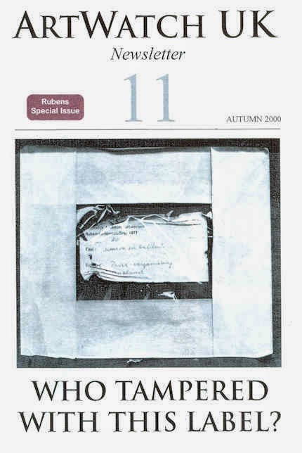


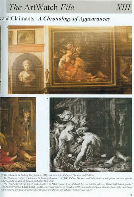
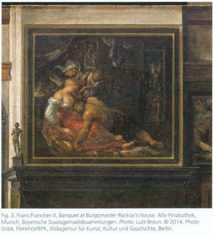


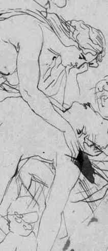
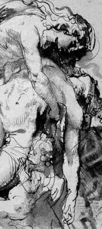


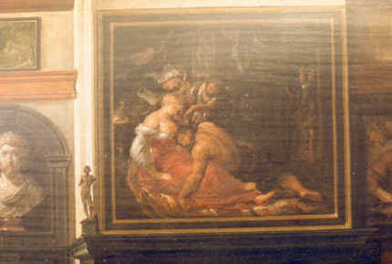


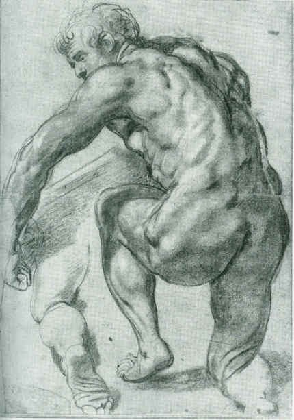
![]()
Could the Louvre’s “Virgin and St. Anne” provide the proof that the (London) National Gallery’s “Virgin of the Rocks” is not by Leonardo da Vinci?
When the National Gallery’s restored “Virgin of the Rocks” was pronounced an entirely autograph Leonardo we were left reeling with incredulity. Picture restorers rarely decline opportunities to claim “discoveries” but could they really be claiming an ability to make a picture an autograph Leonardo simply by thinning its varnish? During the media frenzy of the National Gallery’s £1.5bn Leonardo blockbuster, its chief restorer, Larry Keith, was asked if a distinctive Leonardo brushstroke had emerged. “No”, he said, proof of authenticity lay in the picture’s internal relationships. Given that those relationships differ markedly from the ones present in the Louvre’s unquestionably autograph “Virgin of the Rocks”, what accounted for the discrepancies? The then curator, Luke Syson, replied that Leonardo’s style had, in the London copy, become abstracted, less naturalistic and more “metaphysical”. This seemed fanciful: had not all of Leonardo’s pictures carried a beguiling air of the metaphysical – and had this quality not derived from the artist’s preternaturally intense engagement with natural phenomena and the mysterious powers which operate through them? Had a new corroborating body of drawn studies emerged? The Gallery admits that not only is there no identifiable Leonardo brushwork but that the picture itself is “manifestly uneven in finish and execution” and that there has been “a good deal of agreement that Leonardo himself painted little or none of it”. When we asked if any securely autograph Leonardo paintings shared these newly claimed characteristics, Syson said that they were also found in the “Last Supper”, when only 20% of that large, fragmented, degraded, many-times restored, de-restored and re-restored mural survives – and when its recent restorers “discovered” that it had originally been choc-full of tiny naturalistic details (curtain hooks, slices of lemon, reflections on glassware, tablecloth patterns and so forth). Above all, the National Gallery’s latest upgrade flew in the face of – and seemingly sought to circumnavigate – a landmark 1996 article by a geologist (and now art historian), Ann Pizzorusso, who has shown that while the rock configurations in the Louvre version were entirely consistent with precise formations found in nature and in Leonardo’s own studies, those seen in the London version were found in neither. (See Pizzorusso, “Leonardo’s Geology: The Authenticity of the Virgin of the Rocks”, The MIT Press, Vol. 29, No. 3, and “Leonardo’s Geology: The Authenticity of the Virgin of the Rocks”, in Leonardo Magazine, Vol. 29. No. 3, 1996, pp. 197-200.) Here, Pizzorusso presents further elegant demonstrations of the London picture’s non-autograph status that are manifest in the (recently restored) late Leonardo masterpiece, “The Virgin and Child with St Anne”.
Ann Pizzorusso writes:
London’s National Gallery recently announced that its version of the “Virgin of the Rocks”, previously attributed to various artists who worked in Milan, was now, after being cleaned, solely the work of Leonardo da Vinci. The National Gallery supports its claims by stating that the work represents a change in style and that the geology in the picture is rendered in a more abstract, monumental style (see Appendix A).
While art historians have long discounted the National Gallery’s version as one by Leonardo, the Gallery has now discounted centuries of scholarship with their new interpretation and subsequent attribution of the painting to Leonardo. What is most ironic and troubling about the National Gallery’s position is that there are reams of contractual documents which still exist today documenting a 25 years long lawsuit concerning the two versions of the painting and which show, unequivocally, that Leonardo did not paint the version in the National Gallery. Prof. Charles Hope, a former director of the Warburg Institute, London, and an expert in notarial Latin states that there is no doubt that Leonardo painted the first version and not the second (New York Review, 9 February 2012).
While we may be able to forgive the National Gallery for not being up on notarial Latin, there is no excuse for their proposal that Leonardo changed his style. In the decades in which I have studied Leonardo from all aspects (we must remember, Leonardo did not consider himself primarily a painter) one thing stands out in all his works—a fidelity to nature and a lifelong effort to depict natural objects as realistically as possible.
The father of Leonardo studies, Carlo Pedretti, in his book analyzing Leonardo’s nature drawings, “Leonardo da Vinci Nature Studies from the Royal Library at Windsor Castle” (with a forward written by Kenneth Clark, a former director of the National Gallery in London), devotes the entire volume to discussing Leonardo’s preoccupation with natural objects and his fanaticism in attempting to depict them as realistically as possible. This passion was imparted to his students, Francesco Melzi, Cesare da Sesto, Giovanni Boltraffio and Marco d’Oggiono. So much so that a drawing of a Tree (RL 12417), long thought to be by Leonardo, was later attributed to Cesare da Sesto and a view of Amboise (RL 12727) to Francesco Melzi. In analyzing the works of Leonardo’s students one can see that they have followed Leonardo’s technique and depicted natural objects as realistically as possible. They had obviously heard quite a bit of ranting by Leonardo about “Botticelli’s bad landscapes” (see Appendix B).
Another reason why Leonardo’s approach is reflected in his art is that he was born in the transitional era of the late Middle Ages, an age still filled with superstition and fear, especially about such things as mountains, natural catastrophes and death. He grew up leading the way into the Renaissance, faced all these fears, and debunked them. He travelled extensively in the Alps outside of Milan taking note of nature and geology. He noted landslides and torrential flooding with its associated damage (see Figs. 3 & 4), he dissected corpses to provide the most accurate depiction of human anatomy we have ever had until relatively recent times. His work as engineer, geologist, botanist and astronomer cannot be disconnected from his work as an artist (see Figs. 8 & 9). To understand Leonardo, one must understand him completely. And to understand him completely is not difficult. He has written everything down. He was faithful to nature. If one applies just that one rule to Leonardo da Vinci, looking at his work from a scientific standpoint, the answer is crystal clear: fidelity to nature is a Leonardo trademark that can be used to determine the authenticity of his work.
Now that we have seen that the National Gallery has preferred not to acknowledge the work of many esteemed Leonardo scholars, maybe looking at the recently cleaned “Virgin and Child with St. Anne” in the Louvre will change its mind (see Figs. 1, 7, 10, 11, 14, 17, & 21). The “Virgin and Child with St. Anne”, dated to about 1510, came later than the National Gallery version of the “Virgin of the Rocks”. We do not know how much later, as the National Gallery has now dated the initiation of its version of the “Virgin of the Rocks” as 1491/2-9 and its completion to 1506-08. Professor Hope, in his review of the notarial documents regarding the lawsuit states that the National Gallery version of the “Virgin of the Rocks” could not have been painted before 1508.
If we use the 17 year time period (1491-1508) which the National Gallery cites for its “Virgin of the Rocks”, it would mean Leonardo was painting the “Last Supper” (1492-7/8), completing the Burlington Cartoon (1499-1500 or 1506-08) and the “Virgin of the Rocks” at the same time. On page 96 of Kenneth Clark’s book entitled “Leonardo da Vinci” he indicates that Leonardo was exceptionally busy. Apart from the first “Virgin of the Rocks” his time was taken up with work for the court. He was the court limner and also painted two portraits of the Duke’s mistresses Cecilia Gallerani and Lucrezia Crivelli. With these portraits, we would be up to five major works in progress by Leonardo if we include the National Gallery’s “Virgin of the Rocks”.
This being said, all of these works being done at nearly the same time gives us the perfect opportunity to appraise, determine and evaluate the stylistic traits of the artist at that period of his career. In looking at the Burlington Cartoon and the “Virgin and St. Anne”, both are rich with geologic detail and accuracy. Leonardo has risen to new heights in his portrayal of landscape elements. His talent and passion are vividly displayed in the Burlington Cartoon and he reaches a level of sophistication, subtlety and accuracy in rendering the geology in the “Virgin and St. Anne” which had never been seen before (see Appendix C).
The St. Anne is a geologic tour-de-force. In fact, Leonardo experimented extensively on developing paints and a technique for depicting the pebbles of agate, chalcedony and marble at the feet of the Virgin and St. Anne (see in particular, Figs. 1 & 21). Leonardo writes in his notebooks about his efforts and how satisfied he was to have developed an approach to rendering the pebbles in such a realistic fashion. In fact the entire painting is one geologic treat after another. He had spent years in the Alps so he knew the landscape and geology exactly. With his newly developed technique for painting marbleized pebbles he was delighted (- see Appendix D).
Using a date of 1510 for the “Virgin and St. Anne” and a date of 1483-86 for the “Virgin of the Rocks”, both in the Louvre, we have proof that Leonardo did not change his style, and that, if anything, he became more fanatical in his quest for geologic accuracy, developing new paints and techniques for natural depiction and driving his students to deliver the most accurate depiction of nature in their own works.
So we must ask the question “How and why could Leonardo have changed his style to produce a work so lacking in geological and botanical accuracy as the ‘Virgin of the Rocks’ in the National Gallery in London?” There is no evidence Leonardo changed his style and now, with the recently cleaned “Virgin and St. Anne”, we have that proof. We also know that his students were inculcated with his passion for accurate depiction of natural objects so we must also exclude his students as authors of the National Gallery work.
It would be best for the National Gallery to reopen the case for the attribution of the work to Leonardo. Hundreds of years of scholarship by Leonardo critics as well as the words and the works by Leonardo himself should not be discounted. The National Gallery does a disservice to those who have worked so hard to come up with incontrovertible evidence regarding the attribution of this work and most of all the National Gallery does a disservice to Leonardo himself.
Ann Pizzorusso
Appendix A
The National Gallery’s claimed shift within Leonardo’s oeuvre
“We know that Leonardo’s painting technique gave priority to the figures. The Virgin is designed first, as she is in so many of his drawings, and the landscape seems to flow from her. Since Leonardo saw the painter’s acts of creation as analogous to God’s, his generation of the landscape in the Virgin of the Rocks and the absolute, unalterable perfection of the Madonna at the center could be understood as precisely connected with the doctrine of the Immaculate Conception. But the appearance of the Virgin and her companions, and of the plants and rocks, are different, in the two versions: the theological meaning of his stylistic choices has shifted slightly. In the Louvre picture Leonardo relies on entirely naturalistic tactics to give the picture its spiritual flavor: the sinless beauty of the Virgin becomes the same kind of truth as the natural beauty of the irises nearby. But in the London Virgin of the Rocks, the Virgin and Christ are supernatural, the world around rendered notably less naturalistically, the rocks are straightened to become great columns; the flowers appear to be ideal composites of the leaves and petals of real plants. Tackling the theme for a second time, Leonardo chose to show the viewer not just a vision of the Virgin Mary, but Gods’ perfect ideas for everything around her. What we are shown here is an ideal world made before the physical creation of our own imperfect cosmos, before the need for humankind’s salvation.”
The National Gallery catalogue, “Leonardo da Vinci, Painter at the Court of Milan”, page 174.
Appendix B
Leonardo on Botticelli’s bad landscapes
“He is not universal who does not love equally all the elements in painting, as when one who does not like landscapes holds them to be a subject for cursory and straightforward investigation-just as our Botticelli said such study was of no use because by merely throwing a sponge soaked in a variety of colours at a wall there would be left on the wall a stain in which could be seen a beautiful landscape.”
Leonardo da Vinci, from: “Treatise on Painting”, the chapter on Criteria and Judgments, the subsection “How a painter is not worthy of praise unless he is universal”.
Appendix C
Walter Pater
“Saint Anne–that delicate place, where the wind passes like the hand of some fine etcher over the surface, and the untorn shells are lying thick upon the sand, and the tops of the rocks, to which the waves never rise, are green with grass, grown fine as hair. It is the landscape, not of dreams or of fancy, but of places far withdrawn, and hours selected from a thousand with a miracle of finesse. Through Leonardo’s strange veil of sight things reach him so; in no ordinary night or day, but as in faint light of eclipse, or in some brief interval of falling rain at daybreak, or through deep water.”
Walter Horatio Pater, “The Renaissance, Studies in Art and Poetry”, The Echo Library 2006, page 54.
Appendix D
Carlo Pedretti
“The movement of the fifteenth century was twofold; partly the Renaissance, partly also the coming of what is called the ‘modern spirit’, with its realism, its appeal to experience. It comprehended a return to antiquity, and a return to nature. Raphael represents the return to antiquity, and Leonardo the return to nature. In this return to nature, he was seeking to satisfy a boundless curiosity by her perpetual surprises, a microscopic sense of finish by her finesse, or delicacy of operation, that subtilitas naturae which Bacon notices. So we find him often in intimate relations with men of science – with Fra Luca Paccioli the mathematician, and the anatomist Marc Antonio della Torre. His observations and experiments fill thirteen volumes of manuscript; and those who can judge describe him as anticipating long before, by rapid intuition, the later ideas of science. He explained the obscure light of the un-illuminated part of the moon, knew that the sea had once covered the mountains which contain shells, and of the gathering of the equatorial waters above the polar.
“Notebooks and sheets of about 1508 contain a number of notes on ‘mistioni’ (mixtures), a plastic material of his own invention with which he aimed at imitating the colour and design of semi-precious stones. He describes his production process and how, once the objects were thus produced, he spent much time finishing them with his own hand to a smooth and glossy surface…At the same time he was much taken by anatomical studies, so that when he described the production process of his ‘mistioni’ he came to specify the effect that was to be achieved: ‘…then you will dress it with peels of various colours, which will look like the mesentery of an animal’.
“In 1502, Francesco Malatesta wrote Isabella d’Este that Leonardo had looked at many of the Medici gems and objets d’art made of stone. Leonardo praised ‘the one of amythyst or jasper as Leonardo baptized it, because of the admirable variety of its colours’”.
Carlo Pedretti, Leonardo, A study in Chronology and Style, London, 1974, pages 132-137.
Ann Pizzorusso
For an in-depth comparison of the two versions of the Virgin of the Rocks see:
Comments may be left at: artwatch.uk@gmail.com


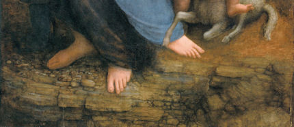


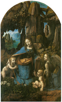


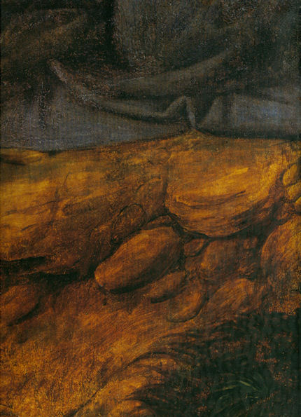


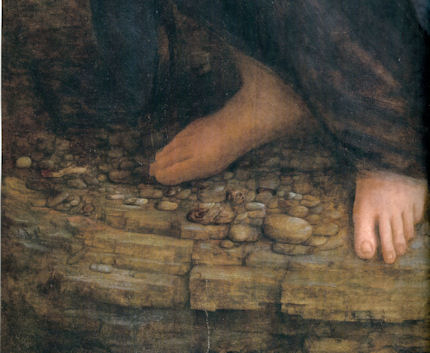
![]()