
Brian Sewell – Still Stinging in Death
The death on September 19th of the famously acerbic art critic Brian Sewell was generally marked by fair, balanced and sometimes touching obituary notices. For one of his critical victims, Susan Loppert, a signatory to the infamous 1994 “Gang of 35” letter calling for Sewell’s dismissal as the Evening Standard art critic, this seems to have been taken as a personal affront.
The now legendary Evening Standard letter of 5 January 1994 from thirty-five self-appointed contemporary art establishment worthies began pompously – “As members of the art world – writers, critics, artists, art historians, curators, dealers – we take the greatest exception to Brian Sewell’s writing in your newspaper…”, proceeded viciously – “His virulent homophobia and misogyny are deeply offensive, particularly the remarks made in the review of the exhibition Writing on the Wall”, and ended with pomposity, viciousness and self-pity: “We believe that the capital deserves better than Sewell’s dire mix of sexual and class hypocrisy, intellectual posturing and artistic prejudice”. This public attempt to silence a maverick critical voice was entirely self-defeating. As demonstrated below, it generated an explosion of support, catapulting the then 63 year-old art critic into a national prominence that would run for two decades.
This happy unintended outcome was, however, the exception to other manoeuvres in a bid to rig press coverage of deeply unpopular experimental art practices. A post hoc rationale for advancing against the press was given by the Tate’s director, Nicholas Serota in the 2000 Dimbleby Lecture with this plaint: “For in spite of much greater public interest in all aspects of visual culture, including design and architecture, the challenge posed by contemporary art has not evaporated. We have only to recall the headlines for last year’s Turner Prize. ‘Eminence without merit’ (The Sunday Telegraph). ‘Tate trendies blow a raspberry’ (Eastern Daily Press), and my favourite, ‘For 1,000 years art has been one of our great civilising forces. Today, pickled sheep and soiled bed threaten to make barbarians of us all’ (The Daily Mail). Are these papers speaking the minds of their readers?” Well, yes, of course they were, that is one of the things that sensible newspapers do. And that was why the articulation of such dissent posed a political threat to the contemporary art establishment’s ambitions.
COVERT MANIPULATION OF THE PRESS
The bid to unseat Sewell occurred when the Tate Gallery had become the greatest promoter of experimental art and was working closely with contemporary art dealers. In 1991 one such dealer, Jay Jopling, served on a secret Tate committee. When the editor of the art magazine Jackdaw, David Lee, later asked the Tate for the members of this shadowy committee, that gallery replied curtly that it could not say because no minutes had been taken. But why a secret committee in a publicly-funded registered charity? All businesses and institutions angle for favourable press coverage – that is why they employ large press departments. What additional purpose or purposes were best served secretly? Were there other secret committees at the Tate? Only two press accounts of this shadowy committee exist, and from these we learn that its express purpose was to plant stories to generate press coverage of, and foster interest in, what was widely reviled avant-garde art. Both insights stem from interviews with Jay Jopling when he was about to open the new White Cube gallery in Hoxton Square. The first, on 20 September 2002, was by Rose Aidin in The Guardian:
“Following a brief flirtation with film-production, Jopling started working with artists such as Damien Hirst and Marc Quinn, putting on warehouse-style shows from his Brixton home. When Nicholas Serota formed a think-tank upon his appointment to the Tate in 1991 [NB Serota had been appointed in 1988 – now some twenty-seven years ago!], Jopling was asked to join it. ‘I was very flattered to be included in this meeting to discuss how we got the newspapers to take contemporary art more seriously,’ he recalls. ‘Yet it seemed to me that if the tabloid press was only interested in ridiculing contemporary art, then get them to ridicule it properly, so that people actually take notice.
‘So we got the Daily Star to take a bag of chips to one of Damien’s fish in formaldehyde pieces which was then on show at the Serpentine and photograph it as the most expensive fish and chips in the world. Stunts like that forced people to know about the art and if they know about it, then that encouraged them to go and see it, and then they were forced to take a view. It certainly was a way of getting art into the public arena.'”
In another interview, “Thinking outside the square”, in the Financial Times on 21-22 September 2002, Lynn MacRitchie reported:
“Jopling recalls a ‘dark period’ when he was among a group summoned by Nick Serota to what was then simply the Tate to discuss how to get press coverage for contemporary art. At that time Jopling and his soon-to-be-star Damien Hirst, who proved a tabloid natural, were happy to go along with whatever the papers wanted – posing with a bag of chips next to the shark for the headline ‘The World’s Most Expensive Fish Supper’ was just one stunt. While Jopling concedes that the tabloids’ insistence on making ‘characters’ out of the artists went further than he had expected, the tactics, however dubious, worked – the British public, notoriously indifferent to contemporary art, was hooked…”
At the other end of the press, Tate-friendly art critics set about persuading their broadsheet newspaper editors that publishing comment articles and news page reports mocking avant garde art made their papers look down-market and “tabloid”. Both ploys worked: serious commentary articles questioning Tate policies were killed in the quality press, while in the tabloid press earlier “You call this art?” stories morphed into colourful tales of endearingly whacky new art world celebs “having a larf” at The Establishment. In no time at all, the one-time rebels were the establishment and they, like their dealers, made killings. Sometimes, the Tate’s secret manipulations of the press involved suppressing stories rather than planting them.
“DANGLED DOSH, UNDERWORLD CONNECTIONS… AND NO ARRESTS”
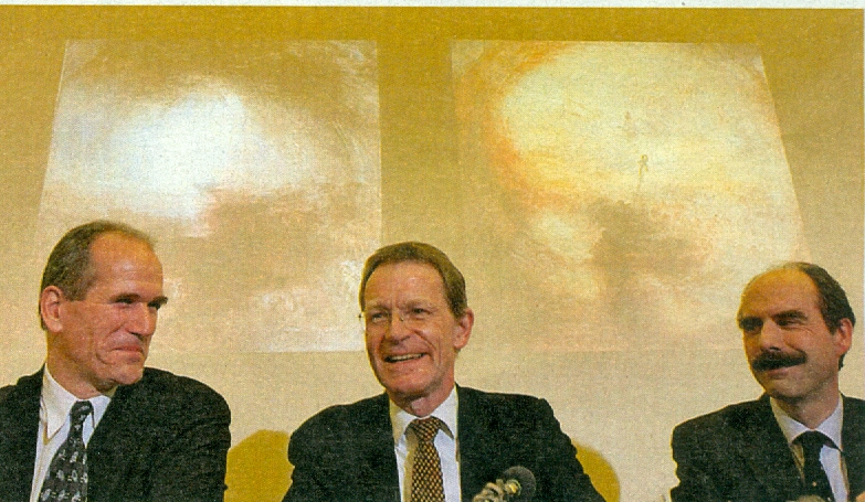
Above, Tate players, Sandy Nairne, left, Nicholas Serota, centre, and Stephen Deuchar, right, announcing the recovery of two stolen Tate Turners at a press conference in December 2002.
When the Tate lost two Turner paintings to thieves after loaning them to an insecure German museum in 1994, it later obtained permission from the High Court to buy them back from Serbian gangsters for a ransom of more than £3 million. Secrecy at the Tate went into overdrive when in 1998 Serota set up a so-called “Operation Cobalt”. The gangsters feared a police recovery action might be in operation. Although this was not the case (on the gangsters’ insistence the police had been “stood down” and the banknotes were unmarked), as a precaution, they released the paintings one at a time. When the first Turner was brought back secretly to London, the man who had negotiated the dangerous transfer of cash, Sandy Nairne, a signatory to the 1994 Sewell-Must-Go letter and the then director of the National Portrait Gallery, wanted to release the news. The Tate’s director, Nicholas Serota, refused on the grounds that by holding back until both pictures were recovered it would be possible to achieve a spectacular publicity coup. Hitherto, Serota said, most of the Tate’s “positive” press coverage had not been real news but, in his words, “merely promotional material”. Nairne recalled (in Art Theft, his 2012 book on the affair) that when stories began appearing in the British press “Nick [Serota] questioned me as to whether I was doing enough to ‘control’ those working for us and preventing anyone from speaking to the press…It then emerged that someone had talked to the senior crime writer on the Mail on Sunday [a sister paper to the Evening Standard]. He had heard that one painting was back in London, and he was keen to find some corroboration for this notion – something I wanted no one to know…” A high-powered press consultant, Erica Bolton, was hired on Serota’s advice and she prepared a dissimulating press statement in Serota’s name:
“November 2000 Turner Paintings
There has been much speculation over the years about the whereabouts of two paintings by J. M. W. Turner stolen in Frankfurt in 1994. And like the authorities in Germany, Tate has always been interested in any serious information which might lead to their recovery. But currently there is no new information, nor are any current discussions being conducted. Of course I remain hopeful that one day the paintings might return to the Tate.
Nicholas Serota, Tate Director“.
Nairne did not say whether or not the Tate had denied outright to the Mail on Sunday that one of the paintings had already been returned but, in any event, the dreaded article did not appear. As Nairne put it, the paper “did not publish and my fears about further investigative pieces, with imputations about ‘Serbian criminals’ receded.” The identity of the criminals had been disclosed in a 2001 book, The Unconventional Minister, by the former Treasury minister (the Paymaster-General) Geoffrey Robinson, who had bullied Lloyds’ insurance underwriters into allowing the Tate to buy back the rights for the paintings, should they be recovered, for only a small fraction of the £22 million insurance payout the gallery had earlier collected. After the final part of the ransom was paid and the second Turner painting was returned, no arrests were made. (For more on this saga, see Michael Daley, “Ransom or Reward? Part III”, the Jackdaw, January/February 2012, and our posts Questions and Grey Answers on the Tate Gallery’s recovered Turners, and Dicing with Art and Earning Approval.)
THE ELEVATION OF BRIAN
On 7 January 1994 the blow-back against the Gang of Thirty-five’s letter began on the Evening Standard letters page.
The Education Secretary, John Patten, wrote:
“I have read with dismay the letter signed by a number of the great and the good in the art world (5 January) attacking Brian Sewell. He shouldn’t be dismayed, but rather cheered…It’s not the whiff of censorship, nor the heavy scent of political correctness which pervades their letter, which concerns me, but its extraordinarily inward-looking nature. In other words, the attitude that cultural life is only for the self-styled cultured, a narrow group alternately puffing and then gently ‘criticising in context’ each other’s work…Their letter marks the barrenness and imploding nature of so much contemporary British intellectual and artistic life, with a few notable exceptions.”
Michael Daley wrote:
“Bravo, Brian. There have been signs for some time that members of our illiberal, modernist, visual arts establishment are becoming unnerved by their own self-constructed isolation. But for one critic, with one review, to derange and bag no fewer than 35 mewling, whining, Arts Council apparatchiks and awards recipients is a splendid achievement.
Long may Mr Sewell (and his Spectator comrade-at-arms Giles Auty) speak for the thinking public and the majority of practising artists. Please give him all the space he needs – the job is urgent. And overdue.”
Vaughan Allen wrote:
“What a laughable reflection on contemporary metropolitan culture was the whingeing letter by its self-appointed spokespeople (Letters, 5 January). And how arrogant to open with ‘As members of the art world’ as though this entitled them to some kind of privileged treatment. Since the sad death of Peter Fuller, Brian Sewell has emerged as one of the few critics consistently to resist the hijacking of the arts by politically correct trendies and mindless charlatans. His denunciation of the pretentious rubbish regularly paraded as art by London’s curators, dealers and critics is a welcome breath of fresh air. Without it Londoners risk suffocation by endless phoney art propaganda and pseudo-intellectual pyscho-babble beloved by a media desperate to foster any artistic fad no matter how imbecilic. Reading down the list [see below] one cannot but help notice the number of indignant signatories who constitute the capital’s incestuous and self-perpetuating art-scene maffia. No wonder they resent Mr Sewell for exposing their specious, life-diminshing but fashionable cultural values. For it is the public’s very acceptance of these warped criteria that they depend on to guarantee their inflated incomes and even more inflated reputations.”
On 14 November 1994, James Beck wrote:
“I read with relish Brian Sewell’s extraordinary ‘Down with bilge, gush and greed’ piece (10 November), nodding my head in agreement after every paragraph. There is no doubt that such views, effectively and brilliantly articulated, are annoying to the art world’s establishment, which has been running a marathon of naked emperors for decades.
Art criticism, and, I would add, official art history, is at the same low ebb, and they feed on and support each other with the aid of colossal sponsorship from international business and foundations, many of them America-based, with limitless funds.
Only with the constant and intelligent criticism by people like Brian Sewell can we hope to open honest debate on the issues that count.”
THAT WAS THEN, THIS IS NOW:
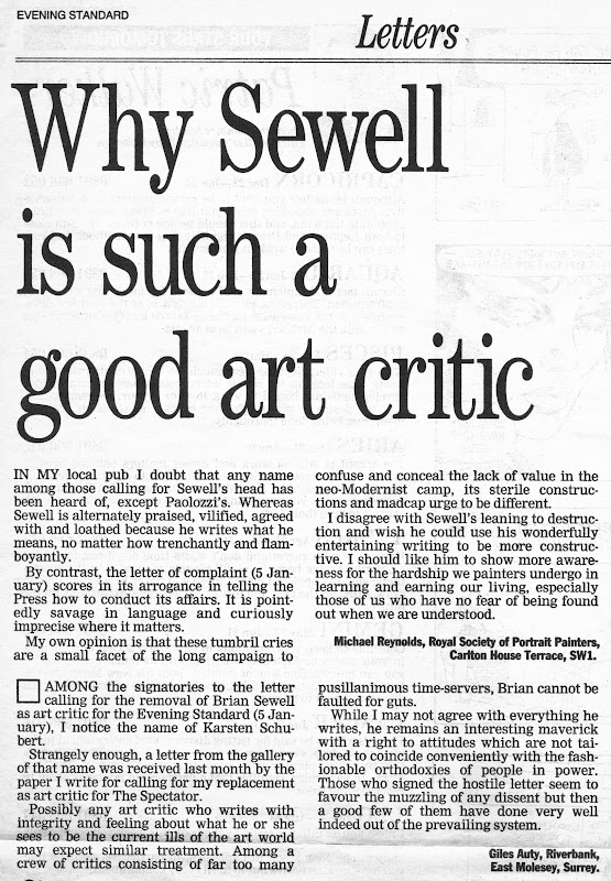
Looking back, two decades on, what effect did that affair have? And, more personally, how is Sewell now regarded on his departure? The television campaigner Mary Whitehouse suffered decades of vilification until the feminist writer Germaine Greer conceded that she had had a point all along when campaigning against gratuitous televised depictions of (male) violence against women. So Sewell was lucky to have his vindication arrive so fast. But on his death it would seem that, for the signatories of the Sewell-Must-Go letter, time brings no reprieve. Even in his grave, the still-righteous letter-writing collective casts him as wrong, vile and repellent, and themselves as both morally vindicated and art-politically triumphant. The generally balanced and charitable tone of the obituary notices pushed one of the original letter’s signatories (- in fact, we now learn, its author), Susan Loppert, into public rebuttal mode. Protesting against Jonathan Jones’ 21 September article “Brian Sewell was Mr Punch to modern art’s Judy”, Ms Loppert took affronted sisterly umbrage on behalf of Judy in a letter to the Guardian:
“As the author of the ‘naive’ letter by ‘art world types’ published by the Evening Standard in 1994 objecting to Brian Sewell’s attitude to contemporary art, I’d like to clarify why the letter was written. Sewell was an art historian whose main area of expertise was old master paintings. He was hostile to and ignorant about contemporary art, yet at the Standard he wrote lengthy reviews giving vent to his splenetic old fogeyism, virulent homophobia (surprising given his own homosexuality) and misogyny. The review that prompted our protest was a 3,000-word diatribe inveighing against a small exhibition at what is Tate Britain of work by female artists, selected by female curators, the catalogue with contributions from female writers. Sewell dismissed it all as ‘a show defiled by feminist claptrap’, in particular a ‘frightful’ female nude by Vanessa Bell that was so ‘ugly and incompetent, it could hardly be the favourite of even a purblind lesbian’.
The letter did not demand that Sewell be fired, as was erroneously claimed at the time. Stewart Steven, editor of the Standard, had told me that Sewell had been hired to be offensive without being libellous, that his work was deliberately targeted at the lowest common denominator: ‘Essex Man – the strap-hanger on the Ongar Line’. Since we recognised that ‘very occasionally, [Sewell] says something perceptive on subjects where he has some expertise’, we felt that the paper should have two art critics: one for art dating from the early 1900s with its dreaded abstraction, and Sewell for what he called ‘traditional’ art.
The 35 signatories included Bridget Riley, Rachel Whiteread, Sir Eduardo Paolozzi, Michael Craig-Martin, Marina Warner, Richard Shone, Christopher Frayling, George Melly, Angela Flowers and John Golding. Perhaps Jonathan Jones was right to say we were naive, but he’s wrong if he thinks ‘Sewell really scared [us]’. What we objected to was his deliberate cruelty and viciousness, and that he was, in the words of your obituary (21 September), ‘puffed up’; like his invented Edwardian voice – and like so many works of art – he was a fake. In the end though, as Jones notes, none of Sewell’s flailing at windmills stopped the inevitable triumph of modern art. Is Sewell turning in his bile-filled grave?”
Note the unreconstructed presumption: “We felt that the paper should have…” We, another respondent, and Ms Loppert herself, replied in letters to the Guardian (3 October) – see “Brian Sewell spoke timely truth to power”. Our letter reads:
“Susan Loppert’s defence of the notorious gang of 35’s attempt to unseat Brian Sewell at the Evening Standard is as disingenuous as her present attack on him is tasteless. Tasteless, too, for her to crow ‘none of Sewell’s flailing at windmills stopped the inevitable triumph of contemporary art. Is Sewell turning in his bile-filled grave?’.
Inevitable triumph? The triumph of all contemporary art – or of just the Tate/Arts Council-sanctioned varieties? In truth, much of the strongest support for Sewell came from contemporary artists of non-state-approved persuasions. I recall this well, having been one of the first to defend Sewell in the Standard: ‘There have been signs for some time that members of our illiberal, modernist, visual art establishment are becoming unnerved by their own self-constructed isolation. But for one critic, with one review, to derange and bag no fewer than 35 mewling, whining, Arts Council apparatchiks and awards recipients is a splendid achievement.
Long may Mr Sewell (and his Spectator comrade-at-arms Giles Auty) speak for the thinking public and for the majority of practising artists. Please give him all the space he needs – the job is urgent. And overdue.’
And so there were but, as it happened, the illiberal gangs did win out, modernism has triumphed and Serota has been anointed (Mugabe-like) Tate director-for-life. But goodness, how close it was then and how deliciously rattled they were – and still are, if Ms Loppert is any indication.”
I should not, perhaps, have mentioned Auty in 1994. He too was attacked at the Spectator by partisans of the Tate and a trendy gallery (see below). Some months later, and again in the Spectator, another of the thirty-five signatories, Richard Shone, then a deputy editor of the Burlington Magazine, attacked every single non-trendy writer on art, including Auty in his own paper – he was branded “didactic”. John McEwen of the Sunday Telegraph was dubbed “world-weary” and so forth. Shone, just like Loppert, demanded a different kind of press and called for a “shake-up of the way fine arts are treated in the press” – even as he admitted that there were “wider individual sympathies for [Sewell] among 20th-century artists than he is given credit for”.
A PAINTER AND A PAINTER/CRITIC IN DEFENCE OF SEWELL:
TAKING OUT A CRITIC ~ THE 35 SIGNATORIES:
Kathy Adler, Don Anderson, Paul Bailey, Michael Craig-Martin,
Graham Crowely, Joanna Drew, Angela Flowers, Matthew Flowers,
Pofessor Christopher Frayling, Rene Gimpel, John Golding, Francis Graham-Dixon,
Susan Hiller, John Hoole, John Hoyland, Sarah Kent,
Nicholas Logsdail, Susan Loppert, Professor Norbert Lynton, George Melly,
Sandy Nairne, Janet Nathan, Prue O’Day, Maureen Paley,
Sir Eduardo Paolozzi, Deanna Petherbridge, Bridget Riley, Michele Roberts,
Bryan Robertson, Karsten Schubert, Richard Shone, Nikos Stangos,
Marina Warner, Natalie Wheen, Rachel Whiteread.
THE WIDE-RANGING CONSPIRACY TO UNSEAT DISSIDENT VOICES
Richard Shone’s assault on politically unacceptable writers prompted a further brace of letters to the Spectator (28 May 1994):
“Out Shone”
“It is heartening to see how jumpy and ratty members of our illiberal, modernist visual arts establishment (for example, Richard Shone, Arts, 21 May, Anthony Everitt, Guardian 16 May, Richard Dorment, Daily Telegraph 14 May) are becoming. Having seized all outlets from the Tate Gallery to the Royal Academy, the Arts Council to the art schools, the Late Show to Time Out and the Burlington Magazine, today’s mandarins seem to be recognising that their grip is precarious. The outside world will not be bullied into believing that commonplace materials (like brick, chocolate and dead animals) can, by fiat or alchemy, be converted into bona fide works of art. Rare, professionally dissenting voices (such as your art critic Giles Auty and the Evening Standard’s Brian Sewell) are increasingly seen, therefore, as menaces who must be removed. Fortunately, the present establishment campaign to this end is proving spectacularly counter-productive. The Gang of Thirty-five’s notorious call for Sewell’s sacking led to an embarrassing avalanche of support for his writing. Mr Shone’s linked attacks on your art critic and on ‘visually illiterate’ art editors is similarly inept: Auty’s authority and influence as a critic is underwritten precisely by his long and first-hand familiarity as a painter with the mechanics and the grammar of the art. There are visual illiterates at large but, mercifully, they rarely find space in The Spectator.
What really sinks Shone’s case, of course, is its self-contradictoriness and hypocrisy. After pious calls for disinterested criticism in general and for a plurality of voices, he ends with the prescriptive demand that critics present exclusively ‘enthusiastic account[s] written with warmth for the subject’ – no cut, no thrust, no scepticism, just remorseless sycophantic, promotional gush.
That such should come from a deputy editor of the Burlington Magazine says much of the health of our arts establishment and of the arrogance of its members. But it also betrays a fatal weakness: if, nearly a century on, modernism truly remained a vigorous, healthy and life-enhancing force, it would hardly require the present ugly, repressive machinations being made on its behalf, would it?”
Michael Daley
“Possibly the long article written by Richard Shone about the current state of art criticism needs placing in a wider context. Mr Shone was one of the signatories to a recent letter to the editor of the Evening Standard calling for the sacking of their art critic Brian Sewell. My own editor has recently received letters from two employees of another of the signatories, Karsten Schubert [the dealer], calling for my removal from this paper. The grounds are that I am not sympathetic to the sort of art that Mr Shone and his kind find quite wonderful, as exemplified by the current exhibition at the Serpentine Gallery ‘Some Went Mad, Some Ran Away’, for which Mr Shone has written a eulogistic catalogue essay. The fact that I think this last is composed largely of hot air, however elegantly written, will not be causing me to write to the editor of the Burlington Magazine, of which Mr Shone is deputy editor, calling for the latter’s instant dismissal. The fact that I do not do so may reflect differences in my character as well as writing from those of Mr Shone. I do not feel any need to defend myself against any of Mr Shone’s charges except one, being content to let 428 articles I have written for this journal on a wide variety of artistic topics, including the old Masters, make my case.
Mr Shone hints that critics grow increasingly unsympathetic to the sillier excesses of the avant-garde as they grow older. This is not my case at all; if anything I have mellowed. The logical conclusion to this argument is that only an unintelligent teenager could write rewardingly about unintelligent teenage art. In spite of Mr Shone’s boyish appearance, I would be alarmed to believe he thinks anything so silly.”
Giles Auty
Richard Shone and I have never met, and I know as little of him as he of me. Had his biographical notes in ‘The Art of Criticism’ suggested that I have reached the sad end of a once-promising career, none could disagree, but he preferred mischievous distortion for the sake of irony, omitted much of substance from my early years, and betrayed a museum’s privacy – fine and fair behaviour for the deputy editor of a scholarly magazine. He mocks my contribution to televised advertisement, but it seemed to me a more honest means of putting jam on my gingerbread than the ekphrastic bilge written for dealers’ catalogues by most other critics (and is far less well paid). He praises Richard Dorment as an exemplar to the errant – Dorment, who in praising Damien Hirst, described himself as a ‘thrill junkie’. This is, alas, a level of critical insight and language quite beyond me.”
Brian Sewell
“PEOPLE LIKE US”
At the end of the Second World War, patricians like Maynard Keynes and Kenneth Clark, recognising that the future in Britain would be socialist, turned a modest highly cost-effective little organisation CEMA (- the 1940 Committee for Encouragement of Music and the Arts) that had taken art and performances around the country during the war to improve morale, into what became today’s sinister instrument of state control for the arts – The Arts Council. With tax on earnings peaking at over 90%, the logic then was impeccable: future art patronage could come only from the state, no longer from rich individuals. This being so, as Clark put it, “people like us had better be sure to get in there to run it”. At first, the Council busied itself with good and useful works – Clark himself had generously supported fine artists like Henry Moore, Graham Sutherland, and John Piper out of his own pocket. But a fateful step was taken in the 1970s when a worthy Northern adult education academic, Roy Shaw, was appointed Secretary General of the Arts Council. Shaw took the disastrous “managerial” view that the Council’s chief function was to create a secure and proper “career structure” for professional arts administrators. This resulted in an explosion of professionally pro-active but artistically-impoverished middlemen – see below. Because the Council was entirely state funded and precisely because its managers lacked the cultural confidence or judgement of a Clark or Keynes, the Council set its face against appraising art and artists in terms of quality. Instead, it took its role, simplistically and perversely, to consist of aiding that which was unlikely ever to find commercial or private funding. Thus, those who made wilfully unintelligible works, or transparently political and provocative ones or, above all, disembodied, “conceptual” and inherently un-saleable works, were ipso facto favoured over those working in any traditional medium and genre. In a blink, the Council switched from assisting and disseminating quality, to being an ideologically coercive enforcer of its own no longer-artistic socio/cultural purposes.
For all of its new professional clout and financial muscle, the Council’s widely mocked and disparaged bias in favour of pretentious novelty and socio-cultural provocations carried clear political dangers. The Council could not afford to become a public laughing stock for the art it was propagating if its own future was to remain politically secure. In addition to warping and constricting the varieties of “acceptable” art, the Council thus itself acquired a vested partisan interest in restricting the range of art-critical discourse. To impart a spurious respectability on its favoured recipients, the Council established a nation-wide chain of galleries in which the right sort of artists could be exhibited and written about by the right sort of art critics. It became possible for someone like Nicholas Serota to leave university and pass swiftly up the food chain of Arts Council funded venture and galleries – namely, becoming chairman of the new Young Friends of the Tate in 1969, a regional Arts Council officer in 1970 and then, respectively, director of MoMA (“Modern Art Oxford is extremely grateful to Arts Council England”) in 1973, the Whitechapel Gallery in 1976, and, since 1988, the Tate Gallery as was, Tate and Tate Modern today, picking up a Knighthood in 1999 and being made a Companion of Honour in 2013.
BUT WHAT IF?
If Serota has led a charmed professional life within the Arts Council family, it has also been one dogged by controversy – as over the notorious buy-back of the two ransomed Turners described above. He obtained funding from the National Art Collection Fund for purchasing the work of a serving trustee by submitting false information. In 2006 he was ruled to have broken Charity Law with many other such purchases of trustees’ work. In 1999 opposition to his rule at the Tate led to the founding of a dedicated group of opponents, The Stuckists. Many figurative artists have called for him to be sacked. He has generated a school of satirical novels. See Ruth Dudley Edwards’ Killing the Emperors – which author has held Serota to have “used his power as head of the Tate galleries to promote talentless self-publicists and to encourage the proliferation of the ugly and the pointless”. Alex Pankhurst’s Art and the Revolutionary Human Fruit Machine chronicles the collisions between modern art’s titans and small town sceptics.
The 1994 letter seeking to remove Sewell was produced at a time when the art critical running was being made by a small group of critics who were entirely immune to the appeals of state-sponsored avant-gardism. In addition to Sewell in the Evening Standard, the painter/critic Giles Auty was writing in the politically influential Spectator. The then recently deceased Peter Fuller, having migrated from both the far left and avant-garde art had been made art critic of the Daily Telegraph in 1989 and from 1987 had been the founder/editor of the heavy-weight, pro-figuration glossy magazine Modern Painters. The Art Review had been transformed since 1992 by David Lee, a vigorous champion of figurative art and artists and a relentless critic of Serota and the Arts Council. Between 1992 and 2001, when the Art Review was acquired by a new owner who wished “to get on board with Saatchi”, Lee had more than tripled the circulation and rallied many supporters. Not wishing to join the then ascendant Charles Saatchi band waggon, Lee left to found his own modestly-produced, proprietor-free, success d’estime – the still-thriving magazine Jackdaw. (He will be writing on Sewell, his great personal generosity, and other matters in its next issue.) At that time, Nicholas Serota was only six years into his reign and had yet to perfect his chillingly autocratic rule at the Tate and its proliferating satellites. However, in the event, the combined and interlocking institutional forces against the small dissident band did prove insuperable. In addition to Fuller’s death at a tragically young age in a car accident in 1990, Auty was to emigrate to Australia. It is remarkable today that notwithstanding the immense institutional power of the modernist establishment and contrary to its barrages of propagandistic hype, public disdain for “cutting edge” art forms remains firm and resolute. That this is so is demonstrated on the rare occasions when its strength is put to some objective test.
In 2003 Sir Roy Strong, a former director of the Victoria and Albert Museum, and ArtWatch UK’s director Michael Daley, took part in a live BBC Radio 4 “Straw Poll” programme debate against a minor Arts Council regional apparatchik and the Saatchi-friendly (but short-lived) editor who succeeded David Lee at the Art Review. The motion under debate was “Is contemporary British Art more about money than art?” and it was supported by Strong and Daley. Each speaker was invited to make a short opening statement. Daley’s was:
Contemporary British Art is more about money than art because much of it is not about art, as such, at all. Its leading figures prosper by playing anti-art games, by flouting artistic norms, intellectual standards and even common notions of human decency.
In Britain today, an arts administrative caste, through the Arts Council and its interlocking client organisations, has rigged the contemporary art market and subverted art practices by displacing aesthetic criteria with social or political ones. Officially-approved artists now swim in a sea of subsidies, free of any need to demonstrate individual artistic skills, original thought, or sensitivity. Ideas can be begged, borrowed, stolen or supplied directly by dealers. The execution of these appropriated “ideas” is frequently farmed out to unsung technicians.
There is, of course, a glaring logical problem with the present system: if such things as an unmade bed, an enlarged toy, or a collection of navel-fluff can now count as art, then anything and everything can be art – and if everything is art, nothing is.
Two years ago, a single sheet of stained lavatory paper was presented by a Young British Artist as a self-portrait and sold at auction for £1,500. That is a lot of money for not very much art.
The debate – which was lively – was held before an invited audience at the Ashmolean Museum, Oxford. It was drawn from “Friends” of both the Ashmolean and the Museum of Modern Art, Oxford. When a vote was taken among the invited studio audience, the motion was narrowly defeated. The next day, the sequel programme on Radio 4 consisting of listeners’ comments on the live debate was broadcast. At the end of it a poll of the programme’s listeners was announced. Radio 4 listeners are acknowledged to be comprised of the most educated and culturally/politically sophisticated variety in the UK. With that much larger and geographically dispersed audience, the motion was carried by 86% to 14%. The slur that opponents of the contemporary art establishment were benighted “strap-hangers” on the London underground had fallen at the first objective hurdle.
“WITHIN A FAIRLY SMALL WORLD…”

Private Eye carried the cartoon above over the exposé below:
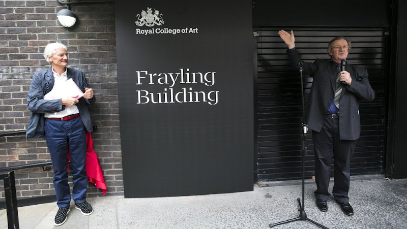
On 24 June 2014 Sir Christopher Frayling (right) and Sir James Dyson (left) at the opening of Frayling Building – aka a renamed old block – at the Royal College or Art. (See: “The RCA Renames Kensington Common Room Block Honouring Former Rector Frayling”.)
On 22 December 1994 Professor Christopher Frayling, a signatory of the Stop Sewell Campaign, rose in the Evening Standard to defend the competence and the probity of the Arts Council’s visual arts panel (which he had chaired) against an attack from Brian Sewell. To the charge that the Arts Council was rewarding its own administrators, Frayling played a bureaucratic hand familiar to us – brushing off charges while confirming the evidence on which they rested:
“The Visual Arts Panel is criticised for being populated with ‘nobodies’. In fact it consists of an excellent committed group of well-respected artists, curators, historians and arts administrators and is chaired by Sir Richard Rogers. He [Sewell] implies that members of the Visual Arts panel have sometimes been direct beneficiaries of grants awarded by the Arts Council.
There are two basic misunderstandings here: first, the Arts Council, in general gives grants to institutions not to individuals (and it is up to the institutions to decide how they then distribute the funds); where it does give grants to individuals there are several formal mechanisms to ensure that those who have a direct or indirect interest take no part whatsoever in any decisions that might affect them. To take one of Sewell’s examples, the award to the Prudential for the Prudential Awards for the Arts. Anyone who has visited that gallery and seen its stunning transformation will not cavil at this acknowledgement. It is invevitable, if the Council seeks advice from the very best sources within a fairly small world, that some of those sources will sometimes also be recipients of public money.”
Yes, indeed, they sometimes are – and it came as no surprise to us for this particular overlap within the exceedingly small world of publicly-funded arts merry-go-rounds to be confirmed. In 1981-82 we had encountered precisely the same pattern of explanation/justification/apologia from another of the Sewell letter signatories, Joana Drew, the head of visual arts at the Arts Council. Where Frayling accused Sewell in 1994 of having produced “an article full of factual errors”, in 1982 Joanna Drew had claimed that my accounts of Arts Council subsidies (published on the letters page of the magazine Art Monthly) contained “inaccuracies of detail”. This routine bureaucratic ploy had been parodied in the advice given to a Government minister by a mandarin civil servant in the television programme “Yes, Minister” (- “Accuse them of inaccuracies of detail, Minister. We’ll find them – there are bound to be some”). My researches in art funding had come about by accident.
In the late 1970s Joanna Drew asked the painter R. B. Kitaj to commend artists to receive Arts Council grants. He had been taken by my work and wrote a generous letter of commendation to the Arts Council and so, in some hope, I applied for the first (and last) time for an Arts Council grant. Despite submitting the invited letter of commendation from Kitaj, my application was unsuccessful. The letter of rejection identified the recipients and I noticed that the awards in what was a national scheme had been swamped with abstractionists, performance artists, conceptualists and such. The Arts Council threw a press lunch so that journalists (and unsuccessful applicants) might meet the winning artists. At this lunch, with a few like-minded artist friends, I staged a small protest. After Ms Drew’s speech to the press, we handed out (silently) a sheet of paper with a list of questions concerning the manifest artistic biases of the awards scheme. We were attacked the next day in a newspaper by an art critic who defended the Council against the disruptive “nobodies”. Had he spoken to any of us at the time he would have appreciated that he had written a glowing piece appreciation of one of the protesting artists for a catalogue to his recent one-man show at the Marlborough gallery. Having made our point and registered our protest that had seemed the end of the matter. I carried on teaching part time in two London art schools and continued to read Art Monthly.
A few years later a regional Arts Council officer on the Greater London Arts Association complained in Art Monthly of “underfunding”. Having noticed that all subsequent awards winners were of the same limited artistic persuasions as those encountered earlier, I sent this short letter to the magazine:
“Given that the GLAA has now noticed that there are indeed 18,000 practising artists in London (AM 43), would it not be helpful if they stopped giving their grants to the same twenty?”
It took the Council four months to reply. In the July/August 1981 issue of Art Monthly, the (unrepentant) officer claimed that my chide of repeated funding was “inaccurate” and that “A more justifiable criticism of GLAA’s grant aid might well be that we spread our butter too thinly. We certainly do not spread jam on one corner of the slice”. Reeling with incredulity I went off and bought copies of past annual reports, and began collating the accounts of the various awards schemes, the findings of which I reported in a letter in the next Art Monthly.
JAM FOR THE FEW
Far from it being the case that only two artists had ever received more than one GLAA award, as had been claimed, I had identified no fewer than 13 artists who had received two or more awards in the previous three years alone. Four had received two awards in the same year and one had received two awards in each of the previous two years. Taking the longer period from 1973-4 to the (then) present, I found that eighty-three artists had received two or more awards, thirty-five had received three or more awards, twenty-four had received four or more, eight had received five or more, four had received six or more, one had received seven, and one – who had been successful in 1978-79, the year in which I applied – had received nine awards. Many of this lucky band had received awards when they themselves, their spouses, their partners or their colleagues were judging the schemes: “Michael Kenny is also a member of a rather more select group of artists, namely those who have, while serving as judges on awards schemes, themselves received awards – a feat achieved by Kenny [then six awards in total] in 1976-77 and by Michael Craig-Martin [a signatory to the Stop Sewell letter] and Tess Jaray in 1975-76.” It was common for artist x to make an award to artist y who, on becoming a judge, made an award to artist x. The correspondence of discovery ran for months (when the bemused editor, Peter Townsend, removed the bails, he noted that the exchanges had run to 582 column inches). To every denial from Council officers I presented fresh and further corroborating evidence. I was able to show, for example, that in the previous year, of twenty recipients, three-quarters were receiving their second, third, fourth, fifth or sixth awards. This game of “pass-the-parcel” was not an easy system for outsiders to enter. When wrongly charging me with inaccuracies, Joanna Drew made errors of her own. On scandals connected with the composition of the judging panels, she said that only five people had served as judges twice and one three times. I showed that nine had served twice, seven three times, four four times, two six times. One had served seven times and one had – at that moment – already served eight consecutive times.
Establishing the prevailing patterns of patronage within awards schemes from the Council’s own records was tedious but easy. I was taken to task in Art Monthly by a correspondent who claimed that I’d missed all “the fat cats” but who declined to identify them and proposed to carry out no research of his own. There were other dimensions to the culturally deadening and warping ideological biases of the Council (see below). One was the extent to which even private galleries and public commissions were being brought into ideological line by the wheeze of “matching funding” schemes. Shortly after finishing the researches I was offered an exhibition by a private gallery in London but it came with strings: I should apply to the Arts Council for support for a travelling exhibition (around Arts Council-sponsored regional galleries) at the end of which the show would be brought to a concluding exhibition at the London gallery, all framing and promotion costs having been met by the Council.
Having stumbled into the grossly mismanaged system of awards for artists it would have been temptingly easy to take the MacGuffin for the plot but in the March 1982 Art Monthly we put the grubby dispensations in their proper institutional and ideological contexts. First, we explained, a sense of proportion was needed: “The awards schemes have engendered hostility out of all proportion to their actual cash values. Council spends, for example, more on the pension scheme for its own central staff (£205,138 in 79-80) than it gives as awards to all visual artists combined.” It spent over twice as much on central staff travel and subsistence allowances as on all painters, sculptors and print-makers combined. The sum spent on all public art throughout the land was barely half that spent by the Council on its own “publicity and entertainment”. A massive switch of resources from artists to administrators had taken place. In the previous four years grants to artists had been halved while those to administrators had tripled. Self-interest was manifest as in all bureaucracies but even this trait did not constitute the root of the Council’s cultural perniciousness.
THE POISON OF STATE SUBSIDISED ARTS
This root, we explained, lay in a fatal ambiguity in the Council’s role as the most powerful artistic patron in the country:
“In its least contentious (and earliest) guise the Council was simply a purveyor of subsidy to the arts: the means by which a culturally responsible society augments the inadequacies or stringencies of private means to support its artistic life. But increasingly, and more and more explicitly, the Council has taken on the role not simply of almoner but of cultural commissariat […so as] to seize outright the possibility of actual intervention in cultural life. It has come to portray itself as a force for initiation and perpetration of artistic trends, for bestowing artistic accreditation, for explicitly political and and sociological direction of artistic activity.”
Bad as the situation seemed back then, worse was to come. The model I examined proved to be but a maquette for what would follow as state and Lottery monies poured in. What was started as an aid to art and artists at a time of national penury morphed into an instrument of control, direction, manipulation and subjugation during times of unimagined plenty. For two decades or more Brian Sewell wrestled with the consequences and legacies this cultural leviathan (as he did also with the Tate and others). It is not really difficult to see why so many felt that he had to be stopped at any price, is it?
Michael Daley, 6 October 2015
POSTSCRIPTS…
1) On the above-mentioned anxiety felt by the trendy establishment at the scale of opposition to its beliefs and actions, we note that in 2005 the critic Richard Cork confessed: “Even so, we would be foolish to imagine that the battle has been completely won. I still meet people who say they love Tate Modern’s spectacular building, along with the views it provides. But then they declare that the art inside is rubbish…and they think I am mad to find anything of interest on display in there. Deep-seated suspicions continue to fester. I remember the Tate director’s striking lack of elation a few months after the gallery opened. ‘Many young people are interested in the visual arts’, said Sir Nicholas Serota, ‘but I’m conscious that a huge part of the public remains sceptical about modern art. Whether it’s people in positions of power, or the many letters I receive that complain about < lack of standards > in the art displayed at Bankside, a lot of people clearly find it difficult to live in the present.'” (- “People ask: ‘But is it art?’ Yes, actually, it is ~ Richard Cork springs to the defence of modern works”, The Times, 2 March 2005.)
What an extraordinary conceit/delusion it is to maintain that unless one likes and admires the kind of works that people like Serota and Cork promote, one is not living in the present. Has this man been in charge of a national institution for twenty-seven years, while harbouring the belief that most people in the country are living, zombie-like, outside of their own time?
Ghosts in the Lecture Room: Connoisseurship and the Making, Appraising, Replicating and Undoing of Art’s Images

On the 3rd of May, the Mellon Centre hosted a lively conference on the divisive subject of art connoisseurship – “The Educated Eye?”, now available on Webinar (http://new.livestream.com/accounts/7709097/connoisseurshipnow). Yesterday, a three-day congress opened at the Hague on “Authentication in Art” (7-9 May) carrying the subtitle “What happens when the painting you are buying, selling, investigating, exhibiting, insuring – Turns Out to be a Fake or a (Re)Discovery…” A small ground-breaking exhibition with bearing on the two conferences (“Diverse Maniere: Piranesi, Fantasy and Excess” – see below and Figs. 1 and 2) is running at the Soane Museum until May 31st.
Curating the Future
The question mark in the Mellon Centre’s conference title, reflects persisting antipathies to connoisseurship, which practice/discipline/pose nonetheless shows signs of rehabilitation. The conference proved admirably even-handed “ideologically” but somewhat constricted in its composition and terms of engagement.
The first speaker, Dr Stephen Deuchar, a former director of Tate Britain who has followed a former chairman of the Tate’s board (David Verey) into the Art Fund’s management, might be taken to represent the official modernist/progressivist museum world establishment. In his paper, “Connoisseurship Now: Some Thoughts”, Dr Deuchar disclosed that the Art Fund no longer confines itself to helping museums buy great works of art that might otherwise be lost to the nation, and now, for example, has contributed “generously” towards something involving the conceptualist Martin Creed (who turns lights on and off), even though no object will be acquired. Gifting this munificence to the Tate required Deuchar (and, perhaps, his chairman?) to step aside from the trustees’ deliberations.
There were two problems with Deuchar’s position. First, in espousing a Connoisseurship of The New-and-the-Forthcoming, the curator effectively operates blind in bandit territory. As the National Gallery’s director, Nicholas Penny, has pointed out, it takes time to evaluate new art, we cannot yet know how it will compare with other art that will shortly follow, or with other yet-to-be-seen contemporary art. Second, his position is old hat and inadvisable: in the 1960s and the 1970s critics championed contemporary art not on quality but on the degree to which it “challenged” existing art practices. So-called “New Activities” were heavily promoted by such critics and curators as Richard Cork and Sir Nicholas Serota of the Museum of Modern Art, Oxford, the Whitechapel Gallery and, for the last twenty-six years, the Tate. With the dismantling of quality as the principal criterion of judgement, and with the aid of the state-funded, respectability-conferring Arts Council, new activities soon became official activities, leaving most fine art practices and practitioners marginalised. Few noticed that “fine art” had cut itself off from related design and craft activities, and from its own history, to become a cosseted licensed playground where rules were the property of “artists” who played by no rules.
Culturally determinist Marxist art historians (like John Berger and, for a while, Peter Fuller), had gone further; had become more mystical and taken to praising art that they judged to have “anticipated the future”. Insofar as art might ever be said to do such a thing, it could only be seen to have done so in retrospect. When asked to comment on the significance of the French Revolution, the connoisseur of history, Mao Tse Tung, replied, “It’s too soon to say”.
The New Art History
The Mellon conference pitted (trade) chalk against (museum) cheese with Dr Bendor Grosvenor of the Philip Mould gallery and Dr Martin Myrone, a Tate curator and champion of the New Art History which pursues the socially signifcant in favour of the aesthetically desirable (“The Limit of Connoisseurship”). In the course of his conceptually suave paper, “Why Connoisseurship Matters”, Dr Grosvenor made two startling disclosures. First, having just seen Michelangelo’s Sistine Chapel ceiling, he now appreciates that the critics he had held to be “myopic” – were right all along: Michelangelo’s work has indeed been ruined. Second, that he stands behind restorers to prevent them from destroying glazes on Van Dyck paintings. (See Figs. 12a to 15.)
Dr Myrone declared allegiance to the New Art History where the social has routed the aesthetic. The resulting knock-about reminded this observer of days on the New Left in the late 1960s when Kim Howells, a rebellious Hornsey College of Art student (but later a New Labour government junior minister), wanted all potentially saleable object-based art to be outlawed – unlike the “democratising” mass medium of TV in which he was dabbling. When we asked Howells how he regarded Goya’s Horrors of War etchings, he replied that, although in sympathy with the works’ politics, the fact that they were printed on paper, “which is a capitalist commodity”, meant that they, too, would have to go. Dr Howells later grew up artistically and, as a visiting minister to the Tate, left a rude comment on a Turner Prize exhibition. Soon after, he lost his place in government.
Parts and Wholes
The afternoon session paired Spike Bucklow, the Hamilton Kerr Institute’s Senior Research Scientist (“Connoisseurship, technical knowledge and conservation”), and the British Museum’s head of prints and drawings, Hugo Chapman (“Dodging the label connoisseur from Christie’s to the British Museum”). Mr Chapman told how, when working in trade (Christie’s), he had been advised to describe himself as “an expert” rather than a connoisseur. It seems that the public can more easily forgive mistakes made by the former. Chapman told a story about a librarian who once hid a key drawing from an artist’s box when showing it to a scholar, and then, when duly reviewing the scholar’s book, professed himself astonished that no mention had been made of the said drawing.
The Hamilton Kerr conservator opted to address small things because “fragments are easier than wholes”, while the embarrassed-connoisseur attempted (more sensibly) to make artistic sense of the whole effects of drawings, and to understand, thereby, how they were executed. Dr Bucklow first showed how eloquently cracks on paintings can testify to a picture’s age, medium, underlying support, country of origin and so on. Having thus demonstrated an evidently usefully diagnostic tool (a kind of Connoisseurship of Cracks), he dismantled his own edifice by demonstrating how the vagaries of individual works’ histories and compositions so complicate the system as to render it effectively useless.
Mr Chapman, while conceding the very great difficulties of making sensible identifications of authorship in drawings, described how he tried to establish Michelangelo’s authorship of a drawing by considering its overall relationships and effects. In a nod towards Myrone’s position, he conceded that because many works in collections are ephemera, it would be futile to attempt to establish authorship of every piece of paper, even though such works often have great social significance and interest.
Salvage Operation
In the final paper (“New Connoisseurship, Old Europe, and the Future of Art history”), Professor Liz Prettejohn, head of York University’s Department of Art History, made a spirited attempt to retain a still-vital discipline that might be free of the more toxic ingredients of past connoisseurship practices. Prof. Prettejohn’s credentials in this respect were well established by a demonstration of her undergraduate response to a formal analysis test set by an old-style connoisseur professor. Prettejohn showed a Rembrandt etching about which students who had been reared exclusively on the study of modern art had been able to volunteer only that it was “old” and “probably Victorian”.
A Missing Link
This constructive, even illuminating, conference had two constricting deficiencies. First, connoisseurship’s purpose was largely confined to determining authorship, with, Dr Grosvenor’s startling asides apart, no consideration given to the urgent need to appraise restorers’ often radically transforming changes – an unforgivable lapse given that unsound attributions can always be corrected, while bad restorations are forever. Second, no artists contributed to this conference. While all speakers addressed the problem of producing an Educated Eye, none seemed aware that nothing educates the eye faster than producing or copying art. With artists, critical faculties were developed in academies and art schools by doing rather than by reading about or simply looking at. Listening to conscientious people grappling with the difficulties of connoisseurship while seemingly indifferent to or ignorant of art practices and blasé about restoration injuries, left an impression of a profession viewing fundamental problems through the wrong end of a telescope.
It is no accident that artists have initiated most of the great picture-cleaning controversies. Those who create art best identify injuries to it. The present state might easily be corrected: it would take small resources to have student scholars make brief drawn copies of the works they study, thereby appreciating art’s vital mind/eye/hand connections. Appreciation and discrimination may be of the theoretical essence in connoisseurship, but taken alone, without knowledge of and engagement with art’s practices, they leave practitioners susceptible to the traditional charge of being pretentious poseurs.
Drawn to Distinguish
Hugo Chapman’s sound quest to grasp the logic of the whole triggered theoretical and practical thoughts. Drawing provides the best route into questions of connoisseurship, being the most private, direct and likely entirely autograph form of image-making. If trainee art historians were required to make different types of drawing, even for brief periods, it would be incalculably helpful in establishing connections between historical artefacts and their original purpose.
Students might, for example, practice drawing as Rodin did with his famous late quick figure studies – never taking their eyes off the model while enclosing a complete figure with a swift continuous contour. Rodin did so, he explained, to fix in his memory the unique total effect of the body – its gestalt – and to test his own grasp of the miracles he had observed. The means required for drawing are miniscule: an American newspaper illustrator who illustrated first night performances of plays concealed a small pad and a very short pencil in a jacket pocket so that he could make discretely drawn notes of the actors to use later to prepare his finished illustrations.
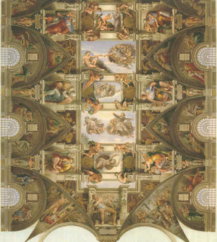
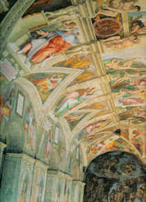
By helping to fix images in the mind, drawing is the very opposite of taking photographs, which practice can evade thought and appraisal. Rodin once reproached himself for having failed to appreciate that the most important part of a head lay not in any of its individual features but in the manner in which they were all fused into a whole. In perverse contrast, the decision to restore the entire cycle of Michelangelo’s Sistine Chapel frescoes was made not on any analysis of the whole and its internal relationships but on the basis of brief chemical tests made on a single lunette (the sections of wall above the arched windows in the Chapel) that happened to be within the reach of restorers who were working on minor frescoes. Misplaced faith in the validity of those “scientific” tests (of an insufficiently tested cleaning agent – it was later discovered to have etched the surfaces of stone, producing corrugations that scattered light, rather than to have cleaned them) permitted the Vatican’s curators and restorers to launch a cleaning programme on the entire fresco scheme with uniform and pre-determined applications of a single, ferocious stone-cleaning material (a soda, ammonia and detergent cocktail) even though, to those with eyes to see, the lunettes had played a subdued and subordinate role to the ceiling proper in Michelangelo’s grand scheme. (See Figs. 4 to 9.)
There is a another way
By all accounts, the finest, least controversial, most sensitive picture restorer working in Britain in the 20th century was the German émigré, Dr. Johannes Hell. His method was utterly respectful of the whole and overall effects of pictures. Dr Hell had trained first as a fine artist and then taken a doctorate on Rembrandt’s drawings. He deplored restorers’ practice of cutting “windows” through (assumed) dirt and varnish until bright colours and light tones are exposed (as at Fig. 7). He worked overall on the entire surface of a picture with the mildest solvents so that no optically and conceptually deranging relationships could emerge. His slow method was made slower by frequently “resting” a picture to give it time to air out, so that no corrosive solvents might accumulate within the paint layers. With Hell’s method in mind, it can be painful to consider the haste in which today’s restorers procede with their swabs, acetone, scalpels and “windows” when in pursuit of more authentic and original paint underneath a picture’s surface.
Connoisseurship in action
We take a degree of pride in the fact that the (proper) exercising of connoisseurship has been alive and flourishing within this organisation for over two decades. From its inception in 1992, Artwatch has deployed aesthetic discrimination and visual analysis in demonstrations of injuries made during “conservation treatments”. Specifically and in terms of methodology, we have done so by the correlation of photographic records of the pre and post-restoration states of works. (This website was custom-made to carry directly corresponding images side by side or in continuous vertical sequences so as to facilitate the most directly revealing visual comparisons.) In the Witt Library, we see photographic records that do not just assist the making of attributions but that also record the progressive debilitation of paintings over successive restorations. We notice that the difference between an authentic work and a close copy can be far smaller than that between an authentic work seen before and after a bad restoration. Dr Grosvenor really did not need to wait until he could join the scrum in the Sistine Chapel to appreciate that Michelangelo’s work has been ruined – he needed only to study the countless pre and post-restoration photographic records that we have carried on this site and had described earlier at length in the 1993 (James Beck and Michael Daley) book “Art Restoration ~ The Culture, the Business and the Scandal”.
The nature of evidence
Defenders of restorations often say that they cannot be judged on photographic evidence. In other regards, art dealers have great faith in the veracity of photographs – they will bid online on the strength of a single photograph. Bernard Berenson preferred to examine Michelangelo’s ceiling by looking at large photographs in books rather than by eye when craning his neck in the chapel. We should be clear on two points: there are no good grounds for disregarding photographic proofs of restoration injuries; the kind of evaluative test that Prof. Prettejohn’s old style connoisseur teacher devised for undergraduates might just as profitably be applied to analysing the differences between pre and post-restoration conditions. (See “An Old Style Connoisseur Test for Undergraduate Art Historians:” opposite.)
For all the social alertness of the New Art Historians, little comment has been made on the major organisational and “ideological” changes within the museum world over the last half century or so. In our view, the failure of scholars and curators to heed artists’ complaints stems from the fact that they have allowed themselves to become dependent on the technical expertise of the very many restorers who have become institutionally embedded throughout the museum world. It is now restorers not painters who pontificate on the making of paintings. It is they who insist that photographic records of their own “treatments” may not be held up and used in evidence against their actions.
Speaking generally, as an organisation, we are bemused by a profession that uses photographs for all manner of curatorial, scholarly and critical ends except for the indentification of restoration injuries. Scholars now routinely revise their own professional scholarly accounts in order to bring them into line with restorers’ latest, often radical, transformations. In the published accounts of restorers and curators alike, nothing ever counts as an injury – every change is presented with drum rolls as a “discovery”. Whole steamships, Vermeer necklaces and sheep can go missing without an art historical murmur or any ruffling of connoisseurs’ feathers. Even in terms of attributions, Artwatch has been pro-active on the connoisseurship front.
The misappliance of science and early calls for the the return of connoisseurship
While protesting since the early 1990s against the cult of “scientific” conservation and its disparagement of “subjective” aesthetic judgements, we have throughout commended a return to proper and rigorous applications of connoisseurship. In the October 1994 Art Review article “How to Make a Michelangelo”, we suggested that “The fact that our scholars and technical experts flit quite so promiscuously through time and space might suggest uncertainty of connoisseurship and ability to ‘read’ paintings”. Three years later, in connection with another National Gallery attribution, we wrote: “In recent years the art of connoisseurship has become entangled with the scientific analysis of paintings. Problems of attribution, once resolved by the educated ‘eyes’ of individuals, are increasingly seen as the property of interdisciplinary teams of curators, restorers and scientists who enjoy the technical, financial and professional support afforded by large museums. But how sound are the new proceedures – and how reliable are the published accounts given of them?” (Art Review, July/August 1997, “Is this really a Rubens?”).
In truth, it might fairly be said that the campaigning essence of Artwatch has been a constant assertion of the primary value of visual connoisseurship – see also, “Is Michelangelo’s Entombment in the National Gallery by Michelangelo?” by James Beck in the Gazette des Beaux Arts, CXXXVIII, 1996. We have devoted two entire ArtWatch UK journals to critiques, successively formulated and advanced by the painter/scholars Euphrosyne Doxiadis and Dr Kasia Pisarek, of the National Gallery’s Rubens “Samson and Delilah” attribution. The title of the last book (2006) by ArtWatch’s founder, the late Prof. James Beck, was “From Duccio to Raphael: Connoisseurship in Crisis”. It received few reviews – and no mention at the Mellon Centre conference.
A connoisseur of Ephemera
No mention was made, either, of a remarkable new work of scholarship published last year by the British Library and the Oak Knoll Press in the USA – Michael Twyman’s “A history of chromolithography ~ printed colour for all” – which we first encountered in the Institute of Conservation’s Chantry Library, Oxford. The ingenious lengths to which printers went in the pre-photographic era to replicate any image, and all things in the world, in reliable colour on multiple, co-ordinated slabs of stone is truly astonishing to behold (see Fig. 3). It is impossible to exaggerate either the illuminating usefulness of this major, beautifully produced book, or the sheer delightfulness of its immense pictorial riches. For those who might feel that a major tome on a history of a printing method might make for dull or excessively technical reading, we would urge, “think again”: here are to be found ephemera (printed bills, advertising cards and the likes) alongside early pioneering hand-drawn attempts faithfully to produce such elusive epically heroic fine art subjects as paintings by Turner and Michelangelo. The faithfulfulness of the attempts to replicate the values of the most hallowed artists summoned applications of great sensibility and powers of aesthetic discrimination. Here, the connoisseur, the scholar, the social historian, the technical historian and the lover of fine drawing and colouring might all feast together, in awe at the dedication, the talent, the artistic insight found in an unsung publishing trade.
We were delighted, for example, to find so full an account of the production of Robert Carrick’s 30 x 44 inches 1852 chromolithographic copy of Turner’s “ Rockets and Blue Lights…” made in no fewer than fourteen colour separations (see Fig. 9). That faithfully made, expensive and then state of the art record (“the only perfect reproduction of a picture ever issued” – as it was claimed to have been in 1900) testifies indisputably to the destruction of the principal boat in the painting on which we have commented a number of times, most recently on the obtuse (or brazen) presentation of this wrecked picture as a jewel in Turner’s crown – see “From Veronese to Turner, Celebrating Restoration-Wrecked Pictures”.
Even more importantly, there is also reproduced, in its entirety, a massive 1,027 x 470 mm (40 by 27 inches) faithful cartography-like, on-the-flat, full colour image of 1852-53, that simultaneously depicts the entire curving geometries of Michelangelo’s combined ceiling and upper walls decorations (see Figs. 4 to 8). We had never before seen this work in its entirety. It reproduces every single figure (there are over three hundred) and architectural motif Michelangelo depicted. Most preciously of all, this encyclopaedic record testifies to the hierarchy of values within which Michelangelo situated his images.
By capturing the tonal and chromatic logic of the whole, not the fragment, of Michelangelo’s murals, this hand-drawn lithograph corroborates precisely the written testimony of the painter Charles Heath Wilson who examined the ceiling on a special scaffold in the 19th century. All parts of this great pictorial ensemble were not equal in their treatment. The “outer” section (as here seen at Figs. 4 and 5) was the semi-circular sections of painting made around the windows on the upper walls (the lunettes). They were the darkest passages of painting. They contained in their illusionistic recesses (see Fig. 7) depictions of the ancestors of Christ. This dark band of human figures set Michelangelo’s work apart from the wall paintings below – as did his great escalation of scale in his figures. Far from being an arbitrary but precisely situated zone of dirt, as the Vatican authorities preposterously and against all scholarly records claimed, this dark zone served aesthetically and symbolically as a kind of visual plinth for the even more monumental figures and the Divine Events depicted above on the ceiling. The next row comprised an architectural screen against which Michelangelo’s stupendous giant prophets and sibyls were set and relieved in the brilliant cinematic, shadows-casting light we have previously described. Above them, set in the sky glimpsed through illusionistic apertures in ceiling’s architectural scheme are the biblical scenes and the depictions of God Himself – Whose restoration injuries we have also chronicled. Today, by the miracles of our technology, we can see and move around the entire, now restoration-ruined surfaces of the Sistine Chapel, but the Vatican will not release a TV film made in the 1960s of the pre-restored state. Recent technical advances have carried us into a world where it is possible to produce perfect facsimiles not only of images but of three-dimensional objects and, even architectural spaces and forms.
CODA
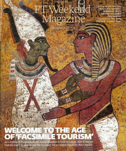
The small exhibition currently showing at the Soane Museum shows three-dimensional realisations of graphic inventions of Piranesi by the foundation Factum Arte. A full size replica made by the foundation of Tutankhamun’s tomb in Egypt was unveiled this week. It was reported by Peter Aspden in the Financial Times “Fit for a king: Tutankhamun’s replica burial chamber”(see Fig.). Such technical capacities for replication raise issues that we will explore in coming posts. This fertile new territory is one for which scholars and connoisseurs will be ill-prepared to assess for as long as they ignore the mistreatment of unique and historic art objects by technicians who transform them into synthetic, polished replications of their (assumed) original autograph states. This website launched in 2010 with a discussion on authenticity in art and music (“The New Relativisms and the Death of ‘Authenticity'”). It did so in response to a restorer’s imposition (in new but deceivingly aged and cracked paint) of a piece of computer-generated “virtual reality” onto Holbein’s The Ambassadors. Connoisseurship is more urgently needed today than ever.
Michael Daley
Comments may be left at: artwatch.uk@gmail.com


![]()