
Connoisseurship: Examinations, Debates and Snap Visual Responses
The rising tide of old master “sleepers” and “discoveries” carries great dangers and demands snap judgements. Some candidates for upgrades intrigue, some look dubious, some scream “Fake!” Last week two cases caught our eye.
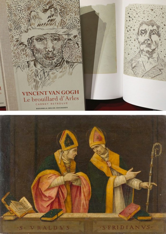
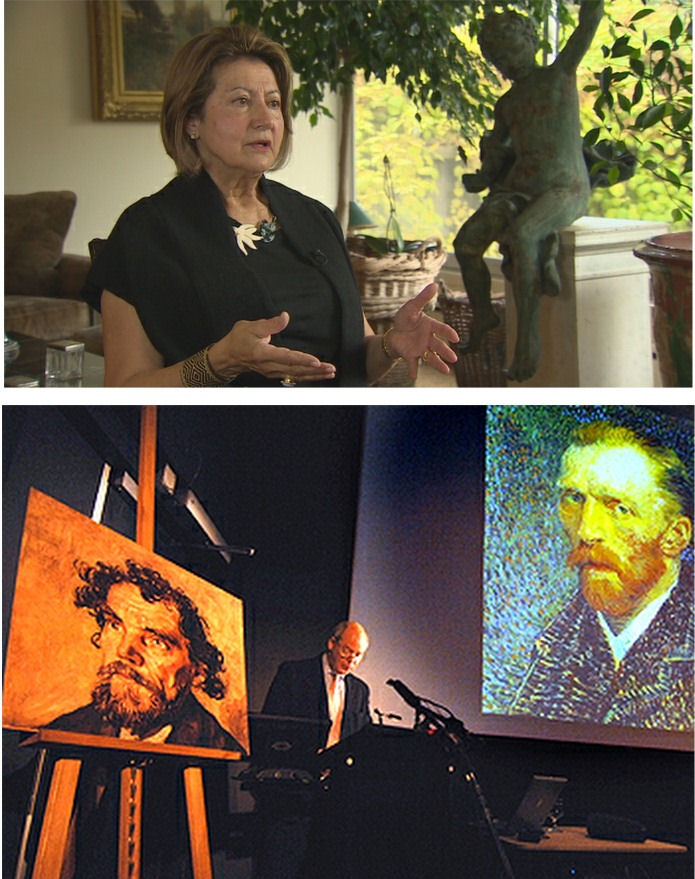
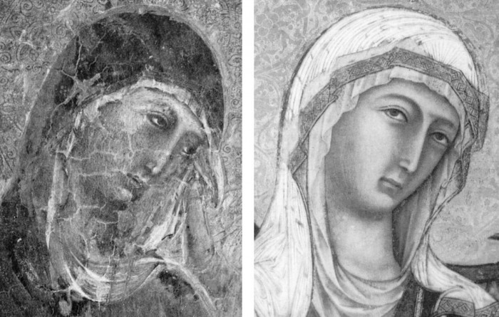
Fig. 1, above. Fig. 2, below. The newly discovered “Lost” Van Gogh sketchbook (above, top) rang our and many other fake bells. Then came a report that a small “Florentine School” painting on a €3-4k estimate fetched €375k at auction as a sleeping Filippino Lippi (above, Fig. 1). A link to another small work attributed to the artist at the North Carolina Museum of Art (Fig. 2, below) showed pronounced, seemingly reassuring correspondences, but something jarred.
On connoisseurship we hold that every claimant work should be rigorously “interrogated” in three crucial respects. Technically, in its physical composition; by documentation on its known or claimed histories (provenance); and, above all, by visual analysis because, in the visual arts, every picture is its own prime historical document and its inbuilt historically-generated artistic relationships constitute the primary subject of art critical appraisal and evaluation.
Failure to excise bad attributions deceives the public and corrupts oeuvres. A good picture has nothing to fear from challenges. No amount of scrutiny constitutes a threat as good pictures outlive their doubters and can fight another day. Argument is healthy and a successfully repulsed challenge can increase understanding and enhance a good picture’s lustre.
Vincent van Gogh: The Lost Arles Sketchbook
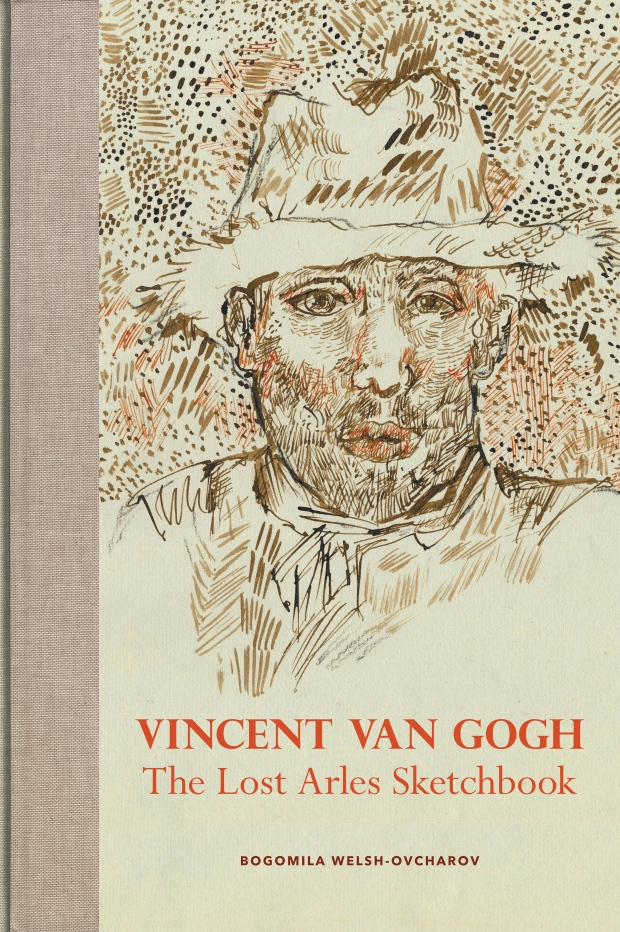
Above, Fig. 3. The controversial lost-but-now-found Van Gogh sketch book above is by Professor Bogomila Welsh-Ovcharov, a Van Gogh authority whose claims of authenticity are supported by Ronald Pickvance, author of Van Gogh in Arles, but the cover’s supposed Van Gogh ink self-portrait announces itself as a draughtsman’s pastiche, as Mark Hudson noted in the Daily Telegraph (“A romantic story but can it really live up to its promise?”, 16 November 2016).
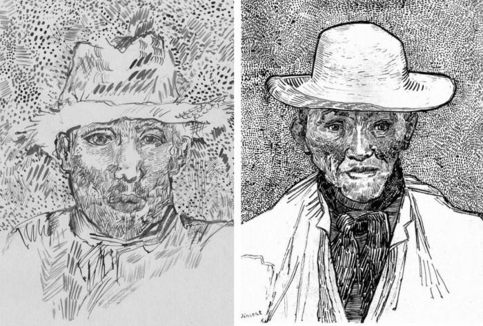
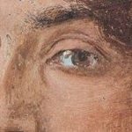
Above, Fig. 4. Simply by placing the supposed Van Gogh self-portrait next to an autograph portrait, immense and glaring differences become apparent: the author of the “discovered” drawing has abandoned symmetry with eyes of radically different sizes and a nose that seems product of a car crash. Throughout, the author mimics Van Gogh’s pen marks without comprehension of his form, power of design, and psychological acuity.
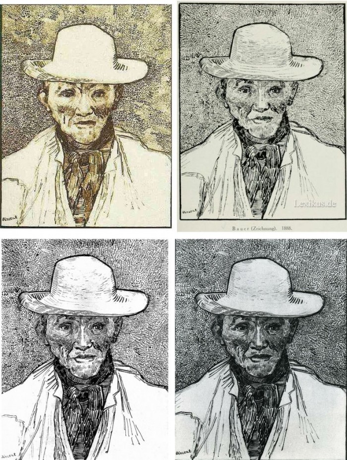
Above, Fig. 5. Instead of a form-camouflaging jumble of marks, the bona fide Van Gogh disports five graphically discrete component parts: a light-coloured jacket; a dark shirt and scarf; a varied but, on aggregate, mid-toned face; a light-toned hat with some mid and dark-toned form articulating shading; and, throwing all other values into relief, an agitated but tonally cohering background. Each of these spheres is allotted its own graphically purposive notations. The four images we show above for comparison are easily found online in historically successive reproductions. While these reproductions vary considerably, the force and artistic coherence of Van Gogh’s graphic intent and method shines through all.
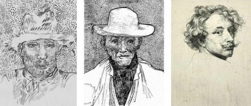
Above, Fig. 6. If we place the bona fide Van Gogh between the clumsy mimicking newcomer and a masterpiece of the greatest graphic brilliance – van Dyck’s etched self-portrait – it is clear that the Van Gogh has more kinship with the latter than with the former.
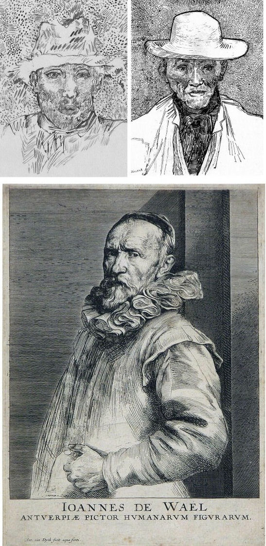
Above, Fig. 7. And if we compare the Van Gogh with an entirely autograph van Dyck etched state of a figure we find a common use of a toned background that throws both subjects’ flickeringly brilliant lights and darks into relief.
The Van Gogh Museum’s objections to the “Lost Arles Sketchbook” and its track record on Van Gogh attributions
Above, Fig. 8. Prof. Welsh-Ovcharov (top) has responded to the Van Gogh Museum’s dismissal of the drawings with a rebuttal and a challenge to debate – thereby showing conviction and good faith. Her publisher reportedly characterises the proposed debate as “an opportunity to shed light on the conditions under which the Van Gogh Museum is claiming the de facto right to a monopoly of attribution.” This is a common plaint against authorities that block would-be, high-value attributions but our impression of the museum’s judgements is favourable.
In 2006 a Van Gogh – The “Head of a Man” owned by the National Gallery of Victoria in Australia (above left, on an easel) – was challenged by the art historian and Sunday Times art critic Frank Whitford when the portrait was loaned to an exhibition in Edinburgh. The newspaper asked our opinion and, when we demurred, sent a (revelatory) high resolution full colour compilation of all of Van Gogh’s painted portraits. We supported Whitford, saying to the newspaper (as reported in ArtWatch UK Journal, Spring 2008):
“The specific warning signs that should have alerted the buyer are:
“1] It is unique in Van Gogh’s portrait oeuvre
“2] It does not fit in the stylistic chronology that exists within that oeuvre. Compare it for example with the brushwork, colours and ‘attack’ of the Old Man with Beard, painted the year before that is in the Van Gogh Museum, and the Portrait of Camille Roulin painted a year or so later and that is also in the museum. There is an enormous but clear and logical development between those two pictures, from thick, laboured, relatively coarse brushwork to much more refined and ‘decorative’ marks – but both are entirely consistent and ‘all-over’ in their treatment.
“3] If its provenance goes back no further than Germany in the late 20s or early 30s, that is particularly unfortunate. Germany at the time was notorious for the certification by scholars (for a fee or sales cut) of dud works. The dealer René Gimpel has referred to the scandalous ‘amounts obtained by means of certificates given daily by German experts to German dealers. Just as there were paper marks, so there are paper canvases, an easy way of bringing dollars into Germany…The German title of Doktor impresses the Americans. The museums are even more intent than the collectors on defending their fakes or their mistaken attributions….’ By coincidence, in the current ArtWatch Journal [No 21], Kasia Pisarek cites the case of the great Rubens scholar Ludwig Burchard who issued so many optimistic certificates that he was unable ever to write his definitive book on the artist…She has identified over 60 Burchard attributions that have subsequently fallen. It was Burchard who first upgraded to Rubens the Samson and Delilah that is now in the National Gallery.
“I would add that the fact that it seems to be admitted that it is a cut-down canvas that was glued onto a panel compounds suspicions… Why should a (presumably) then only forty years old canvas, have needed gluing onto a secondary support? It might be worth asking the Gallery curators if any scholar has questioned the picture publicly or privately.
“It may be coincidence, but two of the pictures that ArtWatch has challenged in our own National Gallery, the Rubens Samson and Delilah and the Raphael Madonna of the Pinks, no longer retain their original backs. The former was planed down to 2 or 3mm thickness and glued onto a sheet of blockboard; with the latter, the family of restorers who sold the picture in the 19th century had (most unusually) polished the back of the panel thereby removing all historical evidence.”
As we have seen more recently, the claimed lost Leonardo drawing “La Bella Principessa” that emerged anonymously in 1998 had been glued to an old oak panel. Gluing canvases or drawings onto boards conceals half the material evidence. On 3 August 2007 Andrew Bolt reported in the Australian Herald Sun:
“The curious thing about the National Gallery of Victoria’s fake van Gogh is how easily it was spotted as phoney once it went on tour…. For more than 60 years this painting hung in the NGV without anyone screaming ‘Fake!’ True, a few experts now say they had their doubts, but it was only when the NGV proudly loaned its ‘van Gogh’ to Scotland’s Dean Gallery last year that the painting was denounced. Three British critics took one look at it and snorted… Even then, there were some back in Melbourne who couldn’t accept the evidence of their own eyes, as ABC Television’s 7.30 Report found:
“‘Two of the critics include Michael Daley from ArtWatch UK and Times art critic Frank Whitford. But Robyn Sloggett [an art authentication expert at Melbourne University] has questioned their expertise. ROBYN SLOGGETT: I don’t think either of them are Van Gogh experts, certainly not known to be such…[Director of the National Gallery of Victoria] DR GERARD VAUGHAN: It is a slightly offbeat picture. It doesn’t fit into the natural progression of Van Gogh’s work at that time because it was a moment in late ’86 and into early 1887 where he was experimenting with two or three different styles. In many ways, this is slipping back into his earlier realist style of the mid 1880s where he concentrates and uses these earthier ochre colours. It is a transitional picture.’”
“Conceived at special moments” and “sometimes repeating, sometimes anticipating themselves” are commonplace apologias for disqualifying incongruities in upgrades. In 1997 and 2000 the National Gallery claimed its Rubens Samson and Delilah did not look like any other Rubens in the gallery because it was “the only work in this collection typical of the artist when he had returned from Italy in 1608”. In truth the painting was unlike the (secure) one that immediately preceded it and unlike the (secure) one that immediately followed. If a Rubens, it would be the only one on which he employed flat brushes and painted finger tips with rectangular highlights. During ABC Television’s 7 August 2006 programme (“NGV’s Van Gogh Labelled a fake”), James Mollison, a former NGV director said: “This picture has been doubted by people very often.”
The upshot of the controversy was that the NGV director announced that such was the gallery’s confidence that the painting would be submitted (voluntarily) to full technical examination at the Van Gogh Museum. A year later the Herald Sun reported the attribution’s demise at the Van Gogh Museum:
“The Dutch team used X-radiograph, digital photographs, light microscopy and paint and thread analysis. Among conclusions were: THE work’s ground layer of white paint is not found in Van Gogh’s Antwerp and Paris works. ITS use of pure ochre is not found in other Van Gogh work. THE portrait shows just the top of the man’s shoulders. Van Gogh usually showed more of the clothes. “A COMBINATION of a fairly coarse and detailed painting style”, with more detail in the mouth, eyes, skin and beard than Van Gogh used. NO reference to the portrait or the sitter in Van Gogh’s extensive letters. The experts also noted no record of the work could be found before 1928, when it appeared at Berlin’s Galerie Goldschmidt and Co.”
The Rubens Samson and Delilah emerged in Germany the following year at Van Diemen and Benedict where it was offered as a Honthorst before being upgraded by Ludwig Burchard. Previously it had been attributed to Jan van den Hoecke, a follower of Rubens. Burchard had recently upgraded the supposed Rubens ink sketch design for the Samson and Delilah (see Art’s Toxic Assets and a Crisis of Connoisseurship ~ Part II: Paper – sometimes photographic – Fakes and the Demise of the Educated Eye ).
The Newly Upgraded Filippino Lippi
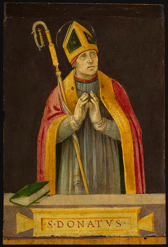
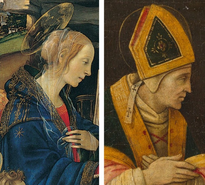
Above, Fig. 9. At first glance the awakened “Filippino Lippi” (above right) seems more plausible than the new Van Gogh drawings – especially when linked to a work attributed to the painter at the North Carolina Museum of Art (above left). In terms of palette, condition and design the two seem as peas in a pod but this closely related pair triggers no recollections of anything similar in the artist’s oeuvre. If their strikingly common format suggests original incorporation in a larger work, disjunctive variations in their parapet walls and stone inscription tablets dispels the possibility. Most inexplicably of all, the new upgrade is incongruously modernist in its emphatic planar and ‘on-the-picture-surface’ geometrical vocabulary.
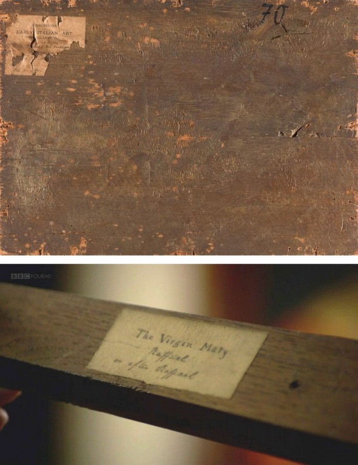
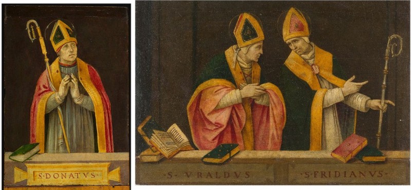
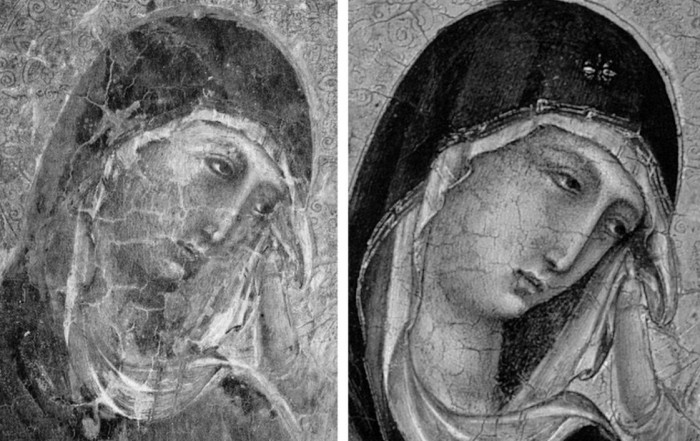
Above, Fig. 10. In 1901 the painting of Saints Uraldus and Fridianus was sold (not as a Philippino Lippi but as a Masaccio) to an English aristocrat, the Earl of Ashburnham. As with the recently proposed Haddo House Raphael (Fig. 10 above), there is little on the panel’s back other than a label in English for an exhibition of “Early Italian Art” (Fig. 10 top). For the Carolina Saint Donatus, the museum offers only a date – “circa 1490” – and the identity of the picture’s donor, the Samuel H. Kress Foundation. Such lacunae are perplexing because Filippino Lippi is a well-chronicled artist whose securely attributed works might easily be brought into direct comparison with the two more recent attributions.
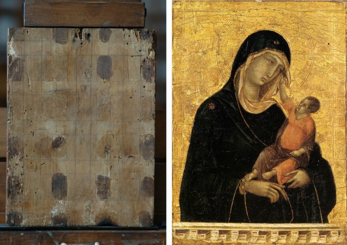
Above, Fig. 11. The backs of attribution upgrades often prove problematic, and none was more so than the small panel “discovered” as a Duccio Madonna and Child (above right) in 1904 after having been bought in an antiques shop in Italy. It was then rarely seen until bought with fanfare (but no technical examinations) for $50m in 2004 by the Metropolitan Museum of Art, New York, in a blind “treaty” sale conducted by an auction house among a few leading museums shortly after the picture was withdrawn from an imminent comparative exhibition of Duccio and his followers that would have introduced the painting to many scholars for the first time and in an instructive context. That withdrawal – despite the painting’s inclusion in the catalogue – might have been made out of fear of repeating the demise of the owners’ second Duccio, as described below.
The back of the tiny picture had been cradled with no fewer than eight mahogany bars and when these were later removed at the Met. a hand-written ascription to Duccio’s pupil “Segna” was found on the bare poplar wood from which painted work had been stripped. The Met Duccio contained modern wire nails, a fact not acknowledged in the museum’s post-purchase technical examination reports. When we asked after the antiquity of the nails the museum claimed they had been inserted as repairs after the panel had been cradled in the 1930s. As “proof” of that unsupported chronology it was said that one of the nails had entered one of the mahogany bars. However, as we pointed out, the head of that particular nail had been visible on the front of the frame throughout all of picture’s photographically recorded history and, while some nail heads were visible most were not and therefore had been applied before the (now heavily distressed) frame was gessoed and gilded. Thus, the panel arrived in the world at the beginning of the 20th century with modern nails intersecting a cradle that concealed an awkward ascription on a stripped-down back.
Above, Fig 12. A face painted in the 14th century by a follower of Duccio (identified by Pèleo Bacci as Segna) is shown above to the right of the face of the Met’s Duccio as it was before restorations established the blue of the Virgin’s mantle to be azurite, not the requisite ultramarine. No one ever suggested that the painting on the right was by Duccio and no one judged the Met’s picture an autograph Duccio before Bernard Berenson’s wife (Mary) in 1904 with the support of Berenson’s protégé Frederic Mason Perkins. An earlier suggestion had been that it was a work of Sano di Pietro, as Frances Vieta discovered in researches at the Frick Library, New York, that were kindly made available to us.
In 1933 Perkins attributed a second Madonna and Child to Duccio and persuaded the then owner of the Met.’s Ducio (the Belgian collector, Adolphe Stoclet) to buy it. In 1989 that Duccio was loaned to the Cleveland Museum of Art and was there identified on technical examination by Gianni Mazzoni as a fake by Icilio Federico Joni who ran a forgery factory fronted by middlemen, one of whom was Berenson’s protégé Frederic Mason Perkins.
Above, Fig. 13. A cult of Supreme Art Historical Importance was activated around the Met. Duccio and part of this mythology rested on the picture’s supposedly miraculously well-preserved, little-restored, condition. Comparison of the photographs above showing its present state (right) and an earlier state (left) discloses how extensively the work has been repainted – note the altered design of the dominant eye, and the extensive reworking of the veil. The potentially falsifying nature of restorations when determining attributions remains a conspicuously under-examined area – as does the extent and nature of repainting on stripped-down “sleepers”. (But see “A restorer’s aim – The fine line between retouching and forgery”. For a fuller account of the Met.’s Duccio difficulties, see Michael Daley: “Buyer Beware”; “Good Buy Duccio?” and “Toxic Attributions?” in the Jackdaw magazine issues of Nov/Dec. 2008, Jan/Feb. 2009, and March/April 2009.)
The Newly Upgraded Filippino Lippi (continued)
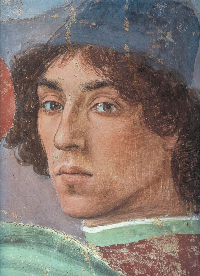
Above, Fig. 14. With the two small “Filippino Lippi” pictures at Fig. 9 and below, top, said to have been painted between 1490 to 1494, precise stylistic comparisons can be made with securely attributed works in the oeuvre. What is believed to be Filippino Lippi’s self-portrait above was executed by the artist in 1481-1482 in the Brancacci Chapel, Santa Maria del Carmine, Florence.

Above, Fig. 15. Filippino Lippi’s Apparition of the Virgin to St Bernard of 1480-86 was said by Bernard Berenson (in his 1938 revised Drawings of the Florentine Painters) to comprise “Filippino’s masterpiece, the last picture in which he is still a pure Quattrocentist, in which there is no sense of the Baroque.” Is it conceivable that some years later this artist painted the two small pictures shown here above the Apparition? Berenson reports that Filippino went on to betray excesses, not to purge and severely abstract his pictorial vocabulary: “Filippino’s Baroque, however had little in common with the qualities of the genuine [Baroque] style, and much with its worst vices. These were the sins of extravagance, of wantonness – the vulgarity of the newly enriched, who feel life is enhanced by the mere act of showy spending.”
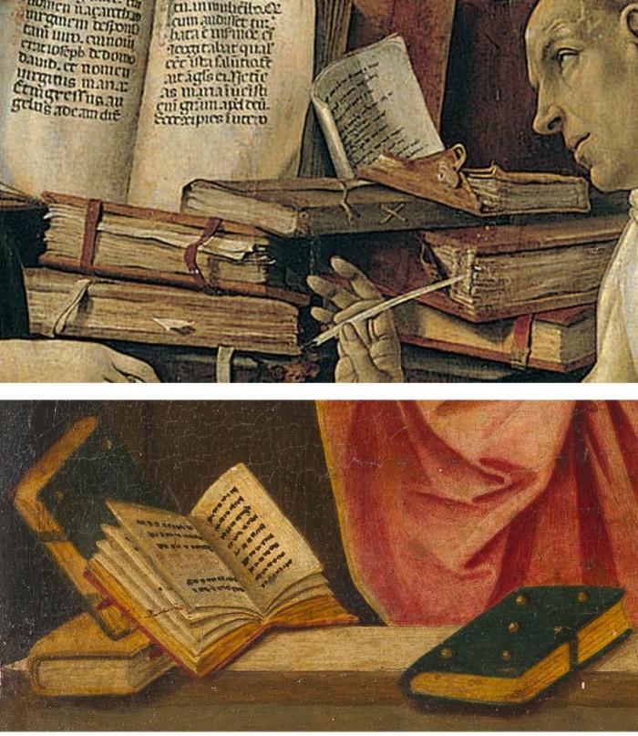
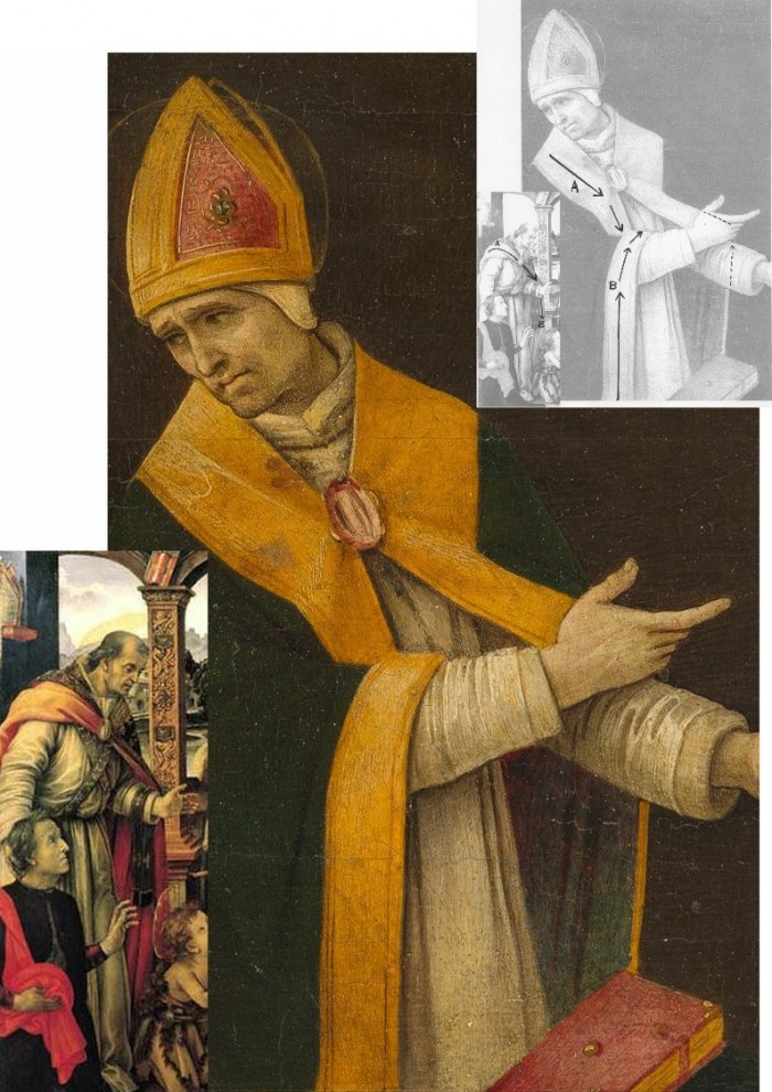
Above, Fig. 16. At the top we see how Filippino Lippi painted books before 1486 in his Apparition of the Virgin to St Bernard and before his lapse into Baroque excesses. In this secure work we not only see great technical accomplishment but a fascination with the very means by which books were stitched together in assembled folded sections. Is it conceivable that after this tour de force celebration of the book binder’s craft skills Filippino should have been satisfied with the out-of-perspective simplifications of books in the Saint Uraldus? While the opened book has been painted in utter ignorance of book binding methods, the ochre coloured book at the bottom left of the pile has managed to anticipate to a remarkable degree the appearance of a neat modern machine-bound book.
Above, Fig. 17. Again, does the chasm of technique and sophistication in this further comparison from the Apparition and the Saint Uraldus not strain credulity at claims of a common author?
Above, Fig. 18. By 1493-94 the artist had completed his Madonna and Child with St Catherine of Alexandria and St Martin of Tours as above and we see precisely the over-elaboration Berenson castigated as Filippino’s squandering “like a nabob with a heady disorderliness all the decorative motives which the heritage of antiquity, the hard earnings of his precursors, and his own fancy had put into his hands.”
Above, Fig. 19. How conceivable is it that Filippino might, at the same short period, have made two so diverse treatments of a man parting drapery with an advancing left arm as in these two paintings? In the one the “Blanket-like drapery dear to Filippino” (in Berenson’s term), curves, twists and folds naturally across the body, while in the other it moves as if fabricated by a former sheet metal worker with little regard for any underlying body, or even for the means by which the glimpsed parts of the (wildly varying) decorative border of the cope might ever have been united as woven material. Why the arbitrary, asymmetrical placement of indeterminate embroidered decorations on the cope’s border? What holds the cope together? Is it a giant garnet or ruby, or a small tambourine? Where else in Filippino might we encounter such flattening abstractions and lax indeterminacy of depiction?
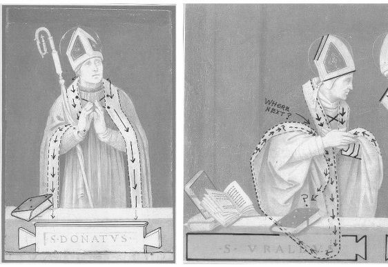
Above, Fig. 20. If the logic and treatment of Saint Donatus’ cope border (above, left) seems plausible and suitably understated, what might have carried the same artist to the Byzantine and conceptually irresolvable twin conundrums of the cope border as encountered on Saint Uraldus (above right)? What accounts for the very different depictions of the inscribed tablets on the parapet wall? If that of Saint Donatus is somewhat overly monumental and set uncomfortably close to the top of the parapet, at least it is sculpturally resolved and satisfactorily symmetrical along its horizontal axis with its twin decorative “butterfly wings” termini. Why, then, would the twinned tablets of Saints Uraldus and Fridianus meet in the middle with single butterfly-wing termini while leaving blank endings at the outer edges of the picture’s composition? Why are these two inscribed tablets skimped and devoid of projection when the saints above are greatly more dynamic and humanly engaged – almost as if in anticipation of Raphael’s later depicted dialogue between Aristotle and Plato?
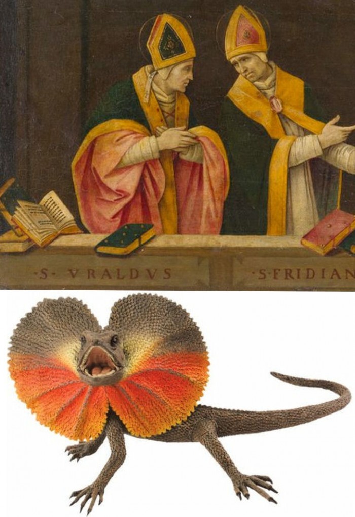
Below, Fig. 21. What theological reading of Saint Uraldus’ life prompted the vast frilled neck lizard-like display of the cope’s pink lining below? If intentionally “Baroque” in its explosive ostentation and theatrical impact, why, then, its implausible combining with a geometric severity of draperies that are more snapped than folded?
With such bizarrely anomalous visual constructs, might it not be prudent to consider the waking “Filippino Lippi” sleeper as a possible product of the late 19th and early 20th century Italian forgeries boom that was tailor-made for British and American collectors? We know that many skilful artists were employed in that trade because when the Italian Government proposed stringent export taxes in 1903 to stem the country’s out-flow of art treasures, the Florentine art dealers association petitioned that the new laws would throttle the large and thriving trade in forged art and antiquities for foreign collectors. (Where did all those often excellent works go?)
At the December 2015 ArtWatch UK/LSE Law/NY Center for Art Law conference Art, Law and Crises of Connoisseurship (the proceedings of which will be published shortly), Professor Charles Hope pointed out how effectively 20th century scholarship had winnowed previously overblown numbers of Titians, Raphaels and such. Markets are good things and the London art market has long been a very good (much envied in Europe) force for Britain, but there are developing dangers. If perceptions were to grow that previously downgraded works are being systematically rehabilitated through “sleeper-discovery” mechanisms at a time when leading houses are fighting to the death for pole position on market share, confidence in the lots on offer might evaporate. Already, certain external structural changes are weakening the London market’s traditional and much-valued symbiotic relationship with disinterested scholarship. Increasing litigation by owners against dissenting independent scholars suppresses debate and frank expert appraisal. In a paper at our conference (“Throwing the baby out with the bath water – the Demise of Connoisseurship since the 1980s”), Brian Allen, former director of studies at the Mellon Centre, warned that recent changes of philosophy and views on connoisseurship in the academic world are greatly reducing the traditionally available body of disinterested academic expertise that counterbalances purely commercial interests:
“In my own field of British art the number of so-called ‘experts’ has now diminished alarmingly as the older generation dies off not to be replaced. It seems extraordinary to me that major artists such as Stubbs, Wright of Derby and Sir Thomas Lawrence, to name but three, don’t have an acknowledged expert to whom one can turn for a reasonably reliable, independent opinion. And this has also certainly happened in other specialist fields… Younger scholars nowadays, especially those in the universities, have almost no contact whatsoever with the art trade compared to fifty years ago. Yet for many years it was perfectly possible for the two worlds to co-exist harmoniously.”
Michael Daley 23 November 2016