
The Futurist Louvre and Leonardo’s Fate: nothing ventured, nothing lost
The more indefensible their restorations, the more museum regimes dig in and shut their ears to criticisms. (With bad restorations the eyes, too, often seem to have been shut.) Given the controversial outcome of the Louvre’s 2011 restoration of Leonardo’s “The Virgin and Child With St. Anne”, it might seem a provocative defiance that the museum should so soon announce that it is not only about to restore another Leonardo (his “La Belle Ferronnière”), as was reported in the Wall Street Journal on 1 February 2014 (Da Vinci Code Red: Restorations Spur Debate), but also the desperately vulnerable “Mona Lisa”.
Vincent Delieuvin, the curator driving (or heading) the restorations, makes a number of claims that lack foundation in the Wall Street Journal article. We had not dared to touch this Leonardo previously, he reportedly says, but now restoration techniques have improved to the point where the museum thinks them safe – even for the Mona Lisa which has become “yellowish and very dark”. The history of modern restoration is peppered with facile claims of technical “advances” that were rushed untested on to great works of art, soon to become the acknowledged follies of yesteryear. (We have often wondered whether the credulous techno-enthusiasts of Futurism, which movement died a swift death, had not migrated into art conservation.) Of what do these latest claimed advances consist? Have they arisen since the 2011 restoration of the “Virgin and St. Anne”, the controversial treatment of which provoked resignations from the restoration’s own advisory committee (as we reported on 28 April 2012 – “Rocking the Louvre: the Bergeon Langle Disclosures on a Leonardo da Vinci restoration”).
On the “La Belle Ferronnière” Mr Delieuvin holds that “The many layers of darkened varnish added over the centuries are getting old and make the painting dark and yellowish”. Such phobic/alarmist language is a constant feature of the would-be restorer’s rationale. After restoration, Mr Delieuvin predicts, the “contrasts and colours will come out again; so will the feeling of movement”. A long-standing (French) charge against intrusive restorers was that in their haste to “liberate” colours and dispel all signs of age in what are old paintings, they remove original material and impart a falsifying, historically inappropriate modernity. Restorers of every generation have insisted that their “advanced science” can prove that no original material was lost. In so saying, they demonstrate cultural naivety and failures to comprehend the nature of that of which art consists and the artistic and art historical, not “techno/scientific”, terrain on which all restoration evaluations should properly be conducted.
Restoration disputes stem from losses of perceived artistic values. Although artists certainly work with and through materials, the materials are not ends in themselves, or even vehicles of intrinisic value. Rather, they are the means by which the “stuff of art” is given fixed material expression. The currency with which artists work is values and the relationships between values. Through these they work by eye to produce artefacts which fix and carry their intentions, so that they might subsequently be optically apprehended by others. In the production of a painting every last feature is a product of thought. But every judgement, evaluation and adjustment is transmitted exclusively through human sight, and not, as techno-conservationists might prefer, through sub-atomic particles of matter, complex chemical formulations or other mystificatory hi-tech red herrings.
Thus, to take Mr Delieuvin’s promised delivery of increases of “contrasts and colours” in the pending Leonardo restoration, we can anticipate the outcome to some considerable degree by applying those very criteria to the last restored Louvre Leonardo, the “Virgin and St. Anne”. On that work it is clear that while an increase in the brightness of colours occurred, it was at the expense of a catastrophic reduction of contrast and strength in the tones by which the heads had been modelled and given corporeal form, as the Poussin scholar, David Packwood, very generously acknowleded on his (excellent) website Art History Today (“Aesthetic Appraisal and the Restoration Process”):
“I’m looking with growing horror at images of pre and post restoration images of the Leonardo Virgin and St Anne in the Louvre. They can be found here, in an article by the head of ArtWatch, Michael Daley. In a balanced and thoughtful post on restoration culture, Michael Daley highlights its real dangers, clearly evident in this latest example…”
When appraising restorations it is essential to do what museum curators and restorers are so clearly reluctant to do in their own catalogues and publications: place directly comparable photographs of before and after cleaning states in the closest possible proximity. This facilitates direct optical appraisal – which is the only methodologically sound and appropriate means of evaluating a work whose appearance has been transformed by a technician’s swabs, solvents, scalpels. It is never possible to compare a restored painting with its own pre-restoration condition because that is irreversibly effaced in the process. Photographs must therefore stand in lieu.
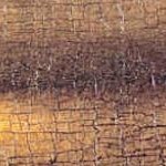
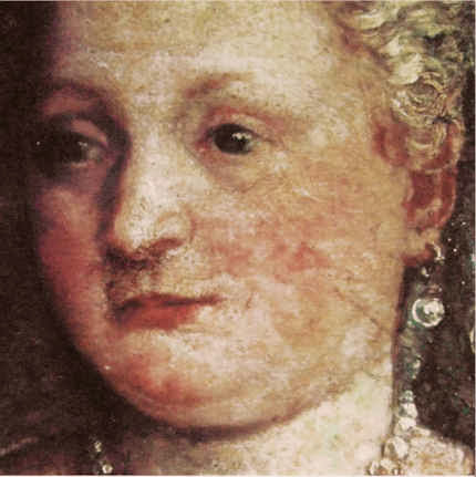
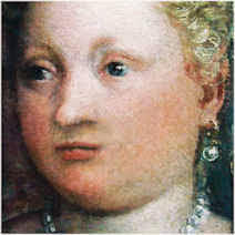
In every photo-comparison shown here of details from the “Virgin and St. Anne”, it is clear to any educated eye that the tonal range that was formerly visible has been massively reduced. This, ipso facto, is a proof of artistic injury: “dirty varnishes” could not have disported themselves in such a manner as to enhance the effects of Leonardo’s own handiwork. Moreover, the values and relationships of values that were perceivable through the varnishes before restoration would, on Mr Delieuvin’s own optical schema, be expected to emerge from a “cleaning” with greatly enhanced, not reduced, power and vivacity – in short, while the lights would certainly be expected to emerge lighter, the half tones and darks should also be strengthened and not diminished – as seen right.
Consider the comparison of the Virgin’s eyes at Figs. 5 and 6. Such has been the loss of modelling-by-shading that the face is reduced to a mask-like reminiscence of its former self. The now obtrusively dark slits of the down-cast eyes are no longer subsumed within the previous anatomically descriptive overall shading of eye sockets. Had Leonardo really painted the face as is presented today as “recovery”, it would be for the restorers, curators and trustees of the Louvre to explain how it was that dirty varnish had formerly imparted superior, Leonardesque traits to the master’s own handiwork. It would also need to be explained why Leonardo might have been content to leave two versions of the pupil of the Virgin’s right eye simultaneously visible on his finished picture.
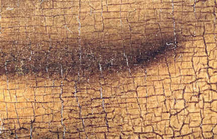
If we consider the comparison shown at Figs. 7 and 8 of the Virgin’s lower face, another aspect of injury is apparent. That is, as the half-tones have receded under the force of swabs and solvent, the resulting increased zones of brightness leave the face looking looks both fatter and flatter. It is hardly heresy to suggest that Leonardo used shading to turn the surfaces of his heads away from light and into shadow. What kind of benefit, then, has been gained by delivering a lighter, brighter, flatter Leonardo? For what reason and on whose authority was the expression of the Virgin’s mouth altered?
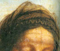
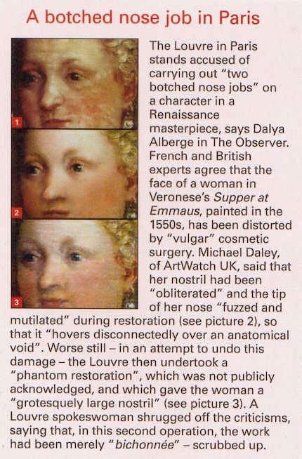
As our colleague at ARIPA, Michel Favre-Felix, disclosed a few years ago, in the Veronese head shown in Figs. 10 to 13, we find evidence of a Louvre house-style of cleaning and repainting that imposes crass puffed-up modernist forms and redrawn and re-modelled features on Renaissance heads. This bizarrely unwarranted policy is accompanied by a cavalier disregard for the norms of museum-world conservation record keeping (as is evident in the Louvre spokeswoman’s reported comments at Fig. 11). The Louvre, as today constituted, is doing indefensible things to the art it holds and feels no obligation even to record or report them. The tragedy is that until quite recently this museum was a model of restoration restraint and a reproach to other institutions. Today, along with with its bonanza of destructive restorations, increasingly we find intrusive and vulgar commercial exploitation by Big Sponsors: “Another Restored Leonardo, Another Sponsored Celebration – Ferragamo at the Louvre”. To think that such a great institution could sink so swiftly into meretricious stewardship and displays of bling.
Michael Daley
Comments may be left at: artwatch.uk@gmail.com


![]()
Barnes, Burrell and a Beck Memorial Lecture: “Philippe Mercier Watteau’s English Follower” ~ by Martin Eidelberg

In 1991 a restorer brought Professor James Beck of Columbia University to trial in four Italian cities on charges of aggravated criminal slander. (Beck’s comments to one journalist had been carried in four regional newspapers.) Facing a possible three years jail sentence and ruinous, punitive damages – the restorer demanded 60 million lire for “material and moral damages” – Beck was exposed, vulnerable, alone. The restorer had sued Beck but not the four newspapers that had carried the allegedly damaging comments by the world’s leading authority on Jacopo della Quercia, whose famous marble carving in Lucca Cathedral, The Ilaria del Carretto, had been stripped of its ancient patina in a “conservation treatment” that included being blasted with particles to remove abrasions and scratches and saturated with penetrating oil to produce a homogeneously shiny surface (see Figs. 2 and 3). Despite the awfulness of the restoration everyone expected Beck to lose. One person who knew that he was going to lose – the trial judge in Florence – told the prosecuting lawyer as they left the court building together for lunch on the first day of the trial that he would find the scholar guilty: “Eh, but I shall convict him”.
Fortunately, that declared intention was overhead by an intern-lawyer and former policeman who happened to be working for Beck’s own lawyer. The judge and the lawyer disputed the attributed words but not the fact that they had left the court talking to each other about the case. Despite their joint denial, eventually, the judge was replaced and Beck was acquitted. (The story of that trial is told in the book “Art Restoration ~ The Culture, the Business and the Scandal” by James Beck and Michael Daley.) By then, Beck had resolved to set up an international organisation dedicated to speak and act on behalf of art against harmful practices and abusive or exploitative treatments. ArtWatch International was founded in 1992 to be that organisation.
When Beck died in 2007 we knew that the best way to honour his courageous stance was by continuing to campaign through ArtWatch. At the same time, to commemorate his achievements as a rigorous (Rudolph Wittkower-trained) scholar and highly popular teacher, we instigated an annual memorial lecture, alternating between London and New York, to be given by scholars of high esteem. We have been honoured by talks from Professors Hellmut Wohl and Charles Hope in London in 2009 and 2011, and by Professors Mark Zucker and David Freedberg in New York in 2010 and 2012.
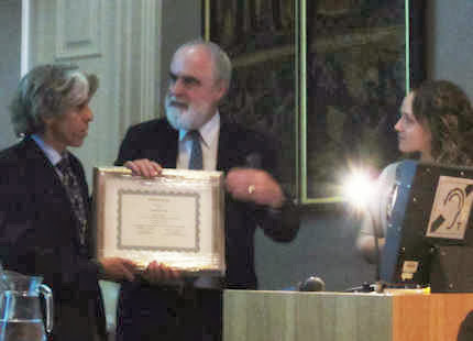
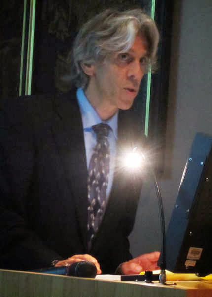
The fifth lecture was given in London this year on September 30th by Professor Martin Eidelberg at the Society of Antiquaries of London in Burlington House. It was a sparkling and instructive occasion as Professor Eidelberg showed (through more than fifty PowerPoint slides) a succession of visual comparisons which deftly separated the subject of his talk, Watteau’s English follower, Philippe Mercier, from the many inferior works that had been attached to the artist as a kind of attributional flag of convenience, thereby exposing the intriguing conundrum of a painter of considerable quality who had remained a faithful pastichist of his chosen master, borrowing motifs at every step of his own career. An account of this elusive artistic entity will be carried in the next ArtWatch UK journal – just as the fourth lecture by Charles Hope (“The National Gallery Cleaning Controversy”) is carried in the current journal. Professor Eidelberg cites on his (excellent, as Selby Whittingham describes below) website, Watteau and His Circle, an anecdote about the friend of a colleague who responded to a general archaeology exam question with:
“an incredibly detailed answer about a minor type of Roman provincial pottery. The examiners were bowled over by this man’s extraordinary knowledge on such a minuscule topic, but then asked him why he had expended so much energy on a subject that only three or four people in the world knew anything about. His reply was ‘I realize that, but with them I have such interesting conversations.'”
Martin Eidelberg expresses the hope that his own essays will find a readership, encourage others’ research, lead to stimulating conversations on the art of Watteau and his circle. Certainly, his lecture on the 30th left the (distinguished) audience delighted and flattered to have been party to so discriminating and illuminating a conversation. Given the talk’s rarified subject it seemed appropriate to ask a specialist in the field, Selby Whittingham, who is Secretary of the Watteau Society, Donor Watch and The Independent Turner Society to offer a note on the speaker and his researches.
Dr Whittingham recalls:
“It is 29 years since I first met Martin Eidelberg at the colloquium at Paris to celebrate the tercentenary of Watteau’s birth, to which we both contributed, Martin on Watteau and his early master, Gillot. The speaker immediately preceding myself, Brian Allen, spoke about early imitators of Watteau in England, of whom “easily the most important” was Philip Mercier. Fifteen years earlier John Ingamells and the late Robert Raines, a founder member of the Watteau Society in 1984, held an exhibition on Mercier at York Art Gallery, followed by a catalogue of his works published fittingly by the Walpole Society (Horace Walpole having owned an actual Watteau, now at St Petersburg).
“As Martin’s conclusions will appear in his excellent Watteau blog, suffice it to say that he has once again challenged accepted views and causes us to revise our ideas about Watteau and his satellites. It was a rare privilege for a London audience to hear such an erudite talk, as the subject of Watteau long bypassed London, the blame for this being laid on the embargo put by Lady Wallace on the Wallace Collection from lending any of its pictures! However the accession of Christoph Vogtherr as its Director (successor but one to Ingamells) has now shown that need not be so, and that scholarly publications are not dependent on blockbuster loan exhibitions. On the other hand it is regrettable that an exhibition, mainly of photographs, on Watteau’s techniques held just after the tercentenary at Brussels never transferred, as its organisers had wished, to England, as the matter would have been of great interest to supporters of ArtWatch, some of whom will remember how a conservation mistake was shown by Martin Eidelberg at a previous meeting to have obliterated additions to a painting made by Watteau himself.”
The earlier ArtWatch talk to which Selby Whittingham refers was much appreciated by James Beck. As well as providing a platform for good talks, Artwatch soon discovered that people feel freer to approach and pass on intelligence to a dedicated organisation than to individuals. One of the first to do so was Nick Tinari, a young electrical engineer and devoted student at the Barnes Foundation in Merion, Pennsylvania. He brought news of an attempt to overturn a prohibition on loans of art works from the Barnes Foundation’s fabulous collection of modern paintings. This, indeed, was alarming: tours not only constitute greatly increased risks (six-fold in the judgement of one insurer) but too often serve also as pretexts for “conservation treatments”. With the Barnes collection (as with that of the Sterling and Francine Clark collection – see “Taking Renoir, Sterling and Francine Clark to the Cleaners”), the now-at-risk paintings were in the best, which is to say, least-restored conditions.
The justification for the proposed breach of a fabulously generous donor’s wishes and conditions was that money could be raised through a foreign tour of key works in the collection to make “conservation” improvements to the building in which the collection was housed. Alleged conservation needs provide morally-coercive cover for many professional expansions and building projects. Tinari saw the proposal as a ruse contemptuous of Barnes’ intentions and philosophy. Events proved him right – the assets of an institution were effectively hi-jacked and its educational purpose greatly subverted. The story of that heist has been well told (and see Tinari’s own comments below). Less sufficiently appreciated is Tinari’s own remarkable and tenacious defence of Barnes’ wishes and instructions against the hot-shot lawyers of the would-be institutional transformers. Those encounters so sharpened his awareness of and appetite for the law that he turned to law school himself and now works as a patents attorney.
Artwatch has always seen itself as something of a standard bearer and supporter of other worthy autonomous campaigns on Art’s behalf. James Beck had great fondness for courageous campaigning individuals and created a small prize which he named after the New York painter Frank Mason. Mason, a longstanding and popular traditionalist teacher at New York’s famous Art Students League (among his student/devotees was the great American satirist and author of “The Painted Word”, Tom Wolfe), was a pioneering anti-restoration figure in the US, leading marches of artists and students at the Art Students League to the Metropolitan Museum in protest at its picture restorations. In opposition to the cleaning of the Sistine Chapel ceiling he enlisted the engagement of the writer and former art critic of Time Magazine, Alexander Eliot. With the philosopher Thomas Molnar and the cultural historian Arcadi Nebolsine, Mason had founded The International Society for the Preservation of Art, which organisation was incorporated within ArtWatch International at its 1992 foundation.
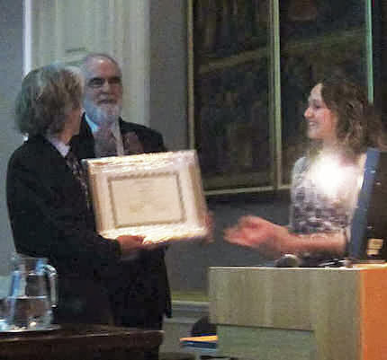
At this year’s James Beck Memorial Lecture we awarded the 2013 Frank Mason Prize to Nick Tinari. He, like Selby Whittingham (the recipient of the 2011 Frank Mason Prize), has joined our campaign against Glasgow City Council’s attempt to have conditions of Sir William Burrell’s bequest overturned by the Scottish Parliament so as to permit foreign tours of works from the collection. The submissions to the Scottish Parliament made by Donor Watch, Nick Tinari, and ourselves, can be read at this site. Evidence given to the Parliamentary Committee by ArtWatch UK and others can be seen here.
Nick Tinari’s submission begins:
“I am a practicing attorney and an electrical engineer. I am also an alumnus of the education program of the Barnes Foundation in Merion, Pennsylvania. Like Mr. Burrell, the founder of the Barnes Foundation, Dr. Albert C. Barnes, made his gift of an extensive art collection including the stipulation in an Indenture of Trust that none of the works should be loaned. This stipulation was temporarily breached in the 1990s based on the argument that the foundation was lacking funds to maintain theMerion gallery and that a “once-in-a-lifetime” opportunity had opened for a tour of the artwork to Washington D.C., Paris and Tokyo, with the French and Japanese venues paying a total of $7 million for the loan. This was one of the earliest instances of outright rental of artwork for exhibition and at the time the largest sum ever paid for such a transaction. Since then, the practice has become commonplace…”
In view of this great familarity with the Barnes case and its clear relevance to present considerations of the private bill presently before the Scottish Parliament, we asked Nick Tinari if he might address that relationship when making his response to receiving the Frank Mason Prize.
Nick Tinari’s response:
“I want to thank everyone at ArtWatch for awarding me the Frank Mason prize this year. I’ve worked alongside ArtWatch for many years and they are doing important work that no one else is addressing, namely, protecting our artistic heritage for the long haul, not just for the next exhibition or next year, but for as long as we will continue to recognize artistic genius, which hopefully is a very, very long way out.
“In addition to being a remarkable artist and teacher, Frank Mason was an early voice against imprudent “restoration” of artwork. We are in the small club of those who organized protests at museums, his in the 1970s at the Metropolitan Museum and mine in the 1990s at the Washington National Gallery and Philadelphia Museum of Art.
“I met Jim Beck many years ago when I was trying to stop the dismantling of the Barnes Foundation in Merion Pennsylvania. One aspect of the plan to break the founder’s will was an international tour of 80 works from the collection. It was a story that is very similar to the current plans for the Burrell Collection in Glasgow. The trustees no longer had connections to the donor or his intent and they wanted to elevate their own agendas and “put the Barnes on the map,” which was, of course, ridiculous because the Barnes Foundation was world-renowned long before the arrival of new trustees.
“I asked Jim for help because the tour organizer, the Washington National Gallery of Art, wanted to remove varnish from many of the works, many of which came into the collection directly from the artists’ studios and thus were in pristine condition, even if not bright enough for the kinds of shows the National Gallery puts on.
“This was in the infancy of ArtWatch and Jim wrote some letters and we did press releases together and got some attention to the matter. In the end, the works were not touched for the tour, the rumor being that the French organizers objected to altering the paintings, although some of the same institutions have certainly made their own mistakes since then.
“Between 1993 and 1995, roughly 80 Barnes paintings did travel to Washington, Paris, Tokyo, Fort Worth, Toronto, Philadelphia and Munich. Because I did not believe the National Gallery’s officials’ promises about the supposedly careful transit conditions—they actually claimed the works would be safer on tour than in Merion—I examined the works myself in Washington, Paris, Fort Worth, Toronto and Philadelphia. Aided by the condition reports for the paintings prepared before the tour by the National Gallery and which I obtained through the Freedom of Information Act, I documented damage to several works as they were moved from city to city.
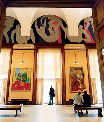
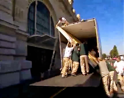
“The most dramatic damage that I saw was in the form of stretcher creases extending the width of one of the four-meter-wide canvas sections of Matisse’s la Danse [see Figs. 24 and 25], which Barnes commissioned for three lunettes in the central gallery at Merion [see Fig. 17]. Contrary to National Gallery testimony that climate-controlled trucks would be used, the large panels were shipped from Merion to Washington in open-air flat bed trucks in 40 degree Fahrenheit weather and then laid flat and rolled up to a special opening in a large window at the National Gallery [see Fig. 19]. I did not witness it, but presumably, a similar procedure was used to move the panels to the Musee d’Art Moderne in Paris. We have photos of the arrival of the panels at the Philadelphia Museum of Art, again on open trucks and again laid flat before being moved into the building.
“These photos [Figs. 24 and 25] show the damage as I recorded it at the Philadelphia Museum of Art, where the painting was on display while the remaining works traveled to other cities. The National Gallery’s incredible response was that they simply had not noted the stretcher creases on the original condition reports. This is belied by an earlier report prepared by chief conservator, Ross Merrill, prior to removal of the work from the Barnes’ walls. In the report, Merrill states that the panels were in “remarkably good condition . . . taught and in plane.” An independent conservator, Paul Himmelstein, testified that the stretcher creases were typical of damage caused by laying a work horizontal against its stretchers, especially during a period of change in relative humidity. That is exactly what one would expect in bringing the work from the heated gallery in Merion to an unheated ride down I95 to Washington and then to be laid flat on the ground there. Prior to this, the work had not been off the wall or out of vertical position since Matisse saw it installed in 1934.
“A second instance of National Gallery mendacity involved the large Seurat les Poseuses, which a previous conservator at the Barnes Foundation stated should not travel [see Fig. 23]. The National Gallery approved the Seurat’s travel but, remarkably, changed its mind after the work had been to Washington, Paris and Tokyo. The claim was that the painting was not damaged but just should not travel any further. Of course this makes no sense. Either the painting was in the exact physical condition that it was in when it left Merion and thus fit for continued travel or it had been degraded since Merion, which was why it was no longer fit for travel. I suppose the third option is that, as the earlier conservator observed, the work was never in condition to travel and the National Gallery, having now exhibited the rare work, was willing to reverse itself, while not admitting that the decision to allow travel was wrong from the start. At least for now, the painting has this helpful footnote in its record should the urge to tour it arise again, although, as in the case of the Matisse, it is pretty clear that Alice in Wonderland rules apply to statements from the National Gallery.
“The final affront to the Matisse occurred only recently when it was moved from Merion to a new gallery in Philadelphia. As it played out, the agenda to put the Barnes Foundation “on the map” did not mean on a map of Merion, Pennsylvania but five miles away in center city Philadelphia. Anyone interested in the full saga of the complete reversal of Barnes’ wishes that the collection remain in Merion as primarily a teaching collection should view the 2009 documentary The Art of the Steal or consult John Anderson’s recently-updated book Art Held Hostage. As for the Matisse, the architects and the Barnes trustees responsible for dismantling Barnes’ express mandate for the collection’s use and display did not recreate in Philadelphia the same building details that Matisse worked to. Rather, in keeping with the Modernist design of the new Philadelphia gallery, they eliminated oak moldings above three windows that Matisse clearly used as visual pediments supporting the figures in the mural [see Figs. 17 and 18]. In place of these visual anchors, there is now a wide strip of bare wall with the figures in the work now adrift. This stripping of the Merion details is so obvious a disturbance of Matisse’s harmonization of the mural to the Merion building that it displays the complete and utter ignorance of both the architects and the Barnes trustees, some of whom fancy themselves as “important” collectors, whose mediocre accretions are regularly exhibited with the connivance of the Philadelphia Museum of Art on whose board they also sit.
“The Barnes matter is unfortunately being replayed nearly verbatim in Glasgow at the Burrell Collection. The present stewards of the collection want to remove Burrell’s restriction against the works travelling outside of the UK. The premise is the same as it was in Merion, namely, there are insufficient funds to repair the gallery and touring the collection would raise funds, while the real motive, as with Barnes, is to use a tour of the artwork to put Glasgow “on the map.” ArtWatch has joined this present battle, and rightly so, because, collections like Barnes and Burrell are special islands of calm in a noisy field where art is now seen as a commercial enticement for tourist dollars. The conditions that Barnes and Burrell attached to their generous gifts should be observed not only because of the moral imperative, but because I think it is important to have at least some small part of the cultural heritage that is not subject to commercial pressures and dangers of endless tour schedules and inevitable damage and repair, not to mention the desire to brighten up works to suit viewers jaded by digital, LCD-lit images. Because Barnes had such restrictions on his collection, the works were not hastily cleaned when most museums were doing so. I fear that the rare condition of these works is now in jeopardy as they have now become part of Philadelphia’s self-declared “museum mile.”
“Jim Beck used to say that the experience between the artwork, and by extension the artist, and the viewer is a fragile one, an experience that cannot bear the weight of other agendas like blockbuster tours and “civic boosterism”. ArtWatch was founded to “speak for the art.” As the Barnes Foundation and Burrell Collection demonstrate, there will always be a need for that voice to be heard and I am glad to be a part of that effort.”
In his closing remarks Nick Tinari evoked one of James Beck’s greatest fears: that Art’s welfare is increasingly considered secondary to that of certain vested interests and professional groups. A key and modish contention employed by those who would overturn Burrell’s prohibition on foreign loans is that they wish to increase “access” to art – when art can only ever be in one place at a time and shuttling it around necessarily means that, in addition to being exposed to greatly increased risks, it becomes inaccessible to anyone except professional art handlers for long periods of time between venues, and entirely inaccessible in its home for what can be exremely long periods. A second contention (which we examine in a forthcoming post) is that shuffling art around facilitates scholarship. Many have complained that the scholarship connected with blockbuster exhibitions is often poor and meretricious. James Beck further held in the Art Review (“Facts and Fictions of Restoration”, January 1999), that the scholarly spin-off of such exhibitions constitutes a professional inducement to take risks:
“The ‘new’ interpretations of one artist or another which result from the blockbuster offer the art historian the opportunity to participate in the resulting symposia and international congresses. The same is true of following the restorations of well-known or important works. These too require a whole new apparatus. What art specialist would be willing to forego a role in these activities? This would mean being left out of the massive catalogues that usually accompany art spectaculars. For those who enjoy it, there also opportunities to participate in television interviews or appear on any CD-ROM merchandise. Each of these can involve substantial compensation.”
Michael Daley
Comments may be left at: artwatch.uk@gmail.com


![]()
“Pick Up A Pencil”
The theme of the new ArtWatch UK members’ Journal (see right) is “The Primacy of the Visual”. Failures to acknowledge, address, or even recognise visual evidence are examined. The text of Charles Hope’s 2011 James Beck Memorial Lecture is carried in full. Professor Hope cites failures of the National Gallery’s curators and restorers to address opponents’ arguments or to recognise the import of key historical documents on artistic practice. When Professor James Beck, the late founder of ArtWatch International, lent support to artist-critics of the Sistine Chapel restoration he came under vicious attacks from some scholarly peers – for all the world as if he had betrayed a priesthood of the visually ignorant. Prof Hope cites a letter of that kind. If artists do sometimes discomfort scholars, it is no presumption: knowing how art is made they are precisely the best qualified to detect its un-making. Here, the painter (and photographer) Gareth Hawker discusses both fundamental differences between painting and photography and the widespread failures to recognise these differences. His demonstration is timely. If (as we have argued elsewhere), art schools have given up the ghost with regard to teaching the traditional skills that formerly equipped artists to recognise restoration blunders, in the wider world of commercial film-making there are signs – notwithstanding giant leaps in the powers of digitalised image-making – of a renaissance in traditional art practices. We discussed this paradoxical relationship in connection with the extraordinary accomplishment of the hand-crafted animated film Frankenweenie. Another such heartening case is discussed opposite. [M. D.]
A Photograph is a Copy, not a Creation, Gareth Hawker writes:
“…we have realised that we should give more attention to photography”. So wrote the Director of the National Gallery, Nicholas Penny, in his introduction to the current exhibition, Seduced by Art: Photography Past and Present [1]. Several reviewers seem to agree. Tabish Khan wrote that, “…photography is a contemporary art form that can be just as inspiring and impressive as painting” [2]. But photographs do not incorporate the high-level thinking that paintings do. It would be misleading to put them in the same category.
The difference between painting and photography is frequently glossed over. For example, many people suggest that the camera is a tool just like brushes and pencils. At first sight, this may appear to make sense. The photographer decides what to include in the picture, in the same way that a painter often does. He chooses where to place the camera; in which direction to point it; how far to zoom in on a subject; and when to press the shutter. He may select models, costumes, and arrange lighting. All these factors contribute to what is called the ‘scene’ – the image in the viewfinder. The ‘scene’ may be recorded by a photographer just as well as by a painter, so the argument goes: they just use different tools in order to complete the same task. However this is to ignore what the tools are used for. The camera is used to record the scene, while the brushes and pencils are used to analyse it. The importance of this analysis is often overlooked.
Photographers who have wanted to claim equal status with painters have made various approaches, all ignoring this analytical element. At first they blurred and smudged photographs in order to make them look like paintings. Then photographers claimed that theirs was a totally separate art form, a pure record of the scene. Some argued against this, saying that if a photograph were pure, it could not be artistic. Before this issue could be resolved, some writers swept it aside. They suggested that what mattered was, “conceiving an image in the brain and finding some way of expressing it” [3]. What counted was the viewer’s response – whether a work, “spoke” to the viewer [4]. This disregarded a significant factor: people do not respond to paintings in the same way as they do to photographs, especially if they can see that a painting provides evidence of thinking, in a way that a photograph does not.
Paintings look different from photographs because they are made differently. A painting is constructed from brushstrokes; each stroke the result of a decision. A painting may represent a scene, or it may represent nothing at all. A painting is an independent creation, whereas a photograph is dependant on the scene. A photograph can be made only if there is a scene to be copied.
A representational painting may be compared to the summary at the beginning of a scientific paper – the paragraph which is entitled, “Abstract”. Its writer makes a personal judgment about which are the most important topics dealt with in the paper, and writes a brief account of his own. The “Abstract” is a new and independent piece of writing, just as a representational painting is a new and independent analysis of the scene. In contrast, a photograph is like a photocopy of the whole scientific paper. The photocopy shows no analysis, and no judgment.
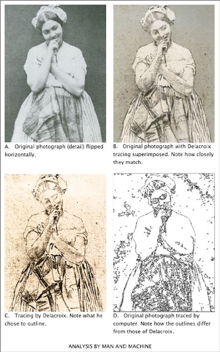
Brushstrokes are only the most basic way in which a painter’s analysis or abstraction may be seen. Another is in the simplification of the human figure – in its reconstruction in terms of geometrical solids, such as eggs and cylinders. Even a simple tracing – the lowest form of analysis – shows which lines the painter has considered to be more important than others.
To give a computing analogy: a photograph is like a bitmap image (which records only pixels – spots of colour), but a painting is like a vector image (which records instructions about where lines are to go). A tracing programme can convert a bitmap file into a vector file. The computer makes a simplification which looks similar to a paint-by-numbers drawing. This computer drawing may be thought of as the beginning of an attempt to imitate human analysis – a type of artificial intelligence – though the computer has a long way to go before it catches up with the human brain in this respect (Fig. 1). If anything may be thought of as being a tool comparable with brushes and pencils, it is a tracing programme (which helps to analyse), not a camera (which does not).
To express the difference in another way: Scene = Photograph (Scene = Photograph) × Analysis = Painting
Analysis is an essential part of what makes a representational painting interesting to look at; whereas what makes a photograph interesting to look at is the scene, not its treatment.
Analysis demands abstract thinking – whether it is done well or done badly. What distinguishes the great painter from the mediocrity is the quality of this thinking, not any manual skill. Anyone who can sign his name, already has enough manual skill to make a great drawing. (This includes drawing in its wider sense: deciding where to place marks made by the pencil or the brush, even when no outlines may be involved).
The modern digital camera provides the most effective means for recording the scene that has ever been devised. Strangely, many photographers want to use it for a different purpose, to express an interpretation – a purpose for which it is singularly unsuited. Some photographers deliberately introduce all sorts of inaccuracies which mean that the result is neither a pure substitute for the scene, nor an independent creation.
The classical case for photography’s status as an equal to painting was put forward by the man who was perhaps, “the most important figure in the history of the visual arts in America” – Alfred Stieglitz (1864-1946) [5]. In his usage, the word ‘artist’ meant someone who, “got the spirit of the truth” [6]. He held that only 0.1% of painters were artists, and only 0.1% of photographers were artists. But not everyone takes such an exalted view. For example, a tax inspector wants to know whether a painter is a house-painter or an artist, not whether he has, “got the spirit of the truth”. So when a painter says that he is an artist, he is simply describing his activity. He is not claiming to be either good or bad at his job: that is for others to decide. But when a photographer says that he is an artist he is claiming to be in the top 0.1% of his profession: he is pushing others to accept the valuation he has placed on his own work.
By using the word ‘artist’ in this way, Stieglitz moved attention away from a vital distinction; that between creating something new (a painting) and making a copy (a photograph). He persuaded many viewers to ignore analysis, and to concentrate on the selection and arrangement of a scene – on pointing and shooting.
Stieglitz’s advocacy, along with that of other theorists, seems to have desensitised many viewers. They see only the subject which has been represented. They fail to notice that a painting exhibits the working of a mind – not just in the choice of subject, but in every single stroke. One consequence of this desensitisation became apparent when the Sistine ceiling was treated by restorers, and much of the best painting ever produced was wiped off. The picture of a man looks like a man, whether it is drawn well or drawn badly. Most historians were satisfied with what remained after the paint-stripping because they could still identify the subjects which had been depicted. Very few noticed how drastically the quality of the drawing had been reduced.
Many people were better informed about these issues in the days when Michelangelo painted his great work. Contemporaries who saw it for the for the first time commented at least as much on the power of its drawing, as on its subject matter [7]. The way in which influential men looked at nudes in those days may be compared with the way in which they look at motor cars now: with an appreciation of the beauty of engineering and construction – an appreciation which derives in part from an understanding of how all the parts connect together.
The paint-stripping made nonsense of some of the connections in Michelangelo’s nudes. His contemporaries would have been appalled, but most of today’s historians and television presenters do not even notice. They focus on the imagery and the iconography, not on the drawing. It is as if they were waiting for the work to ‘speak’ to them – for the artistic content to make itself felt. But, being sensitive only to subject-matter, that is all that they are able to see. Such narrowly prepared minds will respond only to the crudest visual stimulus (the colours looking brighter after the top layer of paint has been removed, for example).
Just as the critical response to painting has become limited, so the meaning of the word Art has expanded – to such a degree that almost anything seems to be embraced by it, including photography. However painting remains distinct: it is a creation which is independent, and which can embody the kind of analysis described above. This is why painting may be categorised with the higher expressions of the human mind, along with poetry and philosophy. Photography does not fit into this category because it cannot display abstract thinking.
But painting is now so little appreciated that, to many people, it seems comparable with photography. This has allowed photography to be called Art, and so to enter the National Gallery. Arguably this is the same lack of discrimination that has allowed paint-stripping to take place, not only on the Sistine ceiling, but on almost all the great works of painting in the Western World, including those in the National Gallery.
“Giving more attention to photography”, seems to be one more example of this downward trend, but perhaps there is a glimmer of hope. When a great artist’s paint has been removed from a picture, the decline in its artistic quality is irreversible; but a decline in critical awareness is different: it can be reversed. At present, many people are only distantly aware that, in every brushstroke, a representational painting gives evidence of analytical thinking. Perhaps the exhibition at the National Gallery will help to promote this awareness. If so, it will have served a very useful purpose.
ENDNOTES:
1 The National Gallery, Seduced by Art: Photography Past and Present, Yale University Press (9 Oct 2012), ISBN-10: 1857095456, ISBN-13: 978-1857095456 The exhibition runs from 31 October 2012 to 20 January 2013 2 londonist. Art-review-seduced-by-art-photography-national-gallery. Retrieved 8 November 2012 3 Gerry Badger. Collecting Photography. London: Mitchell Beazley, 2003. ISBN 1-84000-726-5 p23 4 Gerry Badger. Collecting Photography. London: Mitchell Beazley, 2003. ISBN 1-84000-726-5 p24 5 Richard Whelan, Stieglitz on Photography, Aperture, 2000, p ix 6 Alfred Stieglitz, Is Photography a Failure?, The Sun, New York, March 14, 1922 – reprinted in, Richard Whelan, Stieglitz on Photography, Aperture, 2000, p 229 7 http://artwatchuk.wordpress.com/2012/10/01/12th-november-2012/ Retrieved 12 November 2012
Gareth Hawker
Comments may be left at: artwatch.uk@gmail.com


![]()
Review: Renoir at the Frick – The Curatorial and Conservational Photographic Blind Spots
The Frick Collection’s recent temporary exhibition “Renoir ~ Impressionism and Full-length Painting” contained ten pictures and took ten years to assemble. It was organised by the deputy director, Colin Bailey, to showcase the The Promenade, the museum’s sole and “somewhat overlooked” Renoir – “overlooked” because Henry Clay Frick’s entrenched prohibition against loans had prevented the picture from travelling to major Renoir shows such as the 1997-78 “Renoir Portraits” exhibition which Bailey had organised for the National Gallery of Canada, Ottawa, The Art Institute of Chicago and The Kimbell Art Museum, Fort Worth. If the Promenade could not join the international party then the party might come to the Frick.
For this celebration of a single work nine major pictures were borrowed from seven museums and Bailey, a distinguished scholar of French art, produced a book/catalogue that contains much illuminating material on contemporary costume and fashionable mores. As delightful as the show itself ought to have been, the experience proved dispiriting and alarming. Partly, this was because such temporary compilations of dream combinations always come with downsides and a common glaring omission. In this case, for several months a gallery-full of important Frick pictures were bumped from view as important works from other, also temporarily depleted, museums were put at risk. The Musée d’Orsay, for example, sent both its Dance in the City, which had been transferred from its original canvas and relined (see Figs. 10-13 and below), and its Dance in the Country, across the Atlantic. The National Gallery (London) sent its already travel-damaged The Umbrellas, and did so at a time when it had lent its brittle, fragile, shotgun-blasted, “never-to-travel” Leonardo Cartoon to the Louvre. The Columbus Museum of Art, Ohio, lent its fire-damaged Madame Henriot “en travesti” (The Page)…and so forth.
The omission that is common to all borrowed compilations was the failure – perhaps for reasons of institutional politesse – to take the opportunity to assess the relative physical conditions of the variously treated and restored cross-section of pictures from within an oeuvre or, in this case, from a specific moment within an oeuvre – “the decade of Impressionism”. This commonly encountered lacuna was the more apparent because Bailey himself discusses conservation matters rather more than most. He does so, however, as a seemingly grateful recipient/beneficiary of museum restoration departments’ technical largesse and their routinely delivered “discoveries”. With his prefatory expression of deep gratitude to an international slew of conservators for “their participation in undertaking technical examination on the paintings in their charge and for allowing me to publish their findings in this catalogue” we knew precisely what critical appraisals not to expect.
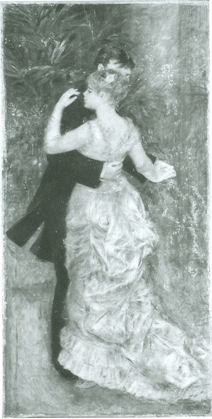
Strictly speaking it would not be necessary to call for comparative assessments on such occasions if museums were all, as a matter of course, completely frank about the restoration-injured conditions of individual works. By way of an example of what might be discussed at a time when recollection of the show is still fresh and when armed with Bailey’s book/catalogue, which is as intensively researched and handsomely illustrated as might ever be expected, we consider here the technical history, in so far as it has been disclosed, of just one of the nine loaned pictures – Renoir’s beautiful invention of arrested intimacy-in-movement, his Dance in the City.
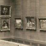
The obvious starting point for any appraisal of a picture’s successive states should be the earliest photographic record of the work. With Renoir we enjoy an immense if not comprehensive photographic record. We even have film footage of him painting and sculpting. We have contemporary or near-contemporary photographs that show his paintings in the context of close proximity to other paintings and in a common light (Fig. 1). When the testimony of early photographs differs markedly from presently photographed states (as so often is the case with modern masters – see Figs. 3-7), then, self-evidently, there is an issue crying to be addressed.
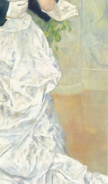
When, for example, we compare the very different states of Renoir’s Dance in the City, as seen in Figs. 3 & 4, despite making allowances for photographic variations (such as the great discrepancies of size between the earlier and later images) and being mindful of Bailey’s own thanks to the photographer Michael Bodycomb for having “improved the quality of almost every image”), it is clear that the painting today is not the work that it once was; that its values and relationships have changed. Consider the floor on which the dancers perform: then, it was more varied in its tones; today it is more equal. Then, the floor to the right of the ball gown was darker than the floor to the left of the couple. That darkness served to emphasize the sweeping profile at the back of the trailing gown. Reading downwards from the waist, the shape of two convex masses of material formerly made a leisurely elegant descent towards the train. Today, that “materially” expressive clarity of design in the lower of the two draped forms has been quite disrupted, if not lost, as the now lighter tone of the floor merges with the now diminished shaded tints of the gown (see Figs. 3, 4 & 11).
For all of Bailey’s admirably close (and expertly advised) attentiveness to the dress-making “mechanics” of the gown – “…The skirt is draped in puffed folds (en bouillonée) with a tier of drapery in the front and two pleated flounces at the bottom. The long train is is draped and pleated to form poufs in the back, and a petticoat can be glimpsed beneath it” – he misses the weakened and possibly redrawn profile. Bailey well describes Renoir’s preoccupation with costume. As the son of a tailor and a seamstress, how could that artist have been unaware of or indifferent to the expressive “cut” and sweep of a costume on a swirling, waltzing figure? Previously, the costume of the male dancer was more various in its tones. Today it reads as a uniform black appendage to the female dancer. Previously there had been no hint of the present overly-assertive, sharpened and darkened treatment of the coat tails which pictorially are now as disruptively emphatic as the head of a claw hammer.
For Bailey, the now lighter toned, more equal floor is “immaculate”. To a charlady that might well seem gratifyingly the case, but Renoir, as Bailey acknowledges, fretted greatly about establishing integrated relationships of figures and backgrounds. As Renoir himself put it: “I just struggle with my figures until they are a harmonious unity with their landscape background, and I want people to feel that neither the setting nor the figures are dull and lifeless.” (“Renoir by Renoir”, N.Y., 1990, p. 50). “Harmonious” sometimes seems to be an elusive concept to non-artists. It is not synonymous with “more-alike”. Rather, it describes the uniting through an artistically forged equilibrium of otherwise potentially disparate, disjunctive elements. We constantly see in artists’ preliminary, intimate sketches how their very first thoughts attempt to anticipate and resolve the requirements of such pictorial equilibriums – see Figs. 8 & 9.
Rendering Renoir’s dance floor more homogeneous has had a spatially flattening and pictorially deadening effect. Rendering it both generally lighter and more equal has contributed to the unfortunate effect of detaching the couple from their swirling space and leaving them as isolated and self-contained as a pressed flower in a book. Indication of the painter’s pictorially melding preoccupation is unmissable in the small oil sketch at Fig. 9 that Renoir made for another of his dance paintings. Compared with the earlier state of Dance in the City, the present one resembles an artificially sharpened photograph.
With apparent injuries we must always look for causes and look for them behind as much as within official accounts. As mentioned, and as Bailey euphemises, this picture has “had a complicated structural history”. That is, it has been both transferred and relined. Both operations are highly dangerous. When the paint film was detached from (its presumably original) canvas, the restorers took the opportunity to photograph the painting from the back of the paint, capturing the image in reverse. This image is excitedly presented as having afforded “a rare glimpse into Renoir’s initial preparations…we can see the lines demarcating the back and the train of the womans dress” (but see comments and photograph at Fig. 10). In the same vein, an X-radiograph “shows how enegetically Renoir laid out both his figures and the background elements”. Bailey discusses an infrared reflectogram (Fig. 11) and acknowledges that these “technical” images were made by the Laboratoire du Louvre, C2RMF. Our colleague in ARIPA, Michel Favre Felix, advises that a certain number of paintings coming from the Louvre or from “l’Orangerie”, were “more or less restored” in 1986 on entering the Musée d’Orsay. Bailey confirms that the picture entered the Louvre in 1979 and was transferred to the the Musée d’Orsay in 1986 but offers no details on any restorations of the picture. The pronounced differences in the picture that are evident in Figs. 4 and 13 would however suggest that a restoration took place at some point after 1986.
Needless to say, Renoir painted from the bottom up with overlaid patches of paint and his final, most considered statements therefore formed the upper visible surface of the original paint film. That original, considered and final surface (as was best seen and recorded in the earlier photograph at fig. 2), is no longer to be found in current photographs or in the flesh. Whatever interest penetrative imaging might have, it is secondary in importance to the actual appearance of pictures to the human eye. The current escalating vogue for “technical” imaging that probes beneath the surfaces of pictures serves to divert attention from destructive restoration actions on pictures’ critically important upper surfaces. If the present international museums merry-go-round of borrowings makes the need to address the condition of paintings impolitic, then that is a further compelling reason for curtailing it.
Michael Daley
Comments may be left at: artwatch.uk@gmail.com


![]()