
Sistina Progress and Tate Transgressions
The tide continues to run against supporters of the Vatican’s 1980s and 1990s restorations of Michelangelo’s Sistine Chapel frescoes, but it looks as if the National Gallery’s technical conservation division might be about to attempt a last-stand defence of the proclaimed “Gloriously Recovered Colours” that were said to have resurrected a “New Michelangelo”. An exhibition at the Gallery, Making Colour (June 18 to September 17), is to examine the stuff of pigments, in the course of which… Michelangelo is to be enthroned among the great colourists Titian, Turner and Matisse. The manoeuvre shows signs of back-firing.
The Times’ art critic Rachel Campbell-Johnston was healthily wary and alert to art world conservation politics when previewing the exhibition (“True colours: from Titian to Turner”, The Times, 31 May 2014):
“It is wilfully provocative to put a sculptor most famous for his pallid stone carvings on a list of the world’s greatest colourists. But his Sistine Chapel paintings – coming together as they do to create the single greatest pictorial scheme of the Italian High Renaissance – are among the most vibrant works of western art ever created. And after a recent and highly controversial restoration in which solvents were used to strip away half a millennium’s worth of accrued candle smoke and grime – and with it, many argue, the artist’s own shadowy subtleties – Michelangelo is being reassessed. Every book on this artist will have to be rewritten declare historians who marvel at the newly revealed drama of vivid colour. Others, however, remain not just sceptical but deeply dismayed at the irreversible damage that the cleaning has done.”
Even the restoration-friendly Art Newspaper carries seditious words on conservation and the Sistine Chapel in its current (June) issue. The spat that we reported between Bendor Grosvenor (“Art historian, dealer and broadcaster”, of the Philip Mould and Company gallery), and Martin Myrone (“Lead curator, pre-1800 British art at Tate Britain”), at last month’s Mellon Centre conference on connoisseurship and educated eyes, is re-run in the Art Newspaper under the heading: “Do we need a return to connoisseurship?” Dr Grosvenor’s latest comments on restoration and connoisseurship are, however, almost cryptically condensed. They read in full:
“I despair at seeing a picture over-cleaned through a conservator’s misunderstanding of how an artist worked, and the removal of an original glaze in the belief that it is either dirt or over-paint (the Sistine Chapel is the most depressing example of this).”
For the record, Dr Grosvenor’s Mellon Centre mea culpa of May 2nd was delivered as follows:
“And to show why I think that connoisseurship has such a valuable role to play in conservation, let me mention what is – let me end with what is probably the most single important painting in Western art history: Michelangelo’s Sistine Chapel ceiling. I recently went to Rome and saw the ceiling for the first time, and as I was standing underneath it with my binoculars, being jostled this way and that by the crowds, I am afraid I got a terrible shock. I always used to think that critics of the Sistine Chapel restoration were being slightly myopic, or a little bit obsessive, and that trained restorers surely at this level were infallible, and couldn’t possibly damage pictures. But how wrong I was! The Sistine Chapel has been subjected to the most brutal over-cleaning imaginable. I don’t mean the exposure of the bright colours which we see looking so nice here, which most people fixate on, but the actual removal, through simple abrasion with solvents and a rough sponge, of the crucial darks and shadows which gave the ceiling so much meaning and form. Though we don’t have time to go into the debate here as to whether Michelangelo worked a secco on the ceiling or purely in fresco it seems to me that the whole approach to the cleaning of the ceiling was fundamentally misunderstood. But my contention is that if the restorers had, in fact, been real trained connoisseurs of Michelangelo’s work and were not just pure technicians and had a feeling and an eye for how Michelangelo intended his pictures to work they might not have made the same mistakes. And I don’t think I can really make a greater example of why connoisseurship matters. Thank you very much.”
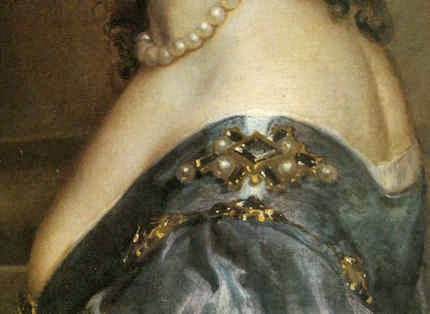
The now linked battles over art restoration and connoisseurship are intensifying. (We are intrigued to know what Dr Grosvenor thinks of the Philip Mould gallery’s own picture cleaning methods. We do know that even when restorers aim to remove just “varnish”, real paint often comes off in the wash – as seen at Figs. 12 and 13. Would the risks not be all the greater when restorers are removing what they take to be “re-paints” from pictures in a hunt for better work underneath?) The museum world’s phoney “Culture Wars” between a supposed but now mythic Art Establishment (look at the recent membership of the Royal Academy and its Summer Show banner “Discover the new; discover the now”) and the Tate and State-pampered, edgy, head-banging contemporary art sensationalists is masking a fundamental art world schism that shows signs of turning ugly. Dr Grosvenor’s ideologically opposite number at both the Mellon Centre conference and the Art Newspaper forum, was Dr Martin Myrone – who happens to have hit the headlines. Tate Britain is mounting an exhibition of British folk art (see “Tate Britain rejects ‘elitist’ Old Masters as Turner makes way for thatched king”, the Times, 5 June 2014). Tate’s press release declared “British Folk Art will include surprising and diverse examples of British folk art, from rustic leather toby jugs to brightly coloured ships’ figureheads. The imposing larger than life-size thatched figure of King Alfred created by master thatcher, Jesse Maycock, in 1960 is one of the exhibition’s highlights.”
News of this exhibition almost caught us off-guard: when Tate spokespeople witter about “diverse” and “surprising” things, we instinctively reach for our cultural pistols, so to speak. But for once, the artefacts clearly are of interest (see Fig. 11) and worthy of attention. The bone cockerel shown in the Times is, in its wit, force and verve of plastic articulation, the superior of the over-sized blue cockerel presently occupying the fourth plinth in Trafalgar Square – which itself is the best of a very long, very bad bunch of occupants. The straw man, likewise is, with its subtle, ominously Germaine Richier-like weight-shifting presence, more than an expressive sculptural match for, say, Sir Anthony Gormley, R. A.’s turgid “Angel of the North”. In short, we have no problem with the subject of the exhibition: quality is, as quality is found. No problem, that is, except this: the Tate is not parking this exhibition in Tate Modern’s vast halls or spinning it as an overdue and welcome blast against the enfeebled self-indulgence of today’s decayed fine art tradition. Instead, it treats this folk art as vindication of that very sector (because Tracey sews and Grayson potters) and is using it as yet another way of denigrating and humiliating odious, elitist Old Masters. (One more sign, perhaps, of the un-wisdom of permitting one man an unbroken, guaranteed-for-life, twenty-six years long reign of tenure at the Tate?)
Insofar as Dr Myrone’s dense sub-Marxian jargon in the Art Newspaper permits appraisal, it would seem that his antipathy to the notion and practice of connoisseurship is deep and visceral. As he puts it in the Art Newspaper:
“…Instead, contriving the resuscitation of connoisseurship on the basis that its worth is self-evident may be retrogressive, obscuring the stakes and investments actually brought into play as the different parties involved (academics, curators, dealers and so forth) establish their relative authority and their claims to public attention…Arguably, the only thing that now distinguishes connoisseurship as such is the element of economic and social purposefulness, its specific role as a way of talking about art and asserting aesthetic merit in terms which are readily translatable into economic value. The language of connoisseurship is simply more compliant to the needs of the market than other forms of historical discussion, which may be more open-ended and questioning, less certain about the judgement of value.
“Moreover, allowing the issues of authenticity and authorship to overshadow all the other issues and questions around historical works of art risks impoverishing our understanding and enjoyment of art’s rich histories and our ability to communicate this in genuinely open-minded, engaging and thought-provoking ways. There is nothing, I think, radical or outrageous in pointing out that connoisseurship has served to reinforce social difference and further material interests over history.There are numerous studies which testify to this. What would be absurd would be to claim that this has somehow stopped in the present age and that connoisseurship is now absolutely removed from struggles over cultural authority…”
What is so sad and alarming is that art professionals working in the most elevated art institutions should be so antipathetic to art as art. As for lucre, they are happy to pursue careers and draw salaries working among art as long as it can be made instrumental – serve some “enlightened” progressivist, consciousness-altering, society-levelling social force. This is sad because it is philistine. It fails to respond directly, unashamedly, unapologetically to art itself. It is dangerous because should such blinkered aversions gain an absolute upper hand, cultural repression would result. Dr Myrone is clearly a conscientious man with the interests of the common weal at heart. But if we were to deny contemplation of the highest, the best, and the most life-enriching art to all, we would gain nothing and simply add cultural and personal impoverishment to existing social ills.
This antipathy to connoisseurship must be defused. First, let us recognise that it really doesn’t necessarily come with snooty baggage or an eye on the financial main chance. That, at heart, it is a perfectly simple, decent and desirable matter; that it is comprised of nothing more odious than an ability to discern qualities that are of value. Second, that every art school lecturer used to recognise “the hand” of every student. We say “used to” because artistic hands are only evident when common cultural purposes are pursued through limited artistic means (as when all art students drew and drew from the same casts or figures). If scrunching paper and blinking lights count as art today then connoisseurship is already dead – and Dr Myrone can chill. He may, on the other hand, already be halfway to connoisseurship himself – in the Art Newspaper, he also writes:
“It is perfectly possible to talk about technique, authorship, authenticity and quality without recourse to the rubric of connoisseurship. Moreover, the application of skill in these various matters is part of the every day work of the art historian and curator, tending in practice to be rather modest and mundane. It is just part of the job.”
Well, which is it to be? If connoisseurship is being done routinely, albeit under a different name, what is the problem? And why should we not talk about the doing of it, on the assumption that some may be doing it better than others?
In art practice itself, every proper artist is a connoisseur, not least of his own work. Every teacher forms preferences and will see more of value in the productions of one student over another. That is connoisseurship in action. Nothing to be ashamed about. When teaching in art schools it is not unheard of to encounter a student from Eton or from the Old Kent Road. Proper professional concern for quality and talent puts the Old Etonian on a level playing field and at risk of being outclassed by the greater talent of someone from nowhere. Dr Myrone complains, as reported in the Times, “We have rested much more on the idea of a canon of great masters, a Hogarth-to-Turner story…it is a fairly narrow kind of canon. A select few artists have been elevated, but there is a whole world of making and physical production which is really exciting.” And so there is – but what humbug: narrow canons? How many working illustrators, film animators or car designers win Turner Prizes or get elected to the Royal Academy? Is everything really of equal value to the Tate? Are all avant gardists of the same merit? On what basis, then, are the Turner Prizes awarded? If someone scrubs a painting and features come away, as was the case with the group of lads holding a ladder at the top of Fig’s. 7 and 8, would it be a good and desirable thing if art historians lacked the critical visual ability to notice – or the courage to speak out? Dr Grosvenor has at last cottoned on to the menace – is Dr Myrone still not up to it? Has he not yet come across the excellent post on Grumpy Art Historian which carries this helpfuly clarifying comment:
“Why cannot the art historian emulate [the archaeologist] and treat all images simply as artefacts of a given culture? I think the answer is simple. Such pretended scientific objectivity would rapidly lead to the suicide of our subject. On a purely practical level the archaeologist is saved from the agony of selection by the relative scarcity of his evidence. We are in a very different position. Once we decided not to make any distinctions between painting ceilings or, for that matter, assembly halls, we would be so swamped with material that Michelangelo’s or Wren’s creations would be lost in an ever-swelling card index”
Michael Daley
Comments may be left at: artwatch.uk@gmail.com


![]()
Ghosts in the Lecture Room: Connoisseurship and the Making, Appraising, Replicating and Undoing of Art’s Images

On the 3rd of May, the Mellon Centre hosted a lively conference on the divisive subject of art connoisseurship – “The Educated Eye?”, now available on Webinar (http://new.livestream.com/accounts/7709097/connoisseurshipnow). Yesterday, a three-day congress opened at the Hague on “Authentication in Art” (7-9 May) carrying the subtitle “What happens when the painting you are buying, selling, investigating, exhibiting, insuring – Turns Out to be a Fake or a (Re)Discovery…” A small ground-breaking exhibition with bearing on the two conferences (“Diverse Maniere: Piranesi, Fantasy and Excess” – see below and Figs. 1 and 2) is running at the Soane Museum until May 31st.
Curating the Future
The question mark in the Mellon Centre’s conference title, reflects persisting antipathies to connoisseurship, which practice/discipline/pose nonetheless shows signs of rehabilitation. The conference proved admirably even-handed “ideologically” but somewhat constricted in its composition and terms of engagement.
The first speaker, Dr Stephen Deuchar, a former director of Tate Britain who has followed a former chairman of the Tate’s board (David Verey) into the Art Fund’s management, might be taken to represent the official modernist/progressivist museum world establishment. In his paper, “Connoisseurship Now: Some Thoughts”, Dr Deuchar disclosed that the Art Fund no longer confines itself to helping museums buy great works of art that might otherwise be lost to the nation, and now, for example, has contributed “generously” towards something involving the conceptualist Martin Creed (who turns lights on and off), even though no object will be acquired. Gifting this munificence to the Tate required Deuchar (and, perhaps, his chairman?) to step aside from the trustees’ deliberations.
There were two problems with Deuchar’s position. First, in espousing a Connoisseurship of The New-and-the-Forthcoming, the curator effectively operates blind in bandit territory. As the National Gallery’s director, Nicholas Penny, has pointed out, it takes time to evaluate new art, we cannot yet know how it will compare with other art that will shortly follow, or with other yet-to-be-seen contemporary art. Second, his position is old hat and inadvisable: in the 1960s and the 1970s critics championed contemporary art not on quality but on the degree to which it “challenged” existing art practices. So-called “New Activities” were heavily promoted by such critics and curators as Richard Cork and Sir Nicholas Serota of the Museum of Modern Art, Oxford, the Whitechapel Gallery and, for the last twenty-six years, the Tate. With the dismantling of quality as the principal criterion of judgement, and with the aid of the state-funded, respectability-conferring Arts Council, new activities soon became official activities, leaving most fine art practices and practitioners marginalised. Few noticed that “fine art” had cut itself off from related design and craft activities, and from its own history, to become a cosseted licensed playground where rules were the property of “artists” who played by no rules.
Culturally determinist Marxist art historians (like John Berger and, for a while, Peter Fuller), had gone further; had become more mystical and taken to praising art that they judged to have “anticipated the future”. Insofar as art might ever be said to do such a thing, it could only be seen to have done so in retrospect. When asked to comment on the significance of the French Revolution, the connoisseur of history, Mao Tse Tung, replied, “It’s too soon to say”.
The New Art History
The Mellon conference pitted (trade) chalk against (museum) cheese with Dr Bendor Grosvenor of the Philip Mould gallery and Dr Martin Myrone, a Tate curator and champion of the New Art History which pursues the socially signifcant in favour of the aesthetically desirable (“The Limit of Connoisseurship”). In the course of his conceptually suave paper, “Why Connoisseurship Matters”, Dr Grosvenor made two startling disclosures. First, having just seen Michelangelo’s Sistine Chapel ceiling, he now appreciates that the critics he had held to be “myopic” – were right all along: Michelangelo’s work has indeed been ruined. Second, that he stands behind restorers to prevent them from destroying glazes on Van Dyck paintings. (See Figs. 12a to 15.)
Dr Myrone declared allegiance to the New Art History where the social has routed the aesthetic. The resulting knock-about reminded this observer of days on the New Left in the late 1960s when Kim Howells, a rebellious Hornsey College of Art student (but later a New Labour government junior minister), wanted all potentially saleable object-based art to be outlawed – unlike the “democratising” mass medium of TV in which he was dabbling. When we asked Howells how he regarded Goya’s Horrors of War etchings, he replied that, although in sympathy with the works’ politics, the fact that they were printed on paper, “which is a capitalist commodity”, meant that they, too, would have to go. Dr Howells later grew up artistically and, as a visiting minister to the Tate, left a rude comment on a Turner Prize exhibition. Soon after, he lost his place in government.
Parts and Wholes
The afternoon session paired Spike Bucklow, the Hamilton Kerr Institute’s Senior Research Scientist (“Connoisseurship, technical knowledge and conservation”), and the British Museum’s head of prints and drawings, Hugo Chapman (“Dodging the label connoisseur from Christie’s to the British Museum”). Mr Chapman told how, when working in trade (Christie’s), he had been advised to describe himself as “an expert” rather than a connoisseur. It seems that the public can more easily forgive mistakes made by the former. Chapman told a story about a librarian who once hid a key drawing from an artist’s box when showing it to a scholar, and then, when duly reviewing the scholar’s book, professed himself astonished that no mention had been made of the said drawing.
The Hamilton Kerr conservator opted to address small things because “fragments are easier than wholes”, while the embarrassed-connoisseur attempted (more sensibly) to make artistic sense of the whole effects of drawings, and to understand, thereby, how they were executed. Dr Bucklow first showed how eloquently cracks on paintings can testify to a picture’s age, medium, underlying support, country of origin and so on. Having thus demonstrated an evidently usefully diagnostic tool (a kind of Connoisseurship of Cracks), he dismantled his own edifice by demonstrating how the vagaries of individual works’ histories and compositions so complicate the system as to render it effectively useless.
Mr Chapman, while conceding the very great difficulties of making sensible identifications of authorship in drawings, described how he tried to establish Michelangelo’s authorship of a drawing by considering its overall relationships and effects. In a nod towards Myrone’s position, he conceded that because many works in collections are ephemera, it would be futile to attempt to establish authorship of every piece of paper, even though such works often have great social significance and interest.
Salvage Operation
In the final paper (“New Connoisseurship, Old Europe, and the Future of Art history”), Professor Liz Prettejohn, head of York University’s Department of Art History, made a spirited attempt to retain a still-vital discipline that might be free of the more toxic ingredients of past connoisseurship practices. Prof. Prettejohn’s credentials in this respect were well established by a demonstration of her undergraduate response to a formal analysis test set by an old-style connoisseur professor. Prettejohn showed a Rembrandt etching about which students who had been reared exclusively on the study of modern art had been able to volunteer only that it was “old” and “probably Victorian”.
A Missing Link
This constructive, even illuminating, conference had two constricting deficiencies. First, connoisseurship’s purpose was largely confined to determining authorship, with, Dr Grosvenor’s startling asides apart, no consideration given to the urgent need to appraise restorers’ often radically transforming changes – an unforgivable lapse given that unsound attributions can always be corrected, while bad restorations are forever. Second, no artists contributed to this conference. While all speakers addressed the problem of producing an Educated Eye, none seemed aware that nothing educates the eye faster than producing or copying art. With artists, critical faculties were developed in academies and art schools by doing rather than by reading about or simply looking at. Listening to conscientious people grappling with the difficulties of connoisseurship while seemingly indifferent to or ignorant of art practices and blasé about restoration injuries, left an impression of a profession viewing fundamental problems through the wrong end of a telescope.
It is no accident that artists have initiated most of the great picture-cleaning controversies. Those who create art best identify injuries to it. The present state might easily be corrected: it would take small resources to have student scholars make brief drawn copies of the works they study, thereby appreciating art’s vital mind/eye/hand connections. Appreciation and discrimination may be of the theoretical essence in connoisseurship, but taken alone, without knowledge of and engagement with art’s practices, they leave practitioners susceptible to the traditional charge of being pretentious poseurs.
Drawn to Distinguish
Hugo Chapman’s sound quest to grasp the logic of the whole triggered theoretical and practical thoughts. Drawing provides the best route into questions of connoisseurship, being the most private, direct and likely entirely autograph form of image-making. If trainee art historians were required to make different types of drawing, even for brief periods, it would be incalculably helpful in establishing connections between historical artefacts and their original purpose.
Students might, for example, practice drawing as Rodin did with his famous late quick figure studies – never taking their eyes off the model while enclosing a complete figure with a swift continuous contour. Rodin did so, he explained, to fix in his memory the unique total effect of the body – its gestalt – and to test his own grasp of the miracles he had observed. The means required for drawing are miniscule: an American newspaper illustrator who illustrated first night performances of plays concealed a small pad and a very short pencil in a jacket pocket so that he could make discretely drawn notes of the actors to use later to prepare his finished illustrations.
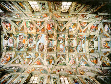
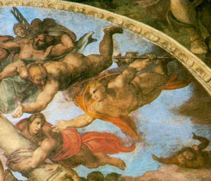
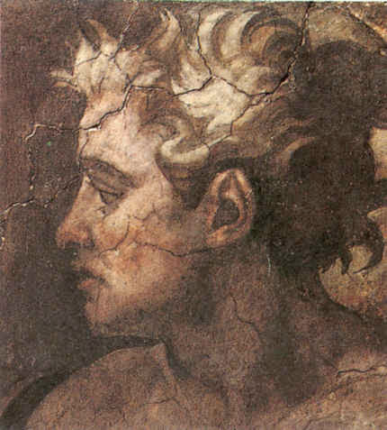
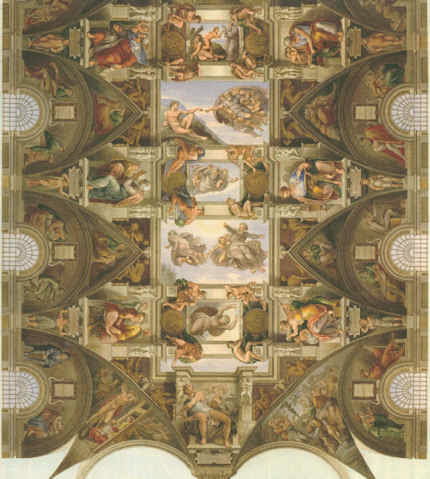
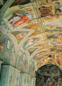
By helping to fix images in the mind, drawing is the very opposite of taking photographs, which practice can evade thought and appraisal. Rodin once reproached himself for having failed to appreciate that the most important part of a head lay not in any of its individual features but in the manner in which they were all fused into a whole. In perverse contrast, the decision to restore the entire cycle of Michelangelo’s Sistine Chapel frescoes was made not on any analysis of the whole and its internal relationships but on the basis of brief chemical tests made on a single lunette (the sections of wall above the arched windows in the Chapel) that happened to be within the reach of restorers who were working on minor frescoes. Misplaced faith in the validity of those “scientific” tests (of an insufficiently tested cleaning agent – it was later discovered to have etched the surfaces of stone, producing corrugations that scattered light, rather than to have cleaned them) permitted the Vatican’s curators and restorers to launch a cleaning programme on the entire fresco scheme with uniform and pre-determined applications of a single, ferocious stone-cleaning material (a soda, ammonia and detergent cocktail) even though, to those with eyes to see, the lunettes had played a subdued and subordinate role to the ceiling proper in Michelangelo’s grand scheme. (See Figs. 4 to 9.)
There is a another way
By all accounts, the finest, least controversial, most sensitive picture restorer working in Britain in the 20th century was the German émigré, Dr. Johannes Hell. His method was utterly respectful of the whole and overall effects of pictures. Dr Hell had trained first as a fine artist and then taken a doctorate on Rembrandt’s drawings. He deplored restorers’ practice of cutting “windows” through (assumed) dirt and varnish until bright colours and light tones are exposed (as at Fig. 7). He worked overall on the entire surface of a picture with the mildest solvents so that no optically and conceptually deranging relationships could emerge. His slow method was made slower by frequently “resting” a picture to give it time to air out, so that no corrosive solvents might accumulate within the paint layers. With Hell’s method in mind, it can be painful to consider the haste in which today’s restorers procede with their swabs, acetone, scalpels and “windows” when in pursuit of more authentic and original paint underneath a picture’s surface.
Connoisseurship in action
We take a degree of pride in the fact that the (proper) exercising of connoisseurship has been alive and flourishing within this organisation for over two decades. From its inception in 1992, Artwatch has deployed aesthetic discrimination and visual analysis in demonstrations of injuries made during “conservation treatments”. Specifically and in terms of methodology, we have done so by the correlation of photographic records of the pre and post-restoration states of works. (This website was custom-made to carry directly corresponding images side by side or in continuous vertical sequences so as to facilitate the most directly revealing visual comparisons.) In the Witt Library, we see photographic records that do not just assist the making of attributions but that also record the progressive debilitation of paintings over successive restorations. We notice that the difference between an authentic work and a close copy can be far smaller than that between an authentic work seen before and after a bad restoration. Dr Grosvenor really did not need to wait until he could join the scrum in the Sistine Chapel to appreciate that Michelangelo’s work has been ruined – he needed only to study the countless pre and post-restoration photographic records that we have carried on this site and had described earlier at length in the 1993 (James Beck and Michael Daley) book “Art Restoration ~ The Culture, the Business and the Scandal”.
The nature of evidence
Defenders of restorations often say that they cannot be judged on photographic evidence. In other regards, art dealers have great faith in the veracity of photographs – they will bid online on the strength of a single photograph. Bernard Berenson preferred to examine Michelangelo’s ceiling by looking at large photographs in books rather than by eye when craning his neck in the chapel. We should be clear on two points: there are no good grounds for disregarding photographic proofs of restoration injuries; the kind of evaluative test that Prof. Prettejohn’s old style connoisseur teacher devised for undergraduates might just as profitably be applied to analysing the differences between pre and post-restoration conditions. (See “An Old Style Connoisseur Test for Undergraduate Art Historians:” opposite.)
For all the social alertness of the New Art Historians, little comment has been made on the major organisational and “ideological” changes within the museum world over the last half century or so. In our view, the failure of scholars and curators to heed artists’ complaints stems from the fact that they have allowed themselves to become dependent on the technical expertise of the very many restorers who have become institutionally embedded throughout the museum world. It is now restorers not painters who pontificate on the making of paintings. It is they who insist that photographic records of their own “treatments” may not be held up and used in evidence against their actions.
Speaking generally, as an organisation, we are bemused by a profession that uses photographs for all manner of curatorial, scholarly and critical ends except for the indentification of restoration injuries. Scholars now routinely revise their own professional scholarly accounts in order to bring them into line with restorers’ latest, often radical, transformations. In the published accounts of restorers and curators alike, nothing ever counts as an injury – every change is presented with drum rolls as a “discovery”. Whole steamships, Vermeer necklaces and sheep can go missing without an art historical murmur or any ruffling of connoisseurs’ feathers. Even in terms of attributions, Artwatch has been pro-active on the connoisseurship front.
The misappliance of science and early calls for the the return of connoisseurship
While protesting since the early 1990s against the cult of “scientific” conservation and its disparagement of “subjective” aesthetic judgements, we have throughout commended a return to proper and rigorous applications of connoisseurship. In the October 1994 Art Review article “How to Make a Michelangelo”, we suggested that “The fact that our scholars and technical experts flit quite so promiscuously through time and space might suggest uncertainty of connoisseurship and ability to ‘read’ paintings”. Three years later, in connection with another National Gallery attribution, we wrote: “In recent years the art of connoisseurship has become entangled with the scientific analysis of paintings. Problems of attribution, once resolved by the educated ‘eyes’ of individuals, are increasingly seen as the property of interdisciplinary teams of curators, restorers and scientists who enjoy the technical, financial and professional support afforded by large museums. But how sound are the new proceedures – and how reliable are the published accounts given of them?” (Art Review, July/August 1997, “Is this really a Rubens?”).
In truth, it might fairly be said that the campaigning essence of Artwatch has been a constant assertion of the primary value of visual connoisseurship – see also, “Is Michelangelo’s Entombment in the National Gallery by Michelangelo?” by James Beck in the Gazette des Beaux Arts, CXXXVIII, 1996. We have devoted two entire ArtWatch UK journals to critiques, successively formulated and advanced by the painter/scholars Euphrosyne Doxiadis and Dr Kasia Pisarek, of the National Gallery’s Rubens “Samson and Delilah” attribution. The title of the last book (2006) by ArtWatch’s founder, the late Prof. James Beck, was “From Duccio to Raphael: Connoisseurship in Crisis”. It received few reviews – and no mention at the Mellon Centre conference.
A connoisseur of Ephemera
No mention was made, either, of a remarkable new work of scholarship published last year by the British Library and the Oak Knoll Press in the USA – Michael Twyman’s “A history of chromolithography ~ printed colour for all” – which we first encountered in the Institute of Conservation’s Chantry Library, Oxford. The ingenious lengths to which printers went in the pre-photographic era to replicate any image, and all things in the world, in reliable colour on multiple, co-ordinated slabs of stone is truly astonishing to behold (see Fig. 3). It is impossible to exaggerate either the illuminating usefulness of this major, beautifully produced book, or the sheer delightfulness of its immense pictorial riches. For those who might feel that a major tome on a history of a printing method might make for dull or excessively technical reading, we would urge, “think again”: here are to be found ephemera (printed bills, advertising cards and the likes) alongside early pioneering hand-drawn attempts faithfully to produce such elusive epically heroic fine art subjects as paintings by Turner and Michelangelo. The faithfulfulness of the attempts to replicate the values of the most hallowed artists summoned applications of great sensibility and powers of aesthetic discrimination. Here, the connoisseur, the scholar, the social historian, the technical historian and the lover of fine drawing and colouring might all feast together, in awe at the dedication, the talent, the artistic insight found in an unsung publishing trade.
We were delighted, for example, to find so full an account of the production of Robert Carrick’s 30 x 44 inches 1852 chromolithographic copy of Turner’s “ Rockets and Blue Lights…” made in no fewer than fourteen colour separations (see Fig. 9). That faithfully made, expensive and then state of the art record (“the only perfect reproduction of a picture ever issued” – as it was claimed to have been in 1900) testifies indisputably to the destruction of the principal boat in the painting on which we have commented a number of times, most recently on the obtuse (or brazen) presentation of this wrecked picture as a jewel in Turner’s crown – see “From Veronese to Turner, Celebrating Restoration-Wrecked Pictures”.
Even more importantly, there is also reproduced, in its entirety, a massive 1,027 x 470 mm (40 by 27 inches) faithful cartography-like, on-the-flat, full colour image of 1852-53, that simultaneously depicts the entire curving geometries of Michelangelo’s combined ceiling and upper walls decorations (see Figs. 4 to 8). We had never before seen this work in its entirety. It reproduces every single figure (there are over three hundred) and architectural motif Michelangelo depicted. Most preciously of all, this encyclopaedic record testifies to the hierarchy of values within which Michelangelo situated his images.
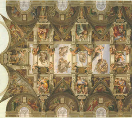
By capturing the tonal and chromatic logic of the whole, not the fragment, of Michelangelo’s murals, this hand-drawn lithograph corroborates precisely the written testimony of the painter Charles Heath Wilson who examined the ceiling on a special scaffold in the 19th century. All parts of this great pictorial ensemble were not equal in their treatment. The “outer” section (as here seen at Figs. 4 and 5) was the semi-circular sections of painting made around the windows on the upper walls (the lunettes). They were the darkest passages of painting. They contained in their illusionistic recesses (see Fig. 7) depictions of the ancestors of Christ. This dark band of human figures set Michelangelo’s work apart from the wall paintings below – as did his great escalation of scale in his figures. Far from being an arbitrary but precisely situated zone of dirt, as the Vatican authorities preposterously and against all scholarly records claimed, this dark zone served aesthetically and symbolically as a kind of visual plinth for the even more monumental figures and the Divine Events depicted above on the ceiling. The next row comprised an architectural screen against which Michelangelo’s stupendous giant prophets and sibyls were set and relieved in the brilliant cinematic, shadows-casting light we have previously described. Above them, set in the sky glimpsed through illusionistic apertures in ceiling’s architectural scheme are the biblical scenes and the depictions of God Himself – Whose restoration injuries we have also chronicled. Today, by the miracles of our technology, we can see and move around the entire, now restoration-ruined surfaces of the Sistine Chapel, but the Vatican will not release a TV film made in the 1960s of the pre-restored state. Recent technical advances have carried us into a world where it is possible to produce perfect facsimiles not only of images but of three-dimensional objects and, even architectural spaces and forms.
CODA
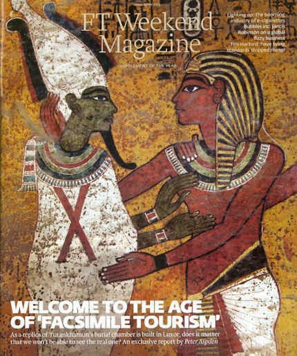
The small exhibition currently showing at the Soane Museum shows three-dimensional realisations of graphic inventions of Piranesi by the foundation Factum Arte. A full size replica made by the foundation of Tutankhamun’s tomb in Egypt was unveiled this week. It was reported by Peter Aspden in the Financial Times “Fit for a king: Tutankhamun’s replica burial chamber”(see Fig.). Such technical capacities for replication raise issues that we will explore in coming posts. This fertile new territory is one for which scholars and connoisseurs will be ill-prepared to assess for as long as they ignore the mistreatment of unique and historic art objects by technicians who transform them into synthetic, polished replications of their (assumed) original autograph states. This website launched in 2010 with a discussion on authenticity in art and music (“The New Relativisms and the Death of ‘Authenticity'”). It did so in response to a restorer’s imposition (in new but deceivingly aged and cracked paint) of a piece of computer-generated “virtual reality” onto Holbein’s The Ambassadors. Connoisseurship is more urgently needed today than ever.
Michael Daley
Comments may be left at: artwatch.uk@gmail.com


![]()