
THE ELEPHANT IN KLIMT’S ROOM
In a recent post (“Now Let’s Murder Klimt”, 5 June), we let photographs speak for themselves on the widespread debilitation of Klimt’s paintings at the hands of picture restorers. Here, we discuss the precision – and the consistency – with which the surviving photographic record of his oeuvre testifies to a progressive and irreversible deconstruction of the artist’s original statements.
“I can paint and I can draw…Whoever wants to know something about me – as an artist, which is the only thing remarkable – should look at my paintings and try to find out through them what I am and what I want.”
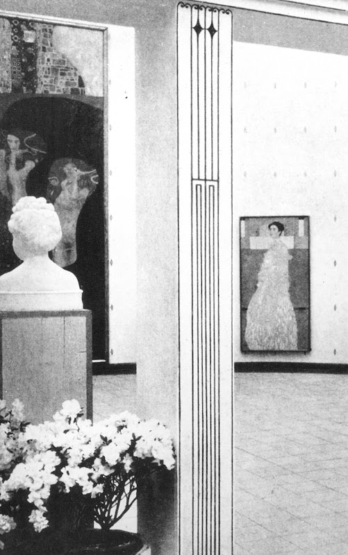
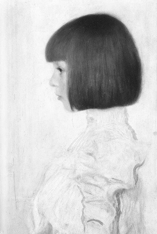
~ Gustav Klimt, as quoted by Serge Sabarsky in his introduction to the “Gustav Klimt” exhibition he had selected at the Isetan Museum of Art, Tokyo, 1981. (See Fig. 1 below.)
“After his death, his plea not to be made the subject of biographical inquiries was ignored: ‘I am convinced that I am not particularly interesting as a person…if anyone wants to find out about me – as an artist, the only capacity in which I am of any note – they should look carefully at my paintings and try to learn from them what I am and what I have tried to achieve.’ Increasing interest in his work over the years has made his many-sided personality a subject of unremitting interest. Artist or upright citizen, bohemian or middle-class bore, sex-obsessed tyrant or sympathetic son and brother? Fantasy was given free reign….”
~ Susanna Partsch Gustav Klimt Painter of Women, Munich, Berlin, London New York, 2008
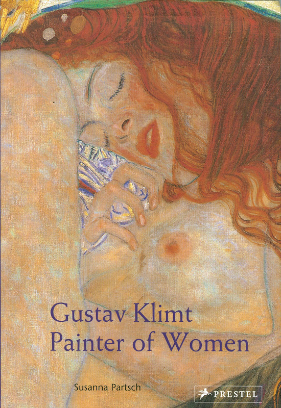
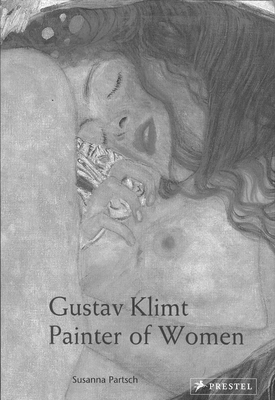
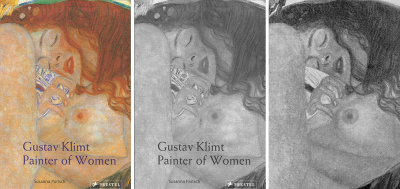
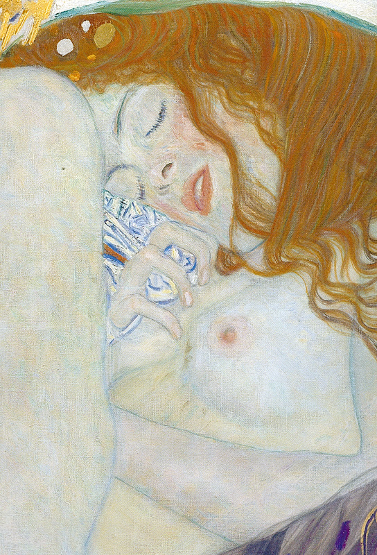
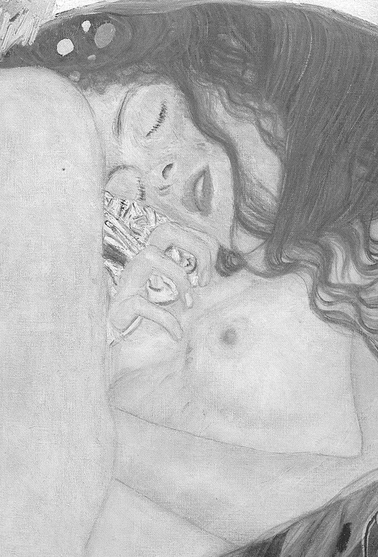
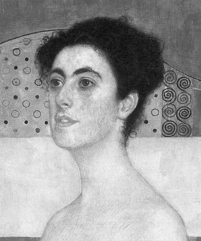
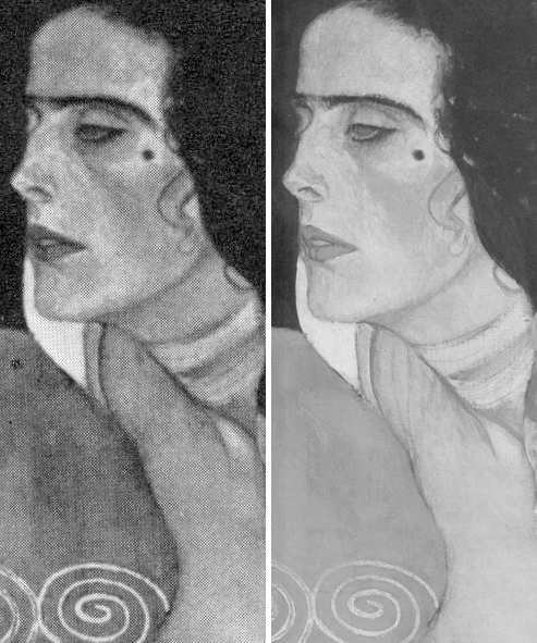
The illustration shown above in colour and in greyscale (Figs. 4 and 5) appears on p. 190 of the 2007 book Gustav Klimt and faces a sub-part by Susanna Partsch of a section headed “On Flowers in Bloom and Radiant Women”. Given that this photograph was likely taken in preparation for the book (see below), the question arises: What accounts for the differences between this image and that used on the cover of Susanna Partsch’s own book the following year? Were they both derived from the same photograph but with the image on the book cover having been digitally manipulated by a designer to heighten the saturation of colours so as to increase graphic force and “attractiveness”? Or, is the image in the slightly earlier book made from a somewhat later photograph? If, when comparing individual photographic reproductions, such problems arise from insufficient knowledge of their origins and handling, what can be seen as clear as day when surveying the Klimt literature is that the earliest photographs and the most recent depict works in profoundly different states. If presently we cannot for logistical reasons hunt down the pedigree, the history and the reproductive variations of every Klimt image-in-public-circulation, we can with confidence flag-up some of the glaring discrepancies of testimony that are encountered in the photo-records of the artist’s individual works. These discrepancies urgently need to be addressed.
WHY PHOTOGRAPHS ALONE MUST NOW SPEAK FOR KLIMT, NOT HIS PAINTINGS – NOR HIS SCHOLARS
Unfortunately, it is no longer possible to let Klimt’s paintings speak for themselves. In barely more than a century, his works, like those of many other modern artists, have been traduced by restorers (see Taking Renoir, Sterling and Francine Clark to the Cleaners). The Klimt literature is rich in photographs showing his paintings when new and unspoiled but scholars seem persuaded that today’s photographs offer the best record of his work even though early photographs make it easy to identify subsequent restoration injuries – and even though nothing could be simpler or more to the point for art critical purposes than comparing old and recent photographs [Endnote 1]. This apparent aversion to the historic visual record is perplexing in two respects.
First, in all contexts other than art restoration there is grateful acceptance of photographic testimony by scholars. Attributions are made on the evidence of photographs. Art dealer/sleuths hunting attribution upgrades buy works on the strength of online photographs [2]. Paradoxically, as today’s scholars effectively turn a collective blind eye to restoration injuries, restorers are seeking permission to declare their errors on a “without-liability” basis [3].
Second, by not noticing – or sometimes seemingly flaunting – patently injured works, Klimt scholars betray the artist and sell the public short. The detail carried as a book cover illustration at Figs. 1 and 2 is of a horrendously mutilated painting that no longer functions as Klimt had intended. In a world where art mattered for what it is, not for what might be said about it and its backstory, scrubbing paintings to the point where under-drawing emerges would properly count as a crime against art, if not in law, and the restorers, owners, curators, sponsors and trustees responsible for dimishing and adulterating its content would be censured, not celebrated.
WHAT COUNTS AS INJURY?
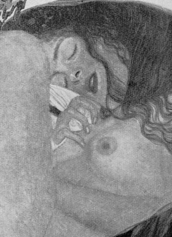
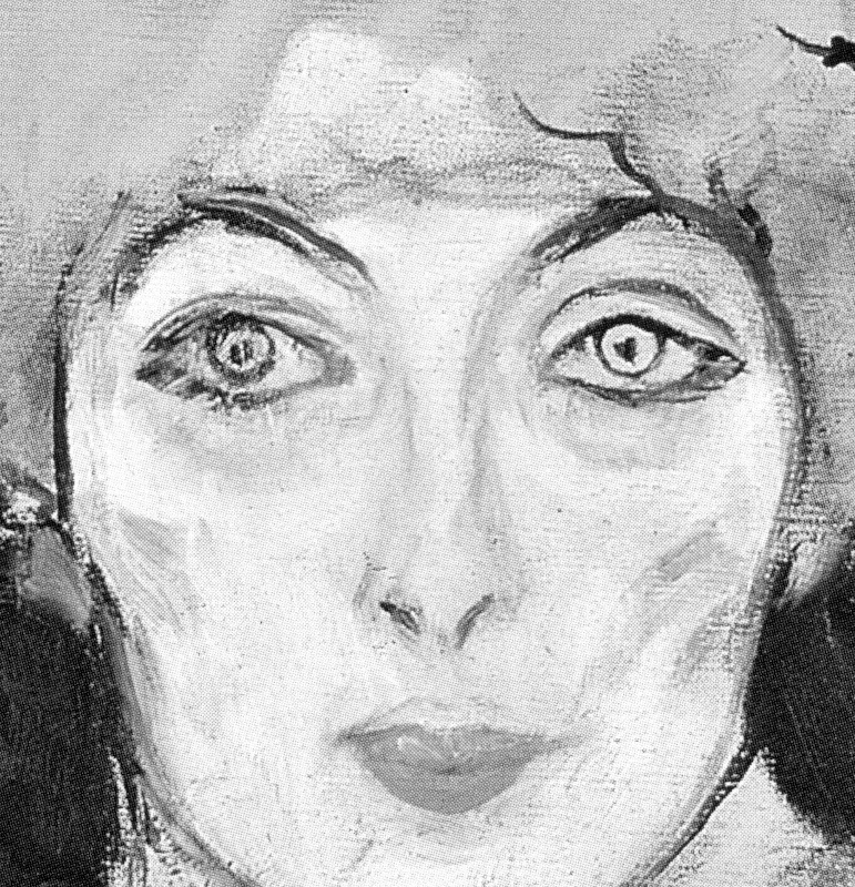
Consider Danae’s right eye. In 1956 (as at Fig. 3) if one had drawn a line of cross-section through the brow and the eye down to the cheek it would have passed through distinct tonal values which varied to a chiefly anatomical, partly expressive purpose. The eyebrow was depicted by a mid-tone (not by the present mess of preparatory lines). Immediately below the eyebrow, the brow was given a light tone. Then came the tones of the upper eyelid, passing from dark to light before reaching the line of eyelashes. Below the eyelashes, the form of the lower lid, where the bulge of the eye re-entered its socket was dark. This dark was separated from the tones of the cheek by a strip of light toned flesh. By its relationship to a light source, this tonal sequence explained the forms of the brow, eye, cheek. Today the upper and lower lids are undifferentiated, with both reduced to the same flattening tone, whereas the eyelashes – which no longer attach to discernable edges of eyelids – have been hardened into a series of sharp parallel strokes to the point where the eyelids now seem stitched together. Where formerly the sleeping woman had drawn a white sheet partially across her face with a claw-like, scrunching hand, that piece of stretched sheet is no longer designed drapery but an incoherent jumble of lines and colours (Figs. 1 and 2). The accenting highlights on the fingernails have been dulled and the light on nail of the little finger has disappeared – as has the much broader tonal distinction between Danae’s right breast and her chest. The narrow dark tones articulating the interiors of the lips have disappeared…
…A PAINTER’S VIEW OF RESTORERS:
“Sir,-‘Il faut laisser mourir un tableau de sa belle mort.’ The English equivalent is only ‘Let a picture die a natural death.’ There remains always the recommendation, ‘Thou shalt do no murder.’
A curator should wipe, but he must not flay. Galleries should be dry, but not too dry. They should be warm, but not hot. On Friday, Dec. 18, the rain was being captured in pails as it dripped from the skylights of the National Gallery. Perhaps money had better be reserved for the integrity of ‘the fabric’.
The attackers of the painters’ position as meddlers with the job of the restorers are in the right. There should not be such meddlers, because there should be no restorers. Voila le mot lâche.”
~ Walter Richard Sickert, Letter, Daily Telegraph, 31 December 1936
SOME FURTHER CASES OF KLIMT ABUSE…
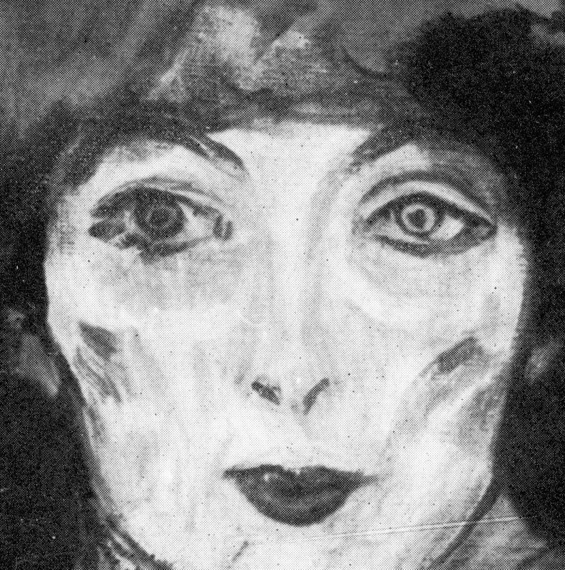
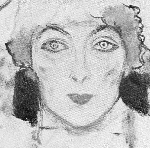
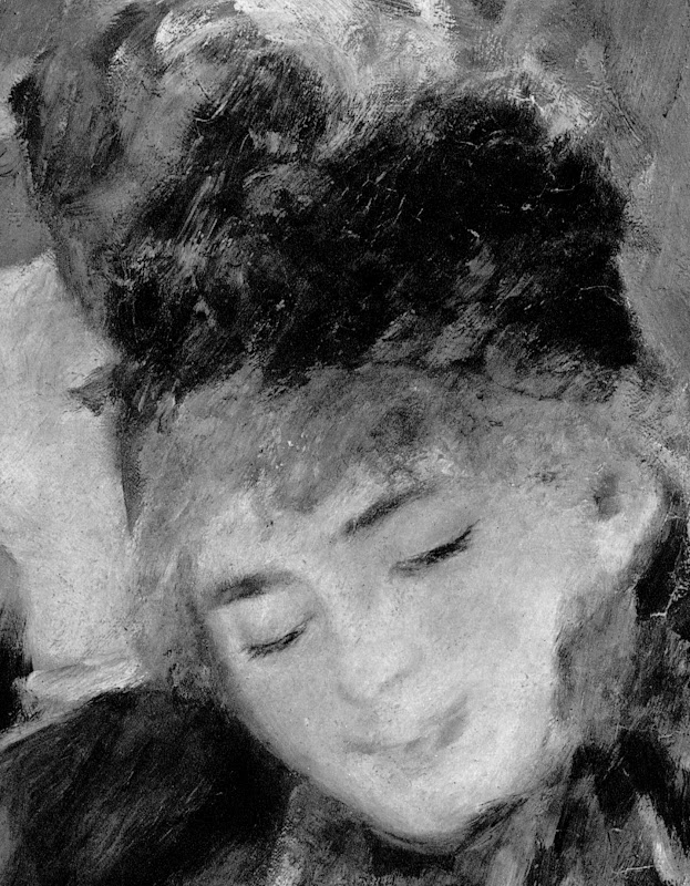
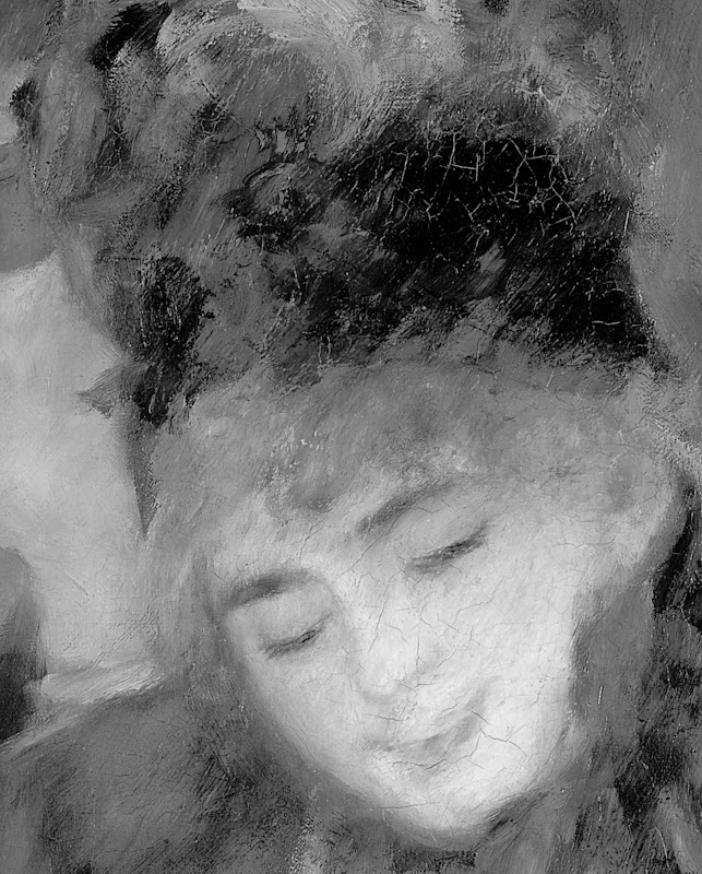
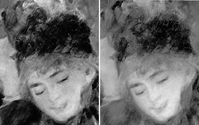
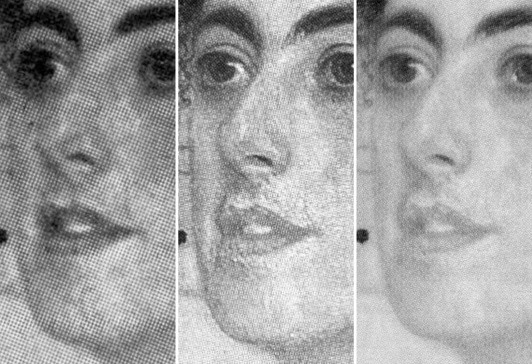
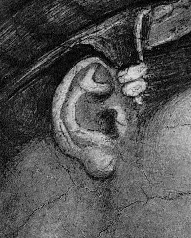
To help identify Klimt’s original purposes in today’s hyper-active conservation world it is essential to study the photographic record of his works, as with, for example, the unfinished 1917-18 Portrait Head of a Lady below.
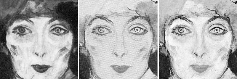
READING PHOTOGRAPHIC IMAGES
Do the startling differences seen above not speak of injury to the painting? If such (apparent) changes in paintings were illusory products of the vagaries of photo-reproductions, reproductions would come and go in their narratives, leaning a bit this way one minute; a bit the other way the next. Some changes certainly are of that order (and particularly so in terms of colour fluctuations) but others are simply too great to be reproductive variations. Moreover, the wider photo-record contains recurrent patterns of change and these are seen to run across the histories of individual works and entire oeuvres alike. Patterns are always significant and eloquent. In the particular recurring pictorial pattern of concern here, paintings become lighter, brighter, thinner and flatter with successive restorations. (See Figs. 9 and 10, and Figs. 17 and 18 for non-Klimt, single-restoration examples.) A rigorous examination of patterns provides a helpfully focussing diagnostic method. If paint losses are not occurring, why should the net effect of picture cleanings be to compress relationships and minimise values rather than to widen and enrich them?
With this particular unfinished Klimt painting, the most dramatic change occurred prior to 1981 and yet, after over a third of a century and very many more photographic reproductions, no subsequent image has resembled its pre-1981 predecessor – those recorded differences have proved permanent and irreversible. Notwithstanding the promise of one restorer in the US to “make your paintings look as good as new – or better”, no restoration can recover what has been lost. In aggregate, art restoration is a one-way street that runs away from authenticity, original conditions, and artists’ express intentions.
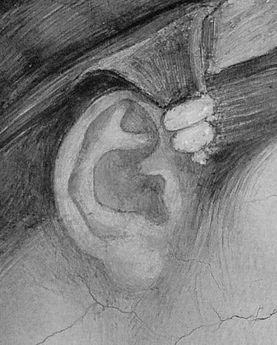
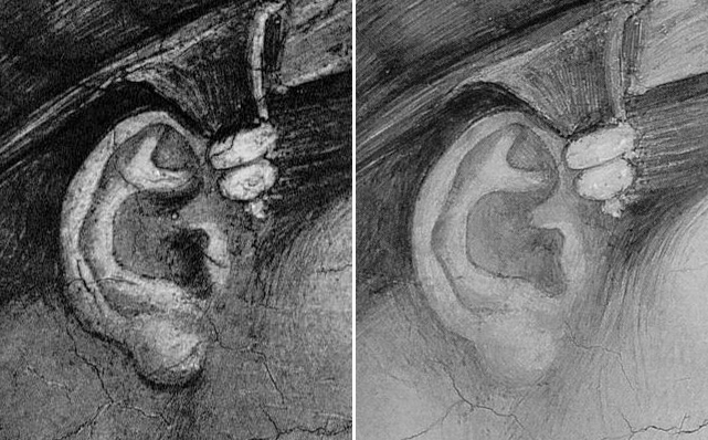
Shortly before the abruptly changed state of the painting seen at Figs. 7 and 8 was published, the picture had been sent from Linz to Tokyo. Loaned works are often “restored”, “put in order” and made to “look their best”. “Putting in order” often includes “lining” or gluing an additional new and reinforcing canvas to the back of the painting. The bond between the two canvases is usually achieved with glues or waxes and hot irons in a notoriously hazardous procedure that was condemned by restorers themselves in the 1970s. Supposedly ameliorative or “preventive” procedures often produce disastrous material and aesthetic changes with first-time restorations. Scholars rarely nowadays discuss such consequences and seem not to notice, even, when paint is removed from the most vulnerable and exposed parts of the picture surface leaving rows of white dots along lines of canvas weave. Such can clearly be seen to run across mid-tone and dark passages alike at Fig. 8. Restorers euphemise such losses as “abrasions” when what most “abrades” paint is solvent-loaded swabs.
THE DEVIL IS IN THE DETAILS AS WELL AS IN THE PATTERNS
The inner corner of the eye on the left of Klimt’s painting (Fig. 6) was formerly marked by two short vertical dark accents. As seen in Figs. 7 and 8, by 1981 those marks had been reduced to a single patch of lighter tone. No photograph or reproductive variation could produce such an alteration. The lips too became lighter and less clearly drawn and modelled. Presumably, good photographic records survive of all treatments to this late unfinished but important work in which Klimt’s working transition from drawing to paint on canvas can be studied? With the losses of a comparable magnitude seen on the Renoir below (Figs. 9 and 10), there can be no question about the veracity of the photographic record.
PROPER RECORD KEEPING, FULL DISCLOSURE
The two photographs above were made at and by the National Gallery immediately before and immediately after cleaning. The evidence of injury is manifest and our claims on it have never been contested. But again, so far as we know, no Renoir scholar has ever addressed these losses. With this painting we know when, by whom and with what materials the damages were made: the National Gallery has given us full access to its picture treatment records and those disclose that prior to this restoration the only cracks present in the painting occurred along the line of a horizontal central stretcher bar against which the canvas vibrated during its regular travels to and from Dublin. The extensive cracking that emerged on the face was entirely attributable to the conservation “treatment”.
FRIGHTENING SCHOLARS OFF
If scholars are reluctant to discuss restoration damage for fear of upsetting owners (public or private), it is less understandable that they should defer to the professional claims of restorers. When picture restorers insist that the testimony of photographs is not to be trusted they betray professional hypocrisy. Restorers make great use of photography for their own promotional purposes – as when (routinely) claiming some restoration “discovery” or “recovery”. They also use old photographs of works to guide their own repainting of losses incurred during a cleaning. On these occasions no health warning against an inherent unreliability of photography is ever issued.
Restorers have now enjoyed criticism-free positions for so long in museums that they lay unchallenged claims to special technical expertises and powers of divination on the authority of which they feel entitled to determine how works of art should “be presented”. They freely admit that they restore works differently from one another and, yet, contend that all of their various improvisations on art are co-equally legitimate, providing only that they are “safely” executed. They do not explain how various impositions of “interpretive alteration”, might all somehow be artistically and historically tenable. It is time curators called their bluff.
COMPARING OLD PHOTOGRAPHS WITH RECENT, MORE RECENT, AND MORE RECENT STILL…
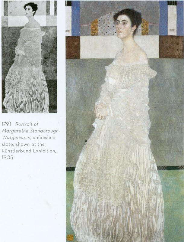
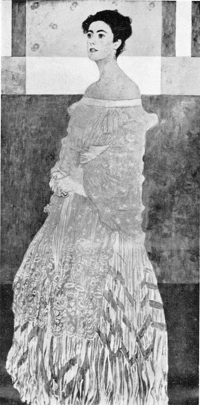
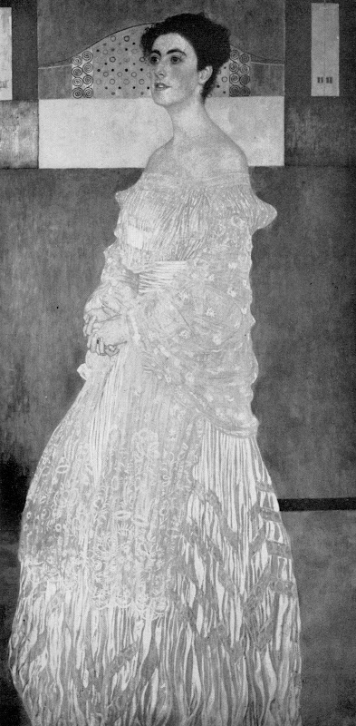
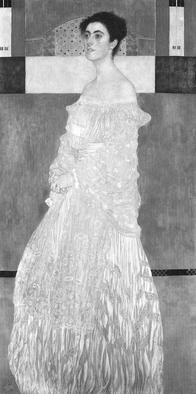
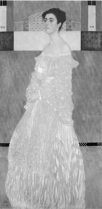
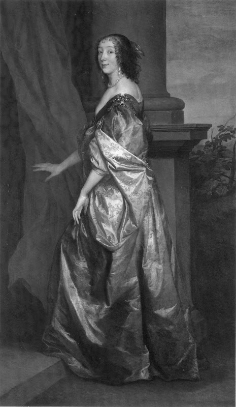
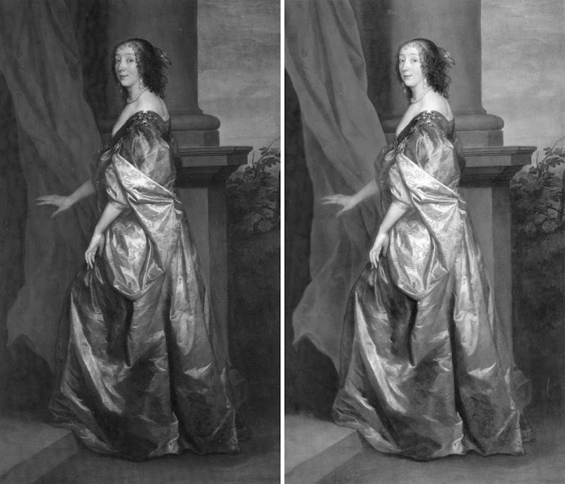
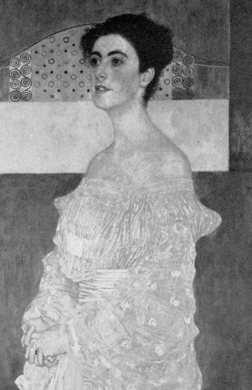
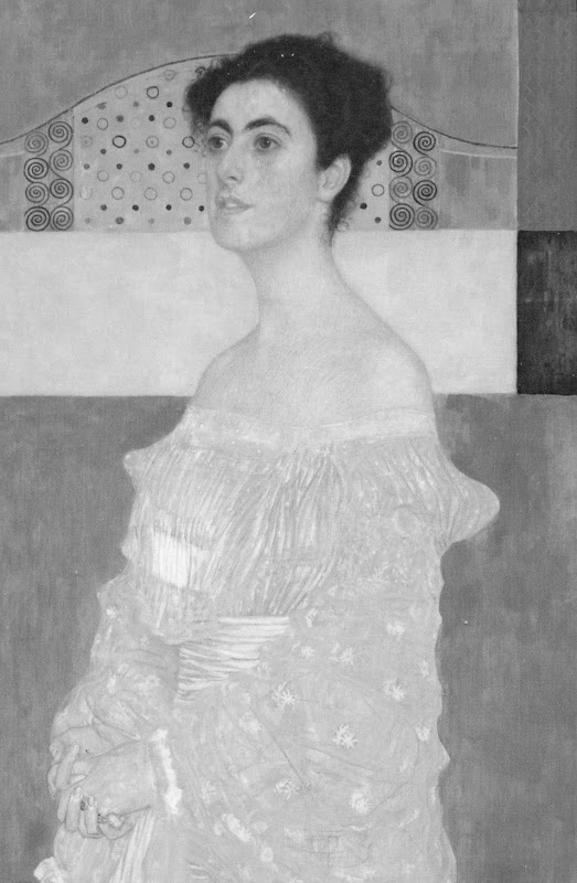
Occasionally scholars do discuss old photographs and do accept the veracity of their testimony. In the above-mentioned 2007 book Gustav Klimt, the catalogue of works includes an entry on Klimt’s Portrait of Margaret Stonborough-Wittgenstein. It carries a 1905 photograph of the painting next to a recent photograph (see Figs. 11 and 12). The author notes that this early photograph shows that “Klimt later reworked the background”. Acknowledgment is given that “Klimt made no alterations to the figure itself”. This being the case, why then is there no discussion of the subsequent restoration changes to the figure? Above all, why is there is no word on the subsequent incremental washing away of the figure’s (recorded) original values that is shown below throughout the sequences of photographs at Figs. 13 to 16 and Figs. 23 to 25?
As with Renoir, there is more interest in the feminism and the sociology of the time than in today’s state of the work of art itself: “This lively, intelligent lady who was described by her sister as being amazingly active, with an exceptional mind and rejecting any form of convention, could not recognize herself in Klimt’s portrait. Here, she is shown removed from reality, captured in ornamentation, frozen.” Again, as in Renoir studies, the scholar is attentive to frocks, noting that Klimt “depicted the young lady with great virtuosity in a velvet moiré dress and silk scarf. The pleats of her dress are shown in sophisticated nuances of grey which give an impression of the structure of the fabric.” Then follows a plaint that “The billowing lengths of material clothing the figure make it impossible to recognize any corporeality beneath them”, seemingly not noticing that a century earlier there had been a markedly greater sense of interior corporeality.
LOOK AT THE RECORD
With the colour reproduction at Fig. 11 converted to the greyscale version at Fig. 12, the extent of the losses in the painting of the dress as seen in 1905 and in c. 2007 is manifest: the darks in 1905 were darker and the lights were lighter. Within this greater tonal range Klimt had disposed his forces to masterly and vivacious effect. The picture’s strongest contrasts at the head were better balanced by the escalation of contrasts towards the bottom of the dress, the treatment of which, truly, was a painterly tour de force.
GOING, GOING, GOING, GOING…
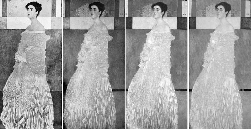
Below: the sequence of same-size, all greyscale, photographs charts the progressive debilitation of values and diminution of pictorial vivacity that has occurred in this painting within a century. One can only shudder at the prospect of another hundred years of conservation treatments in which the corporeal is converted to the ethereal. We can see for example how much the progressive lightening of the background and floor has robbed the figure of its former “relieving” support. Has no one asked why the strategically dynamic pool of darkness in the bottom left hand corner has been removed when it was present in the photographs of 1905, 1911 and 1956?
BEARING, GRACE, DIGNITY – AND THEIR UNDOING
The glimpse below of Klimt’s portrait on the walls of the International Art Exhibition in Rome, 1911 (Fig. 20), evokes the stately dignified presence and bearing of a Van Dyck – in which great artist it can also be seen that a single cleaning can have remorseless brightening, flattening, space-suppressing consequences. (For the cleaning consequences for Lady Lucy’s face and hair, see Ghosts in the Lecture Room: Connoisseurship and the Making, Appraising, Replicating and Undoing of Art’s Images.)

ANYTHING BUT ART AND ITS CONDITION…
We mention scholars’ neglect of condition in favour current obsessions with the sociological and with feminist correctitude, but it sometimes seems there is imperviousness, even, to the self-validating clout of sheer artistry. One after another offers “grounds” for the dissatisfaction felt by Margaret Stonborough-Wittgenstein and her family with the portrait. Thus, Susanna Partsch, in her Klimt ~ Life and Work of 1989, notes: “Margarethe Stonborough-Wittgenstein is known to have possessed a good measure of self confidence, but Klimt saw her differently, He applied ‘his’ view of woman to her, and had to accept that the result did not please her.” It may not have pleased her, but affront today at a male artist’s (perceived) imposition of ‘his’ view of woman onto the subject is a politicised indulgence. How the subject might have preferred to see herself may be a matter of some interest, but more so for a novelist or a social historian, perhaps, than for a historian of art who has at hand the artist’s material artefacts that were intended to carry all necessary information and thereby avoid need for speculation.
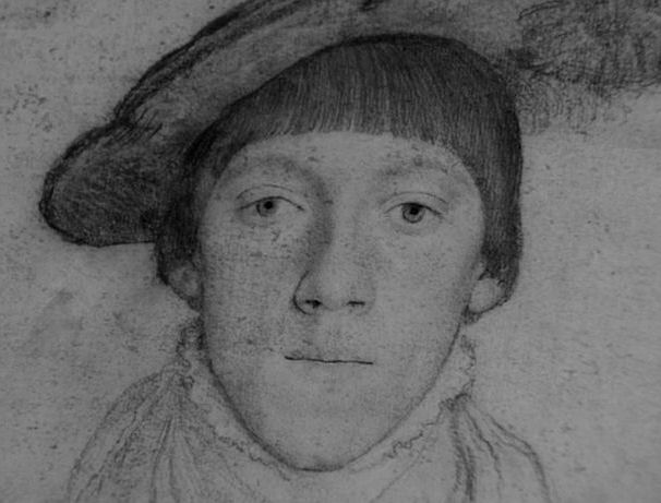
Besides which, it is quite possible that the source of dissatisfaction was something altogether smaller (and less mentionable). Perhaps the subject and her family did not welcome a too-heavy evocation of down in the shading over the upper lip as it turned from the viewer (see Figs. 27, 28 and 29)? A hint of such had been present in the more frontal 1899 portrait of Serena Lederer. The reported feelings of the subject herself aside, the drawing in this portrait was brilliant. Even at this historical distance – and notwithstanding restoration vicissitudes – this portrait stands remarkably fresh, sympathetic and respectful. We see and sense intelligence, brightness and alertness to the world. She is depicted not lustfully but with grace, self possession and dignity. If the opulent, massively High Fashion Statement skirt on her dress is put aside and consideration given to the upper half of the figure, its sculptural presence is quite astonishingly accomplished and attractive (see Figs. 23, 24 and 25) – albeit in bas relief, so to speak, so as to relate more comfortably to the emphatically flattened and decorated background. In its drawing, this upper figure recalls – and could live in the company of – Holbein’s portrait of the young Anne Cresacre (Fig. 22) and even the more luxuriantly plastic (now) Raphael portrait of a young woman in profile at Fig. 21. Of how many 20th century portraits might such parity be entertained?
In truth, the sense of the body within the costume is subtly but superbly evoked. The massive tulip-shaped skirt certainly conceals the legs – but then who bought and wore this dress? Was the subject making no statement of her own? Did she not dress heself? Partsch observes that the “bearing and facial expression make her seem cooly aloof with an air of expectancy, but also far removed from reality.” But removed from which or whose reality? Should Klimt have set her in an oppulent domestic interior? Did this very rich, culturally privileged and intellectually aspirational young person never betray a degree of aloofness? Was she quite without social expectations and sense of entitlement? On what grounds does one scholar after another complain of the in-corporeality of the body underneath the costume? Partsch once more: “Again the human figure takes up almost the entire picture. The principles which Klimt had developed since the painting of Sonja Knips have been sustained. Again the figure is veiled in a long dress, revealing only head, shoulders and hands. This time it is a dress of white moiré velvet that negates the corporeality of the human figure, and again the dress reaches right down to the ground and is cut off by the frame in the vicinity of the feet.” And how is it that so many avid connoisseurs of the corporeal should miss the fact that, in Klimt, this very feature is diminished every time his works go into the conservators’ wash?
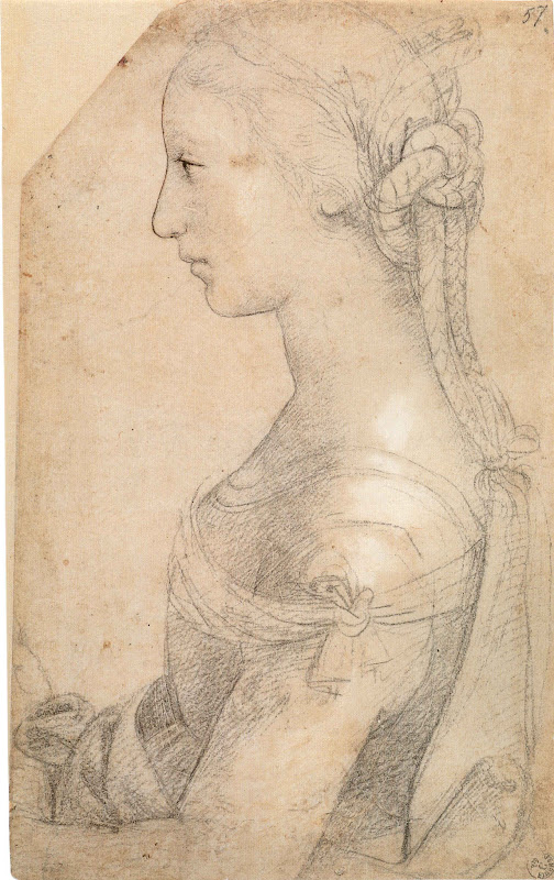
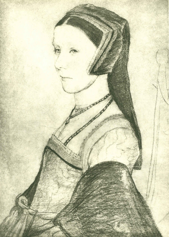
Above, Fig. 22, Holbein’s 1527 drawing of Anne Cresacre (reversed).
BELOW: IT’S A WASHOUT – IS IT NOT?


WHAT MORE CAN BE SAID?
The sequence of three states of the head shown above and below shows why commenting appropriately on the qualities of the portrait made by Klimt in 1905 can no longer be done solely on the basis of the painting as it is encountered today. Klimt’s last intended word has departed involuntarily. What is left is an impersonation of the now lost original and superior state. We should not appraise or speak of the present work without reference to the testimony of its photographic history. For such reasons it is a matter of urgency that the full photographic record of Klimt’s work be assembled and made available to all scholars and art lovers. If we were talk about the portrait today on the selection of three reproductions above, to which image should greatest credence be given: the most recent, the earliest, or the one in the middle? It is not really a difficult question to answer – is it? Graphically-speaking, the three images resemble successive states of an etching – but here with the states running in reverse with less material to hand, not more, at each stage.
If we analyse the changes to the original in detail, we can see for example that the mouth/nose relationship has been mangled by restorers. Assuming that no injury had occurred before the first recorded state (when the painting was no more than fifty years old), we can see among many losses and alterations that the design of the nostril aperture was altered from its original sharply turned upper contour to a blander formulation. Such differences are immensely significant in terms of expression. The greatest student of the pinched, translucent, breathing nostril in women was Rubens. Klimt was very good at and attentive to nostrils. He was also good at mouths. Both are products of astonishingly complex anatomical forces (see Fig. 34 for an entirely unrestored graphic attempt by the author to grapple with just such plastic complexities). Here we see that by 2000/01 the mouth had met with an accident. Both the upper and the lower lip had been garbled in restoration. The loss of definition in the relationship between the lower lip and its surrounding surfaces has resulted in a most unfortunate appearance of an emerging ‘Hapsburg Lip’, the product not of some physical deformity but of an anatomically illiterate restorer who reconstituted beautifully nuanced tonal modelling as a crass, plastically misread linear simplification. More recently, attempt has been to mitigate the previous errors but the general washing-away process continued. Such rapid undoing and redoing of botched restorations is a growing phenomenon, even at the highest levels of the “museum community” (see Fig. 40).


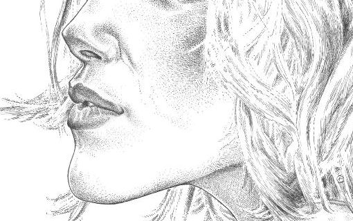
Above, Fig. 34: a detail of a caricature drawn by the author for the Independent on Sunday.
AN UPDATE: THE FINE ART OF SELLING KLIMT
On June 5th we examined the photographic record of Klimt’s 1902 painting of a young Jewish woman (Gertrud Loew) that had been restored to the heirs of her family (Now Let’s Murder Klimt). Despite its manifestly degraded condition (see below), the portrait sold at Sotheby’s on June 23rd for £24.8m (on a £12-£18m estimate). The July/August Art Newspaper attributes the high price not to the picture’s condition – which it does not discuss – but to the history and poignancy of its backstory which Sotheby’s held to have “added to its value” (“The Lure Of A Backstory”, The Art Newspaper, Section 2, p.12). Restoring works to families whose forbears were robbed and murdered is an indisputable good. Questions of ownership, however, like questions of attribution, are less urgent than questions of condition. Whatever their gravity, ownership or attribution disputes might always be resolved at some future point. With restorations, injuries are irreversible and cumulatively compounding. Nothing might now return Gertrud Loew to the beautifully nuanced condition in which she was bequeathed to posterity by Klimt.


Note, among many alterations, how the definition of the eyebrows and the shading around the eyes have been debilitated. Note, too, how changes to the line of parting in the lips have altered the subject’s expression; how an eyebrow has been cocked; how the eyes are now open wider. Note how the loss of shading at the sides of the nose makes the present nose larger than its original self. Note how credibly and well this portrait once lived in the company of Holbein’s full-on portrait of the young Henry Howard and ask if this picture might not have had the mother-of-all ‘cosmeticising’ restorations? Perhaps it’s backstory is richer than Sotheby’s and the Art Newspaper have appreciated?
Michael Daley, 25 July 2015
ENDNOTES:
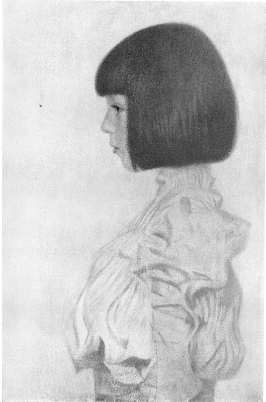
1) In the massive, ambitious and welcome 2007 book Gustav Klimt, the editor writes: “It was a major concern of ours to see, as far as possible, all Klimt’s paintings in the original, and to take new photographs of all them.” With so many recent photographs of Klimt’s works the authors’ were perfectly placed to make comparative studies with the earliest photographs. As seen above, one such a photographic comparison was made with a portrait to show the differences before and after its completion. So why not show some, if not all, of the earliest visual records against their most recent counterparts? In the catalogue, another photo-comparison is made with with Klimt’s portrait of his niece Helene – but this is with a portrait by Fernand Khnopff, and not with the picture’s own earlier recorded self. This was a terrible lost opportunity: as shown below, there are such great differences between the Helenes seen in 1956 and in 2007 as to suggest the existence of two versions of the portrait. There are dramatic differences of design in the dress. In 1956 the lightest part of the hair was at the crown and the back of the head. The hair got progressively darker as it ran down and as it approached the girl’s face, which it emphatically framed. That logic has been reversed. The darkest part is now at the crown and the hair lightens as it approaches the face.
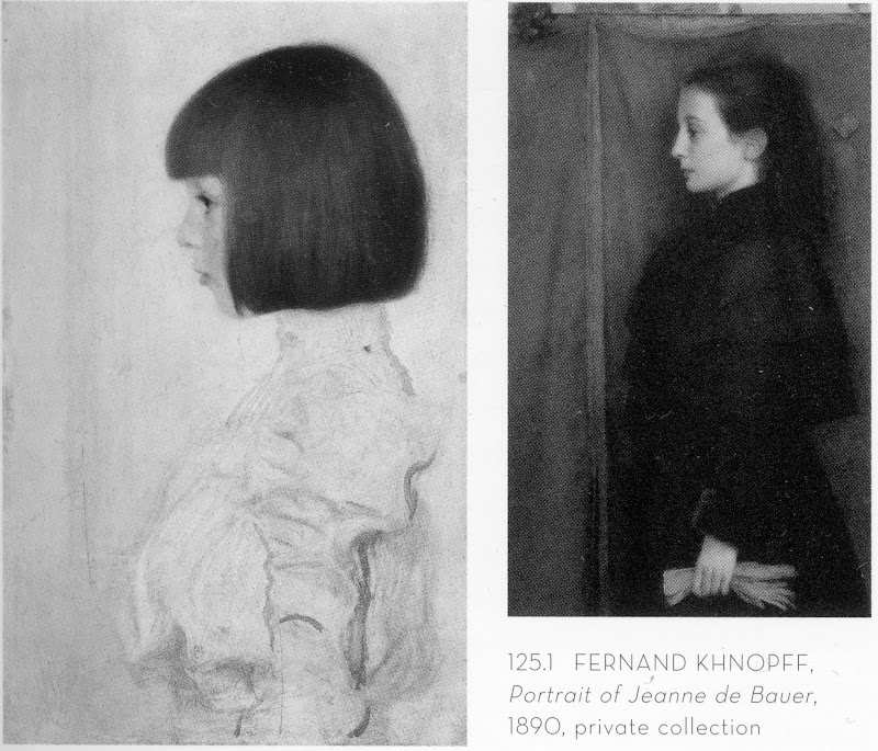
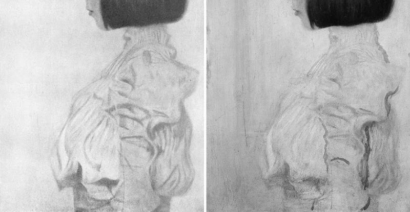
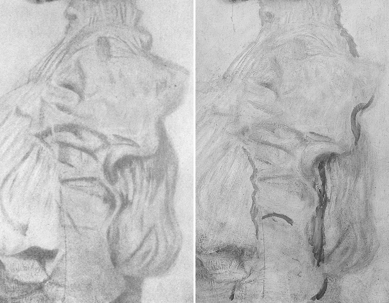
Does the treatment of the drapery now present (above, right) on this privately owned work on loan to the Kunstmuseum, Berne, seem worthy or typical of Klimt in 1898?
2) In a recent BBC “Fake or Fortune” television programme the resident art sleuths faced the challenge of proving that three small Lowry paintings (all of which which carried labels and numbers on the back from the reputable gallery that had sold them) were authentic Lowrys even though the present owner had no paperwork showing right of ownership. What proved to be the programme’s MacGuffin was the presence in the paintings (revealed by technical analysis) of the wrong kind of white paint – zinc not lead. To surmount this hurdle the sleuths examined old photographs of Lowry at work in his studio. A bit of digital enhancement of one showed a whole boxful of the ‘wrong white’ in use. The question still to be resolved still was whether these labelled, numbered paintings really were Lowry paintings. Another old photograph of Lowry’s studio was found to show the three presently ‘homeless’ paintings. When a small image of one of the paintings was digitally enhanced and superimposed over a photograph of the painting today, it proved a perfect match, “brush stroke by brush stroke”. This accumulation of photo-evidence was taken to be so clinching that it trumped both the potentially lethal absence of any paperwork and the scientifically established presence of a ‘wrong’ pigment. When the Big Four Lowry experts were duly assembled to examine the three paintings (away from the cameras) they emerged after a couple of hours to give the trio of paintings the thumbs up. And so, it was photo-evidence that carried the day, not science, not documents. Things might, however, have been very different had the Lowrys been restored to the point where their brushmarks no longer coincided with those recorded in the artist’s studio.
3) At the 2011 ICOM conference in Lisbon, two conservators complained in a joint paper (“To Err is Human: Understanding and Sharing Mistakes in Conservation Practice”) that because a belief exists that it is unacceptable for conservators to damage objects, members of the conservation fraternity are hampered in their desire to make a “collective acknowledgement and sharing of mistakes”. The experience of other fields, such as medicine and aviation, it was explained, demonstates the value of admitting and sharing errors so as to “reduce the risks of their occurrence”. This proposal/demand will be discussed in the Autumn issue of the ArtWatch UK Journal by Michel Favre-Felix, the president of ARIPA (association for the respect of the integrity of artistic heritage).
Bubbles burst.

A few years ago a director at the Victoria and Albert Museum, was chided for producing blockbusters that bust no blocks. Today, aside from its catering and retailing outlets, that museum – which once advertised itself as “An ace caff, with quite a nice museum attached” – has a department exclusively dedicated to the production of special exhibitions. It generates eight exhibitions a year with a further fifteen travelling around the world at any one time (see “The world is her oyster”, in the Autumn/Winter 2013, V&A Magazine). As more and more of Art’s Flying Dutchmen encircle the globe, an awful lot of holes are appearing in the collections of great museums – as at the Louvre, as Didier Rykner has eloquently demonstrated (“The Louvre Invents the Gruyère Museum” ). This development is perverse as well as regrettable: a chief defence that museums make when seeking funding for expensive acquisitions is that they are needed to fill crucial gaps in a collection.
At the British Museum the number of loans (and therefore holes) doubled between 1985 and 2000, in which year 214 objects or groups of objects were loaned. That was for starters. In 2008, under its present globe-trotting director, Neil Macgregor, the museum got 2,500 objects “on the road” in Britain alone. In a submission this year to the Scottish Parliament, Mr MacGregor boasted that between 2003 and 2013 the museum had loaned over “over 30,000 (many very fragile)” objects, with only eight injuries. In 2006 the BM packed 160,000 visitors in three months into a (physically) small exhibition of Michelangelo’s drawings, at £10 a head (plus takings from the catering and retailing outlets). Mr MacGregor ruefully claimed that three times as many tickets could have been sold had space permitted. The following year he announced plans for a £100m expansion of the British Museum that was reportedly triggered because it had had to turn down a unique chance “to show off” the largest collection of Tutankhamun treasures ever seen in the west (Evening Standard, 6 July 2007), works which went instead to the former Millennium Dome, now re-branded as “02”.
It would seem that nothing in museums is now safe from this international exhibitions jamboree – no work plays too important a role within a collection, or is too fragile, or too unwieldy, to prevent curators from taking a gamble with its welfare (in hope of reciprocal loans and a curatorial buzz). The Metropolitan Museum in New York is one of the most voracious recipient/organisers of exhibitions. It needs to be. Its special exhibitions, which are free, are the biggest justification for the museum’s whopping “recommended” $25 entrance charge (- the legality of which is under challenge). As we have seen, the present director of the Metropolitan, Thomas Campbell, once boasted that only his museum could have shaken-down (“Item: The Met’s Strong-arming of Reluctant Lenders”) other great art institutions to get them to part with the fabulous Renaissance tapestries that were sent to a special show in New York.
The Metropolitan Museum will likely be the first international stop (after a six months stay-over at the British Museum) for a long-planned show of plum works from the Burrell Collection in Glasgow that will take place should the Scottish Parliament oblige the Glasgow City Council by over-turning the prohibitions in Sir William Burrell’s bequest on all foreign loans and vulnerable works within Britain.
Next October in New York, the Museum of Modern Art will host a show of some of the most fragile and difficult-to-transport works of modernism. As Martin Bailey reports in the current Art Newspaper, (“Journey at Snail’s pace”) Henri Matisse’s monumental 1953 paper collage, The Snail, is to leave the Tate for the first time since the gallery bought it more than 50 years ago. It will be a star exhibit in “Henri Matisse: the Cut-Outs”, at Tate Modern next April, that will include its sister works, Memory of Oceania, 1953, and Large Composition with Masks, before travelling to MOMA in New York. Although the itinerary is set, what is not yet clear, Bailey discloses, is how the Tate’s giant and fragile work will travel or even how it will be be packed:
“The problem of how to transport the huge work, which measures nearly three square metres, has plagued conservators for years. Paris’s Grand Palais asked to borrow the work for a major retrospective on the artist in 1970, but was refused because of the risks associated with transporting it. Its original late-1960s glazing is being replaced with laminated glass, which will reduce the risk of damage during transportation. However, laminated glass is heavy: with its frame, the work will weigh around 300kg. If the collage is set at a 45° angle within a crate, it will fit more easily through doorways, but if the work is transported flat, it will need a case measuring around four square metres.”
Those keenest to lend and borrow lean heavily on the relative safety of international aviation, but with these particular monumentally large but flimsily constructed works, Bailey discloses that a spokeswoman for the Tate was unwilling to discuss transport arrangements. He has discovered, however, that they might travel by sea because there are almost no cargo planes large enough to carry them, and because the exhibition’s sponsor is… South Korea’s largest shipping company, Hanjin Shipping. Either way, as Nick Tinari of Barnes Watch has repeatedly testified, when Matisse’s mural La Danse was detached from its permanent home at the Barnes Foundation, Merion, and sent off at a 45° angle on an open flatbed truck to the first stop (the National Gallery of Art, Washington) of a world tour, it was to return home badly damaged.
Not only are museums gutting themselves to feed international loan exhibitions, they are, as our colleague in New York, Ruth Osborne, discusses (“The Dismemberment of the Louvre: Travels to Louvre Abu Dhabi promise damages and leave Parisian Museum-goers in the Lurch”), beginning to do so on an even greater scale as part of international “rebranding exercises” in which museum annexes are created in improbable but rich centres so that museums may present themselves as pan-national or global brands (- along with Gucci now read Guggenheim). A lot of money is being made and a lot of careers advanced. Some journalists effectively double as cheerleaders for the tourism-fuelled cultural arts economies of centres like London and New York. However, along with these booming arts economies, risks are rising – and not just with the works of art: those who blithely authorise streams of loans risk putting their own reputations on a block.
Michael Daley
NEWS UPDATE 26-11-13
The Guardian today carries this letter from ArtWatch UK:
“You illustrate the new exhibition of Turner seascapes at the National Maritime Museum with a giant reproduction of the artist’s now badly wrecked, many-times restored ‘Rockets and Blue Lights’ without issuing any kind of art conservation health warning (Eyewitness, 21.11.13). A clue to the extent to which this picture is no longer a remotely fair representation of Turner’s work is found in the picture’s full title, ‘Rockets and Blue lights (Close at Hand) to Warn Steamboats of Shoal Water’ – for this was once a painting of two steamboats in distress, not of one. The now lost boat was recorded in a large chromolithographic copy of the painting that was commissioned in 1852, and in a photograph of 1896. Viewers who compare your present image with the recorded earlier states of the picture will likely marvel at the transformation by twentieth century restorers of the sky, and at the losses of storm-driven smoke from the funnels of the original pair of steamboats, one of which vessels has now disappeared under the waves along with its originally depicted crew members.”
In the ArtWatch UK Journal No 19 (Winter 2003), we carried an article by the artist Edmund Rucinski (“Ship lost at Clark. Many records feared missing. Establishment unfazed.”)
Unfazed the establishment was then – and, evidently, so remains today. Despite the disappearance of the second boat (and its smoke) in a recent cleaning, the owners of the Turner, The Sterling and Francine Clark Art Institute of Williamstown, USA, had included the work in a travelling exhibition (“Turner – The Late Seascapes”) that ran at the Clark from June to November in 2003, before transferring across the Atlantic to the Manchester Art Gallery in January 2004 and then on to Glasgow in March 2004.
At a public lecture at the Clark Institute, on 2 August 2003, Edmund Rucinski (who knew of the 1852 chromolithographic copy shown right) had been astonished to hear the restorer, David Bull, claim that the picture had originally depicted a single boat and that the second, now-removed, boat had not been painted by Turner but was a restorer’s addition made, possibly for Lord Duveen around 1910. That claim slowly sank. When Rucinski spoke to David Bull and asked on what authority the second boat had been removed, he replied that it was on a photograph of a single-boated copy of the painting that had been supplied by the Clark Institute’s senior curator, Richard Rand.
On 15 October 2003, the Times’ arts correspondent, Dalya Alberge, reported that when asked how it had been established that the second boat could not have been painted by Turner, Mr Bull had said: “The answer is we don’t know. It was a general consensus.” Thus, what had been presented publicly as a historically verified certainty was downgraded within a couple of months to a best guess, collective assumption. That position was maintained for several months and was reiterated in the Manchester Evening News of 14 January 2004, which reported: “The American owners of the painting and the restorer…say a second boat may have been added by an early 20th century restorer”.
On 28 March 2004 the show moved to Glasgow and the Glasgow Herald reported that the Clark’s senior curator had said “We have always maintained that the original Turner had two boats”. The importance of heavy promotion for travelling exhibitions was demonstrated in October 2003 when the Tate, which had not taken part in the travelling exhibition, nonetheless issued a press release that ended with the following claim:
“One of the stars of the show is Turner’s dramatic “Rockets and Blue Lights (Close at Hand) to Warn Steamboats of Shoal Water”, 1840 which has recently undergone major conservation and is a loan from the Sterling Clark Art Institute, Williamstown, USA”.
In additions to newspaper reports of critisms of the restoration, many interventions were made by scholars, as below:
“Since ‘Slavers’ and ‘Rockets’…have ended up in collections geographically so close to each other, it struck Hamilton [James Hamilton, the show’s curator] as a good idea to show them together, arguing that Turner had intended them as a pair. The first snag was that Boston decided that ‘Slavers’ was too unstable to travel, even to Williamstown, so it was not in the show at all…But there is a danger that Turner has become a guaranteed crowd-puller, to be had recourse to at the expense of equally interesting but less certainly popular subjects. This is not a development to be welcomed, if only because Turner’s works are exceptionally vulnerable: the paintings, to the stresses of travel on their experimental construction; the watercolours to the exposure of light. He is not a resource that can be exploited indefinitely…”
~ The Turner scholar, Andrew Wilton, in a review for the Burlington Magazine, March 2004.
The ‘Slavers’ of which Wilton spoke, is Turner’s oil painting Slavers throwing overboard the dead and dying – Typhoon coming on. In 2000 the Museum of Fine Arts in Boston which owns the painting found it to be damaged and “extremely unstable” on return from a loan to the Tate Gallery. Despite having been “glazed and sealed against changes in relative humidity, the picture [had] reacted significantly to the voyage” and lost flakes of paint. An unfazed (and institutionally unrepentant) Tate spokeswoman said in response to disclosure of the damage:
“It arrived here safely where it was examined thoroughly. Its condition was stable…However, Turner’s paintings are notorious for becoming unstable.”
Indeed they are. So why the incessant demands from temporary exhibition organisers to keep borrowing them? And why the systematic attempts to deceive the public into believing that the most restoration-wrecked pictures are the “stars” of the shows?
For our part, we have repeatedly drawn attention to these travel-induced injuries. On 24 October 2007 the Daily Telegraph carried this letter from ArtWatch UK:
“Sir – The Mellon Center’s decision (report, October 17) to break its own rule never to lend Turner’s fragile ‘Dort or Dordrecht: The Dort Packet-Boat from Rotterdam Becalmed’ seems perverse: only seven years ago, the Museum of Fine Arts in Boston lent its Turner ‘Slavers throwing overboard the dead and the dying, Typhoon coming on’ to the Tate. On its return to Boston, that painting was found to have suffered losses of paint and to be in an ‘extremely unstable’ condition. A Tate spokeswoman said: ‘It arrived here safely…Its condition was stable…However, Turner’s paintings are notorious for becoming unstable.’ This being so, why are trustees and curators prepared to take such risks with priceless works of art?”
Clearly, the question still stands.
Comments may be left at: artwatch.uk@gmail.com


![]()