
Fakes, Falsifications and Failures of Connoisseurship
2017 marks the twenty-fifth anniversary of ArtWatch International and, today, the tenth anniversary of the death of its founder, Professor James Beck. This year, the eleventh anniversary of Beck’s From Duccio to Raphael: Connoisseurship in Crisis, will see the ninth annual James Beck Memorial Lecture (in London) and publication of the proceedings of the 2015 ArtWatch UK, LSE Law, and the Center for Art Law conference “Art, Law and Crises of Connoisseurship” – which examined the crises from the perspectives of artists, scholars, scientists, and lawyers.
During the early 1990s Michelangelo restoration battles we soon saw misattributions and restoration injuries as twinned failures of connoisseurship. Subsequent events confirmed that analysis and vindicated our warnings on toxic attributions [1]. Our recent protracted silence covered studies of the present fakes/connoisseurship malaise and the results will be published during the year.
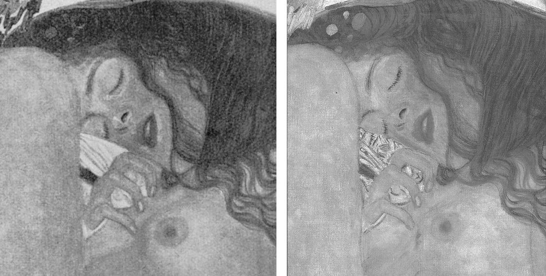
Above, Figs. 1 and 2: restoration degradations to two Klimt paintings – his Danae of 1907-08, as seen before 1956 and today; and his oil on canvas Portrait of Margaret Stonborough-Wittgenstein, as seen, left in 1905 when not-yet finished and subsequently in 1911, pre-1956 and today.
The starburst of exposed fakes that brought down New York’s (unrepentant) House of Knoedler, embarrassed ancient firms like Colnaghi’s and venerable publications like the Burlington Magazine has also humiliated the Louvre, the National Gallery, the Metropolitan Museum, the British Museum, the Art Institute of Chicago, the Tate, the Galleria Nazionale in Parma, the Van Gogh Museum and the Kunsthistorisches Museum in Vienna. On 11 April the FBI warned there could be hundreds more fakes in circulation in addition to the forty the agency has identified from a single forger who donated works to the Smithsonian American Art Museum, the Los Angeles County Museum, the Museum of Fine Arts, Boston, and the Detroit Institute of Arts. Had the FBI prosecuted the forger Ken Perenyi there might have been as many embarrassments again [2]. The problem of fakes occurs online, on land, and at sea outside of legal jurisdictions, as Anthony Amore has shown in his 2015 compendium of scams, The Art of the Con.
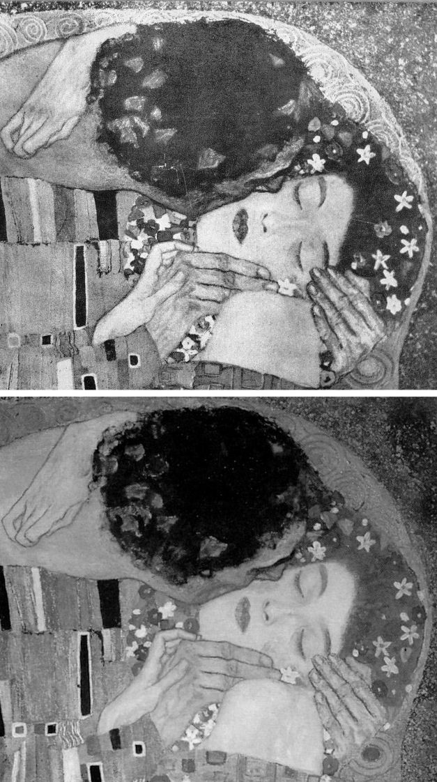
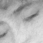
Above, Fig. 3, Klimt’s 1907-08 The Kiss, (detail) as seen before 1956 (top) and today.
With fakes and restoration injuries, the latter are greatly more destructive. Misattributions can be corrected, money can be paid back. However it might be ascribed at a given moment, the work of art – the art object – remains its own prime document (insofar as restorers permit). Sometimes restoration injuries are localised within a work, sometimes they are overall and catastrophic. Successive damaging restorations compound injuries and falsifications irreversibly (as seen above with Klimt and below with Renoir, Degas and Michelangelo). Slow cumulative damages are perhaps more serious than abrupt aberrant mistreatments that draw immediate notice. Scholars who shy from considerations of condition [3] must proceed on the premise that what is today is what originally was – an untenable view given that every restorer loves to undo and redo the works of predecessors but does so at a yet further remove from the work’s original condition and artistic milieu.
RESPONSES TO THE PRESENT ATTRIBUTIONS CRISIS
Responses to the attributions crisis have ranged from panic through self-exculpation and blame-casting to denial and cheerleading assurances of future streams of discoveries from sleeper/hunters. This is not an exclusively art market problem. Its roots are deeper and wider. The market trades objects on what others claim them to be. There has been concern among leading experts over the trade’s capacities of recognition and discrimination because of a precipitate decline in hands-on objects-informed expertise within the academic and museum spheres which have traditionally underpinned market activity [4]. Where Sotheby’s swiftly refunded purchases and took technical precautions, public museums are still flaunting restoration-wrecked pictures [5] and dubious attributions [6]. Much of art historical academia absents itself, fretting over alleged “engendered gazes”, for example, while missing (or disregarding) restoration-wrecked Renoirs and Klimts.
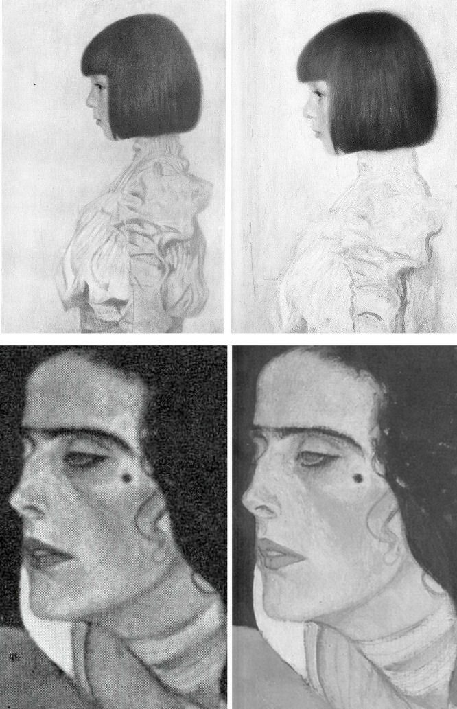
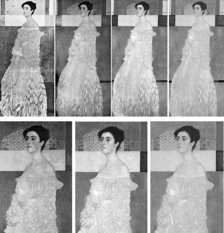
Above (top), Fig. 4, Klimt’s portrait of his niece Helene in 1956 and in 2007. Above, a detail of Klimt’s Judith II (Salome) of 1909, as published in 1956 (left) and in 1985 (Gustav Klimt ~ Women).
Below (left), Fig. 5, a detail of Renoir’s La Loge, as seen in 1921 and in the Courtauld Gallery’s 2008 exhibition catalogue Renoir at the Theatre – Looking at La Loge.
MUSHROOMING MARKETS
Without the cover of museums’ previously thought invincible technical authority, the mechanics of error are suddenly in plain view. To repeat our warnings, three years ago in “Art’s Toxic Assets and a Crisis of Connoisseurship” we wrote:
“‘Buy land’, Mark Twain advised, ‘they’re not making it anymore’. This logic ought to apply to the old masters but does not. Land makes sound investment not only because of its scarcity and its potential for development but because, in law-abiding societies, it comes fixed with legally defendable boundaries… Attributions, however, are neither guaranteed nor immutable. They are made on mixtures of professional judgement, artistic appraisal, art critical conjecture and, sometimes, wishful thinking or deceiving intent. They remain open to revision, challenge, manipulation or abuse… as some buyers later discover to their cost. Buyers are advised in the small print to beware and proceed on their own judgement… few people would dream of buying a house without legal searches and a structural survey.”
Eleven years ago we noted: “…The artists themselves may be dead but their works proliferate. As recently as the 1960s, 250 sheets of drawings were accepted as authentic Michelangelo. Today, over 600 sheets are. Such increases are fed not so much by forgery or the discovery of genuinely long-lost original works (both of which occur) but by a too-ready upgrading of copies, or studio works, to ‘original’ status.” [7.]
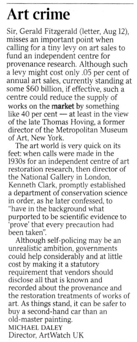
Three years ago we warned that buying old master paintings could be riskier than buying second-hand cars and asked for vendors to be required to disclose all that is known about a work’s provenance and restoration history (13 August 2014, letter, the Times – Fig.6, above). At the time we received silence. This month the art market blogger, Marion Maneker, complained (Art Market Monitor, 2 May 2017) that:
“The Financial Times has yet another ‘How Transparent Is the Art Market?’ story written by an announced participant in an upcoming art market regulation conference revealed in the pages of the Financial Times the week before. Considering the amount of interest the FT has shown in regulating the art market, one would expect the international business newspaper to have some proposals about how to police the trade.” See Georgina Adams, “How transparent is the art market”. Where Maneker complained: “The closest the story comes to offering ideas is to compare the art market to the second-hand car market (unfavorably)” Adams had quoted two art world players who so liken the art market:
“The fundamental problem, according to the FBI’s art and antiquities special agent Meredith Savona, is the lack of records of ownership. ‘Even for cars, I can see who owned it for a certain period of time,’ she says. ‘In the art market there is nothing, no regulation. If someone will not tell you who was the previous owner there’s a reason. There needs to be a way of having records maintained for, say 20 or 30 years.’ This chimes with the stand taken by Nanne Dekking, a Dutch entrepreneur whose start-up Artory aims to bring more transparency to the market through catalogue raisonnés and provenance research – ‘In Holland there is a digital registry for second-hand cars – it’s obligatory to register, so if you buy a car you know exactly what you are getting’, he says. ‘…That’s the kind of transparency we’re after.”
In 2013 Dekking was appointed Sotheby’s Executive Vice President and Vice Chairman, Americas after eleven years with Wildenstein & Co. He is a board member of the Authentication in Art group which first welcomed and then rejected a proposed paper we had offered on the flaws of Technical Art History for a forthcoming AiA conference. We see open and freely published debate as a precondition to reforming a system that is proving unfit for purpose.
PROVENANCE RESEARCH
Georgina Adams also reported calls for a levy on art sales to fund independent bodies to establish and maintain standards in the protection of buyers but such suggestions, in our view, are unworkable. The art market is global and increasingly an arena of private/secret transactions. Taxes are levied by governments. How and by whom would levies be collected around the world, pooled and then disbursed? Who would guarantee the independence of such bodies? Would they be national or international and to whom would they be answerable? Would they charge fees to offset their own costs? Less problematic, much cheaper and perhaps more to the point would be for governments to give buyers enshrined statutory rights to be informed about what should appropriately be known when buying a work of art. Presently, vendors enjoy de facto rights not to disclose their identities; not to disclose how often and to what extent works have been made over by restorers.
CONCEALMENT OF IDENTITIES
In 1998 a pastiche Leonardo drawing was put on the market by Christie’s NY as “German School, early 19th century” and “the property of a lady”. When the work was claimed to be a Leonardo worth $200million (as the so-called “La Bella Principessa”) the lady concerned disclosed her identity and brought an action for damages against the auction house on what was only a claimed valuation, not a sale. Only then did we learn that the vendor was the widow of a painter/restorer (of Leonardo, among others) who had been an intimate of Bernard Berenson, helping him to conceal his collection from the Germans during the War, and the drawing’s only known owner. When the new owner, and Professor Martin Kemp, an AiA board member and a leading advocate of the Leonardo attribution, trawled the Berenson archives together in search of an earlier reference to the drawing they drew a blank. The drawing remains without history outside of the studio of the artist/restorer who is said to have restored it. Such is precisely the kind of information to which potential buyers should rightfully be privy.
THE LAW, SECRECY AND MAKING THE BONA FIDE FAKE
When the Art Newspaper examined the legal ramifications of the current crisis (“It’s time the art market got tough on fakes” 2 February 2017) it found no appetite for either external regulation or self-policing and a blithe acknowledgement that bad restorations convert bona fide pictures into effective forgeries:
“At the annual art-crime symposium held in November at New York University, participants agreed that the culprit was the market’s notorious secrecy. But discussions revealed deep divisions about what should be done. Insurers, auction houses, dealers and other players each have their own interests to protect in a market where, as one participant remarked, the ‘level of greed…is so great’.
‘Information is the currency of the art market,’ said lawyer Steven Thomas, the head of the art law practice at the Los Angeles law firm Irell & Manella. He offered an example showing how information was withheld in trying to close a sale. When one of his clients learned that an impressionist painting he was interested in had been restored so extensively it was no longer considered authentic, he confronted the dealer, a prominent New York gallerist. ‘Oh, you found out,’ was the cavalier response. Such is the attitude in a market where the burden of due diligence as a practical matter may fall on the buyer.”
ACKNOWLEDGING RESTORATION INJURIES TO SAVE AN ATTRIBUTION – AND THE PARAMOUNT IMORTANCE OF PHOTOGRAPHIC RECORDS
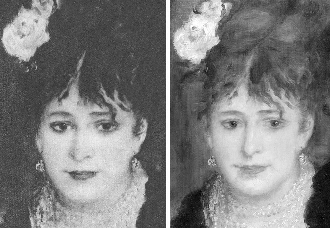
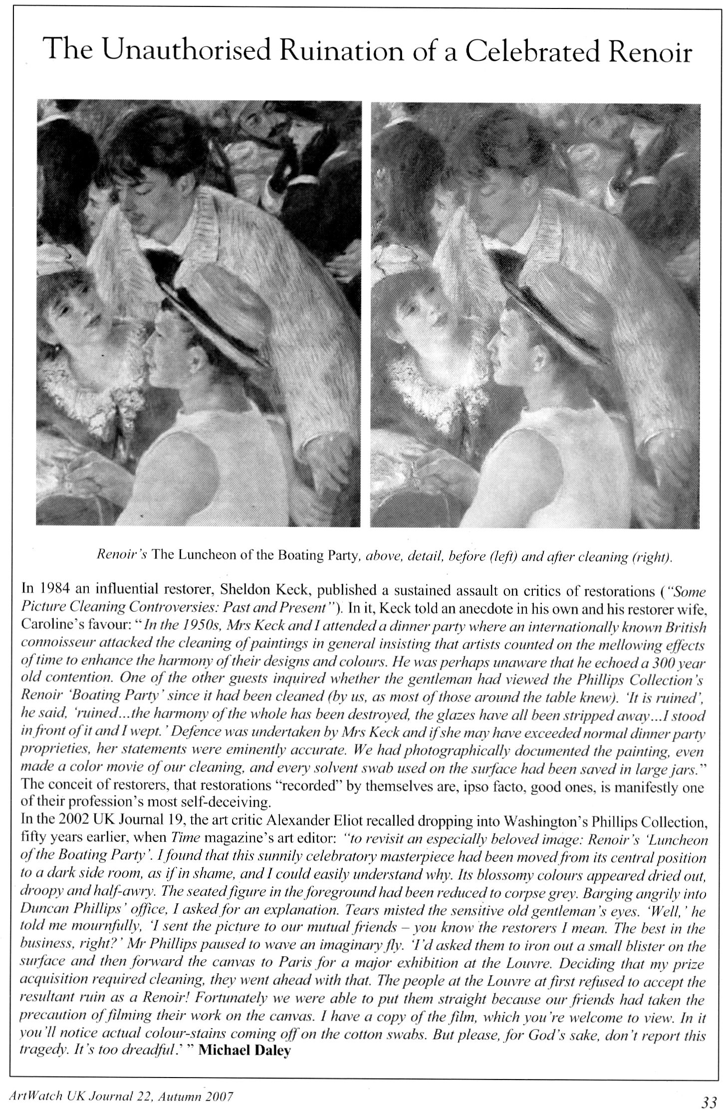
Secrecy on condition can tempt owners. Duncan Phillips privately admitted that his great Renoir The Luncheon of the Boating Party (detail below, Fig. 7) was so mauled by two pre-eminent restorers that it was rejected as authentic when loaned to the Louvre:
“Fortunately we were able to put them right because our friends had taken the precaution of filming their work on the canvas. I have a copy of the film which you’re welcome to view. In it you’ll notice actual colour stains coming off on the cotton swabs. But please, for God’s sake, don’t report this tragedy. It’s too dreadful.” [8.]
Today one can see on the painting where a colour in one part was introduced into the cracks of another area – and yet Phillips’s widow, Marjorie, wrote in her 1970 memoir Duncan Phillips and his Collection “the Sheldon Kecks, outstanding restorers, operated on the Renoir successfully!” We have asked the Phillips Collection’s director several times to see the film and the painting’s restoration records but always without reply. At the National Gallery, under the directorships of Charles Saumarez-Smith and Nicholas Penny, we were given permission to examine the historic and conservation dossiers of paintings with the kind and helpful assistance of the gallery’s librarians and archivists. In contrast, when we asked to see the records of the Bellini/Titian The Feast of the Gods at the National Gallery, Washington, the conservation department refused outright. A curatorial department was more open and supplied good-quality pre and post-restoration photographs of the painting’s states which enabled us to demonstrate losses of value during the cleaning (as at Fig. 8 below). We learn that a member of the gallery’s conservation staff keeps more sensitive photographic records at home for fear that they “might fall into the wrong hands”.
Above, Fig. 7: a page in the Autumn 2007 ArtWatch UK Journal published in memory of James Beck who died on 26 May 2007. In the same journal we published a comparison of a detail of the Feast of the Gods, as taken before cleaning (left) and after cleaning but before repainting – see Fig. 8, below:
SPURIOUS CONSERVATION SCIENCE
Above, top, Fig. 9: a detail from the National Gallery’s Renoir The Umbrellas before cleaning (left) and after cleaning in 1954. Below, Fig. 10, the face, after cleaning and restoring.
It should be clear to any scholar or connoisseur of paintings that the National Gallery cleaning was injurious, that the picture’s values and relationships were degraded and deranged – and yet the technical promises underpinning the restoration were “top-of-the-range” and authoritative. Cleaning was preceded by a physical and a chemical analysis of the painting by two gallery scientists who concluded that an “extremely thin” natural resin varnish could safely be removed “by solvents of a strength well below that likely to attack the paint film, which is resistant to the solvent action of pure acetone.” The scientists offered an additional assurance: “In the hands of a competent restorer [Norman Brommelle, husband of the National Gallery’s head of science, Joyce Plesters, was chosen] there is no reason to fear that the paint layers will be disturbed in the course of cleaning. Since, in this particular picture, there is no evidence of a linoxyn film, nor the presence of any resin in the medium, there is, in our opinion, no need to adopt any special precaution.”
Brommelle reported that the varnish was removed with a 3:1 turpentine/acetone mixture containing a small percentage of diacetone alcohol and that the last traces were removed with toluene but no one explained why an extremely thin varnish layer of no great antiquity needed to be removed. The cracks seen above at Fig. 10 were products of the cleaning (some local cracking had occurred previously where the canvas vibrated against a central stretcher bar on its regular exchanges between London and Dublin. (Technical information by courtesy of the National Gallery Conservation Department.)
THE TECHNICAL AND SCHOLARLY UNDERWRITING OF A FAKE AT THE NATIONAL GALLERY

One of the recently disclosed fakes, an “Orazio Gentileschi” (above right at Fig. 11 next to an authentic work), had been accepted by the National Gallery on a loan from its owner. When the now rejected no-history painting was withdrawn, the gallery justified its inclusion with the claim (Antiques Trade Gazette): “The gallery always undertakes due diligence research on a work coming on loan as well as a technical examination.” After this historical and technical examination, the Gallery label declared that “the poetic depiction of ‘David Contemplating the Head of Goliath’” had been produced by Gentileschi “for a collector’s cabinet” – an unsupported claim that, like “made for private devotion”, often serves as a flag of convenience for small recently-discovered old works without histories.
Above, Fig. 12, here we see a detail (top left) of the real Gentileschi David and (top right and below) the loan accepted as authentic by the National Gallery. If, instead of whatever technical and art historical examinations were carried out, the Gallery had run a few simple photo-comparative checks of the kind shown here, it should have been obvious to anyone with an alert eye that the picture in the top left had been the bona fide historical prototype for the other, markedly inferior and modern-looking, version. Qualitatively, they are not remotely co-equals: the one is a crude pastiche of the other. In every detail the chasm of quality should have identified the loan as a pastiche.
THE CONSEQUENCES OF (UNACKNOWLEDGED) RESTORATION INJURIES
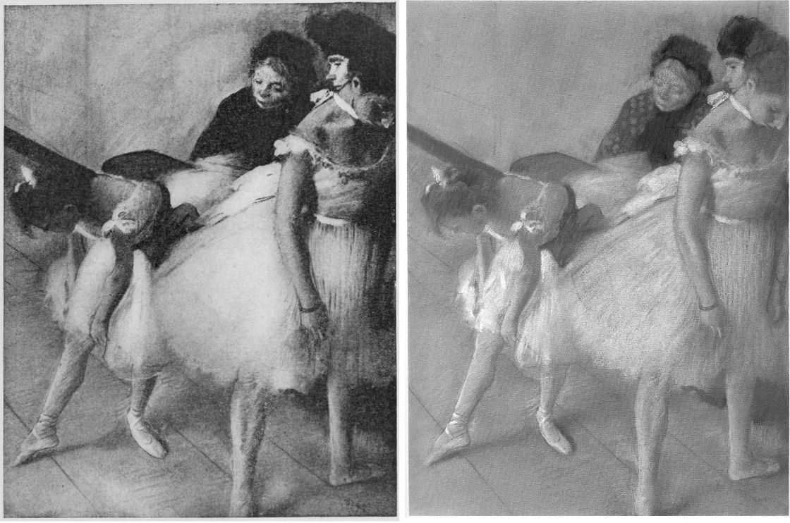
Although this impostor has now been rejected from the National Gallery there is no redress for individual badly restored bona fide works – and often not even an acknowledgement of their plight. Nor is there any apparent means of stemming the swelling tide of destruction that masquerades as a conservation service while delivering incremental degradations of pictures, such as those that can be shown to have taken place in less than a century on what is now the Denver Art Museum’s Degas’ superb pastel and charcoal The Dancing Class or Dance Examination of 1880 below at Fig. 13. The first photograph in the sequence was published in 1918 (Degas, Paul Lafond) when the drawing was not yet forty and therefore likely to have been in an original or near-original state. The third photograph was published in 2002 in the catalogue to Degas and the Dance, a sponsored travelling exhibition organised by the American Federation of Arts (- the “the prime movers”), the Detroit Institute of Arts, and the Philadelphia Museum of Art. The show was curated by the leading Degas specialists Richard Kendall and Jill Devonyar.

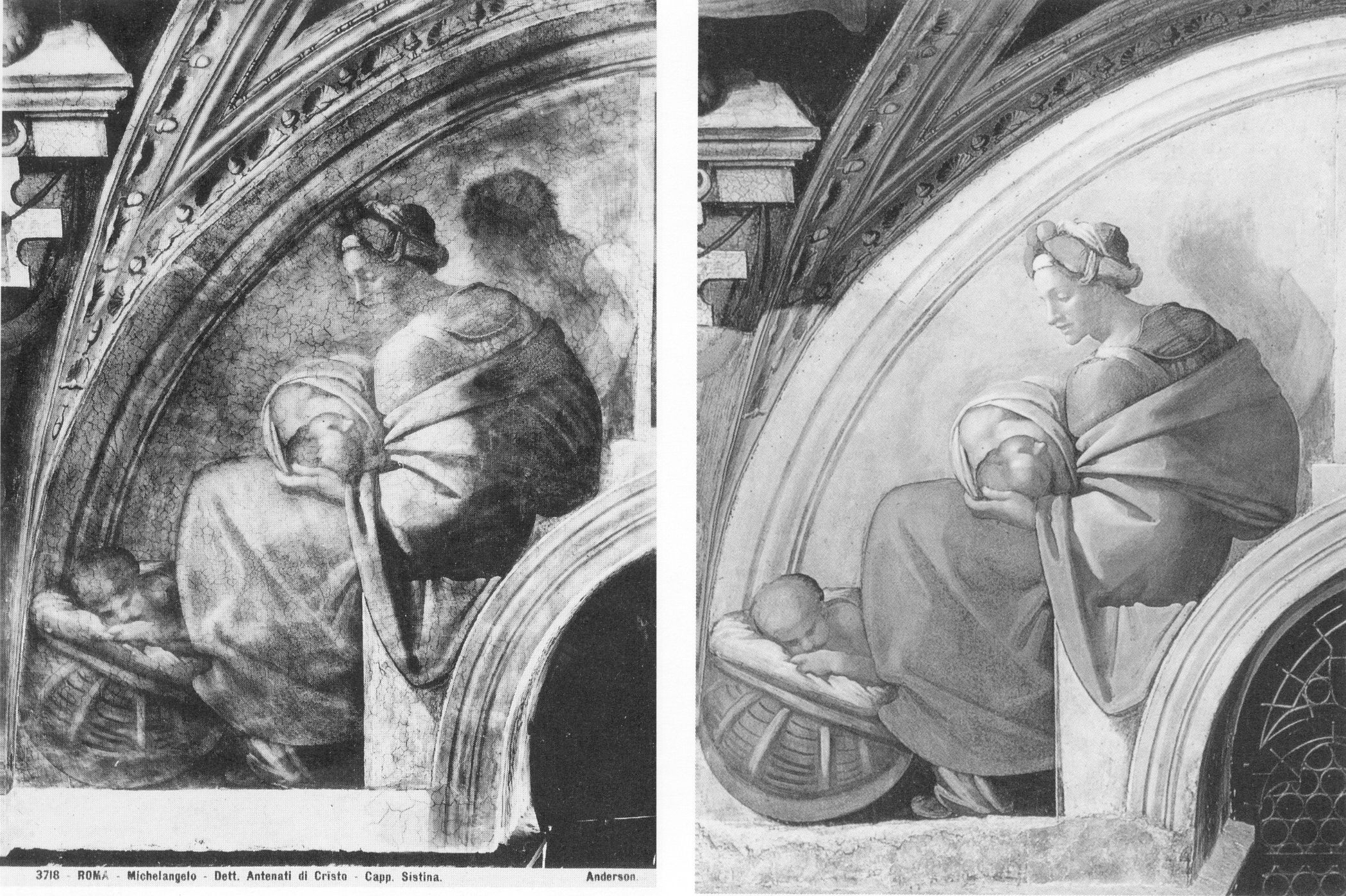
The sequence of states at Fig. 13 above resembles a succession of an etching’s proof states in reverse: the most complete condition is seen in the oldest record and the most debilitated state is recorded most recently. If we make the most direct comparison with the earliest and the most recent records of this drawing, as at Fig. 14 below, the differences become startling and heartbreaking. What happens to one artist happens to all in turn, as was most shamefully seen to Michelangelo at the Sistine Chapel – see Fig. 15 where an early Anderson photograph of a lunette is shown with its post-restoration state. By such simple comparative means we can see/demonstrate that Degas and Michelangelo have not been restored or conserved so much as subjected to a cultural pathology – an infantile revulsion at or terror of darkness and a failure to appreciate that darkness, as artists appreciate, confers brilliance and radiance. Without shadows to relieve lights there is no great vivacity – art’s life-affirming gift. Our historic cultural legacy is being made over into a blander, more homogenised arbitrary colourfulness. With so much value and vivacity already lost in the Dance Class’s first century, who, if offered the chance, would today vote for “More of the same, please” in the next? Restorers can never put the clock back. They can only offer more of the same: yet further intensifications of hue and losses of form and space-creating tones.
THE INCALCULABLY VALUABLE TESTIMONY OF PHOTOGRAPHS
Photographic reproductions do not have to be taken as absolutely faithful replications to have great value as record – why else would they be published and consulted in such great numbers? They are particularly eloquent as witnesses when seen in company with predecessors and successors, because the patterns that successive images make disclose the truth about present conditions. The net consequence of restorations during the last much-photographed century can be seen/shown to have been gravely damaging, effectively washing away art’s pictorial strength, disrupting the internal relationships of individual works, rendering oeuvres capriciously erratic and incoherent and, thereby, creating spaces, opportunities and, even, seeming precedents for misattributions and outright fabrications.
COLOURS V TONES
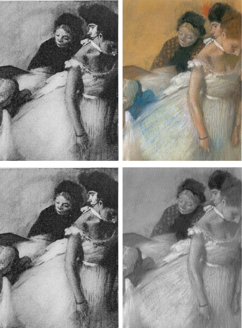
Although we do not have a colour photograph to match the black and white Durand Ruel photograph published in 1918, we can, by juxtapositions, estimate the degrees of loss today. At Fig. 16 below, the top comparison shows that the bump on the head of the woman in the upper right-hand corner was formerly a red feathery hat decoration. It now survives as a smear of colour that, tonally, is almost indistinguishable from the wall behind. We can see in the greyscale comparison at the bottom that the red decoration had originally been given a halo. On his own declared pictorial statagems, we might deduce that Degas had used the pocket of red to create a triad of local counterpointing primary colours: red feathers, ochre spots and an intense dark blue ribbon bow. Certainly, speculations aside, since that date the ineffably soft back of the standing dancer’s tutu has both hardened and become see-through. The feathered, layered back of the bending dancer’s tutu has, on some bizarre and alien tidy-minded logic, been reduced a ghostly but sharp-edged right angle. Degas is leaving us, involuntarily. He learnt and extracted much from photography. Is it too much to ask that all scholars use our very great resources of photography and historic photographic evidence to calibrate the injuries done to his oeuvre and therefore more fully appreciate and give due account of Degas’ great and supremely fresh and audacious genius?
Certainly, the most urgent single reform needed in today’s crisis of connoisseurship lies in increasing the accessibility of photographic records of condition and treatments. In an age of electronically transmissible, high quality photographic images this would be easier to achieve and more instructive than ever before. There are no good reasons for institutions, owners and dealers continuing to sit on such material and thereby prevent people from seeing what’s what.
Michael Daley, 26 May 2017
Coming next: Degrading Degas and Michelangelo
ENDNOTES:
[1] We first used the term in connection with the so-called Stoclet Madonna, the Metropolitan Museum’s attributed Duccio, in “Toxic Attributions?” The Jackdaw March/April 2009.
[2] “In the end, after a five-year investigation and a mountain of evidence collected, no one, neither the two ‘conspirators’ nor I, was ever charged with a crime or indicted” – so wrote Ken Perenyi, in his 2012 memoir Caveat Emptor, p. 312.
[3] One scholar who has engaged on this territory with his pioneering book Condition:The Ageing of Art, Paul Taylor, incurred immediate wrath from some restorers who would claim monopoly rights on all discussions in the field, but a firm welcome elsewhere. Apollo noted that “There are unquestionably many art critics and even academic art historians for whom the material context of art, and particularly flat art, has become a rarefied field. That needs to change, if we are not to see total severance between those who work to preserve physical objects and those who claim to construe their meanings.”
[4] In a paper delivered at the ArtWatch UK/LSE/Centre for Art Law December 2015 conference (“Throwing the baby out with the bathwater”), Brian Allen, a former director of the Paul Mellon Centre for Studies in British Art (1992 to 2012) and Chairman of the Art Fund observed: “…increasingly, the only young connoisseurs emerging are to be found in the commercial art trade and this surely cannot be a desirable state of affairs. It might be argued that many of the best ‘eyes’ have always been in the art trade but, until recently, there was always a body of disinterested academic ‘experts’ to counterbalance commercial self-interest…” In the March 2017 Art Newspaper, Anna Somers Cocks, the paper’s Chairman and a former curator at the Victoria and Albert Museum, discloses that the V&A now considers the giving of opinions a drag on its curators’ time and devotes only three hours a month to it when, in the 1990s, it reserved two afternoons a week to telling the public what their heirlooms were. In the same issue of the Art Newspaper Mark Jones, a former director of the Victoria and Albert Museum, said that expertise, by which he meant “the ability to recognise and identify objects, surmise their history from their appearance, tell the genuine from the false and make judgements about quality” has become patchy, even rare, in museums. Mark Jones was the curator/organiser of the British Museum’s legendary 1990 exhibition “Fake? The Art of Deception”, the catalogue of which remains a seminal study in the field.
In response to Mark Jones the dealer Peter Nahum wrote in the April 2017 Art Newspaper (letter, “Dealers and curators should work together to spot fakes”):
“The art forger Shaun Greenhalgh and his father George visited my gallery in 1984. It was after 6pm and they offered me a painting they said was by Samuel John Peploe, for which I gave them a cheque. As soon as the banks opened at 9am the next morning I cancelled the cheque and called in the police. I was the first to report the family from Bolton for purveying a fake, 16 years before their arrest.
“When they were finally arrested, my cheque was still on their desk. I also advised Bolton Museum on the purchase of the painting by Thomas Moran and subsequently saved them from buying a fake watercolour purportedly by the same artist.
“I have long campaigned for the art and antiques trade and academics, especially those in museums, to work more closely together. Our job, as dealers, is to defend our clients against the legion of fakes and wrongly catalogued items on the market. As we are personally financially responsible for all transactions we make and advise on, we are the most vulnerable and, by necessity, the most careful. As a result we are often best placed to authenticate works.
“Academies and museums obviously have great experts on their staffs, but their prime focus is the history and provenance of objects and thus their visual skills often take a secondary position. When both professions work together, mistakes are lessened.
“I have made it my mission to track down and report those who make fake art, as they are the bane of our lives and can cost those who buy art a great deal of money. They are simply con-men extracting money from innocent people by deceit.
“As dealers, academics and collectors, we are all motivated to push the boundaries of our knowledge, and thus all of us are vulnerable to those who wish to take money under false pretences. We have to be constantly on our guard as each one of us will fall into one of the fakers’ traps sooner or later – we are all human after all.
“Thus, I applaud Mark Jones’s article: scholarly research is flourishing but curators’ ability to judge an object’s quality is not (The Art Newspaper Review, March, p.13) with two main comments. The painting by Samuel John Peploe was not sold, and academics have rarely been the greatest visual judges – that is more our job than theirs. That does not mean that there are not great visual experts in academia – of course there are – it simply means it has never been their primary function.
Peter Nahum.
Peter and Renate Nahum Agency (the Leicester Galleries), London.”
[5] See “From Veronese to Turner, Celebrating Restoration-Wrecked Pictures” and “Taking Renoir, Sterling and Francine Clark to the Cleaners” and THE ELEPHANT IN KLIMT’S ROOM and, finally, “Now let’s murder Klimt”.
[6] The National Gallery includes one of its most dubious and controversial attributions – the Rubens Samson and Delilah – in its list of 30 “must-see” pictures. There are more than twenty secure and superior works by Rubens in the gallery including the magnificent Minerva protects Pax from Mars (‘Peace and War’). When controversy broke over the attribution in 1997 the gallery’s director, Neil MacGregor, placed a statement next to the painting to explain why it looked like no other Rubens in the collection. Two special issues of the ArtWatch UK Journal have been devoted to this picture’s problems. See: “The Samson and Delilah ink sketch – cutting Rubens to the quick” and “Art’s Toxic Assets”
The National Gallery’s highlights list also includes the restoration-wrecked Bacchus and Ariadne by Titian, on which, see: “The Battle of Borja: Cecilia Giménez, Restoration Monkeys, Paediatricians, Titian and Great Women Conservators”
[7] “Oh Blessed Honthorst”, Michael Daley, ArtWatch UK Journal No. 21 Spring 2006 – a Rubens special issue dedicated to the National Gallery’s ascribed Rubens Samson and Delilah), p.4.
[8] As reported by Alexander Eliot, a former Time magazine art critic, in “A Conversation about Conservation”, The World and I (Volume: 15), June 2000.
“Pick Up A Pencil”
The theme of the new ArtWatch UK members’ Journal (see right) is “The Primacy of the Visual”. Failures to acknowledge, address, or even recognise visual evidence are examined. The text of Charles Hope’s 2011 James Beck Memorial Lecture is carried in full. Professor Hope cites failures of the National Gallery’s curators and restorers to address opponents’ arguments or to recognise the import of key historical documents on artistic practice. When Professor James Beck, the late founder of ArtWatch International, lent support to artist-critics of the Sistine Chapel restoration he came under vicious attacks from some scholarly peers – for all the world as if he had betrayed a priesthood of the visually ignorant. Prof Hope cites a letter of that kind. If artists do sometimes discomfort scholars, it is no presumption: knowing how art is made they are precisely the best qualified to detect its un-making. Here, the painter (and photographer) Gareth Hawker discusses both fundamental differences between painting and photography and the widespread failures to recognise these differences. His demonstration is timely. If (as we have argued elsewhere), art schools have given up the ghost with regard to teaching the traditional skills that formerly equipped artists to recognise restoration blunders, in the wider world of commercial film-making there are signs – notwithstanding giant leaps in the powers of digitalised image-making – of a renaissance in traditional art practices. We discussed this paradoxical relationship in connection with the extraordinary accomplishment of the hand-crafted animated film Frankenweenie. Another such heartening case is discussed opposite. [M. D.]
A Photograph is a Copy, not a Creation, Gareth Hawker writes:
“…we have realised that we should give more attention to photography”. So wrote the Director of the National Gallery, Nicholas Penny, in his introduction to the current exhibition, Seduced by Art: Photography Past and Present [1]. Several reviewers seem to agree. Tabish Khan wrote that, “…photography is a contemporary art form that can be just as inspiring and impressive as painting” [2]. But photographs do not incorporate the high-level thinking that paintings do. It would be misleading to put them in the same category.
The difference between painting and photography is frequently glossed over. For example, many people suggest that the camera is a tool just like brushes and pencils. At first sight, this may appear to make sense. The photographer decides what to include in the picture, in the same way that a painter often does. He chooses where to place the camera; in which direction to point it; how far to zoom in on a subject; and when to press the shutter. He may select models, costumes, and arrange lighting. All these factors contribute to what is called the ‘scene’ – the image in the viewfinder. The ‘scene’ may be recorded by a photographer just as well as by a painter, so the argument goes: they just use different tools in order to complete the same task. However this is to ignore what the tools are used for. The camera is used to record the scene, while the brushes and pencils are used to analyse it. The importance of this analysis is often overlooked.
Photographers who have wanted to claim equal status with painters have made various approaches, all ignoring this analytical element. At first they blurred and smudged photographs in order to make them look like paintings. Then photographers claimed that theirs was a totally separate art form, a pure record of the scene. Some argued against this, saying that if a photograph were pure, it could not be artistic. Before this issue could be resolved, some writers swept it aside. They suggested that what mattered was, “conceiving an image in the brain and finding some way of expressing it” [3]. What counted was the viewer’s response – whether a work, “spoke” to the viewer [4]. This disregarded a significant factor: people do not respond to paintings in the same way as they do to photographs, especially if they can see that a painting provides evidence of thinking, in a way that a photograph does not.
Paintings look different from photographs because they are made differently. A painting is constructed from brushstrokes; each stroke the result of a decision. A painting may represent a scene, or it may represent nothing at all. A painting is an independent creation, whereas a photograph is dependant on the scene. A photograph can be made only if there is a scene to be copied.
A representational painting may be compared to the summary at the beginning of a scientific paper – the paragraph which is entitled, “Abstract”. Its writer makes a personal judgment about which are the most important topics dealt with in the paper, and writes a brief account of his own. The “Abstract” is a new and independent piece of writing, just as a representational painting is a new and independent analysis of the scene. In contrast, a photograph is like a photocopy of the whole scientific paper. The photocopy shows no analysis, and no judgment.
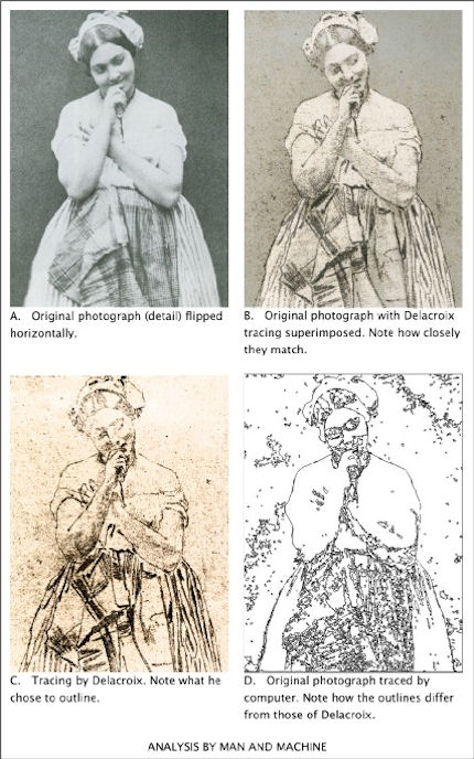
Brushstrokes are only the most basic way in which a painter’s analysis or abstraction may be seen. Another is in the simplification of the human figure – in its reconstruction in terms of geometrical solids, such as eggs and cylinders. Even a simple tracing – the lowest form of analysis – shows which lines the painter has considered to be more important than others.
To give a computing analogy: a photograph is like a bitmap image (which records only pixels – spots of colour), but a painting is like a vector image (which records instructions about where lines are to go). A tracing programme can convert a bitmap file into a vector file. The computer makes a simplification which looks similar to a paint-by-numbers drawing. This computer drawing may be thought of as the beginning of an attempt to imitate human analysis – a type of artificial intelligence – though the computer has a long way to go before it catches up with the human brain in this respect (Fig. 1). If anything may be thought of as being a tool comparable with brushes and pencils, it is a tracing programme (which helps to analyse), not a camera (which does not).
To express the difference in another way: Scene = Photograph (Scene = Photograph) × Analysis = Painting
Analysis is an essential part of what makes a representational painting interesting to look at; whereas what makes a photograph interesting to look at is the scene, not its treatment.
Analysis demands abstract thinking – whether it is done well or done badly. What distinguishes the great painter from the mediocrity is the quality of this thinking, not any manual skill. Anyone who can sign his name, already has enough manual skill to make a great drawing. (This includes drawing in its wider sense: deciding where to place marks made by the pencil or the brush, even when no outlines may be involved).
The modern digital camera provides the most effective means for recording the scene that has ever been devised. Strangely, many photographers want to use it for a different purpose, to express an interpretation – a purpose for which it is singularly unsuited. Some photographers deliberately introduce all sorts of inaccuracies which mean that the result is neither a pure substitute for the scene, nor an independent creation.
The classical case for photography’s status as an equal to painting was put forward by the man who was perhaps, “the most important figure in the history of the visual arts in America” – Alfred Stieglitz (1864-1946) [5]. In his usage, the word ‘artist’ meant someone who, “got the spirit of the truth” [6]. He held that only 0.1% of painters were artists, and only 0.1% of photographers were artists. But not everyone takes such an exalted view. For example, a tax inspector wants to know whether a painter is a house-painter or an artist, not whether he has, “got the spirit of the truth”. So when a painter says that he is an artist, he is simply describing his activity. He is not claiming to be either good or bad at his job: that is for others to decide. But when a photographer says that he is an artist he is claiming to be in the top 0.1% of his profession: he is pushing others to accept the valuation he has placed on his own work.
By using the word ‘artist’ in this way, Stieglitz moved attention away from a vital distinction; that between creating something new (a painting) and making a copy (a photograph). He persuaded many viewers to ignore analysis, and to concentrate on the selection and arrangement of a scene – on pointing and shooting.
Stieglitz’s advocacy, along with that of other theorists, seems to have desensitised many viewers. They see only the subject which has been represented. They fail to notice that a painting exhibits the working of a mind – not just in the choice of subject, but in every single stroke. One consequence of this desensitisation became apparent when the Sistine ceiling was treated by restorers, and much of the best painting ever produced was wiped off. The picture of a man looks like a man, whether it is drawn well or drawn badly. Most historians were satisfied with what remained after the paint-stripping because they could still identify the subjects which had been depicted. Very few noticed how drastically the quality of the drawing had been reduced.
Many people were better informed about these issues in the days when Michelangelo painted his great work. Contemporaries who saw it for the for the first time commented at least as much on the power of its drawing, as on its subject matter [7]. The way in which influential men looked at nudes in those days may be compared with the way in which they look at motor cars now: with an appreciation of the beauty of engineering and construction – an appreciation which derives in part from an understanding of how all the parts connect together.
The paint-stripping made nonsense of some of the connections in Michelangelo’s nudes. His contemporaries would have been appalled, but most of today’s historians and television presenters do not even notice. They focus on the imagery and the iconography, not on the drawing. It is as if they were waiting for the work to ‘speak’ to them – for the artistic content to make itself felt. But, being sensitive only to subject-matter, that is all that they are able to see. Such narrowly prepared minds will respond only to the crudest visual stimulus (the colours looking brighter after the top layer of paint has been removed, for example).
Just as the critical response to painting has become limited, so the meaning of the word Art has expanded – to such a degree that almost anything seems to be embraced by it, including photography. However painting remains distinct: it is a creation which is independent, and which can embody the kind of analysis described above. This is why painting may be categorised with the higher expressions of the human mind, along with poetry and philosophy. Photography does not fit into this category because it cannot display abstract thinking.
But painting is now so little appreciated that, to many people, it seems comparable with photography. This has allowed photography to be called Art, and so to enter the National Gallery. Arguably this is the same lack of discrimination that has allowed paint-stripping to take place, not only on the Sistine ceiling, but on almost all the great works of painting in the Western World, including those in the National Gallery.
“Giving more attention to photography”, seems to be one more example of this downward trend, but perhaps there is a glimmer of hope. When a great artist’s paint has been removed from a picture, the decline in its artistic quality is irreversible; but a decline in critical awareness is different: it can be reversed. At present, many people are only distantly aware that, in every brushstroke, a representational painting gives evidence of analytical thinking. Perhaps the exhibition at the National Gallery will help to promote this awareness. If so, it will have served a very useful purpose.
ENDNOTES:
1 The National Gallery, Seduced by Art: Photography Past and Present, Yale University Press (9 Oct 2012), ISBN-10: 1857095456, ISBN-13: 978-1857095456 The exhibition runs from 31 October 2012 to 20 January 2013 2 londonist. Art-review-seduced-by-art-photography-national-gallery. Retrieved 8 November 2012 3 Gerry Badger. Collecting Photography. London: Mitchell Beazley, 2003. ISBN 1-84000-726-5 p23 4 Gerry Badger. Collecting Photography. London: Mitchell Beazley, 2003. ISBN 1-84000-726-5 p24 5 Richard Whelan, Stieglitz on Photography, Aperture, 2000, p ix 6 Alfred Stieglitz, Is Photography a Failure?, The Sun, New York, March 14, 1922 – reprinted in, Richard Whelan, Stieglitz on Photography, Aperture, 2000, p 229 7 http://artwatchuk.wordpress.com/2012/10/01/12th-november-2012/ Retrieved 12 November 2012
Gareth Hawker
Comments may be left at: artwatch.uk@gmail.com


![]()
Review: Stone-washed Renoirs and the Shock of the Undone

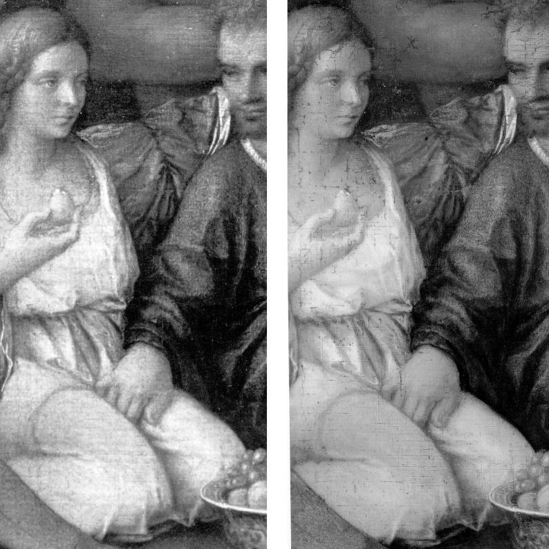
We knew at a glance that something was amiss. On June 16th, a newspaper photograph trailed an imminent auction sale of Renoir’s “Baigneuse” of 1888. Even on the evidence of that single de-saturated newsprint reproduction (right, Fig. 1) it seemed clear that the privately owned masterpiece had gone through the picture restoration wash cycle a time (or two) too often. A comparison of Christie’s pre-sale zoom-able online photograph with historic photographs of the painting further suggested that picture conservation’s would-be beauticians had been at work with swab and solvent: Renoir’s bather had been left (Fig. 2) a paler sugar-smooth pictorially and plastically enfeebled version of her original self. (For the picture’s appearance and condition in 1944, see Figs. 7 and 9.)
Just as museum curators who organise splashy temporary exhibitions rarely broadcast the “conservation” injuries borne by works loaned from sister institutions, so auction houses, which of necessity must act primarily as agents for owners, can seem no less reticent on this fraught subject. In practice, we find that in of both of these art spheres, the “now” is often implicitly presented as the “originally-was” and “always-has-been”, thereby thwarting what would be the greatest inducement to halt needless adulterations of unique historically-rooted artefacts: a full public disclosure of “conservation” treatments and frank art-critical discussion of their material and artistic consequences. By coincidence, recent museum and saleroom activities have brought to London a slew of little-seen examples of Renoir’s oeuvre. As cases in point of Renoir’s vulnerability, we examine here treatments of his “Baigneuse” of 1888 and the Washington National Gallery’s “The Dancer” of 1874.
Renoir’s “Baigneuse” was given star billing (on a £12/18m estimate) at Christie’s June 20th Impressionist/Modern sale, for the catalogue of which it provided the cover illustration (Fig. 2). While much was made in the eight pages long catalogue entry of an impeccable and unbroken provenance through ten successive owners, not a word was said about any restorations of the painting, and although many early photographs are identified in the picture’s literature, none is reproduced. It is disclosed that this Renoir is to be included in the forthcoming “catalogue critique” of the artist’s work being prepared by the Wildenstein Institute from the Archives of François Daulte, Durand-Ruel, Venturi, Vollard and Wildenstein. (Perhaps the present condition of the picture will be discussed in that publication?)
On the night of the sale, an announcement that the picture had been withdrawn drew gasps of surprise. Artinfo reported that the vendor had accepted a private offer from an unidentified buyer for an undisclosed sum somewhere within the estimate. Trade and press eyebrows have been raised at such secretive, pre-auction sales and the withdrawal was the more confounding because expectations of a big auction house “event” had been raised by extensive (and quite stunningly fetching) pre-sale press coverage with photographs of the painting enlivened by the seemingly routine inclusion of beautiful young female staff members.
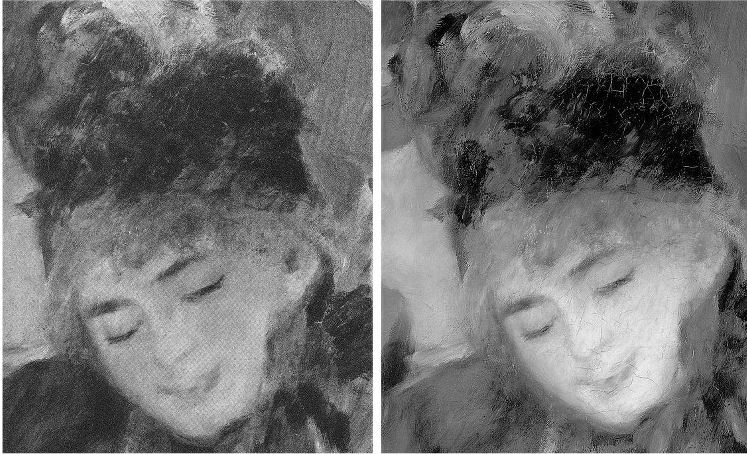
With modern paintings, the starting point for any appraisal should be the earliest known photograph. Old photographs are historic records. Historic records should never be ignored. Old photographs of pictures assembled in homes or exhibition galleries are especially precious and instructive. The photograph of Renoir’s 1905 exhibition at the Grafton Gallery (Fig. 3) testifies not only to the then generally more vivacious relative values within individual works but to the striking variety of pictorial effects and painterly means deployed within Renoir’s oeuvre.
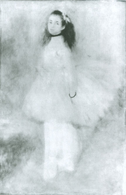
With regard to the photographic testimony of the original appearances of individual pictures, consider first the large, near-central painting in the 1905 Grafton Gallery photograph – Renoir’s “The Dancer”. This picture, now at the National Gallery, Washington, is 138 years old but was then only 31 years old and unrestored. Then, the background was disposed in distinct but linked quadrants (top-left; top-right; bottom right; bottom left). These were not so much naturalistic renderings of an actual space as subservient pictorial devices spotlighting the central bow-tight figure of a child trainee who, through balletic discipline and artistry, had assumed a commanding Velazquez-worthy sideways-on viewer-confronting presence.
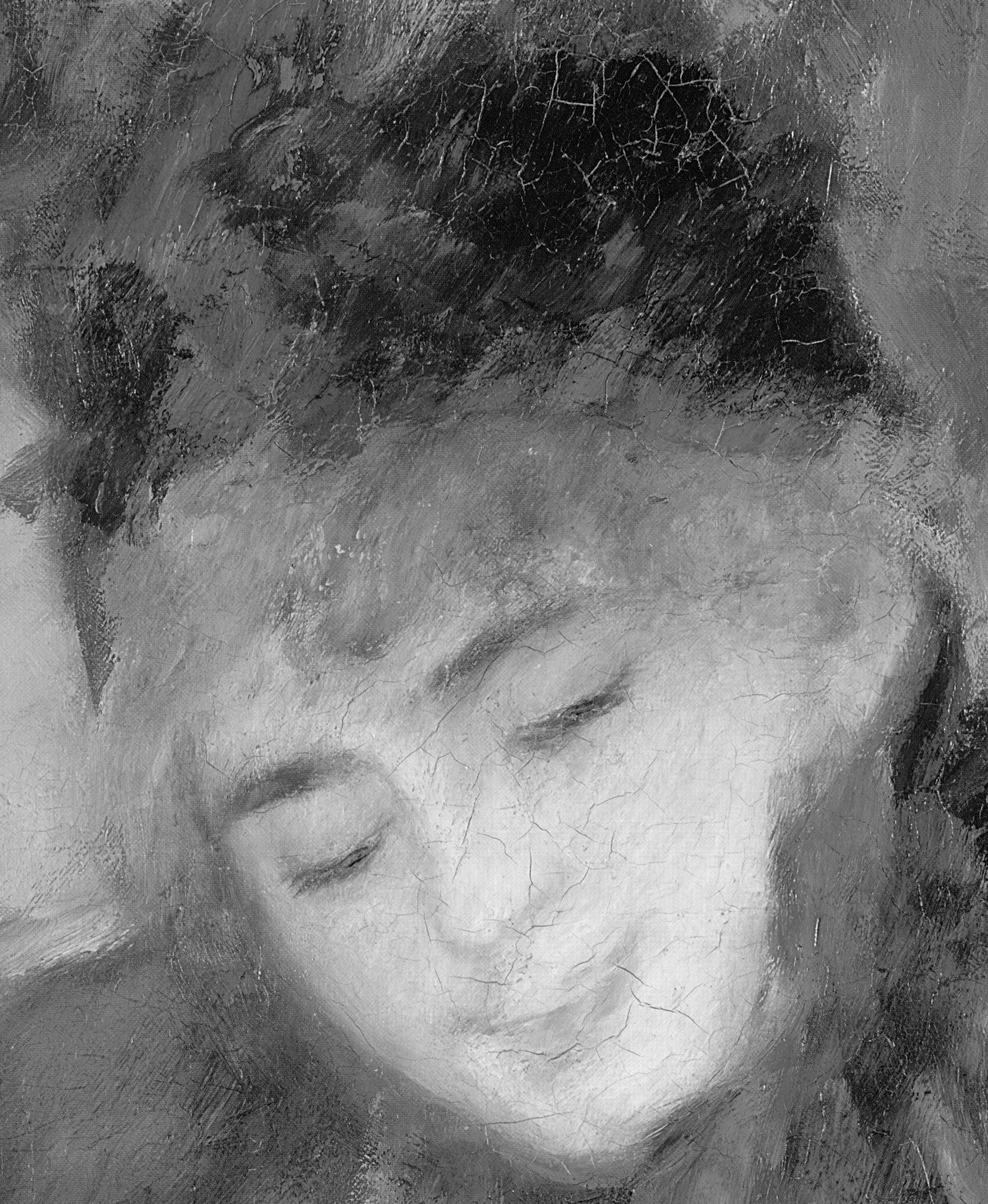
To that expressive end Renoir had welded the dramatically contra-directional lower legs into unity by a pronounced dark shadow in the vertical triangular space they bounded. That shadow sprang also from the heel of the (right) weight-supporting foot backwards and upwards in space, thereby throwing the bottom edges of the trailed skirts into relief. This dark zone in the lower-right counterbalanced another in the upper-left, which had in turn emphasised and thrown into relief the front edge of the costume, withdrawing only to leave a lighter, again relieving, tone at the dancer’s dark hair. The progressive loss through restorations of those artful dispositions (as seen in Figs. 4 & 5) and the picture’s general descent towards an inchoate, arbitrary pictorial froth that increasingly resembles the underlying condition seen today in its own infra-red imaging (see Fig. 6), is heart-breaking. Renoir had here been a sculptor before he became a sculptor, playing off forms that asserted his picture plane with others that ran sharply away from or towards it (rather as Michelangelo had famously done in his crucifixion of Haman). Degas, who spoke of Renoir’s “sharpness of tones”, had chided himself for constructing his own drawings of standing dancers from the head down instead of from the feet up. Renoir had here given a masterclass in how to project a standing figure upwards from the floor. These things artists know and appreciate.
Compendious photographic evidence suggests that restorers (frequently working myopically through head-mounted magnifying eyepieces) have consistently confounded dirt or discoloured varnish with the shiftingly elusive dark grounds used by artists to set off light-toned figures. As seen in our post of June 1st, Klimt’s portrait of Serena Lederer (which was acquired by the Metropolitan Museum of Art, New York, in 1980) has suffered in just such a manner. In the same post we saw also how Renoir’s deployment of a dark background zone in the upper left quadrant of background and a secondary but counter-balancing dark zone in the lower right quadrant of his “Dance in the City” had also been undone by successive restorers.
By courtesy of the 1905 photograph of the dancer we can now see that by 1944 the picture’s decisive tonal orchestration had already been subverted (see Fig. 3 and caption at Fig. 6). By the time of the picture’s appearance at the 2012 Frick show of Renoir’s full-length portraits (which was reviewed in our post of June 1st), the original dark tones in the lower right quadrant had effectively disappeared, leaving two odd arbitrarily truncated dark attachments to the right heel (Fig. 5). Cumulatively, this painting has suffered needless artistic vandalism of which no one speaks. The fact that graphite underdrawing is now visible on the painting has been mentioned but without any hint of alarm or censure.
With Renoir’s “Baigneuse” of 1888, the earliest photograph in our own records (- donations to ArtWatch of old photographs or postcards are always most gratefully received) is that published in 1944 when the painting was 56 years old, as seen here in greyscale at Fig. 7 (left) and at Fig. 9. Six years later, by 1950, the painting had been radically transformed, as seen at Fig. 7 (right, in greyscale) and Fig. 8 (left, in colour). The differences that emerged between 1944 and 1950 were compounded by further changes between the picture’s 1950 state (seen in colour at Fig. 8, left) and its 2012 state (seen in colour at Fig. 8, right). However many times and by whomever this painting might have been “restored”, it is clear that the resulting interventions have profoundly altered its constructional and pictorial rationales. The total extent of the alterations that occurred between 1944 and 2012 are examined right in greyscale details in Figs. 11-18. The differences between the 1950 and 2012 states are examined in colour details at Figs. 19, 20 and 21.
By 1888 Renoir had visited Algiers and Italy, come to admire Cezanne as well as Delacroix, discovered Italian painting and read Cennino Cennini’s Treatise on Painting. He had just completed an intense series of classically inspired, Ingresque female nudes, culminating in that declared trial for decorative painting, the Philadelphia Museum’s great “Bathers” of 1887, by which date he held the nude to be one of the most “essential forms of art”.
Compared with Fantin-Latour’s palpable but fluidly allegorical figure at Fig. 10, Renoir’s “Baigneuse” has, in its 1944 state, a markedly more stolid, out-of-Courbet corporeality. For all its spirited brushwork and sparkling colour, plastically, it constitutes an essay in composure, stability and parallelism. The torso seemingly rests on its own base of compressed and spreading buttocks and thighs. The thighs, knees and lower legs are held together in a manner more primly archaic (Egyptian) than classical. Movement is confined to the bather’s right hand which dries the left side of the waist. This action has enlivening consequences. The upper torso is pulled round by the right arm and the head is turned leftwards and downwards as if to contemplate the drying action of the towel. The left arm is required to be held aloft to free the left side of the figure, and, flexing at the elbow as the left hand draws across the face, it first echoes the thighs but then curls gracefully, weightlessly away in space.
What, then, explains the differences between the picture’s previous and its present condition? In such cases it is always possible to play the “Sistine Chapel Ceiling Restoration Defence” and claim that in 1944 the then 56 years old picture was very dirty and that the removal of this dirt has liberated the forms and the colours of the painting to a hitherto unsuspected degree. But the pattern of relationships that is visible, even under dirt, should not change character during a cleaning. Rather, it should emerge enhanced, with the lights lighter and the darks darker – and all individual values holding their previous positions. This has not happened – the picture has got progressively lighter with successive cleanings instead of returning to its previously cleaned state. If it really had been left by Renoir in today’s state, how could the previous but now lost artistically constructive values ever have arisen? If left untouched for the next 56 years, would anyone expect the painting to return to its 1944 appearance with the stripes on the towel and the shading of the fingers regaining strength? Would a general shading and enhancement of forms once more helpfully tuck the left hand behind the head? How might dirt have drawn more clearly and repositioned the left shoulder? How might it have more emphatically shaded the right, distant side of the face?
If we consider the difference between the 1950 and 2012 colour plates (shown at Figs. 8, 19, 20 & 21), what might account for the loss of orange coloured modelling in the left cheek, and of individual brushstrokes depicting the hair? Is it possible to claim on the evidence of these photographs that there has been a build-up of dirt on the picture over the last 62 years?
When examining the bather’s face in close-up today, as shown at Fig. 21, can we have any confidence that the paint presently surviving in that section is just as it was when left by Renoir in 1888? What kind of brush or paint might he have used that would have resulted in the present fragmentary, seemingly abraded, scattering of orange paint that lies over the blue background between the hand, the face and the shoulder?
In the next post we examine the conservation fate of more than a score of Renoirs that have been loaned from the Sterling and Francine Clark Art Institute in Williamstown, Massachusetts to the Royal Academy. We shall see how Sterling Clark learned the hard way not to trust art experts on matters of condition in paintings when, having been assured that Domenico Ghirlandaio’s “Portrait of a Lady” had never been repainted, he bought it, only to discover, very shortly afterwards, a postcard of the painting showing it in an earlier and quite different state.
Michael Daley
Comments may be left at: artwatch.uk@gmail.com


![]()
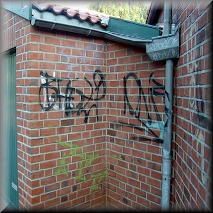
From Annigoni to Banksy: restorers’ crimes against art and graffitist’s crimes against architecture

In cyber-space, a thousand people a day ask: “Is graffiti an art form or a crime?” Edgar Degas, distraught at the handiwork of picture restorers at the Louvre, once threatened to write a pamphlet of protest that would be “a bomb”. Nearly a century later in Britain, a royal portraitist similarly distraught at the actions of restorers, painted a protest on the doors of the National Gallery. Here, the painter Gareth Hawker, taking graffiti as an art form, examines both the motives and the proclaimed “ethical codes” of those who deface/defile buildings and public spaces, and, the sometimes morally ambivalent responses of the public to such actions.
Gareth Hawker writes:
Colin Martindale developed a theory about the way in which art forms evolve. If he is going to get a place in the history books, each artist must outdo his predecessor. He must produce something more exciting; he must strike the imagination more forcibly. Martindale traced this line of development in many areas, not only in painting and in poetry, where one might expect it, but in the development of gravestones in New England and even in the writing of scientific papers. People seem to crave novelty and thrills. So it should come as no surprise to see a similar pressure at work in yet another art-form, that of criminal damage.
When the form was new, it was easy to outdo predecessors, who had been limited to paint-brushes, chalk and charcoal. The spray-can revolutionised graffiti. Simple slogans could be written with great speed. A tradition emerged. This tradition developed rapidly and soon came to what may be termed its academic stage, where rules were formulated which became widely recognised and accepted amongst practitioners.
I learnt from a television programme that the rules were as follows: 1) The paint cans must be stolen (‘nicked’). 2) The paint must be applied freehand (i.e. without stencils). 3) The surface must be hard to get to – the work must demonstrate that a logistical challenge has been overcome. The artist must show that he is a daring sort of character. 4) The artist should break the law. He should not have permission to spray the surface, whether a wall or the side of an underground train. 5) The work should not incorporate another artist’s work. 6) Painting over another artist’s work may be acceptable, but is generally considered to show “disrespect” and is likely to be frowned on. (The fact that the graffiti artist is himself showing disrespect to the wider community does not seem to figure in these considerations.)
The main purpose initially was to mark out and lay claim to a territory. (“Like a dog pissing on a lamp-post”). The placing of an elaborate signature (tag) could demonstrate that an area was now controlled by the graffiti writer and his pals, not by the police or by the local community. The cleaning off of graffiti was a vital element in the “zero tolerance” approach which police adopted in New York, and which ultimately proved successful in reducing the number of murders in that city. This aggressive cleaning made it clear that the police and the local community now controlled the area, not the graffiti writers and other hoodlums.
However the art form did continue to develop elsewhere. Artists had to find ways in which to make their productions more arousing. In Paris one man [“Blek le Rat“] started to use stencils. This meant he could prepare relatively complicated images at home, in the safety of his own studio, and then use his stencils on site in order to apply complicated images with extreme rapidity. This meant his images were far more interesting to look at than the simple lines and colours which had been used previously.
When Banksy copied this approach in the UK it incensed traditionalists. He was cheating. This is similar to the outcry when Caravaggio started to use big contrasts of light and dark – chiaroscuro. His pictures were more eye-catching than anything before, but the big contrasts of tone made it impossible for the viewer to see the construction of the figures as easily as in previous work. In art there is rarely a gain in one aspect of style without a loss in another. In the case of graffiti art, the gain in recognisability, complexity, humour and wit was matched by an equivalent loss in rhythm, clarity and spontaneity.
Banksy seems to have broken all the rules: 1 His paint is not always stolen (‘nicked’). 2 He uses stencils (cheating). 3 Although he does paint illegally, his work is worth so much that some councils protect it with perspex. As a quasi-acceptable part of the local community, he becomes unacceptable amongst the traditional graffiti writers. In practice, his work is hardly illegal at all. 4 By using stencils he reduced the amount of time he would have had to spend on site if he were to produce an equally complicated image. He was playing safe, not taking as much risk as his predecessors. 5 His work is collected by hedge-fund managers and celebrities who pay high prices. These new clients are the very people whom graffiti was originally meant to scare. Pleasing them represents a complete failure according to the old standards. 6 He partially painted over the work of a predecessor, a classic work of the genre. This shows total disrespect and is extremely offensive to traditionalists. (They seem to see no irony in their position. They are vandals who are furious to see their work vandalised by another vandal. They feel proud to break rules, but hate someone who breaks even more rules than they do. It is an example of very strict honour amongst thieves.)
Graffiti artists are prosecuted from time to time: some of their greatest works are destroyed. Why should Banksy be allowed to get away with it? The man in Camden whose task it is to decide what should be removed and what should be allowed to remain, said he has to make a judgement about how far the graffiti “adds value”. In other words, if the work was by Banksy it might be worth thousands of pounds, but if by another artist, it might be worth less than nothing. It may be worth spending money to get rid of it.
The arbiter in Camden wisely kept away from a discussion about whether graffiti was art. As Gombrich pointed out, many unproductive discussions about the definition of art may be avoided if one substitutes for “art” the word, “skill” – which is the original meaning of the word “art”. The man in Camden has to think about money, not philosophy.
Banksy seems to get away with it because his works are like newspaper cartoons, they raise a brief smile. People seem to be able to accept a great deal as long as there is some humour involved. How far will the public allow this sort of thing to go? Witty old criminals appear on chat shows on the radio, as if they are lovable old rogues, even though they have been convicted of torture and murder. Presumably the same spirit applies to graffiti. People will forgive a rich man many things, particularly if he makes them laugh and is not too close to home. He can get away with a lot more than a poor man who is boring and lives next door.
What would you do if Banksy sprayed your wall? Naturally you would want to cash in, just as if someone stole your expensive paintings you would be prepared to pay a ransom to get them back. But this would only encourage other graffiti artists to paint other people’s walls, and other thieves to steal yet more paintings. Is it reasonable to let a criminal off just because he makes you smile and because you might profit from his crime?
Not all of us find the jokes very funny anyway. I myself like plain old walls undistorted by graffiti. The brick walls seen from the train on the way into Liverpool Street Station used to have a lovely colour and patina – a sombre grandeur. Their intact surface was ruined by graffiti. This was eventually painted over in one solid dense colour. This is better than graffiti, but its surface is dull and unresponsive to the light compared to that of the old brickwork. Cleaning off graffiti can never bring back the original surface. “Something is always lost,” as Nicholas Penny once said of cleaning paintings at the National Gallery (where he is currently in charge).
If the issues are serious, it could be argued that breaking the law can be morally justifiable. When, in 1970, Annigoni wrote MURDERERS on the front of the National Gallery, he was not laying claim to territory, nor was he making a joke. He was trying to draw attention to the destruction wrought inside that building. His protests, and those of other eminent artists, had been ignored and he was desperate. And again his protest met with silence. Annigoni’s graffito had failed. The destruction continued, as the gallery’s own before and after restoration photographs demonstrate.
(For the artist’s earlier, entirely law-abiding but unavailing protest – Letter from Pietro Annigoni published in The Times, 14 July 1956 – see the “Appendix” of our 20 April post.)
Gareth Hawker
Comments may be left at: artwatch.uk@gmail.com


![]()