
Art and Photography

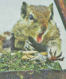
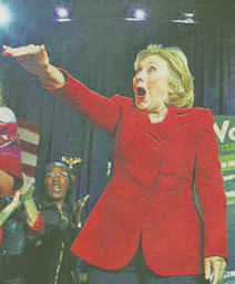
Returning from an ArtWatch trip to New York and Philadelphia (refreshed and invigorated, as always), a first task was to take clippings from the previous week’s newspapers. On facing pages of the Times of 26 October, two startling and memorable images shouted in hilarious unison – and surely not in accidental juxtaposition? The first (here Fig. 2) was of a squirrel that had dropped a nut. The second was of one politician (Hillary Clinton, Fig. 1) endorsing another at a rally. The pendant pair of images testified to photography’s special, most distinguishing technical trait: its unique power to make/capture instantaneous-but-enduring mechanical records of particular scenes at singular moments. Photography (in its chemical and digital forms) has been a profoundly revolutionary addition to the world’s image making and recording capacities. That it is so at this point is beyond any dispute, but, then, it has never constituted, as some still hold, a replacement for those hand-crafted (painted, drawn or engraved) images made by people who are sometimes called artists. (See Gareth Hawker’s “A Photograph is a Copy, not a Creation“.)
On 25 October, at New York’s famous art school, The Art Students League, we were privileged to watch a kind of master class given by the painter Thomas Torak, who for thirty or so minutes, worked over a student’s oil painting of a model – a heretical procedure in many educationalists’ eyes. Using the student’s own palette, paints and brushes, he explained the artistic purpose of every change and adjustment as he went along. Starting at the passage depicting the model’s forehead, Torak suggested that the tones were too uniform. Lightening the student’s own flesh tint on the palette, he placed a firm highlight against the darkest tone on the shaded side of the head. Instantly – at a proverbial stroke – the form of the brow sprang forward from the canvas and turned convincingly in (evoked) space. With a stronger forehead, Torak moved down to the eyes in their sockets, darkening the shadowed hollows and placing strategic lights on the lids and the bulging eyes themselves. And so on and so forth down the head and into the body. Every adjustment was made on the authority of values seen to be present on the model herself, at that time and in that light. Seemingly, nothing was being invented: piece by piece, step by step, observable relationships between adjoining values were first carefully appraised and then artfully replicated in hue and tone on the palette, before being judiciously laid onto the painting.
However, as facet related to facet and form to form, the mosaic whole began to assume a compelling and designed narrative form from a brush that drew and revised as it coloured. Finally, Torak introduced consideration of the model’s entire body and clothing to the values of the background wall within the then-present natural top-down light. Here, again, the student had made too-equal an appraisal of the relative figure/ground values: the background was markedly too dark and too warm. Lightening and cooling its tone and hue caused the untouched figure to jump forward on the canvas in a startling “before-the-eyes” pictorial magic. Watching the demonstration and the entire group of students, it was apparent that without seeing Torak’s painting but simply by heeding his words of analysis and explanation, other painters in the studio were modifying their own work on similar rationales and to considerable benefits.
As a mild-mannered, softly-spoken man, Thomas Torak may be one of the art world’s most insufficently appreciated figures. Fortunately, the deftness of his speech and the acuity of his eye find other outlets at the Art Students League. Writing in that art school’s magazine LINEA (- and how very fortunate New York is that such an institution should have survived waves of modernist iconoclasm), Torak quietly, gently shredded a recent noisy attributional upgrade, rashly made on the back of a pictorially disruptive restoration at the now curatorially hyper-ventilating Metropolitan Museum of Art: see “The Rediscovered Velázquez” of 25 December last year.
Returning to our hotel at 11 p.m. on the last night of the trip, we witnessed another kind of artistic tour de force. On the corner of Times Square and West 48th Street, a “street artist” was working on a triple portrait, made in conté crayon on the basis of a photograph taken on a mobile phone (see Fig. 7), as his three subjects sat on the sidewalk behind him. The image of each head on the photograph could have been no more than half an inch high, and yet, from this miniscule photographic record, the artist was producing at speed perfectly credible heads with very fair likenesses. Like David Hockney – as we discovered once when drawing by the side of Lake Como – artists never pass one another without making an involuntary detour to take a peek. “Where did you learn to draw like this?” I asked the street artist. “In China” he replied. Ah yes, and alas, it could hardly have been recently at the Royal Academy Schools in London where Tracey Emin has been appointed Professor of Drawing. (See Harry Mount’s “Where will the Queen hang her rubbish portrait by Tracey Emin?”)
Michael Daley
Comments may be left at: artwatch.uk@gmail.com


![]()
Destroying archives

Technological advances are often over-sold and deployed in haste. As Nicholson Baker famously showed in his book Double Fold ~ Libraries and the Assault on Paper, countless books, magazines and newspapers were destroyed when microfilm seemed (falsely) to be a better, more durable, more economical means of storing their “information”. The BBC discarded much irreplaceable historic material which, having been shot in black and white, was held technically obsolete on the arrival of colour productions. As we reported on February 28, 2012 (“Shedding archival records at the Tate and the Victoria and Albert Museum”), the Paul Mellon Centre for Studies in British Art had recently received a phone call from a Tate employee who said “you might like the curatorial photo archive because we’re about to throw it on to a skip”. We subsequently learnt that the threat to archival material was more widespread and that it was being strongly resisted. Technical advances and their attendant risks are not abating. Here, the painter and ArtWatch UK Journal’s picture/photography analyst, Gareth Hawker (- see his post of 10 January 2011 on photography in museums), discusses some of the dangers posed to archives by breath-taking but commercially driven and insufficiently examined technical developments in digital photography.
Gareth Hawker writes:
The benefits of digitising archives can seem immense: the archives become easier to index and retrieve than the original documents, and copies may be sent anywhere in the world almost instantly. These advantages can appear so dazzling that the risks of digitising may be disregarded, especially by institutions which lack the funding and the expertise which the major museums can call upon. For those with low budgets and little experience in digitising their archives, several groups have issued guidelines – the “Western States Digital Imaging Best Practices” [Endnote 1] being among the best known. These practices have been taken as the basis for a number of instruction manuals, notably one written by Jim Kennedy [2]. He provides plenty of useful advice but, while he does mention the risks involved, the bulk of his manual describes ways in which an image may be manipulated. An inexperienced archivist may get immersed in this part of the book and, in his enthusiasm for manipulation, throw away the original file.
It is true that the original archive file may not be suitable for all uses, for example a publisher may wish to enhance the image – perhaps by increasing contrast and removing blemishes – so that it would look better in a book or on the Internet. The resulting picture can look quite different from the archive image, but a researcher should always be able to track back to the unaltered original and check through any changes that may have been made. Ensuring that this is possible is known as maintaining image integrity. Digital images are intrinsically more proof against tampering than analogue images, but only if they are stored with the audit trail which records the changes, if any, which have been made to the original digital file. The construction of an audit trail is described in the Adobe document, “Digital Image Integrity” [3]. However, among the procedures which the “Western States Digital Imaging Best Practices” document lists as ‘best practice’ it includes deleting the original file, and keeping only the manipulated version as a ‘master-file’. This invalidates the file as an archive, especially if the original photographic print or transparency has also been thrown away.
Jim Kennedy writes:
“Best practice is:
(a) to make a master image that has tone and color carefully adjusted to correct fading and exposure, or (b) to make a master image that represents the tone and color for the physical condition of the item at the time of digitization without correction of fading or exposure. The choice depends upon the goals and resources for the project, with the second option requiring more extensive resources to create and maintain large files that may never be used and include reference targets when possible.
Both types of master images could be included in an archive. …”
Clearly choosing option (b) is vital for a serious image archive. Relative to the cost of time spent in scanning and filing, the cost of storage on a disc or drive is tiny; but throwing out the original file can cause confusion for ever after. The archivist who is pressed for time need not make any of the manipulations which the guidelines suggest. These could be postponed until someone wanted to adjust a copy of the archive file for a specific purpose, leaving the original untouched.
The task of preserving the new digital records presents new problems. Hard drives and discs become corrupt with the passage of time, so the data on them needs to be transferred to a new set of drives or discs before it is lost. The entire archive needs to be transferred frequently – every two to four years according to some authorities. There is a danger that someone may forget to transfer the data and that it will all be lost. This is a good argument for keeping the original, non-digital documents, but one which is sometimes overlooked. For anyone thinking of digitising a collection, David Saunders’ chapter on the subject of preserving records, “Image Documentation for Paintings Conservation” in Conservation of Easel Paintings (Eds. Stoner and Rushfield), provides a summary of this and other considerations which would be worth bearing in mind.
One consideration is the quality of the digital files themselves. The resolution of a digital photograph or scan is likely to be far lower than that of an old-fashioned photographic print – even one of poor quality. The amount of data lost if the original print or transparency is thrown away is incalculable. In addition, new techniques may be able to retrieve even more data from the originals than was ever imagined. Destroying the original documents will close off this possibility forever. Keeping the print-out of a digital document (‘hard copy’) may be advisable, but is an inadequate substitute for keeping the original, pre-digital document.
As an indication of the types of falsification that the writers of the ‘Western States Digital Imaging Best Practices’ consider acceptable, see the examples at right. A researcher looking at a ‘master image’ would have no way of distinguishing between what was a true record, and what had been doctored.
These doctoring procedures would invalidate photography as a means by which to examine how paintings had changed over time. This would represent a disaster for historians, and a blessed relief to any restorer who wanted his blunders to be forgotten. Restorers themselves rarely seem to look critically at ‘before’ and ‘after ‘photographs of the paintings that they work on, while museums often keep only haphazard photographic records of the works in their collections. The Rembrandt [4] and Raphael [5] databases give some idea of how incomplete these records may be. Perhaps this directionless attitude to record-keeping derives partly from the restorers themselves, who do not often attach much importance to comparing ‘before’ and ‘after’ photographs. Most restorers prefer to monitor their own work according to what they see through the microscope, informed by their own experience and training – but without any objective standard against which to measure the result of their actions. Few restorers outside the major museums take high-resolution ‘before’ and ‘after’ photographs of the paintings they work on, though they may take snapshots which are low in resolution, unevenly lit, and inaccurate in colour. Not having accurate ‘before’ and ‘after’ photographs available – and, when they are available, not being practised at examining them – most restorers have little opportunity to assess the extent to which their work has damaged a painting.
Thus the importance of photographs may be underestimated, and the contribution of the archivist undervalued. It is essential that the best possible photographic records be made and maintained if any objective assessment of changes to a painting’s appearance is to be undertaken. An archivist may do well to consider keeping original, pre-digital documents, and resisting the temptation to become completely dependant on the computer.
Gareth Hawker
Endnotes:
1 http://www.mndigital.org/digitizing/standards/imaging.pdf
2 http://archivehistory.jeksite.org/index.htm
3 http://www.adobe.com/digitalimag/pdfs/phscs2ip_digintegr.pdf
4 http://www.rembrandtdatabase.org/Rembrandt/explore-paintings
5 http://cima.ng-london.org.uk/documentation/index.php
Comments may be left at: artwatch.uk@gmail.com


![]()
“Pick Up A Pencil”
The theme of the new ArtWatch UK members’ Journal (see right) is “The Primacy of the Visual”. Failures to acknowledge, address, or even recognise visual evidence are examined. The text of Charles Hope’s 2011 James Beck Memorial Lecture is carried in full. Professor Hope cites failures of the National Gallery’s curators and restorers to address opponents’ arguments or to recognise the import of key historical documents on artistic practice. When Professor James Beck, the late founder of ArtWatch International, lent support to artist-critics of the Sistine Chapel restoration he came under vicious attacks from some scholarly peers – for all the world as if he had betrayed a priesthood of the visually ignorant. Prof Hope cites a letter of that kind. If artists do sometimes discomfort scholars, it is no presumption: knowing how art is made they are precisely the best qualified to detect its un-making. Here, the painter (and photographer) Gareth Hawker discusses both fundamental differences between painting and photography and the widespread failures to recognise these differences. His demonstration is timely. If (as we have argued elsewhere), art schools have given up the ghost with regard to teaching the traditional skills that formerly equipped artists to recognise restoration blunders, in the wider world of commercial film-making there are signs – notwithstanding giant leaps in the powers of digitalised image-making – of a renaissance in traditional art practices. We discussed this paradoxical relationship in connection with the extraordinary accomplishment of the hand-crafted animated film Frankenweenie. Another such heartening case is discussed opposite. [M. D.]
A Photograph is a Copy, not a Creation, Gareth Hawker writes:
“…we have realised that we should give more attention to photography”. So wrote the Director of the National Gallery, Nicholas Penny, in his introduction to the current exhibition, Seduced by Art: Photography Past and Present [1]. Several reviewers seem to agree. Tabish Khan wrote that, “…photography is a contemporary art form that can be just as inspiring and impressive as painting” [2]. But photographs do not incorporate the high-level thinking that paintings do. It would be misleading to put them in the same category.
The difference between painting and photography is frequently glossed over. For example, many people suggest that the camera is a tool just like brushes and pencils. At first sight, this may appear to make sense. The photographer decides what to include in the picture, in the same way that a painter often does. He chooses where to place the camera; in which direction to point it; how far to zoom in on a subject; and when to press the shutter. He may select models, costumes, and arrange lighting. All these factors contribute to what is called the ‘scene’ – the image in the viewfinder. The ‘scene’ may be recorded by a photographer just as well as by a painter, so the argument goes: they just use different tools in order to complete the same task. However this is to ignore what the tools are used for. The camera is used to record the scene, while the brushes and pencils are used to analyse it. The importance of this analysis is often overlooked.
Photographers who have wanted to claim equal status with painters have made various approaches, all ignoring this analytical element. At first they blurred and smudged photographs in order to make them look like paintings. Then photographers claimed that theirs was a totally separate art form, a pure record of the scene. Some argued against this, saying that if a photograph were pure, it could not be artistic. Before this issue could be resolved, some writers swept it aside. They suggested that what mattered was, “conceiving an image in the brain and finding some way of expressing it” [3]. What counted was the viewer’s response – whether a work, “spoke” to the viewer [4]. This disregarded a significant factor: people do not respond to paintings in the same way as they do to photographs, especially if they can see that a painting provides evidence of thinking, in a way that a photograph does not.
Paintings look different from photographs because they are made differently. A painting is constructed from brushstrokes; each stroke the result of a decision. A painting may represent a scene, or it may represent nothing at all. A painting is an independent creation, whereas a photograph is dependant on the scene. A photograph can be made only if there is a scene to be copied.
A representational painting may be compared to the summary at the beginning of a scientific paper – the paragraph which is entitled, “Abstract”. Its writer makes a personal judgment about which are the most important topics dealt with in the paper, and writes a brief account of his own. The “Abstract” is a new and independent piece of writing, just as a representational painting is a new and independent analysis of the scene. In contrast, a photograph is like a photocopy of the whole scientific paper. The photocopy shows no analysis, and no judgment.
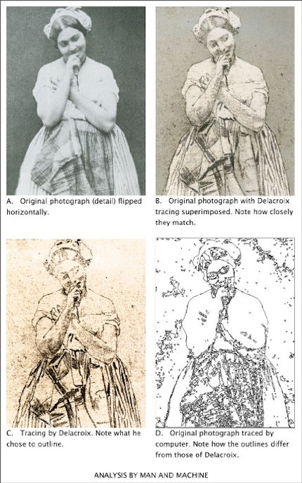
Brushstrokes are only the most basic way in which a painter’s analysis or abstraction may be seen. Another is in the simplification of the human figure – in its reconstruction in terms of geometrical solids, such as eggs and cylinders. Even a simple tracing – the lowest form of analysis – shows which lines the painter has considered to be more important than others.
To give a computing analogy: a photograph is like a bitmap image (which records only pixels – spots of colour), but a painting is like a vector image (which records instructions about where lines are to go). A tracing programme can convert a bitmap file into a vector file. The computer makes a simplification which looks similar to a paint-by-numbers drawing. This computer drawing may be thought of as the beginning of an attempt to imitate human analysis – a type of artificial intelligence – though the computer has a long way to go before it catches up with the human brain in this respect (Fig. 1). If anything may be thought of as being a tool comparable with brushes and pencils, it is a tracing programme (which helps to analyse), not a camera (which does not).
To express the difference in another way: Scene = Photograph (Scene = Photograph) × Analysis = Painting
Analysis is an essential part of what makes a representational painting interesting to look at; whereas what makes a photograph interesting to look at is the scene, not its treatment.
Analysis demands abstract thinking – whether it is done well or done badly. What distinguishes the great painter from the mediocrity is the quality of this thinking, not any manual skill. Anyone who can sign his name, already has enough manual skill to make a great drawing. (This includes drawing in its wider sense: deciding where to place marks made by the pencil or the brush, even when no outlines may be involved).
The modern digital camera provides the most effective means for recording the scene that has ever been devised. Strangely, many photographers want to use it for a different purpose, to express an interpretation – a purpose for which it is singularly unsuited. Some photographers deliberately introduce all sorts of inaccuracies which mean that the result is neither a pure substitute for the scene, nor an independent creation.
The classical case for photography’s status as an equal to painting was put forward by the man who was perhaps, “the most important figure in the history of the visual arts in America” – Alfred Stieglitz (1864-1946) [5]. In his usage, the word ‘artist’ meant someone who, “got the spirit of the truth” [6]. He held that only 0.1% of painters were artists, and only 0.1% of photographers were artists. But not everyone takes such an exalted view. For example, a tax inspector wants to know whether a painter is a house-painter or an artist, not whether he has, “got the spirit of the truth”. So when a painter says that he is an artist, he is simply describing his activity. He is not claiming to be either good or bad at his job: that is for others to decide. But when a photographer says that he is an artist he is claiming to be in the top 0.1% of his profession: he is pushing others to accept the valuation he has placed on his own work.
By using the word ‘artist’ in this way, Stieglitz moved attention away from a vital distinction; that between creating something new (a painting) and making a copy (a photograph). He persuaded many viewers to ignore analysis, and to concentrate on the selection and arrangement of a scene – on pointing and shooting.
Stieglitz’s advocacy, along with that of other theorists, seems to have desensitised many viewers. They see only the subject which has been represented. They fail to notice that a painting exhibits the working of a mind – not just in the choice of subject, but in every single stroke. One consequence of this desensitisation became apparent when the Sistine ceiling was treated by restorers, and much of the best painting ever produced was wiped off. The picture of a man looks like a man, whether it is drawn well or drawn badly. Most historians were satisfied with what remained after the paint-stripping because they could still identify the subjects which had been depicted. Very few noticed how drastically the quality of the drawing had been reduced.
Many people were better informed about these issues in the days when Michelangelo painted his great work. Contemporaries who saw it for the for the first time commented at least as much on the power of its drawing, as on its subject matter [7]. The way in which influential men looked at nudes in those days may be compared with the way in which they look at motor cars now: with an appreciation of the beauty of engineering and construction – an appreciation which derives in part from an understanding of how all the parts connect together.
The paint-stripping made nonsense of some of the connections in Michelangelo’s nudes. His contemporaries would have been appalled, but most of today’s historians and television presenters do not even notice. They focus on the imagery and the iconography, not on the drawing. It is as if they were waiting for the work to ‘speak’ to them – for the artistic content to make itself felt. But, being sensitive only to subject-matter, that is all that they are able to see. Such narrowly prepared minds will respond only to the crudest visual stimulus (the colours looking brighter after the top layer of paint has been removed, for example).
Just as the critical response to painting has become limited, so the meaning of the word Art has expanded – to such a degree that almost anything seems to be embraced by it, including photography. However painting remains distinct: it is a creation which is independent, and which can embody the kind of analysis described above. This is why painting may be categorised with the higher expressions of the human mind, along with poetry and philosophy. Photography does not fit into this category because it cannot display abstract thinking.
But painting is now so little appreciated that, to many people, it seems comparable with photography. This has allowed photography to be called Art, and so to enter the National Gallery. Arguably this is the same lack of discrimination that has allowed paint-stripping to take place, not only on the Sistine ceiling, but on almost all the great works of painting in the Western World, including those in the National Gallery.
“Giving more attention to photography”, seems to be one more example of this downward trend, but perhaps there is a glimmer of hope. When a great artist’s paint has been removed from a picture, the decline in its artistic quality is irreversible; but a decline in critical awareness is different: it can be reversed. At present, many people are only distantly aware that, in every brushstroke, a representational painting gives evidence of analytical thinking. Perhaps the exhibition at the National Gallery will help to promote this awareness. If so, it will have served a very useful purpose.
ENDNOTES:
1 The National Gallery, Seduced by Art: Photography Past and Present, Yale University Press (9 Oct 2012), ISBN-10: 1857095456, ISBN-13: 978-1857095456 The exhibition runs from 31 October 2012 to 20 January 2013 2 londonist. Art-review-seduced-by-art-photography-national-gallery. Retrieved 8 November 2012 3 Gerry Badger. Collecting Photography. London: Mitchell Beazley, 2003. ISBN 1-84000-726-5 p23 4 Gerry Badger. Collecting Photography. London: Mitchell Beazley, 2003. ISBN 1-84000-726-5 p24 5 Richard Whelan, Stieglitz on Photography, Aperture, 2000, p ix 6 Alfred Stieglitz, Is Photography a Failure?, The Sun, New York, March 14, 1922 – reprinted in, Richard Whelan, Stieglitz on Photography, Aperture, 2000, p 229 7 http://artwatchuk.wordpress.com/2012/10/01/12th-november-2012/ Retrieved 12 November 2012
Gareth Hawker
Comments may be left at: artwatch.uk@gmail.com


![]()
Review: Deadly Docents, Dirty Varnish and a Big Educational Push at the Frick

The hardest thing to do in today’s internationalised world of museum administration is to stand still. A trip to New York always compels a visit to the delightful time-frozen art palace that is the Frick Collection but it would seem that, even there, maintaining the status quo there has proved unendurable. Madcap schemes to build new galleries for new exhibitions under the Frick’s garden have been drawn up. It is possible that the new director, Ian Wardropper (former chairman of the department of European sculpture and decorative arts at the Metropolitan Museum of Art), has dampened ardour for the kind of curatorial and physical “bolt-ons” that have skewed similarly bequeathed jewels like the Wallace Collection in London and the Phillips Collection in Washington (where today the historic works and their period architectural setting have been swamped and diminished by curatorial and architectural expansionism; where today “Special exhibitions are a signature element …offering new perspectives on the work of contemporary and modern artists.”) The Frick’s director does however seem minded to expand the audio tours and “other educational programs” and a book prominently displayed in the Frick’s shop (see right) serves as explicit manifesto for Education’s bid to interpose itself noisily at the very centre of museums between art and its visitors. As the painter Gareth Hawker describes below, something vital and of the essence is threatened by the prospect. And, as the painter James Keul discovered on a recent visit, something similar is already up and running at the Getty:
“The docent in the Rembrandt room of the East Pavilion upper level, which covers art from 1600-1800, was speaking to a tour group of about 20 people, mostly middle-aged, and asking what observations people had made on the small painting of the Abduction of Europa. One member of the group asked why all of the paintings appear so dark. The docent answered that varnish and oils applied over the years had darkened, leaving many works darker than they were intended to be. Presumably, this was meant to plant a seed in peoples’ minds that all dark paintings are the result of a darkened varnish rather than an intended effect that was used, in this case by a Baroque artist, to provide contrast and thus bathe a picture in a divine light…”
Gareth Hawker writes:
Visitors who plan a quiet hour or so contemplating works of Art in an American museum risk being accosted by guides called “Docents” who intend to deepen their museum experience. Docents, according to Rika Burnham and Elliott Kai-Kee, the authors of “Teaching in the Art Museum: Interpretation as Experience” (2011, Getty Publications – see Figs. 1 – 4), seek to enable the visitor to “make meanings”. The book’s purpose “is to explain making meanings – to open the world by means of art”. Although many readers might be baffled by such sentences as: “metacognition is a byproduct of practice and it facilitates profound experience”, Burnham and Kai-Kee’s respective positions as Head of Education at the Frick Collection, New York, and Education Specialist at the J. Paul Getty Museum in Los Angeles, requires that their campaign to help docents influence a whole culture by shaping the public’s attitude to works of Art be examined.
Docents are amateur enthusiasts, who have been trained to a high level – though not to degree standard – in both teaching and art history. They come from all sorts of backgrounds, and are of all ages. They probably think of themselves as more or less ordinary people who enjoy appreciating art and wish to help others to do so.
The position of the Docent was created in 1907 in response to a perceived need. Visitors to art galleries wished for a guidance in appreciating works of art which was deeper than that being provided by art-historical lectures. Docents were trained and appointed to meet this need by providing an education in aesthetic pleasure. Nearly a century later, there is no longer agreement about what might be meant by “an education in aesthetic pleasure”. So this book appears at an opportune moment, just when museum educators are seeking to clarify their roles.
In order to help redefine their objectives, Burnham and Kai-Kee refer to the work of the educationalist John Dewey who wrote in his classic 1934, Art as Experience, that “The task is to restore confidence between the refined and intensified forms of experience that are works of art and the everyday events, doings, and sufferings that are universally recognized to constitute experience.” Dewey had identified an ideal response to a work of art. The visitor would begin by gaining an “experience” (that is, a sense of unity). A teacher might help the visitor in this, by stimulating and guiding his thoughts, but without ever imposing any view or judgement. In this way, “guided interpretation” might help the visitor to “make meaning” – to recognise relationships in many aspects of life and art. At its highest this process can generate a sense of over-arching interconnectedness which Dewey called a “culmination”.
In one exercise, students working in a group are encouraged to offer up any ideas and reflections which come to mind in reaction to a painting. These “thought showers” sound as if they could be open and productive, but, if a student asks an awkward question, the process seems to go into shut-down, as the following account (p. 71) may illustrate:
“The picture (the Frick Saint Francis by Giovanni Bellini) is beginning to cast its habitual spell. Suddenly, without warning, in a slightly confrontational tone, one man in the group asks, ‘What’s the difference between a work of art and a mere illustration? This might be just an illustration.’ [See Fig. 2] The question raises larger philosophical issues that are more difficult than he probably realizes and than I can accommodate in the context of a gallery program. I urge him to be patient. Perhaps the experience of the painting may begin to resolve the question, at least for him.”
The docent hopes that the student’s experience of the painting might begin to resolve his question – ignoring that fact that it was his experience which had prompted the question in the first place. Perhaps only certain types of experience are acceptable. (Dewey made a distinction between “experience” and “an experience”). The docent also suggests that the student’s question might be resolved, “for him”, as if his question were personal; as if he were troubled by a mental hang-up; and as if she were his counsellor. But his question was not personal. It was a general question about how works of art may be classified. An answer which was good only “for him” would not have addressed the issue – if indeed such an answer could have any meaning at all.
So, to summarise, the teacher has judged that her student has had the wrong kind of experience, but will not explain why; she judges that he is probably ignorant of issues which are connected with his question but she will not tell him what they are. This begins to look less like an application of Dewey’s theories and more like a power-struggle in which the docent issues a put-down and asserts her superiority.
As so often throughout the book, while the theories seem perfectly innocuous, even illuminating, it is the way in which they are put into practice which gives cause for concern. The authors seem to share a general squeamishness about talking about artistic quality. This is a mindset which is just as prevalent in Museum education in the UK as in the USA. While the authors appear to accept Dewey’s observation that works of aesthetic merit may be found at all levels of human endeavour, not solely in High Art, they apparently interpret this to mean that one must not point out the difference between good and bad.
The authors do mention the importance of looking and seeing, but by these terms they seem to mean finding and telling stories, rather than observing shapes and colours. Works are treated as objects to be read, like books, with stories to be discovered and assimilated. Looking at a painting for its artistic qualities is considered only as a small part of a student’s involvement, not of central importance. (Whistler’s Ten O’ Clock lecture, with its concentration on qualities such as colour, tone and shape, would form a stark contrast to the narrative approach outlined here.)
For the authors, talking is an essential part of the process of experiencing a work of visual art. The authors would like to see the docent become increasingly prominent in museums. They wish to see teaching develop in such a way that, “galleries may be defined as places where dialogues take place around works of art” (p. 151). This means that galleries would no longer be defined as places where one goes to look at paintings. They would no longer be quiet. The authors envisage galleries “filled with the hum of conversation […as] educators move from the periphery to the center.” But this move may have harmful consequences. If visitors learn to think of the appreciation of works of art as a series of “experiences”, with little regard to artistic quality, their eyes will be closed to many fundamental aspects of the art of painting. Such visitors are unlikely to observe that some pictures are better than others. They will not notice when quality has been reduced over time: when paintings have been degraded by insensitive restoration “treatments”. Their non-judgemental, non-critical stance will make them easy prey for apologists who promote restorations with appeals to crude sensation such as, “now we can see what was underneath that dark paint!” or, “now look at how bright that blue has become!”
Works of art will be relegated to the status of tools which enable the visitor “to open the world by means of art.” Defining the function of art in this way is simplistic. Art can have many meanings or none at all, yet we can still recognise that it is “right” – if our minds are quiet. Yet the museum of the future which the authors envisage is hectic and noisy.
“Responsible for the continuing translations of meaning that occur in the new museum, the educators who teach are the most accomplished members of the education department, best qualified to shape and animate museum programs. They lead the department, define its philosophy and mission, and overturn the historical definition of teaching as a peripheral, volunteer, or entry-level activity.”
If, by “translations of meaning” the authors mean anything like the “guided interpretation” we have seen in the verbatim accounts of their teaching sessions, we know that it will involve subtly pressurising the visitor to conform to their view of art, “shaping and animating” his “experience”.
A quiet hour contemplating beautiful paintings looks likely to become ever more elusive if the authors get their way.
Gareth Hawker
Comments may be left at: artwatch.uk@gmail.com


![]()
Something Not Quite Right About Leonardo’s Mouth ~ The Rise and Rise of Cosmetically Altered Art

In the conservation of art, the impulse “to do” is the most dangerous of all. There are so many ways in which picture restorers can, through misreading or misunderstanding, injure art. Unfortunately, there are also many ways of promoting injuries as triumphs. Worst-case injuries can be spun as dramatic “discoveries” and “recoveries”. With the Sistine Chapel ceiling restoration – perhaps, an all-time worst case – the last stages of Michelangelo’s sculptural painting were washed away with oven-cleaner-like chemically-laced thixotropic pastes and copious applications of rinse-water (see Fig. 1 and our earlier post). To sanction the unexpected and unprecedented changes, a “New Michelangelo” of art history-changing, colouristic brilliance was invoked. The surprise outcome was presented, post hoc, as having demolished the “Darkness Fallacy” and the “Sculptural Fallacy” of Michelangelo’s legendary, much-copied and commented-upon work. Less technically experimental methods can also produce serious alterations during a single intervention (see Figs. 2 & 3). Not always immediately noticeable but ultimately no less invidious are the cumulative “Chinese Whispers” changes made as successive restorers undo and redo their predecessors’ work. A case in point of the latter – and of the defences that get offered – can be seen in successive treatments of the London version of Leonardo’s “Virgin of the Rocks”.
The cult of unexpected and dramatic discoveries grew out of earlier (spurious) claims of scientifically underpinned restoration methodologies. “Picture surgeon” restorers mimicked the conventions and vocabularies of medicine with its “diagnoses”, “research”, “interns” and “treatments”, and ended by believing their own easel-side manners and propaganda. In truth, they have always more closely resembled cosmetic surgeons and it makes cultural sense to consider these twin spheres together. Both promise to reverse Time’s effects. With both, adverse consequences are often slow to be recognised. With human cosmetic surgery, everyone has recently learned of the horrors of industrial-grade silicone breast implants and Trout Lips. News has recently begun to emerge of the unanticipated consequences of radically invasive attempts to put the very fabric of paintings into perpetual good health. The National Gallery now concedes that its former penchant for ironing large masterpieces (like Titian’s “Bacchus and Ariadne”, Seurat’s great “Bathers”, and Sebastiano’s “The Raising of Lazarus”) onto sheets of industrially manufactured pressed-paper (Sundeala) boards has bequeathed pictures that can no longer be moved safely.
Both zones of surgery prove prey to stylistic fashions as the distinctive nips, tucks and nose-jobs of one period swiftly become démodé. A worst-case example of multiple botched treatments occurred recently at the Louvre. It was reported in the French and British press, in our Journal (see Fig. 3) and in our post of 28 December 2010. The Louvre’s controversial restorations continue to make headlines. One of our greatest concerns is that no picture restorer ever seems able to resist undoing and redoing (Fig. 4) the painted interventions with which predecessors left their imprints on masterpieces. That there may be some cultural/pathological root to such tampering should perhaps be considered. It sometimes seems as if restorers reward or indulge themselves with a little fancy creative brushwork after the tedium of a long cleaning. In 1998, a restorer, John Dick, working on Titian’s “Diana and Callisto” at the the National Galleries of Scotland told Scotland on Sunday (29 March 1998):
“Most of the areas I will be painting are so small I will not have to invent anything. I will simply have to match the colours to the original. It will be more difficult when it comes to improving Titian’s contours, which I know I will be tempted to do, but which can be dangerous. I will consult with other conservators and with the director [Timothy Clifford]. In the end, a decision has to be taken but if it does not look good it can always be taken back off again.”
Whether restorers are taking off or putting on, restorations never take place in vacuums. There is always a context that is comprised of a singular balance of forces and interests. These forces are various and competitive, being sometimes personal, sometimes professional, sometimes institutional; sometimes local, sometimes national, sometimes international; sometimes technical, sometimes philosophical; sometimes political, sometimes financial. But if there are rival, inter-acting sociologies or cultures of restoration, these always find expression in the individual acts of restorers upon individual, unique and historical works of art. It is therefore incumbent on those who authorise or sanction restorations to permit/guarantee absolute transparency in restoration procedures and methodologies. In this respect the National Gallery has recently made enormous strides. Under the Gallery’s present director and its previous director, ArtWatch UK has been given full and generously helpful access to conservation and archival records. The Gallery publishes in its annual Technical Bulletins much material on its own workings in conservation. Nonetheless, some old habits die hard. The best-reported conservation activities in the bulletins tend to be in the most neutral areas – in technical analyses of materials, applications of imaging systems, and so forth. The least adequately reported activities are precisely the crucial hands-on physical interventions of restorers.
Over the years, we have formed an opinion on this lacuna. There is a problem for the Gallery in fully acknowledging and showing what individual restorers do, because they do different things, each according to his own inclinations and talents. Taking the recent restoration of the “Virgin of the Rocks” as our case in point, let us first look in from “the outside” at the broader context. As we have discussed before, this was a restoration whose celebration (in what was to become a £1.5 billion exhibition) was planned before the restoration itself had even begun. As we have also previously discussed, the Gallery has proudly published its policy or “philosophy” of restoration treatments. Its handbook “Conservation of Paintings” acknowledges that pictures are now “changed primarily for aesthetic reasons” (p. 53) and (p. 45) that restorations are carried out on the “aesthetic objectives of those responsible for the cleaning”. Moreover, (p. 53) although the “different aesthetic decisions” taken by individual restorers produce results that “may look very different”, all of such different outcomes are “equally valid”, provided only that they have been carried out “safely”. These are alarming claims: in matters of aesthetic and artistic integrity, the “safety” or otherwise of the cleaning materials is a red herring: if pictures end up looking different, they are different, and these differences are material and irreversible.
The proof of the National Gallery’s restoration pudding is in the eating – which is to say, in our looking. In the Gallery’s current Technical Bulletin (Vol. 32), Larry Keith, Ashok Roy, Rachel Morrison and Peter Schade, say of the restoration of the “Virgin of the Rocks” that while its practical intent was “primarily aesthetic” it also served to provide an example of the Gallery’s interdisciplinary approach:
“Whenever possible, major restorations are intended as the hub of a wide range of research activity that sees curators, scientists and restorers working together – increasingly alongside colleagues from other institutions”.
The significance of such extra-conservational purposes of restorations should not be overlooked or underestimated: much of the credit for the present historically unprecedented coralling of quite so many Leonardos in one place at one time, has been given to the international connections and diplomatic skills of Gallery staff, as seen in their increasingly close relations with other major institutions such as the Louvre. As it happens, the relationship with the Louvre is proving more problematic and embarrassing than the Gallery might have anticipated. It has recently been reported that among the membership of an international advisory committee set up by the Louvre to advise on and monitor the restoration of Leonardo’s “The Virgin and Child with St Anne”, the two members who proved the most enthusiatic advocates of a more, rather than a less, radical cleaning of the painting, have been the National Gallery’s head of conservation, Larry Keith, and the curator of the current Leonardo blockbuster, Luke Syson.
One of the calling cards that Syson and Keith will have had on the international advisory committee has been the generally ecstatic art-critical reception of the restoration of the “Virgin of the Rocks” and of the blockbuster exhibition it had kick-started. Richard Dorment’s praise for the restoration was unreserved:
“This sense of interaction is palpable too in the National Gallery’s version of the Virgin of the Rocks, which until its recent cleaning was considered to be a slightly inferior version of an altarpiece in the Louvre. But when it emerged last year from the studio of Larry Keith, the National Gallery’s director of conservation, the refinement of the detail, depth of field and exquisitely calibrated tonal harmonies made it apparent that only Leonardo could have painted it, with little or no intervention from his studio assistants.”
How remarkable, perhaps, that so many people could now see, having been told what was to be seen, what so few, unaided, had seen before – an iffy, “not-altogether-Leonardo” had not only beome an “altogether-Leonardo” but a Leonardo that was now more than a match for the previously superior Leonardo. But Dorment’s acceptance of the claimed elevation would have been sweet music to Gallery ears – as must also have been his drum roll for the blockbuster show’s creation and his apparent endorsement, even, of its terrifyingly hazardous back-scratching corrolaries:
“Earlier this week, the National Gallery in London announced a historic collaboration with the Department of Paintings at the Louvre. The French have agreed to lend their version of Leonardo da Vinci’s Virgin of the Rocks to the eagerly awaited Leonardo da Vinci exhibition that opens at Trafalgar Square in November. A few months later, the English will repay the debt by sending Leonardo’s highly finished preparatory drawing The Virgin and Child with Saint Anne and John the Baptist (the Burlington House Cartoon) to Paris, where it will hang in close proximity to the painting it was made for, which is owned by the Louvre.”
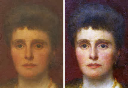
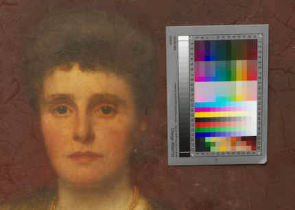
Leaving aside the risks of lending the hitherto unlendable Cartoon, with the restoration of the London “Virgin of the Rocks”, we had initially been somewhat reassured to have been told that this was not to be an aggressive restoration; that while it would greatly thin the varnish applied by Helmut Ruhemann in 1949, it would not entirely remove it. (Pace the Art Critics, it has never been made clear how a cleaning that ran from November 2008 to May 2009 and that had not removed all of the previously applied varnish, might somehow have disclosed an entirely autograph status throughout a picture that was variously painted and unevenly finished.) When it went back on show after its “moderate” cleaning, old anxieties flared: it was evident that, with its now violently assertive blues, the picture had not returned to its previous post-cleaning appearance in the 1950s and 1960s. For the latest detailed accounts of the restoration and for photographic records we turned to the current Technical Bulletin (No. 32).
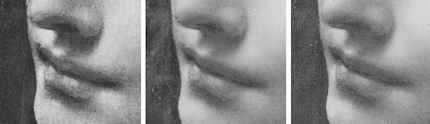
Comparing the large image of the angel’s face that is carried on the cover of the present Bulletin, with the best previous images (seen at Figs. 5 – 8), it was apparent that changes had occurred in this important and sensitive area. The most dramatic of these was to the most expressive feature – the angel’s mouth. With Leonardo, of all artists, a degree of circumspection in the restoration of his mouths might be expected. (Who would lightly change the expression of the “Mona Lisa”?) Instead, we encountered a full-blooded change to the design of a mouth on a face that had been held by one scholar and former director of the National Gallery, Kenneth Clark, to be exclusively the handiwork of Leonardo himself and the section of the painting in which the artist’s finishing glazes had best survived: “this is the one part of our Virgin of the Rocks where the evidence of Leonardo’s hand seems undeniable, not only in the full, simple modelling, but in the drawing of the hair.” Where Clark had seen a clear superiority in the head of the angel over that of the Virgin, in the 1990 re-publication of his book, a note was added saying that “As a result of the cleaning of the altarpiece in 1949 the differences between the heads are rather less apparent.”
The recent redrawing and remodeling during a restoration has cast the far side of the mouth downwards and left the upper lip no longer tucking enigmatically into the cheek in the manner so frequently encountered (see photographs, right) as effectively to constitute a trademark Leonardo/Leonardo school signature. The photographic evidence raised two questions: What had been done? Why had it been done? We returned to the Technical Bulletin.
No answers were to be found. There was no explanation because there was no mention or account of any change having been made to the mouth. As so often, the Bulletin’s authors favoured the general over the particular. We learnt that “The intent of the cleaning was to effect the desired aesthetic improvement through the reduction of the old varnish, not simply to remove it, and in the main a very thin remnant of that layer…remains on the picture.” This deepened the mystery: if a thin layer of Ruhemann’s 1949 varnish had remained over the face, and if this layer had not been injured during the latest cleaning, why should any features have needed changing at all?
We asked the restorer, Larry Keith, if he had made any retouchings to the face of the angel. He replied that he had, but said that these had been confined to areas of damage and or abrasion. Specifically, he said that he had not introduced any new elements. This seemed at variance with the photographic record, insofar as we were in possession of it. That the mouth had changed was beyond doubt: we had record of its condition in photographs of 1938 (Fig. 5) and 1947 (Fig. 6). When Kenneth Clark’s 1938 book of details of paintings in the National Gallery was reissued in 1990 it was with new (this time, colour) photographs. We thus had a record (Figs. 5 & 6) of the angel’s face before the Second World War and, crucially, before Helmut Ruhemann’s 1948-9 restoration. We had a record of 1990 that showed the post-Ruhemann state (see Fig. 7). The mouth might have been weakened by Ruhemann (see Figs. 15 & 16) but its disposition – which had conformed to that seen in an x-ray photograph of 1947 (Fig. 19) – had survived. Ruhemann had, however, chiselled away the end of the nose so as to bring it inside the contour of the face (Figs. 5, 6 & 7), as is the case with the angel in the Louvre version (Figs. 9 & 10) but was seen not to be the case in the 1947 x-ray photograph of the London picture (Fig. 19). Keith has retained Ruhemann’s revision of the nose which had undermined (for reasons to be examined on another occasion) the coherence of the head’s perspective .
Clark’s book had again been re-issued in 2008, this time with distinctly superior new, digital colour photographs (see Fig. 8). At this late date, the mouth showed no change. So when, in November 2008, Larry Keith’s restoration began, the published photograph of that year effectively constituted a pre-treatment record, and the cover photograph of the angel on the current Technical Bulletin constituted a post treatment record. In between the two, the changes to the face had occurred. (To show the changes to the mouth more clearly, the painter Gareth Hawker tonally adjusted the 1938, 2008 and 2011 photographs seen at Fig. 4 so as to bring them to some tonal parity.) In view of the dramatic change to the mouth and the absence of any signs of losses or abrasions that might have preceded the repainting, we requested photographs of the angel’s face taken immediately after cleaning (but before retouching), and after retouching. These were kindly supplied. They confirmed that the mouth had been changed by retouching (see Figs. 17 and 18) but the pre-retouching photograph gave no indication of injuries or losses that might have required treatment. We therefore asked Keith, on what basis he had made his painted changes to the mouth (and elsewhere). He did not reply.
Some weeks later Luke Syson replied on Keith’s behalf, saying that as the curator of the work, he had been responsible for monitoring and advising on all aspects of the restoration and was therefore the person carrying the responsibility for answering all questions, including our own, about the restoration. Unfortunately, in this professional capacity, the curator, too, preferred to talk in the generality and to explain the restorer’s approach to the painting “as a whole”. I replied that, on the evidence of the Gallery’s two photographs, it was clear that features in the angel’s mouth which had survived both the Ruhemann cleaning and Keith’s own cleaning had been painted out. Would he explain, I asked, the thinking behind the alterations, and why changes to so sensitive and highly expressive a feature had not been discussed or acknowledged. I added that in my examination of the Gallery’s conservation dossiers I had encountered other instances of un-discussed and un-acknowledged changes made by restorers – including a major change to the Leonardo Cartoon.
In replying, Syson first said that he had reviewed the photographic evidence but could see no evidence of any deviation in Keith’s retouching from the procedure that he (Syson) had previously described. This was a depressingly circular bureaucratic response. Our concern had not been over command and management procedures at the Gallery, but over actual changes to specific and crucial features of a major and unique historical painting. Syson then claimed that the photographs showed that a single small damage had been revealed in Ruhemann’s 1949 cleaning and that he had retouched it. Keith, Syson added, had removed that single retouch to a small damage, in order to retouch it himself on the evidence provided by the surrounding undamaged paint. But this simply conjures a fresh mystery: how can noe restorer’s substitution of one small retouch of a single small loss by another restorer, have caused a mouth that formerly turned upwards at its extremity and tucked into a cheek, to turn downwards and cease to tuck into the cheek? However this might have happened – and clearly, something happened – where is the record of it?
As if in anticipation of such a question, Syson adds in conclusion, and in returning to his homebase circular bureaucratese explanations:
“Since this, as I’ve stated, is entirely in line with the approach taken elsewhere in the picture, there has been no need separately to document this part of the work.”
Between 1945 and 1994, Vermeer’s poor “Lady Seated at the Virginal” received no fewer than nine bouts of “treatment” – including being lined twice within three years. The last treatment (in 1994) was entered into the conservation dossier as “Retouching in face and neck corrected (Bomford) Surface cleaned, revarnished“. No photographic record of this intervention was to be found. When asked, the restorer, David Bomford, said that this was because: “there were no real changes – it was simply a matter of glazing a few small sections of the previous retouching which had discoloured slightly.” When our colleague, Michel Favre Favre-Felix, of ARIPA, noticed the second repainting in 5 years of the Veronese mouth shown in Fig. 3, and asked to see the Louvre’s documentation on it, he was told there was none because the repainting was but a “localised intervention“. A Louvre spokeswoman later described it as a simple sprucing-up (“bichonnée”) and added triumphantly: “That’s why you cannot find it in the painting’s dossier“.
Michael Daley
Comments may be left at: artwatch.uk@gmail.com


![]()