
The Demise of the National Gallery’s “made just like Rubens” Samson and Delilah with inexplicably cropped toes

Michael Daley writes: In a bombshell article (Observer, 26 September 2021), Dalya Alberge reported on a series of Artificial Intelligence comparisons of the Samson and Delilah’s brushwork with that on 148 uncontested Rubens paintings. The exercise had produced a negative result of such magnitude that the Swiss company, Art Recognition, disbelieved its own findings and ran the tests a second time. The results were identical: an unprecedentedly crushing 91% probability that the picture was not painted by Rubens:
“…Critics have long suggested that the painting is not by Rubens. And now a series of scientific tests employing groundbreaking AI technology have concluded that the 17th-century Flemish master could never have painted it. ‘The results are quite astonishing’, Dr Carina Popavici, the scientist who carried out the study, told the Observer… ‘I was so shocked…Every patch, every single square came out as fake, with more than 90% probability.’”
ArtWatch UK was cited as observing that “coming so soon after its ill-advised espousal of the now-rejected and disappeared $450m Salvator Mundi, these results are a calamity for the National Gallery” [see POSTSCRIPT, below]. A spokesman said: “The gallery always takes note of new research. We await its publication in full so that any evidence can be properly assessed. Until such time it will not be possible to comment further.” That was a far cry from its response in the 21 May 2000 Independent on Sunday: “We have absolutely no doubts about the authenticity of the picture and nor do most experts on Rubens”.
Doubts or not, the Samson and Delilah, which is promoted by the gallery as one its top thirty stars – and therefore as the best of its twenty odd Rubens’ paintings – is now a three-times disabled attribution: it had no provenance as a Rubens before a notoriously unreliable scholar’s 1929 upgrade; stylistically, it has long been shown to be untenable as a Rubens and to be compositionally incompatible with the copies made of the lost original Rubens Samson and Delilah ; and now, on multiple close technical comparisons, its brushwork finds no match with that in secure Rubens’ pictures. How the gallery comes to terms with this latest source of disqualification will test the mettle of its director and trustees, none of whom was party to the picture’s 1980 acquisition.
AN ATTACK ON THE MESSAGE
Alberge’s disclosure has been greeted by a thunderous silence of the Rubens experts – but the art history blogger, auctioneer and film-maker, Bendor Grosvenor, tweeted an immediate blanket dismissal of the findings:
“The only thing this tale should tell us is that computers still don’t understand how artists worked. And probably never will.” And “If you like a bit of science with your art history, it’s still hard to beat the National Gallery’s 1983 technical bulletin for showing the picture is indeed by Rubens.”
Grosvenor’s unsupported assertion bolstered by an appeal to the authority of an old and profoundly unsatisfactory National Gallery report gained tweeted support from the Sunday Times’ art critic, Waldemar Januszczak. In crucial respects the erratic art critical volatility of this pair of commentators (who conduct joint “Waldy and Bendy” podcasts on Januszczak’s ZCZFilms website), exacerbates the National Gallery’s now perilously exposed position. Holding Plesters’ report aloft as a standard may have been thought unhelpful by the gallery – the link Grosvenor provided to it now produces this message: “Page not found – Sorry, the page you requested has been removed or the link was incorrect.”
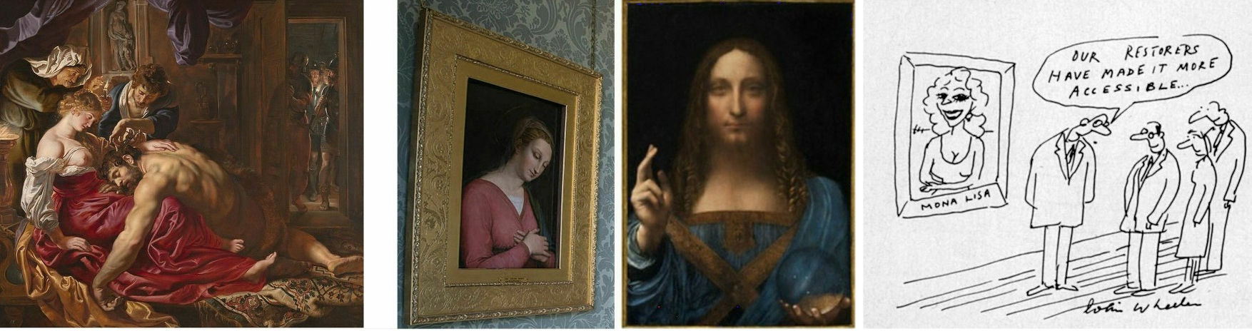
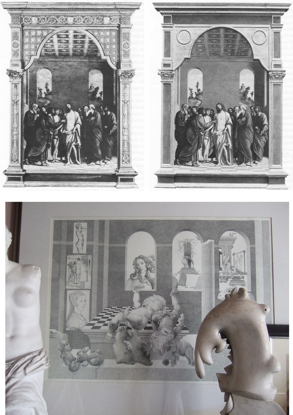
Above, Fig. 1: Left, the National Gallery’s attributed Rubens Samson and Delilah; second left, the Grosvenor-attributed fragmentary “Raphael” of a Madonna at Haddo House, Scotland; third left, the disappeared and demoted “Leonardo” Salvator Mundi; right, a Colin Wheeler cartoon.
Grosvenor’s appeal to the authority of National Gallery expertise was rich: when, after long examinations, that gallery’s experts recently judged his would-be “Raphael” painted fragment of a Madonna in an all’antica cross-over dress (Figs. 1 and 3) to be no more than a “possible 18th century work” he crossly rejected their findings and called for yet further tests. Where Januszczak now supports the Samson and Delilah’s Rubens attribution he does so in flat repudiation of his 1997 younger self’s rumbustious denouncement of it (Fig. 2). With their joint appeal to the authority of the National Gallery conservation staff’s record, Grosvenor and Januszczak have opened the door to the gallery’s skeleton cupboard.

Above, Fig. 2: The cover of the 5 October 1997 Sunday Times Culture Magazine which trailed Waldemar Januszczak’s article “A Rubens or a costly copy”
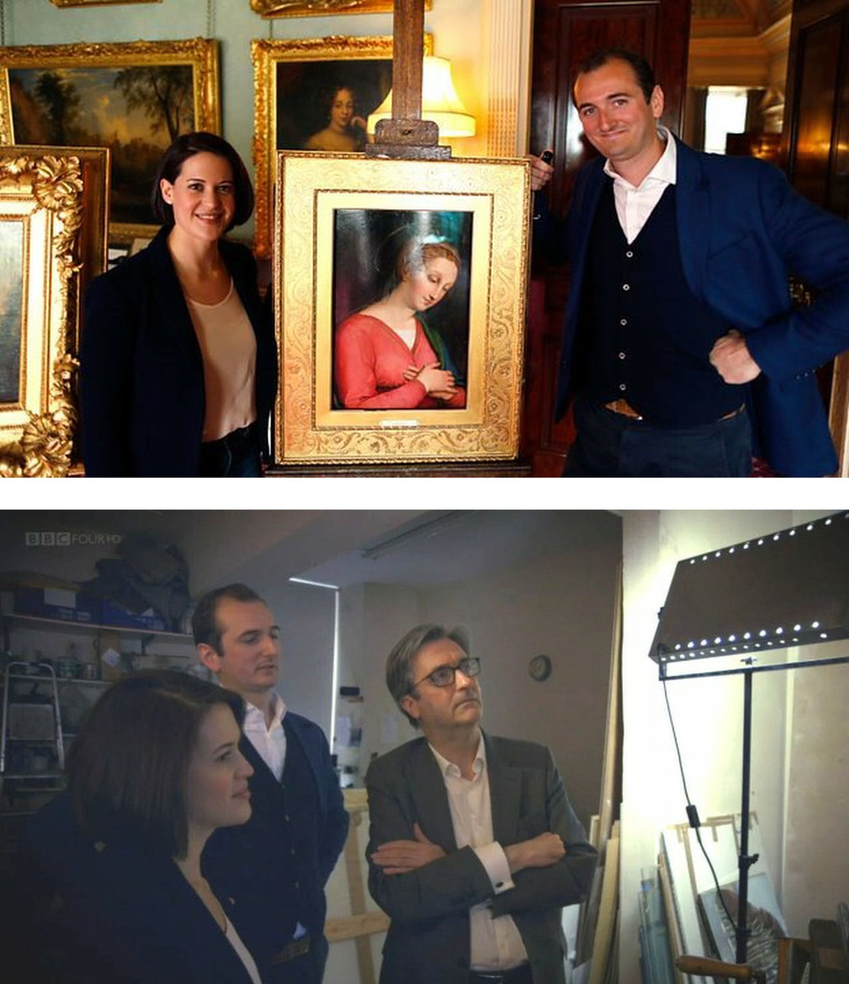
Above, Fig. 3: Top, BBC4 Factual Report, 03. 10, 2016: “Britain’s Lost Masterpieces discovers hidden painting believed to be by Raphael. ‘Finding a potential Raphael is about as exciting as it gets. At first I couldn’t quite believe it might be possible, but gradually the evidence began to all point in the right direction.’ Dr Bendor Grosvenor”. So reported the art-credulous BBC with a photograph (top) of the programme’s co-presenters, art historian Jacky Klein and Bendor Grosvenor, with the putative Haddo House Raphael; above, the presenters consider the “Raphael” on the Lost Masterpieces programme with the former director of the National Gallery, Sir Nicholas Penny.
Invited to pass judgement on the attempted upgrade, Sir Nicholas (whose proselytising on behalf of the $450m Salvator Mundi had been defended by Grosvenor in the 9 October 2011 Sunday Times – “They are taking a risk and I can’t applaud them enough for it”) said that he would place the painting somewhere between “probably by Raphael” and “by Raphael” and that with a “little more time and courage” he might well go the whole hog. That stylishly diplomatic locution was of limited utility – rather like informing a woman that she is somewhere between probably pregnant and pregnant. The pity is that aside from his defences of National Gallery restorations and championing of a not-Raphael and a not-Leonardo, Penny proved the gallery’s most unapologetically serious scholar/director in recent times – as instanced in an excellent Financial Times interview.
ROLL UP
In another Financial Times interview, Simon Gillespie, the restorer who works with Grosvenor on the BBC’s Britain’s Lost Masterpieces programme, disclosed that he, too, believes that he might own yet another Raphael. Gillespie is believed to be the owner of a claimed Lely copy of the £10m “Last Van Dyck Self-portrait” that was sold by the Mould Gallery to the National Portrait Gallery for £10m on 1 May 2014.
DEFENDING INSTITUTIONS AND ATTACKING JOURNALISTIC MESSENGERS
Grosvenor frequently tilts at journalists whose stories embarrass art institutions. In a February 2019 Art History News blog post (“Salvator Mundi & the Louvre”) he berated Sunday Telegraph and Mailonline reports that the Louvre would not be showing the $450m supposed-Leonardo Salvator Mundi in a forthcoming Leonardo exhibition. That story, he sniffed, “is based on the opinion of one Jacques Franck.” It was. Franck’s judgements as the world authority on Leonardo’s painting technique have institutional clout (- and often the ear of French presidents). Franck’s prediction proved precisely correct: the Salvator Mundi was not included in the Louvre exhibition, and it was described in the exhibition catalogue as what it is and what it has remained despite successive restoration makeovers and intense global marketing razzamatazz (- which marketing Grosvenor lauded as the best ever seen) namely, the Leonardo studio work that entered the Cook Collection in 1900, viz: “Salvator Mundi, version Cook, vers 1505-1515″. (See “The Louvre Museum’s bizarre charge of “fake information” on the $450 million Salvator Mundi”.) The Art Newspaper has reported (November 2021, “Prado downgrades $450m Leonardo Salvator Mundi”) that the Prado, too, has demoted the Salvator Mundi to its original standing as the Cook version: “The Prado curator Ana Gonzáles Mozo comments in her catalogue essay that ‘some specialists consider that there was a lost prototype [of Leonardo’s Salvator Mundi] while others think that the much debated Cook version is the original’ However, she suggests ‘there is no painted prototype by Leonardo’.”
(For the latest observations on the $450m Salvator Mundi, see Jacques Franck’s “Further thoughts about the ex-Cook Collection” and ArtWatch UK’s “The Disappeared Salvator Mundi’s endgame: Part I – Altered States and a Disappeared Book”. For ArtWatch UK’s first objections to the Salvator Mundi upgrade, ahead of Christie’s November 2017 $450m sale, see: Dalya Alberge, 19 October 2017: “Mystery over Christ’s orb in $100m Leonardo da Vinci painting” and, “Problems with the New York Leonardo Salvator Mundi Part I: Provenance and Presentation”.)
THE RAMIFICATIONS
The Rubens and the Leonardo attributions are items of considerable public policy interest. Both works achieved world record prices. Both received major and controversial modifications at the hands of restorers. Both upgrades have now collapsed. Both had been championed by National Gallery directors – Michael Levey with the Samson and Delilah and Nicholas Penny with the Salvator Mundi. While Waldy and Bendy both now support the Samson and Delilah, Waldy rejected the Salvator Mundi (which Bendy supports) because: “It resembles nothing else Leonardo painted”; and, because Christie’s claimed resemblance of it to the Mona Lisa “had me laughing out loud”.
THE NATIONAL GALLEY’S WOBBLY DEFENCES
The Art Recognition findings are not, as Grosvenor would imply, off-the-wall. In June 1997 the National Gallery issued a notice claiming that the reason why the Samson and Delilah looked like no other Rubens in the gallery was because it had been painted at a special and very brief moment when Rubens had just returned from Italy and was keen to show off newly acquired Caravaggist traits. That apologia was not credible.
In a pioneering 1992 report, the scholar/painter Euphrosyne Doxiadis and the painters Stephen Harvey and Siân Hopkinson, conducted a focussed survey of six Rubens paintings of 1609 and 1610 and demonstrated that “All these display a consistency and quality of style which is not shared by the Samson and Delilah”. That report – “Delilah cut off Samson’s hair, but who cut off his toes? The case against the National Gallery’s ‘Rubens’ Samson and Delilah” – was placed in the National Gallery’s Samson and Delilah dossiers and is published on the dedicated In Rubens Name website.
THE ART RECOGNITION REPORT
We are very pleased to publish here the full Art Recognition report on the Samson and Delilah, as below, and would urge all to study it along with the pioneering, methodologically exemplary Doxiadis/Harvey/Hopkinson report.
REPORT_Samson_Delilah_Rubens_encr
With no match to be found for the picture among a score of National Gallery Rubens paintings or among six bona fide Rubens’ works of the precise (claimed) historical moment, why should it come as an affronting surprise that none was found by Art Recognition among 148 secure paintings? Just as Grosvenor demanded more tests on his wannabe Raphael, so he would seem to want the Samson and Delilah compared with every single picture in the oeuvre. On September 30th he complained: “To claim a judgement on the Samson & Delilah based only on scans of 400 [sic] works (and at what resolution? We are not told) out of an oeuvre of over 1000 works seems to me optimistic.” Rather than pressing for every work in the oeuvre to be tested, he might prefer to cite and photographically demonstrate a single other painting with brushstrokes that, to his eye, match those of the Samson and Delilah.
The National Gallery has long been unable to cite a single report or record that shows the Samson and Delilah to have been planed-down and mounted on blockboard before it was bought for a world record Rubens price in 1980. In place of evidence, the gallery, too, falls back on appeals to authority, claiming, for example, in a 23 May 2000 press statement, that “…a large number of distinguished scholars who have devoted their careers to the study of Rubens unanimously agreed that the painting was one of the artist’s masterpieces”.
Such appeals cut little ice: every restoration or attribution ArtWatch has challenged in the last thirty years had been supported by a bevy of art historical bigwigs – from the Sistine Chapel ceiling to the recent so-called Leonardo “Male Mona Lisa” (Fig. 1 above). Moreover, of all scholarship, that on Rubens remains the most problematic and herd-like, its key players being uniquely obligated by a family bequest to defer to the scholarship and judgements of the long deceased (and now discredited) scholar Ludwig Burchard.
ARTISTS KNOW
The challenge to that art historical authority has come principally from artist/scholars who are freer agents and arrive armed with hands-on knowledge of art’s practices – knowing, for example, how to put brush to paint and paint to surface. A quarter of a century ago Euphrosyne Doxiadis neatly encapsulated the now technically confirmed deficiencies of the picture’s brushwork in an interview:
“This picture is betrayed by brush strokes which are almost staccato and broken up, rather than having been done with one stroke of the wrist, which you see in all Rubenses. There is an absence of Rubens’ vibrant, pulsating-with-life strokes. In actual Rubenses, each stroke is a tour-de-force. This is clumsy and awkward.” (Dalya Alberge, “Expert denounces National Gallery’s Rubens”, The Times, 25 November 1996.)
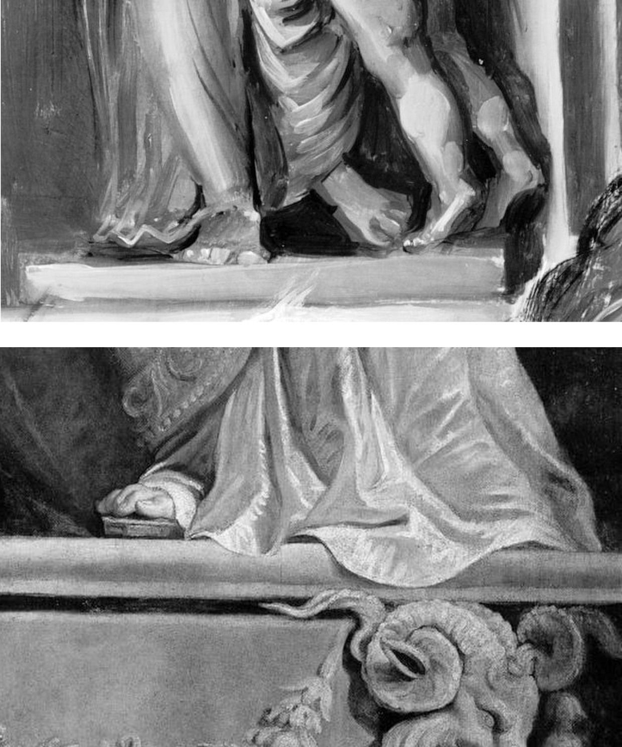
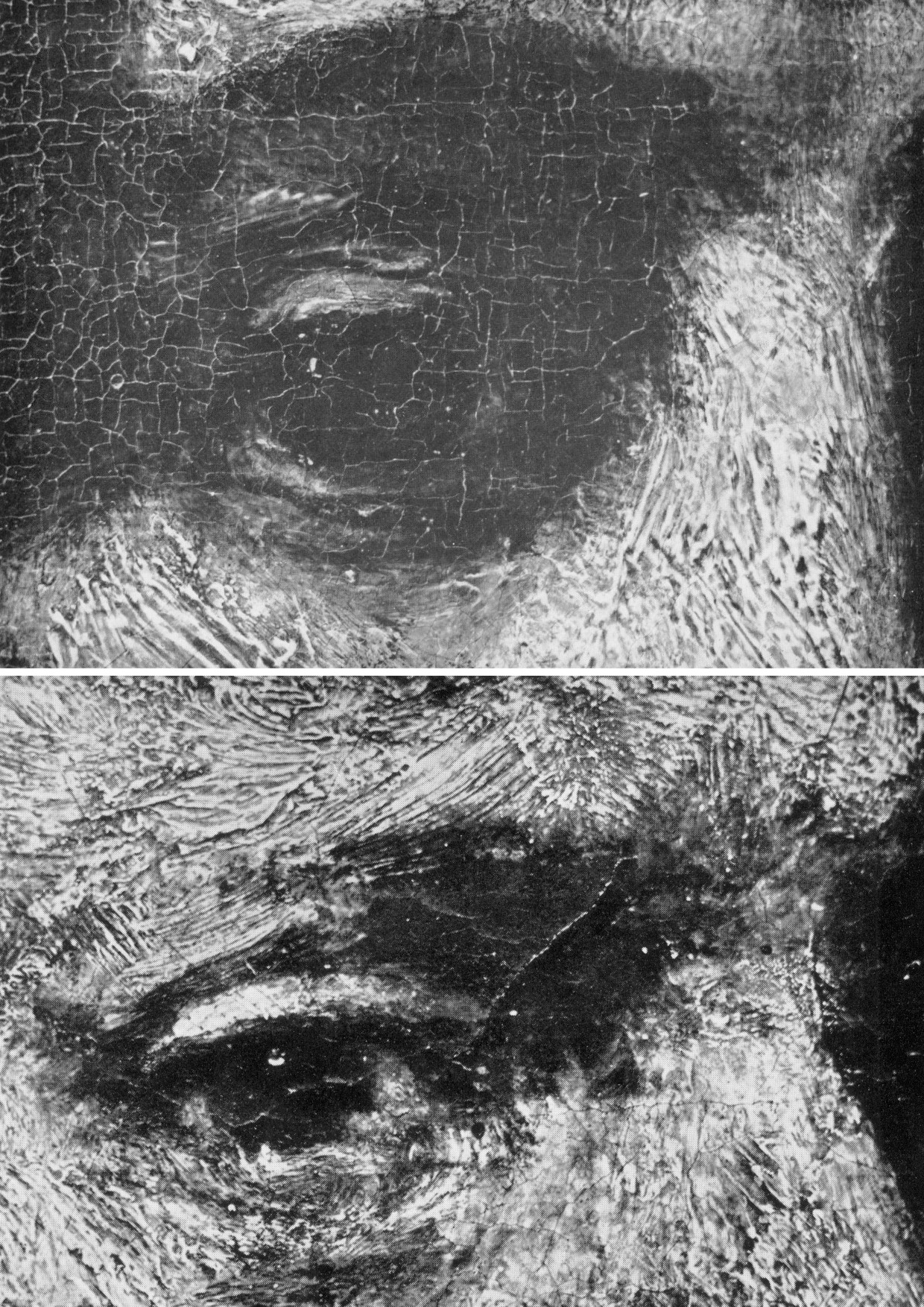
Above, Fig. 4: Top, details of the National Gallery’s Samson and Delilah; above, Rubens’ The Raising of the Cross, Antwerp Cathedral. Where the former is claimed to be a lost picture Rubens painted in 1609-10, the latter was indisputably made by Rubens between 1610-11. Such pronounced differences in brushwork are inconceivable as that of two autograph paintings made at the same moment in Rubens’ oeuvre. Who, looking at this photo-comparison, could believe that Rubens had flitted between the ugly angular Cubist faceted feet in the Samson and Delilah statue (– try counting the toes and note the Art Deco zigzagging hem), and the superb fluency, grace and anatomical fidelity seen in the Raising of the Cross?
THE TESTIMONY OF NATIONAL GALLERY TECHNICAL BULLETINS
When Tweeting support for Grosvenor, Waldemar Januszczak, had seemingly forgotten his own 5 October 1997 Sunday Times article headed: “One of the World’s most valuable paintings hangs in the National Gallery. But Samson and Delilah, widely assumed to be by Rubens, is not by him but is a copy, argues Waldemar Januszczak. Who then did paint it?” Januszczak had ended with this ringing declaration: “The one thing we doubters all agree on is that the painting bought by the gallery for a staggering sum in 1980 is not by Rubens.” What has changed to un-doubt Januszczak? Under challenge on Twitter, Grosvenor admitted that he too had once entertained doubts about the Rubens ascription.
Joyce Plesters’ 1983 Technical Bulletin account was tendentious and error prone. She had counted six planks in the Samson and Delilah panel when the picture’s restorer, David Bomford, made it five and the gallery’s panel specialist, Anthony Reeve, counted seven – as would a dendrochronologist in 1996. Plesters thought the National Gallery’s attributed Michelangelo Entombment of Christ had been painted on a single giant plank when the panel is comprised of three butterfly-keyed planks. The senior curator, Christopher Brown, accepted Plesters’ six planks in the catalogue to the National Gallery’s 1983 “Acquisition in Focus” celebratory exhibition of the restored Samson and Delilah. In 1997 Januszczak poked fun at the conservation department’s shambolic technical reporting:
“I am shown these authoritative-looking documents and, on the first page, the information that the Samson is painted on five planks has been crossed out and changed to seven planks. In the published technical report we are told there are six planks. A conservation report that cannot count the number of bits of wood the gallery’s most expensive painting was done on hardly inspires confidence.”
One of the painting dossiers that I later I examined at the National Gallery (under the directorships of Charles Saumarez Smith and Nicholas Penny) disclosed that a large and important picture had been mounted on “Sundeala” boards with a honeycomb paper core. The disclosure had not been made in the report itself but had been written on an attached yellow post-it note. Plesters’ haplessness was more than arithmetical. The year before Januszczak’s tease she had suffered a mortifying professional reverse. In the 1960s, when scholars like Ernst Gombrich and Otto Kurz warned Gallery restorers against removing all-over tinted varnishes from Renaissance paintings, she insisted that the entire documented technical history of art showed “no convincing case” for any artist having emulated Apelles’ legendary dark varnishes and that the famous passage from Pliny was of “academic rather than practical importance”. She even offered to “sift” and “throw light upon” on any future historical material that Professor Gombrich might uncover.
A BURIED INCONVENIENT TRUTH
In 1977, in the National Gallery’s first Technical Bulletin, Joyce Plesters had mused complacently “one or two readers may recall the furore when the cleaning of discoloured varnishes from paintings…began to find critics.” In that year the scarcely less complacent former National Gallery director Kenneth (Lord) Clark pronounced picture cleaning “a battle won”. A third of a century after the original controversy, the practical import of Pliny’s testimony emerged in a 1996 Technical Bulletin disclosure that a Leonardo assistant, Giampietrino, had toned down his colours with a final dark “varnish” layer of oil with black and warm earth pigments.
Had those pigments been bound in a resin it would have been deemed an earlier restorer’s attempt to impart a spurious “old masters’ glow” and removed. However, Giampietrino’s dark overall toning was identical to the oil medium of the painting itself and any solvent that would dissolve the one would dissolve the other. The gallery had to leave the coating in place. Shamefully, it stifled any acknowledgement of its momentous art historical significance – and it even neglected to inform Gombrich of the corroboration of his earlier claims, despite the fact that the gallery’s then director, Neil MacGregor, held the 1960s dispute to have been “one of the most celebrated jousts” in modern art history.
When ArtWatch UK informed Gombrich of his vindication he was approaching his 87th birthday and responded: “I could hardly have a nicer present than the information you sent me. I don’t see the National Gallery’s Technical Bulletin and would have missed their final conversion to an obvious truth. There is more joy in heaven (or Briardale Gardens…)” Two years later he observed: “I believe it was Francis Bacon who said that ‘knowledge is power’. I had to learn the hard way that power can also masquerade as knowledge, and since there are very few people able to judge these issues, they very easily get away with it.” (See “How the National Gallery belatedly vindicated the restoration criticisms of Sir Ernst Gombrich”.)
THE MISSING BACK, A LEGAL CHALLENGE, AND OTHER SAMSON AND DELILAH PROBLEMS
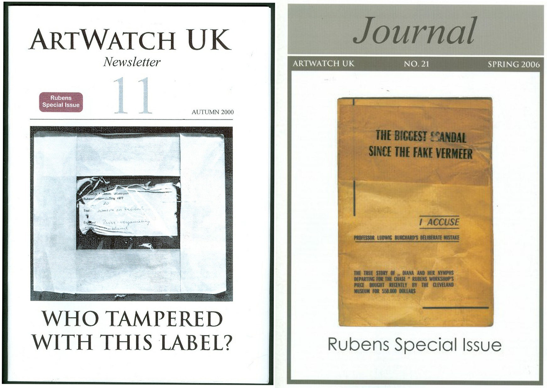
Above, Fig. 5: Two special issues of the ArtWatch UK Journal that examined the Samson and Deliah’s credentials as a Rubens.
In Journal No. 21, Kasia Pisarek wrote:
“I am in possession of a privately printed pamphlet entitled The Biggest Scandal since the Fake Vermeer written in 1960 by a well-known French art dealer Jean Neger. In it, he openly denounced Dr. Ludwig Burchard as being a dishonest man writing a certificate of authenticity for a painting that he knew was a copy. The picture in question was Diana departing for the Hunt, a large oil on canvas, sold in 1960 as a Rubens for a huge amount of money to the Cleveland Museum in America. It first appeared in an Amsterdam sale (Valkenier family) in 1796, in fact as late as 180 years after its supposed creation c.1615. Neger accused Burchard of ‘defrauding the American state of 550.000 dollars’.
“In his highly dramatic pamphlet he declared that Dr. Burchard wrote the certificate of authenticity in 1958, even though he knew that another, nearly identical version (his own) of the painting existed, and had a considerably better provenance, going back to 1655 and the prestigious Spanish collection of the marquis de Leganes, a friend of Rubens. This was the most important collection in Spain, aside from that of the King Philip IV. Leganes probably owned more paintings attributed to Rubens than any other aristocratic collector in Spain, with the possible exception of Gaspar de Haro. After researching his painting, Neger discovered that the number 214 in white paint present on his canvas was the corresponding Leganes inventory number. Moreover, his version of Diana had a lot of pentimenti visible even to the naked eye, which would indicate that it was an original, not a copy.
“According to Neger, Burchard has tried to avoid him on many occasions and has refused to see or to certify his version because he had already certified the other one as the original. When approached, he tried to ‘compromise’ by saying that he would state that Neger’s version was the first one, which Rubens had sketched and abandoned, and that he had then painted a second version, the one from Cleveland. Later, he took up Neger’s picture again, corrected it and completed it. That solution was satisfactory to Neger and yet, Dr. Burchard changed his mind again, and refused to certify Neger’s painting at all. Subsequently, he chose not to reply to Neger’s allegations which appeared to be his usual attitude in such situations.”
Dr. Pisarek concluded:
“I verified most of Neger’s statements, which on the whole appear to be true. I traced both pictures: one is in the Cleveland Museum, effectively considered to be the original by Rubens; the other is in The Getty Museum in Malibu, as ‘a workshop copy’. And yet, the Getty picture (ex-Neger’s) has better chances of being the original: it is the larger of the two versions; it has a superior and older provenance (1655 as compared to 1796); it agrees in most details (presence of sandals, lack of birds in the sky, missing tiger’s skin, background landscape) with an old copy in Cassel which provenance (1756) predates that of the alleged Cleveland’s ‘original’.”
Pisarek discussed the merits of these two pictures in the third chapter – “The two versions of Rubens’s Diana Departing for the Hunt: an American cause célèbre” – of her doctoral thesis, Rubens and Connoisseurship. On the problems of attribution and rediscovery in British and American collections, University of Warsaw, 2009, and there concluded that both the Cleveland and Getty pictures are mostly products of Rubens’s workshop.
DEFENDING MUSEUM FAKES I
On 4 March 1929, the year that Ludwig Burchard found and upgraded the Honthorst painting then owned by van Diemen and Benedict (who had bought it, Doxiadis disclosed, from a painter/restorer) and that is today the National Gallery Samson and Delilah, Rene Gimpel, author of the 1996 Diary of an art dealer, wrote:
“The Italians have sold Americans $2m worth of marbles done by Dossena (a faker). A laughable sum compared with the amounts obtained by means of certificates given daily by German experts to German dealers. Just as there were paper marks, so there are paper canvases, an easy way of bringing dollars into Germany. I went this morning to the Van Diemen gallery, which has an exhibition of sixteen Venetians. Three pictures are good, apart from the Guardis and perhaps the Longhi. Last Sunday’s Times devoted an entire page reproducing this scandalous exhibition, which gives only a faint idea of what is brought in. Bode, the director of the Berlin Museum died two or three days ago. The king is dead long live the king! The Mayers, the Gronau will replace him. The German title of Doktor impresses the Americans. The museums are even more intent than the collectors on defending their fakes or their mistaken attributions.”
WHAT LIES BEHIND
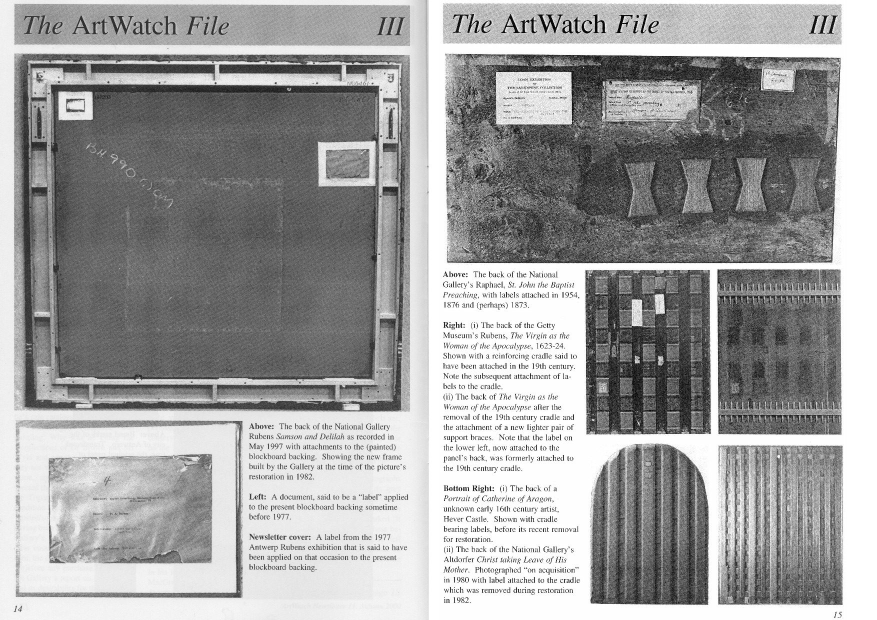
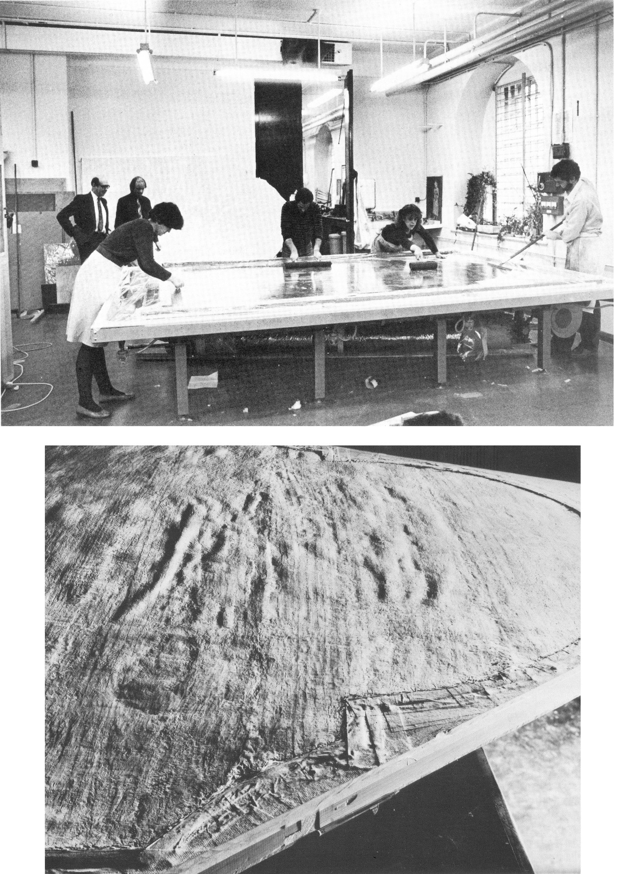
Above, Fig. 6: A spread of pages from ArtWatch UK Journal No. 11 contrasting the Samson and Delilah’s present back with the labelled and cradled backs of comparable period panel paintings.
Above, Fig. 7: Illustrations of the back of the Samson Delilah picture as supplied by the National Gallery and as published in the June 2000 Art Review (“The Back is Where It’s At”) where we showed the back of the Samson and Delilah and its attachments, as recorded in 1997. Our detailed technical and art historical case against the Rubens attribution in the Art Review ran, in full, as follows:
“Last month I referred to a National Gallery picture which lacks a back or a record of a back but on the back of which an incomplete provenance depends. This bizarre, paradoxical case arose as follows.
“On 11 July 1980, the National Gallery paid £2.53m (through Agnew’s at a Christie’s auction) for a large picture, Samson and Delilah, that was said to be an ‘entirely autograph’ Rubens, probably in its original frame. The price was a world record for the artist and, at the time, the second highest for any painting bought at auction. The acquisition was presented to the world with great fanfare, orchestrated as much by the gallery as by the auctioneers. In 1982 the picture was cleaned, restored and reframed in preparation for a special ‘Acquisition in Focus’ exhibition to be held the following year. So far, so straightforward.
“In 1983, two accounts of the restoration were published in the National Gallery’s Technical Bulletin by David Bomford, restorer, and Joyce Plesters, head of science. At this point the painting, which hitherto had always been described as a panel, begins to be described in different terms. Namely, as a planed-down sliver of a panel mounted on a modern laminate sheet of blockboard. As Bomford put it, ‘the large panel on which Samson and Delilah is painted must originally have been substantially thicker than it is now. At some point, probably during the present century, the panel was planed down to a thickness of less than 3 mm and subsequently glued on to a sheet of blockboard.’ This seems in strict, factual terms to be correct, but the word ‘probably’ later came to be questionable.
“Plesters’ account was seriously misleading. She claimed that the planed-down panel had been set not onto but ‘into’ (which it had not) the sheet of blockboard, which supposed placement prevented its edges from being examined for tree-ring dating purposes – which it did not. She insisted that this phantom relationship was of no consequence because ‘the date and provenance of the painting are not in doubt.’ Which claim, as will be shown, was not the case. Plesters admitted that the planing, on an unidentified occasion ‘before the picture was acquired by the Gallery’, might well have destroyed, among other evidence, a branded or carved panel-maker’s mark – a far from trivial matter because such a mark might have sunk the attribution to Rubens. The original Samson and Delilah is dated 1609, sometimes 1610; its engraved and painted copies to c. 1613 and 1615 [sic – 1625-35] respectively. Very few panel-makers marks were made before 1617 when they first became a guild requirement; after this date they can help with datings. Michiel Vrient, whose mark is most commonly found on the back of Rubens’ later panels, only qualified in 1615. His mark on the Samson and Delilah would have been fatal.
“Clearly, establishing when, by whom, and for what purpose a planing was carried out – and what records were kept of the original back – would under any circumstance be a matter of urgency and a test of propriety. In this instance it became greatly more so when, in 1997, a number of eye witnesses reported to ArtWatch UK that the picture had retained its original, label-bearing and ‘cradled’ back immediately prior to and during its auction at Christie’s in 1980. When informed of this, Neil MacGregor, the gallery’s director, dismissed the testimony as ‘mistaken’ (letter 7 April 1997). He later said (9 April) ‘the National Gallery does not have any record, photographic or written, of the back of this picture before it was planed down.’
“This year [2000], in compliance with its ‘Code of Openness’, adopted in anticipation of Government legislation on freedom of information, the gallery reversed an eight-year-old decision and allowed me to examine the dossiers held on the picture and its treatments. I have been assured that the dossiers were complete and that no material was withheld. I am forced to report that the records are therefore lamentably incomplete. This is the more disturbing because, contrary to assurances, the picture’s provenance is extremely insecure. It is not to the gallery’s credit that it took six years of assiduous research by three painters – Euphrosyne Doxiadis, Stephen Harvey and Siân Hopkinson – between 1986 and 1992 – for this embarrassing reality to be brought to light. They demonstrated that the picture is not compositionally consistent with contemporaneous engraved and painted copies of the original picture. Their examination drew from Christopher Brown, the curator responsible for the acquisition, the admission that ‘there are gaps at the beginning and the end of the Liechtenstein provenance which makes it impossible to be 100 per cent certain that this is the picture painted for Rockox.’
“The provenance as presented by Christie’s in their sale catalogue was a daisy-chain of speculations pegged on disconnected and not always accurate citations. It was claimed in the first instance that the picture was ‘probably’ the one known to have been painted in 1609-10 for Nicolaas Rockox’s house. It was said to have ‘perhaps’ been in the possession of the painter Jeremias Wildens (albeit only as a ‘Samson’ and not as Samson and Delilah) before 1653. It was further said to have ‘perhaps’ been in the possession of a ‘Guill Potteau’ before 1692. It was then said to have passed into the hands of the Prince of Liechtenstein on 30 May 1700. The second, third and fourth suggestions are all dependent on an event having taken place for which there is no evidence whatsoever: that the original painting left Rockox’s house at his death in 1640.
“As Euphrosyne Doxiadis established (and as Dalya Alberge reported in The Times of 25 November 1996), the records show that Rockox’s collection remained in his house until its sale in 1714 after the death of Rockox’s last descendant in 1712. The house in Antwerp survives and was restored in 1977 as a museum to Rockox. A booklet produced that year by the museum acknowledged with regret that it had been impossible to reassemble the whole of the original collection which had been dispersed by a public auction in 1715. Knowledge of this sequence of events seems rapidly to have slipped from official art historical consciousness
“By coincidence, the National Gallery’s picture (then in a private German collection) was exhibited in Antwerp in 1977 in a large exhibition celebrating the 400th anniversary of Rubens’ birth. In the catalogue Frans Baudoin described it as a ‘panel’. In the same year, in his book Nicolaas Rockox: ‘Friend and Patron’ of Peter Paul Rubens, Baudoin said the panel was ‘excellently preserved’. He also reported that the picture had been ‘rediscovered’ (when owned by a dealer as a Gerit van Honthorst) in 1929 by Ludwig Burchard, on whose advice, the German magnate August Neuerburg bought it in 1930 (along with another Burchard ‘Rubens’, since de-attributed).
“Burchard’s ‘rediscovery’ closed the second gap in the provenance to which Christopher Brown referred. Samson and Delilah is said to have disappeared after being sold by the Liechtenstein collection in 1880. In addition to the ‘gaps’ of 60 and 50 years at either end of the Liechtenstein provenance there are two further problems. First, the Samson and Delilah was described in every Liechtenstein inventory as a copy. Even the dealers who sold it to the collection thought it not to be by Rubens and to be greatly inferior to a work by Van Dyck. Second, every painting in the Liechtenstein collection was marked with a seal on its front or back. The National Gallery’s picture has no seal on the front. If it had one on its back, what happened to it? What possible reason could there be for removing and destroying such an important feature of a picture’s pedigree?
“When pressed on such specifics, the National Gallery summons the fogs of time. Bomford thought the planing might have taken place in the 19th century. His director, MacGregor, suggested that it was ‘possibly done this century, perhaps when the painting was in the hands of the art trade in the 1920s’ (Letter 9 April 1997.) This really will not do. The dossiers contain, I discovered, an undated sheet of typescript by Burchard (which the gallery’s archivist tells me is part of a letter dated 8 April 1930, but which contains a handwritten postscript referring to an article of 1942) which not only describes the picture as being ‘in a remarkably good state of preservation’ but, crucially, testifies that ‘even the back of the panel is still in its original condition.’ Given Burchard’s testimony, and bearing in mind that Christopher Brown made a special study of Burchard’s manuscript notes on the painting (which we have not been allowed to see) prior to the 1983 ‘Acquisition in Focus’ exhibition, how could the gallery have believed that the planing might have taken place before the last [the 20th] century or when the picture was in French hands?
“These questions are the more perplexing because, after Burchard’s testimony, every single reference to the picture describes it as a ‘panel’ in good – or better – condition. A further document in the [National Gallery] dossier that throws light on the picture’s condition also seems to have been overlooked. Christopher Norris, a benefactor of the gallery, sent a letter of congratulations to Michael Levey, the director, the day after the sale at Christie’s. Norris attributed the picture’s still ‘amazing condition’ to the fact that the German owners [between 1930 and 1980] had not touched it. It still retained, he noted, the varnish applied during its stay in France in 1929. The only change that had occurred during Norris’s forty-seven years’ acquaintance with the picture was that the varnish had toned down. (In 1983 Bomford cited the picture’s ‘thick, considerably yellowed varnish’ as the ‘principal reason’ for cleaning.)
“In 1977, Gregory Martin, the author of Christie’s catalogue entry, reviewed the Antwerp Rubens exhibition. He observed with relief that the Samson and Delilah was one of two ‘great works…on panel’ that were ‘none the worse for their journeys’ to Antwerp. (In 1982, the picture was described in the National Gallery’s Technical Bulletin as one of only three well-made and untroublesome panels in the collection.) Three years later the picture again left Germany when it was sent, on offer of sale, to a Belgian museum. On its arrival, a condition report (dated 4 March 1980) was prepared by a leading Rubens expert. He described the picture as a ‘panel…in good shape’ with painting in a condition ‘which can be called excellent’. The panel remained for several months at the museum before being dispatched directly to Christie’s. During its stay at the museum, the picture was seen to be an old, thick, somewhat bowed, label-bearing and cross-battened panel. Brian Sewell (who had discovered the Samson and Delilah modello some years earlier at Christie’s) recalls that the picture, when at Christie’s, was an intact, cross-battened panel with a blackish painted back on which the Christie’s number [as given to every work on arrival] was stencilled in white paint.
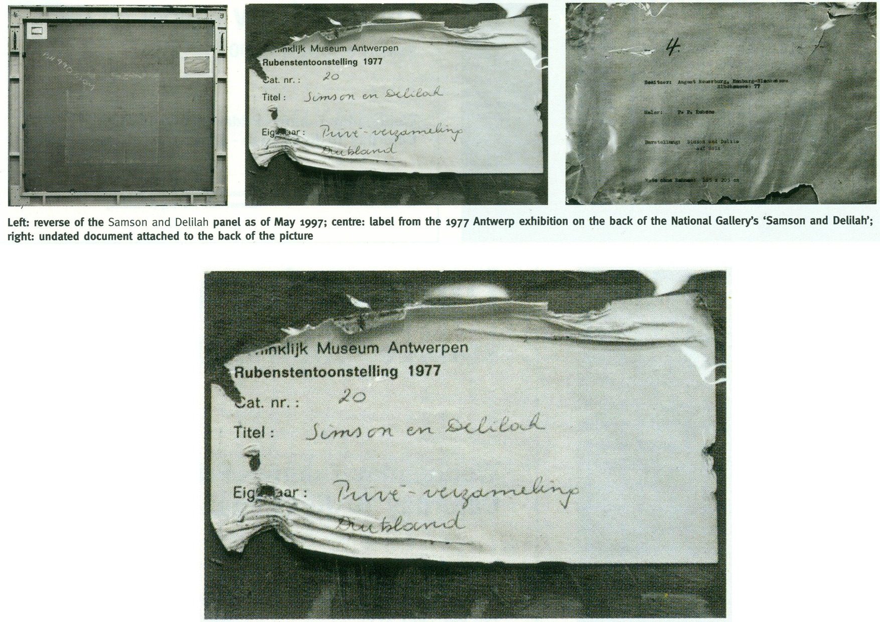
“On 27 May 1997, Neil MacGregor sent me photographs of the picture’s back ‘as it is now’. He drew attention to the Christie’s number (chalked and stencilled in black paint) and to ‘two labels attached to the back of the blockboard’ (see illustrations). One, he said, is from the Antwerp exhibition of 1977, the other ‘rather older, from the Neuerburg Collection’. It was, he said, ‘hard to imagine any of these being put on after the picture left Christie’s.’ It is not. Neither document – only one of which appears to be a label – would seem to be glued or pasted to the blockboard. Both appear to be held in place, identically, with cellophane fixed by clean masking tape. Both documents are clearly proud of the surface and are seen to cast shadows on it. The 1977 Antwerp label shows clear signs of having been attacked with a scraper. Why? When? And by whom? After receiving these photographs, I asked to see the back on an occasion when the picture had been removed from its frame. So far, I have not been permitted to do so, and two requests to government ministers for an inquiry have been turned down.”
THE DIFFERENCE A MISPLACED HISTORICAL WORD CAN MAKE IN AN AUCTION CATALOGUE
Today, given the Samson and Delilah’s recent further disqualification on a technical analysis of its brushwork, the National Gallery’s continuing claim of a Rubens authorship runs increased risks.
First: That espousal continues to fly in the face of historical documentary evidence that the picture cannot safely be ascribed to Rubens – evidence that had emerged and was published twenty-five years ago by Dalya Alberge (“Artists raise fresh doubts on gallery’s Rubens masterpiece” 26 September 1996, the Times”):
“ARTISTS challenging the attribution of Rubens’s Samson and Delilah in the National Gallery believe that evidence presented in an auction house’s catalogue was mistaken. The artists also allege that the gallery refuses to acknowledge historical facts that cast doubt on the picture being by the 17th-century master. The National Gallery acquired the painting from Christie’s in 1980 for £2.5 million, equivalent to £6 million today. The auction catalogue referred to a 1653 inventory which described the painting as ‘Eenen Samson van Rubens’, which would mean ‘by Mr Rubens’. But a Flemish genealogist who has studied the inventory said that it read ‘Eenen Samson naer Rubens’: ‘naer’ is translated as ‘made just like Rubens’ or ‘after Mr Rubens’. Another inventory, dated 1692, lists it as ‘copye’ – a copy.
“Euphrosyne Doxiadis, an artist and scholar, and the painters Steven Harvey and Siân Hopkinson believe that the genealogist’s finding backs the stylistic evidence against the picture being by Rubens… It was only as recently as 1929 that the painting was hailed as a long-lost Rubens. For 180 years it was in the collection of the Princes of Liechtenstein and inventories in 1767, 1780 and 1873 attributed it to a minor hand, Jan Van Den Hoecke…”
THE SHIFTING TESTIMONY OF LUDWIG BURCHARD
Second: With this picture never having been thought an autograph Rubens before Burchard’s 1929 upgrade, everything rests on that scholar’s tarnished standing. Aside from the Neger scandal, Pisarek noted in the Spring 2006 ArtWatch UK Journal (No. 21, “The ‘Samson and Delilah’ – a question of attribution”) that over 60 pictures, albeit mainly small works, attributed by Burchard to Rubens had been down-graded in Corpus Rubenianum to studio works, copies or imitations. In a 1950 letter to a fellow art historian, Burchard had said of a painting now in the North Carolina Museum of Art: “The Rubens-like painting was once shown to me. I missed the transparency of the shadows, which one would expect at least in places. The picture seemed to me like a compilation by a contemporary of Rubens.” However, in 1954 he had said of the same painting in a certificate of 28 May addressed to the D. M. Koetser Gallery, London: “the vigour of the design, the brilliance of the vivid colours, the concentration of movement are comparable in several details to the painter’s Defeat of Sennacherib c. 1612…”
THE FIXED TESTIMONY OF PAINTWORK
Third: As mentioned, the 1992 Doxiadis/Harvey/Hopkinson Report had anticipated and thereby now effectively corroborates the Art Recognition findings in its section on Rubens’ painterly technique:
“We have now studied the technical deficiencies in the execution of the National Gallery Painting; we have collected a very comprehensive catalogue of faults which are demonstrated by comparison with works of that period. This can be done when visual material is included…
“It is totally out of character for Rubens to use what the National Gallery calls ‘bold’ handling over the entire surface of a painting. In all his other works, areas of beautiful and infinitely detailed work appear, in addition to areas which have been handled boldly – a woman’s jewellery, for instance, the lace on a ruff, or a flower in the foreground. On the whole, the great downfall of the National Gallery’s picture is the crudeness with which it has been painted. Quite apart from the unsubtle transitions from tone to tone and from colour to colour (look for example on the Venus statue in the background [here, Fig. 4, above], or at Samson’s ear [Fig. 24, below], compared with his own ear in the self portrait of Rubens and Isabella Brant in the Honeysuckle Bower painted in the same year) there are two enormous drips of paint on the surface of the work, which no painter with even the most basic training would have allowed himself to do at that period….
“Looking closely at Samson and Delilah one misses the vibrant, twisting nature of the brushstrokes themselves. The shapeless, unanimated strokes in this painting seem flat and unexciting when compared with Rubens’ usual virtuosity.”
SO, ONCE AGAIN, WHO PLANED THE BACK OFF THE SAMSON AND DELILAH PANEL?
Fourth: The Samson and Delilah picture retains an abiding technical mystery: at what date and by whom was the panel planed down and attached to a modern laminate sheet of blockboard?
It should always be appreciated that no reference had ever been made to a planing and a blockboard backing before the Plesters/Bomford accounts of 1983, and that the National Gallery’s accounts are inconsistent, shifting and full of holes. As seen, some have said the planing may have occurred in the 19th century or early 20th century, others that it took place between 1930 and 1980. The gallery claims to have kept no records of the picture’s state in 1980 when purchased and, even, to have prepared no reports for its trustees when seeking authorisation to make a then massive purchase that would consume most of the gallery’s annual purchases grant. A director, Neil MacGregor, expressly admitted (in a 1997 letter to ArtWatch UK) that “The National Gallery does not have any record, photographic or written, of the back of this picture before it was planed down” – which, as indicated above and as is further shown below, was not the case.
When the senior curator at the time of the 1980 acquisition, Christopher Brown, and his successor, David Jaffé, both held that it was planed down when in the collection of the German magnate, August Neuerberg, between 1930 and 1980, they did so against the testimony of the National Gallery benefactor (who had gifted a Poussin), Christopher Norris. As first mentioned in the 2000 Art Review, Norris testified in a letter to the director in 1980, Michael Levey, that between 1929 and 1980, no change of condition had occurred in the painting, other than a toning down in its 1929 varnish, because the owners had not touched it. Thus, because we know, on Burchard’s (written) testimony held by the National Gallery, that the panel was intact in 1929 when sold to Neuerburg and, on Norris’s (written) testimony, held by the National Gallery, that the owner had never touched the picture, the only parties who might have planed-off the back are Christie’s and the National Gallery. Christie’s, who described and sold the picture as a panel – not as a reduced or marouflaged panel – are hardly likely to have so-transformed someone else’s property – or even to have had the time and means of doing so. On currently available records, the National Gallery, becomes, willy-nilly, the sole candidate, having itself never once described the picture as a planed-down panel before 1983 – and because its own published records testify that the work was an intact panel up to 1982.
REDUCTIO AD ABSURDUM: THE CASE OF A TOTALLY DISAPPEARED NATIONAL GALLERY ALTARPIECE PANEL
Above, Fig. 8: Top, the National Gallery’s 1504 altarpiece The Incredulity of S. Thomas by Cima da Conegliano, as seen before and after an utterly transforming campaign of restoration in which a modern synthetic composite support was substituted for the original giant poplar panel and a new frame was built to replace the gallery’s own 19th century frame; above, a 1978 pen and ink drawing, “The Ages of Woman”, by the author.
As can be seen above, top, the cleaning and subsequent retouching of the picture surface left a tonally and perspectivally altered appearance: what had been dark and tonally relieving (the back wall) became lighter; what had been contrasted became equalised (the wall and ceiling); what had been dramatically central and axially assertive (the “spotlighted” figure of Christ) became quietened and subsumed within a group. The reduced ornamentation on the new frame left two architecturally assertive raised circles that now vie for attention with the picture’s own depicted half-round windows – which features, the lightening of the wall has brought closer to the picture plane and, therefore, closer also to the new more abstractly assertive frame. The net effect of the physical and pictorial transformations this altarpiece underwent was to leave a painted image surface that is now as flat, de-natured and ahistorical as a giclée print. Above, to a draughtsman (who necessarily commences work on a sheet of – initially – “no-values” to a gradually built-up and considered disposition of “values”, the alterations that are routinely made by restorers during “cleanings” and “restorations” to other artists’ works are as un-missable as they are perplexing and artistically impoverishing.
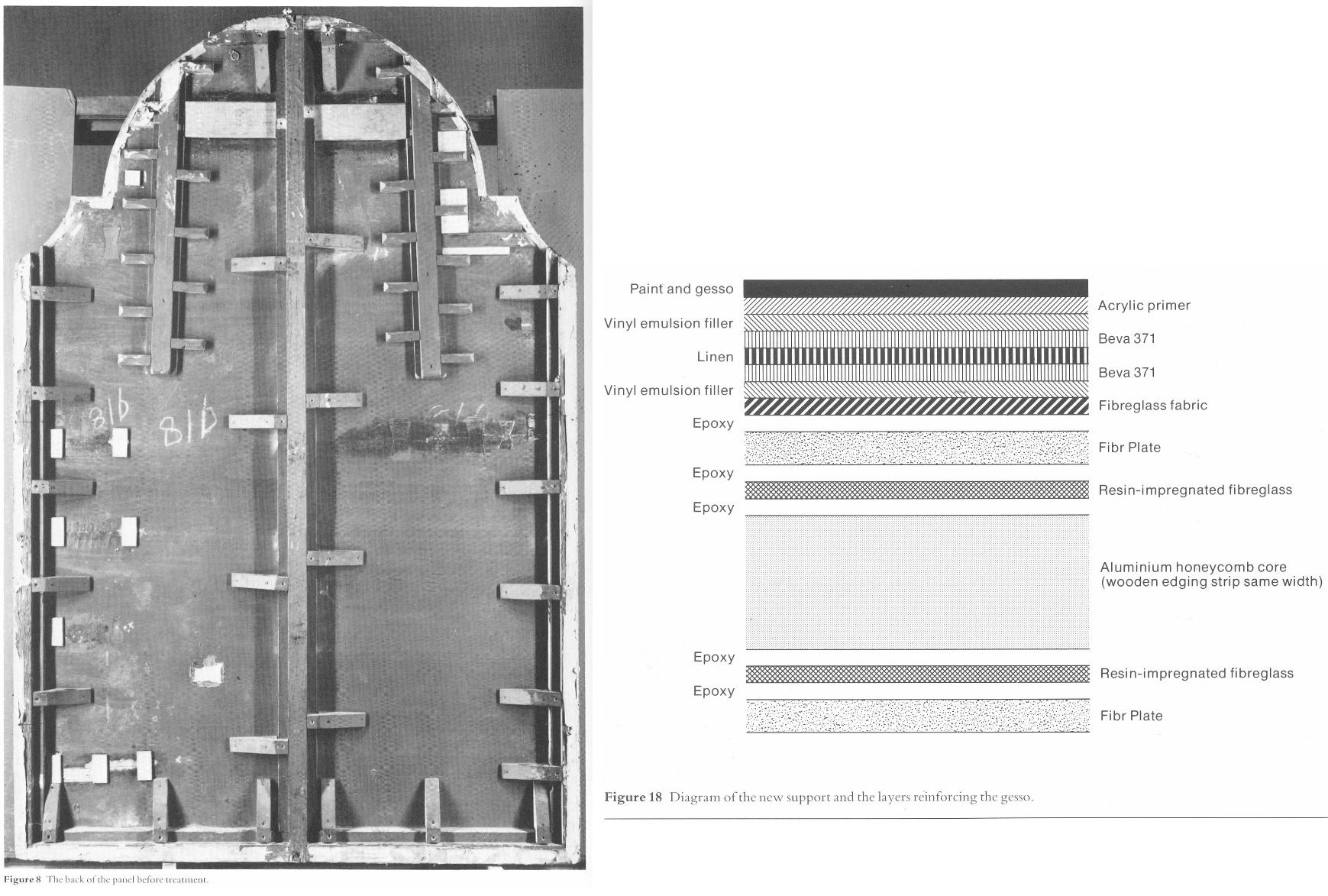
Above, Fig. 9: Left, the back of the altarpiece panel which was totally removed (i. e. destroyed) and replaced by a multi-layered fibreglass and aluminium board – the long-term stability of which is unknown – during restoration. Right, the diagram of the new, entirely synthetic glass fibre and aluminium support in cross-section, as published in the gallery’s 1985 Technical Bulletin.

Above, Fig. 10: The Cima altarpiece, as published in the 1986 Technical Bulletin with the caption: “The picture after cleaning and transfer, before restoration.”
A MASTERFUL JOB
When Waldemar Januszczak was in art critically doubting mode on the Samson and Delilah’s attribution in October 1997, he addressed the persisting Whodunnit Mystery of the Disappeared Back:
“I put this to the gallery’s chief conservator, Martin Wyld, who quips cheerfully that he was rather proud of having been accused; planing a 17th-century oak panel to wafer thinness and attaching it perfectly to blockboard while leaving its surface in pristine condition, is an exceptional feat of restoration. Nobody would or should do it today. Whoever did it earlier did a masterful job. Why did they do it at all? If a painting is in exceptionally good condition, why was there any need to hazard the transfer to blockboard? A question neither the chief conservator nor MacGregor can answer. All I got them from both is the National Gallery version of: it wasn’t us, guv.”
If stunned by Januszczak’s question, Wyld and MacGregor can hardly have been caught unawares. In a then recent letter in the Daily Telegraph (“Doubts about gallery’s Rubens”, 16 August 1997) we had written on that very question:
“…More disturbingly, crucial technical and documentary evidence concerning the picture’s weak provenance was destroyed when the back of its oak panel was planed away in a mysterious intervention for which no one accepts responsibility and during which no records were kept. The National Gallery claims the planing took place before the picture was bought at Christie’s for a record £2.5 million in 1980. If this was so, two questions arise. Why did the gallery’s trustees authorise the acquisition of a picture with no back (the planed-down remains having been glued on to a sheet of blockboard) and with no documented history of a back? And why did the gallery not ask the vendors, who had owned the painting for 50 years, for an account of the planing and a record of the pre-planed back?… Answers to all these questions lie in the reports that were prepared by the gallery staff for the trustees prior to the 1980 purchase and prior to the gallery’s 1982 cleaning and restoration of the picture. The gallery has not responded to requests that these reports be made available for inspection. Nor is it prepared to produce photographs of the picture’s back, as taken by Christie’s staff before the sale, or by gallery staff before the restoration.”
Unable to answer those questions, the head restorer had clearly been ‘avin a larf when he suggested to the Sunday Times’ art critic that planing a panel down to 3 mm and gluing it onto a sheet of block board was an exceptional feat far beyond anyone’s capacities at the National Gallery. Back then in 1997, a reading of recent National Gallery Technical Bulletins would soon have disclosed the gallery’s great pride in its radical substitutions of modern synthetic composite backings for old pictures’ historic (wood or canvas) supports. We had complained in the 1993 and 1996 James Beck and Michael Daley book Art Restoration: The Culture; the Business and the Scandal of the gallery’s use of the compressed paper “Sundeala” boards on to which Titian’s Bacchus and Ariadne, Seurat’s The Bathers and Sebastiano’s The Raising of Lazarus had been affixed.
The spectacularly gung-ho treatment of the latter picture – the largest in the Gallery’s collection – epitomised the artistic presumption and techno-adventurism of the gallery’s restorers. The deleterious consequences of that intervention began to be conceded by the gallery’s restorers in its 2009 Technical Bulletin:
“…eventually it was decided to brush on multiple thin layers of warm wax-resin dissolved in white spirit, embedding a layer of inert terylene net fabric [-“Terylene is a specific form of polyester, more specifically polyethylene terephthalate. It is created via the extraction and mixing of ethylene glycol and terephthalic acid. When turned into a fiber with dyes and other treatments, it becomes a great synthetic with a lot of potential in different sectors” ] within the layers as they solidified. Although the discoloured varnishes had yet to be removed from the paint surface, the appearance of the picture was considered to be darker than intended as a result of lack of reflectance from the ground and so titanium white (titanium dioxide) was added to the wax cement…Once the wax and titanium white layers had been built up to a sufficient thickness the painting could then be mounted on a solid new support. This had previously been coated with wax-resin allowing a bond to be achieved by ironing with a thermostatically controlled iron to soften the wax-resin layers which then fused as they cooled. Although it is unlikely that these methods and materials would be used nowadays, the treatment can be judged a success in that there has been no further flaking of the paint layers. Unfortunately, the work took place before the introduction of lightweight and stable panels made from glass fibre with aluminium honeycomb cores. The painting is mounted, therefore, on a support constructed with a ‘sundeala’ composite board outer faces and a core of paper honeycomb. In spite of its wooden edges and an internal wooden framework this panel is now showing signs of instability, with a tendency to flex and twist when the painting is moved, an operation which is therefore avoided as far as possible.” Emphasis added.

Above, Fig. 11: Staff in the National Gallery’s restoration studio at work on the remains of Cima da Conegliano’s altarpiece, The Incredulity of S. Thomas, after the complete removal of its giant poplar panel and before its transfer onto a multi-layered synthetic support – as shown in the NG’s 1985 Technical Bulletin.
A reading of the 1985 and 1986 Technical Bulletins would have disclosed how gallery restorers had chiselled away the entire wood panel of seven giant planks just under two metres long of Cima’s altarpiece The Incredulity of St Thomas (Figs. 8-10). In the first stage, the panel was reduced “from c. 5 cm to 1 cm.” In the second, the remaining 1 cm of wood was chiselled away entirely until the back of the original gesso coatings was exposed. In the 1985 Technical Bulletin, Martin Wyld described the means and the tools of that perilous operation:
“The removal of the wood then commenced. The techniques used were entirely manual. Though mechanical routers and planes are often used with success in transfer, there is a danger of a power tool, however carefully handled, snagging on knots in the wood or on the bent nails which are mysteriously but commonly found in old panels, and ripping up far more wood than is intended. Semi-circular 15 mm gouges were pushed along the grain, cutting channels 6-7 mm deep, and the ridges left between the channels were then cut down. Each plank was reduced by a similar amount, and the process repeated until the panel had been reduced from c 5 cm to 1 cm in thickness. Many nails were found embedded in the panel and several knots were also cut out.
“The removal of the first layers of wood is usually the easiest part of a transfer [of a paint film to a new support]. The removal of the final layer of wood was complicated by several factors. Many different blister-laying adhesives had been used on the Cima, often in very large quantities. Fig. 6 shows a detail of the Apostles’ heads on the right; the lines of white dots are holes of a syringe in order to inject animal glue under the gesso. Much of this glue, which must have been considerably diluted with water in order to be used in a syringe, had run into the worm channels and soaked into the wood, making the panel surface more brittle…Areas where wax had been used for blister-laying presented less difficulty.
“Experience during earlier transfers had shown that the safest method of removing the last layer of wood was to cut a very shallow slope at a slight angle to the direction of the grain and to shave away the tapered edge of the wood with a small fish-tail chisel. The method proved to be impractical on the Cima. The parts of the panel affected by thick animal glue (of the consistency of carpenter’s glue) or putty filling the worm channels, by knots and by later or original inserts of wood obviously needed individual treatment. However, the remainder of the wood was so insecurely attached to the gesso that it was impossible to cut a shallow slope because strips broke away along the grain no matter how carefully the chisel was used. Strips of wood 10-12 cm long and 3-4 cm wide would become completely detached, but usually with a few small fragments of paint and gesso stuck to them. These fragments were laboriously cut off the wood and replaced… It was found that the safest method of removing the last layer of wood in the very loose areas was to cut it away at an angle of 30 ? to the gesso, instead of across at the very shallow angle normally used, and to cut across rather than along the grain…”
Above, Fig. 12: Top, the director, Michael Levey, and the head restorer, Martin Wyld (top left), watching four restorers in the National Gallery’s basement restoration studios attaching the pictorial remains of Cima da Conegliano’s altarpiece, The Incredulity of S. Thomas, to a linen interleaf on the hot-table after the complete removal of its giant poplar panel and before its transfer onto a multi-layered synthetic support – as shown in the NG’s 1985 Technical Bulletin. Above, the exposed and buckled gesso months after the Cima panel had been chiselled away entirely and the air-conditioning system had malfunctioned.
AN OVERNIGHT MALFUNCTION
Note Wyld’s own account of the “conservation treatment” of the Cima altarpiece:
“Fig. 13 [here, “Fig. 12, above”] shows the arched top of the picture, where the removal of the final layer of wood had started. The panel and gesso had been carefully covered with Melinex and heavy rubber mats all through the transfer, but the gesso had absorbed some moisture from the atmosphere and swollen slightly. An air-conditioning malfunction, which produced RH of 100% for several hours one night, led to pronounced swelling and buckling of the gesso [and the paint layers attached to it] which can be seen in this photograph taken months later.”
Wyld further reported:
“Fig. 13 shows the severe buckling of the top of the picture due to the gesso having absorbed moisture from the atmosphere. Less pronounced buckling had affected some of the lower half of the picture as well. The facing layers had moved with the gesso, and were still secure. The picture was detached from the temporary support and slid face-down onto the Melinex covered hot-table, sealed with a membrane and heated to 40 ? C at a pressure of 15 mbar (1.5 kPa) for an hour. The buckling slowly reduced until the picture was almost flat and relaxed, and the same low pressure, which prevented any alteration of the surface texture, was maintained while the hot-table cooled.”
ALAS, POOR HOLBEIN
The apogee of the white heat of technically transforming restorations was eventually reached in Wyld’s luxuriously long, Esso-sponsored, BBC-televised 1993-96 swank-restoration of Holbein’s The Ambassadors. There, the gallery’s head of restoration produced the world’s first painted insinuation of “virtual reality” into an old master painting by reconstructing the picture’s famous (but damaged) anamorphic skull not according to the laws of perspective by which it had been constructed but from a gallery-generated computer manipulation of a photograph of a medical model of a skull. That operation was defended by the then director, Neil MacGregor on the grounds that “We believe it is our duty to try to present to the public, as much as we can, what the artist intended them to see.” Wyld went further, re-painting a section of the rug to a new design on the authority of a rug expert and painting false and camouflaging “age cracks” onto his own new painting.
And yet, notwithstanding Wyld’s publicly paraded technical expertise, he would have had Waldemar Januszczak believe that the National Gallery’s restorers lacked the wherewithal to reduce a panel to a thickness of c 3 mm and glue it onto a sheet of blockboard.
In the absence of any prior record of a planing, the National Gallery’s last resort defence against suspicions of having carried out the operation has rested on what might seem to be a confession of exceptional negligence – rather as if saying: “With this picture, which we considered a pre-eminent masterpiece within Rubens’ oeuvre and for which we had paid a fortune, we failed to follow our customary procedures and safeguards. We made no records; we took no photographs, neither when we bought it for a world record Rubens price nor earlier, ahead of the sale at Christie’s, when we had borrowed it and were seeking our trustees’ permission to buy it”.
AN OPEN GOAL?
Januszczak might have pressed his point harder. On the absence of records, we had recently reported (“Is this really a Rubens?” The Art Review, July/August 1997) that:
“In the 1980/81 Annual Report the then director, Michael Levey, thanked Christie’s for ‘allowing the trustees to see this painting in the gallery before the sale.’ A trustee at the time has disclosed that in all such purchases curators present a case for the purchase to the trustees who then examine the work ‘in the flesh’. A former Keeper and Deputy Director, Allan Braham, has disclosed that reports on the desirability and condition are prepared by curatorial and conservation staffs for the director before any major purchase…”
A TALE OF TWO OLD PANELS BOUGHT BY THE NATIONAL GALLERY IN 1980
The Gallery’s seeming failure to record and investigate this single work is the more perplexing because the director, Michael Levey, had truly nailed his professional and managerial colours to the painting. He had announced in 1979 that, having reassessed the National Gallery’s holdings of Rubens, he had concluded that it lacked a monumental figurative composition and that he intended to pass this information on to the Trustees at their next Meeting with a recommendation that they should look to acquiring one at the first opportunity. He did not have long to wait for the emergence at Christie’s of the Burchard Samson and Delilah – which might have seemed like a prayer answered. Notwithstanding the eventual very high cost, Levey’s enthusiasm for the picture seemed unbounded. In his foreword to the 1983 “Acquisition in Focus” exhibition, he wrote:
“When on Friday 11th July 1980 the National Gallery acquired at auction in London a Rubens painting of Samson and Delilah – at a cost of over two million pounds – some people might have asked why the nation needed another Rubens. In the Collection at Trafalgar Square there were already twenty paintings by the artist.
“This exhibition, the second in our ‘Acquisition in Focus’ series, will serve as a striking demonstration, I believe, that the painting was indeed needed and will confirm that a crude numbers game in matters of great painters and great paintings is no less obtuse than asking how a piece of canvas [?] can ‘be worth’ so many million pounds. An odd aspect of such questions is that they are rarely directed to areas of national expenditure outside the arts.
“Rubens’ Samson and Delilah is a large scale, early and entirely autograph painting of a kind the National Gallery previously lacked. Its splendid colour and vigorous handling of paint can all the better be appreciated now that it appears cleaned in this exhibition…”
ATTRIBUTIONAL TURBULENCE
If a whiff of defensiveness about the cost of the acquisition might be sensed, it would be understandable: a ferocious dispute was running in the early 1980s between Rubens scholars over the famous paper cartoons-for-tapestries that had been bought for the National Museum Cardiff as by Rubens – and Levey was in the thick of it, having sided with Julius Held who had dissed his arch rival Michael Jaffé’s attribution of the cartoons to Rubens. This would have been the very worst of times for another museum to have been thought to have acquired a dud “Rubens” – and, indeed, for Levey to have been its principal begetter.
In that context, it must be said that the self-declared failure to keep customary (if not statutory) records on the Samson and Delilah stands in bewilderingly sharp contrast with the abundance of prior investigations and records kept and published on another old panel picture bought by the gallery in 1980, (for an undisclosed sum made with contributions from The Art Fund, The Pilgrim Trust and the National Heritage Memorial Fund) – namely, Altdorfer’s Christ taking Leave of His Mother. That purchase was also discussed in the 1983 Technical Bulletin. In Wyld’s report on the treatment of that picture, the first note is headed “The condition on acquisition”. It begins:
“Altdorfer’s Christ taking Leave of his Mother (No. 6463) was examined by the National Gallery Conservation Department before its acquisition in October 1980. As is customary, X-radiographs and infra-red photographs were taken and the picture was studied with infra-red vidicon system and under ultra-violet light…” By those and other examinations it was established ahead of the purchase that the panel was composed of six planks joined vertically and that these had been planed-down to about 6 – 8 mm and cradled. In a section on the subsequent treatment of the panel, Wyld notes of one photograph, “Fig. 5 shows the back of the panel as it was on acquisition…” (Emphasis added.) No such photograph has ever been produced of the Samson and Delilah.
LOOP OF SILENCE
When, on 6 April 2002 (letter), we asked the National Gallery’s then director, Neil MacGregor, whether Dr. Brown had been aware in 1982 of Burchard’s 1930 testimony on the condition of the Samson and Delilah, he replied (letter, 9 April 2002): “As I am sure you know, Christopher Brown left the National Gallery some years ago…I suggest you pursue the matter with him.” When Brown was asked (December 2005) by the US magazine, Salon to comment on his past involvement in the controversy surrounding Samson and Delilah, he replied: “I am sorry but I don’t want to do this. Please address your questions to the National Gallery.” And so, a great silence fell.
On re-visiting the Technical Bulletins today, the mystery of the disappeared picture back deepens. Not only had no one ever spoken of a planing and mounting on blockboard before the picture was acquired in 1980 but no one at the gallery had done so in the two years before the 1983 Plesters/Bomford report. Quite to the contrary, in the 1982 Technical Bulletin, Christopher Brown, Martin Wyld and the gallery’s (now deceased) timber specialist, Anthony Reeve (who was described by Mr MacGregor as the “supreme practitioner of his generation”), wrote on the cleaning and restoration of Rubens’ The Watering Place. In discussing the highly problematic construction of many Rubens’ panels, Reeve wrote:
“Of all the pictures in the National Gallery, Rubens’ panels have been of greater concern, because of their condition, than any other part of the collection. The reason for this is well-known. Rubens frequently found it necessary to enlarge his pictures after he had started painting…Rubens’ oak panels, often enlarged in several different stages, are amongst the most inherently unstable supports used by any artist.”
However, Reeve drew a distinction between “the oak supports which, although made up of many planks joined together, were not enlarged during the painting process, and those which were added to.” On that former, unproblematic, type, Reeve cited just three examples:
“The Rape of the Sabine Women (No. 38) (1.699 x 2.362 m), The Judgement of Paris (No. 6379) (1.339 x 1.1.74 m); Samson and Delilah (No 6461) (1.85 x 2.05 m), the panels of which are made up of six, five and seven oak planks respectively. The grain of every plank, and hence the joins, are horizontal and all the planks are roughly the same width.”
In consequence, Reeve continued, although “these large panels are sensitive to changes in relative humidity (RH), they provide a sound and permanent support if kept in a controlled environment and not exposed to sudden changes in RH.” Conspicuously, he made no mention of the Samson and Delilah as being then a radically reduced panel that had been glued onto a larger blockboard support (Doxiadis reported seeing something like a four inches wide surround of pinkish blockboard when the picture was out of its frame and flat on its back). Of those three fortunate panels Reeve wrote:
“Wood expands and contracts across rather than along its grain. The effect of wood shrinkage of the exposed back [emphasis added] when all the planks are parallel is for the front to become convex, and perhaps slightly corrugated. This shrinkage may cause the joins between the planks to open, or splits to form at the end grain, but treatment and stabilisation are usually straightforward.”
In other words, although all three pictures had been well and favourably constructed, all three were at potential risk of injury through their exposed backs in the event of atmospheric fluctuations – not to mention air-conditioning malfunctions. That was said in 1982. Had the Samson and Delilah already been planed-down to 3 mm and glued or cemented to a larger blockboard panel at that date, a timber craftsman so expert and informed as Reeve could not have bracketed the three panels as being at equal risk of atmospheric changes through their exposed backs.
The planed-down and mounted-on-panel Samson and Delilah artefact described by Plesters and Bomford in 1983 was no longer exposed to fluctuations of humidity: its front was protected by priming, painting and varnish; its back was sealed by its fixture to the blockboard; even its slender 3 mm edges were sealed and protected by putty. Indeed, as Bomford put it in 1983: “Although the nature of this treatment would not find favour today, Samson and Delilah, fortunately, had been treated skilfully. The joins and splits are still secure, the panel is firmly attached to blockboard in all areas and the overall warp (which one might expect to be considerable in a picture of this size) is minimal”. Bomford noted, “no further support treatment is necessary.”
How to account for the two restorers’ discrepancies of accounts between 1982 and 1983? Mr MacGregor once suggested that Burchard might have mistaken a planed-down panel laid on blockboard for an original and intact early 17th century oak panel, but after three decades of removing cradles and reducing panels, Reeve was even less likely to have mistaken a modern blockboard for a 17th century oak panel. He knew the differences well and had noted in the 1981 Technical Bulletin that:
“A very large number of the fifteenth and early sixteenth century Italian panels made of poplar have been planed-down and cradled before they came to the National Gallery collection. This form of panel treatment seems to have been very common in England in the 19th century. The problems caused by the planing-down and cradling vary from panel to panel, but it leaves almost all the panels vulnerable in that they are liable to splitting. Thirty years of experience removing cradles, rejoining splits in the panels and securing them by the method described above has shown that, providing the pictures are then kept in a reasonably well-controlled environment, the panels will remain stable.”
If Burchard truly had mistaken a planed-down panel on blockboard for an original early 17th century, it was a mistake made by everyone else who ever encountered the panel up until the moment it was restored at the National Gallery. Proceeding on the testimony of all the available records, the question might now sensibly be narrowed: who, between 1982 and 1983, planed down the panel and mounted it on blockboard – and who authorised the action?
THE MUTE, ELOQUENT TESTIMONY OF PHOTOGRAPHED BRUSHWORK
While past and present National Gallery players have yet to comment on the Art Recognition findings, eloquent witnesses remain in the Samson and Delilah’s own brushstrokes. Grosvenor’s snap dismissal that computers do not and cannot understand art mis-states the issue: computer programmes do not have to possess all human capacities and levels of understanding to perform otherwise immensely laborious but valuable visual tasks with unerring reliability. To give a commonplace example: for graphic artists who work on A3 or larger sheets, it is prohibitively expensive and space consuming to acquire scanners of corresponding size and capacity; in practice, it not necessary to have such equipment because there are now many computer programmes capable of seamlessly “stitching” overlapping part-scans of large images – as was done with this author’s drawing below at Fig. 13.

Above, Fig. 13: The author’s drawing of Donald Trump’s Relationship with the Republican Party, as published in The Conservative, September 2017.
The earlier revolution of photographic reproduction facilitated all manner of handmade graphic inventions by collage and montage but absolutely seamless conjoining was not possible – the sharpest scalpel cutting through paper cannot do other than leave a trace of its actions. It has taken digitalised computer power to accomplish seamless and effortless manipulations of images and, even, with the advent of AI, of videos. Just as it is not necessary to understand the programming means by which part-images can be invisibly joined, so it is not necessary to envisage the mechanisms whereby a programme might successfully identify distinguishing traits within individual artists’ brushstrokes. Pace Grosvenor, such a programme cannot be deemed theoretically inconceivable for the simple reason that we can already see for ourselves precisely such autographically distinguishing characteristics in paintings – were they not already present and discernible, how would any connoisseur identify any work’s author by eye?
THE NEGLECT OF PHOTOGRAPHIC AIDS TO CONNOISSEURSHIP
Far from being an incredible prospect, the study and evaluation of distinctive brushwork through magnified photographic examination has been around as a diagnostic aid for nearly a century. Despite their proven and demonstrable usefulness, the studies in question and their potential applications have been greatly and perhaps wilfully neglected in subsequent art world practices which have favoured the technical analysis of art’s material components rather than the patterns of artistry which are realised through them.

Above, Fig. 14: An image reproduced in our Journal No. 21 with the following caption:
“This illustration is a photomicrograph of the highlight on the shoulder of [Rembrandt’s] Woman Bathing, National Gallery, No. 54. The patch is pasted on from a photomicrograph of a picture whose attribution had to be tested. It will be seen that the brushwork is identical in both cases. It is possible for a skilful forger to imitate a signature, but it is quite impossible to combine the quality of the paint, the nature of the brush, and the handling of the paint by the painter, so as to reproduce this complete identity.”
So said A. P. Laurie, Professor of Chemistry to the Royal Academy of Arts, in his 1949 book The Techniques of the Great Painters. Would anyone, looking at the above photographic splicing of two brushstrokes from two paintings doubt that both brushstrokes were products of the same author? Professor Laurie was also the author of the invaluable pioneering The Brushwork of Rembrandt and his School (1932), New Light on Old Masters (1935), and, The Painter’s Methods and Materials (1960). Fascinated by scientific means of examining art, Laurie was firm in his conviction that we cannot separate the history of style from the history of artistic technique. Unfortunately, the lesson of Laurie’s penetrating and helpfully clarifying studies were displaced by more clamorous and institutionally self-serving appliances of science – and photography – and in Britain the principal villain had been an earlier director of the National Gallery.
THE PURPORTED SCIENCE OF THE NATIONAL GALLERY
As a very young (and Lord Duveen-engineered) director of the National Gallery, Kenneth Clark, whose picture cleanings produced fury among artists, set up a scientific department so as, as he put it in his 1977 autobiography, to “have in the background what purported to be scientific evidence to ‘prove’ that every precaution had been taken [by the gallery’s restorers and curators].” In pronounced contrast, Laurie’s impeccably disinterested and transparent method was conducted in good faith.
First, he explained, by magnifying details of paintings: “…we isolate the drawing with the brush: we magnify the individual strokes, and, owing to the dark varnish lying in the hollows of the paint, reveal every stroke of the brush with the utmost definiteness.” Second, “If we now proceed to take silver prints of the magnified photographs of two pictures, one known and the other unknown, and cutting up the one, put a portion of the other print so adjusted that the strokes of the brush follow on, we have an infallible method of identification.”
Thus, Laurie appreciated, the marks of brushes left in paint can be as “forensically” helpful as the rifling marks on a bullet. Unlike Plesters, Laurie combined technical ingenuity with artistic perspicacity. On his schema, great precision of identifications of authorship might indeed be attained by almost anyone – and therein may lie the rub and an explanation of institutional resistance and exclusion: his method demystified the mumbo-jumbo of pseudo-scientific museum world “conservation”.
On the certainly pertinent and potential tripwire question “Can we be sure that artists brushstrokes do not evolve to the point of transformation?” Laurie answered in the affirmative: “As in writing, once a painter has formed his style of brushwork, it is curiously persistent. His pictures may alter with the years: they may develop a greater depth of meaning and a richer quality, as we find with Rembrandt, but the brushwork remains the same.” Laurie, who claimed nothing that he was unable to demonstrate for all to see, continued: “Now take a jump from 1633 to about 1660 and examine through a lens the impasto of the portrait of himself (No. 221 in the National Gallery). You will recognise the same impasto, though with a more stiffly ground paint. Or again, the lens will reveal same impasto as in the portrait of Titus in the Wallace Collection. [See Fig. 15 below] A study of these three painters, Velazquez, Rembrandt and Frans Hals will soon convince the reader of the truth of what has been said above. If then we can emphasise this characteristic, we have a powerful weapon to assist in the attribution of painters.”
Above, Fig. 15: Top, in this juxtaposition of the eye in the Wallace Collection portrait of Titus, (the condition of which Laurie described as above in his ground-breaking 1932 study of Rembrandt’s brushwork) and, above, the eye in the National Gallery self-portrait (of which picture’s condition Laurie noted “This, except for the coarse repairs in the corner of the eye and on the upper lip, is in excellent condition and is the best example of his latest manner I have seen which has not been injured by the restorer”), it can be seen that Rembrandt’s brushwork could swish without change through time.
The test of Laurie was truly in the looking: he published comparative details of artists brushwork in which authorial differences were manifest and indisputable – see Figs. 16-19 below. He squarely addressed all potential practical/theoretical/methodological difficulties: “In order to apply this method in a thorough way it is necessary to study a painter through his whole career, and also to study the work of his pupils and imitators, so as to prepare a complete dossier for reference. I have been able to make some approach to doing this for Rembrandt and his school, for which thanks are due to the Duke of Westminster, and the results of the inquiry have been published as The Brushwork of Rembrandt and his School.” As is perfectly demonstrated at the photo-comparison at Fig. 15 above, the signature brushwork patterns of Rembrandt do indeed straddle his early and late works with complete consistency and a seeming interchangeability.

Above, Fig. 16: Laurie’s photomicrograph of the moustache in the Frans Hals portrait of Verdonck (National Gallery of Scotland).
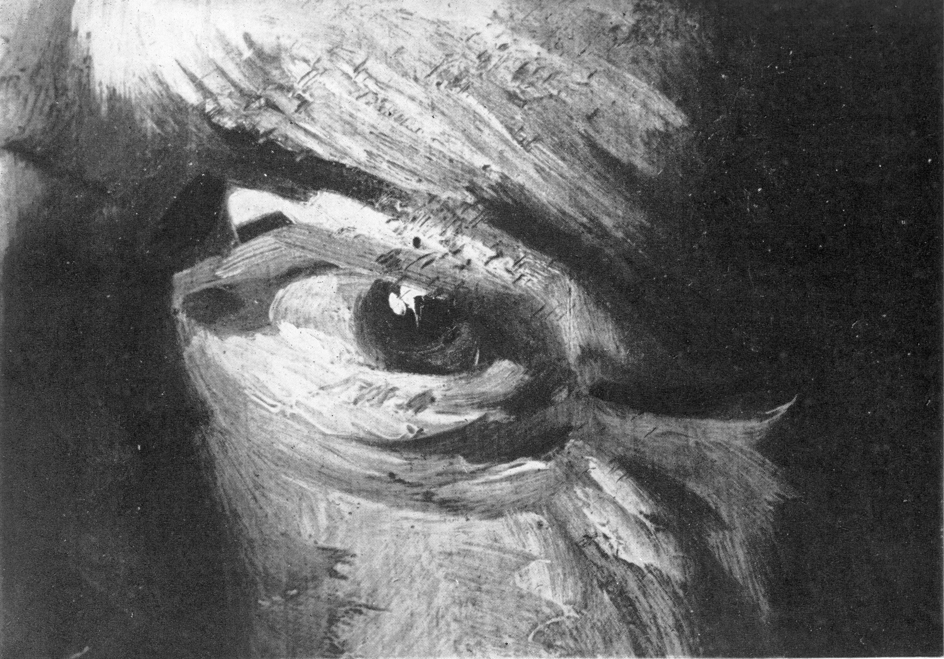
Above, Fig. 17: Laurie’s photomicrograph of the eye in the Frans Hals portrait of Verdonck (National Gallery of Scotland).
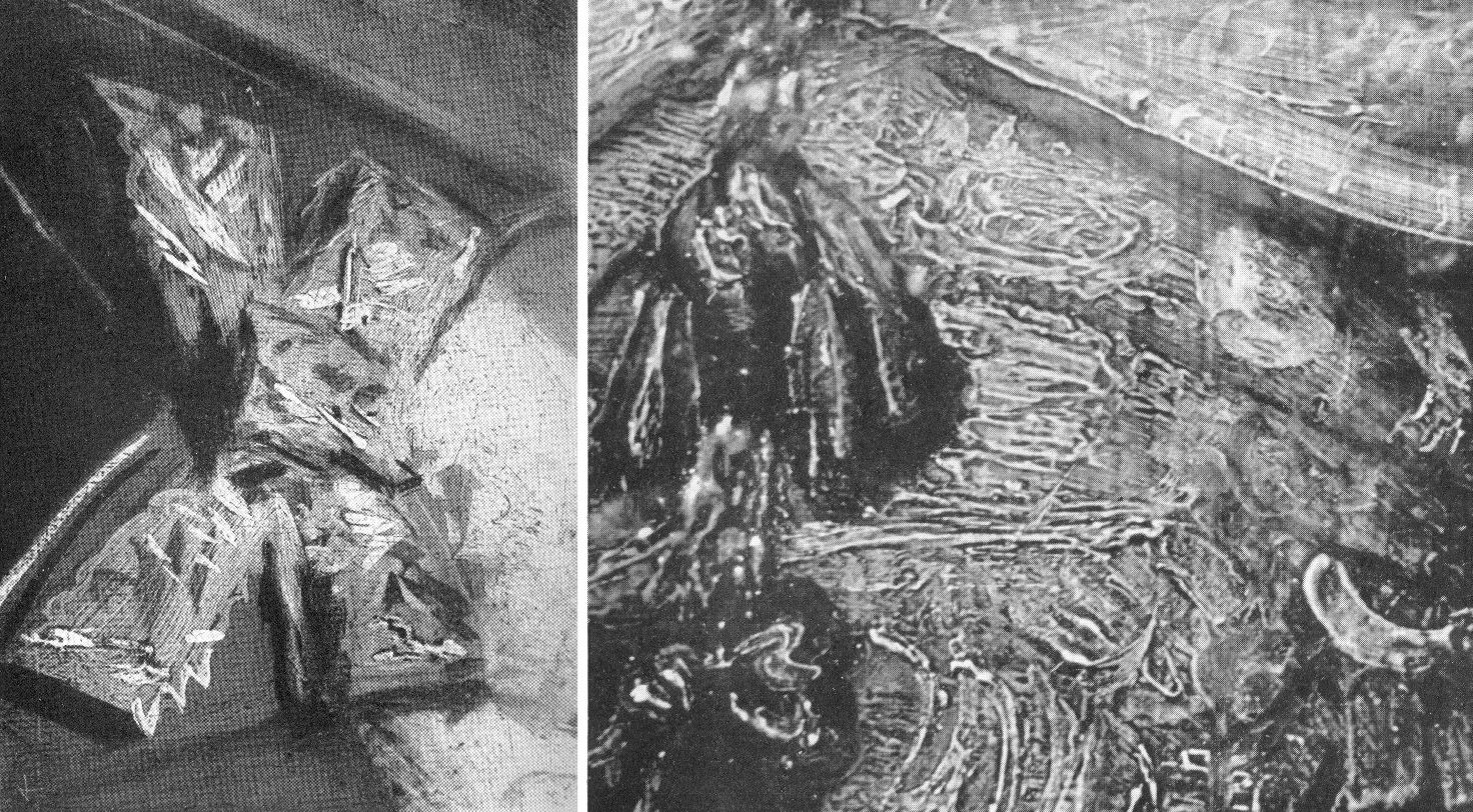
Above, Fig. 18: Left, a photomicrograph of a bow in the Frans Hals Portrait of a Lady (National Gallery of Scotland); right, a detail of the tassel on the shoulder of Rembrandt’s Saskia Laughing, Dresden Gallery. On such a photo-comparison, a child of six would be unlikely to confound the one author with the other.
If perceived in some quarters to constitute a professional threat to vested interests, Laurie acknowledged a personal indebtedness to the London art trade, reporting that his own interests had been aroused by the late Mr Vicars of Bond Street:
“We were all engaged in the famous Romney trial and he took me to see a perfect gallery of the English portrait school belonging to a well-known London banker. ‘We dealers’, he told me, ‘go by brushwork, that is the artist’s true signature which nobody can forge.’ Going up to a Reynolds he said, ‘Do you see how Reynolds has put in that touch there?’ ‘Now come here and see how Romney does it; this is Gainsborough’s touch.’ After we had studied the English portrait school from this point of view, I said to him, ‘I have learnt more from you than from all the art connoisseurs’. He turned to me and said, ‘My boy, we’ve got to know, we risk our money on it!’”
DEFENDING MUSEUM FAKES II
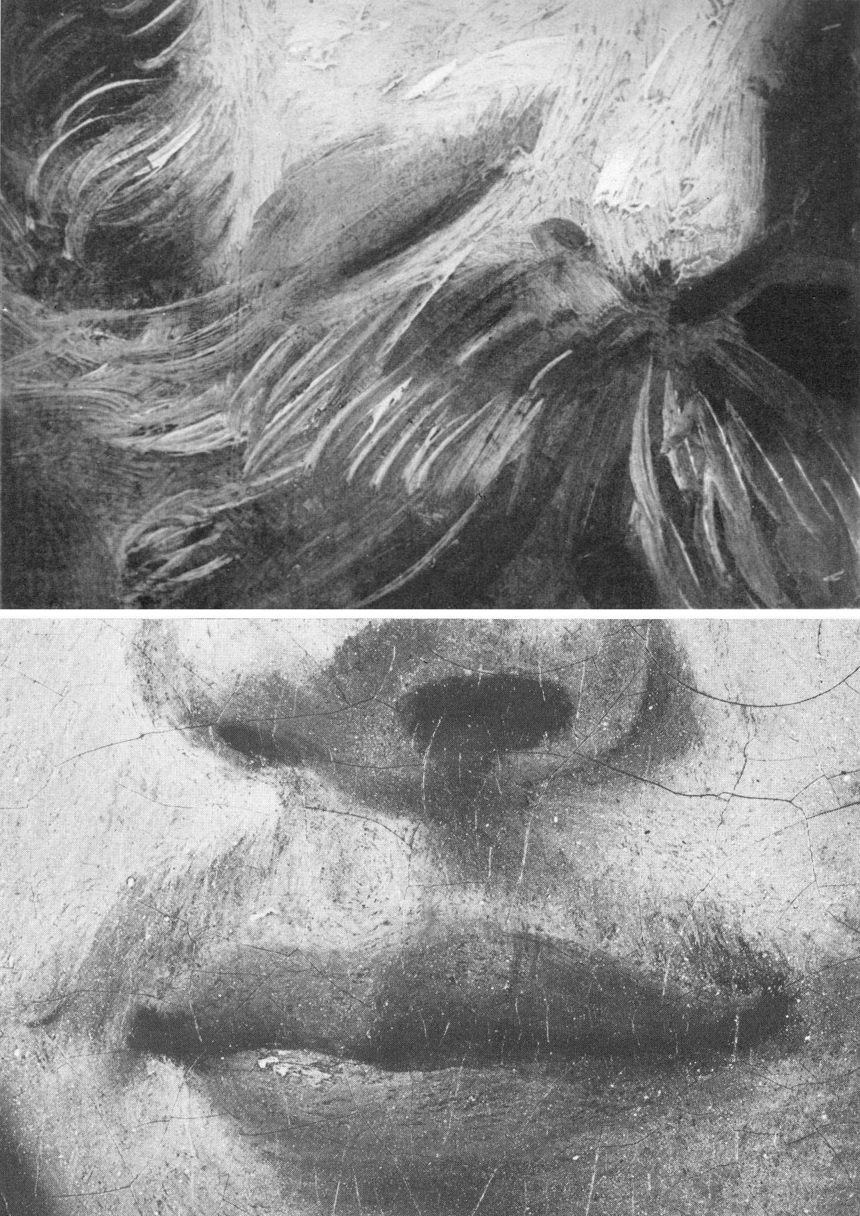
Above, Fig. 19: Top, Laurie’s detail of the Hals moustache; above, a section of a half-page detail of the National Gallery’s du Jardin Portrait of a Young Man, as published in the Technical Bulletin of 1982.
The caption to the Technical Bulletin photograph reads:
“Detail after cleaning, before restoration. The unusually large pigment particles, including those from the lower layer of the ground, can be seen. The paint film is slightly worn so that small areas of grey priming have been exposed, especially to the right of the mouth.”
Thus, as can be seen with this detail of du Jardin’s Portrait of a Young Man, the National Gallery certainly had the means in 1982 to provide Laurie-style detailed photo-comparisons that might have shown, for example, the consequences of its cleaning methods (see Fig. 8 above), or the stylistic correspondences or otherwise between works attributed to a given author. The Gallery had accepted Laurie’s comparative photo-demonstration (as at Fig. 14) that a challenged work was an autograph Rembrandt, but it has commissioned no detailed photo-comparisons of the Samson and Delilah brushwork with that of its own uncontested Rubens pictures (see Fig. 22). Instead of better studying the creative handiwork of artists, the gallery has photographed a million microscopically minute samples of paint ground down so as to reveal paint in stratigraphic cross-sections. In the 1993, 1996 Art Restoration, we complained that the National Gallery’s restorers and scientists were more interested to learn of the chemical constituents of paint than to understand the artistic uses to which artists put their paint, viz:
“…the green earth pigment consisted of ‘glauconite and celadonite [which] have closely similar constitutions, although their primary origins differ: the former is present in certain marine sedimentary deposits, while the latter occurs as inclusions in igneous rocks such as basalt. They are difficult to distinguish by XRD. Both types are layered silicate materials containing FE(II) and FE(III); also characteristic is a content of aluminium, silicon, potassium and sometimes magnesium…” Does this have a point, we asked, or is it swank? Was Rubens handicapped when painting in ignorance of such chemical constituencies?
Laurie encountered hostility from institutions wishing to defend their attributions. He warned: “I suggest a voyage of discovery to some young student with a magnifying camera through the galleries of Europe, but he must be careful to conceal his real object or he will never return alive. I have never forgotten the rage of the Director of a famous continental gallery when he thought I was suggesting that one of his pictures was not by Rembrandt. ‘Nonsense, nonsense’ he shouted, ‘one of the finest Rembrandts in the world’. I hurried to explain that I was referring to a Rembrandt in another Gallery, he smiled sweetly and said, ‘You are probably quite right’.”
TIMES CHANGE
In conclusion, and in Laurie’s inquiring spirit, we consider some close photographic comparisons of the National Gallery’s version of the 1609-10 Samson and Delilah with a bona fide Rubens painting which has retained its back – Rubens’ The Raising of the Cross of 1609-11, Antwerp Cathedral. As with that comparison at Fig. 4, above, the successive comparative details from Fig. 20 to Fig. 25 below are of two works of the same supposed historical moment and stage of development within the oeuvre. Great differences of brushwork might hardly, therefore, be expected. Matches are not to be found.
“SMOOTHLY BRUSHED, THINLY APPLIED”
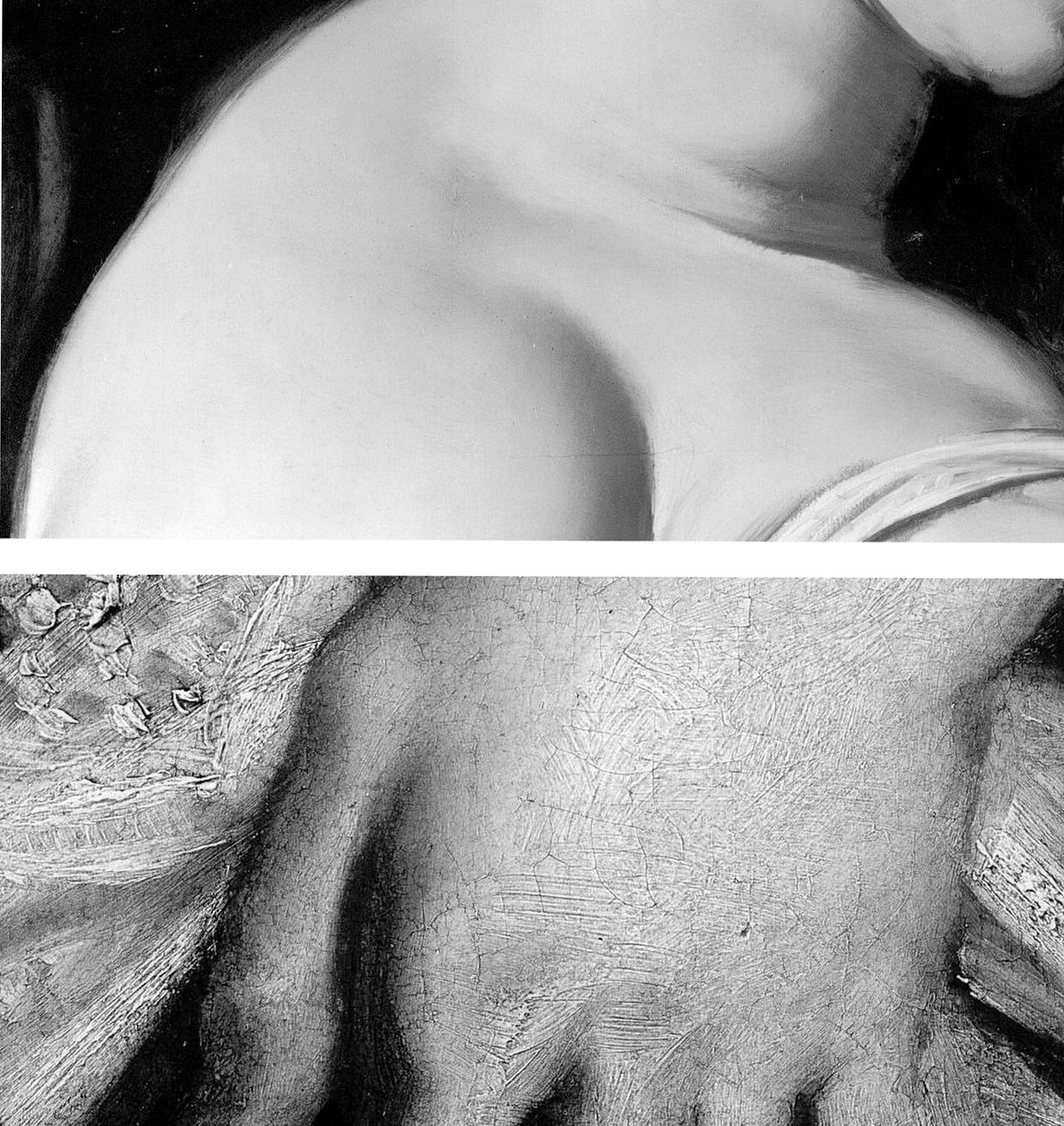
Above, Fig. 20: Top, a section of Delilah’s flesh; above; a detail from Rubens’ The Raising of the Cross.
The astonishing contrast above, is of an apparently phenomenally well-preserved smoothness and absence of age cracks in the Delilah, and the entirely characteristic four centuries old painting of flesh on The Raising of the Cross. Plesters, convinced of the picture’s authenticity, perceived no stylistic discrepancies and remarked on the Samson and Delilah’s seemingly youthful paint: “The flesh of Delilah was in such perfect condition that no small damage could be found from which to take a [microscopically tiny] sample, but viewed under the stereoscopic binocular microscope at low magnification the pale parts of the flesh appear to consist of lead white tinted with a little vermilion, a mixture which results in a clear rosy pink. The transition between the white, pinkish and more creamy tones (probably lead white with a little yellow earth colour) are smoothly brushed apparently in a single paint layer.” Moreover, “Apart from the strongest highlights the flesh paint is quite thin, so much so that in parts the striped pattern of the yellowish imprimatura below is visible lending a pearly translucent effect which Rubens may have calculated…”
As if inoculated against all visual anomalies, Plesters deemed it interesting to find that “in the full-scale version of Samson and Delilah the striped imprimatura, so characteristic of his preparatory and exploratory oil sketches on panel, has been used.” Without her conviction that what she was examining what was unquestionably Rubens’ handiwork, Plesters might have found the exposed imprimatura in a major painting, commissioned by a friend and patron, surprising and incongruous. Perhaps she did sense danger: “…it could of course, in this case, be the accidental result of [unusual] speed and boldness in painting.”

Above, Fig. 21: Two faces of the Rubens “beautiful young blond woman” type. Again, the same striking differences of paint film properties are apparent (thick v. thin; smooth v. textured) but note also how in the secure Rubens picture the “drawing” of the subject’s profile has been realised by modelling the features (brow, nose, lips and chin) over a darker background. In the National Gallery picture the drawing of the profile is weaker, sharper, anatomically inferior and has been realised principally by the encroachment of a superimposed dark background which, at the nose, results in flat, angular edges like cut-out paper that bear no relation to the form of the nose (which, anyway, is itself plastically and anatomically ill-conceived) and with no illusion of aerial recession beyond the figure.

Above, Fig. 22: Top, in the Samson and Delilah the forms of the lips are chaotically and messily unresolved. The upper lip is drawn as if from a three-quarters and above viewpoint, but the lower lip is drawn as if seen sideways on and with no hint of interconnecting flesh. By comparison, in the proper-Rubens head all the surfaces turn, move, and cohere convincingly, as if placed on a piece of sculpture.
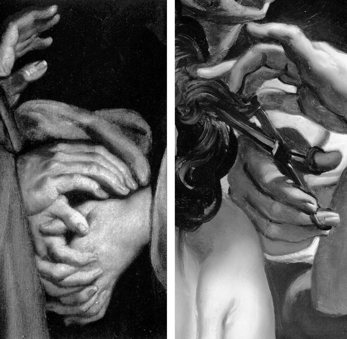
Above, Fig. 23: In these portrayals of hands, the superbly realised expressive resolutions within the one, disqualify the crass and clumsy shorthand treatments seen in the other.
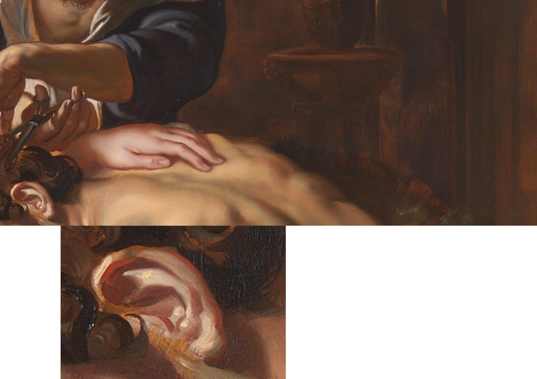
Above, Fig. 24: In these two details on the Burchard/National Gallery painting, the scant, near-void-like treatment of the background is accompanied by a flabby musculature in Samson’s back. The enlarged detail of the ear discloses an angular, almost Cubist treatment of the forms laid hastily over the stripy sketch-like imprimatura.
A TRIPLE COMPARISON AND A SECOND, “TWINNED” RUBENS UPGRADE
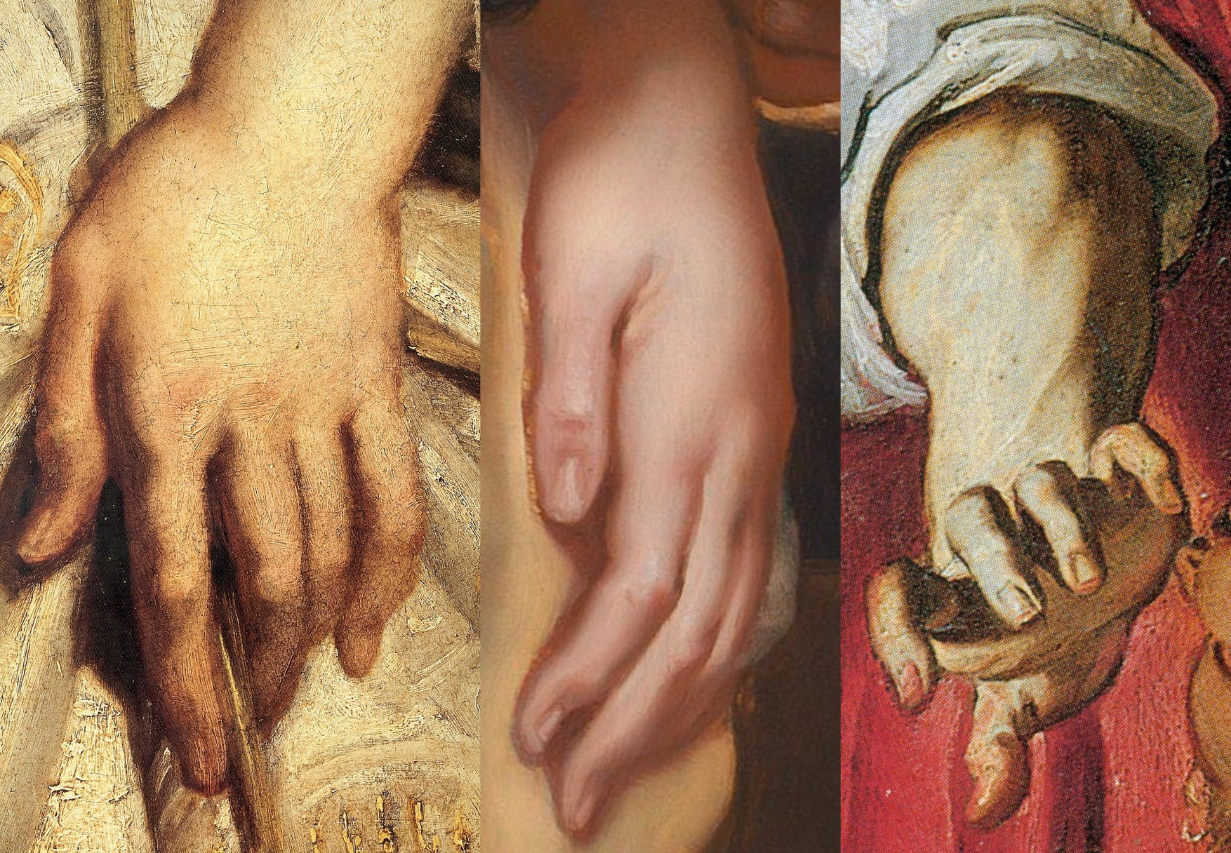
Above, Fig. 25: In this comparison we show three very different treatments of female hands which pose the question: Did Rubens paint female hands so variously in 1609-11?
On the left, we see that encountered in the secure Raising of the Cross in Antwerp cathedral. In the centre we see the Delilah hand from the National Gallery. On the right, we see a hand from the (presently) most-expensive “Rubens” painting, The Massacre of the Innocents which realised £49.5m at Sotheby’s on 10 July 2002. The latter, like the Samson and Delilah, had been regarded as a follower’s copy for centuries. Where our eyes can only tell us that these three hands were executed by different artists, the official Rubens Art Scholarship World insists that all three had been painted almost simultaneously by Rubens. The hand in the centre is an anaemic semblance of a Rubens hand. That on the right is a stridently caricatured – almost comic book-like – derivative.
GROWING OEUVRES DESPITE THE EVIDENCE OF TREE RINGS
When misattributed works are accepted within oeuvres, they immediately exert a toxic influence – if “X Mark I”, then why not also a matching “X Mark II”? And so on, ad infinitum…until an inevitable eventual crisis of confidence arises.
Up to December 2001 the Massacre (Fig. 30, below), like the Samson and Delilah, had for centuries been regarded as a follower’s copy. The upgrading was said to have been made by five experts, only three of whom were named – Paul Huvenne, Arnout Balis and Elizabeth McGrath (the other two were believed to be National Gallery staffers). In the 2006 AWUK Journal No. 21 we reported that Dr. McGrath had corresponded with the National Gallery about Jan van den Hoecke, whom she believed had worked with Rubens in his studio and had possibly collaborated with him on a Rubens temporarily loaned to the National Gallery. She had expressed a fear to the Gallery that if her material were to be passed to the press, she might be thought to be propounding her own theories.
Some of the five experts thought the Massacre had been painted before the Samson and Delilah, some, after it. Of all Rubens paintings of the period under consideration – 1609-11, the National Gallery picture – and not, for example, the absolutely secure Raising of the Cross – was taken by Sotheby’s and the experts to be the “benchmark” picture in making this new Rubens ascription even though both the Samson and Delilah and the Massacre had spent many years together in the Liechtenstein Collection not as Rubens’s but as Jan van den Hoecke copies of Rubens pictures. The Massacre had Liechtenstein seals on the back and front of its panel which, just like the Samson and Delilah in 1929, was said to be original and in excellent condition.
BURYING REPORTS
Sotheby’s had commissioned detailed technical reports which were not carried in the sale catalogue but which were there said to be available on request in a separate volume. The reports carried much material that was injurious to the Rubens ascription, as we reported in the October 2002 Jackdaw (“Is this £49.5 million painting by Rubens?”). The Independent’s financial correspondent William Kay, had advised on 20 July 2002 (“A little detective work can pay off”): “Don’t look at a company’s profits-and-loss account – start at the back of the accounts, where the notes are, not at the front where the chairman puts a gloss on the numbers.”
Turning quickly from the first page of Sotheby’s commissioned reports on the Massacre (- which page carried the disclaimer “The independent reports contained in this document are provided for prospective bidders’ information only and without warranty by Sotheby’s or the seller”) to the very last page, I discovered that the two last lines of a dendrochronological report by Peter Klein on the picture’s oak panel (dated 2 April 2002) read:
“Under an assumption of a median of 15 sapwood rings and 2 years for seasoning a creation is plausible from 1615 upwards.”
That meant the Massacre’s proposed Rubens upgrade as “a just-returned-from-Italy” work of 1609-11 was toast. On the tree ring evidence, this panel could only be considered to have been painted at least four years afters after its claimed date of execution. When Dr Klein examined the wood of the Samson and Delilah in 1996 his technical findings were said by the National Gallery to have corroborated the claimed 1609-10 date of execution. That claim, however, had rested not on the data but on the authority of a Klein covering letter which stated: “The felling date [of the tree] corresponds very well with the art historian attribution” and that a date of execution for the painting “is plausible from 1605 upwards”.
Two British dendrochronologists held that Klein’s summary characterisation of tree ring data was misleading. One said: “it is unsafe to say 1609 is any more likely than a later date of 1620.” Another observed “All Klein should be saying is that the range is 1597 to 1630”. The forces that were desirous of the Massacre being taken as a bona fide Rubens were unmoved by the earlier Samson and Delilah controversy and warnings – and the marketing enterprise rolled on despite the presence of much other disqualifying evidence in the volume of reports. As we reported in the Jackdaw:
“Preliminaries studies failed to link the Massacre’s wood with that found in any of Rubens’ panel. As well as being too late, the Massacre contains the wrong materials. A pigment, orpiment, that is found in no Rubens painting is present here. A second pigment, smalt, said to have been in use ‘mainly in the mid-seventeenth century’ and which seems only to be found in Rubens’ later works is also present. The orpiment yellow is anomalous not only in its presence but in its manner of application – it is mixed with lead tin yellow. Such a combination is said to be “unusual since it was considered unstable” and, even, to be a practice ‘not encountered in 17th century works’…Speaking of Rubens’ debt to classical sources, the anonymous author of the catalogue entry correctly concedes, ‘one of the background figures appears to derive from the Borghese Gladiator…[which] was not excavated until late in 1611’…”
The absence of under-drawing and pentimenti has been remarked in both works. No less anomalous is that both also betrayed an uncharacteristically stinting use of lead white pigment. Plesters, convinced at every turn that a Rubens ascription was beyond question, noted: “The striking feature of the composite X-radiograph is how comparatively sparingly and how subtly Rubens has used lead white, reserving the strongest touches for the brightest highlights and tapering the thickness of the white highlight to almost nothing. This system of painting which uses the light-coloured ground showing through thin translucent paint layers for the middle tones, particularly of flesh, is similar to that used by early Netherlandish painters who also used a chalk ground on oak panel.”
Where Plesters had attempted to explain the absence of underdrawing on the Samson and Delilah by claiming there had been no need to make any because the (anomalously complete) oil sketch for the painting had resolved all matters, in Sotheby’s reports it was more frankly acknowledged that such absences of under-drawing and pentimenti in the Massacre are consistent with pictures originating in Rubens’ workshop:
“…we can identify the use of minor but significant applications of paint to modify the outline and define the shape of the elements in the composition. These can be seen as strongly contrasting additions, frequently following the line of a limb or suchlike. Wadum [J] has effectively argued that these features represent Rubens’ studio control, and that he was in the habit of inspecting works before they left the workshop and making corrections.”
Clearly, had Rubens painted the Massacre with his customary perpetual revisions (as are to be seen on the Raising of the Cross), he would not have needed to make last-minute corrections with ‘brushstrokes of paint containing carbon black’ to his own work.
SCHOLARLY ACCOUNTABILITY
We asked in the 2002 Jackdaw: “Can it be right that we are all asked to take this leap of faith when the [five] experts, displaying a seeming ignorance of – or disregard for – so much germane material evidence, have yet to publish accounts of their verbal endorsements.”
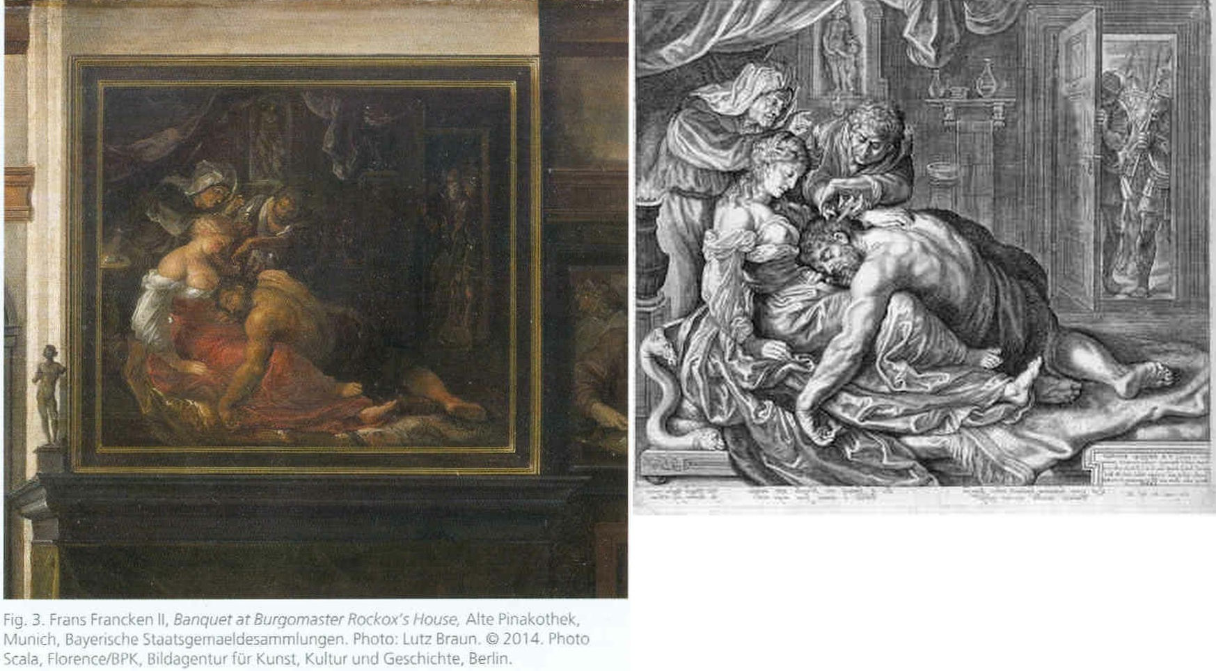
Above, Fig. 26: The two copies made respectively of the original (and subsequently lost) Rubens Samson and Delilah in 1625-35 by Frans Francken (left), and in 1613 by Jacob Mathan (right) in both of which Rubens can be seen to have painted the whole of Samson’s right foot and space beyond.
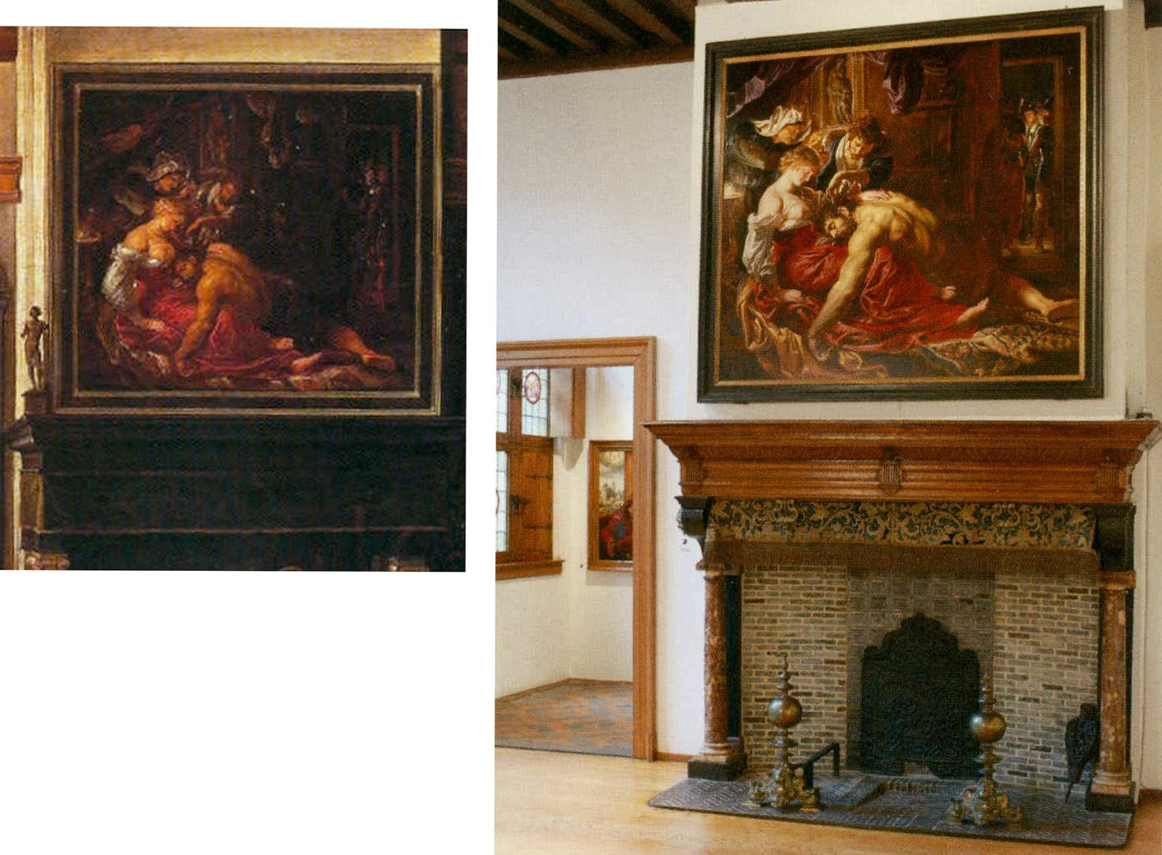
Above, Fig. 27: Left, detail of the Frans Francken painting showing the original Rubens’ Samson and Delilah; right, the National Gallery Samson and Delilah, as exhibited in 1983 in its then new, post-restoration, frame and above a mock-up of the grand fireplace in Nicolaas Rockox’s house. The recorded positioning of Samson’s right foot in the Franken copy testifies to a compositionally taught bisecting of the picture on a descending diagonal. In contrast, the foot is not only cropped in the National Gallery picture, but it first wanders up the edge of the painting leaving a broken-looking leg.
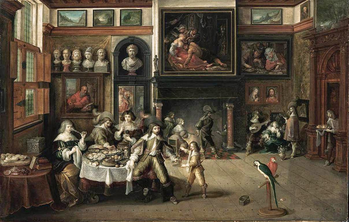
Above, Fig. 28: The whole of Frans Francken’s copy of the original Rubens Samson Delilah enjoying pride of place in Nicolaas Rockox’s house.
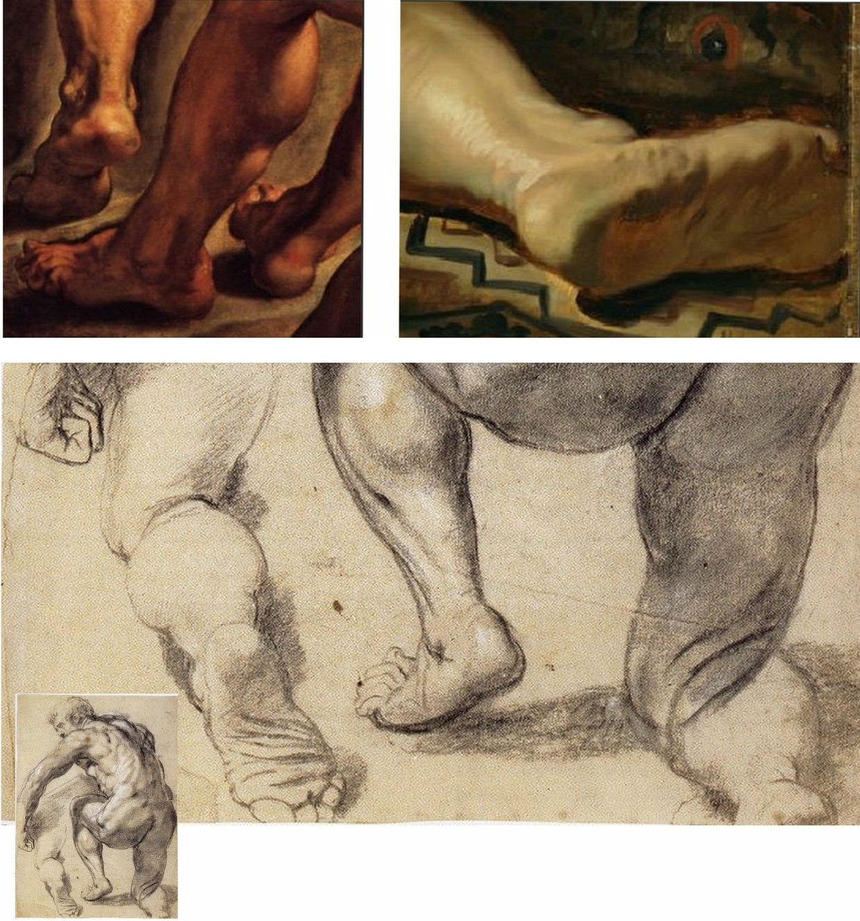
Above, Fig. 29: Top left, detail of feet on Rubens’ The Raising of the Cross; top right, the cropped foot in the National Gallery Samson and Delilah; above, a Rubens chalk figure study for The Raising of the Cross showing how Rubens drew separately on the sheet a cropped leg.
The most visibly disturbing disqualification in the National Gallery picture – as Doxiadis, Harvey and Hopkinson immediately flagged in their 1992 Report – was the fact that the toes of Samson had been cut off at the edge of the painted area on the panel when both copyists of the original painting in Rockox’s house had recorded an intact foot set well away from the edge of the painting in a more reassuringly “Rubensesque” treatment.
The cropping in the National Gallery version is itself disqualifying on two counts. First, few painters have been more attentive to their depicted subjects’ digits than Rubens. When a foot was not included in a large swiftly drawn figure study, as above at Fig. 29, Rubens drew it separately on the sheet so as to have a record of the entire figure. Second, as we have examined previously, copyists frequently produce truncated versions of master works and the £49.5 million Massacre of the Innocents which is now in the Ontaria Museum is – just like the Samson and Delilah – a compositionally cut-down version of a larger composition that is found in a School of Rubens Massacre in the Royal Museum of Fine Arts Belgium as seen below in Figs. 30 and 31.

Above, Fig. 30: Left, a detail of a Rubens School work in the Museum of Fine Arts, Belgium; centre, the former Jan van den Hoecke copy that became the £49.5 million Massacre of the Innocents and now lives in the Ontario Museum; right, the Francken copy of the (lost) original Rubens Samson and Delilah.
Above, Fig. 31: The left-hand sections showing the pair of murdered babies in the bottom left corner of two versions of Rubens’ Massacre – that in the Royal Museum of Fine Arts, Belgium version, left, and, right, that in the cropped £49.5m Ontario Museum, former Jan van den Hoeke version.
On the fact of the 1980 and 2002 upgrades, must we now believe that Rubens had cropped the compositions and subjects in both his Samson and Delilah and his Massacre of the Innocents pictures so disturbingly as to prompt copyists of both works to expand the pictures to more comfortably and characteristically Rubens-like compositions?
How many allowances may be made, how many disqualifications disregarded, to uphold a single troubled attribution? In our experience, it is very often the case that when one thing is wrong with an attribution, everything else is.
Michael Daley, Director, 5 November 2021
POSTSCRIPT: On 12 November 2021, Eric Biétry-Rivierre reported in LE FIGARO (“A Salvator Mundi still record but less and less credible”):
For the Prado Museum, the most expensive painting in the world is not by Leonardo da Vinci. Rather, it is the work of an assistant or follower.
In the catalogue of this exhibition running until 23 January 2022 and relating to an old copy of The Mona Lisa which it preserves, the Prado does not attribute to Leonardo da Vinci the Salvator Mundi of the Crown Prince of Saudi Arabia. According to the Madrid Museum, this version called “Cook” (named after a former owner because there are no fewer than 22 paintings in the world in the Leonardesque style and representing Christ in the manner of a God the Father) belongs to a close assistant or follower. This further darkens the episode of the highly marketed and hypermediatized sale, organized by Christie’s New York in 2017. And it justifies less the $ 450.3 million disbursed by Mohammed Bin Salman.
The curator Ana Gonzalez Mozo even suggests that a prototype made by the master may never have existed. As for which would be the oldest version, she leans towards another Salvator Mundi: the so-called “Ganay” version, also in private hands. Its pedigree, admittedly incomplete, being much less incomplete. It was already this oil painting that, although less beautiful and less well restored, had the preference of the specialists of the Louvre during the retrospective organized at the end of 2019 on the occasion of the 500th anniversary of the death of the master.
After much debate, hesitation, and even the publication of a scientific brochure validating the “Cook” was finally discarded, the “Ganay” completed its exceptional journey. And this not only because the Gulf panel painting was missing (MBS would have conditioned his loan to a hanging near Mona Lisa, which would, de facto, have “consecrated” the work as an authentic Leonardo).
The “Cook” version was also weakened by a recent documentary by Antoine Vitkine. In his Salvator Mundi: the astonishing case of the last Vinci, the main supporter among international “Leonardologists”, the Englishman Martin Kemp, appears less affirmative. As for Luke Syson, the present director of the Fitzwilliam Museum, Cambridge, who in 2011 was the unconditionally supportive curator/architect of the first public presentation of the work at the London National Gallery, he is more and more among peers who denounce his recklessness.
Bernd Lindemann is one of them. In another documentary on the Salvator Mundi, by Andreas Koefoed, Lindemann, director of the Gemäldegalerie in Berlin, says: “It’s not the role of serious museums to present such a controversial painting.” Thus is the reputation of the great British museum damaged. This is bad at a time when its Samson and Delilah, bought at a golden price for a Rubens forty years ago is seriously questioned.
On 14 November 2021 The Times of Israel reported that the $450m Salvator Mundi has been deemed not a Leonardo:
“Sold for $450m to Saudi prince, ‘Salvator Mundi’”
“The Prado catalogue also contains an opening essay by Vincent Delieuvin curator of Paris’s Musée du Louvre’s 2019 retrospective of works by the artist. He discusses the Saudi-owned painting, referring to ‘details of surprisingly poor quality’. Delieuvin concluded, ‘It is to be hoped that a future permanent display of the work will allow it to be reanalyzed with greater objectivity’…”
The initial near-universal hyperbolic analysis has indeed been found wanting but Waldy and Bendy are not the only fleet of foot art critics. As Jacques Franck notes:
“This is interesting news indeed, but it is not how the real story ran when it started in 2016. Delieuvin, no less than Penny and Syson at the National Gallery, had been convinced all along that the Cook Salvator Mundi was by Leonardo, there can be no possible doubt about that. Aside from the strong support Delieuvin gave the painting on the occasion of the Leonardo exhibition he curated at the Italian Embassy in Paris in September 2016, he had long planned to include the work as the guest star in the blockbuster Leonardo show which he co-organised with curator Louis Frank at the Louvre in October 2019. This is testified by the first version of the catalogue which reproduced the Cook Salvator Mundi on the front cover, wherein one could read that it was attributed to Leonardo himself and had been listed as such at no. 157 in the show. That first version was junked for undisclosed reasons and the whole catalogue was reprinted. What is known is that the loan of the Saudi picture was not granted by the owner; that the picture was not exhibited; and, that the non-appearing picture was simply reproduced in the new catalogue as “Salvator Mundi version Cook”, fig. 103 bis, p. 303 thus meaning “studio work”. (See Fig. 32 below.) In December 2019, six weeks after the late October opening of the above-mentioned Leonardo exhibition, a book titled Léonard de Vinci. Le Salvator Mundi by Vincent Delieuvin (Louvre curator), Myriam Eveno and Elisabeth Ravaud (both Louvre laboratory scientists) was put on sale in the Louvre’s bookshop and swiftly withdrawn. However, some copies or photocopies of the latter book have nevertheless circulated around the world and are now in the hands of many Leonardo scholars, like me. In that notoriously disappeared book, the authors concluded enthusiastically (p. 14) that the work had been shown by “decisive scientific tests” in 2018 to be by Leonardo. That is the true story and there exists no other”.
In the December 2021 Art Newspaper, Bendor Grosvenor, over-looking the annual Apollo magazine awards, complained of an absence of art world annual awards and launched a self-styled “Diary of an Art Historian awards”. Two especially rich items caught the eye. His book of the year award was given not to a book but to an online catalogue raisonné, which he contends “might not yet have the kudos of a book published by Yale priced at £150, but it will have a thousand times more readers, and just as impressive a legacy. (Readers might recall Grosvenor’s own recent unsuccessful joint bid with the dealer Philip Mould (who has a degree in art history) to replace the four specialist scholars-authored, Yale-published, 2004 catalogue raisonné Van Dyck A Complete catalogue of the Paintings – see Art-Trading, Connoisseurship and the Van Dyck Bonanza.) Richer still, perhaps, was Grosvenor’s award for “Auction Consignment of the Year to whoever had the imagination to capitalise on Leonardo-mania by buying a humdrum 20th-century copy of the Mona Lisa on eBay for £2,750 and swiftly consigning it to Sotheby’s Old Master Sale in London, where it made £378,000″ – a small beer hike compared with the conversion of a recent, repeatedly restored, one thousand-dollar wreck into the $450m pretendy and now-disappeared Leonardo Salvator Mundi. On the night of that notorious Christie’s, New York, sale Grosvenor swooned: “Christie’s just did something that re-writes the history of auctioneering. They took a big gamble with their brand, their strategy to sell the picture, and not to mention the reputations of their leadership team, and they pulled it off – the best piece of marketing I’ve ever seen. Above all, they had absolute faith in the picture. AHN [Art History News] congratulates them all.”
Art-Trading, Connoisseurship and the Van Dyck Bonanza
There are now two upgraded paintings in two museums that have been claimed as “The Last Van Dyck Self-Portrait” and an upgraded third painting has been presented in a third museum as a lost, earlier Van Dyck self-portrait – see Fig. 1 below. This acceptance by three museums of three self-portraits in six years has coincided with a spate of exposed forgeries and restoration-led upgraded “discoveries”. The opaque means by which three problematic pictures found their separate ways into three museums as upgraded autograph Van Dycks are items of cultural/art-political concern.
This triple elevation has spotlighted levels of scholarship and transparency within the cross-linked spheres of connoisseurship, ownership, restoration, promotion and sales in the wake of the spectacular rise and demise of the now downgraded and disappeared $450m Leonardo School Salvator Mundi that had been bought for barely a thousand dollars and somehow netted nearly two thirds of a billion dollars through three sales in five years on an implausible provenance. The institutionally sensitive roles of upgraded old master paintings serving as conduits for financial exchanges and investment are attracting attention as never before. The Van Dyck bonanza has prompted public challenges on both the artistic status of the pictures being traded and the means and manner by which public and private monies pass hands.
THREE UPGRADED VAN DYCK SELF-PORTRAITS
Above, Fig. 1: Left, the National Portrait Gallery’s “Last Van Dyck Self-Portrait”; centre, the new Bendor Grosvenor-accredited (and owned) “Last Van Dyck Self-Portrait”, as loaned to the Rubenshuis Museum, Antwerp; right, the Philip Mould/Grosvenor accredited, privately owned painting that has been loaned as an autograph Van Dyck self-portrait to the Minneapolis Institute of Arts, Minnesota.
All three of the above self-portraits changed hands recently as autograph Van Dyck self-portraits with the first two both now claimed to be the last Van Dyck self-portrait. All three have undergone modern or recent restorations. The two on the right were transformed within the last decade (and possibly by the same restorer). The picture on the left – an undeclared, covert upgrade – was bought by the National Portrait Gallery in 2014 for £10m.
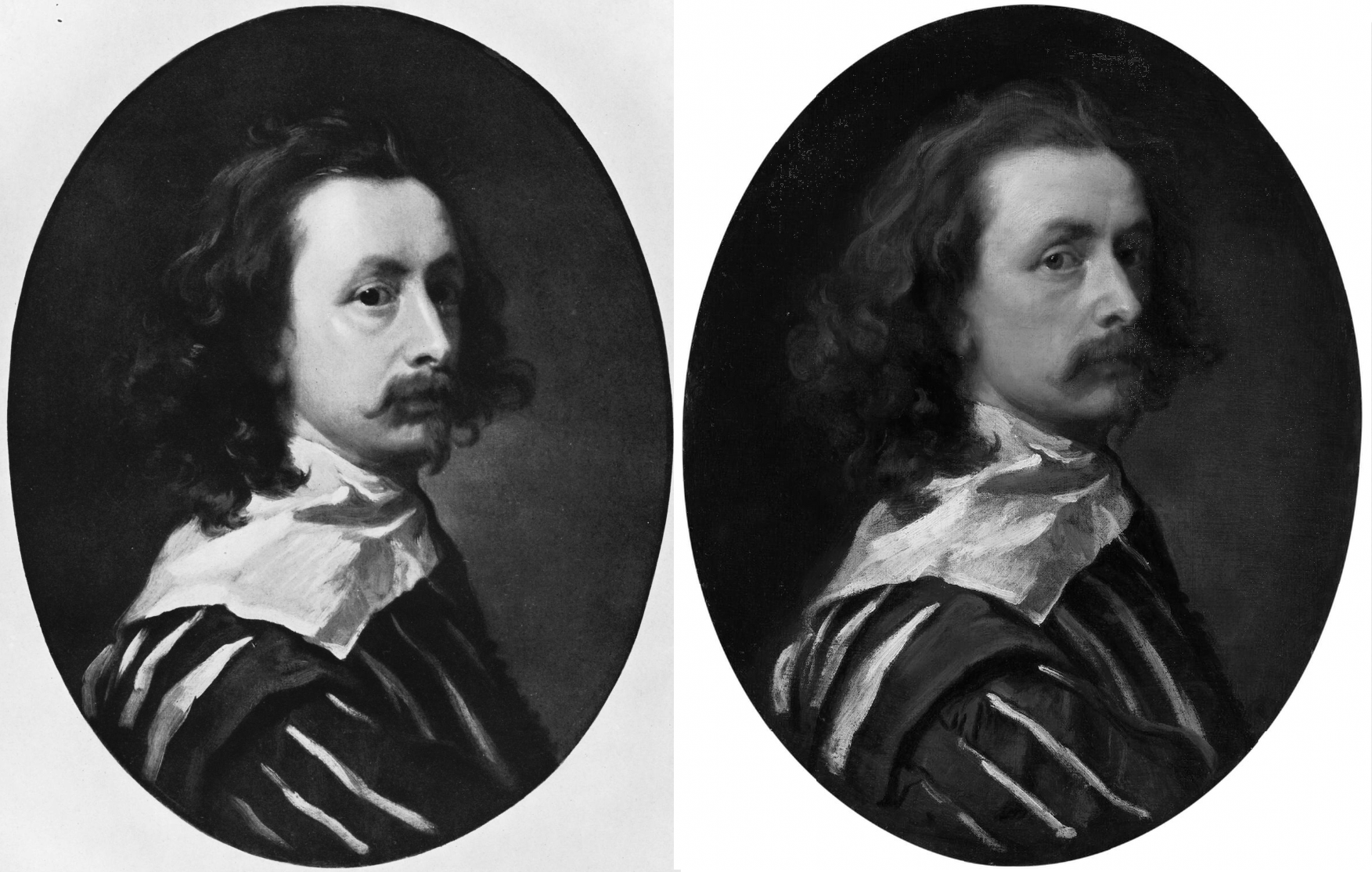
Above, Fig. 2: Left, the “Last Van Dyck Self-Portrait” that was published in 1941 by Gustav Glück in The Burlington Magazine (“Reflections on Van Dyck’s early death”); right, the “Last Van Dyck Self-Portrait” that was sold to the National Portrait Gallery in 2014.
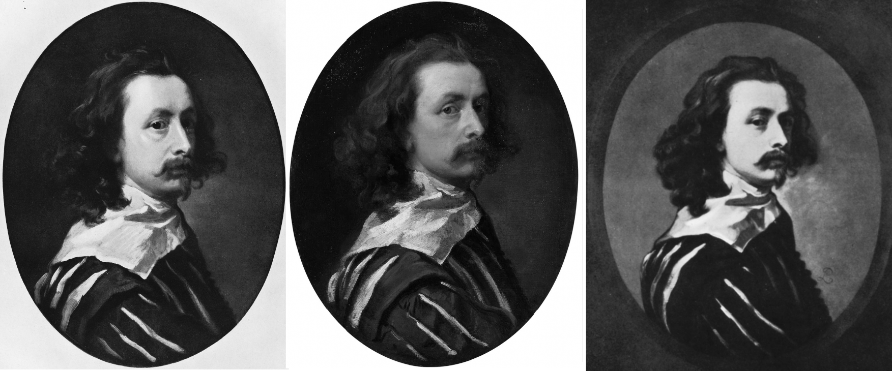
Above, Fig. 3: Left, the “Last Van Dyck Self-Portrait” as published by Glück in 1941; centre, the “Last Van Dyck Self-Portrait” as sold to the National Portrait Gallery in 2014; right the painting published by Glück in 1941 as a copy by Sir Peter Lely of the Glück claimed last Van Dyck self-portrait shown left, here.
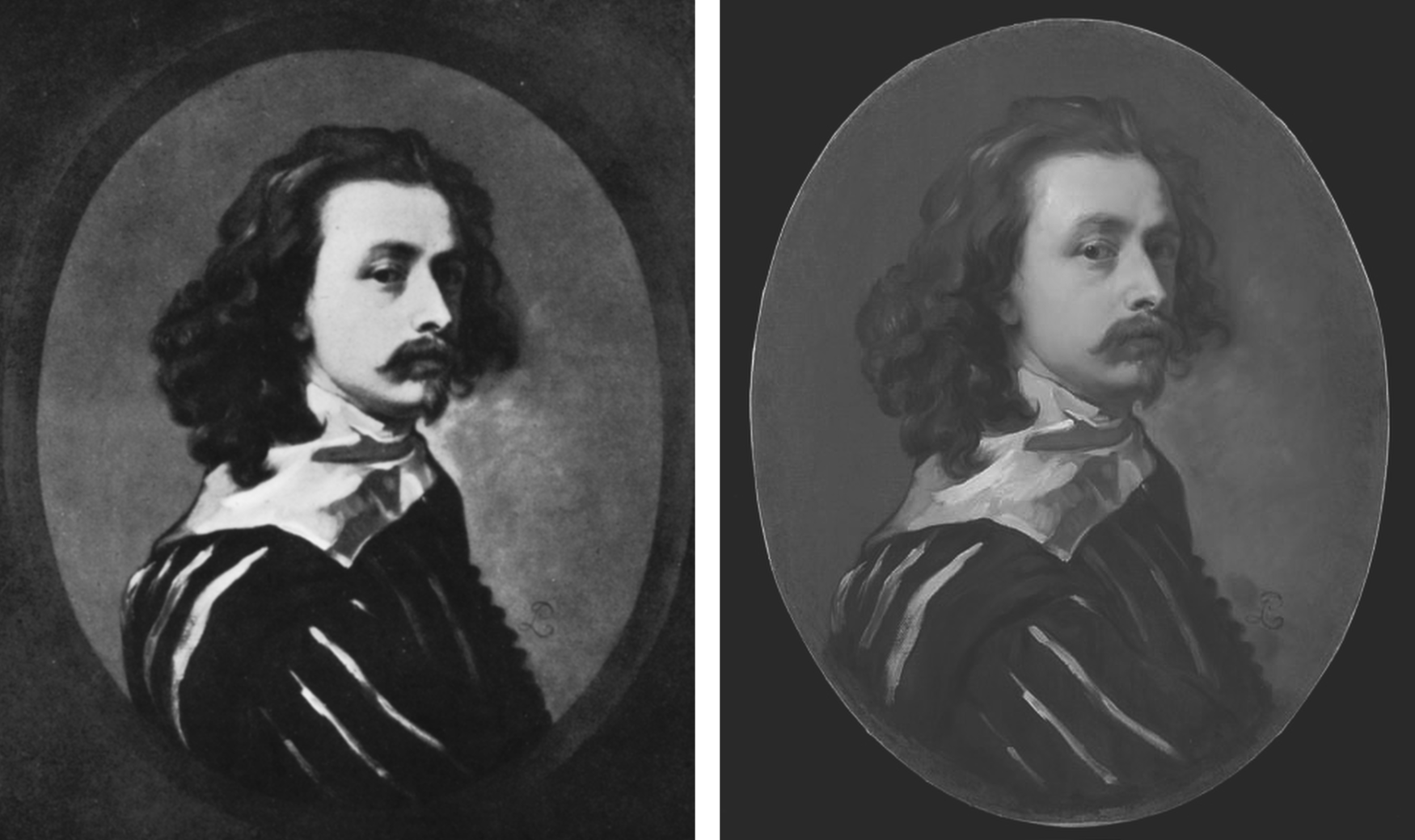
Above, Fig. 4: Left, the painting published by Glück in 1941 as a copy by Sir Peter Lely of the then-claimed last Van Dyck self-portrait shown above left at Fig. 3; right, the painting published in 2011 as a copy by Sir Peter Lely of the then-claimed last Van Dyck self-portrait at Fig. 1, left, which was sold to the NPG in 2014.
MILLAR’S WARNINGS
The notoriously vexing challenge of identifying autograph Van Dycks was set out with frankness and high expertise by Sir Oliver Millar, a former Surveyor of the Queen’s Pictures, in his contribution to the 2004 catalogue raisonné Van Dyck – A Complete Catalogue of the Paintings, by Susan Barnes, Nora De Poorter, Oliver Millar and Horst Vey and published by the Paul Mellon Centre, London, the educational charity committed to supporting original research into the history of British art and architecture of all periods.
Covering Van Dyck’s last English period from 1632 to 1641, Millar listed 264 works and added an appendix of 37 works that comprise records of lost original paintings. Taken together they would average more than thirty-three paintings a year, including many double and very grand group portraits with brilliant elaborate costumes, accoutrements, settings, animals and part-landscapes but the work rate was even higher because of Van Dyck’s many and often long absences and periods of illness – he spent more than a year abroad in 1634-5 and suffered increasing pain in his painting hand. His employment of assistants caused some patrons to complain of work that was not autograph.
Millar assumed that Van Dyck had emulated the practices and “distribution of responsibilities as organised in Rubens’s studio” when setting up his own studio in London and he could hardly have spoken more bluntly of the artistic consequences of such production systems. A great deal of work “especially towards the end of his life”, he noted, “was assigned to Van Dyck’s assistants, and there was a heavy demand for repetitions, whether replicas, part replicas, variants or copies […] Sometimes Van Dyck would himself paint a new detail in a repetition otherwise painted entirely by an assistant”, whereas his “finest English portraits are painted…noticeably with a greater variety of touch.” A pronounced monotony of touch might itself, therefore, ring authorial alarms.
NEW EXPERTS ARE GROWING THE VAN DYCK MARKET
The art market correspondent, Colin Gleadell, restated the attribution problem in relation to current market expansionism, in the Telegraph (28 April 2018):
“Interestingly, Van Dyck has had more re-attributions than any other Old Master in recent times. Philip Mould, presenter of the BBC’s Fake or Fortune, traces this phenomenon to the publication of the first reliable catalogue raisonné in 2004, which allowed for detailed study of nearly 800 examples of the artist’s work.
“Of the catalogue’s four original scholars, only two are still alive, and a number of former museum directors have offered their views on attribution since. It’s differences in opinion that have allowed additional works to be added to the recognised Van Dyck corpus.
“Because Van Dyck was prolific and used studio assistants in his work, it can be tricky to unravel how much of a painting is solely by the master. Consequently, the number of works attributed to him, his studio and his many followers is plentiful. Around 300 have come up for auction in the last four years, with dozens subsequently upgraded with a full attribution.
“Taking some credit for the change in status was Mould’s researcher, Bendor Grosvenor, now a TV presenter in his own right and also a Van Dyck connoisseur, who has been quietly accumulating a small collection of discoveries of his own.
“But while Grosvenor prefers to keep his finds, his friend, Fergus Hall, is in the business of selling, his trained eye capable of recognising Van Dyck’s touch even through centuries of dirt, degraded varnish and additional paint. It is only after painstaking cleaning, though, that the full picture emerges…”
MAGICIANS ANNOINT SECOND-STRING WORKS
There exists an aggravating sub-phenomenon whereby venerable scholar/connoisseurs effectively acquire powers to elevate best available copies to autograph status. Some, like the late Sir Denis Mahon, have been known to elevate more than one such work to a single “vacancy”. (See “Art’s Toxic Assets and a Crisis of Connoisseurship”.) Occasional misattributions are inevitable (and correctable) in a field that necessarily rests on fine judgements, but wholesale upgrades risk diluting and adulterating oeuvres to the point of jeopardising market confidence. Risk is compounded when upgrades are products of prolonged restorations in which paint is subtracted and added to the surviving carcasses of pictures on singular, sometimes optimistic, readings of authorship.
BENDOR GROSVENOR’S ASSORTED CONTRIBUTIONS
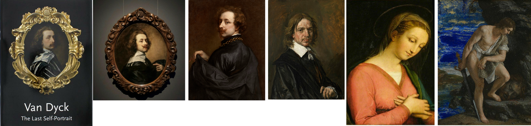
Above, Fig. 5: All six works above have been supported by Bendor Grosvenor.
The three recently and problematically upgraded Van Dyck self-portraits above left were all researched and espoused by Grosvenor. All three works on the right are manifest fakes. The Hals and the Gentileschi were initially accepted by Grosvenor and the “Raphael” attribution was made by him on television.
Respectively, the six are: left, the National Portrait Gallery’s “Last Van Dyck Self-Portrait”, as shown on the gallery’s 2015 celebratory book on the painting; second left, Grosvenor’s own and self-upgraded “Last Van Dyck Self-Portrait”, as loaned by him to the Rubenshuis Museum; third left, the privately owned, Grosvenor/Mould-attributed Van Dyck “Portrait of the Artist” that is now on loan to the Minneapolis Institute of Arts; third right, the now notorious “Frans Hals” (which Grosvenor, the Louvre Museum and a London dealer took to be authentic before Sotheby’s proved by technical analysis that it was a modern paints-riddled fake and fully refunded its buyer ); second right, the self-contained painted fragment of a figure that Grosvenor held to be part of a larger Raphael panel on his BBC4 Britain’s Lost Masterpieces programme (5 October 2016) with near-unequivocal support from the National Gallery’s then director, Sir Nicholas Penny. (The “Raphael” was subsequently rejected and deemed possibly 18th century by the National Gallery in August 2019 following lengthy examinations, but Grosvenor still insists that Raphael had painted this fragment of a “Madonna in a Cross-over Dress” even though it had been painted inside the edges of a piece of wood and therefore could never have been part of a full panel painting); right, the fake Orazio Gentileschi David and Goliath painted on a lapis lazuli slab and which had been exhibited as authentic at the National Gallery when loaned by an anonymous private collector who had bought it from the dealer who had sold on the fake Hals through Sotheby’s.
RESTORATION “SCIENCE” AND THE DETECTION OF AUTHENTICITY
Even before Millar’s warnings, a non-art market exercise had confirmed the problem of identifying studio contributions in 1999 when, in the National Gallery’s Technical Bulletin, the restorer Larry Keith reported that a recent restoration of the Rubens studio work Drunken Silenus supported by Satyrs (Fig. 6 below) had “allowed the opportunity to consider the questions around its authorship and execution afresh in the context of a collaborative technical investigation with the scientific department”. Despite the gallery’s advanced scientific apparatuses and its staffs’ best efforts, it was recognised that “The very nature of the Rubens studio, with its streamlined production and group participation, meant that the painting techniques and materials were also largely uniform, which inevitably limits the ability of technical study to inform specific attributional problems.” In the absence of documentation and relying “heavily on traditional style-based Morellian connoisseurship” the gallery attributed the picture to Van Dyck on a traditional appraisal by eye.

Above, Fig. 6: Above, top left and centre, photographs of a part of the National Gallery’s Rubens studio work Drunken Silenus supported by Satyrs, showing the work before restoration (left), after restoration (centre) and (right) as digitally presented today; below, a detail of a face before and after restoration.
As seen above, the pre- and the post-restoration states are artistically different in their tonal values and relationships. We have examined the National Gallery’s dossiers on the painting and the gallery kindly supplied the two good, hard-copy directly comparative photographs above, top. Where Gleadell shared the sleeper hunters’ proclaimed view of restoration as a benign and “enabling” process, careful comparison of the above detail of a face and its relationship to the foil of a background/sky before and after a single restoration show the debilitating disruptions of values and relationships (relative values) that can occur during a single restoration. Given that what comes off first under restorers’ swabs is what went on last with the artist’s brush, and that highly successful painters like Rubens and Van Dyck often touched up and finished off works that had been largely executed by assistants, it is not hard to appreciate how such subtractions through cleaning followed by painted additions can aggravate difficulties of attribution.
MADE-OVER UPGRADES
The principal instrument in art market upgrades is a long, supposedly “diagnostic”, visually transforming restoration. With dramatically altered pictures, scholars can more easily be chivvied to endorse new and elevating ascriptions. Few restorations give rise to downgrades. Sleeper hunters invariably swear by the brilliance and moderation of their favourite restorers and impute scientific veracity to their methods. In naïve non-specialist circles like the BBC, there exists an unexamined conviction that because today’s technologies are more advanced than earlier ones, aesthetic judgements are now scientifically validated. For example, in short £540 weekend courses at the Royal Academy (with light refreshments, an evening reception and a certificate thrown in), Philip Mould’s former apprentice, Bendor Grosvenor, (who read modern – not art – history and now works as a BBC television arts programme maker, art history blogger, occasional journalist, auction house director, a self-declared ex-dealer collector and, most recently, a picture restorer – see below), promises that “The theory and history of connoisseurship will also be explored, along with the latest scientific techniques for assessing attribution”.
There are no such techniques – science cannot appraise authorship. No matter how technically sophisticated “non-invasive” images might be, they still need to be read for significance. While the “scientific” technical analysis of pictures’ material components can readily disqualify attributed old master works that have been liberally constructed with modern materials, there are no scientific means of assessing authorship, per se.
VISUAL APPRAISALS
Painters make pictures by eye to be viewed by eye and appraisals must also be made by eye, as the National Gallery recognised with its Rubens school picture. When Berenson praised the “seeing eye” and “active not passive eyes” he meant eyes employed “with all the faculties co-operating” but in so-saying he spoke a (self-confessed) part-truth: “As a consumer of the art product I have the right to do all that. As I am neither figure artist nor architect, nor musician, I have no certain right to speak of the producer. I am in the position of most critics, philosophers and scholars. We have enjoyed experiencing the creative process in the art of words only with the logical result that writers on art seldom have in mind any of the arts except the verbal ones.”
Faculties, however refined and words however eloquent, are not the whole story. Too often overlooked is the extent to which for art-practitioners (artists) the powers of the eye are drilled into being both constructive and critical through the marriage of looking and doing that comprises artistic practice. Strictly speaking, that sequence should read: thinking, looking; doing; appraising; looking… Those who see-through-doing are best placed to recognise what counts as undoing and redoing in art. Best-placed but holding no monopoly – Millar fully recognised that restoration alterations handicap appraisals: “…the treatment it may have undergone in the past may also make it impossible to be entirely confident about its quality”. In this regard and for good reasons auctioneers place high premiums on little- or never-restored pictures.
TWO PUBLICATIONS FOUR YEARS APART AND TWO OVERLAPPING CAMPAIGNS OF ATTRIBUTION
Above, Fig.7: Top, left, the 80 pp full colour catalogue FINDING VAN DYCK , pub. PHILIP MOULD LTD, June/July 2011; top right, the Winter 2015/16 British Art Journal, which carried Bendor Grosvenor’s article “A Self-portrait by Sir Anthony van Dyck (1599-1641) from the collection of Charles I”; above, left, the £10m National Portrait Gallery “Last Van Dyck Self-Portrait”; above, right, the Grosvenor-owned, Rubenshuis Museum exhibited, “Last Van Dyck Self-Portrait”.
SHARED EXCITEMENTS, RISKS, AND AVOIDANCE OF SIN
In 2011 Grosvenor, then an employee of the Philip Mould gallery, lauded the gallery’s (and later the National Portrait Gallery’s) “Last Van Dyck Self-Portrait” picture in the FINDING VAN DYCK catalogue shown above, top left:
“Our first exhibit, Cat. 1, is Van Dyck’s last self-portrait. It was acquired by this gallery in partnership with Dr Alfred Bader in December 2009 for £8.3m at Sotheby’s in London, a record for the artist at auction. Self-portraits tend to stand out among a painter’s oeuvre as some of their most compelling works, and as an instructive connoisseurial guide in what an unquestionably genuine and pre-eminent Van Dyck looks like, Cat. 1 takes some beating.” (Emphases added.)
As fulsome advocacy the entry itself takes some beating. The FINDING VAN DYCK exhibition celebrated recently claimed works of or after Van Dyck and it constituted the high-water mark of Van Dyck sleeper-hunting at Philip Mould Ltd which became Philip Mould and Co. from which Grosvenor would depart in 2014 with a (rumoured) £1m settlement. Grosvenor seemed unaware that the Cat. 1 picture, then unsold after eighteen months in the Mould gallery, was a recent upgrade made by stealth and without due scholarly interrogation – see below.
The catalogue bore the gnomic dedication “For Dr Alfred Bader CBE. A distinguished progenitor of adventure in old masters”. Bader, an industrialist, philanthropist as well as an “inveterate collector”, as he once put it, died in December 2018 but he had been a key player in the Mould gallery’s acquisition of the “Last Van Dyck Self-Portrait” and its subsequent sale to the NPG. Bader and Mould seemed not to – but should – have appreciated how recently the painting had been upgraded. The NPG might not have been aware when buying the £10m painting as Van Dyck’s Last Self-Portrait that it was one of three Van Dyck self-portraits then being processed by the Mould gallery, one of which would shortly be presented as being both the true Last Van Dyck Self-Portrait and one with a better provenance, to boot.
LOVE IS ALL YOU NEED
In the catalogue’s foreword, Mould held that “every time a work of art is bought for reasons of love it is a discovery of sorts, albeit of a personal regard or strong emotional connection that has been visually crystallised” and that by “getting to know the signature strokes and habits of a great master, the characteristics of age, restoration and degradation, the [professional sleeper-hunter’s] eye becomes attuned, and even though there may not be many others around who can see it as you do, it can appear little short of sinful not to express the excitement of it all.” A note of anxiety crept into the self-exultation: the exercise of discovering, proclaiming, and selling lost masterpieces “involves excavation, science, observation and research – as well as a fair degree of sometimes hair-raising financial risk”. The precise burdens of risk and divisions of ownership are rarely disclosed.
WHO FUNDS ATTRIBUTION UPGRADES?
Clarity on ownership is occasionally achieved in the courts. Recent London Court of Appeal proceedings revealed that the fake Frans Hals (Figs. 5 and 9) had been bought jointly by a London-based dealer, Mark Weiss Gallery in Paris, and an investment company, Fairlight Art Ventures, for €3m in 2010 from the prime suspect in a French criminal investigation into a huge group of suspected fake Old Masters. The painting was sold in 2011 by private treaty through Sotheby’s (on a 5% commission) to the Seattle collector Richard Hedreen, for $10.75m. Weiss and Fairlight were shown to have taken an equal share of the benefit. See “’The law has to fall on someone’: Seller of allegedly fake Frans Hals must pay Sotheby’s $5.3m for cancelled sale, judge insists”, The Art Newspaper, 29 November 2020.
After discovering the fraud, reimbursing the buyer, and establishing a technical analysis department, Sotheby’s pursued the dealer, who settled first, and the investment company in protracted legal actions which were only resolved last November. In 2013 the now disappeared and Louvre Museum de-attributed $450m Leonardo School Salvator Mundi was sold by a consortium of New York dealers through Sotheby’s in a private treaty sale. The immediate flipping of the picture from $80m into $127m to a Russian oligarch triggered still-running legal proceedings. The London Court of Appeal held that at the time of the Hals sale there was “no general accepted view of the authenticity” of a “newly discovered painting which had no proper provenance, had not been published and had never been in an exhibition”.
NO FAKE-BUSTER, THIS ATTRIBUTION-MAKER
On 21 March 2016 Grosvenor reported that the London art dealer Mark Weiss had bought and sold-on the fake Orazio Gentileschi that deceived the National Gallery (Figs. 5 & 9). He also provided a (now inactive) link to Weiss’s catalogue note on the Gentileschi and asked: “Is the Gentileschi genuine? I suspect it is, but again I’m not a Gentileschi expert, and nor am I much good with late 17th Century Italian art anyway. My conviction about the painting, such as it is, must be led in part by the fact that greater minds and eyes than mine (not least at the National Gallery) have declared the picture not only period, but genuine… My best guess at this stage, working mainly from photos, is that these pictures are not all fakes.” In truth photographs should have sufficed and would have saved time expense and error. Grosvenor later wrote: “For what it’s worth, I believe it is a forgery. But it took me a long time, and a flight to Berlin to see an undisputed original Gentileschi for comparison, to figure it out.”
Unlike Berenson, Grosvenor has evident difficulty reading photographic testimony: he spent decades believing that critics of the Sistine Capel ceiling restoration were “myopic” until a trip to Rome and sight of the chapel itself disabused him. But how so? What is left on the ceiling is still Michelangelo, and retains its magnificent – abeit less sculpturally enhanced – designs. Today, the restoration injuries can only be identified by recollection of how it once was or, less subjectively, through comparative photo-records of its pre- and post-cleaning states.
Richard Feigen, a New York Old Master art dealer and the author of Tales from the Art Crypt, called the recent fakes affair “one of the biggest scandals in my memory”, and one which should make institutions “very wary about things they are offered and the sources of those things”. Grosvenor reportedly expressed a sneaking admiration for the Moriarty of the Old Masters: “Whoever has been making them is an artist of extraordinary skill. Equally skilful is the ability to age these modern creations in such a way as to make them look centuries old. Sadly, we don’t yet know who this genius is.”
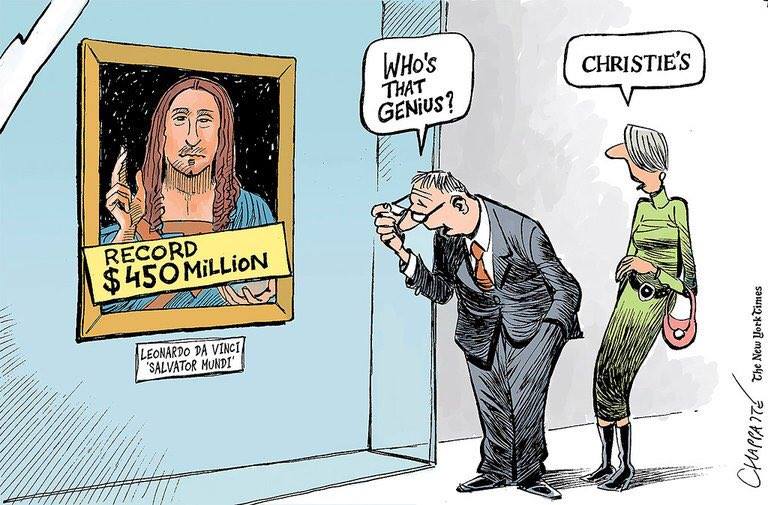
Above, Fig. 8: Patrick Chappatte’s 2017 take on the Salvator Mundi sale/attribution for the New York Times.
On 16 November 2017 Grosvenor responded immediately to the auction of the then attributed Leonardo Salvator Mundi on his Art History News website:
“…Christie’s just did something that re-writes the history of auctioneering. They took a big gamble with their brand, their strategy to sell the picture, and not to mention the reputations of their leadership team, and they pulled it off. They marketed the picture brilliantly – the best piece of art marketing I’ve ever seen… AHN congratulates them all… I was sure the picture would sell, but never imagined it would make this much… We must all now wonder where the picture is going to end up next… Will the sale prompt people to now look anew at Old Masters? Maybe. It will surely end for good now the tired clicheé [sic] that the Old Master market is dead.”
Feigen, who had been offered the “Cranach”, passed on it, and reportedly noted: “We’ve got to know the background and provenance of each object, and be more demanding for sources.”
PHOTO-TESTIMONY AND “ESSENTIAL JUXTAPOSITIONS”
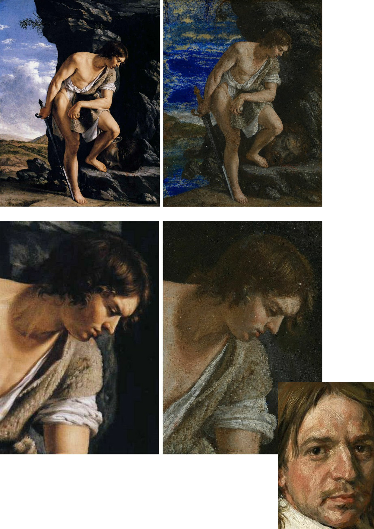
Above, Fig. 9: Here, left, we see the real Orazio Gentileschi David and Goliath (in the Galleria Spada, Rome) and, right, the loaned fake accepted as authentic by the National Gallery. Bottom right corner, the face of the fake Frans Hals portrait.
If, instead of whatever technical and art historical examinations were carried out, the National Gallery had run a few simple photo-comparison checks, as above at Fig. 9, it would have been apparent that the bona fide picture on the left had served as the model for the markedly inferior modern-looking version on the right. Had the fake Hals also been brought into comparison, as above, it would have disclosed a common authorial fondness – in two ostensibly historically disparate pictures – for arbitrary superimposed streaky white smears on the faces. In many respects, photo-comparisons are more helpful to appraisals than ones made from present and recollected pictures. First, there is a chronic logistical problem that Millar put well in 2004:
“…Although in tackling this particular problem it is more than ever essential to see the works in the original, it is difficult to compare works which are closely related but hundreds of miles apart, if not in different hemispheres. In spite of the legendary kindness of their owners these pictures often hang in inaccessible positions and never in ‘museum conditions’. Essential juxtapositions can hardly ever be made. The present state of the picture and the treatment it may have undergone in the past may also make it impossible to be entirely confident about its quality…”
Millar’s alertness to restoration-induced deformations may have been more evident in private than in public: in a letter held in a dossier at the Royal Collection he complained angrily of damage done to a Vermeer. As for his recognition of the need to effect ideal juxtapositions for comparative purposes, today’s sleeper-hunters might heed artists’ examples: when drawing or painting from nature they invariably align their sheet or canvas as closely as possible to their view of the subject, so that their eyes can either flick continuously upwards and downwards or sideways and thereby maintain a stream of direct visual comparisons between the subject and its evolving depiction. Such vital visual comparisons cannot be achieved with pictures in different locations and restorations can only be judged by before- and after treatment photo-comparisons because pre-restoration states disappear in restoration.
THE TWO PRETENDERS?
Above, Fig. 10: Left, the NPG “Last Van Dyck Self-Portrait”; right, the newly-restored, red-lipped and Grosvenor-accredited (and owned) “Last Van Dyck Self-Portrait”, as loaned to the Rubenshuis Museum, Antwerp.
When Grosvenor was about to unleash his own “Last Van Dyck Self-Portrait” in 2015 (above right), the NPG’s formerly “unquestionably genuine, pre-eminent, Van Dyck” £10m world-record price “Last Van Dyck Self-Portrait” (above left) constituted an intrinsic threat: any closely attentive aesthetic appraisal and comparison of the now two rival supposed last self-portraits risked injury to the standing of one or the other. Although many other unresolved problems were attached to Grosvenor’s newly upgraded work (see below), it can sometimes seem that nothing ever counts against an on-the-market potential upgrade – as with the evident discounting of the NPG picture’s utterly out-of-character, out-of-period, anomalous droopy Mexican Bandit-style moustache seen above and below.
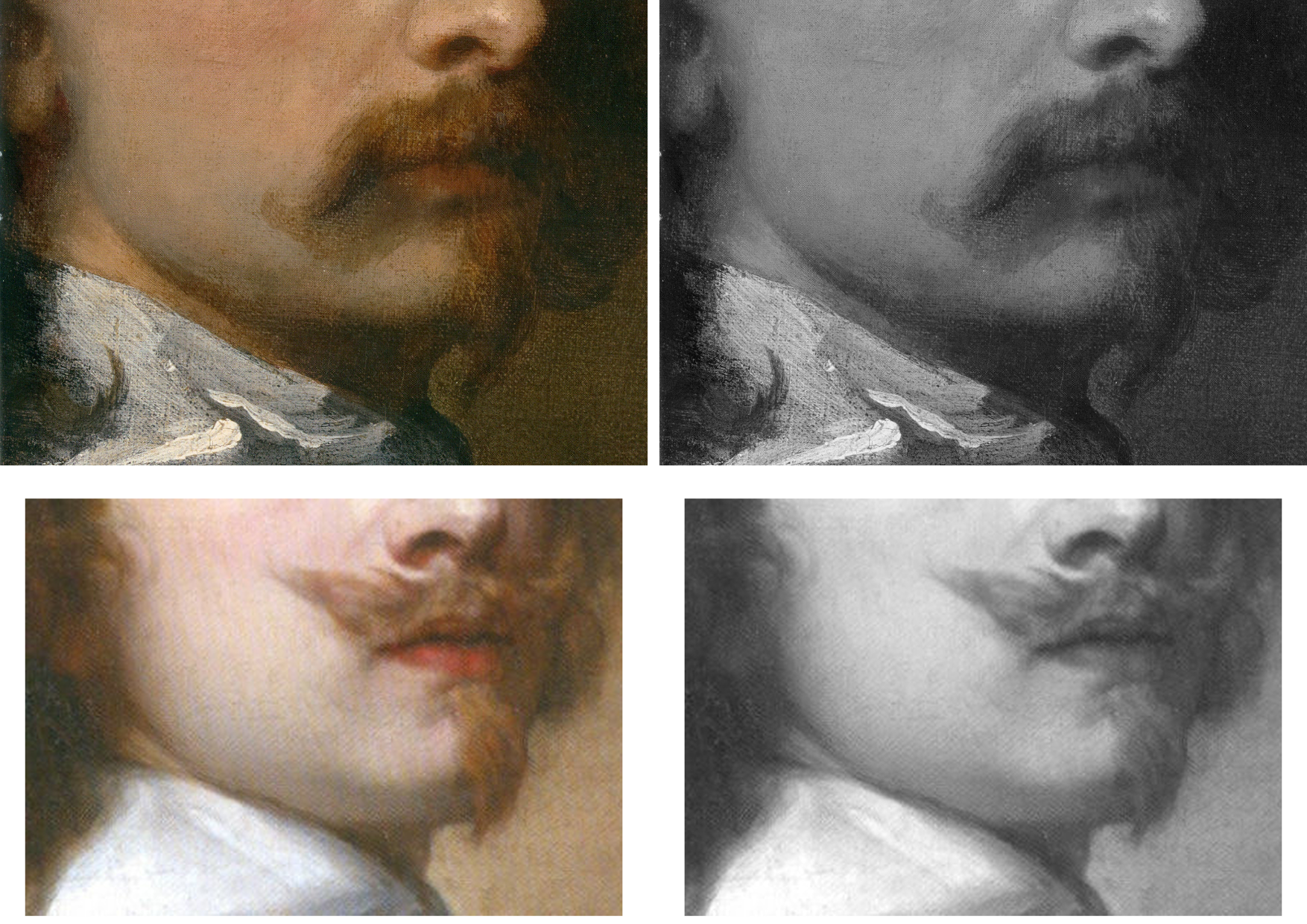
Above, Fig. 11: Top, detail of the National Portrait Gallery “Last Van Dyck Self-Portrait”; above, detail of the 2015 rosy-lipped Grosvenor-proposed “Last Van Dyck Self-Portrait”.
THE ANOMALOUS MOUSTACHE PROBLEM, PART I: GROSVENOR
Grosvenor has proposed that the NPG picture was a study for his own picture despite their numerous differences (see below). The most inexplicable difference is found in the two pictures’ moustaches, one of which is swept up, the other down. This divergence is presented with some ingenuity as a purposive species of social semaphore. Thus, within the NPG picture, which Grosvenor has reassigned to the role of a “study…[a] first attempt at the creation of a new type of self-portrait”, the moustache droops, where, in his own picture, the “moustache is raised, allowing not only for a more formal look perhaps appropriate to court appearance…” but also to illustrate the “difference between Van Dyck’s public and private faces…” Are we to understand, on the sole testimony of this (covertly upgraded) picture, that Van Dyck brushed his moustache down when going about his house and studio and brushed it up to attention whenever he thought he might be being observed?
While prompting incredulity, such a notion also defies artistic logic: given that works of art are made to a purpose within an artist’s practice, how can the same work be held a magnificent, self-sufficient masterpiece one minute and, in the next, to have been a study for another work of a different composition that would present a different aspect of the artist’s self-image to the world? In 2011 Grosvenor held that “the care and finesse of the brushwork in the face [of the NPG picture] is particularly assured” and that the whole was finished off with “more delicate and transparent glazes”. If Van Dyck really had been rehearsing the frigidly swanky public self-display found in Grosvenor’s painting, why would he have produced a highly resolved head which is not cocked back; where the artist does not look down his nose at the viewer; where he does not sport a cloak; where he does not hold a hand to his breast; or, even, where he does not wear a plausible collar that emerges from within his doublet?
THE ANOMALOUS MOUSTACHE PROBLEM, PART II: GLÜCK
Curiously, the problem of accounting for a rogue occurence within the oeuvre was not a new one. In 1941 Gustav Glück had addressed the same problem when he proposed yet another “Last Van Dyck Self-Portrait” version [*] to be Van Dyck’s last self-portrait (as at Figs. 2 and 3 above and 12 below). Describing his Self-portrait (which he had discovered a few years earlier “in a London private collection”) as a much more realistic and therefore interesting version than the Duke of Westminster’s sunflower self-portrait (then regarded as the last), Glück held it to constitute “authoritative evidence of the master’s appearance a short time before his death”, with features “still energetic and expressive, though lean and almost emaciated” – as at Fig. 12 below. The face looked, he felt, almost “spiritualised, and the melancholy character of the expression is enhanced by the ends of the moustaches being turned down instead of showing the upward twist they have in all of Van Dyck’s portraits”. No doubt yet other rationalisations could be made for this unique depiction.
[* We thus encounter two pairs of pictures, each comprised of a supposed Last Van Dyck Self-portrait and a supposed Lely copy of itself. In pressing his two discoveries, Glück acknowledged that “As is the case with most of Van Dyck’s works, several replicas and copies are known of this Self-portrait.” He recalls seeing the [later Mould/Bader/NPG] version and a head and collar copy (“near Matlock”) and a miniature. In 2011, Grosvenor, in contrast, simply accepted the then Mould/Bader picture as an indisputable autograph Van Dyck masterpiece on the authority of Sotheby’s (misleading) provenance and, perhaps, on the strength of it having recently been bought as such for the world record £8.3m by his employer and an investor.
Conspicuously, Grosvenor did not engage with Millar’s estimation of the picture – “The best surviving version of (probably) the last Self-portrait”. Instead, he gushes over the then-loaned privately-owned supposed Lely copy shown at Figs. 4, 12 and 13, as an “exceptionally good copy of a Van Dyck” which “must show that Lely had owned Cat. 1” – the then Mould/Bader picture. But why “must show?” when, as he further reports, the picture’s owners had “contacted us to say that they had a copy of our painting ascribed to Sir Peter Lely, but doubted by some to be by him…the monogram ‘PL’ was not of a type usually seen on Lely’s English portraits, and was thought to be false.” Grosvenor continued “We were immediately interested in researching Cat.4 further, for if it was indeed owned by Lely, it would help confirm that Lely owned Van Dyck’s last self-portrait, a theory much speculated on but unproven.”]
MOVEABLE FEASTS: THE NEW LAST VAN DYCK SELF-PORTRAIT
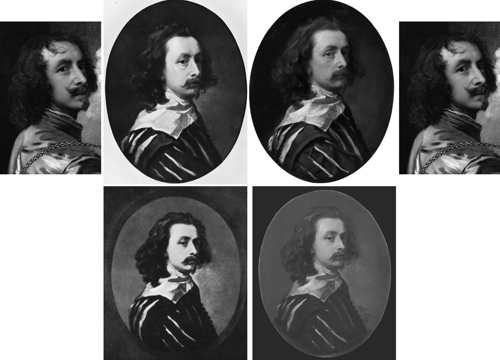
Above, Fig. 12: Top, left and top right, a detail of Van Dyck’s post-1633 Portrait of the Artist with a Sunflower; second left, the 1941 Glück-claimed “Last Van Dyck Self-Portrait”; third left, the National Portrait Gallery “Last Van Dyck Self-Portrait”. Above, left, a detail of the 1941 Glück-claimed Sir Peter Lely copy of the above claimed Van Dyck self-portrait; right, the Mould/Bader-claimed Sir Peter Lely copy of the NPG self-portrait (as published in the 2011 Mould gallery exhibition and catalogue as Cat.4).
In defence of his own Rubenshuis Museum-loaned “Last Van Dyck Self-Portrait” (above, Fig. 10, right), Grosvenor cheekily suggested “the dating of the National Portrait Gallery picture, currently thought to be c.1640 may need to be reconsidered, to perhaps between c.1637-39.” But why so – and on what stylistic basis is such chronological fine-tuning estimated? Not only had the NPG picture’s properties, appearance and relationship to other pictures not changed, only four years earlier Grosvenor had endorsed its late dating by “most scholars” to about 1640-1 – and on that late estimation he, like Glück (on another picture), had perceived a “faint air of melancholy” that added poignancy amidst the origins of the civil war about to erupt in London when the artist was “all the while plagued by the ill health that would shortly cause his death.”
It might seem that such recent perceptions notwithstanding, the NPG picture’s previous dating and estimation had to be jettisoned because Grosvenor was now seeking to attach his own painting to a “vacant” entry for a Van Dyck oval self-portrait, painted to the shoulders and with a hand to the breast, in an inventory of Charles I’s collection. If successfully attached, that entry would constitute a provenance jewel beyond price. But, most awkwardly, the original long-missing self-portrait had been recorded in the collection between 1637-39 and, therefore, Grosvenor’s newly upgraded candidate picture could not be said to have post-dated 1639. However, if so dated, and if the NPG picture were to be left in place at c.1640-1, the latter, with its pronounced differences from Grosvenor’s picture, would not only invite potentially damaging qualitative comparisons, it would retain the prized romantic cache on which it had been heavily promoted as Van Dyck’s last and most “modern” personal free-flowing etc., etc. depiction of himself.
Thus, and seemingly as if in protection of his own picture/investment, Grosvenor contended that the NPG picture, may no longer be considered the magnificent self-sufficient masterpiece that had commanded £1.7m on top of its world record £8.3m when sold to the NPG, and must now be moved back in time so as to do fresh duty as a study for his own picture – and therefore to predate his own picture which would become the new “Last Van Dyck Self-Portrait”, albeit at a somewhat earlier dating.
Although Millar had judged Grosvenor’s picture to be a copy of the lost picture that had been recorded in the Charles I collection, Grosvenor’s redating manoeuvre may have intimidated the NPG. Where it had held in its 2015 celebratory book Van Dyck – The Last Self-Portrait, that “Van Dyck’s self-portrait, now in the collection of the National Portrait Gallery… is probably the last and arguably the finest…” it now claims only that its picture is “one of three known self-portraits painted by van Dyck when he was in England, and it probably dates from the last years of his life”.
GROWING THE PROVENANCE
As seen, where Sotheby’s had claimed only that the [NPG] picture was “Possibly in the collection of Sir Peter Lely, d. 1680” and “possibly” in the 18th April 1682 sale of Lely’s estate, Grosvenor held in the 2011 FINDING VAN DYCK catalogue that his Cat. 4 (supposed) Sir Peter Lely copy of the NPG picture, “must therefore confirm that Lely owned [the then Mould/Bader picture and later NPG picture] and that it was sold from his [Lely’s estate] sale in 1682.” Again, why must it so confirm when the justification was especially feeble: “It is quite possible the self-portrait in Van Dyck’s possession at his death in 1641 was his last […] and that it passed into Lely’s possession at some point…Lely may have acquired it in a number of ways…Or, it may be that the painter and art dealer George Geldorp, for whom Lely worked when he first to came to London, was involved…” (Emphases added.)
In other words, Grosvenor had not added an atom of evidence that Lely had owned and copied the now NPG picture. He had not established when Lely first came to London or whether he had ever met Van Dyck: “Frustratingly, we do not know exactly when Lely first arrived in England, and [or?] the extent to which he knew of Van Dyck or knew of his estate. His early biographer Richard Graham, writing in 1695, said that Lely came over in 1641 (the year of Van Dyck’s death), whilst the art historian Arnoult Houbraken gives a date of 1643. It is perhaps most likely that the ambitious young Lely came to London in response to Van Dyck’s death thus ruling out any possible direct connection.” (Emphases added.) Nothing learned, no value added.
Not only had Grosvenor produced no evidence, he had disclosed in 2011 that the self-portrait in Van Dyck’s estate had not been rated highly by the artist’s contemporaries; and, that while the then Mould/Bader picture “now holds the world record for a work by Van Dyck” the painting in Van Dyck’s estate “had little value placed upon it” – to be precise, it was valued at 6s 8d, a fifteenth of a Van Dyck of Charles I in armour, and a sixtieth of Titian’s Perseus and Andromeda now in the Wallace Collection.
“IT IS, IF I SAY SO”
Lacking evidence that Lely had owned and copied the Bader/Mould self-portrait, Grosvenor, too, betrayed a note of anxiety in the 2011 catalogue: “The pictures after Van Dyck demonstrate that for the Van Dyck hunter the quantity and sometimes the quality of such copies can present potential danger.” In the absence of documentary evidence, Grosvenor played a bold card by appealing to the authority of his own eye: “…the first and most important skill you need to find a Van Dyck is simply the ability to spot a painting of the highest quality. If a painting is truly exceptional, the chances are it is by a truly exceptional artist.” Chance might be a fine thing, but its prospect is not a proof or a demonstration in the here and now.
THE SUPPOSED LELY COPIES OF THE SUPPOSED LAST VAN DYCK SELF-PORTRAITS
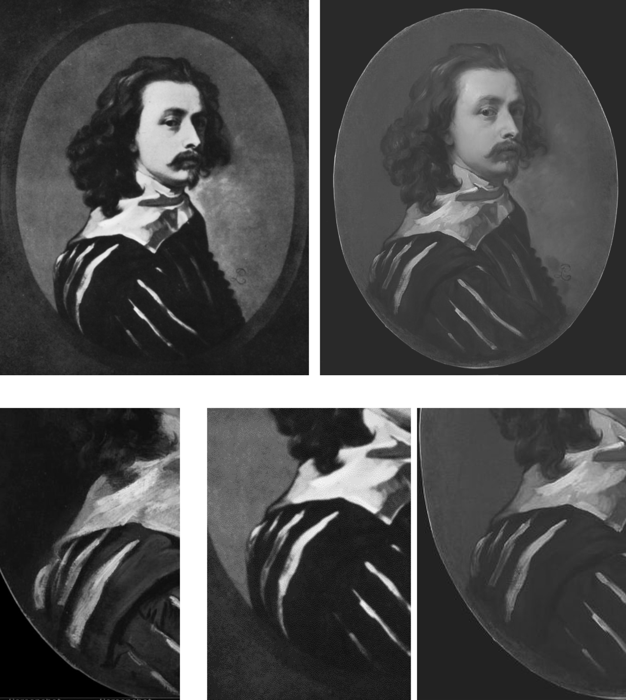
Above, Fig. 13: Top left, the attributed Sir Peter Lely copy, as published in 1941 by Glück; top right, the supposed Sir Peter Lely copy of the NPG self-portrait, as published in the 2011 Mould gallery exhibition catalogue. Above, details of costume from, respectively: the NPG self-portrait; the 1941 Glück-attributed Lely copy; the 2011 Mould/Grosvenor attributed Lely copy of the NPG picture.
Which of the two above versions is the more plausible Lely copy? Where is the Glück version today? Had it fallen by the wayside, much as had his 1934 espousal of what is now the Grosvenor/Rubenshuis last self-portrait (see below)? When did the Grosvenor/Mould-endorsed version of a supposed Lely copy first appear? Was it anywhere recorded before being taken to the Mould gallery? Do early photographs of it exist showing its reported appearance when enlarged onto a rectangular canvas? Did either of the canvases carry any historic material? Who owns it today?
It is said that when this unsettling mystery painting was brought to the Mould Gallery in 2010 shortly after the much-publicised acquisition of the £8.3m Sotheby’s self-portrait, it was “quite dirty and masked by a thick and substantially discoloured varnish.” The cleaning and researching were carried out by the Mould Gallery. Grosvenor claimed they had confirmed Lely’s authorship on the following grounds: [1] that after cleaning and restoration “there is no reason to doubt” it; [2] that “it is in fact by Lely”; and [3] that this is “a rare example of him copying another artist’s work”. The third claim weighed against it being a copy by Lely. The first statement was bluster – “there is no reason to doubt it”. The second contention was a non sequitur – Grosvenor asserted as fact something which had not been established.
SPOT THE DIFFERENCES
Grosvenor declined to address the discrepancies between the supposed Lely copy that had presented itself through an unidentified party to the Mould gallery from nowhere in 2010 or early 2011, and the supposed self-same Lely copy picture that had been published in December 1941 by Gustav Glück in The Burlington Magazine, “Reflections on Van Dyck’s early death” pp 172, 193, 195 and 199 (Fig. 12 above). There is a clear problem here: there are now two rival supposed versions of Van Dyck’s last self-portrait and each has its own supposed copy by Lely. Both pairs cannot be right. Where are the Glück ascribed pictures today? Have they been dismissed? Have they ever been compared with the two published Mould/Bader pictures?
A COVERT UPGRADE
In 2004, the now NPG picture had been described by Millar as:
“the best surviving version of (probably) the last Self-portrait, painted towards the end of Van Dyck’s years in London. The face is delicately modelled. The costume is handled very swiftly and in rough dry paint. There are some alterations made in the painting and it may be partly unfinished.”
In 2009 when included in the Tate’s “Van Dyck in Britain” exhibition, it was described in the catalogue on the (misleading) cited authority of Millar, as “thought to be Van Dyck’s last self-portrait”. Having died in 2007, Millar could not demur over the disappeared qualifier “after”.
On 9 December 2009, on the strength of that very recent Tate show and catalogue, Sotheby’s unequivocally presented what five years earlier had been no more than Millar’s “best surviving version” as an absolutely secure and precisely dated “Sir Anthony Van Dyck” – albeit on a provenance that began with two “Possiblys” – the first being “Possibly in the collection of Sir Peter Lely, d. 1680”. Sotheby’s declaimed:
“An outstanding self portrait by Sir Anthony van Dyck (1599-1641) – one of the most important Continental European artists to have worked in England – comes to auction with exemplary provenance[*] and an estimate of £2-3 million. The masterpiece, which is the artist’s last portrait of himself, was painted in London in 1641 in the final months of his life. It is one of only three self portraits that he painted in England and this, his last, captures him grandly attired in a black and white slashed silk doublet. The painting epitomises the elegant poise and relaxed informality that van Dyck brought to the art of portraiture in Britain and it undoubtedly ranks among the most important works by the artist ever to come to the auction market.” (Emphases added.)
[* On the accuracy of this estimation of the provenance, see Susan Grundy, below.]
THE “POSSIBLYS” AND “PROBABLYS” PLAGUE
A distinguishing characteristic of the upgrades stampede is the parading of superlatives and the drafting of fanciful provenances linked in daisy-chains of “possiblys” or “probablys”. This method was deployed to the most spectacular effect ever by Christie’s, New York, (albeit on the borrowed authority of the National Gallery which had earlier lifted it from a young art historian’s failed attempt to upgrade another and closely related Leonardo School Salvator Mundi) in their November 2017 sale provenance for the Louvre Museum-demoted $450m disappeared Leonardo School Salvator Mundi. It carried no fewer than three “possiblys” in the first item:
“(Possibly) Commissioned after 1500 by King Louis XII of France (1462-1515) and his wife, Anne of Brittany (1477-1514), following the conquest of Milan and Genoa, and possibly by descent to Henrietta Maria of France (1609-1669), by whom possibly brought to England in 1625 upon her marriage to King Charles I of England (1600-1649), Greenwich…”
In 1980, in Christie’s (London) sale of the now-National Gallery “Rubens” Samson and Delilah, the provenance began with three items prefaced: “Probably”; “Perhaps”; and “Perhaps”. The “Probably” – “Probably painted for Nicolaas Rockox” – was an own goal: if autograph, the work had to have been painted for Rockox because he was known to have commissioned Rubens to paint the subject. It was also known that two contemporary copies had been made from the subsequently lost Rockox Rubens original. They had survived. Both depart compositionally in the same manner from the National Gallery picture. In another Christie’s provenance item, the NG picture was said to be “perhaps” that recorded in an inventory of 1653 as a Samson (not a Samson and Delilah) by Rubens. There are two entries in that inventory, one to a Samson by Rubens, another to a Samson after Rubens…If those Samsons had been shorthand for Samson and Delilah, then the subject existed in two versions by 1653, one by Rubens and one after Rubens.
OVERTURNING AN INSTITUTIONAL APPLE CART
When, eventually, the Mould/Bader/Grosvenor campaign succeeded and the “Last Van Dyck Self-Portrait” was acquired by the NPG acquired in late 2014 many were happy: this was deemed a picture at the very top of the tree and Philip Mould’s apprentice, Grosvenor, had claimed no little credit for making it so (see below). However, some had seen matters differently: the means and manner of this particular upgrade attracted censure in a succession of expert warnings. In the May/June 2014 issue of the Jackdaw, its editor, David Lee, noted both disregarded expert opinion and a seeming over-eagerness to sell the picture – as seen below at Fig. 14:
On 23 January 2014 the Evening Standard’s art critic, Brian Sewell, had written of what was about to become the NPG picture:
“…Van Dyck looks wistful, apprehensive and uncertain; he has not flattered himself and his image is the more compelling for its melancholy, yet this careful self-analysis is set on a bust painted with almost vulgar bravura, a rumpled collar of white lawn over a black doublet slashed with white. Not since he painted himself in Italy in black and white has there been such impetuous painting — and not nearly with so loaded a brush.
“I sense dissonance between the face and the costume, as though two quite opposing aesthetics are at work. Does the head sit easily on the bust, the shoulder more brilliantly lit than the face? What exactly is the form of the wide collar and how is it related to the neck? Has the hair been extended over the collar to disguise this awkwardness? It is of a darker tone and subdued definition.
“One question leads to another. Is it possible that Van Dyck painted no more than his face and rather shorter hair, and left posterity an unfinished portrait, to be completed by another painter?”
FOLLOW THE MONEY
Sewell’s doubts had been elicited more colourfully by the MailOnline on 7 December 2013 (“Petra Ecclestone’s husband hopes fight to keep £12.5m Van Dyck in Britain will fail as he snaps it up for their £55m palace of bling in LA”):
“Mr Sewell said: ‘The painting must have been as important in 2009 as it is now. Why did we not buy it then? They [the NPG] didn’t try.[*] They said they put their heads together with Tate Britain to see whether they could do a joint purchase, but they didn’t say a word in public. There was no question of raising funds from the public. But now they’re perfectly happy to start a fundraising campaign at £12.5m. The logic of it completely escapes me…If the picture is as important as everyone’s saying it is, it should have been bought at £8.3m. Now that it hasn’t, they’re putting £4m in the pockets of Philip Mould.”
[* What was not disclosed at the time was that the National Heritage Lottery Fund and the National Heritage Memorial Fund had told the Tate and the National Portrait Gallery, in terms, that they would not get a grant towards the picture’s purchase because of the great drain on those funds for the 2012 Olympics. That unexpected arts funding shortfall had killed off any chance that might have been hoped to exist to make a quick-flip profit on the world record £8.3m Van Dyck by selling it on to the NPG.]
On 9 December 2013, Grosvenor responded in a blog post (on his Art History News site) to Sewell’s criticisms with a double slur: “This is, of course, only the latest salvo in Brian’s apparent campaign against the painting, which can only, I presume, benefit the overseas buyer… His remarks are a good example of that unattractive British habit of demeaning anyone who happens to be successful. Sewell sniffed at something Mr Stunt may or may not have said about his collection (which is already one of the best for 17th C English portraits), when as a lover of art he should applaud the fact that a successful British businessman under the age of 30 not only cares about ‘old’ British art, but also supports, very strongly, exhibitions, publications, loans and research.” (Had Stunt supported the Mould Gallery’s FINDING VAN DYCK exhibition and its 80 pp catalogue? On his support for other Mould/Grosvenor research, see below.) Sewell’s remarks had been given in response to this MailOnline quote from Stunt:
“All my Lelys are important. In Althorp, the Earl of Spencer has the Windsor Beauties, which is a very famous group of pictures by the artist. I’ve been trying to rival the Windsor Beauties. I have more, I think, than him, and I’m just five off the Royal Collection.”
That does not sound made-up. Sewell had responded: “Oh dear. I don’t know him but if he’s setting out to rival Althorp and Buckingham Palace, that’s hardly a meritorious way of collecting. It’s cigarette cards.” Snobby, perhaps, but not without force and humour. Of course, there is nothing wrong with successful businessmen buying art – if: a) they have the means and really are buying; and b) they buy judiciously and not as if from some competitive, vainglorious shopping list. Stunt’s taste for old masters was entirely worthy.
SOME SERIOUSLY AWKWARD CONNECTIONS
The NPG picture’s standing had been again and more radically challenged by Susan Grundy on its authorship, condition, and circumstances. She has shown that both Sotheby’s and the Mould gallery’s citations of the scholarly literature had implied high scholarly support for a Van Dyck ascription that was simply not present. As mentioned, Gustav Glück had seen the now NPG self-portrait picture in 1941 but, then, he had judged it a copy – as had Eric Larsen in 1980 and 1988, and, as seen above, Oliver Millar in 2004. There had been no major scholarly support for the picture as an autograph Van Dyck.
On 26 April 2020 the Mail-on-Sunday reported Grundy’s further startling investigations: “Is the £10m Anthony Van Dyck ‘selfie’ that Kate Middleton helped save for the nation a cheap copy?”
Specifically, Grundy had said: “Philip Mould, the dealer who brokered the sale at such a handsome price, is one of Britain’s most recognisable art experts. He makes regular appearances on the Antiques Roadshow [he also fronts, with Fiona Bruce, the BBC’s Fake or Fortune] and is known as something of an authority on Van Dyck. But this story also involves the unlikely figure of Petra Ecclestone’s ex-husband James Stunt, who once described himself as a billionaire art collector, but is today known as a shambolic, foul-mouthed bankrupt. The Mail-on-Sunday has previously revealed that Stunt lent a number of fake paintings to Prince Charles’s charity at Dumfries House in Scotland where, embarrassingly, they were put on public display. And that attempts had then been made by intermediaries to use the fakes as collateral for millions of pounds worth of loans. The paintings have now been taken down from public view, although Stunt still maintains they are originals. But the businessman’s reputation was intact back in 2013 when, while still married to Formula 1 heiress Petra, he was looking to add to a vast and rapidly expanding collection of masterpieces and agreed to buy the Van Dyck from Mould’s client, Canadian industrialist Alfred Bader.”
In Grundy’s account “agreed to buy” is both the operative and a problematic term. “Client”, too, is problematic: confusion over the 2009 £8.3m purchase at Sotheby’s abounds. It was rumoured that Mould had bought with money loaned by Bader; some expressed surprise that Stunt should have bought it at all at £12.5m, because his purchases rarely exceeded six figures. Many reports referred to a joint Mould/Bader sale to Stunt but those were ambiguously phrased, and it is nowhere confirmed that Stunt had paid £12.5m, taken title of the picture and was about to remove it to the U.S. The Heritage Fund claimed the picture “was sold to a private collector who wished to take it abroad” but the Art Fund disclosed that the picture was bought by the NPG not from Stunt – or Mould – but from “Alfred Bader Fine Arts”, which, if correct, would necessarily mean that that picture had not been sold to Stunt and, therefore, that public monies had been given to block a supposed but phantom pending removal of the picture from the country.
WHEN WAS THE GROSVENOR “LAST VAN DYCK SELF-PORTRAIT MARK II” BOUGHT?
Establishing the point at which Grosvenor acquired his own supposedly superior and historically more significant “Last Van Dyck Self-Portrait” is of interest re both his claimed value-adding role in the promotion of the NPG picture and his subsequent cheerleading role for the public fundraising campaign to secure the picture’s entry into the NPG in 2014. In 2015 Grosvenor disclosed that a restoration of his own picture (Figs. 7 and 10) had taken place “over the last few years”. See below. He also declared that it was only when “all the overpaint and dirt” had been removed, that the very “possibility of a full attribution to Van Dyck [had become] worth pursuing further”.
The “I-had-no-idea-at-first” dealers’ trope was also encountered with the now-famous consortium of New York dealers who had never suspected that their manifest Leonardo School Salvator Mundi might be an autograph Leonardo prototype painting until a certain pentimento on a thumb emerged during restoration. Grosvenor, too, reports a pentimento-on-the-thumb that he, similarly, holds to confirm autograph Van Dyck status on his own picture. However, hands are notoriously difficult to draw even when making a copy – and, as Jacques Franck has demonstrated here, if such thumb pentimenti are to be taken as proofs of autograph states, the Salai copy of Leonardo’s St. John the Baptist would now be considered a second autograph Leonardo St. John the Baptist.
Intriguingly, Grosvenor disclosed that the (eventual) NPG self-portrait had been joined during its near five-year long residence in the Mould gallery by other Van Dyck finds. Of one such, the privately owned picture now on loan to the Minneapolis Institute (Figs. 1, 15 and 19), Grosvenor disclosed on 5 March 2015: “What a pleasure it was to work with Philip Mould in his gallery with it [the now Minneapolis picture] – sometimes we would treat ourselves and hang it next to the later Van Dyck self-portrait we also had in the gallery (the one which was bought by the National Portrait Gallery last year).” But what of the Grosvenor-owned picture which was loaned to the Rubenshuis Museum on 8 March 2016? Had that picture, too, been hung next to the hard-to-shift self-portrait that would enter the NPG in 2014?
A HANDY SOURCE OF POTENTIAL VAN DYCK SELF-PORTRAIT UPGRADES
For those wondering how quite so many Van Dyck self-portraits could turn up in one place in such short time there is a simple explanation: Grosvenor and Mould, like many of us, are avid students of the 2004 catalogue raisonné.

Above, Fig.15: Top row, three “self-portraits” as published in an appendix of copies by Oliver Millar in his contribution to the 2004 Van Dyck catalogue. Bottom row: the three recently upgraded former Millar self-portrait copies, as they presently appear, and the not-for-sale Indianapolis picture.
In this one small section of that invaluable and indispensable account of Van Dyck’s English period, Millar had unwittingly compiled a sort of sleeper-hunters’ treasure chest. Grosvenor has now upgraded the first two of Millar’s three Van Dyck self-portrait copies – and acquired one – both having been privately owned. Only Millar’s third self-portrait copy (above, top right) which cannot turn a penny because it is already in a museum – The Clowes Fund Collection, Indianapolis Museum of Art – remains on the upgrades shelf.
Thus, in the bottom row at Fig. 15 we see: left, the NPG picture judged by Millar to be “The best surviving version of (probably) the last Self-portrait, painted towards the end of Van Dyck’s years in London”; second left, the privately owned, Grosvenor/Mould upgraded self-portrait, now loaned to the Minneapolis Institute; second right, the Grosvenor-owned, restored and new “Last Van Dyck Self-Portrait” that Millar judged a copy of an unknown work recorded in the collection of Charles I; right, the Indianapolis picture with a fine gold chain – for excellent close-up photos, see here – that Millar judged the best-surviving version of an informal Van Dyck self-portrait of c.1634. It might be noted that in this informal attire and unhaughty demeanour, the artist’s moustache had not drooped or turned down.
VAN DYCK’S NOW TWO “LAST SELF-PORTRAITS”
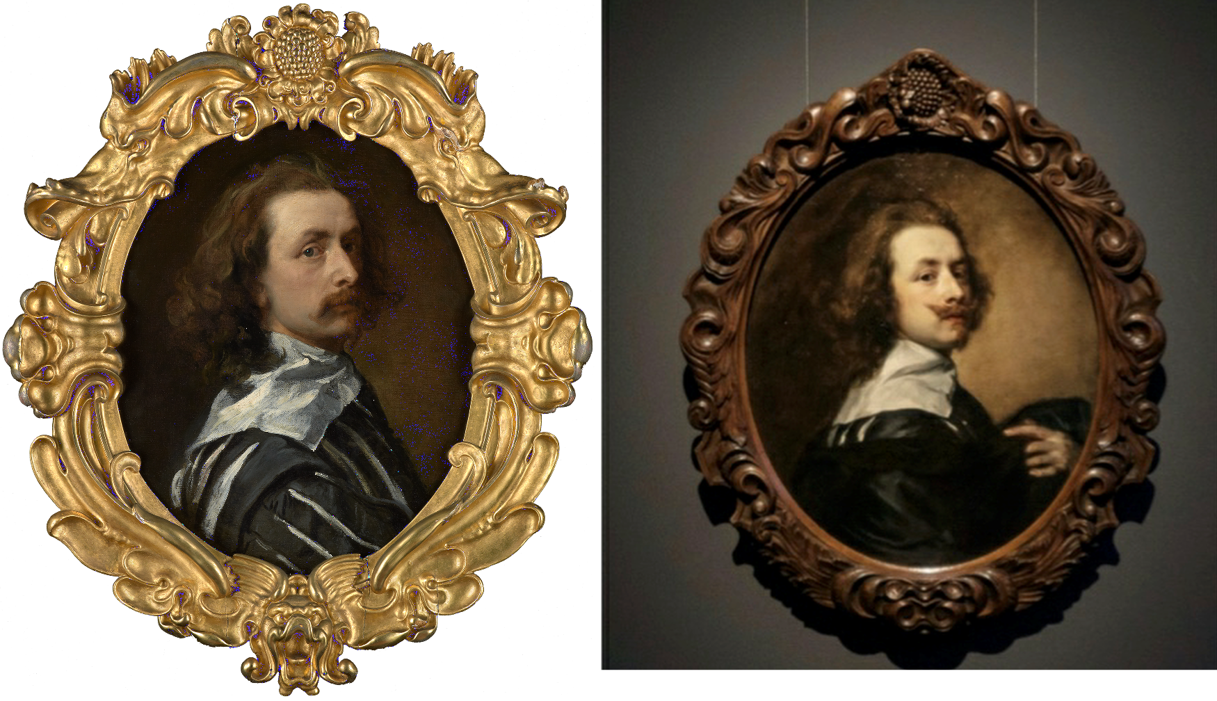
Above, Fig. 16: Left, the National Portrait Gallery’s “Last Van Dyck Self-Portrait”; right, the Grosvenor/Rubenshuis Museum “Last Van Dyck Self-Portrait”.
So, to return to Grosvenor’s second and Rubenshuis loaned “Last Van Dyck Self-Portrait”, there are, as he acknowledges in his 2015-6 British Art Journal account, many outstanding problems of provenance: 1) “We cannot currently draw a direct documentary link from the painting today back to the royal collection”; 2) “there is no record of a payment by Charles I for the picture”; 3) the picture “was first certainly recorded in 1854 when accepted by Gustav Glück” [- sic Glück was born in 1871*]; 4) had the picture been the one owned by Charles I, it would most likely bear the royal monogram (the letters “CR” capped by a crown) on the back of the canvas – but it does not – see Fig. 18 below; and, 5), that the “somewhat loose, rapid handling of the Self-portrait is unlike the high degree of finish and detail that Van Dyck normally produced for Charles I”.
The last admission might seem particularly damaging given Grosvenor’s claim that the (in part) highly wrought NPG picture had been executed as a dress rehearsal for his own picture. Indeed, the NPG’s 2015 book had made a somewhat fanciful virtue of its picture’s stylistically incongruous execution: “The broad, rapid, virtuoso handling of the costume contrasts with the exquisitely fine painting in the face. The relative lack of finish in the costume draws attention to the act of painting that has produced this portrait, perhaps even suggesting that the artist is still in the process of creating it, while we, as viewers, watch him. It may be that Van Dyck was working in a more experimental way in this part of the painting, or it may simply be that it was left unfinished.” (Emphasis added.)
Which, then, might have been the case? The NPG, understandably, was at a loss because: “Nothing is known of the circumstances in which this portrait was produced: whether it was a gift for, or a commission from, a friend, relative or patron, or whether the artist had painted it for himself…” The work is therefore, an orphaned “one-off” or unicum – that intrinsically problematic art historical creature of which Professor James Beck warned his students at Columbia University always to beware. (He also cautioned students to address “what we know about this artist before what has been said or written”.)
[* Grosvenor effectively self-corrects the above slip in his BAJ footnote no. 27, when he cites the earlier and intended Gustav – Gustav Waagen – and his 1854 three-volume Treasures of Art in Great Britain [**]. Although Grosvenor gives the page number, he does not disclose how Waagen had referred to the painting. Had he said something flattering or simply cited an inventory? Grosvenor notes that Gustav Glück had later identified the picture as that in the collection of Charles I and that he had done so not on the grounds of stylistic analysis but of a contingent availability:
“As no other self-portrait answering to the same description is known, there can be no doubt that the picture…once belonged to the royal friend and warm supporter of Van Dyck.” Glück was playing the above-mentioned Denis Mahon Manoeuvre – conferring autograph status on the best available picture. In this case, Glück conferred it to the only possible surviving candidate. With his own (Rubenshuis) self-portrait picture, Grosvenor seems to follow the Gluck/Mahon practice even though he has also identified a second version of the picture that is of similar size and composition. Without addressing the possibility that both versions might have been copies of a lost autograph prototype, as Millar had concluded at the end of a long and distinguished career, Grosvenor holds the newly discovered version (below, Fig. 17, top left) to be a later copy of his own picture, and thereby elevates his own picture from Millar’s copy of a lost original to the original Van Dyck painting.]

Above, Fig. 17: Top row, left a copy of a Van Dyck self-portrait attributed by Bendor Grosvenor to Charles Jervas (1675-1739); the Grosvenor attributed Van Dyck self-portrait before its two-year long restoration; the Grosvenor attributed Van Dyck self-portrait after its restoration. Bottom row: left, the NPG “Last Van Dyck Self-Portrait”; centre, the Grosvenor, Rubenshuis “Last Van Dyck Self-Portrait” before restoration; centre and right, the Grosvenor, Rubenshuis “Last Van Dyck Self-portrait”, as before and after restoration.
In the above-cited Mahon case, it took fifty years for the now accepted original version (at the Prado) to emerge and show Mahon’s claimed “autograph original” to have been a copy – which should have been recognised all along because it, just as with the National Gallery “Rubens” Samson and Delilah, was known from an etched copy to be a compositionally truncated version of a lost original. Where Millar resisted temptation to play the Glück/Mahon/Grosvenor gambit and judged what is now Grosvenor’s picture (above, Fig. 17, top right) to be no more than an early copy of a missing painting, Grosvenor has followed Glück’s earlier “opportunist” elevation (of what is now his own painting) even though it had not gained critical acceptance on Glück’s ascription and had been sold in 1969 for $350 as “after Van Dyck” and for $3,120 in 2006 as “after Van Dyck” (- when possibly bought by Grosvenor). As Millar appreciated, being the only available candidate is not a sufficient qualification for a painting to be accepted as autograph.]
[** As for Waagen’s cited but not quoted observation of Grosvenor’s picture, it too might best be treated with caution. When Nicholas Penny upgraded the Duke of Northumberland’s “Madonna of the Pinks” to Raphael in the February 1992 (Burlington Magazine – “Raphael’s Madonna dei garofnai rediscovered”), he quoted Waagen’s fulsome comment: “on occasion of my visit to England in 1854 I had the privilege of spending a day at Alnwick castle as his Grace’s guest…It is well known that the charming composition is by Raphael and of all the numerous specimens of the picture that I have seen, none appears to me so well entitled to be attributed to his hand as this.” High praise, certainly, but there were three overlooked dangers. First, gushing hyperbole in ascriptions might seem a required social obligation for guests of Dukes – Bernard Berenson and his wife were thrown out of a Scottish Duke’s lair late on a stormy evening when the scholar advised that his Grace’s “Leonardo” was no such thing. Second, Waagen had spoken twice on the Northumberland picture and both of his comments should have been addressed together. Waagen’s helpful-to-Penny’s-cause, praise appeared in the fourth and supplementary 1857 volume to his three-volume 1854 Treasures of Art in Great Britain. In the 1854 Vol. III, p. 253, Waagen, who had yet to enjoy the Duke’s hospitality, had dismissed the Northumberland picture (that would, like the NPG Last Self-portrait be Saved the for The Nation at £22m as the National Gallery’s Raphael “Madonna of the Pinks“): “the small picture in the Camuccini collection at Rome which I do not consider to be original. The tone of the flesh has something insipid and heavy. The treatment makes me suspect a Netherlandish hand.” Third, Waagen’s later fulsome revised comments were written in the knowledge that the whole Camuccini collection was to come to Alnwick Castle, having been bought by the Duke in 1856 (- as James Beck disclosed in his posthumously published 2007 book From Duccio to Raphael: Connoisseurship in Crisis, three chapters of which anatomised the untenability of the National Gallery picture’s Raphael ascription). Had Waagen stuck in 1857 to his earlier scholarly/critical guns, a Duke would likely have been mightily displeased, and Italy’s already lucrative “old masters” export industry would have been thrown into question if not crisis. However, of the two Waagen accounts that of the slightly younger, more disinterested c.1854 self better withstood the test of time: as with the Glück-ascribed now Grosvenor last self-portrait, the Duke’s picture duly came to be seen as a version of a lost Raphael autograph prototype painting – as Penny himself described it, as one of “numerous versions” with none being “generally acknowledged as an original work by Raphael”. It was only on Penny’s 1992 advocacy resting on the authority of the slightly older Waagen’s 1857 obsequious effusion that the scholar’s own earlier, sounder appraisal was eclipsed. When Penny stayed at Alnwick Castle – the second greatest castle in Britain – in the early nineteen-nineties (“The author is grateful to the Duke of Northumberland, the Duchess of Northumberland and Lady Victoria Cuthbert for their hospitality and encouragement”) the potential “oven-ready” upgrade in the form of the ex-Camuccini picture remained lurking-in-residence in its elaborate 19th century frame bearing the proud ascription “Raphael”, patiently awaiting a new scholarly response.]
THE MISSING MONOGRAM ON A GROSVENOR UPGRADE
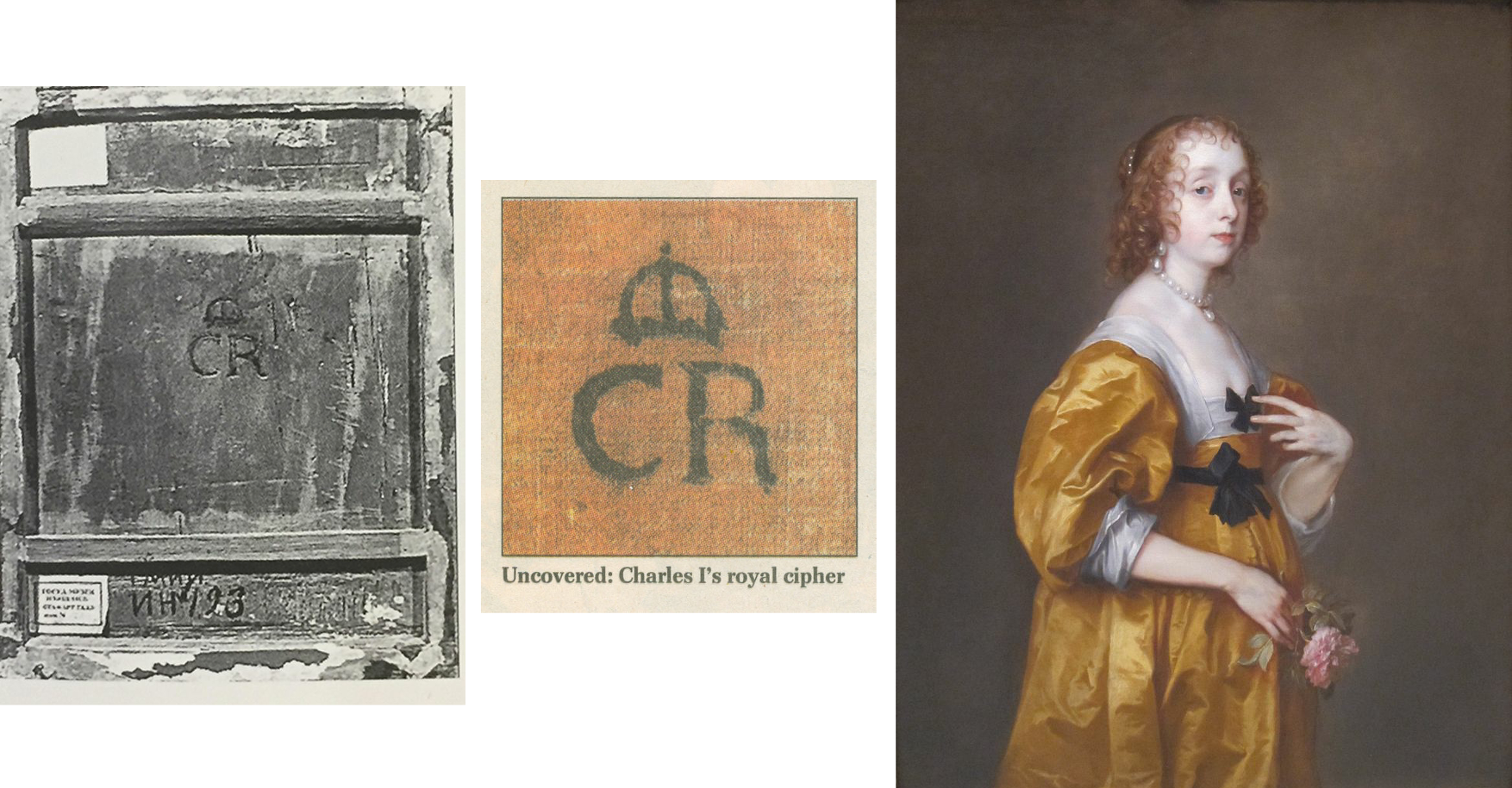
Above, Fig. 18: Left, the back of the Pushkin Museum’s Salvator Mundi by Giampietrino which carries the Charles I monogram, at which period the picture had been attributed to Leonardo; centre, the Charles I monogram found on the back of the Van Dyck painting of Mary Villiers; right, Van Dyck’s Mary Villiers portrait
The presence of a monogram confirming ownership by Charles I adds very considerable value. In 2002 the Mould gallery discovered one (above, centre) on a Van Dyck portrait of Mary Villiers (above, right) that had been bought for £437,587. On discovery of the monogram (made, as with Grosvenor’s picture, during the traumatic act of stripping off and replacing a backing canvas) the Mould picture’s asking price leapt almost fourfold to £1.6m. It follows that Grosvenor’s Rubenshuis Van Dyck will likely be worth a quarter of what it might otherwise have beeen, had it been in Charles I’s collection and duly stamped with the royal monogram.
OUT OF THE FRYING PAN…
Lacking evidence that his picture had been in Charles I’s collection, Grosvenor addressed the absent record of a payment with an initial surmise that the picture had been presented by Van Dyck as a gift to the King. He then added: “Of course, the presumption that the self-portrait was originally presented to Charles I may be incorrect, and if it was part of the collection of Henrietta Maria instead (whose collection was looked after by Daniel Soreau of whom we know little), we would not expect to find a cypher [monogram] on the back.” (Emphases added.)
A neat swerve, but an expectation of an absence of evidence that rests on an unsupported supposition cannot be rolled together and taken to constitute evidence of any kind. If the picture lacks a monogram it lacks a monogram and that tells against it having been in the collection. If it lacks both a monogram and a record of payment, there is certainly no ground for concluding that it must therefore have been gifted by Van Dyck to the King’s wife, because that blatantly begs the question. Grosvenor reports that after the king’s execution the Van Dyck self-portrait that had been in the collection had been bought by the artist’s former assistant and copyist, Remigius van Leemput – and he says so on the cited authority of Oliver Millar, who judged the now-Grosvenor picture…to be a copy of that lost, formerly Charles I Van Dyck self-portrait.
The escape clause possibility of the picture having been owned by Henrietta Maria was suggested to Grosvenor by Margaret Dalivalle who had attempted to underpin the claimed double royal pedigree of the (now-disappeared and Louvre Museum-downgraded) $450m Leonardo school Salvator Mundi with a speculative suggestion that the painting might have been brought to England from the French royal collection by Henrietta Maria. It was also being claimed that the (then New York) Leonardo-attributed Salvator Mundi was the Leonardo Salvator Mundi that had been recorded in the Charles I collection. No evidence supported that claim and in 2018 another picture – the one that really had been attributed to Leonardo when in the collection of Charles I and the one which really does bear the royal monogram (above left, Fig. 18) had emerged in the Pushkin Museum, Moscow. However, that Salvator Mundi is of a different composition and, besides, it had been downgraded to Leonardo’s assistant Giampietrino. Thus, the painting that had been in Charles I’s collection as a Leonardo was not a Leonardo, regardless of whether or not it had been brought from the French royal collection, which it hadn’t: after years of trawling archives, Dalivalle admitted that she had found no evidence that Henrietta Maria had brought the painting from France and had abandoned her search.
A SERIALLY BEGGED QUESTION
In the absence of material or documentary evidence on his Last Van Dyck self-portrait, Grosvenor again appeals in circular fashion to the authority of his own judgement-by-eye on the picture’s artistic merits, which judgement he again confounds with hard evidence: “There is however, other evidence to suggest that this painting did indeed hang at Whitehall, in addition to the fact of its overall quality, and the fact that it certainly appears to be an original work by Van Dyck.” Having conflated his own impressions and judgements with facts, Grosvenor proceeds to add that Van Dyck, “is unlikely to have presented his patron with a second version or a studio replica” when he has not established that the (formerly $350) picture which he owns had been presented to Charles at all. (All emphases added.) Once again, “evidence” that “suggests” that something had happened of which there is no evidence, is not evidence, it is simply wishful thinking. Grosvenor’s painting could not have whispered in the Mould gallery (- had it ever been presented there) that it had once hung somewhere else in London.
If proof were ever to emerge that Van Dyck had gifted an unrecorded portrait of himself to the king’s wife, it would immediately beget another sleeper-hunting opportunity: Where is the Van Dyck self-portrait that was listed in the king’s collection and that would be expected to bear the royal monogram? Were such a monogrammed Van Dyck self-portrait to turn up tomorrow, we would then have two self-portraits gifted by Van Dyck to the royal couple (one to each), just as we now have two claimed last Van Dyck self-portraits in the NPG and Rubenshuis pictures.
BOUNCING THE NPG?
Whatever the exact relationship in this recent Mould and Bader “adventure in old masters”, two things are clear. First, an initial attempt to sell the £8.3m picture to the NPG failed. When the Philip Mould enterprise found no buyer for the picture between 2009 and 2013, the £8.3m purchase at Sotheby’s must indeed have seemed a hair-raising liability. Second, that although James Stunt’s much-reported purchase of the painting for £12.5m never materialised, his repeated and noisily declared intention to remove the painting from Britain greatly assisted the picture’s eventual sale to the NPG.
On the picture’s true or fair value between 2009 and 2014, there is no evidence that the already world record £8.3m Van Dyck had been sold for £12.5m to Stunt, a well-known collector of six-figure Lely paintings. Waldemar Januszczak mused in the Sunday Times: “Why Stunt has chosen to go for the Van Dyck now, when it has been hanging in Mould’s gallery for three years I do not know.”
HYPING A TOP-PRICE WORK
Putting Stunt’s involvement to one side, it might also be asked how the NPG’s £10m purchase of a picture that had been stealthily offered as a safely autograph work (on no scholar’s published account) in 2009 and on a £2-3 million estimate at Sotheby’s, came to be taken as a matter of Very Great National Concern. On 8 December 2013, Richard Brooks rebuked the NPG for dilatoriness over the purchase (Sunday Times “£3m bungle over Van Dyck selfie”): “…the gallery had the chance to buy it four years ago for at least £3m less than it will now have to pay”. If Brooks had meant that had the gallery bid directly at Sotheby’s 9 December 2009 auction it could have got the picture for the £8.3m paid by Mould/Bader, Grosvenor has countered: “we were delighted to acquire it in partnership with Alfred Bader for £8.3m. In fact, we had been prepared to bid much higher, and were slightly surprised when the hammer came down.”
Brooks continued: “In fact it [the NPG] missed the opportunity to buy the painting not once but twice…The gallery had in fact been tipped off by the auctioneer, Sotheby’s, that the painting was coming up for sale four months earlier, in August 2009, when one of its staff went to see Sandy Nairne, the director of the Gallery. ‘It was a heads-up for them to see if they could buy,’ said Sotheby’s last week. Nairne decided not to bid. Last week Nairne confirmed that the approach had been made but said he had worried about the ‘uncertainty’ of buying at auction. It was also thought that the earl [of Jersey] did not seem interested in selling privately to the gallery.” This last was likely the case – Grundy established that the earl had put his own family pile on the market at c.£10m, so he was not likely in financial self-sacrifice mode.
Having bought the picture for £8.3 million at auction, Brooks continued, “Mould and Bader offered the gallery another chance to buy it, this time from them. Initially they asked for £10 million but this was subsequently dropped to £9.5 million…” Those successive reductions might have been public-spirited generosity towards a national institution, but they could also have been hard-nosed commercial realism: the picture was proving impossible to shift. Four other parties, including two non-UK museums, were said to have driven the auction price to £8.3m but having dropped out at that price they were unlikely to re-enter at £10m, £9.5m or £12.5m – as indeed had resoundingly proved to be the case by 2013 when the work remained unsold. All in all, Brooks seemed rather cross that the NPG was not playing ball with a gallery that had failed to shift a picture bought three years earlier at a world record price with the assistance of an industrialist/collector.
HOW SOLID WAS STUNT’S OFFER TO BUY AT £12.5m?
Januszczak appreciated that: “the timing [of Stunt’s late-buying and declared intention to remove from the country] has forced the NPG and the government into action” – which action he and Grosvenor supported. As for Stunt’s declared intention to remove the picture from the country, had he bought it earlier for less and immediately applied for an export licence, there would, Grosvenor has claimed, have been no opposition and the picture would certainly “have left the country”. Instead of quietly buying it for £9.5m and removing it unopposed from the country, Stunt waited until the end of 2013 to declare an intention to buy the picture at the then full Mould/Bader £12.5m asking price and, simultaneously, to remove it from the country. For sure, that last declaration prompted the picture’s supporters to seek and obtain a three-month government export ban in November 2013. Stunt then amplified his Threat-to-Remove by saying that although he well understood the move to block his purchase from Mould, he still hoped he would be able to “take it to his home in Los Angeles and enjoy it.” Thus, without costing Stunt a penny, his noisy public stance greatly facilitated the Mould/Bader sale to the NPG when no other buyer was in sight.
A MAN OF SEVERAL HATS
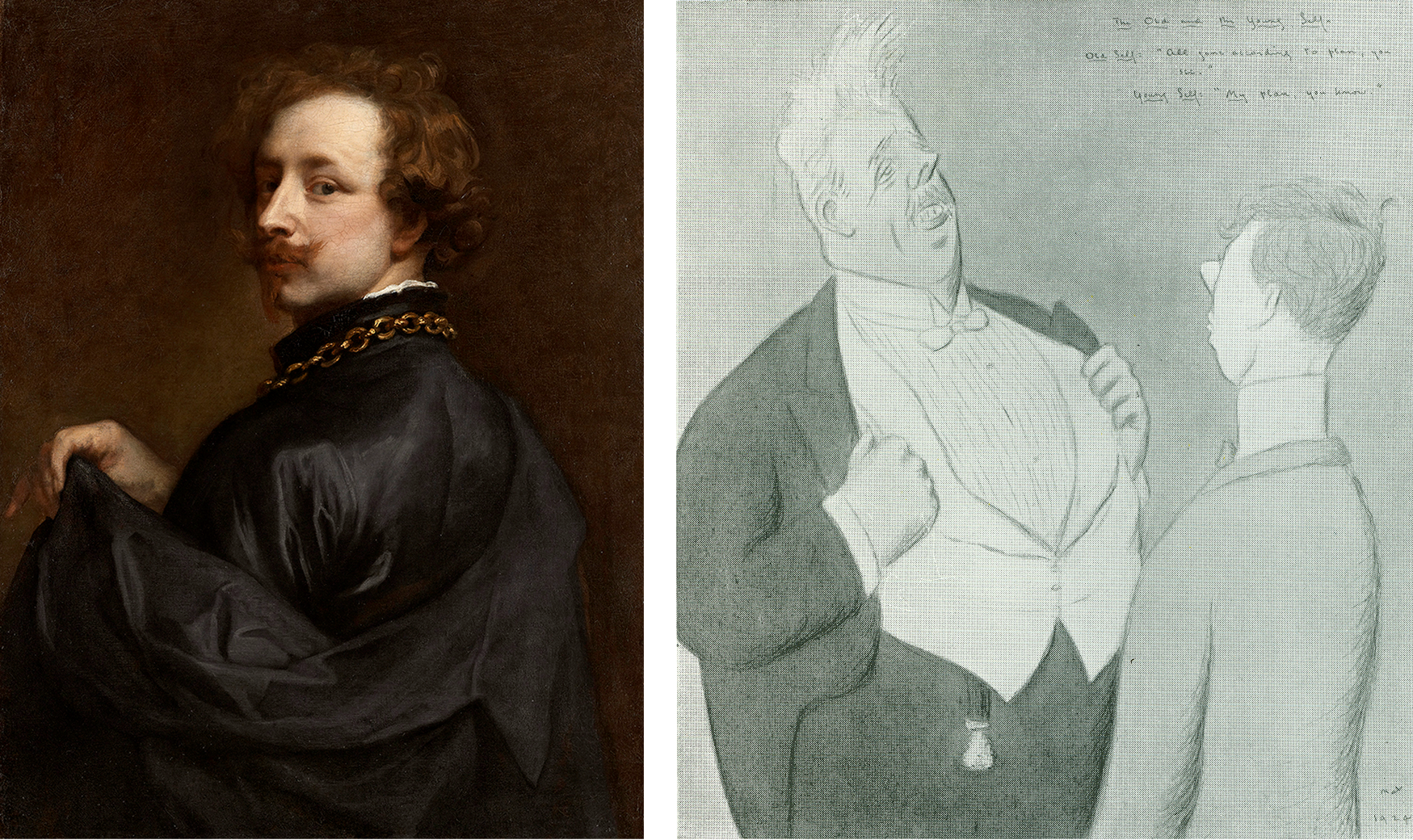
Above, Fig. 19: Left, the newly attributed Van Dyck self-portrait on loan to the Minneapolis Institute of Arts (as discussed below); right, a 1925 Max Beerbohm cartoon in his “The Old and the Young Self” series. (Caption: Mr Arnold Bennett – Old Self: “All gone according to plan, you see.” Young Self: “My plan, you know.”)
Grosvenor’s role as a Mould employee becomes a greater matter of interest given his possibly overlapping role as a private, stand-alone collector/connoisseur. On 14 November 2013 he posted a blog saying that the picture had been sold to an overseas buyer [Stunt] and added: “For the art dealing day-jobber in me, this has to be seen as a Good Thing. We [at Philip Mould] bought the picture (in the thick of the global downturn) because we believed in it, and had the aim of adding value and selling it on. And I believe we have done that… However, for the Van Dyck fan, it obviously pains me that the picture might leave the UK. And it doubly pains me that I might in some small way be responsible for that!”
How so? In addition to his value-adding obligations as a Mould gallery employee, Grosvenor had attended a Government Export Licence Review “as a representative of the picture’s buyer [Stunt]”. It is not clear whether Grosvenor had spoken in support of, or against, Stunt’s declared intentions to remove the picture, at the Review – or whether, whichever line he adopted on that occasion, Stunt had known of it. It is possible that Grosvenor confined his remarks to underlining the seriousness of Stunt’s threat to remove the picture from the country but on 14 November 2013 he hinted that he had opposed the Mould gallery client’s declared intentions:
“A month or so ago we attended the UK government’s Export Licence Reviewing Committee – as representatives of the picture’s buyer – at the Arts Council’s new office… [and the picture] was temporarily blocked for export by the committee on all three ‘Waverley’ criteria (which is unusual). I felt a strange pride in Sir Anthony for pulling that off.” For “Sir Anthony”, we can only read “Dr Grosvenor” and further assume that Stunt was happy to have his by then doubly expressed determination to remove the picture from the country thwarted by a Mould gallery employee. Grosvenor asked: “Will a UK institution [now] be able to raise the funds to stop the sale?” With his gallery salesman’s hat on, he helpfully volunteered: “The price is £12.5m (about 1/3 of a Koons Orange Dog).”
Eleven days later (25 November 2013) Grosvenor reported: “I went to the launch this morning of the National Portrait Gallery’s campaign to save Van Dyck’s last self-portrait for the nation. The picture has been sold to an overseas buyer, and the NPG has 8 months to try and raise £12.5m to keep the painting in the UK. It’s the largest such campaign ever mounted by the NPG… Regular readers will know that I work for the company which has sold the picture, so I’m in something of a predicament. But of course, the Van Dyck fan in me (he’s my favourite artist) wants to see the picture remain on public display in the UK. A large part of whether the campaign to save the picture succeeds will come down to how the public reacts…” (All emphases added.) On the face of it, Grosvenor was openly campaigning against the interest of a Mould/Bader client who, reportedly, had already paid £12.5m and delivered a £4.2m profit to Mould/Bader on an £8.3m picture, and yet, at the same time, he was commanding the country to come to the aid of a public institution so as to help it buy the picture for £12.5m from a dealer and his “progenitor of adventures in old masters” partner/backer.
“ULTIMATE BUYERS”
Again, concerning the price, in his 25 November 2013 post, when scolding Sewell for challenging the attribution and for claiming the NPG could have bought for less than £12.5m had it acted sooner, Grosvenor retorted: “How does Brian know where we, as the ultimate buyers (in partnership with Alfred Bader fine arts) would have stopped bidding? I can tell you now that the NPG would not have got it at auction for less than the asking price today.” Thus, we learn that the Bader-backed Mould gallery had been prepared to buy the supposed Last Van Dyck Self-Portrait for very appreciably more than £12.5m. Having already routed all opposition in 2009 with an £8.3m bid, who – other than the NPG – might have been expected to buy the picture after four years of no-sale? We say “no-sale” because if the picture had belonged to Stunt it would have been reputationally reckless behaviour for the vendor, after taking payment, to seek to block the buyer.
In November 2013 Grosvenor complained “Waldemar [Janusczcak] is mounting a one-man campaign to have my employer donate the picture to the NPG…” – which tacitly disclosed that Mould/Bader were still the owners. An anonymous, but evidently well-informed reader commented on Grosvenor’s website: “…Mould and co are entitled to profit from 1) saving the Van Dyck four years ago by taking the risk of purchasing it at auction during a very difficult period 2) holding the painting for four years with a lot of someone’s capital in it 3) researching the picture to add to its value all that is now known about it.”
THE PRESS WEIGHS IN
When Stunt’s reported bid to remove the picture spurred the NPG’s attempt to retain the picture in Britain at £12.5m, many journalists urged the public to contribute to the “Save-the-Picture” fund. In the Times Ben Macintyre hailed Van Dyck as an exemplary immigrant who had enriched his adopted home – a mongrel nation avidly open and welcoming to foreign talents, in which he was knighted, married into the aristocracy, buried in St Paul’s and had left as his legacy a transformed British school of painting that, having passed through Gainsborough and Reynolds to Singer Sargent, “is still felt nearly four centuries later”. That was a perfectly fair and attractive (if by no means original) analysis. Van Dyck’s last and greatest of all self-portraits, Macintyre assured readers, depicts a man who has found his home from home, “and that is where he should stay.” Against that somewhat sentimental reading, evidence suggests that, ahead of the end of Charles I’s reign, Van Dyck was looking to jump national ships.
Jonathan Jones in the Guardian asked “£12.5m for a self-portrait by Anthony van Dyck? That’s what the National Portrait Gallery and the Art Fund are trying to raise in an appeal launched today. Is it worth it?” Sporting hyperbolic philistinism, he self-answered: “Absolutely. I think this is one of the most worthwhile campaigns in years to ‘save’ a work of art for the nation. Van Dyck’s Self-Portrait would make a spectacular addition to the National Portrait Gallery. Quite frankly, it could make the place. It would give a gallery stuffed with pictures of primarily historical interest a true artistic masterpiece, by the man from Antwerp who gave birth to British art.”
In the Spectator the historian Andrew Roberts wrote: “Of all the great British portrait painters, Van Dyck is by far the most important not to be represented by his own portrait in one of the great British public collections, considering how central he is to the history of the British school of painting and how his influence has grown over the centuries. ‘We are all going to heaven’, Gainsborough said on his deathbed, ‘and Van Dyck is of the company.’ For the National Portrait Gallery, the story of Britain that it attempts to tell through portraiture is simply incomplete without a portrait of Van Dyck, which has long been identified as one of the major lacunae in its otherwise superb collection. This is the only chance a museum or a gallery in the United Kingdom has of acquiring the masterpiece and it’s the only portrait of the artist ever likely to be made available for acquisition by a British public collection…”
Grosvenor purred on his 28 November 2013 post: “excellent piece by historian Andrew Roberts in the Spectator on the NPG’s campaign” without disclosing that since May 2013 Roberts had been an NPG trustee. Nor did he demur when Roberts assured the public that this was “the only chance” of acquiring what was the “only portrait of the artist ever likely to be made available for acquisition”. Not the slightest hint was given that three Van Dyck self-portraits were in the offing and on 8 December 2013, the Sunday Times prodded laggards: “James Stunt, who is married to Bernie Ecclestone’s younger daughter Petra, has already put in an offer of £12.5m and hopes to hang the piece in his Los Angeles mansion.”
A PROLONGED STRUGGLE TO RAISE THE READIES…
On 17 February 2014 Grosvenor announced:
“The National Portrait Gallery has successfully argued for an extension to the export bar on Van Dyck’s c. 1640 Self-Portrait. This means they have another 5 months to try and raise £12.5m, which is the sum required to match the picture’s sale price. The NPG has already raised a quarter of that amount, from bodies such as the Art Fund, the Monuments Trust, and also (impressively) nearly a million from smaller donations made by members of the public…” That left some £8.2-3m to find – effectively the full original world record price paid at auction. Once again, Grosvenor reminded his readers: “I’m in something of a quandry [sic] on this one, given that Philip Mould & Co., for which I work, sold the picture to an overseas buyer.” (Emphasis added.)
AN EMPLOYEE HELPS BROKER A NEW CUT-PRICE MYSTERY DEAL
On 26 March 2014 Grosvenor announced he had been working on “a new deal to help the National Portrait Gallery’s campaign to acquire Van Dyck’s final Self-Portrait” and that the target price “has now been reduced from £12.5m to £10m.” Who exactly was working with whom – and how – on this deal? What role had Grosvenor played? Stunt, he reported, had issued a statement: “When I agreed to buy [not when I bought] this great portrait I didn’t expect the huge swell of public opinion and strength of emotion its export would generate…I have reconsidered my position and have decided, with Dr Bader and Mr Mould’s agreement, to withdraw from the process.” Had Stunt owned the painting he would neither have been able to withdraw from a process, nor have required the agreement of Bader and Mould to sell his own picture to the NPG at a supposed-billionaire’s public-spirited £2.5 million loss, should he have wished. Presumably, Stunt meant only that he was withdrawing both an earlier undertaking to purchase and a declared threat to remove the painting on purchase.
Had Stunt feared opprobrium on removing the picture from the country, he could have bought it on an agreement not to remove it – he had three homes in London at that time. Given that, for whatever reason, the well-publicised Stunt purchase had vaporised, and that Mould/Bader still had no buyer in view – other than the NPG which was clearly struggling to match the reported sale at £12.5m – why did they not revert to their earlier £9.5m offer to the gallery?
At that price, Mould/Bader would still have made £1.2m profit on their £8.3m purchase – almost as much as the £1.4m contributed by the donations of 10,000 members of the public – while earning kudos for contributing to the public weal. Grosvenor reported that Mould and Bader had responded separately. Mould had said: “I am delighted to be able to help the National Portrait Gallery’s campaign in this way”. In what way had he helped? Had he volunteered a £2.5 million cut on a painting he (or he and Bader) still owned but could not sell? Or, had the elderly Bader been the near- or actual owner, with Mould and Grosvenor having acted as his agents in an attempt to flip a £8.3m painting to the National Portrait Gallery?
A CHEERLEADER CONSTRAINED
“And, for what it’s worth”, Grosvenor continued, on 26 March 2014, “here’s what I have to say. Regular readers will know that previously I’ve had to tread carefully when it came to the NPG’s campaign. Van Dyck is my favourite artist, and I’d naturally like to see his final Self-Portrait stay in the UK and on public display. But my responsibilities towards our clients meant that I couldn’t be as much of a cheerleader for the [fund-raising] campaign as I’d liked. Now that Mr Stunt is no longer buying the picture, and Dr Baders [sic] and Philip Mould have agreed this new plan in favour of the NPG, however, all efforts can be focused on the Gallery’s fundraising. I’m pleased with the outcome.” (All emphases added.)
Ostensibly, that was inscrutable: Grosvenor talks of clients when only Stunt had reportedly been in the picture; Stunt is now not buying and therefore, contrary to all previous claims, he had not bought. How real, then, had been the threat to remove the picture from the country? Had it become apparent to Mould/Bader that even with the extended leave to raise funds, the NPG was unlikely to raise the necessary £12.5m? Was it not the case that no one was interested in buying the picture and that to be sure of a sale, the high asking price to the NPG would have to be slashed; that having paid £8.3m for a stealthily upgraded former copy, Mould/Bader had simply bitten off more than they could chew?
As for who was making the twenty per cent price reduction, Bader made no comment. His family responded: “Alfred Bader CBE, an established philanthropist on both sides of the Atlantic, has been impressed by the public’s response to the painting, and the efforts that both the Art Fund and the National Portrait Gallery have made to keep the picture on public display. He very much hopes that the National Portrait Gallery is able to complete the rest of its fundraising challenge.” That would fit with the view some held at the time that (the then ailing) Bader and his family were impatiently seeking the return of his undisclosed investment/stake in the picture.
THE SECOND “LAST VAN DYCK SELF-PORTRAIT”
In the light of a £2.5m reduction after four years of no-sale, it might again be wondered at what point the now Grosvenor-owned True “Last Van Dyck Self-Portrait” that today hangs in the Rubenshuis Museum had emerged. In his December 2015 BAJ article, Grosvenor disclosed that his painting had undergone a long and “sensitive conservation, leaving us with the picture we see today”. Skipping an owner’s obligatory guff on “sensitive conservation”, for how long was it in restoration? Answer: “over the last few years”. That is a lot of sensitivity on a modest painting and it suggests that Grosvenor might have acquired the picture no later than c.2013. [*] Had he at any point advised his employer or the National Portrait Gallery that he had single-handedly acquired a supposedly artistically superior Van Dyck self-portrait with a supposed royal provenance that he would shortly publish and lend to a foreign museum as the True Last Van Dyck Self-portrait? For that matter, had Mould and Grosvenor jointly advised the National Portrait Gallery when the third Van Dyck self-portrait (Figs. 1, 15, 19 and 20) – that would be sold privately and thereafter loaned to the Minnesota Institute of Arts – first came to their attention?
[* Although Grosvenor gives no indication of when or where he acquired the picture, he does track its history as far as 2006 when it fetched $3,120 at Christie’s, NY, in a 6 June sale, as lot 40, ‘After Van Dyck’.]
A RESEARCH AND ADVOCACY-LED BREAK-THROUGH
“Well, hurrah”, Grosvenor had cheered on 1 May 2014, “the National Portrait Gallery in London has successfully raised £10m to buy Van Dyck’s late ‘Self-Portrait’” – but note Grosvenor’s new description of the soon-to-become National Portrait Gallery picture: “Van Dyck’s “late ‘Self-Portrait’”. Why late and no longer last?
“I may write more about the acquisition process later”, Grosvenor went on, “but I’m quite proud to have been involved in both that and the process of research and advocacy that has resulted in the [NPG] portrait becoming what it is today. It’s certainly been a privilege to have handled the picture here at the Philip Mould Gallery. Seeing Sir Anthony in our offices every day made it feel as if he was part of the family. I don’t mind admitting that most days I would greet him with a quiet ‘Morning Ant’, and if I was the first in I’d positively shout it, and even give him a wave. He never waved back of course, but that vivid, knowing expression made it seem as if he was reciprocating in some way. And then there was the strange feeling of having Van Dyck look over us as we made the occasional discovery of a new work by him. These have included – if you’ll forgive the boast – the Portrait of Olivia Porter in the Bowes Museum, the Portrait of a Young Girl now hanging at the Ashmolean, two male full-length portraits painted by Van Dyck while he was in Italy, a Holy Family painted in Sicily, three important head studies, and his last Portrait of Queen Henrietta Maria as St Catherine. There are others which unfortunately I can’t tell you about – at least, not yet. I hope, now that he’s left us, the discoveries don’t dry up.”
THE THIRD VAN DYCK SELF PORTRAIT
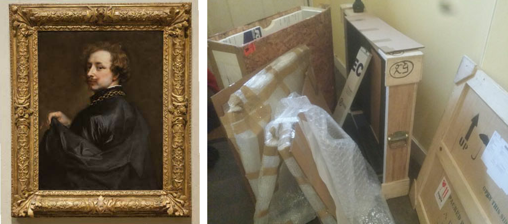
Above, Fig. 20: Left, a photo accompanying Grosvenor’s 5 March 2015 post on a painting loaned as an autograph Van Dyck self-portrait to the Minneapolis Institute of Arts, Minnesota; right, a Grosvenor photo carried on 31 March 2015 with the caption: “Wanted – good homes for second-hand picture crates.”
So, yet other Van Dyck Discoveries-in-Waiting – but which would emerge next? Well, the one now hanging in the Rubenshuis museum had first been written up by Grosvenor in the December 2015 British Art Journal but, in 2018, Gleadell had reported in the Telegraph that Mould’s favourite Van Dyck upgrade “is a self-portrait that he found at auction in Germany, in 2012. Thought to be a copy and with a €30,000 estimate, he bought it for €572,000. By 2015 he had sold it on privately, since it appeared at the Minneapolis Institute of Art on loan from the American investment financier, Scott Minerd. Taking some credit for the change in status was Mould’s researcher, Bendor Grosvenor, now a TV presenter [etc….]” Presumably, with Mould having bought for only half a million, Minerd will have paid very considerably less for his attributed Van Dyck self-portrait than had the NPG for its now Grosvenor-shunted former “Last Van Dyck Self-Portrait”?
KNOCKING SIR OLIVER MILLER
Grosvenor had claimed his own credit on the upgrading of the Mould-to-Minerd self-portrait on 5 March 2015:
“The Art Newspaper seems to have scooped a story I’ve been dying to tell you about for some time; the re-discovery of an important self-portrait by Van Dyck. The picture was one of the last important portraits I worked on with Philip Mould in London.” Grosvenor then cited Martin Bailey’s Art Newspaper coverage:
“Martin Bailey writes: ‘A self-portrait by Van Dyck that was dismissed a decade ago as a copy is now hanging in the Minneapolis Institute of Arts, Minnesota, as an original work. The painting which has been authenticated by experts, was quietly put on display in February…An unpublished paper on the self-portrait, prepared for the owner, dates the work to around 1629 and states that this attribution is accepted by four key experts: Susan Barnes, a co-author [one of four] of the 2004 Van Dyck catalogue raisonné, Christopher Brown [*], the former director of the Ashmolean Museum in Oxford, David Jaffé [**], a former senior curator at the National Gallery in London, and Malcolm Rogers, the outgoing director of the Museum of Fine Arts Boston. The attribution is also accepted by Patrick Noon, the head of paintings at the Minneapolis Museum…The late Oliver Millar, another co-author of the 2004 catalogue raisonné, dismissed the work as ‘possibly a very early copy’. He assumed that the original painting was missing…’”
[* As senior curator at the National Gallery in 1982, Christopher Brown had been instrumental in the gallery’s £2.5m 1980 purchase of the Rubens Samson and Delilah. **David Jaffé, a successor as senior curator, strongly defended the picture’s acquisition and in 2005-6 organised the National Gallery exhibition, Rubens: A Master in the Making that showcased the Samson and Delilah. Conspicuously, neither of the contemporary copies of the original lost Rubens Samson and Delilah – which, as mentioned, had both testified to a wider composition in which Samson’s toes had not been cut off at the edge of the painting – were brought to the exhibition.]
Grosvenor continued: “The unpublished paper referred to above was written by me, and I’ll share further details with you soon. There’s a great deal to discuss. I think the picture was probably painted in late 1628. A few quick additional points: The Art Newspaper mentions that the late Sir Oliver Millar ‘dismissed the work’ – but in fact when he saw it at an Agnews exhibition in 1968 he pretty much accepted it. [Source?] Indeed, although the picture was little known and only exhibited once, it was continuously published as ‘a Van Dyck’ right up until 1999, and it was only in the 2004 Catalogue Raisonné co-written by Sir Oliver Millar that the picture was first doubted. I’m not sure why Sir Oliver changed his mind, but it was probaby [sic] due its pre-conservation condition; it had been substantially over-painted, and was also really quite dirty under old varnish. I believe Sir Oliver was perhaps also misled by the gold chain, thinking that chain was that given to Van Dyck by King Charles I, and that the portrait must therefore be an English-period work (that is, in the section of the catalogue that he was responsible for), dating to after 1632 – when Van Dyck’s technique was rather different. In fact, I linked hte [sic] portrait to a a [sic] gold chain Van Dyck was given earlier, in 1628 by the Archduchess Isabella in Brussels, when she appointed him her court painter…”
The paper for which Grosvenor claimed credit may well have formed the whole or part of this entry in the Mould gallery’s Historical Portraits Picture Library.
The Minneapolis picture, too, Mould reports, had gone into restoration. Had that been in London and, perhaps by the same restorer who sensitively “retrieved” the now Rubenshuis picture over a couple of years? Given that Grosvenor had researched this second, 2012 acquired, rival Van Dyck self-portrait and prepared a scholarly paper on it for the Mould Gallery, had either sleeper hunter informed the NPG of its presence in London before the gallery paid £10m for it’s then – but now Grosvenor-demoted “Last Van Dyck Self-portrait”?
If it might be thought a remarkable coup for all three Mould/Grosvenor Van Dyck self-portraits to have found homes in museums – the NPG, the Rubenshuis and Minneapolis – on this aspect, Grosvenor has shown a certain professional diffidence. Writing in the Financial Times of 3-4 March 2018 on the subject of collectors lending works to museums, he weighed the pros and cons of collectors lending and held: “Critics claim that museums are being used by lenders to enhance the value of their work…It is true that in some circumstances a period on loan can make an artwork better known, and thus more saleable. And there are other benefits to lending, too; the former National Gallery director Sir Nicholas Penny points out that museums can offer collectors the ‘double service of a free safety deposit with a shop window.’” Grosvenor hastened to add: “But the suggestion that a period of display can transform an artwork’s value is overblown…And while there undoubtedly are unscrupulous art owners, most collectors are driven not just by a passion for art, but by a passion to share it, too (disclaimer, this includes me; I have lent works anonymously since I started collecting over a decade ago)…at the Rubenshuis museum in Antwerp, which has only a small collection of its own and an even smaller budget, the well-publicised loan of a Tintoretto that once belonged to David Bowie helped increase visitor numbers by 30 per cent…It is time for museums to become the liggers of the art world, and borrow as much as they can. There’s a good chance they’ll get to keep it.” Grosvenor made no mention of his own loaned Last Van Dyck Self-Portrait, but we all get the picture, so to speak.
“CALL THE CONNOISSEURS!” – MOULD, GROSVENOR AND STUNT BID TO PRODUCE A NEW VAN DYCK CATALOGUE RAISONNÉ

Above, Fig. 21: Top, the entrance to the Paul Mellon Centre, London. Above, left, Bendor Grosvenor; centre, James Stunt; right, Philip Mould.
Leaving the Minneapolis Museum picture aside for Part II, we can now disclose that in 2014, Grosvenor and Mould jointly sought support from the Paul Mellon Centre to write a new catalogue raisonné on Van Dyck – and, also, that James Stunt had presented himself to the centre in support of the two dealers’ proposal with an offer to fund the costs of their proposed venture. It was a combined offer and proposal that could not be accepted, a) because the above-mentioned major catalogue – written by the four specialist Van Dyck authorities, Susan J. Barnes, Nora De Poorter, Oliver Millar, and Horst Vey – had been published by the Mellon Centre in 2004 and which work was then, as it remains today, widely regarded as an indispensable reference source; and, b) because the two would-be revisers were considered to have no real scholarly credentials to conduct such a massive and monumentally important art historical project.
When Mould and Grosvenor parted company (the latter with the rumoured £1m payoff) Waldemar Januszczak declared support for Grosvenor – and the pair now give joint podcasts (“WALDY AND BENDY’S ADVENTURES IN ART” on the Sunday Times’ fire-walled website.)

At 9.44 on 10 January 2021 Grosvenor tweeted the above “in-restauro” picture with this comment: “Ever fancied a go at cleaning a painting. In this week’s #WaldyandBendy we talk conservation and I have a go myself. It’s easy!”
GROSVENOR’S PROLONGED CALLS FOR A NEW VAN DYCK CATALOGUE RAISONNÉ
In August 2014 Grosvenor began disparaging past catalogues of Van Dyck’s work. Thus, of one painting on 19 August: “The above picture has recently gone on display at the Courtauld Gallery in London. It’s currently catalogued as ‘Van Dyck’. I think it was last published by the late Erik Larsen (whose Van Dyck catalogue raisonné is, alas, probably the worst single demonstration of connoisseurship ever published).” Ten days later in another post: “Surely, the most important pre-requisite in compiling a catalogue raisonné is not a degree in art history[*], but the confidence that you will be able to know for certain that your chosen artist really did paint the picture that some label/institution/scholar says they did…Now, I haven’t written a catalogue raisonné[**], but I have (and I hope this doesn’t sound too much like boasting, but there’s no other way of saying it) a proven track record of having a good ‘eye’. So for the benefit of any budding connoisseurs out there, I would add the following three crucial tips (obviously, this is all mostly relevant to Old Masters, and not modern and contemporary catalogues)…”
[* Although Grosvenor does not possess a degree in art history, having read modern history, his PhD dissertation on “The Politics of Foreign Policy: Lord Derby and the Eastern Crisis, 1875-8” might well have developed the usefully transferable research skills that were sometimes in evidence on the BBC’s Fake or Fortune programme. For sure, such desirable skills are not always inculcated within today’s university art history departments, so many of which prefer to fry almost any fish other than those of art and its history, but, as mentioned, Grosvenor has gone further and contended (AHN post, 29 August 2014) that “Actually, I’d be tempted to argue that a degree in history is more useful, as it gives a better training in how to evaluate evidence.”]
[** Tantalisingly, in a footnote, Grosvenor added: “Though that might be about to change!” But then… no further dangled hints of a new Grosvenor Van Dyck catalogue raisonné. As for Grosvenor’s not wishing to boast, some might chuckle – before relinquishing his career as a dealer and when temporarily shutting down his own website, he likened what he described as his “enemies” within the art trade to Salieris. As boasts go, likening oneself to Mozart might take some beating.]
FRUSTRATION AND IMPATIENCE WITH ACADEMIC IMPARTIALITY
Perhaps Grosvenor’s fullest expression of dissatisfaction with art historical scholarly expertise came in a March 2015 Art Newspaper piece (“Spare us the so-called experts and call for the connoisseurs”) which carried another Larsen-was-rubbish diatribe with an added slur: “The late Eric Larsen was a hopeless ‘expert’ on Van Dyck, and (it is said) took cash for attributions…Larsen’s example demonstrates two things. First, that it is dangerously easy to become ‘an expert’: all you need is a publishing contract. And second, that the art world – especially the art market – believes that if a painting is published in the latest book, it must be authentic no matter how bad or good that book is…In the quest for academic impartiality, however, we often ignore actual ability. True attributional expertise…can only be gained through years of experience…”
When Gleadell reported in 2018 that Grosvenor now prefers to keep his finds and is “quietly accumulating a small collection of discoveries of his own”, he added: “At this rate, the 2004 [Van Dyck] catalogue raisonné is going to need updating fairly soon – if everyone can agree on things, that is.” Perhaps Mould and Grosvenor have not altogether abandoned hopes of pulling off The Great Connoisseurship Double of being the art trade’s most proactive sleeper hunters and the arbiters of their own field?
In Part II we consider the Two Last Van Dyck Self-portraits on their relative artistic merits.
Michael Daley, 27 January 2021
IN THEIR OWN WORDS: No. 2 – The Curse of (revenue-generating, thought-precluding) Audio-guides
It’s official: museum audio guides stop people from looking at pictures. It is now clear that it would better to dump them – the audio guides, that is.

SYDNEY SCHAEFER, Staff Photographer. Clay Cofer, an Art Team member at the Barnes Foundation, does a pop-up gallery talk for visitors.

Nick Feldman photo. Courtesy Barnes Foundation. The Barnes Foundation Art Team members (from left) Tamara Mason, Ann Moss, Miriam Klingler, Clay Cofer, Amy Gillette, Florence Hsu, and Sara Land.
“…The Art Team is part of the Barnes’ [i. e. The Barnes Foundation, Philadelphia] continuing effort to deepen its ties with its audience. Initiated by Shelley Bernstein, chief experience officer and deputy director of audience engagement, probably best known for her work with digital technology, the Art Team is notable for its relative lack of tech, at least for now.
“‘You begin with the most meaningful thing first,’ Bernstein said, alluding to engagement efforts. ‘So this is what we call the human-interaction layer. It’s not about technology. It’s not about providing people with a thing or device. It’s thinking about what human interaction should be in the galleries and what we want that to be and trying to get that right before layering in other things.’
“First came some testing. Perhaps surprisingly, Bernstein discovered that people spent a lot more time in the galleries without an audio tour guide (110 minutes) than with one (88 minutes).
“Why? Visitors always said they love and want the audio tour, she said. But they spend less time with the art when an audio tour is in play. People want to talk to one another. They even remove the audio tours.
“Bernstein checked with colleagues at other institutions, notably the Broad museum in Los Angeles, which has assigned a group to do everything from taking tickets to chatting about the collection with visitors.
“The Art Team is a result of these conversations and simultaneous visitor research. Audio tours were retired. Visitors were launched tech-naked.”
Brilliant. Never mind the art jargon, this account in The Inquirer (“Art Team is Barnes Foundation’s new twist on visitor ‘engagement’”) is a most heartening and culturally healthy development. Consider this passage:
“Orbe caught Cofer’s rap in a small gallery filled with a Goya, a Renoir, a Manet, a de Chirico, and several other paintings, and pieces of ironwork and furniture.
“‘Goya is a very important anchor from the past,’ Cofer said to the people crowding the room. He swiped through iPad images. Back and forth.
“Goya harks back to Frans Hals, he told them. Manet, across the room, relates to Hals, as well. Consider Goya’s brushstrokes, said Cofer. Consider the rosy complexion on his portrait here. Is it not like the rosy complexion of the Renoir portrait far down on the wall?
“Visitors watch Cofer’s almost magical manipulation of his iPad images. And then, five or so minutes are up and he’s gone.”
For one thing, that intervention sounds very much in the spirit of Barnes’ educational notions: let art speak through its own variously assembled images. More than that, it sounds positively subversive and revolutionary in terms of today’s museum practice. Here is a man (it could be a woman, of course) who talks about art as art and who is clearly alert to artists’ practices and to the distinctive, culturally-enriching uses to which past artists-of-talent, so to speak, have put them. In talking, he shows, he engages with images – he sees the eloquent testimony of brushstrokes (see picture below). How much more appropriate is that than the museum world’s now bog-standard aesthetically obtuse didactic and patronising “story-telling”? (Whenever people talk of “Art and its Stories”, we should all run a cultural mile: those who would convert art into class, sex or other politics are, by definition, technically philistine and therefore unfit for purpose.)
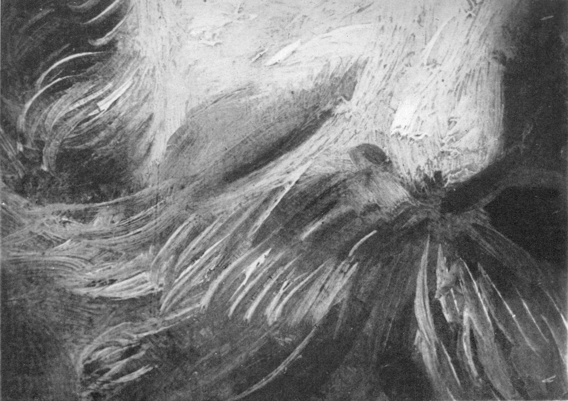
Is this historic photograph above – of a detail of Frans Hals brushwork – not worth a thousand of anybody’s words?
Once, when looking closely at Titian’s (now restoration-wrecked) Bacchus and Ariadne in a quiet lunch-time spell at the National Gallery, I half-registered a voice saying “I’m about to start talking about the painting” but, absorbed in thought, did not heed it. The phrase was politely repeated. When I turned I saw not only the NG badge-wearing speaker but an entire party of elderly grown-ups sitting on little fold-up stools like expectant primary school children. They were asked to identify the brightest colour in the picture. Hands shot up – “Blue!” they chorused. “That’s right”, the speaker said and she then asked: “and what is the pigment?” More raised hands and then a riff about lapis lazuli and its great expensiveness. Ariadne, the class learnt, was an abused and dumped woman whose depiction had been commissioned by a super-rich man for his private engendered-gaze…John Berger would have been so proud.
I wandered off and encountered another guide; another seated party (this time of teenagers sitting on the floor) in another gallery. The guide – a true “Dave Spart” – was explaining how Uccello’s Battle of San Romano was a “celebration” (Berger again) of capitalists’ hired mercenaries…and imperialist blood-letting.
On another occasion I went to re-examine the attributed Rubens Samson and Delilah without noticing a row of head-phoned tourists perched on a bench in the middle of the gallery. They soon began tutting. It seemed that by standing and looking at the painting I had breached cinema etiquette: the seated customers could no longer match the (paid-for) voice-in-their-heads to the image on the screen. They’ll have usherettes soon, selling ice cream.
The greatest benefit/privilege/luxury of museums – the opportunity for people to examine works of art at their own pace while thinking their own thoughts – is being systematically denied by museum staffs grinding their own (- but DCMS-demanded) axes and harvesting cash from contraptions. Such, no less than the cumulative debilitation of the artefacts in the name of the name their “conservation”, constitutes a crime against art and an injury to people.
Michael Daley, 6 March 2018
CODA – AN OPEN LETTER:
Dear all
The next issue of British art periodical The Jackdaw (May) will contain a statement against the current tendency in arts management to apply identity politics. The text is below. It does not contain any aesthetic, political or stylistic subtext. It simply asks for those in the art world to judge art works individually and on merit.
I and a number of artists, editors, writers and others will be signing the text. If you would like to add your name and how you would like it to be presented (i.e. “Dr Robert XX, art historian”, “Sarah XX, artist”) then please email David Lee, editor of The Jackdaw, at david.lee@thejackdaw.co.uk (T: +44 7773 673 722).
You are welcome to forward this email to anyone in the art world who may wish to add their name.
Thank you.
Regards
Alexander Adams
Against Identity Politics in Arts Programming
1) Art should be judged primarily on its intrinsic merit.
2) Artists should not be judged on their demographic characteristics but upon their merits as demonstrated through their production.
3) There should be no quotas (official or unspoken) along demographic lines regarding art programming, prizes, awards, bursaries, exhibitions and acquisitions, as well as the staffing of arts organisations.
4) Arts organisations should be staffed by individuals with sufficient competence, experience and personal attributes to make them suitable for their positions. In their official roles, they should be committed to serve art and their organisation not their private political convictions.
5) Consumers of art should not be patronised but treated as individuals of unique tastes and interests. If members of the public choose not to engage with art then that is not a failure; it is the choice of individuals. There should be no targets for audiences in terms of demographic characteristics.
6) It is healthy for opinions of various political outlooks to exist within the arts. It is important for reasoned dissent to be heard in order to combat the emergence of an unhealthy political monoculture.
We believe that if these principles are applied then the arts – and public life more widely – will benefit.
Yours, etc.
Connoisseurship: Examinations, Debates and Snap Visual Responses
The rising tide of old master “sleepers” and “discoveries” carries great dangers and demands snap judgements. Some candidates for upgrades intrigue, some look dubious, some scream “Fake!” Last week two cases caught our eye.
Fig. 1, above. Fig. 2, below. The newly discovered “Lost” Van Gogh sketchbook (above, top) rang our and many other fake bells. Then came a report that a small “Florentine School” painting on a €3-4k estimate fetched €375k at auction as a sleeping Filippino Lippi (above, Fig. 1). A link to another small work attributed to the artist at the North Carolina Museum of Art (Fig. 2, below) showed pronounced, seemingly reassuring correspondences, but something jarred.
On connoisseurship we hold that every claimant work should be rigorously “interrogated” in three crucial respects. Technically, in its physical composition; by documentation on its known or claimed histories (provenance); and, above all, by visual analysis because, in the visual arts, every picture is its own prime historical document and its inbuilt historically-generated artistic relationships constitute the primary subject of art critical appraisal and evaluation.
Failure to excise bad attributions deceives the public and corrupts oeuvres. A good picture has nothing to fear from challenges. No amount of scrutiny constitutes a threat as good pictures outlive their doubters and can fight another day. Argument is healthy and a successfully repulsed challenge can increase understanding and enhance a good picture’s lustre.
Vincent van Gogh: The Lost Arles Sketchbook
Above, Fig. 3. The controversial lost-but-now-found Van Gogh sketch book above is by Professor Bogomila Welsh-Ovcharov, a Van Gogh authority whose claims of authenticity are supported by Ronald Pickvance, author of Van Gogh in Arles, but the cover’s supposed Van Gogh ink self-portrait announces itself as a draughtsman’s pastiche, as Mark Hudson noted in the Daily Telegraph (“A romantic story but can it really live up to its promise?”, 16 November 2016).
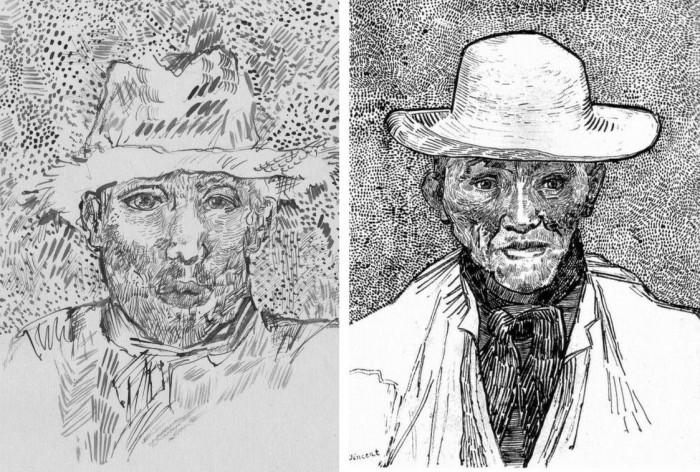
Above, Fig. 4. Simply by placing the supposed Van Gogh self-portrait next to an autograph portrait, immense and glaring differences become apparent: the author of the “discovered” drawing has abandoned symmetry with eyes of radically different sizes and a nose that seems product of a car crash. Throughout, the author mimics Van Gogh’s pen marks without comprehension of his form, power of design, and psychological acuity.
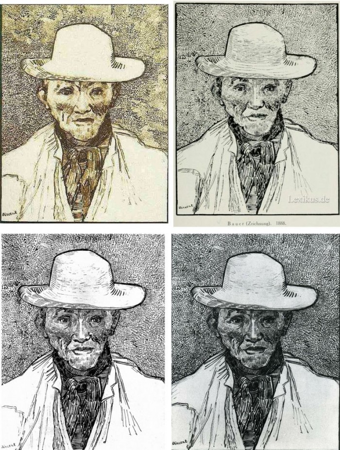
Above, Fig. 5. Instead of a form-camouflaging jumble of marks, the bona fide Van Gogh disports five graphically discrete component parts: a light-coloured jacket; a dark shirt and scarf; a varied but, on aggregate, mid-toned face; a light-toned hat with some mid and dark-toned form articulating shading; and, throwing all other values into relief, an agitated but tonally cohering background. Each of these spheres is allotted its own graphically purposive notations. The four images we show above for comparison are easily found online in historically successive reproductions. While these reproductions vary considerably, the force and artistic coherence of Van Gogh’s graphic intent and method shines through all.
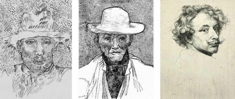
Above, Fig. 6. If we place the bona fide Van Gogh between the clumsy mimicking newcomer and a masterpiece of the greatest graphic brilliance – van Dyck’s etched self-portrait – it is clear that the Van Gogh has more kinship with the latter than with the former.
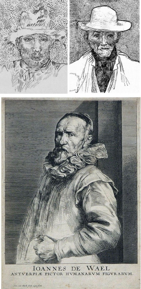
Above, Fig. 7. And if we compare the Van Gogh with an entirely autograph van Dyck etched state of a figure we find a common use of a toned background that throws both subjects’ flickeringly brilliant lights and darks into relief.
The Van Gogh Museum’s objections to the “Lost Arles Sketchbook” and its track record on Van Gogh attributions
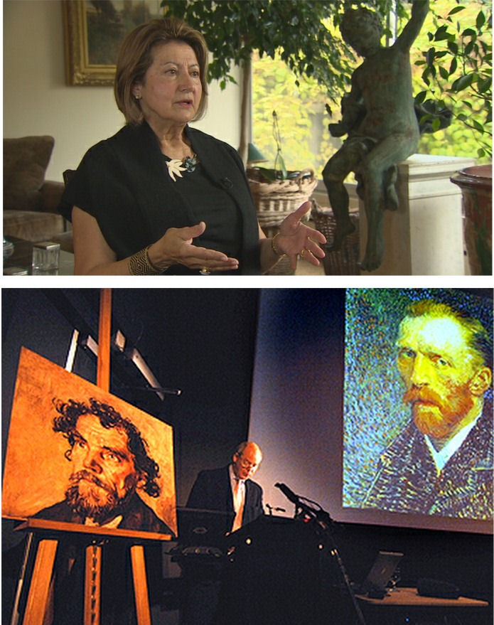
Above, Fig. 8. Prof. Welsh-Ovcharov (top) has responded to the Van Gogh Museum’s dismissal of the drawings with a rebuttal and a challenge to debate – thereby showing conviction and good faith. Her publisher reportedly characterises the proposed debate as “an opportunity to shed light on the conditions under which the Van Gogh Museum is claiming the de facto right to a monopoly of attribution.” This is a common plaint against authorities that block would-be, high-value attributions but our impression of the museum’s judgements is favourable.
In 2006 a Van Gogh – The “Head of a Man” owned by the National Gallery of Victoria in Australia (above left, on an easel) – was challenged by the art historian and Sunday Times art critic Frank Whitford when the portrait was loaned to an exhibition in Edinburgh. The newspaper asked our opinion and, when we demurred, sent a (revelatory) high resolution full colour compilation of all of Van Gogh’s painted portraits. We supported Whitford, saying to the newspaper (as reported in ArtWatch UK Journal, Spring 2008):
“The specific warning signs that should have alerted the buyer are:
“1] It is unique in Van Gogh’s portrait oeuvre
“2] It does not fit in the stylistic chronology that exists within that oeuvre. Compare it for example with the brushwork, colours and ‘attack’ of the Old Man with Beard, painted the year before that is in the Van Gogh Museum, and the Portrait of Camille Roulin painted a year or so later and that is also in the museum. There is an enormous but clear and logical development between those two pictures, from thick, laboured, relatively coarse brushwork to much more refined and ‘decorative’ marks – but both are entirely consistent and ‘all-over’ in their treatment.
“3] If its provenance goes back no further than Germany in the late 20s or early 30s, that is particularly unfortunate. Germany at the time was notorious for the certification by scholars (for a fee or sales cut) of dud works. The dealer René Gimpel has referred to the scandalous ‘amounts obtained by means of certificates given daily by German experts to German dealers. Just as there were paper marks, so there are paper canvases, an easy way of bringing dollars into Germany…The German title of Doktor impresses the Americans. The museums are even more intent than the collectors on defending their fakes or their mistaken attributions….’ By coincidence, in the current ArtWatch Journal [No 21], Kasia Pisarek cites the case of the great Rubens scholar Ludwig Burchard who issued so many optimistic certificates that he was unable ever to write his definitive book on the artist…She has identified over 60 Burchard attributions that have subsequently fallen. It was Burchard who first upgraded to Rubens the Samson and Delilah that is now in the National Gallery.
“I would add that the fact that it seems to be admitted that it is a cut-down canvas that was glued onto a panel compounds suspicions… Why should a (presumably) then only forty years old canvas, have needed gluing onto a secondary support? It might be worth asking the Gallery curators if any scholar has questioned the picture publicly or privately.
“It may be coincidence, but two of the pictures that ArtWatch has challenged in our own National Gallery, the Rubens Samson and Delilah and the Raphael Madonna of the Pinks, no longer retain their original backs. The former was planed down to 2 or 3mm thickness and glued onto a sheet of blockboard; with the latter, the family of restorers who sold the picture in the 19th century had (most unusually) polished the back of the panel thereby removing all historical evidence.”
As we have seen more recently, the claimed lost Leonardo drawing “La Bella Principessa” that emerged anonymously in 1998 had been glued to an old oak panel. Gluing canvases or drawings onto boards conceals half the material evidence. On 3 August 2007 Andrew Bolt reported in the Australian Herald Sun:
“The curious thing about the National Gallery of Victoria’s fake van Gogh is how easily it was spotted as phoney once it went on tour…. For more than 60 years this painting hung in the NGV without anyone screaming ‘Fake!’ True, a few experts now say they had their doubts, but it was only when the NGV proudly loaned its ‘van Gogh’ to Scotland’s Dean Gallery last year that the painting was denounced. Three British critics took one look at it and snorted… Even then, there were some back in Melbourne who couldn’t accept the evidence of their own eyes, as ABC Television’s 7.30 Report found:
“‘Two of the critics include Michael Daley from ArtWatch UK and Times art critic Frank Whitford. But Robyn Sloggett [an art authentication expert at Melbourne University] has questioned their expertise. ROBYN SLOGGETT: I don’t think either of them are Van Gogh experts, certainly not known to be such…[Director of the National Gallery of Victoria] DR GERARD VAUGHAN: It is a slightly offbeat picture. It doesn’t fit into the natural progression of Van Gogh’s work at that time because it was a moment in late ’86 and into early 1887 where he was experimenting with two or three different styles. In many ways, this is slipping back into his earlier realist style of the mid 1880s where he concentrates and uses these earthier ochre colours. It is a transitional picture.’”
“Conceived at special moments” and “sometimes repeating, sometimes anticipating themselves” are commonplace apologias for disqualifying incongruities in upgrades. In 1997 and 2000 the National Gallery claimed its Rubens Samson and Delilah did not look like any other Rubens in the gallery because it was “the only work in this collection typical of the artist when he had returned from Italy in 1608”. In truth the painting was unlike the (secure) one that immediately preceded it and unlike the (secure) one that immediately followed. If a Rubens, it would be the only one on which he employed flat brushes and painted finger tips with rectangular highlights. During ABC Television’s 7 August 2006 programme (“NGV’s Van Gogh Labelled a fake”), James Mollison, a former NGV director said: “This picture has been doubted by people very often.”
The upshot of the controversy was that the NGV director announced that such was the gallery’s confidence that the painting would be submitted (voluntarily) to full technical examination at the Van Gogh Museum. A year later the Herald Sun reported the attribution’s demise at the Van Gogh Museum:
“The Dutch team used X-radiograph, digital photographs, light microscopy and paint and thread analysis. Among conclusions were: THE work’s ground layer of white paint is not found in Van Gogh’s Antwerp and Paris works. ITS use of pure ochre is not found in other Van Gogh work. THE portrait shows just the top of the man’s shoulders. Van Gogh usually showed more of the clothes. “A COMBINATION of a fairly coarse and detailed painting style”, with more detail in the mouth, eyes, skin and beard than Van Gogh used. NO reference to the portrait or the sitter in Van Gogh’s extensive letters. The experts also noted no record of the work could be found before 1928, when it appeared at Berlin’s Galerie Goldschmidt and Co.”
The Rubens Samson and Delilah emerged in Germany the following year at Van Diemen and Benedict where it was offered as a Honthorst before being upgraded by Ludwig Burchard. Previously it had been attributed to Jan van den Hoecke, a follower of Rubens. Burchard had recently upgraded the supposed Rubens ink sketch design for the Samson and Delilah (see Art’s Toxic Assets and a Crisis of Connoisseurship ~ Part II: Paper – sometimes photographic – Fakes and the Demise of the Educated Eye ).
The Newly Upgraded Filippino Lippi
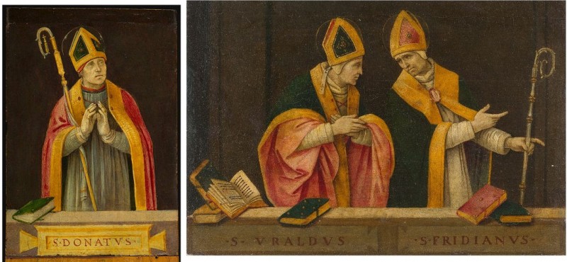
Above, Fig. 9. At first glance the awakened “Filippino Lippi” (above right) seems more plausible than the new Van Gogh drawings – especially when linked to a work attributed to the painter at the North Carolina Museum of Art (above left). In terms of palette, condition and design the two seem as peas in a pod but this closely related pair triggers no recollections of anything similar in the artist’s oeuvre. If their strikingly common format suggests original incorporation in a larger work, disjunctive variations in their parapet walls and stone inscription tablets dispels the possibility. Most inexplicably of all, the new upgrade is incongruously modernist in its emphatic planar and ‘on-the-picture-surface’ geometrical vocabulary.
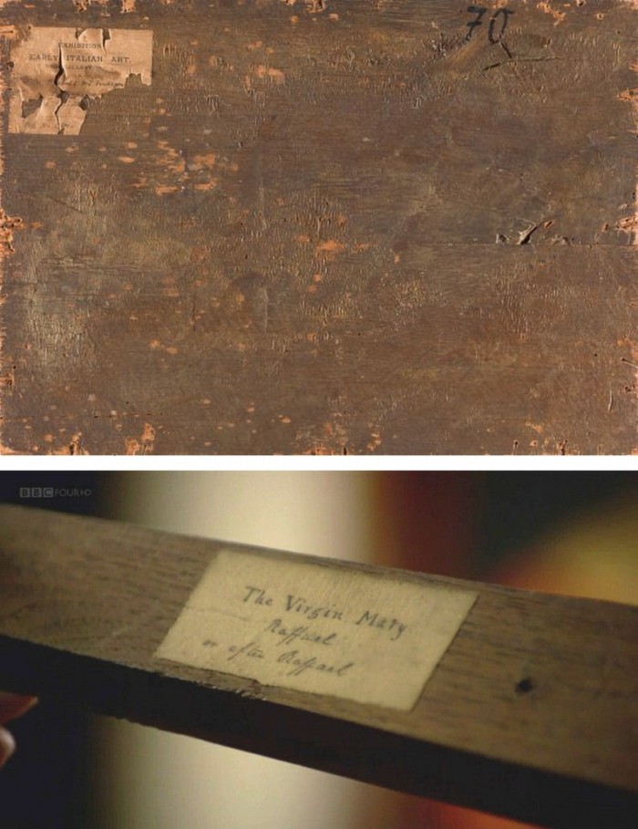
Above, Fig. 10. In 1901 the painting of Saints Uraldus and Fridianus was sold (not as a Philippino Lippi but as a Masaccio) to an English aristocrat, the Earl of Ashburnham. As with the recently proposed Haddo House Raphael (Fig. 10 above), there is little on the panel’s back other than a label in English for an exhibition of “Early Italian Art” (Fig. 10 top). For the Carolina Saint Donatus, the museum offers only a date – “circa 1490” – and the identity of the picture’s donor, the Samuel H. Kress Foundation. Such lacunae are perplexing because Filippino Lippi is a well-chronicled artist whose securely attributed works might easily be brought into direct comparison with the two more recent attributions.
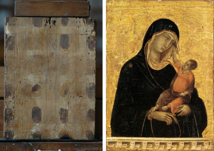
Above, Fig. 11. The backs of attribution upgrades often prove problematic, and none was more so than the small panel “discovered” as a Duccio Madonna and Child (above right) in 1904 after having been bought in an antiques shop in Italy. It was then rarely seen until bought with fanfare (but no technical examinations) for $50m in 2004 by the Metropolitan Museum of Art, New York, in a blind “treaty” sale conducted by an auction house among a few leading museums shortly after the picture was withdrawn from an imminent comparative exhibition of Duccio and his followers that would have introduced the painting to many scholars for the first time and in an instructive context. That withdrawal – despite the painting’s inclusion in the catalogue – might have been made out of fear of repeating the demise of the owners’ second Duccio, as described below.
The back of the tiny picture had been cradled with no fewer than eight mahogany bars and when these were later removed at the Met. a hand-written ascription to Duccio’s pupil “Segna” was found on the bare poplar wood from which painted work had been stripped. The Met Duccio contained modern wire nails, a fact not acknowledged in the museum’s post-purchase technical examination reports. When we asked after the antiquity of the nails the museum claimed they had been inserted as repairs after the panel had been cradled in the 1930s. As “proof” of that unsupported chronology it was said that one of the nails had entered one of the mahogany bars. However, as we pointed out, the head of that particular nail had been visible on the front of the frame throughout all of picture’s photographically recorded history and, while some nail heads were visible most were not and therefore had been applied before the (now heavily distressed) frame was gessoed and gilded. Thus, the panel arrived in the world at the beginning of the 20th century with modern nails intersecting a cradle that concealed an awkward ascription on a stripped-down back.
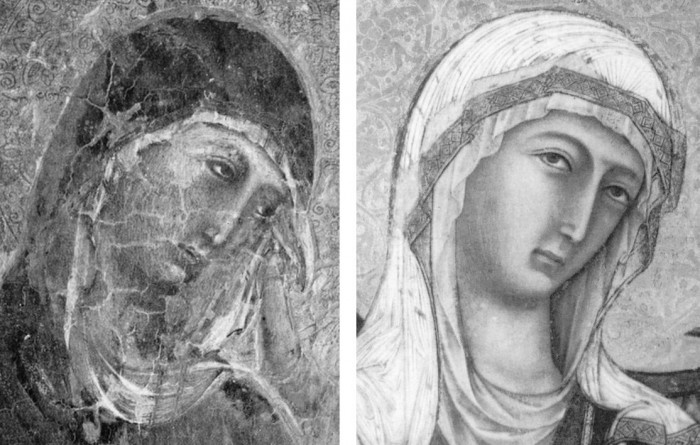
Above, Fig 12. A face painted in the 14th century by a follower of Duccio (identified by Pèleo Bacci as Segna) is shown above to the right of the face of the Met’s Duccio as it was before restorations established the blue of the Virgin’s mantle to be azurite, not the requisite ultramarine. No one ever suggested that the painting on the right was by Duccio and no one judged the Met’s picture an autograph Duccio before Bernard Berenson’s wife (Mary) in 1904 with the support of Berenson’s protégé Frederic Mason Perkins. An earlier suggestion had been that it was a work of Sano di Pietro, as Frances Vieta discovered in researches at the Frick Library, New York, that were kindly made available to us.
In 1933 Perkins attributed a second Madonna and Child to Duccio and persuaded the then owner of the Met.’s Ducio (the Belgian collector, Adolphe Stoclet) to buy it. In 1989 that Duccio was loaned to the Cleveland Museum of Art and was there identified on technical examination by Gianni Mazzoni as a fake by Icilio Federico Joni who ran a forgery factory fronted by middlemen, one of whom was Berenson’s protégé Frederic Mason Perkins.
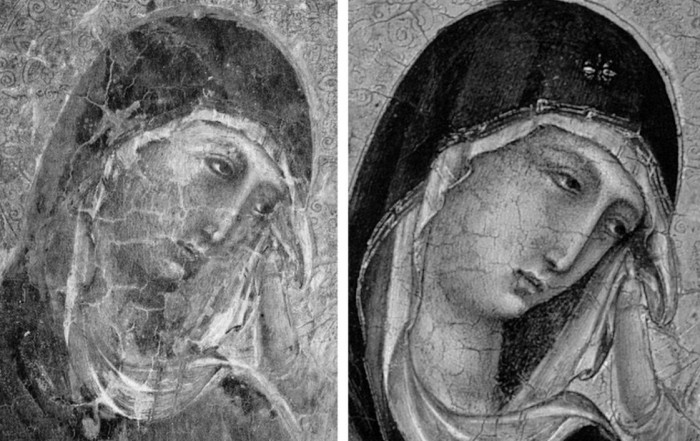
Above, Fig. 13. A cult of Supreme Art Historical Importance was activated around the Met. Duccio and part of this mythology rested on the picture’s supposedly miraculously well-preserved, little-restored, condition. Comparison of the photographs above showing its present state (right) and an earlier state (left) discloses how extensively the work has been repainted – note the altered design of the dominant eye, and the extensive reworking of the veil. The potentially falsifying nature of restorations when determining attributions remains a conspicuously under-examined area – as does the extent and nature of repainting on stripped-down “sleepers”. (But see “A restorer’s aim – The fine line between retouching and forgery”. For a fuller account of the Met.’s Duccio difficulties, see Michael Daley: “Buyer Beware”; “Good Buy Duccio?” and “Toxic Attributions?” in the Jackdaw magazine issues of Nov/Dec. 2008, Jan/Feb. 2009, and March/April 2009.)
The Newly Upgraded Filippino Lippi (continued)
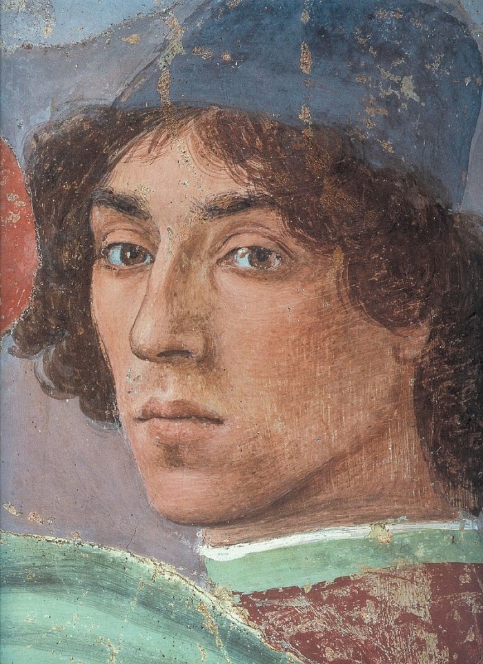
Above, Fig. 14. With the two small “Filippino Lippi” pictures at Fig. 9 and below, top, said to have been painted between 1490 to 1494, precise stylistic comparisons can be made with securely attributed works in the oeuvre. What is believed to be Filippino Lippi’s self-portrait above was executed by the artist in 1481-1482 in the Brancacci Chapel, Santa Maria del Carmine, Florence.

Above, Fig. 15. Filippino Lippi’s Apparition of the Virgin to St Bernard of 1480-86 was said by Bernard Berenson (in his 1938 revised Drawings of the Florentine Painters) to comprise “Filippino’s masterpiece, the last picture in which he is still a pure Quattrocentist, in which there is no sense of the Baroque.” Is it conceivable that some years later this artist painted the two small pictures shown here above the Apparition? Berenson reports that Filippino went on to betray excesses, not to purge and severely abstract his pictorial vocabulary: “Filippino’s Baroque, however had little in common with the qualities of the genuine [Baroque] style, and much with its worst vices. These were the sins of extravagance, of wantonness – the vulgarity of the newly enriched, who feel life is enhanced by the mere act of showy spending.”
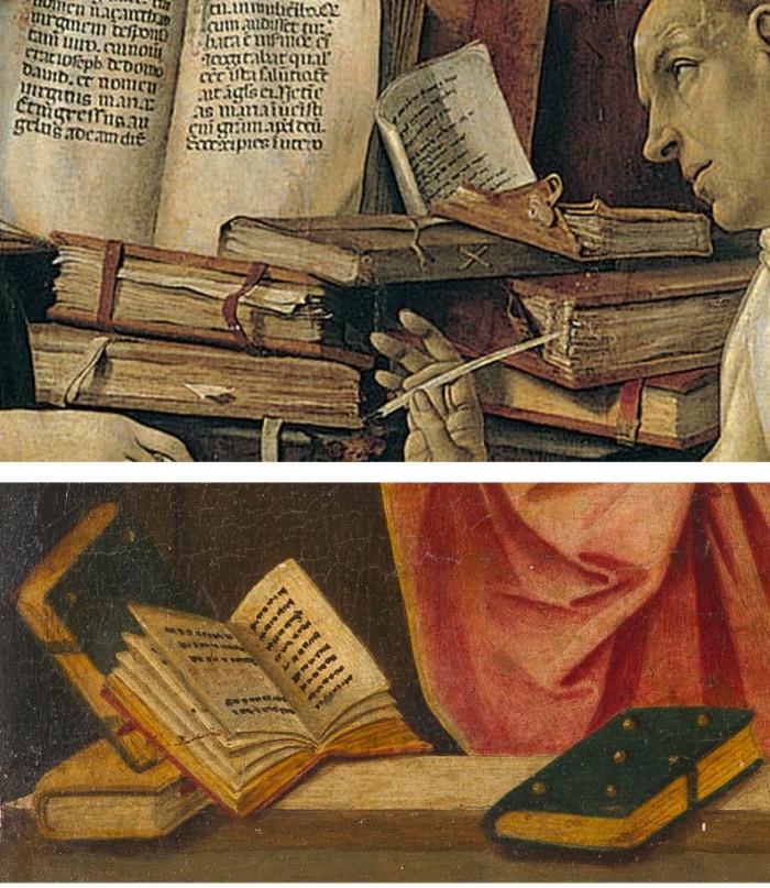
Above, Fig. 16. At the top we see how Filippino Lippi painted books before 1486 in his Apparition of the Virgin to St Bernard and before his lapse into Baroque excesses. In this secure work we not only see great technical accomplishment but a fascination with the very means by which books were stitched together in assembled folded sections. Is it conceivable that after this tour de force celebration of the book binder’s craft skills Filippino should have been satisfied with the out-of-perspective simplifications of books in the Saint Uraldus? While the opened book has been painted in utter ignorance of book binding methods, the ochre coloured book at the bottom left of the pile has managed to anticipate to a remarkable degree the appearance of a neat modern machine-bound book.
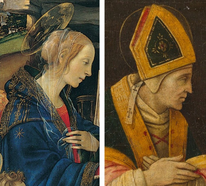
Above, Fig. 17. Again, does the chasm of technique and sophistication in this further comparison from the Apparition and the Saint Uraldus not strain credulity at claims of a common author?
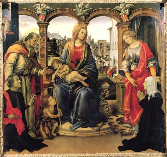
Above, Fig. 18. By 1493-94 the artist had completed his Madonna and Child with St Catherine of Alexandria and St Martin of Tours as above and we see precisely the over-elaboration Berenson castigated as Filippino’s squandering “like a nabob with a heady disorderliness all the decorative motives which the heritage of antiquity, the hard earnings of his precursors, and his own fancy had put into his hands.”
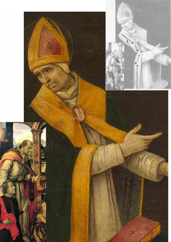
Above, Fig. 19. How conceivable is it that Filippino might, at the same short period, have made two so diverse treatments of a man parting drapery with an advancing left arm as in these two paintings? In the one the “Blanket-like drapery dear to Filippino” (in Berenson’s term), curves, twists and folds naturally across the body, while in the other it moves as if fabricated by a former sheet metal worker with little regard for any underlying body, or even for the means by which the glimpsed parts of the (wildly varying) decorative border of the cope might ever have been united as woven material. Why the arbitrary, asymmetrical placement of indeterminate embroidered decorations on the cope’s border? What holds the cope together? Is it a giant garnet or ruby, or a small tambourine? Where else in Filippino might we encounter such flattening abstractions and lax indeterminacy of depiction?
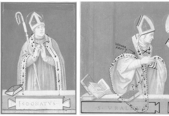
Above, Fig. 20. If the logic and treatment of Saint Donatus’ cope border (above, left) seems plausible and suitably understated, what might have carried the same artist to the Byzantine and conceptually irresolvable twin conundrums of the cope border as encountered on Saint Uraldus (above right)? What accounts for the very different depictions of the inscribed tablets on the parapet wall? If that of Saint Donatus is somewhat overly monumental and set uncomfortably close to the top of the parapet, at least it is sculpturally resolved and satisfactorily symmetrical along its horizontal axis with its twin decorative “butterfly wings” termini. Why, then, would the twinned tablets of Saints Uraldus and Fridianus meet in the middle with single butterfly-wing termini while leaving blank endings at the outer edges of the picture’s composition? Why are these two inscribed tablets skimped and devoid of projection when the saints above are greatly more dynamic and humanly engaged – almost as if in anticipation of Raphael’s later depicted dialogue between Aristotle and Plato?
Below, Fig. 21. What theological reading of Saint Uraldus’ life prompted the vast frilled neck lizard-like display of the cope’s pink lining below? If intentionally “Baroque” in its explosive ostentation and theatrical impact, why, then, its implausible combining with a geometric severity of draperies that are more snapped than folded?
With such bizarrely anomalous visual constructs, might it not be prudent to consider the waking “Filippino Lippi” sleeper as a possible product of the late 19th and early 20th century Italian forgeries boom that was tailor-made for British and American collectors? We know that many skilful artists were employed in that trade because when the Italian Government proposed stringent export taxes in 1903 to stem the country’s out-flow of art treasures, the Florentine art dealers association petitioned that the new laws would throttle the large and thriving trade in forged art and antiquities for foreign collectors. (Where did all those often excellent works go?)
At the December 2015 ArtWatch UK/LSE Law/NY Center for Art Law conference Art, Law and Crises of Connoisseurship (the proceedings of which will be published shortly), Professor Charles Hope pointed out how effectively 20th century scholarship had winnowed previously overblown numbers of Titians, Raphaels and such. Markets are good things and the London art market has long been a very good (much envied in Europe) force for Britain, but there are developing dangers. If perceptions were to grow that previously downgraded works are being systematically rehabilitated through “sleeper-discovery” mechanisms at a time when leading houses are fighting to the death for pole position on market share, confidence in the lots on offer might evaporate. Already, certain external structural changes are weakening the London market’s traditional and much-valued symbiotic relationship with disinterested scholarship. Increasing litigation by owners against dissenting independent scholars suppresses debate and frank expert appraisal. In a paper at our conference (“Throwing the baby out with the bath water – the Demise of Connoisseurship since the 1980s”), Brian Allen, former director of studies at the Mellon Centre, warned that recent changes of philosophy and views on connoisseurship in the academic world are greatly reducing the traditionally available body of disinterested academic expertise that counterbalances purely commercial interests:
“In my own field of British art the number of so-called ‘experts’ has now diminished alarmingly as the older generation dies off not to be replaced. It seems extraordinary to me that major artists such as Stubbs, Wright of Derby and Sir Thomas Lawrence, to name but three, don’t have an acknowledged expert to whom one can turn for a reasonably reliable, independent opinion. And this has also certainly happened in other specialist fields… Younger scholars nowadays, especially those in the universities, have almost no contact whatsoever with the art trade compared to fifty years ago. Yet for many years it was perfectly possible for the two worlds to co-exist harmoniously.”
Michael Daley 23 November 2016
Could the Louvre’s “Virgin and St. Anne” provide the proof that the (London) National Gallery’s “Virgin of the Rocks” is not by Leonardo da Vinci?
When the National Gallery’s restored “Virgin of the Rocks” was pronounced an entirely autograph Leonardo we were left reeling with incredulity. Picture restorers rarely decline opportunities to claim “discoveries” but could they really be claiming an ability to make a picture an autograph Leonardo simply by thinning its varnish? During the media frenzy of the National Gallery’s £1.5bn Leonardo blockbuster, its chief restorer, Larry Keith, was asked if a distinctive Leonardo brushstroke had emerged. “No”, he said, proof of authenticity lay in the picture’s internal relationships. Given that those relationships differ markedly from the ones present in the Louvre’s unquestionably autograph “Virgin of the Rocks”, what accounted for the discrepancies? The then curator, Luke Syson, replied that Leonardo’s style had, in the London copy, become abstracted, less naturalistic and more “metaphysical”. This seemed fanciful: had not all of Leonardo’s pictures carried a beguiling air of the metaphysical – and had this quality not derived from the artist’s preternaturally intense engagement with natural phenomena and the mysterious powers which operate through them? Had a new corroborating body of drawn studies emerged? The Gallery admits that not only is there no identifiable Leonardo brushwork but that the picture itself is “manifestly uneven in finish and execution” and that there has been “a good deal of agreement that Leonardo himself painted little or none of it”. When we asked if any securely autograph Leonardo paintings shared these newly claimed characteristics, Syson said that they were also found in the “Last Supper”, when only 20% of that large, fragmented, degraded, many-times restored, de-restored and re-restored mural survives – and when its recent restorers “discovered” that it had originally been choc-full of tiny naturalistic details (curtain hooks, slices of lemon, reflections on glassware, tablecloth patterns and so forth). Above all, the National Gallery’s latest upgrade flew in the face of – and seemingly sought to circumnavigate – a landmark 1996 article by a geologist (and now art historian), Ann Pizzorusso, who has shown that while the rock configurations in the Louvre version were entirely consistent with precise formations found in nature and in Leonardo’s own studies, those seen in the London version were found in neither. (See Pizzorusso, “Leonardo’s Geology: The Authenticity of the Virgin of the Rocks”, The MIT Press, Vol. 29, No. 3, and “Leonardo’s Geology: The Authenticity of the Virgin of the Rocks”, in Leonardo Magazine, Vol. 29. No. 3, 1996, pp. 197-200.) Here, Pizzorusso presents further elegant demonstrations of the London picture’s non-autograph status that are manifest in the (recently restored) late Leonardo masterpiece, “The Virgin and Child with St Anne”.
Ann Pizzorusso writes:
London’s National Gallery recently announced that its version of the “Virgin of the Rocks”, previously attributed to various artists who worked in Milan, was now, after being cleaned, solely the work of Leonardo da Vinci. The National Gallery supports its claims by stating that the work represents a change in style and that the geology in the picture is rendered in a more abstract, monumental style (see Appendix A).
While art historians have long discounted the National Gallery’s version as one by Leonardo, the Gallery has now discounted centuries of scholarship with their new interpretation and subsequent attribution of the painting to Leonardo. What is most ironic and troubling about the National Gallery’s position is that there are reams of contractual documents which still exist today documenting a 25 years long lawsuit concerning the two versions of the painting and which show, unequivocally, that Leonardo did not paint the version in the National Gallery. Prof. Charles Hope, a former director of the Warburg Institute, London, and an expert in notarial Latin states that there is no doubt that Leonardo painted the first version and not the second (New York Review, 9 February 2012).
While we may be able to forgive the National Gallery for not being up on notarial Latin, there is no excuse for their proposal that Leonardo changed his style. In the decades in which I have studied Leonardo from all aspects (we must remember, Leonardo did not consider himself primarily a painter) one thing stands out in all his works—a fidelity to nature and a lifelong effort to depict natural objects as realistically as possible.
The father of Leonardo studies, Carlo Pedretti, in his book analyzing Leonardo’s nature drawings, “Leonardo da Vinci Nature Studies from the Royal Library at Windsor Castle” (with a forward written by Kenneth Clark, a former director of the National Gallery in London), devotes the entire volume to discussing Leonardo’s preoccupation with natural objects and his fanaticism in attempting to depict them as realistically as possible. This passion was imparted to his students, Francesco Melzi, Cesare da Sesto, Giovanni Boltraffio and Marco d’Oggiono. So much so that a drawing of a Tree (RL 12417), long thought to be by Leonardo, was later attributed to Cesare da Sesto and a view of Amboise (RL 12727) to Francesco Melzi. In analyzing the works of Leonardo’s students one can see that they have followed Leonardo’s technique and depicted natural objects as realistically as possible. They had obviously heard quite a bit of ranting by Leonardo about “Botticelli’s bad landscapes” (see Appendix B).
Another reason why Leonardo’s approach is reflected in his art is that he was born in the transitional era of the late Middle Ages, an age still filled with superstition and fear, especially about such things as mountains, natural catastrophes and death. He grew up leading the way into the Renaissance, faced all these fears, and debunked them. He travelled extensively in the Alps outside of Milan taking note of nature and geology. He noted landslides and torrential flooding with its associated damage (see Figs. 3 & 4), he dissected corpses to provide the most accurate depiction of human anatomy we have ever had until relatively recent times. His work as engineer, geologist, botanist and astronomer cannot be disconnected from his work as an artist (see Figs. 8 & 9). To understand Leonardo, one must understand him completely. And to understand him completely is not difficult. He has written everything down. He was faithful to nature. If one applies just that one rule to Leonardo da Vinci, looking at his work from a scientific standpoint, the answer is crystal clear: fidelity to nature is a Leonardo trademark that can be used to determine the authenticity of his work.
Now that we have seen that the National Gallery has preferred not to acknowledge the work of many esteemed Leonardo scholars, maybe looking at the recently cleaned “Virgin and Child with St. Anne” in the Louvre will change its mind (see Figs. 1, 7, 10, 11, 14, 17, & 21). The “Virgin and Child with St. Anne”, dated to about 1510, came later than the National Gallery version of the “Virgin of the Rocks”. We do not know how much later, as the National Gallery has now dated the initiation of its version of the “Virgin of the Rocks” as 1491/2-9 and its completion to 1506-08. Professor Hope, in his review of the notarial documents regarding the lawsuit states that the National Gallery version of the “Virgin of the Rocks” could not have been painted before 1508.
If we use the 17 year time period (1491-1508) which the National Gallery cites for its “Virgin of the Rocks”, it would mean Leonardo was painting the “Last Supper” (1492-7/8), completing the Burlington Cartoon (1499-1500 or 1506-08) and the “Virgin of the Rocks” at the same time. On page 96 of Kenneth Clark’s book entitled “Leonardo da Vinci” he indicates that Leonardo was exceptionally busy. Apart from the first “Virgin of the Rocks” his time was taken up with work for the court. He was the court limner and also painted two portraits of the Duke’s mistresses Cecilia Gallerani and Lucrezia Crivelli. With these portraits, we would be up to five major works in progress by Leonardo if we include the National Gallery’s “Virgin of the Rocks”.
This being said, all of these works being done at nearly the same time gives us the perfect opportunity to appraise, determine and evaluate the stylistic traits of the artist at that period of his career. In looking at the Burlington Cartoon and the “Virgin and St. Anne”, both are rich with geologic detail and accuracy. Leonardo has risen to new heights in his portrayal of landscape elements. His talent and passion are vividly displayed in the Burlington Cartoon and he reaches a level of sophistication, subtlety and accuracy in rendering the geology in the “Virgin and St. Anne” which had never been seen before (see Appendix C).
The St. Anne is a geologic tour-de-force. In fact, Leonardo experimented extensively on developing paints and a technique for depicting the pebbles of agate, chalcedony and marble at the feet of the Virgin and St. Anne (see in particular, Figs. 1 & 21). Leonardo writes in his notebooks about his efforts and how satisfied he was to have developed an approach to rendering the pebbles in such a realistic fashion. In fact the entire painting is one geologic treat after another. He had spent years in the Alps so he knew the landscape and geology exactly. With his newly developed technique for painting marbleized pebbles he was delighted (- see Appendix D).
Using a date of 1510 for the “Virgin and St. Anne” and a date of 1483-86 for the “Virgin of the Rocks”, both in the Louvre, we have proof that Leonardo did not change his style, and that, if anything, he became more fanatical in his quest for geologic accuracy, developing new paints and techniques for natural depiction and driving his students to deliver the most accurate depiction of nature in their own works.
So we must ask the question “How and why could Leonardo have changed his style to produce a work so lacking in geological and botanical accuracy as the ‘Virgin of the Rocks’ in the National Gallery in London?” There is no evidence Leonardo changed his style and now, with the recently cleaned “Virgin and St. Anne”, we have that proof. We also know that his students were inculcated with his passion for accurate depiction of natural objects so we must also exclude his students as authors of the National Gallery work.
It would be best for the National Gallery to reopen the case for the attribution of the work to Leonardo. Hundreds of years of scholarship by Leonardo critics as well as the words and the works by Leonardo himself should not be discounted. The National Gallery does a disservice to those who have worked so hard to come up with incontrovertible evidence regarding the attribution of this work and most of all the National Gallery does a disservice to Leonardo himself.
Ann Pizzorusso
Appendix A
The National Gallery’s claimed shift within Leonardo’s oeuvre
“We know that Leonardo’s painting technique gave priority to the figures. The Virgin is designed first, as she is in so many of his drawings, and the landscape seems to flow from her. Since Leonardo saw the painter’s acts of creation as analogous to God’s, his generation of the landscape in the Virgin of the Rocks and the absolute, unalterable perfection of the Madonna at the center could be understood as precisely connected with the doctrine of the Immaculate Conception. But the appearance of the Virgin and her companions, and of the plants and rocks, are different, in the two versions: the theological meaning of his stylistic choices has shifted slightly. In the Louvre picture Leonardo relies on entirely naturalistic tactics to give the picture its spiritual flavor: the sinless beauty of the Virgin becomes the same kind of truth as the natural beauty of the irises nearby. But in the London Virgin of the Rocks, the Virgin and Christ are supernatural, the world around rendered notably less naturalistically, the rocks are straightened to become great columns; the flowers appear to be ideal composites of the leaves and petals of real plants. Tackling the theme for a second time, Leonardo chose to show the viewer not just a vision of the Virgin Mary, but Gods’ perfect ideas for everything around her. What we are shown here is an ideal world made before the physical creation of our own imperfect cosmos, before the need for humankind’s salvation.”
The National Gallery catalogue, “Leonardo da Vinci, Painter at the Court of Milan”, page 174.
Appendix B
Leonardo on Botticelli’s bad landscapes
“He is not universal who does not love equally all the elements in painting, as when one who does not like landscapes holds them to be a subject for cursory and straightforward investigation-just as our Botticelli said such study was of no use because by merely throwing a sponge soaked in a variety of colours at a wall there would be left on the wall a stain in which could be seen a beautiful landscape.”
Leonardo da Vinci, from: “Treatise on Painting”, the chapter on Criteria and Judgments, the subsection “How a painter is not worthy of praise unless he is universal”.
Appendix C
Walter Pater
“Saint Anne–that delicate place, where the wind passes like the hand of some fine etcher over the surface, and the untorn shells are lying thick upon the sand, and the tops of the rocks, to which the waves never rise, are green with grass, grown fine as hair. It is the landscape, not of dreams or of fancy, but of places far withdrawn, and hours selected from a thousand with a miracle of finesse. Through Leonardo’s strange veil of sight things reach him so; in no ordinary night or day, but as in faint light of eclipse, or in some brief interval of falling rain at daybreak, or through deep water.”
Walter Horatio Pater, “The Renaissance, Studies in Art and Poetry”, The Echo Library 2006, page 54.
Appendix D
Carlo Pedretti
“The movement of the fifteenth century was twofold; partly the Renaissance, partly also the coming of what is called the ‘modern spirit’, with its realism, its appeal to experience. It comprehended a return to antiquity, and a return to nature. Raphael represents the return to antiquity, and Leonardo the return to nature. In this return to nature, he was seeking to satisfy a boundless curiosity by her perpetual surprises, a microscopic sense of finish by her finesse, or delicacy of operation, that subtilitas naturae which Bacon notices. So we find him often in intimate relations with men of science – with Fra Luca Paccioli the mathematician, and the anatomist Marc Antonio della Torre. His observations and experiments fill thirteen volumes of manuscript; and those who can judge describe him as anticipating long before, by rapid intuition, the later ideas of science. He explained the obscure light of the un-illuminated part of the moon, knew that the sea had once covered the mountains which contain shells, and of the gathering of the equatorial waters above the polar.
“Notebooks and sheets of about 1508 contain a number of notes on ‘mistioni’ (mixtures), a plastic material of his own invention with which he aimed at imitating the colour and design of semi-precious stones. He describes his production process and how, once the objects were thus produced, he spent much time finishing them with his own hand to a smooth and glossy surface…At the same time he was much taken by anatomical studies, so that when he described the production process of his ‘mistioni’ he came to specify the effect that was to be achieved: ‘…then you will dress it with peels of various colours, which will look like the mesentery of an animal’.
“In 1502, Francesco Malatesta wrote Isabella d’Este that Leonardo had looked at many of the Medici gems and objets d’art made of stone. Leonardo praised ‘the one of amythyst or jasper as Leonardo baptized it, because of the admirable variety of its colours’”.
Carlo Pedretti, Leonardo, A study in Chronology and Style, London, 1974, pages 132-137.
Ann Pizzorusso
For an in-depth comparison of the two versions of the Virgin of the Rocks see:
Comments may be left at: artwatch.uk@gmail.com


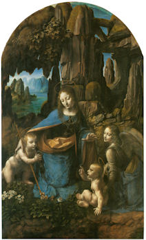


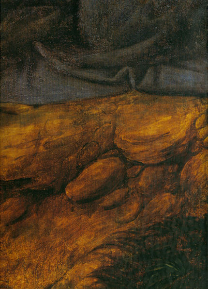


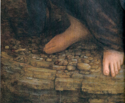
![]()