
Defending the Indefensible Part I: The National Gallery’s Tangled Rubens Web
1) “I know gossip about staff and trustees and stories connected with acquisitions I don’t think I’d better share.”
– Martin Wyld, the National Gallery’s retiring Head of Restoration in the January 2010 Museums Journal.
2) “Rubens’ Samson and Delilah is a large scale, early and entirely autograph painting of a kind the National Gallery previously lacked.”
– Michael Levey, the then-Director of the National Gallery, in the 1983 Rubens Acquisition in Focus exhibition catalogue.
3) “The Samson and Delilah was planed down to a thickness of about three millimetres and set into a new blockboard panel before it was acquired by the National Gallery in 1980 and so no trace of a panel maker’s mark can be found.”
– Christopher Brown, the National Gallery Senior Curator, Flemish Paintings, in his 1996-97 Esso-sponsored National Gallery “Making and Meaning” exhibition catalogue Rubens’s Landscapes“. (Emphasis added.)
4) “Rubens’ panels sometimes bear the branded or carved mark of the panel maker, an example in the National Gallery being the Portrait of Susanna Lunden… unfortunately, as David Bomford has described, the back of the panel of the Samson and Delilah had been planed-down to a thickness of only about 3 mm and then the whole set into [sic] blockboard before the picture was acquired by the National Gallery, so any such marks would have been eradicated.”
– Joyce Plesters, the then-Head of Science, in the 1983 National Gallery Technical Bulletin. (Emphases added.)
5) “The treatment of Cima’s Altarpiece carried out during the 1970s and 1980’s was a rare modern example of a process that was extensively practised (often unnecessarily) in the 18th and 19th centuries – the transfer of a painting to a new support. It is nowadays only carried out in the last resort, when all other attempts at treatment have proved unsuccessful.”
– David Bomford, National Gallery conservator and author, in his 1997 National Gallery Pocket Guide: Conservation of Paintings. (Emphasis added.)
6) “Questions have been raised about aspects of the physical state of Rubens’s Samson and Delilah since its purchase by the National Gallery at auction in 1980… Recent research, however, has yielded some answers to the questions of when and why the painting may have gained this alien backing.”
– David Jaffé Christopher Brown’s successor at the National Gallery, August 2000, Apollo ‘Rubens back and front’. (Emphasis added.)
FROM THE FIRST CRITIC:
7) “Jan Bosselaers had inspected NG6461 up-close in 1977, and then again in 1980. Given his familiarity with the painting, I asked him specifically about its back. Bosselaers grabbed a piece of paper and drew a grid of three vertical lines crossed by three horizontal ones. He looked at me. ‘A cradle!’ I gasped. ‘Yes’, he said, ‘it was a cradle.’”
– Euphrosyne Doxiadis: Painter/author, in her NG6461 The Fake National Gallery Rubens (p. 117. Emphasis added.)
MICHAEL DALEY WRITES:
PART I: A REFORMULATED SAMSON AND DELILAH ACCOUNT THAT STILL DOES NOT STACK UP
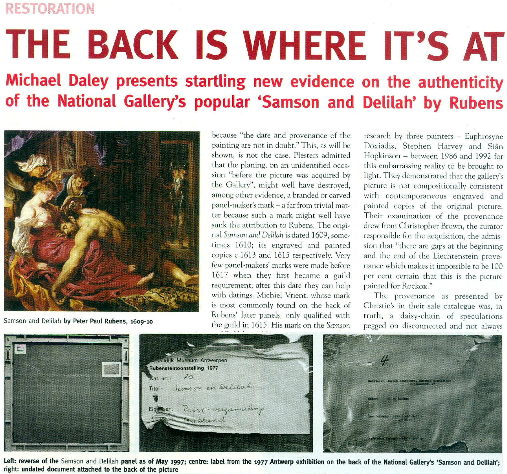
With expensive and massively hyped works bought by major public institutions it would seem that acknowledging errors is an art-political impossibility. Such institutional obduracy is longstanding. In 1966 the art dealer René Gimpel noted that “The museums are even more intent than the collectors on defending their fakes or their mistaken attributions” (- a 1929 entry in his Diary of an Art Dealer.) Today, with the Samson and Delilah, the National Gallery stands in triple jeopardy: its initial error of art historical judgement has been compounded by both an apparent falsification of material evidence and a decades-long withholding of contra-testimony in its possession.
The affair began in 1980 with a deceptive unanimity of assurances and a dearth of disclosures. Today, on interrogation of the picture’s traits, provenance and technical literature, a sleight of hand emerges: the back of its panel and the historical evidence it bore were removed by the Gallery and not by earlier, unknown others, as the Gallery has claimed since 1983 – and blatantly claimed despite its possession of flatly contrary key historic documents. (See Fig. 5 below.)
Thus, there are two cross-linked issues: whether the picture is the long-lost original Rubens painting of 1609-10; and, who planed down the back of its panel and mounted it on a larger sheet of modern blockboard (- and with it, of course, “Why?”). The first is a matter of judgement. The second is one of fact that should also be – but conspicuously is not – one of record. Dr David Jaffé’s August 2000 bid in Apollo (see below) to explain why the panel painting “might have” received its alien backing before being bought by the National Gallery was doomed by his failure to follow such records as exist within the Gallery and extrapolate from them the precise place and time at which the transformation had occurred.
On matters of fact, at Fig. 2 below, we note an item on the National Gallery’s recently updated online Samson and Delilah entry which itself supplies visual confirmation of past institutional culpability.
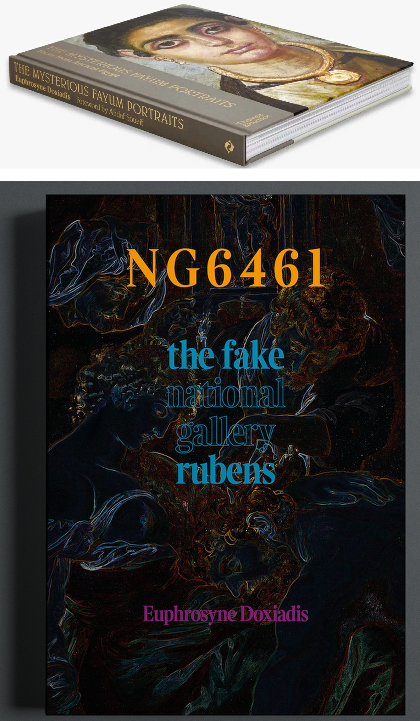
Above, Fig. 1: top, Euphrosyne Doxiadis’s (republished) award-winning 1995 study of the Fayum encaustic paintings; above, Doxiadis’s new book NG 6461 The Fake National Gallery Rubens – N.B. “NG6461” is the Gallery’s inventory number for its supposed Rubens Samson and Delilah.
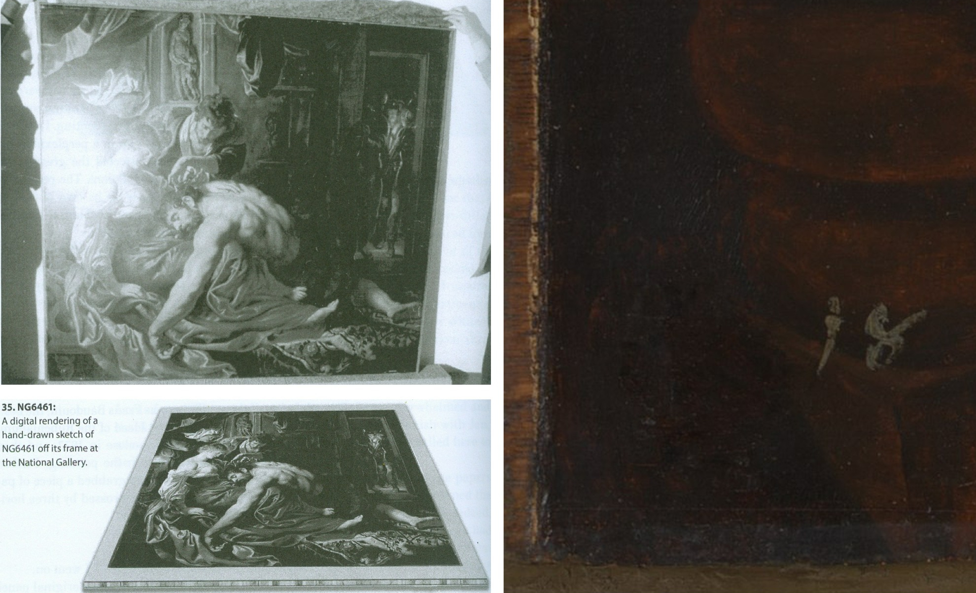
Above, Fig. 2: Top, left, The National Gallery Samson and Delilah, as seen in Antwerp in 1980 when it was about to be dispatched to Christie’s, London, and at which date the paint reached the top and bottom edges of its panel but not the side edges (to which slim battens had been attached – on which, see comment by Martin Wyld below). Above, left, Euphrosyne Doxiadis’s digital rendering of the Samson and Delilah panel on its blockboard mount, as seen by her when the picture was undergoing dendrochronological examination at the National Gallery on 25 September 1996. (Both images above are published in Doxiadis’s NG6461 The Fake National Gallery Rubens.)
Above, right, the bottom left corner of the National Gallery’s Samson and Delilah in which the picture’s post-1980 blockboard backing can now be seen running below the bottom of the painting. The Gallery’s online publication of this image’s visual corroboration of the panel’s post-1980 blockboard extension is intriguing. Wittingly or unwittingly it constitutes a tacit acknowledgement of institutional responsibility for the Gallery’s own (always previously denied) planing down of the panel and subsequent mounting of it on a larger blockboard sheet. (See Figs. 3 and 4 below.)
The Gallery’s online entry acknowledges – somewhat disparagingly – the existence of the Samson and Delilah picture’s “Naysayers” and cites some of their/our publications. Unfortunately, although it cites both issues of our Journal that were dedicated to the Samson and Delilah’s problems (see Fig. 7 below) it does not address their contents – as might be instanced in this pertinent item on the “Material Evidence” section in our Autumn 2000 Journal:
“…This conflict of testimony echoes one found within the Gallery in 1983 when the restorer David Bomford described the thinned panel as glued ‘onto’ the face of the blockboard while the Head of Science, Joyce Plesters, described it as ‘set into’ the blockboard. When I drew this discrepancy to [the then-Director] Neil MacGregor’s attention, he replied (letter 19th June 1997): ‘Incidentally, at the risk of being pedantic, into is the correct preposition, since the edges of the blockboard are flush with the [edge] surface of the panel. Onto would be correct if the panel had simply been glued to the blockboard and protruded above it.’ If this account is accurate, with the edges of the panel and blockboard being flush, there would be no place for the putty bevel encountered by Ms Doxiadis and Mr Norman [*1]. By the same token, had the edges of the panel and blockboard been flush, there could have been no grounds for Joyce Plesters’ 1983 [Technical Bulletin] claim that the treatment had ‘render[ed] the edges of the panel inaccessible’ for dendrochronological examination. A clear, focussed photograph of one of the picture’s corners might throw some light on the subject. Or better yet, permission to examine the panel in the flesh…”
(Emphasis added. Permission to examine the panel was never granted.)
On 14 February 2006, when examining the Samson and Delilah’s dossiers for a second time [*2], we noted photographs showing that the paintwork stopped short of the edges of the oak panel only on the vertical edges. In the present revised online Gallery entry, confirmation and possible explanation for this feature is given: “There is a narrow margin of unpainted wood at the sides of the oak panel which probably results from the support being held firm by grooved battens while the ground and then paint were applied; ‘6’ the ground and paint extend to the top and bottom edges.” The footnote ‘6’ reads: “The same can be seen on Rubens’s Judgement of Paris (NG6379). For this practice see, for example, Wadum 1998. The battens seem often to have been only along the shortest sides. A little of the unpainted margins may have been trimmed away since they are rather narrow.” With the Gallery’s Samson and Delilah, the photographic and documentary records of the restoration treatments are strikingly less complete than those of other Gallery panel paintings. For example, when writing on the restoration of the Altdorfer panel bought in 1980, Martin Wyld discusses the attachment of battens to the edges of panels: “Although some German panels of this period have channels at or near the end grain of the plank in order to accommodate battens which were fixed to the frames, the channels are seldom to be found on all four sides”.
[*1] Charles Norman, Director, The National Timber Trade Federation. As Dalya Alberge reported (The Times, 27 August 1997) on photographs supplied to us by Mr MacGregor, Mr Norman judged the back of the Samson and Delilah to be “a blockboard manufactured in the late 1970s or early 1980s”. It looked, he said, “like a manufactured item, machine-made rather than handmade”. Later, after being invited to see the picture at the National Gallery, Mr Norman amended his earlier observations. His subsequent description of the picture’s physical component parts (made by telephone, 18 & 19 September 1997 to Michael Daley) was a compromise between his original observation and Euphrosyne Doxiadis’ (above-illustrated) clear recollection of a substantial surround between the edges of the planed down panel and the blockboard support, and Mr MacGregor’s claim of flush panel and blockboard edges. That is, Mr Norman claimed that the blockboard was somewhat larger than the planed down panel but that the gap between the two had been filled by a wide putty bevel.
[*2] In 2006, under Charles Saumarez Smith’s directorship, we were given full access to the Collection’s photographic and documentary records – a privilege subsequently extended by Nicholas Penny and Gabriele Finaldi. (ArtWatch is greatly indebted to all three knights – as also to the Gallery’s kindly helpful archival and library staffs.)
With the Gallery’s present publication of the Fig. 2 photograph of the bottom left corner of the Samson and Delilah, two points should be noted. First, the Gallery’s 1997 claimed relationship between the panel and its blockboard backing was clearly unfounded. Second, the photograph of the bottom left corner is cropped and therefore does not show the full blockboard extension. Nonetheless, it does now show (MacGregor’s earlier claims notwithstanding) that, far from the edges of the panel and blockboard being flush, the latter can be seen to protrude beyond the bottom edge of the picture when, as seen above at Fig. 2, top left, it had not done so in 1980 when held by the banker, Jan Bosselaers, in Antwerp, shortly before it was sent to Christie’s. Today’s publication of that photographically-confirmed relationship has finally demonstrated that the blockboard backing must have been applied to the picture’s panel after 1980 and when in London.
CONFLICTED AND OPAQUE GALLERY ACCOUNTS – AND THE FIRST PUBLISHED APPEARANCE OF THE BLOCKBOARD BACKING
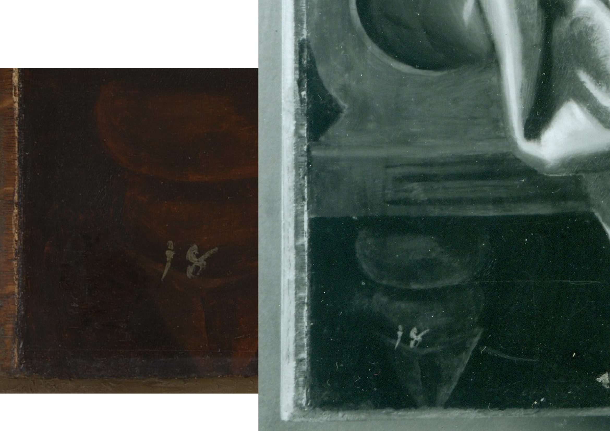
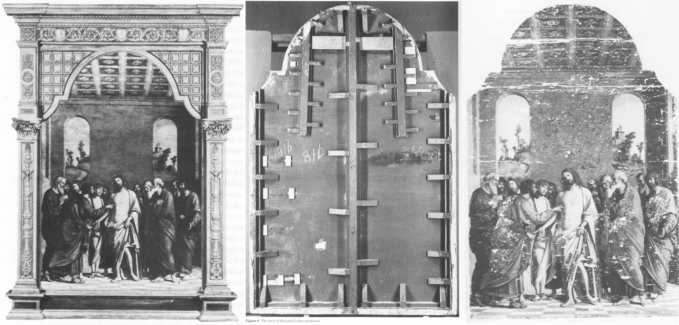
Above, Fig. 3: left, the National Gallery’s recently published online detail of the bottom left corner of the Samson and Delilah; right, a detail of the bottom left corner the Samson and Delilah in a National Gallery photograph taken on 10 August 1982 and designated: “After Cleaning, Before Restoration”.
Above, right, this – so far as we know – unpublished 10 August 1982 photograph, shows the then-present blockboard backing that protrudes not only beyond the bottom edge of the panel but also beyond its left vertical edge (which is not disclosed by the cropped image presently shown online). The date on the black and white photograph shows that the picture had then been in the Gallery’s possession for twenty-five months by which time the planing and mounting on blockboard had occurred (as had also the removal of the picture’s varnish, as shown below.) What the Gallery has never produced – and, we believe, could not ever produce – is a photograph showing the blockboard’s presence before the picture was acquired from Christie’s or when it had been loaned by Christie’s to the National Gallery ahead of the sale. In the absence of such important photographic testimony, the conclusion that the National Gallery itself planed down the panel for undisclosed reasons and mounted it onto a blockboard sheet, is inescapable. The formal authorisation for the picture’s restoration from the Board of Trustees came on May 16 1982 just three months before the above-right photograph was taken. Thus, on the available official records, the removal of the Samson and Delilah panel’s back and the subsequent mounting of it on blockboard had occurred at the National Gallery between 16 May and 10 August 1982. (It is not inconceivable, however, that the formal application for permission to restore the picture had in fact followed a commencement of work on it.)
Above, Fig. 4: The Samson and Delilah’s bottom left and bottom right corners, as respectively recorded at the Gallery on the 10th and 11th of August 1982, by which dates the visible blockboard extensions (which read as the whitish strips) all around the panel had materialised within the Gallery’s own photographic records for the first time – and indicated the extent to which the new blockboard backing extended beyond the planed-down remains of the original oak panel. Earlier, the National Gallery Board Minutes of 16 May 1982 had carried the following note:
“The treatment of No 6461, proposed for Mr Bomford, was recommended by Mr Brown, who explained that the painting was to be the subject of the second ‘Acquisition in Focus’ exhibition, opening in January 1983.” It added, matter-of-factly:
“The painting had a modern support of wood attached to the original panel which had been considerably reduced in thickness and this was considered adequately stable; the surface had probably been only partly cleaned in the recent past, and tests showed considerable discolouration.”
This above account made to the Board was the first-ever mention of a blockboard backing on the painting. It had not been so described by Christie’s and, as shown below, it was even at variance with an in-house National Gallery timber expert’s 1982 account of the painting when it was on exhibition in the Gallery and ahead of its restoration. Strictly speaking, the above statement was technically accurate: the picture had, by that date, been planed down and mounted on blockboard – but only very recently so. Even though the the Gallery had had sight of the picture since the beginning of July 1980 (and had taken photographs and Infra-Red images of it on July 2 1980 – ahead of the sale) it had not – as Mr MacGregor confirmed to us – made any photographic record of the picture’s back either after buying it, or earlier when it had been loaned ahead of the July 11 1980 Christie’s sale. This lacuna is, on our familiarity with the Gallery’s technical literature and dossier records, unprecedented. Indeed the Gallery’s restorers sometimes give the impression that they are more interested in working on pictures’ physical “supports” than on their painted surfaces – and by “working on”, we mean undoing and redoing them. (See Fig. 9 below.)
A TIMBER EXPERT’S ACCOUNT OF THE SAMSON AND DELILAH PANEL
In the 1982 National Gallery Technical Bulletin, Christopher Brown, Martin Wyld and the Gallery’s (now deceased) timber expert, Anthony Reeve (who was held by Mr MacGregor to have been the “supreme practitioner of his generation”) wrote on the cleaning and restoration of Rubens’ The Watering Place and, in doing so, made clear that no blockboard backing had been applied to the Samson and Delilah at that date. That is to say, when discussing the highly problematic construction of many Rubens’ panels, Reeve noted:
“Of all the pictures in the National Gallery, Rubens’ panels have been of greater concern, because of their condition, than any other part of the collection. The reason for this is well-known. Rubens frequently found it necessary to enlarge his pictures after he had started painting… Rubens’ oak panels, often enlarged in several different stages, are amongst the most inherently unstable supports used by any artist.”
However, in so saying, Reeve drew a distinction between “the oak supports which, although made up of many planks joined together, were not enlarged during the painting process, and those which were added to.” Of that former, relatively unproblematic type, Reeve cited just three examples:
“The Rape of the Sabine Women… The Judgement of Paris… Samson and Delilah… the panels of which are made up of six, five and seven oak planks respectively. The grain of every plank, and hence the joins, are horizontal and all the planks are roughly the same width.”
In consequence, Reeve continued, although “these large panels are sensitive to changes in relative humidity (RH), they provide a sound and permanent support if kept in a controlled environment and not exposed to sudden changes in RH.” Whatever reason subsequently led to the National Gallery’s decision to plane down the panel and mount it on blockboard, it was not one of conservation necessity. Curiously, as late as 1996 Christopher Brown was still extolling the the sound construction of the Samson and Delilah’s Panel: “In contrast to a panel like the Samson and Delilah, carefully made from a small number of planks in all of which the grain runs parallel, many of the panels on which Rubens’s landscapes are painted are extremely fragile and prone to splitting”.
Thus, two years after the Gallery had bought the Samson and Delilah for a then huge sum, the Gallery itself (- and, note, just months ahead of Christopher Brown’s 16 May 1982 Board Minute-ed claim of a supposedly long-present blockboard backing) had yet to begin describing the picture as being on a radically reduced panel glued onto a larger blockboard support.
On Reeve’s (nowhere contested) 1982 Technical Bulletin testimony, although the three pictures had been well and favourably constructed, all were at risk of potential injury through their exposed bare panel backs in the event of dramatic atmospheric fluctuations. Had the Samson and Delilah already been planed down to a thickness of just 3 millimetres and mounted on a larger sheet of blockboard, there would have been no such risk or concern – and a timber craftsman as expert as Reeve could not/would not have confounded all three pictures as equally soundly-made and still intact panels which retained their original backs and such information as they bore. This conflict of testimonies within the Gallery coincides with a marked lapse in the Gallery’s own – and frequently self-proclaimed – “customary” record-keeping. That is, no documentary or photographic evidence has ever been produced to support the Gallery’s post-1983 Technical Bulletin Bomford and Plesters’ claims that the Samson and Delilah had been bought on 11 July 1980 as a greatly reduced panel mounted on a blockboard backing sheet even though, as mentioned, other photographs of the picture had been taken when it was loaned to the Gallery ahead of the sale.
Had Brown been right and Reeve wrong on the picture’s then-condition, evidence for the former would normally have been found in the customary condition reports the Gallery makes on receipt of loaned works. Because (as shown below) the Gallery has not been able to produce any written and dated reports on this picture’s condition when loaned ahead of the sale, the most-recent condition report remains that prepared in 1980 by Frans Baudouin when the picture was still – as he had testified (see below) – a cradled panel of between 2.5 and 4 centimetres thickness. Curiously, when Brown later discussed the Samson and Delilah in his 1997 Rubens Landscapes exhibition catalogue, he described it as if it comprised two separate entities. First, in step with Reeve’s 1982 Technical Bulletin account, he held it to be: “A particularly fine panel…composed of six [sic] horizontal oak planks, carefully planed and jointed. The grain runs parallel in all six pieces, which are butt-jointed. The parallel grain ensures that when exposed to humidity the wood expands and contracts without restriction…etc.” But then he went on to hold that it “was planed down to a thickness of about three millimetres and set into [sic] a new blockboard panel before it was acquired by the National Gallery in 1980 and so, no trace of a panelmaker’s mark can be found.”
Perhaps in so reporting these two contrary states of the picture, Brown was simply recalling the two chronologically successive states of the picture as he had encountered it within the National Gallery.
THE PIVOTAL CERTIFICATE OF AUTHENTICITY TO WHICH NOBODY REFERRED

Above, Fig. 5: A photocopy of an undated typewritten sheet in German that had comprised Ludwig Burchard’s 1930 certificate of authenticity provided to the firm Van Diemen and Benedict, and which also carries handwritten Burchard notes on the path of the picture he had authenticated. The existence of this then seventy years-old document was first published by Michael Daley in June 2000 (see note [*3])
CUSTOMARY DOGS THAT DID NOT BARK
With two such expensively acquired old master pictures it might have been expected that the accounts of both would disclose the findings of the customary Gallery technical examinations made prior to works being presented to the Trustees when seeking their authorisation to purchase. However, with the Samson and Delilah no such disclosures were offered.
In 1997 the Gallery claimed to ArtWatch UK it had not kept written records of the picture’s state in 1980 when examined at the Gallery ahead of the purchase; and, therefore, it had not presented such customary reports to its Trustees when seeking authorisation to make the purchase. Indeed, the-then Director, Neil MacGregor, specifically confessed: “The National Gallery does not have any record, photographic or written, of the back of this picture before it was planed down”. The Gallery could supply only a photograph of the picture’s back “as it is today” (see Fig. 6, below, bottom left). The consequence is that while a records trail of an intact panel runs from 1930 to 1982 – when the picture was on display the National Gallery – it is said that no official record exists of its condition on arrival at the Gallery in 1980.
However, in the picture’s own dossiers (as I discovered on 14 Feb 2006) there exist two Infra-red images of the picture (one of them being of the whole picture when still in its frame; the other, a detail showing Samson. Both images were made on the second of July 1980 – that is, nine days before the Christie’s sale at which £2.53 million changed hands. Neither image was reproduced in the 1983 Technical Bulletin even though the report on the picture carried eight images of other paintings. Nonetheless, it was precisely customary for the Gallery’s “Keeper” to prepare a report on a prospective picture’s desirability and art historical importance and for the Head of Restoration to prepare a report on the picture’s condition and soundness. That requirement was expressly noted in 1986 by the Gallery’s then deputy director, Allan Braham: “Before any purchase is made by the Gallery a report on the painting and its desirability for the collection will be made to the Director by the member of the Keeper staff with responsibility for the relevant school of painting: the condition of the painting will be investigated by the Conservation Department.”
In the 1980-81 National Gallery Report, Michael Levey thanked Christie’s for their “co-operation in allowing the Trustees to see this painting in the Gallery before the sale and thus assess not only its powerful impact but also its major contribution to our representation of the painter.” And yet, a trustee in 1980 later recalled to Euphrosyne Doxiadis that no reports had been shown to the Board on the Samson and Delilah. In a letter of May 27th 1997, Mr MacGregor confirmed to us that the painting had been inspected “in the flesh” by the Trustees before the sale but, ambiguously, he added that Christopher Brown and Martin Wyld had conducted examinations and that both remembered “quite clearly that the panel was already set into [sic] blockboard, as do the Christie’s staff most directly involved in the sale.” The person most involved at Christie’s was Gregory Martin, the former National Gallery Flemish paintings specialist. Citing the recollections of Brown and Wyld seemed further to confirm they had not produced written reports on the painting’s condition and state – indeed MacGregor said that their accounts had been delivered “orally” to the Trustees. To repeat: all National Gallery claims that the back had been planed down before the picture arrived at Christie’s are contradicted by Baudouin’s 1980 condition report as commissioned by Bosselaers – and subsequently supplied to Euphrosyne Doxiadis. It had described the picture on 4 March 1980 as a “panel, 185 x 205 cms” that was “in good shape” and in a then conservation state that could be “called excellent”.
A TALE OF TWO NATIONAL GALLERY PANELS – AND THEIR RESPECTIVE PRESENTATIONS IN THE TECHNICAL LITERATURE
In 1980 the National Gallery bought two old master panel paintings for, respectively, just below and just above £2.5 million each. Both were put on immediate display. Both generated much interest. As is customary, both were soon restored by the Gallery. They were Altdorfer’s ‘Christ taking Leave of His Mother’ and the claimed Rubens Samson and Delilah. As is also customary, both restorations were reported in the Gallery’s 1983 Technical Bulletin, but the nature and manner of their accounts diverged dramatically.
THE ALTDORFER PANEL – A PLAIN AND UNPROBLEMATIC ACCOUNT
The Altdorfer was purchased by private treaty sale from the Wernher Estates, through Christie’s, with the aid of contributions from the National Heritage Memorial Fund [NHMF], the Pilgrim Trust and the National Art‐Collections Fund (Eugene Cremetti Fund). Today the NHMF says of the Altdorfer: “The acquisition of this painting strengthened the collection of German paintings at the National Gallery, then relatively under-represented. Works by Altdorfer are exceptionally rare: this painting and the Landscape with a Footbridge (Room 4) are the only two works by the artist in this country. The painting was bought for £2.45 million by the National Gallery in 1980 from the Wernher Collection at Luton Hoo, only months after the NHMF was founded. Without the intervention of the NHMF, which gave £825,000, the National Art Collections Fund (Eugene Cremetti) and the Pilgrim Trust, the painting would have been sold at auction, and almost certainly have been exported.”
THE RUBENS PANEL – A GRAVE ATTRIBUTIONAL MISFIRE
The NHMF has subsequently given much support to the National Gallery assisting it on the purchase of eleven pictures nine of which are shown online by the Gallery; but it had not done so with that of the Samson and Delilah, where Christie’s had given no price estimate in the sale catalogue and the underbidder’s identity remains unknown to this day. We had been given to understand there had been three bidders in the sale: Sir Geoffrey Agnew, acting for the National Gallery; Dr Reinhold Baumstark of the Liechtenstein Princely Collections; and, a bidder on behalf of the Rockox House Museum, who had dropped out at £1,300,000. Christopher Brown has claimed – and his successor at the National Gallery, David Jaffé, intimated in Apollo in 2000 – that Dr Baumstark had bid for the Liechtenstein Princely Collections. However, as Euphrosyne Doxiadis has reported, the then-Prince of Liechtenstein was not the underbidder, nor had he even taken part in the bidding. (See note [*4] below.)
The Samson and Delilah was bought by Agnews on behalf of the National Gallery at a Christie’s auction for a world record Rubens price of £2.53 million. The sale took place in the morning of 11 July 1980 and the picture was hung in a reserved space at the Gallery in the afternoon. A “Strictly Confidential” Gallery press release announcing the purchase had been prepared ahead of the sale. In 1983 the National Gallery Director, Michael Levey, wrote in the “Acquisition in Focus” Samson and Delilah exhibition catalogue: “…some people might have asked why the nation needed another Rubens. In the Collection at Trafalgar Square there were already twenty paintings by the artist… Rubens’ Samson and Delilah is a large scale, early and entirely autograph painting of a kind the National Gallery previously lacked.” (As shown below, Levey’s successor, Neil MacGregor, would be obliged to explain to the public why this “Rubens” looked like no other in the Gallery.)
By that date the picture had been restored and fitted with a new replica period frame made in imitation of the frame shown in Frans Francken’s copy of the original Rubens Samson and Delilah as installed in the house of its first owner, Nicholaas Rockox when its previous frame had been thought possibly original to the painting. The restoration that had immediately preceded the Gallery’ 1983 exhibition was lauded by Levey: “Its splendid colour and vigorous handling of paint can be all the better appreciated now that it appears cleaned in this exhibition.” Along with its world-record price, the Gallery had invested much scholarly/curatorial capital in this particular acquisition – on which its successive accounts would prove so unsatisfactory.
A RISE OF NON-CURATORIAL OPPOSITION THAT DREW IMMEDIATE BLOOD
There seems little question the purchase had been made in professional good faith. Since the picture’s 1929 emergence from nowhere – or, rather, from a restorer’s studio – and its 1930 upgrading by the leading (but subsequently discredited) Rubens scholar Ludwig Burchard, no Rubens specialists had demurred from the view that a well-recorded but long-lost Rubens masterpiece had been found. By the early 1990s, however, certain artist/scholars [*3] had rejected the Rubens ascription, initially, on essentially stylistic grounds and the picture’s manifest visual incompatibility with the testimony of two securely contemporaneous copies of the original painting. Although repeatedly denied by the Gallery, it would further transpire that, during its 1981-82 restoration at the Gallery, the Samson and Delilah panel underwent a covert physical transformation that left the picture at variance with all records of its condition and composition [*4]. As seen above, in 1980, when about to be sent to London, the panel retained its original and by then cradled back. When bought by the National Gallery in 1980 , Christie’s sale catalogue entry described it as being “on panel”. When on display at Christie’s, it was seen by many to have been a cradled panel – albeit one whose “bars did not slide”, as the former-Christie’s staffer, and the then Evening Standard art critic, Brian Sewell informed us.
[*3] In February 1992 a report from three art students challenging the attribution – Euphrosyne Doxiadis (author of the acclaimed The Mysterious Fayum Portraits from Ancient Egypt – see Fig. 1 above), Steven Harvey and Siân Hopkinson – was submitted to the National Gallery and placed in the Samson and Delilah’s dossiers. The Senior Curator, Christopher Brown, would later concede that “gaps at the beginning and end of the picture’s provenance” made it impossible to be 100 per cent sure this was the original Rubens Samson and Delilah of 1609-10.
[*4] That is, when upgraded from Honthorst to Rubens by Burchard, he had specifically enthused – contrary to subsequent official National Gallery claims – that the panel painting “even retains its original back”. (See Figs. 2-5.) I discovered Burchard’s nowhere acknowledged certificate of authenticity in April 2000 in a typed manuscript copy of 8 April 1930 held in the National Gallery’s own Samson and Delilah dossiers, it having presumably been passed on to the Gallery by Christie’s after the 1980 auction. When that discovery was published in the June 2000 Art Review I sent a copy to the Gallery’s Director, Neil MacGregor. The following day, the Gallery released an unsigned statement acknowledging for the first time that, contrary to the Gallery’s (Technical Bulletin) published claims of 1983, the panel of the Samson and Delilah could not have been planed down in the 19th century or in the 1920s “because it was recorded in its original state in 1930.” Nonetheless, at the same time, the unsigned statement claimed “the recent allegation” that the planing had occurred after 1980 was “false”.
Above, Fig. 6: Extracts from the June 2000 disclosures in the Art Review.
In June 2000, in response to press coverage of the Art Review article “The back is where it’s at” (Fig. 6, above), as in the Independent on Sunday (“Tell-tale sign that £40m Rubens could be a copy”), the Times and the Guardian, the National Gallery’s director, Neil MacGregor, had a notice placed in front of the picture to explain why it looked like no other Rubens in the Gallery. That notice drew attention to a fuller statement available at the information desk in which the Gallery denied our charge of its restorers having tampered with the panel. (That document was itself an “updated” version of one prepared and displayed in 1997 in response to press coverage of challenges made by Kasia Pisarek – see Figs. 7 and 8 below).
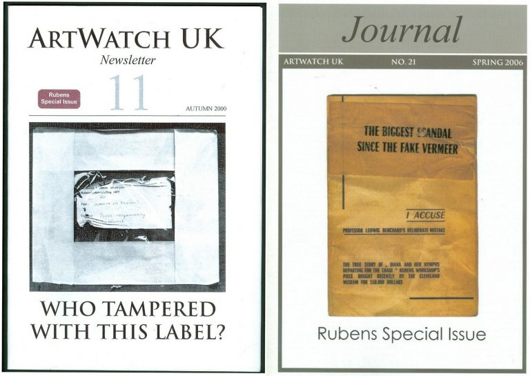
Above, Fig. 7: The Autumn 2000 and the Spring 2006 special issues of the ArtWatch UK Journal given over to discussions of the National Gallery Samson and Delilah.
NO ANSWERS GIVEN. DEBATE REPEATEDLY SHUT DOWN. A LOOP OF SILENCE CREATED.
The National Gallery later announced Christopher Brown would publish a scholarly article in the Burlington Magazine. It never came. The magazine’s editor told us none was submitted. An article by Kasia Pisarek was submitted. It was rejected by the Burlington Magazine – and, later, by Apollo (but see [*5]). In 1998 Dr Brown left the National Gallery to direct the Ashmolean Museum in Oxford. An article by his successor at the Gallery, David Jaffé, appeared in the August 2000 Apollo, but it was expressly intended to end, not launch, consideration of the evidence. Arts journalists summoned to a National Gallery press conference on the pending article were advised “it will finally silence the critics”. Our request to reply was rejected by Apollo’s editor, David Ekserdjian, a former staff member of Christie’s. He also rejected a letter from Michel Favre-Felix, a painter member of the Association Internationale pour le Respect de l’Integrite du Patrimonie Artistique – ARIPA. Christopher Brown’s departure from the National Gallery served to thwart subsequent inquiries into the Samson and Delilah’s acquisition and its subsequent unacknowledged treatment.
On 6 April 2002 (letter) we asked Neil MacGregor whether Dr Brown had been aware in 1982 of Burchard’s 1930 Certificate of Authenticity and its testimony on the then sound condition of the Samson and Delilah panel. He replied: “As I am sure you know, Christopher Brown left the National Gallery some years ago… I suggest you pursue the matter with him.” When Brown was asked by the US magazine Salon (December 2005) to comment on his past involvement in the controversy, he replied: “I am sorry but I don’t want to do this. Please address your questions to the National Gallery.” In 1983 Brown had reported: “Under the terms of Ludwig Burchard’s will, I had the privilege of consulting the manuscript notes on the Samson and Delilah. My visit to Antwerp was made possible by a grant through the Sir Martin Davies Travel Fund”. Had Burchard’s own notes held by the Rubenianum not contained a draft or other record of his 1930 certificate of authenticity, as is held in the National Gallery?
THE VALUE OF REPORTS
When, after we had published Burchard’s certificate of authenticity and Neil MacGregor had adjusted the Gallery’s position accordingly, Christopher Brown and his successor, David Jaffé, held that the Samson and Delilah had been planed down when in the collection of the German magnate, August Neuerberg, between 1930 and 1980. In doing so, they went against the testimony not only of Baudouin’s March 1980 condition report but also of a leading Rubens scholar and National Gallery benefactor who had gifted a Poussin – Christopher Norris. As first mentioned in our June 2000 Art Review, article, Norris had testified in a 1980 letter (held in the picture’s dossiers) to the director, Michael Levey, congratulating him on the Samson and Delilah’s acquisition, and adding that between 1930 and 1980, no change in the picture’s “amazing condition” had occurred, other than a toning down in its 1929 varnish, because “the owners had not touched it.”
Thus – and in addition to Baudouin’s 1980 condition report – we now know on Burchard’s and Norris’s joint written testimonies (both of which are held by – but neither of which had been disclosed by – the National Gallery) that the panel was intact, in good condition and had retained its original back from 1930 until 1980 when it was sent to Christie’s. Therefore, the only parties who might have planed-off the back are Christie’s and the National Gallery itself. Christie’s, who described and sold the picture as a panel and not as a reduced panel laid on board, or as a marouflaged panel, would hardly have so-profoundly and radically transformed someone else’s property (and someone, that is, who as the work’s sole known owner, had left the picture untouched for half a century) – or, for that matter, have had the time and the great technical means to do so. But even if Christie’s had done so, the National Gallery would then, in turn, have duly recorded that recently-altered state of the picture in its customary reports on works loaned to it ahead of sales. It had not done so (see below).
Ignoring the triangulated testimonies of Burchard, Baudouin and Norris, David Jaffé’s second tack had been a more personal charge: “Mr Daley does not seem be aware of the art historical convention whereby a painting on panel, even when thinned, is still called a panel”. He cited the following instance: on December 17th 1998, Sotheby’s auctioned Rubens’ Deluge as an “oil on oak panel” when in fact it was “on a marouflaged panel”.
But how had that been that known? It was so, Jaffé disclosed, “according to a condition report” made at the Gallery by its timber specialist/restorer, Anthony Reeve (which report is held in the Gallery’s exhibition file) when the picture was loaned to the National Gallery ahead of the sale. Why then, is no such report held and cited on the Samson and Delilah when it too had been loaned to the Gallery ahead of its 11 July 1980 sale at Christie’s?
HOW RELIABLE ARE LUDWIG BURCHARD’S ATTRIBUTIONS?
[*5] In an article published in the Spring 2006 Artwatch UK Journal (Fig. 7, above right), Kasia Pisarek (Katarzyna Krzyżagórska-Pisarek) wrote:
“While investigating Dr Ludwig Burchard’s ‘rediscovery’ [of the Samson and Delilah], I was surprised at some of the truly improbable attributions made in the past by him and other well-known experts such as G. Gluck, W. R. Valentiner, W. von Bode, A. Bredius or C. Hofstede de Groot, who all guaranteed their ‘discoveries’ with certificates of authenticity…” On Burchard, specifically, “I traced many of his attributions – he was not infallible in his judgement and changed his mind. Surprisingly, over sixty pictures attributed by Burchard were later downgraded (in Corpus Rubenianum) to studio works, copies or imitations…”
To date, Dr Pisarek has identified seventy-five fallen Burchard Rubens’ attributions. (The title of Pisarek’s 2009 Warsaw University dissertation was “Rubens and Connoisseurship: On the Problems of Attribution and Rediscovery in British and American Collections.”)
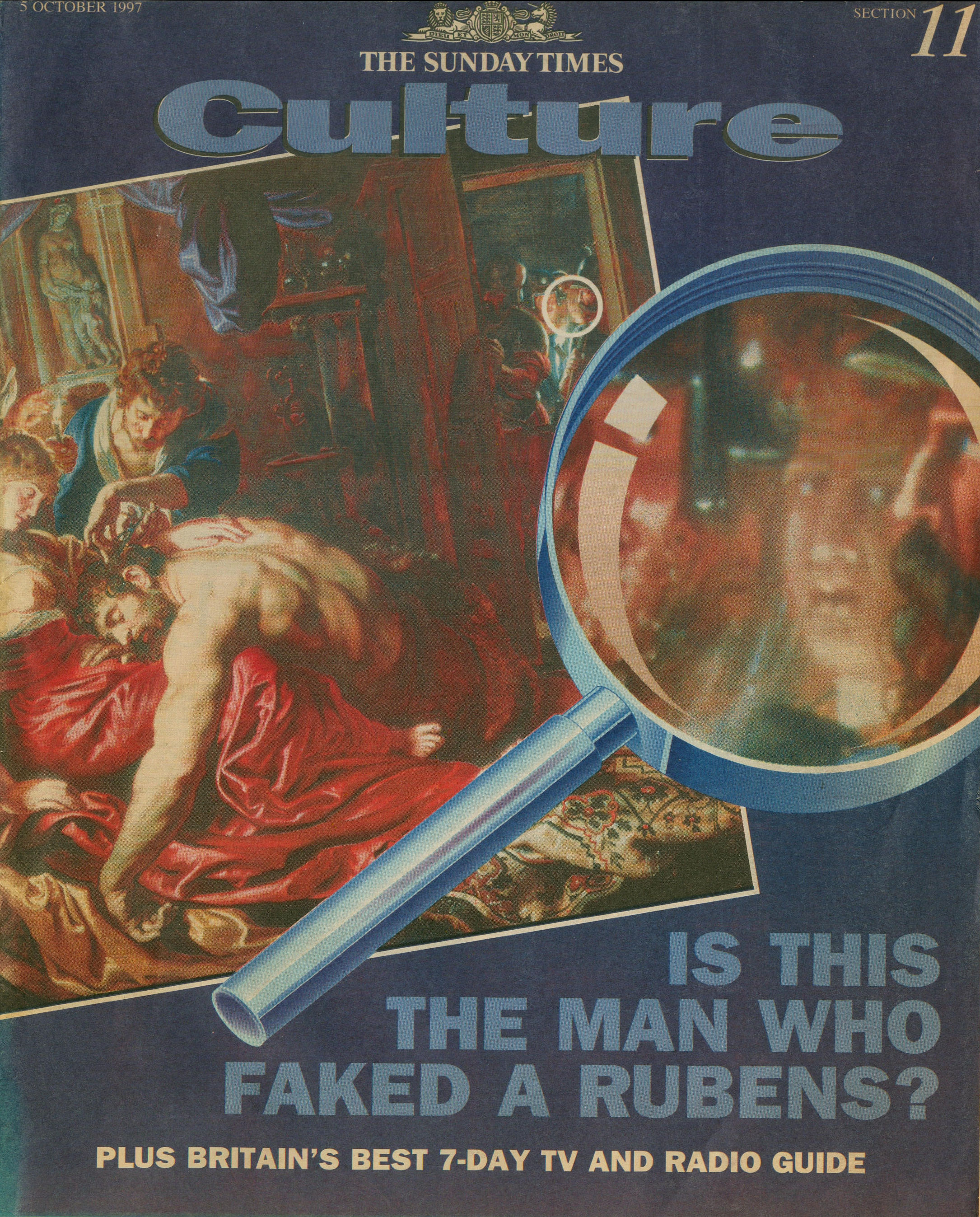
Above, Fig. 8: The Sunday Times’ 5 October 1997 coverage of Kasia Pisarek’s rejection of the Samson and Delilah’s Rubens ascription.
Certain suspicions seem to have arisen in Waldemar Januszczak’s mind as he (at that date) rejected the Samson and Delilah’s Rubens attribution in the above Culture Magazine feature and pressed the striking Whodunnit Mystery of the Disappeared Back:
“…I put this to the gallery’s chief conservator, Martin Wyld, who quips cheerfully that he was rather proud of having been accused; planing a 17th-century oak panel to wafer thinness and attaching it perfectly to blockboard while leaving its surface in pristine condition, is an exceptional feat of restoration. Nobody would or should do it today. Whoever did it earlier did a masterful job. Why did they do it at all? If a painting is in exceptionally good condition, why was there any need to hazard the transfer to block-board? A question neither the chief conservator nor MacGregor can answer. All I got from them both is the National Gallery version of: it wasn’t us, guv.”
Had Januszczak been a student of the National Gallery’s Technical Bulletins he might have recalled that accounts were given in the 1985 and 1986 issues of how Martin Wyld had chiselled away the entire wood panel of seven giant planks just under two metres long of Cima’s The Incredulity of St Thomas and that, in the first stage of this supposedly now verboten practice, the panel was reduced “from c. 5 cm to 1 cm” and in the second stage, the remaining 1 cm of wood was chiselled away entirely until the back of the original gesso coatings was exposed and ready to be attached for ever to its entirely new synthetic materials sandwich.
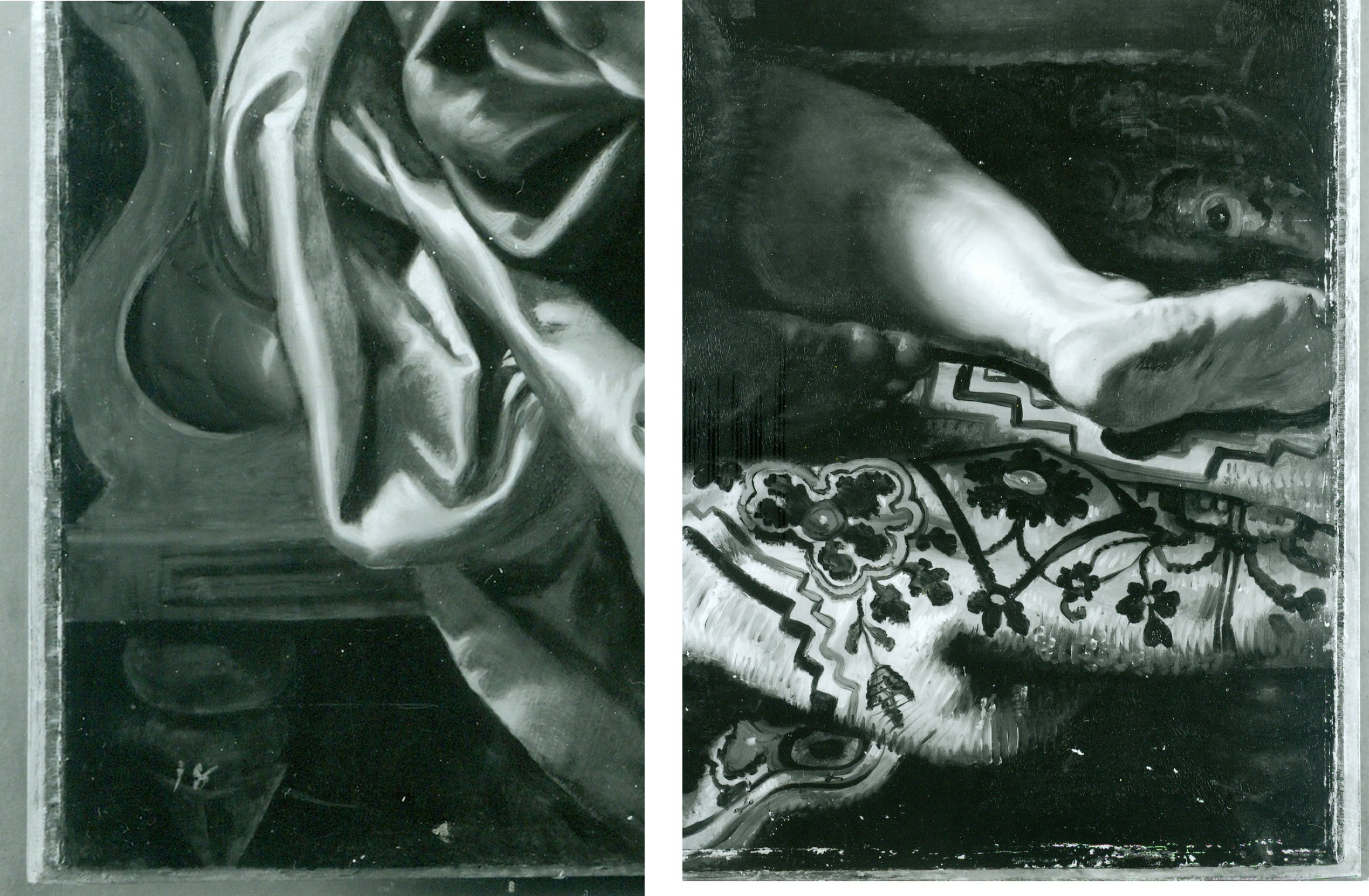
For a glimpse into the National Gallery’s subterranean Factory for Restoration and Attribution Rehabilitations, see:The National Gallery’s Made Just like Rubens Samson and Delilah with Cropped Toes
Above, Fig. 9: The National Gallery’s Cima da Conegliano altarpiece, The Incredulity of S. Thomas. Left, the altarpiece before restoration; Centre, the back of the panel, before its entire removal and replacement; Right, as seen after cleaning and before retouching – and after the transfer of the surviving gesso and paint film onto a multi-layered synthetic support.
RECORDS v RECOLLECTIONS AND BOY-GANGS IN ACTION
If the documentary record is to be trusted, it can be said with certainty that someone within the National Gallery covertly planed the Samson and Delilah panel. Notwithstanding his later Jaffé-flaunted recollection of August 2000, Frans Baudouin [*6] had, in his 1980 condition report prepared for the Samson and Delilah’s owner, Mrs Margaret Köser, solemnly testified on his (likely financially remunerated) professional oath (as the picture was about to be dispatched by the banker Jan Bosselaers from Antwerp to Christie’s in London), that it was a panel between 2.5 cms and 4 cms thick – and, therefore, had not-yet been planed down to a thickness of under 3 millimetres and cemented onto a sheet of modern blockboard. And yet, in the face of all such precisely documented facts between 1930 and 1980, David Bomford would, in his 1983 National Gallery Technical Bulletin account, backdate the planing to an unspecified time, place, and person – viz: “At some time, probably during the present century…” – and, when so-saying, would offer not one jot of supporting technical, photographic or documentary evidence in an institution that had long claimed exemplary record keeping practices.
[*6] Frans Baudouin was described in Codart on his death in 2005 as: “the doyen of Flemish art historians. He was the former director of the Rubenshuis and the driving force behind the founding of the Rubenianum, as well as an outstanding specialist in Rubens.” Nonetheless, he had declined to discuss the Samson and Delilah’s attribution with Euphrosyne Doxiadis (the first critic of the picture’s ascription and a co-author of the 1992 Report submitted to the National Gallery) whom he had met socially. In his August 2000 Apollo article, Dr. Jaffé, belatedly acknowledging Burchard’s certificate of authenticity record of the original panel, wrote: “Three Rubens experts – Dr. Frans Baudouin, Dr. Reinhold Baumstark and Dr. Hubert von Sonnenburg – who had been contacted by potential purchasers and therefore studied the painting with particular attention, all recall seeing it in its present condition just prior to its sale at auction on 11 July 1980.”
Powerful and triangulated testimony, it might well have been thought. However, one might also assume, for example, that Baudouin’s professional documents were likely more trustworthy than his twenty years-old recollections. In support of the former, the photograph (above, Fig. 2) of the Samson and Delilah when out of frame in 1980, and as supplied to Euphrosyne Doxiadis by Jan Bosselaers, along with Baudouin’s own 1980 certificate of condition for the Samson and Delilah might be cited. Further, as mentioned, in 2001 Doxiadis asked Baumstark’s successor at the Liechtenstein Princely Collections, Dr Uwe Wieszorek, if the then-Prince of Liechtenstein had been the underbidder at the 1980 Christie’s sale. In NG6461 she now reports: “He assured me categorically in two letters that as far as the Collections were aware, the Prince was not the underbidder, nor had he even taken part in the bidding.”
As for Dr. Hubert von Sonnenburg [*7], the then Head of Conservation for the Metropolitan Museum, might he be taken as the unsuccessful underbidder? When advising that museum on the possible purchase of the then-sublimely preserved Velázquez Juan de Pareja (which was bought for the Met. from Christie’s in 1971), Sonnenburg had strenuously advised the picture should under no circumstances be bought if its canvas had been relined. Would he likely have advised that great museum to buy a reduced panel laid on blockboard at a nowhere-recorded location and time? If he had, had the Met. attempted to buy the Samson and Delilah but been outbid for once by the National Gallery? Jaffé does not say – but where Christopher Brown had told Euphrosyne Doxiadis that the Prince of Lichtenstein had been the underbidder, for their part Christie’s had refused at the time of the sale to identify the (to this day, mysterious) underbidder, whose bids were said to have been relayed to the main sale room by telephone from an anteroom.
[*7] As we noted in a March 2011 post – Hubert von Sonnenburg was certainly an adept of art museum secrecy:
When, in 1971, the Met. snatched Velázquez’s Juan de Pareja from the British (who had owned it for centuries) Thomas Hoving, Ted Rousseau, von Sonnenburg and Everett Fahy had all flown to London, Madrid, and Rome – a sort of “boy-gang”, as they saw it, playing at spreading rumours like “the disinformation section of the KGB” – as Hoving (who later claimed to have discussed with Wildenstein’s how to “manipulate the art press and crank up the rumor mill” in a general strategy of “dissimulation and misleading rumors”) put it in his memoir. Even when successfully bought, the Velázquez was not paraded at the Met. but, rather, was “sneaked” into Wildenstein and Company “for secrecy”, partly because funds had been committed without the Board’s knowledge and also because, as Hoving put it, the Board had to remain longer in the dark as further “total secrecy” would be needed to “prepare our public relations stance” and to “have the time to clean it.” The deception of the public was to be absolute: for a short period before the restoration, the picture was exhibited to New Yorkers as if it were Wildenstein’s own property. Subsequently, the Met audiences only got to see the von Sonenburg-redone Juan de Pareja and not the miraculously well-preserved jewel that had, some time before, been taken to the New World by a triumphalist, dissimulating art world boy-gang.
In Part II – A TALE OF TWO ASCRIPTIONS AND THEIR RESPECTIVE TECHNICAL EXAMINATIONS – we examine the remarkable methodological discrepancies evident in the National Gallery’s own respective 1983 accounts of its two expensively bought 1980 panel paintings, and show why the Samson and Delilah should never have been presented from 1930 onwards as the long lost Rubens of 1609-10.
POSTSCRIPT: See Dalya Alberge’s disclosures in today’s Guardian:
A £2.5m dud? Fresh doubt cast on authenticity of National Gallery Rubens
15 June 2025
Problems with “La Bella Principessa”~ Part I: The Look
The world famous drawing that was dubbed “La Bella Principessa” by Professor Martin Kemp is insured for $150 million and lives in a “secure vault in Zurich”. It is not a portrait of Bianca Sforza by Leonardo da Vinci, as has been claimed, but a twentieth century forged or pastiche Leonardo.
WHITHER “LA BELLA PRINCIPESSA”
In 1998 the now so-called “La Bella Principessa” appeared from nowhere at Christie’s, New York. A hybrid work made in mixed media that were never employed by Leonardo (three chalks, ink, “liquid colour”), on a support that was never used by Leonardo (vellum), and portraying a woman in a manner that is nowhere encountered in Leonardo, it was presented as “German School, early 19th century” and “the property of a lady”. It went for $22,850 to a New York dealer who sold it nine years later on a requested discount of 10 per cent for $19,000 to an art collector, Peter Silverman, who said he was buying on behalf of another (unidentified) collector whom he later described as one of “the richest men in Europe”. Thus, at that date, it was not known who owned the drawing or by whom it had been consigned to Christie’s and it remained entirely without provenance. In its nine years long life, no one – not even its new owner(s) – had taken it to be by Leonardo.
In a 2012 book (Lost Princess ~ One man’s quest to authenticate an unknown portrait by Leonardo da Vinci), Silverman claimed a successful upgrading to Leonardo and described how he had gained the support of distinguished scholars including Professor Martin Kemp who had formulated an elaborate hypothetical history in which the drawing was said to be a Leonardo portrait made either from a living subject in celebration of her wedding or in commemoration after her death in 1496.
Nonetheless, the drawing failed to gain a consensus of scholarly support and is rejected in centres like New York, London and Vienna. Carmen Bambach, the Metropolitan Museum’s Renaissance drawings authority dismissed “La Bella” on the grounds that “It does not look like a Leonardo”. Thomas Hoving, a former Metropolitan Museum director, held it to look “too sweet” to be Leonardo. ARTnews reported that the Albertina Museum’s director, Klaus Albrecht Schröder, had noted “No one is convinced it is a Leonardo”. In the Burlington Magazine Professor David Ekserdjian suspected it to be “counterfeit”.
THE LOOK OF “LA BELLA” AND THE COMPANY SHE BEST KEEPS
In matters of attribution the most important consideration is the look of a work. Many things can be appraised simultaneously but, conceptually, the “look” of a work might be broken down into two aspects: an initial at-a-glance response to a work’s effects and appraisal of its internal values and relationships; and, a comparison of the effects, relationships and values with those of bona fide productions of the attributed artist, or with those of the artist’s students, associates or followers. It can also be useful to compare the looks of works with those of copyists and known forgers. It might fairly be said that in connoisseurship, as in the evaluation of restorations, visual comparisons are of the essence. (In ArtWatch we take pride in the extent to which we seek out all possible comparative visual material and regret that some institutions still hinder our efforts in this regard.)
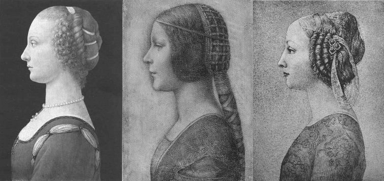
Above, Fig. 1. If we put aside questions of attribution and simply look at the group above, we find works of remarkably similar figural motifs and formats that clearly relate to and derive from a most distinctive type of 15th century Italian profile female portrait. These similar-looking works are similarly sized, being, respectively from left to right:
A Young Woman, 14 and 1/4 x 10 inches;
“La Bella Principessa”, 13 x 9 and 3/4 inches; and,
A Young Woman, 18 x 12 1/2 inches (here shown mirrored).
All show young women depicted in the strict early Renaissance profile convention made in emulation of antique relief portraits on coins and medals. Although very widely encountered (see Fig. 4), Leonardo side-stepped the type in order to intensify plastic and expressive values with sculpturally-purposive shading and axial shifts in the bodies and gazes of his portraits (see Fig. 6). The portrayals above are strikingly similar in their head/torso relationships; in their absences of background; in their highly elaborated coiffures which offset ‘sartorially’ skimped and unconvincing simplifications of costume; in their sparse or wholly absent depictions of jewellery; and, even, in their almost identically cropped motifs. Collectively they might be taken as a suite of variations on a simple theme. We take all three to be twentieth century Italian artefacts. At least two of them are linked to Bernard Berenson and the two on which reports have been published have unusual and problematic supports.
As mentioned below, the Detroit picture is painted on top of photographic paper. It is suspected that it might have been a photograph of the Frick sculpture to which the painting was initially related. The “La Bella Principessa” is drawn, exceptionally for Leonardo, on a sheet of vellum which appears to have been removed from a book and it is, most unusually, glued to an oak panel. The panel itself is a curiosity: although a number of “butterfly keys” have been inserted into its back, as if to restrain splitting, there is no evidence of splits in the panel and, if there were, the present four such keys in such a small panel might be considered restoration “over-kill”. If the panel had split while the vellum was glued to it, the drawing would have split with the panel. The fact that the vellum has been “copiously glued” to a (possibly pre-restored) oak panel makes it impossible to examine the back of the drawing which is said by one of its proponents, (Cristina Geddo, an expert in Leonardo’s students and Milanese “Leonardesques”) to bear “superimposed numbers…a written inscription…[and a] little winged dragon – at least that is what it seems.” For Geddo, this unexamined content is reassuring: “This feature, too, counts in favour of an attribution to Leonardo, who, even though he never to our knowledge used a parchment support in his work, was in the habit of re-using the paper on which he drew.”
(In reading the compendious literature on this proposed attribution, we have sometimes wondered what might be allowed by its supporters to count as evidence against the attribution.)
CONSIDER THE HISTORIES
The portrait on the left, A Young Woman, was bought in 1936 by the Detroit Institute of Arts as by Leonardo da Vinci or Andrea del Verrocchio. The institute’s director, W. D. Valentiner, made this attribution on the strength of clear correspondences with the curls in the hair of Leonardo’s painting Ginevra de’ Benci (see Fig. 6) in the National Gallery of Art, Washington, and with those found in the above-mentioned marble sculpture in the Frick Museum, A Young Woman, given to Andrea del Verrocchio. (Valentiner had made a study of Leonardo’s work in Verrocchio’s workshop.) In 1991 Piero Adorno, specifically identified the Detroit picture as Verrocchio’s lost portrait of Lucrezia Donati. Notwithstanding seeming correspondences with secure works, this picture is now relegated to “An Imitator of Verrochio” – and this is an extremely charitable formulation. In Virtue and Beauty, 2001, David Alan Brown described it as “a probable forgery by its anachronistic materials and unorthodox construction”. “Probable” [!] because: “after a recent technical examination, the picture turns out to have been painted on photographic paper applied to a wood panel that was repaired before it was readied for painting. And at least one of the pigments employed – zinc white – is modern…” Valentiner judged one of two Leonardo studio works of the Madonna with a Yarnwinder to be “more beautiful than the Mona Lisa”.
The portrait on the right, A Young Woman, was attributed to Piero Pollaiuolo by Berenson in 1945. While this figure is perhaps the most attractive of the above three, with its nicely constructed counterbalancing of the thrusts in the neck/head and torso, and its credibly proportioned arm, the work itself has, so far as we can ascertain, sunk without trace. In truth, this female profile portrait type has been assailed by forgeries. Alison Wright notes in her 2005 book The Pollaiuolo Brothers, that “Complications for the historian lie both in the fact that the subjects of most female portraits are no longer identifiable and that, because of their exceptional decorative and historical appeal, such portraits were highly sought after by later nineteenth- and early twentieth-century collectors, encouraging a market for copies, fakes and over-ambitious attributions.”
The portrait in the centre (“La Bella Principessa”) has been precisely attributed by Kemp to Leonardo as a book illustration portrait of Bianca Sforza of 1495-96.
DISTINGUISHING BETWEEN THE LOOKS OF THEN OF NOW
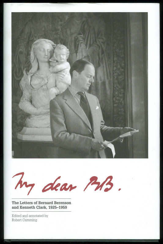
Above, Fig. 2. In My dear BB (an incalculably valuable new resource edited and annotated by Robert Cumming), we learn that in November 1930 Kenneth Clark’s wife, Jane, wrote to Berenson: “K has seen Lord Lee’s two new pictures…The Botticelli Madonna and Child you probably know too. K thinks the latter may be genuine about 1485 or rather part of it may be, but it is not a pretty picture…” A footnote discloses that Lee had bought The Madonna of the Veil, a tempera painting on panel in 1930 from an Italian dealer for a then huge sum of $25,000 (Fig. 3). It was widely accepted by scholars as autograph Botticelli and published by the Medici Society as a “superb composition of the greatest of all Florentine painters”. Clark, doubting the attribution on sight, objected that it had “something of the silent cinema star about it” – and he likened the Madonna to Jean Harlow (Fig. 3). Lee donated the picture to the Courtauld Institute Gallery in 1947. In June 2010 Juliet Chippendale (a National Gallery curatorial intern working in association with the Courtauld Institute MA course) disclosed that scientific examination had identified pigments not known before the 18th and 19th centuries and worm holes that had been produced by a drill. It is now designated a work of the forger Umberto Giunti (1886-1970), who taught at the Institute of Fine Art in Siena and forged fresco fragments.
ART HISTORICAL SILENCES
Four months later Clark wrote to Berenson: “Just in case Lee has sent you a photograph of his new Botticelli may I ask you to forget anything Jane may have reported me as having said of it. It is one of those pictures about which it is best to be silent: in fact I am coming to believe it is best for me to be silent about every picture. Did I tell you that my Leonardo book was a mare’s nest. The man had sent photographs of two drawings from the middle of the Codice Atlantico. They must have been early copies done with some fraudulent motive – perhaps the book really did belong to Leonardo – he certainly had read it – & some pupil thought to enhance its value.”
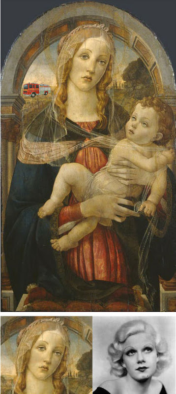
Above Fig. 3. The young Kenneth Clark (then twenty-seven years old) displayed an admirable “eye” by spotting a fraud on sight some eighty years ahead of the pack. Is it better for a connoisseur to see but not speak than it is not to see at all? Undoubtedly, it is. Would Clark have enjoyed his meteoric rise had he humiliated the mighty and exposed the big-time fraudsters of his day? (That question might be taken as self-answering.) If Clark bided his time on Berenson, eventually he delivered an unforgiving former-insider’s repudiation in 1977 by chronicling how Berenson had “sat on a pinnacle of corruption [and] for almost forty years after 1900… [done] practically nothing except authenticate pictures”
PRETTY – AND NOT SO PRETTY – WOMEN
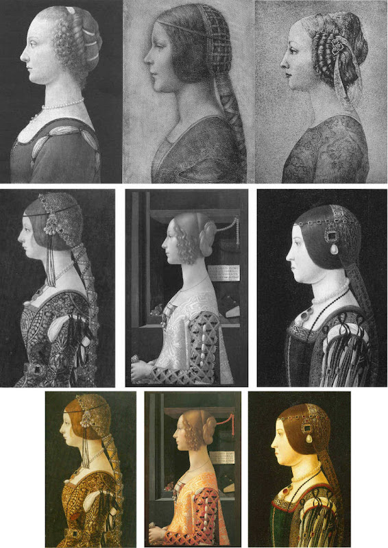
Above, Fig. 4. In the middle and bottom rows we see three bona fide works of the female profile type – respectively:
Portrait of Bianca Maria Sforza, c. 1493, by Ambrogio de Predis, The National Gallery of Art, Washington;
Domenico Ghirlandaio’s 1488-1490 Giovanna degli Albizzi Tornabuoni, Museo Thyssen-Bornemisza, Madrid; and,
a portrait of Beatrice d’Este tentatively attributed by Kemp to Ambrogio da Predis.
The differences between this trio and the works in the top row are pronounced and eloquent. The secure works are highly individuated and immensely richer in their effects. Collectively, they do not constitute an inadvertent suite. Individually, they are greatly more various compositionally. Collectively, they are markedly richer in jewellery and ostentatiously sumptuous costumes. The distinctive physiognomies of their subjects derive from living persons, not from other art or photographs of other art. Flattery and loving attention are channelled more into the costume and bling than into the facial features. In every respect the opposite is the case in the top row where prettiness has been held at a premium with an eye on the modern photographically-informed market.
LEONARDO BREAKS THE MOULD
Above, Fig. 5: As mentioned, “La Bella Principessa” and her two companions are of a piece, and of a type never followed by Leonardo whose female portraits (see below) pioneered an unprecedentedly complex and sophisticated evocation of real, sculpturally palpable women in tangible spaces or landscapes. To include the figurally impoverished and stylistically anachronistic “La Bella Principessa” in Leonardo’s oeuvre would disjunct his revolutionary arc of insights and innovations in portraiture. Such inescapably disruptive consequences have been ceded tacitly by Kemp, “La Bella Principessa’s” principle defender – some say advocate. In “La Bella Principessa ~ The Story of the New Masterpiece by Leonardo da Vinci” (Kemp’s 2010 book jointly written with Pascal Cotte of Lumiere Technology and including chapters by the drawings scholar Nicholas Turner and the recently discredited fingerpints expert Peter Paul Biro), Kemp converts an intractable problem into an asset by begging the essential question. That is, he underwrites “La Bella’s” credibility on an assertion that “Any important new work, to establish itself, must significantly affect the totality of Leonardo’s surviving legacy over the longer term.” Without question, the de-stabilising inclusion of “La Bella Principessa” would produce knock-on effects, but arguing backwards from that predictable disturbance to some endorsement of its source is patently unsound methodologically – the inclusion of any atypical work, whether bona fide or forged, into an oeuvre would affect its “legacy”.
LEONARDO’S ACCOMPLISHMENTS
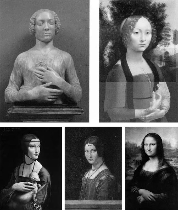
Above, top, Fig. 6: Left, Andrea del Verrocchio’s Lady with a Bunch of Flowers of c. 1475; and (right) Leonardo’s (hypothetically extended) Ginevra de’ Benci of c. 1474-1478.
Above, Fig. 7: Left, Leonardo’s The Lady With an Ermine of about 1489-90; centre, Leonardo’s La Belle Ferronnière of about 1495-96; right, Leonardo’s Mona Lisa (La Giaconda) of about 1503-06 onwards.
In the group above we see extraordinary development in Leonardo’s portraits of women over the last quarter of the fifteenth century as he strove to incorporate the entirety of sculptural, plastic, figural knowledge, and to surpass it by making it dance to an artistically purposive tune liberated from the happenstance, arbitrary lights of nature on which sculpture then necessarily depended. Some have attributed the Bargello sculpture, the Lady with a Bunch of Flowers, to Leonardo on the grounds that its subject was Ginevra de’ Benci, the subject of Leonardo’s painting. Others have seen Leonardo’s authorship of it in the beauty of the hands. In Leonardo da Vinci and the Art of Sculpture, 2010, Gary M. Radke holds that the two works show differences that emerged in the mid-1470s between the two artists. Against this, it has been suggested that the painting might originally have borne a closer relationship to the sculpture with a possible inclusion of hands in a fuller length treatment. A study of hands by Leonardo was incorporated in a hypothetical and digitally realised extension of the painting by David Alan Brown (Virtue and Beauty, 2001, p. 143). Frank Zollner sees the painting as marking the point (1478-1480) at which Leonardo broke away from “the profile view traditionally employed in Florence for portraits of women” in favour of the three-quarters view in order to impart “a pyschological dimension to his sitter – something that would become the hallmark of Renaissance portraiture”. Which is all to say that Leonardo had broken away from the profile convention some sixteen to eighteen years before, on Kemp’s hypothesis, he made a solitary and exceptional “return” to it.
Speaking of the reconstruction of Leonardo’s Ginevra de’ Benci painting, Brown writes:
“Ginevra’s portrait, the lower part of which was cut down after suffering some damage, may have included hands. A drawing of hands by Leonardo at Windsor Castle, assuming it is a preliminary study, aids in reconstructing the original format of the picture. As reconstructed, Leonardo’s portrait may be seen to have broken with the long-standing Florentine convention of portraying women in bust-length profile. In seeking an alternative to the static profile, Leonardo, like Botticelli, seems to have turned to Verrocchio’s Lady with a Bunch of Flowers in the Bargello, Florence. Because of the sitter’s beautiful hands which mark an advance over the earlier head-and-shoulders type of sculpted bust, the marble has even been attributed to Leonardo. But the highly innovative conception of the half-length portrait bust is surely Verrocchio’s achievement. What young Leonardo did was to was to translate this sculptural protype into a pictorial context, placing his sitter into a watery landscape shrouded in a bluish haze…”
A CASE CONSPICUOUSLY NOT MADE
For the owner and the art historical proponents of “La Bella Principessa”, the very chronology of Leonardo’s female portraits constitutes an obstacle. Given Leonardo’s famous eschewal of strict profile depictions of women, the onus is on those who would include “La Bella Principessa” (- albeit as a solitary and exceptional stylistic regression that was undertaken without ever attracting attention or comment) to make a double case.
First, they must show how and where “La Bella Principessa” might plausibly have fitted within the trajectory of Leonardo’s accepted works. Second, they must demonstrate by comparative visual means that “La Bella Principessa” is the artistic equal of the chronologically adjacent works within the oeuvre. Kemp has proposed the precise date of 1495-96 for the execution of “La Bella Principessa” but, conspicuously, has not presented direct, side-by-side visual comparisons with Leonardo’s paintings. Instead of comparing “La Bella Principessa” of 1495-6 directly with Leonardo’s La Belle Ferronnière of about 1495-6, Kemp writes:
“If the subject of Leonardo’s drawing is Bianca, it is likely to date from 1495-6. In style, it seems at first sight to belong with his earlier works rather than to the period of the Last Supper. However, Leonardo was a master of adapting style to subject. Just as his handwriting took on an earlier cast when he needed to adopt a formal script, so his drawing style could have reverted to a meticulous formality, appropriate for a precious set-piece portrait on vellum of a Sforza princess.”
“If”? “Could have”? “At first sight”? The pro-attribution literature is bedecked with daisy-chains of such tendentious and weasel words and terms. With which earlier works is “La Bella Pricipessa” deemed to be artistically comparable or compatible? With the Ginevra de’ Benci of c. 1474-1478? With The Lady With an Ermine of about 1489-90? Never mind the red herrings of handwriting and the giant, near-obliterated historical figures of the Last Supper, what of the relationship with Leonardo’s (supposedly) absolutely contemporaneous La Belle Ferronnière of 1495-96? (On this last we volunteer a pair of comparisons below.)
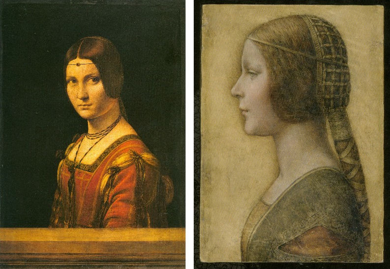
Above, Top, Fig. 8: Leonardo’s La Belle Ferronnière, left, and the “La Bella Principessa”.
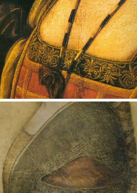
Above, Fig. 9: Details of Leonardo’s La Belle Ferronnière, left, and the “La Bella Principessa”.
Kemp insists: “The Lady in profile [“La Bella Principessa”] is an important addition to Leonardo’s canon. It shows him utilizing a medium that has not previously been observed in his oeuvre…It testifies to his spectacular explosion and development of novel media, tackling each commission as a fresh technical challenge. It enriches our insights into his role at the Milanese court, most notably in his depiction of the Sforza ‘ladies’ – whether family members or mistresses. Above all, it is a work of extraordinary beauty.”
Even if we were to assume that for some reason Leonardo had opted to “revert” in 1496 to a type he had never employed, what might explain a pronounced indifference in “La Bella Principessa” to the detailed depiction of the “stuffs” of costume with which the artist was simultaneously engaged in La Belle Ferronnière? Given that Leonardo clearly appreciated and celebrated the fact that courtly costume required sleeves to be made as independent garments held decorously in place by ribbon bows so as to permit undergarments to peep through; and, given that Leonardo lovingly depicted not only the varying thicknesses of the costume materials but every individual twist in the threads of the elaborately embroidered band in La Belle Ferronnière, how could he possibly – when working for same ducal master, at the same time – have been so negligent and indifferent in the execution of “La Bella Principessa’s” costume? Kemp acknowledges and offers excuse for the distinct poverty of the costume: “It may be that the restraint of her costume and lack of celebratory jewellery indicates that the portrait was destined for a memorial rather than a matrimonial volume.” In so-saying, he jumps out of one frying pan into another.
If “La Bella Principessa” was made after Bianca Sforza’s death, from whence did the likeness derive? One reason why Kemp settled on Bianca as the preferred candidate subject for “La Bella Principessa” was that while (disqualifying) likenesses of the other Sforza princesses existed, none survives for her – she is an image-free figure. Kemp offers no indication of a possible means for Leonardo’s (hypothesised) post-death conjuring of Bianca’s supposed likeness other than to claim that “Leonardo has evoked the sitter’s living presence with an uncanny sense of vitality.” This again begs the crucial question and fails to consider any alternative explanations for the image’s qualities. (We will be showing how the profile of “La Bella Principessa” could well have been a “portmanteau” composite image assembled from one particular work of Leonardo’s and from that of another, unrelated painter.)
The most strikingly “Leonardesque” feature on the costume of “La Bella Principessa” – the knot patterning around the (implausible) triangular slash in the outer garment – is a source of further concern and constitutes evidence of forgery. First, the motif on which much effort will have been expended, is brutally cropped along the bottom edge of the sheet, as if by a careless designer laying a photograph into a book. Why would any Renaissance artist, let alone Leonardo, design a complicated feature so as to “run it off the page”? Further, the illusion of form (created by lights and shades) in the patterning is feeble in the extreme for Leonardo – as when compared with his treament of relief seen in the above embroidered passage in La Belle Ferronnière, for example. Leonardo probably better understood than any artist in history the vital connection between a thing made and a thing depicted. He took bodies and organs apart to understand their construction and he sought to create mental models that would make the otherwise terrifyingly arbitrary and capricious forces of nature graspable if not checkable. Most seriously of all, as our colleague Kasia Pisarek has noted and reported, while the patterning present on “La Bella Principessa” matches none found in any work of Leonardo’s, it more closely matches that found in a carved marble bust by Gian Cristoforo Romano in the Louvre – see “La Bella Principessa – Arguments against the Attribution to Leonardo”, Kasia Pisarek, artibus et historiae, no. 71, 2015. (To receive a pdf of Dr Pisarek’s article please write to: news.artwatchuk@gmail.com )
Michael Daley, 24 February 2012.
In Parts II and III we examine: the provenance of “La Bella Principessa” and the work’s problematic emergence from within the circle of Bernard Berenson; the claim by the forger Shaun Greenhalgh to have produced “La Bella Principessa” in Britain in the 1970s; the spurious “left-handed-ness” of “La Bella Principessa” and the low quality of, and the means by which the drawing was made…
Michelangelo’s disintegrating frescoes
As we predicted at the time of the last restoration of the Sistine chapel ceiling, by removing all of the glue-painting applied by Michelangelo to finish off and heighten the effects of his frescoes, the Vatican’s restorers exposed the bare fresco remains for the first time in their history to new dangers from the atmospheric pollution that is exacerbated by huge numbers of paying visitors.
Then, 2 million visitors entered the chapel every year. Now, that figure is 6 million.The Vatican has been carrying out secret attempts to remove disfiguring calcium deposits building up over the remains of Michelangelo’s painting. These deposits are caused when moisture given off by tourists and air-borne pollutants are absorbed by the plaster. This now-acknowledged process will also activate, as we specifically contended, the remnants of the cleaning agents (sodium and ammonia) that were washed into the frescoes during the rinse cycles of their last so-called restoration and conservation treatments. At the time, the use of the ferociously aggressive cleaning agent AB 57 was justified by the Vatican on the grounds that it was necessary to remove, among other things…ordinary solvent-resistant calcium deposits that had built up over the centuries in parts of the ceiling exposed to leaks in the roof.
Then, the Vatican promised that special air-conditioning systems would protect the newly exposed fresco surfaces in perpetuity. That system had failed even before the Vatican recently celebrated the twentieth anniversary of the end of the last restorations of Michelangelo’s paintings. Today, as the new physical threat is seen to be turning the frescoes white, the Vatican promises new, improved air conditioning units (from the same firm). To counter the new pale appearance, the Vatican recently installed thousands of LED lights, each individually attuned to heighten the colours in Michelangelo’s painting. Michelangelo’s now twice-injured painting has been left a colourised but still lucrative wreck – and an EU-funded (EUR 867 000) showcase (“This made the Vatican City’s Sistine Chapel the ideal venue for LED4ART”) for a company that shows in its advertisements that it has no idea what the Sistine Chapel looks like.
We said at the time that the restoration constituted a crime against art. Now, the Vatican promises to limit the numbers of visitors inside the chapel to 2,000 at any one time. But that means allowing a crowd as big as a full capacity audience at the Royal Opera House in Covent Garden, London, to pack into the small chapel all day long. The Vatican’s administrators – who have known of the present problems since 2010 – now concede that the glue coatings (that were in truth Michelangelo’s own final painted adjustments) had served as a protective barrier against all air-borne pollutants. The tills will continue to ring. Art lovers remain weeping. Shame on the Vatican’s administrators.
For our previous coverage, see:
Misreading Visual Evidence ~ No 2: Michelangelo’s Sistine Chapel Ceiling;
The Sistine Chapel Restorations: Part I ~ Setting the Scene, Packing Them In;
The Sistine Chapel Restorations, Part II: How to Take a Michelangelo Sibyl Apart, from Top to Toes;
The Sistine Chapel Restorations, Part II – CODA: The Remarkable Responses to Our Evidence of Injuries; and Thomas Hoving’s Rant of Denial;
The Sistine Chapel Restorations, Part III: Cutting Michelangelo Down to Size;
The Twilight of a God: Virtual Reality in the Vatican;
Sistina Progress and Tate Transgressions;
ArtWatch Stock-taking and the Sistine Chapel Conservation Debacle;
Coming to Life: Frankenweenie – A Black and White Michelangelo for Our Times
11th November 2014. Michael Daley
UPDATE: 16 November 2014
While the Vatican now admits the hitherto concealed fact of the damage that is being caused to Michelangelo’s frescoes by the massive increase of tourist numbers, it remains in denial about the destruction during the last restoration of the final a secco adjustments that Michelangelo had made to those frescoes. That autograph last-stage painting – which was observed and described with perfect, detailed clarity by the painter Charles Heath Wilson in the 1881 (second) edition of his book Life and Works of Michelangelo Buonarroti – is characterised, preposterously, and against the evidence of all contemporary and subsequent copies of the Sistine ceiling, as consisting of “centuries of built-up candle wax, dirt and smoke”, as if such substances might somehow have disported themselves along the lines of Michelangelo’s design so as to reinforce his modelling and depict shadows cast by his figures. This latest apologia is carried in an Associated Press article “Sistine Chapel frescoes turning white ~ Humidity, tourists’ CO2 to blame”.
A paperback facsimile of a 1923 edition of Wilson’s milestone book (in which he describes his close examination of the ceiling on a special portable scaffold) is now available. It is time for the Vatican to acknowledge that Michelangelo had indeed finished his frescoes with secco painting, and that its curators, restorers and conservation scientists had blundered badly and inexplicably when, having judged Michelangelo’s specific, purposive pictorial enhancements and modifications to be nothing other than arbitrary accumulations of polluting material, removed it – and, thereby, exposed the lime plaster surfaces of the frescoes to their present dangers. That initial error and the subsequent falsification of art history that was made on its back, have both now been maintained for two decades.
The Sistine Chapel Restorations, Part II – CODA: The Remarkable Responses to Our Evidence of Injuries; and Thomas Hoving’s Rant of Denial

Before considering the third and concluding part of our examination of the Sistine Chapel ceiling restoration, it might be helpful to note the responses made to the first two posts (“Setting the Scene, Packing Them In” and “How to Take a Michelangelo Sibyl Apart, from Top to Toes”). Without exception, these have comprised outright expressions of support and/or of indignation and distress at the fate of the frescoes. Such phases as “I had no idea”, “I was horrified to see” and “that things were so bad” abound. Serious and intelligent websites have reported our accounts in similar terms. As is discussed below, no one has challenged our evidence of injuries and everyone who has responded has been shocked and alarmed by it.
Bob Duggan on the Big Think site expressed this concern with precision: “When I learned that my very breath and perspiration could contribute to the slow destruction of the frescoes, I felt sad. However, when I read Art Watch UK’s accusation that the Vatican undertook a 20-year restoration project of the frescoes ‘in full knowledge that the stripped-down bare fresco surfaces would thereafter be attacked by atmospheric pollution unless given some other protective covering’ (which has not yet happened), I felt rage over the local mismanagement of a global cultural treasure…” Duggan added that he was “reminded of a similar, more recent restoration fiasco involving Thomas Eakins’ The Gross Clinic. Years after the artist’s death, overzealous conservators stripped away darkening varnishes applied by Eakins to reveal the brighter colors beneath that were more in line with the Impressionism then en vogue.”
Ikono, an organisation dedicated to democratizing art through the production and broadcasting of short films that present art to the wider public sphere, reported that “ ‘The Vatican authorities are in conservation crisis today because they stripped the Sistine Chapel frescoes bare in the 1980s and 1990s. They did so against material and historical evidence that Michelangelo had finished off his frescoes with additional glue or size-based a secco painting,’ writes Artwatch in an excellent two-part article on the Sistine Chapel Restorations…”
Our case was re-presented in the pithiest form imaginable on the Left Bank Blog: “OY! According to ArtWatchUK: ‘The Vatican authorities are in conservation crisis today because they stripped the Sistine Chapel frescoes bare in the 1980s and 1990s. They did so against material and historical evidence that Michelangelo had finished off his frescoes with additional glue or size-based a secco painting. That original, autograph material was removed in full knowledge that the stripped-down bare fresco surfaces would thereafter be attacked by atmospheric pollution unless given some other protective covering. An attempt to coat the frescoes with synthetic resin (Paraloid B72) was abandoned leaving some surfaces clogged and the rest unprotected. The authorities then promised to install hi-tech paraphernalia that would somehow prevent the polluting atmosphere from making contact with the Chapel’s painted walls and ceiling. As was shown in our previous post, that cockamamie promise was not delivered. Today, in a chapel increasingly over-crowded with paying visitors, these stripped-down frescoes stand in greater peril than ever.'”
A number of questions arise. If the import of the evidence we have assembled over the past 23 years is so clear to so many, why does it have so little traction with the authorities who sanctioned the affronting restorations? Does the absence of any challenge to our evidence mean that everyone is now (privately if not openly) persuaded that – quite aside from the present and ongoing environmental assaults within the chapel – Michelangelo’s painting has indeed been gravely and irreversibly injured artistically, in terms both of its individual component parts and its general orchestration of effects? Or does it show that the authorities, in pursuit of their own interests, are now impervious to and politically insulated against any criticism?
When we first began making this case over two decades ago in the dark pre-digital era, the ink was scarcely ever dry on our criticisms before someone or other claimed that our comparative photographs were misleading; that old painted, drawn, or engraved copies of the ceiling were not to be trusted and had no force as testimony; that we were technically ignorant, or victims of “culture shock”, or agents of mischief – or worse. Could it really be, as it still sometimes seems, that no matter how grave and persuasive the evidence of injuries might be, there exists a wider disabling public resignation and conviction that nothing might today impede the lavishly funded, sponsorship-attracting, Conservation Juggernaut?
To be institutionally specific and somewhat blunt: could it be that the Vatican authorities today think it better to continue sheltering behind a fantastical fairy story of the transforming powers of Wicked Soot and Imperceptibly Darkening Varnishes, than to concede a professional misjudgement made by a small group of in-house experts over a third of a century ago?
Our colleague in France, the painter and the President of ARIPA (The Association Internationale pour le Respect de l’Intégrité du Patrimoine Artistique), Michel Favre-Felix, adds weight and urgency to these considerations with a two-fold reaction. In the first instance, he too was startled by our further evidence of “this incredible statement by the chemist: ‘Ammonium carbonate alone tends to tone down colours…sodium carbonate livens them up'”, and the little-noticed admission of the ferocity of the cleaning agent AB 57 by the chief restorer and co-director of the restoration, Gianluigi Colalucci: “Here’s a tiny patch where I left it on too long. In this little experimental patch you see completely solid violet paint, but around it you can see the gradations of dark and light, which are the shadings of Michelangelo’s own work”. As Favre-Felix notes, whenever a given chemical is known to have even the slightest effect on the original colours, it is rightly forbidden to use it.
His second and generous reaction was to offer further visual corroborations in the form of evidence produced for ARIPA’s journal Nuances of other damages made on the monumental figures of the Sistine Chapel ceiling. The injuries to one of these, the Cumaean Sibyl, are of great strategic significance in our joint battles. That is, we have just shown in our two previous posts the gross damages inflicted on two of the greatest figures that came at the end of Michelangelo’s cycle when he was at the height of his conceptual, painterly and figurally inventive powers – his Libyan Sibyl and his Prophet Daniel (see Figs. 2 and 3). To that catalogue of injuries, the further evidence of this third case must surely now establish an indisputable and irresistible critical mass? Of the ceiling’s twelve alternating Prophets and Sibyls that constituted Michelangelo’s most heroic monumental and spiritually expressive achievement, we can now demonstrate how three in a row of these painted colossi suffered grievously. Statistically, a sample of a quarter might be considered sufficient to make a general case? We could, God willing, pursue the evidence further if necessary, but is it not now time sufficient for the Vatican to confront and address past heritage preservation errors and desist from what would otherwise constitute an effective falsification of scholarship and art history?
The Portuguese online newspaper Publico reported our criticisms of the Sistine Chapel’s restorations on the second of March. Professor Charles Hope, a former director of the Warburg Institute, was quoted in further criticism of the restoration. The present director of the Vatican Museums, Antonio Paolucci, conceded a pressing need for ameliorative environmental measures which he said would shortly be announced. Unfortunately, he nonetheless and bullishly defended the restoration itself as one which will last for centuries – even before any measures have been announced. (We understand that since those comments were made, the promised announcement has retreated from this April to “the end of the year”.)
If we might at least now be sure that the Vatican is aware of our criticisms and evidence, we recognise that for its part, the Vatican will also appreciate the potential material and political risks of abandoning defences of the restoration. Visitors to the chapel greatly swell attendances to the Vatican Museums. In 1976, about 1.3 million people visited the museums. By 2007 the number had reached nearly 4.3 million, netting some $65 million and providing the Vatican City with its most significant source of income. An admission of error would also embarrass the many major players within the international art world who proclaimed a Revolutionary Restoration in the 1980s. To what degree of embarrassment might be sensed in an ill-tempered and defensive outburst by (the late) Thomas Hoving, a former director of the Metropolitan Museum of Art, New York, in a filmed interview for a portrait of the late painter Frank Mason, an early critic of the restoration and a founding member of ArtWatch International.
Thomas Hoving and selected dialogue from an interview in the film A Light In The Dark:
00:53:02 – Thomas Hoving:
“He doesn’t know what he’s talking about (Frank Mason). There’s a guy at Columbia, some professor who’s been screeching about this for years. (pause) Turns out that he just doesn’t know what he’s talking about. (pause) Do you think Michelangelo was honestly going to deliver it to the Pope something that looked dirty?! (laughs) His marble was going to look gray, his marble was going to look blackened out?! You think that he really mixed his fresco to look like that?!”
01:07:01 – Alexander Eliot:
“I wouldn’t say that the Sistine ceiling had been destroyed myself. I wouldn’t use that word. I would say that it had been desecrated.”
01:07:24 – Thomas Hoving:
“I was part of the desecration personally, if this idiot is right. I am part of it so he ought to put my name on it. (pause) I was invited by the man who cleaned it, Paolucci – whoever, (pause) [Gianluigi Colalucci was the chief restorer and co-director of the restorations, which ran from 1980 to 1994. Antonio Paolucci became the Director of The Vatican Museums in December 2007. – Ed.] to come up in the rickety elevator (makes sound effect of elevator) all the way to the top, and he gave me a beautiful fresh sponge, dipped it in the solution and (he) said OK clean. And they were finally doing the Separation of Earth, (uh) Separation of Light and Darkness, the last one. They started with the Flood and worked backwards. I said, ‘What?’ He said, ‘Ya, try it.’ I went (reaches up) ‘shooo!’ (wiping motion) And this thin film of black just disappeared. “It was just built up soot over hundreds of years from the stoves that they used to drag in there when the Cardinals all had to meet. That’s what they all did. They had little cubby holes, their servants had cubby holes, they had tents, they had bunks, full service catering, and stoves. “And fresco is impervious to anything other than being blasted by (uh) laser beams you know (does sound effect) out of Star Wars. Not only did they not desecrate or ruin it, they didn’t do anything to it that wasn’t there. So the guy is full of shit (!) if he said that they damaged the Sistine ceiling in any way, they didn’t! I know it. I was there. I cleaned about eight inches of the Sistine ceiling – personally!”
01:10:11 – Thomas Hoving:
“It’s not a controversy, the guy is full of it (Alex Eliot) He’s never been there, he’s never seen it. Did he clean a part of it?”
Interviewer Sonny Quinn: – “He made a film…”
Thomas Hoving: “Big deal.”
SQ: “He was close enough so he…”
TH: “Close enough? It’s about 55 feet, give me a break!”
SQ: “…they built scaffolding for him and he was there for six weeks…”
TH: “During the cleaning?”
SQ: “No, before the cleaning…”
TH: “Ya, so?”
SQ: “Well, he wanted everybody to examine his film and…”
TH: “Ah the guy is just full of it…”
For the record (once again), in 1967 the art critic and writer Alexander Eliot and his wife Jane Winslow Eliot spent over 500 hours making a close-up documentary film of the ceiling, The Secret of Michelangelo, Every Man’s Dream. Eliot was up there on the scaffold, every bit as close to the ceiling as Hoving was to be – and for much longer. On 20 May 1985 Eliot had pleaded with the Vatican’s Secretary of State for him to view the Vatican’s own copy of the Eliots’ film and to “have it stopped at the images of the Ancestors [on the lunettes]. Compare what it proves was there against what’s left today”. That precious record of the unrestored ceiling awaits a re-showing. One can only wonder why the Vatican never pressed the testimony of that filmed footage of the pre-restoration ceiling in support of the later cleaning.
For footage of the cleaning itself in progress, see the Ikono site mentioned above which links to three short films. The narrations of all are unspeakably hagiographic and tendentious: critics of the restoration are said to have been “divided”, while the restorers displayed a “passion for their task that recalls that of Michelangelo himself”. The restoration’s outcome is said to “speak for itself” and to have answered “all but the most severe critic”. Most brazenly of all, an outing for that old canard: this restoration had provided “rich opportunities for study”.
We should perhaps resign ourselves to the possibilty that the Eliots’ film may never be aired again – but it will never be possible to expunge all the photographs of the unrestored frescoes that permit the kind of directly comparative visual analysis routinely conducted on this site. Such comparisons truly do “speak for themselves” because they permit like fairly to compare itself with like. For those with eyes to see, such photo-comparisons will forever tell the same heart-breaking story: a misconceived, technically aggressive restoration inflicted grievous injuries on Michelangelo’s art.
Michael Daley
Comments may be left at: artwatch.uk@gmail.com
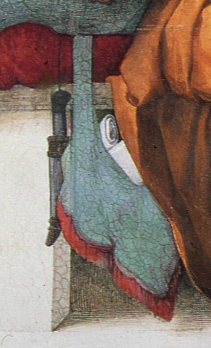


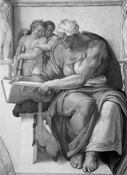
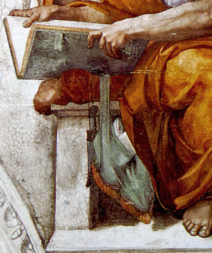
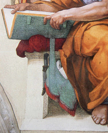

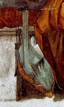


![]()
Coming to Life: Frankenweenie – A Black and White Michelangelo for Our Times

As an organisation with an essentially critical raison d’etre we get few opportunities to celebrate bona fide creative achievements. This post, in part, is an exception. Longer than usual, it is a tale of two separate but cross-linking events. One is the case of a dog that has not barked, the other is a story of a dog that has been brought back from the dead. To a surprising degree, the latter throws light on the former, which case we consider first.
The 500th anniversary of the completion in 1512 of Michelangelo’s Sistine Chapel ceiling paintings has gone almost entirely un-celebrated. On October 31st, in a small “in-house” service marking the 500th anniversary of Pope Julius II’s service celebrating the completion of the ceiling, Pope Benedict XVI asked a group of cardinals, Vatican employees and guests to imagine what it must have been like 500 years ago, adding that contemplating the frescoes renders them “more beautiful still, more authentic. They reveal all of their beauty. It is as if during the liturgy, all of this symphony of figures come to life, certainly in a spiritual sense, but inseparably also aesthetically.”
Apologists for the transforming 1980-90 restoration of the ceiling are nonplussed by the missed opportunity for a mega-beano half-millennium art celebration. In truth, it is not hard to see why this opportunity should have been foregone by the Vatican. Just two decades after completion of the most intensely controversial restoration of modern times, the state-of-the-art air-conditioning system installed to protect the chemically stripped-down plaster ceiling is failing to cope with the “unimaginable amounts of dirt” and massive atmospheric fluctuations caused by the Sistine Chapel’s throngs of paying visitors whose disrespectful raucous behaviour is a source of shame and censure within Italy. On November 1st it was reported that the Vatican has “no plans to try to limit tourists”. There is not a lot to celebrate here.
This latest failure of an “ultimate restoration” to anticipate and meet future conservation needs carries an implicit call for further urgent conservation but, with it, an indication of art restoration’s specious philosophy and too-frequently destructive consequences. When Art begets art there is pure gain, a life-giving gift. The old art remains to exert its own powers; the new brings fresh experiences and perspectives; running in tandem, each enriches the other as traditions are extended and invigorated (see Figs. 29 and 30). Restoration begetting restoration is another matter altogether.
Art restoration is not a bona fide life-conferring process. Because Art is self-renewing and self-extending, it does not follow that its historically rooted artefacts may be renewed endlessly, routinely, by technicians. To the contrary, in order to read Art’s trajectories it is imperative that its works remain unadulterated. Restorers, with their ever-more ambitious and presumptuous attempts to undo and redo earlier restorations and to reverse all evidence of age, leave old works of art as increasingly spurious impostors. It cannot be otherwise. This is not a question of finding the right “Professional Ethics”. Restorers cannot act outside of their own heads and times, which is why the most authentic old works of art remain those that are least restored. Nor can restorers submit to criticism and evaluation, as all bona fide creators must do. Their professional mystique must be preserved at all times. It rests on impenetrable screeds of pseudo-science and systems of technical “analysis” that preclude evaluation of the optical consequences of interventions on works of visual art.
In this depressing art cultural milieu it was startling and refreshing to encounter the recent stunningly brilliant black and white photographic stills promoting Tim Burton’s new animated film Frankenweenie (Figs. 1, 3, 10, 11, 12, 13, 14, 23 and 27). The wit and force of these images rewards examination. The technical key to what might otherwise seem an improbable (if not blasphemous) artistic connection between the unique theologically-charged high art enterprise of Michelanglo’s painting of the Sistine Chapel ceiling, and an animated horror film for children in which one reviewer detected an anti-creationism polemic, can be found in the film’s eschewing of colour, and in Michelangelo’s superimposition of black painting over his own frescoes.
A more general connection is that, for all the marketing hullabaloo of expensively made films, Frankenweenie proves to have been a remarkably art-driven and shaped enterprise (see Figs. 10 to 14). That the full-blown cinematic realisation of this film’s essentially personal and idiosyncratic vision required the specialised contributions of an enormous range of talents and expertises, links it organisationally to the ambitious artistic productions of the great Renaissance art studios.
In part, the power of Burton’s images stems from the simple optical fact that the contrast between a pure solid black and a clean white is the most potent tool in the visual box. But even more, it stems from the fact that between those graphic poles an effectively infinite but individually discernible continuum of values (tints and tones) can be run. An examination of the highly disciplined, imaginatively constructive deployment of such tone/values in Frankenweenie helps pinpoint the nature and the scale of the artistic losses suffered through the “restoration” of Michelangelo’s Sistine Chapel paintings (see Figs. 2, 8, 9, 19, 20, 21, 22, 31, 32, and 33).
Burton’s vivid black and white photographic imagery truly participates in one of modern Western art’s most distinguishing traits. From Alberti to Ruskin, artists have appreciated and explained how tonal gradations can magically conjure three-dimensional structures (form) on flat pictorial surfaces. Until the 1960s every art student learnt to manipulate tonal values in this fashion. Tragically, such conventions have been discarded in (most) fine art education and in much of today’s fine art practice. Fortunately, Cinema and Photography generally have sought (however awkwardly) to absorb those ancient empowering lessons, and in Burton’s hands they find singularly powerful expression.
To take Michelangelo first: he did not want the job of painting the Sistine Chapel ceiling. He wished to work on a massive carved marble tomb of sculpted figures. When compelled by the Pope (Julius II) to paint the ceiling as a novice frescoist, he attempted to get out of the job as soon as he encountered technical difficulties. He was made to continue after being instructed on avoiding future errors (by mixing plaster properly) and concealing existing ones (by applying transparent washes of glue/size). The onerous duty turned into a labour of love and on completion of his hurried, direct painting into the wet plaster of the ceiling, Michelangelo continued working on the dried fresco surface with dark pigments bound with glue or size – to the fury of an impatient Julius II. With those additional (or “auxilliary”) paints he added details and generally strengthened and revised his designs so as to make his pictorial effects more dramatically and unprecedentedly sculptural.
Between 1980 and 1990 the frescoes were transformed in a filmed restoration sponsored by NTV, the Nippon Television Corporation. The restorers contended that the paint applied on the dried frescoes’ surface was not Michelangelo’s and they removed it to artistically adverse and violently controversial effect (for a full account of which, see “Art Restoration ~ The Culture, the Business and the Scandal”, by James Beck and Michael Daley, chapters III and IV). With the work left less sculptural and more stridently coloured, the restorers pronounced the “discovery” of a New and True Michelanglo – an artist who, contrary to all previous understanding, was a brilliant colourist who had abandoned “traditional chiaroscuro modelling” in favour of vibrating “electic contrasts of hue and much irridescence”. This post hoc rationale defied both historical testimony and technical evidence.
It is a matter of record both that Michelangelo made sculptural models of the ceiling figures to study the shadows that their forms would cast (see Fig. 9), and that the shadows he had painted onto the dry ceiling were copied countless times from within his own lifetime until the time of the last restoration (see Figs. 19 to 22). When Michelangelo was compelled to stop painting, the world was astonished by his sculptural – not chromatic – effects. He had revolutionised mural painting by imposing upon the chapel’s curved ceiling the (inverted and paraphrased) monumental architectural tomb peopled by carved figures that he would have preferred to be executing. The restorers, having injured the material realisation of Michelangelo’s revolutionary pictorial conception, demanded a re-writing of art history. That so many scholars were intitially compliant might testify to a profession that writes more than it looks and that uses images as illustrations to theories or texts, rather than as records of the most primary of all sources – the works of art themselves.
Thus, the restorers and their art historical supporters jointly insisted, against hard evidence, that what had been taken for centuries to be carefully studied sculptural effects were deceiving byproducts of “candle smoke and still more of glues” applied by previous restorers. Their suggestion that such phenomena were responsible for “the kind of suggestive painting by shadows for which Michelangelo was admired until a few years ago” was patently absurd: how could gradual arbitrary accumulations have arranged themselves along Michelangelo’s designs so as to enhance his sculptural effects? Conversely, if those effects really had been products of gradual accidental accretions over the centuries, what might have deceived Michelangelo’s own contemporaries, biographers and copyists into believing that they already existed?
Consider further the very weight of the historical evidence. One of Michelangelo’s biographers, Giorgio Vasari, marvelled at his ability to conjure seemingly palpable bodies that had somehow wrested themselves from the surfaces on which they had been painted, into the (seemingly) real space of the artist’s invention:
“Then who is not filled with admiration and amazement at the awesome sight of Jonah…The vaulting [of the ceiling] naturally springs forward, following the curve of the masonry; but through the force of art it is apparently straightened out by the figure of Jonah, which bends in the opposite direction; and thus vanquished by the art of design with its lights and shades, the ceiling even appears to recede.”
Vasari’s testimony on Michelangelo’s deployment of “lights and shades” to sculptural effect was echoed in the short biography written by Ascanio Condivi, a student and assistant through whom Michelangelo is believed to have spoken by proxy. For Condivi, too, the figure of Jonah was:
“…most admirable of all…because contrary to the curve of the vault and owing to the play of light and shadow, the torso which is foreshortened backward is in the part nearest the eye, and the legs which project forward are in the part which is farthest.”
As a single instance of evidence, consider the copy of Jonah shown at Fig. 22. This ink and wash record was made by Giulio Clovio who was known as “the Michelangelo of small works” and recognised by Vasari as a most “excellent illuminator or painter of small things…who has far surpassed all others in this exercise”. His copy happens also to record a group of figures below Jonah. These figures had been painted by Michelangelo beteween 1508 and 1512 but were destroyed by him in 1535 when he prepared the altar wall to receive his single massive Last Judgement mural. Thus, we can see through Clovio’s copy of those long lost passages of Michelangelo painting that strong and cast shadows were decisively present when the painting was brand new. A nude youth then held the tablet bearing Jonah’s name. That figure and the tablet both cast shadows onto the very wall on which they were painted. Michelanglo had thus employed a trompe l’oeil pictorial device to deceive the eye into believing that the figure stood in front of the surface to which it adheres. On this testimony alone claims that Michelangelo’s “suggestive painting by shadows” was a product of “candle smoke and still more of glues” should never have been uttered.
Where the Vatican’s restorers cavalierly discarded Michelangelo’s shadows, in Frankenweenie, Tim Burton has laboured lovingly to produce his shadows. It is remarkable to how great an extent photography and film-making today have been informed and nourished by fine art conventions and the lessons of painting (see Fig. 16). On the influence of painting on the great cinematographer, Jack Cardiff, for example, see the tribute paid to him by Martin Scorcese in Fig. 15. On the early cinematic influences on Burton, see Figs. 4 and 5. It is also remarkable to how great an extent film-making has taken possession of the traditional humanly engaging story-telling and symbolic functions of art that contemporary museum and gallery “fine artists” have abandoned. With animated films, where the characters and their settings are drawn or modelled, distinctions between artistic and photographic media lose almost all force.
Burton’s own film – a remake of his earlier (1984) half-hour, live-action film of a boy who resurrects his pet dog after a fatal accident – was made on an acknowledged artistic impulse: “I’d look at the drawings I did originally, and there was a simplicity to them I wanted to get” (see Fig. 11). Where Michelangelo had completed his vast cycle of painting with hundreds of figures – and probably thousands of preparatory studies – in just four years, thirty modellers (led by puppet makers Ian Mackinnon and Pete Saunders and the animation director, Trey Thomas) each spent over a year working on Burton’s 86 minutes long film. Technically speaking, the film is a 3D black and white stop-motion animation. That is, models of characters are placed in model sets to be moved in tiny increments each of which is separately recorded in a process that is notoriously slow and laborious – a skilled animator might produce five seconds of footage in a week. Burton, a former Disney animator, opted for this method in preference to digital animation for a variety of reasons but, perhaps, primarily because “There’s an amazing amount of artistry in it”, as he told Mark Salisbury in the Daily Telegraph.
This is certainly the case. In the first instance the models for every character and prop are made by hand (see Fig. 10). Then they are then painted. Then they are arranged on sets. Then they are then lit. Finally they are animated and photographed. The models themselves exert great appeal to Burton who loves their handcrafted tactile feel. He loves the challenge of embedding characters in inanimate objects and then “bringing them to life” through motion and changing expressions and relationships. The tactility of the models is deliberately enhanced by showing the film in 3D: “…it’s the closest thing to walking on the set of stop-motion animated film, seeing what the artists have done, feeling those textures and feeling the dimensional quality you get when you are there.” (A delicious glimpse of the artistry evident in the sets by Rick Heinrichs can be found in the online animation magazine Skwigly.)
Capturing individual characters in the models was preceded by immense thought and study. For “Sparky”, Burton required the animators to visit dog shows, and to study and film dogs in the studio. This is very much in the Disney tradition: in Katherine and Richard Greene’s 1991 “The Man Behind the Magic”, a photograph shows no fewer than eighteen draughtsmen and an instructor, surrounding and drawing a live deer from every angle as preparation for the film Bambi. Disney is quoted as holding that “We cannot do fantastic things…unless we first know the real”. (Modern art schools notwithstanding, the Renaissance and its studio practices are not yet extinct.)
The beauty of Burton’s enterprise is that everything in it is given a value and every value serves an express purpose in terms of physical structure, characterisation, emotional force, and/or narrative development. When made, the models were painted in monochrome, in shades of black, white and grey (apart from grass, flowers, drapes and certain other items) because, for Burton “The black and white is very much part of the story, the character and the emotion of it. There’s something very pleasing about it, seeing this kind of animation this way, a certain depth, and the way things go in and out of shadows…” On which, let us further consider Michelangelo’s “suggestive painting by shadows”.
In Fig. 18 we see an apparently brilliant (but in truth deceivingly) “cinematic” photographic exploitation of cast shadows. In Fig. 19 we see (on the left) that before restoration Jonah’s left foot cast a strong shadow across the floor, which shadow merged with another dark shadow under the seat. The shadow under the seat “drew” a sharp, tonally contrasting vertical boundary between the lighter front-facing plane of the upright block that supports the seat and the receding (shaded) side face of that block. To the right of that block (and Jonah’s left leg) another, albeit less strong, shadowed zone threw the block’s right-hand edge into relief. After the restorers removed what they took to be dirt and disfigurement, the shadow cast by the foot disappeared (as seen on the right) – as also did much of the shadow under the bench, thereby exposing the previously hidden side of the upright block. The shadow to the right of the block was also weakened.
Mere dirt settling on a painting would weaken and blur outlines and edges. It would lighten dark sufaces and darken light ones, thereby compressing the range of values present. It is technically inconceivable that it might sharpen edges by intensifying contrasts. There is no dirt (or discoloured varnish) that is simultaneously capable of lightening already light surfaces while darkening dark ones. Had the shadows really been applied, as is claimed, by later restorers, the paint would have run into cracks in the plaster ceiling. And yet we know that it had not. We know that it had in fact cracked as the plaster had cracked. The paint was therefore applied when the plaster was smooth and new – because we also know that the plaster had cracked before any restorers went near it. Besides all of which, as we have seen, the shadows were recorded before 1535. The inescapable truth is that restorers removed painting that could only have been Michelangelo’s own.
Burton’s handcrafted models have an immediate engaging presence but the means of their humorous psychologically charged personalities are complex and artistically sophisticated. They display distinctly sculptural qualities and the satisfyingly palpable presences of diminutive figures in a real space that is continuous with our own. We are drawn into their world much as Michelangelo brought living old testament figures into ours. For force of cartoon-like effect and clarity, Burton’s heads are highly stylised and plastically simplified. Of Sparky, Burton explains: “Obviously he looks like a cartoon. It’s not like he’s an anatomically correct dog” (see Figs. 10 to 14).
Formally speaking, these sculptural simplifications might be related to the abstractions of 20th sculptors such as Brancusi who were in pursuit of “pure” or “significant” form (see Figs. 23, 24 and 25). However, plastic simplification is only part of the artistic/expressive equation with Burton’s Gothic characters who must be sentient engaged actors in intense psychologically-charged emotional dramas.
The chief expressive features of a face are the eyes and the mouth. Making the eyes large and the jaws small enhances childhood traits and vulnerabilities (see Figs. 1, 3, 14 and 27). The placement of the black pupils in the large wide-open eyes permits acute laser-like precision of gaze, as is seen to masterful effect at Fig. 14 in the affectionate twin-engagement of the boy and his beloved and devoted dog. The mouth is the most emotionally expressive feature of all, and although childhood-small in these characters, it becomes a vehicle of astonishingly subtle expressions (see Figs. 1, 3 and, especially, 27).
The antithesis of Brancusi’s plastic self-compression is Daumier’s cartoon-like sculptures where the imperatives of caricature pull the head this way and that with scant regard for any residual internal self-composure (Fig. 26). If the subject in Daumier has a bird-like personna, the nose may become a beak and the forehead may recede at an alarming rate. Burton’s compactly eloquent pebble-smooth but animated heads are a remarkably successful synthesis of these disparate sculptural traditions.
In terms of connections with Michelangelo’s painting, particular consideration should be given to the brilliantly combined effects of modelling and lighting in Frankenweenie. The boy’s head shown at Fig. 27 is articulated with seamless lucidity. It also happens to be exquisitely lit. Everyone knows the Impressionists to be painters of light but, then, light is fair game for painters who may produce their own (artistically, not literally). For the apprehension of form sculptors depend on actual light in the world. (Sculptors can, however, create an implicit light in their own graphic renderings of form, and may even depict forms that are lit as if from within, as seen at Fig. 28.) Cinematic model-making animators are advantaged: they make their own forms and may then provide their own expressively optimal actual light. The lessons of cinema, in this regard, are the more valuable because the relationship between sculptors’ forms and light may be insufficiently appreciated – certainly sculptures suffer terribly at the hands of exhibition designers. Rodin famously described sculpture as the art of the bump and the hollow – or, perhaps more accurately, as an art of hollows and projections: “de creux et de bosses”. He demonstrated this claim to Paul Gsell (“Art, by Auguste Rodin”, Paul Gsell, 1912) in the following manner:
“One late afternoon, when I was with Rodin in his atelier, darkness set in while we talked… He lighted a lamp as he spoke, took it in his hand, and led me towards a marble statue which stood upon a pedestal in a corner of the atelier. It was a delightful little antique copy of the Venus di Medici. Rodin kept it there to stimulate his own inspiration while he worked. ‘Come nearer,’ he said. ‘What do you notice?’ he asked. At the first glance I was extraordinarily struck by what was suddenly revealed to me. The light so directed, indeed, disclosed numbers of slight projections and depressions upon the surface of the marble which I should never have suspected…At the same time he slowly turned the moving stand which supported the Venus. As he turned, I still noticed in the general form of the body a multitude of almost imperceptible roughnesses. What had at first seemed simple was really of astonishing complexity. Rodin threw up his head smiling. ‘Is it not marvellous?’ he cried. ‘Confess that you did not expect to discover so much detail. Just look at the numberless undulations of the hollow which unites the body to the thigh…notice all the voluptuous curvings of the hip…And, now, here, the adorable dimples along the loins…You almost expect, when you touch this body, to find it warm…'”
Unfortunately, Rodin’s demonstrations were not recorded on film (as far as we know) – although a short film does exist of Henry Moore and Kenneth Clark making a nocturnal visit with a lamp to the British Museum’s Greek and Roman collection in order to re-enact Rodin’s lesson. In any event, in the case of Burton’s boy’s head, at Fig. 27, every depression and prominence finds beautiful expression in subtle tonal transitions that would have warmed Rodin’s heart. There is pictorial/plastic alchemy here, as there once was in Michelangelo’s frescoes. The softly continuous undulations of the head are gently disclosed within a dramatic over-arching artificiality of illumination that sets the relatively bright head off against a Great Gothic Darkness. Within the stridency of these clashing lights and darks, the subtlest emotional expression of the mouth is perfectly captured.
The expression of a mouth is controlled by the interplay of many facial muscles and it is notoriously difficult to capture, as even so great a portraitist as John Singer Sargent ruefully noted (“A portrait is a picture in which there is something not quite right about the mouth”). In this model the play of facial muscles at the mouth has given rise to a subtle but distinctive mini-topography of light-catching bosses and light-evading depressions that perfectly express the boy’s finely balanced state of delight and trepidation/wonderment. The artistry here is consumate – this is a mouth to rival Ingres’s or Holbein’s in the precision of its forms and its delicacy of expression. We see another living expression evoked in a painting at Figs. 29 and 30 where Picasso, in one of his greatest neo-classical inventions, has not modelled actual forms but evoked them by simulating an optimal play of light and shade on his imagined forms with a myriad of mosaic-like deftly placed and adjusted patches of tone.
In the Michelangelo head seen in Fig. 2, we see how (before restoration) the artist had expressed sculptural forms by drawing and by tonal manipulation. The tones disclose a three-dimensional head held in very specific and sculpturally revealing lighting. Long before cinema, in his painting, Michelangelo was simultaneously his own model-maker, lighting specialist and recording “camera man”. (This is not to claim that he, in any sense, invented or anticipated photography. Rather, it is to note the extent to which photography was a mechanically aided outgrowth of pre-existing artistic preoccupations.) Before discussing the specific lighting scheme Michelangelo deployed, it might be helpful to consider something of the great variety of lighting options that cinema and photography show to be available. Brilliant examples of lighting made for the purpose of specific and self-consciously artistic effects from the 1920s to the 1950s in the Kobal collection (see Figs. 6, 7 and 18) are illustrated and technically explained in the marvellously instructive book “Hollywood Portraits ~ Classic Shots and How to Take them” by Roger Hicks, a writer on photography, and Christopher Nisperos, a studio portrait photographer who specialises in Hollywood-style photographs (which subject he has studied for nearly thirty years).
In their examination of the photographs, the authors deduce from personal knowledge and the evidence of the images themselves, how many sources of light (lamps) were employed and where they were positioned in relation to the subject. With each photograph a diagram shows the likely positioning of the light sources. In the course of this highly instructive exercise, photography is seen to acknowledge great indebtedness to painting. Such technical analysis of photographic means has, we believe, direct application to the analysis of changes made by restorers to the artistic values of painters, as is discussed at Figs. 8, 19, 27 and 31-33.
In figs. 6 and 7 we see two heads of two beautiful women that have been expertly lit to very different expressive purposes. In the portrait of Ingrid Bergman (Fig. 6) the lighting is soft and greatly emphasises the invitingly tactile values of the wool clothing, the hair, and, above all, of the face itself, which is a perfect essay in the soft plastic undulations that Rodin so cherished in the “radiant appearance of living flesh” found in the finest sculptures of late antiquity. In the portrait of Lana Turner (Fig. 7), a more self-consciously sculptural purpose is evident as the beauty of the subject’s head is directly juxtaposed and equated with both a classical bust and a bouquet of flowers. This portrait is more intensely lit so as to contrast the planar divisions between the front face of the head and its shadowed sides, and to isolate the features of the eyes and mouth. The lights and the darks generally are placed with the utmost calculation, but to the end of a more chilling, marbled perfection – here, the groomed perfection of the coiffure extends no invitation to touch. Every part of the subject’s head and shoulders is drawn with the utmost Bronzino-like clarity by means of carefully adjusted tonal contrast: where the face is brightest there is a dark shadow. Where the blonde hair sinks into dark shadows there is a lighter background. However, these seeming photographically recorded artful placements of value have, the authors disclose, been achieved with the assistance of considerable photographic retouching, which practice was extensively prevalent in the portraits under examination (see comments at Fig. 7).
In Michelangelo’s (unrestored) head at Fig. 2 we see a treatment of background lighting that is, like that of the Lana Turner portrait, subservient to the clear plastic expression of form. Within the head, however, Michelangelo deployed a much wider range of half-tones. His head runs progressively from its brightly lit profile of the face to a very darkly shaded neck and shoulder. The bright profile is emphasised and thrown into relief by a shaded background, while the very dark back of the neck is set off against a light background. We see in Fig. 8, however, that after “restoration” the logic and the dispositions of the tones have been massively weakened and subverted: the dark ground at the face’s contour has been largely removed; the consistent form-disclosing tonal progression within the shading of the head (from brightest light on the upper right to the strongest darks on the left) has been horrendously undermined. This head now looks as if lit by a multiplicity of form-flattening lamps
But that is not all the damage. If one looks carefully at the left contour at the back of the head, it is evident that the very design of Michelanglo’s head has been changed. The forms have been reduced. The space, for example, between the body of the hair and the little plaited “pony tail” has grown larger. This feature of the coiffure has grown smaller and smoother. We have seen recently how a restorer at the National Galleries of Scotland promised to “improve Titian’s contours” with the assistance of his director. Who might have authorised this redrawing of Michelangelo’s contours? Or was the change simply not noticed? Whichever, the more closely one looks into the details of this restored work the more evident the losses of Michelangelo’s work become.
In Fig. 31 we see how, before restoration, the aperture of the nostril was larger. We see how shading that had made the corner of the mouth tuck more covincingly into the forms of the cheek has been sacrificed. We see how the background had been darkened by systematic parallel vertical strokes of black. The restorers deny that such work was Michelangelo’s own. Once again, they defy historical testimony. Giovanni Battista Armenino went to Rome in 1550 and stayed for seven years copying the “best Pictures”, including Michelangelo’s very recently painted Last Judgement (which was made between between 1536 and 1541). In 1587 Armenino produced a treatise on fresco painting in which he noted that, as frescoes begin to dry and no longer absorb pigments with same effectiveness, the painter must:
“…then finish it of with moist and dark shade tints…the muscles of the naked figures as being of greater difficulty, are painted by hatching them in different directions with very liquid shade tints, so that they appear of a texture like granite; and there are very brilliant examples of this painted by the hand of Michelangelo…they can be perfectly harmonized by retouching them in secco…in retouching the dark parts in this manner, there are some painters who make a watercolour tint of black and fine lake mixed together, with which they retouch the naked figures and produce a most beautiful effect, because they make the hatchings upon the painting, as is usual to do while drawing upon paper with black lead…Some persons temper these dark tints with gum, some with thin glue…this I affirm from what I have both seen and done and also what I have been told by the best painters.”
When the ceiling was examined in the 19th century by the painter and fresco expert, Charles Heath Wilson, he found that not only had Michelangelo’s ancient size painting cracked originally as the plaster had cracked but that it now melted readily to the touch of a wet finger. In accordance with Armenino, Wilson saw that the surface painting consisted of:
“…a finely ground black, mixed with size…The shadows of the draperies have been boldy and solidly reouched with this size colour, as well as the shadows on the backgrounds…other parts are glazed with same material, and even portions of the fresco are passed over with size, without any admixture of colour, precisely as the force of water colour drawings is increased with washes of gum. ..These retouchings, as usual with all the masters of the art at the time, constituted the finishing process or as Condivi expresses it, alluding to to it in the history of these frescoes, ‘l’ultima mano’. They were evidently done all at the same time and therefore when the scaffold was in place.”
All of that retouching has gone but record of it survives. In 1967/8 the writer, painter and former art critic of Time, Alexander Eliot and his film-maker wife, (now the late) Jane Winslow Eliot, spent over 500 hours on the scaffold making The Secret of Michelangelo, Every Man’s Dream, in the course of which film they noted that:
“With the exception of the previously restored Prophet Zachariah, almost everything we saw on the barrel vault came clearly from Michelangelo’s own inspired hand. There are passages of the finest, the most delicately incisive draughtsmanship imaginable.”
Someday, the Eliots’ film (made for ABC Television) might be re-shown, but meanwhile, Alexander Eliot’s testimony is now on the record in a new full-length film/DVD biography, A Light in the Dark: The Art and Life of Frank Mason, in which he and other early campaigners against the restoration (including the late painter, Frank Mason, and the late Professor James Beck) are given voice on the Sistine Chapel restoration. Not least of the delights among this film’s precious and historical footage, are Tom Wolfe’s account of his lessons in Frank Mason’s painting classes at the Art Students League, New York, and the sight of the former Metropolitan Museum of Art director, the late Thomas Hoving, belligerently boasting that he himself had helped sponge from the ceiling the “filth” that was in truth the last stages of Michelangelo’s painting.
Michael Daley
Comments may be left at: artwatch.uk@gmail.com


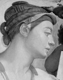


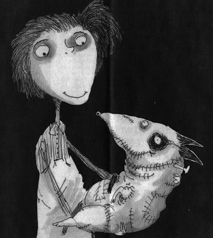


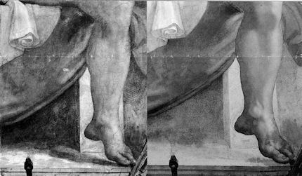

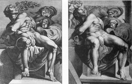


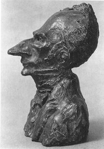


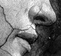


![]()
Why is the Metropolitan Museum of Art afraid of public disclosures on its picture restorers’ cleaning materials?
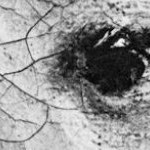
Many museums have mastered the art of presenting their picture restorations as miraculous recoveries that preclude any need for examination or criticism. A few days after our post on secrecy and unaccountability at the Metropolitan Museum of Art, a Public Relations officer at the museum, in the presence of Artwatch International’s executive director, James Keul, asked television crew members who had just interviewed Michael Gallagher, the Met’s head of picture conservation, not to broadcast his comments on cleaning solvents, any mention of which would “open the doors for critics”.
There are strong – but not good – reasons why a museum might wish to avoid discussions on the materials that restorers use. In hope of prising the Met’s doors, we re-visit the museum’s secret 1971 cleaning of Velazquez’s great portrait Juan de Pareja at Wildenstein and Company. We do so in the light of four documents: an untitled, undated Met booklet; a special conservation issue of the Met’s Bulletin (winter 1993/94); and two accounts given by the Met’s then director, Thomas Hoving, in his books of 1993 (Making the Mummies Dance) and 1996 (False Impressions). None of these identifies the solvents and varnishes used on what had been one of the world’s best preserved Velazquezes.
Restorations take place within general cultures and within local/institutional cultures. Healthy cultures require debate and transparency. Unfortunately the richly-funded, impregnably protected Met sometimes seems to take itself as the summation of Culture. When, in 1971, the museum snatched Juan de Pareja from the impoverished and enfeebled British (who had owned it for centuries), institutional pride was fit to burst. The Met booklet carried entries from the President of the Board, Douglas Dillon; the Director, Thomas Hoving; the Vice-Director and Curator in Chief, Theodore Rousseau; the Curator in Charge, European Paintings, Everett Fahy; and the “Conservator”, Hubert von Sonnenburg. Before the sale, Hoving, Rousseau, Sonnenburg and Fahy had flown to London, Madrid, and Rome – a sort of “boy-gang” playing at spreading rumours like “the disinformation section of the KGB”, as Hoving, (who later claimed to have discussed with Wildenstein’s how to “manipulate the art press and crank up the rumor mill” in a general strategy of “dissimulation and misleading rumors”), put it.
When bought, the picture was not paraded to the Met but “sneaked” into Wildenstein and Company “for secrecy”, partly because funds had been committed without the Board’s knowledge but also because, as Hoving put it, the Board had to remain longer in the dark as “total secrecy” would still be needed to “prepare our public relations stance” and “have the time to clean it.” The deceiving of the public was absolute: for a short period before the restoration, the picture was exhibited to New Yorkers as Wildenstein’s own property. Ignoring back-room machinations, the crucial question is: Why should a miraculously well-preserved, three and a quarter century old unlined canvas, have immediately been subjected to the traumas of a rushed restoration before the Board and the city might learn of the acquisition?
Hoving deferred to Sonnenburg on matters of connoisseurship and artistic technique, and had abnegated all responsibility for deciding whether or not to buy the picture: “back in New York with Chairman Dillon, Rousseau and I were on pins and needles awaiting Sonnenburg’s word. Would it be yes, or forget it? ” When Hoving, Sonnenburg, Rousseau and Fahy assembled before the painting in London, the Met’s conservation oracle suavely predicted a new and different picture that would be liberated dramatically from within a yellowed varnish tomb. Hoving sold those predictions of an even greater artistic glory to the Met’s big-wigs, some of whom had personally pledged hundreds of thousands of dollars. Velazquez’s mixed-race assistant with “dark-brown flesh” would emerge with “rosy” flesh tones and a nice clean “grey” doublet. Thus were the museum’s key players guaranteed a dramatic restoration result that would “present” as a further triumph of their collective perspicacity – and also, by eliminating any trace of Radnor family restorations (restorations that had been posited but nowhere established by Sonnenburg), expunge all historical and aesthetic continuities and make the picture entirely their own.
In such possessive and chauvinistic contexts, admitting the possibility of errors, aesthetic losses, or regrets, becomes unthinkable. This restoration would be – must be – beyond appraisal, reflection, debate or criticism. But given that no artist, writer or musician is above evaluation and criticism, why should a technician, acting on what was by common agreement the finest creative work of one of the world’s greatest artists, have been so indulged? And for that matter, why should every Met restorer be allowed to “touch base” on whatever he takes to be a picture’s bedrock “original” surface? How original can a repeatedly solvent-invaded, swab-abraded surface be?
Sonnenburg, working under intense pressure to complete before any political or journalistic exposure of the secrecy, on a script of his own writing, proved himself right to Hoving’s satisfaction: “the most astounding feature of the work was that there was hardly any color in the picture.” Purging the picture of extraneous “varnishes,” or what Hoving called “gunk” transformed the picture, but at what cost? Looking at the booklet’s now historically precious fold-out spread of three identically sized and printed full colour plates that recorded the restoration in progress (see previous post), it would seem that the original “varnished” state was indeed more, and more variously, colourful.
Sonnenburg’s high reputation as a moderate, risk-avoiding restorer stood on his having spent several years as an apprentice to the most famously cautious, slow-working and aesthetically alert restorer, Johan Hell. In Britain, Hell’s restorations were greatly preferred by artists to those of his fellow German émigré Helmut Ruhemann, who established the National Gallery’s highly controversial in-house restoration department after the Second World War. The President of the Royal Academy, Sir Gerald Kelly, entrusted his own grandest works to Hell’s varnishing technique.
By hiring Sonnenburg in the 1960s, the Met put cultural distance between its earlier troubled restorations and those then raging at the National Gallery, but it did so without anyone fully comprehending Hell’s philosophy or method. For a time, Sonneburg was succeeded at the Met by the British restorer John Brealey who had also studied with Hell. Brealey’s disastrous restoration of Velazquez’s Las Meninas at the Prado (see right) shows him to have been no proper student of Hell’s (– a judgement endorsed to us by Dr Hell’s late widow, Kate). The Met booklet sequence makes clear that, on the great Juan de Pareja, Sonneburg proceeded in outright violation of his declared master’s precepts and practices. By swiftly stripping the picture from one side to the other, instead of first establishing the antiquity of the “varnish” and only then, perhaps, proceeding to clean gradually and equally overall, Sonneburg embraced the practices of Ruhemann and repudiated those of his master (- to whose work we shall return in future posts).
The cover photograph of the Met booklet shows the face in detail. A close-up reveals a system of open and exposed cracking that is more visually disruptive than was ever recorded before or after the restoration (see above right). We do not know how – or with what solvents – the painting had been cleaned before that point. There is no indication of when the photograph was taken. We do not know what steps were taken to minimise the visual disruption of those cracks afterwards. We do know – as Sonnenburg must have – that Hell would never have arrived at that point in a restoration; would never have stripped a picture of all varnish, even into its cracks, for fear of letting his solvents invade the paintwork and attack the exposed paint/ground interface.
There may be irony in the fact that the heavy restoration doors now being slammed at the Met have, for five years past, been generously and most helpfully opened to us at the National Gallery in London.
Michael Daley
Comments may be left at: artwatch.uk@gmail.com


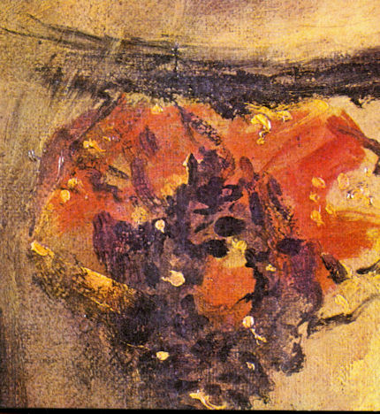


![]()
Discovered Predictions: Secrecy and Unaccountability at the Metropolitan Museum of Art, New York

Impeccable condition in a painting is more of a goad than a deterrent to restorers. When the youthful Thomas Hoving was appointed director of the Metropolitan Museum in 1967, he formed a respectful – even deferential – alliance with the (then) head of picture conservation, Hubert von Sonnenburg. Two decades earlier in London, the National Gallery’s director, Philip Hendy, forged a similarly dependent relationship with the German émigré restorer Helmut Ruhemann. Ironically, von Sonnenburg had presented as the heir-apparent to Johannes Hell, another German émigré to Britain who’s mild and gradual cleanings were widely preferred to Ruhemann’s controversially swift “total cleanings”.
Hoving and von Sonnenburg together stalked one of Velazquez’s finest portraits, his Juan de Pareja, which the Met acquired in 1970 for a world record $4.5m. Although, on their own testimony, that picture was in superb condition and had never even been lined, on acquisition it was whisked to Wildenstein and Company, “for secrecy”, as Hoving later admitted. There, Von Sonnenburg secretly “proceeded to discover”, as Hoving put it, “everything he had predicted he’d find”.
It was not unprecedented for a museum director to have a major acquisition secretly restored. Sir Charles Eastlake, scorched by National Gallery cleaning controversies in 19th century Britain, had his acquisitions cleaned in Italy before bringing them to the gallery. Secrecy in conservation can seem systemic: in 1960, when the National Gallery constructed “modern” purpose-built conservation studios, part of one was partitioned by a wall, behind which the chief restorer could work on projects of “particular difficulty or confidentiality”, as a then National Gallery restorer, David Bomford, put it in 1978.
Eastlake made no photographic record of the pre-restoration condition of his acquisitions – even though he happily used photographs for attributing paintings, and must, as president of the Royal Photographic Society, have appreciated photography’s unprecedented testimonial capacities. Fortunately, photographic records of the Sonnenburg/Hoving Velazquez restoration were kept and published by the Metropolitan Museum (in an undated booklet – see right). While these photographs may not be of the highest, digital age, standards, they are nevertheless “of a piece” and permit comparisons between recorded states to be drawn.
Much as von Sonnenburg thrilled over an impeccably preserved, never-lined canvas, he could not resist tampering with it. Two of its edges had been folded over on the stretcher. This fact was presented to Hoving as a “discovery”, even though it had been reported by the Velazquez specialist José Lopez-Rey seven years earlier. The folded canvas strips were opened, flattened and reinforced with new canvas to extend the picture’s format and diminish its subject, shifting him leftwards and downwards (see right). The justification for this compositional “recovery” was that original paint had been applied to the folded strips, but the pictorial testimony of that paint, when first revealed, was not photographically disclosed – see account on the right.
Von Sonnenburg, it seemed, could not resist the urge to “liberate” the painting’s supposed “pure flesh tones” and thereby leave the dark-skinned servant’s face lighter and pinker. By stripping off “varnish” von Sonnenburg also caused previously unified components to detach themselves from each other:
“the rounded shape of Pareja’s forehead, for example, is defined only by a large spot of impasto-crisp in the center, bordered by dragged spurs – applied directly on the thin underpainting. When seen close up, the highlight seems to be floating over the paint in an almost measurable distance…”
This was a classic restoration apologia. Even the emergence of a formerly hidden streak of flesh-coloured paint on the background was presented as an act of liberation and recovery:
“Attention should be drawn to the single dragged brushstroke of light skin colour in the center of the background at the right…Unquestionably, this randomly applied paint is original, and shows how Velazquez chose to try out his loaded brush on the background…Such spontaneity, combined with the greatest subtlety of color and technique make the Juan de Pareja one of Velazquez’s most painterly works.”
Convinced that Velazquez had happily left his own brush-wipings visible on one of his two finest portraits (the second being his Pope Innocent X), and that he had used glazes less than Titian, von Sonnenburg was not dismayed when his cleaned painting betrayed markedly less colouring and reduced to a “predominantly gray color scheme”. His rationale for losses of colour and of spatial and plastic coherence; for the flattening of a formerly prodigiously well-modelled and sympathetically lit head; and for the spatial inverting of a background that formerly receded, was audaciously lame: in 1938 an English restorer, Horace Buttery, had described the doublet as “dark gray”. Despite recognising that the painting had – miraculously – shown “no signs of ever having been abused by solvent action during the past”, von Sonnenburg nonetheless contended that it must have been cleaned and varnished “at times”. On that basis, he speculated that it could therefore safely be assumed to have been so restored by Buttery, and, therefore, to have enabled him, on that occasion, correctly to have read the doublet’s true colour. This hypothetical daisy-chain was presented as a proof, despite the fact that before and after Mr Buttery, the garment had always been described as a “green doublet” – not least by Velazquez’s biographer, Antonio Palomino who in 1724 precisely reported “a muted green for Juan’s doublet”.
After their stripping and repainting of pictures, restorers invariably apply fresh varnishes… which in turn discolour and thereby serve as a pretext for another “restoration”. With successive varnish removals, solvents deplete, embrittle and optically alter paint films. When penetrated by solvents, paint films heat, swell and soften so that even the friction of cotton wool abrades them – as the restorer Caroline Keck admitted. Soluble plastic components of the paint itself are carried off by evaporating solvents. Restorers sometimes claim that because old paintings have so frequently been abused in the past, there is nothing left to extract today – but with the Juan de Pareja, no such claim could be made. At the same time, they sometimes admit that cleaning pictures with thick paint is easier than cleaning ones with thin paint. (If cleaning methods really were as safe as is claimed, it would not matter whether the paint being treated was thick or thin.) When stripped to a restorer’s conception of “clean”, the remaining paint is left parched, absorbent, matt and in need of “nourishment” by varnishes.
When new varnishes (i.e. resins dissolved in solvents) are applied, they penetrate and amalgamate with the parched paint thereby making the next cleaning the more hazardous, and so on ad infinitum. If we are lucky, von Sonnenburg will have used a natural resin varnish. If not, if he subscribed to the Met’s then hi-tech enthusiasms, he will have used a synthetic resin in the confident but erroneous expectation that it would not discolour and that it would remain easily soluble.
In 1966 a restorer at Moscow’s Pushkin Museum of Fine Arts deplored the use of untested synthetic materials, judging them “all right for space ships” but not for old master paintings. By 1995 a conservation scientist, Tom Learner, reported that synthetic resins which had “appeared to offer” advantages over natural ones “are now known to be inherently unstable”. In 1998 the Met’s (present) Chairman of European Painting, Keith Christiansen, admitted that synthetic varnishes used at the Metropolitan Museum had turned not yellow but grey and had “cross-linked with the pigments below, meaning that removal is, if not impossible, extremely difficult”.
Dr Christiansen has yet to reply to the question ArtWatch and ARIPA put to him on February 6th, concerning the Met’s intentions towards its new, miraculously well-preserved Perino del Vaga painting.
Michael Daley
Comments may be left at: artwatch.uk@gmail.com


![]()