
Problems with “La Bella Principessa” – Part III: Dr. Pisarek responds to Prof. Kemp
In June 2015 Kasia Pisarek, an independent scholar (and a member of ArtWatch UK) published an article, “La Bella Principessa – Arguments against the Attribution to Leonardo”, in the Polish scholarly journal Artibus et Historiae.
In her article Dr Pisarek presented a number of interlocking historical, aesthetic and technical criticisms of the attribution to Leonardo of the drawing “La Bella Principessa”, as it has been made and advanced by Professor Martin Kemp. In response, Prof. Kemp produced an article (“Leonardo da Vinci La Bella Principessa: Errors, Misconceptions, and Allegations of Forgery”) which challenges Dr Pisarek’s account on grounds of what he claims and alleges to be: “mistakes, misconceptions and a series of false allegations”.
A TACTICAL RETREAT?
In his response Kemp says “I do not run an authentication service, but research items of special interest regardless of ownership.” More recently ( May 16) Kemp announced on his website that “After speaking at the Art in Authentication Congress in The Hague, I confirm that I am withdrawing the [unpaid – Ed.] ‘advice service’ I have been providing.”
A SIDEWAYS SWIPE
Kemp discloses that in responding to Pisarek’s article he also sought by “extension” to counter other un-identified challenges to his Leonardo attribution. When this multi-targeted professional defence was submitted to Artibus et Historiae, it was rejected, as Kemp acknowledges, and as the Art Newspaper reports (“La Bella Principessa: Still an Enigma”, Features, May 2016), because of its resemblance to “an errata list”. The article was subsequently carried on the Authentication in Art website to accompany a paper given by Kemp at the AiA’s May 2016 Congress. This non-profit organisation, on which Kemp serves as an advisor, was founded in 2012 at The Hague. On May 8th we made a formal request to the AiA for Kasia Pisarek’s Artibus et Historiae article also to be posted so that the congress speakers and attendees might see both of what Dr Pisarek’s compilation of evidence consisted and of what Prof. Kemp complained. We have yet to receive a reply. For Kasia Pisarek’s Artibus et Historiae article, “La Bella Principessa – Arguments against the Attribution to Leonardo” click here. For Martin Kemp’s response to it, see: “Leonardo da Vinci La Bella Principessa: Errors, Misconceptions, and Allegations of Forgery”.
A CONFERENCE AMBUSH
In December 2015 Kasia Pisarek delivered a paper based on her Artibus essay at the ArtWatch UK/LSE Law Department/Center for Art Law conference “Art, Law and Crises of Connoisseurship”. At this conference, an arts journalist, Simon Hewitt, delivered an attack from the floor on her article. He did so as a proxy for Kemp, by whom he had been briefed, and for the collector/dealer owner of “La Bella Principessa”, Peter Silverman, with whom he is co-writing a book on what Silverman describes to us as “various aspects of the art market, sometimes highlighted by others’ and my own discoveries”. A research assistant of Kemp’s, Kasia Wozniak, who had spent four years attempting to show that “La Bella Principessa” had once been part of a late 15th century book known as the Warsaw Sforziad, had also written to us in denigration of Pisarek’s article which we had forwarded to her at her request.
Earlier, both Professor Kemp, who had declined an invitation to speak at this conference, and Mr Silverman, had suggested that we invite Hewitt to speak at the conference. Silverman expressly requested that this be done so that Hewitt might “present his discoveries as a counterweight to Ms. Pisarek”. We carry Pisarek’s full reply to Kemp’s listed objections below but comment first on a crucial new aspect of this disputed attribution that has emerged in Kemp’s response to Pisarek.
NO HISTORY. NO PROVENANCE. WRONG HOLES. NO FIT.
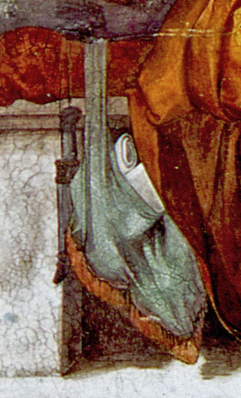
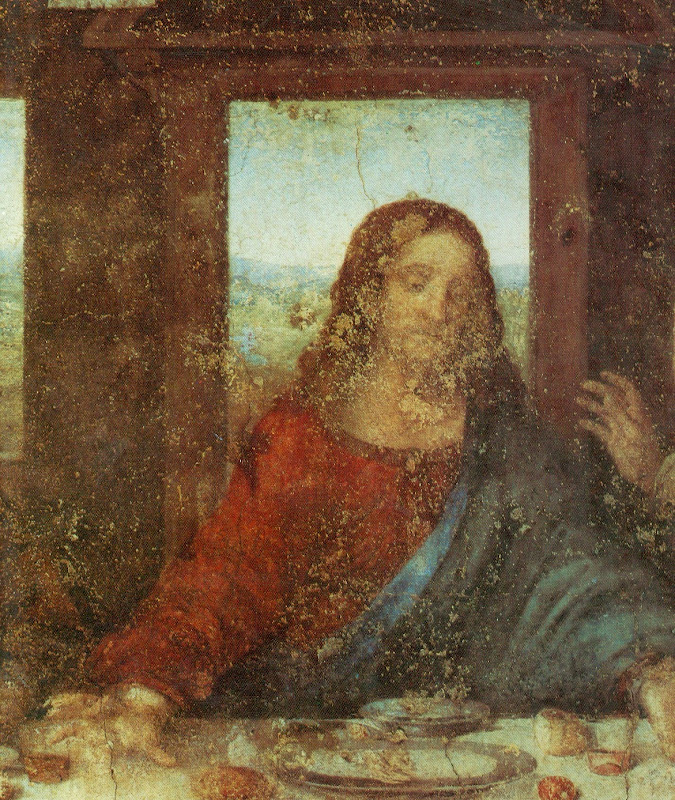
Above, Fig. 1: A facsimile of the “La Bella Principessa” drawing being inserted into the Warsaw Sforziad (but showing only the relationship of the top of the facsimile to the top of the book and not the accompanying relationship of the facsimile and book at the bottom). Photo by courtesy of Lumiere Technology.
For many reasons, it is essential to Prof. Kemp’s Leonardo ascription that it be accepted that “La Bella Principessa” had originally been incorporated within the Warsaw Sforziad now held in the National Library, Poland. It has not been so accepted because, contrary to press releases claims and media coverage thereafter, nothing material or documentary has established such a relationship. No record of any connection between the drawing and the book has been found despite extensive searches by researchers such as Kasia Wozniak. Moreover, despite extensive searches of Berenson’s archives by Kemp and Silverman, no record of the supposed 15th century drawing in any context predates its only-recently acknowledged ownership by the late painter/restorer Giannino Marchig. This pictorially and graphically mongrel work remains without a history and, prior to September 2011, without any claim – even by its only known previous owner – that it might have been a work by Leonardo da Vinci.
Martin Kemp has challenged Kasia Pisarek’s measurements between the stitches in the book’s binding. He and Pascal Cotte (of Lumiere Technology) claim that three stitch holes are present on the left hand edge of the “La Bella Principessa” sheet and that these match three of the book’s five stitches. No confirming visual evidence has been produced in support of this claim. In addition to fresh evidence on dimensions provided below by Pisarek, it might be noted that the Kemp/Cotte claims of a match have been variously and only rarely unequivocally phrased. All emphases below are added:
“The stitch holes in the vellum of the portrait match those in the book” – “The Original Source of the New Leonardo Portrait Discovered”, a Martin Kemp press release, 27 September 2011.
“Three of the stitch marks, the ones that we can still see on the edge of the ‘Bella Principessa’, match as well as they conceivably could” – Martin Kemp, Artinfo interview, “The Da Vinci Detective: Art Historian Martin Kemp on Rediscovering Leonardo’s Tragic Portrait of a Renaissance Princess”, by Andrew M. Goldstein, 11 October 2011;
“During our studies at the National Library, we inserted a facsimile of the portrait into the relevant opening of the book where the size matched very closely” – Martin Kemp, item 14, “Leonardo da Vinci La Bella Principessa: Errors, Misconceptions, and Allegations of Forgery”, on the Authentication in Art website. See Fig.1, above;
“The current stitching of the volume involves five holes, whereas there are only three holes now visible along the left margin of the ‘La Bella Principessa’. However, these three holes correspond very closely to the corresponding ones in the book.” – Martin Kemp and Pascal Cotte, “La Bella Principessa and the Warsaw Sforziad”, Lumiere Technology website, September 2011.
FAILING TO GET THE MEASURE OF HOLES
With linear measurements a near-miss is as good as a mile. If a hole is two millimetres adrift of a stitch there is no match. Claiming “correspondences” and “close” matches between the three holes and the five stitches is problematic enough, but, as Kasia Pisarek has now re-confirmed, the three holes in the “La Bella Principessa” drawing do not correspond with three of the book’s five stitches. Moreover, Kemp’s imprecision came with a perplexing multiple caveat: “In measuring the distances between the holes and matching these distances in the book and the portrait we allowed for four potential sources of error” – Kemp/Cotte, item 13, “La Bella Principessa and the Warsaw Sforziad”, Lumiere Technology website.
If incorporating an allowance for one potential source of error would necessarily be weakening to the force of a claimed match, how might allowances have been made for four different sources of error? How were the different “potentials-for-error” calibrated and weighted one against the three others? With accounts of this attribution, too many features remain in flux. For example, explanations offered for the disparity between the drawing’s three stitch holes and the book’s five stitches have shifted. In 2011 Kemp/Cotte wrote:
“The second task was to see if the holes in the portrait and the stitching pattern in the book corresponds. There is an obvious difference. The current stitching of the volume involves five holes, whereas there are only three holes now visible along the left margin of “La Bella Principessa”. However, these three holes correspond very closely to the corresponding ones in the book…The different number of stitching holes may result from the untidy way the left margin of the portrait has been cut, or from two intermediate stitches being added when the book was later rebound in standard Zamoysky livery. The former explanation is more likely.” (Emphases added.)
The suggestion that the book might possibly have been bound originally with only three stitches seems to have been abandoned altogether. Martin Kemp now accepts in his response to Kasia Pisarek that the book always had five stitches but claims as a countering fact against this recognition that: “The irregularity and extensive damage along the left margin explains why two of the five stitch holes are no longer clearly discernible.”
NOT AN EXPLANATION
The posited stitch holes cannot be said to be “no longer discernible” because there is no evidence that they were ever present. Prof. Kemp here begs a question on which this attribution turns. The roughly cut edge cannot be taken to have explained these absences. What Kemp offers, in truth, is (an implausible) hypothesis that ignores the technical exigencies of book binding and the dimensional realities of the “La Bella Principessa” sheet. When books are being made, the stitches are inserted along the line of a fold made collectively to the small number of sheets that form one of the book’s sections or “quires”. In the case of the Warsaw Sforziad, Pascal Cotte established (by taking and combining 70 precisely-focussed macro-photographs) that each quire was composed of four sheets (folios) which, when folded and stitched, comprised sixteen numbered pages. The book binder’s craft requires that the stitching occurs precisely along the crease line of the folded sheets. This careful alignment is necessary if the pages are not to cockle and for the book to open easily.
The three holes on “La Bella Principessa” have been taken to relate (- more or less, but never exactly) to the book’s central and two outer stitches. Had the “La Bella Principessa” sheet been incorporated in the Warsaw Sforziad when it was made in the late 1490s, the two inner stitch holes would be expected to be present on the sheet, even as it is today, and notwithstanding its roughly cut left-hand edge.
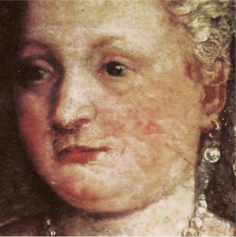
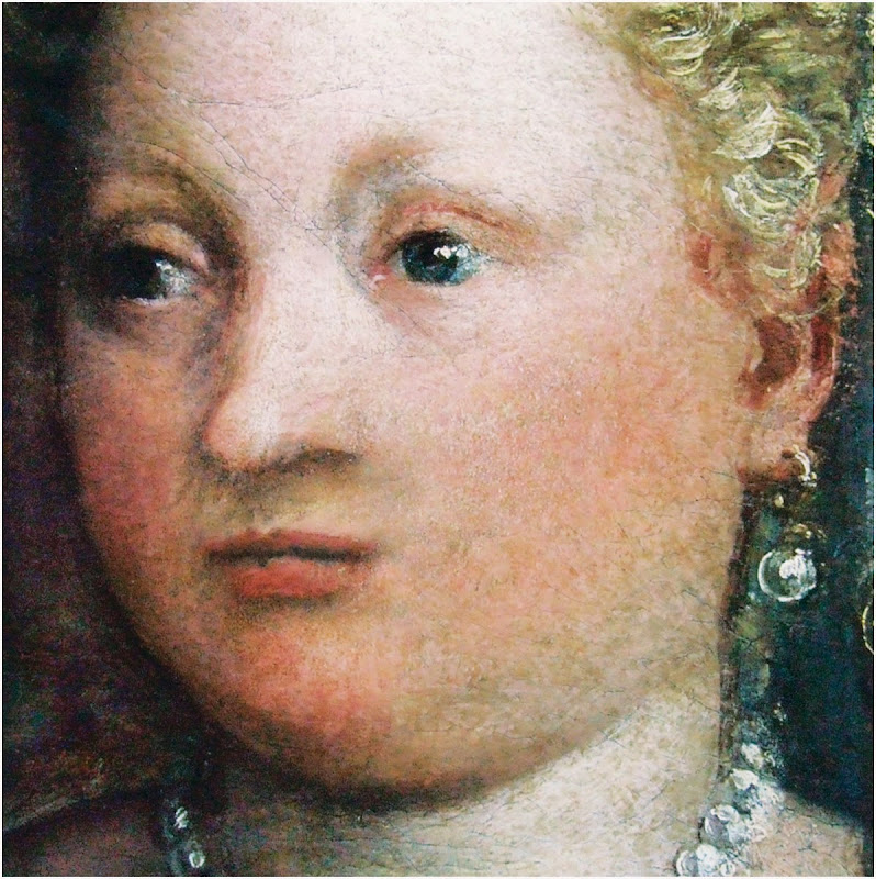
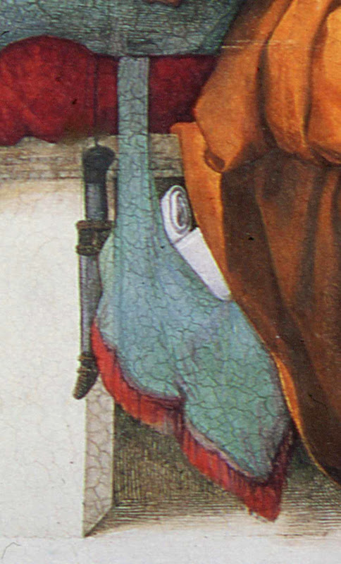
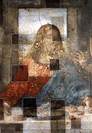
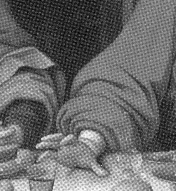
At Fig. 2 below, we see the white arrows and circles with which Pascal Cotte identified what are said to be “La Bella Principessa’s” three stitch holes. On the image on the left, we have drawn in red the alignment of the present three holes and have indicated with arrows where the two hypothesized additional stitching holes would be expected to be located. Both holes would fall within the present sheet despite its roughly cut left-hand edge. In the image on the right of Fig. 2 we again indicate (in black) the alignment of the present three holes, but show in red how the alignment would be disrupted had the two hypothesized additional stitch holes been situated to the left of the present sheet, as Prof. Kemp now claims in “explanation” for their absence from the sheet itself. Such a positioning would have resulted in a zigzag, not a row, of stitch holes. It is impossible to envisage how four sheets of vellum might have been folded so as to produce a neatly zigzagging crease.
Aside from the above problem, any lingering hope that this “La Bella Principessa” sheet might once have formed part of the Warsaw Sforziad will have to be abandoned in the light of Kasia Pisarek’s latest findings described below on her second examination of the Warsaw Sforziad.
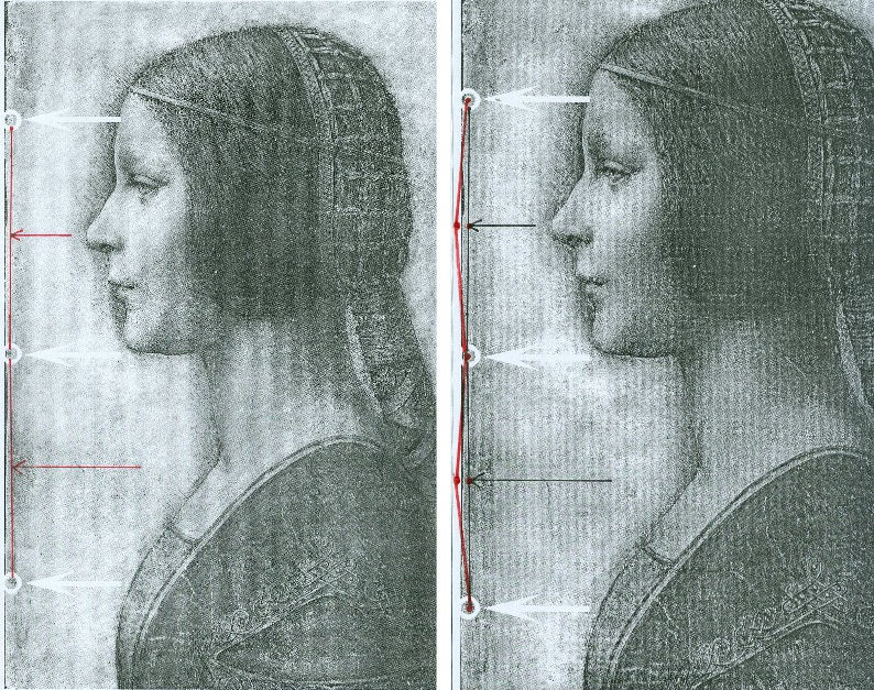
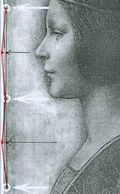
Above, Figs. 2 and 3. In Fig. 2 (top) we see, in the left and right images, the white arrows and circles with which Pascal Cotte located the “three holes showing that the image was once part of a codex or manuscript”. Given that the book (the Warsaw Sforziad) from which this sheet is said to have been cut was originally bound with five stitches, had the “La Bella Principessa” sheet once formed part of that book, it would today have five stitch holes, not the present three. In Figs. 2 and 3, we indicate with arrows (in red and then in black) where the missing two stitch holes would, for the reasons given above, be expected to have been located.
THE DOUBLE ‘DISCOVERY’ OF THE SUPPOSED POSITION OF LA BELLA PRINCIPESSA IN THE WARSAW SFORZIAD
When Andrew Goldstein asked Martin Kemp in an Artinfo interview in October 2011 what, on seeing the drawing, had convinced him it might be a Leonardo, he replied:
“So the initial connoisseur’s reaction merely tells you that something is worth looking at, but at any point one wrong thing can throw that all away — a later pigment, a bit of something that might come up about its history to indicate it was forged at some point, and so on. I was trained as a scientist, and if you have a scientific theory, you only need have one bit of the experiment that says, ‘this is not right,’ and the whole thing collapses. You always have to be looking for that one thing that is going to demolish the whole expectation that’s being set up.”
Kemp has given other grounds for caution when making attributions. On first encountering “La Bella Principessa”, he told Silverman, “I immediately saw it was in a different league from the others. But I was still very, very cautious. I didn’t want to jump at it because once you start believing you can summon up all the evidence you need.” (Peter Silverman, Leonardo’s Lost Princess: One Man’s Quest to Authenticate an Unknown Portrait by Leonardo da Vinci, 2012, p. 74.) Kemp had become a believer in the Leonardo attribution by 28 September 2011 when he issued a press release “The Original Source of the New Leonardo Portrait Discovered”. He added, “This (press release attached without the pics) should more or less settle the arguments – though probably not knowing the myopia of the art world.”
In 2011, after Kemp and Cotte had inserted their facsimile “La Bella Principessa” into the book, Kemp expressed himself 80 per cent confident of the drawing’s Leonardo attribution in a National Geographic film of the occasion. However, this was not the first time that a claimed “fit” between the facsimile and the book had been made and filmed by National Geographic. Peter Silverman describes in his book how, in December 2010, he had established a match in a different part of the book:
“We began by measuring the page size to see if it corresponded to “La Bella Principessa” and were gratified to see that it did, within a millimeter or two (a minute fraction of an inch)… Martin [Kemp] had surmised that the drawing would have been placed either at the very beginning or the very end of the book, but after careful examination we could find no trace of a cut page in either place. ‘May we turn each page?’ I asked. It was not a simple request. The book was nearly two hundred pages, and it would be a bit laborious for her [Anna Zawisza, the head of manuscripts] since utmost care had to be used so as not to damage the precious work in any way…It was apparent that the three pinholes where the binding had been sewn, noted earlier by Martin, which we had hoped would be a key to matching, would not be relevant, since the book had been rebound using five sutures…We slowly continued to turn each page, but there was no sign of a missing page…I had begun to abandon hope and to mentally prepare myself to return empty-handed. But then Zawisza turned page 161. There was a momentary beat of silence, and then she and I let out muffled cries. There, before our incredulous eyes, was what seemed to be the missing link, the element we longed to find: a remnant of a cut and extracted page of vellum that was the same darkish yellow as “La Bella Principessa”. We could barely contain our emotions. We measured the undulation of the remnant, and it corresponded exactly. Kathy [Silverman’s wife] and Kasia [Wozniak, art historian] came round to see for themselves, while David [Murdoch, National Geographic producer] filmed the historic moment. Even the armed guard was caught up in the excitement. Zawisza, who had carefully studied the book on past occasions, murmured how unhappy she was that she’d never noticed the missing page, now so glaringly obvious from the protruding remnant…”
That filmed historic moment was eclipsed by the moment in which Kemp and Cotte discovered a (preferred) location for the drawing at the front of the book. On her second examination of the Warsaw Sforziad, Dr Pisarek has learned that each of the five stitches in the book’s binding resulted in two holes, through which a string was passed. Thus, now that it is accepted that the book was originally bound with five stitches, each of which generated two holes, and that the “La Bella Principessa” sheet possesses only three of the necessary ten holes – and three where there should be six – there is no physical match between the drawing and the book, just as there is no documentary record of a Leonardo drawing having been bound within the book. Those who continue to see the hand of Leonardo in the drawing itself must now find an alternative history and another princess to accompany and bolster it.
Michael Daley 24 May 2016
Kasia Pisarek: A reply to Martin Kemp’s essay “Leonardo da Vinci La Bella Principessa. Errors, Misconceptions and Allegations of Forgery”
Professor Kemp has written an essay in response to my article “La Bella Principessa; Arguments against the Attribution to Leonardo”, Artibus et Historiae, No. 71, XXXVI, June 2015, pp. 61– 89.
In his essay, Prof. Kemp lists what he deems a series of errors and misconceptions in the Artibus article, but says he does not wish to address the issues of attribution I raised.
The purpose of his article is, however, an attempt to counter or undermine my findings.
I will answer his points in the order and with the numbered headings used by Kemp in his text.
[Martin Kemp] “1) Bibliographical”
[Kasia Pisarek] Martin Kemp says that most of my material is quoted from the internet and that I make only one reference to his book in my footnote 50.
This is incorrect. I make extensive reference to his book on the opening page and further references in footnotes 54, 57, 59 and 64. I have examined it as thoroughly as would be expected of any researcher. I also referred to many other books and articles which were accessed from libraries and not from the internet. These were:
M. Kemp and P. Cotte, The Story of the New Masterpiece by Leonardo da Vinci: La Bella Principessa, London, 2010; M. Kemp, Leonardo (rev. ed.), Oxford, 2004; P. Silverman, Leonardo’s Lost Princess: One Man’s Quest to Authenticate an Unknown Portrait by Leonardo Da Vinci, New Jersey, 2012; C. Geddo, ‘A “Pastel” by Leonardo da Vinci: His Newly Discovered Portrait of a Young Woman in Profile’, Artes, 2008–2009, pp. 67–87; C. C. Bambach, ‘Leonardo’s Notes on Pastel Drawing’, Mitteilungen des Kunsthistorischen Institutes in Florenz, vol. 52, 2008, no. 2/3 (Le tecniche del disegno rinascimentale: dai materiali allo stile. Atti del convegno internazionale, Firenze, 22–23 settembre 2008, ed. By M. Faietti, L. Melli, A. Nova), pp. 177–204; M. Gregori, ‘A Note on Leonardo’, Paragone, LXI, 2009, no. 723, pp. 3–4; D. Ekserdjian, ‘Leonardo da Vinci: “La Bella Principessa” – The Profile Portrait of a Milanese Woman’ (book review), Burlington Magazine, vol. 152, 2010, no. 1287, June (Attributions, copies, fakes), pp. 420–421; P. C. Marani, ‘Deux nouveaux Léonard?’, Dossier de l’art, 2012, no. 195, avril, pp. 58–63. Giannino Marchig, 1897–1983: paintings and drawings, exh. cat. London, 1988; Giannino Marchig, 1897–1983, exh. cat., Geneva, 1985; Giannino Marchig: 1897–1983: dipinti, disegni, incisioni, exh. cat. Florence, Gabinetto disegni e stampe degli Uffizi, 12 March – 5 June 1994 (Italian ed.); J. Cartwright (Mrs Henry Ady), Beatrice d’Este, Duchess of Milan, 1475–1497. A Study of the Renaissance, London, 1910; B. Horodyski, ‘Miniaturzysta Sforzów’, Biuletyn Historii Sztuki, 16, 1954, pp. 195–213; E. McGrath, ‘Ludovico il Moro and His Moors’, Journal of the Warburg and Courtauld Institutes, vol. 65, 2002, pp. 67–94; L. Syson with L. Keith, Leonardo da Vinci, Painter at the Court of Milan, exh. cat. National Gallery, London, 2011; Dizionario delle origini, invenzioni e scoperte nelle arti, nelle scienze…, Milan, 1831; B. Berenson, The Drawings of the Florentine Painters, vol. III, Chicago, 1938; Leonardo da Vinci, Master Draftsman, ed. by C. C. Bambach, exh. cat., The Metropolitan Museum of Art, New York, 2003; Z. Zygulski Jr, ‘Ze studiów nad Dama z gronostajem. Styl ubioru i wezly Leonarda’, in: Swiatla Stambulu, Warsaw, 1999 (first published in Biuletyn Historii Sztuki, vol. 31, 1969, no. 1, pp. 3–40).
The 2012 Italian version of Kemp/Cotte’s 2010 book is a translation from the English with the addition of the Sforziad hypothesis. The latter had already been published on the Lumiere Technology website and I discussed it at length.
Gnignera’s text was in Italian so I used Prof. Zygulski’s extensive knowledge of historic costume in general and coazzone in particular. The Monza catalogue (2015) was not published when I submitted my paper. The 2014 exhibition catalogue from the Galleria Nazionale in Urbino was also unavailable. To my knowledge these later publications have not yielded any conclusive evidence.
Prof. Kemp said that I have not addressed any of ‘the scientific evidence in the two books related to the lower layers of the image, the pentimenti or the condition and retouching in various media’ and goes on to say ‘contrary to Pisarek’s assertions, the interventions of restorers are documented in both books’. The latter sentence must refer to my ‘it is also strange that he did not consider that the drawing might have been retouched and repainted at a later time’ (p.79). Prof. Kemp has taken this out of context. I said that he did not mention the restorations in that particular passage of his book Leonardo (p. 210).
I not only analysed his art historical arguments in my text, but also the technical evidence presented by Cotte – which is to say:
– The trois crayons, pen and ink and bodycolour technique on vellum (unprecedented for Leonardo);
– The X-rays (inconclusive, in Cotte’s own words “did not yield significant new findings”, p. 154)
– The Carbon-14 dating of the vellum (wide-ranging 1440-1650, not constituting proof in itself as anyone could draw at any time on a blank folio removed from a manuscript)
– The quality of the vellum (rough; drawing on the hair-side; does not match the Sforziad’s smooth and well-prepared support; Birago’s illumination on the skin-side)
– The left-hand hatching (dry, timid and mechanical; on the outside of the contour of the profile, unlike in all Leonardo’s female portraits)
– The presence of three stitch holes (the Warsaw National Library Sforziad has five holes)
– The ‘knife marks’ when the folio was cut off (unnecessary, if the folio has been removed during rebinding).
– The retouchings of a later restorer (Marchig’s)
– The fingerprint evidence (no longer valid)
– The pentimenti, in the same place as in Leonardo’s Windsor portrait (a negative point, as La Bella Principessa could be based on that drawing).
At this point I would like to discuss some more scientific evidence:
On page 109:
“The support is probably the fine-grained skin of a calf”.
To the contrary, the images show an irregular grainy surface with visible follicles. Both Geddo and Turner described the support as “rough animal hide” and the surface of the vellum as being “pitted”.
“The portrait was drawn on the smooth ‘hair’ side”.
To the contrary, the hair-side has follicles so it is the rough side, not the smooth side.
Contrary to Prof. Kemp’s claim that I ignored Geddo’s contributions, I quoted her (p. 76), and she said exactly the opposite: “Besides the presence of the follicles, the rough unworked surface of the hide and its darkened, somewhat yellowish colour show that the portrait was made on the outer surface of the skin (formerly furcovered) and not on the inner one covering the flesh, which was aesthetically the superior of the two and commonly used as a support for written documents”.
I quoted extensively from Geddo’s article “A ‘Pastel’ by Leonardo da Vinci: His Newly Discovered Portrait of a Young Woman in Profile”, in Artes, 2008–2009, pp. 67–87, on my pages 62, 76 and 88.
On page 114:
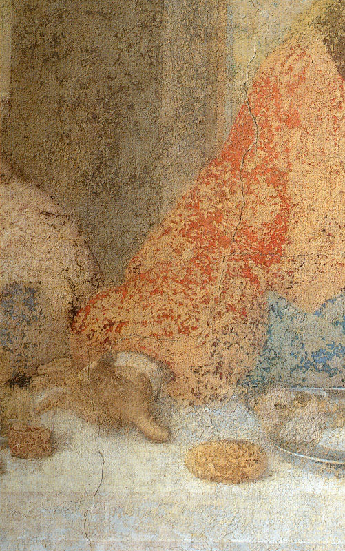
The discovered “small area of pen marks along the left edge of the support” described by Cotte as Leonardo’s “pen trials”. This would surely have no place in a drawing destined for a luxury book presented as a gift to the Sforzas.
On page 154:
A problem with the X-rays:
‘Because white chalk (calcite or calcium carbonate) does not absorb X-rays to any great extent, the luminous zones of the sitter’s face ought to have appeared grey in the X-ray. On the contrary, however, they appear very white here, indicating the presence of a significant amount of dense material in the chalks area – which seems to contradict all the physical evidence considered so far.’
Cotte attributes this anomaly to the technician supposedly over-exposing the plate. This confirms his own observation that X-rays “are vulnerable to diverse interpretation”.
[MK] “2) PROVENANCE”
[KP] I did not say that the Marchigs were involved in forgery of any description. What I did say was that Giannino was familiar with Leonardo’s technique as a restorer and a “Leonardesque painter”. He was able to make such a drawing if he had wanted to, but clearly he had not tried to sell La Bella Principessa as a work by Leonardo.
Prof. Kemp does not explain, however, why the drawing had no provenance prior to Marchig’s ownership, and, as Michael Daley has recently pointed out, Professor Kemp and the drawing’s owner, Peter Silverman jointly trawled Berenson’s archive in hope of finding some pre-Marchig record but found none.
[MK] “3) The assertion that there is an ‘almost total absence of close comparisons with unimpeachable works by Leonardo.’”
[KP] The offending phrase above was written not by me but by David Ekserdjian in “Leonardo da Vinci: ‘La Bella Principessa’ – The Profile Portrait of a Milanese Woman”, The Burlington Magazine, vol. 152, 2010, no. 1287, June (Attributions, copies, fakes), pp. 420–421.
I used the same Leonardo comparisons as Prof. Kemp, but where he saw striking similarities, I saw possible imitation.
As to Cecilia Gallerani, although the structure of the eye looks comparable, it is round, soft and alive in Leonardo’s portrait, and dry, linear and lifeless in La Bella Principessa. The iris is drawn as a flat disc and the eyelid is marked with clear cut lines, unlike in nature.
Cotte states on p. 177: “Leonardo, for example, consistently made the bottom of the eye’s iris coincide exactly with the edge of the lower eyelid”.
This is not always the case. In Portrait of a Woman in Windsor or in La Belle Ferroniere the iris does not touch the lower eyelid, while in some works by Leonardo’s followers it does.
[MK] “4) The lack of records of Leonardo making the drawing”
[KP] Prof. Kemp wrote that all Leonardo’s known works are “unrecorded in his writings”. Leonardo does in fact mention two Madonnas in a sheet of sketches (Gabinetto Disegni e Stampe degi Uffizi, Florence, 446 E) inscribed: “…1478, I began the two Virgin Marys”, possibly referring to the Benois Madonna in St. Petersburg. He also mentions in a note his sculpture of the Sforza Horse (Ms. C, fol. 15v; R 720; B 44; V 53). And in an undated letter (about 1491-95), he writes together with De Predis about being underpaid for the Virgin of the Rocks.
The 16th century record in the Zamoyski collections Kemp refers to applies only to the Sforziad, not to the drawing, which was unrecorded there.
[MK] “5) ‘The entirely unusual for Leonardo medium of vellum commonly found in manuscripts led Prof. Kemp and his colleagues, including David Wright, Emeritus Professor of Art History at the University of South Florida, to search fifteenth-century codices for an excised illumination.’”
[KP] Prof. Kemp writes that “the author’s narrative of an extensive search is imaginary.”
But Dalya Alberge wrote in her article, “Is this portrait a lost Leonardo?” in The Guardian, on 27 September 2011:
“Earlier this year, he [Prof. Kemp] embarked on what he describes as a ‘needle-in-a-haystack’ search for a 15th-century volume with a missing sheet. […] Against the odds, Kemp tracked the volume down, to Poland’s National Library in Warsaw.”
[MK] “6) Forging a Leonardo?”
[KP] To be clear, I only said that the drawing could be a compilation of Leonardo’s works and other sources such as a bust by Cristoforo Romano.
[MK] “7) Pisarek’s reliance on Julia Cartwright”
Cartwright’s work is the only one specifically on Bianca Giovanna Sforza I could find in the English language. As there are no other secure portraits of Bianca Giovanna, the Principessa hypothesis is not supported by any evidence either.
Cartwright’s identification of The Musician as the portrait of Galeazzo Sanseverino, Bianca’s husband, looks convincing. The companion portrait in the Ambrosiana could then be showing his wife Bianca, but she looks very different to La Bella Principessa. Also Professor Carlo Pedretti in his Leonardo: The Portrait, 1999, called the Ambrosiana portrait (p. 23) “a probable portrait of Bianca Giovanna, the illegitimate daughter of Francesco Sforza.”
[MK] “8) Bianca Maria Sforza and earlier scholarship”
Even if the identification and dating of the portrait ‘pre-dates the research into the Sforziad’, as stated by Prof. Kemp, there is still the problem of the dating and the too ‘archaic’ style of the drawing.
Kemp does not explain why Vezzosi and Turner identified La Bella Principessa as Bianca Maria Sforza, even if she looks so different to her other known likenesses.
[MK] “9) Cutting out the portrait from the Sforziad in Warsaw”
[KP] There is no evidence that the folio was in the Sforziad and was removed during rebinding. But if it were so, there would be no need to cut out the folio, only to remove it as a complete sheet. A complete sheet (two folios) is indeed missing in the book, which would eliminate the need for excision.
If the folio had been removed during rebinding for its beauty or high value by the Zamoyskis, it would have been recorded in their collections, but there are no such records. Kasia Wozniak’s research has not found any evidence to this effect.
Her hypothesis that the drawing went to the Czartoryski collections in Pulawy where it was identified as by Leonardo is also so far unsubstantiated. There were no such records in the Czartoryski collections. The late Director of the Czartoryski Museum, Prof. Zygulski Jn. never mentioned the existence of a Leonardo drawing in their collections.
The Bona Sforza drawing listed in the 1815 inventory of the Temple of Sybil in Pulawy and mentioned by Wozniak as the possibly misidentified Bianca Giovanna Sforza, refers to a miniature watercolour on vellum illustrated in D. Dec and J. Walek’s, Czasy! Ludzie! Ich dziela. Teatr obrazów ksieznej Izabeli, listed as no. 99. ‘Polish, 16th century’.
There is no connection between my article in Artibus and the interests of the National Library in Warsaw.
[MK] “10) The foliation and inserted paper pages”
[KP] Prof. Kemp himself used the word ‘codex’ to describe the Sforziad in his book Leonardo: Revised edition, 2011, p. 256:
“this tender and refined formal portrait in ink and coloured chalks on vellum has been cut from a codex (a book), namely the copy of the Sforziada in Warsaw produced for Galeazzo Sanseverino.”
The three folios missing in the Warsaw Sforziad were originally left blank as in the other copies of the book in Paris or London.
Geddo described the drawing’s “apparent crudeness in the preparation of the parchment” and “the rough unworked surface of the hide” (A Pastel by Leonardo da Vinci… reprinted in P. Silverman, Leonardo’s Lost Princess, pp. 219-220). This is not true of the Sforziad’s parchment.
I have seen the Sforziad on two occasions. Once in the summer 2012 and more recently in March 2016; the parchment is finely grained and of high quality, as expected in a luxury book for the Sforzas.
My illustrations Fig. 7, 10 and 11 indeed show paper pages. Because they look so similar it is easy to mistake the paper pages for the vellum ones. My Fig. 6 and Fig. 8 are vellum and they look very similar in colour and texture.
Kemp states that I inaccurately said that his “reconstruction of the insertion of the drawing in the Warsaw Sforziad looks unrealistic, as it is facing a printed page”. He wrote that “The reconstruction shows that the portrait would have faced a blank page”. This is incorrect. His “Fig. 12 – ‘Hypothetical Reconstruction of La Bella Principessa as folio 6r” in the online article “La Bella Principessa and the Warsaw Sforziad” does face a printed page.
[MK] “11) Iconography”
[KP] According to Kemp, Horodyski’s pioneering research on the Sforziad I support ‘has been superseded in the light of more detailed knowledge of Sforza court iconography and analyses by later scholars, including Wright’.
Horodyski suggested Gian Galeazzo Sforza and his offspring, such as Bona Sforza, the later owner of the book in Warsaw as the recipient of the Sforziad.
But according to D.R.E. Wright in his article on the Lumiere Technology website (which has now been removed), M. L. Evans and E. McGrath, the Warsaw Sforziad was destined for Galeazzo Sanseverino, Bianca’s husband.
So why is Galeazzo Severino’s profile absent on the Warsaw frontispiece by Birago, where Ludovico’s is in London and Gian Galeazzo’s in Paris, the recipients of the other Sforziads?
Moreover, Galeazzo Sanseverino was not part of the Sforza dynasty and Bianca was illegitimate. All the copies of the Sforziad on vellum were dedicated to members of the Sforza family.
Horodyski’s reading of the symbolic content of the Birago frontispiece more logically pointed to the death of Gian Galeazzo: the lack of the recipient’s profile as emblem, the missing figure of Gian Galeazzo in the boat with Ludovico il Moro, the tears in the handkerchief, the sarcophagus, the broken shield with the initials GZ, the crest with one half with arms of Milan and the other of Aragon for Gian Galeazzo.
After my defence of Horodyski’s interpretation, an Italian scholar Carla Glori published online her very detailed new iconographic study of the illumination: ‘The Illumination by Birago in the Sforziad incunabulum in Warsaw: in defence of Horodyski’s thesis and a new hypothesis’. I am quoting her extensively below.
She said: “The incunabula with the illuminations now in London and Florence were the property of Ludovico il Moro, given the recurrence of the central upper figure of a moor, and the presence of the ensign of the Duke of Bari with his devices called “la scopetta” (the little broom) and “I due fanali” (the two beacons). The Paris and Warsaw incunabula were the property of Duke Gian Galeazzo Sforza and his family, because they are reproducing the devices of Gian Galeazzo himself and of his father, Galeazzo Maria.”
The sieve, which was said to be the emblem of Galeazzo Sanseverino, was Gian Galeazzo’s personal device (created by his father) called “il buratto” (a sieve held by two hands) with the motto TAL A TI QUAL A MI, as illustrated by the “Cassone dei tre Duchi”, Sforza Castle, Milan, 1479-1494.
Glori also added that the sieve device (“il buratto”) is duplicated in symmetrical position in the central area of the Warsaw illumination.
She concluded that “the Warsaw illumination was dedicated to the memory of the deceased Gian Galeazzo Sforza and his family, and that it was certainly dated after his death (1494)”.
Her argument against the Sanseverino coat of arms or imprese supposedly identified in the Birago’s illumination includes:
– The missing Aragonese “A” in the device of the “three intertwined rings with diamonds” appearing on the Warsaw illumination
– The missing Sanseverino NOSTRO È IL MESTIERE motto
– The fact that the hybrid coat of arms of the Warsaw illumination does not correspond to the coat of arms of the Sanseverino dynasty; it should be silver/white not gold/yellow. “Every armorial certifies that the field (“campo”) of the Sanseverino coat of arms was “SILVER” (white), while the field (“campo”) of the coat of arms in the illumination of Warsaw is “GOLD” (yellow)”. “According to Horodyski’s logical and symbolical interpretation, the emblem is an artistic fusion of the traditional emblem of the city of Milan with the yellow and red lines of the Aragona coat of arms.”
– The reference of the initials “GZ” (appearing in the ducal documents and iconography, also on the ‘Cassone dei Tre Duchi’) to the memory of the deceased dukes Galeazzo Maria and Gian Galeazzo, not Galeazzo Sanseverino.
– The absence of any reference to Galeazzo Sanseverino and his biography such as the tournament lance of the famous jouster, while the ducal arms on the “Cassone dei Tre Duchi” are present: the round shield, the quiver with arrows and the sword. The depicted starry armour on the left is not the typical armour of a jouster. It is empty as Gian Galeazzo is dead, and it is almost identical to the one worn by him in the Paris illumination.
– The presence of a body of heraldic devices celebrating the Visconti-Sforza dynasty and referable in particular to Galeazzo Maria Sforza and his son Gian Galeazzo such as the greyhound/the tree/the divine hand (Francesco Sforza); the “capitergium” device (a bandage with a knot) dedicated to Gian Galeazzo Visconti, the first Duke of Milan, celebrating the Visconti dynasty; the rising waves (“onde montanti”); the three intertwined rings with diamonds (“i tre anelli intrecciati con diamante), by Muzio Attendolo, the founder of the Sforza dynasty: it was probably given to him in 1409 by the Marquis of Ferrara Niccolò II d’Este after the conquest of Reggio Emilia. They are not emblems of Bianca Giovanna as was advanced, but of members of the Sforza family in general.
According to Glori, “we have no evidence that the incunabulum now in Warsaw was confiscated in Milan during the French invasion. In 1517 Antonio de Beatis saw some precious incunabula in the Royal Library of Blois, but he did not cite the Sforziad as being amongst them in his autograph manuscript XF28 of the National Library in Naples. It is plausible that the incunabulum now in Warsaw was a wedding gift to Bona Sforza from her mother Isabella; I propose also the hypothesis that she received the gift from her aunt Caterina Sforza, probably when she left Milan with Isabella after the downfall of Ludovico il Moro.”
[MK] “12) Betrothal and Marriage”
[KP] Although the word ‘betrothal’ might have been more appropriate than ‘marriage’ in the case of Bianca Sforza, others also wrote that her ‘wedding’ (or nuptials) took place in 1490 or late 1489.
Julia Cartwright in her Italian Gardens of the Renaissance and Other Studies, 1914, (reprint 2013) wrote p. 174: “On the 10th of January, 1490, the wedding [of Bianca and Galeazzo] was solemnised in due splendour in the Castello of Milan (…)”.
Edward McCurdy in The Mind of Leonardo da Vinci, New York, 2013, wrote “Bianca Sforza, a natural daughter of Ludovic who in 1489, while still a child, was married to the famous captain Galeazzo di Sanseverino.” p. 301.
Wikipedia entry for Galeazzo Sanseverino also says “He was married to Bianca, illegitimate daughter of Ludovico Sforza, in 1489.”
[MK] “13) The Technique”
[KP] It was Prof. Kemp himself who said that Leonardo never worked on vellum in his book The story of the new masterpiece… p. 35: “There are no other known works by Leonardo on vellum, but there is previously neglected evidence of his interest in making coloured images on prepared animal skin.”
Turner also wrote in his online Statement concerning the portrait on vellum by Leonardo, p.3: ‘Also apparently unprecedented [for Leonardo] is the use of vellum or parchment as a support for the new portrait.’
Geddo also wrote: “The use of parchment was until now unknown in the work of Leonardo (…)”, in P. Silverman, Leonardo’s… p. 226.
In reference to Jean Perréal and dry colouring, the quotation in full is as follows: “Piglia da Gian de Paris il modo di colorire a secco e’l modo del sale bianco e del fare le carte impastate, sole e in molti doppi, e la sua casetta de’colori”.
The translation for carte impastate as ‘paste-board’ is not anachronistic, as it was used as early as 1760 in Joseph Baretti’s, A dictionary of the English and Italian languages, Vol. 1: “Cartone [composto di piu carte impastate insieme] paste-board.”
I have only inspected the vellum of the Sforziad in Warsaw, not the vellum of the drawing, but both Geddo and Turner have described it as ‘rough animal hide’. This is most certainly not what you will find in the Sforziad in Warsaw.
[MK] “14) Dimensions”
[KP] According to Kemp and Cotte, the dimensions of the vellum pages of the Sforziad vary from 33.0 to 33.4 cm in height, while the drawing is 33 cm high.
I have carefully checked the dimensions with the Librarian in March 2016. All the pages are at least 33.4 cm high and more, up to 33.7 cm. The size of 33 cm would be far too small for the book.
The 5 holes in the book are in fact all double holes. Each of the 5 holes is two small holes, between which a string passes. The distance between the two small holes is about 3 mm. The double holes were never mentioned by Kemp or Cotte.
According to the conservator who was present at the time of my last visit, this is the binding that follows the original binding as there is no damage of any kind. So in total there were as many as 10 small holes, not 3 single ones as in the drawing.
I measured the distances between the 3 holes that Kemp and Cotte measured in La Bella Principessa. The measurements were taken from the middle of the double holes.
The distance between the bottom hole and the middle hole is 11.35 cm in the Sforziad, while in the drawing it is 11.06 cm.
The distance between the middle hole and the top hole is 11.7 cm in the Sforziad, while in the drawing it is 11.44 cm.
[MK] “15) The profile and the cartoon portrait of Isabella d’Este”
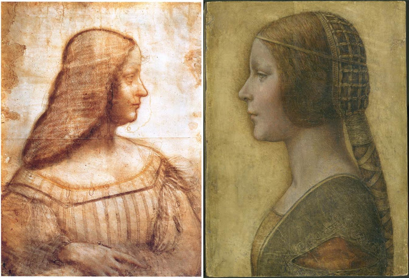
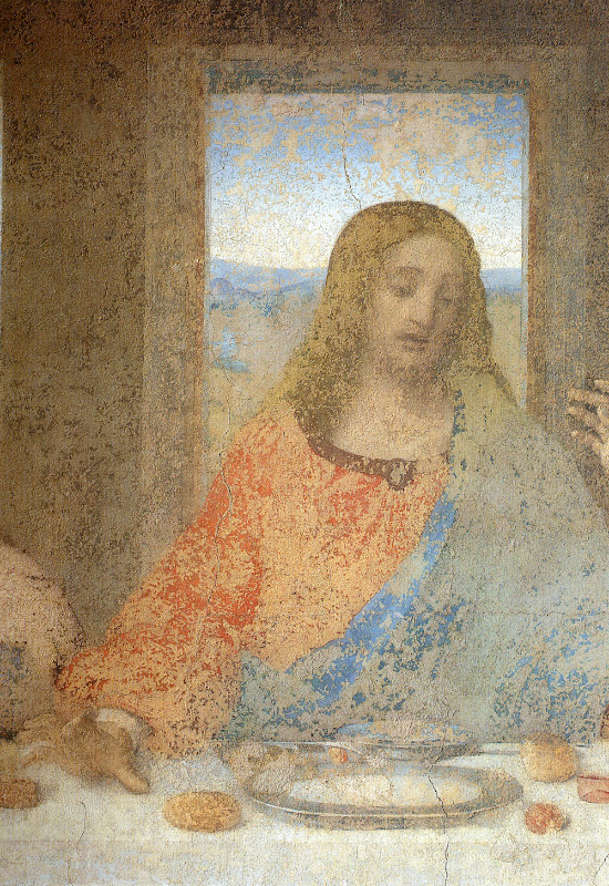
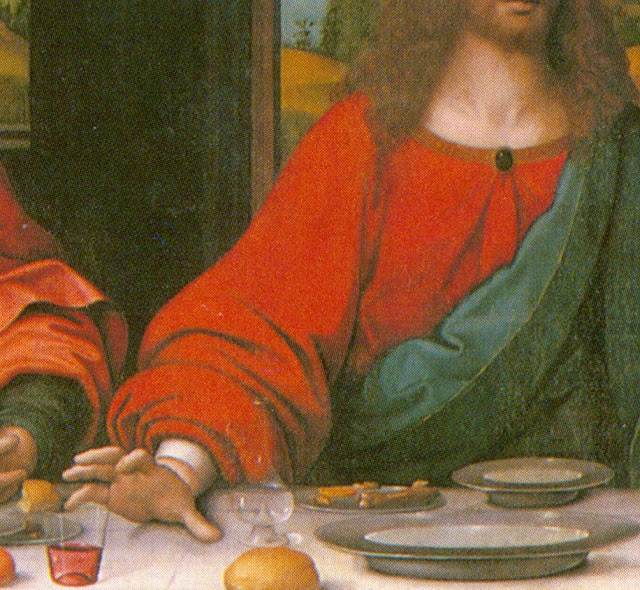
Above, Fig. 4: A comparison of La Bella Principessa with Leonardo da Vinci’s, Portrait of Isabella d’Este, c. 1499–1500, Paris, Musée du Louvre.
[KP] The portrait of Isabella d’Este shows the face in profile but the body in three-quarters, unlike La Bella Principessa. The former is also unfinished, rendered softly with the sfumato effect, fluid in execution, while the shading is on the inside of the profile.
La Bella Principessa is shown in full profile, highly finished, rigid and linear, while the shading is on the outside of the profile.
The similarities between the two profiles are only superficial.
The use of the word ‘repaint’ was an incorrect translation of the French word ‘repentir’, which means pentimento. I would like to mention that I have a good enough grasp of drawing techniques as I also trained as a copyist of Old Masters and an art restorer.
[MK] “16) Left-handedness”
[KP] I disagree that “the left-handed execution cannot undermine the attribution”, as it indicates the intention to imitate Leonardo. None of his collaborators or followers were left-handed, so the drawing is either by him or by an imitator/forger.
[MK] “17) The costume”
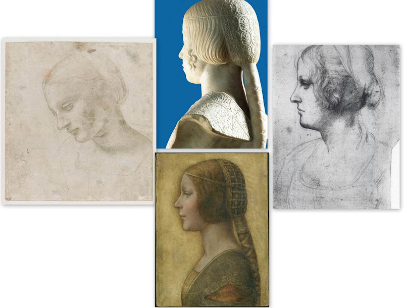
Above, Fig. 5: Comparisons of La Bella Principessa with Leonardo da Vinci’s, Head of a Woman, c. 1488–1490, National Gallery, Parma (left); Leonardo’s Portrait of a Woman in Profile, c. 1489–1490, Windsor Royal Collection (right); and, Gian Cristoforo Romano’s sculpture, Bust of Beatrice d’Este, c. 1491, Paris, Musée du Louvre (top).
[KP] The simplified and flatly rendered dress as well as the coazzone hairstyle do indeed show similarities with the sculpted busts by Gian Cristoforo Romano (Bust of Beatrice d’Este) and Francesco Laurana. But this could be a negative point, as the drawing could be based on one of these busts.
Incidentally, the opening in Laurana’s sculptures differs from that in La Bella Principessa. In the former it is a wide horizontal cut facilitating the movement of the arm, while in the drawing it is a triangular hole which doesn’t seem to play such a role.
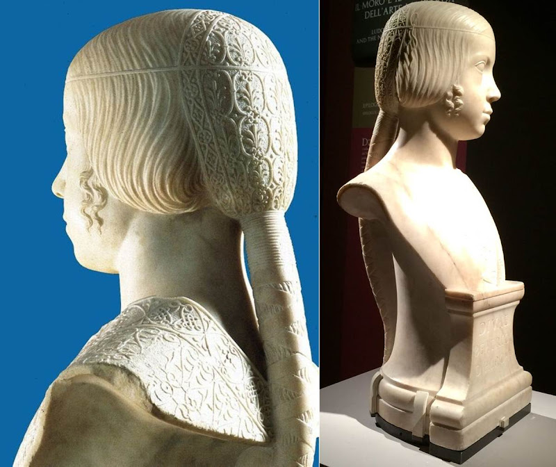
Above, Fig. 6: Gian Cristoforo Romano, Bust of Beatrice d’Este, c. 1491, Paris, Musée du Louvre.
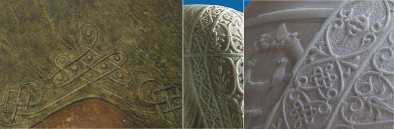
Above, Fig. 7: A comparison of the knots on La Bella Principessa’s dress and Gian Cristoforo Romano’s Bust of Beatrice d’Este, c. 1491.
[MK] “18) The fingerprint”
[KP] The fingerprint evidence which was originally published in the book as “strongly supportive of Leonardo’s authorship” is now considered invalid.
It was not possible to compare the palm imprint to Leonardo’s other examples, and it was described as perhaps unintentional as it is single and isolated, unlike in the execution of Cecilia Gallerani, where many imprints were found where the blending of hues had taken place.
[MK] “19) On Method”
[KP] The “accumulative build-up of different types of evidence” against the attribution to Leonardo is strong, but, as mentioned above, my main arguments were not addressed by Prof. Kemp.
Why is the shading on the outside of the profile? What is the significance of the hand writing on the reverse of the drawing and why was it not investigated? Why is the profile of La Bella Principessa so similar to that in the sculptural Bust of Beatrice d’Este by Cristoforo Romano? Why is the knot on the dress similar to the one on the bust and unlike other Leonardo’s knots? Why are the proportions of the face flawed? Why the vellum of the drawing was described as ‘rough animal hide’ and could it be part of the luxury book of the Sforziad? Why Marchig’s friend the famous Renaissance expert Bernard Berenson had not attributed the drawing to Leonardo? Why there is no known provenance prior to Marchig’s in the 1950s?
In the field of attributions the level of inconsistencies and contradictions always undermine any evidence in favour of a proposed attribution.
[MK] “20) The damaging allegation in the opening to Pisarek’s article that the owner was to set up ‘non-profit-making foundation for multi-disciplinary Classical and Renaissance studies near Florence, to be headed by Professor Martin Kemp’.”
[KP] I made no such allegation. This was a quotation from an article by Simon Hewitt who supports the attribution to Leonardo. This information was published in an Antiques Trade Gazette article by Simon Hewitt in 2009. The article can be found here.
In my article I also wrote: “Prof. Kemp and his colleagues are no doubt genuinely convinced of the authenticity of the drawing, as well as highly enthusiastic about the rediscovery.” This shows that I in no way question Prof. Kemp’s integrity on this matter, only the methodology and the results of the proposed attribution.
Kasia Pisarek, 24 May 2016
And the World’s Worst Restoration is…
WHICH COUNTRY, might you think, has produced the World’s Worst Restoration – Spain? Italy? The UK? India? France? China? Egypt? The United States? Consider the evidence.
THE EVIDENCE IS ABUNDANT and the answer is “All of the above”. There are more contenders than there are countries. No country and no professional stratum is free of recurrent restoration injuries. This evidence can only suggest that injuries are intrinsic to the practice of restoration. Manifestly, no restorers anywhere can “treat” a Renoir – or a Veronese – without injury (see below). Restoration error is the by-product of a singular un-regulated sphere where the distinct languages of art, aesthetics, technology and “science” are conflated in support of presumptuous would-be improvements to the works of others. The official response to demonstrations of error is not engagement but intensification of promotional hype. This dynamic must be reversed and the necessity of criticism ceded.
In response to the latest “restoration” blunder (on the classical heritage in Turkey) we revisit our accumulating chamber of horrors and invite nominations to news.artwatchuk@gmail.com for the title of The World’s Worst Restoration.
Contender No. 1: Turkey
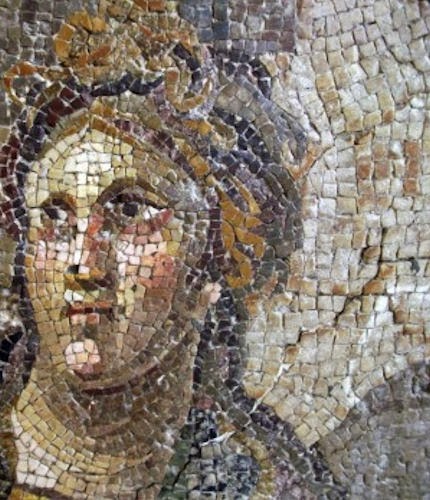
The BBC reports that Turkey’s culture ministry is investigating claims that valuable Roman mosaics have been badly damaged during botched restorations at an archaeological museum:
“Authorities are looking into the claims of a local craftsman who raised concerns over the condition of at least 10 mosaics at the Hatay Archaeology Museum, the Hurriyet Daily News website reports. Mehmet Daskapan first spoke out in an interview with a local paper in February, but the news was only picked up by mainstream Turkish media on Monday. ‘Valuable pieces from the Roman period have been ruined,’ Mr Daskapan told the Antakya Gazetesi website at the time. ‘They have become caricatures of their former selves. Some are in an especially poor condition and have lost their originality and value.'”
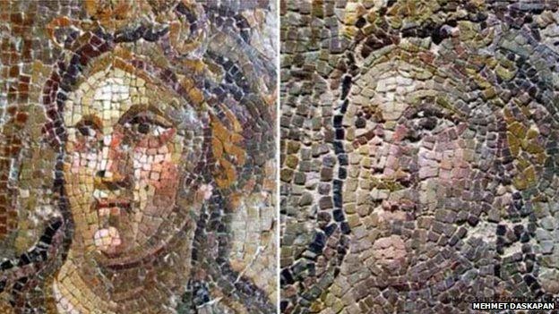
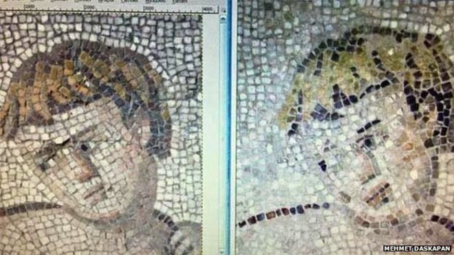
Above, Figs 1 and 2: Before restoration (left) and after (right) photographs by Mr Daskapan testify to devastating iconographic, pictorial and plastic injuries during supposed “conservation” treatments of mosaics held in the Hatay Archaeological Museum in Turkey.
The Guardian reports that (as so often in these disputes) the restorers deny error and allege that the testimony of before and after photographs has been rigged by the press. However, a culture ministry official has confirmed that “erroneous practices” caused injury by adding pieces of mosaic. As always, the restorers further allege that today’s damage had been done by previous (French) restorers in the 1930s who added material which has now been removed because past practices have now been outlawed. The culture official confirmed that today’s restorers at the centre of controversy have had years of experience “including the restoration of the renowned mosaics at Zeugma Museum in south-east Turkey”. Notwithstanding this assurance, all restorations have been halted and investigation is underway. A spokesman from the opposition Nationalist Movement party (MHP) called the restored work a “massacre of history” and blamed the Islamic-rooted ruling AKP for a “bureaucratic scandal”. The BBC reports that the allegedly shoddy restoration “has been compared to an incident in Spain in 2012…[when an] attempted restoration rendered the image of Christ unrecognisable and became a global laughing stock.”
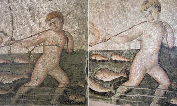
Above, Figs. 3, 4 and 5: The above STR/EPA photographs all testify to simultaneous enfeeblement and vulgarisation.
This below is not a “restoration” or a “conservation”, it is precisely what Mr Daskapan has claimed it to be: the travestying and rendering inauthentic of an ancient classical image.
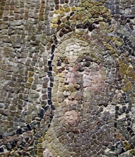
Above, Figs. 6 and 7: Details of Fig. 1 showing the subject before (top) and after “treatment” (above). (Photos: Tamer Yazar/AP)
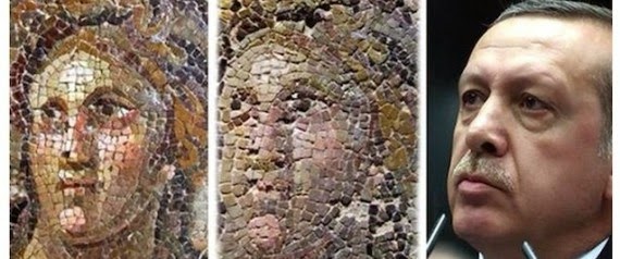
When horrendous things are done to art in the name of its “conservation” people struggle – vainly – to divine a possible motivating rationale. In the face of inexplicable actions, truly awful restoration abuses frequently provoke/generate humour. In Turkey, The Hurriyet Daily News reports that the botched restoration has indeed become a matter of humour: “Perhaps, the restoration’s target was to liken him to Erdoğan [President Recep Tayyip Erdoğan – see Fig. 7b below],” joked famous cartoonist Selçuk Erdem, from the weekly magazine Penguen.” The Huffington Post fleshes out the joke with the photo sequence below. Doing so in Turkey might carry a risk. As the The Hurriyet Daily News adds, two other cartoonists at Penguen, Bahadır Baruter and Özer Aydoğan, were jailed for 11 months in March over a satirical piece on free speech in which they were convicted of including a hidden gesture that was considered to be “insulting” to the Turkish president, Recep Tayyip Erdoğan.
Contender No. 2: Spain
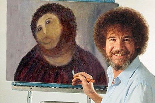
When a granny in Spain, Cecilia Giménez, indulged in a bit of do-it-yourself restoration in her local church, Santuario de Misericordia, in Borja, north-eastern Spain, the whole world fell about laughing. Ms Giménez’s unauthorised restoration of “Ecce Homo – Behold the Man” caused the work to be dubbed “Ecce Mono – Behold the Monkey”. The church threatened to sue and restoration experts from around the world converged to advise on how or whether the damage might be undone. This prompted thousands to petition for the wreck to be left untouched for all to see for all time. The publicity greatly boosted tourism and the church levied a charge on visitors. The “restorer” then sued in protection of her intellectual property rights. (See The “World’s worst restoration” and the Death of Authenticity and The Battle of Borja: Cecilia Giménez, Restoration Monkeys, Paediatricians, Titian and Great Women Conservators.)
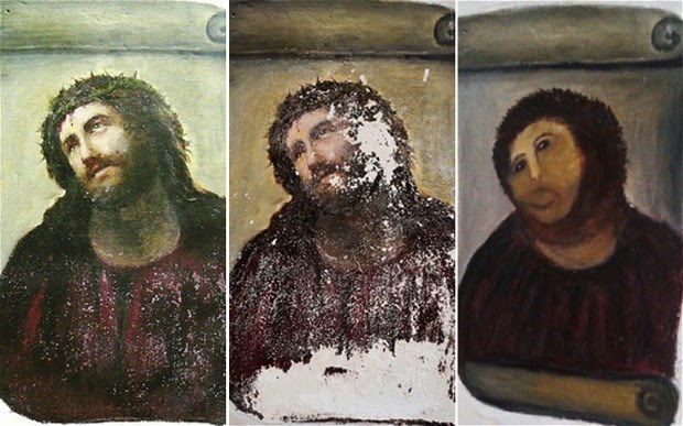
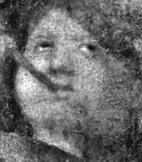
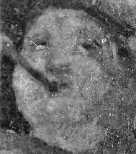
Above, top, Fig. 8: This shows the head of Christ before (left and centre) and after (right) restoration.
Above, Fig. 9: One of many spoofs carried on Upi.com was this of the late TV painting instructor Bob Ross.
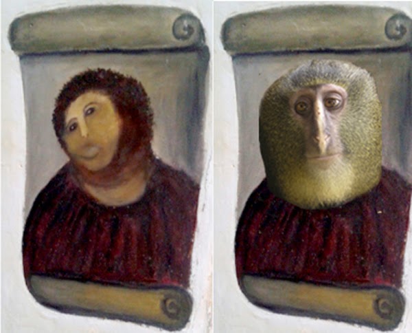
Above, Fig. 10: A satirical news blog (pocho.com) saw a resemblance between Cecilia Giménez’s monkey-faced Christ and a newly discovered species of monkey…The Church has left the desecration of a sacred image in place.
Contender No. 3: Egypt
As shown here recently (A bodge too far: “Conservation’s” catalogue of blunders), whenever ineptitude strikes, those responsible – curators, conservators, trustees, art bureaucrats – run for cover, slinging blame to every other quarter. When news of a bungled repair to the beard of Tutankamun’s death mask in Cairo’s Egyptian Museum leaked out, three conservators, speaking anonymously, gave three different accounts of the injury, but all agreed that orders had come down for the repair to be made quickly. The Daily Telegraph reported that while some said the beard had been broken off by cleaners, other said that it had simply come loose. The Guardian’s account went as follows:
“Did bungling curators snap off Tut’s beard last year, and if so was it stuck back on with with the wrong kind of glue?
These are the allegations levelled at the Egyptian Museum, the gloomy, under-funded palace in central Cairo where Tutankhamun’s bling is housed. Employees claim the beard was dislodged in late 2014 during routine maintenance of the showcase in which Tut’s mask is kept…The director of the museum, Mahmoud el-Halwagy, and the head of its conservation department, Elham Abdelrahman, strenuously denied the claims yesterday. Halwagy says the beard never fell off and nothing has happened to it since he was appointed director in October.”
Although this gaffe caught the western world’s imagination (because of intense abiding interest in ancient Egyptian culture), the incident was of relatively trivial significance: neither the beard nor the head were damaged. When it emerged that “a few little conservation things had to be done” to Assyrian carvings from the Nimrud Palace after the British Museum had irresponsibly flown them to China, the international press looked the other way.
Contender No. 4: The United Kingdom
One of the greatest all-time serial offenders as pioneer in technically advanced but artistically destructive “total cleaning” techniqes has been the National Gallery, London. For an account of the falsifying art historical consequences of such aggressively intrusive restorations, see The National Gallery’s £1.5 billion Leonardo Restoration.
Above, Figs. 11 and 12: A detail of the National Gallery’s Titian Bacchus and Ariadne, shown (top) before restoration by Arthur Lucas in 1967-69, and (above) after restoration. Notwithstanding such dreadful injuries throughout the painting, the restoration was hailed a triumph and the restorer took to boasting to painting students at the Slade School of Art, London University, (where he taught painting techniques) that there was “more of me than Titian in that sky”. One of Lucas’s “advanced” technical wheezes (which was concealed from the trustees and the public) was to iron the canvas painting onto a double laminate (‘Sundeala’) board of compressed-paper. Such boards were used on many of the gallery’s largest paintings and have now become unstable.
Above, Fig. 13: Titian’s Portrait of a Man (detail) at the National Gallery, before being restored by Arthur Lucas (left) and after restoration (right). As part of his preparation for repainting the subject’s head, Lucas hired a bearded student at the Slade School of Art to model for certain “preparatory” studies that he wished to make of hair and beards.
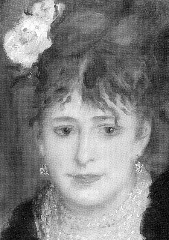
Above, top, Fig. 14: A detail from the National Gallery’s Renoir The Umbrellas before cleaning in 1954.
Above, Fig. 15: The detail from the National Gallery’s Renoir The Umbrellas after cleaning in 1954, showing pronounced solvent-induced paint losses and new cracking when the picture was barely seventy years old.
The Courtauld Gallery, London
That Renoir is exceptionally vulnerable to solvent-cleaning can also be seen in this example below from Courtauld Gallery, London.
Above, Figs. 16 and 17: A detail of Renoir’s La Loge, as seen (top) in 1938, and as seen in the Courtauld Gallery’s 2008 exhibition catalogue “Renoir at the Theatre – Looking at La Loge“.
Contender No. 5: China
On 23 October 2013 the Daily Telegraph reported the outcome of a Chinese Government-approved, £100,000 restoration during which a Qing dynasty temple fresco was entirely obliterated by luridly colourised repainting. This crime against art and historical patrimony only came to light when a student posted comparative photographs online. In the resulting furore, a government official from the city responsible for the temple described the restoration as “an unauthorised project”. Wang Jinyu, an expert on fresco restoration from the Dunhuang Academy, had said the intervention could not be called “restoration, or [even] destructive restoration” because “[It is] the destruction of cultural relics since the original relics no longer exist”. It was noted that the case had echoes of a headline-grabbing incident when an elderly parishioner performed “a disastrous restoration” on a 19th century fresco of Christ in the Spanish town of Borja (- as shown above at Figs. 6, 7 and 8 ). One Chinese website user echoed charges made against the restored Sistine Chapel frescoes of Michelangelo: “They have turned a classic painting into graffiti. It looks like something out of Disneyland, doesn’t it?”

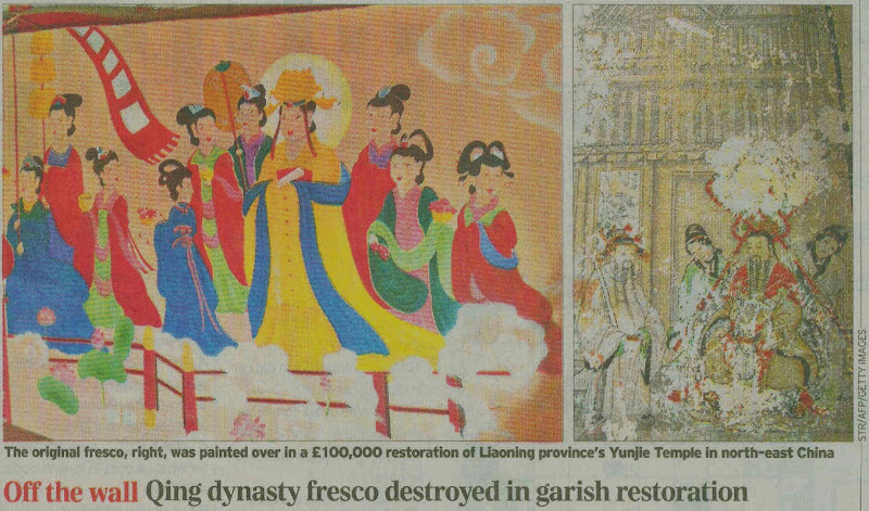
Above, Figs. 18 and 19: The devastating falsification/obliteration of ancient temple murals in China.
See Qing dynasty fresco ruined in botched restoration which makes work look like garish cartoon; and China sackings over ruined ancient Buddhist frescos; and, A restoration project that turned a Qing dynasty fresco into a series of “sloppily drawn” modern paintings has drawn outrage in China; and Assaults on History: Dishing Donors; a Vatican Wobble; and, Reigniting an Old Battle of Hearts, Minds, Interests and Evidence.
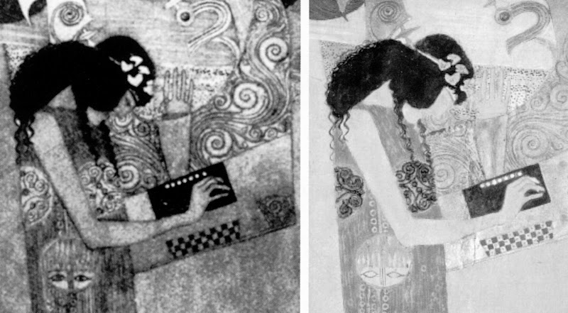
Contender No. 6: Austria
Below, Fig. 20: A detail of Gustav Klimt’s Beethoven Frieze (the figure Poetry), as seen before 1956 (left) and today (right), as featured on the cover of the Spring 2008 issue of the ArtWatch UK Journal.
Contender No. 7: France (principally, and Spain)
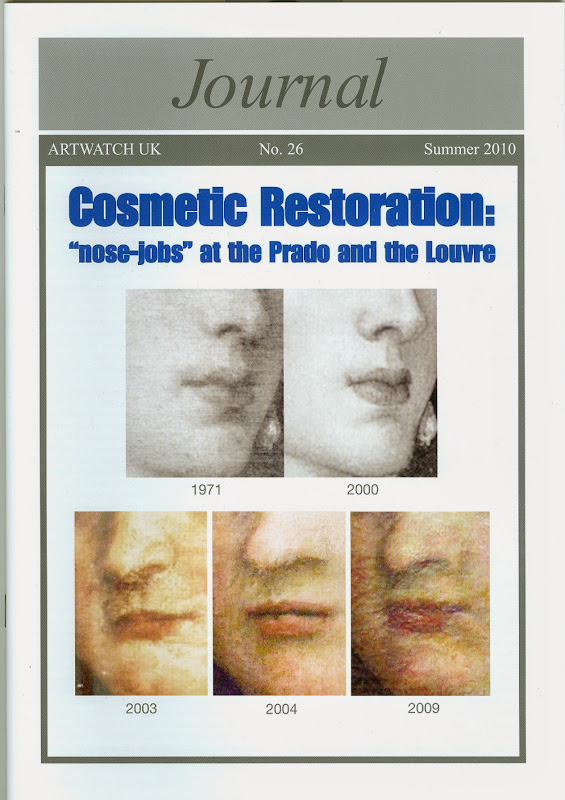
Picture restorers inflict two kinds of injury by first removing material that is integral to paintings and then by adding their own repainting so as to bring works up to what they consider to be acceptable degrees of finish and artistry. When paintings suffer this double combination of subtractions and (“corrective”) additions, the impositions frequently betray gross artistic and anatomical ignorance. This deficiency is found not just among jobbing restorers at the bottom of the art trade, but in even the most technically advanced, scientifically supported, and institutionally prestigious institutions such as the Prado and the Louvre, as we explored in the Journal No 26, shown below. (See also: A spectacular restoration own-goal: undoing, re-doing and (on the quiet) re-re-doing a Veronese masterpiece at the Louvre Museum, and From Veronese to Turner, Celebrating Restoration-Wrecked Pictures.)
<
Above, Figs. 21, 22, 23 and 24. These illustrations show, respectively, from the top down:
1) The ArtWatch UK Journal No. 26 with before and after restoration details of Titian’s Empress Isabella at the Prado and Veronese’s Pilgrims at Emmaüs at the Louvre;
2) A face from Veronese’s Pilgrims at Emmaüs, as seen before the first of two restorations in five years;
3) The same face from Veronese’s Pilgrims at Emmaüs after the first restoration (that is, after the first stripping down and subsequent repainting);
4) Press coverage (in The Week) of the controversy over the two botched repaintings of the Veronese face that had been monitored and disclosed by Michel Favre-Felix, the painter and president of the Association Internationale pour le Respect de l’Intégrité du Patrimoine Artistique (ARIPA). Favre-Felix’s discoveries had been laid out here on 29 December 2010.
…meanwhile, in London:
An implicit acknowledgement by restorers of certain professional insecurities in this area was made in the above 2010 book on different “approaches to” the retouching of cleaned paintings. This publication was a by-product of three one-day workshops organised by two restoration groups, the Icon Paintings Group and the British Association of Paintings Conservator-Restorers (BAPCR). The organisers were taken aback by the demand for the events which “exceeded our expectations. The lecture theatres were packed…” It was explained in the book’s Foreword that the subject of the three events emerged because, athough it could have been:
“…consolidation – or structural work…the general consensus in the brainstorming sessions was that retouching (or inpainting for those across the pond) was the topic for which there was a burning desire to expand knowledge, exchange ideas and gain more practice. There was a need for a practical kind of conference, dealing with the actual techniques involved in the conservation of paintings. With retouching, every conservator-restorer tends to harbour preferences for materials and practices based on experience, types of artworks as well as what is available to hand. This series of events was envisioned as a showcase for the knowledge and skill of individuals in a welcoming and supportive environment that would provide an opportunity to learn by listening and looking (in the morning lecture series) and by doing (in the afternoon practice sessions)…”
The conscientiousness of the participants is not in question and the enthusiasm brought to the task is touching. What is alarming is the sense that emerges of the absence of any artistic and anatomical expertise and guidance. The preponderance of activity addressed the acquistion of technical skills not of artistic comprehension. Some indication of the sense in which conservator-restorer speaking unto conservator-restorer is tantamount to the artistically blind speaking to the artistically blind is found on p.127 in one of the case histories (the conservation-restoration of a painting at the Rijksmuseum):
“…shortly after purchase [in 1976] the picture was cleaned to remove some discoloured varnish layer(s) [- the presence of which material is the most frequent pretext for restorations] and some clearly visible retouches. At the time of the restoration under discussion here, the only known record of how the painting looked before the cleaning was a black and white photograph taken at the Rijksmuseum. It was during that initial cleaning that the restorer [not Arthur Lucas] removed the clouds from the sky exposing blue underpaint. Though he claimed to be removing only over-paints, a shocked curator stopped the restoration and the picture remained in storage until 1995 when it was decided to examine and subsequently restore the picture for an exhibition planned for 1997…since the restorer who had cleaned the painting died in the late 1980s and left no account of the cleaning it can never really be known what had been removed or how…”
On the absence of artistic expertise among conservator-restorers, see Review: Who Cleaned the Queen’s Windows and the Lady’s Pearls?
Contender No. 8: Italy ~ The Vatican
The most controversial restoration in modern times has been that of Michelangelo’s frescoes for the Sistine Chapel, a subject on which we have published many times. In addition to the restoration injuries, the fame of the restored frescoes has drawn (paying) crowds to the chapel of such magnitude as to imperil the physical fabric of the frescoes. For a summary listing of our previous coverage on all aspects of that continuing debacle, see Michelangelo’s disintegrating frescoes.
Above, Figs. 25 and 26: Details of Michelangelo’s Cumaean Sibyl on the Sistine Chapel ceiling, as seen before restoration (top), and after restoration (above). The explanation for the otherwise inexplicably profound changes that occurred during this cleaning, is that Michelangelo had finished off and elaborated his frescoes (when dry) with painting consisting of pigments bound in animal glue or size. With this painting Michelangelo adjusted and enriched his colours while, at the same time, greatly increasing their dramatic lighting and shading. (The revolutionary nature of this theatrical lighting is explored in this post: Coming to Life: Frankenweenie – A Black and White Michelangelo for Our Times.) However, on the authority of technical analysis of the glue-paint, the Vatican treated all of this surface painting by Michelangelo as if it were dirt and soot and washed it off. In this comparative detail above, the loss of shading on the bag and around it is immense.
Above, Figs. 27 and 28: The head of Michelangelo’s Erythraean Sibyl on the Sistine Chapel ceiling, before restoration (top) when showing Michelangelo’s systematic and consistent modelling of forms via a transition from light to dark from the top of the head to the neck and shoulder, as it had survived from 1512 until 1980; and (above), after the restoration in which all of Michelangelo’s supplementary painting had been removed.
Contender No. 9: Italy ~ Milan
If any Renaissance mural might be thought to rival the importance of Michelangelo’s Sistine Chapel ceiling it would be Leonardo’s Last Supper in Santa Maria delle Grazie, Milan. Unfortunately this great work has suffered badly from its experimental technique and subsequently from multiple restorations over the years. It was thought, by Bernard Berenson among others, to have received the best-possible, final and definitive act of rescue in a two-part restoration of 1947-49 and 1952-54. (See The Perpetual Restoration of Leonardo’s ‘Last Supper’ – Part 1: The Law of Diminishing Returns and The Perpetual Restoration of Leonardo’s Last Supper, Part 2: A traumatic production of “a different Leonardo”.)
Just twenty-one years later in 1975 a former student of the previous restorer reported falling fragments of paint. Two years later another (and $8m Olivetti-sponsored) restoration began with the express intention of undoing every trace of all previous restorations. In entirely predictable consequence, vast areas of bare, pictorially disfiguring wall were exposed. To return a semblance of iconographic coherence and legibility to the by-then devastated sacred images, the restorer colourised all of the exposed wall (which constituted most of the mural), not in any semblance of Leonardo’s original pictorial method, but flatly, “abstractly” with water-colours that took their values from the local colours (but not the forms) of adjacent areas. This technique, therefore, imposed an entirely alien and ahistorical modernist sensibility on the remains of a once-supreme Renaissance evocation of real figures, in action, in real spaces. The operation thereby constituted an artistic misrepresentation and a cultural falsification: once-living theatre was effectively pulled onto a decorated backdrop. Aside from the conceptual unaptness of the enterprise, the restorer made errors – or took liberties – within her own terms of operation. (See below.) This was not a restoration and nor was it a recovery. Moreover, as an imposition of a markedly 20th-century sensibility and mindset, it will “date” rapidly and therefore licence those who will next wish to intervene on a world renowned work.
Above, Figs. 29, 30 and 31: The central section of the Last Supper is here shown (top) before the last restoration; during restoration (middle); and (above) after restoration and repainting. One error made at the repainting stage was to the central figure – Christ. Leaving aside what happened to His Face, the restorer decided against all historical testimony (see below) that Leonardo had painted the drapery of Christ’s right arm so that it came to rest on the table cloth among the food and crockery. When our challenge to the decision was reported in the press, Professor Pietro Marani, the Leonardo expert who directed the Last Supper restoration, sarcastically downplayed the criticism – “A small piece of drapery. Oh, my God.” (See Have art restorers ruined Leonardo’s masterpiece?). It might have seemed a small error to the director of the restoration, but it has left drapery in place that Leonardo had not painted. How seriously, then, should we take assurances about the high “ethical” standards of today’s restorers?

Above, Figs. 32, 33, 34 and 35: Details showing (top) the restored [sic] drapery of Christ’s right arm and, below it, two copies of the original arm, as painted by Leonardo’s associates Andrea Solario and Giampietrino (whose copy is shown above in colour and in greyscale).
Contender No. 10: The United States ~ The Clark Institute
The Sterling and Francine Clark Art Institute, has high scholarly aspirations and was generously founded on Sterling Clark’s passionate and well informed love of art. In his will of 1946 Clark expressly prohibited any restoration of his own to-be bequeathed pictures:
“It having been my object in making said collection to acquire only works of the best quality of the artists represented, which were not damaged or distorted by the works of restorers, it is my wish and desire and I request that the said trustees…permanently maintain in said gallery all works of art bequeathed hereunder in the condition in which they shall be at my death without any so-called restoration, cleaning or other work thereon, except in the case of damage from unforeseen causes, and that none of them be sold, exchanged or otherwise disposed of…”
Sterling Clark’s greatest love was for Renoir – he owned thirty-eight of his paintings, including the once magnificent A Box at the Theater (At the Concert) shown in two details below. Sterling died first in 1956 and his widow Francine died in 1960. Within three years of her death, pictures from the collection were being “restored” and (some) sold in breach of the terms of their generous bequest. The consequences were as horrendous as the deeds treacherous.
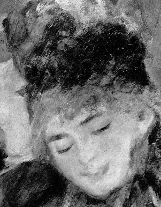
Above, Fig. 36: A detail (top) of the Clark’s Renoir A Box at the Theater (At the Concert), as seen as recently as in the Clark’s 1996/7 exhibition catalogue “A Passion for Renoir: Sterling and Francine Clark Collection, 1916-1951″,
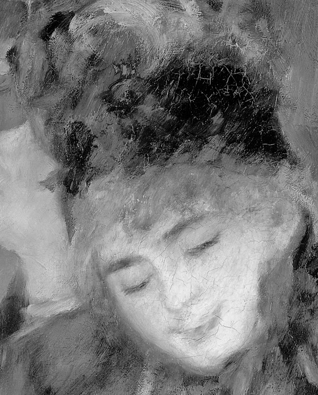
Above, Fig. 37: A Box at the Theater (At the Concert), as seen in the 2008 Courtauld Gallery catalogue “Renoir at the Theatre” exhibition. In all likelihood, the (typically disastrous) Renoir cleaning will have been carried out in so-called preparation for travel to and from the London Exhibition – and in all probability, this would have been the first time the picture had been cleaned and “restored”. (For more information on the systematic institutional abuse of the Clarks’ bequest, see Taking Renoir, Sterling and Francine Clark to the Cleaners.)
On Francine Clark’s death the first of what were to be two radical and utterly deranging restorations of Turner’s Rockets and Blue Lights (Close at Hand) to Warn Steamboats of Shoal Water was under way at the hands of a then leading restorer, William Suhr (below, Fig. 38) after which only traces of the nearer steamboat survived.
Above, Fig. 39: Turner’s Rockets and Blue Lights… after its 2003 restoration by David Bull during which the last traces of the nearer steamboat were removed.
For every restoration there is an apologia. With this picture’s second restoration in forty years (which restoration, once again, preceded a loan across the Atlantic) the story went like this: The painting had been falling apart; and, besides, seventy-five per cent of it consisted of earlier restorers’ repaint which had been applied to “disguise the evidence of some unknown earlier trauma”. Only by removing most of the present paint, could “a full understanding of what lay beneath” be achieved. After the removal – on the authority of the Clark Institute’s trustees – all parties responsible proclaimed a “resurrection” which had created “effectively a new picture”.
Brass cheek does not come bolder than that. This was indeed a new picture, no longer a Turner, more a Suhr-Bull. For one thing, one of the picture’s two original storm distressed coal-burning steamboats had disappeared under the waves with its former belching smoke converted nicely into a white water funnel. When our criticisms (initiated by the painter Edmund Rucinski) were first aired, a feeble, soon-abandoned, claim was made to the effect that the disappeared steamboat had been a 19th century restorer’s addition – another brazen defiance of reality given that the picture’s original title refered to boats, not boat, in distress. The evidence of there having indeed been an original second boat was overwhelming (see below) but there was no apology. Instead, the entire museum establishment, as if in complete solidarity with the Clark Institute (which lends loads of paintings), bigged-up the official line that this was somehow-still-a-Turner by proclaiming that the manifestly wrecked work had now become an especially desirable Turner.
At the time of the UK trip, the Tate Gallery issued a press release claiming that the picture comprised “one of the stars of the show…[having] recently undergone major conservation”. Credulous British art critics lapped up and regurgitated the claims. And they did so once again when this “Turner” returned to the UK for a Tate Liverpool show where Cy Twombly’s solipsistic scribbles and dribbles were flatteringly permed with works by Turner and Monet, no doubt helping the former’s reputation more than Turner’s or Monet’s. We repeated the criticisms to no discernable effect. In 2014 an extraordinary publicity barrage accompanied the launch of the National Maritime Museum’s “Turner & The Sea” blockbuster. It centred on a single painting – yes, the now notorious Rockets and Blue Lights. The decision to celebrate that particular wrecked and critically challenged work had passed beyond the brazen. As Maurice Davies observed in the spring 2014 issue of Turner Society News:
“The most unnecessary loan is Rockets and Blue Lights… The catalogue talks diplomatically of ‘alterations to some areas of the painted surface.’ It is in fact so horribly damaged that there’s little value in seeing it in the flesh. ArtWatch talks of the picture as an example of ‘the bizarre and perverse phenomenon of promoting demonstrably wrecked paintings in special loan exhibitions.’ It would have been quite enough to include a small illustration in the catalogue and move swiftly on.”
By this point the museum establishment had, in truth, passed beyond all reason. The wreck was not just billed as a star of the show, it was flaunted in every advertisement, publication cover, billboard and online marketing venue – see From Veronese to Turner, Celebrating Restoration-Wrecked Pictures. The message to critics seemed Clinton-esque: “We do it, because we can”.
For the record: Proofs that Turner really had painted two Steamboats
Above, (top) Fig. 40: Detail of an 1852 (14 stages) chromolithographic copy by Robert Carrick of Turner’s 1840 oil painting Rockets and Blue Lights (Close at Hand) to Warn Steamboats of Shoal Water. Note particularly the detailed depiction of the distressed steamboat and crew members on the right.
Above, (centre) Fig. 41: The steamboat as recorded in a photograph of 1896 (shown by courtesy of Christie’s).
Above, Fig. 41: Turner’s Rockets and Blue Lights… (detail) after its 2003 restoration by David Bull when the last traces of the nearer steamboat had been removed and the painting was fast approaching the appearance of a 20th-century abstract painting.
Contender No. 11: Location unknown
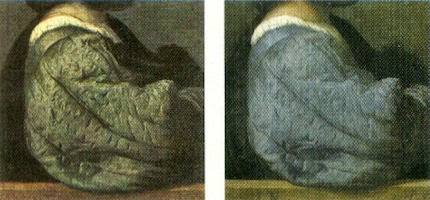
We knew at a glance that something was amiss. On 16 June 2012, a newspaper photograph trailed an imminent auction sale of Renoir’s Baigneuse of 1888. Even on the evidence of a single de-saturated newsprint reproduction it seemed clear that the privately owned masterpiece had gone through the picture restoration wash cycle a time (or two) too often.
Renoir’s Baigneuse had been given star billing (on a £12/18m estimate) at Christie’s June 20th Impressionist/Modern sale. While much was made in the eight pages long catalogue entry of an impeccable and unbroken provenance through ten successive owners, not a word was said about any restorations of the painting, and although many early photographs were identified in the picture’s literature, none was reproduced. It was disclosed that the Renoir was to be included in a forthcoming “catalogue critique” of the artist’s work being prepared by the Wildenstein Institute from the Archives of François Daulte, Durand-Ruel, Venturi, Vollard and Wildenstein.
On the night of the sale, an announcement that the picture had been withdrawn drew gasps of surprise. Artinfo reported that the vendor had accepted a private offer from an unidentified buyer for an undisclosed sum somewhere within the estimate. Trade and press eyebrows have been raised at such secretive, pre-auction sales and the withdrawal was the more confounding because expectations of a big auction house “event” had been raised by extensive – and quite stunningly fetching – pre-sale press coverage with photographs of the painting enlivened by the seemingly routine inclusion of beautiful young female staff members. We wondered whether the present condition of the picture might have contributed to the withdrawal. Without any knowledge of by whom the picture is owned, or by whom and how often it might have been restored, we are content to leave the photo-evidence of condition to speak, as it properly should, for itself. The three then and now pairs of photographic details below (Figs. 42-47) are drawn respectively from Michel Drucker’s 1944 “Renoir” and the 2012 Christie’s “Impressionist/Modern” sale catalogue cover.
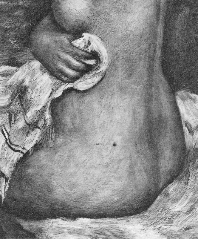
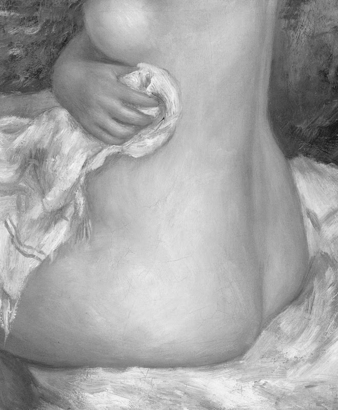
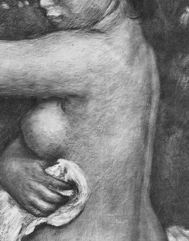
Michael Daley – 8 May 2015.
Review: Stone-washed Renoirs and the Shock of the Undone

We knew at a glance that something was amiss. On June 16th, a newspaper photograph trailed an imminent auction sale of Renoir’s “Baigneuse” of 1888. Even on the evidence of that single de-saturated newsprint reproduction (right, Fig. 1) it seemed clear that the privately owned masterpiece had gone through the picture restoration wash cycle a time (or two) too often. A comparison of Christie’s pre-sale zoom-able online photograph with historic photographs of the painting further suggested that picture conservation’s would-be beauticians had been at work with swab and solvent: Renoir’s bather had been left (Fig. 2) a paler sugar-smooth pictorially and plastically enfeebled version of her original self. (For the picture’s appearance and condition in 1944, see Figs. 7 and 9.)
Just as museum curators who organise splashy temporary exhibitions rarely broadcast the “conservation” injuries borne by works loaned from sister institutions, so auction houses, which of necessity must act primarily as agents for owners, can seem no less reticent on this fraught subject. In practice, we find that in of both of these art spheres, the “now” is often implicitly presented as the “originally-was” and “always-has-been”, thereby thwarting what would be the greatest inducement to halt needless adulterations of unique historically-rooted artefacts: a full public disclosure of “conservation” treatments and frank art-critical discussion of their material and artistic consequences. By coincidence, recent museum and saleroom activities have brought to London a slew of little-seen examples of Renoir’s oeuvre. As cases in point of Renoir’s vulnerability, we examine here treatments of his “Baigneuse” of 1888 and the Washington National Gallery’s “The Dancer” of 1874.
Renoir’s “Baigneuse” was given star billing (on a £12/18m estimate) at Christie’s June 20th Impressionist/Modern sale, for the catalogue of which it provided the cover illustration (Fig. 2). While much was made in the eight pages long catalogue entry of an impeccable and unbroken provenance through ten successive owners, not a word was said about any restorations of the painting, and although many early photographs are identified in the picture’s literature, none is reproduced. It is disclosed that this Renoir is to be included in the forthcoming “catalogue critique” of the artist’s work being prepared by the Wildenstein Institute from the Archives of François Daulte, Durand-Ruel, Venturi, Vollard and Wildenstein. (Perhaps the present condition of the picture will be discussed in that publication?)
On the night of the sale, an announcement that the picture had been withdrawn drew gasps of surprise. Artinfo reported that the vendor had accepted a private offer from an unidentified buyer for an undisclosed sum somewhere within the estimate. Trade and press eyebrows have been raised at such secretive, pre-auction sales and the withdrawal was the more confounding because expectations of a big auction house “event” had been raised by extensive (and quite stunningly fetching) pre-sale press coverage with photographs of the painting enlivened by the seemingly routine inclusion of beautiful young female staff members.
With modern paintings, the starting point for any appraisal should be the earliest known photograph. Old photographs are historic records. Historic records should never be ignored. Old photographs of pictures assembled in homes or exhibition galleries are especially precious and instructive. The photograph of Renoir’s 1905 exhibition at the Grafton Gallery (Fig. 3) testifies not only to the then generally more vivacious relative values within individual works but to the striking variety of pictorial effects and painterly means deployed within Renoir’s oeuvre.
With regard to the photographic testimony of the original appearances of individual pictures, consider first the large, near-central painting in the 1905 Grafton Gallery photograph – Renoir’s “The Dancer”. This picture, now at the National Gallery, Washington, is 138 years old but was then only 31 years old and unrestored. Then, the background was disposed in distinct but linked quadrants (top-left; top-right; bottom right; bottom left). These were not so much naturalistic renderings of an actual space as subservient pictorial devices spotlighting the central bow-tight figure of a child trainee who, through balletic discipline and artistry, had assumed a commanding Velazquez-worthy sideways-on viewer-confronting presence.
To that expressive end Renoir had welded the dramatically contra-directional lower legs into unity by a pronounced dark shadow in the vertical triangular space they bounded. That shadow sprang also from the heel of the (right) weight-supporting foot backwards and upwards in space, thereby throwing the bottom edges of the trailed skirts into relief. This dark zone in the lower-right counterbalanced another in the upper-left, which had in turn emphasised and thrown into relief the front edge of the costume, withdrawing only to leave a lighter, again relieving, tone at the dancer’s dark hair. The progressive loss through restorations of those artful dispositions (as seen in Figs. 4 & 5) and the picture’s general descent towards an inchoate, arbitrary pictorial froth that increasingly resembles the underlying condition seen today in its own infra-red imaging (see Fig. 6), is heart-breaking. Renoir had here been a sculptor before he became a sculptor, playing off forms that asserted his picture plane with others that ran sharply away from or towards it (rather as Michelangelo had famously done in his crucifixion of Haman). Degas, who spoke of Renoir’s “sharpness of tones”, had chided himself for constructing his own drawings of standing dancers from the head down instead of from the feet up. Renoir had here given a masterclass in how to project a standing figure upwards from the floor. These things artists know and appreciate.
Compendious photographic evidence suggests that restorers (frequently working myopically through head-mounted magnifying eyepieces) have consistently confounded dirt or discoloured varnish with the shiftingly elusive dark grounds used by artists to set off light-toned figures. As seen in our post of June 1st, Klimt’s portrait of Serena Lederer (which was acquired by the Metropolitan Museum of Art, New York, in 1980) has suffered in just such a manner. In the same post we saw also how Renoir’s deployment of a dark background zone in the upper left quadrant of background and a secondary but counter-balancing dark zone in the lower right quadrant of his “Dance in the City” had also been undone by successive restorers.
By courtesy of the 1905 photograph of the dancer we can now see that by 1944 the picture’s decisive tonal orchestration had already been subverted (see Fig. 3 and caption at Fig. 6). By the time of the picture’s appearance at the 2012 Frick show of Renoir’s full-length portraits (which was reviewed in our post of June 1st), the original dark tones in the lower right quadrant had effectively disappeared, leaving two odd arbitrarily truncated dark attachments to the right heel (Fig. 5). Cumulatively, this painting has suffered needless artistic vandalism of which no one speaks. The fact that graphite underdrawing is now visible on the painting has been mentioned but without any hint of alarm or censure.
With Renoir’s “Baigneuse” of 1888, the earliest photograph in our own records (- donations to ArtWatch of old photographs or postcards are always most gratefully received) is that published in 1944 when the painting was 56 years old, as seen here in greyscale at Fig. 7 (left) and at Fig. 9. Six years later, by 1950, the painting had been radically transformed, as seen at Fig. 7 (right, in greyscale) and Fig. 8 (left, in colour). The differences that emerged between 1944 and 1950 were compounded by further changes between the picture’s 1950 state (seen in colour at Fig. 8, left) and its 2012 state (seen in colour at Fig. 8, right). However many times and by whomever this painting might have been “restored”, it is clear that the resulting interventions have profoundly altered its constructional and pictorial rationales. The total extent of the alterations that occurred between 1944 and 2012 are examined right in greyscale details in Figs. 11-18. The differences between the 1950 and 2012 states are examined in colour details at Figs. 19, 20 and 21.
By 1888 Renoir had visited Algiers and Italy, come to admire Cezanne as well as Delacroix, discovered Italian painting and read Cennino Cennini’s Treatise on Painting. He had just completed an intense series of classically inspired, Ingresque female nudes, culminating in that declared trial for decorative painting, the Philadelphia Museum’s great “Bathers” of 1887, by which date he held the nude to be one of the most “essential forms of art”.
Compared with Fantin-Latour’s palpable but fluidly allegorical figure at Fig. 10, Renoir’s “Baigneuse” has, in its 1944 state, a markedly more stolid, out-of-Courbet corporeality. For all its spirited brushwork and sparkling colour, plastically, it constitutes an essay in composure, stability and parallelism. The torso seemingly rests on its own base of compressed and spreading buttocks and thighs. The thighs, knees and lower legs are held together in a manner more primly archaic (Egyptian) than classical. Movement is confined to the bather’s right hand which dries the left side of the waist. This action has enlivening consequences. The upper torso is pulled round by the right arm and the head is turned leftwards and downwards as if to contemplate the drying action of the towel. The left arm is required to be held aloft to free the left side of the figure, and, flexing at the elbow as the left hand draws across the face, it first echoes the thighs but then curls gracefully, weightlessly away in space.
What, then, explains the differences between the picture’s previous and its present condition? In such cases it is always possible to play the “Sistine Chapel Ceiling Restoration Defence” and claim that in 1944 the then 56 years old picture was very dirty and that the removal of this dirt has liberated the forms and the colours of the painting to a hitherto unsuspected degree. But the pattern of relationships that is visible, even under dirt, should not change character during a cleaning. Rather, it should emerge enhanced, with the lights lighter and the darks darker – and all individual values holding their previous positions. This has not happened – the picture has got progressively lighter with successive cleanings instead of returning to its previously cleaned state. If it really had been left by Renoir in today’s state, how could the previous but now lost artistically constructive values ever have arisen? If left untouched for the next 56 years, would anyone expect the painting to return to its 1944 appearance with the stripes on the towel and the shading of the fingers regaining strength? Would a general shading and enhancement of forms once more helpfully tuck the left hand behind the head? How might dirt have drawn more clearly and repositioned the left shoulder? How might it have more emphatically shaded the right, distant side of the face?
If we consider the difference between the 1950 and 2012 colour plates (shown at Figs. 8, 19, 20 & 21), what might account for the loss of orange coloured modelling in the left cheek, and of individual brushstrokes depicting the hair? Is it possible to claim on the evidence of these photographs that there has been a build-up of dirt on the picture over the last 62 years?
When examining the bather’s face in close-up today, as shown at Fig. 21, can we have any confidence that the paint presently surviving in that section is just as it was when left by Renoir in 1888? What kind of brush or paint might he have used that would have resulted in the present fragmentary, seemingly abraded, scattering of orange paint that lies over the blue background between the hand, the face and the shoulder?
In the next post we examine the conservation fate of more than a score of Renoirs that have been loaned from the Sterling and Francine Clark Art Institute in Williamstown, Massachusetts to the Royal Academy. We shall see how Sterling Clark learned the hard way not to trust art experts on matters of condition in paintings when, having been assured that Domenico Ghirlandaio’s “Portrait of a Lady” had never been repainted, he bought it, only to discover, very shortly afterwards, a postcard of the painting showing it in an earlier and quite different state.
Michael Daley
Comments may be left at: artwatch.uk@gmail.com


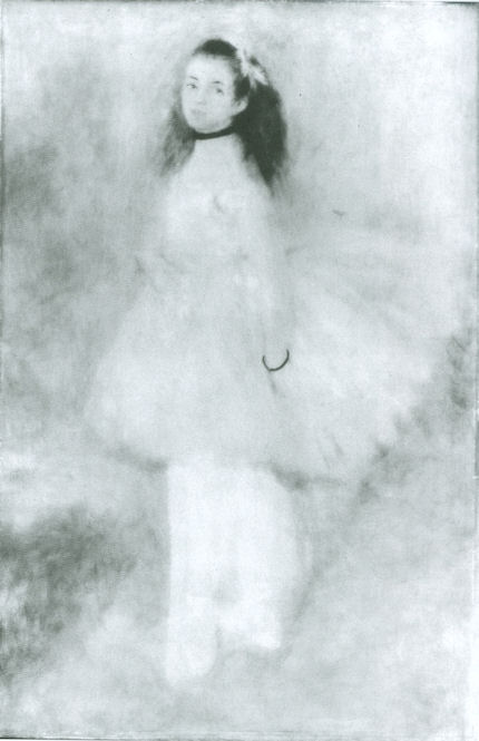


![]()