The Demise of the National Gallery’s “made just like Rubens” Samson and Delilah with inexplicably cropped toes

Michael Daley writes: In a bombshell article (Observer, 26 September 2021), Dalya Alberge reported on a series of Artificial Intelligence comparisons of the Samson and Delilah’s brushwork with that on 148 uncontested Rubens paintings. The exercise had produced a negative result of such magnitude that the Swiss company, Art Recognition, disbelieved its own findings and ran the tests a second time. The results were identical: an unprecedentedly crushing 91% probability that the picture was not painted by Rubens:
“…Critics have long suggested that the painting is not by Rubens. And now a series of scientific tests employing groundbreaking AI technology have concluded that the 17th-century Flemish master could never have painted it. ‘The results are quite astonishing’, Dr Carina Popavici, the scientist who carried out the study, told the Observer… ‘I was so shocked…Every patch, every single square came out as fake, with more than 90% probability.’”
ArtWatch UK was cited as observing that “coming so soon after its ill-advised espousal of the now-rejected and disappeared $450m Salvator Mundi, these results are a calamity for the National Gallery” [see POSTSCRIPT, below]. A spokesman said: “The gallery always takes note of new research. We await its publication in full so that any evidence can be properly assessed. Until such time it will not be possible to comment further.” That was a far cry from its response in the 21 May 2000 Independent on Sunday: “We have absolutely no doubts about the authenticity of the picture and nor do most experts on Rubens”.
Doubts or not, the Samson and Delilah, which is promoted by the gallery as one its top thirty stars – and therefore as the best of its twenty odd Rubens’ paintings – is now a three-times disabled attribution: it had no provenance as a Rubens before a notoriously unreliable scholar’s 1929 upgrade; stylistically, it has long been shown to be untenable as a Rubens and to be compositionally incompatible with the copies made of the lost original Rubens Samson and Delilah ; and now, on multiple close technical comparisons, its brushwork finds no match with that in secure Rubens’ pictures. How the gallery comes to terms with this latest source of disqualification will test the mettle of its director and trustees, none of whom was party to the picture’s 1980 acquisition.
AN ATTACK ON THE MESSAGE
Alberge’s disclosure has been greeted by a thunderous silence of the Rubens experts – but the art history blogger, auctioneer and film-maker, Bendor Grosvenor, tweeted an immediate blanket dismissal of the findings:
“The only thing this tale should tell us is that computers still don’t understand how artists worked. And probably never will.” And “If you like a bit of science with your art history, it’s still hard to beat the National Gallery’s 1983 technical bulletin for showing the picture is indeed by Rubens.”
Grosvenor’s unsupported assertion bolstered by an appeal to the authority of an old and profoundly unsatisfactory National Gallery report gained tweeted support from the Sunday Times’ art critic, Waldemar Januszczak. In crucial respects the erratic art critical volatility of this pair of commentators (who conduct joint “Waldy and Bendy” podcasts on Januszczak’s ZCZFilms website), exacerbates the National Gallery’s now perilously exposed position. Holding Plesters’ report aloft as a standard may have been thought unhelpful by the gallery – the link Grosvenor provided to it now produces this message: “Page not found – Sorry, the page you requested has been removed or the link was incorrect.”
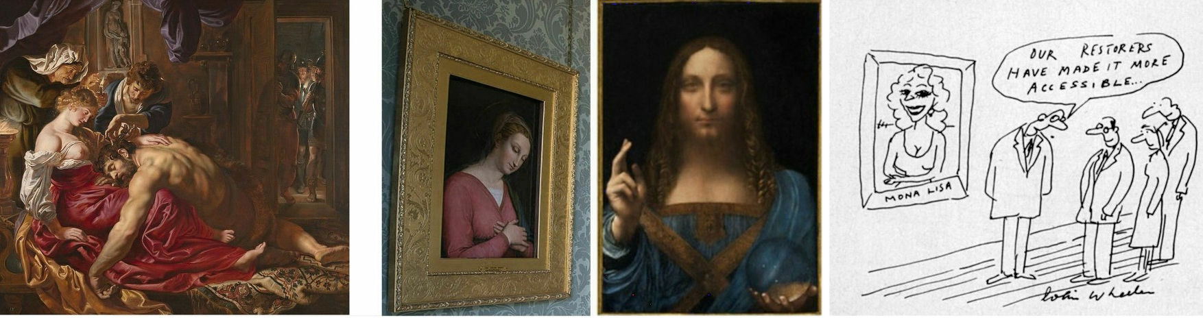
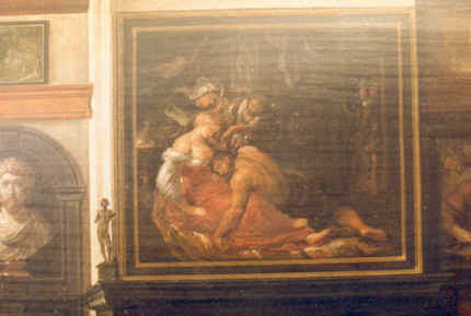
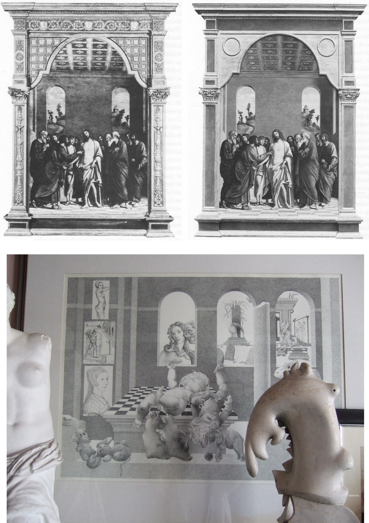
Above, Fig. 1: Left, the National Gallery’s attributed Rubens Samson and Delilah; second left, the Grosvenor-attributed fragmentary “Raphael” of a Madonna at Haddo House, Scotland; third left, the disappeared and demoted “Leonardo” Salvator Mundi; right, a Colin Wheeler cartoon.
Grosvenor’s appeal to the authority of National Gallery expertise was rich: when, after long examinations, that gallery’s experts recently judged his would-be “Raphael” painted fragment of a Madonna in an all’antica cross-over dress (Figs. 1 and 3) to be no more than a “possible 18th century work” he crossly rejected their findings and called for yet further tests. Where Januszczak now supports the Samson and Delilah’s Rubens attribution he does so in flat repudiation of his 1997 younger self’s rumbustious denouncement of it (Fig. 2). With their joint appeal to the authority of the National Gallery conservation staff’s record, Grosvenor and Januszczak have opened the door to the gallery’s skeleton cupboard.

Above, Fig. 2: The cover of the 5 October 1997 Sunday Times Culture Magazine which trailed Waldemar Januszczak’s article “A Rubens or a costly copy”
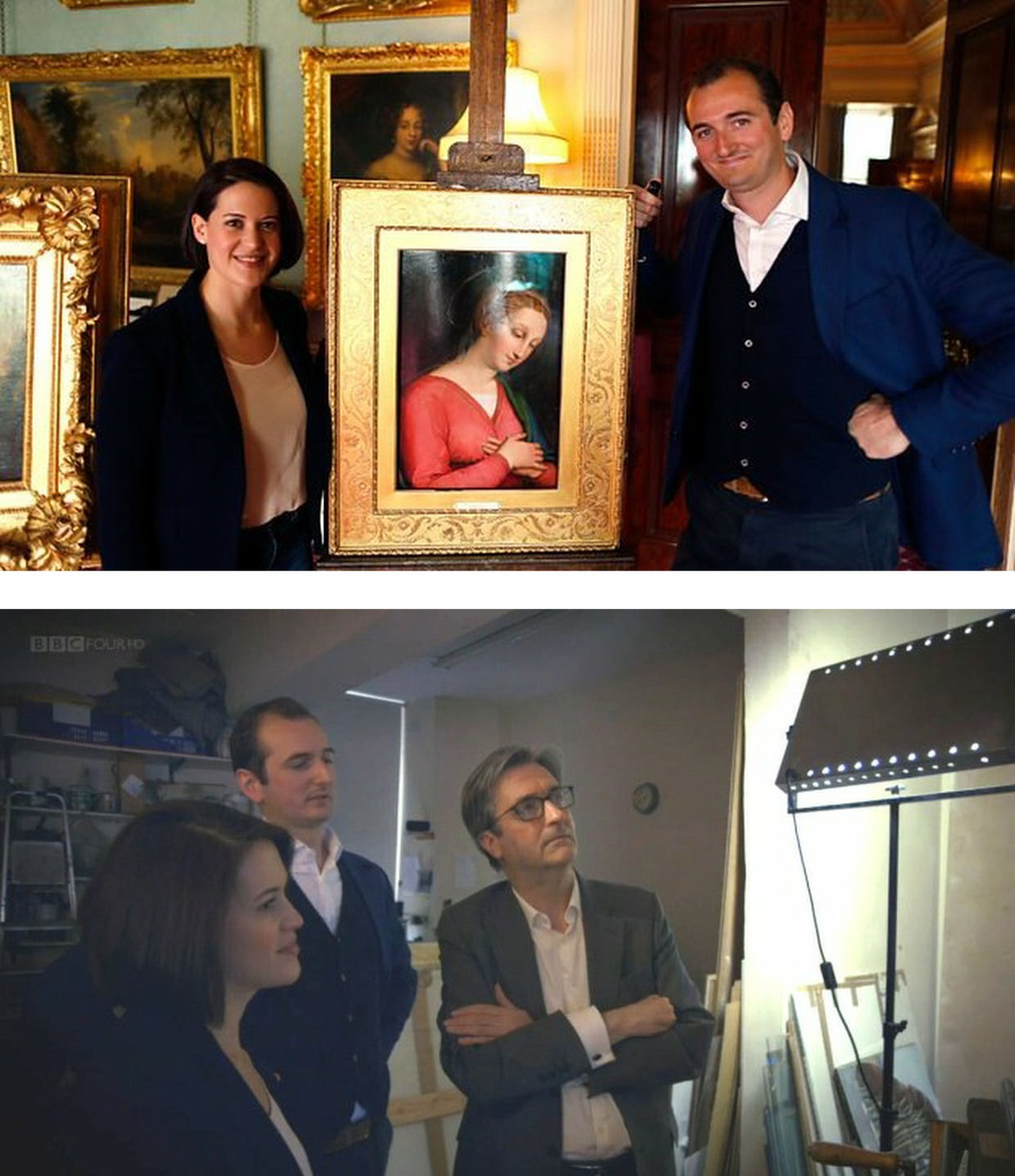
Above, Fig. 3: Top, BBC4 Factual Report, 03. 10, 2016: “Britain’s Lost Masterpieces discovers hidden painting believed to be by Raphael. ‘Finding a potential Raphael is about as exciting as it gets. At first I couldn’t quite believe it might be possible, but gradually the evidence began to all point in the right direction.’ Dr Bendor Grosvenor”. So reported the art-credulous BBC with a photograph (top) of the programme’s co-presenters, art historian Jacky Klein and Bendor Grosvenor, with the putative Haddo House Raphael; above, the presenters consider the “Raphael” on the Lost Masterpieces programme with the former director of the National Gallery, Sir Nicholas Penny.
Invited to pass judgement on the attempted upgrade, Sir Nicholas (whose proselytising on behalf of the $450m Salvator Mundi had been defended by Grosvenor in the 9 October 2011 Sunday Times – “They are taking a risk and I can’t applaud them enough for it”) said that he would place the painting somewhere between “probably by Raphael” and “by Raphael” and that with a “little more time and courage” he might well go the whole hog. That stylishly diplomatic locution was of limited utility – rather like informing a woman that she is somewhere between probably pregnant and pregnant. The pity is that aside from his defences of National Gallery restorations and championing of a not-Raphael and a not-Leonardo, Penny proved the gallery’s most unapologetically serious scholar/director in recent times – as instanced in an excellent Financial Times interview.
ROLL UP
In another Financial Times interview, Simon Gillespie, the restorer who works with Grosvenor on the BBC’s Britain’s Lost Masterpieces programme, disclosed that he, too, believes that he might own yet another Raphael. Gillespie is believed to be the owner of a claimed Lely copy of the £10m “Last Van Dyck Self-portrait” that was sold by the Mould Gallery to the National Portrait Gallery for £10m on 1 May 2014.
DEFENDING INSTITUTIONS AND ATTACKING JOURNALISTIC MESSENGERS
Grosvenor frequently tilts at journalists whose stories embarrass art institutions. In a February 2019 Art History News blog post (“Salvator Mundi & the Louvre”) he berated Sunday Telegraph and Mailonline reports that the Louvre would not be showing the $450m supposed-Leonardo Salvator Mundi in a forthcoming Leonardo exhibition. That story, he sniffed, “is based on the opinion of one Jacques Franck.” It was. Franck’s judgements as the world authority on Leonardo’s painting technique have institutional clout (- and often the ear of French presidents). Franck’s prediction proved precisely correct: the Salvator Mundi was not included in the Louvre exhibition, and it was described in the exhibition catalogue as what it is and what it has remained despite successive restoration makeovers and intense global marketing razzamatazz (- which marketing Grosvenor lauded as the best ever seen) namely, the Leonardo studio work that entered the Cook Collection in 1900, viz: “Salvator Mundi, version Cook, vers 1505-1515″. (See “The Louvre Museum’s bizarre charge of “fake information” on the $450 million Salvator Mundi”.) The Art Newspaper has reported (November 2021, “Prado downgrades $450m Leonardo Salvator Mundi”) that the Prado, too, has demoted the Salvator Mundi to its original standing as the Cook version: “The Prado curator Ana Gonzáles Mozo comments in her catalogue essay that ‘some specialists consider that there was a lost prototype [of Leonardo’s Salvator Mundi] while others think that the much debated Cook version is the original’ However, she suggests ‘there is no painted prototype by Leonardo’.”
(For the latest observations on the $450m Salvator Mundi, see Jacques Franck’s “Further thoughts about the ex-Cook Collection” and ArtWatch UK’s “The Disappeared Salvator Mundi’s endgame: Part I – Altered States and a Disappeared Book”. For ArtWatch UK’s first objections to the Salvator Mundi upgrade, ahead of Christie’s November 2017 $450m sale, see: Dalya Alberge, 19 October 2017: “Mystery over Christ’s orb in $100m Leonardo da Vinci painting” and, “Problems with the New York Leonardo Salvator Mundi Part I: Provenance and Presentation”.)
THE RAMIFICATIONS
The Rubens and the Leonardo attributions are items of considerable public policy interest. Both works achieved world record prices. Both received major and controversial modifications at the hands of restorers. Both upgrades have now collapsed. Both had been championed by National Gallery directors – Michael Levey with the Samson and Delilah and Nicholas Penny with the Salvator Mundi. While Waldy and Bendy both now support the Samson and Delilah, Waldy rejected the Salvator Mundi (which Bendy supports) because: “It resembles nothing else Leonardo painted”; and, because Christie’s claimed resemblance of it to the Mona Lisa “had me laughing out loud”.
THE NATIONAL GALLEY’S WOBBLY DEFENCES
The Art Recognition findings are not, as Grosvenor would imply, off-the-wall. In June 1997 the National Gallery issued a notice claiming that the reason why the Samson and Delilah looked like no other Rubens in the gallery was because it had been painted at a special and very brief moment when Rubens had just returned from Italy and was keen to show off newly acquired Caravaggist traits. That apologia was not credible.
In a pioneering 1992 report, the scholar/painter Euphrosyne Doxiadis and the painters Stephen Harvey and Siân Hopkinson, conducted a focussed survey of six Rubens paintings of 1609 and 1610 and demonstrated that “All these display a consistency and quality of style which is not shared by the Samson and Delilah”. That report – “Delilah cut off Samson’s hair, but who cut off his toes? The case against the National Gallery’s ‘Rubens’ Samson and Delilah” – was placed in the National Gallery’s Samson and Delilah dossiers and is published on the dedicated In Rubens Name website.
THE ART RECOGNITION REPORT
We are very pleased to publish here the full Art Recognition report on the Samson and Delilah, as below, and would urge all to study it along with the pioneering, methodologically exemplary Doxiadis/Harvey/Hopkinson report.
REPORT_Samson_Delilah_Rubens_encr
With no match to be found for the picture among a score of National Gallery Rubens paintings or among six bona fide Rubens’ works of the precise (claimed) historical moment, why should it come as an affronting surprise that none was found by Art Recognition among 148 secure paintings? Just as Grosvenor demanded more tests on his wannabe Raphael, so he would seem to want the Samson and Delilah compared with every single picture in the oeuvre. On September 30th he complained: “To claim a judgement on the Samson & Delilah based only on scans of 400 [sic] works (and at what resolution? We are not told) out of an oeuvre of over 1000 works seems to me optimistic.” Rather than pressing for every work in the oeuvre to be tested, he might prefer to cite and photographically demonstrate a single other painting with brushstrokes that, to his eye, match those of the Samson and Delilah.
The National Gallery has long been unable to cite a single report or record that shows the Samson and Delilah to have been planed-down and mounted on blockboard before it was bought for a world record Rubens price in 1980. In place of evidence, the gallery, too, falls back on appeals to authority, claiming, for example, in a 23 May 2000 press statement, that “…a large number of distinguished scholars who have devoted their careers to the study of Rubens unanimously agreed that the painting was one of the artist’s masterpieces”.
Such appeals cut little ice: every restoration or attribution ArtWatch has challenged in the last thirty years had been supported by a bevy of art historical bigwigs – from the Sistine Chapel ceiling to the recent so-called Leonardo “Male Mona Lisa” (Fig. 1 above). Moreover, of all scholarship, that on Rubens remains the most problematic and herd-like, its key players being uniquely obligated by a family bequest to defer to the scholarship and judgements of the long deceased (and now discredited) scholar Ludwig Burchard.
ARTISTS KNOW
The challenge to that art historical authority has come principally from artist/scholars who are freer agents and arrive armed with hands-on knowledge of art’s practices – knowing, for example, how to put brush to paint and paint to surface. A quarter of a century ago Euphrosyne Doxiadis neatly encapsulated the now technically confirmed deficiencies of the picture’s brushwork in an interview:
“This picture is betrayed by brush strokes which are almost staccato and broken up, rather than having been done with one stroke of the wrist, which you see in all Rubenses. There is an absence of Rubens’ vibrant, pulsating-with-life strokes. In actual Rubenses, each stroke is a tour-de-force. This is clumsy and awkward.” (Dalya Alberge, “Expert denounces National Gallery’s Rubens”, The Times, 25 November 1996.)
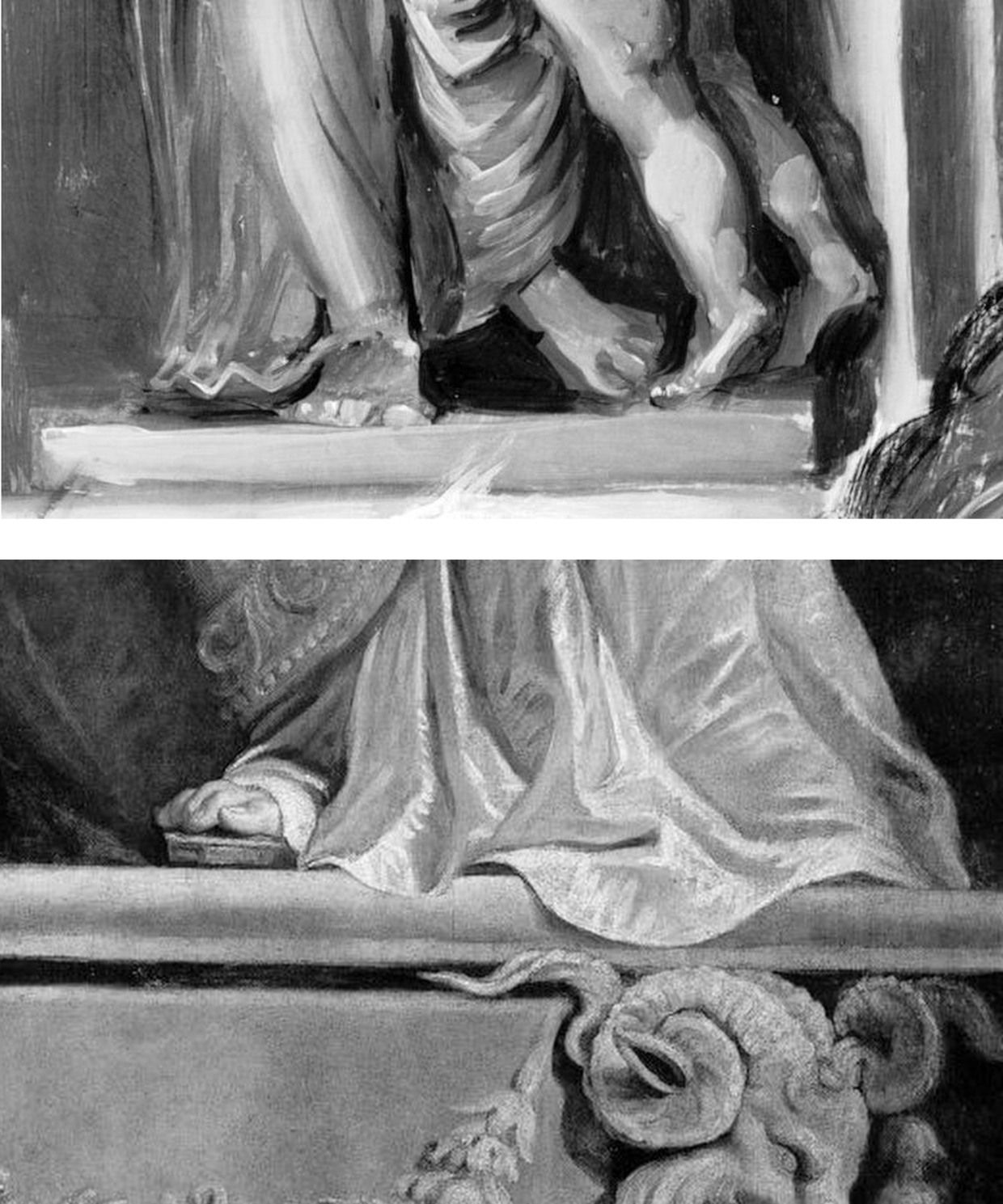
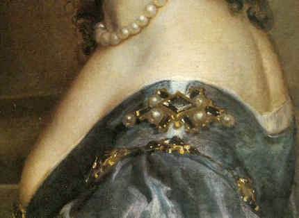
Above, Fig. 4: Top, details of the National Gallery’s Samson and Delilah; above, Rubens’ The Raising of the Cross, Antwerp Cathedral. Where the former is claimed to be a lost picture Rubens painted in 1609-10, the latter was indisputably made by Rubens between 1610-11. Such pronounced differences in brushwork are inconceivable as that of two autograph paintings made at the same moment in Rubens’ oeuvre. Who, looking at this photo-comparison, could believe that Rubens had flitted between the ugly angular Cubist faceted feet in the Samson and Delilah statue (– try counting the toes and note the Art Deco zigzagging hem), and the superb fluency, grace and anatomical fidelity seen in the Raising of the Cross?
THE TESTIMONY OF NATIONAL GALLERY TECHNICAL BULLETINS
When Tweeting support for Grosvenor, Waldemar Januszczak, had seemingly forgotten his own 5 October 1997 Sunday Times article headed: “One of the World’s most valuable paintings hangs in the National Gallery. But Samson and Delilah, widely assumed to be by Rubens, is not by him but is a copy, argues Waldemar Januszczak. Who then did paint it?” Januszczak had ended with this ringing declaration: “The one thing we doubters all agree on is that the painting bought by the gallery for a staggering sum in 1980 is not by Rubens.” What has changed to un-doubt Januszczak? Under challenge on Twitter, Grosvenor admitted that he too had once entertained doubts about the Rubens ascription.
Joyce Plesters’ 1983 Technical Bulletin account was tendentious and error prone. She had counted six planks in the Samson and Delilah panel when the picture’s restorer, David Bomford, made it five and the gallery’s panel specialist, Anthony Reeve, counted seven – as would a dendrochronologist in 1996. Plesters thought the National Gallery’s attributed Michelangelo Entombment of Christ had been painted on a single giant plank when the panel is comprised of three butterfly-keyed planks. The senior curator, Christopher Brown, accepted Plesters’ six planks in the catalogue to the National Gallery’s 1983 “Acquisition in Focus” celebratory exhibition of the restored Samson and Delilah. In 1997 Januszczak poked fun at the conservation department’s shambolic technical reporting:
“I am shown these authoritative-looking documents and, on the first page, the information that the Samson is painted on five planks has been crossed out and changed to seven planks. In the published technical report we are told there are six planks. A conservation report that cannot count the number of bits of wood the gallery’s most expensive painting was done on hardly inspires confidence.”
One of the painting dossiers that I later I examined at the National Gallery (under the directorships of Charles Saumarez Smith and Nicholas Penny) disclosed that a large and important picture had been mounted on “Sundeala” boards with a honeycomb paper core. The disclosure had not been made in the report itself but had been written on an attached yellow post-it note. Plesters’ haplessness was more than arithmetical. The year before Januszczak’s tease she had suffered a mortifying professional reverse. In the 1960s, when scholars like Ernst Gombrich and Otto Kurz warned Gallery restorers against removing all-over tinted varnishes from Renaissance paintings, she insisted that the entire documented technical history of art showed “no convincing case” for any artist having emulated Apelles’ legendary dark varnishes and that the famous passage from Pliny was of “academic rather than practical importance”. She even offered to “sift” and “throw light upon” on any future historical material that Professor Gombrich might uncover.
A BURIED INCONVENIENT TRUTH
In 1977, in the National Gallery’s first Technical Bulletin, Joyce Plesters had mused complacently “one or two readers may recall the furore when the cleaning of discoloured varnishes from paintings…began to find critics.” In that year the scarcely less complacent former National Gallery director Kenneth (Lord) Clark pronounced picture cleaning “a battle won”. A third of a century after the original controversy, the practical import of Pliny’s testimony emerged in a 1996 Technical Bulletin disclosure that a Leonardo assistant, Giampietrino, had toned down his colours with a final dark “varnish” layer of oil with black and warm earth pigments.
Had those pigments been bound in a resin it would have been deemed an earlier restorer’s attempt to impart a spurious “old masters’ glow” and removed. However, Giampietrino’s dark overall toning was identical to the oil medium of the painting itself and any solvent that would dissolve the one would dissolve the other. The gallery had to leave the coating in place. Shamefully, it stifled any acknowledgement of its momentous art historical significance – and it even neglected to inform Gombrich of the corroboration of his earlier claims, despite the fact that the gallery’s then director, Neil MacGregor, held the 1960s dispute to have been “one of the most celebrated jousts” in modern art history.
When ArtWatch UK informed Gombrich of his vindication he was approaching his 87th birthday and responded: “I could hardly have a nicer present than the information you sent me. I don’t see the National Gallery’s Technical Bulletin and would have missed their final conversion to an obvious truth. There is more joy in heaven (or Briardale Gardens…)” Two years later he observed: “I believe it was Francis Bacon who said that ‘knowledge is power’. I had to learn the hard way that power can also masquerade as knowledge, and since there are very few people able to judge these issues, they very easily get away with it.” (See “How the National Gallery belatedly vindicated the restoration criticisms of Sir Ernst Gombrich”.)
THE MISSING BACK, A LEGAL CHALLENGE, AND OTHER SAMSON AND DELILAH PROBLEMS
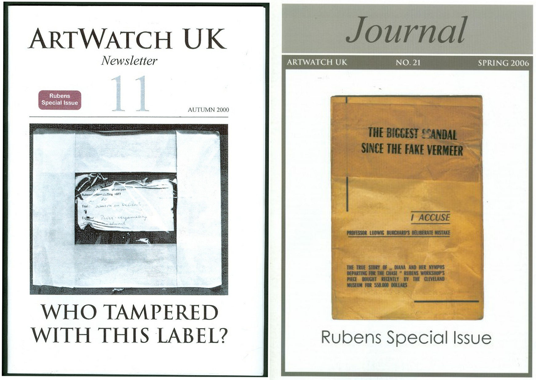
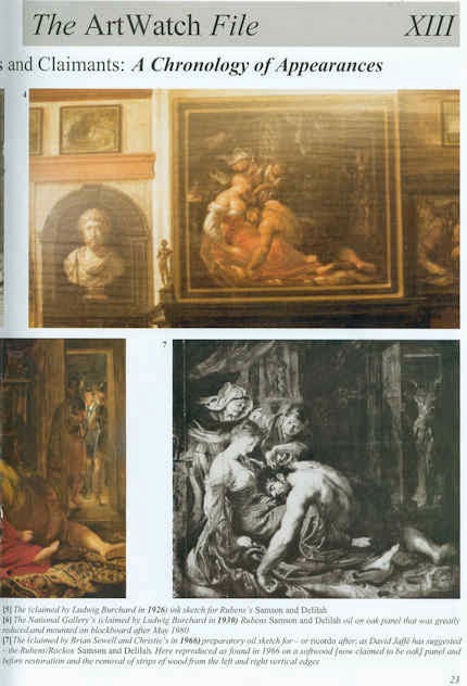
Above, Fig. 5: Two special issues of the ArtWatch UK Journal that examined the Samson and Deliah’s credentials as a Rubens.
In Journal No. 21, Kasia Pisarek wrote:
“I am in possession of a privately printed pamphlet entitled The Biggest Scandal since the Fake Vermeer written in 1960 by a well-known French art dealer Jean Neger. In it, he openly denounced Dr. Ludwig Burchard as being a dishonest man writing a certificate of authenticity for a painting that he knew was a copy. The picture in question was Diana departing for the Hunt, a large oil on canvas, sold in 1960 as a Rubens for a huge amount of money to the Cleveland Museum in America. It first appeared in an Amsterdam sale (Valkenier family) in 1796, in fact as late as 180 years after its supposed creation c.1615. Neger accused Burchard of ‘defrauding the American state of 550.000 dollars’.
“In his highly dramatic pamphlet he declared that Dr. Burchard wrote the certificate of authenticity in 1958, even though he knew that another, nearly identical version (his own) of the painting existed, and had a considerably better provenance, going back to 1655 and the prestigious Spanish collection of the marquis de Leganes, a friend of Rubens. This was the most important collection in Spain, aside from that of the King Philip IV. Leganes probably owned more paintings attributed to Rubens than any other aristocratic collector in Spain, with the possible exception of Gaspar de Haro. After researching his painting, Neger discovered that the number 214 in white paint present on his canvas was the corresponding Leganes inventory number. Moreover, his version of Diana had a lot of pentimenti visible even to the naked eye, which would indicate that it was an original, not a copy.
“According to Neger, Burchard has tried to avoid him on many occasions and has refused to see or to certify his version because he had already certified the other one as the original. When approached, he tried to ‘compromise’ by saying that he would state that Neger’s version was the first one, which Rubens had sketched and abandoned, and that he had then painted a second version, the one from Cleveland. Later, he took up Neger’s picture again, corrected it and completed it. That solution was satisfactory to Neger and yet, Dr. Burchard changed his mind again, and refused to certify Neger’s painting at all. Subsequently, he chose not to reply to Neger’s allegations which appeared to be his usual attitude in such situations.”
Dr. Pisarek concluded:
“I verified most of Neger’s statements, which on the whole appear to be true. I traced both pictures: one is in the Cleveland Museum, effectively considered to be the original by Rubens; the other is in The Getty Museum in Malibu, as ‘a workshop copy’. And yet, the Getty picture (ex-Neger’s) has better chances of being the original: it is the larger of the two versions; it has a superior and older provenance (1655 as compared to 1796); it agrees in most details (presence of sandals, lack of birds in the sky, missing tiger’s skin, background landscape) with an old copy in Cassel which provenance (1756) predates that of the alleged Cleveland’s ‘original’.”
Pisarek discussed the merits of these two pictures in the third chapter – “The two versions of Rubens’s Diana Departing for the Hunt: an American cause célèbre” – of her doctoral thesis, Rubens and Connoisseurship. On the problems of attribution and rediscovery in British and American collections, University of Warsaw, 2009, and there concluded that both the Cleveland and Getty pictures are mostly products of Rubens’s workshop.
DEFENDING MUSEUM FAKES I
On 4 March 1929, the year that Ludwig Burchard found and upgraded the Honthorst painting then owned by van Diemen and Benedict (who had bought it, Doxiadis disclosed, from a painter/restorer) and that is today the National Gallery Samson and Delilah, Rene Gimpel, author of the 1996 Diary of an art dealer, wrote:
“The Italians have sold Americans $2m worth of marbles done by Dossena (a faker). A laughable sum compared with the amounts obtained by means of certificates given daily by German experts to German dealers. Just as there were paper marks, so there are paper canvases, an easy way of bringing dollars into Germany. I went this morning to the Van Diemen gallery, which has an exhibition of sixteen Venetians. Three pictures are good, apart from the Guardis and perhaps the Longhi. Last Sunday’s Times devoted an entire page reproducing this scandalous exhibition, which gives only a faint idea of what is brought in. Bode, the director of the Berlin Museum died two or three days ago. The king is dead long live the king! The Mayers, the Gronau will replace him. The German title of Doktor impresses the Americans. The museums are even more intent than the collectors on defending their fakes or their mistaken attributions.”
WHAT LIES BEHIND
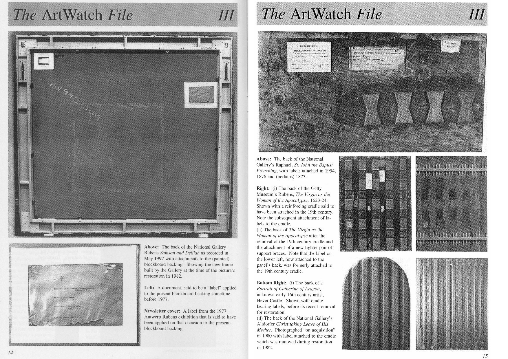
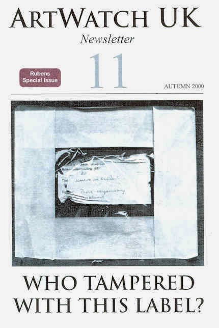
Above, Fig. 6: A spread of pages from ArtWatch UK Journal No. 11 contrasting the Samson and Delilah’s present back with the labelled and cradled backs of comparable period panel paintings.
Above, Fig. 7: Illustrations of the back of the Samson Delilah picture as supplied by the National Gallery and as published in the June 2000 Art Review (“The Back is Where It’s At”) where we showed the back of the Samson and Delilah and its attachments, as recorded in 1997. Our detailed technical and art historical case against the Rubens attribution in the Art Review ran, in full, as follows:
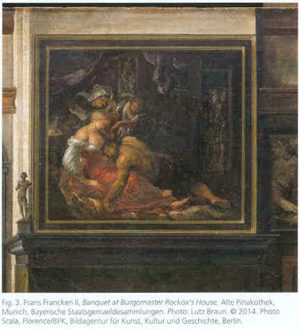
“Last month I referred to a National Gallery picture which lacks a back or a record of a back but on the back of which an incomplete provenance depends. This bizarre, paradoxical case arose as follows.
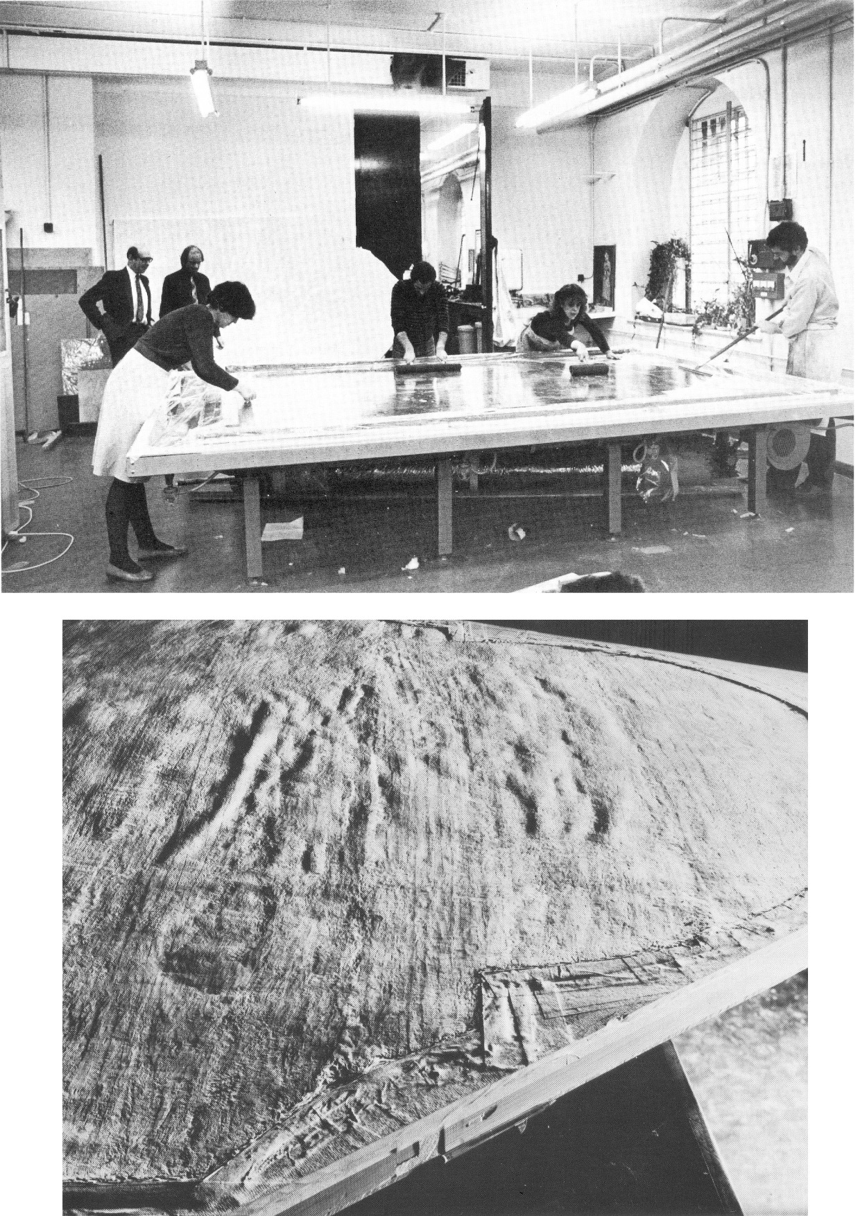
“On 11 July 1980, the National Gallery paid £2.53m (through Agnew’s at a Christie’s auction) for a large picture, Samson and Delilah, that was said to be an ‘entirely autograph’ Rubens, probably in its original frame. The price was a world record for the artist and, at the time, the second highest for any painting bought at auction. The acquisition was presented to the world with great fanfare, orchestrated as much by the gallery as by the auctioneers. In 1982 the picture was cleaned, restored and reframed in preparation for a special ‘Acquisition in Focus’ exhibition to be held the following year. So far, so straightforward.
“In 1983, two accounts of the restoration were published in the National Gallery’s Technical Bulletin by David Bomford, restorer, and Joyce Plesters, head of science. At this point the painting, which hitherto had always been described as a panel, begins to be described in different terms. Namely, as a planed-down sliver of a panel mounted on a modern laminate sheet of blockboard. As Bomford put it, ‘the large panel on which Samson and Delilah is painted must originally have been substantially thicker than it is now. At some point, probably during the present century, the panel was planed down to a thickness of less than 3 mm and subsequently glued on to a sheet of blockboard.’ This seems in strict, factual terms to be correct, but the word ‘probably’ later came to be questionable.
“Plesters’ account was seriously misleading. She claimed that the planed-down panel had been set not onto but ‘into’ (which it had not) the sheet of blockboard, which supposed placement prevented its edges from being examined for tree-ring dating purposes – which it did not. She insisted that this phantom relationship was of no consequence because ‘the date and provenance of the painting are not in doubt.’ Which claim, as will be shown, was not the case. Plesters admitted that the planing, on an unidentified occasion ‘before the picture was acquired by the Gallery’, might well have destroyed, among other evidence, a branded or carved panel-maker’s mark – a far from trivial matter because such a mark might have sunk the attribution to Rubens. The original Samson and Delilah is dated 1609, sometimes 1610; its engraved and painted copies to c. 1613 and 1615 [sic – 1625-35] respectively. Very few panel-makers marks were made before 1617 when they first became a guild requirement; after this date they can help with datings. Michiel Vrient, whose mark is most commonly found on the back of Rubens’ later panels, only qualified in 1615. His mark on the Samson and Delilah would have been fatal.
“Clearly, establishing when, by whom, and for what purpose a planing was carried out – and what records were kept of the original back – would under any circumstance be a matter of urgency and a test of propriety. In this instance it became greatly more so when, in 1997, a number of eye witnesses reported to ArtWatch UK that the picture had retained its original, label-bearing and ‘cradled’ back immediately prior to and during its auction at Christie’s in 1980. When informed of this, Neil MacGregor, the gallery’s director, dismissed the testimony as ‘mistaken’ (letter 7 April 1997). He later said (9 April) ‘the National Gallery does not have any record, photographic or written, of the back of this picture before it was planed down.’
“This year [2000], in compliance with its ‘Code of Openness’, adopted in anticipation of Government legislation on freedom of information, the gallery reversed an eight-year-old decision and allowed me to examine the dossiers held on the picture and its treatments. I have been assured that the dossiers were complete and that no material was withheld. I am forced to report that the records are therefore lamentably incomplete. This is the more disturbing because, contrary to assurances, the picture’s provenance is extremely insecure. It is not to the gallery’s credit that it took six years of assiduous research by three painters – Euphrosyne Doxiadis, Stephen Harvey and Siân Hopkinson – between 1986 and 1992 – for this embarrassing reality to be brought to light. They demonstrated that the picture is not compositionally consistent with contemporaneous engraved and painted copies of the original picture. Their examination drew from Christopher Brown, the curator responsible for the acquisition, the admission that ‘there are gaps at the beginning and the end of the Liechtenstein provenance which makes it impossible to be 100 per cent certain that this is the picture painted for Rockox.’
“The provenance as presented by Christie’s in their sale catalogue was a daisy-chain of speculations pegged on disconnected and not always accurate citations. It was claimed in the first instance that the picture was ‘probably’ the one known to have been painted in 1609-10 for Nicolaas Rockox’s house. It was said to have ‘perhaps’ been in the possession of the painter Jeremias Wildens (albeit only as a ‘Samson’ and not as Samson and Delilah) before 1653. It was further said to have ‘perhaps’ been in the possession of a ‘Guill Potteau’ before 1692. It was then said to have passed into the hands of the Prince of Liechtenstein on 30 May 1700. The second, third and fourth suggestions are all dependent on an event having taken place for which there is no evidence whatsoever: that the original painting left Rockox’s house at his death in 1640.
“As Euphrosyne Doxiadis established (and as Dalya Alberge reported in The Times of 25 November 1996), the records show that Rockox’s collection remained in his house until its sale in 1714 after the death of Rockox’s last descendant in 1712. The house in Antwerp survives and was restored in 1977 as a museum to Rockox. A booklet produced that year by the museum acknowledged with regret that it had been impossible to reassemble the whole of the original collection which had been dispersed by a public auction in 1715. Knowledge of this sequence of events seems rapidly to have slipped from official art historical consciousness
“By coincidence, the National Gallery’s picture (then in a private German collection) was exhibited in Antwerp in 1977 in a large exhibition celebrating the 400th anniversary of Rubens’ birth. In the catalogue Frans Baudoin described it as a ‘panel’. In the same year, in his book Nicolaas Rockox: ‘Friend and Patron’ of Peter Paul Rubens, Baudoin said the panel was ‘excellently preserved’. He also reported that the picture had been ‘rediscovered’ (when owned by a dealer as a Gerit van Honthorst) in 1929 by Ludwig Burchard, on whose advice, the German magnate August Neuerburg bought it in 1930 (along with another Burchard ‘Rubens’, since de-attributed).
“Burchard’s ‘rediscovery’ closed the second gap in the provenance to which Christopher Brown referred. Samson and Delilah is said to have disappeared after being sold by the Liechtenstein collection in 1880. In addition to the ‘gaps’ of 60 and 50 years at either end of the Liechtenstein provenance there are two further problems. First, the Samson and Delilah was described in every Liechtenstein inventory as a copy. Even the dealers who sold it to the collection thought it not to be by Rubens and to be greatly inferior to a work by Van Dyck. Second, every painting in the Liechtenstein collection was marked with a seal on its front or back. The National Gallery’s picture has no seal on the front. If it had one on its back, what happened to it? What possible reason could there be for removing and destroying such an important feature of a picture’s pedigree?
“When pressed on such specifics, the National Gallery summons the fogs of time. Bomford thought the planing might have taken place in the 19th century. His director, MacGregor, suggested that it was ‘possibly done this century, perhaps when the painting was in the hands of the art trade in the 1920s’ (Letter 9 April 1997.) This really will not do. The dossiers contain, I discovered, an undated sheet of typescript by Burchard (which the gallery’s archivist tells me is part of a letter dated 8 April 1930, but which contains a handwritten postscript referring to an article of 1942) which not only describes the picture as being ‘in a remarkably good state of preservation’ but, crucially, testifies that ‘even the back of the panel is still in its original condition.’ Given Burchard’s testimony, and bearing in mind that Christopher Brown made a special study of Burchard’s manuscript notes on the painting (which we have not been allowed to see) prior to the 1983 ‘Acquisition in Focus’ exhibition, how could the gallery have believed that the planing might have taken place before the last [the 20th] century or when the picture was in French hands?
“These questions are the more perplexing because, after Burchard’s testimony, every single reference to the picture describes it as a ‘panel’ in good – or better – condition. A further document in the [National Gallery] dossier that throws light on the picture’s condition also seems to have been overlooked. Christopher Norris, a benefactor of the gallery, sent a letter of congratulations to Michael Levey, the director, the day after the sale at Christie’s. Norris attributed the picture’s still ‘amazing condition’ to the fact that the German owners [between 1930 and 1980] had not touched it. It still retained, he noted, the varnish applied during its stay in France in 1929. The only change that had occurred during Norris’s forty-seven years’ acquaintance with the picture was that the varnish had toned down. (In 1983 Bomford cited the picture’s ‘thick, considerably yellowed varnish’ as the ‘principal reason’ for cleaning.)
“In 1977, Gregory Martin, the author of Christie’s catalogue entry, reviewed the Antwerp Rubens exhibition. He observed with relief that the Samson and Delilah was one of two ‘great works…on panel’ that were ‘none the worse for their journeys’ to Antwerp. (In 1982, the picture was described in the National Gallery’s Technical Bulletin as one of only three well-made and untroublesome panels in the collection.) Three years later the picture again left Germany when it was sent, on offer of sale, to a Belgian museum. On its arrival, a condition report (dated 4 March 1980) was prepared by a leading Rubens expert. He described the picture as a ‘panel…in good shape’ with painting in a condition ‘which can be called excellent’. The panel remained for several months at the museum before being dispatched directly to Christie’s. During its stay at the museum, the picture was seen to be an old, thick, somewhat bowed, label-bearing and cross-battened panel. Brian Sewell (who had discovered the Samson and Delilah modello some years earlier at Christie’s) recalls that the picture, when at Christie’s, was an intact, cross-battened panel with a blackish painted back on which the Christie’s number [as given to every work on arrival] was stencilled in white paint.
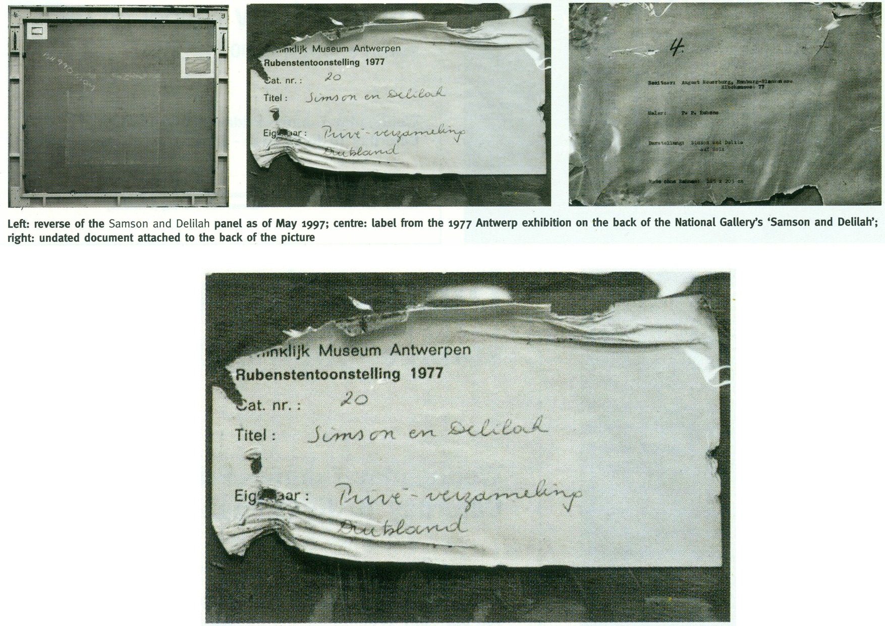
“On 27 May 1997, Neil MacGregor sent me photographs of the picture’s back ‘as it is now’. He drew attention to the Christie’s number (chalked and stencilled in black paint) and to ‘two labels attached to the back of the blockboard’ (see illustrations). One, he said, is from the Antwerp exhibition of 1977, the other ‘rather older, from the Neuerburg Collection’. It was, he said, ‘hard to imagine any of these being put on after the picture left Christie’s.’ It is not. Neither document – only one of which appears to be a label – would seem to be glued or pasted to the blockboard. Both appear to be held in place, identically, with cellophane fixed by clean masking tape. Both documents are clearly proud of the surface and are seen to cast shadows on it. The 1977 Antwerp label shows clear signs of having been attacked with a scraper. Why? When? And by whom? After receiving these photographs, I asked to see the back on an occasion when the picture had been removed from its frame. So far, I have not been permitted to do so, and two requests to government ministers for an inquiry have been turned down.”
THE DIFFERENCE A MISPLACED HISTORICAL WORD CAN MAKE IN AN AUCTION CATALOGUE
Today, given the Samson and Delilah’s recent further disqualification on a technical analysis of its brushwork, the National Gallery’s continuing claim of a Rubens authorship runs increased risks.
First: That espousal continues to fly in the face of historical documentary evidence that the picture cannot safely be ascribed to Rubens – evidence that had emerged and was published twenty-five years ago by Dalya Alberge (“Artists raise fresh doubts on gallery’s Rubens masterpiece” 26 September 1996, the Times”):
“ARTISTS challenging the attribution of Rubens’s Samson and Delilah in the National Gallery believe that evidence presented in an auction house’s catalogue was mistaken. The artists also allege that the gallery refuses to acknowledge historical facts that cast doubt on the picture being by the 17th-century master. The National Gallery acquired the painting from Christie’s in 1980 for £2.5 million, equivalent to £6 million today. The auction catalogue referred to a 1653 inventory which described the painting as ‘Eenen Samson van Rubens’, which would mean ‘by Mr Rubens’. But a Flemish genealogist who has studied the inventory said that it read ‘Eenen Samson naer Rubens’: ‘naer’ is translated as ‘made just like Rubens’ or ‘after Mr Rubens’. Another inventory, dated 1692, lists it as ‘copye’ – a copy.
“Euphrosyne Doxiadis, an artist and scholar, and the painters Steven Harvey and Siân Hopkinson believe that the genealogist’s finding backs the stylistic evidence against the picture being by Rubens… It was only as recently as 1929 that the painting was hailed as a long-lost Rubens. For 180 years it was in the collection of the Princes of Liechtenstein and inventories in 1767, 1780 and 1873 attributed it to a minor hand, Jan Van Den Hoecke…”
THE SHIFTING TESTIMONY OF LUDWIG BURCHARD
Second: With this picture never having been thought an autograph Rubens before Burchard’s 1929 upgrade, everything rests on that scholar’s tarnished standing. Aside from the Neger scandal, Pisarek noted in the Spring 2006 ArtWatch UK Journal (No. 21, “The ‘Samson and Delilah’ – a question of attribution”) that over 60 pictures, albeit mainly small works, attributed by Burchard to Rubens had been down-graded in Corpus Rubenianum to studio works, copies or imitations. In a 1950 letter to a fellow art historian, Burchard had said of a painting now in the North Carolina Museum of Art: “The Rubens-like painting was once shown to me. I missed the transparency of the shadows, which one would expect at least in places. The picture seemed to me like a compilation by a contemporary of Rubens.” However, in 1954 he had said of the same painting in a certificate of 28 May addressed to the D. M. Koetser Gallery, London: “the vigour of the design, the brilliance of the vivid colours, the concentration of movement are comparable in several details to the painter’s Defeat of Sennacherib c. 1612…”
THE FIXED TESTIMONY OF PAINTWORK
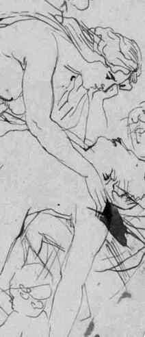
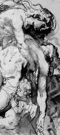
Third: As mentioned, the 1992 Doxiadis/Harvey/Hopkinson Report had anticipated and thereby now effectively corroborates the Art Recognition findings in its section on Rubens’ painterly technique:
“We have now studied the technical deficiencies in the execution of the National Gallery Painting; we have collected a very comprehensive catalogue of faults which are demonstrated by comparison with works of that period. This can be done when visual material is included…
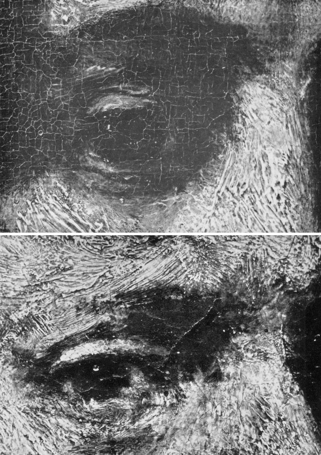
“It is totally out of character for Rubens to use what the National Gallery calls ‘bold’ handling over the entire surface of a painting. In all his other works, areas of beautiful and infinitely detailed work appear, in addition to areas which have been handled boldly – a woman’s jewellery, for instance, the lace on a ruff, or a flower in the foreground. On the whole, the great downfall of the National Gallery’s picture is the crudeness with which it has been painted. Quite apart from the unsubtle transitions from tone to tone and from colour to colour (look for example on the Venus statue in the background [here, Fig. 4, above], or at Samson’s ear [Fig. 24, below], compared with his own ear in the self portrait of Rubens and Isabella Brant in the Honeysuckle Bower painted in the same year) there are two enormous drips of paint on the surface of the work, which no painter with even the most basic training would have allowed himself to do at that period….
“Looking closely at Samson and Delilah one misses the vibrant, twisting nature of the brushstrokes themselves. The shapeless, unanimated strokes in this painting seem flat and unexciting when compared with Rubens’ usual virtuosity.”
SO, ONCE AGAIN, WHO PLANED THE BACK OFF THE SAMSON AND DELILAH PANEL?
Fourth: The Samson and Delilah picture retains an abiding technical mystery: at what date and by whom was the panel planed down and attached to a modern laminate sheet of blockboard?
It should always be appreciated that no reference had ever been made to a planing and a blockboard backing before the Plesters/Bomford accounts of 1983, and that the National Gallery’s accounts are inconsistent, shifting and full of holes. As seen, some have said the planing may have occurred in the 19th century or early 20th century, others that it took place between 1930 and 1980. The gallery claims to have kept no records of the picture’s state in 1980 when purchased and, even, to have prepared no reports for its trustees when seeking authorisation to make a then massive purchase that would consume most of the gallery’s annual purchases grant. A director, Neil MacGregor, expressly admitted (in a 1997 letter to ArtWatch UK) that “The National Gallery does not have any record, photographic or written, of the back of this picture before it was planed down” – which, as indicated above and as is further shown below, was not the case.
When the senior curator at the time of the 1980 acquisition, Christopher Brown, and his successor, David Jaffé, both held that it was planed down when in the collection of the German magnate, August Neuerberg, between 1930 and 1980, they did so against the testimony of the National Gallery benefactor (who had gifted a Poussin), Christopher Norris. As first mentioned in the 2000 Art Review, Norris testified in a letter to the director in 1980, Michael Levey, that between 1929 and 1980, no change of condition had occurred in the painting, other than a toning down in its 1929 varnish, because the owners had not touched it. Thus, because we know, on Burchard’s (written) testimony held by the National Gallery, that the panel was intact in 1929 when sold to Neuerburg and, on Norris’s (written) testimony, held by the National Gallery, that the owner had never touched the picture, the only parties who might have planed-off the back are Christie’s and the National Gallery. Christie’s, who described and sold the picture as a panel – not as a reduced or marouflaged panel – are hardly likely to have so-transformed someone else’s property – or even to have had the time and means of doing so. On currently available records, the National Gallery, becomes, willy-nilly, the sole candidate, having itself never once described the picture as a planed-down panel before 1983 – and because its own published records testify that the work was an intact panel up to 1982.
REDUCTIO AD ABSURDUM: THE CASE OF A TOTALLY DISAPPEARED NATIONAL GALLERY ALTARPIECE PANEL
Above, Fig. 8: Top, the National Gallery’s 1504 altarpiece The Incredulity of S. Thomas by Cima da Conegliano, as seen before and after an utterly transforming campaign of restoration in which a modern synthetic composite support was substituted for the original giant poplar panel and a new frame was built to replace the gallery’s own 19th century frame; above, a 1978 pen and ink drawing, “The Ages of Woman”, by the author.
As can be seen above, top, the cleaning and subsequent retouching of the picture surface left a tonally and perspectivally altered appearance: what had been dark and tonally relieving (the back wall) became lighter; what had been contrasted became equalised (the wall and ceiling); what had been dramatically central and axially assertive (the “spotlighted” figure of Christ) became quietened and subsumed within a group. The reduced ornamentation on the new frame left two architecturally assertive raised circles that now vie for attention with the picture’s own depicted half-round windows – which features, the lightening of the wall has brought closer to the picture plane and, therefore, closer also to the new more abstractly assertive frame. The net effect of the physical and pictorial transformations this altarpiece underwent was to leave a painted image surface that is now as flat, de-natured and ahistorical as a giclée print. Above, to a draughtsman (who necessarily commences work on a sheet of – initially – “no-values” to a gradually built-up and considered disposition of “values”, the alterations that are routinely made by restorers during “cleanings” and “restorations” to other artists’ works are as un-missable as they are perplexing and artistically impoverishing.
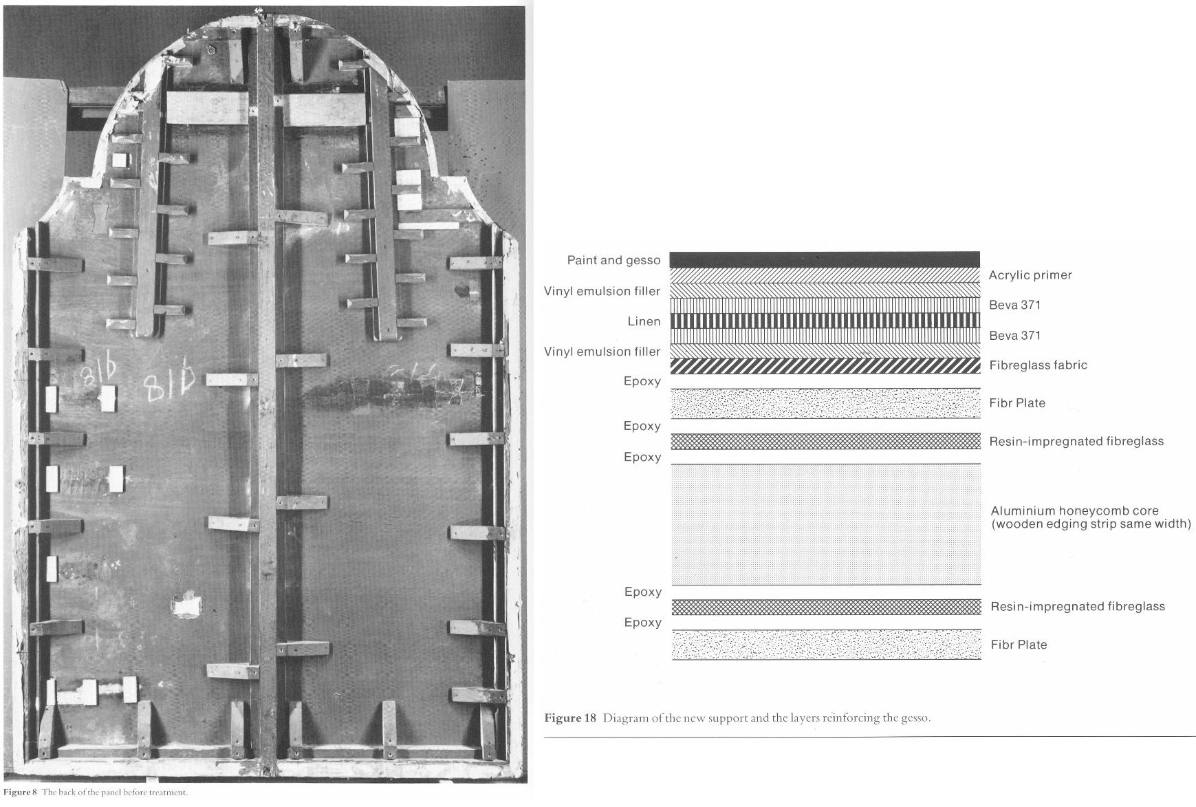
Above, Fig. 9: Left, the back of the altarpiece panel which was totally removed (i. e. destroyed) and replaced by a multi-layered fibreglass and aluminium board – the long-term stability of which is unknown – during restoration. Right, the diagram of the new, entirely synthetic glass fibre and aluminium support in cross-section, as published in the gallery’s 1985 Technical Bulletin.

Above, Fig. 10: The Cima altarpiece, as published in the 1986 Technical Bulletin with the caption: “The picture after cleaning and transfer, before restoration.”
A MASTERFUL JOB
When Waldemar Januszczak was in art critically doubting mode on the Samson and Delilah’s attribution in October 1997, he addressed the persisting Whodunnit Mystery of the Disappeared Back:
“I put this to the gallery’s chief conservator, Martin Wyld, who quips cheerfully that he was rather proud of having been accused; planing a 17th-century oak panel to wafer thinness and attaching it perfectly to blockboard while leaving its surface in pristine condition, is an exceptional feat of restoration. Nobody would or should do it today. Whoever did it earlier did a masterful job. Why did they do it at all? If a painting is in exceptionally good condition, why was there any need to hazard the transfer to blockboard? A question neither the chief conservator nor MacGregor can answer. All I got them from both is the National Gallery version of: it wasn’t us, guv.”
If stunned by Januszczak’s question, Wyld and MacGregor can hardly have been caught unawares. In a then recent letter in the Daily Telegraph (“Doubts about gallery’s Rubens”, 16 August 1997) we had written on that very question:
“…More disturbingly, crucial technical and documentary evidence concerning the picture’s weak provenance was destroyed when the back of its oak panel was planed away in a mysterious intervention for which no one accepts responsibility and during which no records were kept. The National Gallery claims the planing took place before the picture was bought at Christie’s for a record £2.5 million in 1980. If this was so, two questions arise. Why did the gallery’s trustees authorise the acquisition of a picture with no back (the planed-down remains having been glued on to a sheet of blockboard) and with no documented history of a back? And why did the gallery not ask the vendors, who had owned the painting for 50 years, for an account of the planing and a record of the pre-planed back?… Answers to all these questions lie in the reports that were prepared by the gallery staff for the trustees prior to the 1980 purchase and prior to the gallery’s 1982 cleaning and restoration of the picture. The gallery has not responded to requests that these reports be made available for inspection. Nor is it prepared to produce photographs of the picture’s back, as taken by Christie’s staff before the sale, or by gallery staff before the restoration.”
Unable to answer those questions, the head restorer had clearly been ‘avin a larf when he suggested to the Sunday Times’ art critic that planing a panel down to 3 mm and gluing it onto a sheet of block board was an exceptional feat far beyond anyone’s capacities at the National Gallery. Back then in 1997, a reading of recent National Gallery Technical Bulletins would soon have disclosed the gallery’s great pride in its radical substitutions of modern synthetic composite backings for old pictures’ historic (wood or canvas) supports. We had complained in the 1993 and 1996 James Beck and Michael Daley book Art Restoration: The Culture; the Business and the Scandal of the gallery’s use of the compressed paper “Sundeala” boards on to which Titian’s Bacchus and Ariadne, Seurat’s The Bathers and Sebastiano’s The Raising of Lazarus had been affixed.
The spectacularly gung-ho treatment of the latter picture – the largest in the Gallery’s collection – epitomised the artistic presumption and techno-adventurism of the gallery’s restorers. The deleterious consequences of that intervention began to be conceded by the gallery’s restorers in its 2009 Technical Bulletin:
“…eventually it was decided to brush on multiple thin layers of warm wax-resin dissolved in white spirit, embedding a layer of inert terylene net fabric [-“Terylene is a specific form of polyester, more specifically polyethylene terephthalate. It is created via the extraction and mixing of ethylene glycol and terephthalic acid. When turned into a fiber with dyes and other treatments, it becomes a great synthetic with a lot of potential in different sectors” ] within the layers as they solidified. Although the discoloured varnishes had yet to be removed from the paint surface, the appearance of the picture was considered to be darker than intended as a result of lack of reflectance from the ground and so titanium white (titanium dioxide) was added to the wax cement…Once the wax and titanium white layers had been built up to a sufficient thickness the painting could then be mounted on a solid new support. This had previously been coated with wax-resin allowing a bond to be achieved by ironing with a thermostatically controlled iron to soften the wax-resin layers which then fused as they cooled. Although it is unlikely that these methods and materials would be used nowadays, the treatment can be judged a success in that there has been no further flaking of the paint layers. Unfortunately, the work took place before the introduction of lightweight and stable panels made from glass fibre with aluminium honeycomb cores. The painting is mounted, therefore, on a support constructed with a ‘sundeala’ composite board outer faces and a core of paper honeycomb. In spite of its wooden edges and an internal wooden framework this panel is now showing signs of instability, with a tendency to flex and twist when the painting is moved, an operation which is therefore avoided as far as possible.” Emphasis added.

Above, Fig. 11: Staff in the National Gallery’s restoration studio at work on the remains of Cima da Conegliano’s altarpiece, The Incredulity of S. Thomas, after the complete removal of its giant poplar panel and before its transfer onto a multi-layered synthetic support – as shown in the NG’s 1985 Technical Bulletin.
A reading of the 1985 and 1986 Technical Bulletins would have disclosed how gallery restorers had chiselled away the entire wood panel of seven giant planks just under two metres long of Cima’s altarpiece The Incredulity of St Thomas (Figs. 8-10). In the first stage, the panel was reduced “from c. 5 cm to 1 cm.” In the second, the remaining 1 cm of wood was chiselled away entirely until the back of the original gesso coatings was exposed. In the 1985 Technical Bulletin, Martin Wyld described the means and the tools of that perilous operation:
“The removal of the wood then commenced. The techniques used were entirely manual. Though mechanical routers and planes are often used with success in transfer, there is a danger of a power tool, however carefully handled, snagging on knots in the wood or on the bent nails which are mysteriously but commonly found in old panels, and ripping up far more wood than is intended. Semi-circular 15 mm gouges were pushed along the grain, cutting channels 6-7 mm deep, and the ridges left between the channels were then cut down. Each plank was reduced by a similar amount, and the process repeated until the panel had been reduced from c 5 cm to 1 cm in thickness. Many nails were found embedded in the panel and several knots were also cut out.
“The removal of the first layers of wood is usually the easiest part of a transfer [of a paint film to a new support]. The removal of the final layer of wood was complicated by several factors. Many different blister-laying adhesives had been used on the Cima, often in very large quantities. Fig. 6 shows a detail of the Apostles’ heads on the right; the lines of white dots are holes of a syringe in order to inject animal glue under the gesso. Much of this glue, which must have been considerably diluted with water in order to be used in a syringe, had run into the worm channels and soaked into the wood, making the panel surface more brittle…Areas where wax had been used for blister-laying presented less difficulty.
“Experience during earlier transfers had shown that the safest method of removing the last layer of wood was to cut a very shallow slope at a slight angle to the direction of the grain and to shave away the tapered edge of the wood with a small fish-tail chisel. The method proved to be impractical on the Cima. The parts of the panel affected by thick animal glue (of the consistency of carpenter’s glue) or putty filling the worm channels, by knots and by later or original inserts of wood obviously needed individual treatment. However, the remainder of the wood was so insecurely attached to the gesso that it was impossible to cut a shallow slope because strips broke away along the grain no matter how carefully the chisel was used. Strips of wood 10-12 cm long and 3-4 cm wide would become completely detached, but usually with a few small fragments of paint and gesso stuck to them. These fragments were laboriously cut off the wood and replaced… It was found that the safest method of removing the last layer of wood in the very loose areas was to cut it away at an angle of 30 ? to the gesso, instead of across at the very shallow angle normally used, and to cut across rather than along the grain…”
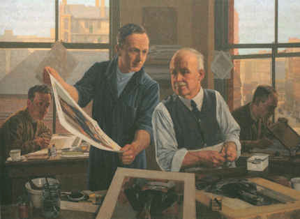
Above, Fig. 12: Top, the director, Michael Levey, and the head restorer, Martin Wyld (top left), watching four restorers in the National Gallery’s basement restoration studios attaching the pictorial remains of Cima da Conegliano’s altarpiece, The Incredulity of S. Thomas, to a linen interleaf on the hot-table after the complete removal of its giant poplar panel and before its transfer onto a multi-layered synthetic support – as shown in the NG’s 1985 Technical Bulletin. Above, the exposed and buckled gesso months after the Cima panel had been chiselled away entirely and the air-conditioning system had malfunctioned.
AN OVERNIGHT MALFUNCTION
Note Wyld’s own account of the “conservation treatment” of the Cima altarpiece:
“Fig. 13 [here, “Fig. 12, above”] shows the arched top of the picture, where the removal of the final layer of wood had started. The panel and gesso had been carefully covered with Melinex and heavy rubber mats all through the transfer, but the gesso had absorbed some moisture from the atmosphere and swollen slightly. An air-conditioning malfunction, which produced RH of 100% for several hours one night, led to pronounced swelling and buckling of the gesso [and the paint layers attached to it] which can be seen in this photograph taken months later.”
Wyld further reported:
“Fig. 13 shows the severe buckling of the top of the picture due to the gesso having absorbed moisture from the atmosphere. Less pronounced buckling had affected some of the lower half of the picture as well. The facing layers had moved with the gesso, and were still secure. The picture was detached from the temporary support and slid face-down onto the Melinex covered hot-table, sealed with a membrane and heated to 40 ? C at a pressure of 15 mbar (1.5 kPa) for an hour. The buckling slowly reduced until the picture was almost flat and relaxed, and the same low pressure, which prevented any alteration of the surface texture, was maintained while the hot-table cooled.”
ALAS, POOR HOLBEIN
The apogee of the white heat of technically transforming restorations was eventually reached in Wyld’s luxuriously long, Esso-sponsored, BBC-televised 1993-96 swank-restoration of Holbein’s The Ambassadors. There, the gallery’s head of restoration produced the world’s first painted insinuation of “virtual reality” into an old master painting by reconstructing the picture’s famous (but damaged) anamorphic skull not according to the laws of perspective by which it had been constructed but from a gallery-generated computer manipulation of a photograph of a medical model of a skull. That operation was defended by the then director, Neil MacGregor on the grounds that “We believe it is our duty to try to present to the public, as much as we can, what the artist intended them to see.” Wyld went further, re-painting a section of the rug to a new design on the authority of a rug expert and painting false and camouflaging “age cracks” onto his own new painting.
And yet, notwithstanding Wyld’s publicly paraded technical expertise, he would have had Waldemar Januszczak believe that the National Gallery’s restorers lacked the wherewithal to reduce a panel to a thickness of c 3 mm and glue it onto a sheet of blockboard.
In the absence of any prior record of a planing, the National Gallery’s last resort defence against suspicions of having carried out the operation has rested on what might seem to be a confession of exceptional negligence – rather as if saying: “With this picture, which we considered a pre-eminent masterpiece within Rubens’ oeuvre and for which we had paid a fortune, we failed to follow our customary procedures and safeguards. We made no records; we took no photographs, neither when we bought it for a world record Rubens price nor earlier, ahead of the sale at Christie’s, when we had borrowed it and were seeking our trustees’ permission to buy it”.
AN OPEN GOAL?
Januszczak might have pressed his point harder. On the absence of records, we had recently reported (“Is this really a Rubens?” The Art Review, July/August 1997) that:
“In the 1980/81 Annual Report the then director, Michael Levey, thanked Christie’s for ‘allowing the trustees to see this painting in the gallery before the sale.’ A trustee at the time has disclosed that in all such purchases curators present a case for the purchase to the trustees who then examine the work ‘in the flesh’. A former Keeper and Deputy Director, Allan Braham, has disclosed that reports on the desirability and condition are prepared by curatorial and conservation staffs for the director before any major purchase…”
A TALE OF TWO OLD PANELS BOUGHT BY THE NATIONAL GALLERY IN 1980
The Gallery’s seeming failure to record and investigate this single work is the more perplexing because the director, Michael Levey, had truly nailed his professional and managerial colours to the painting. He had announced in 1979 that, having reassessed the National Gallery’s holdings of Rubens, he had concluded that it lacked a monumental figurative composition and that he intended to pass this information on to the Trustees at their next Meeting with a recommendation that they should look to acquiring one at the first opportunity. He did not have long to wait for the emergence at Christie’s of the Burchard Samson and Delilah – which might have seemed like a prayer answered. Notwithstanding the eventual very high cost, Levey’s enthusiasm for the picture seemed unbounded. In his foreword to the 1983 “Acquisition in Focus” exhibition, he wrote:
“When on Friday 11th July 1980 the National Gallery acquired at auction in London a Rubens painting of Samson and Delilah – at a cost of over two million pounds – some people might have asked why the nation needed another Rubens. In the Collection at Trafalgar Square there were already twenty paintings by the artist.
“This exhibition, the second in our ‘Acquisition in Focus’ series, will serve as a striking demonstration, I believe, that the painting was indeed needed and will confirm that a crude numbers game in matters of great painters and great paintings is no less obtuse than asking how a piece of canvas [?] can ‘be worth’ so many million pounds. An odd aspect of such questions is that they are rarely directed to areas of national expenditure outside the arts.
“Rubens’ Samson and Delilah is a large scale, early and entirely autograph painting of a kind the National Gallery previously lacked. Its splendid colour and vigorous handling of paint can all the better be appreciated now that it appears cleaned in this exhibition…”
ATTRIBUTIONAL TURBULENCE
If a whiff of defensiveness about the cost of the acquisition might be sensed, it would be understandable: a ferocious dispute was running in the early 1980s between Rubens scholars over the famous paper cartoons-for-tapestries that had been bought for the National Museum Cardiff as by Rubens – and Levey was in the thick of it, having sided with Julius Held who had dissed his arch rival Michael Jaffé’s attribution of the cartoons to Rubens. This would have been the very worst of times for another museum to have been thought to have acquired a dud “Rubens” – and, indeed, for Levey to have been its principal begetter.
In that context, it must be said that the self-declared failure to keep customary (if not statutory) records on the Samson and Delilah stands in bewilderingly sharp contrast with the abundance of prior investigations and records kept and published on another old panel picture bought by the gallery in 1980, (for an undisclosed sum made with contributions from The Art Fund, The Pilgrim Trust and the National Heritage Memorial Fund) – namely, Altdorfer’s Christ taking Leave of His Mother. That purchase was also discussed in the 1983 Technical Bulletin. In Wyld’s report on the treatment of that picture, the first note is headed “The condition on acquisition”. It begins:
“Altdorfer’s Christ taking Leave of his Mother (No. 6463) was examined by the National Gallery Conservation Department before its acquisition in October 1980. As is customary, X-radiographs and infra-red photographs were taken and the picture was studied with infra-red vidicon system and under ultra-violet light…” By those and other examinations it was established ahead of the purchase that the panel was composed of six planks joined vertically and that these had been planed-down to about 6 – 8 mm and cradled. In a section on the subsequent treatment of the panel, Wyld notes of one photograph, “Fig. 5 shows the back of the panel as it was on acquisition…” (Emphasis added.) No such photograph has ever been produced of the Samson and Delilah.
LOOP OF SILENCE
When, on 6 April 2002 (letter), we asked the National Gallery’s then director, Neil MacGregor, whether Dr. Brown had been aware in 1982 of Burchard’s 1930 testimony on the condition of the Samson and Delilah, he replied (letter, 9 April 2002): “As I am sure you know, Christopher Brown left the National Gallery some years ago…I suggest you pursue the matter with him.” When Brown was asked (December 2005) by the US magazine, Salon to comment on his past involvement in the controversy surrounding Samson and Delilah, he replied: “I am sorry but I don’t want to do this. Please address your questions to the National Gallery.” And so, a great silence fell.
On re-visiting the Technical Bulletins today, the mystery of the disappeared picture back deepens. Not only had no one ever spoken of a planing and mounting on blockboard before the picture was acquired in 1980 but no one at the gallery had done so in the two years before the 1983 Plesters/Bomford report. Quite to the contrary, in the 1982 Technical Bulletin, Christopher Brown, Martin Wyld and the gallery’s (now deceased) timber specialist, Anthony Reeve (who was described by Mr MacGregor as the “supreme practitioner of his generation”), wrote on the cleaning and restoration of Rubens’ The Watering Place. In discussing the highly problematic construction of many Rubens’ panels, Reeve wrote:
“Of all the pictures in the National Gallery, Rubens’ panels have been of greater concern, because of their condition, than any other part of the collection. The reason for this is well-known. Rubens frequently found it necessary to enlarge his pictures after he had started painting…Rubens’ oak panels, often enlarged in several different stages, are amongst the most inherently unstable supports used by any artist.”
However, Reeve drew a distinction between “the oak supports which, although made up of many planks joined together, were not enlarged during the painting process, and those which were added to.” On that former, unproblematic, type, Reeve cited just three examples:
“The Rape of the Sabine Women (No. 38) (1.699 x 2.362 m), The Judgement of Paris (No. 6379) (1.339 x 1.1.74 m); Samson and Delilah (No 6461) (1.85 x 2.05 m), the panels of which are made up of six, five and seven oak planks respectively. The grain of every plank, and hence the joins, are horizontal and all the planks are roughly the same width.”
In consequence, Reeve continued, although “these large panels are sensitive to changes in relative humidity (RH), they provide a sound and permanent support if kept in a controlled environment and not exposed to sudden changes in RH.” Conspicuously, he made no mention of the Samson and Delilah as being then a radically reduced panel that had been glued onto a larger blockboard support (Doxiadis reported seeing something like a four inches wide surround of pinkish blockboard when the picture was out of its frame and flat on its back). Of those three fortunate panels Reeve wrote:
“Wood expands and contracts across rather than along its grain. The effect of wood shrinkage of the exposed back [emphasis added] when all the planks are parallel is for the front to become convex, and perhaps slightly corrugated. This shrinkage may cause the joins between the planks to open, or splits to form at the end grain, but treatment and stabilisation are usually straightforward.”
In other words, although all three pictures had been well and favourably constructed, all three were at potential risk of injury through their exposed backs in the event of atmospheric fluctuations – not to mention air-conditioning malfunctions. That was said in 1982. Had the Samson and Delilah already been planed-down to 3 mm and glued or cemented to a larger blockboard panel at that date, a timber craftsman so expert and informed as Reeve could not have bracketed the three panels as being at equal risk of atmospheric changes through their exposed backs.
The planed-down and mounted-on-panel Samson and Delilah artefact described by Plesters and Bomford in 1983 was no longer exposed to fluctuations of humidity: its front was protected by priming, painting and varnish; its back was sealed by its fixture to the blockboard; even its slender 3 mm edges were sealed and protected by putty. Indeed, as Bomford put it in 1983: “Although the nature of this treatment would not find favour today, Samson and Delilah, fortunately, had been treated skilfully. The joins and splits are still secure, the panel is firmly attached to blockboard in all areas and the overall warp (which one might expect to be considerable in a picture of this size) is minimal”. Bomford noted, “no further support treatment is necessary.”
How to account for the two restorers’ discrepancies of accounts between 1982 and 1983? Mr MacGregor once suggested that Burchard might have mistaken a planed-down panel laid on blockboard for an original and intact early 17th century oak panel, but after three decades of removing cradles and reducing panels, Reeve was even less likely to have mistaken a modern blockboard for a 17th century oak panel. He knew the differences well and had noted in the 1981 Technical Bulletin that:
“A very large number of the fifteenth and early sixteenth century Italian panels made of poplar have been planed-down and cradled before they came to the National Gallery collection. This form of panel treatment seems to have been very common in England in the 19th century. The problems caused by the planing-down and cradling vary from panel to panel, but it leaves almost all the panels vulnerable in that they are liable to splitting. Thirty years of experience removing cradles, rejoining splits in the panels and securing them by the method described above has shown that, providing the pictures are then kept in a reasonably well-controlled environment, the panels will remain stable.”
If Burchard truly had mistaken a planed-down panel on blockboard for an original early 17th century, it was a mistake made by everyone else who ever encountered the panel up until the moment it was restored at the National Gallery. Proceeding on the testimony of all the available records, the question might now sensibly be narrowed: who, between 1982 and 1983, planed down the panel and mounted it on blockboard – and who authorised the action?
THE MUTE, ELOQUENT TESTIMONY OF PHOTOGRAPHED BRUSHWORK
While past and present National Gallery players have yet to comment on the Art Recognition findings, eloquent witnesses remain in the Samson and Delilah’s own brushstrokes. Grosvenor’s snap dismissal that computers do not and cannot understand art mis-states the issue: computer programmes do not have to possess all human capacities and levels of understanding to perform otherwise immensely laborious but valuable visual tasks with unerring reliability. To give a commonplace example: for graphic artists who work on A3 or larger sheets, it is prohibitively expensive and space consuming to acquire scanners of corresponding size and capacity; in practice, it not necessary to have such equipment because there are now many computer programmes capable of seamlessly “stitching” overlapping part-scans of large images – as was done with this author’s drawing below at Fig. 13.

Above, Fig. 13: The author’s drawing of Donald Trump’s Relationship with the Republican Party, as published in The Conservative, September 2017.
The earlier revolution of photographic reproduction facilitated all manner of handmade graphic inventions by collage and montage but absolutely seamless conjoining was not possible – the sharpest scalpel cutting through paper cannot do other than leave a trace of its actions. It has taken digitalised computer power to accomplish seamless and effortless manipulations of images and, even, with the advent of AI, of videos. Just as it is not necessary to understand the programming means by which part-images can be invisibly joined, so it is not necessary to envisage the mechanisms whereby a programme might successfully identify distinguishing traits within individual artists’ brushstrokes. Pace Grosvenor, such a programme cannot be deemed theoretically inconceivable for the simple reason that we can already see for ourselves precisely such autographically distinguishing characteristics in paintings – were they not already present and discernible, how would any connoisseur identify any work’s author by eye?
THE NEGLECT OF PHOTOGRAPHIC AIDS TO CONNOISSEURSHIP
Far from being an incredible prospect, the study and evaluation of distinctive brushwork through magnified photographic examination has been around as a diagnostic aid for nearly a century. Despite their proven and demonstrable usefulness, the studies in question and their potential applications have been greatly and perhaps wilfully neglected in subsequent art world practices which have favoured the technical analysis of art’s material components rather than the patterns of artistry which are realised through them.

Above, Fig. 14: An image reproduced in our Journal No. 21 with the following caption:
“This illustration is a photomicrograph of the highlight on the shoulder of [Rembrandt’s] Woman Bathing, National Gallery, No. 54. The patch is pasted on from a photomicrograph of a picture whose attribution had to be tested. It will be seen that the brushwork is identical in both cases. It is possible for a skilful forger to imitate a signature, but it is quite impossible to combine the quality of the paint, the nature of the brush, and the handling of the paint by the painter, so as to reproduce this complete identity.”
So said A. P. Laurie, Professor of Chemistry to the Royal Academy of Arts, in his 1949 book The Techniques of the Great Painters. Would anyone, looking at the above photographic splicing of two brushstrokes from two paintings doubt that both brushstrokes were products of the same author? Professor Laurie was also the author of the invaluable pioneering The Brushwork of Rembrandt and his School (1932), New Light on Old Masters (1935), and, The Painter’s Methods and Materials (1960). Fascinated by scientific means of examining art, Laurie was firm in his conviction that we cannot separate the history of style from the history of artistic technique. Unfortunately, the lesson of Laurie’s penetrating and helpfully clarifying studies were displaced by more clamorous and institutionally self-serving appliances of science – and photography – and in Britain the principal villain had been an earlier director of the National Gallery.
THE PURPORTED SCIENCE OF THE NATIONAL GALLERY
As a very young (and Lord Duveen-engineered) director of the National Gallery, Kenneth Clark, whose picture cleanings produced fury among artists, set up a scientific department so as, as he put it in his 1977 autobiography, to “have in the background what purported to be scientific evidence to ‘prove’ that every precaution had been taken [by the gallery’s restorers and curators].” In pronounced contrast, Laurie’s impeccably disinterested and transparent method was conducted in good faith.
First, he explained, by magnifying details of paintings: “…we isolate the drawing with the brush: we magnify the individual strokes, and, owing to the dark varnish lying in the hollows of the paint, reveal every stroke of the brush with the utmost definiteness.” Second, “If we now proceed to take silver prints of the magnified photographs of two pictures, one known and the other unknown, and cutting up the one, put a portion of the other print so adjusted that the strokes of the brush follow on, we have an infallible method of identification.”
Thus, Laurie appreciated, the marks of brushes left in paint can be as “forensically” helpful as the rifling marks on a bullet. Unlike Plesters, Laurie combined technical ingenuity with artistic perspicacity. On his schema, great precision of identifications of authorship might indeed be attained by almost anyone – and therein may lie the rub and an explanation of institutional resistance and exclusion: his method demystified the mumbo-jumbo of pseudo-scientific museum world “conservation”.
On the certainly pertinent and potential tripwire question “Can we be sure that artists brushstrokes do not evolve to the point of transformation?” Laurie answered in the affirmative: “As in writing, once a painter has formed his style of brushwork, it is curiously persistent. His pictures may alter with the years: they may develop a greater depth of meaning and a richer quality, as we find with Rembrandt, but the brushwork remains the same.” Laurie, who claimed nothing that he was unable to demonstrate for all to see, continued: “Now take a jump from 1633 to about 1660 and examine through a lens the impasto of the portrait of himself (No. 221 in the National Gallery). You will recognise the same impasto, though with a more stiffly ground paint. Or again, the lens will reveal same impasto as in the portrait of Titus in the Wallace Collection. [See Fig. 15 below] A study of these three painters, Velazquez, Rembrandt and Frans Hals will soon convince the reader of the truth of what has been said above. If then we can emphasise this characteristic, we have a powerful weapon to assist in the attribution of painters.”
Above, Fig. 15: Top, in this juxtaposition of the eye in the Wallace Collection portrait of Titus, (the condition of which Laurie described as above in his ground-breaking 1932 study of Rembrandt’s brushwork) and, above, the eye in the National Gallery self-portrait (of which picture’s condition Laurie noted “This, except for the coarse repairs in the corner of the eye and on the upper lip, is in excellent condition and is the best example of his latest manner I have seen which has not been injured by the restorer”), it can be seen that Rembrandt’s brushwork could swish without change through time.
The test of Laurie was truly in the looking: he published comparative details of artists brushwork in which authorial differences were manifest and indisputable – see Figs. 16-19 below. He squarely addressed all potential practical/theoretical/methodological difficulties: “In order to apply this method in a thorough way it is necessary to study a painter through his whole career, and also to study the work of his pupils and imitators, so as to prepare a complete dossier for reference. I have been able to make some approach to doing this for Rembrandt and his school, for which thanks are due to the Duke of Westminster, and the results of the inquiry have been published as The Brushwork of Rembrandt and his School.” As is perfectly demonstrated at the photo-comparison at Fig. 15 above, the signature brushwork patterns of Rembrandt do indeed straddle his early and late works with complete consistency and a seeming interchangeability.

Above, Fig. 16: Laurie’s photomicrograph of the moustache in the Frans Hals portrait of Verdonck (National Gallery of Scotland).
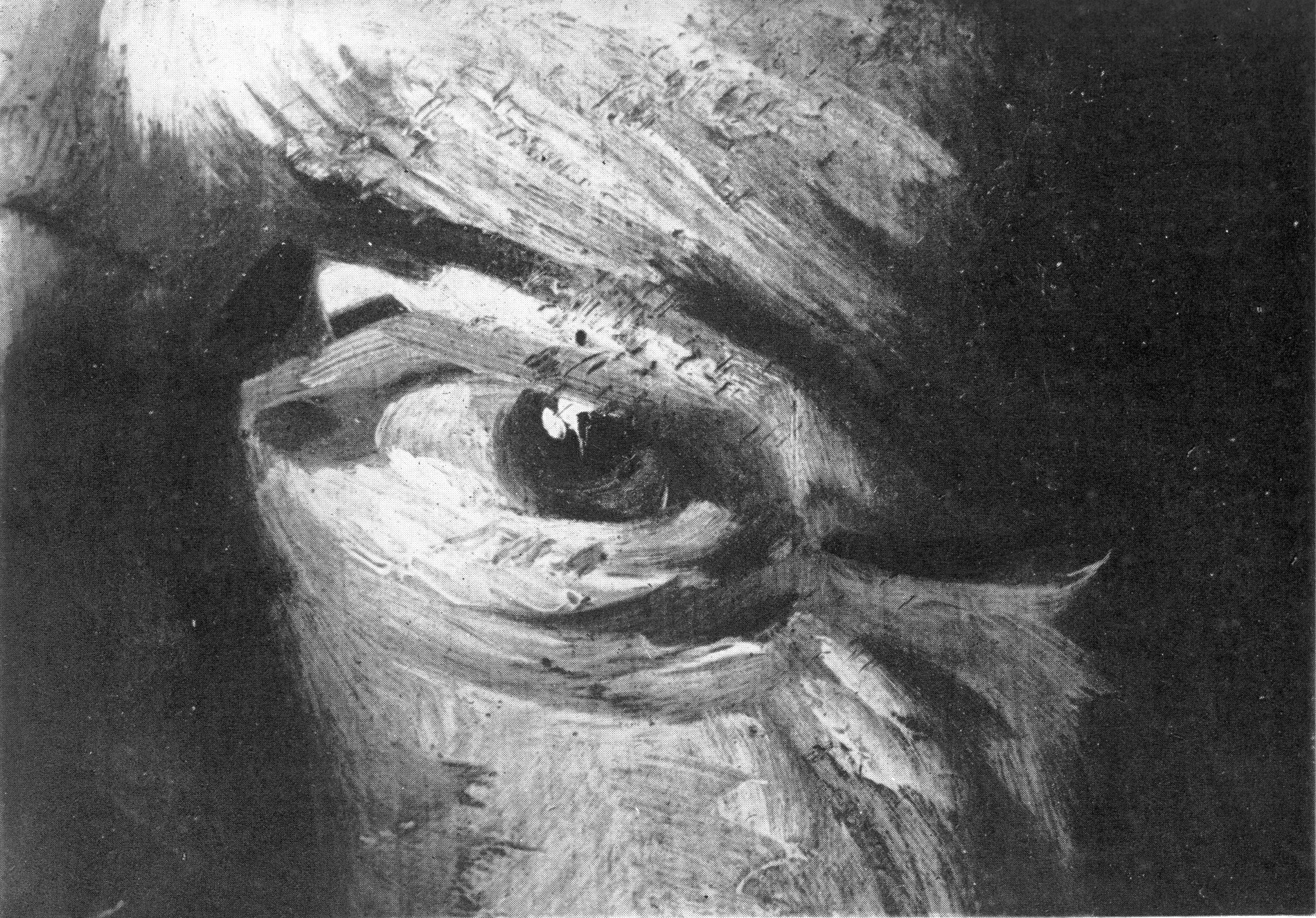
Above, Fig. 17: Laurie’s photomicrograph of the eye in the Frans Hals portrait of Verdonck (National Gallery of Scotland).
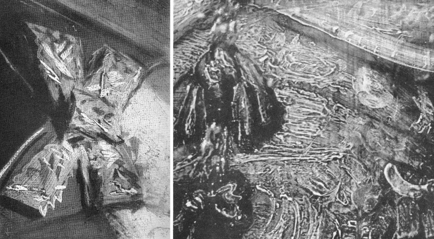
Above, Fig. 18: Left, a photomicrograph of a bow in the Frans Hals Portrait of a Lady (National Gallery of Scotland); right, a detail of the tassel on the shoulder of Rembrandt’s Saskia Laughing, Dresden Gallery. On such a photo-comparison, a child of six would be unlikely to confound the one author with the other.
If perceived in some quarters to constitute a professional threat to vested interests, Laurie acknowledged a personal indebtedness to the London art trade, reporting that his own interests had been aroused by the late Mr Vicars of Bond Street:
“We were all engaged in the famous Romney trial and he took me to see a perfect gallery of the English portrait school belonging to a well-known London banker. ‘We dealers’, he told me, ‘go by brushwork, that is the artist’s true signature which nobody can forge.’ Going up to a Reynolds he said, ‘Do you see how Reynolds has put in that touch there?’ ‘Now come here and see how Romney does it; this is Gainsborough’s touch.’ After we had studied the English portrait school from this point of view, I said to him, ‘I have learnt more from you than from all the art connoisseurs’. He turned to me and said, ‘My boy, we’ve got to know, we risk our money on it!’”
DEFENDING MUSEUM FAKES II
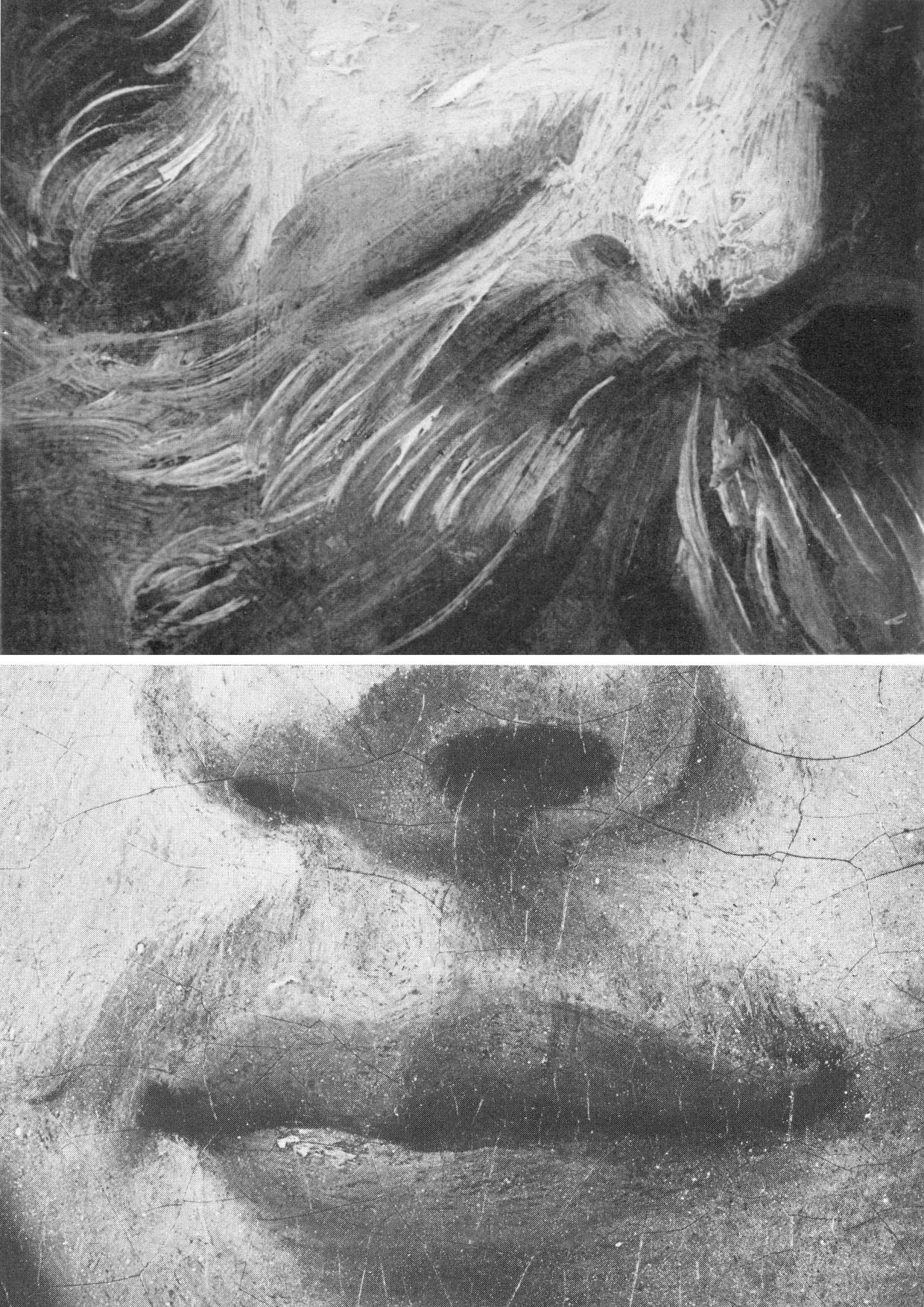
Above, Fig. 19: Top, Laurie’s detail of the Hals moustache; above, a section of a half-page detail of the National Gallery’s du Jardin Portrait of a Young Man, as published in the Technical Bulletin of 1982.
The caption to the Technical Bulletin photograph reads:
“Detail after cleaning, before restoration. The unusually large pigment particles, including those from the lower layer of the ground, can be seen. The paint film is slightly worn so that small areas of grey priming have been exposed, especially to the right of the mouth.”
Thus, as can be seen with this detail of du Jardin’s Portrait of a Young Man, the National Gallery certainly had the means in 1982 to provide Laurie-style detailed photo-comparisons that might have shown, for example, the consequences of its cleaning methods (see Fig. 8 above), or the stylistic correspondences or otherwise between works attributed to a given author. The Gallery had accepted Laurie’s comparative photo-demonstration (as at Fig. 14) that a challenged work was an autograph Rembrandt, but it has commissioned no detailed photo-comparisons of the Samson and Delilah brushwork with that of its own uncontested Rubens pictures (see Fig. 22). Instead of better studying the creative handiwork of artists, the gallery has photographed a million microscopically minute samples of paint ground down so as to reveal paint in stratigraphic cross-sections. In the 1993, 1996 Art Restoration, we complained that the National Gallery’s restorers and scientists were more interested to learn of the chemical constituents of paint than to understand the artistic uses to which artists put their paint, viz:
“…the green earth pigment consisted of ‘glauconite and celadonite [which] have closely similar constitutions, although their primary origins differ: the former is present in certain marine sedimentary deposits, while the latter occurs as inclusions in igneous rocks such as basalt. They are difficult to distinguish by XRD. Both types are layered silicate materials containing FE(II) and FE(III); also characteristic is a content of aluminium, silicon, potassium and sometimes magnesium…” Does this have a point, we asked, or is it swank? Was Rubens handicapped when painting in ignorance of such chemical constituencies?
Laurie encountered hostility from institutions wishing to defend their attributions. He warned: “I suggest a voyage of discovery to some young student with a magnifying camera through the galleries of Europe, but he must be careful to conceal his real object or he will never return alive. I have never forgotten the rage of the Director of a famous continental gallery when he thought I was suggesting that one of his pictures was not by Rembrandt. ‘Nonsense, nonsense’ he shouted, ‘one of the finest Rembrandts in the world’. I hurried to explain that I was referring to a Rembrandt in another Gallery, he smiled sweetly and said, ‘You are probably quite right’.”
TIMES CHANGE
In conclusion, and in Laurie’s inquiring spirit, we consider some close photographic comparisons of the National Gallery’s version of the 1609-10 Samson and Delilah with a bona fide Rubens painting which has retained its back – Rubens’ The Raising of the Cross of 1609-11, Antwerp Cathedral. As with that comparison at Fig. 4, above, the successive comparative details from Fig. 20 to Fig. 25 below are of two works of the same supposed historical moment and stage of development within the oeuvre. Great differences of brushwork might hardly, therefore, be expected. Matches are not to be found.
“SMOOTHLY BRUSHED, THINLY APPLIED”
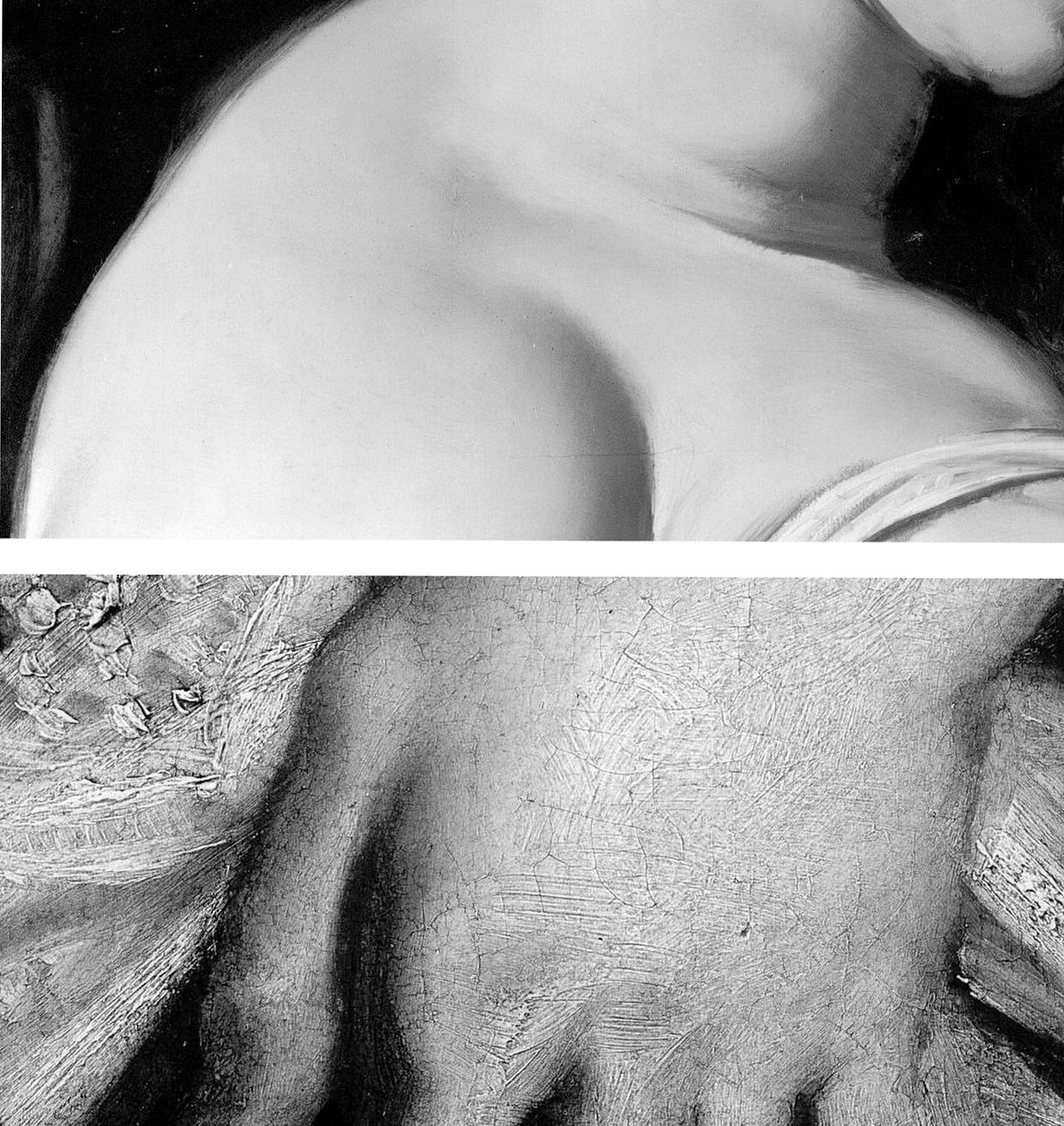
Above, Fig. 20: Top, a section of Delilah’s flesh; above; a detail from Rubens’ The Raising of the Cross.
The astonishing contrast above, is of an apparently phenomenally well-preserved smoothness and absence of age cracks in the Delilah, and the entirely characteristic four centuries old painting of flesh on The Raising of the Cross. Plesters, convinced of the picture’s authenticity, perceived no stylistic discrepancies and remarked on the Samson and Delilah’s seemingly youthful paint: “The flesh of Delilah was in such perfect condition that no small damage could be found from which to take a [microscopically tiny] sample, but viewed under the stereoscopic binocular microscope at low magnification the pale parts of the flesh appear to consist of lead white tinted with a little vermilion, a mixture which results in a clear rosy pink. The transition between the white, pinkish and more creamy tones (probably lead white with a little yellow earth colour) are smoothly brushed apparently in a single paint layer.” Moreover, “Apart from the strongest highlights the flesh paint is quite thin, so much so that in parts the striped pattern of the yellowish imprimatura below is visible lending a pearly translucent effect which Rubens may have calculated…”
As if inoculated against all visual anomalies, Plesters deemed it interesting to find that “in the full-scale version of Samson and Delilah the striped imprimatura, so characteristic of his preparatory and exploratory oil sketches on panel, has been used.” Without her conviction that what she was examining what was unquestionably Rubens’ handiwork, Plesters might have found the exposed imprimatura in a major painting, commissioned by a friend and patron, surprising and incongruous. Perhaps she did sense danger: “…it could of course, in this case, be the accidental result of [unusual] speed and boldness in painting.”

Above, Fig. 21: Two faces of the Rubens “beautiful young blond woman” type. Again, the same striking differences of paint film properties are apparent (thick v. thin; smooth v. textured) but note also how in the secure Rubens picture the “drawing” of the subject’s profile has been realised by modelling the features (brow, nose, lips and chin) over a darker background. In the National Gallery picture the drawing of the profile is weaker, sharper, anatomically inferior and has been realised principally by the encroachment of a superimposed dark background which, at the nose, results in flat, angular edges like cut-out paper that bear no relation to the form of the nose (which, anyway, is itself plastically and anatomically ill-conceived) and with no illusion of aerial recession beyond the figure.

Above, Fig. 22: Top, in the Samson and Delilah the forms of the lips are chaotically and messily unresolved. The upper lip is drawn as if from a three-quarters and above viewpoint, but the lower lip is drawn as if seen sideways on and with no hint of interconnecting flesh. By comparison, in the proper-Rubens head all the surfaces turn, move, and cohere convincingly, as if placed on a piece of sculpture.
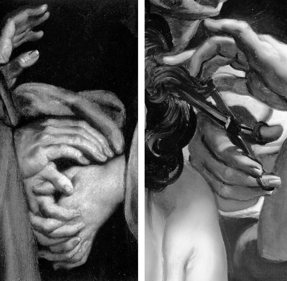
Above, Fig. 23: In these portrayals of hands, the superbly realised expressive resolutions within the one, disqualify the crass and clumsy shorthand treatments seen in the other.
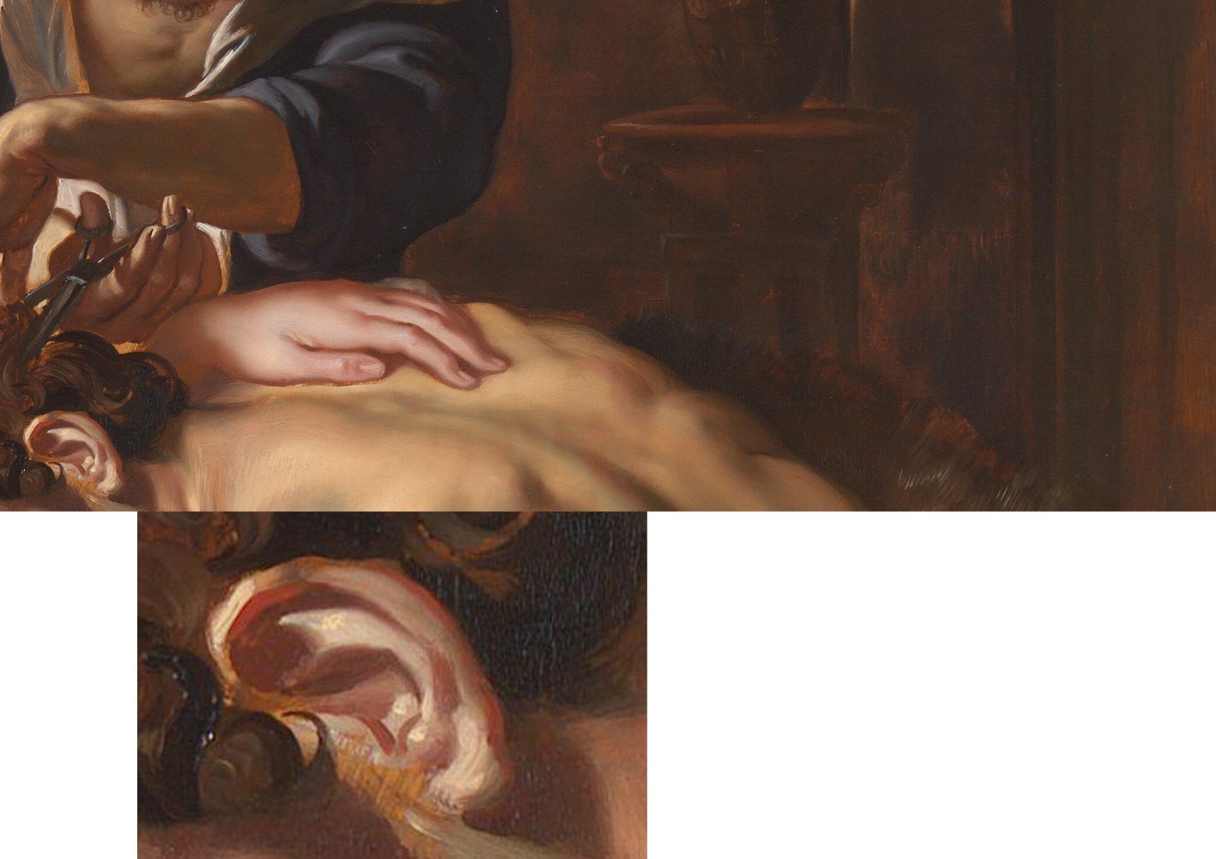
Above, Fig. 24: In these two details on the Burchard/National Gallery painting, the scant, near-void-like treatment of the background is accompanied by a flabby musculature in Samson’s back. The enlarged detail of the ear discloses an angular, almost Cubist treatment of the forms laid hastily over the stripy sketch-like imprimatura.
A TRIPLE COMPARISON AND A SECOND, “TWINNED” RUBENS UPGRADE
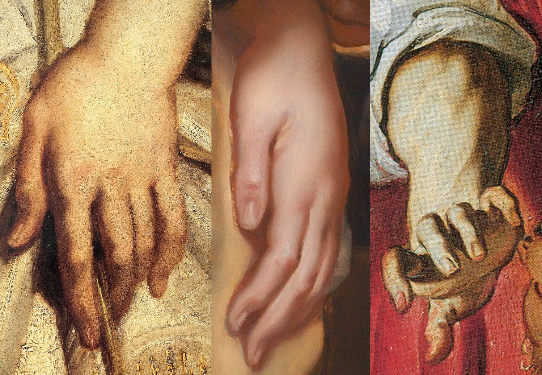
Above, Fig. 25: In this comparison we show three very different treatments of female hands which pose the question: Did Rubens paint female hands so variously in 1609-11?
On the left, we see that encountered in the secure Raising of the Cross in Antwerp cathedral. In the centre we see the Delilah hand from the National Gallery. On the right, we see a hand from the (presently) most-expensive “Rubens” painting, The Massacre of the Innocents which realised £49.5m at Sotheby’s on 10 July 2002. The latter, like the Samson and Delilah, had been regarded as a follower’s copy for centuries. Where our eyes can only tell us that these three hands were executed by different artists, the official Rubens Art Scholarship World insists that all three had been painted almost simultaneously by Rubens. The hand in the centre is an anaemic semblance of a Rubens hand. That on the right is a stridently caricatured – almost comic book-like – derivative.
GROWING OEUVRES DESPITE THE EVIDENCE OF TREE RINGS
When misattributed works are accepted within oeuvres, they immediately exert a toxic influence – if “X Mark I”, then why not also a matching “X Mark II”? And so on, ad infinitum…until an inevitable eventual crisis of confidence arises.
Up to December 2001 the Massacre (Fig. 30, below), like the Samson and Delilah, had for centuries been regarded as a follower’s copy. The upgrading was said to have been made by five experts, only three of whom were named – Paul Huvenne, Arnout Balis and Elizabeth McGrath (the other two were believed to be National Gallery staffers). In the 2006 AWUK Journal No. 21 we reported that Dr. McGrath had corresponded with the National Gallery about Jan van den Hoecke, whom she believed had worked with Rubens in his studio and had possibly collaborated with him on a Rubens temporarily loaned to the National Gallery. She had expressed a fear to the Gallery that if her material were to be passed to the press, she might be thought to be propounding her own theories.
Some of the five experts thought the Massacre had been painted before the Samson and Delilah, some, after it. Of all Rubens paintings of the period under consideration – 1609-11, the National Gallery picture – and not, for example, the absolutely secure Raising of the Cross – was taken by Sotheby’s and the experts to be the “benchmark” picture in making this new Rubens ascription even though both the Samson and Delilah and the Massacre had spent many years together in the Liechtenstein Collection not as Rubens’s but as Jan van den Hoecke copies of Rubens pictures. The Massacre had Liechtenstein seals on the back and front of its panel which, just like the Samson and Delilah in 1929, was said to be original and in excellent condition.
BURYING REPORTS
Sotheby’s had commissioned detailed technical reports which were not carried in the sale catalogue but which were there said to be available on request in a separate volume. The reports carried much material that was injurious to the Rubens ascription, as we reported in the October 2002 Jackdaw (“Is this £49.5 million painting by Rubens?”). The Independent’s financial correspondent William Kay, had advised on 20 July 2002 (“A little detective work can pay off”): “Don’t look at a company’s profits-and-loss account – start at the back of the accounts, where the notes are, not at the front where the chairman puts a gloss on the numbers.”
Turning quickly from the first page of Sotheby’s commissioned reports on the Massacre (- which page carried the disclaimer “The independent reports contained in this document are provided for prospective bidders’ information only and without warranty by Sotheby’s or the seller”) to the very last page, I discovered that the two last lines of a dendrochronological report by Peter Klein on the picture’s oak panel (dated 2 April 2002) read:
“Under an assumption of a median of 15 sapwood rings and 2 years for seasoning a creation is plausible from 1615 upwards.”
That meant the Massacre’s proposed Rubens upgrade as “a just-returned-from-Italy” work of 1609-11 was toast. On the tree ring evidence, this panel could only be considered to have been painted at least four years afters after its claimed date of execution. When Dr Klein examined the wood of the Samson and Delilah in 1996 his technical findings were said by the National Gallery to have corroborated the claimed 1609-10 date of execution. That claim, however, had rested not on the data but on the authority of a Klein covering letter which stated: “The felling date [of the tree] corresponds very well with the art historian attribution” and that a date of execution for the painting “is plausible from 1605 upwards”.
Two British dendrochronologists held that Klein’s summary characterisation of tree ring data was misleading. One said: “it is unsafe to say 1609 is any more likely than a later date of 1620.” Another observed “All Klein should be saying is that the range is 1597 to 1630”. The forces that were desirous of the Massacre being taken as a bona fide Rubens were unmoved by the earlier Samson and Delilah controversy and warnings – and the marketing enterprise rolled on despite the presence of much other disqualifying evidence in the volume of reports. As we reported in the Jackdaw:
“Preliminaries studies failed to link the Massacre’s wood with that found in any of Rubens’ panel. As well as being too late, the Massacre contains the wrong materials. A pigment, orpiment, that is found in no Rubens painting is present here. A second pigment, smalt, said to have been in use ‘mainly in the mid-seventeenth century’ and which seems only to be found in Rubens’ later works is also present. The orpiment yellow is anomalous not only in its presence but in its manner of application – it is mixed with lead tin yellow. Such a combination is said to be “unusual since it was considered unstable” and, even, to be a practice ‘not encountered in 17th century works’…Speaking of Rubens’ debt to classical sources, the anonymous author of the catalogue entry correctly concedes, ‘one of the background figures appears to derive from the Borghese Gladiator…[which] was not excavated until late in 1611’…”
The absence of under-drawing and pentimenti has been remarked in both works. No less anomalous is that both also betrayed an uncharacteristically stinting use of lead white pigment. Plesters, convinced at every turn that a Rubens ascription was beyond question, noted: “The striking feature of the composite X-radiograph is how comparatively sparingly and how subtly Rubens has used lead white, reserving the strongest touches for the brightest highlights and tapering the thickness of the white highlight to almost nothing. This system of painting which uses the light-coloured ground showing through thin translucent paint layers for the middle tones, particularly of flesh, is similar to that used by early Netherlandish painters who also used a chalk ground on oak panel.”
Where Plesters had attempted to explain the absence of underdrawing on the Samson and Delilah by claiming there had been no need to make any because the (anomalously complete) oil sketch for the painting had resolved all matters, in Sotheby’s reports it was more frankly acknowledged that such absences of under-drawing and pentimenti in the Massacre are consistent with pictures originating in Rubens’ workshop:
“…we can identify the use of minor but significant applications of paint to modify the outline and define the shape of the elements in the composition. These can be seen as strongly contrasting additions, frequently following the line of a limb or suchlike. Wadum [J] has effectively argued that these features represent Rubens’ studio control, and that he was in the habit of inspecting works before they left the workshop and making corrections.”
Clearly, had Rubens painted the Massacre with his customary perpetual revisions (as are to be seen on the Raising of the Cross), he would not have needed to make last-minute corrections with ‘brushstrokes of paint containing carbon black’ to his own work.
SCHOLARLY ACCOUNTABILITY
We asked in the 2002 Jackdaw: “Can it be right that we are all asked to take this leap of faith when the [five] experts, displaying a seeming ignorance of – or disregard for – so much germane material evidence, have yet to publish accounts of their verbal endorsements.”
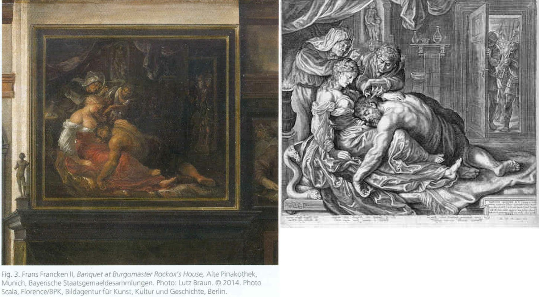
Above, Fig. 26: The two copies made respectively of the original (and subsequently lost) Rubens Samson and Delilah in 1625-35 by Frans Francken (left), and in 1613 by Jacob Mathan (right) in both of which Rubens can be seen to have painted the whole of Samson’s right foot and space beyond.
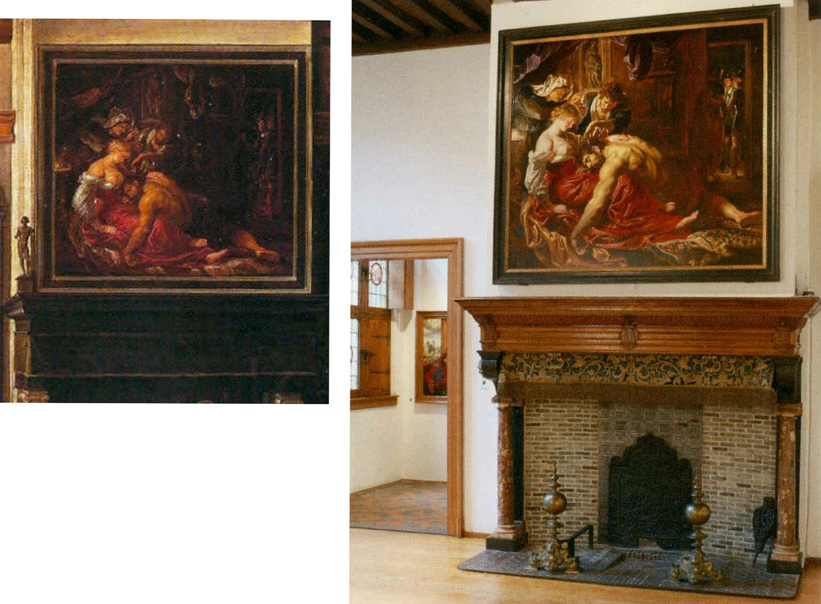
Above, Fig. 27: Left, detail of the Frans Francken painting showing the original Rubens’ Samson and Delilah; right, the National Gallery Samson and Delilah, as exhibited in 1983 in its then new, post-restoration, frame and above a mock-up of the grand fireplace in Nicolaas Rockox’s house. The recorded positioning of Samson’s right foot in the Franken copy testifies to a compositionally taught bisecting of the picture on a descending diagonal. In contrast, the foot is not only cropped in the National Gallery picture, but it first wanders up the edge of the painting leaving a broken-looking leg.
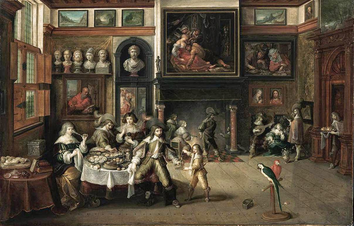
Above, Fig. 28: The whole of Frans Francken’s copy of the original Rubens Samson Delilah enjoying pride of place in Nicolaas Rockox’s house.
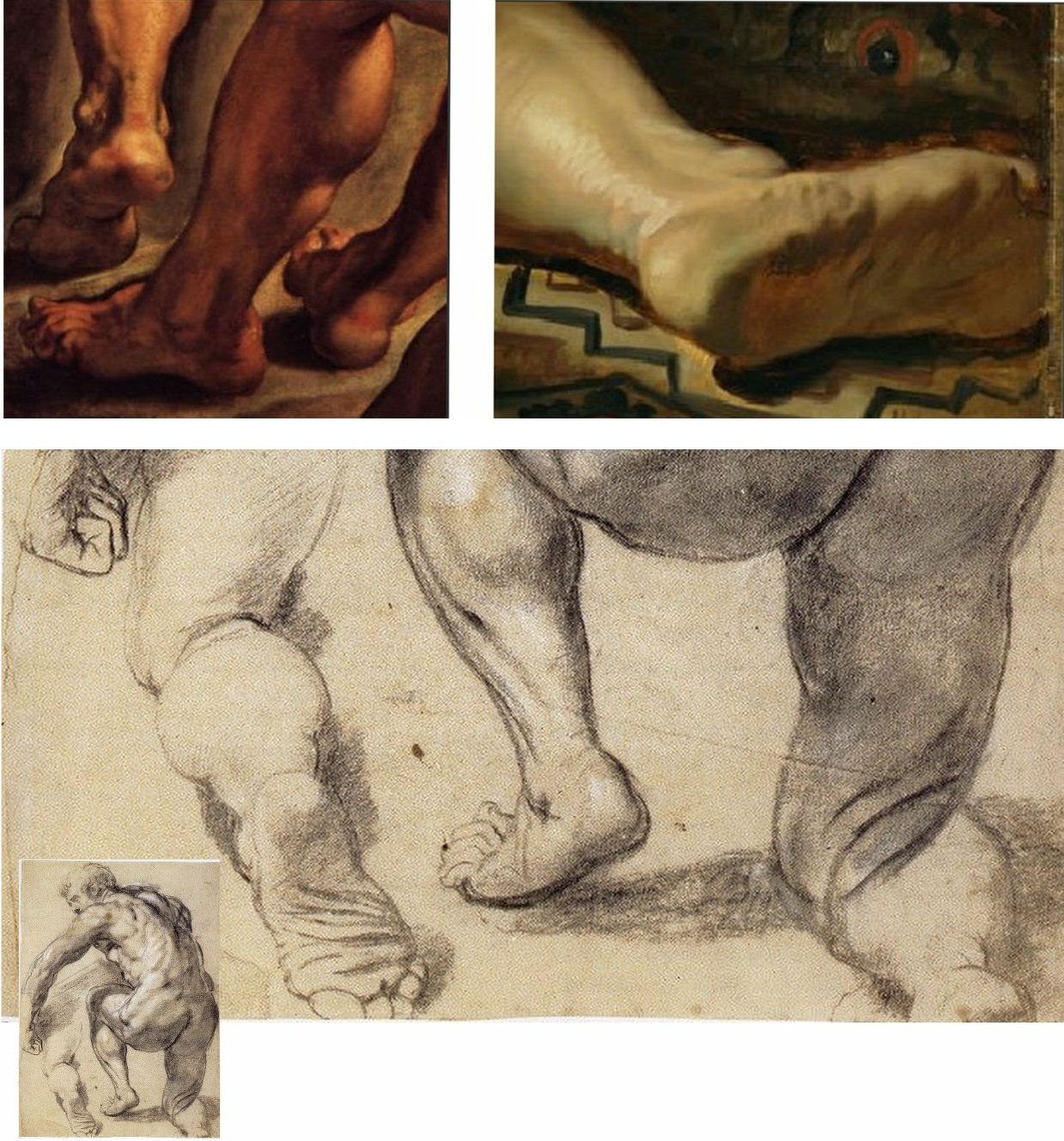
Above, Fig. 29: Top left, detail of feet on Rubens’ The Raising of the Cross; top right, the cropped foot in the National Gallery Samson and Delilah; above, a Rubens chalk figure study for The Raising of the Cross showing how Rubens drew separately on the sheet a cropped leg.
The most visibly disturbing disqualification in the National Gallery picture – as Doxiadis, Harvey and Hopkinson immediately flagged in their 1992 Report – was the fact that the toes of Samson had been cut off at the edge of the painted area on the panel when both copyists of the original painting in Rockox’s house had recorded an intact foot set well away from the edge of the painting in a more reassuringly “Rubensesque” treatment.
The cropping in the National Gallery version is itself disqualifying on two counts. First, few painters have been more attentive to their depicted subjects’ digits than Rubens. When a foot was not included in a large swiftly drawn figure study, as above at Fig. 29, Rubens drew it separately on the sheet so as to have a record of the entire figure. Second, as we have examined previously, copyists frequently produce truncated versions of master works and the £49.5 million Massacre of the Innocents which is now in the Ontaria Museum is – just like the Samson and Delilah – a compositionally cut-down version of a larger composition that is found in a School of Rubens Massacre in the Royal Museum of Fine Arts Belgium as seen below in Figs. 30 and 31.

Above, Fig. 30: Left, a detail of a Rubens School work in the Museum of Fine Arts, Belgium; centre, the former Jan van den Hoecke copy that became the £49.5 million Massacre of the Innocents and now lives in the Ontario Museum; right, the Francken copy of the (lost) original Rubens Samson and Delilah.
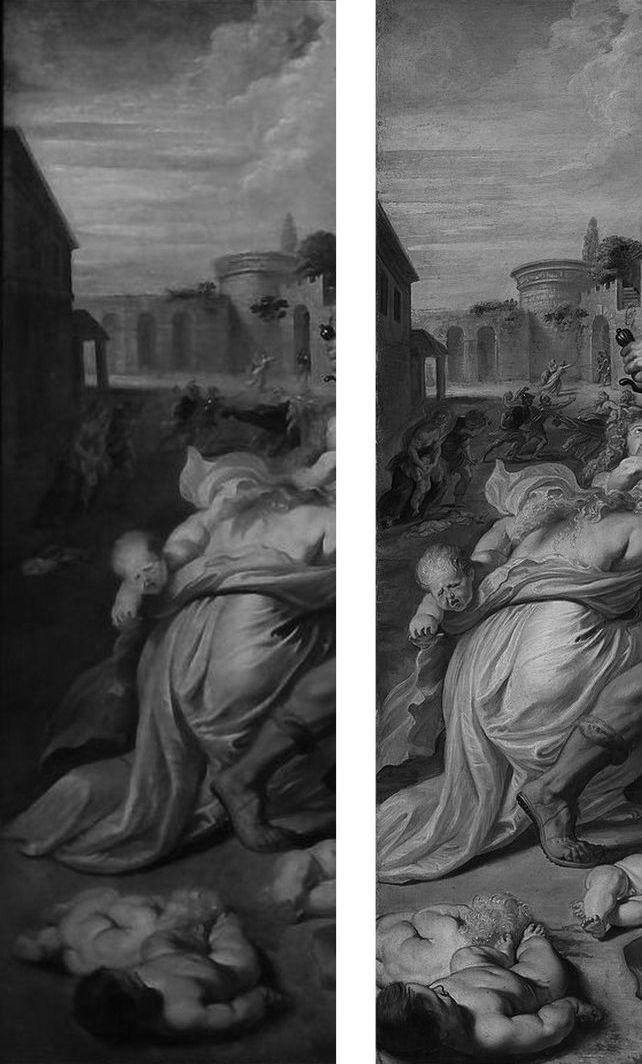
Above, Fig. 31: The left-hand sections showing the pair of murdered babies in the bottom left corner of two versions of Rubens’ Massacre – that in the Royal Museum of Fine Arts, Belgium version, left, and, right, that in the cropped £49.5m Ontario Museum, former Jan van den Hoeke version.
On the fact of the 1980 and 2002 upgrades, must we now believe that Rubens had cropped the compositions and subjects in both his Samson and Delilah and his Massacre of the Innocents pictures so disturbingly as to prompt copyists of both works to expand the pictures to more comfortably and characteristically Rubens-like compositions?
How many allowances may be made, how many disqualifications disregarded, to uphold a single troubled attribution? In our experience, it is very often the case that when one thing is wrong with an attribution, everything else is.
Michael Daley, Director, 5 November 2021
POSTSCRIPT: On 12 November 2021, Eric Biétry-Rivierre reported in LE FIGARO (“A Salvator Mundi still record but less and less credible”):
For the Prado Museum, the most expensive painting in the world is not by Leonardo da Vinci. Rather, it is the work of an assistant or follower.
In the catalogue of this exhibition running until 23 January 2022 and relating to an old copy of The Mona Lisa which it preserves, the Prado does not attribute to Leonardo da Vinci the Salvator Mundi of the Crown Prince of Saudi Arabia. According to the Madrid Museum, this version called “Cook” (named after a former owner because there are no fewer than 22 paintings in the world in the Leonardesque style and representing Christ in the manner of a God the Father) belongs to a close assistant or follower. This further darkens the episode of the highly marketed and hypermediatized sale, organized by Christie’s New York in 2017. And it justifies less the $ 450.3 million disbursed by Mohammed Bin Salman.
The curator Ana Gonzalez Mozo even suggests that a prototype made by the master may never have existed. As for which would be the oldest version, she leans towards another Salvator Mundi: the so-called “Ganay” version, also in private hands. Its pedigree, admittedly incomplete, being much less incomplete. It was already this oil painting that, although less beautiful and less well restored, had the preference of the specialists of the Louvre during the retrospective organized at the end of 2019 on the occasion of the 500th anniversary of the death of the master.
After much debate, hesitation, and even the publication of a scientific brochure validating the “Cook” was finally discarded, the “Ganay” completed its exceptional journey. And this not only because the Gulf panel painting was missing (MBS would have conditioned his loan to a hanging near Mona Lisa, which would, de facto, have “consecrated” the work as an authentic Leonardo).
The “Cook” version was also weakened by a recent documentary by Antoine Vitkine. In his Salvator Mundi: the astonishing case of the last Vinci, the main supporter among international “Leonardologists”, the Englishman Martin Kemp, appears less affirmative. As for Luke Syson, the present director of the Fitzwilliam Museum, Cambridge, who in 2011 was the unconditionally supportive curator/architect of the first public presentation of the work at the London National Gallery, he is more and more among peers who denounce his recklessness.
Bernd Lindemann is one of them. In another documentary on the Salvator Mundi, by Andreas Koefoed, Lindemann, director of the Gemäldegalerie in Berlin, says: “It’s not the role of serious museums to present such a controversial painting.” Thus is the reputation of the great British museum damaged. This is bad at a time when its Samson and Delilah, bought at a golden price for a Rubens forty years ago is seriously questioned.
On 14 November 2021 The Times of Israel reported that the $450m Salvator Mundi has been deemed not a Leonardo:
“Sold for $450m to Saudi prince, ‘Salvator Mundi’”
“The Prado catalogue also contains an opening essay by Vincent Delieuvin curator of Paris’s Musée du Louvre’s 2019 retrospective of works by the artist. He discusses the Saudi-owned painting, referring to ‘details of surprisingly poor quality’. Delieuvin concluded, ‘It is to be hoped that a future permanent display of the work will allow it to be reanalyzed with greater objectivity’…”
The initial near-universal hyperbolic analysis has indeed been found wanting but Waldy and Bendy are not the only fleet of foot art critics. As Jacques Franck notes:
“This is interesting news indeed, but it is not how the real story ran when it started in 2016. Delieuvin, no less than Penny and Syson at the National Gallery, had been convinced all along that the Cook Salvator Mundi was by Leonardo, there can be no possible doubt about that. Aside from the strong support Delieuvin gave the painting on the occasion of the Leonardo exhibition he curated at the Italian Embassy in Paris in September 2016, he had long planned to include the work as the guest star in the blockbuster Leonardo show which he co-organised with curator Louis Frank at the Louvre in October 2019. This is testified by the first version of the catalogue which reproduced the Cook Salvator Mundi on the front cover, wherein one could read that it was attributed to Leonardo himself and had been listed as such at no. 157 in the show. That first version was junked for undisclosed reasons and the whole catalogue was reprinted. What is known is that the loan of the Saudi picture was not granted by the owner; that the picture was not exhibited; and, that the non-appearing picture was simply reproduced in the new catalogue as “Salvator Mundi version Cook”, fig. 103 bis, p. 303 thus meaning “studio work”. (See Fig. 32 below.) In December 2019, six weeks after the late October opening of the above-mentioned Leonardo exhibition, a book titled Léonard de Vinci. Le Salvator Mundi by Vincent Delieuvin (Louvre curator), Myriam Eveno and Elisabeth Ravaud (both Louvre laboratory scientists) was put on sale in the Louvre’s bookshop and swiftly withdrawn. However, some copies or photocopies of the latter book have nevertheless circulated around the world and are now in the hands of many Leonardo scholars, like me. In that notoriously disappeared book, the authors concluded enthusiastically (p. 14) that the work had been shown by “decisive scientific tests” in 2018 to be by Leonardo. That is the true story and there exists no other”.
In the December 2021 Art Newspaper, Bendor Grosvenor, over-looking the annual Apollo magazine awards, complained of an absence of art world annual awards and launched a self-styled “Diary of an Art Historian awards”. Two especially rich items caught the eye. His book of the year award was given not to a book but to an online catalogue raisonné, which he contends “might not yet have the kudos of a book published by Yale priced at £150, but it will have a thousand times more readers, and just as impressive a legacy. (Readers might recall Grosvenor’s own recent unsuccessful joint bid with the dealer Philip Mould (who has a degree in art history) to replace the four specialist scholars-authored, Yale-published, 2004 catalogue raisonné Van Dyck A Complete catalogue of the Paintings – see Art-Trading, Connoisseurship and the Van Dyck Bonanza.) Richer still, perhaps, was Grosvenor’s award for “Auction Consignment of the Year to whoever had the imagination to capitalise on Leonardo-mania by buying a humdrum 20th-century copy of the Mona Lisa on eBay for £2,750 and swiftly consigning it to Sotheby’s Old Master Sale in London, where it made £378,000″ – a small beer hike compared with the conversion of a recent, repeatedly restored, one thousand-dollar wreck into the $450m pretendy and now-disappeared Leonardo Salvator Mundi. On the night of that notorious Christie’s, New York, sale Grosvenor swooned: “Christie’s just did something that re-writes the history of auctioneering. They took a big gamble with their brand, their strategy to sell the picture, and not to mention the reputations of their leadership team, and they pulled it off – the best piece of marketing I’ve ever seen. Above all, they had absolute faith in the picture. AHN [Art History News] congratulates them all.”
Books on No-Hope Art Attributions
The latest addition to the fast-growing but least-estimable art book publishing genre – The Book of Art Attribution Advocacy – has finally arrived. It comes eight years late and on the second anniversary of Christie’s, New York, 15 November 2017 sale of the formerly attributed-Leonardo, Salvator Mundi picture – which disappeared the following day.
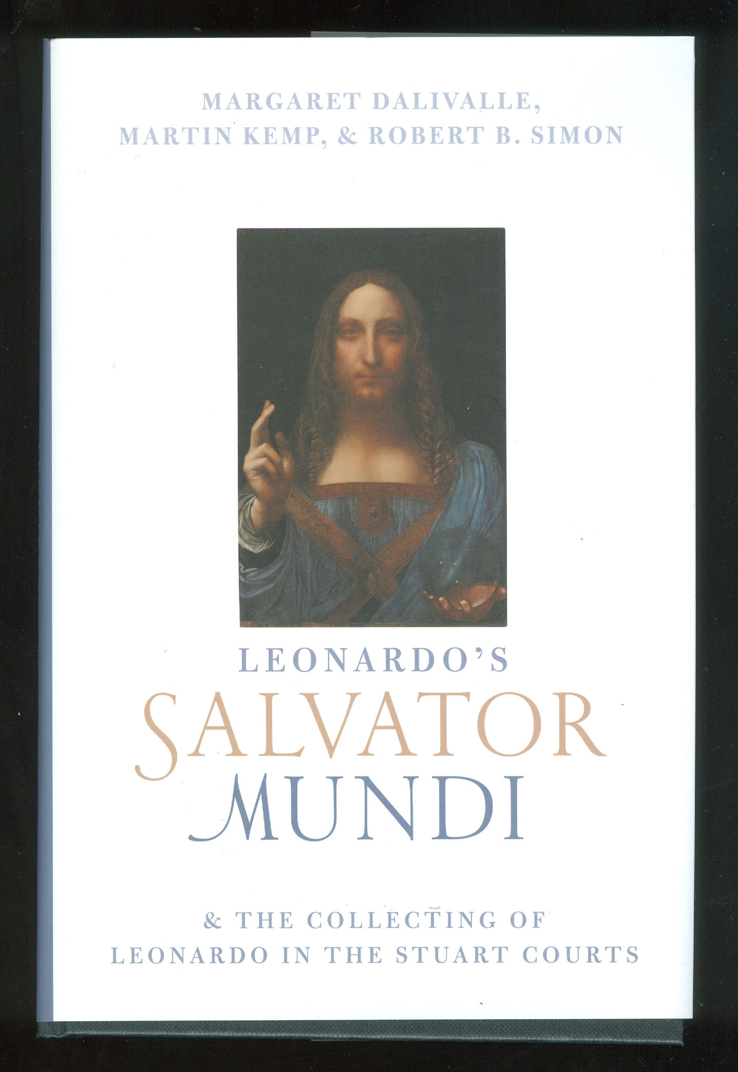
Fig. 1: The above book,Leonardo’s Salvator Mundi & the Collecting of Leonardo in the Stuart Courts, constitutes the first official published account in support of the Salvator Mundi painting that was exhibited as an autograph Leonardo painting at the National Gallery in the 2011-12 exhibition, “Leonardo da Vinci: Painter at the Court of Milan” (see Fig. 10) and that was sold at Christie’s two years ago for $450 million. The authors are: Margaret Dalivalle, a provenance specialist; Martin Kemp, Professor Emeritus and Leonardo specialist; and, Robert Simon, a New York art dealer and one of the two original buyers of the Salvator Mundi in 2005. The book contains no contributions by those who examined the painting technically and worked on its successive restorations. In their introduction and in defence of these startling omissions, the authors liken their book to a three-act opera: “However it is not intended to be an exhaustive treatment of the subject. As with an opera having a grand and intricate plot, this book will consider three facets of the story, each in depth, while necessarily bypassing many ancillary issues.”
There is no mention of the catcalls it has elicited. A glance at the illustrations shows the book to carry a new mystery: there would now seem to have been an undisclosed restoration.
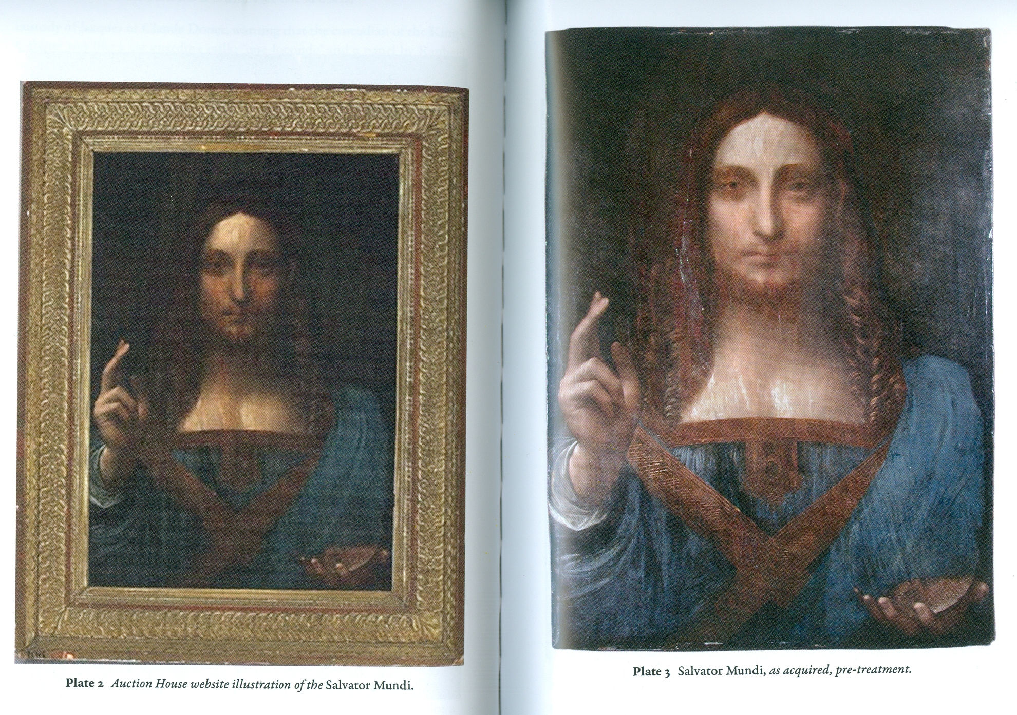
Above, Fig. 2: In this photo-spread, the first image shows the painting as illustrated by the auctioneers in 2005. The second image is said to show the picture as acquired by Robert Simon (and one other) at the auction. The restorer chosen by the new owners was Dianne Dwyer Modestini who worked on the painting in a number of restorations between 2005 and 2017. She has recalled (see Fig. 4) that when the painting was taken to her home in 2005 its surface was still sticky. The painting would thus seem to have been restored at some point after the sale catalogue was prepared and before it was taken to Modestini.
Above, Fig. 3: Simon Hewitt’s long-promised and compendious 2019 book (pp.352), Leonardo da Vinci and the Book of Doom, is written in support of the attributing to Leonardo of a mixed media drawing that was dubbed “La Bella Principessa” by Martin Kemp – and which remains unsold in a Swiss freeport. Now said by Hewitt to have been drawn by Leonardo in 1496 from Bianca Sforza, the illegitimate daughter of “Il Moro”, the 7th Duke of Milan, this book demonstrates – but does not expressly acknowledge – that no record of such a drawing exists before its sale at Christie’s, New York, in 1998 when it was sold as early 19th century German for $22,850 to a New York dealer who sold it on to Peter Silverman in 2007 for $19,000. In 2008 Silverman introduced himself to Hewitt by jumping into his cab saying: “May have a story for you one day! I’ll let you know.” In 2009 Silverman summoned Hewitt to Paris and a facsimile of “La Bella Principessa”. Having taken it at first sight to be early 19th century German, Hewitt produced an article for the Antiques Trade Gazette headed “Is this the greatest art market discovery of the century”.

Above, Fig. 4: Although Dianne Dwyer Modestini’s 2018 memoir, Masterpieces, is not strictly-speaking a book of art attribution advocacy, it contains as an epilogue, a chapter on the Salvator Mundi. In it, Modestini reproduces the photograph of the Salvator Mundi as shown in Fig. 2 above, right, and she describes it as being “as I first saw it in 2005”. We report in the ArtWatch UK Journal No. 32 (p. 47) how Modestini further commented on the picture in Masterpieces:
“When the Salvator Mundi returned to New York in July 2017 ahead of Christie’s November 2017 sale…having been instructed ‘not to inform anyone’ when the painting was ‘delivered to the Conservation Center [of the Institute of Fine Arts, New York University, where Modestini works as Senior Research Fellow and Conservator of the Kress program in Paintings Conservation] under guard and in great secrecy.’ Modestini writes approvingly of the fact that a deal brokered by Christie’s ahead of the sale whereby the vendor would receive at least $100million ‘was successfully kept under wraps’.”
For that late-stage re-restoration work in 2017, see Dalya Alberge, Mailonline, 22 December 2017, (“Auctioneers Christie’s admit Leonardo da Vinci painting which became the world’s most expensive artwork when it sold for £340m has been retouched in the last five years.”)
Above, Fig. 5: Although Martin Kemp’s 2018 Living with Leonardo is a professional lifetime memoir, he too includes chapters in support of the two Leonardo attributions he has championed – those of the Salvator Mundi and the mixed media drawing he dubbed “La Bella Principessa” that is owned by Peter Silverman – as seen above right. Kemp, like Hewitt, devotes much of his advocacy to attacking critics of the two attributions – including ArtWatch UK’s officers and associates.
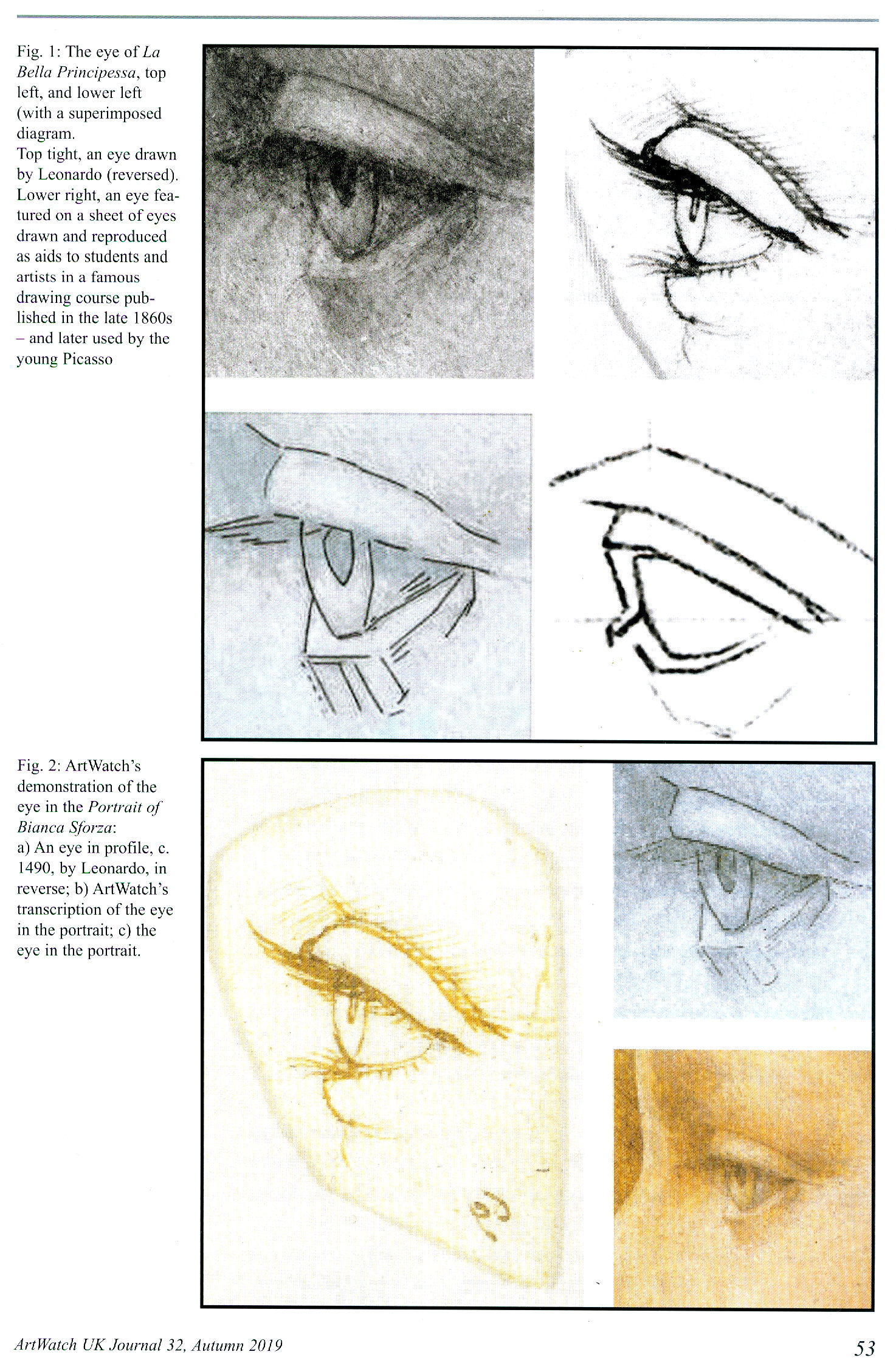
Above, Fig.6: Kemp’s publishers, Thames and Hudson, asked to reproduce a four-part graphic (top) which we had published on 3 May 2016 (“Problems with “La Bella Principessa” – Part II: Authentication Crisis”) precisely to demonstrate why, on stylistic grounds, the eye of “La Bella Principessa” could not possibly have been drawn by Leonardo. A crucial part of our cross-linked visual comparisons was an eye from a 19th century sheet of demonstrations to art students on how best to sketch eyes with short, straight lines. When Kemp’s book was published it carried a three-part diagram as shown above and as if it were the four-part one we had published. In Kemp’s reduced graphic, the embarrassing testimony of the guide to students had been omitted.
Above, Figs. 7 and 8: In the top image we show the sheet that had carried the eye which Kemp dropped. In the second image above we show (top) instructions in one of the “How to draw…” books, a guide to students on the relative merits of drawing ducks with curving lines or straight lines. Below it we show an eye drawn by Leonardo, with curving lines, and the eye of “La Bella Principessa”, drawn with straight lines. (As it happens, the eye that Kemp declined to publish is used as the logo for a drawing school – Sight-Size.)
Above, Fig. 9: This book of 2012 is something of a rarity within the genre of advocacy books in that it is written not by a professional art historian or art critic but by the work’s owner. It makes a fascinating and instructive read. We learn from the horse’s mouth, exactly who approached whom and when in the attempted formation of a sufficiency of experts to constitute an art-market “consensus of support”. We learn how Silverman planned his own media campaign to introduce both the work and its assembled supporters to the world. Such inside disclosures and resulting cross-linked accounts of the campaigning, can become sources of friction. In his 2018 memoir Kemp takes Silverman to task in a number of respects. Firstly (p.152), in terms of how the championing of the attribution should best have been managed:
“I had already written an extended report for Peter Silverman – longer than a standard academic article, shorter than a book. What I had seen and what I was gleaning from my continuing research persuaded me to write a book with Pascal [Cotte of Lumière Technology – see Fig. 11]…We also decided to include a short chapter by fingerprint specialist Paul Biro, who compared the inky fingertip with likely Leonardo prints. Ideally, nothing more should have appeared before our book [Kemp and Cotte’s, at Fig. 11] was launched. I was very concerned that the piecemeal, erratic and sensationalized release of incomplete stories was proving prejudicial. Early in 2009 I circulated a strategy to Peter and his supporters proposing that the drawing should be ‘exposed to a wholly non-commercial venue at the same time as all the research data had been released in full.’ I emphasized that all the material in the planned book should be embargoed before its publication. This placed considerable demands on Peter’s uneven reserves of discretion and patience…”
With so much cross-linking of players mishaps can arise. Members of tightly-knit groups of advocates can come collectively to see all opposition not as differing viewpoints but as quasi-pathological manifestations of “hostility” from rival “gangs”. For example, Hewitt reports:
“On July 1 Peter Paul Biro alerted Kemp and Cotte that the next edition of the New Yorker would be running a ‘potentially prejudiced and cherry-picked article about me, my work and the drawing.’ The New Yorker, he pointed out, was ‘owned by Condé Nast, which in turn is owned by Si Newhouse – a major client of Christie’s.’ ‘Christie’s and their friends are getting as much as they can in the public domain rubbishing the portrait and those who have worked on it’ replied Kemp – who had assured the New Yorker that Biro’s work on the [“La Bella”] portrait was exemplary.’ David Grann’s 16,000 word article on July 12th implied Biro was sleazy and incompetent. When Biro [unsuccessfully] sued the New Yorker for libel, a Federal judge paid implicit tribute to Grann’s verbal craftiness – declaring that his article did not make express accusations against Biro, or suggest concrete conclusions about whether or not he is a fraud.” Kemp, too, discusses Biro in his memoir:
“The strategy I had outlined fell apart when the fingerprint became the explosive subject of international attention before our book was published. Paul Biro, working from his studio in Montreal, compared Pascal’s amplified image of the fingerprint with prints in Leonardo’s unfinished St Jerome in the Vatican. Paul identified a print in the St Jerome which he saw as showing eight points of resemblance with that on the vellum. The most characteristic part of a fingerprint is the complex whorl at the centre of each fleshy pad. This was not apparent [– was not present?] in the print on the portrait which was made by the very tip of a finger. Paul’s ‘eight characteristics’ would not have been enough to secure a criminal conviction, but they were suggestive [of what?] and supportive. I could more or less see what he was seeing, if I tried hard, and I was happy to accept that he possessed a more expert eye for such things. [And besides:] The fingerprint evidence was a small part of the total fabric of evidence I was building up. But a ‘Leonardo fingerprint’ is news; it has a ‘cops and robbers’ dimension. The story was broken in the Antiques Trade Gazette by Simon Hewitt, a journalist with whom Peter had developed a trusting relationship. On 12 October 2009 the Gazette announced:
“‘ATG correspondent SIMON HEWITT gains exclusive access to the evidence used to unveil what the world’s leading scholars say is the first major Leonardo da Vinci find for 100 years…ATG have had exclusive access to that scientific evidence and can reveal that it literally reveals the hand – and fingerprint –of the artist in the work. The fingerprint is ‘highly comparable’ with one in the Vatican’.”
Kemp went on to say: “David Grann threw a lot of unpleasant mud at Paul Biro.” He then threw some of his own: “The source of much of the mud was Theresa Franks, founder of the Fine Art Registry, who had developed a reputation as an effective and litigious polemicist about the vagaries of the art world…The New Yorker piece was hugely damaging for Paul – and for the portrait, because our limited use of his evidence was used to taint the whole of the case we were making.”
Kemp’s remarks on Hewitt’s journalistic prowess might have disappointed the journalist/author whose book begins:
“INTRODUCTION
‘Is this the greatest art discovery of the century?’
“That was the front-page headline [he reproduces the front-page] in Antiques Trade Gazette on 17 October 2009, placed above my story about the portrait…It was one of the biggest stories of my career and, in terms of internet hits, the biggest story ever covered by the respected, if slightly fusty, art market weekly I had served on as Paris correspondent since 1985…”
Another attribution, another “gang” of opponents… Hewitt adds: “What Kemp dubbed ‘the New York gang’ were ‘almost bound to be hostile in an act of closing ranks, since they all missed it.’” Yet another is the “Polish gang”. Under a heading “POLES APART” Hewitt writes:
“Soon after Leonardo’s portrait of Bianca Sforza had gone on show in Monza, Katarzyna Pisarek [books editor of the AWUK Journal] published a 17,000-word article in Artibus & Historiae – a twice yearly journal edited by her Polish compatriot Józef Grabski, whose advisory committee included the Metropolitan Museum’s Everett Fahy (cited by Richard Dorment as a ‘vehement opponent of the Leonardo attribution’)…Pisarek was aping her Communist-era compatriot Bogdan Horodski, a former director of the Polish National Library…Pisarek harped on about Peter Paul Biro’s ‘dubious’ fingerprint evidence, omitting to mention that this had been removed as inconclusive from the second edition of the Kemp Cotte book…”
Hewitt seemed not to grasp the full import of the fact that an entire chapter of the Kemp/Cotte book had been excised. He pursued his Polish Conspiracy slur: “ ‘Why was Pisarek ‘suddenly so concerned to address this portrait when she had no record as a Leonardo scholar?’ wondered Martin Kemp. He presumed it ‘resulted from a kind of Polish solidarity’…On November 29 Waldemar Januszczak [Sunday Times art critic and TV broadcaster] – born in England to Polish parents…” and so on. Kemp/Cotte had had very good professional reasons to disassociate themselves from Biro. Kemp puts it with some delicacy in his memoir but the urgency is clear: “It transpired that Paul had previously achieved some notoriety in the detection of a purported Jackson Pollock discovered by a truck driver in a thrift shop. This discovery had been chronicled in a 2006 TV documentary, Who the #$&% is Jackson Pollock? Grann went on to tell a complex tale of Biro’s engagements with other Pollock authentications, in which the artist’s fingerprints appeared on paintings that were subsequently rejected by important Pollock scholars. It was alleged that Biro forged the Pollock fingerprints.”
In the first edition of the Kemp/Cotte book, the authors described the partial fingerprint as a full fingerprint in their introduction: “Following Lumière Technology’s discovery of a fingerprint and a handprint on the portrait, the authors turned to Peter Paul Biro, Director of Forensic Studies, Art and Access & Research, Montreal, to analyse this evidence in the context of what was known of Leonardo’s work…” And Kemp wrote (in his concluding chapter headed: “What constitutes proof?”): “…We have been able to detect extensive left-handed execution, not least in the layers below those we can see with our naked eye. Finger- and hand-prints have come to light in the way we have come to recognize as characteristic of Leonardo’s working methods. Indeed the isolated fingerprint near the left margin has strong if not conclusive evidential value that Leonardo himself touched the vellum.”
Above, Fig. 10: The catalogue to the National Gallery’s 2011-12 exhibition “Leonardo da Vinci: Painter at the Court of Milan”. Normally such a scholarly publication would not become ensnared in attribution controversies because public galleries do not, on principle, include privately owned, unpublished and un-attributed works without provenances that are on the market, but it did so with the Salvator Mundi – even though the identity of the picture’s by-then three owners (one of whom had bought-in with a $10 million stake) was undisclosed. Also undisclosed was: the venue at which the picture had been bought; the price at which it had been purchased; the identities of the leading scholars who were supposed to have endorsed the Leonardo attribution. Crucially, the supporters included the National Gallery’s director, one of its trustees and the curator and organiser of the Leonardo exhibition. The catalogue entry described the work as an autograph Leonardo painted prototype for the many similar Leonardo school Salvators that exist. Its author, Luke Syson, wrote: “This discussion anticipates the more detailed publication of this picture by Robert Simon and others. I am grateful to Robert Simon for making available his research and that of Dianne Dwyer Modestini, Nica Gutman Rieppi and (for the picture’s provenance) Margaret Dalivalle, all to be presented in a forthcoming book.”
As mentioned above, that book has finally been published over eight years after the opening of the National Gallery exhibition and we now see that there are only three authors of Leonardo’s Salvator Mundi & the Collecting of Leonardo in the Stuart Courts: Margaret Dalivalle, Martin Kemp and Robert Simon. Modestini and Gutman-Rieppi have been dropped. In Living with Leonardo, Martin Kemp discusses the failure of Peter Silverman to get “La Bella Principessa” included in the National Gallery exhibition – on the organisation of which he (Kemp) had, at one point, been under consideration as co-curator:
“Looking back over the different fortunes of the attribution of the Salvator Mundi and the portrait of Bianca Sforza, there are some clear lessons to be drawn. The first concerns how a work of art enters the scholarly and public domains. Robert quietly introduced the Salvator Mundi to a judicious selection of experts, who – remarkably, given the usual leakiness of the art world kept their counsel for three years. By the time the painting emerged in public, there was a critical mass of influential voices who would speak in the painting’s favour. By contrast a series of incontinent leaks to the press, as happened with the Bianca prejudices a work in the eyes of specialist commentators. I regret that I did not have more influence on when and how La Bella Principessa emerged…
“Ownership also plays its role. The owners of the Salvator played their hand cleverly, fostering the idea that they wanted to do right by Leonardo’s masterpiece and were interested in it entering a public collection. Peter Silverman, on the other hand, has become a conspicuous presence in the art world…he has what is conventionally called ‘a good eye’. I believe that his intuition about the portrait of Bianca Sforza will be vindicated in the longer term, but unfortunately his variable declarations about its ownership, even if well-intentioned, did not induce trust and made him vulnerable to media criticism.”
This was in pointed contrast to Kemp’s view of Robert Simon:
“…Robert Simon, the custodian of the picture (whom I later learnt learned was its co-owner), outlined something of its history and restoration. He seemed sincere, straightforward and judiciously restrained, as proved to be the case in all our subsequent contacts…All of the witnesses in the [National] gallery’s conservation studio were sworn to confidentiality, and the painting travelled back to New York with Robert. It was becoming ‘a Leonardo’.”
Above, Fig. 11: The 2010 edition of Leonardo da Vinci, “La Bella Principessa” The Profile Portrait of a Milanese Woman. Since 2014 we have reviewed this work in the following posts:
“Problems with ‘La Bella Principessa’ – Part I: The Look”
“Problems with ‘La Bella Principessa’ – Part II: Authentication Crisis”
“Problems with ‘La Bella Principessa’ – Part III: Dr. Pisarek responds to Prof. Kemp”
“Fake or Fortune: Hypotheses, Claims and Immutable Facts”
The day before the subsequently disappeared Salvator Mundi painting was sold at Christie’s, New York, we published a post explaining why the attribution was unsound and the provenance implausible:
“Problems with the New York Leonardo Salvator Mundi Part I: Provenance and Presentation”
Weeks before the sale and before criticisms of the Salvator Mundi erupted in New York, we had spoken against the attribution in a Guardian interview – “Mystery over Christ’s orb in $100m Leonardo da Vinci painting”
Michael Daley, Director, 15 November 2019
Connoisseurship: Examinations, Debates and Snap Visual Responses

The rising tide of old master “sleepers” and “discoveries” carries great dangers and demands snap judgements. Some candidates for upgrades intrigue, some look dubious, some scream “Fake!” Last week two cases caught our eye.
Fig. 1, above. Fig. 2, below. The newly discovered “Lost” Van Gogh sketchbook (above, top) rang our and many other fake bells. Then came a report that a small “Florentine School” painting on a €3-4k estimate fetched €375k at auction as a sleeping Filippino Lippi (above, Fig. 1). A link to another small work attributed to the artist at the North Carolina Museum of Art (Fig. 2, below) showed pronounced, seemingly reassuring correspondences, but something jarred.
On connoisseurship we hold that every claimant work should be rigorously “interrogated” in three crucial respects. Technically, in its physical composition; by documentation on its known or claimed histories (provenance); and, above all, by visual analysis because, in the visual arts, every picture is its own prime historical document and its inbuilt historically-generated artistic relationships constitute the primary subject of art critical appraisal and evaluation.
Failure to excise bad attributions deceives the public and corrupts oeuvres. A good picture has nothing to fear from challenges. No amount of scrutiny constitutes a threat as good pictures outlive their doubters and can fight another day. Argument is healthy and a successfully repulsed challenge can increase understanding and enhance a good picture’s lustre.
Vincent van Gogh: The Lost Arles Sketchbook
Above, Fig. 3. The controversial lost-but-now-found Van Gogh sketch book above is by Professor Bogomila Welsh-Ovcharov, a Van Gogh authority whose claims of authenticity are supported by Ronald Pickvance, author of Van Gogh in Arles, but the cover’s supposed Van Gogh ink self-portrait announces itself as a draughtsman’s pastiche, as Mark Hudson noted in the Daily Telegraph (“A romantic story but can it really live up to its promise?”, 16 November 2016).
Above, Fig. 4. Simply by placing the supposed Van Gogh self-portrait next to an autograph portrait, immense and glaring differences become apparent: the author of the “discovered” drawing has abandoned symmetry with eyes of radically different sizes and a nose that seems product of a car crash. Throughout, the author mimics Van Gogh’s pen marks without comprehension of his form, power of design, and psychological acuity.
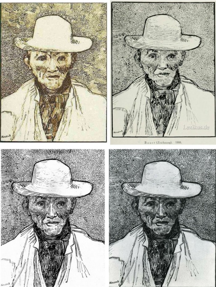
Above, Fig. 5. Instead of a form-camouflaging jumble of marks, the bona fide Van Gogh disports five graphically discrete component parts: a light-coloured jacket; a dark shirt and scarf; a varied but, on aggregate, mid-toned face; a light-toned hat with some mid and dark-toned form articulating shading; and, throwing all other values into relief, an agitated but tonally cohering background. Each of these spheres is allotted its own graphically purposive notations. The four images we show above for comparison are easily found online in historically successive reproductions. While these reproductions vary considerably, the force and artistic coherence of Van Gogh’s graphic intent and method shines through all.
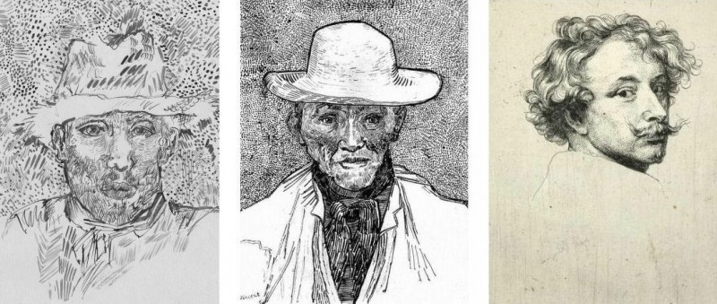
Above, Fig. 6. If we place the bona fide Van Gogh between the clumsy mimicking newcomer and a masterpiece of the greatest graphic brilliance – van Dyck’s etched self-portrait – it is clear that the Van Gogh has more kinship with the latter than with the former.
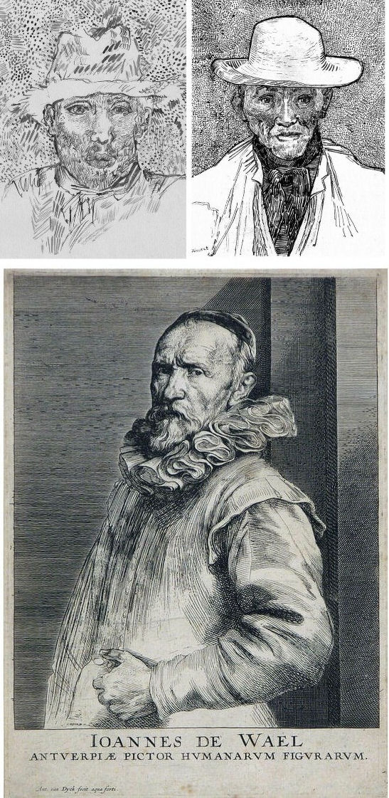
Above, Fig. 7. And if we compare the Van Gogh with an entirely autograph van Dyck etched state of a figure we find a common use of a toned background that throws both subjects’ flickeringly brilliant lights and darks into relief.
The Van Gogh Museum’s objections to the “Lost Arles Sketchbook” and its track record on Van Gogh attributions
Above, Fig. 8. Prof. Welsh-Ovcharov (top) has responded to the Van Gogh Museum’s dismissal of the drawings with a rebuttal and a challenge to debate – thereby showing conviction and good faith. Her publisher reportedly characterises the proposed debate as “an opportunity to shed light on the conditions under which the Van Gogh Museum is claiming the de facto right to a monopoly of attribution.” This is a common plaint against authorities that block would-be, high-value attributions but our impression of the museum’s judgements is favourable.
In 2006 a Van Gogh – The “Head of a Man” owned by the National Gallery of Victoria in Australia (above left, on an easel) – was challenged by the art historian and Sunday Times art critic Frank Whitford when the portrait was loaned to an exhibition in Edinburgh. The newspaper asked our opinion and, when we demurred, sent a (revelatory) high resolution full colour compilation of all of Van Gogh’s painted portraits. We supported Whitford, saying to the newspaper (as reported in ArtWatch UK Journal, Spring 2008):
“The specific warning signs that should have alerted the buyer are:
“1] It is unique in Van Gogh’s portrait oeuvre
“2] It does not fit in the stylistic chronology that exists within that oeuvre. Compare it for example with the brushwork, colours and ‘attack’ of the Old Man with Beard, painted the year before that is in the Van Gogh Museum, and the Portrait of Camille Roulin painted a year or so later and that is also in the museum. There is an enormous but clear and logical development between those two pictures, from thick, laboured, relatively coarse brushwork to much more refined and ‘decorative’ marks – but both are entirely consistent and ‘all-over’ in their treatment.
“3] If its provenance goes back no further than Germany in the late 20s or early 30s, that is particularly unfortunate. Germany at the time was notorious for the certification by scholars (for a fee or sales cut) of dud works. The dealer René Gimpel has referred to the scandalous ‘amounts obtained by means of certificates given daily by German experts to German dealers. Just as there were paper marks, so there are paper canvases, an easy way of bringing dollars into Germany…The German title of Doktor impresses the Americans. The museums are even more intent than the collectors on defending their fakes or their mistaken attributions….’ By coincidence, in the current ArtWatch Journal [No 21], Kasia Pisarek cites the case of the great Rubens scholar Ludwig Burchard who issued so many optimistic certificates that he was unable ever to write his definitive book on the artist…She has identified over 60 Burchard attributions that have subsequently fallen. It was Burchard who first upgraded to Rubens the Samson and Delilah that is now in the National Gallery.
“I would add that the fact that it seems to be admitted that it is a cut-down canvas that was glued onto a panel compounds suspicions… Why should a (presumably) then only forty years old canvas, have needed gluing onto a secondary support? It might be worth asking the Gallery curators if any scholar has questioned the picture publicly or privately.
“It may be coincidence, but two of the pictures that ArtWatch has challenged in our own National Gallery, the Rubens Samson and Delilah and the Raphael Madonna of the Pinks, no longer retain their original backs. The former was planed down to 2 or 3mm thickness and glued onto a sheet of blockboard; with the latter, the family of restorers who sold the picture in the 19th century had (most unusually) polished the back of the panel thereby removing all historical evidence.”
As we have seen more recently, the claimed lost Leonardo drawing “La Bella Principessa” that emerged anonymously in 1998 had been glued to an old oak panel. Gluing canvases or drawings onto boards conceals half the material evidence. On 3 August 2007 Andrew Bolt reported in the Australian Herald Sun:
“The curious thing about the National Gallery of Victoria’s fake van Gogh is how easily it was spotted as phoney once it went on tour…. For more than 60 years this painting hung in the NGV without anyone screaming ‘Fake!’ True, a few experts now say they had their doubts, but it was only when the NGV proudly loaned its ‘van Gogh’ to Scotland’s Dean Gallery last year that the painting was denounced. Three British critics took one look at it and snorted… Even then, there were some back in Melbourne who couldn’t accept the evidence of their own eyes, as ABC Television’s 7.30 Report found:
“‘Two of the critics include Michael Daley from ArtWatch UK and Times art critic Frank Whitford. But Robyn Sloggett [an art authentication expert at Melbourne University] has questioned their expertise. ROBYN SLOGGETT: I don’t think either of them are Van Gogh experts, certainly not known to be such…[Director of the National Gallery of Victoria] DR GERARD VAUGHAN: It is a slightly offbeat picture. It doesn’t fit into the natural progression of Van Gogh’s work at that time because it was a moment in late ’86 and into early 1887 where he was experimenting with two or three different styles. In many ways, this is slipping back into his earlier realist style of the mid 1880s where he concentrates and uses these earthier ochre colours. It is a transitional picture.’”
“Conceived at special moments” and “sometimes repeating, sometimes anticipating themselves” are commonplace apologias for disqualifying incongruities in upgrades. In 1997 and 2000 the National Gallery claimed its Rubens Samson and Delilah did not look like any other Rubens in the gallery because it was “the only work in this collection typical of the artist when he had returned from Italy in 1608”. In truth the painting was unlike the (secure) one that immediately preceded it and unlike the (secure) one that immediately followed. If a Rubens, it would be the only one on which he employed flat brushes and painted finger tips with rectangular highlights. During ABC Television’s 7 August 2006 programme (“NGV’s Van Gogh Labelled a fake”), James Mollison, a former NGV director said: “This picture has been doubted by people very often.”
The upshot of the controversy was that the NGV director announced that such was the gallery’s confidence that the painting would be submitted (voluntarily) to full technical examination at the Van Gogh Museum. A year later the Herald Sun reported the attribution’s demise at the Van Gogh Museum:
“The Dutch team used X-radiograph, digital photographs, light microscopy and paint and thread analysis. Among conclusions were: THE work’s ground layer of white paint is not found in Van Gogh’s Antwerp and Paris works. ITS use of pure ochre is not found in other Van Gogh work. THE portrait shows just the top of the man’s shoulders. Van Gogh usually showed more of the clothes. “A COMBINATION of a fairly coarse and detailed painting style”, with more detail in the mouth, eyes, skin and beard than Van Gogh used. NO reference to the portrait or the sitter in Van Gogh’s extensive letters. The experts also noted no record of the work could be found before 1928, when it appeared at Berlin’s Galerie Goldschmidt and Co.”
The Rubens Samson and Delilah emerged in Germany the following year at Van Diemen and Benedict where it was offered as a Honthorst before being upgraded by Ludwig Burchard. Previously it had been attributed to Jan van den Hoecke, a follower of Rubens. Burchard had recently upgraded the supposed Rubens ink sketch design for the Samson and Delilah (see Art’s Toxic Assets and a Crisis of Connoisseurship ~ Part II: Paper – sometimes photographic – Fakes and the Demise of the Educated Eye ).
The Newly Upgraded Filippino Lippi
Above, Fig. 9. At first glance the awakened “Filippino Lippi” (above right) seems more plausible than the new Van Gogh drawings – especially when linked to a work attributed to the painter at the North Carolina Museum of Art (above left). In terms of palette, condition and design the two seem as peas in a pod but this closely related pair triggers no recollections of anything similar in the artist’s oeuvre. If their strikingly common format suggests original incorporation in a larger work, disjunctive variations in their parapet walls and stone inscription tablets dispels the possibility. Most inexplicably of all, the new upgrade is incongruously modernist in its emphatic planar and ‘on-the-picture-surface’ geometrical vocabulary.
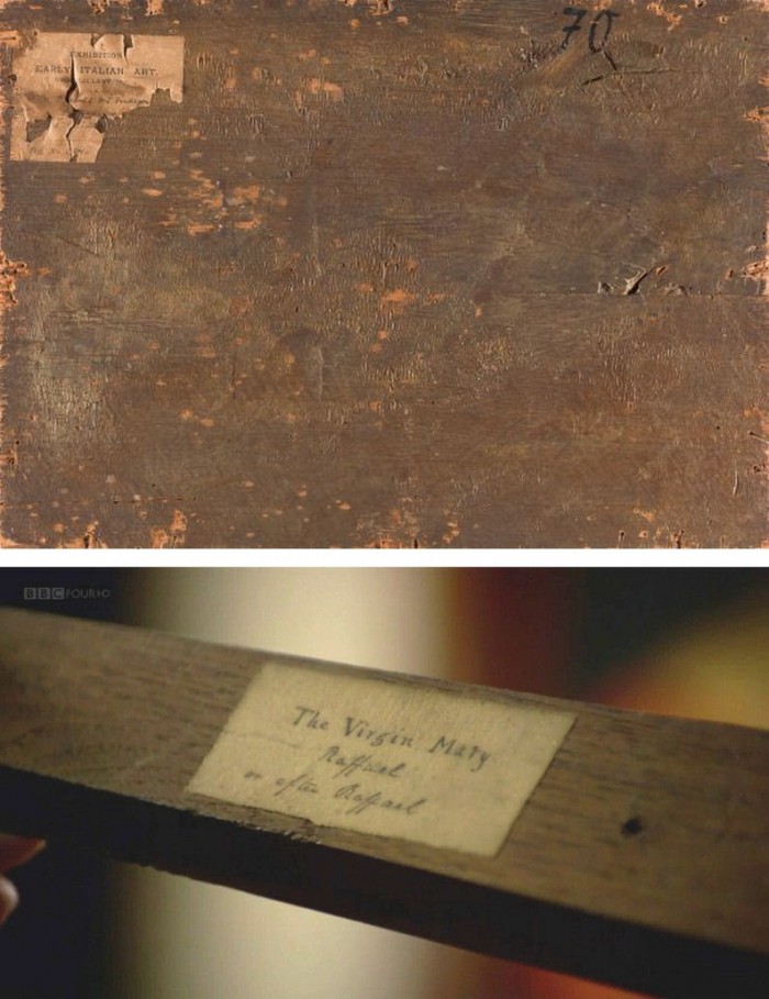
Above, Fig. 10. In 1901 the painting of Saints Uraldus and Fridianus was sold (not as a Philippino Lippi but as a Masaccio) to an English aristocrat, the Earl of Ashburnham. As with the recently proposed Haddo House Raphael (Fig. 10 above), there is little on the panel’s back other than a label in English for an exhibition of “Early Italian Art” (Fig. 10 top). For the Carolina Saint Donatus, the museum offers only a date – “circa 1490” – and the identity of the picture’s donor, the Samuel H. Kress Foundation. Such lacunae are perplexing because Filippino Lippi is a well-chronicled artist whose securely attributed works might easily be brought into direct comparison with the two more recent attributions.
Above, Fig. 11. The backs of attribution upgrades often prove problematic, and none was more so than the small panel “discovered” as a Duccio Madonna and Child (above right) in 1904 after having been bought in an antiques shop in Italy. It was then rarely seen until bought with fanfare (but no technical examinations) for $50m in 2004 by the Metropolitan Museum of Art, New York, in a blind “treaty” sale conducted by an auction house among a few leading museums shortly after the picture was withdrawn from an imminent comparative exhibition of Duccio and his followers that would have introduced the painting to many scholars for the first time and in an instructive context. That withdrawal – despite the painting’s inclusion in the catalogue – might have been made out of fear of repeating the demise of the owners’ second Duccio, as described below.
The back of the tiny picture had been cradled with no fewer than eight mahogany bars and when these were later removed at the Met. a hand-written ascription to Duccio’s pupil “Segna” was found on the bare poplar wood from which painted work had been stripped. The Met Duccio contained modern wire nails, a fact not acknowledged in the museum’s post-purchase technical examination reports. When we asked after the antiquity of the nails the museum claimed they had been inserted as repairs after the panel had been cradled in the 1930s. As “proof” of that unsupported chronology it was said that one of the nails had entered one of the mahogany bars. However, as we pointed out, the head of that particular nail had been visible on the front of the frame throughout all of picture’s photographically recorded history and, while some nail heads were visible most were not and therefore had been applied before the (now heavily distressed) frame was gessoed and gilded. Thus, the panel arrived in the world at the beginning of the 20th century with modern nails intersecting a cradle that concealed an awkward ascription on a stripped-down back.
Above, Fig 12. A face painted in the 14th century by a follower of Duccio (identified by Pèleo Bacci as Segna) is shown above to the right of the face of the Met’s Duccio as it was before restorations established the blue of the Virgin’s mantle to be azurite, not the requisite ultramarine. No one ever suggested that the painting on the right was by Duccio and no one judged the Met’s picture an autograph Duccio before Bernard Berenson’s wife (Mary) in 1904 with the support of Berenson’s protégé Frederic Mason Perkins. An earlier suggestion had been that it was a work of Sano di Pietro, as Frances Vieta discovered in researches at the Frick Library, New York, that were kindly made available to us.
In 1933 Perkins attributed a second Madonna and Child to Duccio and persuaded the then owner of the Met.’s Ducio (the Belgian collector, Adolphe Stoclet) to buy it. In 1989 that Duccio was loaned to the Cleveland Museum of Art and was there identified on technical examination by Gianni Mazzoni as a fake by Icilio Federico Joni who ran a forgery factory fronted by middlemen, one of whom was Berenson’s protégé Frederic Mason Perkins.
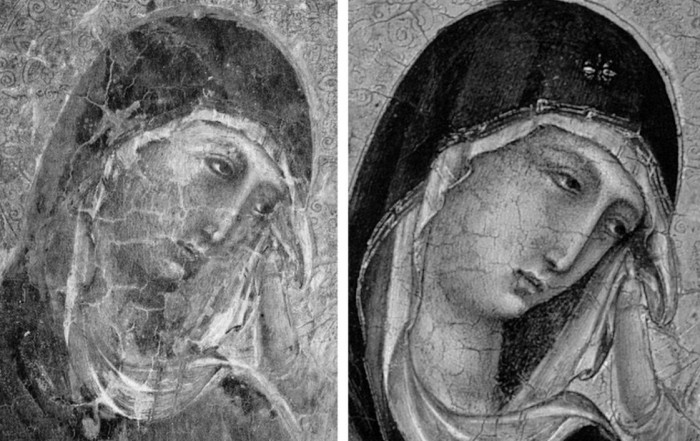
Above, Fig. 13. A cult of Supreme Art Historical Importance was activated around the Met. Duccio and part of this mythology rested on the picture’s supposedly miraculously well-preserved, little-restored, condition. Comparison of the photographs above showing its present state (right) and an earlier state (left) discloses how extensively the work has been repainted – note the altered design of the dominant eye, and the extensive reworking of the veil. The potentially falsifying nature of restorations when determining attributions remains a conspicuously under-examined area – as does the extent and nature of repainting on stripped-down “sleepers”. (But see “A restorer’s aim – The fine line between retouching and forgery”. For a fuller account of the Met.’s Duccio difficulties, see Michael Daley: “Buyer Beware”; “Good Buy Duccio?” and “Toxic Attributions?” in the Jackdaw magazine issues of Nov/Dec. 2008, Jan/Feb. 2009, and March/April 2009.)
The Newly Upgraded Filippino Lippi (continued)
Above, Fig. 14. With the two small “Filippino Lippi” pictures at Fig. 9 and below, top, said to have been painted between 1490 to 1494, precise stylistic comparisons can be made with securely attributed works in the oeuvre. What is believed to be Filippino Lippi’s self-portrait above was executed by the artist in 1481-1482 in the Brancacci Chapel, Santa Maria del Carmine, Florence.

Above, Fig. 15. Filippino Lippi’s Apparition of the Virgin to St Bernard of 1480-86 was said by Bernard Berenson (in his 1938 revised Drawings of the Florentine Painters) to comprise “Filippino’s masterpiece, the last picture in which he is still a pure Quattrocentist, in which there is no sense of the Baroque.” Is it conceivable that some years later this artist painted the two small pictures shown here above the Apparition? Berenson reports that Filippino went on to betray excesses, not to purge and severely abstract his pictorial vocabulary: “Filippino’s Baroque, however had little in common with the qualities of the genuine [Baroque] style, and much with its worst vices. These were the sins of extravagance, of wantonness – the vulgarity of the newly enriched, who feel life is enhanced by the mere act of showy spending.”
Above, Fig. 16. At the top we see how Filippino Lippi painted books before 1486 in his Apparition of the Virgin to St Bernard and before his lapse into Baroque excesses. In this secure work we not only see great technical accomplishment but a fascination with the very means by which books were stitched together in assembled folded sections. Is it conceivable that after this tour de force celebration of the book binder’s craft skills Filippino should have been satisfied with the out-of-perspective simplifications of books in the Saint Uraldus? While the opened book has been painted in utter ignorance of book binding methods, the ochre coloured book at the bottom left of the pile has managed to anticipate to a remarkable degree the appearance of a neat modern machine-bound book.
Above, Fig. 17. Again, does the chasm of technique and sophistication in this further comparison from the Apparition and the Saint Uraldus not strain credulity at claims of a common author?
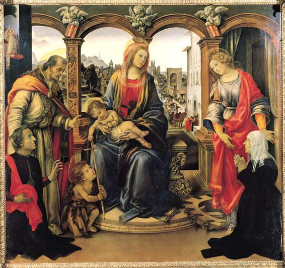
Above, Fig. 18. By 1493-94 the artist had completed his Madonna and Child with St Catherine of Alexandria and St Martin of Tours as above and we see precisely the over-elaboration Berenson castigated as Filippino’s squandering “like a nabob with a heady disorderliness all the decorative motives which the heritage of antiquity, the hard earnings of his precursors, and his own fancy had put into his hands.”
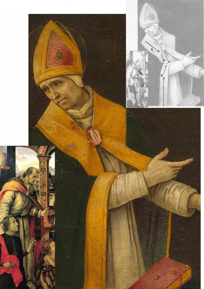
Above, Fig. 19. How conceivable is it that Filippino might, at the same short period, have made two so diverse treatments of a man parting drapery with an advancing left arm as in these two paintings? In the one the “Blanket-like drapery dear to Filippino” (in Berenson’s term), curves, twists and folds naturally across the body, while in the other it moves as if fabricated by a former sheet metal worker with little regard for any underlying body, or even for the means by which the glimpsed parts of the (wildly varying) decorative border of the cope might ever have been united as woven material. Why the arbitrary, asymmetrical placement of indeterminate embroidered decorations on the cope’s border? What holds the cope together? Is it a giant garnet or ruby, or a small tambourine? Where else in Filippino might we encounter such flattening abstractions and lax indeterminacy of depiction?
Above, Fig. 20. If the logic and treatment of Saint Donatus’ cope border (above, left) seems plausible and suitably understated, what might have carried the same artist to the Byzantine and conceptually irresolvable twin conundrums of the cope border as encountered on Saint Uraldus (above right)? What accounts for the very different depictions of the inscribed tablets on the parapet wall? If that of Saint Donatus is somewhat overly monumental and set uncomfortably close to the top of the parapet, at least it is sculpturally resolved and satisfactorily symmetrical along its horizontal axis with its twin decorative “butterfly wings” termini. Why, then, would the twinned tablets of Saints Uraldus and Fridianus meet in the middle with single butterfly-wing termini while leaving blank endings at the outer edges of the picture’s composition? Why are these two inscribed tablets skimped and devoid of projection when the saints above are greatly more dynamic and humanly engaged – almost as if in anticipation of Raphael’s later depicted dialogue between Aristotle and Plato?
Below, Fig. 21. What theological reading of Saint Uraldus’ life prompted the vast frilled neck lizard-like display of the cope’s pink lining below? If intentionally “Baroque” in its explosive ostentation and theatrical impact, why, then, its implausible combining with a geometric severity of draperies that are more snapped than folded?
With such bizarrely anomalous visual constructs, might it not be prudent to consider the waking “Filippino Lippi” sleeper as a possible product of the late 19th and early 20th century Italian forgeries boom that was tailor-made for British and American collectors? We know that many skilful artists were employed in that trade because when the Italian Government proposed stringent export taxes in 1903 to stem the country’s out-flow of art treasures, the Florentine art dealers association petitioned that the new laws would throttle the large and thriving trade in forged art and antiquities for foreign collectors. (Where did all those often excellent works go?)
At the December 2015 ArtWatch UK/LSE Law/NY Center for Art Law conference Art, Law and Crises of Connoisseurship (the proceedings of which will be published shortly), Professor Charles Hope pointed out how effectively 20th century scholarship had winnowed previously overblown numbers of Titians, Raphaels and such. Markets are good things and the London art market has long been a very good (much envied in Europe) force for Britain, but there are developing dangers. If perceptions were to grow that previously downgraded works are being systematically rehabilitated through “sleeper-discovery” mechanisms at a time when leading houses are fighting to the death for pole position on market share, confidence in the lots on offer might evaporate. Already, certain external structural changes are weakening the London market’s traditional and much-valued symbiotic relationship with disinterested scholarship. Increasing litigation by owners against dissenting independent scholars suppresses debate and frank expert appraisal. In a paper at our conference (“Throwing the baby out with the bath water – the Demise of Connoisseurship since the 1980s”), Brian Allen, former director of studies at the Mellon Centre, warned that recent changes of philosophy and views on connoisseurship in the academic world are greatly reducing the traditionally available body of disinterested academic expertise that counterbalances purely commercial interests:
“In my own field of British art the number of so-called ‘experts’ has now diminished alarmingly as the older generation dies off not to be replaced. It seems extraordinary to me that major artists such as Stubbs, Wright of Derby and Sir Thomas Lawrence, to name but three, don’t have an acknowledged expert to whom one can turn for a reasonably reliable, independent opinion. And this has also certainly happened in other specialist fields… Younger scholars nowadays, especially those in the universities, have almost no contact whatsoever with the art trade compared to fifty years ago. Yet for many years it was perfectly possible for the two worlds to co-exist harmoniously.”
Michael Daley 23 November 2016
Fake or Fortune: Hypotheses, Claims and Immutable Facts
We have received two communications on “La Bella Principessa”, which drawing some take to be by Leonardo da Vinci. One came from the work’s owner, the other from a disinterested scholar in confirmation that the work could not, for reasons of arithmetic and plain physical facts, have been made by Leonardo for inclusion in a book.
THE DRAWING
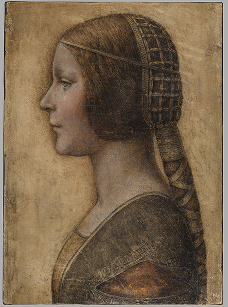
Above, Fig. 1: The full vellum sheet of the proposed Leonardo drawing “La Bella Principessa”.
THE DRAWING’S CLAIMED ORIGIN
This drawing was presented anonymously to the world in 1998 without authorial ascription and without an atom of provenance. When claims of autograph Leonardo authorship were made after barely a decade, it became necessary to fill a five-hundred years long void of records in order to dispel suspicions of forgery or pastiche. In 2010 Professor Martin Kemp bundled together what he held to be a “barrage of evidence – stylistic, historical or technical” that somehow provided collectively what no individual parts constituted: proof that Leonardo da Vinci was the author of what he (Kemp) dubbed “La Bella Principessa”. Thus, a collection of not-evidence was vested with quasi-evidential force on a circular, question-begging appeal to the claimed authority of a “sustained, collective sense that the portrait ‘belongs’ to Leonardo and contributes something new to the Leonardo we currently know.”
Although some scholars (chiefly Italian) were persuaded by the claims, for the consensual majority who did not see Leonardo’s hand in the drawing, Kemp’s methodological ju-ju gained no traction. His claims were advanced in a portmanteau book of collective advocacy, La Bella Principessa – The Story of the New Masterpiece by Leonardo da Vinci, which he co-wrote with Pascal Cotte of Lumiere Technology (the firm hired by the drawing’s owner, Peter Silverman, to conduct technical research) and which carried highly supportive contributions by Peter Paul Biro, Eva Schwan, Claudio Strinati and Nicholas Turner; London, 2010 (– see pp. 187-88).
THE THREE STITCH HOLES
During Pascal Cotte’s technical analysis of the drawing it was noticed that three holes are present on the left-hand edge. Cotte took these to “prove that it originally came from a book or a manuscript” (- Kemp/Cotte 2010, p. 113). Working with Mr Cotte, Prof. Kemp proposed that the hypothetical book might well have been a collection of celebratory poems of Bianca Sforza who had died in childhood and that “La Bella Principessa” had been made as an illustration to such a book.
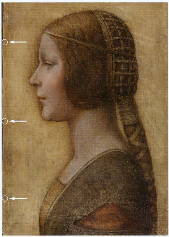
Above, Fig. 2: “La Bella Principessa” with Pascal Cotte’s indicated locations of the three supposed stitch holes.
Kemp’s elaborate hypothetical advocacy constituted a daisy-chain of improbabilities. This is a drawing made in the manner of a distinctive (and invariably painted) profile portrait type that is nowhere encountered in recorded Leonardos – and, indeed, this is the very type which Leonardo famously subverted with his own revolutionary plastically dynamic figural innovations. Within the rigorous constraints of the strict profile type, this drawing’s supposedly high-born subject is bereft of the customary/requisite opulence in clothing and jewellery. The eccentric iconography was made on an atypical support – vellum. It was drawn, Kemp holds, either directly from the subject in celebration of her wedding, or, as a commemorative portrayal after her death and thus made either in recollection or from some other depiction. No explanation was offered for how this single image might have resulted from two radically different circumstances of execution.
THE CLAIMED CORRESPONDENCE BETWEEN THE “LA BELLA PRINCIPESSA” DRAWING AND THE WARSAW SFORZIAD
On a suggestion from Professor David Wright, Kemp proposed that this from-life or post-death portrait had been made to be incorporated within a large, heavy book of the mid-1490s that is now housed in Poland, the so-called Warsaw Sforziad. In the wake of a great deal of (Kemp and Silverman-activated) archival research which found no mention of any work resembling “La Bella Principessa”, it can be seen that without this claimed Warsaw connection, the drawing would remain what it was on its 1998 debut: a stylistically untypical and unprecedented work without any history – the inclusion of which within Leonardo’s oeuvre would, in Prof. Kemp’s own advocacy, “contribute something new to the Leonardo we currently know” and “reveal a previously unknown dimension to the way in which he fulfilled his duties at the court of Duke Ludovico Sforza”. (Kemp/Cotte, 2010, p. 188.) Without history, that is to say, other than the time it is now said to have been in the possession of the restorer/painter Giannino Marchig, the late husband of the anonymous vendor in 1998.
It has been claimed many times that a ‘match’ exists between the drawing’s holes and the book’s stitches but, aside from the small format photo-diagram at Fig. 3, this has never been demonstrated or independently corroborated. Similarly, it has been said that carbon dating tests established that the vellum sheet on which the drawing was made is of an age securely consistent with a drawing being made by Leonardo in the mid-1490s. This claim is seriously misleading, as is shown below.
THE TESTIMONY OF HOLES
Before Prof. Wright’s suggestion, in 2010 Pascal Cotte regarded the three holes on the drawing’s left-hand edge as evidence that might identify incorporation within a specific book:
“It would be interesting to use the evidence of the nature and placement of these needle holes to look for other surviving quires from the same codex, which, with other physical clues, might shed further light on the provenance and original commission.”
(Kemp/Cotte, 2010, page 113.)
Cotte’s hope was reasonable but such testimony can cut both ways. Establishing a relationship between the drawing and a particular book requires an exact correspondence between the drawing’s holes and a book’s stitches. Two separate claims were made of a discovered fit with the Warsaw Sforziad, first by the drawing’s owner, Peter Silverman, and then jointly by Martin Kemp and Pascal Cotte. Both occasions were filmed by National Geographic but only the second was broadcast. In it, Kemp expressed himself as being 80% confident. The presently claimed location of the drawing is at the front of the Sforziad. Clearly, the credibility of what is now a 200 million euro-insured drawing that is stored in the Geneva Free Port depends greatly on confidence being maintained in this claimed connection.
Above, Fig. 3: A facsimile of “La Bella Principessa” inserted into the Warsaw Sforziad with five arrows marking the
book’s stitches and three circles in which matches are claimed, but are not evident, between the drawing’s holes and
the book’s outer and central stitches. (The stitch marked by the right-hand arrow is shown in close-up below at Fig. 5.)
As previously shown, our colleague in ArtWatch, Dr Kasia Pisarek, has catalogued very many discrepancies between the drawing and the book, the most problematic being that the former has only three stitch holes, when the latter was bound with five stitches. To cope with this material/arithmetical incompatibility, Kemp and Cotte conjured two hypotheses.
The first was that the book had originally been bound with only three stitches and that at some undated point the drawing had been removed during a rebinding in which two extra stitches were added to the book. That (unsupported) contention was technically implausible: the book is too large and heavy to be supported by just three stitches – and
both of its sister volumes in London and Paris were bound with five stitches.
The second, and now preferred, hypothesis is that the book was indeed originally bound with five stitches and that, as
a part of this book, the drawing originally possessed the requisite five stitch holes, two of which had subsequently been cut off from the sheet. We demonstrated the impossibility of that claim in an earlier post. (To recap briefly: as Cotte had acknowledged in 2010, stitch holes are always made in a straight line along the crease in a group of folded sheets. Given that a central and two outer stitch holes are all present on the “La Bella Principessa” sheet, any original intermediary stitch holes would necessarily be found in alignment with the present three holes on the sheet as it is today.)
In addition to the absence of the two requisite stitch holes, the sheet itself is a mismatch in terms of colour, texture and size with the sheets in the book. Kasia Pisarek now adds a further mismatch:
“The follicles in the ‘La Bella Principessa’ vellum are tightly spaced, while those in the Sforziad vellum are widely spaced. This can be seen on the Polona website, where you can zoom in until you can see the follicles as dots. I remember seeing some pages where the dots were more apparent and they were definitely widely spaced.”
WHAT LIES BENEATH?
Yet another unaddressed difficulty concerns the back of the drawing. One of the earliest proponents of a Leonardo ascription, Dr Cristina Geddo, has described the presence on the reverse of the drawing of random lettering and an image of a dragon. Kemp and Cotte seem not to have offered an explanation for this content (which, presumably, was revealed by Cotte’s penetrative photography) even though they now claim that the back of the drawing would have faced the book’s beautiful and elaborately painted, symbolically-charged frontispiece. What conceivable iconographic function might such a melange have served in that strategic context of so important and precious a book? Dr Geddo has called for the vellum drawing to be removed from its (most unusual) oak panel support but the owner has declined to do so on grounds of safety. Some of the lettering is visible in an X-ray photograph published in the 2010 and 2012 English and Italian editions of the Kemp/Cotte joint book.
FIVE HOLES GOOD, THREE HOLES BAD
As we reported previously, with regard to the Three Holes v. Five Stitches conundrum, the problems for supporters of “La Bella Principessa” have now become insurmountable: Pisarek established on her second examination of the Warsaw Sforziad in the Polish National Library that while the drawing bears only three holes, the book itself was not only bound with five stitches but that each of those stitches passed through two holes that were two or three millimetres apart (see Figs. 6, 7 and 8 below). At a stroke, the previously claimed ‘fit’ between the drawing and the book is demolished: the drawing possesses only three single stitch holes when it should have five pairs of holes making ten in total. Even if it were to be conceded that two inner stitches might once have been present, today’s three single holes should be three pairs of holes, making six holes in total, not three.
AN OWNER’S RESPONSE
When we sent our previous “La Bella Principessa” post with the newly disqualifying physical/technical evidence to the drawing’s owner, Peter Silverman, (13 June), he dismissed the bearers of the information by alleging lack of expertise: “I leave the attribution question to serious and highly qualified experts!!!” In support of his professional slur, Silverman copied-in two messages to us. The first had been sent to him, at his request, by a costume expert, Elisabetta Gnigera. The second Silverman had sent to Jean Penicaut, the CEO of Lumiere Technology. It was evidently written in haste and heat:
“Dear Jean
I am sorry but we, as owners of the BP, are not to be told how and with whom to talk! I understand your frustration in dealing with Artwatch and Franck but i feel that Pisareks statement must not and cannot be left unchallenged! I therefore request you to rebut each and every point in this latest statement-most importantly of all i would like to see the INDISPUTABLE proof of the binding holes, in a first and separate email to me! Unfortunaley Martin has made statements which can be perverted by anyone in bad faith-equivocal statements quoted in the first part of the enclosed article!!
“I would like Elisabetta to comment on the costume questions.
And i would like YOU to extensively quote from the lab results of La Veneria*, which is very helpful to our cause! [*This is a reference the conservation laboratory “La Venaria Reale” which has conducted analysis of the drawing.]
“We cannot afford to lose the high ground’ in this battle-no matter the bad faith of our ennemy.
“To avoid your corresponding with them please send the rebuttal to me. I INSIST THAT THIS IS AN ABSOLUTE NECESSITY!!
Best, peter
http://artwatch.org.uk/problems-with-la-bella-principessa-part-iii-dr-pisarek-responds-to-prof-kemp/
“PS-the good news is that there is a very serious party interested in acquiring a share in the BP(highly confidential) and July 1 will be a decisive day!!!”
It would seem after more than a month that Lumiere Technology has not provided the owner with indisputable evidence of a connection between the drawing and the Warsaw book that would counter Pisarek’s account. On 14 June we replied to Mr Silverman:
“Speaking of clarification and your requests, I note the various requests from the ‘owners of the BP’ to your associates
to read our current post, and your talk of a prospective part-sale of the BP. Can I take it that the potential buyer of whom you speak has been similarly advised?
“Also, perhaps you might say how you will respond if Jean Penicaut advises you, as we would predict, that he can find
no ‘INDISPUTABLE proof of the binding holes’ that might enable you – or he on your behalf – ‘to rebut each and every point in this latest statement [in the then current AWUK post]’”?
Concerning the La Venaria Reale laboratory reports, we asked Mr Silverman on 15 June:
“On your technical ‘proofs-of-authenticity’ and our possible viewing of your Swiss-vaulted, soon-to-be part-sold drawing, might we not deal with both by: a) your sending to us all reports and data that have been made available to you; and, b) your bringing the drawing to either Paris or London so that we might arrange a group viewing by sceptics and rejecters?”
MISINTERPRETED REPORTS
After more than a month we have received no technical reports on “La Bella Principessa”. Lumiere Technology’s
apparent silence on the conflicting number of stitch holes seems remiss. In our experience it is valuable to see the reports themselves because evidence can sometimes be interpreted and presented in ways that might mislead. For example, it has been claimed (technically-speaking correctly) that carbon dating has established a 95.4% probability
that “La Bella Principessa” had been made at some point between 1440 and 1650. On that particular technical examination and very wide range of possible ages, Pascal Cotte (2010, p. 110) has claimed a number of things in a single sentence:
“This dating confirms that the portrait could well have been made in Leonardo’s lifetime, supporting Martin Kemp’s proposed date in the mid-1490s and virtually eliminating the possibility that it is a 19th century pastiche.”
This was all quite misleading. A confirmed “could well have” remains a “could have” and does not become a confirming “was”. A “virtually eliminated possibility” remains a possibility. Taken as a whole and properly appraised, the data itself cannot reasonably be said to support Kemp’s claimed date and authorship – in fact, it does the opposite.
Cotte’s claims rest on what is only a loose and very wide overall estimation of probability. While it is true to say there is a 95.4% chance that the sheet appeared at some point between 1440 and 1650, there is not a 95.4% probability that it appeared before the mid-1490s when the Sforziad was made. Even on that loose, overall range of possibilities, it would be more accurate to say that because we know (today) that the Warsaw book was made in the 1490s (and had known in 2010 that the proposed subject of “La Bella Principessa”, Bianca Sforza, had died in 1496), it is three times more likely that the “La Bella Principessa” sheet post-dated rather than predated the book. What has not been acknowledged is that within the overall figure, the probabilities had been greatly more precisely quantified.
It was said in the report, for example, that there was a 68.2% probability that the sheet was made between 1470 and 1650 and that, within this period (see Fig. 4 below), there was only a 27.2% probability that the drawing was made between 1470 and 1530 – and this was compared against the appreciably greater probability (41.0%) that the sheet was made some time between 1550 and 1650 – which would place the sheet altogether much later than Leonardo who died in 1519. Properly read, with a proposed date for the drawing set in the mid-1490s, the data shows that there was only a 13.6% probability that the “La Bella Principessa” sheet existed when the book was made. When the general 95.4% probability of an origin anywhere between 1470 and 1650 and the 13.6% probability of an origin between 1470 and 1495 are expressed as racing odds, it is seven times more likely that the sheet was made after the book than before it. And the odds of seven to one against pertain to the vellum sheet itself, not to the possible dates of execution for the drawing. Even if this sheet had once been present in that book, such a dating would indicate only the age of the material, not the date of the drawing’s execution. On this last, we should recall that Eric Hebborn advised in his The Art Forger’s Handbook that a prime source of old materials for forged drawings is obtained from blank end papers in books. Thieves cut valuable illuminated pages from books. Forgers crave blank pages but will make use of a blank side by gluing its reverse firmly to some impenetrable material.
Above, Fig. 4: The carbon dating report on the “La Bella Principessa” sheet (as published by Kemp/Cotte, 2010, p. 110).
FOR THE RECORD
Where Mr Silverman declines to make reports available to us, and Pascal Cotte fails to demonstrate a fit between the drawing’s three stitch holes and the book’s ten stitch holes, we now present further visual proofs and documentary confirmation of the previously claimed mismatch to demonstrate precisely why “La Bella Principessa” could never have been part of the Warsaw Sforziad.
INSTITUTIONAL CORROBORATION
On 23 June 2016 Barbara Dzierzanowska, the Head of Department of Old Prints BN at the National Library of Poland, wrote to Kasia Pisarek:
“Dear Madam,
I would like to inform you that yesterday we entered the Treasury and re-examined the Sforziad, which has confirmed that the binding stitches are double and there are 10 holes.
Yours sincerely,
Barbara Dzierzanowska”
PHOTOGRAPHICALLY-RECORDED AND ELECTRONICALLY TRANSMITTED PROOF OF THE DOUBLE STITCHING OF THE WARSAW SFORZIAD
That the stitching of the Sforziad was made through double holes can be seen by eye on the book itself, as shown below at Fig. 5.
Above, Fig. 5: A stitch made through two holes, as seen on the numbered page 1 of the Warsaw Sforziad. In this photograph, the top stitch and the two flanking holes are shown but some of the other holes can also be seen on stitches below it. This stitch/holes configuration would have been evident when (as described above) a full-size facsimile of “La Bella Principessa” was inserted into the Sforziad at precisely this point. This evidence is also available online: our image was taken from the detailed record of the entire book that is carried on this site: Polona – La Sforziada.
ESTABLISHING THE TRUE DIMENSIONS
When Kasia Pisarek inspected the book for the second time, she asked that the dimensions of the pages and the relative positions of the stitch holes be marked along the edge of a piece of paper. This was done by the library’s books’ conservator in her presence and that of the chief librarian. Intervals between the stitch holes were marked in pencil along the two sides of the strip of paper and these are shown here at Figs. 6 and 7. When we marked off those measurements onto a separate sheet of paper, to prepare the diagram at Fig. 8, and then measured them on our sheet with a ruler, they were all exactly as given by Pisarek. We can be sure, therefore, that the dimensions and ratios between the stitch holes as shown below at Fig. 8 have been accurately established and physically transported to ArtWatch UK – and at practically zero-cost by means of sharp pencils and two pieces of paper.

Above, Figs. 6 (top) and 7: The strip of paper on which the book’s page size and stitch holes were recorded, as described above.
The conservator explained to Pisarek that the present positions of the stitch holes were those of the original construction of the book and that, therefore, there was no possibility that the book had once been bound with only three stitches. She made diagrams on the strip showing (at Fig. 7) different ways of executing stitching with double holes.
THE DIMENSIONS OF THE INTERVALS BETWEEN THE STITCHES IN THE BOOK – A NOTE FROM KASIA PISAREK:
1) According to Kemp and Cotte, the dimensions of the vellum pages of the Sforziad vary from 33.0 to 33.4 cm in height, while the drawing is 33 cm high.
2) I have carefully checked the dimensions with the Librarian in March 2016. All the pages are at least 33.4 cm high and more, up to 33.7 cm. The size of 33 cm would be far too small for the book.
3) The 5 holes in the book are in fact all double holes. Each of the 5 holes is two small holes, between which a string passes. The distance between the two small holes is about 3 mm. The double holes were never mentioned by Kemp or Cotte.
4) According to the conservator who was present at the time of my last visit, this is the binding that follows the original binding as there is no damage of any kind. So in total there were as many as 10 small holes, not 3 single ones as in the drawing.
5) I measured the distances between the 3 holes that Kemp and Cotte measured in La Bella Principessa. The measurements were taken from the middle of the double holes.
6) The distance between the bottom hole and the middle hole is 11.35 cm in the Sforziad, while in the drawing it is 11.06 cm.
7) The distance between the middle hole and the top hole is 11.7 cm in the Sforziad, while in the drawing it is 11.44 cm.
THE MISMATCHED HOLES AND STITCHES
Above Fig. 8: We took the dimensions of the Sforziad’s page and stitch holes from the strip of paper marked by the Polish National Library’s books’ conservator (as shown at Figs. 6 and 7) and drew them in black, as above, and marked “WS”. We then drew in red the “La Bella Principessa” sheet (here marked “LBP”) and its stitch holes as given above by Pisarek.
As can be seen above, it is impossible to align the drawing’s single stitch holes with their claimed counterparts in the book. If the drawing’s centre hole is aligned with the centre of the two central holes in the book (as shown on the left here), its other two holes fall short of their claimed counterparts.
If the LBP drawing’s upper hole is aligned with the centre of book’s two upper holes, its central and lower holes fall progressively further short of their claimed counterparts on the book.
In short, there is no fit or match between the book and the drawing – and which drawing in all probability post-dated the book, for reasons indicated above.
Those who would continue to give this drawing to Leonardo must now find some other means of filling a five centuries absence of provenance and of squaring intractable technical circles. We will examine next the supposed left-handed execution of “La Bella Principessa”.
Michael Daley, 21 July 2016
Problems with “La Bella Principessa” – Part III: Dr. Pisarek responds to Prof. Kemp
In June 2015 Kasia Pisarek, an independent scholar (and a member of ArtWatch UK) published an article, “La Bella Principessa – Arguments against the Attribution to Leonardo”, in the Polish scholarly journal Artibus et Historiae.
In her article Dr Pisarek presented a number of interlocking historical, aesthetic and technical criticisms of the attribution to Leonardo of the drawing “La Bella Principessa”, as it has been made and advanced by Professor Martin Kemp. In response, Prof. Kemp produced an article (“Leonardo da Vinci La Bella Principessa: Errors, Misconceptions, and Allegations of Forgery”) which challenges Dr Pisarek’s account on grounds of what he claims and alleges to be: “mistakes, misconceptions and a series of false allegations”.
A TACTICAL RETREAT?
In his response Kemp says “I do not run an authentication service, but research items of special interest regardless of ownership.” More recently ( May 16) Kemp announced on his website that “After speaking at the Art in Authentication Congress in The Hague, I confirm that I am withdrawing the [unpaid – Ed.] ‘advice service’ I have been providing.”
A SIDEWAYS SWIPE
Kemp discloses that in responding to Pisarek’s article he also sought by “extension” to counter other un-identified challenges to his Leonardo attribution. When this multi-targeted professional defence was submitted to Artibus et Historiae, it was rejected, as Kemp acknowledges, and as the Art Newspaper reports (“La Bella Principessa: Still an Enigma”, Features, May 2016), because of its resemblance to “an errata list”. The article was subsequently carried on the Authentication in Art website to accompany a paper given by Kemp at the AiA’s May 2016 Congress. This non-profit organisation, on which Kemp serves as an advisor, was founded in 2012 at The Hague. On May 8th we made a formal request to the AiA for Kasia Pisarek’s Artibus et Historiae article also to be posted so that the congress speakers and attendees might see both of what Dr Pisarek’s compilation of evidence consisted and of what Prof. Kemp complained. We have yet to receive a reply. For Kasia Pisarek’s Artibus et Historiae article, “La Bella Principessa – Arguments against the Attribution to Leonardo” click here. For Martin Kemp’s response to it, see: “Leonardo da Vinci La Bella Principessa: Errors, Misconceptions, and Allegations of Forgery”.
A CONFERENCE AMBUSH
In December 2015 Kasia Pisarek delivered a paper based on her Artibus essay at the ArtWatch UK/LSE Law Department/Center for Art Law conference “Art, Law and Crises of Connoisseurship”. At this conference, an arts journalist, Simon Hewitt, delivered an attack from the floor on her article. He did so as a proxy for Kemp, by whom he had been briefed, and for the collector/dealer owner of “La Bella Principessa”, Peter Silverman, with whom he is co-writing a book on what Silverman describes to us as “various aspects of the art market, sometimes highlighted by others’ and my own discoveries”. A research assistant of Kemp’s, Kasia Wozniak, who had spent four years attempting to show that “La Bella Principessa” had once been part of a late 15th century book known as the Warsaw Sforziad, had also written to us in denigration of Pisarek’s article which we had forwarded to her at her request.
Earlier, both Professor Kemp, who had declined an invitation to speak at this conference, and Mr Silverman, had suggested that we invite Hewitt to speak at the conference. Silverman expressly requested that this be done so that Hewitt might “present his discoveries as a counterweight to Ms. Pisarek”. We carry Pisarek’s full reply to Kemp’s listed objections below but comment first on a crucial new aspect of this disputed attribution that has emerged in Kemp’s response to Pisarek.
NO HISTORY. NO PROVENANCE. WRONG HOLES. NO FIT.
Above, Fig. 1: A facsimile of the “La Bella Principessa” drawing being inserted into the Warsaw Sforziad (but showing only the relationship of the top of the facsimile to the top of the book and not the accompanying relationship of the facsimile and book at the bottom). Photo by courtesy of Lumiere Technology.
For many reasons, it is essential to Prof. Kemp’s Leonardo ascription that it be accepted that “La Bella Principessa” had originally been incorporated within the Warsaw Sforziad now held in the National Library, Poland. It has not been so accepted because, contrary to press releases claims and media coverage thereafter, nothing material or documentary has established such a relationship. No record of any connection between the drawing and the book has been found despite extensive searches by researchers such as Kasia Wozniak. Moreover, despite extensive searches of Berenson’s archives by Kemp and Silverman, no record of the supposed 15th century drawing in any context predates its only-recently acknowledged ownership by the late painter/restorer Giannino Marchig. This pictorially and graphically mongrel work remains without a history and, prior to September 2011, without any claim – even by its only known previous owner – that it might have been a work by Leonardo da Vinci.
Martin Kemp has challenged Kasia Pisarek’s measurements between the stitches in the book’s binding. He and Pascal Cotte (of Lumiere Technology) claim that three stitch holes are present on the left hand edge of the “La Bella Principessa” sheet and that these match three of the book’s five stitches. No confirming visual evidence has been produced in support of this claim. In addition to fresh evidence on dimensions provided below by Pisarek, it might be noted that the Kemp/Cotte claims of a match have been variously and only rarely unequivocally phrased. All emphases below are added:
“The stitch holes in the vellum of the portrait match those in the book” – “The Original Source of the New Leonardo Portrait Discovered”, a Martin Kemp press release, 27 September 2011.
“Three of the stitch marks, the ones that we can still see on the edge of the ‘Bella Principessa’, match as well as they conceivably could” – Martin Kemp, Artinfo interview, “The Da Vinci Detective: Art Historian Martin Kemp on Rediscovering Leonardo’s Tragic Portrait of a Renaissance Princess”, by Andrew M. Goldstein, 11 October 2011;
“During our studies at the National Library, we inserted a facsimile of the portrait into the relevant opening of the book where the size matched very closely” – Martin Kemp, item 14, “Leonardo da Vinci La Bella Principessa: Errors, Misconceptions, and Allegations of Forgery”, on the Authentication in Art website. See Fig.1, above;
“The current stitching of the volume involves five holes, whereas there are only three holes now visible along the left margin of the ‘La Bella Principessa’. However, these three holes correspond very closely to the corresponding ones in the book.” – Martin Kemp and Pascal Cotte, “La Bella Principessa and the Warsaw Sforziad”, Lumiere Technology website, September 2011.
FAILING TO GET THE MEASURE OF HOLES
With linear measurements a near-miss is as good as a mile. If a hole is two millimetres adrift of a stitch there is no match. Claiming “correspondences” and “close” matches between the three holes and the five stitches is problematic enough, but, as Kasia Pisarek has now re-confirmed, the three holes in the “La Bella Principessa” drawing do not correspond with three of the book’s five stitches. Moreover, Kemp’s imprecision came with a perplexing multiple caveat: “In measuring the distances between the holes and matching these distances in the book and the portrait we allowed for four potential sources of error” – Kemp/Cotte, item 13, “La Bella Principessa and the Warsaw Sforziad”, Lumiere Technology website.
If incorporating an allowance for one potential source of error would necessarily be weakening to the force of a claimed match, how might allowances have been made for four different sources of error? How were the different “potentials-for-error” calibrated and weighted one against the three others? With accounts of this attribution, too many features remain in flux. For example, explanations offered for the disparity between the drawing’s three stitch holes and the book’s five stitches have shifted. In 2011 Kemp/Cotte wrote:
“The second task was to see if the holes in the portrait and the stitching pattern in the book corresponds. There is an obvious difference. The current stitching of the volume involves five holes, whereas there are only three holes now visible along the left margin of “La Bella Principessa”. However, these three holes correspond very closely to the corresponding ones in the book…The different number of stitching holes may result from the untidy way the left margin of the portrait has been cut, or from two intermediate stitches being added when the book was later rebound in standard Zamoysky livery. The former explanation is more likely.” (Emphases added.)
The suggestion that the book might possibly have been bound originally with only three stitches seems to have been abandoned altogether. Martin Kemp now accepts in his response to Kasia Pisarek that the book always had five stitches but claims as a countering fact against this recognition that: “The irregularity and extensive damage along the left margin explains why two of the five stitch holes are no longer clearly discernible.”
NOT AN EXPLANATION
The posited stitch holes cannot be said to be “no longer discernible” because there is no evidence that they were ever present. Prof. Kemp here begs a question on which this attribution turns. The roughly cut edge cannot be taken to have explained these absences. What Kemp offers, in truth, is (an implausible) hypothesis that ignores the technical exigencies of book binding and the dimensional realities of the “La Bella Principessa” sheet. When books are being made, the stitches are inserted along the line of a fold made collectively to the small number of sheets that form one of the book’s sections or “quires”. In the case of the Warsaw Sforziad, Pascal Cotte established (by taking and combining 70 precisely-focussed macro-photographs) that each quire was composed of four sheets (folios) which, when folded and stitched, comprised sixteen numbered pages. The book binder’s craft requires that the stitching occurs precisely along the crease line of the folded sheets. This careful alignment is necessary if the pages are not to cockle and for the book to open easily.
The three holes on “La Bella Principessa” have been taken to relate (- more or less, but never exactly) to the book’s central and two outer stitches. Had the “La Bella Principessa” sheet been incorporated in the Warsaw Sforziad when it was made in the late 1490s, the two inner stitch holes would be expected to be present on the sheet, even as it is today, and notwithstanding its roughly cut left-hand edge.
At Fig. 2 below, we see the white arrows and circles with which Pascal Cotte identified what are said to be “La Bella Principessa’s” three stitch holes. On the image on the left, we have drawn in red the alignment of the present three holes and have indicated with arrows where the two hypothesized additional stitching holes would be expected to be located. Both holes would fall within the present sheet despite its roughly cut left-hand edge. In the image on the right of Fig. 2 we again indicate (in black) the alignment of the present three holes, but show in red how the alignment would be disrupted had the two hypothesized additional stitch holes been situated to the left of the present sheet, as Prof. Kemp now claims in “explanation” for their absence from the sheet itself. Such a positioning would have resulted in a zigzag, not a row, of stitch holes. It is impossible to envisage how four sheets of vellum might have been folded so as to produce a neatly zigzagging crease.
Aside from the above problem, any lingering hope that this “La Bella Principessa” sheet might once have formed part of the Warsaw Sforziad will have to be abandoned in the light of Kasia Pisarek’s latest findings described below on her second examination of the Warsaw Sforziad.
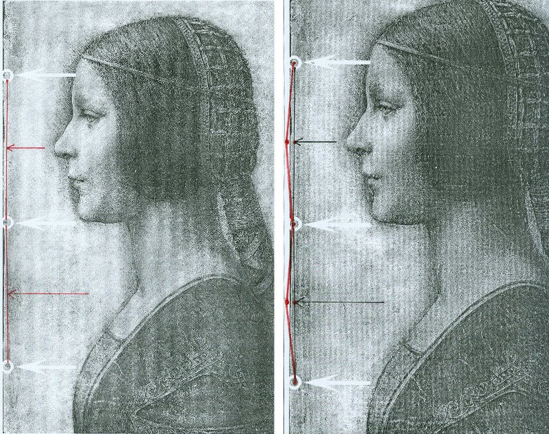
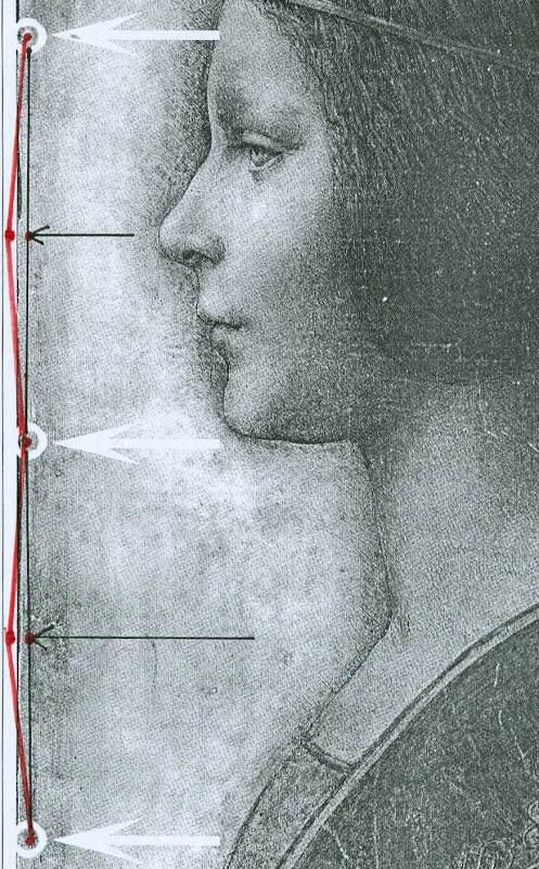
Above, Figs. 2 and 3. In Fig. 2 (top) we see, in the left and right images, the white arrows and circles with which Pascal Cotte located the “three holes showing that the image was once part of a codex or manuscript”. Given that the book (the Warsaw Sforziad) from which this sheet is said to have been cut was originally bound with five stitches, had the “La Bella Principessa” sheet once formed part of that book, it would today have five stitch holes, not the present three. In Figs. 2 and 3, we indicate with arrows (in red and then in black) where the missing two stitch holes would, for the reasons given above, be expected to have been located.
THE DOUBLE ‘DISCOVERY’ OF THE SUPPOSED POSITION OF LA BELLA PRINCIPESSA IN THE WARSAW SFORZIAD
When Andrew Goldstein asked Martin Kemp in an Artinfo interview in October 2011 what, on seeing the drawing, had convinced him it might be a Leonardo, he replied:
“So the initial connoisseur’s reaction merely tells you that something is worth looking at, but at any point one wrong thing can throw that all away — a later pigment, a bit of something that might come up about its history to indicate it was forged at some point, and so on. I was trained as a scientist, and if you have a scientific theory, you only need have one bit of the experiment that says, ‘this is not right,’ and the whole thing collapses. You always have to be looking for that one thing that is going to demolish the whole expectation that’s being set up.”
Kemp has given other grounds for caution when making attributions. On first encountering “La Bella Principessa”, he told Silverman, “I immediately saw it was in a different league from the others. But I was still very, very cautious. I didn’t want to jump at it because once you start believing you can summon up all the evidence you need.” (Peter Silverman, Leonardo’s Lost Princess: One Man’s Quest to Authenticate an Unknown Portrait by Leonardo da Vinci, 2012, p. 74.) Kemp had become a believer in the Leonardo attribution by 28 September 2011 when he issued a press release “The Original Source of the New Leonardo Portrait Discovered”. He added, “This (press release attached without the pics) should more or less settle the arguments – though probably not knowing the myopia of the art world.”
In 2011, after Kemp and Cotte had inserted their facsimile “La Bella Principessa” into the book, Kemp expressed himself 80 per cent confident of the drawing’s Leonardo attribution in a National Geographic film of the occasion. However, this was not the first time that a claimed “fit” between the facsimile and the book had been made and filmed by National Geographic. Peter Silverman describes in his book how, in December 2010, he had established a match in a different part of the book:
“We began by measuring the page size to see if it corresponded to “La Bella Principessa” and were gratified to see that it did, within a millimeter or two (a minute fraction of an inch)… Martin [Kemp] had surmised that the drawing would have been placed either at the very beginning or the very end of the book, but after careful examination we could find no trace of a cut page in either place. ‘May we turn each page?’ I asked. It was not a simple request. The book was nearly two hundred pages, and it would be a bit laborious for her [Anna Zawisza, the head of manuscripts] since utmost care had to be used so as not to damage the precious work in any way…It was apparent that the three pinholes where the binding had been sewn, noted earlier by Martin, which we had hoped would be a key to matching, would not be relevant, since the book had been rebound using five sutures…We slowly continued to turn each page, but there was no sign of a missing page…I had begun to abandon hope and to mentally prepare myself to return empty-handed. But then Zawisza turned page 161. There was a momentary beat of silence, and then she and I let out muffled cries. There, before our incredulous eyes, was what seemed to be the missing link, the element we longed to find: a remnant of a cut and extracted page of vellum that was the same darkish yellow as “La Bella Principessa”. We could barely contain our emotions. We measured the undulation of the remnant, and it corresponded exactly. Kathy [Silverman’s wife] and Kasia [Wozniak, art historian] came round to see for themselves, while David [Murdoch, National Geographic producer] filmed the historic moment. Even the armed guard was caught up in the excitement. Zawisza, who had carefully studied the book on past occasions, murmured how unhappy she was that she’d never noticed the missing page, now so glaringly obvious from the protruding remnant…”
That filmed historic moment was eclipsed by the moment in which Kemp and Cotte discovered a (preferred) location for the drawing at the front of the book. On her second examination of the Warsaw Sforziad, Dr Pisarek has learned that each of the five stitches in the book’s binding resulted in two holes, through which a string was passed. Thus, now that it is accepted that the book was originally bound with five stitches, each of which generated two holes, and that the “La Bella Principessa” sheet possesses only three of the necessary ten holes – and three where there should be six – there is no physical match between the drawing and the book, just as there is no documentary record of a Leonardo drawing having been bound within the book. Those who continue to see the hand of Leonardo in the drawing itself must now find an alternative history and another princess to accompany and bolster it.
Michael Daley 24 May 2016
Kasia Pisarek: A reply to Martin Kemp’s essay “Leonardo da Vinci La Bella Principessa. Errors, Misconceptions and Allegations of Forgery”
Professor Kemp has written an essay in response to my article “La Bella Principessa; Arguments against the Attribution to Leonardo”, Artibus et Historiae, No. 71, XXXVI, June 2015, pp. 61– 89.
In his essay, Prof. Kemp lists what he deems a series of errors and misconceptions in the Artibus article, but says he does not wish to address the issues of attribution I raised.
The purpose of his article is, however, an attempt to counter or undermine my findings.
I will answer his points in the order and with the numbered headings used by Kemp in his text.
[Martin Kemp] “1) Bibliographical”
[Kasia Pisarek] Martin Kemp says that most of my material is quoted from the internet and that I make only one reference to his book in my footnote 50.
This is incorrect. I make extensive reference to his book on the opening page and further references in footnotes 54, 57, 59 and 64. I have examined it as thoroughly as would be expected of any researcher. I also referred to many other books and articles which were accessed from libraries and not from the internet. These were:
M. Kemp and P. Cotte, The Story of the New Masterpiece by Leonardo da Vinci: La Bella Principessa, London, 2010; M. Kemp, Leonardo (rev. ed.), Oxford, 2004; P. Silverman, Leonardo’s Lost Princess: One Man’s Quest to Authenticate an Unknown Portrait by Leonardo Da Vinci, New Jersey, 2012; C. Geddo, ‘A “Pastel” by Leonardo da Vinci: His Newly Discovered Portrait of a Young Woman in Profile’, Artes, 2008–2009, pp. 67–87; C. C. Bambach, ‘Leonardo’s Notes on Pastel Drawing’, Mitteilungen des Kunsthistorischen Institutes in Florenz, vol. 52, 2008, no. 2/3 (Le tecniche del disegno rinascimentale: dai materiali allo stile. Atti del convegno internazionale, Firenze, 22–23 settembre 2008, ed. By M. Faietti, L. Melli, A. Nova), pp. 177–204; M. Gregori, ‘A Note on Leonardo’, Paragone, LXI, 2009, no. 723, pp. 3–4; D. Ekserdjian, ‘Leonardo da Vinci: “La Bella Principessa” – The Profile Portrait of a Milanese Woman’ (book review), Burlington Magazine, vol. 152, 2010, no. 1287, June (Attributions, copies, fakes), pp. 420–421; P. C. Marani, ‘Deux nouveaux Léonard?’, Dossier de l’art, 2012, no. 195, avril, pp. 58–63. Giannino Marchig, 1897–1983: paintings and drawings, exh. cat. London, 1988; Giannino Marchig, 1897–1983, exh. cat., Geneva, 1985; Giannino Marchig: 1897–1983: dipinti, disegni, incisioni, exh. cat. Florence, Gabinetto disegni e stampe degli Uffizi, 12 March – 5 June 1994 (Italian ed.); J. Cartwright (Mrs Henry Ady), Beatrice d’Este, Duchess of Milan, 1475–1497. A Study of the Renaissance, London, 1910; B. Horodyski, ‘Miniaturzysta Sforzów’, Biuletyn Historii Sztuki, 16, 1954, pp. 195–213; E. McGrath, ‘Ludovico il Moro and His Moors’, Journal of the Warburg and Courtauld Institutes, vol. 65, 2002, pp. 67–94; L. Syson with L. Keith, Leonardo da Vinci, Painter at the Court of Milan, exh. cat. National Gallery, London, 2011; Dizionario delle origini, invenzioni e scoperte nelle arti, nelle scienze…, Milan, 1831; B. Berenson, The Drawings of the Florentine Painters, vol. III, Chicago, 1938; Leonardo da Vinci, Master Draftsman, ed. by C. C. Bambach, exh. cat., The Metropolitan Museum of Art, New York, 2003; Z. Zygulski Jr, ‘Ze studiów nad Dama z gronostajem. Styl ubioru i wezly Leonarda’, in: Swiatla Stambulu, Warsaw, 1999 (first published in Biuletyn Historii Sztuki, vol. 31, 1969, no. 1, pp. 3–40).
The 2012 Italian version of Kemp/Cotte’s 2010 book is a translation from the English with the addition of the Sforziad hypothesis. The latter had already been published on the Lumiere Technology website and I discussed it at length.
Gnignera’s text was in Italian so I used Prof. Zygulski’s extensive knowledge of historic costume in general and coazzone in particular. The Monza catalogue (2015) was not published when I submitted my paper. The 2014 exhibition catalogue from the Galleria Nazionale in Urbino was also unavailable. To my knowledge these later publications have not yielded any conclusive evidence.
Prof. Kemp said that I have not addressed any of ‘the scientific evidence in the two books related to the lower layers of the image, the pentimenti or the condition and retouching in various media’ and goes on to say ‘contrary to Pisarek’s assertions, the interventions of restorers are documented in both books’. The latter sentence must refer to my ‘it is also strange that he did not consider that the drawing might have been retouched and repainted at a later time’ (p.79). Prof. Kemp has taken this out of context. I said that he did not mention the restorations in that particular passage of his book Leonardo (p. 210).
I not only analysed his art historical arguments in my text, but also the technical evidence presented by Cotte – which is to say:
– The trois crayons, pen and ink and bodycolour technique on vellum (unprecedented for Leonardo);
– The X-rays (inconclusive, in Cotte’s own words “did not yield significant new findings”, p. 154)
– The Carbon-14 dating of the vellum (wide-ranging 1440-1650, not constituting proof in itself as anyone could draw at any time on a blank folio removed from a manuscript)
– The quality of the vellum (rough; drawing on the hair-side; does not match the Sforziad’s smooth and well-prepared support; Birago’s illumination on the skin-side)
– The left-hand hatching (dry, timid and mechanical; on the outside of the contour of the profile, unlike in all Leonardo’s female portraits)
– The presence of three stitch holes (the Warsaw National Library Sforziad has five holes)
– The ‘knife marks’ when the folio was cut off (unnecessary, if the folio has been removed during rebinding).
– The retouchings of a later restorer (Marchig’s)
– The fingerprint evidence (no longer valid)
– The pentimenti, in the same place as in Leonardo’s Windsor portrait (a negative point, as La Bella Principessa could be based on that drawing).
At this point I would like to discuss some more scientific evidence:
On page 109:
“The support is probably the fine-grained skin of a calf”.
To the contrary, the images show an irregular grainy surface with visible follicles. Both Geddo and Turner described the support as “rough animal hide” and the surface of the vellum as being “pitted”.
“The portrait was drawn on the smooth ‘hair’ side”.
To the contrary, the hair-side has follicles so it is the rough side, not the smooth side.
Contrary to Prof. Kemp’s claim that I ignored Geddo’s contributions, I quoted her (p. 76), and she said exactly the opposite: “Besides the presence of the follicles, the rough unworked surface of the hide and its darkened, somewhat yellowish colour show that the portrait was made on the outer surface of the skin (formerly furcovered) and not on the inner one covering the flesh, which was aesthetically the superior of the two and commonly used as a support for written documents”.
I quoted extensively from Geddo’s article “A ‘Pastel’ by Leonardo da Vinci: His Newly Discovered Portrait of a Young Woman in Profile”, in Artes, 2008–2009, pp. 67–87, on my pages 62, 76 and 88.
On page 114:
The discovered “small area of pen marks along the left edge of the support” described by Cotte as Leonardo’s “pen trials”. This would surely have no place in a drawing destined for a luxury book presented as a gift to the Sforzas.
On page 154:
A problem with the X-rays:
‘Because white chalk (calcite or calcium carbonate) does not absorb X-rays to any great extent, the luminous zones of the sitter’s face ought to have appeared grey in the X-ray. On the contrary, however, they appear very white here, indicating the presence of a significant amount of dense material in the chalks area – which seems to contradict all the physical evidence considered so far.’
Cotte attributes this anomaly to the technician supposedly over-exposing the plate. This confirms his own observation that X-rays “are vulnerable to diverse interpretation”.
[MK] “2) PROVENANCE”
[KP] I did not say that the Marchigs were involved in forgery of any description. What I did say was that Giannino was familiar with Leonardo’s technique as a restorer and a “Leonardesque painter”. He was able to make such a drawing if he had wanted to, but clearly he had not tried to sell La Bella Principessa as a work by Leonardo.
Prof. Kemp does not explain, however, why the drawing had no provenance prior to Marchig’s ownership, and, as Michael Daley has recently pointed out, Professor Kemp and the drawing’s owner, Peter Silverman jointly trawled Berenson’s archive in hope of finding some pre-Marchig record but found none.
[MK] “3) The assertion that there is an ‘almost total absence of close comparisons with unimpeachable works by Leonardo.’”
[KP] The offending phrase above was written not by me but by David Ekserdjian in “Leonardo da Vinci: ‘La Bella Principessa’ – The Profile Portrait of a Milanese Woman”, The Burlington Magazine, vol. 152, 2010, no. 1287, June (Attributions, copies, fakes), pp. 420–421.
I used the same Leonardo comparisons as Prof. Kemp, but where he saw striking similarities, I saw possible imitation.
As to Cecilia Gallerani, although the structure of the eye looks comparable, it is round, soft and alive in Leonardo’s portrait, and dry, linear and lifeless in La Bella Principessa. The iris is drawn as a flat disc and the eyelid is marked with clear cut lines, unlike in nature.
Cotte states on p. 177: “Leonardo, for example, consistently made the bottom of the eye’s iris coincide exactly with the edge of the lower eyelid”.
This is not always the case. In Portrait of a Woman in Windsor or in La Belle Ferroniere the iris does not touch the lower eyelid, while in some works by Leonardo’s followers it does.
[MK] “4) The lack of records of Leonardo making the drawing”
[KP] Prof. Kemp wrote that all Leonardo’s known works are “unrecorded in his writings”. Leonardo does in fact mention two Madonnas in a sheet of sketches (Gabinetto Disegni e Stampe degi Uffizi, Florence, 446 E) inscribed: “…1478, I began the two Virgin Marys”, possibly referring to the Benois Madonna in St. Petersburg. He also mentions in a note his sculpture of the Sforza Horse (Ms. C, fol. 15v; R 720; B 44; V 53). And in an undated letter (about 1491-95), he writes together with De Predis about being underpaid for the Virgin of the Rocks.
The 16th century record in the Zamoyski collections Kemp refers to applies only to the Sforziad, not to the drawing, which was unrecorded there.
[MK] “5) ‘The entirely unusual for Leonardo medium of vellum commonly found in manuscripts led Prof. Kemp and his colleagues, including David Wright, Emeritus Professor of Art History at the University of South Florida, to search fifteenth-century codices for an excised illumination.’”
[KP] Prof. Kemp writes that “the author’s narrative of an extensive search is imaginary.”
But Dalya Alberge wrote in her article, “Is this portrait a lost Leonardo?” in The Guardian, on 27 September 2011:
“Earlier this year, he [Prof. Kemp] embarked on what he describes as a ‘needle-in-a-haystack’ search for a 15th-century volume with a missing sheet. […] Against the odds, Kemp tracked the volume down, to Poland’s National Library in Warsaw.”
[MK] “6) Forging a Leonardo?”
[KP] To be clear, I only said that the drawing could be a compilation of Leonardo’s works and other sources such as a bust by Cristoforo Romano.
[MK] “7) Pisarek’s reliance on Julia Cartwright”
Cartwright’s work is the only one specifically on Bianca Giovanna Sforza I could find in the English language. As there are no other secure portraits of Bianca Giovanna, the Principessa hypothesis is not supported by any evidence either.
Cartwright’s identification of The Musician as the portrait of Galeazzo Sanseverino, Bianca’s husband, looks convincing. The companion portrait in the Ambrosiana could then be showing his wife Bianca, but she looks very different to La Bella Principessa. Also Professor Carlo Pedretti in his Leonardo: The Portrait, 1999, called the Ambrosiana portrait (p. 23) “a probable portrait of Bianca Giovanna, the illegitimate daughter of Francesco Sforza.”
[MK] “8) Bianca Maria Sforza and earlier scholarship”
Even if the identification and dating of the portrait ‘pre-dates the research into the Sforziad’, as stated by Prof. Kemp, there is still the problem of the dating and the too ‘archaic’ style of the drawing.
Kemp does not explain why Vezzosi and Turner identified La Bella Principessa as Bianca Maria Sforza, even if she looks so different to her other known likenesses.
[MK] “9) Cutting out the portrait from the Sforziad in Warsaw”
[KP] There is no evidence that the folio was in the Sforziad and was removed during rebinding. But if it were so, there would be no need to cut out the folio, only to remove it as a complete sheet. A complete sheet (two folios) is indeed missing in the book, which would eliminate the need for excision.
If the folio had been removed during rebinding for its beauty or high value by the Zamoyskis, it would have been recorded in their collections, but there are no such records. Kasia Wozniak’s research has not found any evidence to this effect.
Her hypothesis that the drawing went to the Czartoryski collections in Pulawy where it was identified as by Leonardo is also so far unsubstantiated. There were no such records in the Czartoryski collections. The late Director of the Czartoryski Museum, Prof. Zygulski Jn. never mentioned the existence of a Leonardo drawing in their collections.
The Bona Sforza drawing listed in the 1815 inventory of the Temple of Sybil in Pulawy and mentioned by Wozniak as the possibly misidentified Bianca Giovanna Sforza, refers to a miniature watercolour on vellum illustrated in D. Dec and J. Walek’s, Czasy! Ludzie! Ich dziela. Teatr obrazów ksieznej Izabeli, listed as no. 99. ‘Polish, 16th century’.
There is no connection between my article in Artibus and the interests of the National Library in Warsaw.
[MK] “10) The foliation and inserted paper pages”
[KP] Prof. Kemp himself used the word ‘codex’ to describe the Sforziad in his book Leonardo: Revised edition, 2011, p. 256:
“this tender and refined formal portrait in ink and coloured chalks on vellum has been cut from a codex (a book), namely the copy of the Sforziada in Warsaw produced for Galeazzo Sanseverino.”
The three folios missing in the Warsaw Sforziad were originally left blank as in the other copies of the book in Paris or London.
Geddo described the drawing’s “apparent crudeness in the preparation of the parchment” and “the rough unworked surface of the hide” (A Pastel by Leonardo da Vinci… reprinted in P. Silverman, Leonardo’s Lost Princess, pp. 219-220). This is not true of the Sforziad’s parchment.
I have seen the Sforziad on two occasions. Once in the summer 2012 and more recently in March 2016; the parchment is finely grained and of high quality, as expected in a luxury book for the Sforzas.
My illustrations Fig. 7, 10 and 11 indeed show paper pages. Because they look so similar it is easy to mistake the paper pages for the vellum ones. My Fig. 6 and Fig. 8 are vellum and they look very similar in colour and texture.
Kemp states that I inaccurately said that his “reconstruction of the insertion of the drawing in the Warsaw Sforziad looks unrealistic, as it is facing a printed page”. He wrote that “The reconstruction shows that the portrait would have faced a blank page”. This is incorrect. His “Fig. 12 – ‘Hypothetical Reconstruction of La Bella Principessa as folio 6r” in the online article “La Bella Principessa and the Warsaw Sforziad” does face a printed page.
[MK] “11) Iconography”
[KP] According to Kemp, Horodyski’s pioneering research on the Sforziad I support ‘has been superseded in the light of more detailed knowledge of Sforza court iconography and analyses by later scholars, including Wright’.
Horodyski suggested Gian Galeazzo Sforza and his offspring, such as Bona Sforza, the later owner of the book in Warsaw as the recipient of the Sforziad.
But according to D.R.E. Wright in his article on the Lumiere Technology website (which has now been removed), M. L. Evans and E. McGrath, the Warsaw Sforziad was destined for Galeazzo Sanseverino, Bianca’s husband.
So why is Galeazzo Severino’s profile absent on the Warsaw frontispiece by Birago, where Ludovico’s is in London and Gian Galeazzo’s in Paris, the recipients of the other Sforziads?
Moreover, Galeazzo Sanseverino was not part of the Sforza dynasty and Bianca was illegitimate. All the copies of the Sforziad on vellum were dedicated to members of the Sforza family.
Horodyski’s reading of the symbolic content of the Birago frontispiece more logically pointed to the death of Gian Galeazzo: the lack of the recipient’s profile as emblem, the missing figure of Gian Galeazzo in the boat with Ludovico il Moro, the tears in the handkerchief, the sarcophagus, the broken shield with the initials GZ, the crest with one half with arms of Milan and the other of Aragon for Gian Galeazzo.
After my defence of Horodyski’s interpretation, an Italian scholar Carla Glori published online her very detailed new iconographic study of the illumination: ‘The Illumination by Birago in the Sforziad incunabulum in Warsaw: in defence of Horodyski’s thesis and a new hypothesis’. I am quoting her extensively below.
She said: “The incunabula with the illuminations now in London and Florence were the property of Ludovico il Moro, given the recurrence of the central upper figure of a moor, and the presence of the ensign of the Duke of Bari with his devices called “la scopetta” (the little broom) and “I due fanali” (the two beacons). The Paris and Warsaw incunabula were the property of Duke Gian Galeazzo Sforza and his family, because they are reproducing the devices of Gian Galeazzo himself and of his father, Galeazzo Maria.”
The sieve, which was said to be the emblem of Galeazzo Sanseverino, was Gian Galeazzo’s personal device (created by his father) called “il buratto” (a sieve held by two hands) with the motto TAL A TI QUAL A MI, as illustrated by the “Cassone dei tre Duchi”, Sforza Castle, Milan, 1479-1494.
Glori also added that the sieve device (“il buratto”) is duplicated in symmetrical position in the central area of the Warsaw illumination.
She concluded that “the Warsaw illumination was dedicated to the memory of the deceased Gian Galeazzo Sforza and his family, and that it was certainly dated after his death (1494)”.
Her argument against the Sanseverino coat of arms or imprese supposedly identified in the Birago’s illumination includes:
– The missing Aragonese “A” in the device of the “three intertwined rings with diamonds” appearing on the Warsaw illumination
– The missing Sanseverino NOSTRO È IL MESTIERE motto
– The fact that the hybrid coat of arms of the Warsaw illumination does not correspond to the coat of arms of the Sanseverino dynasty; it should be silver/white not gold/yellow. “Every armorial certifies that the field (“campo”) of the Sanseverino coat of arms was “SILVER” (white), while the field (“campo”) of the coat of arms in the illumination of Warsaw is “GOLD” (yellow)”. “According to Horodyski’s logical and symbolical interpretation, the emblem is an artistic fusion of the traditional emblem of the city of Milan with the yellow and red lines of the Aragona coat of arms.”
– The reference of the initials “GZ” (appearing in the ducal documents and iconography, also on the ‘Cassone dei Tre Duchi’) to the memory of the deceased dukes Galeazzo Maria and Gian Galeazzo, not Galeazzo Sanseverino.
– The absence of any reference to Galeazzo Sanseverino and his biography such as the tournament lance of the famous jouster, while the ducal arms on the “Cassone dei Tre Duchi” are present: the round shield, the quiver with arrows and the sword. The depicted starry armour on the left is not the typical armour of a jouster. It is empty as Gian Galeazzo is dead, and it is almost identical to the one worn by him in the Paris illumination.
– The presence of a body of heraldic devices celebrating the Visconti-Sforza dynasty and referable in particular to Galeazzo Maria Sforza and his son Gian Galeazzo such as the greyhound/the tree/the divine hand (Francesco Sforza); the “capitergium” device (a bandage with a knot) dedicated to Gian Galeazzo Visconti, the first Duke of Milan, celebrating the Visconti dynasty; the rising waves (“onde montanti”); the three intertwined rings with diamonds (“i tre anelli intrecciati con diamante), by Muzio Attendolo, the founder of the Sforza dynasty: it was probably given to him in 1409 by the Marquis of Ferrara Niccolò II d’Este after the conquest of Reggio Emilia. They are not emblems of Bianca Giovanna as was advanced, but of members of the Sforza family in general.
According to Glori, “we have no evidence that the incunabulum now in Warsaw was confiscated in Milan during the French invasion. In 1517 Antonio de Beatis saw some precious incunabula in the Royal Library of Blois, but he did not cite the Sforziad as being amongst them in his autograph manuscript XF28 of the National Library in Naples. It is plausible that the incunabulum now in Warsaw was a wedding gift to Bona Sforza from her mother Isabella; I propose also the hypothesis that she received the gift from her aunt Caterina Sforza, probably when she left Milan with Isabella after the downfall of Ludovico il Moro.”
[MK] “12) Betrothal and Marriage”
[KP] Although the word ‘betrothal’ might have been more appropriate than ‘marriage’ in the case of Bianca Sforza, others also wrote that her ‘wedding’ (or nuptials) took place in 1490 or late 1489.
Julia Cartwright in her Italian Gardens of the Renaissance and Other Studies, 1914, (reprint 2013) wrote p. 174: “On the 10th of January, 1490, the wedding [of Bianca and Galeazzo] was solemnised in due splendour in the Castello of Milan (…)”.
Edward McCurdy in The Mind of Leonardo da Vinci, New York, 2013, wrote “Bianca Sforza, a natural daughter of Ludovic who in 1489, while still a child, was married to the famous captain Galeazzo di Sanseverino.” p. 301.
Wikipedia entry for Galeazzo Sanseverino also says “He was married to Bianca, illegitimate daughter of Ludovico Sforza, in 1489.”
[MK] “13) The Technique”
[KP] It was Prof. Kemp himself who said that Leonardo never worked on vellum in his book The story of the new masterpiece… p. 35: “There are no other known works by Leonardo on vellum, but there is previously neglected evidence of his interest in making coloured images on prepared animal skin.”
Turner also wrote in his online Statement concerning the portrait on vellum by Leonardo, p.3: ‘Also apparently unprecedented [for Leonardo] is the use of vellum or parchment as a support for the new portrait.’
Geddo also wrote: “The use of parchment was until now unknown in the work of Leonardo (…)”, in P. Silverman, Leonardo’s… p. 226.
In reference to Jean Perréal and dry colouring, the quotation in full is as follows: “Piglia da Gian de Paris il modo di colorire a secco e’l modo del sale bianco e del fare le carte impastate, sole e in molti doppi, e la sua casetta de’colori”.
The translation for carte impastate as ‘paste-board’ is not anachronistic, as it was used as early as 1760 in Joseph Baretti’s, A dictionary of the English and Italian languages, Vol. 1: “Cartone [composto di piu carte impastate insieme] paste-board.”
I have only inspected the vellum of the Sforziad in Warsaw, not the vellum of the drawing, but both Geddo and Turner have described it as ‘rough animal hide’. This is most certainly not what you will find in the Sforziad in Warsaw.
[MK] “14) Dimensions”
[KP] According to Kemp and Cotte, the dimensions of the vellum pages of the Sforziad vary from 33.0 to 33.4 cm in height, while the drawing is 33 cm high.
I have carefully checked the dimensions with the Librarian in March 2016. All the pages are at least 33.4 cm high and more, up to 33.7 cm. The size of 33 cm would be far too small for the book.
The 5 holes in the book are in fact all double holes. Each of the 5 holes is two small holes, between which a string passes. The distance between the two small holes is about 3 mm. The double holes were never mentioned by Kemp or Cotte.
According to the conservator who was present at the time of my last visit, this is the binding that follows the original binding as there is no damage of any kind. So in total there were as many as 10 small holes, not 3 single ones as in the drawing.
I measured the distances between the 3 holes that Kemp and Cotte measured in La Bella Principessa. The measurements were taken from the middle of the double holes.
The distance between the bottom hole and the middle hole is 11.35 cm in the Sforziad, while in the drawing it is 11.06 cm.
The distance between the middle hole and the top hole is 11.7 cm in the Sforziad, while in the drawing it is 11.44 cm.
[MK] “15) The profile and the cartoon portrait of Isabella d’Este”
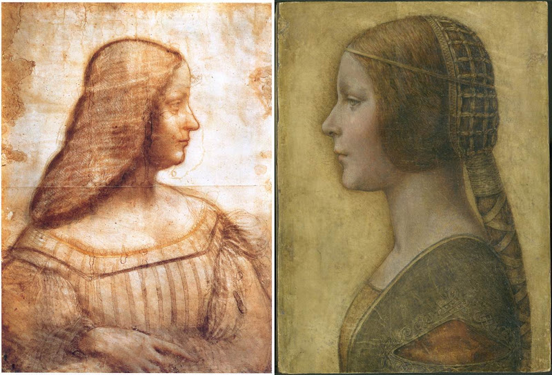
Above, Fig. 4: A comparison of La Bella Principessa with Leonardo da Vinci’s, Portrait of Isabella d’Este, c. 1499–1500, Paris, Musée du Louvre.
[KP] The portrait of Isabella d’Este shows the face in profile but the body in three-quarters, unlike La Bella Principessa. The former is also unfinished, rendered softly with the sfumato effect, fluid in execution, while the shading is on the inside of the profile.
La Bella Principessa is shown in full profile, highly finished, rigid and linear, while the shading is on the outside of the profile.
The similarities between the two profiles are only superficial.
The use of the word ‘repaint’ was an incorrect translation of the French word ‘repentir’, which means pentimento. I would like to mention that I have a good enough grasp of drawing techniques as I also trained as a copyist of Old Masters and an art restorer.
[MK] “16) Left-handedness”
[KP] I disagree that “the left-handed execution cannot undermine the attribution”, as it indicates the intention to imitate Leonardo. None of his collaborators or followers were left-handed, so the drawing is either by him or by an imitator/forger.
[MK] “17) The costume”
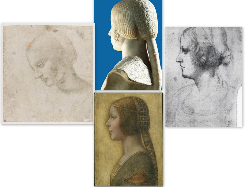
Above, Fig. 5: Comparisons of La Bella Principessa with Leonardo da Vinci’s, Head of a Woman, c. 1488–1490, National Gallery, Parma (left); Leonardo’s Portrait of a Woman in Profile, c. 1489–1490, Windsor Royal Collection (right); and, Gian Cristoforo Romano’s sculpture, Bust of Beatrice d’Este, c. 1491, Paris, Musée du Louvre (top).
[KP] The simplified and flatly rendered dress as well as the coazzone hairstyle do indeed show similarities with the sculpted busts by Gian Cristoforo Romano (Bust of Beatrice d’Este) and Francesco Laurana. But this could be a negative point, as the drawing could be based on one of these busts.
Incidentally, the opening in Laurana’s sculptures differs from that in La Bella Principessa. In the former it is a wide horizontal cut facilitating the movement of the arm, while in the drawing it is a triangular hole which doesn’t seem to play such a role.
Above, Fig. 6: Gian Cristoforo Romano, Bust of Beatrice d’Este, c. 1491, Paris, Musée du Louvre.
Above, Fig. 7: A comparison of the knots on La Bella Principessa’s dress and Gian Cristoforo Romano’s Bust of Beatrice d’Este, c. 1491.
[MK] “18) The fingerprint”
[KP] The fingerprint evidence which was originally published in the book as “strongly supportive of Leonardo’s authorship” is now considered invalid.
It was not possible to compare the palm imprint to Leonardo’s other examples, and it was described as perhaps unintentional as it is single and isolated, unlike in the execution of Cecilia Gallerani, where many imprints were found where the blending of hues had taken place.
[MK] “19) On Method”
[KP] The “accumulative build-up of different types of evidence” against the attribution to Leonardo is strong, but, as mentioned above, my main arguments were not addressed by Prof. Kemp.
Why is the shading on the outside of the profile? What is the significance of the hand writing on the reverse of the drawing and why was it not investigated? Why is the profile of La Bella Principessa so similar to that in the sculptural Bust of Beatrice d’Este by Cristoforo Romano? Why is the knot on the dress similar to the one on the bust and unlike other Leonardo’s knots? Why are the proportions of the face flawed? Why the vellum of the drawing was described as ‘rough animal hide’ and could it be part of the luxury book of the Sforziad? Why Marchig’s friend the famous Renaissance expert Bernard Berenson had not attributed the drawing to Leonardo? Why there is no known provenance prior to Marchig’s in the 1950s?
In the field of attributions the level of inconsistencies and contradictions always undermine any evidence in favour of a proposed attribution.
[MK] “20) The damaging allegation in the opening to Pisarek’s article that the owner was to set up ‘non-profit-making foundation for multi-disciplinary Classical and Renaissance studies near Florence, to be headed by Professor Martin Kemp’.”
[KP] I made no such allegation. This was a quotation from an article by Simon Hewitt who supports the attribution to Leonardo. This information was published in an Antiques Trade Gazette article by Simon Hewitt in 2009. The article can be found here.
In my article I also wrote: “Prof. Kemp and his colleagues are no doubt genuinely convinced of the authenticity of the drawing, as well as highly enthusiastic about the rediscovery.” This shows that I in no way question Prof. Kemp’s integrity on this matter, only the methodology and the results of the proposed attribution.
Kasia Pisarek, 24 May 2016
Problems with “La Bella Principessa”~ Part I: The Look
The world famous drawing that was dubbed “La Bella Principessa” by Professor Martin Kemp is insured for $150 million and lives in a “secure vault in Zurich”. It is not a portrait of Bianca Sforza by Leonardo da Vinci, as has been claimed, but a twentieth century forged or pastiche Leonardo.
WHITHER “LA BELLA PRINCIPESSA”
In 1998 the now so-called “La Bella Principessa” appeared from nowhere at Christie’s, New York. A hybrid work made in mixed media that were never employed by Leonardo (three chalks, ink, “liquid colour”), on a support that was never used by Leonardo (vellum), and portraying a woman in a manner that is nowhere encountered in Leonardo, it was presented as “German School, early 19th century” and “the property of a lady”. It went for $22,850 to a New York dealer who sold it nine years later on a requested discount of 10 per cent for $19,000 to an art collector, Peter Silverman, who said he was buying on behalf of another (unidentified) collector whom he later described as one of “the richest men in Europe”. Thus, at that date, it was not known who owned the drawing or by whom it had been consigned to Christie’s and it remained entirely without provenance. In its nine years long life, no one – not even its new owner(s) – had taken it to be by Leonardo.
In a 2012 book (Lost Princess ~ One man’s quest to authenticate an unknown portrait by Leonardo da Vinci), Silverman claimed a successful upgrading to Leonardo and described how he had gained the support of distinguished scholars including Professor Martin Kemp who had formulated an elaborate hypothetical history in which the drawing was said to be a Leonardo portrait made either from a living subject in celebration of her wedding or in commemoration after her death in 1496.
Nonetheless, the drawing failed to gain a consensus of scholarly support and is rejected in centres like New York, London and Vienna. Carmen Bambach, the Metropolitan Museum’s Renaissance drawings authority dismissed “La Bella” on the grounds that “It does not look like a Leonardo”. Thomas Hoving, a former Metropolitan Museum director, held it to look “too sweet” to be Leonardo. ARTnews reported that the Albertina Museum’s director, Klaus Albrecht Schröder, had noted “No one is convinced it is a Leonardo”. In the Burlington Magazine Professor David Ekserdjian suspected it to be “counterfeit”.
THE LOOK OF “LA BELLA” AND THE COMPANY SHE BEST KEEPS
In matters of attribution the most important consideration is the look of a work. Many things can be appraised simultaneously but, conceptually, the “look” of a work might be broken down into two aspects: an initial at-a-glance response to a work’s effects and appraisal of its internal values and relationships; and, a comparison of the effects, relationships and values with those of bona fide productions of the attributed artist, or with those of the artist’s students, associates or followers. It can also be useful to compare the looks of works with those of copyists and known forgers. It might fairly be said that in connoisseurship, as in the evaluation of restorations, visual comparisons are of the essence. (In ArtWatch we take pride in the extent to which we seek out all possible comparative visual material and regret that some institutions still hinder our efforts in this regard.)
Above, Fig. 1. If we put aside questions of attribution and simply look at the group above, we find works of remarkably similar figural motifs and formats that clearly relate to and derive from a most distinctive type of 15th century Italian profile female portrait. These similar-looking works are similarly sized, being, respectively from left to right:
A Young Woman, 14 and 1/4 x 10 inches;
“La Bella Principessa”, 13 x 9 and 3/4 inches; and,
A Young Woman, 18 x 12 1/2 inches (here shown mirrored).
All show young women depicted in the strict early Renaissance profile convention made in emulation of antique relief portraits on coins and medals. Although very widely encountered (see Fig. 4), Leonardo side-stepped the type in order to intensify plastic and expressive values with sculpturally-purposive shading and axial shifts in the bodies and gazes of his portraits (see Fig. 6). The portrayals above are strikingly similar in their head/torso relationships; in their absences of background; in their highly elaborated coiffures which offset ‘sartorially’ skimped and unconvincing simplifications of costume; in their sparse or wholly absent depictions of jewellery; and, even, in their almost identically cropped motifs. Collectively they might be taken as a suite of variations on a simple theme. We take all three to be twentieth century Italian artefacts. At least two of them are linked to Bernard Berenson and the two on which reports have been published have unusual and problematic supports.
As mentioned below, the Detroit picture is painted on top of photographic paper. It is suspected that it might have been a photograph of the Frick sculpture to which the painting was initially related. The “La Bella Principessa” is drawn, exceptionally for Leonardo, on a sheet of vellum which appears to have been removed from a book and it is, most unusually, glued to an oak panel. The panel itself is a curiosity: although a number of “butterfly keys” have been inserted into its back, as if to restrain splitting, there is no evidence of splits in the panel and, if there were, the present four such keys in such a small panel might be considered restoration “over-kill”. If the panel had split while the vellum was glued to it, the drawing would have split with the panel. The fact that the vellum has been “copiously glued” to a (possibly pre-restored) oak panel makes it impossible to examine the back of the drawing which is said by one of its proponents, (Cristina Geddo, an expert in Leonardo’s students and Milanese “Leonardesques”) to bear “superimposed numbers…a written inscription…[and a] little winged dragon – at least that is what it seems.” For Geddo, this unexamined content is reassuring: “This feature, too, counts in favour of an attribution to Leonardo, who, even though he never to our knowledge used a parchment support in his work, was in the habit of re-using the paper on which he drew.”
(In reading the compendious literature on this proposed attribution, we have sometimes wondered what might be allowed by its supporters to count as evidence against the attribution.)
CONSIDER THE HISTORIES
The portrait on the left, A Young Woman, was bought in 1936 by the Detroit Institute of Arts as by Leonardo da Vinci or Andrea del Verrocchio. The institute’s director, W. D. Valentiner, made this attribution on the strength of clear correspondences with the curls in the hair of Leonardo’s painting Ginevra de’ Benci (see Fig. 6) in the National Gallery of Art, Washington, and with those found in the above-mentioned marble sculpture in the Frick Museum, A Young Woman, given to Andrea del Verrocchio. (Valentiner had made a study of Leonardo’s work in Verrocchio’s workshop.) In 1991 Piero Adorno, specifically identified the Detroit picture as Verrocchio’s lost portrait of Lucrezia Donati. Notwithstanding seeming correspondences with secure works, this picture is now relegated to “An Imitator of Verrochio” – and this is an extremely charitable formulation. In Virtue and Beauty, 2001, David Alan Brown described it as “a probable forgery by its anachronistic materials and unorthodox construction”. “Probable” [!] because: “after a recent technical examination, the picture turns out to have been painted on photographic paper applied to a wood panel that was repaired before it was readied for painting. And at least one of the pigments employed – zinc white – is modern…” Valentiner judged one of two Leonardo studio works of the Madonna with a Yarnwinder to be “more beautiful than the Mona Lisa”.
The portrait on the right, A Young Woman, was attributed to Piero Pollaiuolo by Berenson in 1945. While this figure is perhaps the most attractive of the above three, with its nicely constructed counterbalancing of the thrusts in the neck/head and torso, and its credibly proportioned arm, the work itself has, so far as we can ascertain, sunk without trace. In truth, this female profile portrait type has been assailed by forgeries. Alison Wright notes in her 2005 book The Pollaiuolo Brothers, that “Complications for the historian lie both in the fact that the subjects of most female portraits are no longer identifiable and that, because of their exceptional decorative and historical appeal, such portraits were highly sought after by later nineteenth- and early twentieth-century collectors, encouraging a market for copies, fakes and over-ambitious attributions.”
The portrait in the centre (“La Bella Principessa”) has been precisely attributed by Kemp to Leonardo as a book illustration portrait of Bianca Sforza of 1495-96.
DISTINGUISHING BETWEEN THE LOOKS OF THEN OF NOW
Above, Fig. 2. In My dear BB (an incalculably valuable new resource edited and annotated by Robert Cumming), we learn that in November 1930 Kenneth Clark’s wife, Jane, wrote to Berenson: “K has seen Lord Lee’s two new pictures…The Botticelli Madonna and Child you probably know too. K thinks the latter may be genuine about 1485 or rather part of it may be, but it is not a pretty picture…” A footnote discloses that Lee had bought The Madonna of the Veil, a tempera painting on panel in 1930 from an Italian dealer for a then huge sum of $25,000 (Fig. 3). It was widely accepted by scholars as autograph Botticelli and published by the Medici Society as a “superb composition of the greatest of all Florentine painters”. Clark, doubting the attribution on sight, objected that it had “something of the silent cinema star about it” – and he likened the Madonna to Jean Harlow (Fig. 3). Lee donated the picture to the Courtauld Institute Gallery in 1947. In June 2010 Juliet Chippendale (a National Gallery curatorial intern working in association with the Courtauld Institute MA course) disclosed that scientific examination had identified pigments not known before the 18th and 19th centuries and worm holes that had been produced by a drill. It is now designated a work of the forger Umberto Giunti (1886-1970), who taught at the Institute of Fine Art in Siena and forged fresco fragments.
ART HISTORICAL SILENCES
Four months later Clark wrote to Berenson: “Just in case Lee has sent you a photograph of his new Botticelli may I ask you to forget anything Jane may have reported me as having said of it. It is one of those pictures about which it is best to be silent: in fact I am coming to believe it is best for me to be silent about every picture. Did I tell you that my Leonardo book was a mare’s nest. The man had sent photographs of two drawings from the middle of the Codice Atlantico. They must have been early copies done with some fraudulent motive – perhaps the book really did belong to Leonardo – he certainly had read it – & some pupil thought to enhance its value.”
Above Fig. 3. The young Kenneth Clark (then twenty-seven years old) displayed an admirable “eye” by spotting a fraud on sight some eighty years ahead of the pack. Is it better for a connoisseur to see but not speak than it is not to see at all? Undoubtedly, it is. Would Clark have enjoyed his meteoric rise had he humiliated the mighty and exposed the big-time fraudsters of his day? (That question might be taken as self-answering.) If Clark bided his time on Berenson, eventually he delivered an unforgiving former-insider’s repudiation in 1977 by chronicling how Berenson had “sat on a pinnacle of corruption [and] for almost forty years after 1900… [done] practically nothing except authenticate pictures”
PRETTY – AND NOT SO PRETTY – WOMEN
Above, Fig. 4. In the middle and bottom rows we see three bona fide works of the female profile type – respectively:
Portrait of Bianca Maria Sforza, c. 1493, by Ambrogio de Predis, The National Gallery of Art, Washington;
Domenico Ghirlandaio’s 1488-1490 Giovanna degli Albizzi Tornabuoni, Museo Thyssen-Bornemisza, Madrid; and,
a portrait of Beatrice d’Este tentatively attributed by Kemp to Ambrogio da Predis.
The differences between this trio and the works in the top row are pronounced and eloquent. The secure works are highly individuated and immensely richer in their effects. Collectively, they do not constitute an inadvertent suite. Individually, they are greatly more various compositionally. Collectively, they are markedly richer in jewellery and ostentatiously sumptuous costumes. The distinctive physiognomies of their subjects derive from living persons, not from other art or photographs of other art. Flattery and loving attention are channelled more into the costume and bling than into the facial features. In every respect the opposite is the case in the top row where prettiness has been held at a premium with an eye on the modern photographically-informed market.
LEONARDO BREAKS THE MOULD
Above, Fig. 5: As mentioned, “La Bella Principessa” and her two companions are of a piece, and of a type never followed by Leonardo whose female portraits (see below) pioneered an unprecedentedly complex and sophisticated evocation of real, sculpturally palpable women in tangible spaces or landscapes. To include the figurally impoverished and stylistically anachronistic “La Bella Principessa” in Leonardo’s oeuvre would disjunct his revolutionary arc of insights and innovations in portraiture. Such inescapably disruptive consequences have been ceded tacitly by Kemp, “La Bella Principessa’s” principle defender – some say advocate. In “La Bella Principessa ~ The Story of the New Masterpiece by Leonardo da Vinci” (Kemp’s 2010 book jointly written with Pascal Cotte of Lumiere Technology and including chapters by the drawings scholar Nicholas Turner and the recently discredited fingerpints expert Peter Paul Biro), Kemp converts an intractable problem into an asset by begging the essential question. That is, he underwrites “La Bella’s” credibility on an assertion that “Any important new work, to establish itself, must significantly affect the totality of Leonardo’s surviving legacy over the longer term.” Without question, the de-stabilising inclusion of “La Bella Principessa” would produce knock-on effects, but arguing backwards from that predictable disturbance to some endorsement of its source is patently unsound methodologically – the inclusion of any atypical work, whether bona fide or forged, into an oeuvre would affect its “legacy”.
LEONARDO’S ACCOMPLISHMENTS
Above, top, Fig. 6: Left, Andrea del Verrocchio’s Lady with a Bunch of Flowers of c. 1475; and (right) Leonardo’s (hypothetically extended) Ginevra de’ Benci of c. 1474-1478.
Above, Fig. 7: Left, Leonardo’s The Lady With an Ermine of about 1489-90; centre, Leonardo’s La Belle Ferronnière of about 1495-96; right, Leonardo’s Mona Lisa (La Giaconda) of about 1503-06 onwards.
In the group above we see extraordinary development in Leonardo’s portraits of women over the last quarter of the fifteenth century as he strove to incorporate the entirety of sculptural, plastic, figural knowledge, and to surpass it by making it dance to an artistically purposive tune liberated from the happenstance, arbitrary lights of nature on which sculpture then necessarily depended. Some have attributed the Bargello sculpture, the Lady with a Bunch of Flowers, to Leonardo on the grounds that its subject was Ginevra de’ Benci, the subject of Leonardo’s painting. Others have seen Leonardo’s authorship of it in the beauty of the hands. In Leonardo da Vinci and the Art of Sculpture, 2010, Gary M. Radke holds that the two works show differences that emerged in the mid-1470s between the two artists. Against this, it has been suggested that the painting might originally have borne a closer relationship to the sculpture with a possible inclusion of hands in a fuller length treatment. A study of hands by Leonardo was incorporated in a hypothetical and digitally realised extension of the painting by David Alan Brown (Virtue and Beauty, 2001, p. 143). Frank Zollner sees the painting as marking the point (1478-1480) at which Leonardo broke away from “the profile view traditionally employed in Florence for portraits of women” in favour of the three-quarters view in order to impart “a pyschological dimension to his sitter – something that would become the hallmark of Renaissance portraiture”. Which is all to say that Leonardo had broken away from the profile convention some sixteen to eighteen years before, on Kemp’s hypothesis, he made a solitary and exceptional “return” to it.
Speaking of the reconstruction of Leonardo’s Ginevra de’ Benci painting, Brown writes:
“Ginevra’s portrait, the lower part of which was cut down after suffering some damage, may have included hands. A drawing of hands by Leonardo at Windsor Castle, assuming it is a preliminary study, aids in reconstructing the original format of the picture. As reconstructed, Leonardo’s portrait may be seen to have broken with the long-standing Florentine convention of portraying women in bust-length profile. In seeking an alternative to the static profile, Leonardo, like Botticelli, seems to have turned to Verrocchio’s Lady with a Bunch of Flowers in the Bargello, Florence. Because of the sitter’s beautiful hands which mark an advance over the earlier head-and-shoulders type of sculpted bust, the marble has even been attributed to Leonardo. But the highly innovative conception of the half-length portrait bust is surely Verrocchio’s achievement. What young Leonardo did was to was to translate this sculptural protype into a pictorial context, placing his sitter into a watery landscape shrouded in a bluish haze…”
A CASE CONSPICUOUSLY NOT MADE
For the owner and the art historical proponents of “La Bella Principessa”, the very chronology of Leonardo’s female portraits constitutes an obstacle. Given Leonardo’s famous eschewal of strict profile depictions of women, the onus is on those who would include “La Bella Principessa” (- albeit as a solitary and exceptional stylistic regression that was undertaken without ever attracting attention or comment) to make a double case.
First, they must show how and where “La Bella Principessa” might plausibly have fitted within the trajectory of Leonardo’s accepted works. Second, they must demonstrate by comparative visual means that “La Bella Principessa” is the artistic equal of the chronologically adjacent works within the oeuvre. Kemp has proposed the precise date of 1495-96 for the execution of “La Bella Principessa” but, conspicuously, has not presented direct, side-by-side visual comparisons with Leonardo’s paintings. Instead of comparing “La Bella Principessa” of 1495-6 directly with Leonardo’s La Belle Ferronnière of about 1495-6, Kemp writes:
“If the subject of Leonardo’s drawing is Bianca, it is likely to date from 1495-6. In style, it seems at first sight to belong with his earlier works rather than to the period of the Last Supper. However, Leonardo was a master of adapting style to subject. Just as his handwriting took on an earlier cast when he needed to adopt a formal script, so his drawing style could have reverted to a meticulous formality, appropriate for a precious set-piece portrait on vellum of a Sforza princess.”
“If”? “Could have”? “At first sight”? The pro-attribution literature is bedecked with daisy-chains of such tendentious and weasel words and terms. With which earlier works is “La Bella Pricipessa” deemed to be artistically comparable or compatible? With the Ginevra de’ Benci of c. 1474-1478? With The Lady With an Ermine of about 1489-90? Never mind the red herrings of handwriting and the giant, near-obliterated historical figures of the Last Supper, what of the relationship with Leonardo’s (supposedly) absolutely contemporaneous La Belle Ferronnière of 1495-96? (On this last we volunteer a pair of comparisons below.)
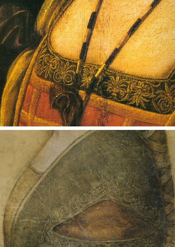
Above, Top, Fig. 8: Leonardo’s La Belle Ferronnière, left, and the “La Bella Principessa”.
Above, Fig. 9: Details of Leonardo’s La Belle Ferronnière, left, and the “La Bella Principessa”.
Kemp insists: “The Lady in profile [“La Bella Principessa”] is an important addition to Leonardo’s canon. It shows him utilizing a medium that has not previously been observed in his oeuvre…It testifies to his spectacular explosion and development of novel media, tackling each commission as a fresh technical challenge. It enriches our insights into his role at the Milanese court, most notably in his depiction of the Sforza ‘ladies’ – whether family members or mistresses. Above all, it is a work of extraordinary beauty.”
Even if we were to assume that for some reason Leonardo had opted to “revert” in 1496 to a type he had never employed, what might explain a pronounced indifference in “La Bella Principessa” to the detailed depiction of the “stuffs” of costume with which the artist was simultaneously engaged in La Belle Ferronnière? Given that Leonardo clearly appreciated and celebrated the fact that courtly costume required sleeves to be made as independent garments held decorously in place by ribbon bows so as to permit undergarments to peep through; and, given that Leonardo lovingly depicted not only the varying thicknesses of the costume materials but every individual twist in the threads of the elaborately embroidered band in La Belle Ferronnière, how could he possibly – when working for same ducal master, at the same time – have been so negligent and indifferent in the execution of “La Bella Principessa’s” costume? Kemp acknowledges and offers excuse for the distinct poverty of the costume: “It may be that the restraint of her costume and lack of celebratory jewellery indicates that the portrait was destined for a memorial rather than a matrimonial volume.” In so-saying, he jumps out of one frying pan into another.
If “La Bella Principessa” was made after Bianca Sforza’s death, from whence did the likeness derive? One reason why Kemp settled on Bianca as the preferred candidate subject for “La Bella Principessa” was that while (disqualifying) likenesses of the other Sforza princesses existed, none survives for her – she is an image-free figure. Kemp offers no indication of a possible means for Leonardo’s (hypothesised) post-death conjuring of Bianca’s supposed likeness other than to claim that “Leonardo has evoked the sitter’s living presence with an uncanny sense of vitality.” This again begs the crucial question and fails to consider any alternative explanations for the image’s qualities. (We will be showing how the profile of “La Bella Principessa” could well have been a “portmanteau” composite image assembled from one particular work of Leonardo’s and from that of another, unrelated painter.)
The most strikingly “Leonardesque” feature on the costume of “La Bella Principessa” – the knot patterning around the (implausible) triangular slash in the outer garment – is a source of further concern and constitutes evidence of forgery. First, the motif on which much effort will have been expended, is brutally cropped along the bottom edge of the sheet, as if by a careless designer laying a photograph into a book. Why would any Renaissance artist, let alone Leonardo, design a complicated feature so as to “run it off the page”? Further, the illusion of form (created by lights and shades) in the patterning is feeble in the extreme for Leonardo – as when compared with his treament of relief seen in the above embroidered passage in La Belle Ferronnière, for example. Leonardo probably better understood than any artist in history the vital connection between a thing made and a thing depicted. He took bodies and organs apart to understand their construction and he sought to create mental models that would make the otherwise terrifyingly arbitrary and capricious forces of nature graspable if not checkable. Most seriously of all, as our colleague Kasia Pisarek has noted and reported, while the patterning present on “La Bella Principessa” matches none found in any work of Leonardo’s, it more closely matches that found in a carved marble bust by Gian Cristoforo Romano in the Louvre – see “La Bella Principessa – Arguments against the Attribution to Leonardo”, Kasia Pisarek, artibus et historiae, no. 71, 2015. (To receive a pdf of Dr Pisarek’s article please write to: news.artwatchuk@gmail.com )
Michael Daley, 24 February 2012.
In Parts II and III we examine: the provenance of “La Bella Principessa” and the work’s problematic emergence from within the circle of Bernard Berenson; the claim by the forger Shaun Greenhalgh to have produced “La Bella Principessa” in Britain in the 1970s; the spurious “left-handed-ness” of “La Bella Principessa” and the low quality of, and the means by which the drawing was made…
Connoisseurship in Action and in Peril
“WHEN THE FIRST catalogue of the Ashmolean Museum’s Sculpture collection (in three volumes) was undertaken more than twenty-five years ago, the present author decided to exclude works made before 1540…”
“…The decision was partly determined by the quantity of the material but also in recognition of the special attention that the finest of the small bronzes given and bequeathed by Charles Drury Fortnum deserved. It is indeed because of these that the Ashmolean’s sculpture collection is the most important in the United Kingdom after that of the Victoria and Albert Museum, London…”
Above and below: The ‘Fortnum Venus’, attributed to Francesco Francia or his circle. c. 1500-05. Bronze, 26.1 cm. high. (Ashmolean Museum, Oxford).
Above, detail of St Jerome, by Cosimo Tura. c.1470. Panel, 101 by 57.2 cm. (National Gallery, London).
“The first of Jeremy Warren’s three volumes under review here includes these very figures. One of them is the
exquisite Venus associated with the Bolognese painter and goldsmith Francesco Francia (cat. No.20). It is one of the earliest responses in the Renaissance to the antique female nude, and perhaps belonged to a narrative group for, as her drapery falls, her hand is cupped as if to receive the apple from Paris…”
“…In conclusion it should be noted that the cataloguing of the permanent collection is not now often considered an essential part of the curator’s job. Any museum director who is chiefly an impresario is inevitably attentive to fashionable ideas and taste, whereas the cataloguer of a permanent collection is bound to give his or her attention to neglected artists, and to works by artists in which they are not initially interested, but which beg the question as to why the appealed to their predecessors – collectors, scholars and curators long deceased. This provides an antidote not only to the narrow outlook of the popular exhibition machine, but to that of academic institutions where scholars, having achieved promotion by imitating their seniors, are obliged to compete in appealing to the young consumers upon
whose favour the prosperity of the institution depends.”
~ NICHOLAS PENNY: “Sculpture in the Ashmolean”, Burlington Magazine, January 2016. A review of Catalogue: Medieval and Renaissance Sculpture. A Catalogue of the Collection in the Ashmolean Museum, by JEREMY WARREN, 3 vols., continuously paginated, 1188 pp. incl. numerous col. + b. & w. ills. (Ashmolean Publications, Oxford, 2014, £395.)
“FIVE NEW YEAR BLOCKBUSTERS
“It’s a new dawn, it’s a new day… what new art exhibitions will make you feel good? Read our list of the top five shows opening this season to get inspired.
“Discover the enduring impact of Botticelli and Delacroix on the art world and prepare to be star struck at exhibitions celebrating 100 years of British Vogue and the incredible beauty of our Solar System.
“Need a second opinion? Watch art historian Jacky Klein’s guide to the season’s unmissable art exhibitions.”
~ THE ART FUND, a mailing, 8 December 2016.
PERMANENT EVOLUTION – A JOB FOR LIFE
“Museums have become places where we take part in social as well as learning activity. It is easy to be cynical about
the impact of the café, restaurant or shop spaces on the culture and character of museums, but such facilities have made museums less daunting, more welcoming and more open to general visitors. However, such [democratization] needs to go deeper than the provision of opportunities to purchase or to consume.”
NICHOLAS SEROTA, the director (- since 1988) of the Tate, at the Leeum Samsung Museum of Art in Seoul.
HOW ART HISTORIANS CAN BE FOOLED BY CONDITION
“One of the most influential books in the twentieth-century art history was Erwin Panofsky’s Studies in Iconology. In this seminal work, the very latest German approaches and method were presented to an Anglo-Saxon audience for the first time. One of the dazzlingly learned chapters was devoted to the figure of Cupid wearing a blindfold, and Panofsky showed how this theme could be traced back to the writings of the medieval moralists. For thinkers of this Christian stamp, lovers were metaphorically blind, since they were ‘without judgement or discrimination and guided by mere passion’. But later, in the Renaissance, ‘moralists and and humanists with Platonizing leanings’ contrasted the figure of the blindfold Cupid with another kind of…”
~ PAUL TAYLOR. Introduction, CONDITION The Ageing of Art, Paul Holberton Publishing, 2016. ISBN 978 1 907372 79 7
Illustration: Jean-Auguste-Dominique Ingres, The Composer Luigi Cherubini with the Muse of Lyric Poetry, 1842, detail.
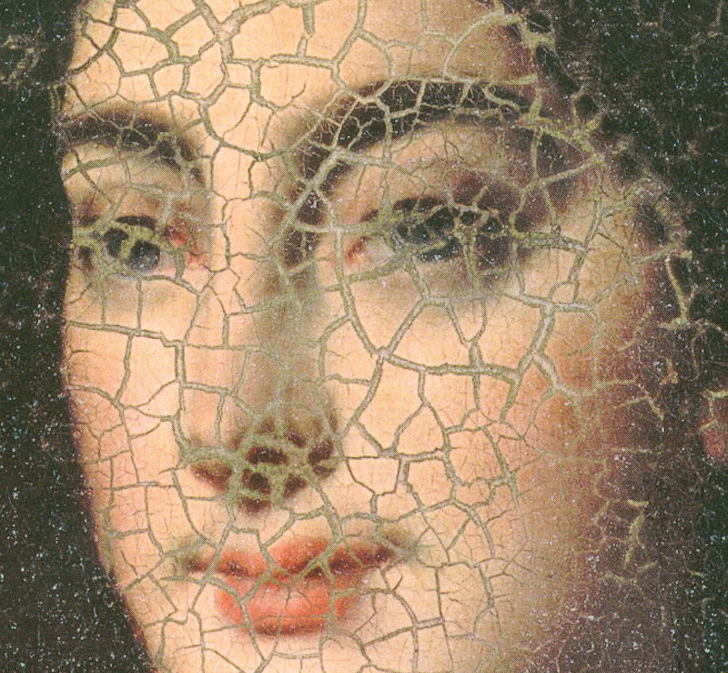
“…Although Bode was extremely learned in many branches of art history and had his information always ready – he had little need of written notes and photographs – he was no scholar in the true sense. He was more fond of action than reflection, and was far from having a just and objective mind. Moreover, the distracting practice of uninterrupted daily work hindered a comprehensive synthesis of realization. The deepest motive of the scholar, namely, disinterested love of truth, could not function productively in a nature always resolutely aiming for effectiveness and visible results. Bode was utterly unphilosophical, he considered no affair from more than one side. He saw black or white, good or bad, advantageous or inimical; he knew no intermediary steps. To forsee obstacles, to fear, to guard against them was not his way. Consequently he became angry as soon as he encountered opposition. He made more mistakes by acting than by failing to act. He was a hunter, not an angler.”
~ Max J. Friedländer – Reminiscences and Reflections, Edited from the literary remains and with a foreword by
Rudolf M. Heilbrunn, 1969, New York.
“…Anyway, getting back to the book that was sent to me, its title was rather grand and pompous: La bella Principessa – the beautiful princess. Or, as I knew her, ‘Bossy Sally from the Co-op’. I’m a bit unsure of how to talk of this because the book was written by an eminent Oxford professor and must have been quite an effort. I don’t want to ruffle any feathers or cause problems but I nearly swallowed my tongue on reading its supposed value – £150 million! It would be crazy for a public body to pay such a sum. So I feel the need to say something about it.
“The drawing is thought by some to be a work by Leonardo da Vinci, but it does divide opinion and it wasn’t included in the National Gallery’s Leonardo show of 2011, a show which I thought was really well done except for it being staged ‘underground’ in the Sainsbury Wing basement…
“I drew this picture in 1978…It was done on vellum, quite a large piece to find unfolded and without crease lines. I did it on vellum because at that time I couldn’t make old paper yet…The first thing I had to do was sand off the writing with 600-grit wet and dry paper. That done, it looked too new for anything old to look right on it, so I turned it over and did the drawing on the other side. That is why the drawing is done on the hair side of the vellum instead of the much-preferred ‘flesh side’. The texture of the sanding should still seen on its reverse.
“As I said, the face is of 1970s vintage, and I think that shows in the drawing…The drawings of Leonardo and Holbein especially have always impressed me with their fineness of line and detail, and in my view they must have been done under some magnification…The vellum is mounted on an oak board…before drawing on it, the vellum was stuck to the backboard with cabinet maker’s pearl glue, so it needed to be under a weighted press for a while to allow the glue to go off without ‘cockling’ the vellum. ‘Cockling’ is the effect you see on paper when you try to paint a watercolour without soaking and stretching the paper first. On vellum the dampness looks like blisters or a cockle bed on the shore. It’s caused by the water content of the glue, so the thing needs to be under a heavy press to dry it flat.
“After a bit of experimentation, and just to prove a point to myself, I lightly traced the drawing I’d invented onto the vellum (I’m sure the graphite can still be detected) and started to draw the image in hard black chalk – carbon black in gum arabic – using a pair of jeweller’s magnifying glasses. It took some time to get used to working like that, and I had to go to back to practising on papper for a while so as not to bugger things up…
“It was done in just three colours – black white and red – all earth pigments based in gum arabic, with the carbon black mostly gone over with oak gall ink. To be a bit Leonardo-like or even Holbein-like – they were both left-handers – I put in a left-hander’s slant to it…The Leonardo book [“La Bella Principessa ~ The Story of the New Masterpiece by Leonardo da Vinci”, By Martin Kemp and Pascal Cotte, with contributions by Claudio Strinati, Nicholas Turner and Peter Paul Biro] seems to put great store by the apparent leftyness of the drawing, but it can be shown up very easily. With the face on the vellum facing left, just turn the drawing clockwise to face her skyward, and hatch strokes from profile outwards in the normal manner…Incidentally, the book points out a palm print on the neck area, just the spot a right-hander doing an impersonation of a left-hander might rest their hand whilst doing the background hatching.
“Although I am no Oxford professor, I could list umpteen reasons for not thinking this drawing to be by leonardo…
The book mentions several holes on one margin as evidence that it has been bound into a volume, and also mentions some later ‘restoration’. I did not do these things, and don’t know who did, or where it went on its later travels. Looking closely at the picture in the book, it looks to have had the left margin peeled back an inch or so and has been restuck, not very well, especially at the bottom left. Could this be from when the left margin was pierced and roughly re-cut by someone else?
“I sold it for less than the effort that went into it to a dealer in Harrogate in late 1978 – not as a fake, or by ever claiming it was something it wasn’t. I can’t really say any more on it. At least it may now be known for what it is.”
~ SHAUN GREENHALGH – A Forger’s Tale, Published by ZCZ Editions in 2015
In the past it was customary for scholars to advance claims of attribution for particular works of art in scholarly journals and then wait to see how peers and colleagues responded to their evidence and arguments. Increasingly, we are seeing co-ordinated promotional campaigns of advocacy by players and owners who eschew venues of debate and sometimes denigrate sceptics and opponents. We invited two of the leading advocates of “La Bella Principessa’s” Leonardo’s authorship – Martin Kemp and Nicholas Turner – to speak at our recent conference on connoisseurship. Both declined. Neither our post of January 2014 (“Art’s Toxic Assets and a Crisis of Connoisseurship ~ Part II: Paper – sometimes photographic – Fakes and the Demise of the Educated Eye”) nor our colleague Kasia Pisarek’s article “La Bella Principessa: Arguments against the attribution to Leonardo” that was published in the June 2015 issue of the scholarly journal artibus et historiae have been challenged in print.
(For a pdf copy of Kasia Pisarek’s article, please write to: news.artwatchuk@gmail.com. For our conference, see Art, Law and Crises of Connoisseurship and Recap of Art, Law and Crisis of Connoisseurship Conference.)
The da Vinci Detective: Art Historian Martin Kemp on Rediscovering Leonardo’s Tragic Portrait of a Renaissance Princess – an ARTINFO Interview by Andrew M. Goldstein, 17 October 2011. Extracts:
…[Andrew Goldstein] “They weren’t the only ones to differ on the attribution of the painting, and when you first announced that you believed it to be a Leonardo, a lot of people disagreed. One museum director even told the Telegraph’s Richard Dorment, anonymously, that it was a “screaming 20th century fake, and not even close to Leonardo himself.” Has there been any reversal since then?
[Martin Kemp] “I don’t know who this anonymous person was, but we carbon-dated the parchment and that eliminates it from being a screaming modern forgery. If it were a forgery, it used things that we’ve only recently discovered about Leonardo’s technique in the last 20, 30 years. The fact that it was owned by Giannino Marchig takes it outside the period when it could be a forgery, knowing what we know now, so that’s not an option. The ultra-violet turns up retouching, and it’s very clear it has been heavily restored, but most objects 500 years old, including the “Salvator Mundi”, which is the new picture being shown in the National Gallery.
[…] “One thing that critics of your ‘Principessa’ attribution tend to bring up is the involvement in your research of Peter Paul Biro, a fingerprint expert whose credibility was questioned. What is your opinion of him?
“Well, Biro I knew of as someone who’d specialized in fingerprints and paintings, so we asked him to look at the fingerprint that is in the upper left side of the ‘Bella Principessa.’ I had data on finger prints and finger marks in other Leonardo paintings, and he said one of these matched – not astoundingly, because it’s just the tip of a finger, and one doesn’t rely on fingerprints on vellum. It wouldn’t convict anybody in a court of law. You need more than that. So he did a limited job here, and we didn’t depend too much on that evidence. The press liked it, of course because it was cops and robbers stuff.
“I would not now probably say much about it at all, because on reflection I don’t think we have an adequate reference bank of Leonardo fingerprints. I’ve talked to fingerprint specialists, and they typically require a full set of reference prints. We don’t have that for Leonardo. My sense is – and this is Pascal’s sense, too – that it’s probably premature, given what we know about Leonardo’s fingerprints, to come up with matches at all. But the job Biro did was perfectly straightforward. There were no grounds for dishonesty. Peter Paul Biro is suing the New Yorker*, but I can’t comment at all upon the court case because that’s about things that I know nothing about, so it’d be totally improper. But he did work for us, which I now, let’s say, place less reliance on, simply because, on reflection, I think the fingerprint evidence is rather slippery.
“Because of the work you have done to bring the ‘Principessa’ into the fold of acknowledged Leonardos, some say you have crossed from the realm of scholarship to something more like advocacy. How do you explain your passion for the portrait?
“I would say that one of the differences between being a historian of art and being a scientist, as I was trained, is that you’re dealing with objects that are deliberately communicating with something other than just our intellect. So, for me, it’s not a dry process. You begin with the feeling it’s special, and if it stands up to the research, you end with the feeling that it’s special, and I make no apology for that. I’ve been critized as acting as an advocate for it, but if I’m writing, as I am in ‘Christ to Coke’, about the ‘Mona Lisa’, I’m an advocate for that too, because it’s a miraculous picture. Also, when I’m writing about the Coke bottle, I’m not an advocate for Coke as a drink. I hate it. But it’s one of the all-time great
bits of product design and I’m happy to say that.”
“*THE MARK OF A MASTERPIECE” by David Grann, The New Yorker, 12 July 2010 ~ Extracts:
[1] “But he [Martin Kemp] also relies on a more primal force. ‘The initial thing is just that immediate reaction, as when we’re recognizing the face of a friend in a crowd,’ he explains. ‘You can go on later and say “I recognize her face because the eyebrows are like this, and that is the right colour of her hair,” but, in effect, we don’t do it like that. It’s
the totality of the thing. It feels instantaneous.'”
[2] “Moreover, according to [the curator of Drawings at the Metropolitan Museum of Art, Carmen] Bambach, there was a more profound problem: after studying an image of the drawing [La Bella Principessa] – the same costume, the same features, the same strokes that Kemp examined – she had her own strong intuition. ‘It does not look like a Leonardo’, she said.”
[3] “When such a schism emerges among the most respected connoisseurs, a painting is often cast into purgatory. But in January, 2009, Kemp turned to a Canadian forensic art expert named Peter Paul Biro who, during the past several years has pioneered a radical new approach to authenticating pictures. He does not merely try to detect the artist’s invisible hand; he scours a painting for the artist’s fingerprints, impressed in the paint on the canvas. Treating each painting as a crime scene, in which an artist has left behind traces of evidence, Biro has tried to render objective what has historically been subjective. In the process he has shaken the priesthood of connoisseurship, raising questions about the nature of art, about the commodification of aesthetic beauty, about the very legitimacy of the art world.Biro’s research seems to confirm what many people have long suspected: that the system of authenticating art works can be arbitrary and, at times, a fraud.”
[4] “Biro asserted that he had uncovered the painting’s ‘forensic provenance,’ telling a reporter, ‘The science of fingerprint identification is a true science. There are no gray areas.’ Having developed what he advertised as a ‘rigorous methodology’ that followed ‘accepted police standards,’ he began to devote part of the family business to authenticating works of art with fingerprints—or, as he liked to say, to ‘placing an artist at the scene of the creation of a work.'”
[5] “But the International Foundation for Art Research, a nonprofit organization that is the primary authenticator of Pollock’s works, balked, saying that Biro’s method was not yet ‘universally’ accepted.
[6] “In 2009, Biro and Nicholas Eastaugh, a scientist known for his expertise on pigments, formed a company, Art Access and Research, which analyzes and authenticates paintings. Biro is its director of forensic studies. Clients include museums, private galleries, corporations, dealers, and major auction houses such as Sotheby’s. Biro was also enlisted by the Pigmentum Project, which is affiliated with Oxford University.”
[7] “Biro told me that the divide between connoisseurs and scientists was finally eroding. The best demonstration of this change, he added, was the fact that he had been commissioned to examine ‘La Bella Principessa’ and, possibly, help make one of the greatest discoveries in the history of art.”
[8] “After he first revealed his findings, last October, a prominent dealer estimated that the drawing [‘La Bella Principessa’] could be worth a hundred and fifty million dollars. (The unnamed ‘lady’ who had sold it at Christie’s for less than twenty-two thousand dollars came forward and identified herself as Jeanne Marchig, a Swedish animal-rights activist. Citing, among other things, the fingerprint evidence, she sued the auction house for ‘negligence’ and ‘breach of warranty’ for failing to attribute the drawing correctly.)”
[9] “Ellen Landau, the art historian, said that she was ‘absolutely convinced’ that the paintings were by Pollock. Biro was sent a photograph of a fingerprint impressed on the front of one picture. He identified six characteristics that corresponded with the fingerprint on the paint can in Pollock’s studio—strong evidence that the work was by Pollock. But, as more and more connoisseurs weighed in, they noticed patterns that seemed at odds with Pollock’s style. Meanwhile, in sixteen of twenty art works submitted for analysis, forensic scientists discovered pigments that were not patented until after Pollock’s death, in 1956. At a symposium three years ago, Pollock experts all but ruled out the pictures. Ronald D. Spencer, a lawyer who represents the Pollock-Krasner Foundation, told me, ‘Biro can find all the fingerprints he wants. But, in terms of the marketplace, the Matter paintings are done. They are finished.'”
[10] “Reporters work, in many ways, like authenticators. We encounter people, form intuitions about them, and then attempt to verify these impressions. I began to review Biro’s story; I spoke again with people I had already interviewed, and tracked down other associates. A woman who had once known him well told me, ‘Look deeper into his past. Look at his family business.’ As I probed further, I discovered an underpainting that I had never imagined.”
[11] “During the eighties and early nineties, more than a dozen civil lawsuits had been filed against Peter Paul Biro, his brother, his father, or their art businesses. Many of them stemmed from unpaid creditors. An owner of a picture-frame company alleged that the Biros had issued checks that bounced and had operated ‘under the cover’ of defunct companies ‘with the clear aim of confusing their creditors.’ (The matter was settled out of court.) As I sifted through the files, I found other cases that raised fundamental questions about Peter Paul Biro’s work as a restorer and an art dealer.
[12] “Biro refused, multiple times, to divulge where he had obtained either of the paintings. According to the Wises, Biro insisted that the person who sold him the paintings was in Europe, and that it was impossible to contact him.
[13] “Sand sought proof of a financial transaction—a check or a credit-card payment—between Biro and Pap. Biro, however, said that he had obtained them in exchange for two musical instruments: a Steinway piano and a cello.
[14] “Sand was incredulous: ‘Is Mr. Pap a music dealer or is he an art dealer?’ After Biro could not recall where he had originally purchased the cello, Sand suddenly asked him, ‘You ever been convicted of a criminal offense, sir?’
‘No.’
‘You are certain of that?’
‘Yes,’ Biro said.”
[15] “Throughout the trial, the Biros and their attorneys maintained that the two paintings sold to the Wises were authentic, but to make their case they presented an art expert who was not a specialist on Roberts, or even on Canadian art. On September 3, 1986, the court found in favor of the Wises, and ordered Peter Paul and Geza Biro to pay them the seventeen thousand dollars they had spent on the pictures, as well as interest.”
[16] “Lawsuits had piled up against Peter Paul Biro and his family business. In two instances, there were allegations that art works had vanished under mysterious circumstances while in the care of Peter Paul. In one of the cases, Serge Joyal, who is now a senator in Canada, told me that he left a nineteenth-century drawing with the Biros to be restored. Before he could pick it up, Peter Paul notified him that it had been stolen from his car and that there was no insurance. Biro, however, never filed a police report, and Joyal says that Biro pleaded with him to wait before going to the authorities. During their conversations, Joyal says, Peter Paul acted evasive and suspicious, and Joyal became convinced that Biro was lying about the theft. As Joyal put it, ‘There was something fishy.’ Though Peter Paul said that there was nothing ‘suspect’ about his behavior, and that he should not be held liable, the court awarded Joyal seven thousand dollars, plus interest.”
[17] “Within Montreal’s small art world, there were whispers about Peter Paul Biro and his father. But the lawsuits appear to have attracted virtually no public attention. In 1993, Peter Paul Biro filed for bankruptcy, and he never paid many of the judgments against him, including what he owed the Wises and Joyal. Lipsz’s lawyer said of Biro, ‘He oiled his way out of that whole thing. . . . He got away scot-free.'”
[18] “Biro was part of an effort to launch a venture named Provenance, which would provide, as he put it, the ‘clever strategy’ necessary to sell ‘orphaned’ paintings for tens of millions of dollars. According to a business prospectus, marked confidential, Provenance would acquire art works that had been forensically validated by Biro and several colleagues, and sell them in a gallery in New York City. The company chose a thumbprint for a logo.”
[19] “Provenance was cleverly tapping into the public’s desire to crack open the art world, offering the tantalizing dream that anyone could find a Pollock or a Leonardo or a Turner languishing in a basement or a thrift shop. The company combined the forensic triumphalism of ‘C.S.I.’ with the lottery ethos of ‘Antiques Roadshow.’ (An associate producer at ‘Roadshow’ had already sent Biro an e-mail about possibly doing a segment on the Parkers’ ‘unbelievable discovery.’)
[20] “Biro previously had been suspected of creating an investment scheme around a seemingly precious object, with the promise that it would eventually reap huge profits. In the late nineteen-nineties, he persuaded a Canadian financial adviser, Richard Lafferty, who is now dead, to invest in a venture to authenticate and sell a work purportedly by Raphael’s disciple Perino del Vaga. Three of Lafferty’s colleagues confirm the story, as do letters, memorandums, and other documents.”
[21] “By the fall of 2005, Ken Parker had begun to look into the people behind Provenance. It turned out that Tod Volpe, in the nineties, had defrauded his art clients, including Jack Nicholson, of nearly two million dollars, and had served two years in prison. Parker discovered that one of Volpe’s principal partners in Provenance was also an ex-con, who had done time for tax evasion and for running a drug-smuggling operation in the United States. (Volpe told me, ‘We all have skeletons in our past.’) Parker confronted Biro, who, in a subsequent e-mail, told Parker that he had ‘severed all communication with Volpe.’”
[22] “And only months after rescinding his request for money he asked the Parkers to fund another new project: a privately endowed department for him and a colleague at Oxford University. ‘Naturally it is 100% tax deductible,’ Biro wrote, in an e-mail. ‘Those who support the foundation of a bold and new department for us at Oxford will have their name on a plaque or have the department named after them such as “The Ken Parker Department for Forensic Art History.” Sounds cool?'”
[23] “When a forgery is exposed, people in the art world generally have the same reaction: how could anyone have ever been fooled by something so obviously phony, so artless? Few connoisseurs still think that Han van Meegeren’s paintings look at all like Vermeers, or even have any artistic value. Forgers usually succeed not because they are so talented but, rather, because they provide, at a moment in time, exactly what others desperately want to see. Conjurers as much as copyists, they fulfill a wish or a fantasy. And so the inconsistencies—crooked signatures, uncharacteristic brushstrokes—are ignored or explained away. “
[24] “In the case of ‘La Bella Principessa,’ Biro did not handle the drawing, and was sent multispectral images from another laboratory, which he then developed and enhanced. Martin Kemp, the Leonardo scholar, told me, ‘In terms of what Biro did for us, I have absolutely no problems with any potential ethical issues.’ He emphasized that his opinion of the drawing did not depend on the fingerprint evidence: ‘I’m entirely confident that it is by Leonardo.'”
[25] “A final verdict on whether ‘La Bella Principessa’ is genuine may not be reached for years, but more and more connoisseurs have voiced doubts. Skeptics express surprise that there is no apparent historical record for the drawing, given that Leonardo was one of Italy’s most famous painters during the Renaissance. They note that vellum lasts for centuries, and that it would be easy for a forger to obtain old sheets. Many of the critics share the view of the Met’s Carmen Bambach: it just doesn’t look like a Leonardo. ARTnews, which has reported on Wertheim’s findings, recently interviewed Klaus Albrecht Schröder, the director of the Albertina Museum, in Vienna. ‘No one is convinced it is a Leonardo,’ he said. David Ekserdjian, an expert on sixteenth-century Italian drawings, wrote in The Burlington Magazine that he ‘strongly suspects’ it is a ‘counterfeit.’ Other art critics have suggested that Kemp has succumbed to a fantasy.
[26] “Whereas Biro had once spoken of the absolute objectivity and infallibility of fingerprint analysis, he now sounded more like a connoisseur than like a scientist. ‘I’m trying to define, for example, what is the point that something becomes a matter of interpretation,’ he said. ‘In other words, where is that line? O.K., on the one hand, fingerprint practitioners state that fingerprint identification is a science. I’m more toward the other side, where I’m convinced by my own personal experience that it is very much like connoisseurship, because of . . . things I see they don’t.’”
[27] “I asked him whether he might have been wrong in suggesting that Leonardo had ever touched ‘La Bella Principessa.’ He looked up at the sky and said, ‘It’s possible. Yes.’”
In July 2011 ADWEEK reported that Biro had sued The New Yorker and David Grann for $2 million on twenty-four charges of false and malicious defamation – Forensic Art Expert Peter Paul Biro Sues New Yorker for Deformation. The action failed on every count (see “Art Authenticator Loses Defamation Suit Against The New Yorker“).
CODA: Faking A Picasso and a Provenance
In June last year, we and Martin Kemp were asked (separately) by the Daily Mail to comment on a claimed Picasso painting that supposedly had been found by an artist among his late mother’s belongings in an old suitcase in the loft – “Is this a long-lost Picasso? Painting that bears a strong resemblance to Cubist’s work is discovered rolled up in a battered suitcase that hasn’t been touched in 50 years” – the Mail reported:
“…Last month, a 1955 Picasso painting – Les Femmes d’Alger – broke auction records when it sold at Christie’s for a staggering £115 million.
“Art expert Michael Daley told MailOnline his first instinct was that the painting was not a Picasso. ‘The colours and all of that are right but I think there is too much incidental detail and not enough decisive interest or exploration. This is
all sharp edges and brown tones and what-have-you, but it doesn’t have the driving sense of Picasso getting at something, getting at a figure trying to see something about it. This is more decorative. It can be no more than an instinctive first impression, but to me it doesn’t look like a Picasso Cubist painting from that period.’
“Martin Kemp, emeritus professor of art history at Oxford University, was also skeptical. Prof Kemp said: ‘It’s pretty close to Picasso’s portrait of Daniel-Henry Kahnweiler, the dealer whom he painted in 1910 and is in the Art Institute of Chicago. This looks to be a relatively competent but not excellent near copy of it – the signature is very dodgy. Without doing a full art historical analysis – and I’m not a Picasso expert – I would say someone has made a variant of the Picasso portrait. Also the signature with the rounded S’s doesn’t seem to correspond to Picasso’s way of signing and thirdly the canvas doesn’t look quite right for Picasso of that period.
But I hope for the sake of the owner that I’m wrong.'”
On 6 July 2015 The Scotsman disclosed that the discovered ‘Picasso’ was a fake (“Picasso painting in Fife attic ‘a hoax’”). The faker, Dominic Currie, reportedly described his purported-Picasso (which had been about to be inspected by Christie’s) as “a piece of performance art [made] in order to raise awareness of the struggling artists in Scotland.” The fake is now being offered for sale on the website of a picture restoration business.
Michael Daley. 10 December 2016.
12 December 2016. Postscript: “Bode gave an opinion on art works from many fields, on Netherlandish painting of the seventeenth century, on Italian sculpture, Persian rugs, majolica, German wood sculpture, and many other things. His writings were for him always a means to an end, and were frequently controversial and advocatory. Almost always he judged correctly, and at the time he expressed them, his communications were of significance and infinitely enriched knowledge in many fields. But the tragic fate of the ‘connoisseur’ lies in the fact that yesterday’s new, strikingly accurate definitions are today’s common properties and banalities, that only the mistakes linger in the memory under the name of the originator.”
~ Max J. Friedländer on Wilhelm Bode – Reminiscences and Reflections.
Art, Law and Crises of Connoisseurship
Connoisseurship may be defined as expertise in art in the very narrowest of senses; surprisingly, however, it is also a definition in which many different disciplines intersect.
In the public realms of law and the art world, a ‘connoisseur’ must be recognized as being an expert, as being capable of giving credible testimony regarding the subject, and as remaining actively engaged with the world in which attributions and authentications are made. This public recognition takes years of work and is hard-won.
Yet, does this public recognition of expertise signify accuracy or truth in the claims that a connoisseur makes about art? This one-day conference investigates the always-interrelated and often mutually-troubled processes by which connoisseurship is constructed in the fields of art and law, and the ways in which these different fields come together in determining the scope and clarity of the connoisseur’s ‘eye’.
“Art, Law and Crises of Connoisseurship”
A conference organized by ArtWatch UK, the Center for Art Law (USA) and the LSE Cultural Heritage Law (UK), to be held at: The Society of Antiquaries of London, Burlington House, Piccadilly, London W1J 0BE – all inquiries to: artwatch.uk@gmail.com.
1 December 2015 from 08:30 to 19:30 (GMT)
London, United Kingdom
For full conference programme, see below.
Admission is by ticket only.
For ticket prices and to purchase tickets (exclusively through Eventbrite ), please click on: Art, Law and Crises of Connoisseurship
PROGRAMME
8.30 – 9.00: Registration
PART I: The Making of Art and the Power of Its Testimonies
9.00-25: Welcome and Keynote Paper: Michael Daley, “Like/Unlike; Interests/Disinterest”
Michael Daley (UK), Director, ArtWatch UK, an artist who trained for twelve years (with post-graduate studies at the Royal Academy Schools) and taught in art schools for fifteen years before practicing as an illustrator (principally with the Financial Times, the Times Supplements, the Independent and, presently, Standpoint magazine), will suggest that the principles of sound connoisseurship in making attributions and appraising restorations are implicit in fine art training and practice, and will discuss the trial in Italy of Professor James Beck on a charge of aggravated criminal slander brought in Italy by a restorer against the scholar but not against the newspapers which had carried his reported comments.
9.25-9.40: Euphrosyne Doxiadis, “Perception, Hype and the Rubens Police.”
Euphrosyne Doxiadis (Greece), a painter/scholar whose 1996 book The Mysterious Fayum Portraits: Faces from Ancient Egypt won the won the Prix Bordin, the Prix d’ ouvrage by the Académie des Beaux-Arts, Institut de France, and, the 1997 “Prize of the Athens Academy”, will challenge the Rubens attribution given to the National Gallery’s oil on panel Samson and Delilah in the 28th year of her researches. Astonished at her first sighting of this painting in the National Gallery, the author will discuss both its manifest artistic disqualifications and the edifice of support that surrounds an attribution first made in 1930 by a leading Rubens scholar who today is notorious for his many excessively-generous certificates of authenticity.
9.40-9.55: Jacques Franck, “Why the Mona Lisa would not survive modern day conservation treatment.”
Jacques Franck (FR), an art historian and a painter trained in Old Master techniques, is the Permanent Consulting Expert to The Armand Hammer Center for Leonardo Studies at The University of California, Los Angeles, with its European headquarters at the Centro Studi Leonardo da Vinci e il Rinascimento, Università degli Studi di Urbino, and an editorial consultant to Achademia Leonardi Vinci. He was a curator/exhibitor in the Uffizi’s exhibition La mente di Leonardo (2006) and will draw on experiences as an adviser to the Louvre’s restorations of Leonardo’s St Anne and Belle Ferronnière, and his current PhD investigations on Leonardo’s sfumato technique at the École Pratique des Hautes Études in Paris, to demonstrate the threats presently facing the Mona Lisa in a museum conservation system that he considers inadequate to preserve the masterpiece in the event of it being cleaned at the Louvre.
9.55-10.10: Ann Pizzorusso, “Leonardo’s Geology: The Authenticity of the Virgin of the Rocks”
Ann Pizzorusso (US) is a professional geologist and a Renaissance scholar whose work focuses on Leonardo da Vinci as a geologist. She has written numerous scholarly articles on Leonardo and his students, and the artists who preceded and followed him, analyzing the use of geology in their works. Her landmark article, “Leonardo’s Geology: The Authenticity of The Virgin of the Rocks” compared the two versions of the paintings. Demonstrating geology as a diagnostic tool – which was in fact Leonardo’s trademark – she will attribute only one of the two versions to Leonardo. Her new, four gold medals-winning book, Tweeting Da Vinci, discusses how the geology of Italy has influenced its art, literature, religion, medicine.
10.10-10.30: Discussion/Questions: – Irina Tarsis, Center for Art Law, Moderator
10.30-11.00: COFFEE
11.00-11:15: Segolene Bergeon-Langle, “Can science deliver its promises to art?”
Segolene Bergeon-Langle (FR), France’s Honorary General Curator of Heritage, is both a scientist and an art historian. A former Head of Painting Conservation in the Louvre and the French National Museums, and a former Chair of the ICCROM Council (Rome), she is presently a member of the Louvre’s preservation and conservation committee. She will discuss various restoration cases showing how scientific analysis can fail properly to understand painters’ techniques and the deterioration of paint layers when questions are inadequately framed or when the interpretation of scientific reports is inadequate. Such difficulties can be overcome when connoisseurs themselves ask for scientific analysis to clarify some problem they have encountered, or when they can examine technical reports together with their scientific partners so as to avoid otherwise possible misinterpretations.
11.15-11.30: Michel Favre-Felix, “Overlooked Witnesses: The Testimony of Copies”
Michel Favre-Felix (FR) is a painter, the president of ARIPA (association for the respect of the integrity of artistic heritage), the director of the review Nuances, and the 2009 recipient of the ArtWatch International Frank Mason Prize, will present two restoration cases, studied from the French Museums’ scientific files, illustrating how restorations fail by not heeding the testimony of historical copies. He will stress the importance of disciplined arguments and of expert guidance from art historians, in a critical approach, rather than as the endorsement of “discoveries” claimed during restorations by restorers. His cases will demonstrate how successive restorations can impose fresh and compounding misrepresentations on art when supposedly correcting previous errors.
11.30-11.45: Kasia Pisarek, “How reliable are today’s attributions in art? The case of “La Bella Principessa” examined.”
Kasia Pisarek (Poland/UK), an independent art historian and research specialist on attributions, took an MA at the Sorbonne and a PhD at the University of Warsaw. Her doctoral dissertation “Rubens and Connoisseurship ~ On the problems of attribution and rediscovery”, identified many recently fallen Rubens attributions. She will set out a number of interlocking aesthetic, art historical and technical arguments against the recently claimed attribution to Leonardo of the drawing “La Bella Principessa”, which work appeared anonymously and without provenance in New York in 1998. Her findings were published in the June 2015 Artibus et Historiae.
11.45-12.15: Discussion/Questions: Irina Tarsis, Center for Art Law, Moderator
12.15-1.15: LUNCH
Part II: Righting the Record – Diverse Experts as Authority
1.15-1.20: Introduction: Tatiana Flessas, Cultural Heritage Law, LSE Law, Moderator
1.20-1.35: Brian Allen — “Throwing the baby out with the bathwater – the Demise of Connoisseurship since the 1980s.”
Brian Allen (UK) is a former Director of Studies at the Paul Mellon Centre for Studies in British Art and is now Chairman of the London Old Master dealers Hazlitt Ltd. He will speak about the gradual demise of connoisseurship in academic art history (especially in the UK) over the past three decades and will consider the effect of this on the study of art history and the art market. Up to the early 1980s few questioned the importance for young art historians of acquiring the skills to determine authorship but as the discipline of art history evolved from its amateur roots in Britain so too did a determination to adopt the theoretical principles of other areas of study. Only now are we witnessing the consequences of this change of emphasis.
1.35-1.50: Peter Cannon-Brookes, “Reconciling Connoisseurship with Different Means of Production of Works of Art”
Peter Cannon-Brookes (UK) turned from natural sciences to art history and has been active as a museum curator with strong interests in conservation and security. Connoisseurship has been undermined by the decay of museum-based pre-Modern Movement scholarship leading to the growing corruption of reference collections and of connoisseurship enhanced by the detailed study of them. Can the systems of stylistic analysis evolved from the 1940s and social anthropology be reconciled with the actual processes of production of works of art throughout the ages? The business models adopted by Raphael, El Greco and Rubens are by no means exceptional, and the evident disdain of Rodin for those prepared to pay high prices for indifferent drawing-room marble versions of his compositions, encourage re-evaluation of connoisseurship as an essential tool.
1.50-2.05: Charles Hope, “Demotion and promotion: the asymmetrical aspect of connoisseurship”
Charles Hope (UK) is a former Director of the Warburg Institute and will discuss the tension that exists between connoisseurship as a type of expertise acquired by long experience and as an activity based on the use of historical evidence and reasoned argument. Will claim that, in practice, these two aspects are often in contradiction to one another, and that many connoisseurs have been unable or unwilling to provide clear arguments about how they have reached their opinions. Too often, judgements about authorship are decided by appeals to authority, and almost by vote, rather than by evidence.
2.05-2.20: Martin Eidelberg, “Fact vs. Interpretation: the Art Historian at Work”
Martin Eidelberg (US), professor emeritus of art history at Rutgers University, will discuss the reliability and fallibility of provenance and scientific analysis of pictures in determining the authenticity of paintings. Using case histories that he has gathered from his research in preparing a catalogue raisonné of the paintings of Jean Antoine Watteau (1684-1721), he will consider whether such supposedly factual data is reliable, or whether it is subjective and open to the interpretation of scholars.
2.20-2.40: Discussion/Questions: Tatiana Flessas, Cultural Heritage Law, LSE Law, Moderator
2.40-2.55: Robin Simon, “Owzat! The great cricket fakes operation”
Robin Simon (UK) is Editor of The British Art Journal and Honorary Professor of English, UCL. Recent books include Hogarth, France and British Art and (with Martin Postle) Richard Wilson and the Transformation of European Landscape Painting. He will report his discovery (in 1983) that many of the paintings depicting cricket in the MCC collection at Lord’s were fakes, most of them made by one person between 1918 and 1948 but purporting to date from the 16th century to the 20th. They had been presented to MCC by Sir Jeremiah Colman (of the mustard family) who acquired them from a variety of agents and dealers. It is quite a tale and turns, among other things, upon an ingenious manipulation of provenance.
2.55-3.10: Anne Laure Bandle, “Sleepers at auction: Boon or bane?”
Anne Laure Bandle (CH) is guest lecturer at the LSE, director of the Art Law Foundation, and a trainee lawyer at the law firm Froriep in Geneva. She wrote a PhD in law on the misattribution of art at auction and more specifically on the sale of sleepers. She will discuss the creation of sleepers at auction by means of different cases, and focus on the attribution process of auction houses and their liability when selling a sleeper.
3.10-3.25: Elizabeth Simpson, “Connoisseurship: Its Use, Disuse, and Misuse in the Study of Ancient Art”
Elizabeth Simpson (USA) is a professor at the Bard Graduate Center in New York, NY; a consulting scholar at the University of Pennsylvania Museum of Archaeology and Anthropology in Philadelphia, PA; and director of the project to study and conserve the collection of wooden objects excavated from the royal tumulus burials at Gordion, Turkey.She will address the use and misuse of connoisseurship in the study of ancient art, the scholarly and methodological divides between archaeology and art history, and the current trend away from connoisseurship in the study of ancient art and artifacts. She will also show how connoisseurship is used to fabricate narratives for looted objects in order to validate unprovenienced works in private and museum collections.
3.25-3.45: Round table discussion: Tatiana Flessas, Cultural Heritage Law, LSE Law, Moderator
3.45-4.15: TEA
Part III: Wishful Thinking, Scientific Evidence and Legal Precedent
4.15-4.20: Intro by Session Moderator, Charles Hope.
4:20-4.35: Irina Tarsis, “Reputation is no Substitute to Due Diligence: Lessons from the closure of the Knoedler Gallery (1857-2011) ”
Irina Tarsis (USA), is an art historian and an attorney based in Brooklyn, NY. Founder and Director of Center for Art Law, Ms. Tarsis is an author of multiple articles on the subject of restitution, provenance research, book history and copyright issues. With degrees in International Business, Art History and Law, in her practice Ms. Tarsis focuses on ownership disputes surrounding tangible and intangible property. She will discuss the history of the Knoedler Gallery that closed after more than 160 years in business having sold a cache of misattributed forgeries. Short of a dozen lawsuits were brought against the principles and staff of the Gallery for selling works attributed to the blue chip artists. Ms. Tarsis will discuss the responsibilities of dealers, collectors and art advisors to their clients and the scholarship when handling art in business transactions.
4:35-4.50: Nicholas Eastaugh, “The Challenge of Science: Does ‘Fine Art Forensics’ Really Exist?”
Dr Nicholas Eastaugh (UK), Founder/Director, Art Analysis and Research Ltd., London, originally trained as a physicist before going on to study conservation and art history at the Courtauld Institute of Art, London, where he completed a PhD in scientific analysis and documentary research of historical pigments in 1988. Since 1989 he has been a consultant in the scientific and art technological study of paint and paintings. A frequent lecturer, he is also a Visiting Research Fellow at the University of Oxford. In 1999 he co-founded the Pigmentum Project, an interdisciplinary research group developing comprehensive high-quality documentary and analytical data on historical pigments and other artists’ materials. This led to the publication of The Pigment Compendium in 2004, which quickly became a standard reference text in the field. In 2008 he identified the first of the forgeries to be recognised as by Wolfgang Beltracchi, the now infamous ‘Red Painting with Horses’.
4.50-5.05: Megan Noh, “Trends in Authentication Disputes”
Megan E. Noh (USA) is the Associate General Counsel of Bonhams, one of the world’s largest international auction houses. Based in the New York office, Ms. Noh practices in a global hub for art transactions, and is uniquely poised to observe the numerous transactions conducted by Bonhams which require its specialists’ assistance with the authentication process, as well as the growing body of caselaw and legislative efforts emerging from this key jurisdiction. Ms. Noh’s presentation will cover trends in authentication disputes, including the cessation of artists’ foundations and authentication boards to issue opinions confirming attribution, as well as increased litigation and reliance of parties on scientific evidence and testimony. She will also elucidate the position of auction houses as a liaisons or “middlemen” in this process, facilitating the flow of information as between collectors (sellers and buyers) and third party authenticators.
5.25-50: Final Discussion/Questions: Charles Hope, Moderator.
5.50-5.55: Closing Remarks: Irina Tarsis, Center for Art Law.
6.00-7.30: RECEPTION