
ArtWatch and the Death of the Independent
On 26 March 2016 the printed Independent newspapers died. As Michael Daley reports, it was a poignant moment for those like himself who were in at the Great Project’s beginning in 1986 and had experienced the rush of excitement as the new newspaper’s pioneering innovations rapidly achieved commercial success and professional acclaim.
The paths of the Independent and ArtWatch were cross-linked for over two decades. The Independent was launched in 1986 as a newspaper in which much had been rethought and with firm editorial convictions that there should be no “freebies” (copy produced in exchange for free holidays or such) and no sacred cows – least of all with the royal family. At that date, twenty years after the heroic rescue operations that followed the flooding of Florence, one of the most sacrosanct received wisdoms was that art restoration was a safe and miraculous means of rejuvenating old works of art. I had left the Financial Times to work as the Independent’s principal illustrator shortly before the launch.

Above, the first issue of the Independent which was published on 7 October 1986.
A CRITICAL REVERSAL
Today, criticisms of even the grandest restorations are commonplace and no longer prompt ridicule and abuse. To the contrary, it is now restorations that attract ridicule. (See “And the World’s Worst Restoration is…”) In the brain-stretching BBC2 television quiz show Only Connect, a recent winning answer was: “They are all paintings that have been ruined by restorers”. Strictly speaking as the host, Victoria Coren, advised (on legal advice no doubt ), the correct answer was: “They are all paintings that have been controversially restored”. Controversially for sure – all had been condemned on this site: the Monkey-faced Christ; the Louvre’s botched Veronese nose jobs; the reconfigured-little that survived the last restoration of Leonardo’s Last Supper (see below); and the “Disney-fied” repainting of an ancient Chinese mural. The Guardian now asks readers to submit photographs of the worst restorations they have witnessed: “Restoration disasters around the world: share your pictures and stories”. Auctioneers and dealers place premiums on little- or never-restored works, not vice versa. No one would dream of producing a television or radio series called “Your Hundred Best Restorations”. No one (“sleeper” hunters aside) would celebrate a many-times restored painting. How we got to this stage is a long story. The Independent’s contribution to it was crucial, honourable and is worthy of greater recognition.
NINE MEN, ONE WOMAN, AN EXECUTIVE CHAIR AND NO PROPRIETOR
On 7 October 1988, Campaign magazine observed and reported on the Independent’s workings and progress at the time of its second anniversary, by which date it had exceeded its initial target of 375,000 sales.
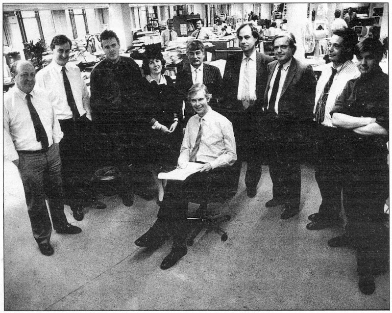
Above, from left to right: Jonathan Fenby, Home Editor; Chris McKane, Picture Editor; Charles Burgess, Sports Editor; Sarah Hogg, Business and City Editor; Peter Jenkins, Political Columnist; Andreas Whittam Smith, Editor; Stephen Glover, Foreign Editor; Alexander Chancellor, Magazine Editor; John Torode, Leader Writer; Tom Sutcliffe, Arts Editor. (Not present, Michael Crozier, Art Editor.)
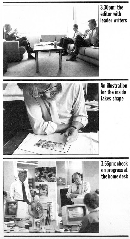
Below, Campaign’s photographer followed Andreas Whittam Smith’s day, showing here (top) a meeting with the leader writers, Roger Berthoud and John Torode; (centre), the principal illustrator, Michael Daley, at work; and, (bottom) with the home desk editor, Jonathan Fenby.
THE LOOK OF THE PAPER
The smart and distinctive look of the Independent contributed greatly to its initial success. Much as everyone in the city and business had felt impelled to sport the pink Financial Times, so everyone in advertising, design, architecture, photography and the visual arts seemed to have taken to the Independent. The newspaper – the first to exploit digital typesetting – was printed on good white paper that had little “show-through” from adjoining pages. By editorial requirement, its photography and graphics were distinctive and of high professional quality.
INNOVATIVE CONTENT
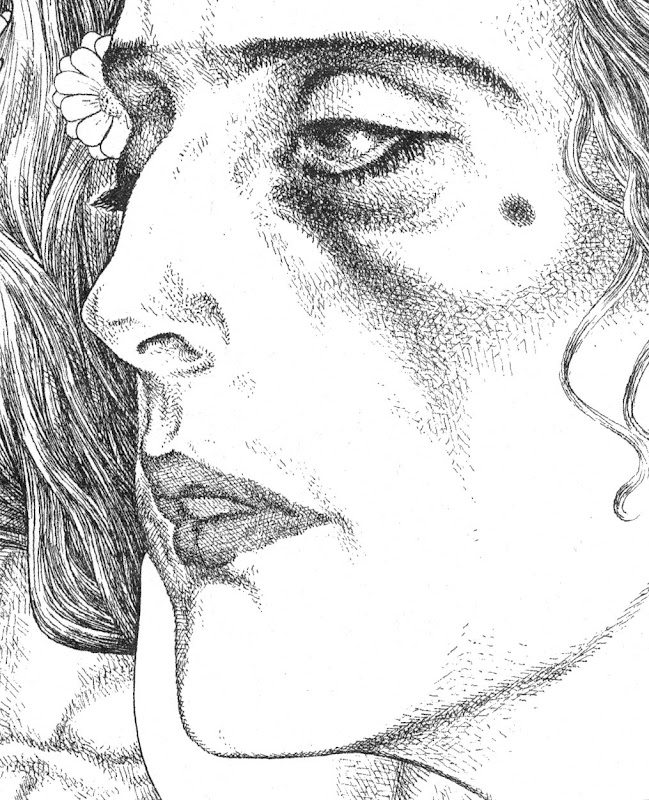
A journalistically novel and distinctive development on the paper had been a decision to expand and elevate the non-news, “features” sections, giving each a dedicated, professionally expert editor. In consequence I worked for sections as diverse as Law, Health, Food, Books, Gardening, Music, Wine, Architecture and so forth. For a fine art-trained illustrator, working with top calibre journalists (and an art editor who gave drawings due space and air) was a privileging and highly stimulating situation. The paper’s famous high-mindedness and unashamedly high-brow arts coverage, left one free to reference anything (including past art) that might best help illustrate pieces that ranged from, say, written evocations of the tastes and smells of food; cultural anxieties over decadence felt as the end of the century approached; and, acrimonious disputes of custody that sometimes arose when lesbian couples broke up after having had children by complicated paternity arrangements. Thus, by way of example, seven images:
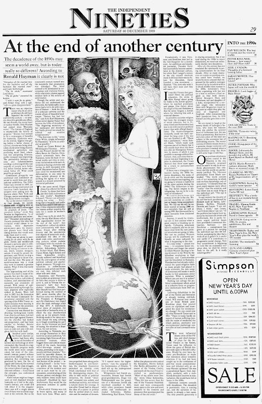


Above, seven drawings for the Independent, by Michael Daley.
THE GRAPHIC TECHNIQUE
If the conceptual challenges on the Independent were exhilarating, deadline pressures meant that there was rarely more than 24 hours from inception to delivery of a drawing. The ink drawing technique (which I had developed during the previous four years on the Financial Times and the Times’ educational supplements), aimed to exploit as much as possible the easy extremes of graphic art with solid blacks (quickly brushed) and pure whites (paper left bare). Between those polar graphic opposites, slow-to-realise shading was judiciously deployed with cross-hatched lines and stippled dots. To speed output, all preliminary drawing was made in pencil on the finished sheet and then directly inked over so that the sketching stage could be completely erased. I had come to recognise that a drawing for reproduction in a newspaper is not a thing-in-its-own-right but a piece of page furniture that must live variously with the “grey” of closely set print texts, the assertive blacks of headlines, and, the graphically strident clamour of advertisements.
RECOGNITION
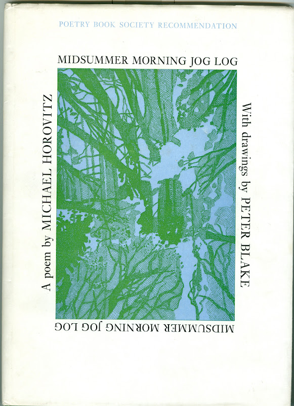
The novelty of the Independent’s employment of an illustrator who had trained principally in sculpture and etching swiftly resulted in a press award and commissions from book publishers and advertising agencies. The sweetest and most surprising outcome was earning the respect as an illustrator of established practising fine artists. One of the most generous was Peter Blake, who sent a kind note of thanks and respect with a book of illustrations he had made for Michael Horovitz’s poem of celebration, love and homage to Frances Horovitz. Blake had surmised (correctly) that I, like he, was an admirer of Maxfield Parrish. Such recognition almost immediately took on an art political significance in an entirely unanticipated way.
THE SISTINE CHAPEL RESTORATION DISPUTE
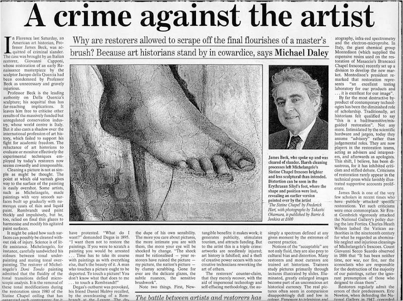
Within a month of receiving Peter Blake’s gift, the Sunday Times Magazine published an article on the restoration of Michelangelo’s Sistine Chapel ceiling frescoes. It told of condemnation from artists and an art historian, Professor James Beck of Columbia University, New York. Against them, the art historical establishment claimed momentous restoration “discoveries” and “revelations” that were said to require nothing less than a rewriting of five centuries of art history. The profound changes that all parties conceded had been achieved by repeatedly brushed-on and washed-off applications of a ferocious solvent gel that had left Michelangelo’s painting a pale and deformed reflection of its former self (see below). Beck was being likened to the man who refused to look through Galileo’s telescope for his refusal to acknowledge as a miraculous “recovery” a hitherto unsuspected and nowhere-recorded “New Michelangelo”. “We didn’t need one”, Beck had retorted, “There was nothing wrong with the old”.
To this working artist, the photographic evidence of the pre- and post-cleaned sections made it clear that the proposed art historical edifice being offered in post hoc defence of a demonstrably bungled restoration threatened a compounding falsification of history itself. Suspicion arose that because so many art historians had authorised or endorsed the restoration on which so much institutional capital and foreign sponsorship monies had been invested, none could break ranks. Further, it seemed to have been especially galling to art historians that their endorsements had been rejected on visual evidence cited by artists. (One scholar/supporter of the restoration, Professor Martin Kemp, would later complain in the Times Higher Educational Supplement: “I am unclear about the identity of this archetypal beast. Is ‘an artist’ to be identified with Andy Warhol or one of his fellow practitioners who protested during the cleaning of the Sistine ceiling?”)
COPYING OTHER ARTISTS’ WORK
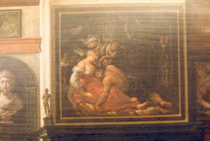
It so happened that having switched to illustration from art school teaching and fine art practice in 1982, working long hours, six or seven days a week left little time for travel or even museum attendance. Partly in substitution, I had kept touch with art through books and, as an illustrator, took every opportunity to incorporate work by artists I admired. These ranged from classical Greek sculpture, through Michelangelo, to certain favourite modern artists like Gustav Klimt, the painter/sculptor Max Klinger and Picasso (on our homage to Klimt and Klinger, see “At the end of another century” above).
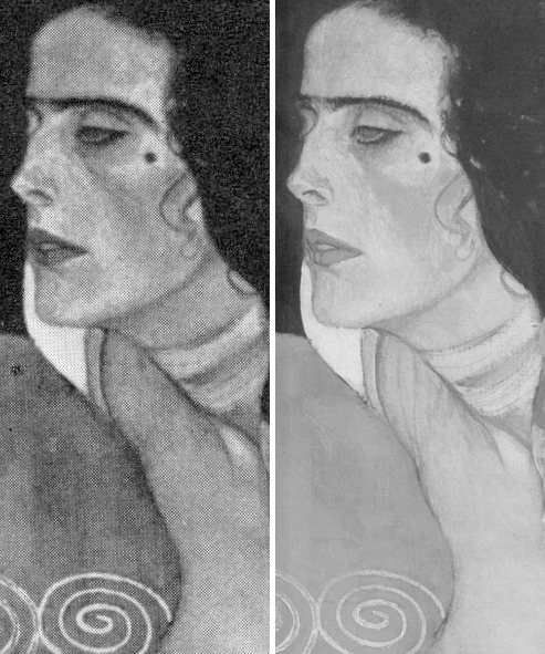
Above: (top) a detail of a copy of a Klimt portrait of Judith made by Michael Daley for the Independent in illustration of a Health article. Below it is a comparison of a section of the Klimt painting, as seen before (left) and after restoration(s). (For sight of the wholesale destruction of this modern artist’s work at the hand of restorers, see “The Elephant in Klimt’s Room” and “Now let’s murder Klimt”.)
APPRECIATING OTHER ARTISTS’ WORKS AND THE RELEVANCE OF COPYING TO APPRAISING RESTORATIONS
To copy the work of another artist it is necessary to look closely and attentively at it. You cannot draw what you have not analysed and understood. Indeed, drawings produced after the works of others are tests of understanding even more than of skill. Spending a working life both copying the various uses of shading made by other artists, and applying one’s own marks to paper so as to create plastically coherent and expressive tonal relationships, sharpens the eye and confers an ability to detect injuries to original tonal relationships in the works of others. This should not be considered surprising or remarkable: those who organise and dispose marks on surfaces, are perfectly placed to recognise the obverse – which is to say, the adulteration or deconstruction of artistically purposive values during so-called restorations.
Pace sneering art historians, to artists’ art practice trained eyes, spotting such injuries is as easy as it is for accountants to spot errors of arithmetic. That many art historians fail to recognise injuries to the works of the artists they study, might indeed suggest (as others have recently claimed) that something very wrong has been going on in art history education. And yet, at the end of the 1980s, when artists and rare visually discerning scholars challenged officially-sanctioned and endorsed restorations, it was they, not the visually-limited, who met with abuse. When I introduced myself to James Beck, prior to writing the 1990 Independent on Sunday article discussed below, he had been reviled in scholarly print by his peers – not least by a sister professor who served the Vatican as its art historical adviser/spokesman on the Sistine Chapel restoration. When I asked him if it might be helpful for an artist to make visual demonstrations of the injuries to Michelangelo’s work, he replied that it would be the most important thing to do, because “only artists understand these matters”. (Beck’s sister was a painter and he had studied fine art before switching to art history.)
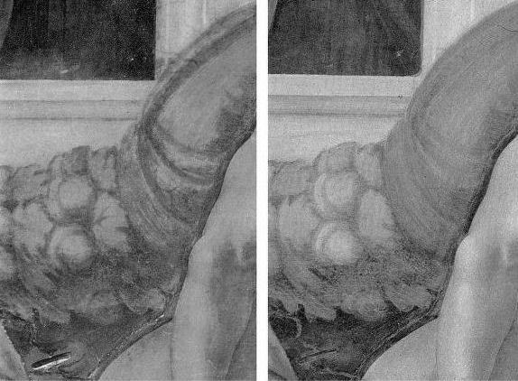

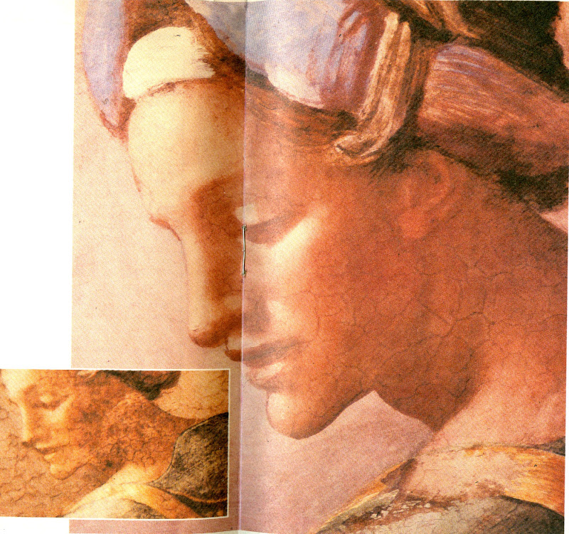
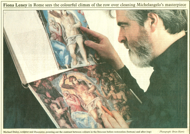
Above, A detail shown in greyscale and in colour of a section of Michelangelo’s Sistine Chapel ceiling, as seen before (left) and after cleaning in the 1980s.
THE VALUE OF DIRECT PHOTO-COMPARISONS
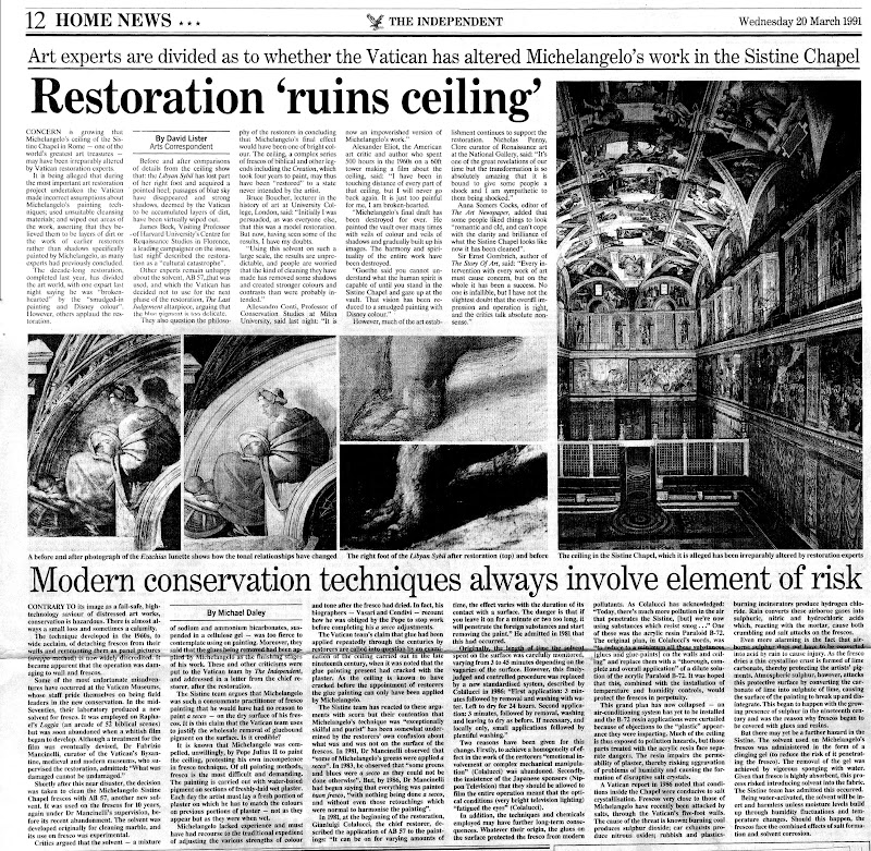
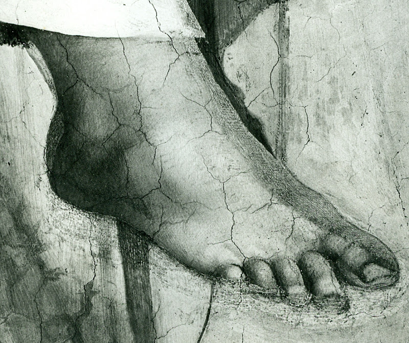
To identify restoration injuries it is helpful to place photographs of small sections of a restored work directly side-by-side (as in the Klimt Judith above, where the relative weakening of the spirals at the bottom, for example, should be apparent to the most untutored eye). The above detail of the Sistine Chapel ceiling was reproduced in the December 1988 Sunday Times article. It was immediately clear to me that the cleaning had weakened and in some places altogether erased bona fide features of shading and specific details like veins on the giant symbolic oak leaves. I asked the Independent’s arts editor if I might write a short article explaining why Prof. James Beck was right and the art historical establishment was wrong. On the face of it, this was a perfect Independent “questioning-of-authority” story. Unfortunately, the request could not be granted because the paper’s then art critic had recently visited the restorers’ scaffold in the chapel and had judged the restoration… a success. His art critical authority could not be challenged by a working artist with clear “standing” within the paper. Fortunately, when the Independent on Sunday was launched in 1990, its arts editor, Michael Church, commissioned a piece showing the damaging consequences of the restoration. Many criticisms of the restoration had previously been reported in the press but no one before had been given space in a national newspaper to set out evidence of injury. That article proved to be a game-changer.
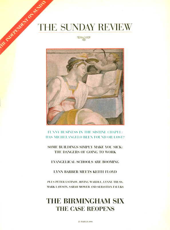
Above, top, the Independent on Sunday magazine of 25 March 1990 which carried (above) photographs showing restoration injuries in Michael Daley’s “Michelangelo: found or lost”
ESTABLISHMENT INTIMIDATION OF THE PRESS
Newspapers are complex entities comprised of many distinct departments that speak to particular constituencies. Dedicated arts journalists must swim in the art world and negotiate with its players and institutions. For them, breaking the “rules of engagement” can incur ostracism and worse. Those who play by the rules can be rewarded with exclusive stories and material. They might receive invitations to accompany globe-trotting museum directors on blockbuster shows. They might be invited to become embedded within a conservation department so as to counter anticipated criticisms. News journalists are less constrained. They are licensed to get and follow stories; to look for bodies; to follow money; to report mishaps and so forth.
When the Independent on Sunday article on the Sistine Chapel restoration was published the news editor on the daily Independent was intrigued by the magnitude of the controversy and he commissioned the above pair of articles. Despite such strong editorial support the articles nearly failed to see the light of day. Even though I had professional “standing”, the paper’s arts correspondent, David Lister, was taken aback by the high-level hostility and abuse levelled at me and Professor Beck. He became fearful of challenging key and venerable sections of the art establishment. How could the two of us be right and all of them wrong, he asked? It was a fair and sensible question: newspapers can never afford to back losers and must always invite responses from those under attack.
By way of reassurance, I showed the catalogues to the 1969 Olivetti-sponsored Frescoes from Florence travelling exhibition to London and New York. This exhibition consisted of murals that had been detached (on grounds of conservation) from buildings in Italy and then mounted on panels as stand-alone works of art that might be flown around the world – much as restored medieval glass from cathedrals is being despatched today. Both catalogues groaned under the weight of luminaries included in the exhibition’s “Committees of Honour”. At the time the show had been a sensation on two continents but I was able to show a recent Burlington Magazine editorial which condemned the detachment of frescoes from buildings as a barbarous and now discredited practice that had injured the paintings and buildings alike, and left many frescoes mouldering like rolled-up like rugs in church and chapel basements.
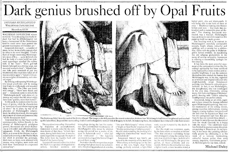
The procedural obstacle was cleared and both articles were published. The sky did not fall in and although squeals were heard, thereafter, the paper had confidence and trust in my judgements and accounts, enabling me to write further on the Sistine Chapel debacle and restorations at the National Gallery – including a review (below) of a book extolling the Sistine Chapel restoration that was written by the Sunday Times’ art critic, Waldemar Januszczak.
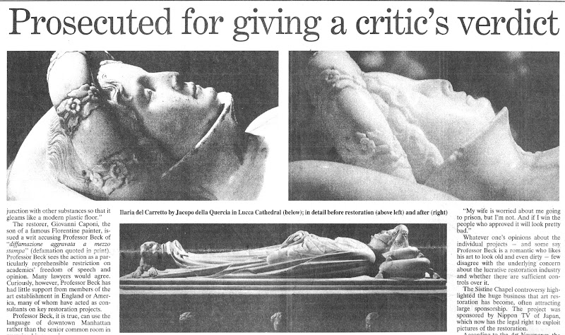
PROFESSOR BECK GETS SUED
In 1991, after surviving years of abuse over the Sistine Chapel controversy, Beck was hit with a criminal action in the Italian courts over reported criticisms he had made in Lucca Cathedral on the restoration of a marble tomb by the early Renaissance sculptor Jacopo della Quercia. The restorer (in fact, the head of a restoration company) had not sued the Italian newspapers that had reported Beck’s (oral) criticisms. Instead, he sued the scholar alone for aggravated criminal slander – a charge that carried a possible three years jail sentence – and for damages of 60 million Lire. By not suing those who had transmitted the criticisms (and therefore had, allegedly, harmed his reputation), the restorer ensured that Beck could receive no support from the newspapers and their lawyers and would have to bear all the risks alone. As the world authority on this early Renaissance sculptor, he felt compelled to do so. Although the trial’s ramifications might have been horrendous for scholarship generally, he received no public expressions of support from his peers. When I asked the editor of the Burlington Magazine why this was the case, she replied “Because he is going to lose”. The public needed to be alerted to the case. Once again, the Independent came through. On 8 November 1991, David Lister reported the imminent trial:

Below, part of David Lister’s 8 November 1991 article.
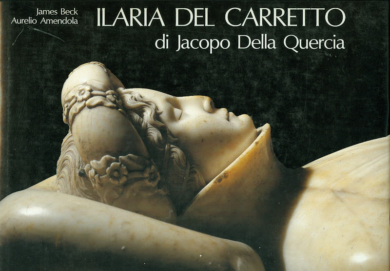
Below, a book Beck had produced on the Lucca Cathedral monument
THE TRIAL AND THE PROFESSIONAL SILENCE
Like the editor of the Burlington Magazine, the judge at Beck’s trial in Florence knew that he was going to lose. Indeed, he declared an intention to find him guilty to the prosecuting lawyer, as they left the court together discussing the case at lunchtime after the trial’s first morning session. “Eh, but I shall find him guilty” he said. Fortunately, he was overheard by an off-duty policeman who was working as an intern for Beck’s lawyer. When challenged, the judge refused to recuse himself but eventually he disappeared and Beck, under a new judge, was soon acquitted.
REPORTING THE TRIAL OUTCOME
At the time we were able by courtesy once more of the Independent (22 November 1991) to raise a cheer for Beck and for the blow he had struck for the free expression of scholarly judgements on matters of artistic welfare and integrity. But this had been an extremely close call and, while contemplating a possible jail sentence, Beck decided that a dedicated international organisation was needed to speak for the interests of the world’s great and insufficiently protected works of art. A year later ArtWatch International was founded in New York.
On the day of publication of the Independent’s 22 November article, Grant McIntyre, an editor at the venerable and (then) still independent publishing house John Murray, telephoned to ask if there might be a book on the trial and on matters of restoration. There was and, following its initial publication in 1993, it ran to many subsequent editions (see below).
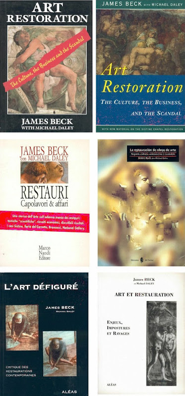
THE BOOK’S RECEPTION
The book soon faced a formidable hurdle: it was to be reviewed in the New York Review of Books by a formidable Renaissance scholar, Professor Charles Hope, a supporter of the Sistine Chapel restoration. In the event, Prof. Hope was persuaded by the art historical and technical proofs of injury we had amassed. Moreover, he held that Beck had performed an admirable and brave service to scholars and scholarship alike. He also pointed that while many scholars of his acquaintance had initially supported the restoration enthusiastically, many had recently fallen silent on the subject.
After the trial turmoil and the creation of ArtWatch International, I continued to draw the art I loved and to criticise restorations in the Independent.

DENIAL AT THE VATICAN
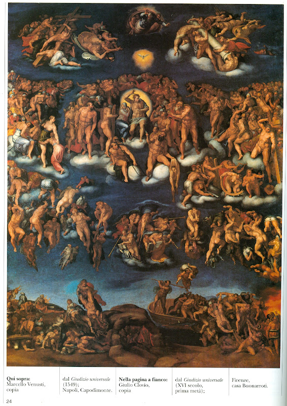
After the horrors on the ceiling, we later witnessed the injuries to Michelangelo’s Last Judgement. There are still institutionally ensconced scholars and administrators who are in denial on the injuries at the Sistine Chapel and insist against all evidence – such as is found in the contemporary painted copy of the “Last Judgement” by Marcelo Venusti shown above – that Michelangelo had painted in today’s vapid tones and hues. In part this New Pallor is not only the product of the last restoration but also of the quarter of a century since in which the interactions of tourism-induced airborne pollution and chemical residues of the cleaning have been devouring the fresco surfaces. So great has been the debilitation that, in addition to a new air-conditioning system, thousands of colour-enhancing LED lights have been installed on the ceiling.
THE INDEPENDENT AND A CHANGED CRITICAL CLIMATE
The Independent gave fair and generous voice to previously unheard criticisms. By doing so it made an invaluable contribution to artistic health – not only directly but indirectly by opening up the rich, hitherto unexamined field to the rest of the press. The Times, the Sunday Telegraph, the Daily Telegraph, the Guardian and the Observer and others all saw the importance of the subject and recognised that “news” is that which somebody, somewhere, would prefer not to see published. The importance of newspapers in this regard cannot be exaggerated – our colleagues in the United States and France cannot believe that newspapers can be so challenging to entrenched authorities in the arts. The vigour of the British press can also be seen by comparison with our broadcast media which remains perpetually asleep on the job, treating the visual arts as little more than a gifted succession of diverting, institution-promoting “Good News” stories.
ARTS BROADCASTING PAP
When the Beck/Daley art restoration book was published in 1993 a number of independent television companies rightly saw the potential for a televisual “public affairs” type of treatment. All of these proceded well until they reached the top of their commissioning chains. Once, the head of music and arts at the BBC went so far as to offer a whole arts programme, reassuring us that although the BBC and the National Gallery were commercial partners “that shouldn’t create a problem”. But it did: the almost-commissioned independent meticulously even-handed examination of the pros and cons of picture restoration was swiftly killed off. In its place the BBC permitted the National Gallery to make its own effective tele-promotional “selfie” (with gallery staff using left-in-place BBC cameras) of its mangled, falsifying restoration of Holbein’s The Ambassadors. On 29 January 2000 the Independent carried a letter from ArtWatch UK entitled “‘Virtual reality’ art”:
“…When the National Gallery recently restored Holbein’s The Ambassadors, the famous anamorphic skull in the foreground was repainted to a new design not according to the laws of perspective by which it had been produced but after a computer generated distortion of a photograph of a real skull. This Bizarre imposition of ‘virtual reality’ into an old master painting is defended by the gallery on the grounds that ‘modern imaging techniques’ offer more ‘scope for exploring possible reconstructions’ than do the 16th century perspectival conventions by which the artist’s original image had been generated. The difference between the original and the new parts has been concealed from the general public by the restorer’s attempt to integrate the handiwork of his own ‘tentative reconstruction’ with surrounding old paint by painting fake lines of cracking to match the old, actual, cracks.”
It is a tragedy that the lights should have gone out on a newspaper that had caused justifable discomfort in so many art world recesses. As described above, it is a measure of the success of the campaigning that first gained exposure in the Independent that we now enjoy a quite different and healthily expanded art critical universe. We thank the Independent for good times past and wish it all good fortune in its new streamlined format with global outreach at The Independent.
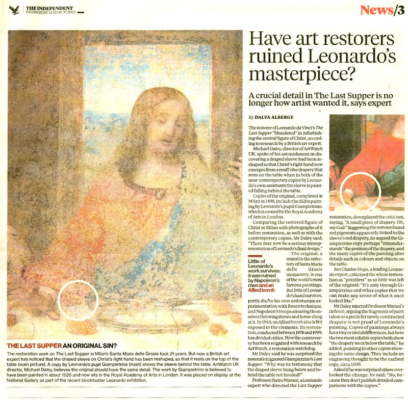
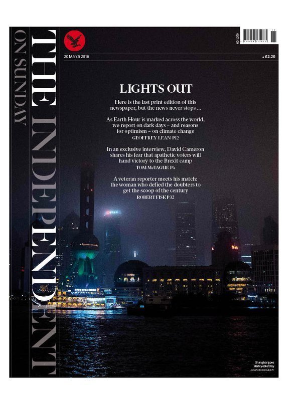
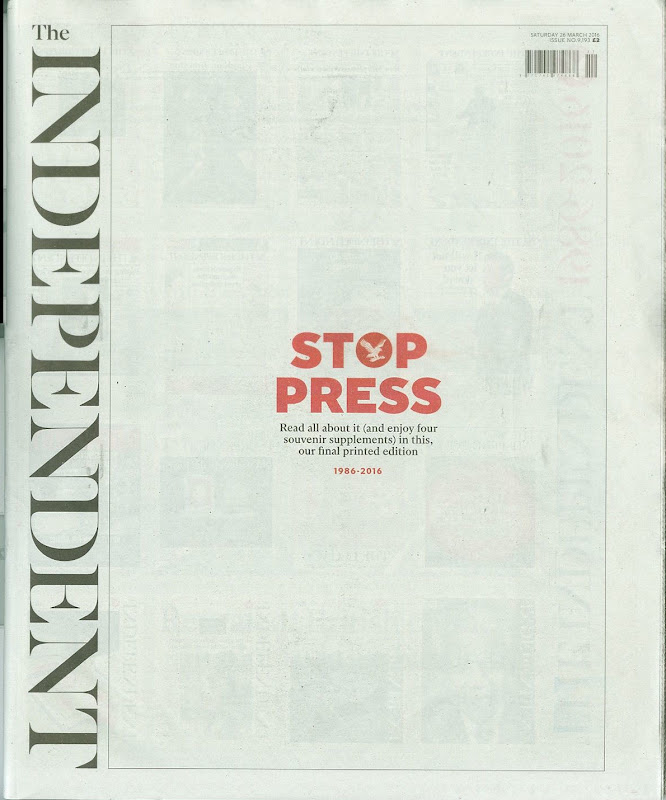
Below (top): The last Independent coverage of ArtWatch UK by Dalya Alberge on 14 March 2012. (On the restoration of Leonardo’s Last Supper, see: A different Leonardo and, The Law of Diminishing Returns ); below (bottom) the last editions of the Independent on Sunday and the Independent.
Michael Daley, 30 March 2016
Chartres Cathedral Make-Work Scheme
A Columbia University trained architectural historian, Martin Filler, has reported (A Scandalous Makeover at Chartres) his great shock when visiting Chartres Cathedral to discover that:
“In 2009, amid a rising wave of other refurbishments of medieval buildings, the French Ministry of Culture’s Monuments Historiques division embarked on a drastic, $18.5 million overhaul of the eight-hundred-year-old cathedral. Though little is specifically known about the church’s original appearance—despite small traces of pigment at many points throughout the interior stonework—the project’s leaders, apparently with the full support of the French state, have set out to do no less than repaint the entire interior in bright whites and garish colors that are intended to return the sanctuary to its medieval state. This sweeping program to ‘reclaim’ Chartres from its allegedly anachronistic gloom is supposed to be completed in 2017.”
Filler (correctly) notes that:
“The belief that a heavy-duty reworking can allow us see the cathedral as its makers did is not only magical thinking but also a foolhardy concept that makes authentic artifacts look fake. To cite only one obvious solecism, the artificial lighting inside the present-day cathedral—which no one has suggested removing—already makes the interiors far brighter than they were during the Middle Ages, and thus we can be sure that the painted walls look nothing like they would have before the advent of electricity.”
At Chartres, although the interior had initially been painted, Filler further notes that:
“…the exact chemical components of the medieval pigments remain unknown. The original paint is thought to have flaked off within a few generations and not been replaced, so for most of the building’s eight-century history it has not been experienced with painted surfaces. The emerging color scheme now allows a direct, and deeply disheartening, before-and-after comparison.”
Shocking though the case is it is no aberration. To the contrary, it is part of a well-established mania for the execution of aggressively radical transformations of world heritage buildings, the most dramatic of which was the notorious so-called restoration of Michelangelo’s Sistine Chapel ceiling frescoes in the 1980s. In his New York Review blog, Martin Filler maintains – despite all criticisms and evidence – that the restoration of Michelangelo’s Sistine Chapel ceiling did no harm and he declares that “in the opinion of many, myself included, the ultimate emergence of characteristically high-keyed Mannerist colors—acidulous pinks, greens, yellows, and oranges—from beneath the Sistine ceiling’s long-predominant blues and browns confirmed the project’s correctness”. (For the material and historic evidence of injuries published on this site, see Michelangelo’s disintegrating frescoes)
At St Paul’s Cathedral in London, the opposite process to that underway at Chartres was executed. Here, parts of the original painted interior applied by Sir Christopher Wren had survived and their pigments had been analyzed. It was known that Wren had applied three coats of oil paint to produce a uniformly warm not-white, not bare-stone finish. The cathedral’s present architect surveyor, Martin Stancliffe, harboured a modernist infatuation with dazzling white interiors and, accordingly, he stripped St Paul’s of the last vestiges of its original painted interior surfaces. Having done so, he then greatly increased the amount of artificial light to heighten the effects of his own historical falsification. See our accounts:
Brighter than Right, Part 1: A Modernist Makeover at St Paul’s Cathedral
Concern on the repainting of the Chartres Cathedral was first raised in the Spectator on 12 May 2012 (Restoration tragedy ~ Alasdair Palmer questions the ill-conceived makeover of Chartres cathedral which robs us of the sense of passing time that is part of its fascination and mystery). The contempt for history in Grandiose Conservation Projects is as much a constant as their high costs. Against the estimated $18.5m at Chartres the whitening at St Paul’s Cathedral (inside and out) cost £40m.
Self-evidently, major transforming restorations serve substantial vested material and professional purposes. They also take place in economic and cultural climates. The now long-running attempt to create a United States of Europe is an economically and politically failing enterprise. As manufacturing jobs flee the continent and democratically elected governments are replaced by bureaucrats, make-work schemes in the cultural sector are finding great favour as a means to stimulate compensatory economic growth. Not only do such grand and labour intensive restoration schemes make jobs for their duration, they stimulate tourism which is now one of the world’s greatest industries.
According to the World Travel and Tourism Council (See the future of tourism), the UN’s World Tourism Organisation reckons that, by 2020, the number of travelling tourists will approach 1.6 billion, double the number who packed their bags this year. Those directly employed by tourism worldwide will rise from 238 million this year to 296 million, or one in every 10.8 jobs, by 2018. The USA will build 720,000 new hotel rooms over the next ten years, and a further 432,000 will be built in Asia over the same period. In this respect, we discussed the pressures to create blockbuster exhibitions and increase the velocity of borrowing and lending works of art by disregarding the known risks in two posts in 2011:
Why is the European Commission instructing museums to incur more risks by lending more art?
The European Commission’s way of moving works of art around
In 2001 we complained of the role being played by heritage bodies in stimulating tourism with recreations of long-lost historic interiors – see:
Applying recreated authenticity to historic buildings in the name of their conservation
In addition to boosting tourist revenues, another benefit of major restoration projects is that they continue to make work further work down the line. At Chartres, the interior was untreated for 800 years but its new and speculative livery will rapidly go dingy and need re-doing every twenty or so years. As we have recently seen, within twenty years at the Sistine chapel, urgent restoration measures have been carried out (in part in secret) because Michelangelo’s frescoes are physically disintegrating following the destruction-by-restoration of his final coat of secco painting. As for the resulting over-bright “restored” colours, to compensate for their already fading appearance, a new, immensely brighter artificial lighting system (with thousands of LED lights) has been installed. As the great “conservation” merry-go-round goes round, lightening, brightening, physically undermining and aesthetically falsifying, it is becoming increasingly necessary for those concerned for the integrity of our common artistic heritage to join the dots and to “follow the money”.
M. D. 15 December 2014
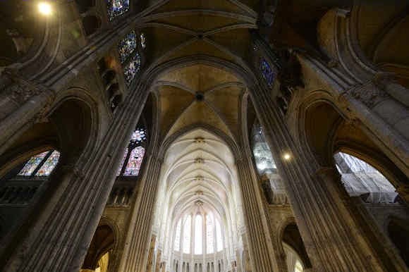
Above, top: Chartres Cathedral, with repainted vaulting in the choir contrasting with the existing nave and transepts in the foreground, Chartres, France, July 11, 2012
Above: The ambulatory of Chartres Cathedral, with repainted vaulting visible (right), July 11, 2012
Photographs by courtesy of Hubert Fanthomme/Getty Images. For more photographs and for treatment of statuary, see Art History News
UPDATES: 16 December 2014. The painter and former Rhodes Scholar Edmund Rucinski writes:
This even further compounds the damage done during the horrid “restoration” of the stained glass. Instead of doing the proper thing and sandwiching the original glass between protective layers of modern clear glass and re-leading the windows, the original glass was impregnated with some acrylic which filled in all the tiny irregularities that gave the original glass its famous quality.
Bear in mind that the leading naturally deteriorates and needs to be re done every so often (like replacing deteriorated stonework)…..so none (if any) of the original medieval leading is there anyway.
The result of the glass ‘restoration’ was to give the appearance of a garish plastic reproduction of the originals. This impregnation with the offending plastic may never be able to be reversed.
Fortunately, I managed to see Chartres before the vile attack on the windows. [See below]
For a grossly irresponsible and exploitative treatment of glass from Canterbury Cathedral, see How the Metropolitan Museum of Art gets hold of the world’s most precious and vulnerable treasures viz:
“An exhibition of stained glass that has been removed from “England’s historic Canterbury Cathedral” has arrived at the Metropolitan Museum, New York, after being shown at the Getty Museum in California. The show (“Radiant Light: Stained Glass from Canterbury Cathedral at the Cloisters”) is comprised of six whole windows from the clerestory of the cathedral’s choir, east transepts, and Trinity Chapel. These single monumental seated figures anticipate in their grandeur and gravity the prophets depicted by Michelangelo on the Sistine Chapel ceiling. They are the only surviving parts of an original cycle of eighty-six ancestors of Christ, once one of the most comprehensive stained-glass cycles known in art history.”
Michelangelo’s disintegrating frescoes
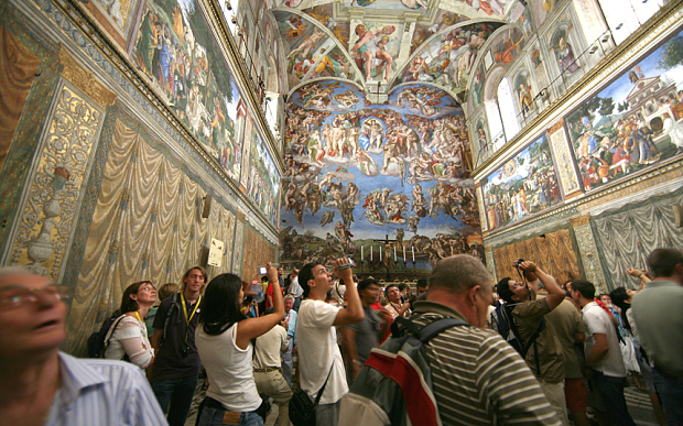
As we predicted at the time of the last restoration of the Sistine chapel ceiling, by removing all of the glue-painting applied by Michelangelo to finish off and heighten the effects of his frescoes, the Vatican’s restorers exposed the bare fresco remains for the first time in their history to new dangers from the atmospheric pollution that is exacerbated by huge numbers of paying visitors.
Then, 2 million visitors entered the chapel every year. Now, that figure is 6 million.The Vatican has been carrying out secret attempts to remove disfiguring calcium deposits building up over the remains of Michelangelo’s painting. These deposits are caused when moisture given off by tourists and air-borne pollutants are absorbed by the plaster. This now-acknowledged process will also activate, as we specifically contended, the remnants of the cleaning agents (sodium and ammonia) that were washed into the frescoes during the rinse cycles of their last so-called restoration and conservation treatments. At the time, the use of the ferociously aggressive cleaning agent AB 57 was justified by the Vatican on the grounds that it was necessary to remove, among other things…ordinary solvent-resistant calcium deposits that had built up over the centuries in parts of the ceiling exposed to leaks in the roof.
Then, the Vatican promised that special air-conditioning systems would protect the newly exposed fresco surfaces in perpetuity. That system had failed even before the Vatican recently celebrated the twentieth anniversary of the end of the last restorations of Michelangelo’s paintings. Today, as the new physical threat is seen to be turning the frescoes white, the Vatican promises new, improved air conditioning units (from the same firm). To counter the new pale appearance, the Vatican recently installed thousands of LED lights, each individually attuned to heighten the colours in Michelangelo’s painting. Michelangelo’s now twice-injured painting has been left a colourised but still lucrative wreck – and an EU-funded (EUR 867 000) showcase (“This made the Vatican City’s Sistine Chapel the ideal venue for LED4ART”) for a company that shows in its advertisements that it has no idea what the Sistine Chapel looks like.
We said at the time that the restoration constituted a crime against art. Now, the Vatican promises to limit the numbers of visitors inside the chapel to 2,000 at any one time. But that means allowing a crowd as big as a full capacity audience at the Royal Opera House in Covent Garden, London, to pack into the small chapel all day long. The Vatican’s administrators – who have known of the present problems since 2010 – now concede that the glue coatings (that were in truth Michelangelo’s own final painted adjustments) had served as a protective barrier against all air-borne pollutants. The tills will continue to ring. Art lovers remain weeping. Shame on the Vatican’s administrators.
For our previous coverage, see:
Misreading Visual Evidence ~ No 2: Michelangelo’s Sistine Chapel Ceiling;
The Sistine Chapel Restorations: Part I ~ Setting the Scene, Packing Them In;
The Sistine Chapel Restorations, Part II: How to Take a Michelangelo Sibyl Apart, from Top to Toes;
The Sistine Chapel Restorations, Part II – CODA: The Remarkable Responses to Our Evidence of Injuries; and Thomas Hoving’s Rant of Denial;
The Sistine Chapel Restorations, Part III: Cutting Michelangelo Down to Size;
The Twilight of a God: Virtual Reality in the Vatican;
Sistina Progress and Tate Transgressions;
ArtWatch Stock-taking and the Sistine Chapel Conservation Debacle;
Coming to Life: Frankenweenie – A Black and White Michelangelo for Our Times
11th November 2014. Michael Daley
UPDATE: 16 November 2014
While the Vatican now admits the hitherto concealed fact of the damage that is being caused to Michelangelo’s frescoes by the massive increase of tourist numbers, it remains in denial about the destruction during the last restoration of the final a secco adjustments that Michelangelo had made to those frescoes. That autograph last-stage painting – which was observed and described with perfect, detailed clarity by the painter Charles Heath Wilson in the 1881 (second) edition of his book Life and Works of Michelangelo Buonarroti – is characterised, preposterously, and against the evidence of all contemporary and subsequent copies of the Sistine ceiling, as consisting of “centuries of built-up candle wax, dirt and smoke”, as if such substances might somehow have disported themselves along the lines of Michelangelo’s design so as to reinforce his modelling and depict shadows cast by his figures. This latest apologia is carried in an Associated Press article “Sistine Chapel frescoes turning white ~ Humidity, tourists’ CO2 to blame”.
A paperback facsimile of a 1923 edition of Wilson’s milestone book (in which he describes his close examination of the ceiling on a special portable scaffold) is now available. It is time for the Vatican to acknowledge that Michelangelo had indeed finished his frescoes with secco painting, and that its curators, restorers and conservation scientists had blundered badly and inexplicably when, having judged Michelangelo’s specific, purposive pictorial enhancements and modifications to be nothing other than arbitrary accumulations of polluting material, removed it – and, thereby, exposed the lime plaster surfaces of the frescoes to their present dangers. That initial error and the subsequent falsification of art history that was made on its back, have both now been maintained for two decades.
The Samson and Delilah ink sketch – cutting Rubens to the quick

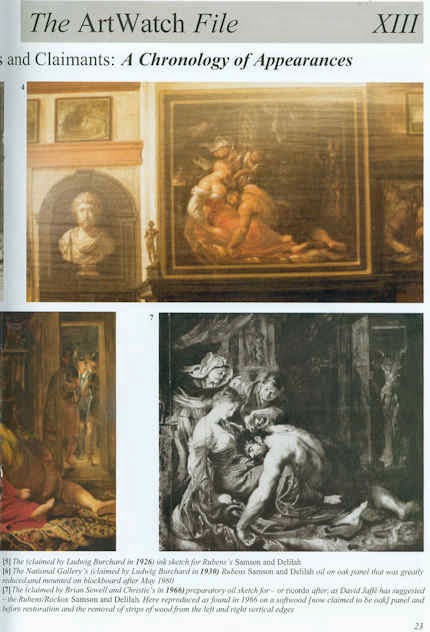
Today, in a sale of old master drawings (and on an estimate of £1.5m -£2.5m), Christie’s is offering large claims for the artistic and historical significance of a small (roughly 16cms square and shown here at Fig. 1) pen and brown ink drawing:
“This is the only known preparatory drawing for Rubens’s Samson and Delilah in the National Gallery, London (inv. NG 6461), and it was followed by a modello oil sketch now in the Cincinnati Art Museum (inv. 1972.459). Commissioned by Nicolaas Rockox (1560-1640), who was Rubens’s most important early patron, this powerful composition dates from shortly after the artist’s return to Antwerp from Italy, where he had been from 1600 until 1608, and provides a valuable insight into his developing style and preparatory processes.”
This account is conventional but, nonetheless, contentious. No hint is given that the relationships between these three linked works are highly problematic or that all three have suffered cuts or thinning. The authorship of this group has been contested for over two decades. On February 19 2004 the Daily Telegraph published a letter from ArtWatch on the painting’s problems (“Is the National Gallery’s Samson and Delilah another copy?) We have published two special issues of the Artwatch UK Journal mounting challenges (Figs. 2 and 3) and have written a number of articles on the subject for the Art Review. The principal challenges to the attribution came from two artist/scholars, initially, Euphrosyne Doxiadis, whose findings (made with fellow artist Steven Harvey and Siân Hopkinson) were compiled in a report (see this website) that was submitted to the National Gallery in 1992 and later covered in the Times and the Independent. In 1997 researches by Kasia Pisarek, prompted two articles by the Sunday Times’ art critic, Waldemar Januszczak (“A Rubens or a costly copy?” and “National’s £40m Rubens could be fake”). In the latter article, the then director of the National Gallery, Neil MacGregor, conceded that the evidence “is respectable, and the scholar raises some serious questions that I cannot easily answer”. Those questions have never been answered. In October 1997 the National Gallery issued a press release in which it was said that:
“Debates of this sort require patient consideration of different sorts of evidence. The best format is for this evidence to be presented at some length for public discussion – and the National Gallery will be arranging such a lecture and debate over the next few months.”
A debate that has yet to take place
Within a few days the commitment was dropped when the press release was re-issued and the debate never took place. To this day there remains an enormous accumulation of problems with the National Gallery’s “Rubens” Samson and Delilah and, therefore, with its two closely associated works – the ink drawing and the oil sketch. All three works, which are dated to 1609-10, have unusual and anomalous features – and all appeared only in the 20th century. The modello arrived last without name or history in 1966 and was upgraded by Christie’s to Rubens even though it is painted on a soft wood and not the oak which Rubens invariably used.
Ludwig Burchard’s cunning plan?
Behind the successful 20th century elevation of this trio, is the fact that both the drawing and the large finished painting in the National Gallery were attributed to Rubens barely two years apart by the same man, Ludwig Burchard. Burchard was a great authority on Rubens who, notoriously, was unable to publish his life-long Great Work on the Artist for fear of having to de-attribute very many paintings for which he had supplied unwarranted certificates of authenticity. In the ArtWatch UK Journal No. 21(Spring 2006) Kasia Pisarek, whose PhD Dissertation was on Rubens and Connoisseurship, identified over sixty Burchard Rubens attributions that had subsequently been demoted in the Corpus Rubenianum itself.
Dr Pisarek felt that the year of launch for the picture now in the National Gallery might be signicant. As she put it:
“That year 1929 was not free of strange coincidences. By a bizarre stroke of luck, the painting re-emerged 48 years after its disposal by the Prince of Liechtenstein in Paris in 1881 (not 1880, as is commonly said), the exact same year as the deaths of the Prince Johannes II, the previous owner of the painting, and of his picture adviser Wilhelm von Bode, the then General Director of the Berlin Museums. The former died in February 1929, the latter a month later, in March. Moreover, we know that the Prince himself had weeded out a considerable number of pictures, Samson and Delilah included. He also financed many research projects, and the collection was accessible to scholars. The art historian Wilhelm von Bode published (in 1896) the first comprehensive and illustrated book on the Liechtenstein collection, so he could have been aware of the Samson and Delilah’s disposal. Why didn’t he identify the picture as the long lost Rubens if he was also a Rubens expert and had even co-signed certificates of authenticity with Ludwig Burchard?
In 1927 the drawing was bought from a private collector by a scholar of drawings and prints, I.Q. van Regteren Altena, for 26 guilders as a Van Dyck (whose initials it still bears). It was promptly upgraded to Rubens by Burchard, who then cited it as such in his 1930 certificate of authenticity for the Honthorst on offer by a Berlin dealer that is now in the National Gallery as an entirely autograph Rubens.
A precursor or a successor – or both?
It is claimed that Rubens’ characteristic stylistic development through stages of work is evident in the three works’ sequence, when the essential motif remains remarkably constant throughout. In fact, the modello (see Figs. 5 and 7) is so like the finished work that one supporter of the attribution, the former senior curator of the National Gallery, David Jaffe, has suggested that this oil sketch might be a ricordo – a record of the finished painting[!] However, if the presently accepted 1, 2 and 3 sequence of drawing, oil sketch, finished painting were to become 1, 3 and 2, it would make nonsense of the National Gallery’s technical reports which stated that the finished picture’s uncharacteristic thin, swift and little-revised paint work – paint work which today remains preternaturally fresh and unblemished (see Figs. 10 and 11) – was a product of the fact that Rubens had made such an unusually complete and resolved oil sketch that he had been able to paint the larger panel (which, the gallery claims, itself resembles a large sketch) out of his head and at a stroke and without any need for his customary revisions. Then again, the ricordo suggestion constitutes, perhaps, a kind of insurance policy, a way of covering against the possible outcomes of an eventual debate and presentation of evidence? If so, the sequence 1, 2, 3 and 2 again, would make a kind of institutional sense? This might indeed constitute a veritable “belt and braces” insurance: given that the gallery has admitted that its large finished panel is so very swift and sure-footed in its execution (or uncharacteristically sloppy and out-of-character to its critics), that it is itself but an over-blown sketch, the formulation 1, 2/4, 3/2 and 2 might serve perfectly to cover all eventualities.
The evidence of our eyes
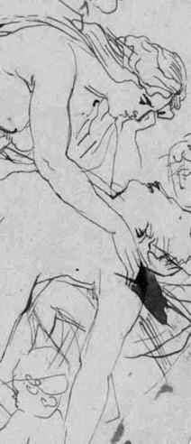
The Samson and Delilah ink sketch, as a drawing, lacks the customary force, focus and eloquence of design seen in Rubens’ initial compositional ideas (- see Figs. 8b, 9a and 16). This supposed preliminary study has a curiously finished, pictorial air. Iconographically it has a pronounced “portmanteau” quality, showing, for example, Delilah’s draped right leg as seen in the secure Rubens oil sketch of 1609-10, The Taking of Samson in Chicago, while her draped left leg is as seen in the insecure National Gallery picture. Most disturbingly (to this draughtsman, at least) is that fact that when looking at the drawing in the flesh it is impossible to read an order or purpose to which its many and various components might have been made or to locate the essential, determining compositional and figural point at which Rubens always and brilliantly drove (see Figs. 8b and 16).
A ruled ink border surrounds and compositionally confines the ink and wash drawing (Fig. 1). When seen in reproduction, this border gives an impression that Rubens designed a format from the outset precisely in order to achieve an effect that is the single most problematic feature of the finished painting – the fact that the toes on Samson’s right foot were cropped at the edge of the painting. The border, like the drawing, is drawn in brown ink but clearly, as Christie’s describes, it can be seen by eye to comprise later framing lines. However, while this usage is seen to be common in the collection where the drawing has lived since 1927 – and while the border lines themselves can be seen to pass over a number of tiny losses on the edges of the sheet – the particular placement of the border is disquieting because the sheet on which the drawing was made has been trimmed at either the outside edges of the border or even within the border lines themselves. Why and when was this done? While some of the ink lines of the drawing can be seen by eye to run into the ruled borders, we cannot calculate where they might have terminated because of the severity of the sheet’s cropping. For whatever reason, this is now an artificially constrained and possibly edited image.
Flouting historical evidence
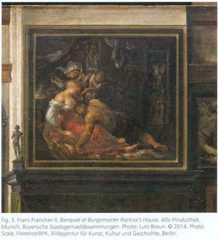
While the toes on Samson’s right foot are cropped at the edge of the National Gallery painting (Fig. 12), both of the contemporary copies that were made of the original Rubens painting show the foot, as painted by Rubens, to have been both whole and set well within the right-hand edge of the painting (see Figs. 4, 5 and 6). It is hard to see on what grounds this testimony might be disregarded: the first copy, an engraving (see Fig. 14), was made in c 1613 and very possibly under Rubens’ instruction. The second was a painting in oil commissioned by Rockox to show off his collection of paintings in the grand salon of his home (see Figs. 6 and 13). Is it conceivable that he – and Rubens, who was still alive – would have permitted a man famous for the accuracy of his records, to make a gratuitous, out-of-character “improvement” to the Rubens painting that occupied pride of place above the mantelpiece? Because of the inked box and the trimmed sheet it is not possible to determine whether the drawing’s author might originally have drawn the foot whole.
The panel support of the modello, as reproduced in the catalogue (see Fig. 7), is seen to have been cropped on its vertical edges since being sold to the Cincinnati Art Museum by the removal of two strips of wood, thereby conferring a clear crop onto Samson’s foot and bringing it into accord with the foot seen in both the National Gallery picture and the ink drawing. At one point the Cincinnati Museum claimed that the oil sketch’s panel was made of oak. When the picture was loaned to the National Gallery we asked if the panel was oak or softwood. It was not possible to say, we were told, because the back of the frame was enclosed and the gallery was not permitted to remove it. The museum today ducks the issue by saying that its painting is “on panel”.
The National Gallery’s picture was doctored at some undisclosed point by planing rather than cutting. The gallery restored the picture after purchasing it and reported that the panel had been planed down to a thickness of 2-3mm and set into a sheet of block-board. We knew for technical reasons that that was most unlikely: block-board is held together by its outer veneer layers and cutting one of them away would have had catastrophic structural consequences. When pressed, the gallery acknowledged that the planed-down panel had in fact been glued onto, and not set into, a larger sheet of block-board, with its edges being concealed by a bevelled putty. The restorer, David Bomford (now of the Museum of Fine Arts, Houston), said in his report, that the planing had taken place at some point in the early twentieth, or possibly during the late 19th century. That, too struck us as improbable: could there be no record of the back of a panel bought for a world record price (£2.5m) for a Rubens? Had the gallery not made a record of condition when the picture was loaned to it before the sale at Christie’s? We asked Neil MacGregor, if the gallery had any record of the back – and he said not. We asked if we might see picture’s conservation dossiers and there found Burchard’s 1930 certificate of authenticity, which described the panel as being intact and in excellent health.
At Christie’s we asked, and were kindly permitted, to examine the back of the drawing which is said to bear other drawings. A little (unintelligible) drawing is present but most of the surface bears the remains of a second sheet of paper to which the ink sketch had once been pasted. Effectively, the drawing’s verso is invisible – just as is the back of the National Gallery’s picture, any evidence on which has ceased to exist.
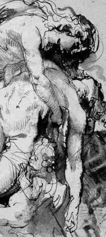
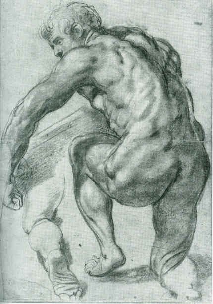
As for the contention – made against the evidence of the contemporary copies – that Rubens deliberately cropped Samson’s toes at every stage of the work, we know that he was very attentive to his toes. When drawing one of Michelangelo’s ignudi in the Sistine Chapel, he ran out of room on the paper for the toes on one of the feet and then drew them separately elsewhere on the sheet. On his return from Italy, and virtually simultaneously with working on the Samson and Delilah, Rubens made the magnificent Michelangelesque study of a nude man kneeling shown at Fig. 17. On that sheet, the right foot was truncated by the edge of the paper and, again, Rubens redrew the whole lower leg so as to include the foot and toes.
What kind of artist was Rubens?
The National Gallery has admitted that its painting is not typical of Rubens’s oeuvre, which fact it attempts to explain by claiming that immediately after his return to Antwerp from a long stay in Italy, Rubens was working “experimentally”. Unfortunately, it so happens that at the date of the Samson and Delilah’s execution, Rubens was also working on the very large altarpiece The Raising of the Cross (see Fig. 10). No one has ever suggested that that great work occupied a position in some experimental mode. To the bizarre and unsupported suggestion that Rubens, on his return from Italy, simultaneously worked experimentally and not-experimentally within the same brief period, Christie’s lend support with a contention that:
“The exact date of Samson and Delilah is unclear, partly because Rubens experimented with two very different approaches to the same subject in these post-Italian years.”
The truth is that attempts to keep this Burchard-initiated show on the road require that everything today be considered part of a moveable feast. It is neither a satisfactory situation nor a tenable position. Attribution is a difficult and taxing activity at the best of times and there is no shame in admitting error – and least of all with Rubens. As we put it in the 2006 Spring Journal:
“The upgrading of copies or studio works to autograph status frequently flouts the most elementary visual and methodological safeguards. Identification of the autograph hand of a master requires a ‘good eye’, sound method, and a recognition that comparisons are of the essence, that like should be compared with like. Procedural fastidiousness and visual acuity are nowhere more essential than with Rubens, who not only ran a large studio of highly talented assistant/followers but who famously placed a very high premium on studio works that had been modified or finished off by his own hand. When wishing to claim unreserved autograph status for a ‘Rubens’, it would seem imperative that some plausible connection between the aspirant and an unquestionably secure work be established. With the National Gallery’s Samson and Delilah, exemption is claimed on grounds that this work was special product of a peculiar moment in the artist’s career. Unfortunately for the attribution – and the picture’s supporters – this special ‘moment’ coincides precisely with a work of bedrock security – The Raising of the Cross of 1609-1610. An artist’s designs and motifs are easily replicated – and with Rubens, were often intended to be so ‘in house’. Pronounced similarities of subject matter or motif, therefore, are no guarantors of authenticity. What is most distinctive to a master and impossible to replicate – even by close associates within his own studio – is what is termed his touch, his individual, characteristic manner and speed of execution. Artistic mastery lies in some particular combination of technical fluency and commanding thought. The quality of an artist’s thoughts and his authorial ‘fingerprints’ are certainly made manifest in and through material – it cannot be otherwise – but only in material as handled, not in terms of its intrinsic, chemically analysable composition. A flat-footed analysis of the material components of pictures can no more corroborate authorship than they can validate a restoration. There are no material tests for authenticity…”
Update:
16.00, 10-07-14. The editor of Jackdaw, David Lee, writes to point out that, R W P de Vries, the person who sold the Samson and Delilah ink sketch produces this note, when Googled:
“Reinier Willem Petrus de Vries Jr. (Amsterdam , March 3, 1874 – Hilversum , 27 May 1953 ) was a Dutch artist. He was a painter , illustrator , book cover designer , and made ??etchings and woodcuts . He was a student at the State Normal School in Amsterdam, obtained his MO drawing. From 1913 to 1935 he was a teacher at a secondary school in Hilversum.”
The Jackdaw’s distinguished editor reflects: “An artist and secondary school teacher who flogs drawings. Not exactly what you’d expect…” No, indeed, but precisely the kind of thing about which we have learned not to expect to be given information.
Michael Daley
Comments may be left at: artwatch.uk@gmail.com


![]()
The Sistine Chapel Restorations, Part II – CODA: The Remarkable Responses to Our Evidence of Injuries; and Thomas Hoving’s Rant of Denial

Before considering the third and concluding part of our examination of the Sistine Chapel ceiling restoration, it might be helpful to note the responses made to the first two posts (“Setting the Scene, Packing Them In” and “How to Take a Michelangelo Sibyl Apart, from Top to Toes”). Without exception, these have comprised outright expressions of support and/or of indignation and distress at the fate of the frescoes. Such phases as “I had no idea”, “I was horrified to see” and “that things were so bad” abound. Serious and intelligent websites have reported our accounts in similar terms. As is discussed below, no one has challenged our evidence of injuries and everyone who has responded has been shocked and alarmed by it.
Bob Duggan on the Big Think site expressed this concern with precision: “When I learned that my very breath and perspiration could contribute to the slow destruction of the frescoes, I felt sad. However, when I read Art Watch UK’s accusation that the Vatican undertook a 20-year restoration project of the frescoes ‘in full knowledge that the stripped-down bare fresco surfaces would thereafter be attacked by atmospheric pollution unless given some other protective covering’ (which has not yet happened), I felt rage over the local mismanagement of a global cultural treasure…” Duggan added that he was “reminded of a similar, more recent restoration fiasco involving Thomas Eakins’ The Gross Clinic. Years after the artist’s death, overzealous conservators stripped away darkening varnishes applied by Eakins to reveal the brighter colors beneath that were more in line with the Impressionism then en vogue.”
Ikono, an organisation dedicated to democratizing art through the production and broadcasting of short films that present art to the wider public sphere, reported that “ ‘The Vatican authorities are in conservation crisis today because they stripped the Sistine Chapel frescoes bare in the 1980s and 1990s. They did so against material and historical evidence that Michelangelo had finished off his frescoes with additional glue or size-based a secco painting,’ writes Artwatch in an excellent two-part article on the Sistine Chapel Restorations…”
Our case was re-presented in the pithiest form imaginable on the Left Bank Blog: “OY! According to ArtWatchUK: ‘The Vatican authorities are in conservation crisis today because they stripped the Sistine Chapel frescoes bare in the 1980s and 1990s. They did so against material and historical evidence that Michelangelo had finished off his frescoes with additional glue or size-based a secco painting. That original, autograph material was removed in full knowledge that the stripped-down bare fresco surfaces would thereafter be attacked by atmospheric pollution unless given some other protective covering. An attempt to coat the frescoes with synthetic resin (Paraloid B72) was abandoned leaving some surfaces clogged and the rest unprotected. The authorities then promised to install hi-tech paraphernalia that would somehow prevent the polluting atmosphere from making contact with the Chapel’s painted walls and ceiling. As was shown in our previous post, that cockamamie promise was not delivered. Today, in a chapel increasingly over-crowded with paying visitors, these stripped-down frescoes stand in greater peril than ever.'”
A number of questions arise. If the import of the evidence we have assembled over the past 23 years is so clear to so many, why does it have so little traction with the authorities who sanctioned the affronting restorations? Does the absence of any challenge to our evidence mean that everyone is now (privately if not openly) persuaded that – quite aside from the present and ongoing environmental assaults within the chapel – Michelangelo’s painting has indeed been gravely and irreversibly injured artistically, in terms both of its individual component parts and its general orchestration of effects? Or does it show that the authorities, in pursuit of their own interests, are now impervious to and politically insulated against any criticism?
When we first began making this case over two decades ago in the dark pre-digital era, the ink was scarcely ever dry on our criticisms before someone or other claimed that our comparative photographs were misleading; that old painted, drawn, or engraved copies of the ceiling were not to be trusted and had no force as testimony; that we were technically ignorant, or victims of “culture shock”, or agents of mischief – or worse. Could it really be, as it still sometimes seems, that no matter how grave and persuasive the evidence of injuries might be, there exists a wider disabling public resignation and conviction that nothing might today impede the lavishly funded, sponsorship-attracting, Conservation Juggernaut?
To be institutionally specific and somewhat blunt: could it be that the Vatican authorities today think it better to continue sheltering behind a fantastical fairy story of the transforming powers of Wicked Soot and Imperceptibly Darkening Varnishes, than to concede a professional misjudgement made by a small group of in-house experts over a third of a century ago?
Our colleague in France, the painter and the President of ARIPA (The Association Internationale pour le Respect de l’Intégrité du Patrimoine Artistique), Michel Favre-Felix, adds weight and urgency to these considerations with a two-fold reaction. In the first instance, he too was startled by our further evidence of “this incredible statement by the chemist: ‘Ammonium carbonate alone tends to tone down colours…sodium carbonate livens them up'”, and the little-noticed admission of the ferocity of the cleaning agent AB 57 by the chief restorer and co-director of the restoration, Gianluigi Colalucci: “Here’s a tiny patch where I left it on too long. In this little experimental patch you see completely solid violet paint, but around it you can see the gradations of dark and light, which are the shadings of Michelangelo’s own work”. As Favre-Felix notes, whenever a given chemical is known to have even the slightest effect on the original colours, it is rightly forbidden to use it.
His second and generous reaction was to offer further visual corroborations in the form of evidence produced for ARIPA’s journal Nuances of other damages made on the monumental figures of the Sistine Chapel ceiling. The injuries to one of these, the Cumaean Sibyl, are of great strategic significance in our joint battles. That is, we have just shown in our two previous posts the gross damages inflicted on two of the greatest figures that came at the end of Michelangelo’s cycle when he was at the height of his conceptual, painterly and figurally inventive powers – his Libyan Sibyl and his Prophet Daniel (see Figs. 2 and 3). To that catalogue of injuries, the further evidence of this third case must surely now establish an indisputable and irresistible critical mass? Of the ceiling’s twelve alternating Prophets and Sibyls that constituted Michelangelo’s most heroic monumental and spiritually expressive achievement, we can now demonstrate how three in a row of these painted colossi suffered grievously. Statistically, a sample of a quarter might be considered sufficient to make a general case? We could, God willing, pursue the evidence further if necessary, but is it not now time sufficient for the Vatican to confront and address past heritage preservation errors and desist from what would otherwise constitute an effective falsification of scholarship and art history?
The Portuguese online newspaper Publico reported our criticisms of the Sistine Chapel’s restorations on the second of March. Professor Charles Hope, a former director of the Warburg Institute, was quoted in further criticism of the restoration. The present director of the Vatican Museums, Antonio Paolucci, conceded a pressing need for ameliorative environmental measures which he said would shortly be announced. Unfortunately, he nonetheless and bullishly defended the restoration itself as one which will last for centuries – even before any measures have been announced. (We understand that since those comments were made, the promised announcement has retreated from this April to “the end of the year”.)
If we might at least now be sure that the Vatican is aware of our criticisms and evidence, we recognise that for its part, the Vatican will also appreciate the potential material and political risks of abandoning defences of the restoration. Visitors to the chapel greatly swell attendances to the Vatican Museums. In 1976, about 1.3 million people visited the museums. By 2007 the number had reached nearly 4.3 million, netting some $65 million and providing the Vatican City with its most significant source of income. An admission of error would also embarrass the many major players within the international art world who proclaimed a Revolutionary Restoration in the 1980s. To what degree of embarrassment might be sensed in an ill-tempered and defensive outburst by (the late) Thomas Hoving, a former director of the Metropolitan Museum of Art, New York, in a filmed interview for a portrait of the late painter Frank Mason, an early critic of the restoration and a founding member of ArtWatch International.
Thomas Hoving and selected dialogue from an interview in the film A Light In The Dark:
00:53:02 – Thomas Hoving:
“He doesn’t know what he’s talking about (Frank Mason). There’s a guy at Columbia, some professor who’s been screeching about this for years. (pause) Turns out that he just doesn’t know what he’s talking about. (pause) Do you think Michelangelo was honestly going to deliver it to the Pope something that looked dirty?! (laughs) His marble was going to look gray, his marble was going to look blackened out?! You think that he really mixed his fresco to look like that?!”
01:07:01 – Alexander Eliot:
“I wouldn’t say that the Sistine ceiling had been destroyed myself. I wouldn’t use that word. I would say that it had been desecrated.”
01:07:24 – Thomas Hoving:
“I was part of the desecration personally, if this idiot is right. I am part of it so he ought to put my name on it. (pause) I was invited by the man who cleaned it, Paolucci – whoever, (pause) [Gianluigi Colalucci was the chief restorer and co-director of the restorations, which ran from 1980 to 1994. Antonio Paolucci became the Director of The Vatican Museums in December 2007. – Ed.] to come up in the rickety elevator (makes sound effect of elevator) all the way to the top, and he gave me a beautiful fresh sponge, dipped it in the solution and (he) said OK clean. And they were finally doing the Separation of Earth, (uh) Separation of Light and Darkness, the last one. They started with the Flood and worked backwards. I said, ‘What?’ He said, ‘Ya, try it.’ I went (reaches up) ‘shooo!’ (wiping motion) And this thin film of black just disappeared. “It was just built up soot over hundreds of years from the stoves that they used to drag in there when the Cardinals all had to meet. That’s what they all did. They had little cubby holes, their servants had cubby holes, they had tents, they had bunks, full service catering, and stoves. “And fresco is impervious to anything other than being blasted by (uh) laser beams you know (does sound effect) out of Star Wars. Not only did they not desecrate or ruin it, they didn’t do anything to it that wasn’t there. So the guy is full of shit (!) if he said that they damaged the Sistine ceiling in any way, they didn’t! I know it. I was there. I cleaned about eight inches of the Sistine ceiling – personally!”
01:10:11 – Thomas Hoving:
“It’s not a controversy, the guy is full of it (Alex Eliot) He’s never been there, he’s never seen it. Did he clean a part of it?”
Interviewer Sonny Quinn: – “He made a film…”
Thomas Hoving: “Big deal.”
SQ: “He was close enough so he…”
TH: “Close enough? It’s about 55 feet, give me a break!”
SQ: “…they built scaffolding for him and he was there for six weeks…”
TH: “During the cleaning?”
SQ: “No, before the cleaning…”
TH: “Ya, so?”
SQ: “Well, he wanted everybody to examine his film and…”
TH: “Ah the guy is just full of it…”
For the record (once again), in 1967 the art critic and writer Alexander Eliot and his wife Jane Winslow Eliot spent over 500 hours making a close-up documentary film of the ceiling, The Secret of Michelangelo, Every Man’s Dream. Eliot was up there on the scaffold, every bit as close to the ceiling as Hoving was to be – and for much longer. On 20 May 1985 Eliot had pleaded with the Vatican’s Secretary of State for him to view the Vatican’s own copy of the Eliots’ film and to “have it stopped at the images of the Ancestors [on the lunettes]. Compare what it proves was there against what’s left today”. That precious record of the unrestored ceiling awaits a re-showing. One can only wonder why the Vatican never pressed the testimony of that filmed footage of the pre-restoration ceiling in support of the later cleaning.
For footage of the cleaning itself in progress, see the Ikono site mentioned above which links to three short films. The narrations of all are unspeakably hagiographic and tendentious: critics of the restoration are said to have been “divided”, while the restorers displayed a “passion for their task that recalls that of Michelangelo himself”. The restoration’s outcome is said to “speak for itself” and to have answered “all but the most severe critic”. Most brazenly of all, an outing for that old canard: this restoration had provided “rich opportunities for study”.
We should perhaps resign ourselves to the possibilty that the Eliots’ film may never be aired again – but it will never be possible to expunge all the photographs of the unrestored frescoes that permit the kind of directly comparative visual analysis routinely conducted on this site. Such comparisons truly do “speak for themselves” because they permit like fairly to compare itself with like. For those with eyes to see, such photo-comparisons will forever tell the same heart-breaking story: a misconceived, technically aggressive restoration inflicted grievous injuries on Michelangelo’s art.
Michael Daley
Comments may be left at: artwatch.uk@gmail.com


![]()
Review: Deadly Docents, Dirty Varnish and a Big Educational Push at the Frick
The hardest thing to do in today’s internationalised world of museum administration is to stand still. A trip to New York always compels a visit to the delightful time-frozen art palace that is the Frick Collection but it would seem that, even there, maintaining the status quo there has proved unendurable. Madcap schemes to build new galleries for new exhibitions under the Frick’s garden have been drawn up. It is possible that the new director, Ian Wardropper (former chairman of the department of European sculpture and decorative arts at the Metropolitan Museum of Art), has dampened ardour for the kind of curatorial and physical “bolt-ons” that have skewed similarly bequeathed jewels like the Wallace Collection in London and the Phillips Collection in Washington (where today the historic works and their period architectural setting have been swamped and diminished by curatorial and architectural expansionism; where today “Special exhibitions are a signature element …offering new perspectives on the work of contemporary and modern artists.”) The Frick’s director does however seem minded to expand the audio tours and “other educational programs” and a book prominently displayed in the Frick’s shop (see right) serves as explicit manifesto for Education’s bid to interpose itself noisily at the very centre of museums between art and its visitors. As the painter Gareth Hawker describes below, something vital and of the essence is threatened by the prospect. And, as the painter James Keul discovered on a recent visit, something similar is already up and running at the Getty:
“The docent in the Rembrandt room of the East Pavilion upper level, which covers art from 1600-1800, was speaking to a tour group of about 20 people, mostly middle-aged, and asking what observations people had made on the small painting of the Abduction of Europa. One member of the group asked why all of the paintings appear so dark. The docent answered that varnish and oils applied over the years had darkened, leaving many works darker than they were intended to be. Presumably, this was meant to plant a seed in peoples’ minds that all dark paintings are the result of a darkened varnish rather than an intended effect that was used, in this case by a Baroque artist, to provide contrast and thus bathe a picture in a divine light…”
Gareth Hawker writes:
Visitors who plan a quiet hour or so contemplating works of Art in an American museum risk being accosted by guides called “Docents” who intend to deepen their museum experience. Docents, according to Rika Burnham and Elliott Kai-Kee, the authors of “Teaching in the Art Museum: Interpretation as Experience” (2011, Getty Publications – see Figs. 1 – 4), seek to enable the visitor to “make meanings”. The book’s purpose “is to explain making meanings – to open the world by means of art”. Although many readers might be baffled by such sentences as: “metacognition is a byproduct of practice and it facilitates profound experience”, Burnham and Kai-Kee’s respective positions as Head of Education at the Frick Collection, New York, and Education Specialist at the J. Paul Getty Museum in Los Angeles, requires that their campaign to help docents influence a whole culture by shaping the public’s attitude to works of Art be examined.
Docents are amateur enthusiasts, who have been trained to a high level – though not to degree standard – in both teaching and art history. They come from all sorts of backgrounds, and are of all ages. They probably think of themselves as more or less ordinary people who enjoy appreciating art and wish to help others to do so.
The position of the Docent was created in 1907 in response to a perceived need. Visitors to art galleries wished for a guidance in appreciating works of art which was deeper than that being provided by art-historical lectures. Docents were trained and appointed to meet this need by providing an education in aesthetic pleasure. Nearly a century later, there is no longer agreement about what might be meant by “an education in aesthetic pleasure”. So this book appears at an opportune moment, just when museum educators are seeking to clarify their roles.
In order to help redefine their objectives, Burnham and Kai-Kee refer to the work of the educationalist John Dewey who wrote in his classic 1934, Art as Experience, that “The task is to restore confidence between the refined and intensified forms of experience that are works of art and the everyday events, doings, and sufferings that are universally recognized to constitute experience.” Dewey had identified an ideal response to a work of art. The visitor would begin by gaining an “experience” (that is, a sense of unity). A teacher might help the visitor in this, by stimulating and guiding his thoughts, but without ever imposing any view or judgement. In this way, “guided interpretation” might help the visitor to “make meaning” – to recognise relationships in many aspects of life and art. At its highest this process can generate a sense of over-arching interconnectedness which Dewey called a “culmination”.
In one exercise, students working in a group are encouraged to offer up any ideas and reflections which come to mind in reaction to a painting. These “thought showers” sound as if they could be open and productive, but, if a student asks an awkward question, the process seems to go into shut-down, as the following account (p. 71) may illustrate:
“The picture (the Frick Saint Francis by Giovanni Bellini) is beginning to cast its habitual spell. Suddenly, without warning, in a slightly confrontational tone, one man in the group asks, ‘What’s the difference between a work of art and a mere illustration? This might be just an illustration.’ [See Fig. 2] The question raises larger philosophical issues that are more difficult than he probably realizes and than I can accommodate in the context of a gallery program. I urge him to be patient. Perhaps the experience of the painting may begin to resolve the question, at least for him.”
The docent hopes that the student’s experience of the painting might begin to resolve his question – ignoring that fact that it was his experience which had prompted the question in the first place. Perhaps only certain types of experience are acceptable. (Dewey made a distinction between “experience” and “an experience”). The docent also suggests that the student’s question might be resolved, “for him”, as if his question were personal; as if he were troubled by a mental hang-up; and as if she were his counsellor. But his question was not personal. It was a general question about how works of art may be classified. An answer which was good only “for him” would not have addressed the issue – if indeed such an answer could have any meaning at all.
So, to summarise, the teacher has judged that her student has had the wrong kind of experience, but will not explain why; she judges that he is probably ignorant of issues which are connected with his question but she will not tell him what they are. This begins to look less like an application of Dewey’s theories and more like a power-struggle in which the docent issues a put-down and asserts her superiority.
As so often throughout the book, while the theories seem perfectly innocuous, even illuminating, it is the way in which they are put into practice which gives cause for concern. The authors seem to share a general squeamishness about talking about artistic quality. This is a mindset which is just as prevalent in Museum education in the UK as in the USA. While the authors appear to accept Dewey’s observation that works of aesthetic merit may be found at all levels of human endeavour, not solely in High Art, they apparently interpret this to mean that one must not point out the difference between good and bad.
The authors do mention the importance of looking and seeing, but by these terms they seem to mean finding and telling stories, rather than observing shapes and colours. Works are treated as objects to be read, like books, with stories to be discovered and assimilated. Looking at a painting for its artistic qualities is considered only as a small part of a student’s involvement, not of central importance. (Whistler’s Ten O’ Clock lecture, with its concentration on qualities such as colour, tone and shape, would form a stark contrast to the narrative approach outlined here.)
For the authors, talking is an essential part of the process of experiencing a work of visual art. The authors would like to see the docent become increasingly prominent in museums. They wish to see teaching develop in such a way that, “galleries may be defined as places where dialogues take place around works of art” (p. 151). This means that galleries would no longer be defined as places where one goes to look at paintings. They would no longer be quiet. The authors envisage galleries “filled with the hum of conversation […as] educators move from the periphery to the center.” But this move may have harmful consequences. If visitors learn to think of the appreciation of works of art as a series of “experiences”, with little regard to artistic quality, their eyes will be closed to many fundamental aspects of the art of painting. Such visitors are unlikely to observe that some pictures are better than others. They will not notice when quality has been reduced over time: when paintings have been degraded by insensitive restoration “treatments”. Their non-judgemental, non-critical stance will make them easy prey for apologists who promote restorations with appeals to crude sensation such as, “now we can see what was underneath that dark paint!” or, “now look at how bright that blue has become!”
Works of art will be relegated to the status of tools which enable the visitor “to open the world by means of art.” Defining the function of art in this way is simplistic. Art can have many meanings or none at all, yet we can still recognise that it is “right” – if our minds are quiet. Yet the museum of the future which the authors envisage is hectic and noisy.
“Responsible for the continuing translations of meaning that occur in the new museum, the educators who teach are the most accomplished members of the education department, best qualified to shape and animate museum programs. They lead the department, define its philosophy and mission, and overturn the historical definition of teaching as a peripheral, volunteer, or entry-level activity.”
If, by “translations of meaning” the authors mean anything like the “guided interpretation” we have seen in the verbatim accounts of their teaching sessions, we know that it will involve subtly pressurising the visitor to conform to their view of art, “shaping and animating” his “experience”.
A quiet hour contemplating beautiful paintings looks likely to become ever more elusive if the authors get their way.
Gareth Hawker
Comments may be left at: artwatch.uk@gmail.com


![]()
Brighter than Right, Part 2: Technical Problems of Protection, Health and Safety at St Paul’s Cathedral
On June 15th the BBC news website reported that a £40m 15 years long restoration of St Paul’s cathedral by “state-of-the-art conservation techniques” had recovered Sir Christopher Wren’s “original vision” and left the building “as fresh as the day it was completed”. Major restorations invariably generate breathless accounts of recovered original glories made by vanquishing the “grime of centuries” – but grime only ever dates back to the previous restorations. At St Paul’s these were in the early and late twentieth century and the proposals for this last restoration explicitly declared that far from returning the interior to Wren’s original painted scheme, it would be stripped to a never-intended, never encountered state of bare-stone whiteness – see Part 1. As for the operation being “state-of-the-art”, consider these defensive/confessional remarks by David Odgers, of Nimbus Conservation, in 2005 just after the remains of Wren’s paint had been stripped: “Being completely inexperienced in the use of the material at the beginning, the learning curve was steep and problems of protection, health and safety issues and night time application had to be addressed”. This is the story of that learning curve.
The method used for cleaning the St Paul’s interior was novel and experimental but as such it was unproven. In both its composition and its effects it earned censure from leading conservation experts (see below). The cleaning agent was an adapted, commercially available, latex rubber poultice laced with a mix of chemicals that were said to comprise an agent tailored to be similar to the mild alkalinity of Portland stone – a special version of the “Arte Mundit” water-based paste manufactured by the Belgian company FTB Restoration. The instigator/director of the restoration, the architect and the 17th Surveyor to the Fabric at St Paul’s Cathedral, Martin Stancliffe, admitted (at a lecture on October 21st 2003) to having slim knowledge of matters chemical and of having devolved – “entrusted” – responsibility for the application of the new paste to the Nimbus conservators (who were learning on the job while the cathedral remained in full commercial and ecclesiastical use).
This state arose despite Mr Stancliffe’s boast that Nimbus had been selected as contractors after “the optimum formulation of the material had been achieved.” In practice, Nimbus, being entirely unfamiliar with this supposedly thoroughly researched and tested material, found its application by hand to be “slow, messy and to leave a streaky appearance on the cleaned stone.” Thus, when this multi-million pounds single-sponsor restoration was approved and underway it was discovered that: a) the result would look awful; b) it would take forever; and, c) it was leaving a terrible smell (of ammonia) throughout the cathedral.
With the restoration in full progress, the manufacturer went back to the drawing board and radically changed the paste’s approved composition and method of application. It has not been made clear of what the chemical changes consisted or whether approval for them was obtained (see below). With thousands of square metres of stonework to be cleaned, FTB Restoration devised what Mr Stancliffe and Mr Odgers described as “a method for spraying on the material using compressed air with a specially designed pump and nozzle”. This enabled each restorer to apply in “only a few minutes” up to 3.5kg of chemically laced latex paste per square metre (See Figs. 1,2,3,4 & 5). The industrial speed of application – between 50 and a 100 square metres a night – and, with it, the wider commercial prospect of buildings remaining open to business during interior restorations, caused great excitement in the upper tiers of heritage administration. With 2m visitors a year to St Paul’s and admission charges then at £6, now at £14.50, closing St Paul’s during the interior restoration would likely have lost something in the region of £50-60m, but, as we will see, the technical “solutions” to the initial unanticipated problems created serious consequences of their own.
Approval for the Arte Mundit cleaning method had been given by The Cathedrals Fabric Commision for England in November 1999 following claimed earlier approvals by a bevy of heritage watchdogs: English Heritage; SPAB – The Society for the Protection of Ancient Buildings; The Victorian Society; and The Georgian Group. It is not possible to establish the precise chemical basis on which formal approval was given by the CFCE because, in breach of good conservation practice, the three technical parts of the eight parts submission document have been withheld on grounds of commercial confidentiality. For information on technical matters we must rely on the cathedral’s own fluctuating (and self-contradicting) published accounts, on our correspondence with Mr Stancliffe (which was terminated by him in March 2003), and on documents obtained by cathedral employees whose health was affected by the restoration (see below).
In December 2002, Mr Stancliffe and Mr Odgers gave a joint account of the ongoing restoration in Conservation News. They explained why the Arte Mundit poultice method had been adopted and why the so-called “Mora Poultice” method had been rejected. It might be noted that the latter is a cocktail of thixotropic paste, sodium bicarbonate, ammonium bicarbonate, detergents and the aggressively powerful chelating agent EDTA – ethylene diamine tetra-acetic acid. That poultice had been designed for cleaning marble buildings and was used experimentally on Michelangelo’s Sistine Chapel ceiling frescoes to disastrous effect (see our post of April 1st). By 1992 research had shown that the brightness produced was not a product of marble surfaces having been cleaned but of their being etched by the EDTA into dissolved irregularities which scatter light in all directions.
It was thus known before this restoration began that consuming stone is a consequence of EDTA levels being either too high or left too long on the surface. The Mora poultice was also rejected because the copious amounts of water needed to remove it would have turned St Paul’s Portland stone brown when, as we saw in Part 1, Mr Stancliffe’s ambition was to produce white stripped-stonework in defiance of Wren’s original warmly toned oil painted decorative scheme.
Mr Stancliffe and Mr Odgers reiterated in their joint Conservation News article, that the chemical composition of their Arte Mundit paste had been “specifically formulated” after a great deal of research (but by then the research seemed to have run into the restoration itself). While it had been found necessary at the outset to add EDTA to the latex paste, they said, this had been done only “at a concentration of 2000mg/kg (0.2%)” precisely to avoid injuries to stone when used at solutions of 11% in the Mora poultices. Before discussing the hugely varying EDTA levels seen to have been used at St Paul’s, consideration should be given to Arte Mundit’s initial principle cleaning ingredient – the pungent alkali ammonia.
Sprayed applications compound the health risks associated with hazardous chemical products. Although Mr Stancliffe and Mr Odgers admitted “the downside of using compressed air is that the Arte Mundit is applied as a fine particulate and releases ammonia into the atmosphere”, they seemed to regard this as a nuisance rather than a threat to health. Until then, as they put it, the paste had “contained ammonia” but, because “St Paul’s is visited by thousands of people each day, it would be inappropriate for the Cathedral to smell of ammonia.” They added that “Recent developments have meant that the concentrations of ammonia have been significantly reduced in the Arte Mundit so that potential risk has been minimised.” It was not there said of what the “developments” consisted or to what figure the ammonia had been reduced, but it was admitted that atmospheric concentrations of ammonia (which is generally detectable at 4ppm) had reached 10ppm in the cathedral. Needless to say, reducing the smell of the most pungent chemical ingredient is not the same as eliminating or reducing the risks presented by all the chemicals present in the sprayed paste.
Sand blasting the interior surfaces had been rejected partly because installing absolutely airtight isolation to retain airborne dust would have been too expensive (see Figs. 4, 5, 6, 7, 8 & 9). In April 2003 a Health and Safety Executive officer (who was under the impression that the only change made to the Arte Mundit paste had been a reduction in its ammonia content and who seemed unaware that EDTA had been incorporated even though it was listed in the manufacturer’s safety data sheet to which she referred – see Figs. 10, 11 & 12) reported, in a seeming counsel of ineffectuality, that “In order to clean a large, old cathedral it is expected that dust will become airborne and it may be that this is contributing to the respiratory problems [of staff members]”. Despite not finding any trace of what she termed “EDA” anywhere in the cathedral, she had “asked the contractor to improve the ventilation in the work areas during the cleaning process.” (See Figs. 3, 4 & 5.) Quite mystifyingly, she added that this EDA, “was not a separate substance within the mixture but we wished to ensure that it was not produced as a by-product.”
When in October 2002 a member of the cathedral’s staff who had suffered severe skin afflictions requested a copy of the manufacturer’s material safety sheet (Figs. 10, 11 & 12), she discovered that the paste was then containing EDTA at up to10% – which is to say, almost the same as in the discredited (and rejected) Mora Poultice, and therefore at up to fifty times greater than the figure shortly to be claimed by Mr Stancliffe and Mr Odgers in the December Conservation News.
That safety sheet was no rogue document. In March 2003, when declining to answer our questions on inconsistencies in the official accounts, Mr Stancliffe produced certain “fact sheets” which, he averred, “answered all potential questions which you or anyone else may have on this aspect of our interior cleaning programme.” The sheets (entitled “The Arte Mundit Fact File”) were models of un-clarity and consisted entirely of questions jointly put to the restorers and to the Arte Mundit manufacturer by themselves, along with the answers they gave to their own questions. Thus, to “What controls are in place to ensure that the application and removal of the Arte Mundit is competently handled?” (their question 23), Nimbus/FTB replied “The contract has been entrusted to a company run by and employing accredited conservators.” This circular defence would suggest that the restorers, even while learning on the job, were judged capable of monitoring their own performance as well as the performance and the safety of their untested and still evolving methods.
These “fact sheets” contain contradictory material. They give an account (in answer to their question 16, “Has the formulation been changed?”) of the manner in which Arte Mundit’s composition had been changed after the 1999 approval of its “optimal” formulation: “In the first fifteen months of using the material the concentration of ammonia was less than 0.5%. Further development of the product allowed to [sic] reduce the level of ammonia, which is now less than 0.005%.” This account prompts two concerns. First, the reduction of ammonia to one hundredth of its original levels is not confirmed in official restoration documents (see below). Second, in answer to question 16 it was also stated that, regardless of the claimed dramatic reductions of the ammonia level, “The level of EDTA was not changed and the efficacy of the product remained identical.” This beggars belief: there are two cleaning agents in the paste, one an alkali, the other an acid – ammonia and EDTA. If the former was reduced to a hundredth of its original level, how could the efficacy of the whole not have been diminished on the one hand, and slewed in its pH composition, on the other? And, for that matter, what is the level of the EDTA? There is no confirmation in the “fact sheets” of Mr Stancliffe’s and Mr Odger’s joint claim in the December 2002 Conservation News that EDTA was used at 0.2%. In answer to question 4 (“What are its [Arte Mundit’s] constituents?”), EDTA is mentioned as a component but no figure is given for it. In answer to question 7 (“Are there different types?”), it is said: “Yes there are five different types, Arte Mundit I, II, III, IV and V. These are similar except the concentrations of EDTA differ with the lowest concentration (less than 2.5%) being Type II and the Highest concentration being Type V. Arte Mundit I contains no EDTA.” So what type was being used at St Paul’s? To find an answer we must turn to question 15 (“What type is used at St Paul’s?”) where it is revealed that: “After tests carried out at St Paul’s Arte Mundit V was formulated by Dr Eddy de Witte to address the specific conditions found at the Cathedral.” But on this answer we learn that the type of Arte Mundit which contains the highest levels of EDTA (at up to 10%), Type V, was the very one that had been specifically developed for St Paul’s – so from where does the figure 0.2% derive? Had EDTA been required only at the Stancliffe/Odgers claimed level of 0.2%, it would surely not have been necessary to develop a special type of Arte Mundit at all, because the already existing Type II, containing EDTA levels of up to 2.5%, would more than have sufficed?
When a cathedral worker whose station was next to a cleaning area complained to the Clerk of the Works on May 13th 2002 that strong smells were affecting her throat, he prepared a report (see Fig. 13) on May 17th saying that he had asked Nimbus to “get details of material, and improve ventilation”. On that day, she fell sick and was off work for a fortnight with a blocked nose and a bad chest having reportedly been told by the Clerk “Don’t worry, whatever they were using has been banned, they shouldn’t have been using it”.
In the following August a Health and Safety Executive COSSH ASSESSMENT (Control of substances harmful to health – see Fig. 14) identified the main active components of the Arte Mundit paste as: “EDTA (<30%); ammonia (<0.5%)”, which is to say with ammonia still at its original (and not the claimed massively reduced levels) but with EDTA levels then at up to an astounding 150 times higher than Stancliffe and Odgers were to claim publicly in December 2002.
The consequences of exposure to the EDTA-laced Type V paste, as stated on FTB Restoration’s own Material Safety Sheet of August 16th 2001, (where EDTA levels were already put at 10% and not at the later claimed figure of 0.2% – Figs. 11, 12 & 13) were said to be: “irritating to eyes, respiratory system and skin”. The primary route of exposure was: “Skin and eyes contact. Vapours inhalation.” The symptoms relating to use were: through inhalation – “Sore throat. Cough. Shortness of breath”; by skin contact – “Redness”; by eye contact – “Redness, pain. Tears”; by ingestion – “Abdominal pain, nausea.”
The staff member who had requested the safety sheet had recorded her own afflictions as they occurred. They made disturbing and progressively grimmer reading (– see Fig. 13). Because that member of staff had previously suffered from skin ailments, a specialist medical examiner who had been hired by the cathedral and who, (like the HSE inspector mentioned above) had accepted the claim that “the only change that was made [to the Arte Mundit] was to reduce the level of ammonia from 0.5% to 0.005% because of ‘the slight smell of ammonia that was present after the initial application’”, contended that her afflictions could not, “on the balance of probabilities”, safely be attributed to airborne chemicals in the cathedral. Nonetheless, he admitted that his decision might have to be reconsidered were “compelling further evidence in favour of occupational causation to be adduced”. This staff member had not been alone in her afflictions. In January 2003, a Press Association article (“Cathedral staff ‘have symptoms of chemical poisoning’”) reported that:
“Staff at St Paul’s Cathedral have been falling ill with symptoms of chemical poisoning, it emerged today. The Health and Safety Executive is sending investigators to the London landmark after staff reported suffering chest pains, respiratory problems and skin complaints. Chief suspect is the substance being used to clean the stonework of the historic building as part of a £40million restoration project. Arte Mundit, a cream paste that removes stains and dust on most surfaces, is being sprayed on to the fabric of the building. It contains ammonia, the smell and intensity of which has prompted the cathedral authorities to carry out all spraying at night. The man in charge of the project, surveyor to the fabric, Martin Stancliffe, was not available for comment today…Another substance in the cleaning mixture that might be causing the health problems is latex – it can cause skin allergies, sneezing, throat irritation and asthma…St Paul’s Cathedral registrar John Milne said that 20 out of 150 people working at the Cathedral had reported conditions which might be related to the restoration…”
In the March 2003 Conservation News, the St Paul’s/FTB Restoration method (as described there by Stancliffe and Odgers in December 2002) was challenged by conservation specialists. Professor Richard Wolbers, conservation scientist and solvents expert at the Winterthur Museum and Gardens, University of Delaware Art Conservation Department, charged the authors with appearing “not to understand very well the chemistry of the materials they are using” and of seeming to “resort to what I would call several common (and spurious) arguments to rationalise the ‘safety’ of their cleaning systems over other methods cited.” For example, he wrote, “EDTA is one of the strongest chelating materials one could bring to such a surface.” It would certainly dissolve “any calcium carbonate beneath it in the stone substrate that it may come into contact with…It is almost as if they simply adopted a commercial material that was easy to obtain or apply without considering what specific chemistry they were bringing with it to the stone surfaces or how it might affect the other constituents they might be adding.”
Professor Wolbers was highly critical of a number of other technical features of the programme but reiterated his fear that the authors “seem to have taken a poorly characterised material, a latex paste, and modified it with the addition of a considerable amount of EDTA (largely as an adaption in their minds, I suppose, of one of the main ingredients in the Mora’s AB57 cleaning system).”
John Larson, Head of Sculpture and Inorganic Conservation at the Conservation Centre, National Museums and Galleries on Merseyside, said that applications of moulding materials had contributed so much damage over the past 200 years that museums around the world “have now banned” their use, and that the application of liquid latex by brush or spray “has a dramatic effect on porous material such as stone…as it dries latex shrinks and clings tenaciously to the surface.” The effect of pulling it off the stone “exerts strong mechanical forces on the surfaces when the stone is carved and deeply undercut, as shown on the cover of Conservation News.” (See Figs. 1 & 2.)
Seemingly in the face of such attacks, accounts of the St Paul’s/FTB Restoration method shifted once more. In the May 2003 Conservation News Mr Stancliffe and Mr Odgers ignored Prof. Wolbers’ criticisms, which, they said, would be answered in a future article not by themselves but, instead, by the man who had developed Arte Mundit for the Belgian firm, Dr Eddy de Witte. Having said in December 2002 that “The original oil paint [of Sir Christopher Wren] is found to soften and can then be removed with water and scrubbing and this is both acceptable and desirable, as it is removing an unwanted and dirty paint layer”, Stancliffe and Odgers now insisted that Arte Mundit “is certainly not a paint stripper.” Apologising for having “misled” readers on the point, the pair claimed that when they had said “original oil paint” they had not been referring to the original oil paint but to “subsequent distemper applications and not to the original paint.” The distemper “is indeed softened by the latex”, they added, “as it would be by soaking with water”. At this point they admitted that the paste contained EDTA but gave no indication of whether it was at solutions of up to 0.2%, 10% or 30%.
A key concern of conservationists facing such methodological discrepancies was whether or not the EDTA migrated into the stone during the periods of curing after being sprayed as a water-bound paste on to porous surfaces that had already been attacked with caustics and abrasives by previous restorers. With regard to Prof. Wolbers’ fear that Arte Mundit’s EDTA would have the time and the opportunity to invade and damage the stone yet another set of Stancliffe/Odgers claims was revised. In their May 2003 account, they claimed that the latex solution was sprayed to a depth of only 2mm and left for only “two or three hours” when in December 2002 they had said that the curing lasted “usually 24-48 hours”. In May 2002, Conservation News reported that the latex was removed after “one to four days”. In April 2003, the BBC reported that the latex was left on the stone surfaces for between “One to four days [depending] on the thickness and temperature”.
In December 2002, Stancliffe and Odgers had claimed that after removal of the Arte Mundit paste and subsequent washing and scrubbing, the stonework “still retains a patina”. In May 2003 they admitted that John Larson had rightly pulled them up for their “inappropriate use of the word”. Today the surface of the stone can be seen to have been left porous, susceptible to invasion by pollution, and chalky. Its weakened surface can now be rubbed away with a wipe of dry cloth – see Figs. 15 and 16.
Michael Daley
Comments may be left at: artwatch.uk@gmail.com


The member of St Paul’s staff who asked for the Arte Mundit Material Safety Sheet kept a log on her own ailments until her early retirement on June 12th 2003 because of her declining state of health. Her notes began on October 1st 2002:
“01/10/02: Became very hot and itchy. By end of day a red rash covered my arms and chest. The itching was intense and I could not sleep. 03/10/02: Rash extended now to back. Went to GP – also saw nurse. Given anti-histamine pills and steroid cream – went to work for the rest of the day. 04/10/02: After work, went back to GP as rash still spreading fast and felt very ill. Given another type of pill plus different creams and a blood test. 07/10/02: First day of duty. Felt very unwell, cancelled a visit to my mother and went to GP once more. Again, they are very worried and put me onto steroid pills. I could not sleep at all at night due to the constant irritation which was now causing me major distress. 10/10/02: While on my days off duty, I had started to feel better – lot less hot and itchy. However, this is my first day back on rota and start to itch and become very hot and unwell. Went to see […] our personnel manager. She was on her way to a meeting, but promised to get back to me later in the day. This did not happen. 11/10/02: After an unbearable night, went into work despite feeling very unwell. Went to see the registrar, John Milne and asked that he contact Health and Safety, as by now other members of staff had… 14/10/02: Saw doctor at hospital. She was very concerned and asked if it were possible to obtain a detailed list of constituents of the cleaning agent, as the COSSH assessment we were given was of little use. The rash was too active to allow any tests to take place…11/11/02: Went to GP. Actual allergy now seems unlikely. However, it seems I have been rendered extremely sensitive to the cocktail of toxic chemicals used at work, resulting in a severe attack of industrial dermatitis, which has left my skin in a very damaged condition…”


The conservator John Larson (see left) had warned in the March 2002 Conservation News that “Anyone who has worked with care on the conservation of historic stone surfaces will be aware that there are always hidden weaknesses and cracks that will often only be revealed when pressure from cleaning systems such as water, abrasives and steam are applied. To use a technique that subjects a historic surface to unnecessary pressures (as with Arte Mundit) cannot be described as conservation or innovation…With all stone cleaning it is sensible to avoid the introduction of extra chemicals which can cause irreverisble damage.”
Mr Larson cited the cautionary example of Glasgow where a rash of chemical cleanings caused a rapid growth of salts which turned the affected buildings green. He added: “The damage was so bad that a moratorium was called on all stone cleaning in Scotland.“

![]()