
Situating “La Bella Principessa’s” Eye
In today’s rolling connoisseurship crisis, the credibility stakes are higher with the unsold claimed Leonardo “La Bella Principessa” drawing than with the spectacularly sold but immediately disappeared $450 million Salvator Mundi painting.
Turning a $1,175 Salvator of 2005 into a record-breaking $450 million in 2017 was achieved with a work that is of its claimed Renaissance period and that is of Leonardo’s school. At issue is whether an unpublished badly damaged, much- restored school work with a couple of good passages (two folded fingers and a section of trompe l’oeil knot pattern) is an autograph Leonardo painting that served as a finished prototype for all other Leonardo school Salvator Mundi paintings.
With “La Bella Principessa” an upgrade is being attempted on a work that first emerged in 1998 without provenance and that was presented anonymously as 19th century German by Christie’s, New York, and sold for $22,850 to a dealer who divested it in 2007 for $19,000 to an art collector who reportedly keeps it in a Swiss Freeport. We propose below that “La Bella” bears the stamp of a singular 19th century school of academic art practice.
WHO DREW “LA BELLA PRINCIPESSA”?
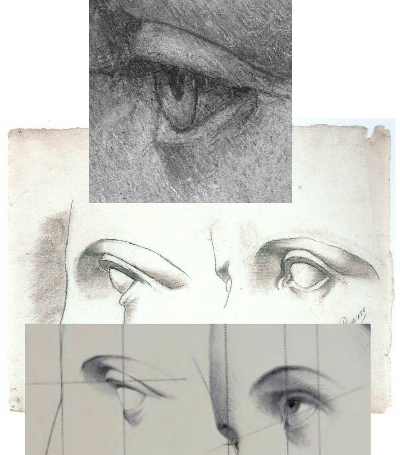
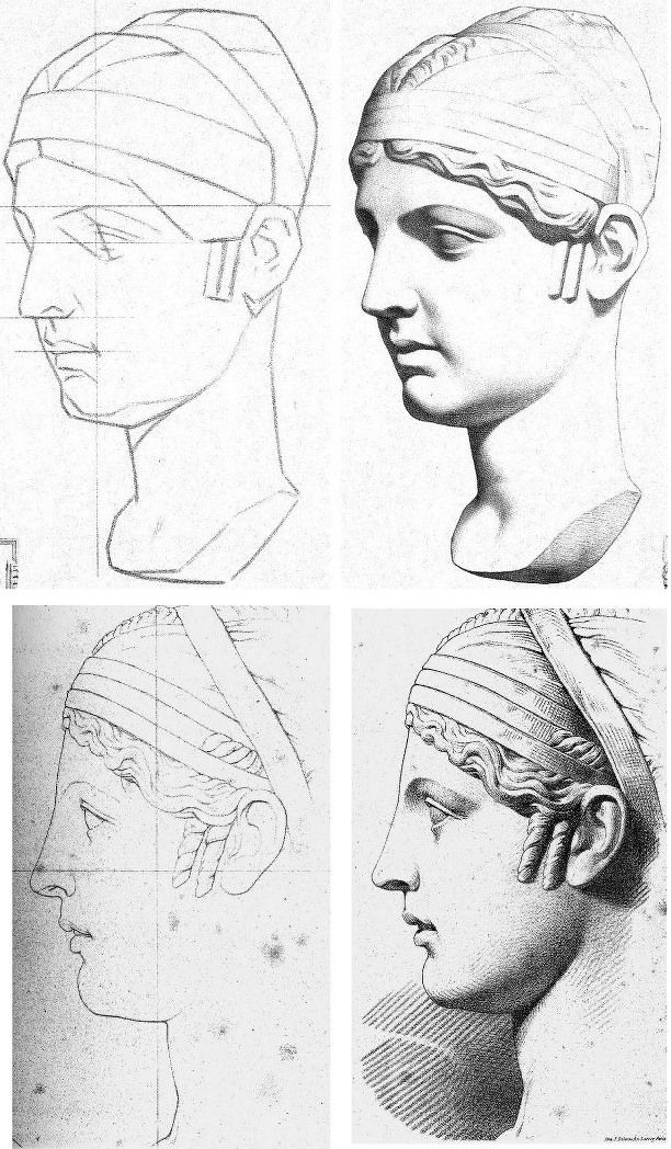
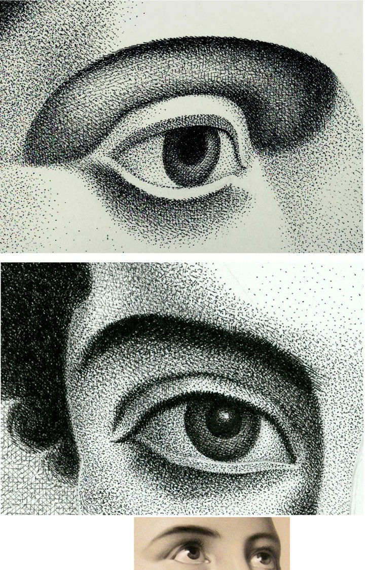
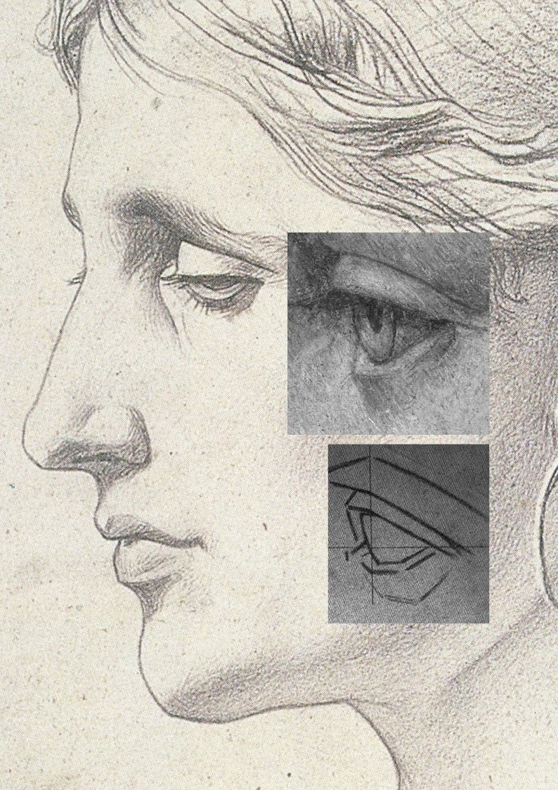
Above, Fig. 1: top, the eye of “La Bella Principessa”; centre, eyes drawn by Picasso, aged eleven; bottom, eyes drawn c. 1860 by Bernard-Romain Julien (1802-1871).
THE DISCOVERY OF THE SOLE PRE-1998 OWNER
In 2010 “La Bella’s” 1998 vendor, Jeanne Marchig, stepped from the shadows to sue Christie’s following press reports that fingerprint evidence had established Leonardo authorship and a value of $100/150 million. That claim was later discredited and dropped. Despite twelve years of assiduous searches by journalistic and art historical advocates, no record of the work predates its only known owner, Jeanne Marchig’s deceased artist/restorer husband, Giannino Marchig (1897–1983). Notwithstanding “La Bella’s” five-century provenance gap and stylistic incongruity advocates have declared it a 1496 portrait of Bianca Sforza. (See “Books on No-Hope Art Attributions”.)

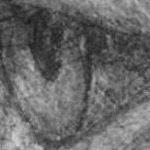
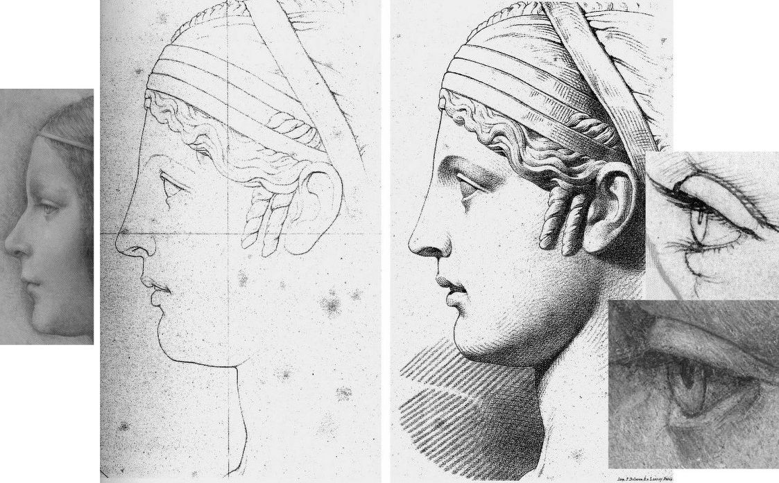
“La Bella Principessa’s” stylistic disqualifications (above, Fig. 2, bottom right) coalesce in the drawing of the eye (above, top left) and against a bona fide Leonardo eye drawing (bottom left). That is, “La Bella’s” eye is constructed by straight-edged planar surfaces when every Leonardo eye was constructed with curves and curving surfaces in accord with anatomically-dictated surface shifts at the eye/cheek intersection (see Fig. 3 below).
Where “La Bella’s” eye could never have been drawn by Leonardo, it could have been made by many skilful artists trained during the late 19th or early 20th centuries when an emphatically linear/planar manner of drawing was widely imposed. Giannino Marchig’s (above) self-portrait and etched profile of a lady betray such stylistic indebtedness. As well as being “La Bella’s” only known/claimed owner – and one who reportedly declined to disclose to his wife from whom or when the drawing had been obtained – Marchig fits the classic forger’s profile by being a talented well-trained artist who after initial successes found himself professionally unfashionable; became a close friend of Bernard Berenson; worked as a restorer; grew inexplicably rich…
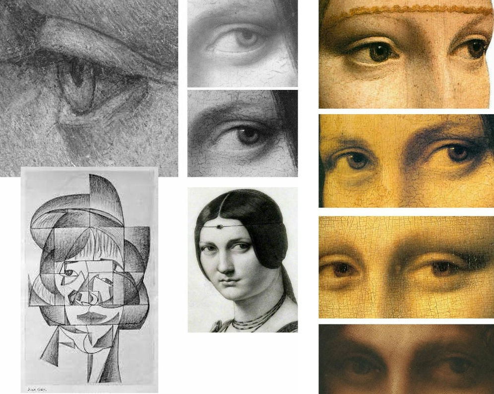
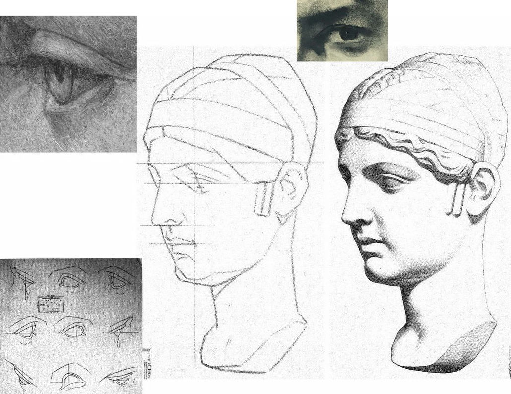
As previously noted, “La Bella’s” eye bears stylistic affinities with Cubist artists like Juan Gris (Fig. 3, above, left) and is anatomically incompatible with Leonardo’s drawn and painted eyes as instanced (above, centre) in La belle ferronnière in an infra-red image that discloses the preparatory drawing for the curving, thin lower eyelid; as painted by Leonardo; and, as copied in pencil by Ingres. The chronological sequence of Leonardo eyes above right (the Lady with an Ermine, La belle ferronnière, the Mona Lisa, and the St. John) shows Leonardo striving for an ever-greater softness of effect and nowhere constructing eyes with short straight lines and flat planes.
A NOTE ON THE FAILED-ARTISTS, RESTORERS AND ART FORGERS’ FRATERNITY:

Following the recent publication of Giannino Marchig’s self-portrait, a self-portrait, Fig. 4 above, left, has been attributed to Han van Meegeren (1889-1947), the forger and highly skilled author of the drawn illustration, above right. As Susan Grundy discussed here in 2016 (“A restorer’s aim – The fine line between retouching and forgery”), van Meegeren took a discarded copy by an unknown artist and, by careful restoration and creative additions, turned it into an autograph “Frans Hals” which sold handsomely. Eric Hebborn trained as a medals-winning painter at the Royal Academy Schools in the 1950s before working in London’s West End as a restorer specialising in repairing large paint losses with seemingly continuous old and cracked paint. In his 1997 memoir Confessions of a Master Forger, Hebborn discloses that under the tutelage of his restorer-employer he so improved his knowledge of old techniques, materials and styles as to “become able to ‘restore’ a whole painting – from nothing at all.”
GIANNINO MARCHIG
Above, Fig. 5, details of van Meegeren’s and Marchig’s self portraits. Although Marchig seems to have left no memoir, he did restore a Leonardo school painting and his wife reportedly sold many other works through Christies, New York, presumably also anonymously. It is possible that Marchig made no forgeries. It is possible that he had, as has been claimed since 2010, bought the drawing in the 1950s when forged Renaissance Ladies-in-Profile were commonplace. It is possible that having so bought, he came to doubt the drawing’s authenticity (- on Jeanne Marchig’s testimony, he “restored” the drawing with his own pastels). It is possible that he had made the drawing on a piece of old vellum with “lettering and a little dragon” on the side that has been glued onto an old oak panel, not to sell but to assure himself as a classically trained artist and teacher at the Florence Academy that, had modernism not swept the board, he “could have been a contender”.
THE ROOTS OF A DISTINCTIVE CULT OF DEPICTION BY FRAGMENTARY SURFACE PLANES
Because Marchig’s ownership rests on unsupported and shifting hearsay, anything might be the case with “La Bella Principessa” but, as is stylistically evident in the two self-portrait details above, Marchig and van Meegeren adhered to straight-edged, planar analyses of form.

In the self-portrait details of ears at Fig. 6 above, we see a common predilection for planes and edges and the eschewing of curved lines and surfaces. In van Meegeren (left), three intersecting straight lines confer two sharp points on the lower ear, precisely in the manner of the two diagrammatic ears above that are encountered below at Fig. 8 on the instruction sheet for artists drawn by Charles Bargue in May 1878.
To this draughtsman, the human ear (as drawn for the above 2001 Independent profile portrait of the then President of Zimbabwe, Robert Mugabe) presents an engaging formal/plastic challenge of complexly turning convexities and concavities in which straight lines and points of intersection make no appearance.
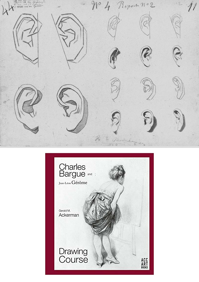
As mentioned, the pointy-eared diagrams at Fig. 6 are found on one of nearly two hundred sheets of dawn aids for art students from 1868 onwards that have been gathered in an invaluable 2003-2011 book above at Fig. 8 by Gerald M. Ackerman (in collaboration with the artist Graydon Parrish). It was felt in France during the late 1800s that shortcomings in art training might be corrected by placing better “models” of art before students who would then improve their drawing techniques and imbibe artistic good taste by copying exemplary lithographic drawings of sculptural casts, works of art and life drawings of male models. The national and international influence of the Charles Bargue (1826/27–1883) Jean-Léon Gèrôme Drawing Course (Cours de dessin) was immense. It spread to England and Spain. Van Gogh worked repeatedly through the plates and Picasso famously copied them.
CASTS’ WARS: EVALUATING THE JULIEN v BARGUE LEGACIES
There are two principal components of drawing: shapes and shading. Shape is best and most expeditiously made by line. Line is the principal agent of design being the most precise, accurate and swift tool in the graphic box. Shading is located within a design and can serve many roles. It can mimic the tonal values of colours. It can make surfaces advance or recede optically. Above all, by making gradations of tone from light to dark it can indicate depth and volume in forms or figures. (See Fig. 15.)
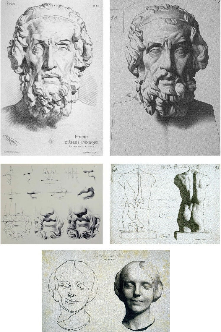
The Bargue-Gérôme drawing course was largely executed by Bargue (he drew the lithographs if not all of the prior charcoal drawings of casts) but it was not the first of its kind. A course had been published around 1860 by Bernard-Romain Julien (1802-1871), whose method is shown above left at Fig. 9, against the slightly later Bargue method, above right. Here we have a direct means of comparison in drawings of the same cast classical sculpture and, below, of the successive stages between line and line-with-shading.
Julien seizes the bull by the horns and fixes the shapes of forms immediately with curves and precision. Bargue splits the process into two conceptually discrete stages by depicting the cast first as a straight-edged mapping of “key” points and angles as at centre right, above. By so “abstracting complicated curvilinear outlines into straight lines and angles”, Bargue, as Gerald Ackerman puts it, is “making it something measurable”. Today’s key champions of Bargue (artists who adhere to the practice of accurately measured “sight-size” drawings) hold that an understanding of form will arise from such accurate and checkable (map-like) plotting of successive points and angles. While true to a degree, the practice generates an impoverished understanding of form – impoverished because it derives from an essentially pictorial exercise on a flat surface that is conducted from a rigorously fixed point in relation to the “model” when form exists in the round and offers infinitely changing aspects to a mobile viewer.
Bargue’s corpus is massively impressive and graphically brilliant but it confers an air of accuracy that may be spurious and it sometimes spawns slackly curvaceous outlines and lazily rounded shading that says little of internal structures (- see Fig. 22 below). Sometimes Bargue contrives a still-angular, facetted outline in his second-stage drawings and these impart a “cut-out photograph” quality, as on the entirely shaded life-cast of a young woman’s head as at Fig. 9, bottom.
On the Bargue v. Julien dichotomy, Ackerman holds: “In both, the drawing is excellent, tight and accurate. However, the proliferation of hatching in Julien’s example confuses the relationships of the various volumes of the face. Bargue works tonally, logically progressing from light to dark. The result is a greater range of value from black to white, providing more drama, unity and volume. It’s almost as if Julien were emphasizing the decorative aspects of the antique bust as opposed to Bargue’s stress on the sculptural qualities.” We take issue with this last claim.
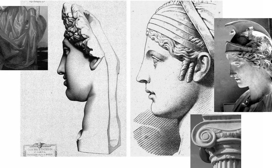
Above, Fig. 10, Bargue’s sheet of a cast sculpture, “Faustine” (the Roman empress Faustina), here mirrored in alignment with the eye of “La Bella”, top left. Before addressing Ackerman’s reading, consider the relationships of the eyes of “La Bella” and van Megeeren’s self-portrait, top right, and with Bargue’s sketch and final shaded stage. By comparison with van Megeeren’s graphic subtlety, fluidity and richness, the author of “La Bella’s” eye seems trapped within the preliminary sketching vocabulary – as at bottom left in the first Bargue “plate of instruction”. Against Bargue’s second stage eye rendering, “La Bella” not only lacks tonal fluidity and coherence, it looks superimposed upon the uncertain forms of “La Bella’s” head.
The lower line and line/shaded sequence above at Fig. 11 by Julien is also of the Faustine cast, albeit from a different view and not showing the whole head. Ackerman suspects that Julien’s refined, linear neo-classical style incurred official disfavour and that its more elaborate stylized refinement might have been considered to make impractical models for the teaching of basic drawing skills. While such judgements may well have been the case we take Julien’s graphic qualities and legacy to have been significantly underestimated – and perhaps especially so with Picasso, as discussed below.
In general terms and with regard to working artists’ methods, it is a moot point whether prior sketching with exclusively straight lines is a necessary or helpful step towards the imperative end of drawing accurately with curved lines and contours. Why delay engagement with an essential skill by erecting a conceptually complicating two-stage graphic means, like a music teacher who advises pupils to get the notes right first and then put the expression in later? Bargue’s two-stage pedagogic model is nowhere found in working artists’ practices and we should not be intimidated by the sheer beauty and descriptive power of Julien’s Faustina. His subtle precisely curving lines confer not only great elegance of drawing and design but hard, precise, well-organised information and great sculptural clarity.
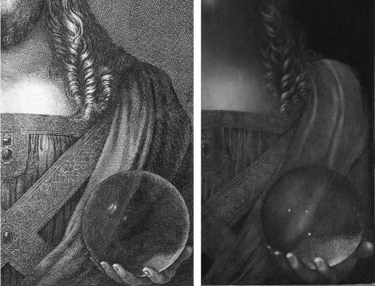
The three photo-inserts, above at Fig. 12, highlight the incompatibility of “La Bella’s” slightly wayward, downcast, sideways glancing, thick angular-lidded eye with either a true classical portrait’s eye, or those drawn by Leonardo.
At Fig. 13 above we see, left, Bargue’s second stage depiction of a cast of The Capitoline Ariadne, left, and Julien’s Faustina, right. This is a prime example of Bargue’s forceful graphic combination of crisply decisive shapes and a rich tonal spectrum of shading. In depicting the forms of the hair, Bargue seems to luxuriate in tonal variety for reasons more painterly than sculptural. His decoratively shaped discrete tonal values resemble Vermeer’s treatments of drapery, as above left. In contrast, Julien’s account of the hair is sculpturally pellucid. His shading escalates gently to a degree that supplements, not obscures, the precise linear description. Although only part-drawn, his head seems as crisply carved as a classical sculpture and as plastically coherent as a column capital through his scrupulously observed face and neck articulation. Julien’s lighter tonal notations perfectly capture the neck’s anatomical forms where Bargue’s heavier more uniform tones evoke an unfortunate rounded softness of a pig’s trotter.
PICASSO’S DUAL ENGAGEMENT
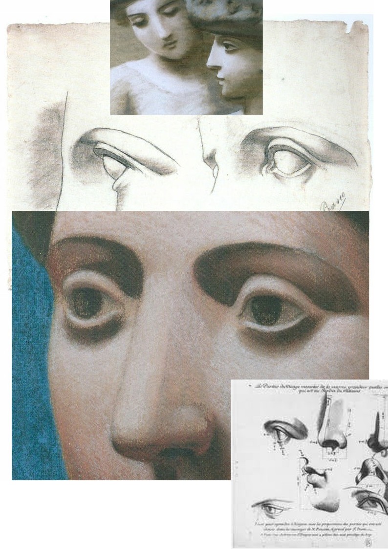
At Fig. 1, we contrasted “La Bella’s” masonry-like forms with two Julien sheet eyes copied by the eleven year-old Pablo Picasso and attached to that drawing a pair of Julien eyes that might have been taken as the young artist’s models were it not for the smooth transition from nose to eyebrow in the right-hand drawing where that transition was shown furrowed by Picasso. Further searching (- see Fig. 15 below) revealed that the particular Julien sheet Picasso had copied contained three line drawings of a woman’s left eye as seen in profile, in three-quarters view and head-on (and with three shaded versions of the same). Here above at Fig. 14 we place the eleven-year old’s eyes above a mirrored detail of the forty-year old Picasso’s pastel Head of a Woman made at Fontainebleu with superimposed details of Picasso’s 1921 pastel, Two Women with Hats and a 1683 engraving by Gerard Audran of Features of the Pythian Apollo.

Picasso had copied the Julien eyes under the guidance of his father at the Instituto da Guarda in La Coruña. His copy of the two eyes is, as Joan P. Uraneck noted in the August 2003 Burlington Magazine, (“Picasso’s ‘Two views of a left eye’, of 1892-93: a recent discovery”) one of seven surviving sheets the eleven-year old made – with four from Bargue. Uraneck sees a “remarkable resemblance” between Picasso’s juvenile copy of Julien eyes and his neo-classical work of the 1920s, and she reproduces one of the studies (above Fig. 15, top left) for Picasso’s Three women at the fountain. The main top image here is an ink transcription (made by this author as part of a suite of classical heads from antiquity onwards) of another of the Fontainebleu Picasso pastels, the Head of a Woman, Fondation Beyeler, Basel, which starred in the Frick Collection’s 2011 “Picasso’s Drawings, 1890-1921 exhibition”. At the time of drawing I had known nothing of Julien’s work but had been struck by the opacity in the eyes of Head of a Woman and especially so in comparison with eyes of a Graeco-Egyptian encaustic portrait a woman as below at Fig. 16. Today, that opacity is the more intriguing when we know of the astonishing vivacity of Julien’s eyes – as above and as in the bottom detail at Fig. 16. What we do not know is how many Julien sheets Picasso had seen and copied but given that he was being taught by his artist father we might safely assume that he had seen and produced appreciably more than seven such copies.
Uraneck’s discovery is intriguing: could Picasso have summoned the suite of monumental heads seen below (Fig. 17) in the Pushkin Museum’s invaluable photograph of Olga Picasso in the studio at Fontainebleu in 1921 without exposure to Julien’s fastidious intelligent studies? By the same token, had copying Bargue’s “analytical” first sketches (as with his Homer below) implanted a conceptual schema or template for a Cubist deconstruction/reconstruction of figures? Or, even: had Picasso’s simultaneous exposure to two powerful conflicted pedagogical programmes at a tender, highly susceptible age left him artistically like a dog between two bones – never fully able to decide which kind of artistic voice to adopt?
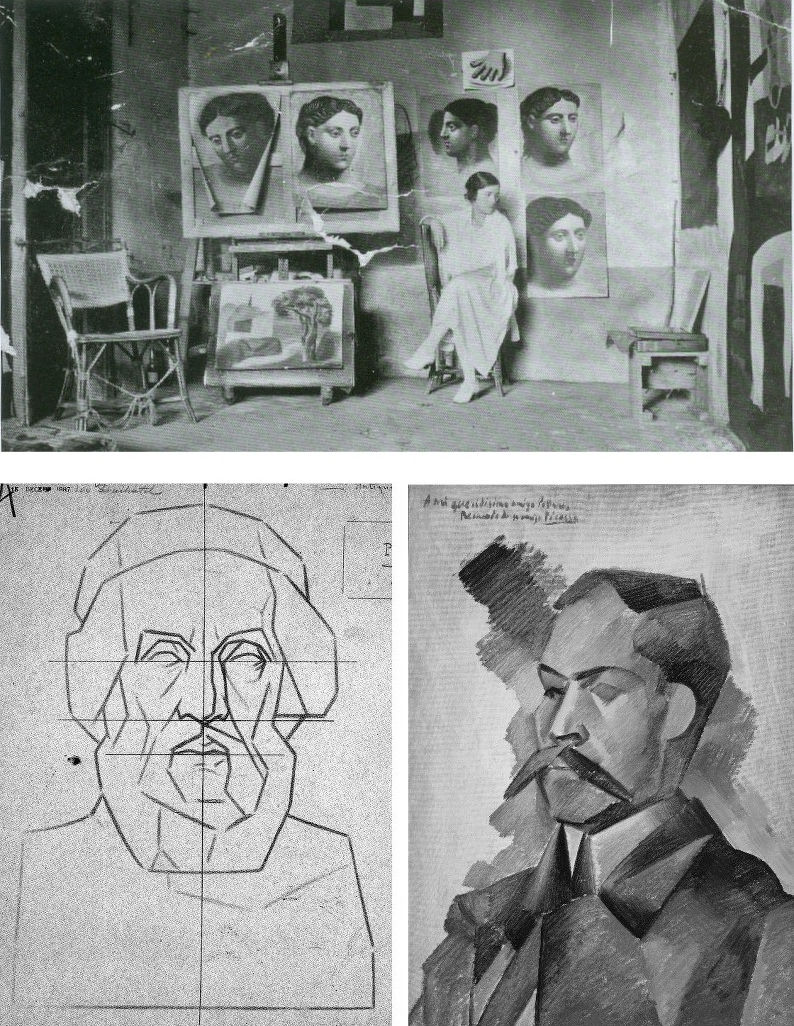

In Fig. 18 above, it might look at a casual glance as if the same drawing has been reproduced twice on differently coloured grounds. In fact, that on the left is Bargue’s second stage study of an antique torso and that on the right is a copy made by Picasso when only twelve. This drawing is sometimes cited as a proof that the young Picasso was able to draw as well as Raphael and had needed to learn how to throw off his classical manacles. Although Picasso has replicated Bargue’s disposition of dark, mid and light tones with great precocity and therefore seemingly succeeded in producing a striking copy of the “model” drawing before him, the drawing contains elementary errors.
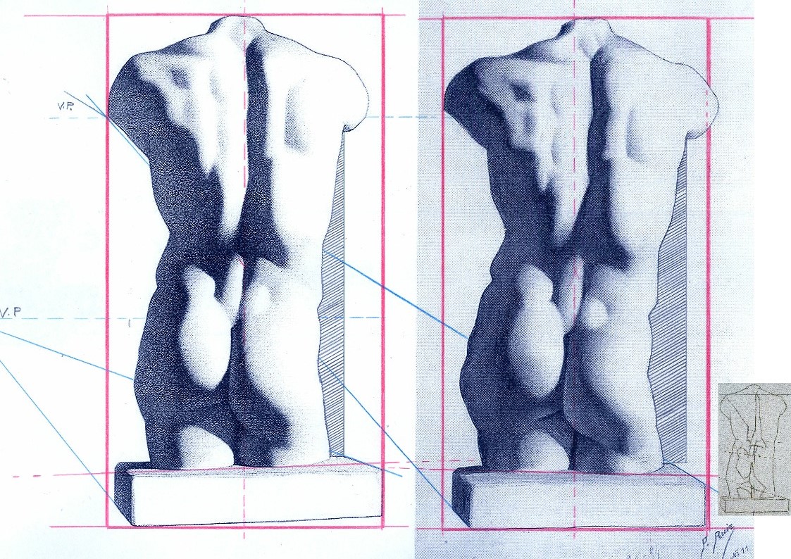
Despite having the two states of Bargue before him, Picasso greatly exaggerated every subtle movement and shift of direction in the torso’s right-hand contour. In Fig 20 above we subject the two versions to identical simple checks on proportion and alignment and soon discover an accumulation of egregious errors. Picasso was not attentive to the “architecture” of the design or to the placement of the cast’s torso on the rectangular plinth which Bargue set on a slight diagonal that runs away from the viewer. Projecting the bottom left and top right edges of Bargue’s base (as with the blue lines) imparts a perspective in which the vanishing point gives a horizon line that crosses the torso at about one third of its height. Projecting the same edges in the Picasso copy sets the horizon at chest height. The dotted red central vertical line in the Bargue version shows subtle counter sways in the upper and lower parts of the torso that are broadly balanced and give a securely composed symmetry within the figure. Picasso, seemingly mesmerised by the seductively dramatic powers of shading, loses sight of the torso’s taught musculature and allows his own reading of too-large and too-soft forms to sway precariously to (our and his) right – and to bulge at the left hip. Michelangelo said that his compasses were in the eye. If at any stage Picasso had dropped a plumb-line in his mind’s eye from the point where the right arm parts company with the torso down towards the cast’s base he would have seen immediately how badly his figure was listing.
BENCHMARK DRAWINGS
Bargue had not invented the schema of a strongly outlined figure with one side brightly lit and the other heavily shaded. At Fig. 20 below stands one of the most graphically and sculpturally masterful combinations of line and tones ever to be dropped onto a sheet of paper – Benvenuto Cellini’s awesome Juno.
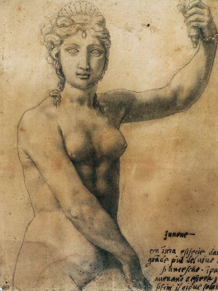
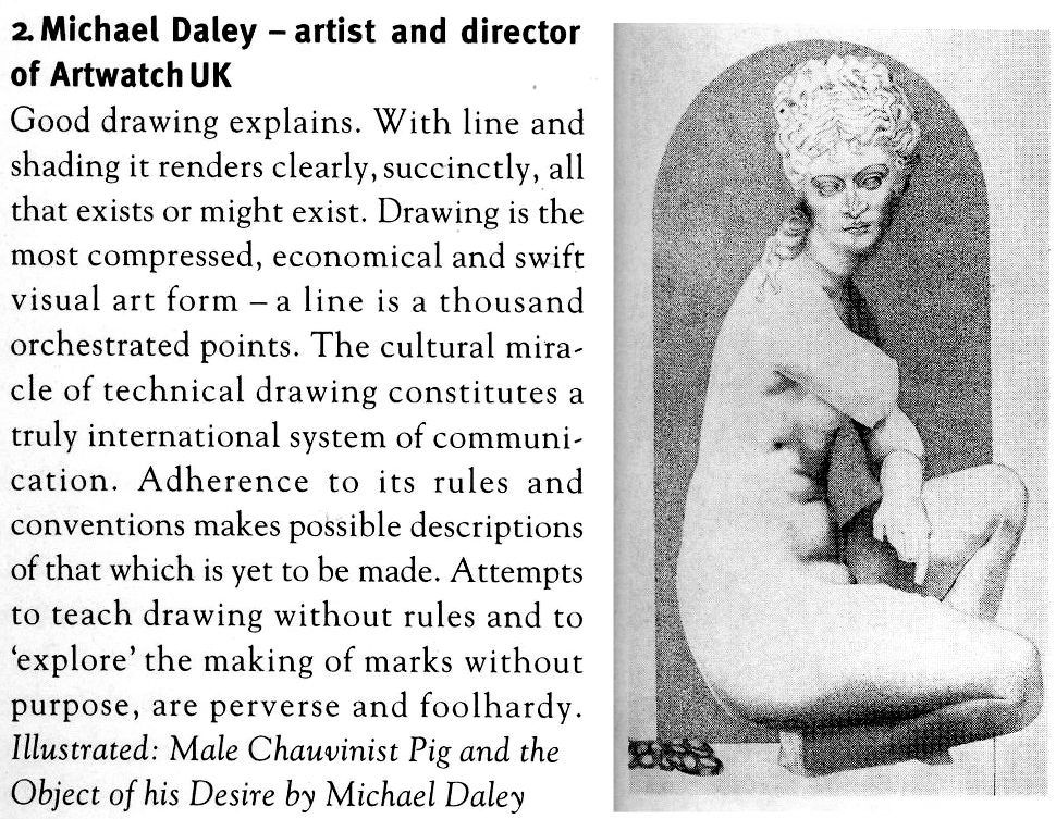
In 1980, some years after first encountering Cellini’s Juno, I paid homage to his graphic/sculptural dispositions in a section of a pen and ink drawing (“Male Chauvinist Pig and the Object of His Desire”) as above right at Fig. 21, albeit establishing the lit side not with a line but with a tonal distinction. In 1996 David Lee, then editor of the Art Review, challenged six people (John Ward RA; Michael Kenny RA; Timothy Clifford, then Director, National Galleries of Scotland; Oliver Berggruen, old master drawings dealer; Michael Daley, AWUK, and Leonard McComb RA, then Keeper of the Royal Academy Schools) to say in under two hundred words each of what Good Drawing consists. I pitched for technical drawing in part as a polemical antidote to then current art school practices (see below) on the firm conviction that participation in a short crash course in technical drawing would do more to improve standards of drawing than anything else. Technical drawings have to be clear, comprehensible, coherent and unambiguous because they trade in objectively verifiable facts. Such is their precision and authority that they can – and often do – form part of legal contracts.
Fast forward a century from the competing talents of Bargue and Julien to State art schools in Britain. By this time, insofar as drawing was encouraged or permitted, it was under the empty rubric “Mark Making” and its brain-dead twinned invitation to “Explore Marks” – as, for example, in this sadly characteristic art school directive:
“At the end of this project the student will be involved in drawing in a creative way and not consider it as a mechanical function carried out somewhere at the end of his hand. In this studio the project is devised to increase the student’s experience of drawn marks and of drawing techniques. To do this a varied selection of drawing implements are used, e. g. sponge, sticks, stones, finger, hand, hair, glass marbles, string, pencil, pen, brush, etc…e. g. Drawing with a glove on – with the glove filled with small stones – with the glove having two fingers knotted – with the glove filled with sand – with various kinds of gloves e. g. industrial gloves to supple cricket gloves…e. g. Drawing on a sheet placed on a board which is suspended from the ceiling by rope. Trying to draw a controlled mark on this swinging surface. Using the same board but having two students drawing, one on each side influencing each other’s marks…e. g. Drawing through visual restrictions: through glasses, glasses with dots painted on them – through smoked glass – with one eye covered – wearing a gas mask – with strings obstructing vision – with moving strings doing the same (using a hair dryer to blow the strings). Drawing in a dark room. Drawing with hand under water…e. g. Physical restrictions: with one arm tied to the shoulder using the mouth to hold the implement…etc. etc.”
Above, Fig. 22, one of Bargue’s weaker, more slackly drawn sheets.
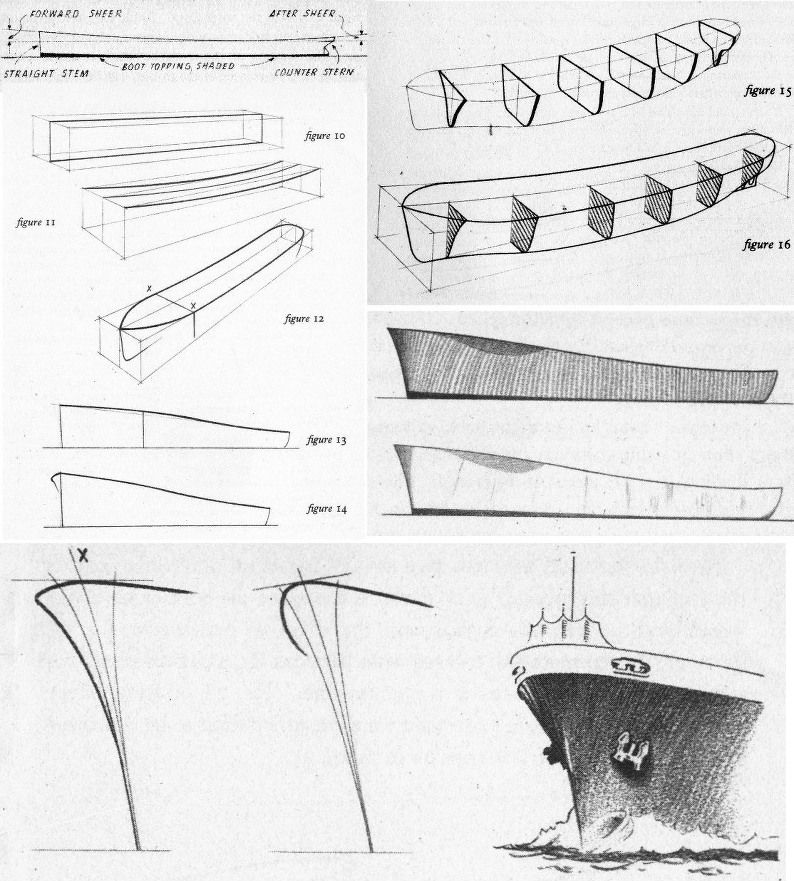
In London, from the beginning of the Second World War, The Studio magazine published an extensive series of “How to draw…” books that channelled lessons derived from Bargue–Gèrôme, Julien and others in the simplest, most direct manner. In Fig. 23, above, a suite of introductory drawings is shown from Leonard W. Sharpe’s 1945 How to Draw Merchant Ships. Sharpe begins with a sermon on the marriage of technical necessities and poetry in ships: you must know the what and the why before you can appreciate ships and hope to draw them successfully. Sharpe’s first lesson was to understand the sheer (the curvature in side elevation) of a ship’s hull. To aid buoyancy in driving seas, the forward sheer needs to be greater than that of the after sheer – less lift is required against a sea that is following a vessel. The creation of this vital seaworthiness is not just a matter of maritime efficacy: “A good designer arranges the design of his ship…handsomely so as to ‘take the eye’…the hull is a combination of exceedingly graceful curves which could very well be described as ‘poetry in steel’, particularly when seen from the bow or quarter.” Sharpe, like Julien, assumes a novice draughtsman’s willingness to master curves. Until recently every ship in the world had been an orchestration of curves. To the sheer is added the flare at the bow “so that heaving waves are flung outwards instead of cascading in full force onto the deck”.
CLOTH EYES AND SCHOLARLY CLOSED SHOPS
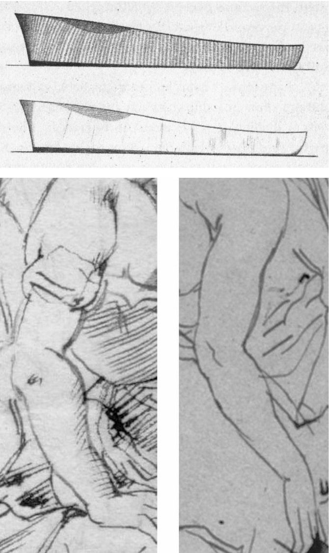
Sharpe’s comments were underpinned by his drawn sketch demonstrations. As seen in Fig. 23 above, top, he made two drawings of a nominal hull to illustrate different types of shading. No one looking at the pair would likely suspect that Sharpe had been the author of only one of the drawings. Looking at the above two details of ink sketches that carry a bent female arm, how many would feel just as confidently that these are the work of the same artist (Rubens) working at the same time (c. 1610 and c. 1608-12, respectively) in the same medium (pen, ink, paper)? Both drawings were included as autograph in Julius Held’s canonical 1959 work Rubens – Selected Drawings. We catalogued a stream of alarm calls in September 2014 (“Art’s Toxic Assets and a Crisis of Connoisseurship”):
The arm on the left belongs to a supposed Rubens ink sketch for the painting of Samson and Delilah that is given to Rubens by the National Gallery even though a director of the gallery admitted that it does not look like any other of the many Rubens’s held. If by Rubens, this ink sketch would be the only one framed on the paper by an ink box that severs part of one of Samson’s feet – an anomaly in Rubens that is also found in the National Gallery’s Samson and Delilah painting. Like “La Bella Principessa”, this drawing (which bears the inked initials “V.D.”) emerged only in the 20th century – 1926 – from a Dutch firm of antiquaries (a family member of whom was a graphic artist) when it was sold as a van Dyck. Contemporary copies of the (long-lost) original Rubens Samson and Delilah painting showed that Samson’s toes had not been cropped at the edge of the painting. The ink sketch had been authenticated by the esteemed Rubens scholar Ludwig Burchard very shortly before he also authenticated the then recently discovered Samson and Delilah painting that is now in the National Gallery and is there paraded on the website as one of the Gallery’s “not-to-be-missed” paintings. In his 1930 certificate of authenticity for this painting, Burchard said the picture was in excellent condition and even retained its panel’s original back. Following a restoration at the National Gallery it was reported that the original back had disappeared sometime in the late 19th century or early 20th century when the panel had been planed down to wafer thinness and glued onto a sheet of blockboard. As reported in our 2006 Journal No. 21, over sixty Burchard attributions had subsequently been down-graded in Corpus Rubenianum.
The second stage of the Bargue course consisted of his copies of exemplary, taste-conferring models found among great artists’ drawings. The stunning drawing above (detail) at Fig. 24 is by Bargue after a (now lost) drawing by Adolphe-William Bouguereau (1825-1905). Ackermann congratulates Bargue for replicating the character and manner of a great variety of artists. Of this (near-profile) drawing entitled A Roman Woman (Femme romaine) he observes:
“It is a wonder, displaying a marvellous balance between the observation of a realist and the ideals of a classicist. Bouguereau is more concerned with anatomy than some of the other masters. The bony appearance of her nose, the sunken eyes and cheeks, and the thickness of her neck are qualities he describes so accurately that it places the woman in her late forties, at not quite overripe maturity. The outline is elegantly, sensitively drawn by means of a line that continually changes its thickness or emphasis as it gives sensitivity to the nose and lips, strength to the chin, and fullness to the neck. The hair is complex without being detailed. In this drawing Bouguereau is an absolute master of the Academic realist drawing technique, a mixture of observation, knowledge and ideals.”
As with “La Bella”, in this (near-) profile portrait the eye has a downward cast, sideways glancing eye with a thick and facetted lower lid. Is it conceivable that Leonardo, in a single out-of-character work, should have anticipated a means of drawing encountered in one 19th century artist’s copy of another 19th century artist’s work?
HIGH STAKES

In our view, if the scholars who still hold that Leonardo made both of the eyes and both of the faces above (and at the same art historical moments) were to prevail, the parameters of the artist’s oeuvre would be so greatly elasticised as to undermine international art market credibility, which credibility has already been rocked by the recent spate of exposed fake modern and fake old master paintings.
Michael Daley, Director, 18 January 2020
How the Louvre Abu Dhabi Salvator Mundi became a Leonardo-from-nowhere
If it’s not over in opera until the fat lady sings, it’s not over in art attributions until the paint dries and the provenance settles. In art historical disputes over the origins (provenances) or conditions (restorations) of art, the weight of academic study and curatorial politics has assumed a greater importance than the dwindling creative/technical expertise of living artists. That this imbalanced dynamic is culturally destabilising, can perfectly be seen in the Leonardo Salvator Mundi Saga. Following a scholar’s recent re-attribution of the Louvre Abu Dhabi Salvator Mundi to Leonardo’s follower, Bernardino Luini, dedicated supporters of the $450million painting are re-writing its provenance in the wake of a second scholar’s newly discovered documents. The painting itself has not been seen since it was sold at Christie’s, New York, on 15 November 2017 and it is not clear when it might be seen again – the Louvre Abu Dhabi indefinitely postponed its planned launch of the painting a day ahead of a visit by the French Foreign Minister, Jean-Yves Le Drian, to mark the announcement of the museum’s programme of events for the next year.
The first question here is stark: Is the picture that was sold for nearly half a billion dollars an entirely autograph painting by Leonardo or a dressed-up school work? The second question is: Had a proper art historical case been made for this painting before it was exhibited in 2011 at the National Gallery as a Leonardo? In our view, the latter had not happened, partly because no attempt had been made, and partly because on a reading of the available historical evidence, the Leonardo case could not be made. On the former question, the Vienna Times reported scholarly concerns on 17 September 2018 (“What Happened With the 450 Million Dollars Painting”):
“Is there anything wrong with the painting that was auctioned at the Christie’s New York in November 2017 for the world record price of 450 million dollars? Experts suspect that the image of Christ had been doctored before sale. When it was exhibited at the National Gallery London in 2011, there were some doubts: the pedantic Leonardo would never have painted the folds of the robe behind the glass ball, ignoring the refraction of the light. At the 2017 auction, the wrinkles suddenly looked ‘right’. In the magazine ‘Art’ the German specialist Prof. Frank Zöllner (62) [The author of the catalogue raisonné Leonardo da Vinci – the Complete Paintings and Drawings] wrote about Leonardo: ‘The question arises whether the restorers responded with a modification of the folds to the objections of the critics.’ So, a manipulation to seduce connoisseurs and drive up the price? Zöllner: ‘An absurdity, if that happened.'”
On the pre-sale re-restoration, see Dalya Alberge – “Auctioneers Christie’s admit Leonardo Da Vinci painting which became world’s most expensive artwork when it sold for £340m has been retouched in last five years” – and our: “The $450m New York Leonardo Salvator Mundi Part II: It Restores, It Sells, therefore It Is.”
WHAT HAPPENED?
From the first this work has been soaked in mystery. Professor Martin Kemp discloses in his latest book Living with Leonardo: Fifty Years of Sanity and Insanity in the Art World and Beyond that it: “crossed Robert’s [Robert Simon] path in 2005 when it came up for sale at a regional auction house in Louisiana. Robert and his fellow New York art dealer Alexander Parrish, who had also noticed it, thought it might be a bit better than it superficially looked – without imagining that it might be the original. They decided to bid by proxy, and met with success, apparently acquiring it for less than $10,000, which at the time would have seemed like quite a high price.” “Apparently”? For how much? How had it been listed? Who sold it? When? Where? Many have searched and no one has found answers but this serially redone as-if-from-nowhere work has been sold twice already – with a different face of Christ each time – for a total of over half a billion dollars, first in a private sale by Sotheby’s in 2013, reportedly for $75-80 million to the owner of a string of free ports who immediately sold it on to a Russian oligarch for $127 million, and then, famously, by Christie’s, New York, for $450million in 2017. Did that initial opacity pass freely through the National Gallery and into the art market food chain? It might seem so: when the painting was taken to the National Gallery for a private viewing by a select group of experts, “All of the witnesses were sworn to confidentiality”, Kemp has disclosed, “and the painting travelled back to New York with Robert. It was becoming a Leonardo.” The invitation to view, appraise and perhaps authenticate flattered: “We are only inviting two or three scholars.”
Kemp believes that the National Gallery had not included another Leonardo attributed work he supports (the so-called “La Bella Principessa” drawing) in the 2011 Leonardo show because the curators did not accept its attribution and he now feels that that rejection had highlighted: “the rationale for the inclusion of the Salvator Mundi. Was it on the market? Would exhibiting it mean that the National Gallery was tacitly involved in a huge act of commercial promotion? It seemed highly likely that it was also ‘in the trade’. All I knew at this stage was that it was being represented by Robert Simon. He told me that it was in the hands of a ‘good owner’ who intended to do the right thing by it, and I did not inquire further. I was keen to consider the painting in its own right, not in relation to its ownership. I speculated, of course, that Robert might have a financial interest, perhaps a share in its ownership; and I assumed he was gaining some kind of legitimate income from his work on the picture’s behalf. But the gallery was assured that the painting was not actively on the market. Understandably keen to exhibit, they were happy to accept this assurance.”
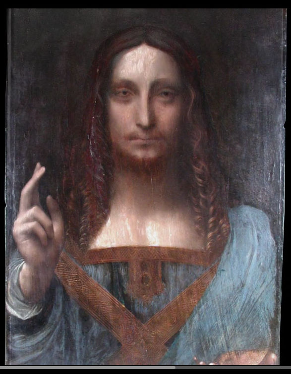
Above, Fig. 1: Part of the Louvre Abu Dhabi Salvator Mundi painting (as shown on television) when it arrived in 2005 (still sticky from a previous restoration) at the New York studio of the restorer Dianne Dwyer Modestini.
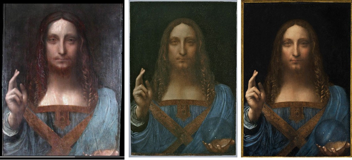
Above, Fig. 2: Left, the screen grab of the 2005 state; centre, the picture as exhibited as an autograph Leonardo painting in 2011-12 at the National Gallery ; right, the picture as sold at Christie’s, New York, in November 2017 after further and recent restoration repainting.
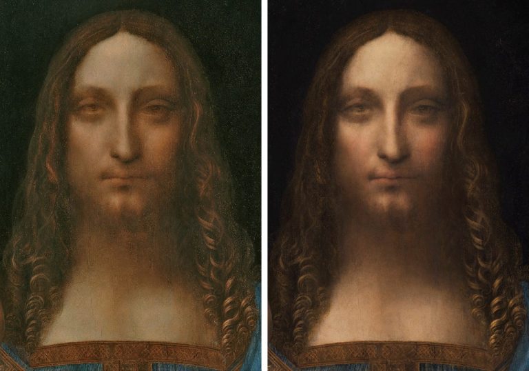
Above, Fig. 3: Left, the head as in 2011-12 when at the National Gallery; right, the head in 2017 when sold at Christie’s, New York.
Above, Fig. 4: Left, the face as in 2011-12 at the National Gallery; right, the face as sold st Christie’s, New York, in 2017.
Above, Fig. 5: Top, the eyes after cleaning but before any repainting; left, the face, as in 2011-12; right, the face, as in 2017.
Above, Fig. 6: Far left, the face, as in 2005; left, the face as 2007 after the panel had been repaired and cleaned; centre, the painting in 2008 when taken to London for a private viewing at the National Gallery; right, the face as exhibited at the National Gallery in 2011-12; far right, the face as when sold at Christie’s, New York, in 2017.
GROWING THE PROVENANCE
We had warned ahead of the picture’s 15 November 2017 sale that the provenances compiled by the National Gallery in 2011 and Christie’s, New York, in 2017, were inflated and overly-reliant on the unpublished researches of one of the first consortium of owners (see “Problems with the New York Leonardo Salvator Mundi Part I: Provenance and Presentation”):
“…this work, now unequivocally described as a fully autograph Leonardo painting that is the artistic equal of the Mona Lisa, first materialised in 1900 when bought as by Leonardo’s follower, Bernardino Luini (- it was later taken to be a copy after Boltraffio). That purchase, and what followed immediately afterwards remained in the realm of verifiable facts until the painting went missing [after 1958] before reappearing in 2005. What was suggested to have happened before 1900 is speculation and/or contention. The first reference to such a Leonardo subject is in 1651. Christie’s provides the following provenance:
“(Possibly) Commissioned after 1500 by King Louis XII of France (1462-1515) and his wife, Anne of Brittany (1477-1514), following the conquest of Milan and Genoa, and possibly by descent to
Henrietta Maria of France (1609-1669), by whom possibly brought to England in 1625 upon her marriage to King Charles I of England (1600-1649), Greenwich;
Commonwealth Sale, as ‘A peece of Christ done by Leonardo at 30- 00- 00’, presented, 23 October 1651, as part of the Sixth Dividend to
Captain John Stone (1620-1667), leader of the Sixth Dividend of creditors, until 1660, when it was returned with other works upon the Restoration to
King Charles II of England (1630-1685), Whitehall, and probably by inheritance to his brother King James II of England (1633-1701), Whitehall, from which probably removed by
Catherine Sedley, Countess of Dorchester (1657-1717), or her future son-in-law, John Sheffield, 1st Duke of Buckingham and Normanby (1648-1721), and probably by descent to his illegitimate son
Sir Charles Herbert Sheffield, 1st Bt. (c. 1706-1774); John Prestage, London, 24 February 1763, lot 53, as ‘L. Da. Vinci A head of our Saviour’ (£2.10).
Sir [John] Charles Robinson (1824-1913), as Bernardino Luini; by whom sold in 1900 to
Sir Francis Cook, 1st Bt. (1817-1901), Doughty House, Richmond, and by descent through
Sir Frederick [Lucas] Cook, 2nd Bt. (1844-1920), Doughty House, Richmond, and
Sir Herbert [Frederick] Cook, 3rd Bt. (1868-1939), Doughty House, Richmond, as ‘Free copy after Boltraffio’ and later ‘Milanese School’, to
Sir Francis [Ferdinand Maurice] Cook, 4th Bt. (1907-1978); his sale, Sotheby’s, London, 25 June 1958, lot 40, as ‘Boltraffio’ (£45 to Kuntz).
Private collection, United States.
Robert Simon, New York.
Private sale, Sotheby’s, New York.
Acquired from the above by the present owner
Pre-Lot Text
Property from a Private European Collection
“Thus, from a claimed execution either before or after 1500 (the supporters are divided on a possible position within Leonardo’s oeuvre) it is said to have passed through four centuries via a ‘(Possibly) Commissioned’; ‘Possibly by descent’; ‘by whom possibly brought to England’; ‘probably by inheritance’; ‘from which probably removed’; ‘and probably by descent’ to 1900. It then took a further 111 years for this work to gain accreditation as a Leonardo when it was included in the National Gallery’s special exhibition Leonardo, Painter at the Court of Milan after a long and highly problematic restoration.” Emphases added.
On 2 February 2018, in “The $450m New York Leonardo Salvator Mundi Part II: It Restores, It Sells, therefore It Is”, we held the National Gallery’s 2011 provenance to have been similarly problematic:
“This Leonardo ascription has been made on almost no published scholarship. It rests on a largely unstated and, therefore, unexamined art critical case. Apart from the restorer’s report and the National Gallery exhibition catalogue’s entry by its curator, Luke Syson, almost nothing, so far as we know, has been published in support of this Leonardo. Christie’s lot essay appealed to the authority of the unpublished researches of one of the original owners, Dr Robert Simon, a New York art dealer, and to [the restorer] Diane Dwyer Modestini’s and Syson’s accounts when they, too, both acknowledged indebtedness to the researches of Simon. After twelve years, serial restorations and two sales at a combined total of over half a billion dollars, those researches have yet to be published… Luke Syson writes:
“‘The re-emergence of this picture, cleaned and restored to reveal an autograph work by Leonardo, therefore comes as an extraordinary surprise’ but, he adds, of Wenceslaus Hollar’s engraved testimony: ‘None of this, of course, is evidence for the picture’s autograph status. After all, the pictures by pupils copying Leonardo’s design may sometimes have been rather good, and one such might easily have been owned by Henrietta Maria.’ Quite so, and in view of Jacques Franck’s account [that Leonardo had not painted a prototype Salvator Mundi because he was otherwise engaged and devolving painting to his studio – see below] … that very possibility, as advanced by Ludwig Heydenreich, is the first mountain that any autograph Leonardo Salvator Mundi aspirant must be seen to have scaled. It is now six years since Syson alerted us that ‘This discussion anticipates the more detailed publication of this picture by Robert Simon and others’ but he gave little indication of any corroborative evidence being to hand. It would sometimes seem that Simon’s researches on the New York candidate echo or adapt the extensive researches earlier conducted by Joanne Snow-Smith in her support of the unsuccessful Paris candidate, the so-called de Ganay Salvator Mundi. If Syson should prove to have been a dutiful student of Simon we might be in for a daisy-chain of hypotheses in which awkward and peculiar features are advanced as material corroborations with rhetorical flourishes. Syson ends his account thusly:
“’Snow-Smith has shown that King Louis XII and his consort, Anne of Brittany, were particularly devoted to Christ as Salvator Mundi, and that they could connect this cult with the Mandylion of Edessa twice-over we now see. Given the date – around 1500 – of Leonardo’s preparatory drawings [only two sheets of drapery studies, one of which is thought not to be entirely autograph], the style of the picture and its association with a French princess [Charles I’s queen, Henrietta Maria], Louis and Anne become the most likely patrons for Leonardo’s Salvator Mundi, probably commissioning the work soon after the conquest of Milan and Genoa. This would therefore be one of the French commissions mentioned by Fra Pietro da Novellara. And it was perhaps to accommodate their wishes that Leonardo based Christ’s features, the set of the eyes, the heavy lower lids, and especially his smoothly arched eyebrows [sic] down into a long nose, on the Christ of the Mandylion of Edessa.’”
“How can you extract a ‘would therefore be’ from a ‘could’, a ‘most likely’, and a ‘probably’? In lieu of a single hard shiny fact, we are offered a forest of fancies, maybes, perhaps’s and scholarly borrowings.” Emphases added.
THE FRA PIETRO DA NOVELLARA CONNECTION
When Luke Syson claimed that the now-Louvre Abu Dhabi Salvator Mundi had “therefore been” one of the French commissions by King Louis XII and his consort mentioned by Fra Pietro da Novellara he risked readers confounding his “therefore” with a proof rather than a contention. In a footnote, Syson cites paintings (of only recent provenances) that “must also” have derived from this Royal commission. One, the Young Christ by Marco d’Oggiono in the Galleria Borghese, Rome, is discussed below at Fig. 14. On the precise testimony of Fra Pietro da Novellara, see Jacques Franck, below.
ALL CHANGE
When the Leonardo scholar Matthew Landrus recently contended that most of the upgraded Salvator Mundi was painted by Leonardo’s assistant, Bernardino Luini (the very artist under whose name the secure provenance began in 1900 – see “Leonardo scholar challenges attribution of $450m painting” and “Salvator Mundi: Why Bernardinino Luini should be back in the frame”) he was disparaged by his former teacher, Martin Kemp, at the Edinburgh Festival, and on CNN, who reported:
“Others are in less doubt. Curator of Italian Paintings at London’s National Gallery [sic], Martin Kemp, sent the following statement to CNN Style by email: ‘The book I am publishing in 2019 with Robert Simon and Margaret Dalivalle (…) will present a conclusive body of evidence that the Salvator Mundi is a masterpiece by Leonardo. In the meantime I am not addressing ill-founded assertions that would attract no attention were it not for the sale price.’”
Kemp’s disinclination to address “ill-founded assertions that would attract no attention were it not for the sale price” marked a change of policy and showed a touch of humbug. Last year, immediately ahead of the sale that produced the astronomical price of the Salvator Mundi, Kemp engaged polemically with those who rejected the picture’s Leonardo attribution: “I was approached by the auctioneers to confirm my research and agreed to record a video interview to combat the misinformation appearing in the press – providing I was not drawn into the actual sale process.” As for the long-forthcoming Book That Will Answer All Doubters, its co-authors failed to meet a Yale University Press deadline to publish in time for the 2011-12 National Gallery Leonardo show, in part, Kemp now discloses, because “I was unconvinced that all the authors actually had anything to say.”
THE JEREMY WOOD WALPOLE SOCIETY FINDINGS
Certain discoveries in Jeremy Wood’s Walpole Society article “Buying and Selling Art in Venice, London and Antwerp… c.1637-52” have thrown the earlier Salvator Mundi provenances of the National Gallery and Christie’s, New York, into question. Because so much credence is (rightly) attached to documentation, the sudden discovery of a parallel never-seen but documented ghost painting has undermined official accounts of the Louvre Abu Dhabi picture’s history. Within a single country at the same historical moment there are now two records of a Leonardo painting in the Collection of Charles I and two records of a Leonardo Salvator Mundi painting in the (nearby) Hamilton collection. With the Charles I collection, the first record is in the 1649 inventory of Charles I’s possessions drawn up in the year of his death. It is not of a Christ as Salvator Mundi but was recorded simply as ‘A peece of Christ done by Leonardo’ when sold in 1651. It tells us that Charles I had had a painting of that description but not when or how it had been acquired. The second and later record of 1666, as disclosed in Martin Kemp’s new book, is a work in the numbered list of the “King’s Closet” in Whitehall and “featured as number 311: ‘Leonard De Vince O.r Savio.r w.th a gloabe in one hand & holding up y.e other’.” Today, thanks to Wood’s researches those two records are balanced by the discovery that a ‘Christ with a globe in his hande done by Leonardus Vinsett’ was in the Chelsea home of James, 3rd Marquis, later 1st Duke of Hamilton, between 1638 and 1641. A second record further testifies to a Salvator Mundi in the Hamilton collection in 1643, as is discussed below.
The four records of two Salvator Mundis attributed to Leonardo in two important collections might be taken to show that two Leonardo Salvator Mundis co-existed in England at that time. But records of two Leonardo Christs cannot safely be taken to confirm that two Leonardo paintings of Christ were present in England. Nor need it mean that one painting was a Leonardo and the other not – they might both have been misattributed. Max Friedlander warned that “The inventories of princely galleries – such as those of Margaret of Austria, Vicereine of the Netherlands, or of King Charles I of England…are to be utilized sceptically and to be taken seriously only to the extent that facts derived from style criticism do not contradict them.”
LEONARDO HAD NO TIME TO PAINT
In part the destabilisation stems from an emerging contrast between the unexpected abundance of records in mid-seventeenth century England of an attributed Leonardo picture and the complete absence in early sixteenth century Italy of any record or mention of a Leonardo Salvator Mundi. Not only is there no documentary record of Leonardo ever having painted a Salvator Mundi prototype, in material/visual terms, there are no characteristically faithful copies of the kind executed from such autograph Leonardo paintings as the Mona Lisa and The Virgin and St. Anne. The day before the 15 November 2017 sale at Christie’s, New York, we contrasted that marked absence of copies with the plethora of variants (more than twenty) of a Leonardesque Salvator Mundi – all of which seemingly derive from little more than a couple of drapery studies that have been attributed to Leonardo. This might all indicate, as Heydenreich had concluded after a most exhaustive study, that while Leonardo – a notoriously fastidious and slow artist – had made drawings for his school, he had not painted a Salvator Mundi. We reported then that Jacques Franck, the expert of Leonardo’s painting techniques and a restoration adviser to the Louvre, had noted that the logistics of Leonardo’s life at the time were known to have made painting all but impossible:
“By 1500 onwards, the period in which the painted panel is said to have been executed, for want of time Leonardo produced few works. Fra Pietro da Novellara, who visited his studio in April 1501, reported: ‘His mathematical researches have so much distracted him that he can’t stand the brush’, and, he added, ‘Two of his pupils make copies to which he adds some touches from time to time’. In 1501, he was commissioned to produce a ‘Madonna of the Yarnwinder’ by Florimond Robertet (the French King Louis XII’s secretary) at the time when he was already creating both the major group ‘The Virgin and Child with Saint Anne’ and the phenomenally accomplished ‘Mona Lisa’. Both panels were seen during their executions in October 1503 by Agostino Vespucci, an assistant of Machiavelli at the Signoria in Florence but he, too, made no reference to a Salvator Mundi. Giorgio Vasari says of the ‘Mona Lisa’s’ execution that Leonardo, as a meticulous and slow-working painter had ‘toiled over it for four years’. Between May and August 1502 until early 1503 Leonardo was committed with Cesare Borgia as an architect and general engineer in the Marches and Romagna. He was then fully employed by the City of Florence during the Summer of 1503 as a military architect and, two or three months later, he worked fully on the commission of a huge mural (the now destroyed ‘Battle of Anghiari’) until late May 1506, before travelling between Florence and Milan up to mid 1508, because of his appointment as painter and engineer to the French King while serving Charles II d’Amboise, the new governor of Milan. Because of such taxing commitments – and all of the above were in addition to his intense scientific researches and literary activities – Leonardo increasingly resorted to workshop productions from 1500 onwards. The ‘Salvator Mundi’ must, of necessity, be thought to be one of those works and, given the preceding it is very likely that a fully original version never existed.”
That was then. Franck was speaking from memory. He has now revisited the source and adds:
“Novellara’s text says (letter to Isabella d’Este of 14 April 1501): “…if he could free himself from his obligation to His Majesty the King of France without disgrace, as he hopes to do within a month at the most, he would be ever so ready to serve your Excellency more than anyone else in the world” (“…se si potea spiccare da la maestà del Re di Franza senza sua disgrazia, como sperava, a la più longa fra meso uno, servirebbe più presto Vostra Excellentia che persona al mondo”). In the two letters written by Fra Pietro to Isabella on the 3rd and 14th April 1501, this is the only mention regarding Leonardo’s commitment with the French King. No mention that the “obligation to the King” in question is a painting. The other French commission described very precisely by Isabella’s emissary in Florence is the small devotional Madonna painted for Florimond Robertet, the King’s secretary (the Madonna of the Yarnwinder). But it wasn’t a royal commission. Another painting described in this famous correspondence is the Saint Anne in its preliminary graphic stage (cartoon): Novellara does not say who commissioned it. In other words, no hint about a Salvator Mundi, even as a possibility, to be connected to Louis XII and Anne of Brittany in Novellara’s above-mentioned letters.”
AN ATTEMPTED PROVENANCE SWITCH
The response of the supporters of the Abu Dhabi painting to Jeremy Wood’s disclosure of twin records of a rival candidate painting of a Christ with a globe in the Hamilton collection is concerning. Margaret Dalivalle, a former Martin Kemp student who has been conducting provenance research for some years on the Abu Dhabi picture, seems to have been the first properly to spot the potentially game-changing significance of Wood’s research findings. Alison Cole, the editor of the Art Newspaper, reported on 30 August (- “Leonardo’s Salvator Mundi: expert uncovers ‘exciting’ new evidence”) that Dalivalle finds Wood’s discovery of the Hamilton picture “exciting” and says “I immediately recognised the significance of one item hanging in the Lower Gallery: ‘Christ: with a globe in his hande done by Leonardus Vinsett’”.
However, before any open scholarly discussions and evaluations of the two now-rival recorded candidates have taken place, Dalivalle has placed this reading on that most significant finding:
“The painting was in a collection closely, almost incestuously, related to the Royal Collection; the king, according to a document of 18 October 1638, expressly wished to have the pick of paintings bought by Hamilton in Venice, threatening the imposition of customs duty, and the king and queen’s predilection for Leonardo is documented. Therefore, I consider there is a strong possibility that this painting was seen at Chelsea House and chosen by the king at some point between 1638 and 1641, finding its way to the queen’s apartments at Greenwich.”
Thus, the Hamilton picture would now find itself located in the royal collection as an earlier incarnation of what is held to be the Abu Dhabi Leonardo picture. In the absence of any visual records such a switch might be thought plausible on circumstantial grounds but the suggestion is made against the testimony of another Wood document that makes clear that the painting could not have been purloined by Charles I between 1638 and 1641.
THE WOOD/HAMILTON DOCUMENTS
Pace Dalivalle’s reading of the earlier document, Wood discloses that in 1643 Hamilton’s collection was crated in order to be sent to Scotland. The move was blocked in Parliament but one case contained a “Christ Holding up his two fingers.” A Christ with two fingers held up in blessing testifies no less to a Christ as Salvator Mundi than does a Christ with a globe. That the picture was in Hamilton’s possession as late as 1643 makes a subsequent transfer to the royal collection greatly less likely: the following year the Queen (Henrietta Maria) and the copyist Wenceslaus Hollar both fled to Antwerp. Was Charles I seizing paintings at that turbulent moment – even assuming that the Hamilton pictures had been un-crated? In any event, we have a doubly confirmed Hamilton Salvator Mundi in 1643 – just six years before the first record of a Leonardo in the Charles I collection. Either two attributed Leonardos ran in parallel or the Hamilton picture was snatched for the royal collection shortly before the execution of Charles I. Because there is no record of a switch between 1643 and 1649 does not, of course, mean that it could not have taken place but much hangs on the question.
While leaving the question open, Alison Cole has pointed out (re Hollar’s 1650 copy of a Salvator Mundi) that there is another possibility:
“Wood and Dalivalle have also discussed other possible hypotheses… After James Hamilton’s execution in 1649, his brother, the 2nd Duke, transported a large portion of his collection to the Netherlands to be sold. Could Hamilton’s Salvator Mundi have been part of this consignment, and could this explain the “how and the why” Hollar etched it “from the original” in Antwerp at that precise time? (Indeed, in 1649 and 1650, Hollar made a number of etchings after Italian paintings that were available to him in the original.)”
That would be to say: the twice-recorded Hamilton Salvator Mundi then stayed in the collection after 1643 until it was sent to Antwerp to be sold in 1649, the year of Charles I’s execution. This possibility is being dismissed: Cole further reports that Dalivalle places this hypothesis among what she terms the “red herrings” to be addressed in her contribution to the long-forthcoming (now Oxford University Press book) Leonardo’s Salvator Mundi and the Collecting of Leonardo in the Stuart Courts that she is co-authoring with Robert Simon and Martin Kemp. That dismissal is premature and question-begging. It also offers a degree of protection to the now-challenged claim that the Abu Dhabi picture had been copied in 1650 by Wenceslaus Hollar – see below.
THE END OF THE FRENCH ROYAL CONNECTIONS IN THE SALVATOR MUNDI PROVENANCE
For the Louvre Abu Dhabi picture’s supporters, situating the Hamilton picture within the royal collection would compensate for the loss of the painting’s supposed French royal origins in the official provenances. Margaret Dalivalle, in talking to the Art Newspaper , has now disclosed that:
“I have found no evidence that the Salvator Mundi was brought by Henrietta Maria from France; it belonged to her [only] by dint of the fact that it was recorded in a property of her jointure in 1649.”
As seen, it has not been established that the Hamilton Salvator Mundi had entered the royal collection at all. The previously suggested arrival of the painting at court with Henrietta Maria in 1625 had comprised the lynchpin of the Abu Dhabi painting’s 2011 and 2017 provenances – those supposed initial double royal connections were flaunted in Christie’s 2017 global marketing pitch (see – The Leonardo Salvator Mundi Saga: Three Developments).
In the 2011-12 National Gallery exhibition catalogue Luke Syson said (of the copyist Wenceslaus Hollar) “The several connections with the Queen suggest that the Salvator Mundi is likely to have come to England when she married Charles in 1625, and was originally the property of the French Royal family; several of the best copies have a French provenance.” Emphases added. There were multiple problems with that account. First, the above described absences of records in Italy. Second, the nature of the visual testimony of the Hollar copy, as discussed below. Third, the now Dalivalle-confirmed absence of any evidence that Henrietta Maria had previously owned and brought a Leonardo Salvator Mundi with her from France when she married Charles I in 1625. In consequence, the opening sequence of Christie’s 2017 provenance below evaporates:
“(Possibly) Commissioned after 1500 by King Louis XII of France (1462-1515) and his wife, Anne of Brittany (1477-1514), following the conquest of Milan and Genoa, and possibly by descent to Henrietta Maria of France (1609-1669), by whom possibly brought to England in 1625 upon her marriage to King Charles I of England (1600-1649)…
Without the previously implied royal pedigree the open question of when or whether the Hamilton painting entered the royal collection becomes pressing, because, as Martin Kemp ackowledges, despite all Dalivalle’s researches, nothing links the Abu Dhabi Salvator Mundi painting to anything beyond the painting’s entry into the Cook collection in 1900:
“We could not be absolutely sure that Charles’s Leonardo was the same as ‘Robert’s’ [Robert Simon and others’] Leonardo, rather than one of the copies, but it seemed highly likely. Margaret was subsequently able to track the picture back to the beautiful Queen’s House in Greenwich, where it was in one of the ‘closets’ of Queen Henrieta Maria…she was also able to track its later history though not yet as far as the Cook collection.”
The Greenwich record was dated 1666 when Henrieta Maria had fled England in 1644. Whichever picture was then present, it could not have been copied by Hollar in his 1650 etching because he and Henrietta Maria were then in Antwerp (and perhaps later, on one account, in France), and for reasons given it was unlikely to have been the Abu Dhabi picture. In truth, we have no idea which of several possible paintings was recorded by Hollar.
Without a secure Hollar connection, the Abu Dhabi Salvator Mundi’s provenance begins only at 1900, four centuries after its supposed execution. The pre-1900 history which Dalivalle has failed to establish is itself highly problematic. It is not known from whom, where or when the picture had been acquired by Sir Charles Robinson who bought the work as a Bernardino Luino for the Cook Collection. We have been informed (as has Robert Simon) that an English fossil-hunter, Thomas Hawkins (1810-89), seems to have donated a “Leonardo Salvator Mundi” in 1848 to a church in Birmingham. That church was closed down in 1895, at which date its collection was presumably disbursed. Had Robinson bought the Abu Dhabi picture from that church? Or, were there two claimed Leonardo Salvator Mundi versions then at large in England? Or three – the whereabouts of a third version formerly in the Worsey and Yarborough Collections is presently unknown…
The Cook collection picture’s provenance ran into the ground in 1958 when sold by Sotheby’s for £45. Between 1900 and 1958 no one thought the New York, now Abu Dhabi Salvator Mundi to be a Leonardo. Christie’s 2017 sale provenance ended: “Kuntz, Private Collection USA”. Kemp suggests that this might have been a punning play on the German word for art, and Sotheby’s have no additional information on Kuntz. That trail should not be given up lightly.
Wiki has an entry on a US artist Roger Edward Kuntz, a talented painter who wavered between abstraction and representation and died in 1975. In the early 50s he and his wife travelled for four months in Europe so that he could visit museums. They had a daughter in 1951. If Kuntz, an artist with a “pensive, thoughtfully naturalistic sensibility” made another European trip in 1958, might he have had £45 (at that date about a month’s wage for an unskilled worker in Britain) to spare on an old Italian painting? Roger Kuntz died in 1975 but was succeeded by his wife and daughter. If not that particular Kuntz family, what of others in the United States? As previously reported, our colleague Alexa Tzarnas has identified a Kuntz family in Louisiana who used to be avid collectors of paintings, antiques and historical documents. Rosemund E. and Emile Kuntz had two sons, one of whom donated a majority of their collection to Tulane University in New Orleans. Given that we do not know the identity of the 2005 vendor or the venue of the sale and given the still sticky varnish then present on the New York/Abu Dhabi Salvator Mundi, it could be useful to establish the identity of the previous owner who might well have information on previous restorations and photo-records of the painting from 1958 onwards.
THE WENCESLAUS HOLLAR 1650 ETCHING OF THE LEONARDO SALVATOR MUNDI – AND THREE PROPOSED PAINTINGS THAT MIGHT HAVE PROVIDED THE MODEL
Above, Fig. 7: The Wenceslaus Hollar etching which carries in (Latin) the following inscription: “Leonardo da Vinci painted the original from which Wenceslaus Hollar etched [this copy] in 1650 Anno Domini”
The Hollar copy (above) is being treated today as if unquestionably a record of the painting in the collection of Charles I but certain difficulties with this assumed relationship were acknowledged by Luke Syson:
“Hollar must have made a drawing of Leonardo’s painting while he was still in England, when it still belonged to the King and Queen. This drawing then formed the basis of the print, an image that had come to have additional associations for the Catholic Henrietta Maria.” Emphases added.
Against Syson’s suggestion that Hollar had made a drawing before 1644 and taken it with him to Antwerp, keeping it for at least six years before making an etching from it in 1650, we return to the Alison Cole/Jeremy Wood hypothesis that the Hamilton Salvator Mundi had been among the large proportion of the collection sent to Antwerp to be sold in 1649. On this proposed account Hollar would have had no need to work from a six or more years old drawing at a time when he was making copies of other Italian paintings in Antwerp. The inscription on the etching itself suggests that it was made from the painting itself rather than from memory and an old drawing:
“Leonardo da Vinci painted the original from which Wenceslaus Hollar etched [this copy] in 1650 Anno Domini”.
Before looking at the etching itself in relation to rival paintings with a view to formulating some “style criticisms”, there is a third candidate Salvator Mundi painting to be considered. That is the so-called “de Ganay Salvator Mundi” which painting was presented in 1978 and 1982 as the original Leonardo Salvator Mundi by the art historian Joanne Snow-Smith (with, it was posthumously stated, the endorsement of Ludwig Heydenreich). Its claims merit consideration if for no other reason than that aspects of Snow-Smith’s account have been incorporated in the Simon/Syson/Christie’s/Kemp accounts – and most especially her claim of French royal origins for the painting. Moreover, the de Ganay and the Abu Dhabi versions are the two Salvator Mundi paintings that offer the most credible “fits” with the 1650 image produced by the accomplished draughtsman/copyist Wenceslaus Hollar. As will be seen, neither version achieves a full match but they depart from the Hollar record in different ways.
In support of her attribution Joanne Snow-Smith suggested this chronology:
“1506 – Leonardo’s second Milanese period begins upon return to Milan at invitation of Louis XII. Active at the court of Charles d’Amboise, the French governor of Milan;
1507 – Louis XII in Milan with Jean Perréal, his court painter. Leonardo appointed painter and engineer to the King;
c. 1507-08 – Commission for the Salvator Mundi given to Leonardo by Louis XII;
c. 1510 – Preliminary drawings in red chalk on red-prepared paper for a Salvator Mundi, now at Windsor Royal Library, begun;
1510-13 – Salvator Mundi in Leonardo’s studio in Milan. Copies made by pupils in various stages of completion;
1513, Spring – Salvator Mundi completed by Leonardo by order of Louis XII. Given to French general for delivery to Louis XII in France;
[…] 1514 – January 9, Anne of Brittany, beloved wife of Louis XII, dies at Blois. The King presents Leonardo’s Salvator Mundi to a Franciscan convent of the Order of Saint Claire in Nantes as votive funerary offering for her soul. Painting remains cloistered until late 19th-early 20th century…”
In support of her claim of a French-owned painting as the subject of Hollar’s etching, Snow-Smith imagined a trip along the Loire by Henrietta Maria:
“There were along the course of the Loire convents of the Order…and making such a trip may well have been suggested to Henrietta Maria by…further impetus for a journey to Nantes would have been supplied by the fact that her mother, Marie de’ Medici, had in 1626 laid the cornerstone of the convent there. It is suggested that Henrietta Maria requested Hollar to accompany her in the role of court etcher. There is no question but that his sense of duty to the family he loved so well would have induced his acceptance. Whether they stayed in Nantes in the convent of the Visitation or of the Calvairiennes need not concern us. Suffice it to say that in either place she would have heard of the Salvator Mundi by Leonardo cloistered in the Clairician convent in that city…and it would certainly be understandable that she…would have wished Hollar to copy for her a painting in which the kindness and love of the ultimate justice were expressed with such strength, tenderness and pathos…” Emphases added.
Even if we discount Snow-Smith’s imaginary journey, Hollar’s presence in France in 1650 is credible – his etchings were published in Paris. Given Hollar’s close connections with Henrietta there are thus two locations in which he might have etched the Salvator Mundi – Antwerp or Nantes. In Antwerp, he might conceivably, on Syson’s account, have made it from a drawing made in London six or more years earlier if a salvator Mundi had entered the royal collection before 1644, or from the Hamilton Salvator Mundi; or, in Nantes from the de Ganay Salvator Mundi.
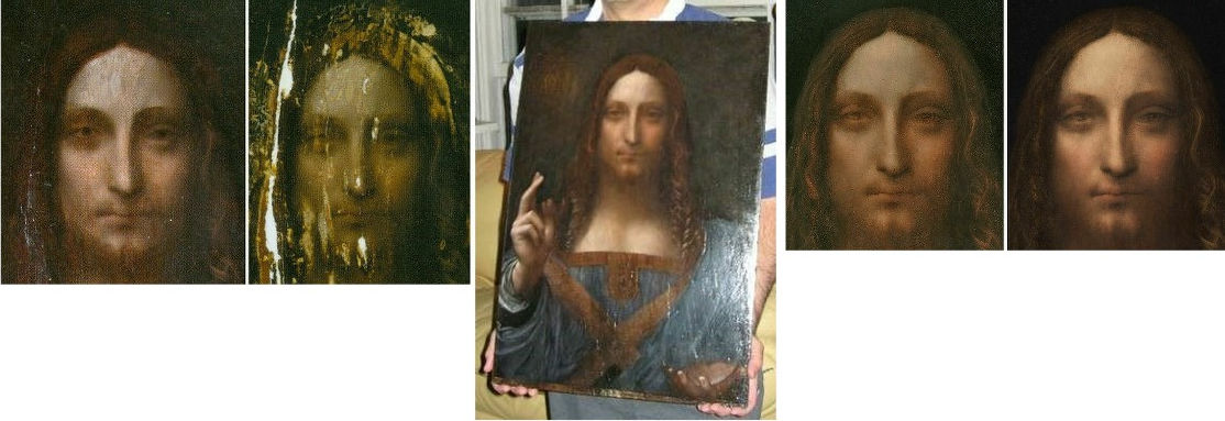
With the Abu Dhabi Leonardo attribution the etching’s testimony is double edged: there are, for sure, clear general correspondences – as there are with the de Ganay version – but Hollar’s 1650 recording of painting of a Christ as Salvator Mundi is different in significant stylistic respects from the Louvre Abu Dhabi picture. Greatly compounding the problem today of plausibly attaching rival documentary records and accounts to the sole etched copy, is the fact that the Abu Dhabi painting has itself borne rival appearances since it emerged in 2005 – and has existed in two distinct states in the last five years. As seen at Fig. 6 above, those appearances are: the painting as it was when it first appeared in 2005 still sticky from some previous treatment; as it was in 2007 after being cleaned and repaired; as it was in 2008 when part-restored and first taken to London for appraisal by a select group of Leonardo experts; as it was when further repainted and taken back to London in 2011 to be included in the National Gallery Leonardo exhibition; and, as it was when yet further restored by Christie’s ahead of the November 2017 sale.
This shifting appearance poses an acute problem for supporters: with which state/version of the Abu Dhabi picture might the Hollar etching be considered to show a better correspondence? Is it that seen when exhibited at the National Gallery in 2011-12, as below left at Fig. 8? Or is it that seen at Christie’s, New York, in 2017, as below right at Fig. 8? If the latter, had Christie’s requested the original restorer to work further on the painting to that end?
“STYLE CRITICISMS” AND CERTAIN VISUAL DISPROOFS
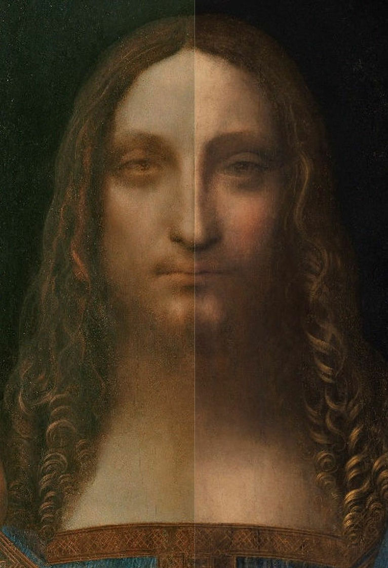
Above, Fig. 8: Top, Leonardo’s face of St. Anne (on the Louvre’s The Virgin and St Anne with Child), before cleaning, left; after cleaning, right; above the Louvre Abu Dhabi face of Christ, left, as exibited at the National Gallery in 2011-12, and, right, as when sold at Christie’s, New York, in 2017
In the double comparison above we see the destructive and reconstructive faces of picture restoration. At the top, pictoral values are depleted by cleaning (“abraded” is the commonly encountered official euphemism). In the before and after comparison of the Salvator Mundi we see the superimposition of a more marketable state by repainting (officially, “retouching”) an earlier National Gallery endorsed appearance. The extent of this pictorial transformation is only demonstrable because the long 2007-2017 restoration was temporarily halted to allow the painting to rub shoulders with Leonardo and others at the National Gallery in 2011-12.
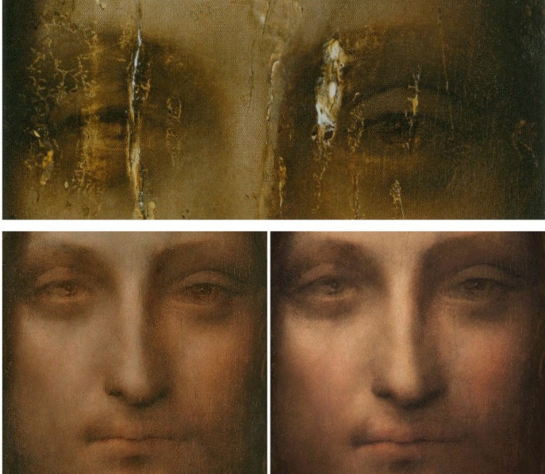
Above, Fig. 9: Left, the de Ganay Salvator Mundi; centre, the Wenceslaus Hollar etched copy; right, the Abu Dhabi Salvator Mundi.
While both above paintings depart from the Hollar copy, they do so differently. Such variations speak against the Abu Dhabi painting being an original autograph prototype for all others. In one respect, Hollar comes close to recording a unique feature of the Abu Dhabi picture – the closely cropped composition around the hand holding the orb in the bottom right-hand corner of the composition – see Fig. 11. Against that local similarity, the Abu Dhabi picture departs from Hollar (and all other painted versions) with its aberrantly wide, chipmunk-like face. In every other version, Christ has a long narrow face that tapers downward from the widest point at about the level of the eyes. Uniquely, the Abu Dhabi face is widest at a level a little above the mouth. It also lacks the pronounced beard that was recorded by Hollar and is widely encountered among the variants. Such icongraphic deviations make it inconceivable that the Abu Dhabi picture was recorded by Hollar in 1650.
Above, Fig. 10: Top, left, the 1650 Hollar etching; top, right the Louvre Abu Dhabi Salvator Mundi, as it was when exhibited at the National Gallery in 2011-12. Above, left, a portrait of Henrietta Maria by van Dyck; above right, a copy by Hollar of a similar van Dyck portrait of Henrietta Maria.
When comparing etchings to paintings allowances have to be made for restoration injuries and falsifications to the latter and for the fact that copyists do not make “photographically” accurate facsimiles. Nonetheless, claims that Hollar’s copy was made from the Abu Dhabi painting are insupportable. In his 2011 catalogue entry, Luke Syson acknowledged that “the fit” between the print and the painting was not a complete one:
“It has always seemed likely that Leonardo painted a picture of Christ as the Saviour of the World. In 1650 the celebrated printmaker Wenceslaus Hollar signed an etching of Christ raising his right hand in blessing, holding a transparent orb in his left, with a nimbus of light behind his head: the image was taken he states, from a painting by Leonardo. Though Hollar was generally well-informed, this would not be enough on its own to prove that an autograph picture by Leonardo had once existed…Though Hollar’s Christ is very slightly stouter and broader, the two images coincide almost exactly. The draperies are just a little simplified and there is no glow of light around Christ’s head. Otherwise the newly discovered painting has the same…etc.”
Hollar recorded three sources of light in the picture he copied, not the single ineffectual one encountered in the Abu Dhabi painting. Hollar’s overall disposition of tonal values is greatly more vivacious and lucid. Light falling on Christ from above left creates a consistent shift from the (viewer’s) brightly lit left side of Christ to his shaded right side. Variations of shading on the drapery at Christ’s left shoulder cause the figure to turn away from the viewer and recede into shadow. Christ, emits his own illumination. So does the globe as light accumulates around its circumference. The inner fold on the drapery of Christ’s raised arm casts a shadow on the tunic’s folds. In Hollar a clear, plastically expressive distinction exists between the arm’s draperies and the tunic. Throughout, Hollar recorded a progressive disposition of lights and darks to establish form and space. Although the above Hollar van Dyck copy is not taken from the adjacent van Dyck painting it demonstrates how faithfully Hollar captured Henrietta Maria’s mouth’s upturned corners. Had he made his copy from the Abu Dhabi picture, would he have turned the corners of Christ’s mouth upwards? On the superiority of the print over the painting in 2011, see below. But first, hear Leonardo on his lights and shades:
“The primary purpose of the painter is to make a plane surface display a body in relief, detached from the plane, and he who in that art most surpasses others deserves most praise, and this concern, which is the crown of the science of painting, comes about from the use of shadows and lights, or, if you wish, brightness and darkness. Therefore whoever avoids shadows avoids what is the glory of the art for noble minds, but gains glory with the ignorant public, who want nothing in painting but the beauty of colour, altogether forgetting the beauty and marvel of depicting a relief on what in reality is a plane surface.”
Above, Fig. 11: Left, a detail of Hollar’s 1650 etching; right, a detail of the Abu Dhabi Salvator Mundi as it was when offered for sale by Christie’s, New York, in November 2017.
It strikes again how greatly more vivacious and lucid is the etched copy than the Abu Dhabi painting. It might be objected that painters work on a larger scale and have greatly more pictorial weapons at their disposal than the tones of etchers who must say everything with monochromatic drawing and shading. But, as seen, Leonardo embraced such pictorial self-restraint as the most precious tool in the painter’s box.
We mentioned the coincidence of design and composition in this section of the painting: the knuckles of the hand rest in both cases on the bottom of the composition and the protruding thumb seems equally constrained. Those coincidences notwithstanding, even in this section the differences are legion. In the painting the thumb is cropped at the picture’s edge – and not because the picture was trimmed. The panel had been set in its frame and only then prepared for painting, as a build-up of priming and paint along the edge testifies. Whoever painted this picture was careless with its design. It is possible that the artist had transferred a cartoon onto a too-small painting and ran out of space along the right-hand edge. This Salvator Mundi figure is not just cropped above the waist as are a number of Leonardo figures, it is also severely cropped on both sides. Such a design would not be shocking in our age of photography but it was unprecedented in Leonardo’s own finished work. While there are similarities in this corner, they are confined to the design alone and not to the content within.
Uniquely, in Abu Dhabi picture the visible palm of the globe-supporting hand is massive and anatomically indeterminate. Professor Kemp holds that this unclarity is a pentimento and, hence, a token of authenticity. But the hand was drawn differently in all other versions, including Hollar’s. Everywhere else it is optically compressed towards the circumference of the globe. Why would every school work have thus made Leonardo’s clumsily drawn effort more optically sophisticated? Why did everyone else “correct” the drawing of the thumb by placing it on a diagonal, not horizontal, axis? The prevalent top left down lighting caused three reflections in a diagonal row on the surface of the globe Hollar copied. The globe itself (necessarily one of glass on that scale, not of polished rock crystal, as Kemp insists) is radiant in Hollar: dark at its centre and with light accumulating around its circumference. Kemp remarks that he has “been asked on more than one occasion why the drapery behind the sphere is so little affected by what is in effect a large magnifying lens.” He answers that Leonardo would not have concerned himself with such natural phenomena out of respect for “decorum – that is to say pictorial good manners”. It is a stylish answer but it ignores a point I had made when the National Gallery exhibition opened (“Leonardo viewed in a curious light”, letter, The Times, 12 November 2011). Namely, that in Hollar’s copy “the folds of the drapery on Christ’s left shoulder are shown to be bent when viewed through the glass sphere.” Kemp’s ex cathedra pronouncement collides with the artistic/material facts of a work of art. This is not a question of what Leonardo would or would not have done. It is a question of what Hollar did when copying a painting he believed to be a Leonardo. As previously published and shown below, in Hollar the sweeping curve of a fold on the shoulder drapery is seen to be deflected inside the globe – and a shift of direction in a drawn image cannot be gainsaid: if a convex fold of drapery becomes concave while seen through a glass orb, that is a graphic fact, not a possibly, a perhaps, a likely or maybe. If Hollar had been copying the Abu Dhabi painting, why would he have rendered a sophisticated optical phenomenon that was not present in the painting before him?
Above, Fig. 12: Left, an illustration of a rock crystal sphere in Martin Kemp’s book Living with Leonardo; right, the globe in the now lost Salvator Mundi that was formerly in the Worsey and Yarborough Collections, England.
Kemp writes that the most satisfactory facet of his own research concerned his hunch the globe was made of rock crystal. He looked at specimens of crystal spheres – all small – and realised that large crystal spheres would “exhibit both inclusions and jagged cleavage planes, compromising the ‘purity’ for which the best crystal is prized.” On the abnormally large hand seen through the globe, he writes:
“I had toyed with the idea that the double image of the of the heel of Christ’s right hand [sic] visible through the sphere might be the result of the double refraction characteristic of rock crystal; but the optics would not work. The apparent doubling is almost certainly another pentimento.”
The above crystal sphere Kemp examined at Oxford University’s Museum of Natural History was under two inches wide and therefore “quite large as such spheres go”. Reproducing the lighting direction in the Abu Dhabi picture had confirmed that there should have been (as there is in Hollar) a shiny highlight in the upper left:
“He is unlikely to have left this out, and it seemed likely that the raised area of white pigment had been abraded off at some point in the painting’s chequered history.”
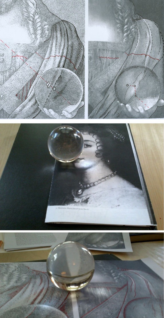
Above, Fig. 13: In the top row diagrams we see, left, how, in Hollar, the globe’s reflected lights are aligned with the directional lighting and not as found in the 2017 state of the Abu Dhabi picture on the right. We see on the left (black dotted line) how the sweeping curved fold of drapery is deflected when viewed through the globe. While Kemp says that the original properly placed highlight on the globe must have been abraded off, he offers no explanation for the three randomly placed, unaligned “reflections” that emerged during the cleaning. If they were not added during the past restoration they must have been painted out previously. As seen in the television screen-grab at Fig. 1, there was no trace left in place of any impastoed white reflections when the painting was presented for restoration in 2005. One correspondent (Dr. Stefaan Missinne) has suggested that the three present lights were a depiction of a cluster of stars seen in the Southern hemisphere that had been noted in Italy in 1503. If these now miraculously recovered lights had been integral to the Abu Dhabi painting all along, they too would indicate that Hollar had made his 1650 copy from some other painting. Curiously, an alignment of lights like that seen in Hollar is present in the now lost Salvator Mundi that was formerly in the Worsey and Yarborough Collection in England (as seen above at Fig. 12).
Our glass sphere shown above is also no more than two inches in diameter. In the lower image above it rests on the photocopied sheet of diagrams that is shown here above, top. The white space between the two copied images on the sheet appears as two curving lines when viewed through the globe. We can see here how the differing degrees of refraction depend on the position within the globe. The curvature is least pronounced at the globe’s centre and increases as it approaches the circumference. The deflection on the drapery that was recorded in Hollar’s etching is consistent the distortions in evidence in the glass sphere above.
Above, Fig. 14: Left and centre, The Young Christ by Marco d’Oggiono in the Galleria Borghese, Rome, as seen before and after restoration; right, Marco d’Oggiono’s The Young Christ in the Fundación Lázaro Galdianiano, Madrid.
Luke Syson cites the Galleria Borghese picture above left and centre as a work of about 1500 that is clearly derived from the Abu Dhabi painting. The Madrid Young Christ picture, above right, was included in the National Gallery’s 2011-12 Leonardo in Milan exhibition as a newly attributed work of Marco d’Oggiono. Unlike the Abu Dhabi picture, its whereabouts in the 20th century are known. Indeed, its history is confined to that century. A work in oils on beech, its literature begins in 1910 as “circle of Leonardo” (Meier-Graef) and in 1932 it was elevated to Ambrogio de Predis by Berenson. More recently, in 1981, it was moved to “pseudo-Boltraffio” by Romano. In 1985 the “pseudo-” was dropped by Ballarin. In 1985 Marani (who has been said to support the Abu Dhabi picture) re-attached the “pseudo-”. In 1990 Baudequin gave it to Marco d’Oggiono but the following year Brown preferred Ambrogio de Predis and was supported in this by Ruiz Manero in 1996 and by Fiorio in 2000. In 2004 Saguar Quer gave it unreservedly to Boltraffio – and with “a detailed provenance” which, presumably, had not gone further back than 1910. In 2005-6 Marani suggested “a Milanese artist close to Leonardo”. In 2006-07 Danieli settled for “a Lombard painter close to Boltraffio”. (In art historical circles, “Pseudo-“ is sometimes used as polite way of saying “not kosher”.)
In the National Gallery’s 2011-12 exhibition catalogue this work is dated to c. 1490-01 and assigned to Marco d’Oggiono by Antonio Mazzotta who notes that “this is a [Leonardo] pupil’s skilful combination of workshop models and techniques, with such a commitment to ‘academic’ rules and his master’s ideas, that the pupil here seems to be acting, in the words of William Suida, ‘as Leonardo’s right hand’.” Mazzotta points out that this work has previously been given to Boltraffio – “a hypothesis explicable in the light of its high quality and of Marco’s close working relationship with him in the 1490s. Indeed, there are many features here that evoke Boltraffio’s work: the lighting and structure of the head, hair and neck are similar to his Madonna of the Rose; the swathe of drapery over the shoulder and concertina folds of the shirt recall his early drapery studies…”
Mazzotta is somewhat back-handed in his support: while Marco’s “greyish skin tones” are similar to Boltraffio’s, the latter is more elegant and controlled. “The rather too prominent eyes are typical of Marco d’Oggiono: the sfumato modelling is applied like make-up, though the eyelids remain both flat and puffy. As a result, Marco loses control of Christ’s expression, which is at the same time melancholic and slightly gormless, an expression that strongly resembles that of the sitter for the Archinto Portrait…” The latter, a National Gallery painting in oil on walnut, was included in the 2011-12 exhibition as Marco d’Oggiono. Its literature began with Morelli in 1880 – “inadvertently by Amrogio de Predis” and at the same time “as by Bernardino dei Conti”, the latter ascription being re-affirmed by Morelli five years later…The literature ended with Syson in 2004 as “attributed to the Master of the Pala Sforzesca”.
Within this moveable feast of attribution, Marco d’Oggiono’s Madrid and Rome “Young Christs” might yet be taken as a benchmark indication of the painterly skills found in Leonardo’s studio between c. 1490 and c. 1500. Both of these school works (or pseudo-school works) reflect Leonardo’s own long-standing aversion to frontal or profile figures. Leonardo was an arch repudiator of archaistic (and, in anticipation, 20th century Modernist) affirmations of the picture plane within a painting. The planar picture surface was no more than a necessary convenience for Leonardo’s compulsion to display bodies in relief and detached from the plane. That he must have been party to the plethora of archaistic Salvator Mundis is not disputed and many see his hand in parts of the Louvre Abu Dhabi painting. Had he gone so far as to have painted an entire fully-realised autograph departure from his very hard won accomplishments it would have constituted a pictorial reversal of noteworthy surprise. Not only has there been no whisper of such an upheaval, nothing survives of any contribution other than the two sheets of drawn studies shown below.
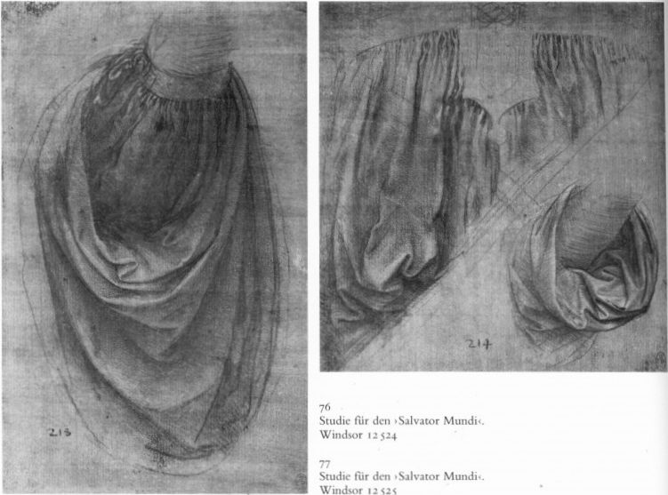
Above, Fig. 15: The two sheets of drapery studies attributed to Leonardo and taken as preparatory studies for the Leonardesque Salvator Mundis. The main study for the costume seems taken from a garment suspended on a hanger, not worn by a person. That flattening arrangement seems to have transported itself to the Abu Dhabi Salvator Mundi. In the Hollar copy the concertina folds form groups that swell and catch the light accordingly. It is striking that greater variation of lighting is present in the studio work shown at Fig. 16, below, than in the now much-restored Louvre Abu Dhabi painting.
Above, Fig. 16: Top, a detail of the c. 1490 Spanish “Young Christ” of Marco d’Oggiono; above, a comparable detail from the Abu Dhabi painting.
Martin Kemp, who has championed both of recently attributed works in which Leonardo is claimed to have embraced the picture plane (- the Abu Dhabi painting and the profile drawing he dubbed “La Bella Principessa”), suggests that the Salvator Mundi appealed to its first buyer, the Russian oligarch Dimitry Rybolovlev, because “he had earlier collected Eastern Orthodox icons, and it is not difficult to see how the typically hieratic, frontal presentation of holy figures in Russian devotional images would have resonated powerfully with the traditional composition and spiritual power of the Salvator Mundi.” When addressing the painting’s spatially disjointed parts, he offers a quasi-photographic rationale:
“I wondered why Christ’s soft-focus features contrasted so strongly with the precise definition of his right hand. Was it simply a question of condition? It was true that the face was quite abraded; but even the best-preserved parts, such as his left eye, seemed blurred. Or was it was photographers call the depth of field problem? If a camera lens is physically or digitally focussed on a form at a certain depth in a scene, objects closer or further away will be out of sharp focus – increasingly so as they are more distant from the focussed zone.
“Depth of field is in photography is an anachronistic concept when looking at a Renaissance painting. However… [Leonardo] explored the reasons why vision worked less than perfectly under different circumstances. He stated that something would not be seen well if much too close, and it would lose clarity as it moved further away (though he did not have any sense that the lens of the eye focuses our vision). He realized that there was an optimum distance at which some something would be seen most sharply. Christ’s hands are at that distance. The softening of Christ’s more distant facial features works to define depth in an image that is otherwise very shallow, and serves brilliantly to evoke the otherness of Christ’s gaze.”
Kemp, presumably, is talking about the painting as when sold last year, not as it was when exhibited at the National Gallery in 2011. His “vari-focal” thesis addresses neither the evidence of Hollar’s copy nor the transformation by restoration the painting underwent from 2006 to 2017. On Kemp’s schema the tip of the nose would be in sharper focus than any other part of the face. In truth the most obtrusively sharp distinction encountered on this inconsistently rendered face remains the emphatic and anatomically ill-drawn crease above the true left eyelid at the brow. Where Kemp talks of the “softened” “otherness” of Christ’s gaze, he does not address the fact that the irises in Hollar eyes were not dreamily forward-looking but cast rightwards almost as if looking over his raised blessing fingers. There is no hint of an overhanging upper lip in Hollar, his lower lip protrudes. Throughout the etching, light falls even-handedly so as to illuminate by light and shade the three-dimensional forms of the figure. A full range of tones renders the blessing hand “emphatic” but it is no more so than the forms of the face. In fact there is a parity of graphic force between the hand, the face and the orb and the only retiring passage falls between, in the treatment of the costume. But even in that recorded quiet zone if we look at the Leonardesque concertina folds in the two comparative details above, who would say that the Louvre Abu Dhabi displays superior artistry?
Above, Fig. 17: Top, a detail, of Leonardo’s La belle ferronnière of about 1493-1494; above, a detail of the Louvre Abu Dhabi Leonardo Salvator Mundi which is generally dated by its supporters as c. 1500. For Kemp it is taken as c. 1504-1507, having been painted between the Mona Lisa of c. 1503-1516 and the St. John the Baptist of 1513-1516. Viewing drapery seen in the earlier Leonardo La belle ferronnière, could anyone hold that the Salvator Mundi drapery above showed superior painting technique or a more vividly tangible body?
Above, Fig. 18: Top, the Abu Dhabi Salvator Mundi detail; above, a detail of the Mona Lisa. Quality aside, what would explain the manifest differences of age in the two details? Why has the paint cracked so markedly in one work and retained such a youthful bloom in the other?
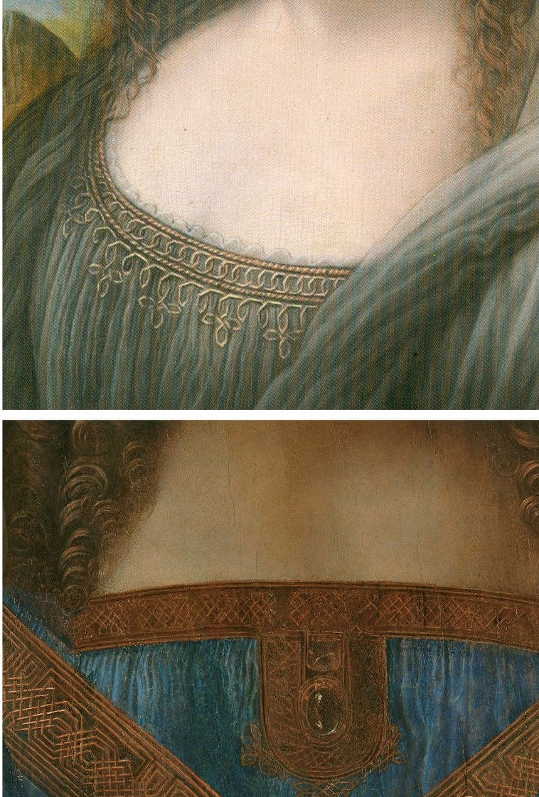
Above, Fig. 19: A detail, top, of a copy of Leonardo’s (then-unfinished) Mona Lisa that has been attributed to his assistant Salai; above the detail of the Louvre Abu Dhabi Salvator Mundi. Although the flesh passages in the two works are comparably smooth, bland and unblemished, could anyone claim that the handling of the hair, the knot patterning and the drapery folds in the Salvator Mundi is superior to that seen in the copy above?
More detailed examinations of parts of the Louvre Abu Dhabi Salvator Mundi painting will be carried in future posts.
Past posts, in chronological order, were:
23 October 2017 – Leonardo, Salvator Mundi, and an “unusual lapse”
14 November 2017 – Problems with the New York Leonardo Salvator Mundi Part I: Provenance and Presentation
02 February 2018 – The $450m New York Leonardo Salvator Mundi Part II: It Restores, It Sells, therefore It Is
12 February 2018 – A day in the life of the new Louvre Abu Dhabi Annexe’s pricey new Leonardo Salvator Mundi
27 February 2018 – Nouveau riche? Welcome to the Club!
11 March 2018 – The Reception of the First Version of the Leonardo Salvator Mundi
Michael Daley, 18 September 2018
“Leonardo scholar challenges attribution of $450m painting”
Dalya Alberge reports in the Guardian that a Leonardo scholar, Matthew Landrus, believes most of the upgraded Salvator Mundi was painted by a Leonardo assistant, Bernardino Luini.
THE LUINI CONNECTION
In her Guardian article, “Leonardo scholar challenges attribution of $450m painting”, Dalya Alberge further reports that the upgraded version of the Salvator Mundi that Matthew Landrus has de-attributed to Leonardo’s assistant, Bernardino Luini, is the very painting that was attributed to Luini in 1900, when acquired by Sir Charles Robinson for the Cook collection.

Above, Fig. 1: Left, the Salvator Mundi that was bought for $450m as a Leonardo for the Louvre Abu Dhabi in November 2017 as it was seen in 2007 when only part-repainted and about to be taken to the National Gallery, London, for a viewing by a small group of Leonardo scholars who are said to have been sworn to secrecy. (For the many subsequent changes to the painting see our “The $450m New York Leonardo Salvator Mundi Part II: It Restores, It Sells, therefore It Is” and Figs. 4 to 6 below.) Above, right: A detail of the National Gallery’s Luini Christ among the Doctors.
BIG CLAIMS ON INCOMPLETE EVIDENCE
Even after being sold twice (in 2013 and 2017) for a total of more than half a billion dollars, the painting’s 118 year long journey from a Luini to a Leonardo and now back to Luini again, remains a mystery: no one has disclosed when, from whom and where the painting is said to have been bought in 2005. Professor Martin Kemp recently disclosed that the work was bought for the original consortium of owners “by proxy”. Long-promised technical reports and accounts of the provenance have yet to appear and keep receding into the future. These lacunae notwithstanding, the painting is scheduled to be launched at the Louvre Abu Dhabi in September, and also to be included in a major Leonardo exhibition at the Paris Louvre in 2019.
THE ROLE OF LEONARDO’S ASSISTANTS IN THE LOUVRE ABU DHABI SALVATOR MUNDI
As Dalya Alberge reports, a number of Leonardo scholars have contested the present Leonardo attribution and held the work to be largely a studio production that was only part-painted by Leonardo himself. Frank Zöllner, a German art historian at the University of Leipzig and author of the catalogue raisonné Leonardo da Vinci – the Complete Paintings and Drawings, believes it to be either the work of a later Leonardo follower or a “high-quality product of Leonardo’s workshop”. Carmen Bambach, of the Metropolitan Museum of Art, holds it to have been largely the work of Leonardo’s assistant Giovanni Antonio Boltraffio. One scholar, Jacques Franck, suggested in a 29 November 2011 interview in the Journal des Arts that an attribution to either Luini or Leonardo’s late assistant (and effective ‘office manager’) Gian Giacomo Caprotti, called Salai or Salaino seemed plausible and persuasive. More recently, in January 2018, he tipped to Salai as the author because of strong similarities revealed by penetrating technical imaging examinations – see Figs. 2 and 3 below and “Salvator Mundi LES DESSOUS DE LA VENTE DU SIECLE”.
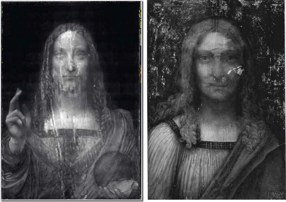
Above, Fig. 2: Left, an infra-red reflectogram of the Louvre Abu Dhabi Salvator Mundi; above, right, an infra-red reflectogram of Salai’s Head of Christ, signed and dated 1511, Pinacoteca Ambrosiana (Milan).

Above, Fig. 3: An infra-red reflectogram detail of the Louvre Abu Dhabi Salvator Mundi. Jacques Franck writes: “This close-up view of the Fig. 2, left, document, reveals in the Saviour’s face, neck and head, the same typical underlying sketching-out technique using very thick dark lines to define the preliminary contours and modelling that are seen in Fig. 2, right. None of this underlying graphic/roughing out process is ever encountered in original Leonardo painting where the graphic/painterly stages are more subtle.”
CHANGING FACES: FOUR STAGES OF DEVELOPMENT IN THE LOUVRE ABU DHABI SALVATOR MUNDI
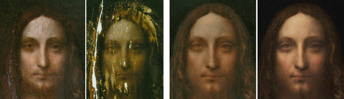
ABOVE, FIG.4: From the left, Face 1 – The former Cook collection Salvator Mundi when presented in 2005 (– when still “sticky” from a recent restoration) to the New York restorer, Dianne Dwyer Modestini.
Face 2: The former Cook collection painting after the panel had been repaired and the painting had been stripped down.
Face 3: The former Cook collection Salvator Mundi after several stages of repainting and as exhibited as a Leonardo at the National Gallery’s 2011-2012 Leonardo da Vinci, Painter at the Court of Milan exhibition.
Face 4: The face after yet further (- and initially undisclosed) repainting by Dianne Dwyer Modestini at Christie’s, New York, ahead of the 2017 sale – as was first published by Dalya Alberge in her Mail Online revelation: “Auctioneers Christie’s admit Leonardo Da Vinci painting which became world’s most expensive artwork when it sold for £340m has been retouched in last five years”.
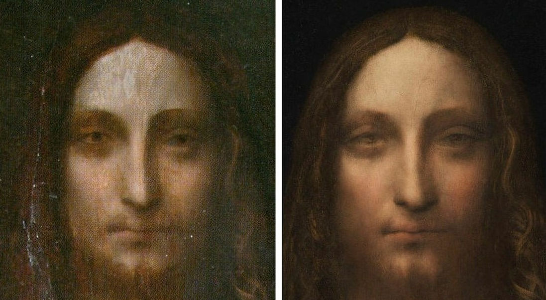
Above, Fig. 5: Left, the former Cook collection painting’s face as in 2005; right, the face, as transformed over twelve years by Modestini, when presented for sale at Christie’s, New York, in November 2017.
Alberge’s current Guardian article, “Leonardo scholar challenges attribution of $450m painting” has gone viral – see for example: CNN’s “Leonardo’s $450M painting may not be all Leonardo’s, says scholar”, and the ABC (Spain) “Crecen las dudas sobre la autoría del «Salvator Mundi» de Leonardo”.
In the CNN report, it is said that:
“Others are in less doubt. Curator of Italian Paintings at London’s National Gallery, Martin Kemp, sent the following statement to CNN Style by email: ‘The book I am publishing in 2019 with Robert Simon and Margaret Dalivalle (…) will present a conclusive body of evidence that the Salvator Mundi is a masterpiece by Leonardo. In the meantime I am not addressing ill-founded assertions that would attract no attention were it not for the sale price.’”
We make the following observations. Although Professor Martin Kemp is not a curator at the National Gallery he does seem to have been considered at one point as a possible co-curator of the National Gallery’s 2011-2012 Leonardo exhibition, which, in the event, was curated solely by the Gallery’s own then curator, Luke Syson, who is now at the Metropolitan Museum of Art. Syson drew heavily for his 2011 catalogue entry on the painting on the researches of one of the owners of the Salvator Mundi, the New York art dealer, Robert Simon: “This discussion anticipates the more detailed publication of this picture by Robert Simon and others. I am grateful to Robert Simon for making available his research and that of Dianne Dwyer Modestini, Nica Gutman Rieppi and (for the picture’s provenance) Margaret Dalivalle, all to be presented in a forthcoming book.” That book has now been coming for some time. First promised by the National Gallery in 2011, it was more recently promised for 2017, and then for this year, and now, for next year – and possibly in time for inclusion in the catalogue of the Paris Louvre’s planned major 2019 Leonardo exhibition?
Professor Kemp also promised a conclusive body of evidence for his attribution to Leonardo of the drawing he dubbed “La Bella Principessa”. In his 2012 book Leonardo’s Lost Princess, Peter Silverman, the owner of “La Bella Principessa”, wrote: “Martin believed that the fingerprints [compiled by the now discredited fingerprints expert Peter Paul Biro], though not conclusive on their own, added an important piece to the puzzle. He wrote to me, ‘This is yet one more component in what is as consistent a body of evidence as I have ever seen. I will be happy to emphasize that we have something as close to an open and shut case as is ever likely with an attribution of a previously unknown work to a major master. As you know, I was hugely skeptical at first, as one needs to be in the Leonardo jungle, but now I have not the slightest flicker of doubt that we are a dealing with a work of great beauty and originality that contributes something special to Leonardo’s oeuvre. It deserves to be in the public domain.’” In the event, the “La Bella Principessa” drawing did not enter the public domain. Unlike the Salvator Mundi, which sold for $450m, it was not included in the National Gallery’s 2011-2012 Leonardo exhibition and it presently remains, so far as we know, unsold, in a Swiss free port.
Kemp’s present lofty disinclination to address “ill-founded assertions that would attract no attention were it not for the sale price” marks a change of policy. Last year, immediately ahead of the sale that produced the astronomical price of the Salvator Mundi, Kemp was happy to engage polemically with those who rejected the Salvator Mundi’s Leonardo attribution. As he has recently disclosed: “I was approached by the auctioneers to confirm my research and agreed to record a video interview to combat the misinformation appearing in the press – providing I was not drawn into the actual sale process.”
SCHOLARS’ NEED FOR FULL AND DETAILED REPORTS AND FOR OPEN DEBATES

Above, Fig. 6: Left, the small-scale published (infra-red) technical image of the Salvator Mundi; centre, the painting as exhibited in 2011-2012 as a Leonardo at the National Gallery; right, the painting as presented for sale at Christie’s, New York, in 2017.
Much remains to be examined with this restoration-transformed but still, effectively, unpublished work where the promised reports on technical examinations and provenance seem perpetually trapped in the post like Billy Bunter’s postal order. Note in Fig. 6 above, for example, the radical changes made to the true left shoulder draperies; to the orb and the sole of the hand that holds it; and, above all, to the face. We must hope that the painting’s new owners will encourage the old 2005 consortium of owners to publish their privately commissioned researches as soon as possible. In general terms, it would be a much better thing if new and elevating attributions were once more published by single scholars, taking full responsibility in a scholarly publication, so that the case for a work’s re-attribution might be examined widely and discussed openly on a fully informative account and presentation of technical evidence and history of provenance. The recent tendency for owners to hold and selectively part-release researches during promotional campaigns of advocacy is not conducive to best scholarly practice.
Michael Daley, Director, 9 August 2018
Coming next:
Professor Martin Kemp and ArtWatch – Part 1: Twenty-four years of abuse on photo-testimony
In Memoriam: Tom Wolfe (1930 – 2018)
The journalist and writer Tom Wolfe died on 14 May aged 88. He is survived by his wife Sheila (Berger) Wolfe, a graphic designer and former art director of Harper’s Magazine, and their two children, Alexandra Wolfe, a reporter for The Wall Street Journal, and Tommy Wolfe, a sculptor and furniture designer.
The New York Times reports Tom Wolfe’s least-forgiven and most-wounding foray. In 1970 he mocked what he termed New York’s “radical-chic”. This had been prompted by a fund-raising party given for the Black Panthers by Leonard Bernstein, the conductor of the New York Philharmonic, and his wife, the Chilean actress Felicia Montealegre, in their 13-room Park Avenue penthouse. The guests were the Bernstein’s rich liberal and mostly famous friends. How very remarkably on-target that attack was – and how infectiously well and fast that chic travelled. At that period, across the pond in London, well-meaning pre-eminent thespians like Vanessa Redgrave rattled the revolutionists’ tin under the noses of artists like R. B. Kitaj. As the designer of UK New Left publications – first The Black Dwarf and then Idiot International – we, along with Jean Genet and a Parisian Leftist called Castro, attended a dinner given in the marble-floored, art-rich (Mondrians, Bellmers…) Paris apartment of the novelist, polemicist and publisher of L’Idiot International, Jean-Edern Hallier and his Italian heiress wife, Anna. The guests of honour were a group of visiting Black Panthers, lead by (the beautiful) Connie Matthews, who would later be killed in a police shoot-out in the United States. The books in the Halliers apartment had been rebound in white leather, with gold-tooled lettering and they were displayed on shelves made of polished black lignum vitae, the hardest, densest wood that makes the best truncheons, the most wind-resistant cricket balls and that is used as bearings for ships propeller shafts. This apartment, with its live-in servants was not, however, where “the real” Jean-Edern Hallier lived. He once told me that his true self was to be found in a small, occasionally used bed-sit furnished only with a single bed and a Che poster.
Above, Tom Wolfe as photographed in New York in 1968 by Sam Falk for The New York Times
Best known for his first novel, The Bonfire of the Vanities, Wolfe blew the whistle on pretentious ideas-led, art critics-sanctioned contemporary art in The Painted Word which was excerpted in Harpers Magazine. Incensed art world players responded with scurrilous/puerile abuse. One victim accused Wolfe of having written his devolution – i. e. reverse-evolution – of modern art (“In the beginning we got rid of nineteenth-century storybook realism. Then we got rid of representational objects. Then we got rid of the third dimension altogether and got really flat – Abstract Expressionism. Then we got rid of airiness, brushstrokes, most of the paint, and the last viruses of drawing and complicated designs”…) without ever “getting away from his typewriter and into the thick of his subject”. Not many people know this, but Tom Wolfe took classes at the Art Students League in New York with the painter, Frank Mason, the scourge of art-destroying picture restorers (and a founder member of ArtWatch International) who had blown the whistle in New York on the restoration of Michelangelo’s Sistine Chapel ceiling. At a memorial service on 18 October 2009, Wolfe delivered this tribute to Frank Mason who had died aged 88 on 16 June 2009:
“I’m not sure how many people here have seen Tom Stoppard’s wonderful play, Artist Descending the Staircase. Well, in that play one of the characters turns to the audience and says, ‘Imagination plus lack of skill, gives us no-hands art.’ Andy Warhol showing photographs of commercial products to his elves, and ping-pong shots from amusement arcades of famous people. Or, Jeff Koons, who sends photographs of himself slogging at it with an Italian prostitute of some fame, and sends these photographs off to elves in Switzerland who then convert the photographs into three-dimensional ceramic objects. Or, Richard Serra, who orders ten-foot high raw core tin steel walls from the foundry and has unionized elves to transport them to open spaces and prop them up. Or, Richard Prince, a self-elf who takes photographs of photographs and sells them for stunning sums to culturally anxious hedge fund managers.
“Now I have to confess that those examples were supplied by me. But, what Tom Stoppard has his character actually say is, ‘Imagination plus lack of skill, gives us modern art.’ So there has to be a corollary to that, and I think the corollary would be: imagination plus real skill gives us Michelangelo, Bernini, Tissot and Titian. And, Frank was known in his youth as the rebirth of Titian, the comparison was made consummate of Frank Mason and Titian. And both Titian and Tissot loved the deepest perspective a painting could possibly effect and one of my favorite Frank Mason paintings is of – I think it might be the Italian restaurant below his apartment on Broome Street – and it is of a group of people, many, many people, and no person in the background is neglected at all. Every head that appears in a Frank Mason painting is developed and is an individual who is distinct from every other. But, what particularly surprised me was that in the vast, vast deep Titianesque, Tissot-like perspective of that painting is the carving on wood work at the very back of the room. These are details that the naked eye can probably not see beyond six feet. In this painting they are about sixty feet away. What he did with them was absolutely marvelous, I can’t think of another painter who could do it better, perhaps not even Tissot or Titian.
“There’s also . . . his skill went across every possible category – still life, which, in a way, is the opposite of Titianesque painting of deep perspective. Earlier, before the [memorial] programme started on the screen here was Frank’s Silver Pitcher. A still life with the silver pitcher in the middle of it – and that silver pitcher is so much more real than an actual silver pitcher you just want to grab it and drink some of that New York tap water. You know, New York tap water is some of the best water in the country. It’s better than anything that comes in a bottle, I assure you. Now Frank was much more than a great artist. And to say that somebody is much more than a great artist (particularly John Varriano brought it out) is saying a great deal. Frank is what I think of as a life force. You know, Darwin once appeared before a class of students at a university in England, and you know the young will ask questions that the old do not dare ask. And he would explain how life had begun out of a cell and all that is before us came from that tiny origin. So one of the students says, ‘Well, where was it?’ And Darwin says, ‘Where was what?’ ‘The cell? Where was it?’ And he said, ‘Well I don’t know. It was probably in a warm pool of water somewhere’. And then another student said, ‘Yes, so then how did it get there?’ And he said, ‘Well, I don’t know where, and I don’t know if it’s terribly important.’ And then another student said, ‘Why does it want to divide? Why does it want to reproduce? Why?’ At this point Darwin reflected and said, ‘To tell the truth, no one knows where the life force comes from and perhaps no one will ever know. If they do it will be hundreds of years from now before we learn where the life force comes from. Isn’t it enough that I brought you all these plants and all these animals? How much do you want from me?’
“But, this life force – it is not a metaphor, it’s a concept. I always thought when I first came to New York my ambition as a youngster was to work in a newspaper in New York. It took me many years to get here but I finally did it. Unfortunately, my image of New York City had gone from books written in the 1920s and 1930s about people like Ben Hecht. So I was waiting to see Mark Twain walking up Broadway in a white linen suit. I was waiting to see Walter Winchell who at that time was on the radio saying, ‘Good evening Mr. and Mrs. America and all the ships at sea. Let’s go to press.’ To me that voice of Walter Winchill, that was that excitement, that earnestness, that was New York. Or, Henry Luce the great creator of Time magazine threatening to throw Harold Ross out the window of his apartment because Ross had run a profile of Luce in the form of a parody of the famous Time magazine style, particularly its inverted rhetoric. And the piece ended, ‘where it will all end knows not.’
“All of this to me was, this excitement, this was New York. So, when I arrived all I saw was men in stingy rim hats with the rims about this wide, crowns right down on top of their heads. And they had their chins hooked in their collarbones, scuffling down the street and they were muttering, ‘Aw Hell’. That’s what was actually here. But then, well incidentally at least they had hats.
“125-30 years ago, men – in the English-speaking world anyway – wore tall stiff hats known as toppers. That began to change, by 1900 they began to shrink a bit and get dents down the middle or in the sides. By the time I came to New York it was the stingy brim hats. But, at least they had them. Back in the 19th century women had these little pieces of cloth with lace around them called kerchiefs. Today, the men wear the kerchiefs – they’re known as baseball caps – while the women have all the testosterone. Look at the great party hats you see everywhere in fashion today. But I did find a flip side. People here, Clay Felker, who was my editor at New York magazine, Roger Straus – an indomitable publisher – and I finally began to realize that every age is the same, every age has had the mass equivalent of the guy shuffling along the sidewalk in the stingy brim hat. What has made New York exciting, what has given it the reputation of excitement, what makes it exciting today is really a relative handful of people who are motors. They’re motors in a ship that goes hurtling at an unbelievable speed, making reckless turns and we’re all invited to jump on board for the ride. And that’s what living in New York means, either they enjoy the ride or they just get out. And Frank Mason was one of those motors, extraordinary.
“But, I happened to have the privilege of seeing Frank work – I saw him giving instruction at the Art Students League. I can’t describe it quite as well as John [Varriano] did or as Peace [Sullivan] did, but I saw it and I saw this congestion of not only human beings, but easels – when you see easel fights and they go ‘- there’s room!’ Everyone trying to get into that room and to get into a position to see the model, which was in deep perspective way over there. It’s an astonishing spectacle.
“I also had the privilege of participating in some of those Tuesday night sessions on Broome Street. You know Frank and Anne moved to Broome Street I think 20 years before you had all these, ‘You have to live down there, you have to live below Houston Street or you weren’t real.’ These sessions were held in that great studio and apartment. And Frank was very indulgent with me because the only thing I cared about was getting the hands right. To this day that’s the first thing I look at in a painting – the hands, all the rest is not as – is secondary. Frank could do, absolutely, hands that you wanted to shake and you want to look up into those eyes. This sort of spirit is so rare, so precious – and everyone [speaking] today has described it accurately – the booming voice, the laughter. I never saw Frank in anything but a mood of enthusiasm and love of life. So, I made a rather rash prediction in 1976 that by the year 2020 what Frank Mason prophesized would have come true.
“Frank at one point said that modernism is dying a slow death. Not far away from that we will climb the mountain once again, because you cannot kill genius. And, today it’s almost 2010. I don’t see the art world, as we call the little village that controls prestige, I don’t see it calming down very much. I think it’s really more frantic than ever – ‘No-Hands’ Art sweeps the art village.
“Tenure art sweeps the art village. ‘Tenure Art’ is conceptual art that is happening which cannot possibly be bought or collected. But, one thing for the artist is to be hired by the faculty of a university, hang on for ten years and you’ve got tenure. You’ve got a salary until the end of your days and then a great pension plan. ‘No-Hands Art’ and ‘Tenure Art’. So, we’ve only got ten years, folks. But, I think now is the time to do it. Frank Mason was the beginning of a neo-Renaissance. A Renaissance – is a rebirth. A neo-Renaissance is a rebirth of what should not have died the first time. So I leave here with the sense that I – I’m paying homage to Frank Mason. And that I also feel that some-how, all of us – me with my hands and you with the rest of the things that you do – can bring Frank’s prediction alive. I leave here with tremendous hope.”
Today, there are only two years left for that predicted expiration of modernism and, on the face of it, all the signs are that means have been found to buoy its markets indefinitely. But, then, there are jitters that might yet prove portents: culturally anxious chump oligarchs now queue in such numbers to buy Koons’ balloons on the never-never that even that artist’s legion of elves cannot keep pace with the orders. A restorer who part-painted a half-billion dollars Salvator Mundi recently donated the brushes she had used to Columbia Museum of Art to help the museum’s mission to celebrate outstanding artistic creativity. Roll up! Roll-up! “Own a piece of art history!” the museum urged, “These seven paint brushes were used to restore Leonardo’s Salvator Mundi, which set a new record for the price of a work of art when it sold for $450 million in 2017.” The brushes found no taker – no one met the Ebay reserve of $1,000. At Columbia university, as Artnet reports, disgruntled students in the visual arts MFA program are demanding a refund for the current school year’s ($63,961) tuition fees, in part because the buildings are disintegrating; in part because too many tenured professors have gone on sabbaticals at the same time; in part because the students have not been able to work with—or even meet—some of the notable artists whose reputations drew them to the school in the first place. (See “Columbia University MFAs Share Stories of Dysfunctional Studios and Overworked Faculty”.) In the UK, a superannuated Lecturer in Fine Art at the University of Lincoln dismissed the teaching of life drawing as “a deeply conservative and reactionary position” in the November/December 2017 Jackdaw magazine. A “Curator of Interpretation” at the Tate has explained that anything dragged into a gallery can be considered to be fine art providing only that the dragger-in is an art school-accredited person. Anything can be art except art. Such cultural lunacy must end sometime.
Above, the brushes that helped paint the $450m Salvator Mundi, as presented and offered for sale on Ebay. Below, a corner of Frank Mason’s Broome Street studio and a detail of his hurtling life-celebrating painting “Before the Storm, Nova Scotia”.

Above: Frank Mason in his studio; some of the plaster casts he had saved from destruction in a New York art school; and, his “Little Italy” mural, to which Tom Wolfe referred.
Anne Mason writes of Tom Wolfe’s death: “I hadn’t heard. Lovely person. We ran into Tom and Shiela on 5th Ave one night. Frank said, ‘What are you doing tonight?’ Tom answered, ‘Looking for you.’ A gentleman through and through. He was in Frank’s class at the ASL for a short while. Frank was so pleased to have him there. Don’t know if you knew that Frank painted Shiela’s portrait? It was a Christmas surprise for Tom. Nice memory. She carried it off. He had no idea. Thanks for telling me.”
Our thanks to Anne, and Frank and Tom Wolfe.
Michael Daley, 16 May 2018
The Sixth James Beck Memorial Lecture
On 30 November 2015, Professor Elizabeth Simpson of the Bard Graduate Center, New York, will deliver the sixth annual ArtWatch International James Beck Memorial Lecture in London ~ “KING MIDAS’S FURNITURE: A TALE OF ARCHAEOLOGICAL CONSERVATION”. The 2015 winner of the Frank Mason Prize will be announced.
In “KING MIDAS’S FURNITURE: A TALE OF ARCHAEOLOGICAL CONSERVATION”, Prof. Simpson discusses the remarkable but problematic excavation of the huge “Midas Mound” (Tumulus MM) at Gordion, Turkey, by the University of Pennsylvania Museum of Archaeology and Anthropology in 1957. The Phrygian royal tumulus burial contained a wealth of grave goods, including a rare collection of carved and inlaid wooden furniture dating to the 8th century B.C. The lecture details the excavation and initial conservation of the wood, along with subsequent efforts to rescue and reconstruct these spectacular pieces by the Gordion Furniture Project’s team of conservators, archaeologists, and scientists. Issues of display and storage continue up to the present, with the recent renovation of the Museum of Anatolian Civilizations, Ankara, where the wooden furniture is kept.
The Gordion wooden objects comprise a large collection of furniture and other finds from Tumulus MM, Tumulus P, Tumulus W, and the city mound at Gordion. An introduction to the project can be found at https://en.wikipedia.org/wiki/Gordion_Furniture_and_Wooden_Artifacts.
Above, an inlaid table, Tumulus MM, Gordion, at the time of excavation in 1957 (top); in drawn reconstruction by Elizabeth Simpson (centre); in full restoration (above).
The lecture will be given at the Society of Antiquaries of London, Burlington House, Piccadilly, London, W1J 0BE – all inquiries to: artwatch.uk@gmail.com – at 6 p.m. for 6.15 on Monday, 30 November 2015.
Admission is free but entry is by ticket only. For tickets, please write to “James Beck Memorial Lecture Tickets” at: artwatch.uk@gmail.com
For full details and programme of the ArtWatch UK/Center for Art Law/LSE Law December 1st conference “Art, Law and Crises of Connoisseurship”, click here. To buy conference tickets, click here.
Now let’s murder Klimt
We have seen that works of art are under physical threat and that proper contemplation of them is becoming impossible through commercial exploitation and lax administration. (We will return shortly to the especially alarming case of the British Museum.) Aside from institutional mismanagement, all the while the stock of art is being debilitated in the name of its conservation.
It goes without saying that it is easier to destroy art than to create it. Gothic churches can be razed in an afternoon (and without explosives). With restoration injuries it is easy to recognise them but impossible to reverse them. Restoration is a one-way street: every little hurts; the harm that restorers can do individually and do do cumulatively can never be undone.
It was long ago contended that every picture restoration is a partial destruction, but every restoration is also a falsification. When destructive subtractions of material are completed, the restorer’s own painted additions begin. Restorers do not make the soundest judges of their own performance. Their accounts claim lots of different things simultaneously. First, that their additions (somehow) help to recover lost original conditions. Second, that their additions/ “recoveries” are made with removable synthetic materials so that the next restorer can easily impose his or her own interpretation of the lost original state. Worse, not only is there an expectation that each generation of restorers will have a different estimation of lost original states, within generations one restorer will have a different understanding from another. At the National Gallery (London) relativity has been written into the institution’s “philosophy” of restoration practice. It does not matter, the gallery claims, if restorers do their own things when attempting to recover authentic original states, so long as each version is realised “safely”.
Use your eyes – everything is in the looking
The proof of picture restoration’s pudding is not in self-protective philosophising or proclaimed professional “ethics”. It is in the looking – pictures are made by hand, brain and eye to be looked at, not to be bombarded by solvents, swabs, scalpels, heat-inducing imaging techniques, hot irons, adhesives, synthetic materials and such. In this regard, every day brings a new alarm.
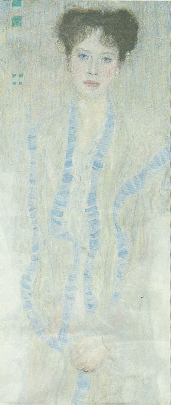
Yesterday, the Daily Telegraph and many other media outlets reported that a painting made in 1902 of a young Jewish woman (Gertrud Loew) by Gustav Klimt has been “restored” to her family. Such cases are heartening and just, but so often the accompanying photographs of returned works are, as here, disturbingly unlike early photographic records. The image shown above of this returned painting is from a printed paper copy of the Daily Telegraph. Newsprint photography is never of the highest quality but, with all allowances made, the strikingly washed-out appearance of the painting is evident also in the higher quality online reproductions, as below where all images are shown in greyscale to facilitate fair visual comparisons. What can be seen in all of these comparisons is a progressive and debilitating loss of values in the painting’s design, drawing, modelling and spatial ‘envelope’. Such sequences invariably run chronologically from darker, richer, sharper and better-modelled depictions, to lighter, brighter, flatter, more abstract, less plastic, less life-like arrangements. If dirt alone had been removed, the opposite effect would be obtained: all values would be more intense; all relationships would be more vivacious in their effects.
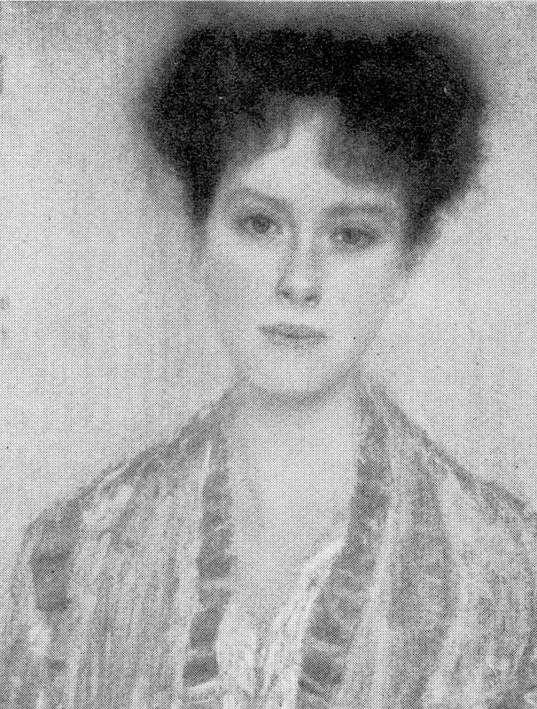
Above, these details show the painting as successively recorded a) before 1956 (top), when it was at most 54 years old and probably never previously restored; b) as before 1986 (centre); and, above c) as it is today (albeit, here, in an over-enlarged detail).
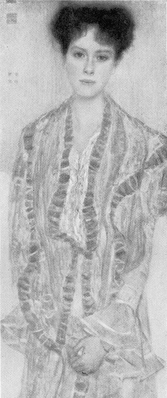
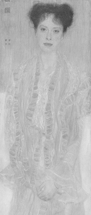
Above, top, a detail of the painting as before 1956; above, the detail as seen today. In this comparison we see, for example, that the contour of the subject’s left arm was more clearly drawn and shaded before 1956; that the shaded modelling around the eyes was more emphatic before 1956 than it is today; that the costume had two distinct parts – a darker over-garment and a lighter undergarment; and, that the tone of the flesh at the neck and above the undergarment was appreciably darker before 1956.
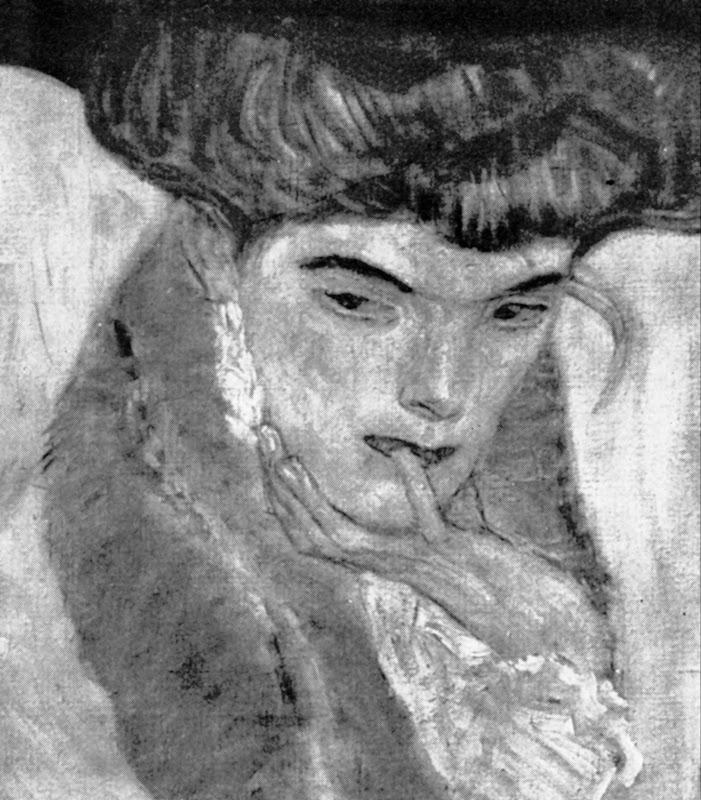
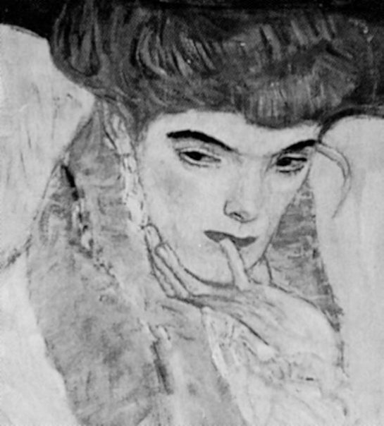
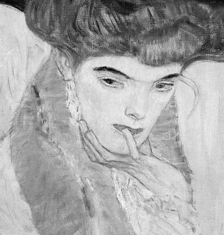
Above, a detail of Klimt’s 1910 picture The Black Feathered Hat shown (top) before 1956; as seen on a Dover postcard (centre); and (above), as seen today.
The Black Feathered Hat, as used on a CD cover of music accompanying an exhibition at the Neue Galerie, New York.
Below, a detail of Klimt’s Danae of 1907-08.
Above (top) Danae before 1956 and (above), as seen today. Note in particular the radically altered (and weakened) relationships at the crucially intense and psychologically-charged face/sheet/hand/breast configuration.
Below, the figure Poetry from Klimt’s 1901-02 Beethoven Freeze, before 1956 (top) and today (bottom).
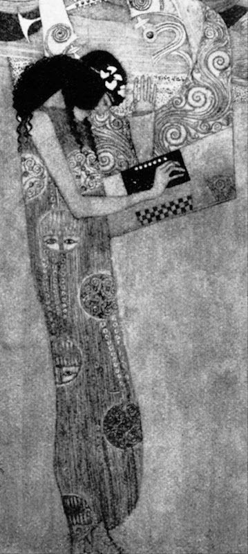
Below, finally: SPOT THE DIFFERENCES – AND WEEP
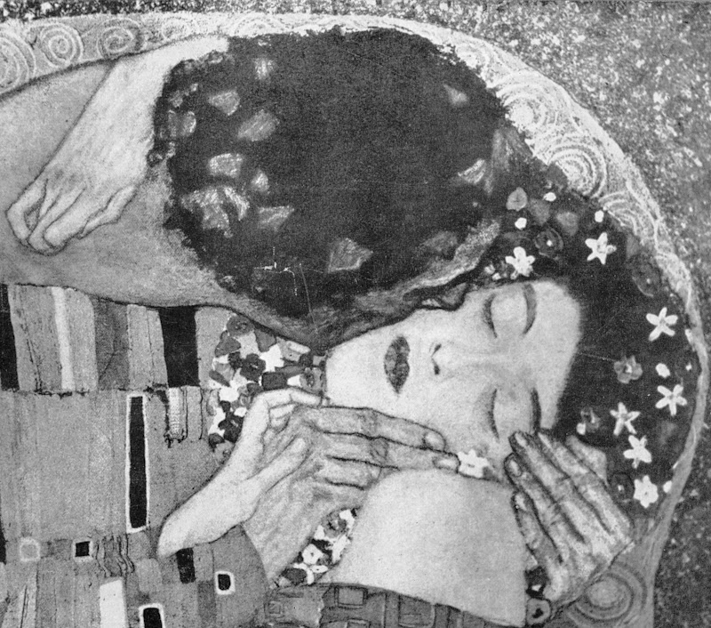
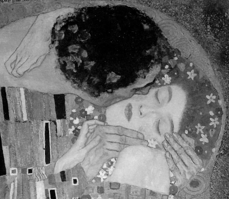
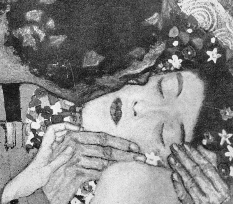
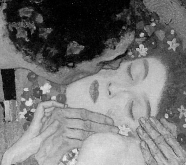
Michael Daley, 5 June 2015.
Bubbles burst.

A few years ago a director at the Victoria and Albert Museum, was chided for producing blockbusters that bust no blocks. Today, aside from its catering and retailing outlets, that museum – which once advertised itself as “An ace caff, with quite a nice museum attached” – has a department exclusively dedicated to the production of special exhibitions. It generates eight exhibitions a year with a further fifteen travelling around the world at any one time (see “The world is her oyster”, in the Autumn/Winter 2013, V&A Magazine). As more and more of Art’s Flying Dutchmen encircle the globe, an awful lot of holes are appearing in the collections of great museums – as at the Louvre, as Didier Rykner has eloquently demonstrated (“The Louvre Invents the Gruyère Museum” ). This development is perverse as well as regrettable: a chief defence that museums make when seeking funding for expensive acquisitions is that they are needed to fill crucial gaps in a collection.
At the British Museum the number of loans (and therefore holes) doubled between 1985 and 2000, in which year 214 objects or groups of objects were loaned. That was for starters. In 2008, under its present globe-trotting director, Neil Macgregor, the museum got 2,500 objects “on the road” in Britain alone. In a submission this year to the Scottish Parliament, Mr MacGregor boasted that between 2003 and 2013 the museum had loaned over “over 30,000 (many very fragile)” objects, with only eight injuries. In 2006 the BM packed 160,000 visitors in three months into a (physically) small exhibition of Michelangelo’s drawings, at £10 a head (plus takings from the catering and retailing outlets). Mr MacGregor ruefully claimed that three times as many tickets could have been sold had space permitted. The following year he announced plans for a £100m expansion of the British Museum that was reportedly triggered because it had had to turn down a unique chance “to show off” the largest collection of Tutankhamun treasures ever seen in the west (Evening Standard, 6 July 2007), works which went instead to the former Millennium Dome, now re-branded as “02”.
It would seem that nothing in museums is now safe from this international exhibitions jamboree – no work plays too important a role within a collection, or is too fragile, or too unwieldy, to prevent curators from taking a gamble with its welfare (in hope of reciprocal loans and a curatorial buzz). The Metropolitan Museum in New York is one of the most voracious recipient/organisers of exhibitions. It needs to be. Its special exhibitions, which are free, are the biggest justification for the museum’s whopping “recommended” $25 entrance charge (- the legality of which is under challenge). As we have seen, the present director of the Metropolitan, Thomas Campbell, once boasted that only his museum could have shaken-down (“Item: The Met’s Strong-arming of Reluctant Lenders”) other great art institutions to get them to part with the fabulous Renaissance tapestries that were sent to a special show in New York.
The Metropolitan Museum will likely be the first international stop (after a six months stay-over at the British Museum) for a long-planned show of plum works from the Burrell Collection in Glasgow that will take place should the Scottish Parliament oblige the Glasgow City Council by over-turning the prohibitions in Sir William Burrell’s bequest on all foreign loans and vulnerable works within Britain.
Next October in New York, the Museum of Modern Art will host a show of some of the most fragile and difficult-to-transport works of modernism. As Martin Bailey reports in the current Art Newspaper, (“Journey at Snail’s pace”) Henri Matisse’s monumental 1953 paper collage, The Snail, is to leave the Tate for the first time since the gallery bought it more than 50 years ago. It will be a star exhibit in “Henri Matisse: the Cut-Outs”, at Tate Modern next April, that will include its sister works, Memory of Oceania, 1953, and Large Composition with Masks, before travelling to MOMA in New York. Although the itinerary is set, what is not yet clear, Bailey discloses, is how the Tate’s giant and fragile work will travel or even how it will be be packed:
“The problem of how to transport the huge work, which measures nearly three square metres, has plagued conservators for years. Paris’s Grand Palais asked to borrow the work for a major retrospective on the artist in 1970, but was refused because of the risks associated with transporting it. Its original late-1960s glazing is being replaced with laminated glass, which will reduce the risk of damage during transportation. However, laminated glass is heavy: with its frame, the work will weigh around 300kg. If the collage is set at a 45° angle within a crate, it will fit more easily through doorways, but if the work is transported flat, it will need a case measuring around four square metres.”
Those keenest to lend and borrow lean heavily on the relative safety of international aviation, but with these particular monumentally large but flimsily constructed works, Bailey discloses that a spokeswoman for the Tate was unwilling to discuss transport arrangements. He has discovered, however, that they might travel by sea because there are almost no cargo planes large enough to carry them, and because the exhibition’s sponsor is… South Korea’s largest shipping company, Hanjin Shipping. Either way, as Nick Tinari of Barnes Watch has repeatedly testified, when Matisse’s mural La Danse was detached from its permanent home at the Barnes Foundation, Merion, and sent off at a 45° angle on an open flatbed truck to the first stop (the National Gallery of Art, Washington) of a world tour, it was to return home badly damaged.
Not only are museums gutting themselves to feed international loan exhibitions, they are, as our colleague in New York, Ruth Osborne, discusses (“The Dismemberment of the Louvre: Travels to Louvre Abu Dhabi promise damages and leave Parisian Museum-goers in the Lurch”), beginning to do so on an even greater scale as part of international “rebranding exercises” in which museum annexes are created in improbable but rich centres so that museums may present themselves as pan-national or global brands (- along with Gucci now read Guggenheim). A lot of money is being made and a lot of careers advanced. Some journalists effectively double as cheerleaders for the tourism-fuelled cultural arts economies of centres like London and New York. However, along with these booming arts economies, risks are rising – and not just with the works of art: those who blithely authorise streams of loans risk putting their own reputations on a block.
Michael Daley
NEWS UPDATE 26-11-13
The Guardian today carries this letter from ArtWatch UK:
“You illustrate the new exhibition of Turner seascapes at the National Maritime Museum with a giant reproduction of the artist’s now badly wrecked, many-times restored ‘Rockets and Blue Lights’ without issuing any kind of art conservation health warning (Eyewitness, 21.11.13). A clue to the extent to which this picture is no longer a remotely fair representation of Turner’s work is found in the picture’s full title, ‘Rockets and Blue lights (Close at Hand) to Warn Steamboats of Shoal Water’ – for this was once a painting of two steamboats in distress, not of one. The now lost boat was recorded in a large chromolithographic copy of the painting that was commissioned in 1852, and in a photograph of 1896. Viewers who compare your present image with the recorded earlier states of the picture will likely marvel at the transformation by twentieth century restorers of the sky, and at the losses of storm-driven smoke from the funnels of the original pair of steamboats, one of which vessels has now disappeared under the waves along with its originally depicted crew members.”
In the ArtWatch UK Journal No 19 (Winter 2003), we carried an article by the artist Edmund Rucinski (“Ship lost at Clark. Many records feared missing. Establishment unfazed.”)
Unfazed the establishment was then – and, evidently, so remains today. Despite the disappearance of the second boat (and its smoke) in a recent cleaning, the owners of the Turner, The Sterling and Francine Clark Art Institute of Williamstown, USA, had included the work in a travelling exhibition (“Turner – The Late Seascapes”) that ran at the Clark from June to November in 2003, before transferring across the Atlantic to the Manchester Art Gallery in January 2004 and then on to Glasgow in March 2004.
At a public lecture at the Clark Institute, on 2 August 2003, Edmund Rucinski (who knew of the 1852 chromolithographic copy shown right) had been astonished to hear the restorer, David Bull, claim that the picture had originally depicted a single boat and that the second, now-removed, boat had not been painted by Turner but was a restorer’s addition made, possibly for Lord Duveen around 1910. That claim slowly sank. When Rucinski spoke to David Bull and asked on what authority the second boat had been removed, he replied that it was on a photograph of a single-boated copy of the painting that had been supplied by the Clark Institute’s senior curator, Richard Rand.
On 15 October 2003, the Times’ arts correspondent, Dalya Alberge, reported that when asked how it had been established that the second boat could not have been painted by Turner, Mr Bull had said: “The answer is we don’t know. It was a general consensus.” Thus, what had been presented publicly as a historically verified certainty was downgraded within a couple of months to a best guess, collective assumption. That position was maintained for several months and was reiterated in the Manchester Evening News of 14 January 2004, which reported: “The American owners of the painting and the restorer…say a second boat may have been added by an early 20th century restorer”.
On 28 March 2004 the show moved to Glasgow and the Glasgow Herald reported that the Clark’s senior curator had said “We have always maintained that the original Turner had two boats”. The importance of heavy promotion for travelling exhibitions was demonstrated in October 2003 when the Tate, which had not taken part in the travelling exhibition, nonetheless issued a press release that ended with the following claim:
“One of the stars of the show is Turner’s dramatic “Rockets and Blue Lights (Close at Hand) to Warn Steamboats of Shoal Water”, 1840 which has recently undergone major conservation and is a loan from the Sterling Clark Art Institute, Williamstown, USA”.
In additions to newspaper reports of critisms of the restoration, many interventions were made by scholars, as below:
“Since ‘Slavers’ and ‘Rockets’…have ended up in collections geographically so close to each other, it struck Hamilton [James Hamilton, the show’s curator] as a good idea to show them together, arguing that Turner had intended them as a pair. The first snag was that Boston decided that ‘Slavers’ was too unstable to travel, even to Williamstown, so it was not in the show at all…But there is a danger that Turner has become a guaranteed crowd-puller, to be had recourse to at the expense of equally interesting but less certainly popular subjects. This is not a development to be welcomed, if only because Turner’s works are exceptionally vulnerable: the paintings, to the stresses of travel on their experimental construction; the watercolours to the exposure of light. He is not a resource that can be exploited indefinitely…”
~ The Turner scholar, Andrew Wilton, in a review for the Burlington Magazine, March 2004.
The ‘Slavers’ of which Wilton spoke, is Turner’s oil painting Slavers throwing overboard the dead and dying – Typhoon coming on. In 2000 the Museum of Fine Arts in Boston which owns the painting found it to be damaged and “extremely unstable” on return from a loan to the Tate Gallery. Despite having been “glazed and sealed against changes in relative humidity, the picture [had] reacted significantly to the voyage” and lost flakes of paint. An unfazed (and institutionally unrepentant) Tate spokeswoman said in response to disclosure of the damage:
“It arrived here safely where it was examined thoroughly. Its condition was stable…However, Turner’s paintings are notorious for becoming unstable.”
Indeed they are. So why the incessant demands from temporary exhibition organisers to keep borrowing them? And why the systematic attempts to deceive the public into believing that the most restoration-wrecked pictures are the “stars” of the shows?
For our part, we have repeatedly drawn attention to these travel-induced injuries. On 24 October 2007 the Daily Telegraph carried this letter from ArtWatch UK:
“Sir – The Mellon Center’s decision (report, October 17) to break its own rule never to lend Turner’s fragile ‘Dort or Dordrecht: The Dort Packet-Boat from Rotterdam Becalmed’ seems perverse: only seven years ago, the Museum of Fine Arts in Boston lent its Turner ‘Slavers throwing overboard the dead and the dying, Typhoon coming on’ to the Tate. On its return to Boston, that painting was found to have suffered losses of paint and to be in an ‘extremely unstable’ condition. A Tate spokeswoman said: ‘It arrived here safely…Its condition was stable…However, Turner’s paintings are notorious for becoming unstable.’ This being so, why are trustees and curators prepared to take such risks with priceless works of art?”
Clearly, the question still stands.
Comments may be left at: artwatch.uk@gmail.com


![]()
Art and Photography

Returning from an ArtWatch trip to New York and Philadelphia (refreshed and invigorated, as always), a first task was to take clippings from the previous week’s newspapers. On facing pages of the Times of 26 October, two startling and memorable images shouted in hilarious unison – and surely not in accidental juxtaposition? The first (here Fig. 2) was of a squirrel that had dropped a nut. The second was of one politician (Hillary Clinton, Fig. 1) endorsing another at a rally. The pendant pair of images testified to photography’s special, most distinguishing technical trait: its unique power to make/capture instantaneous-but-enduring mechanical records of particular scenes at singular moments. Photography (in its chemical and digital forms) has been a profoundly revolutionary addition to the world’s image making and recording capacities. That it is so at this point is beyond any dispute, but, then, it has never constituted, as some still hold, a replacement for those hand-crafted (painted, drawn or engraved) images made by people who are sometimes called artists. (See Gareth Hawker’s “A Photograph is a Copy, not a Creation“.)
On 25 October, at New York’s famous art school, The Art Students League, we were privileged to watch a kind of master class given by the painter Thomas Torak, who for thirty or so minutes, worked over a student’s oil painting of a model – a heretical procedure in many educationalists’ eyes. Using the student’s own palette, paints and brushes, he explained the artistic purpose of every change and adjustment as he went along. Starting at the passage depicting the model’s forehead, Torak suggested that the tones were too uniform. Lightening the student’s own flesh tint on the palette, he placed a firm highlight against the darkest tone on the shaded side of the head. Instantly – at a proverbial stroke – the form of the brow sprang forward from the canvas and turned convincingly in (evoked) space. With a stronger forehead, Torak moved down to the eyes in their sockets, darkening the shadowed hollows and placing strategic lights on the lids and the bulging eyes themselves. And so on and so forth down the head and into the body. Every adjustment was made on the authority of values seen to be present on the model herself, at that time and in that light. Seemingly, nothing was being invented: piece by piece, step by step, observable relationships between adjoining values were first carefully appraised and then artfully replicated in hue and tone on the palette, before being judiciously laid onto the painting.
However, as facet related to facet and form to form, the mosaic whole began to assume a compelling and designed narrative form from a brush that drew and revised as it coloured. Finally, Torak introduced consideration of the model’s entire body and clothing to the values of the background wall within the then-present natural top-down light. Here, again, the student had made too-equal an appraisal of the relative figure/ground values: the background was markedly too dark and too warm. Lightening and cooling its tone and hue caused the untouched figure to jump forward on the canvas in a startling “before-the-eyes” pictorial magic. Watching the demonstration and the entire group of students, it was apparent that without seeing Torak’s painting but simply by heeding his words of analysis and explanation, other painters in the studio were modifying their own work on similar rationales and to considerable benefits.
As a mild-mannered, softly-spoken man, Thomas Torak may be one of the art world’s most insufficently appreciated figures. Fortunately, the deftness of his speech and the acuity of his eye find other outlets at the Art Students League. Writing in that art school’s magazine LINEA (- and how very fortunate New York is that such an institution should have survived waves of modernist iconoclasm), Torak quietly, gently shredded a recent noisy attributional upgrade, rashly made on the back of a pictorially disruptive restoration at the now curatorially hyper-ventilating Metropolitan Museum of Art: see “The Rediscovered Velázquez” of 25 December last year.
Returning to our hotel at 11 p.m. on the last night of the trip, we witnessed another kind of artistic tour de force. On the corner of Times Square and West 48th Street, a “street artist” was working on a triple portrait, made in conté crayon on the basis of a photograph taken on a mobile phone (see Fig. 7), as his three subjects sat on the sidewalk behind him. The image of each head on the photograph could have been no more than half an inch high, and yet, from this miniscule photographic record, the artist was producing at speed perfectly credible heads with very fair likenesses. Like David Hockney – as we discovered once when drawing by the side of Lake Como – artists never pass one another without making an involuntary detour to take a peek. “Where did you learn to draw like this?” I asked the street artist. “In China” he replied. Ah yes, and alas, it could hardly have been recently at the Royal Academy Schools in London where Tracey Emin has been appointed Professor of Drawing. (See Harry Mount’s “Where will the Queen hang her rubbish portrait by Tracey Emin?”)
Michael Daley
Comments may be left at: artwatch.uk@gmail.com


![]()