
Defending the Indefensible Part I: The National Gallery’s Tangled Rubens Web
1) “I know gossip about staff and trustees and stories connected with acquisitions I don’t think I’d better share.”
– Martin Wyld, the National Gallery’s retiring Head of Restoration in the January 2010 Museums Journal.
2) “Rubens’ Samson and Delilah is a large scale, early and entirely autograph painting of a kind the National Gallery previously lacked.”
– Michael Levey, the then-Director of the National Gallery, in the 1983 Rubens Acquisition in Focus exhibition catalogue.
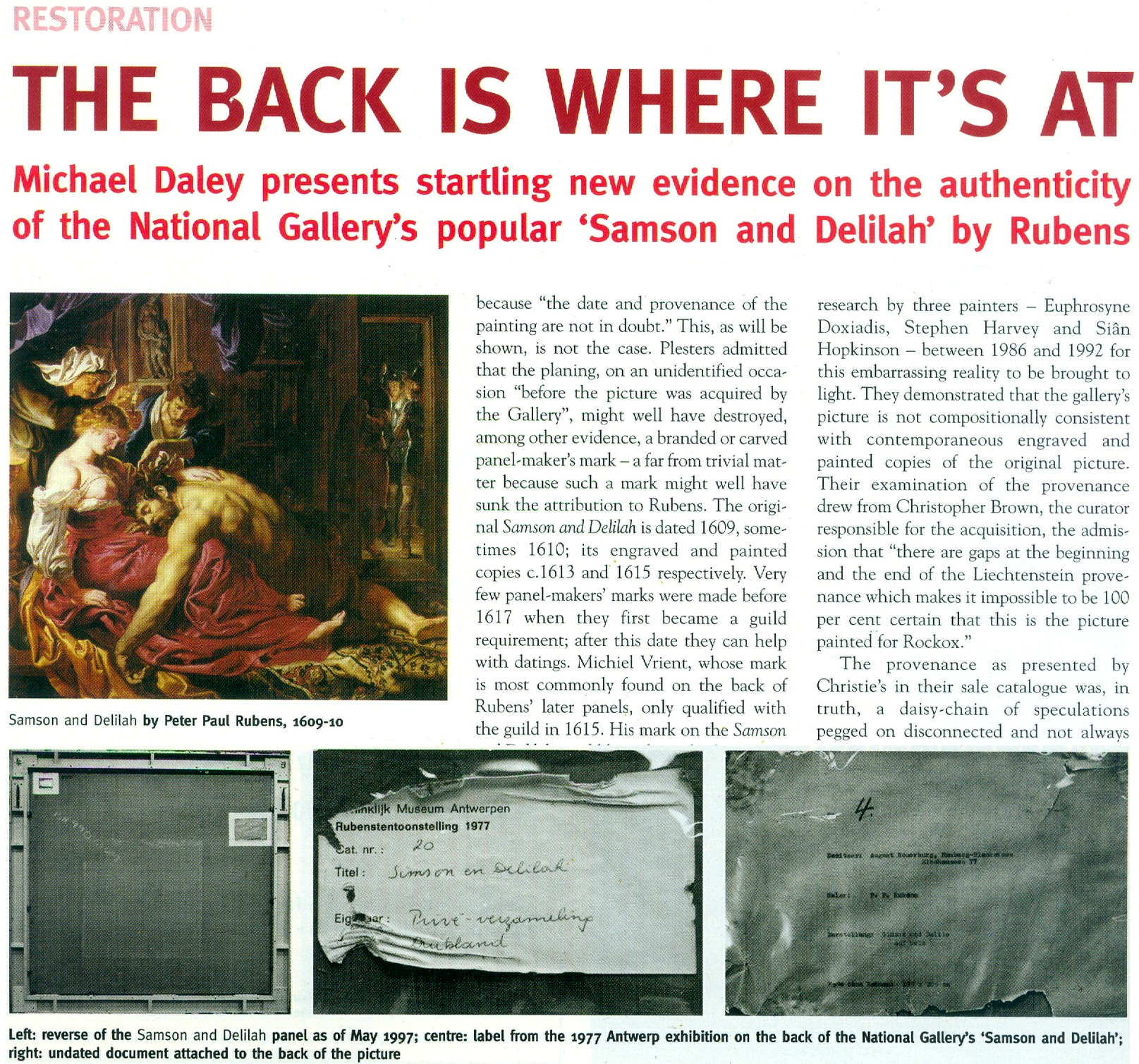
3) “The Samson and Delilah was planed down to a thickness of about three millimetres and set into a new blockboard panel before it was acquired by the National Gallery in 1980 and so no trace of a panel maker’s mark can be found.”
– Christopher Brown, the National Gallery Senior Curator, Flemish Paintings, in his 1996-97 Esso-sponsored National Gallery “Making and Meaning” exhibition catalogue Rubens’s Landscapes“. (Emphasis added.)
4) “Rubens’ panels sometimes bear the branded or carved mark of the panel maker, an example in the National Gallery being the Portrait of Susanna Lunden… unfortunately, as David Bomford has described, the back of the panel of the Samson and Delilah had been planed-down to a thickness of only about 3 mm and then the whole set into [sic] blockboard before the picture was acquired by the National Gallery, so any such marks would have been eradicated.”
– Joyce Plesters, the then-Head of Science, in the 1983 National Gallery Technical Bulletin. (Emphases added.)
5) “The treatment of Cima’s Altarpiece carried out during the 1970s and 1980’s was a rare modern example of a process that was extensively practised (often unnecessarily) in the 18th and 19th centuries – the transfer of a painting to a new support. It is nowadays only carried out in the last resort, when all other attempts at treatment have proved unsuccessful.”
– David Bomford, National Gallery conservator and author, in his 1997 National Gallery Pocket Guide: Conservation of Paintings. (Emphasis added.)
6) “Questions have been raised about aspects of the physical state of Rubens’s Samson and Delilah since its purchase by the National Gallery at auction in 1980… Recent research, however, has yielded some answers to the questions of when and why the painting may have gained this alien backing.”
– David Jaffé Christopher Brown’s successor at the National Gallery, August 2000, Apollo ‘Rubens back and front’. (Emphasis added.)
FROM THE FIRST CRITIC:
7) “Jan Bosselaers had inspected NG6461 up-close in 1977, and then again in 1980. Given his familiarity with the painting, I asked him specifically about its back. Bosselaers grabbed a piece of paper and drew a grid of three vertical lines crossed by three horizontal ones. He looked at me. ‘A cradle!’ I gasped. ‘Yes’, he said, ‘it was a cradle.’”
– Euphrosyne Doxiadis: Painter/author, in her NG6461 The Fake National Gallery Rubens (p. 117. Emphasis added.)
MICHAEL DALEY WRITES:
PART I: A REFORMULATED SAMSON AND DELILAH ACCOUNT THAT STILL DOES NOT STACK UP
With expensive and massively hyped works bought by major public institutions it would seem that acknowledging errors is an art-political impossibility. Such institutional obduracy is longstanding. In 1966 the art dealer René Gimpel noted that “The museums are even more intent than the collectors on defending their fakes or their mistaken attributions” (- a 1929 entry in his Diary of an Art Dealer.) Today, with the Samson and Delilah, the National Gallery stands in triple jeopardy: its initial error of art historical judgement has been compounded by both an apparent falsification of material evidence and a decades-long withholding of contra-testimony in its possession.
The affair began in 1980 with a deceptive unanimity of assurances and a dearth of disclosures. Today, on interrogation of the picture’s traits, provenance and technical literature, a sleight of hand emerges: the back of its panel and the historical evidence it bore were removed by the Gallery and not by earlier, unknown others, as the Gallery has claimed since 1983 – and blatantly claimed despite its possession of flatly contrary key historic documents. (See Fig. 5 below.)
Thus, there are two cross-linked issues: whether the picture is the long-lost original Rubens painting of 1609-10; and, who planed down the back of its panel and mounted it on a larger sheet of modern blockboard (- and with it, of course, “Why?”). The first is a matter of judgement. The second is one of fact that should also be – but conspicuously is not – one of record. Dr David Jaffé’s August 2000 bid in Apollo (see below) to explain why the panel painting “might have” received its alien backing before being bought by the National Gallery was doomed by his failure to follow such records as exist within the Gallery and extrapolate from them the precise place and time at which the transformation had occurred.
On matters of fact, at Fig. 2 below, we note an item on the National Gallery’s recently updated online Samson and Delilah entry which itself supplies visual confirmation of past institutional culpability.
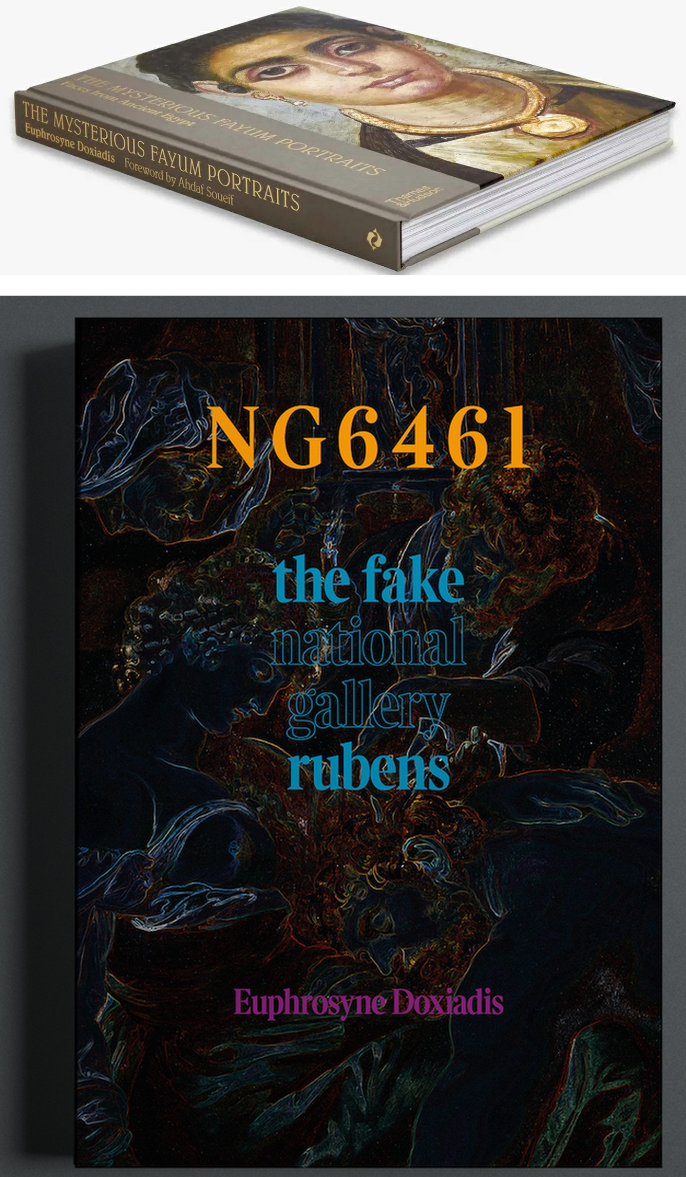
Above, Fig. 1: top, Euphrosyne Doxiadis’s (republished) award-winning 1995 study of the Fayum encaustic paintings; above, Doxiadis’s new book NG 6461 The Fake National Gallery Rubens – N.B. “NG6461” is the Gallery’s inventory number for its supposed Rubens Samson and Delilah.
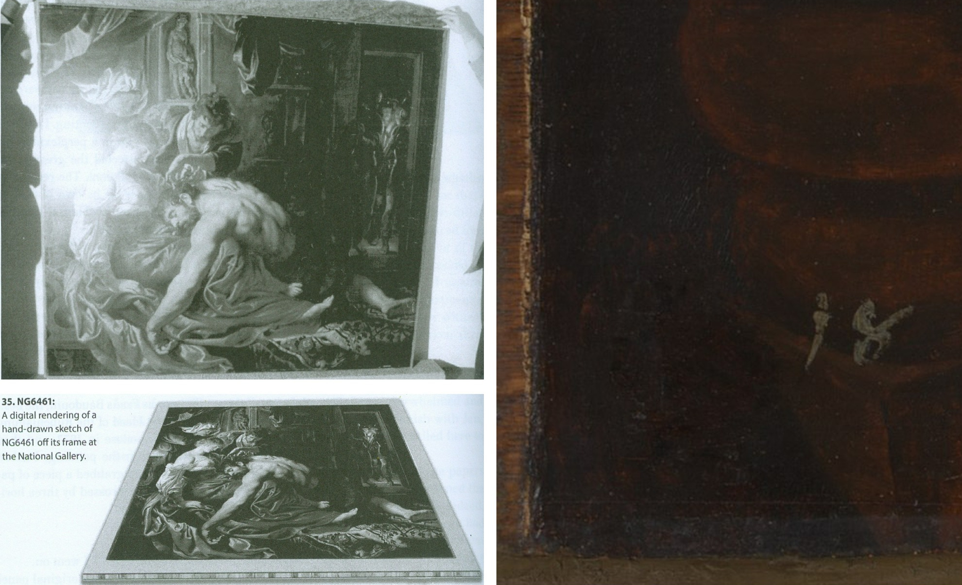
Above, Fig. 2: Top, left, The National Gallery Samson and Delilah, as seen in Antwerp in 1980 when it was about to be dispatched to Christie’s, London, and at which date the paint reached the top and bottom edges of its panel but not the side edges (to which slim battens had been attached – on which, see comment by Martin Wyld below). Above, left, Euphrosyne Doxiadis’s digital rendering of the Samson and Delilah panel on its blockboard mount, as seen by her when the picture was undergoing dendrochronological examination at the National Gallery on 25 September 1996. (Both images above are published in Doxiadis’s NG6461 The Fake National Gallery Rubens.)
Above, right, the bottom left corner of the National Gallery’s Samson and Delilah in which the picture’s post-1980 blockboard backing can now be seen running below the bottom of the painting. The Gallery’s online publication of this image’s visual corroboration of the panel’s post-1980 blockboard extension is intriguing. Wittingly or unwittingly it constitutes a tacit acknowledgement of institutional responsibility for the Gallery’s own (always previously denied) planing down of the panel and subsequent mounting of it on a larger blockboard sheet. (See Figs. 3 and 4 below.)
The Gallery’s online entry acknowledges – somewhat disparagingly – the existence of the Samson and Delilah picture’s “Naysayers” and cites some of their/our publications. Unfortunately, although it cites both issues of our Journal that were dedicated to the Samson and Delilah’s problems (see Fig. 7 below) it does not address their contents – as might be instanced in this pertinent item on the “Material Evidence” section in our Autumn 2000 Journal:
“…This conflict of testimony echoes one found within the Gallery in 1983 when the restorer David Bomford described the thinned panel as glued ‘onto’ the face of the blockboard while the Head of Science, Joyce Plesters, described it as ‘set into’ the blockboard. When I drew this discrepancy to [the then-Director] Neil MacGregor’s attention, he replied (letter 19th June 1997): ‘Incidentally, at the risk of being pedantic, into is the correct preposition, since the edges of the blockboard are flush with the [edge] surface of the panel. Onto would be correct if the panel had simply been glued to the blockboard and protruded above it.’ If this account is accurate, with the edges of the panel and blockboard being flush, there would be no place for the putty bevel encountered by Ms Doxiadis and Mr Norman [*1]. By the same token, had the edges of the panel and blockboard been flush, there could have been no grounds for Joyce Plesters’ 1983 [Technical Bulletin] claim that the treatment had ‘render[ed] the edges of the panel inaccessible’ for dendrochronological examination. A clear, focussed photograph of one of the picture’s corners might throw some light on the subject. Or better yet, permission to examine the panel in the flesh…”
(Emphasis added. Permission to examine the panel was never granted.)
On 14 February 2006, when examining the Samson and Delilah’s dossiers for a second time [*2], we noted photographs showing that the paintwork stopped short of the edges of the oak panel only on the vertical edges. In the present revised online Gallery entry, confirmation and possible explanation for this feature is given: “There is a narrow margin of unpainted wood at the sides of the oak panel which probably results from the support being held firm by grooved battens while the ground and then paint were applied; ‘6’ the ground and paint extend to the top and bottom edges.” The footnote ‘6’ reads: “The same can be seen on Rubens’s Judgement of Paris (NG6379). For this practice see, for example, Wadum 1998. The battens seem often to have been only along the shortest sides. A little of the unpainted margins may have been trimmed away since they are rather narrow.” With the Gallery’s Samson and Delilah, the photographic and documentary records of the restoration treatments are strikingly less complete than those of other Gallery panel paintings. For example, when writing on the restoration of the Altdorfer panel bought in 1980, Martin Wyld discusses the attachment of battens to the edges of panels: “Although some German panels of this period have channels at or near the end grain of the plank in order to accommodate battens which were fixed to the frames, the channels are seldom to be found on all four sides”.
[*1] Charles Norman, Director, The National Timber Trade Federation. As Dalya Alberge reported (The Times, 27 August 1997) on photographs supplied to us by Mr MacGregor, Mr Norman judged the back of the Samson and Delilah to be “a blockboard manufactured in the late 1970s or early 1980s”. It looked, he said, “like a manufactured item, machine-made rather than handmade”. Later, after being invited to see the picture at the National Gallery, Mr Norman amended his earlier observations. His subsequent description of the picture’s physical component parts (made by telephone, 18 & 19 September 1997 to Michael Daley) was a compromise between his original observation and Euphrosyne Doxiadis’ (above-illustrated) clear recollection of a substantial surround between the edges of the planed down panel and the blockboard support, and Mr MacGregor’s claim of flush panel and blockboard edges. That is, Mr Norman claimed that the blockboard was somewhat larger than the planed down panel but that the gap between the two had been filled by a wide putty bevel.
[*2] In 2006, under Charles Saumarez Smith’s directorship, we were given full access to the Collection’s photographic and documentary records – a privilege subsequently extended by Nicholas Penny and Gabriele Finaldi. (ArtWatch is greatly indebted to all three knights – as also to the Gallery’s kindly helpful archival and library staffs.)
With the Gallery’s present publication of the Fig. 2 photograph of the bottom left corner of the Samson and Delilah, two points should be noted. First, the Gallery’s 1997 claimed relationship between the panel and its blockboard backing was clearly unfounded. Second, the photograph of the bottom left corner is cropped and therefore does not show the full blockboard extension. Nonetheless, it does now show (MacGregor’s earlier claims notwithstanding) that, far from the edges of the panel and blockboard being flush, the latter can be seen to protrude beyond the bottom edge of the picture when, as seen above at Fig. 2, top left, it had not done so in 1980 when held by the banker, Jan Bosselaers, in Antwerp, shortly before it was sent to Christie’s. Today’s publication of that photographically-confirmed relationship has finally demonstrated that the blockboard backing must have been applied to the picture’s panel after 1980 and when in London.
CONFLICTED AND OPAQUE GALLERY ACCOUNTS – AND THE FIRST PUBLISHED APPEARANCE OF THE BLOCKBOARD BACKING
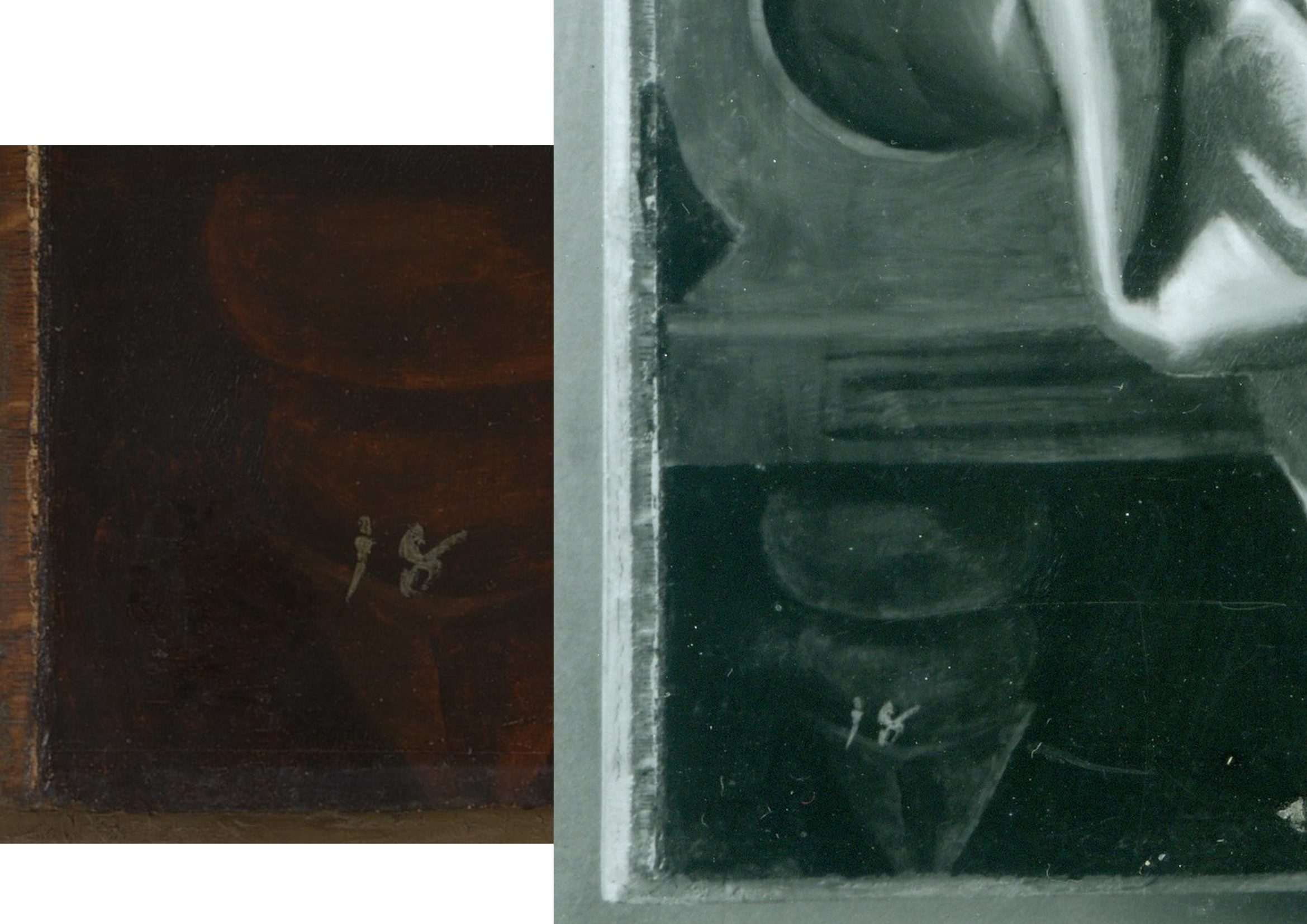
Above, Fig. 3: left, the National Gallery’s recently published online detail of the bottom left corner of the Samson and Delilah; right, a detail of the bottom left corner the Samson and Delilah in a National Gallery photograph taken on 10 August 1982 and designated: “After Cleaning, Before Restoration”.
Above, right, this – so far as we know – unpublished 10 August 1982 photograph, shows the then-present blockboard backing that protrudes not only beyond the bottom edge of the panel but also beyond its left vertical edge (which is not disclosed by the cropped image presently shown online). The date on the black and white photograph shows that the picture had then been in the Gallery’s possession for twenty-five months by which time the planing and mounting on blockboard had occurred (as had also the removal of the picture’s varnish, as shown below.) What the Gallery has never produced – and, we believe, could not ever produce – is a photograph showing the blockboard’s presence before the picture was acquired from Christie’s or when it had been loaned by Christie’s to the National Gallery ahead of the sale. In the absence of such important photographic testimony, the conclusion that the National Gallery itself planed down the panel for undisclosed reasons and mounted it onto a blockboard sheet, is inescapable. The formal authorisation for the picture’s restoration from the Board of Trustees came on May 16 1982 just three months before the above-right photograph was taken. Thus, on the available official records, the removal of the Samson and Delilah panel’s back and the subsequent mounting of it on blockboard had occurred at the National Gallery between 16 May and 10 August 1982. (It is not inconceivable, however, that the formal application for permission to restore the picture had in fact followed a commencement of work on it.)
Above, Fig. 4: The Samson and Delilah’s bottom left and bottom right corners, as respectively recorded at the Gallery on the 10th and 11th of August 1982, by which dates the visible blockboard extensions (which read as the whitish strips) all around the panel had materialised within the Gallery’s own photographic records for the first time – and indicated the extent to which the new blockboard backing extended beyond the planed-down remains of the original oak panel. Earlier, the National Gallery Board Minutes of 16 May 1982 had carried the following note:
“The treatment of No 6461, proposed for Mr Bomford, was recommended by Mr Brown, who explained that the painting was to be the subject of the second ‘Acquisition in Focus’ exhibition, opening in January 1983.” It added, matter-of-factly:
“The painting had a modern support of wood attached to the original panel which had been considerably reduced in thickness and this was considered adequately stable; the surface had probably been only partly cleaned in the recent past, and tests showed considerable discolouration.”
This above account made to the Board was the first-ever mention of a blockboard backing on the painting. It had not been so described by Christie’s and, as shown below, it was even at variance with an in-house National Gallery timber expert’s 1982 account of the painting when it was on exhibition in the Gallery and ahead of its restoration. Strictly speaking, the above statement was technically accurate: the picture had, by that date, been planed down and mounted on blockboard – but only very recently so. Even though the the Gallery had had sight of the picture since the beginning of July 1980 (and had taken photographs and Infra-Red images of it on July 2 1980 – ahead of the sale) it had not – as Mr MacGregor confirmed to us – made any photographic record of the picture’s back either after buying it, or earlier when it had been loaned ahead of the July 11 1980 Christie’s sale. This lacuna is, on our familiarity with the Gallery’s technical literature and dossier records, unprecedented. Indeed the Gallery’s restorers sometimes give the impression that they are more interested in working on pictures’ physical “supports” than on their painted surfaces – and by “working on”, we mean undoing and redoing them. (See Fig. 9 below.)
A TIMBER EXPERT’S ACCOUNT OF THE SAMSON AND DELILAH PANEL
In the 1982 National Gallery Technical Bulletin, Christopher Brown, Martin Wyld and the Gallery’s (now deceased) timber expert, Anthony Reeve (who was held by Mr MacGregor to have been the “supreme practitioner of his generation”) wrote on the cleaning and restoration of Rubens’ The Watering Place and, in doing so, made clear that no blockboard backing had been applied to the Samson and Delilah at that date. That is to say, when discussing the highly problematic construction of many Rubens’ panels, Reeve noted:
“Of all the pictures in the National Gallery, Rubens’ panels have been of greater concern, because of their condition, than any other part of the collection. The reason for this is well-known. Rubens frequently found it necessary to enlarge his pictures after he had started painting… Rubens’ oak panels, often enlarged in several different stages, are amongst the most inherently unstable supports used by any artist.”
However, in so saying, Reeve drew a distinction between “the oak supports which, although made up of many planks joined together, were not enlarged during the painting process, and those which were added to.” Of that former, relatively unproblematic type, Reeve cited just three examples:
“The Rape of the Sabine Women… The Judgement of Paris… Samson and Delilah… the panels of which are made up of six, five and seven oak planks respectively. The grain of every plank, and hence the joins, are horizontal and all the planks are roughly the same width.”
In consequence, Reeve continued, although “these large panels are sensitive to changes in relative humidity (RH), they provide a sound and permanent support if kept in a controlled environment and not exposed to sudden changes in RH.” Whatever reason subsequently led to the National Gallery’s decision to plane down the panel and mount it on blockboard, it was not one of conservation necessity. Curiously, as late as 1996 Christopher Brown was still extolling the the sound construction of the Samson and Delilah’s Panel: “In contrast to a panel like the Samson and Delilah, carefully made from a small number of planks in all of which the grain runs parallel, many of the panels on which Rubens’s landscapes are painted are extremely fragile and prone to splitting”.
Thus, two years after the Gallery had bought the Samson and Delilah for a then huge sum, the Gallery itself (- and, note, just months ahead of Christopher Brown’s 16 May 1982 Board Minute-ed claim of a supposedly long-present blockboard backing) had yet to begin describing the picture as being on a radically reduced panel glued onto a larger blockboard support.
On Reeve’s (nowhere contested) 1982 Technical Bulletin testimony, although the three pictures had been well and favourably constructed, all were at risk of potential injury through their exposed bare panel backs in the event of dramatic atmospheric fluctuations. Had the Samson and Delilah already been planed down to a thickness of just 3 millimetres and mounted on a larger sheet of blockboard, there would have been no such risk or concern – and a timber craftsman as expert as Reeve could not/would not have confounded all three pictures as equally soundly-made and still intact panels which retained their original backs and such information as they bore. This conflict of testimonies within the Gallery coincides with a marked lapse in the Gallery’s own – and frequently self-proclaimed – “customary” record-keeping. That is, no documentary or photographic evidence has ever been produced to support the Gallery’s post-1983 Technical Bulletin Bomford and Plesters’ claims that the Samson and Delilah had been bought on 11 July 1980 as a greatly reduced panel mounted on a blockboard backing sheet even though, as mentioned, other photographs of the picture had been taken when it was loaned to the Gallery ahead of the sale.
Had Brown been right and Reeve wrong on the picture’s then-condition, evidence for the former would normally have been found in the customary condition reports the Gallery makes on receipt of loaned works. Because (as shown below) the Gallery has not been able to produce any written and dated reports on this picture’s condition when loaned ahead of the sale, the most-recent condition report remains that prepared in 1980 by Frans Baudouin when the picture was still – as he had testified (see below) – a cradled panel of between 2.5 and 4 centimetres thickness. Curiously, when Brown later discussed the Samson and Delilah in his 1997 Rubens Landscapes exhibition catalogue, he described it as if it comprised two separate entities. First, in step with Reeve’s 1982 Technical Bulletin account, he held it to be: “A particularly fine panel…composed of six [sic] horizontal oak planks, carefully planed and jointed. The grain runs parallel in all six pieces, which are butt-jointed. The parallel grain ensures that when exposed to humidity the wood expands and contracts without restriction…etc.” But then he went on to hold that it “was planed down to a thickness of about three millimetres and set into [sic] a new blockboard panel before it was acquired by the National Gallery in 1980 and so, no trace of a panelmaker’s mark can be found.”
Perhaps in so reporting these two contrary states of the picture, Brown was simply recalling the two chronologically successive states of the picture as he had encountered it within the National Gallery.
THE PIVOTAL CERTIFICATE OF AUTHENTICITY TO WHICH NOBODY REFERRED

Above, Fig. 5: A photocopy of an undated typewritten sheet in German that had comprised Ludwig Burchard’s 1930 certificate of authenticity provided to the firm Van Diemen and Benedict, and which also carries handwritten Burchard notes on the path of the picture he had authenticated. The existence of this then seventy years-old document was first published by Michael Daley in June 2000 (see note [*3])
CUSTOMARY DOGS THAT DID NOT BARK
With two such expensively acquired old master pictures it might have been expected that the accounts of both would disclose the findings of the customary Gallery technical examinations made prior to works being presented to the Trustees when seeking their authorisation to purchase. However, with the Samson and Delilah no such disclosures were offered.
In 1997 the Gallery claimed to ArtWatch UK it had not kept written records of the picture’s state in 1980 when examined at the Gallery ahead of the purchase; and, therefore, it had not presented such customary reports to its Trustees when seeking authorisation to make the purchase. Indeed, the-then Director, Neil MacGregor, specifically confessed: “The National Gallery does not have any record, photographic or written, of the back of this picture before it was planed down”. The Gallery could supply only a photograph of the picture’s back “as it is today” (see Fig. 6, below, bottom left). The consequence is that while a records trail of an intact panel runs from 1930 to 1982 – when the picture was on display the National Gallery – it is said that no official record exists of its condition on arrival at the Gallery in 1980.
However, in the picture’s own dossiers (as I discovered on 14 Feb 2006) there exist two Infra-red images of the picture (one of them being of the whole picture when still in its frame; the other, a detail showing Samson. Both images were made on the second of July 1980 – that is, nine days before the Christie’s sale at which £2.53 million changed hands. Neither image was reproduced in the 1983 Technical Bulletin even though the report on the picture carried eight images of other paintings. Nonetheless, it was precisely customary for the Gallery’s “Keeper” to prepare a report on a prospective picture’s desirability and art historical importance and for the Head of Restoration to prepare a report on the picture’s condition and soundness. That requirement was expressly noted in 1986 by the Gallery’s then deputy director, Allan Braham: “Before any purchase is made by the Gallery a report on the painting and its desirability for the collection will be made to the Director by the member of the Keeper staff with responsibility for the relevant school of painting: the condition of the painting will be investigated by the Conservation Department.”
In the 1980-81 National Gallery Report, Michael Levey thanked Christie’s for their “co-operation in allowing the Trustees to see this painting in the Gallery before the sale and thus assess not only its powerful impact but also its major contribution to our representation of the painter.” And yet, a trustee in 1980 later recalled to Euphrosyne Doxiadis that no reports had been shown to the Board on the Samson and Delilah. In a letter of May 27th 1997, Mr MacGregor confirmed to us that the painting had been inspected “in the flesh” by the Trustees before the sale but, ambiguously, he added that Christopher Brown and Martin Wyld had conducted examinations and that both remembered “quite clearly that the panel was already set into [sic] blockboard, as do the Christie’s staff most directly involved in the sale.” The person most involved at Christie’s was Gregory Martin, the former National Gallery Flemish paintings specialist. Citing the recollections of Brown and Wyld seemed further to confirm they had not produced written reports on the painting’s condition and state – indeed MacGregor said that their accounts had been delivered “orally” to the Trustees. To repeat: all National Gallery claims that the back had been planed down before the picture arrived at Christie’s are contradicted by Baudouin’s 1980 condition report as commissioned by Bosselaers – and subsequently supplied to Euphrosyne Doxiadis. It had described the picture on 4 March 1980 as a “panel, 185 x 205 cms” that was “in good shape” and in a then conservation state that could be “called excellent”.
A TALE OF TWO NATIONAL GALLERY PANELS – AND THEIR RESPECTIVE PRESENTATIONS IN THE TECHNICAL LITERATURE
In 1980 the National Gallery bought two old master panel paintings for, respectively, just below and just above £2.5 million each. Both were put on immediate display. Both generated much interest. As is customary, both were soon restored by the Gallery. They were Altdorfer’s ‘Christ taking Leave of His Mother’ and the claimed Rubens Samson and Delilah. As is also customary, both restorations were reported in the Gallery’s 1983 Technical Bulletin, but the nature and manner of their accounts diverged dramatically.
THE ALTDORFER PANEL – A PLAIN AND UNPROBLEMATIC ACCOUNT
The Altdorfer was purchased by private treaty sale from the Wernher Estates, through Christie’s, with the aid of contributions from the National Heritage Memorial Fund [NHMF], the Pilgrim Trust and the National Art‐Collections Fund (Eugene Cremetti Fund). Today the NHMF says of the Altdorfer: “The acquisition of this painting strengthened the collection of German paintings at the National Gallery, then relatively under-represented. Works by Altdorfer are exceptionally rare: this painting and the Landscape with a Footbridge (Room 4) are the only two works by the artist in this country. The painting was bought for £2.45 million by the National Gallery in 1980 from the Wernher Collection at Luton Hoo, only months after the NHMF was founded. Without the intervention of the NHMF, which gave £825,000, the National Art Collections Fund (Eugene Cremetti) and the Pilgrim Trust, the painting would have been sold at auction, and almost certainly have been exported.”
THE RUBENS PANEL – A GRAVE ATTRIBUTIONAL MISFIRE
The NHMF has subsequently given much support to the National Gallery assisting it on the purchase of eleven pictures nine of which are shown online by the Gallery; but it had not done so with that of the Samson and Delilah, where Christie’s had given no price estimate in the sale catalogue and the underbidder’s identity remains unknown to this day. We had been given to understand there had been three bidders in the sale: Sir Geoffrey Agnew, acting for the National Gallery; Dr Reinhold Baumstark of the Liechtenstein Princely Collections; and, a bidder on behalf of the Rockox House Museum, who had dropped out at £1,300,000. Christopher Brown has claimed – and his successor at the National Gallery, David Jaffé, intimated in Apollo in 2000 – that Dr Baumstark had bid for the Liechtenstein Princely Collections. However, as Euphrosyne Doxiadis has reported, the then-Prince of Liechtenstein was not the underbidder, nor had he even taken part in the bidding. (See note [*4] below.)
The Samson and Delilah was bought by Agnews on behalf of the National Gallery at a Christie’s auction for a world record Rubens price of £2.53 million. The sale took place in the morning of 11 July 1980 and the picture was hung in a reserved space at the Gallery in the afternoon. A “Strictly Confidential” Gallery press release announcing the purchase had been prepared ahead of the sale. In 1983 the National Gallery Director, Michael Levey, wrote in the “Acquisition in Focus” Samson and Delilah exhibition catalogue: “…some people might have asked why the nation needed another Rubens. In the Collection at Trafalgar Square there were already twenty paintings by the artist… Rubens’ Samson and Delilah is a large scale, early and entirely autograph painting of a kind the National Gallery previously lacked.” (As shown below, Levey’s successor, Neil MacGregor, would be obliged to explain to the public why this “Rubens” looked like no other in the Gallery.)
By that date the picture had been restored and fitted with a new replica period frame made in imitation of the frame shown in Frans Francken’s copy of the original Rubens Samson and Delilah as installed in the house of its first owner, Nicholaas Rockox when its previous frame had been thought possibly original to the painting. The restoration that had immediately preceded the Gallery’ 1983 exhibition was lauded by Levey: “Its splendid colour and vigorous handling of paint can be all the better appreciated now that it appears cleaned in this exhibition.” Along with its world-record price, the Gallery had invested much scholarly/curatorial capital in this particular acquisition – on which its successive accounts would prove so unsatisfactory.
A RISE OF NON-CURATORIAL OPPOSITION THAT DREW IMMEDIATE BLOOD
There seems little question the purchase had been made in professional good faith. Since the picture’s 1929 emergence from nowhere – or, rather, from a restorer’s studio – and its 1930 upgrading by the leading (but subsequently discredited) Rubens scholar Ludwig Burchard, no Rubens specialists had demurred from the view that a well-recorded but long-lost Rubens masterpiece had been found. By the early 1990s, however, certain artist/scholars [*3] had rejected the Rubens ascription, initially, on essentially stylistic grounds and the picture’s manifest visual incompatibility with the testimony of two securely contemporaneous copies of the original painting. Although repeatedly denied by the Gallery, it would further transpire that, during its 1981-82 restoration at the Gallery, the Samson and Delilah panel underwent a covert physical transformation that left the picture at variance with all records of its condition and composition [*4]. As seen above, in 1980, when about to be sent to London, the panel retained its original and by then cradled back. When bought by the National Gallery in 1980 , Christie’s sale catalogue entry described it as being “on panel”. When on display at Christie’s, it was seen by many to have been a cradled panel – albeit one whose “bars did not slide”, as the former-Christie’s staffer, and the then Evening Standard art critic, Brian Sewell informed us.
[*3] In February 1992 a report from three art students challenging the attribution – Euphrosyne Doxiadis (author of the acclaimed The Mysterious Fayum Portraits from Ancient Egypt – see Fig. 1 above), Steven Harvey and Siân Hopkinson – was submitted to the National Gallery and placed in the Samson and Delilah’s dossiers. The Senior Curator, Christopher Brown, would later concede that “gaps at the beginning and end of the picture’s provenance” made it impossible to be 100 per cent sure this was the original Rubens Samson and Delilah of 1609-10.
[*4] That is, when upgraded from Honthorst to Rubens by Burchard, he had specifically enthused – contrary to subsequent official National Gallery claims – that the panel painting “even retains its original back”. (See Figs. 2-5.) I discovered Burchard’s nowhere acknowledged certificate of authenticity in April 2000 in a typed manuscript copy of 8 April 1930 held in the National Gallery’s own Samson and Delilah dossiers, it having presumably been passed on to the Gallery by Christie’s after the 1980 auction. When that discovery was published in the June 2000 Art Review I sent a copy to the Gallery’s Director, Neil MacGregor. The following day, the Gallery released an unsigned statement acknowledging for the first time that, contrary to the Gallery’s (Technical Bulletin) published claims of 1983, the panel of the Samson and Delilah could not have been planed down in the 19th century or in the 1920s “because it was recorded in its original state in 1930.” Nonetheless, at the same time, the unsigned statement claimed “the recent allegation” that the planing had occurred after 1980 was “false”.
Above, Fig. 6: Extracts from the June 2000 disclosures in the Art Review.
In June 2000, in response to press coverage of the Art Review article “The back is where it’s at” (Fig. 6, above), as in the Independent on Sunday (“Tell-tale sign that £40m Rubens could be a copy”), the Times and the Guardian, the National Gallery’s director, Neil MacGregor, had a notice placed in front of the picture to explain why it looked like no other Rubens in the Gallery. That notice drew attention to a fuller statement available at the information desk in which the Gallery denied our charge of its restorers having tampered with the panel. (That document was itself an “updated” version of one prepared and displayed in 1997 in response to press coverage of challenges made by Kasia Pisarek – see Figs. 7 and 8 below).

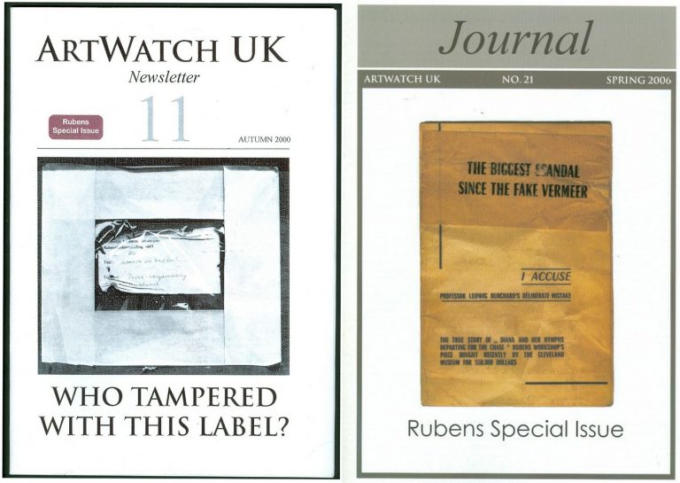
Above, Fig. 7: The Autumn 2000 and the Spring 2006 special issues of the ArtWatch UK Journal given over to discussions of the National Gallery Samson and Delilah.
NO ANSWERS GIVEN. DEBATE REPEATEDLY SHUT DOWN. A LOOP OF SILENCE CREATED.
The National Gallery later announced Christopher Brown would publish a scholarly article in the Burlington Magazine. It never came. The magazine’s editor told us none was submitted. An article by Kasia Pisarek was submitted. It was rejected by the Burlington Magazine – and, later, by Apollo (but see [*5]). In 1998 Dr Brown left the National Gallery to direct the Ashmolean Museum in Oxford. An article by his successor at the Gallery, David Jaffé, appeared in the August 2000 Apollo, but it was expressly intended to end, not launch, consideration of the evidence. Arts journalists summoned to a National Gallery press conference on the pending article were advised “it will finally silence the critics”. Our request to reply was rejected by Apollo’s editor, David Ekserdjian, a former staff member of Christie’s. He also rejected a letter from Michel Favre-Felix, a painter member of the Association Internationale pour le Respect de l’Integrite du Patrimonie Artistique – ARIPA. Christopher Brown’s departure from the National Gallery served to thwart subsequent inquiries into the Samson and Delilah’s acquisition and its subsequent unacknowledged treatment.
On 6 April 2002 (letter) we asked Neil MacGregor whether Dr Brown had been aware in 1982 of Burchard’s 1930 Certificate of Authenticity and its testimony on the then sound condition of the Samson and Delilah panel. He replied: “As I am sure you know, Christopher Brown left the National Gallery some years ago… I suggest you pursue the matter with him.” When Brown was asked by the US magazine Salon (December 2005) to comment on his past involvement in the controversy, he replied: “I am sorry but I don’t want to do this. Please address your questions to the National Gallery.” In 1983 Brown had reported: “Under the terms of Ludwig Burchard’s will, I had the privilege of consulting the manuscript notes on the Samson and Delilah. My visit to Antwerp was made possible by a grant through the Sir Martin Davies Travel Fund”. Had Burchard’s own notes held by the Rubenianum not contained a draft or other record of his 1930 certificate of authenticity, as is held in the National Gallery?
THE VALUE OF REPORTS
When, after we had published Burchard’s certificate of authenticity and Neil MacGregor had adjusted the Gallery’s position accordingly, Christopher Brown and his successor, David Jaffé, held that the Samson and Delilah had been planed down when in the collection of the German magnate, August Neuerberg, between 1930 and 1980. In doing so, they went against the testimony not only of Baudouin’s March 1980 condition report but also of a leading Rubens scholar and National Gallery benefactor who had gifted a Poussin – Christopher Norris. As first mentioned in our June 2000 Art Review, article, Norris had testified in a 1980 letter (held in the picture’s dossiers) to the director, Michael Levey, congratulating him on the Samson and Delilah’s acquisition, and adding that between 1930 and 1980, no change in the picture’s “amazing condition” had occurred, other than a toning down in its 1929 varnish, because “the owners had not touched it.”
Thus – and in addition to Baudouin’s 1980 condition report – we now know on Burchard’s and Norris’s joint written testimonies (both of which are held by – but neither of which had been disclosed by – the National Gallery) that the panel was intact, in good condition and had retained its original back from 1930 until 1980 when it was sent to Christie’s. Therefore, the only parties who might have planed-off the back are Christie’s and the National Gallery itself. Christie’s, who described and sold the picture as a panel and not as a reduced panel laid on board, or as a marouflaged panel, would hardly have so-profoundly and radically transformed someone else’s property (and someone, that is, who as the work’s sole known owner, had left the picture untouched for half a century) – or, for that matter, have had the time and the great technical means to do so. But even if Christie’s had done so, the National Gallery would then, in turn, have duly recorded that recently-altered state of the picture in its customary reports on works loaned to it ahead of sales. It had not done so (see below).
Ignoring the triangulated testimonies of Burchard, Baudouin and Norris, David Jaffé’s second tack had been a more personal charge: “Mr Daley does not seem be aware of the art historical convention whereby a painting on panel, even when thinned, is still called a panel”. He cited the following instance: on December 17th 1998, Sotheby’s auctioned Rubens’ Deluge as an “oil on oak panel” when in fact it was “on a marouflaged panel”.
But how had that been that known? It was so, Jaffé disclosed, “according to a condition report” made at the Gallery by its timber specialist/restorer, Anthony Reeve (which report is held in the Gallery’s exhibition file) when the picture was loaned to the National Gallery ahead of the sale. Why then, is no such report held and cited on the Samson and Delilah when it too had been loaned to the Gallery ahead of its 11 July 1980 sale at Christie’s?
HOW RELIABLE ARE LUDWIG BURCHARD’S ATTRIBUTIONS?
[*5] In an article published in the Spring 2006 Artwatch UK Journal (Fig. 7, above right), Kasia Pisarek (Katarzyna Krzyżagórska-Pisarek) wrote:
“While investigating Dr Ludwig Burchard’s ‘rediscovery’ [of the Samson and Delilah], I was surprised at some of the truly improbable attributions made in the past by him and other well-known experts such as G. Gluck, W. R. Valentiner, W. von Bode, A. Bredius or C. Hofstede de Groot, who all guaranteed their ‘discoveries’ with certificates of authenticity…” On Burchard, specifically, “I traced many of his attributions – he was not infallible in his judgement and changed his mind. Surprisingly, over sixty pictures attributed by Burchard were later downgraded (in Corpus Rubenianum) to studio works, copies or imitations…”
To date, Dr Pisarek has identified seventy-five fallen Burchard Rubens’ attributions. (The title of Pisarek’s 2009 Warsaw University dissertation was “Rubens and Connoisseurship: On the Problems of Attribution and Rediscovery in British and American Collections.”)
Above, Fig. 8: The Sunday Times’ 5 October 1997 coverage of Kasia Pisarek’s rejection of the Samson and Delilah’s Rubens ascription.
Certain suspicions seem to have arisen in Waldemar Januszczak’s mind as he (at that date) rejected the Samson and Delilah’s Rubens attribution in the above Culture Magazine feature and pressed the striking Whodunnit Mystery of the Disappeared Back:
“…I put this to the gallery’s chief conservator, Martin Wyld, who quips cheerfully that he was rather proud of having been accused; planing a 17th-century oak panel to wafer thinness and attaching it perfectly to blockboard while leaving its surface in pristine condition, is an exceptional feat of restoration. Nobody would or should do it today. Whoever did it earlier did a masterful job. Why did they do it at all? If a painting is in exceptionally good condition, why was there any need to hazard the transfer to block-board? A question neither the chief conservator nor MacGregor can answer. All I got from them both is the National Gallery version of: it wasn’t us, guv.”
Had Januszczak been a student of the National Gallery’s Technical Bulletins he might have recalled that accounts were given in the 1985 and 1986 issues of how Martin Wyld had chiselled away the entire wood panel of seven giant planks just under two metres long of Cima’s The Incredulity of St Thomas and that, in the first stage of this supposedly now verboten practice, the panel was reduced “from c. 5 cm to 1 cm” and in the second stage, the remaining 1 cm of wood was chiselled away entirely until the back of the original gesso coatings was exposed and ready to be attached for ever to its entirely new synthetic materials sandwich.
For a glimpse into the National Gallery’s subterranean Factory for Restoration and Attribution Rehabilitations, see:The National Gallery’s Made Just like Rubens Samson and Delilah with Cropped Toes
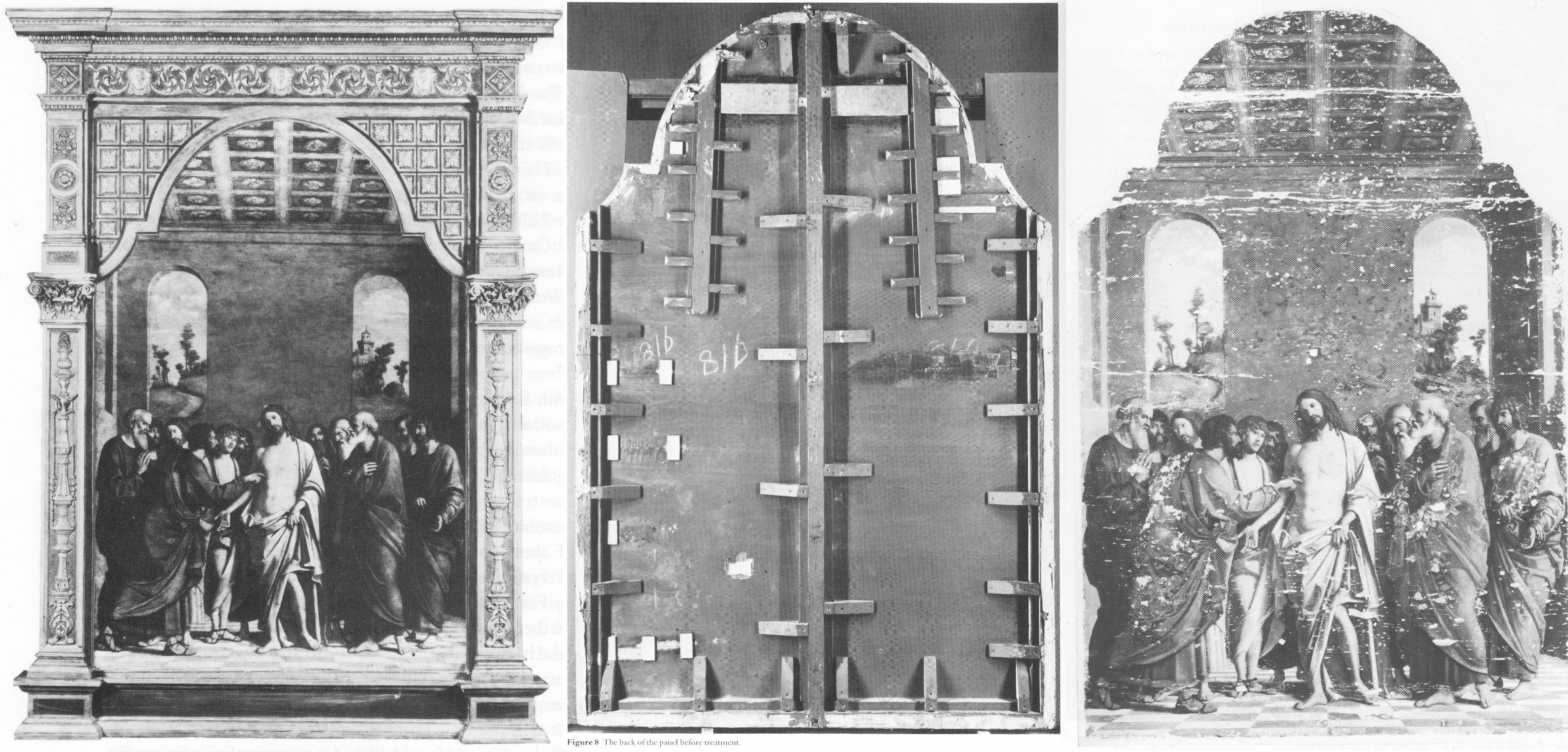
Above, Fig. 9: The National Gallery’s Cima da Conegliano altarpiece, The Incredulity of S. Thomas. Left, the altarpiece before restoration; Centre, the back of the panel, before its entire removal and replacement; Right, as seen after cleaning and before retouching – and after the transfer of the surviving gesso and paint film onto a multi-layered synthetic support.
RECORDS v RECOLLECTIONS AND BOY-GANGS IN ACTION
If the documentary record is to be trusted, it can be said with certainty that someone within the National Gallery covertly planed the Samson and Delilah panel. Notwithstanding his later Jaffé-flaunted recollection of August 2000, Frans Baudouin [*6] had, in his 1980 condition report prepared for the Samson and Delilah’s owner, Mrs Margaret Köser, solemnly testified on his (likely financially remunerated) professional oath (as the picture was about to be dispatched by the banker Jan Bosselaers from Antwerp to Christie’s in London), that it was a panel between 2.5 cms and 4 cms thick – and, therefore, had not-yet been planed down to a thickness of under 3 millimetres and cemented onto a sheet of modern blockboard. And yet, in the face of all such precisely documented facts between 1930 and 1980, David Bomford would, in his 1983 National Gallery Technical Bulletin account, backdate the planing to an unspecified time, place, and person – viz: “At some time, probably during the present century…” – and, when so-saying, would offer not one jot of supporting technical, photographic or documentary evidence in an institution that had long claimed exemplary record keeping practices.
[*6] Frans Baudouin was described in Codart on his death in 2005 as: “the doyen of Flemish art historians. He was the former director of the Rubenshuis and the driving force behind the founding of the Rubenianum, as well as an outstanding specialist in Rubens.” Nonetheless, he had declined to discuss the Samson and Delilah’s attribution with Euphrosyne Doxiadis (the first critic of the picture’s ascription and a co-author of the 1992 Report submitted to the National Gallery) whom he had met socially. In his August 2000 Apollo article, Dr. Jaffé, belatedly acknowledging Burchard’s certificate of authenticity record of the original panel, wrote: “Three Rubens experts – Dr. Frans Baudouin, Dr. Reinhold Baumstark and Dr. Hubert von Sonnenburg – who had been contacted by potential purchasers and therefore studied the painting with particular attention, all recall seeing it in its present condition just prior to its sale at auction on 11 July 1980.”
Powerful and triangulated testimony, it might well have been thought. However, one might also assume, for example, that Baudouin’s professional documents were likely more trustworthy than his twenty years-old recollections. In support of the former, the photograph (above, Fig. 2) of the Samson and Delilah when out of frame in 1980, and as supplied to Euphrosyne Doxiadis by Jan Bosselaers, along with Baudouin’s own 1980 certificate of condition for the Samson and Delilah might be cited. Further, as mentioned, in 2001 Doxiadis asked Baumstark’s successor at the Liechtenstein Princely Collections, Dr Uwe Wieszorek, if the then-Prince of Liechtenstein had been the underbidder at the 1980 Christie’s sale. In NG6461 she now reports: “He assured me categorically in two letters that as far as the Collections were aware, the Prince was not the underbidder, nor had he even taken part in the bidding.”
As for Dr. Hubert von Sonnenburg [*7], the then Head of Conservation for the Metropolitan Museum, might he be taken as the unsuccessful underbidder? When advising that museum on the possible purchase of the then-sublimely preserved Velázquez Juan de Pareja (which was bought for the Met. from Christie’s in 1971), Sonnenburg had strenuously advised the picture should under no circumstances be bought if its canvas had been relined. Would he likely have advised that great museum to buy a reduced panel laid on blockboard at a nowhere-recorded location and time? If he had, had the Met. attempted to buy the Samson and Delilah but been outbid for once by the National Gallery? Jaffé does not say – but where Christopher Brown had told Euphrosyne Doxiadis that the Prince of Lichtenstein had been the underbidder, for their part Christie’s had refused at the time of the sale to identify the (to this day, mysterious) underbidder, whose bids were said to have been relayed to the main sale room by telephone from an anteroom.
[*7] As we noted in a March 2011 post – Hubert von Sonnenburg was certainly an adept of art museum secrecy:
When, in 1971, the Met. snatched Velázquez’s Juan de Pareja from the British (who had owned it for centuries) Thomas Hoving, Ted Rousseau, von Sonnenburg and Everett Fahy had all flown to London, Madrid, and Rome – a sort of “boy-gang”, as they saw it, playing at spreading rumours like “the disinformation section of the KGB” – as Hoving (who later claimed to have discussed with Wildenstein’s how to “manipulate the art press and crank up the rumor mill” in a general strategy of “dissimulation and misleading rumors”) put it in his memoir. Even when successfully bought, the Velázquez was not paraded at the Met. but, rather, was “sneaked” into Wildenstein and Company “for secrecy”, partly because funds had been committed without the Board’s knowledge and also because, as Hoving put it, the Board had to remain longer in the dark as further “total secrecy” would be needed to “prepare our public relations stance” and to “have the time to clean it.” The deception of the public was to be absolute: for a short period before the restoration, the picture was exhibited to New Yorkers as if it were Wildenstein’s own property. Subsequently, the Met audiences only got to see the von Sonenburg-redone Juan de Pareja and not the miraculously well-preserved jewel that had, some time before, been taken to the New World by a triumphalist, dissimulating art world boy-gang.
In Part II – A TALE OF TWO ASCRIPTIONS AND THEIR RESPECTIVE TECHNICAL EXAMINATIONS – we examine the remarkable methodological discrepancies evident in the National Gallery’s own respective 1983 accounts of its two expensively bought 1980 panel paintings, and show why the Samson and Delilah should never have been presented from 1930 onwards as the long lost Rubens of 1609-10.
POSTSCRIPT: See Dalya Alberge’s disclosures in today’s Guardian:
A £2.5m dud? Fresh doubt cast on authenticity of National Gallery Rubens
15 June 2025
To Criticise a Critic
An examination of certain pre-emptive scholarly/art market establishment strikes against a pending book that rejects the Rubens ascription of the National Gallery’s contested Samson and Delilah.
Michael Daley writes: Those who challenge art establishment scholars or institutions can suffer swift repudiation and denigration in lieu of frank and open debate, as I discovered when supporting Prof James Beck’s criticisms of the Sistine Chapel Ceiling restoration in the late 1980s. In the 1996 edition of the Beck/Daley Art Restoration – The Culture, The Business, And The Scandal, in a chapter headed “The Establishment Counter-attacks”, I noted:
“When criticized in this area, institutions react institutionally, which is to say, by deploying self-protecting mechanisms common to all establishments. The best and most favoured response is no response, implying that the criticism is inconsequential and deserves to be ignored. In those instances where a response is unavoidable, it is thought best to be made by proxy… When a direct defence is necessary, its tone becomes all important. By tradition, the tone ranges from amused disdain, through supercilious dismissiveness to outright disparagement and attempts to discredit personal or professional credentials.”
It seems little has changed and that responses to the imminent arrival of Euphrosyne Doxiadis’s book on the National Gallery’s supposed Rubens Samson and Delilah (NG6461 – The Fake National Gallery Rubens) have run true to institutional templates. As a case in point, take this even-handed Artnet account: “Is This Rubens Real? Inside the ‘Samson and Delilah’ Debate” by Jo Lawson-Tancred.
Lawson-Tancred reports an anonymous National Gallery spokesman’s claims that the picture “has long been accepted by Rubens scholars” and that the Gallery finds no cause to update its initial technical examination of the painting [as had been reported in its 1983 Technical Bulletin] and whose “findings remain valid.” The first part is true – Rubens scholars had so accepted the attribution. However, the insistence that the report on the then recently acquired, exhibited, and restored £2.53mn picture requires no updating disregards subsequent findings on this and other Rubens paintings.
To be precise, the Gallery claimed in 1983: “At some time, probably during the present century, the panel was planed-down to a thickness of 3mm and subsequently glued onto a sheet of blockboard”. As Doxiadis and we have established the picture had emerged as a panel in 1929 – albeit ascribed to Honthorst. Crucially, it had remained a panel when sent to Christie’s, London, for sale in 1980 as an autograph Rubens – indeed it was precisely so described in Christie’s 1980 catalogue (see Fig. 1 below.) The picture’s physical state as a panel had been disclosed to Doxiadis by a Belgian banker who had wished to buy the picture for the Rockox House museum in 1977 and who again held it in Antwerp for its owner in 1980 before sending it on her behalf to Christie’s, London. Beyond any question, it was still an intact panel at that date.
WHERE’S THE BEEF?
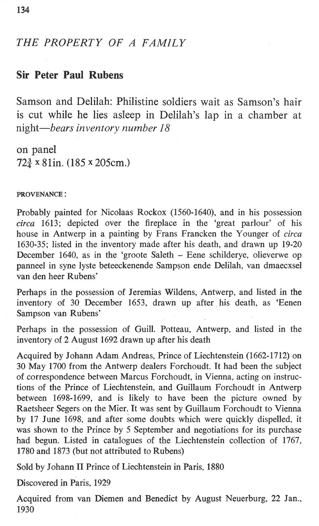
Fig. 1, above: Christie’s 1980 sale catalogue entry on the Rubens-attributed Samson and Delilah panel. Note how the entry comprises a daisy-chain of “probablys” and “possiblys” – and also its parenthetical disclosure that, throughout its claimed long stay in the Liechtenstein Collection, this Samson and Delilah had not been judged a Rubens.
Given that we informed the National Gallery a quarter of a century ago of the picture’s confirmed physical status as a bowed and cradled panel in good shape in 1980, its 1983 technical account has long needed correction because the planing had not taken place before 1980, let alone in the 19th century. And yet, that manifestly unfounded suggestion that the planing might have occurred before the 20th century had been endorsed by Joyce Plesters, the Gallery’s Head of Science in the 1983 Technical Bulletin: “Unfortunately, as David Bomford has described, the back of the panel had been planed down to a thickness of only about 3mm and then the whole set into blockboard before the picture was acquired by the National Gallery…” In truth, it had not been set into the blockboard, but rather, as Bomford had correctly reported, and Doxiadis would later discover, it had been glued onto a blockboard sheet larger than itself and fitted into a new purpose made frame.
On the combined records of 1929 and 1980 that Doxiadis and we had uncovered – and as on Christie’s own published catalogue description – it followed that the planing could only have occurred after the picture was sold to the Gallery for its then world record Rubens price of £2.53million in 1980. Our concerns were compounded when informed (by the National Gallery’s then director, Neil MacGregor) that the Gallery had not followed its own procedure of preparing written curatorial and restoration reports on the picture’s desirability and condition to assist the trustees when they examined the picture (which had been loaned to the Gallery ahead of the sale – see below) to consider an authorisation of the purchase.
AN APPEAL TO AUTHORITY
In view of Doxiadis’s recently reported disclosures on the picture’s physical condition in 1980 (Dalya Alberge “Fresh doubt cast on authenticity of Rubens painting in the National Gallery,” ) Lawson-Tancred might have questioned or challenged the National Gallery’s abiding stance. Instead, she reported:
“…despite the marginal but adamant voices of researchers like Doxiadis, top scholars in the field support Samson and Delilah’s authenticity unequivocally. Chief among these is Nils Büttner, chairman of the Centrum Rubenianum in Antwerp, who is working on the Corpus Rubenianum, the definitive catalogue raisonné for the Flemish Baroque painter. He has previously described the doubts about Samson and Delilah’s provenance as “conspiracy theories.” However, Lawson-Tancred also noted that “Büttner [had] declined to comment on Doxiadis’s book”. While Büttner, presumably, has not yet read the unpublished book, his assertions received immediate support from players in the art trade:
“Büttner’s position is backed by his peers like Adam Busiakiewicz, a lecturer and consultant on Old Master paintings for Sotheby’s. He pointed out to the Telegraph that Doxiadis is not a scholar of the period and has mostly published on Greco-Roman antiquities previously. Though she ‘had a hunch the quality of the picture wasn’t good enough’, he said, ‘I think there are some misunderstandings about the painting.’”
On misunderstandings, Busiakiewicz (who seems also to be employed by the art market “sleeper-hunter” and former Philip Mould assistant, Bendor Grosvenor, on the latter’s “Art History News” blog site), paraded just such in his reported burst of professional condescension to Doxiadis:
“Busiakiewicz explained that a comparison between Samson and Delilah and other paintings by Rubens are complicated, especially when they were made decades apart. ‘He’s an artist that changed his style throughout his career,’ he said. ‘Art historians who specialize in paintings like Rubens’ can track these changes.’ It is for this reason that the National Gallery painting has been connected to Rubens’s interest in the work of Caravaggio and other Renaissance masters whose work he had, at that time, recently encountered while traveling in Italy.”
While it is widely known that Rubens underwent changes of manner in his later paintings, Busiakiewicz failed to acknowledge (or appreciate?) that Doxiadis, we, and other critics of the attribution, such as Dr Kasia Pisarek, have for decades pointed out and demonstrated that the Samson and Delilah is glaringly unlike the bona fide Rubens paintings made precisely in that brief period when the artist had just returned from Italy.
Specifically, we had reminded readers in November 2021 that:
“In a pioneering 1992 report, the scholar/painter Euphrosyne Doxiadis and the painters Stephen Harvey and Siân Hopkinson, conducted a focussed survey of six Rubens paintings of 1609 and 1610 and demonstrated that “All these display a consistency and quality of style which is not shared by the Samson and Delilah”. That report – “Delilah cut off Samson’s hair, but who cut off his toes? The case against the National Gallery’s ‘Rubens’ Samson and Delilah” – was placed in the National Gallery’s Samson and Delilah dossiers and is published on the dedicated In Rubens Name website.”
WHITHER THE PANEL’S BACK
Above, Fig. 2: The covers of two ArtWatch UK journals given over to detailed accounts of the Samson and Delilah problems and shortcomings.
In issue 21 Kasia Pisarek wrote: “The Corpus Rubenianum project is based on the archive left by the late Dr Ludwig Burchard. Should it perhaps follow it less closely? Dr Burchard was an active Rubens attributionist in Berlin before the Second World War and in London afterwards. Several paintings formerly attributed to Rubens’s school or studio or even to another artist (such as Samson and Delilah), were reinstated by Burchard as by the master. I traced many of his attributions – he was not infallible in his judgement and changed his mind. Surprisingly, over sixty pictures* attributed to Rubens were later downgraded (in Corpus Rubenianum) to studio works, copies or imitations.” Pisarek adds: “they were, however, mostly portraits of small or medium dimensions.”
If a major work like Samson and Delilah might be considered something of an exception, Doxiadis supplies a possible explanation – Burchard was a relative of one of the owners of the dealing firm that had brought the supposed Honthorst to the marketplace.
*On the subsequent completion of her PhD thesis – Rubens and Connoisseurship: Problems of Attribution and Rediscovery in British and American Collections – Dr Pisarek remarked: “I traced many paintings attributed by Ludwig Burchard… At least seventy-five works he certified authentic were subsequently downgraded to studio works, copies, and imitations in the volumes of the Corpus Rubenianum, and the list is not complete… can we trust Burchard’s old rediscovery and attribution of the London Samson and Delilah?)
In issue No.11 we had written: “On December 17th 1998 Dr Jaffe [David Jaffé, then Senior Curator at the National Gallery] writes: ‘Sotheby’s auctioned Rubens Deluge as ‘oil on oak panel’ when, in fact, it was on a marouflaged panel’.” But how is this known? It was so, Jaffé discloses, “according to the condition report made in 1996-97 when the picture was loaned the National Gallery…” But no such condition report was made when the Samson and Delilah was loaned to the National Gallery by Christies ahead of the sale. That condition report on the Deluge had been prepared by the National Gallery’s timber specialist restorer, Anthony Reeve. As recently as 1982 Reeve had reported in the National Gallery’s Technical Bulletin (see Fig. 7) that the Samson and Delilah was “one of only three well-made straightforward Rubens panels in the collection” – which panels, he elaborated, required stable humidity because otherwise “The effect of wood shrinkage on the exposed backs of the panel…is for the front to become convex, and perhaps slightly corrugated”. Had the Samson and Delilah been planed-down and glued to blockboard at that date there would have been no possibility of its back being subjected to environmental hazards. It might be thought inconceivable that the National Gallery should have lost recollection of Reeve’s testimony by the following year and when writing in the same publication. As the National Gallery’s senior picture restorer Reeve was held after his death by Neil MacGregor to be the “supreme practitioner of his generation.”
There are yet further confirmations of the panel’s still-then exposed back. Doxiadis had obtained a Belgian condition report on the Samson and Delilah which began: “On arrival on 4 March 1980, about 14.30 hours the painting mentioned above (panel, 185 x 205 cms) was in good shape…” Doxiadis’s account squared with testimony supplied to ArtWatch by the art critic Brian Sewell (an ex-Christie’s man who took pride in having there identified an oil sketch as the modello for the Rubens Samson and Delilah), namely: that the panel had not been mounted on blockboard; that the back of the panel had been painted in a darkish matt colour and was criss-crossed with supporting bars of wood; that because Christie’s customary stencil number was made with dark paint it had been superimposed over a patch of white paint Christie’s had applied to the panel’s back.
Presumably Busiakiewicz has yet to access the 1992 Doxiadis/Harvey/Hopkinson report. For the record, the document I found in the National Gallery’s Samson and Delilah dossiers was a copy of the picture’s 1929 certificate of authenticity written by the great but subsequently discredited Rubens specialist Ludwig Burchard who had observed: “The picture is in a remarkably good state of preservation with even the back of the panel in its original condition”.
A CRITICAL FORMATION ASSEMBLES…
Where Busiakiewicz patronises Doxiadis on an allegedly insufficient familiarity with the Samson and Delilah literature, Nils Büttner has been joined in that disparagement by Bert Watteeuw, the director of the Antwerp Rubens House. As John Smith reports in the EuroWeekly:
“The latest suggestion that this is a 20th-century copy comes from Greek art historian Euphrosyne Doxiadis in her new book The Fake Rubens although this accusation finds little support from one of Belgium’s top Rubens experts Bert Watteeuw. Not only does he pour scorn on her status as a genuine expert, suggesting that anyone of any standard would have already checked with his Antwerp Rubens House and other specialist houses about the painting. In addition, he also said: ‘the provenance of this painting is very well known throughout the 17th, 18th and 19th centuries. A provenance that can be trusted is always crucial’…”
This implied claim of a trustworthy Rubens provenance was a brazen sleight of hand: what John Smith was not to know is that, as shown above, the provenance concerned at no point confirmed the painting as being by Rubens’ hand. Being thus kept in the dark, poor Smith could only but conclude: “Whilst the National Gallery has kept a dignified silence on the matter of the painting, it is no doubt delighted that one of the great Rubens scholars has come out publicly to dismiss the fake claim by Doxiadis which Watteeuw considers is purely invented to promote her book.”
Delighted as the National Gallery might be and while its Trappist silence might do yet further service as an institutionally imperative damage limitation exercise, it remains an untenable stance because, as one very distinguished former National Gallery trustee at the time of the Samson and Delilah purchase told Doxiadis, “the truth will come out – it always does”. As for Watteeuw, for a Rubens scholar at the supposed top of his professional tree to resort to professionally unfounded claims and personally directed abuse is as counterproductive as it is contemptible.
Moreover, in this regard, Watteeuw might be considered a serial offender: when apprised of negative AI findings on the Samson and Delilah panel he told another journalist, Colin Clapson (‘Fake Rubens in London’s National Gallery? This painting is genuine” counters Rubens House director Bert Watteeuw”) that Doxiadis’s soon-to-be-published book is “Complete nonsense and not based on facts. To begin with, I do not know this art historian and that is a sign. Most researchers on Rubens have passed by our Rubens House and the Rubenianium, the Rubens Library, in the search of sources and information,’ says Bert Watteeuw, the director of the Antwerp Rubens House. ‘Moreover, Doxiadis has an agenda of her own: to promote her book and that seems to be working well. In such cases conspiracies à la Dan Brown are more interesting than science.’ Whilst attacking its critic, Watteeuw gifts the National Gallery a clean bill of scholarly probity on its protracted silence: “‘The painting ‘Samson and Delilah’ in London is a genuine Rubens, a masterpiece. It is logical that the National Gallery does not want to comment or discuss its authenticity,’ he says.”
DISALLOWED TESTIMONY
In view of the above it might seem that among Rubens establishment scholars generally and for the National Gallery itself, nothing can be allowed to count as evidence against the challenged panel’s Rubens ascription. For example, in 2021, the brushwork of the Samson and Delilah was compared with that found in no fewer than 148 uncontested Rubens paintings. As Dalya Alberge noted in the Guardian (“Was famed Samson and Delilah really painted by Rubens? No, says AI”), “Its report concludes: ‘The AI System evaluates Samson and Delilah not to be an original artwork by Rubens with a probability of 91.78%.’ In contrast, the scientists’ analysis of another National Gallery Rubens – A View of Het Steen in the Early Morning – came out with a probability of 98.76% in favour of the artist.”
Such disinterested testimony is dismissed by the affronted – and perhaps professionally discomfited – scholarly grandees: “Watteeuw also dismisses AI research dating from a few years ago. ‘When that appeared, we engaged in extensive behind-the-scenes dialogue with that Swiss firm that had carried it out. AI can only work if you train it with an artist’s entire oeuvre. That was not the case at that time.’” (Watteeuw was here echoing Bendor Grosvenor’s mis-characterisation of the Swiss firm: “It is simply not possible to determine whether a painting is by Rubens by relying on poor quality images [sic] of not much more than half of his oeuvre…”) First, there is once again, as with Doxiadis, an implicit professional slur on the firm in question. Second, there is yet further evidence that logic is underemployed by many art establishment players: if, given the very great distinctiveness of Rubens’ style and painterly applications, you can find no visual correspondences when comparing the Samson and Delilah’s brushwork with a single one of 148 secure Rubens paintings, why would you be likely to find such correspondences in another batch of equally secure Rubens paintings? At this point, calling for yet more extensive AI tests on a vast oeuvre – and one with ever-shifting boundaries – is procrastination, the obliging sister of obdurate institutional silence.
CAN’T SEE – OR WON’T SEE?
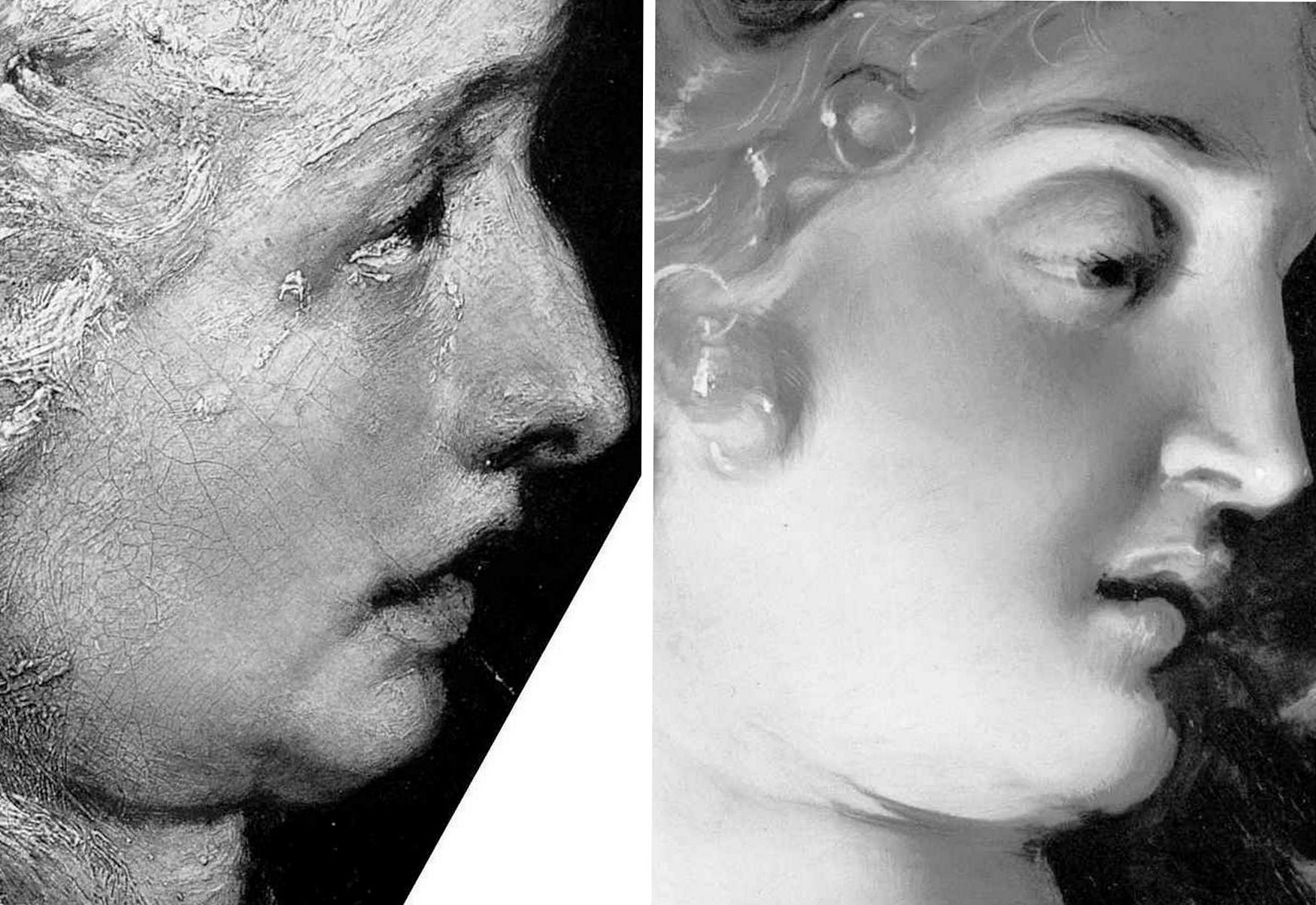
Professor James Beck once remarked that too many of his peers “look with their ears” and that it is “only the artists who can see things clearly”. It so happens that all the principal critics of the Samson and Delilah picture – Doxiadis/Harvey/Hopkinson/Daley/Pisarek – happen to have trained as artists, as Beck himself had done. Doxiadis noticed what no Rubens scholar, so far as we know, had noticed: that while Rubens painted with round brushes, the shadowy author of the Samson and Delilah had deployed flat brushes.
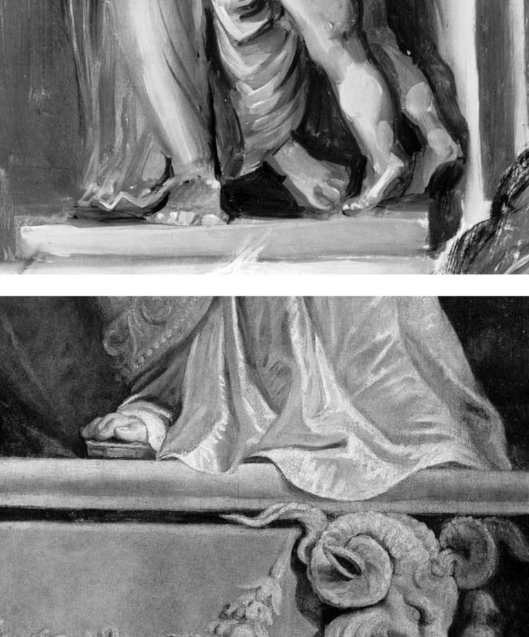
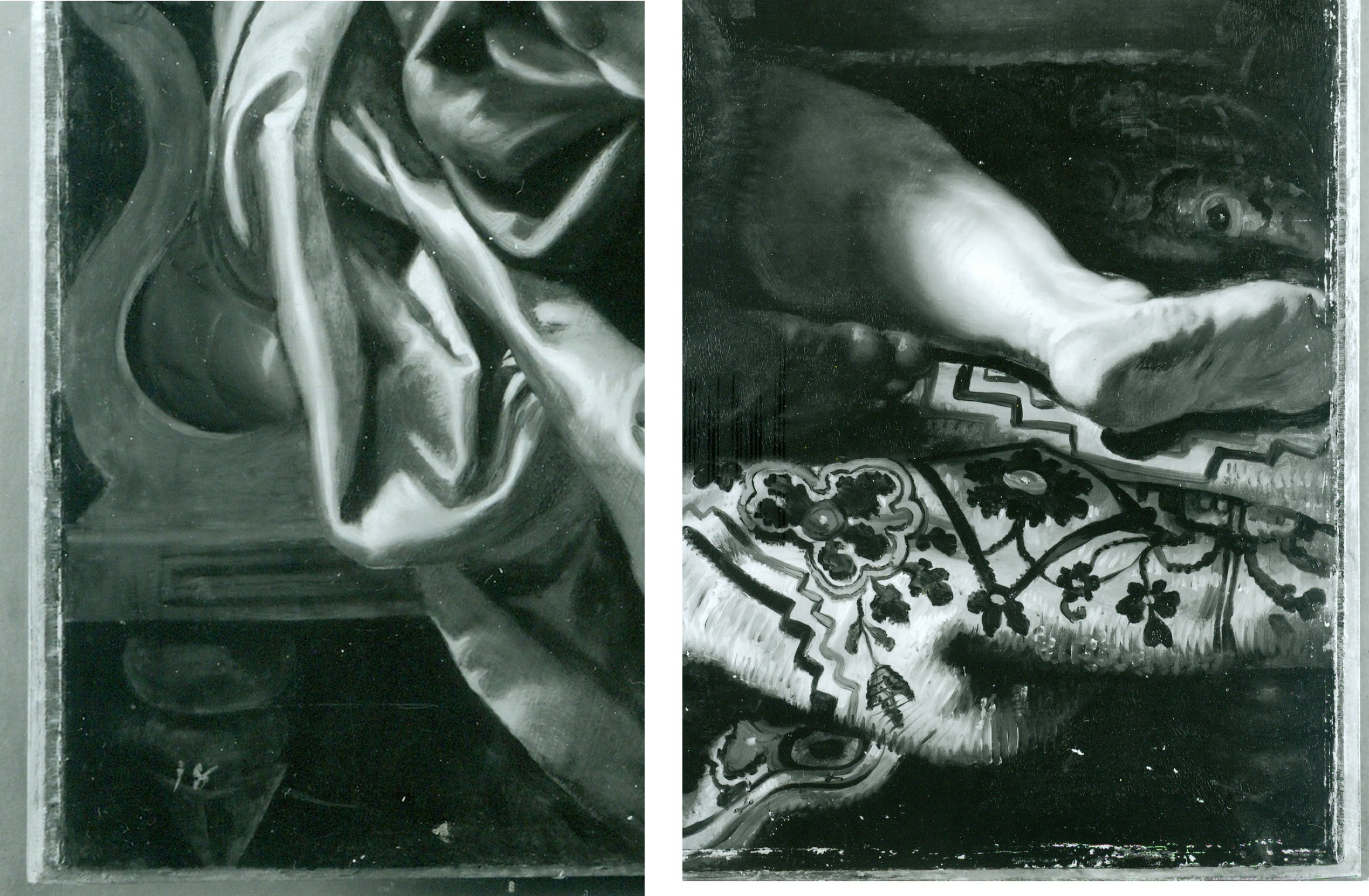
Above, Fig. 3: Top, detail of the National Gallery’s Samson and Delilah; above, detail of Rubens’ The Raising of the Cross, Antwerp Cathedral. Where the former is claimed to be a lost picture Rubens painted in 1609-10, the latter was indisputably made by Rubens between 1610-11. Such pronounced differences in brushwork are inconceivable as that of two autograph paintings made at the same moment in Rubens’ oeuvre. Who, looking at this photo-comparison, could believe that Rubens had flitted between the ugly angular Cubist faceted feet in the Samson and Delilah statue (– try counting the toes and note the Art Deco zigzagging hem), and the superb plastic fluency, grace and anatomical fidelity seen throughout the Raising of the Cross?
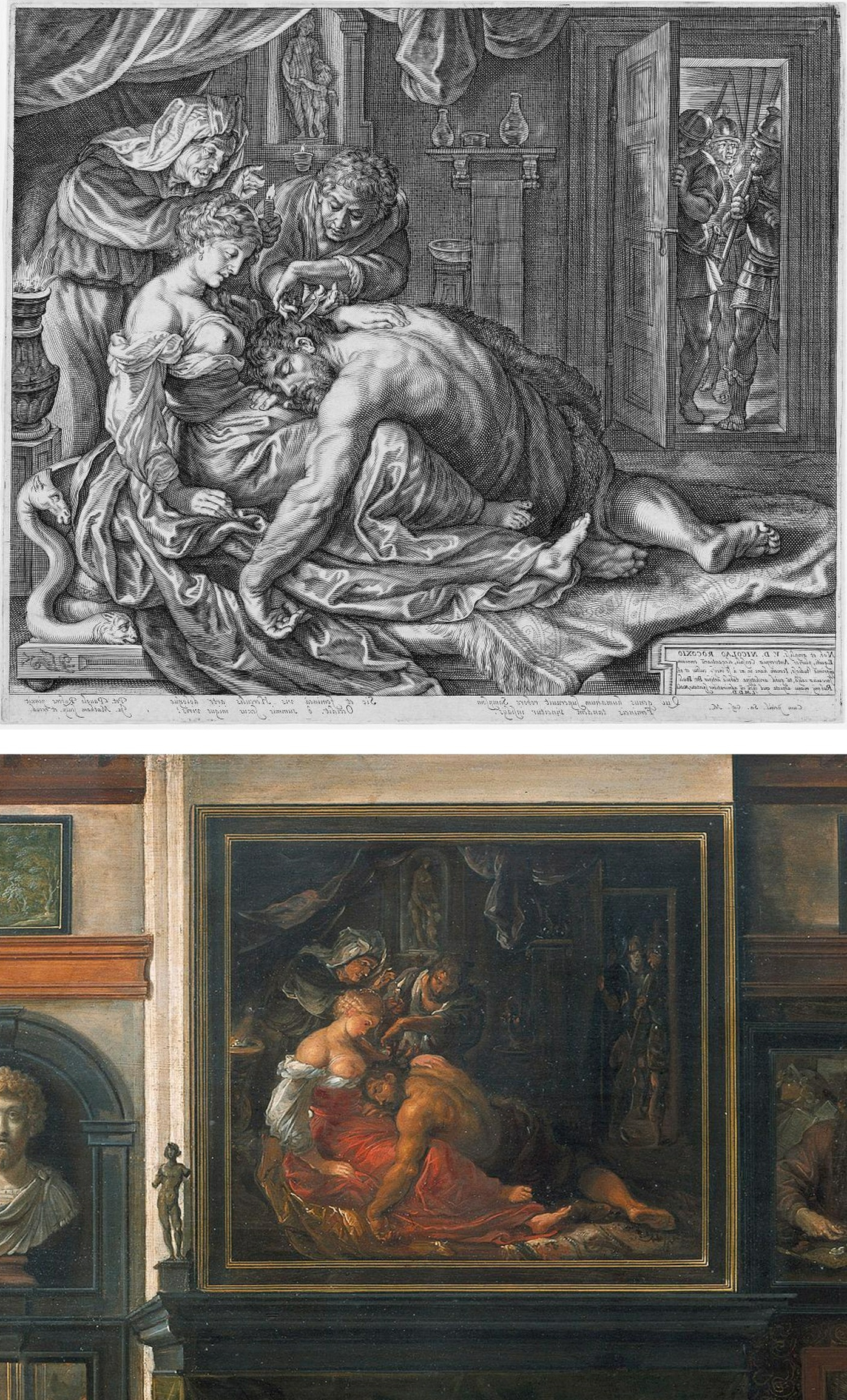
Above, Fig. 4: Two copies of the lost original Rubens Samson and Delilah – Top, Jacob Matham’s c. 1613 engraving (here reversed); bottom, Frans Francken II, a detail of his oil on copper depiction of the Grand Salon in Nicolaas Rockox’s House, made between 1615 and before 1640. Neither copy shows the cropped right foot found on the National Gallery picture. No one has cited a similarly cropped limb in any finished Rubens painting.
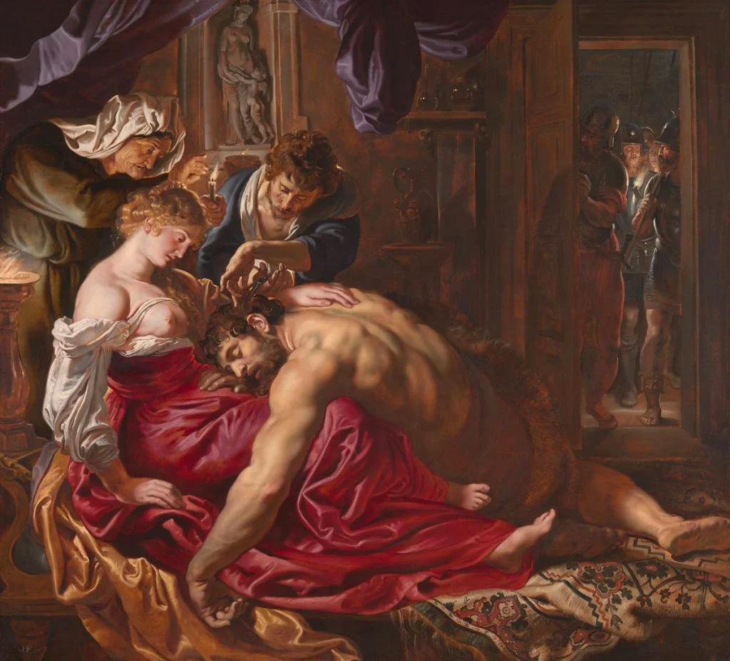
Above, Fig. 5: The National Gallery’s supposed Rubens Samson and Delilah painting.
Above, Fig. 6: Left, a detail (from the left wing) of Rubens’ 1609-1610 The Raising of the Cross, Antwerp Cathedral. Right, a detail of the National Gallery’s Samson and Delilah which Christopher Brown (David Jaffe’s predecessor as Senior Curator at the National Gallery) dates at “c.1609” and Jaffé puts “about 1610”. Among the National Gallery picture’s countless visual disqualifications, we would cite: the thinness of the paint; the absence of a 17th century craquelure; the irresolute profile; the cinematic lighting of the head; and, the anatomical and perspectival travestying of Delilah’s nose/mouth/chin configuration.
For many more disqualifying photo-comparisons, see Abigail Buchanan’s “The National Gallery ‘masterpiece’ that’s probably a fake”.
TANGLED DOCUMENTARY WEBS…
Such clinching visual evidence, however, leaves Adam Busiakiewicz unmoved and unpersuaded. He tells the Daily Telegraph that the National Gallery Samson and Delilah could be in no one but Rubens’ hand – viz: “‘It is a really stonking great picture,’ he says. ‘The textures, the sumptuous drapery, the muscular back – no one except Rubens could have painted that.’” Each to his own art critical estimations, perhaps, but what happened to the Samson and Delilah when in the National Gallery’s restoration studios is – or should be – a matter of scrupulously recorded and reported facts. We are now faced by a major art institution that cannot/will not give a proper and credible account of its own actions; that effectively denies, even, the historical record of its own doings. Consider the recorded facts: (1) it is a matter of record that this painting emerged in 1929 as a sound panel and that it remained so in 1977 (when exhibited in Antwerp); (2) it is known that in 1980 the picture was a panel when it was dispatched to London; when it arrived in London; and, when it was sold in London to the National Gallery; (3) it is known that when in London and on exhibition at the National Gallery it remained a panel in 1982 (- see Fig. 7 below). However, it is also known that the following year the National Gallery claimed – after the picture had been restored at the Gallery – that it was not now a panel at all – and, indeed, that it had not been a panel for a very long time and possibly, even, into the 19th century or beyond. This extraordinary denial of the picture’s own documented historical record might seem inexplicable in a major national institution, but it is by no means unprecedented – and nor, for that matter, is the Gallery’s effective outsourcing of its own defence to obligingly helpful scholarly proxies.
Not the least consequence of misleading institutionally-official accounts is the corruption of subsequent scholarship and the making of monkeys out of good faith and technically trusting patrons. In part-defence against widespread and prolonged criticisms of its notoriously over-energetic techno-adventurist restorations, the National Gallery ran a series of didactic, so-called “Making and Meaning” exhibitions. One such in 1996-97 was Rubens’s Landscapes. It was organised jointly by the Gallery’s then senior curator, Christopher Brown, and by its senior restorer, Anthony Reeve. The exhibition was sponsored by Esso UK plc and its chairman and chief executive, K.H. Taylor, expressed pleasure in being associated with “the quality of research and scholarship that are the Gallery’s hallmarks”. In turn, the then National Gallery director, Neil MacGregor, expressed gratitude to Esso for its generosity, for year after year, in enabling the Gallery to “present to the public recent research on how and why the pictures were made”. In a section on the rigorously high standards of professional panel making in 17th century Antwerp it was noted that panels were marked with their makers’ monograms and that the panel back of Rubens’s “Chapeau de Paille” portrait bore Antwerp’s coat of arms and the carved initials of its maker, Michiel Vriendt. However, with the Samson and Delilah no such assurance was offered. Instead, the reader seemingly learns – with a nod to the contrary testimony of Reeve and Bomford/Plesters (see Fig. 7 below) that “A particularly fine panel made for Rubens by an Antwerp panelmaker is that for the Samson and Delilah, painted about 1609 for Nicolaas Rockox…” But then, after a section reprising Reeve’s own 1982 Technical Bulletin account of the risks posed to such fine panels by fluctuations in humidity, comes an abrupt claim that “The Samson and Delilah was planed down to a thickness of about three millimetres and set into [sic] a new blockboard panel before it was acquired by the National Gallery in 1980 and so no trace of a panelmaker’s mark can be found…”
Now, in Fig. 7 above we see two incompatible accounts that were made and published just a year apart in successive National Gallery Technical Bulletins. Which of the contrary pair might be taken by the public and future scholars to be the more reliable and trustworthy record? Reeve’s account had preceded that of Bomford/Plesters – he had seen and reported what he saw and knew. Brown must therefore have found himself in the unenviable position of having to choose between Reeve’s earlier account and the later contrary one of Bomford/Plesters. That is, he had either to accept that the picture came into the Gallery after it had been planed down by some unknown party at an indeterminate date and that Reeve had imagined and chronicled an entirely fictional panel comprised of “six [sic] horizontal oak planks, carefully planed and jointed”, or, recognising that Reeve of all people was unlikely to have confounded a new sheet of blockboard with an early 17th century Flemish oak panel and extol its technical virtues even among Rubens’s panels, or… what? What could Brown say of the Bomford/Plesters account when he was aware that the picture’s own dossiers contained the already widely press-reported and potentially explosive 1992 Doxiadis/Harvey/Hopkinson report precisely challenging the Bomford/Plesters account? Could he go down the middle and say that while the picture had come into the gallery as a panel in good shape – as Reeve had testified – when subsequently taken into restoration, it had been planed down and glued onto (not “into”) a new sheet of blockboard – and do so without offering any explanation for such a radical and inescapably material and historical evidence-erasing procedure? In the event, Brown did neither. Rather, he fudged a technically-incoherent mongrel account even though he and Reeve were the exhibition’s joint authors. That is, on the one hand he spoke of the Samson and Delilah having been a “particularly fine panel made for Rubens by an Antwerp panelmaker” and then, leaving a gaping, mystifying narrative hole in his own account, jumped to “The Samson and Delilah panel was planed down to… etc. etc.” This was a curatorial equivalent of the old comic book cop-out gag “With one bound, Jack was free”. It is not easy to conclude other than that it had seemed institutionally imperative to dissemble rather than clarify.
8 March 2025.
Good buy Duccio?
In Part I* of III, Michael Daley introduces the [$45-50m.] purchase of a panel attributed to the father of the Siennese school of painting (*As published in the November/December 2008 issue of the Jackdaw).
Spending pots of money on works of art is rarely without risk. The Metropolitan Museum’s 2004 decision to pay between $45-$50m (- in a blind “treaty” sale conducted by Christie’s) for the “Stoclet” Duccio Madonna and Child, already seems a source of anxiety. That the acquisition breached the Met’s own “due process” requirements was initially flaunted. It is no more. Our own researches suggest (– as will be discussed in Part II) that the attribution may prove unsound.
Four years after the Met’s Board authorised payment (- after the event ) for this Duccio, the architects of the acquisition, Philippe de Montebello, who is retiring after thirty-one years as Director, and Keith Christiansen, the Museum’s curator of European Painting, now seem to be saying: “The Duccio remains a great acquisition – but it was his responsibility more than mine”.
Above, the “Met Duccio” as it appears today (right) and as it appeared in 1904 (left) when it had recently emerged without provenance – that is: it was said to have been bought by a Russian collector from an antiques shop.
Christiansen gave detailed account of his role in Danny Danziger’s 2007 book Museum ~ Behind the scenes at the Metropolitan Museum of Art:
“…Nicholas Hall of Christie’s, with whom I have been friends for many years, phoned me up and said, ‘I would like you to have lunch with me; there is something I’d like to show you.’ During the meal he slipped me a transparency, and I looked at it.
It was a painting that had not been seen by any of the major Duccio specialists for fifty years; it had been in the hands of the Stoclet family and out of circulation. ‘Fantastic, how about the price?’ I asked. He told me. ‘OK,’ I said, ‘I will deal with that later.’ And then we finished our lunch.
…I waited for the director to come back from his vacation. And then I went into his office and said, ‘I am duty bound to show you this,’ and then I showed him the transparency. I casually said to him, ‘You know, Philippe, you deserve this picture. Tom Hoving had his Juan de Pareja [a stunning portrait by Velazquez, bought in 1970 for $5.5m], Rorimer had his Rembrandt [the majestic double portrait Aristotle with a Bust of Homer, bought in 1961 for $2.3m.]; I don’t see why you shouldn’t have this towards the end of your career’…”
De Montebello told Calvin Tomkins in the New Yorker (July 2005):
“I was just smitten by the transparency, as anyone would be, and I decided we had to go and look at this picture… It’s the single most important purchase during my twenty-eight years as director. It’s my Juan Parega, it’s my Aristotle with the bust of Homer… There was not an ounce of doubt in my mind about it… Technically I was not authorized to make an offer. I just took a chance that my trustees would go along.”
Christiansen had lauded this decisiveness in the New York Times on November 10 2004: “When I showed it to him, it took him about 30 seconds to say, ‘We really have to have this.’” But in a prefatory note to the Metropolitan Museum’s Summer 2008 Art Bulletin (which is given over to Christiansen’s: “Duccio and the Origins of Western Painting”), de Montebello now downplays his own role:
“…I wish simply to correct the misleading impression that in making an acquisition of this importance and expense, it was my response to the picture’s quality and art historical significance and my confidence in that response that was the determinative factor… recommending so large an expenditure to our Acquisitions Committee required more than just my response… It required that this response be reinforced by the assurance that comes from the trust I have learned to place in the curators and conservators in this great institution… As I held the picture in my hands, enraptured by its wonderful quality… I was treated all the while to Keith’s impassioned scholarship… it was particularly Keith’s precise and learned assessment of the picture that allowed me to consider the acquisition an imperative.”
In his own Bulletin foreword, Christiansen again admits this was a work known to scholars only by photographs; that it had very recently been withdrawn from a (comparative) exhibition on Duccio and his followers – despite being in the catalogue; that it had never undergone any modern scientific analysis; and, that in the normal course of events, it would have been sent to the Museum for examination and eventual presentation before the Acquisitions Committee, composed of members of the Board of trustees. He then tells how he and the Met’s restorer, Dorothy Mahon, travelled with the Director to Christie’s, London:
“We spent about two hours with the picture before calling the Christie’s representatives back into the room. I imagined that we were now about to embark on drawn-out discussions and negotiations, with intense pressure from other institutions. This assumption proved dead wrong. The Director seized the initiative and stated that he was prepared to make an offer for the painting. I don’t know who was more taken aback, the Christie’s representatives or Dorothy and I… On the return flight I noticed that the Director was bent over a list of what seemed to be various funds that might be applied to the purchase of the picture. ‘You must have worked out the mechanics for this even before we left to examine the picture,’ I observed. ‘Oh yes, this trip was to confirm that the picture was as extraordinary as it already seemed to me, and if it was, I had determined we were going to get it.’ Trustees still needed to be consulted and further funds identified, and weeks were to pass before a final deed of sale was signed. But the key step had been taken…”
Indeed it had.
Coming next in Part II: “BUYER BEWARE”
Why Greece Does Not Need the Elgin Marbles

An (unpublished) paper by Michael Daley, Director, ArtWatch UK, that was delivered at the Economist’s Athens Conference, 12 March 2003:
Lots of reasons have been put forward in support of the campaign to remove the so-called Elgin Marbles from the British Museum. Individually, these justifications rarely withstand scrutiny, but cumulatively, their repetition has left many in Britain with the impression that under all the smoke there must be both a fire and a wrong in need of righting.
I wish to suggest today that, to the contrary, there are good reasons for contending that the restitution campaign is itself wrongheaded, unjust and culturally dangerous.
The original removal of the sculptures from the Parthenon and the ground and the walls of the Acropolis by Lord Elgin has been presented as theft when the British Museum’s legal title is today accepted by all parties to the dispute. The removal has long been caricatured as vandalism and desecration when, demonstrably, it constituted an act of rescue and celebration. This fact, too, has now largely been accepted.
Faced with the legitimacy of the British Museum’s ownership, the would-be “restitutionists” have appealed above the rule of law to the forces of sentiment – and forces, often, of distinctly nationalistic sentiment. “These sculptures mean so much more to us than they ever could to you” it is said. And even more disconcertingly:
“Without these sculptures we are not complete as a nation, they comprise our very soul.”
It would be hard for anyone to resist such morally coercive appeals – and the British are constitutionally inclined to want to “do the right thing” but, as it happens, resistance is no longer necessary: Greek scholars have testified that although the Parthenon indeed was, for members of late 19th century Greek society, a sacred symbol of the nation, the rise in the 20th century of tourism and economic modernisation has “taken them out of their role as symbols and gradually turned them into social goods”.
Confirmation of this transition appeared with a recent announcement that Greece plans to replace low-spending tourists with high spending ones by “showcasing Greek cultural traditions”.
With the decline of appeals to nationalistic sentiments, the claims of an Urgent Aesthetic Imperative have been advanced. “It is a crime against art”, the argument goes, “not to allow the component parts of a glorious entity to be seen whole.”
The cult of the dismembered-whole-in-need-of-reintegration was launched in 1945 by Thomas Bodkin with his seminal book Dismembered Masterpieces – A plea for reconstruction by International Action. It certainly is sad when artistic ensembles are scattered by history but in the case of the Parthenon sculptures it is worth recalling Bodkin’s comments on them:
“It is abundantly clear that the statues from the pediments, the portions of the frieze and the metopes now in England should never be re-integrated on their original sites. Those few sculptures which Lord Elgin did not remove have in the intervening one hundred and forty-two years been allowed to deteriorate into utter wreckage, corroded by wind and rain and the fumes ascending from the factories of Piraeus”.
Bodkin of course did not know of the notorious Athenian pollution that would be in train from the 1960s. Greek scholars have testified to the devastating consequences for the Acropolis monuments of that further, later pollution.
In the view of many here and abroad, Greece’s own past neglect and mishandling of the Parthenon and its remaining sculptures constitutes one of the greatest 20th century art conservation tragedies. To those of us who are professionally dedicated to the survival and welfare of art, the vocal opposition of Greece’s own scholars and art lovers to today’s Government-led scramble for development is certainly heartening but it does also confirm that vital lessons have not yet been learnt. These developments compel the observation that a nation that is showing indifference to its own patrimony and is cavalier with even its most precious historical sites, does not need to take on more heritage responsibilities. To those who might feel such a judgement harsh, we cite a single plea. It came recently from the island of Paros.
“…We are therefore obliged to ask for the support of the international academic community, suggesting that our overseas friends mail letters of protest to the Greek Minister of Culture, underlining their concern about the deliberate destruction of monuments on Paros. How is it possible to demand the return of the Parthenon marbles, while allowing the ruthless destruction of other ancient temples by unqualified employees?”
In the face of this actual, ongoing destruction, British restitutionists and museum personnel have taken to fretting about a need for “context”. What context? Reuniting the Elgin sculptures with the decaying Parthenon building is now, as Bodkin could already see, impossible. The new sculptural ensemble being mooted for Athens is that of a wholly severed – and, in fact, distinctly out of context collection. That is, it would be indoors, not out. It would be off Acropolis, not on. Even if every museum presently holding Acropolis sculptures were to return their works, the new “entity” would still remain incomplete because of early losses.
More embarrassingly, if all the surviving sculptures were to be returned to Athens tomorrow, they could not be joined by Greece’s own west frieze sculptures, which were removed from the Parthenon ten years ago and still await a decision on possible conservation treatments to stabilise their pollution-damaged surfaces. Were this problem to be resolved, it would still be necessary, before any assembling of the survivors could take place, for the sculptures that presently remain united with the Parthenon, to be “dis-united” from it, as if in emulation of Lord Elgin’s long condemned original actions.
In truth, of course, the Parthenon sculptures can never be “shown in context” because their original context is so long gone. It might now be imagined but it can never be replicated. We do know, however, that the sculptures originally survived as symbolic adornments to a temple standing on a reinforced hill and not in a modernist museum, to be built on stilts, on an important archaeological site in an earthquake zone and in the teeth of opposition from national and international scholars. Far from there being plans to recreate the original on-Acropolis context, there are even plans to remove, what one leading restitutionist terms, “the litter of unclassified stones” from the Acropolis in order to make more footpaths for more tourists. This is a particularly alarming prospect if Professor Snodgrass’s claim that eighty per cent of the Parthenon building is believed to be still present, is correct. There is, however, something much more important at stake in this dispute than the preservation and the right displaying of historical artefacts.
As mentioned earlier, the present hectoring demand that sculptures be moved from one museum to another is unedifying and dangerous. For one thing it constitutes nothing less than a government-led assault on the very idea of the internationally comparative museum. Greece – of all countries – does not need to be party to such a regressive manoeuvre.
It jeopardises international scholarly cooperation. It gives encouragement to those members of the museum sector in Britain who seem only too eager to shed as much as possible of what they see as so much colonial loot. I do recognise that members of the Greek Government have shown themselves to be aware of some of these dangers and that they themselves insist that the Elgin Marbles are the only sculptures for which demands will pressed. But what politician was ever able to bind his successors? Who today could guarantee that the removal of the Elgin sculptures from the British Museum would not instantly and forever thereafter be taken as a precedent for copycat campaigns in Greece and elsewhere?
For this artist, what is most saddening about the present campaign is that by trading the universal for the local, it conspires against a proper recognition of the true nature and full extent of Greece’s patrimony. There is a lot of wonderful art in the world but the truth that is being lost in this squabble over particular material objects is that Greek classical art is like no other art – it has done what no other art has ever done: millennia after its birth, it has emerged from death and neglect to seize the imaginations and enlist the passions of other people in other places. Greek classicism has even vanquished, later, better-preserved classical offspring. It has done so not by conquest or politicking but solely on merit; by example; on the unrivalled authority of its inventions. It is unfashionable to say so, but these inventions stand uniquely transcendent and enduring, outside of time, original context and regardless of geography and ethnicity, as artistic paradigms and exemplars.
Even within the antique world, Plutarch had marvelled that the sculptures of Pericles’ time, far from dating, retained a time-defying freshness and newness – as masterpieces. In the 19th century Karl Marx was stymied by the sheer force of Greek Art – to which, as a scholar at the British Museum’s reading room, he was regularly exposed. Marx’s grand meta-system was to be elegance itself: the so-called cultural superstructures of societies stand on, and are determined by, their economic bases; by their technical means of production. The more advanced the means of production, the more advanced the cultural manifestations. Primitive, economically backward societies, he planned to demonstrate, produce primitive backward art. Classical Greek art, however, blew this premise. How could it be, Marx was forced to ask himself, that an ancient art should not only continue to afford us with pleasure but should persist beyond its own time as both a standard and an unobtainable goal? The best explanation he could offer was that Greek art remained eternally charming because it represents the “the historical childhood of humanity, where it had obtained its most beautiful development.” This condescension will not do.
Greek forms have gripped modern minds, in world superpowers like Britain and the United States, not by their charm but by their potency, and their living relevance. Colonialism exposed modern Europeans to the charms of very many competing aesthetic value systems, but the power of Greece’s artefacts has remained uniquely awesome and persuasive – wherever they have come to rest.
The Greek temple, for example, stands perennially iconic as motif. It remains unequalled for its combined lucidity of construction and elegance of articulation. Which is why, for example, it remains incorporated into the fabric of Britain’s premier motorcar, the Rolls Royce – and with a winged victory as mascot on its bonnet. The Greek temple – and not, say, the pagoda – is as deeply entrenched in the modern unconscious as any Jungian archetype. Simultaneously, it confers dignity and reassurance to banking and stands guardian to free speech and debate in our modern universities and seats of government. In London, next to the historic Tower of London, a temple provides home to the names of British merchant seamen who perished in the Atlantic and Mediterranean at the hands of German U-boats and bombers.
Given the chance, Greek sculpture is seen to stand supreme in all company, in whichever museum – the bigger the museum, the greater the victory. The grandly ambitious international museum is now coming under fire politically, but it has been both an expression of and an agent for the modern renaissance of Greek antiquity. It is barely half a century since an historian like Hans Tietze could describe the artistic individuality of great museums as themselves “spiritual entities, and not merely as fortuitous accumulations of art treasures.”
Under today’s rules of correct, multi-cultural, discourse, museums like the British Museum may no longer say that ancient Greek art stands as the world’s best, as the most attractive and most humanly affirmative. But nowhere is this trait more apparent than in Bloomsbury in London, in the British Museum. By Insisting on seeing international, multi-cultural museums as repositories of loot; by fetishising original architectural/social contexts and localities; and by fostering nationalistic sentiment, we risk losing sight of a fundamental artistic truth: the sheer stand-alone transcendent quality of Greek sculpture. Pericles was given to inviting his dinner guests to see the Parthenon sculptures as they were being carved. Everyone who passes through London today can dine for free at Pericles’ table in a splendid purpose-built neo-classical hall – and certainly not in a cellar or basement as British restitutionists too often allege. It would be a tragedy if these supreme ambassadors for the finest art of sculpture were to be wrenched out of the great world forum of cultural voices that the British Museum comprises and in which they excel. Greece truly does not need to be party to such a brutal, disruptive act. Greece thrives, looks her very best in such elevated and various company. She lives. She needs nothing. Her primacy is absolute and unassailable. Well should be left alone.

Above, Michael Daley, Director ArtWatch UK, at the Acropolis, Athens, 2003.
CODA
The Economist conference – and the campaigning contribution made by Lord (David) Owen – was reviewed in the Greek newspaper eKathimerini – as is today’s meeting of Prime Ministers Keir Starmer and Kyriakos Mitsotakis in London.
In August 1998 a correspondent in the Sunday Times’ books section wrote (under the heading “All Greek”):
“A more positive and generous list of the achievements of the ancient Greeks than Frederick Raphael’s more grudging one is given by the scholar F L Lucas: ‘Within seven centuries this race invented for itself epic, elergy, lyric, tragedy, comedy, opera, pastoral epigram, novel, democratic government, political and economic science, history, geography, philosophy, physics and biology; and made revolutionary advances in architecture, sculpture, painting, music, oratory, mathematics, astronomy, medicine, anatomy, engineering, law and war… a stupendous feat for a race… whose most brilliant state, Attica, was the size of Hertfordshire, with a free population (including children) of perhaps 160,000′!”
In February 2000 we wrote (in “Pheidias Albion”, Art Review):
And let no one believe that foreigners alone reject Greek demands or condemn Greek practices. A few years ago, The Times carried this plea from Mrs Magdala Delfas:
“When in 1967 I left Greece under the colonels’ rule, my visits to the British Museum brought me solace. I was able to keep in touch with my cultural heritage outside the geographical and political confines of Greece.
“Later, I discovered to my delight and amazement that apart from the perfect display of the Elgin Marbles in their special gallery, they are kept in a country where the study of Ancient Greece is kept alive, where Greek plays are performed either in the original or in English, and in the most erudite and scholarly fashion, like the Theban plays by the Royal Shakespeare Company in Stratford last season and in London this year.
“Schoolchildren, among them my own son, have the privilege and joy of reciting verse and studying Homer in the original. By contrast in Greece, the study of ancient Greek in schools has been stopped. The impoverished language of today has been cut off from its natural roots.
“Visitors to museums (including that on the Acropolis) are frustrated by restricted opening times and high admission charges. Moreover, a new gallery close to the Parthenon to house the marbles would violate the Acropolis.
“The advocates of the demand for the return of the Elgin marbles, which stems from empty nationalist zeal and socialist politics, should direct their zeal and support towards Cyprus. The marbles must remain where they are, in a country which cherishes the classical tradition.”
3 December 2024
Holbein’s Anne Boleyns and the “Discovery” Trope
Art is made by artists to order, or for the market, or from personal compulsions. Thereafter its standing is determined by others – primarily scholars, curators, auctioneers, and dealers – who confirm or reject the authenticity of works and the identities of sitters within them. Such judgements are often presented not as expert, professional opinions on which scholarly discussions might proceed, but as discovered truths. Discoveries can be well-founded or spurious. In art restoration, where claimed “discoveries” so often mask bungled interventions, the proof of the pudding is in the looking (at comparative photo-records) and it should be considered so, too, with claimed art historical discoveries.
A CASE IN POINT: TWO HOLBEIN ANNE BOLEYN ASCRIPTIONS
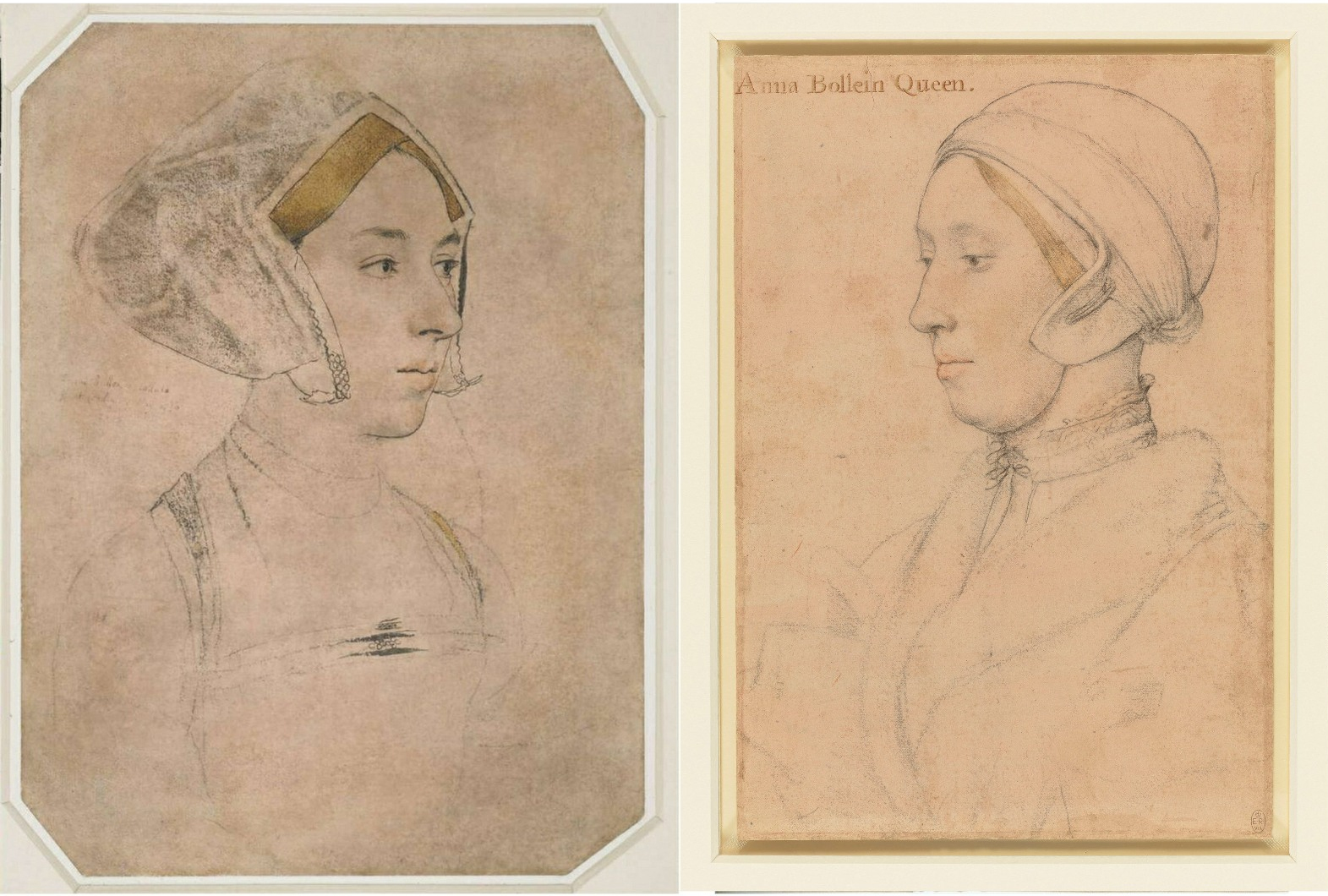
Above, Fig. 1: Left, the British Museum (formerly “Bradford”) Anne Boleyn-inscribed Holbein drawing; right, the Royal Collection Anne Boleyn-inscribed Holbein drawing.
Both of the above English Holbein portrait drawings are securely provenanced – both entered the Royal Collection on Holbein’s death. Both bear inscriptions identifying the portrayed sitter as Anne Boleyn. One or other of the drawings might be of Anne Boleyn but both cannot be so because, as all parties are agreed, the drawings depict two different people. In this case both sitters had been identified by the same respectable near-contemporary witness, Sir John Cheke, but for almost five centuries everyone had taken the (now) British Museum drawing to be the true record of Anne’s likeness. In the last half-century an overlapping succession of three people (an art historian, a Tudor historian and a modern historian) laboured for three decades to reverse that traditional identification. They all did so without offering a direct photo-comparison of the two drawings at issue. Effectively, this campaign was an anomalous images-light war of words.
We take the eventual success of that campaign as a prime case of a visually unsupported and spuriously claimed discovery, notwithstanding its seeming vindication in 2007 when the Royal Collection held that its Anne Boleyn-inscribed Holbein drawing bears the ill-fated queen’s likeness. Four years later that dramatic reversal was recalled/celebrated by Bendor Grosvenor in a 15 December 2011 Art History News post “Anne Boleyn regains her head”:
“This isn’t ‘news’ as such, but in a foray into the Tudor realms of Twitter last night I mentioned the drawing of Anne Boleyn by Holbein in the Royal Collection. I said that although in the past the identity was doubted by art historians, the sitter was now catalogued with certainty as ‘Anne Boleyn’, as you can see on the Royal Collection website…”
That claimed certainty of identification had rested on a three-stage campaign that ran between 1977 and 2007 and to which Grosvenor had contributed last. It proceeded as follows.
STAGE I: A REVISIONIST CHALLENGE
In 1977 John Rowlands, the deputy keeper of prints and drawings at the British Museum, challenged the traditional identification of Anne in the museum’s newly acquired landmark Holbein Anne Boleyn drawing. He did so in a commemorative article (“A portrait drawing by Hans Holbein the Younger”) carried in the British Museum YEARBOOK No. 2. The challenge rested on an objection that the drawing’s documentary records began in the 17th century (- see Part I: Sex, Trigonometry and Anne Boleyn’s Recovered Likeness.) Rowlands’ article carried just three photographs (Fig. 2, below) with none showing the Windsor Royal Library drawing being proposed as the true Anne Boleyn Likeness.
STAGE II: THE 1983 ROWLANDS/STARKEY COLLABORATION
Six years later, Rowlands co-authored an article with the Tudor historian David Starkey in the February 1983 Burlington Magazine (“An Old Tradition Reasserted: Holbein’s Portrait of Anne Boleyn”). Dr Starkey had scored a Bull’s Eye in a 1981 Burlington Magazine article (“Holbein’s Irish Sitter?”) by identifying a more plausible sitter in a Royal Collection Holbein drawing given to “Ormond”. As Jane Roberts put it in her 1993 National Galleries of Scotland Holbein and the Court of Henry VIII catalogue:
“The old identifying inscription, ‘Ormond’, has led to some confusion concerning the subject of this drawing. There were for a time two rival claimants to the Earldom of Ormond (or Ormonde): Thomas Boleyn (1477-1539) and James Butler (c. 1504-46). The former, the father of Anne Boleyn, was considered the most obvious candidate, although it was remarked that the drawing appeared to show someone younger than fifty (Thomas Boleyn’s age at the time of Holbein’s first visit to England.) David Starkey has plausibly suggested that the drawing instead represents James Butler, son of Piers Butler, the illegitimate kinsman of the 7th Earl of Ormond (died 1515) and claimant to his title and lands…”
As with Rowlands, Rowlands/Starkey gained no official acceptance. Recognition would only be obtained in 2007 when Starkey joined forces with the Philip Mould Gallery in an “identity discoveries” fest, some thirty years after Rowlands’ initial challenge (see below). Where Starkey’s independent professional historical elucidation of Ormond familial relationships had proved valuable to art historians, on his 1983 pairing with Rowlands he became a partisan/advocate to a historically unsupported and visually unexamined ascription. On this turkey of a case, Starkey’s professional juju failed.
Offering no visual argument, Rowlands/Starkey effectively attempted a verbal sleight of hand on a non sequitur by holding that because Sir John Cheke (the source of the English Holbein portrait drawings’ sitters identifications) might have been better placed to validate an Anne Boleyn inscription than had previously been appreciated, the Windsor drawing’s sitter therefore was the true Anne Boleyn likeness. Thus, the logical flaw of Rowlands’ initial 1977 essay remained: the more well-placed Cheke becomes as an identifier of sitters, the more reliable he becomes as the man who had also identified the sitter in the British Museum’s Anne Boleyn-ascribed Holbein drawing.
NO BEEF
The authors tacitly acknowledged the absence of corroborating evidence for the Windsor drawing’s sitter by contending that “In view of all the evidence accumulated here it seems likely at the least that Holbein was taken up by the Queen as well”. (Emphases added.) Even if such a relationship been established, it could not in itself have weighed in favour of one rival Anne Boleyn inscribed drawing over the other, for reasons given – but it had not been so established: a “likely” is not a “was” – and nor is a “likely was”. In an article cumulatively held together by a “could have”; a “would have”; a “must have”; a “could well have”; a “could have taken”; a “had every reason to take”; a “most likely”; and, a “we would guess,” the authors’ peroration itself comprised a further mini daisy-chain of question-begging speculations (emphases added):
“…his appointment as the King’s painter probably antedates it. And the likely responsibility rests with Anne Boleyn herself. For it may not be a coincidence that Holbein’s advancement at court… appears to have progressed largely through the favour of adherents to religious reform…”
That lame ending had followed a weak opening. The existence of the two rival Holbein Anne Boleyn drawings was acknowledged, as was the fact that they “clearly show different sitters”, but the drawings were not shown together side-by-side so as to permit a direct visual comparison – the authors’ claims had to be taken on trust. Similarly, it was claimed on no cited evidence that because Rowlands’ 1977 identification had “apparently” been “generally accepted” the case for the possible authenticity of the Windsor Anne Boleyn inscribed drawing “must be re-opened”.
ABSENCES OF EVIDENCE
Had Rowlands’ 1977 case been accepted, there would have been no cause to reopen it in 1983. Whether Rowlands’ original claims had been partly/largely accepted or not, the features on the two Anne Boleyn-ascribed drawings remained physically incompatible (see Figs. 1 & 3). Only one, therefore, might be a true likeness. Rowlands/Starkey conceded further absences of evidence for their position by (wrongly) claiming that no visually comparative means of adjudicating between the rival likenesses existed: “For such a re-examination there is no available visual evidence”. That assertion was made on the grounds that the only secure contemporary image of Anne is that on the damaged coronation medal of 1534. The damage on the medal is local and by no means robs the image of all testimonial capacity. When the authors published the medal and the Windsor drawing side-by-side, they claimed (rightly) that no correspondences exist between those two works, when, as can be seen at Fig. 2 below, there are clear correspondences with the British Museum drawing, the etched copy of it by Wenceslaus Hollar, and the National Portrait Gallery painting of Anne Boleyn.
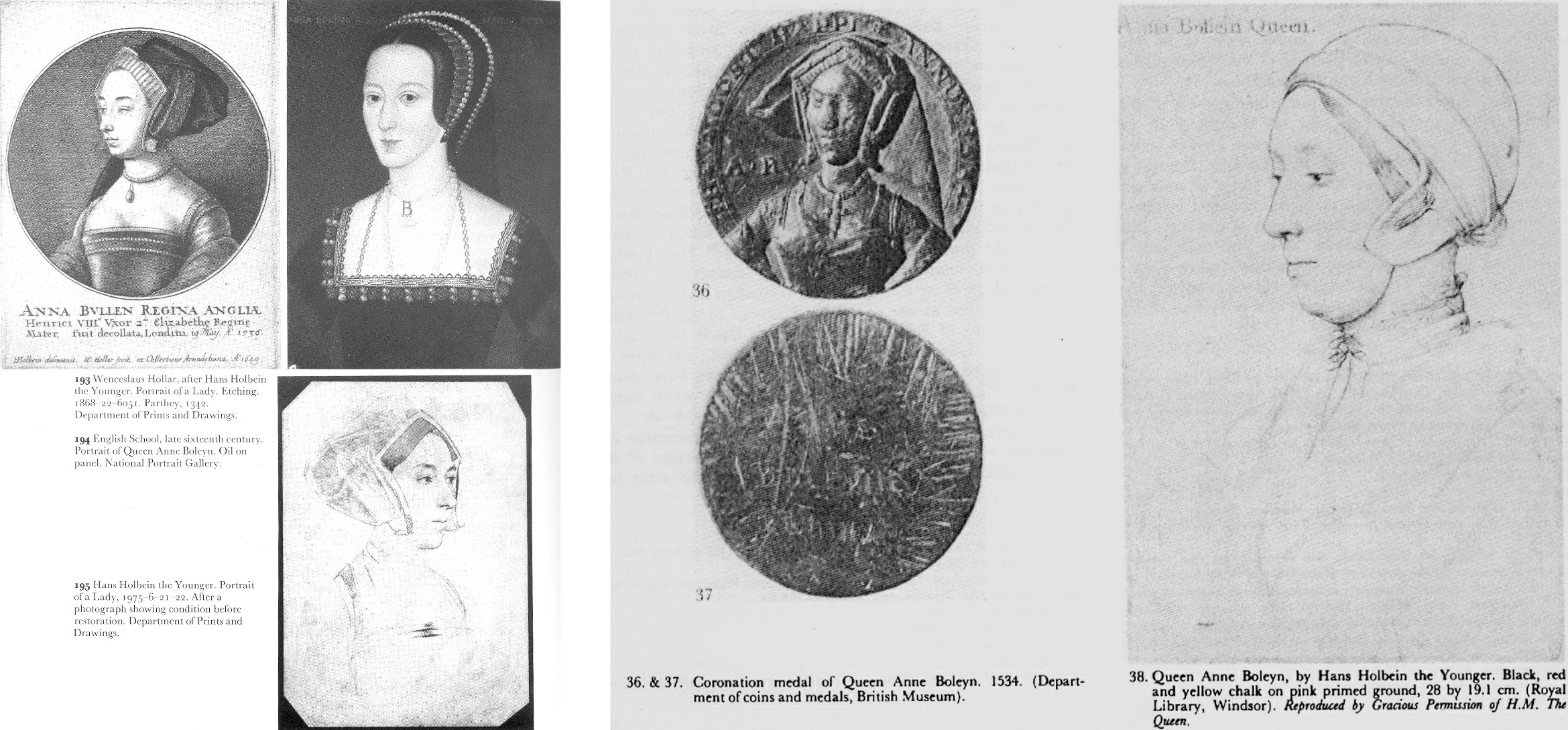
Above, Fig. 2: Left, the three illustrations carried in Rowlands’ 1977 British Museum Year-Book II article “A portrait drawing by Hans Holbein the Younger”; right, the two illustrations carried in the Rowlands/Starkey February 1983 Burlington Magazine article “An Old Tradition Reasserted: Holbein’s Portrait of Anne Boleyn”.
As if aware that their “evidential” cupboard was bare, the authors continued “fortunately… there are other pointers”.
AN UNFORCED ERROR
The first Rowlands/Starkey “pointer” was that the sitter in the Windsor drawing shows, like Henry’s other queens, little signs of prettiness – “and certainly nothing to compare with the ‘Bradford’ lady’s charm, which could well explain why in the seventeenth century the latter was claimed to be the bewitching Queen”. By alleging a supposedly misleading power of influence to Anne’s appearance in the British Museum drawing, the authors tacitly conceded that it – and not the Windsor drawing – had for five centuries been taken as the true likeness and that it had informed the subsequent late sixteenth century Anne Boleyn paintings (see Figs. 10-13.) No iconographic legacy of any sort attaches to the Windsor “Anne”.
Against their own acknowledgement of the British Museum drawing’s historically influential artistic potency, the authors offered a subjective counterclaim that the Windsor portrait had given true expression to the “strong will and intelligence [of Anne Boleyn] that her contemporaries noted”. As shown above, below, and previously, the sleepy-eyed, older, fleshier, fair-haired not dark-haired sitter in the Windsor drawing does not look more charismatically strong-willed and intelligent than the British Museum drawing’s sitter. Had the authors’ estimation of the relative traits in the rival drawings been sound it would have helped their cause to demonstrate the relationship by showing the two likenesses together, as here below.
A PHOTO-COMPARISON THAT DID NOT SHOW ITS FACE
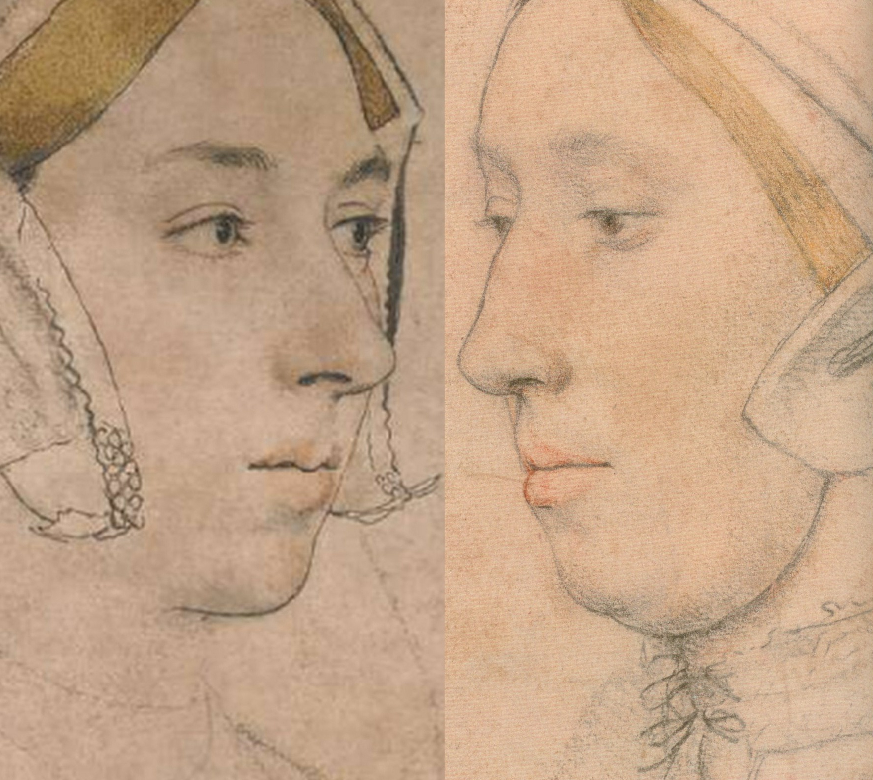
Above Fig. 3: Details of the British Museum Holbein Anne Boleyn-ascribed drawing, left, and, right, the Royal Collection Holbein Anne Boleyn-ascribed drawing.
POINTERS AND CONCRETE INDICATIONS
Evidently still fearful of the manifest weaknesses in their case and notwithstanding their own “pointers”, the authors cited certain “more concrete indications” of Anne Boleyn’s “appearance and dress”. These supposed concretely reliable indications were hearsay comments made in an acknowledged “anonymous and scurrilous French account” of Anne’s grandly ceremonial entry into London the day before her coronation. That is, Rowlands/Starkey presented as if concrete and corroborating evidence, the account of an unknown, manifestly malicious source who had described Anne as “scrofulous” (suffering from a form of tuberculosis and glandular swelling) and of having worn her dress fastened up very high on her throat to conceal a goitre. Thus, from Rowlands/Starkey: “In the [Windsor] drawing her double chin is so pronounced, as to suggest such a swelling of the throat glands, which is indeed partly hidden by a high neckline.”
There were so many problems with acceptance of that malicious account. First, the reported, supposedly goitre-concealing, garment worn by Anne was not her customary dress but what the Tudor historian Eric Ives described as “the traditional high-necked English coronation mantle”. Second, the Windsor drawing’s sitter was not wearing any form of day wear: “She wears some kind of under-cap and a furred nightgown over her chemise”. Third, the tied neck of the chemise did not conceal the double chin – only a very high turtle-necked garment might have done so. Fourth, the displaying of such “undress” for a likeness-recording artist, was held to constitute proof of regal identity because: “only a woman of the highest rank could have taken such a liberty in court circles.” Begging their own question, the authors added: “Several of Holbein’s male sitters appear in similar states of undress but Anne was the only woman to do so.” In this instance, a “could have” became a “was” in two breaths, with a seeming wish once again being the father of the deed.
Had Holbein drawn Henry’s second queen in such a state of undress, he would have put himself at risk of accompanying her and her alleged lovers to the executions. Had the fair-haired Windsor sitter been the mother of Holbein’s two English children, no suspicion of impropriety could have arisen. As it happens, downcast eyes and wistful expressions are common to the Windsor drawing and Holbein’s German wife, as depicted in his The Artist’s Wife and Children – detail below, left. (Also, as discussed below, the Windsor sitter bears certain facial similarities with another contested Holbein sitter in the Royal Collection.)
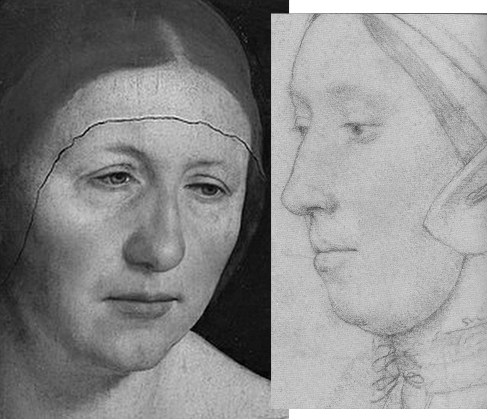
Above, Fig. 4: Left, detail, Holbein’s The Artist’s Wife and Children; right, a detail of the Royal Collection “Anne Boleyn” drawing.
THREE NOSTRILS AND TWO TRAPEZOIDS
While nothing is known of the mother of Holbein’s two English children, Anne Boleyn famously had a brother, George, three or four years her junior, and with whom she was alleged to have committed adultery. No Holbein drawing in the Royal Collection is identified as George, but as luck would have it, one of Holbein’s unidentified portraits in the collection happens to have been made from a closely similar viewpoint to that of the British Museum Anne. As shown below, an unmissably similar configuration of brows, eyes, and nose is present in the two drawings. The only significant difference in the features is the appreciably more masculine jaw in the – here proposed – George Boleyn likeness. Unlike the Windsor sitter’s nose, those of George and Anne both have deep nostril apertures.
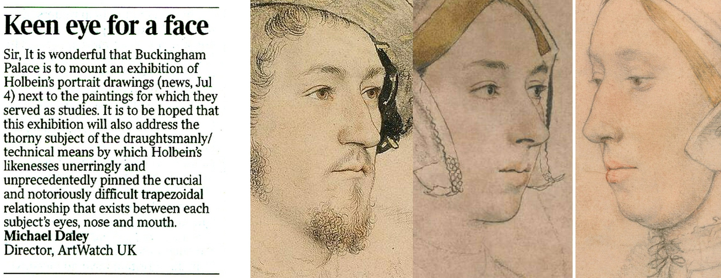
Above, Fig. 5. From left to right: ArtWatch UK letter, the Times, 5 July 2023; an unidentified Royal Collection Holbein drawing which we take to be of George Boleyn, Viscount Rochford; the British Museum “Ann Boleyn”; the Royal Collection “Ann Boleyn”.
HOLBEIN’S “UNIDENTIFIED MAN”
The above Holbein male portrait is today described by the Royal Collection as “An unidentified man, c. 1532-43”. Sir Karl Parker, author of the seminal 1945 Holbein’s Drawings at Windsor Castle, described it as “A Gentleman: Unknown”. Given the many facial similarities in the two drawings we can, perhaps, take it that Sir John Cheke had either not known Anne’s brother or had failed to recall him.
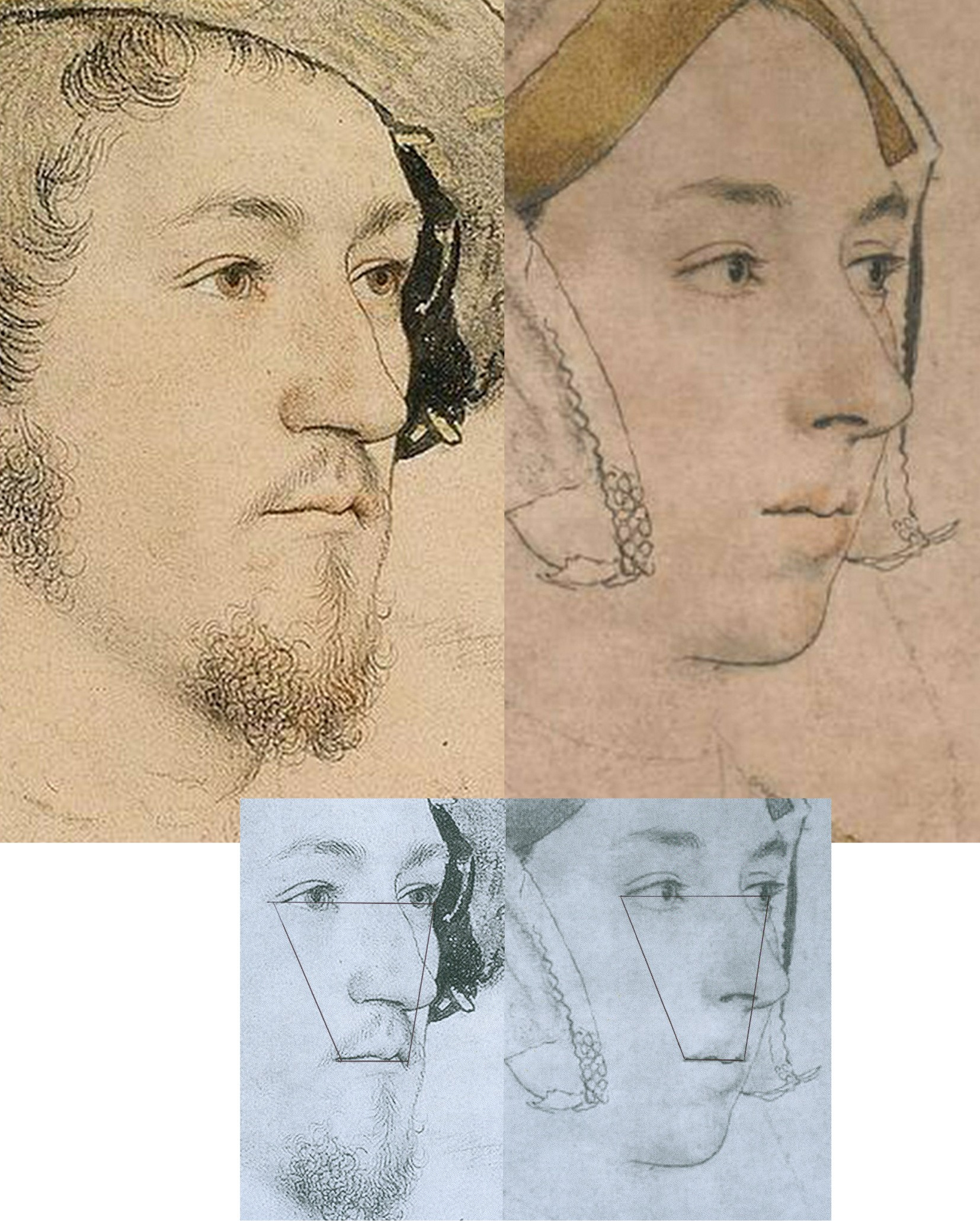
Above, Fig. 6: Left, the proposed Holbein portrayal of George Boleyn; right, the five centuries long accepted British Museum Holbein drawing of Anne Boleyn. Does this “George” not seem a little younger – and perhaps sweeter – than this Anne Boleyn? For that matter, has Holbein ever drawn eyes that are more vividly alive and penetrating than those found in this Anne?
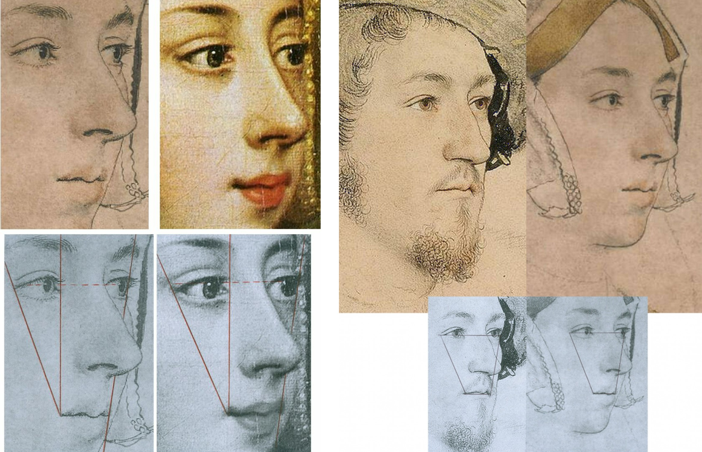
Above, Fig. 7: Left, the similarities between the British Museum Anne and a later painting, as shown in Part I; right, the similarities between the Windsor “George” and the British Museum Anne.
STAGE THREE: A CASE NOT MADE
As with Rowlands, so Rowlands/Starkey had failed to effect a switch of the sitters’ identities. It would take twenty-four more years for victory to be claimed. On 14 March 2007 the Daily Mail (“Finally historians can give Anne Boleyn her head back”) reported:
“A Holbein drawing has been revealed as the only portrait of Henry VIII’s second wife Anne Boleyn. The c.1530 picture carries Anne’s name but other evidence suggested this was an error. Now expert Bendor Grosvenor and historian David Starkey have traced the inscription to her contemporary Sir John Cheke, confirming she is indeed the subject.”
No evidence had been presented by Starkey/Grosvenor that Cheke had specifically and exclusively ascribed the Windsor drawing – or that he had not also so ascribed the British Museum drawing. On the reported claims to have “traced” the Windsor drawing’s identification to Cheke, see below. Nothing had been found and nothing had changed – except, that is, the 1983 Rowlands/Starkey Burlington Magazine thesis had been robustly challenged and rejected in 1986 by a major Tudor historian, Eric Ives, in his biography Anne Boleyn, which work was frequently reprinted until 1994 and later superseded in Ives’ highly acclaimed 2004 The Life and Death of Anne Boleyn ‘The Most Happy.’ Starkey, author of Six Wives: The Queens of Henry VIII and Elizabeth, had generously described Ives’ biography as “The best full-length life of Anne Boleyn and a monument to investigative scholarship”.
THE IVES INTERREGNUM
Prof. Ives’ challenge to Rowlands/Starkey in his books had also been developed separately in a major article for the July 1994 Apollo magazine “The Queen and the Painters – Anne Boleyn, Holbein and the Tudor Royal portraits”. Where Starkey/Rowlands had taken two and a half Burlington pages, which included just two photographs, Ives’ essay ran over ten pages and carried sixteen photographs. Although not all pages addressed the Holbein Anne Boleyn drawings, Ives’ substantial scholarly and visually supported account seemed to have trumped Rowlands/Starkey and put the lid on the Windsor sitter campaign. So far as we know, Starkey never added to his joint 1983 Burlington article contribution. When Rowlands returned to the Windsor drawing in 1988 on publishing the British Museum portrait (which was then described as “Portrait of a Lady, thought to be Anne Boleyn”) in his catalogue to the museum’s “The Age of Durer and Holbein” exhibition, he claimed no more against the British Museum Anne Boleyn drawing’s ascription than that the “circumstantial grounds in favour of the Windsor drawing are really very compelling, and one cannot necessarily cast aside Sir John Cheke’s authority for the identification merely because of the confusion over a sitter in the Windsor series being called by him in error ‘Mother Iak’”.
Ives had indeed challenged Cheke’s reliability, and Rowlands acknowledged that his own (somewhat defensive) stance had followed the publication of Ives’ 1986 Anne Boleyn biography:
“Its rejection by Ives in his brilliant historical study is based on a mistaken disregard of the widely varying value of the different supposed likenesses of the Queen; for it is not wise to rely too readily on inferior Elizabethan portraits to form a basis for establishing her appearance.”
Thus, in another attempt to bolster Cheke’s reliability, Rowlands again discounted the testimonies of the many later painted portraits of Anne, none of which, as mentioned, showed any indebtedness to or affinities with the Windsor drawing. As shown in Part I and below, the markedly contrasting degrees of connectedness of the two Anne Boleyn-ascribed Holbein drawings to the many subsequent portraits of the queen constitute the art critical nub of this dispute: How and why had the British Museum Anne – and not the Windsor Anne – come to be held the true likeness for five centuries? To be clear: the contrary case presented for the Windsor Anne rested on nothing more than a) an assertion of near-infallibility in Cheke’s identifications; and b) a systematic disparagement of the visual testimony found in the (near-forty?) subsequent surviving late sixteenth century painted portraits of Anne. Nonetheless, where Rowlands, and Rowlands/Starkey had failed in 1977 and 1983 respectively, Starkey plus Team Philip Mould Ltd would seemingly prevail in 2007. It happened as follows.
TURNING ART MARKET STORIES TO COMPETE WITH SEX SCANDALS AND WARS
Above, Fig. 8: The catalogue to the 2007 Philip Mould Ltd “Lost Faces – Identity & Discovery in Tudor Royal Portraiture” exhibition.
The Philip Mould catalogue’s editor, Dr Bendor Grosvenor, set out the contributors’ aims:
“This exhibition seeks to raise questions, stimulate debate, and, where appropriate, suggest answers. Its purpose is intentionally provocative. The authors are indebted to those who have researched and published in the field of Tudor portraiture before. We hope that in bringing fresh eyes to bear on the subject we do not offend, merely illuminate further this fascinating subject.”
ADDING COMMERCIAL VALUE AND ACADEMIC RESPECTABILITY
The commercial and historical importances of attaching faces to historical figures was set out frankly and with passion, respectively, by Philip Mould and David Starkey. Mould began in the Foreword:
“When, early last year, David Starkey mentioned he would like to collaborate with us on an exhibition highlighting some of the more interesting discoveries in the Tudor arena, I responded with what must have seemed unseemly enthusiasm. On one level it was naturally a very great privilege to work with such an esteemed historian and communicator – cause enough for celebration. However I was also personally delighted to have the opportunity to show how making and announcing art discoveries can have a more substantive purpose and legacy when set in the context of academic history.
“When we lurched into life as a business twenty years ago it was discoveries in a modest form that both paid the rent and paved the way for the future identity of the company. We found that the subject of revealing lost faces, with its inherent humanity and drama was something people liked to read about, and some years later, as a further response to this phenomenon, I wrote Sleepers, which was an account of some of the more sensational finds in the art business, combined with some insights into both the process and the people who make them.
“A discovery requires three elements to turn it into a story: a discoverer with whom the reader can identify; the recovery or disclosure of something that matters; and a writer or commentator who can authoritatively communicate the discovery’s significance. The reason that we get asked regularly by newspaper editors for any discoveries is that they are a valuable news commodity. But it goes both ways. Not only do they sell newspapers, they are also one of the few ways that history and antique art can compete with celebrity, sex scandal and world wars for news headlines. In other words it allows art and history a safe passage into the hearths of middle England…”
THE ENTRANCE OF DAVID STARKEY

Above, Fig. 9, an ink drawing (in the collection of Professor Edward Chaney) of David Starkey made by the author to illustrate a profile article, “The apoplectic academic”, by D. J. Taylor, in the Independent on Sunday, 9 November 2001.
The Independent profile had tracked Dr Starkey’s pathway to celebrityhood:
“In the absence of the late Sir Malcolm Bradbury, whom can we safely characterise as Britain’s foremost media don? …by far the most successful performer in this glitzy but exhausting medium, delight of both the set-tethered TV audience and the browsers of bookshop history shelves, is the engagingly self-styled ‘academic thug’, David Starkey. Strictly speaking, to mark down the Tudor bruiser as a media don is a technical inaccuracy. Dr Starkey no longer teaches professionally, and the Cambridge quadrangles and the senior common room of the LSE have yielded up to ‘private research’ and solitary archival jaunts…
“For a bright, academically inclined teenager, the path from the local grammar school could lead only south, in this case to Cambridge, where he took a first in history and became a protégé of the leading Tudor historian of the age, Professor Geoffrey Elton. Starkey quickly decided that Elton’s view of history was sharply opposed to his own. Elton’s magisterial analyses of Tudor government rested on ideas of bureaucratic improvement. Starkey, on the other hand, was a personality man, seduced by the thought of titanic egos in conflict, ante-room punch-ups and backstairs intrigue. His first book, The Reign of Henry VIII: politics and personalities, was among other things a spectacular debunking of the Elton line. Sir Geoffrey is supposed to have taken this intellectual throwing over very hard…”
THE ROLE AND IMPORTANCE OF VISUAL EVIDENCE
In the catalogue’s Introduction, Starkey spoke with verve to the great importance – and the rarity – of visual evidence in historical studies:
“‘Henry VIII’, the lecturer declared, ‘is the only king whose shape you remember’. He then proved his point with a quick blackboard sketch, which deconstructed Holbein’s great full-length portrait into its elements of almost Cubist geometry. He made the body a trapezium, the legs splayed columns, the arms triangles, the head and neck a single massive cylinder, and finished off with the hat, which he drew with a flourish as a short acute angle to the head.
“We all laughed, for once un-sycophantically, as back then we were unused to visual aids and the joke was rather a good one. The time was 1964; the place a Cambridge lecture theatre; and the lecturer G. R. Elton. Elton was already the doyen of Tudor studies, but he spoke more truly than even he knew. For without the Holbein painting, how would we have an image of Henry at all? And without an image, how could Henry be memorable let alone world-famous? Would even, that is to say, the upheavals of the Reformation and the magnificent storyline of Henry and his Six Wives be enough if we could not envisage so vividly the male lead, let alone the female co-stars?
“I think not. For, speaking now as a television presenter as much as an historian, seeing is more than half of believing and almost all of caring. This means that Holbein’s painting is more than ‘the most enduring of all Henry VIII’s portraits – perhaps indeed the most memorable image of any English monarch’, it is Henry. It is, more than anything else, the reason that he fascinates us and that we study him; it is, I would go further, the beginning of his biography and the key to his mind. Once, it was poets who had promised eternal fame; with the Renaissance, painters were able to offer a more certain and enduring pathway to celebrity.”
In the 2007 Mould catalogue Dr Starkey made no further claims for the Windsor Anne Boleyn likeness. Dr Grosvenor, the catalogue editor, took the reins – and, later, part-credit for its acceptance by the Royal Collection, as in his 15 December 2011 Art History News post “Anne Boleyn regains her head”:
“…There used to be an article online in The Times detailing how research by myself and David Starkey had helped confirm the identity. But it has now disappeared behind the paywall. So below the jump, and online for the first time, is the article I wrote for an exhibition at Philip Mould in 2006 [sic] called ‘Lost Faces – Identity & Discovery in Tudor Royal Portraiture’, which was guest curated by David. The article was in the context of a fine but posthumous portrait of Anne we had borrowed from Hever Castle, Anne’s childhood home [Fig. 10, below, left]. The Royal Collection have found all the evidence compelling enough to change their cataloguing of the drawing (saying ‘this is a rare surviving portrait of Anne’), which is very pleasing. Let me know if you agree (or disagree)!”
The Times (“Nightgown clue turns Holbein’s unknown lady into Anne Boleyn”, 14 March 2007) had reported:
“Academics have now traced the inscription to Boleyn’s contemporary, Sir John Cheke, who began his career at the court under her patronage, before becoming secretary to Edward VI. A document of 1590 notes that Sir John inscribed numerous Holbeins for the King, helping to identify faces of royals and courtiers. Bendor Grosvenor, who carried out the research with David Starkey, the Tudor Historian, said: ‘Cheke was one of the brightest brains of the Tudor court. He would have known most of Holbein’s sitters, if not on personal terms, then at least visually’…Mr Grosvenor, who works at Philip Mould Historical Portraits, London, said: “it is inconceivable that she did not sit at some point for her portrait…’ The drawing appears to be a most unqueenly portrait, as the sitter is wearing a nightgown. Mr Gosvenor said: ‘Only a woman of the highest rank would have taken such a liberty in court circles.’ …The Royal Collection accepted that the portrait was of Boleyn.”
Among respondents to Grosvenor’s 2011 Art history News post, the author Claire Ridgway said on her Anne Boleyn Files blog: “…it is a very interesting read when compared with the thoughts of Eric Ives and Roland Hui…”
In a January 2000 post (“A Reassessment of Queen Anne Boleyn’s Portraiture”), Hui had noted that:
“The confusion surrounding the portraiture of Anne Boleyn was addressed by the art historian E. W. Ives in his biography of the Queen in 1986…In regard to the [Windsor] Holbein sketch, John Rowlands and David Starkey have proposed that the sitter was indeed Anne Boleyn… She is seen in three-quarters profile dressed in a furred robe over a chemise laced at the throat, and wears a simple undercap…Rowlands and Starkey have argued that such ‘undress’ on the part of this ‘royal’ sitter was a novelty of sorts to ‘relax’ the dictates of court etiquette. However, it seems unlikely that Anne with her much commented upon sense of style would have permitted herself to be depicted as such…Since her early days at court Anne Boleyn had a reputation in fine dressing in fashion-setting. George Wyatt, the grandson of Anne’s admirer, the Celebrated poet Thomas Wyatt, wrote that in her attire ‘she excelled them all’. Even those hostile to Anne Boleyn, such as the Elizabethan Catholic Nicholas Sander, admitted to the Queen always being ‘well dressed, and every day made some change in the fashion of her garments’…”
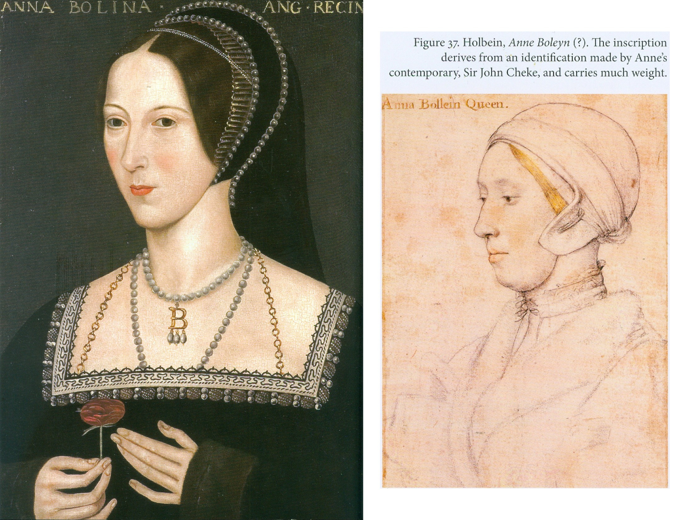
Above, Fig. 10: The photo-linkage that was carried across two pages of Anne Boleyn-ascribed works, as discussed by Grosvenor in the 2007 Philip Mould Gallery catalogue “Lost Faces – Identity & Discovery in Tudor Royal Portraiture”.
Note that, as seen above, in Grosvenor’s section of the 2007 Mould catalogue, the proposed Windsor sitter’s identification as Anne Boleyn carried a parenthetical question mark, and that nothing more was said of Cheke’s claimed identification of it than that it carried much weight – when, by the same token, so too must Cheke’s identification of the British Museum Anne – to repeat: because the two drawings’ sitters are, as everybody agrees, physically incompatible, if Cheke was right on one he had to be wrong on the other. In three decades of campaigning no one had established that Cheke had only endorsed the one drawing and not the other.
In “Lost Faces”, Grosvenor acknowledged his own restating of Rowlands/Starkey and strenuously endeavoured to show that Cheke had been proved right on almost every sitter’s identification. To two Ives-cited Cheke misidentifications he responded:
“We can surely forgive Cheke these errors, for the drawings date to Holbein’s first trip to England between 1526-8, well before Cheke came to Court.”
Ives had written:
“Most worrying of all, the portrait of Margaret Clements, More’s foster daughter, is identified as ‘Mother Jak’, Edward the VI’s nurse. Not only is it highly likely that Cheke knew Margaret – her husband John was erstwhile reader in Greek at Oxford, and Cheke was Regius Professor of Greek at Cambridge – but, as tutor to the future Edward VI, Cheke undoubtedly knew the real ‘Mother Jack’. Clearly, his authorship of the current [Anne Boleyn] identifications is highly questionable.”
CONCEALING GOITRES
Like Rowlands/Starkey, Grosvenor took the politically hostile witnesses’ accounts as firm corroborations of the Windsor drawing’s Anne. One such, Nicholas Sanders, alleged “a large wen under her chin” which she had attempted to conceal. Where Ives had rebutted Sanders’ testimony outright – “one can dismiss out of hand the arguments which seeks to link the [Windsor] sitter’s double chin and high collar with… a velvet mantle with a high collar to conceal a scrofulous neck” – Grosvenor countered: “We do know, however, from another contemporary source Sanders’ description of a swelling under her chin was probably correct.” A footnote to this claim cited Sir Roy Strong’s seminal work Tudor and Jacobean Portraits, but, as readers of Strong’s book will appreciate, while he had indeed identified a second observer (who claimed a grossly disfiguring wart and a swelling “resembling a goitre”), he, like Ives later, had dismissed both observers as hostile and, in Sanders’ case, of also being “too late to be taken as reliable evidence”.
DISCOUNTING AUTHORITIES
Although Grosvenor had cited both Strong and Ives in footnotes, on the former, he might have left an impression of support for his own position when Strong had not only dismissed the hostile witnesses’ reliability but had also noted that their accounts were incompatible (had failed to “harmonise very closely”) with the later painted pictures of Anne. Strong’s recognition of the testimonial value of the later paintings highlights the collective and abiding failure of the Windsor drawing’s successive champions to acknowledge and heed the evidential force of artistic images when, properly considered, such works of art themselves constitute primary documents as (truly) concrete manifestations of highly specific and personal artistic/intellectual productions. Grosvenor’s footnote on Ives’ 1994 Apollo article said no more of him than that he was one of the “authorities [who] have dismissed the validity of the [Windsor] ‘Anna Bollein’ inscription due to other inconsistencies and errors in the [Cheke] identifications.”
Ives had objected to more than the unreliability of Cheke’s identifications. He had made a methodologically rigorous visual and comparative appraisal of the available pictorial and graphic records that would have done a trained art historian proud. He rejected the two Holbein Anne Boleyn drawings as likenesses of Anne – but not equally so. While recognising that a case can be made for each, he pointed out that where the British Museum Anne looks the part – “The love of Henry VIII’s life should have looked like that” – against that, the “curious undress” of the Windsor sitter suggested that rather than being a queen, “A far more likely explanation of the implied intimacy would be a link between artist and sitter”. The combined facts that Hollar had chosen to engrave the now British Museum Anne and not the Windsor Anne, and the latter’s intimate garb “should make further discussion of the Windsor drawing unnecessary”.
Having disregarded an entire tranche of historically adjacent paintings of Anne Boleyn, Grosvenor, following Rowlands and Starkey, subscribed to the veracity of the widely recognised malice on alleged facial disfigurements as reliable corroborations of the double chinned, heavy jawed sitter with the (disqualifying) fair-not-famously-dark hair in the Windsor drawing: “The chin in the drawing is perhaps swollen, and would accord with Anne’s alleged misfortune” – and this, despite Ives’ objection that the Windsor drawing sitter’s “almost bovine impression” was “fatally contradicted by the medal’s long assertive neck and its total absence of a double chin.” (See Fig. 11, below.)
ROYAL HEADWEAR
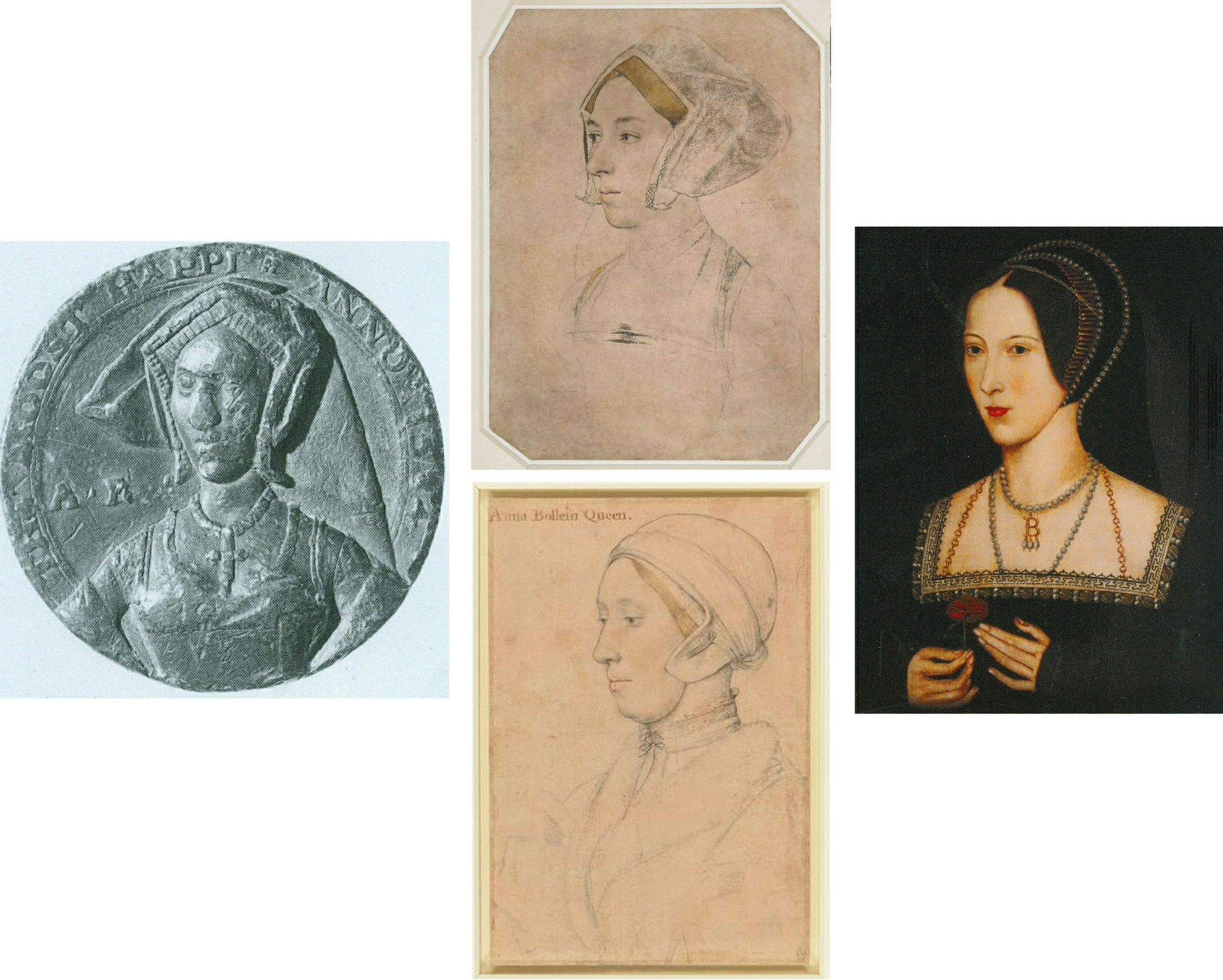
Above, Fig. 11: Left, the British Museum-owned 1534 Coronation medal; centre, top, the British Museum “Anne Boleyn” Holbein drawing (mirrored) and, bottom, the Windsor “Anne Boleyn” Holbein drawing; right, the Hever Castle Anne Boleyn painting loaned to the 2007 Mould Gallery exhibition. Although the medal is certainly damaged, pace Rowlands/Starkey, it clearly shows Anne to be attired and be-jewelled, as in the B.M. drawing. The sitter in both wears a “gable hood” – which fashion would be superseded within Anne’s own reign by the “French Bonnet” fashion, as found in the Hever paintings. In the above formation of images, where the similarities of costume and composition arc from the medal through the British Museum Anne to the painting, the Windsor drawing, by contrast, acts as a circuit breaker between the medal and the painting.
Where Grosvenor made no comment on Strong’s recognition of the wider testimonial force of artistic depictions, on the testimony itself he faced both ways, declaring on the one hand that “The author does not believe that the [Windsor] likeness… is totally dissimilar to the later portraits of Anne, such as that exhibited here [the Hever Castle portrait at Fig. 11, above, right]”, while, on the other hand, dismissing the testimonial power of the later portraits en masse:
“As with all posthumous portraits, however, they are subject to the historical, political, and visual prejudices of those who created and commissioned them. They cannot give us an accurate picture of what Anne really looked like”.
THE PERILS OF DISAVOWING PICTORIAL TESTIMONY
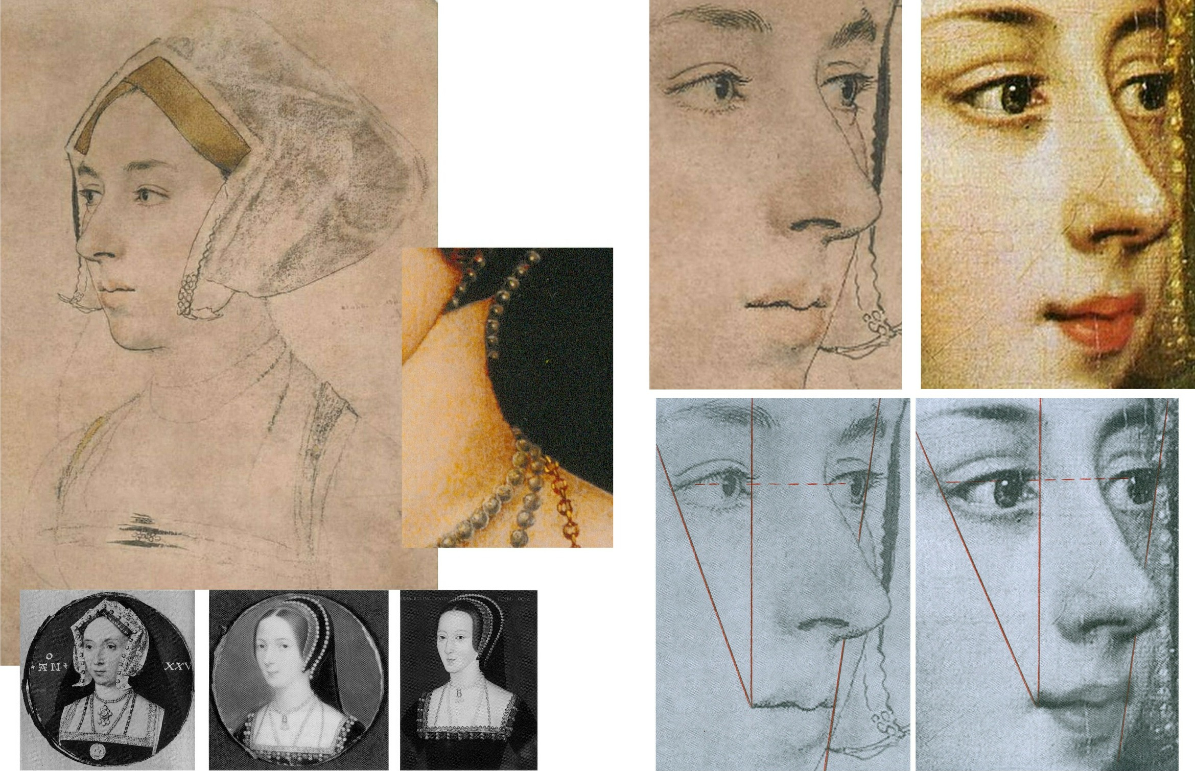
Above, Fig. 12: Left, as shown in Part I, appraising and evaluating artistic productions is not a mystical or even an entirely subjective exercise. As seen above, left, while the Windsor sitter was shown in nightwear and sans jewellery, Holbein’s British Museum sitter was fully dressed and with indications of three rows of necklaces. Many paintings of Anne show her in precisely such dress and so be-jewelled – jewellery which often included her initial “B” as a suspended centrepiece. Elsewhere in the Mould catalogue, Grosvenor accepted the testimonial power of jewellery when defending Cheke’s reliability on a Holbein sitter that had been doubted – “The Lady Mary after Queen”:
“But the Holbein drawing certainly is Mary. A study of the jewellery allows a positive identification to be made…”
Above, right: with the British Museum Anne Boleyn drawing, not only does the indicated jewellery clinch the status of the drawing as the precursor to the paintings, it was (as previously shown) further possible to demonstrate the clear derivation of a particular painting (also at Hever Castle) from the drawing.
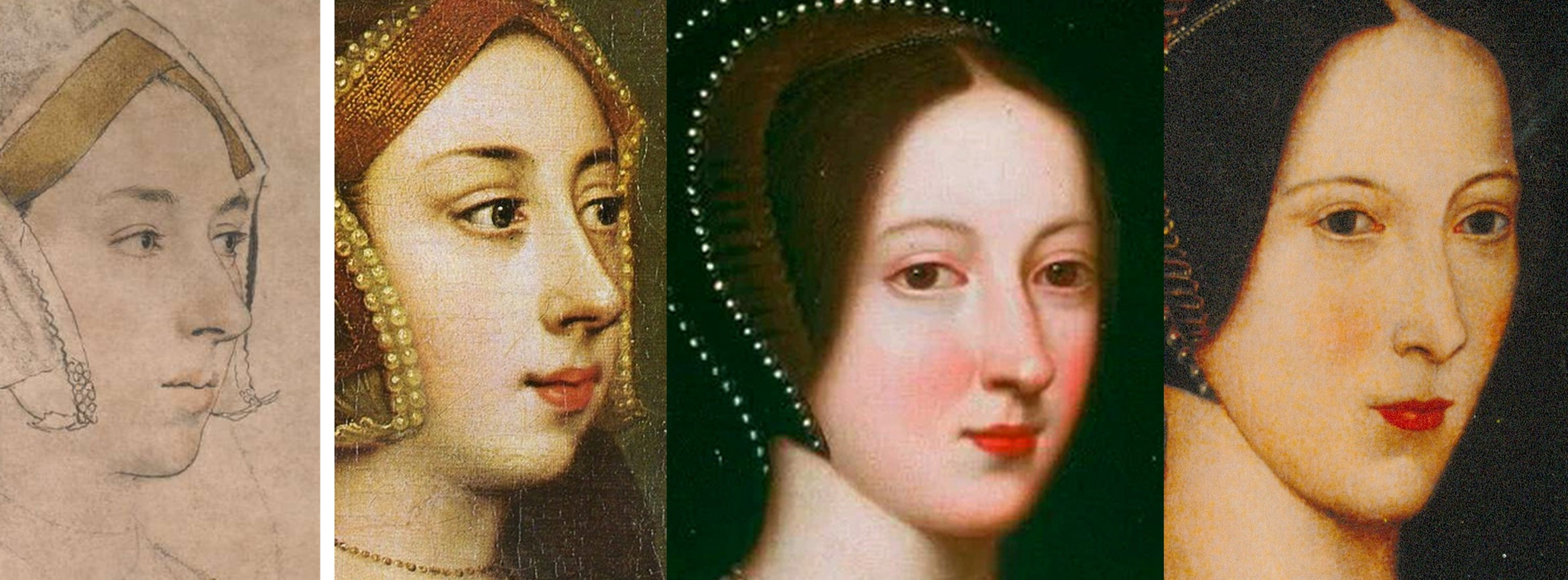
Above, Fig. 13: In the above sequence it is possible to see a morphing familial relationship in the faces in which, notwithstanding stylistic changes, a progressive sequencing of slight rotations of the head from the original near profile drawing (in which the nose fractionally overlapped the cheek contour and the edge of the gable hood) progresses towards a more frontal face in which the eyes in the second Hever Castle Anne painting (here mirrored) turn to confront the viewer.
DOUBLE CHINS AND CHEKE’S RELIABILITY
As shown in Part I, the features of the Windsor sitter markedly better resemble those of the ascribed Duchess of Suffolk (Fig. 14, below) than those of the British Museum drawing. As mentioned, when Starkey paired with Rowlands in the 1983 Burlington Magazine article hopes of a visually supported case for the Windsor “Anne Boleyn” were dashed, and again, with Starkey/Grosvenor, after three decades, no direct visual comparison of the rival Holbein drawings was offered to readers.
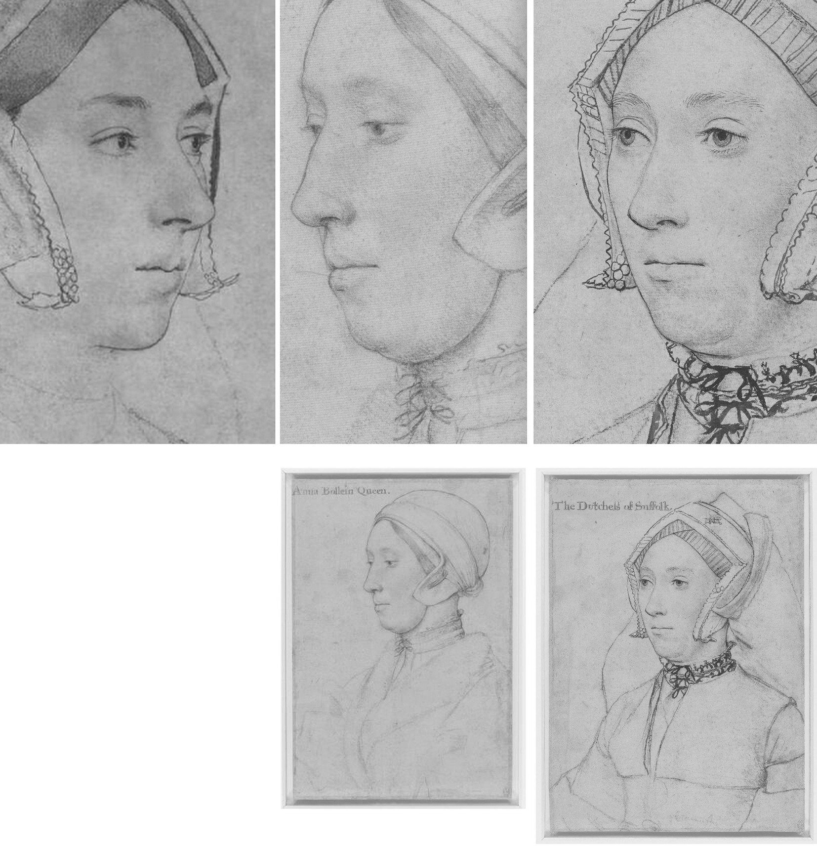
Above, Fig. 14: Left and centre, the British Museum and the Windsor Holbein “Anne Boleyn drawings; right, the Royal Library’s “The Dutchess of Suffolk”. Note, in the case of the British Museum Anne, a nostril that is markedly larger than the two similarly shaped nostrils on the other two drawings.
Collectively, Rowlands, Rowlands/Starkey, and Starkey/Grosvenor had all failed to acknowledge that the sitter in the Windsor drawing was not the only double-chinned, high cheek-boned lady wearing a (potentially) goitre concealing, neck-tied chemise in Holbein’s drawn portraits. As seen above, Holbein’s later inscribed portrayal of Katherine Brandon, the “Dutchess of Suffolk”, bears not only another double chin but an almost identically laced and tied high-necked garment. Were both sitters scrofulous? Or might they have been one and the same person?
CODA: AGE CUTS BOTH WAYS
Ironically, an unsuccessful attempt was made in the Lost Faces exhibition to re-assign the identity of the Duchess of Suffolk’s sitter to an earlier wife and to count the proposed switch as another Mould and co. “discovery”. Grosvenor raised the reliability of the ascribed Duchess of Suffolk sitter:
“…there has been some confusion about which ‘Dutchess of Suffolk’ Holbein shows, an issue raised below in some detail by Alisdair Hawkyard.”
Hawkyard, possibly in emulation of Starkey on “Ormond”, wrote:
“One of the drawings of a sitter whose identity has been doubted is inscribed ‘The Dutchess of Suffolk’. She has been identified as Catherine Willoughby born c. 1519 who in September 1533 married her guardian Charles Brandon, Duke of Suffolk. The woman depicted is more mature than Catherine would have been had she sat to Holbein before his death in 1543. The sitter’s greater maturity suggests that she was Suffolk’s third wife Mary who died on 25 June 1533. Mary, Henry viii’s younger surviving sister, had married Suffolk in 1515 while still in mourning for her recently deceased husband King Louis xii of France and without the consent of either her brother or the new King of France, Francis I. The physiognomy of the Duchess accords with what is known of her appearance…”
If Hawkyard’s objection seems a fair one, it would follow that the very similar-looking Windsor sitter is also too old to be Anne who, on Ives’ reckoning, was thirty-one when Holbein began his second visit to England and thirty-five when executed. Grosvenor dismissed the British Museum drawing’s sitter on grounds of age: “Alas, this pretty sitter is too young to be Anne”, adding, “The drawing has been convincingly discounted by, among others, John Rowlands”. (Which others? – the people who “apparently” had “generally accepted” Rowlands’ identification?) On Anne’s age, Margot Robbie, who played Barbie in the recent film, is thirty-three. Lily James is thirty-five. Had the Royal Collection accepted the Grosvenor/Mould Gallery’s proposed re-identification of the Duchess of Suffolk sitter, it would, of course, have spoken further against Cheke’s reliability.
Despite Grosvenor/Starkey’s reported claims to have “traced” the Windsor drawing’s provenance to Cheke and to have discovered a document of c. 1590 which noted that Cheke had inscribed “numerous Holbeins for the King”, as mentioned above, there had been no tracing or discoveries because the claims made had derived directly from (and added nothing to) Parker’s 1945 account. Viz:
“…The basis, of course, for all such inquiry is the evidence provided by the inscriptions on the drawings themselves, or to be more exact, by the inscriptions that appear on sixty-nine of the total of eighty-five, the further sixteen having remained nameless. At this point we must revert to the Lumley inventory of 1590, and complete the quotation of that vitally important entry with the further information that the names were ‘subscribed’ to the drawings by ‘Sir John Cheke, Secretary to the Edward the 6.’ One of the most learned men of his day, Cheke, then in his twenties, was summoned to Court in July, 1542, to succeed Richard Cox as tutor to Prince Edward. On the newcomer’s arrival, therefore, Holbein himself was still on the scene, and the circle of his more recent sitters still about him. That Cheke must have had personal contacts with many of them is beyond doubt. It follows that if the names now inscribed on the drawings correspond, as presumably they do, with Cheke’s identifications referred to in the inventory, they have abundant claim to interest and attention, though not, of course, to blind faith. It is demonstrable that their accuracy is not infallible, nor can the date of their recording have been otherwise than belated.”
Moreover, respectful as he had been of Cheke’s authority, Parker had rejected the Windsor drawing’s identification as a portrayal of Anne Boleyn:
“The inscription is certainly incorrect, the features showing no resemblance whatever with the well authenticated drawing of Anne Boleyn in Lord Bradford’s [now the British Museum’s] possession.”
SUGGESTIONS BECOME FACTS
Grosvenor’s counter to Parker’s dismissal of the Windsor “Anne” comprised nothing more than appeals to the authority of his predecessor-partisans’ authority:
“The present author, however, here restates an earlier suggestion that the sitter is, in fact, Anne Boleyn – Originally suggested by John Rowlands and David Starkey in ‘An Old Tradition Reasserted: Holbein’s portrait of Queen Anne Boleyn”, Burlington Magazine, CXXV (1983).”
Cheke was personally pressed into Grosvenor’s service:
“On simple probability alone, the chances of the [Windsor] inscription being erroneous are slim. And, as mentioned above, Anne is one of the sitters Cheke was least likely to get wrong.”
Grosvenor’s 2007 contention was thus, like that of Rowlands/Starkey in 1983, yet a further sleight of hand: Cheke cannot be held to have ascribed the Windsor drawing alone, because, on the same historical record, he had also ascribed the now British Museum drawing. The Royal Collection switched the Anne Boleyn identities in error and on a case lacking either scholarly merit or visual credibility – this truly was a spurious discovery.
Michael Daley, Director; 31 May 2024
Sex, Trigonometry and Anne Boleyn’s Recovered Likeness
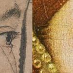
Art can suffer many injuries and indignities. The worst of these, short of outright destruction – but also irreversible – is restoration damage. Misattributions corrupt and debilitate oeuvres and can mask restoration injuries – but they can be corrected. In portraiture depicted sitters can be misidentified but, again, these can be corrected. When presented to the world, injurious restorations, misattributions and misidentifications alike are commonly trumpeted as “discoveries”. Such discoveries, as in the misidentification examined here, can be claimed without supporting evidence or, even, against strong contra-evidence.
ANNE BOLEYN’S NEW HEAD
On 14 March 2007 the Daily Mail (“Finally historians can give Anne Boleyn her head back”) reported:
“A Holbein drawing has been revealed as the only portrait of Henry VIII’s second wife Anne Boleyn. The c.1530 picture carries Anne’s name but other evidence suggested this was an error. Now expert Bendor Grosvenor and historian David Starkey have traced the inscription to her contemporary Sir John Cheke, confirming she is indeed the subject.”
Four years later the claimed confirmation of the Royal Collection’s “Anne Boleyn” drawing graduated into “certainty” on Bendor Grosvenor’s 15 December 2011 Art History News post “Anne Boleyn regains her head”:
“This isn’t ‘news’ as such, but in a foray into the Tudor realms of Twitter last night I mentioned the drawing of Anne Boleyn by Holbein in the Royal Collection. I said that although in the past the identity was doubted by art historians, the sitter was now catalogued with certainty as ‘Anne Boleyn’, as you can see on the Royal Collection website…”
THE TRUE ANNE BOLEYN LIKENESS
Since 1977, the dispute over Anne Boleyn’s likeness has turned on two Holbein portrait drawings of equal artistic merit and provenance strength but of manifestly different sitters. One drawing is in the British Museum, the other is in the Royal Library at Windsor (see Fig. 1 below). While the Windsor drawing’s advocates claim “certainty” on their “Anne Boleyn” identification, both drawings bear written Anne Boleyn ascriptions derived from the same largely reliable historical source and the British Museum drawing had been considered the true likeness for many centuries. How, then, had the switch occurred? The now protracted Anne Boleyn Identity Literature discloses the Royal Collection’s acceptance of a campaign which had eschewed all use of the most illuminating art critical tool – the photo-comparison. In this switch of identities, Art had been denied its own voice as words trumped the intrinsic – and markedly contrary – visual testimony of images.
EYES, NOSES and MOUTHS: GIVING A VOICE TO HOLBEIN
In a letter to the Times (5 July 2023) we had hoped a forthcoming Holbein portrait drawings exhibition might address the drawn method by which Holbein unerringly fixed the characteristic trapezoidal relationships between a sitter’s eyes, nose, and mouth.
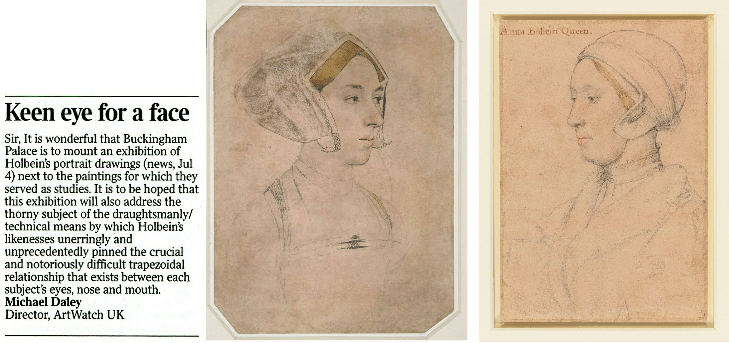
Above, Fig. 1: Left, ArtWatch UK letter; centre, the British Museum Holbein drawing formerly said to depict Anne Boleyn; right, the Royal Collection Holbein drawing now said to depict Anne Boleyn.
The British Museum Anne Boleyn drawing was not in the Buckingham Palace exhibition Holbein at the Tudor Court and therefore was not discussed. The Royal Collection Trust’s Senior Curator of Prints and Drawings, Kate Heard, speaks in the catalogue of Holbein’s “sensitive and life-like” depictions that “bring us face to face” with key Tudor players. The portraits are addressed in terms of social history and patterns of patronage, as in Holbein’s rise from foreign itinerant to court artist, and with Heard wondering whether, as the only artist of his day to possess a horse, Holbein travelled to his sitters, or they to him. His drawing method was discussed as “taking likenesses” and on the frequency with which his chalk drawings had been reinforced with ink in possible preparation for transfer as “patterns” for painted portraits.
Heard’s “taking likenesses” was a telling phrase because distinctions are commonly drawn between making drawings and taking photographs and because Holbein’s depicted facial features can seem as reliably fixed as in any photograph.
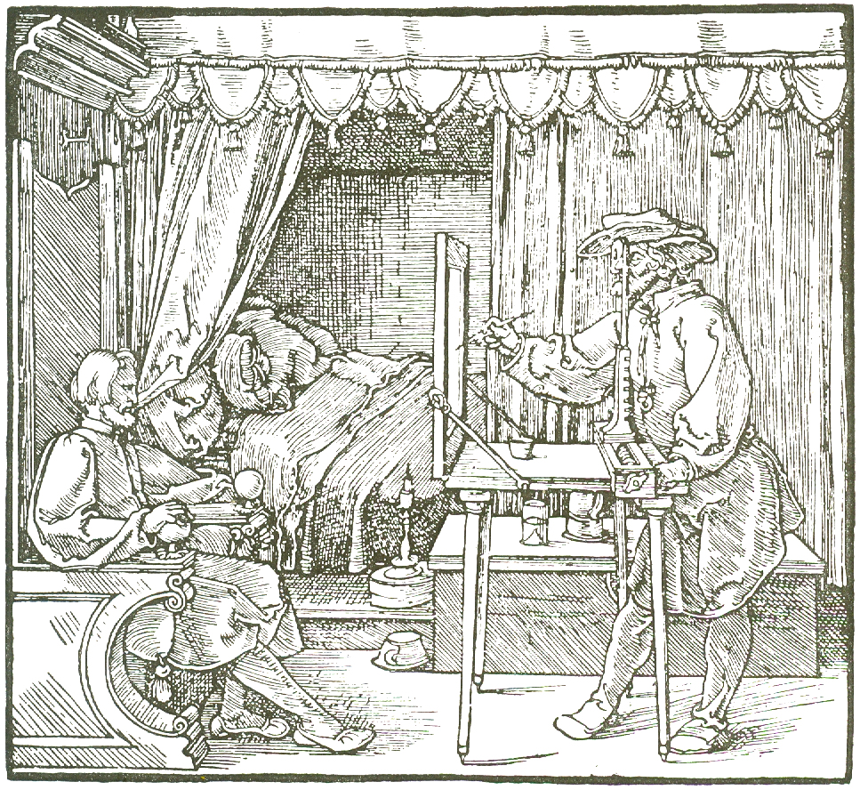
Above, Fig. 2: Durer’s depiction of a method of capturing traced outlines and features on a pane of glass.
The scholar who had held the formerly Bradford family, now British Museum, Holbein portrait of Anne Boleyn to be the true likeness (Fig. 1, above, centre) was K. T. Parker in his seminal 1945 book The Drawings of Hans Holbein in the Collection of His Majesty the King at Windsor Castle. Parker succeeded Kenneth Clark as Keeper of the Department of Fine Art in the Ashmolean Museum, Oxford, and was Keeper of the whole museum from 1945 until his retirement in 1962. His high reputation as a connoisseur is said to have been laid when working in the British Museum’s Department of Prints and Drawings with A. E. Popham and Campbell Dodgson.
THE RELIABILITY OF INSCRIPTIONS
In Parker’s book, the Windsor Royal Library drawing’s inscribed identification as “Anna Bollein Queen” (Fig. 1, above, right) was bluntly dispatched:
“The inscription is certainly incorrect, the features showing no resemblance whatever with the well authenticated drawing of Anne Boleyn in Lord Bradford’s possession”.
Parker drew a distinction between “two kinds” of evidence – “pictorial” and “literary” (or visual and documentary) and was duly alert to the importance of both. As will be examined separately, he also advanced a pictorially sophisticated hypothesis that Holbein, like Durer at Fig. 2 above, might have fixed the essential features of his sitters by tracing them onto a pane of glass and transferring the resulting image to paper. Here, we consider how and why visual records failed to receive due critical consideration when the Anne Boleyn sitters’ identities were switched.
A REVISIONIST CHALLENGE
In 1977 John Rowlands, the then deputy keeper of prints and drawings at the British Museum (and, later, Keeper from 1981 to 1991), challenged the Anne Boleyn identification in the Parker-endorsed drawing. The “demotion” was curiously, if not inappropriately executed. First, it was made not in a scholarly journal – which could have facilitated a correspondence – but in the museum’s own YEARBOOK No. 2 (“A portrait drawing by Hans Holbein the Younger”). Second, it was not advanced on its own merits but was slipped within a commemorative article on the British Museum’s recent acquisition from the Bradford family of its landmark Holbein drawn portrait. The article itself carried just three photographs (as shown below) and with none of the Royal Library drawing being espoused as the new, true Anne Boleyn likeness.
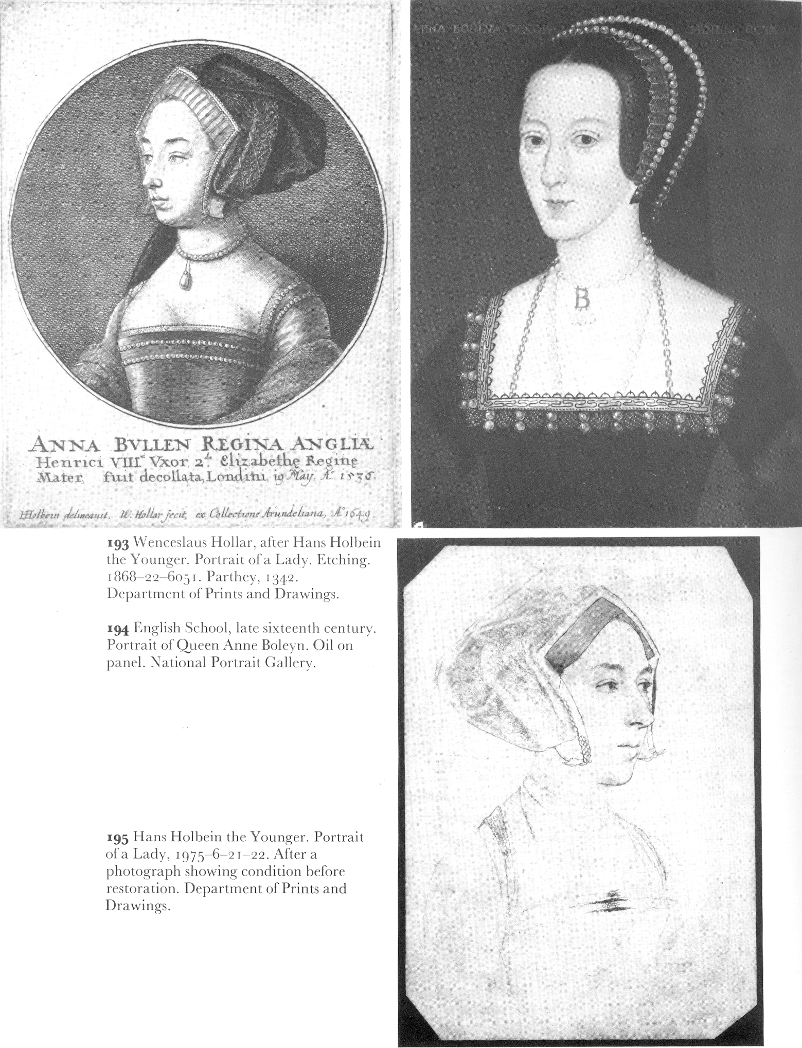
Above, Fig. 3: The three illustrations to Rowlands’ British Museum Year-Book II article. There was also a full colour plate of the newly acquired drawing.
Rowlands acknowledged the new acquisition as an outstanding drawing that had traditionally been held to be of Queen Anne Boleyn (Paul Ganz,1937; Karl Parker 1945). He offered no artistic grounds for his “de-identification” of the drawing’s sitter – indeed, as shown below, he celebrated the drawing’s supreme artistry – and he made no suggestion of another likely or possible sitter. The relative visual authority/plausibility of the two radically different depictions of the same historical figure was not examined. Rowlands’ sole objection to the British Museum’s own drawing was documentary – that its Anne Boleyn ascription could be traced no further back than 1649 when in the Earl of Arundel’s collection and where it was copied in Wenceslaus Hollar’s etching (Fig. 3 above, top left).
The objection seemed something of a pedantic contrivance: both the etching and the drawing bore an inscription which identified the sitter as Anne Boleyn and gave the date of her beheading – “Anna Bullen decollata fuit Londini 19 May 1536”. On the general authority of the inscriptions on Holbein’s drawings, Parker had reported that of the eighty-five Royal Collection Holbein drawings sixty-nine bore written inscriptions from an inventory made in 1590 to which the names of the identified sitters had been “subscribed” by “Sir John Cheke, Secretary to King Edward the 6th”. Cheke had died in 1557. The British Museum’s new drawing had been part of the Royal Collection’s Holbein holdings after the artist’s sudden death in 1543 from the plague. Most inscriptions on Holbein’s portraits thus originate from the turn of the sixteenth and seventeenth centuries. Parker held that because Cheke had had direct contact with many of the drawings’ sitters, his subscribed names enjoyed “abundant claim to interest and attention, though not, of course, to blind faith.” The eventual acceptance of Rowlands’ misidentification by the Royal Collection evidently rested on a claimed near-infallibility of Cheke’s recorded identifications – even though he had evidently given the same sitter to two incompatible drawn portraits.
IN AND OUT OF HISTORY
Rowlands, who would later be supported by two historians (David Starkey and Bendor Grosvenor) and opposed by a third (Eric Ives, author of an acclaimed Anne Boleyn biography), acknowledged “a strong likelihood” that the Bradford/BM drawing had been incorporated in the famous “Great Booke” of bound Holbein drawings and had subsequently been removed from it:
“How and when the ‘Anne Boleyn’ sheet became separated from the rest is unknown, but this probably occurred after the death of the earl of Arundel in 1646”.
Rowlands also held that although the British Museum drawing had been incorporated within the famous book, such incorporation was no guarantor of pedigree: the Windsor group “undoubtedly contains drawings which are not by Holbein”. Such a consideration would, of course, apply to all works bound in the book. Parker had said in 1945 that: “The Windsor series certainly contains extraneous matter, but the only drawing known to be incorporated at a later date is the so-called ‘Amelia of Cleves’…in the eighteenth century”. Rowlands spoke too of “extractions” from the book, with the first having probably begun “around 1630″. With the British Museum drawing, he said its date of extraction was unknown but had “probably occurred after the death of the Earl of Arundel in 1646” and “probably in the reign of Charles II [1660-1685]”.
A CLASH OF DATES AND AN ARISTOCRATIC VILLAIN
Against his own “probablys”, Rowlands cited and accepted a detailed account of how the now British Museum drawing had been stolen by the Bradford family when the great book was owned by Jonathan Richardson, senior. Rowlands quoted Richardson’s son’s account of the theft in full:
“The Original of this Drawing, by Holbein, of his finest style & most Capital, the Old E[arl] of Bradford cheated my father of Thus. When he was confined with gout, a little before his Death, He sent request to my F[ather] that he would lend him a Book of Drawings to Divert him; w[hi]ch my F[ather] compl’d with. The E[arl] sent him back the Book in a few Days, but without this Drawing. My F[ather] went immediately to wait on him, & found the Drawing hanging by the Bed side in which he lay, in a Frame & Glass. There was other Company in the Room, so my F[ather] could not claim it at that time; but look’d several times at ye Drawing, stedfastly, & lookd at my L[or]d. My L[or]d stood it, discoursing with him, quite unconcerned; & in two or three days failly sneak’d out of the world, & kept the Drawing. My F[ather] could not claim it afterwards of his Heir (L[or]d Torrington I think) without accusing Bradford of a most infamous piece of Villany, of which he had no witness.”
Rowlands thought the Earl was likely to have been Henry Newport who died in 1734 and added “since then this drawing has been in the possession of the Earl’s descendants”. Parker (whose Holbein scholarship is considered “exemplary” by Susan Foister) had stated that the great book was “broken up” in 1727 when back in royal possession and that by 1728 the drawings had been glazed, framed, and displayed at Richmond Lodge. The Bradford theft must therefore have occurred before the book returned to Royal ownership, the date of which Parker said remains unknown in a period “so full of problems”.
Rowlands acknowledged that after Hollar’s 1649 printed copy, “all representations of Anne Boleyn, whether they were painted or engraved, were based on the Bradford drawing, right through the next two centuries.” He did not ask why this had been so or wonder why no such comparable copies had been made from the Royal Collection “Anne Boleyn” drawing he was championing as the sole and true record of Anne Boleyn’s likeness. On Rowlands’ account, the theft of the drawing had clearly left the Richardson family highly aggrieved. At the time of the theft, Jonathan Richardson senior had owned both inscribed Anne Boleyn drawings and had made a pencil copy of the British Museum version (Fig. 13, below). Similarly, when the Earl of Bradford had both inscribed “Anne Boleyn” drawings bound in the (loaned) book before him, he stole the now British Museum version and not the one that returned to the Royal Collection. As Eric Ives would later point out, when Hollar had had the the option of copying either of the Anne Boleyn-inscribed Holbein drawings, he opted – or was instructed – to copy the now British Museum likeness.
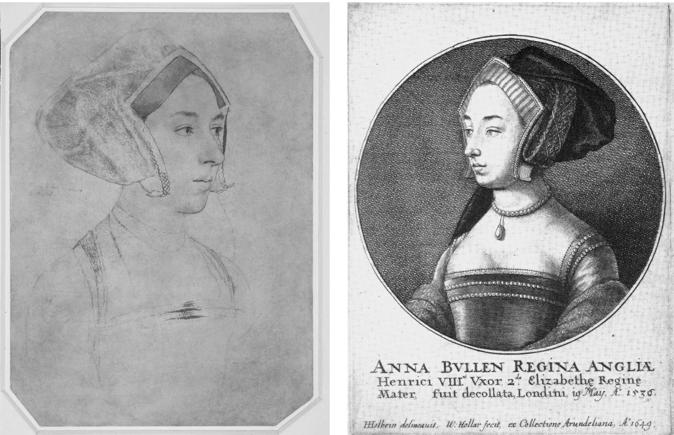
Above, Fig. 4: Left, the Bradford/BM Holbein Anne Boleyn drawing and, right, the Hollar copy of 1649. Hollar had of necessity resorted to a degree of invention with the costume and jewellery – and he showed only one of the three necklaces indicated on the Holbein drawing. His seemingly strengthened shading around the cheek, jaw and neck might indicate a subsequent loss of chalk shading on the drawing itself (see Fig. 13, below).
A SOLE RELIABLE RECORD
Rowlands noted that the only securely known contemporary likeness of Anne “is the medal struck to commemorate her coronation in 1533” but which, he said, is too worn to give any indication of her features (see Fig. 5 below). Given his unsteady and visually unsupported 1977 account, it might seem timely to consider the expanded and invigorated joint Rowlands/David Starkey 1983 Burlington Magazine article, but note should first be made of the methodological and visual shortcomings in Rowlands’ solo challenge to Parker – on the (slim) authority of which all subsequent accounts rested. Rowlands had not shown the drawing he was espousing. He had not shown the relationship between the two rival “Anne Boleyn” drawings. He had not shown how the two drawings respectively related to the medal’s likeness as the only securely dated contemporary image of Anne. Nor had he claimed any resemblance of the Windsor drawing to either the medal’s image of Anne Boleyn or any of the later painted portraits of her. His case comprised little more than a visually unsupported expression of a contrary professional opinion – an unsubstantiated glancing swipe, as it were, from a rising mid-career scholar to one who had retired fifteen years previously.
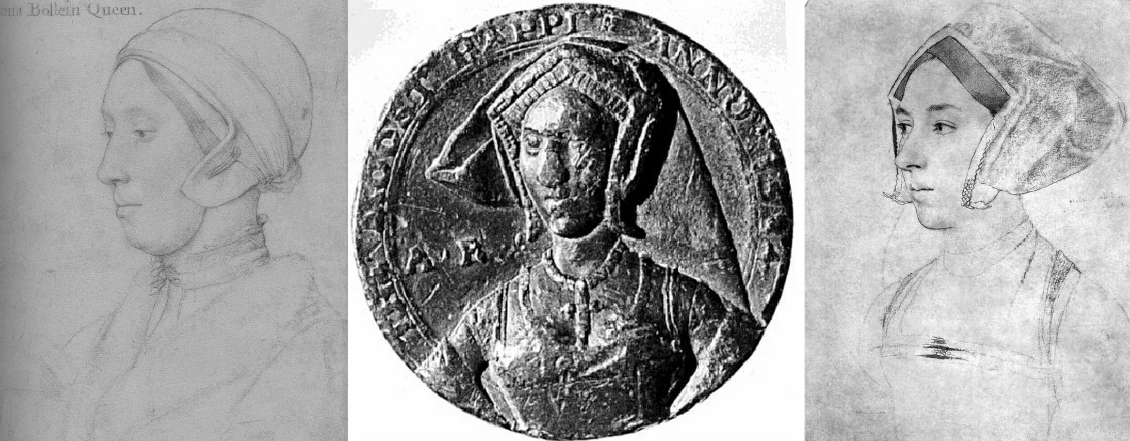
Fig. 5 above. When the Royal Collection drawing (left) and the Bradford/B.M. drawing (right, here mirrored) are seen with the medal it shows markedly more kinship with the latter drawing.
That scholarly prudence and diligence is required on these matters was recognised in Susan Foister’s 2004 Mellon Centre/Yale published monograph Holbein & England:
“There is every reason to suppose that Holbein might have painted Anne’s portrait, but no clear evidence that he did… No portraits of Anne Boleyn are mentioned as such in contemporary inventories, and official images of her are unlikely to have circulated after her execution…The only contemporary likeness of Anne appears to be that in a medal, showing her thin-faced and in a gable headdress; later painted portraits echo this image, and show her wearing jewellery with the initials A and AB…”
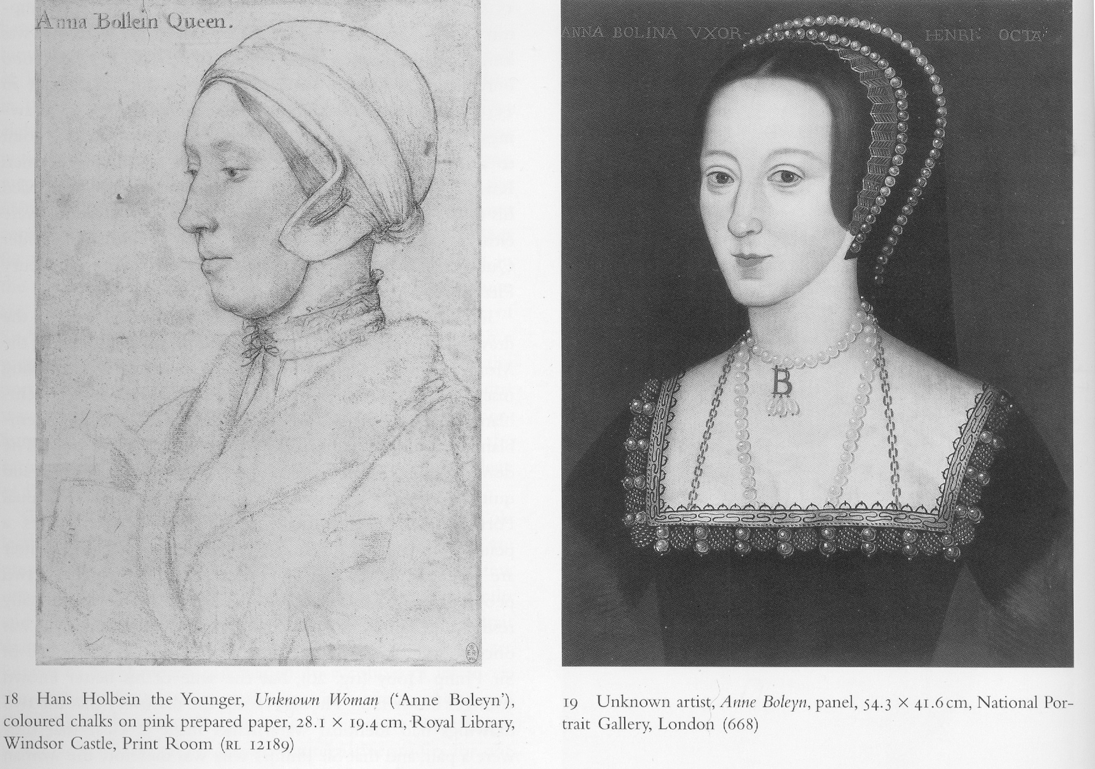
Above, Fig. 6: This photo-comparison, carried in Foister’s 2004 Holbein & England, showed the great discrepancy between the Rowlands-claimed Royal Library near-profile portrayal of Anne Boleyn (above left) and one of the many subsequently painted three-quarters view portraits like that in the National Portrait Gallery (above right) and at Hever Castle (as in Figs. 9, 10, and 13, below.)
THE WRONG HAIR COLOUR
Foister objected that the Windsor “Anne Boleyn” drawing (see Figs. 1, 14 & 18) “shows a sitter with fair hair and quite a different appearance to the [painted] portrait in the National Portrait Gallery in which the dark-haired sitter wears a pendant B.”
A seeming attempt to defuse problems arising from the Royal Collection’s acceptance of the fair-haired Windsor “Anne Boleyn” presently appears on its website:
“A portrait drawing of Anne Boleyn (c.1500-1536) on pink prepared paper. She is shown bust length in profile facing to the left. She wears a fur collar and linen cap… Although the identification of the sitter has been doubted, her informal dress and the presence of an inscription based on an identification made by Sir John Cheke have been cited as convincing evidence that the sitter is the queen (see, for example, John Rowlands and David Starkey in the Burlington Magazine, February 1983, pp. 90-2)…
“Abrasion has removed some pigment from the sitter’s hair meaning that it may now appear lighter than it did when the drawing was made. The sitter’s eyes are brown…”
Certainly, as Parker had noted, the “Windsor Holbeins have suffered in both ways from rubbing and reworking, and the fact has long been known and all too emphatically stressed.” The recorded superimposition of oiled paper for the purpose of making tracings (for engravings) can only have had deleterious effects on drawings made largely of chalks. Nonetheless, one must wonder what kind of precisely selective abrasion might have left a sitter’s eyes brown while turning her dark brown hair fair.
In her 2006 Tate Gallery catalogue Holbein in England, Foister cast doubts on both “Anne Boleyn” drawings – but not equally so. Of the British Museum drawing, and echoing Rowlands/Starkey: “The identification as Anne Boleyn arose when the drawing was in the Arundel collection and was etched by Hollar in 1649. It appears to have been based on a superficial similarity to portraits which have a reasonable claim to represent Anne… Whether Holbein portrayed Anne remains an open question: a drawing at Windsor (Parker 63) inscribed with her name shows a fair-haired woman whose appearance differs greatly from the painted portraits.” Of the British Museum drawing Foister said the dress is “similar to that of representations of those of the More family but also those of higher status: the jewels on her hood and on her bodice indicate that she might have been a member of a noble family…”
PICTORIAL TESTIMONY
What seems not to have been appreciated by any supporters of the Royal Collection drawing is that in the absence of a Holbein painted portrait of Anne – or an evidently intermediary work – adjudications between the two rival and incompatible “Anne Boleyn” drawings can only proceed on an examination of their respective correspondences with both the historically secure and dated medal and the many later painted depictions of Anne. With Anne long deceased, the later paintings had to have derived from something already painted or drawn, so the question is: which of the rival drawings is a better fit with the surviving Anne Boleyn depictions. Given the virtually complete concordance of design in Holbein’s portrait drawings and paintings (Figs. 10 and 11), appraising and comparing the now rival “Anne Boleyn” drawings with the medal and the depictions of Anne that followed her 1536 execution and the 1547 death of Henry VIII, is not only germane, it becomes, in the absence of “literary” records, of the pictorial essence – and thus is, pace Foister, a far from superficial exercise.
For example, the three rows of jewellery indicated in shorthand at the neck of Anne in the British Museum drawing are also found in completed form on the necks of both the National Portrait Gallery and Hever Castle paintings of Anne (see Figs. 7 and 11 below). Further, while this now officially discounted Holbein drawn likeness of Anne had either directly determined or – somehow – anticipated a crucially important and distinctive feature common to both types of the later painted portraits of Anne, the upgraded Royal Collection “Anne Boleyn” drawing found no echo in either type of the many later paintings.
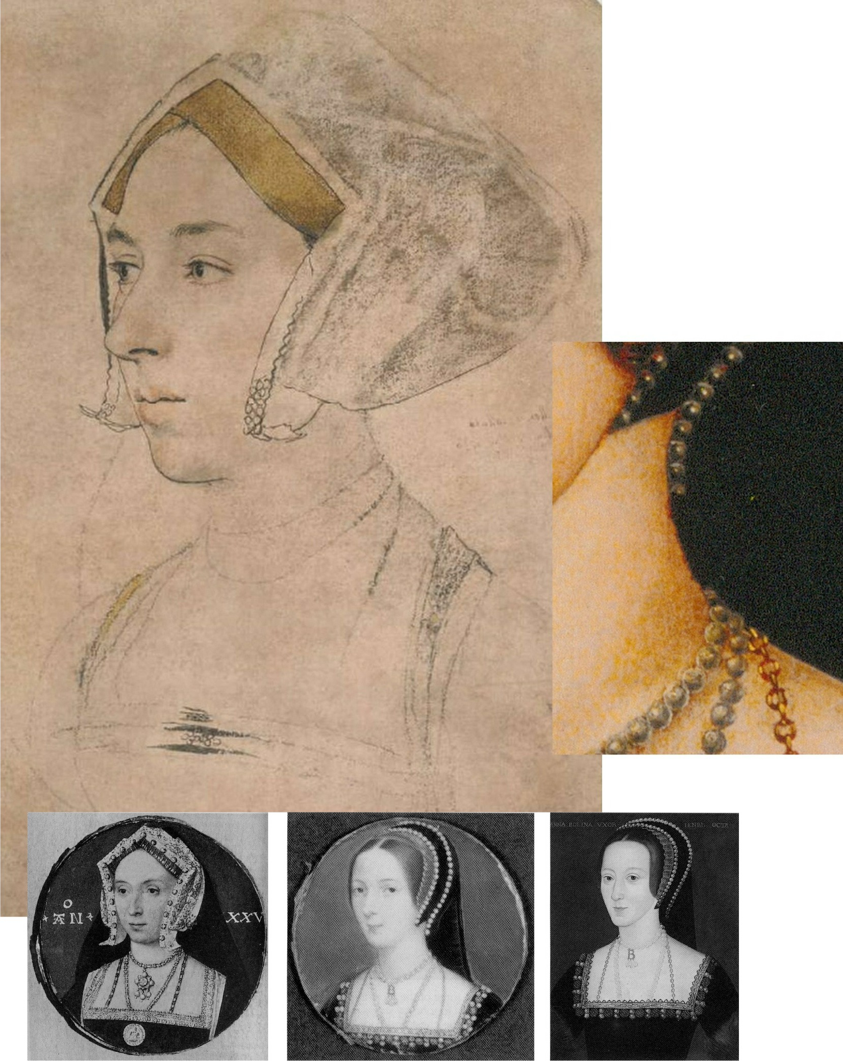
Above, Fig. 7: Top, the British Museum Anne Boleyn (mirrored); right, inset, a detail of the Hever Castle Anne Boleyn painting; bottom row, painted portraits of Anne by Lucas Horenbout (in the gable hood type) and (in the French bonnet type) by John Hoskins, and anonymous.
THE MEDAL IN THE ROOM
The only securely surviving – and dated – contemporary likeness of Anne is on the damaged 1534 commemorative medal. The medal itself, however, will have derived from a drawn design or model – but by whom? Given his designs for jewellery and other precious objects, might Holbein be considered in this regard?
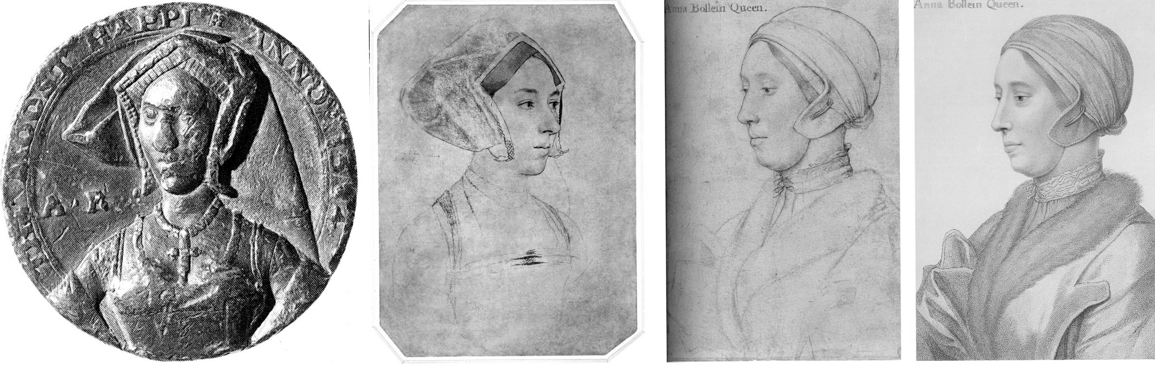
Above, Fig. 8: Left, the British Museum-owned 1534 medal; second and third left, respectively, the British Museum and the Windsor Holbein “Anne Boleyn” portraits; right an 18th century engraved copy by Francesco Bartolozzi of the Windsor “Anne Boleyn”. Prints of the Bartolozzi copy can be obtained from the National Portrait Gallery – where they are described as “Unknown woman, formerly known as Anne Boleyn”. Because of the Bradford family’s theft, there is no comparable Bartolozzi copy of the now British Museum Anne, but it might be noted that Bartolozzi showed the Windsor sitter to be fair- not dark-haired and, thus, any abrasion to the sitter’s hair must have preceded this record.
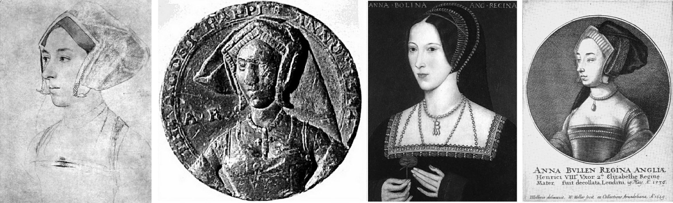
Above, Fig. 9: A possible chronological migratory sequence of depictions and motifs spanning one hundred and fifteen years. From left to right: the British Museum’s Cheke, Ganz, and Parker-ascribed Holbein drawing (here mirrored); the 1534 commemorative medal; third left, the Hever Castle, late 16th century English School oil-painted portrait of Anne Boleyn; right, the 1649 Hollar engraved copy of the British Museum drawing. It might be proposed that the British Museum drawing more likely predated the 1534 medal (struck just two years before Anne’s execution) and that it might, with its gable hood and indications of jewellery, have served in mirrored form as something of a guide to the medal maker.
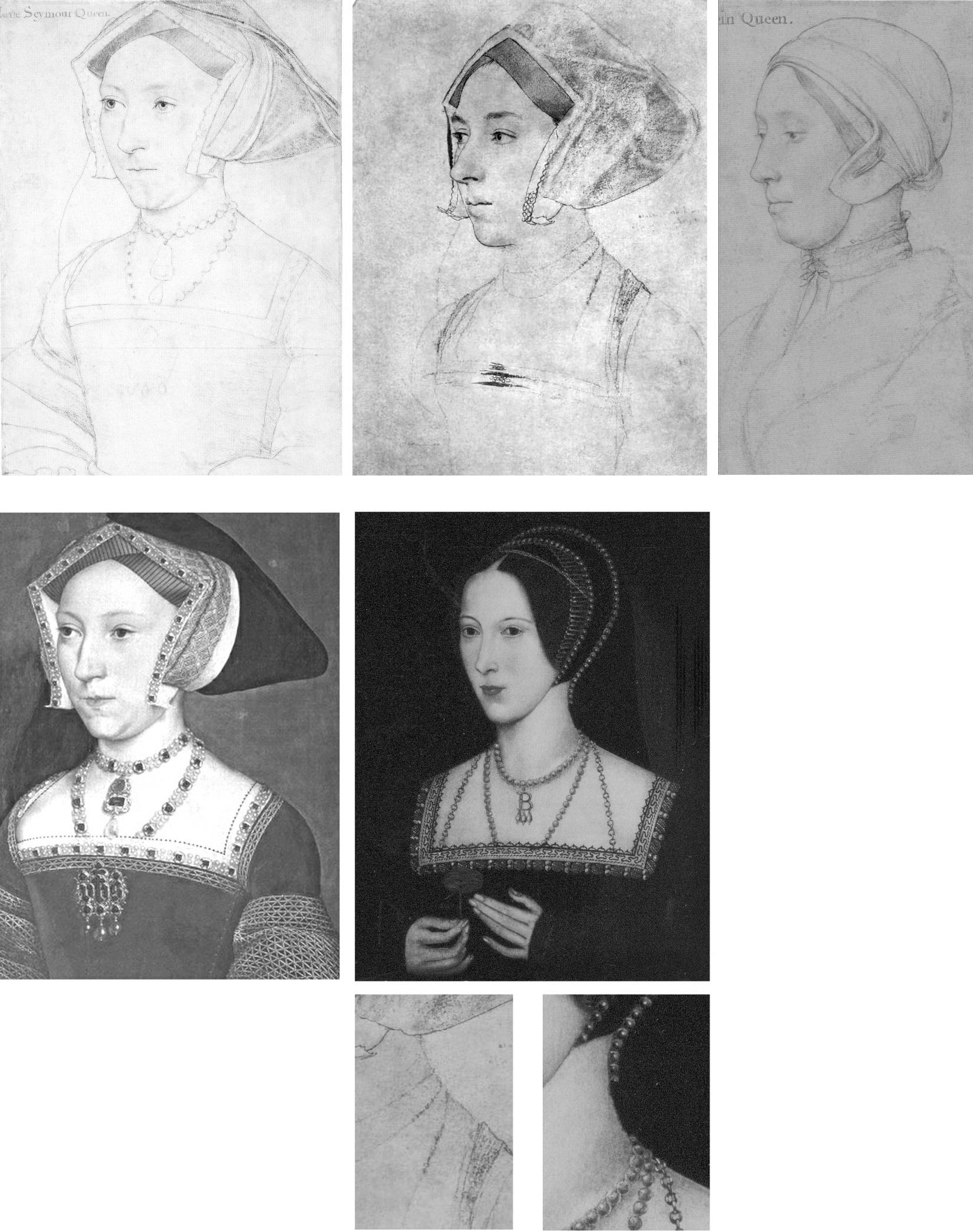
Above, Fig. 10: The extremely close design relationship between Holbein’s drawings and paintings can be seen (left column) in his drawn and painted portrayals of Jane Seymour. Such constancy would be expected also in a Holbein painting of Anne but, given either that one was never made or that none has survived, we must therefore consider from whence the (above, centre) Hever pattern of portraits might have sprung. Clearly, in terms of costume and physiognomy, it could not possibly have derived from the Windsor drawing – whereas, as seen at Fig. 7 and above here, the triple necklaces motif had migrated from the British Museum drawing to the later paintings while the Royal Collection linen cap and fur-collared nightwear costume would seem to have influenced no other work.
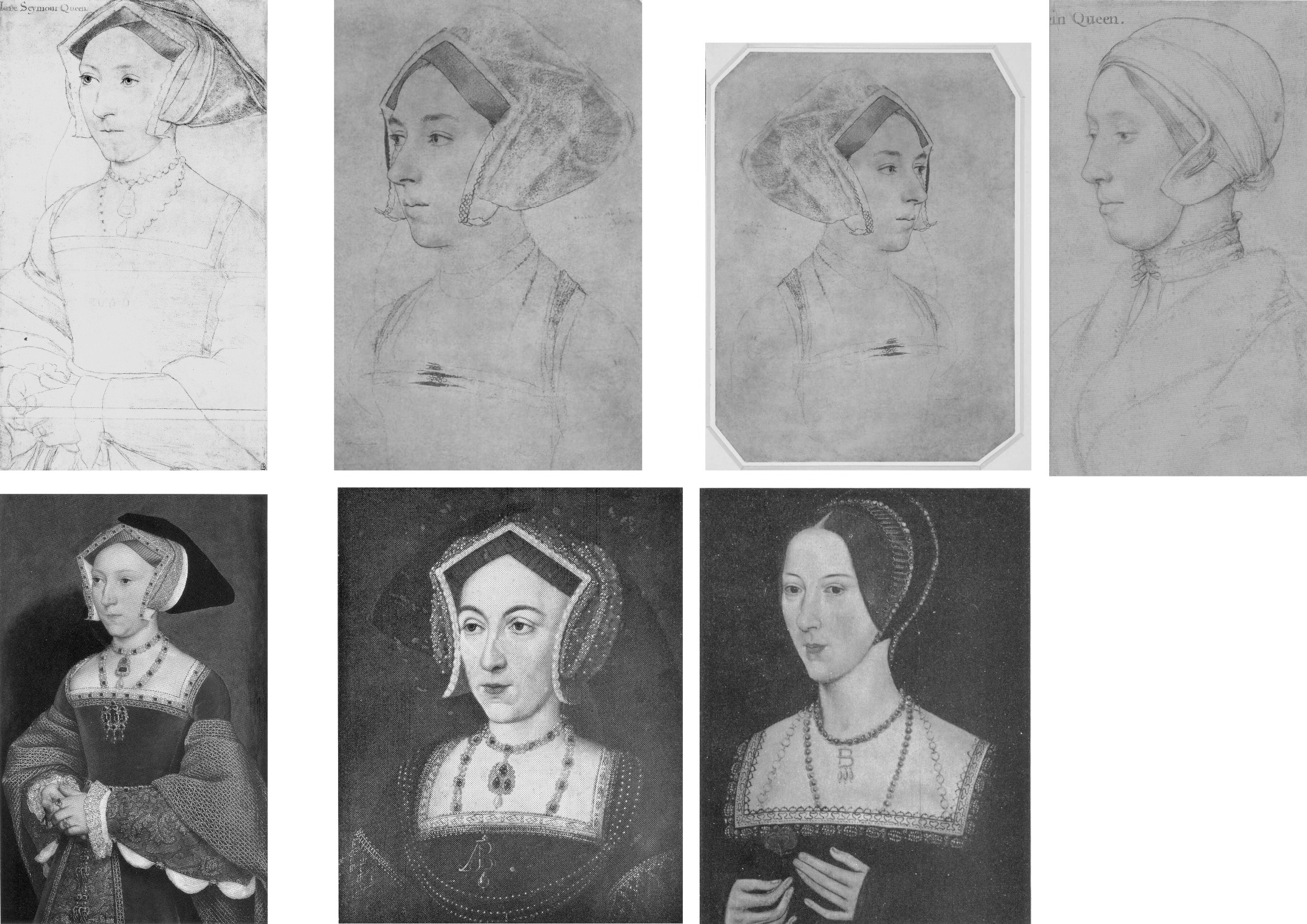
Above, Fig. 11: In the left-hand column we again see the absolute unity of design in Holbein’s drawing (top) and painting (bottom) of Jane Seymour. In the second and third columns we see degrees of kinship between Holbein’s British Museum portrait of Anne Boleyn (top row) and, below, with the two types of the later painted portraits, as found formerly at Nidd Hall, now privately owned, and at Hever Castle.

Above, Fig. 12. While all agree that the rival “Anne Boleyn” drawings (top, left and centre) could not have been made from the same person, it has not been remarked that with the Windsor “Anne Boleyn” (centre column), the general set of the face, the disqualifying double chin, and, the greater age of the sitter, find correspondences in the Royal Library’s “The Dutchess of Suffolk” (right hand column) – which include an almost identically tied, high-necked chemise. (An unsuccessful attempt was made to re-assign the identity of the Duchess of Suffolk’s sitter to an earlier wife and to count the proposed switch as a “discovery” in the 2007 Philip Mould Gallery Lost Faces exhibition.)
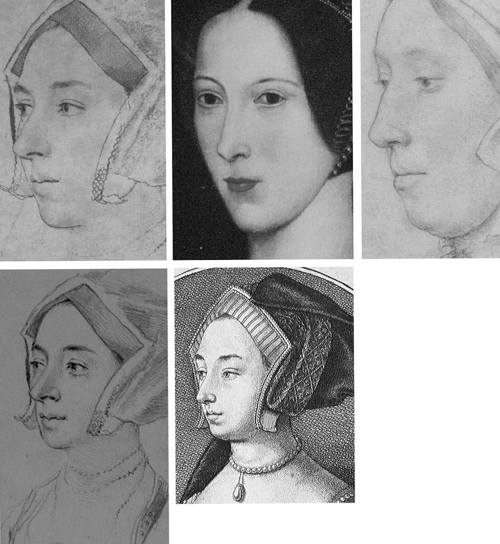
Fig. 13, above. In terms of likenesses, the late sixteenth century painted portrait at Hever Castle (above, top, centre) has common traits with the BM drawing (mirrored, above, top left) but none with the Windsor drawing (above, top, right) – other, that is, than a sharply drawn edge to the lower face caused, doubtlessly, by tied bonnets. As seen at bottom left, a (mirrored) pencil copy of the Bradford/BM drawing held in the Ashmolean Museum, Oxford, and now attributed to Jonathan Richardson senior, suggests that more supplementary chalk shading might formerly have articulated the head/neck relationship on the Bradford/BM drawing – and, as seen at bottom, centre, above, (and at Figs. 3 and 4), the Hollar copy of 1649 had indicated by tonal variations an implicitly continuous line of demarcation between the lower face/jaw and the neck.
HOLBEIN’S CAPTURED LIKENESSES AND THEIR ORIENTATIONS
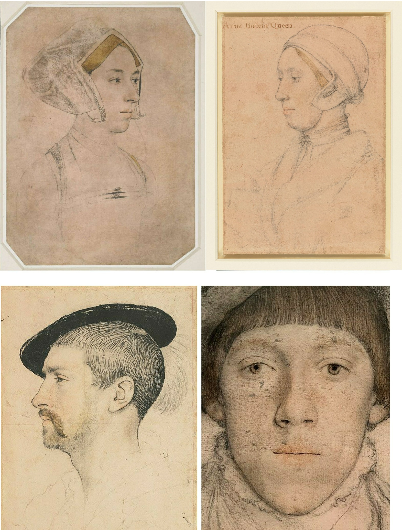
Above, Fig. 14: Top, The British Museum and Royal Collection “Anne Boleyn” Holbein drawings; bottom, left, Holbein’s “Simon George”, which carries an inscription “S. George of Cornwall”; bottom, right, Holbein’s “Henry Howard, Earl of Surrey” (detail).
Holbein possessed a seemingly effortless ability to draw heads from any position – in one perspectival tour de force, John Poyntz (in the Royal Collection) was drawn from behind and below. Because the portraits are such vivid, compelling likenesses the artist’s remarkable spatial/plastic illusionistic facility can be underestimated. As shown below at Fig. 15, Holbein, like a sculptor, clearly appreciated that a head is an object, and that depicted faces constitute a record of the visible front of an object that is deeper than it is wide – and, therefore, that a face drawn full-on must find the graphic means to evoke the depths of a head (as was brilliantly achieved by Holbein in Henry Howard, above, right) by plastically nuanced tonal variations. So-saying is not to fail to recognise that for very good reasons and from infancy, human beings attend more to faces than to profiles – and nor is it to disregard Holbein’s own distinctive human engagement and psychological penetration*. It is simply to recognise the paradoxical ease with which viewers can safely make plastic/sculptural extrapolations from Holbein’s predominantly linear drawn likenesses. In this regard, Paul Ganz, spoke eloquently in his 1950 The Paintings of Hans Holbein: “…line was the means by which he rendered form, indicated movement and suggested expression. It remained the sure foundation even of his painting, and gave to his figure compositions, his portraits and even his decorative works an astonishing clarity and organically coherent solidity.” (*On Holbein’s emotional truthfulness, see Susan Foister’s fine “Holbein the Portraitist” in her 2004 Holbein & England.)
Above, Fig. 15: An ink-over-chalk study sheet in which Holbein simultaneously examines the plastic structures of heads; the expressive force of directional gazes; and – with a curving line in each head (except for the top right head where, being seen from the front, the profile registers as a straight line) – unfailingly locates and orientates the faces’ profiles. (Ӧffenliche Kunstsammlung, Basel, Kuperfestichkabinett.)
In all graphic, painted, and sculptural media, the profile of a head is the single most potent contour because the plastic entirety of a head is bounded by and articulated within it. Expressively speaking, the profile also fixes the distinctive “set” of a sitter’s head, as seen below and above at Fig. 14 with Holbein’s “Simon George” drawing.
Above, Fig. 16: Top, a modelled head-in-progress and its sitter, at the Royal Drawing School; bottom, extrapolated lines indicating the location of the sitters’ profiles in the two contested “Anne Boleyn” portraits. While flesh might sag with age, the bony part of the nose does not continue to grow.
Above, Fig. 17: Top row, the Hever Castle Anne Boleyn painting (mirrored) and a detail of the British Museum Anne Boleyn drawing, far right, the actor Natalie Dormer in role as Anne Boleyn in the 2007-10 TV series The Tudors; centre row, views of an Anne Boleyn waxwork at Hever Castle modelled by Emma Pooley (– “I settled on Holbein’s sketch of Anne as it has always been my favourite, and is by far the most realistic reproduction, in terms of skill, of her image from around the time”); bottom row – the Pooley waxwork at Hever Castle; a painting of Anne Boleyn at Hever Castle; a waxwork of Anne Boleyn at Warwick castle.
All the above paintings and waxwork reconstructions of Anne Boleyn share a common and simple three-part dynamic in their profiles with that present in the British Museum drawing. That is, in each, from the top downwards: the forehead advances somewhat; the nose advances more rapidly; but then, from the base of the nose the profile moves into reverse and retreats appreciably down through the mouth and to the chin. The Royal Collection drawing’s profile has a different, flatter dynamic and for clear reasons of anatomy could not have been made from the same sitter.
WHO WAS ANNE BOLEYN?
Above, Fig. 18: Left, the British Museum Holbein Anne Boleyn drawing (detail); right, the Royal Collection Anne Boleyn drawing (detail). Note the line that descends from the turned-up wing of the gable hood on the right of the BM drawing.
The sitter on the left is younger, slimmer, brighter-eyed (albeit with grey/blue eyes, not brown) and is shown to have dark hair and dark eyebrows. She has a sharper, less highly bridged and more upturned nose with markedly larger nostrils. Her eyes are focussed, attentive, seemingly purposive, certainly not downcast, or self-absorbed and reflective – or with a pronounced fold of flesh over the upper eyelids. She has a single, not a double chin. In this context, Anne’s recorded character and appearance might be considered. Eric Ives, author of the acclaimed 2004 The Life and Death of Anne Boleyn (which succeeded his 1986-1994 Anne Boleyn), wrote:
“Captivating to men, Anne was also sharp, assertive, subtle, calculating, vindictive, a power dresser and a power player, perhaps a figure to be more admired than liked…All reports agree that she was dark. As well as Sanuto’s ‘swarthy’, Thomas Wyatt gave her the poetic name, ‘Brunet’.”
Ives cited a host of contemporary descriptions:
“…beautiful with an elegant figure”; “very beautiful”; “very eloquent and gracious, and reasonably good looking”; “young and good looking”; “not one of the handsomest women in the world, she is of middling stature, swarthy complexion, long neck, wide mouth, a bosom not much raised, and eyes which are black and beautiful…” Ives summarised: “Looks only tolerable, but a splendid head of dark hair and fine eyes”. One observer expanded on Anne’s use of her eyes: “…eyes always most attractive Which she knew well how to use with effect, sometimes leaving them at rest, and at others sending a message to carry the secret witness of the heart. And truth to tell, such was their power That many surrendered to their obedience.” Ives remarked that Anne “…radiated sex”. Emma Pooley’s choice of source image was sound: no female sitter’s eyes in Holbein’s drawings better evoke such reported properties and powers than those found in the British Museum drawing of Anne Boleyn – and, on this emotionally charged correspondence, Rowlands had seemed almost to concur in 1977: “The eyes, of a rare beauty, the eyebrows and eyelashes are all marvellously drawn”.
Above, Fig. 19: The arresting eyes, quivering nostril and sensuous mouth drawn by Holbein had migrated so faithfully and vividly to the (above right) later painted portrait at Hever Castle that there would scarcely seem space between them for an intermediary work. The line of the descending hood drapery in the bottom right corners of the above details departs from behind precisely the same points on the respective turned-over wings of the gable hood. Similarly, there is an almost perfect duplication in the painting of Holbein’s lightly indicated triple necklaces. Trigonometry (and see below) no less than sexual animation, testifies here to an almost identical and – surely – true likeness of Anne?
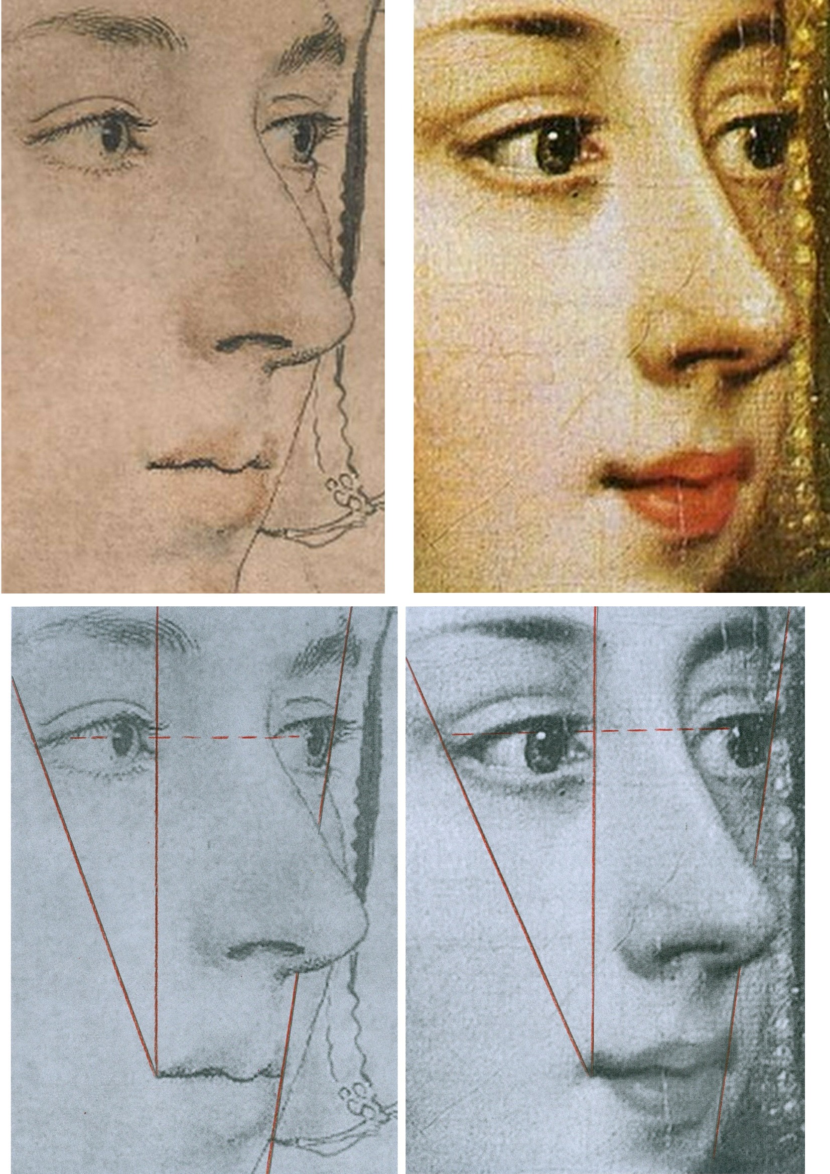
Above, Fig 20: There are differences sufficient between the drawn and painted images above to show that the painting was not made on a transposed tracing of the drawing, but the essential trigonometric relationships between the features make it inconceivable that the one image had not derived from the other – and with both describing the same sitter – even though the drawing is a more sparingly rendered account than that in the weightier, lusher and historically later oil painting. The immense odds against the reflected highlights in the eyes of two different works made decades apart and in different mediums coincidentally occurring in alignment, at the same latitude, and at the junctions of the pupils and irises, leave no option other than to conclude that what we have here is two near-identical heads that share a common light source because the one image derived from the other and both share the common sitter of Anne Boleyn.
The mouth in this Holbein drawing may be unique in the artist’s portraits. So far as we recall, Holbein invariably showed a single line of demarcation between his sitter’s upper and lower lips. On the mouths of both the drawing and painting above there seems to be a parting of the lips on the left. Ives mentions that the most hostile witness, the “Elizabethan recusant activist”, Nicholas Sander, claimed Anne had “a projecting tooth under the upper lip”. The same witness also testified that, nonetheless, as well as being handsome, Anne had “a pretty mouth”.
THE 1977 ROWLANDS CASE
On his methodologically flimsy and not duly illustrated account Rowlands had gingerly proposed in 1977 that “An implication of the rejection of the Bradford/BM portrait as a representation of Anne Boleyn, is that the drawing in the Royal Collection series with the inscription Anna Bollein Queen could in principle be once again a candidate for consideration as the Queen.” Having also admitted that the problem of the identity of his (not-shown) candidate Royal Collection drawing “must remain unsolved” for “want of less inconclusive evidence”, Rowland’s espousal in toto constituted little more than a-case-proposed-but-not-made. On occasions, Rowlands seemed bent on deconstructing his own case: when speaking of the British Museum drawing’s “precision” and “excellence” of outlining, for example, he well noted that “In addition to giving depth to the face, the brush-line of varying thickness defines the line of the wavy outer edge of the right-hand side of the headdress, and has enabled the artist to determine its position exactly in relation to the line of the cheek and the nose” – just as is shown in the close-up in Fig. 20, above, left. That so-careful and deft recording of the features, he ended, “is the hallmark of all Holbein’s portraiture, and it is particularly disappointing that the painting that would no doubt have been done from this drawing, should not have survived.” Disappointing indeed, but no reason to pivot towards an alternative drawing that had left no waves and triggered no echoes – not least because in regretting the likely destruction of Holbein painted version of this particular Anne Boleyn-ascribed drawing, Rowlands had overlooked the fact that the drawing itself had found a close and faithful painted expression in a second Hever Castle Anne Boleyn work, as shown above.
Six years later Rowlands would co-author an article with the Tudor historian David Starkey in the February 1983 Burlington Magazine – “An Old Tradition Reasserted: Holbein’s Portrait of Anne Boleyn”.
THE ENTRANCE OF DAVID STARKEY
Above, Fig. 21, an ink drawing (in the collection of Professor Edward Chaney) of David Starkey that was made by the author to illustrate a profile article, “The apoplectic academic”, by D. J. Taylor, in the Independent on Sunday, 9 November 2001.
In Part II, we examine how the Starkey-bolstered Rowlands’ Case came to persuade the Royal Collection that it now holds the true Anne Boleyn Likeness.
Michael Daley, Director; 18 April 2024
ArtWatch at Thirty, Part II: The Artful Promotion of the World’s Worst Restorations

15 APRIL 2023. MICHAEL DALEY WRITES:
In Part I we set the 1980-1994 cleaning of Michelangelo’s Sistine Chapel frescoes in the era’s ambitiously experimental and accident-prone restorations. Here, we examine the art-historically untenable scholarship that arose when Michelangelo’s debilitated frescoes were endorsed as if constituting revelations that merited a rewritten history of art. Three decades on, identifying and examining the polished art-political stratagems that draw so many scholars and art critics into supporting egregiously destructive restorations remains a matter of professional urgency.
Above, Fig. 1, Top: National Geographic’s iconic photo-record of the Sistine Chapel ceiling which captured the last moments of the most acclaimed late stage of Michelangelo’s painting, including his The Crucifixion of Haman, the Prophet Jonah, and the Libyan Sibyl. Above, the post-cleaning, LED-lit chapel. When unveiled in 1512, the then brilliantly lit and shaded figures set in deep architectural spaces were eulogised for having made surfaces which physically advanced towards the viewer recede optically through Michelangelo’s powers of design and unprecedented deployment of lights and shades. At the time, no one spoke of Michelangelo’s colour – “brilliant” or otherwise.
TWIN AND CROSS-LINKED ASSAULTS ON A CRITIC
On 8 October 1987, halfway through the cleaning of the Sistine Chapel Ceiling, the restoration’s leading scholarly critic, Professor James Beck, Chairman of Columbia University’s Art History and Archaeology Department, was branded the “most culpable of the critics” by Sir John Pope-Hennessy in the New York Review of Books (“Storm Over the Sistine Ceiling”). Two months later, that attack was followed by another in the December Apollo magazine by Kathleen Weil-Garris Brandt (“Twenty-five Questions about Michelangelo’s Sistine Ceiling”). Like Pope-Hennessy, Brandt was a professor of Renaissance art at New York University’s post-graduate art history school, The Institute of Fine Arts (which incorporates a Samuel H. Kress Program-sponsored conservation department), and she was considered a long-standing friend by him.
Brandt characterised the restoration’s critics as “a tiny, heterogenous and vociferous cadre”. She likened their arguments to “the wild cries of some ferocious mutant of Chicken Little” and added “Many believe that the critics, like that benighted bird, were misunderstanding insufficient evidence, to draw mistaken conclusions to the alarm and detriment of the neighbours.” She conceded the issue “is a serious one” but only the better to sting: “Are the critics merely opportunists, bodysurfing in a wave of publicity they would never otherwise have enjoyed?” In his 2016 memoir, Michelangelo and I, Gianluigi Colalucci, the restorer/co-director of the Sistine Chapel restorations, described Brandt as “sweet and gentle in appearance but with a character of steel” who, having “obtained her own office in the museum complex”, had “put just about everybody under pressure with her inflexible activity”.
“THINGS ARE NOT AS YOU THINK”
There were degrees of hypocrisy in both attacks. Pope-Hennessy’s charge of professional culpability had followed his invitation to Beck to serve on a Metropolitan Museum Advisory Committee. As Colalucci would later disclose, Brandt’s denigration was not made as the self-effacing and disinterested scholar she had implied in Apollo – “Like many Renaissance scholars, I have held a kind of informal watching brief for the cleaning operation since its inception in 1981 [sic] and I talk on the subject with groups and individuals of all kinds.” Formally speaking, Brandt had two dogs in this fight. First, she had obtained her Vatican office as the official spokesman on “Scholarly and General information” for Arts and Communications Counsellors, a division of the New York Public Relations firm Ruder and Finn Inc. which had been retained by the Vatican to handle the restoration crisis. Second, she was a member of a shadowy, secretive scientific advisory committee the Vatican had set up, ostensibly, to monitor the controversial restoration. On learning of that committee, Colalucci threatened to resign but was dissuaded by his restoration co-director, Fabrizio Mancinelli, who urged him to calm down because: “You’ll see that things are not as you think…” In due course, Colalucci recalled, “we were given to understand that the findings were positive”.
As will be shown in Part III, the ploy of an institutionally self-appointed, supposedly invigilating but intended exonerating body, had been honed at the National Gallery in 1947 and 1967. Given the importance of the greatest art, whenever major restorations are started, they must, of political necessity, be defended unequivocally for the duration and at length thereafter, for fear of triggering institutional melt-downs. When a restoration of sacred art in a sacred place is funded in advance by a foreign corporation in a commercial exchange for film and photography rights, any admission of error becomes doubly inconceivable. Little surprise therefore that, as Colalucci disclosed, the Vatican’s own scientific advisory committee remained in place as a supportive “working group” throughout the entire restoration of Michelangelo’s Sistine Chapel frescoes. Headed by André Chastel, this group’s members, in addition to Brandt, were:
“Carlo Bertelli of Lausanne University, initiator of the restoration of Leonardo’s Last Supper executed by Pinin Brambilla [See: The Perpetual Restoration of Leonardo’s Last Supper, Part I: The Law of Diminishing Returns]; Pierluigi De Vecchi, an expert on Michelangelo; Sydney J. Freedburg from Washington; Giovanni Urban[i] former director ICR [the Istituto Centrale di Restauro]; Luitpold Frommell and Matthias Winner, directors of the Bibliotecca Hertziana in Rome; Umberto Baldini, director of the ICR [and head of the Brancacci Chapel restoration]; Michael Hirst, an expert on Michelangelo’s drawings; John Shearman, an expert on Raphael and the Sistine Chapel…The restorers were Alfio Del Serra from Florence…and Paul Schwartzbaum from New York, head of the ICCROM school and projects in Rome. Norbert Baer from New York University was the only chemist.”
THE SAMUEL H. KRESS FOUNDATION INTERVENTION
Colalucci aired a secondary grievance concerning the advisory committee in 2016: “By express desire of Chastel and the other members, we were not allowed to inform the press of the work of this group of experts, even though it would have been of great benefit to us because” [the quasi-invigilators] “wished to keep a low profile and avoid the attention of the already overly excited public opinion”. However, “Shortly afterwards, Marilyn Perry, the pleasant and dynamic president of the Kress Foundation, set up another working group, this time consisting almost exclusively of restorers on her own initiative.”
“The members were Mario Modestini, the foremost restorer in America; John Brealey, director of the restoration department of the Metropolitan Museum of Art in New York; the young Dianne Dwyer, then assistant to John Brealey [see Fig. 11 below]; Andrea Rothe, director of the restoration department of the J. P. Getty Museum in Malibu; David Bull, director of the restoration department of the National Gallery in Washington [see Figs. 2 and 3 below]; and Leonetto Tintori, a highly skilled restorer from Florence [see Fig. 3 below].
“The group’s task was to monitor our work, give advice and put forward criticisms. The [single] meeting was very fruitful and ended positively with a report drawn up [by] the members of the group aimed in particular at public opinion in the United States.”
The resulting open letter from this committee to the American press executed its expressly intended effect to perfection. In April 1987, Time’s art critic, Robert Hughes, claimed:
“…most experts on Renaissance art, and on Michelangelo in particular, strongly endorse it and reject out of hand the anti’s allegation of haste or insufficient study…Last week a further vote of confidence came from the Samuel H. Kress Foundation, a long-established non-profit organisation concerned with the care and preservation of Italian art. Six of the world’s leading conservators… reported in an open letter that the ‘new freshness of the colours and the clarity of the forms on the Sistine Ceiling, totally in keeping with 16th century Italian painting, affirm the full majesty and splendor of Michelangelo’s creation’”
John Russell reported in the New York Times:
“An international Group of leading conservators of Italian paintings has given its unanimous and strongly enthusiastic approval to the current restoration of Michelangelo’s frescoes in the Sistine Chapel in Rome…Though not intended as a riposte to recent criticism of the restoration the report could be said to rebut the attacks that have been made upon it. Among those who have opposed the restoration are Prof. James Beck of Columbia, Alexander Eliot, formerly of Time Inc. and a group of 14 American artists who asked the Pope to halt the work…”
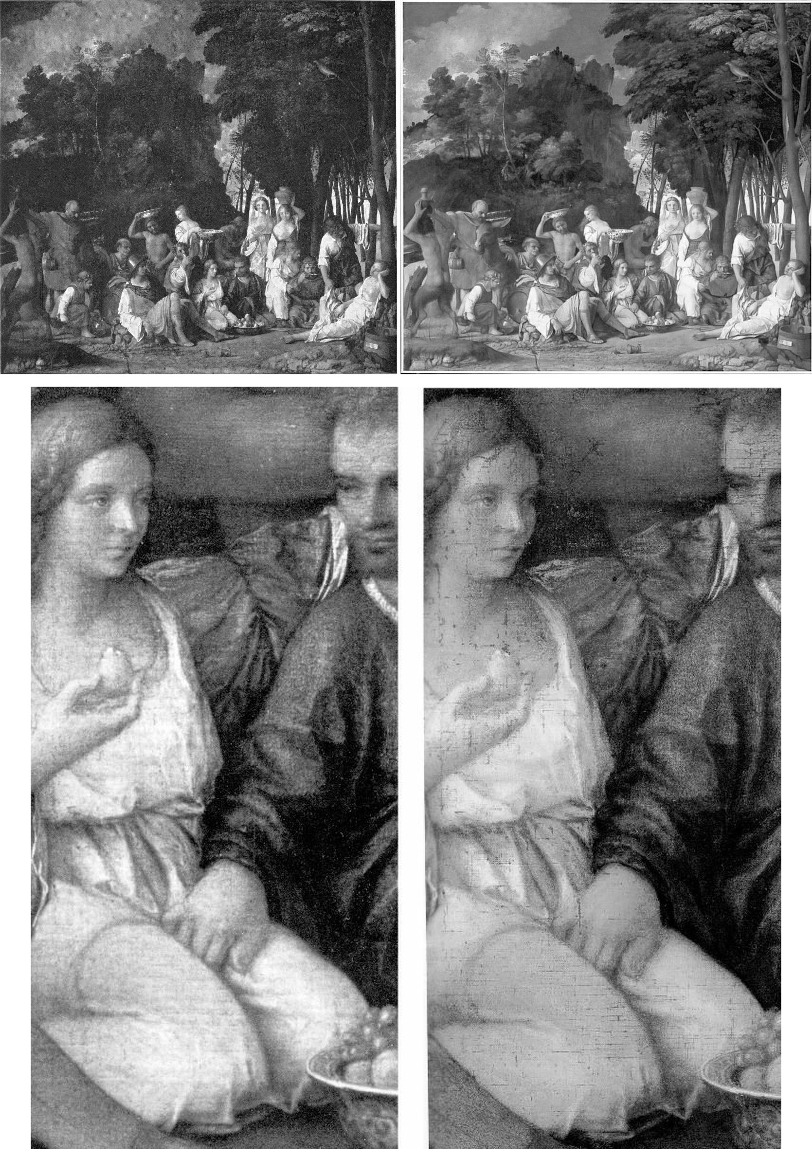
Above, Fig. 2: Top, the David Bull-restored Bellini/Titian Feast of the Gods, (before cleaning, left; after cleaning, right); below, a detail before cleaning, left, and immediately after cleaning, right. If Bull had simply removed a discoloured film of varnish, the previously discernible tonal values would have emerged enhanced – and not, as seen, diminished, compressed, and with a flattening of previously tangible forms. Such losses were Bull’s forte: when he restored Turner’s Rockets and Blue Lights (Fig. 3, below), one of the picture’s two distressed steamboats disappeared and its plume of once-black smoke was painted into a waterspout. (When that restorations-wrecked picture was sent to the UK on a tour, credulous British art critics took their lead from a Tate Gallery press release and gushingly proclaimed it “One of the stars of the show”.)
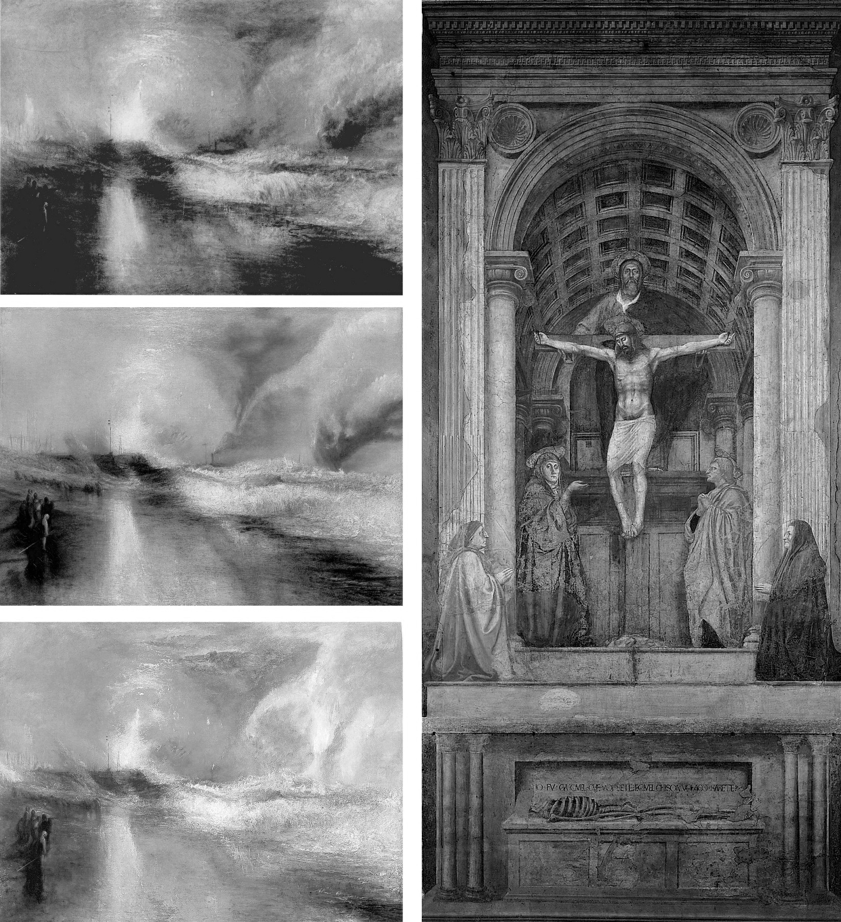
Above, Fig. 3: Left, Turner’s painting of two steamboats in distress, “Rockets and Blue Lights…” as seen in: 1896 (top); 1934 after restoration by William Suhr (centre); 2003 after restoration by David Bull (above). Right, Massacio’s Holy Trinity in the Santa Maria Novella, Florence, after restoration by Leonetto Tintori.
SUCKERED ART CRITICS
Where the Kress Committee’s open letter achieved immediate propagandistic effect, it took time for the claimed unanimity of its expert endorsement to dissolve. In a 28 April 2012 post we made the following (uncontested) disclosures:
“ArtWatch has been haunted for two decades by a nearly-but-not-made restoration disclosure. In the 1993 Beck/Daley account of the Nippon TV sponsored Sistine Chapel restoration (Art Restoration: The Culture, the Business and the Scandal), we reported that in the late 1980s Leonetto Tintori, the restorer of Masaccio’s Holy Trinity in the Santa Maria Novella, Florence [Fig. 3, above] and a member of the international committee that investigated the controversial cleaning, had urged the Sistine team privately to preserve what he termed ‘Michelangelo’s auxiliary techniques’ which in his view included oil painting as well as glue-based secco. What we had not been able to say was that Tintori (who died in 2000, aged 92) had prepared a dissenting minority report expressly opposing the radical and experimental cleaning method.
“Shortly before the press conference called to announce the committee’s findings, Tintori was persuaded by a (now-deceased) member [Fabrizio Mancinelli] of the Vatican not to go public with his views. He was assured that his judgement had been accepted and that what remained on the Sistine Chapel ceiling of Michelangelo’s finishing auxiliary secco painting would be protected during the cleaning. With a catastrophically embarrassing professional schism averted, the restoration continued and the rest of what Tintori judged to be Michelangelo’s own auxiliary and finishing stages of painting was eliminated. Without knowledge of Tintori’s highly expert dissenting professional testimony, the public was assured that despite intense and widespread opposition the cleaning had received unanimous expert endorsement. Critics of the restoration were left prey to disparagement and even vilification.”
Our 1993/2012 claims on the dissent within the international committee had been double-sourced by James Beck and the Florence-based art historian Richard Fremantle in conversations with Tintori (a member of ArtWatch). They became triple-sourced and document-backed on 8 June 2011 when the Titian expert and former director of the Warburg Institute, Professor Charles Hope, gave the following account when delivering the third James Beck Memorial Lecture (“The National Gallery Cleaning Controversy”) at the Society of Antiquaries, London:
“It would be unrealistic to suppose that those directly involved in the restoration would willingly concede that large areas of Michelangelo’s own work were removed. But even those who believe that the restorers did a good job ought to recognise that much of the controversy could have been avoided if a more careful assessment of the art-historical evidence had been carried out before the restoration began. But no serious investigation was made of the records of earlier restorations, the issues raised by Wilson were not addressed, and Vasari’s testimony was accepted as conclusive evidence that Michelangelo only used buon fresco, without any recognition of its problematic character (which was well understood in the nineteenth century) and without any discussion of the evidence of Armenini. In this context, one might also mention an article in the 1995 Revue de l’art by Leonetto Tintori, the most experienced restorer of Tuscan frescoes of his generation, who died in 2000 at the age of 92. Tintori was consulted about the desirability of restoring the ceiling, and I understand that he opposed it. The most important point in his article is that the technique supposedly used by Michelangelo on the ceiling, buon fresco alone, with only very small additions in secco, was entirely inconsistent with the practice of other painters in Tuscany, from Buffalmacco to Lippi and Sarto; and the same point was made by Eve Borsook [art historian and author of the 1960 and 1980 The Mural Painters of Italy] in the same journal. Tintori ended his article by deploring the modern practice of ever deeper cleaning, concluding, ‘This new orientation aimed at the total restitution of the original paint has had the paradoxical effect that the appearance of pure authenticity has become increasingly rare.’ Given his membership of the [Kress-assembled] committee that recommended, apparently against his own advice, the restoration of the ceiling, he could hardly have attacked the results explicitly, but it cannot be by chance that he chose to say what he did, a year after the publication of the [Vatican’s] final restoration report.
WHO HAD KNOWN OF TINTORI’S DISSENT?
In his 2016 memoir, Colalucci made no mention of Tintori’s opposition or his 1995 Revue de l’art views on the destructiveness of the Sistine Chapel restorations – his sole reference to the opposing restorer came in his above-cited composition of the Kress committee. Presumably, all other members of the working group – Modestini; Brealey; Dwyer [-Modestini]; Rothe and Bull had known of his opposition, as had Mancinelli. Perhaps Marilyn Perry and Colalucci had not known, but, certainly, Robert Hughes, John Russell, and very many other journalists were duped. Brandt gave no hint of Tintori’s opposition in Apollo but she stopped fractionally short of claiming unanimity:
“Everyone agrees with David Bull, Head of Paintings Conservation at Washington’s National Gallery of Art, that ‘the work being done on the frescoes should be meticulously watched, examined and questioned… (Fresco conservators seem not to be disturbed by the cleaning.)”
POPE-HENNESSY’S ATTACK ON BECK
When dubbing Beck the most culpable scholar/critic, Pope-Hennessy detached himself from his professional obligations:
“If you are an art historian, it is essential to free yourself from the fetters of your profession. The Sistine Ceiling is no more the property of art historians than the Ninth Symphony is the property of musicologists.”
The analogy was perversely inapt: in the Sistine Chapel, two recently appointed young officials – an art historian/curator and a quasi-scientific restorer – were rewriting a score they had ignorantly/wilfully misread in defiance of their predecessors’ views and reports and they were demanding that musical history be re-written to sanctify their systematic adulterations.
Pope-Hennessy was not alone in standing on such treacherous ground – he was running with a pack. His denunciation of Beck was made in a review of the 1986 book The Sistine Chapel: The Art, the History, and the Restoration (- published in the UK as The Sistine Chapel: Michelangelo Rediscovered). The book carried accounts from the three principal Vatican agents of the restoration: Professor Carlo Pietrangeli (Director General of the Vatican Museums); Dr Fabrizio Mancinelli (Curator of the Vatican Museums’ Byzantine, Medieval and Modern collections); and Gianluigi Colalucci (the Vatican’s Chief Restorer) – the latter two being the restoration’s co-directors. Their views were implicitly endorsed by accompanying scholarly essays from André Chastel, Pierluigi de Vecchi, Michael Hirst, John O’Malley, and John Shearman. The book was co-published by the Nippon Television Network Corporation which had sponsored the 1980-1994 restoration for $3million in exchange for all film and photography rights throughout each of the restoration’s three stages (the upper wall lunettes; the ceiling; and the Last Judgement altar wall) and for three years afterwards on each part.
INDEFENSIBLE METHODS
Pope-Hennessy appreciated that the restoration breached fundamental protocols by being conducted piecemeal on a narrow, enclosed platform when under intense film-set lighting that denied the restorers any means of appraising the actions and artistic effects of their radical, oven cleaner-like gelled cocktail of soda, ammonia, and detergents. (See Figs. 1 and 4.)
The cleaning paste, AB57, had been formulated to strip all historic organic materials from the plaster surface in two three-minute applications set twenty-four hours apart and removed each time with copious amounts of sponged water. The solvents-contaminated rinse water saturated the fresco plaster so completely that underdrawings on a lower plaster layer became visible. Empty assurances were given that a new air-conditioning system would protect the newly exposed bare plaster surfaces from the Chapel’s notoriously high levels of dirt, humidity, and fluctuating temperatures. Reports later emerged of secret night-time removals of white powder accumulations on the ceiling frescoes. By 2013 the ceiling had been lit to brighter and more colourful effect with powerful LED lights, when the chief defence of the restorers had been their supposed recovery of originally brilliant colours. See “The Twilight of a God: Virtual Reality in the Vatican” where we asked:
“Given this recent history, might Prof. Brandt – or any of the restoration’s supporters at that time – ever have imagined that within a couple of decades the Vatican would conclude that the chromatically brilliant ‘New Michelangelo’ would require artificial lighting ten times more powerful than that installed at the time of the restoration?”
In 2016, Colalucci blamed the chapel’s initially too-powerful levels of artificial lighting for the cleaning controversy itself:
“None of us had realized that after cleaning, these frescoes needed minimal lighting in order to be seen correctly. We should have considered the fact that, having been painted to be seen solely in light from the windows or candles and torches, they would look wrong in very brights lights such as television crews use.”
Despite the claim that the restoration had recovered an original intense chromaticism in Michelangelo’s painting that required low levels of lighting, the apparently natural light entering through the chapel’s windows was subsequently turbo-charged:
“…in the end the entire lighting system was revolutionized and moved outside with quartz lamps behind the window panes in accordance with a project devised by the technical department for a combination of natural and artificial light. Today with the new [LED] technologies, the Vatican Museums have installed a new lighting system with good results.”
THE STILL-UNSOLVED ATMOSPHERIC POLLUTION PROBLEM
On 10 January 2013 we reported:
“It is now clear that having first engineered a needless artistic calamity, the Vatican authorities have additionally contrived a situation in which the already adulterated remains of Michelangelo’s Sistine Chapel frescoes are presently in grave physical peril. On January 2nd 2012 Art Daily carried an Agence France-Presse report on the panic that has beset the Vatican authorities over the present and worsening environmental threat to the Chapel’s frescoes:
“The Vatican Museums’ chief warned that dust and polluting agents brought into the Sistine Chapel by thousands of tourists every-day risk one day endangering its priceless artworks. Antonio Paolucci told the newspaper La Repubblica in comments published last Thursday that in order to preserve Michelangelo’s Last Judgment and the other treasures in the Sistine Chapel, new tools to control temperature and humidity must be studied and implemented. Between 15,000 and 20,000 people a day, or over 4 million a year, visit the chapel where popes get elected, to admire its frescoes, floor mosaics and paintings. ‘In this chapel people often invoke the Holy Spirit. But the people who fill this room every day aren’t pure spirits,’ Paolucci told the newspaper. ‘Such a crowd… emanates sweat, breath, carbon dioxide, all sorts of dust,’ he said. ‘This deadly combination is moved around by winds and ends up on the walls, meaning on the artwork.’ Paolucci said better tools were necessary to avoid ‘serious damage’ to the chapel… The Sistine Chapel, featuring works by Michelangelo, Botticelli and Perugino, underwent a massive restoration that ended in the late 1990s. The restoration was controversial because some critics said the refurbishing made the colours brighter than originally intended.”
POPE-HENNESSY’S MANIFEST AMBIVALENCE
Without addressing the invasive actions of AB57 – the use of which had been condemned by restorers, scientists, artists, and art historians – or the abnormal film lighting – Pope-Hennessy did acknowledge some of their artistically disruptive consequences:
“On the other hand, it must be recognised that the effect made by any section of the fresco is contingent on the cleaning not only of that section but of the areas contiguous to it. The figure of God the Father in the Creation of the World could be cleaned faultlessly, but it would appear less dominant if the equation between the figure and the fictive moulding around it were disturbed. This has occurred in the first half of the ceiling…where the upper strip of the [fictive architectural] framing is now too light. If this happened in the second half of the ceiling, there would be protests that the Genesis scenes had been diminished or spoiled. The present width of the scaffolding is the equivalent roughly of one bay of the ceiling, and it is extremely difficult when standing on it to judge the relationship of the part of the ceiling that is within touching distance to the cleaned part beyond. I have repeatedly wondered whether it would not be prudent in the second half of the ceiling to employ a platform of double width, even at the cost of denying a larger area of the fresco to current visitors.” (Emphases added.)
Above, Fig. 4: The Sistine Chapel ceiling showing the restorers and film-makers’ platform approaching the most brilliant, deep-space final stages of Michelangelo’s painting.
“TO RESTORE OR NOT TO RESTORE” – COLALUCCI’S BREACH OF PROTOCOLS
Had Pope-Hennessy’s suggestion been made and accepted (thereby tacitly acknowledging an unsound seven-year long procedure) it would have had no effect. Colalucci had stipulated the pre-set, no variations, two three-minute AB57 applications precisely to prevent his restorers from making individual appraisals for fear of undermining his desired aesthetic homogeneity. As he put it in 2016: “I wanted to have every square centimetre under my control and was reluctant to expose others to the risk of failure or controversy.” We can now be clear that this restoration truly was one man’s folly. On his unwarranted and unfounded insistence that Michelangelo had not painted on the fresco surface, the restoration was reduced to the brutally simplistic and non-artistic goal of executing the most technically expeditious removal of all historic materials from the plaster surface – which, in truth, was to say, primarily, the last stages of Michelangelo’s own work. For this reason, even if the restorers had been able to compare the already cleaned fresco sections with the one being cleaned, they had no authority to depart from Colalucci’s twin, three-minutes AB57 applications procedure. Later, in self-exculpation at a Kress-organised conference in New York, Colalucci claimed that the heat and the brilliant film-set lighting had “fatigued the eyes” and made aesthetic appraisals impossible – when the decision to clean with AB57 had been taken before the deal with the Japanese film-makers had been struck.
On his own admission, Colalucci had sanctioned a procedure that breached the most fundamental restoration protocol of all – and one that had recently been stated by Professors Paolo and Laura Mora, the inventors of AB57 – that, at all times, the restorer and not the cleaning agent itself must assume responsibility for all the resulting changes of appearance in the work of art. The absence of declared support for the Sistine restorations by the Moras themselves is conspicuous. My (Leonardist) colleague, Jacques Franck, recalls – and may still possess – a 1980s Italian newspaper report in which it was claimed that the Moras had resigned from a Vatican committee because they had judged AB57 (which had been developed to remove traffic pollution from Rome’s marble buildings) unsuitable for Michelangelo’s frescoes. Had they been invited to serve on the Kress-assembled committee, along with Tintori – and if not, why not? Or on the Vatican’s own committee? Our researches had found a single enigmatic comment on the subject. In the Summer 1987 Art News (“Michelangelo Rediscovered”), M. Kirby Talley, Jr. wrote: “The decision to restore the Sistine frescoes was not taken lightly. ‘To restore, or not to restore, that’s the question you have to ask yourself every time you are confronted with a problem.’ cautioned Professor Laura Mora, restorer at the Istituto Centrale del Restauro and a leading authority on fresco conservation.” Talley continued: “This question was posed by the Vatican authorities, and the pros and cons were scrupulously weighed before the final go ahead was given”. No doubt they were, but the fact remains that contrary to the Kress-driven propaganda coup that may have turned Pope-Hennessy, three – and arguably, the top three – leading fresco authorities had not been on the scales. Brandt brought no clarification on the matter in Apollo with her gnomic observation “Fresco conservators seem not to be disturbed by the cleaning”.
SACRIFICING MICHELANGELO’S “COMMUNICATIVE POWER”
Above, Fig. 5, top: two engraved copies of the Libyan Sibyl, both of which showed the Sibyl’s left arm relieved by a tonally dark background; above, a detail of Michelangelo’s Libyan Sibyl before (left) and after (right) Colalucci’s cleaning and showing the profound and systematic losses of Michelangelo’s secco-extended tonal range of shading and aerial placements. As well as making broad-brush tonal adjustments, Michelangelo had – as Charles Heath Wilson had testified in the late nineteenth century (when very closely examining the ceiling from a special scaffolding) – also drawn secco revisions to contours and to many details such as hair and eyes. In the above photo-comparison, it can be seen that many lines which had clarified and reinforced details like the Sibyl’s thumb, lower jaw, the hair band, and the edges of the giant book, had all perished in Colalucci’s soda/ammonia/detergent double-washing. Further, Wilson had supplied an incontrovertible material/scientific proof that the secco painting was Michelangelo’s own: the secco painting had cracked as the plaster had cracked. The ceiling had begun cracking in Michelangelo’s own lifetime. Had the painting been applied centuries later by subsequent restorers, as the Vatican claimed on no evidence, it would have run into the cracks. It had not run into the cracks – but the world heard nothing of this: Wilson’s crucial, utterly subverting testimony on the secco painting had been air-brushed out by all players at the Vatican and, wittingly or unwittingly, by all of their art historical supporter/apologists.
For his part, Pope-Hennessy harboured and instanced futher (well-founded) aesthetic and historical anxieties:
“…you come in, as you have always done, through the little door under the Last Judgement and look up, speechless at the rebellious Jonah, the melancholy Jeremiah, and the Libyan Sibyl heroically supporting her colossal book [Fig. 5, above]. But about halfway down the chapel is a scaffolding resting on rails along the walls, covered with mustard-coloured fabric on which appear the shadows of ordinary mortals busily at work. [Fig. 4, above.] Beyond it you look towards the Zechariah, the Joel, and the Delphic Sibyl, suffused with light and seemingly the work of another, more lively, more decorative artist…Inevitably, judgement contains a strong subjective element, the more so as two kinds of verdict are involved, short-term judgement dominated by pleasure at the unwonted freshness of paint surface and long-term judgement in which one asks oneself whether the image has the same communicative power that it possessed before… Each time I go back to the chapel and sit, as I have so often sat, before the pitted surface of the Jeremiah, I feel concern that future generations may be denied an experience that raised the minds and formed the standards of so many earlier visitors. This is the basis of the claim of Beck and many others that the cleaning should be suspended at this point.” (Emphases added.)
Against all of which, he baldly insisted: “If there were the least reason to believe that the late frescoes would be overcleaned, this would be a valid view. But there is no evidence of overcleaning in the restored section of the chapel and there is no reason to suppose that the later frescoes will be treated less judiciously.”
THE WILFULLY DISREGARDED HISTORICAL VISUAL RECORD
On Pope-Hennesy’s own – albeit limited – admissions, there was every reason not to take the Vatican restorers’ methods on trust, not the least of these being the fact that, as any visually alert scholar should have appreciated, the many copies of the Ceiling made from Michelangelo’s day to our own, had all testified to his secco overpainting:
Above, Fig. 6: Top, left, the ink and wash copy of Michelangelo’s Sistine Ceiling figure Jonah, made between 1524 and 1534 by Giulio Clovio; top, right, a c. 1800 etched copy of Michelangelo’s Jonah by the Irish painter James Barry, R. A.; above, left, a detail of Michelangelo’s Jonah before Colalucci’s cleaning and showing the then surviving secco remains of the Clovio-copied dramatic shadow cast from the Prophet’s left foot; above, right, Jonah’s left foot after Colalucci’s elimination of the secco-enhanced shadows.
Disregarding all such historical visual testimony, the Vatican insisted that what had been understood since the 1512 unveiling to be Michelangelo’s own shadows, were arbitrary accumulations of soot trapped in “glue-varnishes” applied centuries later by successive restorers with sponges tied to thirty-feet long poles – poles of which, we established, no record existed and which, had they existed, would have stopped thirty-feet short of the ceiling. The phantom poles were summoned by Vatican officials in the absence – which we also established – of Vatican records of ceiling-high restoration scaffolding.
THE BOOK THAT WOULD HAVE BLOCKED THE SISTINE CHAPEL RESTORATION:
Above, Fig. 7: Left, the compendious 1990 book of historic copies of Michelangelo’s Sistine Chapel frescoes; centre, the book’s reproduction of Giulio Clovio’s Jonah drawing; right, the book’s reproduction of 19th century engravings (after lost copies) of the two lunettes Michelangelo had painted on the Chapel’s altar wall and would later destroy when preparing that wall for his Last Judgement.
Had the above book been published before 1980 and due consideration been given to Wilson’s account, a cleaning of the ceiling would have been stopped dead by the testimony of the above two images. The Clovio drawing alone constituted a proof positive that Michelangelo’s instantly-acclaimed lights and shadows had not only been present on the Ceiling but were also present on Michelangelo’s upper wall lunette frescoes – just as Colalucci’s Vatican restorer predecessors had reported. It did so because the two lunettes part-shown in its lower corners, were the very ones that Michelangelo destroyed to paint his Last Judgement. Thus, the sharply pronounced shadow that had been cast along the ground by Jonah’s left foot had been painted before any restorer had been near the frescoes. It could not, therefore, have been a freakishly artistic by-product of soot trapped within successive “glue varnishes” applied by restorers. Moreover, the glimpses of the shadows cast by Michelangelo’s lunette figures in Clovio were in turn confirmed by the etched copies of the two destroyed lunettes on the altar wall. Even the Clovio-recorded nude boy supporting Jonah’s name tablet had originally cast his own shadow on the wall before Michelangelo painted his Last Judgement.
Above, Fig. 8: The name tablet for the Prophet Zacherias – top, before cleaning: above, after cleaning.
THE ELEPHANT ON THE CEILING
Michelangelo had not been the first artist to depict cast shadows. What stunned his contemporaries had been the thunderous force of spatial illusionism within which his figures had realised an unprecedentedly vivid sculptural presence-in-space. It was precisely in the wake of the illusionistic shading’s evisceration that Pope-Hennessy had (correctly) noted that where the name tablets had previously been “firmly integrated in the [real and fictive] architecture of the chapel…they [now] read like supertitles in an opera house” – see Fig. 8, above. To repeat: that tragically late-published book had shown beyond any dispute that there had been no break in the visual record of Michelangelo’s shadows from his day to ours – and, therefore, that the Vatican’s restorers had destroyed the finishing stages of Michelangelo’s own painting throughout the ceiling. In retrospect – and after all the account/demonstrations we have published (see, for example, Cutting Michelangelo Down to Size) – it might increasingly seem that this visually self-evident truth was a truth too big and too inconvenient in its implications ever to be ceded by the Vatican and the compliantly supportive art historical establishment it had garnered.
UNDERSTANDING POPE-HENNESSY’S SCHOLARLY BLANK CHEQUE
As a former director of both the Victoria and Albert Museum and the British Museum; a professor of art history at New York University’s post-graduate Institute of Fine Arts; and the very recently retired Chairman of European Paintings at the Metropolitan Museum of Art, Pope-Hennessy’s essay had effortless clout despite his self-subverting acknowledgements of both disturbing artistic results and – even – a wide distrust of the restoration among professionally sound peers. He opted to berate the critics while lauding the restorers, not on what they had done (on some of which he was critical) but on what he expected them to do next. Perhaps he had been privy to Mancinelli’s assurance to Tintori? He had certainly registered concern over of a group of cleaned Prophets and Sibyls:
“Optically, seen from the altar end of the chapel, they look a little smaller and less weighty than they did before. In the heads, a gain in definition is accompanied by a loss of ambiguity.”
Given that the visual arts work on and through their optical reception, how could Pope-Hennessy discount his own art historically informed, optically received, reading of diminished volumes and weights in Michelangelo’s figures? Perhaps he, like the art critics Hughes and Russell, had been swayed (or cowed) by the sheer authority of the supposedly unanimous Kress Foundation report? In any event, he wrote:
“…a gulf opened between those who adhered to the old concept of the ceiling and those who embraced the ceiling as it seemed originally to have been. The dispute was taken up in the American press, in largely polemical terms. There were demonstrations; and vociferous protests were made by both academic and non-figurative artists. The Vatican authorities went so far as to explain publicly, in two days of conferences in New York, the restoration program and the data on which it was based. Not unnaturally American criticism was reported throughout Italy, and had a disturbing, though not demoralizing, effect on the restorers involved. Arrangements, however, were made for a number of restorers of acknowledged excellence (three of them specialists in fresco decoration) to visit Rome, and they one and all endorsed the wisdom of what was being done.” (Emphases added.)
LEARNING TO LOOK
Aside from this explicit professional deference to a Higher Technical Authority in matters of aesthetic appraisal, other possible explanations for Pope-Hennessy’s stance emerged in his 1991 memoir, Learning to Look. This most distinguished scholar had a visual Achilles Heel – of time spent in an art school, he recalled “I disliked this too, and to this day I cannot draw.” Moreover, he had developed aversions to fellow art historians – and even (like Colalucci) to subjective judgements:
“One of the things about art history that I found puzzling from the first was that clever art historians (there were stupid ones too, of course, but a lot of them were really clever) should reach diametrically opposite conclusions on the basis of a tiny nucleus of evidence. The reason, so far as one could judge, was that the subjective element in art history was disproportionately large. If this were so, it was not only works of art that needed to be looked at in the original but art historians too, since their results were a projection of their personalities. So for some years, I made meeting art historians a secondary avocation.”
From the first, Pope-Hennessy had indeed made it his business to meet as many art historians as possible. When he left Balliol College, Oxford, with a second-class degree in history and an alumnus’s legendary “tranquil consciousness of an effortless superiority” (- in his case, specifically: “in the form of a self-confidence that sometimes verged on arrogance and a clear understanding of the difference between success and a succès d’estime”) he sold some inherited coconut islands off Borneo as income to be devoted “to travelling and to the preparation of a book” – and all this when, like Max Beerbohm’s Young Arnold Bennet, already having “a life plan in my mind.” During the Second World War he “found himself” in the Intelligence Department of the Air Ministry and there, for the first time, “met ordinary people” whom he considered “congenial and interesting”. In later life he expressed a preference for works of art over people of any kind:
“Objects mean more to me than people. It is not that I am frigid or reclusive, but that object-based relationships are more constant than human ones (they never change their nature and they do not pall).”
THE CHURNING “RAW MATERIAL” OF SCHOLARSHIP – AND A NEW SPECTATOR SPORT?
However, and despite his avowed attraction to the constancy of objects, as a self-made art historian, Pope-Hennessy came to welcome their radical alteration by restorers:
“People sometimes complain that there is nothing new to be said about Italian painting. They mean by this there are now monographs on many minor painters and that the works of great artists have been discussed in a large number of books. But the truth is that the raw material of Italian painting is in a constant state of flux. When paintings change through cleaning, our view of the artist who produced them changes as well.”
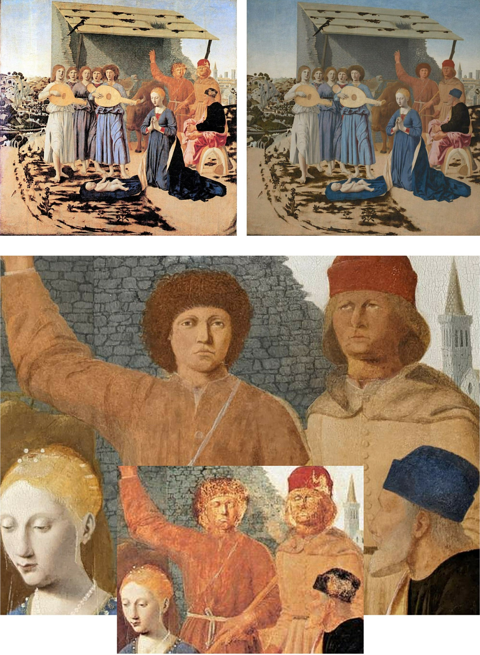
Above, Fig. 9: Top, the National Galley’s Piero della Francesca The Nativity before its latest restoration (left), and afterwards (right); above, a comparative detail showing the recently repainted shepherds and wall, with (inset) their previous state.
Like many of their scholarly peers, newspaper art critics have come to welcome the easy copy-generating potential of restorers’ alterations. In December 2022, Waldemar Januszczak of the Sunday Times, extolled the National Gallery’s controversially reconstructed Piero della Francesca Nativity (Fig. 9, above) and claimed that museums themselves now welcome “the inevitable brouhaha that follows any big restoration” because it “provokes interest and gets people through the door.” However, the art historian Giorgio Bonsanti deplored the intervention in IL GIORNALE DELL’ARTE and fears that such “controversies are destined not to subside but to remain and grow in future years, because the problem exists, and will remain evident to the millions of visitors to the National Gallery”. Scarcely less alarming to the Gallery must have been the Guardian critic, Jonathan Jones’, (earlier) assault on the repainted Nativity.
Jones had been the newspaper art critic of choice who was embedded within the Gallery’s conservation department during the restoration of its version of the Leonardo Virgin of the Rocks. The Evening Standard art critic, Brian Sewell, a student of Anthony Blunt at the Courtauld Institute, and a long-time scourge of National Gallery restorations, had been similarly co-opted within the restoration of Holbein’s The Ambassadors (Fig. 10, below). When so embedded, Jones predicted (wrongly) that “ArtWatch will attack the restoration”. On the Nativity, Januszczak similarly predicted: “There will be those, of course, who will howl at the changes – there always are.” In this case, at least three have now done so on the record – in addition to Jones and Bonsanti, in the March/April 2023 issue of the Jackdaw, its editor, David Lee (“Abbronzatura Solaire”), complained that aside from imposing complexions on the shepherds that are “more appropriate to Love Island than Bethlehem”, the Gallery has confounded a manifestly un-finished painting with a damaged finished painting.
Having previously studied the Nativity’s historic and restoration dossiers, we would add that this panel painting has likely suffered more accumulated restoration blunders than any other in the collection – with the possible exception, perhaps, of Giovanni Bellini’s Madonna of the Meadow. Both of those two pictures received disastrous “structural surgery” from a restorer (Richard D. Buck) who had been hired and brought over from America in 1948 by the National Gallery’s Director, Sir Philip Hendy, to introduce supposedly advanced conservation methods. Januszczak, who defends the Nativity’s recent repainting make-over on the grounds that “an active artwork that is doing what it is supposed to be doing must always trump a charming ruin”, begs the crucial question – “What is an historic picture supposed to do?” – and he clearly fails to appreciate that it is not Time and Neglect but, rather, restorers who, through their ceaseless Un-doing and Re-doing of pictures, create ruins. Where no auction house or dealer would dream of boasting that a picture on offer has had multiple restorations, museum pictures are treated today like so many bags on an airport carousel waiting to be picked up and done over on the whims and fancies of the next available restorer.
(Incidentally, Jones, Bonsanti, and Lee have by no means exhausted the many due criticisms of the Nativity’s latest restoration makeover. The ruined stone wall behind the repainted Shepherds, for example, has itself been repainted in a manner that robbed it of thickness and perspectival placement and left it running flatly across the picture plane, like so much stone-patterned wallpaper, to serve as a backdrop foil to the hypothetically reconstructed heads, as seen at Fig. 9.)
PROCLAIMED RESTORATION TRANSFORMATIONS – AND THINGS THAT CRITICS OVERLOOK
Where Pope-Hennessy had likened the Sistine Ceiling to Beethoven’s Ninth and noted that “another, more lively, more decorative artist” was emerging, Januszczak whooped at the spectacle of the transformation:
“The thin and neat scaffolding bridge moved elegantly along the ceiling like a very slow windscreen wiper. In front of it lay the old Michelangelo, the great tragedian, all basso profundo and crescendo. Behind it the colourful new one, a lighter touch, a more inventive mind, a higher pitch, alto and diminuendo. It was being able to see both of them at once – Beethoven turning into Mozart before your eyes – that made this restoration such a memorable piece of theatre.”
Unlike Januszczak, Pope-Hennessy had not always welcomed restoration-induced changes. In his 1970 book, Raphael, he observed: “But Raphael restored is Raphael interpreted; it is different from the real thing” – and in 1987 he would likely have known that a recent “Raphael restored” at the Vatican had proved disastrously different from the real thing. In 1982, Mancinelli had said of a bungled, chemically experimental restoration that required extensive repainting by Colalucci in Raphael’s Loggia, “It is the best demonstration that a restoration can also not go along well.” In 2016, Colalucci recalled that the Vatican had faced “a serious problem” when “a new inorganic substance that had not been sufficiently tried and tested” was used.
In 1991, as the Sistine Chapel restorations neared completion, Pope Hennessy reverted to his younger self’s restoration-critical stance and noted:
“In London since 1945 the National Gallery had been the target of ceaseless criticism. There had been intermittent controversies in the press over the cleaning of paintings, but successive directors had enjoyed the support of a passive, compliant board. The policy of Radical Cleaning had been espoused by Philip Hendy (who must have suffered from some retinal defect which made him see pictures as flat areas of colour) and had continued under his successors for so long that proof of the damage done to the collection over thirty years could be seen in almost every room.”
That judgement on National Gallery cleanings was sound and it constituted an international commonplace. Mario Modestini wept for half an hour at the sight the Gallery’s “flayed” restorations; in 1970 Pietro Annigoni painted “MURDERERS” on the National Gallery’s doors in protest; in March 1999 when I visited the Gallery with Professor Anatoly Alyoshin, head of the Repin Institute, St. Petersburg (Russia’s leading institute for the training of picture restorers), he was shocked by the paintings’ uniform brightness and seeming newness. Stopping between galleries, he swept his arm around and said “See! Everything in every school looks as if it was painted in the same studio at the same time.” In a sense, everything had been – after stripping paintings of all they judge extraneous, National Gallery restorers are permitted to this day to paint onto them whatever they take to have been an artist’s original intentions, even with pictures as old and venerated as Holbein’s The Ambassadors and Piero’s Nativity. Old masters are being treated like neglected scores awaiting the life-restoring interpretation of a would-be pictorial Furtwängler, von Karajan or Barenboim – but with the difference that where musical scores outlive their successive interpreters, a painting is its own score.
PURISM AND FAKISM: FALSE AGE CRACKS AND RE-INTERPRETATIONS ON RESTORED PAINTINGS
In the 1990s the National Gallery’s then head of restoration, Martin Wyld, contended: “The ‘Good Restorer’ is the one who ‘does the minimum necessary but not too little… we remove everything not put on by the artist and then use our judgement to get back to the original.” On 8 April 2023, the Financial Times (“Behind the seams at the museum”) reported that the present head of restoration, Larry Keith, said of his restoration of Parmigianino’s Saint Jerome’s vision of John the Baptist revealing the Virgin and Jesus, “We are editing, in a way. The work is informed by science and objective criteria, but there are decisions you take, which on some level are interpretive”. In an Esso-sponsored, BBC-filmed restoration of the Ambassadors (which has ceased to be available), Wyld was seen to have repainted much of the carpet to a new design on the authority of a “carpet expert”, and to have repainted much of Holbein’s famous anamorphic skull to a new and elongated design derived from a computer-distorted photograph of another skull. The Gallery’s defence of Wyld’s first-ever insertion of a Virtual Reality image into an old master painting was its claim that “modern imaging techniques” offered more “scope for exploring possible reconstructions” than the perspectival and optical conventions by which the skull had been produced. The pronounced differences between the Ambassadors’s old original paint and Wyld’s newly redesigned and presumptuously repainted parts of the skull, were concealed by his painting fake lines of cracking onto his own newly painted hypothetical reconstructions to match the real cracks on the real old paint.
Above, Fig. 10: Top, a detail of Holbein’s The Ambassadors, showing a section of redesigned and repainted carpet, before treatment (left) and after treatment (right); centre, the pre-restoration anamorphic skull in Holbein’s Ambassadors; above, the Wyld-extended, computer-generated skull in the Ambassadors.
PRODUCING “DIFFERENT, MORE POWERFUL” IMAGES
The New York restorer and Kress-appointed Sistine Chapel invigilator, Dianne Dwyer Modestini (formerly Clinical Professor, Kress Program in Paintings Conservation at NYU’s Institute of Fine Arts) – very extensively repainted and artificially distressed the much-damaged Leonardo School Salvator Mundi that fetched a world record $450 million in 2017 at Christie’s, New York – prompting Thomas Campbell, a former director of the Metropolitan Museum of Art, to ask: “450 million dollars?! Hope the buyer understands conservation issues – #readthesmallprint”. Dwyer Modestini had published this small-print report of an early intervention in her decade long undoing and redoing of the picture:
“The initial cleaning was promising especially where the verdigris had preserved the original layers. Unfortunately, in the upper parts of the background, the paint had been scraped down to the ground and in some cases to the wood itself. Whether or not I would have begun had I known, is a moot point. Since the putty and overpaint were quite thick I had no choice but to remove them completely. I repainted the large missing areas in the upper part of the painting with ivory black and a little cadmium red light, followed by a glaze of rich warm brown, then more black and vermilion. Between stages I distressed and then retouched the new paint to make it look antique. The new colour freed the head, which had been trapped in the muddy background, so close in tone to the hair, and made a different, altogether more powerful image. At close range and under a strong light the new background is obvious, but at only a slight remove, it closely mimics the original [paint work] … Most of the retouching was done with dry pigments bound with PVA AYAB. Translucent watercolours, mainly ivory black and raw siena, were used for final glazes and to draw [false age-] cracks…” (Emphasis added.)
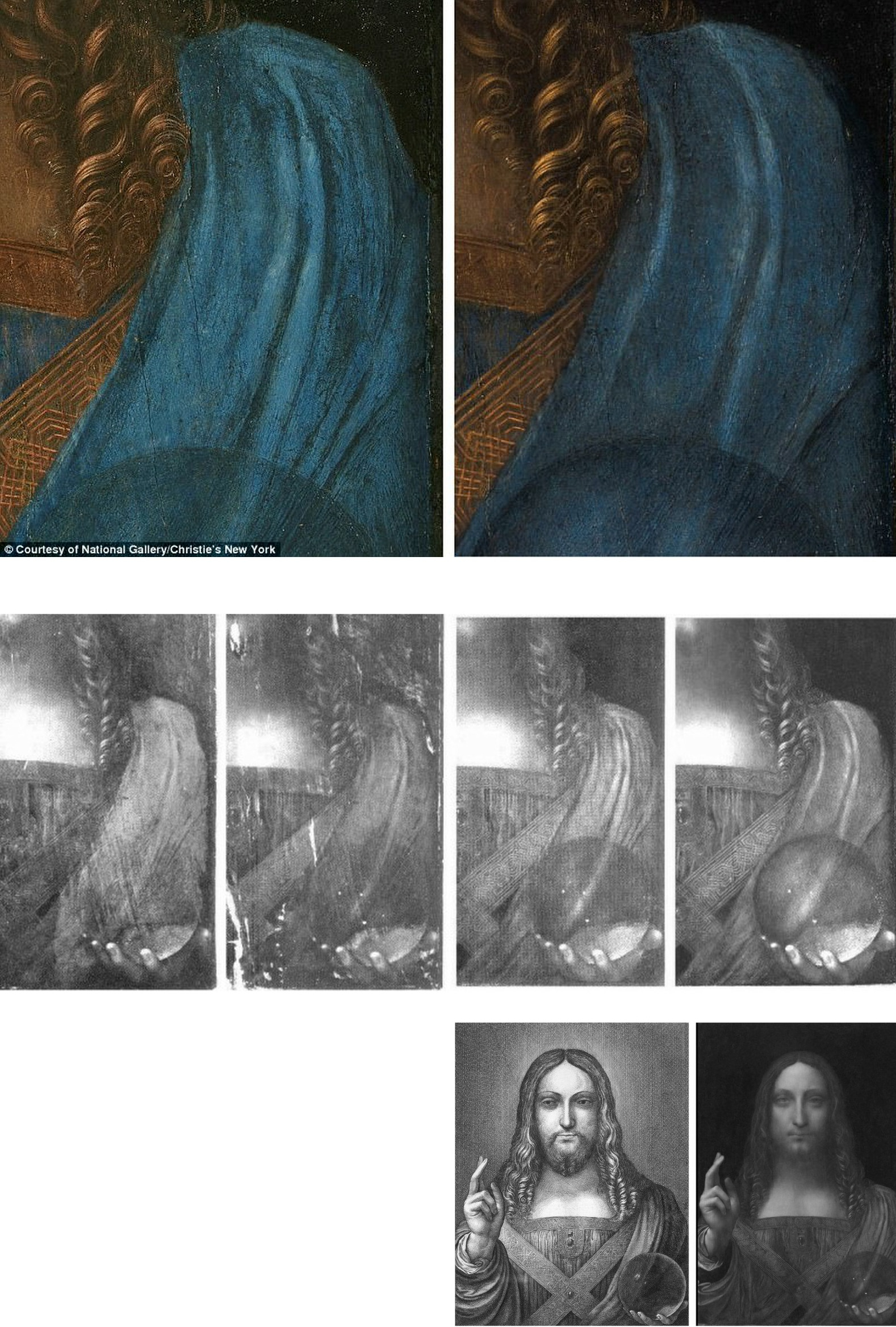
Above, Fig. 11: Top, a section of drapery on the $450million Leonardo school Salvator Mundi, as seen in 2011-12 at the National Gallery (left), and (right) as when sold in October 2017 at Christie’s, New York; centre row, showing left, and second left, the picture detail, as when acquired in 2005 and taken to Modestini for restoration; third left, the Modestini-restored picture detail when shown as an autograph Leonardo in 2011-12 at the National Gallery; and, right, the Modestini re-modified feature, as sold in 2017 as an autograph Leonardo, at Christie’s, New York; bottom row, left, the Wenceslaus Hollar engraving that was said by the National Gallery to have been copied from the National Gallery-exhibited Salvator Mundi picture (bottom right) when in the collection of Charles I. That claim was subsequently disproved when the lost Charles I Salvator Mundi emerged in Moscow and was seen to be of an entirely different composition – at which point, the previous resemblance of the painting’s complex shoulder drapery folds to those in the Hollar etching had become more of a disqualification than a potential corroboration.
CHRISTIE’S RESPONSE
In December 2017, Christie’s was presented with photographic evidence (Fig. 11, above, top) assembled by Dr Martin Pracher, a lecturer in technical art history, that showed the changed states of the Salvator Mundi’s (true left) shoulder drapery between 2012, when exhibited at the National Gallery as an autograph Leonardo prototype painting, and 2017, immediately before the $450million October 2017 sale at Christie’s, New York, in which the picture was offered as a then different but supposedly still-autograph Leonardo prototype that enjoyed “an unusually strong consensus” of scholarly support. Under Press questioning (see Dalya Alberge in the Daily Mail) a Christie’s spokeswoman said Modestini had “partially cleaned the passage of paint in the shoulder and the dark streaks disappeared… To imply something incorrect has taken place would itself be incorrect”. Thus, it was insisted that the recently “disappeared” multiple folds, were not folds but mere “dark streaks” that had appeared during Modestini’s 2005-2010 restorations only to disappear under her 2017 ministrations.
INSTITUTIONALLY SEALED LIPS
Of whatever it consisted, Modestini’s last-minute intervention had been made under sworn secrecy at NYU’s Institute of Fine Arts conservation studios, as she disclosed in her 2018 memoir, Masterpieces: Based on a manuscript by Mario Modestini. That is, when the Salvator Mundi returned to New York in July 2017 ahead of Christie’s November sale, Modestini, was instructed “not to inform anyone” when the painting was “delivered to the Conservation Center under guard and in great secrecy”. Modestini further disclosed that a deal brokered by Christie’s ahead of the sale whereby the vendor would receive at least $100million had also been “successfully kept under wraps.”
THE NATIONAL GALLERY’S ABIDING INFLUENCE ON RESTORATION “REVELATIONS”
When Pope-Hennessy deviated in 1987 from his earlier soundness on transformative restorations, he bought into the National Gallery’s longstanding picture cleaning rationale by endorsing two of the 20th century’s most spectacularly controversial restorations:
“In its cleaned form the [Sistine] ceiling has become again what Michelangelo’s contemporaries considered it, one of the supreme achievements of mankind. With Titian, the revelation started in the National Gallery in London, when the Bacchus and Ariadne was freed of centuries of dirt and proved to be painted in an altogether different tonality from any that had previously been supposed.”
That there had been no “centuries of dirt” to remove from the Titian will be shown in Part III. A fuller understanding of Pope-Hennessy’s late-life restorations lapse and an appreciation of the methodological and promotional similarities between the two most controversially transformative restorations in the second half of the twentieth century will be tracked through the records of the two successive National Gallery directors from 1934 to 1967, Sir Kenneth [later Lord] Clark, and Sir Philip Hendy. By the 1980s, that pair’s polished formulations had come to serve as an internationally infectious template for the unbridled techno-experimentalism seen in the Brancacci and Sistine chapels during what, for Colalucci, had constituted the terminus of “the golden age of restoration in Italy, the halcyon era from the late 1940s to the mid-1990s.”
In Part III, we correlate the false scholarship that flowed from the Titian Bacchus and Ariadne and Michelangelo Sistine Chapel restorations, along with the artfully engineered professional endorsements both restorations received from the then highest authorities.
Michael Daley, Director; 15 April 2023
With the Sistine Chapel ceiling we know, but who wrecked Gustav Klimt’s Helene and Sonja portraits?

The restoration injuries on Klimt’s paintings now rival those seen on Michelangelo’s Sistine Chapel ceiling frescoes. Both cases testify to profession-wide failures to read pictures as art and to heed the testimony of photo-records – that is, they testify to the linked failures of restorers who inflict damage and of scholars who accommodate adulterated works within their narrative accounts.
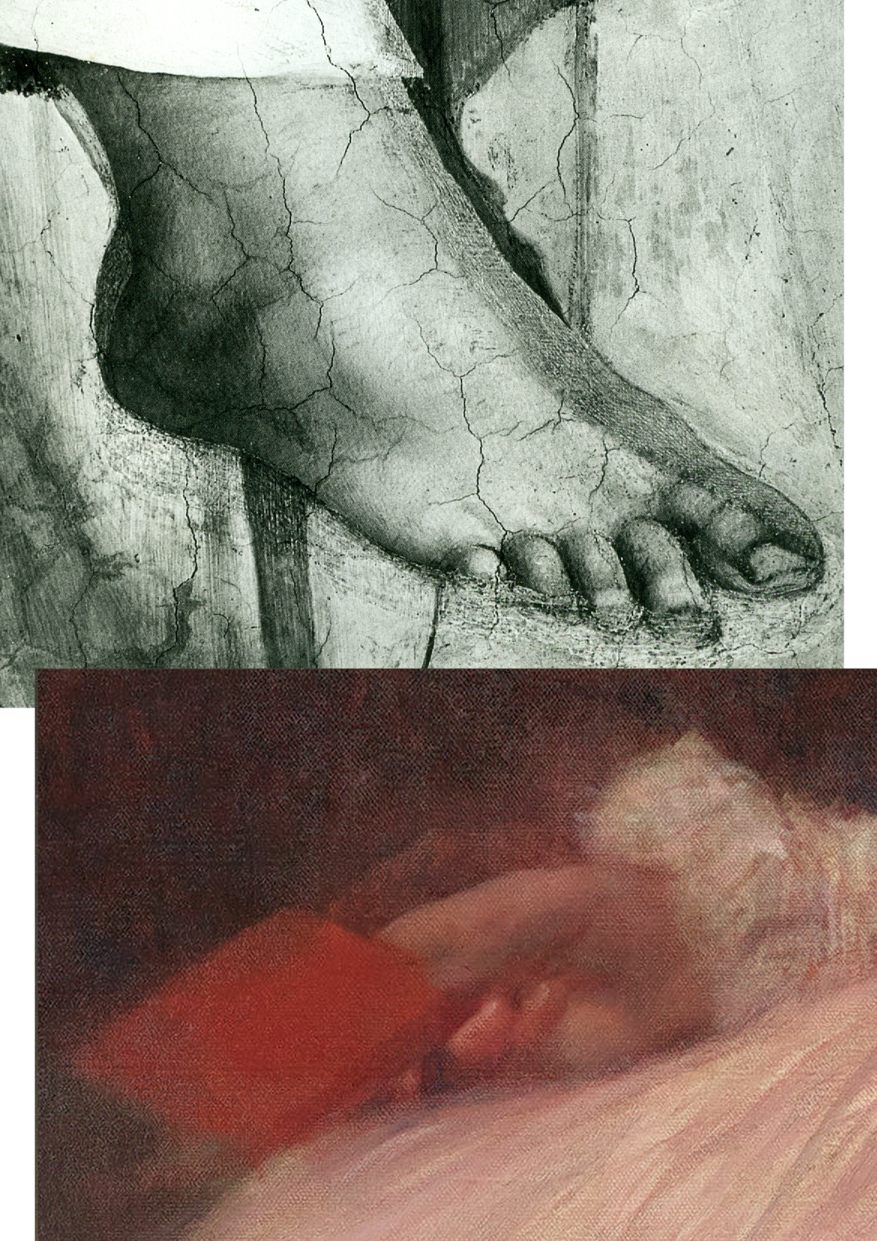
Above, Fig. 1: Top, the after-restoration right foot of Michelangelo’s monumental Erythraean Sibyl on the Sistine Chapel ceiling; below, the after-restoration right hand in Klimt’s 1898 Portrait of Sonja Knips, as seen today (in the Galerie Belvedere, Vienna).
Above, Fig. 2: Top, the after-restoration right hand in Klimt’s Portrait of Sonja Knips, as in Christian M. Nebehay’s 1992 Gustav Klimt; above, the after-restoration right hand in the Portrait of Sonja Knips today. Inset, left, the book held by Sonja Knips in Klimt’s portrait.
Above, Fig. 3: A detail of Klimt’s portrait of Helene Klimt as seen before restoration, left, in 1956 and after restoration, right, in 2012.
While the injuries to the two artists are comparable in magnitude, the means are quite unalike. With the Sistine Chapel, there is no mystery about the cause. Before the cleaning of the ceiling started (after the cleaning of Michelangelo’s lunettes on the chapel’s upper walls), leading Michelangelo scholars endorsed a Dan Brown-esque claim that self-declared New-Era restorers had uncovered a New Michelangelo whose true traits had gone unnoticed by all those who had, in the artist’s lifetime and for nearly half a millennium afterwards, copied and studied his work. The claim was preposterous, but the fact of the ceiling’s highly controversial and radically transformed appearance was acknowledged by all parties and is now on the historical record. Moreover, twenty-two years after the greatly contested restoration finished, the late chief restorer, Gianluigi Colalucci, admitted that his predecessor at the Vatican, Luigi Brandi, “the old chief restorer”, had warned him that Michelangelo had conducted much if not most of his painting with “pigments perhaps diluted with oil or resin or varnish” on the fresco surface.
What neither Colalucci nor the Vatican ever acknowledged was that in the late 1980s, as we had first reported in 1993, Leonetto Tintori, the restorer of Masaccio’s Trinity in the Santa Maria Novella, Florence, and a member of the international committee that investigated the controversial cleaning in the mid-1980s, had “urged the Sistine team privately to preserve what he termed ‘Michelangelo’s auxiliary techniques’ which in his view included oil painting as well as glue-based secco”.
Cleaning the ceiling had been thought impossible because of the complexity and vulnerability of Michelangelo’s method. To justify the use throughout the ceiling of a ferocious solvent gel that was robotically brushed on and washed off twice in twenty-fours like an oven cleaner in a pre-determined method devised to ensure a homogenous appearance, the restorers and curators claimed – against material and documentary evidence – that Michelangelo had not worked on top of his frescoes when dry. The Vatican never delivered a report on the restoration and now, with the death of Colalucci, never will. The photo-record, thanks to digitalisation and the web will endure.
With Klimt’s oeuvre, the debilitation occurred piecemeal in public and private collections over (roughly) half a century and on no overtly declared programme. Again, thanks to photography, there can be no long-term cover for mis-restorations because we know how Klimt left his works and can calibrate and demonstrate injuries to them, as with the two portraits of Sonja Knips and Helene Klimt.
Klimt’s instruction that those wishing to understand him need only look at his pictures is widely acknowledged but little comprehended. “I am convinced that I am not particularly interesting as a person”, he had written, “if anyone wants to find out about me – as an artist, the only capacity in which I am of any note – they should look carefully at my paintings and try to learn from them what I am and what I have tried to achieve.”
That is no longer possible. It no more occurred to Klimt that his works would cease to bear true witness than it had to Michelangelo that he would one day be hailed as the Matisse of the Renaissance by a restorer (see our “Maestro Colalucci: His Method and its Madness”, Jackdaw, May/June 2021, and “A crime against the artist”, The Independent, 22 November 1991, at Fig. 34 below.) Now, a century on from Klimt’s death and with scarcely a single picture true to its original self, the most charitable view of scholarly silences on injuries might be to assume that those who depend on access to Klimt’s works and records either know or fear they cannot afford professionally to embarrass private or institutional owners by citing past or recent injuries. However, Klimt scholarship and publications have exploded in recent years and it is now possible (through photo-illustrations) to make fair appraisals of the various changes his works have undergone at the hands of restorers – even though their actions remain almost nowhere acknowledged.
HELENE KLIMT: ASKING THE RIGHT QUESTIONS
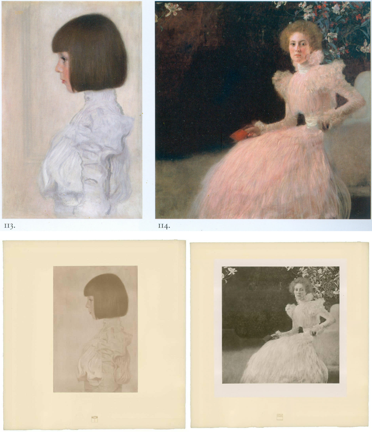
Fig. 4, above: Top, Klimt’s portraits of Helene Klimt and Sonja Knips, as bracketed in the precious and giant – it weighs 16 lbs – 2012 Taschen Gustav Klimt The Complete Paintings, Ed. Tobias G. Natter; above, the Klimt and Knips portraits as published with Klimt’s approval between 1908-14.
As Dr Natter hoped, the Taschen book is now a standard work of reference. His ambition to supplement updated “details about each work, its provenance, exhibition history and selected bibliographic references” with a picture of “how it was received in its day” proves richly informative. Notwithstanding such art historical diligence, no account is given of what restorers euphemise as pictures’ “conservation histories” and therefore this book, like all others in the field, fails to address how each work looked in its day and to estimate how much or how little it does so today. Seemingly failing to recognise that every work of visual art starts life as its own primary document, this ambitious book takes what restorers have left in their wake as synonymous with the art Klimt produced. As is customary in the field, Natter expresses deep and sincere gratitude to all owners and “in particular, the private owners” for their trust, helpfulness, and inspiring conversations.
ART HISTORICAL NARRATIVES
One of the book’s contributors, Susanna Partsch, (“Paintings of women”), sets the above two portraits as staging posts in a now prevalent art historical schema:
“The earliest portraits on display at that occasion [a 1903 Klimt exhibition] were the private ones of his young niece Helene Klimt and the Portrait of Sonja Knips both of which were completed in 1898. The some twenty portraits that Klimt produced between 1891 and 1898, most of them showing anonymous models, seem to have been finger exercises on the way to a new style.”
With the Portrait of Helene Klimt, the artist’s then six years old niece who became his ward on the death of his brother (Fig. 4, above left), Natter jumps straight into formalist art criticism:
“If Klimt’s portraits of the early 1890s had shown him dissolving line and blurring colour in a painterly manner, the artist here explores the harmony of the strict profile view. This is reinforced by the precision of the page-boy haircut, the neutral background and the high-necked blouse, its fabric interpreted and ennobled by the generosity of the execution. The dualism of mimesis and dissolution, of faithful reproduction and painterly openness, is already in evidence here as a stylistic means.” (Emphases added.)
Thus, the head is said to be painted in one manner and the blouse in a radically contrary one, but this supposed pictorial dichotomy rests on an assumption that the picture’s present traits are as when originally executed when the photo-record (at Fig. 3 and below) testifies that they are not. Natter cites but does not reproduce an early record of the Portrait of Helene Klimt: “A previously unheeded photograph published in the magazine Das Interieur in 1911 [that] shows the child’s portrait hanging in a bedroom in the Flöge sisters’ home in Ungargasse, Vienna (N.N. 1911).” Having brought photography to the table, Natter neglects to consider the testimony of the earliest published photographs of this painting including one above at Fig. 4 of 1908-14 which Klimt himself had carefully vetted and endorsed.
This profession-wide neglect of historical photo-records persists even as Klimt’s own use of photography attracts attention. In 2012 Prestel published Gustav Klimt & Emilie Flöge Photographs, edited by Agnes Husslein-Arco and Alfred Weidinger, the scientific director of the Linz Upper Austrian State Museum; former vice-president of the Belvedere in Vienna; and a digital and film photography specialist with a preference for black and white images. Agnes Husslein-Arco, a former figure skater and Sotheby’s Austrian director, was director of the Belvedere museum between 2007 and 2016 and is credited with transforming it into a major tourist attraction in Vienna. In the book’s preface, the then director said: “The product, a chronological presentation of photographs and snapshots, illustrates a biographical panoptic of these two personalities who were so influential in the fin-de-siècle art world…The following contribution by Alfred Weidinger provides information about Klimt’s relationship to photography and the use of the same in his artistic creations.” Weidinger wrote: “The reference to Klimt’s involvement with photography, only briefly sketched out here, is meant to offer a first look at a hitherto neglected area of Klimt research, and, at the same time, make evident the importance of this medium to the artist.”
Above, Fig. 5: Left, one of a group of Moriz Nähr photographs acquired by the Austrian National Library in 1943 that recorded both Klimt himself and “revealing reproductions” of his paintings, as here above left with his 1900 The Large Poplar I. Above right, The Large Poplar I, as reproduced (with slightly trimmed edges) in Alfred Weidinger’s 2007 Prestel Gustav Klimt – an earlier massive and compendious complete catalogue with specialist essays which had weighed in at a respectable 10 lbs. Weidinger expressed the hope that the book, which offered a fundamentally new basis for research, “holds out an invitation to discover many new aspects of the life and work of the great painter whose artistic home is the Vienna Belvedere.” (We welcome and accept that invitation.)
A SECOND OPINION
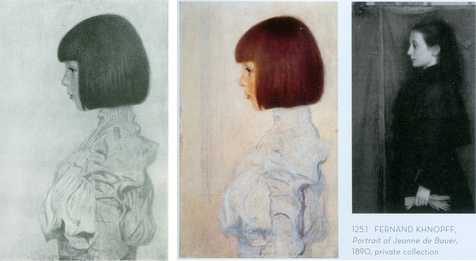
Above, Fig. 6: Left, Klimt’s 1898 portrait of his niece (and later ward), Helene Klimt, as published in Emil Pirchan’s pioneering 1942 and 1956 book Gustav Klimt and, centre and right, Helene, as paired with a Fernand Knopff profile portrait by Alfred Weidinger in his 2007 Gustav Klimt.
As with Dr Natter, Dr Weidinger’s catalogue entry on the Helene Klimt portrait made no reference to the Pirchan book’s photographic testimony. Instead, he drew attention to Klimt’s apparent indebtedness to an 1890 Fernand Knopff portrait in which “a severely profiled half-length portrait faces to the left, with an almost monochrome background which is divided into two areas by a thick brown vertical line.” Weidinger further notes that while Klimt “reduces his composition to the girl and the pale background we may detect a reminder of Knopff’s composition in the group of vertical lines in the front of Helene’s face, which in the Jeanne de Bauer portrait, functions as a special accent”. The stylistic comparison with Knopff is apt and fair but no mention is made of the photographically recorded fact that the lines to which Weidinger refers had not been visible in the picture in its 1908-14 and 1942-1956 photographs.
Weidinger takes pride that it had been “a major concern of ours to see, as far as possible, all Klimt’s pictures in the original and to take new photographs of them” and that their wishes had been met in the great majority of cases. That the lines in the portrait’s background had not previously been present must mean that they had emerged in a post-1956 restoration, which in turn suggests that a restorer had uncovered and left exposed a feature previously begun and then painted out by Klimt, perhaps because of second thoughts about introducing a parallel secondary motif that would have stood distractingly in competition with the picture’s subject.
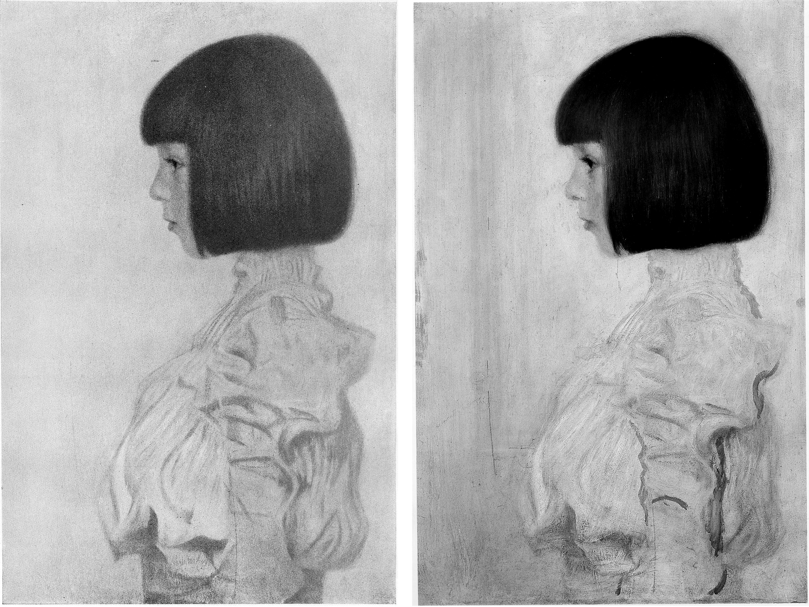
Above, Fig. 7: Left, Klimt’s portrait of Helene Klimt as recorded before 1956 in Pirchan; right, the portrait as reproduced by Weidinger in 2007.
Had Weidinger compared the above pair of images he would surely have noted not only the late emergence of the lines but also the many changes to the blouse – and perhaps have offered some account for them. Instead, and seemingly accepting the 2007 state as if Klimt’s own, he drew a stylistic distinction between the treatment of the undamaged head – “the fine brushstrokes with which Klimt renders her hairstyle and profile give a draughtsman-like character to the girl’s head” – and the body, where: “the treatment of the high necked, puff-sleeved blouse, which Klimt paints in cream and light blue tones, is sketchy.” In 2012, Natter saw more in the blouse than sketchiness – viz: “fabric interpreted and ennobled by the generosity of the execution”; and, in the now disrupted head/blouse relationship, “a dualism of mimesis and dissolution, of faithful reproduction and painterly openness”. The photo record shows that both scholars missed countless injuries and adulterations to the blouse – including superimpositions that crudely redrew the collar and the arm’s contours – all of which they took to comprise evidence of a significant step in the march of Klimt’s stylistic development of which Partsch spoke in 2012.
Had Weidinger addressed such a comparison as that above, he would likely have seen that the draughtsman-like character of the head had been no less evident in the economical but precise elegant treatment of blouse, too, and that viewed as a whole, the work had originally shown no great dichotomy of pictorial means and, rather, comprised a beautifully measured record of a young girl’s dutifully patient self-conscious expression and resolute little soldier-like stance.

Above, Fig. 8: Left, Klimt’s portrait of Helene Klimt as in Weidinger, 2007 and, right, as reproduced by Natter in 2012.
The above, same-size, greyscale, direct photo-comparison shows that the painting underwent further changes between 2007 and 2012: the long-invisible vertical lines that emerged in 2007 had by 2012 turned more clearly towards the child suggesting a framed picture on a parallel background wall; an area of damage in the centre of the picture’s left edge that was visible in 2007 has been touched out, as were several scratches of long-standing.
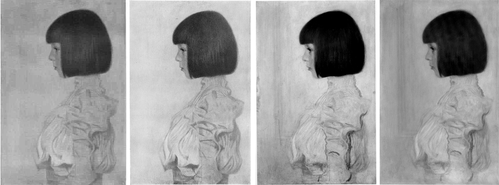
Above, Fig. 9: Klimt’s portrait of Helene Klimt as recorded, left, between 1908-14; as before 1956, second left; as by Weidinger in 2007, second right; right, as by Natter in 2012.
Comparing four same-size successive photographs above shows the first two records of the blouse (1908-14 and 1942-56) to be identical and radically different from the two in 2007 and 2012. The post-2007 traits that are now enshrined in the literature as “sketchy”, or an “ennoblement by generosity of execution” can be seen on a simple photo-comparison to be products of hands other than Klimt’s. The photographic record incontrovertibly shows that in this portrait, autograph features that survived until at least 1956 were subsequently weakened or erased, and that new and stylistically alien contours had been added in an evident attempt to simulate something of the then-botched blouse’s original coherence and richness of design. Thus, field-leading contemporary scholarship had failed to notice, acknowledge, or condemn a vandalising act of bowdlerisation. Instead, it has incorporated a restorer’s deformations into a celebratory narrative of a privately owned work that is on loan to a public museum (Berne, Kunstmuseum).

Above, Fig. 10: Top, left, Klimt’s Portrait of Helene Klimt in Pirchan, 1956; and, top right, in Weidinger’s 2007 Gustav Klimt. Above, left, Klimt’s 1894 Seated Young Girl; above, centre and right, a diagram showing first the 1956 Pirchan illustration with the then folds of the blouse outlined in black, and right, with what we take to be a post-1956 restorer’s superimpositions also identified in black.
Weidinger’s comments on Klimt’s indebtedness to Knopff (and to Whistler) are constructive and, in Klimt’s early Seated Young Girl, above left, he sees indebtedness to both Klimt’s brother, Ernst, and their joint master, the painter Hans Makart. Despite such fine-tuned stylistic discrimination, Weidinger seems to see no relation in the Seated Young Girl to Helene’s blouse. Had Natter addressed the losses and additions in the post-1956 blouse, would he have spoken of a “dualism of mimesis and dissolution, of faithful reproduction and painterly openness, [that] is already in evidence here as a stylistic means” in Klimt’s supposedly contrasting handling of the head and blouse? The blunt tuth is that, with Helene’s blouse, the dissolution was chemically and physically induced decades after Klimt’s death by an unidentified restorer on an unrecorded/undisclosed occasion.
SONJA KNIPS
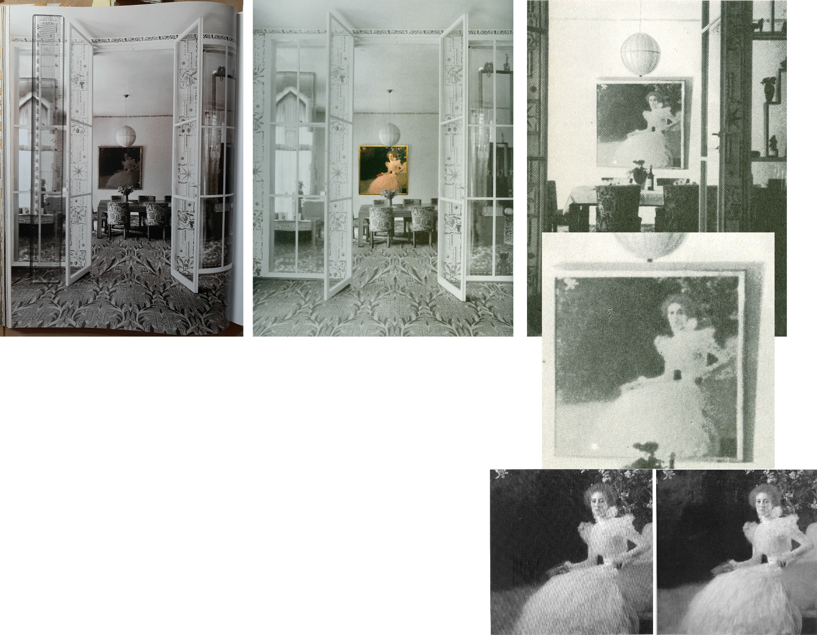
Above, Fig. 11: A 1915 photograph of the Sonja Knips portrait in the dining room of the Villa Knips, as in the giant 2012 Taschen book, left; as in the Neue Galerie’s, 2008 Gustav Klimt: The Ronald S. Lauder and Serge Sabasky Collections, Ed. Renée Price, where a modern colour photograph of the painting has been superimposed, centre; and right, top and centre, as in Christian M. Nebehay’s, 1976 Gustav Klimt; bottom right, Sonja Knips as published respectively in Weidinger, 2007, and Natter 2012.
Natter and Weidinger both carry historic photographs showing Klimt paintings in the background but without comment on their then appearances. The Nebehay image above, right and centre, is small and printed on poor paper but even at this level of reproduction, it gives indication of the picture’s tonal hierarchies and dispositions – the subject is brilliantly lit on the left and moves into shadow on the right of the picture.
Klimt’s paintings were much photographed in his lifetime (that is, before his death in 1918), many were seen in their exhibited environments, some were photographed before being first exhibited and then again after subsequent reworking. For all this, and even though both 1898 portraits at Fig. 4, top, have exceptionally long and secure photo-histories, their narratives have been written without regard to such evidence and in terms of constituting steps towards subsequent pictorial developments – which progressivist schema happens to provide perfect art historical cover for dramatically altered pictures.
Of the Portrait of Sonja Knips, Dr Natter summarises: “This graceful female portrait marks a turning point in Klimt’s portraiture and is rightly considered a prelude to his Secessionist works. The sitter is portrayed in life size, seated in an outdoor setting. The square format is new and represents a fundamental choice whose possibilities Klimt would explore over the next few years. New, too, is the corresponding juxtaposition of light and dark, foreground and background, fullness and void.” That account was more consistent with the picture’s 2012 published appearance, Fig. 4, top right, than when first recorded as at, Fig, 4, bottom right, where today’s “void” comprised distinctly articulated spaces, forms and, even, mini-figures.
Of the painterly means, Natter adds: “Klimt employs a differentiated manner of painting, executing some areas of the portrait in a cursory fashion while focussing with great precision upon others. He thereby creates a fascinating contrast between the naturalistically modelled head of the sitter and the gauzy shimmer of her dress. This latter conceals a wealth of painterly effects and is infused with a rustling tension by a cascade of multiple parallel brushstrokes. Klimt at the same time camouflages the highly artificial nature of the arrangement as a snapshot.” In terms of a perceived stylistic dichotomy no mention is made of the picture’s former second carefully composed and precisely, naturalistically realised component – the now transformed and deranged small red sketchbook, as seen at Figs. 1 and 2.
AN AFFAIR – OR NOT?
With Klimt and his female subjects there is always a relationship issue and with this picture scholarly differences have arisen. Natter is agnostic: “Whether – as some suspect – Klimt and Sonja Knips enjoyed an intimate relationship, cannot be verified. But it is certainly the case that the painter presented her with one of his sketchbooks as a token of his particular affection.” He first speculates: “Whether he indeed pressed one such red leather-bound book into her hand during a sitting, because he felt the painting needed an accent of colour at that point remains conjecture”. (The reported source for this formalist reading had been the subject herself, as discussed below.) Natter takes the fact that such a scenario is conceivable to be “a clear reminder that Klimt, unlike the expressionists, continued to legitimize internal compositional requirements by cloaking them in external motifs.” Thus, a key question is begged: Whatever the relationship between the artist and the sitter, the book served an essentially formal pictorial purpose – the pink dress had “needed” on chromatic/pictorial grounds to be offset by a small red parallelogram of which just such an instance was conveniently to hand in a book of sketches Klimt had gifted to the picture’s beautiful subject whom he had known since her teenage years.
Thus was a formalist painterly purpose attributed to an immensely charged and fastidiously depicted small book, even after its – undiscussed – visually deranging transformation into the quasi-Cubist construct at Figs. 1 and 2.
TWO SCHOLARLY TAKES ON THE TWO PORTRAITS
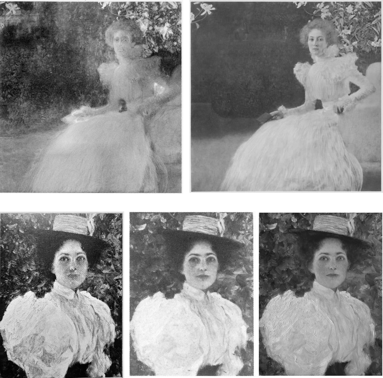
Above, Fig. 12: Top left, the infra-red image of the Sonja Knips portrait published by Weidinger in 2007; top right, the second oldest (1908-1914) photo-record of the painting; below, Klimt’s 1896 Girl in the Foliage as published, left, in Emil Pirchan’s 1942 Gustav Klimt, centre, in Johannes Dobai’s 1978 Klimt, and, right, by Weidinger in 2007.
Weidinger situates the Sonja Knips portrait in the same part of the oeuvre’s developmental arc but also within social artistic and fashion contexts:
“This portrait is considered a turning point in Klimt’s portrait painting…the beginning of a series of large format portraits of ladies, predominantly of the prosperous, Viennese upper-middle class…and their wish for prestigious portrayal…[Knips] was one of his few models from the circles of – albeit minor – nobility…Klimt portrayed Sonja Knips sitting in a chair. A portrait formula he had already tried out in small-format portraits of ladies of 1896-98. The diagonal division of the painting into two zones places the subject opposite an empty space in tones of dark brown – a motif also used in Whistler’s Arrangement of Grey and Black No 1: Portrait of the artist’s mother (1867-71) and already taken up by Klimt in his Lady in an Armchair (cat. 106) and Lady by the Fireplace (cat. 106)…”
While the social/professional account of Klimt’s developing career is of interest, the perceived dichotomy of subject and void better accords with the picture’s present appearance than that seen in the special reproduction of 1908-14 (Fig. 4, right). Weidinger’s “empty space” had been closer than Natter’s “void” to the picture’s original and distinctly articulated spaces and forms but, then, he brushed away all claims that Klimt had originally “painted figures, a pool, or even a horse in the background which he then overpainted” on the grounds that no figural elements can be identified in the infra-red image. Thus, the testimony of a single undated technically penetrating image trumps all the compendious photo-records that testify to the contrary.
Above Fig. 13: Left, Dante Gabriel Rossetti’s 1868 Lady Lilith; right, the undated infra-red image of the Sonja Knips portrait made – presumably – at the Belvedere, Vienna.
In lieu of an evaluation of the infra-red image in the context of the picture’s full photo-history, Weidinger pursues stylistic antecedents and influences: “The all-over brushstrokes suggest a landscape of bushes and trees such as Klimt had already once depicted in his Girl in the Foliage”, as above Fig. 12. Further, “In the upper left-hand corner of the picture there is a recognisable view, accentuated by a flower. Since Sonja is presumably in a garden, as suggested by the lilies above her head, this may be a view of the landscape, similar to Rossetti”. (In the Rossetti above, the landscape view is a reflection in a framed mirror.)
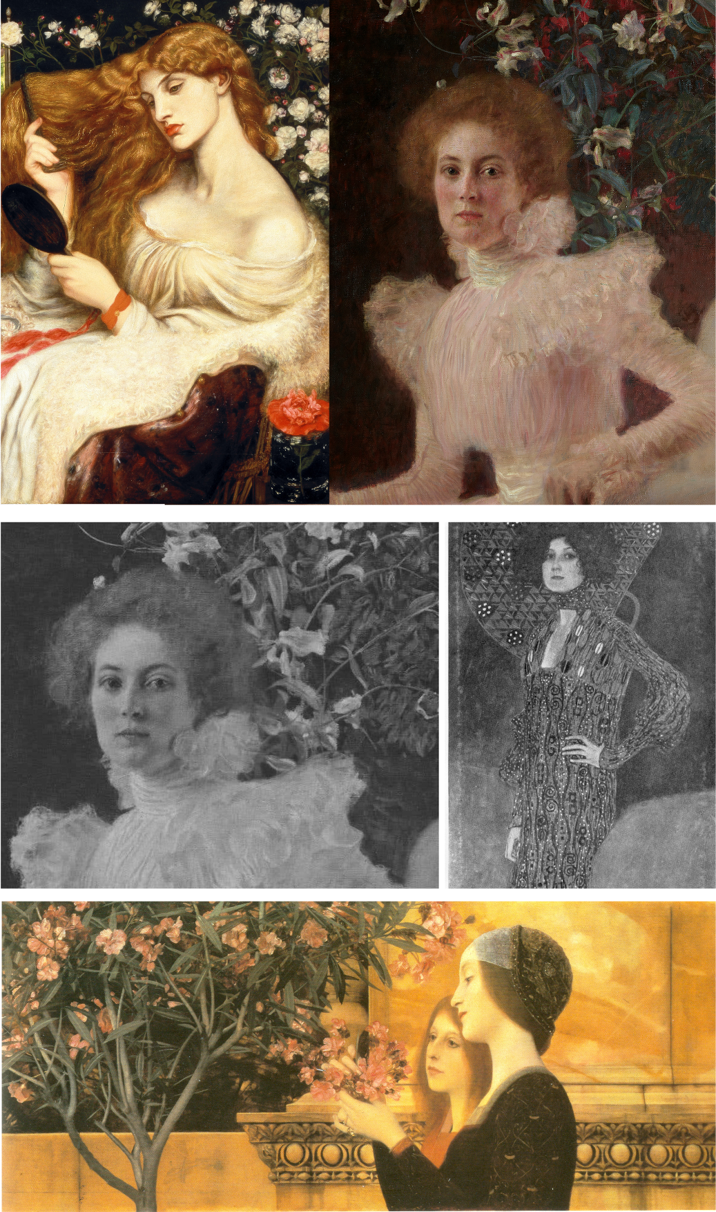
Above, Fig. 14: Above, Rossetti and Klimt details; centre, details, of Klimt’s Sonja Knips and Emilie Flöge portraits before restorations; below, Klimt’s Two Girls with Oleander.
Notwithstanding his reading of the infra-red testimony on foliage, Weidinger adds: “Admittedly, it is also possible that the setting is an interior room.” The picture’s present void may thus be read either as an ex-interior or an ex-garden or even a landscape – but which and how to decide? While the lilies above Sonja’s head might have been made in homage to Rossetti’s roses, in terms of Klimt’s stylistic development, they might also be considered to have anticipated his first placement of a decorative foil behind a portrait, which scholars have located in Klimt’s slightly later and more abstracted 1902 portrait of Emilie Flöge, as above, centre right. At the same time, Klimt might have been nodding back to his recent self’s 1890-92 counterpointing of closely adjacent flowers and young female subjects in the Wadsworth, Connecticut Two Girls with Oleander (as above, bottom) – which picture Weidinger nicely pairs with Alma Tadema’s deep-spaced 1893 Unconscious Rivals, at Bristol City Museum.
KLIMT’S CROPPING DEVICE
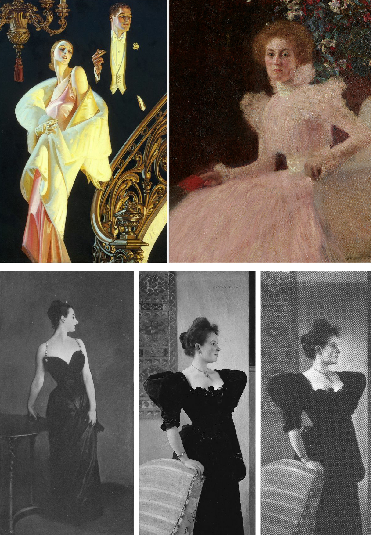
Above, Fig. 15: Top, left, J. C. Leyendeker, Couple Descending a Staircase, c. 1925; right a detail of Klimt’s Sonja Knips portrait; above, left, John Singer Sargent’s 1884 sensation-generating “Madame X”; centre, Klimt’s c.1894 Portrait of a Lady in Black as seen today; right, Klimt’s Lady in Black as shown in 1978.
Sonja Knips is shown wearing an elaborate evening dress and seated in a softly upholstered armchair. Her and the chair’s images are cropped by the bottom and right-hand edges of the picture and therefore are brought closer to the viewer while left without a clear relationship to a ground plane. Such cropping facilitates key modernist picture plane-asserting strategies – as evident in the above Sargent and Klimt portraits of a standing lady in a black costume. Sargent sets the whole figure in a dark enveloping but bounded space. The fused figure and (vertically, not horizontally, cropped) table are as securely placed on the floor as a linked piece of sculpture on a plinth. Adding to that palpable sense of the body, Sargent’s light picks up form-disclosing drapery configurations within the dress’s overall blackness. That mix of a theatrically lit figure and minimal but precisely realised furniture may have found echo in the American illustrator J. C. Leyendecker’s brilliant advertisement for Arrow Shirts (above, top left).
With the cropped chair and figure in Klimt’s lady-in-black, above centre, we are given fewer such lights and altogether less spatial orientation – except in narrow overlapping recessional relief: the chair overlaps the lady, who overlaps the hanging carpet and the wall, which overlaps a second parallel wall. While such treatment can be read as a staging post in a long march towards modernism, Klimt had shown fondness for precisely such compositional parallelisms and eschewing of deep spaces at the height of his neo-classical “historicist” period, as recapitulated in his Young Girls with Oleander at Fig. 14 above.
In any event, whether a recapitulation or an anticipation, in his lady-in-black, the emphatically extravagant shapes of the black dress pin the subject to the picture plane like a butterfly to a board. Or, rather, they do so in the picture’s present restored and buffed state. Originally, and as late as in its 1978 appearance as above right (in Johannes Dobai’s Klimt) when much of Klimt’s complex and nuanced hierarchy of values survived, the lighting was not uniformly bright but softer and more focussed, in a more Sargent-like theatrically light-animated space. Then, the décolleté was rendered both more brilliant and more plastic by adjacent as well as internal tonal values. A darker tone at the back of the neck/shoulder in combination with the more shadowed profile face and shoulder (offset by a spotlighted halo) bestowed a more columnar, sculptural neck.
Klimt was then disposing lights and shades imbibed from his classical training like a masterly cinematographer with his lamps. The great British cinematographer, Jack Cardiff, learnt his lighting in childhood from studying old masters in museums and his lighting was so skilful and flattering that great actresses of a certain age would only appear in films employing him. (One of Klimt’s sons, Gustav Ucicky, began a distinguished filmmaking career as a camera man in 1916, as Nebehay discussed in his 1992 Gustav Klimt: From Drawing to Painting.)
THE FULL PHOTO-RECORD
Weidinger’s inclusion of the Belvedere infra-red image raised awkward methodological questions. With a century old painting, can a “below-the-surface” view reliably locate a work’s original appearance? If infra-reds are admissible evidence, what grounds exist for excluding the testimony of all other photographic records?
Above, Fig. 16: Top, Klimt’s Helene and Sonja portraits, as published between 1908-14 through the H. O. Miethke gallery in Vienna; and (above), the portraits as published in 1942 and 1956 in Emil Pirchan’s Gustav Klimt.
In Klimt’s portrait of Sonja Knips, the group of lilies shown above and close behind her head must be presumed to be either cut flowers in a hidden vase or some free-floating artistic/symbolic device. Presently (as at Fig. 11, bottom right), the subject herself aside, all is indeed darkly mysterious and serves effectively as a backdrop/foil to the brightly lit head and spectacular dress – almost as in Leyendecker (Fig. 15, top left) when the early photo-record shows Sonja set in an articulated and bounded space.
In 1908, Klimt and Galerie Miethke had collaborated on the publication of a group of collotypes marketed under the name Das Werk Gustav Klimts, a project aimed to distribute his work to a new type of collector. From 1908 to 1914, Klimt personally supervised the 50-print enterprise, which faithfully reproduced what he thought to be his most important paintings from 1898 to 1913 and he designed a unique signet for each print, which was placed beneath the image and impressed in gold ink. Emperor Franz Joseph I of Austria was the first to own the initial instalment.
Where some might sniff at the enterprise’s commercialism, Weidinger reminded us (2008, the Tate, “The master of erotic theatre” ) that: “Contrary to what people think and what has been written about the Secession, it was not a museum, but a gallery operation that generated cash. The artists had families and needed the money.” In the event, those limited edition ultra-high quality photographic reproductions generated a niche market as quasi-artworks. (See, for example, 1stDibs; Acquisitions of Fine Art and the Jason Jacques Gallery.)
If the art historical testimony of these images remains neglected, their role in the withdrawal of the Klimt group of artists from the Secession was reported in Nebehay, 1992:
“In the spring of 1905, after a difference of opinion regarding Carl Moll’s activities in the then leading gallery H. O. Miethke, the ‘Klimt group’ had left the Secession. This group, which comprised apart from Klimt, architects such as Josef Hoffmann and Otto Wagner and artisans such as Kolo Moser, was opposed by the so-called painter group, led by Jose Engelhart, who protested against Moll’s exhibition activities at Miethke’s which, they said (not without reason) were damaging to the Secession. When it came to a ballot, the opponents – having roped in one of their members then staying in Berlin – won by only one vote. Again, the real talents gathered around Klimt: the rest were mediocre. The eight wonderful years of the Vienna Art Spring were over: after the ‘Ver Sacrum’ came no mild summer, no fruitful autumn, no contemplative winter.”
A MOST ADVANCED METHOD OF PHOTOGRAPHIC REPRODUCTION
The following technically informative account of the role of the originally created portfolio of ten Klimt works is given by 1stDibs:
“…the folios of collotype prints published by H.O. Miethke in Vienna between 1908-1914 known as Das Werk Gustav Klimts, are important art documents worthy of as much consideration for the bold stand they take on established ways of thinking about artistic collaboration as they are for their breathtakingly striking images…Miethke’s pioneering art house had become Klimt’s exclusive art dealer and main promoter of his modernist vision. Paul Bacher and Carl Moll, a founding member with Klimt of the Vienna Secession, who all broke away during the rift in 1905, took stewardship of the gallery following the fallout with the Secession. Das Werk Gustav Klimts is a prime example of Miethke’s masterful and revolutionary approach to marketing art. Miethke’s innovative marketing strategy played to a penchant for exclusivity. The art gallery and publishing house utilized the press and art critics – such as Austria’s preeminent Art Historian, Hugo Haberfield, who became Director of the gallery in 1912 – as a means of gaining publicity as well as maintaining effective public relations. Miethke used the grand exposition format to extend the art gallery’s market reach, cultivating their product’s prestige by stroking the egos of current art patrons while simultaneously creating accessibility for newcomers and other avid collectors to share a relative proximity to other wealthy and respected members of the art collecting community… Between 1908 and 1914, H.O. Miethke published a total of 5 instalments of print folios of Klimt’s painted work, each comprising 10 prints. The series was limited in availability to 300 and purchase was arranged through subscription. Each issue was presented unbound in a gold embossed black paper folder…These folios were not comprehensive of Klimt’s work; but rather, they feature what he believed were his most important paintings from 1898-1913. Only 2 collotypes in each folio were multicolored…Alice Strobl’s scholarship on this subject confirms Klimt’s involvement throughout the 7-year production process. The Virgin, for example, which dates from c. 1912-1913, was created well after the portfolio was first conceived c. 1908. Its corresponding signet, therefore, could not have been created a priori [see Fig. 17 below] … Understanding the fragile nature of the collotype printing process also reinforces this project’s distinctive and ground-breaking characteristics. The fragile collotype plates could not be reused. As such, this necessitated the completion of a run on the first go and also dictated the limited production numbers such as the 300 pulled for Klimt’s Das Werk. Printed by hand, the collotypes required deft handling by the printer, k.k..Hof-und Staatsdruckerei. A complicated and lengthy process involving gelatin colloids mixed with dichromates, the creation of 16 color separation thin glass filters to achieve the light-sensitive internegative images which could faithfully capture all of the painting’s tonal gradations and colors, exposure to actinic light, and delicate chine collie papers which allowed for greater color saturation, the printer’s collaborative role in capturing and transmitting Klimt’s nuanced paint strokes is nothing short of remarkable. Ernst Ganglbauer, Director of kaiserlich-konigliche Hof-und Staatsdruckerei (1901-1917) was eager to promote art prints. An innovator, he elevated the Kaiser’s press to international renown by assembling the best of the best in technical and aesthetic advisors. This dream team of free-lance artists developed adaptive uses for the Staatsdruckerei’s existing equipment and, together with the printers there, perfected the multicolor print process for Miethke and Klimt’s Das Werk.
(Emphases added.)
Clearly, these early Klimt-approved images were as good as could be made at the time and might properly form the starting point for any comparative study of the two pictures’ photo-records. Their then technological sophistication was truly remarkable: in key respects, the multiple colour separations made to capture the exact tones and hues anticipated by a century the ground-breaking multi-spectral high-definition digital camera invented by the engineer/optician Pascal Cotte of Lumiere Technology.)
Other collotypes made and produced in limited-edition books today sell at eye-watering prices. In 1942 and again in 1956 the two portraits (along with many others) were published in Emil Pirchan’s book Gustav Klimt, as above at Fig. 16.
PHOTOGRAPHIC DEMONSTRATIONS OF RESTORATION INJURIES

Above, Fig. 17: Left, a collotype print of Klimt’s The Virgin published between 1908-14 through the H. O. Miethke gallery in Vienna, here overlapped by its Wiki image. The chromatic and tonal differences between the two records speak for themselves.

Above, Fig. 18: Top left, Klimt’s Sonja Knips portrait (a Miethke 1908-14 collotype); right, the left section of the Belvedere infra-red image published by Weidinger in 2007. Above left, the portrait as in 2007 and, above right, in 2012.
The above comparison of the testimony of the 1908-14 photo-record and the pre-2007 infra-red image, suggests that formalist accounts of a light v. dark triangular pictorial dualism are over-stated, space-denying simplifications. Note that almost half-way up the photo-record’s left-hand edge, the picture is bisected by a short horizontal tonal division between a darker upper area and a less dark, seemingly shadowed area of ground. That crisp horizontal division speaks not of a void but of a distinction between a wall and a ground plane. Such an architectural reading is further indicated in the top left-hand corner of the infra-red image by a seeming bottom corner of a window or aperture. On the combined evidence of the Klimt-approved Miethke collotype and the Weidinger infra-red image we can conclude – much as with the Helene portrait – that Klimt had toyed with the idea of inserting an implicit rectangular feature (a fragment of a window, or aperture) in the picture’s top left-hand corner which would have echoed the picture plane but that he had decided against it and painted it out. Having painted out the feature, Klimt then pulled that corner of the picture back towards the picture plane with the “echoing” parallelism of the flowers’ motif. (Had the superimposed fragmentary flowers not been in place, the restorers might well have semi-excavated the window aperture as with the frame behind Helene.)
With further regard to the Klimt-approved Miethke-recorded spaces and structures, if we read leftwards from the centre of Klimt’s strategically placed little red book, another tonal division runs horizontally before turning upwards diagonally to meet (almost) that of the wall/floor junction running in from the left edge. Above this lower division there are leaf-like formations that suggest a shrub or topiary that runs upwards and behind the lilies. However, on the infra-red image detail, above right, the leaf-like formations also run below the book and into the area that had read in 1908-14 as the shadowed section of the floor. That would indicate that Klimt had painted out the lower leaf-like forms to produce the ground plane as recorded in the Miethke gallery collotype. Today, as seen above in 2007 and 2012 (Fig. 18), the originally distinct tonal zones have been subsumed in the larger, undifferentiated dark zone that is now taken as a Klimt-intended emptiness or void. However, even today, within this supposed void, a seeming tableau of small figures and statuary can still be glimpsed despite having been ruled out on the supposed evidence of the sole infra-red image.
FIGURES IN THE BUSHES OF A TRULY EXCEPTIONAL PICTURE
In her 1989 Klimt, Life and Work, Susanna Partsch wrote of the Knips portrait:
“Sonja Knips is sitting in a park or garden, on the edge of a light-coloured chair…The light earth contrasts with the dark background, which has some red in it on the left. There is something mysterious about the dark, irregularly applied colour, which casts shadows on the light earth. There is the merest suggestion of a pond in the background. Against this background Sonja Knips sits in a sumptuous pink dress with high neck and ruffles, narrow waist and full skirt. The lower edge of the picture cuts off the bottom of the skirt, which is therefore not visible, any more than are the feet. With her left hand, Sonja Knips grips the armrest, as if she were just about to get up, and this impression is strengthened by the way she sits on the edge of the chair but is contradicted by her right hand, which rests quietly on her leg clasping a red booklet. Nor does the expression on her face suggest that she is about to move, she gazes straight ahead out of the picture, disquieting in her immobility. This portrait is the only one with a hint of landscape in the background. Klimt painted many landscapes and many people but kept the two distinct, which makes this portrait truly exceptional. It was painted at a time of upheaval, when Klimt had abandoned historicism but not yet found his own style. In the same year he painted his first landscape pictures. The orchids and the pond in the portrait represent a subdued symbolism, hinting at sumptuousness and mystery.”
That nicely observed account presumably preceded the picture’s restoration. Twenty-three years later in her 2012 Taschen essay “Paintings of women” Dr Partsch writes of the same picture:
“…She is sitting at the very front of the seat of a generously sized armchair and is leaning on the upholstered arm as if she were about to stand up. In her right hand she holds a small red book. With her body angled to the left, she has turned her head so that she is looking straight out the picture and fixes the viewer with her gaze. The curls of her hair are taken up in the ruffles of her dress, while her head is framed as a whole by a backdrop of flowers – lilies or orchids that are either growing in a garden or standing in a large vase on the floor. Beyond the top of the canvas, blooms and branches form an invisible arch that descends into the picture in the top left-hand corner in the shape of another flower. This left half of the picture consists of two planes clearly divided by their colour. The [lower] area of pale brown, in some places shot with green, in the lower left-hand corner barely distinguishes itself from the tender pink dress and forms a floor of some kind. The dominant field of blackish brown, which provides a foil to the flowers and the female sitter, contains several lighter patches. These have inspired numerous interpretations, with some authors suggesting that Klimt had painted over what was originally a garden setting. Infra-red photography has failed to confirm this theory and it thus remains unclear whether Sonja Knips is situated in a room or outdoors in a garden…”
The two accounts of the same picture by the same author differ – but what has changed if not the picture itself? A certain hardening of a feminist stance emerges. Sonja is now more assertively “looking straight out the picture” and “fixes the viewer with her gaze”. Partsch now complains generally that Klimt’s portraits of women “seldom reveal the individuality, character or abilities of the women they depict” and raps him over the knuckles for having reduced one female subject, his Rose von Rosthorn-Friedmann of 1901, “to a figure of elegance and sensualism” while neglecting to indicate that “she was a pioneering female alpinist who became the first woman to climb the East Face of Watzmann and Thurwieserspitze in the Ortler Alps”. The complaint seems something of an ideology-signalling contrivance: short of tying some rope, climbing boots and crampons around his subject’s neck, it is hard to see how Klimt might better have done justice to her than as below at Figs. 19 to 21.
A digression is merited on this female portrait: the charge of “reducing” his subject to elegance and sensualism – as if those two traits preclude all others – is unfounded. Klimt, who said of Alma Schindler “She is beautiful, she is clever and witty, she has everything that a fastidious man can expect from a woman”, did not rob the subjects of his commissioned female portraits of dignity, gravity or intelligence, any eroticising tendencies notwithstanding – and nor was he formulaic in his portrayals: every subject prompted a re-invention, and a re-invention that was preceded by multiple exploratory studies. Natter’s close attention to the receptions initially given to Klimt’s paintings is pertinent on Rosthorn-Friedmann: “her death, still relatively young, on 19 January 1919, prompted Hugo von Hoffmannsthal to write a letter to her widowed husband, in which he emphasized the striking beauty, intelligence and warmth of this exceptional woman.”
Above, Fig. 19: Left, Sargent’s “Madame X”; right, Klimt’s portrait of Rose von Rosthorn-Friedmann, as in Natter, et al, 2012.
In Rosthorn-Friedmann Klimt fused glamour athleticism and grit, if not steel (note the eyes; the pinched nostrils; the mouth and its bared teeth); not to mention the sinuous lightness of a delicately perched and coiled figure whose torsion more than vies with that of Sargent’s “Madame X”. With what is known of his subject, all would seem to be in order in Klimt’s painted account. Partsch casts doubt on Alma Schindler’s claim that Klimt had just begun an affair with his model, but Natter spells it out: “In her diary entry of 19 January 1900, Alma mentioned Klimt’s latest liaison: ‘What’s more, he’s just started an affair with Rose Friedmann, that old hag! He takes where he finds.”
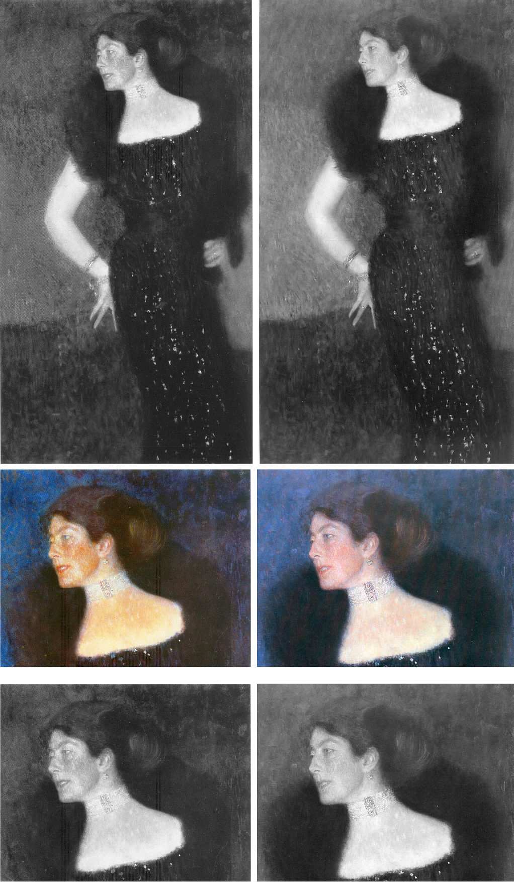
Above, Fig. 20: Klimt’s 1901 portrait of Rose von Rosthorn-Friedmann as seen in the two deluxe Klimt catalogues: that is, as in Weidinger, 2007 left; and as in Natter, 2012, right.
We cannot vouch for the veracity of the two books’ reproductions of the painting and both publishers take fair pride in their productions. Yet, as seen above, there are numerous chromatic and tonal differences in the respective photo-illustrations which, given the chronology, suggest a post-2007 restoration. Because Weidinger attempted to have every Klimt work re-photographed for the 2007 Prestel book’s catalogue we can, perhaps, safely take the images above left to be a fair record of the then state of the picture. So what might account for the general losses of tonal and chromatic vivacity as seen on the right in 2012? For example, Partsch notes (Taschen, 2012) that “her dark, coiffured hair is barely distinguishable from the blue of the background”. That indeed was the case, but it had not been so in the 2007 Weidinger reproduction as above left, centre, when the blues, blacks and whites were warmed and enriched by red. The evident weakening of the strong form and shape of the greatly more lustrous hair in 2007 is not an isolated incident within the picture. It had been accompanied in 2007 by a markedly sharper, darkly unified near-diamond shape of background enclosed by the arm and body.
WHICH IS THE REAL KLIMT?
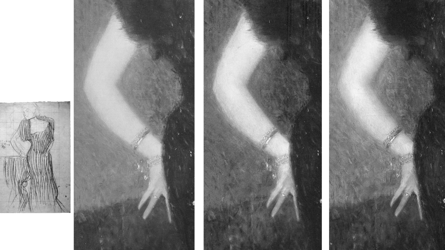
Above, Fig. 21: Left, Klimt’s working drawing for the Rose von Rosthorn-Friedmann portrait (which picture is held in a private collection in Switzerland); right, a detail of the painting, as reproduced respectively in: 1988, Gabriella Belli, Gustav Klimt Masterpieces; 2007, Weidinger, et al; and in 2012, Natter, et al.
The picture had long been thought lost and was known only by a single photograph. Unfortunately, no one seems to have reproduced that early record. What is to be made of the above trio of details recorded consecutively in just twenty-four years? With the above detail, we see three successive states: 1988; 2007; 2012. With the second and third – which is to say, the two most recent states – we can dismiss the possibility of photo/reproduction variations because such could not be responsible for distinctly local changes, as with the dramatically and selectively darkened space between the little and the ring finger that occurred between 2007 and 2012. All three images are individually of a piece and speak of distinct appearances in the picture. Of the three states, the first (1988) is the one that is least like the others: its arm has two sharply defined contours and is slimmer than those in the other two photographs. To this photo-testimony, might anything be gleaned from what is known and what has been said about the picture?
Writing on the most recent (2012) state Natter speaks first of its reception and then of Klimt’s initial struggle: “Klimt wrestled long and hard with the composition and the standing motif, as his preliminary drawings testify… Only gradually did he arrive at the curvaceous, serpentine pose of the final portrait… Noteworthy is the dialogue between the figure and background…Such a permeability of natural forms and representations of the human figure is therefore thoroughly typical of Klimt…” (Emphasis added.)
Writing on the 2007 state, centre image above, Weidinger related the picture’s “erotic connotations” to Klimt’s “numerous snaky women who populate the symbolist paintings of 1898 to 1907” and held that, in this portrait, Klimt “emphasizes both line and area so as to produce a stylized rendering of the body such as manifested itself first in his Symbolist works…Instead of twisting three-dimensionally around her own axis, as do Mannerist figures [and Sargent’s “Madame X”] Rose von Rosthorn’s S-shaped body appears to be all on the same plane; the effect of this, coupled with the emphatic outlining, is to make the portrait seem curiously flat.”
There is a crucial difference in the two accounts. Where Natter speaks of the permeability evident in a dialogue between the figure and its background, he seems on safe ground with the borders of the extravagant fur stole and the lower body on the right, and with the division between the background and the assumed reddish chair, but there is no such permeability at the contour of the face and choker, or at the scissors-like fingers and chair back. Weidinger notes that the red of the armchair had been achieved with “the application of innumerable tiny brushstrokes, pointing in all directions at once” and that “the same method is used for the skin, although here the outcome is not so coarse”. The key difference in the two accounts lies in Weidinger’s recognition of Klimt’s deployment of both line and area. The line (which bounds impermeable shapes) is confined to the areas of bare flesh – the head neck and arm – where Klimt’s classically trained draughtsmanship asserts itself. In his commissioned portraits Klimt retained a respectful and more traditionally hierarchical attentiveness to the forms of heads and hands, whatever indulgence might have been given elsewhere to symbolism, pattern-making abstractions, and decorations.
The earliest photograph, above left is, by definition, the record that is temporally closest to the picture’s original appearance and it should, accordingly, be taken as a more reliable record than the two later states. Additionally, this 1988 state better accords with a vivid contemporary response to the painting. In contradiction of the present (post-2012) chilled blue background, Natter cites Frans Servaes’ captivation in 1901 with Klimt’s use of colour: “The shimmering violet of the background plays with tumultuous gentleness around the bare propped arm and the dark dress covered with spangles in the most wonderful fashion.” Today, one sees no violet against the arm in Figs. 19 and 20. A patch of background to the right of the dress might be thought of as violet but the larger cooler blue areas certainly could not. Might there have been earlier losses in the background as with those seen more recently in the hair? Natter also mentions that Ludwig Hevesi had been particularly struck by “Slender elastic lines having a singular swing, profile to the left…A slim pale arm supports itself on three fingertips on a piece of furniture; one realizes immediately that a figure such as this really does not need to support itself” – like that of an agile, super-fit rock climber, perhaps? Klimt’s final, working study, above left, had fixed the slim arm’s outer contour with deftness and precision. Such decisiveness of design in the arm is best seen here in the oldest record (1988) and is least evident in the most recent and most fumbled arm (2012) where the contours have succumbed to a havering state of permeability. To discount the 1988 photo-testimony in favour of the later states it would be necessary to claim that an earlier restorer had wrongly imposed an alien linearity on the arm and that in two successive restorations an original, fumbled and fatter arm had been recovered. The non-publication of the sole photograph by which this once lost painting was known is to be regretted.
VOID SPACE OR INTRIGUE?
To return to the Knips portrait, in both Figs. 16 above and 22 below it is possible to read miniature figures or statuary within the vegetation along a horizontal line to the left of Sonja Knips’ forehead.
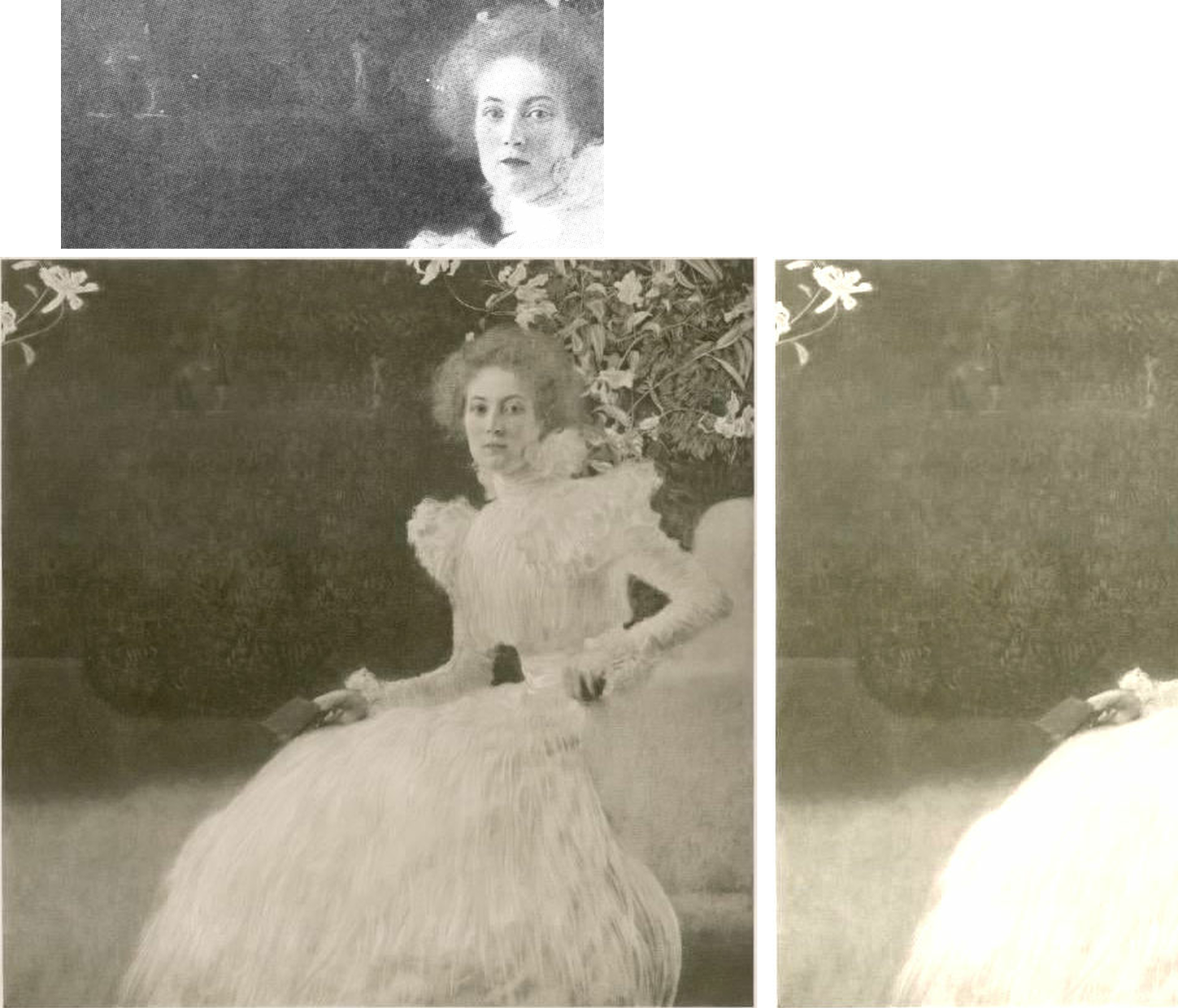
Above, Fig. 22: Left, the 1908-14 collotype of Sonja Knips; right, a lightened section of the collotype’s left-hand area, in which the original two-tone ground/wall/shrubbery boundary is clearer. The above greyscale inset is a detail of a photograph carried in the October 1900 Figaro Illustré, as discussed by Emily Braun in the 2001 Gustav Klimt Modernism in the Making, Ed. Colin B. Bailey. In all three images the horizontal line of figures and a statue is discernible.
Above, Fig. 23: Top row, left, the 2007 Weidinger infra-red image; right, the 1908-14 Miethke collotype – in these, we indicate (in red) the moving ground/wall boundaries and the placement of the “window”. Below, in the centre group, we see how the reported figures had appeared in early photographs. In his 2007 rejection of earlier claims of perceptible figures in the picture’s upper half on the testimony of the infra-red image, Weidinger cites scholarly experts who had variously identified: “cupids and two figures…[a] pool and fish-like creatures… [and a] horse’s head…” Given such testimony – and the fact that discernible figures had registered in the dark background to the left of Sonja’s head in the Klimt-approved collotype and subsequent photographs to this day, as in Fig. 24, right below – those figures’ status might better have been resolved by the publication at high resolution of all the Belvedere’s photographs and technical records of the picture rather than with a dismissal by technical fiat on a single, out-of-context, difficult-to-read infra-red image.
The small, photographed free-standing Cupid sculpture in the centre group above is the former antiques shop find that has been upgraded and displayed at the Metropolitan Museum, New York, as an autograph early Michelangelo. If it might seem improbable that Klimt should have included secondary figures in a large and exceptional portrait, it could equally be held that the photographically-recorded figures in question were forerunners of the artist’s later incorporations of entire armies of people and horse riders – as in the above three later portraits of The Dancer (1916-17), left; Adele Bloch-Bauer II (1912), top; and Elisabeth Lederer (1914-16) bottom right.

Above, Fig. 24: The Portrait of Sonja Knips, as in 1908-14, left, and today, right, as seen in both colour and in greyscale.
THE DEMISE OF THE LILIES AND THE RISE OF “APPROPRIATE RESTORATION STRATEGIES” AT THE BELVEDERE
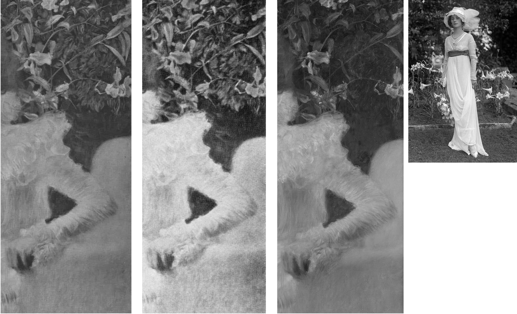
Above, Fig. 25: Three details of the lilies backdrop as recorded in: 1908-14, left; 1942-56, centre; today, right. In the inset, above right, a 1912 British Vogue fashion shot.
The differences seen above between 1908-14, left, and 1942-56, centre, are not substantial and might amount to little more than variations in reproduction values. The subsequent differences seen above, right, however, are of another magnitude and show outright losses of autograph material, as to the foliage between the upper arm and the back of the chair.
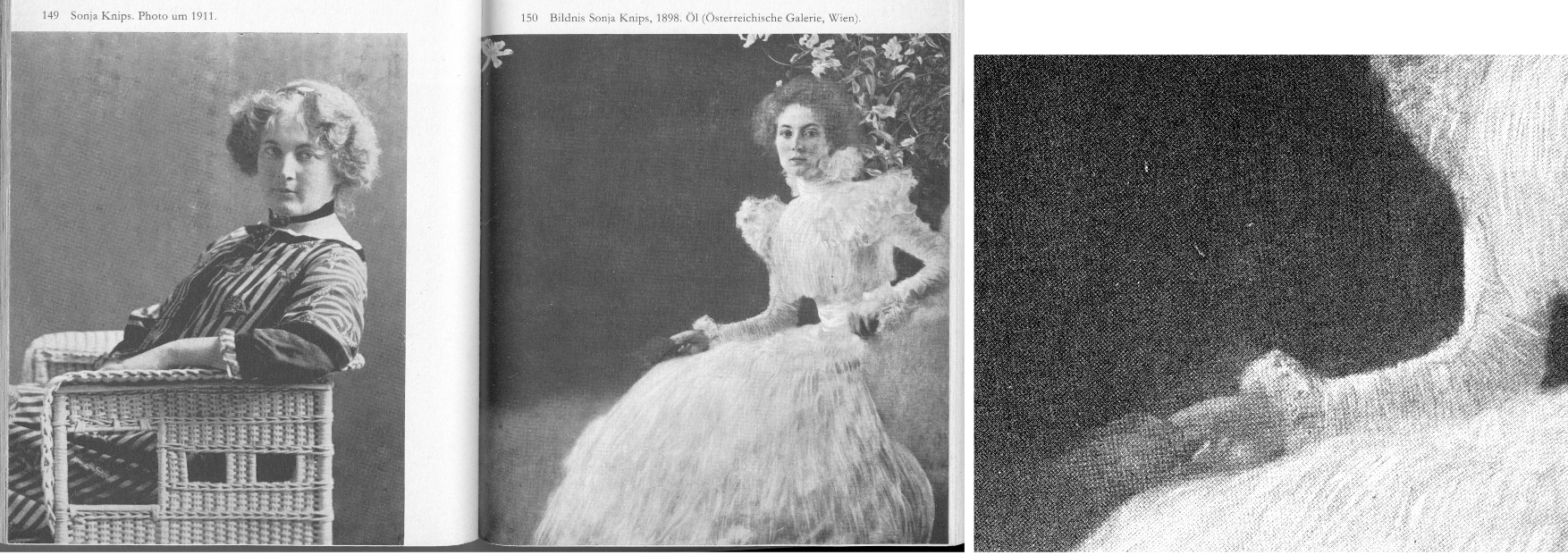
Above, Fig. 26: Left and centre, a two-page spread from Christian Nebehay’s 1969 Gustav Klimt, showing Sonia Knips in 2011 and her portrait when the hand/notebook motif was still intact; right, a detail from Johannes Dobai’s 1978 Klimt showing that by that date the hand/book had been injured and left incoherent. The offending restoration must, therefore, have taken place between 1969 and 1978. The picture itself was commissioned by Sonja Knips (1873-1959) and owned by her until 1950 when she was seventy-seven and it was bought by the Belvedere, Vienna. The museum says of its (manifestly hyperactive) conservation department:
“The Belvedere’s restoration and conservation department is dedicated to the preservation and care, restoration, and technological research into the art and cultural assets of the Belvedere’s collection, which ranges from the Middle Ages to contemporary art. Its mission is to record and preserve objects of historical and cultural significance. Conserving these irreplaceable originals requires a methodical and scientific approach in order to shed light on the historical, stylistic, iconographical, technological, and material aspects of the artworks. With this in mind, the Belvedere’s conservators devise appropriate strategies. On average, the department conserves and restores 150 paintings and frames each year, and frames and mounts between 100 and 150 graphic works.”
THE DECONSTRUCTION OF SONJA’S LITTLE RED BOOK

Above, Fig.27: The red leather-bound Klimt sketch book held by Sonja Knips, as seen, respectively in 1908-14, top; in 1956, centre; and today, above.
In this photo-sequence we see that crucial differences of appearance arose between 1956 and 2012 – in fact, on above evidence, between 1956 and 2007. Given the book’s changed appearances, Dr Natter’s claim that “The dualism of mimesis and dissolution, of faithful reproduction and painterly openness, is already in evidence here as a stylistic means” becomes problematic. Given that the once faithfully tight and precise book/right-hand had by then been left in a quasi-Cubist double image that resembles time-lapse photography, should it have been regarded as an instance of mimesis or dissolution? Natter’s view remains unknown because has not commented on the present condition. Such questions arise with other Klimt portrait pictures:
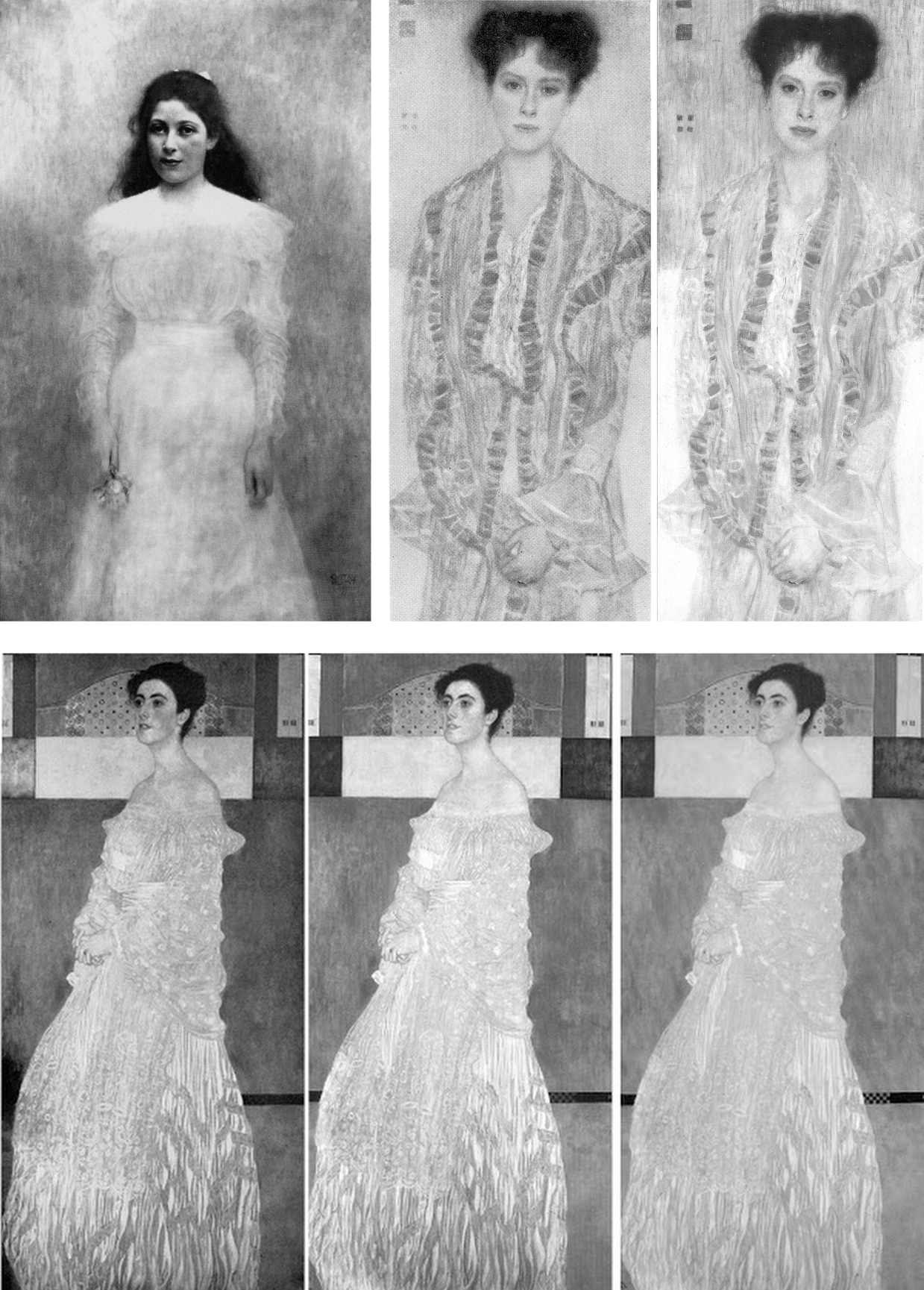
Above Fig. 28: Top, left, Klimt’s now lost 1900 portrait of the thirteen-years old Trude Steine (note the strong line of the shoulders); centre and right, a large detail of Klimt’s 1902 Portrait of Gertrud Loew, as in 1956 and today; above, a three-part chronological sequence of Klimt’s 1905 Portrait of Margaret Stonborough-Wittgenstein.
As a lost work, the Trudy Steine picture, will at least now never lose its great – photographically preserved – vivacity and force. Gertrud Loew disappeared when sent to Berlin in 1938. Her portrait survives but it has not been spared by restorers. Speaking to its condition today, as top right, Weidinger writes:
“Ludwig Hevesi [1902] referred to the portrait of Gertrud Loew – shown for the first time at the ‘Klimt Collective exhibition’ at the Secession in 1902 – as ‘the most fragrant lyric of which the painter’s palette is capable’. Like Serena Lederer the subject is clad in white. Colour accents are set by her long, downward cascading shawl with its lilac-coloured border. Klimt renders her pale skin in tones close to that of her dress, and only her red lips, blue eyes and dark hair supply the necessary contrasts. Her loosely flowing dress betrays no sense of corporeality. In this connection, Natter speaks of her ‘dematerialization’”. Weidinger adds that when exhibited in 1903 it had been said to possess “all the charm of radiant filminess” and “the gauziest lyricism of which the palette is capable.”
That was then. Restorers thought the filminess might be taken further and, to that end, simultaneously darkened the upper background and lightened the upper costume, thereby dematerializing the previously clear articulation of the subject’s shoulders. To add to the tonal mayhem, both the lower background and the lower dress have been lightened. This is no longer the picture Klimt painted of Loew. The Pirchan reproduction gives a truer account than the painting itself.
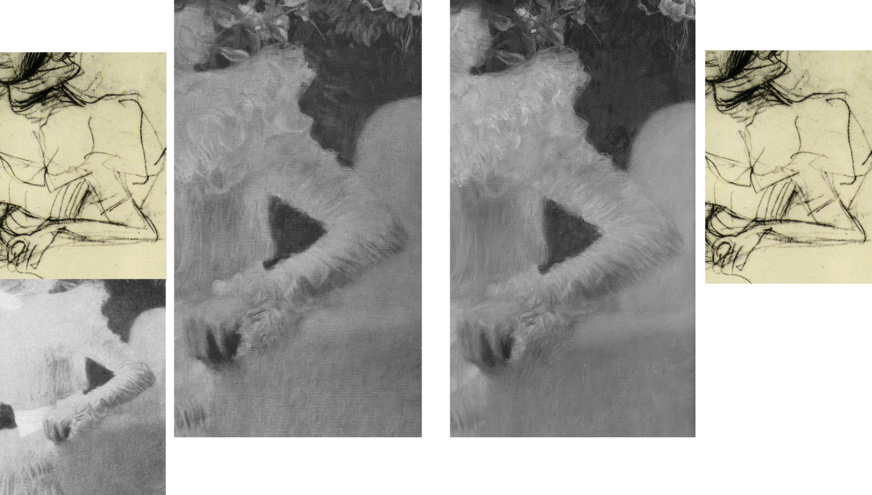
Above, Fig. 29: Main centre images: a detail of the picture as recorded in 1956 and today, in which sequence it is easy to identify the obliteration of leaves, multiple micro-losses of value in this dress and the loss/painting-over of the original foliage between the shoulder and the chair back; insets, a detail of one of Klimt’s preparatory studies for the painting; and (bottom left), a detail from a photograph of the portrait carried in the October 1900 Figaro Illustré (as discussed by Emily Braun in the 2001 Gustav Klimt Modernism in the Making, Ed. Colin B. Bailey).
Natter’s claim that Klimt camouflaged disparate pictorial means by simulating a photo snapshot holds fair insofar as Sonja grips the arm of chair firmly and (as others have noted) leans forward as if caught when about to rise, but the picture was no product of a snatched moment, as the many studies Klimt made of his subject when in costume and in the chair testify (see Fig. 30 below). It is also part-true that Klimt conjured a “fascinating contrast between the naturalistically modelled head of the sitter and the gauzy shimmer of her dress” (we are advised that the material was likely either very finely pleated silk chiffon or muslin) but, aside from the abundant skirt, there is no near-abandonment of corporeality: even in semi-repose this dress in animated and formed by the lithe, almost geometricized, body that was captured in Klimt’s preliminary studies.
Notwithstanding the abundance of small folds on the sleeves, the thin shapely taught-ness of the arm seen by Klimt and captured in the drawn studies had asserted itself in the painting. On comparing the above photographic sequence, it is evident that in the very earliest recorded state (1900, bottom left), the orchestrated collection of shadows at the bottom of the lower arm much better and more decisively “drew” the limb’s contour: at the turn of the sharply defined elbow there is first a discernible concavity and then a convexity that straightens as it runs down towards the wrist. That original taught-ness of form/anatomy and relative weight of shadow at the lower contour was also evident even in the small low-quality image from Nebehay’s, 1976 Gustav Klimt, shown above at Fig. 11, but, like so much in Klimt, it has subsequently been fuzzed and lost.
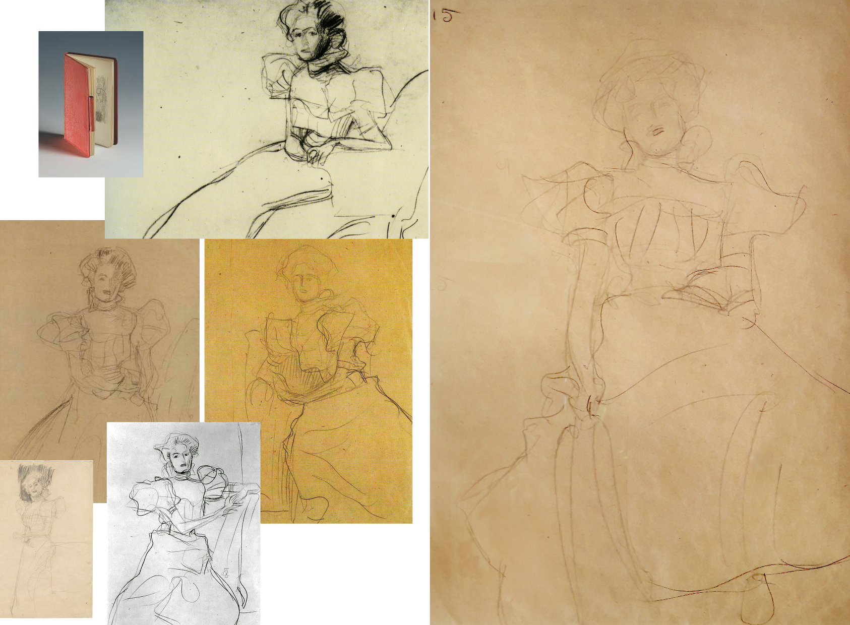
Above, Fig. 30: Some of Klimt’s many sketches for the Portrait of Sonja Knips, in every one of which the forms and the massing of the hair were noted in relation to the head.
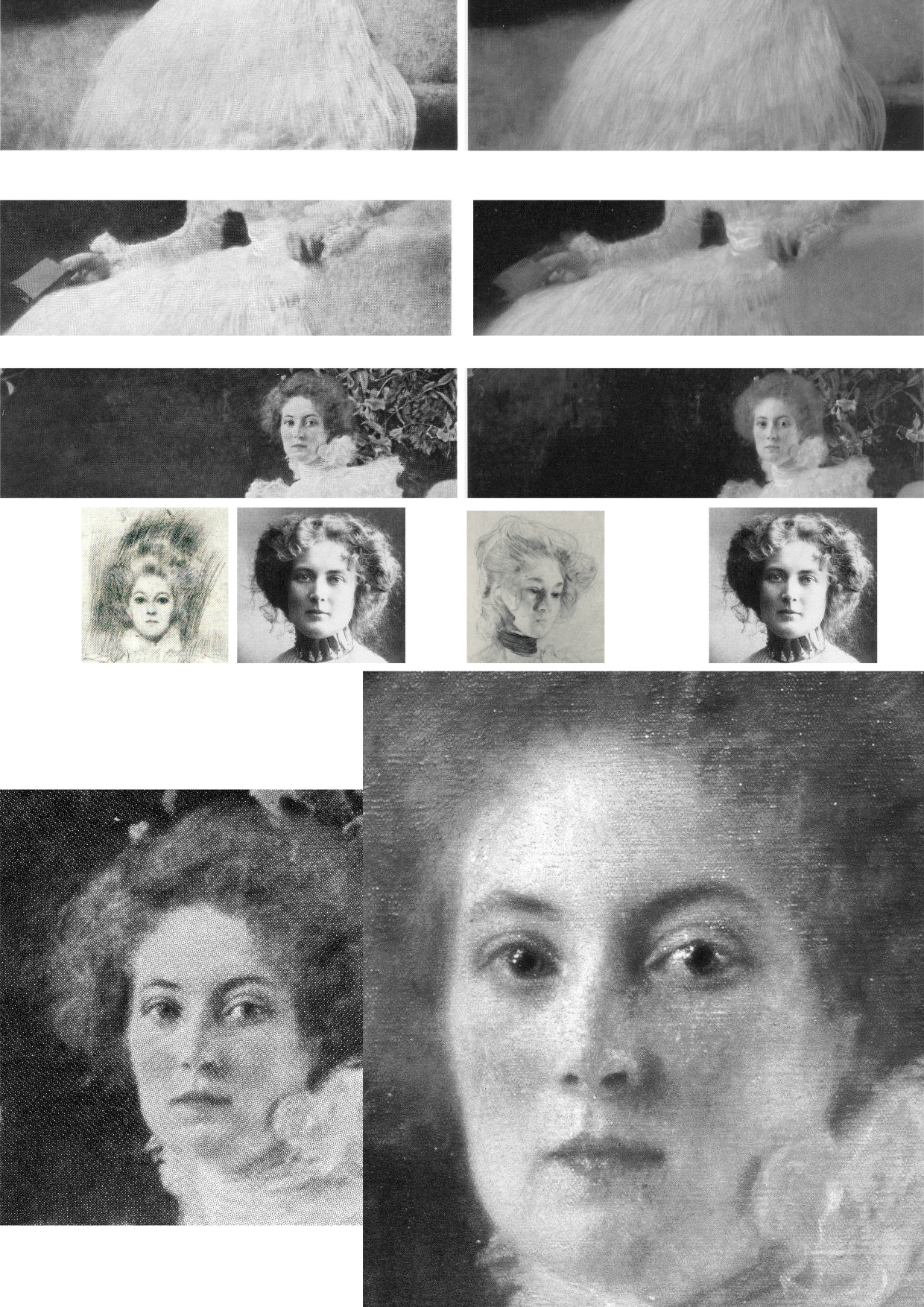
Above, Fig. 31: Top, three photo-comparisons of details showing changes between 1956 and today; centre row, left, a drawing of Sonja Knips and a later photograph; right, a Klimt study for another painting; bottom row, Knips in 1956 and in 2007 (Weidinger).
More than a first foray into a new type, this arguably stands as one of Klimt’s best female portraits, its twenty-five years-old subject being utterly composed, beautiful, intelligent and with a resolute, if poignant gaze. As mentioned, having first seen Sonja to be gazing out of the picture, Susanna Partsch (“Paintings of Women”, Taschen, 2012) now sees a Gorgon-like demeanour with Sonja turning her head “so that she is looking out of the picture and fixes the viewer with her gaze”. That reading is not remiss on today’s appearance but in Pirchan’s 1956 image (here bottom left) the gaze seemed fractionally averted and the effect markedly more reflective than confrontational. Moreover, a comparison of the mouth’s two states shows that Sonja has received a fresh lipstick that no long conforms to the shapes and forms of her lips.
Partsch writes that “The curls of her hair are taken up in the ruffles of her dress” without noticing that the earlier softly disposed forms and luxuriance of the hair have been drained of form and vitality – as with the disappeared darkly accented shadow at the lower temple and cheek that formerly served to draw the contour of the face and drew attention to Knips’ right eye. Considering the importance of hair as a feminine adornment and how hard artists labour to do justice to its glories, it seems odd that clear injuries to it, as here and with Rose von Rosthorn-Friedmann alike, should generally go unremarked.
Above, Fig. 32: Left, Sonja Knips in 1911; centre, top, Evelyn Nesbit, the muse of the American illustrator Dana Gibson, left, and one of Gibson’s famous “Gibson Girl” drawings; right, a Klimt drawing of 1898-1900; centre above, a Gibson Girl left and Sonja Knips in 1911 in Japanese-style Reformklied, as carried in the Neue Galerie 2007 Gustav Klimt. (For live early film footage of American women sporting Gibson Girl hairdos, see “The Real Edwardian Gibson Girls of the USA” at Glamour Daze.)
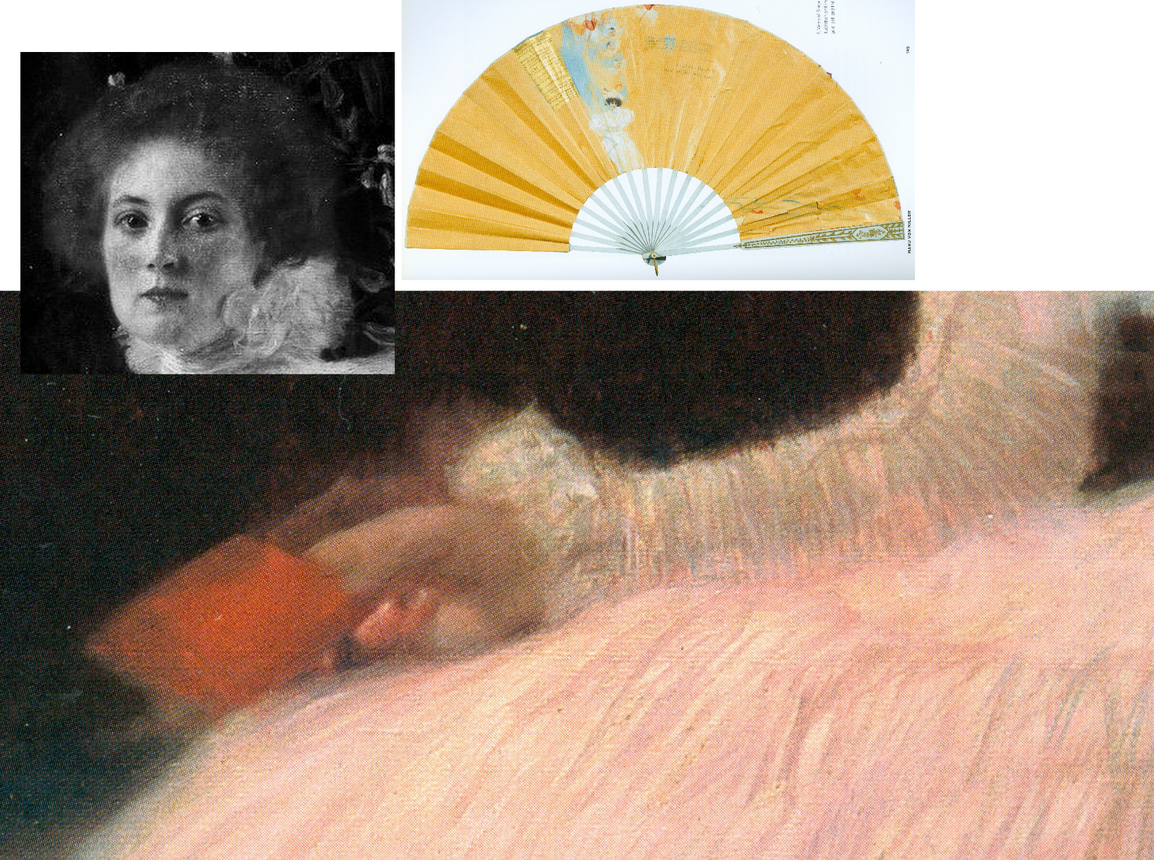
Above, Fig. 33: Main picture, the right hand of Sonja Knips; top left inset, Sonja Knips; above right, Sonja Knips’ fan, as decorated by Klimt.
Consensual views break down on Klimt’s and Sonja Knips’ relationship. In the 2007 Neue Galerie book, Knips’s granddaughter, Dr Manu von Miller, author of Sonja Knips Und Die Wiener Moderne, 2004, reports (“Embracing Modernism, Gustav Klimt and Sonja Knips”) that recently disclosed materials from the Knips family revealed much about Sonja and shed light on previously unknown aspects of Klimt’s life and person. Thus: Klimt’s Sonja portrait “likewise contains hints about the life of the artist” and that the two had had an affair years before it was painted, Klimt having known her since she was a teenager. Painting Sonja had released Klimt from his role as “a ‘decorative’ painter”, and he in turn enormously influenced Knips enabling her to “break free of the rigid bourgeois conventions of her time, and to create her own highly personal approach to aesthetics and collecting.” In 1896 Sonja married the industrial magnate Anton Knips – a mismatch, he not sharing her passions for socialising, modern art and young artists. Klimt’s relationship had, Dr Miller reported, “blossomed at some point into an amorous relationship. How long the affair lasted is not known but Gustav and Sonja’s romance is substantiated by notations on a paper fan found among Sonja Knips’s personal effects.” Those included a love poem dated 1895, the year before Sonja married Anton. A member of her family had told Miller the affair ended because Klimt was unwilling to marry her. The fan was thus “a love note and a farewell”, Klimt having ended another affair in the same manner…and given that Sonja sat for Klimt’s portrait scarcely a year after her wedding, Miller felt “It is hard to imagine that the painting could have been produced without their recent love affair being in the minds of both artist and sitter. She may have viewed the portrait as an enduring reminder of the relationship; it was noted by an acquaintance of Sonja’s that her eyes would light up when she was asked about the history of the painting’s creation.”
As mentioned, Sonja Knips kept the painting until her seventy-seventh year and, as Miller noted, she purchased Klimt’s unfinished (and highly erotic) Adam and Eve after his death and hung it “in the small boudoir next her bedroom”. Partsch will have none of Miller’s account, writing (Taschen, 2012): “On the basis of this fan and the decoration on the reverse side, Manu von Miller reconstructed a love affair between Gustav Klimt and Sonja Knips before her marriage and proposed that Klimt used the fan as a way of ending their relationship. Miller also suggests that Klimt may have done the same with a second fan destined for an unknown recipient and on that occasion carrying the German proverb… (‘Best to get unpleasant things over and done with’) … It is my view that the fan belonging to Sonja Knips points neither to a love affair between the artist and his model nor to a rupture between the two. Rather, it shows Klimt expressing his congratulations to Sonja Knips upon her engagement…”
What then, to make of the prominently displayed (- almost at the picture’s geometrical centre) little red book? In 1992 Nebehay wrote of “a small red notebook: a sketchbook that Klimt gave her.” It had been found in Sonja Knips’s estate and edited by Nebehay and was one of only three such surviving notebooks. It contained a small photograph of Klimt. Alice Strobl had dated Klimt sketches in it to between 1897 and 1899. Strobl had reported an eyewitness’s recollection of Klimt’s studio floor “strewn with thin red notebooks in which he jotted his artistic ideas down in shorthand, as it were.” Nebehay notes that Klimt was as disorderly with his notebooks as with his sketches which lay about in heaps on the floor.
On the book’s possible significance, Nebehay, like Partsch, leaned towards scepticism: “A married society woman would never have dared keep anything that was more than a souvenir” and, he went on, “Johannes Dobai reports that the lady [Knips] told him that the figures hidden in the foliage behind her had no symbolic meaning and as for the notebook in her hand, that was chosen for the colour effect.” Against that, Weidinger wrote in 2007:
“During his second series of studies, Klimt appears to have wanted to portray Rose von Rosthorn-Friedmann holding a rose in her right hand, but in the final version decided against this. The little sketchbook Sonja Knips is portrayed holding serves a similar purpose. Her claim that Klimt had merely wanted to add a shot of colour can be refuted on the grounds that the book appears in the studies for this work as well. Klimt is clearly using the book as an attribute which he considers apposite.”
Alma Schindler who so jealously and angrily cited Klimt’s affair with Rose had been delighted when Klimt preferred to make a new fan for her rather than contribute to a fan gifted by another man. Klimt pursued Alma as a teenager and was greatly distressed when prevented from initiating an affair with her. Klimt, as mentioned had known Sonja, too, as a teenager before her marriage. If the presence of the book is to be discounted, what of the picture’s part-hidden Cupid and figures and why have they been so uniformly dismissed on the sole testimony of a technically penetrating image?
Partsch contests an affair against much evidence and trusts an infra-red image: “The dominant field of blackish brown, which provides a foil to the flowers and the female sitter, contains several lighter patches. These have inspired numerous interpretations… [which infra-red photography] has failed to confirm…” In 2008 Rachel Barnes (Gustav Klimt) wrote: “There was a theory that Klimt painted a number of things in the background, including a horse. Subsequent infra-red examination has proved this was not the case.”
It is unfortunate on many levels that in modern times scholars turned from artists to restorers for guidance on technical and aesthetic matters when restorers have no technical means of analysing artistic values and, through their interventions, so repeatedly demonstrate inabilities even to recognise and respect them. It seems that nothing might arrest their long march through the world’s art – no matter how egregiously they mangle its images and, hence, meanings. We live in hope that owners and scholars will better defend the integrity and dignity of works of art but note that we first complained of restorers’ manifestly and indefensibly destructive actions – and of art historians’ effective complicity – in an article, “A crime against the artist”, in The Independent of 22 November 1991 as reproduced below at Fig. 34:
Michael Daley, Director, 29 April 2021
Art-Trading, Connoisseurship and the Van Dyck Bonanza
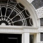
There are now two upgraded paintings in two museums that have been claimed as “The Last Van Dyck Self-Portrait” and an upgraded third painting has been presented in a third museum as a lost, earlier Van Dyck self-portrait – see Fig. 1 below. This acceptance by three museums of three self-portraits in six years has coincided with a spate of exposed forgeries and restoration-led upgraded “discoveries”. The opaque means by which three problematic pictures found their separate ways into three museums as upgraded autograph Van Dycks are items of cultural/art-political concern.
This triple elevation has spotlighted levels of scholarship and transparency within the cross-linked spheres of connoisseurship, ownership, restoration, promotion and sales in the wake of the spectacular rise and demise of the now downgraded and disappeared $450m Leonardo School Salvator Mundi that had been bought for barely a thousand dollars and somehow netted nearly two thirds of a billion dollars through three sales in five years on an implausible provenance. The institutionally sensitive roles of upgraded old master paintings serving as conduits for financial exchanges and investment are attracting attention as never before. The Van Dyck bonanza has prompted public challenges on both the artistic status of the pictures being traded and the means and manner by which public and private monies pass hands.
THREE UPGRADED VAN DYCK SELF-PORTRAITS
Above, Fig. 1: Left, the National Portrait Gallery’s “Last Van Dyck Self-Portrait”; centre, the new Bendor Grosvenor-accredited (and owned) “Last Van Dyck Self-Portrait”, as loaned to the Rubenshuis Museum, Antwerp; right, the Philip Mould/Grosvenor accredited, privately owned painting that has been loaned as an autograph Van Dyck self-portrait to the Minneapolis Institute of Arts, Minnesota.
All three of the above self-portraits changed hands recently as autograph Van Dyck self-portraits with the first two both now claimed to be the last Van Dyck self-portrait. All three have undergone modern or recent restorations. The two on the right were transformed within the last decade (and possibly by the same restorer). The picture on the left – an undeclared, covert upgrade – was bought by the National Portrait Gallery in 2014 for £10m.
Above, Fig. 2: Left, the “Last Van Dyck Self-Portrait” that was published in 1941 by Gustav Glück in The Burlington Magazine (“Reflections on Van Dyck’s early death”); right, the “Last Van Dyck Self-Portrait” that was sold to the National Portrait Gallery in 2014.
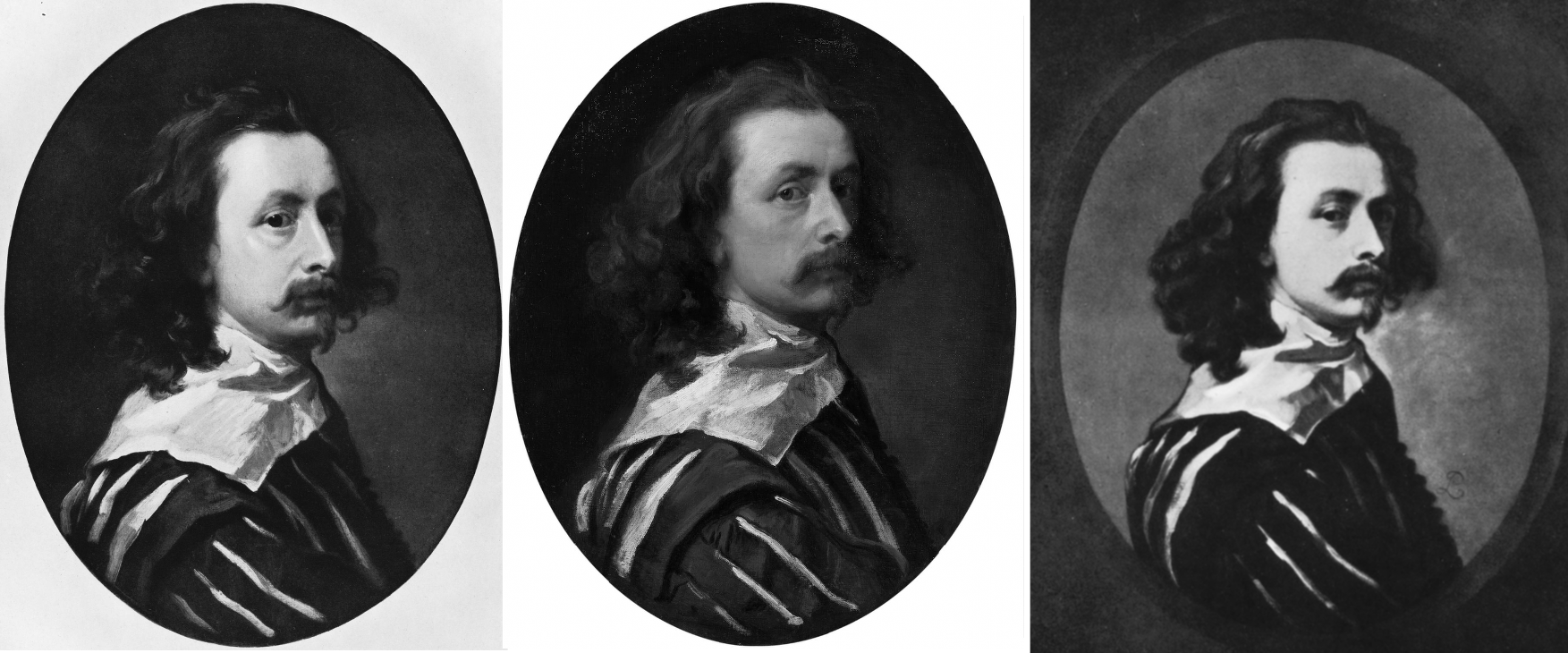
Above, Fig. 3: Left, the “Last Van Dyck Self-Portrait” as published by Glück in 1941; centre, the “Last Van Dyck Self-Portrait” as sold to the National Portrait Gallery in 2014; right the painting published by Glück in 1941 as a copy by Sir Peter Lely of the Glück claimed last Van Dyck self-portrait shown left, here.
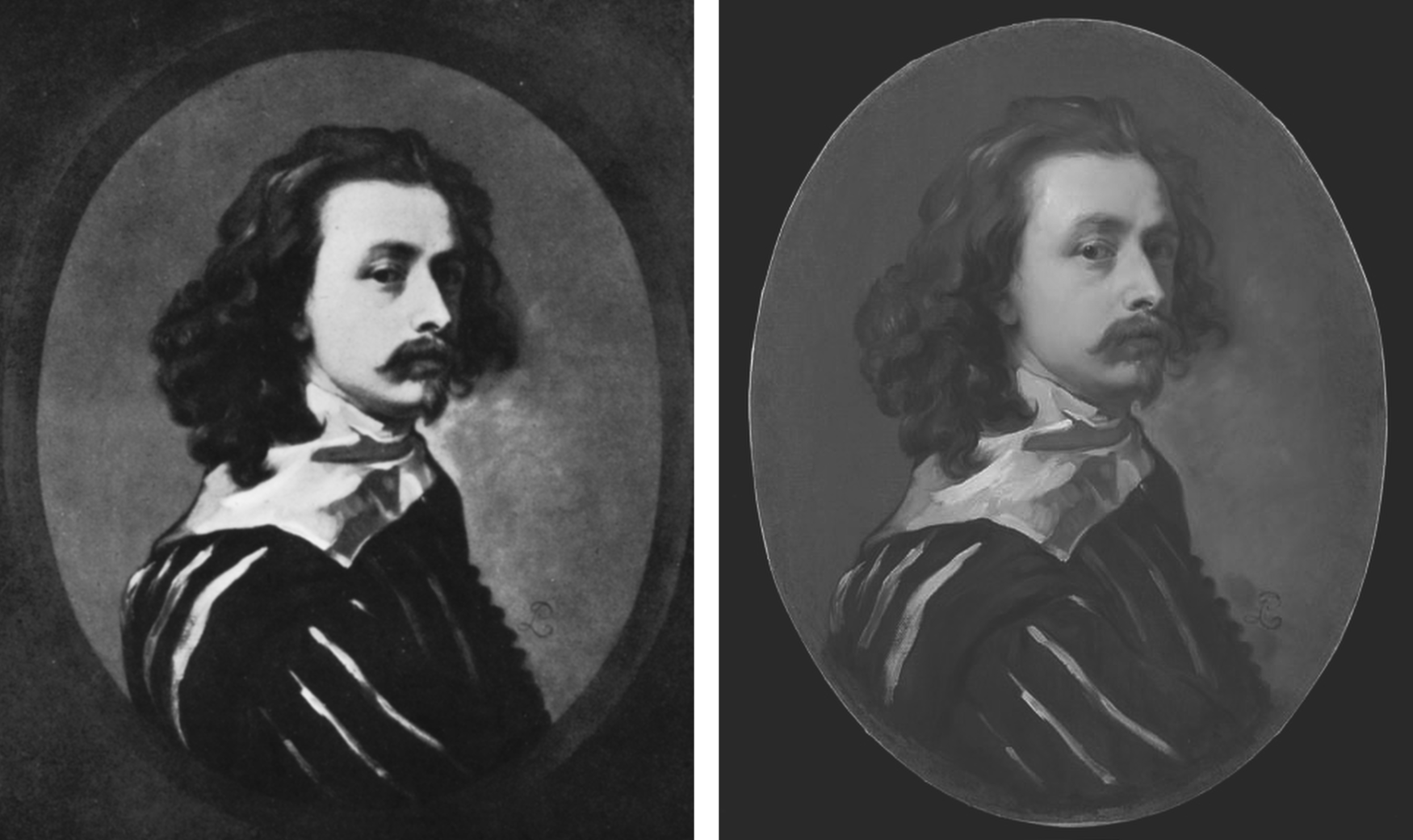
Above, Fig. 4: Left, the painting published by Glück in 1941 as a copy by Sir Peter Lely of the then-claimed last Van Dyck self-portrait shown above left at Fig. 3; right, the painting published in 2011 as a copy by Sir Peter Lely of the then-claimed last Van Dyck self-portrait at Fig. 1, left, which was sold to the NPG in 2014.
MILLAR’S WARNINGS
The notoriously vexing challenge of identifying autograph Van Dycks was set out with frankness and high expertise by Sir Oliver Millar, a former Surveyor of the Queen’s Pictures, in his contribution to the 2004 catalogue raisonné Van Dyck – A Complete Catalogue of the Paintings, by Susan Barnes, Nora De Poorter, Oliver Millar and Horst Vey and published by the Paul Mellon Centre, London, the educational charity committed to supporting original research into the history of British art and architecture of all periods.
Covering Van Dyck’s last English period from 1632 to 1641, Millar listed 264 works and added an appendix of 37 works that comprise records of lost original paintings. Taken together they would average more than thirty-three paintings a year, including many double and very grand group portraits with brilliant elaborate costumes, accoutrements, settings, animals and part-landscapes but the work rate was even higher because of Van Dyck’s many and often long absences and periods of illness – he spent more than a year abroad in 1634-5 and suffered increasing pain in his painting hand. His employment of assistants caused some patrons to complain of work that was not autograph.
Millar assumed that Van Dyck had emulated the practices and “distribution of responsibilities as organised in Rubens’s studio” when setting up his own studio in London and he could hardly have spoken more bluntly of the artistic consequences of such production systems. A great deal of work “especially towards the end of his life”, he noted, “was assigned to Van Dyck’s assistants, and there was a heavy demand for repetitions, whether replicas, part replicas, variants or copies […] Sometimes Van Dyck would himself paint a new detail in a repetition otherwise painted entirely by an assistant”, whereas his “finest English portraits are painted…noticeably with a greater variety of touch.” A pronounced monotony of touch might itself, therefore, ring authorial alarms.
NEW EXPERTS ARE GROWING THE VAN DYCK MARKET
The art market correspondent, Colin Gleadell, restated the attribution problem in relation to current market expansionism, in the Telegraph (28 April 2018):
“Interestingly, Van Dyck has had more re-attributions than any other Old Master in recent times. Philip Mould, presenter of the BBC’s Fake or Fortune, traces this phenomenon to the publication of the first reliable catalogue raisonné in 2004, which allowed for detailed study of nearly 800 examples of the artist’s work.
“Of the catalogue’s four original scholars, only two are still alive, and a number of former museum directors have offered their views on attribution since. It’s differences in opinion that have allowed additional works to be added to the recognised Van Dyck corpus.
“Because Van Dyck was prolific and used studio assistants in his work, it can be tricky to unravel how much of a painting is solely by the master. Consequently, the number of works attributed to him, his studio and his many followers is plentiful. Around 300 have come up for auction in the last four years, with dozens subsequently upgraded with a full attribution.
“Taking some credit for the change in status was Mould’s researcher, Bendor Grosvenor, now a TV presenter in his own right and also a Van Dyck connoisseur, who has been quietly accumulating a small collection of discoveries of his own.
“But while Grosvenor prefers to keep his finds, his friend, Fergus Hall, is in the business of selling, his trained eye capable of recognising Van Dyck’s touch even through centuries of dirt, degraded varnish and additional paint. It is only after painstaking cleaning, though, that the full picture emerges…”
MAGICIANS ANNOINT SECOND-STRING WORKS
There exists an aggravating sub-phenomenon whereby venerable scholar/connoisseurs effectively acquire powers to elevate best available copies to autograph status. Some, like the late Sir Denis Mahon, have been known to elevate more than one such work to a single “vacancy”. (See “Art’s Toxic Assets and a Crisis of Connoisseurship”.) Occasional misattributions are inevitable (and correctable) in a field that necessarily rests on fine judgements, but wholesale upgrades risk diluting and adulterating oeuvres to the point of jeopardising market confidence. Risk is compounded when upgrades are products of prolonged restorations in which paint is subtracted and added to the surviving carcasses of pictures on singular, sometimes optimistic, readings of authorship.
BENDOR GROSVENOR’S ASSORTED CONTRIBUTIONS
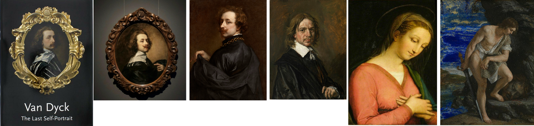
Above, Fig. 5: All six works above have been supported by Bendor Grosvenor.
The three recently and problematically upgraded Van Dyck self-portraits above left were all researched and espoused by Grosvenor. All three works on the right are manifest fakes. The Hals and the Gentileschi were initially accepted by Grosvenor and the “Raphael” attribution was made by him on television.
Respectively, the six are: left, the National Portrait Gallery’s “Last Van Dyck Self-Portrait”, as shown on the gallery’s 2015 celebratory book on the painting; second left, Grosvenor’s own and self-upgraded “Last Van Dyck Self-Portrait”, as loaned by him to the Rubenshuis Museum; third left, the privately owned, Grosvenor/Mould-attributed Van Dyck “Portrait of the Artist” that is now on loan to the Minneapolis Institute of Arts; third right, the now notorious “Frans Hals” (which Grosvenor, the Louvre Museum and a London dealer took to be authentic before Sotheby’s proved by technical analysis that it was a modern paints-riddled fake and fully refunded its buyer ); second right, the self-contained painted fragment of a figure that Grosvenor held to be part of a larger Raphael panel on his BBC4 Britain’s Lost Masterpieces programme (5 October 2016) with near-unequivocal support from the National Gallery’s then director, Sir Nicholas Penny. (The “Raphael” was subsequently rejected and deemed possibly 18th century by the National Gallery in August 2019 following lengthy examinations, but Grosvenor still insists that Raphael had painted this fragment of a “Madonna in a Cross-over Dress” even though it had been painted inside the edges of a piece of wood and therefore could never have been part of a full panel painting); right, the fake Orazio Gentileschi David and Goliath painted on a lapis lazuli slab and which had been exhibited as authentic at the National Gallery when loaned by an anonymous private collector who had bought it from the dealer who had sold on the fake Hals through Sotheby’s.
RESTORATION “SCIENCE” AND THE DETECTION OF AUTHENTICITY
Even before Millar’s warnings, a non-art market exercise had confirmed the problem of identifying studio contributions in 1999 when, in the National Gallery’s Technical Bulletin, the restorer Larry Keith reported that a recent restoration of the Rubens studio work Drunken Silenus supported by Satyrs (Fig. 6 below) had “allowed the opportunity to consider the questions around its authorship and execution afresh in the context of a collaborative technical investigation with the scientific department”. Despite the gallery’s advanced scientific apparatuses and its staffs’ best efforts, it was recognised that “The very nature of the Rubens studio, with its streamlined production and group participation, meant that the painting techniques and materials were also largely uniform, which inevitably limits the ability of technical study to inform specific attributional problems.” In the absence of documentation and relying “heavily on traditional style-based Morellian connoisseurship” the gallery attributed the picture to Van Dyck on a traditional appraisal by eye.

Above, Fig. 6: Above, top left and centre, photographs of a part of the National Gallery’s Rubens studio work Drunken Silenus supported by Satyrs, showing the work before restoration (left), after restoration (centre) and (right) as digitally presented today; below, a detail of a face before and after restoration.
As seen above, the pre- and the post-restoration states are artistically different in their tonal values and relationships. We have examined the National Gallery’s dossiers on the painting and the gallery kindly supplied the two good, hard-copy directly comparative photographs above, top. Where Gleadell shared the sleeper hunters’ proclaimed view of restoration as a benign and “enabling” process, careful comparison of the above detail of a face and its relationship to the foil of a background/sky before and after a single restoration show the debilitating disruptions of values and relationships (relative values) that can occur during a single restoration. Given that what comes off first under restorers’ swabs is what went on last with the artist’s brush, and that highly successful painters like Rubens and Van Dyck often touched up and finished off works that had been largely executed by assistants, it is not hard to appreciate how such subtractions through cleaning followed by painted additions can aggravate difficulties of attribution.
MADE-OVER UPGRADES
The principal instrument in art market upgrades is a long, supposedly “diagnostic”, visually transforming restoration. With dramatically altered pictures, scholars can more easily be chivvied to endorse new and elevating ascriptions. Few restorations give rise to downgrades. Sleeper hunters invariably swear by the brilliance and moderation of their favourite restorers and impute scientific veracity to their methods. In naïve non-specialist circles like the BBC, there exists an unexamined conviction that because today’s technologies are more advanced than earlier ones, aesthetic judgements are now scientifically validated. For example, in short £540 weekend courses at the Royal Academy (with light refreshments, an evening reception and a certificate thrown in), Philip Mould’s former apprentice, Bendor Grosvenor, (who read modern – not art – history and now works as a BBC television arts programme maker, art history blogger, occasional journalist, auction house director, a self-declared ex-dealer collector and, most recently, a picture restorer – see below), promises that “The theory and history of connoisseurship will also be explored, along with the latest scientific techniques for assessing attribution”.
There are no such techniques – science cannot appraise authorship. No matter how technically sophisticated “non-invasive” images might be, they still need to be read for significance. While the “scientific” technical analysis of pictures’ material components can readily disqualify attributed old master works that have been liberally constructed with modern materials, there are no scientific means of assessing authorship, per se.
VISUAL APPRAISALS
Painters make pictures by eye to be viewed by eye and appraisals must also be made by eye, as the National Gallery recognised with its Rubens school picture. When Berenson praised the “seeing eye” and “active not passive eyes” he meant eyes employed “with all the faculties co-operating” but in so-saying he spoke a (self-confessed) part-truth: “As a consumer of the art product I have the right to do all that. As I am neither figure artist nor architect, nor musician, I have no certain right to speak of the producer. I am in the position of most critics, philosophers and scholars. We have enjoyed experiencing the creative process in the art of words only with the logical result that writers on art seldom have in mind any of the arts except the verbal ones.”
Faculties, however refined and words however eloquent, are not the whole story. Too often overlooked is the extent to which for art-practitioners (artists) the powers of the eye are drilled into being both constructive and critical through the marriage of looking and doing that comprises artistic practice. Strictly speaking, that sequence should read: thinking, looking; doing; appraising; looking… Those who see-through-doing are best placed to recognise what counts as undoing and redoing in art. Best-placed but holding no monopoly – Millar fully recognised that restoration alterations handicap appraisals: “…the treatment it may have undergone in the past may also make it impossible to be entirely confident about its quality”. In this regard and for good reasons auctioneers place high premiums on little- or never-restored pictures.
TWO PUBLICATIONS FOUR YEARS APART AND TWO OVERLAPPING CAMPAIGNS OF ATTRIBUTION
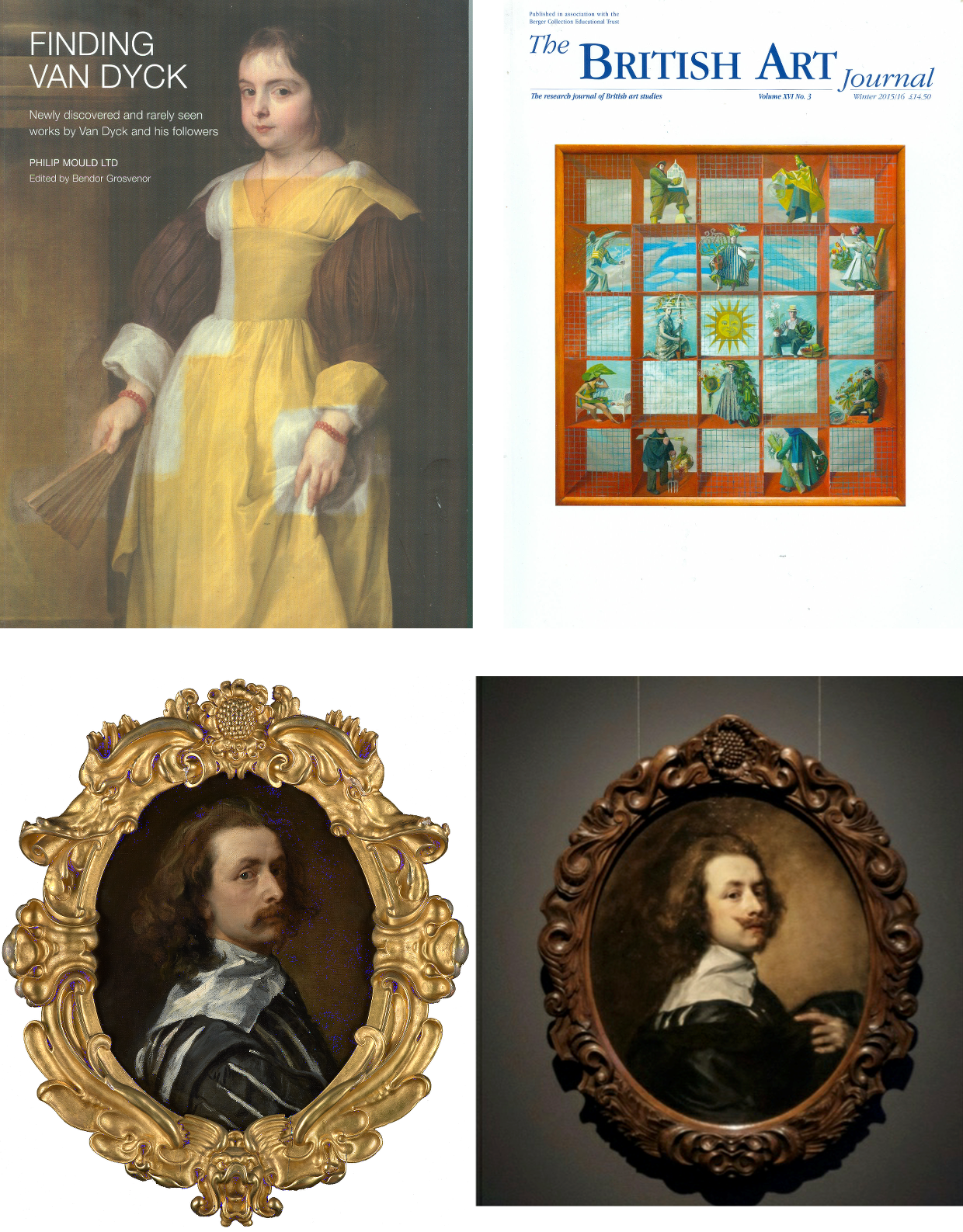
Above, Fig.7: Top, left, the 80 pp full colour catalogue FINDING VAN DYCK , pub. PHILIP MOULD LTD, June/July 2011; top right, the Winter 2015/16 British Art Journal, which carried Bendor Grosvenor’s article “A Self-portrait by Sir Anthony van Dyck (1599-1641) from the collection of Charles I”; above, left, the £10m National Portrait Gallery “Last Van Dyck Self-Portrait”; above, right, the Grosvenor-owned, Rubenshuis Museum exhibited, “Last Van Dyck Self-Portrait”.
SHARED EXCITEMENTS, RISKS, AND AVOIDANCE OF SIN
In 2011 Grosvenor, then an employee of the Philip Mould gallery, lauded the gallery’s (and later the National Portrait Gallery’s) “Last Van Dyck Self-Portrait” picture in the FINDING VAN DYCK catalogue shown above, top left:
“Our first exhibit, Cat. 1, is Van Dyck’s last self-portrait. It was acquired by this gallery in partnership with Dr Alfred Bader in December 2009 for £8.3m at Sotheby’s in London, a record for the artist at auction. Self-portraits tend to stand out among a painter’s oeuvre as some of their most compelling works, and as an instructive connoisseurial guide in what an unquestionably genuine and pre-eminent Van Dyck looks like, Cat. 1 takes some beating.” (Emphases added.)
As fulsome advocacy the entry itself takes some beating. The FINDING VAN DYCK exhibition celebrated recently claimed works of or after Van Dyck and it constituted the high-water mark of Van Dyck sleeper-hunting at Philip Mould Ltd which became Philip Mould and Co. from which Grosvenor would depart in 2014 with a (rumoured) £1m settlement. Grosvenor seemed unaware that the Cat. 1 picture, then unsold after eighteen months in the Mould gallery, was a recent upgrade made by stealth and without due scholarly interrogation – see below.
The catalogue bore the gnomic dedication “For Dr Alfred Bader CBE. A distinguished progenitor of adventure in old masters”. Bader, an industrialist, philanthropist as well as an “inveterate collector”, as he once put it, died in December 2018 but he had been a key player in the Mould gallery’s acquisition of the “Last Van Dyck Self-Portrait” and its subsequent sale to the NPG. Bader and Mould seemed not to – but should – have appreciated how recently the painting had been upgraded. The NPG might not have been aware when buying the £10m painting as Van Dyck’s Last Self-Portrait that it was one of three Van Dyck self-portraits then being processed by the Mould gallery, one of which would shortly be presented as being both the true Last Van Dyck Self-Portrait and one with a better provenance, to boot.
LOVE IS ALL YOU NEED
In the catalogue’s foreword, Mould held that “every time a work of art is bought for reasons of love it is a discovery of sorts, albeit of a personal regard or strong emotional connection that has been visually crystallised” and that by “getting to know the signature strokes and habits of a great master, the characteristics of age, restoration and degradation, the [professional sleeper-hunter’s] eye becomes attuned, and even though there may not be many others around who can see it as you do, it can appear little short of sinful not to express the excitement of it all.” A note of anxiety crept into the self-exultation: the exercise of discovering, proclaiming, and selling lost masterpieces “involves excavation, science, observation and research – as well as a fair degree of sometimes hair-raising financial risk”. The precise burdens of risk and divisions of ownership are rarely disclosed.
WHO FUNDS ATTRIBUTION UPGRADES?
Clarity on ownership is occasionally achieved in the courts. Recent London Court of Appeal proceedings revealed that the fake Frans Hals (Figs. 5 and 9) had been bought jointly by a London-based dealer, Mark Weiss Gallery in Paris, and an investment company, Fairlight Art Ventures, for €3m in 2010 from the prime suspect in a French criminal investigation into a huge group of suspected fake Old Masters. The painting was sold in 2011 by private treaty through Sotheby’s (on a 5% commission) to the Seattle collector Richard Hedreen, for $10.75m. Weiss and Fairlight were shown to have taken an equal share of the benefit. See “’The law has to fall on someone’: Seller of allegedly fake Frans Hals must pay Sotheby’s $5.3m for cancelled sale, judge insists”, The Art Newspaper, 29 November 2020.
After discovering the fraud, reimbursing the buyer, and establishing a technical analysis department, Sotheby’s pursued the dealer, who settled first, and the investment company in protracted legal actions which were only resolved last November. In 2013 the now disappeared and Louvre Museum de-attributed $450m Leonardo School Salvator Mundi was sold by a consortium of New York dealers through Sotheby’s in a private treaty sale. The immediate flipping of the picture from $80m into $127m to a Russian oligarch triggered still-running legal proceedings. The London Court of Appeal held that at the time of the Hals sale there was “no general accepted view of the authenticity” of a “newly discovered painting which had no proper provenance, had not been published and had never been in an exhibition”.
NO FAKE-BUSTER, THIS ATTRIBUTION-MAKER
On 21 March 2016 Grosvenor reported that the London art dealer Mark Weiss had bought and sold-on the fake Orazio Gentileschi that deceived the National Gallery (Figs. 5 & 9). He also provided a (now inactive) link to Weiss’s catalogue note on the Gentileschi and asked: “Is the Gentileschi genuine? I suspect it is, but again I’m not a Gentileschi expert, and nor am I much good with late 17th Century Italian art anyway. My conviction about the painting, such as it is, must be led in part by the fact that greater minds and eyes than mine (not least at the National Gallery) have declared the picture not only period, but genuine… My best guess at this stage, working mainly from photos, is that these pictures are not all fakes.” In truth photographs should have sufficed and would have saved time expense and error. Grosvenor later wrote: “For what it’s worth, I believe it is a forgery. But it took me a long time, and a flight to Berlin to see an undisputed original Gentileschi for comparison, to figure it out.”
Unlike Berenson, Grosvenor has evident difficulty reading photographic testimony: he spent decades believing that critics of the Sistine Capel ceiling restoration were “myopic” until a trip to Rome and sight of the chapel itself disabused him. But how so? What is left on the ceiling is still Michelangelo, and retains its magnificent – abeit less sculpturally enhanced – designs. Today, the restoration injuries can only be identified by recollection of how it once was or, less subjectively, through comparative photo-records of its pre- and post-cleaning states.
Richard Feigen, a New York Old Master art dealer and the author of Tales from the Art Crypt, called the recent fakes affair “one of the biggest scandals in my memory”, and one which should make institutions “very wary about things they are offered and the sources of those things”. Grosvenor reportedly expressed a sneaking admiration for the Moriarty of the Old Masters: “Whoever has been making them is an artist of extraordinary skill. Equally skilful is the ability to age these modern creations in such a way as to make them look centuries old. Sadly, we don’t yet know who this genius is.”
Above, Fig. 8: Patrick Chappatte’s 2017 take on the Salvator Mundi sale/attribution for the New York Times.
On 16 November 2017 Grosvenor responded immediately to the auction of the then attributed Leonardo Salvator Mundi on his Art History News website:
“…Christie’s just did something that re-writes the history of auctioneering. They took a big gamble with their brand, their strategy to sell the picture, and not to mention the reputations of their leadership team, and they pulled it off. They marketed the picture brilliantly – the best piece of art marketing I’ve ever seen… AHN congratulates them all… I was sure the picture would sell, but never imagined it would make this much… We must all now wonder where the picture is going to end up next… Will the sale prompt people to now look anew at Old Masters? Maybe. It will surely end for good now the tired clicheé [sic] that the Old Master market is dead.”
Feigen, who had been offered the “Cranach”, passed on it, and reportedly noted: “We’ve got to know the background and provenance of each object, and be more demanding for sources.”
PHOTO-TESTIMONY AND “ESSENTIAL JUXTAPOSITIONS”
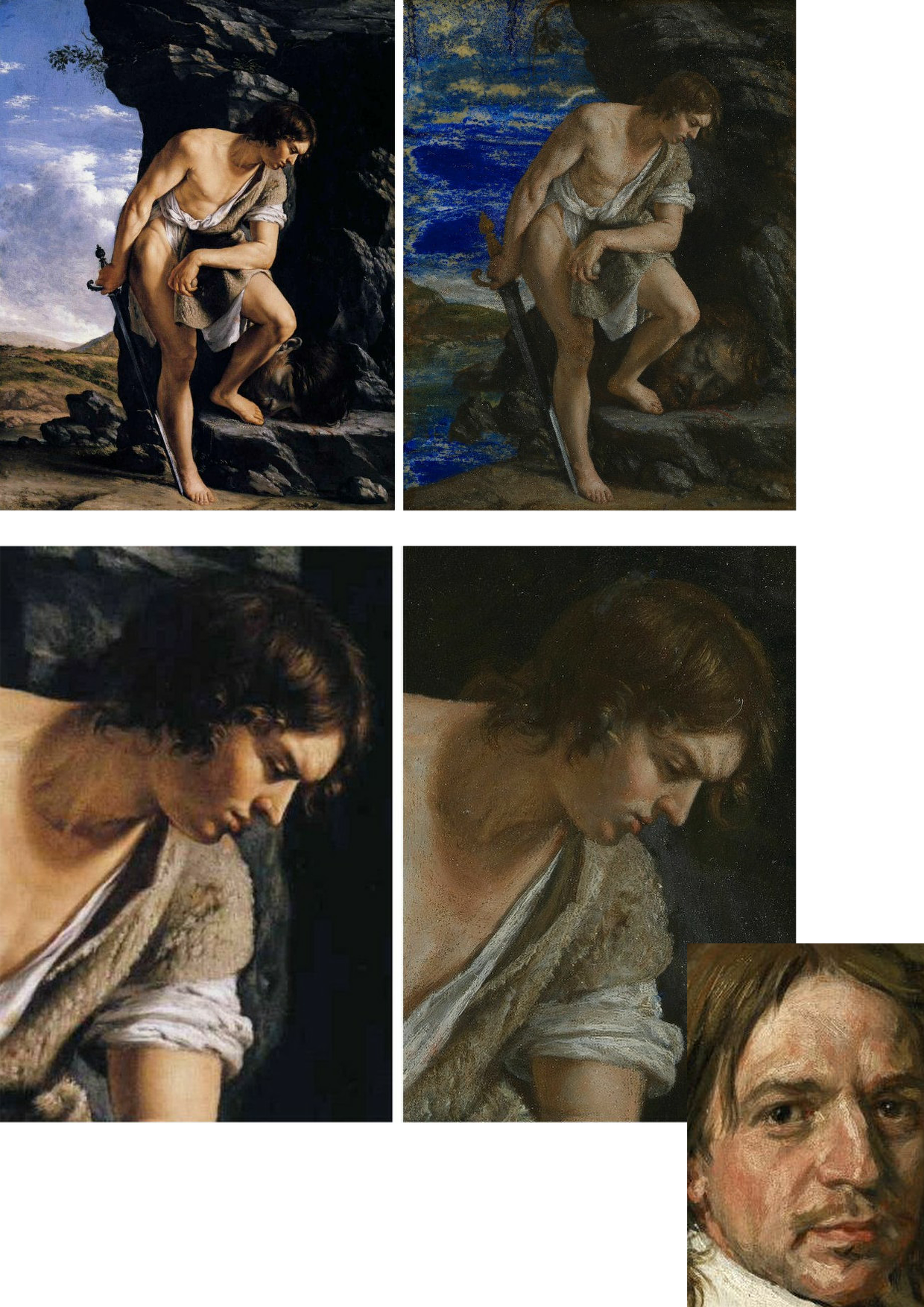
Above, Fig. 9: Here, left, we see the real Orazio Gentileschi David and Goliath (in the Galleria Spada, Rome) and, right, the loaned fake accepted as authentic by the National Gallery. Bottom right corner, the face of the fake Frans Hals portrait.
If, instead of whatever technical and art historical examinations were carried out, the National Gallery had run a few simple photo-comparison checks, as above at Fig. 9, it would have been apparent that the bona fide picture on the left had served as the model for the markedly inferior modern-looking version on the right. Had the fake Hals also been brought into comparison, as above, it would have disclosed a common authorial fondness – in two ostensibly historically disparate pictures – for arbitrary superimposed streaky white smears on the faces. In many respects, photo-comparisons are more helpful to appraisals than ones made from present and recollected pictures. First, there is a chronic logistical problem that Millar put well in 2004:
“…Although in tackling this particular problem it is more than ever essential to see the works in the original, it is difficult to compare works which are closely related but hundreds of miles apart, if not in different hemispheres. In spite of the legendary kindness of their owners these pictures often hang in inaccessible positions and never in ‘museum conditions’. Essential juxtapositions can hardly ever be made. The present state of the picture and the treatment it may have undergone in the past may also make it impossible to be entirely confident about its quality…”
Millar’s alertness to restoration-induced deformations may have been more evident in private than in public: in a letter held in a dossier at the Royal Collection he complained angrily of damage done to a Vermeer. As for his recognition of the need to effect ideal juxtapositions for comparative purposes, today’s sleeper-hunters might heed artists’ examples: when drawing or painting from nature they invariably align their sheet or canvas as closely as possible to their view of the subject, so that their eyes can either flick continuously upwards and downwards or sideways and thereby maintain a stream of direct visual comparisons between the subject and its evolving depiction. Such vital visual comparisons cannot be achieved with pictures in different locations and restorations can only be judged by before- and after treatment photo-comparisons because pre-restoration states disappear in restoration.
THE TWO PRETENDERS?
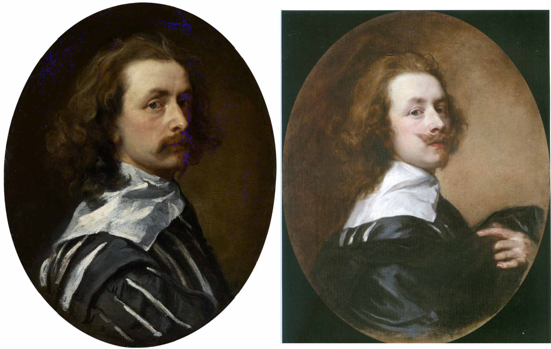
Above, Fig. 10: Left, the NPG “Last Van Dyck Self-Portrait”; right, the newly-restored, red-lipped and Grosvenor-accredited (and owned) “Last Van Dyck Self-Portrait”, as loaned to the Rubenshuis Museum, Antwerp.
When Grosvenor was about to unleash his own “Last Van Dyck Self-Portrait” in 2015 (above right), the NPG’s formerly “unquestionably genuine, pre-eminent, Van Dyck” £10m world-record price “Last Van Dyck Self-Portrait” (above left) constituted an intrinsic threat: any closely attentive aesthetic appraisal and comparison of the now two rival supposed last self-portraits risked injury to the standing of one or the other. Although many other unresolved problems were attached to Grosvenor’s newly upgraded work (see below), it can sometimes seem that nothing ever counts against an on-the-market potential upgrade – as with the evident discounting of the NPG picture’s utterly out-of-character, out-of-period, anomalous droopy Mexican Bandit-style moustache seen above and below.
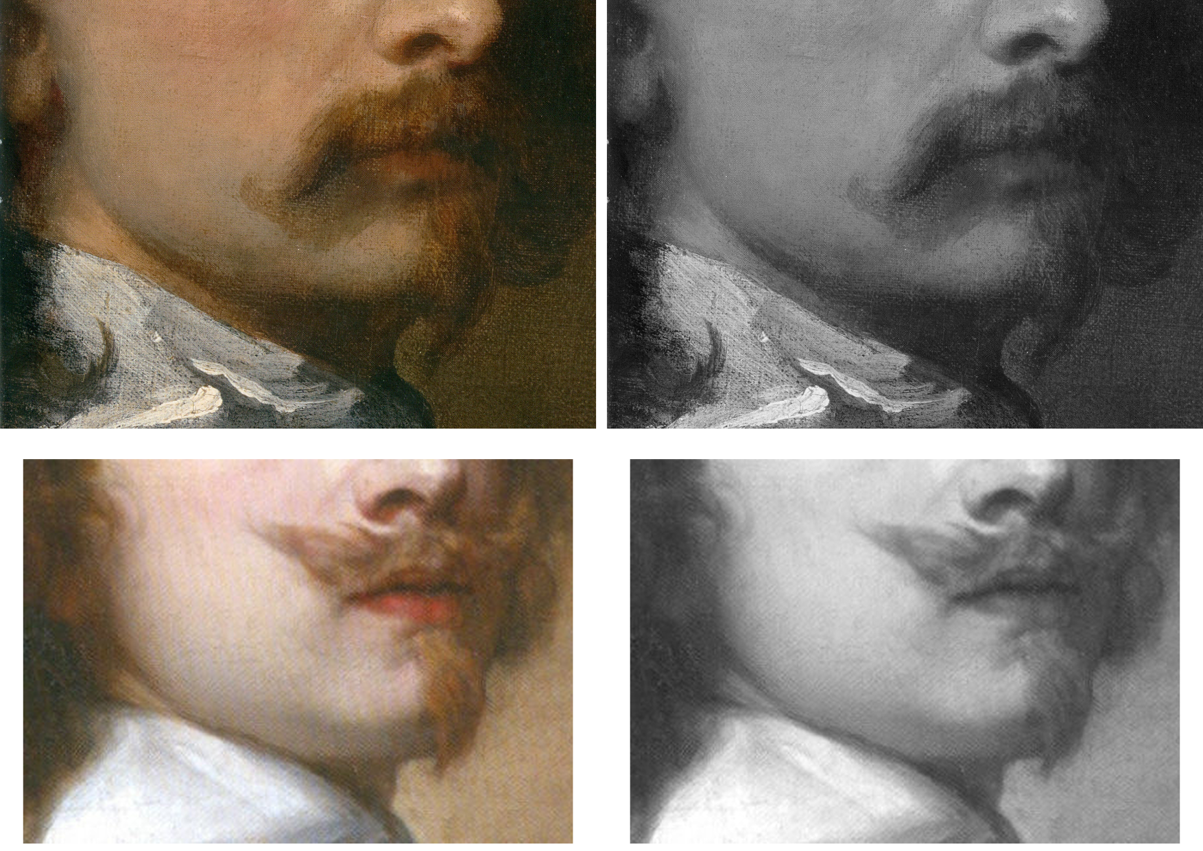
Above, Fig. 11: Top, detail of the National Portrait Gallery “Last Van Dyck Self-Portrait”; above, detail of the 2015 rosy-lipped Grosvenor-proposed “Last Van Dyck Self-Portrait”.
THE ANOMALOUS MOUSTACHE PROBLEM, PART I: GROSVENOR
Grosvenor has proposed that the NPG picture was a study for his own picture despite their numerous differences (see below). The most inexplicable difference is found in the two pictures’ moustaches, one of which is swept up, the other down. This divergence is presented with some ingenuity as a purposive species of social semaphore. Thus, within the NPG picture, which Grosvenor has reassigned to the role of a “study…[a] first attempt at the creation of a new type of self-portrait”, the moustache droops, where, in his own picture, the “moustache is raised, allowing not only for a more formal look perhaps appropriate to court appearance…” but also to illustrate the “difference between Van Dyck’s public and private faces…” Are we to understand, on the sole testimony of this (covertly upgraded) picture, that Van Dyck brushed his moustache down when going about his house and studio and brushed it up to attention whenever he thought he might be being observed?
While prompting incredulity, such a notion also defies artistic logic: given that works of art are made to a purpose within an artist’s practice, how can the same work be held a magnificent, self-sufficient masterpiece one minute and, in the next, to have been a study for another work of a different composition that would present a different aspect of the artist’s self-image to the world? In 2011 Grosvenor held that “the care and finesse of the brushwork in the face [of the NPG picture] is particularly assured” and that the whole was finished off with “more delicate and transparent glazes”. If Van Dyck really had been rehearsing the frigidly swanky public self-display found in Grosvenor’s painting, why would he have produced a highly resolved head which is not cocked back; where the artist does not look down his nose at the viewer; where he does not sport a cloak; where he does not hold a hand to his breast; or, even, where he does not wear a plausible collar that emerges from within his doublet?
THE ANOMALOUS MOUSTACHE PROBLEM, PART II: GLÜCK
Curiously, the problem of accounting for a rogue occurence within the oeuvre was not a new one. In 1941 Gustav Glück had addressed the same problem when he proposed yet another “Last Van Dyck Self-Portrait” version [*] to be Van Dyck’s last self-portrait (as at Figs. 2 and 3 above and 12 below). Describing his Self-portrait (which he had discovered a few years earlier “in a London private collection”) as a much more realistic and therefore interesting version than the Duke of Westminster’s sunflower self-portrait (then regarded as the last), Glück held it to constitute “authoritative evidence of the master’s appearance a short time before his death”, with features “still energetic and expressive, though lean and almost emaciated” – as at Fig. 12 below. The face looked, he felt, almost “spiritualised, and the melancholy character of the expression is enhanced by the ends of the moustaches being turned down instead of showing the upward twist they have in all of Van Dyck’s portraits”. No doubt yet other rationalisations could be made for this unique depiction.
[* We thus encounter two pairs of pictures, each comprised of a supposed Last Van Dyck Self-portrait and a supposed Lely copy of itself. In pressing his two discoveries, Glück acknowledged that “As is the case with most of Van Dyck’s works, several replicas and copies are known of this Self-portrait.” He recalls seeing the [later Mould/Bader/NPG] version and a head and collar copy (“near Matlock”) and a miniature. In 2011, Grosvenor, in contrast, simply accepted the then Mould/Bader picture as an indisputable autograph Van Dyck masterpiece on the authority of Sotheby’s (misleading) provenance and, perhaps, on the strength of it having recently been bought as such for the world record £8.3m by his employer and an investor.
Conspicuously, Grosvenor did not engage with Millar’s estimation of the picture – “The best surviving version of (probably) the last Self-portrait”. Instead, he gushes over the then-loaned privately-owned supposed Lely copy shown at Figs. 4, 12 and 13, as an “exceptionally good copy of a Van Dyck” which “must show that Lely had owned Cat. 1” – the then Mould/Bader picture. But why “must show?” when, as he further reports, the picture’s owners had “contacted us to say that they had a copy of our painting ascribed to Sir Peter Lely, but doubted by some to be by him…the monogram ‘PL’ was not of a type usually seen on Lely’s English portraits, and was thought to be false.” Grosvenor continued “We were immediately interested in researching Cat.4 further, for if it was indeed owned by Lely, it would help confirm that Lely owned Van Dyck’s last self-portrait, a theory much speculated on but unproven.”]
MOVEABLE FEASTS: THE NEW LAST VAN DYCK SELF-PORTRAIT
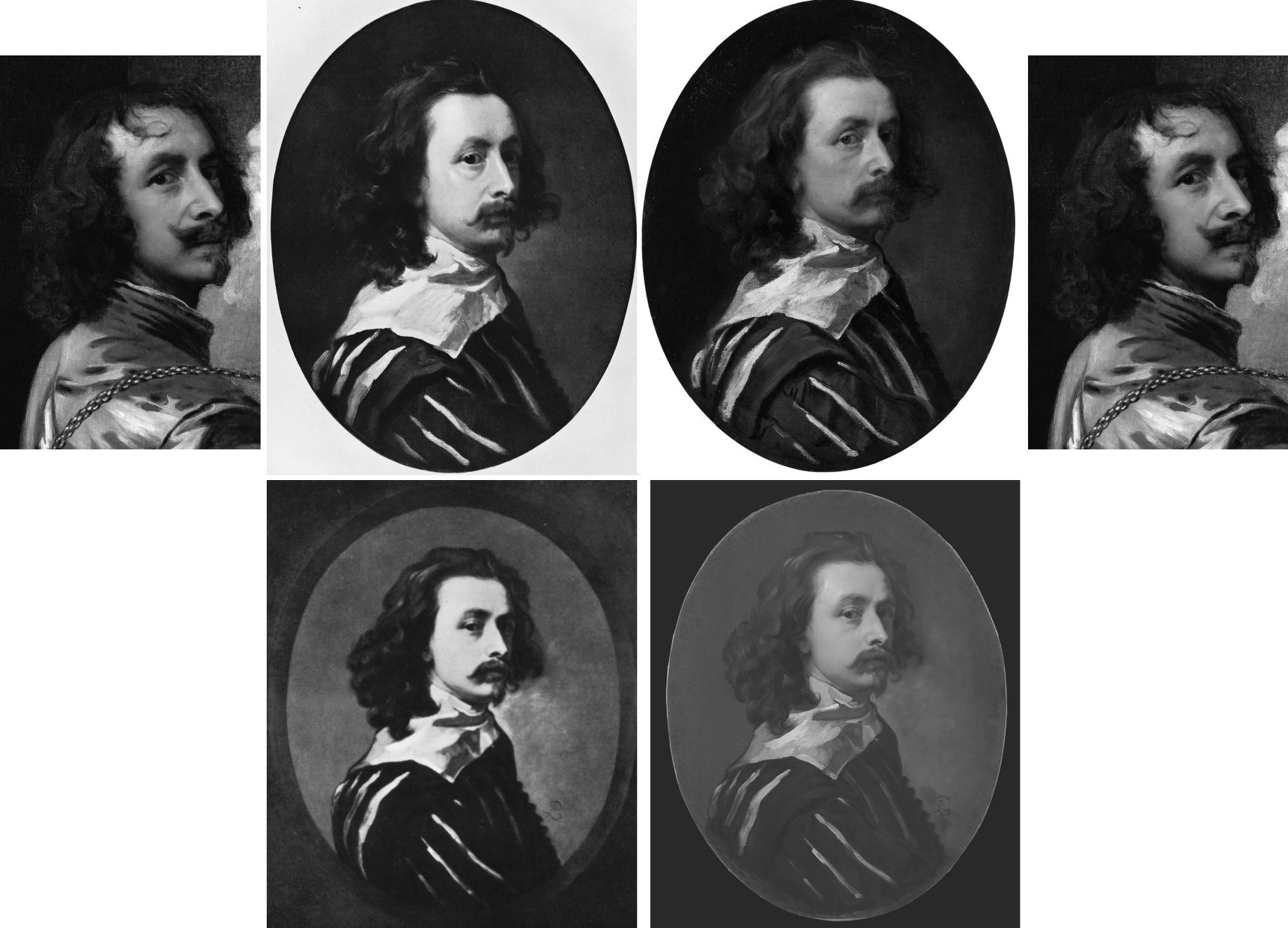
Above, Fig. 12: Top, left and top right, a detail of Van Dyck’s post-1633 Portrait of the Artist with a Sunflower; second left, the 1941 Glück-claimed “Last Van Dyck Self-Portrait”; third left, the National Portrait Gallery “Last Van Dyck Self-Portrait”. Above, left, a detail of the 1941 Glück-claimed Sir Peter Lely copy of the above claimed Van Dyck self-portrait; right, the Mould/Bader-claimed Sir Peter Lely copy of the NPG self-portrait (as published in the 2011 Mould gallery exhibition and catalogue as Cat.4).
In defence of his own Rubenshuis Museum-loaned “Last Van Dyck Self-Portrait” (above, Fig. 10, right), Grosvenor cheekily suggested “the dating of the National Portrait Gallery picture, currently thought to be c.1640 may need to be reconsidered, to perhaps between c.1637-39.” But why so – and on what stylistic basis is such chronological fine-tuning estimated? Not only had the NPG picture’s properties, appearance and relationship to other pictures not changed, only four years earlier Grosvenor had endorsed its late dating by “most scholars” to about 1640-1 – and on that late estimation he, like Glück (on another picture), had perceived a “faint air of melancholy” that added poignancy amidst the origins of the civil war about to erupt in London when the artist was “all the while plagued by the ill health that would shortly cause his death.”
It might seem that such recent perceptions notwithstanding, the NPG picture’s previous dating and estimation had to be jettisoned because Grosvenor was now seeking to attach his own painting to a “vacant” entry for a Van Dyck oval self-portrait, painted to the shoulders and with a hand to the breast, in an inventory of Charles I’s collection. If successfully attached, that entry would constitute a provenance jewel beyond price. But, most awkwardly, the original long-missing self-portrait had been recorded in the collection between 1637-39 and, therefore, Grosvenor’s newly upgraded candidate picture could not be said to have post-dated 1639. However, if so dated, and if the NPG picture were to be left in place at c.1640-1, the latter, with its pronounced differences from Grosvenor’s picture, would not only invite potentially damaging qualitative comparisons, it would retain the prized romantic cache on which it had been heavily promoted as Van Dyck’s last and most “modern” personal free-flowing etc., etc. depiction of himself.
Thus, and seemingly as if in protection of his own picture/investment, Grosvenor contended that the NPG picture, may no longer be considered the magnificent self-sufficient masterpiece that had commanded £1.7m on top of its world record £8.3m when sold to the NPG, and must now be moved back in time so as to do fresh duty as a study for his own picture – and therefore to predate his own picture which would become the new “Last Van Dyck Self-Portrait”, albeit at a somewhat earlier dating.
Although Millar had judged Grosvenor’s picture to be a copy of the lost picture that had been recorded in the Charles I collection, Grosvenor’s redating manoeuvre may have intimidated the NPG. Where it had held in its 2015 celebratory book Van Dyck – The Last Self-Portrait, that “Van Dyck’s self-portrait, now in the collection of the National Portrait Gallery… is probably the last and arguably the finest…” it now claims only that its picture is “one of three known self-portraits painted by van Dyck when he was in England, and it probably dates from the last years of his life”.
GROWING THE PROVENANCE
As seen, where Sotheby’s had claimed only that the [NPG] picture was “Possibly in the collection of Sir Peter Lely, d. 1680” and “possibly” in the 18th April 1682 sale of Lely’s estate, Grosvenor held in the 2011 FINDING VAN DYCK catalogue that his Cat. 4 (supposed) Sir Peter Lely copy of the NPG picture, “must therefore confirm that Lely owned [the then Mould/Bader picture and later NPG picture] and that it was sold from his [Lely’s estate] sale in 1682.” Again, why must it so confirm when the justification was especially feeble: “It is quite possible the self-portrait in Van Dyck’s possession at his death in 1641 was his last […] and that it passed into Lely’s possession at some point…Lely may have acquired it in a number of ways…Or, it may be that the painter and art dealer George Geldorp, for whom Lely worked when he first to came to London, was involved…” (Emphases added.)
In other words, Grosvenor had not added an atom of evidence that Lely had owned and copied the now NPG picture. He had not established when Lely first came to London or whether he had ever met Van Dyck: “Frustratingly, we do not know exactly when Lely first arrived in England, and [or?] the extent to which he knew of Van Dyck or knew of his estate. His early biographer Richard Graham, writing in 1695, said that Lely came over in 1641 (the year of Van Dyck’s death), whilst the art historian Arnoult Houbraken gives a date of 1643. It is perhaps most likely that the ambitious young Lely came to London in response to Van Dyck’s death thus ruling out any possible direct connection.” (Emphases added.) Nothing learned, no value added.
Not only had Grosvenor produced no evidence, he had disclosed in 2011 that the self-portrait in Van Dyck’s estate had not been rated highly by the artist’s contemporaries; and, that while the then Mould/Bader picture “now holds the world record for a work by Van Dyck” the painting in Van Dyck’s estate “had little value placed upon it” – to be precise, it was valued at 6s 8d, a fifteenth of a Van Dyck of Charles I in armour, and a sixtieth of Titian’s Perseus and Andromeda now in the Wallace Collection.
“IT IS, IF I SAY SO”
Lacking evidence that Lely had owned and copied the Bader/Mould self-portrait, Grosvenor, too, betrayed a note of anxiety in the 2011 catalogue: “The pictures after Van Dyck demonstrate that for the Van Dyck hunter the quantity and sometimes the quality of such copies can present potential danger.” In the absence of documentary evidence, Grosvenor played a bold card by appealing to the authority of his own eye: “…the first and most important skill you need to find a Van Dyck is simply the ability to spot a painting of the highest quality. If a painting is truly exceptional, the chances are it is by a truly exceptional artist.” Chance might be a fine thing, but its prospect is not a proof or a demonstration in the here and now.
THE SUPPOSED LELY COPIES OF THE SUPPOSED LAST VAN DYCK SELF-PORTRAITS
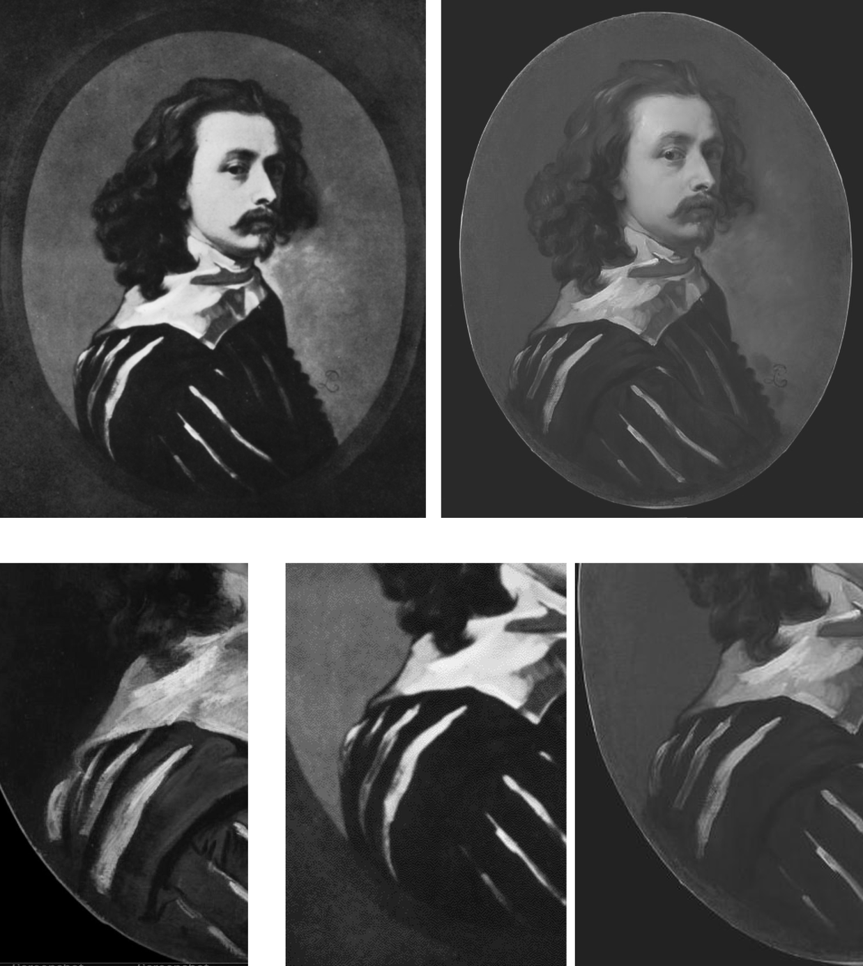
Above, Fig. 13: Top left, the attributed Sir Peter Lely copy, as published in 1941 by Glück; top right, the supposed Sir Peter Lely copy of the NPG self-portrait, as published in the 2011 Mould gallery exhibition catalogue. Above, details of costume from, respectively: the NPG self-portrait; the 1941 Glück-attributed Lely copy; the 2011 Mould/Grosvenor attributed Lely copy of the NPG picture.
Which of the two above versions is the more plausible Lely copy? Where is the Glück version today? Had it fallen by the wayside, much as had his 1934 espousal of what is now the Grosvenor/Rubenshuis last self-portrait (see below)? When did the Grosvenor/Mould-endorsed version of a supposed Lely copy first appear? Was it anywhere recorded before being taken to the Mould gallery? Do early photographs of it exist showing its reported appearance when enlarged onto a rectangular canvas? Did either of the canvases carry any historic material? Who owns it today?
It is said that when this unsettling mystery painting was brought to the Mould Gallery in 2010 shortly after the much-publicised acquisition of the £8.3m Sotheby’s self-portrait, it was “quite dirty and masked by a thick and substantially discoloured varnish.” The cleaning and researching were carried out by the Mould Gallery. Grosvenor claimed they had confirmed Lely’s authorship on the following grounds: [1] that after cleaning and restoration “there is no reason to doubt” it; [2] that “it is in fact by Lely”; and [3] that this is “a rare example of him copying another artist’s work”. The third claim weighed against it being a copy by Lely. The first statement was bluster – “there is no reason to doubt it”. The second contention was a non sequitur – Grosvenor asserted as fact something which had not been established.
SPOT THE DIFFERENCES
Grosvenor declined to address the discrepancies between the supposed Lely copy that had presented itself through an unidentified party to the Mould gallery from nowhere in 2010 or early 2011, and the supposed self-same Lely copy picture that had been published in December 1941 by Gustav Glück in The Burlington Magazine, “Reflections on Van Dyck’s early death” pp 172, 193, 195 and 199 (Fig. 12 above). There is a clear problem here: there are now two rival supposed versions of Van Dyck’s last self-portrait and each has its own supposed copy by Lely. Both pairs cannot be right. Where are the Glück ascribed pictures today? Have they been dismissed? Have they ever been compared with the two published Mould/Bader pictures?
A COVERT UPGRADE
In 2004, the now NPG picture had been described by Millar as:
“the best surviving version of (probably) the last Self-portrait, painted towards the end of Van Dyck’s years in London. The face is delicately modelled. The costume is handled very swiftly and in rough dry paint. There are some alterations made in the painting and it may be partly unfinished.”
In 2009 when included in the Tate’s “Van Dyck in Britain” exhibition, it was described in the catalogue on the (misleading) cited authority of Millar, as “thought to be Van Dyck’s last self-portrait”. Having died in 2007, Millar could not demur over the disappeared qualifier “after”.
On 9 December 2009, on the strength of that very recent Tate show and catalogue, Sotheby’s unequivocally presented what five years earlier had been no more than Millar’s “best surviving version” as an absolutely secure and precisely dated “Sir Anthony Van Dyck” – albeit on a provenance that began with two “Possiblys” – the first being “Possibly in the collection of Sir Peter Lely, d. 1680”. Sotheby’s declaimed:
“An outstanding self portrait by Sir Anthony van Dyck (1599-1641) – one of the most important Continental European artists to have worked in England – comes to auction with exemplary provenance[*] and an estimate of £2-3 million. The masterpiece, which is the artist’s last portrait of himself, was painted in London in 1641 in the final months of his life. It is one of only three self portraits that he painted in England and this, his last, captures him grandly attired in a black and white slashed silk doublet. The painting epitomises the elegant poise and relaxed informality that van Dyck brought to the art of portraiture in Britain and it undoubtedly ranks among the most important works by the artist ever to come to the auction market.” (Emphases added.)
[* On the accuracy of this estimation of the provenance, see Susan Grundy, below.]
THE “POSSIBLYS” AND “PROBABLYS” PLAGUE
A distinguishing characteristic of the upgrades stampede is the parading of superlatives and the drafting of fanciful provenances linked in daisy-chains of “possiblys” or “probablys”. This method was deployed to the most spectacular effect ever by Christie’s, New York, (albeit on the borrowed authority of the National Gallery which had earlier lifted it from a young art historian’s failed attempt to upgrade another and closely related Leonardo School Salvator Mundi) in their November 2017 sale provenance for the Louvre Museum-demoted $450m disappeared Leonardo School Salvator Mundi. It carried no fewer than three “possiblys” in the first item:
“(Possibly) Commissioned after 1500 by King Louis XII of France (1462-1515) and his wife, Anne of Brittany (1477-1514), following the conquest of Milan and Genoa, and possibly by descent to Henrietta Maria of France (1609-1669), by whom possibly brought to England in 1625 upon her marriage to King Charles I of England (1600-1649), Greenwich…”
In 1980, in Christie’s (London) sale of the now-National Gallery “Rubens” Samson and Delilah, the provenance began with three items prefaced: “Probably”; “Perhaps”; and “Perhaps”. The “Probably” – “Probably painted for Nicolaas Rockox” – was an own goal: if autograph, the work had to have been painted for Rockox because he was known to have commissioned Rubens to paint the subject. It was also known that two contemporary copies had been made from the subsequently lost Rockox Rubens original. They had survived. Both depart compositionally in the same manner from the National Gallery picture. In another Christie’s provenance item, the NG picture was said to be “perhaps” that recorded in an inventory of 1653 as a Samson (not a Samson and Delilah) by Rubens. There are two entries in that inventory, one to a Samson by Rubens, another to a Samson after Rubens…If those Samsons had been shorthand for Samson and Delilah, then the subject existed in two versions by 1653, one by Rubens and one after Rubens.
OVERTURNING AN INSTITUTIONAL APPLE CART
When, eventually, the Mould/Bader/Grosvenor campaign succeeded and the “Last Van Dyck Self-Portrait” was acquired by the NPG acquired in late 2014 many were happy: this was deemed a picture at the very top of the tree and Philip Mould’s apprentice, Grosvenor, had claimed no little credit for making it so (see below). However, some had seen matters differently: the means and manner of this particular upgrade attracted censure in a succession of expert warnings. In the May/June 2014 issue of the Jackdaw, its editor, David Lee, noted both disregarded expert opinion and a seeming over-eagerness to sell the picture – as seen below at Fig. 14:
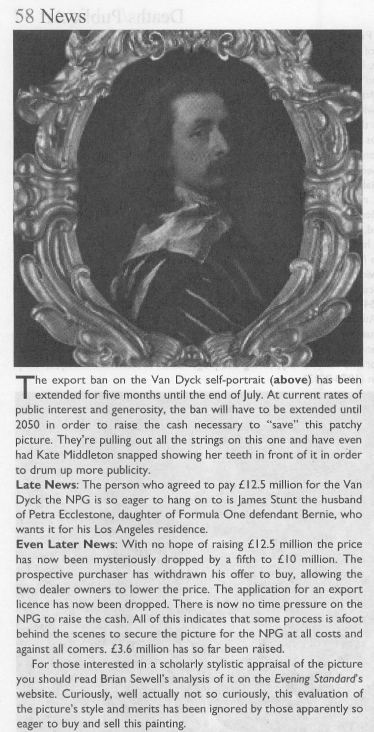
On 23 January 2014 the Evening Standard’s art critic, Brian Sewell, had written of what was about to become the NPG picture:
“…Van Dyck looks wistful, apprehensive and uncertain; he has not flattered himself and his image is the more compelling for its melancholy, yet this careful self-analysis is set on a bust painted with almost vulgar bravura, a rumpled collar of white lawn over a black doublet slashed with white. Not since he painted himself in Italy in black and white has there been such impetuous painting — and not nearly with so loaded a brush.
“I sense dissonance between the face and the costume, as though two quite opposing aesthetics are at work. Does the head sit easily on the bust, the shoulder more brilliantly lit than the face? What exactly is the form of the wide collar and how is it related to the neck? Has the hair been extended over the collar to disguise this awkwardness? It is of a darker tone and subdued definition.
“One question leads to another. Is it possible that Van Dyck painted no more than his face and rather shorter hair, and left posterity an unfinished portrait, to be completed by another painter?”
FOLLOW THE MONEY
Sewell’s doubts had been elicited more colourfully by the MailOnline on 7 December 2013 (“Petra Ecclestone’s husband hopes fight to keep £12.5m Van Dyck in Britain will fail as he snaps it up for their £55m palace of bling in LA”):
“Mr Sewell said: ‘The painting must have been as important in 2009 as it is now. Why did we not buy it then? They [the NPG] didn’t try.[*] They said they put their heads together with Tate Britain to see whether they could do a joint purchase, but they didn’t say a word in public. There was no question of raising funds from the public. But now they’re perfectly happy to start a fundraising campaign at £12.5m. The logic of it completely escapes me…If the picture is as important as everyone’s saying it is, it should have been bought at £8.3m. Now that it hasn’t, they’re putting £4m in the pockets of Philip Mould.”
[* What was not disclosed at the time was that the National Heritage Lottery Fund and the National Heritage Memorial Fund had told the Tate and the National Portrait Gallery, in terms, that they would not get a grant towards the picture’s purchase because of the great drain on those funds for the 2012 Olympics. That unexpected arts funding shortfall had killed off any chance that might have been hoped to exist to make a quick-flip profit on the world record £8.3m Van Dyck by selling it on to the NPG.]
On 9 December 2013, Grosvenor responded in a blog post (on his Art History News site) to Sewell’s criticisms with a double slur: “This is, of course, only the latest salvo in Brian’s apparent campaign against the painting, which can only, I presume, benefit the overseas buyer… His remarks are a good example of that unattractive British habit of demeaning anyone who happens to be successful. Sewell sniffed at something Mr Stunt may or may not have said about his collection (which is already one of the best for 17th C English portraits), when as a lover of art he should applaud the fact that a successful British businessman under the age of 30 not only cares about ‘old’ British art, but also supports, very strongly, exhibitions, publications, loans and research.” (Had Stunt supported the Mould Gallery’s FINDING VAN DYCK exhibition and its 80 pp catalogue? On his support for other Mould/Grosvenor research, see below.) Sewell’s remarks had been given in response to this MailOnline quote from Stunt:
“All my Lelys are important. In Althorp, the Earl of Spencer has the Windsor Beauties, which is a very famous group of pictures by the artist. I’ve been trying to rival the Windsor Beauties. I have more, I think, than him, and I’m just five off the Royal Collection.”
That does not sound made-up. Sewell had responded: “Oh dear. I don’t know him but if he’s setting out to rival Althorp and Buckingham Palace, that’s hardly a meritorious way of collecting. It’s cigarette cards.” Snobby, perhaps, but not without force and humour. Of course, there is nothing wrong with successful businessmen buying art – if: a) they have the means and really are buying; and b) they buy judiciously and not as if from some competitive, vainglorious shopping list. Stunt’s taste for old masters was entirely worthy.
SOME SERIOUSLY AWKWARD CONNECTIONS
The NPG picture’s standing had been again and more radically challenged by Susan Grundy on its authorship, condition, and circumstances. She has shown that both Sotheby’s and the Mould gallery’s citations of the scholarly literature had implied high scholarly support for a Van Dyck ascription that was simply not present. As mentioned, Gustav Glück had seen the now NPG self-portrait picture in 1941 but, then, he had judged it a copy – as had Eric Larsen in 1980 and 1988, and, as seen above, Oliver Millar in 2004. There had been no major scholarly support for the picture as an autograph Van Dyck.
On 26 April 2020 the Mail-on-Sunday reported Grundy’s further startling investigations: “Is the £10m Anthony Van Dyck ‘selfie’ that Kate Middleton helped save for the nation a cheap copy?”
Specifically, Grundy had said: “Philip Mould, the dealer who brokered the sale at such a handsome price, is one of Britain’s most recognisable art experts. He makes regular appearances on the Antiques Roadshow [he also fronts, with Fiona Bruce, the BBC’s Fake or Fortune] and is known as something of an authority on Van Dyck. But this story also involves the unlikely figure of Petra Ecclestone’s ex-husband James Stunt, who once described himself as a billionaire art collector, but is today known as a shambolic, foul-mouthed bankrupt. The Mail-on-Sunday has previously revealed that Stunt lent a number of fake paintings to Prince Charles’s charity at Dumfries House in Scotland where, embarrassingly, they were put on public display. And that attempts had then been made by intermediaries to use the fakes as collateral for millions of pounds worth of loans. The paintings have now been taken down from public view, although Stunt still maintains they are originals. But the businessman’s reputation was intact back in 2013 when, while still married to Formula 1 heiress Petra, he was looking to add to a vast and rapidly expanding collection of masterpieces and agreed to buy the Van Dyck from Mould’s client, Canadian industrialist Alfred Bader.”
In Grundy’s account “agreed to buy” is both the operative and a problematic term. “Client”, too, is problematic: confusion over the 2009 £8.3m purchase at Sotheby’s abounds. It was rumoured that Mould had bought with money loaned by Bader; some expressed surprise that Stunt should have bought it at all at £12.5m, because his purchases rarely exceeded six figures. Many reports referred to a joint Mould/Bader sale to Stunt but those were ambiguously phrased, and it is nowhere confirmed that Stunt had paid £12.5m, taken title of the picture and was about to remove it to the U.S. The Heritage Fund claimed the picture “was sold to a private collector who wished to take it abroad” but the Art Fund disclosed that the picture was bought by the NPG not from Stunt – or Mould – but from “Alfred Bader Fine Arts”, which, if correct, would necessarily mean that that picture had not been sold to Stunt and, therefore, that public monies had been given to block a supposed but phantom pending removal of the picture from the country.
WHEN WAS THE GROSVENOR “LAST VAN DYCK SELF-PORTRAIT MARK II” BOUGHT?
Establishing the point at which Grosvenor acquired his own supposedly superior and historically more significant “Last Van Dyck Self-Portrait” is of interest re both his claimed value-adding role in the promotion of the NPG picture and his subsequent cheerleading role for the public fundraising campaign to secure the picture’s entry into the NPG in 2014. In 2015 Grosvenor disclosed that a restoration of his own picture (Figs. 7 and 10) had taken place “over the last few years”. See below. He also declared that it was only when “all the overpaint and dirt” had been removed, that the very “possibility of a full attribution to Van Dyck [had become] worth pursuing further”.
The “I-had-no-idea-at-first” dealers’ trope was also encountered with the now-famous consortium of New York dealers who had never suspected that their manifest Leonardo School Salvator Mundi might be an autograph Leonardo prototype painting until a certain pentimento on a thumb emerged during restoration. Grosvenor, too, reports a pentimento-on-the-thumb that he, similarly, holds to confirm autograph Van Dyck status on his own picture. However, hands are notoriously difficult to draw even when making a copy – and, as Jacques Franck has demonstrated here, if such thumb pentimenti are to be taken as proofs of autograph states, the Salai copy of Leonardo’s St. John the Baptist would now be considered a second autograph Leonardo St. John the Baptist.
Intriguingly, Grosvenor disclosed that the (eventual) NPG self-portrait had been joined during its near five-year long residence in the Mould gallery by other Van Dyck finds. Of one such, the privately owned picture now on loan to the Minneapolis Institute (Figs. 1, 15 and 19), Grosvenor disclosed on 5 March 2015: “What a pleasure it was to work with Philip Mould in his gallery with it [the now Minneapolis picture] – sometimes we would treat ourselves and hang it next to the later Van Dyck self-portrait we also had in the gallery (the one which was bought by the National Portrait Gallery last year).” But what of the Grosvenor-owned picture which was loaned to the Rubenshuis Museum on 8 March 2016? Had that picture, too, been hung next to the hard-to-shift self-portrait that would enter the NPG in 2014?
A HANDY SOURCE OF POTENTIAL VAN DYCK SELF-PORTRAIT UPGRADES
For those wondering how quite so many Van Dyck self-portraits could turn up in one place in such short time there is a simple explanation: Grosvenor and Mould, like many of us, are avid students of the 2004 catalogue raisonné.

Above, Fig.15: Top row, three “self-portraits” as published in an appendix of copies by Oliver Millar in his contribution to the 2004 Van Dyck catalogue. Bottom row: the three recently upgraded former Millar self-portrait copies, as they presently appear, and the not-for-sale Indianapolis picture.
In this one small section of that invaluable and indispensable account of Van Dyck’s English period, Millar had unwittingly compiled a sort of sleeper-hunters’ treasure chest. Grosvenor has now upgraded the first two of Millar’s three Van Dyck self-portrait copies – and acquired one – both having been privately owned. Only Millar’s third self-portrait copy (above, top right) which cannot turn a penny because it is already in a museum – The Clowes Fund Collection, Indianapolis Museum of Art – remains on the upgrades shelf.
Thus, in the bottom row at Fig. 15 we see: left, the NPG picture judged by Millar to be “The best surviving version of (probably) the last Self-portrait, painted towards the end of Van Dyck’s years in London”; second left, the privately owned, Grosvenor/Mould upgraded self-portrait, now loaned to the Minneapolis Institute; second right, the Grosvenor-owned, restored and new “Last Van Dyck Self-Portrait” that Millar judged a copy of an unknown work recorded in the collection of Charles I; right, the Indianapolis picture with a fine gold chain – for excellent close-up photos, see here – that Millar judged the best-surviving version of an informal Van Dyck self-portrait of c.1634. It might be noted that in this informal attire and unhaughty demeanour, the artist’s moustache had not drooped or turned down.
VAN DYCK’S NOW TWO “LAST SELF-PORTRAITS”
Above, Fig. 16: Left, the National Portrait Gallery’s “Last Van Dyck Self-Portrait”; right, the Grosvenor/Rubenshuis Museum “Last Van Dyck Self-Portrait”.
So, to return to Grosvenor’s second and Rubenshuis loaned “Last Van Dyck Self-Portrait”, there are, as he acknowledges in his 2015-6 British Art Journal account, many outstanding problems of provenance: 1) “We cannot currently draw a direct documentary link from the painting today back to the royal collection”; 2) “there is no record of a payment by Charles I for the picture”; 3) the picture “was first certainly recorded in 1854 when accepted by Gustav Glück” [- sic Glück was born in 1871*]; 4) had the picture been the one owned by Charles I, it would most likely bear the royal monogram (the letters “CR” capped by a crown) on the back of the canvas – but it does not – see Fig. 18 below; and, 5), that the “somewhat loose, rapid handling of the Self-portrait is unlike the high degree of finish and detail that Van Dyck normally produced for Charles I”.
The last admission might seem particularly damaging given Grosvenor’s claim that the (in part) highly wrought NPG picture had been executed as a dress rehearsal for his own picture. Indeed, the NPG’s 2015 book had made a somewhat fanciful virtue of its picture’s stylistically incongruous execution: “The broad, rapid, virtuoso handling of the costume contrasts with the exquisitely fine painting in the face. The relative lack of finish in the costume draws attention to the act of painting that has produced this portrait, perhaps even suggesting that the artist is still in the process of creating it, while we, as viewers, watch him. It may be that Van Dyck was working in a more experimental way in this part of the painting, or it may simply be that it was left unfinished.” (Emphasis added.)
Which, then, might have been the case? The NPG, understandably, was at a loss because: “Nothing is known of the circumstances in which this portrait was produced: whether it was a gift for, or a commission from, a friend, relative or patron, or whether the artist had painted it for himself…” The work is therefore, an orphaned “one-off” or unicum – that intrinsically problematic art historical creature of which Professor James Beck warned his students at Columbia University always to beware. (He also cautioned students to address “what we know about this artist before what has been said or written”.)
[* Grosvenor effectively self-corrects the above slip in his BAJ footnote no. 27, when he cites the earlier and intended Gustav – Gustav Waagen – and his 1854 three-volume Treasures of Art in Great Britain [**]. Although Grosvenor gives the page number, he does not disclose how Waagen had referred to the painting. Had he said something flattering or simply cited an inventory? Grosvenor notes that Gustav Glück had later identified the picture as that in the collection of Charles I and that he had done so not on the grounds of stylistic analysis but of a contingent availability:
“As no other self-portrait answering to the same description is known, there can be no doubt that the picture…once belonged to the royal friend and warm supporter of Van Dyck.” Glück was playing the above-mentioned Denis Mahon Manoeuvre – conferring autograph status on the best available picture. In this case, Glück conferred it to the only possible surviving candidate. With his own (Rubenshuis) self-portrait picture, Grosvenor seems to follow the Gluck/Mahon practice even though he has also identified a second version of the picture that is of similar size and composition. Without addressing the possibility that both versions might have been copies of a lost autograph prototype, as Millar had concluded at the end of a long and distinguished career, Grosvenor holds the newly discovered version (below, Fig. 17, top left) to be a later copy of his own picture, and thereby elevates his own picture from Millar’s copy of a lost original to the original Van Dyck painting.]

Above, Fig. 17: Top row, left a copy of a Van Dyck self-portrait attributed by Bendor Grosvenor to Charles Jervas (1675-1739); the Grosvenor attributed Van Dyck self-portrait before its two-year long restoration; the Grosvenor attributed Van Dyck self-portrait after its restoration. Bottom row: left, the NPG “Last Van Dyck Self-Portrait”; centre, the Grosvenor, Rubenshuis “Last Van Dyck Self-Portrait” before restoration; centre and right, the Grosvenor, Rubenshuis “Last Van Dyck Self-portrait”, as before and after restoration.
In the above-cited Mahon case, it took fifty years for the now accepted original version (at the Prado) to emerge and show Mahon’s claimed “autograph original” to have been a copy – which should have been recognised all along because it, just as with the National Gallery “Rubens” Samson and Delilah, was known from an etched copy to be a compositionally truncated version of a lost original. Where Millar resisted temptation to play the Glück/Mahon/Grosvenor gambit and judged what is now Grosvenor’s picture (above, Fig. 17, top right) to be no more than an early copy of a missing painting, Grosvenor has followed Glück’s earlier “opportunist” elevation (of what is now his own painting) even though it had not gained critical acceptance on Glück’s ascription and had been sold in 1969 for $350 as “after Van Dyck” and for $3,120 in 2006 as “after Van Dyck” (- when possibly bought by Grosvenor). As Millar appreciated, being the only available candidate is not a sufficient qualification for a painting to be accepted as autograph.]
[** As for Waagen’s cited but not quoted observation of Grosvenor’s picture, it too might best be treated with caution. When Nicholas Penny upgraded the Duke of Northumberland’s “Madonna of the Pinks” to Raphael in the February 1992 (Burlington Magazine – “Raphael’s Madonna dei garofnai rediscovered”), he quoted Waagen’s fulsome comment: “on occasion of my visit to England in 1854 I had the privilege of spending a day at Alnwick castle as his Grace’s guest…It is well known that the charming composition is by Raphael and of all the numerous specimens of the picture that I have seen, none appears to me so well entitled to be attributed to his hand as this.” High praise, certainly, but there were three overlooked dangers. First, gushing hyperbole in ascriptions might seem a required social obligation for guests of Dukes – Bernard Berenson and his wife were thrown out of a Scottish Duke’s lair late on a stormy evening when the scholar advised that his Grace’s “Leonardo” was no such thing. Second, Waagen had spoken twice on the Northumberland picture and both of his comments should have been addressed together. Waagen’s helpful-to-Penny’s-cause, praise appeared in the fourth and supplementary 1857 volume to his three-volume 1854 Treasures of Art in Great Britain. In the 1854 Vol. III, p. 253, Waagen, who had yet to enjoy the Duke’s hospitality, had dismissed the Northumberland picture (that would, like the NPG Last Self-portrait be Saved the for The Nation at £22m as the National Gallery’s Raphael “Madonna of the Pinks“): “the small picture in the Camuccini collection at Rome which I do not consider to be original. The tone of the flesh has something insipid and heavy. The treatment makes me suspect a Netherlandish hand.” Third, Waagen’s later fulsome revised comments were written in the knowledge that the whole Camuccini collection was to come to Alnwick Castle, having been bought by the Duke in 1856 (- as James Beck disclosed in his posthumously published 2007 book From Duccio to Raphael: Connoisseurship in Crisis, three chapters of which anatomised the untenability of the National Gallery picture’s Raphael ascription). Had Waagen stuck in 1857 to his earlier scholarly/critical guns, a Duke would likely have been mightily displeased, and Italy’s already lucrative “old masters” export industry would have been thrown into question if not crisis. However, of the two Waagen accounts that of the slightly younger, more disinterested c.1854 self better withstood the test of time: as with the Glück-ascribed now Grosvenor last self-portrait, the Duke’s picture duly came to be seen as a version of a lost Raphael autograph prototype painting – as Penny himself described it, as one of “numerous versions” with none being “generally acknowledged as an original work by Raphael”. It was only on Penny’s 1992 advocacy resting on the authority of the slightly older Waagen’s 1857 obsequious effusion that the scholar’s own earlier, sounder appraisal was eclipsed. When Penny stayed at Alnwick Castle – the second greatest castle in Britain – in the early nineteen-nineties (“The author is grateful to the Duke of Northumberland, the Duchess of Northumberland and Lady Victoria Cuthbert for their hospitality and encouragement”) the potential “oven-ready” upgrade in the form of the ex-Camuccini picture remained lurking-in-residence in its elaborate 19th century frame bearing the proud ascription “Raphael”, patiently awaiting a new scholarly response.]
THE MISSING MONOGRAM ON A GROSVENOR UPGRADE
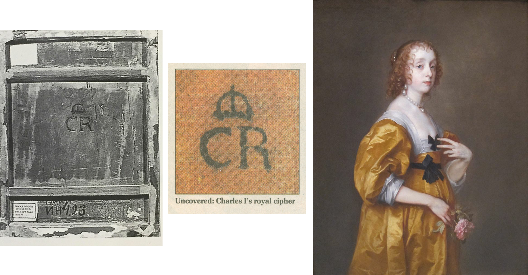
Above, Fig. 18: Left, the back of the Pushkin Museum’s Salvator Mundi by Giampietrino which carries the Charles I monogram, at which period the picture had been attributed to Leonardo; centre, the Charles I monogram found on the back of the Van Dyck painting of Mary Villiers; right, Van Dyck’s Mary Villiers portrait
The presence of a monogram confirming ownership by Charles I adds very considerable value. In 2002 the Mould gallery discovered one (above, centre) on a Van Dyck portrait of Mary Villiers (above, right) that had been bought for £437,587. On discovery of the monogram (made, as with Grosvenor’s picture, during the traumatic act of stripping off and replacing a backing canvas) the Mould picture’s asking price leapt almost fourfold to £1.6m. It follows that Grosvenor’s Rubenshuis Van Dyck will likely be worth a quarter of what it might otherwise have beeen, had it been in Charles I’s collection and duly stamped with the royal monogram.
OUT OF THE FRYING PAN…
Lacking evidence that his picture had been in Charles I’s collection, Grosvenor addressed the absent record of a payment with an initial surmise that the picture had been presented by Van Dyck as a gift to the King. He then added: “Of course, the presumption that the self-portrait was originally presented to Charles I may be incorrect, and if it was part of the collection of Henrietta Maria instead (whose collection was looked after by Daniel Soreau of whom we know little), we would not expect to find a cypher [monogram] on the back.” (Emphases added.)
A neat swerve, but an expectation of an absence of evidence that rests on an unsupported supposition cannot be rolled together and taken to constitute evidence of any kind. If the picture lacks a monogram it lacks a monogram and that tells against it having been in the collection. If it lacks both a monogram and a record of payment, there is certainly no ground for concluding that it must therefore have been gifted by Van Dyck to the King’s wife, because that blatantly begs the question. Grosvenor reports that after the king’s execution the Van Dyck self-portrait that had been in the collection had been bought by the artist’s former assistant and copyist, Remigius van Leemput – and he says so on the cited authority of Oliver Millar, who judged the now-Grosvenor picture…to be a copy of that lost, formerly Charles I Van Dyck self-portrait.
The escape clause possibility of the picture having been owned by Henrietta Maria was suggested to Grosvenor by Margaret Dalivalle who had attempted to underpin the claimed double royal pedigree of the (now-disappeared and Louvre Museum-downgraded) $450m Leonardo school Salvator Mundi with a speculative suggestion that the painting might have been brought to England from the French royal collection by Henrietta Maria. It was also being claimed that the (then New York) Leonardo-attributed Salvator Mundi was the Leonardo Salvator Mundi that had been recorded in the Charles I collection. No evidence supported that claim and in 2018 another picture – the one that really had been attributed to Leonardo when in the collection of Charles I and the one which really does bear the royal monogram (above left, Fig. 18) had emerged in the Pushkin Museum, Moscow. However, that Salvator Mundi is of a different composition and, besides, it had been downgraded to Leonardo’s assistant Giampietrino. Thus, the painting that had been in Charles I’s collection as a Leonardo was not a Leonardo, regardless of whether or not it had been brought from the French royal collection, which it hadn’t: after years of trawling archives, Dalivalle admitted that she had found no evidence that Henrietta Maria had brought the painting from France and had abandoned her search.
A SERIALLY BEGGED QUESTION
In the absence of material or documentary evidence on his Last Van Dyck self-portrait, Grosvenor again appeals in circular fashion to the authority of his own judgement-by-eye on the picture’s artistic merits, which judgement he again confounds with hard evidence: “There is however, other evidence to suggest that this painting did indeed hang at Whitehall, in addition to the fact of its overall quality, and the fact that it certainly appears to be an original work by Van Dyck.” Having conflated his own impressions and judgements with facts, Grosvenor proceeds to add that Van Dyck, “is unlikely to have presented his patron with a second version or a studio replica” when he has not established that the (formerly $350) picture which he owns had been presented to Charles at all. (All emphases added.) Once again, “evidence” that “suggests” that something had happened of which there is no evidence, is not evidence, it is simply wishful thinking. Grosvenor’s painting could not have whispered in the Mould gallery (- had it ever been presented there) that it had once hung somewhere else in London.
If proof were ever to emerge that Van Dyck had gifted an unrecorded portrait of himself to the king’s wife, it would immediately beget another sleeper-hunting opportunity: Where is the Van Dyck self-portrait that was listed in the king’s collection and that would be expected to bear the royal monogram? Were such a monogrammed Van Dyck self-portrait to turn up tomorrow, we would then have two self-portraits gifted by Van Dyck to the royal couple (one to each), just as we now have two claimed last Van Dyck self-portraits in the NPG and Rubenshuis pictures.
BOUNCING THE NPG?
Whatever the exact relationship in this recent Mould and Bader “adventure in old masters”, two things are clear. First, an initial attempt to sell the £8.3m picture to the NPG failed. When the Philip Mould enterprise found no buyer for the picture between 2009 and 2013, the £8.3m purchase at Sotheby’s must indeed have seemed a hair-raising liability. Second, that although James Stunt’s much-reported purchase of the painting for £12.5m never materialised, his repeated and noisily declared intention to remove the painting from Britain greatly assisted the picture’s eventual sale to the NPG.
On the picture’s true or fair value between 2009 and 2014, there is no evidence that the already world record £8.3m Van Dyck had been sold for £12.5m to Stunt, a well-known collector of six-figure Lely paintings. Waldemar Januszczak mused in the Sunday Times: “Why Stunt has chosen to go for the Van Dyck now, when it has been hanging in Mould’s gallery for three years I do not know.”
HYPING A TOP-PRICE WORK
Putting Stunt’s involvement to one side, it might also be asked how the NPG’s £10m purchase of a picture that had been stealthily offered as a safely autograph work (on no scholar’s published account) in 2009 and on a £2-3 million estimate at Sotheby’s, came to be taken as a matter of Very Great National Concern. On 8 December 2013, Richard Brooks rebuked the NPG for dilatoriness over the purchase (Sunday Times “£3m bungle over Van Dyck selfie”): “…the gallery had the chance to buy it four years ago for at least £3m less than it will now have to pay”. If Brooks had meant that had the gallery bid directly at Sotheby’s 9 December 2009 auction it could have got the picture for the £8.3m paid by Mould/Bader, Grosvenor has countered: “we were delighted to acquire it in partnership with Alfred Bader for £8.3m. In fact, we had been prepared to bid much higher, and were slightly surprised when the hammer came down.”
Brooks continued: “In fact it [the NPG] missed the opportunity to buy the painting not once but twice…The gallery had in fact been tipped off by the auctioneer, Sotheby’s, that the painting was coming up for sale four months earlier, in August 2009, when one of its staff went to see Sandy Nairne, the director of the Gallery. ‘It was a heads-up for them to see if they could buy,’ said Sotheby’s last week. Nairne decided not to bid. Last week Nairne confirmed that the approach had been made but said he had worried about the ‘uncertainty’ of buying at auction. It was also thought that the earl [of Jersey] did not seem interested in selling privately to the gallery.” This last was likely the case – Grundy established that the earl had put his own family pile on the market at c.£10m, so he was not likely in financial self-sacrifice mode.
Having bought the picture for £8.3 million at auction, Brooks continued, “Mould and Bader offered the gallery another chance to buy it, this time from them. Initially they asked for £10 million but this was subsequently dropped to £9.5 million…” Those successive reductions might have been public-spirited generosity towards a national institution, but they could also have been hard-nosed commercial realism: the picture was proving impossible to shift. Four other parties, including two non-UK museums, were said to have driven the auction price to £8.3m but having dropped out at that price they were unlikely to re-enter at £10m, £9.5m or £12.5m – as indeed had resoundingly proved to be the case by 2013 when the work remained unsold. All in all, Brooks seemed rather cross that the NPG was not playing ball with a gallery that had failed to shift a picture bought three years earlier at a world record price with the assistance of an industrialist/collector.
HOW SOLID WAS STUNT’S OFFER TO BUY AT £12.5m?
Januszczak appreciated that: “the timing [of Stunt’s late-buying and declared intention to remove from the country] has forced the NPG and the government into action” – which action he and Grosvenor supported. As for Stunt’s declared intention to remove the picture from the country, had he bought it earlier for less and immediately applied for an export licence, there would, Grosvenor has claimed, have been no opposition and the picture would certainly “have left the country”. Instead of quietly buying it for £9.5m and removing it unopposed from the country, Stunt waited until the end of 2013 to declare an intention to buy the picture at the then full Mould/Bader £12.5m asking price and, simultaneously, to remove it from the country. For sure, that last declaration prompted the picture’s supporters to seek and obtain a three-month government export ban in November 2013. Stunt then amplified his Threat-to-Remove by saying that although he well understood the move to block his purchase from Mould, he still hoped he would be able to “take it to his home in Los Angeles and enjoy it.” Thus, without costing Stunt a penny, his noisy public stance greatly facilitated the Mould/Bader sale to the NPG when no other buyer was in sight.
A MAN OF SEVERAL HATS
Above, Fig. 19: Left, the newly attributed Van Dyck self-portrait on loan to the Minneapolis Institute of Arts (as discussed below); right, a 1925 Max Beerbohm cartoon in his “The Old and the Young Self” series. (Caption: Mr Arnold Bennett – Old Self: “All gone according to plan, you see.” Young Self: “My plan, you know.”)
Grosvenor’s role as a Mould employee becomes a greater matter of interest given his possibly overlapping role as a private, stand-alone collector/connoisseur. On 14 November 2013 he posted a blog saying that the picture had been sold to an overseas buyer [Stunt] and added: “For the art dealing day-jobber in me, this has to be seen as a Good Thing. We [at Philip Mould] bought the picture (in the thick of the global downturn) because we believed in it, and had the aim of adding value and selling it on. And I believe we have done that… However, for the Van Dyck fan, it obviously pains me that the picture might leave the UK. And it doubly pains me that I might in some small way be responsible for that!”
How so? In addition to his value-adding obligations as a Mould gallery employee, Grosvenor had attended a Government Export Licence Review “as a representative of the picture’s buyer [Stunt]”. It is not clear whether Grosvenor had spoken in support of, or against, Stunt’s declared intentions to remove the picture, at the Review – or whether, whichever line he adopted on that occasion, Stunt had known of it. It is possible that Grosvenor confined his remarks to underlining the seriousness of Stunt’s threat to remove the picture from the country but on 14 November 2013 he hinted that he had opposed the Mould gallery client’s declared intentions:
“A month or so ago we attended the UK government’s Export Licence Reviewing Committee – as representatives of the picture’s buyer – at the Arts Council’s new office… [and the picture] was temporarily blocked for export by the committee on all three ‘Waverley’ criteria (which is unusual). I felt a strange pride in Sir Anthony for pulling that off.” For “Sir Anthony”, we can only read “Dr Grosvenor” and further assume that Stunt was happy to have his by then doubly expressed determination to remove the picture from the country thwarted by a Mould gallery employee. Grosvenor asked: “Will a UK institution [now] be able to raise the funds to stop the sale?” With his gallery salesman’s hat on, he helpfully volunteered: “The price is £12.5m (about 1/3 of a Koons Orange Dog).”
Eleven days later (25 November 2013) Grosvenor reported: “I went to the launch this morning of the National Portrait Gallery’s campaign to save Van Dyck’s last self-portrait for the nation. The picture has been sold to an overseas buyer, and the NPG has 8 months to try and raise £12.5m to keep the painting in the UK. It’s the largest such campaign ever mounted by the NPG… Regular readers will know that I work for the company which has sold the picture, so I’m in something of a predicament. But of course, the Van Dyck fan in me (he’s my favourite artist) wants to see the picture remain on public display in the UK. A large part of whether the campaign to save the picture succeeds will come down to how the public reacts…” (All emphases added.) On the face of it, Grosvenor was openly campaigning against the interest of a Mould/Bader client who, reportedly, had already paid £12.5m and delivered a £4.2m profit to Mould/Bader on an £8.3m picture, and yet, at the same time, he was commanding the country to come to the aid of a public institution so as to help it buy the picture for £12.5m from a dealer and his “progenitor of adventures in old masters” partner/backer.
“ULTIMATE BUYERS”
Again, concerning the price, in his 25 November 2013 post, when scolding Sewell for challenging the attribution and for claiming the NPG could have bought for less than £12.5m had it acted sooner, Grosvenor retorted: “How does Brian know where we, as the ultimate buyers (in partnership with Alfred Bader fine arts) would have stopped bidding? I can tell you now that the NPG would not have got it at auction for less than the asking price today.” Thus, we learn that the Bader-backed Mould gallery had been prepared to buy the supposed Last Van Dyck Self-Portrait for very appreciably more than £12.5m. Having already routed all opposition in 2009 with an £8.3m bid, who – other than the NPG – might have been expected to buy the picture after four years of no-sale? We say “no-sale” because if the picture had belonged to Stunt it would have been reputationally reckless behaviour for the vendor, after taking payment, to seek to block the buyer.
In November 2013 Grosvenor complained “Waldemar [Janusczcak] is mounting a one-man campaign to have my employer donate the picture to the NPG…” – which tacitly disclosed that Mould/Bader were still the owners. An anonymous, but evidently well-informed reader commented on Grosvenor’s website: “…Mould and co are entitled to profit from 1) saving the Van Dyck four years ago by taking the risk of purchasing it at auction during a very difficult period 2) holding the painting for four years with a lot of someone’s capital in it 3) researching the picture to add to its value all that is now known about it.”
THE PRESS WEIGHS IN
When Stunt’s reported bid to remove the picture spurred the NPG’s attempt to retain the picture in Britain at £12.5m, many journalists urged the public to contribute to the “Save-the-Picture” fund. In the Times Ben Macintyre hailed Van Dyck as an exemplary immigrant who had enriched his adopted home – a mongrel nation avidly open and welcoming to foreign talents, in which he was knighted, married into the aristocracy, buried in St Paul’s and had left as his legacy a transformed British school of painting that, having passed through Gainsborough and Reynolds to Singer Sargent, “is still felt nearly four centuries later”. That was a perfectly fair and attractive (if by no means original) analysis. Van Dyck’s last and greatest of all self-portraits, Macintyre assured readers, depicts a man who has found his home from home, “and that is where he should stay.” Against that somewhat sentimental reading, evidence suggests that, ahead of the end of Charles I’s reign, Van Dyck was looking to jump national ships.
Jonathan Jones in the Guardian asked “£12.5m for a self-portrait by Anthony van Dyck? That’s what the National Portrait Gallery and the Art Fund are trying to raise in an appeal launched today. Is it worth it?” Sporting hyperbolic philistinism, he self-answered: “Absolutely. I think this is one of the most worthwhile campaigns in years to ‘save’ a work of art for the nation. Van Dyck’s Self-Portrait would make a spectacular addition to the National Portrait Gallery. Quite frankly, it could make the place. It would give a gallery stuffed with pictures of primarily historical interest a true artistic masterpiece, by the man from Antwerp who gave birth to British art.”
In the Spectator the historian Andrew Roberts wrote: “Of all the great British portrait painters, Van Dyck is by far the most important not to be represented by his own portrait in one of the great British public collections, considering how central he is to the history of the British school of painting and how his influence has grown over the centuries. ‘We are all going to heaven’, Gainsborough said on his deathbed, ‘and Van Dyck is of the company.’ For the National Portrait Gallery, the story of Britain that it attempts to tell through portraiture is simply incomplete without a portrait of Van Dyck, which has long been identified as one of the major lacunae in its otherwise superb collection. This is the only chance a museum or a gallery in the United Kingdom has of acquiring the masterpiece and it’s the only portrait of the artist ever likely to be made available for acquisition by a British public collection…”
Grosvenor purred on his 28 November 2013 post: “excellent piece by historian Andrew Roberts in the Spectator on the NPG’s campaign” without disclosing that since May 2013 Roberts had been an NPG trustee. Nor did he demur when Roberts assured the public that this was “the only chance” of acquiring what was the “only portrait of the artist ever likely to be made available for acquisition”. Not the slightest hint was given that three Van Dyck self-portraits were in the offing and on 8 December 2013, the Sunday Times prodded laggards: “James Stunt, who is married to Bernie Ecclestone’s younger daughter Petra, has already put in an offer of £12.5m and hopes to hang the piece in his Los Angeles mansion.”
A PROLONGED STRUGGLE TO RAISE THE READIES…
On 17 February 2014 Grosvenor announced:
“The National Portrait Gallery has successfully argued for an extension to the export bar on Van Dyck’s c. 1640 Self-Portrait. This means they have another 5 months to try and raise £12.5m, which is the sum required to match the picture’s sale price. The NPG has already raised a quarter of that amount, from bodies such as the Art Fund, the Monuments Trust, and also (impressively) nearly a million from smaller donations made by members of the public…” That left some £8.2-3m to find – effectively the full original world record price paid at auction. Once again, Grosvenor reminded his readers: “I’m in something of a quandry [sic] on this one, given that Philip Mould & Co., for which I work, sold the picture to an overseas buyer.” (Emphasis added.)
AN EMPLOYEE HELPS BROKER A NEW CUT-PRICE MYSTERY DEAL
On 26 March 2014 Grosvenor announced he had been working on “a new deal to help the National Portrait Gallery’s campaign to acquire Van Dyck’s final Self-Portrait” and that the target price “has now been reduced from £12.5m to £10m.” Who exactly was working with whom – and how – on this deal? What role had Grosvenor played? Stunt, he reported, had issued a statement: “When I agreed to buy [not when I bought] this great portrait I didn’t expect the huge swell of public opinion and strength of emotion its export would generate…I have reconsidered my position and have decided, with Dr Bader and Mr Mould’s agreement, to withdraw from the process.” Had Stunt owned the painting he would neither have been able to withdraw from a process, nor have required the agreement of Bader and Mould to sell his own picture to the NPG at a supposed-billionaire’s public-spirited £2.5 million loss, should he have wished. Presumably, Stunt meant only that he was withdrawing both an earlier undertaking to purchase and a declared threat to remove the painting on purchase.
Had Stunt feared opprobrium on removing the picture from the country, he could have bought it on an agreement not to remove it – he had three homes in London at that time. Given that, for whatever reason, the well-publicised Stunt purchase had vaporised, and that Mould/Bader still had no buyer in view – other than the NPG which was clearly struggling to match the reported sale at £12.5m – why did they not revert to their earlier £9.5m offer to the gallery?
At that price, Mould/Bader would still have made £1.2m profit on their £8.3m purchase – almost as much as the £1.4m contributed by the donations of 10,000 members of the public – while earning kudos for contributing to the public weal. Grosvenor reported that Mould and Bader had responded separately. Mould had said: “I am delighted to be able to help the National Portrait Gallery’s campaign in this way”. In what way had he helped? Had he volunteered a £2.5 million cut on a painting he (or he and Bader) still owned but could not sell? Or, had the elderly Bader been the near- or actual owner, with Mould and Grosvenor having acted as his agents in an attempt to flip a £8.3m painting to the National Portrait Gallery?
A CHEERLEADER CONSTRAINED
“And, for what it’s worth”, Grosvenor continued, on 26 March 2014, “here’s what I have to say. Regular readers will know that previously I’ve had to tread carefully when it came to the NPG’s campaign. Van Dyck is my favourite artist, and I’d naturally like to see his final Self-Portrait stay in the UK and on public display. But my responsibilities towards our clients meant that I couldn’t be as much of a cheerleader for the [fund-raising] campaign as I’d liked. Now that Mr Stunt is no longer buying the picture, and Dr Baders [sic] and Philip Mould have agreed this new plan in favour of the NPG, however, all efforts can be focused on the Gallery’s fundraising. I’m pleased with the outcome.” (All emphases added.)
Ostensibly, that was inscrutable: Grosvenor talks of clients when only Stunt had reportedly been in the picture; Stunt is now not buying and therefore, contrary to all previous claims, he had not bought. How real, then, had been the threat to remove the picture from the country? Had it become apparent to Mould/Bader that even with the extended leave to raise funds, the NPG was unlikely to raise the necessary £12.5m? Was it not the case that no one was interested in buying the picture and that to be sure of a sale, the high asking price to the NPG would have to be slashed; that having paid £8.3m for a stealthily upgraded former copy, Mould/Bader had simply bitten off more than they could chew?
As for who was making the twenty per cent price reduction, Bader made no comment. His family responded: “Alfred Bader CBE, an established philanthropist on both sides of the Atlantic, has been impressed by the public’s response to the painting, and the efforts that both the Art Fund and the National Portrait Gallery have made to keep the picture on public display. He very much hopes that the National Portrait Gallery is able to complete the rest of its fundraising challenge.” That would fit with the view some held at the time that (the then ailing) Bader and his family were impatiently seeking the return of his undisclosed investment/stake in the picture.
THE SECOND “LAST VAN DYCK SELF-PORTRAIT”
In the light of a £2.5m reduction after four years of no-sale, it might again be wondered at what point the now Grosvenor-owned True “Last Van Dyck Self-Portrait” that today hangs in the Rubenshuis Museum had emerged. In his December 2015 BAJ article, Grosvenor disclosed that his painting had undergone a long and “sensitive conservation, leaving us with the picture we see today”. Skipping an owner’s obligatory guff on “sensitive conservation”, for how long was it in restoration? Answer: “over the last few years”. That is a lot of sensitivity on a modest painting and it suggests that Grosvenor might have acquired the picture no later than c.2013. [*] Had he at any point advised his employer or the National Portrait Gallery that he had single-handedly acquired a supposedly artistically superior Van Dyck self-portrait with a supposed royal provenance that he would shortly publish and lend to a foreign museum as the True Last Van Dyck Self-portrait? For that matter, had Mould and Grosvenor jointly advised the National Portrait Gallery when the third Van Dyck self-portrait (Figs. 1, 15, 19 and 20) – that would be sold privately and thereafter loaned to the Minnesota Institute of Arts – first came to their attention?
[* Although Grosvenor gives no indication of when or where he acquired the picture, he does track its history as far as 2006 when it fetched $3,120 at Christie’s, NY, in a 6 June sale, as lot 40, ‘After Van Dyck’.]
A RESEARCH AND ADVOCACY-LED BREAK-THROUGH
“Well, hurrah”, Grosvenor had cheered on 1 May 2014, “the National Portrait Gallery in London has successfully raised £10m to buy Van Dyck’s late ‘Self-Portrait’” – but note Grosvenor’s new description of the soon-to-become National Portrait Gallery picture: “Van Dyck’s “late ‘Self-Portrait’”. Why late and no longer last?
“I may write more about the acquisition process later”, Grosvenor went on, “but I’m quite proud to have been involved in both that and the process of research and advocacy that has resulted in the [NPG] portrait becoming what it is today. It’s certainly been a privilege to have handled the picture here at the Philip Mould Gallery. Seeing Sir Anthony in our offices every day made it feel as if he was part of the family. I don’t mind admitting that most days I would greet him with a quiet ‘Morning Ant’, and if I was the first in I’d positively shout it, and even give him a wave. He never waved back of course, but that vivid, knowing expression made it seem as if he was reciprocating in some way. And then there was the strange feeling of having Van Dyck look over us as we made the occasional discovery of a new work by him. These have included – if you’ll forgive the boast – the Portrait of Olivia Porter in the Bowes Museum, the Portrait of a Young Girl now hanging at the Ashmolean, two male full-length portraits painted by Van Dyck while he was in Italy, a Holy Family painted in Sicily, three important head studies, and his last Portrait of Queen Henrietta Maria as St Catherine. There are others which unfortunately I can’t tell you about – at least, not yet. I hope, now that he’s left us, the discoveries don’t dry up.”
THE THIRD VAN DYCK SELF PORTRAIT
Above, Fig. 20: Left, a photo accompanying Grosvenor’s 5 March 2015 post on a painting loaned as an autograph Van Dyck self-portrait to the Minneapolis Institute of Arts, Minnesota; right, a Grosvenor photo carried on 31 March 2015 with the caption: “Wanted – good homes for second-hand picture crates.”
So, yet other Van Dyck Discoveries-in-Waiting – but which would emerge next? Well, the one now hanging in the Rubenshuis museum had first been written up by Grosvenor in the December 2015 British Art Journal but, in 2018, Gleadell had reported in the Telegraph that Mould’s favourite Van Dyck upgrade “is a self-portrait that he found at auction in Germany, in 2012. Thought to be a copy and with a €30,000 estimate, he bought it for €572,000. By 2015 he had sold it on privately, since it appeared at the Minneapolis Institute of Art on loan from the American investment financier, Scott Minerd. Taking some credit for the change in status was Mould’s researcher, Bendor Grosvenor, now a TV presenter [etc….]” Presumably, with Mould having bought for only half a million, Minerd will have paid very considerably less for his attributed Van Dyck self-portrait than had the NPG for its now Grosvenor-shunted former “Last Van Dyck Self-Portrait”?
KNOCKING SIR OLIVER MILLER
Grosvenor had claimed his own credit on the upgrading of the Mould-to-Minerd self-portrait on 5 March 2015:
“The Art Newspaper seems to have scooped a story I’ve been dying to tell you about for some time; the re-discovery of an important self-portrait by Van Dyck. The picture was one of the last important portraits I worked on with Philip Mould in London.” Grosvenor then cited Martin Bailey’s Art Newspaper coverage:
“Martin Bailey writes: ‘A self-portrait by Van Dyck that was dismissed a decade ago as a copy is now hanging in the Minneapolis Institute of Arts, Minnesota, as an original work. The painting which has been authenticated by experts, was quietly put on display in February…An unpublished paper on the self-portrait, prepared for the owner, dates the work to around 1629 and states that this attribution is accepted by four key experts: Susan Barnes, a co-author [one of four] of the 2004 Van Dyck catalogue raisonné, Christopher Brown [*], the former director of the Ashmolean Museum in Oxford, David Jaffé [**], a former senior curator at the National Gallery in London, and Malcolm Rogers, the outgoing director of the Museum of Fine Arts Boston. The attribution is also accepted by Patrick Noon, the head of paintings at the Minneapolis Museum…The late Oliver Millar, another co-author of the 2004 catalogue raisonné, dismissed the work as ‘possibly a very early copy’. He assumed that the original painting was missing…’”
[* As senior curator at the National Gallery in 1982, Christopher Brown had been instrumental in the gallery’s £2.5m 1980 purchase of the Rubens Samson and Delilah. **David Jaffé, a successor as senior curator, strongly defended the picture’s acquisition and in 2005-6 organised the National Gallery exhibition, Rubens: A Master in the Making that showcased the Samson and Delilah. Conspicuously, neither of the contemporary copies of the original lost Rubens Samson and Delilah – which, as mentioned, had both testified to a wider composition in which Samson’s toes had not been cut off at the edge of the painting – were brought to the exhibition.]
Grosvenor continued: “The unpublished paper referred to above was written by me, and I’ll share further details with you soon. There’s a great deal to discuss. I think the picture was probably painted in late 1628. A few quick additional points: The Art Newspaper mentions that the late Sir Oliver Millar ‘dismissed the work’ – but in fact when he saw it at an Agnews exhibition in 1968 he pretty much accepted it. [Source?] Indeed, although the picture was little known and only exhibited once, it was continuously published as ‘a Van Dyck’ right up until 1999, and it was only in the 2004 Catalogue Raisonné co-written by Sir Oliver Millar that the picture was first doubted. I’m not sure why Sir Oliver changed his mind, but it was probaby [sic] due its pre-conservation condition; it had been substantially over-painted, and was also really quite dirty under old varnish. I believe Sir Oliver was perhaps also misled by the gold chain, thinking that chain was that given to Van Dyck by King Charles I, and that the portrait must therefore be an English-period work (that is, in the section of the catalogue that he was responsible for), dating to after 1632 – when Van Dyck’s technique was rather different. In fact, I linked hte [sic] portrait to a a [sic] gold chain Van Dyck was given earlier, in 1628 by the Archduchess Isabella in Brussels, when she appointed him her court painter…”
The paper for which Grosvenor claimed credit may well have formed the whole or part of this entry in the Mould gallery’s Historical Portraits Picture Library.
The Minneapolis picture, too, Mould reports, had gone into restoration. Had that been in London and, perhaps by the same restorer who sensitively “retrieved” the now Rubenshuis picture over a couple of years? Given that Grosvenor had researched this second, 2012 acquired, rival Van Dyck self-portrait and prepared a scholarly paper on it for the Mould Gallery, had either sleeper hunter informed the NPG of its presence in London before the gallery paid £10m for it’s then – but now Grosvenor-demoted “Last Van Dyck Self-portrait”?
If it might be thought a remarkable coup for all three Mould/Grosvenor Van Dyck self-portraits to have found homes in museums – the NPG, the Rubenshuis and Minneapolis – on this aspect, Grosvenor has shown a certain professional diffidence. Writing in the Financial Times of 3-4 March 2018 on the subject of collectors lending works to museums, he weighed the pros and cons of collectors lending and held: “Critics claim that museums are being used by lenders to enhance the value of their work…It is true that in some circumstances a period on loan can make an artwork better known, and thus more saleable. And there are other benefits to lending, too; the former National Gallery director Sir Nicholas Penny points out that museums can offer collectors the ‘double service of a free safety deposit with a shop window.’” Grosvenor hastened to add: “But the suggestion that a period of display can transform an artwork’s value is overblown…And while there undoubtedly are unscrupulous art owners, most collectors are driven not just by a passion for art, but by a passion to share it, too (disclaimer, this includes me; I have lent works anonymously since I started collecting over a decade ago)…at the Rubenshuis museum in Antwerp, which has only a small collection of its own and an even smaller budget, the well-publicised loan of a Tintoretto that once belonged to David Bowie helped increase visitor numbers by 30 per cent…It is time for museums to become the liggers of the art world, and borrow as much as they can. There’s a good chance they’ll get to keep it.” Grosvenor made no mention of his own loaned Last Van Dyck Self-Portrait, but we all get the picture, so to speak.
“CALL THE CONNOISSEURS!” – MOULD, GROSVENOR AND STUNT BID TO PRODUCE A NEW VAN DYCK CATALOGUE RAISONNÉ

Above, Fig. 21: Top, the entrance to the Paul Mellon Centre, London. Above, left, Bendor Grosvenor; centre, James Stunt; right, Philip Mould.
Leaving the Minneapolis Museum picture aside for Part II, we can now disclose that in 2014, Grosvenor and Mould jointly sought support from the Paul Mellon Centre to write a new catalogue raisonné on Van Dyck – and, also, that James Stunt had presented himself to the centre in support of the two dealers’ proposal with an offer to fund the costs of their proposed venture. It was a combined offer and proposal that could not be accepted, a) because the above-mentioned major catalogue – written by the four specialist Van Dyck authorities, Susan J. Barnes, Nora De Poorter, Oliver Millar, and Horst Vey – had been published by the Mellon Centre in 2004 and which work was then, as it remains today, widely regarded as an indispensable reference source; and, b) because the two would-be revisers were considered to have no real scholarly credentials to conduct such a massive and monumentally important art historical project.
When Mould and Grosvenor parted company (the latter with the rumoured £1m payoff) Waldemar Januszczak declared support for Grosvenor – and the pair now give joint podcasts (“WALDY AND BENDY’S ADVENTURES IN ART” on the Sunday Times’ fire-walled website.)

At 9.44 on 10 January 2021 Grosvenor tweeted the above “in-restauro” picture with this comment: “Ever fancied a go at cleaning a painting. In this week’s #WaldyandBendy we talk conservation and I have a go myself. It’s easy!”
GROSVENOR’S PROLONGED CALLS FOR A NEW VAN DYCK CATALOGUE RAISONNÉ
In August 2014 Grosvenor began disparaging past catalogues of Van Dyck’s work. Thus, of one painting on 19 August: “The above picture has recently gone on display at the Courtauld Gallery in London. It’s currently catalogued as ‘Van Dyck’. I think it was last published by the late Erik Larsen (whose Van Dyck catalogue raisonné is, alas, probably the worst single demonstration of connoisseurship ever published).” Ten days later in another post: “Surely, the most important pre-requisite in compiling a catalogue raisonné is not a degree in art history[*], but the confidence that you will be able to know for certain that your chosen artist really did paint the picture that some label/institution/scholar says they did…Now, I haven’t written a catalogue raisonné[**], but I have (and I hope this doesn’t sound too much like boasting, but there’s no other way of saying it) a proven track record of having a good ‘eye’. So for the benefit of any budding connoisseurs out there, I would add the following three crucial tips (obviously, this is all mostly relevant to Old Masters, and not modern and contemporary catalogues)…”
[* Although Grosvenor does not possess a degree in art history, having read modern history, his PhD dissertation on “The Politics of Foreign Policy: Lord Derby and the Eastern Crisis, 1875-8” might well have developed the usefully transferable research skills that were sometimes in evidence on the BBC’s Fake or Fortune programme. For sure, such desirable skills are not always inculcated within today’s university art history departments, so many of which prefer to fry almost any fish other than those of art and its history, but, as mentioned, Grosvenor has gone further and contended (AHN post, 29 August 2014) that “Actually, I’d be tempted to argue that a degree in history is more useful, as it gives a better training in how to evaluate evidence.”]
[** Tantalisingly, in a footnote, Grosvenor added: “Though that might be about to change!” But then… no further dangled hints of a new Grosvenor Van Dyck catalogue raisonné. As for Grosvenor’s not wishing to boast, some might chuckle – before relinquishing his career as a dealer and when temporarily shutting down his own website, he likened what he described as his “enemies” within the art trade to Salieris. As boasts go, likening oneself to Mozart might take some beating.]
FRUSTRATION AND IMPATIENCE WITH ACADEMIC IMPARTIALITY
Perhaps Grosvenor’s fullest expression of dissatisfaction with art historical scholarly expertise came in a March 2015 Art Newspaper piece (“Spare us the so-called experts and call for the connoisseurs”) which carried another Larsen-was-rubbish diatribe with an added slur: “The late Eric Larsen was a hopeless ‘expert’ on Van Dyck, and (it is said) took cash for attributions…Larsen’s example demonstrates two things. First, that it is dangerously easy to become ‘an expert’: all you need is a publishing contract. And second, that the art world – especially the art market – believes that if a painting is published in the latest book, it must be authentic no matter how bad or good that book is…In the quest for academic impartiality, however, we often ignore actual ability. True attributional expertise…can only be gained through years of experience…”
When Gleadell reported in 2018 that Grosvenor now prefers to keep his finds and is “quietly accumulating a small collection of discoveries of his own”, he added: “At this rate, the 2004 [Van Dyck] catalogue raisonné is going to need updating fairly soon – if everyone can agree on things, that is.” Perhaps Mould and Grosvenor have not altogether abandoned hopes of pulling off The Great Connoisseurship Double of being the art trade’s most proactive sleeper hunters and the arbiters of their own field?
In Part II we consider the Two Last Van Dyck Self-portraits on their relative artistic merits.
Michael Daley, 27 January 2021
SALVATOR GRUMPI – UPDATED
The July/August issue of the Art Newspaper carries three fascinating items on the standing of the disappeared Salvator Mundi painting which may or may not be included in the forthcoming Leonardo exhibition at the Louvre.
It was sharp of the Art Newspaper to spot the inconsistency (above, left) at the Queen’s Gallery exhibition “Leonardo da Vinci: A Life in Drawing”. Two months ago, the Guardian reported that Martin Clayton, head of prints and drawings at the Royal Collection Trust, had said that while some experts still doubt its authenticity: “For what it’s worth, I believe it is [a Leonardo].” He then made this extraordinary claim:
“My opinion is not a controversial one among Leonardo scholars … the more somebody knows about Leonardo the more likely they are to accept the painting and the people who have been saying ‘no, Leonardo would never paint anything like that’ tend to be people who, to be frank, aren’t great Leonardo scholars.”
This seemed both ill-informed and rash. Does Clayton take himself to be a better judge of Leonardo matters than say – just to name two prominent Salvator Mundi dissenters – Carmen Bambach, curator of Drawings and Prints at the Metropolitan Museum of Art and author of the recently published four-volume study Leonardo da Vinci Rediscovered, or, Frank Zöllner, author of the Leonardo catalogue raisonné? Contrary to claims made by the National Gallery and Christie’s, the author Ben Lewis has disclosed in his book The Last Leonardo that when the Salvator Mundi was examined at the National Gallery in 2008 – in one of its earlier restoration incarnations – only two out of five leading Leonardo scholars endorsed the then proposed Leonardo attribution.
Tonight Martin Clayton chairs a discussion at the Queen’s Gallery with the experts, Adam Rutherford, Maya Corry and Matthew Landrus, on the ways Leonardo understood observation and drawing while combining art and science in every aspect of his work. The event is a sell-out and, unfortunately, the Gallery declined to admit ArtWatch to cover the event for our forth-coming Journal on the theme “From Sistina to Salvator”.
Michael Daley, 4 July 2019
Update, 10 July 2019 – ATTRIBUTING UP AND ATTRIBUTING DOWN
Two ArtWatchers’ present at the (£15) Leonardo observation/drawing/science discussion, report that in the “Leonardo da Vinci – a Life in Drawing” exhibition catalogue, Martin Clayton takes the c. 1475 drawing, A Lily, from Leonardo and attributes it to the artist’s master, Andrea del Verrocchio, on the grounds that the drawing bears “close comparison to several of the few known drawings” attributed to Verrocchio (Fig. 1 below). The claim goes unsupported visually. Clayton has reportedly acknowledged that:
“The Royal Collection has one less Leonardo drawing, but we have one more Verrocchio, which is even more exciting. This is our only Verrocchio. We don’t have any other drawings by [him]” and “Whereas his sculpture and architecture is very well known, very few of his drawings survive. We have something like 1,000 artistic drawings by Leonardo, whereas we have about 10 – if that – by Verrocchio [worldwide]. So, in a sense the subtraction of one drawing from Leonardo’s oeuvre matters hardly at all, whereas the addition of one drawing of Verrocchio’s is a big deal. That’s why I find it exciting… It is one of the most beautiful of his few drawings.”
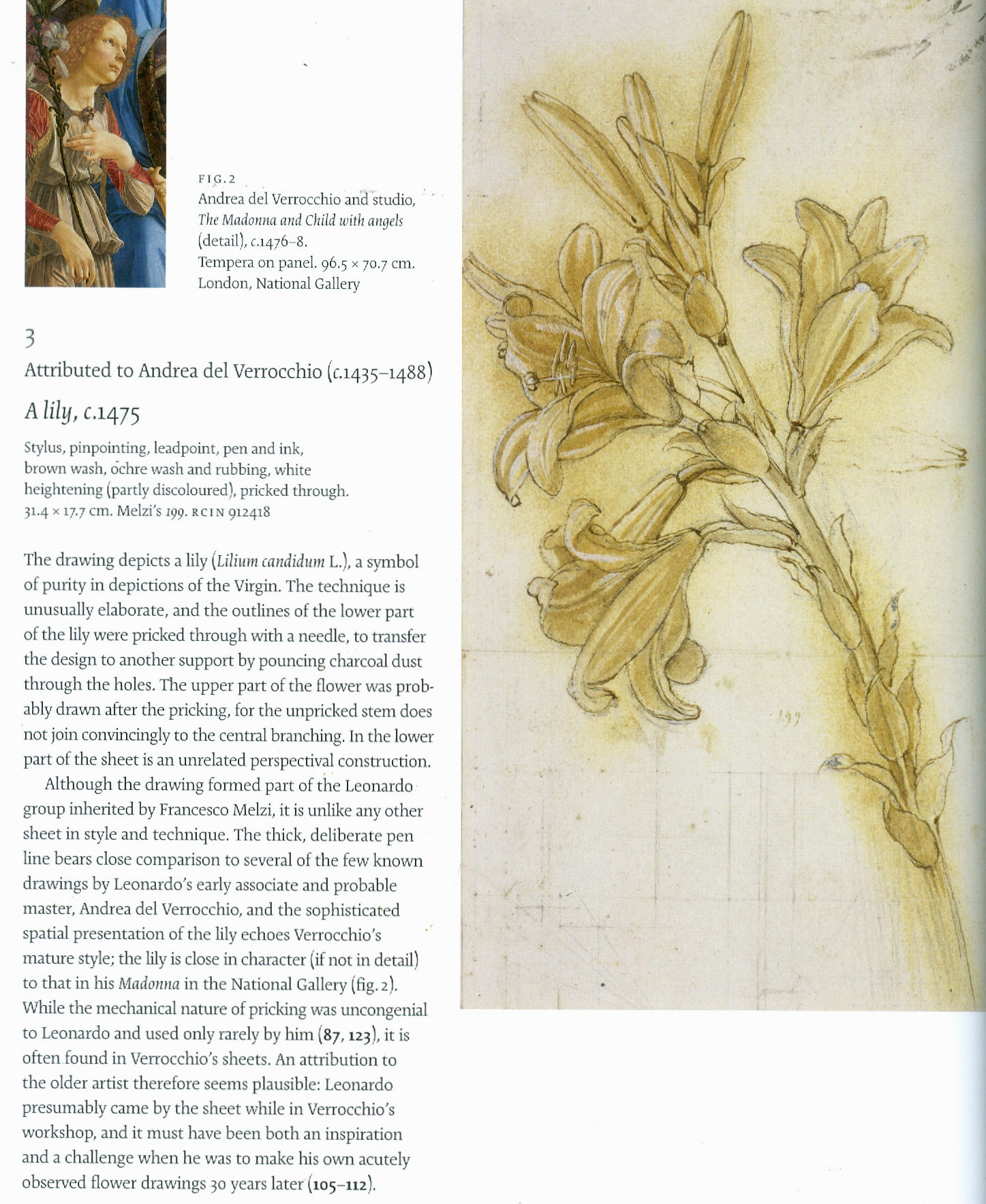
For those who care about works of art as art – and not as quasi-philatelic holdings – it matters a very great deal. Consider the logic: if we re-attribute a (fabulous) Leonardo plant study and place it among Verrocchio’s very few drawings it becomes…one of the latter’s most beautiful drawings. That is an alarm bell – it should look at home in the oeuvre. In answer to the question how comfortably or plausibly the Lily sits among Verrocchio’s few drawings, Clayton’s case is twofold. First, “Leonardo’s earliest drawings do not feature the bold, confident line seen here”; then, an acknowledgement/assertion that although there is “no direct parallel in the few known drawings by Verrocchio, this penwork is close to that in his Head of an Angel and the double-sided Study of Putti”. And, for that reason: “An attribution to Verrocchio of this accomplished drawing thus seems preferable.”
“Preferable” is an odd word in this context and is not the same thing as “more secure”. Moreover, if we juxtapose the details of the Leonardo Lily and the Verrocchio angel (as above at Fig. 2) we do not find a common bold line or a common anything. The drawing of the hair has none of the fluency of design or eloquent plasticity of the Lily. I first encountered the Lily at sixteen in a regional art school library Phaidon book, (probably Goldscheider’s Leonardo da Vinci). Then, I found it and Leonardo’s drapery studies breath-taking in their acuity and realisation of form-on-a-flat-surface. I still do. In Verrocchio’s oeuvre, the Lily is both atypical and most beautiful. This should not surprise: above grace and elegance, in this particular drawn stalk of flowers Leonardo had summoned a force of nature in an image that pulsates with life as it unfurls before us (Fig. 3).
![]()
Clayton’s principal justification for making his dramatic demotion is that the Lily constitutes a unicum within Leonardo’s surviving drawings oeuvre. It does but, then, it constitutes a more pronounced one in Verrochio’s tiny oeuvre. In making this switch Clayton discounts earlier scholarship on the drawing’s special status. Ann Pizzorusso kindly points out that while acknowledging the drawing’s distinctive nature, the late Carlo Pedretti had seen no disqualification. In Leonardo da Vinci Nature Studies from the Royal Library at Windsor Castle Pedretti noted that in nearly every one of his early paintings, Leonardo addressed landscape and “in particular” vegetation – where “Plants and flowers are consistently represented with scientific accuracy…” Moreover, “Evidence of Leonardo’s extensive study of plants and flowers in his youth is provided by Leonardo himself as he records ‘molto fiori ritratti di naturale’ in the list of works that in about 1482 he was taking to Milan or leaving in Florence…”
Whatever administrative benefits this effective de-attribution may bring, it neither rests on visual demonstration nor makes artistic sense. In our view, Clayton has thus committed a double Leonardo attribution error: he takes the now disappeared, much-restored and re-restored $450 million Salvator Mundi as a fully autograph Leonardo prototype painting and, he gives away one of Leonardo’s most brilliant studies. In both exercises methodological shortcomings are evident: neither the re-attribution nor the attribution upgrade followed a due presentation of evidence and invitation to debate. With the Salvator Mundi it is claimed that the (surviving) hair constitutes proof of Leonardo’s hand. It does nothing of the sort. Martin Kemp, the painting’s most vocal advocate, places the Salvator Mundi between the Mona Lisa and the St. John – in other words, at the very peak of Leonardo’s painterly accomplishment. In the comparison below (Fig. 4) we show details of the hair of the St. John, left, and the Salvator Mundi, right. By comparison with the secure St. John, the hair of the Salvator Mundi can be seen to be less sumptuously formed, more linear, sharper and metallic – like lathe turnings. The differences of painterly sophistication in these two works greatly outweigh any similarities of design.
Where the Lily seems to have been downgraded by a single scholar’s proclamation, with the Salvator Mundi, as Ben Lewis* has chronicled in his book, The Last Leonardo – The secret Lives of the World’s Most Expensive Painting, the attribution was made through a cumulative series of covert manoeuvres between 2005 and 2011, at which late date the painting was sprung on the world with the full authority of a National Gallery director, curator and trustee, as an entirely autograph Leonardo painted prototype in the Gallery’s major Leonardo Painter at the Court of Milan blockbuster exhibition. To Lewis, Luke Syson, the exhibition curator, admits erring in his catalogue entry on the painting (which was indebted to the then – and still – unpublished papers of one of the owners). Specifically, Syson confesses: “I catalogued it more firmly in the exhibition as a Leonardo because my feeling was that I was making a proposal and I could make it cautiously or with some degree of scholarly oomph”. Nothing indicated to the reader or the exhibition visitor that a proposal was being made. As Syson put it in his entry: “The re-emergence of this picture, cleaned and restored to reveal an autograph work by Leonardo, therefore comes as an extraordinary surprise.” No “ifs”, no “buts”, this was a long-lost Leonardo. On which claimed certainty, see our review of Lewis’s book in “Selling a Leonardo with ‘oomph’” in the July/August 2019 issue of the Jackdaw.

A CURATE’S EGG OF AN ATTRIBUTION
In March 2008 five Leonardo scholars were invited to examine the Salvator Mundi in its then state of restoration. Martin Kemp has reproduced the emailed invitation he received from the Gallery’s then director, Nicholas Penny:
“I would like to invite you to examine a damaged old painting of Christ as Salvator Mundi which is in private hands in New York. Now it has been cleaned, Luke Syson and I, together with our colleagues in both paintings and drawings at the Met, are convinced that it is Leonardo’s original version, although some of us consider that there may be [parts?] which are by the workshop. We hope to have the painting in the National Gallery sometime in March or in April so that it can be examined next to our version of the Virgin of the Rocks. The best-preserved passages in the Salvator Mundi panel are very similar to parts of the latter painting. Would you be free to come to London at any time in this period? We are only inviting two or three scholars.”
In the event, five scholars were invited, and, Ben Lewis has established, of those, two accepted the attribution, one rejected it and two declined to offer a judgement. Kemp did accept it and he has further disclosed that: “All of the witnesses in the conservation studio were sworn to confidentiality, and the painting travelled back to New York with Robert [Simon, one of the consortium of owners who had bought the painting for $1,175 in 2005]. It was becoming ‘a Leonardo’.” And so it was. Having done so and having twice been sold as such for a total of over half a billion dollars, it disappeared. Its whereabouts remain unknown.
*Ben Lewis will deliver the tenth ArtWatch International James Beck Memorial Lecture (“Fingers Crossed: Wishful Thinking, White Lies, Benedictions and the Attribution of the Salvator Mundi”) in London, on Tuesday October 1st. Details to be announced shortly.
Whiter than right

Robin Simon, editor of the British Art Journal and Honorary Professor of English at University College, London, has visited Chartres Cathedral and condemned its present restoration on a Facebook post and in a tweet:
“Just visited Chartres and I am appalled at the misguided ‘restoration’ that is covering the old stone walls in paint, with false pointing, creating a bland and uniform interior where the articulation of the architecture is crudely diminished. The history of the walls, of the building itself, is lost beneath a futile attempt to return the building to some imagined date in the distant past. What makes it much, much worse is the presence of bright electric lighting at crossing, choir and east end that destroys the effect of the greatest stained glass ever made, which used to cast the most wonderful haunting blue light throughout what was a uniquely ethereal interior. The magnificent chiefly 17th-century carved choir screen that wraps around the high altar end is also being whitewashed and the figures painted white, which is diminishing the three-dimensionality of these dramatic groups fully carved in the round. They now, remarkably, look flat, and have a smooth slimy surface with much of the miraculous crispness of the carving and detail lost.”
Robin Simon @robinsimonbaj:
“Just seen #Chartres #cathedral shocking #restoration. Walls painted, false pointing, glaring lights ruining blue light of glass, 17C carved choir screen flattened by white paint. State vandalism, arrogant architects, wrong-headed’experts’. Sign the petition https://bit.ly/2AmSRmN”
10:15 AM – 22 Oct 2018
Above, Fig. 1: Chartres Cathedral, with repainted vaulting in the choir contrasting with the existing nave and transepts in the foreground, Chartres, France, as published on July 11, 2012 in the New York Review (Photo: Hubert Fanthomme/Paris Match via Getty Images)
We have repeatedly attacked this restoration and on 16 December 2014 (“Chartres Cathedral Make-Work Scheme”) reported that this restoration had first been challenged in May 2012 by Alasdair Palmer in the Spectator – see his “Restoration tragedy” which began:
“Should old buildings look old? Or should they be restored to a condition where they look as if they could have been put up yesterday? Those questions are raised in a particularly pertinent form by the work going on at one of the most beautiful and inspiring of all old buildings: Chartres cathedral in France.
“Most of Chartres cathedral dates from between 1194 and 1230, when the bulk of the colossal stone structure, with its nearly 200 stained-glass windows and thousands of sculptures, was built. The extraordinary speed of its construction means that Chartres has an architectural and decorative unity that is unique among surviving cathedrals, most of which took a hundred years or more to complete, and were then altered drastically over the succeeding centuries.
“Chartres has suffered from the inevitable indignities inflicted by time. The paint with which the medieval artists originally covered the statues and the walls faded and flaked off within a few generations. Centuries of burning wax candles covered the interior with a thick layer of black soot. But Chartres remains far closer to the original building than almost any other medieval cathedral. The biggest effect of the intervening centuries since 1230 has been the accretion of the patina of age. A sense of the passing of time is part of the experience of looking at Chartres. The stone, the glass, the sculpture — it all looks very old, and its age is part of its fascination and its mystery.
“Or at least, it is in those parts of Chartres cathedral that have not yet been cleaned by the latest restoration project. It isn’t in those parts where the restorers have finished their work, for they look brand-new. There’s no patina of age here: there are only clean and bright surfaces.
“Is that an improvement? The restorers insist that it is…”
On 14 December 2014 Martin Filler, an architectural historian of Columbia University, New York, protested against the aims and consequences of such restorations in the New York Review (“A Scandalous Makeover at Chartres”):
“In 2009, amid a rising wave of other refurbishments of medieval buildings, the French Ministry of Culture’s Monuments Historiques division embarked on a drastic, $18.5 million overhaul of the eight-hundred-year-old cathedral. Though little is specifically known about the church’s original appearance—despite small traces of pigment at many points throughout the interior stonework—the project’s leaders, apparently with the full support of the French state, have set out to do no less than repaint the entire interior in bright whites and garish colors that are intended to return the sanctuary to its medieval state. This sweeping program to ‘reclaim’ Chartres from its allegedly anachronistic gloom is supposed to be completed in 2017.
“The belief that a heavy-duty reworking can allow us see the cathedral as its makers did is not only magical thinking but also a foolhardy concept that makes authentic artifacts look fake. To cite only one obvious solecism, the artificial lighting inside the present-day cathedral—which no one has suggested removing—already makes the interiors far brighter than they were during the Middle Ages, and thus we can be sure that the painted walls look nothing like they would have before the advent of electricity.”
Although the Chartres interior had initially been painted Filler noted that:
“…the exact chemical components of the medieval pigments remain unknown. The original paint is thought to have flaked off within a few generations and not been replaced, so for most of the building’s eight-century history it has not been experienced with painted surfaces. The emerging color scheme now allows a direct, and deeply disheartening, before-and-after comparison.”
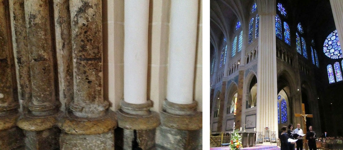
Above, Fig. 2: left, Chartres cathedral stone work in its pre- and post-restoration conditions; right, the view looking SE in Chartres cathedral showing painted and unpainted areas adjacent to each other.
THWARTING A THREAT TO CHARTRES CATHEDRAL’S STAINED GLASS WINDOWS
As well as making a historically falsifying transformation of the interior, the funding of the restoration was itself exposing the ancient stained glass windows to needless risks. On 18 February 2016, Florence Hallett (“Chartres’ Flying Windows”) protested against plans to fly part of the cathedral’s stained glass to the United States as a fund-raising quid pro quo for support given by the American Friends of Chartres:
“While the cost of the controversial repainting of the cathedral’s interior has been met by the French state and donors including Crédit Agricole, Caisse Val de France et Fondation, and MMA assurances, the restoration of the cathedral’s famous glass has been funded in part by the American Friends of Chartres (AFC), an organisation that works ‘to raise awareness in the United States of Chartres Cathedral and its unique history, sculpture, stained glass, and architecture and their conservation needs.’
“Based in Washington, the AFC has ambitious plans to fund the restoration of the cathedral’s windows and sculptures. In 2013 it announced on its own site, and via the crowd-funding website razoo.com, that in return for funding the restoration of the Bakers’ Window (two lancets and a rose in the nave), the 13th-century glass would travel to a US museum. Indeed, the still extant webpage makes explicit the nature of the exchange, proclaiming: ‘American Friends of Chartres INVITES YOU to Restore and Bring to the United States a 13th-Century Stained Glass Window for Museum Exhibit’.”
Hallett’s specific challenge to the American Friends on the foolhardy plan to fly ancient stained glass windows to the United States seemed to have proved a successful deterrent. As we reported in a footnote:
“STOP PRESS: At 17.33 today, in answer to an email of 14 February, Florence Hallett was notified by the American Friends of Chartres that:
‘The exhibit of Bay 140 which had been envisaged will not take place because of cost reasons. And, to answer your question, of course all the proper authorizations from the French Ministry of Culture and other authorities had been secured by the DRAC-Centre Val de Loire, which had been nominated by the Ministry of Culture to execute the project. All the arrangements for the exhibit of Bay 140 would have been contractually arranged between the DRAC on behalf of the French authorities and the cultural institution that would have exhibited the window. American Friends of Chartres would not have been part of these contractual arrangements.’ ”
Above, Fig. 3: Top, a section of the Belle Verrière windows at Chartres. Above, a potential means of transport for early 13th century glass
If you owned or were the guardian of such ancient precious glass painting, would you pack it onto an aeroplane and dispatch it across an ocean to another continent? If “yes” you would be able to claim precedents: the ecclesiastical authorities at Canterbury cathedral sent the entire surviving six parts of an original cycle of eighty-six ancestors of Christ, once one of the most comprehensive stained-glass cycles known in art history, on a museum tour around the United States. (See “How the Metropolitan Museum of Art gets hold of the world’s most precious and vulnerable treasures”. )
Florence Hallett is the architecture and monuments correspondent at ArtWatch UK and visual arts editor at theartsdesk.com
Robin Simon gave the ninth annual ArtWatch International James Beck Memorial Lecture – “Never trust the teller trust the tale” – on 7 November 2017 at the Society of Antiquaries of London, in Burlington House, Piccadilly, London.
Alasdair Palmer has written frequently on art restoration for the Spectator and the Sunday Telegraph – see “Restoration tragedies” 26 August 2012.
Martin Filler is a prominent American architecture critic and a fellow of the American Academy of Arts and Sciences.
WHO PROFITS?
The various strongly made cases against the Chartres Cathedral restoration project, rest in essence on the folly of attempting to replicate a speculative incompletely-informed notion of how an interior might have appeared many centuries ago when brand new. At Chartres this particular exercise is not only wrong-headed, it is, as Alasdair Palmer pointed out five and a half years ago, especially egregious: this attempted replication of an original state is inflicting a peculiarly brutal and unforgivable expunging of an ancient building’s historically lived evolving appearance. “Brutal”, because having been uniquely executed as a distinct artistically integrated whole this cathedral’s precious fabric had thereafter survived in uniquely unmolested form. Here was a building whose monumental lucidity might be considered a match for the timeless Parthenon. Here was a building which, unlike the Parthenon today, had not become a cadaver on a test bed for aggressively invasive conservation methods; which retained its forms and, even, an especial ancient illumination – one that, as Robin Simon attests, had once “cast the most wonderful haunting blue light throughout what was a uniquely ethereal interior”. Gone. And all in exchange for an $18million building contract that is already running over schedule and will, no doubt, end over budget.
When faced with incomprehensibly barbaric mistreatments of old art and monuments we must ask not only “why?” but “who profits?” The last is no slur. It is a necessary step towards explanations for otherwise inexplicably perverse cultural actions. It is indisputably the case that such high-prestige art and architecture restorations generate much employment, purchases of materials, scaffolding etc. – and that they can greatly enhance professional reputations. None of those consequences is necessarily wrong or bad in itself but due acknowledgement of them should constitute a component part of any calculus of appraisal of restorations or proposed restoration campaigns. It is concerning that in today’s rapidly accelerating restoration boom, material/professional interests are looming ever-larger as it proves increasingly easy to raise funds for large-scale building projects made on the back of the culturally-loaded, ethically coercive, names of “conservation” and “restoration”.
We have shown that it is European Union policy to increase activity in the arts sphere as a means of generating jobs in compensation for those being lost to less moribund economies: “I am especially happy to highlight the importance of culture to the European Union’s objective of smart, sustainable and inclusive growth. At a time when many of our industries are facing difficulties, the cultural and creative industries have experienced unprecedented growth and offer the prospect of sustainable, future-oriented and fulfilling jobs.” See “Why is the European Commission instructing museums to incur more risks by lending more art?” and “The European Commission’s way of moving works of art around”.)
We know that the Chartres project has been part funded by the French Government. In this climate, greatly more vigilance and disclosure are now urgently required. No such project should ever be sprung on the world again. Monumentally dramatic proposals should be examined widely publicly and well in advance of the scaffolders moving in.
ASSORTED CONSERVATION RATIONALES
Above, Fig. 4: Left, the original interior of St Paul’s Cathedral as recorded in an undated but apparently 18th century painting that is owned by The Worshipful Company of Goldsmiths, at which date Sir Christopher Wren’s original painted finish comprised of three coats of warmly tinted oil paint that had been stipulated, according to Wren’s son, “not just for beautifying, but to preserve and harden the stone” still survived.
It was only disclosed during the recent under-researched stripping of the interior of St. Paul’s that Wren’s oil painted surface had contained lead white, ochre and black pigments so as to produce precisely the warm “stone colour” found in other Wren churches. Above, right, we see the new dazzling white surfaces of the building’s interior and its sculptures when illuminated by one of new electric chandeliers installed during the restoration because, as Martin Stancliffe, the cathedral’s then 17th Surveyor to the Fabric, put it, “the heart of my vision for the interior [was] to clean it and relight it”.
It is striking not only how frequently programmes have proceeded on artistically/art-historically injurious premises, but also how very contrary the aims of those various programmes can be. Where at Chartres cathedral attempt is being made to replicate a far-distant hypothesized original decorative scheme, at St Paul’s Cathedral, London, as Florence Hallett established, a major project to transform an interior was made on a reverse (and equally perverse) artistic/historical agenda. At St Paul’s, with a much more modern documented and visually recorded building, a programme was implemented to expunge the last traces of the original architect’s initial (and easily replicable) decorative programme with aesthetically falsifying – and, in the event, health-threatening – consequences even though the originally applied tinted oil paint was a known quantity, having survived intact in protected places.
In London too, much money was quickly raised but here it was spent stripping an interior down (with chemically-invasive materials never before used inside an occupied, still functioning cathedral) to create an a-historical modernist whiteness rather than to retain surviving traces or fully replicate the known original historic surface decoration. In consequence, not only has a powdery surface of stripped-down raw stone been exposed, but an already misleading appearance was subjected to the very greatly amplified artificial lighting that is shown above and was first established by Florence Hallett’s investigations: “Cleaning St. Paul’s Cathedral”, ArtWatch UK Journal 17, Winter, 2002; and “The supposedly ‘model’ restoration of St. Paul’s Cathedral”, ArtWatch UK Journal 18, Spring/summer 2003. Online, see Michael Daley: “Brighter than Right, Part 1: A Modernist Makeover at St Paul’s Cathedral” (1 June 2011) and “Brighter than Right, Part 2: Technical Problems of Protection, Health and Safety at St Paul’s Cathedral” (5 July 2011).
Above, Fig. 5: Left, a conservator removing a latex “cleansing pack” from a carved head at St Paul’s Cathedral, as published on the cover of Conservation News in May 2002. The journal reported that the latex was left on the surface for “one to four days” and that after its removal the stone was cleaned with “damp sponges and bristle brushes”. Right, a carved head at St Paul’s after being cleaned with water and bristle brushes. (Photography by Peter Smith/Jarrold Publishing.)
The chemical stripping-down of the cathedral’s interior surfaces to a novel whiteness was in accordance with an idée fixe of the 17th Surveyor to the Fabric, not of Sir Christopher Wren. In a 2005 programme note to a service held in honour of the restoration’s donors (“How the glory of St Paul’s was restored”), Mr Stancliffe declared that “the heart of my vision for the interior [was] to clean it and relight it”. In the Times of 10 June 2004 he announced his “pretty controversial” intention to introduce “six huge chandeliers” to flood the interior with artificial light. A year later he told the Guardian “we have installed new chandeliers and more lights” and expressed specific satisfaction on “seeing our initial vision gloriously realised.”


Above, Figs. 6 and 7: Top, the blotchy appearance of the stripped-down stone surfaces. Above, a simple, quick demonstration of the present dangerously powdery surfaces.
The brightness of this “restoration” was achieved at great aesthetic and material cost. As shown above, the surfaces have been left without patina and remain disfiguringly blotchy even after cosmetic attempts to mitigate the grosser consequences of the standardised indiscriminate cleaning method (see below). As for the supposed “conservation” purposes of this multi-million pounds programme, the interior’s now powdery surfaces are more vulnerable to environmental pollution and fluctuations of temperature and humidity than at any time in the building’s history. That the originally oil-paint protected surface of this limestone has been left as powdery as chalk was easily demonstrated by brushing the above sleeve against it.
CHECKS? BALANCES? TOOTHLESS WATCHDOGS?
Approval for the use of an experimental cleaning method on the interior of a publicly occupied and in-service cathedral had been given by The Cathedrals Fabric Commission for England in November 1999 following (claimed) earlier approvals by a bevy of heritage watchdogs: English Heritage; SPAB (The Society for the Protection of Ancient Buildings); The Victorian Society; and The Georgian Group. It is not possible to establish the precise chemical basis on which formal approval was given by the Cathedrals Fabric Commission for England because, in breach of good conservation practices, the three technical parts of the eight part submission document were withheld on grounds of commercial confidentiality. For information on technical matters we had to rely on the cathedral’s own fluctuating (and often self-contradicting) accounts; on our correspondence with the 17th Surveyor to the Fabric, which he terminated in March 2003; and on documents obtained by cathedral employees whose health was adversely affected by the restoration.
The cleaning agent used on St Paul’s interior was an experimental, technically undisclosed, adaptation of a commercial product. In both its composition and effects, it earned censure from leading conservation experts (see below). It was a commercially available, latex rubber poultice laced with a mix of chemicals that were said to comprise an agent specifically tailored to be similar to the mild alkalinity of St. Paul’s Portland stone – that is, it was a special version of the “Arte Mundit” water-based paste manufactured by the Belgian company FTB Restoration. The instigator/director of the restoration, the architect and the 17th Surveyor to the Fabric at St Paul’s Cathedral, admitted (at a lecture on October 21st 2003) to having slim knowledge of matters chemical and of having devolved – “entrusted” – responsibility for the application of the new paste to the conservators of the firm Nimbus who themselves were learning on the job while the cathedral remained in full commercial and ecclesiastical use.
Professor Richard Wolbers, conservation scientist and solvents expert at the Winterthur Museum and Gardens, University of Delaware Art Conservation Department, was highly critical of a number of technical features of the programme and reiterated his fear that the authors “seem to have taken a poorly characterised material, a latex paste, and modified it with the addition of a considerable amount of EDTA – largely as an adaption in their minds, I suppose, of one of the main ingredients in the Mora’s AB57 cleaning system.”
(The Mora AB57 method was the notorious cocktail of EDTA, sodium and ammonium, detergent and other ingredients in a paste that was twice applied and twice washed off Michelangelo’s Sistine Chapel ceiling paintings. We have chronicled the artistically disastrous consequence of stripping all organic material from the ceiling plaster. Within a generation the newly-exposed bare plaster had been secretly re-restored to remove powdering of the plaster, and then, in part-compensation, it was massively relit with coloured LED lights – see “The Sistine Chapel Restorations: Part I ~ Setting the Scene, Packing Them In” and “The Twilight of a God: Virtual Reality in the Vatican”.)
John Larson, the then Head of Sculpture and Inorganic Conservation at the Conservation Centre, National Museums and Galleries on Merseyside, said that applications of moulding materials had contributed so much damage over the past 200 years that museums around the world “have now banned” their use, and that the application of liquid latex by brush or spray “has a dramatic effect on porous material such as stone…as it dries latex shrinks and clings tenaciously to the surface.” The effect of pulling it off the stone “exerts strong mechanical forces on the surfaces when the stone is carved and deeply undercut, as shown on the cover of Conservation News.” (See Figs. 5, 6 and 7 above.)
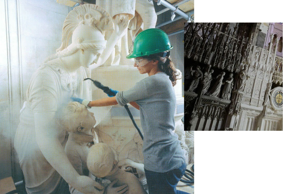
Above, Fig. 8: Left, sculptures at St. Paul’s being cleaned by steam jets; right, a detail showing the sculptures in the ambulatory of Chartres Cathedral on 11 July 2012. (Photograph by courtesy of Hubert Fanthomme/Getty Images.)
All horrible restorations are horrible in their own ways. Steam cleaning sculpture is considered an acceptable “conservation technique” even though it is visually deadening and leaves marble surfaces resembling white granular sugar and greatly more exposed to environmental pollution and fluctuations of humidity and temperature. We have witnessed conservators at the Metropolitan Museum of Art, New York, painting dead white steam-cleaned Greek marble carvings with water colours. One, when asked what he was doing, replied that he was “putting back the patina” destroyed by the cleaning. That, presumably, is why the Greek sculptures at the MET now sport a uniformly tasteful biscuit-coloured “patina” regardless of their age and geographical origins. As seen above, at St Paul’s Cathedral the all-white, sans-patina effect found favour and sculptures were left as raw-white as the building itself. At Chartres, however, the new visually deadening whiteness of the sculptures is the product of yet another method and philosophy. The sculptures are not being stripped down to the innate interior whiteness of the stone but are having a white skin of paint superimposed – before also being further brightened by artificial lights. The aesthetic, psychological and spiritual consequences of this practice at Chartres can be seen above right where just a few years ago the not-yet “restored” figures in the ambulatory still shared our common spaces. There, among us, touchable and as if alive, they had for centuries acted their roles in a drama greater than Shakespeare’s – one that, millennia ago, had been played for real on earth and, for believers, at God’s will for our benefit. Their once miraculously constructed living tableaus and endlessly changing chiaroscuro are now, as Robin Simon has so poignantly described, flattened and left with “a smooth slimy surface with much of the miraculous crispness of the carving and detail lost.”
Even now, it is not too late to save an unmolested portion of this cathedral for future generations who would otherwise never be aware of the loss and adulteration: a petition – and an invitation to comment – beckons at a touch.
Michael Daley, 30 April 2018
CODA:
Today, 30 April 2018, Electronics Weekly reports that the lighting firm Osram has announced it has won a contract to light St. Peter’s in Rome: “‘We won worldwide recognition for the LED lighting system we installed in the Sistine Chapel’, said Osram Licht CEO Olaf Berlien. ‘We are very excited about this new opportunity to demonstrate our skills as a provider of complex, large-scale lighting solutions by conducting the lighting project in St. Peter’s.’” The report does not say how much Osram will be paid to light St. Peter’s (and, thereby, showcase its own products) but it does give further information on the lighting installed in the Sistine Chapel “The aim was to light the paintings so they appear to be lit by sunlight…Researchers went so far as to incorporate the current thinking of historians – that Michelangelo mixed paints in daylight rather than under candlelight or the light of torches, and therefore needed a cooler over-all colour temperature to get the best view of them today”. Michelangelo, of course, painted in the light of the chapel and for the chapel’s then sources of lighting. Indeed, when the ceiling was stripped down with the Moras’ AB57 chemical cocktail, art historian apologists for the garish colours that emerged contended that Michelangelo had had to make his colours so intense in order for his painting to read through the gloom of the chapel. As Professor Kathleen Weil-Garris Brandt of New York University and a Vatican spokesman for the restoration, put it in Apollo in December 1987: “Michelangelo…painted the ceiling in the knowledge that his forms would have to carry in the daylight or in the golden glow of candles and oil lamps. That’s one reason why his [restored] colours are so bright. Now that they are being revealed, the anachronistic spotlights only distort the appearance of the frescoes. In fact, the strong artificial lighting of cleaned areas of the Ceiling originally contributed to the false impression which disturbed critics of the conservation project.” In other words, now that the original colours of Michelangelo had been recovered, the chapel’s strong artificial lighting was surplus to aesthetic requirements. Why, then, was Osram recently invited to create a system of lighting for those (controversially) restoration-intensified colours that mimics the power of direct sunlight? For St Peter’s, Osram have a different agenda: “the lighting will be adjustable to suit different occasions, and will ‘accentuate the properties of the materials used and the building itself, highlighting the plasticity of the structure, its marbles and its architecture.'”
Christie’s recent sale of a stolen painting
In our 11 October post (“Two developments in the no-show Louvre Abu Dhabi Leonardo Salvator Mundi saga”) we suggested that new-style confidential legal conflict-resolution procedures might favour the big guys over the little guys – who “necessarily will forfeit their strongest card: the capacity to raise institutionally embarrassing press coverage”.
Just two days after that post, Mailonline carried a report that demonstrated the hard cash value that press coverage of grievances can unlock: “Painting stolen a week after being valued at £20,000 on Antiques Roadshow 30 years ago turns up at auction by Christie’s – who sell it to the astonishment of the disgruntled original owners”.
The Mailonline reports that the 1874 painting in question, Portrait of Mary Emma Jones, by Emma Sandys, had been stolen a week after the BBC show – in which its experts had valued it at £20,000 – was broadcast in January 1988. Christie’s, who sold the painting for £62,500 in July this year is now said by Mailonline to be involved in tense negotiations with the former owner’s daughter and to be “allegedly trying to buy the silence of the family from whom it was stolen by making an offer of £10,000 in exchange for them surrendering their claim and signing a confidentiality agreement.”
The family have rejected the offer as too low, according to the Times and Christies say that they won’t release it until a settlement can be reached.
Christie’s gushing catalogue entry said no more on the provenance than that the picture had been “recently rediscovered” and was “the property of a private collector”. This was the pre-sale lot essay in full:
“Emma Sandys was the sister of Frederick Sandys (1829-1904), whose luscious portraits in the Rossettian mould served as inspiration to his younger sibling. Although Emma’s work is similar in style and in the strength of its design, she established herself on her own professional terms, exhibiting at the Royal Academy, The Society of Lady Artists, and various Norwich galleries, thereby attracting patrons from amongst the local aristocracy. While images of women predominate in Pre-Raphaelite paintings, the wider artistic circle included many talented female artists, such as Emma, Elizabeth Siddal, Marie Stillman and Evelyn de Morgan, each of whom sustained successful artistic careers.
“Recently rediscovered, the present lot depicts Mary Emma Jones, Emma’s sister-in-law, who modelled for many of Frederick’s works including Perdita (Lloyd Webber Collection) and Proud Maisie (Victoria & Albert Museum). The oil painting appears to be based on a chalk drawing by Frederick from circa 1873, now in the Birmingham City Art Museum (see B. Elzea, Frederick Sandys (1829-1904), p. 249, no. 3.48) One of the characteristics of the oeuvre of the Sandys siblings was the sharing and repetition of models, studio props and costumes, as well as a similarity in technique which has often led to confusion over attribution between the siblings. Portrait of Mary Emma Jones bears all the hallmarks of Emma’s mature style, and shows the level of sophistication the genre achieved during the 1860s and 1870s.
“We are grateful to Betty Elzea, author of the monograph on Frederick Sandys, for confirming the attribution of the present lot.”
Under “Other information” and “Pre-Lot Text” was found the description “THE PROPERTY OF A PRIVATE COLLECTOR”. That was all. So, no names, no dates, no theft, no nothing.
Once again, we can only repeat our 2014 contention that “As things stand, it can be safer to buy a second-hand car than an old master painting” (“Art crime”, Letter, the Times, 13 August 2014) and renew the call we made in that letter for governments to make it a statutory requirement that vendors should “disclose all that is known and recorded about the provenance and the restoration treatments of works of art”. How else might auctioneers be persuaded to supply a proper log book with their goods?
Michael Daley – 14 October 2018
In Memoriam: Tom Wolfe (1930 – 2018)
The journalist and writer Tom Wolfe died on 14 May aged 88. He is survived by his wife Sheila (Berger) Wolfe, a graphic designer and former art director of Harper’s Magazine, and their two children, Alexandra Wolfe, a reporter for The Wall Street Journal, and Tommy Wolfe, a sculptor and furniture designer.
The New York Times reports Tom Wolfe’s least-forgiven and most-wounding foray. In 1970 he mocked what he termed New York’s “radical-chic”. This had been prompted by a fund-raising party given for the Black Panthers by Leonard Bernstein, the conductor of the New York Philharmonic, and his wife, the Chilean actress Felicia Montealegre, in their 13-room Park Avenue penthouse. The guests were the Bernstein’s rich liberal and mostly famous friends. How very remarkably on-target that attack was – and how infectiously well and fast that chic travelled. At that period, across the pond in London, well-meaning pre-eminent thespians like Vanessa Redgrave rattled the revolutionists’ tin under the noses of artists like R. B. Kitaj. As the designer of UK New Left publications – first The Black Dwarf and then Idiot International – we, along with Jean Genet and a Parisian Leftist called Castro, attended a dinner given in the marble-floored, art-rich (Mondrians, Bellmers…) Paris apartment of the novelist, polemicist and publisher of L’Idiot International, Jean-Edern Hallier and his Italian heiress wife, Anna. The guests of honour were a group of visiting Black Panthers, lead by (the beautiful) Connie Matthews, who would later be killed in a police shoot-out in the United States. The books in the Halliers apartment had been rebound in white leather, with gold-tooled lettering and they were displayed on shelves made of polished black lignum vitae, the hardest, densest wood that makes the best truncheons, the most wind-resistant cricket balls and that is used as bearings for ships propeller shafts. This apartment, with its live-in servants was not, however, where “the real” Jean-Edern Hallier lived. He once told me that his true self was to be found in a small, occasionally used bed-sit furnished only with a single bed and a Che poster.
Above, Tom Wolfe as photographed in New York in 1968 by Sam Falk for The New York Times
Best known for his first novel, The Bonfire of the Vanities, Wolfe blew the whistle on pretentious ideas-led, art critics-sanctioned contemporary art in The Painted Word which was excerpted in Harpers Magazine. Incensed art world players responded with scurrilous/puerile abuse. One victim accused Wolfe of having written his devolution – i. e. reverse-evolution – of modern art (“In the beginning we got rid of nineteenth-century storybook realism. Then we got rid of representational objects. Then we got rid of the third dimension altogether and got really flat – Abstract Expressionism. Then we got rid of airiness, brushstrokes, most of the paint, and the last viruses of drawing and complicated designs”…) without ever “getting away from his typewriter and into the thick of his subject”. Not many people know this, but Tom Wolfe took classes at the Art Students League in New York with the painter, Frank Mason, the scourge of art-destroying picture restorers (and a founder member of ArtWatch International) who had blown the whistle in New York on the restoration of Michelangelo’s Sistine Chapel ceiling. At a memorial service on 18 October 2009, Wolfe delivered this tribute to Frank Mason who had died aged 88 on 16 June 2009:
“I’m not sure how many people here have seen Tom Stoppard’s wonderful play, Artist Descending the Staircase. Well, in that play one of the characters turns to the audience and says, ‘Imagination plus lack of skill, gives us no-hands art.’ Andy Warhol showing photographs of commercial products to his elves, and ping-pong shots from amusement arcades of famous people. Or, Jeff Koons, who sends photographs of himself slogging at it with an Italian prostitute of some fame, and sends these photographs off to elves in Switzerland who then convert the photographs into three-dimensional ceramic objects. Or, Richard Serra, who orders ten-foot high raw core tin steel walls from the foundry and has unionized elves to transport them to open spaces and prop them up. Or, Richard Prince, a self-elf who takes photographs of photographs and sells them for stunning sums to culturally anxious hedge fund managers.
“Now I have to confess that those examples were supplied by me. But, what Tom Stoppard has his character actually say is, ‘Imagination plus lack of skill, gives us modern art.’ So there has to be a corollary to that, and I think the corollary would be: imagination plus real skill gives us Michelangelo, Bernini, Tissot and Titian. And, Frank was known in his youth as the rebirth of Titian, the comparison was made consummate of Frank Mason and Titian. And both Titian and Tissot loved the deepest perspective a painting could possibly effect and one of my favorite Frank Mason paintings is of – I think it might be the Italian restaurant below his apartment on Broome Street – and it is of a group of people, many, many people, and no person in the background is neglected at all. Every head that appears in a Frank Mason painting is developed and is an individual who is distinct from every other. But, what particularly surprised me was that in the vast, vast deep Titianesque, Tissot-like perspective of that painting is the carving on wood work at the very back of the room. These are details that the naked eye can probably not see beyond six feet. In this painting they are about sixty feet away. What he did with them was absolutely marvelous, I can’t think of another painter who could do it better, perhaps not even Tissot or Titian.
“There’s also . . . his skill went across every possible category – still life, which, in a way, is the opposite of Titianesque painting of deep perspective. Earlier, before the [memorial] programme started on the screen here was Frank’s Silver Pitcher. A still life with the silver pitcher in the middle of it – and that silver pitcher is so much more real than an actual silver pitcher you just want to grab it and drink some of that New York tap water. You know, New York tap water is some of the best water in the country. It’s better than anything that comes in a bottle, I assure you. Now Frank was much more than a great artist. And to say that somebody is much more than a great artist (particularly John Varriano brought it out) is saying a great deal. Frank is what I think of as a life force. You know, Darwin once appeared before a class of students at a university in England, and you know the young will ask questions that the old do not dare ask. And he would explain how life had begun out of a cell and all that is before us came from that tiny origin. So one of the students says, ‘Well, where was it?’ And Darwin says, ‘Where was what?’ ‘The cell? Where was it?’ And he said, ‘Well I don’t know. It was probably in a warm pool of water somewhere’. And then another student said, ‘Yes, so then how did it get there?’ And he said, ‘Well, I don’t know where, and I don’t know if it’s terribly important.’ And then another student said, ‘Why does it want to divide? Why does it want to reproduce? Why?’ At this point Darwin reflected and said, ‘To tell the truth, no one knows where the life force comes from and perhaps no one will ever know. If they do it will be hundreds of years from now before we learn where the life force comes from. Isn’t it enough that I brought you all these plants and all these animals? How much do you want from me?’
“But, this life force – it is not a metaphor, it’s a concept. I always thought when I first came to New York my ambition as a youngster was to work in a newspaper in New York. It took me many years to get here but I finally did it. Unfortunately, my image of New York City had gone from books written in the 1920s and 1930s about people like Ben Hecht. So I was waiting to see Mark Twain walking up Broadway in a white linen suit. I was waiting to see Walter Winchell who at that time was on the radio saying, ‘Good evening Mr. and Mrs. America and all the ships at sea. Let’s go to press.’ To me that voice of Walter Winchill, that was that excitement, that earnestness, that was New York. Or, Henry Luce the great creator of Time magazine threatening to throw Harold Ross out the window of his apartment because Ross had run a profile of Luce in the form of a parody of the famous Time magazine style, particularly its inverted rhetoric. And the piece ended, ‘where it will all end knows not.’
“All of this to me was, this excitement, this was New York. So, when I arrived all I saw was men in stingy rim hats with the rims about this wide, crowns right down on top of their heads. And they had their chins hooked in their collarbones, scuffling down the street and they were muttering, ‘Aw Hell’. That’s what was actually here. But then, well incidentally at least they had hats.
“125-30 years ago, men – in the English-speaking world anyway – wore tall stiff hats known as toppers. That began to change, by 1900 they began to shrink a bit and get dents down the middle or in the sides. By the time I came to New York it was the stingy brim hats. But, at least they had them. Back in the 19th century women had these little pieces of cloth with lace around them called kerchiefs. Today, the men wear the kerchiefs – they’re known as baseball caps – while the women have all the testosterone. Look at the great party hats you see everywhere in fashion today. But I did find a flip side. People here, Clay Felker, who was my editor at New York magazine, Roger Straus – an indomitable publisher – and I finally began to realize that every age is the same, every age has had the mass equivalent of the guy shuffling along the sidewalk in the stingy brim hat. What has made New York exciting, what has given it the reputation of excitement, what makes it exciting today is really a relative handful of people who are motors. They’re motors in a ship that goes hurtling at an unbelievable speed, making reckless turns and we’re all invited to jump on board for the ride. And that’s what living in New York means, either they enjoy the ride or they just get out. And Frank Mason was one of those motors, extraordinary.
“But, I happened to have the privilege of seeing Frank work – I saw him giving instruction at the Art Students League. I can’t describe it quite as well as John [Varriano] did or as Peace [Sullivan] did, but I saw it and I saw this congestion of not only human beings, but easels – when you see easel fights and they go ‘- there’s room!’ Everyone trying to get into that room and to get into a position to see the model, which was in deep perspective way over there. It’s an astonishing spectacle.
“I also had the privilege of participating in some of those Tuesday night sessions on Broome Street. You know Frank and Anne moved to Broome Street I think 20 years before you had all these, ‘You have to live down there, you have to live below Houston Street or you weren’t real.’ These sessions were held in that great studio and apartment. And Frank was very indulgent with me because the only thing I cared about was getting the hands right. To this day that’s the first thing I look at in a painting – the hands, all the rest is not as – is secondary. Frank could do, absolutely, hands that you wanted to shake and you want to look up into those eyes. This sort of spirit is so rare, so precious – and everyone [speaking] today has described it accurately – the booming voice, the laughter. I never saw Frank in anything but a mood of enthusiasm and love of life. So, I made a rather rash prediction in 1976 that by the year 2020 what Frank Mason prophesized would have come true.
“Frank at one point said that modernism is dying a slow death. Not far away from that we will climb the mountain once again, because you cannot kill genius. And, today it’s almost 2010. I don’t see the art world, as we call the little village that controls prestige, I don’t see it calming down very much. I think it’s really more frantic than ever – ‘No-Hands’ Art sweeps the art village.
“Tenure art sweeps the art village. ‘Tenure Art’ is conceptual art that is happening which cannot possibly be bought or collected. But, one thing for the artist is to be hired by the faculty of a university, hang on for ten years and you’ve got tenure. You’ve got a salary until the end of your days and then a great pension plan. ‘No-Hands Art’ and ‘Tenure Art’. So, we’ve only got ten years, folks. But, I think now is the time to do it. Frank Mason was the beginning of a neo-Renaissance. A Renaissance – is a rebirth. A neo-Renaissance is a rebirth of what should not have died the first time. So I leave here with the sense that I – I’m paying homage to Frank Mason. And that I also feel that some-how, all of us – me with my hands and you with the rest of the things that you do – can bring Frank’s prediction alive. I leave here with tremendous hope.”
Today, there are only two years left for that predicted expiration of modernism and, on the face of it, all the signs are that means have been found to buoy its markets indefinitely. But, then, there are jitters that might yet prove portents: culturally anxious chump oligarchs now queue in such numbers to buy Koons’ balloons on the never-never that even that artist’s legion of elves cannot keep pace with the orders. A restorer who part-painted a half-billion dollars Salvator Mundi recently donated the brushes she had used to Columbia Museum of Art to help the museum’s mission to celebrate outstanding artistic creativity. Roll up! Roll-up! “Own a piece of art history!” the museum urged, “These seven paint brushes were used to restore Leonardo’s Salvator Mundi, which set a new record for the price of a work of art when it sold for $450 million in 2017.” The brushes found no taker – no one met the Ebay reserve of $1,000. At Columbia university, as Artnet reports, disgruntled students in the visual arts MFA program are demanding a refund for the current school year’s ($63,961) tuition fees, in part because the buildings are disintegrating; in part because too many tenured professors have gone on sabbaticals at the same time; in part because the students have not been able to work with—or even meet—some of the notable artists whose reputations drew them to the school in the first place. (See “Columbia University MFAs Share Stories of Dysfunctional Studios and Overworked Faculty”.) In the UK, a superannuated Lecturer in Fine Art at the University of Lincoln dismissed the teaching of life drawing as “a deeply conservative and reactionary position” in the November/December 2017 Jackdaw magazine. A “Curator of Interpretation” at the Tate has explained that anything dragged into a gallery can be considered to be fine art providing only that the dragger-in is an art school-accredited person. Anything can be art except art. Such cultural lunacy must end sometime.
Above, the brushes that helped paint the $450m Salvator Mundi, as presented and offered for sale on Ebay. Below, a corner of Frank Mason’s Broome Street studio and a detail of his hurtling life-celebrating painting “Before the Storm, Nova Scotia”.

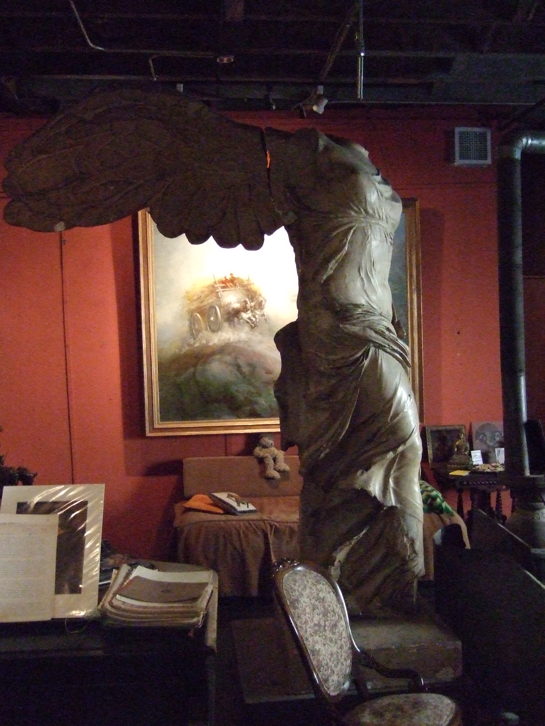
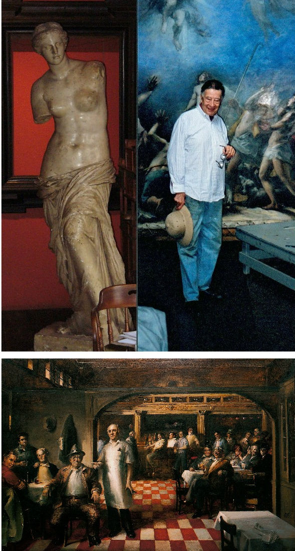
Above: Frank Mason in his studio; some of the plaster casts he had saved from destruction in a New York art school; and, his “Little Italy” mural, to which Tom Wolfe referred.
Anne Mason writes of Tom Wolfe’s death: “I hadn’t heard. Lovely person. We ran into Tom and Shiela on 5th Ave one night. Frank said, ‘What are you doing tonight?’ Tom answered, ‘Looking for you.’ A gentleman through and through. He was in Frank’s class at the ASL for a short while. Frank was so pleased to have him there. Don’t know if you knew that Frank painted Shiela’s portrait? It was a Christmas surprise for Tom. Nice memory. She carried it off. He had no idea. Thanks for telling me.”
Our thanks to Anne, and Frank and Tom Wolfe.
Michael Daley, 16 May 2018
Rodin and ancient Greek art – a personal view of a magnificent show
Last night we were bidden, as Sir Roy Strong might have put it, to the opening and reception of the joint British Museum and Rodin Museum exhibition “Rodin and the art of Greece”.
It proved an extraordinary and privileging occasion that was close to our heart in very many respects. Guests were ushered into a corner of the Great Court for drinks and canapés. In that dwarfing space the buzz of expectation among the small standing groups resembled a Royal Opera House opening of Verdi’s Un ballo in maschera. The company was illustrious. Among the many VIPs, journalistic aristocracy was present in Sir Simon Jenkins of the Guardian and Lord Gnome of Private Eye. The Two Greatest Living British Sculptors were represented by Sir Anthony Gormley R. A. (who sported some Palestinian headwear around his neck). The British Museum’s new director, Hartwig Fischer, opened the speeches well and graciously. The man from the generous sponsors, Bank of America, Merrill Lynch, followed and the French Ambassador opened the exhibition itself with certain ironical asides about the virtues of European cooperation. And we then poured into the exhibition.
As others have already indicated, this show, the combined product of a great dedicated artists’ museum and a great “universal” encyclopaedic museum, is simply stupendous. On entry, the shock of the space and its fabulous contents was also operatic: a beautifully lit elegantly constructed chip-board “set” snakes down the centre of the otherwise soul-less and dispiriting Lord Rogers’ black box, which, thankfully on this occasion, has been opened to disclose a courtyard. The continuous low plinth carries the larger, show-stopping sculptures and creates subsidiary spaces that house drawings and smaller works. Sparks fly between the works on display. The labels are good and the catalogue is exemplary. If the essential message of this engagement of a giant of modernism (Rodin) with a legendary classical artist (Phidias) – that to advance we must look back – seems subversively reactionary in today’s art world, so much the worse for us. But for this artist, the timing feels optimal: Modernism is a spent and disintegrating force. Its void is filling with assorted non-artistic activisms and relativisms.

The show is welcome in other respects. It springs from the strengths of museum curators working to their departmental briefs, in this case that of Ian Jenkins, a very fine classical scholar, who himself, as it happens, has carved stone. Even before the show opened Jenkins was creating sparks of his own. He had noticed a distinct echo in Rodin’s “Thinker” of a convention for mourning figures in Greek classical art. Yesterday (24 April), a sculptor took issue with this suggestion in a letter to the Times (see below) claiming a likelier source to be present in Michelangelo’s sculpture and paintings.
Certainly, Rodin’s awareness of and indebtedness to Michelangelo (who once said that he was never less alone than when alone with his own thoughts) was immense and, as David Breuer-Weil points out, there are strong figural resemblances. Nonetheless, Jenkins’ point was phrased with precision and he had elaborated it with striking eloquence on yesterday’s Radio 4 Today programme – this itself being a most welcome development: we have rather forgotten in recent years that museums are their curators. In the two cited Michelangelos the Lorenzo de’ Medici figure is thoughtful but imperious and unperturbed. His back is straight and his shoulders are held high. A forefinger touches his nose and lips but it has no structural function. In the painted prophet Jeremiah from the Sistine Chapel ceiling, while the figure slumps the lower legs are decorously crossed and bear little weight. It so happens, this is a figure with which we have engaged in the past and it is carried on the back of the current ArtWatch UK members’ Journal:
As seen in the Jeremiah detail we had adapted for a newspaper illustration (above), the head rests heavily on the hand which grips the lower face and entirely conceals the mouth – perhaps this near-universal indicator of thought stems from the source of speech being taken out of commission? There is a vital difference between the Thinker and the Jeremiah. In the former, the head rests heavily on the hand but the forearm/hand serves only as a prop or buttress. Indeed, the entire figure is a dynamic portrayal of weight, as we noted in graphic shorthand last night in the diagram below right. Even the legs are involved in buttressing the entire slumping figure who grips the very earth with his toes (photo. by promentary.net.au). Crucially, the hand does not engage directly or expressively with the face other than insofar as the upward buttressing force of the knuckles distorts the upper lip.
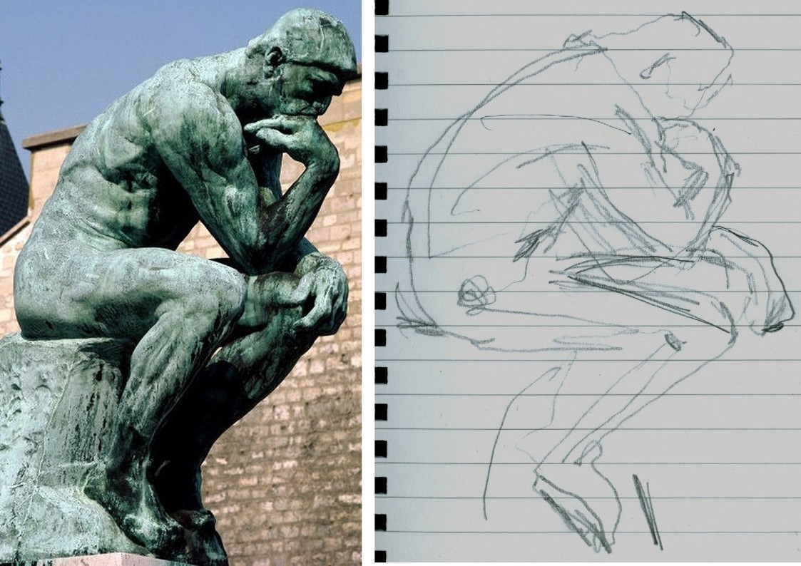
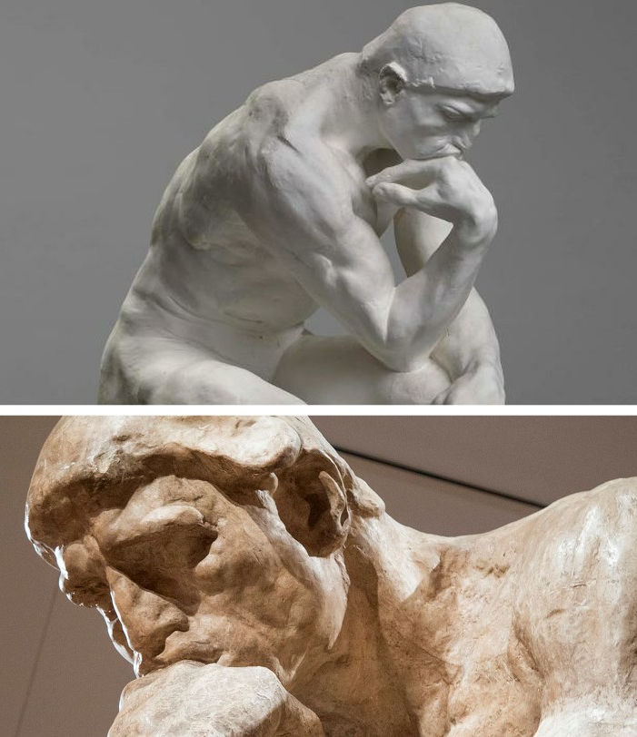
The face itself (above) is not simply thoughtful or absorbed but mournful, desolate. This head is as heavy as the heart within the figure. Jenkins seems vindicated on his observation. For artists and, particularly for sculptors, this show is, more than an invitation, a command to stop, look and draw. The British Museum has sensed as much and will be making drawing materials available to visitors. For our part, we would urge them not to be bashful and to seize the opportunity to draw unselfconsciously and purposively. Drawings are best seen not as a species of self-expression but as straightforward explanations. Draw to explain that which seems interesting significant or distinctive in a particular figure. There are no right answers here, just nice observations worthy of being made. Drawing regularly disciplines thinking and sharpens looking. (Degas once told a woman she had a beautifully drawn head. Draughtsmen know exactly what he meant.) Last night we snatched some drawings of the backs of figures, as below with Iris from the Parthenon whose flowing animalistic energy directly inspired Rodin to make an even more dynamically eroticised bronze.
RODIN’S METHOD ENCAPSULATED
We would especially urge all visitors to take careful note of a little showcase at the far end of the gallery (next to a demonstration of plaster piece/mould casting). In it are two small modelled figures that constitute a summation of Rodin’s sculptural insights. The models were made to explain/demonstrate the differences between classical sculpture and Michelangelo’s figures. We wrote of Rodin’s understanding of differing figural conventions four years ago in the Jackdaw magazine.
The quoted Rodin comments in the article above came from the 1912 English version of Paul Gsell’s Art by Auguste Rodin. We supplement them here with a fuller account from the horse’s mouth:
“One Saturday evening Rodin said to me ‘Come and see me tomorrow morning at Meudon. We will talk of Phidias and of Michael Angelo and I will model statuettes for you on the principles of both. In that way you will quickly grasp the essential differences of the two inspirations, or, to express it better, the opposed characteristics which divide them’…Rolling balls of clay on the table, he began rapidly to model a figure talking at the same time. ‘This first figure will be founded on the conception of Phidias. When I pronounce that name I am really thinking of all Greek sculpture, which found its highest expression in Phidias.’
“The clay figure was taking shape. Rodin’s hands came and went, adding bits of clay; gathering it with in his large palms, with swift accurate movements; then the thumb and the fingers took part, turning a leg with a single pressure, rounding a hip, sloping a shoulder, turning the head, and all with incredible swiftness, almost as if he were performing a conjuring trick. Occasionally the master stopped a moment to consider his work, reflected, decided, and then rapidly executed his idea…Rodin’s statuette grew into life. It was full of rhythm, one hand on the hip, the other arm falling gracefully at her side and the head bent. ‘I am not [f]atuous enough believe that this quick sketch is as beautiful as an antique,’ the master said, laughing, ‘but don’t you find it gives you a dim idea of it? […]Well, then, let us examine and see from what this resemblance arises. My statuette offers, from head to feet, four planes which are alternatively opposed. The plane of the shoulders and chest leads to the left shoulder – the plane of the lower half of the body leads towards the right side – the plane of the knees leads again towards the left knee, for the knee of the right leg, which is bent, comes ahead of the other – and finally, the foot of this same right leg is back of the left foot. So, I repeat, you can note four directions in my figure which produce a very gentle undulation through the whole body.
‘This impression of tranquil charm is equally given by the balance of the figure. A plumb-line through the middle of the neck would fall on the inner ankle bone of the left foot, which bears all the weight of the body. The other leg, on the contrary, is free – only its toes touch the ground and so furnish a supplementary support; it could be lifted without disturbing the equilibrium. The pose is full of abandon and of grace.
‘There is another thing to notice. The upper part of the torso leans to the side of the leg which supports the body. The left shoulder is, thus, at a lower level than the other. But, as opposed to it, the left hip, which supports the whole pose, is raised and salient. So, on this side of the body, the shoulder is nearer the hip, while on the other side the right shoulder, which is raised, is separated from the right hip, which is lowered. This recalls the movement of an accordion which, closes on one side and opens on the other…Now look at my statuette in profile. It is bent backwards; the back is hollowed and the chest is slightly expanded. In a word, the figure is convex and has the form of a letter C. This form helps it to catch the light, which is distributed softly over the torso and the limbs and so adds to the general charm…Now translate this technical system into spiritual terms; you will then recognise that antique art signifies contentment, calm, grace, balance and reason…And now, by the way, an important truth. When the planes of a figure are well placed, with decision and intelligence, all is done, so to speak; the whole effect is obtained; the refinements which come after might please the spectator but they are almost superfluous. This science of the planes is common to all great epochs; it is almost ignored today.’”
And then, Gsell noted, Rodin turned to Michelangelo: “‘Now! Follow my explanation. Here, instead of four planes, you have only two; one for the upper half of the statuette and the other, opposed, for the lower half. This gives at once a sense of violence and constraint – and the result is a striking contrast to the calm of the antiques. Both legs are bent, and consequently the weight of the body is divided between the two instead of being borne exclusively by one. So there is no repose here, but work for both lower limbs…Nor is the torso less animated. Instead of resting quietly, as in the antique, on the most prominent hip, it, on the contrary, raises the shoulder on the same side so as to continue the movement of the hip. Now, note that the concentration of effort places the two limbs one against the other, and the two arms, one against the body and the other against the head. In this way there is no space left between the limbs and the body. You see none of those openings which, resulting from the freedom with which the arms and legs were placed, gave lightness to Greek sculpture. The art of Michelangelo created statues all of a size in a block. He said himself that only those statues were good which could be rolled from the top of a mountain without breaking; and in his opinion all that was broken off in such a fall was superfluous
‘His figures surely seem to be carved to meet this test; but it is certain not a single antique could have stood it; the greatest works of Phidias, of Praxiteles, of Polycletes, of Scopas and of Lysippus would have reached the foot of the hill in pieces. And this proves how a formula which may be profoundly true for one artistic school may be false for another.
‘A last important characteristic of my statuette is that it is in the form of a console; the knees constitute the lower protuberance; the retreating chest represents the concavity, the bent head the upper jutment of the console. The torso is thus arched forward instead of backward as in antique art. It is that which produces here such deep shadows in the hollow chest and beneath the legs. To sum it up, the greatest genius of modern times has celebrated the epic of shadow, while the ancients celebrated that of light. And if we now seek the spiritual significance of the technique of Michael Angelo, as we did that of the Greeks, we shall find that his sculpture expressed restless energy, the will to act without hope of success – in fine, the martyrdom of the creature tormented by unrealisable aspirations…To tell the truth, Michael Angelo does not, as is often contended, hold a unique place in art. He is the culmination of all Gothic thought…He is manifestly the descendant of the thirteenth and fourteenth centuries. You constantly find in the sculpture of the Middle Ages this form of the console to which I drew your attention. There you find this same restriction of the chest, these limbs glued to the body, and this attitude of effort. There you find above all a melancholy which regards life as a transitory thing to which you must not cling.’”
Clearly, Rodin would have no shortage of ideas if invited to deliver the Reith Lectures. We think we understand what political point Gormley wishes to make with his neckwear. The point of his sculptures is less apparent, as we complained in a letter to the Daily Telegraph (12 March 2008):

This Rodin/Phidias show has not been cost-free in terms of disruption and the further cleaning of the Parthenon sculptures but, leaving such aside, it is the most sculpturally engaging and instructive we have seen since the great 1972 Royal Academy and Victoria and Albert Museum exhibition “The Age of Neo-Classicism”.
ArtWatch has no politics and, as mentioned, this is an entirely personal response to an exhibition but, nonetheless, we would respectfully point out to the French Ambassador that that earlier wonderful internationally cooperative Neo-classicism show – the fourteenth exhibition of the Council of Europe – was mounted two years before Britain voted to join what was presented to its electorate as a common market in goods. Culturally-speaking we were all Europeans then and we will remain so after Britain has exited the grand project (some believe great folly) that is the European Union. In or out of that organisation, Britain and France will continue to play roles in pan-European culture, just as did the two sculptors below, one being French, one British, whose work was included in the 1972 exhibition. The Briton, Flaxman, had earlier echoed the ancient convention of mourning that Ian Jenkins has so well spotted in Rodin. Art is a universal and welcoming, all-inclusive language. We should keep politics out of it at all costs.

Michael Daley, 25 April 2018
The Leonardo Salvator Mundi Saga: Three Developments

“The more I read it, the more it looks probable.”
Above, Salvator Mundi, the painting attributed to Leonardo da Vinci and sold at auction in 2017 for $450 million. Photo: Drew Angerer/Getty Images – as published on 2 April 2018 in Buffalo News
The sensational Mail Online story (“EXCLUSIVE: The world’s most expensive painting cost $450 MILLION because two Arab princes bid against each other by mistake and wouldn’t back down (but settled by swapping it for a yacht”) discussed here in this News & Notices post, has been questioned or disparaged by a number of commentators but not directly challenged by Christie’s, so far as we know. On March 30 Bendor Grosvenor wrote (“Who underbid the Salvator Mundi?):
“I’m sceptical about this version of events. First, the source seems determined to prove mainly that the picture is somehow ‘not worth’ what it made – the figure of $80m is mentioned – when there were other underbidders up to the $200m level. Second, I’ve been told that the underbidder to $400m was not from the Middle East, from a source who would know.”
Had Grosvenor’s source been correct and the Mail’s story, thus, been seriously misleading, one would expect Christie’s’ lawyers to have demanded either changes to the online article or its removal. Grosvenor’s seeming partisanship on the Salvator Mundi case takes two forms. As well as knocking the knockers, he hypes his brother-auctioneers’ hype, as, on November 12 2017 (“Leonardo’s ‘Salvator Mundi’ to be sold at Christie’s”):
“I love this video of people seeing Leonardo’s Salvator Mundi. Christie’s say 20,000 have been to see the painting on its world tour. I’ve been impressed by how Christie’s have marketed the picture – in fact, I’d say that they’ve taken marketing Old Masters to a whole new level. A well deserved AHN pat on the back to all involved. The sale is on Wednesday 15th November. Anyone care to make a prediction?”
On November 16, the day after the $450m sale, Grosvenor was ecstatically supportive (“’Salvator Mundi’ – the most expensive artwork ever sold at auction”):
“Christie’s just did something that re-writes the history of auctioneering. They took a big gamble with their brand, their strategy to sell the picture, and not to mention the reputations of their leadership team, and they pulled it off. They marketed the picture brilliantly – the best piece of art marketing I’ve ever seen. Above all, they had absolute faith in the picture. AHN congratulates them all.”
Pace Grosvenor and his sources, questions on Christie’s marketing of the Salvator Mundi persist. The whispering campaign against the Mail’s disclosures has not worked. In this weekend’s Financial Times the author Melanie Gerlis closed her art market column with the item below:

As things stand, no one has disproved the Mail’s suggestion that the (disputed) Leonardo Salvator Mundi has been swapped for a luxury yacht. In her book Art as Investment, Gerlis noted that because the “worth and price are known to only a few” in an art market that is underpinned by a lack of “verifiable and meaningful data”, those looking to art purely as a secure investment “might first consider looking elsewhere.”
With the Salvator Mundi, some 13 years after its emergence, we still do not know when, where and by whom the painting was bought. There have been many conflicting accounts on the work’s ownership (see below). In the April 6 Antiques and Arts Weekly, the New York dealer Dr Robert Simon was asked: “Can you say where you found Leonardo’s ‘Salvator Mundi’?” He replied:
“Alex and I acquired the painting at an estate auction in the United States, but we’ve never divulged the location of the auction. We were not permitted to, according to the terms of the confidentiality agreement we signed at the time we sold the painting.”
The sale was conducted privately in 2013 through Sotheby’s when it was acquired by the “Freeport King”, Yves Bouvier, who was acting as an agent for the Russian oligarch Dmitry Rybolovlev. Did Sotheby’s insist that the origin of the picture not be disclosed? Or Bouvier? Whomever – the enforced confidentiality clause was made eight years after the claimed discovery/acquisition in 2005. However constricting the terms of the 2013 sale agreement might have been, they could hardly account for the non-disclosure of the owners’ identities for the previous eight years – including the time the picture spent in the National Gallery. When the Salvator Mundi was about to enter the Gallery’s big Leonardo show in 2011 as an autograph Leonardo, the Sunday Times reported:
“Its ownership is a closely guarded secret. Robert Simon, a New York art dealer, is representing the owner, or owners – the official line is it is a ‘consortium’.”
Why, then, did the National Gallery agree to participate in this secrecy on the ownership of a painting whose (contested) Leonardo ascription had been supported by the gallery’s own director; by one of its curators; and, by one of its trustees?
Another of the scholar-supporters of this upgraded Leonardo is Professor Martin Kemp. In 2011 Kemp told the Sunday Times how he had been invited to view the work by the National Gallery (“there’s something it’s worth you coming in to look at”, was how Kemp put it). Kemp described entering the National Gallery’s conservation studios and joining “a little group of people, including some Leonardo scholars from Italy and America, and Robert Simon.” Robert Simon had been accompanied on that trip by the Salvator Mundi’s restorer, Dianne Dwyer Modestini. In 2012 Modestini would deliver a paper on the picture’s (then) two restoration campaigns at a conference held in the National Gallery.
FRESH CLAIMS
On April 6 Buffalo News reported that Dianne Modestini was to speak on April 9 in the Burchfield Penney Art Center at SUNY Buffalo State and was about to make two new claims.
First, that she and her late husband, the restorer Mario Modestini, had entertained no doubts that this was an autograph Leonardo painting: “We were completely convinced and we felt that we could justify this to anyone without sounding like idiots.” This goes further than Modestini’s 2012 paper: “…when I first saw it I never imagined what would transpire with this lovely but damaged painting on panel…I wasn’t aware of a lost, much-copied Salvator Mundi by Leonardo and I was perplexed. I showed the painting to my then 98 year old husband, Mario…He looked at it for a long time and said, ‘It is by a very great artist, a generation after Leonardo’.”
Second, that no technical evidence had emerged to confirm authorship by Leonardo. Modestini reportedly said that what made her so sure was not “the discovery of any single clue attributable to the master’s style or any technical element of the painting that could be traced to his hand, but rather the quality of the painting”. There was “no under-drawing for example, that was Leonardo’s drawing style, or anything like that. The pigments are the pigments that any one of his contemporaries could have used, and did.” This attribution was entirely a matter of judgment: “the quality of the painting, the sort of old-fashioned connoisseurship and skills, which art historians have always used to make an attribution, were in the end the telling factor for us.”
Those present at her lecture might have learnt why a painting that had so soon revealed itself as an autograph Leonardo to two experienced restorers and in which “apart from the discrete losses, the flesh tones of the face retain their entire structure, including the final scumbles and glazes” had needed a third campaign of restoration with substantial repainting of the face, some time between 2016 (when the Qataris reportedly turned down a private offer of the painting for $80m) and the spectacular $450m sale at Christie’s on 15 November 2017 amidst modern works, not old masters.
A NEW BOOK – FURTHER COMPLICATIONS
Above: left, Peter Silverman, the owner of the drawing “La Bella Principessa”; right, Professor Martin Kemp, author of the 2010 book “La Bella Principessa” – The Story of the New Masterpiece by Leonardo da Vinci. Photo: as published in Martin Kemp’s Living With Leonardo
Professor Martin Kemp has published a new book (Living with Leonardo – Fifty Years of Sanity and Insanity in the Art World and Beyond) in which he pays a back-handed compliment to ArtWatch in his second chapter: “Theirs has been the most sustained and fully researched of the hostile polemics”. Elsewhere he launches a series of slurs against three named ArtWatch UK contributors and officers in defence of his own support for two recently attributed Leonardos, the Salvator Mundi painting, and the mixed media drawing on vellum glued onto oak, that he dubbed “La Bella Principessa”. The slurs will be refuted, but we note here that Kemp has now provided a fuller, and apparently verbatim, account of the National Gallery’s invitation to him to view the Salvator Mundi:
“On 5 March 2008, my birthday, an email arrived, announcing the appearance of a new Leonardo – a painting rather than a drawing […It] came from a well known source: Nicholas Penny, then director of the National Gallery in London.
“I would like to invite you to examine a damaged old painting of Christ as Salvator Mundi which is in private hands in New York. Now it has been cleaned, Luke Syson and I, together with our colleagues in both paintings and drawings in the Met, are convinced that it is Leonardo’s original version, although some of us consider that there may be [parts? – Kemp’s parenthesis] which are by the workshop. We hope to have the painting in the National Gallery sometime later in March or in April so that it can be examined next to our version of the Virgin of the Rocks. The best preserved passages in the Salvator Mundi panel are very similar to parts of the latter painting. Would you be free to come to London at any time in this period? We are only inviting two or three scholars.”
The following observations on that stage of the Salvator Mundi’s Leonardo accreditation might be made:
1) The method of inviting successive select groups of scholars to see and appraise the painting in the prior knowledge of others’ support for the new attribution might be thought to have fallen short of the National Gallery’s own practices. When Nicholas Penny, as a curator at the National Gallery, proposed the Northumberland version of Raphael’s Madonna of the Pinks as the original painted prototype of the very many versions, he first published a thorough and well-received scholarly article in the Burlington Magazine, and later invited a group of some thirty Raphael scholars to discuss the matter during a day-long symposium at the National Gallery.
2) With this Salvator Mundi upgrade, none of the fifteen or so invited experts has published a case for the attribution. Robert Simon has yet to publish the researches to which both Modestini’s restoration report and Luke Syson’s exhibition catalogue entry were indebted. It is not clear whether Modestini was present when the painting was examined at the National Gallery. Kemp writes in his new book:
“No one in this assembly was openly expressing doubt that Leonardo was responsible for the painting, although the possibility of participation by an assistant or two was generally acknowledged. I sensed that Carmen [Bambach, of the Metropolitan Museum drawings] was the most reserved about the painting’s overall quality. A general discussion followed. Robert Simon, the custodian of the picture (whom I later learnt was its co-owner), outlined something of its history and its restoration. He seemed sincere, straightforward and judiciously restrained, as proved to be the case in all our subsequent contacts…”
Carmen Bambach rejected the Leonardo attribution in a 2012 Apollo review of the National Gallery exhibition and gave the painting to Leonardo’s student Boltraffio. Ironically, the Times reported on 9 April 2017 that Kemp has now demoted the Hermitage Museum’s Litta Madonna (which was included as a Leonardo in the National Gallery’s 2011-12 exhibition) from Leonardo to Boltraffio.
3) After seeing the Salvator Mundi next to the National Gallery’s version of Leonardo’s Virgin of the Rocks (which is to say, its second version), Dianne Modestini was inspired to change the appearance of the former:
“There were actually two stages of the current restoration. In 2008 when it went to London to be studied by several Leonardo experts, there was less retouching. I hadn’t replaced the glazes on the orb, finished the eyes, suppressed the pentimenti on the thumb and stole, and several other small details but, chiefly, the painting still had the mud-coloured modern background that was close in tone to the hair. Two years later I was troubled by the way the background encroached upon the head, trapping it in the same plane as the background. Having seen the richness of the well-preserved browns and blacks in the London Virgin of the Rocks and based on fragments of the black background which had not been covered up by the repainting, I suggested to the owners that it might be worthwhile to try to recover the original background and finish the complete restoration.”
Thus, Modestini had intervened radically on the painting shortly before it was included in the National Gallery’s major 2011-12 Leonardo exhibition and two years after it was appraised by selected Leonardo scholars at the National Gallery.
4) Restoration campaigns, like wars, are easy to start. In 2012 Modestini acknowledged an ambition to finish a “complete restoration”, after seeing the National Gallery’s restored Virgin of the Rocks. Permission, she recalled, was granted to strip and repaint the entire background:
“The initial cleaning [i. e. paint and varnish removal] was promising especially where the verdigris had preserved the original layers. Unfortunately, in the upper parts of the background, the paint had been scraped down to the ground and in some cases the wood itself. Whether or not I would have begun had I known, is a moot point. Since the putty and overpaint were quite thick I had no choice but to remove them completely. I repainted the large missing areas in the upper part of the painting with ivory black and a little cadmium light red, followed by a glaze of rich warm brown, then more black and vermilion. Between stages I distressed and then retouched the new paint to make it look antique. The new colour then freed the head, which had been trapped in the muddy background, so close in tone to the hair, and made a different, altogether more powerful image.”
5) “Restorations”, which might more accurately be described as “stripped and painted re-presentations commissioned by owners”, are rarely straightforward and unproblematic. Modestini made her decisions in the sincere belief that the London Virgin of the Rocks is an entirely autograph Leonardo painting and therefore a reliable guide to her own interventions on the Salvator Mundi. However, that Leonardo attribution has only been widely thought to be the case since the painting’s recent restoration. Kenneth Clark, when director of the National Gallery thought otherwise. In 1944 he said of the head of the picture’s angel: “This is one part of our Virgin of the Rocks where the evidence of Leonardo’s hand seems undeniable, not only in the full, simple modelling, but in the drawing of the hair. The curls around the shoulder have exactly the same movement as Leonardo’s drawings of swirling water. Beautiful as it is, this angel lacks the enchantment of the lighter, more Gothic angel in the Paris version…” Of the head of the Virgin, Clark wrote:
“…It is uncertain how much of this replica [of the first, Louvre, Virgin of the Rocks] he [Leonardo] executed with his own hand, and this head of the Virgin is the most difficult part of the problem. It is too heavy and lifeless for Leonardo and the actual type is un-Leonardesque; yet it is painted in exactly the same technique as the angel’s head in the same picture; and that is so perfect that Leonardo must surely have had a hand in it. Both show curious marks of palm and thumb…made when the paint was wet, and no doubt covered by glazes long since removed. This perhaps is a clue to the problem. A pupil did the main work of drawing and modelling, and before the paint was dry Leonardo put in the finishing touches. Most of these have been removed from the Virgin’s face but remain in the angel’s, where perhaps they were always more numerous.”
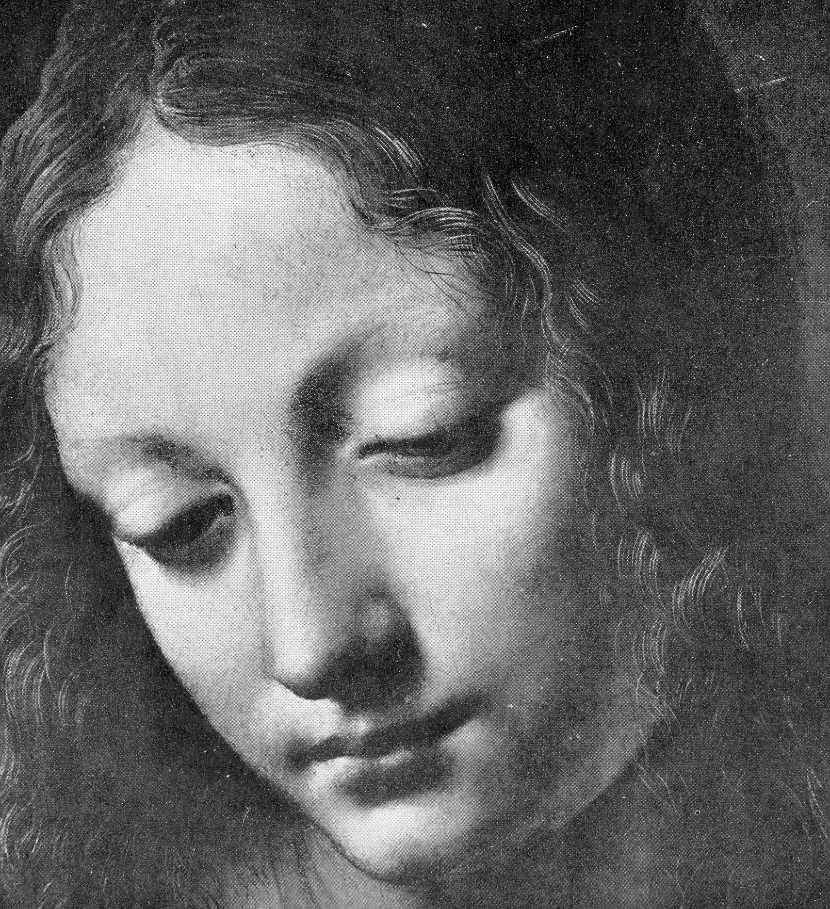
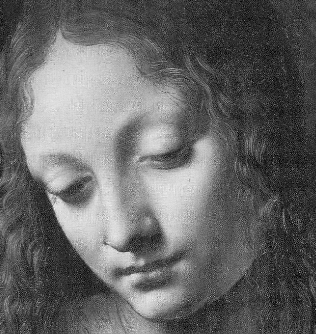
Above, top: The head of the Virgin in the National Gallery’s (second) version of Leonardo da Vinci’s The Virgin of the Rocks, as published in 1944 in Kenneth Clark’s One Hundred Details from Pictures in the National Gallery. Above, the Head of the Virgin as published in the 1990 re-issue of Clark’s “Details” book and, therefore, after its post-war restoration by Helmut Ruhemann but before its more recent re-restoration by Larry Keith (in which the mouth of the Angel was altered, on Luke Syson’s advice, as discussed here in “Something Not Quite Right About Leonardo’s Mouth ~ The Rise and Rise of Cosmetically Altered Art”).
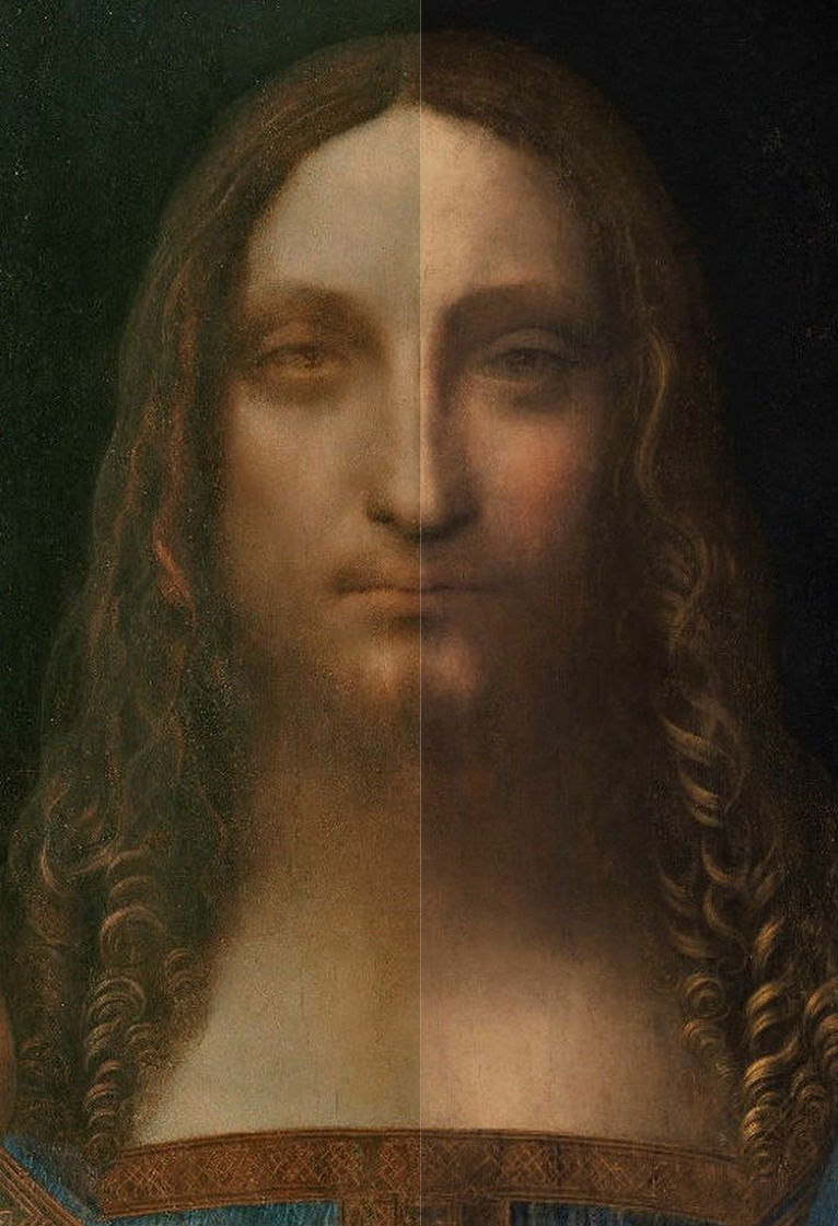
Above, the face in the accredited Leonardo da Vinci Salvator Mundi, as exhibited, left, in the National Gallery in 2011-12, and, right, as when sold at Christie’s in November 2017.
In 1990 the National Gallery remarked that “as a result of” the picture’s 1949 restoration “the differences between the heads are perhaps less apparent”. That being so, either one face had received new glazing or the other had lost original glazing. For Kemp, a crucial technical proof of Leonardo’s authorship of the Salvator Mundi is the fact that technical examinations had disclosed that “As is generally the case with Leonardo, infrared rays delivered the most striking results. It was good to be able to see that the artist had pressed his hand in to the tacky paint above Christ’s left eye – which we have seen to be characteristic of Leonardo’s technique.”
THE UNDERSTANDING TODAY ON THE SALVATOR MUNDI’S OWNERSHIP BETWEEN 2005 AND 2013
In his seventh chapter (“The Saviour”) Kemp twice discusses the ownership of the Salvator Mundi. He does so first with regard to the exclusion from the National Gallery’s 2011-12 exhibition of the “La Bella Principessa” drawing (– whose Leonardo ascription he has energetically advocated):
“This episode highlighted the rationale for the inclusion of the Salvator Mundi. Was it on the market? Would exhibiting it mean that the National Gallery was tacitly involved in a huge act of commercial promotion? It seemed highly likely that it was also ‘in the trade’ [like the ‘La Bella Principessa’]. All I knew at this stage [2011] was that it was being represented by Robert Simon. He told me that it was in the hands of a ‘good owner’ who intended to do the right thing by it, and I did not inquire any further.”
So, it would seem that the National Gallery had not disclosed the identity of the owner/owners to the scholars it invited to appraise the painting. Kemp continued:
“I was keen to consider the painting in its own right, not in relation to its ownership. I speculated, of course, that Robert might have a financial interest, perhaps a share in its ownership; and I assumed that he was gaining some kind of legitimate income from his work on the picture’s behalf. But the gallery was assured that the work was not on the market. Understandably keen to exhibit it, they were happy to accept this assurance…Might the Salvator have been less well regarded if its messy sale [in 2013, privately through Sotheby’s] to Bouvier [for $80m – $68m in cash and a Picasso valued at $12m, according to Georgina Adam in her “Dark Side of the Boom” book] and its resale [to Dimitry Rybolovlev for $127.5m] had been apparent before its public debut [at the National Gallery in 2011-12]? It has turned out to be a substantial mess. In November 2016, an article in The New York Times reported the latest developments: three ‘art traders’ (Robert Simon, Warren Adelson and Alexander Parrish) were disconcerted to find that painting was ‘flipped’ by Bouvier for $47.5m more than their selling price. Was Sotheby’s a knowing party to the the resale? The auction house claimed that it was not, taking pre-emptive legal action to block any law suit by the ‘traders’….It was however a great surprise to find that the Salvator was to be sold at Christie’s in New York on 15 November 2017 at a mega-auction of celebrity works from the modern era. The auctioneers sent the painting on a glamorous marketing tour of Hong Kong, San Francisco and London. I was approached by the auctioneers to confirm my research and agreed to record a video interview to combat the misinformation appearing in the press – providing I was not drawn into the actual sale process.”
Where would we be without a free and vigilant press? Where, precisely, is the $450m Salvator Mundi today?
Michael Daley, 10 April 2018
Startling disclosures on the re-re-restored Leonardo Salvator Mundi
One of the many mysteries surrounding the sale of the Modestini Leonardo Salvator Mundi that fetched $450m at Christie’s on 17 November 2017 was the identity of the under-bidder who staked $370m. The Daily Mail would seem to have the answer:
“EXCLUSIVE: The world’s most expensive painting cost $450 MILLION because two Arab princes bid against each other by mistake and wouldn’t back down (but settled by swapping it for a yacht)
• Leonardo Da Vinci’s ‘Salvator Mundi’ sold at an auction last November for a record-breaking $405.3million
• It was later revealed the painting’s buyer was Saudi Prince Bader bin Abdullah
• Palace insiders said the purchase was on behalf of the country’s crown prince Mohammed Bin Salman, whose regime was criticized for the purchase
• De-facto United Arab Emirates ruler Mohammed Bin Zayed also sent a representative to bid on the painting at the Christie’s New York auction
• Neither knew the other was bidding, instead they both feared losing the auction to reps from the Qatari ruling family – fierce rivals of UAE and Saudi Arabia
• Qatar’s ruling family was offered the painting just a year earlier for $80 million
• Salman’s $450 million purchase was condemned by critics of his regime
• After facing criticism, he struck a deal with his Emirati counterpart to swap the painting for a superyacht also worth $450 million”
The Mail’s remarkable account rather makes monkeys out of those cheer-leading art market commentators who took the record price achieved by Christie’s as if a confirmation of the (untenable) attribution. See the whole account here:
The Royal Academy, having unsuccessfully requested the Dianne Dwyer Modestini Mark III Version of the painting for its (magnificent) Charles I Collection exhibition the day after the sale, may have had a close escape. Curators at the Louvre, who bagged the painting for their planned big Leonardo anniversary exhibition next year, might now be given pause for thought. The Mail article shows the $450m Salvator Mundi not as it was sold in 2017 but as it was exhibited in 2011 at the National Gallery in its Modestini Mark II version. Professor Martin Kemp necessarily reproduced the Modestini Mark II version in the 2011 edition of his book Leonardo but he continues to reproduce that now obliterated version in his new memoir Living with Leonardo – Fifty Years of Sanity and Insanity in the Art World and Beyond which goes on sale tomorrow.
To see the Mark II state of the painting, as in 2011, click on our: The Reception of the First Version of the Leonardo Salvator Mundi . To see the Modestini Marks II and III versions together, click on: The $450m New York Leonardo Salvator Mundi Part II: It Restores, It Sells, therefore It Is. To see the extent of the changes between 2011 and 2017, click on The “Salvator Mundi” attributed to Leonardo da Vinci, from the authentication in 2011/12 to the sale in 2017, on which site Dr Martin Pracher (- who first spotted the post-2011 re-restoration) shows a number of details in gif formats that will enable even the most aesthetically disadvantaged viewer to appreciate the scale of the transformation this attributed Leonardo had undergone without any acknowledgement by Christie’s before its now-legendary – if not notorious – 17 November 2017 sale.
Michael Daley, 29 March 2018
Fakes, Falsifications and Failures of Connoisseurship
2017 marks the twenty-fifth anniversary of ArtWatch International and, today, the tenth anniversary of the death of its founder, Professor James Beck. This year, the eleventh anniversary of Beck’s From Duccio to Raphael: Connoisseurship in Crisis, will see the ninth annual James Beck Memorial Lecture (in London) and publication of the proceedings of the 2015 ArtWatch UK, LSE Law, and the Center for Art Law conference “Art, Law and Crises of Connoisseurship” – which examined the crises from the perspectives of artists, scholars, scientists, and lawyers.
During the early 1990s Michelangelo restoration battles we soon saw misattributions and restoration injuries as twinned failures of connoisseurship. Subsequent events confirmed that analysis and vindicated our warnings on toxic attributions [1]. Our recent protracted silence covered studies of the present fakes/connoisseurship malaise and the results will be published during the year.
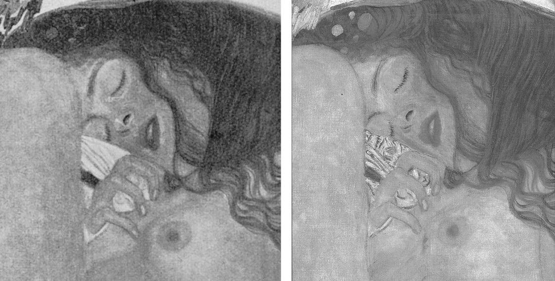
Above, Figs. 1 and 2: restoration degradations to two Klimt paintings – his Danae of 1907-08, as seen before 1956 and today; and his oil on canvas Portrait of Margaret Stonborough-Wittgenstein, as seen, left in 1905 when not-yet finished and subsequently in 1911, pre-1956 and today.
The starburst of exposed fakes that brought down New York’s (unrepentant) House of Knoedler, embarrassed ancient firms like Colnaghi’s and venerable publications like the Burlington Magazine has also humiliated the Louvre, the National Gallery, the Metropolitan Museum, the British Museum, the Art Institute of Chicago, the Tate, the Galleria Nazionale in Parma, the Van Gogh Museum and the Kunsthistorisches Museum in Vienna. On 11 April the FBI warned there could be hundreds more fakes in circulation in addition to the forty the agency has identified from a single forger who donated works to the Smithsonian American Art Museum, the Los Angeles County Museum, the Museum of Fine Arts, Boston, and the Detroit Institute of Arts. Had the FBI prosecuted the forger Ken Perenyi there might have been as many embarrassments again [2]. The problem of fakes occurs online, on land, and at sea outside of legal jurisdictions, as Anthony Amore has shown in his 2015 compendium of scams, The Art of the Con.
Above, Fig. 3, Klimt’s 1907-08 The Kiss, (detail) as seen before 1956 (top) and today.
With fakes and restoration injuries, the latter are greatly more destructive. Misattributions can be corrected, money can be paid back. However it might be ascribed at a given moment, the work of art – the art object – remains its own prime document (insofar as restorers permit). Sometimes restoration injuries are localised within a work, sometimes they are overall and catastrophic. Successive damaging restorations compound injuries and falsifications irreversibly (as seen above with Klimt and below with Renoir, Degas and Michelangelo). Slow cumulative damages are perhaps more serious than abrupt aberrant mistreatments that draw immediate notice. Scholars who shy from considerations of condition [3] must proceed on the premise that what is today is what originally was – an untenable view given that every restorer loves to undo and redo the works of predecessors but does so at a yet further remove from the work’s original condition and artistic milieu.
RESPONSES TO THE PRESENT ATTRIBUTIONS CRISIS
Responses to the attributions crisis have ranged from panic through self-exculpation and blame-casting to denial and cheerleading assurances of future streams of discoveries from sleeper/hunters. This is not an exclusively art market problem. Its roots are deeper and wider. The market trades objects on what others claim them to be. There has been concern among leading experts over the trade’s capacities of recognition and discrimination because of a precipitate decline in hands-on objects-informed expertise within the academic and museum spheres which have traditionally underpinned market activity [4]. Where Sotheby’s swiftly refunded purchases and took technical precautions, public museums are still flaunting restoration-wrecked pictures [5] and dubious attributions [6]. Much of art historical academia absents itself, fretting over alleged “engendered gazes”, for example, while missing (or disregarding) restoration-wrecked Renoirs and Klimts.
Above (top), Fig. 4, Klimt’s portrait of his niece Helene in 1956 and in 2007. Above, a detail of Klimt’s Judith II (Salome) of 1909, as published in 1956 (left) and in 1985 (Gustav Klimt ~ Women).
Below (left), Fig. 5, a detail of Renoir’s La Loge, as seen in 1921 and in the Courtauld Gallery’s 2008 exhibition catalogue Renoir at the Theatre – Looking at La Loge.
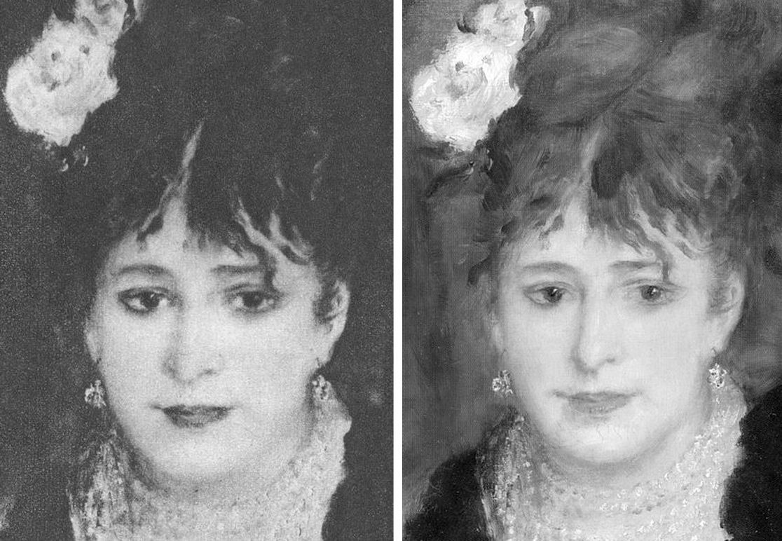
MUSHROOMING MARKETS
Without the cover of museums’ previously thought invincible technical authority, the mechanics of error are suddenly in plain view. To repeat our warnings, three years ago in “Art’s Toxic Assets and a Crisis of Connoisseurship” we wrote:
“‘Buy land’, Mark Twain advised, ‘they’re not making it anymore’. This logic ought to apply to the old masters but does not. Land makes sound investment not only because of its scarcity and its potential for development but because, in law-abiding societies, it comes fixed with legally defendable boundaries… Attributions, however, are neither guaranteed nor immutable. They are made on mixtures of professional judgement, artistic appraisal, art critical conjecture and, sometimes, wishful thinking or deceiving intent. They remain open to revision, challenge, manipulation or abuse… as some buyers later discover to their cost. Buyers are advised in the small print to beware and proceed on their own judgement… few people would dream of buying a house without legal searches and a structural survey.”
Eleven years ago we noted: “…The artists themselves may be dead but their works proliferate. As recently as the 1960s, 250 sheets of drawings were accepted as authentic Michelangelo. Today, over 600 sheets are. Such increases are fed not so much by forgery or the discovery of genuinely long-lost original works (both of which occur) but by a too-ready upgrading of copies, or studio works, to ‘original’ status.” [7.]
Three years ago we warned that buying old master paintings could be riskier than buying second-hand cars and asked for vendors to be required to disclose all that is known about a work’s provenance and restoration history (13 August 2014, letter, the Times – Fig.6, above). At the time we received silence. This month the art market blogger, Marion Maneker, complained (Art Market Monitor, 2 May 2017) that:
“The Financial Times has yet another ‘How Transparent Is the Art Market?’ story written by an announced participant in an upcoming art market regulation conference revealed in the pages of the Financial Times the week before. Considering the amount of interest the FT has shown in regulating the art market, one would expect the international business newspaper to have some proposals about how to police the trade.” See Georgina Adams, “How transparent is the art market”. Where Maneker complained: “The closest the story comes to offering ideas is to compare the art market to the second-hand car market (unfavorably)” Adams had quoted two art world players who so liken the art market:
“The fundamental problem, according to the FBI’s art and antiquities special agent Meredith Savona, is the lack of records of ownership. ‘Even for cars, I can see who owned it for a certain period of time,’ she says. ‘In the art market there is nothing, no regulation. If someone will not tell you who was the previous owner there’s a reason. There needs to be a way of having records maintained for, say 20 or 30 years.’ This chimes with the stand taken by Nanne Dekking, a Dutch entrepreneur whose start-up Artory aims to bring more transparency to the market through catalogue raisonnés and provenance research – ‘In Holland there is a digital registry for second-hand cars – it’s obligatory to register, so if you buy a car you know exactly what you are getting’, he says. ‘…That’s the kind of transparency we’re after.”
In 2013 Dekking was appointed Sotheby’s Executive Vice President and Vice Chairman, Americas after eleven years with Wildenstein & Co. He is a board member of the Authentication in Art group which first welcomed and then rejected a proposed paper we had offered on the flaws of Technical Art History for a forthcoming AiA conference. We see open and freely published debate as a precondition to reforming a system that is proving unfit for purpose.
PROVENANCE RESEARCH
Georgina Adams also reported calls for a levy on art sales to fund independent bodies to establish and maintain standards in the protection of buyers but such suggestions, in our view, are unworkable. The art market is global and increasingly an arena of private/secret transactions. Taxes are levied by governments. How and by whom would levies be collected around the world, pooled and then disbursed? Who would guarantee the independence of such bodies? Would they be national or international and to whom would they be answerable? Would they charge fees to offset their own costs? Less problematic, much cheaper and perhaps more to the point would be for governments to give buyers enshrined statutory rights to be informed about what should appropriately be known when buying a work of art. Presently, vendors enjoy de facto rights not to disclose their identities; not to disclose how often and to what extent works have been made over by restorers.
CONCEALMENT OF IDENTITIES
In 1998 a pastiche Leonardo drawing was put on the market by Christie’s NY as “German School, early 19th century” and “the property of a lady”. When the work was claimed to be a Leonardo worth $200million (as the so-called “La Bella Principessa”) the lady concerned disclosed her identity and brought an action for damages against the auction house on what was only a claimed valuation, not a sale. Only then did we learn that the vendor was the widow of a painter/restorer (of Leonardo, among others) who had been an intimate of Bernard Berenson, helping him to conceal his collection from the Germans during the War, and the drawing’s only known owner. When the new owner, and Professor Martin Kemp, an AiA board member and a leading advocate of the Leonardo attribution, trawled the Berenson archives together in search of an earlier reference to the drawing they drew a blank. The drawing remains without history outside of the studio of the artist/restorer who is said to have restored it. Such is precisely the kind of information to which potential buyers should rightfully be privy.
THE LAW, SECRECY AND MAKING THE BONA FIDE FAKE
When the Art Newspaper examined the legal ramifications of the current crisis (“It’s time the art market got tough on fakes” 2 February 2017) it found no appetite for either external regulation or self-policing and a blithe acknowledgement that bad restorations convert bona fide pictures into effective forgeries:
“At the annual art-crime symposium held in November at New York University, participants agreed that the culprit was the market’s notorious secrecy. But discussions revealed deep divisions about what should be done. Insurers, auction houses, dealers and other players each have their own interests to protect in a market where, as one participant remarked, the ‘level of greed…is so great’.
‘Information is the currency of the art market,’ said lawyer Steven Thomas, the head of the art law practice at the Los Angeles law firm Irell & Manella. He offered an example showing how information was withheld in trying to close a sale. When one of his clients learned that an impressionist painting he was interested in had been restored so extensively it was no longer considered authentic, he confronted the dealer, a prominent New York gallerist. ‘Oh, you found out,’ was the cavalier response. Such is the attitude in a market where the burden of due diligence as a practical matter may fall on the buyer.”
ACKNOWLEDGING RESTORATION INJURIES TO SAVE AN ATTRIBUTION – AND THE PARAMOUNT IMORTANCE OF PHOTOGRAPHIC RECORDS
Secrecy on condition can tempt owners. Duncan Phillips privately admitted that his great Renoir The Luncheon of the Boating Party (detail below, Fig. 7) was so mauled by two pre-eminent restorers that it was rejected as authentic when loaned to the Louvre:
“Fortunately we were able to put them right because our friends had taken the precaution of filming their work on the canvas. I have a copy of the film which you’re welcome to view. In it you’ll notice actual colour stains coming off on the cotton swabs. But please, for God’s sake, don’t report this tragedy. It’s too dreadful.” [8.]
Today one can see on the painting where a colour in one part was introduced into the cracks of another area – and yet Phillips’s widow, Marjorie, wrote in her 1970 memoir Duncan Phillips and his Collection “the Sheldon Kecks, outstanding restorers, operated on the Renoir successfully!” We have asked the Phillips Collection’s director several times to see the film and the painting’s restoration records but always without reply. At the National Gallery, under the directorships of Charles Saumarez-Smith and Nicholas Penny, we were given permission to examine the historic and conservation dossiers of paintings with the kind and helpful assistance of the gallery’s librarians and archivists. In contrast, when we asked to see the records of the Bellini/Titian The Feast of the Gods at the National Gallery, Washington, the conservation department refused outright. A curatorial department was more open and supplied good-quality pre and post-restoration photographs of the painting’s states which enabled us to demonstrate losses of value during the cleaning (as at Fig. 8 below). We learn that a member of the gallery’s conservation staff keeps more sensitive photographic records at home for fear that they “might fall into the wrong hands”.
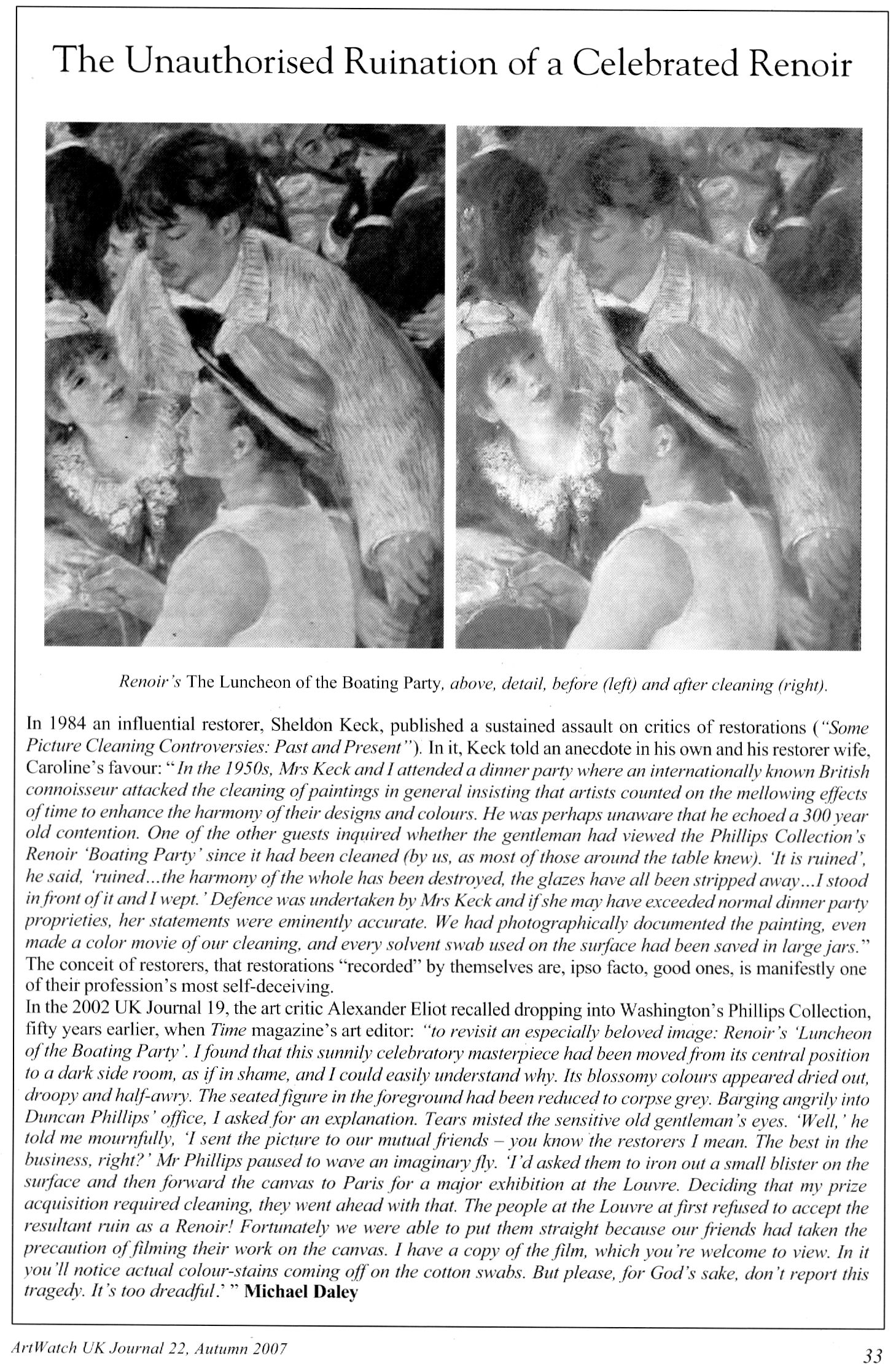
Above, Fig. 7: a page in the Autumn 2007 ArtWatch UK Journal published in memory of James Beck who died on 26 May 2007. In the same journal we published a comparison of a detail of the Feast of the Gods, as taken before cleaning (left) and after cleaning but before repainting – see Fig. 8, below:
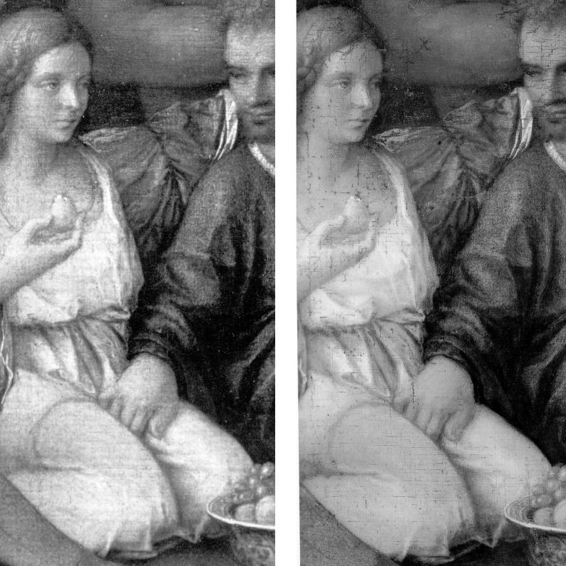
SPURIOUS CONSERVATION SCIENCE
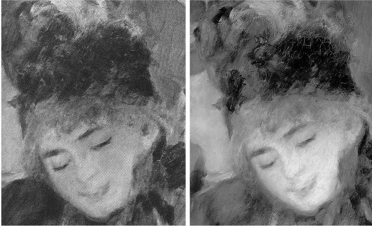
Above, top, Fig. 9: a detail from the National Gallery’s Renoir The Umbrellas before cleaning (left) and after cleaning in 1954. Below, Fig. 10, the face, after cleaning and restoring.
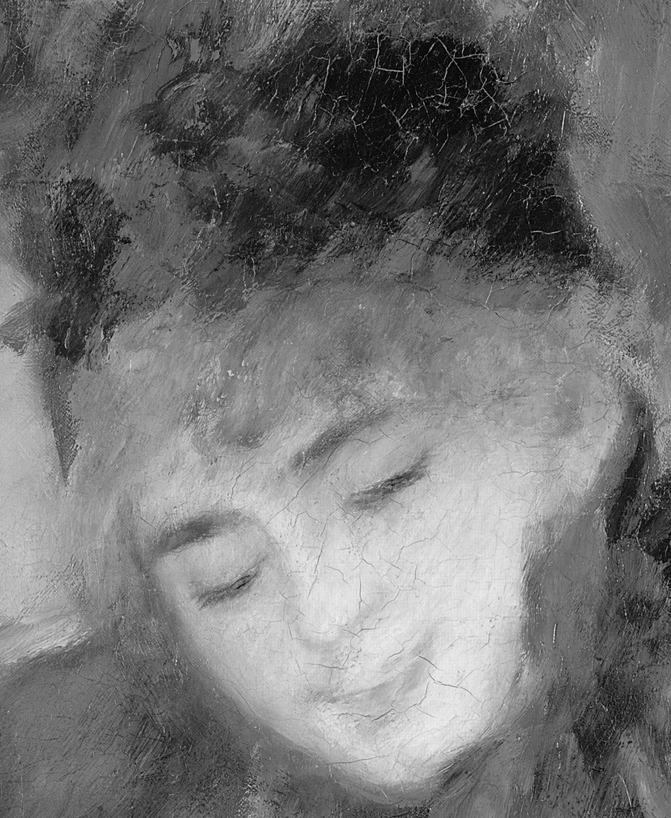
It should be clear to any scholar or connoisseur of paintings that the National Gallery cleaning was injurious, that the picture’s values and relationships were degraded and deranged – and yet the technical promises underpinning the restoration were “top-of-the-range” and authoritative. Cleaning was preceded by a physical and a chemical analysis of the painting by two gallery scientists who concluded that an “extremely thin” natural resin varnish could safely be removed “by solvents of a strength well below that likely to attack the paint film, which is resistant to the solvent action of pure acetone.” The scientists offered an additional assurance: “In the hands of a competent restorer [Norman Brommelle, husband of the National Gallery’s head of science, Joyce Plesters, was chosen] there is no reason to fear that the paint layers will be disturbed in the course of cleaning. Since, in this particular picture, there is no evidence of a linoxyn film, nor the presence of any resin in the medium, there is, in our opinion, no need to adopt any special precaution.”
Brommelle reported that the varnish was removed with a 3:1 turpentine/acetone mixture containing a small percentage of diacetone alcohol and that the last traces were removed with toluene but no one explained why an extremely thin varnish layer of no great antiquity needed to be removed. The cracks seen above at Fig. 10 were products of the cleaning (some local cracking had occurred previously where the canvas vibrated against a central stretcher bar on its regular exchanges between London and Dublin. (Technical information by courtesy of the National Gallery Conservation Department.)
THE TECHNICAL AND SCHOLARLY UNDERWRITING OF A FAKE AT THE NATIONAL GALLERY

One of the recently disclosed fakes, an “Orazio Gentileschi” (above right at Fig. 11 next to an authentic work), had been accepted by the National Gallery on a loan from its owner. When the now rejected no-history painting was withdrawn, the gallery justified its inclusion with the claim (Antiques Trade Gazette): “The gallery always undertakes due diligence research on a work coming on loan as well as a technical examination.” After this historical and technical examination, the Gallery label declared that “the poetic depiction of ‘David Contemplating the Head of Goliath’” had been produced by Gentileschi “for a collector’s cabinet” – an unsupported claim that, like “made for private devotion”, often serves as a flag of convenience for small recently-discovered old works without histories.
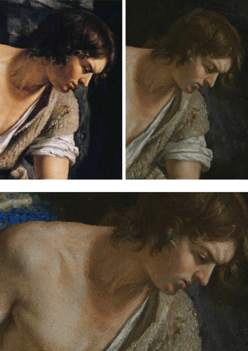
Above, Fig. 12, here we see a detail (top left) of the real Gentileschi David and (top right and below) the loan accepted as authentic by the National Gallery. If, instead of whatever technical and art historical examinations were carried out, the Gallery had run a few simple photo-comparative checks of the kind shown here, it should have been obvious to anyone with an alert eye that the picture in the top left had been the bona fide historical prototype for the other, markedly inferior and modern-looking, version. Qualitatively, they are not remotely co-equals: the one is a crude pastiche of the other. In every detail the chasm of quality should have identified the loan as a pastiche.
THE CONSEQUENCES OF (UNACKNOWLEDGED) RESTORATION INJURIES
Although this impostor has now been rejected from the National Gallery there is no redress for individual badly restored bona fide works – and often not even an acknowledgement of their plight. Nor is there any apparent means of stemming the swelling tide of destruction that masquerades as a conservation service while delivering incremental degradations of pictures, such as those that can be shown to have taken place in less than a century on what is now the Denver Art Museum’s Degas’ superb pastel and charcoal The Dancing Class or Dance Examination of 1880 below at Fig. 13. The first photograph in the sequence was published in 1918 (Degas, Paul Lafond) when the drawing was not yet forty and therefore likely to have been in an original or near-original state. The third photograph was published in 2002 in the catalogue to Degas and the Dance, a sponsored travelling exhibition organised by the American Federation of Arts (- the “the prime movers”), the Detroit Institute of Arts, and the Philadelphia Museum of Art. The show was curated by the leading Degas specialists Richard Kendall and Jill Devonyar.

The sequence of states at Fig. 13 above resembles a succession of an etching’s proof states in reverse: the most complete condition is seen in the oldest record and the most debilitated state is recorded most recently. If we make the most direct comparison with the earliest and the most recent records of this drawing, as at Fig. 14 below, the differences become startling and heartbreaking. What happens to one artist happens to all in turn, as was most shamefully seen to Michelangelo at the Sistine Chapel – see Fig. 15 where an early Anderson photograph of a lunette is shown with its post-restoration state. By such simple comparative means we can see/demonstrate that Degas and Michelangelo have not been restored or conserved so much as subjected to a cultural pathology – an infantile revulsion at or terror of darkness and a failure to appreciate that darkness, as artists appreciate, confers brilliance and radiance. Without shadows to relieve lights there is no great vivacity – art’s life-affirming gift. Our historic cultural legacy is being made over into a blander, more homogenised arbitrary colourfulness. With so much value and vivacity already lost in the Dance Class’s first century, who, if offered the chance, would today vote for “More of the same, please” in the next? Restorers can never put the clock back. They can only offer more of the same: yet further intensifications of hue and losses of form and space-creating tones.
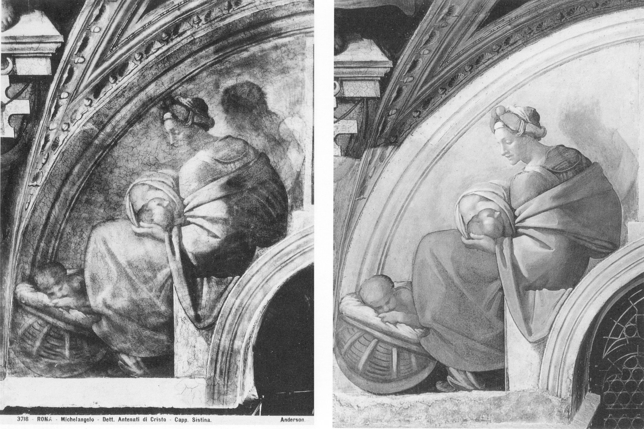
THE INCALCULABLY VALUABLE TESTIMONY OF PHOTOGRAPHS
Photographic reproductions do not have to be taken as absolutely faithful replications to have great value as record – why else would they be published and consulted in such great numbers? They are particularly eloquent as witnesses when seen in company with predecessors and successors, because the patterns that successive images make disclose the truth about present conditions. The net consequence of restorations during the last much-photographed century can be seen/shown to have been gravely damaging, effectively washing away art’s pictorial strength, disrupting the internal relationships of individual works, rendering oeuvres capriciously erratic and incoherent and, thereby, creating spaces, opportunities and, even, seeming precedents for misattributions and outright fabrications.
COLOURS V TONES
Although we do not have a colour photograph to match the black and white Durand Ruel photograph published in 1918, we can, by juxtapositions, estimate the degrees of loss today. At Fig. 16 below, the top comparison shows that the bump on the head of the woman in the upper right-hand corner was formerly a red feathery hat decoration. It now survives as a smear of colour that, tonally, is almost indistinguishable from the wall behind. We can see in the greyscale comparison at the bottom that the red decoration had originally been given a halo. On his own declared pictorial statagems, we might deduce that Degas had used the pocket of red to create a triad of local counterpointing primary colours: red feathers, ochre spots and an intense dark blue ribbon bow. Certainly, speculations aside, since that date the ineffably soft back of the standing dancer’s tutu has both hardened and become see-through. The feathered, layered back of the bending dancer’s tutu has, on some bizarre and alien tidy-minded logic, been reduced a ghostly but sharp-edged right angle. Degas is leaving us, involuntarily. He learnt and extracted much from photography. Is it too much to ask that all scholars use our very great resources of photography and historic photographic evidence to calibrate the injuries done to his oeuvre and therefore more fully appreciate and give due account of Degas’ great and supremely fresh and audacious genius?
Certainly, the most urgent single reform needed in today’s crisis of connoisseurship lies in increasing the accessibility of photographic records of condition and treatments. In an age of electronically transmissible, high quality photographic images this would be easier to achieve and more instructive than ever before. There are no good reasons for institutions, owners and dealers continuing to sit on such material and thereby prevent people from seeing what’s what.
Michael Daley, 26 May 2017
Coming next: Degrading Degas and Michelangelo
ENDNOTES:
[1] We first used the term in connection with the so-called Stoclet Madonna, the Metropolitan Museum’s attributed Duccio, in “Toxic Attributions?” The Jackdaw March/April 2009.
[2] “In the end, after a five-year investigation and a mountain of evidence collected, no one, neither the two ‘conspirators’ nor I, was ever charged with a crime or indicted” – so wrote Ken Perenyi, in his 2012 memoir Caveat Emptor, p. 312.
[3] One scholar who has engaged on this territory with his pioneering book Condition:The Ageing of Art, Paul Taylor, incurred immediate wrath from some restorers who would claim monopoly rights on all discussions in the field, but a firm welcome elsewhere. Apollo noted that “There are unquestionably many art critics and even academic art historians for whom the material context of art, and particularly flat art, has become a rarefied field. That needs to change, if we are not to see total severance between those who work to preserve physical objects and those who claim to construe their meanings.”
[4] In a paper delivered at the ArtWatch UK/LSE/Centre for Art Law December 2015 conference (“Throwing the baby out with the bathwater”), Brian Allen, a former director of the Paul Mellon Centre for Studies in British Art (1992 to 2012) and Chairman of the Art Fund observed: “…increasingly, the only young connoisseurs emerging are to be found in the commercial art trade and this surely cannot be a desirable state of affairs. It might be argued that many of the best ‘eyes’ have always been in the art trade but, until recently, there was always a body of disinterested academic ‘experts’ to counterbalance commercial self-interest…” In the March 2017 Art Newspaper, Anna Somers Cocks, the paper’s Chairman and a former curator at the Victoria and Albert Museum, discloses that the V&A now considers the giving of opinions a drag on its curators’ time and devotes only three hours a month to it when, in the 1990s, it reserved two afternoons a week to telling the public what their heirlooms were. In the same issue of the Art Newspaper Mark Jones, a former director of the Victoria and Albert Museum, said that expertise, by which he meant “the ability to recognise and identify objects, surmise their history from their appearance, tell the genuine from the false and make judgements about quality” has become patchy, even rare, in museums. Mark Jones was the curator/organiser of the British Museum’s legendary 1990 exhibition “Fake? The Art of Deception”, the catalogue of which remains a seminal study in the field.
In response to Mark Jones the dealer Peter Nahum wrote in the April 2017 Art Newspaper (letter, “Dealers and curators should work together to spot fakes”):
“The art forger Shaun Greenhalgh and his father George visited my gallery in 1984. It was after 6pm and they offered me a painting they said was by Samuel John Peploe, for which I gave them a cheque. As soon as the banks opened at 9am the next morning I cancelled the cheque and called in the police. I was the first to report the family from Bolton for purveying a fake, 16 years before their arrest.
“When they were finally arrested, my cheque was still on their desk. I also advised Bolton Museum on the purchase of the painting by Thomas Moran and subsequently saved them from buying a fake watercolour purportedly by the same artist.
“I have long campaigned for the art and antiques trade and academics, especially those in museums, to work more closely together. Our job, as dealers, is to defend our clients against the legion of fakes and wrongly catalogued items on the market. As we are personally financially responsible for all transactions we make and advise on, we are the most vulnerable and, by necessity, the most careful. As a result we are often best placed to authenticate works.
“Academies and museums obviously have great experts on their staffs, but their prime focus is the history and provenance of objects and thus their visual skills often take a secondary position. When both professions work together, mistakes are lessened.
“I have made it my mission to track down and report those who make fake art, as they are the bane of our lives and can cost those who buy art a great deal of money. They are simply con-men extracting money from innocent people by deceit.
“As dealers, academics and collectors, we are all motivated to push the boundaries of our knowledge, and thus all of us are vulnerable to those who wish to take money under false pretences. We have to be constantly on our guard as each one of us will fall into one of the fakers’ traps sooner or later – we are all human after all.
“Thus, I applaud Mark Jones’s article: scholarly research is flourishing but curators’ ability to judge an object’s quality is not (The Art Newspaper Review, March, p.13) with two main comments. The painting by Samuel John Peploe was not sold, and academics have rarely been the greatest visual judges – that is more our job than theirs. That does not mean that there are not great visual experts in academia – of course there are – it simply means it has never been their primary function.
Peter Nahum.
Peter and Renate Nahum Agency (the Leicester Galleries), London.”
[5] See “From Veronese to Turner, Celebrating Restoration-Wrecked Pictures” and “Taking Renoir, Sterling and Francine Clark to the Cleaners” and THE ELEPHANT IN KLIMT’S ROOM and, finally, “Now let’s murder Klimt”.
[6] The National Gallery includes one of its most dubious and controversial attributions – the Rubens Samson and Delilah – in its list of 30 “must-see” pictures. There are more than twenty secure and superior works by Rubens in the gallery including the magnificent Minerva protects Pax from Mars (‘Peace and War’). When controversy broke over the attribution in 1997 the gallery’s director, Neil MacGregor, placed a statement next to the painting to explain why it looked like no other Rubens in the collection. Two special issues of the ArtWatch UK Journal have been devoted to this picture’s problems. See: “The Samson and Delilah ink sketch – cutting Rubens to the quick” and “Art’s Toxic Assets”
The National Gallery’s highlights list also includes the restoration-wrecked Bacchus and Ariadne by Titian, on which, see: “The Battle of Borja: Cecilia Giménez, Restoration Monkeys, Paediatricians, Titian and Great Women Conservators”
[7] “Oh Blessed Honthorst”, Michael Daley, ArtWatch UK Journal No. 21 Spring 2006 – a Rubens special issue dedicated to the National Gallery’s ascribed Rubens Samson and Delilah), p.4.
[8] As reported by Alexander Eliot, a former Time magazine art critic, in “A Conversation about Conservation”, The World and I (Volume: 15), June 2000.
Leonardo and the Growing Sleeper Crisis
Another day, another new Leonardo drawing – this time a St. Sebastian with a mismatched verso and recto, with as many legs as a millipede, and lashed in a gale-force wind to a tree set in a landscape of icebergs…

Above, Fig. 1. A newly proposed Leonardo whose problems will be the subject of our next post. See Scott Reyburn’s “An Artistic Discovery Makes a Curator’s Heart Pound”, the New York Times, 11 December 2016.
The old masters world is bursting with Leonardo “discoveries” that flaunt their five-century no-histories. (See Problems with “La Bella Principessa”~ Parts I, II and III; and, “Fake or Fortune: Hypotheses, Claims and Immutable Facts”. “Problems with La Bella Principessa ~ Part I: The Look”.) At the same time there is a near meltdown over a spate of recent high quality exposed fake “sleepers” and “discoveries”. Sotheby’s has hired its own in-house technical analyst to spot inappropriate materials in new-to-the-scene old masters so as to “help make the art market a safer place” (“FBI expert to head up Sotheby’s new anti-forgery unit”, 6 December 2016, the Daily Telegraph). This is no bad thing and the appointment has been universally welcomed when, following the fake Frans Hals affair, it is reportedly feared that 25 forgeries sold for up to £200million are on the walls of unsuspecting owners, and when the new Sotheby’s appointee had himself single-handedly unmasked 40 supposed modern masterpieces sold for £47million at the now deservedly gone Knoedler Gallery, New York.
The real crisis, however, is the product of failures of judgements even more than failures to carry out due diligence checks on the material components of works. It remains the case that aside from works instantly disbarred by technical diagnosis, identifying authorship and establishing authenticity will necessarily and inescapably continue to be a matter of professional judgement. (We hold that here is systemic methodological flaw in appraisals that has yet to be addressed.) Meanwhile, dealers, critics, scholars and collectors embarrassed by suspected fakes are left agonising: should they concede error and take a hit on credibility but thereby limit damage, or should they stand firm and double the risks?
Even professional sleeper-hunters are falling out in acrimonious fashion over rival BBC television platforms – sorry, programmes – with one said to believe the other jealous of his good looks and success: “It’s a copy: Fake or Fortune? Stars try to halt rival show”, Richard Brooks, Sunday Times, 4 December 2016.
One auctioneer shouts you’ve ruined my sale at a musical scholar on Radio4. “Sotheby’s view is shared by the majority of world renowned Beethoven scholars who have inspected the manuscript personally”, the Sotheby’s man insists when characterising a scholar’s refusal to come in to view the manuscript as “irresponsible” (“Sotheby’s give Beethoven expert an earful after copied manuscript row scuppers sale”, The Times, 30 November 2016.)
The charge is a red herring, we say: if errors in the manuscript are visible in an auction house’s high quality photographs, coming in to touch the paper will not make them go away. If the auction house’s (anonymous) world authority musical experts think there are no errors, we add, they should come forward and say so. A Cambridge professor of musical theory did step forward to affirm his endorsement of the manuscript but he also admitted having been bothered by an anomaly (“Sotheby’s expert admits doubts over Beethoven script”, The Times, 3 December 2016.) To Sotheby’s likely mortification, it was revealed that arch-rival Christie’s had refused to sell the score last year, after being unable to confirm its authenticity – “Beethoven manuscript row remains unfinished”, the Daily Telegraph, 30 November 2016: “There was some good news for Sotheby’s however as the auction house succeeded in breaking a new auction world record for another musical manuscript…Gustav Mahler’s complete Second Symphony (the ‘Resurrection’), written in the composer’s own hand…went for £4,546,250.”
“Sotheby’s catalogue was an artful dodge, claims Russian billionaire” – the Times, which reported on 8 December: “Mr Ivanov said that honest mistakes were understandable. The problem is at Sotheby’s the fakes are listed as the top lots and are published”. With experts in as much disarray as auction houses and dealer/broadcasters, what perfect timing, then, for the appearance of a new, cool and calm legal anatomy of the sleeper phenomenon and its associated problems of authentication.
Above, Fig. 2. In “The Sale of Misattributed Artworks at Antiques at Auction” by Anne Laure Bandle of the London School of Economics and a director of the Art Law Foundation (Geneva), we encounter a book greatly richer and more urgently required than what is simply “said on its tin”. This work, the product of a PhD at the LSE, deftly turns over the law with regard to art market workings as encountered and applied under three key (for the art market) systems of law, those of Swizterland, England and the United States. Under all three it is shown how the auctioneer’s primary duty is to the seller (the consignor) not the buyer. It follows therefore that failing to identify the proper status of a work of a work when conferring an attribution can/should carry penalties of compensation to the consignor. However, in response to this duty/financial danger, auctioneers insert massive disclaimers of liability into their contracts and attributions. These disclaimers are also widely appreciated in terms of warnings to buyers of a need to satisfy themselves of the validity, accuracy and reliability of any catalogue description before buying. Such self-protective clauses have consequences that can bite hard on those who apply them. For one thing, we would add, forgers have not been slow to notice them.
Above, Fig. 3. The American Ken Perenyi, cheekily called his 2012 Forger’s Memoir Caveat Emptor – The Secret Life of an American Forger. With little interest in consignors’ rights – he being both the knowing maker and the eager consignor of forgeries – Perenyi, after first studying the terminology of attributions in London auction house catalogues (“Attributed to; Signed; Studio of; Circle of; Manner of…”) swiftly moved to “Conditions of Business”; “Limited Warranty”; and thence “Terms and Conditions”. He reported (pp. 228-247) that when in London he noted that:
“In what can only be described as a masterpiece of duplicity, the terms and conditions made it clear (that is, if one has a law degree) that they warranted and guaranteed absolutely nothing. However, farther down, a paragraph entitled ‘Guarantee’ made it plain for even the most thickheaded. It stated: ‘Subject to the obligations accepted by Christie’s under this condition. Neither the seller Christie’s, its employees, or agents is responsible for the correctness of any statement as to the authorship, origin, date, age, size medium, attribution, genuiness, or provenance of any lot.’”
On return to the United States he then examined New York auction house catalogues: “Again and again we saw the phrase neither Christie’s nor the consignor make any representations as to the authorship or authenticity of any lot offered in this catalogue. ‘Hell, they don’t guarantee anything [over] here either!’ I said.”
After reading a paragraph on forgeries stating that if within five years of a sale the buyer could establish “scientifically” that a purchased painting was a fake, the “Sole Remedy” would be a refund of monies paid [- But for a cautionary case-in-point today, see UPDATE , below] Perenyi concluded the following: “A) Virtually nothing sold here was guaranteed to be what it claimed to be, B) Neither the auction house nor the seller assumed any responsibility whatsoever, C) Even if a buyer discovered a painting to be an outright fake, all he could do was ask for a refund, I came to the conclusion that this was an engraved invitation to do business.”
His late partner, José, concluded “Well, maybe we could save people the trouble of going to London and sell them [Perenyi’s forgeries] right here!”
In her new book, Dr Bandle carries the full terms and conditions of three auction houses (Christie’s, Koller Auctionen’s and Sotheby’s) as an appendix. She notes that notwithstanding disclaimers, such is the volume and reach of art sales that many art market players take auction house catalogues as reference points on the identification and evaluation of art and antiques and do so particularly with regard to attributions, confidence in which confers authority and engenders trust. In this regard the “sleeper”, as an under-identified and therefore under-valued work, is a special problem. A (conceptually subtle and fascinating) chapter is devoted to the sleeper’s elusive and problematic character. In fact, a delight of this book is its constant precision, economy and deftness of language in what is a perpetually shifting and re-forming arena where the market structures have both democratised and globalised the ownership of art but where buyers gathered from around the globe must compete in heated races to acquire multi-million valued art in spectacular shows of competitive bidding that are over in minutes. In a recent double television celebration of Christies-in-the-World, the term “buyer’s remorse” was heard in counterbalance to auctioneers’ seductively whispered advice to “think how terrible you will feel tomorrow if you don’t get this”.
A “sleeper” is first identified as being not a legal term but a figurative illustration of a legal problem. It is one that fleshes the notion that an artwork can remain a “dormant treasure” until it is properly identified. If not so identified, it stands dangerously (to auctioneers, and expensively to consignors) as a work that has been “undervalued and mislabelled due to an expert’s oversight and consequently undersold”. Sleepers are products of three types of error and each receives its own section. The extent to which restorations aiming and claiming to recover original conditions may alter objects and mislead authenticators is examined.
(But for our specialised concerns, recognition of the inherently problematic nature of restoration’s role in the identification and subsequent elevation of authenticity is a rare instance of under-examination in this book. Stripping off later materials does not in itself recover original states. It may disclose little more than badly damaged remains of an earlier, more “authentic” state. How much repainting, or “retouching” as it is euphemised, should be considered permissible before a worked-over sleeper approaches a forged recovery of authenticity? – See “A restorer’s aim – The fine line between retouching and forgery”.
It should be said that sensitivity in this arena is not an art market-confined problem: the Frick Museum does not publish the photograph below – Fig. 6 – of a stripped-down, not-yet repainted Vermeer that the Getty Institute holds and makes freely available – and many museums, in our experience, sit on photographs of their own restoration-wrecked paintings.)
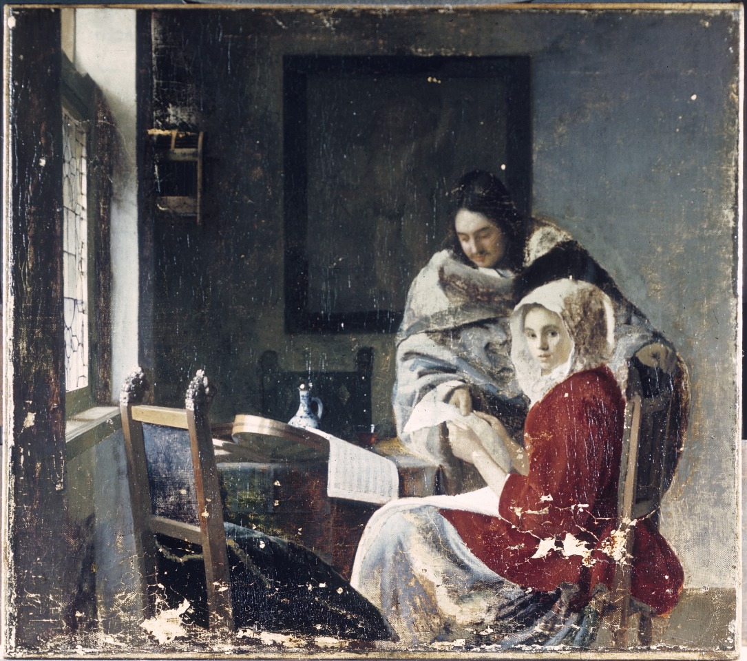
Dr Bandle’s section on the relationship between sleepers and fakes or forgeries, between the unrecognised and the counterfeit, is adroitly introduced: “sleepers are the negative reflection of counterfeits: both are held as something that they are not.” Fine distinctions are drawn between a fake and a forgery. Both are characterised “negative concepts, referring, as they do, not to qualities but to their absences.” Before considering the legal status of sleepers, a fascinating examination is made of the tools and methods of attribution. So examined, too, are the hoped-for instruments of probity, the best-practice and ethical codes for authentication and dealing. Like auction house terms and conditions, ethical codes are shown carry their own disclaimers: “Similarly, the Swiss Association of Dealers in Antiques and Art contains a disclaimer of the attribution and appraisal’s accuracy.” (One hears a Perenyi expletive of delight here.) As for auction houses, while they “issue attributions in sale catalogues, they are not considered to be formal authentication reports”, whatever weight they might carry in the market and for buyers.
The section on the “Essence of Attribution” might be considered essential reading for all art market players and commentators, not least because the art market “greatly relies on scholarship”, and such expert appraisal is uniquely challenged “by the peculiarities of the art world” – one of which is that however long debates rage, scholars themselves “may very well never achieve a consensus”, in which case, the circularity is complete: “scholarship cannot halt during the art object’s identification process by establishing an attribution, not even temporarily”. Like painting the Forth Bridge, attributing an art object can be “an ongoing undertaking that never settles”. Existing attributions are constantly subject to challenge or revision.
The law itself can seem helpless or exasperated in the face of art world processes. Elusive notions of authenticity tax judges as well as scholars. With regard to establishing the merit or applicability of warranties of authenticity or the diligence of experts, even the admission of testimony is problematic within both Swiss civil law and the English and United States traditions of common law. Swiss courts can commission reports and instruct experts to answer set questions. Under common law conflicting parties support their rival positions by calling rival and conflicting experts. Courts may confine these adversarial jousts to “that which is reasonably required”. Under US Federal rules courts may exclude what they consider “unreliable expert testimony” and even when testimony is based on scientific principles it may be held acceptable only when these principles have “gained general acceptance”.
Under Swiss, English and United States jurisdictions alike, contractual relationships governing art auction sales are not clearly defined by law and are subject to scholarly debate (which, as mentioned, is a never-ending process). Further complications arise from the dual and conflicted position of the auctioneer. Does he really serve the buyer’s or the seller’s interest – or, somehow, both? In practice, we might think, he should/must aim to serve both since different people must always be persuaded any moment that it is a “good time” to sell and a “good time” to buy. Failures to recognise “sleepers” are the mirror image of failures to recognise fakes or forgeries: the one injures consignors’ interests, the other those of the buyer. But how to stay out of trouble as an auctioneer when case law results in unclear and unreliable notions of liability – and while there is a requirement to perform diligently but not one to produce to specific results?
By increments the law emerges as unfit for its presently allotted purpose in resolving sleeper disputes. Auctioneers are judged by standards predicated on what is little more than a fiction. Standards of performance must be interpreted on a case-by-case basis but these provide no benchmark in cases of sleepers sold at auctions. Aside from these problems, judges generally lack connoisseurship in art and art auction sales and may have difficulty in assessing authenticity and in reconstructing the attribution process – and while this is understandable because art connoisseurship and art market mechanisms are both highly sensitive and influential forces, judges, no matter how well educated and competent in other areas of the law, will struggle to redress a present structural imbalance between the interests of (favoured) buyers and (disfavoured) consignors.
Can applications of the law be made to work in this arena? Are alternatives to the law presently or potentially available? For answers to these questions it is necessary to read the concluding section of a timely book that will commend itself to Art’s players and watchers alike.
The Sale of Misattributed Artworks and Antiques at Auction, Anne Laure Bandle. ISBN: 978 1 78643 100 4 Price £100 or Web: £90
Michael Daley, 15 December 2016
UPDATE 17 December 2016
In the 17/18 December Financial Times “The Art Market”, Melanie Gerlis writes:
“ Art is notoriously a ‘buyer beware’ market, but even prolific professionals can get caught out. Micky Tiroche, a private dealer in London and co-founder of the Tiroche auction house in Israel, bought ‘Sun and Stars’, a gouache attributed to Alexander Calder, for £28,000 (with fees) at Bonhams, London in 2007. The purchase was made through his dealing company, Thomas Holdings, which has about 160 works on paper by Calder.
“In 2013, the gouache was submitted, along with other works, to the Calder Foundation in New York, which doesn’t officially authenticate the artist’s works but gives them an inventory number (known as an ‘A-number’ because the digits are prefixed with the letter A). ‘Sun and Stars’ was not given an A-number, making it effectively unsellable.
“Christie’s, Sotheby’s and now Bonhams will not sell Calder works that do not have an A-number.
“Tiroche, who buys frequently at Bonhams as well as elsewhere, says that he asked the auction house for a refund and was refused. He has suggested alternative, less visible ways of refunding (such as deducting its value from other works) and legal letters have been exchanged, but to no avail.
“A spokesman for Bonhams said: ‘It is [the auction house’s policy] not to discuss individual cases, beyond saying that we are in communication with Mr Tiroche’s company about the situation.”
Connoisseurship: Examinations, Debates and Snap Visual Responses

The rising tide of old master “sleepers” and “discoveries” carries great dangers and demands snap judgements. Some candidates for upgrades intrigue, some look dubious, some scream “Fake!” Last week two cases caught our eye.
Fig. 1, above. Fig. 2, below. The newly discovered “Lost” Van Gogh sketchbook (above, top) rang our and many other fake bells. Then came a report that a small “Florentine School” painting on a €3-4k estimate fetched €375k at auction as a sleeping Filippino Lippi (above, Fig. 1). A link to another small work attributed to the artist at the North Carolina Museum of Art (Fig. 2, below) showed pronounced, seemingly reassuring correspondences, but something jarred.
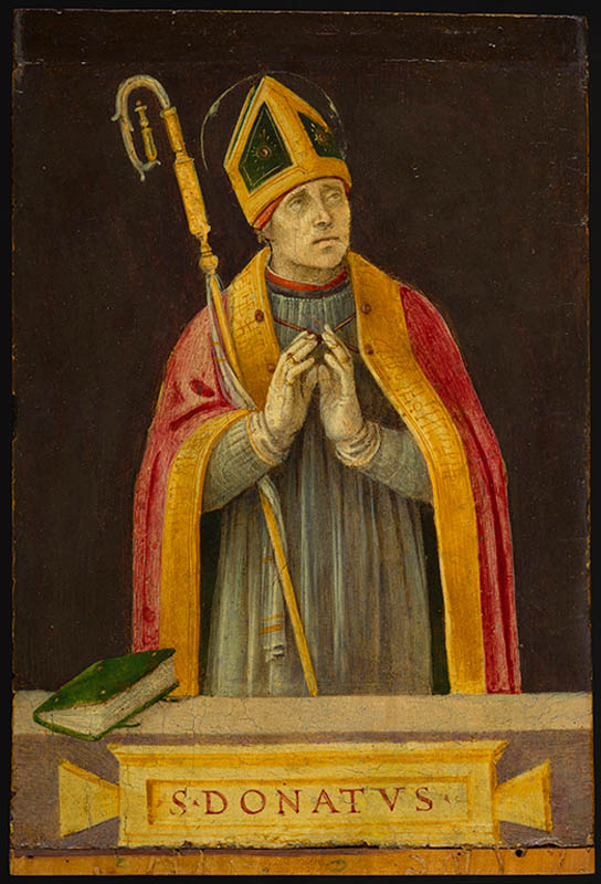
On connoisseurship we hold that every claimant work should be rigorously “interrogated” in three crucial respects. Technically, in its physical composition; by documentation on its known or claimed histories (provenance); and, above all, by visual analysis because, in the visual arts, every picture is its own prime historical document and its inbuilt historically-generated artistic relationships constitute the primary subject of art critical appraisal and evaluation.
Failure to excise bad attributions deceives the public and corrupts oeuvres. A good picture has nothing to fear from challenges. No amount of scrutiny constitutes a threat as good pictures outlive their doubters and can fight another day. Argument is healthy and a successfully repulsed challenge can increase understanding and enhance a good picture’s lustre.
Vincent van Gogh: The Lost Arles Sketchbook
Above, Fig. 3. The controversial lost-but-now-found Van Gogh sketch book above is by Professor Bogomila Welsh-Ovcharov, a Van Gogh authority whose claims of authenticity are supported by Ronald Pickvance, author of Van Gogh in Arles, but the cover’s supposed Van Gogh ink self-portrait announces itself as a draughtsman’s pastiche, as Mark Hudson noted in the Daily Telegraph (“A romantic story but can it really live up to its promise?”, 16 November 2016).
Above, Fig. 4. Simply by placing the supposed Van Gogh self-portrait next to an autograph portrait, immense and glaring differences become apparent: the author of the “discovered” drawing has abandoned symmetry with eyes of radically different sizes and a nose that seems product of a car crash. Throughout, the author mimics Van Gogh’s pen marks without comprehension of his form, power of design, and psychological acuity.
Above, Fig. 5. Instead of a form-camouflaging jumble of marks, the bona fide Van Gogh disports five graphically discrete component parts: a light-coloured jacket; a dark shirt and scarf; a varied but, on aggregate, mid-toned face; a light-toned hat with some mid and dark-toned form articulating shading; and, throwing all other values into relief, an agitated but tonally cohering background. Each of these spheres is allotted its own graphically purposive notations. The four images we show above for comparison are easily found online in historically successive reproductions. While these reproductions vary considerably, the force and artistic coherence of Van Gogh’s graphic intent and method shines through all.
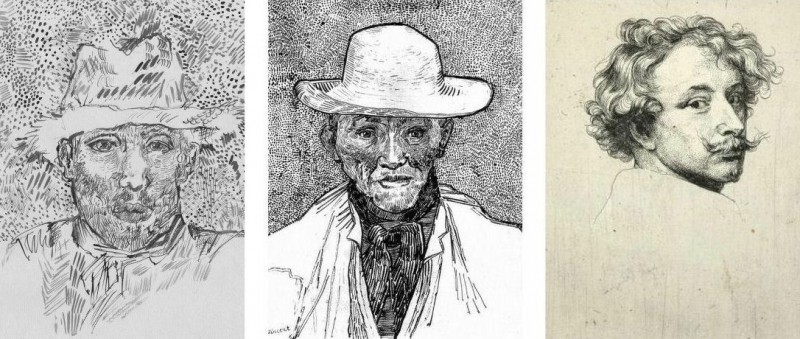
Above, Fig. 6. If we place the bona fide Van Gogh between the clumsy mimicking newcomer and a masterpiece of the greatest graphic brilliance – van Dyck’s etched self-portrait – it is clear that the Van Gogh has more kinship with the latter than with the former.
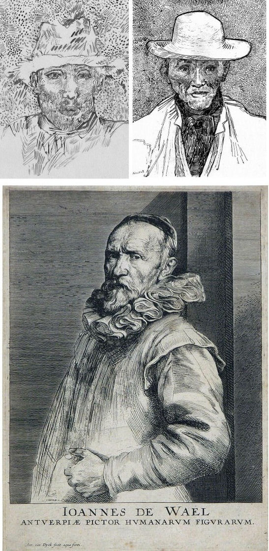
Above, Fig. 7. And if we compare the Van Gogh with an entirely autograph van Dyck etched state of a figure we find a common use of a toned background that throws both subjects’ flickeringly brilliant lights and darks into relief.
The Van Gogh Museum’s objections to the “Lost Arles Sketchbook” and its track record on Van Gogh attributions
Above, Fig. 8. Prof. Welsh-Ovcharov (top) has responded to the Van Gogh Museum’s dismissal of the drawings with a rebuttal and a challenge to debate – thereby showing conviction and good faith. Her publisher reportedly characterises the proposed debate as “an opportunity to shed light on the conditions under which the Van Gogh Museum is claiming the de facto right to a monopoly of attribution.” This is a common plaint against authorities that block would-be, high-value attributions but our impression of the museum’s judgements is favourable.
In 2006 a Van Gogh – The “Head of a Man” owned by the National Gallery of Victoria in Australia (above left, on an easel) – was challenged by the art historian and Sunday Times art critic Frank Whitford when the portrait was loaned to an exhibition in Edinburgh. The newspaper asked our opinion and, when we demurred, sent a (revelatory) high resolution full colour compilation of all of Van Gogh’s painted portraits. We supported Whitford, saying to the newspaper (as reported in ArtWatch UK Journal, Spring 2008):
“The specific warning signs that should have alerted the buyer are:
“1] It is unique in Van Gogh’s portrait oeuvre
“2] It does not fit in the stylistic chronology that exists within that oeuvre. Compare it for example with the brushwork, colours and ‘attack’ of the Old Man with Beard, painted the year before that is in the Van Gogh Museum, and the Portrait of Camille Roulin painted a year or so later and that is also in the museum. There is an enormous but clear and logical development between those two pictures, from thick, laboured, relatively coarse brushwork to much more refined and ‘decorative’ marks – but both are entirely consistent and ‘all-over’ in their treatment.
“3] If its provenance goes back no further than Germany in the late 20s or early 30s, that is particularly unfortunate. Germany at the time was notorious for the certification by scholars (for a fee or sales cut) of dud works. The dealer René Gimpel has referred to the scandalous ‘amounts obtained by means of certificates given daily by German experts to German dealers. Just as there were paper marks, so there are paper canvases, an easy way of bringing dollars into Germany…The German title of Doktor impresses the Americans. The museums are even more intent than the collectors on defending their fakes or their mistaken attributions….’ By coincidence, in the current ArtWatch Journal [No 21], Kasia Pisarek cites the case of the great Rubens scholar Ludwig Burchard who issued so many optimistic certificates that he was unable ever to write his definitive book on the artist…She has identified over 60 Burchard attributions that have subsequently fallen. It was Burchard who first upgraded to Rubens the Samson and Delilah that is now in the National Gallery.
“I would add that the fact that it seems to be admitted that it is a cut-down canvas that was glued onto a panel compounds suspicions… Why should a (presumably) then only forty years old canvas, have needed gluing onto a secondary support? It might be worth asking the Gallery curators if any scholar has questioned the picture publicly or privately.
“It may be coincidence, but two of the pictures that ArtWatch has challenged in our own National Gallery, the Rubens Samson and Delilah and the Raphael Madonna of the Pinks, no longer retain their original backs. The former was planed down to 2 or 3mm thickness and glued onto a sheet of blockboard; with the latter, the family of restorers who sold the picture in the 19th century had (most unusually) polished the back of the panel thereby removing all historical evidence.”
As we have seen more recently, the claimed lost Leonardo drawing “La Bella Principessa” that emerged anonymously in 1998 had been glued to an old oak panel. Gluing canvases or drawings onto boards conceals half the material evidence. On 3 August 2007 Andrew Bolt reported in the Australian Herald Sun:
“The curious thing about the National Gallery of Victoria’s fake van Gogh is how easily it was spotted as phoney once it went on tour…. For more than 60 years this painting hung in the NGV without anyone screaming ‘Fake!’ True, a few experts now say they had their doubts, but it was only when the NGV proudly loaned its ‘van Gogh’ to Scotland’s Dean Gallery last year that the painting was denounced. Three British critics took one look at it and snorted… Even then, there were some back in Melbourne who couldn’t accept the evidence of their own eyes, as ABC Television’s 7.30 Report found:
“‘Two of the critics include Michael Daley from ArtWatch UK and Times art critic Frank Whitford. But Robyn Sloggett [an art authentication expert at Melbourne University] has questioned their expertise. ROBYN SLOGGETT: I don’t think either of them are Van Gogh experts, certainly not known to be such…[Director of the National Gallery of Victoria] DR GERARD VAUGHAN: It is a slightly offbeat picture. It doesn’t fit into the natural progression of Van Gogh’s work at that time because it was a moment in late ’86 and into early 1887 where he was experimenting with two or three different styles. In many ways, this is slipping back into his earlier realist style of the mid 1880s where he concentrates and uses these earthier ochre colours. It is a transitional picture.’”
“Conceived at special moments” and “sometimes repeating, sometimes anticipating themselves” are commonplace apologias for disqualifying incongruities in upgrades. In 1997 and 2000 the National Gallery claimed its Rubens Samson and Delilah did not look like any other Rubens in the gallery because it was “the only work in this collection typical of the artist when he had returned from Italy in 1608”. In truth the painting was unlike the (secure) one that immediately preceded it and unlike the (secure) one that immediately followed. If a Rubens, it would be the only one on which he employed flat brushes and painted finger tips with rectangular highlights. During ABC Television’s 7 August 2006 programme (“NGV’s Van Gogh Labelled a fake”), James Mollison, a former NGV director said: “This picture has been doubted by people very often.”
The upshot of the controversy was that the NGV director announced that such was the gallery’s confidence that the painting would be submitted (voluntarily) to full technical examination at the Van Gogh Museum. A year later the Herald Sun reported the attribution’s demise at the Van Gogh Museum:
“The Dutch team used X-radiograph, digital photographs, light microscopy and paint and thread analysis. Among conclusions were: THE work’s ground layer of white paint is not found in Van Gogh’s Antwerp and Paris works. ITS use of pure ochre is not found in other Van Gogh work. THE portrait shows just the top of the man’s shoulders. Van Gogh usually showed more of the clothes. “A COMBINATION of a fairly coarse and detailed painting style”, with more detail in the mouth, eyes, skin and beard than Van Gogh used. NO reference to the portrait or the sitter in Van Gogh’s extensive letters. The experts also noted no record of the work could be found before 1928, when it appeared at Berlin’s Galerie Goldschmidt and Co.”
The Rubens Samson and Delilah emerged in Germany the following year at Van Diemen and Benedict where it was offered as a Honthorst before being upgraded by Ludwig Burchard. Previously it had been attributed to Jan van den Hoecke, a follower of Rubens. Burchard had recently upgraded the supposed Rubens ink sketch design for the Samson and Delilah (see Art’s Toxic Assets and a Crisis of Connoisseurship ~ Part II: Paper – sometimes photographic – Fakes and the Demise of the Educated Eye ).
The Newly Upgraded Filippino Lippi
Above, Fig. 9. At first glance the awakened “Filippino Lippi” (above right) seems more plausible than the new Van Gogh drawings – especially when linked to a work attributed to the painter at the North Carolina Museum of Art (above left). In terms of palette, condition and design the two seem as peas in a pod but this closely related pair triggers no recollections of anything similar in the artist’s oeuvre. If their strikingly common format suggests original incorporation in a larger work, disjunctive variations in their parapet walls and stone inscription tablets dispels the possibility. Most inexplicably of all, the new upgrade is incongruously modernist in its emphatic planar and ‘on-the-picture-surface’ geometrical vocabulary.
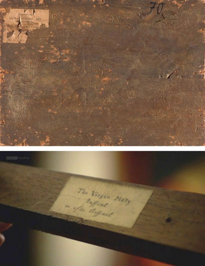
Above, Fig. 10. In 1901 the painting of Saints Uraldus and Fridianus was sold (not as a Philippino Lippi but as a Masaccio) to an English aristocrat, the Earl of Ashburnham. As with the recently proposed Haddo House Raphael (Fig. 10 above), there is little on the panel’s back other than a label in English for an exhibition of “Early Italian Art” (Fig. 10 top). For the Carolina Saint Donatus, the museum offers only a date – “circa 1490” – and the identity of the picture’s donor, the Samuel H. Kress Foundation. Such lacunae are perplexing because Filippino Lippi is a well-chronicled artist whose securely attributed works might easily be brought into direct comparison with the two more recent attributions.
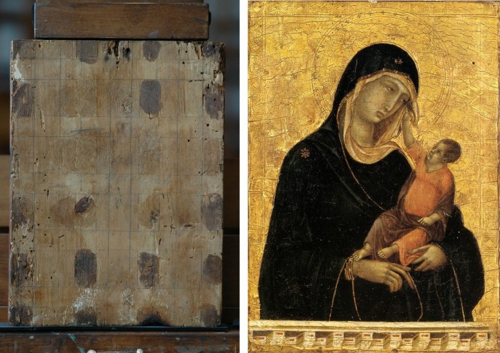
Above, Fig. 11. The backs of attribution upgrades often prove problematic, and none was more so than the small panel “discovered” as a Duccio Madonna and Child (above right) in 1904 after having been bought in an antiques shop in Italy. It was then rarely seen until bought with fanfare (but no technical examinations) for $50m in 2004 by the Metropolitan Museum of Art, New York, in a blind “treaty” sale conducted by an auction house among a few leading museums shortly after the picture was withdrawn from an imminent comparative exhibition of Duccio and his followers that would have introduced the painting to many scholars for the first time and in an instructive context. That withdrawal – despite the painting’s inclusion in the catalogue – might have been made out of fear of repeating the demise of the owners’ second Duccio, as described below.
The back of the tiny picture had been cradled with no fewer than eight mahogany bars and when these were later removed at the Met. a hand-written ascription to Duccio’s pupil “Segna” was found on the bare poplar wood from which painted work had been stripped. The Met Duccio contained modern wire nails, a fact not acknowledged in the museum’s post-purchase technical examination reports. When we asked after the antiquity of the nails the museum claimed they had been inserted as repairs after the panel had been cradled in the 1930s. As “proof” of that unsupported chronology it was said that one of the nails had entered one of the mahogany bars. However, as we pointed out, the head of that particular nail had been visible on the front of the frame throughout all of picture’s photographically recorded history and, while some nail heads were visible most were not and therefore had been applied before the (now heavily distressed) frame was gessoed and gilded. Thus, the panel arrived in the world at the beginning of the 20th century with modern nails intersecting a cradle that concealed an awkward ascription on a stripped-down back.
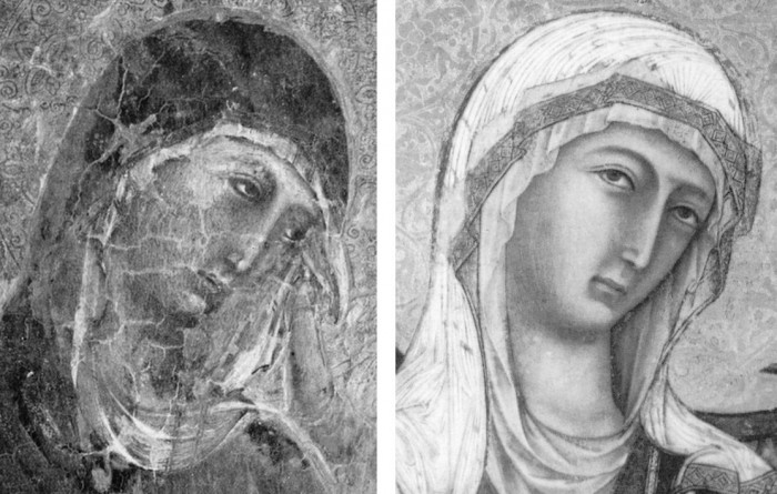
Above, Fig 12. A face painted in the 14th century by a follower of Duccio (identified by Pèleo Bacci as Segna) is shown above to the right of the face of the Met’s Duccio as it was before restorations established the blue of the Virgin’s mantle to be azurite, not the requisite ultramarine. No one ever suggested that the painting on the right was by Duccio and no one judged the Met’s picture an autograph Duccio before Bernard Berenson’s wife (Mary) in 1904 with the support of Berenson’s protégé Frederic Mason Perkins. An earlier suggestion had been that it was a work of Sano di Pietro, as Frances Vieta discovered in researches at the Frick Library, New York, that were kindly made available to us.
In 1933 Perkins attributed a second Madonna and Child to Duccio and persuaded the then owner of the Met.’s Ducio (the Belgian collector, Adolphe Stoclet) to buy it. In 1989 that Duccio was loaned to the Cleveland Museum of Art and was there identified on technical examination by Gianni Mazzoni as a fake by Icilio Federico Joni who ran a forgery factory fronted by middlemen, one of whom was Berenson’s protégé Frederic Mason Perkins.
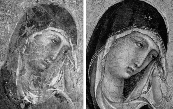
Above, Fig. 13. A cult of Supreme Art Historical Importance was activated around the Met. Duccio and part of this mythology rested on the picture’s supposedly miraculously well-preserved, little-restored, condition. Comparison of the photographs above showing its present state (right) and an earlier state (left) discloses how extensively the work has been repainted – note the altered design of the dominant eye, and the extensive reworking of the veil. The potentially falsifying nature of restorations when determining attributions remains a conspicuously under-examined area – as does the extent and nature of repainting on stripped-down “sleepers”. (But see “A restorer’s aim – The fine line between retouching and forgery”. For a fuller account of the Met.’s Duccio difficulties, see Michael Daley: “Buyer Beware”; “Good Buy Duccio?” and “Toxic Attributions?” in the Jackdaw magazine issues of Nov/Dec. 2008, Jan/Feb. 2009, and March/April 2009.)
The Newly Upgraded Filippino Lippi (continued)
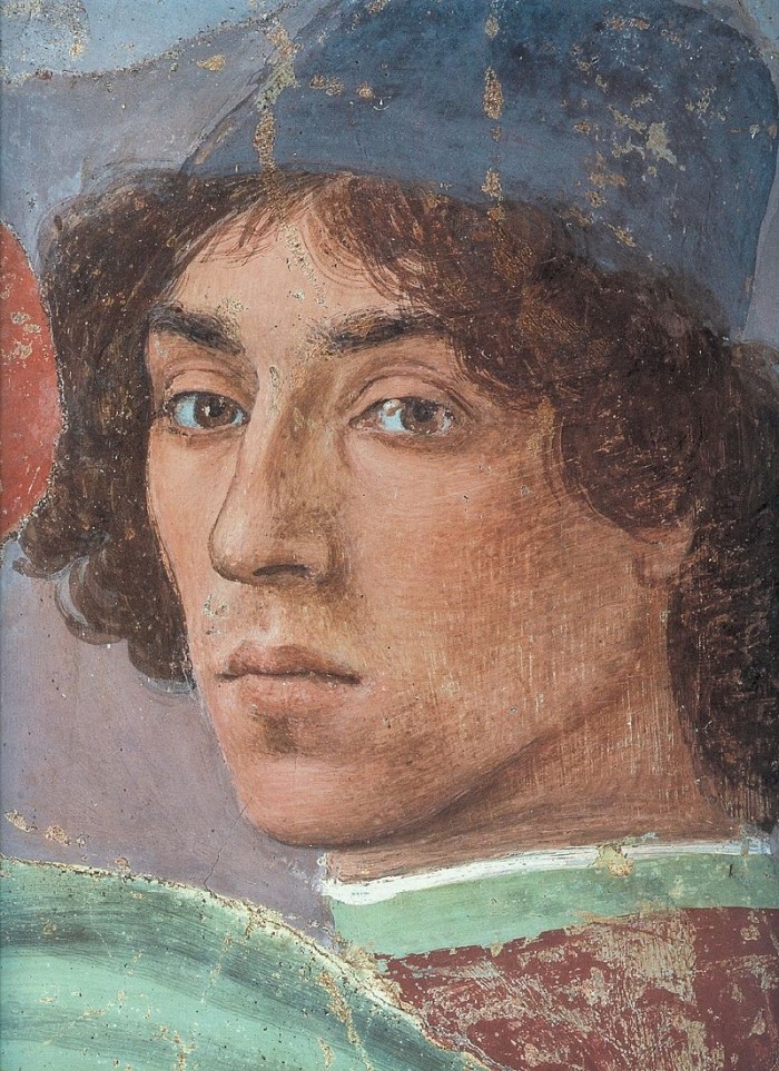
Above, Fig. 14. With the two small “Filippino Lippi” pictures at Fig. 9 and below, top, said to have been painted between 1490 to 1494, precise stylistic comparisons can be made with securely attributed works in the oeuvre. What is believed to be Filippino Lippi’s self-portrait above was executed by the artist in 1481-1482 in the Brancacci Chapel, Santa Maria del Carmine, Florence.

Above, Fig. 15. Filippino Lippi’s Apparition of the Virgin to St Bernard of 1480-86 was said by Bernard Berenson (in his 1938 revised Drawings of the Florentine Painters) to comprise “Filippino’s masterpiece, the last picture in which he is still a pure Quattrocentist, in which there is no sense of the Baroque.” Is it conceivable that some years later this artist painted the two small pictures shown here above the Apparition? Berenson reports that Filippino went on to betray excesses, not to purge and severely abstract his pictorial vocabulary: “Filippino’s Baroque, however had little in common with the qualities of the genuine [Baroque] style, and much with its worst vices. These were the sins of extravagance, of wantonness – the vulgarity of the newly enriched, who feel life is enhanced by the mere act of showy spending.”
Above, Fig. 16. At the top we see how Filippino Lippi painted books before 1486 in his Apparition of the Virgin to St Bernard and before his lapse into Baroque excesses. In this secure work we not only see great technical accomplishment but a fascination with the very means by which books were stitched together in assembled folded sections. Is it conceivable that after this tour de force celebration of the book binder’s craft skills Filippino should have been satisfied with the out-of-perspective simplifications of books in the Saint Uraldus? While the opened book has been painted in utter ignorance of book binding methods, the ochre coloured book at the bottom left of the pile has managed to anticipate to a remarkable degree the appearance of a neat modern machine-bound book.
Above, Fig. 17. Again, does the chasm of technique and sophistication in this further comparison from the Apparition and the Saint Uraldus not strain credulity at claims of a common author?
Above, Fig. 18. By 1493-94 the artist had completed his Madonna and Child with St Catherine of Alexandria and St Martin of Tours as above and we see precisely the over-elaboration Berenson castigated as Filippino’s squandering “like a nabob with a heady disorderliness all the decorative motives which the heritage of antiquity, the hard earnings of his precursors, and his own fancy had put into his hands.”
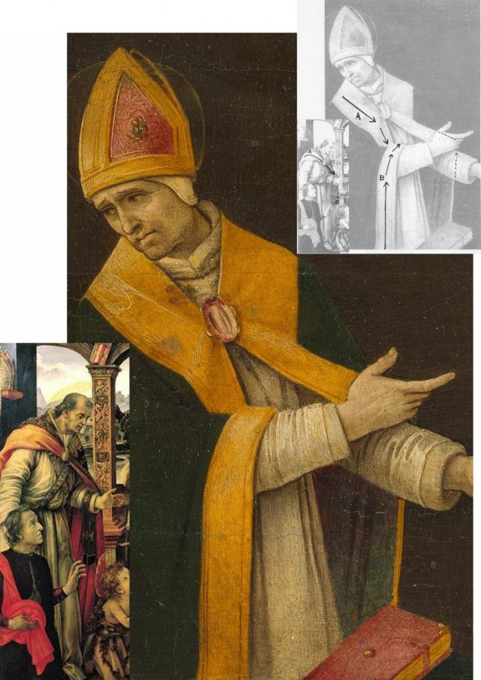
Above, Fig. 19. How conceivable is it that Filippino might, at the same short period, have made two so diverse treatments of a man parting drapery with an advancing left arm as in these two paintings? In the one the “Blanket-like drapery dear to Filippino” (in Berenson’s term), curves, twists and folds naturally across the body, while in the other it moves as if fabricated by a former sheet metal worker with little regard for any underlying body, or even for the means by which the glimpsed parts of the (wildly varying) decorative border of the cope might ever have been united as woven material. Why the arbitrary, asymmetrical placement of indeterminate embroidered decorations on the cope’s border? What holds the cope together? Is it a giant garnet or ruby, or a small tambourine? Where else in Filippino might we encounter such flattening abstractions and lax indeterminacy of depiction?
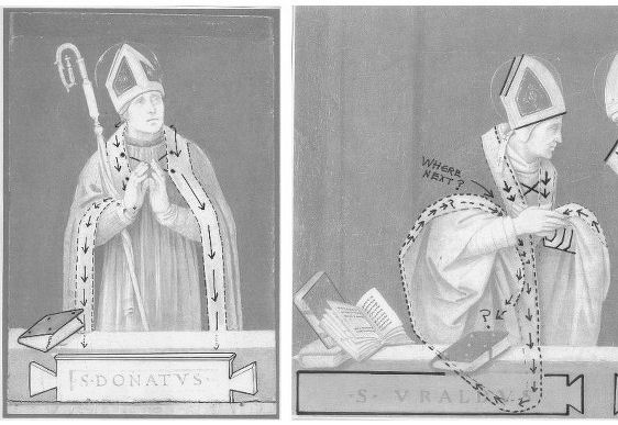
Above, Fig. 20. If the logic and treatment of Saint Donatus’ cope border (above, left) seems plausible and suitably understated, what might have carried the same artist to the Byzantine and conceptually irresolvable twin conundrums of the cope border as encountered on Saint Uraldus (above right)? What accounts for the very different depictions of the inscribed tablets on the parapet wall? If that of Saint Donatus is somewhat overly monumental and set uncomfortably close to the top of the parapet, at least it is sculpturally resolved and satisfactorily symmetrical along its horizontal axis with its twin decorative “butterfly wings” termini. Why, then, would the twinned tablets of Saints Uraldus and Fridianus meet in the middle with single butterfly-wing termini while leaving blank endings at the outer edges of the picture’s composition? Why are these two inscribed tablets skimped and devoid of projection when the saints above are greatly more dynamic and humanly engaged – almost as if in anticipation of Raphael’s later depicted dialogue between Aristotle and Plato?
Below, Fig. 21. What theological reading of Saint Uraldus’ life prompted the vast frilled neck lizard-like display of the cope’s pink lining below? If intentionally “Baroque” in its explosive ostentation and theatrical impact, why, then, its implausible combining with a geometric severity of draperies that are more snapped than folded?
With such bizarrely anomalous visual constructs, might it not be prudent to consider the waking “Filippino Lippi” sleeper as a possible product of the late 19th and early 20th century Italian forgeries boom that was tailor-made for British and American collectors? We know that many skilful artists were employed in that trade because when the Italian Government proposed stringent export taxes in 1903 to stem the country’s out-flow of art treasures, the Florentine art dealers association petitioned that the new laws would throttle the large and thriving trade in forged art and antiquities for foreign collectors. (Where did all those often excellent works go?)
At the December 2015 ArtWatch UK/LSE Law/NY Center for Art Law conference Art, Law and Crises of Connoisseurship (the proceedings of which will be published shortly), Professor Charles Hope pointed out how effectively 20th century scholarship had winnowed previously overblown numbers of Titians, Raphaels and such. Markets are good things and the London art market has long been a very good (much envied in Europe) force for Britain, but there are developing dangers. If perceptions were to grow that previously downgraded works are being systematically rehabilitated through “sleeper-discovery” mechanisms at a time when leading houses are fighting to the death for pole position on market share, confidence in the lots on offer might evaporate. Already, certain external structural changes are weakening the London market’s traditional and much-valued symbiotic relationship with disinterested scholarship. Increasing litigation by owners against dissenting independent scholars suppresses debate and frank expert appraisal. In a paper at our conference (“Throwing the baby out with the bath water – the Demise of Connoisseurship since the 1980s”), Brian Allen, former director of studies at the Mellon Centre, warned that recent changes of philosophy and views on connoisseurship in the academic world are greatly reducing the traditionally available body of disinterested academic expertise that counterbalances purely commercial interests:
“In my own field of British art the number of so-called ‘experts’ has now diminished alarmingly as the older generation dies off not to be replaced. It seems extraordinary to me that major artists such as Stubbs, Wright of Derby and Sir Thomas Lawrence, to name but three, don’t have an acknowledged expert to whom one can turn for a reasonably reliable, independent opinion. And this has also certainly happened in other specialist fields… Younger scholars nowadays, especially those in the universities, have almost no contact whatsoever with the art trade compared to fifty years ago. Yet for many years it was perfectly possible for the two worlds to co-exist harmoniously.”
Michael Daley 23 November 2016
Bendor Grosvenor’s Eye, a new Raphael, and further barbarism at the Louvre
Bendor Grosvenor has challenged our post on the so-called “Haddo Raphael” and asked for a right to reply.
Dr Grosvenor writes:
It is not correct to say that the Haddo Madonna ‘relates to no known Raphael work’. The picture bears a very interesting relation to a drawing by Raphael of the Head of a Virgin formerly in the de Triqueti collection. Sadly, that drawing is now lost, but it is listed in Paul Joannides’ 1983 catalogue, ’The Drawings of Raphael’ (no.64). A good quality reproduction is in the Witt Library. What I think Michael means is that the Haddo Madonna relates to no known work which he agrees is by Raphael (he does not agree that the de Triqueti drawing is by Raphael).
Michael seeks to establish the connoisseurial quality of my ‘eye’ by referencing the ongoing and recently uncovered fake Old Master scandal. He writes that, like numerous Hals scholars and the Louvre, I was ‘deceived’ by a Hals which has been proven to be fake. But there is an important distinction to be drawn between the Louvre’s deception and my alleged deception – I never actually saw the painting. As I make clear in the Financial Times article in which I discuss the Hals, I had only seen it via a photograph, long before the fake story ever began, and never paid it especial attention. In my business, seeing a picture in the flesh and via photographs offers a world of difference.
Michael then also states that I ‘came within a whisker of being deceived by a Gentileschi fake’ formerly on display at the National Gallery in London. I suppose that not actually being deceived by a painting which is indeed almost certainly a fake (it hasn’t yet been proved) could be characterised as ‘coming within a whisker of being deceived’. But that presentation of my views seems perhaps a little unfair. The Gentileschi is the only painting of a number of works currently being doubted as fakes that I have seen in the flesh. I have been the first to go on the record as saying that I think it is a fake. I have made that conclusion on the basis of ‘my eye’. I might be wrong, of course – in which case Michael will have further reason to doubt my connoisseurship, but for a different reason.
It might have been more helpful to ArtWatch readers if Michael had introduced them to the quality or otherwise of my ‘eye’ via the other re-attributions we made in the series ‘Britain’s Lost Masterpieces’; works by Jacob Jordaens, Peter Breughel the Younger, Allan Ramsay, and Claude Lorrain, all of which had been doubted before. (I must admit I am rather proud of them, so I’m sorry if it sounds like boasting, it’s not meant to.) For these pictures I felt confident enough to say, ‘this is what I believe them to be’, and happily had the agreement of other experts too. But in the case of the Haddo Madonna I have only ever said ‘it might be by Raphael’ (and happily had the agreement of Sir Nicholas Penny). I am very far from certain that it is. Much further work is clearly required. It seems at this stage that the preponderance of evidence, including the qualities of the painting itself, does suggest, at the very least, that the former attribution to Raphael ought to be re-considered.
I take no issue with Michael casting doubt on the possible attribution. Indeed, given his longstanding views on the Madonna of the Pinks, which Sir Nicholas Penny discovered and (rightly in my view) believes in wholeheartedly, I expected it. I welcome the debate. But I am grateful for the opportunity to respond to some of the points Michael has made so far, which I felt framed the argument in a rather unhelpful manner. I would also have preferred it if he had gone to see the Haddo Madonna in person before making such firm conclusions about its quality. But I suppose we must all practice our connoisseurship in our own ways.
Bendor Grosvenor, 23 October 2016
Above, Fig. 1: BBC4 Factual Report, 03. 10, 2016: “Britain’s Lost Masterpieces discovers hidden painting believed to be by Raphael. ‘Finding a potential Raphael is about as exciting as it gets. At first I couldn’t quite believe it it might be possible, but gradually the evidence began to all point in the right direction.’ Dr Bendor Grosvenor.” Photograph showing the co-presenters of the programme, Jacky Klein and Bendor Grosvenor with the attributed Haddo House Raphael.
Michael Daley replies:
It is good that Bendor Grosvenor is prepared to engage in debate on the nature of connoisseurship. Bendor reproaches me for not adhering to practices employed in his “business”. I take his connoisseurship to be rooted in a niche art market where works of unrecognised quality (“sleepers”) are identified, stripped down and painted back together again by restorers, before being presented as reconditioned, aesthetically and financially elevated works. Within this milieu Bendor can indeed claim successes, but his “eye” is grounded in neither artistic practice, nor art historical studies. My eye has been sharpened by a long professional training in art and crafts; through art school lecturing; and, above all, by practice as an artist and illustrator. From 1990 this was supplemented and enriched through friendship with Professor James Beck whose rigorous scholarly method was respected even by his opponents.
Bendor complains that I have not trekked to Aberdeenshire to see his claimed Raphael in the flesh but, then, he underwrites it by appealing to the authority of a drawing that he has never seen and that nobody can see because it is lost and known only through a poor quality photograph (see Fig. 3 below). Bendor insists that this singular, un-examinable, slight and problematic drawing establishes that the Haddo painting was executed by Raphael, even though it is not related to the heroic and revolutionary works of Raphael’s first “Florentine period” (1504-08) when he – more student than genius, in Michelangelo’s view – was galvanised by sight of Michelangelo’s and Leonardo’s works.
Bendor appeals to the authority of two scholars, one of whom, Sir Nicholas Penny, described the Haddo picture as “Very beautiful – I’m very impressed by parts of it.” However, this curate’s egg is itself only a part. The composition would appear to have been brutally cut out of a larger panel but Bendor tells me that while the paint runs up to the (distressed) edges of the panel, it does so without evidence of saw mark injuries. Does that unusual relationship not suggest that the painting was made to fit this particular piece of old wood?
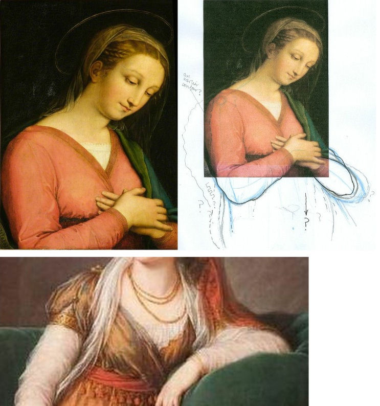
Above, Fig. 2: The Haddo House Raphael, top left; an attempt by the author to extend the image on the cropped design of the painting, top right; a detail of a painting by Le Brun, showing a similar cross-over dress with a triangle of under garment showing (above).
On the impressive parts, would Sir Nicholas include the Virgin’s costume – a racy empire-style cross-over dress with a sash under the breasts (above) – when such costumes were as scarce as hens’ teeth in Florentine Madonnas of the first decade of the 16th century? Bendor appeals to authority of Professor Paul Joannides, the author of the 1983 complete catalogue of Raphael’s drawings, but has he read the book? Prof. Joannides gives this drawing not to the Florence Madonnas but to a group of studies made in Umbria in 1503-04 for one of the Virgin’s companions in Raphael’s first major work, The Marriage of the Virgin, (as shown below) when the artist was still under the sway of Perugino.
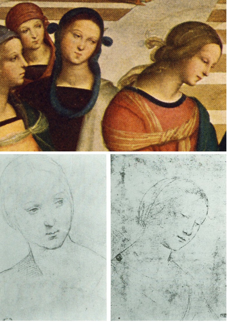
Above, fig. 3: Above, two drawings given to Raphael by Professor Paul Joannides in his 1983 The drawings of Raphael with a complete catalogue. Prof. Joannides assigns these drawings to Raphael as studies made in 1503-04 for the central companion (above, top) to the Virgin in Raphael’s The Marriage of the Virgin. The drawing whose design coincides with head and neck of the Haddo House painting is here on the bottom right
My eye tells me that the drawing is the inferior of others in its group and that it was clearly not made as an auxiliary cartoon for anything, let alone for part of the Haddo picture, it being summary not exploratory. Connoisseurship consists more of discriminating between qualities than in identifying similarities. The highly schematic drawing proposed as Raphael’s intended cartoon for the Haddo House painting shows none of the flair, absorption in the model’s features, and sheer graphic brilliance brought by Raphael to other 1503 studies of heads made as auxiliary cartoons for major paintings. That this particular drawing should closely fit with the design of (only) part of the Haddo painting, is a problem for, not a corroboration of, Bendor’s Raphael inscription. This supposed “cartoon” shows the ear covered by hair that is tightly bound and held free of the neck by a simple head-dress. Such was entirely appropriate for a secondary figure in a large group painting. In this regard it is quite unlike the Haddo painting (below) where the coiffure is elaborately braided and pulled back to expose the ear, and where a long transparent veil is draped over the neck.

Above, Fig. 4: In the monochrome block in the top right shows we see at the top how the neck on the Haddo House painting is draped with a transparent veil. Below it is two such near-identical arrangements of coiffures/necks are encountered on two of the very many copy versions of the Raphael’s Madonna of the Pinks. The one on the right, here, is the one that was attributed to Raphael by Nicholas Penny in 1992.
For Bendor’s proposed drawing to underwrite the new Haddo ascription we would have to believe that Raphael re-used an earlier atypically schematic Umbrian study at some point during his 1504-08 Florentine period, and that he elaborated it in a manner which, by a remarkable coincidence, closely anticipated the very treatment of hair and neck that is found in the painting (the National Gallery’s £35m Madonna of the Pinks) that Nicholas Penny upgraded to Raphael in 1992 as a work of c. 1507-08. Scholars of Raphael’s drawings have noted that his draughtsmanship was constantly evolving to meet the requirements of the task in hand. Bendor may believe that Raphael recycled an old study here. I do not.
As for that old chestnut, the “in-admissability” of photographic records, when I saw a before and after photo-comparison of a detail of Michelangelo’s cleaned Sistine Chapel ceiling frescoes in 1988 (see below), my artist’s eye concluded immediately that the ceiling, which I had not yet seen, had been damaged. For the longest time, Bendor held critics of the restoration to be rather myopic. But then he visited the Chapel and concluded that we had been right all along. As he says, we each have our own way of proceeding.
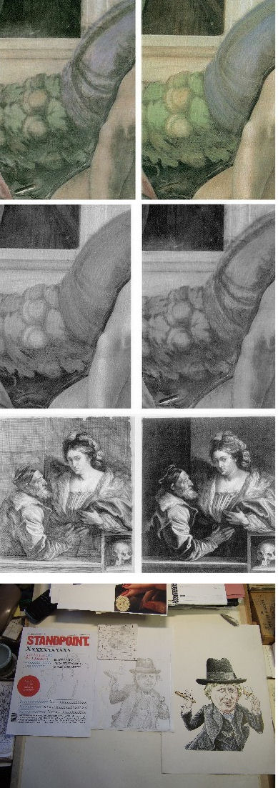
Above, Fig. 5: In demonstration that restorations can be appraised by photographs alone, we show above (top) a small photo-comparison of a section of the cleaned Sistine Chapel, as it was published in 1988 when I was working on the Independent as an illustrator. On first sight of that photographic testimony I saw instantly that the ceiling was being damaged; that James Beck’s criticisms were well-founded; and, that the restorers’ claims to have removed only soot and varnish were preposterously implausible. I had not yet visited the chapel and knew it only from photographs. In the second comparison above we converted the two images to grey scale and reversed their order. So, now, the cleaned state is on the left and the pre-cleaning state is on the right. It is striking how the two states resemble earlier and later stages of an etched plate (as can be seen in the third comparison which shows two stages of a van Dyck etching of a now lost Titian).
Had the ceiling really been painted and left by Michelangelo as seen in the cleaned state on the left of the second comparison, we would have to believe that over a period of more than four hundred years, soot and dirt had accumulated selectively and artistically purposively on the ceiling in patterns that followed Michelangelo’s design so closely as to complete his shading and add specific details like veins to the oak leaves. The challenge for those who continue to subscribe to this fairy story is to explain how it was that Michelangelo’s contemporaries and early copyists all contrived together to describe and record the ceiling, not as it was in their time, but as it would gradually become over the centuries.
As an illustrator I not only fully appreciate that images get built up from nothing in stages (as indicated in the development of a magazine cover drawing in the bottom photograph above) but also how much photographs can vary and then vary further still when reproduced for the printing process on different types of paper.
I have not seen the newly “restored” Leonardo St John (which is not yet on public display) but can see from the comparative before and after cleaning photographs that have just been published by the Louvre (as shown below) that it has – as with the Louvre’s recently restored Leonardo, The Virgin and St, Anne – been damaged. This time, however, it has been damaged in a most unusual and perversely misguided manner. It is virtually customary in big museum set-piece restorations for a trade-off to be licenced in which finishing, tonally-modulating layers are sacrificed in order get at the brighter, underlying colours. On this occasion, as seems obvious, none was to be found below. In consequence, this Leonardo has lost form-giving tonal modulations without even the slightest spurious intensification of hue. Worse, the Louvre (which for most of the 20th century constituted an institutional reproach to the restoration barbarians-at-large in the Anglo-Saxon sphere) has now achieved a new low: it has contrived to lower the highlights as well as the mid tones and thereby reduce the pictorial vivacity of an already sombre but divinely lucid painting. I hope that Bendor will see this too – or, perhaps we should wait and proceed to Paris together to judge the picture on the spot?
Michael Daley, 6 November 2016
Trouble at Yale University Press London
This week Yale University Press published Art History and Emergency, a book of essays assessing art history’s role and responsibilities in what has been described as today’s “humanities crisis”. It explores how artists, art historians and related professionals respond to pressures and demonstrate worth.
It considers how it might be possible to think deeply about art objects and images without losing the intellectual intensity of the best works being studied. (We are tempted to hold that a clear distinction should always be drawn between making and appraising art. Fuseli held it desirable to maintain such a division even within the production of art when he advised artists to conceive with fire but to execute with phlegm.)
The content and timing of Art History and Emergency must coincide embarrassingly for its publisher with the profound collapse of scholarly confidence triggered by a radical restructuring of Yale University Press’s own art historical programme. There is also irony in the fact that this particular examination of the “humanities crisis” is published in the “Clark Studies in the Visual Arts” series. ArtWatchers will be familiar with the Clark Institute’s own contribution to that crisis through mistreatment of paintings and breaches of its founder’s terms of bequest. (See “Taking Renoir, Sterling and Francine Clark to the Cleaners” and “From Veronese to Turner, Celebrating Restoration-Wrecked Pictures”.)
Art is perpetually vulnerable to wrong-headed, impetuous and destructive administrative impulses. Its traditions are slow to build but all too easy to dismantle – an architect in revolutionary France devised a way of destroying Gothic churches in an afternoon. When Sterling Clark’s widow died the Institute’s staff rushed to “restore” paintings against Clark’s explicit terms and despite the fact that he had carefully bought un-restored works in excellent condition. Paintings are not the only victims of administrators wishing to make their mark.
A LETTER OF MASS PROTEST BY SCHOLARS
On 8 July a letter signed by more than 290 scholars from 77 universities, and 30 museums and institutions in 9 countries, was sent to Peter Salovey, the President of Yale University; Susan Gibbons, the Librarian and Deputy Provost for libraries and scholarly communications, Yale University; and John Donatich, the Director of Yale University Press. The letter had been framed by two scholars, Professor Andrew Saint and Professor Jules Lubbock, in protest against what has been widely taken to be:
“[A] grave threat to the future of excellence in publishing books on art, architecture and design in Britain, the United States and around the world.”
This threat is seen to come from a “restructuring” of the Yale University Press (London)’s art books under the Managing Director, Heather McCallum, whose actions are supported by the (interlocking) directors and trustees.
Over the past forty years this university press is widely regarded as having built an unparalleled record for first-class, good-looking and scholarly books on the visual arts. This much-admired tradition was established by John Nicoll in the early 1970s and has continued under two outstanding editors, Gillian Malpass and Sally Salvesen, whose experience, scholarship and eye for design earned international acclaim, the gratitude of many eminent authors, and many awards.
Malpass and Salvesen are being sacked to make way for an editorial director (on whom, see below). This restructuring – for which no financial requirement or other necessity has been demonstrated – has caught the art world unawares. No one had been consulted in London – not even The Paul Mellon Centre in London whose generous financial support, together with that of The Yale Centre for British Art, lies behind much of this outstanding publishing. Although the top-down restructuring operation was hatched in secrecy and executed by fiat, its intended means and underlying rationale had peeped out two years ago.
A BAD IDEA IN THE MAKING
In the absence of consultation and transparent policy-making, institutional players put the spotlight on their own standing and tastes. At a conference in Berlin in 2014, Francis Bennett, the deputy chairman of Yale University Press, issued a “Positioning statement” that was both portentous and alarming. (It is to be found in full here.) Mr Bennett’s c.v. seemed to have run into the sand when, after a mixed career in publishing (“My first managing directorship [was] an unhappy time at WH Allen, but I learned to run a company”), he became an electronic publisher and set up a company, Book Data, that was sold in 2002.
Today, as deputy chairman of Yale University Press, Mr Bennet’s views and his declared “vision for the future of academic publishing (2020)” merit close examination. He prides himself on a commitment to professionalism and “a questioning of orthodoxies” when his own views betray prevalent patterns of banal management-speak and received wisdom. He fixates on “trends which will force change on university presses” when Yale University Press is anything but a run of the mill university press. He sees university education as “becoming a global trading commodity, aka the knowledge economy”.
In other generations such over-heating and simplistic techno-Futurist visions might well have been taken as disqualifications for a leading role in venerable and high-minded cultural institutions. Mr Bennett thrills that “Communication is instant” and that “Market expectations are immediate”, seemingly without awareness that current trends are never irreversible escalators to the future and that the chief distinguishing traits of markets are volatility and unpredictability. As for the supposedly irresistible force of techno-determinism, far from knocking out hard-copy books, e-book tablet sales have already levelled off. Television did not kill off cinema or radio. The world, for the imaginative and the enterprising, remains full of niches and opportunities, and books remain phenomenally attractive and enduringly user-friendly artefacts.
BRAVE NEW ACADEMIC WORLD AND THE DEMISE OF PEER REVIEW
Mr Bennett betrays a strikingly short term view of the future and confidently predicts that within four years we will occupy “A new academic publishing world” in which the printed book with a high price and a small market will have vanished. Peer review will also have gone on grounds of being too slow. To survive at all, university presses must now accept that their “traditional methods must change”. Under the Bennett Prescription, change means becoming “brands” that support the “extended reach of their owners”. One word is absent in Bennett’s programme. It is scholarship.
On the internal evidence of this particular positioning statement it might seem that the lacuna is the product of a personal aversion as much as a reflection of institutional policy. The deputy chairman of Yale University Press came from an academically distinguished family. His father was a Cambridge don. His mother was an author of biographies. An aunt was principal of St Hilda’s Oxford. One uncle was a don and then a civil servant; another was a don and then the Astronomer Royal. This Bennett confesses that he “couldn’t compete, so became a publisher.” Also absent is the term “charitable mission” which notion is central to Yale University purposes and is stated like this:
“Yale is committed to improving the world today and for future generations through outstanding research and scholarship, education, preservation, and practice. Yale educates aspiring leaders worldwide who serve all sectors of society. We carry out this mission through the free exchange of ideas in an ethical, interdependent, and diverse community of faculty, staff, students, and alumni.”
For Mr Bennett the future is pre-ordained and it’s anticipated imminent impositions are relished in business-speak:
“The academic publishing process must respond by creating a new model. The present system is too slow at experimenting and adopting new models – and will be left behind if it doesn’t change.”
Left behind what? The publishing world is various and serves many purposes well and simultaneously. What law says that academic publishing must travel in tandem with cut-throat commercial publishing where economies can be made through skilful mass-marketing? Why must great, richly-endowed and tax-favoured universities cease to give succour to scholars?
YALE UNIVERSITY’S MISSION
Yale University Press happens to have its own mission. Its purpose is to play a key role in the university’s core mission of “improving the world today and for future generations through outstanding research and scholarship, education, preservation, and practice” and, specifically, to do so by publishing “books and other materials that further scholarly investigation, advance interdisciplinary inquiry, stimulate public debate, educate both within and outside the classroom, and enhance cultural life.”
AN EGREGIOUS REPLY
How, then, did this month’s appeal from Professors Lubbock and Saint and their many scholarly associates go down when sent to Salovey, Gibbons and Donatich? The reply came only from John Donatich, who is both the Director of Yale University Press and the Chairman of the Board of Trustees, Yale University Press London, and Heather McCallum, the Managing Editor of Yale University Press London.
John Donatich’s appointment in 2003 was highly welcomed. He arrived as the departing publisher and vice president of Basic Books, having previously served at HarperCollins from 1992-1996 and before that from 1989-1992 as the director of national accounts for the Putnam Publishing Group. All was auspicious in that now long ago-seeming world. Anthony Kronman, the dean of Yale Law School and the chair of the search committee, said of him: “John has a scholar’s taste, an editor’s eye and bookseller’s experience and judgment,” and, “He possesses just the combination of qualities we sought when we began our search and he brings to the Press great vitality, high idealism and a profound love of books.” Mr Donatich responded graciously and fittingly:
“I am thrilled to be joining this prestigious press and invited to help shape its future. Yale University Press commands a unique and leading position among university presses. I can’t imagine a better place for scholars and intellectuals to publish books.”
Quite so – but today Donatich’s and McCallum’s (seemingly “lawyered”) joint reply to the anxious scholars insults their intelligence. It describes their anxieties as products of (a mass) confusion. It contends that, on the one hand, they have nothing to fear, and that on the other, they can do nothing to reverse the done deal. In a torrent of blather about seeking to help YUPL to “flourish and lead in the years ahead” by a reorganisation that “is by no means confined to the Art department [because] it is part of a company-wide initiative” the pair insist that the restructuring “was thoroughly researched and discussed at great length” and, besides, that “it has the full support of the YUPL Trustees, Yale University Press and Yale University leadership”. On the nature and purpose of the restructuring, we find echo of Bennett: “However, in the context of the ever-changing publishing arena, maintaining these standards requires a fundamental reappraisal of YUPL’s entire operation”.
Logic escapes the twin authors who insist that the restructuring has been discussed at great length while justifying their own secrecy about it and its consequences: “As we hope you will appreciate, a complex company-wide restructure of this magnitude is a confidential process and it would not be appropriate for us to enter into discussions about individual members of staff.” At the same time there is a brass-faced insistence that “We have fully apprised both the Yale Centre for British Art and the Paul Mellon Centre about the reorganisation of YUPL and have regularly informed them about the changes of personnel that have followed…”
The facts must speak for themselves. Two principal and outstanding editors at Yale University Press (London), Gillian Malpass and Sally Salvesen – who have established the very qualities at issue – are to be replaced by an Editorial Director for Art and Architecture, Mark Eastment, under whose direction “we will develop exciting and innovative books which lead agendas…” When asked last year what he most enjoyed about his job as director of publishing at the V&A, Mr Eastment replied “the challenge of balancing the financial expectations of the museum, by generating as much revenue as possible (all our end-year profits are given back to the museum) along with the academic wishes of curators.”
It would thus seem that proven and acclaimed excellence is being put at risk on an opaque, non-discussable promise of changes being made within some vaguely perceived “ever-changing” and economically-menacing publishing arena. On such an inadequate prospectus, scholars have very clear cause for alarm. To indicate the potential loss we now face under an apparently panicked and insecure Yale Administration, we cite an earlier demonstration that serious scholarship is a collective, slow-running cumulative process. (See Art’s Toxic Assets and a Crisis of Connoisseurship ~ Part II: Paper (sometimes photographic) Fakes and the Demise of the Educated Eye.)
HOW SCHOLARSHIP WORKS
In her magnificent 2005 Yale University Press monograph The Pollaiuolo Brothers – The Arts of Florence and Rome, Alison Wright describes a particularly vexing “market for copies, fakes and over-ambitious attributions” but gives gratitude for the fact that she need not re-invent a particular wheel by sifting it all afresh. Instead, she cites Professor Hellmut Wohl’s 1980 New York University monograph The Paintings of Domenico Veneziano – A Study in Florentine Art of the Early Renaissance in which he had, as Dr Wright acknowledges, “listed the myriad attributions under which surviving Florentine female profiles have passed…” Writing a full generation on, she gives specific thanks that “Wohl’s study absolves me from a repetition of this unrewarding task.” Prof. Wohl had taught art history at Yale University before his Professorship at Boston University and he had studied Domenico for three decades. Dr Wright is Reader in the History of Art at University College, London. Such books as theirs are bricks in civilisation’s walls. They should be cherished, not implicitly slighted – and other scholars should not be denied the opportunity to produce such books through a major university’s press.
The President of Yale University, Peter Salovey, may prove wise not to have attached his own name to so egregious and unsatisfactory a reply as that sent by two of his officers to an esteemed body of appropriately anxious scholars. Evidence is everywhere to be seen that Yale University Press have created a self-fulfilling prophesy without the crisis that might have triggered it.
Michael Daley ~ 28 July 2016
Fake or Fortune: Hypotheses, Claims and Immutable Facts
We have received two communications on “La Bella Principessa”, which drawing some take to be by Leonardo da Vinci. One came from the work’s owner, the other from a disinterested scholar in confirmation that the work could not, for reasons of arithmetic and plain physical facts, have been made by Leonardo for inclusion in a book.
THE DRAWING
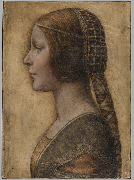
Above, Fig. 1: The full vellum sheet of the proposed Leonardo drawing “La Bella Principessa”.
THE DRAWING’S CLAIMED ORIGIN
This drawing was presented anonymously to the world in 1998 without authorial ascription and without an atom of provenance. When claims of autograph Leonardo authorship were made after barely a decade, it became necessary to fill a five-hundred years long void of records in order to dispel suspicions of forgery or pastiche. In 2010 Professor Martin Kemp bundled together what he held to be a “barrage of evidence – stylistic, historical or technical” that somehow provided collectively what no individual parts constituted: proof that Leonardo da Vinci was the author of what he (Kemp) dubbed “La Bella Principessa”. Thus, a collection of not-evidence was vested with quasi-evidential force on a circular, question-begging appeal to the claimed authority of a “sustained, collective sense that the portrait ‘belongs’ to Leonardo and contributes something new to the Leonardo we currently know.”
Although some scholars (chiefly Italian) were persuaded by the claims, for the consensual majority who did not see Leonardo’s hand in the drawing, Kemp’s methodological ju-ju gained no traction. His claims were advanced in a portmanteau book of collective advocacy, La Bella Principessa – The Story of the New Masterpiece by Leonardo da Vinci, which he co-wrote with Pascal Cotte of Lumiere Technology (the firm hired by the drawing’s owner, Peter Silverman, to conduct technical research) and which carried highly supportive contributions by Peter Paul Biro, Eva Schwan, Claudio Strinati and Nicholas Turner; London, 2010 (– see pp. 187-88).
THE THREE STITCH HOLES
During Pascal Cotte’s technical analysis of the drawing it was noticed that three holes are present on the left-hand edge. Cotte took these to “prove that it originally came from a book or a manuscript” (- Kemp/Cotte 2010, p. 113). Working with Mr Cotte, Prof. Kemp proposed that the hypothetical book might well have been a collection of celebratory poems of Bianca Sforza who had died in childhood and that “La Bella Principessa” had been made as an illustration to such a book.
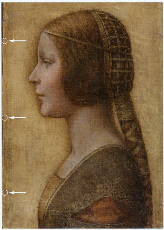
Above, Fig. 2: “La Bella Principessa” with Pascal Cotte’s indicated locations of the three supposed stitch holes.
Kemp’s elaborate hypothetical advocacy constituted a daisy-chain of improbabilities. This is a drawing made in the manner of a distinctive (and invariably painted) profile portrait type that is nowhere encountered in recorded Leonardos – and, indeed, this is the very type which Leonardo famously subverted with his own revolutionary plastically dynamic figural innovations. Within the rigorous constraints of the strict profile type, this drawing’s supposedly high-born subject is bereft of the customary/requisite opulence in clothing and jewellery. The eccentric iconography was made on an atypical support – vellum. It was drawn, Kemp holds, either directly from the subject in celebration of her wedding, or, as a commemorative portrayal after her death and thus made either in recollection or from some other depiction. No explanation was offered for how this single image might have resulted from two radically different circumstances of execution.
THE CLAIMED CORRESPONDENCE BETWEEN THE “LA BELLA PRINCIPESSA” DRAWING AND THE WARSAW SFORZIAD
On a suggestion from Professor David Wright, Kemp proposed that this from-life or post-death portrait had been made to be incorporated within a large, heavy book of the mid-1490s that is now housed in Poland, the so-called Warsaw Sforziad. In the wake of a great deal of (Kemp and Silverman-activated) archival research which found no mention of any work resembling “La Bella Principessa”, it can be seen that without this claimed Warsaw connection, the drawing would remain what it was on its 1998 debut: a stylistically untypical and unprecedented work without any history – the inclusion of which within Leonardo’s oeuvre would, in Prof. Kemp’s own advocacy, “contribute something new to the Leonardo we currently know” and “reveal a previously unknown dimension to the way in which he fulfilled his duties at the court of Duke Ludovico Sforza”. (Kemp/Cotte, 2010, p. 188.) Without history, that is to say, other than the time it is now said to have been in the possession of the restorer/painter Giannino Marchig, the late husband of the anonymous vendor in 1998.
It has been claimed many times that a ‘match’ exists between the drawing’s holes and the book’s stitches but, aside from the small format photo-diagram at Fig. 3, this has never been demonstrated or independently corroborated. Similarly, it has been said that carbon dating tests established that the vellum sheet on which the drawing was made is of an age securely consistent with a drawing being made by Leonardo in the mid-1490s. This claim is seriously misleading, as is shown below.
THE TESTIMONY OF HOLES
Before Prof. Wright’s suggestion, in 2010 Pascal Cotte regarded the three holes on the drawing’s left-hand edge as evidence that might identify incorporation within a specific book:
“It would be interesting to use the evidence of the nature and placement of these needle holes to look for other surviving quires from the same codex, which, with other physical clues, might shed further light on the provenance and original commission.”
(Kemp/Cotte, 2010, page 113.)
Cotte’s hope was reasonable but such testimony can cut both ways. Establishing a relationship between the drawing and a particular book requires an exact correspondence between the drawing’s holes and a book’s stitches. Two separate claims were made of a discovered fit with the Warsaw Sforziad, first by the drawing’s owner, Peter Silverman, and then jointly by Martin Kemp and Pascal Cotte. Both occasions were filmed by National Geographic but only the second was broadcast. In it, Kemp expressed himself as being 80% confident. The presently claimed location of the drawing is at the front of the Sforziad. Clearly, the credibility of what is now a 200 million euro-insured drawing that is stored in the Geneva Free Port depends greatly on confidence being maintained in this claimed connection.
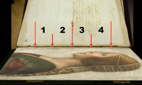
Above, Fig. 3: A facsimile of “La Bella Principessa” inserted into the Warsaw Sforziad with five arrows marking the
book’s stitches and three circles in which matches are claimed, but are not evident, between the drawing’s holes and
the book’s outer and central stitches. (The stitch marked by the right-hand arrow is shown in close-up below at Fig. 5.)
As previously shown, our colleague in ArtWatch, Dr Kasia Pisarek, has catalogued very many discrepancies between the drawing and the book, the most problematic being that the former has only three stitch holes, when the latter was bound with five stitches. To cope with this material/arithmetical incompatibility, Kemp and Cotte conjured two hypotheses.
The first was that the book had originally been bound with only three stitches and that at some undated point the drawing had been removed during a rebinding in which two extra stitches were added to the book. That (unsupported) contention was technically implausible: the book is too large and heavy to be supported by just three stitches – and
both of its sister volumes in London and Paris were bound with five stitches.
The second, and now preferred, hypothesis is that the book was indeed originally bound with five stitches and that, as
a part of this book, the drawing originally possessed the requisite five stitch holes, two of which had subsequently been cut off from the sheet. We demonstrated the impossibility of that claim in an earlier post. (To recap briefly: as Cotte had acknowledged in 2010, stitch holes are always made in a straight line along the crease in a group of folded sheets. Given that a central and two outer stitch holes are all present on the “La Bella Principessa” sheet, any original intermediary stitch holes would necessarily be found in alignment with the present three holes on the sheet as it is today.)
In addition to the absence of the two requisite stitch holes, the sheet itself is a mismatch in terms of colour, texture and size with the sheets in the book. Kasia Pisarek now adds a further mismatch:
“The follicles in the ‘La Bella Principessa’ vellum are tightly spaced, while those in the Sforziad vellum are widely spaced. This can be seen on the Polona website, where you can zoom in until you can see the follicles as dots. I remember seeing some pages where the dots were more apparent and they were definitely widely spaced.”
WHAT LIES BENEATH?
Yet another unaddressed difficulty concerns the back of the drawing. One of the earliest proponents of a Leonardo ascription, Dr Cristina Geddo, has described the presence on the reverse of the drawing of random lettering and an image of a dragon. Kemp and Cotte seem not to have offered an explanation for this content (which, presumably, was revealed by Cotte’s penetrative photography) even though they now claim that the back of the drawing would have faced the book’s beautiful and elaborately painted, symbolically-charged frontispiece. What conceivable iconographic function might such a melange have served in that strategic context of so important and precious a book? Dr Geddo has called for the vellum drawing to be removed from its (most unusual) oak panel support but the owner has declined to do so on grounds of safety. Some of the lettering is visible in an X-ray photograph published in the 2010 and 2012 English and Italian editions of the Kemp/Cotte joint book.
FIVE HOLES GOOD, THREE HOLES BAD
As we reported previously, with regard to the Three Holes v. Five Stitches conundrum, the problems for supporters of “La Bella Principessa” have now become insurmountable: Pisarek established on her second examination of the Warsaw Sforziad in the Polish National Library that while the drawing bears only three holes, the book itself was not only bound with five stitches but that each of those stitches passed through two holes that were two or three millimetres apart (see Figs. 6, 7 and 8 below). At a stroke, the previously claimed ‘fit’ between the drawing and the book is demolished: the drawing possesses only three single stitch holes when it should have five pairs of holes making ten in total. Even if it were to be conceded that two inner stitches might once have been present, today’s three single holes should be three pairs of holes, making six holes in total, not three.
AN OWNER’S RESPONSE
When we sent our previous “La Bella Principessa” post with the newly disqualifying physical/technical evidence to the drawing’s owner, Peter Silverman, (13 June), he dismissed the bearers of the information by alleging lack of expertise: “I leave the attribution question to serious and highly qualified experts!!!” In support of his professional slur, Silverman copied-in two messages to us. The first had been sent to him, at his request, by a costume expert, Elisabetta Gnigera. The second Silverman had sent to Jean Penicaut, the CEO of Lumiere Technology. It was evidently written in haste and heat:
“Dear Jean
I am sorry but we, as owners of the BP, are not to be told how and with whom to talk! I understand your frustration in dealing with Artwatch and Franck but i feel that Pisareks statement must not and cannot be left unchallenged! I therefore request you to rebut each and every point in this latest statement-most importantly of all i would like to see the INDISPUTABLE proof of the binding holes, in a first and separate email to me! Unfortunaley Martin has made statements which can be perverted by anyone in bad faith-equivocal statements quoted in the first part of the enclosed article!!
“I would like Elisabetta to comment on the costume questions.
And i would like YOU to extensively quote from the lab results of La Veneria*, which is very helpful to our cause! [*This is a reference the conservation laboratory “La Venaria Reale” which has conducted analysis of the drawing.]
“We cannot afford to lose the high ground’ in this battle-no matter the bad faith of our ennemy.
“To avoid your corresponding with them please send the rebuttal to me. I INSIST THAT THIS IS AN ABSOLUTE NECESSITY!!
Best, peter
http://artwatch.org.uk/problems-with-la-bella-principessa-part-iii-dr-pisarek-responds-to-prof-kemp/
“PS-the good news is that there is a very serious party interested in acquiring a share in the BP(highly confidential) and July 1 will be a decisive day!!!”
It would seem after more than a month that Lumiere Technology has not provided the owner with indisputable evidence of a connection between the drawing and the Warsaw book that would counter Pisarek’s account. On 14 June we replied to Mr Silverman:
“Speaking of clarification and your requests, I note the various requests from the ‘owners of the BP’ to your associates
to read our current post, and your talk of a prospective part-sale of the BP. Can I take it that the potential buyer of whom you speak has been similarly advised?
“Also, perhaps you might say how you will respond if Jean Penicaut advises you, as we would predict, that he can find
no ‘INDISPUTABLE proof of the binding holes’ that might enable you – or he on your behalf – ‘to rebut each and every point in this latest statement [in the then current AWUK post]’”?
Concerning the La Venaria Reale laboratory reports, we asked Mr Silverman on 15 June:
“On your technical ‘proofs-of-authenticity’ and our possible viewing of your Swiss-vaulted, soon-to-be part-sold drawing, might we not deal with both by: a) your sending to us all reports and data that have been made available to you; and, b) your bringing the drawing to either Paris or London so that we might arrange a group viewing by sceptics and rejecters?”
MISINTERPRETED REPORTS
After more than a month we have received no technical reports on “La Bella Principessa”. Lumiere Technology’s
apparent silence on the conflicting number of stitch holes seems remiss. In our experience it is valuable to see the reports themselves because evidence can sometimes be interpreted and presented in ways that might mislead. For example, it has been claimed (technically-speaking correctly) that carbon dating has established a 95.4% probability
that “La Bella Principessa” had been made at some point between 1440 and 1650. On that particular technical examination and very wide range of possible ages, Pascal Cotte (2010, p. 110) has claimed a number of things in a single sentence:
“This dating confirms that the portrait could well have been made in Leonardo’s lifetime, supporting Martin Kemp’s proposed date in the mid-1490s and virtually eliminating the possibility that it is a 19th century pastiche.”
This was all quite misleading. A confirmed “could well have” remains a “could have” and does not become a confirming “was”. A “virtually eliminated possibility” remains a possibility. Taken as a whole and properly appraised, the data itself cannot reasonably be said to support Kemp’s claimed date and authorship – in fact, it does the opposite.
Cotte’s claims rest on what is only a loose and very wide overall estimation of probability. While it is true to say there is a 95.4% chance that the sheet appeared at some point between 1440 and 1650, there is not a 95.4% probability that it appeared before the mid-1490s when the Sforziad was made. Even on that loose, overall range of possibilities, it would be more accurate to say that because we know (today) that the Warsaw book was made in the 1490s (and had known in 2010 that the proposed subject of “La Bella Principessa”, Bianca Sforza, had died in 1496), it is three times more likely that the “La Bella Principessa” sheet post-dated rather than predated the book. What has not been acknowledged is that within the overall figure, the probabilities had been greatly more precisely quantified.
It was said in the report, for example, that there was a 68.2% probability that the sheet was made between 1470 and 1650 and that, within this period (see Fig. 4 below), there was only a 27.2% probability that the drawing was made between 1470 and 1530 – and this was compared against the appreciably greater probability (41.0%) that the sheet was made some time between 1550 and 1650 – which would place the sheet altogether much later than Leonardo who died in 1519. Properly read, with a proposed date for the drawing set in the mid-1490s, the data shows that there was only a 13.6% probability that the “La Bella Principessa” sheet existed when the book was made. When the general 95.4% probability of an origin anywhere between 1470 and 1650 and the 13.6% probability of an origin between 1470 and 1495 are expressed as racing odds, it is seven times more likely that the sheet was made after the book than before it. And the odds of seven to one against pertain to the vellum sheet itself, not to the possible dates of execution for the drawing. Even if this sheet had once been present in that book, such a dating would indicate only the age of the material, not the date of the drawing’s execution. On this last, we should recall that Eric Hebborn advised in his The Art Forger’s Handbook that a prime source of old materials for forged drawings is obtained from blank end papers in books. Thieves cut valuable illuminated pages from books. Forgers crave blank pages but will make use of a blank side by gluing its reverse firmly to some impenetrable material.
Above, Fig. 4: The carbon dating report on the “La Bella Principessa” sheet (as published by Kemp/Cotte, 2010, p. 110).
FOR THE RECORD
Where Mr Silverman declines to make reports available to us, and Pascal Cotte fails to demonstrate a fit between the drawing’s three stitch holes and the book’s ten stitch holes, we now present further visual proofs and documentary confirmation of the previously claimed mismatch to demonstrate precisely why “La Bella Principessa” could never have been part of the Warsaw Sforziad.
INSTITUTIONAL CORROBORATION
On 23 June 2016 Barbara Dzierzanowska, the Head of Department of Old Prints BN at the National Library of Poland, wrote to Kasia Pisarek:
“Dear Madam,
I would like to inform you that yesterday we entered the Treasury and re-examined the Sforziad, which has confirmed that the binding stitches are double and there are 10 holes.
Yours sincerely,
Barbara Dzierzanowska”
PHOTOGRAPHICALLY-RECORDED AND ELECTRONICALLY TRANSMITTED PROOF OF THE DOUBLE STITCHING OF THE WARSAW SFORZIAD
That the stitching of the Sforziad was made through double holes can be seen by eye on the book itself, as shown below at Fig. 5.
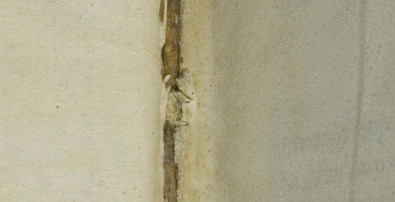
Above, Fig. 5: A stitch made through two holes, as seen on the numbered page 1 of the Warsaw Sforziad. In this photograph, the top stitch and the two flanking holes are shown but some of the other holes can also be seen on stitches below it. This stitch/holes configuration would have been evident when (as described above) a full-size facsimile of “La Bella Principessa” was inserted into the Sforziad at precisely this point. This evidence is also available online: our image was taken from the detailed record of the entire book that is carried on this site: Polona – La Sforziada.
ESTABLISHING THE TRUE DIMENSIONS
When Kasia Pisarek inspected the book for the second time, she asked that the dimensions of the pages and the relative positions of the stitch holes be marked along the edge of a piece of paper. This was done by the library’s books’ conservator in her presence and that of the chief librarian. Intervals between the stitch holes were marked in pencil along the two sides of the strip of paper and these are shown here at Figs. 6 and 7. When we marked off those measurements onto a separate sheet of paper, to prepare the diagram at Fig. 8, and then measured them on our sheet with a ruler, they were all exactly as given by Pisarek. We can be sure, therefore, that the dimensions and ratios between the stitch holes as shown below at Fig. 8 have been accurately established and physically transported to ArtWatch UK – and at practically zero-cost by means of sharp pencils and two pieces of paper.

Above, Figs. 6 (top) and 7: The strip of paper on which the book’s page size and stitch holes were recorded, as described above.
The conservator explained to Pisarek that the present positions of the stitch holes were those of the original construction of the book and that, therefore, there was no possibility that the book had once been bound with only three stitches. She made diagrams on the strip showing (at Fig. 7) different ways of executing stitching with double holes.
THE DIMENSIONS OF THE INTERVALS BETWEEN THE STITCHES IN THE BOOK – A NOTE FROM KASIA PISAREK:
1) According to Kemp and Cotte, the dimensions of the vellum pages of the Sforziad vary from 33.0 to 33.4 cm in height, while the drawing is 33 cm high.
2) I have carefully checked the dimensions with the Librarian in March 2016. All the pages are at least 33.4 cm high and more, up to 33.7 cm. The size of 33 cm would be far too small for the book.
3) The 5 holes in the book are in fact all double holes. Each of the 5 holes is two small holes, between which a string passes. The distance between the two small holes is about 3 mm. The double holes were never mentioned by Kemp or Cotte.
4) According to the conservator who was present at the time of my last visit, this is the binding that follows the original binding as there is no damage of any kind. So in total there were as many as 10 small holes, not 3 single ones as in the drawing.
5) I measured the distances between the 3 holes that Kemp and Cotte measured in La Bella Principessa. The measurements were taken from the middle of the double holes.
6) The distance between the bottom hole and the middle hole is 11.35 cm in the Sforziad, while in the drawing it is 11.06 cm.
7) The distance between the middle hole and the top hole is 11.7 cm in the Sforziad, while in the drawing it is 11.44 cm.
THE MISMATCHED HOLES AND STITCHES
Above Fig. 8: We took the dimensions of the Sforziad’s page and stitch holes from the strip of paper marked by the Polish National Library’s books’ conservator (as shown at Figs. 6 and 7) and drew them in black, as above, and marked “WS”. We then drew in red the “La Bella Principessa” sheet (here marked “LBP”) and its stitch holes as given above by Pisarek.
As can be seen above, it is impossible to align the drawing’s single stitch holes with their claimed counterparts in the book. If the drawing’s centre hole is aligned with the centre of the two central holes in the book (as shown on the left here), its other two holes fall short of their claimed counterparts.
If the LBP drawing’s upper hole is aligned with the centre of book’s two upper holes, its central and lower holes fall progressively further short of their claimed counterparts on the book.
In short, there is no fit or match between the book and the drawing – and which drawing in all probability post-dated the book, for reasons indicated above.
Those who would continue to give this drawing to Leonardo must now find some other means of filling a five centuries absence of provenance and of squaring intractable technical circles. We will examine next the supposed left-handed execution of “La Bella Principessa”.
Michael Daley, 21 July 2016
Problems with “La Bella Principessa” – Part III: Dr. Pisarek responds to Prof. Kemp
In June 2015 Kasia Pisarek, an independent scholar (and a member of ArtWatch UK) published an article, “La Bella Principessa – Arguments against the Attribution to Leonardo”, in the Polish scholarly journal Artibus et Historiae.
In her article Dr Pisarek presented a number of interlocking historical, aesthetic and technical criticisms of the attribution to Leonardo of the drawing “La Bella Principessa”, as it has been made and advanced by Professor Martin Kemp. In response, Prof. Kemp produced an article (“Leonardo da Vinci La Bella Principessa: Errors, Misconceptions, and Allegations of Forgery”) which challenges Dr Pisarek’s account on grounds of what he claims and alleges to be: “mistakes, misconceptions and a series of false allegations”.
A TACTICAL RETREAT?
In his response Kemp says “I do not run an authentication service, but research items of special interest regardless of ownership.” More recently ( May 16) Kemp announced on his website that “After speaking at the Art in Authentication Congress in The Hague, I confirm that I am withdrawing the [unpaid – Ed.] ‘advice service’ I have been providing.”
A SIDEWAYS SWIPE
Kemp discloses that in responding to Pisarek’s article he also sought by “extension” to counter other un-identified challenges to his Leonardo attribution. When this multi-targeted professional defence was submitted to Artibus et Historiae, it was rejected, as Kemp acknowledges, and as the Art Newspaper reports (“La Bella Principessa: Still an Enigma”, Features, May 2016), because of its resemblance to “an errata list”. The article was subsequently carried on the Authentication in Art website to accompany a paper given by Kemp at the AiA’s May 2016 Congress. This non-profit organisation, on which Kemp serves as an advisor, was founded in 2012 at The Hague. On May 8th we made a formal request to the AiA for Kasia Pisarek’s Artibus et Historiae article also to be posted so that the congress speakers and attendees might see both of what Dr Pisarek’s compilation of evidence consisted and of what Prof. Kemp complained. We have yet to receive a reply. For Kasia Pisarek’s Artibus et Historiae article, “La Bella Principessa – Arguments against the Attribution to Leonardo” click here. For Martin Kemp’s response to it, see: “Leonardo da Vinci La Bella Principessa: Errors, Misconceptions, and Allegations of Forgery”.
A CONFERENCE AMBUSH
In December 2015 Kasia Pisarek delivered a paper based on her Artibus essay at the ArtWatch UK/LSE Law Department/Center for Art Law conference “Art, Law and Crises of Connoisseurship”. At this conference, an arts journalist, Simon Hewitt, delivered an attack from the floor on her article. He did so as a proxy for Kemp, by whom he had been briefed, and for the collector/dealer owner of “La Bella Principessa”, Peter Silverman, with whom he is co-writing a book on what Silverman describes to us as “various aspects of the art market, sometimes highlighted by others’ and my own discoveries”. A research assistant of Kemp’s, Kasia Wozniak, who had spent four years attempting to show that “La Bella Principessa” had once been part of a late 15th century book known as the Warsaw Sforziad, had also written to us in denigration of Pisarek’s article which we had forwarded to her at her request.
Earlier, both Professor Kemp, who had declined an invitation to speak at this conference, and Mr Silverman, had suggested that we invite Hewitt to speak at the conference. Silverman expressly requested that this be done so that Hewitt might “present his discoveries as a counterweight to Ms. Pisarek”. We carry Pisarek’s full reply to Kemp’s listed objections below but comment first on a crucial new aspect of this disputed attribution that has emerged in Kemp’s response to Pisarek.
NO HISTORY. NO PROVENANCE. WRONG HOLES. NO FIT.
Above, Fig. 1: A facsimile of the “La Bella Principessa” drawing being inserted into the Warsaw Sforziad (but showing only the relationship of the top of the facsimile to the top of the book and not the accompanying relationship of the facsimile and book at the bottom). Photo by courtesy of Lumiere Technology.
For many reasons, it is essential to Prof. Kemp’s Leonardo ascription that it be accepted that “La Bella Principessa” had originally been incorporated within the Warsaw Sforziad now held in the National Library, Poland. It has not been so accepted because, contrary to press releases claims and media coverage thereafter, nothing material or documentary has established such a relationship. No record of any connection between the drawing and the book has been found despite extensive searches by researchers such as Kasia Wozniak. Moreover, despite extensive searches of Berenson’s archives by Kemp and Silverman, no record of the supposed 15th century drawing in any context predates its only-recently acknowledged ownership by the late painter/restorer Giannino Marchig. This pictorially and graphically mongrel work remains without a history and, prior to September 2011, without any claim – even by its only known previous owner – that it might have been a work by Leonardo da Vinci.
Martin Kemp has challenged Kasia Pisarek’s measurements between the stitches in the book’s binding. He and Pascal Cotte (of Lumiere Technology) claim that three stitch holes are present on the left hand edge of the “La Bella Principessa” sheet and that these match three of the book’s five stitches. No confirming visual evidence has been produced in support of this claim. In addition to fresh evidence on dimensions provided below by Pisarek, it might be noted that the Kemp/Cotte claims of a match have been variously and only rarely unequivocally phrased. All emphases below are added:
“The stitch holes in the vellum of the portrait match those in the book” – “The Original Source of the New Leonardo Portrait Discovered”, a Martin Kemp press release, 27 September 2011.
“Three of the stitch marks, the ones that we can still see on the edge of the ‘Bella Principessa’, match as well as they conceivably could” – Martin Kemp, Artinfo interview, “The Da Vinci Detective: Art Historian Martin Kemp on Rediscovering Leonardo’s Tragic Portrait of a Renaissance Princess”, by Andrew M. Goldstein, 11 October 2011;
“During our studies at the National Library, we inserted a facsimile of the portrait into the relevant opening of the book where the size matched very closely” – Martin Kemp, item 14, “Leonardo da Vinci La Bella Principessa: Errors, Misconceptions, and Allegations of Forgery”, on the Authentication in Art website. See Fig.1, above;
“The current stitching of the volume involves five holes, whereas there are only three holes now visible along the left margin of the ‘La Bella Principessa’. However, these three holes correspond very closely to the corresponding ones in the book.” – Martin Kemp and Pascal Cotte, “La Bella Principessa and the Warsaw Sforziad”, Lumiere Technology website, September 2011.
FAILING TO GET THE MEASURE OF HOLES
With linear measurements a near-miss is as good as a mile. If a hole is two millimetres adrift of a stitch there is no match. Claiming “correspondences” and “close” matches between the three holes and the five stitches is problematic enough, but, as Kasia Pisarek has now re-confirmed, the three holes in the “La Bella Principessa” drawing do not correspond with three of the book’s five stitches. Moreover, Kemp’s imprecision came with a perplexing multiple caveat: “In measuring the distances between the holes and matching these distances in the book and the portrait we allowed for four potential sources of error” – Kemp/Cotte, item 13, “La Bella Principessa and the Warsaw Sforziad”, Lumiere Technology website.
If incorporating an allowance for one potential source of error would necessarily be weakening to the force of a claimed match, how might allowances have been made for four different sources of error? How were the different “potentials-for-error” calibrated and weighted one against the three others? With accounts of this attribution, too many features remain in flux. For example, explanations offered for the disparity between the drawing’s three stitch holes and the book’s five stitches have shifted. In 2011 Kemp/Cotte wrote:
“The second task was to see if the holes in the portrait and the stitching pattern in the book corresponds. There is an obvious difference. The current stitching of the volume involves five holes, whereas there are only three holes now visible along the left margin of “La Bella Principessa”. However, these three holes correspond very closely to the corresponding ones in the book…The different number of stitching holes may result from the untidy way the left margin of the portrait has been cut, or from two intermediate stitches being added when the book was later rebound in standard Zamoysky livery. The former explanation is more likely.” (Emphases added.)
The suggestion that the book might possibly have been bound originally with only three stitches seems to have been abandoned altogether. Martin Kemp now accepts in his response to Kasia Pisarek that the book always had five stitches but claims as a countering fact against this recognition that: “The irregularity and extensive damage along the left margin explains why two of the five stitch holes are no longer clearly discernible.”
NOT AN EXPLANATION
The posited stitch holes cannot be said to be “no longer discernible” because there is no evidence that they were ever present. Prof. Kemp here begs a question on which this attribution turns. The roughly cut edge cannot be taken to have explained these absences. What Kemp offers, in truth, is (an implausible) hypothesis that ignores the technical exigencies of book binding and the dimensional realities of the “La Bella Principessa” sheet. When books are being made, the stitches are inserted along the line of a fold made collectively to the small number of sheets that form one of the book’s sections or “quires”. In the case of the Warsaw Sforziad, Pascal Cotte established (by taking and combining 70 precisely-focussed macro-photographs) that each quire was composed of four sheets (folios) which, when folded and stitched, comprised sixteen numbered pages. The book binder’s craft requires that the stitching occurs precisely along the crease line of the folded sheets. This careful alignment is necessary if the pages are not to cockle and for the book to open easily.
The three holes on “La Bella Principessa” have been taken to relate (- more or less, but never exactly) to the book’s central and two outer stitches. Had the “La Bella Principessa” sheet been incorporated in the Warsaw Sforziad when it was made in the late 1490s, the two inner stitch holes would be expected to be present on the sheet, even as it is today, and notwithstanding its roughly cut left-hand edge.
At Fig. 2 below, we see the white arrows and circles with which Pascal Cotte identified what are said to be “La Bella Principessa’s” three stitch holes. On the image on the left, we have drawn in red the alignment of the present three holes and have indicated with arrows where the two hypothesized additional stitching holes would be expected to be located. Both holes would fall within the present sheet despite its roughly cut left-hand edge. In the image on the right of Fig. 2 we again indicate (in black) the alignment of the present three holes, but show in red how the alignment would be disrupted had the two hypothesized additional stitch holes been situated to the left of the present sheet, as Prof. Kemp now claims in “explanation” for their absence from the sheet itself. Such a positioning would have resulted in a zigzag, not a row, of stitch holes. It is impossible to envisage how four sheets of vellum might have been folded so as to produce a neatly zigzagging crease.
Aside from the above problem, any lingering hope that this “La Bella Principessa” sheet might once have formed part of the Warsaw Sforziad will have to be abandoned in the light of Kasia Pisarek’s latest findings described below on her second examination of the Warsaw Sforziad.
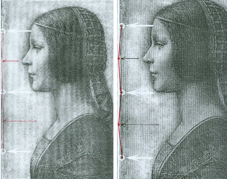
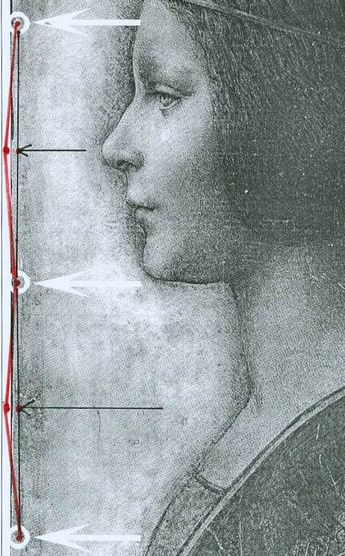
Above, Figs. 2 and 3. In Fig. 2 (top) we see, in the left and right images, the white arrows and circles with which Pascal Cotte located the “three holes showing that the image was once part of a codex or manuscript”. Given that the book (the Warsaw Sforziad) from which this sheet is said to have been cut was originally bound with five stitches, had the “La Bella Principessa” sheet once formed part of that book, it would today have five stitch holes, not the present three. In Figs. 2 and 3, we indicate with arrows (in red and then in black) where the missing two stitch holes would, for the reasons given above, be expected to have been located.
THE DOUBLE ‘DISCOVERY’ OF THE SUPPOSED POSITION OF LA BELLA PRINCIPESSA IN THE WARSAW SFORZIAD
When Andrew Goldstein asked Martin Kemp in an Artinfo interview in October 2011 what, on seeing the drawing, had convinced him it might be a Leonardo, he replied:
“So the initial connoisseur’s reaction merely tells you that something is worth looking at, but at any point one wrong thing can throw that all away — a later pigment, a bit of something that might come up about its history to indicate it was forged at some point, and so on. I was trained as a scientist, and if you have a scientific theory, you only need have one bit of the experiment that says, ‘this is not right,’ and the whole thing collapses. You always have to be looking for that one thing that is going to demolish the whole expectation that’s being set up.”
Kemp has given other grounds for caution when making attributions. On first encountering “La Bella Principessa”, he told Silverman, “I immediately saw it was in a different league from the others. But I was still very, very cautious. I didn’t want to jump at it because once you start believing you can summon up all the evidence you need.” (Peter Silverman, Leonardo’s Lost Princess: One Man’s Quest to Authenticate an Unknown Portrait by Leonardo da Vinci, 2012, p. 74.) Kemp had become a believer in the Leonardo attribution by 28 September 2011 when he issued a press release “The Original Source of the New Leonardo Portrait Discovered”. He added, “This (press release attached without the pics) should more or less settle the arguments – though probably not knowing the myopia of the art world.”
In 2011, after Kemp and Cotte had inserted their facsimile “La Bella Principessa” into the book, Kemp expressed himself 80 per cent confident of the drawing’s Leonardo attribution in a National Geographic film of the occasion. However, this was not the first time that a claimed “fit” between the facsimile and the book had been made and filmed by National Geographic. Peter Silverman describes in his book how, in December 2010, he had established a match in a different part of the book:
“We began by measuring the page size to see if it corresponded to “La Bella Principessa” and were gratified to see that it did, within a millimeter or two (a minute fraction of an inch)… Martin [Kemp] had surmised that the drawing would have been placed either at the very beginning or the very end of the book, but after careful examination we could find no trace of a cut page in either place. ‘May we turn each page?’ I asked. It was not a simple request. The book was nearly two hundred pages, and it would be a bit laborious for her [Anna Zawisza, the head of manuscripts] since utmost care had to be used so as not to damage the precious work in any way…It was apparent that the three pinholes where the binding had been sewn, noted earlier by Martin, which we had hoped would be a key to matching, would not be relevant, since the book had been rebound using five sutures…We slowly continued to turn each page, but there was no sign of a missing page…I had begun to abandon hope and to mentally prepare myself to return empty-handed. But then Zawisza turned page 161. There was a momentary beat of silence, and then she and I let out muffled cries. There, before our incredulous eyes, was what seemed to be the missing link, the element we longed to find: a remnant of a cut and extracted page of vellum that was the same darkish yellow as “La Bella Principessa”. We could barely contain our emotions. We measured the undulation of the remnant, and it corresponded exactly. Kathy [Silverman’s wife] and Kasia [Wozniak, art historian] came round to see for themselves, while David [Murdoch, National Geographic producer] filmed the historic moment. Even the armed guard was caught up in the excitement. Zawisza, who had carefully studied the book on past occasions, murmured how unhappy she was that she’d never noticed the missing page, now so glaringly obvious from the protruding remnant…”
That filmed historic moment was eclipsed by the moment in which Kemp and Cotte discovered a (preferred) location for the drawing at the front of the book. On her second examination of the Warsaw Sforziad, Dr Pisarek has learned that each of the five stitches in the book’s binding resulted in two holes, through which a string was passed. Thus, now that it is accepted that the book was originally bound with five stitches, each of which generated two holes, and that the “La Bella Principessa” sheet possesses only three of the necessary ten holes – and three where there should be six – there is no physical match between the drawing and the book, just as there is no documentary record of a Leonardo drawing having been bound within the book. Those who continue to see the hand of Leonardo in the drawing itself must now find an alternative history and another princess to accompany and bolster it.
Michael Daley 24 May 2016
Kasia Pisarek: A reply to Martin Kemp’s essay “Leonardo da Vinci La Bella Principessa. Errors, Misconceptions and Allegations of Forgery”
Professor Kemp has written an essay in response to my article “La Bella Principessa; Arguments against the Attribution to Leonardo”, Artibus et Historiae, No. 71, XXXVI, June 2015, pp. 61– 89.
In his essay, Prof. Kemp lists what he deems a series of errors and misconceptions in the Artibus article, but says he does not wish to address the issues of attribution I raised.
The purpose of his article is, however, an attempt to counter or undermine my findings.
I will answer his points in the order and with the numbered headings used by Kemp in his text.
[Martin Kemp] “1) Bibliographical”
[Kasia Pisarek] Martin Kemp says that most of my material is quoted from the internet and that I make only one reference to his book in my footnote 50.
This is incorrect. I make extensive reference to his book on the opening page and further references in footnotes 54, 57, 59 and 64. I have examined it as thoroughly as would be expected of any researcher. I also referred to many other books and articles which were accessed from libraries and not from the internet. These were:
M. Kemp and P. Cotte, The Story of the New Masterpiece by Leonardo da Vinci: La Bella Principessa, London, 2010; M. Kemp, Leonardo (rev. ed.), Oxford, 2004; P. Silverman, Leonardo’s Lost Princess: One Man’s Quest to Authenticate an Unknown Portrait by Leonardo Da Vinci, New Jersey, 2012; C. Geddo, ‘A “Pastel” by Leonardo da Vinci: His Newly Discovered Portrait of a Young Woman in Profile’, Artes, 2008–2009, pp. 67–87; C. C. Bambach, ‘Leonardo’s Notes on Pastel Drawing’, Mitteilungen des Kunsthistorischen Institutes in Florenz, vol. 52, 2008, no. 2/3 (Le tecniche del disegno rinascimentale: dai materiali allo stile. Atti del convegno internazionale, Firenze, 22–23 settembre 2008, ed. By M. Faietti, L. Melli, A. Nova), pp. 177–204; M. Gregori, ‘A Note on Leonardo’, Paragone, LXI, 2009, no. 723, pp. 3–4; D. Ekserdjian, ‘Leonardo da Vinci: “La Bella Principessa” – The Profile Portrait of a Milanese Woman’ (book review), Burlington Magazine, vol. 152, 2010, no. 1287, June (Attributions, copies, fakes), pp. 420–421; P. C. Marani, ‘Deux nouveaux Léonard?’, Dossier de l’art, 2012, no. 195, avril, pp. 58–63. Giannino Marchig, 1897–1983: paintings and drawings, exh. cat. London, 1988; Giannino Marchig, 1897–1983, exh. cat., Geneva, 1985; Giannino Marchig: 1897–1983: dipinti, disegni, incisioni, exh. cat. Florence, Gabinetto disegni e stampe degli Uffizi, 12 March – 5 June 1994 (Italian ed.); J. Cartwright (Mrs Henry Ady), Beatrice d’Este, Duchess of Milan, 1475–1497. A Study of the Renaissance, London, 1910; B. Horodyski, ‘Miniaturzysta Sforzów’, Biuletyn Historii Sztuki, 16, 1954, pp. 195–213; E. McGrath, ‘Ludovico il Moro and His Moors’, Journal of the Warburg and Courtauld Institutes, vol. 65, 2002, pp. 67–94; L. Syson with L. Keith, Leonardo da Vinci, Painter at the Court of Milan, exh. cat. National Gallery, London, 2011; Dizionario delle origini, invenzioni e scoperte nelle arti, nelle scienze…, Milan, 1831; B. Berenson, The Drawings of the Florentine Painters, vol. III, Chicago, 1938; Leonardo da Vinci, Master Draftsman, ed. by C. C. Bambach, exh. cat., The Metropolitan Museum of Art, New York, 2003; Z. Zygulski Jr, ‘Ze studiów nad Dama z gronostajem. Styl ubioru i wezly Leonarda’, in: Swiatla Stambulu, Warsaw, 1999 (first published in Biuletyn Historii Sztuki, vol. 31, 1969, no. 1, pp. 3–40).
The 2012 Italian version of Kemp/Cotte’s 2010 book is a translation from the English with the addition of the Sforziad hypothesis. The latter had already been published on the Lumiere Technology website and I discussed it at length.
Gnignera’s text was in Italian so I used Prof. Zygulski’s extensive knowledge of historic costume in general and coazzone in particular. The Monza catalogue (2015) was not published when I submitted my paper. The 2014 exhibition catalogue from the Galleria Nazionale in Urbino was also unavailable. To my knowledge these later publications have not yielded any conclusive evidence.
Prof. Kemp said that I have not addressed any of ‘the scientific evidence in the two books related to the lower layers of the image, the pentimenti or the condition and retouching in various media’ and goes on to say ‘contrary to Pisarek’s assertions, the interventions of restorers are documented in both books’. The latter sentence must refer to my ‘it is also strange that he did not consider that the drawing might have been retouched and repainted at a later time’ (p.79). Prof. Kemp has taken this out of context. I said that he did not mention the restorations in that particular passage of his book Leonardo (p. 210).
I not only analysed his art historical arguments in my text, but also the technical evidence presented by Cotte – which is to say:
– The trois crayons, pen and ink and bodycolour technique on vellum (unprecedented for Leonardo);
– The X-rays (inconclusive, in Cotte’s own words “did not yield significant new findings”, p. 154)
– The Carbon-14 dating of the vellum (wide-ranging 1440-1650, not constituting proof in itself as anyone could draw at any time on a blank folio removed from a manuscript)
– The quality of the vellum (rough; drawing on the hair-side; does not match the Sforziad’s smooth and well-prepared support; Birago’s illumination on the skin-side)
– The left-hand hatching (dry, timid and mechanical; on the outside of the contour of the profile, unlike in all Leonardo’s female portraits)
– The presence of three stitch holes (the Warsaw National Library Sforziad has five holes)
– The ‘knife marks’ when the folio was cut off (unnecessary, if the folio has been removed during rebinding).
– The retouchings of a later restorer (Marchig’s)
– The fingerprint evidence (no longer valid)
– The pentimenti, in the same place as in Leonardo’s Windsor portrait (a negative point, as La Bella Principessa could be based on that drawing).
At this point I would like to discuss some more scientific evidence:
On page 109:
“The support is probably the fine-grained skin of a calf”.
To the contrary, the images show an irregular grainy surface with visible follicles. Both Geddo and Turner described the support as “rough animal hide” and the surface of the vellum as being “pitted”.
“The portrait was drawn on the smooth ‘hair’ side”.
To the contrary, the hair-side has follicles so it is the rough side, not the smooth side.
Contrary to Prof. Kemp’s claim that I ignored Geddo’s contributions, I quoted her (p. 76), and she said exactly the opposite: “Besides the presence of the follicles, the rough unworked surface of the hide and its darkened, somewhat yellowish colour show that the portrait was made on the outer surface of the skin (formerly furcovered) and not on the inner one covering the flesh, which was aesthetically the superior of the two and commonly used as a support for written documents”.
I quoted extensively from Geddo’s article “A ‘Pastel’ by Leonardo da Vinci: His Newly Discovered Portrait of a Young Woman in Profile”, in Artes, 2008–2009, pp. 67–87, on my pages 62, 76 and 88.
On page 114:
The discovered “small area of pen marks along the left edge of the support” described by Cotte as Leonardo’s “pen trials”. This would surely have no place in a drawing destined for a luxury book presented as a gift to the Sforzas.
On page 154:
A problem with the X-rays:
‘Because white chalk (calcite or calcium carbonate) does not absorb X-rays to any great extent, the luminous zones of the sitter’s face ought to have appeared grey in the X-ray. On the contrary, however, they appear very white here, indicating the presence of a significant amount of dense material in the chalks area – which seems to contradict all the physical evidence considered so far.’
Cotte attributes this anomaly to the technician supposedly over-exposing the plate. This confirms his own observation that X-rays “are vulnerable to diverse interpretation”.
[MK] “2) PROVENANCE”
[KP] I did not say that the Marchigs were involved in forgery of any description. What I did say was that Giannino was familiar with Leonardo’s technique as a restorer and a “Leonardesque painter”. He was able to make such a drawing if he had wanted to, but clearly he had not tried to sell La Bella Principessa as a work by Leonardo.
Prof. Kemp does not explain, however, why the drawing had no provenance prior to Marchig’s ownership, and, as Michael Daley has recently pointed out, Professor Kemp and the drawing’s owner, Peter Silverman jointly trawled Berenson’s archive in hope of finding some pre-Marchig record but found none.
[MK] “3) The assertion that there is an ‘almost total absence of close comparisons with unimpeachable works by Leonardo.’”
[KP] The offending phrase above was written not by me but by David Ekserdjian in “Leonardo da Vinci: ‘La Bella Principessa’ – The Profile Portrait of a Milanese Woman”, The Burlington Magazine, vol. 152, 2010, no. 1287, June (Attributions, copies, fakes), pp. 420–421.
I used the same Leonardo comparisons as Prof. Kemp, but where he saw striking similarities, I saw possible imitation.
As to Cecilia Gallerani, although the structure of the eye looks comparable, it is round, soft and alive in Leonardo’s portrait, and dry, linear and lifeless in La Bella Principessa. The iris is drawn as a flat disc and the eyelid is marked with clear cut lines, unlike in nature.
Cotte states on p. 177: “Leonardo, for example, consistently made the bottom of the eye’s iris coincide exactly with the edge of the lower eyelid”.
This is not always the case. In Portrait of a Woman in Windsor or in La Belle Ferroniere the iris does not touch the lower eyelid, while in some works by Leonardo’s followers it does.
[MK] “4) The lack of records of Leonardo making the drawing”
[KP] Prof. Kemp wrote that all Leonardo’s known works are “unrecorded in his writings”. Leonardo does in fact mention two Madonnas in a sheet of sketches (Gabinetto Disegni e Stampe degi Uffizi, Florence, 446 E) inscribed: “…1478, I began the two Virgin Marys”, possibly referring to the Benois Madonna in St. Petersburg. He also mentions in a note his sculpture of the Sforza Horse (Ms. C, fol. 15v; R 720; B 44; V 53). And in an undated letter (about 1491-95), he writes together with De Predis about being underpaid for the Virgin of the Rocks.
The 16th century record in the Zamoyski collections Kemp refers to applies only to the Sforziad, not to the drawing, which was unrecorded there.
[MK] “5) ‘The entirely unusual for Leonardo medium of vellum commonly found in manuscripts led Prof. Kemp and his colleagues, including David Wright, Emeritus Professor of Art History at the University of South Florida, to search fifteenth-century codices for an excised illumination.’”
[KP] Prof. Kemp writes that “the author’s narrative of an extensive search is imaginary.”
But Dalya Alberge wrote in her article, “Is this portrait a lost Leonardo?” in The Guardian, on 27 September 2011:
“Earlier this year, he [Prof. Kemp] embarked on what he describes as a ‘needle-in-a-haystack’ search for a 15th-century volume with a missing sheet. […] Against the odds, Kemp tracked the volume down, to Poland’s National Library in Warsaw.”
[MK] “6) Forging a Leonardo?”
[KP] To be clear, I only said that the drawing could be a compilation of Leonardo’s works and other sources such as a bust by Cristoforo Romano.
[MK] “7) Pisarek’s reliance on Julia Cartwright”
Cartwright’s work is the only one specifically on Bianca Giovanna Sforza I could find in the English language. As there are no other secure portraits of Bianca Giovanna, the Principessa hypothesis is not supported by any evidence either.
Cartwright’s identification of The Musician as the portrait of Galeazzo Sanseverino, Bianca’s husband, looks convincing. The companion portrait in the Ambrosiana could then be showing his wife Bianca, but she looks very different to La Bella Principessa. Also Professor Carlo Pedretti in his Leonardo: The Portrait, 1999, called the Ambrosiana portrait (p. 23) “a probable portrait of Bianca Giovanna, the illegitimate daughter of Francesco Sforza.”
[MK] “8) Bianca Maria Sforza and earlier scholarship”
Even if the identification and dating of the portrait ‘pre-dates the research into the Sforziad’, as stated by Prof. Kemp, there is still the problem of the dating and the too ‘archaic’ style of the drawing.
Kemp does not explain why Vezzosi and Turner identified La Bella Principessa as Bianca Maria Sforza, even if she looks so different to her other known likenesses.
[MK] “9) Cutting out the portrait from the Sforziad in Warsaw”
[KP] There is no evidence that the folio was in the Sforziad and was removed during rebinding. But if it were so, there would be no need to cut out the folio, only to remove it as a complete sheet. A complete sheet (two folios) is indeed missing in the book, which would eliminate the need for excision.
If the folio had been removed during rebinding for its beauty or high value by the Zamoyskis, it would have been recorded in their collections, but there are no such records. Kasia Wozniak’s research has not found any evidence to this effect.
Her hypothesis that the drawing went to the Czartoryski collections in Pulawy where it was identified as by Leonardo is also so far unsubstantiated. There were no such records in the Czartoryski collections. The late Director of the Czartoryski Museum, Prof. Zygulski Jn. never mentioned the existence of a Leonardo drawing in their collections.
The Bona Sforza drawing listed in the 1815 inventory of the Temple of Sybil in Pulawy and mentioned by Wozniak as the possibly misidentified Bianca Giovanna Sforza, refers to a miniature watercolour on vellum illustrated in D. Dec and J. Walek’s, Czasy! Ludzie! Ich dziela. Teatr obrazów ksieznej Izabeli, listed as no. 99. ‘Polish, 16th century’.
There is no connection between my article in Artibus and the interests of the National Library in Warsaw.
[MK] “10) The foliation and inserted paper pages”
[KP] Prof. Kemp himself used the word ‘codex’ to describe the Sforziad in his book Leonardo: Revised edition, 2011, p. 256:
“this tender and refined formal portrait in ink and coloured chalks on vellum has been cut from a codex (a book), namely the copy of the Sforziada in Warsaw produced for Galeazzo Sanseverino.”
The three folios missing in the Warsaw Sforziad were originally left blank as in the other copies of the book in Paris or London.
Geddo described the drawing’s “apparent crudeness in the preparation of the parchment” and “the rough unworked surface of the hide” (A Pastel by Leonardo da Vinci… reprinted in P. Silverman, Leonardo’s Lost Princess, pp. 219-220). This is not true of the Sforziad’s parchment.
I have seen the Sforziad on two occasions. Once in the summer 2012 and more recently in March 2016; the parchment is finely grained and of high quality, as expected in a luxury book for the Sforzas.
My illustrations Fig. 7, 10 and 11 indeed show paper pages. Because they look so similar it is easy to mistake the paper pages for the vellum ones. My Fig. 6 and Fig. 8 are vellum and they look very similar in colour and texture.
Kemp states that I inaccurately said that his “reconstruction of the insertion of the drawing in the Warsaw Sforziad looks unrealistic, as it is facing a printed page”. He wrote that “The reconstruction shows that the portrait would have faced a blank page”. This is incorrect. His “Fig. 12 – ‘Hypothetical Reconstruction of La Bella Principessa as folio 6r” in the online article “La Bella Principessa and the Warsaw Sforziad” does face a printed page.
[MK] “11) Iconography”
[KP] According to Kemp, Horodyski’s pioneering research on the Sforziad I support ‘has been superseded in the light of more detailed knowledge of Sforza court iconography and analyses by later scholars, including Wright’.
Horodyski suggested Gian Galeazzo Sforza and his offspring, such as Bona Sforza, the later owner of the book in Warsaw as the recipient of the Sforziad.
But according to D.R.E. Wright in his article on the Lumiere Technology website (which has now been removed), M. L. Evans and E. McGrath, the Warsaw Sforziad was destined for Galeazzo Sanseverino, Bianca’s husband.
So why is Galeazzo Severino’s profile absent on the Warsaw frontispiece by Birago, where Ludovico’s is in London and Gian Galeazzo’s in Paris, the recipients of the other Sforziads?
Moreover, Galeazzo Sanseverino was not part of the Sforza dynasty and Bianca was illegitimate. All the copies of the Sforziad on vellum were dedicated to members of the Sforza family.
Horodyski’s reading of the symbolic content of the Birago frontispiece more logically pointed to the death of Gian Galeazzo: the lack of the recipient’s profile as emblem, the missing figure of Gian Galeazzo in the boat with Ludovico il Moro, the tears in the handkerchief, the sarcophagus, the broken shield with the initials GZ, the crest with one half with arms of Milan and the other of Aragon for Gian Galeazzo.
After my defence of Horodyski’s interpretation, an Italian scholar Carla Glori published online her very detailed new iconographic study of the illumination: ‘The Illumination by Birago in the Sforziad incunabulum in Warsaw: in defence of Horodyski’s thesis and a new hypothesis’. I am quoting her extensively below.
She said: “The incunabula with the illuminations now in London and Florence were the property of Ludovico il Moro, given the recurrence of the central upper figure of a moor, and the presence of the ensign of the Duke of Bari with his devices called “la scopetta” (the little broom) and “I due fanali” (the two beacons). The Paris and Warsaw incunabula were the property of Duke Gian Galeazzo Sforza and his family, because they are reproducing the devices of Gian Galeazzo himself and of his father, Galeazzo Maria.”
The sieve, which was said to be the emblem of Galeazzo Sanseverino, was Gian Galeazzo’s personal device (created by his father) called “il buratto” (a sieve held by two hands) with the motto TAL A TI QUAL A MI, as illustrated by the “Cassone dei tre Duchi”, Sforza Castle, Milan, 1479-1494.
Glori also added that the sieve device (“il buratto”) is duplicated in symmetrical position in the central area of the Warsaw illumination.
She concluded that “the Warsaw illumination was dedicated to the memory of the deceased Gian Galeazzo Sforza and his family, and that it was certainly dated after his death (1494)”.
Her argument against the Sanseverino coat of arms or imprese supposedly identified in the Birago’s illumination includes:
– The missing Aragonese “A” in the device of the “three intertwined rings with diamonds” appearing on the Warsaw illumination
– The missing Sanseverino NOSTRO È IL MESTIERE motto
– The fact that the hybrid coat of arms of the Warsaw illumination does not correspond to the coat of arms of the Sanseverino dynasty; it should be silver/white not gold/yellow. “Every armorial certifies that the field (“campo”) of the Sanseverino coat of arms was “SILVER” (white), while the field (“campo”) of the coat of arms in the illumination of Warsaw is “GOLD” (yellow)”. “According to Horodyski’s logical and symbolical interpretation, the emblem is an artistic fusion of the traditional emblem of the city of Milan with the yellow and red lines of the Aragona coat of arms.”
– The reference of the initials “GZ” (appearing in the ducal documents and iconography, also on the ‘Cassone dei Tre Duchi’) to the memory of the deceased dukes Galeazzo Maria and Gian Galeazzo, not Galeazzo Sanseverino.
– The absence of any reference to Galeazzo Sanseverino and his biography such as the tournament lance of the famous jouster, while the ducal arms on the “Cassone dei Tre Duchi” are present: the round shield, the quiver with arrows and the sword. The depicted starry armour on the left is not the typical armour of a jouster. It is empty as Gian Galeazzo is dead, and it is almost identical to the one worn by him in the Paris illumination.
– The presence of a body of heraldic devices celebrating the Visconti-Sforza dynasty and referable in particular to Galeazzo Maria Sforza and his son Gian Galeazzo such as the greyhound/the tree/the divine hand (Francesco Sforza); the “capitergium” device (a bandage with a knot) dedicated to Gian Galeazzo Visconti, the first Duke of Milan, celebrating the Visconti dynasty; the rising waves (“onde montanti”); the three intertwined rings with diamonds (“i tre anelli intrecciati con diamante), by Muzio Attendolo, the founder of the Sforza dynasty: it was probably given to him in 1409 by the Marquis of Ferrara Niccolò II d’Este after the conquest of Reggio Emilia. They are not emblems of Bianca Giovanna as was advanced, but of members of the Sforza family in general.
According to Glori, “we have no evidence that the incunabulum now in Warsaw was confiscated in Milan during the French invasion. In 1517 Antonio de Beatis saw some precious incunabula in the Royal Library of Blois, but he did not cite the Sforziad as being amongst them in his autograph manuscript XF28 of the National Library in Naples. It is plausible that the incunabulum now in Warsaw was a wedding gift to Bona Sforza from her mother Isabella; I propose also the hypothesis that she received the gift from her aunt Caterina Sforza, probably when she left Milan with Isabella after the downfall of Ludovico il Moro.”
[MK] “12) Betrothal and Marriage”
[KP] Although the word ‘betrothal’ might have been more appropriate than ‘marriage’ in the case of Bianca Sforza, others also wrote that her ‘wedding’ (or nuptials) took place in 1490 or late 1489.
Julia Cartwright in her Italian Gardens of the Renaissance and Other Studies, 1914, (reprint 2013) wrote p. 174: “On the 10th of January, 1490, the wedding [of Bianca and Galeazzo] was solemnised in due splendour in the Castello of Milan (…)”.
Edward McCurdy in The Mind of Leonardo da Vinci, New York, 2013, wrote “Bianca Sforza, a natural daughter of Ludovic who in 1489, while still a child, was married to the famous captain Galeazzo di Sanseverino.” p. 301.
Wikipedia entry for Galeazzo Sanseverino also says “He was married to Bianca, illegitimate daughter of Ludovico Sforza, in 1489.”
[MK] “13) The Technique”
[KP] It was Prof. Kemp himself who said that Leonardo never worked on vellum in his book The story of the new masterpiece… p. 35: “There are no other known works by Leonardo on vellum, but there is previously neglected evidence of his interest in making coloured images on prepared animal skin.”
Turner also wrote in his online Statement concerning the portrait on vellum by Leonardo, p.3: ‘Also apparently unprecedented [for Leonardo] is the use of vellum or parchment as a support for the new portrait.’
Geddo also wrote: “The use of parchment was until now unknown in the work of Leonardo (…)”, in P. Silverman, Leonardo’s… p. 226.
In reference to Jean Perréal and dry colouring, the quotation in full is as follows: “Piglia da Gian de Paris il modo di colorire a secco e’l modo del sale bianco e del fare le carte impastate, sole e in molti doppi, e la sua casetta de’colori”.
The translation for carte impastate as ‘paste-board’ is not anachronistic, as it was used as early as 1760 in Joseph Baretti’s, A dictionary of the English and Italian languages, Vol. 1: “Cartone [composto di piu carte impastate insieme] paste-board.”
I have only inspected the vellum of the Sforziad in Warsaw, not the vellum of the drawing, but both Geddo and Turner have described it as ‘rough animal hide’. This is most certainly not what you will find in the Sforziad in Warsaw.
[MK] “14) Dimensions”
[KP] According to Kemp and Cotte, the dimensions of the vellum pages of the Sforziad vary from 33.0 to 33.4 cm in height, while the drawing is 33 cm high.
I have carefully checked the dimensions with the Librarian in March 2016. All the pages are at least 33.4 cm high and more, up to 33.7 cm. The size of 33 cm would be far too small for the book.
The 5 holes in the book are in fact all double holes. Each of the 5 holes is two small holes, between which a string passes. The distance between the two small holes is about 3 mm. The double holes were never mentioned by Kemp or Cotte.
According to the conservator who was present at the time of my last visit, this is the binding that follows the original binding as there is no damage of any kind. So in total there were as many as 10 small holes, not 3 single ones as in the drawing.
I measured the distances between the 3 holes that Kemp and Cotte measured in La Bella Principessa. The measurements were taken from the middle of the double holes.
The distance between the bottom hole and the middle hole is 11.35 cm in the Sforziad, while in the drawing it is 11.06 cm.
The distance between the middle hole and the top hole is 11.7 cm in the Sforziad, while in the drawing it is 11.44 cm.
[MK] “15) The profile and the cartoon portrait of Isabella d’Este”
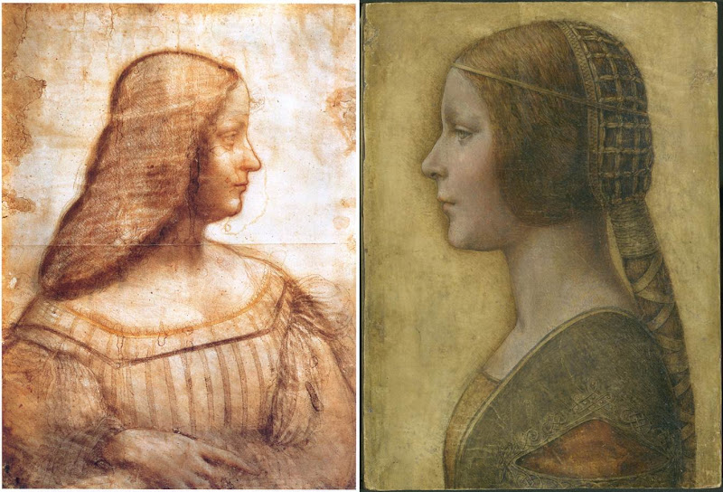
Above, Fig. 4: A comparison of La Bella Principessa with Leonardo da Vinci’s, Portrait of Isabella d’Este, c. 1499–1500, Paris, Musée du Louvre.
[KP] The portrait of Isabella d’Este shows the face in profile but the body in three-quarters, unlike La Bella Principessa. The former is also unfinished, rendered softly with the sfumato effect, fluid in execution, while the shading is on the inside of the profile.
La Bella Principessa is shown in full profile, highly finished, rigid and linear, while the shading is on the outside of the profile.
The similarities between the two profiles are only superficial.
The use of the word ‘repaint’ was an incorrect translation of the French word ‘repentir’, which means pentimento. I would like to mention that I have a good enough grasp of drawing techniques as I also trained as a copyist of Old Masters and an art restorer.
[MK] “16) Left-handedness”
[KP] I disagree that “the left-handed execution cannot undermine the attribution”, as it indicates the intention to imitate Leonardo. None of his collaborators or followers were left-handed, so the drawing is either by him or by an imitator/forger.
[MK] “17) The costume”
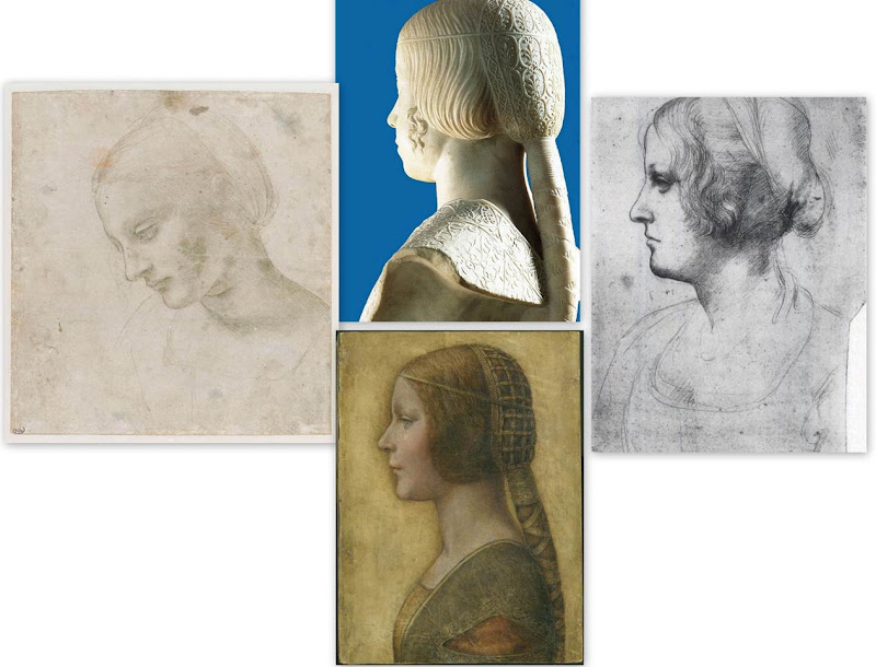
Above, Fig. 5: Comparisons of La Bella Principessa with Leonardo da Vinci’s, Head of a Woman, c. 1488–1490, National Gallery, Parma (left); Leonardo’s Portrait of a Woman in Profile, c. 1489–1490, Windsor Royal Collection (right); and, Gian Cristoforo Romano’s sculpture, Bust of Beatrice d’Este, c. 1491, Paris, Musée du Louvre (top).
[KP] The simplified and flatly rendered dress as well as the coazzone hairstyle do indeed show similarities with the sculpted busts by Gian Cristoforo Romano (Bust of Beatrice d’Este) and Francesco Laurana. But this could be a negative point, as the drawing could be based on one of these busts.
Incidentally, the opening in Laurana’s sculptures differs from that in La Bella Principessa. In the former it is a wide horizontal cut facilitating the movement of the arm, while in the drawing it is a triangular hole which doesn’t seem to play such a role.
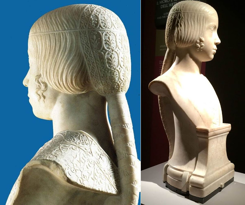
Above, Fig. 6: Gian Cristoforo Romano, Bust of Beatrice d’Este, c. 1491, Paris, Musée du Louvre.
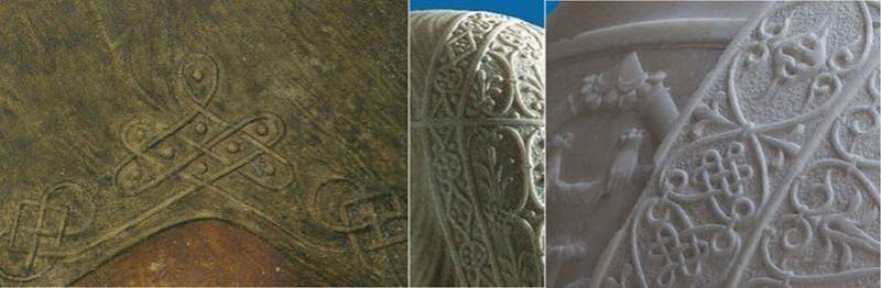
Above, Fig. 7: A comparison of the knots on La Bella Principessa’s dress and Gian Cristoforo Romano’s Bust of Beatrice d’Este, c. 1491.
[MK] “18) The fingerprint”
[KP] The fingerprint evidence which was originally published in the book as “strongly supportive of Leonardo’s authorship” is now considered invalid.
It was not possible to compare the palm imprint to Leonardo’s other examples, and it was described as perhaps unintentional as it is single and isolated, unlike in the execution of Cecilia Gallerani, where many imprints were found where the blending of hues had taken place.
[MK] “19) On Method”
[KP] The “accumulative build-up of different types of evidence” against the attribution to Leonardo is strong, but, as mentioned above, my main arguments were not addressed by Prof. Kemp.
Why is the shading on the outside of the profile? What is the significance of the hand writing on the reverse of the drawing and why was it not investigated? Why is the profile of La Bella Principessa so similar to that in the sculptural Bust of Beatrice d’Este by Cristoforo Romano? Why is the knot on the dress similar to the one on the bust and unlike other Leonardo’s knots? Why are the proportions of the face flawed? Why the vellum of the drawing was described as ‘rough animal hide’ and could it be part of the luxury book of the Sforziad? Why Marchig’s friend the famous Renaissance expert Bernard Berenson had not attributed the drawing to Leonardo? Why there is no known provenance prior to Marchig’s in the 1950s?
In the field of attributions the level of inconsistencies and contradictions always undermine any evidence in favour of a proposed attribution.
[MK] “20) The damaging allegation in the opening to Pisarek’s article that the owner was to set up ‘non-profit-making foundation for multi-disciplinary Classical and Renaissance studies near Florence, to be headed by Professor Martin Kemp’.”
[KP] I made no such allegation. This was a quotation from an article by Simon Hewitt who supports the attribution to Leonardo. This information was published in an Antiques Trade Gazette article by Simon Hewitt in 2009. The article can be found here.
In my article I also wrote: “Prof. Kemp and his colleagues are no doubt genuinely convinced of the authenticity of the drawing, as well as highly enthusiastic about the rediscovery.” This shows that I in no way question Prof. Kemp’s integrity on this matter, only the methodology and the results of the proposed attribution.
Kasia Pisarek, 24 May 2016
Problems with “La Bella Principessa” – Part II: Authentication Crisis
In Part I we discussed the look of the so-called “La Bella Principessa” drawing and showed that while it bears no comparison with Leonardo’s female portrait type, it sits comfortably among 20th century fakes (see Fig. 1). Here, we consider the singular campaign to have this work accepted as a Leonardo.
“LA BELLA PRINCIPESSA” AND THE (DECOROUS) COMPANY SHE BEST KEEPS
Above, Fig. 1: “La Bella Principessa” (centre) among 20th century fakes. For the drawing’s striking mismatch with secure Leonardo works – and with other bona fide associated works of the period – see Problems with “La Bella Principessa” – Part I: The Look.
A SINGULAR CAMPAIGN OF ATTRIBUTION
The nine years long campaign to have the drawing “La Bella Principessa” accepted as an autograph Leonardo da Vinci is faltering even before our series of examinations is completed. The leading proponent, Professor Martin Kemp, is said in the May 2016 Art Newspaper (Vincent Noce’s “La Bella Principessa: Still an Enigma”) to have his “reputation on the line” in the wake of our posts and an article “How reliable are today’s attributions in art? The case of ‘La Bella Principessa’ examined”, that was published in the Polish scholarly journal Artibus et Historiae, no. 71, 2015 (“La Bella Principessa – Arguments against the Attribution to Leonardo”) by Dr. Kasia Pisarek, an independent art historian (and ArtWatch member). In delayed response to our January 2014 suggestion that the disputed drawing’s author might have been the painter/restorer Gianinno Marchig (see Art’s Toxic Assets – Part II), Kemp now alleges on his blog that we are making “scurrilous and unsupported” attempts to “divert the argument into claiming that Jeanne Marchig lied profusely”. This is not the first such slur against us from that quarter. When Professor Kemp reviewed the James Beck/Michael Daley book Art Restoration: The Culture, the Business and the Scandal in 1994 he made similarly unfounded charges which we rebutted immediately. In recent years Kemp has cast his denunciations more widely and generally against his fellow scholars. (See below.)
Notwithstanding the “La Bella Principessa” campaigners’ belligerence towards doubters, and Professor Kemp’s own publicly bullish support for the attribution, his position on “La Bella Principessa” is untenable in terms of the work’s artistic properties and its emerging circumstances – as indeed is the methodological model for attributions that he hubristically offers to fellow scholars in connection with the Leonardo upgrades that he supports (see below).
Pace Kemp’s charge of evasion, it would be evasive not to consider Marchig’s role when appraising a drawing reportedly bought by a Panamean, Jersey-based company nine years ago at a requested discount for $19,000 but which now, as a claimed Leonardo, lives in a Swiss vault and is said to be insured for $150 million. We should all consider the circumstances and nature of this particular work and the assiduous, sometimes muscular campaign to upgrade it. The old masters market is fragile. The accelerating expanionism of recent years cannot be sustained. The market cannot afford to take in too many too-hopefully upgraded Leonardos, Michelangelos, Rubens’s, Van Dycks, Caravaggios and so forth. Aside from the resulting adulteration of scholarship, markets, as we all now appreciate, lose confidence and crash when too high a proportion of toxic assets is thought to have been bundled in among the bona fide.
PROMOTING THE DRAWING THAT CAME FROM NOWHERE
What is now presented as Leonardo’s “La Bella Principessa” of c. 1496 was sold anonymously at Christie’s, New York, in 1998 for $22,850 as a work without provenance. Twelve years later, Jeanne Marchig, the widow of the artist/restorer Giannino Marchig who had worked as a restorer for Bernard Berenson (who, Kenneth Clark said, sat on a pinnacle of corruption), identified herself as the vendor. She did so not in the disinterested cause of scholarship but to claim damages after sensational but unfounded and misleading media reports that fingerprint evidence had shown the drawing to be a Leonardo.
As we reported, aside from the widow’s hearsay claims concerning the ownership of the drawing by the painter/restorer, the drawing otherwise possesses not a shred of recorded history in its supposed five centuries. On the widow’s account (as variously reported by Kemp, by the drawing’s owner, Peter Silverman, and by a journalist selected by Silverman to promote the attribution, Simon Hewitt), Marchig, an unsuccessful artist who had grown rich and acquired a collection of valuable historic works, had declined to say even to his wife when or from whom he had acquired the framed drawing which he is said to have kept in a portfolio.
Jeanne Marchig dangled the possibility that he might have acquired it from Berenson, with whom he had grown close and for whom he had hidden paintings, photographs and documents during the war. Had he done so that would hardly dispel doubts and suspicions but even that possible lifeline to a past now seems unlikely: the drawing’s present owner and Kemp vainly trawled Berenson’s archives at I Tatti for any sign or mention of the drawing. The trail of this supposed Leonardo begins and ends with the Marchigs. Marchig, if his widow is reliable, said nowt and simply had. By coincidence, the widow was born in Warsaw where a book is housed that was later said (unpersuasively for reasons given by Dr Pisarek) to have contained the vellum sheet on which the drawing was made. Professor Kemp thinks the late Jeanne Marchig “a person of great credibility”. The journalist Simon Hewitt reported in the Huffington Post that:
“Jeanne Marchig was born Janina Paszkowska in Warsaw, into a family of doctors and lawyers. She was an only child: her father died in an accident before she was born. Her mother Elzbieta Chrostowska, an amateur wood-carver, took her to Sweden in 1939, where she grew up and married, became Janina Hama. The marriage didn’t last. She met the artist Giannino Marchig on a train between Stockholm and Florence, where he worked as a picture restorer. Berenson and Wildenstein were his top clients. Although a youthful exponent of racy nudes, Giannino was no lady’s man. He lived at home with his mother on the banks of the Arno. He was over 50. Jeanne was an art student. Their age-difference ran into decades. They married. People talked. Talked, too, about Giannino’s wealth. What had he done during the war? Helped hide Berenson’s collection from the Nazis, among other things. Did Berenson give him the Bianca portrait? Jeanne Marchig didn’t know. Or wasn’t saying. They moved to Switzerland. She morphed from a flirtatious livewire into a coquettish Miss Marple of unfluffy shrewdness. Giannino died in 1983. Jeanne published a sumptuous catalogue of her husband’s career and religiously kept the box of pastels he had used to restore the Leonardo.”
PROFESSOR KEMP’S EYE
Above, Fig. 2: The eye of “La Bella Principessa”, top left, and above left (with a superimposed diagram). Top right, an eye drawn by Leonardo (reversed). Above right, an eye featured on a sheet of eyes drawn and reproduced as aids to students and artists in a famous drawing course published in the late 1860s – and later used by the young Picasso.
THE NUB OF CONNOISSEURSHIP DISPUTES IN THE VISUAL ARTS
Martin Kemp and I have recently discussed the eye in “La Bella Principessa” (top left) vis-à-vis the eye by Leonardo (top right) and I am grateful to him for this.
He believes that both eyes are drawn by Leonardo. I (a left-handed draughtsman) hold that the “La Bella Principessa” eye, with its pronounced, almost Cubist, angular and planar construction cannot conceivably have been drawn by Leonardo. There is simply nothing like it in Leonardo’s oeuvre. It is a construct of an alien, more modern kind. Kemp now admits that the unnaturally thick and angular lower lid is problematic but writes: “With the exception of the angularity of the lower lid, which is in an area of some damage, it is consistent (above all the amazingly delicate lashes) with the attached [the eye by Leonardo, top right]. Leonardo’s works of art are not anatomical demonstrations. It’s easy to find ‘anatomical erors’. I find the seizing on such things is to divert the arguments into issues of a peripheral nature in the face of evidence of a non-arbitrary kind.” This is a helpfully clarifying statement, but the suggestion that the eye might have been repaired is new.
In the 2010 Martin Kemp and Pascal Cotte book Leonardo da Vinci “La Bella Principessa” The Profile Portrait of a Milanese Woman, there is no indication given in Cotte’s map (Fig. 3) of repairs to “La bella Principessa” that the eye had been damaged, and Kemp, when comparing the eye with that of Leonardo’s Windsor Castle drawing Portrait of a Woman in Profile (Fig. 5), wrote of it “Even Boltraffio could not achieve this. The structure of the eyelids, the delicate flicks to create the lashes, and the translucent iris of the eye are extremely close on both portraits…” Pascal Cotte goes further, claiming a “distinct and identical logic” with the eye in Leonardo’s portrait of Cecilia Gallerani (The Lady with an Ermine, Fig. 4). Making no reference to injuries or repairs, Cotte specifically points in his diagram (Fig. 4) to the “The juxtaposition of the edge of the lower eyelid with the bottom of the iris”. Speaking generally of the analysed physical evidence of the drawing, Cotte adds “There have been some diplomatic retouchings over the years, but this has not affected the expression and physiognomy of the face to a significant degree or seriously affected the overall impact of the portrait.”
THE PRIMACY OF VISUAL EVIDENCE IN THE VISUAL ARTS
What Kemp sees as a peripheral issue that lacks “non-arbitrary” evidential value, I take to be of the essence in the evaluation and critical appraisal of (visual) works of art. In traditional connoisseurship – an area which Kemp frequently disparages on quasi-scientific professional and leftist political grounds – the test is not to identify similarities (which exist in abundance between authentic works, copies and forgeries) but to discern differences, to discriminate between products of the authentic autograph hand and closely related but variant artefacts.
Of course, Leonardo did not draw every eye as an anatomical demonstration, but nor did he ever draw an eye in ignorance of that crucial feature’s anatomical construction. The eyeball, being an orb, determines the shape and forms of the surrounding soft protective tissue of the lids. Leonardo’s eyes and lids are constructed with curves, not straight lines. With the four images above at Fig. 2, a connoisseur’s ‘eye’ should recognise that even when constructing an eye with straight and not curved lines (as in the lower right demonstration drawing) it is possible to render the visible part of the eyeball conceptually if not literally spherical. That schematic drawing displays greater sculptural and anatomical acuity than does the more laboured and “finished” “La Bella Principessa”. It recognises and describes with three (faint) straight lines, what Leonardo depicts with curves: the line(s) of collision between the bulging soft flesh of the lower eyelid (when the eye is open) and the more taught flesh that is stretched over the cheekbone. In the infrared image at Fig. 6 we can see with crystal clarity how Leonardo saw the structure of the lower eyelid and how he set out this structure in preliminary drawing form. While Leonardo gave fluent anatomically-informed account of eyes, Marchig was insecure in his treatment (see Art’s Toxic Assets – Part II). Had Leonardo complied – against everything else in his output – with an irresistible court demand for a strictly profile treatment of a female subject’s head and torso, as Kemp claims in defence of La Bella Principessa, he would have had the wit and the judgement to render the eye, too, in strict profile. “La Bella Principessa’s” eye – which is smaller – is not drawn in accord with that strict out-of-perspective formal convention. Rather, it strays into looking both outwards and downwards, imparting an insecure, wary, not proud air.
MAPPING THE “RESTORATIONS” OF “LA BELLA PRINCIPESSA”
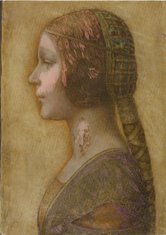
Above, Fig. 3: The colour coded map that is said to show areas of restoration in “La Bella Principessa”, as published on page 133 of the 2010 Kemp/Cotte book Leonardo da Vinci “La bella Principessa” The Profile Portrait of a Milanese Woman. It is striking how discretely localised are the areas of “restoration”, and how fortuitously the corresponding areas of injury had fallen in the least important parts of the image.
CONFOUNDING THE SIMILAR AND THE DISSIMILAR
Above, Fig. 4: Top, the (true) right eye of The Lady with an Ermine. Above, the eye of “La Bella Principessa”. In this diagram Pascal Cotte, a brilliant engineer, sees confirmation of a common author – even at his arrowed point 2 where Leonardo’s curved demarcation between the eyeball and the lower lid is set against the form-denying straight demarcations in “La Bella Principessa”.
Above, Fig. 5: Left, the eye of Leonardo’s Windsor Castle Portrait of a Woman in Profile (reversed). Right, the smaller, more angular and more sunken eye of “La Bella Principessa”.
A common fault of copyists, pastiche-makers and forgers is to get details correct while missing the larger unified relationships which, collectively, they should constitute. The author of “La Bella Principessa” not only misses the cohering sense of the eye as a ball but even misconstrues the form and anatomical function of particular details. This error testifies to forgery rather than pastiche. We will be showing “La Bella Principessa” to be a “portmanteau work” composed from features drawn from a number of bona fide Leonardos. It can hardly seem a coincidence that the most disqualifying error of drawing in “La Bella Principessa” – the lower eyelid – occurs at the very point where damage is found in the (“prototype”) work which it is most closely said to resemble. At this point the drawing’s author has clearly been required to invent rather than copy or paraphrase. Indeed, in “La Bella Principessa’s” eye we find a progressive falling off of anatomical and artistic credibility from top to bottom: most plausible in “La Bella Principessa” is the somewhat simplifying paraphrase of the upper eyelid. Less plausible is the treatment of the more complex and elusive eyeball and iris. Least plausible of all is the fabricated lower eyelid. Martin Kemp’s claim that by drawing attention to such incompatibility we seek to divert the arguments “into issues of a peripheral nature in the face of evidence of a non-arbitrary kind” is not only unfounded – much material is in train on this attribution – it betrays a technically philistine misapprehension of sound scholarly method. Let us be clear: art, not the devil, lies in artistic detail and these details testify to authorship. We have the clearest possible understanding of how much Leonardo knew and how well he gave expression/record to what he knew/saw. It is for those who would count “La Bella Principessa” as a Leonardo to explain the disparity between its eye and that below at Figs. 7 & 8, which, on Kemp’s account, were both made at the same date.
SPOT THE ODD ONE OUT
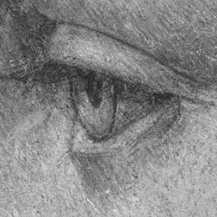
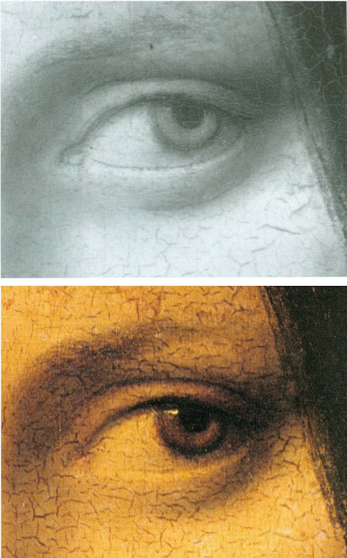
Above, Figs. 6, 7 & 8: Top, the eye of “La Bella Principessa”; Centre, the (true) left eye of Leonardo’s La Belle Ferronnière, as seen in an infrared reflectogram by E. Lambert for C2RMF as published in Leonardo’s Technical Practice, Paris, 2014; Above, the (true) left eye of Leonardo’s La Belle Ferronnière, as seen in Pietro Marani’s Leonardo da Vinci – The Complete Paintings, New York, 2000. It is, for reasons given here, inconceivable that both of these eyes could have been produced by Leonardo at the same time – c. 1496.
There is another sense in which Kemp’s espousal of “La Bella Principessa” exposes his art historical method. By drawing attention to “La Bella Principessa’s” many points of direct correspondence with the Windsor Castle profile portrait in terms of overall effects, pentimenti, anatomical details and so forth, the scholar strains credulity. The Windsor Castle portrait is clearly of a mature woman. It was made some 15 years earlier than the supposed portrait of Bianca Sforza who died when a child of fourteen. The Windsor drawing is made in another (and single) medium – silverpoint – in which Leonardo was effortlessly, supremely fluent. “La Bella Principessa”, however, was made in an unprecedented combination of materials on a never or extremely rarely encountered-in-Leonardo support. How likely, then, is it that Leonardo would produce an elaborately finished drawing in an un-encountered mix of graphic and pictorial media and of a type nowhere else encountered in his oeuvre, of a young girl who, on Kemp’s account, was drawn either directly from life or from some other unknown record of her appearance, in commemoration after her death, some fifteen years later, that would, when reversed, produce a near perfect coincidence of proportions, features and, even, pentimenti?
It would, of course, be entirely unremarkable for a forger or pastiche-maker to engineer a similar reversed coincidence of features and traits with a bona fide Leonardo work. A canny forger who happened to be a restorer of old masters – including Leonardo, as was the case with Marchig – would well appreciate the need for evidence of one or two reassuring “campaigns of restoration” in a supposed work of five centuries of age. Marchig’s widow has reportedly claimed that he had indeed conducted restorations on the front of the drawing and on the back of the oak panel to which it was – unprecedentedly and, it is now claimed, irreversibly – glued. Kemp has not discussed, as far as we know, technical evidence that has been discussed by another Leonardo scholar – Cristina Geddo – that the back of the vellum is not blank as it would surely have been had it ever faced the the elaborately illuminated frontispiece of a major book as Kemp claims. For Dr Geddo, it is reassuring that the back of “La Bella Principessa’s” vellum support bears “superimposed numbers…like others written in pen, such as a very pale inscription visible along the upper border of the sheet and the little winged dragon – at least this is what it seems – in the lower left corner. This feature, too, counts in favour of an attribution to Leonardo, who, even though he has never to our knowledge used a parchment support in his work, was in the habit of re-using the paper on which he wrote or drew.” Of course, forgers too re-use old material.
THE AiA: AN OPEN FORUM; A PROFESSIONAL TALKING SHOP; OR, A CONSERVATION-FRIENDLY CLOSED SHOP?
Nothing can bring greater benefit to the art world than free, frank discussions and debate. The annual three-day Hague Congress is organised by a body that addresses the subject of authenticity in art and is titled AUTHENTICATION IN ART. This year’s AiA congress (11-13 May) specifically addresses the voguish museum world hybrid discipline known as Technical Art History, the misapplied and anti-aesthetic scientism of which we have criticised since its earliest days (see, for example, the first post on this site The New Relativisms and the Death of “Authenticity”). Attendees at this year’s AiA congress comprise “art collectors, collection managers, directors of museums and galleries, art dealers, appraisers, connoisseurs, advisors, auctioneers, insurers, investors, lawyers, authors of catalogues raisonnés, restorers, conservators, material scientists and art historians.” This particular critic of Technical Art History will not be speaking even though our proposal for a paper was encouragingly received by a congress organiser who wrote:
“Dear Michael, Thank you. Very valuable to the whole set up of AiA 2016. Get back to you in the coming weeks.”
The proposal had opened:
“Technical Art History is presented as a multi-discipline, international museum-standard professional synthesis that eliminates error and delivers enlightenment when, in truth, it testifies to little more than the ascendency in museums of technicians over curator/connoisseurs. This putsch began with the creation of in-house museum restoration departments where staff restorers could no longer be sacked. The National Gallery in London claims pioneering authorship of the new hybrid discipline and it perfectly reflects the new pecking order.”
We were subsequently “dis-invited” through a form notification to unsuccessful applicants. Among this year’s speakers will be Professor Kemp, a member of the AiA’s advisory board, and Pascal Cotte, of Lumière Technology. Cotte was, as mentioned, co-author with Kemp of the 2010 and 2012 English and Italian editions of a book of advocacy, La Bella Principessa – The Story of the New Masterpiece by Leonardo da Vinci. (Kemp has been critical of Cotte’s recent, go-it-alone book Lumière on the Mona Lisa – Hidden Portraits.) A working group was set up to organise this year’s congress. It is comprised entirely of conservators or conservation scientists. Curators and connoisseurs are not represented. One member of this advisory group was David Bomford, who is presently the Chair of Conservation and Head of European Art at The Museum of Fine Arts, Houston. Formerly, as a senior restorer, Bomford was the architect of the National Gallery’s presently stated cleaning philosophy – which we had discussed in some detail in our proposed congress paper (“…The false assurances of Clark’s aesthetics/science sleight of hand haunt and deform the National Gallery. Its official conservation guide declares restorations to rest on individual restorer’s own aesthetic inclinations…”)
PROFESSOR KEMP’S ART HISTORICAL METHOD
In his 2014 AiA congress paper (“It Doesn’t Look Like Leonardo”) Kemp discussed two other Leonardo upgrading attributions with which he is associated. Namely, the two versions of the Madonna of the Yarnwinder (one of which was restored badly, Kemp once complained, by Marchig) and the massively restored wreck of a panel painting, the Salvator Mundi. His paper’s abstract ran:
“The state of methods and protocols used in attribution is a professional disgrace. Different kinds of evidence documentation, provenance, surrounding circumstances of contexts of varied kinds, scientific analysis, and judgement by eye are used and ignored opportunistically in ways that suit each advocate (who too frequently has undeclared interests). Scientific evidence is particularly abused in this respect. The status of different kinds of evidence is generally not acknowledged, particularly with respect to falsifiability… I will attempt to bring some systematic awareness into this area, which is a necessary first step in establishing some rational protocols. The case studies will be drawn from Leonardo.”
On reading this abstract with its scattergun slurs “opportunistically”, “disgrace” and “undeclared interests”, we laughed out loud. Partly because of the grandiose title – “The 2014 Hague Congress Authentication in Art – What happens when the painting you are buying, selling, investigating, exhibiting, insuring – Turns Out to be a Fake or a (Re)Discovery…” – chosen at a time when Kemp and others had failed to achieve a consensus of support for the drawing he had portentously dubbed “La Bella Principessa”. But also because, as mentioned, two decades earlier we had experienced Kemp’s invective and sneering distaste for traditional connoisseurs whom he sees as “a self-proclaimed (and often class-based) elite whose skills are insulated from systematic scrutiny”.
In his review of the James Beck/Michael Daley book Art Restoration – The Culture, the Business and the Scandal”, the authors – much as with Kemp’s peers today – were found professionally wanting and morally deficient: “…Their problem is that they seem unwilling to acknowledge the status of different kinds of evidence…The slanting of arguments, manipulation of quotations, and rigging of visual evidence may be effective journalism but it is poor history…” A more focussed barb was aimed at artists’ evaluations of conservation treatments: “Stalking throughout their book… is a very particular notion of ‘Art’ and its creators. ‘An Artist’ (ie What Beck and Daley understand as an artist in today’s terms) is adduced as the most important arbiter of the criteria for the treatment of our historical heritage. I am unclear about the identity of this archetypal beast.” Unclear indeed.
Kemp’s professional aversion to the views and judgements of artists is presented as a token of “higher”, more philosophically sophisticated notions of scholarly method and a scientist’s preference for non-judgemental, non-subjective “evidence” within it.
CRITICAL SILENCES
While some are cowed by Professor Kemp’s trademark abusive critical put-downs, others, like the blogger and art “sleeper” hunter, Bendor Grosvenor (21 April), openly admire them. We called Kemp’s bluff in a letter to the THES (2 May 1994):
“…he alleges… a misuse of historical and material evidence. Professor Kemp’s notions of misuse would seem to be singular: he complains, for example, that Professor James Beck and I accepted Charles Heath Wilson’s clear and detailed testimony that Michelangelo had extensively revised his frescoes with glue painting, ‘with unquestioning approval’. This is presented as proof of our ‘lack of discrimination’. But Wilson saw what he saw and said what he said… Does Kemp have any grounds for rejecting Wilson’s record?… Kemp is silent on this evidence. Why? The photographic evidence we supply of restoration-induced injuries is impugned by Kemp as ‘rigged’. It is nothing of the sort – most of it was provided by the restoration authorities themselves… Does Kemp wish to defend that restoration? Is he in possession of any photographs which tell a different story?”
No grounds for rejecting Wilson were offered in reply. No contra-testifying un-rigged photographs were ever produced.
For a fuller account of the spurious charges raised by art conservators and Kemp to Art Restoration, see “Why are picture restorers allergic to appraisal?”, Jackdaw, May/June 2016.
THE 2016 AUTHENTICATION-IN-ART CONGRESS AND ‘DISORDERLY’ SCHOLARSHIP
In this year’s AiA congress paper Kemp returns to his 2014 AiA congress attack on the shortcomings and abuses he perceives in the methodologies and behaviour of all other scholars in the field, albeit in muted form. Today his abstract reads:
“A speech on Technical Art History and the way he [Kemp] implements the research on Leonardo’s La Bella Principessa: the varieties of evidence and arguments, and how reactions to the attribution shed light on the disorderly nature of current methods”.
A clue to where he might be going can be found on his blogsite where he has published a “reworked” version of his 2014 paper that excludes his earlier linking remarks on other Leonardo attributions he supports – “Science and Judgement by Eye in the Historical Identification of Works of Art”.
The methodological schema Kemp outlines and censoriously offers to others seems little more than an overly complicated regurgitation of the tendentious, the self-evident and the true-by-definition. It leans heavily on and misapplies Karl Popper’s famously illuminating discussion of scientific knowledge and methods. Kemp seems to crave an aesthetic equivalent of the decisive Popperian test of scientific “falsifiability”. This is a vain, misdirected quest. Because of the profound differences between appraisal of works of art and the technical analysis of their constituent materials, Kemp is forever complicating and caveating his proposed model method. He compiles tables of hierarchies that are organised into polarising dualities. He is constantly extricating himself from fogs of his own making:
“In this and the following table, I am using the terms ‘scientific’ and ‘art historical’ in a conventional way without intending to signal that they can be isolated in the actual practice of attribution – and certainly not to suggest that the application of scientific analysis necessarily delivers more certainty than art historical evidence. In the actual practice of art history, its isolation from scientific analysis is all too common.”
Which? What? To help orientate us, Kemp devises a table of criteria that are more traditionally “art historical” with the “the most malleable [being] at the top.” But nothing ever comes to rest. Here, “I have added standard kinds of evidence relating to provenance and documentation that are highly constructive.” If baffled by the usage “constructive”, the reader must back-track to an earlier explanation that “The kinds of evidence and explanation that can be subject to various degrees of falsification can be grouped under two headings: constructive and permissive.” Thus, “By constructive I mean those that add positively and accumulatively to the case being made for a specific attribution. By permissive I am signalling those that present no obstacle to the attribution being made, i. e. they offer a nil obstat.”
JUDGEMENT BY EYE
When Picasso was asked what he thought of the philosophical discipline aesthetics, he replied: “Aesthetics is to the artist what ornithology is to birds.” In Kemp, everything is dunked in pseudo-philosophical terminology. Take the simple clear self-explanatory notion “judgement by eye” which he offers in preference to snobby, elitist, class-based etc “connoisseurship”:
“As we have seen, judgement by eye plays a key role in key scientific techniques. Although the most constructive of the kinds of art historical evidence, documentation and provenance, do not rely upon judgement by eye, it is common that this kind of evidence is not available or is less conclusive than we would wish. In many cases judgement by eye necessarily provides the actual starting point, before other kinds of investigation are undertaken. This is often the situation when a previously unknown or unrecognised work first emerges with specific claims attached to it. Let us try to formulate some propositions about judgement by eye in a somewhat Popperian manner”
Why, apart from intellectual snobbery, in a “Popperian” manner? Well, they help Kemp to conclude with the twin observations that “Judgement by eye is malleable in the light of multiple interests”, and “Judgement by eye is falsifiable only by factors outside of itself.” Kemp’s Popperian edifice is, as it were, a perniciously misleading red herring. In truth judgements by eye cannot be equated with falsifiable scientific propositions, they are a different beast – they are critical appraisals. As such they are gambits in a discussion. They can be countered by demonstrably superior, more percipient and persuasive judgements that accord better with the material circumstances and visual facts of a given work of art. Because Kemp sets the hard and “irrefutable facts” of material analysis (many of which, he acknowledges, require judgement by eye) against what he deems the “subjective”, “relative” and “malleable” act of appraisal of the (despised) connoisseur, he misrepresents what is indispensable to proper appraisals of art. Connoisseurship (the term should not frighten or repel us) cannot sensibly be treated as a natural science – properly, rigorously conducted it is an open, competitive adversarial system that is full of checks and balances wherein anything that is proposed may examined, challenged and deposed. Art world abuses certainly exist but they flourish best when legitimate criticisms and demonstrations are blocked and disqualified and critics are ruled out of court. Kemp, who despises the “class-based” connoisseur, does not respond well to criticism and prefers abuse and denigration to straightforward and healthy critical engagement. That is his loss, but also, he being a talented man, it is that of scholarship itself.
AN INTELLECTUALLY OPEN CONFERENCE
When ArtWatch UK, The Center for Art Law, and the London School of Economics Law Department, organised a conference on connoisseurship in London last December (“Art, Law and Crises of Connoisseurship”), one of the papers, “How reliable are today’s attributions in art? The case of ‘La Bella Principessa’ examined”, by Kasia Pisarek, presented a number of the interlocking art historical, aesthetic and technical criticisms she had recently published in the above mentioned Polish scholarly journal Artibus et Historiae.
Because this paper was a strong and detailed rejection of the attribution, we invited Martin Kemp to give a paper. He declined. We then invited Nicholas Turner, an independent scholar and drawings expert who had championed the “La Bella Principessa” drawing before Prof. Kemp. He, also, declined to speak. To represent the restoration-pro-active, attribution-making school of art dealers, we invited Philip Mould. Mr Mould, too, declined to speak. Shortly before the conference, Kemp, Silverman and a Polish art historian, Kasia Wozniak, all lobbied for the “balancing” inclusion in our conference proceedings of the journalist Simon Hewitt who is writing a book with the owner of La Bella Principessa, Peter Silverman – who tells us that the book is on “various aspects of the art market, sometimes highlighted by others’ and my own discoveries”. Hewitt attended the conference and, from the floor, launched an assault on Pisarek’s case – but did so, we later learned, on the borrowed authority of Kemp who had “prepped” him for the occasion on objections he had framed in response to Pisarek’s Artibus et Historiae article. Kemp later submitted his lengthy response to Artibus et Historiae for publication but it was turned down. This article has now been posted on the AiA Congress website. Perhaps, in the interests of scholarly balance, the AiA congress will now also post the article by Dr Pisarek which Professor Kemp aims to rebut? Perhaps the Congress might also consider posting our own initially valuable-to-proceedings but later rejected paper on Technical Art History?
Michael Daley, 3 May 2016
COMING SOON: The Salvator Mundi, Giannino Marchig, Left-handedness and “La Bella Principessa”