
Connoisseurship: Examinations, Debates and Snap Visual Responses

The rising tide of old master “sleepers” and “discoveries” carries great dangers and demands snap judgements. Some candidates for upgrades intrigue, some look dubious, some scream “Fake!” Last week two cases caught our eye.
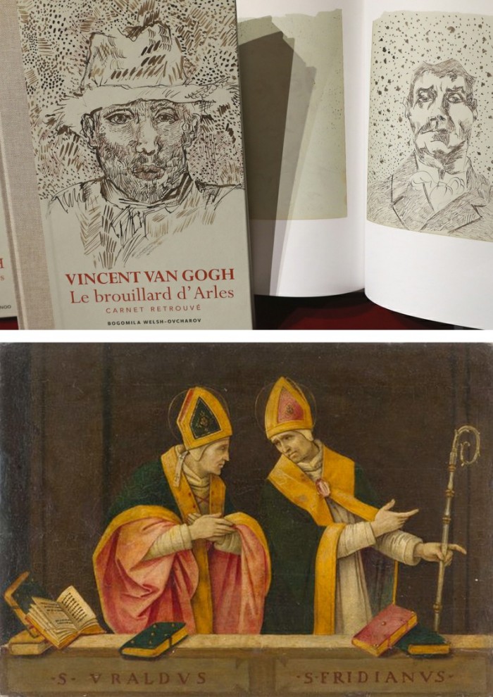
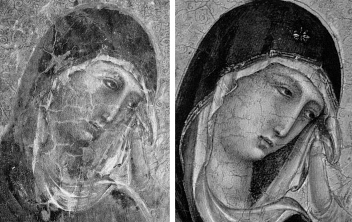
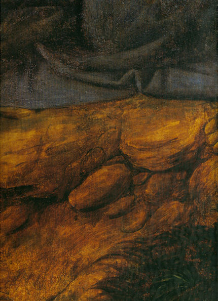
Fig. 1, above. Fig. 2, below. The newly discovered “Lost” Van Gogh sketchbook (above, top) rang our and many other fake bells. Then came a report that a small “Florentine School” painting on a €3-4k estimate fetched €375k at auction as a sleeping Filippino Lippi (above, Fig. 1). A link to another small work attributed to the artist at the North Carolina Museum of Art (Fig. 2, below) showed pronounced, seemingly reassuring correspondences, but something jarred.
On connoisseurship we hold that every claimant work should be rigorously “interrogated” in three crucial respects. Technically, in its physical composition; by documentation on its known or claimed histories (provenance); and, above all, by visual analysis because, in the visual arts, every picture is its own prime historical document and its inbuilt historically-generated artistic relationships constitute the primary subject of art critical appraisal and evaluation.
Failure to excise bad attributions deceives the public and corrupts oeuvres. A good picture has nothing to fear from challenges. No amount of scrutiny constitutes a threat as good pictures outlive their doubters and can fight another day. Argument is healthy and a successfully repulsed challenge can increase understanding and enhance a good picture’s lustre.
Vincent van Gogh: The Lost Arles Sketchbook
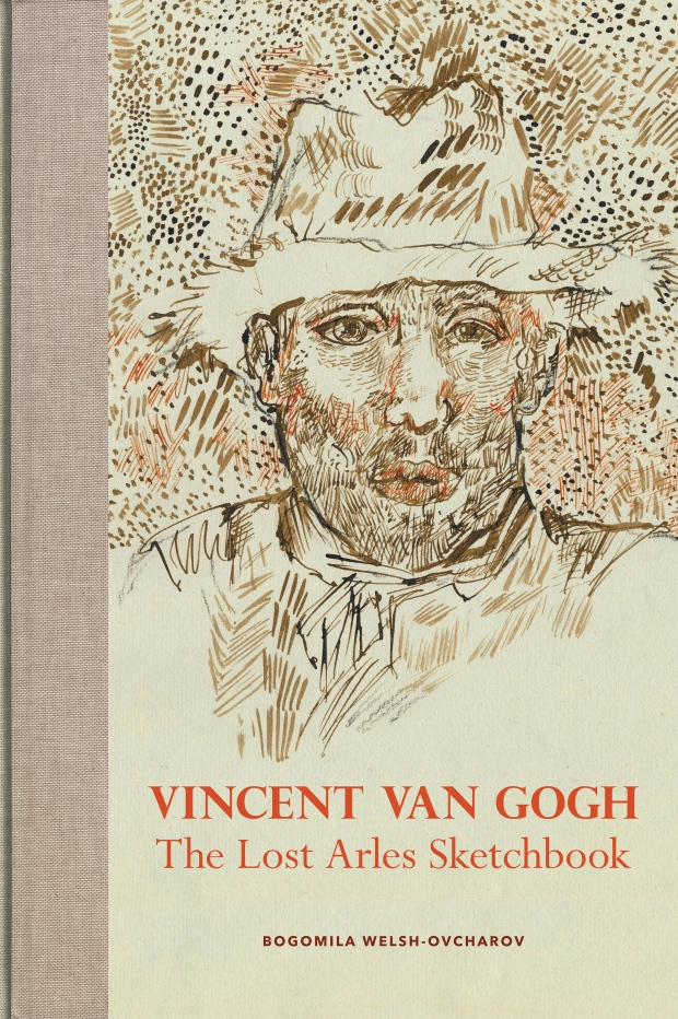
Above, Fig. 3. The controversial lost-but-now-found Van Gogh sketch book above is by Professor Bogomila Welsh-Ovcharov, a Van Gogh authority whose claims of authenticity are supported by Ronald Pickvance, author of Van Gogh in Arles, but the cover’s supposed Van Gogh ink self-portrait announces itself as a draughtsman’s pastiche, as Mark Hudson noted in the Daily Telegraph (“A romantic story but can it really live up to its promise?”, 16 November 2016).
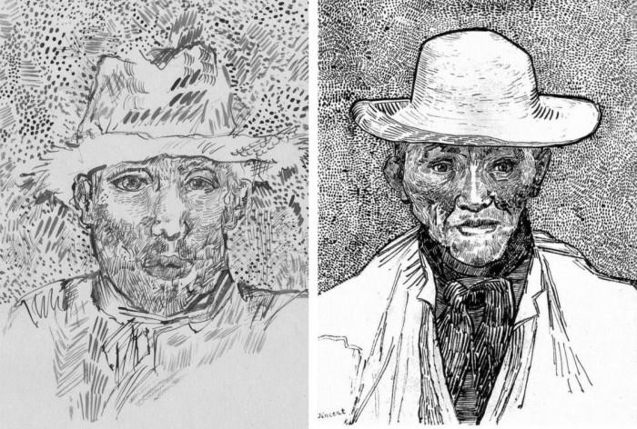
Above, Fig. 4. Simply by placing the supposed Van Gogh self-portrait next to an autograph portrait, immense and glaring differences become apparent: the author of the “discovered” drawing has abandoned symmetry with eyes of radically different sizes and a nose that seems product of a car crash. Throughout, the author mimics Van Gogh’s pen marks without comprehension of his form, power of design, and psychological acuity.
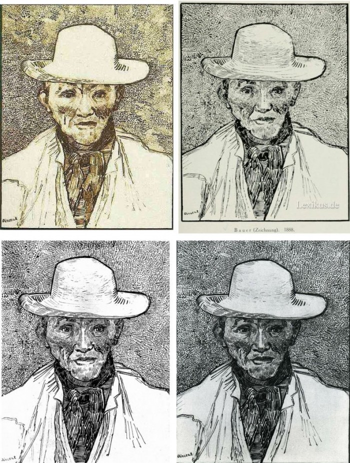
Above, Fig. 5. Instead of a form-camouflaging jumble of marks, the bona fide Van Gogh disports five graphically discrete component parts: a light-coloured jacket; a dark shirt and scarf; a varied but, on aggregate, mid-toned face; a light-toned hat with some mid and dark-toned form articulating shading; and, throwing all other values into relief, an agitated but tonally cohering background. Each of these spheres is allotted its own graphically purposive notations. The four images we show above for comparison are easily found online in historically successive reproductions. While these reproductions vary considerably, the force and artistic coherence of Van Gogh’s graphic intent and method shines through all.
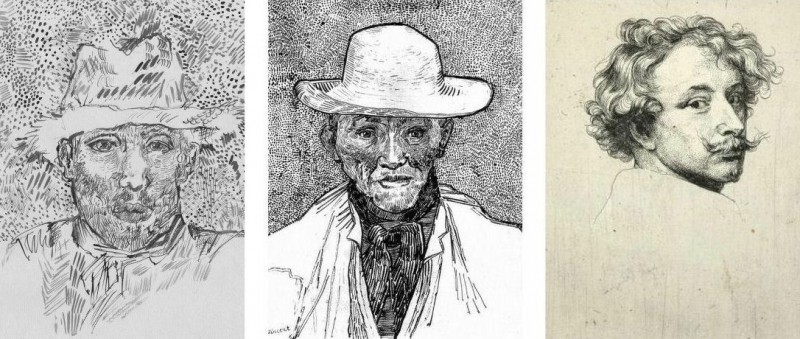
Above, Fig. 6. If we place the bona fide Van Gogh between the clumsy mimicking newcomer and a masterpiece of the greatest graphic brilliance – van Dyck’s etched self-portrait – it is clear that the Van Gogh has more kinship with the latter than with the former.
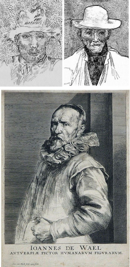
Above, Fig. 7. And if we compare the Van Gogh with an entirely autograph van Dyck etched state of a figure we find a common use of a toned background that throws both subjects’ flickeringly brilliant lights and darks into relief.
The Van Gogh Museum’s objections to the “Lost Arles Sketchbook” and its track record on Van Gogh attributions
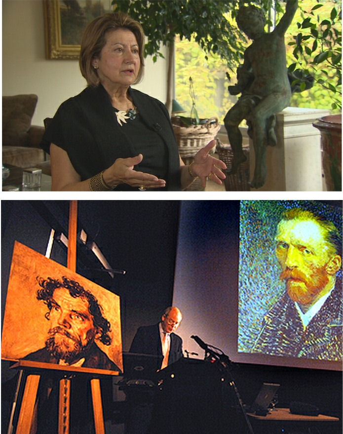
Above, Fig. 8. Prof. Welsh-Ovcharov (top) has responded to the Van Gogh Museum’s dismissal of the drawings with a rebuttal and a challenge to debate – thereby showing conviction and good faith. Her publisher reportedly characterises the proposed debate as “an opportunity to shed light on the conditions under which the Van Gogh Museum is claiming the de facto right to a monopoly of attribution.” This is a common plaint against authorities that block would-be, high-value attributions but our impression of the museum’s judgements is favourable.
In 2006 a Van Gogh – The “Head of a Man” owned by the National Gallery of Victoria in Australia (above left, on an easel) – was challenged by the art historian and Sunday Times art critic Frank Whitford when the portrait was loaned to an exhibition in Edinburgh. The newspaper asked our opinion and, when we demurred, sent a (revelatory) high resolution full colour compilation of all of Van Gogh’s painted portraits. We supported Whitford, saying to the newspaper (as reported in ArtWatch UK Journal, Spring 2008):
“The specific warning signs that should have alerted the buyer are:
“1] It is unique in Van Gogh’s portrait oeuvre
“2] It does not fit in the stylistic chronology that exists within that oeuvre. Compare it for example with the brushwork, colours and ‘attack’ of the Old Man with Beard, painted the year before that is in the Van Gogh Museum, and the Portrait of Camille Roulin painted a year or so later and that is also in the museum. There is an enormous but clear and logical development between those two pictures, from thick, laboured, relatively coarse brushwork to much more refined and ‘decorative’ marks – but both are entirely consistent and ‘all-over’ in their treatment.
“3] If its provenance goes back no further than Germany in the late 20s or early 30s, that is particularly unfortunate. Germany at the time was notorious for the certification by scholars (for a fee or sales cut) of dud works. The dealer René Gimpel has referred to the scandalous ‘amounts obtained by means of certificates given daily by German experts to German dealers. Just as there were paper marks, so there are paper canvases, an easy way of bringing dollars into Germany…The German title of Doktor impresses the Americans. The museums are even more intent than the collectors on defending their fakes or their mistaken attributions….’ By coincidence, in the current ArtWatch Journal [No 21], Kasia Pisarek cites the case of the great Rubens scholar Ludwig Burchard who issued so many optimistic certificates that he was unable ever to write his definitive book on the artist…She has identified over 60 Burchard attributions that have subsequently fallen. It was Burchard who first upgraded to Rubens the Samson and Delilah that is now in the National Gallery.
“I would add that the fact that it seems to be admitted that it is a cut-down canvas that was glued onto a panel compounds suspicions… Why should a (presumably) then only forty years old canvas, have needed gluing onto a secondary support? It might be worth asking the Gallery curators if any scholar has questioned the picture publicly or privately.
“It may be coincidence, but two of the pictures that ArtWatch has challenged in our own National Gallery, the Rubens Samson and Delilah and the Raphael Madonna of the Pinks, no longer retain their original backs. The former was planed down to 2 or 3mm thickness and glued onto a sheet of blockboard; with the latter, the family of restorers who sold the picture in the 19th century had (most unusually) polished the back of the panel thereby removing all historical evidence.”
As we have seen more recently, the claimed lost Leonardo drawing “La Bella Principessa” that emerged anonymously in 1998 had been glued to an old oak panel. Gluing canvases or drawings onto boards conceals half the material evidence. On 3 August 2007 Andrew Bolt reported in the Australian Herald Sun:
“The curious thing about the National Gallery of Victoria’s fake van Gogh is how easily it was spotted as phoney once it went on tour…. For more than 60 years this painting hung in the NGV without anyone screaming ‘Fake!’ True, a few experts now say they had their doubts, but it was only when the NGV proudly loaned its ‘van Gogh’ to Scotland’s Dean Gallery last year that the painting was denounced. Three British critics took one look at it and snorted… Even then, there were some back in Melbourne who couldn’t accept the evidence of their own eyes, as ABC Television’s 7.30 Report found:
“‘Two of the critics include Michael Daley from ArtWatch UK and Times art critic Frank Whitford. But Robyn Sloggett [an art authentication expert at Melbourne University] has questioned their expertise. ROBYN SLOGGETT: I don’t think either of them are Van Gogh experts, certainly not known to be such…[Director of the National Gallery of Victoria] DR GERARD VAUGHAN: It is a slightly offbeat picture. It doesn’t fit into the natural progression of Van Gogh’s work at that time because it was a moment in late ’86 and into early 1887 where he was experimenting with two or three different styles. In many ways, this is slipping back into his earlier realist style of the mid 1880s where he concentrates and uses these earthier ochre colours. It is a transitional picture.’”
“Conceived at special moments” and “sometimes repeating, sometimes anticipating themselves” are commonplace apologias for disqualifying incongruities in upgrades. In 1997 and 2000 the National Gallery claimed its Rubens Samson and Delilah did not look like any other Rubens in the gallery because it was “the only work in this collection typical of the artist when he had returned from Italy in 1608”. In truth the painting was unlike the (secure) one that immediately preceded it and unlike the (secure) one that immediately followed. If a Rubens, it would be the only one on which he employed flat brushes and painted finger tips with rectangular highlights. During ABC Television’s 7 August 2006 programme (“NGV’s Van Gogh Labelled a fake”), James Mollison, a former NGV director said: “This picture has been doubted by people very often.”
The upshot of the controversy was that the NGV director announced that such was the gallery’s confidence that the painting would be submitted (voluntarily) to full technical examination at the Van Gogh Museum. A year later the Herald Sun reported the attribution’s demise at the Van Gogh Museum:
“The Dutch team used X-radiograph, digital photographs, light microscopy and paint and thread analysis. Among conclusions were: THE work’s ground layer of white paint is not found in Van Gogh’s Antwerp and Paris works. ITS use of pure ochre is not found in other Van Gogh work. THE portrait shows just the top of the man’s shoulders. Van Gogh usually showed more of the clothes. “A COMBINATION of a fairly coarse and detailed painting style”, with more detail in the mouth, eyes, skin and beard than Van Gogh used. NO reference to the portrait or the sitter in Van Gogh’s extensive letters. The experts also noted no record of the work could be found before 1928, when it appeared at Berlin’s Galerie Goldschmidt and Co.”
The Rubens Samson and Delilah emerged in Germany the following year at Van Diemen and Benedict where it was offered as a Honthorst before being upgraded by Ludwig Burchard. Previously it had been attributed to Jan van den Hoecke, a follower of Rubens. Burchard had recently upgraded the supposed Rubens ink sketch design for the Samson and Delilah (see Art’s Toxic Assets and a Crisis of Connoisseurship ~ Part II: Paper – sometimes photographic – Fakes and the Demise of the Educated Eye ).
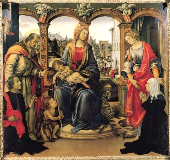
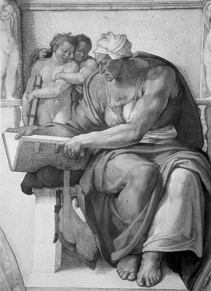
The Newly Upgraded Filippino Lippi
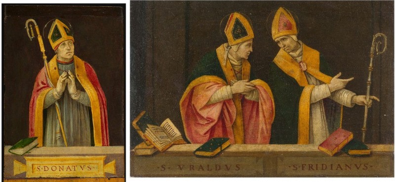
Above, Fig. 9. At first glance the awakened “Filippino Lippi” (above right) seems more plausible than the new Van Gogh drawings – especially when linked to a work attributed to the painter at the North Carolina Museum of Art (above left). In terms of palette, condition and design the two seem as peas in a pod but this closely related pair triggers no recollections of anything similar in the artist’s oeuvre. If their strikingly common format suggests original incorporation in a larger work, disjunctive variations in their parapet walls and stone inscription tablets dispels the possibility. Most inexplicably of all, the new upgrade is incongruously modernist in its emphatic planar and ‘on-the-picture-surface’ geometrical vocabulary.
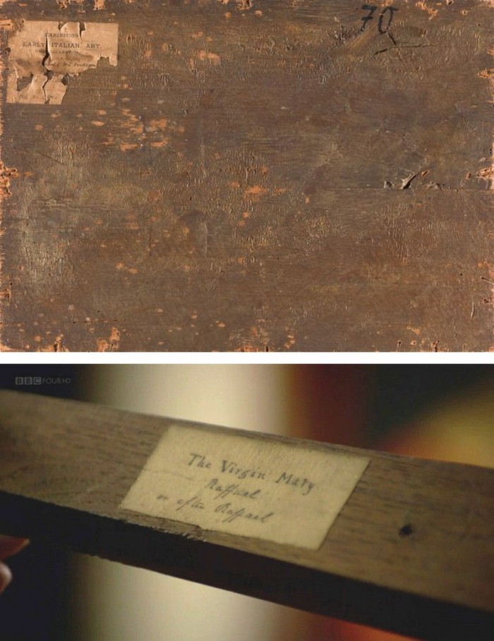
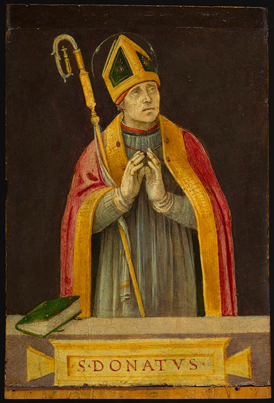
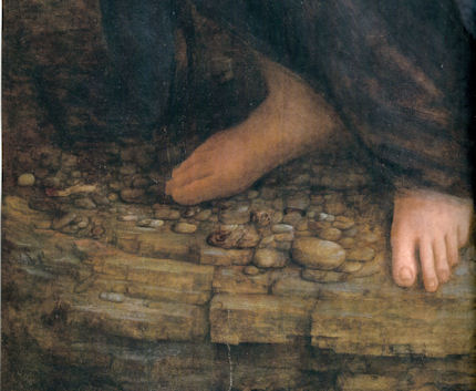
Above, Fig. 10. In 1901 the painting of Saints Uraldus and Fridianus was sold (not as a Philippino Lippi but as a Masaccio) to an English aristocrat, the Earl of Ashburnham. As with the recently proposed Haddo House Raphael (Fig. 10 above), there is little on the panel’s back other than a label in English for an exhibition of “Early Italian Art” (Fig. 10 top). For the Carolina Saint Donatus, the museum offers only a date – “circa 1490” – and the identity of the picture’s donor, the Samuel H. Kress Foundation. Such lacunae are perplexing because Filippino Lippi is a well-chronicled artist whose securely attributed works might easily be brought into direct comparison with the two more recent attributions.
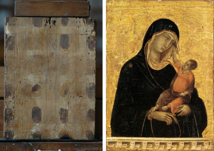
Above, Fig. 11. The backs of attribution upgrades often prove problematic, and none was more so than the small panel “discovered” as a Duccio Madonna and Child (above right) in 1904 after having been bought in an antiques shop in Italy. It was then rarely seen until bought with fanfare (but no technical examinations) for $50m in 2004 by the Metropolitan Museum of Art, New York, in a blind “treaty” sale conducted by an auction house among a few leading museums shortly after the picture was withdrawn from an imminent comparative exhibition of Duccio and his followers that would have introduced the painting to many scholars for the first time and in an instructive context. That withdrawal – despite the painting’s inclusion in the catalogue – might have been made out of fear of repeating the demise of the owners’ second Duccio, as described below.
The back of the tiny picture had been cradled with no fewer than eight mahogany bars and when these were later removed at the Met. a hand-written ascription to Duccio’s pupil “Segna” was found on the bare poplar wood from which painted work had been stripped. The Met Duccio contained modern wire nails, a fact not acknowledged in the museum’s post-purchase technical examination reports. When we asked after the antiquity of the nails the museum claimed they had been inserted as repairs after the panel had been cradled in the 1930s. As “proof” of that unsupported chronology it was said that one of the nails had entered one of the mahogany bars. However, as we pointed out, the head of that particular nail had been visible on the front of the frame throughout all of picture’s photographically recorded history and, while some nail heads were visible most were not and therefore had been applied before the (now heavily distressed) frame was gessoed and gilded. Thus, the panel arrived in the world at the beginning of the 20th century with modern nails intersecting a cradle that concealed an awkward ascription on a stripped-down back.
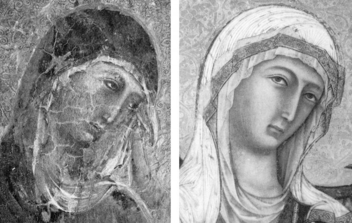
Above, Fig 12. A face painted in the 14th century by a follower of Duccio (identified by Pèleo Bacci as Segna) is shown above to the right of the face of the Met’s Duccio as it was before restorations established the blue of the Virgin’s mantle to be azurite, not the requisite ultramarine. No one ever suggested that the painting on the right was by Duccio and no one judged the Met’s picture an autograph Duccio before Bernard Berenson’s wife (Mary) in 1904 with the support of Berenson’s protégé Frederic Mason Perkins. An earlier suggestion had been that it was a work of Sano di Pietro, as Frances Vieta discovered in researches at the Frick Library, New York, that were kindly made available to us.
In 1933 Perkins attributed a second Madonna and Child to Duccio and persuaded the then owner of the Met.’s Ducio (the Belgian collector, Adolphe Stoclet) to buy it. In 1989 that Duccio was loaned to the Cleveland Museum of Art and was there identified on technical examination by Gianni Mazzoni as a fake by Icilio Federico Joni who ran a forgery factory fronted by middlemen, one of whom was Berenson’s protégé Frederic Mason Perkins.
Above, Fig. 13. A cult of Supreme Art Historical Importance was activated around the Met. Duccio and part of this mythology rested on the picture’s supposedly miraculously well-preserved, little-restored, condition. Comparison of the photographs above showing its present state (right) and an earlier state (left) discloses how extensively the work has been repainted – note the altered design of the dominant eye, and the extensive reworking of the veil. The potentially falsifying nature of restorations when determining attributions remains a conspicuously under-examined area – as does the extent and nature of repainting on stripped-down “sleepers”. (But see “A restorer’s aim – The fine line between retouching and forgery”. For a fuller account of the Met.’s Duccio difficulties, see Michael Daley: “Buyer Beware”; “Good Buy Duccio?” and “Toxic Attributions?” in the Jackdaw magazine issues of Nov/Dec. 2008, Jan/Feb. 2009, and March/April 2009.)
The Newly Upgraded Filippino Lippi (continued)
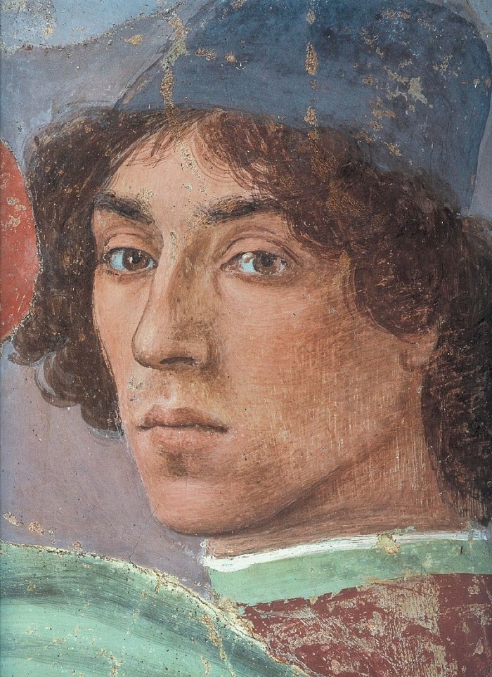
Above, Fig. 14. With the two small “Filippino Lippi” pictures at Fig. 9 and below, top, said to have been painted between 1490 to 1494, precise stylistic comparisons can be made with securely attributed works in the oeuvre. What is believed to be Filippino Lippi’s self-portrait above was executed by the artist in 1481-1482 in the Brancacci Chapel, Santa Maria del Carmine, Florence.

Above, Fig. 15. Filippino Lippi’s Apparition of the Virgin to St Bernard of 1480-86 was said by Bernard Berenson (in his 1938 revised Drawings of the Florentine Painters) to comprise “Filippino’s masterpiece, the last picture in which he is still a pure Quattrocentist, in which there is no sense of the Baroque.” Is it conceivable that some years later this artist painted the two small pictures shown here above the Apparition? Berenson reports that Filippino went on to betray excesses, not to purge and severely abstract his pictorial vocabulary: “Filippino’s Baroque, however had little in common with the qualities of the genuine [Baroque] style, and much with its worst vices. These were the sins of extravagance, of wantonness – the vulgarity of the newly enriched, who feel life is enhanced by the mere act of showy spending.”
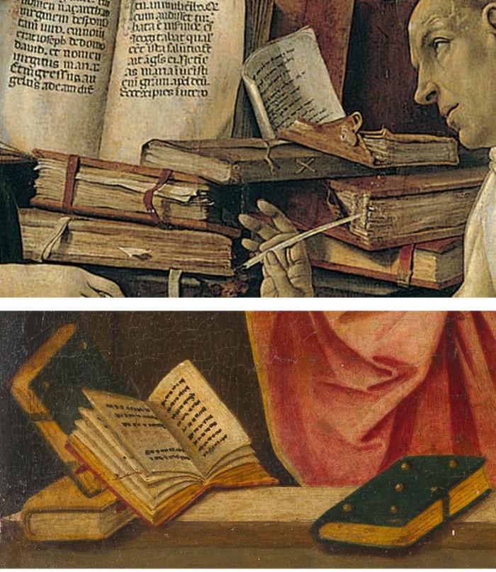
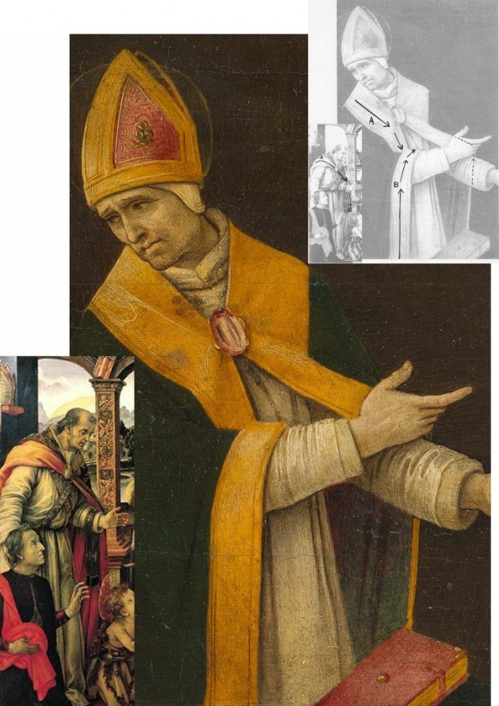
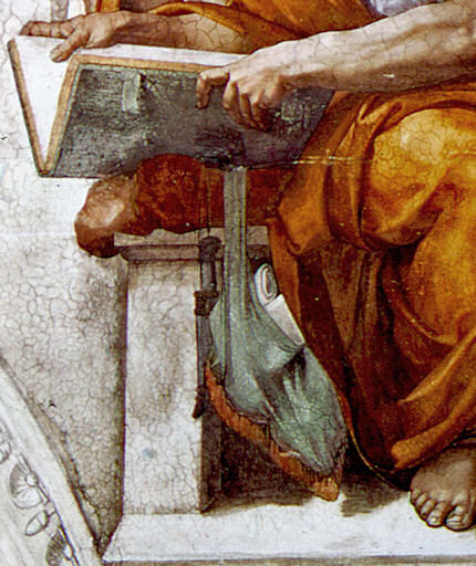
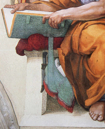
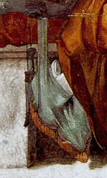
Above, Fig. 16. At the top we see how Filippino Lippi painted books before 1486 in his Apparition of the Virgin to St Bernard and before his lapse into Baroque excesses. In this secure work we not only see great technical accomplishment but a fascination with the very means by which books were stitched together in assembled folded sections. Is it conceivable that after this tour de force celebration of the book binder’s craft skills Filippino should have been satisfied with the out-of-perspective simplifications of books in the Saint Uraldus? While the opened book has been painted in utter ignorance of book binding methods, the ochre coloured book at the bottom left of the pile has managed to anticipate to a remarkable degree the appearance of a neat modern machine-bound book.
Above, Fig. 17. Again, does the chasm of technique and sophistication in this further comparison from the Apparition and the Saint Uraldus not strain credulity at claims of a common author?
Above, Fig. 18. By 1493-94 the artist had completed his Madonna and Child with St Catherine of Alexandria and St Martin of Tours as above and we see precisely the over-elaboration Berenson castigated as Filippino’s squandering “like a nabob with a heady disorderliness all the decorative motives which the heritage of antiquity, the hard earnings of his precursors, and his own fancy had put into his hands.”
Above, Fig. 19. How conceivable is it that Filippino might, at the same short period, have made two so diverse treatments of a man parting drapery with an advancing left arm as in these two paintings? In the one the “Blanket-like drapery dear to Filippino” (in Berenson’s term), curves, twists and folds naturally across the body, while in the other it moves as if fabricated by a former sheet metal worker with little regard for any underlying body, or even for the means by which the glimpsed parts of the (wildly varying) decorative border of the cope might ever have been united as woven material. Why the arbitrary, asymmetrical placement of indeterminate embroidered decorations on the cope’s border? What holds the cope together? Is it a giant garnet or ruby, or a small tambourine? Where else in Filippino might we encounter such flattening abstractions and lax indeterminacy of depiction?
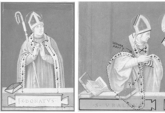
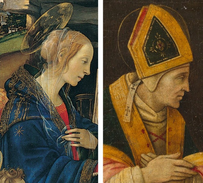
Above, Fig. 20. If the logic and treatment of Saint Donatus’ cope border (above, left) seems plausible and suitably understated, what might have carried the same artist to the Byzantine and conceptually irresolvable twin conundrums of the cope border as encountered on Saint Uraldus (above right)? What accounts for the very different depictions of the inscribed tablets on the parapet wall? If that of Saint Donatus is somewhat overly monumental and set uncomfortably close to the top of the parapet, at least it is sculpturally resolved and satisfactorily symmetrical along its horizontal axis with its twin decorative “butterfly wings” termini. Why, then, would the twinned tablets of Saints Uraldus and Fridianus meet in the middle with single butterfly-wing termini while leaving blank endings at the outer edges of the picture’s composition? Why are these two inscribed tablets skimped and devoid of projection when the saints above are greatly more dynamic and humanly engaged – almost as if in anticipation of Raphael’s later depicted dialogue between Aristotle and Plato?
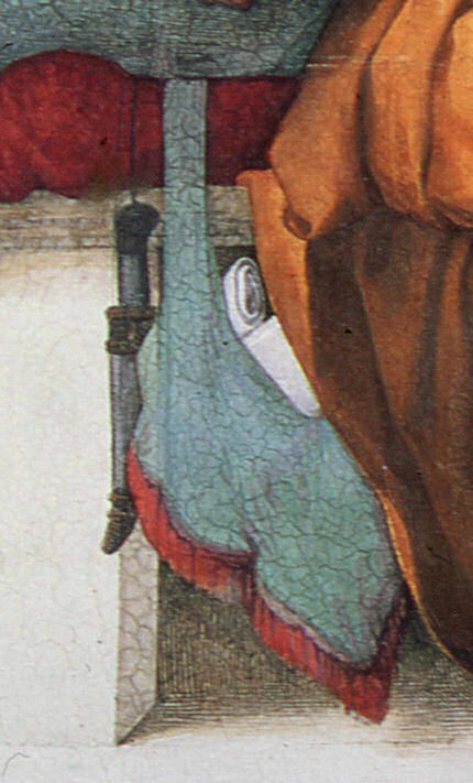
Below, Fig. 21. What theological reading of Saint Uraldus’ life prompted the vast frilled neck lizard-like display of the cope’s pink lining below? If intentionally “Baroque” in its explosive ostentation and theatrical impact, why, then, its implausible combining with a geometric severity of draperies that are more snapped than folded?

With such bizarrely anomalous visual constructs, might it not be prudent to consider the waking “Filippino Lippi” sleeper as a possible product of the late 19th and early 20th century Italian forgeries boom that was tailor-made for British and American collectors? We know that many skilful artists were employed in that trade because when the Italian Government proposed stringent export taxes in 1903 to stem the country’s out-flow of art treasures, the Florentine art dealers association petitioned that the new laws would throttle the large and thriving trade in forged art and antiquities for foreign collectors. (Where did all those often excellent works go?)
At the December 2015 ArtWatch UK/LSE Law/NY Center for Art Law conference Art, Law and Crises of Connoisseurship (the proceedings of which will be published shortly), Professor Charles Hope pointed out how effectively 20th century scholarship had winnowed previously overblown numbers of Titians, Raphaels and such. Markets are good things and the London art market has long been a very good (much envied in Europe) force for Britain, but there are developing dangers. If perceptions were to grow that previously downgraded works are being systematically rehabilitated through “sleeper-discovery” mechanisms at a time when leading houses are fighting to the death for pole position on market share, confidence in the lots on offer might evaporate. Already, certain external structural changes are weakening the London market’s traditional and much-valued symbiotic relationship with disinterested scholarship. Increasing litigation by owners against dissenting independent scholars suppresses debate and frank expert appraisal. In a paper at our conference (“Throwing the baby out with the bath water – the Demise of Connoisseurship since the 1980s”), Brian Allen, former director of studies at the Mellon Centre, warned that recent changes of philosophy and views on connoisseurship in the academic world are greatly reducing the traditionally available body of disinterested academic expertise that counterbalances purely commercial interests:
“In my own field of British art the number of so-called ‘experts’ has now diminished alarmingly as the older generation dies off not to be replaced. It seems extraordinary to me that major artists such as Stubbs, Wright of Derby and Sir Thomas Lawrence, to name but three, don’t have an acknowledged expert to whom one can turn for a reasonably reliable, independent opinion. And this has also certainly happened in other specialist fields… Younger scholars nowadays, especially those in the universities, have almost no contact whatsoever with the art trade compared to fifty years ago. Yet for many years it was perfectly possible for the two worlds to co-exist harmoniously.”
Michael Daley 23 November 2016
The Sistine Chapel Restorations, Part II – CODA: The Remarkable Responses to Our Evidence of Injuries; and Thomas Hoving’s Rant of Denial

Before considering the third and concluding part of our examination of the Sistine Chapel ceiling restoration, it might be helpful to note the responses made to the first two posts (“Setting the Scene, Packing Them In” and “How to Take a Michelangelo Sibyl Apart, from Top to Toes”). Without exception, these have comprised outright expressions of support and/or of indignation and distress at the fate of the frescoes. Such phases as “I had no idea”, “I was horrified to see” and “that things were so bad” abound. Serious and intelligent websites have reported our accounts in similar terms. As is discussed below, no one has challenged our evidence of injuries and everyone who has responded has been shocked and alarmed by it.
Bob Duggan on the Big Think site expressed this concern with precision: “When I learned that my very breath and perspiration could contribute to the slow destruction of the frescoes, I felt sad. However, when I read Art Watch UK’s accusation that the Vatican undertook a 20-year restoration project of the frescoes ‘in full knowledge that the stripped-down bare fresco surfaces would thereafter be attacked by atmospheric pollution unless given some other protective covering’ (which has not yet happened), I felt rage over the local mismanagement of a global cultural treasure…” Duggan added that he was “reminded of a similar, more recent restoration fiasco involving Thomas Eakins’ The Gross Clinic. Years after the artist’s death, overzealous conservators stripped away darkening varnishes applied by Eakins to reveal the brighter colors beneath that were more in line with the Impressionism then en vogue.”
Ikono, an organisation dedicated to democratizing art through the production and broadcasting of short films that present art to the wider public sphere, reported that “ ‘The Vatican authorities are in conservation crisis today because they stripped the Sistine Chapel frescoes bare in the 1980s and 1990s. They did so against material and historical evidence that Michelangelo had finished off his frescoes with additional glue or size-based a secco painting,’ writes Artwatch in an excellent two-part article on the Sistine Chapel Restorations…”
Our case was re-presented in the pithiest form imaginable on the Left Bank Blog: “OY! According to ArtWatchUK: ‘The Vatican authorities are in conservation crisis today because they stripped the Sistine Chapel frescoes bare in the 1980s and 1990s. They did so against material and historical evidence that Michelangelo had finished off his frescoes with additional glue or size-based a secco painting. That original, autograph material was removed in full knowledge that the stripped-down bare fresco surfaces would thereafter be attacked by atmospheric pollution unless given some other protective covering. An attempt to coat the frescoes with synthetic resin (Paraloid B72) was abandoned leaving some surfaces clogged and the rest unprotected. The authorities then promised to install hi-tech paraphernalia that would somehow prevent the polluting atmosphere from making contact with the Chapel’s painted walls and ceiling. As was shown in our previous post, that cockamamie promise was not delivered. Today, in a chapel increasingly over-crowded with paying visitors, these stripped-down frescoes stand in greater peril than ever.'”
A number of questions arise. If the import of the evidence we have assembled over the past 23 years is so clear to so many, why does it have so little traction with the authorities who sanctioned the affronting restorations? Does the absence of any challenge to our evidence mean that everyone is now (privately if not openly) persuaded that – quite aside from the present and ongoing environmental assaults within the chapel – Michelangelo’s painting has indeed been gravely and irreversibly injured artistically, in terms both of its individual component parts and its general orchestration of effects? Or does it show that the authorities, in pursuit of their own interests, are now impervious to and politically insulated against any criticism?
When we first began making this case over two decades ago in the dark pre-digital era, the ink was scarcely ever dry on our criticisms before someone or other claimed that our comparative photographs were misleading; that old painted, drawn, or engraved copies of the ceiling were not to be trusted and had no force as testimony; that we were technically ignorant, or victims of “culture shock”, or agents of mischief – or worse. Could it really be, as it still sometimes seems, that no matter how grave and persuasive the evidence of injuries might be, there exists a wider disabling public resignation and conviction that nothing might today impede the lavishly funded, sponsorship-attracting, Conservation Juggernaut?
To be institutionally specific and somewhat blunt: could it be that the Vatican authorities today think it better to continue sheltering behind a fantastical fairy story of the transforming powers of Wicked Soot and Imperceptibly Darkening Varnishes, than to concede a professional misjudgement made by a small group of in-house experts over a third of a century ago?
Our colleague in France, the painter and the President of ARIPA (The Association Internationale pour le Respect de l’Intégrité du Patrimoine Artistique), Michel Favre-Felix, adds weight and urgency to these considerations with a two-fold reaction. In the first instance, he too was startled by our further evidence of “this incredible statement by the chemist: ‘Ammonium carbonate alone tends to tone down colours…sodium carbonate livens them up'”, and the little-noticed admission of the ferocity of the cleaning agent AB 57 by the chief restorer and co-director of the restoration, Gianluigi Colalucci: “Here’s a tiny patch where I left it on too long. In this little experimental patch you see completely solid violet paint, but around it you can see the gradations of dark and light, which are the shadings of Michelangelo’s own work”. As Favre-Felix notes, whenever a given chemical is known to have even the slightest effect on the original colours, it is rightly forbidden to use it.
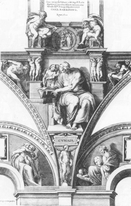
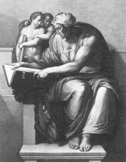
His second and generous reaction was to offer further visual corroborations in the form of evidence produced for ARIPA’s journal Nuances of other damages made on the monumental figures of the Sistine Chapel ceiling. The injuries to one of these, the Cumaean Sibyl, are of great strategic significance in our joint battles. That is, we have just shown in our two previous posts the gross damages inflicted on two of the greatest figures that came at the end of Michelangelo’s cycle when he was at the height of his conceptual, painterly and figurally inventive powers – his Libyan Sibyl and his Prophet Daniel (see Figs. 2 and 3). To that catalogue of injuries, the further evidence of this third case must surely now establish an indisputable and irresistible critical mass? Of the ceiling’s twelve alternating Prophets and Sibyls that constituted Michelangelo’s most heroic monumental and spiritually expressive achievement, we can now demonstrate how three in a row of these painted colossi suffered grievously. Statistically, a sample of a quarter might be considered sufficient to make a general case? We could, God willing, pursue the evidence further if necessary, but is it not now time sufficient for the Vatican to confront and address past heritage preservation errors and desist from what would otherwise constitute an effective falsification of scholarship and art history?
The Portuguese online newspaper Publico reported our criticisms of the Sistine Chapel’s restorations on the second of March. Professor Charles Hope, a former director of the Warburg Institute, was quoted in further criticism of the restoration. The present director of the Vatican Museums, Antonio Paolucci, conceded a pressing need for ameliorative environmental measures which he said would shortly be announced. Unfortunately, he nonetheless and bullishly defended the restoration itself as one which will last for centuries – even before any measures have been announced. (We understand that since those comments were made, the promised announcement has retreated from this April to “the end of the year”.)
If we might at least now be sure that the Vatican is aware of our criticisms and evidence, we recognise that for its part, the Vatican will also appreciate the potential material and political risks of abandoning defences of the restoration. Visitors to the chapel greatly swell attendances to the Vatican Museums. In 1976, about 1.3 million people visited the museums. By 2007 the number had reached nearly 4.3 million, netting some $65 million and providing the Vatican City with its most significant source of income. An admission of error would also embarrass the many major players within the international art world who proclaimed a Revolutionary Restoration in the 1980s. To what degree of embarrassment might be sensed in an ill-tempered and defensive outburst by (the late) Thomas Hoving, a former director of the Metropolitan Museum of Art, New York, in a filmed interview for a portrait of the late painter Frank Mason, an early critic of the restoration and a founding member of ArtWatch International.
Thomas Hoving and selected dialogue from an interview in the film A Light In The Dark:
00:53:02 – Thomas Hoving:
“He doesn’t know what he’s talking about (Frank Mason). There’s a guy at Columbia, some professor who’s been screeching about this for years. (pause) Turns out that he just doesn’t know what he’s talking about. (pause) Do you think Michelangelo was honestly going to deliver it to the Pope something that looked dirty?! (laughs) His marble was going to look gray, his marble was going to look blackened out?! You think that he really mixed his fresco to look like that?!”
01:07:01 – Alexander Eliot:
“I wouldn’t say that the Sistine ceiling had been destroyed myself. I wouldn’t use that word. I would say that it had been desecrated.”
01:07:24 – Thomas Hoving:
“I was part of the desecration personally, if this idiot is right. I am part of it so he ought to put my name on it. (pause) I was invited by the man who cleaned it, Paolucci – whoever, (pause) [Gianluigi Colalucci was the chief restorer and co-director of the restorations, which ran from 1980 to 1994. Antonio Paolucci became the Director of The Vatican Museums in December 2007. – Ed.] to come up in the rickety elevator (makes sound effect of elevator) all the way to the top, and he gave me a beautiful fresh sponge, dipped it in the solution and (he) said OK clean. And they were finally doing the Separation of Earth, (uh) Separation of Light and Darkness, the last one. They started with the Flood and worked backwards. I said, ‘What?’ He said, ‘Ya, try it.’ I went (reaches up) ‘shooo!’ (wiping motion) And this thin film of black just disappeared. “It was just built up soot over hundreds of years from the stoves that they used to drag in there when the Cardinals all had to meet. That’s what they all did. They had little cubby holes, their servants had cubby holes, they had tents, they had bunks, full service catering, and stoves. “And fresco is impervious to anything other than being blasted by (uh) laser beams you know (does sound effect) out of Star Wars. Not only did they not desecrate or ruin it, they didn’t do anything to it that wasn’t there. So the guy is full of shit (!) if he said that they damaged the Sistine ceiling in any way, they didn’t! I know it. I was there. I cleaned about eight inches of the Sistine ceiling – personally!”
01:10:11 – Thomas Hoving:
“It’s not a controversy, the guy is full of it (Alex Eliot) He’s never been there, he’s never seen it. Did he clean a part of it?”
Interviewer Sonny Quinn: – “He made a film…”
Thomas Hoving: “Big deal.”
SQ: “He was close enough so he…”
TH: “Close enough? It’s about 55 feet, give me a break!”
SQ: “…they built scaffolding for him and he was there for six weeks…”
TH: “During the cleaning?”
SQ: “No, before the cleaning…”
TH: “Ya, so?”
SQ: “Well, he wanted everybody to examine his film and…”
TH: “Ah the guy is just full of it…”
For the record (once again), in 1967 the art critic and writer Alexander Eliot and his wife Jane Winslow Eliot spent over 500 hours making a close-up documentary film of the ceiling, The Secret of Michelangelo, Every Man’s Dream. Eliot was up there on the scaffold, every bit as close to the ceiling as Hoving was to be – and for much longer. On 20 May 1985 Eliot had pleaded with the Vatican’s Secretary of State for him to view the Vatican’s own copy of the Eliots’ film and to “have it stopped at the images of the Ancestors [on the lunettes]. Compare what it proves was there against what’s left today”. That precious record of the unrestored ceiling awaits a re-showing. One can only wonder why the Vatican never pressed the testimony of that filmed footage of the pre-restoration ceiling in support of the later cleaning.
For footage of the cleaning itself in progress, see the Ikono site mentioned above which links to three short films. The narrations of all are unspeakably hagiographic and tendentious: critics of the restoration are said to have been “divided”, while the restorers displayed a “passion for their task that recalls that of Michelangelo himself”. The restoration’s outcome is said to “speak for itself” and to have answered “all but the most severe critic”. Most brazenly of all, an outing for that old canard: this restoration had provided “rich opportunities for study”.
We should perhaps resign ourselves to the possibilty that the Eliots’ film may never be aired again – but it will never be possible to expunge all the photographs of the unrestored frescoes that permit the kind of directly comparative visual analysis routinely conducted on this site. Such comparisons truly do “speak for themselves” because they permit like fairly to compare itself with like. For those with eyes to see, such photo-comparisons will forever tell the same heart-breaking story: a misconceived, technically aggressive restoration inflicted grievous injuries on Michelangelo’s art.
Michael Daley
Comments may be left at: artwatch.uk@gmail.com


![]()
“Pick Up A Pencil”
The theme of the new ArtWatch UK members’ Journal (see right) is “The Primacy of the Visual”. Failures to acknowledge, address, or even recognise visual evidence are examined. The text of Charles Hope’s 2011 James Beck Memorial Lecture is carried in full. Professor Hope cites failures of the National Gallery’s curators and restorers to address opponents’ arguments or to recognise the import of key historical documents on artistic practice. When Professor James Beck, the late founder of ArtWatch International, lent support to artist-critics of the Sistine Chapel restoration he came under vicious attacks from some scholarly peers – for all the world as if he had betrayed a priesthood of the visually ignorant. Prof Hope cites a letter of that kind. If artists do sometimes discomfort scholars, it is no presumption: knowing how art is made they are precisely the best qualified to detect its un-making. Here, the painter (and photographer) Gareth Hawker discusses both fundamental differences between painting and photography and the widespread failures to recognise these differences. His demonstration is timely. If (as we have argued elsewhere), art schools have given up the ghost with regard to teaching the traditional skills that formerly equipped artists to recognise restoration blunders, in the wider world of commercial film-making there are signs – notwithstanding giant leaps in the powers of digitalised image-making – of a renaissance in traditional art practices. We discussed this paradoxical relationship in connection with the extraordinary accomplishment of the hand-crafted animated film Frankenweenie. Another such heartening case is discussed opposite. [M. D.]
A Photograph is a Copy, not a Creation, Gareth Hawker writes:
“…we have realised that we should give more attention to photography”. So wrote the Director of the National Gallery, Nicholas Penny, in his introduction to the current exhibition, Seduced by Art: Photography Past and Present [1]. Several reviewers seem to agree. Tabish Khan wrote that, “…photography is a contemporary art form that can be just as inspiring and impressive as painting” [2]. But photographs do not incorporate the high-level thinking that paintings do. It would be misleading to put them in the same category.
The difference between painting and photography is frequently glossed over. For example, many people suggest that the camera is a tool just like brushes and pencils. At first sight, this may appear to make sense. The photographer decides what to include in the picture, in the same way that a painter often does. He chooses where to place the camera; in which direction to point it; how far to zoom in on a subject; and when to press the shutter. He may select models, costumes, and arrange lighting. All these factors contribute to what is called the ‘scene’ – the image in the viewfinder. The ‘scene’ may be recorded by a photographer just as well as by a painter, so the argument goes: they just use different tools in order to complete the same task. However this is to ignore what the tools are used for. The camera is used to record the scene, while the brushes and pencils are used to analyse it. The importance of this analysis is often overlooked.
Photographers who have wanted to claim equal status with painters have made various approaches, all ignoring this analytical element. At first they blurred and smudged photographs in order to make them look like paintings. Then photographers claimed that theirs was a totally separate art form, a pure record of the scene. Some argued against this, saying that if a photograph were pure, it could not be artistic. Before this issue could be resolved, some writers swept it aside. They suggested that what mattered was, “conceiving an image in the brain and finding some way of expressing it” [3]. What counted was the viewer’s response – whether a work, “spoke” to the viewer [4]. This disregarded a significant factor: people do not respond to paintings in the same way as they do to photographs, especially if they can see that a painting provides evidence of thinking, in a way that a photograph does not.
Paintings look different from photographs because they are made differently. A painting is constructed from brushstrokes; each stroke the result of a decision. A painting may represent a scene, or it may represent nothing at all. A painting is an independent creation, whereas a photograph is dependant on the scene. A photograph can be made only if there is a scene to be copied.
A representational painting may be compared to the summary at the beginning of a scientific paper – the paragraph which is entitled, “Abstract”. Its writer makes a personal judgment about which are the most important topics dealt with in the paper, and writes a brief account of his own. The “Abstract” is a new and independent piece of writing, just as a representational painting is a new and independent analysis of the scene. In contrast, a photograph is like a photocopy of the whole scientific paper. The photocopy shows no analysis, and no judgment.
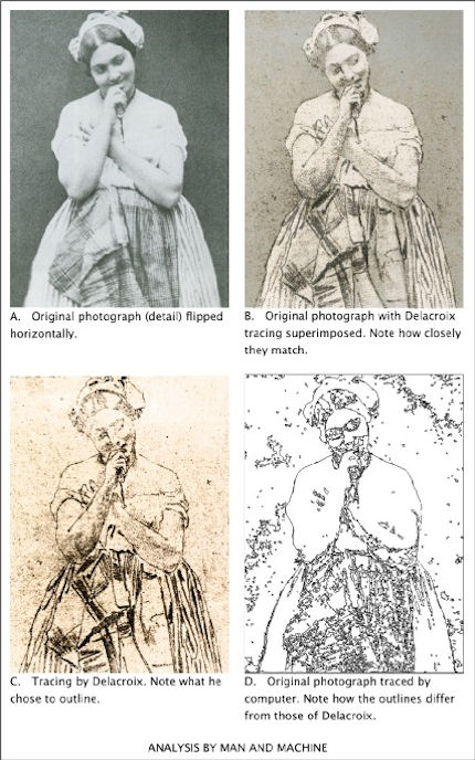
Brushstrokes are only the most basic way in which a painter’s analysis or abstraction may be seen. Another is in the simplification of the human figure – in its reconstruction in terms of geometrical solids, such as eggs and cylinders. Even a simple tracing – the lowest form of analysis – shows which lines the painter has considered to be more important than others.
To give a computing analogy: a photograph is like a bitmap image (which records only pixels – spots of colour), but a painting is like a vector image (which records instructions about where lines are to go). A tracing programme can convert a bitmap file into a vector file. The computer makes a simplification which looks similar to a paint-by-numbers drawing. This computer drawing may be thought of as the beginning of an attempt to imitate human analysis – a type of artificial intelligence – though the computer has a long way to go before it catches up with the human brain in this respect (Fig. 1). If anything may be thought of as being a tool comparable with brushes and pencils, it is a tracing programme (which helps to analyse), not a camera (which does not).
To express the difference in another way: Scene = Photograph (Scene = Photograph) × Analysis = Painting
Analysis is an essential part of what makes a representational painting interesting to look at; whereas what makes a photograph interesting to look at is the scene, not its treatment.
Analysis demands abstract thinking – whether it is done well or done badly. What distinguishes the great painter from the mediocrity is the quality of this thinking, not any manual skill. Anyone who can sign his name, already has enough manual skill to make a great drawing. (This includes drawing in its wider sense: deciding where to place marks made by the pencil or the brush, even when no outlines may be involved).
The modern digital camera provides the most effective means for recording the scene that has ever been devised. Strangely, many photographers want to use it for a different purpose, to express an interpretation – a purpose for which it is singularly unsuited. Some photographers deliberately introduce all sorts of inaccuracies which mean that the result is neither a pure substitute for the scene, nor an independent creation.
The classical case for photography’s status as an equal to painting was put forward by the man who was perhaps, “the most important figure in the history of the visual arts in America” – Alfred Stieglitz (1864-1946) [5]. In his usage, the word ‘artist’ meant someone who, “got the spirit of the truth” [6]. He held that only 0.1% of painters were artists, and only 0.1% of photographers were artists. But not everyone takes such an exalted view. For example, a tax inspector wants to know whether a painter is a house-painter or an artist, not whether he has, “got the spirit of the truth”. So when a painter says that he is an artist, he is simply describing his activity. He is not claiming to be either good or bad at his job: that is for others to decide. But when a photographer says that he is an artist he is claiming to be in the top 0.1% of his profession: he is pushing others to accept the valuation he has placed on his own work.
By using the word ‘artist’ in this way, Stieglitz moved attention away from a vital distinction; that between creating something new (a painting) and making a copy (a photograph). He persuaded many viewers to ignore analysis, and to concentrate on the selection and arrangement of a scene – on pointing and shooting.
Stieglitz’s advocacy, along with that of other theorists, seems to have desensitised many viewers. They see only the subject which has been represented. They fail to notice that a painting exhibits the working of a mind – not just in the choice of subject, but in every single stroke. One consequence of this desensitisation became apparent when the Sistine ceiling was treated by restorers, and much of the best painting ever produced was wiped off. The picture of a man looks like a man, whether it is drawn well or drawn badly. Most historians were satisfied with what remained after the paint-stripping because they could still identify the subjects which had been depicted. Very few noticed how drastically the quality of the drawing had been reduced.
Many people were better informed about these issues in the days when Michelangelo painted his great work. Contemporaries who saw it for the for the first time commented at least as much on the power of its drawing, as on its subject matter [7]. The way in which influential men looked at nudes in those days may be compared with the way in which they look at motor cars now: with an appreciation of the beauty of engineering and construction – an appreciation which derives in part from an understanding of how all the parts connect together.
The paint-stripping made nonsense of some of the connections in Michelangelo’s nudes. His contemporaries would have been appalled, but most of today’s historians and television presenters do not even notice. They focus on the imagery and the iconography, not on the drawing. It is as if they were waiting for the work to ‘speak’ to them – for the artistic content to make itself felt. But, being sensitive only to subject-matter, that is all that they are able to see. Such narrowly prepared minds will respond only to the crudest visual stimulus (the colours looking brighter after the top layer of paint has been removed, for example).
Just as the critical response to painting has become limited, so the meaning of the word Art has expanded – to such a degree that almost anything seems to be embraced by it, including photography. However painting remains distinct: it is a creation which is independent, and which can embody the kind of analysis described above. This is why painting may be categorised with the higher expressions of the human mind, along with poetry and philosophy. Photography does not fit into this category because it cannot display abstract thinking.
But painting is now so little appreciated that, to many people, it seems comparable with photography. This has allowed photography to be called Art, and so to enter the National Gallery. Arguably this is the same lack of discrimination that has allowed paint-stripping to take place, not only on the Sistine ceiling, but on almost all the great works of painting in the Western World, including those in the National Gallery.
“Giving more attention to photography”, seems to be one more example of this downward trend, but perhaps there is a glimmer of hope. When a great artist’s paint has been removed from a picture, the decline in its artistic quality is irreversible; but a decline in critical awareness is different: it can be reversed. At present, many people are only distantly aware that, in every brushstroke, a representational painting gives evidence of analytical thinking. Perhaps the exhibition at the National Gallery will help to promote this awareness. If so, it will have served a very useful purpose.
ENDNOTES:
1 The National Gallery, Seduced by Art: Photography Past and Present, Yale University Press (9 Oct 2012), ISBN-10: 1857095456, ISBN-13: 978-1857095456 The exhibition runs from 31 October 2012 to 20 January 2013 2 londonist. Art-review-seduced-by-art-photography-national-gallery. Retrieved 8 November 2012 3 Gerry Badger. Collecting Photography. London: Mitchell Beazley, 2003. ISBN 1-84000-726-5 p23 4 Gerry Badger. Collecting Photography. London: Mitchell Beazley, 2003. ISBN 1-84000-726-5 p24 5 Richard Whelan, Stieglitz on Photography, Aperture, 2000, p ix 6 Alfred Stieglitz, Is Photography a Failure?, The Sun, New York, March 14, 1922 – reprinted in, Richard Whelan, Stieglitz on Photography, Aperture, 2000, p 229 7 http://artwatchuk.wordpress.com/2012/10/01/12th-november-2012/ Retrieved 12 November 2012
Gareth Hawker
Comments may be left at: artwatch.uk@gmail.com


![]()
Could the Louvre’s “Virgin and St. Anne” provide the proof that the (London) National Gallery’s “Virgin of the Rocks” is not by Leonardo da Vinci?

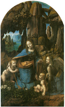
When the National Gallery’s restored “Virgin of the Rocks” was pronounced an entirely autograph Leonardo we were left reeling with incredulity. Picture restorers rarely decline opportunities to claim “discoveries” but could they really be claiming an ability to make a picture an autograph Leonardo simply by thinning its varnish? During the media frenzy of the National Gallery’s £1.5bn Leonardo blockbuster, its chief restorer, Larry Keith, was asked if a distinctive Leonardo brushstroke had emerged. “No”, he said, proof of authenticity lay in the picture’s internal relationships. Given that those relationships differ markedly from the ones present in the Louvre’s unquestionably autograph “Virgin of the Rocks”, what accounted for the discrepancies? The then curator, Luke Syson, replied that Leonardo’s style had, in the London copy, become abstracted, less naturalistic and more “metaphysical”. This seemed fanciful: had not all of Leonardo’s pictures carried a beguiling air of the metaphysical – and had this quality not derived from the artist’s preternaturally intense engagement with natural phenomena and the mysterious powers which operate through them? Had a new corroborating body of drawn studies emerged? The Gallery admits that not only is there no identifiable Leonardo brushwork but that the picture itself is “manifestly uneven in finish and execution” and that there has been “a good deal of agreement that Leonardo himself painted little or none of it”. When we asked if any securely autograph Leonardo paintings shared these newly claimed characteristics, Syson said that they were also found in the “Last Supper”, when only 20% of that large, fragmented, degraded, many-times restored, de-restored and re-restored mural survives – and when its recent restorers “discovered” that it had originally been choc-full of tiny naturalistic details (curtain hooks, slices of lemon, reflections on glassware, tablecloth patterns and so forth). Above all, the National Gallery’s latest upgrade flew in the face of – and seemingly sought to circumnavigate – a landmark 1996 article by a geologist (and now art historian), Ann Pizzorusso, who has shown that while the rock configurations in the Louvre version were entirely consistent with precise formations found in nature and in Leonardo’s own studies, those seen in the London version were found in neither. (See Pizzorusso, “Leonardo’s Geology: The Authenticity of the Virgin of the Rocks”, The MIT Press, Vol. 29, No. 3, and “Leonardo’s Geology: The Authenticity of the Virgin of the Rocks”, in Leonardo Magazine, Vol. 29. No. 3, 1996, pp. 197-200.) Here, Pizzorusso presents further elegant demonstrations of the London picture’s non-autograph status that are manifest in the (recently restored) late Leonardo masterpiece, “The Virgin and Child with St Anne”.
Ann Pizzorusso writes:
London’s National Gallery recently announced that its version of the “Virgin of the Rocks”, previously attributed to various artists who worked in Milan, was now, after being cleaned, solely the work of Leonardo da Vinci. The National Gallery supports its claims by stating that the work represents a change in style and that the geology in the picture is rendered in a more abstract, monumental style (see Appendix A).
While art historians have long discounted the National Gallery’s version as one by Leonardo, the Gallery has now discounted centuries of scholarship with their new interpretation and subsequent attribution of the painting to Leonardo. What is most ironic and troubling about the National Gallery’s position is that there are reams of contractual documents which still exist today documenting a 25 years long lawsuit concerning the two versions of the painting and which show, unequivocally, that Leonardo did not paint the version in the National Gallery. Prof. Charles Hope, a former director of the Warburg Institute, London, and an expert in notarial Latin states that there is no doubt that Leonardo painted the first version and not the second (New York Review, 9 February 2012).
While we may be able to forgive the National Gallery for not being up on notarial Latin, there is no excuse for their proposal that Leonardo changed his style. In the decades in which I have studied Leonardo from all aspects (we must remember, Leonardo did not consider himself primarily a painter) one thing stands out in all his works—a fidelity to nature and a lifelong effort to depict natural objects as realistically as possible.
The father of Leonardo studies, Carlo Pedretti, in his book analyzing Leonardo’s nature drawings, “Leonardo da Vinci Nature Studies from the Royal Library at Windsor Castle” (with a forward written by Kenneth Clark, a former director of the National Gallery in London), devotes the entire volume to discussing Leonardo’s preoccupation with natural objects and his fanaticism in attempting to depict them as realistically as possible. This passion was imparted to his students, Francesco Melzi, Cesare da Sesto, Giovanni Boltraffio and Marco d’Oggiono. So much so that a drawing of a Tree (RL 12417), long thought to be by Leonardo, was later attributed to Cesare da Sesto and a view of Amboise (RL 12727) to Francesco Melzi. In analyzing the works of Leonardo’s students one can see that they have followed Leonardo’s technique and depicted natural objects as realistically as possible. They had obviously heard quite a bit of ranting by Leonardo about “Botticelli’s bad landscapes” (see Appendix B).
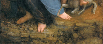
Another reason why Leonardo’s approach is reflected in his art is that he was born in the transitional era of the late Middle Ages, an age still filled with superstition and fear, especially about such things as mountains, natural catastrophes and death. He grew up leading the way into the Renaissance, faced all these fears, and debunked them. He travelled extensively in the Alps outside of Milan taking note of nature and geology. He noted landslides and torrential flooding with its associated damage (see Figs. 3 & 4), he dissected corpses to provide the most accurate depiction of human anatomy we have ever had until relatively recent times. His work as engineer, geologist, botanist and astronomer cannot be disconnected from his work as an artist (see Figs. 8 & 9). To understand Leonardo, one must understand him completely. And to understand him completely is not difficult. He has written everything down. He was faithful to nature. If one applies just that one rule to Leonardo da Vinci, looking at his work from a scientific standpoint, the answer is crystal clear: fidelity to nature is a Leonardo trademark that can be used to determine the authenticity of his work.
Now that we have seen that the National Gallery has preferred not to acknowledge the work of many esteemed Leonardo scholars, maybe looking at the recently cleaned “Virgin and Child with St. Anne” in the Louvre will change its mind (see Figs. 1, 7, 10, 11, 14, 17, & 21). The “Virgin and Child with St. Anne”, dated to about 1510, came later than the National Gallery version of the “Virgin of the Rocks”. We do not know how much later, as the National Gallery has now dated the initiation of its version of the “Virgin of the Rocks” as 1491/2-9 and its completion to 1506-08. Professor Hope, in his review of the notarial documents regarding the lawsuit states that the National Gallery version of the “Virgin of the Rocks” could not have been painted before 1508.
If we use the 17 year time period (1491-1508) which the National Gallery cites for its “Virgin of the Rocks”, it would mean Leonardo was painting the “Last Supper” (1492-7/8), completing the Burlington Cartoon (1499-1500 or 1506-08) and the “Virgin of the Rocks” at the same time. On page 96 of Kenneth Clark’s book entitled “Leonardo da Vinci” he indicates that Leonardo was exceptionally busy. Apart from the first “Virgin of the Rocks” his time was taken up with work for the court. He was the court limner and also painted two portraits of the Duke’s mistresses Cecilia Gallerani and Lucrezia Crivelli. With these portraits, we would be up to five major works in progress by Leonardo if we include the National Gallery’s “Virgin of the Rocks”.
This being said, all of these works being done at nearly the same time gives us the perfect opportunity to appraise, determine and evaluate the stylistic traits of the artist at that period of his career. In looking at the Burlington Cartoon and the “Virgin and St. Anne”, both are rich with geologic detail and accuracy. Leonardo has risen to new heights in his portrayal of landscape elements. His talent and passion are vividly displayed in the Burlington Cartoon and he reaches a level of sophistication, subtlety and accuracy in rendering the geology in the “Virgin and St. Anne” which had never been seen before (see Appendix C).
The St. Anne is a geologic tour-de-force. In fact, Leonardo experimented extensively on developing paints and a technique for depicting the pebbles of agate, chalcedony and marble at the feet of the Virgin and St. Anne (see in particular, Figs. 1 & 21). Leonardo writes in his notebooks about his efforts and how satisfied he was to have developed an approach to rendering the pebbles in such a realistic fashion. In fact the entire painting is one geologic treat after another. He had spent years in the Alps so he knew the landscape and geology exactly. With his newly developed technique for painting marbleized pebbles he was delighted (- see Appendix D).
Using a date of 1510 for the “Virgin and St. Anne” and a date of 1483-86 for the “Virgin of the Rocks”, both in the Louvre, we have proof that Leonardo did not change his style, and that, if anything, he became more fanatical in his quest for geologic accuracy, developing new paints and techniques for natural depiction and driving his students to deliver the most accurate depiction of nature in their own works.
So we must ask the question “How and why could Leonardo have changed his style to produce a work so lacking in geological and botanical accuracy as the ‘Virgin of the Rocks’ in the National Gallery in London?” There is no evidence Leonardo changed his style and now, with the recently cleaned “Virgin and St. Anne”, we have that proof. We also know that his students were inculcated with his passion for accurate depiction of natural objects so we must also exclude his students as authors of the National Gallery work.
It would be best for the National Gallery to reopen the case for the attribution of the work to Leonardo. Hundreds of years of scholarship by Leonardo critics as well as the words and the works by Leonardo himself should not be discounted. The National Gallery does a disservice to those who have worked so hard to come up with incontrovertible evidence regarding the attribution of this work and most of all the National Gallery does a disservice to Leonardo himself.
Ann Pizzorusso
Appendix A
The National Gallery’s claimed shift within Leonardo’s oeuvre
“We know that Leonardo’s painting technique gave priority to the figures. The Virgin is designed first, as she is in so many of his drawings, and the landscape seems to flow from her. Since Leonardo saw the painter’s acts of creation as analogous to God’s, his generation of the landscape in the Virgin of the Rocks and the absolute, unalterable perfection of the Madonna at the center could be understood as precisely connected with the doctrine of the Immaculate Conception. But the appearance of the Virgin and her companions, and of the plants and rocks, are different, in the two versions: the theological meaning of his stylistic choices has shifted slightly. In the Louvre picture Leonardo relies on entirely naturalistic tactics to give the picture its spiritual flavor: the sinless beauty of the Virgin becomes the same kind of truth as the natural beauty of the irises nearby. But in the London Virgin of the Rocks, the Virgin and Christ are supernatural, the world around rendered notably less naturalistically, the rocks are straightened to become great columns; the flowers appear to be ideal composites of the leaves and petals of real plants. Tackling the theme for a second time, Leonardo chose to show the viewer not just a vision of the Virgin Mary, but Gods’ perfect ideas for everything around her. What we are shown here is an ideal world made before the physical creation of our own imperfect cosmos, before the need for humankind’s salvation.”
The National Gallery catalogue, “Leonardo da Vinci, Painter at the Court of Milan”, page 174.
Appendix B
Leonardo on Botticelli’s bad landscapes
“He is not universal who does not love equally all the elements in painting, as when one who does not like landscapes holds them to be a subject for cursory and straightforward investigation-just as our Botticelli said such study was of no use because by merely throwing a sponge soaked in a variety of colours at a wall there would be left on the wall a stain in which could be seen a beautiful landscape.”
Leonardo da Vinci, from: “Treatise on Painting”, the chapter on Criteria and Judgments, the subsection “How a painter is not worthy of praise unless he is universal”.
Appendix C
Walter Pater
“Saint Anne–that delicate place, where the wind passes like the hand of some fine etcher over the surface, and the untorn shells are lying thick upon the sand, and the tops of the rocks, to which the waves never rise, are green with grass, grown fine as hair. It is the landscape, not of dreams or of fancy, but of places far withdrawn, and hours selected from a thousand with a miracle of finesse. Through Leonardo’s strange veil of sight things reach him so; in no ordinary night or day, but as in faint light of eclipse, or in some brief interval of falling rain at daybreak, or through deep water.”
Walter Horatio Pater, “The Renaissance, Studies in Art and Poetry”, The Echo Library 2006, page 54.
Appendix D
Carlo Pedretti
“The movement of the fifteenth century was twofold; partly the Renaissance, partly also the coming of what is called the ‘modern spirit’, with its realism, its appeal to experience. It comprehended a return to antiquity, and a return to nature. Raphael represents the return to antiquity, and Leonardo the return to nature. In this return to nature, he was seeking to satisfy a boundless curiosity by her perpetual surprises, a microscopic sense of finish by her finesse, or delicacy of operation, that subtilitas naturae which Bacon notices. So we find him often in intimate relations with men of science – with Fra Luca Paccioli the mathematician, and the anatomist Marc Antonio della Torre. His observations and experiments fill thirteen volumes of manuscript; and those who can judge describe him as anticipating long before, by rapid intuition, the later ideas of science. He explained the obscure light of the un-illuminated part of the moon, knew that the sea had once covered the mountains which contain shells, and of the gathering of the equatorial waters above the polar.
“Notebooks and sheets of about 1508 contain a number of notes on ‘mistioni’ (mixtures), a plastic material of his own invention with which he aimed at imitating the colour and design of semi-precious stones. He describes his production process and how, once the objects were thus produced, he spent much time finishing them with his own hand to a smooth and glossy surface…At the same time he was much taken by anatomical studies, so that when he described the production process of his ‘mistioni’ he came to specify the effect that was to be achieved: ‘…then you will dress it with peels of various colours, which will look like the mesentery of an animal’.
“In 1502, Francesco Malatesta wrote Isabella d’Este that Leonardo had looked at many of the Medici gems and objets d’art made of stone. Leonardo praised ‘the one of amythyst or jasper as Leonardo baptized it, because of the admirable variety of its colours’”.
Carlo Pedretti, Leonardo, A study in Chronology and Style, London, 1974, pages 132-137.
Ann Pizzorusso
For an in-depth comparison of the two versions of the Virgin of the Rocks see:
Comments may be left at: artwatch.uk@gmail.com


![]()
The Controversial Treatments of the Wallace Collection Watteaus

Restorers who blunder often present their dramatically altered works as miraculous “recoveries” or “discoveries”. Sometimes they (or their curators) park their handiwork in dark corners pending re-restorations (see the Phillips Collection restoration of Renoir’s “The Luncheon of the Boating Party” and the Louvre’s multi-restoration of Veronese’s “The Pilgrims of Emmaüs”). Here, Dr Selby Whittingham, the Secretary-General of the Watteau Society (and the 2011 winner of ArtWatch International’s Frank Mason Prize – see below), discusses the controversial restorations of Watteau paintings at the Wallace Collection and calls for greater transparency and accountability in the treatment of old masters.
Selby Whittingham writes:
The Watteau exhibitions held in London 12 March – 5 June 2011 prompted much comment, but little about the condition of the oils at the Wallace Collection [- see endnote 1]. Exceptionally Brian Sewell mentioned their poor state: “both overcleaned and undercleaned, victims of cleaners with Brillo pads and restorers with a taste for gravy.” [2] This was a bit sweeping, but had some justification.
In the Watteau Society Bulletin 1985 Sarah Walden contrasted the recent restorations at the Wallace Collection with those at the Louvre and the different philosophies behind them [3]. The report on the cleaning of “Les Charmes de la vie” at the Wallace by Herbert Lank in 1980, she wrote, did not discuss “whether to touch the varnish at all…and if so how far it should be lightened and removed.” By contrast the Louvre report on cleaning “L’Embarquement pour l’isle de Cythère” centred “on the ethical and perceptual problems of thinning the varnish.”
If the results were far more satisfying at the Louvre, a defence might be that its picture was in better condition to start with than the Wallace one. In his 1989 catalogue of the Watteau pictures John Ingamells said that “Les Charmes de la vie” was described as “much injured” in 1895, and that in 1980 several areas of retouching were uncovered [4]. That might explain the loss of paint suffered on the face of the girl in the centre, but this glaring defect was only made all the more obvious by cleaning, to disguise which the picture was at first hung in a dark corner and then was retouched by Lank again in 1987. [For Ingamells’ and Lank’s discussions of the restoration in the Burlington Magazine, December 1983, see below, right.] However the scrubbed appearance of the picture overall with subtle transitions in the landscape lost (- see Figs. 1 – 7.) cannot be explained by partial losses of paint earlier.
In 1984 Lee cleaned “Pour nous prouver que cette belle” at the Wallace (- see Figs. 10 & 11). It had already been cleaned by Lord Hertford’s factotum Mawson in 1856, when Hertford acquired it and its pendant, “Arlequin, Pierrot et Scapin”, at the sale of Samuel Rogers, before which they had belonged to Sir Joshua Reynolds. In 1989 Ingamells de-attributed the picture, whereas now Dr Christoph Vogtherr re-attributes it (surely rightly) to the master. This is ironical, as an excuse for cleaning is that sometimes it leads to the uncovering of an original, whereas the opposite happened in this case. Though the painting now has the same scraped appearance as “Les Charmes de la vie”, this has not altogether obliterated Watteau’s touch and the quality of the faces and other details. It was a pity that Waddesdon had not lent for comparison the pendant (the attribution of which to Watteau was also once questioned – by Ellis Waterhouse – probably unjustifiably) [5].
In 1975 the two large oils at the Wallace, “Divertissements champêtres” and “Rendez-vous de chasse” were cleaned by Vallance. The result was generally considered disappointing. Part of the blame for this was laid at the door of Watteau, who was charged with painting mechanically, the first being an enlarged version of the much more pleasing “Les Champs Elisées”, also at the Wallace. The two big pictures were not painted as pendants, but made into such at an early date, thus necessitating, to make them the same size, the addition of strips at the left and bottom of “Rendez-vous de chasse”, thereby seriously slackening the tautness of its composition. This provides another irony. A merit of restoration is said to be that it returns works to their original state as near as maybe, but here deliberately that has not been done. Paint by a later hand and extensions are retained to the detriment of the overall effect contrary to what the artist intended.
Two loans were added to the main display upstairs. They were “Le Défillé”, an early battle scene from York, and another early work, “L’Accordée de village”, from the Soane Museum. These may be interesting to the specialist, but for most merely diminished the display, considerably helping justify Sewell’s sweeping castigation. The second in particular has long been recognised to be a wreck. Was it when Soane acquired it in 1802? We are not told. Admittedly Dr Vogtherr has not set out to produce another catalogue raisonné and exhibition labels never say anything about condition, but surely they should?
Downstairs in the exhibition devoted to Watteau’s great promoter, Jean de Jullienne, hung “Fêtes vénitiennes” from Edinburgh, which is generally acknowledged to be in good condition. Critics often blame the condition of Watteau’s oils on his poor and hasty technique. Why, then, are some of his pictures in a so much better state than others? Is this a case of curators and restorers trying to shift the blame?
Watteau provides an excellent subject for the consideration of such questions. As he often evolved compositions as he painted, x-rays are frequently informative. Jean de Jullienne by having most of his paintings engraved provides a valuable check on their original appearance, supplemented by the numerous painted copies made in 18th century. (The pair of “Arlequin, Pierrot et Scapin” and “Pour nous prouver que cette belle” were in fact engraved by L. Surugue in Watteau’s lifetime almost immediately after they were painted, showing that the extensions in that case were Watteau’s own). In 1986 there was such an exhibition at Brussels, to which the Louvre and Wallace (in the person of John Ingamells) contributed. [6] But no British curator (including Dr Nicholas Penny) was interested in transferring it to Britain. This short changed the British public, as does the continuing failure to make conservation history a routine element in any exhibition of old masters.
ENDNOTES
1 Watteau at the Wallace Collection, by Christoph Martin Vogtherr, 2011; Jean de Jullienne: Collector & Connoisseur, by Christoph Martin Vogtherr and Jennifer Tonkovich, 2011.
2 “Top Drawer,” Evening Standard, 24 March 2011.
3 “A Tale of Two Watteaus,” pp, 9-11. She has since restored the strange and almost unknown “Le Rêve de l’artiste”, the attribution to Watteau doubted by Donald Posner in 1984, a doubt apparently removed for some after cleaning.
4 The Wallace Collection Catalogue of Pictures, III, French before 1815, 1989. These catalogues were inexplicably remaindered off by the museum a few years ago.
5 Selby Whittingham, “Watteaus and ‘Watteaus’ in Britain c.1780-1851,” in Antoine Watteau (1684-1721) le peintre, son temps et sa légende, ed.François Moureau and Margaret Morgan Grasselli, 1987, pp.271-2.
6 Watteau, technique picturale et problèmes de restauration, ed. Catherine Périer-D’Ieteren, Université Libre de Bruxelles, 1986. Dr Martin Eidelberg pointed out the catastrophe of cleaning when the restorer failed to realise that a painting might be a collaboration between Watteau and another artist (Lecture at the 1999 ArtWatch UK Annual Meeting).
Selby Whittingham
The 2011 ArtWatch International Frank Mason Prize
The 2011 ArtWatch International Frank Mason Prize was awarded to Dr Selby Whittingham on June 8th, on the occasion of the annual Professor James Beck Memorial Lecture given at the Society of Antiquaries of London, Burlington House, by Professor Charles Hope on the subject of cleaning controversies at the National Gallery. Artwatch UK director Michael Daley paid the following tribute:
“In Britain, one of the doughtiest, longest-standing opponents of a sometimes self-regarding fine art establishment has been the art historian Selby Whittingham. Dr Whittingham, a student of medieval art and a devotee of both Watteau and Turner – two of the most restoration-vulnerable painters – started a campaign in 1975 for the creation of a proper and fitting Turner Gallery to house Turner’s great bequest. Some here may remember what a very fashionable cause this had been – enjoying the support of Henry Moore, Hugh Casson, Kenneth Clark, and John Betjeman among many others. But art establishments can look after themselves and sometimes prove accomplished practitioners of the principle Divide and Misrule.
“A case in point might be seen in the curator T. J. Honeyman who, in the 1940s, supported critics of the National Gallery’s cleaning policies in a letter to the Times. Merely for observing that the then failure of the gallery’s trustees’ to respond to their critics might suggest a certain “cynical aloofness”, he was, he later disclosed, “severely ticked off” by the trustees’ Chairman, Lord Crawford. It was only many years later that he was, as he put it, “restored to favour in high places” when he made it clear in an article in the Studio that he was now entirely convinced that “our National treasures were in the keeping of qualified responsible people”.
“Far from recanting, Dr Whittingham has never flinched and, over the last 35 years, has mastered the art of writing the letter you might hope never to receive – and would only deserve to receive if you were, say, the head an Academy that had mislaid both Turner’s death mask and the substantial funds that he had provided for a generous award and medal in his name to practicing landscape painters – or, if you were the head of a gallery that had lost two Turner paintings to what a government minister described as “a particularly nasty gang of Serbs”, after announcing that the pictures would not be accompanied by a courier when loaned to a foreign museum.
“It gives me very great pleasure therefore to award the 2011 ArtWatch International Frank Mason Prize to Selby Whittingham and to invite Dr Whittingham to say a few words about the current state of his campaigning – and I should add that we do so with a great sense of organisational indebtedness to this most widely-read recipient who, over the years, has generously supplied us with countless citations of restoration practices and abuses – Ladies and gentlemen, the Secretary-General of the Watteau Society, the Secretary of The Real Turner Society, and the Secretary-General of Donor-Watch, Dr Selby Whittingham.
Selby Whittingham’s acceptance:
“I would like to pay tribute to Art Watch, which, by challenging the restoration and attribution of works of art, additionally makes people scrutinise them more carefully. Sir David Piper, whom I knew at the National Portrait Gallery, welcomed the National Gallery controversy over picture cleaning ‘as furthering a continual extension of knowledge and of alertness’.
“Piper realised that for the enjoyment of art many things are requisite, and that one needs also to consider the psychology and the conditions of viewing art. I once asked Sir Trenchard Cox what the attitude of the National Gallery was when he was a curator there in the early 1930s. He said that display was regarded as a very ‘deuxième’ matter.
“Today museum curators regard everything as secondary to getting as many visitors as possible and their own researches published. Hence the vogue for museum blockbusters with their ponderous catalogues and the concomitant damage to exhibits and frustration for viewers.
“Of course such shows go back at least to the 1857 Manchester Art Treasures Exhibition. But now museums hold them, resulting in the devaluation of their permanent collections and sometimes, through their eagerness to lend in order to borrow, the breaking faith with donors, something increasingly prevalent more generally, as seen in the attempt to overturn the founding aims of the Warburg Institute. Granting powers to lend were fought against by the grandfather of the present Lord Crawford, when a trustee of the National Gallery, as he knew just where that would end.
“Sir Maurice Bowra, when charged with betraying his principles by accepting honours, said in justification that ‘they gave pain to academic enemies whose influence he had fought all his life; and, secondly, they recognised his campaigns …’ Through this prize I am very happy to be associated with Art Watch, whose leaders have, while many in the art world merely mutter their discontents in private, been bold enough to put their heads repeatedly above the parapet.
Comments may be left at: artwatch.uk@gmail.com


![]()