Defending the Indefensible Part I: The National Gallery’s Tangled Rubens Web
1) “I know gossip about staff and trustees and stories connected with acquisitions I don’t think I’d better share.”
– Martin Wyld, the National Gallery’s retiring Head of Restoration in the January 2010 Museums Journal.
2) “Rubens’ Samson and Delilah is a large scale, early and entirely autograph painting of a kind the National Gallery previously lacked.”
– Michael Levey, the then-Director of the National Gallery, in the 1983 Rubens Acquisition in Focus exhibition catalogue.
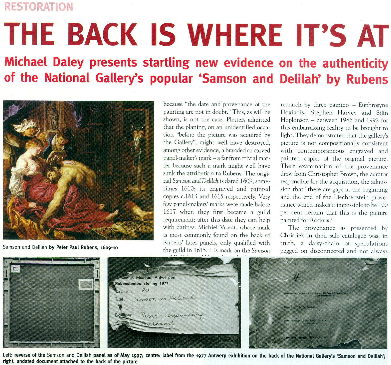
3) “The Samson and Delilah was planed down to a thickness of about three millimetres and set into a new blockboard panel before it was acquired by the National Gallery in 1980 and so no trace of a panel maker’s mark can be found.”
– Christopher Brown, the National Gallery Senior Curator, Flemish Paintings, in his 1996-97 Esso-sponsored National Gallery “Making and Meaning” exhibition catalogue Rubens’s Landscapes“. (Emphasis added.)
4) “Rubens’ panels sometimes bear the branded or carved mark of the panel maker, an example in the National Gallery being the Portrait of Susanna Lunden… unfortunately, as David Bomford has described, the back of the panel of the Samson and Delilah had been planed-down to a thickness of only about 3 mm and then the whole set into [sic] blockboard before the picture was acquired by the National Gallery, so any such marks would have been eradicated.”
– Joyce Plesters, the then-Head of Science, in the 1983 National Gallery Technical Bulletin. (Emphases added.)
5) “The treatment of Cima’s Altarpiece carried out during the 1970s and 1980’s was a rare modern example of a process that was extensively practised (often unnecessarily) in the 18th and 19th centuries – the transfer of a painting to a new support. It is nowadays only carried out in the last resort, when all other attempts at treatment have proved unsuccessful.”
– David Bomford, National Gallery conservator and author, in his 1997 National Gallery Pocket Guide: Conservation of Paintings. (Emphasis added.)
6) “Questions have been raised about aspects of the physical state of Rubens’s Samson and Delilah since its purchase by the National Gallery at auction in 1980… Recent research, however, has yielded some answers to the questions of when and why the painting may have gained this alien backing.”
– David Jaffé Christopher Brown’s successor at the National Gallery, August 2000, Apollo ‘Rubens back and front’. (Emphasis added.)
FROM THE FIRST CRITIC:
7) “Jan Bosselaers had inspected NG6461 up-close in 1977, and then again in 1980. Given his familiarity with the painting, I asked him specifically about its back. Bosselaers grabbed a piece of paper and drew a grid of three vertical lines crossed by three horizontal ones. He looked at me. ‘A cradle!’ I gasped. ‘Yes’, he said, ‘it was a cradle.’”
– Euphrosyne Doxiadis: Painter/author, in her NG6461 The Fake National Gallery Rubens (p. 117. Emphasis added.)
MICHAEL DALEY WRITES:
PART I: A REFORMULATED SAMSON AND DELILAH ACCOUNT THAT STILL DOES NOT STACK UP
With expensive and massively hyped works bought by major public institutions it would seem that acknowledging errors is an art-political impossibility. Such institutional obduracy is longstanding. In 1966 the art dealer René Gimpel noted that “The museums are even more intent than the collectors on defending their fakes or their mistaken attributions” (- a 1929 entry in his Diary of an Art Dealer.) Today, with the Samson and Delilah, the National Gallery stands in triple jeopardy: its initial error of art historical judgement has been compounded by both an apparent falsification of material evidence and a decades-long withholding of contra-testimony in its possession.
The affair began in 1980 with a deceptive unanimity of assurances and a dearth of disclosures. Today, on interrogation of the picture’s traits, provenance and technical literature, a sleight of hand emerges: the back of its panel and the historical evidence it bore were removed by the Gallery and not by earlier, unknown others, as the Gallery has claimed since 1983 – and blatantly claimed despite its possession of flatly contrary key historic documents. (See Fig. 5 below.)
Thus, there are two cross-linked issues: whether the picture is the long-lost original Rubens painting of 1609-10; and, who planed down the back of its panel and mounted it on a larger sheet of modern blockboard (- and with it, of course, “Why?”). The first is a matter of judgement. The second is one of fact that should also be – but conspicuously is not – one of record. Dr David Jaffé’s August 2000 bid in Apollo (see below) to explain why the panel painting “might have” received its alien backing before being bought by the National Gallery was doomed by his failure to follow such records as exist within the Gallery and extrapolate from them the precise place and time at which the transformation had occurred.
On matters of fact, at Fig. 2 below, we note an item on the National Gallery’s recently updated online Samson and Delilah entry which itself supplies visual confirmation of past institutional culpability.
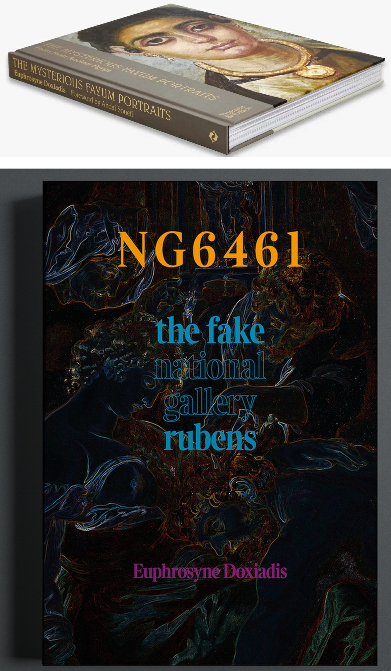
Above, Fig. 1: top, Euphrosyne Doxiadis’s (republished) award-winning 1995 study of the Fayum encaustic paintings; above, Doxiadis’s new book NG 6461 The Fake National Gallery Rubens – N.B. “NG6461” is the Gallery’s inventory number for its supposed Rubens Samson and Delilah.
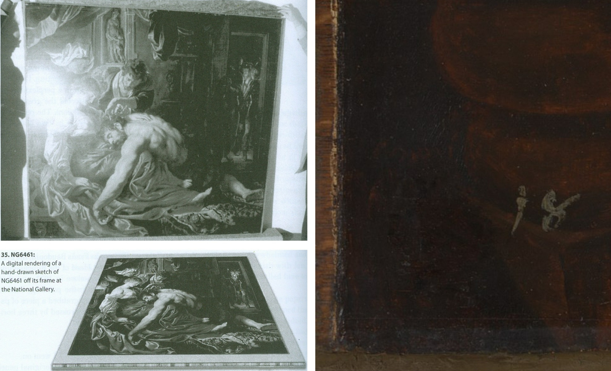
Above, Fig. 2: Top, left, The National Gallery Samson and Delilah, as seen in Antwerp in 1980 when it was about to be dispatched to Christie’s, London, and at which date the paint reached the top and bottom edges of its panel but not the side edges (to which slim battens had been attached – on which, see comment by Martin Wyld below). Above, left, Euphrosyne Doxiadis’s digital rendering of the Samson and Delilah panel on its blockboard mount, as seen by her when the picture was undergoing dendrochronological examination at the National Gallery on 25 September 1996. (Both images above are published in Doxiadis’s NG6461 The Fake National Gallery Rubens.)
Above, right, the bottom left corner of the National Gallery’s Samson and Delilah in which the picture’s post-1980 blockboard backing can now be seen running below the bottom of the painting. The Gallery’s online publication of this image’s visual corroboration of the panel’s post-1980 blockboard extension is intriguing. Wittingly or unwittingly it constitutes a tacit acknowledgement of institutional responsibility for the Gallery’s own (always previously denied) planing down of the panel and subsequent mounting of it on a larger blockboard sheet. (See Figs. 3 and 4 below.)
The Gallery’s online entry acknowledges – somewhat disparagingly – the existence of the Samson and Delilah picture’s “Naysayers” and cites some of their/our publications. Unfortunately, although it cites both issues of our Journal that were dedicated to the Samson and Delilah’s problems (see Fig. 7 below) it does not address their contents – as might be instanced in this pertinent item on the “Material Evidence” section in our Autumn 2000 Journal:
“…This conflict of testimony echoes one found within the Gallery in 1983 when the restorer David Bomford described the thinned panel as glued ‘onto’ the face of the blockboard while the Head of Science, Joyce Plesters, described it as ‘set into’ the blockboard. When I drew this discrepancy to [the then-Director] Neil MacGregor’s attention, he replied (letter 19th June 1997): ‘Incidentally, at the risk of being pedantic, into is the correct preposition, since the edges of the blockboard are flush with the [edge] surface of the panel. Onto would be correct if the panel had simply been glued to the blockboard and protruded above it.’ If this account is accurate, with the edges of the panel and blockboard being flush, there would be no place for the putty bevel encountered by Ms Doxiadis and Mr Norman [*1]. By the same token, had the edges of the panel and blockboard been flush, there could have been no grounds for Joyce Plesters’ 1983 [Technical Bulletin] claim that the treatment had ‘render[ed] the edges of the panel inaccessible’ for dendrochronological examination. A clear, focussed photograph of one of the picture’s corners might throw some light on the subject. Or better yet, permission to examine the panel in the flesh…”
(Emphasis added. Permission to examine the panel was never granted.)
On 14 February 2006, when examining the Samson and Delilah’s dossiers for a second time [*2], we noted photographs showing that the paintwork stopped short of the edges of the oak panel only on the vertical edges. In the present revised online Gallery entry, confirmation and possible explanation for this feature is given: “There is a narrow margin of unpainted wood at the sides of the oak panel which probably results from the support being held firm by grooved battens while the ground and then paint were applied; ‘6’ the ground and paint extend to the top and bottom edges.” The footnote ‘6’ reads: “The same can be seen on Rubens’s Judgement of Paris (NG6379). For this practice see, for example, Wadum 1998. The battens seem often to have been only along the shortest sides. A little of the unpainted margins may have been trimmed away since they are rather narrow.” With the Gallery’s Samson and Delilah, the photographic and documentary records of the restoration treatments are strikingly less complete than those of other Gallery panel paintings. For example, when writing on the restoration of the Altdorfer panel bought in 1980, Martin Wyld discusses the attachment of battens to the edges of panels: “Although some German panels of this period have channels at or near the end grain of the plank in order to accommodate battens which were fixed to the frames, the channels are seldom to be found on all four sides”.
[*1] Charles Norman, Director, The National Timber Trade Federation. As Dalya Alberge reported (The Times, 27 August 1997) on photographs supplied to us by Mr MacGregor, Mr Norman judged the back of the Samson and Delilah to be “a blockboard manufactured in the late 1970s or early 1980s”. It looked, he said, “like a manufactured item, machine-made rather than handmade”. Later, after being invited to see the picture at the National Gallery, Mr Norman amended his earlier observations. His subsequent description of the picture’s physical component parts (made by telephone, 18 & 19 September 1997 to Michael Daley) was a compromise between his original observation and Euphrosyne Doxiadis’ (above-illustrated) clear recollection of a substantial surround between the edges of the planed down panel and the blockboard support, and Mr MacGregor’s claim of flush panel and blockboard edges. That is, Mr Norman claimed that the blockboard was somewhat larger than the planed down panel but that the gap between the two had been filled by a wide putty bevel.
[*2] In 2006, under Charles Saumarez Smith’s directorship, we were given full access to the Collection’s photographic and documentary records – a privilege subsequently extended by Nicholas Penny and Gabriele Finaldi. (ArtWatch is greatly indebted to all three knights – as also to the Gallery’s kindly helpful archival and library staffs.)
With the Gallery’s present publication of the Fig. 2 photograph of the bottom left corner of the Samson and Delilah, two points should be noted. First, the Gallery’s 1997 claimed relationship between the panel and its blockboard backing was clearly unfounded. Second, the photograph of the bottom left corner is cropped and therefore does not show the full blockboard extension. Nonetheless, it does now show (MacGregor’s earlier claims notwithstanding) that, far from the edges of the panel and blockboard being flush, the latter can be seen to protrude beyond the bottom edge of the picture when, as seen above at Fig. 2, top left, it had not done so in 1980 when held by the banker, Jan Bosselaers, in Antwerp, shortly before it was sent to Christie’s. Today’s publication of that photographically-confirmed relationship has finally demonstrated that the blockboard backing must have been applied to the picture’s panel after 1980 and when in London.
CONFLICTED AND OPAQUE GALLERY ACCOUNTS – AND THE FIRST PUBLISHED APPEARANCE OF THE BLOCKBOARD BACKING
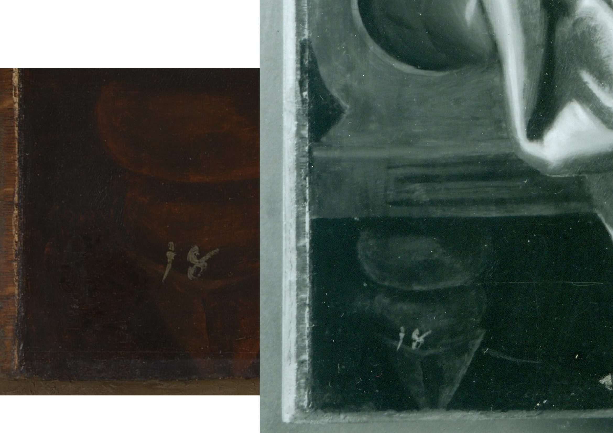
Above, Fig. 3: left, the National Gallery’s recently published online detail of the bottom left corner of the Samson and Delilah; right, a detail of the bottom left corner the Samson and Delilah in a National Gallery photograph taken on 10 August 1982 and designated: “After Cleaning, Before Restoration”.
Above, right, this – so far as we know – unpublished 10 August 1982 photograph, shows the then-present blockboard backing that protrudes not only beyond the bottom edge of the panel but also beyond its left vertical edge (which is not disclosed by the cropped image presently shown online). The date on the black and white photograph shows that the picture had then been in the Gallery’s possession for twenty-five months by which time the planing and mounting on blockboard had occurred (as had also the removal of the picture’s varnish, as shown below.) What the Gallery has never produced – and, we believe, could not ever produce – is a photograph showing the blockboard’s presence before the picture was acquired from Christie’s or when it had been loaned by Christie’s to the National Gallery ahead of the sale. In the absence of such important photographic testimony, the conclusion that the National Gallery itself planed down the panel for undisclosed reasons and mounted it onto a blockboard sheet, is inescapable. The formal authorisation for the picture’s restoration from the Board of Trustees came on May 16 1982 just three months before the above-right photograph was taken. Thus, on the available official records, the removal of the Samson and Delilah panel’s back and the subsequent mounting of it on blockboard had occurred at the National Gallery between 16 May and 10 August 1982. (It is not inconceivable, however, that the formal application for permission to restore the picture had in fact followed a commencement of work on it.)
Above, Fig. 4: The Samson and Delilah’s bottom left and bottom right corners, as respectively recorded at the Gallery on the 10th and 11th of August 1982, by which dates the visible blockboard extensions (which read as the whitish strips) all around the panel had materialised within the Gallery’s own photographic records for the first time – and indicated the extent to which the new blockboard backing extended beyond the planed-down remains of the original oak panel. Earlier, the National Gallery Board Minutes of 16 May 1982 had carried the following note:
“The treatment of No 6461, proposed for Mr Bomford, was recommended by Mr Brown, who explained that the painting was to be the subject of the second ‘Acquisition in Focus’ exhibition, opening in January 1983.” It added, matter-of-factly:
“The painting had a modern support of wood attached to the original panel which had been considerably reduced in thickness and this was considered adequately stable; the surface had probably been only partly cleaned in the recent past, and tests showed considerable discolouration.”
This above account made to the Board was the first-ever mention of a blockboard backing on the painting. It had not been so described by Christie’s and, as shown below, it was even at variance with an in-house National Gallery timber expert’s 1982 account of the painting when it was on exhibition in the Gallery and ahead of its restoration. Strictly speaking, the above statement was technically accurate: the picture had, by that date, been planed down and mounted on blockboard – but only very recently so. Even though the the Gallery had had sight of the picture since the beginning of July 1980 (and had taken photographs and Infra-Red images of it on July 2 1980 – ahead of the sale) it had not – as Mr MacGregor confirmed to us – made any photographic record of the picture’s back either after buying it, or earlier when it had been loaned ahead of the July 11 1980 Christie’s sale. This lacuna is, on our familiarity with the Gallery’s technical literature and dossier records, unprecedented. Indeed the Gallery’s restorers sometimes give the impression that they are more interested in working on pictures’ physical “supports” than on their painted surfaces – and by “working on”, we mean undoing and redoing them. (See Fig. 9 below.)
A TIMBER EXPERT’S ACCOUNT OF THE SAMSON AND DELILAH PANEL
In the 1982 National Gallery Technical Bulletin, Christopher Brown, Martin Wyld and the Gallery’s (now deceased) timber expert, Anthony Reeve (who was held by Mr MacGregor to have been the “supreme practitioner of his generation”) wrote on the cleaning and restoration of Rubens’ The Watering Place and, in doing so, made clear that no blockboard backing had been applied to the Samson and Delilah at that date. That is to say, when discussing the highly problematic construction of many Rubens’ panels, Reeve noted:
“Of all the pictures in the National Gallery, Rubens’ panels have been of greater concern, because of their condition, than any other part of the collection. The reason for this is well-known. Rubens frequently found it necessary to enlarge his pictures after he had started painting… Rubens’ oak panels, often enlarged in several different stages, are amongst the most inherently unstable supports used by any artist.”
However, in so saying, Reeve drew a distinction between “the oak supports which, although made up of many planks joined together, were not enlarged during the painting process, and those which were added to.” Of that former, relatively unproblematic type, Reeve cited just three examples:
“The Rape of the Sabine Women… The Judgement of Paris… Samson and Delilah… the panels of which are made up of six, five and seven oak planks respectively. The grain of every plank, and hence the joins, are horizontal and all the planks are roughly the same width.”
In consequence, Reeve continued, although “these large panels are sensitive to changes in relative humidity (RH), they provide a sound and permanent support if kept in a controlled environment and not exposed to sudden changes in RH.” Whatever reason subsequently led to the National Gallery’s decision to plane down the panel and mount it on blockboard, it was not one of conservation necessity. Curiously, as late as 1996 Christopher Brown was still extolling the the sound construction of the Samson and Delilah’s Panel: “In contrast to a panel like the Samson and Delilah, carefully made from a small number of planks in all of which the grain runs parallel, many of the panels on which Rubens’s landscapes are painted are extremely fragile and prone to splitting”.
Thus, two years after the Gallery had bought the Samson and Delilah for a then huge sum, the Gallery itself (- and, note, just months ahead of Christopher Brown’s 16 May 1982 Board Minute-ed claim of a supposedly long-present blockboard backing) had yet to begin describing the picture as being on a radically reduced panel glued onto a larger blockboard support.
On Reeve’s (nowhere contested) 1982 Technical Bulletin testimony, although the three pictures had been well and favourably constructed, all were at risk of potential injury through their exposed bare panel backs in the event of dramatic atmospheric fluctuations. Had the Samson and Delilah already been planed down to a thickness of just 3 millimetres and mounted on a larger sheet of blockboard, there would have been no such risk or concern – and a timber craftsman as expert as Reeve could not/would not have confounded all three pictures as equally soundly-made and still intact panels which retained their original backs and such information as they bore. This conflict of testimonies within the Gallery coincides with a marked lapse in the Gallery’s own – and frequently self-proclaimed – “customary” record-keeping. That is, no documentary or photographic evidence has ever been produced to support the Gallery’s post-1983 Technical Bulletin Bomford and Plesters’ claims that the Samson and Delilah had been bought on 11 July 1980 as a greatly reduced panel mounted on a blockboard backing sheet even though, as mentioned, other photographs of the picture had been taken when it was loaned to the Gallery ahead of the sale.
Had Brown been right and Reeve wrong on the picture’s then-condition, evidence for the former would normally have been found in the customary condition reports the Gallery makes on receipt of loaned works. Because (as shown below) the Gallery has not been able to produce any written and dated reports on this picture’s condition when loaned ahead of the sale, the most-recent condition report remains that prepared in 1980 by Frans Baudouin when the picture was still – as he had testified (see below) – a cradled panel of between 2.5 and 4 centimetres thickness. Curiously, when Brown later discussed the Samson and Delilah in his 1997 Rubens Landscapes exhibition catalogue, he described it as if it comprised two separate entities. First, in step with Reeve’s 1982 Technical Bulletin account, he held it to be: “A particularly fine panel…composed of six [sic] horizontal oak planks, carefully planed and jointed. The grain runs parallel in all six pieces, which are butt-jointed. The parallel grain ensures that when exposed to humidity the wood expands and contracts without restriction…etc.” But then he went on to hold that it “was planed down to a thickness of about three millimetres and set into [sic] a new blockboard panel before it was acquired by the National Gallery in 1980 and so, no trace of a panelmaker’s mark can be found.”
Perhaps in so reporting these two contrary states of the picture, Brown was simply recalling the two chronologically successive states of the picture as he had encountered it within the National Gallery.
THE PIVOTAL CERTIFICATE OF AUTHENTICITY TO WHICH NOBODY REFERRED

Above, Fig. 5: A photocopy of an undated typewritten sheet in German that had comprised Ludwig Burchard’s 1930 certificate of authenticity provided to the firm Van Diemen and Benedict, and which also carries handwritten Burchard notes on the path of the picture he had authenticated. The existence of this then seventy years-old document was first published by Michael Daley in June 2000 (see note [*3])
CUSTOMARY DOGS THAT DID NOT BARK
With two such expensively acquired old master pictures it might have been expected that the accounts of both would disclose the findings of the customary Gallery technical examinations made prior to works being presented to the Trustees when seeking their authorisation to purchase. However, with the Samson and Delilah no such disclosures were offered.
In 1997 the Gallery claimed to ArtWatch UK it had not kept written records of the picture’s state in 1980 when examined at the Gallery ahead of the purchase; and, therefore, it had not presented such customary reports to its Trustees when seeking authorisation to make the purchase. Indeed, the-then Director, Neil MacGregor, specifically confessed: “The National Gallery does not have any record, photographic or written, of the back of this picture before it was planed down”. The Gallery could supply only a photograph of the picture’s back “as it is today” (see Fig. 6, below, bottom left). The consequence is that while a records trail of an intact panel runs from 1930 to 1982 – when the picture was on display the National Gallery – it is said that no official record exists of its condition on arrival at the Gallery in 1980.
However, in the picture’s own dossiers (as I discovered on 14 Feb 2006) there exist two Infra-red images of the picture (one of them being of the whole picture when still in its frame; the other, a detail showing Samson. Both images were made on the second of July 1980 – that is, nine days before the Christie’s sale at which £2.53 million changed hands. Neither image was reproduced in the 1983 Technical Bulletin even though the report on the picture carried eight images of other paintings. Nonetheless, it was precisely customary for the Gallery’s “Keeper” to prepare a report on a prospective picture’s desirability and art historical importance and for the Head of Restoration to prepare a report on the picture’s condition and soundness. That requirement was expressly noted in 1986 by the Gallery’s then deputy director, Allan Braham: “Before any purchase is made by the Gallery a report on the painting and its desirability for the collection will be made to the Director by the member of the Keeper staff with responsibility for the relevant school of painting: the condition of the painting will be investigated by the Conservation Department.”
In the 1980-81 National Gallery Report, Michael Levey thanked Christie’s for their “co-operation in allowing the Trustees to see this painting in the Gallery before the sale and thus assess not only its powerful impact but also its major contribution to our representation of the painter.” And yet, a trustee in 1980 later recalled to Euphrosyne Doxiadis that no reports had been shown to the Board on the Samson and Delilah. In a letter of May 27th 1997, Mr MacGregor confirmed to us that the painting had been inspected “in the flesh” by the Trustees before the sale but, ambiguously, he added that Christopher Brown and Martin Wyld had conducted examinations and that both remembered “quite clearly that the panel was already set into [sic] blockboard, as do the Christie’s staff most directly involved in the sale.” The person most involved at Christie’s was Gregory Martin, the former National Gallery Flemish paintings specialist. Citing the recollections of Brown and Wyld seemed further to confirm they had not produced written reports on the painting’s condition and state – indeed MacGregor said that their accounts had been delivered “orally” to the Trustees. To repeat: all National Gallery claims that the back had been planed down before the picture arrived at Christie’s are contradicted by Baudouin’s 1980 condition report as commissioned by Bosselaers – and subsequently supplied to Euphrosyne Doxiadis. It had described the picture on 4 March 1980 as a “panel, 185 x 205 cms” that was “in good shape” and in a then conservation state that could be “called excellent”.
A TALE OF TWO NATIONAL GALLERY PANELS – AND THEIR RESPECTIVE PRESENTATIONS IN THE TECHNICAL LITERATURE
In 1980 the National Gallery bought two old master panel paintings for, respectively, just below and just above £2.5 million each. Both were put on immediate display. Both generated much interest. As is customary, both were soon restored by the Gallery. They were Altdorfer’s ‘Christ taking Leave of His Mother’ and the claimed Rubens Samson and Delilah. As is also customary, both restorations were reported in the Gallery’s 1983 Technical Bulletin, but the nature and manner of their accounts diverged dramatically.
THE ALTDORFER PANEL – A PLAIN AND UNPROBLEMATIC ACCOUNT
The Altdorfer was purchased by private treaty sale from the Wernher Estates, through Christie’s, with the aid of contributions from the National Heritage Memorial Fund [NHMF], the Pilgrim Trust and the National Art‐Collections Fund (Eugene Cremetti Fund). Today the NHMF says of the Altdorfer: “The acquisition of this painting strengthened the collection of German paintings at the National Gallery, then relatively under-represented. Works by Altdorfer are exceptionally rare: this painting and the Landscape with a Footbridge (Room 4) are the only two works by the artist in this country. The painting was bought for £2.45 million by the National Gallery in 1980 from the Wernher Collection at Luton Hoo, only months after the NHMF was founded. Without the intervention of the NHMF, which gave £825,000, the National Art Collections Fund (Eugene Cremetti) and the Pilgrim Trust, the painting would have been sold at auction, and almost certainly have been exported.”
THE RUBENS PANEL – A GRAVE ATTRIBUTIONAL MISFIRE
The NHMF has subsequently given much support to the National Gallery assisting it on the purchase of eleven pictures nine of which are shown online by the Gallery; but it had not done so with that of the Samson and Delilah, where Christie’s had given no price estimate in the sale catalogue and the underbidder’s identity remains unknown to this day. We had been given to understand there had been three bidders in the sale: Sir Geoffrey Agnew, acting for the National Gallery; Dr Reinhold Baumstark of the Liechtenstein Princely Collections; and, a bidder on behalf of the Rockox House Museum, who had dropped out at £1,300,000. Christopher Brown has claimed – and his successor at the National Gallery, David Jaffé, intimated in Apollo in 2000 – that Dr Baumstark had bid for the Liechtenstein Princely Collections. However, as Euphrosyne Doxiadis has reported, the then-Prince of Liechtenstein was not the underbidder, nor had he even taken part in the bidding. (See note [*4] below.)
The Samson and Delilah was bought by Agnews on behalf of the National Gallery at a Christie’s auction for a world record Rubens price of £2.53 million. The sale took place in the morning of 11 July 1980 and the picture was hung in a reserved space at the Gallery in the afternoon. A “Strictly Confidential” Gallery press release announcing the purchase had been prepared ahead of the sale. In 1983 the National Gallery Director, Michael Levey, wrote in the “Acquisition in Focus” Samson and Delilah exhibition catalogue: “…some people might have asked why the nation needed another Rubens. In the Collection at Trafalgar Square there were already twenty paintings by the artist… Rubens’ Samson and Delilah is a large scale, early and entirely autograph painting of a kind the National Gallery previously lacked.” (As shown below, Levey’s successor, Neil MacGregor, would be obliged to explain to the public why this “Rubens” looked like no other in the Gallery.)
By that date the picture had been restored and fitted with a new replica period frame made in imitation of the frame shown in Frans Francken’s copy of the original Rubens Samson and Delilah as installed in the house of its first owner, Nicholaas Rockox when its previous frame had been thought possibly original to the painting. The restoration that had immediately preceded the Gallery’ 1983 exhibition was lauded by Levey: “Its splendid colour and vigorous handling of paint can be all the better appreciated now that it appears cleaned in this exhibition.” Along with its world-record price, the Gallery had invested much scholarly/curatorial capital in this particular acquisition – on which its successive accounts would prove so unsatisfactory.
A RISE OF NON-CURATORIAL OPPOSITION THAT DREW IMMEDIATE BLOOD
There seems little question the purchase had been made in professional good faith. Since the picture’s 1929 emergence from nowhere – or, rather, from a restorer’s studio – and its 1930 upgrading by the leading (but subsequently discredited) Rubens scholar Ludwig Burchard, no Rubens specialists had demurred from the view that a well-recorded but long-lost Rubens masterpiece had been found. By the early 1990s, however, certain artist/scholars [*3] had rejected the Rubens ascription, initially, on essentially stylistic grounds and the picture’s manifest visual incompatibility with the testimony of two securely contemporaneous copies of the original painting. Although repeatedly denied by the Gallery, it would further transpire that, during its 1981-82 restoration at the Gallery, the Samson and Delilah panel underwent a covert physical transformation that left the picture at variance with all records of its condition and composition [*4]. As seen above, in 1980, when about to be sent to London, the panel retained its original and by then cradled back. When bought by the National Gallery in 1980 , Christie’s sale catalogue entry described it as being “on panel”. When on display at Christie’s, it was seen by many to have been a cradled panel – albeit one whose “bars did not slide”, as the former-Christie’s staffer, and the then Evening Standard art critic, Brian Sewell informed us.
[*3] In February 1992 a report from three art students challenging the attribution – Euphrosyne Doxiadis (author of the acclaimed The Mysterious Fayum Portraits from Ancient Egypt – see Fig. 1 above), Steven Harvey and Siân Hopkinson – was submitted to the National Gallery and placed in the Samson and Delilah’s dossiers. The Senior Curator, Christopher Brown, would later concede that “gaps at the beginning and end of the picture’s provenance” made it impossible to be 100 per cent sure this was the original Rubens Samson and Delilah of 1609-10.
[*4] That is, when upgraded from Honthorst to Rubens by Burchard, he had specifically enthused – contrary to subsequent official National Gallery claims – that the panel painting “even retains its original back”. (See Figs. 2-5.) I discovered Burchard’s nowhere acknowledged certificate of authenticity in April 2000 in a typed manuscript copy of 8 April 1930 held in the National Gallery’s own Samson and Delilah dossiers, it having presumably been passed on to the Gallery by Christie’s after the 1980 auction. When that discovery was published in the June 2000 Art Review I sent a copy to the Gallery’s Director, Neil MacGregor. The following day, the Gallery released an unsigned statement acknowledging for the first time that, contrary to the Gallery’s (Technical Bulletin) published claims of 1983, the panel of the Samson and Delilah could not have been planed down in the 19th century or in the 1920s “because it was recorded in its original state in 1930.” Nonetheless, at the same time, the unsigned statement claimed “the recent allegation” that the planing had occurred after 1980 was “false”.
Above, Fig. 6: Extracts from the June 2000 disclosures in the Art Review.
In June 2000, in response to press coverage of the Art Review article “The back is where it’s at” (Fig. 6, above), as in the Independent on Sunday (“Tell-tale sign that £40m Rubens could be a copy”), the Times and the Guardian, the National Gallery’s director, Neil MacGregor, had a notice placed in front of the picture to explain why it looked like no other Rubens in the Gallery. That notice drew attention to a fuller statement available at the information desk in which the Gallery denied our charge of its restorers having tampered with the panel. (That document was itself an “updated” version of one prepared and displayed in 1997 in response to press coverage of challenges made by Kasia Pisarek – see Figs. 7 and 8 below).

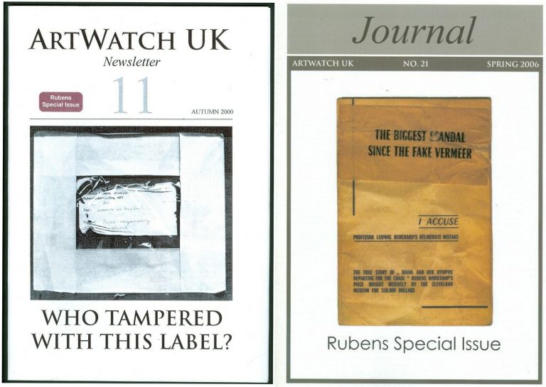
Above, Fig. 7: The Autumn 2000 and the Spring 2006 special issues of the ArtWatch UK Journal given over to discussions of the National Gallery Samson and Delilah.
NO ANSWERS GIVEN. DEBATE REPEATEDLY SHUT DOWN. A LOOP OF SILENCE CREATED.
The National Gallery later announced Christopher Brown would publish a scholarly article in the Burlington Magazine. It never came. The magazine’s editor told us none was submitted. An article by Kasia Pisarek was submitted. It was rejected by the Burlington Magazine – and, later, by Apollo (but see [*5]). In 1998 Dr Brown left the National Gallery to direct the Ashmolean Museum in Oxford. An article by his successor at the Gallery, David Jaffé, appeared in the August 2000 Apollo, but it was expressly intended to end, not launch, consideration of the evidence. Arts journalists summoned to a National Gallery press conference on the pending article were advised “it will finally silence the critics”. Our request to reply was rejected by Apollo’s editor, David Ekserdjian, a former staff member of Christie’s. He also rejected a letter from Michel Favre-Felix, a painter member of the Association Internationale pour le Respect de l’Integrite du Patrimonie Artistique – ARIPA. Christopher Brown’s departure from the National Gallery served to thwart subsequent inquiries into the Samson and Delilah’s acquisition and its subsequent unacknowledged treatment.
On 6 April 2002 (letter) we asked Neil MacGregor whether Dr Brown had been aware in 1982 of Burchard’s 1930 Certificate of Authenticity and its testimony on the then sound condition of the Samson and Delilah panel. He replied: “As I am sure you know, Christopher Brown left the National Gallery some years ago… I suggest you pursue the matter with him.” When Brown was asked by the US magazine Salon (December 2005) to comment on his past involvement in the controversy, he replied: “I am sorry but I don’t want to do this. Please address your questions to the National Gallery.” In 1983 Brown had reported: “Under the terms of Ludwig Burchard’s will, I had the privilege of consulting the manuscript notes on the Samson and Delilah. My visit to Antwerp was made possible by a grant through the Sir Martin Davies Travel Fund”. Had Burchard’s own notes held by the Rubenianum not contained a draft or other record of his 1930 certificate of authenticity, as is held in the National Gallery?
THE VALUE OF REPORTS
When, after we had published Burchard’s certificate of authenticity and Neil MacGregor had adjusted the Gallery’s position accordingly, Christopher Brown and his successor, David Jaffé, held that the Samson and Delilah had been planed down when in the collection of the German magnate, August Neuerberg, between 1930 and 1980. In doing so, they went against the testimony not only of Baudouin’s March 1980 condition report but also of a leading Rubens scholar and National Gallery benefactor who had gifted a Poussin – Christopher Norris. As first mentioned in our June 2000 Art Review, article, Norris had testified in a 1980 letter (held in the picture’s dossiers) to the director, Michael Levey, congratulating him on the Samson and Delilah’s acquisition, and adding that between 1930 and 1980, no change in the picture’s “amazing condition” had occurred, other than a toning down in its 1929 varnish, because “the owners had not touched it.”
Thus – and in addition to Baudouin’s 1980 condition report – we now know on Burchard’s and Norris’s joint written testimonies (both of which are held by – but neither of which had been disclosed by – the National Gallery) that the panel was intact, in good condition and had retained its original back from 1930 until 1980 when it was sent to Christie’s. Therefore, the only parties who might have planed-off the back are Christie’s and the National Gallery itself. Christie’s, who described and sold the picture as a panel and not as a reduced panel laid on board, or as a marouflaged panel, would hardly have so-profoundly and radically transformed someone else’s property (and someone, that is, who as the work’s sole known owner, had left the picture untouched for half a century) – or, for that matter, have had the time and the great technical means to do so. But even if Christie’s had done so, the National Gallery would then, in turn, have duly recorded that recently-altered state of the picture in its customary reports on works loaned to it ahead of sales. It had not done so (see below).
Ignoring the triangulated testimonies of Burchard, Baudouin and Norris, David Jaffé’s second tack had been a more personal charge: “Mr Daley does not seem be aware of the art historical convention whereby a painting on panel, even when thinned, is still called a panel”. He cited the following instance: on December 17th 1998, Sotheby’s auctioned Rubens’ Deluge as an “oil on oak panel” when in fact it was “on a marouflaged panel”.
But how had that been that known? It was so, Jaffé disclosed, “according to a condition report” made at the Gallery by its timber specialist/restorer, Anthony Reeve (which report is held in the Gallery’s exhibition file) when the picture was loaned to the National Gallery ahead of the sale. Why then, is no such report held and cited on the Samson and Delilah when it too had been loaned to the Gallery ahead of its 11 July 1980 sale at Christie’s?
HOW RELIABLE ARE LUDWIG BURCHARD’S ATTRIBUTIONS?
[*5] In an article published in the Spring 2006 Artwatch UK Journal (Fig. 7, above right), Kasia Pisarek (Katarzyna Krzyżagórska-Pisarek) wrote:
“While investigating Dr Ludwig Burchard’s ‘rediscovery’ [of the Samson and Delilah], I was surprised at some of the truly improbable attributions made in the past by him and other well-known experts such as G. Gluck, W. R. Valentiner, W. von Bode, A. Bredius or C. Hofstede de Groot, who all guaranteed their ‘discoveries’ with certificates of authenticity…” On Burchard, specifically, “I traced many of his attributions – he was not infallible in his judgement and changed his mind. Surprisingly, over sixty pictures attributed by Burchard were later downgraded (in Corpus Rubenianum) to studio works, copies or imitations…”
To date, Dr Pisarek has identified seventy-five fallen Burchard Rubens’ attributions. (The title of Pisarek’s 2009 Warsaw University dissertation was “Rubens and Connoisseurship: On the Problems of Attribution and Rediscovery in British and American Collections.”)
Above, Fig. 8: The Sunday Times’ 5 October 1997 coverage of Kasia Pisarek’s rejection of the Samson and Delilah’s Rubens ascription.
Certain suspicions seem to have arisen in Waldemar Januszczak’s mind as he (at that date) rejected the Samson and Delilah’s Rubens attribution in the above Culture Magazine feature and pressed the striking Whodunnit Mystery of the Disappeared Back:
“…I put this to the gallery’s chief conservator, Martin Wyld, who quips cheerfully that he was rather proud of having been accused; planing a 17th-century oak panel to wafer thinness and attaching it perfectly to blockboard while leaving its surface in pristine condition, is an exceptional feat of restoration. Nobody would or should do it today. Whoever did it earlier did a masterful job. Why did they do it at all? If a painting is in exceptionally good condition, why was there any need to hazard the transfer to block-board? A question neither the chief conservator nor MacGregor can answer. All I got from them both is the National Gallery version of: it wasn’t us, guv.”
Had Januszczak been a student of the National Gallery’s Technical Bulletins he might have recalled that accounts were given in the 1985 and 1986 issues of how Martin Wyld had chiselled away the entire wood panel of seven giant planks just under two metres long of Cima’s The Incredulity of St Thomas and that, in the first stage of this supposedly now verboten practice, the panel was reduced “from c. 5 cm to 1 cm” and in the second stage, the remaining 1 cm of wood was chiselled away entirely until the back of the original gesso coatings was exposed and ready to be attached for ever to its entirely new synthetic materials sandwich.
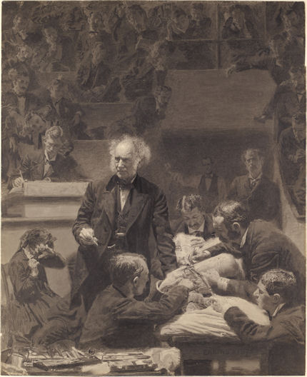
For a glimpse into the National Gallery’s subterranean Factory for Restoration and Attribution Rehabilitations, see:The National Gallery’s Made Just like Rubens Samson and Delilah with Cropped Toes
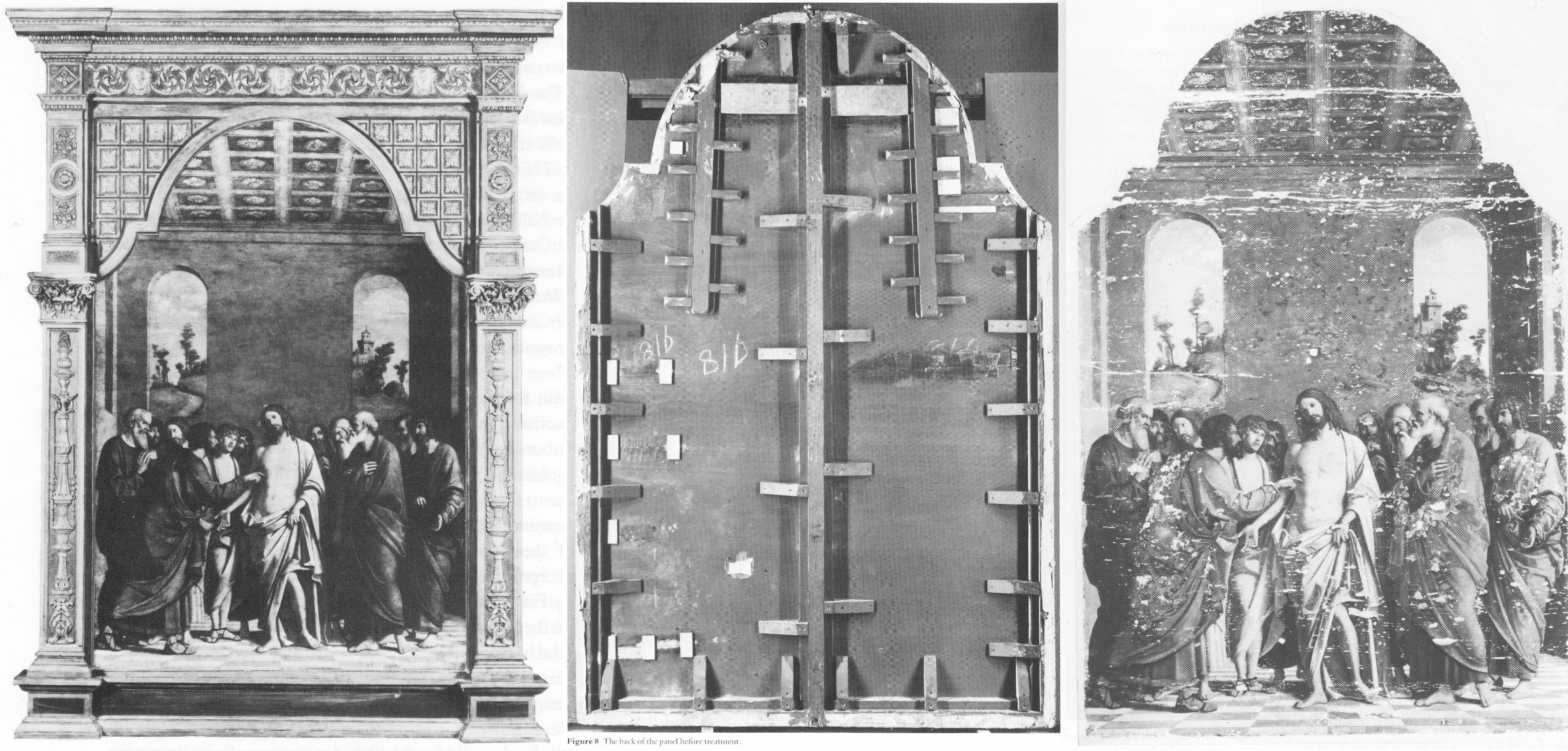
Above, Fig. 9: The National Gallery’s Cima da Conegliano altarpiece, The Incredulity of S. Thomas. Left, the altarpiece before restoration; Centre, the back of the panel, before its entire removal and replacement; Right, as seen after cleaning and before retouching – and after the transfer of the surviving gesso and paint film onto a multi-layered synthetic support.
RECORDS v RECOLLECTIONS AND BOY-GANGS IN ACTION
If the documentary record is to be trusted, it can be said with certainty that someone within the National Gallery covertly planed the Samson and Delilah panel. Notwithstanding his later Jaffé-flaunted recollection of August 2000, Frans Baudouin [*6] had, in his 1980 condition report prepared for the Samson and Delilah’s owner, Mrs Margaret Köser, solemnly testified on his (likely financially remunerated) professional oath (as the picture was about to be dispatched by the banker Jan Bosselaers from Antwerp to Christie’s in London), that it was a panel between 2.5 cms and 4 cms thick – and, therefore, had not-yet been planed down to a thickness of under 3 millimetres and cemented onto a sheet of modern blockboard. And yet, in the face of all such precisely documented facts between 1930 and 1980, David Bomford would, in his 1983 National Gallery Technical Bulletin account, backdate the planing to an unspecified time, place, and person – viz: “At some time, probably during the present century…” – and, when so-saying, would offer not one jot of supporting technical, photographic or documentary evidence in an institution that had long claimed exemplary record keeping practices.
[*6] Frans Baudouin was described in Codart on his death in 2005 as: “the doyen of Flemish art historians. He was the former director of the Rubenshuis and the driving force behind the founding of the Rubenianum, as well as an outstanding specialist in Rubens.” Nonetheless, he had declined to discuss the Samson and Delilah’s attribution with Euphrosyne Doxiadis (the first critic of the picture’s ascription and a co-author of the 1992 Report submitted to the National Gallery) whom he had met socially. In his August 2000 Apollo article, Dr. Jaffé, belatedly acknowledging Burchard’s certificate of authenticity record of the original panel, wrote: “Three Rubens experts – Dr. Frans Baudouin, Dr. Reinhold Baumstark and Dr. Hubert von Sonnenburg – who had been contacted by potential purchasers and therefore studied the painting with particular attention, all recall seeing it in its present condition just prior to its sale at auction on 11 July 1980.”
Powerful and triangulated testimony, it might well have been thought. However, one might also assume, for example, that Baudouin’s professional documents were likely more trustworthy than his twenty years-old recollections. In support of the former, the photograph (above, Fig. 2) of the Samson and Delilah when out of frame in 1980, and as supplied to Euphrosyne Doxiadis by Jan Bosselaers, along with Baudouin’s own 1980 certificate of condition for the Samson and Delilah might be cited. Further, as mentioned, in 2001 Doxiadis asked Baumstark’s successor at the Liechtenstein Princely Collections, Dr Uwe Wieszorek, if the then-Prince of Liechtenstein had been the underbidder at the 1980 Christie’s sale. In NG6461 she now reports: “He assured me categorically in two letters that as far as the Collections were aware, the Prince was not the underbidder, nor had he even taken part in the bidding.”
As for Dr. Hubert von Sonnenburg [*7], the then Head of Conservation for the Metropolitan Museum, might he be taken as the unsuccessful underbidder? When advising that museum on the possible purchase of the then-sublimely preserved Velázquez Juan de Pareja (which was bought for the Met. from Christie’s in 1971), Sonnenburg had strenuously advised the picture should under no circumstances be bought if its canvas had been relined. Would he likely have advised that great museum to buy a reduced panel laid on blockboard at a nowhere-recorded location and time? If he had, had the Met. attempted to buy the Samson and Delilah but been outbid for once by the National Gallery? Jaffé does not say – but where Christopher Brown had told Euphrosyne Doxiadis that the Prince of Lichtenstein had been the underbidder, for their part Christie’s had refused at the time of the sale to identify the (to this day, mysterious) underbidder, whose bids were said to have been relayed to the main sale room by telephone from an anteroom.
[*7] As we noted in a March 2011 post – Hubert von Sonnenburg was certainly an adept of art museum secrecy:
When, in 1971, the Met. snatched Velázquez’s Juan de Pareja from the British (who had owned it for centuries) Thomas Hoving, Ted Rousseau, von Sonnenburg and Everett Fahy had all flown to London, Madrid, and Rome – a sort of “boy-gang”, as they saw it, playing at spreading rumours like “the disinformation section of the KGB” – as Hoving (who later claimed to have discussed with Wildenstein’s how to “manipulate the art press and crank up the rumor mill” in a general strategy of “dissimulation and misleading rumors”) put it in his memoir. Even when successfully bought, the Velázquez was not paraded at the Met. but, rather, was “sneaked” into Wildenstein and Company “for secrecy”, partly because funds had been committed without the Board’s knowledge and also because, as Hoving put it, the Board had to remain longer in the dark as further “total secrecy” would be needed to “prepare our public relations stance” and to “have the time to clean it.” The deception of the public was to be absolute: for a short period before the restoration, the picture was exhibited to New Yorkers as if it were Wildenstein’s own property. Subsequently, the Met audiences only got to see the von Sonenburg-redone Juan de Pareja and not the miraculously well-preserved jewel that had, some time before, been taken to the New World by a triumphalist, dissimulating art world boy-gang.
In Part II – A TALE OF TWO ASCRIPTIONS AND THEIR RESPECTIVE TECHNICAL EXAMINATIONS – we examine the remarkable methodological discrepancies evident in the National Gallery’s own respective 1983 accounts of its two expensively bought 1980 panel paintings, and show why the Samson and Delilah should never have been presented from 1930 onwards as the long lost Rubens of 1609-10.
POSTSCRIPT: See Dalya Alberge’s disclosures in today’s Guardian:
A £2.5m dud? Fresh doubt cast on authenticity of National Gallery Rubens
15 June 2025
To Criticise a Critic
An examination of certain pre-emptive scholarly/art market establishment strikes against a pending book that rejects the Rubens ascription of the National Gallery’s contested Samson and Delilah.
Michael Daley writes: Those who challenge art establishment scholars or institutions can suffer swift repudiation and denigration in lieu of frank and open debate, as I discovered when supporting Prof James Beck’s criticisms of the Sistine Chapel Ceiling restoration in the late 1980s. In the 1996 edition of the Beck/Daley Art Restoration – The Culture, The Business, And The Scandal, in a chapter headed “The Establishment Counter-attacks”, I noted:
“When criticized in this area, institutions react institutionally, which is to say, by deploying self-protecting mechanisms common to all establishments. The best and most favoured response is no response, implying that the criticism is inconsequential and deserves to be ignored. In those instances where a response is unavoidable, it is thought best to be made by proxy… When a direct defence is necessary, its tone becomes all important. By tradition, the tone ranges from amused disdain, through supercilious dismissiveness to outright disparagement and attempts to discredit personal or professional credentials.”
It seems little has changed and that responses to the imminent arrival of Euphrosyne Doxiadis’s book on the National Gallery’s supposed Rubens Samson and Delilah (NG6461 – The Fake National Gallery Rubens) have run true to institutional templates. As a case in point, take this even-handed Artnet account: “Is This Rubens Real? Inside the ‘Samson and Delilah’ Debate” by Jo Lawson-Tancred.
Lawson-Tancred reports an anonymous National Gallery spokesman’s claims that the picture “has long been accepted by Rubens scholars” and that the Gallery finds no cause to update its initial technical examination of the painting [as had been reported in its 1983 Technical Bulletin] and whose “findings remain valid.” The first part is true – Rubens scholars had so accepted the attribution. However, the insistence that the report on the then recently acquired, exhibited, and restored £2.53mn picture requires no updating disregards subsequent findings on this and other Rubens paintings.
To be precise, the Gallery claimed in 1983: “At some time, probably during the present century, the panel was planed-down to a thickness of 3mm and subsequently glued onto a sheet of blockboard”. As Doxiadis and we have established the picture had emerged as a panel in 1929 – albeit ascribed to Honthorst. Crucially, it had remained a panel when sent to Christie’s, London, for sale in 1980 as an autograph Rubens – indeed it was precisely so described in Christie’s 1980 catalogue (see Fig. 1 below.) The picture’s physical state as a panel had been disclosed to Doxiadis by a Belgian banker who had wished to buy the picture for the Rockox House museum in 1977 and who again held it in Antwerp for its owner in 1980 before sending it on her behalf to Christie’s, London. Beyond any question, it was still an intact panel at that date.
WHERE’S THE BEEF?
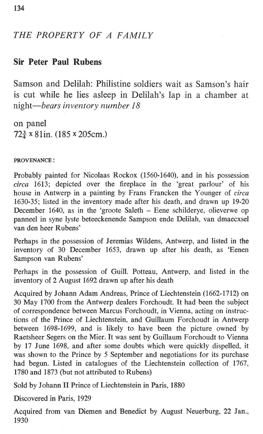
Fig. 1, above: Christie’s 1980 sale catalogue entry on the Rubens-attributed Samson and Delilah panel. Note how the entry comprises a daisy-chain of “probablys” and “possiblys” – and also its parenthetical disclosure that, throughout its claimed long stay in the Liechtenstein Collection, this Samson and Delilah had not been judged a Rubens.
Given that we informed the National Gallery a quarter of a century ago of the picture’s confirmed physical status as a bowed and cradled panel in good shape in 1980, its 1983 technical account has long needed correction because the planing had not taken place before 1980, let alone in the 19th century. And yet, that manifestly unfounded suggestion that the planing might have occurred before the 20th century had been endorsed by Joyce Plesters, the Gallery’s Head of Science in the 1983 Technical Bulletin: “Unfortunately, as David Bomford has described, the back of the panel had been planed down to a thickness of only about 3mm and then the whole set into blockboard before the picture was acquired by the National Gallery…” In truth, it had not been set into the blockboard, but rather, as Bomford had correctly reported, and Doxiadis would later discover, it had been glued onto a blockboard sheet larger than itself and fitted into a new purpose made frame.
On the combined records of 1929 and 1980 that Doxiadis and we had uncovered – and as on Christie’s own published catalogue description – it followed that the planing could only have occurred after the picture was sold to the Gallery for its then world record Rubens price of £2.53million in 1980. Our concerns were compounded when informed (by the National Gallery’s then director, Neil MacGregor) that the Gallery had not followed its own procedure of preparing written curatorial and restoration reports on the picture’s desirability and condition to assist the trustees when they examined the picture (which had been loaned to the Gallery ahead of the sale – see below) to consider an authorisation of the purchase.
AN APPEAL TO AUTHORITY
In view of Doxiadis’s recently reported disclosures on the picture’s physical condition in 1980 (Dalya Alberge “Fresh doubt cast on authenticity of Rubens painting in the National Gallery,” ) Lawson-Tancred might have questioned or challenged the National Gallery’s abiding stance. Instead, she reported:
“…despite the marginal but adamant voices of researchers like Doxiadis, top scholars in the field support Samson and Delilah’s authenticity unequivocally. Chief among these is Nils Büttner, chairman of the Centrum Rubenianum in Antwerp, who is working on the Corpus Rubenianum, the definitive catalogue raisonné for the Flemish Baroque painter. He has previously described the doubts about Samson and Delilah’s provenance as “conspiracy theories.” However, Lawson-Tancred also noted that “Büttner [had] declined to comment on Doxiadis’s book”. While Büttner, presumably, has not yet read the unpublished book, his assertions received immediate support from players in the art trade:
“Büttner’s position is backed by his peers like Adam Busiakiewicz, a lecturer and consultant on Old Master paintings for Sotheby’s. He pointed out to the Telegraph that Doxiadis is not a scholar of the period and has mostly published on Greco-Roman antiquities previously. Though she ‘had a hunch the quality of the picture wasn’t good enough’, he said, ‘I think there are some misunderstandings about the painting.’”
On misunderstandings, Busiakiewicz (who seems also to be employed by the art market “sleeper-hunter” and former Philip Mould assistant, Bendor Grosvenor, on the latter’s “Art History News” blog site), paraded just such in his reported burst of professional condescension to Doxiadis:
“Busiakiewicz explained that a comparison between Samson and Delilah and other paintings by Rubens are complicated, especially when they were made decades apart. ‘He’s an artist that changed his style throughout his career,’ he said. ‘Art historians who specialize in paintings like Rubens’ can track these changes.’ It is for this reason that the National Gallery painting has been connected to Rubens’s interest in the work of Caravaggio and other Renaissance masters whose work he had, at that time, recently encountered while traveling in Italy.”
While it is widely known that Rubens underwent changes of manner in his later paintings, Busiakiewicz failed to acknowledge (or appreciate?) that Doxiadis, we, and other critics of the attribution, such as Dr Kasia Pisarek, have for decades pointed out and demonstrated that the Samson and Delilah is glaringly unlike the bona fide Rubens paintings made precisely in that brief period when the artist had just returned from Italy.
Specifically, we had reminded readers in November 2021 that:
“In a pioneering 1992 report, the scholar/painter Euphrosyne Doxiadis and the painters Stephen Harvey and Siân Hopkinson, conducted a focussed survey of six Rubens paintings of 1609 and 1610 and demonstrated that “All these display a consistency and quality of style which is not shared by the Samson and Delilah”. That report – “Delilah cut off Samson’s hair, but who cut off his toes? The case against the National Gallery’s ‘Rubens’ Samson and Delilah” – was placed in the National Gallery’s Samson and Delilah dossiers and is published on the dedicated In Rubens Name website.”
WHITHER THE PANEL’S BACK
Above, Fig. 2: The covers of two ArtWatch UK journals given over to detailed accounts of the Samson and Delilah problems and shortcomings.
In issue 21 Kasia Pisarek wrote: “The Corpus Rubenianum project is based on the archive left by the late Dr Ludwig Burchard. Should it perhaps follow it less closely? Dr Burchard was an active Rubens attributionist in Berlin before the Second World War and in London afterwards. Several paintings formerly attributed to Rubens’s school or studio or even to another artist (such as Samson and Delilah), were reinstated by Burchard as by the master. I traced many of his attributions – he was not infallible in his judgement and changed his mind. Surprisingly, over sixty pictures* attributed to Rubens were later downgraded (in Corpus Rubenianum) to studio works, copies or imitations.” Pisarek adds: “they were, however, mostly portraits of small or medium dimensions.”
If a major work like Samson and Delilah might be considered something of an exception, Doxiadis supplies a possible explanation – Burchard was a relative of one of the owners of the dealing firm that had brought the supposed Honthorst to the marketplace.
*On the subsequent completion of her PhD thesis – Rubens and Connoisseurship: Problems of Attribution and Rediscovery in British and American Collections – Dr Pisarek remarked: “I traced many paintings attributed by Ludwig Burchard… At least seventy-five works he certified authentic were subsequently downgraded to studio works, copies, and imitations in the volumes of the Corpus Rubenianum, and the list is not complete… can we trust Burchard’s old rediscovery and attribution of the London Samson and Delilah?)
In issue No.11 we had written: “On December 17th 1998 Dr Jaffe [David Jaffé, then Senior Curator at the National Gallery] writes: ‘Sotheby’s auctioned Rubens Deluge as ‘oil on oak panel’ when, in fact, it was on a marouflaged panel’.” But how is this known? It was so, Jaffé discloses, “according to the condition report made in 1996-97 when the picture was loaned the National Gallery…” But no such condition report was made when the Samson and Delilah was loaned to the National Gallery by Christies ahead of the sale. That condition report on the Deluge had been prepared by the National Gallery’s timber specialist restorer, Anthony Reeve. As recently as 1982 Reeve had reported in the National Gallery’s Technical Bulletin (see Fig. 7) that the Samson and Delilah was “one of only three well-made straightforward Rubens panels in the collection” – which panels, he elaborated, required stable humidity because otherwise “The effect of wood shrinkage on the exposed backs of the panel…is for the front to become convex, and perhaps slightly corrugated”. Had the Samson and Delilah been planed-down and glued to blockboard at that date there would have been no possibility of its back being subjected to environmental hazards. It might be thought inconceivable that the National Gallery should have lost recollection of Reeve’s testimony by the following year and when writing in the same publication. As the National Gallery’s senior picture restorer Reeve was held after his death by Neil MacGregor to be the “supreme practitioner of his generation.”
There are yet further confirmations of the panel’s still-then exposed back. Doxiadis had obtained a Belgian condition report on the Samson and Delilah which began: “On arrival on 4 March 1980, about 14.30 hours the painting mentioned above (panel, 185 x 205 cms) was in good shape…” Doxiadis’s account squared with testimony supplied to ArtWatch by the art critic Brian Sewell (an ex-Christie’s man who took pride in having there identified an oil sketch as the modello for the Rubens Samson and Delilah), namely: that the panel had not been mounted on blockboard; that the back of the panel had been painted in a darkish matt colour and was criss-crossed with supporting bars of wood; that because Christie’s customary stencil number was made with dark paint it had been superimposed over a patch of white paint Christie’s had applied to the panel’s back.
Presumably Busiakiewicz has yet to access the 1992 Doxiadis/Harvey/Hopkinson report. For the record, the document I found in the National Gallery’s Samson and Delilah dossiers was a copy of the picture’s 1929 certificate of authenticity written by the great but subsequently discredited Rubens specialist Ludwig Burchard who had observed: “The picture is in a remarkably good state of preservation with even the back of the panel in its original condition”.
A CRITICAL FORMATION ASSEMBLES…
Where Busiakiewicz patronises Doxiadis on an allegedly insufficient familiarity with the Samson and Delilah literature, Nils Büttner has been joined in that disparagement by Bert Watteeuw, the director of the Antwerp Rubens House. As John Smith reports in the EuroWeekly:
“The latest suggestion that this is a 20th-century copy comes from Greek art historian Euphrosyne Doxiadis in her new book The Fake Rubens although this accusation finds little support from one of Belgium’s top Rubens experts Bert Watteeuw. Not only does he pour scorn on her status as a genuine expert, suggesting that anyone of any standard would have already checked with his Antwerp Rubens House and other specialist houses about the painting. In addition, he also said: ‘the provenance of this painting is very well known throughout the 17th, 18th and 19th centuries. A provenance that can be trusted is always crucial’…”
This implied claim of a trustworthy Rubens provenance was a brazen sleight of hand: what John Smith was not to know is that, as shown above, the provenance concerned at no point confirmed the painting as being by Rubens’ hand. Being thus kept in the dark, poor Smith could only but conclude: “Whilst the National Gallery has kept a dignified silence on the matter of the painting, it is no doubt delighted that one of the great Rubens scholars has come out publicly to dismiss the fake claim by Doxiadis which Watteeuw considers is purely invented to promote her book.”
Delighted as the National Gallery might be and while its Trappist silence might do yet further service as an institutionally imperative damage limitation exercise, it remains an untenable stance because, as one very distinguished former National Gallery trustee at the time of the Samson and Delilah purchase told Doxiadis, “the truth will come out – it always does”. As for Watteeuw, for a Rubens scholar at the supposed top of his professional tree to resort to professionally unfounded claims and personally directed abuse is as counterproductive as it is contemptible.
Moreover, in this regard, Watteeuw might be considered a serial offender: when apprised of negative AI findings on the Samson and Delilah panel he told another journalist, Colin Clapson (‘Fake Rubens in London’s National Gallery? This painting is genuine” counters Rubens House director Bert Watteeuw”) that Doxiadis’s soon-to-be-published book is “Complete nonsense and not based on facts. To begin with, I do not know this art historian and that is a sign. Most researchers on Rubens have passed by our Rubens House and the Rubenianium, the Rubens Library, in the search of sources and information,’ says Bert Watteeuw, the director of the Antwerp Rubens House. ‘Moreover, Doxiadis has an agenda of her own: to promote her book and that seems to be working well. In such cases conspiracies à la Dan Brown are more interesting than science.’ Whilst attacking its critic, Watteeuw gifts the National Gallery a clean bill of scholarly probity on its protracted silence: “‘The painting ‘Samson and Delilah’ in London is a genuine Rubens, a masterpiece. It is logical that the National Gallery does not want to comment or discuss its authenticity,’ he says.”
DISALLOWED TESTIMONY
In view of the above it might seem that among Rubens establishment scholars generally and for the National Gallery itself, nothing can be allowed to count as evidence against the challenged panel’s Rubens ascription. For example, in 2021, the brushwork of the Samson and Delilah was compared with that found in no fewer than 148 uncontested Rubens paintings. As Dalya Alberge noted in the Guardian (“Was famed Samson and Delilah really painted by Rubens? No, says AI”), “Its report concludes: ‘The AI System evaluates Samson and Delilah not to be an original artwork by Rubens with a probability of 91.78%.’ In contrast, the scientists’ analysis of another National Gallery Rubens – A View of Het Steen in the Early Morning – came out with a probability of 98.76% in favour of the artist.”
Such disinterested testimony is dismissed by the affronted – and perhaps professionally discomfited – scholarly grandees: “Watteeuw also dismisses AI research dating from a few years ago. ‘When that appeared, we engaged in extensive behind-the-scenes dialogue with that Swiss firm that had carried it out. AI can only work if you train it with an artist’s entire oeuvre. That was not the case at that time.’” (Watteeuw was here echoing Bendor Grosvenor’s mis-characterisation of the Swiss firm: “It is simply not possible to determine whether a painting is by Rubens by relying on poor quality images [sic] of not much more than half of his oeuvre…”) First, there is once again, as with Doxiadis, an implicit professional slur on the firm in question. Second, there is yet further evidence that logic is underemployed by many art establishment players: if, given the very great distinctiveness of Rubens’ style and painterly applications, you can find no visual correspondences when comparing the Samson and Delilah’s brushwork with a single one of 148 secure Rubens paintings, why would you be likely to find such correspondences in another batch of equally secure Rubens paintings? At this point, calling for yet more extensive AI tests on a vast oeuvre – and one with ever-shifting boundaries – is procrastination, the obliging sister of obdurate institutional silence.
CAN’T SEE – OR WON’T SEE?
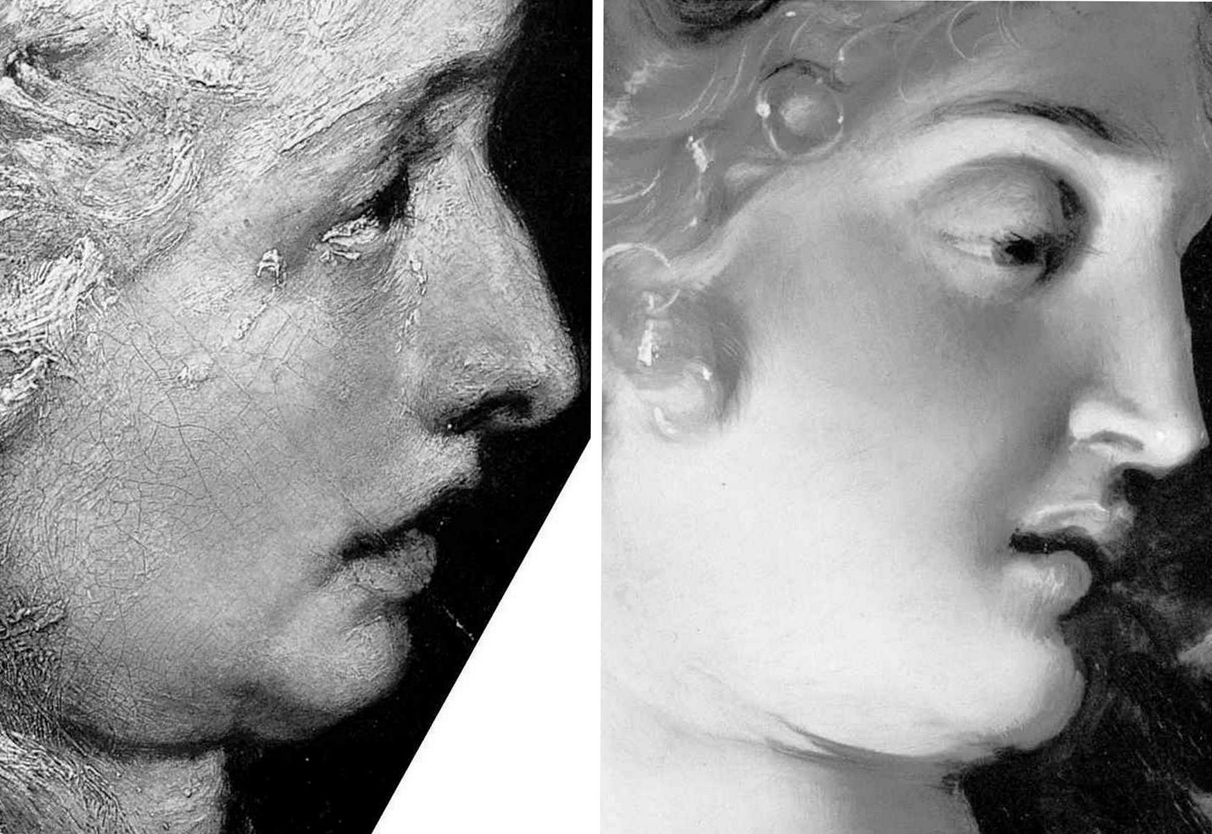
Professor James Beck once remarked that too many of his peers “look with their ears” and that it is “only the artists who can see things clearly”. It so happens that all the principal critics of the Samson and Delilah picture – Doxiadis/Harvey/Hopkinson/Daley/Pisarek – happen to have trained as artists, as Beck himself had done. Doxiadis noticed what no Rubens scholar, so far as we know, had noticed: that while Rubens painted with round brushes, the shadowy author of the Samson and Delilah had deployed flat brushes.
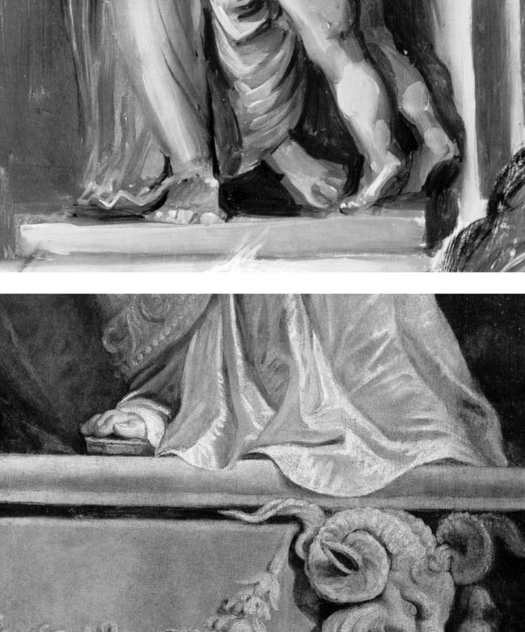
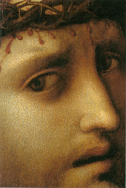
Above, Fig. 3: Top, detail of the National Gallery’s Samson and Delilah; above, detail of Rubens’ The Raising of the Cross, Antwerp Cathedral. Where the former is claimed to be a lost picture Rubens painted in 1609-10, the latter was indisputably made by Rubens between 1610-11. Such pronounced differences in brushwork are inconceivable as that of two autograph paintings made at the same moment in Rubens’ oeuvre. Who, looking at this photo-comparison, could believe that Rubens had flitted between the ugly angular Cubist faceted feet in the Samson and Delilah statue (– try counting the toes and note the Art Deco zigzagging hem), and the superb plastic fluency, grace and anatomical fidelity seen throughout the Raising of the Cross?
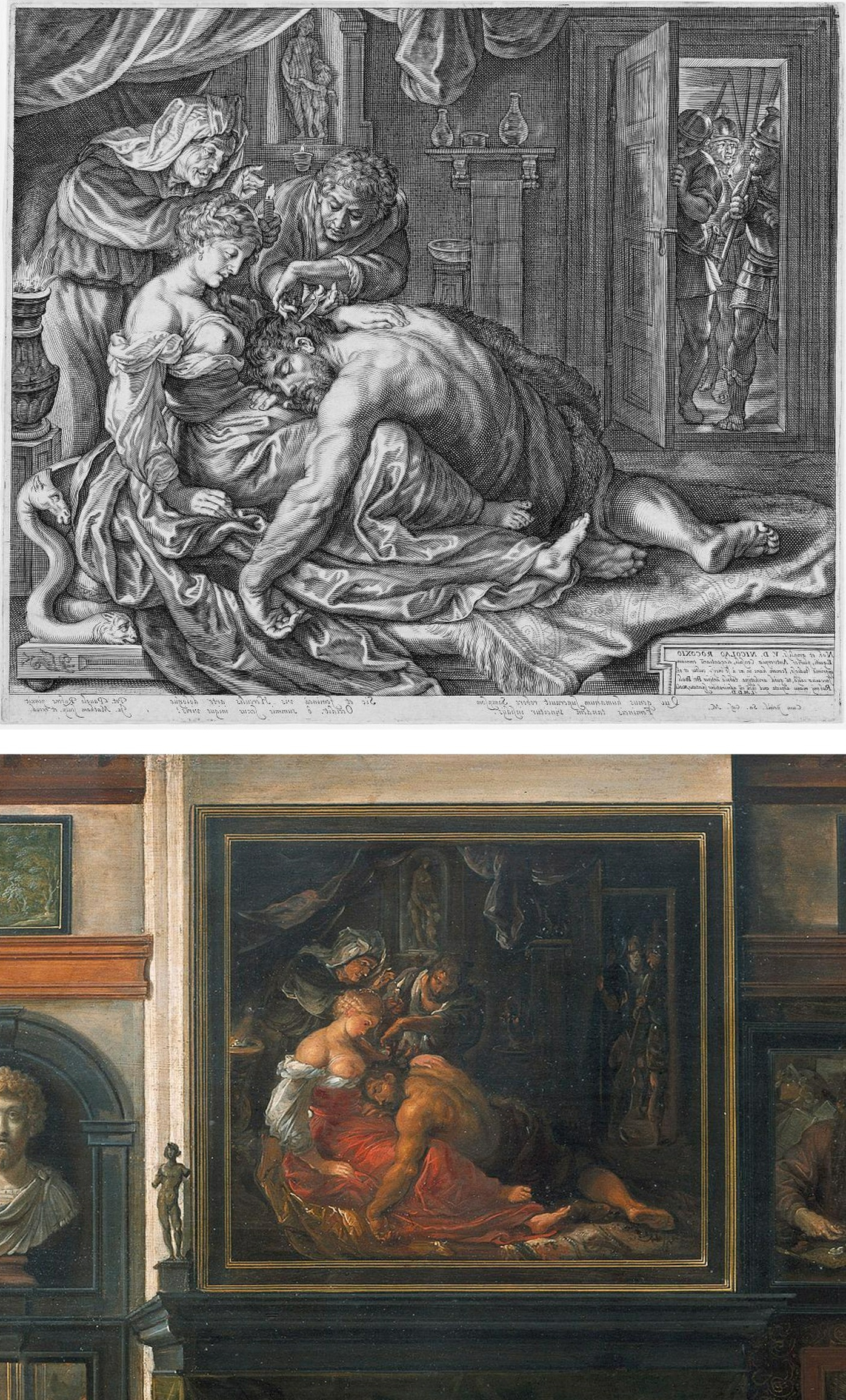
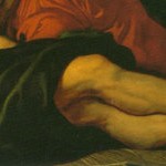
Above, Fig. 4: Two copies of the lost original Rubens Samson and Delilah – Top, Jacob Matham’s c. 1613 engraving (here reversed); bottom, Frans Francken II, a detail of his oil on copper depiction of the Grand Salon in Nicolaas Rockox’s House, made between 1615 and before 1640. Neither copy shows the cropped right foot found on the National Gallery picture. No one has cited a similarly cropped limb in any finished Rubens painting.
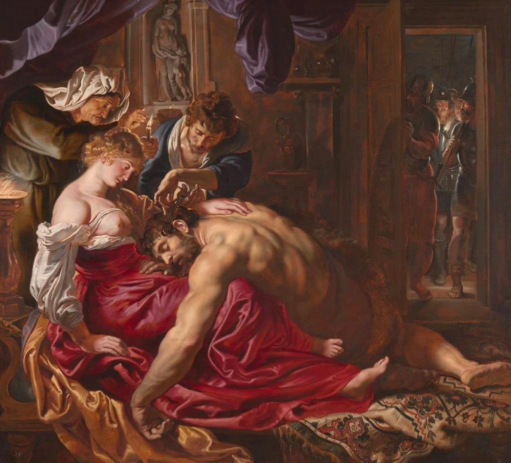
Above, Fig. 5: The National Gallery’s supposed Rubens Samson and Delilah painting.
Above, Fig. 6: Left, a detail (from the left wing) of Rubens’ 1609-1610 The Raising of the Cross, Antwerp Cathedral. Right, a detail of the National Gallery’s Samson and Delilah which Christopher Brown (David Jaffe’s predecessor as Senior Curator at the National Gallery) dates at “c.1609” and Jaffé puts “about 1610”. Among the National Gallery picture’s countless visual disqualifications, we would cite: the thinness of the paint; the absence of a 17th century craquelure; the irresolute profile; the cinematic lighting of the head; and, the anatomical and perspectival travestying of Delilah’s nose/mouth/chin configuration.
For many more disqualifying photo-comparisons, see Abigail Buchanan’s “The National Gallery ‘masterpiece’ that’s probably a fake”.
TANGLED DOCUMENTARY WEBS…
Such clinching visual evidence, however, leaves Adam Busiakiewicz unmoved and unpersuaded. He tells the Daily Telegraph that the National Gallery Samson and Delilah could be in no one but Rubens’ hand – viz: “‘It is a really stonking great picture,’ he says. ‘The textures, the sumptuous drapery, the muscular back – no one except Rubens could have painted that.’” Each to his own art critical estimations, perhaps, but what happened to the Samson and Delilah when in the National Gallery’s restoration studios is – or should be – a matter of scrupulously recorded and reported facts. We are now faced by a major art institution that cannot/will not give a proper and credible account of its own actions; that effectively denies, even, the historical record of its own doings. Consider the recorded facts: (1) it is a matter of record that this painting emerged in 1929 as a sound panel and that it remained so in 1977 (when exhibited in Antwerp); (2) it is known that in 1980 the picture was a panel when it was dispatched to London; when it arrived in London; and, when it was sold in London to the National Gallery; (3) it is known that when in London and on exhibition at the National Gallery it remained a panel in 1982 (- see Fig. 7 below). However, it is also known that the following year the National Gallery claimed – after the picture had been restored at the Gallery – that it was not now a panel at all – and, indeed, that it had not been a panel for a very long time and possibly, even, into the 19th century or beyond. This extraordinary denial of the picture’s own documented historical record might seem inexplicable in a major national institution, but it is by no means unprecedented – and nor, for that matter, is the Gallery’s effective outsourcing of its own defence to obligingly helpful scholarly proxies.
Not the least consequence of misleading institutionally-official accounts is the corruption of subsequent scholarship and the making of monkeys out of good faith and technically trusting patrons. In part-defence against widespread and prolonged criticisms of its notoriously over-energetic techno-adventurist restorations, the National Gallery ran a series of didactic, so-called “Making and Meaning” exhibitions. One such in 1996-97 was Rubens’s Landscapes. It was organised jointly by the Gallery’s then senior curator, Christopher Brown, and by its senior restorer, Anthony Reeve. The exhibition was sponsored by Esso UK plc and its chairman and chief executive, K.H. Taylor, expressed pleasure in being associated with “the quality of research and scholarship that are the Gallery’s hallmarks”. In turn, the then National Gallery director, Neil MacGregor, expressed gratitude to Esso for its generosity, for year after year, in enabling the Gallery to “present to the public recent research on how and why the pictures were made”. In a section on the rigorously high standards of professional panel making in 17th century Antwerp it was noted that panels were marked with their makers’ monograms and that the panel back of Rubens’s “Chapeau de Paille” portrait bore Antwerp’s coat of arms and the carved initials of its maker, Michiel Vriendt. However, with the Samson and Delilah no such assurance was offered. Instead, the reader seemingly learns – with a nod to the contrary testimony of Reeve and Bomford/Plesters (see Fig. 7 below) that “A particularly fine panel made for Rubens by an Antwerp panelmaker is that for the Samson and Delilah, painted about 1609 for Nicolaas Rockox…” But then, after a section reprising Reeve’s own 1982 Technical Bulletin account of the risks posed to such fine panels by fluctuations in humidity, comes an abrupt claim that “The Samson and Delilah was planed down to a thickness of about three millimetres and set into [sic] a new blockboard panel before it was acquired by the National Gallery in 1980 and so no trace of a panelmaker’s mark can be found…”
Now, in Fig. 7 above we see two incompatible accounts that were made and published just a year apart in successive National Gallery Technical Bulletins. Which of the contrary pair might be taken by the public and future scholars to be the more reliable and trustworthy record? Reeve’s account had preceded that of Bomford/Plesters – he had seen and reported what he saw and knew. Brown must therefore have found himself in the unenviable position of having to choose between Reeve’s earlier account and the later contrary one of Bomford/Plesters. That is, he had either to accept that the picture came into the Gallery after it had been planed down by some unknown party at an indeterminate date and that Reeve had imagined and chronicled an entirely fictional panel comprised of “six [sic] horizontal oak planks, carefully planed and jointed”, or, recognising that Reeve of all people was unlikely to have confounded a new sheet of blockboard with an early 17th century Flemish oak panel and extol its technical virtues even among Rubens’s panels, or… what? What could Brown say of the Bomford/Plesters account when he was aware that the picture’s own dossiers contained the already widely press-reported and potentially explosive 1992 Doxiadis/Harvey/Hopkinson report precisely challenging the Bomford/Plesters account? Could he go down the middle and say that while the picture had come into the gallery as a panel in good shape – as Reeve had testified – when subsequently taken into restoration, it had been planed down and glued onto (not “into”) a new sheet of blockboard – and do so without offering any explanation for such a radical and inescapably material and historical evidence-erasing procedure? In the event, Brown did neither. Rather, he fudged a technically-incoherent mongrel account even though he and Reeve were the exhibition’s joint authors. That is, on the one hand he spoke of the Samson and Delilah having been a “particularly fine panel made for Rubens by an Antwerp panelmaker” and then, leaving a gaping, mystifying narrative hole in his own account, jumped to “The Samson and Delilah panel was planed down to… etc. etc.” This was a curatorial equivalent of the old comic book cop-out gag “With one bound, Jack was free”. It is not easy to conclude other than that it had seemed institutionally imperative to dissemble rather than clarify.
8 March 2025.
Art’s Toxic Assets and a Crisis of Connoisseurship
“Buy land”, Mark Twain advised, “they’re not making it anymore”. This logic ought to apply to the old masters but does not. Land makes sound investment not only because of its scarcity and its potential for development but because, in law-abiding societies, it comes fixed with legally defendable boundaries. Karl Marx, plundering English classical economists, held that all value is unlocked by human labour – but all labour does not generate equal values. In given periods and places all painters work pretty much with the same materials but their artistic transformations of those materials are various and unequal in accomplishment and merit. Such differences drive reputations and hence the market value of artists’ works but they do so in ways that are intrinsically problematic.
Artists’ reputations may or may not endure. With many surviving works the identities of authors are either not securely established or entirely unknown. In such cases paintings are appraised and then attributed to particular artists or schools. Attributions, however, are neither guaranteed nor immutable. They are made on mixtures of professional judgement, artistic appraisal, art critical conjecture and, sometimes, wishful thinking or deceiving intent. They remain open to revision, challenge, manipulation or abuse. The experts who make attributions exist in professional rivalry with one another (sometimes with vehemence) and while their disagreements are signs of art critical health, a consequence is that legal guarantees for attributions are untenable and non-existent, as some buyers later discover to their costs. Buyers are advised in the small print to beware and to proceed on their own judgement. With art, as we recently pointed out (see Endnote 1) it can be safer to buy a second-hand car than an old master painting (- and few people would dream of buying a house without legal searches and a structural survey.)
“Scientific” red herrings
In recent years attempts have been made to impart quasi-legal assurances to attributions by appealing to the authority of supposedly “scientifically verifiable” technical proofs. The exercise is vain and, technically, philistine: by its very nature, art is not reducible to scientifically quantifiable component parts. The technical evidence cult reflects a collapse of confidence in powers of connoisseurship on the one hand and a grab for cultural and institutional power by technocrats and bureaucrats on the other. The new hybrid discipline “Technical Art History” in which restorers, conservation scientists and curators pool expertises in attempt to arrive at professionally impregnable positions, has proved pernicious. Art-politically, this united front seeks to neutralise all charges of art critical and methodological failure with professional mystification and displacement activities – by fostering a “closed-shop” mentality and claiming that its mysteries are beyond the reach of any outsiders [2]. The new technocrats insufficiently appreciate that paintings are no more and no less than the products of artists who, working by brain, eye and hand, fix values and the relationships between values so as to produce specific and unique artistic effects that can be comprehended by others using eyes and minds in response. In the visual arts the visual should remain paramount – what you see is what it is about. Art loving viewers and professional art experts alike might be said to have duties of appropriate response to art itself and not to its shadows and encumbrances. It is the optically perceived quality of artists’ artefacts that drives reputations and market values. Understanding art is not the same thing as poking and poring over the component parts of its fabric – let alone presuming, as “restorers” (or now, “conservators”) perpetually do, to undo and redo its features at regular intervals. What matters is what you see, not what might be said or thought to lie under the surface.
Managing lapses of connoisseurship
This is not, of course, to say that technical examinations can serve no purposes. Rather, it is to say that in matters of art attribution and appreciation technical examinations of the physical composition of works might supplement informed visual appraisals but they cannot stand in lieu of them. Nor can the supposedly disinterested and neutral character of technical examinations themselves be taken at face value. In practice, with every technical investigation and its resulting “findings”, someone, some institution, some interest group, has commissioned/conducted the exercise and controlled its dissemination. Paintings in powerful institutionally-protected locations (particularly major museum) can be afforded dispensations from otherwise injurious findings [2]. It sometimes seems that just as banks are now too big to be allowed to fail, so big museum attributions cannot be allowed to fall, whatever evidence and arguments accumulate against them [3], for fear of undermining public, political and art market confidence.
Follow the money and look at the drawings
Concerning the frequency of art world upgrades, it would seem easier to grow old master drawings than paintings. Where only 250 sheets of drawings were attributed to Michelangelo in the 1960s, today that oeuvre has been expanded to over 600 sheets. Although drawings do not command the high prices of paintings they can greatly assist their attributions. In the late 1920s a firm of antiquarian dealers in Holland, R.W.P. de Vries of Amsterdam, sold a number of old master drawings some of which have ended in museums, and two of which concern us here (Figs. 1 and 2). Neither of these had a provenance (i.e. a proven history of previous ownership). Both had simply materialised in the dealers’ hands with old master attributions. The first sold in 1927 for 26 florins (guilders), some € 235.80 at today’s values. The second sold two years later for 750 florins, some €6,801.91 today. The first was attributed to van Dyck, the second to Veronese. Neither attribution survived and the original perplexing ratio of value between them (which approached thirty to one) has reversed dramatically.
The Veronese attribution crashed in 1984 when Richard Cocke published his catalogue raisonné Veronese’s Drawings and dismissed the drawing with the single (apt) sentence: “The heavy forceful cross-hatching in the drapery and the forms of the head and hands have nothing to do with Veronese.” That drawing sold in 1991 at Christie’s for £7,000 as “attributed to Agostino Carracci”. In contrast, the former van Dyck drawing morphed into the work that sold at Christie’s on July 10th as an autograph Rubens ink sketch for a world record Rubens drawing price of £3,218,500. The former “van Dyck” has thus enjoyed a 14,000-fold increase of value since 1927.
The extraordinary success of the van Dyck that is now a Rubens was due only in part to Christie’s masterful promotion. It was very much on the strength of its current art-historical position that the drawing was drum-rolled as the starred lot in a sale of part of the prestigious I. Q. van Regteren Altena drawings collection. Most helpfully of all, the drawing was precisely characterised as Rubens’s “first thought” preparatory ink sketch for the National Gallery’s Samson and Delilah painting (Fig. 4). Notwithstanding its anomalous traits (see our previous post), its artistic shortcomings and its dubious provenance, the drawing remains bolstered by its crucial allotted role in a sequence of three Samson and Delilahs, two of which have been acquired by museums (Figs. 3 & 4). Although Christie’s July 10 sale realised more than twice its highest estimates and broke many records for individual artists, only one of the top ten works went to an art gallery or museum. Two were sold on to the trade. Seven, including the Samson and Delilah drawing, went to anonymous individuals.
Making four Rubens’s
Christie’s catalogue entry burnishes the drawing’s pedigree with upbeat optimism. It is said for example: “When I. Q. van Regteren Altena bought the drawing in 1927, he listed it in his inventory under its traditional attribution to Sir Anthony van Dyck (1599-1641). That attribution also accounts for an earlier owner’s inscription of the letters ‘V.D.’ in the lower left corner.” What traditional attribution? Which earlier owners? Christie’s account of the provenance begins: “with R.W.P. de Vries Amsterdam; from whom purchased by I.Q. van Regteren Altena on 20 December 1927 for 26 guilders (‘387.t. A. v. Dijck. Samson & Delilah’)”. And that is all. There had been no previous owners and no evidence exists of any “traditional” reception as a van Dyck – or anything. Any suppositions aside, all that can safely be said is that this drawing emerged from nowhere at a time when forgery was rife and the art world suffered from what Bernard Berenson [!] described as “the universal tendency to ascribe a given work of art to the greatest artist to whom wishful thinking and excited imagination can ascribe it.” (“Essays in Appreciation”, 1958, p. 95.)
Christie’s entry continues: “With the emergence of the finished painting and the connected oil sketch the drawing’s significance rapidly became apparent.” There was no rapidity and the claimed significance is mythic. The supposed second stage oil sketch or modello did not appear until 1966. The claim that, “The picture of Samson and Delilah was only rediscovered in 1929”, also misleads. The painting was not “rediscovered” as a Rubens. It had never been a Rubens. When it appeared in 1929 it was, just like the ink drawing three years earlier, without provenance and it was not judged a Rubens by its German dealers, Van Diemen and Benedict, who were offering it as a Honthorst. It was later upgraded to Rubens in a certificate of authenticity by Dr Ludwig Burchard and it then sold in 1930 to August Neurburg, a German tobacco magnate.
Burchard was a leading Rubens scholar, but today his attributions have a notoriously poor record [4]. Far from the ink drawing being corroborated as a first stage sketch by the arrival of the painting, Burchard had upgraded the painting on the authority of the drawing which he had himself upgraded to Rubens in 1926. In Christie’s catalogue the drawing’s “Literature” begins with Burchard’s attribution: “L. Burchard, ‘Die Skizzen des jungen Rubens’ in Sitzungsberichte der Kunstgeschichtlichen Gesellschaft, Berlin, 8 October 1926, p. 30, no. 2.” At that date no one had previously owned or discussed the work. Burchard thus upgraded a drawing that had never been exhibited and was in a dealer’s hands without any provenance. Notwithstanding his claims on behalf of the drawing, in 1927 both the dealer selling and the collector buying still held it to be a van Dyck.
When the modello eventually appeared in 1966 it had no provenance. Its history consisted of a hearsay account (from the anonymous lady vendor) of an ancestor said to have bought the work for a few shillings in an antique shop in York during the 1930s because she liked the frame. This supposed Rubens oil sketch had been painted on a support that is found in none of the artist’s oil sketches – on a soft, conifer wood, not on his customary oak panel. Its appearance was, for a Rubens oil sketch, disturbingly close in design and effects to those of both the ink drawing and the finished painting (see Figs. 2, 3 and 4). Its arrival completed an unicum in Rubens’ oeuvre: a suite of stages of work without evidence of development. Notwithstanding that problem, the modello on the wrong wood was given to Rubens by Christie’s themselves, to join the company of a panel painting whose back, it later emerged, had disappeared in an operation for which no one acknowledged responsibility, and a drawing whose back was concealed by being pasted onto a second sheet even though it bore drawing itself. The modello sold to a London gallery for £24,000, going to a private collector before passing through Agnews to the Cincinnati Art Museum in 1972. The last of the trio to emerge, this technically problematic work-without-provenance was the first to achieve museum status. At some point, pieces of wood were removed from its sides (creating a closer compositional alignment with what is now the National Gallery painting) and, at another, the Cincinnati museum claimed the panel to be oak. Presently the wood is not identified, the work being described as on “panel”.
Why? Why? Why? Delilah?
In July 1980, the supposed third stage, the Samson and Delilah painting, was sold by Neurburg’s heirs through Christie’s to Agnews, acting on behalf of the National Gallery, for a then Rubens world record price of £2.53m. In 2002, with two parts of the Samson and Delilah trio now secure in museums and the third in a respected private collection, Sotheby’s sold a painting, The Massacre of the Innocents (see Fig. 13), as an autograph Rubens on the back of its perceived shared characteristics and collections history with the National Gallery’s Samson and Delilah for £49.5m, to Lord (Kenneth) Thompson. Even though those paintings are riddled with problems (see “Is this really a Rubens?” Michael Daley, Art Review, July/August 1997, and “Is this a Rubens?” Michael Daley, Jackdaw, October 2002), and the Samson and Delilah had been challenged for over a decade [5], the price was an outright old masters’ world record. Thompson loaned the Massacre to the National Gallery and then bequeathed it to the Art Gallery of Ontario, Toronto, thereby making it publicly available and greatly enhancing its pedigree. Thus, today, three high valued well-placed but individually problematic museum Rubens’s owe their positions to a belated acceptance of Burchard’s initial attribution of what is still a privately (but now anonymously) owned ink drawing.
Who cut Samson’s toes?
The reason why all of these subsequent Rubens upgrades rest on the authority of this ink drawing is because of a glaringly anomalous feature in the National Gallery painting – the fact that the toes of Samson’s right foot are cropped by the edge of the picture. This was not because the panel had been trimmed at some point. Rather, it is because the painting simply stops disturbingly, inexplicably, at the beginning of the toes. Thus, without the drawing’s seeming testimony that Rubens had planned to crop Samson’s toes by cropping his own initial design within a precisely drawn ruled box that anticipated (even before he had executed an oil sketch) the final format of what is now the National Gallery painting, that painting could never have been attributed to him. This is so for reasons that are implicit in Burchard’s 1930 certificate of authenticity. It read:
“The photographed painting on the other page is one of Peter Paul Rubens’ major works from the time of the master’s return from Italy. It must have been painted in 1609 or 1610. With Rubens’ agreement, Jacob Matham reproduced the painting with a copper engraving around 1615. As witnessed by the inscription of the painting, the picture at that time was in the possession of Antwerp mayor Nicolas Rockox. Indeed, the inventory of Nic. Rockox’ estate, dated 19 Dec. 1640, lists the picture as “Eene schilderne…(Annales de l’Academie d’Archaeologie de Belgique, Anvers 1881, p. 437). On pp. 143-44 in vol. I of 1886, the five-volume catalogue of Rubens’ work by Max Rooses, the painting is described in detail as number 115, based on the Matham engraving and mentioning the Rockox inventory. The picture itself remained as unknown to Rooses as to all literature since. It is further notable that a picture of an interior by Frans Francken (Pinakothek Munchen No 720), which appeared to be of mayor Rockox’s living room, showing the painting in pride of place above the mantelpiece, while in an adjoining room is the picture of the “Doubting Thomas” which we know Rubens painted for Rockox. According to S. Hartveld of Antwerp, the room with the mantelpiece exists even today in the Kaiserstraat in Antwerp where Frau Gruter-Van der Linden now lives in the Rockox house. A sketch for the Samson picture (pen, varnished, 16.4 x 16.2) is in Amsterdam in the collection of Mr J.Q. Regteren, Altena. The picture is in a remarkably good state of preservation, with even the back of the panel in its original condition.” [By courtesy of the National Gallery Archives Department.]
Note, even as Burchard asserts that this is the original painting of the subject that Rubens is known to have made shortly after 1608, he acknowledges that the original painting itself had universally been understood to have been lost since 1641. (To this day, despite detailed and sustained searches, nothing connects the present version to the original painting.) Crucially, Burchard also acknowledges that the appearance of the original Samson and Delilah had been recorded in two contemporary copies, one of which had been supervised by Rubens. Both of these copies by two artists who likely worked decades apart, testify that Samson’s original right foot had not been (improbably) cropped at the toes, as in the National Gallery version, but had originally been painted intact and set comfortably inside the composition and consistently with the artist’s known manner. See, for example, the almost contemporary, probably pendant (and near mirror-image compositional group) Cimon and Pero – “Roman Charity”, at Fig. 9.
A perplexing silence
It was in defiance of such hard historical testimony that Burchard claimed his own upgraded ink drawing to be not only by Rubens but, specifically, to be his preliminary sketch for the former Honthorst painting that is now in the National Gallery. When attributing that painting to Rubens Burchard executed a sleight of hand by implying but not stating that the ink drawing (which had only recently been sold as a van Dyck) was by Rubens. The truth is this ink drawing-from-nowhere and without-history had needed to exist if the Berlin Honthorst were to be presented remotely credibly as a Rubens. Had Burchard sincerely believed that the cropped-foot drawing was Rubens’ original ink sketch, he would have felt himself the agent of a remarkable double art historical coup: first, for having identified a famous masterpiece that had been lost for 289 years; second, for having further established that both of the contemporary copies of that original Rubens’ painting (through which it had been known for centuries), had been compositionally misleading in identical manners.
Conspicuously, Burchard trumpeted neither of these “discoveries” [6]. His diffidence contrasts markedly with the reaction of the day’s leading Vermeer scholar, Dr. Abraham Bredius, who believed in 1937 that he had found an unknown Vermeer (in what was the first of a stream of Han van Meegeren fakes). Firstly, Bredius’ certificate of authenticity was ecstatically and unreservedly fulsome: “…I found it hard to contain my emotions when this masterpiece was first shown to me and many will feel the same who have the privilege of beholding it. Composition, expression, colour – all combine to an unity of the highest art, the highest beauty”. Secondly, he rushed news of his discovery onto the scholarly record via the Burlington Magazine (“A New Vermeer”, November 1937).
If Bredius betrayed credulousness as an eighty-two year old scholar, what of Burchard’s manoeuvres as a forty-four year old at the peak of his powers? It can only be said that suspicions are in order. When, shortly after the First World War, the great German scholar, Wilhelm von Bode, was reproached for having certificated an implausible Petrus Christus, he replied, “You don’t understand the intricacies of the German language. After a brief description of the subject I say ‘I have never seen a Petrus Christus like this!'” (- “The Partnership”, Colin Simpson, 1987, p. 240). One must suspect that Burchard’s twinned and circular Rubens attributions were made sotto voce out of fear that his “attributional” heist might be exposed by anyone with an alert eye who appreciated that it is surprisingly common for later copies of original works to be cruder compositionally cut-down and abridged versions – and who would, therefore, recognise the “Honthorst” as a prime member of that type.
We have found that not only are such insensitively truncated pictures frequently encountered (in Rubens twice-over with the Samson and Delilah and the Ontario Massacre, and in artists like Leonardo, Raphael, Caravaggio and Annibale Carracci – see opposite) but, also, that with a little effort they can in almost every instance be shown to post-date the superior models and prototypes from which they derive. As shown opposite, in copyists’ hands, no part of an original composition can be considered sacrosanct. As well as toes, dogs’ noses and cupids’ wings, even portions of dead infants have been cropped to fit pre-existing images to new supports and formats. Mistaking a copy for an absent original is one thing. Disregarding clear and contrary historical evidence, as Burchard would seem to have done, is another altogether. Knowingly elevating adulterated versions to a master’s oeuvre pollutes the well of scholarship and ultimately threatens the credibility of the field.
Such lapses of critical judgement are as common in appraisals of restorations as they are in the making of attributions. How much or little of an original surface has survived the vicissitudes of time and “conservators” attentions might seem a lesser matter but it is not. Professional art critical failures to spot the tell-tale differences between autograph and studio works are the twins of failures to recognise restoration-induced injuries. The differences of states within individual works can be as pronounced as the differences between autograph and studio works (see Figs. 28a, 28b, 29 and 30). Failures of judgement in both areas are frequently found in even the most high-ranking individual scholars.
Making two Caravaggios in one decade
Within little more than a decade the late Sir Denis Mahon upgraded two pictures to autograph Caravaggio status. This might seem unremarkable given that Mahon was a prolific finder/maker of old masters. What is remarkable is that he did so with two versions (of more than a dozen) of the same painting – Caravaggio’s The Taking of Christ. This Caravaggio survives in two formats, one being a truncated version of the other. Mahon managed to endorse one version of each type, doing so in the wake of two “investigative” restorations in which each team claimed revealed authenticity on the basis of its own “discoveries”. (Mahon had serious form in the double attributions stakes – we discuss opposite a painting of Annibale Carracci where he authenticated one version and later suavely switched to another, less abridged, picture. See Figs. 25-30.)
During the first restoration in 1993 in Dublin, a long-attributed Honthorst copy was found to have been made largely without revisions and it was declared the original autograph Caravaggio by Mahon precisely by virtue of its revisions-light painterly fluency. This version was of the truncated type. In Rome in 2004 Mahon conferred autograph Caravaggio status on a work from Florence (where acquired from the Sannini family) that was found to have been made with many and major revisions taken to be “serious afterthoughts as was Caravaggio’s wont”. This version was composed in the larger format and Mahon reportedly said he had “no doubt that this was now the original work”. Dublin was not best pleased and Mahon promptly rowed his position back and claimed that both versions were now original but that one was rather more so than the other. (See “New twist in the tale of two Caravaggios”, Daily Telegraph, 17 February 2004; “A dangerous business”, Michael Daley, letter, Daily Telegraph, 19 February 2004; and, “The real Caravaggio is . . . both of them” Daily Telegraph, 20 February 2004.)
Like the two R.W.P. de Vries of Amsterdam drawings, the two “autograph” Mahon Caravaggios have enjoyed unequal fortunes. In 1993 the (revisions-light) Dublin Caravaggio was loaned to the National Gallery in London and then, permanently, to the National Gallery in Dublin. The later 2004 Florence/Rome Caravaggio with numerous major revisions and other “cast iron” technical proofs enjoyed no institutional protection, being still in private hands. Its cause seems to have fallen into abeyance following legal disputes over ownership. In 2005 the initial 1993 “discovery” of the now institutionally protected Dublin Caravaggio (Mahon enjoyed a long-standing relationship with the National Gallery in London, as a trustee and as a generous benefactor-in-waiting) became the subject of an illuminating, if somewhat parti pris book, “The Lost Painting”, by Jonathan Harr.
In an epilogue, Harr has described a falling-out over the ownership of the Florence/Rome version. Technical examinations of the painting were ordered by court prosecutors without the knowledge of the owners. They were carried out by Maurizio Seracini, a leading private technical diagnostician who has examined something like half of Caravaggio’s output. The pigment Naples Yellow, which contains the metal antinomy, was found. Because that pigment is presently said not to have been used on paintings before 1630 (or “from around 1620”, according to Wikipedia), and therefore twenty years after Caravaggio’s death in 1610, Seracini held the painting inauthentic. Harr accepts the force of this technical testimony and, concluding that Mahon had demonstrably blundered in his support for the Rome/Florence painting, imagines that that old scholar’s long-time adversary, Roberto Longhi, might now be enjoying “a mirthless laugh” over Mahon’s discomfiture. The conclusion was hasty and perhaps too trusting of technical testimony.
It is certainly the case that the presence of a modern, manufactured pigment within the fabric of a supposedly old painting can safely be considered fatal to an attribution. However, Naples Yellow is not a product of a known and precisely dated modern manufacture – such as Prussian Blue of 1704 – it is ancient and greatly pre-dates Christ. Harr acknowledges that the pigment is found on a painting of 1615 by Orazio Gentileschi – just five years after Caravaggio’s death. Harr further reports that traces of this pigment had been found on another Caravaggio, his Martydom of St Ursula, which is owned by Banca Intesta in the Palazzo Zevallos, Naples. He reports a suggestion that the offending material might have come from an 18th century restoration that had subsequently been removed. Such hypothetical exculpation would only be necessary if claims that Naples Yellow could not have been used by anyone before 1630 were Gospel and if the painting’s attribution was insecure. Neither is the case. The Martyrdom is one of Caravaggio’s most reliably and completely documented works so there can be no question about its authenticity. Further, it was almost certainly his last work. It was recorded as still being wet in May 1610. If this painting contains antimony, and unless evidence exists to support the former existence of a now entirely disappeared 18th century restoration, we should accept that this material has now been found in two Caravaggio paintings and adjust the technical literature chronologies accordingly.
In this episode, we see that negative hard “scientific evidence” can be discounted on the basis of assumptions, hunches, and suspicions. We also see that the claimed chronologies of materials within the literature of technical analysis are moveable and, only ever, provisional feasts. (For such chronologies to be considered reliable it would be necessary for every painting in the world to be analysed at the same time by the most advanced technologies – and even then, subsequent technical advances would require further examinations: it is common for old formerly “advanced” tests to be re-run in conservation departments when new and improved apparatus become available.) We have asked Seracini, in the light of Harr’s comments, if “it is still the case that the presence of antimony is considered an absolute technical disqualification in paintings made before 1630?” Meanwhile, Jacques Franck, the Consulting Expert to The Armand Hammer Center for Leonardo Studies at The University of California, Los Angeles, advises that:
“The best scientific bibliographic reference concerning the history and chemistry of pigments over here is: J. Petit, J. Roire, H. Valot, “Des liants et des couleurs pour servir aux artistes peintres et aux restaurateurs”, EREC éditeur, Puteaux, 1995. Regarding Naples yellow, it says: ‘(Lead antimonate yellow) was rediscovered in Europe at the end of the Middle-Ages and was later mentioned in a document dating from 1540, “Pirotechnia”. The oldest recipes, written in 1556-1559, were supplied by Cipriano Piccolpaso…who was a painter of ceramics”
Although those recipes were indeed written primarily in connection with ceramics, given that they existed before Caravaggio’s birth (1571) it should never have been insisted that knowledge of them could not have been obtained by contemporary painters. As it happens, a study on Lorenzo Lotto’s pigments was made in connection with the exhibition “Lorenzo Lotto” (Venezia, 1480 – Loreto, 1556-57) at the Scuderie del Quirinale in Rome in spring 2011. On that occasion, more than fifty Lotto paintings spanning from 1505 to around 1556 were studied using non-invasive techniques by Maria Letizia Amadori, Pietro Baraldi, Sara Barcelli and Gianluca Poldi. The authors’ report (pages 2 and 19):
“About yellows, he uses both lead-tin and lead-antimony (Naples yellow) pigments, the latter found by XRF, in works starting from 1530 to the last years: it can be related to the ‘zalolin da vasarj’ cited by Lotto in 1541 in his account book (Libro di spese diverse)”, and, “As XRF analyses show, in some works, starting from 1530 to the last years of the century, also lead-antimony (Naples yellow) pigments, can be found, together with the previous yellow or almost alone: they can be related to the “zalolin da vasarj” cited by Lotto in 1541 in his account book (Libro di spese diverse).”
Thus, the presence of antimony would seem not to have given grounds for dismissing the Florence/Rome version of the Taking in the courts. Perhaps we can see that it might have been more to the point for the courts to require the production of the best possible photographs of as many of the versions as possible to permit visual comparisons of the two rival versions. There are many indications of the limitations of modern conservation practices to be had in Harr’s fascinating account. On page 169 he describes an encounter between the Dublin National Gallery of Art’s two picture restorers, Andrew O’Connor and Sergio Benedetti (who had re-attributed the Hontorst Taking to Caravaggio, and who had experienced “a fleeting moment of doubt” about his attribution while cutting ever larger ‘windows’ through the painting’s varnish):
“One day, about three weeks after the painting’s arrival, O’Connor and Benedetti crossed paths in the studio. Benedetti was staring at the painting. He stood with his arms crossed, his eyes narrowed in concentration, his mouth compressed into a frown. ‘Look at the arm of Judas’, Benedetti said to O’Connor. ‘What do you think?’ O’Connor studied the painting. ‘What are you getting at?’ he asked. ‘It seems too short, doesn’t it?’ said Benedetti. It did…O’Connor realised that Benedetti was wrestling with his doubts. ‘Well’, said Benedetti finally, ‘he wasn’t a perfect anatomist. He made other errors like this. In the Supper at Emmaus, the apostle’s hand is too large.’”
In this recollection we might be witness to a double failure of art critical methodology. Given his doubts, Benedetti might have assembled all available photographs of the many versions of this painting to determine whether or not the short-coming that concerned him was unique or common to (some or all) other versions. A greater lapse may be evident in the fact that while Benedetti expressed anxiety over the arm of Judas, he seems not to have done so over the compositionally and emotionally more important advancing left arm of the fleeing St John who is seen behind Christ and Judas. In the Dublin version, the arm of St John is cropped above the elbow and not above the wrist as it is in the Florence/Rome version. (On the compositional function of the arm in the Florence/Rome version, see comments at Figs. 21 and 22.)
To repeat what should be self-evident: pictures are made to be looked at. When, as with this Caravaggio, multiple versions exist we should make hard detailed visual comparisons of each against the others, if necessary (and it could hardly be otherwise when so many versions exist) by photographic means. When later copies or engravings exist we should make careful comparative estimations of their relationships to the various contenders. Whenever there are cut-down versions of more expansive compositions, we should always consider which state is likelier to have been the primary and which the secondary one. Visual comparisons in attributions, as in restorations, are of the essence. They should never be neglected, let alone discounted, on the authority of some technical evidence that may or may not be soundly framed; that may or may not be selective or loaded in its presentation; and, that will, in any event, soon be rendered obsolete by more up-to-date equipment. The informed human eye is our best “diagnostic tool” in the study of art and will remain so no matter how much money and resources might be thrown into technical studies. It remains the greatest tragedy that Bernard Berenson so badly debased his own critical currency with his shady Duveen dealings. On the primacy of the visual in visual art forms he was peerless:
“I am here concerned with names in painting. When I pronounce the words Giotto, Michelangelo, Leonardo, Giorgione, Durer, Velazquez, Vermeer, Ingres, Manet, Degas and hundreds of others, each stands for certain qualities which I expect to find in a painting ascribed to them. If the expectation fails, then no argument, no documentary evidence, be it biographical, historical, psycho-analytical, or radiological and chemical will persuade me.”
That was and is how it should be.
Michael Daley
ENDNOTES:
1 The Times, letter, 13 August 2014:
“Sir, Gerald Fitzgerald (letter, Aug 12), misses an important point when calling for a tiny levy on art sales to fund an independent centre for provenance research. Although such a levy might cost only .05 per cent of annual art sales, currently standing at some $60 billion, if effective, such a centre would reduce the supply of works on the market by something like 40 per cent – at least in the view of the late Thomas Hoving, a former director of the Metropolitan Museum of Art, New York. The art world is very quick on its feet: when calls were made in the 1930s for an independent centre of art restoration research, then director of the National Gallery in London, Kenneth Clark, promptly established a department of conservation science in order, as he later confessed, to ‘have in the background what purported to be scientific evidence to “prove” that every precaution had been taken’. Although self-policing may be an unrealistic ambition, governments could help considerably and at little cost by making it a statutory requirement that vendors should disclose all that is known and recorded about the provenance and the restoration treatments of works of art. As things stand, it can be safer to buy a second-hand car than an old master painting.”
Michael Daley, Director, ArtWatch UK, London
2 The Massacre of the Innocents which came up at Sotheby’s on 10 July 2002 as a very recent Rubens upgrade is a case in point of misleading assurances and over-ridden technical evidence. In a long sale catalogue entry it was said that technical analyses and condition reports had been commissioned and that these were available on request. The implication was clear: we have exercised all possible due diligence and this painting has emerged with flying colours. That implicit reassurance evaporated on a close reading of the material – as we reported in the October 2002 Jackdaw (“Is this £49.5 million painting by Rubens?”). The reports were, by their nature dense and couched in technical language. Nonetheless they clearly contained information that was highly injurious to the attribution and to the picture’s claimed early dating of c. 1609-11. One technical fact alone should have sunk the attribution. It was found in the last paragraph of the last report. As we put it: “The author of a report on the tree-ring dating…concludes that a date of execution for the picture only becomes ‘plausible from 1615 upwards’.” In other words, the panel on which this picture was painted could not have been manufactured at the time the picture is said to have been painted – and this dating could not be amended because, like the Samson and Delilah, the picture was only remotely credible on stylistic grounds if seen as the product of a (fancifully claimed) brief stylistic abberation in Rubens’ oeuvre said to have occurred on his immediate return from Italy in 1608. As well as being on wood that was too recent, the picture contained the wrong materials: “A pigment, orpiment, that is found in no Rubens is present here. A second pigment, smalt, said to have been in use ‘mainly in the mid-seventeenth century’ and which seems only to be found in Rubens’ later works is also present. The orpiment yellow is anomalous not only in its presence but in its manner of application – it is mixed with lead-tin yellow. Such a combination is said to be ‘unusual since it was considered unstable’ and, even, to be a practice ‘not encountered in 17th century works’”. This was not just a twice-over dead attribution: “Speaking of Rubens’ debt to classical sources, the anonymous author of the catalogue entry correctly concedes, ‘one of the background figures appears to derive from the Borghese Gladiator’. There follows immediate self-disavowal: ‘it cannot’ so derive, he/she contends, because ‘though famous in subsequent centuries, the Borghese Gladiator was not excavated until late in 1611”. This painting on the wrong (too recent) wood, with what would normally be considered disqualifying (out of period)materials, and which contained a miraculous allusion to a future event, was presented to the world as a major art historical discovery. That “discovery” had taken place very shortly before the sale. The upgrading of this centuries old studio work had been made by just five experts only three of whom were identified. We put the question: “Can it be right that we are all being asked to share this leap of faith when the experts, displaying a seeming ignorance of – or disregard for – so much germane material evidence, have yet to declare their hands or publish accounts of their vital endorsements?”
3 Jonathan Harr reports in his 2005 account of the upgrading of a Honthorst to Caravaggio (“The Lost Painting” p. 222) that when the picture, The Taking of Christ, was examined at the National Gallery in London it was found that its ground (priming layer) was anomalous: Ashok Roy, the head of science, observed, as Harr reports, that “the composition of this particular ground was strange – ‘bizarre’ was the word used. It contained reds and yellows and large grains of green earth, a pigment composed of iron and magnesium. Grounds usually contained lead-based pigments and calcium, which dry quickly. Green earth dries slowly. This primer looked to Roy like a ‘palette-scraping’ ground – the painter had simply recycled leftover paints from his palette board to make the priming layer.” Well, yes, someone evidently had – but what in Roy’s detailed technical analysis of the ground might have suggested that on this occasion Caravaggio had departed from his own habits in order to do so? When the painting was exhibited in a special exhibition (“Caravaggio ~ The Master Revealed”) at the National Gallery of Ireland in 1993, the catalogue gave a different spin to Roy’s research: “Analyses have shown that the ground is composed of a brown pigment, heterogeneous and unevenly applied. Several pigments were mixed with it: lead white, red and yellow ochre, umber and large granuli of green earth.” On a casual reading: impressive and reassuring technical detail and expertise. No mention of bizarreness. No acknowledgement of what was for Dr. Roy, a perplexing departure from Caravaggio’s known practices. On page 160 Harr reports that Sergio Benedetti (the Dublin National Gallery of Art restorer who first made the attribution)“saw immediately that the painting had been relined at least once before” and judged the present lining canvas to be at least a hundred years old. In the National Gallery catalogue Benedetti reported that “the picture has undergone at least three interventions, probably accompanied each time by a relining of the canvas. One of these linings caused a shrinking of the surface in some limited areas.” What is not said is that Benedetti two of the three-plus hypothecated linings had been made by Benedetti himself the first having caused cracking. Harr reports that after the first lining “There is much dispute about what happened next. For Benedetti, restoring the Taking of Christ was the greatest moment in his professional career, and to this day he adamantly denies that he had any problem relining the painting. O’Connor and others at the gallery, however, tell a very different story. According to them, he came close to ruining the painting.” Andrew O’Connor, the Gallery’s chief restorer, said that Benedetti had elected to use a densely-woven Irish canvas rather than wait for an appropriately matching loose-weave canvas to arrive from Italy. When Michael O’Olohan, the gallery’s photographer, who had made detailed photographic records of every inch of the picture’s surface, saw the painting immediately after its first relining, he could not believe his eyes and recalled “There were areas that had hairline cracks, like a sheet of ice that has started to melt, a flash of cracks all over it. I was shocked. I couldn’t believe it.” O’Connor explained that because the Irish canvas was densely woven, “it did not absorb the [water-based] glue at the same rate as the old Italian canvas. It had not dried properly and had contracted, pulling with it the Italian canvas and raising ridges, small corrugations, in the paint surface. Along these corrugations, the paint layer had cracked and lifted.”
4 In the ArtWatch UK Journal No. 21, (“The ‘Samson and Delilah’ ~ a question of attribution”), Kasia Pisarek wrote: “Dr. Ludwig Burchard was an active Rubens attributionist in Berlin before the Second World War and in London afterwards. Several paintings formerly attributed to Rubens’s school or studio or even to another artist (such as Sampson and Delilah), were reinstated by Burchard as by the master. I traced many of his attributions – he was not infallible in his judgement and changed his mind. Surprisingly, over 60 pictures attributed by Burchard to Rubens were later down-graded (in Corpus Rubenianum) to studio works, copies or imitations.”
5 The principal challenges to the attribution came from two artist/scholars, Euphrosyne Doxiadis, author of the award-winning 1995 book “The Mysterious Fayum Portraits: Faces from Ancient Egypt”, and Kasia Pisarek whose 2009 doctorate dissertation was entitled “Rubens and Connoisseurship ~ On the problems of attribution and rediscovery in the British and American collections (late XIX – XX c.)”. In 1986 Euphrosyne Doxiadis began researching the painting’s credentials with fellow art students Steven Harvey and Siân Hopkinson. Their findings were compiled in a report submitted to the National Gallery in 1992 and which is now held in the painting’s dossiers. (It is also available online at this site: www.afterrubens.org.) Their challenges to the attribution were covered in reports in the Times (“Artists raise fresh doubts on gallery’s Rubens masterpiece”, 22 September 1996, and “Expert denounces National Gallery’s Rubens”, 25 November 1996), and in The Independent on Sunday (“Tell-tale sign that £40m Rubens could be a copy”, 21 May 2000). Researches begun in 1990 by Kasia Pisarek prompted two articles on 5 October 1997 by the Sunday Times’ art critic, Waldemar Januszczak (“A Rubens or a costly copy?” and “National’s £40m Rubens could be fake”). In the latter article, the then director of the National Gallery, Neil MacGregor, conceded that “the scholar raises some serious questions that I cannot easily answer”.
6 As Dr. Pisarek put it in the ArtWatch UK Journal 21 (“The ‘Samson and Delilah’ ~ a question of attribution”): “Both the rediscovery and the sale of this early Rubens masterpiece should have been well publicised in the press, yet there are no records of it in any art magazine (I checked most art journals published in 1929-30). However, other, even minor, Rubens discoveries could easily be traced (‘Forgotten Rubens found in Austria’ – Art News, 1930; ‘Van Diemen sells notable Rubens’ – Art News, 1931 etc.) Strangely, the Samson and Delilah was not even included in Valentiner’s ‘Unknown Masterpieces’, co-edited with Burchard, and published in 1930, which presented important little-known and rediscovered paintings. Dr. Burchard only wrote about it briefly in 1933, and only in a short note.”
Comments may be left at: artwatch.uk@gmail.com


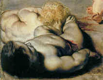


![]()
The Sistine Chapel Restorations, Part III: Cutting Michelangelo Down to Size

“Judging by Past Experience, it is Perilous to Suggest Restoration…”
~ Charles Heath Wilson, 1881, “The Life and Works of Michelangelo Buonarroti”. Publisher: John Murray, London.
“I once barged into a correspondence in The Times when the National Gallery was under fire from the ‘anti-cleaners’. I was ticked off very severely by Lord Crawford, the Chairman of the Trustees. I had, mildly I thought, criticised the authorities for ignoring the sincerely held views of the opposition…I was later restored to favour in high places when I made it clear in an article in The Studio that I was convinced that our National Treasures were in the keeping of qualified responsible people.”
T. J. Honeyman, 1971, “Art and Audacity”. Publisher: Collins, London.
It is not widely appreciated how inherently dangerous art restoration practices remain, or how culturally deranging restoration changes can be. At the bottom end of the trade, restorers often advertise their services on a promise to leave pictures “as good as new – or better”. The restoration of Michelangelo’s Sistine Chapel ceiling was – on the accounts of its own restorers and initiators – the biggest, the best, the most scientifically advanced and “radically transforming” top-end restoration ever undertaken. This “Restoration of the Century” left one of the world’s greatest artistic accomplishments so profoundly unlike its former self that enthusiasts could announce the discovery of a “New Michelangelo” who was “very different from the one art experts thought they knew”. At the same time, the chief restorer thrilled in 1982 that the frescoes looked as good as new: “as though they were executed yesterday”. In the midst of this commonplace restorers’ confusion between “recoveries” and “discoveries” (or sometimes, “revelations”), some surprising expressions of support materialised. In 1987, a top-end art historian writing in the magazine Apollo [Endnote 1] announced the demolition of the “Darkness Fallacy and the Sculptural Fallacy” within Michelangelo scholarship, and predicted that the then concurrent restorations of the Sistine and Brancacci chapels would leave both Michelangelo and Masaccio as “less isolated geniuses” who would be “returned to their respective periods” (i.e. confined within designated art historical boxes). In 1991, a newspaper art critic exulted in the displacement of “doomy outpourings of religious angst” by colours as “bright as Opal Fruits” – which colours reflected the workings of a “much more rational mind” [2]. Unsurprisingly, such professional pleasure-taking in chemical transformations that could cut artistic Titans down to size alarmed those who had been happy with the surviving Michelangelo, and an enormous controversy arose. Unsurprisingly, the criticised characterised the criticisers as instances of “the magnitude of the shock to entrenched opinion” that had been unleashed by a triumphant restoration. (As will be seen, the expression of sincerely held citicisms can be harshly punished when substantial vested conservation interests are challenged.)
Behind this interpretive culture war, the effects of the restoration on Michelangelo’s art were material and aesthetic. Those changes are forever. Although bad scholarship can be remedied by good scholarship, the latter cannot undo damage to unique, historic works. What remains to be done, a third of a century after the restoration’s 1980 launch, is a proper, disinterested aesthetically informed analysis of the restoration-induced changes, item by item, figure by figure, photograph by photograph; and, a frank evaluation and acknowledgement of their cultural and art historical consequences. Had this restoration’s profound transformation been accepted without challenge, we would be in a world today where technicians enjoyed unfettered licence to rewrite (or as they sometimes prefer, “to re-present”) history itself. Even tacit endorsements of injurious restorations can damage scholarship and falsify history.
The restoration of Michelangelo’s Sistine Chapel ceiling was well and publicly defended from 1980 until the mid 1990s. At that period, a seismic shift occurred. What follows is an examination from a British perspective of the restoration’s defences up to 1995 (in which year implicit art historical support for the restoration resulted in a seriously misleading exhibition at the National Gallery); and, a further presentation of visual proofs of the restoration’s injurious consequences. We note here how many supporters have admitted entertaining doubts about the restoration’s probity.
A new cleaning method, and the selling of a “New Michelangelo”
In the 1980s, at the height of an international restoration mania, a supposedly “advanced” “scientific” cleaning material was used on Michelangelo’s Sistine Chapel ceiling. It was ferocious in its effects and mechanistic in its application which was expressly designed to thwart personal and allegedly “subjective” and “unscientific”, aesthetic appraisals. The most sophisticated imagery on an immensely important historic work of art was thus subjected to a “treatment” that derived not from the complexities of picture restoration and its necessary acts of discrimination and constant evaluation but, rather, from architectural stone cleaning techniques. This cleaning method altered the ceiling’s centuries old artistic/historic continuity to such a degree that the restorers and their supporters ventured that history would need to be rewritten. The changes, for sure, were dramatic: depictions of figures that had been archetypally and transcendentally alive were brightened, flattened, rendered more abstract, more “on the picture surface” and left with an altogether more modernist and imaginatively impoverished aspect. Contrary to official claims this (demonstrably) was not a liberation or recovery of the ceiling’s original condition and appearance – see, particularly, Figs. 1 and 60.
When Michelangelo’s ceiling was unveiled in 1512 the world was stunned by the grandeur, pictorial audacity and, above all, by figural inventions that had rendered the divine corporeal and vividly alive within our own space and time. Michelangelo had not so much made depictions-on-surfaces as conjured perceived spaces adjacent to the ceiling’s imperfect forms. His optically “sculpted” spaces – which opened vistas beyond the ceiling’s surfaces while simultaneously projecting figures in front of them – had been realised through powers of draughtsmanship and modelling with utter disregard for the “integrity” of the architectural surfaces. Seemingly palpable space was necessary to situate Michelangelo’s monumental programme of over three hundred figures – figures that ran from depicted carved stone sculptures (his architecture-adorning putti), through living, space-occupying young sculptural Adonis’s (his contorted, anxious ignudi) and, more prosaically, through the historical ancestors of Christ, to the divinely gifted Prophets and Sibyls, and finally to God Himself and his celestial supporters. This was immediately acclaimed as a dazzling artistic and illusionistic advance. Its eventual influence was to carry mural painting into the Baroque and beyond. Although artistic fashions and modes of description change constantly, for nearly five centuries this “stupendous” work’s vital relationships endured, as the many copies made throughout its existence testify (see Fig. 1b).
How Doubts became Denials
With the restoration of Michelangelo’s Sistine Chapel ceiling, while some art world players were galvanized into opposition, many others were excited and swept along by the presumptuous magnitude of the transformation. As mentioned, many of the supporters of the restoration have disclosed moments of doubt. We cited in our post of March 4th that the co-director and chief restorer of the ceiling, Gianluigi Colalucci, had said in 1990: “I must confess I harbour a lingering almost subconscious fear that someday someone will come, unexpectedly, with a really intelligent observation that will show all of us to have been blind.” The following year the Sunday Times art critic, Waldemar Januszczak, produced a celebratory book (“Sayonara Michelangelo”) in which he asked in the face of the transition:
“Who among us looking up for the first time at this new, bright, clear Sistine ceiling, perfectly rational, a light-filled work, was not tempted by the doubt: it can’t be so.”
This temptation was throttled by the sheer spectacle of the restoration as an art-changing performance:
“The thin and neat scaffolding bridge moved elegantly along the ceiling like a very slow windscreen wiper. In front of it lay the old Michelangelo, the great tragedian, all basso profundo and crescendo. Behind it the colourful new one, a lighter touch, a more inventive mind, a higher pitch, alto and diminuendo. It was being able to see both of them at once – Beethoven turning into Mozart before your eyes – that made this restoration such a memorable piece of theatre.”
Even the National Gallery’s thoughtful and scholarly (then) curator of Renaissance painting, Nicholas Penny, who recognised (“White Coats v. Bow Ties”, London Review of Books, 11 February 1993) that “The most terrifying thing about the restoration of old paintings and sculpture, as distinct from the editing of texts, is that something might be lost altogether”, swallowed his own moment of anxiety:
“But perhaps one should admit that something is lost however much is gained by any intervention – some possibility of interpretation if not some actual pigment or glaze or polish.” [Emphasis added.] With a seeming acceptance of such material and interpretive losses, the greater gains in the Sistine Chapel were said by Penny to have emerged as follows:
“Study of the ceiling now that it has been cleaned tends to distance Michelangelo from the art of recent centuries – and from the work of artists who were inspired by the ceiling – and reveals a far closer connection with the dazzling colours favoured by artists in his immediate following and also evident in some of the better-preserved 15-century Florentine panel paintings.”
Note the cultural role being served by “restoration” changes: even when their legitimacy is vehemently challenged, restorations facilitate through “study”, new interpretations and a certain re-shuffling of scholarly furniture. Scholars and restorers invariably say that they have duly considered and rejected the criticisms as ill-informed, but the fact remains that eventually all restorations themselves come to be rejected and undone by later restorers. Indeed the alleged need to undo previous restorations is one of the commonest justifications for a restoration. The net consequence of repeated restorations is not a return to an original condition each time, but a daisy chain of altered alterations, with each successive restoration leaving the given work looking unlike its previously “restored” state. With accumulating alterations, works get thinner and thinner. Insofar as such abraded appearances are acknowledged, they are attributed to previous “rubbing”, or other euphemisms. Losses of original material during restorations (as Penny conceded) are to some degree inevitable. This is because while painters work from supporting canvases or panels upwards, restorers work downwards with their solvents and abrasives towards or beyond pictures’ finished surfaces. Collisions are inevitable.
The “New Michelangelo”
The art historical revisionism that advanced with this restoration might have been plausible had changes of colouring been the only changes, and had any of Michelangelo’s contemporaries noted dazzling colours. By any properly visually alert appraisal, however, the changes were less ones of enhanced chromatic power than of debilitating losses to the ceiling’s initially celebrated dramatic modelling and lighting (see Fig. 60). Although Nicholas Penny acknowledged such objections to the received critical consensus, he nonetheless caricatured them:
“Polemics against the restoration appeal repeatedly to the ideas of chiaroscuro and harmony as artistic absolutes.” The implication that critics were in the grip of a fetishized false artistic consciousness was underscored: “It is painful but important to acknowledge that the inspiration one artist draws from another, earlier one is often inseparable from misunderstanding.” It is a common defence against critics to allege some “misunderstanding” of the “facts” because of ingrained or entrenched prejudices but with this restoration the objections stemmed not from misapprehensions or misplaced adherence to ahistorical idée fixes, but from the fact of the concrete, demonstrable and historically verifiable injuries to the painting.
Further Material Evidence of Injury
Having shown many directly comparative pairs of “before” and “after” restoration photographs as proofs of injury – we further present seven single photographs (Figs. 1 to 6 and 48b), each of which alone testifies to the destruction of the final stages of Michelangelo’s painting. To pinpoint the unsoundness of the restoration’s theoretical underpinning, we also show two other works, one drawn (Fig. 41), one painted (Fig. 47) that seem emblematic of serious critical neglect. It will be argued that insufficient respect for the artistic and documentary records (particularly in the form of graphic copies and related paintings) facilitated an initial misdiagnosis of Michelangelo’s painting methods. In addition, we examine the “macro” consequences in terms of changes to the previous relationships between the broad and differentiated zones of the Sistine Chapel’s consecutively decorated surfaces.
Selling the Restoration and Blocking the Critics
In December 1987 two articles that acknowledged the intensity of the controversy were published in Britain. One was a work of journalism by a leading cultural writer with strong interests in science, Brian Appleyard. The other was a full-blown and frankly declared Public Relations Apologia by Kathleen Weil-Garris Brandt, a professor of art history at New York University, a consultant member of the Vatican’s Scientific Advisory Committee on the restoration, and the Vatican’s spokesman on “scholarly and general information” for the public relations firm Arts and Communications Counsellors, which had been retained to handle the crisis.
To take the former first: on 20 December 1987 the Sunday Times magazine carried an article on the restoration – “Lost or Found?”. Its author, Brian Appleyard, acknowledged that he had been “carefully and elaborately briefed” by the co-directors of the restoration, Fabrizio Mancinelli, the curator of the Vatican Museums’ modern paintings, and Gianluigi Colalucci, the head restorer, and by Professor Carlo Pietrangeli, the director of the Vatican Museums, and that the next day he had been “scientifically persuaded” by the Vatican’s chemist, Nazzareno Gabrielli. Nonetheless, Appleyard gave a fair and balanced account, citing the arguments of James Beck, a professor of art history at Columbia University, New York. Even while recognising that “the vast majority of art historians are on the side of the Vatican”, Appleyard concluded “So far the Vatican have been troubled by Beck but have been secure behind the battery of art historians prepared to stand up and oppose him. But his fury and energy are beginning to pay off. More and more awkward questions are beginning to be asked and he warns of more home-grown opposition in Italy.”
An Artist Thwarted
The article itself prompted controversy in Britain by including directly comparative before and after restoration photographs of sections of the frescoes. To this artist’s eyes, those photo-comparisons showed instantly that the “cleaning” was damaging and that the protests were well founded (see Figs. 9 to 11b). Working then as the principal illustrator of the Independent, a new and fashionable newspaper with excellent arts coverage, I asked the arts editor if I might write a short article demonstrating the ways in which the ceiling was being damaged. He declined on grounds that the newspaper’s art critic, Andrew Graham Dixon, had (like Beck) visited the scaffolding, and had been persuaded (like many art historians and critics) that all was fine.
Thus, the first lesson in this controversy was that an artist who had trained for four years in a junior art school, for five years in a fine art college and for three post-graduate years at the Royal Academy Schools – and who afterwards had taught and practised drawing and sculpture for fifteen years – could be unvoiced in a debate about the treatment of a work of art in deference to the views of someone sixteen years younger who had read English at university and art history at the Courtauld Institute (- on which institution’s restorations see “Taking Renoir, Sterling and Francine Clark to the Cleaners”).
An Artist Heeded
When the Independent launched a Sunday edition in 1990, its arts editor invited an article on the Sistine Chapel restoration. In preparation, I contacted James Beck who put me in touch with many key critics. These included, in Italy, Professor Alessandro Conti, Venanzo Crocetti, the sculptor who had worked on the previous restoration of the Sistine ceiling in the 1930s, the restorer Mirella Simonetti; and, in the US, the critic and writer Alexander Eliot and the painter Frank Mason. From the Independent on Sunday I spoke directly to Professor Brandt, Dr Fabrizio Mancinelli, Professor John Shearman, (an advisor to the restoration who viciously attacked Beck on the record and then threatened to sue if I published his grossly defamatory comments), and wrote to Gianluigi Colalucci. The second lesson had thus been that critics of restorations, however prestigious, could find themselves victims of scurrilous attacks from professional peers.
Shooting the Messengers
When surveying the restoration’s then decade long literature, Brandt’s 1987 Apollo article emerged as a seminal document. Its declared purpose had precisely been to defend the “transformation of Michelangelo’s mysterious dark frescoes…into [the] blazing colouristic pyrotechnics that is attracting the most public attention and controversy” (this was despite the fact that Michelangelo had been praised at his own funeral for “the fleeting and sombre colours with which he had formed such rare and lofty shapes”). Most striking of all was Brandt’s assaults on the restoration’s critics, whether they were scholars, restorers, traditionalist artists or fashionably modish artists:
“But, a tiny, heterogeneous and vociferous cadre emerged with the dramatic charge that Vatican conservators are ruining one of the great icons of western civilisation. “Convinced of the urgency of their mission, the critics conducted their campaign in the international press and television and achieved a remarkable degree of public visibility. A letter by a well-meaning group of American master painters of the Pop generation, calling for a halt to the cleaning of the Sistina (as well as the Last Supper) was one index of their success. An interview with one of the American Sistina critics in People Magazine was, however, another… “To the ears of most art historians and conservation experts, however, the critics claims sounded more and more like the wild cries of some ferocious mutant of Chicken Little. Many believe that the critics, like that benighted bird, were misunderstanding insufficient evidence to draw mistaken conclusions to the alarm of the neighbours. Still the issue is a serious one. Are the critics merely opportunists, body-surfing on a wave of publicity they would never otherwise have enjoyed? Or should we be hearing in their polemics a warning that the cleaning of major works of art is another of those matters too important to be left to the experts?” “If the critics’ questions have such detailed answers, what is the continuing public fuss about? Why has the criticism been so remarkably vague, shifting and misinformed? Why have the critics been so reluctant to make the frequent visits to the Sistine Chapel scaffolding…Why does criticism remain invulnerable to the abundant available information. How could such a small group of people, none of whom is – in a professional sense – an expert on Michelangelo and conservation, attract so much publicity and even some well-intentioned adherents? (The original nucleus of nay-sayers consists of only five persons: two painters, one former art critic and two art historians, distributed in Italy and the USA; connexions between them exist but are hard to define.)”
In addition to an insinuation of some underlying conspiracy, Brandt appended an imputation of political motivations that served as platforms for personal opportunism:
“It is easy to see how any hint that the Vatican might be hurting Michelangelo could fuel political fires while providing a chance for professional power play among factions of the intellectual establishment.”
If political motivations combined with personal power play might exist among critics in Italy, Brandt maintained, the situation was different in the United States where:
“The continuing publicity has, of course, also become a phenomenon in itself with a life and fascination of its own. All the more significant that only one American scholar has been tempted to join the public furore. “None of this grandstanding matters much – although one doesn’t like to see an important issue distorted and people misled. I do not believe that a tenacious campaign of ill-informed criticism and personal attacks on the conservators will stop the careful cleaning of the Ceiling.”
Traditional Slurs
At this historical point Brandt’s past abuse of the critics might best be taken to have been self-answering. Her assurance that “the cleaning chemicals do not actually come into contact with the fresco surface” has not worn well and, besides, was at odds with the chief restorer’s earlier admission that if left on a minute too long the chemicals began devouring the fresco surface and Michelangelo’s shading with it. Similarly, her claim that the restoration had been “spurred by the alarming discovery that the glue layers were contracting as they aged , and were pulling flakes of plaster and pigment away from the surface of Michelangelo’s frescoes” proved an impermanent position. As was later reported in “Art Restoration, The Culture, the Business and the Scandal” (James Beck and Michael Daley, 1993), it had been claimed in 1986 (six years into the restoration) that “various checks [had] ascertained that in several places minute flecks of colour were lifting” and that this had “necessitated an immediate restoration.” In 1987 it was said that extensive areas of flaking were progressively worsening and threatening an imminently “uncontrollable situation”. By 1988 Vatican spokesmen were claiming that the weight of encrustations upon the paint surface was causing it to break away from its ground. By 1989 it was said that the glues had “shrunk and puckered” causing “scabs” to fall away “pulling pigment with them”. It was said that this “slow destruction by glue-pox” was “the Vatican’s principle motivation for cleaning the ceiling”. When we asked Brandt in 1990 how big the puckerings were, she replied “Oh! Some are as big as your hand.” Soon after, in 1991, the problem de-escalated: initial investigations were acknowledged, once more, to have encountered “minute desquamations and loss of pigment.”
Brandt’s patronising claim that “the so-called ‘controversy’ is not actually about facts and issues but is a reflection of culture shock” lamely echoed charges made in earlier restoration controversies. During the National Gallery cleaning controversy in London in the late 1940s the critics were said by the art critic, Eric Newton of the Daily Telegraph, to be suffering from the “shocked eye”, a condition which afflicted “the connoisseur and the artist – the visually sensitive man with a quick eye and profound reverence for what he had seen”. Just as at the Sistine Chapel, Newton’s dismissal of the expertise of creative players was made on the claimed authority of restoration “science”. Such generalised appeals to the authority of science often prove to be empty incantation and Newton volunteered no more than “The purely scientific and technical aspects of the process, however are too complex to describe here.”
In 1857 picture cleanings at the Louvre were defended on the grounds that “It is understandable that the romantic amateur loves the rust and the haze of the varnish, for it has become a veil behind which he can see whatever he desires” (Horsin Déon). One critic of the Louvre’s restorations, Edgar Degas, threatened to produce a pamphlet that would be “a bomb”. When Brandt dismissed the Sistine Chapel critics on the grounds that the controversy was “rather unreal since the arguments against cleaning are mainly nostalgically emotional [while] those on the other side are chemical and scientific” she presented her role as being to “dissolve some of the murky argument and preserve a few facts”. As will be seen, artists and art historians can have distinctly differing views as to what constitutes a “fact” and what a blind prejudice.
The Evidence of Restoration Injuries – and the Surprising Reactions To It
When the Independent on Sunday’s picture desk obtained high-quality colour transparencies from the Vatican in 1990 we examined the image of the Erythraean Sybil, part of which had been shown in Appleyard’s Sunday Times article, and encountered among many losses the restoration-mangled foot seen at Figs. 2 and 3. Those losses and losses to a figure on one of the lunettes were first published in the Independent on Sunday of 25 March 1990 (see Figs. 12, 13 and 14) and then later in the Independent of 20 March 1991, where the arguments against the restoration were put by Daley, Beck, Conti, Eliot and the art historian Bruce Boucher, and balanced by three counter arguments.
Of the latter, Ernst Gombrich was harshest on the critics: “No one is infallible, but I have not the slightest doubt that the overall impression and operation is right, and the critics talk absolute nonsense.” The Courtauld Institute-trained editor of The Art Newspaper, Anna Somers Cocks, condescended that some people liked things to look “romantic and old, and can’t cope with the clarity and brilliance of what the Sistine Chapel looks like now it has been cleaned”. The Courtauld Institute-trained Nicholas Penny said “It’s one of the great revelations of our time but the transformation is so absolutely amazing that it is bound to give some people a shock and I am sympathetic to them being shocked”.
Brandt’s 1987 Apollo account had fallen on well-worked ground in Britain where even art world players with strong track records of being critical of restorations had become supportive of this restoration. The Courtauld Institute-trained restorer Sarah Walden, who had implicitly criticised many of her peers and predecessors in her 1985 book “The Ravished Image ~ Or How to Ruin Masterpieces by Restoration”, was one such and she offered this (simplistic) technical distinction in defence of the restoration’s results:
“Unlike easel paintings, frescos are not a film of paint on a surface but impregnate their own support and need no varnish. Given an intact, dry wall, they are spared many of the rigours of restoration, except for the removal of dust and dirt. As the recent cleaning of Raphael’s Galatea in the Farnesina in Rome has shown, and as the present work on Michelangelo’s Sistine Chapel seems to confirm, this is one area where impressive results can be had with far less risk.”
As shown on 28 April 2012, the restorer Leonetto Tintori had discovered on examining the ceiling that it had been covered by what he termed “Michelangelo’s auxilliary techniques” which included not just glue or size painting but also oils. Walden, whose principle critical complaints had been against the “Anglo-Saxon” schools of restoration in Germany, Britain and the US, as opposed to the “Latin” restorations of France and Italy [3], had evidently accepted the restorers’ claims that Michelangelo had simply coloured successive patches of wet and drying plaster at great speed and thereafter accepted whatever disparities and inequalities of value emerged on drying without making any unifying or enriching interventions with glue-based painting a secco on his fresco surfaces when dry, as was customary and as had been noted by his contemporaries. She had further accepted the restorers’ (revisionist and unsupported) claims that the large amounts of glue-based material on Michelangelo’s frescoes had been applied by restorers as a “varnish” to a work which, on her own account, would have required no varnish, and despite the fact that previous Vatican restorers had attributed that very material to Michelangelo. Gombrich, who had played a prominent role in the post-war cleaning controversies at the National Gallery in London – and who had written the Foreword to Walden’s book – was similarly persuaded by the present Vatican restorers’ well disseminated technical account.
Gombrich’s Startling Lapse of Scholarship and Visual Acuity
In 1995 Gombrich presented an exhibition, “Shadows: The Depiction of Cast Shadows in Western Art”, at the National Gallery (London) on the thesis that an avoidance of cast shadows had been “widespread among painters of the High Renaissance”. He did so without reference to the paintings of Michelangelo or Raphael. (When pressed on these omissions he replied “I never meant [the catalogue] to be an encyclopaedia of all cast shadows, though some of my readers seem to assume so.” – Letter to Michael Daley, 10 June 1995.) As will be shown, in a curious fashion, Gombrich’s pictorial amnesia constituted the logical terminus of a more general denial by art historians of the distinctive artistic relationships that had survived on the pre-restoration ceiling, and of the connections between those relationships and the art forms of the period and immediately afterwards. Defending this restoration became an exercise in not-seeing what was and what had been. Gombrich’s position on this restoration was a great disappointment to us given his outstanding earlier contributions.
Gombrich on the Sanctity of Scholarship
In 1978 as the Vatican Museums’ curators, restorers and scientists were moving towards restoring the Sistine Chapel ceiling, Gombrich had discussed one of Michelangelo’s prophets – his Ezekiel – in the context of problems of art connoisseurship and medical practices (and with no reference to colour) [4]. He pointed out that just as with placebos “suggestibility plays a part in our response to works of art”. Demonstrating by a comparison between Jeremiah and Ezekiel that the latter was uncharacteristic of Michelangelo but characteristic of Raphael, he firmly attributed its execution to Raphael (see Fig. 25). Of all the prophets on the ceiling, he contended, this one alone lacked Michelangelo’s profound stylistic traits: “he always negates the picture plane. Jonah being the most famous example of this space-creating and surface-denying imagination, which so aroused the admiration of Renaissance writers.” How could it have been overlooked, Gombrich continued, that the Ezekiel, far from denying the picture plane, asserted it: “Instead of being self-enclosed it impetuously moves to the right, addressing an unseen partner in what looks like a violent argument. It is this implied movement which tears the cohesion to pieces and introduces a shrill note of drama entirely absent from the other creations. The composition is only superficially Michelangelesque…” Further, what the Ezekiel betrayed in its agitated gestures was Raphael’s own great indebtedness to Leonardo: “Indeed it is hardly too much to say that Ezekiel would fit comfortably into the groups of the apostles in the Last Supper of S. Maria delle Grazie.”
This was vintage Gombrich, learned, conceptually adroit, visually acute and boldly re-attributing a Michelangleo to Raphael through Leonardo. Except that here his elegant arguments and persuasive stylistic “evidence” amounted to no more than a plausible contrivance – a conceit that was, he confessed, an art connoisseur’s equivalent of the medical practitioner’s placebo. He hoped that connoisseurs “will not take offence and that the spirits of Michelangelo and Raphael will forgive me this harmless fabrication.” (Was that jest to become a maquette for a far greater and undisclosed prank on those two great artists seventeen years later?)
Gombrich and the Guardians of Memory
Two decades earlier, in a moving 1957 essay “Art and Scholarship”, Gombrich had championed the scholar as “the guardian of memories”. It seemed that he had been stung to do so by the painter Wyndham Lewis who had recently written:
“When I see a writer, a word man, among a number of painters, I shake my head. For I know he would not be there unless he was up to something. And I know that he will do them no good…”
Gombrich’s retort was: “Why should the artist bother about that spoilsport the scholar and his past? The brief answer to this question, I fear, may sound moralistic. Because truth is better than lies.”
Indeed it is – but this leaves his own later omissions in the National Gallery exhibition the more perplexing: How could so great a scholar make so seriously misleading and unfounded a claim in (seeming) defence of such an unsupportable restoration? Spicing this mystery is the fact, as shown below, that Gombrich’s faith in the Sistine ceiling restoration was not absolute and that he, too, like Colalucci, Januszczak and Penny, had once acknowledged a moment of doubt.
Gombrich’s Moment of Doubt
As mentioned, Gombrich was as one with the views of the restorer Sarah Walden on this restoration. Walden was to persist with her endorsement of the restoration until at least 2004 when, in a revised edition of her book (now titled “The Ravished Image ~ An Introduction to the Art of Picture Restoration & Its Risks”), she pressed Gombrich into a swipe at critics of the Sistine ceiling restoration:
“The subject of restoration tends to attract cranks and fanatics, but to suggest that the world’s foremost art historian was one of those would be absurd. He approved for example of the cleaning of the Sistine Chapel, and wrote to me about an Italian who opposed it and was seeking his support: ‘Of course he wants to use [my writings] as ammunition against the cleaning of the Sistine Chapel, but I do think the problems of cleaning are different…I have been up the scaffold…I have no doubt that the team are aware of the many problems…I am even fairly happy about the work on the Sistine ceiling.’” [Walden’s ellipses.]
While Walden tactfully refrained from identifying the Italian critic, by publishing a letter she received from Gombrich in 1987 in the revised book, she revealed an intriguingly confessional remark:
“Last week I was sent a book from Italy violently attacking the ‘cleaning’ of the Sistine ceiling. It may contain some exaggerations but it is still disquieting. Michelangelo e la Pittoria a Fresco, by Alessandro Conti (La Casa Usher, Florence 1986). If you read Italian and have a little time during the next few weeks I’ll gladly lend it to you to look at.”
That unsettling book was later described by Penny in the LRB as “the most sustained polemic against the restoration”. Charles Hope, an authority on Titian and then the Senior Lecturer in Renaissance Studies at the Warburg Institute, London, wrote (in a letter of 1994 to the restorer Helen Glanville – see below) that “The scholar who has done most to draw attention to the relevant texts is of course Conti; and whatever you think of his book (he is not a restorer, by the way), I am sure we can agree that it is obligatory reading for anyone interested in the controversy surrounding the ceiling. Yet […] and so on not only pass over his arguments in silence instead of addressing them, they seem never to cite his book at all…” Gombrich, too, would seem to have suppressed his own disquiet and passed over Conti’s arguments even though he must have appreciated that Conti was a very considerable authority on restoration having taught the History and Techniques of Restoration at the University of Bologna; the History of Modern Art at the state university in Milan; and, the History of Art Criticism at the University of Siena. In his 1988 “History of the Restoration and Conservation of Works of Art” (republished by Butterworth in a 2007 English translation by Helen Glanville) Conti spoke of the alien “material and chromatic robe” with which the Sistine ceiling paintings had been invested “during the present restoration” and identified “the various media” Michelangelo had used on the ceiling as “fresco, lime and secco”. (For Conti’s further comments in that book on Domenico Carnevale’s repairs to Michelangelo’s ceiling, see the caption at Figs. 48a and 48b. That his now very scarce Michelangelo e la Pittoria a Fresco has yet to be published in English might itself be thought something of a scandal.)
The Context of Gombrich’s National Gallery Exhibition
Gombrich’s 1995 exhibition came not just towards the end of his long and distinguished career but at the end of a brief period of intense discussions in Britain on the restorations at the Sistine Chapel and the National Gallery. We had been at pains to show that extreme as the Sistine Chapel restoration was, it was part of a wider radically transforming international assault by restorers acting on historic works of art in the name of their “conservation”. (Between 1990 and 1995, this author alone had published twenty-three times on those subjects – see Fig. 12.) Such discussions greatly accelerated with the publication of the 1993 Beck/Daley book “Art Restoration ~ The Culture, the Business and the Scandal” which, in addition to two chapters on the Sistine Chapel carried a chapter on the National Gallery’s restorations. Responses to the book were various and sometimes startling. They prompted an additional chapter, “The Establishment Counterattacks”, in the revised 1996 American paperback edition. We should acknowledge here that the National Gallery, under its present director, Nicholas Penny, as initially under its previous director, Charles Saumarez Smith, has given ArtWatch UK full and most generously helpful access to all conservation and archival records, and that we have drawn heavily on the compendious material on the Gallery’s conservation practices that is provided in the annual Technical Bulletins. Moreover, since 2012 the Gallery has placed much archival material online.
Responses to “Art Restoration, the Culture, the Business and the Scandal”
After his initially even-handed coverage, Brian Appleyard now characterised Beck in the Independent as being “litigious” – even though he had brought no legal actions but had been sued (unsuccessfully) for criminal slander by an Italian sculpture restorer and had faced a possible prison sentence of three years. Appleyard compared the Beck/Daley book unfavourably before its publication – and before he had read it – with Walden’s book of 1985, specifically dismissing its unseen chapters on the Sistine ceiling on a Waldenesque insistence that “The fact that it was largely pure fresco made the cleaning process straightforward.”
On 18 November 1993 the New York Review of Books carried an essay by Charles Hope, on “Art Restoration ~ The Culture, the Business and the Scandal”. Hope (who was later to become, as Gombrich had been, the director of the Warburg Institute), recalled that “like many other art historians” his initial response to the cleaning had been “entirely favourable”, but which confidence, he now confessed, had been “entirely misplaced”. Viewed in their entirety, the cleaned frescoes create “a decidedly disagreeable impression: the colours are gaudy…the figures look crude and often flat and the architecture seems insubstantial and pedantic.” In short, “Restrained grandeur has been replaced by garish confusion” and it was “difficult to believe that the right procedure was adopted.” Worse followed for the restoration establishment. “Restorers are not always particularly well-informed about the history of art nor especially interested in it”, while, for their part, art historians “seldom have the scientific training to judge the full implication of the courses of action proposed to them.”
Perhaps most disturbing to the Sistine Chapel restoration supporters was Hope’s acknowledgement that when “Talking to friends I find that my unease is widely shared; and it is certainly noticeable that the completion of the restoration has not attracted the kind of acclaim that greeted the unveiling of the lunettes.” After the publication of his review, Hope told Beck in a letter (20 November 1993) “You’ll be cheered to know that several art historians have told me, by letter or in person, how glad they were that I had said what I did.” This greatly amplified a note of caution that had already been present in Nicholas Penny’s observations in the LRB nine months earlier:
“I have met few art historians, even among those who are nervous about the cleaning of paintings, who believe that a mistake was made in cleaning the ceiling. Nevertheless, many art lovers were shaken by what has been published on the subject and some have been no less alarmed by what they have seen in the chapel itself.”
A Restorer’s Response
Temperatures rose after Hope’s review. The Art Newspaper allotted four pages in its May 1994 issue for the counter arguments of Helen Glanville, a Courtauld Institute-trained picture restorer who had read Modern Languages at Oxford. Like Brandt seven years earlier in Apollo, Glanville struck a combative tone and a tendentious note by producing accounts of our “Accusations” against which she provided lawyerish “Defences” written in consultation with the authorities. In 1963 Gombrich had complained “Nobody who criticizes the policy of a great institution expects such criticism to be accepted without further argument. What one has the right to expect, however, is that the answer should concern itself with the substance of the criticism.” In language eerily reminiscent of that used against Beck by Shearman, Glanville challenged not only our character but the judgement of those who had supported us: “The most disturbing aspect is that reviews of the book (including that by Charles Hope in the New York Review of Books of 18 November 1993) appear to indicate that even respected members of the art world accept Daley’s presentation of ‘facts’ at face value”.
Hope’s Riposte
Hope sent a letter to Glanville explaining that he had been “particularly careful not to take Daley at his word”, that he had checked what I had written on Sebastiano was in accordance with the monograph on the artist by Professor Michael Hirst (of the Courtauld Institute, and a member of the Vatican’s Pontifical Commission for the Restoration of the Sistine Chapel ceiling), and also with “the account of the [Sebastiano] restoration in the National Gallery’s Annual Report”. In further reproach, he added “I would have thought it was fairly obvious to anyone familiar with the recent literature that I had done my homework, not least because there are various arguments and texts used in the review which do not figure in the Beck-Daley book at all. [5] In my review I have tried very hard to be fair to both sides…Having read your article I see nothing that ought to be changed; indeed it would be difficult to see what you actually found objectionable in it…Before I began working on the review my scholarly sympathies were entirely on side of the defenders of the recent restoration, and I was hoping indeed expecting, to be persuaded that my unease at the present appearance of the ceiling was unjustified. But the reverse has happened, and not just because Beck and Daley produced such compelling arguments…” Hope then set out with great clarity the scholarly import of the material evidence we had supplied and which he had found persuasive:
“I was disappointed that you did not discuss directly what seemed to me the most important single type of evidence in the whole controversy, the drawing by Clovio of Jonah [see Fig. 1] and the one at Windsor showing the whole ceiling. Both of these, as you will remember, can be securely dated to no later than 1534, and they both show very specific, well-defined areas of shadow also recorded in the engravings of the sixteenth century and later, which have now disappeared. The important thing is that the drawings predate the engravings, that they were manifestly produced independently of one another, yet they are consistent. If they are misleading in the same way, we need to have some explanation of why this is so, because if Michelangelo did paint shadows of the kind they show, and in the places they show, then Beck and Daley would seem to be vindicated.”
Gombrich’s Denial of Historical Realities
Coming so soon after Hope’s generous and substantial support, Gombrich’s claim, as a scholar with an impeccable record as a critic of restorations, that cast shadows had popped out of existence for the duration of the High Renaissance might have seemed like manna to the National Gallery and the Vatican. Did his historical account not implicitly constitute a most authoritative rebuttal of the Beck-Daley, Hope-supported, central claim that the destruction of Michelangelo’s cast shadows had given historically corroborated proof of injury to the Sistine Chapel ceiling? In so doing, did he not also provide express relief to the restorers themselves? If the shadows had never existed during the High Renaissance, as he was claiming, how could they possibly have been harmed in restoration?
In May 1994 The Art Newspaper published my letter of reply to Glanville’s article. It concluded: “this concern [over restorations] is shared by others. The current director of the Prado, Calvo Serrraller, has condemned the Sistine Chapel restoration as a misguided ‘face-lift’. A restorer in St Petersburg complains of the ‘perniciousness of radical British restoration techniques’. A curator of New York’s Metropolitan Museum condemns the ‘strident tones’ produced by ‘the exuberant cleaning of paint surfaces, for which the National Gallery has unfortunately become famous’. It is a pity that the National Gallery staff are not prepared to debate these matters directly. It is a pity that discussion should be necessary at all when, to educated eyes, the evidence of injury contained in before and after cleaning photographs is so unmissable.” It would seem, (on Gombrich’s recollection – “In the shadow of the masters”, interview, The Art Newspaper, May 1995) that that very month, the National Gallery’s director, Neil MacGregor, approached Gombrich to ask whether he would do an exhibition in the “The Artist’s Eye” series (in which artists assembled and discussed selections of paintings made from within the Gallery’s collection).
Mr MacGregor’s Choice
Gombrich submitted five or six proposals from which, he said, MacGregor “selected shadows”. Thus the National Gallery had obtained an exhibition that purported to explain why the masters of the High Renaissance had opted to “show us a shadowless world”. If the content was helpful to the Gallery, the fact of Gombrich’s participation might have been a greater boon still. As a critic of the Gallery’s restorations during the 1950s and 1960s he had been a dangerous foe. Before becoming the National Gallery’s director, MacGregor, as editor of the Burlington Magazine, had himself been a partisan of restorations and was well aware of Gombrich’s standing in these disputes. In a Burlington editorial in January 1985, MacGregor had written:
“Cleaning controversies are probably the liveliest, and they are certainly the hardiest, of the art world’s perennial topics of discussion. Of course, thefts and exports make bigger headlines, but they lack conversational staying power, just as new record prices slip faster and faster from the memory. But debates on cleaning run and run, this Magazine having been the forum for one of the most celebrated jousts in the early 1960s.”
MacGregor then drew a distinction that marked a crucial advance that picture restorers had made by the 1980s: “Then the key question was how, or even whether, to clean. Now it is more likely to focus on what can be learnt through cleaning about the picture itself.” This rebranding of art restoration, despite all of its inherent risks, as an aid to scholarship had seemed a spectacular professional coup. By the late 1980s museum restorers had forged a common professional alliance with curators in which “discoveries” made in the course of a restoration could be presented to the world through professional journals, museum press releases, and newspaper/television interviews. The National Gallery laid claim for having pioneered the new hybrid discipline known as Technical Art History, in which curators, restorers and scientists pool efforts so as to fly in tight professional formations. In reality, museums and galleries had set themselves a trap – and Gombrich had chosen the worst possible moment to flip sides in the Great Restoration Battles: to talk about what has been learned/discovered requires the production of material, visual evidence and such evidence becomes fair game for examination.
Gombrich’s Case Against the National Gallery’s Restoration Methods
In 1950 Gombrich had drawn attention in a letter to the Burlington Magazine, to a passage in Pliny which described wondrous effects achieved by the legendary painter Apelles when he finished off his pictures with a thinly spread dark coating or “varnish”. How could we be sure, Gombrich asked, that no Renaissance masters had ever emulated the great painter of antiquity by applying similarly toned varnishes to their own works? He received no reply from the National Gallery. Ten years later, he put the question again in his book “Art and Illusion”, this time provoking Helmut Ruhemann, the Gallery’s pioneering exponent of “Total Cleaning”, into a categorical insistence that “there is no evidence for anything so inherently improbable as that a great old master should cover his whole picture with a ‘toning down layer.'”
Gombrich returned to the fray in 1962 in a Burlington Magazine article (“Dark varnishes – Variations on a Theme from Pliny”) contending that even a single instance of tinted overall varnish would undermine the philosophy of the Gallery’s intrusive restorers who presumed to discern and recover originally “intended” effects among the complex, variously degraded, many times altered material layers of old paintings. Gombrich had cited Pliny’s remarkable technically eloquent account of Apelles’ method: “He used to give his pictures when finished a dark coating so thinly spread that, by reflecting, it enhanced the brilliance of the colour while, at the same time, it afforded protection from dust and dirt and was not itself visible except at close quarters. One main purpose was to prevent the brilliance of the colours from offending the eye, since it gave the impression as if the beholder were seeing them through a window of talc, so that he gave from a distance an imperceptible touch of severity to excessively rich colours.” To the National Gallery the suggestion that colour might be suppressed in any degree by an artist was an affronting heresy, and the idea that a dark toning layer might simultaneously render colours individually more brilliant while collectively more unified was an oxymoron.
The Gallery’s then head of conservation science, Joyce Plesters, responded with a long, witheringly dismissive rebuttal in the Burlington (“Dark Varnishes – Some Further Comments”). Professor Gombrich, she insisted, lacked “technical knowledge” and his scholarship was incomplete and misinterpreted. The entire documented history technical history of art – much of which she appeared to quote – showed that “no convincing case” could be made for a single artist ever having emulated Apelles’ tinted varnish. The passage from Pliny, she sniffed, was but a matter of “academic rather than practical importance” – a charge that was echoed by the director, Philip Hendy, in the Gallery’s Annual Report where he disparaged technically ignorant “university art historians”. Plesters grandly offered to “sift” and “throw light” upon any further historical material that Gombrich or others might care to present in future directly to the National Gallery. Once again, a moment of high political danger for the Gallery’s restorers and curators passed: if no evidence existed of artists having used glazes and varnishes in the manner alleged by critics, how could restorers possibly be damaging them?
The controversy slowly subsided into isolated protests such as that of the painter Pietro Annigoni who painted “MURDERERS” onto the doors of the National Gallery, one night in 1970, in protest against what he had described in a 1956 letter to the Times as “atrocious results [that] reveal an incredible absence of sensibility”. But by 1977 it was “game-over”, so to speak. That year the National Gallery felt confident enough to launch its Technical Bulletin in which restoration methods would be described and illustrated. In it, Plesters mused complacently that “one or two readers may recall the furore when the cleaning of discoloured varnishes from paintings…began to find critics”. (On Plesters’ own technical incompetence, see our post of 27 January 2011.) In the same year a former director of the Gallery, Kenneth Clark, pronounced picture cleaning “a battle won” and claimed responsibility for the victory by having installed a “scientific department with all the latest apparatus” at the National Gallery. He had done so, he said, not because he believed in the “application of science to picture cleaning”, but rather because “until quite recently the cleaning of pictures used to arouse extraordinary public indignation, and it was therefore advisable to have in the background what purported to be scientific evidence to ‘prove’ that every precaution had been taken.”
Gombrich’s Vindication
Joyce Plesters died in October 1996. Earlier that year the National Gallery’s Technical Bulletin carried reports of the cleaning of two paintings by Leonardo’s follower Giampietrino. One, his Salome, had suffered the usual weakening of modelling and shading. The other, his Christ carrying his Cross (Fig. 45) had not. Intriguingly, the latter was said to enjoy both “intensity of colour” and a “restrained overall effect” – the very paradoxical effect the Gallery had dismissed as inherently improbable. Even more remarkably, Giampietrino had first built up an “illusion of relief” with “dark translucent glazes”, and then – just like Apelles – had deliberately “restricted his own range of values” with “a final extremely thin overall toning layer consisting of warm dark pigments and black [!] in a medium essentially of walnut oil with a little resin”. The “varnish” was thus virtually identical as a material to the painting itself – which may explain why it had survived for so long. Many, more soluble, resin varnishes with warm dark pigments had been judged to be earlier restorers’ attempt to impart a deceiving “old masters’ glow” after a harsh cleaning…and removed as alien disfigurements.
Conspicuously, the Technical Bulletin reports made no reference to the Burlington Magazine’s celebrated joust of the early 1960s. Had the Gallery privately informed its recently honoured guest exhibitor of his belated vindication, we wondered? It had not. When we informed Gombrich of this technical corroboration, he replied:
“Many thanks for your letter. I happen to have a birthday these days (87, alas!) and I could hardly have a nicer present than the information you sent me. I don’t ever see the N. G. Technical Bulletin and would have missed their final conversion to an obvious truth! Better late, than never. There is more joy in heaven (or Briardale gardens)…”
We published an account of the National Gallery’s remarkable discovery, and of Gombrich’s response to it, in the November 1998 Art Review (“The Unvarnished Truth”). Three years later in a prefatory remark for the revised 2004 edition of Walden’s book “The Ravished Image”, Gombrich announced: “It is now clear that the position I took forty nine years ago in this matter has been vindicated”. As, indeed, it had been, but curiously, Gombrich declined to mention the fact that an exact analogue of Apelles’ reported practice had been discovered on the work of an associate of Leonardo’s within the conservation studios of the Gallery which had originally dismissed his claims but recently honoured him with an “autograph” exhibition. Instead, he attributed his vindication to research reported five years later in a Burlington Magazine article of January 2001 on work conducted in the conservation studios of the Getty Museum. The article, “‘Amber Varnish’ and Orazio Gentileschi’s ‘Lot and His Daughters'”, by Mark Leonard, Narayan Khandekar and Dawson W. Carr, was certainly an important document. It reported that underneath a thick recent, disfiguring but easily soluble varnish, an older thinner much tougher (but still soluble) varnish “remained directly on the paint surface in many areas.” Examinations of paint samples established that “in some areas at least”, this varnish layer had been applied “very early in the life of the painting”, if not originally.
It had been found that in areas where sections of this early, possibly original varnish had been removed in earlier cleanings, the artistic consequences had been devastating: “One particularly prominent loss was in the neck of the daughter at the left. The older varnish remained intact throughout the face, yet at the line of the chin it had been broken through, and removed throughout the rest of the neck. To the naked eye, it looked as if the final layer of modelling in the neck had been ripped from the surface. Although the preparatory flesh tones were still intact, the carefully nuanced sculptural solidity found throughout the rest of the face was missing.” Although no one noticed it, this last remark echoed and corroborated Annigoni’s Times complaint of 1956 that restorers at the National Gallery pronounce “miracles” when “brilliant colours begin to appear“. Unfortunately, he continued, “what they have found are nothing but the preparative tones, sometimes even of the first sketch, on which the artist has worked carefully, giving the best that is in him, in preparation for the execution of the finished work.”
Welcome as such recent confirmations of longstanding claims by artist and art historian critics of restorations are, it should be noted to how great an extent they are arising after the horse had bolted. The National Gallery has yet to disown any of its post-war restorations – in which period it has restored and often re-restored almost its entire collection and often to seriously deleterious effects (see Figs. 55 to 59b by way of example). As the unwisdom of stripping off old varnishes finally begins to gain acceptance in restoration and curatorial circles, the fact remains that had artists’ testimony been heeded, not only would the ponderous and hugely expensive particle accelerators and other “diagnostic” apparatuses of modern museum conservation departments not have been needed, but that much of our visual cultural patrimony could far sooner have been spared mistreatment. Even before Gombrich’s first 1950 letter to the Burlington, in 1946, a painter, Laura Knight, had explained the intrinsic dangers of picture cleaning with perfectly calm “hands-on” knowledge and clarity in a letter to the Times (27 November):
“With the exception of direct painting, a comparatively modern method, a painter builds his pigment onto canvas or panel – always with the final effect in view. The actual surface of a picture is the picture as it leaves the artist’s hand. The varnish which finally covers the work for protection to a varying extent amalgamates with the paint underneath. Therefore drastic cleaning – the removal of the covering varnish – is bound to remove also this surface painting and should never be undertaken.”
Although Gombrich might well once again have been feeling that “There is more joy in heaven…” this early or original Getty Museum Varnish had not corroborated his Apelles’ thesis to the same degree as the National Gallery’s research on the Giampietrino. There, the surviving original “varnish” layer was not simply naturally discoloured but had been deliberately loaded with “warm dark pigments and black”.
Had Gombrich learned of his own vindication on this point a decade sooner, he might perhaps have been less censorious of those who claimed that Michelangelo, too, had toned down his own colours with black pigment on the Sistine Chapel ceiling. He might even have been less easily persuaded that Michelangelo had confined himself to painting into wet plaster with waterbound pigments. For that matter, even as late as 1993, had Gombrich heeded (as had done his successor at the Warburg Institute, Charles Hope), the hard evidence we presented in “Art Restoration” that the most massively extensive applications of original dark toning layers had occurred on the greatest masterpiece of the High Renaissance – Michelangelo’s Sistine Chapel ceiling – he might have enjoyed his sense of vindication sooner [6]. He might also then have appreciated that the very technical proof of the antiquity of the discoloured layer on the Orazio Gentileschi painting (the fact that this layer had not run into pre-existing age cracks) had been observed more than a century earlier on the surface of Michelangelo’s Sistine ceiling; that the ceiling’s controversially removed a secco passages had, in fact, precisely passed the Getty Cracks Test. As Charles Heath Wilson had discovered and reported when examining the ceiling within touching distance: “There can be no doubt that nearly all of this work is contemporary, and in one part only was there evidence of a later and incapable hand. The size colour has cracked as the plaster has cracked, but apart from this appearance of age, the retouchings have all the characteristics of original work.” Where Brandt had reported in her influential Apollo article that while the restorers had been on the lookout for “the famous secchi”… “they were surprised not find a secco passages”, Wilson had found it without any difficulty (and without any hi-tech apparatus) because: “Retouches in size-colour are easily recognised. Pure fresco has a metallic lustre, but the retouches are opaque. They are also necessarily painted differently from the fresco, have a sketchy appearance, with hard edges, or are hatched [see Fig. 34] where an attempt is made to graduate them.”
Perhaps, even after twenty further years of campaigning, we might need to re-emphasize that earlier testimony of Wilson’s: the size colour had cracked as the plaster had cracked. The glue/size had not run into any pre-existing cracks. That is to say, the size colour had been applied before the plaster had cracked. The plaster is known to have cracked before any restorers went near the ceiling. Ergo, the size colour could only have been applied when the ceiling was new – and therefore Michelangelo alone could have been the author of the secco painting that lay so clearly to view on the dry surface of his frescoes. This hard technical proof cross-links with the even earlier artistic corroboration of Michelangelo’s authorship of the shading and the cast shadows that was found in Clovio’s beautiful hand-drawn sketch of the Jonah shown at Fig. 1. Moreover, had Gombrich heeded our 1993 account, he would also have appreciated that Wilson had, a century earlier, precisely confirmed his Apelles’ dark toning thesis, insofar as Michelangelo’s extensive secco paintwork had been observed to have “consisted of a finely ground black, mixed with a size”.
By accepting Wilson’s firsthand testimony, Gombrich would further have appreciated, pace Mrs Walden, that Michelangelo had put this secco work to the following extensive artistic ends:
“The shadows of the draperies have been boldly and solidly retouched with this size colour, as well as the shadows on the backgrounds. This is the case not only in the groups of the Prophets and Sibyls, but also in the ancestors of Christ in the lunettes and the ornamental portions are retouched in the same way. The hair of the heads and the beards of many of the figures are finished in size colour, whilst the shadows are also thus strengthened, other parts are glazed with the same material, and even portions of the fresco are passed over with the size, without any admixture of colour, precisely as the force of watercolour drawings is increased with washes of gum…These retouchings, as usual with all the masters of the art at the time, constituted the finishing process or as Condivi expresses it, alluding to it in the history of these frescoes, ‘l’ultima mano’. They were evidently all done at the same time and therefore when the scaffold was in place.” And not only! He would have seen an anticipation of the Getty Museum Optical Identification of Aesthetic Injuries Method. That is, Wilson had testified precisely that the faces of the Prophets Daniel and Jeremiah had “undoubtedly been injured by rude hands, suggesting that glazing has been partially or entirely swept away”. Specifically: “The face of Jeremiah seems colourless and painted in black and white only: that the face of Daniel is blotched with brown marks.”
Gombrich had thus been magnificently vindicated twice over on his Apelles Thesis: once on the testimony of a close follower of Leonardo, and once on the testimony of the mighty Michelangelo. He had very graciously accepted news from us of the (lesser) confirmation from within the National Gallery. How sad it is that he had left himself unable to lay rightful claim to the vastly more substantial example of Michelangelo’s Sistine Chapel ceiling paintings. How sad, too, that in defending his error of judgement on Michelangelo, he should have obliged himself to unperson the artistic legacy of the twin giants Michelangelo and Raphael in order to mount an incoherent untenable shabby little exhibition at the National Gallery.
CODA:
Sad as this all is, even now, it is not yet the end of the tragedy. Art historians and their (reversible) tribulations aside, how terrifying it remains that the consequence of the destruction of the precious historic/artistic material that comprised the finishing stages of Michelangelo’s own paintings (and which had protected the fresco surfaces for hundreds of years) is that the remaining now stripped-bare surfaces have been left prey to a persisting polluted atmospheric stew for which no solution has been found by the Vatican’s technical and scientific wizards after two decades of assurances – and twenty-six years after Prof. Brandt disclosed in Apollo that “I have urged repeatedly that problems of climate and pollution control in the Sistine Chapel be given higher priority.” In our post of 21 January, “Setting the Scene, Packing Them In” we cited reports that as many as 20,000 visitors a day were being run through the Chapel. Already, we are outdated. More recent reports put the daily total as high as 30,000 – and report a new pestilence: pickpockets operating within the Pope’s private chapel.
Michael Daley
ENDNOTES:
1. “The Sistine ceiling and the Critics”, David Ekserdjian, December 1987. 2. Wldemar Januszczak, “Sayonara Michelangelo”, 1991. Publisher: Bloomsbury, London. 3. The force of this distinction masked certain inconsistencies. For example, even in Britain during the early post-war period when national schools or tendencies were most pronounced, two highly successful German restorers represented polar opposites in picture restoration’s “ideological” wars. While Helmut Ruhemann lead the controversial school of “Total Cleaning” from within the National Gallery, Johannes Hell championed the philosophy of gradualist and minimalist restorations in which an overall appraisal of the aesthetic consequences of cleaning was maintained at all times. Hell, whose work was admired by members of the Royal Academy, including its painter-president, Gerald Kelly, did so from a successful career within the private sector but his disciples were to gain influential positions in the US museum world. Today, the linkage of competing restoration philosophies to national practices has lost almost all force. All museums – like the Louvre, like the Getty – now sport increasingly powerful science departments and engage nationally and internationally in the kind of professional collaborations between restorers, scientists and curators that operate under the new umbrella discipline know as Technical Art History – and there is scarcely a Technical Art Historian today who would subscribe to a “Total Cleaning” philosophy. Virtually to a person, restorers nowadays declare themselves to be minimalists. 4. Originally published under the title “Rhétorique de l’attribution (Reductio ad absurdum)” in Revue de l’Art, 42, October 1978. Republished as “The rhetoric of attribution – a cautionary tale” in Reflections on the history of art, 1987. (We are indebted to Charles Hope for locating the sources of this vividly recalled but utterly misplaced text.) 5. Charles Hope wrote to Helen Glanville: “The Fichard passage, for example, was not mentioned by them, but by Mancinelli, and I had to consult to Repertorium für Kunstwissenschaft for 1891 to discover the full context; and it was Conti who drew attention to Michelangelo’s purchase of lake in 1508…” In the third James Beck Memorial Lecture, in London, June 2011, Hope discussed the Sistine Chapel ceiling restoration in the context of the National Gallery’s post-war restoration policies. He warned how misunderstandings of key art historical terms such as sfumato and colorito had carried grave and irreversible consequences for much art “as it did in the case of the Sistine ceiling”. Hope’s lecture has been published in full in the ArtWatch UK members’ Journal No. 28. (For membership subscription details, contact Helen Hulson, Membership and Events Secretary, ArtWatch UK, at: hahulson@googlemail.com) 6. …or, even sooner still, had he read Alexander Eliot’s essay “The Sistine Cleanup: Agony or Ecstasy” in the March 1987 Harvard Magazine. In an interview with Einav Zamir on the Artwatch International website (“Evidence of the Eyes”), Eliot recalls: “Frank Mason said ‘We’ve got to protest and stop the cleaning’ to which I responded ‘You can’t buck city hall, let alone the Vatican.’ Then Frank said, ‘Yes, but think of how awful you’ll feel if you don’t try,’ and so he recruited me. I then wrote a piece for Harvard Magazine on the subject, which Jim Beck told me helped persuade him to join us. At that point, the Vatican became noticeably upset.” For more of Eliot and Mason’s views on the Sistine Chapel ceiling restoration, see A Light in the Dark: The Art & Life of Frank Mason and “Divine Light”.
Comments may be left at: artwatch.uk@gmail.com

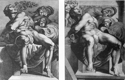
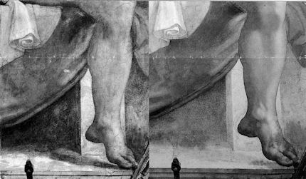
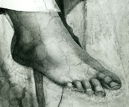


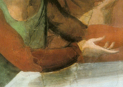

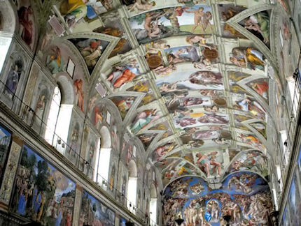


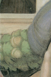

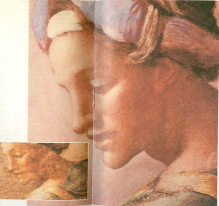


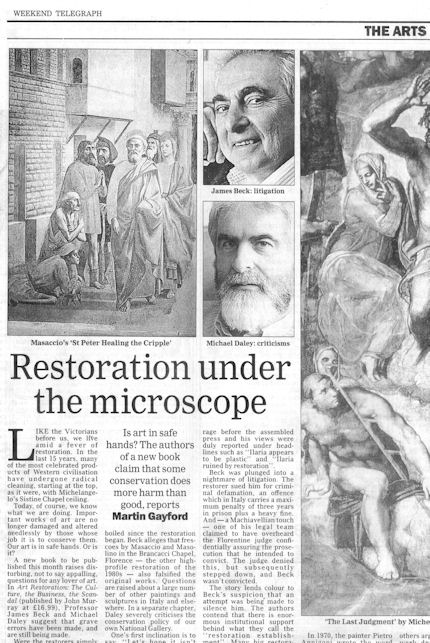


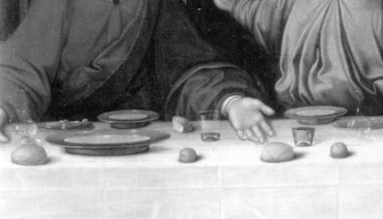


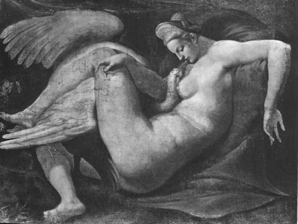

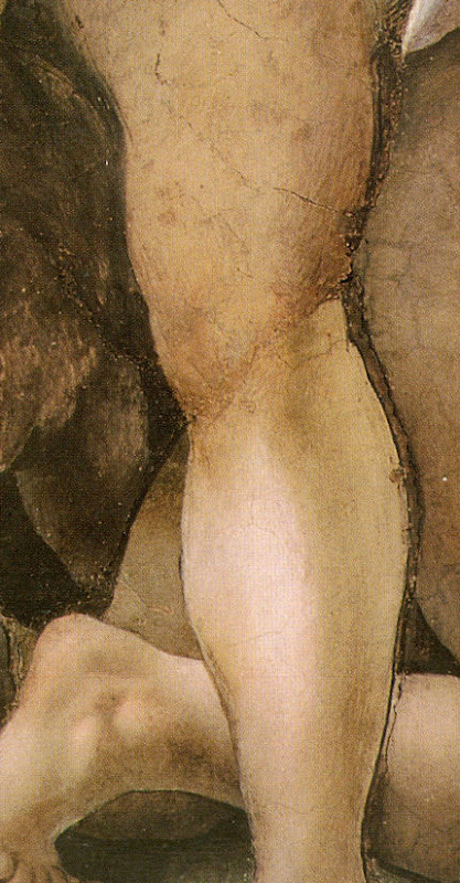

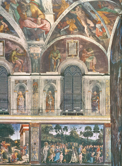
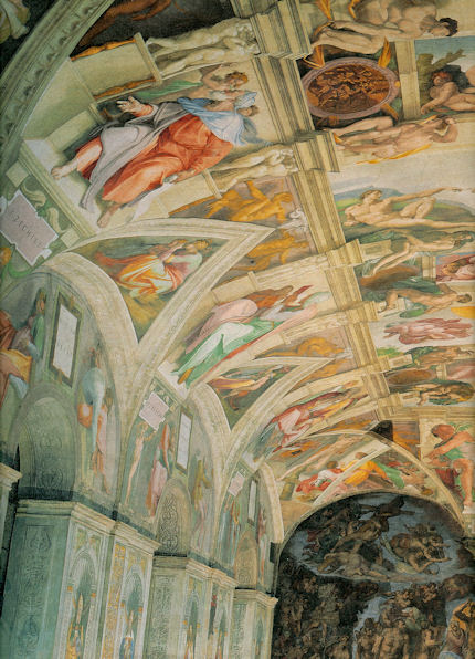


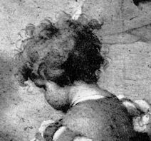
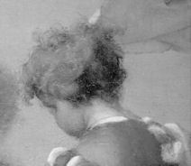
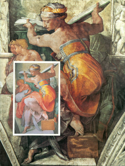
![]()
The “World’s worst restoration” and the Death of Authenticity
When news broke of the 81 years old painter Cecilia Gimenez’s disastrous restoration of a painting of Christ in her local church, the world fell about laughing (see Figs. 2 to 5). The distressed restorer has taken to her bed as people queue to see the now infamous monkey-faced Christ and, wishing to preserve the hilarity, over 5,000 wags have signed a petition to block attempts to “return the painting to its pre-restoration glory” – as if such an outcome might credibly be in prospect.
With one honourable exception (Fig. 1) commentators failed to grasp that while this debacle is an extreme case it is not an aberration within modern art restoration practices. To the contrary, adulterations of major works of art are commonplace, seemingly systemic products of a booming, insufficiently monitored international art conservation nexus. In our previous post it was shown both how a steamboat painted by Turner sank without trace during two top-flight restorations at the US Sterling and Francine Clark Art Institute, and, how Renoir’s oeuvre is being traduced across museums. Here, to show that it is not just in sleepy Spanish churches that paintings are risk, we reprise a few of the professional art world’s own most radically controversial – and officially sanctioned – restorations.
The Observer columnist, Barbara Ellen, having good sport with the Spanish Incident (see Fig. 2), hoped a wave of copycat vigilante restorations (“Let’s nip into the Louvre and give the Mona Lisa something to smirk about”) would not ensue. Her nightmare has been “virtually” realised – Fig. 3. When saying that Ms Gimenez perhaps had not realised “that, as a rule, professional art restorers don’t start work with a bucket of Flash and some Brillo pads”, she assumed too much. While Brillo pads were skipped at the Sistine Chapel, bucket loads of oven-cleaner-like substances were repeatedly brushed onto and washed from Michelangelo’s Ceiling frescoes to the artistically injurious consequences described below and at Fig. 23. As we reported on April 1st 2011 – and that was no joke – the Vatican’s restorers’ own account of their experimental fresco cleaning method read as follows:
“…Removal of retouchings and repaintings with a mixed gelatinous solvent, consisting of ammonium bicarbonate, sodium bicarbonate, Desogen (a surf-actant and anti-fungal agent), carboxymethylcellulose (a thixotropic agent), dissolved in distilled water. Mixture acts on contact. The times of application, rigorously measured, were: “First application: 3 minutes, followed by removal, washing with water. Left to dry for 24 hours. “Second application: 3 minutes, followed by removal, washing and leaving to dry as before. If necessary, and locally only, small applications, followed by plentiful final washing. “In the case of salt efflorescences consisting of calcium carbonate, there was added to the solvent mixture a saturated solution of dimethylformamide… “Final treatment: the thorough, complete and overall application of a solution of Paraloid B72 diluted to 3% in organic solvent, removed from the surface of the pictorial skin by the combined action almost simultaneously of organic solvent and distilled water, which coagulates the surface acrylic resin dissolved by the solvent.”
A quick rinse with Flash might have been kinder.
There are three component parts in the professional restoration armoury: taking material off; putting material on; and, defending and promoting the said removals and additions with techno/aesthetic reassurances. Notwithstanding all supposedly science-validated self-justifications (reports on restorations are invariably written by the restorers themselves), the proper and appropriate test of a restoration is aesthetic appraisal of the resulting changes. It is reassuring that so many recognise that the transformation made to the Spanish painting shown at Fig. 5 constitutes a gross artistic injury. Perhaps the less extreme but also gratuitous injuries recently inflicted by restorers at the Louvre on the Veronese figure and face shown at Figs. 6 to 10 (and here reported on December 28th 2010) might also be acknowledged as the very crime against art and history that they constitute.
As shown at Fig. 10, even when the Louvre’s restorers were caught having secretly re-repainted the already repainted and publicly criticised Veronese face, the museum maintained a brazen official insouciance. The authorities do these things because they can and, presumably, because they do not know better. They ignore criticisms because they can and again, presumably, because they do not comprehend their force and their gravity.
In Figs. 11 to 26 we show the variously unfortunate consequences of restorers taking off and putting on material. (Like Tolstoy’s unhappy families, every unhappy restoration is so in its own way.) It is widely recognised in the art trade that pictures untouched or rarely touched by restorers enjoy better conditions than many-times restored works. For that reason, a high premium is placed on such rare but fortunate works. This reality notwithstanding, nothing seems capable of restraining the tide of restorations.
In Figs. 11 and 13 we see two successive restorers at work on the same figure in the same mural, Leonardo’s “Last Supper”, in Milan. It is a long-standing complaint that restorers thrive by undoing and redoing each others’ handiwork. In Fig. 11 the restorer Mauro Pelliccioli is removing paint with a knife. His restoration, the first post war intervention on the notoriously unstable mural, was highly acclaimed at the time. His philosophy had been to remove earlier restorers’ repaint where it concealed original paint-work by Leonardo, but to leave it in place when covering only bare wall (- see our post of February 8th 2012). In Figure 13 Pelliccioli’s former student and assistant, Pinin Brambilla Barcilon, is seen repainting Leonardo’s mural (- or, as restorers prefer, “reintegrating” the remains of original paint with fresh additional paint). Given that an estimated 80 per cent of Leonardo’s work had been lost and that Barcilon had aimed to remove all previous restorers’ handiwork regardless of whether or not original Leonardo paint survived underneath, she had to do massive amounts of repainting during her agonising two decades long restoration (see our post of March 14th 2012).
In Figs. 12 and 14 we see how dramatically differently two professionally linked Italian restorers, working just one generation apart, left the very same principal figure in Leonardo’s “Last Supper”. (What might be expected to survive or emerge from the next two restorations?) Like the 81 years old Cecilia Gimenez, Barcilon exercised artistic licence – albeit to a far lesser degree – during her painterly interventions on Leonardo’s remains. Where the cuff of Christ’s right sleeve had originally hung below and behind the table, for example, she painted it resting upon the table. To Christ, she too gave a new face and expression. The sole commentator to have recognised such continuums between extreme and lesser restoration injuries, the Sunday Telegraph columnist, Alasdair Palmer, wrote: “while the gulf between what modern restorers do and the dreadful hatchet-job done by Cecilia Gimenez is large, it is not always as vast as restorers would like us to believe”. He noted that while Pinin Brambilla Barcilon had done some magnificent work in recreating what she took to be Leonardo’s original picture, “it wasn’t a restoration because most of the paint applied by Leonardo had long ago disappeared”, and he cited an art historian who holds precisely that “The Last Supper is now a first-rate example of Barcilon’s work. It is not a Leonardo”. Palmer further notes that some of the most severe critics of recent restorations are other restorers:
“‘A great deal of restoration is incompetent,’ maintains Bruno Zanardi, professor of the theory and practice of restoration at the University of Urbino, and one of Italy’s most distinguished restorers. ‘Many of those who are let loose on great works of art do not know what they are doing: they have not been properly trained, and do not understand how fragile old pictures are.'”
To French and Italian transgressions many British and American ones might be added. At the National Gallery, London, it has been officially acknowledged that changes are made to pictures “primarily for aesthetic reasons”, and that while these aesthetic changes rest on the judgements of individual restorers whose “different aesthetic decisions” may result in pictures which “look very different”, all such results are considered “equally valid” (see “The New Relativisms and the Death of ‘Authenticity'”). In Figs. 15 and 16 we show a detail of the National Gallery’s Holbein, “The Ambassadors”. During its restoration (which, like that of Michelangelo’s Sistine Capel Ceiling, was a televised and sponsored event) the then head of conservation, Martin Wyld, took the opportunity to improve and, on “experts” advice, to change the surviving design of the Turkish carpet. In doing so, he paid scant regard to the aerial perspective that had previously been found in the picture. Ignoring the shadows that had previously been cast on the carpet, Wyld introduced a crisper, cleaner, flatter, more “on the picture surface”, altogether more abstract, modernist and, therefore, ahistorical version of Holbein’s original depiction.
More egregious were the changes made to Holbein’s anamorphic skull (Figs. 17 and 18). The cleaning exposed many losses of paint on the skull which bewildered the restorers and caused them to introduce – for the first time, to our knowledge – a piece of painted “virtual reality”. As we put it in a letter to the Independent (“Virtual reality art”, 29 January 2000):
“When the National Gallery recently restored Holbein’s The Ambassadors, the famous skull in the foreground was repainted to a new design not according to the laws of perspective by which it had been produced but after a computer-generated distortion of a photograph of an actual skull. “This bizarre imposition of ‘virtual reality’ on to an old master painting is defended by the gallery on the grounds that ‘modern imaging techniques’ offer ‘more scope for exploring possible reconstructions’ than do the 16th century perspectival conventions by which the artist’s image had originally been generated. “The difference between the original and the new parts has been concealed from the general public by the restorer’s attempt to integrate the handiwork of his own ‘tentative reconstruction’ with surrounding old paint by painting fake lines of cracking to match the old, actual cracks.”
In Figs. 19 and 20 we see the liberties taken by Wyld’s predecessor, Arthur Lucas, on Titian’s “Bacchus and Ariadne”. Lucas boasted to art students at the Slade School of Art that “there is more of me than Titian in that sky”. In thrall to new technologies and materials, Lucas took the trustees’ permission to reline the canvas, as authority for ironing the picture on to a double board of compressed paper. Such boards are today found to be unstable and will doubtless serve to licence further “urgent” conservation treatments.
In Figs. 21 and 22 we again show the startling changes made to a painting at the National Gallery of Art in Washington during the course of two restorations. During the first, as seen on the right of Fig. 21, a general weakening of values occurred. The woman’s necklace, for example, was dimished. As seen on the left in Fig. 22 , during a further restoration, part of the necklace disappeared. Rather than paint it back in, the restorer painted out the surviving section, as can be seen on the right.
When specific bits of paintings disappear restorers often claim that they were only additions made by earlier restorers. If such claims sometimes provoke scepticism, in the case of overall losses and degradations restorers usually offer no defences, seemingly hoping that curators, trustees, art critics, scholars and members of the public will be delighted or distracted by brightened colours and lightened tonalities. In Fig. 23, on Michelangelo’s Sistine Chapel ceiling, we see both the general lightening and brightening that attends an aggressive cleaning and losses of specific features and pictorially strategic values. Michelangelo had finished off his frescoes with additional glue or size-based painting but because the Vatican’s restorers held this to be either dirt or earlier restorations, it was all removed. Michelangelo had redrawn and remodelled the drapery seen on the left hanging from the figure’s right shoulder. It was washed off. The removal is shown to be an error by the testimony of earlier copies of the ceiling. (Rubens had copied the drapery as it was found before the recent cleaning.) Michelangelo sought to enhance sculptural effects to his painted figures by adding shadows that were seemingly cast by the three dimensional bodies he had depicted with contrasting brightly lit forms and dark, shadowy recesses and nooks. The latter, too, were lost.
Back at the National Gallery in London, we see in Fig. 24 similarly catastrophic general losses (in the course of another single restoration) of tonal gradations and modelling. In the case of the horse’s right nostril, we see the loss of the very aperture which formerly had carried air to the creature’s lungs. Alasdair Palmer points out that a comparison of the National Gallery picture with its sister panel in the Uffizi Gallery in Florence is shocking to behold. It is the more unforgivable because the National Gallery restoration was prompted by an earlier one of the Florence picture that had not flattened and weakened the horses.
The National Gallery’s great Velazquez, “The Rokeby Venus”, suffered dreadful injuries in 1914 at the hands of a suffragette (Fig. 25). That damage was as nothing when compared with subsequent injuries inflicted by restorers who here too (Fig. 26) were blind to artists’ manipulation of space; creation of atmosphere; rendering of form through calibrated tonal gradations. Before the gallery’s restorers had done their Cecilia Gimenez-esque worst, there existed a parity of brilliance in the two figures, with both displaying the seeming self-illumination of divinities. What sense of that miraculous evocation survives today? Little wonder that the previous owner of the picture made a scene at the National Gallery on sight of its “restoration” and protested that, had he known how it would be treated, he would never have sold it. His grievous personal loss-through-restoration was of a single picture. What price the world’s continuing collective losses at the hands of restorers?
Michael Daley
Comments may be left at: artwatch.uk@gmail.com


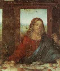


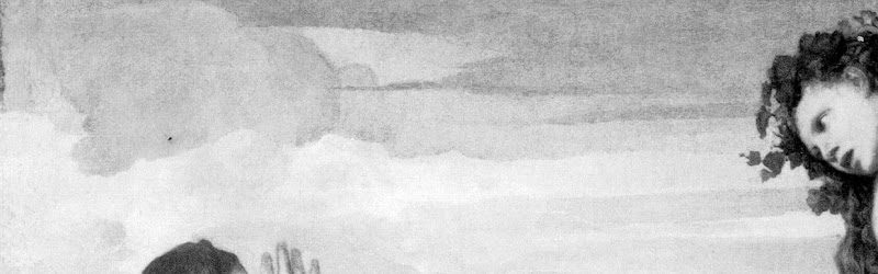


![]()
L. O. L. It’s Peeping Tom Time at the National Gallery!
A little over a decade ago we were requested to move away from Titian’s “Bacchus and Ariadne” by a member of the National Gallery’s education department who was about to give a talk. Her narrative thrust on this great canvas (which had been glued by restorers on to a sheet of “Sundeala” board) proved more sociological than artistic or art historical. It had a villain – the original patron – who, the audience learned, had been a rich dirty old man who supplied extravagantly expensive pigments for an ostentatiously sexy depiction of a victim – an abused mythical woman – who would provide literary cover for his private delectation within his own apartment.
If the Gallery had then hit a low with such travestying philistine cant, we now find that in its drive to increase visitor numbers and extend social constituencies, it has jettisoned the very distinction between Art and Life. Pictures acquired at immense expense in the name of the Public Good are no longer treated as self-sufficient imaginatively crafted works that merit reciprocally reflective attention from the viewer but as pretexts for real-life events of a titillating, humanly exploitative and degrading nature.
Thus, in the bureaucratised stew that is the Cultural Olympiad’s London 2012 Festival, the National Gallery has permitted Titian’s great poesies to serve as springboards to three “edgy” artists. In 2001, in a drawing for Jackdaw (see Fig. 4), we had already marked one of this triumverate, Mark Wallinger, as a clown ripe for elevation to the National Gallery Pantheon, and today, with few honourable exceptions, the newspaper art critics have duly fawned over his efforts:
We are so cast only if we choose to play the chump-role that is offered as a legitimately “performative” (to use Sir Nicholas Serota’s term-of-the-moment) contribution to art. We do not have to do so. We do not have to be complicit with museum educators’ perverse cultural de-constructions. Rather, we might ask them why they do not consider this particular use of real people – women hired-in for the duration – to be a form of “sexploitation”. We might also ask them, as public educators, to explain the connection that they believe Wallinger’s stunt has with Ovid’s stories and Titian’s depictions of them. Even if Wallinger cannot see that Acteon was the very opposite of a voyeur – a man who had had the great misfortune accidentally to intrude upon a bathing goddess – might we not ask why no one at the National Gallery felt able to disabuse him.
Michael Daley
Ruined Renoirs
Our examination of the fate of more than twenty Clark Art Institute Renoirs now showing at the Royal Academy will follow in the next post.
Comments may be left at: artwatch.uk@gmail.com


![]()
Review: Stone-washed Renoirs and the Shock of the Undone

We knew at a glance that something was amiss. On June 16th, a newspaper photograph trailed an imminent auction sale of Renoir’s “Baigneuse” of 1888. Even on the evidence of that single de-saturated newsprint reproduction (right, Fig. 1) it seemed clear that the privately owned masterpiece had gone through the picture restoration wash cycle a time (or two) too often. A comparison of Christie’s pre-sale zoom-able online photograph with historic photographs of the painting further suggested that picture conservation’s would-be beauticians had been at work with swab and solvent: Renoir’s bather had been left (Fig. 2) a paler sugar-smooth pictorially and plastically enfeebled version of her original self. (For the picture’s appearance and condition in 1944, see Figs. 7 and 9.)
Just as museum curators who organise splashy temporary exhibitions rarely broadcast the “conservation” injuries borne by works loaned from sister institutions, so auction houses, which of necessity must act primarily as agents for owners, can seem no less reticent on this fraught subject. In practice, we find that in of both of these art spheres, the “now” is often implicitly presented as the “originally-was” and “always-has-been”, thereby thwarting what would be the greatest inducement to halt needless adulterations of unique historically-rooted artefacts: a full public disclosure of “conservation” treatments and frank art-critical discussion of their material and artistic consequences. By coincidence, recent museum and saleroom activities have brought to London a slew of little-seen examples of Renoir’s oeuvre. As cases in point of Renoir’s vulnerability, we examine here treatments of his “Baigneuse” of 1888 and the Washington National Gallery’s “The Dancer” of 1874.
Renoir’s “Baigneuse” was given star billing (on a £12/18m estimate) at Christie’s June 20th Impressionist/Modern sale, for the catalogue of which it provided the cover illustration (Fig. 2). While much was made in the eight pages long catalogue entry of an impeccable and unbroken provenance through ten successive owners, not a word was said about any restorations of the painting, and although many early photographs are identified in the picture’s literature, none is reproduced. It is disclosed that this Renoir is to be included in the forthcoming “catalogue critique” of the artist’s work being prepared by the Wildenstein Institute from the Archives of François Daulte, Durand-Ruel, Venturi, Vollard and Wildenstein. (Perhaps the present condition of the picture will be discussed in that publication?)
On the night of the sale, an announcement that the picture had been withdrawn drew gasps of surprise. Artinfo reported that the vendor had accepted a private offer from an unidentified buyer for an undisclosed sum somewhere within the estimate. Trade and press eyebrows have been raised at such secretive, pre-auction sales and the withdrawal was the more confounding because expectations of a big auction house “event” had been raised by extensive (and quite stunningly fetching) pre-sale press coverage with photographs of the painting enlivened by the seemingly routine inclusion of beautiful young female staff members.
With modern paintings, the starting point for any appraisal should be the earliest known photograph. Old photographs are historic records. Historic records should never be ignored. Old photographs of pictures assembled in homes or exhibition galleries are especially precious and instructive. The photograph of Renoir’s 1905 exhibition at the Grafton Gallery (Fig. 3) testifies not only to the then generally more vivacious relative values within individual works but to the striking variety of pictorial effects and painterly means deployed within Renoir’s oeuvre.
With regard to the photographic testimony of the original appearances of individual pictures, consider first the large, near-central painting in the 1905 Grafton Gallery photograph – Renoir’s “The Dancer”. This picture, now at the National Gallery, Washington, is 138 years old but was then only 31 years old and unrestored. Then, the background was disposed in distinct but linked quadrants (top-left; top-right; bottom right; bottom left). These were not so much naturalistic renderings of an actual space as subservient pictorial devices spotlighting the central bow-tight figure of a child trainee who, through balletic discipline and artistry, had assumed a commanding Velazquez-worthy sideways-on viewer-confronting presence.
To that expressive end Renoir had welded the dramatically contra-directional lower legs into unity by a pronounced dark shadow in the vertical triangular space they bounded. That shadow sprang also from the heel of the (right) weight-supporting foot backwards and upwards in space, thereby throwing the bottom edges of the trailed skirts into relief. This dark zone in the lower-right counterbalanced another in the upper-left, which had in turn emphasised and thrown into relief the front edge of the costume, withdrawing only to leave a lighter, again relieving, tone at the dancer’s dark hair. The progressive loss through restorations of those artful dispositions (as seen in Figs. 4 & 5) and the picture’s general descent towards an inchoate, arbitrary pictorial froth that increasingly resembles the underlying condition seen today in its own infra-red imaging (see Fig. 6), is heart-breaking. Renoir had here been a sculptor before he became a sculptor, playing off forms that asserted his picture plane with others that ran sharply away from or towards it (rather as Michelangelo had famously done in his crucifixion of Haman). Degas, who spoke of Renoir’s “sharpness of tones”, had chided himself for constructing his own drawings of standing dancers from the head down instead of from the feet up. Renoir had here given a masterclass in how to project a standing figure upwards from the floor. These things artists know and appreciate.
Compendious photographic evidence suggests that restorers (frequently working myopically through head-mounted magnifying eyepieces) have consistently confounded dirt or discoloured varnish with the shiftingly elusive dark grounds used by artists to set off light-toned figures. As seen in our post of June 1st, Klimt’s portrait of Serena Lederer (which was acquired by the Metropolitan Museum of Art, New York, in 1980) has suffered in just such a manner. In the same post we saw also how Renoir’s deployment of a dark background zone in the upper left quadrant of background and a secondary but counter-balancing dark zone in the lower right quadrant of his “Dance in the City” had also been undone by successive restorers.
By courtesy of the 1905 photograph of the dancer we can now see that by 1944 the picture’s decisive tonal orchestration had already been subverted (see Fig. 3 and caption at Fig. 6). By the time of the picture’s appearance at the 2012 Frick show of Renoir’s full-length portraits (which was reviewed in our post of June 1st), the original dark tones in the lower right quadrant had effectively disappeared, leaving two odd arbitrarily truncated dark attachments to the right heel (Fig. 5). Cumulatively, this painting has suffered needless artistic vandalism of which no one speaks. The fact that graphite underdrawing is now visible on the painting has been mentioned but without any hint of alarm or censure.
With Renoir’s “Baigneuse” of 1888, the earliest photograph in our own records (- donations to ArtWatch of old photographs or postcards are always most gratefully received) is that published in 1944 when the painting was 56 years old, as seen here in greyscale at Fig. 7 (left) and at Fig. 9. Six years later, by 1950, the painting had been radically transformed, as seen at Fig. 7 (right, in greyscale) and Fig. 8 (left, in colour). The differences that emerged between 1944 and 1950 were compounded by further changes between the picture’s 1950 state (seen in colour at Fig. 8, left) and its 2012 state (seen in colour at Fig. 8, right). However many times and by whomever this painting might have been “restored”, it is clear that the resulting interventions have profoundly altered its constructional and pictorial rationales. The total extent of the alterations that occurred between 1944 and 2012 are examined right in greyscale details in Figs. 11-18. The differences between the 1950 and 2012 states are examined in colour details at Figs. 19, 20 and 21.
By 1888 Renoir had visited Algiers and Italy, come to admire Cezanne as well as Delacroix, discovered Italian painting and read Cennino Cennini’s Treatise on Painting. He had just completed an intense series of classically inspired, Ingresque female nudes, culminating in that declared trial for decorative painting, the Philadelphia Museum’s great “Bathers” of 1887, by which date he held the nude to be one of the most “essential forms of art”.
Compared with Fantin-Latour’s palpable but fluidly allegorical figure at Fig. 10, Renoir’s “Baigneuse” has, in its 1944 state, a markedly more stolid, out-of-Courbet corporeality. For all its spirited brushwork and sparkling colour, plastically, it constitutes an essay in composure, stability and parallelism. The torso seemingly rests on its own base of compressed and spreading buttocks and thighs. The thighs, knees and lower legs are held together in a manner more primly archaic (Egyptian) than classical. Movement is confined to the bather’s right hand which dries the left side of the waist. This action has enlivening consequences. The upper torso is pulled round by the right arm and the head is turned leftwards and downwards as if to contemplate the drying action of the towel. The left arm is required to be held aloft to free the left side of the figure, and, flexing at the elbow as the left hand draws across the face, it first echoes the thighs but then curls gracefully, weightlessly away in space.
What, then, explains the differences between the picture’s previous and its present condition? In such cases it is always possible to play the “Sistine Chapel Ceiling Restoration Defence” and claim that in 1944 the then 56 years old picture was very dirty and that the removal of this dirt has liberated the forms and the colours of the painting to a hitherto unsuspected degree. But the pattern of relationships that is visible, even under dirt, should not change character during a cleaning. Rather, it should emerge enhanced, with the lights lighter and the darks darker – and all individual values holding their previous positions. This has not happened – the picture has got progressively lighter with successive cleanings instead of returning to its previously cleaned state. If it really had been left by Renoir in today’s state, how could the previous but now lost artistically constructive values ever have arisen? If left untouched for the next 56 years, would anyone expect the painting to return to its 1944 appearance with the stripes on the towel and the shading of the fingers regaining strength? Would a general shading and enhancement of forms once more helpfully tuck the left hand behind the head? How might dirt have drawn more clearly and repositioned the left shoulder? How might it have more emphatically shaded the right, distant side of the face?
If we consider the difference between the 1950 and 2012 colour plates (shown at Figs. 8, 19, 20 & 21), what might account for the loss of orange coloured modelling in the left cheek, and of individual brushstrokes depicting the hair? Is it possible to claim on the evidence of these photographs that there has been a build-up of dirt on the picture over the last 62 years?
When examining the bather’s face in close-up today, as shown at Fig. 21, can we have any confidence that the paint presently surviving in that section is just as it was when left by Renoir in 1888? What kind of brush or paint might he have used that would have resulted in the present fragmentary, seemingly abraded, scattering of orange paint that lies over the blue background between the hand, the face and the shoulder?
In the next post we examine the conservation fate of more than a score of Renoirs that have been loaned from the Sterling and Francine Clark Art Institute in Williamstown, Massachusetts to the Royal Academy. We shall see how Sterling Clark learned the hard way not to trust art experts on matters of condition in paintings when, having been assured that Domenico Ghirlandaio’s “Portrait of a Lady” had never been repainted, he bought it, only to discover, very shortly afterwards, a postcard of the painting showing it in an earlier and quite different state.
Michael Daley
Comments may be left at: artwatch.uk@gmail.com


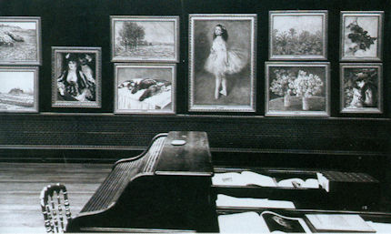


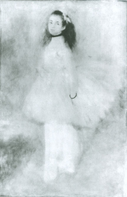


![]()
Review: Renoir at the Frick – The Curatorial and Conservational Photographic Blind Spots
The Frick Collection’s recent temporary exhibition “Renoir ~ Impressionism and Full-length Painting” contained ten pictures and took ten years to assemble. It was organised by the deputy director, Colin Bailey, to showcase the The Promenade, the museum’s sole and “somewhat overlooked” Renoir – “overlooked” because Henry Clay Frick’s entrenched prohibition against loans had prevented the picture from travelling to major Renoir shows such as the 1997-78 “Renoir Portraits” exhibition which Bailey had organised for the National Gallery of Canada, Ottawa, The Art Institute of Chicago and The Kimbell Art Museum, Fort Worth. If the Promenade could not join the international party then the party might come to the Frick.
For this celebration of a single work nine major pictures were borrowed from seven museums and Bailey, a distinguished scholar of French art, produced a book/catalogue that contains much illuminating material on contemporary costume and fashionable mores. As delightful as the show itself ought to have been, the experience proved dispiriting and alarming. Partly, this was because such temporary compilations of dream combinations always come with downsides and a common glaring omission. In this case, for several months a gallery-full of important Frick pictures were bumped from view as important works from other, also temporarily depleted, museums were put at risk. The Musée d’Orsay, for example, sent both its Dance in the City, which had been transferred from its original canvas and relined (see Figs. 10-13 and below), and its Dance in the Country, across the Atlantic. The National Gallery (London) sent its already travel-damaged The Umbrellas, and did so at a time when it had lent its brittle, fragile, shotgun-blasted, “never-to-travel” Leonardo Cartoon to the Louvre. The Columbus Museum of Art, Ohio, lent its fire-damaged Madame Henriot “en travesti” (The Page)…and so forth.
The omission that is common to all borrowed compilations was the failure – perhaps for reasons of institutional politesse – to take the opportunity to assess the relative physical conditions of the variously treated and restored cross-section of pictures from within an oeuvre or, in this case, from a specific moment within an oeuvre – “the decade of Impressionism”. This commonly encountered lacuna was the more apparent because Bailey himself discusses conservation matters rather more than most. He does so, however, as a seemingly grateful recipient/beneficiary of museum restoration departments’ technical largesse and their routinely delivered “discoveries”. With his prefatory expression of deep gratitude to an international slew of conservators for “their participation in undertaking technical examination on the paintings in their charge and for allowing me to publish their findings in this catalogue” we knew precisely what critical appraisals not to expect.
Strictly speaking it would not be necessary to call for comparative assessments on such occasions if museums were all, as a matter of course, completely frank about the restoration-injured conditions of individual works. By way of an example of what might be discussed at a time when recollection of the show is still fresh and when armed with Bailey’s book/catalogue, which is as intensively researched and handsomely illustrated as might ever be expected, we consider here the technical history, in so far as it has been disclosed, of just one of the nine loaned pictures – Renoir’s beautiful invention of arrested intimacy-in-movement, his Dance in the City.
The obvious starting point for any appraisal of a picture’s successive states should be the earliest photographic record of the work. With Renoir we enjoy an immense if not comprehensive photographic record. We even have film footage of him painting and sculpting. We have contemporary or near-contemporary photographs that show his paintings in the context of close proximity to other paintings and in a common light (Fig. 1). When the testimony of early photographs differs markedly from presently photographed states (as so often is the case with modern masters – see Figs. 3-7), then, self-evidently, there is an issue crying to be addressed.
When, for example, we compare the very different states of Renoir’s Dance in the City, as seen in Figs. 3 & 4, despite making allowances for photographic variations (such as the great discrepancies of size between the earlier and later images) and being mindful of Bailey’s own thanks to the photographer Michael Bodycomb for having “improved the quality of almost every image”), it is clear that the painting today is not the work that it once was; that its values and relationships have changed. Consider the floor on which the dancers perform: then, it was more varied in its tones; today it is more equal. Then, the floor to the right of the ball gown was darker than the floor to the left of the couple. That darkness served to emphasize the sweeping profile at the back of the trailing gown. Reading downwards from the waist, the shape of two convex masses of material formerly made a leisurely elegant descent towards the train. Today, that “materially” expressive clarity of design in the lower of the two draped forms has been quite disrupted, if not lost, as the now lighter tone of the floor merges with the now diminished shaded tints of the gown (see Figs. 3, 4 & 11).
For all of Bailey’s admirably close (and expertly advised) attentiveness to the dress-making “mechanics” of the gown – “…The skirt is draped in puffed folds (en bouillonée) with a tier of drapery in the front and two pleated flounces at the bottom. The long train is is draped and pleated to form poufs in the back, and a petticoat can be glimpsed beneath it” – he misses the weakened and possibly redrawn profile. Bailey well describes Renoir’s preoccupation with costume. As the son of a tailor and a seamstress, how could that artist have been unaware of or indifferent to the expressive “cut” and sweep of a costume on a swirling, waltzing figure? Previously, the costume of the male dancer was more various in its tones. Today it reads as a uniform black appendage to the female dancer. Previously there had been no hint of the present overly-assertive, sharpened and darkened treatment of the coat tails which pictorially are now as disruptively emphatic as the head of a claw hammer.
For Bailey, the now lighter toned, more equal floor is “immaculate”. To a charlady that might well seem gratifyingly the case, but Renoir, as Bailey acknowledges, fretted greatly about establishing integrated relationships of figures and backgrounds. As Renoir himself put it: “I just struggle with my figures until they are a harmonious unity with their landscape background, and I want people to feel that neither the setting nor the figures are dull and lifeless.” (“Renoir by Renoir”, N.Y., 1990, p. 50). “Harmonious” sometimes seems to be an elusive concept to non-artists. It is not synonymous with “more-alike”. Rather, it describes the uniting through an artistically forged equilibrium of otherwise potentially disparate, disjunctive elements. We constantly see in artists’ preliminary, intimate sketches how their very first thoughts attempt to anticipate and resolve the requirements of such pictorial equilibriums – see Figs. 8 & 9.
Rendering Renoir’s dance floor more homogeneous has had a spatially flattening and pictorially deadening effect. Rendering it both generally lighter and more equal has contributed to the unfortunate effect of detaching the couple from their swirling space and leaving them as isolated and self-contained as a pressed flower in a book. Indication of the painter’s pictorially melding preoccupation is unmissable in the small oil sketch at Fig. 9 that Renoir made for another of his dance paintings. Compared with the earlier state of Dance in the City, the present one resembles an artificially sharpened photograph.
With apparent injuries we must always look for causes and look for them behind as much as within official accounts. As mentioned, and as Bailey euphemises, this picture has “had a complicated structural history”. That is, it has been both transferred and relined. Both operations are highly dangerous. When the paint film was detached from (its presumably original) canvas, the restorers took the opportunity to photograph the painting from the back of the paint, capturing the image in reverse. This image is excitedly presented as having afforded “a rare glimpse into Renoir’s initial preparations…we can see the lines demarcating the back and the train of the womans dress” (but see comments and photograph at Fig. 10). In the same vein, an X-radiograph “shows how enegetically Renoir laid out both his figures and the background elements”. Bailey discusses an infrared reflectogram (Fig. 11) and acknowledges that these “technical” images were made by the Laboratoire du Louvre, C2RMF. Our colleague in ARIPA, Michel Favre Felix, advises that a certain number of paintings coming from the Louvre or from “l’Orangerie”, were “more or less restored” in 1986 on entering the Musée d’Orsay. Bailey confirms that the picture entered the Louvre in 1979 and was transferred to the the Musée d’Orsay in 1986 but offers no details on any restorations of the picture. The pronounced differences in the picture that are evident in Figs. 4 and 13 would however suggest that a restoration took place at some point after 1986.
Needless to say, Renoir painted from the bottom up with overlaid patches of paint and his final, most considered statements therefore formed the upper visible surface of the original paint film. That original, considered and final surface (as was best seen and recorded in the earlier photograph at fig. 2), is no longer to be found in current photographs or in the flesh. Whatever interest penetrative imaging might have, it is secondary in importance to the actual appearance of pictures to the human eye. The current escalating vogue for “technical” imaging that probes beneath the surfaces of pictures serves to divert attention from destructive restoration actions on pictures’ critically important upper surfaces. If the present international museums merry-go-round of borrowings makes the need to address the condition of paintings impolitic, then that is a further compelling reason for curtailing it.
Michael Daley
Comments may be left at: artwatch.uk@gmail.com


![]()
Rocking the Louvre: the Bergeon Langle Disclosures on a Leonardo da Vinci restoration

ArtWatch has been haunted for two decades by a nearly-but-not-made restoration disclosure. In the 1993 Beck/Daley account of the Nippon TV sponsored Sistine Chapel restoration (Art Restoration: The Culture, the Business and the Scandal), we reported that in the late 1980s Leonetto Tintori, the restorer of Masaccio’s “Trinity” in the Santa Maria Novella, Florence, and a member of the international committee that investigated the controversial cleaning, had “urged the Sistine team privately to preserve what he termed ‘Michelangelo’s auxiliary techniques’ which in his view included oil painting as well as glue-based secco” (p. 111). What we had not been able to say was that Tintori (who died in 2000, aged 92) had prepared a dissenting minority report expressly opposing the radical and experimental cleaning method.
Shortly before the press conference called to announce the committee’s findings, Tintori was persuaded by a (now-deceased) member of the Vatican not to go public with his views. He was assured that his judgement had been accepted and that what remained on the Sistine Chapel ceiling of Michelangelo’s finishing auxiliary secco painting would be protected during the cleaning. With a catastrophically embarrassing professional schism averted, the restoration continued and the rest of what Tintori judged to be Michelangelo’s own auxiliary and finishing stages of painting was eliminated. Without knowledge of Tintori’s highly expert dissenting professional testimony, the public was assured that despite intense and widespread opposition the cleaning had received unanimous expert endorsement. Critics of the restoration were left prey to disparagement and even vilification.
On January 4th, we noted that in the widely reported schism that emerged at the Louvre with the resignations of Ségolène Bergeon Langle, the former director of conservation for the Louvre and France’s national museums, and, and Jean-Pierre Cuzin, the former director of paintings at the Louvre, from the Louvre’s international advisory committee on the restoration of Leonardo’s “Virgin and Child with St. Anne”, it had been recognised that the resulting crisis of confidence was of a magnitude not seen since the Sistine Chapel controversy. Restoration advisory committees are not imposed on museums and customarily they serve as political/professional fig leaves. In the wake of the Louvre committee resignations, embarrassed and perhaps panicky members of the museum’s staff offered self-contradictory and unfounded assurances (see below). In January, the Louvre’s head of painting, Vincent Pomarède reportedly claimed that “The recent cleaning was absolutely necessary for both conservation and aesthetical reasons.” This assurance proved unfounded on both grounds. Pomarède added that no member of the committee “has ever said that the cleaning was not prudent and had gone too far technically.” One has now done so – publicly – and left museum restorations under an unprecedented spotlight.
During an earlier cleaning controversy at the Louvre, Edgar Degas threatened to produce an anti-restoration pamphlet that would be what he termed a “bomb” – but he never did so, so far as we know. Now, as Dalya Alberge reports in the Guardian, the French Le Journal des Arts yesterday published an interview with Ségolène Bergeon Langle of truly momentous if not incendiary consequence (see below). We learn that her resignation came after no fewer than twelve letters requesting information on the restoration’s course went unanswered; that it was made in specific and pointed protest against the use of retouching pigments whose safety had not been proven; and, that the Louvre’s public claims of some pressing conservation need to remove the varnish were false, having been made despite it being known within the museum that any potential threat to the paint came not from the varnish but from a single faulty board in the picture’s panel which was reacting to the museum’s insufficiently stable environmental conditions. Perhaps most disturbingly serious for art lovers are Bergeon Langle’s disclosures that along with old (but nonetheless still protective) varnishes, original material of Leonardo’s was removed – against her advice – from the painting; and, aesthetically, that it is confirmed that the modelling of the Virgin’s face was weakened (see Figs. 1 and 2; and, for weakening to the modelling of St. Anne’s face, Figs. 12 and 13).
That the Louvre authorities would not inform even so distinguished a member of its own advisory committee might suggest either that the restorers had not known in advance what they would be doing to the painting; or, they feared that disclosure of their intentions would provoke opposition within the advisory committee. Either way, this was clearly an unacceptable (if not improper) way for a museum to execute irreversible alterations to one of Leonardo’s most advanced sophisticated, complex and problematic works. To Bergeon Langle’s now public “insider” criticisms, additional detailed material to highlight further Louvre procedural shortcomings and misrepresentations to the press and to the public will shortly be presented by Michel Favre-Felix, the president of the Association Internationale pour le Respect de l’Intégrité du Patrimoine Artistique (ARIPA). Favre-Felix is also to call formally for the establishment of a national scientific ethics committee that would be independent of museums and their restoration teams and be charged with re-examining the conservation file on the challenged St. Anne restoration.
A second member of Louvre’s advisory committee, Jacques Franck, the world authority on Leonardo’s painting technique, has said to the Guardian that a restoration likely to generate such disapproval from leading figures should never have been undertaken in the first place and, given that Ségolène Bergeon Langle is unquestionably France’s highest authority on restoration matters, her alarmed protest is therefore one that should mean a lot to both Leonardo scholars and art lovers the world over.
Unfortunately, the restoration-induced changes on the St Anne are not unprecedented. It is Art’s general tragedy that while scholars have quietly enlarged the oeuvre of Leonardo over the last century and a half, restorers have repeatedly swabbed and scritched away at the surviving fabric of those precious works – sometimes to an astounding degree, as with the “Last Supper” in Milan. With the National Gallery’s substitute version of the “Virgin of the Rocks” we have seen how the distinctive Leonardesque expression on the angel’s mouth was altered (without any acknowledgement) despite the fact that a distinguished scholar and former director of the Gallery, Kenneth Clark, had seen the angel’s face as being “the one part of our Virgin of the Rocks where the evidence of Leonardo’s hand seems undeniable, not only in the full, simple modelling, but in the drawing of the hair”. It is a matter of note that four of the most enthusiastically supportive members of the Louvre advisory committee were drawn from the curators and restorers who were directly responsible for the London and Milan Leonardo restorations.
Of Leonardo’s accepted earlier paintings, in 1939 Kenneth Clark lavished especial praise on the treatment of modelling found on two portrait heads – and in his enthusiasm, he awarded the palm of best preservation to both of them. The “Ginevra Benci”, then in the Liechtenstein Collection but now in the National Gallery of Art, Washington, was judged “the best preserved of all Leonardo’s early pictures”; one that “shows most clearly his intentions at this period”; and, one where “within the light oval of the face there is very little shadow, and the modelling is suggested by delicate gradations of tone, especially in the reflected lights.” Clark thrilled to the great refinement of execution: “We see a similar treatment of form in Desiderio’s low reliefs, controlled by the same sensibility to minute variations of surface. There are passages, such as the modelling of the eyelids, which Leonardo never surpassed in delicacy, and here for once he seems to have had none of that distaste for the medium which we can deduce from his later paintings, no less than from contemporary descriptions of his practice.” Ever aesthetically alert and deft, Clark saw all of these ultra-refined technical devices as being entirely “subordinate to the feeling of individual character with which Leonardo had been able to charge his portrait, so that this pale young woman has become one of the most memorable personalities of the Renaissance.” (We are grateful to Carroll Janis for drawing attention to this passage.)
Clark’s alertness to the physical/aesthetic characteristics of Leonardo’s hand was to the fore in his reflections on the “Portrait of a Musician” at the Ambrosiana in Milan. In the “subtle luminous modelling” of its head and its “delicate observation of light as it passes across the convex forms”, this work could only be “by Leonardo’s own hand alone and unaided” and it was “very similar to that of the angel in the Virgin of the Rocks”. As it stood before 1939, this too was “perhaps the best preserved of Leonardo’s paintings”, and in it we were then able to “learn something of his actual use of pigment, elsewhere obscured by dirty varnish, and we see that it was less smooth and ‘licked’ than that of his followers.”
Ironically, Clark, with his pathological aversion to “dirty” varnish (which is to say, old varnish on an old painting on an old support), was more responsible than anyone for the subsequent museum restoration/stripping mania. Looking around today’s museums, it is hard not to conclude that Clark might have been more careful in his wishes. Bergeon Langle’s warning against the modern addiction to penetrative imaging systems is particularly apt and timely: the hyper-active restoration changes (see right) made to the modelling and to the expression of those precious living Renaissance faces have cumulatively thinned and abraded pictures surfaces and material components and thereby remorselessly pushed great paintings into sad resemblances of their own infra-red under-states (see particularly, Figs. 4-11 and 19 & 20). Technical curiosity kills more than cats. In the case of Leonardo it has contrived to pull that artist back from his own increasingly lush highly-wrought subtly atmospheric shading towards the brilliant but thinner decorous linearity of Botticelli, when any comparison of the “Mona Lisa’s” hands with those of Leonardo’s “Annunciation” would have warned precisely against such perverse and regressive adulterations.
The interview given to Le Journal des Arts of 27 April, by Ségolène Bergeon Langle read as follows:
Why resign from the Louvre’s scientific advisory committee for the St Anne? “In January 2011 the committee had agreed on a gentle cleaning of late varnishes and the removal of the stains on the Virgin’s cloak. Yet, between July and October 2011 a more pronounced cleaning was done and presented as ‘necessary’, which I objected to. I was then faced with people who would oppose my position, which is technical and not based on aesthetics. My 12 letters [to the Louvre] asking for precisions on some aspects of the cleaning process and on the materials to be used for retouching, remained unanswered. I had to resign (on December 20th, 2011) to be heard just on one specific point: the Gamblin retouching pigments were not to be used since their innocuousness is not proven. Right from the beginning, false ideas have been put forth, like calling ‘repaints’ original retouches by Leonardo in the work’s early stages, or to attribute flaking in the paint layer to the ‘contracting varnish’, a [consequence that was] actually due to the sawing up of the wood [panel]…”
What do you think of the work done? “In my opinion, the precautionary principle hasn’t been respected. We must face the fact that the Virgin’s face is less modelled now. The cleaning should never have gone so far. However, I was happy that the grove [of trees] be preserved and, also, the ground’s material constituents that some ‘felt’ not original (though between January and April 2011 a brown-greenish section of the ground, located below St Anne’s elbow had been removed already). Besides, another matter of much controversy, the whitened layer on Christ Child’s body, has mistakenly been understood as a late varnish [that has] gone mouldy. I’m inclined to believe it was an irreversibly altered [original] glaze and, therefore, I have recommended that it be preserved, but nobody would hear me.”
The current Leonardo exhibition implies that his other paintings in the Louvre should be cleaned also. How do you feel about that? “Just not to do it, by all means! The original flesh paint in the St John-the-Baptist, being rich in oil, displays a significant network of drying cracks and might be fragile in the event of cleaning. For sure, scientific methods are essential but they need sound interpretation and wisdom dually… To date, there is too much boldness originating mistakes and an alarming fascination for infra-red investigation whereby are revealed under-layers that were never meant to be seen.”
Michael Daley
Comments may be left at: artwatch.uk@gmail.com
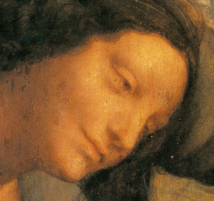


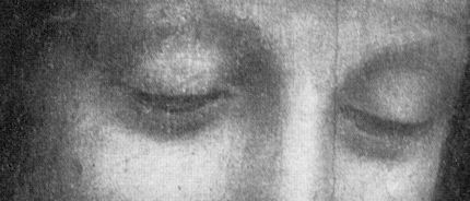


![]()
Two “As Good as New”, Colour Contrasting Velazquezs ~ Thanks to the Fundación Iberdrola

Following the recent National Gallery restoration that launched a £1.5 billion Leonardo blockbuster, comes news of a brace of corporately funded restorations (- two pictures and a classical sculpture) at the Prado. The energy corporation Iberdrola is acting through its cultural off-shoot, “Fundación Iberdrola”, to “Raise awareness about the contribution of the IBERDROLA Group to society” by allocations of pre-tax profits dedicated “decisively to the promotion and dissemination of art and culture in the territories where IBERDROLA operates”. As part of its green image-building campaign of Good Works (which includes illuminating buildings at night and training young researchers in the energy field) the foundation has made itself “Protector Member” of the Prado’s “Restoration Programme” which encourages restoration research and trains restorers within the museum to the tune of 300,000 euros per annum.
Our prime fear with Art/Business relationships in the treatment of unique, historic and irreplaceable works of art has always been that the commercial tail might wag the custodial dog; might press for excitement and drama over minimalist judicious and restrained intervention; for more frequent rather than less frequent interventions – in effect, might expect big bangs for big bucks. A second concern is that corporate restorations receive over-hyped and propagandistic “Good News” promotion as instruments of miraculous “recoveries” and “discoveries”. This last practice compounds the problem of chronic unaccountability in art restoration. Restorers who work in-house at museums are, for obvious reasons, given full political protection for their actions however controversial or demonstrably harmful they might be. Museums rarely concede that even long-past restorations were harmful and almost never admit to recent – let alone current – injuries.
When reporting the Prado’s latest restorations, the online Artdaily.org, echoes Iberdrola’s own website account of the treatment of the monumental, paired paintings “Philip III on Horseback” and “Margaret of Austria on Horseback”. As the proselytising global energy giant puts it: “These paintings have been rehabilitated by the art gallery’s team of technicians with the backing of Fundación IBERDROLA as a supporting member of its restoration activity. The labour of specialists has allowed for recovering the original values of both portraits, which were significantly affected by the accumulation of dirt and the alteration of the varnish that had buffered the contrasts of colour”. Both accounts fail to appraise the Prado’s own before and after cleaning photographs which show changes that seem arbitrary and artistically injurious (see Figs. 1, 4 & 5). Such preparedness to accept on trust that the latest photographically recorded states are the best, most “advanced”, most reliably truthful – and even “original” – conditions of historic works of art reflects a wider and dangerous absence of properly critical appraisals of restorations. It would seem axiomatic that if works of art are to be altered (and then re-altered by the next generation) the processes concerned should be absolutely transparent and freely discussed. Artdaily trills that the paintings have been “fully restored to their original appearance” by the removal of a “veil” of dirt and “altered” varnish; and, that the restorers “allowed for the recuperation of [the pictures’] original values”. This is naive and illogical: if removing the “veil” had revealed the original paintwork, what would need to be recuperated?
The over-selling of restorations can distort scholarship itself. Where Artdaily describes the two pictures as having been painted by Velazquez with the help of assistants, Iberdrola speaks with possessive proprietary pride of “emblematic works of Diego Velazquez” now rightfully displayed in the same gallery as “Las Meninas” and “the other three renowned equestrian portraits of the artist”. This inflation traduces the labours of scholars. In her 1948 book “Velazquez”, Elizabeth du Gué Trapier (a member of the Hispanic Society of America) said of the Philip III that it is:
“by an unknown artist, or according to Beruete by Bartolomé González, retouched by Velázquez…Beruete wrote of Philip III’s portrait: ‘The greater part of the horse, the retouches of the armour, the horseman’s right arm, leg and foot; the stirrup, bit, the ornaments which hang from the horse’s croup, and the retouching of some parts of the sea-scape in the distance, are undoubtedly by his hand; one feels in them the lightness of his touch and his habitual precision and vigour. On the other hand, the forehead and the nostrils of the horse, as well as a great part of the background, were doubtless executed by the pupil Mazo.’ Beruete thought that Veláquez left the head of the King in its original state; others are of the opinion that he repainted it.”
More recently, in his posthumously republished Catalogue Raisonné (Taschen/Wildenstein, 1996), José Lopez-Rey describes a bewildering array of attributions and summarises that most scholars are agreed “on the strength of visual evidence that this equestrian portrait […had been] executed by a lesser hand and later reworked by Velázquez or under his direction”. Lopez-Rey adds that “Whoever the original painter of Philip III on Horseback, the painting has been visibly repainted, mainly the head, chest, forelegs and tail of the horse, possibly by Velázquez or an assistant in about 1634-35” and that by 1772 both Philip III and Queen Margaret had been extended from vertical to roughly square formats by additional vertical strips of canvas on both sides. Re Iberdrola’s hyperbole, Lopez-Rey draws distinctions between the entirely autograph Velazquezs “The Surrender of Breda” and the equestrian portraits of Philip IV and Prince Balthasar Carlos; the equestrian portrait of Queen Isabel, where Velazquez’s hand is “recognisable”, and the two recently restored works under consideration here, where that authorial hand is present only to a “lesser degree” in pictures “which were mostly executed by other painters”.
Given this consensus of uncertain authorial contributions, Iberdrola’s attempt to spin authentic Velazquez silk seems brazen when the Prado’s own before and after restoration photographs of the Philip III show so many artistically disturbing changes. During their latest restoration/recuperation, the sections of canvas that had been added to the sides of both paintings during the 18th century were cut off. Artdaily says that these additions had been made to make the paintings compositionally compatible with other works when installed in a new room in the Royal Palace in Madrid. The Fundación Iberdrola justifies stripping these historical extensions on the grounds that their removal has created a greater compositional contrast between the two pictures and the three great autograph Velazquez equestrian portraits of Philp IV, Isabel of Bourbon and Prince Baltasar Carlos. Artdaily describes the cleaning and the cropping together as having achieved the greatest possible recuperation of the “original perceptual conditions“. What is not acknowledged by either party is that this removal of historically resonant material has served to eliminate possibly discomfiting visual testimony to the original condition of the paintings (- at least insofar as it had survived into the 18th century) and made the task of gauging the effects of successive restorations almost impossible.
It can be assumed that when those strips were added, their values matched and seamlessly extended the then extant values of the two pictures (as with the repair to Michelangelo’s Sistine Chapel frescoes discussed in our April 1st 2011 post). What, therefore, might account for the mismatched values that had emerged and persisted (see right) until the recent twin restoration? The strips would likely have been painted by a single artist, in a single campaign and without need for making the numerous revisions and re-revisions by the assorted, variously attributed hands that are evident in the paintings themselves. It is unlikley that any paint layers in the extensions would have been made over already varnished paintwork and therefore be at risk of floating off during cleaning. Conspicuously, the most obviously exculpatory explanation for the mismatch of tones – that the additions had matched the values of the picture when under an old darkened varnish – has not been offered. The restorers reportedly attribute the mismatches solely to the technical fact that the bordering strips had been painted over darker ground colours than those in the paintings, and that this had somehow caused “the pigments in the two areas [to have] behaved differently over the course of the centuries”. This does not hold water: while darker grounds would certainly come to influence the values of the extensions as the overlying paint became translucent with age (as can most clearly be seen in the “see-through” of the first state of Philip III’s horse), it could not alone have done so to such striking (and varying) extents as have occurred in the two paintings. Whereas, the fact that darker grounds were used on the extensions would itself suggest an initial perceived need to match the then darker values of the paintings.
There is another reason for disregarding the current restorers’ explanation. If the dark ground theory were correct, the mismatch phenomenon would have arisen very slowly over time and not have – as the photographic record shows – lurched into being on successive restorations (see Figs. 2, 6 & 7). Artdaily has not shown before and after photographs of the Queen Margaret, which painting Lopez-Rey describes in the 1996 edition of his catalogue raisonné as having been restored in 1968. His post-1968 illustration is shown here in Fig. 2. However, in the 1978 edition of the book an apparently earlier (and presumably pre-1968 restoration) state is reproduced (see Figs. 6 & 7 for details of that state). At that date, the left-hand extension read only fractionally darker than the painting, and although the right-hand extension was appreciably darker it was less obtrusively so than was the case after the 1968 restoration. As described opposite, and as can clearly be seen in Fig. 7, the impact of the dark ground was neglible at the brightest part of the sky, on the horizon, where it might have been expected to be most evident. The original dramatically escalating darkness in the sky above those points should, therefore, properly be taken as part of the original tonal schema – and not as either accumulated filth or ground paint see-through. The similarity of the states in both paintings, as seen in Fig. 2, might suggest that the Philip too had been restored around the late 1960s. The differences between the pre and the post 1968 restoration states of the Margaret speak of massive changes of value being made during a single “treatment”. The horse, for example, was reduced from a deep rich chestnut to a tan colouring. That the earlier chestnut appearance had not been a by-product of some filthy misleading “veil” is demonstrable: the whites on the horse’s muzzle and upper left leg read as white not yellow or grey or brown. Whatever might account for the radical changes, it was not consistent with the removal of some overall disfiguring layer.
Characterising the surgical elimination of material that bears awkward testimony of an earlier, now irrecoverably lost state, as a recuperation of a painting’s “ original conditions” is naive and seriously misleading. With every restoration – however funded – the most urgent critical question must always be: “did it do any harm?” To answer it, we must begin by using our eyes and, perhaps, by heeding the advice of artists, one of whom reportedly asked “What’s that dirt called that the restorers clean off? Oh, that’s right – burnt umber.”
Michael Daley
Comments may be left at: artwatch.uk@gmail.com
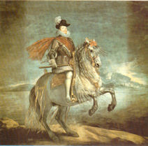


![]()
<