
Holbein’s Anne Boleyns and the “Discovery” Trope
Art is made by artists to order, or for the market, or from personal compulsions. Thereafter its standing is determined by others – primarily scholars, curators, auctioneers, and dealers – who confirm or reject the authenticity of works and the identities of sitters within them. Such judgements are often presented not as expert, professional opinions on which scholarly discussions might proceed, but as discovered truths. Discoveries can be well-founded or spurious. In art restoration, where claimed “discoveries” so often mask bungled interventions, the proof of the pudding is in the looking (at comparative photo-records) and it should be considered so, too, with claimed art historical discoveries.
A CASE IN POINT: TWO HOLBEIN ANNE BOLEYN ASCRIPTIONS
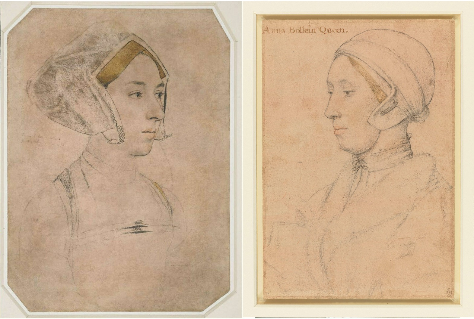
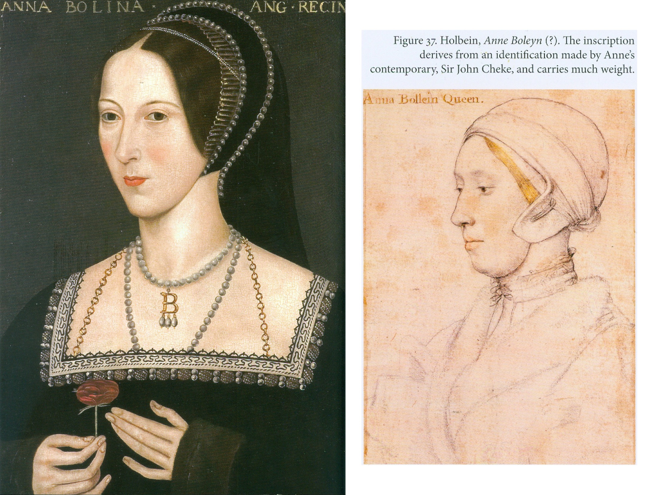
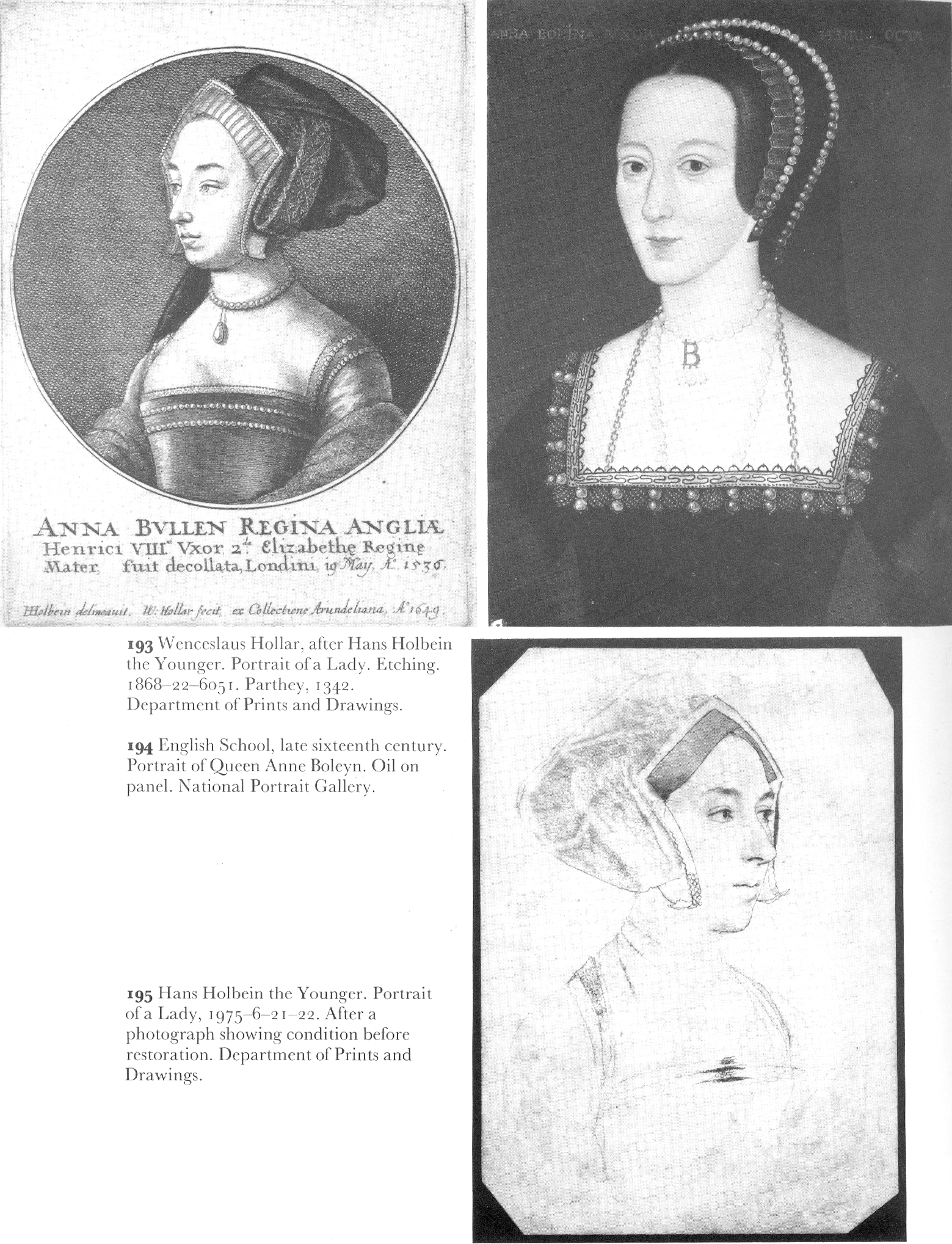
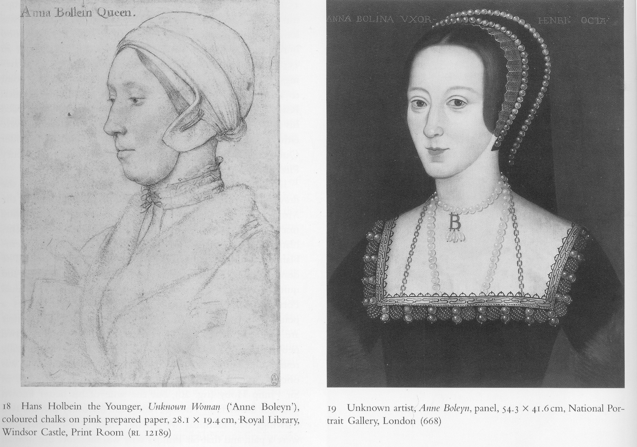
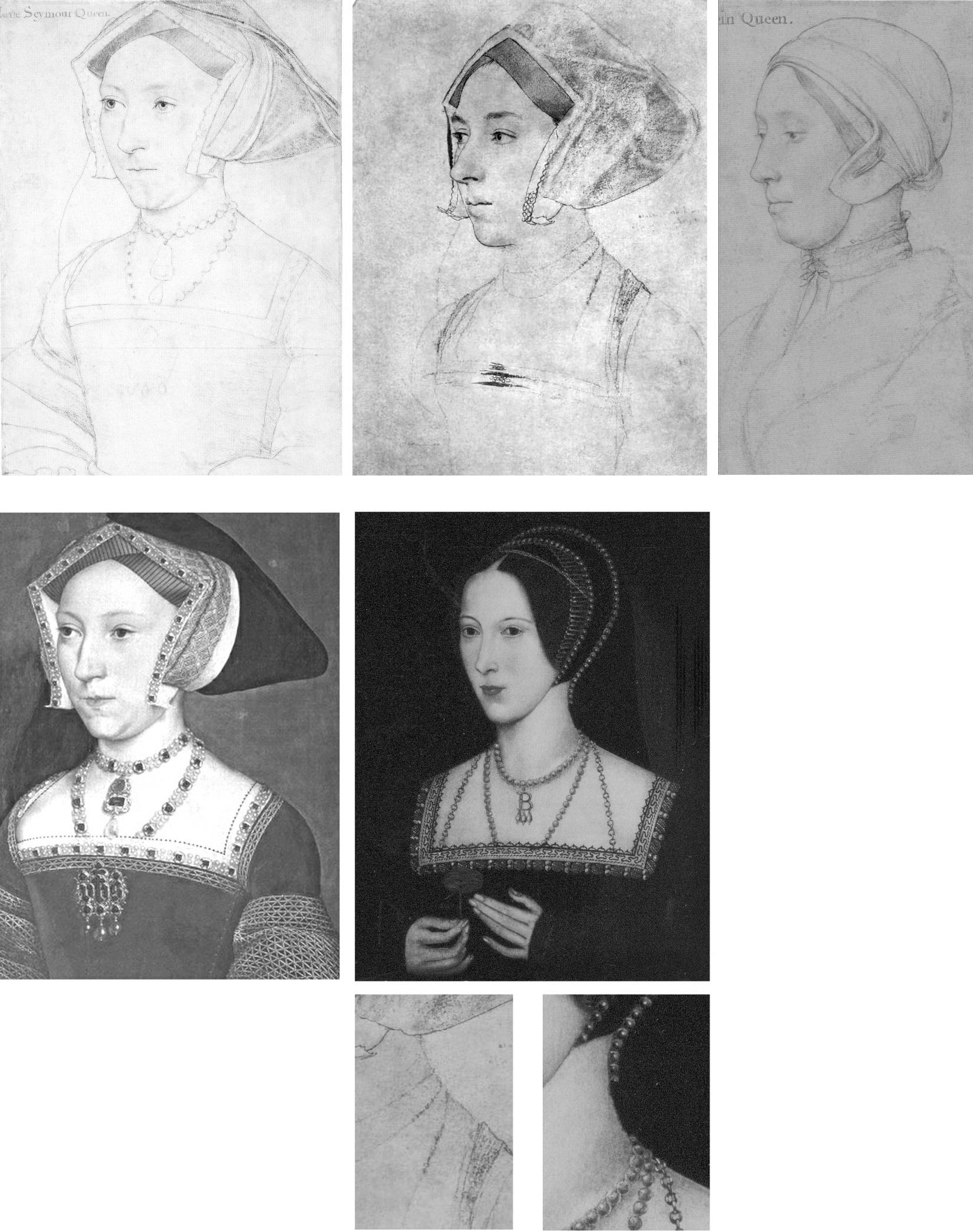
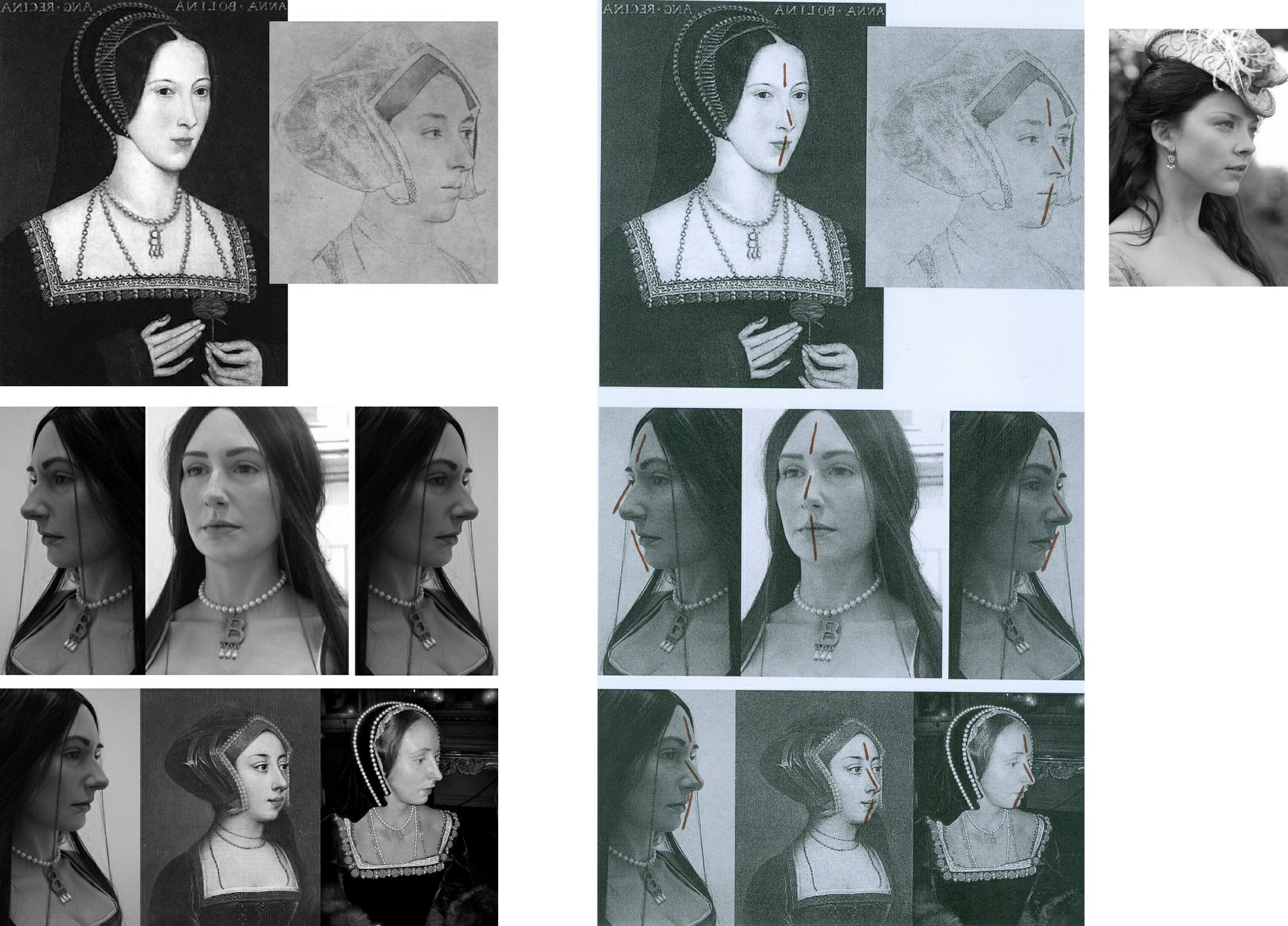
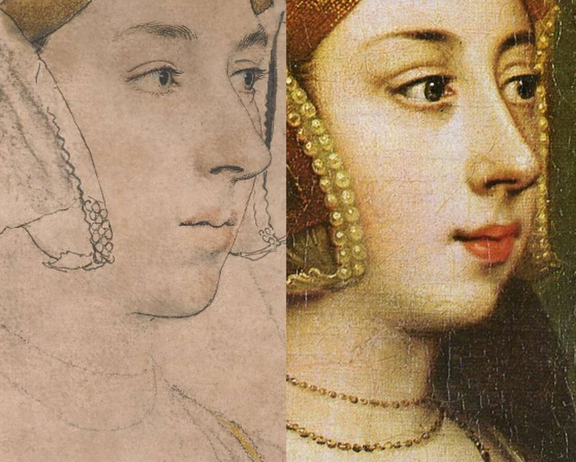
Above, Fig. 1: Left, the British Museum (formerly “Bradford”) Anne Boleyn-inscribed Holbein drawing; right, the Royal Collection Anne Boleyn-inscribed Holbein drawing.
Both of the above English Holbein portrait drawings are securely provenanced – both entered the Royal Collection on Holbein’s death. Both bear inscriptions identifying the portrayed sitter as Anne Boleyn. One or other of the drawings might be of Anne Boleyn but both cannot be so because, as all parties are agreed, the drawings depict two different people. In this case both sitters had been identified by the same respectable near-contemporary witness, Sir John Cheke, but for almost five centuries everyone had taken the (now) British Museum drawing to be the true record of Anne’s likeness. In the last half-century an overlapping succession of three people (an art historian, a Tudor historian and a modern historian) laboured for three decades to reverse that traditional identification. They all did so without offering a direct photo-comparison of the two drawings at issue. Effectively, this campaign was an anomalous images-light war of words.
We take the eventual success of that campaign as a prime case of a visually unsupported and spuriously claimed discovery, notwithstanding its seeming vindication in 2007 when the Royal Collection held that its Anne Boleyn-inscribed Holbein drawing bears the ill-fated queen’s likeness. Four years later that dramatic reversal was recalled/celebrated by Bendor Grosvenor in a 15 December 2011 Art History News post “Anne Boleyn regains her head”:
“This isn’t ‘news’ as such, but in a foray into the Tudor realms of Twitter last night I mentioned the drawing of Anne Boleyn by Holbein in the Royal Collection. I said that although in the past the identity was doubted by art historians, the sitter was now catalogued with certainty as ‘Anne Boleyn’, as you can see on the Royal Collection website…”
That claimed certainty of identification had rested on a three-stage campaign that ran between 1977 and 2007 and to which Grosvenor had contributed last. It proceeded as follows.
STAGE I: A REVISIONIST CHALLENGE
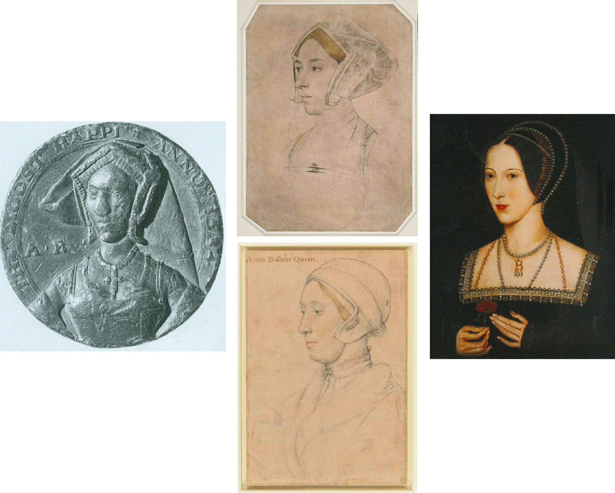
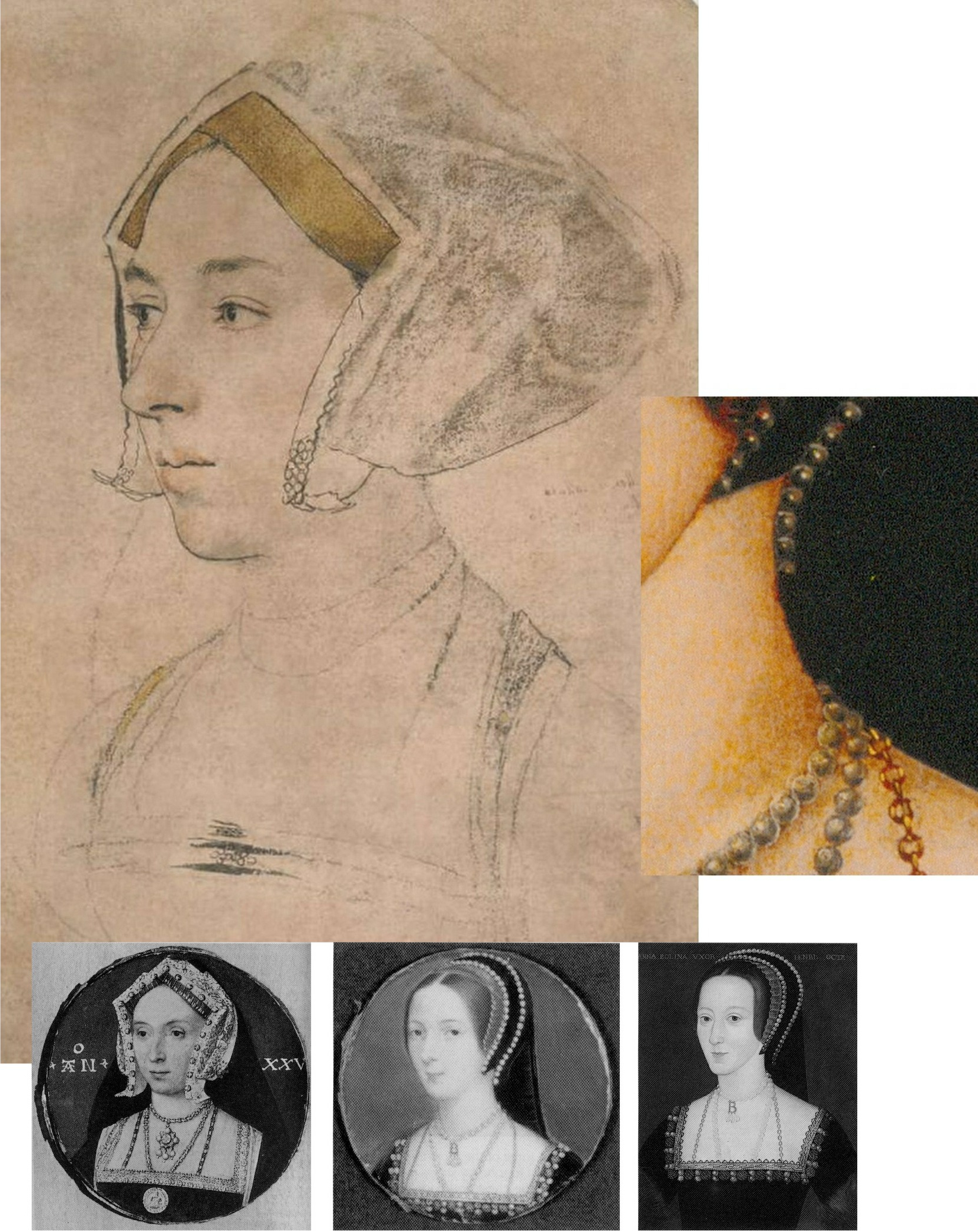
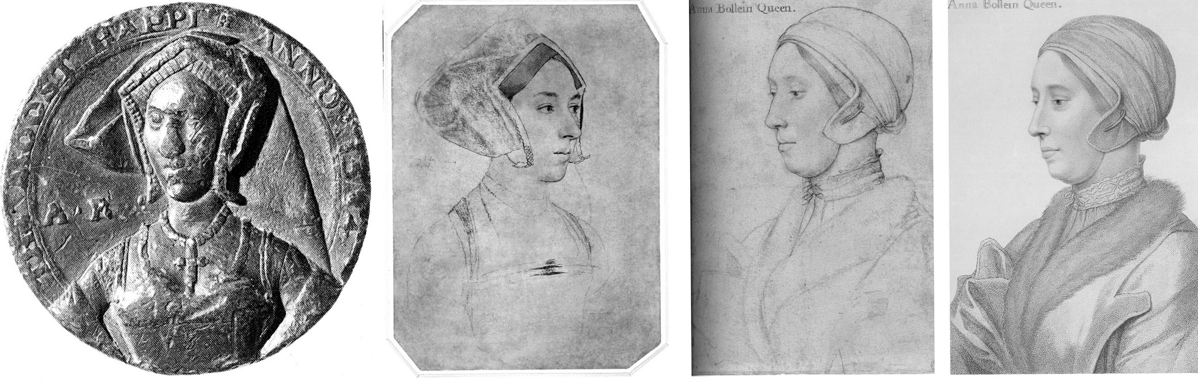
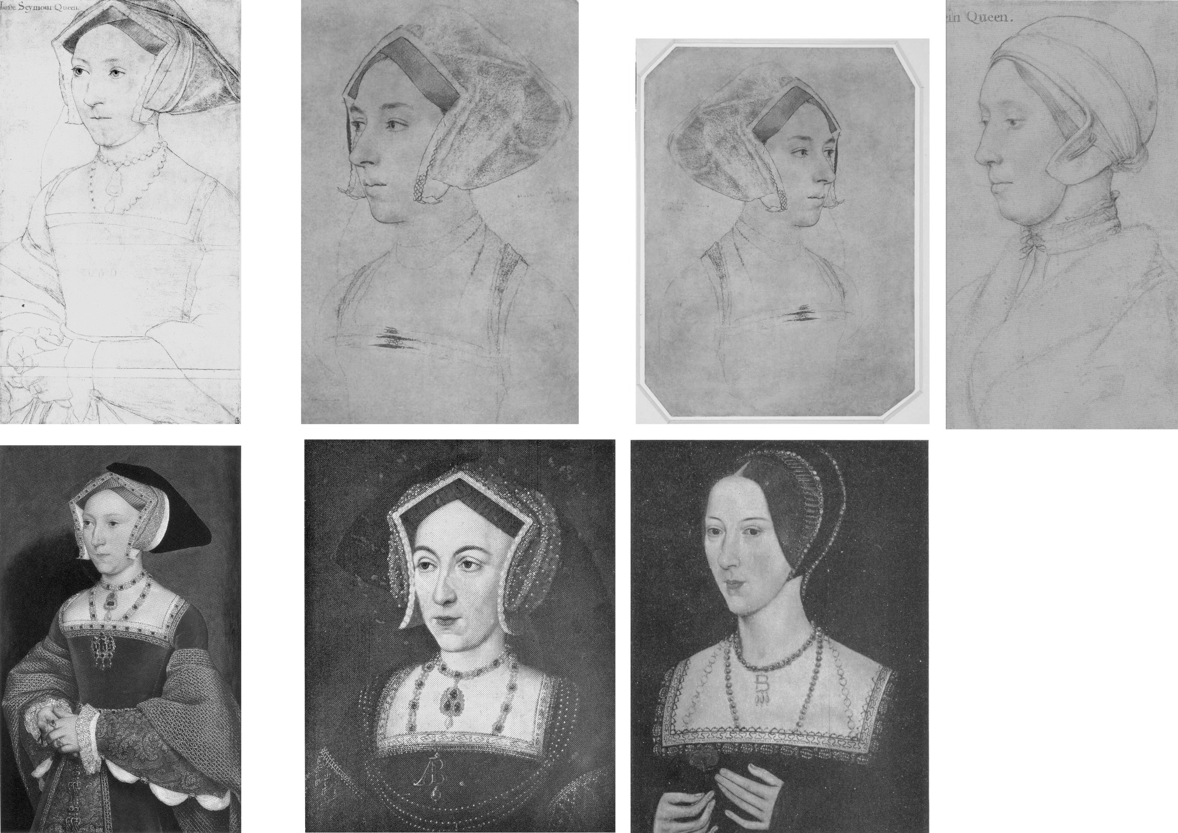
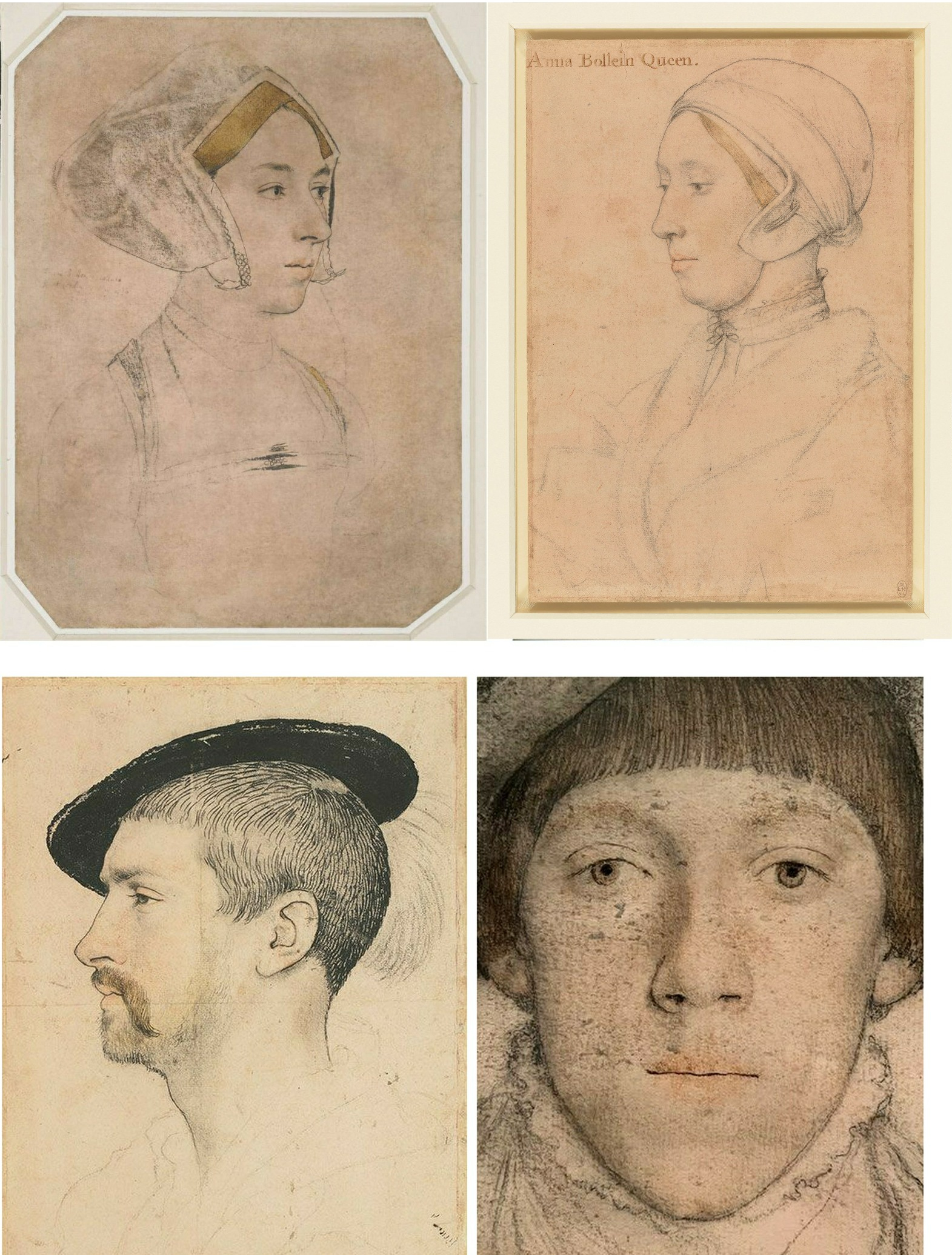
In 1977 John Rowlands, the deputy keeper of prints and drawings at the British Museum, challenged the traditional identification of Anne in the museum’s newly acquired landmark Holbein Anne Boleyn drawing. He did so in a commemorative article (“A portrait drawing by Hans Holbein the Younger”) carried in the British Museum YEARBOOK No. 2. The challenge rested on an objection that the drawing’s documentary records began in the 17th century (- see Part I: Sex, Trigonometry and Anne Boleyn’s Recovered Likeness.) Rowlands’ article carried just three photographs (Fig. 2, below) with none showing the Windsor Royal Library drawing being proposed as the true Anne Boleyn Likeness.
STAGE II: THE 1983 ROWLANDS/STARKEY COLLABORATION
Six years later, Rowlands co-authored an article with the Tudor historian David Starkey in the February 1983 Burlington Magazine (“An Old Tradition Reasserted: Holbein’s Portrait of Anne Boleyn”). Dr Starkey had scored a Bull’s Eye in a 1981 Burlington Magazine article (“Holbein’s Irish Sitter?”) by identifying a more plausible sitter in a Royal Collection Holbein drawing given to “Ormond”. As Jane Roberts put it in her 1993 National Galleries of Scotland Holbein and the Court of Henry VIII catalogue:
“The old identifying inscription, ‘Ormond’, has led to some confusion concerning the subject of this drawing. There were for a time two rival claimants to the Earldom of Ormond (or Ormonde): Thomas Boleyn (1477-1539) and James Butler (c. 1504-46). The former, the father of Anne Boleyn, was considered the most obvious candidate, although it was remarked that the drawing appeared to show someone younger than fifty (Thomas Boleyn’s age at the time of Holbein’s first visit to England.) David Starkey has plausibly suggested that the drawing instead represents James Butler, son of Piers Butler, the illegitimate kinsman of the 7th Earl of Ormond (died 1515) and claimant to his title and lands…”
As with Rowlands, Rowlands/Starkey gained no official acceptance. Recognition would only be obtained in 2007 when Starkey joined forces with the Philip Mould Gallery in an “identity discoveries” fest, some thirty years after Rowlands’ initial challenge (see below). Where Starkey’s independent professional historical elucidation of Ormond familial relationships had proved valuable to art historians, on his 1983 pairing with Rowlands he became a partisan/advocate to a historically unsupported and visually unexamined ascription. On this turkey of a case, Starkey’s professional juju failed.
Offering no visual argument, Rowlands/Starkey effectively attempted a verbal sleight of hand on a non sequitur by holding that because Sir John Cheke (the source of the English Holbein portrait drawings’ sitters identifications) might have been better placed to validate an Anne Boleyn inscription than had previously been appreciated, the Windsor drawing’s sitter therefore was the true Anne Boleyn likeness. Thus, the logical flaw of Rowlands’ initial 1977 essay remained: the more well-placed Cheke becomes as an identifier of sitters, the more reliable he becomes as the man who had also identified the sitter in the British Museum’s Anne Boleyn-ascribed Holbein drawing.
NO BEEF
The authors tacitly acknowledged the absence of corroborating evidence for the Windsor drawing’s sitter by contending that “In view of all the evidence accumulated here it seems likely at the least that Holbein was taken up by the Queen as well”. (Emphases added.) Even if such a relationship been established, it could not in itself have weighed in favour of one rival Anne Boleyn inscribed drawing over the other, for reasons given – but it had not been so established: a “likely” is not a “was” – and nor is a “likely was”. In an article cumulatively held together by a “could have”; a “would have”; a “must have”; a “could well have”; a “could have taken”; a “had every reason to take”; a “most likely”; and, a “we would guess,” the authors’ peroration itself comprised a further mini daisy-chain of question-begging speculations (emphases added):
“…his appointment as the King’s painter probably antedates it. And the likely responsibility rests with Anne Boleyn herself. For it may not be a coincidence that Holbein’s advancement at court… appears to have progressed largely through the favour of adherents to religious reform…”
That lame ending had followed a weak opening. The existence of the two rival Holbein Anne Boleyn drawings was acknowledged, as was the fact that they “clearly show different sitters”, but the drawings were not shown together side-by-side so as to permit a direct visual comparison – the authors’ claims had to be taken on trust. Similarly, it was claimed on no cited evidence that because Rowlands’ 1977 identification had “apparently” been “generally accepted” the case for the possible authenticity of the Windsor Anne Boleyn inscribed drawing “must be re-opened”.
ABSENCES OF EVIDENCE
Had Rowlands’ 1977 case been accepted, there would have been no cause to reopen it in 1983. Whether Rowlands’ original claims had been partly/largely accepted or not, the features on the two Anne Boleyn-ascribed drawings remained physically incompatible (see Figs. 1 & 3). Only one, therefore, might be a true likeness. Rowlands/Starkey conceded further absences of evidence for their position by (wrongly) claiming that no visually comparative means of adjudicating between the rival likenesses existed: “For such a re-examination there is no available visual evidence”. That assertion was made on the grounds that the only secure contemporary image of Anne is that on the damaged coronation medal of 1534. The damage on the medal is local and by no means robs the image of all testimonial capacity. When the authors published the medal and the Windsor drawing side-by-side, they claimed (rightly) that no correspondences exist between those two works, when, as can be seen at Fig. 2 below, there are clear correspondences with the British Museum drawing, the etched copy of it by Wenceslaus Hollar, and the National Portrait Gallery painting of Anne Boleyn.
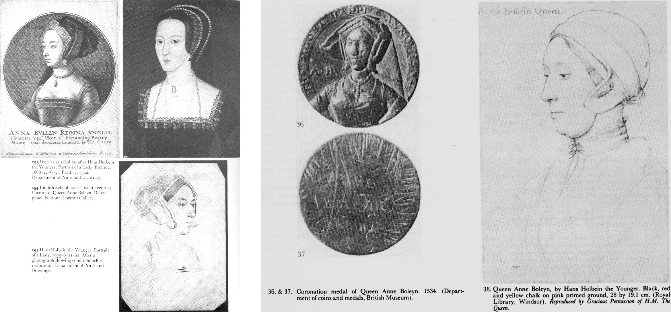
Above, Fig. 2: Left, the three illustrations carried in Rowlands’ 1977 British Museum Year-Book II article “A portrait drawing by Hans Holbein the Younger”; right, the two illustrations carried in the Rowlands/Starkey February 1983 Burlington Magazine article “An Old Tradition Reasserted: Holbein’s Portrait of Anne Boleyn”.
As if aware that their “evidential” cupboard was bare, the authors continued “fortunately… there are other pointers”.
AN UNFORCED ERROR
The first Rowlands/Starkey “pointer” was that the sitter in the Windsor drawing shows, like Henry’s other queens, little signs of prettiness – “and certainly nothing to compare with the ‘Bradford’ lady’s charm, which could well explain why in the seventeenth century the latter was claimed to be the bewitching Queen”. By alleging a supposedly misleading power of influence to Anne’s appearance in the British Museum drawing, the authors tacitly conceded that it – and not the Windsor drawing – had for five centuries been taken as the true likeness and that it had informed the subsequent late sixteenth century Anne Boleyn paintings (see Figs. 10-13.) No iconographic legacy of any sort attaches to the Windsor “Anne”.
Against their own acknowledgement of the British Museum drawing’s historically influential artistic potency, the authors offered a subjective counterclaim that the Windsor portrait had given true expression to the “strong will and intelligence [of Anne Boleyn] that her contemporaries noted”. As shown above, below, and previously, the sleepy-eyed, older, fleshier, fair-haired not dark-haired sitter in the Windsor drawing does not look more charismatically strong-willed and intelligent than the British Museum drawing’s sitter. Had the authors’ estimation of the relative traits in the rival drawings been sound it would have helped their cause to demonstrate the relationship by showing the two likenesses together, as here below.
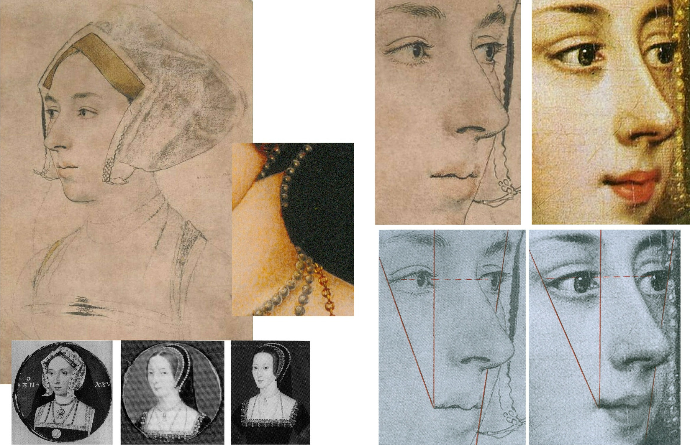
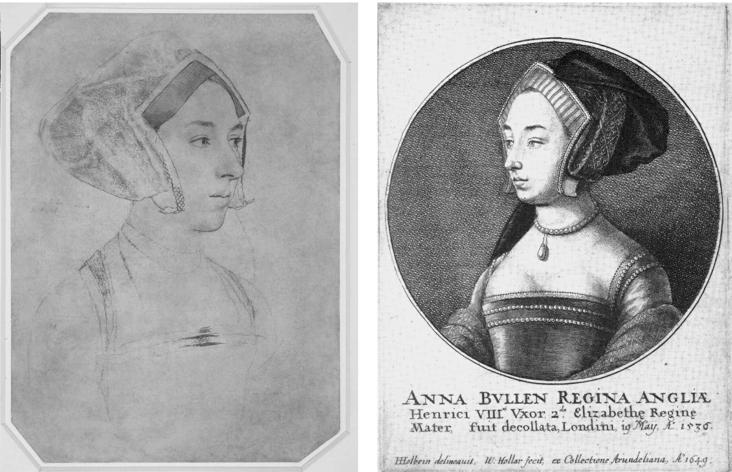
A PHOTO-COMPARISON THAT DID NOT SHOW ITS FACE
Above Fig. 3: Details of the British Museum Holbein Anne Boleyn-ascribed drawing, left, and, right, the Royal Collection Holbein Anne Boleyn-ascribed drawing.
POINTERS AND CONCRETE INDICATIONS
Evidently still fearful of the manifest weaknesses in their case and notwithstanding their own “pointers”, the authors cited certain “more concrete indications” of Anne Boleyn’s “appearance and dress”. These supposed concretely reliable indications were hearsay comments made in an acknowledged “anonymous and scurrilous French account” of Anne’s grandly ceremonial entry into London the day before her coronation. That is, Rowlands/Starkey presented as if concrete and corroborating evidence, the account of an unknown, manifestly malicious source who had described Anne as “scrofulous” (suffering from a form of tuberculosis and glandular swelling) and of having worn her dress fastened up very high on her throat to conceal a goitre. Thus, from Rowlands/Starkey: “In the [Windsor] drawing her double chin is so pronounced, as to suggest such a swelling of the throat glands, which is indeed partly hidden by a high neckline.”
There were so many problems with acceptance of that malicious account. First, the reported, supposedly goitre-concealing, garment worn by Anne was not her customary dress but what the Tudor historian Eric Ives described as “the traditional high-necked English coronation mantle”. Second, the Windsor drawing’s sitter was not wearing any form of day wear: “She wears some kind of under-cap and a furred nightgown over her chemise”. Third, the tied neck of the chemise did not conceal the double chin – only a very high turtle-necked garment might have done so. Fourth, the displaying of such “undress” for a likeness-recording artist, was held to constitute proof of regal identity because: “only a woman of the highest rank could have taken such a liberty in court circles.” Begging their own question, the authors added: “Several of Holbein’s male sitters appear in similar states of undress but Anne was the only woman to do so.” In this instance, a “could have” became a “was” in two breaths, with a seeming wish once again being the father of the deed.
Had Holbein drawn Henry’s second queen in such a state of undress, he would have put himself at risk of accompanying her and her alleged lovers to the executions. Had the fair-haired Windsor sitter been the mother of Holbein’s two English children, no suspicion of impropriety could have arisen. As it happens, downcast eyes and wistful expressions are common to the Windsor drawing and Holbein’s German wife, as depicted in his The Artist’s Wife and Children – detail below, left. (Also, as discussed below, the Windsor sitter bears certain facial similarities with another contested Holbein sitter in the Royal Collection.)
Above, Fig. 4: Left, detail, Holbein’s The Artist’s Wife and Children; right, a detail of the Royal Collection “Anne Boleyn” drawing.
THREE NOSTRILS AND TWO TRAPEZOIDS
While nothing is known of the mother of Holbein’s two English children, Anne Boleyn famously had a brother, George, three or four years her junior, and with whom she was alleged to have committed adultery. No Holbein drawing in the Royal Collection is identified as George, but as luck would have it, one of Holbein’s unidentified portraits in the collection happens to have been made from a closely similar viewpoint to that of the British Museum Anne. As shown below, an unmissably similar configuration of brows, eyes, and nose is present in the two drawings. The only significant difference in the features is the appreciably more masculine jaw in the – here proposed – George Boleyn likeness. Unlike the Windsor sitter’s nose, those of George and Anne both have deep nostril apertures.
Above, Fig. 5. From left to right: ArtWatch UK letter, the Times, 5 July 2023; an unidentified Royal Collection Holbein drawing which we take to be of George Boleyn, Viscount Rochford; the British Museum “Ann Boleyn”; the Royal Collection “Ann Boleyn”.
HOLBEIN’S “UNIDENTIFIED MAN”
The above Holbein male portrait is today described by the Royal Collection as “An unidentified man, c. 1532-43”. Sir Karl Parker, author of the seminal 1945 Holbein’s Drawings at Windsor Castle, described it as “A Gentleman: Unknown”. Given the many facial similarities in the two drawings we can, perhaps, take it that Sir John Cheke had either not known Anne’s brother or had failed to recall him.
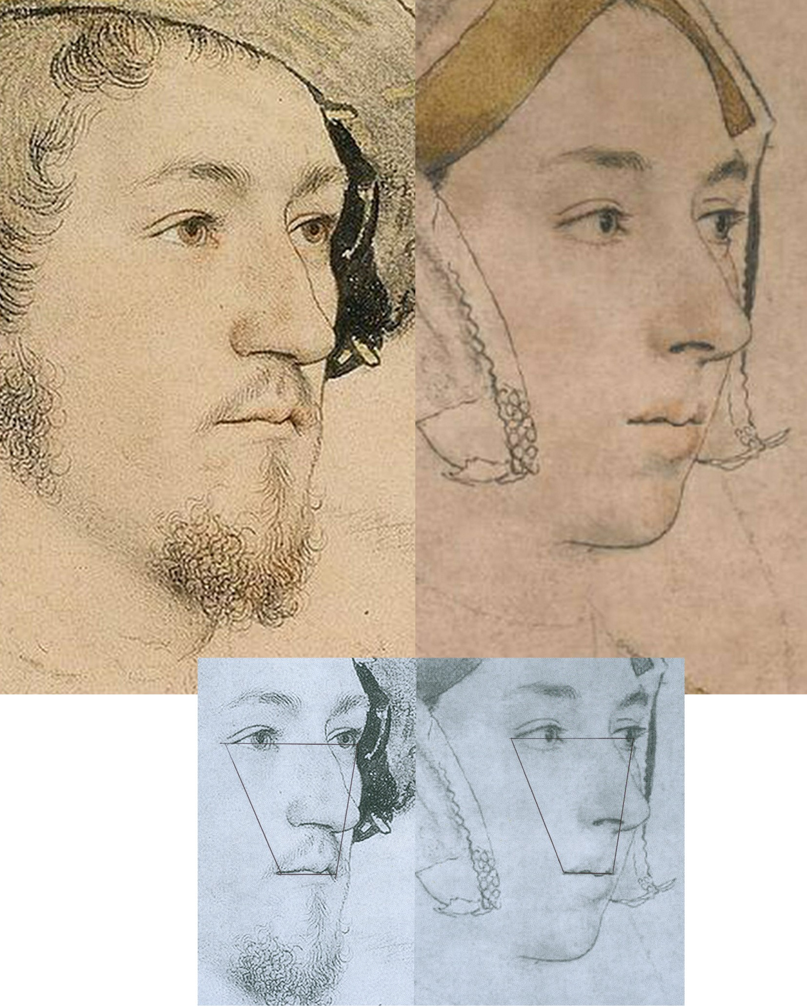
Above, Fig. 6: Left, the proposed Holbein portrayal of George Boleyn; right, the five centuries long accepted British Museum Holbein drawing of Anne Boleyn. Does this “George” not seem a little younger – and perhaps sweeter – than this Anne Boleyn? For that matter, has Holbein ever drawn eyes that are more vividly alive and penetrating than those found in this Anne?
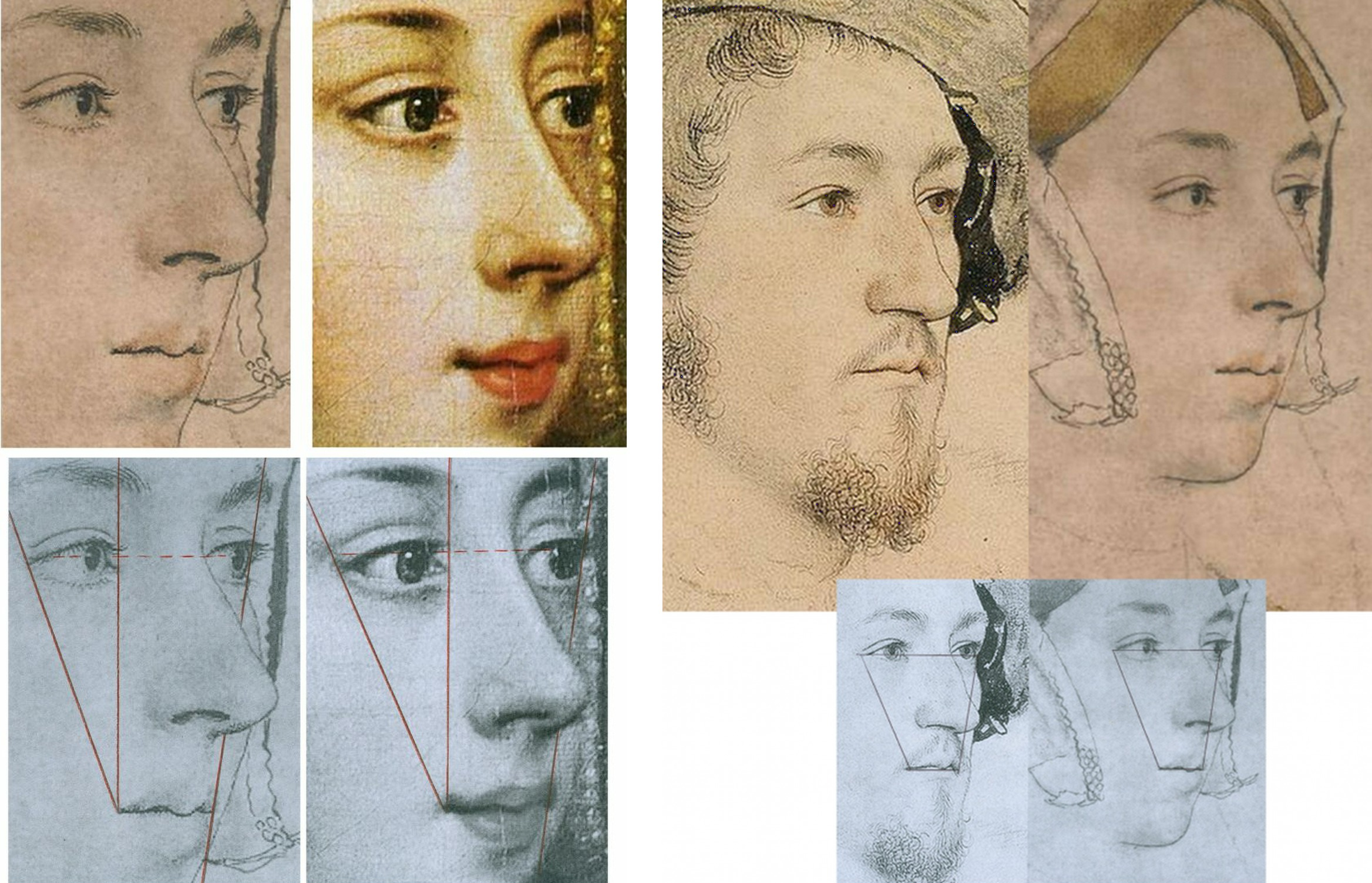
Above, Fig. 7: Left, the similarities between the British Museum Anne and a later painting, as shown in Part I; right, the similarities between the Windsor “George” and the British Museum Anne.
STAGE THREE: A CASE NOT MADE
As with Rowlands, so Rowlands/Starkey had failed to effect a switch of the sitters’ identities. It would take twenty-four more years for victory to be claimed. On 14 March 2007 the Daily Mail (“Finally historians can give Anne Boleyn her head back”) reported:
“A Holbein drawing has been revealed as the only portrait of Henry VIII’s second wife Anne Boleyn. The c.1530 picture carries Anne’s name but other evidence suggested this was an error. Now expert Bendor Grosvenor and historian David Starkey have traced the inscription to her contemporary Sir John Cheke, confirming she is indeed the subject.”
No evidence had been presented by Starkey/Grosvenor that Cheke had specifically and exclusively ascribed the Windsor drawing – or that he had not also so ascribed the British Museum drawing. On the reported claims to have “traced” the Windsor drawing’s identification to Cheke, see below. Nothing had been found and nothing had changed – except, that is, the 1983 Rowlands/Starkey Burlington Magazine thesis had been robustly challenged and rejected in 1986 by a major Tudor historian, Eric Ives, in his biography Anne Boleyn, which work was frequently reprinted until 1994 and later superseded in Ives’ highly acclaimed 2004 The Life and Death of Anne Boleyn ‘The Most Happy.’ Starkey, author of Six Wives: The Queens of Henry VIII and Elizabeth, had generously described Ives’ biography as “The best full-length life of Anne Boleyn and a monument to investigative scholarship”.
THE IVES INTERREGNUM
Prof. Ives’ challenge to Rowlands/Starkey in his books had also been developed separately in a major article for the July 1994 Apollo magazine “The Queen and the Painters – Anne Boleyn, Holbein and the Tudor Royal portraits”. Where Starkey/Rowlands had taken two and a half Burlington pages, which included just two photographs, Ives’ essay ran over ten pages and carried sixteen photographs. Although not all pages addressed the Holbein Anne Boleyn drawings, Ives’ substantial scholarly and visually supported account seemed to have trumped Rowlands/Starkey and put the lid on the Windsor sitter campaign. So far as we know, Starkey never added to his joint 1983 Burlington article contribution. When Rowlands returned to the Windsor drawing in 1988 on publishing the British Museum portrait (which was then described as “Portrait of a Lady, thought to be Anne Boleyn”) in his catalogue to the museum’s “The Age of Durer and Holbein” exhibition, he claimed no more against the British Museum Anne Boleyn drawing’s ascription than that the “circumstantial grounds in favour of the Windsor drawing are really very compelling, and one cannot necessarily cast aside Sir John Cheke’s authority for the identification merely because of the confusion over a sitter in the Windsor series being called by him in error ‘Mother Iak’”.
Ives had indeed challenged Cheke’s reliability, and Rowlands acknowledged that his own (somewhat defensive) stance had followed the publication of Ives’ 1986 Anne Boleyn biography:
“Its rejection by Ives in his brilliant historical study is based on a mistaken disregard of the widely varying value of the different supposed likenesses of the Queen; for it is not wise to rely too readily on inferior Elizabethan portraits to form a basis for establishing her appearance.”
Thus, in another attempt to bolster Cheke’s reliability, Rowlands again discounted the testimonies of the many later painted portraits of Anne, none of which, as mentioned, showed any indebtedness to or affinities with the Windsor drawing. As shown in Part I and below, the markedly contrasting degrees of connectedness of the two Anne Boleyn-ascribed Holbein drawings to the many subsequent portraits of the queen constitute the art critical nub of this dispute: How and why had the British Museum Anne – and not the Windsor Anne – come to be held the true likeness for five centuries? To be clear: the contrary case presented for the Windsor Anne rested on nothing more than a) an assertion of near-infallibility in Cheke’s identifications; and b) a systematic disparagement of the visual testimony found in the (near-forty?) subsequent surviving late sixteenth century painted portraits of Anne. Nonetheless, where Rowlands, and Rowlands/Starkey had failed in 1977 and 1983 respectively, Starkey plus Team Philip Mould Ltd would seemingly prevail in 2007. It happened as follows.
TURNING ART MARKET STORIES TO COMPETE WITH SEX SCANDALS AND WARS
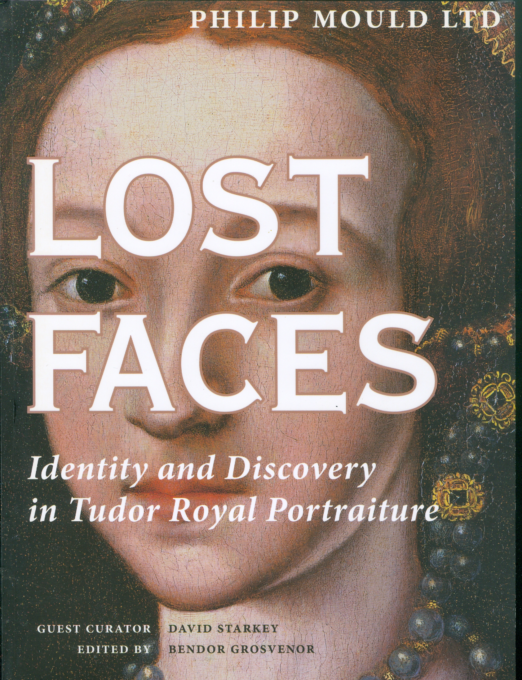
Above, Fig. 8: The catalogue to the 2007 Philip Mould Ltd “Lost Faces – Identity & Discovery in Tudor Royal Portraiture” exhibition.
The Philip Mould catalogue’s editor, Dr Bendor Grosvenor, set out the contributors’ aims:
“This exhibition seeks to raise questions, stimulate debate, and, where appropriate, suggest answers. Its purpose is intentionally provocative. The authors are indebted to those who have researched and published in the field of Tudor portraiture before. We hope that in bringing fresh eyes to bear on the subject we do not offend, merely illuminate further this fascinating subject.”
ADDING COMMERCIAL VALUE AND ACADEMIC RESPECTABILITY
The commercial and historical importances of attaching faces to historical figures was set out frankly and with passion, respectively, by Philip Mould and David Starkey. Mould began in the Foreword:
“When, early last year, David Starkey mentioned he would like to collaborate with us on an exhibition highlighting some of the more interesting discoveries in the Tudor arena, I responded with what must have seemed unseemly enthusiasm. On one level it was naturally a very great privilege to work with such an esteemed historian and communicator – cause enough for celebration. However I was also personally delighted to have the opportunity to show how making and announcing art discoveries can have a more substantive purpose and legacy when set in the context of academic history.
“When we lurched into life as a business twenty years ago it was discoveries in a modest form that both paid the rent and paved the way for the future identity of the company. We found that the subject of revealing lost faces, with its inherent humanity and drama was something people liked to read about, and some years later, as a further response to this phenomenon, I wrote Sleepers, which was an account of some of the more sensational finds in the art business, combined with some insights into both the process and the people who make them.
“A discovery requires three elements to turn it into a story: a discoverer with whom the reader can identify; the recovery or disclosure of something that matters; and a writer or commentator who can authoritatively communicate the discovery’s significance. The reason that we get asked regularly by newspaper editors for any discoveries is that they are a valuable news commodity. But it goes both ways. Not only do they sell newspapers, they are also one of the few ways that history and antique art can compete with celebrity, sex scandal and world wars for news headlines. In other words it allows art and history a safe passage into the hearths of middle England…”
THE ENTRANCE OF DAVID STARKEY

Above, Fig. 9, an ink drawing (in the collection of Professor Edward Chaney) of David Starkey made by the author to illustrate a profile article, “The apoplectic academic”, by D. J. Taylor, in the Independent on Sunday, 9 November 2001.
The Independent profile had tracked Dr Starkey’s pathway to celebrityhood:
“In the absence of the late Sir Malcolm Bradbury, whom can we safely characterise as Britain’s foremost media don? …by far the most successful performer in this glitzy but exhausting medium, delight of both the set-tethered TV audience and the browsers of bookshop history shelves, is the engagingly self-styled ‘academic thug’, David Starkey. Strictly speaking, to mark down the Tudor bruiser as a media don is a technical inaccuracy. Dr Starkey no longer teaches professionally, and the Cambridge quadrangles and the senior common room of the LSE have yielded up to ‘private research’ and solitary archival jaunts…
“For a bright, academically inclined teenager, the path from the local grammar school could lead only south, in this case to Cambridge, where he took a first in history and became a protégé of the leading Tudor historian of the age, Professor Geoffrey Elton. Starkey quickly decided that Elton’s view of history was sharply opposed to his own. Elton’s magisterial analyses of Tudor government rested on ideas of bureaucratic improvement. Starkey, on the other hand, was a personality man, seduced by the thought of titanic egos in conflict, ante-room punch-ups and backstairs intrigue. His first book, The Reign of Henry VIII: politics and personalities, was among other things a spectacular debunking of the Elton line. Sir Geoffrey is supposed to have taken this intellectual throwing over very hard…”
THE ROLE AND IMPORTANCE OF VISUAL EVIDENCE
In the catalogue’s Introduction, Starkey spoke with verve to the great importance – and the rarity – of visual evidence in historical studies:
“‘Henry VIII’, the lecturer declared, ‘is the only king whose shape you remember’. He then proved his point with a quick blackboard sketch, which deconstructed Holbein’s great full-length portrait into its elements of almost Cubist geometry. He made the body a trapezium, the legs splayed columns, the arms triangles, the head and neck a single massive cylinder, and finished off with the hat, which he drew with a flourish as a short acute angle to the head.
“We all laughed, for once un-sycophantically, as back then we were unused to visual aids and the joke was rather a good one. The time was 1964; the place a Cambridge lecture theatre; and the lecturer G. R. Elton. Elton was already the doyen of Tudor studies, but he spoke more truly than even he knew. For without the Holbein painting, how would we have an image of Henry at all? And without an image, how could Henry be memorable let alone world-famous? Would even, that is to say, the upheavals of the Reformation and the magnificent storyline of Henry and his Six Wives be enough if we could not envisage so vividly the male lead, let alone the female co-stars?
“I think not. For, speaking now as a television presenter as much as an historian, seeing is more than half of believing and almost all of caring. This means that Holbein’s painting is more than ‘the most enduring of all Henry VIII’s portraits – perhaps indeed the most memorable image of any English monarch’, it is Henry. It is, more than anything else, the reason that he fascinates us and that we study him; it is, I would go further, the beginning of his biography and the key to his mind. Once, it was poets who had promised eternal fame; with the Renaissance, painters were able to offer a more certain and enduring pathway to celebrity.”
In the 2007 Mould catalogue Dr Starkey made no further claims for the Windsor Anne Boleyn likeness. Dr Grosvenor, the catalogue editor, took the reins – and, later, part-credit for its acceptance by the Royal Collection, as in his 15 December 2011 Art History News post “Anne Boleyn regains her head”:
“…There used to be an article online in The Times detailing how research by myself and David Starkey had helped confirm the identity. But it has now disappeared behind the paywall. So below the jump, and online for the first time, is the article I wrote for an exhibition at Philip Mould in 2006 [sic] called ‘Lost Faces – Identity & Discovery in Tudor Royal Portraiture’, which was guest curated by David. The article was in the context of a fine but posthumous portrait of Anne we had borrowed from Hever Castle, Anne’s childhood home [Fig. 10, below, left]. The Royal Collection have found all the evidence compelling enough to change their cataloguing of the drawing (saying ‘this is a rare surviving portrait of Anne’), which is very pleasing. Let me know if you agree (or disagree)!”
The Times (“Nightgown clue turns Holbein’s unknown lady into Anne Boleyn”, 14 March 2007) had reported:
“Academics have now traced the inscription to Boleyn’s contemporary, Sir John Cheke, who began his career at the court under her patronage, before becoming secretary to Edward VI. A document of 1590 notes that Sir John inscribed numerous Holbeins for the King, helping to identify faces of royals and courtiers. Bendor Grosvenor, who carried out the research with David Starkey, the Tudor Historian, said: ‘Cheke was one of the brightest brains of the Tudor court. He would have known most of Holbein’s sitters, if not on personal terms, then at least visually’…Mr Grosvenor, who works at Philip Mould Historical Portraits, London, said: “it is inconceivable that she did not sit at some point for her portrait…’ The drawing appears to be a most unqueenly portrait, as the sitter is wearing a nightgown. Mr Gosvenor said: ‘Only a woman of the highest rank would have taken such a liberty in court circles.’ …The Royal Collection accepted that the portrait was of Boleyn.”
Among respondents to Grosvenor’s 2011 Art history News post, the author Claire Ridgway said on her Anne Boleyn Files blog: “…it is a very interesting read when compared with the thoughts of Eric Ives and Roland Hui…”
In a January 2000 post (“A Reassessment of Queen Anne Boleyn’s Portraiture”), Hui had noted that:
“The confusion surrounding the portraiture of Anne Boleyn was addressed by the art historian E. W. Ives in his biography of the Queen in 1986…In regard to the [Windsor] Holbein sketch, John Rowlands and David Starkey have proposed that the sitter was indeed Anne Boleyn… She is seen in three-quarters profile dressed in a furred robe over a chemise laced at the throat, and wears a simple undercap…Rowlands and Starkey have argued that such ‘undress’ on the part of this ‘royal’ sitter was a novelty of sorts to ‘relax’ the dictates of court etiquette. However, it seems unlikely that Anne with her much commented upon sense of style would have permitted herself to be depicted as such…Since her early days at court Anne Boleyn had a reputation in fine dressing in fashion-setting. George Wyatt, the grandson of Anne’s admirer, the Celebrated poet Thomas Wyatt, wrote that in her attire ‘she excelled them all’. Even those hostile to Anne Boleyn, such as the Elizabethan Catholic Nicholas Sander, admitted to the Queen always being ‘well dressed, and every day made some change in the fashion of her garments’…”
Above, Fig. 10: The photo-linkage that was carried across two pages of Anne Boleyn-ascribed works, as discussed by Grosvenor in the 2007 Philip Mould Gallery catalogue “Lost Faces – Identity & Discovery in Tudor Royal Portraiture”.
Note that, as seen above, in Grosvenor’s section of the 2007 Mould catalogue, the proposed Windsor sitter’s identification as Anne Boleyn carried a parenthetical question mark, and that nothing more was said of Cheke’s claimed identification of it than that it carried much weight – when, by the same token, so too must Cheke’s identification of the British Museum Anne – to repeat: because the two drawings’ sitters are, as everybody agrees, physically incompatible, if Cheke was right on one he had to be wrong on the other. In three decades of campaigning no one had established that Cheke had only endorsed the one drawing and not the other.
In “Lost Faces”, Grosvenor acknowledged his own restating of Rowlands/Starkey and strenuously endeavoured to show that Cheke had been proved right on almost every sitter’s identification. To two Ives-cited Cheke misidentifications he responded:
“We can surely forgive Cheke these errors, for the drawings date to Holbein’s first trip to England between 1526-8, well before Cheke came to Court.”
Ives had written:
“Most worrying of all, the portrait of Margaret Clements, More’s foster daughter, is identified as ‘Mother Jak’, Edward the VI’s nurse. Not only is it highly likely that Cheke knew Margaret – her husband John was erstwhile reader in Greek at Oxford, and Cheke was Regius Professor of Greek at Cambridge – but, as tutor to the future Edward VI, Cheke undoubtedly knew the real ‘Mother Jack’. Clearly, his authorship of the current [Anne Boleyn] identifications is highly questionable.”
CONCEALING GOITRES
Like Rowlands/Starkey, Grosvenor took the politically hostile witnesses’ accounts as firm corroborations of the Windsor drawing’s Anne. One such, Nicholas Sanders, alleged “a large wen under her chin” which she had attempted to conceal. Where Ives had rebutted Sanders’ testimony outright – “one can dismiss out of hand the arguments which seeks to link the [Windsor] sitter’s double chin and high collar with… a velvet mantle with a high collar to conceal a scrofulous neck” – Grosvenor countered: “We do know, however, from another contemporary source Sanders’ description of a swelling under her chin was probably correct.” A footnote to this claim cited Sir Roy Strong’s seminal work Tudor and Jacobean Portraits, but, as readers of Strong’s book will appreciate, while he had indeed identified a second observer (who claimed a grossly disfiguring wart and a swelling “resembling a goitre”), he, like Ives later, had dismissed both observers as hostile and, in Sanders’ case, of also being “too late to be taken as reliable evidence”.
DISCOUNTING AUTHORITIES
Although Grosvenor had cited both Strong and Ives in footnotes, on the former, he might have left an impression of support for his own position when Strong had not only dismissed the hostile witnesses’ reliability but had also noted that their accounts were incompatible (had failed to “harmonise very closely”) with the later painted pictures of Anne. Strong’s recognition of the testimonial value of the later paintings highlights the collective and abiding failure of the Windsor drawing’s successive champions to acknowledge and heed the evidential force of artistic images when, properly considered, such works of art themselves constitute primary documents as (truly) concrete manifestations of highly specific and personal artistic/intellectual productions. Grosvenor’s footnote on Ives’ 1994 Apollo article said no more of him than that he was one of the “authorities [who] have dismissed the validity of the [Windsor] ‘Anna Bollein’ inscription due to other inconsistencies and errors in the [Cheke] identifications.”
Ives had objected to more than the unreliability of Cheke’s identifications. He had made a methodologically rigorous visual and comparative appraisal of the available pictorial and graphic records that would have done a trained art historian proud. He rejected the two Holbein Anne Boleyn drawings as likenesses of Anne – but not equally so. While recognising that a case can be made for each, he pointed out that where the British Museum Anne looks the part – “The love of Henry VIII’s life should have looked like that” – against that, the “curious undress” of the Windsor sitter suggested that rather than being a queen, “A far more likely explanation of the implied intimacy would be a link between artist and sitter”. The combined facts that Hollar had chosen to engrave the now British Museum Anne and not the Windsor Anne, and the latter’s intimate garb “should make further discussion of the Windsor drawing unnecessary”.
Having disregarded an entire tranche of historically adjacent paintings of Anne Boleyn, Grosvenor, following Rowlands and Starkey, subscribed to the veracity of the widely recognised malice on alleged facial disfigurements as reliable corroborations of the double chinned, heavy jawed sitter with the (disqualifying) fair-not-famously-dark hair in the Windsor drawing: “The chin in the drawing is perhaps swollen, and would accord with Anne’s alleged misfortune” – and this, despite Ives’ objection that the Windsor drawing sitter’s “almost bovine impression” was “fatally contradicted by the medal’s long assertive neck and its total absence of a double chin.” (See Fig. 11, below.)
ROYAL HEADWEAR
Above, Fig. 11: Left, the British Museum-owned 1534 Coronation medal; centre, top, the British Museum “Anne Boleyn” Holbein drawing (mirrored) and, bottom, the Windsor “Anne Boleyn” Holbein drawing; right, the Hever Castle Anne Boleyn painting loaned to the 2007 Mould Gallery exhibition. Although the medal is certainly damaged, pace Rowlands/Starkey, it clearly shows Anne to be attired and be-jewelled, as in the B.M. drawing. The sitter in both wears a “gable hood” – which fashion would be superseded within Anne’s own reign by the “French Bonnet” fashion, as found in the Hever paintings. In the above formation of images, where the similarities of costume and composition arc from the medal through the British Museum Anne to the painting, the Windsor drawing, by contrast, acts as a circuit breaker between the medal and the painting.
Where Grosvenor made no comment on Strong’s recognition of the wider testimonial force of artistic depictions, on the testimony itself he faced both ways, declaring on the one hand that “The author does not believe that the [Windsor] likeness… is totally dissimilar to the later portraits of Anne, such as that exhibited here [the Hever Castle portrait at Fig. 11, above, right]”, while, on the other hand, dismissing the testimonial power of the later portraits en masse:
“As with all posthumous portraits, however, they are subject to the historical, political, and visual prejudices of those who created and commissioned them. They cannot give us an accurate picture of what Anne really looked like”.
THE PERILS OF DISAVOWING PICTORIAL TESTIMONY
Above, Fig. 12: Left, as shown in Part I, appraising and evaluating artistic productions is not a mystical or even an entirely subjective exercise. As seen above, left, while the Windsor sitter was shown in nightwear and sans jewellery, Holbein’s British Museum sitter was fully dressed and with indications of three rows of necklaces. Many paintings of Anne show her in precisely such dress and so be-jewelled – jewellery which often included her initial “B” as a suspended centrepiece. Elsewhere in the Mould catalogue, Grosvenor accepted the testimonial power of jewellery when defending Cheke’s reliability on a Holbein sitter that had been doubted – “The Lady Mary after Queen”:
“But the Holbein drawing certainly is Mary. A study of the jewellery allows a positive identification to be made…”
Above, right: with the British Museum Anne Boleyn drawing, not only does the indicated jewellery clinch the status of the drawing as the precursor to the paintings, it was (as previously shown) further possible to demonstrate the clear derivation of a particular painting (also at Hever Castle) from the drawing.
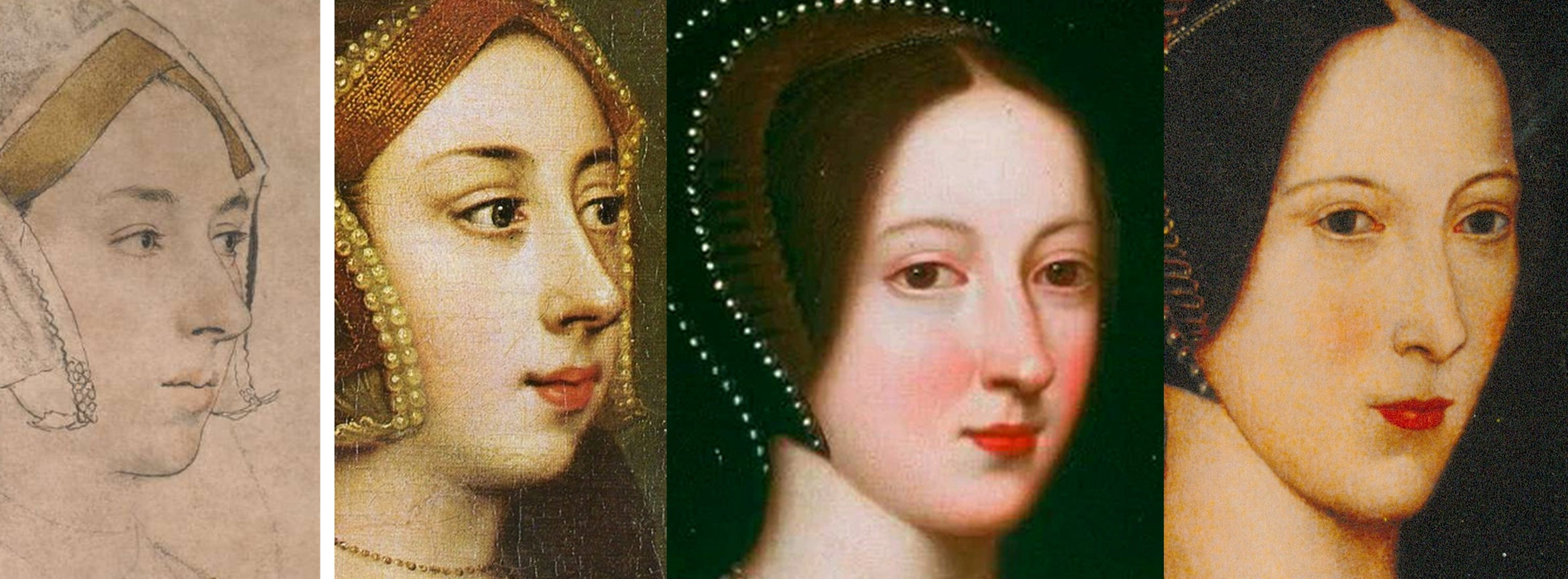
Above, Fig. 13: In the above sequence it is possible to see a morphing familial relationship in the faces in which, notwithstanding stylistic changes, a progressive sequencing of slight rotations of the head from the original near profile drawing (in which the nose fractionally overlapped the cheek contour and the edge of the gable hood) progresses towards a more frontal face in which the eyes in the second Hever Castle Anne painting (here mirrored) turn to confront the viewer.
DOUBLE CHINS AND CHEKE’S RELIABILITY
As shown in Part I, the features of the Windsor sitter markedly better resemble those of the ascribed Duchess of Suffolk (Fig. 14, below) than those of the British Museum drawing. As mentioned, when Starkey paired with Rowlands in the 1983 Burlington Magazine article hopes of a visually supported case for the Windsor “Anne Boleyn” were dashed, and again, with Starkey/Grosvenor, after three decades, no direct visual comparison of the rival Holbein drawings was offered to readers.
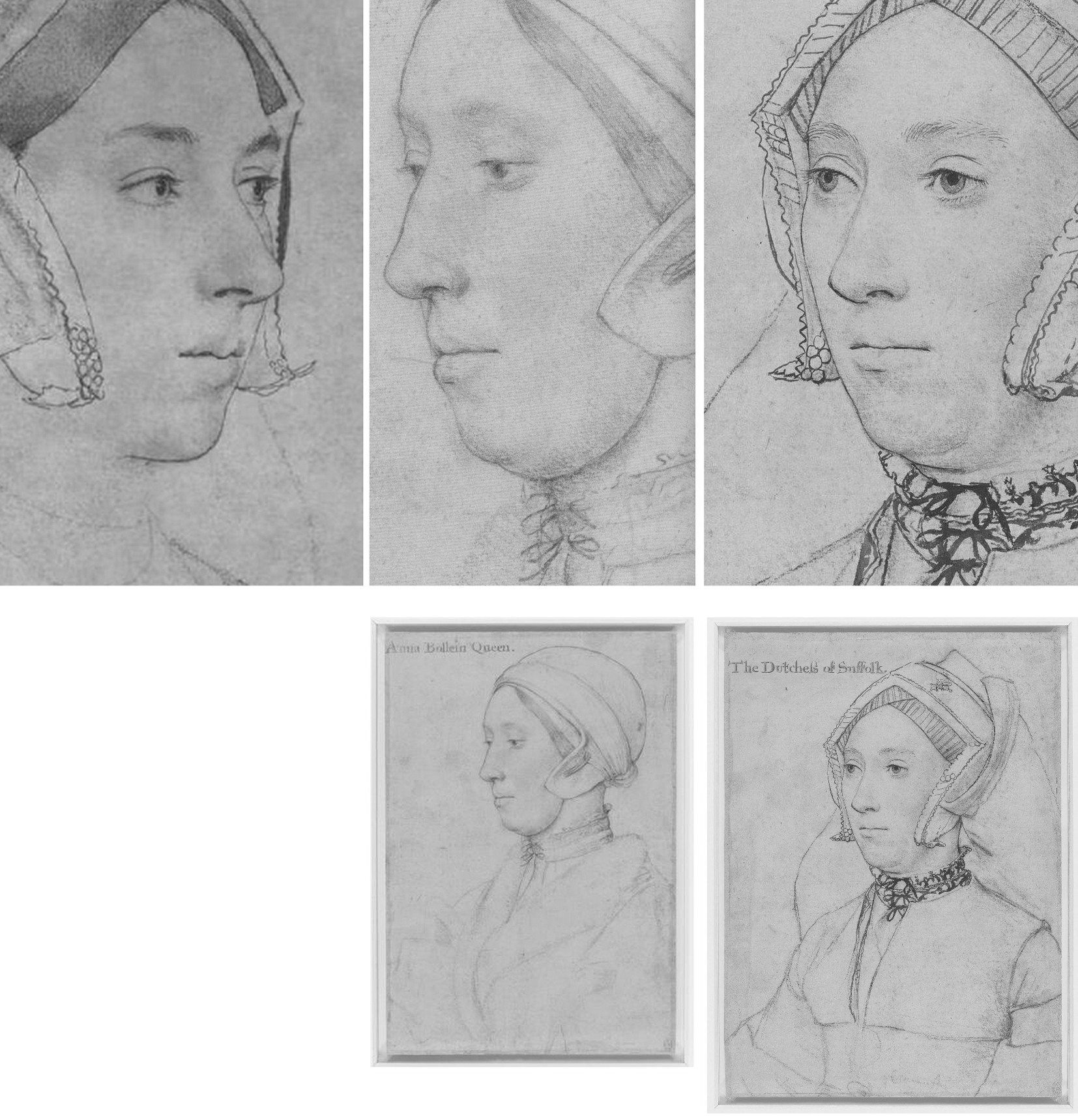
Above, Fig. 14: Left and centre, the British Museum and the Windsor Holbein “Anne Boleyn drawings; right, the Royal Library’s “The Dutchess of Suffolk”. Note, in the case of the British Museum Anne, a nostril that is markedly larger than the two similarly shaped nostrils on the other two drawings.
Collectively, Rowlands, Rowlands/Starkey, and Starkey/Grosvenor had all failed to acknowledge that the sitter in the Windsor drawing was not the only double-chinned, high cheek-boned lady wearing a (potentially) goitre concealing, neck-tied chemise in Holbein’s drawn portraits. As seen above, Holbein’s later inscribed portrayal of Katherine Brandon, the “Dutchess of Suffolk”, bears not only another double chin but an almost identically laced and tied high-necked garment. Were both sitters scrofulous? Or might they have been one and the same person?
CODA: AGE CUTS BOTH WAYS
Ironically, an unsuccessful attempt was made in the Lost Faces exhibition to re-assign the identity of the Duchess of Suffolk’s sitter to an earlier wife and to count the proposed switch as another Mould and co. “discovery”. Grosvenor raised the reliability of the ascribed Duchess of Suffolk sitter:
“…there has been some confusion about which ‘Dutchess of Suffolk’ Holbein shows, an issue raised below in some detail by Alisdair Hawkyard.”
Hawkyard, possibly in emulation of Starkey on “Ormond”, wrote:
“One of the drawings of a sitter whose identity has been doubted is inscribed ‘The Dutchess of Suffolk’. She has been identified as Catherine Willoughby born c. 1519 who in September 1533 married her guardian Charles Brandon, Duke of Suffolk. The woman depicted is more mature than Catherine would have been had she sat to Holbein before his death in 1543. The sitter’s greater maturity suggests that she was Suffolk’s third wife Mary who died on 25 June 1533. Mary, Henry viii’s younger surviving sister, had married Suffolk in 1515 while still in mourning for her recently deceased husband King Louis xii of France and without the consent of either her brother or the new King of France, Francis I. The physiognomy of the Duchess accords with what is known of her appearance…”
If Hawkyard’s objection seems a fair one, it would follow that the very similar-looking Windsor sitter is also too old to be Anne who, on Ives’ reckoning, was thirty-one when Holbein began his second visit to England and thirty-five when executed. Grosvenor dismissed the British Museum drawing’s sitter on grounds of age: “Alas, this pretty sitter is too young to be Anne”, adding, “The drawing has been convincingly discounted by, among others, John Rowlands”. (Which others? – the people who “apparently” had “generally accepted” Rowlands’ identification?) On Anne’s age, Margot Robbie, who played Barbie in the recent film, is thirty-three. Lily James is thirty-five. Had the Royal Collection accepted the Grosvenor/Mould Gallery’s proposed re-identification of the Duchess of Suffolk sitter, it would, of course, have spoken further against Cheke’s reliability.
Despite Grosvenor/Starkey’s reported claims to have “traced” the Windsor drawing’s provenance to Cheke and to have discovered a document of c. 1590 which noted that Cheke had inscribed “numerous Holbeins for the King”, as mentioned above, there had been no tracing or discoveries because the claims made had derived directly from (and added nothing to) Parker’s 1945 account. Viz:
“…The basis, of course, for all such inquiry is the evidence provided by the inscriptions on the drawings themselves, or to be more exact, by the inscriptions that appear on sixty-nine of the total of eighty-five, the further sixteen having remained nameless. At this point we must revert to the Lumley inventory of 1590, and complete the quotation of that vitally important entry with the further information that the names were ‘subscribed’ to the drawings by ‘Sir John Cheke, Secretary to the Edward the 6.’ One of the most learned men of his day, Cheke, then in his twenties, was summoned to Court in July, 1542, to succeed Richard Cox as tutor to Prince Edward. On the newcomer’s arrival, therefore, Holbein himself was still on the scene, and the circle of his more recent sitters still about him. That Cheke must have had personal contacts with many of them is beyond doubt. It follows that if the names now inscribed on the drawings correspond, as presumably they do, with Cheke’s identifications referred to in the inventory, they have abundant claim to interest and attention, though not, of course, to blind faith. It is demonstrable that their accuracy is not infallible, nor can the date of their recording have been otherwise than belated.”
Moreover, respectful as he had been of Cheke’s authority, Parker had rejected the Windsor drawing’s identification as a portrayal of Anne Boleyn:
“The inscription is certainly incorrect, the features showing no resemblance whatever with the well authenticated drawing of Anne Boleyn in Lord Bradford’s [now the British Museum’s] possession.”
SUGGESTIONS BECOME FACTS
Grosvenor’s counter to Parker’s dismissal of the Windsor “Anne” comprised nothing more than appeals to the authority of his predecessor-partisans’ authority:
“The present author, however, here restates an earlier suggestion that the sitter is, in fact, Anne Boleyn – Originally suggested by John Rowlands and David Starkey in ‘An Old Tradition Reasserted: Holbein’s portrait of Queen Anne Boleyn”, Burlington Magazine, CXXV (1983).”
Cheke was personally pressed into Grosvenor’s service:
“On simple probability alone, the chances of the [Windsor] inscription being erroneous are slim. And, as mentioned above, Anne is one of the sitters Cheke was least likely to get wrong.”
Grosvenor’s 2007 contention was thus, like that of Rowlands/Starkey in 1983, yet a further sleight of hand: Cheke cannot be held to have ascribed the Windsor drawing alone, because, on the same historical record, he had also ascribed the now British Museum drawing. The Royal Collection switched the Anne Boleyn identities in error and on a case lacking either scholarly merit or visual credibility – this truly was a spurious discovery.
Michael Daley, Director; 31 May 2024
Sex, Trigonometry and Anne Boleyn’s Recovered Likeness
Art can suffer many injuries and indignities. The worst of these, short of outright destruction – but also irreversible – is restoration damage. Misattributions corrupt and debilitate oeuvres and can mask restoration injuries – but they can be corrected. In portraiture depicted sitters can be misidentified but, again, these can be corrected. When presented to the world, injurious restorations, misattributions and misidentifications alike are commonly trumpeted as “discoveries”. Such discoveries, as in the misidentification examined here, can be claimed without supporting evidence or, even, against strong contra-evidence.
ANNE BOLEYN’S NEW HEAD
On 14 March 2007 the Daily Mail (“Finally historians can give Anne Boleyn her head back”) reported:
“A Holbein drawing has been revealed as the only portrait of Henry VIII’s second wife Anne Boleyn. The c.1530 picture carries Anne’s name but other evidence suggested this was an error. Now expert Bendor Grosvenor and historian David Starkey have traced the inscription to her contemporary Sir John Cheke, confirming she is indeed the subject.”
Four years later the claimed confirmation of the Royal Collection’s “Anne Boleyn” drawing graduated into “certainty” on Bendor Grosvenor’s 15 December 2011 Art History News post “Anne Boleyn regains her head”:
“This isn’t ‘news’ as such, but in a foray into the Tudor realms of Twitter last night I mentioned the drawing of Anne Boleyn by Holbein in the Royal Collection. I said that although in the past the identity was doubted by art historians, the sitter was now catalogued with certainty as ‘Anne Boleyn’, as you can see on the Royal Collection website…”
THE TRUE ANNE BOLEYN LIKENESS
Since 1977, the dispute over Anne Boleyn’s likeness has turned on two Holbein portrait drawings of equal artistic merit and provenance strength but of manifestly different sitters. One drawing is in the British Museum, the other is in the Royal Library at Windsor (see Fig. 1 below). While the Windsor drawing’s advocates claim “certainty” on their “Anne Boleyn” identification, both drawings bear written Anne Boleyn ascriptions derived from the same largely reliable historical source and the British Museum drawing had been considered the true likeness for many centuries. How, then, had the switch occurred? The now protracted Anne Boleyn Identity Literature discloses the Royal Collection’s acceptance of a campaign which had eschewed all use of the most illuminating art critical tool – the photo-comparison. In this switch of identities, Art had been denied its own voice as words trumped the intrinsic – and markedly contrary – visual testimony of images.
EYES, NOSES and MOUTHS: GIVING A VOICE TO HOLBEIN
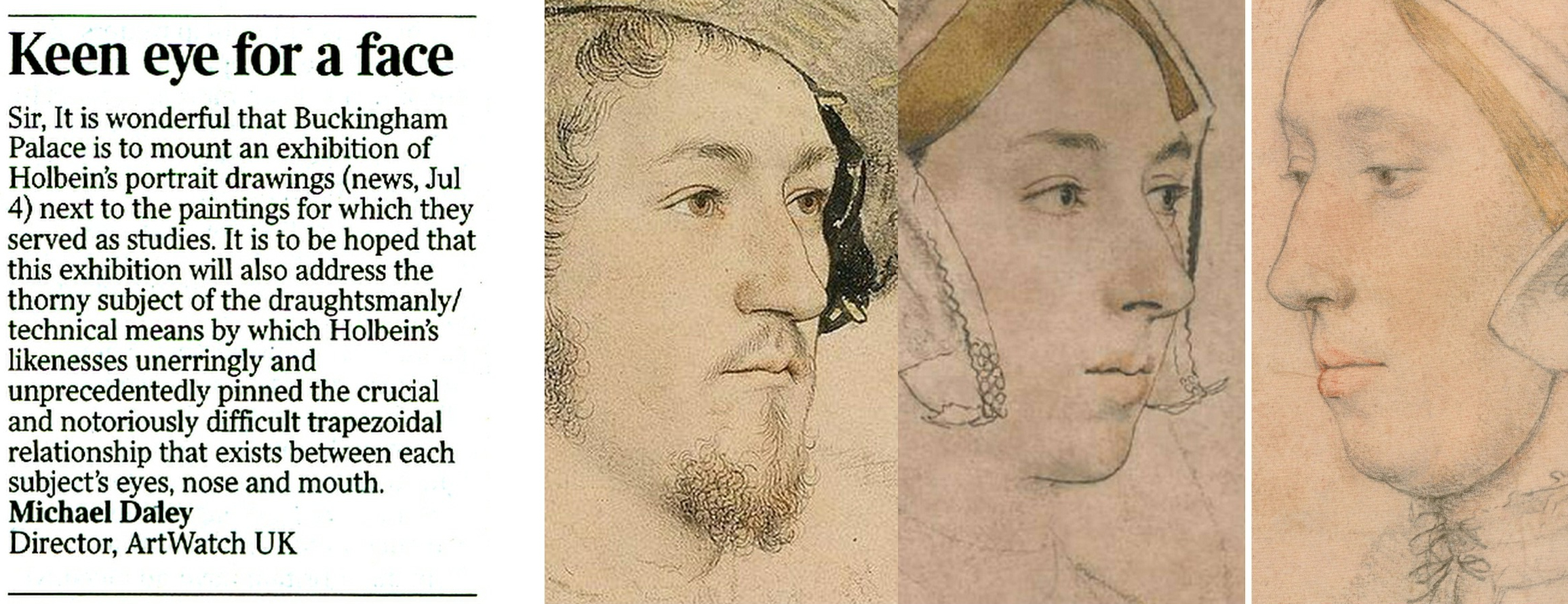
In a letter to the Times (5 July 2023) we had hoped a forthcoming Holbein portrait drawings exhibition might address the drawn method by which Holbein unerringly fixed the characteristic trapezoidal relationships between a sitter’s eyes, nose, and mouth.
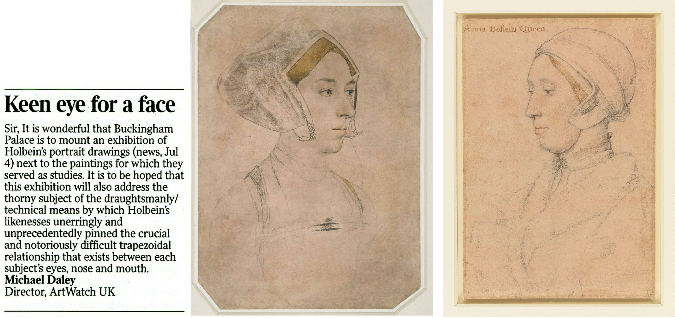
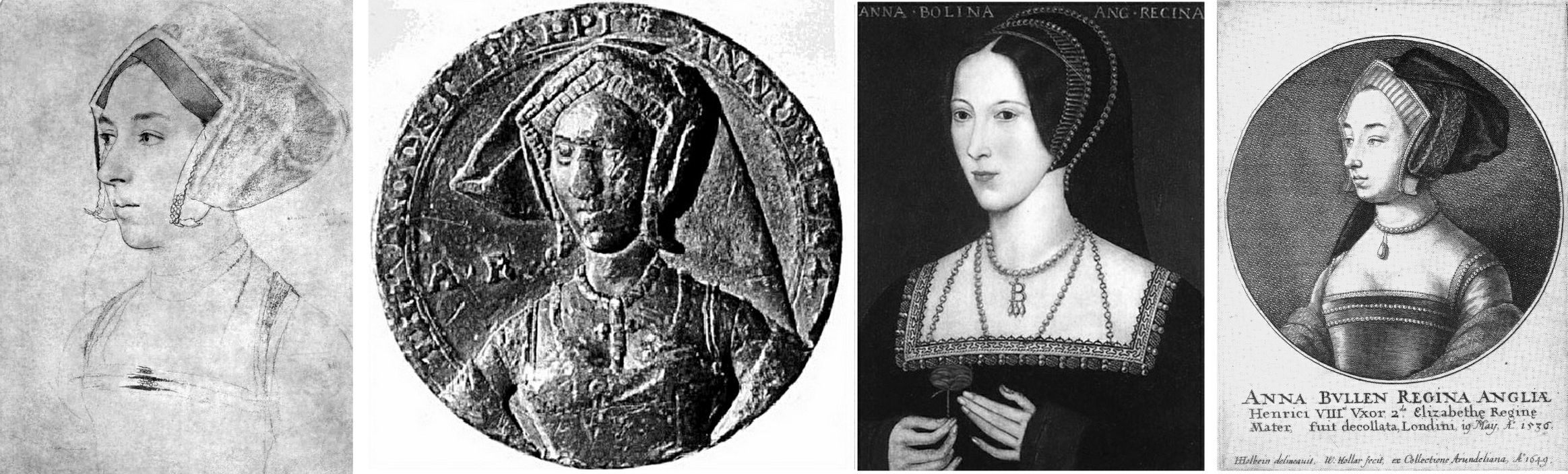
Above, Fig. 1: Left, ArtWatch UK letter; centre, the British Museum Holbein drawing formerly said to depict Anne Boleyn; right, the Royal Collection Holbein drawing now said to depict Anne Boleyn.
The British Museum Anne Boleyn drawing was not in the Buckingham Palace exhibition Holbein at the Tudor Court and therefore was not discussed. The Royal Collection Trust’s Senior Curator of Prints and Drawings, Kate Heard, speaks in the catalogue of Holbein’s “sensitive and life-like” depictions that “bring us face to face” with key Tudor players. The portraits are addressed in terms of social history and patterns of patronage, as in Holbein’s rise from foreign itinerant to court artist, and with Heard wondering whether, as the only artist of his day to possess a horse, Holbein travelled to his sitters, or they to him. His drawing method was discussed as “taking likenesses” and on the frequency with which his chalk drawings had been reinforced with ink in possible preparation for transfer as “patterns” for painted portraits.
Heard’s “taking likenesses” was a telling phrase because distinctions are commonly drawn between making drawings and taking photographs and because Holbein’s depicted facial features can seem as reliably fixed as in any photograph.
Above, Fig. 2: Durer’s depiction of a method of capturing traced outlines and features on a pane of glass.
The scholar who had held the formerly Bradford family, now British Museum, Holbein portrait of Anne Boleyn to be the true likeness (Fig. 1, above, centre) was K. T. Parker in his seminal 1945 book The Drawings of Hans Holbein in the Collection of His Majesty the King at Windsor Castle. Parker succeeded Kenneth Clark as Keeper of the Department of Fine Art in the Ashmolean Museum, Oxford, and was Keeper of the whole museum from 1945 until his retirement in 1962. His high reputation as a connoisseur is said to have been laid when working in the British Museum’s Department of Prints and Drawings with A. E. Popham and Campbell Dodgson.
THE RELIABILITY OF INSCRIPTIONS
In Parker’s book, the Windsor Royal Library drawing’s inscribed identification as “Anna Bollein Queen” (Fig. 1, above, right) was bluntly dispatched:
“The inscription is certainly incorrect, the features showing no resemblance whatever with the well authenticated drawing of Anne Boleyn in Lord Bradford’s possession”.
Parker drew a distinction between “two kinds” of evidence – “pictorial” and “literary” (or visual and documentary) and was duly alert to the importance of both. As will be examined separately, he also advanced a pictorially sophisticated hypothesis that Holbein, like Durer at Fig. 2 above, might have fixed the essential features of his sitters by tracing them onto a pane of glass and transferring the resulting image to paper. Here, we consider how and why visual records failed to receive due critical consideration when the Anne Boleyn sitters’ identities were switched.
A REVISIONIST CHALLENGE
In 1977 John Rowlands, the then deputy keeper of prints and drawings at the British Museum (and, later, Keeper from 1981 to 1991), challenged the Anne Boleyn identification in the Parker-endorsed drawing. The “demotion” was curiously, if not inappropriately executed. First, it was made not in a scholarly journal – which could have facilitated a correspondence – but in the museum’s own YEARBOOK No. 2 (“A portrait drawing by Hans Holbein the Younger”). Second, it was not advanced on its own merits but was slipped within a commemorative article on the British Museum’s recent acquisition from the Bradford family of its landmark Holbein drawn portrait. The article itself carried just three photographs (as shown below) and with none of the Royal Library drawing being espoused as the new, true Anne Boleyn likeness.
Above, Fig. 3: The three illustrations to Rowlands’ British Museum Year-Book II article. There was also a full colour plate of the newly acquired drawing.
Rowlands acknowledged the new acquisition as an outstanding drawing that had traditionally been held to be of Queen Anne Boleyn (Paul Ganz,1937; Karl Parker 1945). He offered no artistic grounds for his “de-identification” of the drawing’s sitter – indeed, as shown below, he celebrated the drawing’s supreme artistry – and he made no suggestion of another likely or possible sitter. The relative visual authority/plausibility of the two radically different depictions of the same historical figure was not examined. Rowlands’ sole objection to the British Museum’s own drawing was documentary – that its Anne Boleyn ascription could be traced no further back than 1649 when in the Earl of Arundel’s collection and where it was copied in Wenceslaus Hollar’s etching (Fig. 3 above, top left).
The objection seemed something of a pedantic contrivance: both the etching and the drawing bore an inscription which identified the sitter as Anne Boleyn and gave the date of her beheading – “Anna Bullen decollata fuit Londini 19 May 1536”. On the general authority of the inscriptions on Holbein’s drawings, Parker had reported that of the eighty-five Royal Collection Holbein drawings sixty-nine bore written inscriptions from an inventory made in 1590 to which the names of the identified sitters had been “subscribed” by “Sir John Cheke, Secretary to King Edward the 6th”. Cheke had died in 1557. The British Museum’s new drawing had been part of the Royal Collection’s Holbein holdings after the artist’s sudden death in 1543 from the plague. Most inscriptions on Holbein’s portraits thus originate from the turn of the sixteenth and seventeenth centuries. Parker held that because Cheke had had direct contact with many of the drawings’ sitters, his subscribed names enjoyed “abundant claim to interest and attention, though not, of course, to blind faith.” The eventual acceptance of Rowlands’ misidentification by the Royal Collection evidently rested on a claimed near-infallibility of Cheke’s recorded identifications – even though he had evidently given the same sitter to two incompatible drawn portraits.
IN AND OUT OF HISTORY
Rowlands, who would later be supported by two historians (David Starkey and Bendor Grosvenor) and opposed by a third (Eric Ives, author of an acclaimed Anne Boleyn biography), acknowledged “a strong likelihood” that the Bradford/BM drawing had been incorporated in the famous “Great Booke” of bound Holbein drawings and had subsequently been removed from it:
“How and when the ‘Anne Boleyn’ sheet became separated from the rest is unknown, but this probably occurred after the death of the earl of Arundel in 1646”.
Rowlands also held that although the British Museum drawing had been incorporated within the famous book, such incorporation was no guarantor of pedigree: the Windsor group “undoubtedly contains drawings which are not by Holbein”. Such a consideration would, of course, apply to all works bound in the book. Parker had said in 1945 that: “The Windsor series certainly contains extraneous matter, but the only drawing known to be incorporated at a later date is the so-called ‘Amelia of Cleves’…in the eighteenth century”. Rowlands spoke too of “extractions” from the book, with the first having probably begun “around 1630″. With the British Museum drawing, he said its date of extraction was unknown but had “probably occurred after the death of the Earl of Arundel in 1646” and “probably in the reign of Charles II [1660-1685]”.
A CLASH OF DATES AND AN ARISTOCRATIC VILLAIN
Against his own “probablys”, Rowlands cited and accepted a detailed account of how the now British Museum drawing had been stolen by the Bradford family when the great book was owned by Jonathan Richardson, senior. Rowlands quoted Richardson’s son’s account of the theft in full:
“The Original of this Drawing, by Holbein, of his finest style & most Capital, the Old E[arl] of Bradford cheated my father of Thus. When he was confined with gout, a little before his Death, He sent request to my F[ather] that he would lend him a Book of Drawings to Divert him; w[hi]ch my F[ather] compl’d with. The E[arl] sent him back the Book in a few Days, but without this Drawing. My F[ather] went immediately to wait on him, & found the Drawing hanging by the Bed side in which he lay, in a Frame & Glass. There was other Company in the Room, so my F[ather] could not claim it at that time; but look’d several times at ye Drawing, stedfastly, & lookd at my L[or]d. My L[or]d stood it, discoursing with him, quite unconcerned; & in two or three days failly sneak’d out of the world, & kept the Drawing. My F[ather] could not claim it afterwards of his Heir (L[or]d Torrington I think) without accusing Bradford of a most infamous piece of Villany, of which he had no witness.”
Rowlands thought the Earl was likely to have been Henry Newport who died in 1734 and added “since then this drawing has been in the possession of the Earl’s descendants”. Parker (whose Holbein scholarship is considered “exemplary” by Susan Foister) had stated that the great book was “broken up” in 1727 when back in royal possession and that by 1728 the drawings had been glazed, framed, and displayed at Richmond Lodge. The Bradford theft must therefore have occurred before the book returned to Royal ownership, the date of which Parker said remains unknown in a period “so full of problems”.
Rowlands acknowledged that after Hollar’s 1649 printed copy, “all representations of Anne Boleyn, whether they were painted or engraved, were based on the Bradford drawing, right through the next two centuries.” He did not ask why this had been so or wonder why no such comparable copies had been made from the Royal Collection “Anne Boleyn” drawing he was championing as the sole and true record of Anne Boleyn’s likeness. On Rowlands’ account, the theft of the drawing had clearly left the Richardson family highly aggrieved. At the time of the theft, Jonathan Richardson senior had owned both inscribed Anne Boleyn drawings and had made a pencil copy of the British Museum version (Fig. 13, below). Similarly, when the Earl of Bradford had both inscribed “Anne Boleyn” drawings bound in the (loaned) book before him, he stole the now British Museum version and not the one that returned to the Royal Collection. As Eric Ives would later point out, when Hollar had had the the option of copying either of the Anne Boleyn-inscribed Holbein drawings, he opted – or was instructed – to copy the now British Museum likeness.
Above, Fig. 4: Left, the Bradford/BM Holbein Anne Boleyn drawing and, right, the Hollar copy of 1649. Hollar had of necessity resorted to a degree of invention with the costume and jewellery – and he showed only one of the three necklaces indicated on the Holbein drawing. His seemingly strengthened shading around the cheek, jaw and neck might indicate a subsequent loss of chalk shading on the drawing itself (see Fig. 13, below).
A SOLE RELIABLE RECORD
Rowlands noted that the only securely known contemporary likeness of Anne “is the medal struck to commemorate her coronation in 1533” but which, he said, is too worn to give any indication of her features (see Fig. 5 below). Given his unsteady and visually unsupported 1977 account, it might seem timely to consider the expanded and invigorated joint Rowlands/David Starkey 1983 Burlington Magazine article, but note should first be made of the methodological and visual shortcomings in Rowlands’ solo challenge to Parker – on the (slim) authority of which all subsequent accounts rested. Rowlands had not shown the drawing he was espousing. He had not shown the relationship between the two rival “Anne Boleyn” drawings. He had not shown how the two drawings respectively related to the medal’s likeness as the only securely dated contemporary image of Anne. Nor had he claimed any resemblance of the Windsor drawing to either the medal’s image of Anne Boleyn or any of the later painted portraits of her. His case comprised little more than a visually unsupported expression of a contrary professional opinion – an unsubstantiated glancing swipe, as it were, from a rising mid-career scholar to one who had retired fifteen years previously.
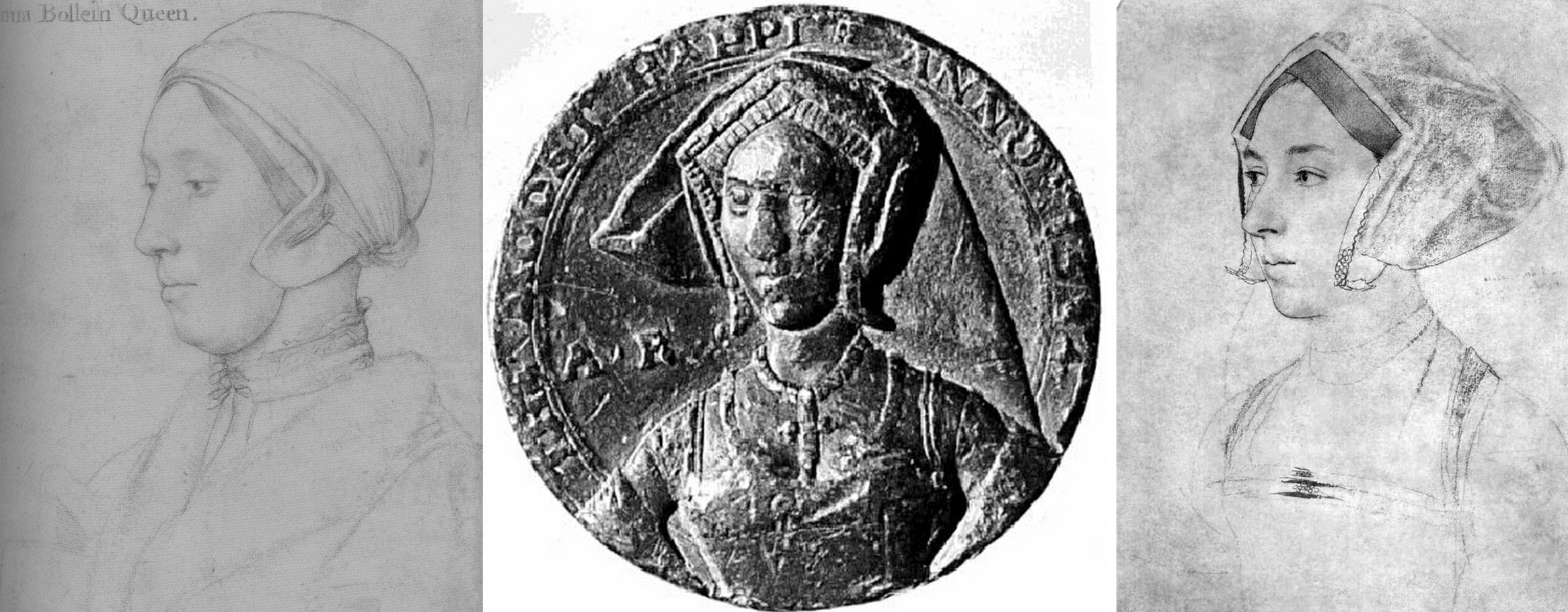
Fig. 5 above. When the Royal Collection drawing (left) and the Bradford/B.M. drawing (right, here mirrored) are seen with the medal it shows markedly more kinship with the latter drawing.
That scholarly prudence and diligence is required on these matters was recognised in Susan Foister’s 2004 Mellon Centre/Yale published monograph Holbein & England:
“There is every reason to suppose that Holbein might have painted Anne’s portrait, but no clear evidence that he did… No portraits of Anne Boleyn are mentioned as such in contemporary inventories, and official images of her are unlikely to have circulated after her execution…The only contemporary likeness of Anne appears to be that in a medal, showing her thin-faced and in a gable headdress; later painted portraits echo this image, and show her wearing jewellery with the initials A and AB…”
Above, Fig. 6: This photo-comparison, carried in Foister’s 2004 Holbein & England, showed the great discrepancy between the Rowlands-claimed Royal Library near-profile portrayal of Anne Boleyn (above left) and one of the many subsequently painted three-quarters view portraits like that in the National Portrait Gallery (above right) and at Hever Castle (as in Figs. 9, 10, and 13, below.)
THE WRONG HAIR COLOUR
Foister objected that the Windsor “Anne Boleyn” drawing (see Figs. 1, 14 & 18) “shows a sitter with fair hair and quite a different appearance to the [painted] portrait in the National Portrait Gallery in which the dark-haired sitter wears a pendant B.”
A seeming attempt to defuse problems arising from the Royal Collection’s acceptance of the fair-haired Windsor “Anne Boleyn” presently appears on its website:
“A portrait drawing of Anne Boleyn (c.1500-1536) on pink prepared paper. She is shown bust length in profile facing to the left. She wears a fur collar and linen cap… Although the identification of the sitter has been doubted, her informal dress and the presence of an inscription based on an identification made by Sir John Cheke have been cited as convincing evidence that the sitter is the queen (see, for example, John Rowlands and David Starkey in the Burlington Magazine, February 1983, pp. 90-2)…
“Abrasion has removed some pigment from the sitter’s hair meaning that it may now appear lighter than it did when the drawing was made. The sitter’s eyes are brown…”
Certainly, as Parker had noted, the “Windsor Holbeins have suffered in both ways from rubbing and reworking, and the fact has long been known and all too emphatically stressed.” The recorded superimposition of oiled paper for the purpose of making tracings (for engravings) can only have had deleterious effects on drawings made largely of chalks. Nonetheless, one must wonder what kind of precisely selective abrasion might have left a sitter’s eyes brown while turning her dark brown hair fair.
In her 2006 Tate Gallery catalogue Holbein in England, Foister cast doubts on both “Anne Boleyn” drawings – but not equally so. Of the British Museum drawing, and echoing Rowlands/Starkey: “The identification as Anne Boleyn arose when the drawing was in the Arundel collection and was etched by Hollar in 1649. It appears to have been based on a superficial similarity to portraits which have a reasonable claim to represent Anne… Whether Holbein portrayed Anne remains an open question: a drawing at Windsor (Parker 63) inscribed with her name shows a fair-haired woman whose appearance differs greatly from the painted portraits.” Of the British Museum drawing Foister said the dress is “similar to that of representations of those of the More family but also those of higher status: the jewels on her hood and on her bodice indicate that she might have been a member of a noble family…”
PICTORIAL TESTIMONY
What seems not to have been appreciated by any supporters of the Royal Collection drawing is that in the absence of a Holbein painted portrait of Anne – or an evidently intermediary work – adjudications between the two rival and incompatible “Anne Boleyn” drawings can only proceed on an examination of their respective correspondences with both the historically secure and dated medal and the many later painted depictions of Anne. With Anne long deceased, the later paintings had to have derived from something already painted or drawn, so the question is: which of the rival drawings is a better fit with the surviving Anne Boleyn depictions. Given the virtually complete concordance of design in Holbein’s portrait drawings and paintings (Figs. 10 and 11), appraising and comparing the now rival “Anne Boleyn” drawings with the medal and the depictions of Anne that followed her 1536 execution and the 1547 death of Henry VIII, is not only germane, it becomes, in the absence of “literary” records, of the pictorial essence – and thus is, pace Foister, a far from superficial exercise.
For example, the three rows of jewellery indicated in shorthand at the neck of Anne in the British Museum drawing are also found in completed form on the necks of both the National Portrait Gallery and Hever Castle paintings of Anne (see Figs. 7 and 11 below). Further, while this now officially discounted Holbein drawn likeness of Anne had either directly determined or – somehow – anticipated a crucially important and distinctive feature common to both types of the later painted portraits of Anne, the upgraded Royal Collection “Anne Boleyn” drawing found no echo in either type of the many later paintings.
Above, Fig. 7: Top, the British Museum Anne Boleyn (mirrored); right, inset, a detail of the Hever Castle Anne Boleyn painting; bottom row, painted portraits of Anne by Lucas Horenbout (in the gable hood type) and (in the French bonnet type) by John Hoskins, and anonymous.
THE MEDAL IN THE ROOM
The only securely surviving – and dated – contemporary likeness of Anne is on the damaged 1534 commemorative medal. The medal itself, however, will have derived from a drawn design or model – but by whom? Given his designs for jewellery and other precious objects, might Holbein be considered in this regard?
Above, Fig. 8: Left, the British Museum-owned 1534 medal; second and third left, respectively, the British Museum and the Windsor Holbein “Anne Boleyn” portraits; right an 18th century engraved copy by Francesco Bartolozzi of the Windsor “Anne Boleyn”. Prints of the Bartolozzi copy can be obtained from the National Portrait Gallery – where they are described as “Unknown woman, formerly known as Anne Boleyn”. Because of the Bradford family’s theft, there is no comparable Bartolozzi copy of the now British Museum Anne, but it might be noted that Bartolozzi showed the Windsor sitter to be fair- not dark-haired and, thus, any abrasion to the sitter’s hair must have preceded this record.
Above, Fig. 9: A possible chronological migratory sequence of depictions and motifs spanning one hundred and fifteen years. From left to right: the British Museum’s Cheke, Ganz, and Parker-ascribed Holbein drawing (here mirrored); the 1534 commemorative medal; third left, the Hever Castle, late 16th century English School oil-painted portrait of Anne Boleyn; right, the 1649 Hollar engraved copy of the British Museum drawing. It might be proposed that the British Museum drawing more likely predated the 1534 medal (struck just two years before Anne’s execution) and that it might, with its gable hood and indications of jewellery, have served in mirrored form as something of a guide to the medal maker.
Above, Fig. 10: The extremely close design relationship between Holbein’s drawings and paintings can be seen (left column) in his drawn and painted portrayals of Jane Seymour. Such constancy would be expected also in a Holbein painting of Anne but, given either that one was never made or that none has survived, we must therefore consider from whence the (above, centre) Hever pattern of portraits might have sprung. Clearly, in terms of costume and physiognomy, it could not possibly have derived from the Windsor drawing – whereas, as seen at Fig. 7 and above here, the triple necklaces motif had migrated from the British Museum drawing to the later paintings while the Royal Collection linen cap and fur-collared nightwear costume would seem to have influenced no other work.
Above, Fig. 11: In the left-hand column we again see the absolute unity of design in Holbein’s drawing (top) and painting (bottom) of Jane Seymour. In the second and third columns we see degrees of kinship between Holbein’s British Museum portrait of Anne Boleyn (top row) and, below, with the two types of the later painted portraits, as found formerly at Nidd Hall, now privately owned, and at Hever Castle.

Above, Fig. 12. While all agree that the rival “Anne Boleyn” drawings (top, left and centre) could not have been made from the same person, it has not been remarked that with the Windsor “Anne Boleyn” (centre column), the general set of the face, the disqualifying double chin, and, the greater age of the sitter, find correspondences in the Royal Library’s “The Dutchess of Suffolk” (right hand column) – which include an almost identically tied, high-necked chemise. (An unsuccessful attempt was made to re-assign the identity of the Duchess of Suffolk’s sitter to an earlier wife and to count the proposed switch as a “discovery” in the 2007 Philip Mould Gallery Lost Faces exhibition.)
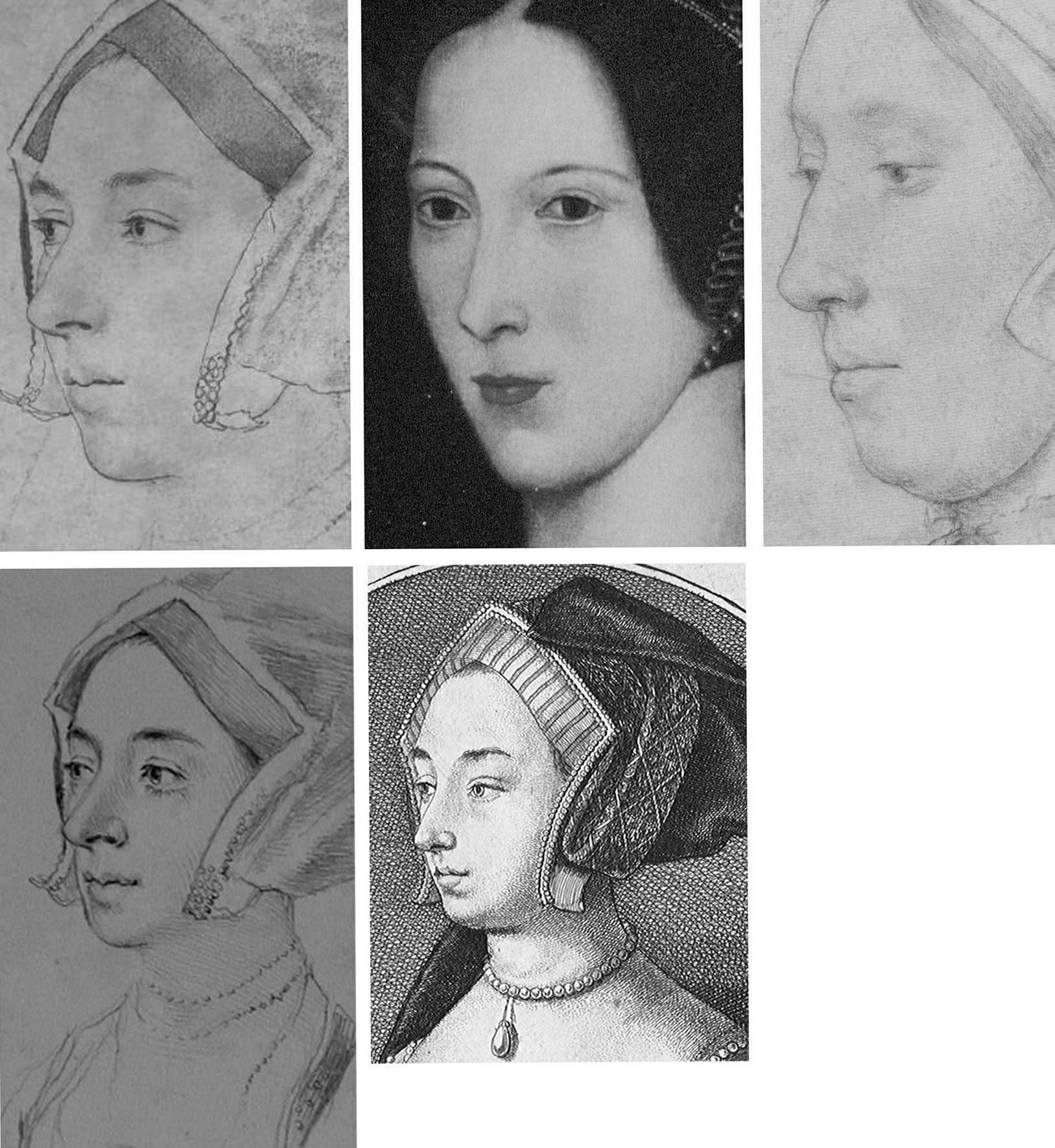
Fig. 13, above. In terms of likenesses, the late sixteenth century painted portrait at Hever Castle (above, top, centre) has common traits with the BM drawing (mirrored, above, top left) but none with the Windsor drawing (above, top, right) – other, that is, than a sharply drawn edge to the lower face caused, doubtlessly, by tied bonnets. As seen at bottom left, a (mirrored) pencil copy of the Bradford/BM drawing held in the Ashmolean Museum, Oxford, and now attributed to Jonathan Richardson senior, suggests that more supplementary chalk shading might formerly have articulated the head/neck relationship on the Bradford/BM drawing – and, as seen at bottom, centre, above, (and at Figs. 3 and 4), the Hollar copy of 1649 had indicated by tonal variations an implicitly continuous line of demarcation between the lower face/jaw and the neck.
HOLBEIN’S CAPTURED LIKENESSES AND THEIR ORIENTATIONS
Above, Fig. 14: Top, The British Museum and Royal Collection “Anne Boleyn” Holbein drawings; bottom, left, Holbein’s “Simon George”, which carries an inscription “S. George of Cornwall”; bottom, right, Holbein’s “Henry Howard, Earl of Surrey” (detail).
Holbein possessed a seemingly effortless ability to draw heads from any position – in one perspectival tour de force, John Poyntz (in the Royal Collection) was drawn from behind and below. Because the portraits are such vivid, compelling likenesses the artist’s remarkable spatial/plastic illusionistic facility can be underestimated. As shown below at Fig. 15, Holbein, like a sculptor, clearly appreciated that a head is an object, and that depicted faces constitute a record of the visible front of an object that is deeper than it is wide – and, therefore, that a face drawn full-on must find the graphic means to evoke the depths of a head (as was brilliantly achieved by Holbein in Henry Howard, above, right) by plastically nuanced tonal variations. So-saying is not to fail to recognise that for very good reasons and from infancy, human beings attend more to faces than to profiles – and nor is it to disregard Holbein’s own distinctive human engagement and psychological penetration*. It is simply to recognise the paradoxical ease with which viewers can safely make plastic/sculptural extrapolations from Holbein’s predominantly linear drawn likenesses. In this regard, Paul Ganz, spoke eloquently in his 1950 The Paintings of Hans Holbein: “…line was the means by which he rendered form, indicated movement and suggested expression. It remained the sure foundation even of his painting, and gave to his figure compositions, his portraits and even his decorative works an astonishing clarity and organically coherent solidity.” (*On Holbein’s emotional truthfulness, see Susan Foister’s fine “Holbein the Portraitist” in her 2004 Holbein & England.)
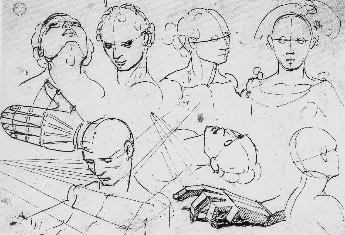
Above, Fig. 15: An ink-over-chalk study sheet in which Holbein simultaneously examines the plastic structures of heads; the expressive force of directional gazes; and – with a curving line in each head (except for the top right head where, being seen from the front, the profile registers as a straight line) – unfailingly locates and orientates the faces’ profiles. (Ӧffenliche Kunstsammlung, Basel, Kuperfestichkabinett.)
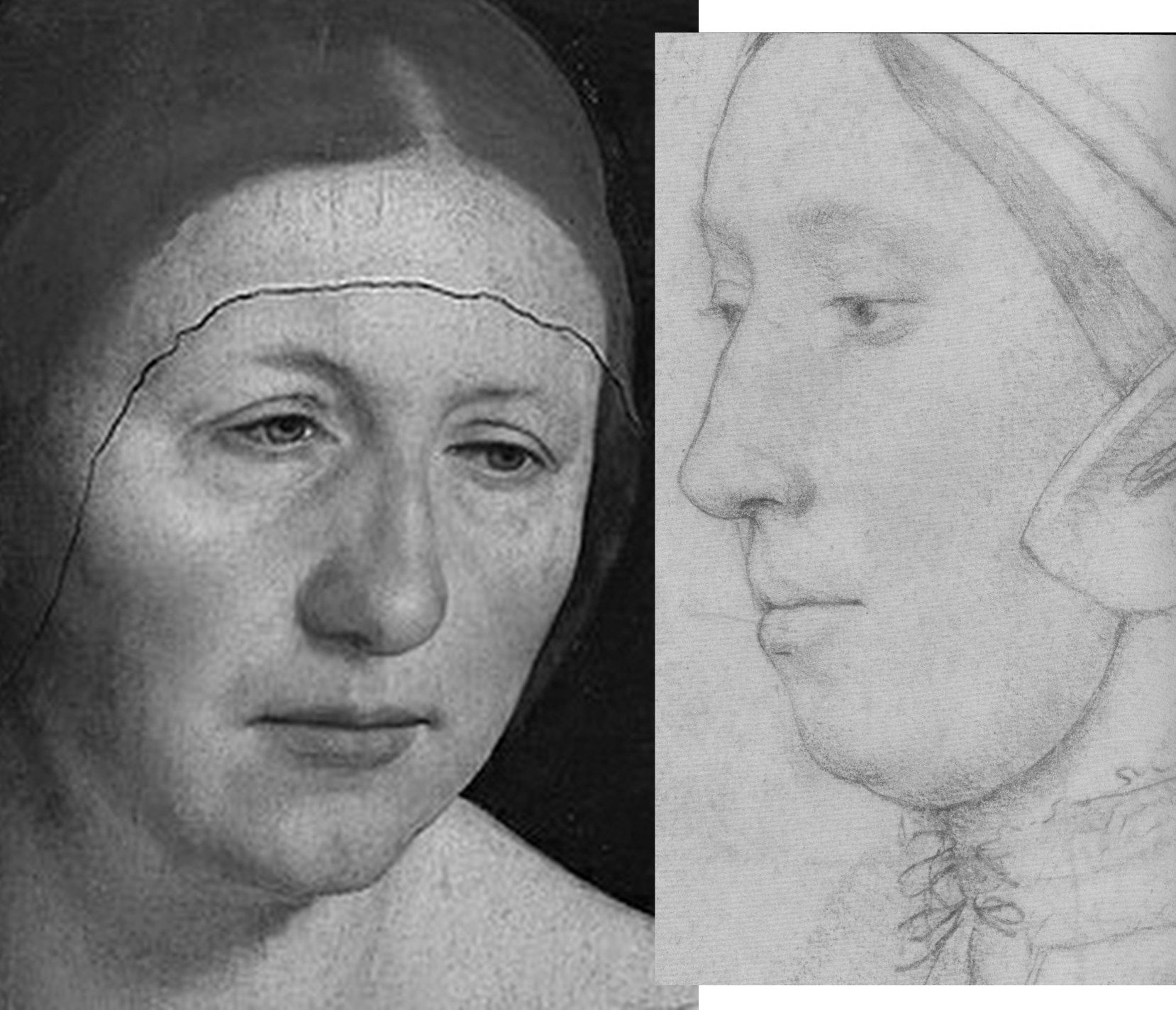
In all graphic, painted, and sculptural media, the profile of a head is the single most potent contour because the plastic entirety of a head is bounded by and articulated within it. Expressively speaking, the profile also fixes the distinctive “set” of a sitter’s head, as seen below and above at Fig. 14 with Holbein’s “Simon George” drawing.
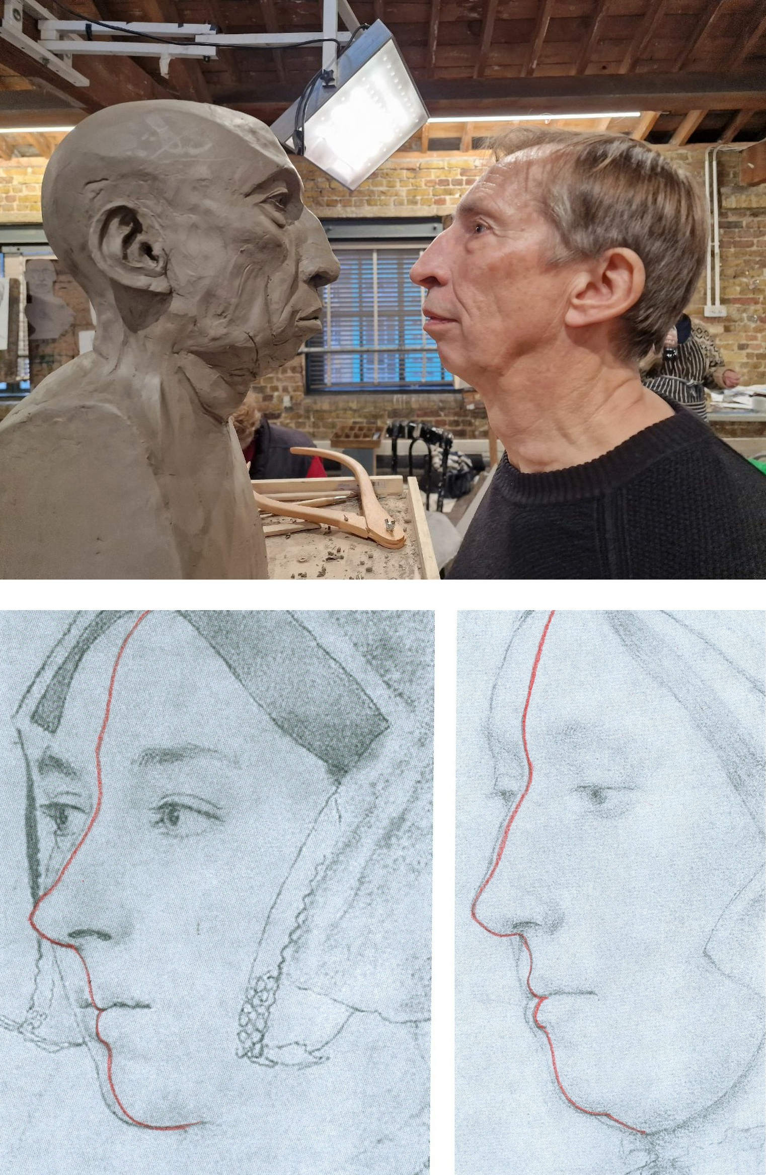
Above, Fig. 16: Top, a modelled head-in-progress and its sitter, at the Royal Drawing School; bottom, extrapolated lines indicating the location of the sitters’ profiles in the two contested “Anne Boleyn” portraits. While flesh might sag with age, the bony part of the nose does not continue to grow.
Above, Fig. 17: Top row, the Hever Castle Anne Boleyn painting (mirrored) and a detail of the British Museum Anne Boleyn drawing, far right, the actor Natalie Dormer in role as Anne Boleyn in the 2007-10 TV series The Tudors; centre row, views of an Anne Boleyn waxwork at Hever Castle modelled by Emma Pooley (– “I settled on Holbein’s sketch of Anne as it has always been my favourite, and is by far the most realistic reproduction, in terms of skill, of her image from around the time”); bottom row – the Pooley waxwork at Hever Castle; a painting of Anne Boleyn at Hever Castle; a waxwork of Anne Boleyn at Warwick castle.
All the above paintings and waxwork reconstructions of Anne Boleyn share a common and simple three-part dynamic in their profiles with that present in the British Museum drawing. That is, in each, from the top downwards: the forehead advances somewhat; the nose advances more rapidly; but then, from the base of the nose the profile moves into reverse and retreats appreciably down through the mouth and to the chin. The Royal Collection drawing’s profile has a different, flatter dynamic and for clear reasons of anatomy could not have been made from the same sitter.
WHO WAS ANNE BOLEYN?
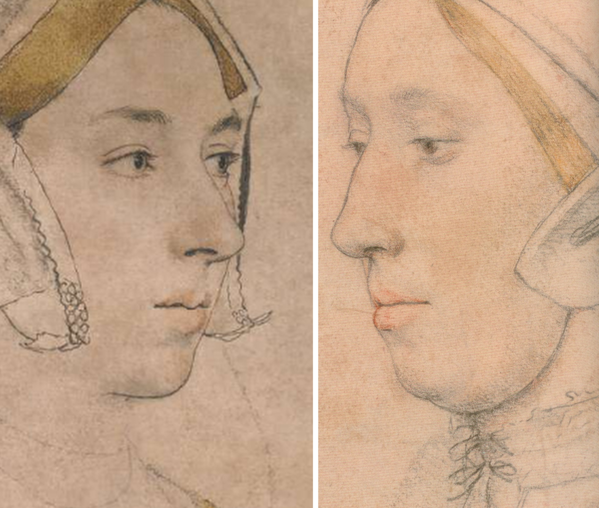
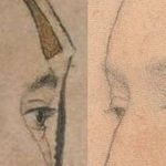
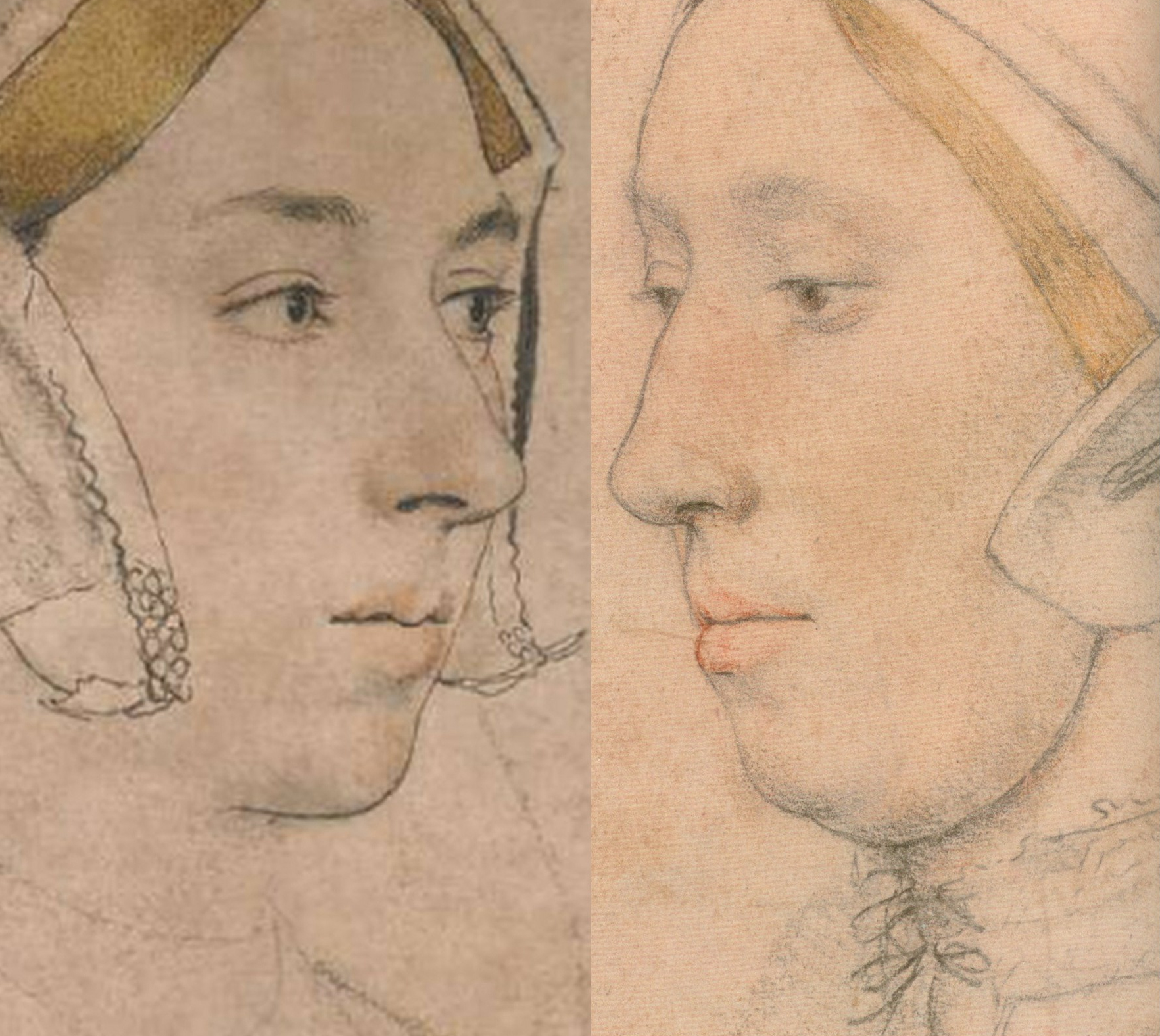
Above, Fig. 18: Left, the British Museum Holbein Anne Boleyn drawing (detail); right, the Royal Collection Anne Boleyn drawing (detail). Note the line that descends from the turned-up wing of the gable hood on the right of the BM drawing.
The sitter on the left is younger, slimmer, brighter-eyed (albeit with grey/blue eyes, not brown) and is shown to have dark hair and dark eyebrows. She has a sharper, less highly bridged and more upturned nose with markedly larger nostrils. Her eyes are focussed, attentive, seemingly purposive, certainly not downcast, or self-absorbed and reflective – or with a pronounced fold of flesh over the upper eyelids. She has a single, not a double chin. In this context, Anne’s recorded character and appearance might be considered. Eric Ives, author of the acclaimed 2004 The Life and Death of Anne Boleyn (which succeeded his 1986-1994 Anne Boleyn), wrote:
“Captivating to men, Anne was also sharp, assertive, subtle, calculating, vindictive, a power dresser and a power player, perhaps a figure to be more admired than liked…All reports agree that she was dark. As well as Sanuto’s ‘swarthy’, Thomas Wyatt gave her the poetic name, ‘Brunet’.”
Ives cited a host of contemporary descriptions:
“…beautiful with an elegant figure”; “very beautiful”; “very eloquent and gracious, and reasonably good looking”; “young and good looking”; “not one of the handsomest women in the world, she is of middling stature, swarthy complexion, long neck, wide mouth, a bosom not much raised, and eyes which are black and beautiful…” Ives summarised: “Looks only tolerable, but a splendid head of dark hair and fine eyes”. One observer expanded on Anne’s use of her eyes: “…eyes always most attractive Which she knew well how to use with effect, sometimes leaving them at rest, and at others sending a message to carry the secret witness of the heart. And truth to tell, such was their power That many surrendered to their obedience.” Ives remarked that Anne “…radiated sex”. Emma Pooley’s choice of source image was sound: no female sitter’s eyes in Holbein’s drawings better evoke such reported properties and powers than those found in the British Museum drawing of Anne Boleyn – and, on this emotionally charged correspondence, Rowlands had seemed almost to concur in 1977: “The eyes, of a rare beauty, the eyebrows and eyelashes are all marvellously drawn”.
Above, Fig. 19: The arresting eyes, quivering nostril and sensuous mouth drawn by Holbein had migrated so faithfully and vividly to the (above right) later painted portrait at Hever Castle that there would scarcely seem space between them for an intermediary work. The line of the descending hood drapery in the bottom right corners of the above details departs from behind precisely the same points on the respective turned-over wings of the gable hood. Similarly, there is an almost perfect duplication in the painting of Holbein’s lightly indicated triple necklaces. Trigonometry (and see below) no less than sexual animation, testifies here to an almost identical and – surely – true likeness of Anne?
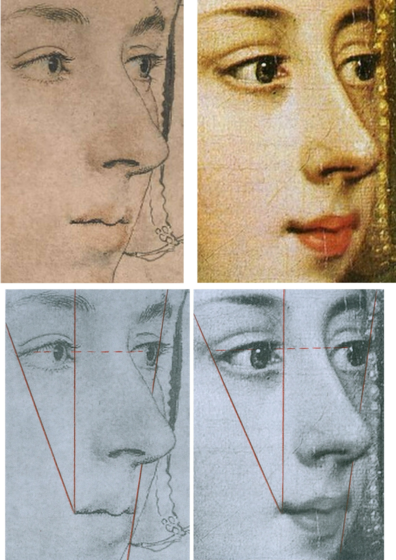
Above, Fig 20: There are differences sufficient between the drawn and painted images above to show that the painting was not made on a transposed tracing of the drawing, but the essential trigonometric relationships between the features make it inconceivable that the one image had not derived from the other – and with both describing the same sitter – even though the drawing is a more sparingly rendered account than that in the weightier, lusher and historically later oil painting. The immense odds against the reflected highlights in the eyes of two different works made decades apart and in different mediums coincidentally occurring in alignment, at the same latitude, and at the junctions of the pupils and irises, leave no option other than to conclude that what we have here is two near-identical heads that share a common light source because the one image derived from the other and both share the common sitter of Anne Boleyn.
The mouth in this Holbein drawing may be unique in the artist’s portraits. So far as we recall, Holbein invariably showed a single line of demarcation between his sitter’s upper and lower lips. On the mouths of both the drawing and painting above there seems to be a parting of the lips on the left. Ives mentions that the most hostile witness, the “Elizabethan recusant activist”, Nicholas Sander, claimed Anne had “a projecting tooth under the upper lip”. The same witness also testified that, nonetheless, as well as being handsome, Anne had “a pretty mouth”.
THE 1977 ROWLANDS CASE
On his methodologically flimsy and not duly illustrated account Rowlands had gingerly proposed in 1977 that “An implication of the rejection of the Bradford/BM portrait as a representation of Anne Boleyn, is that the drawing in the Royal Collection series with the inscription Anna Bollein Queen could in principle be once again a candidate for consideration as the Queen.” Having also admitted that the problem of the identity of his (not-shown) candidate Royal Collection drawing “must remain unsolved” for “want of less inconclusive evidence”, Rowland’s espousal in toto constituted little more than a-case-proposed-but-not-made. On occasions, Rowlands seemed bent on deconstructing his own case: when speaking of the British Museum drawing’s “precision” and “excellence” of outlining, for example, he well noted that “In addition to giving depth to the face, the brush-line of varying thickness defines the line of the wavy outer edge of the right-hand side of the headdress, and has enabled the artist to determine its position exactly in relation to the line of the cheek and the nose” – just as is shown in the close-up in Fig. 20, above, left. That so-careful and deft recording of the features, he ended, “is the hallmark of all Holbein’s portraiture, and it is particularly disappointing that the painting that would no doubt have been done from this drawing, should not have survived.” Disappointing indeed, but no reason to pivot towards an alternative drawing that had left no waves and triggered no echoes – not least because in regretting the likely destruction of Holbein painted version of this particular Anne Boleyn-ascribed drawing, Rowlands had overlooked the fact that the drawing itself had found a close and faithful painted expression in a second Hever Castle Anne Boleyn work, as shown above.
Six years later Rowlands would co-author an article with the Tudor historian David Starkey in the February 1983 Burlington Magazine – “An Old Tradition Reasserted: Holbein’s Portrait of Anne Boleyn”.
THE ENTRANCE OF DAVID STARKEY
Above, Fig. 21, an ink drawing (in the collection of Professor Edward Chaney) of David Starkey that was made by the author to illustrate a profile article, “The apoplectic academic”, by D. J. Taylor, in the Independent on Sunday, 9 November 2001.
In Part II, we examine how the Starkey-bolstered Rowlands’ Case came to persuade the Royal Collection that it now holds the true Anne Boleyn Likeness.
Michael Daley, Director; 18 April 2024
Bendor Grosvenor’s Eye, a new Raphael, and further barbarism at the Louvre
Bendor Grosvenor has challenged our post on the so-called “Haddo Raphael” and asked for a right to reply.
Dr Grosvenor writes:
It is not correct to say that the Haddo Madonna ‘relates to no known Raphael work’. The picture bears a very interesting relation to a drawing by Raphael of the Head of a Virgin formerly in the de Triqueti collection. Sadly, that drawing is now lost, but it is listed in Paul Joannides’ 1983 catalogue, ’The Drawings of Raphael’ (no.64). A good quality reproduction is in the Witt Library. What I think Michael means is that the Haddo Madonna relates to no known work which he agrees is by Raphael (he does not agree that the de Triqueti drawing is by Raphael).
Michael seeks to establish the connoisseurial quality of my ‘eye’ by referencing the ongoing and recently uncovered fake Old Master scandal. He writes that, like numerous Hals scholars and the Louvre, I was ‘deceived’ by a Hals which has been proven to be fake. But there is an important distinction to be drawn between the Louvre’s deception and my alleged deception – I never actually saw the painting. As I make clear in the Financial Times article in which I discuss the Hals, I had only seen it via a photograph, long before the fake story ever began, and never paid it especial attention. In my business, seeing a picture in the flesh and via photographs offers a world of difference.
Michael then also states that I ‘came within a whisker of being deceived by a Gentileschi fake’ formerly on display at the National Gallery in London. I suppose that not actually being deceived by a painting which is indeed almost certainly a fake (it hasn’t yet been proved) could be characterised as ‘coming within a whisker of being deceived’. But that presentation of my views seems perhaps a little unfair. The Gentileschi is the only painting of a number of works currently being doubted as fakes that I have seen in the flesh. I have been the first to go on the record as saying that I think it is a fake. I have made that conclusion on the basis of ‘my eye’. I might be wrong, of course – in which case Michael will have further reason to doubt my connoisseurship, but for a different reason.
It might have been more helpful to ArtWatch readers if Michael had introduced them to the quality or otherwise of my ‘eye’ via the other re-attributions we made in the series ‘Britain’s Lost Masterpieces’; works by Jacob Jordaens, Peter Breughel the Younger, Allan Ramsay, and Claude Lorrain, all of which had been doubted before. (I must admit I am rather proud of them, so I’m sorry if it sounds like boasting, it’s not meant to.) For these pictures I felt confident enough to say, ‘this is what I believe them to be’, and happily had the agreement of other experts too. But in the case of the Haddo Madonna I have only ever said ‘it might be by Raphael’ (and happily had the agreement of Sir Nicholas Penny). I am very far from certain that it is. Much further work is clearly required. It seems at this stage that the preponderance of evidence, including the qualities of the painting itself, does suggest, at the very least, that the former attribution to Raphael ought to be re-considered.
I take no issue with Michael casting doubt on the possible attribution. Indeed, given his longstanding views on the Madonna of the Pinks, which Sir Nicholas Penny discovered and (rightly in my view) believes in wholeheartedly, I expected it. I welcome the debate. But I am grateful for the opportunity to respond to some of the points Michael has made so far, which I felt framed the argument in a rather unhelpful manner. I would also have preferred it if he had gone to see the Haddo Madonna in person before making such firm conclusions about its quality. But I suppose we must all practice our connoisseurship in our own ways.
Bendor Grosvenor, 23 October 2016
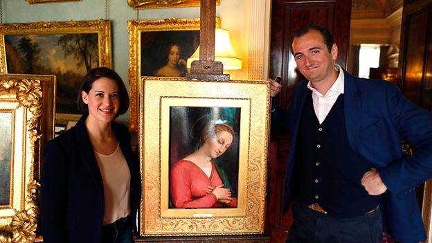
Above, Fig. 1: BBC4 Factual Report, 03. 10, 2016: “Britain’s Lost Masterpieces discovers hidden painting believed to be by Raphael. ‘Finding a potential Raphael is about as exciting as it gets. At first I couldn’t quite believe it it might be possible, but gradually the evidence began to all point in the right direction.’ Dr Bendor Grosvenor.” Photograph showing the co-presenters of the programme, Jacky Klein and Bendor Grosvenor with the attributed Haddo House Raphael.
Michael Daley replies:
It is good that Bendor Grosvenor is prepared to engage in debate on the nature of connoisseurship. Bendor reproaches me for not adhering to practices employed in his “business”. I take his connoisseurship to be rooted in a niche art market where works of unrecognised quality (“sleepers”) are identified, stripped down and painted back together again by restorers, before being presented as reconditioned, aesthetically and financially elevated works. Within this milieu Bendor can indeed claim successes, but his “eye” is grounded in neither artistic practice, nor art historical studies. My eye has been sharpened by a long professional training in art and crafts; through art school lecturing; and, above all, by practice as an artist and illustrator. From 1990 this was supplemented and enriched through friendship with Professor James Beck whose rigorous scholarly method was respected even by his opponents.
Bendor complains that I have not trekked to Aberdeenshire to see his claimed Raphael in the flesh but, then, he underwrites it by appealing to the authority of a drawing that he has never seen and that nobody can see because it is lost and known only through a poor quality photograph (see Fig. 3 below). Bendor insists that this singular, un-examinable, slight and problematic drawing establishes that the Haddo painting was executed by Raphael, even though it is not related to the heroic and revolutionary works of Raphael’s first “Florentine period” (1504-08) when he – more student than genius, in Michelangelo’s view – was galvanised by sight of Michelangelo’s and Leonardo’s works.
Bendor appeals to the authority of two scholars, one of whom, Sir Nicholas Penny, described the Haddo picture as “Very beautiful – I’m very impressed by parts of it.” However, this curate’s egg is itself only a part. The composition would appear to have been brutally cut out of a larger panel but Bendor tells me that while the paint runs up to the (distressed) edges of the panel, it does so without evidence of saw mark injuries. Does that unusual relationship not suggest that the painting was made to fit this particular piece of old wood?
Above, Fig. 2: The Haddo House Raphael, top left; an attempt by the author to extend the image on the cropped design of the painting, top right; a detail of a painting by Le Brun, showing a similar cross-over dress with a triangle of under garment showing (above).
On the impressive parts, would Sir Nicholas include the Virgin’s costume – a racy empire-style cross-over dress with a sash under the breasts (above) – when such costumes were as scarce as hens’ teeth in Florentine Madonnas of the first decade of the 16th century? Bendor appeals to authority of Professor Paul Joannides, the author of the 1983 complete catalogue of Raphael’s drawings, but has he read the book? Prof. Joannides gives this drawing not to the Florence Madonnas but to a group of studies made in Umbria in 1503-04 for one of the Virgin’s companions in Raphael’s first major work, The Marriage of the Virgin, (as shown below) when the artist was still under the sway of Perugino.
Above, fig. 3: Above, two drawings given to Raphael by Professor Paul Joannides in his 1983 The drawings of Raphael with a complete catalogue. Prof. Joannides assigns these drawings to Raphael as studies made in 1503-04 for the central companion (above, top) to the Virgin in Raphael’s The Marriage of the Virgin. The drawing whose design coincides with head and neck of the Haddo House painting is here on the bottom right
My eye tells me that the drawing is the inferior of others in its group and that it was clearly not made as an auxiliary cartoon for anything, let alone for part of the Haddo picture, it being summary not exploratory. Connoisseurship consists more of discriminating between qualities than in identifying similarities. The highly schematic drawing proposed as Raphael’s intended cartoon for the Haddo House painting shows none of the flair, absorption in the model’s features, and sheer graphic brilliance brought by Raphael to other 1503 studies of heads made as auxiliary cartoons for major paintings. That this particular drawing should closely fit with the design of (only) part of the Haddo painting, is a problem for, not a corroboration of, Bendor’s Raphael inscription. This supposed “cartoon” shows the ear covered by hair that is tightly bound and held free of the neck by a simple head-dress. Such was entirely appropriate for a secondary figure in a large group painting. In this regard it is quite unlike the Haddo painting (below) where the coiffure is elaborately braided and pulled back to expose the ear, and where a long transparent veil is draped over the neck.

Above, Fig. 4: In the monochrome block in the top right shows we see at the top how the neck on the Haddo House painting is draped with a transparent veil. Below it is two such near-identical arrangements of coiffures/necks are encountered on two of the very many copy versions of the Raphael’s Madonna of the Pinks. The one on the right, here, is the one that was attributed to Raphael by Nicholas Penny in 1992.
For Bendor’s proposed drawing to underwrite the new Haddo ascription we would have to believe that Raphael re-used an earlier atypically schematic Umbrian study at some point during his 1504-08 Florentine period, and that he elaborated it in a manner which, by a remarkable coincidence, closely anticipated the very treatment of hair and neck that is found in the painting (the National Gallery’s £35m Madonna of the Pinks) that Nicholas Penny upgraded to Raphael in 1992 as a work of c. 1507-08. Scholars of Raphael’s drawings have noted that his draughtsmanship was constantly evolving to meet the requirements of the task in hand. Bendor may believe that Raphael recycled an old study here. I do not.
As for that old chestnut, the “in-admissability” of photographic records, when I saw a before and after photo-comparison of a detail of Michelangelo’s cleaned Sistine Chapel ceiling frescoes in 1988 (see below), my artist’s eye concluded immediately that the ceiling, which I had not yet seen, had been damaged. For the longest time, Bendor held critics of the restoration to be rather myopic. But then he visited the Chapel and concluded that we had been right all along. As he says, we each have our own way of proceeding.
Above, Fig. 5: In demonstration that restorations can be appraised by photographs alone, we show above (top) a small photo-comparison of a section of the cleaned Sistine Chapel, as it was published in 1988 when I was working on the Independent as an illustrator. On first sight of that photographic testimony I saw instantly that the ceiling was being damaged; that James Beck’s criticisms were well-founded; and, that the restorers’ claims to have removed only soot and varnish were preposterously implausible. I had not yet visited the chapel and knew it only from photographs. In the second comparison above we converted the two images to grey scale and reversed their order. So, now, the cleaned state is on the left and the pre-cleaning state is on the right. It is striking how the two states resemble earlier and later stages of an etched plate (as can be seen in the third comparison which shows two stages of a van Dyck etching of a now lost Titian).
Had the ceiling really been painted and left by Michelangelo as seen in the cleaned state on the left of the second comparison, we would have to believe that over a period of more than four hundred years, soot and dirt had accumulated selectively and artistically purposively on the ceiling in patterns that followed Michelangelo’s design so closely as to complete his shading and add specific details like veins to the oak leaves. The challenge for those who continue to subscribe to this fairy story is to explain how it was that Michelangelo’s contemporaries and early copyists all contrived together to describe and record the ceiling, not as it was in their time, but as it would gradually become over the centuries.
As an illustrator I not only fully appreciate that images get built up from nothing in stages (as indicated in the development of a magazine cover drawing in the bottom photograph above) but also how much photographs can vary and then vary further still when reproduced for the printing process on different types of paper.
I have not seen the newly “restored” Leonardo St John (which is not yet on public display) but can see from the comparative before and after cleaning photographs that have just been published by the Louvre (as shown below) that it has – as with the Louvre’s recently restored Leonardo, The Virgin and St, Anne – been damaged. This time, however, it has been damaged in a most unusual and perversely misguided manner. It is virtually customary in big museum set-piece restorations for a trade-off to be licenced in which finishing, tonally-modulating layers are sacrificed in order get at the brighter, underlying colours. On this occasion, as seems obvious, none was to be found below. In consequence, this Leonardo has lost form-giving tonal modulations without even the slightest spurious intensification of hue. Worse, the Louvre (which for most of the 20th century constituted an institutional reproach to the restoration barbarians-at-large in the Anglo-Saxon sphere) has now achieved a new low: it has contrived to lower the highlights as well as the mid tones and thereby reduce the pictorial vivacity of an already sombre but divinely lucid painting. I hope that Bendor will see this too – or, perhaps we should wait and proceed to Paris together to judge the picture on the spot?
Michael Daley, 6 November 2016
Art’s Toxic Assets and a Crisis of Connoisseurship
“Buy land”, Mark Twain advised, “they’re not making it anymore”. This logic ought to apply to the old masters but does not. Land makes sound investment not only because of its scarcity and its potential for development but because, in law-abiding societies, it comes fixed with legally defendable boundaries. Karl Marx, plundering English classical economists, held that all value is unlocked by human labour – but all labour does not generate equal values. In given periods and places all painters work pretty much with the same materials but their artistic transformations of those materials are various and unequal in accomplishment and merit. Such differences drive reputations and hence the market value of artists’ works but they do so in ways that are intrinsically problematic.
Artists’ reputations may or may not endure. With many surviving works the identities of authors are either not securely established or entirely unknown. In such cases paintings are appraised and then attributed to particular artists or schools. Attributions, however, are neither guaranteed nor immutable. They are made on mixtures of professional judgement, artistic appraisal, art critical conjecture and, sometimes, wishful thinking or deceiving intent. They remain open to revision, challenge, manipulation or abuse. The experts who make attributions exist in professional rivalry with one another (sometimes with vehemence) and while their disagreements are signs of art critical health, a consequence is that legal guarantees for attributions are untenable and non-existent, as some buyers later discover to their costs. Buyers are advised in the small print to beware and to proceed on their own judgement. With art, as we recently pointed out (see Endnote 1) it can be safer to buy a second-hand car than an old master painting (- and few people would dream of buying a house without legal searches and a structural survey.)
“Scientific” red herrings
In recent years attempts have been made to impart quasi-legal assurances to attributions by appealing to the authority of supposedly “scientifically verifiable” technical proofs. The exercise is vain and, technically, philistine: by its very nature, art is not reducible to scientifically quantifiable component parts. The technical evidence cult reflects a collapse of confidence in powers of connoisseurship on the one hand and a grab for cultural and institutional power by technocrats and bureaucrats on the other. The new hybrid discipline “Technical Art History” in which restorers, conservation scientists and curators pool expertises in attempt to arrive at professionally impregnable positions, has proved pernicious. Art-politically, this united front seeks to neutralise all charges of art critical and methodological failure with professional mystification and displacement activities – by fostering a “closed-shop” mentality and claiming that its mysteries are beyond the reach of any outsiders [2]. The new technocrats insufficiently appreciate that paintings are no more and no less than the products of artists who, working by brain, eye and hand, fix values and the relationships between values so as to produce specific and unique artistic effects that can be comprehended by others using eyes and minds in response. In the visual arts the visual should remain paramount – what you see is what it is about. Art loving viewers and professional art experts alike might be said to have duties of appropriate response to art itself and not to its shadows and encumbrances. It is the optically perceived quality of artists’ artefacts that drives reputations and market values. Understanding art is not the same thing as poking and poring over the component parts of its fabric – let alone presuming, as “restorers” (or now, “conservators”) perpetually do, to undo and redo its features at regular intervals. What matters is what you see, not what might be said or thought to lie under the surface.
Managing lapses of connoisseurship
This is not, of course, to say that technical examinations can serve no purposes. Rather, it is to say that in matters of art attribution and appreciation technical examinations of the physical composition of works might supplement informed visual appraisals but they cannot stand in lieu of them. Nor can the supposedly disinterested and neutral character of technical examinations themselves be taken at face value. In practice, with every technical investigation and its resulting “findings”, someone, some institution, some interest group, has commissioned/conducted the exercise and controlled its dissemination. Paintings in powerful institutionally-protected locations (particularly major museum) can be afforded dispensations from otherwise injurious findings [2]. It sometimes seems that just as banks are now too big to be allowed to fail, so big museum attributions cannot be allowed to fall, whatever evidence and arguments accumulate against them [3], for fear of undermining public, political and art market confidence.
Follow the money and look at the drawings
Concerning the frequency of art world upgrades, it would seem easier to grow old master drawings than paintings. Where only 250 sheets of drawings were attributed to Michelangelo in the 1960s, today that oeuvre has been expanded to over 600 sheets. Although drawings do not command the high prices of paintings they can greatly assist their attributions. In the late 1920s a firm of antiquarian dealers in Holland, R.W.P. de Vries of Amsterdam, sold a number of old master drawings some of which have ended in museums, and two of which concern us here (Figs. 1 and 2). Neither of these had a provenance (i.e. a proven history of previous ownership). Both had simply materialised in the dealers’ hands with old master attributions. The first sold in 1927 for 26 florins (guilders), some € 235.80 at today’s values. The second sold two years later for 750 florins, some €6,801.91 today. The first was attributed to van Dyck, the second to Veronese. Neither attribution survived and the original perplexing ratio of value between them (which approached thirty to one) has reversed dramatically.
The Veronese attribution crashed in 1984 when Richard Cocke published his catalogue raisonné Veronese’s Drawings and dismissed the drawing with the single (apt) sentence: “The heavy forceful cross-hatching in the drapery and the forms of the head and hands have nothing to do with Veronese.” That drawing sold in 1991 at Christie’s for £7,000 as “attributed to Agostino Carracci”. In contrast, the former van Dyck drawing morphed into the work that sold at Christie’s on July 10th as an autograph Rubens ink sketch for a world record Rubens drawing price of £3,218,500. The former “van Dyck” has thus enjoyed a 14,000-fold increase of value since 1927.
The extraordinary success of the van Dyck that is now a Rubens was due only in part to Christie’s masterful promotion. It was very much on the strength of its current art-historical position that the drawing was drum-rolled as the starred lot in a sale of part of the prestigious I. Q. van Regteren Altena drawings collection. Most helpfully of all, the drawing was precisely characterised as Rubens’s “first thought” preparatory ink sketch for the National Gallery’s Samson and Delilah painting (Fig. 4). Notwithstanding its anomalous traits (see our previous post), its artistic shortcomings and its dubious provenance, the drawing remains bolstered by its crucial allotted role in a sequence of three Samson and Delilahs, two of which have been acquired by museums (Figs. 3 & 4). Although Christie’s July 10 sale realised more than twice its highest estimates and broke many records for individual artists, only one of the top ten works went to an art gallery or museum. Two were sold on to the trade. Seven, including the Samson and Delilah drawing, went to anonymous individuals.
Making four Rubens’s
Christie’s catalogue entry burnishes the drawing’s pedigree with upbeat optimism. It is said for example: “When I. Q. van Regteren Altena bought the drawing in 1927, he listed it in his inventory under its traditional attribution to Sir Anthony van Dyck (1599-1641). That attribution also accounts for an earlier owner’s inscription of the letters ‘V.D.’ in the lower left corner.” What traditional attribution? Which earlier owners? Christie’s account of the provenance begins: “with R.W.P. de Vries Amsterdam; from whom purchased by I.Q. van Regteren Altena on 20 December 1927 for 26 guilders (‘387.t. A. v. Dijck. Samson & Delilah’)”. And that is all. There had been no previous owners and no evidence exists of any “traditional” reception as a van Dyck – or anything. Any suppositions aside, all that can safely be said is that this drawing emerged from nowhere at a time when forgery was rife and the art world suffered from what Bernard Berenson [!] described as “the universal tendency to ascribe a given work of art to the greatest artist to whom wishful thinking and excited imagination can ascribe it.” (“Essays in Appreciation”, 1958, p. 95.)
Christie’s entry continues: “With the emergence of the finished painting and the connected oil sketch the drawing’s significance rapidly became apparent.” There was no rapidity and the claimed significance is mythic. The supposed second stage oil sketch or modello did not appear until 1966. The claim that, “The picture of Samson and Delilah was only rediscovered in 1929”, also misleads. The painting was not “rediscovered” as a Rubens. It had never been a Rubens. When it appeared in 1929 it was, just like the ink drawing three years earlier, without provenance and it was not judged a Rubens by its German dealers, Van Diemen and Benedict, who were offering it as a Honthorst. It was later upgraded to Rubens in a certificate of authenticity by Dr Ludwig Burchard and it then sold in 1930 to August Neurburg, a German tobacco magnate.
Burchard was a leading Rubens scholar, but today his attributions have a notoriously poor record [4]. Far from the ink drawing being corroborated as a first stage sketch by the arrival of the painting, Burchard had upgraded the painting on the authority of the drawing which he had himself upgraded to Rubens in 1926. In Christie’s catalogue the drawing’s “Literature” begins with Burchard’s attribution: “L. Burchard, ‘Die Skizzen des jungen Rubens’ in Sitzungsberichte der Kunstgeschichtlichen Gesellschaft, Berlin, 8 October 1926, p. 30, no. 2.” At that date no one had previously owned or discussed the work. Burchard thus upgraded a drawing that had never been exhibited and was in a dealer’s hands without any provenance. Notwithstanding his claims on behalf of the drawing, in 1927 both the dealer selling and the collector buying still held it to be a van Dyck.
When the modello eventually appeared in 1966 it had no provenance. Its history consisted of a hearsay account (from the anonymous lady vendor) of an ancestor said to have bought the work for a few shillings in an antique shop in York during the 1930s because she liked the frame. This supposed Rubens oil sketch had been painted on a support that is found in none of the artist’s oil sketches – on a soft, conifer wood, not on his customary oak panel. Its appearance was, for a Rubens oil sketch, disturbingly close in design and effects to those of both the ink drawing and the finished painting (see Figs. 2, 3 and 4). Its arrival completed an unicum in Rubens’ oeuvre: a suite of stages of work without evidence of development. Notwithstanding that problem, the modello on the wrong wood was given to Rubens by Christie’s themselves, to join the company of a panel painting whose back, it later emerged, had disappeared in an operation for which no one acknowledged responsibility, and a drawing whose back was concealed by being pasted onto a second sheet even though it bore drawing itself. The modello sold to a London gallery for £24,000, going to a private collector before passing through Agnews to the Cincinnati Art Museum in 1972. The last of the trio to emerge, this technically problematic work-without-provenance was the first to achieve museum status. At some point, pieces of wood were removed from its sides (creating a closer compositional alignment with what is now the National Gallery painting) and, at another, the Cincinnati museum claimed the panel to be oak. Presently the wood is not identified, the work being described as on “panel”.
Why? Why? Why? Delilah?
In July 1980, the supposed third stage, the Samson and Delilah painting, was sold by Neurburg’s heirs through Christie’s to Agnews, acting on behalf of the National Gallery, for a then Rubens world record price of £2.53m. In 2002, with two parts of the Samson and Delilah trio now secure in museums and the third in a respected private collection, Sotheby’s sold a painting, The Massacre of the Innocents (see Fig. 13), as an autograph Rubens on the back of its perceived shared characteristics and collections history with the National Gallery’s Samson and Delilah for £49.5m, to Lord (Kenneth) Thompson. Even though those paintings are riddled with problems (see “Is this really a Rubens?” Michael Daley, Art Review, July/August 1997, and “Is this a Rubens?” Michael Daley, Jackdaw, October 2002), and the Samson and Delilah had been challenged for over a decade [5], the price was an outright old masters’ world record. Thompson loaned the Massacre to the National Gallery and then bequeathed it to the Art Gallery of Ontario, Toronto, thereby making it publicly available and greatly enhancing its pedigree. Thus, today, three high valued well-placed but individually problematic museum Rubens’s owe their positions to a belated acceptance of Burchard’s initial attribution of what is still a privately (but now anonymously) owned ink drawing.
Who cut Samson’s toes?
The reason why all of these subsequent Rubens upgrades rest on the authority of this ink drawing is because of a glaringly anomalous feature in the National Gallery painting – the fact that the toes of Samson’s right foot are cropped by the edge of the picture. This was not because the panel had been trimmed at some point. Rather, it is because the painting simply stops disturbingly, inexplicably, at the beginning of the toes. Thus, without the drawing’s seeming testimony that Rubens had planned to crop Samson’s toes by cropping his own initial design within a precisely drawn ruled box that anticipated (even before he had executed an oil sketch) the final format of what is now the National Gallery painting, that painting could never have been attributed to him. This is so for reasons that are implicit in Burchard’s 1930 certificate of authenticity. It read:
“The photographed painting on the other page is one of Peter Paul Rubens’ major works from the time of the master’s return from Italy. It must have been painted in 1609 or 1610. With Rubens’ agreement, Jacob Matham reproduced the painting with a copper engraving around 1615. As witnessed by the inscription of the painting, the picture at that time was in the possession of Antwerp mayor Nicolas Rockox. Indeed, the inventory of Nic. Rockox’ estate, dated 19 Dec. 1640, lists the picture as “Eene schilderne…(Annales de l’Academie d’Archaeologie de Belgique, Anvers 1881, p. 437). On pp. 143-44 in vol. I of 1886, the five-volume catalogue of Rubens’ work by Max Rooses, the painting is described in detail as number 115, based on the Matham engraving and mentioning the Rockox inventory. The picture itself remained as unknown to Rooses as to all literature since. It is further notable that a picture of an interior by Frans Francken (Pinakothek Munchen No 720), which appeared to be of mayor Rockox’s living room, showing the painting in pride of place above the mantelpiece, while in an adjoining room is the picture of the “Doubting Thomas” which we know Rubens painted for Rockox. According to S. Hartveld of Antwerp, the room with the mantelpiece exists even today in the Kaiserstraat in Antwerp where Frau Gruter-Van der Linden now lives in the Rockox house. A sketch for the Samson picture (pen, varnished, 16.4 x 16.2) is in Amsterdam in the collection of Mr J.Q. Regteren, Altena. The picture is in a remarkably good state of preservation, with even the back of the panel in its original condition.” [By courtesy of the National Gallery Archives Department.]
Note, even as Burchard asserts that this is the original painting of the subject that Rubens is known to have made shortly after 1608, he acknowledges that the original painting itself had universally been understood to have been lost since 1641. (To this day, despite detailed and sustained searches, nothing connects the present version to the original painting.) Crucially, Burchard also acknowledges that the appearance of the original Samson and Delilah had been recorded in two contemporary copies, one of which had been supervised by Rubens. Both of these copies by two artists who likely worked decades apart, testify that Samson’s original right foot had not been (improbably) cropped at the toes, as in the National Gallery version, but had originally been painted intact and set comfortably inside the composition and consistently with the artist’s known manner. See, for example, the almost contemporary, probably pendant (and near mirror-image compositional group) Cimon and Pero – “Roman Charity”, at Fig. 9.
A perplexing silence
It was in defiance of such hard historical testimony that Burchard claimed his own upgraded ink drawing to be not only by Rubens but, specifically, to be his preliminary sketch for the former Honthorst painting that is now in the National Gallery. When attributing that painting to Rubens Burchard executed a sleight of hand by implying but not stating that the ink drawing (which had only recently been sold as a van Dyck) was by Rubens. The truth is this ink drawing-from-nowhere and without-history had needed to exist if the Berlin Honthorst were to be presented remotely credibly as a Rubens. Had Burchard sincerely believed that the cropped-foot drawing was Rubens’ original ink sketch, he would have felt himself the agent of a remarkable double art historical coup: first, for having identified a famous masterpiece that had been lost for 289 years; second, for having further established that both of the contemporary copies of that original Rubens’ painting (through which it had been known for centuries), had been compositionally misleading in identical manners.
Conspicuously, Burchard trumpeted neither of these “discoveries” [6]. His diffidence contrasts markedly with the reaction of the day’s leading Vermeer scholar, Dr. Abraham Bredius, who believed in 1937 that he had found an unknown Vermeer (in what was the first of a stream of Han van Meegeren fakes). Firstly, Bredius’ certificate of authenticity was ecstatically and unreservedly fulsome: “…I found it hard to contain my emotions when this masterpiece was first shown to me and many will feel the same who have the privilege of beholding it. Composition, expression, colour – all combine to an unity of the highest art, the highest beauty”. Secondly, he rushed news of his discovery onto the scholarly record via the Burlington Magazine (“A New Vermeer”, November 1937).
If Bredius betrayed credulousness as an eighty-two year old scholar, what of Burchard’s manoeuvres as a forty-four year old at the peak of his powers? It can only be said that suspicions are in order. When, shortly after the First World War, the great German scholar, Wilhelm von Bode, was reproached for having certificated an implausible Petrus Christus, he replied, “You don’t understand the intricacies of the German language. After a brief description of the subject I say ‘I have never seen a Petrus Christus like this!'” (- “The Partnership”, Colin Simpson, 1987, p. 240). One must suspect that Burchard’s twinned and circular Rubens attributions were made sotto voce out of fear that his “attributional” heist might be exposed by anyone with an alert eye who appreciated that it is surprisingly common for later copies of original works to be cruder compositionally cut-down and abridged versions – and who would, therefore, recognise the “Honthorst” as a prime member of that type.
We have found that not only are such insensitively truncated pictures frequently encountered (in Rubens twice-over with the Samson and Delilah and the Ontario Massacre, and in artists like Leonardo, Raphael, Caravaggio and Annibale Carracci – see opposite) but, also, that with a little effort they can in almost every instance be shown to post-date the superior models and prototypes from which they derive. As shown opposite, in copyists’ hands, no part of an original composition can be considered sacrosanct. As well as toes, dogs’ noses and cupids’ wings, even portions of dead infants have been cropped to fit pre-existing images to new supports and formats. Mistaking a copy for an absent original is one thing. Disregarding clear and contrary historical evidence, as Burchard would seem to have done, is another altogether. Knowingly elevating adulterated versions to a master’s oeuvre pollutes the well of scholarship and ultimately threatens the credibility of the field.
Such lapses of critical judgement are as common in appraisals of restorations as they are in the making of attributions. How much or little of an original surface has survived the vicissitudes of time and “conservators” attentions might seem a lesser matter but it is not. Professional art critical failures to spot the tell-tale differences between autograph and studio works are the twins of failures to recognise restoration-induced injuries. The differences of states within individual works can be as pronounced as the differences between autograph and studio works (see Figs. 28a, 28b, 29 and 30). Failures of judgement in both areas are frequently found in even the most high-ranking individual scholars.
Making two Caravaggios in one decade
Within little more than a decade the late Sir Denis Mahon upgraded two pictures to autograph Caravaggio status. This might seem unremarkable given that Mahon was a prolific finder/maker of old masters. What is remarkable is that he did so with two versions (of more than a dozen) of the same painting – Caravaggio’s The Taking of Christ. This Caravaggio survives in two formats, one being a truncated version of the other. Mahon managed to endorse one version of each type, doing so in the wake of two “investigative” restorations in which each team claimed revealed authenticity on the basis of its own “discoveries”. (Mahon had serious form in the double attributions stakes – we discuss opposite a painting of Annibale Carracci where he authenticated one version and later suavely switched to another, less abridged, picture. See Figs. 25-30.)
During the first restoration in 1993 in Dublin, a long-attributed Honthorst copy was found to have been made largely without revisions and it was declared the original autograph Caravaggio by Mahon precisely by virtue of its revisions-light painterly fluency. This version was of the truncated type. In Rome in 2004 Mahon conferred autograph Caravaggio status on a work from Florence (where acquired from the Sannini family) that was found to have been made with many and major revisions taken to be “serious afterthoughts as was Caravaggio’s wont”. This version was composed in the larger format and Mahon reportedly said he had “no doubt that this was now the original work”. Dublin was not best pleased and Mahon promptly rowed his position back and claimed that both versions were now original but that one was rather more so than the other. (See “New twist in the tale of two Caravaggios”, Daily Telegraph, 17 February 2004; “A dangerous business”, Michael Daley, letter, Daily Telegraph, 19 February 2004; and, “The real Caravaggio is . . . both of them” Daily Telegraph, 20 February 2004.)
Like the two R.W.P. de Vries of Amsterdam drawings, the two “autograph” Mahon Caravaggios have enjoyed unequal fortunes. In 1993 the (revisions-light) Dublin Caravaggio was loaned to the National Gallery in London and then, permanently, to the National Gallery in Dublin. The later 2004 Florence/Rome Caravaggio with numerous major revisions and other “cast iron” technical proofs enjoyed no institutional protection, being still in private hands. Its cause seems to have fallen into abeyance following legal disputes over ownership. In 2005 the initial 1993 “discovery” of the now institutionally protected Dublin Caravaggio (Mahon enjoyed a long-standing relationship with the National Gallery in London, as a trustee and as a generous benefactor-in-waiting) became the subject of an illuminating, if somewhat parti pris book, “The Lost Painting”, by Jonathan Harr.
In an epilogue, Harr has described a falling-out over the ownership of the Florence/Rome version. Technical examinations of the painting were ordered by court prosecutors without the knowledge of the owners. They were carried out by Maurizio Seracini, a leading private technical diagnostician who has examined something like half of Caravaggio’s output. The pigment Naples Yellow, which contains the metal antinomy, was found. Because that pigment is presently said not to have been used on paintings before 1630 (or “from around 1620”, according to Wikipedia), and therefore twenty years after Caravaggio’s death in 1610, Seracini held the painting inauthentic. Harr accepts the force of this technical testimony and, concluding that Mahon had demonstrably blundered in his support for the Rome/Florence painting, imagines that that old scholar’s long-time adversary, Roberto Longhi, might now be enjoying “a mirthless laugh” over Mahon’s discomfiture. The conclusion was hasty and perhaps too trusting of technical testimony.
It is certainly the case that the presence of a modern, manufactured pigment within the fabric of a supposedly old painting can safely be considered fatal to an attribution. However, Naples Yellow is not a product of a known and precisely dated modern manufacture – such as Prussian Blue of 1704 – it is ancient and greatly pre-dates Christ. Harr acknowledges that the pigment is found on a painting of 1615 by Orazio Gentileschi – just five years after Caravaggio’s death. Harr further reports that traces of this pigment had been found on another Caravaggio, his Martydom of St Ursula, which is owned by Banca Intesta in the Palazzo Zevallos, Naples. He reports a suggestion that the offending material might have come from an 18th century restoration that had subsequently been removed. Such hypothetical exculpation would only be necessary if claims that Naples Yellow could not have been used by anyone before 1630 were Gospel and if the painting’s attribution was insecure. Neither is the case. The Martyrdom is one of Caravaggio’s most reliably and completely documented works so there can be no question about its authenticity. Further, it was almost certainly his last work. It was recorded as still being wet in May 1610. If this painting contains antimony, and unless evidence exists to support the former existence of a now entirely disappeared 18th century restoration, we should accept that this material has now been found in two Caravaggio paintings and adjust the technical literature chronologies accordingly.
In this episode, we see that negative hard “scientific evidence” can be discounted on the basis of assumptions, hunches, and suspicions. We also see that the claimed chronologies of materials within the literature of technical analysis are moveable and, only ever, provisional feasts. (For such chronologies to be considered reliable it would be necessary for every painting in the world to be analysed at the same time by the most advanced technologies – and even then, subsequent technical advances would require further examinations: it is common for old formerly “advanced” tests to be re-run in conservation departments when new and improved apparatus become available.) We have asked Seracini, in the light of Harr’s comments, if “it is still the case that the presence of antimony is considered an absolute technical disqualification in paintings made before 1630?” Meanwhile, Jacques Franck, the Consulting Expert to The Armand Hammer Center for Leonardo Studies at The University of California, Los Angeles, advises that:
“The best scientific bibliographic reference concerning the history and chemistry of pigments over here is: J. Petit, J. Roire, H. Valot, “Des liants et des couleurs pour servir aux artistes peintres et aux restaurateurs”, EREC éditeur, Puteaux, 1995. Regarding Naples yellow, it says: ‘(Lead antimonate yellow) was rediscovered in Europe at the end of the Middle-Ages and was later mentioned in a document dating from 1540, “Pirotechnia”. The oldest recipes, written in 1556-1559, were supplied by Cipriano Piccolpaso…who was a painter of ceramics”
Although those recipes were indeed written primarily in connection with ceramics, given that they existed before Caravaggio’s birth (1571) it should never have been insisted that knowledge of them could not have been obtained by contemporary painters. As it happens, a study on Lorenzo Lotto’s pigments was made in connection with the exhibition “Lorenzo Lotto” (Venezia, 1480 – Loreto, 1556-57) at the Scuderie del Quirinale in Rome in spring 2011. On that occasion, more than fifty Lotto paintings spanning from 1505 to around 1556 were studied using non-invasive techniques by Maria Letizia Amadori, Pietro Baraldi, Sara Barcelli and Gianluca Poldi. The authors’ report (pages 2 and 19):
“About yellows, he uses both lead-tin and lead-antimony (Naples yellow) pigments, the latter found by XRF, in works starting from 1530 to the last years: it can be related to the ‘zalolin da vasarj’ cited by Lotto in 1541 in his account book (Libro di spese diverse)”, and, “As XRF analyses show, in some works, starting from 1530 to the last years of the century, also lead-antimony (Naples yellow) pigments, can be found, together with the previous yellow or almost alone: they can be related to the “zalolin da vasarj” cited by Lotto in 1541 in his account book (Libro di spese diverse).”
Thus, the presence of antimony would seem not to have given grounds for dismissing the Florence/Rome version of the Taking in the courts. Perhaps we can see that it might have been more to the point for the courts to require the production of the best possible photographs of as many of the versions as possible to permit visual comparisons of the two rival versions. There are many indications of the limitations of modern conservation practices to be had in Harr’s fascinating account. On page 169 he describes an encounter between the Dublin National Gallery of Art’s two picture restorers, Andrew O’Connor and Sergio Benedetti (who had re-attributed the Hontorst Taking to Caravaggio, and who had experienced “a fleeting moment of doubt” about his attribution while cutting ever larger ‘windows’ through the painting’s varnish):
“One day, about three weeks after the painting’s arrival, O’Connor and Benedetti crossed paths in the studio. Benedetti was staring at the painting. He stood with his arms crossed, his eyes narrowed in concentration, his mouth compressed into a frown. ‘Look at the arm of Judas’, Benedetti said to O’Connor. ‘What do you think?’ O’Connor studied the painting. ‘What are you getting at?’ he asked. ‘It seems too short, doesn’t it?’ said Benedetti. It did…O’Connor realised that Benedetti was wrestling with his doubts. ‘Well’, said Benedetti finally, ‘he wasn’t a perfect anatomist. He made other errors like this. In the Supper at Emmaus, the apostle’s hand is too large.’”
In this recollection we might be witness to a double failure of art critical methodology. Given his doubts, Benedetti might have assembled all available photographs of the many versions of this painting to determine whether or not the short-coming that concerned him was unique or common to (some or all) other versions. A greater lapse may be evident in the fact that while Benedetti expressed anxiety over the arm of Judas, he seems not to have done so over the compositionally and emotionally more important advancing left arm of the fleeing St John who is seen behind Christ and Judas. In the Dublin version, the arm of St John is cropped above the elbow and not above the wrist as it is in the Florence/Rome version. (On the compositional function of the arm in the Florence/Rome version, see comments at Figs. 21 and 22.)
To repeat what should be self-evident: pictures are made to be looked at. When, as with this Caravaggio, multiple versions exist we should make hard detailed visual comparisons of each against the others, if necessary (and it could hardly be otherwise when so many versions exist) by photographic means. When later copies or engravings exist we should make careful comparative estimations of their relationships to the various contenders. Whenever there are cut-down versions of more expansive compositions, we should always consider which state is likelier to have been the primary and which the secondary one. Visual comparisons in attributions, as in restorations, are of the essence. They should never be neglected, let alone discounted, on the authority of some technical evidence that may or may not be soundly framed; that may or may not be selective or loaded in its presentation; and, that will, in any event, soon be rendered obsolete by more up-to-date equipment. The informed human eye is our best “diagnostic tool” in the study of art and will remain so no matter how much money and resources might be thrown into technical studies. It remains the greatest tragedy that Bernard Berenson so badly debased his own critical currency with his shady Duveen dealings. On the primacy of the visual in visual art forms he was peerless:
“I am here concerned with names in painting. When I pronounce the words Giotto, Michelangelo, Leonardo, Giorgione, Durer, Velazquez, Vermeer, Ingres, Manet, Degas and hundreds of others, each stands for certain qualities which I expect to find in a painting ascribed to them. If the expectation fails, then no argument, no documentary evidence, be it biographical, historical, psycho-analytical, or radiological and chemical will persuade me.”
That was and is how it should be.
Michael Daley
ENDNOTES:
1 The Times, letter, 13 August 2014:
“Sir, Gerald Fitzgerald (letter, Aug 12), misses an important point when calling for a tiny levy on art sales to fund an independent centre for provenance research. Although such a levy might cost only .05 per cent of annual art sales, currently standing at some $60 billion, if effective, such a centre would reduce the supply of works on the market by something like 40 per cent – at least in the view of the late Thomas Hoving, a former director of the Metropolitan Museum of Art, New York. The art world is very quick on its feet: when calls were made in the 1930s for an independent centre of art restoration research, then director of the National Gallery in London, Kenneth Clark, promptly established a department of conservation science in order, as he later confessed, to ‘have in the background what purported to be scientific evidence to “prove” that every precaution had been taken’. Although self-policing may be an unrealistic ambition, governments could help considerably and at little cost by making it a statutory requirement that vendors should disclose all that is known and recorded about the provenance and the restoration treatments of works of art. As things stand, it can be safer to buy a second-hand car than an old master painting.”
Michael Daley, Director, ArtWatch UK, London
2 The Massacre of the Innocents which came up at Sotheby’s on 10 July 2002 as a very recent Rubens upgrade is a case in point of misleading assurances and over-ridden technical evidence. In a long sale catalogue entry it was said that technical analyses and condition reports had been commissioned and that these were available on request. The implication was clear: we have exercised all possible due diligence and this painting has emerged with flying colours. That implicit reassurance evaporated on a close reading of the material – as we reported in the October 2002 Jackdaw (“Is this £49.5 million painting by Rubens?”). The reports were, by their nature dense and couched in technical language. Nonetheless they clearly contained information that was highly injurious to the attribution and to the picture’s claimed early dating of c. 1609-11. One technical fact alone should have sunk the attribution. It was found in the last paragraph of the last report. As we put it: “The author of a report on the tree-ring dating…concludes that a date of execution for the picture only becomes ‘plausible from 1615 upwards’.” In other words, the panel on which this picture was painted could not have been manufactured at the time the picture is said to have been painted – and this dating could not be amended because, like the Samson and Delilah, the picture was only remotely credible on stylistic grounds if seen as the product of a (fancifully claimed) brief stylistic abberation in Rubens’ oeuvre said to have occurred on his immediate return from Italy in 1608. As well as being on wood that was too recent, the picture contained the wrong materials: “A pigment, orpiment, that is found in no Rubens is present here. A second pigment, smalt, said to have been in use ‘mainly in the mid-seventeenth century’ and which seems only to be found in Rubens’ later works is also present. The orpiment yellow is anomalous not only in its presence but in its manner of application – it is mixed with lead-tin yellow. Such a combination is said to be ‘unusual since it was considered unstable’ and, even, to be a practice ‘not encountered in 17th century works’”. This was not just a twice-over dead attribution: “Speaking of Rubens’ debt to classical sources, the anonymous author of the catalogue entry correctly concedes, ‘one of the background figures appears to derive from the Borghese Gladiator’. There follows immediate self-disavowal: ‘it cannot’ so derive, he/she contends, because ‘though famous in subsequent centuries, the Borghese Gladiator was not excavated until late in 1611”. This painting on the wrong (too recent) wood, with what would normally be considered disqualifying (out of period)materials, and which contained a miraculous allusion to a future event, was presented to the world as a major art historical discovery. That “discovery” had taken place very shortly before the sale. The upgrading of this centuries old studio work had been made by just five experts only three of whom were identified. We put the question: “Can it be right that we are all being asked to share this leap of faith when the experts, displaying a seeming ignorance of – or disregard for – so much germane material evidence, have yet to declare their hands or publish accounts of their vital endorsements?”
3 Jonathan Harr reports in his 2005 account of the upgrading of a Honthorst to Caravaggio (“The Lost Painting” p. 222) that when the picture, The Taking of Christ, was examined at the National Gallery in London it was found that its ground (priming layer) was anomalous: Ashok Roy, the head of science, observed, as Harr reports, that “the composition of this particular ground was strange – ‘bizarre’ was the word used. It contained reds and yellows and large grains of green earth, a pigment composed of iron and magnesium. Grounds usually contained lead-based pigments and calcium, which dry quickly. Green earth dries slowly. This primer looked to Roy like a ‘palette-scraping’ ground – the painter had simply recycled leftover paints from his palette board to make the priming layer.” Well, yes, someone evidently had – but what in Roy’s detailed technical analysis of the ground might have suggested that on this occasion Caravaggio had departed from his own habits in order to do so? When the painting was exhibited in a special exhibition (“Caravaggio ~ The Master Revealed”) at the National Gallery of Ireland in 1993, the catalogue gave a different spin to Roy’s research: “Analyses have shown that the ground is composed of a brown pigment, heterogeneous and unevenly applied. Several pigments were mixed with it: lead white, red and yellow ochre, umber and large granuli of green earth.” On a casual reading: impressive and reassuring technical detail and expertise. No mention of bizarreness. No acknowledgement of what was for Dr. Roy, a perplexing departure from Caravaggio’s known practices. On page 160 Harr reports that Sergio Benedetti (the Dublin National Gallery of Art restorer who first made the attribution)“saw immediately that the painting had been relined at least once before” and judged the present lining canvas to be at least a hundred years old. In the National Gallery catalogue Benedetti reported that “the picture has undergone at least three interventions, probably accompanied each time by a relining of the canvas. One of these linings caused a shrinking of the surface in some limited areas.” What is not said is that Benedetti two of the three-plus hypothecated linings had been made by Benedetti himself the first having caused cracking. Harr reports that after the first lining “There is much dispute about what happened next. For Benedetti, restoring the Taking of Christ was the greatest moment in his professional career, and to this day he adamantly denies that he had any problem relining the painting. O’Connor and others at the gallery, however, tell a very different story. According to them, he came close to ruining the painting.” Andrew O’Connor, the Gallery’s chief restorer, said that Benedetti had elected to use a densely-woven Irish canvas rather than wait for an appropriately matching loose-weave canvas to arrive from Italy. When Michael O’Olohan, the gallery’s photographer, who had made detailed photographic records of every inch of the picture’s surface, saw the painting immediately after its first relining, he could not believe his eyes and recalled “There were areas that had hairline cracks, like a sheet of ice that has started to melt, a flash of cracks all over it. I was shocked. I couldn’t believe it.” O’Connor explained that because the Irish canvas was densely woven, “it did not absorb the [water-based] glue at the same rate as the old Italian canvas. It had not dried properly and had contracted, pulling with it the Italian canvas and raising ridges, small corrugations, in the paint surface. Along these corrugations, the paint layer had cracked and lifted.”
4 In the ArtWatch UK Journal No. 21, (“The ‘Samson and Delilah’ ~ a question of attribution”), Kasia Pisarek wrote: “Dr. Ludwig Burchard was an active Rubens attributionist in Berlin before the Second World War and in London afterwards. Several paintings formerly attributed to Rubens’s school or studio or even to another artist (such as Sampson and Delilah), were reinstated by Burchard as by the master. I traced many of his attributions – he was not infallible in his judgement and changed his mind. Surprisingly, over 60 pictures attributed by Burchard to Rubens were later down-graded (in Corpus Rubenianum) to studio works, copies or imitations.”
5 The principal challenges to the attribution came from two artist/scholars, Euphrosyne Doxiadis, author of the award-winning 1995 book “The Mysterious Fayum Portraits: Faces from Ancient Egypt”, and Kasia Pisarek whose 2009 doctorate dissertation was entitled “Rubens and Connoisseurship ~ On the problems of attribution and rediscovery in the British and American collections (late XIX – XX c.)”. In 1986 Euphrosyne Doxiadis began researching the painting’s credentials with fellow art students Steven Harvey and Siân Hopkinson. Their findings were compiled in a report submitted to the National Gallery in 1992 and which is now held in the painting’s dossiers. (It is also available online at this site: www.afterrubens.org.) Their challenges to the attribution were covered in reports in the Times (“Artists raise fresh doubts on gallery’s Rubens masterpiece”, 22 September 1996, and “Expert denounces National Gallery’s Rubens”, 25 November 1996), and in The Independent on Sunday (“Tell-tale sign that £40m Rubens could be a copy”, 21 May 2000). Researches begun in 1990 by Kasia Pisarek prompted two articles on 5 October 1997 by the Sunday Times’ art critic, Waldemar Januszczak (“A Rubens or a costly copy?” and “National’s £40m Rubens could be fake”). In the latter article, the then director of the National Gallery, Neil MacGregor, conceded that “the scholar raises some serious questions that I cannot easily answer”.
6 As Dr. Pisarek put it in the ArtWatch UK Journal 21 (“The ‘Samson and Delilah’ ~ a question of attribution”): “Both the rediscovery and the sale of this early Rubens masterpiece should have been well publicised in the press, yet there are no records of it in any art magazine (I checked most art journals published in 1929-30). However, other, even minor, Rubens discoveries could easily be traced (‘Forgotten Rubens found in Austria’ – Art News, 1930; ‘Van Diemen sells notable Rubens’ – Art News, 1931 etc.) Strangely, the Samson and Delilah was not even included in Valentiner’s ‘Unknown Masterpieces’, co-edited with Burchard, and published in 1930, which presented important little-known and rediscovered paintings. Dr. Burchard only wrote about it briefly in 1933, and only in a short note.”
Comments may be left at: artwatch.uk@gmail.com


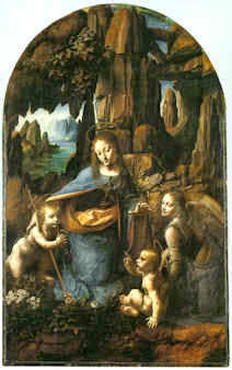


![]()
The Samson and Delilah ink sketch – cutting Rubens to the quick

Today, in a sale of old master drawings (and on an estimate of £1.5m -£2.5m), Christie’s is offering large claims for the artistic and historical significance of a small (roughly 16cms square and shown here at Fig. 1) pen and brown ink drawing:
“This is the only known preparatory drawing for Rubens’s Samson and Delilah in the National Gallery, London (inv. NG 6461), and it was followed by a modello oil sketch now in the Cincinnati Art Museum (inv. 1972.459). Commissioned by Nicolaas Rockox (1560-1640), who was Rubens’s most important early patron, this powerful composition dates from shortly after the artist’s return to Antwerp from Italy, where he had been from 1600 until 1608, and provides a valuable insight into his developing style and preparatory processes.”
This account is conventional but, nonetheless, contentious. No hint is given that the relationships between these three linked works are highly problematic or that all three have suffered cuts or thinning. The authorship of this group has been contested for over two decades. On February 19 2004 the Daily Telegraph published a letter from ArtWatch on the painting’s problems (“Is the National Gallery’s Samson and Delilah another copy?) We have published two special issues of the Artwatch UK Journal mounting challenges (Figs. 2 and 3) and have written a number of articles on the subject for the Art Review. The principal challenges to the attribution came from two artist/scholars, initially, Euphrosyne Doxiadis, whose findings (made with fellow artist Steven Harvey and Siân Hopkinson) were compiled in a report (see this website) that was submitted to the National Gallery in 1992 and later covered in the Times and the Independent. In 1997 researches by Kasia Pisarek, prompted two articles by the Sunday Times’ art critic, Waldemar Januszczak (“A Rubens or a costly copy?” and “National’s £40m Rubens could be fake”). In the latter article, the then director of the National Gallery, Neil MacGregor, conceded that the evidence “is respectable, and the scholar raises some serious questions that I cannot easily answer”. Those questions have never been answered. In October 1997 the National Gallery issued a press release in which it was said that:
“Debates of this sort require patient consideration of different sorts of evidence. The best format is for this evidence to be presented at some length for public discussion – and the National Gallery will be arranging such a lecture and debate over the next few months.”
A debate that has yet to take place
Within a few days the commitment was dropped when the press release was re-issued and the debate never took place. To this day there remains an enormous accumulation of problems with the National Gallery’s “Rubens” Samson and Delilah and, therefore, with its two closely associated works – the ink drawing and the oil sketch. All three works, which are dated to 1609-10, have unusual and anomalous features – and all appeared only in the 20th century. The modello arrived last without name or history in 1966 and was upgraded by Christie’s to Rubens even though it is painted on a soft wood and not the oak which Rubens invariably used.
Ludwig Burchard’s cunning plan?
Behind the successful 20th century elevation of this trio, is the fact that both the drawing and the large finished painting in the National Gallery were attributed to Rubens barely two years apart by the same man, Ludwig Burchard. Burchard was a great authority on Rubens who, notoriously, was unable to publish his life-long Great Work on the Artist for fear of having to de-attribute very many paintings for which he had supplied unwarranted certificates of authenticity. In the ArtWatch UK Journal No. 21(Spring 2006) Kasia Pisarek, whose PhD Dissertation was on Rubens and Connoisseurship, identified over sixty Burchard Rubens attributions that had subsequently been demoted in the Corpus Rubenianum itself.
Dr Pisarek felt that the year of launch for the picture now in the National Gallery might be signicant. As she put it:
“That year 1929 was not free of strange coincidences. By a bizarre stroke of luck, the painting re-emerged 48 years after its disposal by the Prince of Liechtenstein in Paris in 1881 (not 1880, as is commonly said), the exact same year as the deaths of the Prince Johannes II, the previous owner of the painting, and of his picture adviser Wilhelm von Bode, the then General Director of the Berlin Museums. The former died in February 1929, the latter a month later, in March. Moreover, we know that the Prince himself had weeded out a considerable number of pictures, Samson and Delilah included. He also financed many research projects, and the collection was accessible to scholars. The art historian Wilhelm von Bode published (in 1896) the first comprehensive and illustrated book on the Liechtenstein collection, so he could have been aware of the Samson and Delilah’s disposal. Why didn’t he identify the picture as the long lost Rubens if he was also a Rubens expert and had even co-signed certificates of authenticity with Ludwig Burchard?
In 1927 the drawing was bought from a private collector by a scholar of drawings and prints, I.Q. van Regteren Altena, for 26 guilders as a Van Dyck (whose initials it still bears). It was promptly upgraded to Rubens by Burchard, who then cited it as such in his 1930 certificate of authenticity for the Honthorst on offer by a Berlin dealer that is now in the National Gallery as an entirely autograph Rubens.
A precursor or a successor – or both?
It is claimed that Rubens’ characteristic stylistic development through stages of work is evident in the three works’ sequence, when the essential motif remains remarkably constant throughout. In fact, the modello (see Figs. 5 and 7) is so like the finished work that one supporter of the attribution, the former senior curator of the National Gallery, David Jaffe, has suggested that this oil sketch might be a ricordo – a record of the finished painting[!] However, if the presently accepted 1, 2 and 3 sequence of drawing, oil sketch, finished painting were to become 1, 3 and 2, it would make nonsense of the National Gallery’s technical reports which stated that the finished picture’s uncharacteristic thin, swift and little-revised paint work – paint work which today remains preternaturally fresh and unblemished (see Figs. 10 and 11) – was a product of the fact that Rubens had made such an unusually complete and resolved oil sketch that he had been able to paint the larger panel (which, the gallery claims, itself resembles a large sketch) out of his head and at a stroke and without any need for his customary revisions. Then again, the ricordo suggestion constitutes, perhaps, a kind of insurance policy, a way of covering against the possible outcomes of an eventual debate and presentation of evidence? If so, the sequence 1, 2, 3 and 2 again, would make a kind of institutional sense? This might indeed constitute a veritable “belt and braces” insurance: given that the gallery has admitted that its large finished panel is so very swift and sure-footed in its execution (or uncharacteristically sloppy and out-of-character to its critics), that it is itself but an over-blown sketch, the formulation 1, 2/4, 3/2 and 2 might serve perfectly to cover all eventualities.
The evidence of our eyes
The Samson and Delilah ink sketch, as a drawing, lacks the customary force, focus and eloquence of design seen in Rubens’ initial compositional ideas (- see Figs. 8b, 9a and 16). This supposed preliminary study has a curiously finished, pictorial air. Iconographically it has a pronounced “portmanteau” quality, showing, for example, Delilah’s draped right leg as seen in the secure Rubens oil sketch of 1609-10, The Taking of Samson in Chicago, while her draped left leg is as seen in the insecure National Gallery picture. Most disturbingly (to this draughtsman, at least) is that fact that when looking at the drawing in the flesh it is impossible to read an order or purpose to which its many and various components might have been made or to locate the essential, determining compositional and figural point at which Rubens always and brilliantly drove (see Figs. 8b and 16).
A ruled ink border surrounds and compositionally confines the ink and wash drawing (Fig. 1). When seen in reproduction, this border gives an impression that Rubens designed a format from the outset precisely in order to achieve an effect that is the single most problematic feature of the finished painting – the fact that the toes on Samson’s right foot were cropped at the edge of the painting. The border, like the drawing, is drawn in brown ink but clearly, as Christie’s describes, it can be seen by eye to comprise later framing lines. However, while this usage is seen to be common in the collection where the drawing has lived since 1927 – and while the border lines themselves can be seen to pass over a number of tiny losses on the edges of the sheet – the particular placement of the border is disquieting because the sheet on which the drawing was made has been trimmed at either the outside edges of the border or even within the border lines themselves. Why and when was this done? While some of the ink lines of the drawing can be seen by eye to run into the ruled borders, we cannot calculate where they might have terminated because of the severity of the sheet’s cropping. For whatever reason, this is now an artificially constrained and possibly edited image.
Flouting historical evidence
While the toes on Samson’s right foot are cropped at the edge of the National Gallery painting (Fig. 12), both of the contemporary copies that were made of the original Rubens painting show the foot, as painted by Rubens, to have been both whole and set well within the right-hand edge of the painting (see Figs. 4, 5 and 6). It is hard to see on what grounds this testimony might be disregarded: the first copy, an engraving (see Fig. 14), was made in c 1613 and very possibly under Rubens’ instruction. The second was a painting in oil commissioned by Rockox to show off his collection of paintings in the grand salon of his home (see Figs. 6 and 13). Is it conceivable that he – and Rubens, who was still alive – would have permitted a man famous for the accuracy of his records, to make a gratuitous, out-of-character “improvement” to the Rubens painting that occupied pride of place above the mantelpiece? Because of the inked box and the trimmed sheet it is not possible to determine whether the drawing’s author might originally have drawn the foot whole.
The panel support of the modello, as reproduced in the catalogue (see Fig. 7), is seen to have been cropped on its vertical edges since being sold to the Cincinnati Art Museum by the removal of two strips of wood, thereby conferring a clear crop onto Samson’s foot and bringing it into accord with the foot seen in both the National Gallery picture and the ink drawing. At one point the Cincinnati Museum claimed that the oil sketch’s panel was made of oak. When the picture was loaned to the National Gallery we asked if the panel was oak or softwood. It was not possible to say, we were told, because the back of the frame was enclosed and the gallery was not permitted to remove it. The museum today ducks the issue by saying that its painting is “on panel”.
The National Gallery’s picture was doctored at some undisclosed point by planing rather than cutting. The gallery restored the picture after purchasing it and reported that the panel had been planed down to a thickness of 2-3mm and set into a sheet of block-board. We knew for technical reasons that that was most unlikely: block-board is held together by its outer veneer layers and cutting one of them away would have had catastrophic structural consequences. When pressed, the gallery acknowledged that the planed-down panel had in fact been glued onto, and not set into, a larger sheet of block-board, with its edges being concealed by a bevelled putty. The restorer, David Bomford (now of the Museum of Fine Arts, Houston), said in his report, that the planing had taken place at some point in the early twentieth, or possibly during the late 19th century. That, too struck us as improbable: could there be no record of the back of a panel bought for a world record price (£2.5m) for a Rubens? Had the gallery not made a record of condition when the picture was loaned to it before the sale at Christie’s? We asked Neil MacGregor, if the gallery had any record of the back – and he said not. We asked if we might see picture’s conservation dossiers and there found Burchard’s 1930 certificate of authenticity, which described the panel as being intact and in excellent health.
At Christie’s we asked, and were kindly permitted, to examine the back of the drawing which is said to bear other drawings. A little (unintelligible) drawing is present but most of the surface bears the remains of a second sheet of paper to which the ink sketch had once been pasted. Effectively, the drawing’s verso is invisible – just as is the back of the National Gallery’s picture, any evidence on which has ceased to exist.
As for the contention – made against the evidence of the contemporary copies – that Rubens deliberately cropped Samson’s toes at every stage of the work, we know that he was very attentive to his toes. When drawing one of Michelangelo’s ignudi in the Sistine Chapel, he ran out of room on the paper for the toes on one of the feet and then drew them separately elsewhere on the sheet. On his return from Italy, and virtually simultaneously with working on the Samson and Delilah, Rubens made the magnificent Michelangelesque study of a nude man kneeling shown at Fig. 17. On that sheet, the right foot was truncated by the edge of the paper and, again, Rubens redrew the whole lower leg so as to include the foot and toes.
What kind of artist was Rubens?
The National Gallery has admitted that its painting is not typical of Rubens’s oeuvre, which fact it attempts to explain by claiming that immediately after his return to Antwerp from a long stay in Italy, Rubens was working “experimentally”. Unfortunately, it so happens that at the date of the Samson and Delilah’s execution, Rubens was also working on the very large altarpiece The Raising of the Cross (see Fig. 10). No one has ever suggested that that great work occupied a position in some experimental mode. To the bizarre and unsupported suggestion that Rubens, on his return from Italy, simultaneously worked experimentally and not-experimentally within the same brief period, Christie’s lend support with a contention that:
“The exact date of Samson and Delilah is unclear, partly because Rubens experimented with two very different approaches to the same subject in these post-Italian years.”
The truth is that attempts to keep this Burchard-initiated show on the road require that everything today be considered part of a moveable feast. It is neither a satisfactory situation nor a tenable position. Attribution is a difficult and taxing activity at the best of times and there is no shame in admitting error – and least of all with Rubens. As we put it in the 2006 Spring Journal:
“The upgrading of copies or studio works to autograph status frequently flouts the most elementary visual and methodological safeguards. Identification of the autograph hand of a master requires a ‘good eye’, sound method, and a recognition that comparisons are of the essence, that like should be compared with like. Procedural fastidiousness and visual acuity are nowhere more essential than with Rubens, who not only ran a large studio of highly talented assistant/followers but who famously placed a very high premium on studio works that had been modified or finished off by his own hand. When wishing to claim unreserved autograph status for a ‘Rubens’, it would seem imperative that some plausible connection between the aspirant and an unquestionably secure work be established. With the National Gallery’s Samson and Delilah, exemption is claimed on grounds that this work was special product of a peculiar moment in the artist’s career. Unfortunately for the attribution – and the picture’s supporters – this special ‘moment’ coincides precisely with a work of bedrock security – The Raising of the Cross of 1609-1610. An artist’s designs and motifs are easily replicated – and with Rubens, were often intended to be so ‘in house’. Pronounced similarities of subject matter or motif, therefore, are no guarantors of authenticity. What is most distinctive to a master and impossible to replicate – even by close associates within his own studio – is what is termed his touch, his individual, characteristic manner and speed of execution. Artistic mastery lies in some particular combination of technical fluency and commanding thought. The quality of an artist’s thoughts and his authorial ‘fingerprints’ are certainly made manifest in and through material – it cannot be otherwise – but only in material as handled, not in terms of its intrinsic, chemically analysable composition. A flat-footed analysis of the material components of pictures can no more corroborate authorship than they can validate a restoration. There are no material tests for authenticity…”
Update:
16.00, 10-07-14. The editor of Jackdaw, David Lee, writes to point out that, R W P de Vries, the person who sold the Samson and Delilah ink sketch produces this note, when Googled:
“Reinier Willem Petrus de Vries Jr. (Amsterdam , March 3, 1874 – Hilversum , 27 May 1953 ) was a Dutch artist. He was a painter , illustrator , book cover designer , and made ??etchings and woodcuts . He was a student at the State Normal School in Amsterdam, obtained his MO drawing. From 1913 to 1935 he was a teacher at a secondary school in Hilversum.”
The Jackdaw’s distinguished editor reflects: “An artist and secondary school teacher who flogs drawings. Not exactly what you’d expect…” No, indeed, but precisely the kind of thing about which we have learned not to expect to be given information.
Michael Daley
Comments may be left at: artwatch.uk@gmail.com


![]()
Ghosts in the Lecture Room: Connoisseurship and the Making, Appraising, Replicating and Undoing of Art’s Images

On the 3rd of May, the Mellon Centre hosted a lively conference on the divisive subject of art connoisseurship – “The Educated Eye?”, now available on Webinar (http://new.livestream.com/accounts/7709097/connoisseurshipnow). Yesterday, a three-day congress opened at the Hague on “Authentication in Art” (7-9 May) carrying the subtitle “What happens when the painting you are buying, selling, investigating, exhibiting, insuring – Turns Out to be a Fake or a (Re)Discovery…” A small ground-breaking exhibition with bearing on the two conferences (“Diverse Maniere: Piranesi, Fantasy and Excess” – see below and Figs. 1 and 2) is running at the Soane Museum until May 31st.
Curating the Future
The question mark in the Mellon Centre’s conference title, reflects persisting antipathies to connoisseurship, which practice/discipline/pose nonetheless shows signs of rehabilitation. The conference proved admirably even-handed “ideologically” but somewhat constricted in its composition and terms of engagement.
The first speaker, Dr Stephen Deuchar, a former director of Tate Britain who has followed a former chairman of the Tate’s board (David Verey) into the Art Fund’s management, might be taken to represent the official modernist/progressivist museum world establishment. In his paper, “Connoisseurship Now: Some Thoughts”, Dr Deuchar disclosed that the Art Fund no longer confines itself to helping museums buy great works of art that might otherwise be lost to the nation, and now, for example, has contributed “generously” towards something involving the conceptualist Martin Creed (who turns lights on and off), even though no object will be acquired. Gifting this munificence to the Tate required Deuchar (and, perhaps, his chairman?) to step aside from the trustees’ deliberations.
There were two problems with Deuchar’s position. First, in espousing a Connoisseurship of The New-and-the-Forthcoming, the curator effectively operates blind in bandit territory. As the National Gallery’s director, Nicholas Penny, has pointed out, it takes time to evaluate new art, we cannot yet know how it will compare with other art that will shortly follow, or with other yet-to-be-seen contemporary art. Second, his position is old hat and inadvisable: in the 1960s and the 1970s critics championed contemporary art not on quality but on the degree to which it “challenged” existing art practices. So-called “New Activities” were heavily promoted by such critics and curators as Richard Cork and Sir Nicholas Serota of the Museum of Modern Art, Oxford, the Whitechapel Gallery and, for the last twenty-six years, the Tate. With the dismantling of quality as the principal criterion of judgement, and with the aid of the state-funded, respectability-conferring Arts Council, new activities soon became official activities, leaving most fine art practices and practitioners marginalised. Few noticed that “fine art” had cut itself off from related design and craft activities, and from its own history, to become a cosseted licensed playground where rules were the property of “artists” who played by no rules.
Culturally determinist Marxist art historians (like John Berger and, for a while, Peter Fuller), had gone further; had become more mystical and taken to praising art that they judged to have “anticipated the future”. Insofar as art might ever be said to do such a thing, it could only be seen to have done so in retrospect. When asked to comment on the significance of the French Revolution, the connoisseur of history, Mao Tse Tung, replied, “It’s too soon to say”.
The New Art History
The Mellon conference pitted (trade) chalk against (museum) cheese with Dr Bendor Grosvenor of the Philip Mould gallery and Dr Martin Myrone, a Tate curator and champion of the New Art History which pursues the socially signifcant in favour of the aesthetically desirable (“The Limit of Connoisseurship”). In the course of his conceptually suave paper, “Why Connoisseurship Matters”, Dr Grosvenor made two startling disclosures. First, having just seen Michelangelo’s Sistine Chapel ceiling, he now appreciates that the critics he had held to be “myopic” – were right all along: Michelangelo’s work has indeed been ruined. Second, that he stands behind restorers to prevent them from destroying glazes on Van Dyck paintings. (See Figs. 12a to 15.)
Dr Myrone declared allegiance to the New Art History where the social has routed the aesthetic. The resulting knock-about reminded this observer of days on the New Left in the late 1960s when Kim Howells, a rebellious Hornsey College of Art student (but later a New Labour government junior minister), wanted all potentially saleable object-based art to be outlawed – unlike the “democratising” mass medium of TV in which he was dabbling. When we asked Howells how he regarded Goya’s Horrors of War etchings, he replied that, although in sympathy with the works’ politics, the fact that they were printed on paper, “which is a capitalist commodity”, meant that they, too, would have to go. Dr Howells later grew up artistically and, as a visiting minister to the Tate, left a rude comment on a Turner Prize exhibition. Soon after, he lost his place in government.
Parts and Wholes
The afternoon session paired Spike Bucklow, the Hamilton Kerr Institute’s Senior Research Scientist (“Connoisseurship, technical knowledge and conservation”), and the British Museum’s head of prints and drawings, Hugo Chapman (“Dodging the label connoisseur from Christie’s to the British Museum”). Mr Chapman told how, when working in trade (Christie’s), he had been advised to describe himself as “an expert” rather than a connoisseur. It seems that the public can more easily forgive mistakes made by the former. Chapman told a story about a librarian who once hid a key drawing from an artist’s box when showing it to a scholar, and then, when duly reviewing the scholar’s book, professed himself astonished that no mention had been made of the said drawing.
The Hamilton Kerr conservator opted to address small things because “fragments are easier than wholes”, while the embarrassed-connoisseur attempted (more sensibly) to make artistic sense of the whole effects of drawings, and to understand, thereby, how they were executed. Dr Bucklow first showed how eloquently cracks on paintings can testify to a picture’s age, medium, underlying support, country of origin and so on. Having thus demonstrated an evidently usefully diagnostic tool (a kind of Connoisseurship of Cracks), he dismantled his own edifice by demonstrating how the vagaries of individual works’ histories and compositions so complicate the system as to render it effectively useless.
Mr Chapman, while conceding the very great difficulties of making sensible identifications of authorship in drawings, described how he tried to establish Michelangelo’s authorship of a drawing by considering its overall relationships and effects. In a nod towards Myrone’s position, he conceded that because many works in collections are ephemera, it would be futile to attempt to establish authorship of every piece of paper, even though such works often have great social significance and interest.
Salvage Operation
In the final paper (“New Connoisseurship, Old Europe, and the Future of Art history”), Professor Liz Prettejohn, head of York University’s Department of Art History, made a spirited attempt to retain a still-vital discipline that might be free of the more toxic ingredients of past connoisseurship practices. Prof. Prettejohn’s credentials in this respect were well established by a demonstration of her undergraduate response to a formal analysis test set by an old-style connoisseur professor. Prettejohn showed a Rembrandt etching about which students who had been reared exclusively on the study of modern art had been able to volunteer only that it was “old” and “probably Victorian”.
A Missing Link
This constructive, even illuminating, conference had two constricting deficiencies. First, connoisseurship’s purpose was largely confined to determining authorship, with, Dr Grosvenor’s startling asides apart, no consideration given to the urgent need to appraise restorers’ often radically transforming changes – an unforgivable lapse given that unsound attributions can always be corrected, while bad restorations are forever. Second, no artists contributed to this conference. While all speakers addressed the problem of producing an Educated Eye, none seemed aware that nothing educates the eye faster than producing or copying art. With artists, critical faculties were developed in academies and art schools by doing rather than by reading about or simply looking at. Listening to conscientious people grappling with the difficulties of connoisseurship while seemingly indifferent to or ignorant of art practices and blasé about restoration injuries, left an impression of a profession viewing fundamental problems through the wrong end of a telescope.
It is no accident that artists have initiated most of the great picture-cleaning controversies. Those who create art best identify injuries to it. The present state might easily be corrected: it would take small resources to have student scholars make brief drawn copies of the works they study, thereby appreciating art’s vital mind/eye/hand connections. Appreciation and discrimination may be of the theoretical essence in connoisseurship, but taken alone, without knowledge of and engagement with art’s practices, they leave practitioners susceptible to the traditional charge of being pretentious poseurs.
Drawn to Distinguish
Hugo Chapman’s sound quest to grasp the logic of the whole triggered theoretical and practical thoughts. Drawing provides the best route into questions of connoisseurship, being the most private, direct and likely entirely autograph form of image-making. If trainee art historians were required to make different types of drawing, even for brief periods, it would be incalculably helpful in establishing connections between historical artefacts and their original purpose.
Students might, for example, practice drawing as Rodin did with his famous late quick figure studies – never taking their eyes off the model while enclosing a complete figure with a swift continuous contour. Rodin did so, he explained, to fix in his memory the unique total effect of the body – its gestalt – and to test his own grasp of the miracles he had observed. The means required for drawing are miniscule: an American newspaper illustrator who illustrated first night performances of plays concealed a small pad and a very short pencil in a jacket pocket so that he could make discretely drawn notes of the actors to use later to prepare his finished illustrations.
By helping to fix images in the mind, drawing is the very opposite of taking photographs, which practice can evade thought and appraisal. Rodin once reproached himself for having failed to appreciate that the most important part of a head lay not in any of its individual features but in the manner in which they were all fused into a whole. In perverse contrast, the decision to restore the entire cycle of Michelangelo’s Sistine Chapel frescoes was made not on any analysis of the whole and its internal relationships but on the basis of brief chemical tests made on a single lunette (the sections of wall above the arched windows in the Chapel) that happened to be within the reach of restorers who were working on minor frescoes. Misplaced faith in the validity of those “scientific” tests (of an insufficiently tested cleaning agent – it was later discovered to have etched the surfaces of stone, producing corrugations that scattered light, rather than to have cleaned them) permitted the Vatican’s curators and restorers to launch a cleaning programme on the entire fresco scheme with uniform and pre-determined applications of a single, ferocious stone-cleaning material (a soda, ammonia and detergent cocktail) even though, to those with eyes to see, the lunettes had played a subdued and subordinate role to the ceiling proper in Michelangelo’s grand scheme. (See Figs. 4 to 9.)
There is a another way
By all accounts, the finest, least controversial, most sensitive picture restorer working in Britain in the 20th century was the German émigré, Dr. Johannes Hell. His method was utterly respectful of the whole and overall effects of pictures. Dr Hell had trained first as a fine artist and then taken a doctorate on Rembrandt’s drawings. He deplored restorers’ practice of cutting “windows” through (assumed) dirt and varnish until bright colours and light tones are exposed (as at Fig. 7). He worked overall on the entire surface of a picture with the mildest solvents so that no optically and conceptually deranging relationships could emerge. His slow method was made slower by frequently “resting” a picture to give it time to air out, so that no corrosive solvents might accumulate within the paint layers. With Hell’s method in mind, it can be painful to consider the haste in which today’s restorers procede with their swabs, acetone, scalpels and “windows” when in pursuit of more authentic and original paint underneath a picture’s surface.
Connoisseurship in action
We take a degree of pride in the fact that the (proper) exercising of connoisseurship has been alive and flourishing within this organisation for over two decades. From its inception in 1992, Artwatch has deployed aesthetic discrimination and visual analysis in demonstrations of injuries made during “conservation treatments”. Specifically and in terms of methodology, we have done so by the correlation of photographic records of the pre and post-restoration states of works. (This website was custom-made to carry directly corresponding images side by side or in continuous vertical sequences so as to facilitate the most directly revealing visual comparisons.) In the Witt Library, we see photographic records that do not just assist the making of attributions but that also record the progressive debilitation of paintings over successive restorations. We notice that the difference between an authentic work and a close copy can be far smaller than that between an authentic work seen before and after a bad restoration. Dr Grosvenor really did not need to wait until he could join the scrum in the Sistine Chapel to appreciate that Michelangelo’s work has been ruined – he needed only to study the countless pre and post-restoration photographic records that we have carried on this site and had described earlier at length in the 1993 (James Beck and Michael Daley) book “Art Restoration ~ The Culture, the Business and the Scandal”.
The nature of evidence
Defenders of restorations often say that they cannot be judged on photographic evidence. In other regards, art dealers have great faith in the veracity of photographs – they will bid online on the strength of a single photograph. Bernard Berenson preferred to examine Michelangelo’s ceiling by looking at large photographs in books rather than by eye when craning his neck in the chapel. We should be clear on two points: there are no good grounds for disregarding photographic proofs of restoration injuries; the kind of evaluative test that Prof. Prettejohn’s old style connoisseur teacher devised for undergraduates might just as profitably be applied to analysing the differences between pre and post-restoration conditions. (See “An Old Style Connoisseur Test for Undergraduate Art Historians:” opposite.)
For all the social alertness of the New Art Historians, little comment has been made on the major organisational and “ideological” changes within the museum world over the last half century or so. In our view, the failure of scholars and curators to heed artists’ complaints stems from the fact that they have allowed themselves to become dependent on the technical expertise of the very many restorers who have become institutionally embedded throughout the museum world. It is now restorers not painters who pontificate on the making of paintings. It is they who insist that photographic records of their own “treatments” may not be held up and used in evidence against their actions.
Speaking generally, as an organisation, we are bemused by a profession that uses photographs for all manner of curatorial, scholarly and critical ends except for the indentification of restoration injuries. Scholars now routinely revise their own professional scholarly accounts in order to bring them into line with restorers’ latest, often radical, transformations. In the published accounts of restorers and curators alike, nothing ever counts as an injury – every change is presented with drum rolls as a “discovery”. Whole steamships, Vermeer necklaces and sheep can go missing without an art historical murmur or any ruffling of connoisseurs’ feathers. Even in terms of attributions, Artwatch has been pro-active on the connoisseurship front.
The misappliance of science and early calls for the the return of connoisseurship
While protesting since the early 1990s against the cult of “scientific” conservation and its disparagement of “subjective” aesthetic judgements, we have throughout commended a return to proper and rigorous applications of connoisseurship. In the October 1994 Art Review article “How to Make a Michelangelo”, we suggested that “The fact that our scholars and technical experts flit quite so promiscuously through time and space might suggest uncertainty of connoisseurship and ability to ‘read’ paintings”. Three years later, in connection with another National Gallery attribution, we wrote: “In recent years the art of connoisseurship has become entangled with the scientific analysis of paintings. Problems of attribution, once resolved by the educated ‘eyes’ of individuals, are increasingly seen as the property of interdisciplinary teams of curators, restorers and scientists who enjoy the technical, financial and professional support afforded by large museums. But how sound are the new proceedures – and how reliable are the published accounts given of them?” (Art Review, July/August 1997, “Is this really a Rubens?”).
In truth, it might fairly be said that the campaigning essence of Artwatch has been a constant assertion of the primary value of visual connoisseurship – see also, “Is Michelangelo’s Entombment in the National Gallery by Michelangelo?” by James Beck in the Gazette des Beaux Arts, CXXXVIII, 1996. We have devoted two entire ArtWatch UK journals to critiques, successively formulated and advanced by the painter/scholars Euphrosyne Doxiadis and Dr Kasia Pisarek, of the National Gallery’s Rubens “Samson and Delilah” attribution. The title of the last book (2006) by ArtWatch’s founder, the late Prof. James Beck, was “From Duccio to Raphael: Connoisseurship in Crisis”. It received few reviews – and no mention at the Mellon Centre conference.
A connoisseur of Ephemera
No mention was made, either, of a remarkable new work of scholarship published last year by the British Library and the Oak Knoll Press in the USA – Michael Twyman’s “A history of chromolithography ~ printed colour for all” – which we first encountered in the Institute of Conservation’s Chantry Library, Oxford. The ingenious lengths to which printers went in the pre-photographic era to replicate any image, and all things in the world, in reliable colour on multiple, co-ordinated slabs of stone is truly astonishing to behold (see Fig. 3). It is impossible to exaggerate either the illuminating usefulness of this major, beautifully produced book, or the sheer delightfulness of its immense pictorial riches. For those who might feel that a major tome on a history of a printing method might make for dull or excessively technical reading, we would urge, “think again”: here are to be found ephemera (printed bills, advertising cards and the likes) alongside early pioneering hand-drawn attempts faithfully to produce such elusive epically heroic fine art subjects as paintings by Turner and Michelangelo. The faithfulfulness of the attempts to replicate the values of the most hallowed artists summoned applications of great sensibility and powers of aesthetic discrimination. Here, the connoisseur, the scholar, the social historian, the technical historian and the lover of fine drawing and colouring might all feast together, in awe at the dedication, the talent, the artistic insight found in an unsung publishing trade.
We were delighted, for example, to find so full an account of the production of Robert Carrick’s 30 x 44 inches 1852 chromolithographic copy of Turner’s “ Rockets and Blue Lights…” made in no fewer than fourteen colour separations (see Fig. 9). That faithfully made, expensive and then state of the art record (“the only perfect reproduction of a picture ever issued” – as it was claimed to have been in 1900) testifies indisputably to the destruction of the principal boat in the painting on which we have commented a number of times, most recently on the obtuse (or brazen) presentation of this wrecked picture as a jewel in Turner’s crown – see “From Veronese to Turner, Celebrating Restoration-Wrecked Pictures”.
Even more importantly, there is also reproduced, in its entirety, a massive 1,027 x 470 mm (40 by 27 inches) faithful cartography-like, on-the-flat, full colour image of 1852-53, that simultaneously depicts the entire curving geometries of Michelangelo’s combined ceiling and upper walls decorations (see Figs. 4 to 8). We had never before seen this work in its entirety. It reproduces every single figure (there are over three hundred) and architectural motif Michelangelo depicted. Most preciously of all, this encyclopaedic record testifies to the hierarchy of values within which Michelangelo situated his images.
By capturing the tonal and chromatic logic of the whole, not the fragment, of Michelangelo’s murals, this hand-drawn lithograph corroborates precisely the written testimony of the painter Charles Heath Wilson who examined the ceiling on a special scaffold in the 19th century. All parts of this great pictorial ensemble were not equal in their treatment. The “outer” section (as here seen at Figs. 4 and 5) was the semi-circular sections of painting made around the windows on the upper walls (the lunettes). They were the darkest passages of painting. They contained in their illusionistic recesses (see Fig. 7) depictions of the ancestors of Christ. This dark band of human figures set Michelangelo’s work apart from the wall paintings below – as did his great escalation of scale in his figures. Far from being an arbitrary but precisely situated zone of dirt, as the Vatican authorities preposterously and against all scholarly records claimed, this dark zone served aesthetically and symbolically as a kind of visual plinth for the even more monumental figures and the Divine Events depicted above on the ceiling. The next row comprised an architectural screen against which Michelangelo’s stupendous giant prophets and sibyls were set and relieved in the brilliant cinematic, shadows-casting light we have previously described. Above them, set in the sky glimpsed through illusionistic apertures in ceiling’s architectural scheme are the biblical scenes and the depictions of God Himself – Whose restoration injuries we have also chronicled. Today, by the miracles of our technology, we can see and move around the entire, now restoration-ruined surfaces of the Sistine Chapel, but the Vatican will not release a TV film made in the 1960s of the pre-restored state. Recent technical advances have carried us into a world where it is possible to produce perfect facsimiles not only of images but of three-dimensional objects and, even architectural spaces and forms.
CODA
The small exhibition currently showing at the Soane Museum shows three-dimensional realisations of graphic inventions of Piranesi by the foundation Factum Arte. A full size replica made by the foundation of Tutankhamun’s tomb in Egypt was unveiled this week. It was reported by Peter Aspden in the Financial Times “Fit for a king: Tutankhamun’s replica burial chamber”(see Fig.). Such technical capacities for replication raise issues that we will explore in coming posts. This fertile new territory is one for which scholars and connoisseurs will be ill-prepared to assess for as long as they ignore the mistreatment of unique and historic art objects by technicians who transform them into synthetic, polished replications of their (assumed) original autograph states. This website launched in 2010 with a discussion on authenticity in art and music (“The New Relativisms and the Death of ‘Authenticity'”). It did so in response to a restorer’s imposition (in new but deceivingly aged and cracked paint) of a piece of computer-generated “virtual reality” onto Holbein’s The Ambassadors. Connoisseurship is more urgently needed today than ever.
Michael Daley
Comments may be left at: artwatch.uk@gmail.com


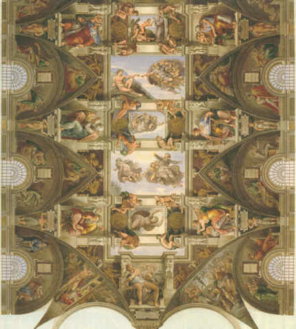


![]()
How the Metropolitan Museum of Art gets hold of the world’s most precious and vulnerable treasures

An exhibition of stained glass that has been removed from “England’s historic Canterbury Cathedral” has arrived at the Metropolitan Museum, New York, after being shown at the Getty Museum in California. The show (“Radiant Light: Stained Glass from Canterbury Cathedral at the Cloisters”) is comprised of six whole windows from the clerestory of the cathedral’s choir, east transepts, and Trinity Chapel. These single monumental seated figures anticipate in their grandeur and gravity the prophets depicted by Michelangelo on the Sistine Chapel ceiling. They are the only surviving parts of an original cycle of eighty-six ancestors of Christ, once one of the most comprehensive stained-glass cycles known in art history. (See Figs. 1 – 5.)
The Met boasts that this exhibition of “Masterpieces of Romanesque art…represents the first time they have left the cathedral precincts since their creation in 1178-80”. Who, then, gave permission for the loan of such fragile, precious and architecturally integral material?
The New York Times says of the exhibition that it “Seemed to have been beamed down from on high”, when it undoubtedly had been flown and vibrated down from on high in an aeroplane. The museum world repeatedly offers assurances that modern air transport is perfectly safe for moving treasures around, even though, as the world now well appreciates, aeroplanes do sometimes crash or disappear. Aside from in-flight hazards, works of art get taken by roads to and from airports where they disappear from curatorial view and supervision into high-security cargo depots, sometimes being injured by forklift trucks, and the like, in the process.
The bureaucrats of “Glasgow Life” who administer Glasgow’s museums recently argued (successfully) in Scotland’s Parliament that, as Sir William Burrell had permitted loans from his bequeathed collection within Britain, and as the most dangerous part of lending works is dismantling them in one place and reassembling them in another, overturning his prohibition on foreign travels would be no more dangerous than moving works within Britain. The bureaucrats were similarly successful in overturning Burrell’s prohibition on lending certain categories of fragile works at all, within or outside Britain, such as glass, tapestries and pastels, by arguing that advances in modern packaging skills meant that even the most fragile work could now safely be moved subject to prior conservation examinations.
With the Burrell Collection we know precisely who will carry responsibility for any future travel injuries or losses but with the Canterbury treasures, who at the Cathedral (or in the Church) would take responsibility were these windows to be harmed or lost during their trans-Atlantic travels?
Were these windows insured for their travels, and, if so, what price was put on them?
Has the Church received any payment for this loan, and, if so, how much?
Were the six windows which travelled from London to California and from California to New York flown in separate aeroplanes – as were the three (of ten) gilded panels from Ghiberti’s Florence Baptistery doors (dubbed “The Gates of Paradise” by Michelangelo) when they were sent from Florence to Atlanta; from Atlanta to Chicago; from Chicago to the Metropolitan Museum, New York; from New York to Seattle; and, finally, from Seattle back to Florence? (See Figs. 6 and 7.)
The Metropolitan Museum seems to be a common destination point on many of the most ambitious and hazardous inter-continental tours of art (it will receive the current Tate show of Matisse’s monumental, previously too-fragile to loan, cut-out paper works). In the case of the Burrell Collection even before the Scottish Parliament had heard all the evidence arrangements for an international tour of works were in motion. On 10 September 2013, Joan McAlpine, SNP, the Chair (“Convener”) of the scrutinising Parliamentary committee, disclosed in The Scotsman that “Sir Angus Grossart was giving some hints [the day before, during evidence to the committee’s first session] of the kind of people he’s been speaking to in terms of a world tour…I know they’re talking to the Met in New York, and from the point of view of the people at Glasgow Life, that’s an opportunity to enhance the reputation of the collection, the city and Scotland.”
Crucially, Grossart’s moves were not being made under the aegis of the Burrell Trustees, who are charged with protecting the collection according to the terms of Burrell’s fabulously generous bequest (the 8,000 bequeathed works still constitute the largest gift ever made to a city), but by “Glasgow Renaissance”, an interceding body set up by Glasgow Life expressly to “oversee the Burrell Collection’s immediate future”, advise on the refurbishment of the leaking building which has suffered decades of neglect, and to facilitate the fund-raising, profile-heightening international tour of key works. Sir Angus Grossart, a member of Glasgow Life’s board of directors is the appointed chair of Burrell Renaissance.
In January 2013 it was reported (Herald Scotland) that the first, six months-long stop of the tour would be at the British Museum, whose director, Neil MacGregor, had been co-opted by Glasgow Life to serve on Burrell Renaissance (– as had been his fellow Glaswegian, Lord Kerr, the deputy chairman of Scottish Power). Grossart claimed in evidence given to the Scottish Parliament’s Burrell committee that no conflict of interest existed because no other venue in London had been thought appropriate to receive Burrell works – which is to say, not the Victoria and Albert Museum; not the Royal Academy; nor even the Hayward Gallery where an exhibition “Treasures from the Burrell Collection” was mounted in 1975.
When we appeared for ArtWatch UK as one of only two opposing witnesses before the Scottish Parliamentary committee (the other being Jeremy Warren of the Wallace Collection), we pointed out that the Metropolitan Museum’s present director, Thomas Campbell, had said of a major exhibition he had organised, “No one but the Met could have pulled off the exhibition of Renaissance tapestries we had a few years ago…We bribed and cajoled and twisted the arms of institutions around the world – well, we didn’t bribe of course – but politically it was very complicated negotiating the loan of these objects, which came from the British Royal Collection, the Louvre, the Hermitage, the Vatican and were just all absolute masterpieces.” (“Museum: Behind the Scenes at the Metropolitan Museum of Art”, Danny Danziger, 2007, p.40.)
It will now be greatly less complicated for Burrell’s fragile glass, tapestries, lace and pastels to be sent to the Metropolitan Museum – or anywhere else. Where Jeremy Warren of the Wallace Collection had testified “It is disingenuous to suggest that when one moves a 500-year-old tapestry from one country to another – perhaps taking it across the Atlantic – one is not shortening its life”, Councillor Archie Graham, Glasgow Council’s deputy Leader and the chairperson of Glasgow Life, thrilled at the prospect of “unlock[ing] the potential of this outstanding collection” and of being able thereby to “realise the full benefits of his gift.” We were not surprised to read Jackie Wullschlager’s report in the Financial Times (“Scottish independence”, 5/6 April 2014) that within months of overturning Burrell’s terms of bequest, a themed exhibition of works from within the collection (“Bellini to Boudin: Five Centuries of Painting in the Burrell Collection”) should open with all of Degas’s “glorious, delicate, light-sensitive” pastels shown in their entirety for the first time in a gallery in which water was dripping from the still unfixed roof “the day before” the show opened – that is to say, opened while on the watch of co-opted art world big-wig guarantors, the likes of Sir Angus Grossart and Mr Neil MacGregor. We did not, however, expect, when opposing the attempt to harvest the benefits of a collection bequeathed to the city of Glasgow, so soon to see the Church of England recklessly playing the same value-harvesting game with an irreplaceable part of the fabric of a cathedral and of our national heritage.
Michael Daley
Comments may be left at: artwatch.uk@gmail.com
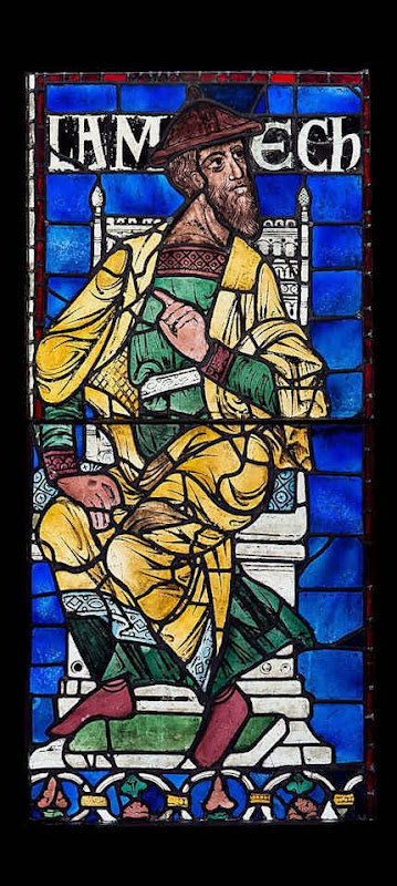
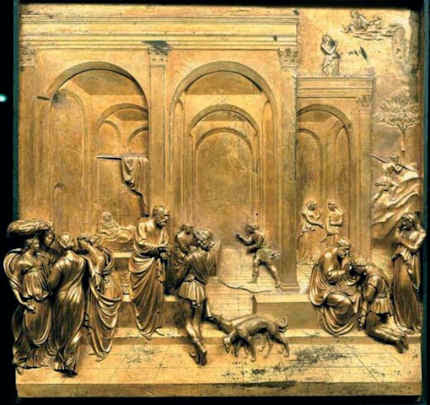
![]()
Betraying Burrell – Shame on Glasgow

It would seem that the arts (along with sport) have been “nationalised”, or more precisely, municipalised, in Glasgow. Both spheres have been brought under the control of a hybrid entity known as “Glasgow Life” which is both a company and a charity with the formal title “Culture and Sport Glasgow”. The directors and trustees of Glasgow Life are appointed by the Council. Glasgow City Council manages the Burrell Collection and the City’s other museums through this body. In the case of the Burrell Collection, Glasgow Life has established an intermediary overseeing body known as “Burrell Renaissance”, the chair of which is a member of Glasgow Life’s own, Council-appointed board of directors. Glasgow City Council is promoting a private bill in the Scottish Parliament to remove the prohibition on foreign loans that was stipulated by Sir William Burrell when he gifted his entire collection (of some 8,000 works) to the city of Glasgow in a will of 1944 and in a later Memorandum of Agreement.
When we were invited to give evidence to a hearing on the bill in the Scottish Parliament on 19 September we attempted to speak to the curators of the Burrell Collection at the museum itself on 18 September. Contact had to be made through Glasgow Life. After inquiries by that body on the nature of our interest, arrangement was made to meet two Glasgow Life officers (in the event three) at the Burrell Collection with no museum curators present. We had hoped to establish the logic of the development whereby a chronically leaking roof – which requires urgent, immediate action (see right) – had grown into a proposed redevelopment of the museum that would cost £45m and that would require not only that the museum be closed to the public for four years between 2016 and 2020 but that works from the collection would go on foreign tours in hope of raising the profile of the collection and generating “revenue-raising opportunities”.
The private Bill presently before the Scottish Parliament seeks expressly to “remove these restrictions [imposed by Sir William] permanently so that items can be lent and borrowed more freely”. It was explained to us that the purpose of increasing borrowing into the Burrell was to enable curators to put on special exhibitions that would set the Collection’s works into a wider and more scholarly context. However, this proposed move towards what is by now a near universal museum practice is itself problematic because it threatens to disrupt the present unique and very special character of the Collection as bequeathed and as has survived since the museum was opened in 1983 (see below).
The hearings on 19 September were filmed and have been placed in full on YouTube. In the first hearing, the Chair of the Burrell Trustees, Sir Peter Hutchison, and the legal agent of the Trustees, Mr Robert Taylor, presented a case for overturning Burrell’s overseas loans prohibition on a variety of grounds that taken together would cede to Glasgow Life permission to conduct the borrowing and lending policies of the Burrell Collection without hindrance. Both witnesses expressed confidence that a proposed new lending code that has been agreed between Glasgow Life and the Burrell trustees offers sufficient safeguards to “mitigate” (but note, not eliminate) the enduring risks of foreign travel. It was alarming when Sir Peter indicated that while, presently and in compliance with Burrell’s repeatedly asserted wishes and conditions, it is the case that entire categories of vulnerable objects (such as tapestries and pastels) are specifically excluded from permission to travel even within the UK, let alone abroad, in the future (were the Bill to be approved), consideration of what might be loaned both in the UK and abroad would be made not by categories of artefacts but on a “case by case”, object by object basis. This would be done under the provisions of the new lending code which is designed to “harmonise” the collection and to “treat [it] as a single entity”. The justification offered for this radical overturning of previously respected conditions is that within what are recognised as highly vulnerable categories a range of conditions exists in which individual works can vary from great fragility to robust good health. We challenged that notion strongly during the second session and note that in the first session, the Committee’s Convener, Joan McAlpine, pointed out that when the Committee’s members visited the Burrell they had been advised by a textiles conservator how and why textiles are so peculiarly unsuited to the risks of travel.
To our fears that the bill effectively seeks to give carte blanche to those in Glasgow Life who will administer the collection, it can be added that it is not altogether clear where accountability might lie. The relationship between the curators at the Burrell museum and the administrators of Glasgow Life is ambiguous and seems unhealthily lop-sided. Sir Peter offers assurances that, on a successful passage of the Bill, he would expect all parties to work harmoniously together and that if displeased the trustees “could make our views quite clear”. Expectations and expressions of displeasure comprise no guarantees. What became clear under close interrogation by the Committee’s members is that Glasgow Life (which as mentioned is the cultural arm of Glasgow City Council – which body is directly promoting the private bill to overturn Burrell’s prohibition on foreign loans) will have the final say and even the right if challenged to have issues determined on the judgement of such “experts” as it might commission. It seemed unfortunate and not reassuring when Sir Peter likened the future role of the Trustees to that of a long-stop cricket fielder rather than a wicket-keeper. (An awful lot of runs can be conceded without balls crossing the boundary – and besides, in modern cricketing practice, the long-stop position is almost obsolete because wicket keepers are expected to stop all balls that comes along.) Sir Peter accepted that Glasgow and not his trustees should have the final say on the fatalistic grounds that “they already perform that function”. It was not made clear why a Parliamentary bill had been thought necessary at all when, as Selby Whittingham of Donor Watch has subsequently submitted to the inquiry:
“There is no need to enact bills to allow for loosening of conditions. This can be done through the courts, as in the case of the Barnes Collection and by application to the principle of cy-pres. If it can’t be done in the Burrell case, one may ask if the case for changing the restrictions is really a good one.”
Certainly the essential claim that Burrell’s restrictions on foreign loans can now be dropped because of increased safety has not been substantiated. Even Sir Peter, a former insurance man himself, recognised that risks remain and are inescapable. Under these circumstances, as he put it, the Trustees have a duty to assess and “mitigate risks as far as possible”. This seems a defeatist position. As we have pointed out, in a world where technical improvements in aircraft safety are offset by great increases of volume and velocities in museum world art swaps, a need to mitigate risks would arise only if Burrell’s many times expressed prohibition were to be overturned. That need not happen. It should not happen. The Trustees’ lawyer, Mr Taylor launched a technical sophistry in the Committee hearings by suggesting that lending to the Louvre today was little different from lending within Britain. This was presumably on a belief that travelling under the English Channel by rail is no riskier than travelling by road within the UK. He had perhaps failed to recall that the tunnel has already suffered a number of very serious fires – including one in 1996 when many heavy goods vehicles were destroyed.
The record of accidents, as the National Gallery’s director, Nicholas Penny, has offered to demonstrate to the Committee, hardly indicates a new, risk-free universe. In 1987 a cross channel ferry, The Herald of Free Enterprise, collapsed and sank in shallow waters, under calm conditions, with a loss of 191 lives and 47 heavy goods vehicles. Three years earlier the Herald’s sister ship, The Spirit of Free Enterprise, had carried two lorries bearing 267 Turners for an exhibition at the Louvre. In 2000, as Dr Whittingham discovered, the Museum of Fine Arts in Boston found its Turner oil painting “Slavers throwing overboard the dead and dying” to be damaged and extremely unstable on return from a loan to the Tate Gallery. Despite the picture having been glazed and sealed according to modern “best practices” against changes in relative humidity, it had “reacted significantly” to the voyage and had lost flakes of paint. It was established that the injury had occurred on the homebound journey. As a Tate spokeswoman acknowledged:
“It arrived here safely where it was examined thoroughly. Its condition was stable”. Incredibly, she added, as if in some exculpation, “Turner’s paintings are notorious for becoming unstable”. Indeed they are – and no gallery knows this better than the Tate. In 1980 the Observer reported that many Turner paintings were too fragile to travel – that barely 100 out of the 279 paintings were fit to “risk being shaken, bumped or dropped in travelling”. As the Tate’s head of conservation, Viscount Dunluce, put it: “Paintings are not designed to travel but to go on a wall. If you send them about in lorries, trains, ships or planes it is bound to have a deleterious effect on them”.
Against Sir Peter Hutchison’s belief that were Burrell alive today he might be happy to “trust his own trustees” to overturn his prohibition on foreign loans, must be set the fact that when two Burrell pictures were sent against his wishes and without his knowledge to Switzerland in 1953, Burrell himself reminded Glasgow Corporation that:
“The Memorandum of Agreement with the Corporation only gives permission to lend items from the collection to any public gallery in Great Britain. That stipulation was made to safeguard the items from damage. Had I known in time it would not have been allowed. It mustn’t occur again.”
That accidents still occur in the air as well as on sea, was the principal force of our own testimony. But all questions of risks aside, the proposed changes do not constitute a well-considered appraisal or culturally desirable end. The impact of the already planned increases of borrowing and lending on the character and the aesthetic appeal of the collection as presently constituted and displayed would likely prove detrimental. That is to say, as Glasgow life explained matters to us, the intention of increased borrowing within the museum (for which borrowing must follow the inevitable quid pro quo of increased lending) is to enable curators to make “more sense” of the works that are held in the collection. This seems an aesthetically and culturally unfortunate form of professional special-pleading. The desire of curators to engage in practices that are becoming near universal within the museum world (but with consequently diminishing results in an international scramble to lay hands on the finite number of plum works) misses or ignores the very traits of the Burrell Collection that are uniquely distinctive and attractive.
What is so remarkable and special about the Burrell collection is that although very large as a private collection, at over 8,000 objects, by its catholic nature it comprises in miniature an easily accessible and digestible cultural “over-view” that is otherwise only available in the grandest “encyclopedic museums”. It should be more widely appreciated (and acknowledged) that nowhere else is it possible to move so effortlessly and rewardingly between great and beautiful artefacts drawn from so many of the world’s great cultures without risking the physical and mental fatigue that so easily sets in when moving through the vast halls and din of traipsing tourist parties of a British Museum, Louvre or Metropolitan Museum. At the Burrell museum, for all its current technical deficiencies and its aesthetically over-asserted means of construction, the building nonetheless has a kind of grace and ease of navigation that is immensely conducive to aesthetic contemplation and enjoyment. The contents of the beautiful classically housed Freer Gallery in Washington afford a similarly high aesthetic payload, but do so on a much narrower palette of art and cultures. The Burrell offers the chance to enjoy, compare and evaluate disparate cultures through a collection of works of remarkably high quality (as is here indicated right without any captions – and without reference to whole treasuries of works in the collection such as tapestries, stained glass, silver and furniture) that is uniquely accessible. This collection should properly and attentively be cherished for what it is and for what it offers and facilitates. It should not be exposed to disruption, adulteration and very greatly increased risks to the works themselves for the sake of turning it, at inordinate costs, into something more common place and altogether less enchanting and special.
ADDENDUM
At the James Beck Memorial Lecture in London on September 30th (see details opposite), the Frank Mason Prize is to be awarded to Nicholas Tinari for his role in opposing the changes made at the Barnes Foundation. (To see his submission to the Scottish Parliament, and those of Donor Watch, ArtWatch UK and others, click here.) In response, Mr Tinari will discuss in brief the lessons for those presently seeking a comparably radical overturning of the terms of governance of the Burrell Collection. Under sharp questioning from the Committee members, led by the Convenor, Joan McAlpine, at the Scottish Parliament on 19 September, Sir Peter Hutchison showed signs of anxiety that money raised by a world tour of works from the Burrell Collection could fall short of that being committed to fund not just repairs to the roof but a greatly more ambitious development of the Burrell’s building. If that were to be the case, could Glasgow City Council be relied upon to pick up a likely deficit of some £40m?
Michael Daley
Comments may be left at: artwatch.uk@gmail.com


![]()
Review: Stone-washed Renoirs and the Shock of the Undone
We knew at a glance that something was amiss. On June 16th, a newspaper photograph trailed an imminent auction sale of Renoir’s “Baigneuse” of 1888. Even on the evidence of that single de-saturated newsprint reproduction (right, Fig. 1) it seemed clear that the privately owned masterpiece had gone through the picture restoration wash cycle a time (or two) too often. A comparison of Christie’s pre-sale zoom-able online photograph with historic photographs of the painting further suggested that picture conservation’s would-be beauticians had been at work with swab and solvent: Renoir’s bather had been left (Fig. 2) a paler sugar-smooth pictorially and plastically enfeebled version of her original self. (For the picture’s appearance and condition in 1944, see Figs. 7 and 9.)
Just as museum curators who organise splashy temporary exhibitions rarely broadcast the “conservation” injuries borne by works loaned from sister institutions, so auction houses, which of necessity must act primarily as agents for owners, can seem no less reticent on this fraught subject. In practice, we find that in of both of these art spheres, the “now” is often implicitly presented as the “originally-was” and “always-has-been”, thereby thwarting what would be the greatest inducement to halt needless adulterations of unique historically-rooted artefacts: a full public disclosure of “conservation” treatments and frank art-critical discussion of their material and artistic consequences. By coincidence, recent museum and saleroom activities have brought to London a slew of little-seen examples of Renoir’s oeuvre. As cases in point of Renoir’s vulnerability, we examine here treatments of his “Baigneuse” of 1888 and the Washington National Gallery’s “The Dancer” of 1874.
Renoir’s “Baigneuse” was given star billing (on a £12/18m estimate) at Christie’s June 20th Impressionist/Modern sale, for the catalogue of which it provided the cover illustration (Fig. 2). While much was made in the eight pages long catalogue entry of an impeccable and unbroken provenance through ten successive owners, not a word was said about any restorations of the painting, and although many early photographs are identified in the picture’s literature, none is reproduced. It is disclosed that this Renoir is to be included in the forthcoming “catalogue critique” of the artist’s work being prepared by the Wildenstein Institute from the Archives of François Daulte, Durand-Ruel, Venturi, Vollard and Wildenstein. (Perhaps the present condition of the picture will be discussed in that publication?)
On the night of the sale, an announcement that the picture had been withdrawn drew gasps of surprise. Artinfo reported that the vendor had accepted a private offer from an unidentified buyer for an undisclosed sum somewhere within the estimate. Trade and press eyebrows have been raised at such secretive, pre-auction sales and the withdrawal was the more confounding because expectations of a big auction house “event” had been raised by extensive (and quite stunningly fetching) pre-sale press coverage with photographs of the painting enlivened by the seemingly routine inclusion of beautiful young female staff members.
With modern paintings, the starting point for any appraisal should be the earliest known photograph. Old photographs are historic records. Historic records should never be ignored. Old photographs of pictures assembled in homes or exhibition galleries are especially precious and instructive. The photograph of Renoir’s 1905 exhibition at the Grafton Gallery (Fig. 3) testifies not only to the then generally more vivacious relative values within individual works but to the striking variety of pictorial effects and painterly means deployed within Renoir’s oeuvre.
With regard to the photographic testimony of the original appearances of individual pictures, consider first the large, near-central painting in the 1905 Grafton Gallery photograph – Renoir’s “The Dancer”. This picture, now at the National Gallery, Washington, is 138 years old but was then only 31 years old and unrestored. Then, the background was disposed in distinct but linked quadrants (top-left; top-right; bottom right; bottom left). These were not so much naturalistic renderings of an actual space as subservient pictorial devices spotlighting the central bow-tight figure of a child trainee who, through balletic discipline and artistry, had assumed a commanding Velazquez-worthy sideways-on viewer-confronting presence.
To that expressive end Renoir had welded the dramatically contra-directional lower legs into unity by a pronounced dark shadow in the vertical triangular space they bounded. That shadow sprang also from the heel of the (right) weight-supporting foot backwards and upwards in space, thereby throwing the bottom edges of the trailed skirts into relief. This dark zone in the lower-right counterbalanced another in the upper-left, which had in turn emphasised and thrown into relief the front edge of the costume, withdrawing only to leave a lighter, again relieving, tone at the dancer’s dark hair. The progressive loss through restorations of those artful dispositions (as seen in Figs. 4 & 5) and the picture’s general descent towards an inchoate, arbitrary pictorial froth that increasingly resembles the underlying condition seen today in its own infra-red imaging (see Fig. 6), is heart-breaking. Renoir had here been a sculptor before he became a sculptor, playing off forms that asserted his picture plane with others that ran sharply away from or towards it (rather as Michelangelo had famously done in his crucifixion of Haman). Degas, who spoke of Renoir’s “sharpness of tones”, had chided himself for constructing his own drawings of standing dancers from the head down instead of from the feet up. Renoir had here given a masterclass in how to project a standing figure upwards from the floor. These things artists know and appreciate.
Compendious photographic evidence suggests that restorers (frequently working myopically through head-mounted magnifying eyepieces) have consistently confounded dirt or discoloured varnish with the shiftingly elusive dark grounds used by artists to set off light-toned figures. As seen in our post of June 1st, Klimt’s portrait of Serena Lederer (which was acquired by the Metropolitan Museum of Art, New York, in 1980) has suffered in just such a manner. In the same post we saw also how Renoir’s deployment of a dark background zone in the upper left quadrant of background and a secondary but counter-balancing dark zone in the lower right quadrant of his “Dance in the City” had also been undone by successive restorers.
By courtesy of the 1905 photograph of the dancer we can now see that by 1944 the picture’s decisive tonal orchestration had already been subverted (see Fig. 3 and caption at Fig. 6). By the time of the picture’s appearance at the 2012 Frick show of Renoir’s full-length portraits (which was reviewed in our post of June 1st), the original dark tones in the lower right quadrant had effectively disappeared, leaving two odd arbitrarily truncated dark attachments to the right heel (Fig. 5). Cumulatively, this painting has suffered needless artistic vandalism of which no one speaks. The fact that graphite underdrawing is now visible on the painting has been mentioned but without any hint of alarm or censure.
With Renoir’s “Baigneuse” of 1888, the earliest photograph in our own records (- donations to ArtWatch of old photographs or postcards are always most gratefully received) is that published in 1944 when the painting was 56 years old, as seen here in greyscale at Fig. 7 (left) and at Fig. 9. Six years later, by 1950, the painting had been radically transformed, as seen at Fig. 7 (right, in greyscale) and Fig. 8 (left, in colour). The differences that emerged between 1944 and 1950 were compounded by further changes between the picture’s 1950 state (seen in colour at Fig. 8, left) and its 2012 state (seen in colour at Fig. 8, right). However many times and by whomever this painting might have been “restored”, it is clear that the resulting interventions have profoundly altered its constructional and pictorial rationales. The total extent of the alterations that occurred between 1944 and 2012 are examined right in greyscale details in Figs. 11-18. The differences between the 1950 and 2012 states are examined in colour details at Figs. 19, 20 and 21.
By 1888 Renoir had visited Algiers and Italy, come to admire Cezanne as well as Delacroix, discovered Italian painting and read Cennino Cennini’s Treatise on Painting. He had just completed an intense series of classically inspired, Ingresque female nudes, culminating in that declared trial for decorative painting, the Philadelphia Museum’s great “Bathers” of 1887, by which date he held the nude to be one of the most “essential forms of art”.
Compared with Fantin-Latour’s palpable but fluidly allegorical figure at Fig. 10, Renoir’s “Baigneuse” has, in its 1944 state, a markedly more stolid, out-of-Courbet corporeality. For all its spirited brushwork and sparkling colour, plastically, it constitutes an essay in composure, stability and parallelism. The torso seemingly rests on its own base of compressed and spreading buttocks and thighs. The thighs, knees and lower legs are held together in a manner more primly archaic (Egyptian) than classical. Movement is confined to the bather’s right hand which dries the left side of the waist. This action has enlivening consequences. The upper torso is pulled round by the right arm and the head is turned leftwards and downwards as if to contemplate the drying action of the towel. The left arm is required to be held aloft to free the left side of the figure, and, flexing at the elbow as the left hand draws across the face, it first echoes the thighs but then curls gracefully, weightlessly away in space.
What, then, explains the differences between the picture’s previous and its present condition? In such cases it is always possible to play the “Sistine Chapel Ceiling Restoration Defence” and claim that in 1944 the then 56 years old picture was very dirty and that the removal of this dirt has liberated the forms and the colours of the painting to a hitherto unsuspected degree. But the pattern of relationships that is visible, even under dirt, should not change character during a cleaning. Rather, it should emerge enhanced, with the lights lighter and the darks darker – and all individual values holding their previous positions. This has not happened – the picture has got progressively lighter with successive cleanings instead of returning to its previously cleaned state. If it really had been left by Renoir in today’s state, how could the previous but now lost artistically constructive values ever have arisen? If left untouched for the next 56 years, would anyone expect the painting to return to its 1944 appearance with the stripes on the towel and the shading of the fingers regaining strength? Would a general shading and enhancement of forms once more helpfully tuck the left hand behind the head? How might dirt have drawn more clearly and repositioned the left shoulder? How might it have more emphatically shaded the right, distant side of the face?
If we consider the difference between the 1950 and 2012 colour plates (shown at Figs. 8, 19, 20 & 21), what might account for the loss of orange coloured modelling in the left cheek, and of individual brushstrokes depicting the hair? Is it possible to claim on the evidence of these photographs that there has been a build-up of dirt on the picture over the last 62 years?
When examining the bather’s face in close-up today, as shown at Fig. 21, can we have any confidence that the paint presently surviving in that section is just as it was when left by Renoir in 1888? What kind of brush or paint might he have used that would have resulted in the present fragmentary, seemingly abraded, scattering of orange paint that lies over the blue background between the hand, the face and the shoulder?
In the next post we examine the conservation fate of more than a score of Renoirs that have been loaned from the Sterling and Francine Clark Art Institute in Williamstown, Massachusetts to the Royal Academy. We shall see how Sterling Clark learned the hard way not to trust art experts on matters of condition in paintings when, having been assured that Domenico Ghirlandaio’s “Portrait of a Lady” had never been repainted, he bought it, only to discover, very shortly afterwards, a postcard of the painting showing it in an earlier and quite different state.
Michael Daley
Comments may be left at: artwatch.uk@gmail.com


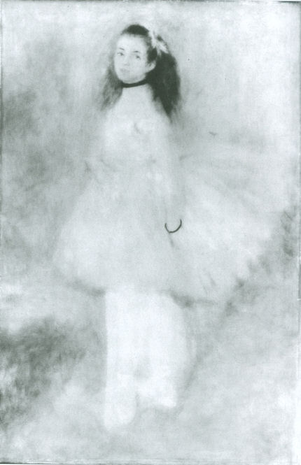


![]()
Brighter than Right, Part 1: A Modernist Makeover at St Paul’s Cathedral
“I’m the 17th surveyor to the fabric after Sir Christopher Wren and am responsible to the Dean and Chapter for the care and conservation of the cathedral”, the architect Martin Stancliffe told Fiona Campbell of the Financial Times Magazine (“Lord of all he surveys” January 10th 2004) and, he added, “If there was anything I could ask Sir Christopher Wren it would have to be what his intentions were for the interior of the building.”
We were startled by this apparent admission of ignorance about the original condition of the interior at a time when the cathedral authorities were over three years into a most radical and experimental restoration of it. Two years earlier the stripped stonework of the cathedral’s newly cleaned south transept had been presented to the press (and widely accepted) as a “recovery” of Wren’s proper original condition. It had specifically been claimed in a press release (“Restoring the glory”) and press interviews that by “returning” the interior stone to its natural state, Wren’s intentions were being shown “for the first time”. (For the post-cleaning state of the stone, see Figs. 4 & 5.)
As the final stage of the building of St. Paul’s was reached in 1709, Wren ordered the interior to be coated three times with oil paint. His son later said that this was not just “for beautifying, but to preserve and harden the stone”. That there is much evidence for what Wren had considered to be beautifying was shown by the art historian Florence Hallett in two articles in the ArtWatch UK Journal (“Cleaning St Paul’s Cathedral”, No. 17, Autumn/Winter 2002, and “The supposedly ‘model’ restoration of St. Paul’s Cathedral”, No. 18, Spring/Summer 2003). In essence, Wren’s aesthetic purpose had been to unify the interior surfaces by suppressing all arbitrary blemishes and irregularities (see Figs. 4 and 5) that had arisen during the building’s thirty-five years long construction, so that his own finely adjusted architectural forms and decorations would read at their best.
Analysis of surviving sections of Wren’s paint was only undertaken – we discovered – after the stripping began. It had established that, in addition to lead white, ochre and black pigments had been included to produce a warm “stone colour” and not a pure white finish. This was precisely the warm effect found in other Wren churches and the effect recorded in early paintings of St. Paul’s’ interior (see Fig. 1). Had these findings been available before the cleaning programme began, would its aims and methods have been different?
Mr Stancliffe has disclosed that prior to 1999 a “comprehensive repainting of the interior” had been considered in order to return it to the true state at which Wren left it, and “to unify the interior”. This was rejected on two grounds. First, it would “result in a finish which, to modern eyes, would seem bland and perhaps inappropriate”. (Perhaps this trumping of historical authenticity by modernist aesthetic sensibilities had been a hangover from Mr Stancliffe’s own early career spent with the modernist firm Powell & Moya?) Secondly, because it would “undo the work so carefully and laboriously executed in the 1870s to strip Wren’s paintwork”.
One might have thought that an architect charged in the 21st century with protecting the fabric and artistic integrity of an ancient cathedral would have felt more loyalty to the original architect’s (painted) creation than to a 19th century predecessor Surveyor’s misguided and botched attempt to undo it. There are grounds for concluding that, as with 19th century church-stripping restorers before him, imposing whiteness and brightness on an originally coloured decorative scheme was Mr Stancliffe’s own and primary objective in this restoration. After stripping the interior, he told the Guardian (“Interior of St Paul’s – brighter than even Wren saw it”, June 10th 2005) that: “During the 35 years of its original building the architect had the Portland stone painted in several thick layers of oil and paint to protect it from the elements before the roof was put on, so it never was as white as now.”
This was misleading. While it was true that no one had ever seen all the stones in the cathedral as if simultaneously quarried and dressed, this was because by the time the construction of the cathedral was finished, the first laid stones had been exposed to the elements and London’s pollution for over a third of a century. Wren’s 1709 instruction to have the interior painted “3 times in oyle” was made 34 years into the construction when the roof was in place and it was far too late for the paint to act as weatherproofing. Moreover, in the cathedral’s own1999 proposal for treatment, it had been tacitly acknowledged that Wren’s paint served aesthetic not weatherproofing purposes because it had been applied late to “cover the uneven effects of the new stone inserted where the supports to the dome had cracked” and to “unite and brighten” the whole interior.
To unite, certainly, but brightening, we should be clear, was Mr Stancliffe’s idée fixe not Sir Christopher Wren’s. In a programme note (“How the glory of St Paul’s was restored”) to a service held at the cathedral on June 1st 2005 in honour of the restoration’s donors, Mr Stancliffe declared that “the heart of my vision for the interior [was] to clean it and relight it” – even though Wren had not brightened the interior to a state of whiteness and the cathedral was not being “relit” to original levels but lit to unprecedentedly high ones. Further, Mr Stancliffe had specifically boasted in the Times of June 10th 2004, of his own “pretty controversial” intention to introduce “six huge chandeliers” to flood the interior with artificial light. A year later he told the Guardian “we have installed new chandeliers and more lights”. Also in 2005, Mr Stancliffe expressed satisfaction on “seeing our initial vision gloriously realised.”
Thus, by courtesy of the banker Robin Fleming’s generosity, the cathedral’s 17th surveyor has been permitted by the church authorities (and by architectural heritage watchdog bodies) to have his own way with Wren’s great, once-painted interior, which now resembles a plaster cast of itself that is lit to department store levels (see Fig. 3, right). As well as being historically false and aesthetically/spiritually inappropriate, the present vulgar fix of whiteness will prove transitory. No surface is harder to maintain and keep free of dust, grime and finger marks than a white, porous, (and now) highly chemically reactive one in the fluctuating environment of a tourist thronged building.
Coda: Mr Stancliffe had sought an even whiter finish. It was his intention to lime-wash the stripped stone surfaces. Ironically – and much as critics among conservationists had predicted – his chemically invasive cleaning method has left the now exposed raw stonework chemically vulnerable. Trial applications of lime-wash kept turning brown. Research that is reported in the conservators’ own house organ, ICON NEWS, (May 2011 issue, p. 30) discovered that humic acids within the stone were being drawn to the surface by the water-based lime applications. For centuries Wren’s oil paint had rendered the stone surfaces hard and impervious and thereby provided a barrier against disfiguring chemical interactions and migrations. Mr Stancliffe has been hoist with his own petard.
In part two, we will examine the controversial and health-threatening chemical means by which Mr Stancliffe’s whiteness and brightness were achieved.
Michael Daley
Comments may be left at: artwatch.uk@gmail.com


![]()