
The Demise of the National Gallery’s “made just like Rubens” Samson and Delilah with inexplicably cropped toes

Michael Daley writes: In a bombshell article (Observer, 26 September 2021), Dalya Alberge reported on a series of Artificial Intelligence comparisons of the Samson and Delilah’s brushwork with that on 148 uncontested Rubens paintings. The exercise had produced a negative result of such magnitude that the Swiss company, Art Recognition, disbelieved its own findings and ran the tests a second time. The results were identical: an unprecedentedly crushing 91% probability that the picture was not painted by Rubens:
“…Critics have long suggested that the painting is not by Rubens. And now a series of scientific tests employing groundbreaking AI technology have concluded that the 17th-century Flemish master could never have painted it. ‘The results are quite astonishing’, Dr Carina Popavici, the scientist who carried out the study, told the Observer… ‘I was so shocked…Every patch, every single square came out as fake, with more than 90% probability.’”
ArtWatch UK was cited as observing that “coming so soon after its ill-advised espousal of the now-rejected and disappeared $450m Salvator Mundi, these results are a calamity for the National Gallery” [see POSTSCRIPT, below]. A spokesman said: “The gallery always takes note of new research. We await its publication in full so that any evidence can be properly assessed. Until such time it will not be possible to comment further.” That was a far cry from its response in the 21 May 2000 Independent on Sunday: “We have absolutely no doubts about the authenticity of the picture and nor do most experts on Rubens”.
Doubts or not, the Samson and Delilah, which is promoted by the gallery as one its top thirty stars – and therefore as the best of its twenty odd Rubens’ paintings – is now a three-times disabled attribution: it had no provenance as a Rubens before a notoriously unreliable scholar’s 1929 upgrade; stylistically, it has long been shown to be untenable as a Rubens and to be compositionally incompatible with the copies made of the lost original Rubens Samson and Delilah ; and now, on multiple close technical comparisons, its brushwork finds no match with that in secure Rubens’ pictures. How the gallery comes to terms with this latest source of disqualification will test the mettle of its director and trustees, none of whom was party to the picture’s 1980 acquisition.
AN ATTACK ON THE MESSAGE
Alberge’s disclosure has been greeted by a thunderous silence of the Rubens experts – but the art history blogger, auctioneer and film-maker, Bendor Grosvenor, tweeted an immediate blanket dismissal of the findings:
“The only thing this tale should tell us is that computers still don’t understand how artists worked. And probably never will.” And “If you like a bit of science with your art history, it’s still hard to beat the National Gallery’s 1983 technical bulletin for showing the picture is indeed by Rubens.”
Grosvenor’s unsupported assertion bolstered by an appeal to the authority of an old and profoundly unsatisfactory National Gallery report gained tweeted support from the Sunday Times’ art critic, Waldemar Januszczak. In crucial respects the erratic art critical volatility of this pair of commentators (who conduct joint “Waldy and Bendy” podcasts on Januszczak’s ZCZFilms website), exacerbates the National Gallery’s now perilously exposed position. Holding Plesters’ report aloft as a standard may have been thought unhelpful by the gallery – the link Grosvenor provided to it now produces this message: “Page not found – Sorry, the page you requested has been removed or the link was incorrect.”
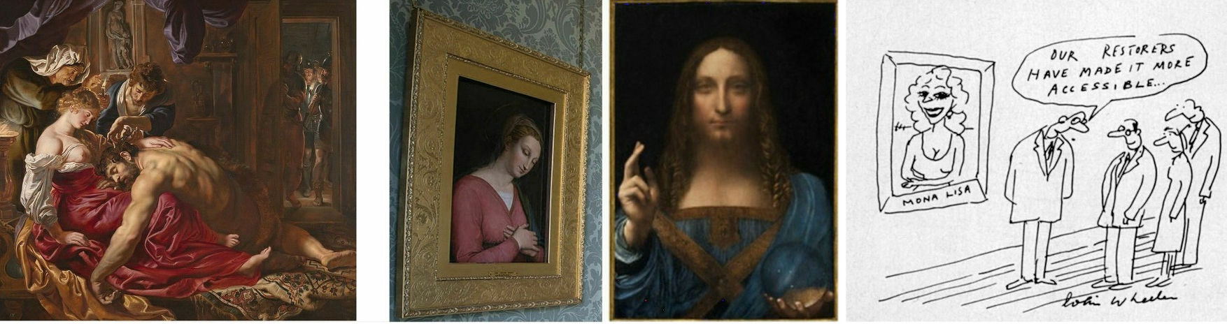
Above, Fig. 1: Left, the National Gallery’s attributed Rubens Samson and Delilah; second left, the Grosvenor-attributed fragmentary “Raphael” of a Madonna at Haddo House, Scotland; third left, the disappeared and demoted “Leonardo” Salvator Mundi; right, a Colin Wheeler cartoon.
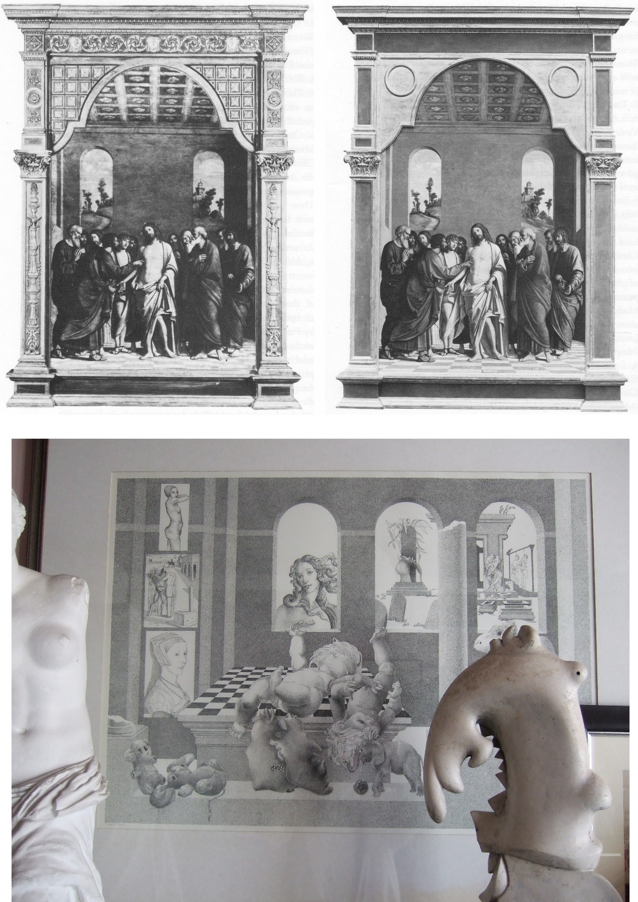
Grosvenor’s appeal to the authority of National Gallery expertise was rich: when, after long examinations, that gallery’s experts recently judged his would-be “Raphael” painted fragment of a Madonna in an all’antica cross-over dress (Figs. 1 and 3) to be no more than a “possible 18th century work” he crossly rejected their findings and called for yet further tests. Where Januszczak now supports the Samson and Delilah’s Rubens attribution he does so in flat repudiation of his 1997 younger self’s rumbustious denouncement of it (Fig. 2). With their joint appeal to the authority of the National Gallery conservation staff’s record, Grosvenor and Januszczak have opened the door to the gallery’s skeleton cupboard.

Above, Fig. 2: The cover of the 5 October 1997 Sunday Times Culture Magazine which trailed Waldemar Januszczak’s article “A Rubens or a costly copy”
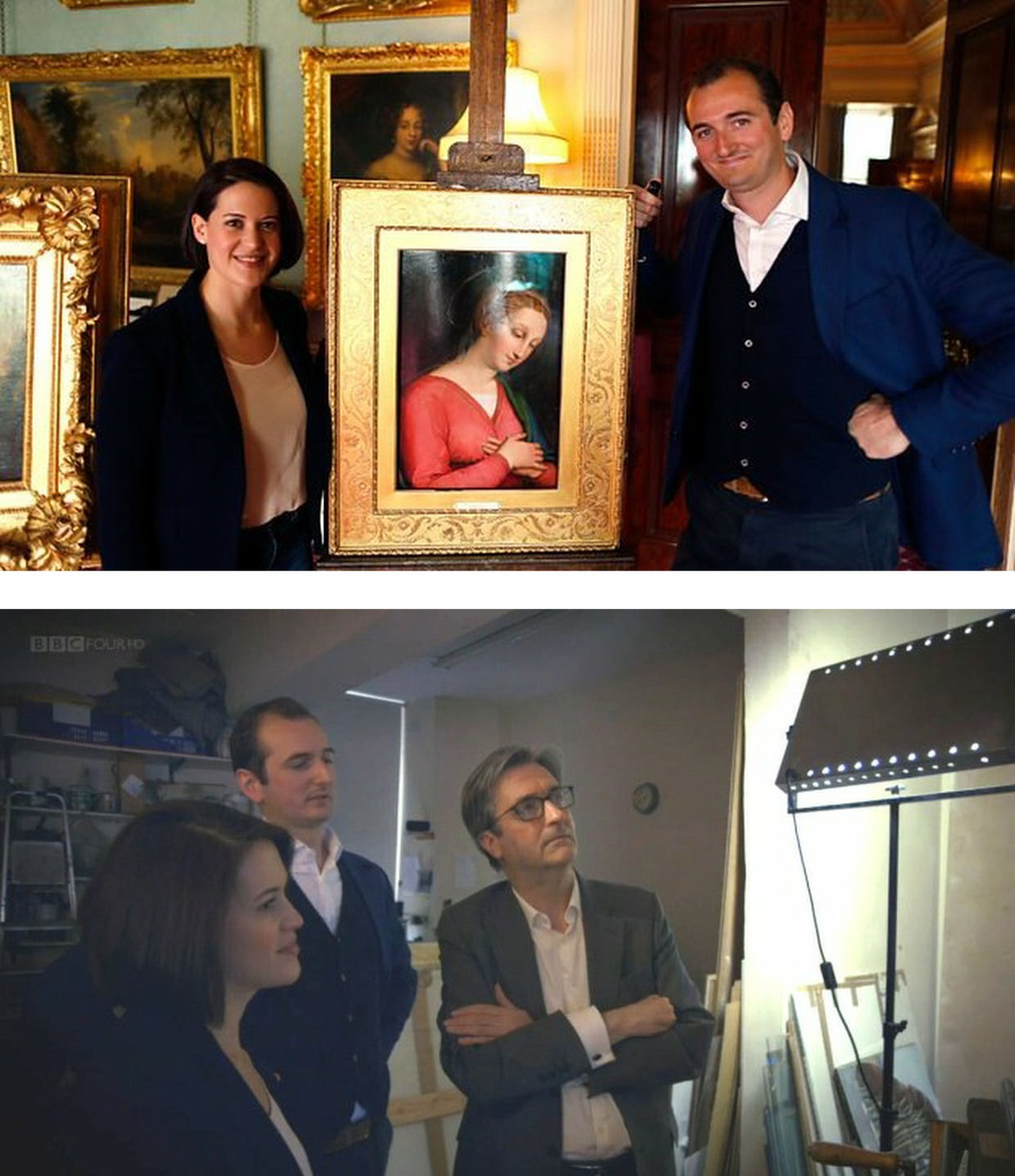
Above, Fig. 3: Top, BBC4 Factual Report, 03. 10, 2016: “Britain’s Lost Masterpieces discovers hidden painting believed to be by Raphael. ‘Finding a potential Raphael is about as exciting as it gets. At first I couldn’t quite believe it might be possible, but gradually the evidence began to all point in the right direction.’ Dr Bendor Grosvenor”. So reported the art-credulous BBC with a photograph (top) of the programme’s co-presenters, art historian Jacky Klein and Bendor Grosvenor, with the putative Haddo House Raphael; above, the presenters consider the “Raphael” on the Lost Masterpieces programme with the former director of the National Gallery, Sir Nicholas Penny.
Invited to pass judgement on the attempted upgrade, Sir Nicholas (whose proselytising on behalf of the $450m Salvator Mundi had been defended by Grosvenor in the 9 October 2011 Sunday Times – “They are taking a risk and I can’t applaud them enough for it”) said that he would place the painting somewhere between “probably by Raphael” and “by Raphael” and that with a “little more time and courage” he might well go the whole hog. That stylishly diplomatic locution was of limited utility – rather like informing a woman that she is somewhere between probably pregnant and pregnant. The pity is that aside from his defences of National Gallery restorations and championing of a not-Raphael and a not-Leonardo, Penny proved the gallery’s most unapologetically serious scholar/director in recent times – as instanced in an excellent Financial Times interview.
ROLL UP
In another Financial Times interview, Simon Gillespie, the restorer who works with Grosvenor on the BBC’s Britain’s Lost Masterpieces programme, disclosed that he, too, believes that he might own yet another Raphael. Gillespie is believed to be the owner of a claimed Lely copy of the £10m “Last Van Dyck Self-portrait” that was sold by the Mould Gallery to the National Portrait Gallery for £10m on 1 May 2014.
DEFENDING INSTITUTIONS AND ATTACKING JOURNALISTIC MESSENGERS
Grosvenor frequently tilts at journalists whose stories embarrass art institutions. In a February 2019 Art History News blog post (“Salvator Mundi & the Louvre”) he berated Sunday Telegraph and Mailonline reports that the Louvre would not be showing the $450m supposed-Leonardo Salvator Mundi in a forthcoming Leonardo exhibition. That story, he sniffed, “is based on the opinion of one Jacques Franck.” It was. Franck’s judgements as the world authority on Leonardo’s painting technique have institutional clout (- and often the ear of French presidents). Franck’s prediction proved precisely correct: the Salvator Mundi was not included in the Louvre exhibition, and it was described in the exhibition catalogue as what it is and what it has remained despite successive restoration makeovers and intense global marketing razzamatazz (- which marketing Grosvenor lauded as the best ever seen) namely, the Leonardo studio work that entered the Cook Collection in 1900, viz: “Salvator Mundi, version Cook, vers 1505-1515″. (See “The Louvre Museum’s bizarre charge of “fake information” on the $450 million Salvator Mundi”.) The Art Newspaper has reported (November 2021, “Prado downgrades $450m Leonardo Salvator Mundi”) that the Prado, too, has demoted the Salvator Mundi to its original standing as the Cook version: “The Prado curator Ana Gonzáles Mozo comments in her catalogue essay that ‘some specialists consider that there was a lost prototype [of Leonardo’s Salvator Mundi] while others think that the much debated Cook version is the original’ However, she suggests ‘there is no painted prototype by Leonardo’.”
(For the latest observations on the $450m Salvator Mundi, see Jacques Franck’s “Further thoughts about the ex-Cook Collection” and ArtWatch UK’s “The Disappeared Salvator Mundi’s endgame: Part I – Altered States and a Disappeared Book”. For ArtWatch UK’s first objections to the Salvator Mundi upgrade, ahead of Christie’s November 2017 $450m sale, see: Dalya Alberge, 19 October 2017: “Mystery over Christ’s orb in $100m Leonardo da Vinci painting” and, “Problems with the New York Leonardo Salvator Mundi Part I: Provenance and Presentation”.)
THE RAMIFICATIONS
The Rubens and the Leonardo attributions are items of considerable public policy interest. Both works achieved world record prices. Both received major and controversial modifications at the hands of restorers. Both upgrades have now collapsed. Both had been championed by National Gallery directors – Michael Levey with the Samson and Delilah and Nicholas Penny with the Salvator Mundi. While Waldy and Bendy both now support the Samson and Delilah, Waldy rejected the Salvator Mundi (which Bendy supports) because: “It resembles nothing else Leonardo painted”; and, because Christie’s claimed resemblance of it to the Mona Lisa “had me laughing out loud”.
THE NATIONAL GALLEY’S WOBBLY DEFENCES
The Art Recognition findings are not, as Grosvenor would imply, off-the-wall. In June 1997 the National Gallery issued a notice claiming that the reason why the Samson and Delilah looked like no other Rubens in the gallery was because it had been painted at a special and very brief moment when Rubens had just returned from Italy and was keen to show off newly acquired Caravaggist traits. That apologia was not credible.
In a pioneering 1992 report, the scholar/painter Euphrosyne Doxiadis and the painters Stephen Harvey and Siân Hopkinson, conducted a focussed survey of six Rubens paintings of 1609 and 1610 and demonstrated that “All these display a consistency and quality of style which is not shared by the Samson and Delilah”. That report – “Delilah cut off Samson’s hair, but who cut off his toes? The case against the National Gallery’s ‘Rubens’ Samson and Delilah” – was placed in the National Gallery’s Samson and Delilah dossiers and is published on the dedicated In Rubens Name website.
THE ART RECOGNITION REPORT
We are very pleased to publish here the full Art Recognition report on the Samson and Delilah, as below, and would urge all to study it along with the pioneering, methodologically exemplary Doxiadis/Harvey/Hopkinson report.
REPORT_Samson_Delilah_Rubens_encr
With no match to be found for the picture among a score of National Gallery Rubens paintings or among six bona fide Rubens’ works of the precise (claimed) historical moment, why should it come as an affronting surprise that none was found by Art Recognition among 148 secure paintings? Just as Grosvenor demanded more tests on his wannabe Raphael, so he would seem to want the Samson and Delilah compared with every single picture in the oeuvre. On September 30th he complained: “To claim a judgement on the Samson & Delilah based only on scans of 400 [sic] works (and at what resolution? We are not told) out of an oeuvre of over 1000 works seems to me optimistic.” Rather than pressing for every work in the oeuvre to be tested, he might prefer to cite and photographically demonstrate a single other painting with brushstrokes that, to his eye, match those of the Samson and Delilah.
The National Gallery has long been unable to cite a single report or record that shows the Samson and Delilah to have been planed-down and mounted on blockboard before it was bought for a world record Rubens price in 1980. In place of evidence, the gallery, too, falls back on appeals to authority, claiming, for example, in a 23 May 2000 press statement, that “…a large number of distinguished scholars who have devoted their careers to the study of Rubens unanimously agreed that the painting was one of the artist’s masterpieces”.
Such appeals cut little ice: every restoration or attribution ArtWatch has challenged in the last thirty years had been supported by a bevy of art historical bigwigs – from the Sistine Chapel ceiling to the recent so-called Leonardo “Male Mona Lisa” (Fig. 1 above). Moreover, of all scholarship, that on Rubens remains the most problematic and herd-like, its key players being uniquely obligated by a family bequest to defer to the scholarship and judgements of the long deceased (and now discredited) scholar Ludwig Burchard.
ARTISTS KNOW
The challenge to that art historical authority has come principally from artist/scholars who are freer agents and arrive armed with hands-on knowledge of art’s practices – knowing, for example, how to put brush to paint and paint to surface. A quarter of a century ago Euphrosyne Doxiadis neatly encapsulated the now technically confirmed deficiencies of the picture’s brushwork in an interview:
“This picture is betrayed by brush strokes which are almost staccato and broken up, rather than having been done with one stroke of the wrist, which you see in all Rubenses. There is an absence of Rubens’ vibrant, pulsating-with-life strokes. In actual Rubenses, each stroke is a tour-de-force. This is clumsy and awkward.” (Dalya Alberge, “Expert denounces National Gallery’s Rubens”, The Times, 25 November 1996.)
Above, Fig. 4: Top, details of the National Gallery’s Samson and Delilah; above, Rubens’ The Raising of the Cross, Antwerp Cathedral. Where the former is claimed to be a lost picture Rubens painted in 1609-10, the latter was indisputably made by Rubens between 1610-11. Such pronounced differences in brushwork are inconceivable as that of two autograph paintings made at the same moment in Rubens’ oeuvre. Who, looking at this photo-comparison, could believe that Rubens had flitted between the ugly angular Cubist faceted feet in the Samson and Delilah statue (– try counting the toes and note the Art Deco zigzagging hem), and the superb fluency, grace and anatomical fidelity seen in the Raising of the Cross?
THE TESTIMONY OF NATIONAL GALLERY TECHNICAL BULLETINS
When Tweeting support for Grosvenor, Waldemar Januszczak, had seemingly forgotten his own 5 October 1997 Sunday Times article headed: “One of the World’s most valuable paintings hangs in the National Gallery. But Samson and Delilah, widely assumed to be by Rubens, is not by him but is a copy, argues Waldemar Januszczak. Who then did paint it?” Januszczak had ended with this ringing declaration: “The one thing we doubters all agree on is that the painting bought by the gallery for a staggering sum in 1980 is not by Rubens.” What has changed to un-doubt Januszczak? Under challenge on Twitter, Grosvenor admitted that he too had once entertained doubts about the Rubens ascription.
Joyce Plesters’ 1983 Technical Bulletin account was tendentious and error prone. She had counted six planks in the Samson and Delilah panel when the picture’s restorer, David Bomford, made it five and the gallery’s panel specialist, Anthony Reeve, counted seven – as would a dendrochronologist in 1996. Plesters thought the National Gallery’s attributed Michelangelo Entombment of Christ had been painted on a single giant plank when the panel is comprised of three butterfly-keyed planks. The senior curator, Christopher Brown, accepted Plesters’ six planks in the catalogue to the National Gallery’s 1983 “Acquisition in Focus” celebratory exhibition of the restored Samson and Delilah. In 1997 Januszczak poked fun at the conservation department’s shambolic technical reporting:
“I am shown these authoritative-looking documents and, on the first page, the information that the Samson is painted on five planks has been crossed out and changed to seven planks. In the published technical report we are told there are six planks. A conservation report that cannot count the number of bits of wood the gallery’s most expensive painting was done on hardly inspires confidence.”
One of the painting dossiers that I later I examined at the National Gallery (under the directorships of Charles Saumarez Smith and Nicholas Penny) disclosed that a large and important picture had been mounted on “Sundeala” boards with a honeycomb paper core. The disclosure had not been made in the report itself but had been written on an attached yellow post-it note. Plesters’ haplessness was more than arithmetical. The year before Januszczak’s tease she had suffered a mortifying professional reverse. In the 1960s, when scholars like Ernst Gombrich and Otto Kurz warned Gallery restorers against removing all-over tinted varnishes from Renaissance paintings, she insisted that the entire documented technical history of art showed “no convincing case” for any artist having emulated Apelles’ legendary dark varnishes and that the famous passage from Pliny was of “academic rather than practical importance”. She even offered to “sift” and “throw light upon” on any future historical material that Professor Gombrich might uncover.
A BURIED INCONVENIENT TRUTH
In 1977, in the National Gallery’s first Technical Bulletin, Joyce Plesters had mused complacently “one or two readers may recall the furore when the cleaning of discoloured varnishes from paintings…began to find critics.” In that year the scarcely less complacent former National Gallery director Kenneth (Lord) Clark pronounced picture cleaning “a battle won”. A third of a century after the original controversy, the practical import of Pliny’s testimony emerged in a 1996 Technical Bulletin disclosure that a Leonardo assistant, Giampietrino, had toned down his colours with a final dark “varnish” layer of oil with black and warm earth pigments.
Had those pigments been bound in a resin it would have been deemed an earlier restorer’s attempt to impart a spurious “old masters’ glow” and removed. However, Giampietrino’s dark overall toning was identical to the oil medium of the painting itself and any solvent that would dissolve the one would dissolve the other. The gallery had to leave the coating in place. Shamefully, it stifled any acknowledgement of its momentous art historical significance – and it even neglected to inform Gombrich of the corroboration of his earlier claims, despite the fact that the gallery’s then director, Neil MacGregor, held the 1960s dispute to have been “one of the most celebrated jousts” in modern art history.
When ArtWatch UK informed Gombrich of his vindication he was approaching his 87th birthday and responded: “I could hardly have a nicer present than the information you sent me. I don’t see the National Gallery’s Technical Bulletin and would have missed their final conversion to an obvious truth. There is more joy in heaven (or Briardale Gardens…)” Two years later he observed: “I believe it was Francis Bacon who said that ‘knowledge is power’. I had to learn the hard way that power can also masquerade as knowledge, and since there are very few people able to judge these issues, they very easily get away with it.” (See “How the National Gallery belatedly vindicated the restoration criticisms of Sir Ernst Gombrich”.)
THE MISSING BACK, A LEGAL CHALLENGE, AND OTHER SAMSON AND DELILAH PROBLEMS
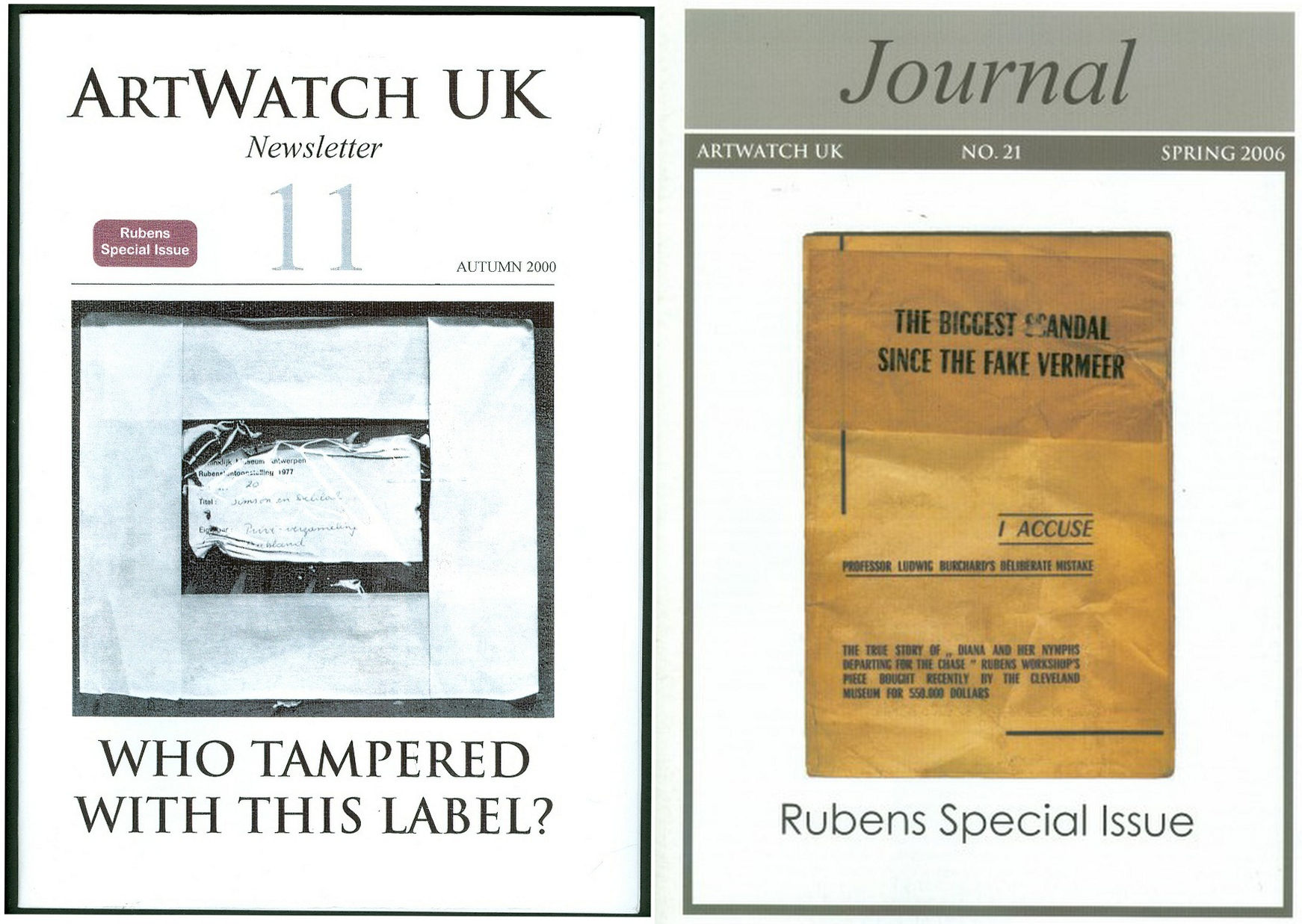
Above, Fig. 5: Two special issues of the ArtWatch UK Journal that examined the Samson and Deliah’s credentials as a Rubens.
In Journal No. 21, Kasia Pisarek wrote:
“I am in possession of a privately printed pamphlet entitled The Biggest Scandal since the Fake Vermeer written in 1960 by a well-known French art dealer Jean Neger. In it, he openly denounced Dr. Ludwig Burchard as being a dishonest man writing a certificate of authenticity for a painting that he knew was a copy. The picture in question was Diana departing for the Hunt, a large oil on canvas, sold in 1960 as a Rubens for a huge amount of money to the Cleveland Museum in America. It first appeared in an Amsterdam sale (Valkenier family) in 1796, in fact as late as 180 years after its supposed creation c.1615. Neger accused Burchard of ‘defrauding the American state of 550.000 dollars’.
“In his highly dramatic pamphlet he declared that Dr. Burchard wrote the certificate of authenticity in 1958, even though he knew that another, nearly identical version (his own) of the painting existed, and had a considerably better provenance, going back to 1655 and the prestigious Spanish collection of the marquis de Leganes, a friend of Rubens. This was the most important collection in Spain, aside from that of the King Philip IV. Leganes probably owned more paintings attributed to Rubens than any other aristocratic collector in Spain, with the possible exception of Gaspar de Haro. After researching his painting, Neger discovered that the number 214 in white paint present on his canvas was the corresponding Leganes inventory number. Moreover, his version of Diana had a lot of pentimenti visible even to the naked eye, which would indicate that it was an original, not a copy.
“According to Neger, Burchard has tried to avoid him on many occasions and has refused to see or to certify his version because he had already certified the other one as the original. When approached, he tried to ‘compromise’ by saying that he would state that Neger’s version was the first one, which Rubens had sketched and abandoned, and that he had then painted a second version, the one from Cleveland. Later, he took up Neger’s picture again, corrected it and completed it. That solution was satisfactory to Neger and yet, Dr. Burchard changed his mind again, and refused to certify Neger’s painting at all. Subsequently, he chose not to reply to Neger’s allegations which appeared to be his usual attitude in such situations.”
Dr. Pisarek concluded:
“I verified most of Neger’s statements, which on the whole appear to be true. I traced both pictures: one is in the Cleveland Museum, effectively considered to be the original by Rubens; the other is in The Getty Museum in Malibu, as ‘a workshop copy’. And yet, the Getty picture (ex-Neger’s) has better chances of being the original: it is the larger of the two versions; it has a superior and older provenance (1655 as compared to 1796); it agrees in most details (presence of sandals, lack of birds in the sky, missing tiger’s skin, background landscape) with an old copy in Cassel which provenance (1756) predates that of the alleged Cleveland’s ‘original’.”
Pisarek discussed the merits of these two pictures in the third chapter – “The two versions of Rubens’s Diana Departing for the Hunt: an American cause célèbre” – of her doctoral thesis, Rubens and Connoisseurship. On the problems of attribution and rediscovery in British and American collections, University of Warsaw, 2009, and there concluded that both the Cleveland and Getty pictures are mostly products of Rubens’s workshop.
DEFENDING MUSEUM FAKES I
On 4 March 1929, the year that Ludwig Burchard found and upgraded the Honthorst painting then owned by van Diemen and Benedict (who had bought it, Doxiadis disclosed, from a painter/restorer) and that is today the National Gallery Samson and Delilah, Rene Gimpel, author of the 1996 Diary of an art dealer, wrote:
“The Italians have sold Americans $2m worth of marbles done by Dossena (a faker). A laughable sum compared with the amounts obtained by means of certificates given daily by German experts to German dealers. Just as there were paper marks, so there are paper canvases, an easy way of bringing dollars into Germany. I went this morning to the Van Diemen gallery, which has an exhibition of sixteen Venetians. Three pictures are good, apart from the Guardis and perhaps the Longhi. Last Sunday’s Times devoted an entire page reproducing this scandalous exhibition, which gives only a faint idea of what is brought in. Bode, the director of the Berlin Museum died two or three days ago. The king is dead long live the king! The Mayers, the Gronau will replace him. The German title of Doktor impresses the Americans. The museums are even more intent than the collectors on defending their fakes or their mistaken attributions.”
WHAT LIES BEHIND
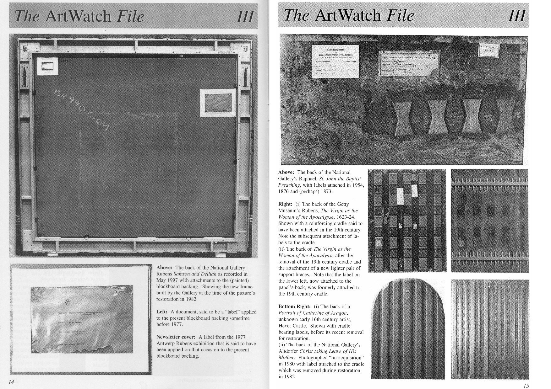
Above, Fig. 6: A spread of pages from ArtWatch UK Journal No. 11 contrasting the Samson and Delilah’s present back with the labelled and cradled backs of comparable period panel paintings.
Above, Fig. 7: Illustrations of the back of the Samson Delilah picture as supplied by the National Gallery and as published in the June 2000 Art Review (“The Back is Where It’s At”) where we showed the back of the Samson and Delilah and its attachments, as recorded in 1997. Our detailed technical and art historical case against the Rubens attribution in the Art Review ran, in full, as follows:
“Last month I referred to a National Gallery picture which lacks a back or a record of a back but on the back of which an incomplete provenance depends. This bizarre, paradoxical case arose as follows.
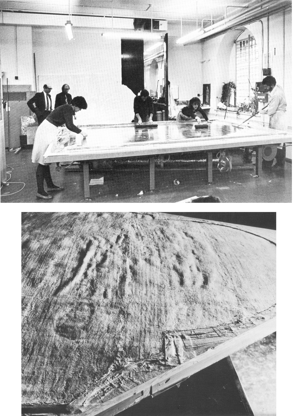
“On 11 July 1980, the National Gallery paid £2.53m (through Agnew’s at a Christie’s auction) for a large picture, Samson and Delilah, that was said to be an ‘entirely autograph’ Rubens, probably in its original frame. The price was a world record for the artist and, at the time, the second highest for any painting bought at auction. The acquisition was presented to the world with great fanfare, orchestrated as much by the gallery as by the auctioneers. In 1982 the picture was cleaned, restored and reframed in preparation for a special ‘Acquisition in Focus’ exhibition to be held the following year. So far, so straightforward.
“In 1983, two accounts of the restoration were published in the National Gallery’s Technical Bulletin by David Bomford, restorer, and Joyce Plesters, head of science. At this point the painting, which hitherto had always been described as a panel, begins to be described in different terms. Namely, as a planed-down sliver of a panel mounted on a modern laminate sheet of blockboard. As Bomford put it, ‘the large panel on which Samson and Delilah is painted must originally have been substantially thicker than it is now. At some point, probably during the present century, the panel was planed down to a thickness of less than 3 mm and subsequently glued on to a sheet of blockboard.’ This seems in strict, factual terms to be correct, but the word ‘probably’ later came to be questionable.
“Plesters’ account was seriously misleading. She claimed that the planed-down panel had been set not onto but ‘into’ (which it had not) the sheet of blockboard, which supposed placement prevented its edges from being examined for tree-ring dating purposes – which it did not. She insisted that this phantom relationship was of no consequence because ‘the date and provenance of the painting are not in doubt.’ Which claim, as will be shown, was not the case. Plesters admitted that the planing, on an unidentified occasion ‘before the picture was acquired by the Gallery’, might well have destroyed, among other evidence, a branded or carved panel-maker’s mark – a far from trivial matter because such a mark might have sunk the attribution to Rubens. The original Samson and Delilah is dated 1609, sometimes 1610; its engraved and painted copies to c. 1613 and 1615 [sic – 1625-35] respectively. Very few panel-makers marks were made before 1617 when they first became a guild requirement; after this date they can help with datings. Michiel Vrient, whose mark is most commonly found on the back of Rubens’ later panels, only qualified in 1615. His mark on the Samson and Delilah would have been fatal.
“Clearly, establishing when, by whom, and for what purpose a planing was carried out – and what records were kept of the original back – would under any circumstance be a matter of urgency and a test of propriety. In this instance it became greatly more so when, in 1997, a number of eye witnesses reported to ArtWatch UK that the picture had retained its original, label-bearing and ‘cradled’ back immediately prior to and during its auction at Christie’s in 1980. When informed of this, Neil MacGregor, the gallery’s director, dismissed the testimony as ‘mistaken’ (letter 7 April 1997). He later said (9 April) ‘the National Gallery does not have any record, photographic or written, of the back of this picture before it was planed down.’
“This year [2000], in compliance with its ‘Code of Openness’, adopted in anticipation of Government legislation on freedom of information, the gallery reversed an eight-year-old decision and allowed me to examine the dossiers held on the picture and its treatments. I have been assured that the dossiers were complete and that no material was withheld. I am forced to report that the records are therefore lamentably incomplete. This is the more disturbing because, contrary to assurances, the picture’s provenance is extremely insecure. It is not to the gallery’s credit that it took six years of assiduous research by three painters – Euphrosyne Doxiadis, Stephen Harvey and Siân Hopkinson – between 1986 and 1992 – for this embarrassing reality to be brought to light. They demonstrated that the picture is not compositionally consistent with contemporaneous engraved and painted copies of the original picture. Their examination drew from Christopher Brown, the curator responsible for the acquisition, the admission that ‘there are gaps at the beginning and the end of the Liechtenstein provenance which makes it impossible to be 100 per cent certain that this is the picture painted for Rockox.’
“The provenance as presented by Christie’s in their sale catalogue was a daisy-chain of speculations pegged on disconnected and not always accurate citations. It was claimed in the first instance that the picture was ‘probably’ the one known to have been painted in 1609-10 for Nicolaas Rockox’s house. It was said to have ‘perhaps’ been in the possession of the painter Jeremias Wildens (albeit only as a ‘Samson’ and not as Samson and Delilah) before 1653. It was further said to have ‘perhaps’ been in the possession of a ‘Guill Potteau’ before 1692. It was then said to have passed into the hands of the Prince of Liechtenstein on 30 May 1700. The second, third and fourth suggestions are all dependent on an event having taken place for which there is no evidence whatsoever: that the original painting left Rockox’s house at his death in 1640.
“As Euphrosyne Doxiadis established (and as Dalya Alberge reported in The Times of 25 November 1996), the records show that Rockox’s collection remained in his house until its sale in 1714 after the death of Rockox’s last descendant in 1712. The house in Antwerp survives and was restored in 1977 as a museum to Rockox. A booklet produced that year by the museum acknowledged with regret that it had been impossible to reassemble the whole of the original collection which had been dispersed by a public auction in 1715. Knowledge of this sequence of events seems rapidly to have slipped from official art historical consciousness
“By coincidence, the National Gallery’s picture (then in a private German collection) was exhibited in Antwerp in 1977 in a large exhibition celebrating the 400th anniversary of Rubens’ birth. In the catalogue Frans Baudoin described it as a ‘panel’. In the same year, in his book Nicolaas Rockox: ‘Friend and Patron’ of Peter Paul Rubens, Baudoin said the panel was ‘excellently preserved’. He also reported that the picture had been ‘rediscovered’ (when owned by a dealer as a Gerit van Honthorst) in 1929 by Ludwig Burchard, on whose advice, the German magnate August Neuerburg bought it in 1930 (along with another Burchard ‘Rubens’, since de-attributed).
“Burchard’s ‘rediscovery’ closed the second gap in the provenance to which Christopher Brown referred. Samson and Delilah is said to have disappeared after being sold by the Liechtenstein collection in 1880. In addition to the ‘gaps’ of 60 and 50 years at either end of the Liechtenstein provenance there are two further problems. First, the Samson and Delilah was described in every Liechtenstein inventory as a copy. Even the dealers who sold it to the collection thought it not to be by Rubens and to be greatly inferior to a work by Van Dyck. Second, every painting in the Liechtenstein collection was marked with a seal on its front or back. The National Gallery’s picture has no seal on the front. If it had one on its back, what happened to it? What possible reason could there be for removing and destroying such an important feature of a picture’s pedigree?
“When pressed on such specifics, the National Gallery summons the fogs of time. Bomford thought the planing might have taken place in the 19th century. His director, MacGregor, suggested that it was ‘possibly done this century, perhaps when the painting was in the hands of the art trade in the 1920s’ (Letter 9 April 1997.) This really will not do. The dossiers contain, I discovered, an undated sheet of typescript by Burchard (which the gallery’s archivist tells me is part of a letter dated 8 April 1930, but which contains a handwritten postscript referring to an article of 1942) which not only describes the picture as being ‘in a remarkably good state of preservation’ but, crucially, testifies that ‘even the back of the panel is still in its original condition.’ Given Burchard’s testimony, and bearing in mind that Christopher Brown made a special study of Burchard’s manuscript notes on the painting (which we have not been allowed to see) prior to the 1983 ‘Acquisition in Focus’ exhibition, how could the gallery have believed that the planing might have taken place before the last [the 20th] century or when the picture was in French hands?
“These questions are the more perplexing because, after Burchard’s testimony, every single reference to the picture describes it as a ‘panel’ in good – or better – condition. A further document in the [National Gallery] dossier that throws light on the picture’s condition also seems to have been overlooked. Christopher Norris, a benefactor of the gallery, sent a letter of congratulations to Michael Levey, the director, the day after the sale at Christie’s. Norris attributed the picture’s still ‘amazing condition’ to the fact that the German owners [between 1930 and 1980] had not touched it. It still retained, he noted, the varnish applied during its stay in France in 1929. The only change that had occurred during Norris’s forty-seven years’ acquaintance with the picture was that the varnish had toned down. (In 1983 Bomford cited the picture’s ‘thick, considerably yellowed varnish’ as the ‘principal reason’ for cleaning.)
“In 1977, Gregory Martin, the author of Christie’s catalogue entry, reviewed the Antwerp Rubens exhibition. He observed with relief that the Samson and Delilah was one of two ‘great works…on panel’ that were ‘none the worse for their journeys’ to Antwerp. (In 1982, the picture was described in the National Gallery’s Technical Bulletin as one of only three well-made and untroublesome panels in the collection.) Three years later the picture again left Germany when it was sent, on offer of sale, to a Belgian museum. On its arrival, a condition report (dated 4 March 1980) was prepared by a leading Rubens expert. He described the picture as a ‘panel…in good shape’ with painting in a condition ‘which can be called excellent’. The panel remained for several months at the museum before being dispatched directly to Christie’s. During its stay at the museum, the picture was seen to be an old, thick, somewhat bowed, label-bearing and cross-battened panel. Brian Sewell (who had discovered the Samson and Delilah modello some years earlier at Christie’s) recalls that the picture, when at Christie’s, was an intact, cross-battened panel with a blackish painted back on which the Christie’s number [as given to every work on arrival] was stencilled in white paint.
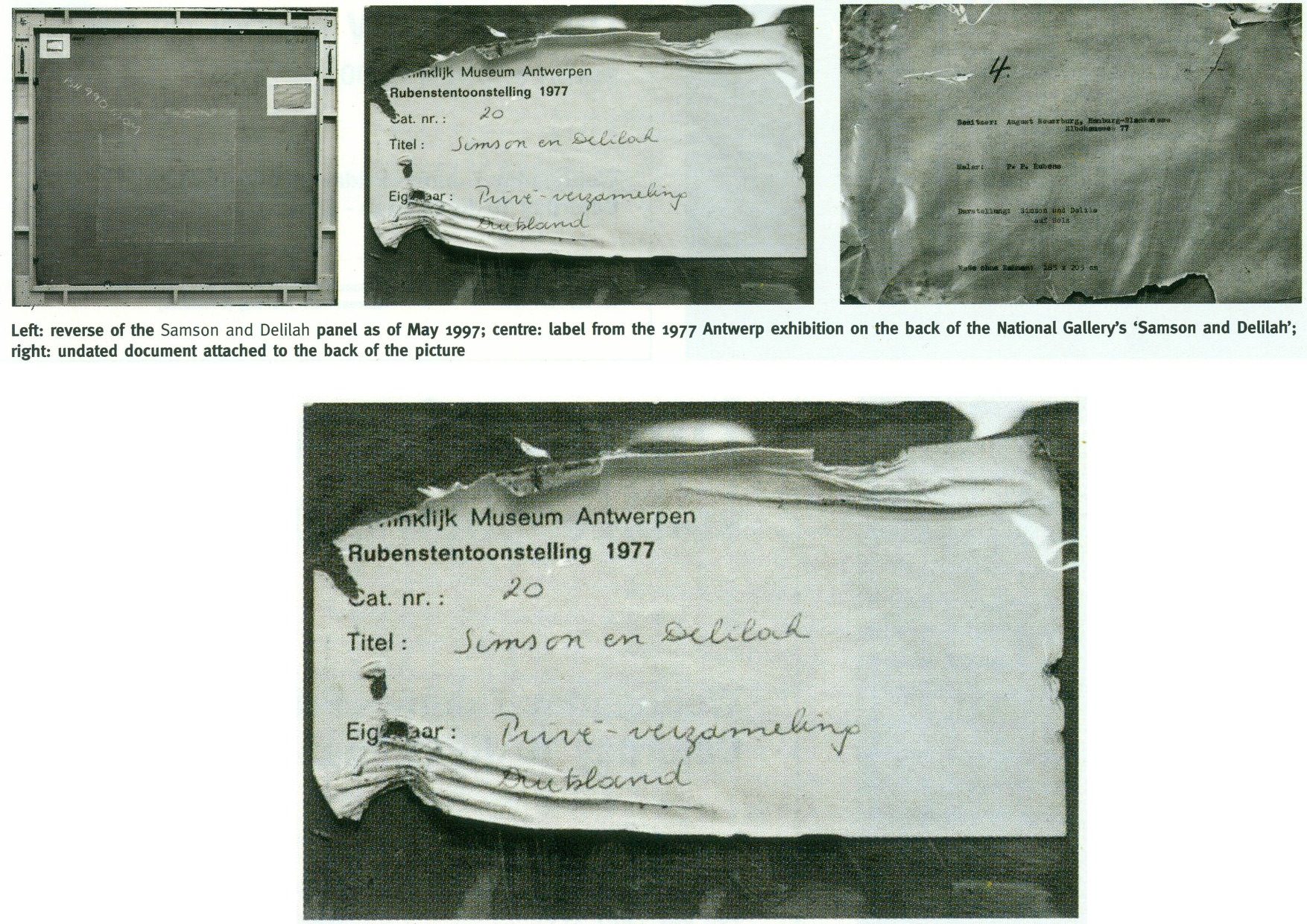
“On 27 May 1997, Neil MacGregor sent me photographs of the picture’s back ‘as it is now’. He drew attention to the Christie’s number (chalked and stencilled in black paint) and to ‘two labels attached to the back of the blockboard’ (see illustrations). One, he said, is from the Antwerp exhibition of 1977, the other ‘rather older, from the Neuerburg Collection’. It was, he said, ‘hard to imagine any of these being put on after the picture left Christie’s.’ It is not. Neither document – only one of which appears to be a label – would seem to be glued or pasted to the blockboard. Both appear to be held in place, identically, with cellophane fixed by clean masking tape. Both documents are clearly proud of the surface and are seen to cast shadows on it. The 1977 Antwerp label shows clear signs of having been attacked with a scraper. Why? When? And by whom? After receiving these photographs, I asked to see the back on an occasion when the picture had been removed from its frame. So far, I have not been permitted to do so, and two requests to government ministers for an inquiry have been turned down.”
THE DIFFERENCE A MISPLACED HISTORICAL WORD CAN MAKE IN AN AUCTION CATALOGUE
Today, given the Samson and Delilah’s recent further disqualification on a technical analysis of its brushwork, the National Gallery’s continuing claim of a Rubens authorship runs increased risks.
First: That espousal continues to fly in the face of historical documentary evidence that the picture cannot safely be ascribed to Rubens – evidence that had emerged and was published twenty-five years ago by Dalya Alberge (“Artists raise fresh doubts on gallery’s Rubens masterpiece” 26 September 1996, the Times”):
“ARTISTS challenging the attribution of Rubens’s Samson and Delilah in the National Gallery believe that evidence presented in an auction house’s catalogue was mistaken. The artists also allege that the gallery refuses to acknowledge historical facts that cast doubt on the picture being by the 17th-century master. The National Gallery acquired the painting from Christie’s in 1980 for £2.5 million, equivalent to £6 million today. The auction catalogue referred to a 1653 inventory which described the painting as ‘Eenen Samson van Rubens’, which would mean ‘by Mr Rubens’. But a Flemish genealogist who has studied the inventory said that it read ‘Eenen Samson naer Rubens’: ‘naer’ is translated as ‘made just like Rubens’ or ‘after Mr Rubens’. Another inventory, dated 1692, lists it as ‘copye’ – a copy.
“Euphrosyne Doxiadis, an artist and scholar, and the painters Steven Harvey and Siân Hopkinson believe that the genealogist’s finding backs the stylistic evidence against the picture being by Rubens… It was only as recently as 1929 that the painting was hailed as a long-lost Rubens. For 180 years it was in the collection of the Princes of Liechtenstein and inventories in 1767, 1780 and 1873 attributed it to a minor hand, Jan Van Den Hoecke…”
THE SHIFTING TESTIMONY OF LUDWIG BURCHARD
Second: With this picture never having been thought an autograph Rubens before Burchard’s 1929 upgrade, everything rests on that scholar’s tarnished standing. Aside from the Neger scandal, Pisarek noted in the Spring 2006 ArtWatch UK Journal (No. 21, “The ‘Samson and Delilah’ – a question of attribution”) that over 60 pictures, albeit mainly small works, attributed by Burchard to Rubens had been down-graded in Corpus Rubenianum to studio works, copies or imitations. In a 1950 letter to a fellow art historian, Burchard had said of a painting now in the North Carolina Museum of Art: “The Rubens-like painting was once shown to me. I missed the transparency of the shadows, which one would expect at least in places. The picture seemed to me like a compilation by a contemporary of Rubens.” However, in 1954 he had said of the same painting in a certificate of 28 May addressed to the D. M. Koetser Gallery, London: “the vigour of the design, the brilliance of the vivid colours, the concentration of movement are comparable in several details to the painter’s Defeat of Sennacherib c. 1612…”
THE FIXED TESTIMONY OF PAINTWORK
Third: As mentioned, the 1992 Doxiadis/Harvey/Hopkinson Report had anticipated and thereby now effectively corroborates the Art Recognition findings in its section on Rubens’ painterly technique:
“We have now studied the technical deficiencies in the execution of the National Gallery Painting; we have collected a very comprehensive catalogue of faults which are demonstrated by comparison with works of that period. This can be done when visual material is included…
“It is totally out of character for Rubens to use what the National Gallery calls ‘bold’ handling over the entire surface of a painting. In all his other works, areas of beautiful and infinitely detailed work appear, in addition to areas which have been handled boldly – a woman’s jewellery, for instance, the lace on a ruff, or a flower in the foreground. On the whole, the great downfall of the National Gallery’s picture is the crudeness with which it has been painted. Quite apart from the unsubtle transitions from tone to tone and from colour to colour (look for example on the Venus statue in the background [here, Fig. 4, above], or at Samson’s ear [Fig. 24, below], compared with his own ear in the self portrait of Rubens and Isabella Brant in the Honeysuckle Bower painted in the same year) there are two enormous drips of paint on the surface of the work, which no painter with even the most basic training would have allowed himself to do at that period….
“Looking closely at Samson and Delilah one misses the vibrant, twisting nature of the brushstrokes themselves. The shapeless, unanimated strokes in this painting seem flat and unexciting when compared with Rubens’ usual virtuosity.”
SO, ONCE AGAIN, WHO PLANED THE BACK OFF THE SAMSON AND DELILAH PANEL?
Fourth: The Samson and Delilah picture retains an abiding technical mystery: at what date and by whom was the panel planed down and attached to a modern laminate sheet of blockboard?
It should always be appreciated that no reference had ever been made to a planing and a blockboard backing before the Plesters/Bomford accounts of 1983, and that the National Gallery’s accounts are inconsistent, shifting and full of holes. As seen, some have said the planing may have occurred in the 19th century or early 20th century, others that it took place between 1930 and 1980. The gallery claims to have kept no records of the picture’s state in 1980 when purchased and, even, to have prepared no reports for its trustees when seeking authorisation to make a then massive purchase that would consume most of the gallery’s annual purchases grant. A director, Neil MacGregor, expressly admitted (in a 1997 letter to ArtWatch UK) that “The National Gallery does not have any record, photographic or written, of the back of this picture before it was planed down” – which, as indicated above and as is further shown below, was not the case.
When the senior curator at the time of the 1980 acquisition, Christopher Brown, and his successor, David Jaffé, both held that it was planed down when in the collection of the German magnate, August Neuerberg, between 1930 and 1980, they did so against the testimony of the National Gallery benefactor (who had gifted a Poussin), Christopher Norris. As first mentioned in the 2000 Art Review, Norris testified in a letter to the director in 1980, Michael Levey, that between 1929 and 1980, no change of condition had occurred in the painting, other than a toning down in its 1929 varnish, because the owners had not touched it. Thus, because we know, on Burchard’s (written) testimony held by the National Gallery, that the panel was intact in 1929 when sold to Neuerburg and, on Norris’s (written) testimony, held by the National Gallery, that the owner had never touched the picture, the only parties who might have planed-off the back are Christie’s and the National Gallery. Christie’s, who described and sold the picture as a panel – not as a reduced or marouflaged panel – are hardly likely to have so-transformed someone else’s property – or even to have had the time and means of doing so. On currently available records, the National Gallery, becomes, willy-nilly, the sole candidate, having itself never once described the picture as a planed-down panel before 1983 – and because its own published records testify that the work was an intact panel up to 1982.
REDUCTIO AD ABSURDUM: THE CASE OF A TOTALLY DISAPPEARED NATIONAL GALLERY ALTARPIECE PANEL
Above, Fig. 8: Top, the National Gallery’s 1504 altarpiece The Incredulity of S. Thomas by Cima da Conegliano, as seen before and after an utterly transforming campaign of restoration in which a modern synthetic composite support was substituted for the original giant poplar panel and a new frame was built to replace the gallery’s own 19th century frame; above, a 1978 pen and ink drawing, “The Ages of Woman”, by the author.
As can be seen above, top, the cleaning and subsequent retouching of the picture surface left a tonally and perspectivally altered appearance: what had been dark and tonally relieving (the back wall) became lighter; what had been contrasted became equalised (the wall and ceiling); what had been dramatically central and axially assertive (the “spotlighted” figure of Christ) became quietened and subsumed within a group. The reduced ornamentation on the new frame left two architecturally assertive raised circles that now vie for attention with the picture’s own depicted half-round windows – which features, the lightening of the wall has brought closer to the picture plane and, therefore, closer also to the new more abstractly assertive frame. The net effect of the physical and pictorial transformations this altarpiece underwent was to leave a painted image surface that is now as flat, de-natured and ahistorical as a giclée print. Above, to a draughtsman (who necessarily commences work on a sheet of – initially – “no-values” to a gradually built-up and considered disposition of “values”, the alterations that are routinely made by restorers during “cleanings” and “restorations” to other artists’ works are as un-missable as they are perplexing and artistically impoverishing.
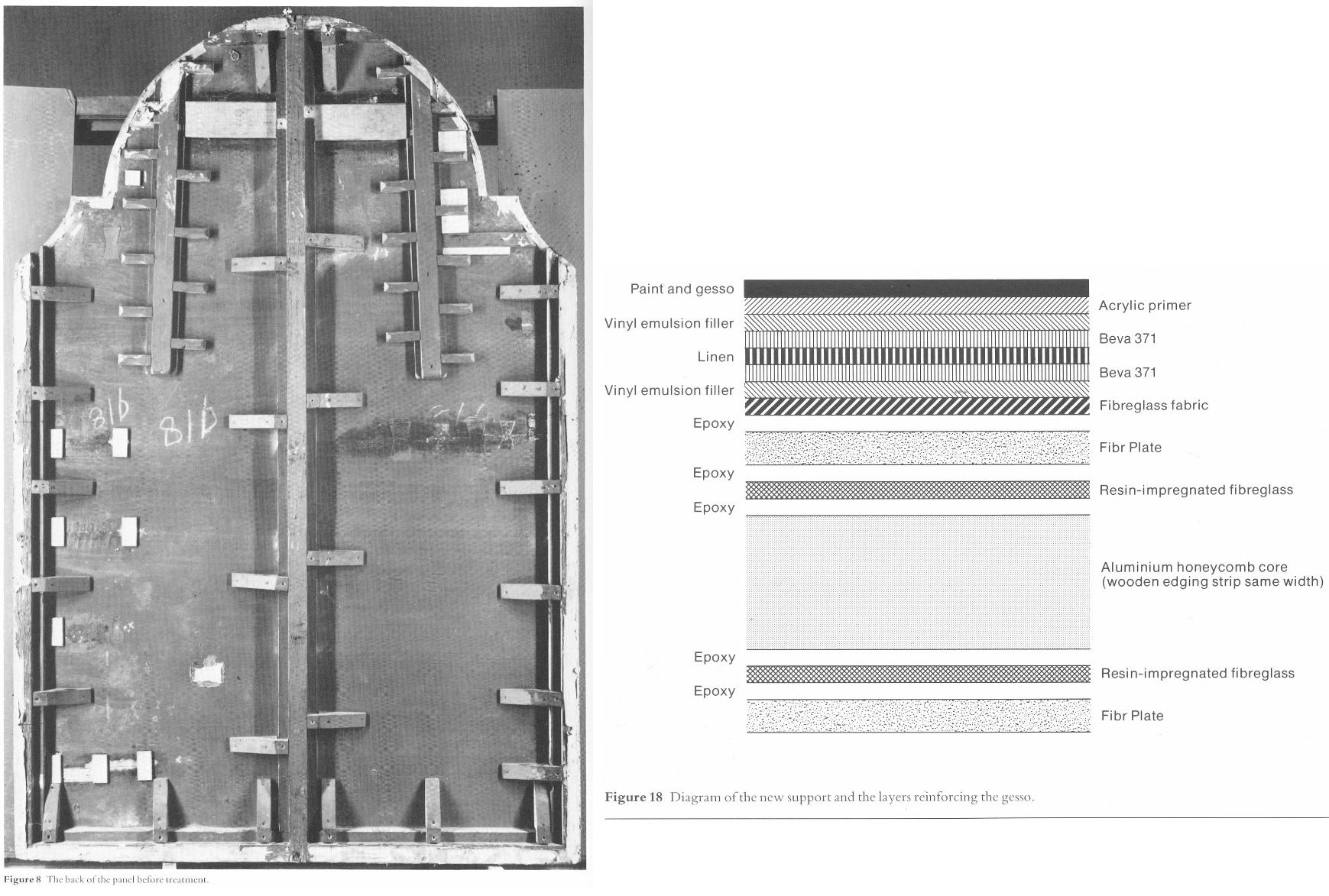
Above, Fig. 9: Left, the back of the altarpiece panel which was totally removed (i. e. destroyed) and replaced by a multi-layered fibreglass and aluminium board – the long-term stability of which is unknown – during restoration. Right, the diagram of the new, entirely synthetic glass fibre and aluminium support in cross-section, as published in the gallery’s 1985 Technical Bulletin.

Above, Fig. 10: The Cima altarpiece, as published in the 1986 Technical Bulletin with the caption: “The picture after cleaning and transfer, before restoration.”
A MASTERFUL JOB
When Waldemar Januszczak was in art critically doubting mode on the Samson and Delilah’s attribution in October 1997, he addressed the persisting Whodunnit Mystery of the Disappeared Back:
“I put this to the gallery’s chief conservator, Martin Wyld, who quips cheerfully that he was rather proud of having been accused; planing a 17th-century oak panel to wafer thinness and attaching it perfectly to blockboard while leaving its surface in pristine condition, is an exceptional feat of restoration. Nobody would or should do it today. Whoever did it earlier did a masterful job. Why did they do it at all? If a painting is in exceptionally good condition, why was there any need to hazard the transfer to blockboard? A question neither the chief conservator nor MacGregor can answer. All I got them from both is the National Gallery version of: it wasn’t us, guv.”
If stunned by Januszczak’s question, Wyld and MacGregor can hardly have been caught unawares. In a then recent letter in the Daily Telegraph (“Doubts about gallery’s Rubens”, 16 August 1997) we had written on that very question:
“…More disturbingly, crucial technical and documentary evidence concerning the picture’s weak provenance was destroyed when the back of its oak panel was planed away in a mysterious intervention for which no one accepts responsibility and during which no records were kept. The National Gallery claims the planing took place before the picture was bought at Christie’s for a record £2.5 million in 1980. If this was so, two questions arise. Why did the gallery’s trustees authorise the acquisition of a picture with no back (the planed-down remains having been glued on to a sheet of blockboard) and with no documented history of a back? And why did the gallery not ask the vendors, who had owned the painting for 50 years, for an account of the planing and a record of the pre-planed back?… Answers to all these questions lie in the reports that were prepared by the gallery staff for the trustees prior to the 1980 purchase and prior to the gallery’s 1982 cleaning and restoration of the picture. The gallery has not responded to requests that these reports be made available for inspection. Nor is it prepared to produce photographs of the picture’s back, as taken by Christie’s staff before the sale, or by gallery staff before the restoration.”
Unable to answer those questions, the head restorer had clearly been ‘avin a larf when he suggested to the Sunday Times’ art critic that planing a panel down to 3 mm and gluing it onto a sheet of block board was an exceptional feat far beyond anyone’s capacities at the National Gallery. Back then in 1997, a reading of recent National Gallery Technical Bulletins would soon have disclosed the gallery’s great pride in its radical substitutions of modern synthetic composite backings for old pictures’ historic (wood or canvas) supports. We had complained in the 1993 and 1996 James Beck and Michael Daley book Art Restoration: The Culture; the Business and the Scandal of the gallery’s use of the compressed paper “Sundeala” boards on to which Titian’s Bacchus and Ariadne, Seurat’s The Bathers and Sebastiano’s The Raising of Lazarus had been affixed.
The spectacularly gung-ho treatment of the latter picture – the largest in the Gallery’s collection – epitomised the artistic presumption and techno-adventurism of the gallery’s restorers. The deleterious consequences of that intervention began to be conceded by the gallery’s restorers in its 2009 Technical Bulletin:
“…eventually it was decided to brush on multiple thin layers of warm wax-resin dissolved in white spirit, embedding a layer of inert terylene net fabric [-“Terylene is a specific form of polyester, more specifically polyethylene terephthalate. It is created via the extraction and mixing of ethylene glycol and terephthalic acid. When turned into a fiber with dyes and other treatments, it becomes a great synthetic with a lot of potential in different sectors” ] within the layers as they solidified. Although the discoloured varnishes had yet to be removed from the paint surface, the appearance of the picture was considered to be darker than intended as a result of lack of reflectance from the ground and so titanium white (titanium dioxide) was added to the wax cement…Once the wax and titanium white layers had been built up to a sufficient thickness the painting could then be mounted on a solid new support. This had previously been coated with wax-resin allowing a bond to be achieved by ironing with a thermostatically controlled iron to soften the wax-resin layers which then fused as they cooled. Although it is unlikely that these methods and materials would be used nowadays, the treatment can be judged a success in that there has been no further flaking of the paint layers. Unfortunately, the work took place before the introduction of lightweight and stable panels made from glass fibre with aluminium honeycomb cores. The painting is mounted, therefore, on a support constructed with a ‘sundeala’ composite board outer faces and a core of paper honeycomb. In spite of its wooden edges and an internal wooden framework this panel is now showing signs of instability, with a tendency to flex and twist when the painting is moved, an operation which is therefore avoided as far as possible.” Emphasis added.

Above, Fig. 11: Staff in the National Gallery’s restoration studio at work on the remains of Cima da Conegliano’s altarpiece, The Incredulity of S. Thomas, after the complete removal of its giant poplar panel and before its transfer onto a multi-layered synthetic support – as shown in the NG’s 1985 Technical Bulletin.
A reading of the 1985 and 1986 Technical Bulletins would have disclosed how gallery restorers had chiselled away the entire wood panel of seven giant planks just under two metres long of Cima’s altarpiece The Incredulity of St Thomas (Figs. 8-10). In the first stage, the panel was reduced “from c. 5 cm to 1 cm.” In the second, the remaining 1 cm of wood was chiselled away entirely until the back of the original gesso coatings was exposed. In the 1985 Technical Bulletin, Martin Wyld described the means and the tools of that perilous operation:
“The removal of the wood then commenced. The techniques used were entirely manual. Though mechanical routers and planes are often used with success in transfer, there is a danger of a power tool, however carefully handled, snagging on knots in the wood or on the bent nails which are mysteriously but commonly found in old panels, and ripping up far more wood than is intended. Semi-circular 15 mm gouges were pushed along the grain, cutting channels 6-7 mm deep, and the ridges left between the channels were then cut down. Each plank was reduced by a similar amount, and the process repeated until the panel had been reduced from c 5 cm to 1 cm in thickness. Many nails were found embedded in the panel and several knots were also cut out.
“The removal of the first layers of wood is usually the easiest part of a transfer [of a paint film to a new support]. The removal of the final layer of wood was complicated by several factors. Many different blister-laying adhesives had been used on the Cima, often in very large quantities. Fig. 6 shows a detail of the Apostles’ heads on the right; the lines of white dots are holes of a syringe in order to inject animal glue under the gesso. Much of this glue, which must have been considerably diluted with water in order to be used in a syringe, had run into the worm channels and soaked into the wood, making the panel surface more brittle…Areas where wax had been used for blister-laying presented less difficulty.
“Experience during earlier transfers had shown that the safest method of removing the last layer of wood was to cut a very shallow slope at a slight angle to the direction of the grain and to shave away the tapered edge of the wood with a small fish-tail chisel. The method proved to be impractical on the Cima. The parts of the panel affected by thick animal glue (of the consistency of carpenter’s glue) or putty filling the worm channels, by knots and by later or original inserts of wood obviously needed individual treatment. However, the remainder of the wood was so insecurely attached to the gesso that it was impossible to cut a shallow slope because strips broke away along the grain no matter how carefully the chisel was used. Strips of wood 10-12 cm long and 3-4 cm wide would become completely detached, but usually with a few small fragments of paint and gesso stuck to them. These fragments were laboriously cut off the wood and replaced… It was found that the safest method of removing the last layer of wood in the very loose areas was to cut it away at an angle of 30 ? to the gesso, instead of across at the very shallow angle normally used, and to cut across rather than along the grain…”
Above, Fig. 12: Top, the director, Michael Levey, and the head restorer, Martin Wyld (top left), watching four restorers in the National Gallery’s basement restoration studios attaching the pictorial remains of Cima da Conegliano’s altarpiece, The Incredulity of S. Thomas, to a linen interleaf on the hot-table after the complete removal of its giant poplar panel and before its transfer onto a multi-layered synthetic support – as shown in the NG’s 1985 Technical Bulletin. Above, the exposed and buckled gesso months after the Cima panel had been chiselled away entirely and the air-conditioning system had malfunctioned.
AN OVERNIGHT MALFUNCTION
Note Wyld’s own account of the “conservation treatment” of the Cima altarpiece:
“Fig. 13 [here, “Fig. 12, above”] shows the arched top of the picture, where the removal of the final layer of wood had started. The panel and gesso had been carefully covered with Melinex and heavy rubber mats all through the transfer, but the gesso had absorbed some moisture from the atmosphere and swollen slightly. An air-conditioning malfunction, which produced RH of 100% for several hours one night, led to pronounced swelling and buckling of the gesso [and the paint layers attached to it] which can be seen in this photograph taken months later.”
Wyld further reported:
“Fig. 13 shows the severe buckling of the top of the picture due to the gesso having absorbed moisture from the atmosphere. Less pronounced buckling had affected some of the lower half of the picture as well. The facing layers had moved with the gesso, and were still secure. The picture was detached from the temporary support and slid face-down onto the Melinex covered hot-table, sealed with a membrane and heated to 40 ? C at a pressure of 15 mbar (1.5 kPa) for an hour. The buckling slowly reduced until the picture was almost flat and relaxed, and the same low pressure, which prevented any alteration of the surface texture, was maintained while the hot-table cooled.”
ALAS, POOR HOLBEIN
The apogee of the white heat of technically transforming restorations was eventually reached in Wyld’s luxuriously long, Esso-sponsored, BBC-televised 1993-96 swank-restoration of Holbein’s The Ambassadors. There, the gallery’s head of restoration produced the world’s first painted insinuation of “virtual reality” into an old master painting by reconstructing the picture’s famous (but damaged) anamorphic skull not according to the laws of perspective by which it had been constructed but from a gallery-generated computer manipulation of a photograph of a medical model of a skull. That operation was defended by the then director, Neil MacGregor on the grounds that “We believe it is our duty to try to present to the public, as much as we can, what the artist intended them to see.” Wyld went further, re-painting a section of the rug to a new design on the authority of a rug expert and painting false and camouflaging “age cracks” onto his own new painting.
And yet, notwithstanding Wyld’s publicly paraded technical expertise, he would have had Waldemar Januszczak believe that the National Gallery’s restorers lacked the wherewithal to reduce a panel to a thickness of c 3 mm and glue it onto a sheet of blockboard.
In the absence of any prior record of a planing, the National Gallery’s last resort defence against suspicions of having carried out the operation has rested on what might seem to be a confession of exceptional negligence – rather as if saying: “With this picture, which we considered a pre-eminent masterpiece within Rubens’ oeuvre and for which we had paid a fortune, we failed to follow our customary procedures and safeguards. We made no records; we took no photographs, neither when we bought it for a world record Rubens price nor earlier, ahead of the sale at Christie’s, when we had borrowed it and were seeking our trustees’ permission to buy it”.
AN OPEN GOAL?
Januszczak might have pressed his point harder. On the absence of records, we had recently reported (“Is this really a Rubens?” The Art Review, July/August 1997) that:
“In the 1980/81 Annual Report the then director, Michael Levey, thanked Christie’s for ‘allowing the trustees to see this painting in the gallery before the sale.’ A trustee at the time has disclosed that in all such purchases curators present a case for the purchase to the trustees who then examine the work ‘in the flesh’. A former Keeper and Deputy Director, Allan Braham, has disclosed that reports on the desirability and condition are prepared by curatorial and conservation staffs for the director before any major purchase…”
A TALE OF TWO OLD PANELS BOUGHT BY THE NATIONAL GALLERY IN 1980
The Gallery’s seeming failure to record and investigate this single work is the more perplexing because the director, Michael Levey, had truly nailed his professional and managerial colours to the painting. He had announced in 1979 that, having reassessed the National Gallery’s holdings of Rubens, he had concluded that it lacked a monumental figurative composition and that he intended to pass this information on to the Trustees at their next Meeting with a recommendation that they should look to acquiring one at the first opportunity. He did not have long to wait for the emergence at Christie’s of the Burchard Samson and Delilah – which might have seemed like a prayer answered. Notwithstanding the eventual very high cost, Levey’s enthusiasm for the picture seemed unbounded. In his foreword to the 1983 “Acquisition in Focus” exhibition, he wrote:
“When on Friday 11th July 1980 the National Gallery acquired at auction in London a Rubens painting of Samson and Delilah – at a cost of over two million pounds – some people might have asked why the nation needed another Rubens. In the Collection at Trafalgar Square there were already twenty paintings by the artist.
“This exhibition, the second in our ‘Acquisition in Focus’ series, will serve as a striking demonstration, I believe, that the painting was indeed needed and will confirm that a crude numbers game in matters of great painters and great paintings is no less obtuse than asking how a piece of canvas [?] can ‘be worth’ so many million pounds. An odd aspect of such questions is that they are rarely directed to areas of national expenditure outside the arts.
“Rubens’ Samson and Delilah is a large scale, early and entirely autograph painting of a kind the National Gallery previously lacked. Its splendid colour and vigorous handling of paint can all the better be appreciated now that it appears cleaned in this exhibition…”
ATTRIBUTIONAL TURBULENCE
If a whiff of defensiveness about the cost of the acquisition might be sensed, it would be understandable: a ferocious dispute was running in the early 1980s between Rubens scholars over the famous paper cartoons-for-tapestries that had been bought for the National Museum Cardiff as by Rubens – and Levey was in the thick of it, having sided with Julius Held who had dissed his arch rival Michael Jaffé’s attribution of the cartoons to Rubens. This would have been the very worst of times for another museum to have been thought to have acquired a dud “Rubens” – and, indeed, for Levey to have been its principal begetter.
In that context, it must be said that the self-declared failure to keep customary (if not statutory) records on the Samson and Delilah stands in bewilderingly sharp contrast with the abundance of prior investigations and records kept and published on another old panel picture bought by the gallery in 1980, (for an undisclosed sum made with contributions from The Art Fund, The Pilgrim Trust and the National Heritage Memorial Fund) – namely, Altdorfer’s Christ taking Leave of His Mother. That purchase was also discussed in the 1983 Technical Bulletin. In Wyld’s report on the treatment of that picture, the first note is headed “The condition on acquisition”. It begins:
“Altdorfer’s Christ taking Leave of his Mother (No. 6463) was examined by the National Gallery Conservation Department before its acquisition in October 1980. As is customary, X-radiographs and infra-red photographs were taken and the picture was studied with infra-red vidicon system and under ultra-violet light…” By those and other examinations it was established ahead of the purchase that the panel was composed of six planks joined vertically and that these had been planed-down to about 6 – 8 mm and cradled. In a section on the subsequent treatment of the panel, Wyld notes of one photograph, “Fig. 5 shows the back of the panel as it was on acquisition…” (Emphasis added.) No such photograph has ever been produced of the Samson and Delilah.
LOOP OF SILENCE
When, on 6 April 2002 (letter), we asked the National Gallery’s then director, Neil MacGregor, whether Dr. Brown had been aware in 1982 of Burchard’s 1930 testimony on the condition of the Samson and Delilah, he replied (letter, 9 April 2002): “As I am sure you know, Christopher Brown left the National Gallery some years ago…I suggest you pursue the matter with him.” When Brown was asked (December 2005) by the US magazine, Salon to comment on his past involvement in the controversy surrounding Samson and Delilah, he replied: “I am sorry but I don’t want to do this. Please address your questions to the National Gallery.” And so, a great silence fell.
On re-visiting the Technical Bulletins today, the mystery of the disappeared picture back deepens. Not only had no one ever spoken of a planing and mounting on blockboard before the picture was acquired in 1980 but no one at the gallery had done so in the two years before the 1983 Plesters/Bomford report. Quite to the contrary, in the 1982 Technical Bulletin, Christopher Brown, Martin Wyld and the gallery’s (now deceased) timber specialist, Anthony Reeve (who was described by Mr MacGregor as the “supreme practitioner of his generation”), wrote on the cleaning and restoration of Rubens’ The Watering Place. In discussing the highly problematic construction of many Rubens’ panels, Reeve wrote:
“Of all the pictures in the National Gallery, Rubens’ panels have been of greater concern, because of their condition, than any other part of the collection. The reason for this is well-known. Rubens frequently found it necessary to enlarge his pictures after he had started painting…Rubens’ oak panels, often enlarged in several different stages, are amongst the most inherently unstable supports used by any artist.”
However, Reeve drew a distinction between “the oak supports which, although made up of many planks joined together, were not enlarged during the painting process, and those which were added to.” On that former, unproblematic, type, Reeve cited just three examples:
“The Rape of the Sabine Women (No. 38) (1.699 x 2.362 m), The Judgement of Paris (No. 6379) (1.339 x 1.1.74 m); Samson and Delilah (No 6461) (1.85 x 2.05 m), the panels of which are made up of six, five and seven oak planks respectively. The grain of every plank, and hence the joins, are horizontal and all the planks are roughly the same width.”
In consequence, Reeve continued, although “these large panels are sensitive to changes in relative humidity (RH), they provide a sound and permanent support if kept in a controlled environment and not exposed to sudden changes in RH.” Conspicuously, he made no mention of the Samson and Delilah as being then a radically reduced panel that had been glued onto a larger blockboard support (Doxiadis reported seeing something like a four inches wide surround of pinkish blockboard when the picture was out of its frame and flat on its back). Of those three fortunate panels Reeve wrote:
“Wood expands and contracts across rather than along its grain. The effect of wood shrinkage of the exposed back [emphasis added] when all the planks are parallel is for the front to become convex, and perhaps slightly corrugated. This shrinkage may cause the joins between the planks to open, or splits to form at the end grain, but treatment and stabilisation are usually straightforward.”
In other words, although all three pictures had been well and favourably constructed, all three were at potential risk of injury through their exposed backs in the event of atmospheric fluctuations – not to mention air-conditioning malfunctions. That was said in 1982. Had the Samson and Delilah already been planed-down to 3 mm and glued or cemented to a larger blockboard panel at that date, a timber craftsman so expert and informed as Reeve could not have bracketed the three panels as being at equal risk of atmospheric changes through their exposed backs.
The planed-down and mounted-on-panel Samson and Delilah artefact described by Plesters and Bomford in 1983 was no longer exposed to fluctuations of humidity: its front was protected by priming, painting and varnish; its back was sealed by its fixture to the blockboard; even its slender 3 mm edges were sealed and protected by putty. Indeed, as Bomford put it in 1983: “Although the nature of this treatment would not find favour today, Samson and Delilah, fortunately, had been treated skilfully. The joins and splits are still secure, the panel is firmly attached to blockboard in all areas and the overall warp (which one might expect to be considerable in a picture of this size) is minimal”. Bomford noted, “no further support treatment is necessary.”
How to account for the two restorers’ discrepancies of accounts between 1982 and 1983? Mr MacGregor once suggested that Burchard might have mistaken a planed-down panel laid on blockboard for an original and intact early 17th century oak panel, but after three decades of removing cradles and reducing panels, Reeve was even less likely to have mistaken a modern blockboard for a 17th century oak panel. He knew the differences well and had noted in the 1981 Technical Bulletin that:
“A very large number of the fifteenth and early sixteenth century Italian panels made of poplar have been planed-down and cradled before they came to the National Gallery collection. This form of panel treatment seems to have been very common in England in the 19th century. The problems caused by the planing-down and cradling vary from panel to panel, but it leaves almost all the panels vulnerable in that they are liable to splitting. Thirty years of experience removing cradles, rejoining splits in the panels and securing them by the method described above has shown that, providing the pictures are then kept in a reasonably well-controlled environment, the panels will remain stable.”
If Burchard truly had mistaken a planed-down panel on blockboard for an original early 17th century, it was a mistake made by everyone else who ever encountered the panel up until the moment it was restored at the National Gallery. Proceeding on the testimony of all the available records, the question might now sensibly be narrowed: who, between 1982 and 1983, planed down the panel and mounted it on blockboard – and who authorised the action?
THE MUTE, ELOQUENT TESTIMONY OF PHOTOGRAPHED BRUSHWORK
While past and present National Gallery players have yet to comment on the Art Recognition findings, eloquent witnesses remain in the Samson and Delilah’s own brushstrokes. Grosvenor’s snap dismissal that computers do not and cannot understand art mis-states the issue: computer programmes do not have to possess all human capacities and levels of understanding to perform otherwise immensely laborious but valuable visual tasks with unerring reliability. To give a commonplace example: for graphic artists who work on A3 or larger sheets, it is prohibitively expensive and space consuming to acquire scanners of corresponding size and capacity; in practice, it not necessary to have such equipment because there are now many computer programmes capable of seamlessly “stitching” overlapping part-scans of large images – as was done with this author’s drawing below at Fig. 13.

Above, Fig. 13: The author’s drawing of Donald Trump’s Relationship with the Republican Party, as published in The Conservative, September 2017.
The earlier revolution of photographic reproduction facilitated all manner of handmade graphic inventions by collage and montage but absolutely seamless conjoining was not possible – the sharpest scalpel cutting through paper cannot do other than leave a trace of its actions. It has taken digitalised computer power to accomplish seamless and effortless manipulations of images and, even, with the advent of AI, of videos. Just as it is not necessary to understand the programming means by which part-images can be invisibly joined, so it is not necessary to envisage the mechanisms whereby a programme might successfully identify distinguishing traits within individual artists’ brushstrokes. Pace Grosvenor, such a programme cannot be deemed theoretically inconceivable for the simple reason that we can already see for ourselves precisely such autographically distinguishing characteristics in paintings – were they not already present and discernible, how would any connoisseur identify any work’s author by eye?
THE NEGLECT OF PHOTOGRAPHIC AIDS TO CONNOISSEURSHIP
Far from being an incredible prospect, the study and evaluation of distinctive brushwork through magnified photographic examination has been around as a diagnostic aid for nearly a century. Despite their proven and demonstrable usefulness, the studies in question and their potential applications have been greatly and perhaps wilfully neglected in subsequent art world practices which have favoured the technical analysis of art’s material components rather than the patterns of artistry which are realised through them.

Above, Fig. 14: An image reproduced in our Journal No. 21 with the following caption:
“This illustration is a photomicrograph of the highlight on the shoulder of [Rembrandt’s] Woman Bathing, National Gallery, No. 54. The patch is pasted on from a photomicrograph of a picture whose attribution had to be tested. It will be seen that the brushwork is identical in both cases. It is possible for a skilful forger to imitate a signature, but it is quite impossible to combine the quality of the paint, the nature of the brush, and the handling of the paint by the painter, so as to reproduce this complete identity.”
So said A. P. Laurie, Professor of Chemistry to the Royal Academy of Arts, in his 1949 book The Techniques of the Great Painters. Would anyone, looking at the above photographic splicing of two brushstrokes from two paintings doubt that both brushstrokes were products of the same author? Professor Laurie was also the author of the invaluable pioneering The Brushwork of Rembrandt and his School (1932), New Light on Old Masters (1935), and, The Painter’s Methods and Materials (1960). Fascinated by scientific means of examining art, Laurie was firm in his conviction that we cannot separate the history of style from the history of artistic technique. Unfortunately, the lesson of Laurie’s penetrating and helpfully clarifying studies were displaced by more clamorous and institutionally self-serving appliances of science – and photography – and in Britain the principal villain had been an earlier director of the National Gallery.
THE PURPORTED SCIENCE OF THE NATIONAL GALLERY
As a very young (and Lord Duveen-engineered) director of the National Gallery, Kenneth Clark, whose picture cleanings produced fury among artists, set up a scientific department so as, as he put it in his 1977 autobiography, to “have in the background what purported to be scientific evidence to ‘prove’ that every precaution had been taken [by the gallery’s restorers and curators].” In pronounced contrast, Laurie’s impeccably disinterested and transparent method was conducted in good faith.
First, he explained, by magnifying details of paintings: “…we isolate the drawing with the brush: we magnify the individual strokes, and, owing to the dark varnish lying in the hollows of the paint, reveal every stroke of the brush with the utmost definiteness.” Second, “If we now proceed to take silver prints of the magnified photographs of two pictures, one known and the other unknown, and cutting up the one, put a portion of the other print so adjusted that the strokes of the brush follow on, we have an infallible method of identification.”
Thus, Laurie appreciated, the marks of brushes left in paint can be as “forensically” helpful as the rifling marks on a bullet. Unlike Plesters, Laurie combined technical ingenuity with artistic perspicacity. On his schema, great precision of identifications of authorship might indeed be attained by almost anyone – and therein may lie the rub and an explanation of institutional resistance and exclusion: his method demystified the mumbo-jumbo of pseudo-scientific museum world “conservation”.
On the certainly pertinent and potential tripwire question “Can we be sure that artists brushstrokes do not evolve to the point of transformation?” Laurie answered in the affirmative: “As in writing, once a painter has formed his style of brushwork, it is curiously persistent. His pictures may alter with the years: they may develop a greater depth of meaning and a richer quality, as we find with Rembrandt, but the brushwork remains the same.” Laurie, who claimed nothing that he was unable to demonstrate for all to see, continued: “Now take a jump from 1633 to about 1660 and examine through a lens the impasto of the portrait of himself (No. 221 in the National Gallery). You will recognise the same impasto, though with a more stiffly ground paint. Or again, the lens will reveal same impasto as in the portrait of Titus in the Wallace Collection. [See Fig. 15 below] A study of these three painters, Velazquez, Rembrandt and Frans Hals will soon convince the reader of the truth of what has been said above. If then we can emphasise this characteristic, we have a powerful weapon to assist in the attribution of painters.”
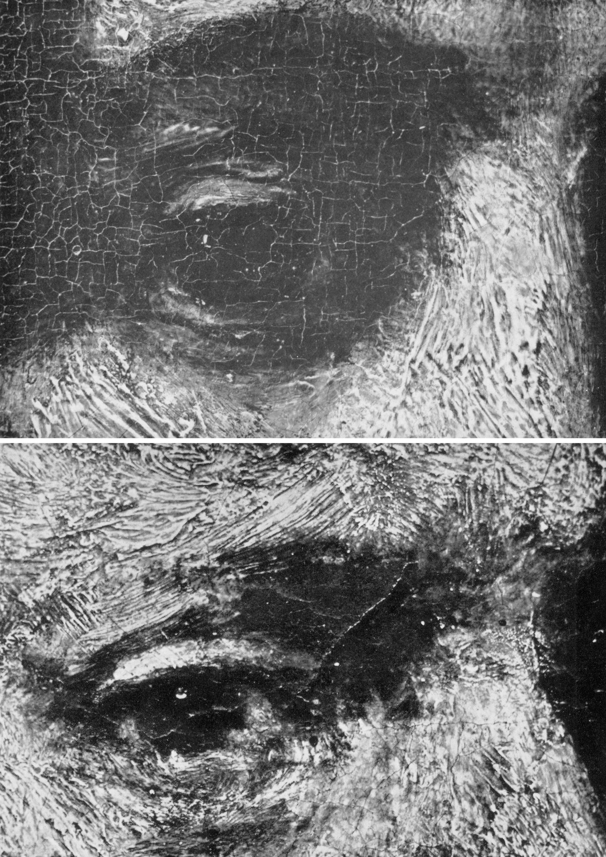
Above, Fig. 15: Top, in this juxtaposition of the eye in the Wallace Collection portrait of Titus, (the condition of which Laurie described as above in his ground-breaking 1932 study of Rembrandt’s brushwork) and, above, the eye in the National Gallery self-portrait (of which picture’s condition Laurie noted “This, except for the coarse repairs in the corner of the eye and on the upper lip, is in excellent condition and is the best example of his latest manner I have seen which has not been injured by the restorer”), it can be seen that Rembrandt’s brushwork could swish without change through time.
The test of Laurie was truly in the looking: he published comparative details of artists brushwork in which authorial differences were manifest and indisputable – see Figs. 16-19 below. He squarely addressed all potential practical/theoretical/methodological difficulties: “In order to apply this method in a thorough way it is necessary to study a painter through his whole career, and also to study the work of his pupils and imitators, so as to prepare a complete dossier for reference. I have been able to make some approach to doing this for Rembrandt and his school, for which thanks are due to the Duke of Westminster, and the results of the inquiry have been published as The Brushwork of Rembrandt and his School.” As is perfectly demonstrated at the photo-comparison at Fig. 15 above, the signature brushwork patterns of Rembrandt do indeed straddle his early and late works with complete consistency and a seeming interchangeability.

Above, Fig. 16: Laurie’s photomicrograph of the moustache in the Frans Hals portrait of Verdonck (National Gallery of Scotland).
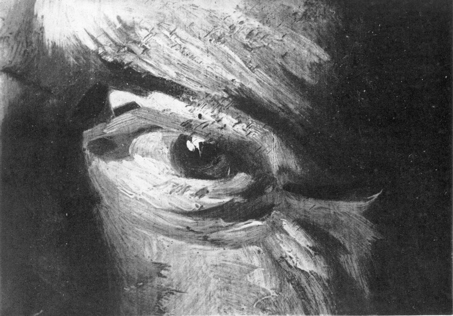
Above, Fig. 17: Laurie’s photomicrograph of the eye in the Frans Hals portrait of Verdonck (National Gallery of Scotland).
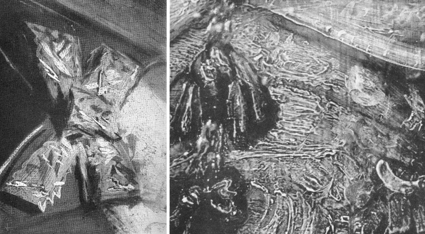
Above, Fig. 18: Left, a photomicrograph of a bow in the Frans Hals Portrait of a Lady (National Gallery of Scotland); right, a detail of the tassel on the shoulder of Rembrandt’s Saskia Laughing, Dresden Gallery. On such a photo-comparison, a child of six would be unlikely to confound the one author with the other.
If perceived in some quarters to constitute a professional threat to vested interests, Laurie acknowledged a personal indebtedness to the London art trade, reporting that his own interests had been aroused by the late Mr Vicars of Bond Street:
“We were all engaged in the famous Romney trial and he took me to see a perfect gallery of the English portrait school belonging to a well-known London banker. ‘We dealers’, he told me, ‘go by brushwork, that is the artist’s true signature which nobody can forge.’ Going up to a Reynolds he said, ‘Do you see how Reynolds has put in that touch there?’ ‘Now come here and see how Romney does it; this is Gainsborough’s touch.’ After we had studied the English portrait school from this point of view, I said to him, ‘I have learnt more from you than from all the art connoisseurs’. He turned to me and said, ‘My boy, we’ve got to know, we risk our money on it!’”
DEFENDING MUSEUM FAKES II
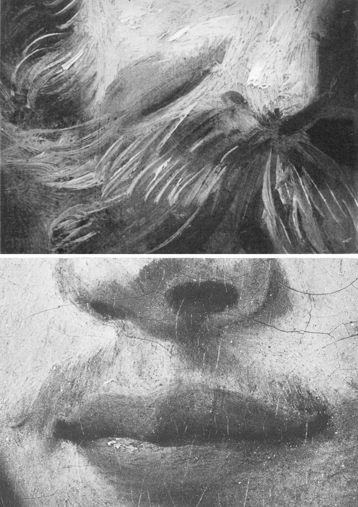
Above, Fig. 19: Top, Laurie’s detail of the Hals moustache; above, a section of a half-page detail of the National Gallery’s du Jardin Portrait of a Young Man, as published in the Technical Bulletin of 1982.
The caption to the Technical Bulletin photograph reads:
“Detail after cleaning, before restoration. The unusually large pigment particles, including those from the lower layer of the ground, can be seen. The paint film is slightly worn so that small areas of grey priming have been exposed, especially to the right of the mouth.”
Thus, as can be seen with this detail of du Jardin’s Portrait of a Young Man, the National Gallery certainly had the means in 1982 to provide Laurie-style detailed photo-comparisons that might have shown, for example, the consequences of its cleaning methods (see Fig. 8 above), or the stylistic correspondences or otherwise between works attributed to a given author. The Gallery had accepted Laurie’s comparative photo-demonstration (as at Fig. 14) that a challenged work was an autograph Rembrandt, but it has commissioned no detailed photo-comparisons of the Samson and Delilah brushwork with that of its own uncontested Rubens pictures (see Fig. 22). Instead of better studying the creative handiwork of artists, the gallery has photographed a million microscopically minute samples of paint ground down so as to reveal paint in stratigraphic cross-sections. In the 1993, 1996 Art Restoration, we complained that the National Gallery’s restorers and scientists were more interested to learn of the chemical constituents of paint than to understand the artistic uses to which artists put their paint, viz:
“…the green earth pigment consisted of ‘glauconite and celadonite [which] have closely similar constitutions, although their primary origins differ: the former is present in certain marine sedimentary deposits, while the latter occurs as inclusions in igneous rocks such as basalt. They are difficult to distinguish by XRD. Both types are layered silicate materials containing FE(II) and FE(III); also characteristic is a content of aluminium, silicon, potassium and sometimes magnesium…” Does this have a point, we asked, or is it swank? Was Rubens handicapped when painting in ignorance of such chemical constituencies?
Laurie encountered hostility from institutions wishing to defend their attributions. He warned: “I suggest a voyage of discovery to some young student with a magnifying camera through the galleries of Europe, but he must be careful to conceal his real object or he will never return alive. I have never forgotten the rage of the Director of a famous continental gallery when he thought I was suggesting that one of his pictures was not by Rembrandt. ‘Nonsense, nonsense’ he shouted, ‘one of the finest Rembrandts in the world’. I hurried to explain that I was referring to a Rembrandt in another Gallery, he smiled sweetly and said, ‘You are probably quite right’.”
TIMES CHANGE
In conclusion, and in Laurie’s inquiring spirit, we consider some close photographic comparisons of the National Gallery’s version of the 1609-10 Samson and Delilah with a bona fide Rubens painting which has retained its back – Rubens’ The Raising of the Cross of 1609-11, Antwerp Cathedral. As with that comparison at Fig. 4, above, the successive comparative details from Fig. 20 to Fig. 25 below are of two works of the same supposed historical moment and stage of development within the oeuvre. Great differences of brushwork might hardly, therefore, be expected. Matches are not to be found.
“SMOOTHLY BRUSHED, THINLY APPLIED”
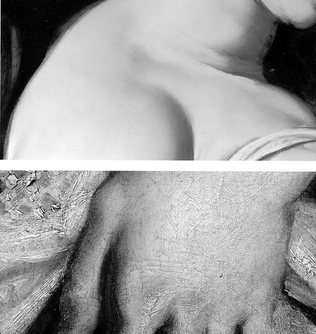
Above, Fig. 20: Top, a section of Delilah’s flesh; above; a detail from Rubens’ The Raising of the Cross.
The astonishing contrast above, is of an apparently phenomenally well-preserved smoothness and absence of age cracks in the Delilah, and the entirely characteristic four centuries old painting of flesh on The Raising of the Cross. Plesters, convinced of the picture’s authenticity, perceived no stylistic discrepancies and remarked on the Samson and Delilah’s seemingly youthful paint: “The flesh of Delilah was in such perfect condition that no small damage could be found from which to take a [microscopically tiny] sample, but viewed under the stereoscopic binocular microscope at low magnification the pale parts of the flesh appear to consist of lead white tinted with a little vermilion, a mixture which results in a clear rosy pink. The transition between the white, pinkish and more creamy tones (probably lead white with a little yellow earth colour) are smoothly brushed apparently in a single paint layer.” Moreover, “Apart from the strongest highlights the flesh paint is quite thin, so much so that in parts the striped pattern of the yellowish imprimatura below is visible lending a pearly translucent effect which Rubens may have calculated…”
As if inoculated against all visual anomalies, Plesters deemed it interesting to find that “in the full-scale version of Samson and Delilah the striped imprimatura, so characteristic of his preparatory and exploratory oil sketches on panel, has been used.” Without her conviction that what she was examining what was unquestionably Rubens’ handiwork, Plesters might have found the exposed imprimatura in a major painting, commissioned by a friend and patron, surprising and incongruous. Perhaps she did sense danger: “…it could of course, in this case, be the accidental result of [unusual] speed and boldness in painting.”

Above, Fig. 21: Two faces of the Rubens “beautiful young blond woman” type. Again, the same striking differences of paint film properties are apparent (thick v. thin; smooth v. textured) but note also how in the secure Rubens picture the “drawing” of the subject’s profile has been realised by modelling the features (brow, nose, lips and chin) over a darker background. In the National Gallery picture the drawing of the profile is weaker, sharper, anatomically inferior and has been realised principally by the encroachment of a superimposed dark background which, at the nose, results in flat, angular edges like cut-out paper that bear no relation to the form of the nose (which, anyway, is itself plastically and anatomically ill-conceived) and with no illusion of aerial recession beyond the figure.

Above, Fig. 22: Top, in the Samson and Delilah the forms of the lips are chaotically and messily unresolved. The upper lip is drawn as if from a three-quarters and above viewpoint, but the lower lip is drawn as if seen sideways on and with no hint of interconnecting flesh. By comparison, in the proper-Rubens head all the surfaces turn, move, and cohere convincingly, as if placed on a piece of sculpture.
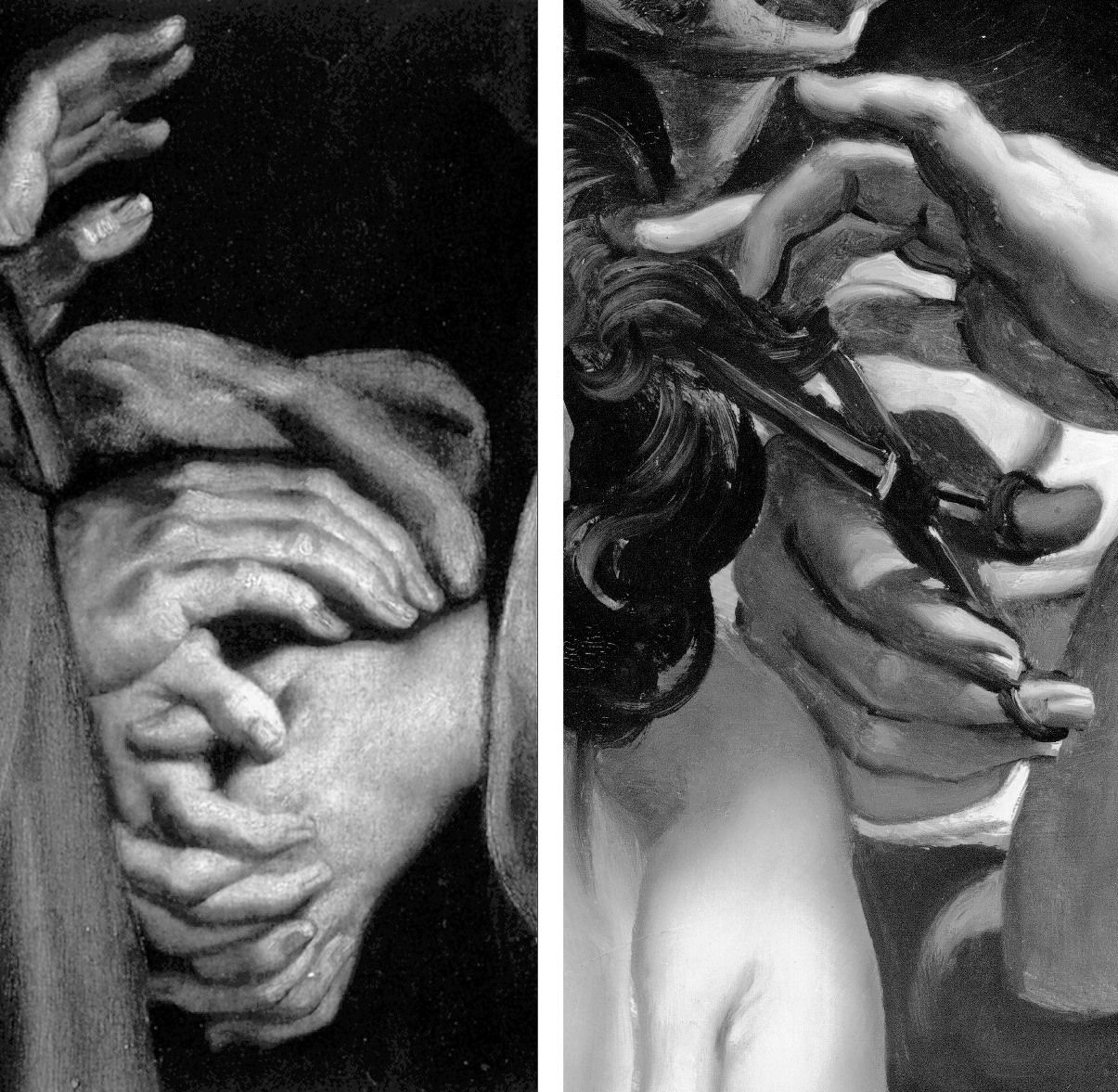
Above, Fig. 23: In these portrayals of hands, the superbly realised expressive resolutions within the one, disqualify the crass and clumsy shorthand treatments seen in the other.
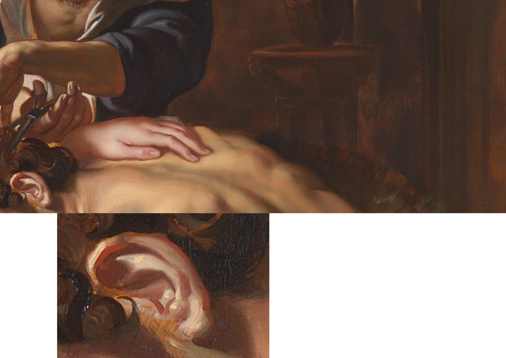
Above, Fig. 24: In these two details on the Burchard/National Gallery painting, the scant, near-void-like treatment of the background is accompanied by a flabby musculature in Samson’s back. The enlarged detail of the ear discloses an angular, almost Cubist treatment of the forms laid hastily over the stripy sketch-like imprimatura.
A TRIPLE COMPARISON AND A SECOND, “TWINNED” RUBENS UPGRADE
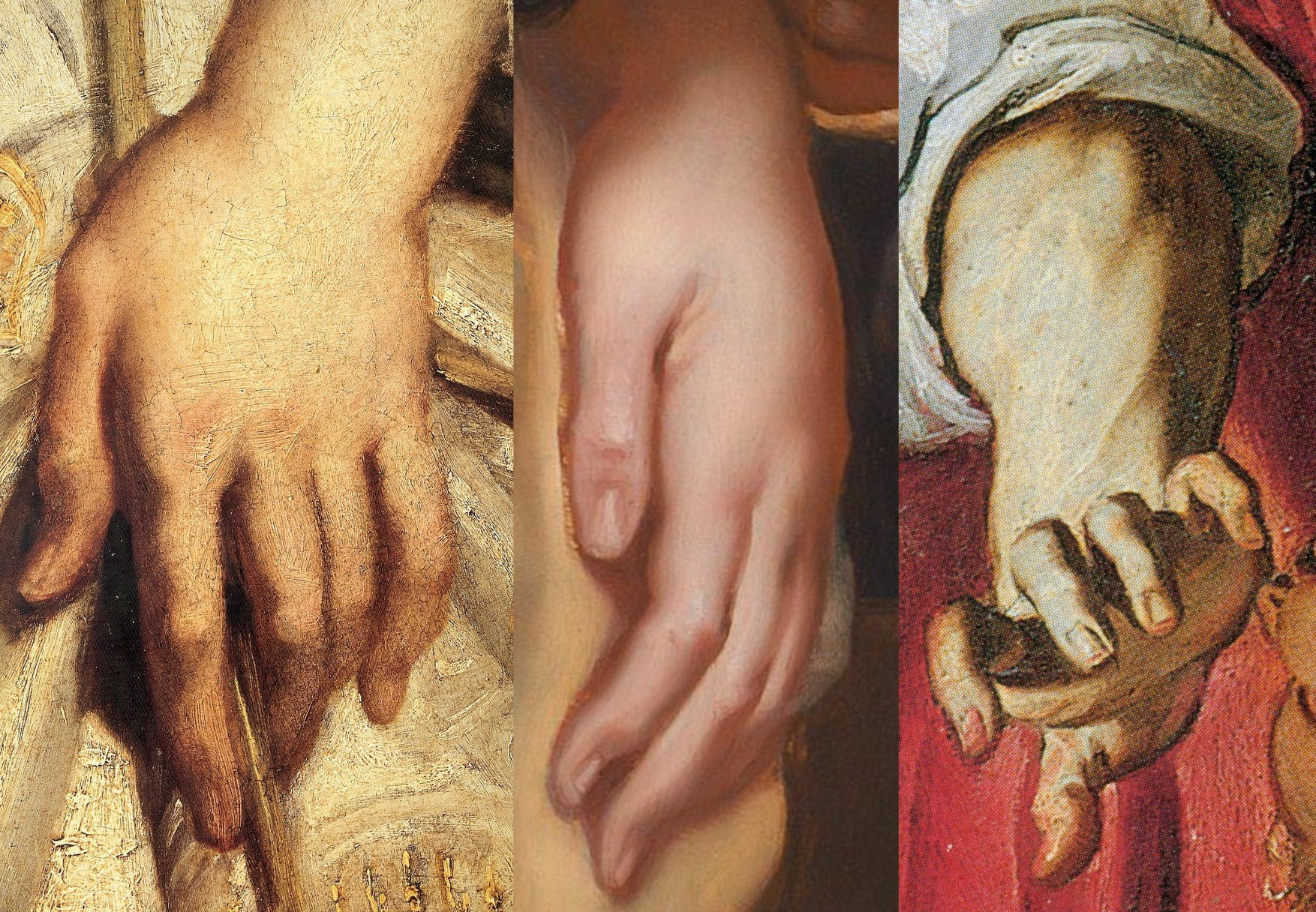
Above, Fig. 25: In this comparison we show three very different treatments of female hands which pose the question: Did Rubens paint female hands so variously in 1609-11?
On the left, we see that encountered in the secure Raising of the Cross in Antwerp cathedral. In the centre we see the Delilah hand from the National Gallery. On the right, we see a hand from the (presently) most-expensive “Rubens” painting, The Massacre of the Innocents which realised £49.5m at Sotheby’s on 10 July 2002. The latter, like the Samson and Delilah, had been regarded as a follower’s copy for centuries. Where our eyes can only tell us that these three hands were executed by different artists, the official Rubens Art Scholarship World insists that all three had been painted almost simultaneously by Rubens. The hand in the centre is an anaemic semblance of a Rubens hand. That on the right is a stridently caricatured – almost comic book-like – derivative.
GROWING OEUVRES DESPITE THE EVIDENCE OF TREE RINGS
When misattributed works are accepted within oeuvres, they immediately exert a toxic influence – if “X Mark I”, then why not also a matching “X Mark II”? And so on, ad infinitum…until an inevitable eventual crisis of confidence arises.
Up to December 2001 the Massacre (Fig. 30, below), like the Samson and Delilah, had for centuries been regarded as a follower’s copy. The upgrading was said to have been made by five experts, only three of whom were named – Paul Huvenne, Arnout Balis and Elizabeth McGrath (the other two were believed to be National Gallery staffers). In the 2006 AWUK Journal No. 21 we reported that Dr. McGrath had corresponded with the National Gallery about Jan van den Hoecke, whom she believed had worked with Rubens in his studio and had possibly collaborated with him on a Rubens temporarily loaned to the National Gallery. She had expressed a fear to the Gallery that if her material were to be passed to the press, she might be thought to be propounding her own theories.
Some of the five experts thought the Massacre had been painted before the Samson and Delilah, some, after it. Of all Rubens paintings of the period under consideration – 1609-11, the National Gallery picture – and not, for example, the absolutely secure Raising of the Cross – was taken by Sotheby’s and the experts to be the “benchmark” picture in making this new Rubens ascription even though both the Samson and Delilah and the Massacre had spent many years together in the Liechtenstein Collection not as Rubens’s but as Jan van den Hoecke copies of Rubens pictures. The Massacre had Liechtenstein seals on the back and front of its panel which, just like the Samson and Delilah in 1929, was said to be original and in excellent condition.
BURYING REPORTS
Sotheby’s had commissioned detailed technical reports which were not carried in the sale catalogue but which were there said to be available on request in a separate volume. The reports carried much material that was injurious to the Rubens ascription, as we reported in the October 2002 Jackdaw (“Is this £49.5 million painting by Rubens?”). The Independent’s financial correspondent William Kay, had advised on 20 July 2002 (“A little detective work can pay off”): “Don’t look at a company’s profits-and-loss account – start at the back of the accounts, where the notes are, not at the front where the chairman puts a gloss on the numbers.”
Turning quickly from the first page of Sotheby’s commissioned reports on the Massacre (- which page carried the disclaimer “The independent reports contained in this document are provided for prospective bidders’ information only and without warranty by Sotheby’s or the seller”) to the very last page, I discovered that the two last lines of a dendrochronological report by Peter Klein on the picture’s oak panel (dated 2 April 2002) read:
“Under an assumption of a median of 15 sapwood rings and 2 years for seasoning a creation is plausible from 1615 upwards.”
That meant the Massacre’s proposed Rubens upgrade as “a just-returned-from-Italy” work of 1609-11 was toast. On the tree ring evidence, this panel could only be considered to have been painted at least four years afters after its claimed date of execution. When Dr Klein examined the wood of the Samson and Delilah in 1996 his technical findings were said by the National Gallery to have corroborated the claimed 1609-10 date of execution. That claim, however, had rested not on the data but on the authority of a Klein covering letter which stated: “The felling date [of the tree] corresponds very well with the art historian attribution” and that a date of execution for the painting “is plausible from 1605 upwards”.
Two British dendrochronologists held that Klein’s summary characterisation of tree ring data was misleading. One said: “it is unsafe to say 1609 is any more likely than a later date of 1620.” Another observed “All Klein should be saying is that the range is 1597 to 1630”. The forces that were desirous of the Massacre being taken as a bona fide Rubens were unmoved by the earlier Samson and Delilah controversy and warnings – and the marketing enterprise rolled on despite the presence of much other disqualifying evidence in the volume of reports. As we reported in the Jackdaw:
“Preliminaries studies failed to link the Massacre’s wood with that found in any of Rubens’ panel. As well as being too late, the Massacre contains the wrong materials. A pigment, orpiment, that is found in no Rubens painting is present here. A second pigment, smalt, said to have been in use ‘mainly in the mid-seventeenth century’ and which seems only to be found in Rubens’ later works is also present. The orpiment yellow is anomalous not only in its presence but in its manner of application – it is mixed with lead tin yellow. Such a combination is said to be “unusual since it was considered unstable” and, even, to be a practice ‘not encountered in 17th century works’…Speaking of Rubens’ debt to classical sources, the anonymous author of the catalogue entry correctly concedes, ‘one of the background figures appears to derive from the Borghese Gladiator…[which] was not excavated until late in 1611’…”
The absence of under-drawing and pentimenti has been remarked in both works. No less anomalous is that both also betrayed an uncharacteristically stinting use of lead white pigment. Plesters, convinced at every turn that a Rubens ascription was beyond question, noted: “The striking feature of the composite X-radiograph is how comparatively sparingly and how subtly Rubens has used lead white, reserving the strongest touches for the brightest highlights and tapering the thickness of the white highlight to almost nothing. This system of painting which uses the light-coloured ground showing through thin translucent paint layers for the middle tones, particularly of flesh, is similar to that used by early Netherlandish painters who also used a chalk ground on oak panel.”
Where Plesters had attempted to explain the absence of underdrawing on the Samson and Delilah by claiming there had been no need to make any because the (anomalously complete) oil sketch for the painting had resolved all matters, in Sotheby’s reports it was more frankly acknowledged that such absences of under-drawing and pentimenti in the Massacre are consistent with pictures originating in Rubens’ workshop:
“…we can identify the use of minor but significant applications of paint to modify the outline and define the shape of the elements in the composition. These can be seen as strongly contrasting additions, frequently following the line of a limb or suchlike. Wadum [J] has effectively argued that these features represent Rubens’ studio control, and that he was in the habit of inspecting works before they left the workshop and making corrections.”
Clearly, had Rubens painted the Massacre with his customary perpetual revisions (as are to be seen on the Raising of the Cross), he would not have needed to make last-minute corrections with ‘brushstrokes of paint containing carbon black’ to his own work.
SCHOLARLY ACCOUNTABILITY
We asked in the 2002 Jackdaw: “Can it be right that we are all asked to take this leap of faith when the [five] experts, displaying a seeming ignorance of – or disregard for – so much germane material evidence, have yet to publish accounts of their verbal endorsements.”
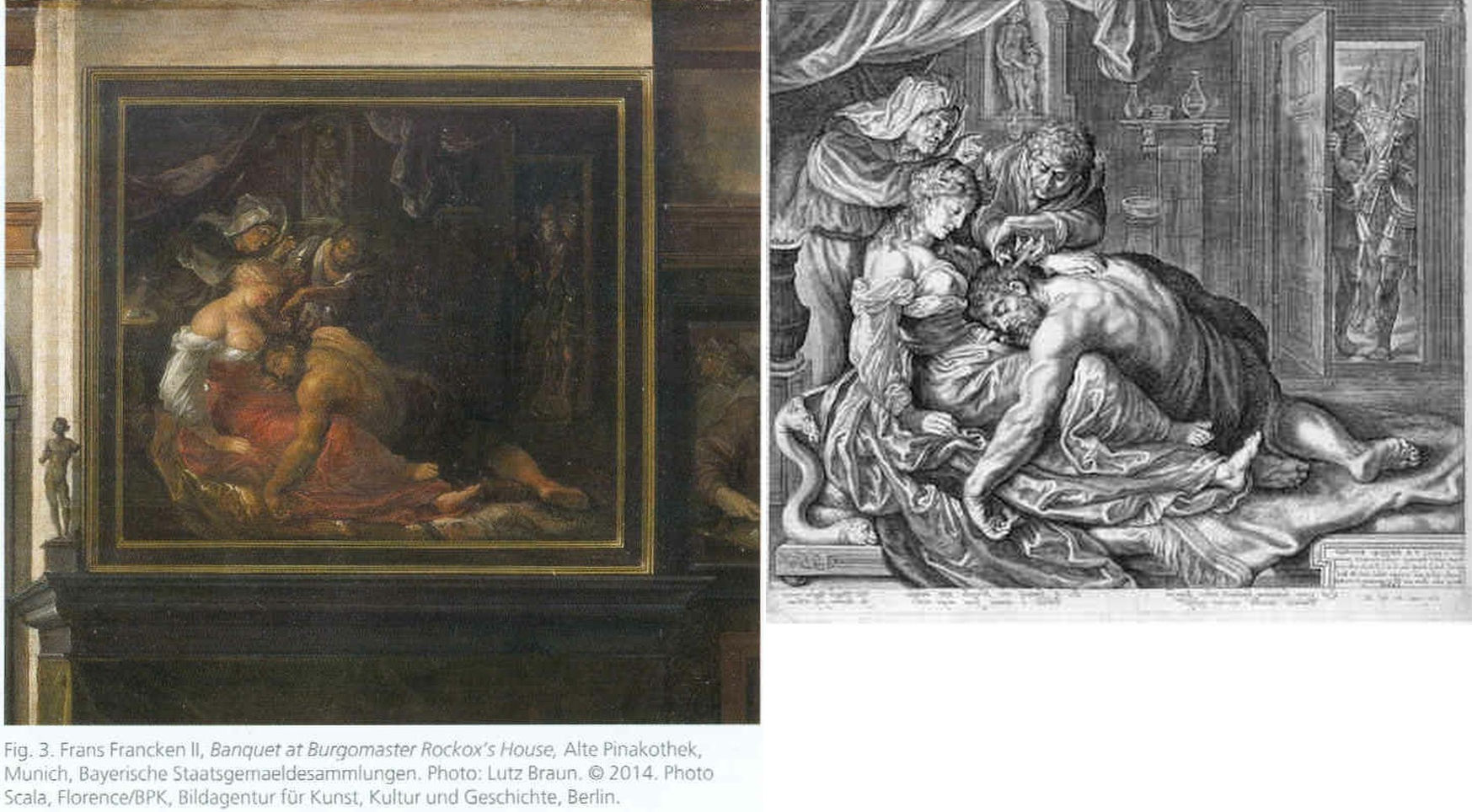
Above, Fig. 26: The two copies made respectively of the original (and subsequently lost) Rubens Samson and Delilah in 1625-35 by Frans Francken (left), and in 1613 by Jacob Mathan (right) in both of which Rubens can be seen to have painted the whole of Samson’s right foot and space beyond.
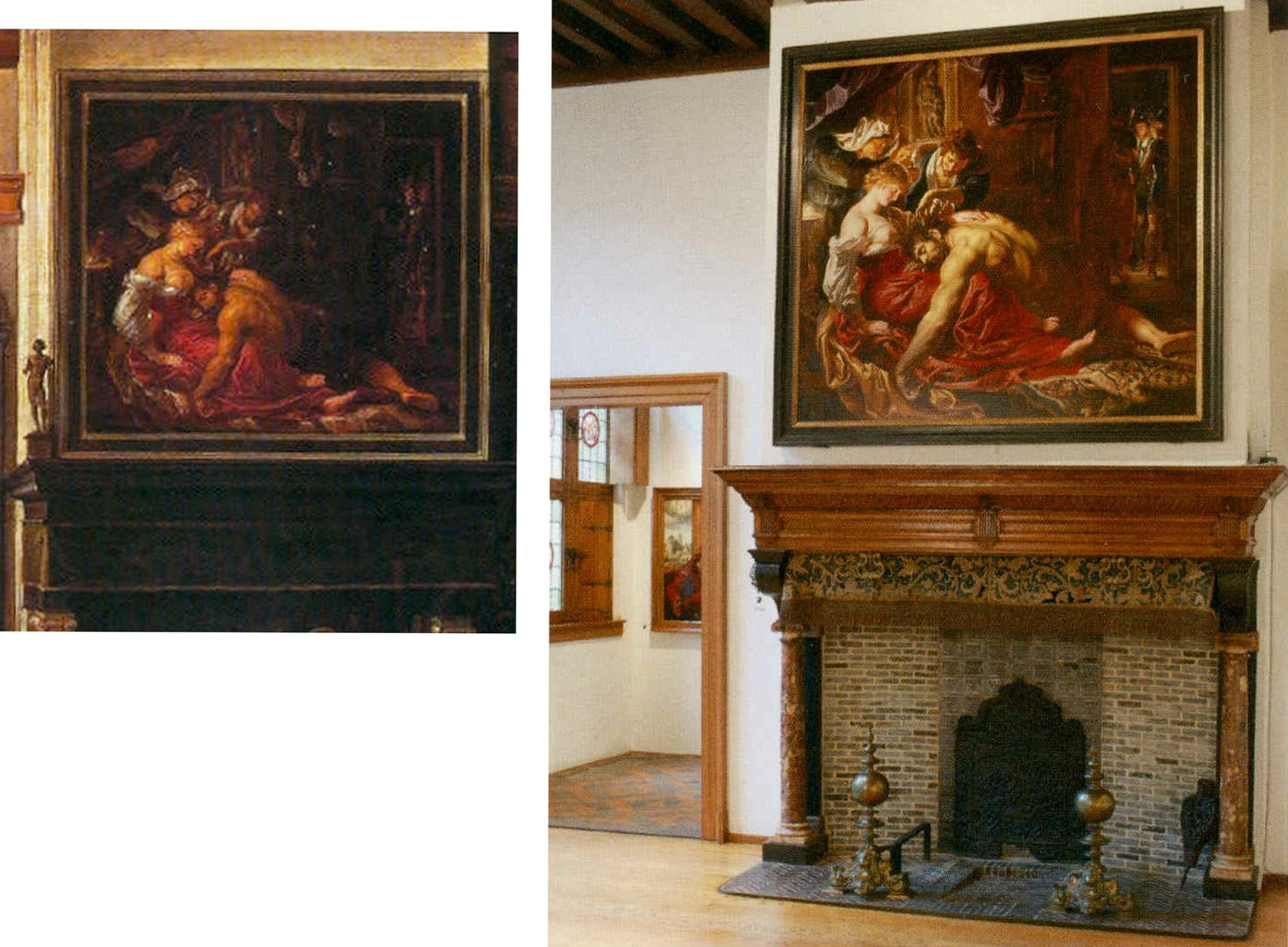
Above, Fig. 27: Left, detail of the Frans Francken painting showing the original Rubens’ Samson and Delilah; right, the National Gallery Samson and Delilah, as exhibited in 1983 in its then new, post-restoration, frame and above a mock-up of the grand fireplace in Nicolaas Rockox’s house. The recorded positioning of Samson’s right foot in the Franken copy testifies to a compositionally taught bisecting of the picture on a descending diagonal. In contrast, the foot is not only cropped in the National Gallery picture, but it first wanders up the edge of the painting leaving a broken-looking leg.
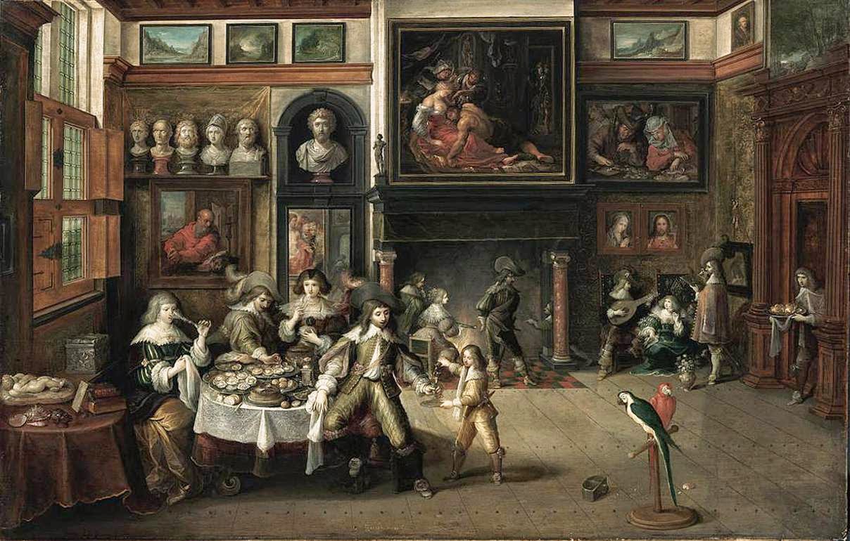
Above, Fig. 28: The whole of Frans Francken’s copy of the original Rubens Samson Delilah enjoying pride of place in Nicolaas Rockox’s house.
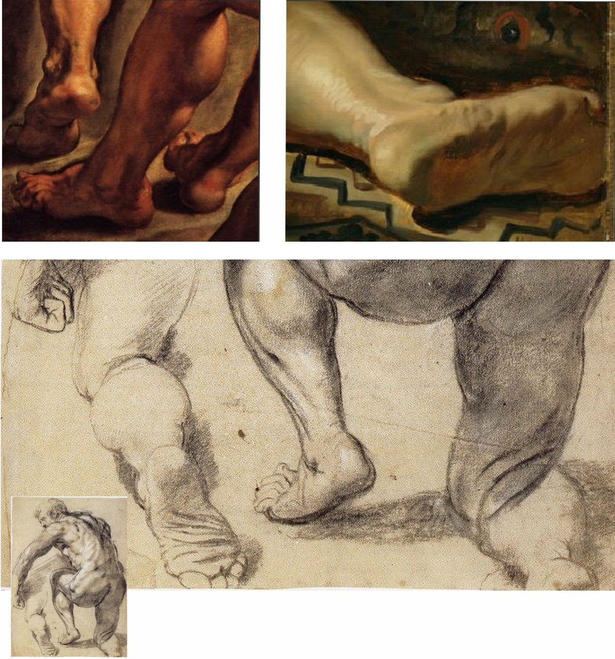
Above, Fig. 29: Top left, detail of feet on Rubens’ The Raising of the Cross; top right, the cropped foot in the National Gallery Samson and Delilah; above, a Rubens chalk figure study for The Raising of the Cross showing how Rubens drew separately on the sheet a cropped leg.
The most visibly disturbing disqualification in the National Gallery picture – as Doxiadis, Harvey and Hopkinson immediately flagged in their 1992 Report – was the fact that the toes of Samson had been cut off at the edge of the painted area on the panel when both copyists of the original painting in Rockox’s house had recorded an intact foot set well away from the edge of the painting in a more reassuringly “Rubensesque” treatment.
The cropping in the National Gallery version is itself disqualifying on two counts. First, few painters have been more attentive to their depicted subjects’ digits than Rubens. When a foot was not included in a large swiftly drawn figure study, as above at Fig. 29, Rubens drew it separately on the sheet so as to have a record of the entire figure. Second, as we have examined previously, copyists frequently produce truncated versions of master works and the £49.5 million Massacre of the Innocents which is now in the Ontaria Museum is – just like the Samson and Delilah – a compositionally cut-down version of a larger composition that is found in a School of Rubens Massacre in the Royal Museum of Fine Arts Belgium as seen below in Figs. 30 and 31.

Above, Fig. 30: Left, a detail of a Rubens School work in the Museum of Fine Arts, Belgium; centre, the former Jan van den Hoecke copy that became the £49.5 million Massacre of the Innocents and now lives in the Ontario Museum; right, the Francken copy of the (lost) original Rubens Samson and Delilah.
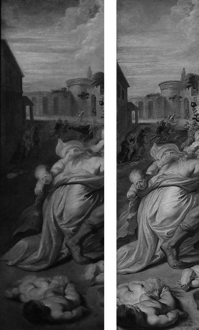
Above, Fig. 31: The left-hand sections showing the pair of murdered babies in the bottom left corner of two versions of Rubens’ Massacre – that in the Royal Museum of Fine Arts, Belgium version, left, and, right, that in the cropped £49.5m Ontario Museum, former Jan van den Hoeke version.
On the fact of the 1980 and 2002 upgrades, must we now believe that Rubens had cropped the compositions and subjects in both his Samson and Delilah and his Massacre of the Innocents pictures so disturbingly as to prompt copyists of both works to expand the pictures to more comfortably and characteristically Rubens-like compositions?
How many allowances may be made, how many disqualifications disregarded, to uphold a single troubled attribution? In our experience, it is very often the case that when one thing is wrong with an attribution, everything else is.
Michael Daley, Director, 5 November 2021
POSTSCRIPT: On 12 November 2021, Eric Biétry-Rivierre reported in LE FIGARO (“A Salvator Mundi still record but less and less credible”):
For the Prado Museum, the most expensive painting in the world is not by Leonardo da Vinci. Rather, it is the work of an assistant or follower.
In the catalogue of this exhibition running until 23 January 2022 and relating to an old copy of The Mona Lisa which it preserves, the Prado does not attribute to Leonardo da Vinci the Salvator Mundi of the Crown Prince of Saudi Arabia. According to the Madrid Museum, this version called “Cook” (named after a former owner because there are no fewer than 22 paintings in the world in the Leonardesque style and representing Christ in the manner of a God the Father) belongs to a close assistant or follower. This further darkens the episode of the highly marketed and hypermediatized sale, organized by Christie’s New York in 2017. And it justifies less the $ 450.3 million disbursed by Mohammed Bin Salman.
The curator Ana Gonzalez Mozo even suggests that a prototype made by the master may never have existed. As for which would be the oldest version, she leans towards another Salvator Mundi: the so-called “Ganay” version, also in private hands. Its pedigree, admittedly incomplete, being much less incomplete. It was already this oil painting that, although less beautiful and less well restored, had the preference of the specialists of the Louvre during the retrospective organized at the end of 2019 on the occasion of the 500th anniversary of the death of the master.
After much debate, hesitation, and even the publication of a scientific brochure validating the “Cook” was finally discarded, the “Ganay” completed its exceptional journey. And this not only because the Gulf panel painting was missing (MBS would have conditioned his loan to a hanging near Mona Lisa, which would, de facto, have “consecrated” the work as an authentic Leonardo).
The “Cook” version was also weakened by a recent documentary by Antoine Vitkine. In his Salvator Mundi: the astonishing case of the last Vinci, the main supporter among international “Leonardologists”, the Englishman Martin Kemp, appears less affirmative. As for Luke Syson, the present director of the Fitzwilliam Museum, Cambridge, who in 2011 was the unconditionally supportive curator/architect of the first public presentation of the work at the London National Gallery, he is more and more among peers who denounce his recklessness.
Bernd Lindemann is one of them. In another documentary on the Salvator Mundi, by Andreas Koefoed, Lindemann, director of the Gemäldegalerie in Berlin, says: “It’s not the role of serious museums to present such a controversial painting.” Thus is the reputation of the great British museum damaged. This is bad at a time when its Samson and Delilah, bought at a golden price for a Rubens forty years ago is seriously questioned.
On 14 November 2021 The Times of Israel reported that the $450m Salvator Mundi has been deemed not a Leonardo:
“Sold for $450m to Saudi prince, ‘Salvator Mundi’”
“The Prado catalogue also contains an opening essay by Vincent Delieuvin curator of Paris’s Musée du Louvre’s 2019 retrospective of works by the artist. He discusses the Saudi-owned painting, referring to ‘details of surprisingly poor quality’. Delieuvin concluded, ‘It is to be hoped that a future permanent display of the work will allow it to be reanalyzed with greater objectivity’…”
The initial near-universal hyperbolic analysis has indeed been found wanting but Waldy and Bendy are not the only fleet of foot art critics. As Jacques Franck notes:
“This is interesting news indeed, but it is not how the real story ran when it started in 2016. Delieuvin, no less than Penny and Syson at the National Gallery, had been convinced all along that the Cook Salvator Mundi was by Leonardo, there can be no possible doubt about that. Aside from the strong support Delieuvin gave the painting on the occasion of the Leonardo exhibition he curated at the Italian Embassy in Paris in September 2016, he had long planned to include the work as the guest star in the blockbuster Leonardo show which he co-organised with curator Louis Frank at the Louvre in October 2019. This is testified by the first version of the catalogue which reproduced the Cook Salvator Mundi on the front cover, wherein one could read that it was attributed to Leonardo himself and had been listed as such at no. 157 in the show. That first version was junked for undisclosed reasons and the whole catalogue was reprinted. What is known is that the loan of the Saudi picture was not granted by the owner; that the picture was not exhibited; and, that the non-appearing picture was simply reproduced in the new catalogue as “Salvator Mundi version Cook”, fig. 103 bis, p. 303 thus meaning “studio work”. (See Fig. 32 below.) In December 2019, six weeks after the late October opening of the above-mentioned Leonardo exhibition, a book titled Léonard de Vinci. Le Salvator Mundi by Vincent Delieuvin (Louvre curator), Myriam Eveno and Elisabeth Ravaud (both Louvre laboratory scientists) was put on sale in the Louvre’s bookshop and swiftly withdrawn. However, some copies or photocopies of the latter book have nevertheless circulated around the world and are now in the hands of many Leonardo scholars, like me. In that notoriously disappeared book, the authors concluded enthusiastically (p. 14) that the work had been shown by “decisive scientific tests” in 2018 to be by Leonardo. That is the true story and there exists no other”.
In the December 2021 Art Newspaper, Bendor Grosvenor, over-looking the annual Apollo magazine awards, complained of an absence of art world annual awards and launched a self-styled “Diary of an Art Historian awards”. Two especially rich items caught the eye. His book of the year award was given not to a book but to an online catalogue raisonné, which he contends “might not yet have the kudos of a book published by Yale priced at £150, but it will have a thousand times more readers, and just as impressive a legacy. (Readers might recall Grosvenor’s own recent unsuccessful joint bid with the dealer Philip Mould (who has a degree in art history) to replace the four specialist scholars-authored, Yale-published, 2004 catalogue raisonné Van Dyck A Complete catalogue of the Paintings – see Art-Trading, Connoisseurship and the Van Dyck Bonanza.) Richer still, perhaps, was Grosvenor’s award for “Auction Consignment of the Year to whoever had the imagination to capitalise on Leonardo-mania by buying a humdrum 20th-century copy of the Mona Lisa on eBay for £2,750 and swiftly consigning it to Sotheby’s Old Master Sale in London, where it made £378,000″ – a small beer hike compared with the conversion of a recent, repeatedly restored, one thousand-dollar wreck into the $450m pretendy and now-disappeared Leonardo Salvator Mundi. On the night of that notorious Christie’s, New York, sale Grosvenor swooned: “Christie’s just did something that re-writes the history of auctioneering. They took a big gamble with their brand, their strategy to sell the picture, and not to mention the reputations of their leadership team, and they pulled it off – the best piece of marketing I’ve ever seen. Above all, they had absolute faith in the picture. AHN [Art History News] congratulates them all.”
Books on No-Hope Art Attributions
The latest addition to the fast-growing but least-estimable art book publishing genre – The Book of Art Attribution Advocacy – has finally arrived. It comes eight years late and on the second anniversary of Christie’s, New York, 15 November 2017 sale of the formerly attributed-Leonardo, Salvator Mundi picture – which disappeared the following day.
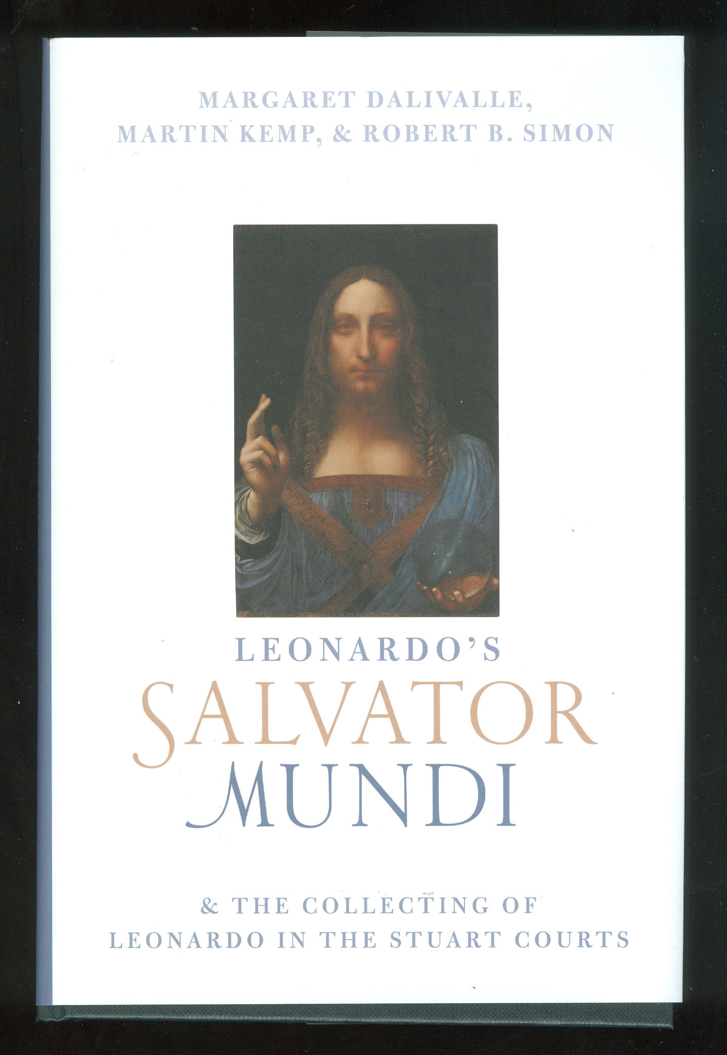
Fig. 1: The above book,Leonardo’s Salvator Mundi & the Collecting of Leonardo in the Stuart Courts, constitutes the first official published account in support of the Salvator Mundi painting that was exhibited as an autograph Leonardo painting at the National Gallery in the 2011-12 exhibition, “Leonardo da Vinci: Painter at the Court of Milan” (see Fig. 10) and that was sold at Christie’s two years ago for $450 million. The authors are: Margaret Dalivalle, a provenance specialist; Martin Kemp, Professor Emeritus and Leonardo specialist; and, Robert Simon, a New York art dealer and one of the two original buyers of the Salvator Mundi in 2005. The book contains no contributions by those who examined the painting technically and worked on its successive restorations. In their introduction and in defence of these startling omissions, the authors liken their book to a three-act opera: “However it is not intended to be an exhaustive treatment of the subject. As with an opera having a grand and intricate plot, this book will consider three facets of the story, each in depth, while necessarily bypassing many ancillary issues.”
There is no mention of the catcalls it has elicited. A glance at the illustrations shows the book to carry a new mystery: there would now seem to have been an undisclosed restoration.
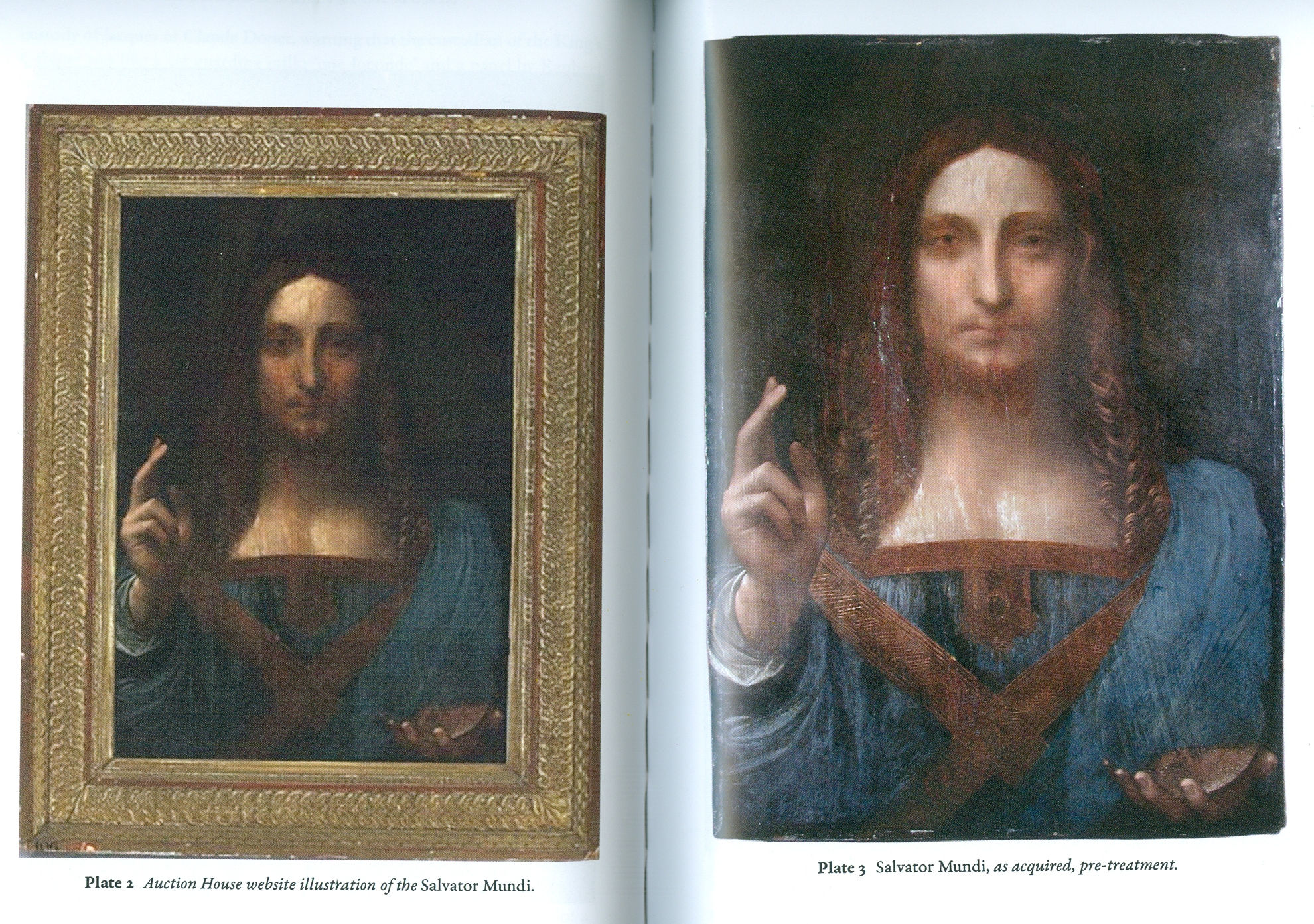
Above, Fig. 2: In this photo-spread, the first image shows the painting as illustrated by the auctioneers in 2005. The second image is said to show the picture as acquired by Robert Simon (and one other) at the auction. The restorer chosen by the new owners was Dianne Dwyer Modestini who worked on the painting in a number of restorations between 2005 and 2017. She has recalled (see Fig. 4) that when the painting was taken to her home in 2005 its surface was still sticky. The painting would thus seem to have been restored at some point after the sale catalogue was prepared and before it was taken to Modestini.
Above, Fig. 3: Simon Hewitt’s long-promised and compendious 2019 book (pp.352), Leonardo da Vinci and the Book of Doom, is written in support of the attributing to Leonardo of a mixed media drawing that was dubbed “La Bella Principessa” by Martin Kemp – and which remains unsold in a Swiss freeport. Now said by Hewitt to have been drawn by Leonardo in 1496 from Bianca Sforza, the illegitimate daughter of “Il Moro”, the 7th Duke of Milan, this book demonstrates – but does not expressly acknowledge – that no record of such a drawing exists before its sale at Christie’s, New York, in 1998 when it was sold as early 19th century German for $22,850 to a New York dealer who sold it on to Peter Silverman in 2007 for $19,000. In 2008 Silverman introduced himself to Hewitt by jumping into his cab saying: “May have a story for you one day! I’ll let you know.” In 2009 Silverman summoned Hewitt to Paris and a facsimile of “La Bella Principessa”. Having taken it at first sight to be early 19th century German, Hewitt produced an article for the Antiques Trade Gazette headed “Is this the greatest art market discovery of the century”.

Above, Fig. 4: Although Dianne Dwyer Modestini’s 2018 memoir, Masterpieces, is not strictly-speaking a book of art attribution advocacy, it contains as an epilogue, a chapter on the Salvator Mundi. In it, Modestini reproduces the photograph of the Salvator Mundi as shown in Fig. 2 above, right, and she describes it as being “as I first saw it in 2005”. We report in the ArtWatch UK Journal No. 32 (p. 47) how Modestini further commented on the picture in Masterpieces:
“When the Salvator Mundi returned to New York in July 2017 ahead of Christie’s November 2017 sale…having been instructed ‘not to inform anyone’ when the painting was ‘delivered to the Conservation Center [of the Institute of Fine Arts, New York University, where Modestini works as Senior Research Fellow and Conservator of the Kress program in Paintings Conservation] under guard and in great secrecy.’ Modestini writes approvingly of the fact that a deal brokered by Christie’s ahead of the sale whereby the vendor would receive at least $100million ‘was successfully kept under wraps’.”
For that late-stage re-restoration work in 2017, see Dalya Alberge, Mailonline, 22 December 2017, (“Auctioneers Christie’s admit Leonardo da Vinci painting which became the world’s most expensive artwork when it sold for £340m has been retouched in the last five years.”)
Above, Fig. 5: Although Martin Kemp’s 2018 Living with Leonardo is a professional lifetime memoir, he too includes chapters in support of the two Leonardo attributions he has championed – those of the Salvator Mundi and the mixed media drawing he dubbed “La Bella Principessa” that is owned by Peter Silverman – as seen above right. Kemp, like Hewitt, devotes much of his advocacy to attacking critics of the two attributions – including ArtWatch UK’s officers and associates.
Above, Fig.6: Kemp’s publishers, Thames and Hudson, asked to reproduce a four-part graphic (top) which we had published on 3 May 2016 (“Problems with “La Bella Principessa” – Part II: Authentication Crisis”) precisely to demonstrate why, on stylistic grounds, the eye of “La Bella Principessa” could not possibly have been drawn by Leonardo. A crucial part of our cross-linked visual comparisons was an eye from a 19th century sheet of demonstrations to art students on how best to sketch eyes with short, straight lines. When Kemp’s book was published it carried a three-part diagram as shown above and as if it were the four-part one we had published. In Kemp’s reduced graphic, the embarrassing testimony of the guide to students had been omitted.
Above, Figs. 7 and 8: In the top image we show the sheet that had carried the eye which Kemp dropped. In the second image above we show (top) instructions in one of the “How to draw…” books, a guide to students on the relative merits of drawing ducks with curving lines or straight lines. Below it we show an eye drawn by Leonardo, with curving lines, and the eye of “La Bella Principessa”, drawn with straight lines. (As it happens, the eye that Kemp declined to publish is used as the logo for a drawing school – Sight-Size.)

Above, Fig. 9: This book of 2012 is something of a rarity within the genre of advocacy books in that it is written not by a professional art historian or art critic but by the work’s owner. It makes a fascinating and instructive read. We learn from the horse’s mouth, exactly who approached whom and when in the attempted formation of a sufficiency of experts to constitute an art-market “consensus of support”. We learn how Silverman planned his own media campaign to introduce both the work and its assembled supporters to the world. Such inside disclosures and resulting cross-linked accounts of the campaigning, can become sources of friction. In his 2018 memoir Kemp takes Silverman to task in a number of respects. Firstly (p.152), in terms of how the championing of the attribution should best have been managed:
“I had already written an extended report for Peter Silverman – longer than a standard academic article, shorter than a book. What I had seen and what I was gleaning from my continuing research persuaded me to write a book with Pascal [Cotte of Lumière Technology – see Fig. 11]…We also decided to include a short chapter by fingerprint specialist Paul Biro, who compared the inky fingertip with likely Leonardo prints. Ideally, nothing more should have appeared before our book [Kemp and Cotte’s, at Fig. 11] was launched. I was very concerned that the piecemeal, erratic and sensationalized release of incomplete stories was proving prejudicial. Early in 2009 I circulated a strategy to Peter and his supporters proposing that the drawing should be ‘exposed to a wholly non-commercial venue at the same time as all the research data had been released in full.’ I emphasized that all the material in the planned book should be embargoed before its publication. This placed considerable demands on Peter’s uneven reserves of discretion and patience…”
With so much cross-linking of players mishaps can arise. Members of tightly-knit groups of advocates can come collectively to see all opposition not as differing viewpoints but as quasi-pathological manifestations of “hostility” from rival “gangs”. For example, Hewitt reports:
“On July 1 Peter Paul Biro alerted Kemp and Cotte that the next edition of the New Yorker would be running a ‘potentially prejudiced and cherry-picked article about me, my work and the drawing.’ The New Yorker, he pointed out, was ‘owned by Condé Nast, which in turn is owned by Si Newhouse – a major client of Christie’s.’ ‘Christie’s and their friends are getting as much as they can in the public domain rubbishing the portrait and those who have worked on it’ replied Kemp – who had assured the New Yorker that Biro’s work on the [“La Bella”] portrait was exemplary.’ David Grann’s 16,000 word article on July 12th implied Biro was sleazy and incompetent. When Biro [unsuccessfully] sued the New Yorker for libel, a Federal judge paid implicit tribute to Grann’s verbal craftiness – declaring that his article did not make express accusations against Biro, or suggest concrete conclusions about whether or not he is a fraud.” Kemp, too, discusses Biro in his memoir:
“The strategy I had outlined fell apart when the fingerprint became the explosive subject of international attention before our book was published. Paul Biro, working from his studio in Montreal, compared Pascal’s amplified image of the fingerprint with prints in Leonardo’s unfinished St Jerome in the Vatican. Paul identified a print in the St Jerome which he saw as showing eight points of resemblance with that on the vellum. The most characteristic part of a fingerprint is the complex whorl at the centre of each fleshy pad. This was not apparent [– was not present?] in the print on the portrait which was made by the very tip of a finger. Paul’s ‘eight characteristics’ would not have been enough to secure a criminal conviction, but they were suggestive [of what?] and supportive. I could more or less see what he was seeing, if I tried hard, and I was happy to accept that he possessed a more expert eye for such things. [And besides:] The fingerprint evidence was a small part of the total fabric of evidence I was building up. But a ‘Leonardo fingerprint’ is news; it has a ‘cops and robbers’ dimension. The story was broken in the Antiques Trade Gazette by Simon Hewitt, a journalist with whom Peter had developed a trusting relationship. On 12 October 2009 the Gazette announced:
“‘ATG correspondent SIMON HEWITT gains exclusive access to the evidence used to unveil what the world’s leading scholars say is the first major Leonardo da Vinci find for 100 years…ATG have had exclusive access to that scientific evidence and can reveal that it literally reveals the hand – and fingerprint –of the artist in the work. The fingerprint is ‘highly comparable’ with one in the Vatican’.”
Kemp went on to say: “David Grann threw a lot of unpleasant mud at Paul Biro.” He then threw some of his own: “The source of much of the mud was Theresa Franks, founder of the Fine Art Registry, who had developed a reputation as an effective and litigious polemicist about the vagaries of the art world…The New Yorker piece was hugely damaging for Paul – and for the portrait, because our limited use of his evidence was used to taint the whole of the case we were making.”
Kemp’s remarks on Hewitt’s journalistic prowess might have disappointed the journalist/author whose book begins:
“INTRODUCTION
‘Is this the greatest art discovery of the century?’
“That was the front-page headline [he reproduces the front-page] in Antiques Trade Gazette on 17 October 2009, placed above my story about the portrait…It was one of the biggest stories of my career and, in terms of internet hits, the biggest story ever covered by the respected, if slightly fusty, art market weekly I had served on as Paris correspondent since 1985…”
Another attribution, another “gang” of opponents… Hewitt adds: “What Kemp dubbed ‘the New York gang’ were ‘almost bound to be hostile in an act of closing ranks, since they all missed it.’” Yet another is the “Polish gang”. Under a heading “POLES APART” Hewitt writes:
“Soon after Leonardo’s portrait of Bianca Sforza had gone on show in Monza, Katarzyna Pisarek [books editor of the AWUK Journal] published a 17,000-word article in Artibus & Historiae – a twice yearly journal edited by her Polish compatriot Józef Grabski, whose advisory committee included the Metropolitan Museum’s Everett Fahy (cited by Richard Dorment as a ‘vehement opponent of the Leonardo attribution’)…Pisarek was aping her Communist-era compatriot Bogdan Horodski, a former director of the Polish National Library…Pisarek harped on about Peter Paul Biro’s ‘dubious’ fingerprint evidence, omitting to mention that this had been removed as inconclusive from the second edition of the Kemp Cotte book…”
Hewitt seemed not to grasp the full import of the fact that an entire chapter of the Kemp/Cotte book had been excised. He pursued his Polish Conspiracy slur: “ ‘Why was Pisarek ‘suddenly so concerned to address this portrait when she had no record as a Leonardo scholar?’ wondered Martin Kemp. He presumed it ‘resulted from a kind of Polish solidarity’…On November 29 Waldemar Januszczak [Sunday Times art critic and TV broadcaster] – born in England to Polish parents…” and so on. Kemp/Cotte had had very good professional reasons to disassociate themselves from Biro. Kemp puts it with some delicacy in his memoir but the urgency is clear: “It transpired that Paul had previously achieved some notoriety in the detection of a purported Jackson Pollock discovered by a truck driver in a thrift shop. This discovery had been chronicled in a 2006 TV documentary, Who the #$&% is Jackson Pollock? Grann went on to tell a complex tale of Biro’s engagements with other Pollock authentications, in which the artist’s fingerprints appeared on paintings that were subsequently rejected by important Pollock scholars. It was alleged that Biro forged the Pollock fingerprints.”
In the first edition of the Kemp/Cotte book, the authors described the partial fingerprint as a full fingerprint in their introduction: “Following Lumière Technology’s discovery of a fingerprint and a handprint on the portrait, the authors turned to Peter Paul Biro, Director of Forensic Studies, Art and Access & Research, Montreal, to analyse this evidence in the context of what was known of Leonardo’s work…” And Kemp wrote (in his concluding chapter headed: “What constitutes proof?”): “…We have been able to detect extensive left-handed execution, not least in the layers below those we can see with our naked eye. Finger- and hand-prints have come to light in the way we have come to recognize as characteristic of Leonardo’s working methods. Indeed the isolated fingerprint near the left margin has strong if not conclusive evidential value that Leonardo himself touched the vellum.”
Above, Fig. 10: The catalogue to the National Gallery’s 2011-12 exhibition “Leonardo da Vinci: Painter at the Court of Milan”. Normally such a scholarly publication would not become ensnared in attribution controversies because public galleries do not, on principle, include privately owned, unpublished and un-attributed works without provenances that are on the market, but it did so with the Salvator Mundi – even though the identity of the picture’s by-then three owners (one of whom had bought-in with a $10 million stake) was undisclosed. Also undisclosed was: the venue at which the picture had been bought; the price at which it had been purchased; the identities of the leading scholars who were supposed to have endorsed the Leonardo attribution. Crucially, the supporters included the National Gallery’s director, one of its trustees and the curator and organiser of the Leonardo exhibition. The catalogue entry described the work as an autograph Leonardo painted prototype for the many similar Leonardo school Salvators that exist. Its author, Luke Syson, wrote: “This discussion anticipates the more detailed publication of this picture by Robert Simon and others. I am grateful to Robert Simon for making available his research and that of Dianne Dwyer Modestini, Nica Gutman Rieppi and (for the picture’s provenance) Margaret Dalivalle, all to be presented in a forthcoming book.”
As mentioned above, that book has finally been published over eight years after the opening of the National Gallery exhibition and we now see that there are only three authors of Leonardo’s Salvator Mundi & the Collecting of Leonardo in the Stuart Courts: Margaret Dalivalle, Martin Kemp and Robert Simon. Modestini and Gutman-Rieppi have been dropped. In Living with Leonardo, Martin Kemp discusses the failure of Peter Silverman to get “La Bella Principessa” included in the National Gallery exhibition – on the organisation of which he (Kemp) had, at one point, been under consideration as co-curator:
“Looking back over the different fortunes of the attribution of the Salvator Mundi and the portrait of Bianca Sforza, there are some clear lessons to be drawn. The first concerns how a work of art enters the scholarly and public domains. Robert quietly introduced the Salvator Mundi to a judicious selection of experts, who – remarkably, given the usual leakiness of the art world kept their counsel for three years. By the time the painting emerged in public, there was a critical mass of influential voices who would speak in the painting’s favour. By contrast a series of incontinent leaks to the press, as happened with the Bianca prejudices a work in the eyes of specialist commentators. I regret that I did not have more influence on when and how La Bella Principessa emerged…
“Ownership also plays its role. The owners of the Salvator played their hand cleverly, fostering the idea that they wanted to do right by Leonardo’s masterpiece and were interested in it entering a public collection. Peter Silverman, on the other hand, has become a conspicuous presence in the art world…he has what is conventionally called ‘a good eye’. I believe that his intuition about the portrait of Bianca Sforza will be vindicated in the longer term, but unfortunately his variable declarations about its ownership, even if well-intentioned, did not induce trust and made him vulnerable to media criticism.”
This was in pointed contrast to Kemp’s view of Robert Simon:
“…Robert Simon, the custodian of the picture (whom I later learnt learned was its co-owner), outlined something of its history and restoration. He seemed sincere, straightforward and judiciously restrained, as proved to be the case in all our subsequent contacts…All of the witnesses in the [National] gallery’s conservation studio were sworn to confidentiality, and the painting travelled back to New York with Robert. It was becoming ‘a Leonardo’.”
Above, Fig. 11: The 2010 edition of Leonardo da Vinci, “La Bella Principessa” The Profile Portrait of a Milanese Woman. Since 2014 we have reviewed this work in the following posts:
“Problems with ‘La Bella Principessa’ – Part I: The Look”
“Problems with ‘La Bella Principessa’ – Part II: Authentication Crisis”
“Problems with ‘La Bella Principessa’ – Part III: Dr. Pisarek responds to Prof. Kemp”
“Fake or Fortune: Hypotheses, Claims and Immutable Facts”
The day before the subsequently disappeared Salvator Mundi painting was sold at Christie’s, New York, we published a post explaining why the attribution was unsound and the provenance implausible:
“Problems with the New York Leonardo Salvator Mundi Part I: Provenance and Presentation”
Weeks before the sale and before criticisms of the Salvator Mundi erupted in New York, we had spoken against the attribution in a Guardian interview – “Mystery over Christ’s orb in $100m Leonardo da Vinci painting”
Michael Daley, Director, 15 November 2019
“Leonardo scholar challenges attribution of $450m painting”
Dalya Alberge reports in the Guardian that a Leonardo scholar, Matthew Landrus, believes most of the upgraded Salvator Mundi was painted by a Leonardo assistant, Bernardino Luini.
THE LUINI CONNECTION
In her Guardian article, “Leonardo scholar challenges attribution of $450m painting”, Dalya Alberge further reports that the upgraded version of the Salvator Mundi that Matthew Landrus has de-attributed to Leonardo’s assistant, Bernardino Luini, is the very painting that was attributed to Luini in 1900, when acquired by Sir Charles Robinson for the Cook collection.

Above, Fig. 1: Left, the Salvator Mundi that was bought for $450m as a Leonardo for the Louvre Abu Dhabi in November 2017 as it was seen in 2007 when only part-repainted and about to be taken to the National Gallery, London, for a viewing by a small group of Leonardo scholars who are said to have been sworn to secrecy. (For the many subsequent changes to the painting see our “The $450m New York Leonardo Salvator Mundi Part II: It Restores, It Sells, therefore It Is” and Figs. 4 to 6 below.) Above, right: A detail of the National Gallery’s Luini Christ among the Doctors.
BIG CLAIMS ON INCOMPLETE EVIDENCE
Even after being sold twice (in 2013 and 2017) for a total of more than half a billion dollars, the painting’s 118 year long journey from a Luini to a Leonardo and now back to Luini again, remains a mystery: no one has disclosed when, from whom and where the painting is said to have been bought in 2005. Professor Martin Kemp recently disclosed that the work was bought for the original consortium of owners “by proxy”. Long-promised technical reports and accounts of the provenance have yet to appear and keep receding into the future. These lacunae notwithstanding, the painting is scheduled to be launched at the Louvre Abu Dhabi in September, and also to be included in a major Leonardo exhibition at the Paris Louvre in 2019.
THE ROLE OF LEONARDO’S ASSISTANTS IN THE LOUVRE ABU DHABI SALVATOR MUNDI
As Dalya Alberge reports, a number of Leonardo scholars have contested the present Leonardo attribution and held the work to be largely a studio production that was only part-painted by Leonardo himself. Frank Zöllner, a German art historian at the University of Leipzig and author of the catalogue raisonné Leonardo da Vinci – the Complete Paintings and Drawings, believes it to be either the work of a later Leonardo follower or a “high-quality product of Leonardo’s workshop”. Carmen Bambach, of the Metropolitan Museum of Art, holds it to have been largely the work of Leonardo’s assistant Giovanni Antonio Boltraffio. One scholar, Jacques Franck, suggested in a 29 November 2011 interview in the Journal des Arts that an attribution to either Luini or Leonardo’s late assistant (and effective ‘office manager’) Gian Giacomo Caprotti, called Salai or Salaino seemed plausible and persuasive. More recently, in January 2018, he tipped to Salai as the author because of strong similarities revealed by penetrating technical imaging examinations – see Figs. 2 and 3 below and “Salvator Mundi LES DESSOUS DE LA VENTE DU SIECLE”.
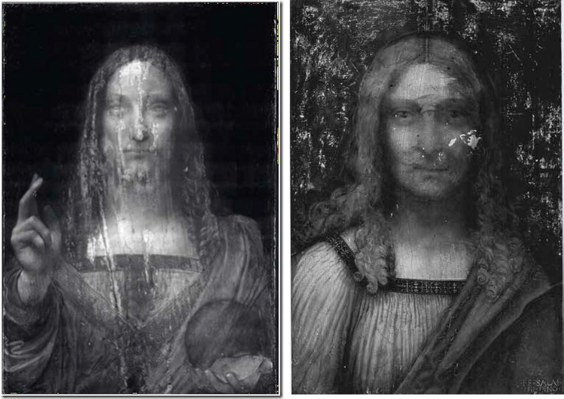
Above, Fig. 2: Left, an infra-red reflectogram of the Louvre Abu Dhabi Salvator Mundi; above, right, an infra-red reflectogram of Salai’s Head of Christ, signed and dated 1511, Pinacoteca Ambrosiana (Milan).

Above, Fig. 3: An infra-red reflectogram detail of the Louvre Abu Dhabi Salvator Mundi. Jacques Franck writes: “This close-up view of the Fig. 2, left, document, reveals in the Saviour’s face, neck and head, the same typical underlying sketching-out technique using very thick dark lines to define the preliminary contours and modelling that are seen in Fig. 2, right. None of this underlying graphic/roughing out process is ever encountered in original Leonardo painting where the graphic/painterly stages are more subtle.”
CHANGING FACES: FOUR STAGES OF DEVELOPMENT IN THE LOUVRE ABU DHABI SALVATOR MUNDI
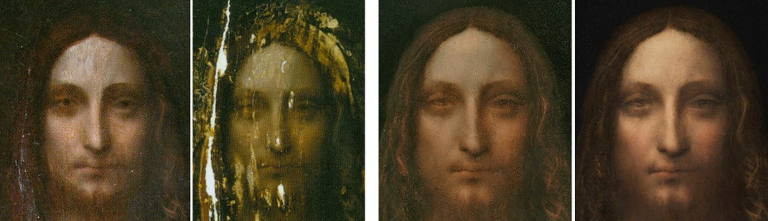
ABOVE, FIG.4: From the left, Face 1 – The former Cook collection Salvator Mundi when presented in 2005 (– when still “sticky” from a recent restoration) to the New York restorer, Dianne Dwyer Modestini.
Face 2: The former Cook collection painting after the panel had been repaired and the painting had been stripped down.
Face 3: The former Cook collection Salvator Mundi after several stages of repainting and as exhibited as a Leonardo at the National Gallery’s 2011-2012 Leonardo da Vinci, Painter at the Court of Milan exhibition.
Face 4: The face after yet further (- and initially undisclosed) repainting by Dianne Dwyer Modestini at Christie’s, New York, ahead of the 2017 sale – as was first published by Dalya Alberge in her Mail Online revelation: “Auctioneers Christie’s admit Leonardo Da Vinci painting which became world’s most expensive artwork when it sold for £340m has been retouched in last five years”.
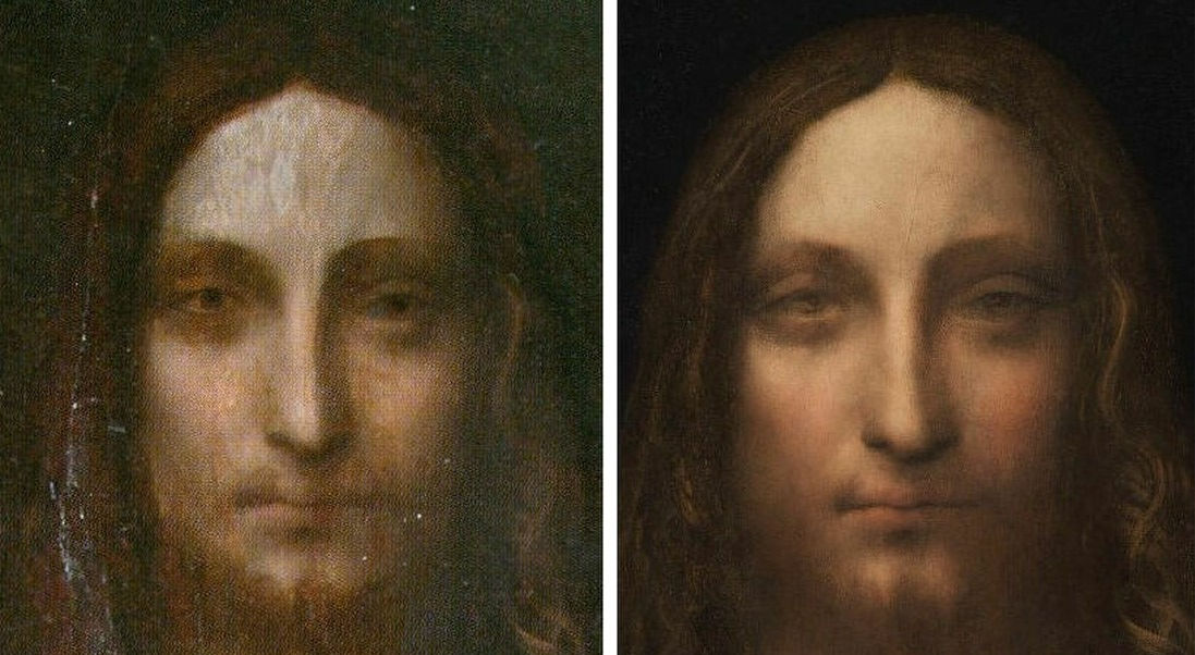
Above, Fig. 5: Left, the former Cook collection painting’s face as in 2005; right, the face, as transformed over twelve years by Modestini, when presented for sale at Christie’s, New York, in November 2017.
Alberge’s current Guardian article, “Leonardo scholar challenges attribution of $450m painting” has gone viral – see for example: CNN’s “Leonardo’s $450M painting may not be all Leonardo’s, says scholar”, and the ABC (Spain) “Crecen las dudas sobre la autoría del «Salvator Mundi» de Leonardo”.
In the CNN report, it is said that:
“Others are in less doubt. Curator of Italian Paintings at London’s National Gallery, Martin Kemp, sent the following statement to CNN Style by email: ‘The book I am publishing in 2019 with Robert Simon and Margaret Dalivalle (…) will present a conclusive body of evidence that the Salvator Mundi is a masterpiece by Leonardo. In the meantime I am not addressing ill-founded assertions that would attract no attention were it not for the sale price.’”
We make the following observations. Although Professor Martin Kemp is not a curator at the National Gallery he does seem to have been considered at one point as a possible co-curator of the National Gallery’s 2011-2012 Leonardo exhibition, which, in the event, was curated solely by the Gallery’s own then curator, Luke Syson, who is now at the Metropolitan Museum of Art. Syson drew heavily for his 2011 catalogue entry on the painting on the researches of one of the owners of the Salvator Mundi, the New York art dealer, Robert Simon: “This discussion anticipates the more detailed publication of this picture by Robert Simon and others. I am grateful to Robert Simon for making available his research and that of Dianne Dwyer Modestini, Nica Gutman Rieppi and (for the picture’s provenance) Margaret Dalivalle, all to be presented in a forthcoming book.” That book has now been coming for some time. First promised by the National Gallery in 2011, it was more recently promised for 2017, and then for this year, and now, for next year – and possibly in time for inclusion in the catalogue of the Paris Louvre’s planned major 2019 Leonardo exhibition?
Professor Kemp also promised a conclusive body of evidence for his attribution to Leonardo of the drawing he dubbed “La Bella Principessa”. In his 2012 book Leonardo’s Lost Princess, Peter Silverman, the owner of “La Bella Principessa”, wrote: “Martin believed that the fingerprints [compiled by the now discredited fingerprints expert Peter Paul Biro], though not conclusive on their own, added an important piece to the puzzle. He wrote to me, ‘This is yet one more component in what is as consistent a body of evidence as I have ever seen. I will be happy to emphasize that we have something as close to an open and shut case as is ever likely with an attribution of a previously unknown work to a major master. As you know, I was hugely skeptical at first, as one needs to be in the Leonardo jungle, but now I have not the slightest flicker of doubt that we are a dealing with a work of great beauty and originality that contributes something special to Leonardo’s oeuvre. It deserves to be in the public domain.’” In the event, the “La Bella Principessa” drawing did not enter the public domain. Unlike the Salvator Mundi, which sold for $450m, it was not included in the National Gallery’s 2011-2012 Leonardo exhibition and it presently remains, so far as we know, unsold, in a Swiss free port.
Kemp’s present lofty disinclination to address “ill-founded assertions that would attract no attention were it not for the sale price” marks a change of policy. Last year, immediately ahead of the sale that produced the astronomical price of the Salvator Mundi, Kemp was happy to engage polemically with those who rejected the Salvator Mundi’s Leonardo attribution. As he has recently disclosed: “I was approached by the auctioneers to confirm my research and agreed to record a video interview to combat the misinformation appearing in the press – providing I was not drawn into the actual sale process.”
SCHOLARS’ NEED FOR FULL AND DETAILED REPORTS AND FOR OPEN DEBATES

Above, Fig. 6: Left, the small-scale published (infra-red) technical image of the Salvator Mundi; centre, the painting as exhibited in 2011-2012 as a Leonardo at the National Gallery; right, the painting as presented for sale at Christie’s, New York, in 2017.
Much remains to be examined with this restoration-transformed but still, effectively, unpublished work where the promised reports on technical examinations and provenance seem perpetually trapped in the post like Billy Bunter’s postal order. Note in Fig. 6 above, for example, the radical changes made to the true left shoulder draperies; to the orb and the sole of the hand that holds it; and, above all, to the face. We must hope that the painting’s new owners will encourage the old 2005 consortium of owners to publish their privately commissioned researches as soon as possible. In general terms, it would be a much better thing if new and elevating attributions were once more published by single scholars, taking full responsibility in a scholarly publication, so that the case for a work’s re-attribution might be examined widely and discussed openly on a fully informative account and presentation of technical evidence and history of provenance. The recent tendency for owners to hold and selectively part-release researches during promotional campaigns of advocacy is not conducive to best scholarly practice.
Michael Daley, Director, 9 August 2018
Coming next:
Professor Martin Kemp and ArtWatch – Part 1: Twenty-four years of abuse on photo-testimony
ArtWatch and the Death of the Independent
On 26 March 2016 the printed Independent newspapers died. As Michael Daley reports, it was a poignant moment for those like himself who were in at the Great Project’s beginning in 1986 and had experienced the rush of excitement as the new newspaper’s pioneering innovations rapidly achieved commercial success and professional acclaim.
The paths of the Independent and ArtWatch were cross-linked for over two decades. The Independent was launched in 1986 as a newspaper in which much had been rethought and with firm editorial convictions that there should be no “freebies” (copy produced in exchange for free holidays or such) and no sacred cows – least of all with the royal family. At that date, twenty years after the heroic rescue operations that followed the flooding of Florence, one of the most sacrosanct received wisdoms was that art restoration was a safe and miraculous means of rejuvenating old works of art. I had left the Financial Times to work as the Independent’s principal illustrator shortly before the launch.

Above, the first issue of the Independent which was published on 7 October 1986.
A CRITICAL REVERSAL
Today, criticisms of even the grandest restorations are commonplace and no longer prompt ridicule and abuse. To the contrary, it is now restorations that attract ridicule. (See “And the World’s Worst Restoration is…”) In the brain-stretching BBC2 television quiz show Only Connect, a recent winning answer was: “They are all paintings that have been ruined by restorers”. Strictly speaking as the host, Victoria Coren, advised (on legal advice no doubt ), the correct answer was: “They are all paintings that have been controversially restored”. Controversially for sure – all had been condemned on this site: the Monkey-faced Christ; the Louvre’s botched Veronese nose jobs; the reconfigured-little that survived the last restoration of Leonardo’s Last Supper (see below); and the “Disney-fied” repainting of an ancient Chinese mural. The Guardian now asks readers to submit photographs of the worst restorations they have witnessed: “Restoration disasters around the world: share your pictures and stories”. Auctioneers and dealers place premiums on little- or never-restored works, not vice versa. No one would dream of producing a television or radio series called “Your Hundred Best Restorations”. No one (“sleeper” hunters aside) would celebrate a many-times restored painting. How we got to this stage is a long story. The Independent’s contribution to it was crucial, honourable and is worthy of greater recognition.
NINE MEN, ONE WOMAN, AN EXECUTIVE CHAIR AND NO PROPRIETOR
On 7 October 1988, Campaign magazine observed and reported on the Independent’s workings and progress at the time of its second anniversary, by which date it had exceeded its initial target of 375,000 sales.
Above, from left to right: Jonathan Fenby, Home Editor; Chris McKane, Picture Editor; Charles Burgess, Sports Editor; Sarah Hogg, Business and City Editor; Peter Jenkins, Political Columnist; Andreas Whittam Smith, Editor; Stephen Glover, Foreign Editor; Alexander Chancellor, Magazine Editor; John Torode, Leader Writer; Tom Sutcliffe, Arts Editor. (Not present, Michael Crozier, Art Editor.)
Below, Campaign’s photographer followed Andreas Whittam Smith’s day, showing here (top) a meeting with the leader writers, Roger Berthoud and John Torode; (centre), the principal illustrator, Michael Daley, at work; and, (bottom) with the home desk editor, Jonathan Fenby.
THE LOOK OF THE PAPER
The smart and distinctive look of the Independent contributed greatly to its initial success. Much as everyone in the city and business had felt impelled to sport the pink Financial Times, so everyone in advertising, design, architecture, photography and the visual arts seemed to have taken to the Independent. The newspaper – the first to exploit digital typesetting – was printed on good white paper that had little “show-through” from adjoining pages. By editorial requirement, its photography and graphics were distinctive and of high professional quality.
INNOVATIVE CONTENT
A journalistically novel and distinctive development on the paper had been a decision to expand and elevate the non-news, “features” sections, giving each a dedicated, professionally expert editor. In consequence I worked for sections as diverse as Law, Health, Food, Books, Gardening, Music, Wine, Architecture and so forth. For a fine art-trained illustrator, working with top calibre journalists (and an art editor who gave drawings due space and air) was a privileging and highly stimulating situation. The paper’s famous high-mindedness and unashamedly high-brow arts coverage, left one free to reference anything (including past art) that might best help illustrate pieces that ranged from, say, written evocations of the tastes and smells of food; cultural anxieties over decadence felt as the end of the century approached; and, acrimonious disputes of custody that sometimes arose when lesbian couples broke up after having had children by complicated paternity arrangements. Thus, by way of example, seven images:


Above, seven drawings for the Independent, by Michael Daley.
THE GRAPHIC TECHNIQUE
If the conceptual challenges on the Independent were exhilarating, deadline pressures meant that there was rarely more than 24 hours from inception to delivery of a drawing. The ink drawing technique (which I had developed during the previous four years on the Financial Times and the Times’ educational supplements), aimed to exploit as much as possible the easy extremes of graphic art with solid blacks (quickly brushed) and pure whites (paper left bare). Between those polar graphic opposites, slow-to-realise shading was judiciously deployed with cross-hatched lines and stippled dots. To speed output, all preliminary drawing was made in pencil on the finished sheet and then directly inked over so that the sketching stage could be completely erased. I had come to recognise that a drawing for reproduction in a newspaper is not a thing-in-its-own-right but a piece of page furniture that must live variously with the “grey” of closely set print texts, the assertive blacks of headlines, and, the graphically strident clamour of advertisements.
RECOGNITION
The novelty of the Independent’s employment of an illustrator who had trained principally in sculpture and etching swiftly resulted in a press award and commissions from book publishers and advertising agencies. The sweetest and most surprising outcome was earning the respect as an illustrator of established practising fine artists. One of the most generous was Peter Blake, who sent a kind note of thanks and respect with a book of illustrations he had made for Michael Horovitz’s poem of celebration, love and homage to Frances Horovitz. Blake had surmised (correctly) that I, like he, was an admirer of Maxfield Parrish. Such recognition almost immediately took on an art political significance in an entirely unanticipated way.
THE SISTINE CHAPEL RESTORATION DISPUTE
Within a month of receiving Peter Blake’s gift, the Sunday Times Magazine published an article on the restoration of Michelangelo’s Sistine Chapel ceiling frescoes. It told of condemnation from artists and an art historian, Professor James Beck of Columbia University, New York. Against them, the art historical establishment claimed momentous restoration “discoveries” and “revelations” that were said to require nothing less than a rewriting of five centuries of art history. The profound changes that all parties conceded had been achieved by repeatedly brushed-on and washed-off applications of a ferocious solvent gel that had left Michelangelo’s painting a pale and deformed reflection of its former self (see below). Beck was being likened to the man who refused to look through Galileo’s telescope for his refusal to acknowledge as a miraculous “recovery” a hitherto unsuspected and nowhere-recorded “New Michelangelo”. “We didn’t need one”, Beck had retorted, “There was nothing wrong with the old”.
To this working artist, the photographic evidence of the pre- and post-cleaned sections made it clear that the proposed art historical edifice being offered in post hoc defence of a demonstrably bungled restoration threatened a compounding falsification of history itself. Suspicion arose that because so many art historians had authorised or endorsed the restoration on which so much institutional capital and foreign sponsorship monies had been invested, none could break ranks. Further, it seemed to have been especially galling to art historians that their endorsements had been rejected on visual evidence cited by artists. (One scholar/supporter of the restoration, Professor Martin Kemp, would later complain in the Times Higher Educational Supplement: “I am unclear about the identity of this archetypal beast. Is ‘an artist’ to be identified with Andy Warhol or one of his fellow practitioners who protested during the cleaning of the Sistine ceiling?”)
COPYING OTHER ARTISTS’ WORK
It so happened that having switched to illustration from art school teaching and fine art practice in 1982, working long hours, six or seven days a week left little time for travel or even museum attendance. Partly in substitution, I had kept touch with art through books and, as an illustrator, took every opportunity to incorporate work by artists I admired. These ranged from classical Greek sculpture, through Michelangelo, to certain favourite modern artists like Gustav Klimt, the painter/sculptor Max Klinger and Picasso (on our homage to Klimt and Klinger, see “At the end of another century” above).
Above: (top) a detail of a copy of a Klimt portrait of Judith made by Michael Daley for the Independent in illustration of a Health article. Below it is a comparison of a section of the Klimt painting, as seen before (left) and after restoration(s). (For sight of the wholesale destruction of this modern artist’s work at the hand of restorers, see “The Elephant in Klimt’s Room” and “Now let’s murder Klimt”.)
APPRECIATING OTHER ARTISTS’ WORKS AND THE RELEVANCE OF COPYING TO APPRAISING RESTORATIONS
To copy the work of another artist it is necessary to look closely and attentively at it. You cannot draw what you have not analysed and understood. Indeed, drawings produced after the works of others are tests of understanding even more than of skill. Spending a working life both copying the various uses of shading made by other artists, and applying one’s own marks to paper so as to create plastically coherent and expressive tonal relationships, sharpens the eye and confers an ability to detect injuries to original tonal relationships in the works of others. This should not be considered surprising or remarkable: those who organise and dispose marks on surfaces, are perfectly placed to recognise the obverse – which is to say, the adulteration or deconstruction of artistically purposive values during so-called restorations.
Pace sneering art historians, to artists’ art practice trained eyes, spotting such injuries is as easy as it is for accountants to spot errors of arithmetic. That many art historians fail to recognise injuries to the works of the artists they study, might indeed suggest (as others have recently claimed) that something very wrong has been going on in art history education. And yet, at the end of the 1980s, when artists and rare visually discerning scholars challenged officially-sanctioned and endorsed restorations, it was they, not the visually-limited, who met with abuse. When I introduced myself to James Beck, prior to writing the 1990 Independent on Sunday article discussed below, he had been reviled in scholarly print by his peers – not least by a sister professor who served the Vatican as its art historical adviser/spokesman on the Sistine Chapel restoration. When I asked him if it might be helpful for an artist to make visual demonstrations of the injuries to Michelangelo’s work, he replied that it would be the most important thing to do, because “only artists understand these matters”. (Beck’s sister was a painter and he had studied fine art before switching to art history.)
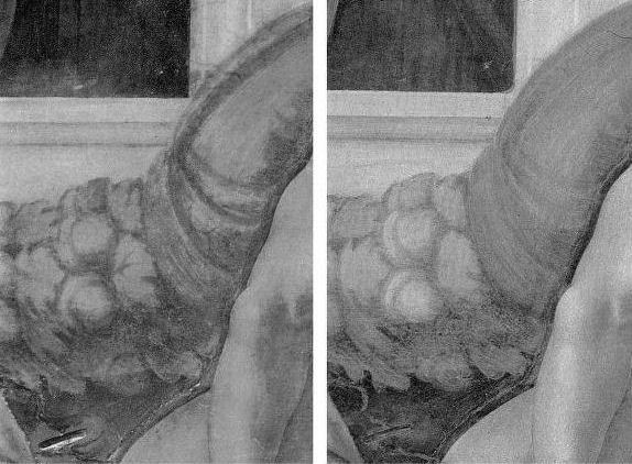

Above, A detail shown in greyscale and in colour of a section of Michelangelo’s Sistine Chapel ceiling, as seen before (left) and after cleaning in the 1980s.
THE VALUE OF DIRECT PHOTO-COMPARISONS
To identify restoration injuries it is helpful to place photographs of small sections of a restored work directly side-by-side (as in the Klimt Judith above, where the relative weakening of the spirals at the bottom, for example, should be apparent to the most untutored eye). The above detail of the Sistine Chapel ceiling was reproduced in the December 1988 Sunday Times article. It was immediately clear to me that the cleaning had weakened and in some places altogether erased bona fide features of shading and specific details like veins on the giant symbolic oak leaves. I asked the Independent’s arts editor if I might write a short article explaining why Prof. James Beck was right and the art historical establishment was wrong. On the face of it, this was a perfect Independent “questioning-of-authority” story. Unfortunately, the request could not be granted because the paper’s then art critic had recently visited the restorers’ scaffold in the chapel and had judged the restoration… a success. His art critical authority could not be challenged by a working artist with clear “standing” within the paper. Fortunately, when the Independent on Sunday was launched in 1990, its arts editor, Michael Church, commissioned a piece showing the damaging consequences of the restoration. Many criticisms of the restoration had previously been reported in the press but no one before had been given space in a national newspaper to set out evidence of injury. That article proved to be a game-changer.
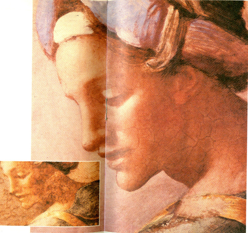
Above, top, the Independent on Sunday magazine of 25 March 1990 which carried (above) photographs showing restoration injuries in Michael Daley’s “Michelangelo: found or lost”
ESTABLISHMENT INTIMIDATION OF THE PRESS
Newspapers are complex entities comprised of many distinct departments that speak to particular constituencies. Dedicated arts journalists must swim in the art world and negotiate with its players and institutions. For them, breaking the “rules of engagement” can incur ostracism and worse. Those who play by the rules can be rewarded with exclusive stories and material. They might receive invitations to accompany globe-trotting museum directors on blockbuster shows. They might be invited to become embedded within a conservation department so as to counter anticipated criticisms. News journalists are less constrained. They are licensed to get and follow stories; to look for bodies; to follow money; to report mishaps and so forth.
When the Independent on Sunday article on the Sistine Chapel restoration was published the news editor on the daily Independent was intrigued by the magnitude of the controversy and he commissioned the above pair of articles. Despite such strong editorial support the articles nearly failed to see the light of day. Even though I had professional “standing”, the paper’s arts correspondent, David Lister, was taken aback by the high-level hostility and abuse levelled at me and Professor Beck. He became fearful of challenging key and venerable sections of the art establishment. How could the two of us be right and all of them wrong, he asked? It was a fair and sensible question: newspapers can never afford to back losers and must always invite responses from those under attack.
By way of reassurance, I showed the catalogues to the 1969 Olivetti-sponsored Frescoes from Florence travelling exhibition to London and New York. This exhibition consisted of murals that had been detached (on grounds of conservation) from buildings in Italy and then mounted on panels as stand-alone works of art that might be flown around the world – much as restored medieval glass from cathedrals is being despatched today. Both catalogues groaned under the weight of luminaries included in the exhibition’s “Committees of Honour”. At the time the show had been a sensation on two continents but I was able to show a recent Burlington Magazine editorial which condemned the detachment of frescoes from buildings as a barbarous and now discredited practice that had injured the paintings and buildings alike, and left many frescoes mouldering like rolled-up like rugs in church and chapel basements.
The procedural obstacle was cleared and both articles were published. The sky did not fall in and although squeals were heard, thereafter, the paper had confidence and trust in my judgements and accounts, enabling me to write further on the Sistine Chapel debacle and restorations at the National Gallery – including a review (below) of a book extolling the Sistine Chapel restoration that was written by the Sunday Times’ art critic, Waldemar Januszczak.
PROFESSOR BECK GETS SUED
In 1991, after surviving years of abuse over the Sistine Chapel controversy, Beck was hit with a criminal action in the Italian courts over reported criticisms he had made in Lucca Cathedral on the restoration of a marble tomb by the early Renaissance sculptor Jacopo della Quercia. The restorer (in fact, the head of a restoration company) had not sued the Italian newspapers that had reported Beck’s (oral) criticisms. Instead, he sued the scholar alone for aggravated criminal slander – a charge that carried a possible three years jail sentence – and for damages of 60 million Lire. By not suing those who had transmitted the criticisms (and therefore had, allegedly, harmed his reputation), the restorer ensured that Beck could receive no support from the newspapers and their lawyers and would have to bear all the risks alone. As the world authority on this early Renaissance sculptor, he felt compelled to do so. Although the trial’s ramifications might have been horrendous for scholarship generally, he received no public expressions of support from his peers. When I asked the editor of the Burlington Magazine why this was the case, she replied “Because he is going to lose”. The public needed to be alerted to the case. Once again, the Independent came through. On 8 November 1991, David Lister reported the imminent trial:

Below, part of David Lister’s 8 November 1991 article.
Below, a book Beck had produced on the Lucca Cathedral monument
THE TRIAL AND THE PROFESSIONAL SILENCE
Like the editor of the Burlington Magazine, the judge at Beck’s trial in Florence knew that he was going to lose. Indeed, he declared an intention to find him guilty to the prosecuting lawyer, as they left the court together discussing the case at lunchtime after the trial’s first morning session. “Eh, but I shall find him guilty” he said. Fortunately, he was overheard by an off-duty policeman who was working as an intern for Beck’s lawyer. When challenged, the judge refused to recuse himself but eventually he disappeared and Beck, under a new judge, was soon acquitted.
REPORTING THE TRIAL OUTCOME
At the time we were able by courtesy once more of the Independent (22 November 1991) to raise a cheer for Beck and for the blow he had struck for the free expression of scholarly judgements on matters of artistic welfare and integrity. But this had been an extremely close call and, while contemplating a possible jail sentence, Beck decided that a dedicated international organisation was needed to speak for the interests of the world’s great and insufficiently protected works of art. A year later ArtWatch International was founded in New York.
On the day of publication of the Independent’s 22 November article, Grant McIntyre, an editor at the venerable and (then) still independent publishing house John Murray, telephoned to ask if there might be a book on the trial and on matters of restoration. There was and, following its initial publication in 1993, it ran to many subsequent editions (see below).
THE BOOK’S RECEPTION
The book soon faced a formidable hurdle: it was to be reviewed in the New York Review of Books by a formidable Renaissance scholar, Professor Charles Hope, a supporter of the Sistine Chapel restoration. In the event, Prof. Hope was persuaded by the art historical and technical proofs of injury we had amassed. Moreover, he held that Beck had performed an admirable and brave service to scholars and scholarship alike. He also pointed that while many scholars of his acquaintance had initially supported the restoration enthusiastically, many had recently fallen silent on the subject.
After the trial turmoil and the creation of ArtWatch International, I continued to draw the art I loved and to criticise restorations in the Independent.
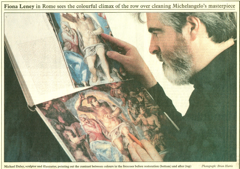
DENIAL AT THE VATICAN
After the horrors on the ceiling, we later witnessed the injuries to Michelangelo’s Last Judgement. There are still institutionally ensconced scholars and administrators who are in denial on the injuries at the Sistine Chapel and insist against all evidence – such as is found in the contemporary painted copy of the “Last Judgement” by Marcelo Venusti shown above – that Michelangelo had painted in today’s vapid tones and hues. In part this New Pallor is not only the product of the last restoration but also of the quarter of a century since in which the interactions of tourism-induced airborne pollution and chemical residues of the cleaning have been devouring the fresco surfaces. So great has been the debilitation that, in addition to a new air-conditioning system, thousands of colour-enhancing LED lights have been installed on the ceiling.
THE INDEPENDENT AND A CHANGED CRITICAL CLIMATE
The Independent gave fair and generous voice to previously unheard criticisms. By doing so it made an invaluable contribution to artistic health – not only directly but indirectly by opening up the rich, hitherto unexamined field to the rest of the press. The Times, the Sunday Telegraph, the Daily Telegraph, the Guardian and the Observer and others all saw the importance of the subject and recognised that “news” is that which somebody, somewhere, would prefer not to see published. The importance of newspapers in this regard cannot be exaggerated – our colleagues in the United States and France cannot believe that newspapers can be so challenging to entrenched authorities in the arts. The vigour of the British press can also be seen by comparison with our broadcast media which remains perpetually asleep on the job, treating the visual arts as little more than a gifted succession of diverting, institution-promoting “Good News” stories.
ARTS BROADCASTING PAP
When the Beck/Daley art restoration book was published in 1993 a number of independent television companies rightly saw the potential for a televisual “public affairs” type of treatment. All of these proceded well until they reached the top of their commissioning chains. Once, the head of music and arts at the BBC went so far as to offer a whole arts programme, reassuring us that although the BBC and the National Gallery were commercial partners “that shouldn’t create a problem”. But it did: the almost-commissioned independent meticulously even-handed examination of the pros and cons of picture restoration was swiftly killed off. In its place the BBC permitted the National Gallery to make its own effective tele-promotional “selfie” (with gallery staff using left-in-place BBC cameras) of its mangled, falsifying restoration of Holbein’s The Ambassadors. On 29 January 2000 the Independent carried a letter from ArtWatch UK entitled “‘Virtual reality’ art”:
“…When the National Gallery recently restored Holbein’s The Ambassadors, the famous anamorphic skull in the foreground was repainted to a new design not according to the laws of perspective by which it had been produced but after a computer generated distortion of a photograph of a real skull. This Bizarre imposition of ‘virtual reality’ into an old master painting is defended by the gallery on the grounds that ‘modern imaging techniques’ offer more ‘scope for exploring possible reconstructions’ than do the 16th century perspectival conventions by which the artist’s original image had been generated. The difference between the original and the new parts has been concealed from the general public by the restorer’s attempt to integrate the handiwork of his own ‘tentative reconstruction’ with surrounding old paint by painting fake lines of cracking to match the old, actual, cracks.”
It is a tragedy that the lights should have gone out on a newspaper that had caused justifable discomfort in so many art world recesses. As described above, it is a measure of the success of the campaigning that first gained exposure in the Independent that we now enjoy a quite different and healthily expanded art critical universe. We thank the Independent for good times past and wish it all good fortune in its new streamlined format with global outreach at The Independent.
Below (top): The last Independent coverage of ArtWatch UK by Dalya Alberge on 14 March 2012. (On the restoration of Leonardo’s Last Supper, see: A different Leonardo and, The Law of Diminishing Returns ); below (bottom) the last editions of the Independent on Sunday and the Independent.
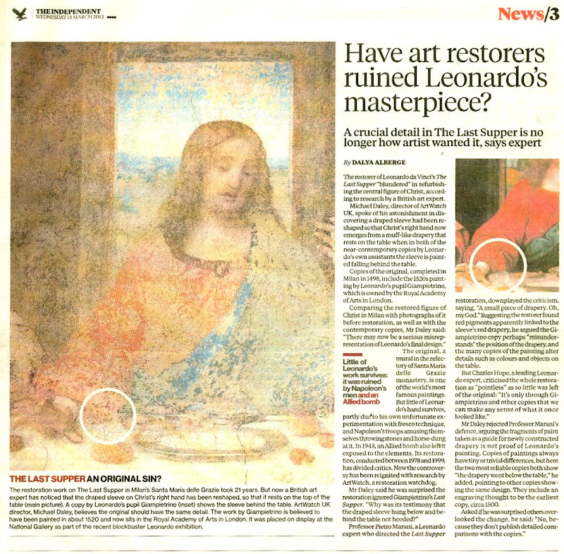
Michael Daley, 30 March 2016
Good Science; Over-Reaching Science; Over-Promoted Science.

On February 10th the Daily Telegraph published a letter from a professor of chemistry at University College London (Robin J. H. Clark) questioning the relationship between art and science in general terms and with regard to a supposed Chagall painting featured on a recent BBC Fake or Fortune television programme. Prof. Clark expressed particular concern over art world failures to heed the testimony of available scientific techniques.
In the late 1980s the UCL chemistry department had developed a non-invasive technique (“Raman microscopy”) for identifying both natural and synthetic pigments within paintings. Because the latter have known dates of invention, their presence in a picture can establish the earliest date at which it could have been produced. This technique is said by Prof. Clark to have been known to Sotheby’s by 1992. The Chagall painting, he pointed out, could have been exposed as a fake at any point in the last 20 years. He further reported that the painting was exposed as a forgery in his UCL laboratory in July last year in the presence of its owners and the presenters of Fake or Fortune:
“I am disappointed that neither of the presenters of Fake or Fortune made this clear. The conclusion that the painting is a forgery is based on our spectroscopic results, which showed that at least two of the key pigments had not been synthesized until the late Thirties, putting the earliest date for the painting at 1938, long after the supposed date of 1909-10.”
Because of the unequivocal nature of those technical findings, Prof. Clark (rightly) observed that the Chagall Committee in Paris, to which the painting was sent, had no option but to confirm the forgery. He also asked how art historians might be encouraged to read science journals so as be informed about “significant developments in science as applied to arts”. In part, his question is fair and urgent. The art market’s notorious governing trade dictum is caveat emptor (buyer beware) – while auctioneers and dealers may take every pain to verify their claims, it is ultimately for buyers to satisfy themselves that attributions and conditions are as described. Auctioneers can only submit works to (possibly disqualifying) technical analysis with owners’ permission. Dealers who buy at auctions almost invariably have works restored but are not required, when selling works on, to disclose which if any tests may have been run.
Support on the extent to which scientific (and also historical and visual) evidence is ignored or manipulated in the interests of “boosting financial rewards in attributing paintings to particular masters” was given in an Observer interview on February 23rd (“Revelealed: the art experts who pass fakes as authentic”) by Professor Martin Kemp, a Leonardo specialist. In the same report by Dalya Alberge, Nicholas Eastaugh, a leading independent scientist (of Art Access and Research), described the present climate as being both without standards and “totally unregulated. It’s a Wild West.”
However, much as we sympathised with Prof. Clark’s impatience with some art world practices, we could not endorse his call for a blanket acceptance of all scientific methods presently being applied to works of art. As we put it in a letter to the Daily Telegraph (published 12 February):
“Professor Robin Clark (letters February 10) calls for developments in science to be applied to art. If sound science is underused by the art trade, more questionable ‘scientific studies’ have been used for many years to offer assurances that picture-cleaners’ solvents have been a safe method of stripping varnishes and repaint from old pictures. As the current issue of the journal of the International Institute for Conservation of Historic and Artistic Works makes clear, the understanding in the art and museum world since the Sixties of how solvents work has been seriously flawed scientifically. Because important intermolecular interactions have been ignored, the theoretical model used cannot predict, as assumed, the actions of solvents on the underlying paints.”
History teaches that the many cumulative “scientific” defences of restorations have best been treated with scepticism. In 1977 Kenneth Clark admitted founding the National Gallery’s conservation science department precisely to bamboozle critics and dupe the public. In later years the Gallery pioneered a new mongrel discipline known as Technical Art History in which curators, conservators and conservation scientists pool expertises so as to arrive at some seemingly “scientifically underpinned” consensus on aesthetic decisions. In reality curators were glossing authority already-ceded to restorers. As the National Gallery restorer Helmut Ruhemann wrote in 1968: “Although the art historians in charge of pictures are officially responsible for the policies regarding cleaning, they naturally form their ideas in the first place from what they are told by their restorers.”
In its guides to conservation the National Gallery presently claims that while its restorations are carried out for aesthetic rather than conservation purposes, and while each restorer imposes a personal aesthetic taste on pictures, it considers all aesthetically various outcomes to be equally valid so long as they have been carried out “safely”. The contention that the (claimed) safety of cleaning methods can underwrite conflicting aesthetic outcomes is a non sequitur. Besides which, no claims have proved more unreliable than those of cleaning solvents’ safety.
The crucial and sometimes wilfully over-looked cultural truth is that there are no properly scientific means of comprehending art’s variously created aesthetic values and relationships. When reiterating this point in our post of 7 February 2014 (“From the Horse’s Mouth ~ Seventy years of worthless ‘science’ and reassurances on the safety of picture cleaning solvents”) we were able to disclose the most recent and most damning evidence of the un-soundness of past scientific endorsements of picture-cleaning solvents.
Notwithstanding these spectacular technical reverses, this month the press has been chocked with uncritical “Good News” accounts of scientific advances in the arts. Most newspapers and the BBC carried claims that scientists had “digitally reconstructed” the original appearance of a Renoir painting in which a former pink background had faded. By coincidence, this claimed miraculous virtual recovery had also been made by “a technique known as Surface-Enhanced Raman Spectroscopy (SERS)” carried out at the Art Institute of Chicago.
The BBC reported that “Northwestern University chemist Prof Richard Van Duyne pioneered SERS. He said the Renoir demonstrated why the Raman technique was fast becoming an invaluable tool for studying artworks: ‘You get tremendous information about the origins of the painting, the techniques of the artist, an understanding of the fading mechanism, and the ability to restore the painting.’” Note that speculative hypotheses are now being presented as sound platforms for restorations. In the art world it is frequently the dogs that don’t bark that matter most. Note that this wonder technique which addresses changes resulting from natural causes would seem to have no powers or potential with regard to the more common and much more seriously deleterious man-made changes made by restorers. Given that both types of injury are easily evident by eye to anyone lifing a picture out of its frame (see Figs. 2 and 3), the silence of “science” on the latter injuries can only seem self-compromising .
In a letter to the Times (February 17) we protested:
“The claim that scientists have recreated the original appearance of a Renoir painting (‘Laser technique shows masterpiece as Renoir intended’, Feb 14) is unfounded. All elements of a picture undergo natural changes over time. To these, further unnatural changes are added by restorers and their invasive paint-penetrating solvents. Compensating for a single faded pigment does not constitute a recovery of a picture’s original appearance. Rather, it offers a further falsification: a single artificially simulated ingredient within a remaining, generally altered and debilitated surviving whole.”
Our letter was accompanied by one from a Professor of Allergy and Clinical Immunology at Imperial College London, making a far-fetched claim that the fact that a synthetic red dye used in paintings had also helped in the discovery of an important white blood cell constituted an unusual “bridging [of] fine art and science”.
While Raman microscopy could certainly disprove the claimed date of the fake Chagall, it seriously misleads the public to present speculative and hypothetical digitally manipulated reconstructions as if literal recoveries of original conditions. On February 22nd the Economist reported an account of another digital re-mastering of real paintings delivered at this year’s meeting of the American Association for the Advancement of Science. The Economist too saw a bridging of the divide between art and science, which it likens to a resolution of the science/art schism of which the chemist and novelist C. P. Snow complained in his famous 1959 lecture “The Two Cultures”. The report also reveals, however, that what was presented as a recovery of the murals’ original conditions was in fact a double hypothetical reconstruction. Not only had Rothko’s colours faded, so too had those of the contemporary photographs of his murals that were to serve as the basis for a digital re-mastering of the actual paintings. Despite the methodologically dubious procedure of digitally re-mastering actual paintings on the back of digitally re-mastered photographs, there was customary breathless admiration for this latest claimed technical miracle:
“In the case of the Holyoke Centre’s Rothkos […e]ach had faded differently, depending on its original colours and how much sunlight it had seen. And various parts of individual paintings had faded at different rates, too. But modern technology allows optical illusions to be finely crafted indeed. The paintings are continuously observed by a high-resolution camera. Its images are compared, pixel by pixel, with the idealised versions provided by the restored photographs. A computer then works out, moment by moment, what mixture of light to shine back to make the faded originals match the vibrant reconstructions—with no messy repainting necessary. For now, the paintings remain under wraps while the museum at which they are stored is renovated. One day soon, though, they will be on display in all their illusory glory.”
There was no discussion of the consequences of viewers’ bodies blocking the projected “correcting” coloured lights. What we are witnessing in this heavily promoted technical bonanza is not a genuinely increased understanding of art by courtesy of scientific advances. If the attempt to increase public understanding of the degree to which even quite modern paintings have suffered alterations since their executions was a real ambition of museum staffs and conservation scientists, it would be imperative for them to discuss (and demonstrate) the largest single source of alterations and adulterations: “restoration” treatments. In the absence of such an agenda, what we see unfolding is a cultually diversionary Big Push by certain professional groups into new and uncontroversial employment pastures where the potential pickings and funding opportunities are immense – there is scarcely an old picture in existence where some pigments have not faded. This virtual remastering show is one that could run and run. But who might fund and who might execute research into all those paintings that suffered far more grievously from the chemical coshes of restorers?
The real problem in the arts is not an insufficiency of technical or scientific assistance. It is deeper and more fundamental. Its root lies within institutional withdrawals from exercising properly critical considerations. The non-appliance of due critical practices is long-standing. There were uncritical responses in the late 1990s when (as we reported in our first post) the National Gallery used a computer-manipulated photograph of an actual skull as the basis for a hypothetical virtual reconstruction of missing parts in Holbein’s “The Ambassadors” which led to the redrawing of Holbein’s skull in defiance (or ignorance) of the perspectival systems of the artist’s times. More recently, the Tate repainted large lost parts of a flood-damaged work on the basis of early colour photographs in the course of a “restoration”. In our uncritical, increasingly “virtual” cultural universe it is more urgent than ever that museum curators should return to acting primarily on sound scholarly appraisals and aesthetically informed insights, and that they should not further devolve their responsibilities to technicians who may or may not be properly alert to matters aesthetic and artistic.
Michael Daley
Comments may be left at: artwatch.uk@gmail.com


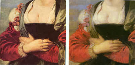
![]()
The Futurist Louvre and Leonardo’s Fate: nothing ventured, nothing lost
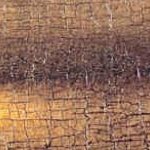
The more indefensible their restorations, the more museum regimes dig in and shut their ears to criticisms. (With bad restorations the eyes, too, often seem to have been shut.) Given the controversial outcome of the Louvre’s 2011 restoration of Leonardo’s “The Virgin and Child With St. Anne”, it might seem a provocative defiance that the museum should so soon announce that it is not only about to restore another Leonardo (his “La Belle Ferronnière”), as was reported in the Wall Street Journal on 1 February 2014 (Da Vinci Code Red: Restorations Spur Debate), but also the desperately vulnerable “Mona Lisa”.
Vincent Delieuvin, the curator driving (or heading) the restorations, makes a number of claims that lack foundation in the Wall Street Journal article. We had not dared to touch this Leonardo previously, he reportedly says, but now restoration techniques have improved to the point where the museum thinks them safe – even for the Mona Lisa which has become “yellowish and very dark”. The history of modern restoration is peppered with facile claims of technical “advances” that were rushed untested on to great works of art, soon to become the acknowledged follies of yesteryear. (We have often wondered whether the credulous techno-enthusiasts of Futurism, which movement died a swift death, had not migrated into art conservation.) Of what do these latest claimed advances consist? Have they arisen since the 2011 restoration of the “Virgin and St. Anne”, the controversial treatment of which provoked resignations from the restoration’s own advisory committee (as we reported on 28 April 2012 – “Rocking the Louvre: the Bergeon Langle Disclosures on a Leonardo da Vinci restoration”).
On the “La Belle Ferronnière” Mr Delieuvin holds that “The many layers of darkened varnish added over the centuries are getting old and make the painting dark and yellowish”. Such phobic/alarmist language is a constant feature of the would-be restorer’s rationale. After restoration, Mr Delieuvin predicts, the “contrasts and colours will come out again; so will the feeling of movement”. A long-standing (French) charge against intrusive restorers was that in their haste to “liberate” colours and dispel all signs of age in what are old paintings, they remove original material and impart a falsifying, historically inappropriate modernity. Restorers of every generation have insisted that their “advanced science” can prove that no original material was lost. In so saying, they demonstrate cultural naivety and failures to comprehend the nature of that of which art consists and the artistic and art historical, not “techno/scientific”, terrain on which all restoration evaluations should properly be conducted.
Restoration disputes stem from losses of perceived artistic values. Although artists certainly work with and through materials, the materials are not ends in themselves, or even vehicles of intrinisic value. Rather, they are the means by which the “stuff of art” is given fixed material expression. The currency with which artists work is values and the relationships between values. Through these they work by eye to produce artefacts which fix and carry their intentions, so that they might subsequently be optically apprehended by others. In the production of a painting every last feature is a product of thought. But every judgement, evaluation and adjustment is transmitted exclusively through human sight, and not, as techno-conservationists might prefer, through sub-atomic particles of matter, complex chemical formulations or other mystificatory hi-tech red herrings.
Thus, to take Mr Delieuvin’s promised delivery of increases of “contrasts and colours” in the pending Leonardo restoration, we can anticipate the outcome to some considerable degree by applying those very criteria to the last restored Louvre Leonardo, the “Virgin and St. Anne”. On that work it is clear that while an increase in the brightness of colours occurred, it was at the expense of a catastrophic reduction of contrast and strength in the tones by which the heads had been modelled and given corporeal form, as the Poussin scholar, David Packwood, very generously acknowleded on his (excellent) website Art History Today (“Aesthetic Appraisal and the Restoration Process”):
“I’m looking with growing horror at images of pre and post restoration images of the Leonardo Virgin and St Anne in the Louvre. They can be found here, in an article by the head of ArtWatch, Michael Daley. In a balanced and thoughtful post on restoration culture, Michael Daley highlights its real dangers, clearly evident in this latest example…”
When appraising restorations it is essential to do what museum curators and restorers are so clearly reluctant to do in their own catalogues and publications: place directly comparable photographs of before and after cleaning states in the closest possible proximity. This facilitates direct optical appraisal – which is the only methodologically sound and appropriate means of evaluating a work whose appearance has been transformed by a technician’s swabs, solvents, scalpels. It is never possible to compare a restored painting with its own pre-restoration condition because that is irreversibly effaced in the process. Photographs must therefore stand in lieu.
In every photo-comparison shown here of details from the “Virgin and St. Anne”, it is clear to any educated eye that the tonal range that was formerly visible has been massively reduced. This, ipso facto, is a proof of artistic injury: “dirty varnishes” could not have disported themselves in such a manner as to enhance the effects of Leonardo’s own handiwork. Moreover, the values and relationships of values that were perceivable through the varnishes before restoration would, on Mr Delieuvin’s own optical schema, be expected to emerge from a “cleaning” with greatly enhanced, not reduced, power and vivacity – in short, while the lights would certainly be expected to emerge lighter, the half tones and darks should also be strengthened and not diminished – as seen right.
Consider the comparison of the Virgin’s eyes at Figs. 5 and 6. Such has been the loss of modelling-by-shading that the face is reduced to a mask-like reminiscence of its former self. The now obtrusively dark slits of the down-cast eyes are no longer subsumed within the previous anatomically descriptive overall shading of eye sockets. Had Leonardo really painted the face as is presented today as “recovery”, it would be for the restorers, curators and trustees of the Louvre to explain how it was that dirty varnish had formerly imparted superior, Leonardesque traits to the master’s own handiwork. It would also need to be explained why Leonardo might have been content to leave two versions of the pupil of the Virgin’s right eye simultaneously visible on his finished picture.
If we consider the comparison shown at Figs. 7 and 8 of the Virgin’s lower face, another aspect of injury is apparent. That is, as the half-tones have receded under the force of swabs and solvent, the resulting increased zones of brightness leave the face looking looks both fatter and flatter. It is hardly heresy to suggest that Leonardo used shading to turn the surfaces of his heads away from light and into shadow. What kind of benefit, then, has been gained by delivering a lighter, brighter, flatter Leonardo? For what reason and on whose authority was the expression of the Virgin’s mouth altered?
As our colleague at ARIPA, Michel Favre-Felix, disclosed a few years ago, in the Veronese head shown in Figs. 10 to 13, we find evidence of a Louvre house-style of cleaning and repainting that imposes crass puffed-up modernist forms and redrawn and re-modelled features on Renaissance heads. This bizarrely unwarranted policy is accompanied by a cavalier disregard for the norms of museum-world conservation record keeping (as is evident in the Louvre spokeswoman’s reported comments at Fig. 11). The Louvre, as today constituted, is doing indefensible things to the art it holds and feels no obligation even to record or report them. The tragedy is that until quite recently this museum was a model of restoration restraint and a reproach to other institutions. Today, along with with its bonanza of destructive restorations, increasingly we find intrusive and vulgar commercial exploitation by Big Sponsors: “Another Restored Leonardo, Another Sponsored Celebration – Ferragamo at the Louvre”. To think that such a great institution could sink so swiftly into meretricious stewardship and displays of bling.
Michael Daley
Comments may be left at: artwatch.uk@gmail.com

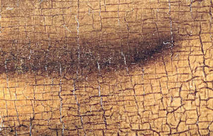


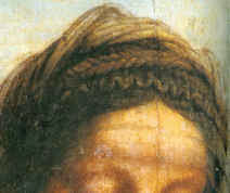


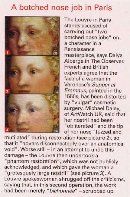
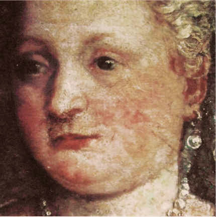

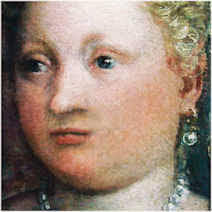
![]()
Bubbles burst.

A few years ago a director at the Victoria and Albert Museum, was chided for producing blockbusters that bust no blocks. Today, aside from its catering and retailing outlets, that museum – which once advertised itself as “An ace caff, with quite a nice museum attached” – has a department exclusively dedicated to the production of special exhibitions. It generates eight exhibitions a year with a further fifteen travelling around the world at any one time (see “The world is her oyster”, in the Autumn/Winter 2013, V&A Magazine). As more and more of Art’s Flying Dutchmen encircle the globe, an awful lot of holes are appearing in the collections of great museums – as at the Louvre, as Didier Rykner has eloquently demonstrated (“The Louvre Invents the Gruyère Museum” ). This development is perverse as well as regrettable: a chief defence that museums make when seeking funding for expensive acquisitions is that they are needed to fill crucial gaps in a collection.
At the British Museum the number of loans (and therefore holes) doubled between 1985 and 2000, in which year 214 objects or groups of objects were loaned. That was for starters. In 2008, under its present globe-trotting director, Neil Macgregor, the museum got 2,500 objects “on the road” in Britain alone. In a submission this year to the Scottish Parliament, Mr MacGregor boasted that between 2003 and 2013 the museum had loaned over “over 30,000 (many very fragile)” objects, with only eight injuries. In 2006 the BM packed 160,000 visitors in three months into a (physically) small exhibition of Michelangelo’s drawings, at £10 a head (plus takings from the catering and retailing outlets). Mr MacGregor ruefully claimed that three times as many tickets could have been sold had space permitted. The following year he announced plans for a £100m expansion of the British Museum that was reportedly triggered because it had had to turn down a unique chance “to show off” the largest collection of Tutankhamun treasures ever seen in the west (Evening Standard, 6 July 2007), works which went instead to the former Millennium Dome, now re-branded as “02”.
It would seem that nothing in museums is now safe from this international exhibitions jamboree – no work plays too important a role within a collection, or is too fragile, or too unwieldy, to prevent curators from taking a gamble with its welfare (in hope of reciprocal loans and a curatorial buzz). The Metropolitan Museum in New York is one of the most voracious recipient/organisers of exhibitions. It needs to be. Its special exhibitions, which are free, are the biggest justification for the museum’s whopping “recommended” $25 entrance charge (- the legality of which is under challenge). As we have seen, the present director of the Metropolitan, Thomas Campbell, once boasted that only his museum could have shaken-down (“Item: The Met’s Strong-arming of Reluctant Lenders”) other great art institutions to get them to part with the fabulous Renaissance tapestries that were sent to a special show in New York.
The Metropolitan Museum will likely be the first international stop (after a six months stay-over at the British Museum) for a long-planned show of plum works from the Burrell Collection in Glasgow that will take place should the Scottish Parliament oblige the Glasgow City Council by over-turning the prohibitions in Sir William Burrell’s bequest on all foreign loans and vulnerable works within Britain.
Next October in New York, the Museum of Modern Art will host a show of some of the most fragile and difficult-to-transport works of modernism. As Martin Bailey reports in the current Art Newspaper, (“Journey at Snail’s pace”) Henri Matisse’s monumental 1953 paper collage, The Snail, is to leave the Tate for the first time since the gallery bought it more than 50 years ago. It will be a star exhibit in “Henri Matisse: the Cut-Outs”, at Tate Modern next April, that will include its sister works, Memory of Oceania, 1953, and Large Composition with Masks, before travelling to MOMA in New York. Although the itinerary is set, what is not yet clear, Bailey discloses, is how the Tate’s giant and fragile work will travel or even how it will be be packed:
“The problem of how to transport the huge work, which measures nearly three square metres, has plagued conservators for years. Paris’s Grand Palais asked to borrow the work for a major retrospective on the artist in 1970, but was refused because of the risks associated with transporting it. Its original late-1960s glazing is being replaced with laminated glass, which will reduce the risk of damage during transportation. However, laminated glass is heavy: with its frame, the work will weigh around 300kg. If the collage is set at a 45° angle within a crate, it will fit more easily through doorways, but if the work is transported flat, it will need a case measuring around four square metres.”
Those keenest to lend and borrow lean heavily on the relative safety of international aviation, but with these particular monumentally large but flimsily constructed works, Bailey discloses that a spokeswoman for the Tate was unwilling to discuss transport arrangements. He has discovered, however, that they might travel by sea because there are almost no cargo planes large enough to carry them, and because the exhibition’s sponsor is… South Korea’s largest shipping company, Hanjin Shipping. Either way, as Nick Tinari of Barnes Watch has repeatedly testified, when Matisse’s mural La Danse was detached from its permanent home at the Barnes Foundation, Merion, and sent off at a 45° angle on an open flatbed truck to the first stop (the National Gallery of Art, Washington) of a world tour, it was to return home badly damaged.
Not only are museums gutting themselves to feed international loan exhibitions, they are, as our colleague in New York, Ruth Osborne, discusses (“The Dismemberment of the Louvre: Travels to Louvre Abu Dhabi promise damages and leave Parisian Museum-goers in the Lurch”), beginning to do so on an even greater scale as part of international “rebranding exercises” in which museum annexes are created in improbable but rich centres so that museums may present themselves as pan-national or global brands (- along with Gucci now read Guggenheim). A lot of money is being made and a lot of careers advanced. Some journalists effectively double as cheerleaders for the tourism-fuelled cultural arts economies of centres like London and New York. However, along with these booming arts economies, risks are rising – and not just with the works of art: those who blithely authorise streams of loans risk putting their own reputations on a block.
Michael Daley
NEWS UPDATE 26-11-13
The Guardian today carries this letter from ArtWatch UK:
“You illustrate the new exhibition of Turner seascapes at the National Maritime Museum with a giant reproduction of the artist’s now badly wrecked, many-times restored ‘Rockets and Blue Lights’ without issuing any kind of art conservation health warning (Eyewitness, 21.11.13). A clue to the extent to which this picture is no longer a remotely fair representation of Turner’s work is found in the picture’s full title, ‘Rockets and Blue lights (Close at Hand) to Warn Steamboats of Shoal Water’ – for this was once a painting of two steamboats in distress, not of one. The now lost boat was recorded in a large chromolithographic copy of the painting that was commissioned in 1852, and in a photograph of 1896. Viewers who compare your present image with the recorded earlier states of the picture will likely marvel at the transformation by twentieth century restorers of the sky, and at the losses of storm-driven smoke from the funnels of the original pair of steamboats, one of which vessels has now disappeared under the waves along with its originally depicted crew members.”
In the ArtWatch UK Journal No 19 (Winter 2003), we carried an article by the artist Edmund Rucinski (“Ship lost at Clark. Many records feared missing. Establishment unfazed.”)
Unfazed the establishment was then – and, evidently, so remains today. Despite the disappearance of the second boat (and its smoke) in a recent cleaning, the owners of the Turner, The Sterling and Francine Clark Art Institute of Williamstown, USA, had included the work in a travelling exhibition (“Turner – The Late Seascapes”) that ran at the Clark from June to November in 2003, before transferring across the Atlantic to the Manchester Art Gallery in January 2004 and then on to Glasgow in March 2004.
At a public lecture at the Clark Institute, on 2 August 2003, Edmund Rucinski (who knew of the 1852 chromolithographic copy shown right) had been astonished to hear the restorer, David Bull, claim that the picture had originally depicted a single boat and that the second, now-removed, boat had not been painted by Turner but was a restorer’s addition made, possibly for Lord Duveen around 1910. That claim slowly sank. When Rucinski spoke to David Bull and asked on what authority the second boat had been removed, he replied that it was on a photograph of a single-boated copy of the painting that had been supplied by the Clark Institute’s senior curator, Richard Rand.
On 15 October 2003, the Times’ arts correspondent, Dalya Alberge, reported that when asked how it had been established that the second boat could not have been painted by Turner, Mr Bull had said: “The answer is we don’t know. It was a general consensus.” Thus, what had been presented publicly as a historically verified certainty was downgraded within a couple of months to a best guess, collective assumption. That position was maintained for several months and was reiterated in the Manchester Evening News of 14 January 2004, which reported: “The American owners of the painting and the restorer…say a second boat may have been added by an early 20th century restorer”.
On 28 March 2004 the show moved to Glasgow and the Glasgow Herald reported that the Clark’s senior curator had said “We have always maintained that the original Turner had two boats”. The importance of heavy promotion for travelling exhibitions was demonstrated in October 2003 when the Tate, which had not taken part in the travelling exhibition, nonetheless issued a press release that ended with the following claim:
“One of the stars of the show is Turner’s dramatic “Rockets and Blue Lights (Close at Hand) to Warn Steamboats of Shoal Water”, 1840 which has recently undergone major conservation and is a loan from the Sterling Clark Art Institute, Williamstown, USA”.
In additions to newspaper reports of critisms of the restoration, many interventions were made by scholars, as below:
“Since ‘Slavers’ and ‘Rockets’…have ended up in collections geographically so close to each other, it struck Hamilton [James Hamilton, the show’s curator] as a good idea to show them together, arguing that Turner had intended them as a pair. The first snag was that Boston decided that ‘Slavers’ was too unstable to travel, even to Williamstown, so it was not in the show at all…But there is a danger that Turner has become a guaranteed crowd-puller, to be had recourse to at the expense of equally interesting but less certainly popular subjects. This is not a development to be welcomed, if only because Turner’s works are exceptionally vulnerable: the paintings, to the stresses of travel on their experimental construction; the watercolours to the exposure of light. He is not a resource that can be exploited indefinitely…”
~ The Turner scholar, Andrew Wilton, in a review for the Burlington Magazine, March 2004.
The ‘Slavers’ of which Wilton spoke, is Turner’s oil painting Slavers throwing overboard the dead and dying – Typhoon coming on. In 2000 the Museum of Fine Arts in Boston which owns the painting found it to be damaged and “extremely unstable” on return from a loan to the Tate Gallery. Despite having been “glazed and sealed against changes in relative humidity, the picture [had] reacted significantly to the voyage” and lost flakes of paint. An unfazed (and institutionally unrepentant) Tate spokeswoman said in response to disclosure of the damage:
“It arrived here safely where it was examined thoroughly. Its condition was stable…However, Turner’s paintings are notorious for becoming unstable.”
Indeed they are. So why the incessant demands from temporary exhibition organisers to keep borrowing them? And why the systematic attempts to deceive the public into believing that the most restoration-wrecked pictures are the “stars” of the shows?
For our part, we have repeatedly drawn attention to these travel-induced injuries. On 24 October 2007 the Daily Telegraph carried this letter from ArtWatch UK:
“Sir – The Mellon Center’s decision (report, October 17) to break its own rule never to lend Turner’s fragile ‘Dort or Dordrecht: The Dort Packet-Boat from Rotterdam Becalmed’ seems perverse: only seven years ago, the Museum of Fine Arts in Boston lent its Turner ‘Slavers throwing overboard the dead and the dying, Typhoon coming on’ to the Tate. On its return to Boston, that painting was found to have suffered losses of paint and to be in an ‘extremely unstable’ condition. A Tate spokeswoman said: ‘It arrived here safely…Its condition was stable…However, Turner’s paintings are notorious for becoming unstable.’ This being so, why are trustees and curators prepared to take such risks with priceless works of art?”
Clearly, the question still stands.
Comments may be left at: artwatch.uk@gmail.com


![]()
L. O. L. It’s Peeping Tom Time at the National Gallery!
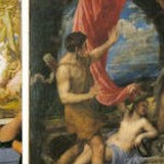
A little over a decade ago we were requested to move away from Titian’s “Bacchus and Ariadne” by a member of the National Gallery’s education department who was about to give a talk. Her narrative thrust on this great canvas (which had been glued by restorers on to a sheet of “Sundeala” board) proved more sociological than artistic or art historical. It had a villain – the original patron – who, the audience learned, had been a rich dirty old man who supplied extravagantly expensive pigments for an ostentatiously sexy depiction of a victim – an abused mythical woman – who would provide literary cover for his private delectation within his own apartment.
If the Gallery had then hit a low with such travestying philistine cant, we now find that in its drive to increase visitor numbers and extend social constituencies, it has jettisoned the very distinction between Art and Life. Pictures acquired at immense expense in the name of the Public Good are no longer treated as self-sufficient imaginatively crafted works that merit reciprocally reflective attention from the viewer but as pretexts for real-life events of a titillating, humanly exploitative and degrading nature.
Thus, in the bureaucratised stew that is the Cultural Olympiad’s London 2012 Festival, the National Gallery has permitted Titian’s great poesies to serve as springboards to three “edgy” artists. In 2001, in a drawing for Jackdaw (see Fig. 4), we had already marked one of this triumverate, Mark Wallinger, as a clown ripe for elevation to the National Gallery Pantheon, and today, with few honourable exceptions, the newspaper art critics have duly fawned over his efforts:
We are so cast only if we choose to play the chump-role that is offered as a legitimately “performative” (to use Sir Nicholas Serota’s term-of-the-moment) contribution to art. We do not have to do so. We do not have to be complicit with museum educators’ perverse cultural de-constructions. Rather, we might ask them why they do not consider this particular use of real people – women hired-in for the duration – to be a form of “sexploitation”. We might also ask them, as public educators, to explain the connection that they believe Wallinger’s stunt has with Ovid’s stories and Titian’s depictions of them. Even if Wallinger cannot see that Acteon was the very opposite of a voyeur – a man who had had the great misfortune accidentally to intrude upon a bathing goddess – might we not ask why no one at the National Gallery felt able to disabuse him.
Michael Daley
Ruined Renoirs
Our examination of the fate of more than twenty Clark Art Institute Renoirs now showing at the Royal Academy will follow in the next post.
Comments may be left at: artwatch.uk@gmail.com


![]()
Rocking the Louvre: the Bergeon Langle Disclosures on a Leonardo da Vinci restoration

ArtWatch has been haunted for two decades by a nearly-but-not-made restoration disclosure. In the 1993 Beck/Daley account of the Nippon TV sponsored Sistine Chapel restoration (Art Restoration: The Culture, the Business and the Scandal), we reported that in the late 1980s Leonetto Tintori, the restorer of Masaccio’s “Trinity” in the Santa Maria Novella, Florence, and a member of the international committee that investigated the controversial cleaning, had “urged the Sistine team privately to preserve what he termed ‘Michelangelo’s auxiliary techniques’ which in his view included oil painting as well as glue-based secco” (p. 111). What we had not been able to say was that Tintori (who died in 2000, aged 92) had prepared a dissenting minority report expressly opposing the radical and experimental cleaning method.
Shortly before the press conference called to announce the committee’s findings, Tintori was persuaded by a (now-deceased) member of the Vatican not to go public with his views. He was assured that his judgement had been accepted and that what remained on the Sistine Chapel ceiling of Michelangelo’s finishing auxiliary secco painting would be protected during the cleaning. With a catastrophically embarrassing professional schism averted, the restoration continued and the rest of what Tintori judged to be Michelangelo’s own auxiliary and finishing stages of painting was eliminated. Without knowledge of Tintori’s highly expert dissenting professional testimony, the public was assured that despite intense and widespread opposition the cleaning had received unanimous expert endorsement. Critics of the restoration were left prey to disparagement and even vilification.
On January 4th, we noted that in the widely reported schism that emerged at the Louvre with the resignations of Ségolène Bergeon Langle, the former director of conservation for the Louvre and France’s national museums, and, and Jean-Pierre Cuzin, the former director of paintings at the Louvre, from the Louvre’s international advisory committee on the restoration of Leonardo’s “Virgin and Child with St. Anne”, it had been recognised that the resulting crisis of confidence was of a magnitude not seen since the Sistine Chapel controversy. Restoration advisory committees are not imposed on museums and customarily they serve as political/professional fig leaves. In the wake of the Louvre committee resignations, embarrassed and perhaps panicky members of the museum’s staff offered self-contradictory and unfounded assurances (see below). In January, the Louvre’s head of painting, Vincent Pomarède reportedly claimed that “The recent cleaning was absolutely necessary for both conservation and aesthetical reasons.” This assurance proved unfounded on both grounds. Pomarède added that no member of the committee “has ever said that the cleaning was not prudent and had gone too far technically.” One has now done so – publicly – and left museum restorations under an unprecedented spotlight.
During an earlier cleaning controversy at the Louvre, Edgar Degas threatened to produce an anti-restoration pamphlet that would be what he termed a “bomb” – but he never did so, so far as we know. Now, as Dalya Alberge reports in the Guardian, the French Le Journal des Arts yesterday published an interview with Ségolène Bergeon Langle of truly momentous if not incendiary consequence (see below). We learn that her resignation came after no fewer than twelve letters requesting information on the restoration’s course went unanswered; that it was made in specific and pointed protest against the use of retouching pigments whose safety had not been proven; and, that the Louvre’s public claims of some pressing conservation need to remove the varnish were false, having been made despite it being known within the museum that any potential threat to the paint came not from the varnish but from a single faulty board in the picture’s panel which was reacting to the museum’s insufficiently stable environmental conditions. Perhaps most disturbingly serious for art lovers are Bergeon Langle’s disclosures that along with old (but nonetheless still protective) varnishes, original material of Leonardo’s was removed – against her advice – from the painting; and, aesthetically, that it is confirmed that the modelling of the Virgin’s face was weakened (see Figs. 1 and 2; and, for weakening to the modelling of St. Anne’s face, Figs. 12 and 13).
That the Louvre authorities would not inform even so distinguished a member of its own advisory committee might suggest either that the restorers had not known in advance what they would be doing to the painting; or, they feared that disclosure of their intentions would provoke opposition within the advisory committee. Either way, this was clearly an unacceptable (if not improper) way for a museum to execute irreversible alterations to one of Leonardo’s most advanced sophisticated, complex and problematic works. To Bergeon Langle’s now public “insider” criticisms, additional detailed material to highlight further Louvre procedural shortcomings and misrepresentations to the press and to the public will shortly be presented by Michel Favre-Felix, the president of the Association Internationale pour le Respect de l’Intégrité du Patrimoine Artistique (ARIPA). Favre-Felix is also to call formally for the establishment of a national scientific ethics committee that would be independent of museums and their restoration teams and be charged with re-examining the conservation file on the challenged St. Anne restoration.
A second member of Louvre’s advisory committee, Jacques Franck, the world authority on Leonardo’s painting technique, has said to the Guardian that a restoration likely to generate such disapproval from leading figures should never have been undertaken in the first place and, given that Ségolène Bergeon Langle is unquestionably France’s highest authority on restoration matters, her alarmed protest is therefore one that should mean a lot to both Leonardo scholars and art lovers the world over.
Unfortunately, the restoration-induced changes on the St Anne are not unprecedented. It is Art’s general tragedy that while scholars have quietly enlarged the oeuvre of Leonardo over the last century and a half, restorers have repeatedly swabbed and scritched away at the surviving fabric of those precious works – sometimes to an astounding degree, as with the “Last Supper” in Milan. With the National Gallery’s substitute version of the “Virgin of the Rocks” we have seen how the distinctive Leonardesque expression on the angel’s mouth was altered (without any acknowledgement) despite the fact that a distinguished scholar and former director of the Gallery, Kenneth Clark, had seen the angel’s face as being “the one part of our Virgin of the Rocks where the evidence of Leonardo’s hand seems undeniable, not only in the full, simple modelling, but in the drawing of the hair”. It is a matter of note that four of the most enthusiastically supportive members of the Louvre advisory committee were drawn from the curators and restorers who were directly responsible for the London and Milan Leonardo restorations.
Of Leonardo’s accepted earlier paintings, in 1939 Kenneth Clark lavished especial praise on the treatment of modelling found on two portrait heads – and in his enthusiasm, he awarded the palm of best preservation to both of them. The “Ginevra Benci”, then in the Liechtenstein Collection but now in the National Gallery of Art, Washington, was judged “the best preserved of all Leonardo’s early pictures”; one that “shows most clearly his intentions at this period”; and, one where “within the light oval of the face there is very little shadow, and the modelling is suggested by delicate gradations of tone, especially in the reflected lights.” Clark thrilled to the great refinement of execution: “We see a similar treatment of form in Desiderio’s low reliefs, controlled by the same sensibility to minute variations of surface. There are passages, such as the modelling of the eyelids, which Leonardo never surpassed in delicacy, and here for once he seems to have had none of that distaste for the medium which we can deduce from his later paintings, no less than from contemporary descriptions of his practice.” Ever aesthetically alert and deft, Clark saw all of these ultra-refined technical devices as being entirely “subordinate to the feeling of individual character with which Leonardo had been able to charge his portrait, so that this pale young woman has become one of the most memorable personalities of the Renaissance.” (We are grateful to Carroll Janis for drawing attention to this passage.)
Clark’s alertness to the physical/aesthetic characteristics of Leonardo’s hand was to the fore in his reflections on the “Portrait of a Musician” at the Ambrosiana in Milan. In the “subtle luminous modelling” of its head and its “delicate observation of light as it passes across the convex forms”, this work could only be “by Leonardo’s own hand alone and unaided” and it was “very similar to that of the angel in the Virgin of the Rocks”. As it stood before 1939, this too was “perhaps the best preserved of Leonardo’s paintings”, and in it we were then able to “learn something of his actual use of pigment, elsewhere obscured by dirty varnish, and we see that it was less smooth and ‘licked’ than that of his followers.”
Ironically, Clark, with his pathological aversion to “dirty” varnish (which is to say, old varnish on an old painting on an old support), was more responsible than anyone for the subsequent museum restoration/stripping mania. Looking around today’s museums, it is hard not to conclude that Clark might have been more careful in his wishes. Bergeon Langle’s warning against the modern addiction to penetrative imaging systems is particularly apt and timely: the hyper-active restoration changes (see right) made to the modelling and to the expression of those precious living Renaissance faces have cumulatively thinned and abraded pictures surfaces and material components and thereby remorselessly pushed great paintings into sad resemblances of their own infra-red under-states (see particularly, Figs. 4-11 and 19 & 20). Technical curiosity kills more than cats. In the case of Leonardo it has contrived to pull that artist back from his own increasingly lush highly-wrought subtly atmospheric shading towards the brilliant but thinner decorous linearity of Botticelli, when any comparison of the “Mona Lisa’s” hands with those of Leonardo’s “Annunciation” would have warned precisely against such perverse and regressive adulterations.
The interview given to Le Journal des Arts of 27 April, by Ségolène Bergeon Langle read as follows:
Why resign from the Louvre’s scientific advisory committee for the St Anne? “In January 2011 the committee had agreed on a gentle cleaning of late varnishes and the removal of the stains on the Virgin’s cloak. Yet, between July and October 2011 a more pronounced cleaning was done and presented as ‘necessary’, which I objected to. I was then faced with people who would oppose my position, which is technical and not based on aesthetics. My 12 letters [to the Louvre] asking for precisions on some aspects of the cleaning process and on the materials to be used for retouching, remained unanswered. I had to resign (on December 20th, 2011) to be heard just on one specific point: the Gamblin retouching pigments were not to be used since their innocuousness is not proven. Right from the beginning, false ideas have been put forth, like calling ‘repaints’ original retouches by Leonardo in the work’s early stages, or to attribute flaking in the paint layer to the ‘contracting varnish’, a [consequence that was] actually due to the sawing up of the wood [panel]…”
What do you think of the work done? “In my opinion, the precautionary principle hasn’t been respected. We must face the fact that the Virgin’s face is less modelled now. The cleaning should never have gone so far. However, I was happy that the grove [of trees] be preserved and, also, the ground’s material constituents that some ‘felt’ not original (though between January and April 2011 a brown-greenish section of the ground, located below St Anne’s elbow had been removed already). Besides, another matter of much controversy, the whitened layer on Christ Child’s body, has mistakenly been understood as a late varnish [that has] gone mouldy. I’m inclined to believe it was an irreversibly altered [original] glaze and, therefore, I have recommended that it be preserved, but nobody would hear me.”
The current Leonardo exhibition implies that his other paintings in the Louvre should be cleaned also. How do you feel about that? “Just not to do it, by all means! The original flesh paint in the St John-the-Baptist, being rich in oil, displays a significant network of drying cracks and might be fragile in the event of cleaning. For sure, scientific methods are essential but they need sound interpretation and wisdom dually… To date, there is too much boldness originating mistakes and an alarming fascination for infra-red investigation whereby are revealed under-layers that were never meant to be seen.”
Michael Daley
Comments may be left at: artwatch.uk@gmail.com
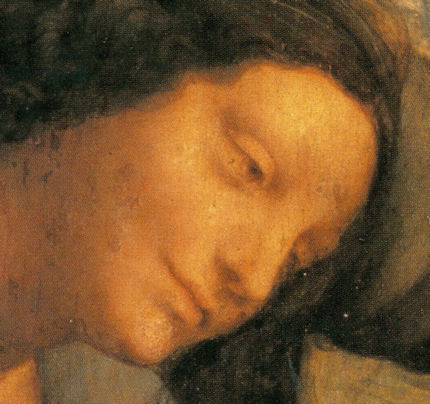


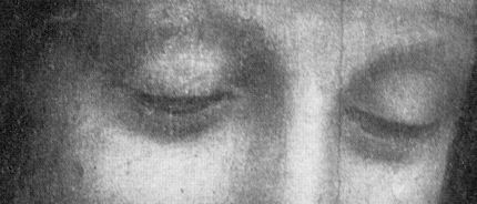

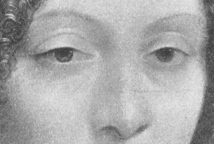


![]()