
How the Metropolitan Museum of Art gets hold of the world’s most precious and vulnerable treasures

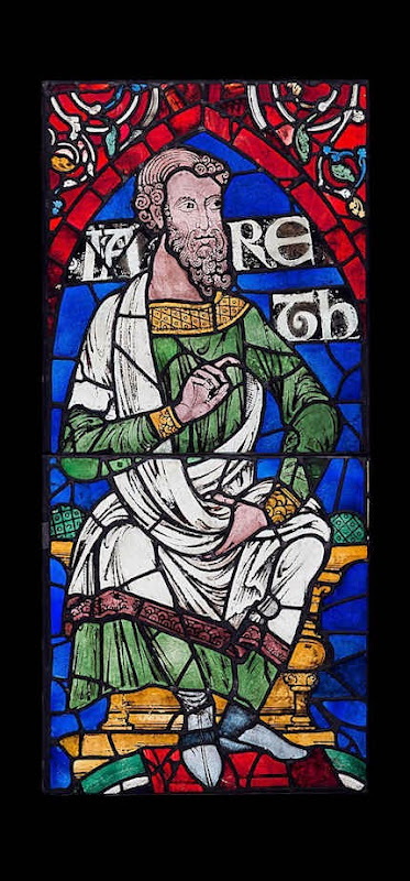
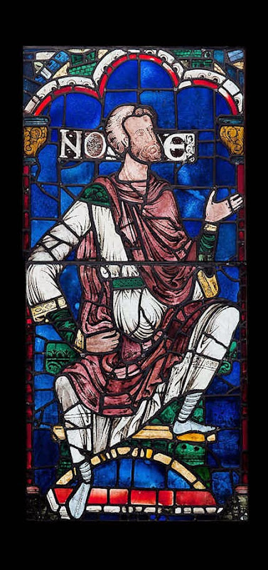
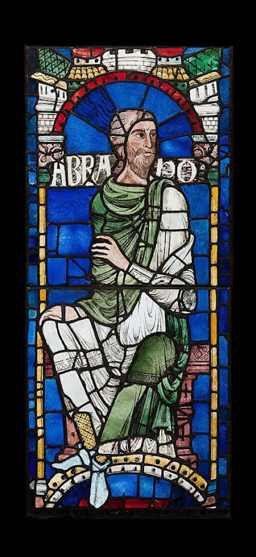
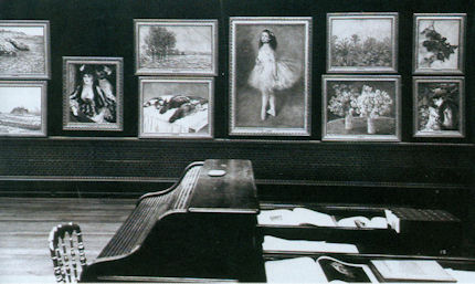
An exhibition of stained glass that has been removed from “England’s historic Canterbury Cathedral” has arrived at the Metropolitan Museum, New York, after being shown at the Getty Museum in California. The show (“Radiant Light: Stained Glass from Canterbury Cathedral at the Cloisters”) is comprised of six whole windows from the clerestory of the cathedral’s choir, east transepts, and Trinity Chapel. These single monumental seated figures anticipate in their grandeur and gravity the prophets depicted by Michelangelo on the Sistine Chapel ceiling. They are the only surviving parts of an original cycle of eighty-six ancestors of Christ, once one of the most comprehensive stained-glass cycles known in art history. (See Figs. 1 – 5.)
The Met boasts that this exhibition of “Masterpieces of Romanesque art…represents the first time they have left the cathedral precincts since their creation in 1178-80”. Who, then, gave permission for the loan of such fragile, precious and architecturally integral material?
The New York Times says of the exhibition that it “Seemed to have been beamed down from on high”, when it undoubtedly had been flown and vibrated down from on high in an aeroplane. The museum world repeatedly offers assurances that modern air transport is perfectly safe for moving treasures around, even though, as the world now well appreciates, aeroplanes do sometimes crash or disappear. Aside from in-flight hazards, works of art get taken by roads to and from airports where they disappear from curatorial view and supervision into high-security cargo depots, sometimes being injured by forklift trucks, and the like, in the process.
The bureaucrats of “Glasgow Life” who administer Glasgow’s museums recently argued (successfully) in Scotland’s Parliament that, as Sir William Burrell had permitted loans from his bequeathed collection within Britain, and as the most dangerous part of lending works is dismantling them in one place and reassembling them in another, overturning his prohibition on foreign travels would be no more dangerous than moving works within Britain. The bureaucrats were similarly successful in overturning Burrell’s prohibition on lending certain categories of fragile works at all, within or outside Britain, such as glass, tapestries and pastels, by arguing that advances in modern packaging skills meant that even the most fragile work could now safely be moved subject to prior conservation examinations.
With the Burrell Collection we know precisely who will carry responsibility for any future travel injuries or losses but with the Canterbury treasures, who at the Cathedral (or in the Church) would take responsibility were these windows to be harmed or lost during their trans-Atlantic travels?
Were these windows insured for their travels, and, if so, what price was put on them?
Has the Church received any payment for this loan, and, if so, how much?
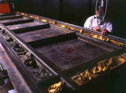
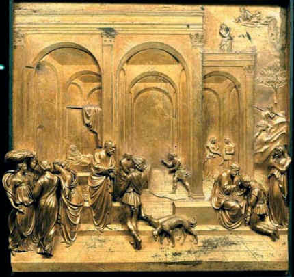
Were the six windows which travelled from London to California and from California to New York flown in separate aeroplanes – as were the three (of ten) gilded panels from Ghiberti’s Florence Baptistery doors (dubbed “The Gates of Paradise” by Michelangelo) when they were sent from Florence to Atlanta; from Atlanta to Chicago; from Chicago to the Metropolitan Museum, New York; from New York to Seattle; and, finally, from Seattle back to Florence? (See Figs. 6 and 7.)
The Metropolitan Museum seems to be a common destination point on many of the most ambitious and hazardous inter-continental tours of art (it will receive the current Tate show of Matisse’s monumental, previously too-fragile to loan, cut-out paper works). In the case of the Burrell Collection even before the Scottish Parliament had heard all the evidence arrangements for an international tour of works were in motion. On 10 September 2013, Joan McAlpine, SNP, the Chair (“Convener”) of the scrutinising Parliamentary committee, disclosed in The Scotsman that “Sir Angus Grossart was giving some hints [the day before, during evidence to the committee’s first session] of the kind of people he’s been speaking to in terms of a world tour…I know they’re talking to the Met in New York, and from the point of view of the people at Glasgow Life, that’s an opportunity to enhance the reputation of the collection, the city and Scotland.”
Crucially, Grossart’s moves were not being made under the aegis of the Burrell Trustees, who are charged with protecting the collection according to the terms of Burrell’s fabulously generous bequest (the 8,000 bequeathed works still constitute the largest gift ever made to a city), but by “Glasgow Renaissance”, an interceding body set up by Glasgow Life expressly to “oversee the Burrell Collection’s immediate future”, advise on the refurbishment of the leaking building which has suffered decades of neglect, and to facilitate the fund-raising, profile-heightening international tour of key works. Sir Angus Grossart, a member of Glasgow Life’s board of directors is the appointed chair of Burrell Renaissance.
In January 2013 it was reported (Herald Scotland) that the first, six months-long stop of the tour would be at the British Museum, whose director, Neil MacGregor, had been co-opted by Glasgow Life to serve on Burrell Renaissance (– as had been his fellow Glaswegian, Lord Kerr, the deputy chairman of Scottish Power). Grossart claimed in evidence given to the Scottish Parliament’s Burrell committee that no conflict of interest existed because no other venue in London had been thought appropriate to receive Burrell works – which is to say, not the Victoria and Albert Museum; not the Royal Academy; nor even the Hayward Gallery where an exhibition “Treasures from the Burrell Collection” was mounted in 1975.
When we appeared for ArtWatch UK as one of only two opposing witnesses before the Scottish Parliamentary committee (the other being Jeremy Warren of the Wallace Collection), we pointed out that the Metropolitan Museum’s present director, Thomas Campbell, had said of a major exhibition he had organised, “No one but the Met could have pulled off the exhibition of Renaissance tapestries we had a few years ago…We bribed and cajoled and twisted the arms of institutions around the world – well, we didn’t bribe of course – but politically it was very complicated negotiating the loan of these objects, which came from the British Royal Collection, the Louvre, the Hermitage, the Vatican and were just all absolute masterpieces.” (“Museum: Behind the Scenes at the Metropolitan Museum of Art”, Danny Danziger, 2007, p.40.)
It will now be greatly less complicated for Burrell’s fragile glass, tapestries, lace and pastels to be sent to the Metropolitan Museum – or anywhere else. Where Jeremy Warren of the Wallace Collection had testified “It is disingenuous to suggest that when one moves a 500-year-old tapestry from one country to another – perhaps taking it across the Atlantic – one is not shortening its life”, Councillor Archie Graham, Glasgow Council’s deputy Leader and the chairperson of Glasgow Life, thrilled at the prospect of “unlock[ing] the potential of this outstanding collection” and of being able thereby to “realise the full benefits of his gift.” We were not surprised to read Jackie Wullschlager’s report in the Financial Times (“Scottish independence”, 5/6 April 2014) that within months of overturning Burrell’s terms of bequest, a themed exhibition of works from within the collection (“Bellini to Boudin: Five Centuries of Painting in the Burrell Collection”) should open with all of Degas’s “glorious, delicate, light-sensitive” pastels shown in their entirety for the first time in a gallery in which water was dripping from the still unfixed roof “the day before” the show opened – that is to say, opened while on the watch of co-opted art world big-wig guarantors, the likes of Sir Angus Grossart and Mr Neil MacGregor. We did not, however, expect, when opposing the attempt to harvest the benefits of a collection bequeathed to the city of Glasgow, so soon to see the Church of England recklessly playing the same value-harvesting game with an irreplaceable part of the fabric of a cathedral and of our national heritage.
Michael Daley
Comments may be left at: artwatch.uk@gmail.com


![]()
THE FATE OF SCULPTURES AT: 1) The Metropolitan Museum of Art; 2) The British Museum; 3) The National Museum of Kolkata; 4) The Academy of Art in Perugia; And, the Burrell Collection next?

STOP PRESS: On Tuesday January 21st the Burrell Collection (Lending and Borrowing) (Scotland) was passed in the Scottish Parliament without a vote. Barely half a dozen MSPs attended. They unanimously supported the Bill (although one called for some published account of the proposed £45m development plan). There is no minimum number of votes necessary for a bill to gain approval.
Neil MacGregor and Thomas Campbell, the directors respectively of the British Museum and the Metropolitan Museum of Art, will now be able to make arrangements for the first two stops in the planned international tour of plum Burrell works to help raise £45m to repair and refurbish the Burrell Collection building, the roof of which has been left leaking for decades. The desultory non-debate took place during an international spate of damaged sculptures.
Accident at Perugia
As we reported on 14 October 2013, when Canova’s sculpture The Killing of Priam was being detached from the wall of the Academy of Art in Perugia to be shipped to an exhibition at Assisi, just 24 kilometres away, it was dropped and smashed beyond repair (as Tomaso Montanari had recently disclosed). The removal operation was headed by the shipping company Alessandro Maggi di Pietrasanta.
Accident at Kolkata
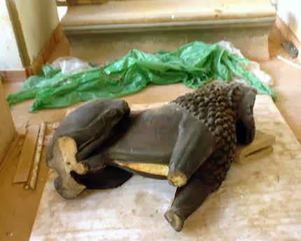
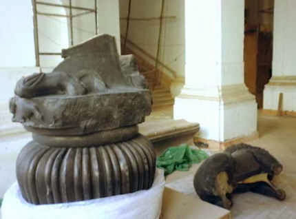
On 14 January this year, the Art Newspaper reported another catastrophic accident, this time at the National Museum of Kolkata where a rare 2,000 years old carved lion was dropped and smashed when being moved within the museum during renovation (see Figs. 1 and 2). The Art Newspaper was quick to claim that the accident “highlighted a shocking lack of professional procedures for handling antiquities at Indian museums” but many major well-resourced and staffed western museums have proved accident-prone in their treatment of sculptures in recent years – and in one respect, as discussed below, the Kolkata museum procedures would seem superior.
Accidents at the British Museum
Consider first the record of the British Museum. In the 2007 book “The Museum: Behind the scenes at the British Museum” (written to accompany a fawning ten-part BBC television series), it is said that:
“Sending precious ancient objects around the world is all very well in theory, but in reality it’s a massive operation fraught with practical and official difficulties. Before any loan is considered, the British Museum has to be certain that the destination museum can provide the right conditions and security. ‘We can only lend responsibly’, says Neil MacGregor. ‘The museums we’re sending to have to be able to ensure their safety. Beijing now has a museum that can accept international loans: it’s new, and it reaches international standards, and it’s very pleasing that they chose to open it with an exhibition of British Museum treasures. Shanghai, being a more cosmopolitan city, has had a good museum for a long time – and there are places opening up in the Chinese provinces that we’ll be happy to work with. It’s easier and safer to transport these big, valuable objects now but it’s just as important to be certain that they’ll be safe at the other end.’”
With regard to safety, as we reported on 6-8 September, when, in 2006, the British Museum packed the peerless and desperately fragile Nimrud Palace alabaster relief carvings (see Figs. 8 and 9) and sent them all by lorry to Luxembourg from where they were flown to Shanghai in two cargo Jets (which broke their 11 hours flights with a stopover in Azerbaijan), it was discovered on arrival that the recipient museum’s doorways were too low. No one, it seems, had thought to measure either the doors or the packing cases.
It was further discovered that the host museum’s lifts were inadequate. In consequence, the crated carvings had to be “rolled in through the front door”. This meant “that we had to get a mobile crane to get them up the stairs. Even then we had to unpack three of the modules to get a bit more clearance”, said the British Museum’s senior heavy-objects handler, Darrel Day, in one of the museum’s self-promotional television programmes (see “The Museum”, BBC2, 2007).
When the collection was finally unpacked it was found that “a few little conservation things had to be done.” The injuries have not been identified and no photographs of them have been published. When crated Chinese terra cotta warriors arrived on loan at the British Museum, they in turn would not pass through the door of the reading room – even when the door’s frame was removed.
Accidents at the Metropolitan Museum
As for the Metropolitan Museum, New York, the Burrell Trustees will have further grounds for qualms when considering authorisation of loan requests to that venue. In 2008 an Andrea della Robbia terra cotta, St. Michael the Archangel, fell from the walls and smashed (see Fig. 4). So far as we know, it has not yet been repaired and returned to view.
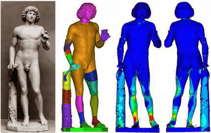
Six years earlier, in 2002, a much larger and art historically more important sculpture, Tullio Lombardo’s life-sized carved marble Adam (Fig. 6) – the first monumental, classically inspired nude of the Renaissance – also fell to the ground and smashed into many pieces (see Fig. 7). It did so when its stand collapsed. We must assume that like the Andrea della Robbia, this work, too, has still not been repaired and returned to the gallery. On 28 January 2010, Randy Kennedy reported in the New York Times that neither of the Met’s smashed Renaissance sculptures were back on view (“Despite Assurances, Met Finds Artworks Aren’t restored Overnight”). The Museum’s press office has not responded to either of our inquiries last week on the present condition and whereabouts of the two Renaissance sculptures. At the time of its collapse in 2002, the Met said that the Lombardo would be back on display in two years time. Fortunately, both of these accidents occurred after hours and when no visitors were present. In both cases no museum staff witnessed the accidents.
Unlike the Kolkata Museum (and the National Gallery in London, which supplied ArtWatch with photographs of the painted panel by Beccafumi which was dropped and smashed when being dismounted from a temporary exhibition within the gallery), the Met permitted no photographs to be taken of the Tullio Lombardo sculpture, which witnesses reported to have been smashed into hundreds of pieces.
The Met defends both that original suppression of evidence and the continuing secrecy surrounding the two restorations. In January 2010, Randy Kennedy reported that the unusual seclusion in which the Lombardo restoration was being carried out had generated suspicions that the sculpture is beyond repair. This lack of institutional transparency was defended by the chairman of the museum’s department of European sculpture and decorative arts, Ian Wardropper, on the grounds that seeing images of broken sculptures would be “detrimental to museumgoers’ ability to appreciate such pieces once repaired”. Mr Wardropper suggested on that occasion that the work was probably three years from re-emerging and he attributed the increasing length of time to an original decision to restore the statue “in the most meticulous and durable way possible.”
The Met believes itself to have been hampered in its goal, Mr Kennedy reported, because “few pristine life-size museum marbles like the Adam have ever shattered, so reliable technical information about restoring one is limited.” Nonetheless, Mr Wardropper was bullish about the significance of the protracted restoration. A large insurance pay-out had been made (the size of which the Met also declines to disclose), and it was decided to use this money for a monumental restoration research project on the best means of repairing smashed carvings.
It has been promised that at the restoration’s end, the repaired and cleaned work will be unveiled as the centrepiece of a special exhibition to be housed in a new gallery dedicated to the Venetian Renaissance. That the work itself is of great art historical and artistic significance is not in dispute (see comments at Fig. 6). At the same time, consideration might be given to the artful propagandistic means by which museums can contrive to present the eventual recovery of needlessly or carelessly lost or damaged works as Public Relations Triumphs – see “Questions and Grey Answers on the Tate Gallery’s recovered Turners”.
In January 2010 the Met’s then new director, Thomas P. Campbell, said that after initial doubts he fully supported the lengthy restoration: “The sculpture is 500 years old. Whether it’s off display for eight years rather than five is insignificant.” The sculpture is now at least 521 years old and has been off display for twelve years. We are told that research carried out on the safest means of pinning fragments of marble together has established that the most commonly used material – stainless steel – has the great disadvantage of having greatly more tensile strength than the marble itself. It is not clear why this “discovery” required such lengthy and expensive research: it has long been recognised that the iron pins used to re-assemble the Parthenon during its 1930s restoration had resulted in fractures of the marble, either as a result of earth tremors or the expansion of the iron through rusting (the restorers had not followed the ancient Greek practice of encasing the iron in lead to prevent corrosion). The consequence of using steel (or titanium, as is now being used on the Parthenon) for pinning today, is that when sculptures are next dropped or severely shaken, the pins can shatter the marble from within, introducing many more and greatly more serious injuries. It should, therefore, go without saying that moving stone works that have been repaired with metal pins inescapably compounds the risks.
Even if the vote in the Scottish Parliament should go in favour of Glasgow Life’s attempt to overturn Burrell’s wishes and binding instructions against foreign travels, the trustees of his collection might nonetheless, when considering authorising a loan to the Metropolitan Museum of Art, reflect on the fact that the Lombardo sculpture was smashed only because (as we had reported in the ArtWatch UK Journal 17 in 2002) it had been removed in 2000 from the cherry-wood pedestal on which it had (presumably) stood since its 1936 acquisition by the Met, and placed on a modern conservation-standard base and shallow plinth constructed with MDO (Medium Density Overlay Plywood). At that time, the then director, Philippe de Montebello, promised that, after an anticipated two years restoration, “The figure will stand again on a solid pedestal and, frankly, only the cognoscenti will know.” A dozen years on, that claim has yet to be tested. What can be said, is that the sculptures at the Burrell Collection presently stand securely on wonderfully stable stone bases (see Figs. 11 and 12) and, as ArtWatch pointed out to the Scottish Parliamentary hearing on September 19th, they would remain safely so if “as we most strongly urge, the Parliament rejects the request to overturn Burrell’s still perfectly well-founded prohibition on foreign travels for works in collection.”
Michael Daley
Comments may be left at: artwatch.uk@gmail.com


![]()
Bubbles burst.

A few years ago a director at the Victoria and Albert Museum, was chided for producing blockbusters that bust no blocks. Today, aside from its catering and retailing outlets, that museum – which once advertised itself as “An ace caff, with quite a nice museum attached” – has a department exclusively dedicated to the production of special exhibitions. It generates eight exhibitions a year with a further fifteen travelling around the world at any one time (see “The world is her oyster”, in the Autumn/Winter 2013, V&A Magazine). As more and more of Art’s Flying Dutchmen encircle the globe, an awful lot of holes are appearing in the collections of great museums – as at the Louvre, as Didier Rykner has eloquently demonstrated (“The Louvre Invents the Gruyère Museum” ). This development is perverse as well as regrettable: a chief defence that museums make when seeking funding for expensive acquisitions is that they are needed to fill crucial gaps in a collection.
At the British Museum the number of loans (and therefore holes) doubled between 1985 and 2000, in which year 214 objects or groups of objects were loaned. That was for starters. In 2008, under its present globe-trotting director, Neil Macgregor, the museum got 2,500 objects “on the road” in Britain alone. In a submission this year to the Scottish Parliament, Mr MacGregor boasted that between 2003 and 2013 the museum had loaned over “over 30,000 (many very fragile)” objects, with only eight injuries. In 2006 the BM packed 160,000 visitors in three months into a (physically) small exhibition of Michelangelo’s drawings, at £10 a head (plus takings from the catering and retailing outlets). Mr MacGregor ruefully claimed that three times as many tickets could have been sold had space permitted. The following year he announced plans for a £100m expansion of the British Museum that was reportedly triggered because it had had to turn down a unique chance “to show off” the largest collection of Tutankhamun treasures ever seen in the west (Evening Standard, 6 July 2007), works which went instead to the former Millennium Dome, now re-branded as “02”.
It would seem that nothing in museums is now safe from this international exhibitions jamboree – no work plays too important a role within a collection, or is too fragile, or too unwieldy, to prevent curators from taking a gamble with its welfare (in hope of reciprocal loans and a curatorial buzz). The Metropolitan Museum in New York is one of the most voracious recipient/organisers of exhibitions. It needs to be. Its special exhibitions, which are free, are the biggest justification for the museum’s whopping “recommended” $25 entrance charge (- the legality of which is under challenge). As we have seen, the present director of the Metropolitan, Thomas Campbell, once boasted that only his museum could have shaken-down (“Item: The Met’s Strong-arming of Reluctant Lenders”) other great art institutions to get them to part with the fabulous Renaissance tapestries that were sent to a special show in New York.
The Metropolitan Museum will likely be the first international stop (after a six months stay-over at the British Museum) for a long-planned show of plum works from the Burrell Collection in Glasgow that will take place should the Scottish Parliament oblige the Glasgow City Council by over-turning the prohibitions in Sir William Burrell’s bequest on all foreign loans and vulnerable works within Britain.
Next October in New York, the Museum of Modern Art will host a show of some of the most fragile and difficult-to-transport works of modernism. As Martin Bailey reports in the current Art Newspaper, (“Journey at Snail’s pace”) Henri Matisse’s monumental 1953 paper collage, The Snail, is to leave the Tate for the first time since the gallery bought it more than 50 years ago. It will be a star exhibit in “Henri Matisse: the Cut-Outs”, at Tate Modern next April, that will include its sister works, Memory of Oceania, 1953, and Large Composition with Masks, before travelling to MOMA in New York. Although the itinerary is set, what is not yet clear, Bailey discloses, is how the Tate’s giant and fragile work will travel or even how it will be be packed:
“The problem of how to transport the huge work, which measures nearly three square metres, has plagued conservators for years. Paris’s Grand Palais asked to borrow the work for a major retrospective on the artist in 1970, but was refused because of the risks associated with transporting it. Its original late-1960s glazing is being replaced with laminated glass, which will reduce the risk of damage during transportation. However, laminated glass is heavy: with its frame, the work will weigh around 300kg. If the collage is set at a 45° angle within a crate, it will fit more easily through doorways, but if the work is transported flat, it will need a case measuring around four square metres.”
Those keenest to lend and borrow lean heavily on the relative safety of international aviation, but with these particular monumentally large but flimsily constructed works, Bailey discloses that a spokeswoman for the Tate was unwilling to discuss transport arrangements. He has discovered, however, that they might travel by sea because there are almost no cargo planes large enough to carry them, and because the exhibition’s sponsor is… South Korea’s largest shipping company, Hanjin Shipping. Either way, as Nick Tinari of Barnes Watch has repeatedly testified, when Matisse’s mural La Danse was detached from its permanent home at the Barnes Foundation, Merion, and sent off at a 45° angle on an open flatbed truck to the first stop (the National Gallery of Art, Washington) of a world tour, it was to return home badly damaged.
Not only are museums gutting themselves to feed international loan exhibitions, they are, as our colleague in New York, Ruth Osborne, discusses (“The Dismemberment of the Louvre: Travels to Louvre Abu Dhabi promise damages and leave Parisian Museum-goers in the Lurch”), beginning to do so on an even greater scale as part of international “rebranding exercises” in which museum annexes are created in improbable but rich centres so that museums may present themselves as pan-national or global brands (- along with Gucci now read Guggenheim). A lot of money is being made and a lot of careers advanced. Some journalists effectively double as cheerleaders for the tourism-fuelled cultural arts economies of centres like London and New York. However, along with these booming arts economies, risks are rising – and not just with the works of art: those who blithely authorise streams of loans risk putting their own reputations on a block.
Michael Daley
NEWS UPDATE 26-11-13
The Guardian today carries this letter from ArtWatch UK:
“You illustrate the new exhibition of Turner seascapes at the National Maritime Museum with a giant reproduction of the artist’s now badly wrecked, many-times restored ‘Rockets and Blue Lights’ without issuing any kind of art conservation health warning (Eyewitness, 21.11.13). A clue to the extent to which this picture is no longer a remotely fair representation of Turner’s work is found in the picture’s full title, ‘Rockets and Blue lights (Close at Hand) to Warn Steamboats of Shoal Water’ – for this was once a painting of two steamboats in distress, not of one. The now lost boat was recorded in a large chromolithographic copy of the painting that was commissioned in 1852, and in a photograph of 1896. Viewers who compare your present image with the recorded earlier states of the picture will likely marvel at the transformation by twentieth century restorers of the sky, and at the losses of storm-driven smoke from the funnels of the original pair of steamboats, one of which vessels has now disappeared under the waves along with its originally depicted crew members.”
In the ArtWatch UK Journal No 19 (Winter 2003), we carried an article by the artist Edmund Rucinski (“Ship lost at Clark. Many records feared missing. Establishment unfazed.”)
Unfazed the establishment was then – and, evidently, so remains today. Despite the disappearance of the second boat (and its smoke) in a recent cleaning, the owners of the Turner, The Sterling and Francine Clark Art Institute of Williamstown, USA, had included the work in a travelling exhibition (“Turner – The Late Seascapes”) that ran at the Clark from June to November in 2003, before transferring across the Atlantic to the Manchester Art Gallery in January 2004 and then on to Glasgow in March 2004.
At a public lecture at the Clark Institute, on 2 August 2003, Edmund Rucinski (who knew of the 1852 chromolithographic copy shown right) had been astonished to hear the restorer, David Bull, claim that the picture had originally depicted a single boat and that the second, now-removed, boat had not been painted by Turner but was a restorer’s addition made, possibly for Lord Duveen around 1910. That claim slowly sank. When Rucinski spoke to David Bull and asked on what authority the second boat had been removed, he replied that it was on a photograph of a single-boated copy of the painting that had been supplied by the Clark Institute’s senior curator, Richard Rand.
On 15 October 2003, the Times’ arts correspondent, Dalya Alberge, reported that when asked how it had been established that the second boat could not have been painted by Turner, Mr Bull had said: “The answer is we don’t know. It was a general consensus.” Thus, what had been presented publicly as a historically verified certainty was downgraded within a couple of months to a best guess, collective assumption. That position was maintained for several months and was reiterated in the Manchester Evening News of 14 January 2004, which reported: “The American owners of the painting and the restorer…say a second boat may have been added by an early 20th century restorer”.
On 28 March 2004 the show moved to Glasgow and the Glasgow Herald reported that the Clark’s senior curator had said “We have always maintained that the original Turner had two boats”. The importance of heavy promotion for travelling exhibitions was demonstrated in October 2003 when the Tate, which had not taken part in the travelling exhibition, nonetheless issued a press release that ended with the following claim:
“One of the stars of the show is Turner’s dramatic “Rockets and Blue Lights (Close at Hand) to Warn Steamboats of Shoal Water”, 1840 which has recently undergone major conservation and is a loan from the Sterling Clark Art Institute, Williamstown, USA”.
In additions to newspaper reports of critisms of the restoration, many interventions were made by scholars, as below:
“Since ‘Slavers’ and ‘Rockets’…have ended up in collections geographically so close to each other, it struck Hamilton [James Hamilton, the show’s curator] as a good idea to show them together, arguing that Turner had intended them as a pair. The first snag was that Boston decided that ‘Slavers’ was too unstable to travel, even to Williamstown, so it was not in the show at all…But there is a danger that Turner has become a guaranteed crowd-puller, to be had recourse to at the expense of equally interesting but less certainly popular subjects. This is not a development to be welcomed, if only because Turner’s works are exceptionally vulnerable: the paintings, to the stresses of travel on their experimental construction; the watercolours to the exposure of light. He is not a resource that can be exploited indefinitely…”
~ The Turner scholar, Andrew Wilton, in a review for the Burlington Magazine, March 2004.
The ‘Slavers’ of which Wilton spoke, is Turner’s oil painting Slavers throwing overboard the dead and dying – Typhoon coming on. In 2000 the Museum of Fine Arts in Boston which owns the painting found it to be damaged and “extremely unstable” on return from a loan to the Tate Gallery. Despite having been “glazed and sealed against changes in relative humidity, the picture [had] reacted significantly to the voyage” and lost flakes of paint. An unfazed (and institutionally unrepentant) Tate spokeswoman said in response to disclosure of the damage:
“It arrived here safely where it was examined thoroughly. Its condition was stable…However, Turner’s paintings are notorious for becoming unstable.”
Indeed they are. So why the incessant demands from temporary exhibition organisers to keep borrowing them? And why the systematic attempts to deceive the public into believing that the most restoration-wrecked pictures are the “stars” of the shows?
For our part, we have repeatedly drawn attention to these travel-induced injuries. On 24 October 2007 the Daily Telegraph carried this letter from ArtWatch UK:
“Sir – The Mellon Center’s decision (report, October 17) to break its own rule never to lend Turner’s fragile ‘Dort or Dordrecht: The Dort Packet-Boat from Rotterdam Becalmed’ seems perverse: only seven years ago, the Museum of Fine Arts in Boston lent its Turner ‘Slavers throwing overboard the dead and the dying, Typhoon coming on’ to the Tate. On its return to Boston, that painting was found to have suffered losses of paint and to be in an ‘extremely unstable’ condition. A Tate spokeswoman said: ‘It arrived here safely…Its condition was stable…However, Turner’s paintings are notorious for becoming unstable.’ This being so, why are trustees and curators prepared to take such risks with priceless works of art?”
Clearly, the question still stands.
Comments may be left at: artwatch.uk@gmail.com


![]()
Art and Photography

Returning from an ArtWatch trip to New York and Philadelphia (refreshed and invigorated, as always), a first task was to take clippings from the previous week’s newspapers. On facing pages of the Times of 26 October, two startling and memorable images shouted in hilarious unison – and surely not in accidental juxtaposition? The first (here Fig. 2) was of a squirrel that had dropped a nut. The second was of one politician (Hillary Clinton, Fig. 1) endorsing another at a rally. The pendant pair of images testified to photography’s special, most distinguishing technical trait: its unique power to make/capture instantaneous-but-enduring mechanical records of particular scenes at singular moments. Photography (in its chemical and digital forms) has been a profoundly revolutionary addition to the world’s image making and recording capacities. That it is so at this point is beyond any dispute, but, then, it has never constituted, as some still hold, a replacement for those hand-crafted (painted, drawn or engraved) images made by people who are sometimes called artists. (See Gareth Hawker’s “A Photograph is a Copy, not a Creation“.)
On 25 October, at New York’s famous art school, The Art Students League, we were privileged to watch a kind of master class given by the painter Thomas Torak, who for thirty or so minutes, worked over a student’s oil painting of a model – a heretical procedure in many educationalists’ eyes. Using the student’s own palette, paints and brushes, he explained the artistic purpose of every change and adjustment as he went along. Starting at the passage depicting the model’s forehead, Torak suggested that the tones were too uniform. Lightening the student’s own flesh tint on the palette, he placed a firm highlight against the darkest tone on the shaded side of the head. Instantly – at a proverbial stroke – the form of the brow sprang forward from the canvas and turned convincingly in (evoked) space. With a stronger forehead, Torak moved down to the eyes in their sockets, darkening the shadowed hollows and placing strategic lights on the lids and the bulging eyes themselves. And so on and so forth down the head and into the body. Every adjustment was made on the authority of values seen to be present on the model herself, at that time and in that light. Seemingly, nothing was being invented: piece by piece, step by step, observable relationships between adjoining values were first carefully appraised and then artfully replicated in hue and tone on the palette, before being judiciously laid onto the painting.
However, as facet related to facet and form to form, the mosaic whole began to assume a compelling and designed narrative form from a brush that drew and revised as it coloured. Finally, Torak introduced consideration of the model’s entire body and clothing to the values of the background wall within the then-present natural top-down light. Here, again, the student had made too-equal an appraisal of the relative figure/ground values: the background was markedly too dark and too warm. Lightening and cooling its tone and hue caused the untouched figure to jump forward on the canvas in a startling “before-the-eyes” pictorial magic. Watching the demonstration and the entire group of students, it was apparent that without seeing Torak’s painting but simply by heeding his words of analysis and explanation, other painters in the studio were modifying their own work on similar rationales and to considerable benefits.
As a mild-mannered, softly-spoken man, Thomas Torak may be one of the art world’s most insufficently appreciated figures. Fortunately, the deftness of his speech and the acuity of his eye find other outlets at the Art Students League. Writing in that art school’s magazine LINEA (- and how very fortunate New York is that such an institution should have survived waves of modernist iconoclasm), Torak quietly, gently shredded a recent noisy attributional upgrade, rashly made on the back of a pictorially disruptive restoration at the now curatorially hyper-ventilating Metropolitan Museum of Art: see “The Rediscovered Velázquez” of 25 December last year.
Returning to our hotel at 11 p.m. on the last night of the trip, we witnessed another kind of artistic tour de force. On the corner of Times Square and West 48th Street, a “street artist” was working on a triple portrait, made in conté crayon on the basis of a photograph taken on a mobile phone (see Fig. 7), as his three subjects sat on the sidewalk behind him. The image of each head on the photograph could have been no more than half an inch high, and yet, from this miniscule photographic record, the artist was producing at speed perfectly credible heads with very fair likenesses. Like David Hockney – as we discovered once when drawing by the side of Lake Como – artists never pass one another without making an involuntary detour to take a peek. “Where did you learn to draw like this?” I asked the street artist. “In China” he replied. Ah yes, and alas, it could hardly have been recently at the Royal Academy Schools in London where Tracey Emin has been appointed Professor of Drawing. (See Harry Mount’s “Where will the Queen hang her rubbish portrait by Tracey Emin?”)
Michael Daley
Comments may be left at: artwatch.uk@gmail.com


![]()
Review: Stone-washed Renoirs and the Shock of the Undone

We knew at a glance that something was amiss. On June 16th, a newspaper photograph trailed an imminent auction sale of Renoir’s “Baigneuse” of 1888. Even on the evidence of that single de-saturated newsprint reproduction (right, Fig. 1) it seemed clear that the privately owned masterpiece had gone through the picture restoration wash cycle a time (or two) too often. A comparison of Christie’s pre-sale zoom-able online photograph with historic photographs of the painting further suggested that picture conservation’s would-be beauticians had been at work with swab and solvent: Renoir’s bather had been left (Fig. 2) a paler sugar-smooth pictorially and plastically enfeebled version of her original self. (For the picture’s appearance and condition in 1944, see Figs. 7 and 9.)
Just as museum curators who organise splashy temporary exhibitions rarely broadcast the “conservation” injuries borne by works loaned from sister institutions, so auction houses, which of necessity must act primarily as agents for owners, can seem no less reticent on this fraught subject. In practice, we find that in of both of these art spheres, the “now” is often implicitly presented as the “originally-was” and “always-has-been”, thereby thwarting what would be the greatest inducement to halt needless adulterations of unique historically-rooted artefacts: a full public disclosure of “conservation” treatments and frank art-critical discussion of their material and artistic consequences. By coincidence, recent museum and saleroom activities have brought to London a slew of little-seen examples of Renoir’s oeuvre. As cases in point of Renoir’s vulnerability, we examine here treatments of his “Baigneuse” of 1888 and the Washington National Gallery’s “The Dancer” of 1874.
Renoir’s “Baigneuse” was given star billing (on a £12/18m estimate) at Christie’s June 20th Impressionist/Modern sale, for the catalogue of which it provided the cover illustration (Fig. 2). While much was made in the eight pages long catalogue entry of an impeccable and unbroken provenance through ten successive owners, not a word was said about any restorations of the painting, and although many early photographs are identified in the picture’s literature, none is reproduced. It is disclosed that this Renoir is to be included in the forthcoming “catalogue critique” of the artist’s work being prepared by the Wildenstein Institute from the Archives of François Daulte, Durand-Ruel, Venturi, Vollard and Wildenstein. (Perhaps the present condition of the picture will be discussed in that publication?)
On the night of the sale, an announcement that the picture had been withdrawn drew gasps of surprise. Artinfo reported that the vendor had accepted a private offer from an unidentified buyer for an undisclosed sum somewhere within the estimate. Trade and press eyebrows have been raised at such secretive, pre-auction sales and the withdrawal was the more confounding because expectations of a big auction house “event” had been raised by extensive (and quite stunningly fetching) pre-sale press coverage with photographs of the painting enlivened by the seemingly routine inclusion of beautiful young female staff members.
With modern paintings, the starting point for any appraisal should be the earliest known photograph. Old photographs are historic records. Historic records should never be ignored. Old photographs of pictures assembled in homes or exhibition galleries are especially precious and instructive. The photograph of Renoir’s 1905 exhibition at the Grafton Gallery (Fig. 3) testifies not only to the then generally more vivacious relative values within individual works but to the striking variety of pictorial effects and painterly means deployed within Renoir’s oeuvre.
With regard to the photographic testimony of the original appearances of individual pictures, consider first the large, near-central painting in the 1905 Grafton Gallery photograph – Renoir’s “The Dancer”. This picture, now at the National Gallery, Washington, is 138 years old but was then only 31 years old and unrestored. Then, the background was disposed in distinct but linked quadrants (top-left; top-right; bottom right; bottom left). These were not so much naturalistic renderings of an actual space as subservient pictorial devices spotlighting the central bow-tight figure of a child trainee who, through balletic discipline and artistry, had assumed a commanding Velazquez-worthy sideways-on viewer-confronting presence.
To that expressive end Renoir had welded the dramatically contra-directional lower legs into unity by a pronounced dark shadow in the vertical triangular space they bounded. That shadow sprang also from the heel of the (right) weight-supporting foot backwards and upwards in space, thereby throwing the bottom edges of the trailed skirts into relief. This dark zone in the lower-right counterbalanced another in the upper-left, which had in turn emphasised and thrown into relief the front edge of the costume, withdrawing only to leave a lighter, again relieving, tone at the dancer’s dark hair. The progressive loss through restorations of those artful dispositions (as seen in Figs. 4 & 5) and the picture’s general descent towards an inchoate, arbitrary pictorial froth that increasingly resembles the underlying condition seen today in its own infra-red imaging (see Fig. 6), is heart-breaking. Renoir had here been a sculptor before he became a sculptor, playing off forms that asserted his picture plane with others that ran sharply away from or towards it (rather as Michelangelo had famously done in his crucifixion of Haman). Degas, who spoke of Renoir’s “sharpness of tones”, had chided himself for constructing his own drawings of standing dancers from the head down instead of from the feet up. Renoir had here given a masterclass in how to project a standing figure upwards from the floor. These things artists know and appreciate.
Compendious photographic evidence suggests that restorers (frequently working myopically through head-mounted magnifying eyepieces) have consistently confounded dirt or discoloured varnish with the shiftingly elusive dark grounds used by artists to set off light-toned figures. As seen in our post of June 1st, Klimt’s portrait of Serena Lederer (which was acquired by the Metropolitan Museum of Art, New York, in 1980) has suffered in just such a manner. In the same post we saw also how Renoir’s deployment of a dark background zone in the upper left quadrant of background and a secondary but counter-balancing dark zone in the lower right quadrant of his “Dance in the City” had also been undone by successive restorers.
By courtesy of the 1905 photograph of the dancer we can now see that by 1944 the picture’s decisive tonal orchestration had already been subverted (see Fig. 3 and caption at Fig. 6). By the time of the picture’s appearance at the 2012 Frick show of Renoir’s full-length portraits (which was reviewed in our post of June 1st), the original dark tones in the lower right quadrant had effectively disappeared, leaving two odd arbitrarily truncated dark attachments to the right heel (Fig. 5). Cumulatively, this painting has suffered needless artistic vandalism of which no one speaks. The fact that graphite underdrawing is now visible on the painting has been mentioned but without any hint of alarm or censure.
With Renoir’s “Baigneuse” of 1888, the earliest photograph in our own records (- donations to ArtWatch of old photographs or postcards are always most gratefully received) is that published in 1944 when the painting was 56 years old, as seen here in greyscale at Fig. 7 (left) and at Fig. 9. Six years later, by 1950, the painting had been radically transformed, as seen at Fig. 7 (right, in greyscale) and Fig. 8 (left, in colour). The differences that emerged between 1944 and 1950 were compounded by further changes between the picture’s 1950 state (seen in colour at Fig. 8, left) and its 2012 state (seen in colour at Fig. 8, right). However many times and by whomever this painting might have been “restored”, it is clear that the resulting interventions have profoundly altered its constructional and pictorial rationales. The total extent of the alterations that occurred between 1944 and 2012 are examined right in greyscale details in Figs. 11-18. The differences between the 1950 and 2012 states are examined in colour details at Figs. 19, 20 and 21.
By 1888 Renoir had visited Algiers and Italy, come to admire Cezanne as well as Delacroix, discovered Italian painting and read Cennino Cennini’s Treatise on Painting. He had just completed an intense series of classically inspired, Ingresque female nudes, culminating in that declared trial for decorative painting, the Philadelphia Museum’s great “Bathers” of 1887, by which date he held the nude to be one of the most “essential forms of art”.
Compared with Fantin-Latour’s palpable but fluidly allegorical figure at Fig. 10, Renoir’s “Baigneuse” has, in its 1944 state, a markedly more stolid, out-of-Courbet corporeality. For all its spirited brushwork and sparkling colour, plastically, it constitutes an essay in composure, stability and parallelism. The torso seemingly rests on its own base of compressed and spreading buttocks and thighs. The thighs, knees and lower legs are held together in a manner more primly archaic (Egyptian) than classical. Movement is confined to the bather’s right hand which dries the left side of the waist. This action has enlivening consequences. The upper torso is pulled round by the right arm and the head is turned leftwards and downwards as if to contemplate the drying action of the towel. The left arm is required to be held aloft to free the left side of the figure, and, flexing at the elbow as the left hand draws across the face, it first echoes the thighs but then curls gracefully, weightlessly away in space.
What, then, explains the differences between the picture’s previous and its present condition? In such cases it is always possible to play the “Sistine Chapel Ceiling Restoration Defence” and claim that in 1944 the then 56 years old picture was very dirty and that the removal of this dirt has liberated the forms and the colours of the painting to a hitherto unsuspected degree. But the pattern of relationships that is visible, even under dirt, should not change character during a cleaning. Rather, it should emerge enhanced, with the lights lighter and the darks darker – and all individual values holding their previous positions. This has not happened – the picture has got progressively lighter with successive cleanings instead of returning to its previously cleaned state. If it really had been left by Renoir in today’s state, how could the previous but now lost artistically constructive values ever have arisen? If left untouched for the next 56 years, would anyone expect the painting to return to its 1944 appearance with the stripes on the towel and the shading of the fingers regaining strength? Would a general shading and enhancement of forms once more helpfully tuck the left hand behind the head? How might dirt have drawn more clearly and repositioned the left shoulder? How might it have more emphatically shaded the right, distant side of the face?
If we consider the difference between the 1950 and 2012 colour plates (shown at Figs. 8, 19, 20 & 21), what might account for the loss of orange coloured modelling in the left cheek, and of individual brushstrokes depicting the hair? Is it possible to claim on the evidence of these photographs that there has been a build-up of dirt on the picture over the last 62 years?
When examining the bather’s face in close-up today, as shown at Fig. 21, can we have any confidence that the paint presently surviving in that section is just as it was when left by Renoir in 1888? What kind of brush or paint might he have used that would have resulted in the present fragmentary, seemingly abraded, scattering of orange paint that lies over the blue background between the hand, the face and the shoulder?
In the next post we examine the conservation fate of more than a score of Renoirs that have been loaned from the Sterling and Francine Clark Art Institute in Williamstown, Massachusetts to the Royal Academy. We shall see how Sterling Clark learned the hard way not to trust art experts on matters of condition in paintings when, having been assured that Domenico Ghirlandaio’s “Portrait of a Lady” had never been repainted, he bought it, only to discover, very shortly afterwards, a postcard of the painting showing it in an earlier and quite different state.
Michael Daley
Comments may be left at: artwatch.uk@gmail.com


![]()
Review: Deadly Docents, Dirty Varnish and a Big Educational Push at the Frick

The hardest thing to do in today’s internationalised world of museum administration is to stand still. A trip to New York always compels a visit to the delightful time-frozen art palace that is the Frick Collection but it would seem that, even there, maintaining the status quo there has proved unendurable. Madcap schemes to build new galleries for new exhibitions under the Frick’s garden have been drawn up. It is possible that the new director, Ian Wardropper (former chairman of the department of European sculpture and decorative arts at the Metropolitan Museum of Art), has dampened ardour for the kind of curatorial and physical “bolt-ons” that have skewed similarly bequeathed jewels like the Wallace Collection in London and the Phillips Collection in Washington (where today the historic works and their period architectural setting have been swamped and diminished by curatorial and architectural expansionism; where today “Special exhibitions are a signature element …offering new perspectives on the work of contemporary and modern artists.”) The Frick’s director does however seem minded to expand the audio tours and “other educational programs” and a book prominently displayed in the Frick’s shop (see right) serves as explicit manifesto for Education’s bid to interpose itself noisily at the very centre of museums between art and its visitors. As the painter Gareth Hawker describes below, something vital and of the essence is threatened by the prospect. And, as the painter James Keul discovered on a recent visit, something similar is already up and running at the Getty:
“The docent in the Rembrandt room of the East Pavilion upper level, which covers art from 1600-1800, was speaking to a tour group of about 20 people, mostly middle-aged, and asking what observations people had made on the small painting of the Abduction of Europa. One member of the group asked why all of the paintings appear so dark. The docent answered that varnish and oils applied over the years had darkened, leaving many works darker than they were intended to be. Presumably, this was meant to plant a seed in peoples’ minds that all dark paintings are the result of a darkened varnish rather than an intended effect that was used, in this case by a Baroque artist, to provide contrast and thus bathe a picture in a divine light…”
Gareth Hawker writes:
Visitors who plan a quiet hour or so contemplating works of Art in an American museum risk being accosted by guides called “Docents” who intend to deepen their museum experience. Docents, according to Rika Burnham and Elliott Kai-Kee, the authors of “Teaching in the Art Museum: Interpretation as Experience” (2011, Getty Publications – see Figs. 1 – 4), seek to enable the visitor to “make meanings”. The book’s purpose “is to explain making meanings – to open the world by means of art”. Although many readers might be baffled by such sentences as: “metacognition is a byproduct of practice and it facilitates profound experience”, Burnham and Kai-Kee’s respective positions as Head of Education at the Frick Collection, New York, and Education Specialist at the J. Paul Getty Museum in Los Angeles, requires that their campaign to help docents influence a whole culture by shaping the public’s attitude to works of Art be examined.
Docents are amateur enthusiasts, who have been trained to a high level – though not to degree standard – in both teaching and art history. They come from all sorts of backgrounds, and are of all ages. They probably think of themselves as more or less ordinary people who enjoy appreciating art and wish to help others to do so.
The position of the Docent was created in 1907 in response to a perceived need. Visitors to art galleries wished for a guidance in appreciating works of art which was deeper than that being provided by art-historical lectures. Docents were trained and appointed to meet this need by providing an education in aesthetic pleasure. Nearly a century later, there is no longer agreement about what might be meant by “an education in aesthetic pleasure”. So this book appears at an opportune moment, just when museum educators are seeking to clarify their roles.
In order to help redefine their objectives, Burnham and Kai-Kee refer to the work of the educationalist John Dewey who wrote in his classic 1934, Art as Experience, that “The task is to restore confidence between the refined and intensified forms of experience that are works of art and the everyday events, doings, and sufferings that are universally recognized to constitute experience.” Dewey had identified an ideal response to a work of art. The visitor would begin by gaining an “experience” (that is, a sense of unity). A teacher might help the visitor in this, by stimulating and guiding his thoughts, but without ever imposing any view or judgement. In this way, “guided interpretation” might help the visitor to “make meaning” – to recognise relationships in many aspects of life and art. At its highest this process can generate a sense of over-arching interconnectedness which Dewey called a “culmination”.
In one exercise, students working in a group are encouraged to offer up any ideas and reflections which come to mind in reaction to a painting. These “thought showers” sound as if they could be open and productive, but, if a student asks an awkward question, the process seems to go into shut-down, as the following account (p. 71) may illustrate:
“The picture (the Frick Saint Francis by Giovanni Bellini) is beginning to cast its habitual spell. Suddenly, without warning, in a slightly confrontational tone, one man in the group asks, ‘What’s the difference between a work of art and a mere illustration? This might be just an illustration.’ [See Fig. 2] The question raises larger philosophical issues that are more difficult than he probably realizes and than I can accommodate in the context of a gallery program. I urge him to be patient. Perhaps the experience of the painting may begin to resolve the question, at least for him.”
The docent hopes that the student’s experience of the painting might begin to resolve his question – ignoring that fact that it was his experience which had prompted the question in the first place. Perhaps only certain types of experience are acceptable. (Dewey made a distinction between “experience” and “an experience”). The docent also suggests that the student’s question might be resolved, “for him”, as if his question were personal; as if he were troubled by a mental hang-up; and as if she were his counsellor. But his question was not personal. It was a general question about how works of art may be classified. An answer which was good only “for him” would not have addressed the issue – if indeed such an answer could have any meaning at all.
So, to summarise, the teacher has judged that her student has had the wrong kind of experience, but will not explain why; she judges that he is probably ignorant of issues which are connected with his question but she will not tell him what they are. This begins to look less like an application of Dewey’s theories and more like a power-struggle in which the docent issues a put-down and asserts her superiority.
As so often throughout the book, while the theories seem perfectly innocuous, even illuminating, it is the way in which they are put into practice which gives cause for concern. The authors seem to share a general squeamishness about talking about artistic quality. This is a mindset which is just as prevalent in Museum education in the UK as in the USA. While the authors appear to accept Dewey’s observation that works of aesthetic merit may be found at all levels of human endeavour, not solely in High Art, they apparently interpret this to mean that one must not point out the difference between good and bad.
The authors do mention the importance of looking and seeing, but by these terms they seem to mean finding and telling stories, rather than observing shapes and colours. Works are treated as objects to be read, like books, with stories to be discovered and assimilated. Looking at a painting for its artistic qualities is considered only as a small part of a student’s involvement, not of central importance. (Whistler’s Ten O’ Clock lecture, with its concentration on qualities such as colour, tone and shape, would form a stark contrast to the narrative approach outlined here.)
For the authors, talking is an essential part of the process of experiencing a work of visual art. The authors would like to see the docent become increasingly prominent in museums. They wish to see teaching develop in such a way that, “galleries may be defined as places where dialogues take place around works of art” (p. 151). This means that galleries would no longer be defined as places where one goes to look at paintings. They would no longer be quiet. The authors envisage galleries “filled with the hum of conversation […as] educators move from the periphery to the center.” But this move may have harmful consequences. If visitors learn to think of the appreciation of works of art as a series of “experiences”, with little regard to artistic quality, their eyes will be closed to many fundamental aspects of the art of painting. Such visitors are unlikely to observe that some pictures are better than others. They will not notice when quality has been reduced over time: when paintings have been degraded by insensitive restoration “treatments”. Their non-judgemental, non-critical stance will make them easy prey for apologists who promote restorations with appeals to crude sensation such as, “now we can see what was underneath that dark paint!” or, “now look at how bright that blue has become!”
Works of art will be relegated to the status of tools which enable the visitor “to open the world by means of art.” Defining the function of art in this way is simplistic. Art can have many meanings or none at all, yet we can still recognise that it is “right” – if our minds are quiet. Yet the museum of the future which the authors envisage is hectic and noisy.
“Responsible for the continuing translations of meaning that occur in the new museum, the educators who teach are the most accomplished members of the education department, best qualified to shape and animate museum programs. They lead the department, define its philosophy and mission, and overturn the historical definition of teaching as a peripheral, volunteer, or entry-level activity.”
If, by “translations of meaning” the authors mean anything like the “guided interpretation” we have seen in the verbatim accounts of their teaching sessions, we know that it will involve subtly pressurising the visitor to conform to their view of art, “shaping and animating” his “experience”.
A quiet hour contemplating beautiful paintings looks likely to become ever more elusive if the authors get their way.
Gareth Hawker
Comments may be left at: artwatch.uk@gmail.com


![]()
Thomas Eakins’ The Gross Clinic – A suitable Case for Treatment?

A director of the National Gallery, Sir Philip Hendy, once joked that the (helpful) consequence of successive picture restorations was the eventual recovery of a perfectly preserved, pristine white under-painting. After several further generations of modernist stripping and purging, even the restorers have taken fright. Now – and perhaps feeling licensed by the indulgencies and frivolities of post-modernism – they are discovering the delights of “putting back” what their (sometimes very recent) predecessors should never have taken off. After a century of pictorial reductionism, the latest pioneering “recoverist” restoration at the Philadelphia Museum of Art, Thomas Eakins’s painting The Gross Clinic, has been heavily trailed in the press. In celebrating their own attempts to reconstitute what had been wrongly discarded, today’s restorers seem little aware that they, too, are entering methodological quick-sands.
James Keul writes:
The Thomas Eakins picture The Gross Clinic is arguably the most important American painting of the 19th Century. In spite of – or perhaps because of – this exalted status it has had a difficult and complicated history. Aside from suffering the “theme park” indignity of being relegated to a mock-medical tent when first exhibited at the 1876 Centennial Expo in Philadelphia, and an initial rejection by contemporary critics, it has been humiliated further through its subjection to no fewer than five major restorations in its relatively short existence of 136 years.
The painting has been relined three times – one of which nearly caused it to tear in half. (Why should a modern canvas require relining even once, let alone three times?) It was dramatically altered in 1925 by the removal of dark glazes that Eakins had applied with the specific artistic intention of toning down areas that were meant to recede. As recently as 1961, an overall varnish was applied that has since darkened enough to be used as one of the justifications for the most recent restoration of the painting last year (- but see photograph and caption comments at top right). The days when museums could credibly refuse to admit that paintings were damaged by past restorations have passed and it has become increasingly common to see labels next to paintings admitting such unfortunate occurrences. At the Metropolitan Museum’s 2008 exhibition “The Age of Rembrandt: Dutch Paintings in The Metropolitan Museum of Art”, for example, numerous paintings were accompanied by specific acknowledgements of past restoration-induced injuries. The Philadelphia Museum of Art’s decision to restore the Gross Clinic is another example of this new trend – but one, as will be seen, with a crucial difference.
It is almost inevitable that each new generation of restorers views itself as superior to its predecessors. Perhaps restorers today are more cautious than those of a half-century ago and it is encouraging to see that with the benefit of hindsight many earlier harmful practices have been abandoned. With new developments in x-radiographs, infrared reflectography, chromatography and other specialized equipment, restorers certainly have a lot more technical (if not artistic) information at their disposal, but the question remains: what does this mean for the art itself?
In the case of the 2010 restoration of the Gross Clinic, it meant that Mark Tucker, Senior Conservator of Paintings at the Philadelphia Museum of Art, with a team of restorers, including a Mellon Fellow in Conservation, felt sufficiently confident in this new technology to undertake the task of repainting large portions of Thomas Eakins’ masterpiece in an attempt to bring it back to the way Eakins had intended it to be seen. At best, however, this could only have been a partially realisable goal. Attempting to return a painting to its original condition is, on its own, an area of great debate. With age, paintings acquire patinas and, as with all objects, time takes its toll. What makes this restoration the more troubling is the fact that the latest restorers in the chain are not trying to bring it back to its (supposed) original condition, but rather to a specific condition that is represented in photographs from a period more than thirty years after the painting was completed and after the painting had already been lined with an ironed-on backing canvas – a procedure now widely acknowledged to risk adversely effecting a painting’s appearance.
Our concerns about the questionable nature of this enterprise have been compounded by the explanations that have been offered to us concerning its execution. Mr. Tucker informs us, for example, that, in order to maximize the accuracy of the placement of his own “in-painting”, tracings were made on clear Mylar film from an enlargement of a photograph of the painting taken in 1917. Some of these tracings were cut out, “producing something that looked like a stencil”, and were used to “place small temporary reference marks that were useful in attaining an appearance in the restored damages that is as faithful as possible to the early images of the painting”. [Emphasis added.] Inferring what an artist wanted his work to look like decades or even centuries after it was made is problematic enough, but attempting to recreate one particular historical state of the painting based on black and white photography is problematic to say the least.
In addition to the inherent problems presented by using photography for this purpose at all, because no colour reproductions of the painting exist prior to the 1925 restoration, determining even the proper colours becomes itself a major issue. When asked how the freshly added colours were determined, Mr. Tucker replied that their colour choices were:
“based on a determination of the pigments present in a preserved area of the original surface, on a direct visual match to the colour of the best preserved areas of the passageway, and on close consideration of the relationship between the colours present on the painting and the tones recorded in the 1917 photograph”.
This attempt itself raises concerns. Because pigments vary greatly depending on their source, how can one be sure that the pigments used by today’s restorers will be the same as those used by Eakins? Any artist who has bought raw umber from different manufacturers will immediately notice differences in colour “temperature” and value from one brand to another. If the latest restorers were to say that it does not matter since the colours used were matched to the adjacent colours that had survived on the painting, the question would arise: what, then, was the point of even “determining” the pigments that the artist had originally used?
There would also be a question concerning the reliability of the tones present in the period photograph that was chosen as a point of reference.The restorers have informed us that they also used a drawing made of the painting by Eakins himself as a source of reference. But, aside from questions concerning the level of its accuracy to the original painting, the fact remains that the drawing is a different work of art from the painting and whatever its accuracy might be (see comments right), it is clear that on close examination it differs greatly from the picture today in terms of pictorial/tonal values. To use some combination of the testimonies of a drawing that does not match the painting and a period (1917) photograph whose reliability cannot be assumed, in order to infer some compromise position on the artist’s original intent as a basis for present “in-painting” (- which is, properly speaking, re-painting) leaves a great deal of room for error and artistic interpretation on the part of the restorer, and possible historical falsifications.
On the American Institute for Conservation (AIC) website, under a heading ‘compensation for loss’, the recommended practice states that “If compensation is so extensive that it forms a substantial portion of the cultural property, then the compensation should be visually apparent to all viewers”. Though only a recommended practice, it is indicative of the importance of authenticity. This recommendation was not followed in the case of the Gross Clinic. The “in-painting” on the occasion of the last restoration was an attempt to recover an original condition that had been lost, and to match it perfectly (- that is to say, deceivingly) to the surviving surrounding passages. If a group of school children were to go to the Philadelphia Museum today and look at the Gross Clinic, they would not be able to tell where Eakins’ work ended and where Mr. Tucker’s began.
The video which accompanied the recent Eakins exhibition and which covers the history of the painting by examining the evidence left by its various restorations, states that this is the third painting by Thomas Eakins from their collection that has been “renewed” with repainting (- the other two being his Between Rounds and Mending the Nets). As a society, we must think about what we want to see when going to museums. Is it the image that is important, or is it the authenticity? For sure, the picture will have changed significantly since it was painted (more by restoration than by time), but attempting to bring back something that has been lost is simply not possible. While Thomas Eakins’ painting might look closer to the original now than it previously had, it is by no means an original picture today. Rather, it is a reconstruction of what today’s restorers take to have been its likely original condition, had so many bad things not been done to it by their predecessors. We trust that future visitors to the museum will be fully informed of the eventful “conservation history” of this painting.
James Keul is a painter and the executive director of ArtWatch International
Comments may be left at: artwatch.uk@gmail.com


![]()
Discovered Predictions: Secrecy and Unaccountability at the Metropolitan Museum of Art, New York

Impeccable condition in a painting is more of a goad than a deterrent to restorers. When the youthful Thomas Hoving was appointed director of the Metropolitan Museum in 1967, he formed a respectful – even deferential – alliance with the (then) head of picture conservation, Hubert von Sonnenburg. Two decades earlier in London, the National Gallery’s director, Philip Hendy, forged a similarly dependent relationship with the German émigré restorer Helmut Ruhemann. Ironically, von Sonnenburg had presented as the heir-apparent to Johannes Hell, another German émigré to Britain who’s mild and gradual cleanings were widely preferred to Ruhemann’s controversially swift “total cleanings”.
Hoving and von Sonnenburg together stalked one of Velazquez’s finest portraits, his Juan de Pareja, which the Met acquired in 1970 for a world record $4.5m. Although, on their own testimony, that picture was in superb condition and had never even been lined, on acquisition it was whisked to Wildenstein and Company, “for secrecy”, as Hoving later admitted. There, Von Sonnenburg secretly “proceeded to discover”, as Hoving put it, “everything he had predicted he’d find”.
It was not unprecedented for a museum director to have a major acquisition secretly restored. Sir Charles Eastlake, scorched by National Gallery cleaning controversies in 19th century Britain, had his acquisitions cleaned in Italy before bringing them to the gallery. Secrecy in conservation can seem systemic: in 1960, when the National Gallery constructed “modern” purpose-built conservation studios, part of one was partitioned by a wall, behind which the chief restorer could work on projects of “particular difficulty or confidentiality”, as a then National Gallery restorer, David Bomford, put it in 1978.
Eastlake made no photographic record of the pre-restoration condition of his acquisitions – even though he happily used photographs for attributing paintings, and must, as president of the Royal Photographic Society, have appreciated photography’s unprecedented testimonial capacities. Fortunately, photographic records of the Sonnenburg/Hoving Velazquez restoration were kept and published by the Metropolitan Museum (in an undated booklet – see right). While these photographs may not be of the highest, digital age, standards, they are nevertheless “of a piece” and permit comparisons between recorded states to be drawn.
Much as von Sonnenburg thrilled over an impeccably preserved, never-lined canvas, he could not resist tampering with it. Two of its edges had been folded over on the stretcher. This fact was presented to Hoving as a “discovery”, even though it had been reported by the Velazquez specialist José Lopez-Rey seven years earlier. The folded canvas strips were opened, flattened and reinforced with new canvas to extend the picture’s format and diminish its subject, shifting him leftwards and downwards (see right). The justification for this compositional “recovery” was that original paint had been applied to the folded strips, but the pictorial testimony of that paint, when first revealed, was not photographically disclosed – see account on the right.
Von Sonnenburg, it seemed, could not resist the urge to “liberate” the painting’s supposed “pure flesh tones” and thereby leave the dark-skinned servant’s face lighter and pinker. By stripping off “varnish” von Sonnenburg also caused previously unified components to detach themselves from each other:
“the rounded shape of Pareja’s forehead, for example, is defined only by a large spot of impasto-crisp in the center, bordered by dragged spurs – applied directly on the thin underpainting. When seen close up, the highlight seems to be floating over the paint in an almost measurable distance…”
This was a classic restoration apologia. Even the emergence of a formerly hidden streak of flesh-coloured paint on the background was presented as an act of liberation and recovery:
“Attention should be drawn to the single dragged brushstroke of light skin colour in the center of the background at the right…Unquestionably, this randomly applied paint is original, and shows how Velazquez chose to try out his loaded brush on the background…Such spontaneity, combined with the greatest subtlety of color and technique make the Juan de Pareja one of Velazquez’s most painterly works.”
Convinced that Velazquez had happily left his own brush-wipings visible on one of his two finest portraits (the second being his Pope Innocent X), and that he had used glazes less than Titian, von Sonnenburg was not dismayed when his cleaned painting betrayed markedly less colouring and reduced to a “predominantly gray color scheme”. His rationale for losses of colour and of spatial and plastic coherence; for the flattening of a formerly prodigiously well-modelled and sympathetically lit head; and for the spatial inverting of a background that formerly receded, was audaciously lame: in 1938 an English restorer, Horace Buttery, had described the doublet as “dark gray”. Despite recognising that the painting had – miraculously – shown “no signs of ever having been abused by solvent action during the past”, von Sonnenburg nonetheless contended that it must have been cleaned and varnished “at times”. On that basis, he speculated that it could therefore safely be assumed to have been so restored by Buttery, and, therefore, to have enabled him, on that occasion, correctly to have read the doublet’s true colour. This hypothetical daisy-chain was presented as a proof, despite the fact that before and after Mr Buttery, the garment had always been described as a “green doublet” – not least by Velazquez’s biographer, Antonio Palomino who in 1724 precisely reported “a muted green for Juan’s doublet”.
After their stripping and repainting of pictures, restorers invariably apply fresh varnishes… which in turn discolour and thereby serve as a pretext for another “restoration”. With successive varnish removals, solvents deplete, embrittle and optically alter paint films. When penetrated by solvents, paint films heat, swell and soften so that even the friction of cotton wool abrades them – as the restorer Caroline Keck admitted. Soluble plastic components of the paint itself are carried off by evaporating solvents. Restorers sometimes claim that because old paintings have so frequently been abused in the past, there is nothing left to extract today – but with the Juan de Pareja, no such claim could be made. At the same time, they sometimes admit that cleaning pictures with thick paint is easier than cleaning ones with thin paint. (If cleaning methods really were as safe as is claimed, it would not matter whether the paint being treated was thick or thin.) When stripped to a restorer’s conception of “clean”, the remaining paint is left parched, absorbent, matt and in need of “nourishment” by varnishes.
When new varnishes (i.e. resins dissolved in solvents) are applied, they penetrate and amalgamate with the parched paint thereby making the next cleaning the more hazardous, and so on ad infinitum. If we are lucky, von Sonnenburg will have used a natural resin varnish. If not, if he subscribed to the Met’s then hi-tech enthusiasms, he will have used a synthetic resin in the confident but erroneous expectation that it would not discolour and that it would remain easily soluble.
In 1966 a restorer at Moscow’s Pushkin Museum of Fine Arts deplored the use of untested synthetic materials, judging them “all right for space ships” but not for old master paintings. By 1995 a conservation scientist, Tom Learner, reported that synthetic resins which had “appeared to offer” advantages over natural ones “are now known to be inherently unstable”. In 1998 the Met’s (present) Chairman of European Painting, Keith Christiansen, admitted that synthetic varnishes used at the Metropolitan Museum had turned not yellow but grey and had “cross-linked with the pigments below, meaning that removal is, if not impossible, extremely difficult”.
Dr Christiansen has yet to reply to the question ArtWatch and ARIPA put to him on February 6th, concerning the Met’s intentions towards its new, miraculously well-preserved Perino del Vaga painting.
Michael Daley
Comments may be left at: artwatch.uk@gmail.com

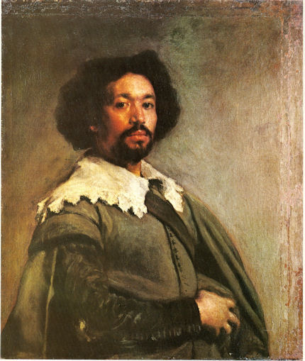


![]()