Posts tagged “Michael Daley”
An art historian has mentioned the restoration of the Sistine Chapel and professional restorers are furious. Art restorers, it seems, cannot cope with criticism and would like certain discussions of restorations to be proscribed.
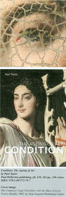
A reviewer of a book on the condition of works of art, protests that its author became “enmeshed” in the debates over the controversial cleaning of the Sistine Chapel, thereby committing “error” in an otherwise “thoroughly accurate and levelly argued book”.
Why should a discussion of the greatest art restoration controversy of modern times – and a discussion that was made precisely when writing of the importance of condition in works of art – trigger defensive and totalitarian impulses, as if some Index Librorum Prohibitorum on restoration controversies has been breached? The review of Paul Taylor’s book Condition – The Ageing of Art appeared in the March 2016 ICON NEWS, the magazine of the Institute of Conservation. The reviewer, Dr Clare Finn, ACR, is a member of the Institute of Conservation. She runs a firm, Clare Finn & Co Ltd, which is described on its online home page as being “a well-known and highly respected firm of painting restorers and conservators”. Dr Finn is not alone among restorers in seeking such a prohibition on this topic.
As we discussed in the recent conference on connoisseurship and law, another of the art restoration trade’s many Sistine Chapel injury-deniers, Will Shank, reviewed Paul Taylor’s book in the December 2015 Art Newspaper. Shank, who is said to work “privately in collections care in from his base in Barcelona” is the co-chair of the US initiative Rescue Public Murals. He also complained of Taylor’s discussion of the Sistine Chapel restoration controversy. He, too, did so despite finding Taylor’s research thorough and his presentation “for the most part unbiased.” What gave offence was the scholar’s “choice to light a fire under a long dead controversy.” Shank gratefully acknowledges that the Sistine Chapel restoration controversy brought the term art restoration into the consciousness of the “lay public”. Writing thusly from within the cosy confines of the art conservation priest-craft, Shank had the brass to complain that it failed to do so “in a positive way”.
For well over half a century, picture restorers (who used to be dubbed Picture Rats) have sought to present their trade as academically respectable with ethical, rigorously conducted and reported procedures. (Shank obtained a Certificate in Paintings Conservation from Harvard University Art Museums in 1983 after taking a Master of Arts in Art History in 1981 at the Institute of Fine Arts, New York University, following a Bachelor of Science, 1973 in languages and linguistics at Georgetown University, Washington, D.C.). Picture restorers should recognise that in properly rigorous intellectual disciplines, no topics are proscribed; that all are fair game for scrutiny and discussion; and, that there are no heresies. Shank and Finn will be aware that although the Vatican has yet to publish a technical report on its still-controversial restoration of Michelangelo’s Sistine Chapel frescoes, it abolished its list of banned books in 1966.
Michael Daley, 5 April 2016
April 5, 2016 | Categories: news | Tags: "Condition - The Ageing of Art", Clare Finn, ICON NEWS, Index Librorum Prohibitorum, Michael Daley, Paul Taylor, Rescue Public Murals, The Institute of Conservation, Will Shank | Leave A Comment »
Italy has decided to play international museum world catch-up at precisely the wrong moment and with a panicked, plagarising zeal that bodes ill for art lovers and that country’s own cultural well-being.
MR JAMES BRADBURNE LANDS A NEW JOB AND SEMAPHORE’S “CHANGES AHEAD”
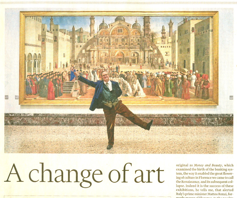
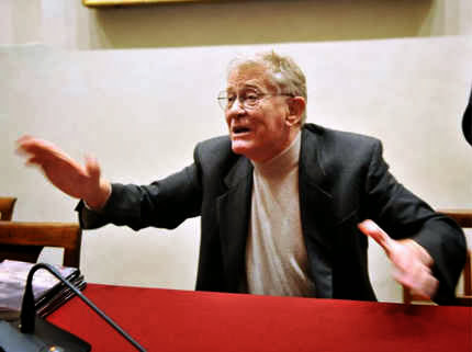
Above, James Bradburne in front of “St Mark Preaching in Alexandria” at the Brera, Milan.
We had hoped against hope that the reports were not true. We could not believe that a deranged Italy had engaged in a mass cull of museum directors in hope of a making another of its periodic surges away from itself and into the future.
It was true, of course, and we should not have averted our eyes and stuffed our ears. In a chilling report carried in the travel section of this weekend’s Finanacial Times, Claire Wrathall (“Shaking up Milan’s Pinacoteca di Brera”) anatomises a cultural spasm-in-the-making:
“In January 2015 an advertisement placed by the Italian Ministry of Culture appeared in the Economist seeking directors-general for 20 of Italy’s leading museums…(Existing incumbents had to apply for their own jobs; only one, Anna Coliva of the Galleria Borghese in Rome, was rehired.) As the culture minister, Dario Francheschini, put it, ‘Italian museums should be dynamic. A country with 4,000 museums should see that as a formidable economic resource.'”
Mr Bradburne, a British-Canadian architect and museum expert has landed the directorship of the Brera in Milan (the Pinacotecca di Brera), with, as Ms Wrathall reports, the fatuous governmental brief “to turn one of the world’s greatest collections of Renaissance masterpieces (not to mention works by 20th-century Italian artists such as Modigliani, Morandi and Severini)” into “an outstanding museum.” Since when was the Brera not an outstanding museum? Since when have museums in Italy not been a formidable economic force? Italy can hardly be chasing even more tourists? If Brits are the cat’s pyjamas as curators, how come our own museums are filling up with Germans? (Could this be an EU conspiracy to simulate dynamism in a moribund entity by artificially increasing the velocity of trans-national exchanges?)
POSSIBLE USES FOR MR JAMES BRADBURNE
It seems that Mr Bradburne’s reputation at the Palazzo Strozzi awakened the culture minister to “the need to shake up the nation’s moribund museums”. So, how do you shake a museum blessed with great art and enjoying an ideal natural lighting in which to view paintings? Official Answer: as Mr Bradburne puts it, “When I got here I was shocked by the dull flat approach to lighting which strove to recreate the sort of northern light the artist would have worked in.”
In other words, to shake things up, you obliterate the best and most sympathetic lighting imaginable – the very light in which the work was made. And then you replace it with what? In Mr Bradburne’s own words, you swap old orthodoxy with today’s fashion, “That is an old orthodoxy; the prevailing fashion nowadays is to put things in the spotlight. We speak with light and colour now.” Note the brazen and presumptuous sleight of hand: it is we, the adminstrators, not the art, who now speak. And, “we” may now play pseudo-theatrical games with all the inappropriate and intrusive vulgarity and gusto of interior designers on the loose in a boutique: “By making the walls darker you can make more contrast”.
THE PONG OF ART
As well as changing the light, Bradburne plans to add smells. Oh yes! That’s right, he will add “the smells of the plants that give colours to paints”. Bradburne does not explain how the smells of mineral or insect-derived pigments will be introduced into the galleries or how if the smell of all the pigments in a painting could be captured it would be possible for the vistor to tell them apart. Bradburne does freely admit to one problem: even if he were to succeed in reproducing all the smells, “the difficulty is the scents diffuse very quickly”.
More gimmicks are in train. Labels are to be written not by museum curators but by (non-Italian?) novelists like Julian Barnes, Sarah Dunnant, Ali Smith and Orhan Pamuk.
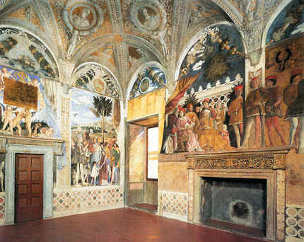
A MUSEOLOGICAL CURATE’S EGG
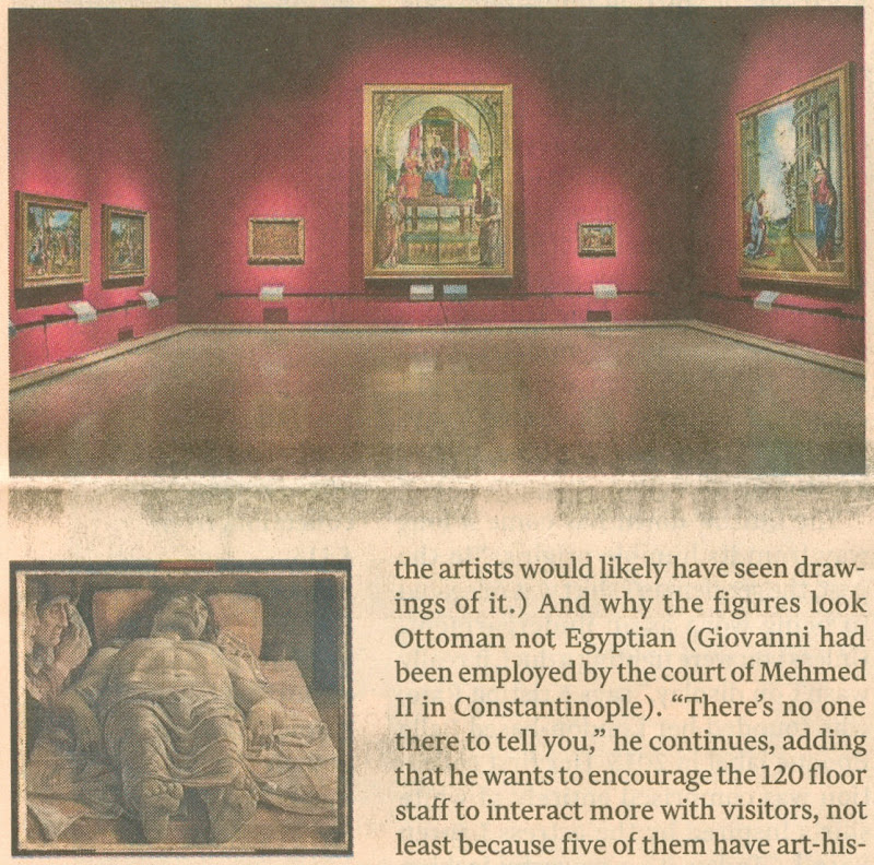
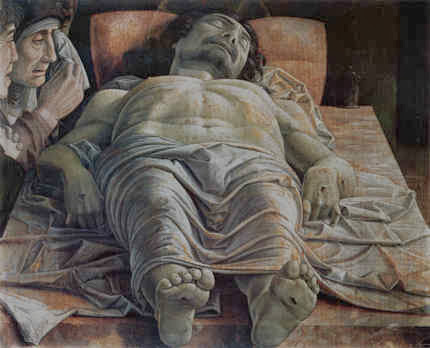
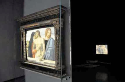
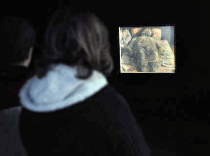
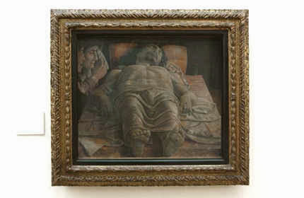
Above (top), one of the Bradburne-Refurbished galleries; above, “The Dead Christ and Three Mourners” (1474) by Andrea Mantegna.
A LITTLE CHEER
It has to be said that there are two cheering prospects. Although the glass wall will remain through which visitors can watch restorers nibbling away at the once-gloriously little-touched works (- I well recall being shown round the gallery by Pietro Marani, when Leonardo’s “Last Supper” was part-way through its debilitating restoration and repainting, and he proudly pointed out how well his Cima altarpiece then looked against its counterpart in the National Gallery, London), Bradborne will, at least, be eschewing the Blockbuster Game. That, he well and aptly describes as “cannibalising our collections”. Presently, he notes, “People come and never see the permanent collection”.
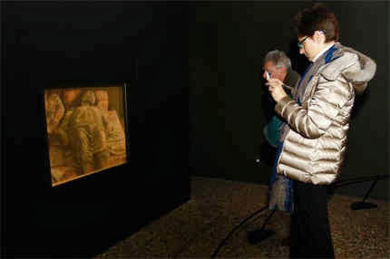
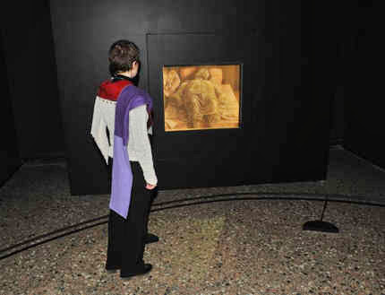
Further, one of the most gratuitously offensive pieces of contrived theatrical staging that predates his reign in the museum is to go. That is to say, “the most complained-about display in the museum” – Mantegna’s “Dead Christ”.
Followers of this site will recall Michel Favre-Felix’s shocking post of 13 March 2014 (“Mantegna’s Dead Christ : They Know Not What They Do”): “…the Dead Christ is now housed in a special crypt-like dark room, stripped of His historic frame and visually isolated by spot-lighting, as if now embedded into a monolithic black wall – and at a height of only 67 cm from the ground. This presentation is intended to be permanent and the film-maker, humility notwithstanding, declares ‘This will last: I will fight for it’.” Good riddance to that.
Michael Daley, 2 April 2016
April 2, 2016 | Categories: news | Tags: Artificial light in museums, Claire Wrathall, James Bradborne, Mantegna, Michael Daley, Michel Favre-Felix, Pietro Marani, Smells in museums, the Brera | Leave A Comment »
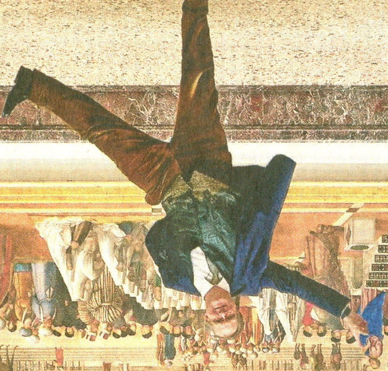
On 26 March 2016 the printed Independent newspapers died. As Michael Daley reports, it was a poignant moment for those like himself who were in at the Great Project’s beginning in 1986 and had experienced the rush of excitement as the new newspaper’s pioneering innovations rapidly achieved commercial success and professional acclaim.
The paths of the Independent and ArtWatch were cross-linked for over two decades. The Independent was launched in 1986 as a newspaper in which much had been rethought and with firm editorial convictions that there should be no “freebies” (copy produced in exchange for free holidays or such) and no sacred cows – least of all with the royal family. At that date, twenty years after the heroic rescue operations that followed the flooding of Florence, one of the most sacrosanct received wisdoms was that art restoration was a safe and miraculous means of rejuvenating old works of art. I had left the Financial Times to work as the Independent’s principal illustrator shortly before the launch.
Above, the first issue of the Independent which was published on 7 October 1986.
A CRITICAL REVERSAL
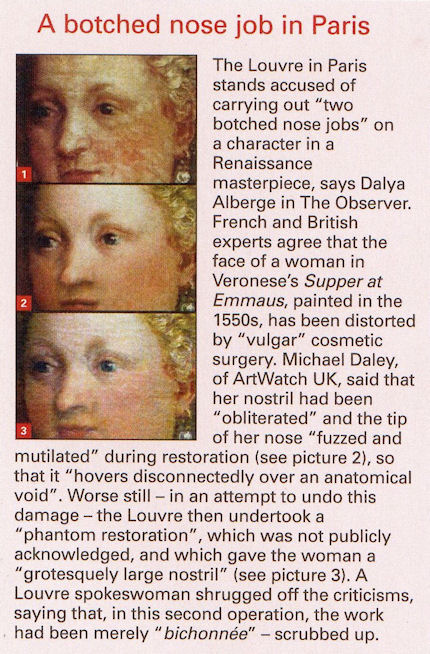
Today, criticisms of even the grandest restorations are commonplace and no longer prompt ridicule and abuse. To the contrary, it is now restorations that attract ridicule. (See “And the World’s Worst Restoration is…”) In the brain-stretching BBC2 television quiz show Only Connect, a recent winning answer was: “They are all paintings that have been ruined by restorers”. Strictly speaking as the host, Victoria Coren, advised (on legal advice no doubt ), the correct answer was: “They are all paintings that have been controversially restored”. Controversially for sure – all had been condemned on this site: the Monkey-faced Christ; the Louvre’s botched Veronese nose jobs; the reconfigured-little that survived the last restoration of Leonardo’s Last Supper (see below); and the “Disney-fied” repainting of an ancient Chinese mural. The Guardian now asks readers to submit photographs of the worst restorations they have witnessed: “Restoration disasters around the world: share your pictures and stories”. Auctioneers and dealers place premiums on little- or never-restored works, not vice versa. No one would dream of producing a television or radio series called “Your Hundred Best Restorations”. No one (“sleeper” hunters aside) would celebrate a many-times restored painting. How we got to this stage is a long story. The Independent’s contribution to it was crucial, honourable and is worthy of greater recognition.
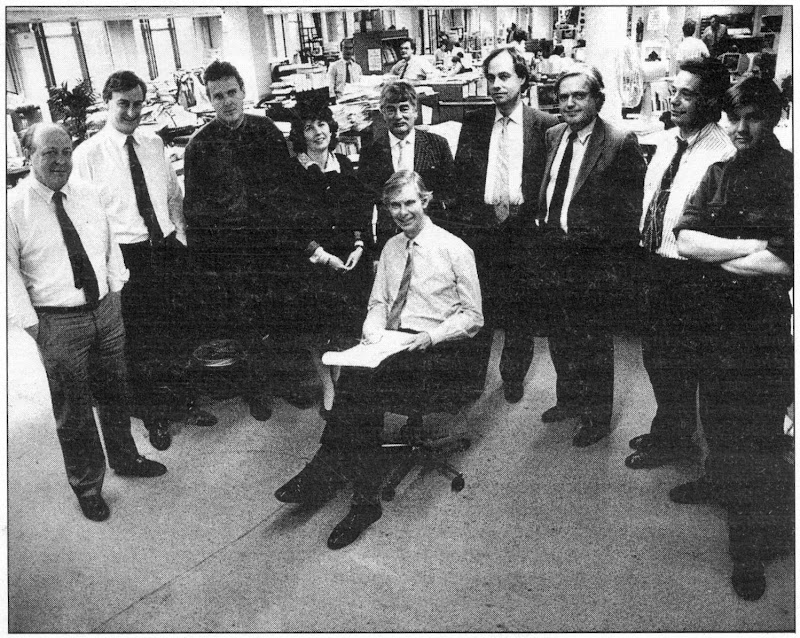
NINE MEN, ONE WOMAN, AN EXECUTIVE CHAIR AND NO PROPRIETOR
On 7 October 1988, Campaign magazine observed and reported on the Independent’s workings and progress at the time of its second anniversary, by which date it had exceeded its initial target of 375,000 sales.
Above, from left to right: Jonathan Fenby, Home Editor; Chris McKane, Picture Editor; Charles Burgess, Sports Editor; Sarah Hogg, Business and City Editor; Peter Jenkins, Political Columnist; Andreas Whittam Smith, Editor; Stephen Glover, Foreign Editor; Alexander Chancellor, Magazine Editor; John Torode, Leader Writer; Tom Sutcliffe, Arts Editor. (Not present, Michael Crozier, Art Editor.)
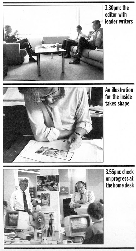
Below, Campaign’s photographer followed Andreas Whittam Smith’s day, showing here (top) a meeting with the leader writers, Roger Berthoud and John Torode; (centre), the principal illustrator, Michael Daley, at work; and, (bottom) with the home desk editor, Jonathan Fenby.
THE LOOK OF THE PAPER
The smart and distinctive look of the Independent contributed greatly to its initial success. Much as everyone in the city and business had felt impelled to sport the pink Financial Times, so everyone in advertising, design, architecture, photography and the visual arts seemed to have taken to the Independent. The newspaper – the first to exploit digital typesetting – was printed on good white paper that had little “show-through” from adjoining pages. By editorial requirement, its photography and graphics were distinctive and of high professional quality.
INNOVATIVE CONTENT
A journalistically novel and distinctive development on the paper had been a decision to expand and elevate the non-news, “features” sections, giving each a dedicated, professionally expert editor. In consequence I worked for sections as diverse as Law, Health, Food, Books, Gardening, Music, Wine, Architecture and so forth. For a fine art-trained illustrator, working with top calibre journalists (and an art editor who gave drawings due space and air) was a privileging and highly stimulating situation. The paper’s famous high-mindedness and unashamedly high-brow arts coverage, left one free to reference anything (including past art) that might best help illustrate pieces that ranged from, say, written evocations of the tastes and smells of food; cultural anxieties over decadence felt as the end of the century approached; and, acrimonious disputes of custody that sometimes arose when lesbian couples broke up after having had children by complicated paternity arrangements. Thus, by way of example, seven images:
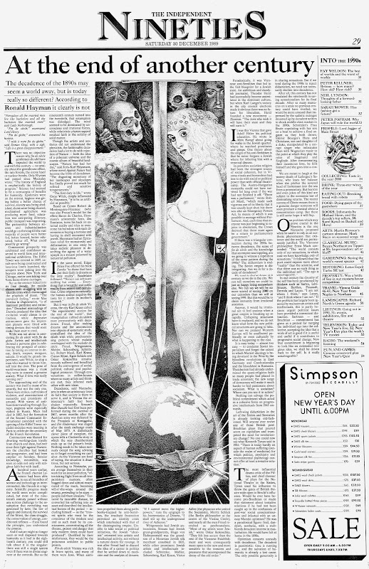

Above, seven drawings for the Independent, by Michael Daley.
THE GRAPHIC TECHNIQUE
If the conceptual challenges on the Independent were exhilarating, deadline pressures meant that there was rarely more than 24 hours from inception to delivery of a drawing. The ink drawing technique (which I had developed during the previous four years on the Financial Times and the Times’ educational supplements), aimed to exploit as much as possible the easy extremes of graphic art with solid blacks (quickly brushed) and pure whites (paper left bare). Between those polar graphic opposites, slow-to-realise shading was judiciously deployed with cross-hatched lines and stippled dots. To speed output, all preliminary drawing was made in pencil on the finished sheet and then directly inked over so that the sketching stage could be completely erased. I had come to recognise that a drawing for reproduction in a newspaper is not a thing-in-its-own-right but a piece of page furniture that must live variously with the “grey” of closely set print texts, the assertive blacks of headlines, and, the graphically strident clamour of advertisements.
RECOGNITION
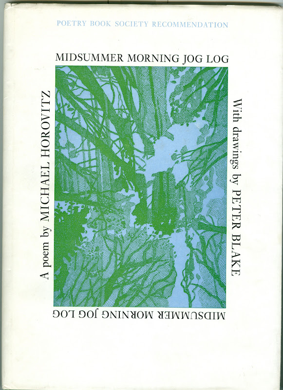
The novelty of the Independent’s employment of an illustrator who had trained principally in sculpture and etching swiftly resulted in a press award and commissions from book publishers and advertising agencies. The sweetest and most surprising outcome was earning the respect as an illustrator of established practising fine artists. One of the most generous was Peter Blake, who sent a kind note of thanks and respect with a book of illustrations he had made for Michael Horovitz’s poem of celebration, love and homage to Frances Horovitz. Blake had surmised (correctly) that I, like he, was an admirer of Maxfield Parrish. Such recognition almost immediately took on an art political significance in an entirely unanticipated way.
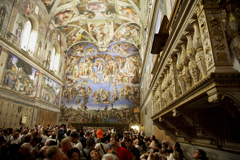
THE SISTINE CHAPEL RESTORATION DISPUTE
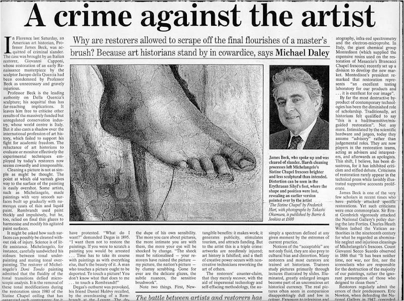
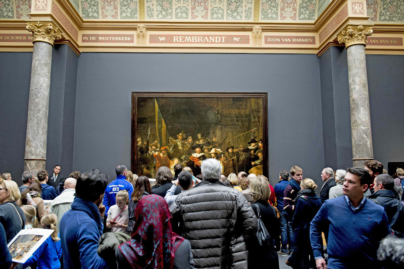
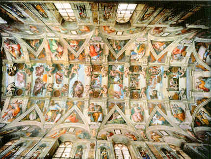
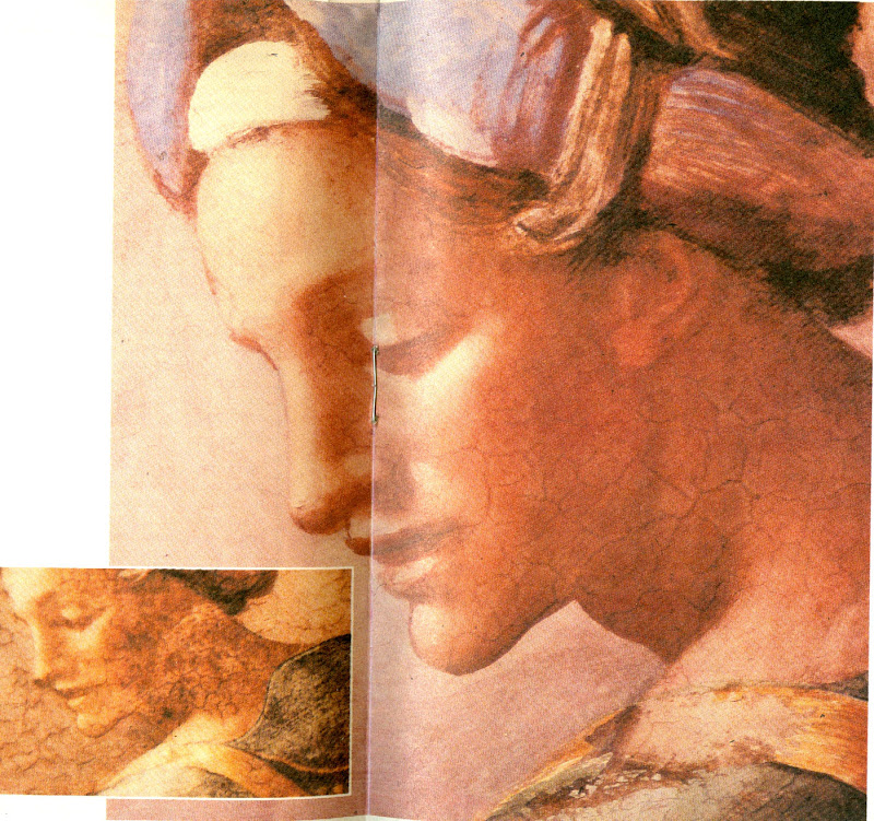
Within a month of receiving Peter Blake’s gift, the Sunday Times Magazine published an article on the restoration of Michelangelo’s Sistine Chapel ceiling frescoes. It told of condemnation from artists and an art historian, Professor James Beck of Columbia University, New York. Against them, the art historical establishment claimed momentous restoration “discoveries” and “revelations” that were said to require nothing less than a rewriting of five centuries of art history. The profound changes that all parties conceded had been achieved by repeatedly brushed-on and washed-off applications of a ferocious solvent gel that had left Michelangelo’s painting a pale and deformed reflection of its former self (see below). Beck was being likened to the man who refused to look through Galileo’s telescope for his refusal to acknowledge as a miraculous “recovery” a hitherto unsuspected and nowhere-recorded “New Michelangelo”. “We didn’t need one”, Beck had retorted, “There was nothing wrong with the old”.
To this working artist, the photographic evidence of the pre- and post-cleaned sections made it clear that the proposed art historical edifice being offered in post hoc defence of a demonstrably bungled restoration threatened a compounding falsification of history itself. Suspicion arose that because so many art historians had authorised or endorsed the restoration on which so much institutional capital and foreign sponsorship monies had been invested, none could break ranks. Further, it seemed to have been especially galling to art historians that their endorsements had been rejected on visual evidence cited by artists. (One scholar/supporter of the restoration, Professor Martin Kemp, would later complain in the Times Higher Educational Supplement: “I am unclear about the identity of this archetypal beast. Is ‘an artist’ to be identified with Andy Warhol or one of his fellow practitioners who protested during the cleaning of the Sistine ceiling?”)
COPYING OTHER ARTISTS’ WORK
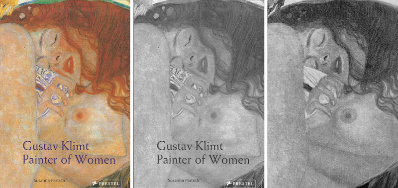
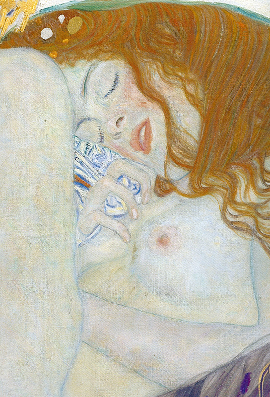
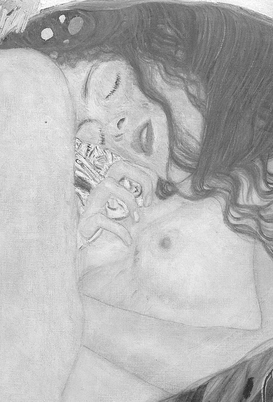
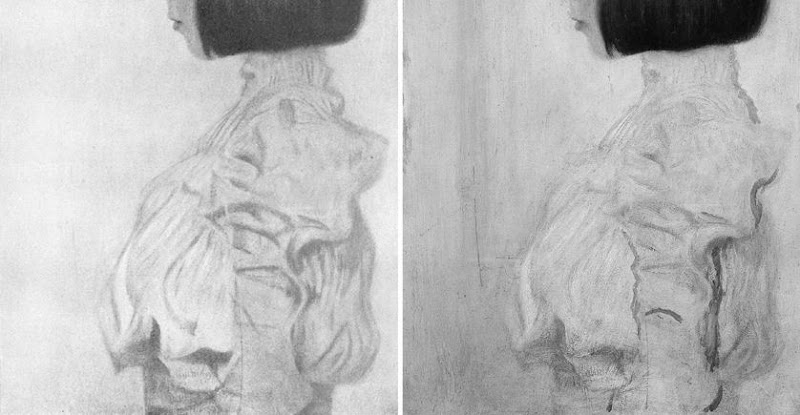
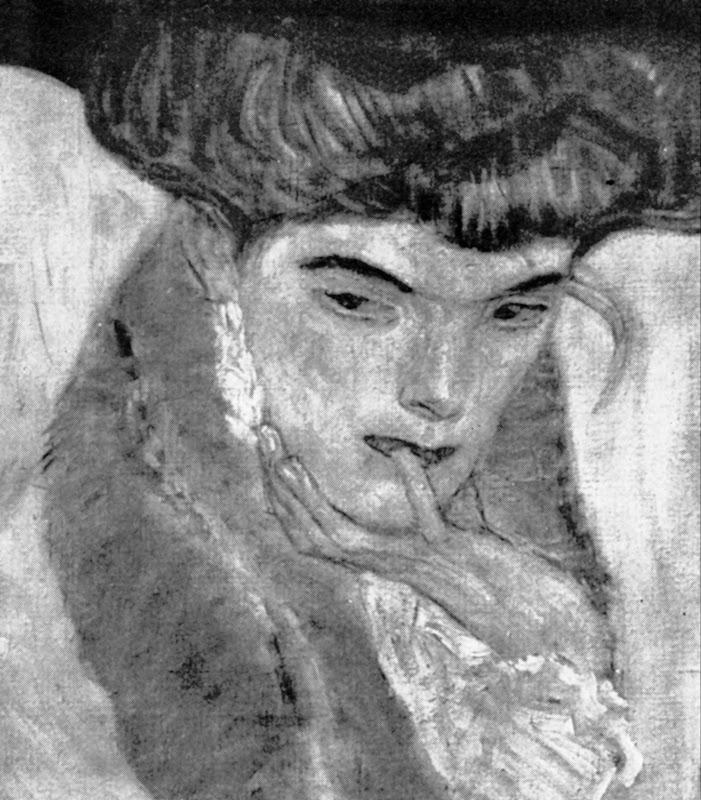
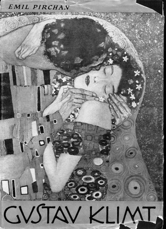
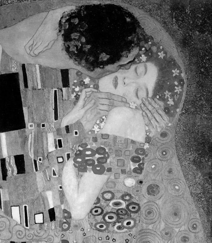
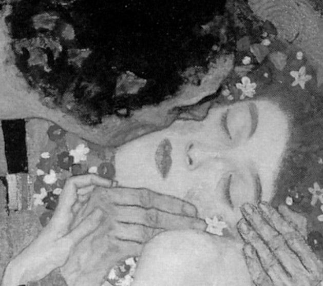
It so happened that having switched to illustration from art school teaching and fine art practice in 1982, working long hours, six or seven days a week left little time for travel or even museum attendance. Partly in substitution, I had kept touch with art through books and, as an illustrator, took every opportunity to incorporate work by artists I admired. These ranged from classical Greek sculpture, through Michelangelo, to certain favourite modern artists like Gustav Klimt, the painter/sculptor Max Klinger and Picasso (on our homage to Klimt and Klinger, see “At the end of another century” above).

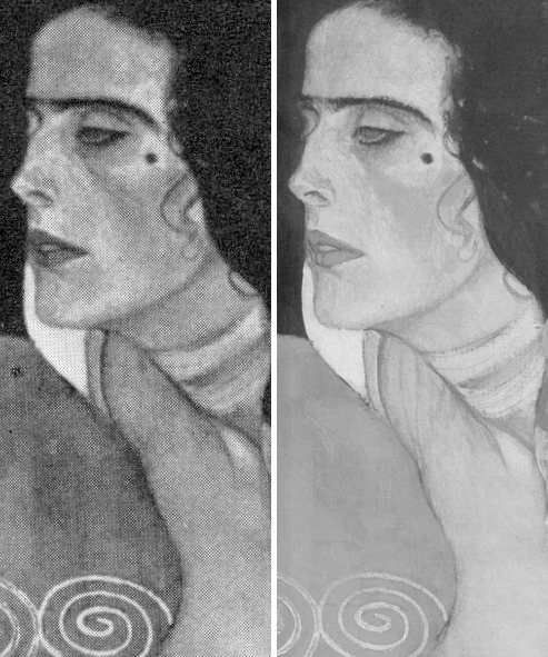
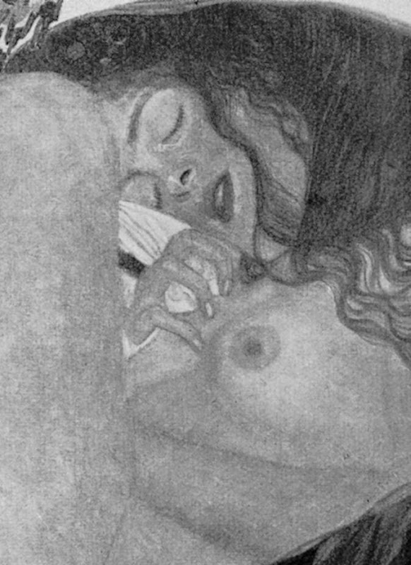
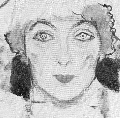
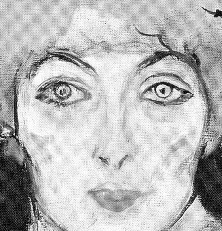
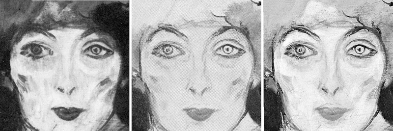
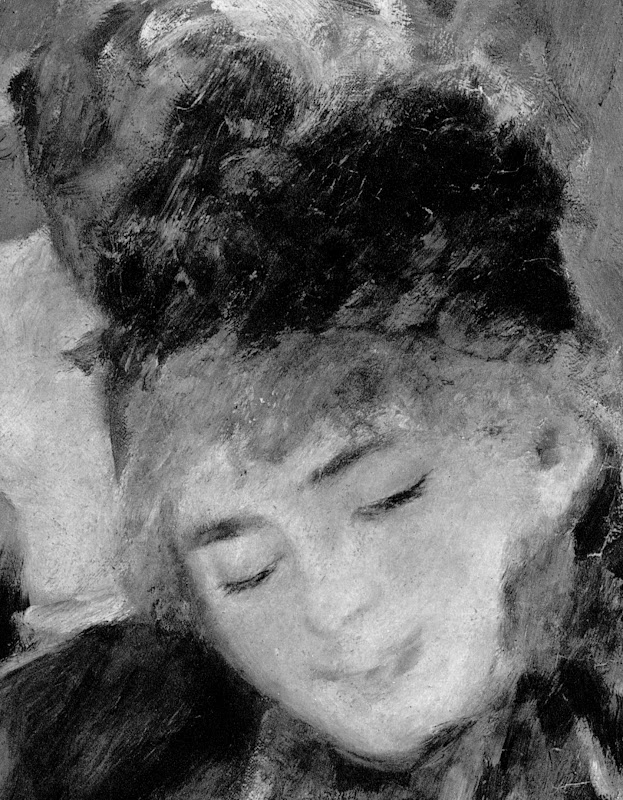
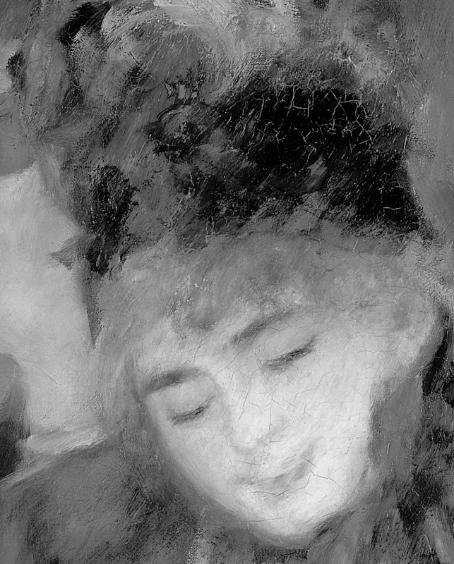
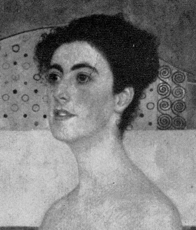
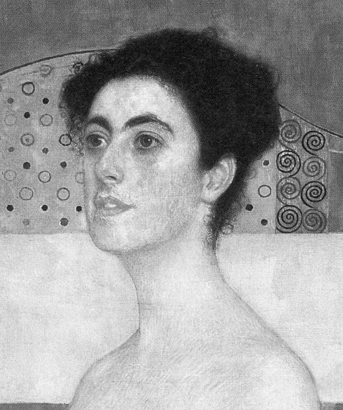
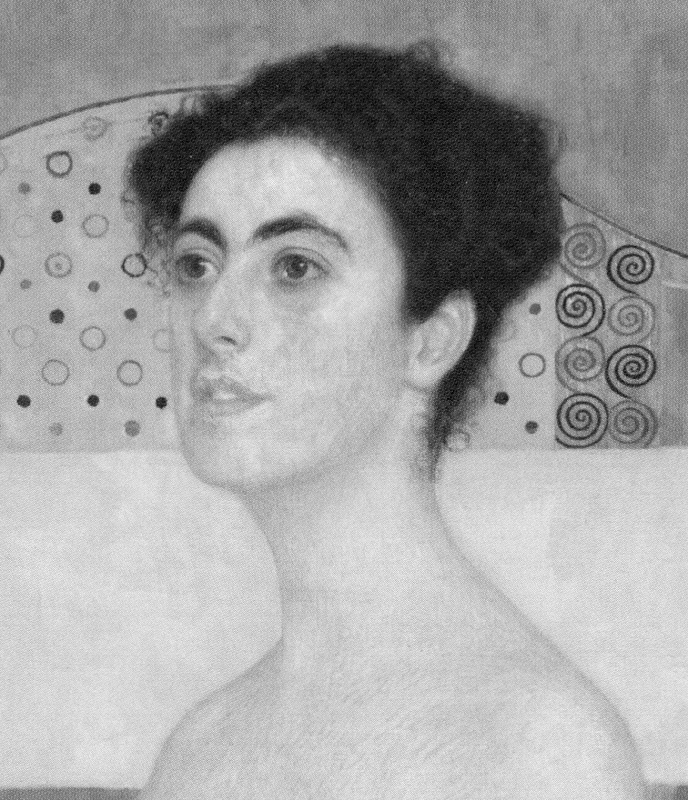
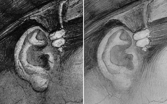
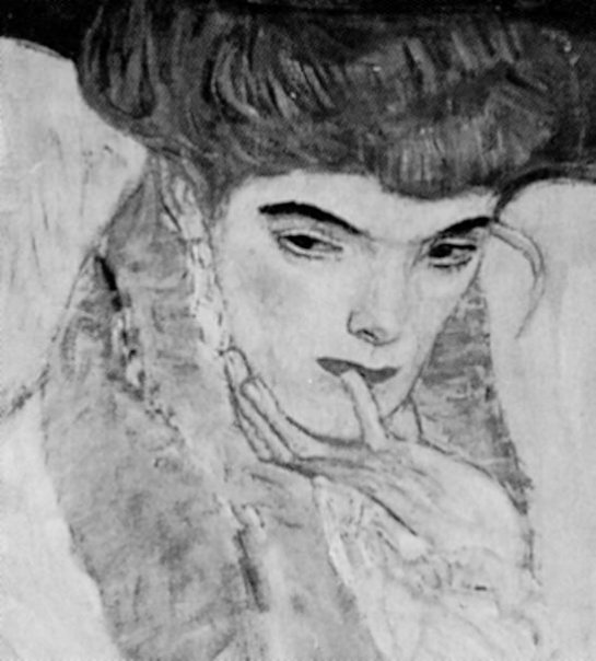
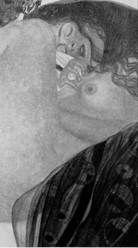
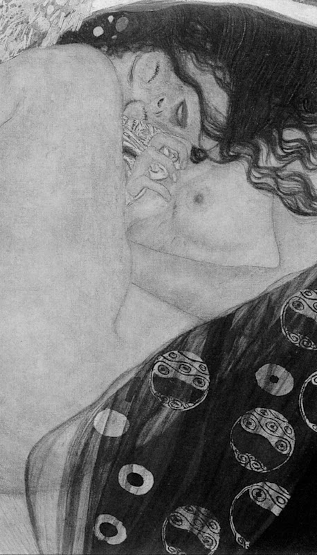
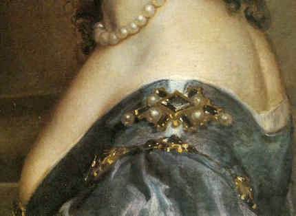
Above: (top) a detail of a copy of a Klimt portrait of Judith made by Michael Daley for the Independent in illustration of a Health article. Below it is a comparison of a section of the Klimt painting, as seen before (left) and after restoration(s). (For sight of the wholesale destruction of this modern artist’s work at the hand of restorers, see “The Elephant in Klimt’s Room” and “Now let’s murder Klimt”.)
APPRECIATING OTHER ARTISTS’ WORKS AND THE RELEVANCE OF COPYING TO APPRAISING RESTORATIONS
To copy the work of another artist it is necessary to look closely and attentively at it. You cannot draw what you have not analysed and understood. Indeed, drawings produced after the works of others are tests of understanding even more than of skill. Spending a working life both copying the various uses of shading made by other artists, and applying one’s own marks to paper so as to create plastically coherent and expressive tonal relationships, sharpens the eye and confers an ability to detect injuries to original tonal relationships in the works of others. This should not be considered surprising or remarkable: those who organise and dispose marks on surfaces, are perfectly placed to recognise the obverse – which is to say, the adulteration or deconstruction of artistically purposive values during so-called restorations.
Pace sneering art historians, to artists’ art practice trained eyes, spotting such injuries is as easy as it is for accountants to spot errors of arithmetic. That many art historians fail to recognise injuries to the works of the artists they study, might indeed suggest (as others have recently claimed) that something very wrong has been going on in art history education. And yet, at the end of the 1980s, when artists and rare visually discerning scholars challenged officially-sanctioned and endorsed restorations, it was they, not the visually-limited, who met with abuse. When I introduced myself to James Beck, prior to writing the 1990 Independent on Sunday article discussed below, he had been reviled in scholarly print by his peers – not least by a sister professor who served the Vatican as its art historical adviser/spokesman on the Sistine Chapel restoration. When I asked him if it might be helpful for an artist to make visual demonstrations of the injuries to Michelangelo’s work, he replied that it would be the most important thing to do, because “only artists understand these matters”. (Beck’s sister was a painter and he had studied fine art before switching to art history.)
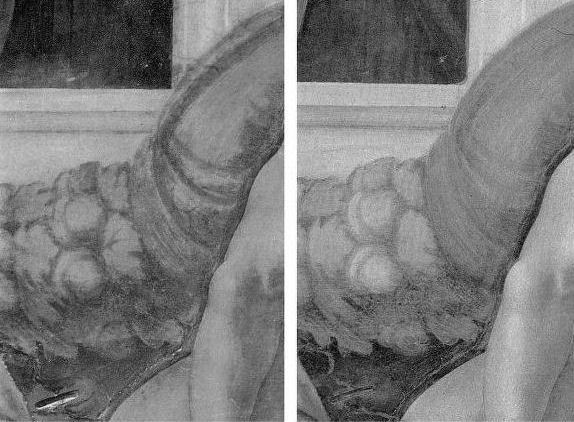

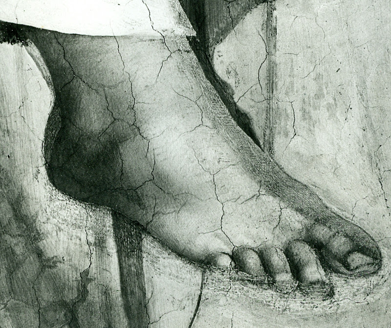
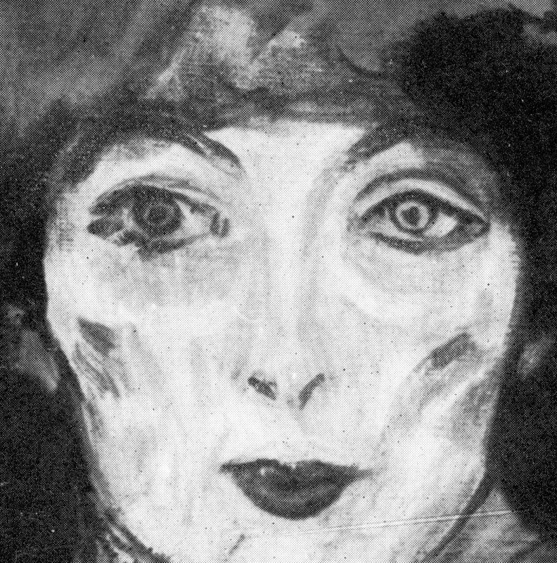
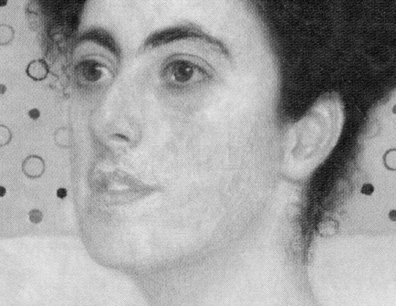
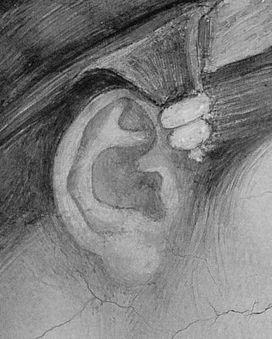
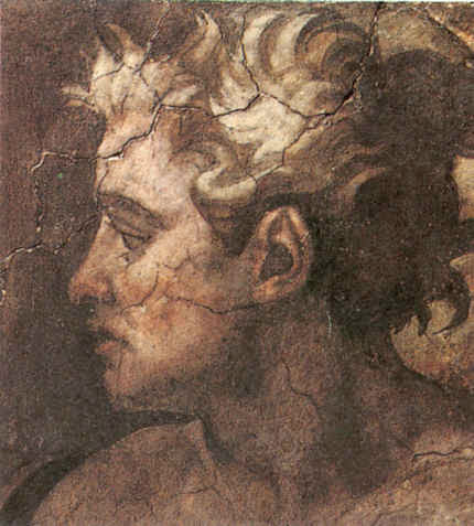
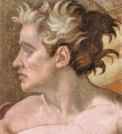
Above, A detail shown in greyscale and in colour of a section of Michelangelo’s Sistine Chapel ceiling, as seen before (left) and after cleaning in the 1980s.
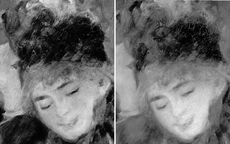
THE VALUE OF DIRECT PHOTO-COMPARISONS
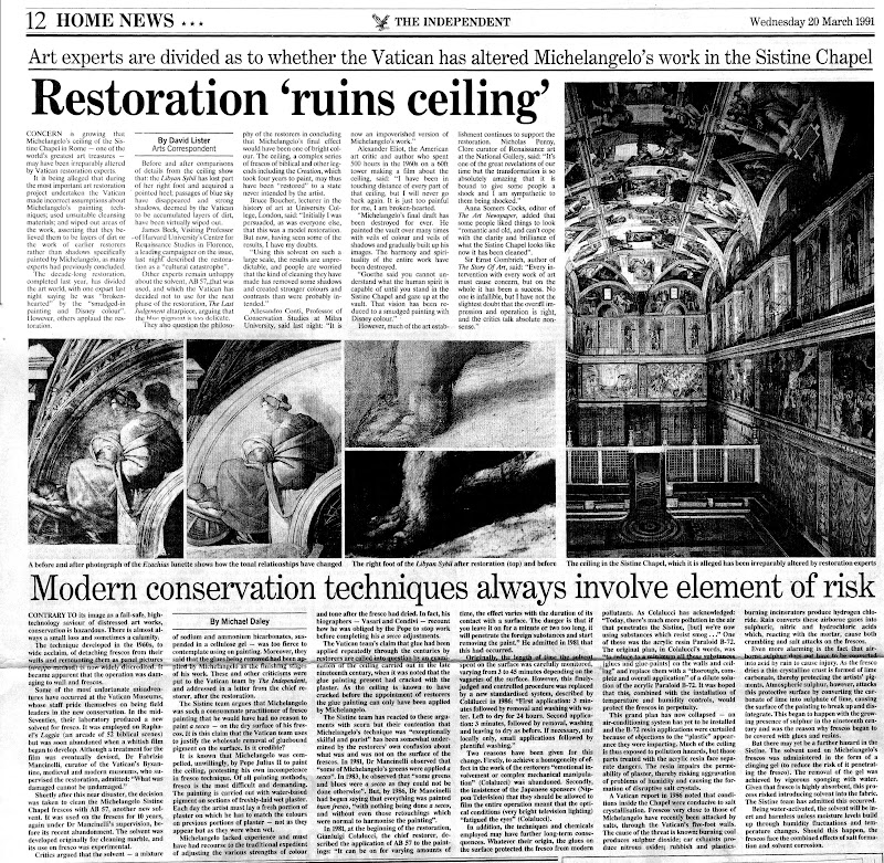
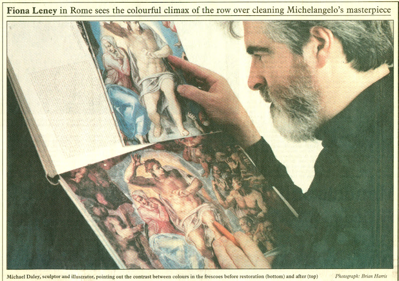
To identify restoration injuries it is helpful to place photographs of small sections of a restored work directly side-by-side (as in the Klimt Judith above, where the relative weakening of the spirals at the bottom, for example, should be apparent to the most untutored eye). The above detail of the Sistine Chapel ceiling was reproduced in the December 1988 Sunday Times article. It was immediately clear to me that the cleaning had weakened and in some places altogether erased bona fide features of shading and specific details like veins on the giant symbolic oak leaves. I asked the Independent’s arts editor if I might write a short article explaining why Prof. James Beck was right and the art historical establishment was wrong. On the face of it, this was a perfect Independent “questioning-of-authority” story. Unfortunately, the request could not be granted because the paper’s then art critic had recently visited the restorers’ scaffold in the chapel and had judged the restoration… a success. His art critical authority could not be challenged by a working artist with clear “standing” within the paper. Fortunately, when the Independent on Sunday was launched in 1990, its arts editor, Michael Church, commissioned a piece showing the damaging consequences of the restoration. Many criticisms of the restoration had previously been reported in the press but no one before had been given space in a national newspaper to set out evidence of injury. That article proved to be a game-changer.
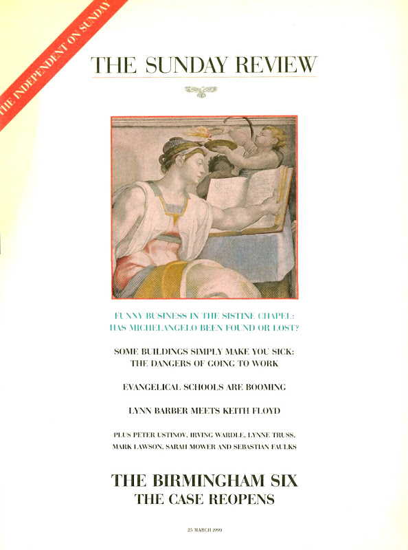
Above, top, the Independent on Sunday magazine of 25 March 1990 which carried (above) photographs showing restoration injuries in Michael Daley’s “Michelangelo: found or lost”
ESTABLISHMENT INTIMIDATION OF THE PRESS
Newspapers are complex entities comprised of many distinct departments that speak to particular constituencies. Dedicated arts journalists must swim in the art world and negotiate with its players and institutions. For them, breaking the “rules of engagement” can incur ostracism and worse. Those who play by the rules can be rewarded with exclusive stories and material. They might receive invitations to accompany globe-trotting museum directors on blockbuster shows. They might be invited to become embedded within a conservation department so as to counter anticipated criticisms. News journalists are less constrained. They are licensed to get and follow stories; to look for bodies; to follow money; to report mishaps and so forth.
When the Independent on Sunday article on the Sistine Chapel restoration was published the news editor on the daily Independent was intrigued by the magnitude of the controversy and he commissioned the above pair of articles. Despite such strong editorial support the articles nearly failed to see the light of day. Even though I had professional “standing”, the paper’s arts correspondent, David Lister, was taken aback by the high-level hostility and abuse levelled at me and Professor Beck. He became fearful of challenging key and venerable sections of the art establishment. How could the two of us be right and all of them wrong, he asked? It was a fair and sensible question: newspapers can never afford to back losers and must always invite responses from those under attack.
By way of reassurance, I showed the catalogues to the 1969 Olivetti-sponsored Frescoes from Florence travelling exhibition to London and New York. This exhibition consisted of murals that had been detached (on grounds of conservation) from buildings in Italy and then mounted on panels as stand-alone works of art that might be flown around the world – much as restored medieval glass from cathedrals is being despatched today. Both catalogues groaned under the weight of luminaries included in the exhibition’s “Committees of Honour”. At the time the show had been a sensation on two continents but I was able to show a recent Burlington Magazine editorial which condemned the detachment of frescoes from buildings as a barbarous and now discredited practice that had injured the paintings and buildings alike, and left many frescoes mouldering like rolled-up like rugs in church and chapel basements.
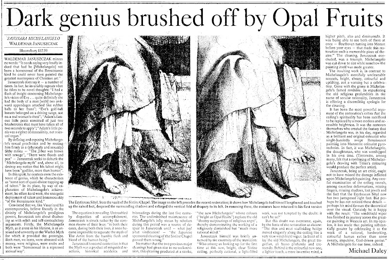
The procedural obstacle was cleared and both articles were published. The sky did not fall in and although squeals were heard, thereafter, the paper had confidence and trust in my judgements and accounts, enabling me to write further on the Sistine Chapel debacle and restorations at the National Gallery – including a review (below) of a book extolling the Sistine Chapel restoration that was written by the Sunday Times’ art critic, Waldemar Januszczak.
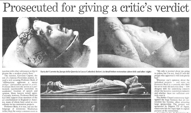
PROFESSOR BECK GETS SUED
In 1991, after surviving years of abuse over the Sistine Chapel controversy, Beck was hit with a criminal action in the Italian courts over reported criticisms he had made in Lucca Cathedral on the restoration of a marble tomb by the early Renaissance sculptor Jacopo della Quercia. The restorer (in fact, the head of a restoration company) had not sued the Italian newspapers that had reported Beck’s (oral) criticisms. Instead, he sued the scholar alone for aggravated criminal slander – a charge that carried a possible three years jail sentence – and for damages of 60 million Lire. By not suing those who had transmitted the criticisms (and therefore had, allegedly, harmed his reputation), the restorer ensured that Beck could receive no support from the newspapers and their lawyers and would have to bear all the risks alone. As the world authority on this early Renaissance sculptor, he felt compelled to do so. Although the trial’s ramifications might have been horrendous for scholarship generally, he received no public expressions of support from his peers. When I asked the editor of the Burlington Magazine why this was the case, she replied “Because he is going to lose”. The public needed to be alerted to the case. Once again, the Independent came through. On 8 November 1991, David Lister reported the imminent trial:

Below, part of David Lister’s 8 November 1991 article.
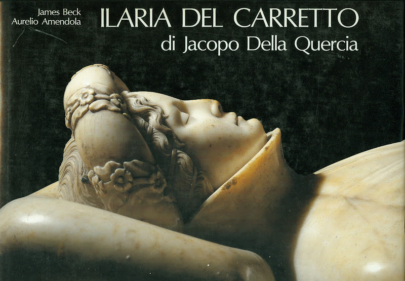
Below, a book Beck had produced on the Lucca Cathedral monument
THE TRIAL AND THE PROFESSIONAL SILENCE
Like the editor of the Burlington Magazine, the judge at Beck’s trial in Florence knew that he was going to lose. Indeed, he declared an intention to find him guilty to the prosecuting lawyer, as they left the court together discussing the case at lunchtime after the trial’s first morning session. “Eh, but I shall find him guilty” he said. Fortunately, he was overheard by an off-duty policeman who was working as an intern for Beck’s lawyer. When challenged, the judge refused to recuse himself but eventually he disappeared and Beck, under a new judge, was soon acquitted.
REPORTING THE TRIAL OUTCOME
At the time we were able by courtesy once more of the Independent (22 November 1991) to raise a cheer for Beck and for the blow he had struck for the free expression of scholarly judgements on matters of artistic welfare and integrity. But this had been an extremely close call and, while contemplating a possible jail sentence, Beck decided that a dedicated international organisation was needed to speak for the interests of the world’s great and insufficiently protected works of art. A year later ArtWatch International was founded in New York.
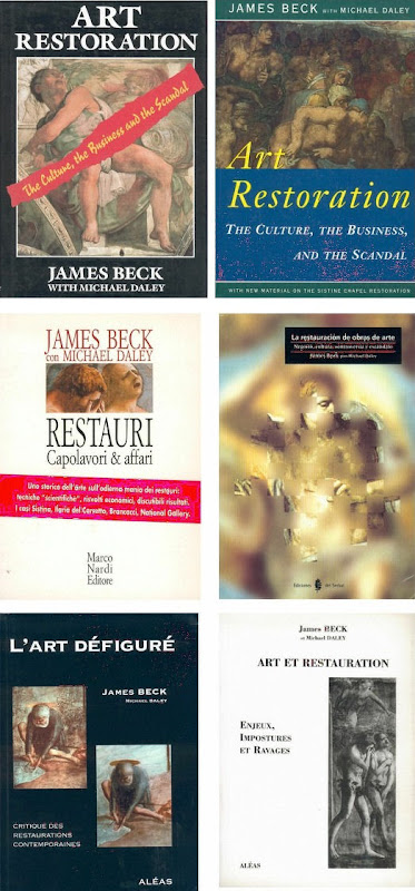
On the day of publication of the Independent’s 22 November article, Grant McIntyre, an editor at the venerable and (then) still independent publishing house John Murray, telephoned to ask if there might be a book on the trial and on matters of restoration. There was and, following its initial publication in 1993, it ran to many subsequent editions (see below).
THE BOOK’S RECEPTION
The book soon faced a formidable hurdle: it was to be reviewed in the New York Review of Books by a formidable Renaissance scholar, Professor Charles Hope, a supporter of the Sistine Chapel restoration. In the event, Prof. Hope was persuaded by the art historical and technical proofs of injury we had amassed. Moreover, he held that Beck had performed an admirable and brave service to scholars and scholarship alike. He also pointed that while many scholars of his acquaintance had initially supported the restoration enthusiastically, many had recently fallen silent on the subject.
After the trial turmoil and the creation of ArtWatch International, I continued to draw the art I loved and to criticise restorations in the Independent.
DENIAL AT THE VATICAN
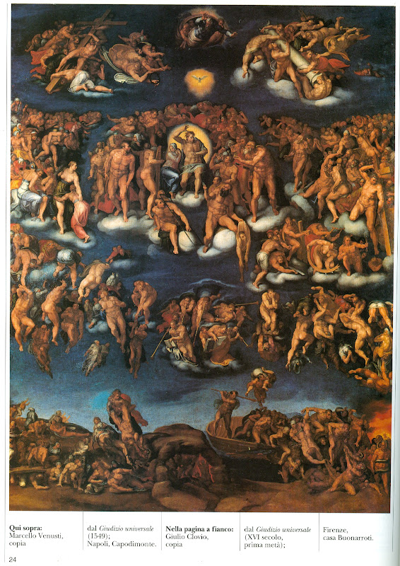
After the horrors on the ceiling, we later witnessed the injuries to Michelangelo’s Last Judgement. There are still institutionally ensconced scholars and administrators who are in denial on the injuries at the Sistine Chapel and insist against all evidence – such as is found in the contemporary painted copy of the “Last Judgement” by Marcelo Venusti shown above – that Michelangelo had painted in today’s vapid tones and hues. In part this New Pallor is not only the product of the last restoration but also of the quarter of a century since in which the interactions of tourism-induced airborne pollution and chemical residues of the cleaning have been devouring the fresco surfaces. So great has been the debilitation that, in addition to a new air-conditioning system, thousands of colour-enhancing LED lights have been installed on the ceiling.
THE INDEPENDENT AND A CHANGED CRITICAL CLIMATE
The Independent gave fair and generous voice to previously unheard criticisms. By doing so it made an invaluable contribution to artistic health – not only directly but indirectly by opening up the rich, hitherto unexamined field to the rest of the press. The Times, the Sunday Telegraph, the Daily Telegraph, the Guardian and the Observer and others all saw the importance of the subject and recognised that “news” is that which somebody, somewhere, would prefer not to see published. The importance of newspapers in this regard cannot be exaggerated – our colleagues in the United States and France cannot believe that newspapers can be so challenging to entrenched authorities in the arts. The vigour of the British press can also be seen by comparison with our broadcast media which remains perpetually asleep on the job, treating the visual arts as little more than a gifted succession of diverting, institution-promoting “Good News” stories.
ARTS BROADCASTING PAP
When the Beck/Daley art restoration book was published in 1993 a number of independent television companies rightly saw the potential for a televisual “public affairs” type of treatment. All of these proceded well until they reached the top of their commissioning chains. Once, the head of music and arts at the BBC went so far as to offer a whole arts programme, reassuring us that although the BBC and the National Gallery were commercial partners “that shouldn’t create a problem”. But it did: the almost-commissioned independent meticulously even-handed examination of the pros and cons of picture restoration was swiftly killed off. In its place the BBC permitted the National Gallery to make its own effective tele-promotional “selfie” (with gallery staff using left-in-place BBC cameras) of its mangled, falsifying restoration of Holbein’s The Ambassadors. On 29 January 2000 the Independent carried a letter from ArtWatch UK entitled “‘Virtual reality’ art”:
“…When the National Gallery recently restored Holbein’s The Ambassadors, the famous anamorphic skull in the foreground was repainted to a new design not according to the laws of perspective by which it had been produced but after a computer generated distortion of a photograph of a real skull. This Bizarre imposition of ‘virtual reality’ into an old master painting is defended by the gallery on the grounds that ‘modern imaging techniques’ offer more ‘scope for exploring possible reconstructions’ than do the 16th century perspectival conventions by which the artist’s original image had been generated. The difference between the original and the new parts has been concealed from the general public by the restorer’s attempt to integrate the handiwork of his own ‘tentative reconstruction’ with surrounding old paint by painting fake lines of cracking to match the old, actual, cracks.”
It is a tragedy that the lights should have gone out on a newspaper that had caused justifable discomfort in so many art world recesses. As described above, it is a measure of the success of the campaigning that first gained exposure in the Independent that we now enjoy a quite different and healthily expanded art critical universe. We thank the Independent for good times past and wish it all good fortune in its new streamlined format with global outreach at The Independent.
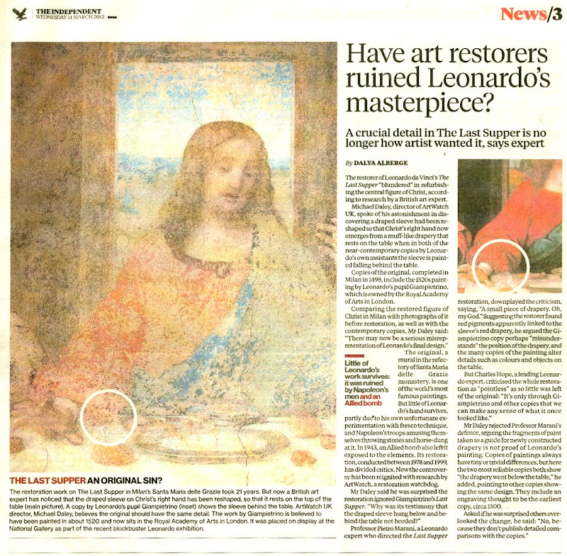
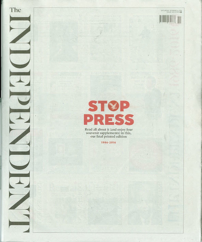
Below (top): The last Independent coverage of ArtWatch UK by Dalya Alberge on 14 March 2012. (On the restoration of Leonardo’s Last Supper, see: A different Leonardo and, The Law of Diminishing Returns ); below (bottom) the last editions of the Independent on Sunday and the Independent.
Michael Daley, 30 March 2016
March 30, 2016 | Categories: news | Tags: "Only Connect", Alexander Chancellor, Andreas Whittam Smith, Campaign magazine, Charles Burgess, Chris McKane, Dalya Alberge, David Lister, Drawings for reproduction, Grant McIntyre, Gustav Klimt, Holbein's The Ambassadors, John Torode, Jonathan Fenby, Louvre Veronese Nose jobs, Matthew Symonds, Max Klinger, Maxfield Parrish, Michael Church, Michael Crozier, Michael Daley, Michelangelo, Peter Blake, Peter Jenkins, Prof Martin Kemp, Roger Berthoud, Sarah Hogg, Stephen Glover, The Independent, The Independent on Sunday, The Sistine Chapel restoration, Tom Sutcliffe, Victoria Coren, Waldemar Januszczak | Comments Off on ArtWatch and the Death of the Independent
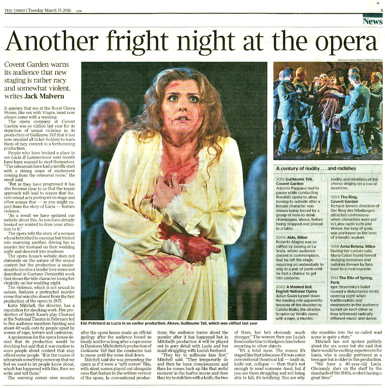
The director of the Royal Opera House, Kasper Holten, has written to ticket holders for the forthcoming Lucia di Lammermoor to say that because of “sexual acts portrayed on stage, and other scenes that… feature violence”, the House will “discuss suitable arrangements” for anyone likely to be upset. On the evidence of the House’s website, many are more than upset.
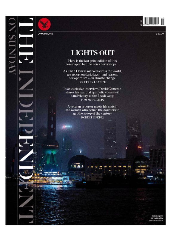
Above, top, a Royal Opera House email photograph promoting “Lucia di Lammermoor 7 April-19 May”
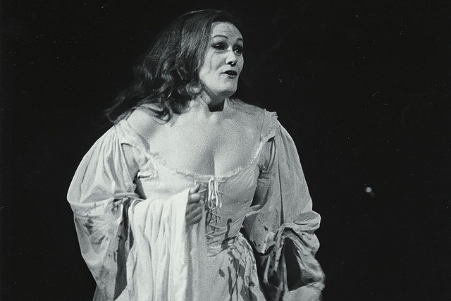
Above, Joan Sutherland as Lucia in the Covent Garden Opera Company production of Lucia di Lammermoor © Royal Opera House, 1959. (For observations on Sutherland’s artistry and standing vis a vis today’s performers, see Jacques Franck’s comments below at CODA. For Sutherland performing Lucia’s “Mad scene”, see this video. )
On March 14th we received an email from Kasper Holten, the The Royal Opera House’s director of opera. At first glance it looked like a customary ROH sexed-up advertising puff for an under-selling opera. In fact, the glam blonde-in-a-tub (see above) came in advance warning that the opera house would allow ticket holders to pull out:
“I am writing to you as our records show you have booked tickets for The Royal Opera’s new production of Lucia di Lammermoor, staged by one of the UK’s most acclaimed directors, Katie Mitchell.
Katie and her team have set the production around the time of the opera’s creation in the 19th century, and they use this as a platform to explore deeply all the aspects of human relationships in the story – sexual, emotional, physical and psychological. As Katie observes of the famous ending, ‘after all if on your wedding night you took a sharp implement and tried to kill a very strong man, and it went horribly wrong… We’re going to see all of that’.
The rehearsals have had a terrific start with a strong sense of excitement coming from the rehearsal room. But as they have progressed it has also become clear to us that the team’s approach will lead to scenes that feature sexual acts portrayed on stage, and other scenes that – as you might expect from the story of Lucia – feature violence. As a result, we have recently updated our website with a message about this. As you have already booked, we wanted to draw your attention to it. If there are any members of your party who you feel may be upset by such scenes then please email us at onlinebooking@roh.org.uk and we will, of course, discuss suitable arrangements.”
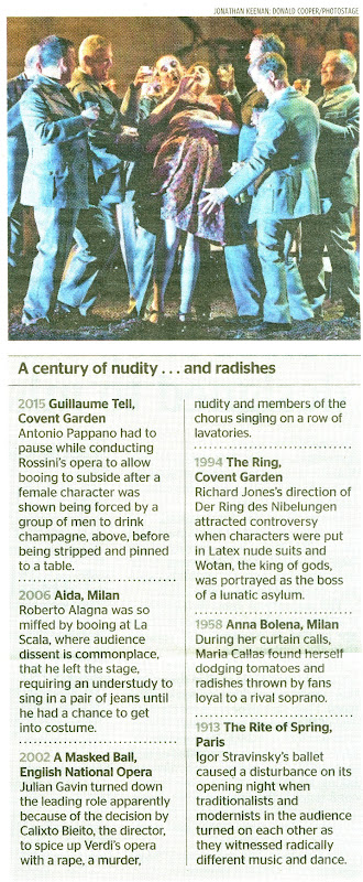
The Daily Telegraph revealed (17 March – “Royal Opera House customers demand money back over new risqué production”) that the ROH reported forty cancellations by March 15th and now advises that children should not be brought to the performance. On 15 March the Times predicted “Another fright night at the opera” and the next day carried a letter from ArtWatch UK calling for more respectful treatments of great dramatic and musical art (see below). The Evening Standard (“Outraged opera fans cancel bookings after sex and violence warning”, 18 March) reported our protest over an attempt to rewrite history and turn historical works into crusading politically progressive instruments, and noted that 100 responses had been made to the ROH’s unprecedented emailed warning. The warning provided links to a ROH interview with the director of Lucia di Lammermoor, Katie Mitchell and to a YouTube discussion in which she takes part. NB – Both of these items carry viewers’ comments. The banner heading to the video reads:
“Watch: Katie Mitchell on Lucia di Lammermoor ‘My focus is 100% on the female characters’
The director on her feminist take on Donizetti, and an innovative split-stage design.”
It is never good for artistic productions to be given over to politicised axe-grinders or sensation-seekers. Here, the express purpose of the split-staging is political and didactic – an indulged subterfuge under which alien additions enjoy a deforming and subverting parity with the opera’s authentic material. When Mitchell was asked in Warwick Thomson’s ROH magazine interview if this is “going to be ‘a feminist Lucia’?” her answer had two parts, one being the assertion of a political credo, the other a programme for its theatrical implementation: “If feminism is a political movement about equality then, yes, you could say that this interpretation will favour a feminist viewpoint”, and, “I want to find ideas that support the movement of the drama, but fill in the gaps in the female narrative in a dynamic way.” What gaps?
On Mitchell’s account, such alleged gaps are not confined to this opera but are present also throughout 19th century operas where the number of women who die is seen as being unacceptably high and “a cultural problem that we’ve inherited”. The director displays a sense of aggrievement that is personal as much as professional: “if it were matched by the equivalent number of dead and mentally disturbed men, I’d be happy as Larry. But it isn’t. So we have to be a bit more rigorous now about how we think about it and how we represent those 19th-century heroines. We can’t just glamourize them, or leave them unexamined. Just because there are beautiful sounds, they can’t be immune to scrutiny.”
By “scrutiny” Mitchell means artistic reformulation. The sheer ambition of pending licensed revisionism is breath-taking: a century’s worth of fabulous cultural achievements are deemed in need of ideological purification. We should be clear, this is not re-interpretation of Donizetti’s great work, but reconstruction on a nakedly and narrowly specialised political agenda. It might fairly be protested that if Mitchell wishes women to be cast in different, non-19th century lights she should consider writing her own operas or directing those written today by other women. There is certainly no shortage of role models in our culture that might find operatic realisation. The portrayal of women in the highly acclaimed television series “Happy Valley” is a currently prominent case in point. (Moreover, it happens to be one that helpfully includes a highly climactic operatic moment in which the forty-something police officer heroine tasers an aggressing male criminal in his genital area.)
Mitchell’s interview was published on 7 October 2015, long before rehearsals began. In a more culturally confident and artistically respectful milieu, she might have been gently advised that there are no artistic gaps in Donizetti’s opera; that, dramatically, Lucia needs to remain who she gloriously is and who Donizetti created. Instead, Mitchell has been allowed to proceed presumptuously through the opera righting shortcomings of her own reckoning, such as:
“The male characters in Lucia di Lammermoor are on stage a lot, their psychologies are well drawn, they’re complex and thrilling and interesting. My beef with the piece is that there just isn’t that same degree of attention and thoughtfulness in the drawing of the female characters. There are scenes that seem to be missing. So my production will try to fill in some of the gaps in the central character’s story. It will balance things out.”
To make physical space for her bolted-on countervailing constructions of meaning, Mitchell plans “to create a split-stage, in which there will be lots of different simultaneous environments. In the first scene, the main action, the sung action, will show Normanno [the captain of the castle guard] describing the search for the lovers – but we will also see Lucia and her maid sneaking into her brother’s bedroom to try on men’s clothes in order to disguise herself. She’s in a threatening situation, and she mustn’t be recognized going to meet her beloved Edgardo, whom her brother hates; she doesn’t just waft down in her normal clothing. I want to show scenes like that, which raise the IQ and agency of Lucia. Those are the sort of gaps I mean.”
The interviewer, instead of asking what might be meant by raising IQ and agency, supplies more rope, asking if there are other gaps. He discovers there are perceived gaps-that-constitute-missing-scenes everywhere, including at the opera’s heart and ending:
“We need to understand why Lucia goes mad. There’s a missing scene, rather like in Hamlet, where we don’t see how Ophelia goes mad. It’s the same with Lucia: we see her sane, then insane. We’ll fill that gap here as well. After all, if on your wedding night you took a sharp implement and tried to kill a very strong man, and it went horribly wrong – not like in the movies, where a knife just pops in and out, but it’s a complete bloody mess – it’s enough to unsettle anyone. We’re going to see all of that.”
It would seem that in this feminist’s politicised artistic universe, nothing can be taken as read or implicit. Even at the risk of being thought risible, everything must be acted out and underscored in full-frontal fashion: the lovers must be shown in sexual congress; the groom must not simply be taken to be dead, he must be shown to a die a horrible slow death in which he is first smothered and then, on staging a Lazarus-like recovery [- message to Arturo from the Amphitheatre: “Lie down you silly bugger, you’re supposed to be dead!”], is variously knifed and battered. Battered with a fossil. Why a fossil? Because by recasting the heroine from an emotionally fragile teenage innocent caught between a rock and a hard place, to a feisty forty-something woman in the mid 19th- rather than the 17th-century, the director can portray her as of a breed of unmarried women who “often found other ways to channel their energies. It was a period of brilliant female artists – just think of the Brontës or George Eliot. Or of other women who were fossil-hunters, or scientists.” It is sometimes difficult to decide whether perversity has trumped obtuseness or vice versa.
Mitchell’s claim that her changes and additions are intended to assist Donizetti is self-disabling: “All the choices we’re making will support the story and hopefully nudge it into more of a thriller genre”. How does pushing a work of 19th century high operatic tragedy – and that was set by its author in 17th century Scotland – towards a 20th-century literary genre assist? And what assistance is rendered by dressing the mixed choir in men’s clothing to illustrate “male domination” in support of the director’s own avowed beef about the dominance of the opera’s men, and her counter-determination to focus “100% on the female characters”? The ROH management must be hoping that few in the audience will recall Alfred Hitchcock’s description of the slow and difficult demise of one of his characters who was murdered by having his head placed into a gas oven, and then, on regaining consciousness and sitting up, by being beaten about the head by a couple of hapless would-be murderers with a succession of increasingly heavy kitchen implements.
Much as the ROH management’s indulgence of Mitchell’s programme in the production of a work that has not been seen at Covent Garden for a decade might be regretted, it not a purely local culpability. Women are having their way with dead male composers throughout the world – and in the unlikeliest places. In her production of Wagner’s Tristan und Isolde at last year’s Bayreuth Festival, Katharina Wagner reworked her great grandfather’s sublime work in such fashion that Isolde’s (unacceptably) transcendent “Liebestod” was followed not by her suicide but by her being dragged off by an out-of-role vengeful and impatient King Marke.
There are frequent laments over the ‘greying’ of classical music audiences. This can seem hypocritical. It is not helpful to attempts to introduce other generations if producers are allowed to turn the grandest, most beautiful operas into sensationally, provocatively schlocky x-rated ersatz horror movies. To give a personal example: a friend who had bought three tickets for himself, his wife and their twelve-years old daughter has cancelled what would have been the daughter’s first visit to the opera. I started taking my elder daughter to the ROH when she was about that age and had become captivated by opera after viewing a televised performance of Monteverdi’s ‘The Return of Ulysses’. The present policy of encouraging ever-more disturbingly naturalistic sexual and violent enactments is as institutionally short-sighted as it tasteless and offensive. There are more youngsters who might be brought into opera-going than people craving voyeuristic sensationalism. Most crave movingly performed, beautifully sung stories, not debasing simulations of “dogging” and violence.
On what counts as beautiful singing, and perceived shortcomings in performances today, see CODA below.
Michael Daley, 18 March 2016
CODA
Our colleague, the painter and Leonardo scholar, Jacques Franck responds from Paris:
“I knew Sutherland indirectly through two friends in London in the early sixties: Alan Freeman, an Australian BBC producer, and Cornell Senekal, a South African top male model who knew Richard Bonynge very well. At the time Joan was already complaining about many singers lacking the proper technique … What would she say if she were alive today? That ROH stage director is confusing Bel canto romantic operas of the early 19th century and expressionist operas 80 years later, like Berg’s Lulu or even later like Shostakovich’s Lady Macbeth of Mzentsk. The musical aesthetic she’s trying to introduce into Lucia di Lammermoor is entirely anachronistic and has never existed in Donizetti’s mind and music – how can the ROH accept that??
“It’s a devilish situation. I’m regularly fighting with a politically correct musical critic from Le Figaro who hates singers of extremely skilled vocal technique like Sutherland because, he says, it hinders their dramatic expression. I always retort that opera singing is based on vocal qualities first and that no proper dramatic interpretation can exist unless you have a well educated voice and a lot of musical feeling. I also add that all these awful women he favours so much with horrible worn wobbly voices producing false notes and who can’t vocalize easily if at all (notably in Mozart and all the Bel canto repertoire) yet are, on his judgment, genius actresses, should stop singing and devote themselves to acting. That would spare the public’s ears and leave room to those who have real talent… Diana Damrau is to me the absolute anti-Sutherland: the voice is colourless and, in my opinion, she shows – or is allowed to show – no musical intelligence or feeling. I just don’t understand her success. I know all the coloratura soprano parts in her repertoire, like the Queen of night (Mozart, Zaüberflöte), Violetta (a real horror – compare her with any average good soprano like Ghiorghiu), Rigoletto’s Gilda (her best, but still with a jerky singing line), Constanza (Mozart, Seraglio) with inappropriate vocalizing in both of Constanza’s major arias (notably the very tricky “Martern aller Arten”, one of the most difficult in Western operatic music). Try and find it sung by Teresa Stitch-Randall in the sixties: you’ll see the extent to which vocal art has decayed since then. Please feel free to use my comments about the Glorious Joan in your post, one of the few leading dramatic coloraturas of the 20th C, just next to Callas. They were sisters in art, ‘la Divina’ and ‘la Stupenda’. Sutherland was a marvelous Alcina, have you heard her in that opera?
“I just heard a magnificent American tenor on the radio, Frank Lopardo, singing Don Ottavio’s great aria from Don Giovanni – simply fantastic with the proper style. Thanks Heavens some good ones still exist – but I feel sad to see the degree to which insanity has perverted art nowadays including opera singing. Remembering Sutherland’s performance in Lucia as if it was yesterday, I just cannot think that the ROH would break with its own glorious past days and stage now the very mockery of what once was a planetary, sensational, operatic event…”
On seeing a draft of this post, Jacques Franck wrote:
“Mike, Thanks. I’m happy with this quote because it expresses all I’ve been longing to say publicly about the awful decadence that has occurred in operatic art for about twenty years. None of the great singers of the (still) recent past would accept what’s going on nowadays. I mean people whose shows and recitals I’ve attended with my wife, that is Callas, Sutherland, Schwarzkopf, Norma Procter, Mado Robin, Régine Crespin, Rita Gorr, Monserrat Caballé, Mirella Freni, Marilyn Horne, Gundula Janowitz, Dame Janet Baker, Jessye Norman, Margaret Price, Frederica von Stade, Tito Gobbi, Giuseppe di Stefano, Carlo Bergonzi, Dietrich Fischer-Diskau, Hermann Prey, José Van Dam, etc., etc. And I feel sure that those ones of the younger generation like Angela Ghiorghiu, Renée Fleming, Jonas Kaufmann, etc. don’t think otherwise but accept the situation because it’s hopeless and there isn’t much they can do about it.”
It might be added that Franck is especially well qualified to speak on such technical music matters: on our pointing out a video link to a live performance by Joan Sutherland of the final scene of Lucia di Lammermoor (instructions above), he responded:
“Not only have I had Sutherland’s mad scene in my collection of favourite records since the early sixties, but don’t forget what I told you in confidence one day. I was born with a totally anomalous/exceptional coloratura soprano voice revealed at the age of 13. It lasted as such until it partially broke at the age of 20 and then extended towards the deepest lower notes. During that period the voice would cover the range of 4 octaves up to a counter-counter F which is 7 notes higher than the highest note in Mozart’s famous second aria of the Queen of the night! Just imagine that I was able to sing anything in the written coloratura repertoire of Western opera. In fact my voice was 9 notes above Sutherland’s highest one and very close to that of Mado Robin, whose voice was like mine the highest ever heard. Listen to her Lakmé online in which she emits a counter A. However, when the voice broke off, it was left with a shortly extended baritone in the lower register while keeping an enormous high “soprano counter tenor” in the upper one. Which means I could still sing Lucia and all the Bellini/Verdi/Mozart coloratura parts without difficulty although the voice had to be re-educated and trained. At the time, since it was impossible for a male singer to make a career with such a voice, I used it as a means to learn all about the art of singing just for my personal information and pleasure. Imitating the art of Callas, Sutherland, Schwarzkopf and the like was part of my lessons. It lasted until the age of 44 when my larynx developed an ulcer (due to causes strange to singing) that kept bleeding each time I would sing: my doctor asked me to stop singing. My last “exercise” was the famous aria “Son vergin vezzosa” from Bellini’s “I Puritani” which I sung a major fourth above the original score, terminating with an enormous, rich counter A as a conclusion of a most thrilling and instructive experience. Every time I listen to Sutherland, not only I do understand what she actually does technically and the high level of her art, but I live it from inside. Now you can understand fully how much, like you, I suffer from what’s going on at the ROH and elsewhere in the operatic world to date.”
March 18, 2016 | Categories: news | Tags: "Happy Valley", Angela Ghiorghiu, Dian Damrau, Donizetti, Frank Lopard, Frederica von Stade, Jacques Franck, Jonas Kaufman, Kasper Holten, Katherina Wagner, Katie, Katie Mitchell, Liebestod, Lucia di Lammermoor, Michael, Michael Daley, Monteverdi's Return of Ulysses, Renee Fleming, Royal Opera House, Tristan und Isolde | Leave A Comment »
In the new Art Newspaper it is reported that the free-standing Parthenon sculpture, Illissos, was flown by a “circuitous” route when loaned by the British Museum to the Hermitage Museum in St Petersburg. It did so, it has been acknowledged by the Hermitage’s director, Mikhail Piotrovsky, to avoid possible Greek seizure through the E.U. courts.
The Hermitage Museum director, Mikhail Piotrovsky, and the British Museum’s (then) director, Neil MacGregor, at the press opening of the loaned Parthenon sculpture Illissos in St Petersburg in December 2014.
As the Art Newspaper reports:
‘Mikhail Piotrovsky, the director of the Hermitage, tells us that to forestall any attempt to intercept the sculpture, it was flown from London to St Petersburg “circuitously”. He says: “It could not be transported through Europe, because Greece believe that it belongs to them and they could have attempted to seize it at some airport en route, and according to the laws of the European Union, this would have been legitimate.” The exact route it took is a mystery, however. Did it travel via the Arctic or over North Africa? Piotrovsky declines to say, and a spokeswoman for the British Museum will only say: “When flying any loan overseas, the British Museum chooses the most direct route possible. This was true for the loan of Ilissos to the Hermitage.”’
Previously, in a letter to the Times and in our Spring 2015 Journal (- see below), we attacked the fact of the profoundly politically provocative, insensitive and physically dangerous loan that was conducted in such secrecy that neither the UK Goverment nor any of its cultural agencies were informed of the loan. But we had not disclosed that the sculpture was, in truth, flown in two stages via a Middle-Eastern state, thereby subjecting the sculpture to additional risks and to four take-offs and four landings in addition to transportation by the usual lorries and fork-lift trucks.
“Where should the Elgin Marbles be housed?” – ArtWatch UK Letter to The Times, 9 December 2014:
“Sir, On balance, the case for the British Museum retaining the Elgin Marbles stands (reports, Dec 5 & 6), but it has been gravely weakened by the irresponsible and gratuitously provocative loan of one of the works to the Hermitage Museum.
The case for continuing to hold the Elgin Marbles in Bloomsbury after two centuries has rested in part on the physical safety of the collection and on permitting the illuminating artistic pre-eminence of the sculptures themselves to be best appreciated in the context of a multi-cultural, international ‘encyclopaedic’ museum.
That the present venture has exposed what is arguably the world’s supreme depiction of a nude male figure to serious and needless risks is confirmed by the museum’s defence of its own great secrecy. As you report, its registrar boasted that ‘museums are good at mitigating risk’; that the loan needed undisclosed insurance; and that, if intercepted by thieves, ‘they would be unable to sell it’.
Reducing risk is not the same as eliminating or declining to incur it. Positively embracing risk by placing the sculpture on a lorry, a passenger aircraft (months after another was brought down by Russian-armed separatists in Eastern Europe) and another lorry, on each leg of the journey, can only be seen as a failure of imagination and a dereliction of duty on the part of the museum’s trustees.”
ArtWatch UK Journal No. 29
In the introduction to Journal 29, (“Museums, Means and Menaces”) we noted that museums had once provided havens for art and solace to visitors; that they had been cherished for their distinctive historically-given holdings and that their staffs were (appropriately) answerable to trustees. Today, we complained, museums serve as platforms for conservators to strut their invasive stuff and as springboards for directors wishing to play impresario, broadcaster or global ambassador. Collections that constituted institutional raisons d’être, are now swappable, disrupt-able value-harvesting feasts. Trustees are reduced to helpmeet enablers of directorial “visions”. No longer content to hold, display and study, museums crave growth, action, crowds and corporately branded income-generation. For works of art, actions spell danger as directors compete to beg, bribe and cajole so as to borrow and swap great art for transient but lucrative “dream” compilations. Today, even architecturally integral medieval glass and gilded bronze Renaissance door panels get shuttled around the international museum loans circus (- see Chartres’ Flying Windows).
We had supported the British Museum’s retention of the so-called Elgin Marbles for over a decade, in print and in public debates in New York, Athens and Brussels (- see Journals 19, 20, 25 and 26).
We complained that the loan had breached a two-centuries long honouring of the original terms of purchase which had required that the Parthenon carvings collection be kept intact within the museum and that this state be regarded as inviolable. We had learned that the British Museum’s (supine) trustees, having already conferred an effective vote of confidence in Putin’s Russia just months after that country had annexed the Crimea, and Russian-armed separatists in eastern Ukraine had destroyed a Malaysian Airlines Boeing with a loss of 298 lives, including around 100 children (see Journal 29 cover above), were reportedly considering a further three loans to other “suitable” museums. This declared intention gave the lie to suggestions that the loan to St Petersburg had been an exceptional case made in celebration of the Hermitage Museum’s 250th anniversary. Given that a key consideration in ArtWatch UK’s support of the museum’s retention of the Parthenon carvings had been their relative safety in the museum, the undiscussed action and reversal of policy meant that it had become impossible for us to maintain that support. Now, in the light of Mikhail Piotrovksy’s disclosure, it is surely time for the Trustees of the British Museum to cease sheltering behind the unfounded statements of its spokespeople and disclose the route by which a manoeuvre to evade the possible processes of European law was made. The Trustees might also make clear whether the provocative Parthenon loans policy initiated by the previous director is to be maintained under the new director.
Michael Daley, 9 March 2016
March 9, 2016 | Categories: news | Tags: Elgin Marbles, Loan of Parthenon sculpture, Michael Daley, Mikhail Piotrovsky, Neil MacGregor, The British Museum, The British Museum Trustees, The Hermitage Museum | Leave A Comment »
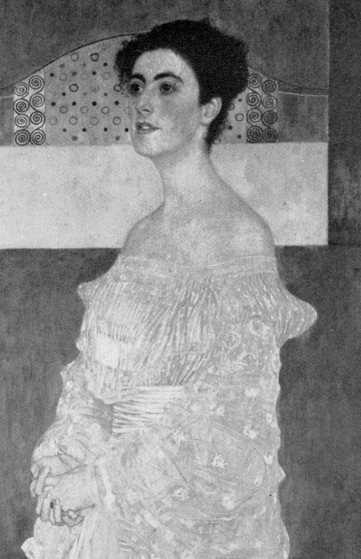
The world famous drawing that was dubbed “La Bella Principessa” by Professor Martin Kemp is insured for $150 million and lives in a “secure vault in Zurich”. It is not a portrait of Bianca Sforza by Leonardo da Vinci, as has been claimed, but a twentieth century forged or pastiche Leonardo.
WHITHER “LA BELLA PRINCIPESSA”
In 1998 the now so-called “La Bella Principessa” appeared from nowhere at Christie’s, New York. A hybrid work made in mixed media that were never employed by Leonardo (three chalks, ink, “liquid colour”), on a support that was never used by Leonardo (vellum), and portraying a woman in a manner that is nowhere encountered in Leonardo, it was presented as “German School, early 19th century” and “the property of a lady”. It went for $22,850 to a New York dealer who sold it nine years later on a requested discount of 10 per cent for $19,000 to an art collector, Peter Silverman, who said he was buying on behalf of another (unidentified) collector whom he later described as one of “the richest men in Europe”. Thus, at that date, it was not known who owned the drawing or by whom it had been consigned to Christie’s and it remained entirely without provenance. In its nine years long life, no one – not even its new owner(s) – had taken it to be by Leonardo.
In a 2012 book (Lost Princess ~ One man’s quest to authenticate an unknown portrait by Leonardo da Vinci), Silverman claimed a successful upgrading to Leonardo and described how he had gained the support of distinguished scholars including Professor Martin Kemp who had formulated an elaborate hypothetical history in which the drawing was said to be a Leonardo portrait made either from a living subject in celebration of her wedding or in commemoration after her death in 1496.
Nonetheless, the drawing failed to gain a consensus of scholarly support and is rejected in centres like New York, London and Vienna. Carmen Bambach, the Metropolitan Museum’s Renaissance drawings authority dismissed “La Bella” on the grounds that “It does not look like a Leonardo”. Thomas Hoving, a former Metropolitan Museum director, held it to look “too sweet” to be Leonardo. ARTnews reported that the Albertina Museum’s director, Klaus Albrecht Schröder, had noted “No one is convinced it is a Leonardo”. In the Burlington Magazine Professor David Ekserdjian suspected it to be “counterfeit”.
THE LOOK OF “LA BELLA” AND THE COMPANY SHE BEST KEEPS
In matters of attribution the most important consideration is the look of a work. Many things can be appraised simultaneously but, conceptually, the “look” of a work might be broken down into two aspects: an initial at-a-glance response to a work’s effects and appraisal of its internal values and relationships; and, a comparison of the effects, relationships and values with those of bona fide productions of the attributed artist, or with those of the artist’s students, associates or followers. It can also be useful to compare the looks of works with those of copyists and known forgers. It might fairly be said that in connoisseurship, as in the evaluation of restorations, visual comparisons are of the essence. (In ArtWatch we take pride in the extent to which we seek out all possible comparative visual material and regret that some institutions still hinder our efforts in this regard.)
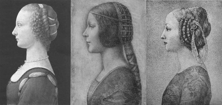
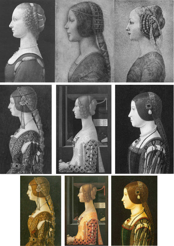
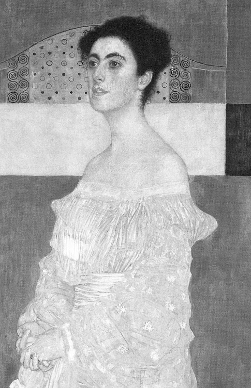
Above, Fig. 1. If we put aside questions of attribution and simply look at the group above, we find works of remarkably similar figural motifs and formats that clearly relate to and derive from a most distinctive type of 15th century Italian profile female portrait. These similar-looking works are similarly sized, being, respectively from left to right:
A Young Woman, 14 and 1/4 x 10 inches;
“La Bella Principessa”, 13 x 9 and 3/4 inches; and,
A Young Woman, 18 x 12 1/2 inches (here shown mirrored).
All show young women depicted in the strict early Renaissance profile convention made in emulation of antique relief portraits on coins and medals. Although very widely encountered (see Fig. 4), Leonardo side-stepped the type in order to intensify plastic and expressive values with sculpturally-purposive shading and axial shifts in the bodies and gazes of his portraits (see Fig. 6). The portrayals above are strikingly similar in their head/torso relationships; in their absences of background; in their highly elaborated coiffures which offset ‘sartorially’ skimped and unconvincing simplifications of costume; in their sparse or wholly absent depictions of jewellery; and, even, in their almost identically cropped motifs. Collectively they might be taken as a suite of variations on a simple theme. We take all three to be twentieth century Italian artefacts. At least two of them are linked to Bernard Berenson and the two on which reports have been published have unusual and problematic supports.
As mentioned below, the Detroit picture is painted on top of photographic paper. It is suspected that it might have been a photograph of the Frick sculpture to which the painting was initially related. The “La Bella Principessa” is drawn, exceptionally for Leonardo, on a sheet of vellum which appears to have been removed from a book and it is, most unusually, glued to an oak panel. The panel itself is a curiosity: although a number of “butterfly keys” have been inserted into its back, as if to restrain splitting, there is no evidence of splits in the panel and, if there were, the present four such keys in such a small panel might be considered restoration “over-kill”. If the panel had split while the vellum was glued to it, the drawing would have split with the panel. The fact that the vellum has been “copiously glued” to a (possibly pre-restored) oak panel makes it impossible to examine the back of the drawing which is said by one of its proponents, (Cristina Geddo, an expert in Leonardo’s students and Milanese “Leonardesques”) to bear “superimposed numbers…a written inscription…[and a] little winged dragon – at least that is what it seems.” For Geddo, this unexamined content is reassuring: “This feature, too, counts in favour of an attribution to Leonardo, who, even though he never to our knowledge used a parchment support in his work, was in the habit of re-using the paper on which he drew.”
(In reading the compendious literature on this proposed attribution, we have sometimes wondered what might be allowed by its supporters to count as evidence against the attribution.)
CONSIDER THE HISTORIES
The portrait on the left, A Young Woman, was bought in 1936 by the Detroit Institute of Arts as by Leonardo da Vinci or Andrea del Verrocchio. The institute’s director, W. D. Valentiner, made this attribution on the strength of clear correspondences with the curls in the hair of Leonardo’s painting Ginevra de’ Benci (see Fig. 6) in the National Gallery of Art, Washington, and with those found in the above-mentioned marble sculpture in the Frick Museum, A Young Woman, given to Andrea del Verrocchio. (Valentiner had made a study of Leonardo’s work in Verrocchio’s workshop.) In 1991 Piero Adorno, specifically identified the Detroit picture as Verrocchio’s lost portrait of Lucrezia Donati. Notwithstanding seeming correspondences with secure works, this picture is now relegated to “An Imitator of Verrochio” – and this is an extremely charitable formulation. In Virtue and Beauty, 2001, David Alan Brown described it as “a probable forgery by its anachronistic materials and unorthodox construction”. “Probable” [!] because: “after a recent technical examination, the picture turns out to have been painted on photographic paper applied to a wood panel that was repaired before it was readied for painting. And at least one of the pigments employed – zinc white – is modern…” Valentiner judged one of two Leonardo studio works of the Madonna with a Yarnwinder to be “more beautiful than the Mona Lisa”.
The portrait on the right, A Young Woman, was attributed to Piero Pollaiuolo by Berenson in 1945. While this figure is perhaps the most attractive of the above three, with its nicely constructed counterbalancing of the thrusts in the neck/head and torso, and its credibly proportioned arm, the work itself has, so far as we can ascertain, sunk without trace. In truth, this female profile portrait type has been assailed by forgeries. Alison Wright notes in her 2005 book The Pollaiuolo Brothers, that “Complications for the historian lie both in the fact that the subjects of most female portraits are no longer identifiable and that, because of their exceptional decorative and historical appeal, such portraits were highly sought after by later nineteenth- and early twentieth-century collectors, encouraging a market for copies, fakes and over-ambitious attributions.”
The portrait in the centre (“La Bella Principessa”) has been precisely attributed by Kemp to Leonardo as a book illustration portrait of Bianca Sforza of 1495-96.
DISTINGUISHING BETWEEN THE LOOKS OF THEN OF NOW
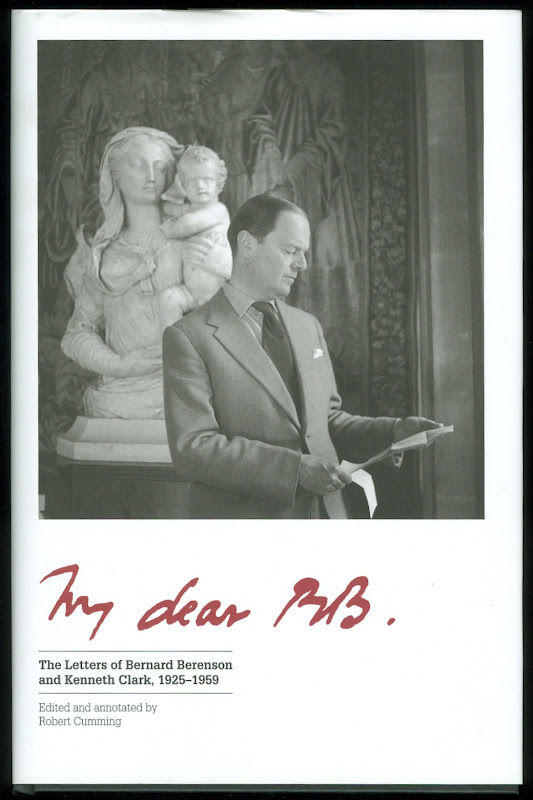
Above, Fig. 2. In My dear BB (an incalculably valuable new resource edited and annotated by Robert Cumming), we learn that in November 1930 Kenneth Clark’s wife, Jane, wrote to Berenson: “K has seen Lord Lee’s two new pictures…The Botticelli Madonna and Child you probably know too. K thinks the latter may be genuine about 1485 or rather part of it may be, but it is not a pretty picture…” A footnote discloses that Lee had bought The Madonna of the Veil, a tempera painting on panel in 1930 from an Italian dealer for a then huge sum of $25,000 (Fig. 3). It was widely accepted by scholars as autograph Botticelli and published by the Medici Society as a “superb composition of the greatest of all Florentine painters”. Clark, doubting the attribution on sight, objected that it had “something of the silent cinema star about it” – and he likened the Madonna to Jean Harlow (Fig. 3). Lee donated the picture to the Courtauld Institute Gallery in 1947. In June 2010 Juliet Chippendale (a National Gallery curatorial intern working in association with the Courtauld Institute MA course) disclosed that scientific examination had identified pigments not known before the 18th and 19th centuries and worm holes that had been produced by a drill. It is now designated a work of the forger Umberto Giunti (1886-1970), who taught at the Institute of Fine Art in Siena and forged fresco fragments.
ART HISTORICAL SILENCES
Four months later Clark wrote to Berenson: “Just in case Lee has sent you a photograph of his new Botticelli may I ask you to forget anything Jane may have reported me as having said of it. It is one of those pictures about which it is best to be silent: in fact I am coming to believe it is best for me to be silent about every picture. Did I tell you that my Leonardo book was a mare’s nest. The man had sent photographs of two drawings from the middle of the Codice Atlantico. They must have been early copies done with some fraudulent motive – perhaps the book really did belong to Leonardo – he certainly had read it – & some pupil thought to enhance its value.”
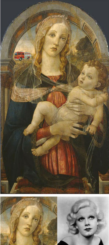
Above Fig. 3. The young Kenneth Clark (then twenty-seven years old) displayed an admirable “eye” by spotting a fraud on sight some eighty years ahead of the pack. Is it better for a connoisseur to see but not speak than it is not to see at all? Undoubtedly, it is. Would Clark have enjoyed his meteoric rise had he humiliated the mighty and exposed the big-time fraudsters of his day? (That question might be taken as self-answering.) If Clark bided his time on Berenson, eventually he delivered an unforgiving former-insider’s repudiation in 1977 by chronicling how Berenson had “sat on a pinnacle of corruption [and] for almost forty years after 1900… [done] practically nothing except authenticate pictures”
PRETTY – AND NOT SO PRETTY – WOMEN
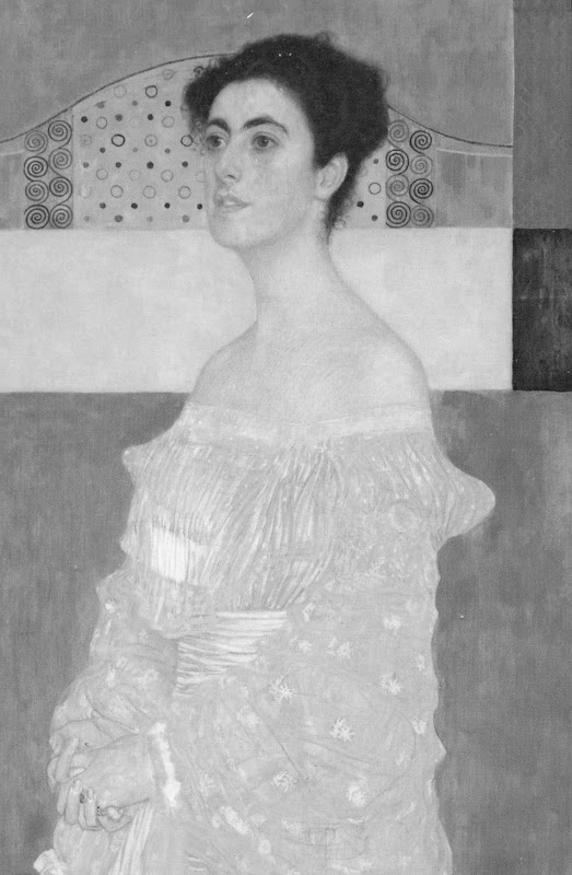
Above, Fig. 4. In the middle and bottom rows we see three bona fide works of the female profile type – respectively:
Portrait of Bianca Maria Sforza, c. 1493, by Ambrogio de Predis, The National Gallery of Art, Washington;
Domenico Ghirlandaio’s 1488-1490 Giovanna degli Albizzi Tornabuoni, Museo Thyssen-Bornemisza, Madrid; and,
a portrait of Beatrice d’Este tentatively attributed by Kemp to Ambrogio da Predis.
The differences between this trio and the works in the top row are pronounced and eloquent. The secure works are highly individuated and immensely richer in their effects. Collectively, they do not constitute an inadvertent suite. Individually, they are greatly more various compositionally. Collectively, they are markedly richer in jewellery and ostentatiously sumptuous costumes. The distinctive physiognomies of their subjects derive from living persons, not from other art or photographs of other art. Flattery and loving attention are channelled more into the costume and bling than into the facial features. In every respect the opposite is the case in the top row where prettiness has been held at a premium with an eye on the modern photographically-informed market.
LEONARDO BREAKS THE MOULD
Above, Fig. 5: As mentioned, “La Bella Principessa” and her two companions are of a piece, and of a type never followed by Leonardo whose female portraits (see below) pioneered an unprecedentedly complex and sophisticated evocation of real, sculpturally palpable women in tangible spaces or landscapes. To include the figurally impoverished and stylistically anachronistic “La Bella Principessa” in Leonardo’s oeuvre would disjunct his revolutionary arc of insights and innovations in portraiture. Such inescapably disruptive consequences have been ceded tacitly by Kemp, “La Bella Principessa’s” principle defender – some say advocate. In “La Bella Principessa ~ The Story of the New Masterpiece by Leonardo da Vinci” (Kemp’s 2010 book jointly written with Pascal Cotte of Lumiere Technology and including chapters by the drawings scholar Nicholas Turner and the recently discredited fingerpints expert Peter Paul Biro), Kemp converts an intractable problem into an asset by begging the essential question. That is, he underwrites “La Bella’s” credibility on an assertion that “Any important new work, to establish itself, must significantly affect the totality of Leonardo’s surviving legacy over the longer term.” Without question, the de-stabilising inclusion of “La Bella Principessa” would produce knock-on effects, but arguing backwards from that predictable disturbance to some endorsement of its source is patently unsound methodologically – the inclusion of any atypical work, whether bona fide or forged, into an oeuvre would affect its “legacy”.
LEONARDO’S ACCOMPLISHMENTS
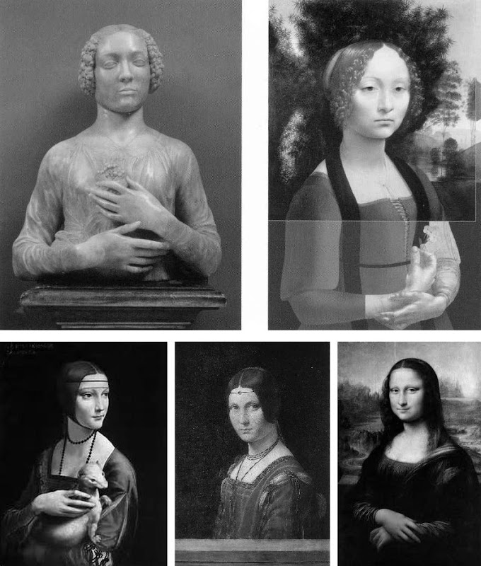
Above, top, Fig. 6: Left, Andrea del Verrocchio’s Lady with a Bunch of Flowers of c. 1475; and (right) Leonardo’s (hypothetically extended) Ginevra de’ Benci of c. 1474-1478.
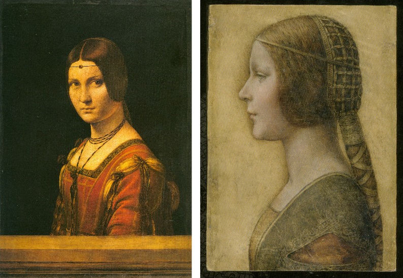
Above, Fig. 7: Left, Leonardo’s The Lady With an Ermine of about 1489-90; centre, Leonardo’s La Belle Ferronnière of about 1495-96; right, Leonardo’s Mona Lisa (La Giaconda) of about 1503-06 onwards.
In the group above we see extraordinary development in Leonardo’s portraits of women over the last quarter of the fifteenth century as he strove to incorporate the entirety of sculptural, plastic, figural knowledge, and to surpass it by making it dance to an artistically purposive tune liberated from the happenstance, arbitrary lights of nature on which sculpture then necessarily depended. Some have attributed the Bargello sculpture, the Lady with a Bunch of Flowers, to Leonardo on the grounds that its subject was Ginevra de’ Benci, the subject of Leonardo’s painting. Others have seen Leonardo’s authorship of it in the beauty of the hands. In Leonardo da Vinci and the Art of Sculpture, 2010, Gary M. Radke holds that the two works show differences that emerged in the mid-1470s between the two artists. Against this, it has been suggested that the painting might originally have borne a closer relationship to the sculpture with a possible inclusion of hands in a fuller length treatment. A study of hands by Leonardo was incorporated in a hypothetical and digitally realised extension of the painting by David Alan Brown (Virtue and Beauty, 2001, p. 143). Frank Zollner sees the painting as marking the point (1478-1480) at which Leonardo broke away from “the profile view traditionally employed in Florence for portraits of women” in favour of the three-quarters view in order to impart “a pyschological dimension to his sitter – something that would become the hallmark of Renaissance portraiture”. Which is all to say that Leonardo had broken away from the profile convention some sixteen to eighteen years before, on Kemp’s hypothesis, he made a solitary and exceptional “return” to it.
Speaking of the reconstruction of Leonardo’s Ginevra de’ Benci painting, Brown writes:
“Ginevra’s portrait, the lower part of which was cut down after suffering some damage, may have included hands. A drawing of hands by Leonardo at Windsor Castle, assuming it is a preliminary study, aids in reconstructing the original format of the picture. As reconstructed, Leonardo’s portrait may be seen to have broken with the long-standing Florentine convention of portraying women in bust-length profile. In seeking an alternative to the static profile, Leonardo, like Botticelli, seems to have turned to Verrocchio’s Lady with a Bunch of Flowers in the Bargello, Florence. Because of the sitter’s beautiful hands which mark an advance over the earlier head-and-shoulders type of sculpted bust, the marble has even been attributed to Leonardo. But the highly innovative conception of the half-length portrait bust is surely Verrocchio’s achievement. What young Leonardo did was to was to translate this sculptural protype into a pictorial context, placing his sitter into a watery landscape shrouded in a bluish haze…”
A CASE CONSPICUOUSLY NOT MADE
For the owner and the art historical proponents of “La Bella Principessa”, the very chronology of Leonardo’s female portraits constitutes an obstacle. Given Leonardo’s famous eschewal of strict profile depictions of women, the onus is on those who would include “La Bella Principessa” (- albeit as a solitary and exceptional stylistic regression that was undertaken without ever attracting attention or comment) to make a double case.
First, they must show how and where “La Bella Principessa” might plausibly have fitted within the trajectory of Leonardo’s accepted works. Second, they must demonstrate by comparative visual means that “La Bella Principessa” is the artistic equal of the chronologically adjacent works within the oeuvre. Kemp has proposed the precise date of 1495-96 for the execution of “La Bella Principessa” but, conspicuously, has not presented direct, side-by-side visual comparisons with Leonardo’s paintings. Instead of comparing “La Bella Principessa” of 1495-6 directly with Leonardo’s La Belle Ferronnière of about 1495-6, Kemp writes:
“If the subject of Leonardo’s drawing is Bianca, it is likely to date from 1495-6. In style, it seems at first sight to belong with his earlier works rather than to the period of the Last Supper. However, Leonardo was a master of adapting style to subject. Just as his handwriting took on an earlier cast when he needed to adopt a formal script, so his drawing style could have reverted to a meticulous formality, appropriate for a precious set-piece portrait on vellum of a Sforza princess.”
“If”? “Could have”? “At first sight”? The pro-attribution literature is bedecked with daisy-chains of such tendentious and weasel words and terms. With which earlier works is “La Bella Pricipessa” deemed to be artistically comparable or compatible? With the Ginevra de’ Benci of c. 1474-1478? With The Lady With an Ermine of about 1489-90? Never mind the red herrings of handwriting and the giant, near-obliterated historical figures of the Last Supper, what of the relationship with Leonardo’s (supposedly) absolutely contemporaneous La Belle Ferronnière of 1495-96? (On this last we volunteer a pair of comparisons below.)
Above, Top, Fig. 8: Leonardo’s La Belle Ferronnière, left, and the “La Bella Principessa”.
Above, Fig. 9: Details of Leonardo’s La Belle Ferronnière, left, and the “La Bella Principessa”.
Kemp insists: “The Lady in profile [“La Bella Principessa”] is an important addition to Leonardo’s canon. It shows him utilizing a medium that has not previously been observed in his oeuvre…It testifies to his spectacular explosion and development of novel media, tackling each commission as a fresh technical challenge. It enriches our insights into his role at the Milanese court, most notably in his depiction of the Sforza ‘ladies’ – whether family members or mistresses. Above all, it is a work of extraordinary beauty.”
Even if we were to assume that for some reason Leonardo had opted to “revert” in 1496 to a type he had never employed, what might explain a pronounced indifference in “La Bella Principessa” to the detailed depiction of the “stuffs” of costume with which the artist was simultaneously engaged in La Belle Ferronnière? Given that Leonardo clearly appreciated and celebrated the fact that courtly costume required sleeves to be made as independent garments held decorously in place by ribbon bows so as to permit undergarments to peep through; and, given that Leonardo lovingly depicted not only the varying thicknesses of the costume materials but every individual twist in the threads of the elaborately embroidered band in La Belle Ferronnière, how could he possibly – when working for same ducal master, at the same time – have been so negligent and indifferent in the execution of “La Bella Principessa’s” costume? Kemp acknowledges and offers excuse for the distinct poverty of the costume: “It may be that the restraint of her costume and lack of celebratory jewellery indicates that the portrait was destined for a memorial rather than a matrimonial volume.” In so-saying, he jumps out of one frying pan into another.
If “La Bella Principessa” was made after Bianca Sforza’s death, from whence did the likeness derive? One reason why Kemp settled on Bianca as the preferred candidate subject for “La Bella Principessa” was that while (disqualifying) likenesses of the other Sforza princesses existed, none survives for her – she is an image-free figure. Kemp offers no indication of a possible means for Leonardo’s (hypothesised) post-death conjuring of Bianca’s supposed likeness other than to claim that “Leonardo has evoked the sitter’s living presence with an uncanny sense of vitality.” This again begs the crucial question and fails to consider any alternative explanations for the image’s qualities. (We will be showing how the profile of “La Bella Principessa” could well have been a “portmanteau” composite image assembled from one particular work of Leonardo’s and from that of another, unrelated painter.)
The most strikingly “Leonardesque” feature on the costume of “La Bella Principessa” – the knot patterning around the (implausible) triangular slash in the outer garment – is a source of further concern and constitutes evidence of forgery. First, the motif on which much effort will have been expended, is brutally cropped along the bottom edge of the sheet, as if by a careless designer laying a photograph into a book. Why would any Renaissance artist, let alone Leonardo, design a complicated feature so as to “run it off the page”? Further, the illusion of form (created by lights and shades) in the patterning is feeble in the extreme for Leonardo – as when compared with his treament of relief seen in the above embroidered passage in La Belle Ferronnière, for example. Leonardo probably better understood than any artist in history the vital connection between a thing made and a thing depicted. He took bodies and organs apart to understand their construction and he sought to create mental models that would make the otherwise terrifyingly arbitrary and capricious forces of nature graspable if not checkable. Most seriously of all, as our colleague Kasia Pisarek has noted and reported, while the patterning present on “La Bella Principessa” matches none found in any work of Leonardo’s, it more closely matches that found in a carved marble bust by Gian Cristoforo Romano in the Louvre – see “La Bella Principessa – Arguments against the Attribution to Leonardo”, Kasia Pisarek, artibus et historiae, no. 71, 2015. (To receive a pdf of Dr Pisarek’s article please write to: news.artwatchuk@gmail.com )
Michael Daley, 24 February 2012.
In Parts II and III we examine: the provenance of “La Bella Principessa” and the work’s problematic emergence from within the circle of Bernard Berenson; the claim by the forger Shaun Greenhalgh to have produced “La Bella Principessa” in Britain in the 1970s; the spurious “left-handed-ness” of “La Bella Principessa” and the low quality of, and the means by which the drawing was made…
February 25, 2016 | Categories: news | Tags: "La Bella Principessa", "My dear BB.", Bernard Berenson, Botticelli, Carmen Bambach, Christies NY, Cristina Geddo, David Alan Brown, David Ek, David Ekserdjian, Detroit Institute of Arts, Ginevra da Benci, Jean Harlow, Kasia Pisarek, Kenneth Clark, Klaus Albrecht Schroeder, Leonardo da Vinci, Lucrezia Donati, Michael Daley, Nicholas Turner, Peter Paul Biro, Piero Pollaiuolo, Robert Cumming, Robert Silverman, Shaun Greenhalgh, The Mona Lisa, Thomas Hoving., Verrocchio, W D Valentiner | Leave A Comment »

18 February 2016
By Florence Hallett
When in 2014, six stained glass windows were removed from Canterbury cathedral to star in an exhibition at the Getty Museum, California and the Metropolitan Museum of Art, New York, it seemed that the Rubicon had been crossed. As the Met boasted in its exhibition publicity, this was the first time that the windows had left the cathedral precincts in their 850-year history; now, they were not only to be removed, but removed far away and subjected to the extreme risk of air transportation.
In the past, various circumstances have led to the temporary removal of stained glass, with routine cleaning and maintenance the most common cause, followed by war and conflict. During the Reformation and the English Civil War and more recently during the Second World War, glass was, on occasion, removed and stored to protect it from danger.
This is of course, fundamentally different to removing glass in order to put it on display in museums thousands of miles away and thousands of miles apart. The glass at Canterbury, made by men alive at the time of Thomas Becket’s death in 1170, had seemed as immovable as the cathedral itself, a building old enough to have more in common with the rivers and hills than the relative transience of bricks and mortar. It is fair to say that the very fact of their transatlantic tour has changed the character of these windows irrevocably.
Art up in the air
Some 20 months ago, as the Canterbury glass touched down in New York from the Getty in California, we asked how in the middle of the one of the worst years in aviation history the Met could be confident of the safety of air transportation [How the Metropolitan Museum of Art gets hold of the world’s most precious and vulnerable treasures]. As we begin 2016 fresh with the news of recent air disasters, aeroplanes have not seemed more dangerous in decades – indeed, on February 15th this year, the Art Newspaper reported that American Airlines and seven others are being sued over damage to a Lucio Fontana sculpture when it was flown from Paris to the Armory Show in New York last year.
And yet, preparations are underway for another cargo of stained glass to take to the skies, as windows removed as part of the controversial, wholesale restoration of Chartres cathedral form the centrepiece of an exhibition originally scheduled for 2016, but currently postponed, to be hosted by an as yet undisclosed US museum.
As at Canterbury, the removal of the Chartres glass for restoration has been taken as a convenient opportunity to send it overseas. Where we speculated as to whether the Church had received any payment for the loan of the Canterbury windows (a question to which we still do not have a definitive answer), in the case of Chartres, just such a transaction is known to have taken place.
A fund-raising quid pro quo
While the cost of the controversial repainting of the cathedral’s interior has been met by the French state and donors including Crédit Agricole, Caisse Val de France et Fondation, and MMA assurances, the restoration of the cathedral’s famous glass has been funded in part by the American Friends of Chartres (AFC), an organisation that works “to raise awareness in the United States of Chartres Cathedral and its unique history, sculpture, stained glass, and architecture and their conservation needs”.
Based in Washington, the AFC has ambitious plans to fund the restoration of the cathedral’s windows and sculptures. In 2013 it announced on its own site, and via the crowdfunding website razoo.com, that in return for funding the restoration of the Bakers’ Window (two lancets and a rose in the nave), the 13th-century glass would travel to a US museum. Indeed, the still extant webpage makes explicit the nature of the exchange, proclaiming:
“American Friends of Chartres INVITES YOU to Restore and Bring to the United States a 13th-Century Stained Glass Window for Museum Exhibit
WELCOME TO AMERICAN FRIENDS OF CHARTRES’ UNPRECENTED [sic] PROJECT: THE RESTORATION OF A MEDIEVAL STAINED GLASS WINDOW FOR EXHIBIT IN AMERICA.”
In appealing to members of the public to donate to the project, the AFC invokes American efforts to save Chartres from destruction during World War Two, treating the fundraising project as the corollary of the cathedral’s status as “a wonderful testimony to the friendship between the French and American people. The French people honor every year the memory of the Americans who contributed to saving the cathedral from destruction at the end of WWII.” But why, if the AFC is so concerned for the welfare of the cathedral, must the glass be removed from the building, and subjected to a transatlantic tour?
Speaking to French Morning in 2014 about the plans to exhibit the windows in the US, Dominique Lallement, the president of the AFC said: “The lancet windows measure more than 6 meters in height, which means there will have to be a structure built similar to the cathedral to accommodate them.” Given the success of the Canterbury exhibition, which represented a huge coup for the Met, already notorious for its ability to secure rare loans from reluctant lenders, the Chartres exhibition is likely to be equally high-profile, on a scale indicated by the planned construction of a special display area within some as yet un-chosen or unannounced venue.
A “scandalous desecration of a cultural holy place”
Perhaps the significance and sensitivity of the deal were indicated by the official reaction to architecture critic Martin Filler’s heartfelt but thoughtful attack on the repainting of the cathedral interior. In his blog on the New York Review of Books website, Filler expressed shock at the “scandalous desecration of a cultural holy place”, and accused the French government of breaching the international rules of conservation established in the 1964 Charter of Venice.
As Filler’s article spread around the internet, those in charge of the restoration were notable for their silence. Patrice Calvel, the architect who oversaw the project prior to his retirement over three years ago was high-handed in his dismissal of Filler, saying that he had never heard of him. He had previously refused to respond to a highly critical report in Le Figaro, telling the Guardian that its author Adrien Goetz “has no competence in this matter.”
From the horse’s mouth…
Less reticent than the architects and restorers, however, was Caroline Berthod-Bonnet, who at the time was head of fundraising at Chartres, but has since left the role. Speaking to the Guardian in response to Filler’s blog she asked: “What will be the effect on our sister organisation in the United States, which is raising money to restore stained glass windows to be displayed in the US?”
By highlighting the link between the restoration project as a whole and the loan of the glass to the US, Berthod-Bonnet’s comment cut to the heart of the matter, but without providing any plausible justification for so rash and ill-advised an operation. In fact, the only extended defence of the repainting project has come from Professors Madeline H. Caviness and Jeffrey F. Hamburger, American academics and members of the AFC’s advisory panel, the organisation masterminding the loan of the glass to the US. Responding to Martin Filler via the New York Review of Books website, they adopted a tone of weary condescension, describing Filler as “well-meaning but also misinformed”, conjuring up a picture of a hopelessly deluded aesthete, clinging to a romantic but impossible vision of glorious decay.
Revelations beyond restorations and recreations
Professor Hamburger has been a loyal supporter of the Chartres restorers, writing a second defence of the project for Apollo last April, in which he argued that “The restoration of the false masonry proved more of a revelation than a restoration, let alone a recreation”. Either naive or a wilfully blinkered interpretation of the flimsy evidence produced in support of the work, Hamburger’s statement ignores the complexities of the material evidence that exists while also dismissing out of hand the ethical, philosophical and aesthetic problems this project presents.
Hamburger and Caviness are keen to put distance between the deal struck in relation to the windows and the restoration project overall, but the relationship between glass and masonry is so thoroughly entwined, on every level, that they are not entirely convincing. Stained glass is such an intrinsic and essential aspect of any Gothic building, as exemplified at Chartres, that common sense dictates that any programme of cleaning and restoration must take into consideration both elements.
Accordingly, the rationale put forward by Hamburger and Caviness in support of the restoration hangs on the relationship between glass and masonry, and they insist that: “Combined with the restoration of the windows, the restoration of the original color scheme in fact enhances the perception of color in the windows.” In both intellectual and practical terms, the projects to repaint the masonry and to clean the windows are mutually and irrevocably dependent.
Such interdependency seems also to extend to the fundraising projects relating to Chartres. In their response to Martin Filler, Hamburger and Caviness emphasised that the AFC “raises funds only for the restoration of the windows” but fail to explain the function of this arbitrary divide. Dominique Lallement, president of the AFC, told us: “To the best of my knowledge, no donor to American Friends of Chartres is supporting other aspects of the restoration”. But records of donations made to the cathedral’s funding organisations over the past five or six years suggest that there has been overlap between the funding of different aspects of the restoration. In addition, there seems to have been professional overlaps among key players.
The Revelation Brokers
Both the president of the AFC, and its former vice-president, the late Pierre Louis-Roederer, are listed as donors to Chartres Sanctuaire du Monde (CSM), AFC’s sister organisation. In addition, the president of CSM, Servane de Layre-Mathéus is an honorary member of the Board of Trustees at the AFC, a position which affords no voting rights. Today, CSM raises money for the restoration, principally, of stained-glass windows but has also funded work on the organ, the steps to the high altar and the liturgical furniture in the choir and has a more general role in co-ordinating fundraising efforts made on behalf of the cathedral.
While recent fundraising efforts have focused on the restoration of the glass, in the lifetime of the current programme of works its scope has been broader. Indeed, CSM newsletters of March 2008 and February 2009 explain that in addition to financing the restoration of stained-glass windows, it contributed the full cost of a trial restoration of the Chapel of the Apostles (the axis chapel). This trial, completed in 2009, involved the application of a latex peel to reveal “the traces of old polychrome decorations” beneath layers of dirt. The 2008 newsletter anticipates that “The experience gained from these important preliminary works should enable the Monuments Historiques division of the Ministry of Culture to undertake the far more ambitious program of restoration of the vaulting of the nave.”
Asked to what extent donors to AFC are also involved in funding other areas of the project, Dominique Lallement said: “our fundraising activities are totally separate, as well as the use of our funds. To the best of my knowledge, CSM is also working only on the restoration of the stained-glass windows. CSM finances a percentage of the restoration costs of certain windows, and AFC finances other windows. Thus, for our first project, AFC financed 50% of the restoration costs of the 5 lancets of the South Portal, and the French Government financed the other 50%. For our second project, AFC finances 100% of the restoration costs of Bay 140, the Bakers’ Window.” While both CSM and AFC now confine their activities to the glass, CSM’s funding of a trial that informed the restoration overall, seen in light of the close working relationship between the two organisations, and the crossover of personnel, surely undermines the rather curious attempts to separate the work on the windows from the project as a whole.
Just as the French restorers have failed to respond to criticisms regarding the treatment of the cathedral’s walls, AFC have adopted a similar approach when it comes to sharing information on the cleaning and restoration of the windows. When we asked AFC to supply us with high-resolution files of their photographs showing the removal of the Bakers’ Window in Bay 140, Craig Kuehl of the AFC replied: “Before we provide the photos, we’d like to see your draft article, especially the references to the photos. Otherwise we can’t give the authorization.”
As advisors to the AFC, Hamburger and Caviness’s defence of the restoration programme clearly cannot be separated from the AFC’s prestigious and lucrative coup to bring the glass to the USA. The anxiety expressed above by chief Chartres fundraiser Catherine Berthod-Bonnet, seems astute in hindsight, having anticipated the wider consequences that such negative publicity could bring to the entire project – a project that, in truth, extended far beyond the cathedral itself and into an intended commercial deal with an American museum.
A petition demanding an immediate halt to the restoration work was started in the autumn by American student Stefan Evans and has attracted such high-profile signatories as Professor Sophie Guillouet, an art historian at the University of Rouen.
Watchdogs that Don’t Bite
The petition argues that the 1964 Charter of Venice – a document setting out internationally agreed principles for the care and restoration of ancient buildings – has been breached, and makes particular reference to articles 3 and 6. Article 3 stipulates that “The intention of conserving and restoring monuments is to safeguard them no less as works of art than as historical evidence”, a guideline that would seem to have been compromised at Chartres not just because distinctions between building phases have been muddied, but also because evidence of 800 years of aging has been removed.
Article 6 states that: “The conservation of a monument implies preserving a setting which is not out of scale. Wherever the traditional setting exists, it must be kept. No new construction, demolition or modification which would alter the relations of mass and colour must be allowed.” Critics argue that current interventions alter the relation of mass and colour fundamentally, and indeed, it could be argued that this is outcome is in fact the primary objective of the project.
In addition, article 11 appears to address the specific actions taken at Chartres, and emphasises the importance of seeking expert opinions beyond that of the person in charge of the project: “The valid contributions of all periods to the building of a monument must be respected, since unity of style is not the aim of a restoration. When a building includes the superimposed work of different periods, the revealing of the underlying state can only be justified in exceptional circumstances and when what is removed is of little interest and the material which is brought to light is of great historical, archaeological or aesthetic value, and its state of preservation good enough to justify the action. Evaluation of the importance of the elements involved and the decision as to what may be destroyed cannot rest solely on the individual in charge of the work.”
Given the concerns about the Chartres project raised by experts from around the world, the onus would seem to be on ICOMOS to investigate allegations of such a serious breach or breaches of the very charter that serves as the foundations for the organisation’s existence. But as the charter makes clear that each country is responsible “for applying the plan within the framework of its own culture and traditions” there is little prospect of any meaningful intervention from ICOMOS.
The plight of Chartres is further highlighted by the case of a member of the public who petitioned the European Parliament in 2013, demanding an immediate stop to the restoration at Chartres. A document issued on 31 January 2014, states “The European Union’s competence in the field of cultural heritage is limited.” Despite co-funding the restoration of Chartres, “the Commission cannot interfere in the way national cultural heritage is protected.” The petitioner, an Italian named Marta Mariani, was told that responsibility for the project lies with the French government and the regional prefecture. As neither international outrage nor a petition have so far elicited anything more than disdain from the French authorities, it is clear that no institution has either the teeth or the will to act.
STOP PRESS: At 17.33 today, in answer to an email of 14 February, Florence Hallett was notified by the American Friends of Chartres that:
“The exhibit of Bay 140 which had been envisaged will not take place because of cost reasons. And, to answer your question, of course all the proper authorizations from the French Ministry of Culture and other authorities had been secured by the DRAC-Centre Val de Loire, which had been nominated by the Ministry of Culture to execute the project. All the arrangements for the exhibit of Bay 140 would have been contractually arranged between the DRAC on behalf of the French authorities and the cultural institution that would have exhibited the window. American Friends of Chartres would not have been part of these contractual arrangements.”
Florence Hallett is architecture and monuments correspondent at AWUK and visual arts editor at theartsdesk.com
Above, Fig. 1: Top, part of the Belle Verrière window at Chartres Cathedral.
Above, Fig. 2a and 2b: Part of Belle Verrière window, as seen before cleaning (left) and after cleaning (right).
CAN YOU SPOT THE DIFFERENCE ABOVE?
The ‘after-cleaning’ photograph on the right is taken from the website of the “American Friends of Chartres”. It is said of the cleaned state of the window:
“Meanwhile, here is a look at the newly restored Belle Verrière window with the Blue Halo Virgin which is perhaps the most famous stained glass at Chartres. The startlingly bright colors, including the famous Chartres blue, just pop out at you.”
19 February: Although this ‘after-restoration’ image is of low resolution the comparison of pre- and post-restoration states is highly disturbing and we accordingly requested a high quality photograph of the Bakers’ window which, on restoration, was to be dispatched to an American museum. The American Friends of Chartres have declined to send one. Instead, they have in effect erected a Catch 22 obstacle, saying: “Show us what you’ll be saying in your article and photo-captions and we will then decide whether or not to supply them”. As Mr Kuehl presumably appreciated, we cannot possibly comply with such an irrational and perverse requirement – we can only comment on that which we can see. We therefore draw attention to the cautionary disparity between the Belle Verrière window before its treatment and afterwards on the available, already published photographs. In our organisational experience, reluctance on the part of restorers to supply high quality directly comparable before- and after-treatment photographs is almost invariably an indication that damage has occurred during treatment. There is much talk of ethics in conservation practice. If such is to have substance it is imperative that records of all of the various states of works be freely available to interested parties – how else might errors be detected and injurious procedures halted?
WHAT CAN BE SEEN TODAY?
Certainly, on the evidence of the comparative photographs shown at Figs. 2a and 2b, there would appear to have been substantial losses of colour on the Belle Verrière window during its “restoration”. The claims on the American Friends of Chartres website that the colours are startlingly bright and that the colours now pop out are both vulgar and imprecise. Why should the colours of the glass at Chartres startle anyone? Why should colours that previously were both individually strong and collectively harmonious (as seen at Figs. 1 and 2a) have ceased to be so as a result of a restoration? With regard to the reliability of photographic evidence in these matters, we refer the reader/viewer to an earlier, and grotesquely bungled restoration, that of Michelangelo’s frescoes in the Sistine Chapel.

Above, Fig. 3: Top, a section of Michelangelo’s Sistine Chapel ceiling frescoes, as seen before restoration (left) and after restoration (right). Above, a section of the Belle Verrière windows at Chartres Cathedral, as seen before restoration (left) and after restoration (right).
We see at the top a small section of Michelangelo’s ceiling (as it was first published in 1988) with the pre-restoration state on the left and the post restoration state on the right. We recognised instantly on the evidence of this single photo-comparison that Michelangelo’s painting had been damaged by the removal of painting (chiefly black) with which he had strengthened shadows and modelling and, even, added details (such as veins on the oak leaves). At the time, the restorers and their art historical advisers all insisted that the removed paint
had not been paint, that, rather, it had been arbitrary accumulations of soot and discoloured varnish that had built up over the centuries to produce…
precisely the features which Michelangelo’s contemporaries had copied in engravings and drawings. We commented then on the preposterousness of that claim – which we have demonstrated many time since
on this site. The comparison of the glass at Chartres, as seen before and after after restoration above, and at Figs. 2a and 2b, most disturbingly suggests similarly adverse restoration consequences. If the American Friends of Chartres will not permit proper visual appraisal of the consequences of a restoration funded by themselves through US tax-exempt donations, the French authorities should feel honour-bound to do so.
[NB in the original version of this post we mislabelled the glass at Figs. 1 and 2 as being part of the Bakers’ window. Michael Daley, 19 February.]
Above, Fig. 4: An American Airlines plane. See left for an account of damage to a Lucio Fontana sculpture when it was flown from Paris to the Armory Show in New York last year.
Above, Fig. 5: Chartres Cathedral
Above, Fig. 6: View looking west showing the painted masonry against the uncleaned masonry.
Above, Fig. 7: Detail showing the repainted masonry.
Above, Fig. 8: View looking SE showing painted and unpainted areas adjacent to each other.
Above, Figs. 9 and 10: Views of west end before restoration and painting.
Above, Fig. 11: View of west end after restoration and the painting of fictive masonry.
Above, Fig. 12: The west door before treatment.
Above, Figs. 13 and 14: A detail of the west door before (top) and after (above) treatment.

February 16, 2016 | Categories: blog | Tags: 1964 Charter of Venice, Canterbury Cathedral Glass, Chartes cathedral petition, Chartres Cathedral, Dominique Lallement, Florence Hallett, Flying Cathedral windows to America, Martin Filler, Michael Daley, The American Friends of Chartres, The Metropolitan Museum | Comments Off on Chartres’ Flying Windows
Connoisseurship may be defined as expertise in art in the very narrowest of senses; surprisingly, however, it is also a definition in which many different disciplines intersect.
In the public realms of law and the art world, a ‘connoisseur’ must be recognized as being an expert, as being capable of giving credible testimony regarding the subject, and as remaining actively engaged with the world in which attributions and authentications are made. This public recognition takes years of work and is hard-won.
Yet, does this public recognition of expertise signify accuracy or truth in the claims that a connoisseur makes about art? This one-day conference investigates the always-interrelated and often mutually-troubled processes by which connoisseurship is constructed in the fields of art and law, and the ways in which these different fields come together in determining the scope and clarity of the connoisseur’s ‘eye’.
“Art, Law and Crises of Connoisseurship”
A conference organized by ArtWatch UK, the Center for Art Law (USA) and the LSE Cultural Heritage Law (UK), to be held at: The Society of Antiquaries of London, Burlington House, Piccadilly, London W1J 0BE – all inquiries to: artwatch.uk@gmail.com.
1 December 2015 from 08:30 to 19:30 (GMT)
London, United Kingdom
For full conference programme, see below.
Admission is by ticket only.
For ticket prices and to purchase tickets (exclusively through Eventbrite ), please click on: Art, Law and Crises of Connoisseurship
PROGRAMME
8.30 – 9.00: Registration
PART I: The Making of Art and the Power of Its Testimonies
9.00-25: Welcome and Keynote Paper: Michael Daley, “Like/Unlike; Interests/Disinterest”
Michael Daley (UK), Director, ArtWatch UK, an artist who trained for twelve years (with post-graduate studies at the Royal Academy Schools) and taught in art schools for fifteen years before practicing as an illustrator (principally with the Financial Times, the Times Supplements, the Independent and, presently, Standpoint magazine), will suggest that the principles of sound connoisseurship in making attributions and appraising restorations are implicit in fine art training and practice, and will discuss the trial in Italy of Professor James Beck on a charge of aggravated criminal slander brought in Italy by a restorer against the scholar but not against the newspapers which had carried his reported comments.
9.25-9.40: Euphrosyne Doxiadis, “Perception, Hype and the Rubens Police.”
Euphrosyne Doxiadis (Greece), a painter/scholar whose 1996 book The Mysterious Fayum Portraits: Faces from Ancient Egypt won the won the Prix Bordin, the Prix d’ ouvrage by the Académie des Beaux-Arts, Institut de France, and, the 1997 “Prize of the Athens Academy”, will challenge the Rubens attribution given to the National Gallery’s oil on panel Samson and Delilah in the 28th year of her researches. Astonished at her first sighting of this painting in the National Gallery, the author will discuss both its manifest artistic disqualifications and the edifice of support that surrounds an attribution first made in 1930 by a leading Rubens scholar who today is notorious for his many excessively-generous certificates of authenticity.
9.40-9.55: Jacques Franck, “Why the Mona Lisa would not survive modern day conservation treatment.”
Jacques Franck (FR), an art historian and a painter trained in Old Master techniques, is the Permanent Consulting Expert to The Armand Hammer Center for Leonardo Studies at The University of California, Los Angeles, with its European headquarters at the Centro Studi Leonardo da Vinci e il Rinascimento, Università degli Studi di Urbino, and an editorial consultant to Achademia Leonardi Vinci. He was a curator/exhibitor in the Uffizi’s exhibition La mente di Leonardo (2006) and will draw on experiences as an adviser to the Louvre’s restorations of Leonardo’s St Anne and Belle Ferronnière, and his current PhD investigations on Leonardo’s sfumato technique at the École Pratique des Hautes Études in Paris, to demonstrate the threats presently facing the Mona Lisa in a museum conservation system that he considers inadequate to preserve the masterpiece in the event of it being cleaned at the Louvre.
9.55-10.10: Ann Pizzorusso, “Leonardo’s Geology: The Authenticity of the Virgin of the Rocks”
Ann Pizzorusso (US) is a professional geologist and a Renaissance scholar whose work focuses on Leonardo da Vinci as a geologist. She has written numerous scholarly articles on Leonardo and his students, and the artists who preceded and followed him, analyzing the use of geology in their works. Her landmark article, “Leonardo’s Geology: The Authenticity of The Virgin of the Rocks” compared the two versions of the paintings. Demonstrating geology as a diagnostic tool – which was in fact Leonardo’s trademark – she will attribute only one of the two versions to Leonardo. Her new, four gold medals-winning book, Tweeting Da Vinci, discusses how the geology of Italy has influenced its art, literature, religion, medicine.
10.10-10.30: Discussion/Questions: – Irina Tarsis, Center for Art Law, Moderator
10.30-11.00: COFFEE
11.00-11:15: Segolene Bergeon-Langle, “Can science deliver its promises to art?”
Segolene Bergeon-Langle (FR), France’s Honorary General Curator of Heritage, is both a scientist and an art historian. A former Head of Painting Conservation in the Louvre and the French National Museums, and a former Chair of the ICCROM Council (Rome), she is presently a member of the Louvre’s preservation and conservation committee. She will discuss various restoration cases showing how scientific analysis can fail properly to understand painters’ techniques and the deterioration of paint layers when questions are inadequately framed or when the interpretation of scientific reports is inadequate. Such difficulties can be overcome when connoisseurs themselves ask for scientific analysis to clarify some problem they have encountered, or when they can examine technical reports together with their scientific partners so as to avoid otherwise possible misinterpretations.
11.15-11.30: Michel Favre-Felix, “Overlooked Witnesses: The Testimony of Copies”
Michel Favre-Felix (FR) is a painter, the president of ARIPA (association for the respect of the integrity of artistic heritage), the director of the review Nuances, and the 2009 recipient of the ArtWatch International Frank Mason Prize, will present two restoration cases, studied from the French Museums’ scientific files, illustrating how restorations fail by not heeding the testimony of historical copies. He will stress the importance of disciplined arguments and of expert guidance from art historians, in a critical approach, rather than as the endorsement of “discoveries” claimed during restorations by restorers. His cases will demonstrate how successive restorations can impose fresh and compounding misrepresentations on art when supposedly correcting previous errors.
11.30-11.45: Kasia Pisarek, “How reliable are today’s attributions in art? The case of “La Bella Principessa” examined.”
Kasia Pisarek (Poland/UK), an independent art historian and research specialist on attributions, took an MA at the Sorbonne and a PhD at the University of Warsaw. Her doctoral dissertation “Rubens and Connoisseurship ~ On the problems of attribution and rediscovery”, identified many recently fallen Rubens attributions. She will set out a number of interlocking aesthetic, art historical and technical arguments against the recently claimed attribution to Leonardo of the drawing “La Bella Principessa”, which work appeared anonymously and without provenance in New York in 1998. Her findings were published in the June 2015 Artibus et Historiae.
11.45-12.15: Discussion/Questions: Irina Tarsis, Center for Art Law, Moderator
12.15-1.15: LUNCH
Part II: Righting the Record – Diverse Experts as Authority
1.15-1.20: Introduction: Tatiana Flessas, Cultural Heritage Law, LSE Law, Moderator
1.20-1.35: Brian Allen — “Throwing the baby out with the bathwater – the Demise of Connoisseurship since the 1980s.”
Brian Allen (UK) is a former Director of Studies at the Paul Mellon Centre for Studies in British Art and is now Chairman of the London Old Master dealers Hazlitt Ltd. He will speak about the gradual demise of connoisseurship in academic art history (especially in the UK) over the past three decades and will consider the effect of this on the study of art history and the art market. Up to the early 1980s few questioned the importance for young art historians of acquiring the skills to determine authorship but as the discipline of art history evolved from its amateur roots in Britain so too did a determination to adopt the theoretical principles of other areas of study. Only now are we witnessing the consequences of this change of emphasis.
1.35-1.50: Peter Cannon-Brookes, “Reconciling Connoisseurship with Different Means of Production of Works of Art”
Peter Cannon-Brookes (UK) turned from natural sciences to art history and has been active as a museum curator with strong interests in conservation and security. Connoisseurship has been undermined by the decay of museum-based pre-Modern Movement scholarship leading to the growing corruption of reference collections and of connoisseurship enhanced by the detailed study of them. Can the systems of stylistic analysis evolved from the 1940s and social anthropology be reconciled with the actual processes of production of works of art throughout the ages? The business models adopted by Raphael, El Greco and Rubens are by no means exceptional, and the evident disdain of Rodin for those prepared to pay high prices for indifferent drawing-room marble versions of his compositions, encourage re-evaluation of connoisseurship as an essential tool.
1.50-2.05: Charles Hope, “Demotion and promotion: the asymmetrical aspect of connoisseurship”
Charles Hope (UK) is a former Director of the Warburg Institute and will discuss the tension that exists between connoisseurship as a type of expertise acquired by long experience and as an activity based on the use of historical evidence and reasoned argument. Will claim that, in practice, these two aspects are often in contradiction to one another, and that many connoisseurs have been unable or unwilling to provide clear arguments about how they have reached their opinions. Too often, judgements about authorship are decided by appeals to authority, and almost by vote, rather than by evidence.
2.05-2.20: Martin Eidelberg, “Fact vs. Interpretation: the Art Historian at Work”
Martin Eidelberg (US), professor emeritus of art history at Rutgers University, will discuss the reliability and fallibility of provenance and scientific analysis of pictures in determining the authenticity of paintings. Using case histories that he has gathered from his research in preparing a catalogue raisonné of the paintings of Jean Antoine Watteau (1684-1721), he will consider whether such supposedly factual data is reliable, or whether it is subjective and open to the interpretation of scholars.
2.20-2.40: Discussion/Questions: Tatiana Flessas, Cultural Heritage Law, LSE Law, Moderator
2.40-2.55: Robin Simon, “Owzat! The great cricket fakes operation”
Robin Simon (UK) is Editor of The British Art Journal and Honorary Professor of English, UCL. Recent books include Hogarth, France and British Art and (with Martin Postle) Richard Wilson and the Transformation of European Landscape Painting. He will report his discovery (in 1983) that many of the paintings depicting cricket in the MCC collection at Lord’s were fakes, most of them made by one person between 1918 and 1948 but purporting to date from the 16th century to the 20th. They had been presented to MCC by Sir Jeremiah Colman (of the mustard family) who acquired them from a variety of agents and dealers. It is quite a tale and turns, among other things, upon an ingenious manipulation of provenance.
2.55-3.10: Anne Laure Bandle, “Sleepers at auction: Boon or bane?”
Anne Laure Bandle (CH) is guest lecturer at the LSE, director of the Art Law Foundation, and a trainee lawyer at the law firm Froriep in Geneva. She wrote a PhD in law on the misattribution of art at auction and more specifically on the sale of sleepers. She will discuss the creation of sleepers at auction by means of different cases, and focus on the attribution process of auction houses and their liability when selling a sleeper.
3.10-3.25: Elizabeth Simpson, “Connoisseurship: Its Use, Disuse, and Misuse in the Study of Ancient Art”
Elizabeth Simpson (USA) is a professor at the Bard Graduate Center in New York, NY; a consulting scholar at the University of Pennsylvania Museum of Archaeology and Anthropology in Philadelphia, PA; and director of the project to study and conserve the collection of wooden objects excavated from the royal tumulus burials at Gordion, Turkey.She will address the use and misuse of connoisseurship in the study of ancient art, the scholarly and methodological divides between archaeology and art history, and the current trend away from connoisseurship in the study of ancient art and artifacts. She will also show how connoisseurship is used to fabricate narratives for looted objects in order to validate unprovenienced works in private and museum collections.
3.25-3.45: Round table discussion: Tatiana Flessas, Cultural Heritage Law, LSE Law, Moderator
3.45-4.15: TEA
Part III: Wishful Thinking, Scientific Evidence and Legal Precedent
4.15-4.20: Intro by Session Moderator, Charles Hope.
4:20-4.35: Irina Tarsis, “Reputation is no Substitute to Due Diligence: Lessons from the closure of the Knoedler Gallery (1857-2011) ”
Irina Tarsis (USA), is an art historian and an attorney based in Brooklyn, NY. Founder and Director of Center for Art Law, Ms. Tarsis is an author of multiple articles on the subject of restitution, provenance research, book history and copyright issues. With degrees in International Business, Art History and Law, in her practice Ms. Tarsis focuses on ownership disputes surrounding tangible and intangible property. She will discuss the history of the Knoedler Gallery that closed after more than 160 years in business having sold a cache of misattributed forgeries. Short of a dozen lawsuits were brought against the principles and staff of the Gallery for selling works attributed to the blue chip artists. Ms. Tarsis will discuss the responsibilities of dealers, collectors and art advisors to their clients and the scholarship when handling art in business transactions.
4:35-4.50: Nicholas Eastaugh, “The Challenge of Science: Does ‘Fine Art Forensics’ Really Exist?”
Dr Nicholas Eastaugh (UK), Founder/Director, Art Analysis and Research Ltd., London, originally trained as a physicist before going on to study conservation and art history at the Courtauld Institute of Art, London, where he completed a PhD in scientific analysis and documentary research of historical pigments in 1988. Since 1989 he has been a consultant in the scientific and art technological study of paint and paintings. A frequent lecturer, he is also a Visiting Research Fellow at the University of Oxford. In 1999 he co-founded the Pigmentum Project, an interdisciplinary research group developing comprehensive high-quality documentary and analytical data on historical pigments and other artists’ materials. This led to the publication of The Pigment Compendium in 2004, which quickly became a standard reference text in the field. In 2008 he identified the first of the forgeries to be recognised as by Wolfgang Beltracchi, the now infamous ‘Red Painting with Horses’.
4.50-5.05: Megan Noh, “Trends in Authentication Disputes”
Megan E. Noh (USA) is the Associate General Counsel of Bonhams, one of the world’s largest international auction houses. Based in the New York office, Ms. Noh practices in a global hub for art transactions, and is uniquely poised to observe the numerous transactions conducted by Bonhams which require its specialists’ assistance with the authentication process, as well as the growing body of caselaw and legislative efforts emerging from this key jurisdiction. Ms. Noh’s presentation will cover trends in authentication disputes, including the cessation of artists’ foundations and authentication boards to issue opinions confirming attribution, as well as increased litigation and reliance of parties on scientific evidence and testimony. She will also elucidate the position of auction houses as a liaisons or “middlemen” in this process, facilitating the flow of information as between collectors (sellers and buyers) and third party authenticators.
5.25-50: Final Discussion/Questions: Charles Hope, Moderator.
5.50-5.55: Closing Remarks: Irina Tarsis, Center for Art Law.
6.00-7.30: RECEPTION
October 23, 2015 | Categories: news | Tags: Ann Pizzorusso, Anne Laure Bandle, Brian Allen, Charles Hope, Elizabeth Simpson, Euphrosyne Doxiadis, Irina Tarsis, Jacques Franck, Kasia Pisarek, Martin Eidelberg, Megan Noh, Michael Daley, Michel Favre-Felix, Nicholas Easthaugh, Peter Cannon-Brookes, Robin Simon, Segolene Bergeon Langle, Tatiana Flessas | Leave A Comment »
The death on September 19th of the famously acerbic art critic Brian Sewell was generally marked by fair, balanced and sometimes touching obituary notices. For one of his critical victims, Susan Loppert, a signatory to the infamous 1994 “Gang of 35” letter calling for Sewell’s dismissal as the Evening Standard art critic, this seems to have been taken as a personal affront.
The now legendary Evening Standard letter of 5 January 1994 from thirty-five self-appointed contemporary art establishment worthies began pompously – “As members of the art world – writers, critics, artists, art historians, curators, dealers – we take the greatest exception to Brian Sewell’s writing in your newspaper…”, proceeded viciously – “His virulent homophobia and misogyny are deeply offensive, particularly the remarks made in the review of the exhibition Writing on the Wall”, and ended with pomposity, viciousness and self-pity: “We believe that the capital deserves better than Sewell’s dire mix of sexual and class hypocrisy, intellectual posturing and artistic prejudice”. This public attempt to silence a maverick critical voice was entirely self-defeating. As demonstrated below, it generated an explosion of support, catapulting the then 63 year-old art critic into a national prominence that would run for two decades.
This happy unintended outcome was, however, the exception to other manoeuvres in a bid to rig press coverage of deeply unpopular experimental art practices. A post hoc rationale for advancing against the press was given by the Tate’s director, Nicholas Serota in the 2000 Dimbleby Lecture with this plaint: “For in spite of much greater public interest in all aspects of visual culture, including design and architecture, the challenge posed by contemporary art has not evaporated. We have only to recall the headlines for last year’s Turner Prize. ‘Eminence without merit’ (The Sunday Telegraph). ‘Tate trendies blow a raspberry’ (Eastern Daily Press), and my favourite, ‘For 1,000 years art has been one of our great civilising forces. Today, pickled sheep and soiled bed threaten to make barbarians of us all’ (The Daily Mail). Are these papers speaking the minds of their readers?” Well, yes, of course they were, that is one of the things that sensible newspapers do. And that was why the articulation of such dissent posed a political threat to the contemporary art establishment’s ambitions.
COVERT MANIPULATION OF THE PRESS
The bid to unseat Sewell occurred when the Tate Gallery had become the greatest promoter of experimental art and was working closely with contemporary art dealers. In 1991 one such dealer, Jay Jopling, served on a secret Tate committee. When the editor of the art magazine Jackdaw, David Lee, later asked the Tate for the members of this shadowy committee, that gallery replied curtly that it could not say because no minutes had been taken. But why a secret committee in a publicly-funded registered charity? All businesses and institutions angle for favourable press coverage – that is why they employ large press departments. What additional purpose or purposes were best served secretly? Were there other secret committees at the Tate? Only two press accounts of this shadowy committee exist, and from these we learn that its express purpose was to plant stories to generate press coverage of, and foster interest in, what was widely reviled avant-garde art. Both insights stem from interviews with Jay Jopling when he was about to open the new White Cube gallery in Hoxton Square. The first, on 20 September 2002, was by Rose Aidin in The Guardian:
“Following a brief flirtation with film-production, Jopling started working with artists such as Damien Hirst and Marc Quinn, putting on warehouse-style shows from his Brixton home. When Nicholas Serota formed a think-tank upon his appointment to the Tate in 1991 [NB Serota had been appointed in 1988 – now some twenty-seven years ago!], Jopling was asked to join it. ‘I was very flattered to be included in this meeting to discuss how we got the newspapers to take contemporary art more seriously,’ he recalls. ‘Yet it seemed to me that if the tabloid press was only interested in ridiculing contemporary art, then get them to ridicule it properly, so that people actually take notice.
‘So we got the Daily Star to take a bag of chips to one of Damien’s fish in formaldehyde pieces which was then on show at the Serpentine and photograph it as the most expensive fish and chips in the world. Stunts like that forced people to know about the art and if they know about it, then that encouraged them to go and see it, and then they were forced to take a view. It certainly was a way of getting art into the public arena.'”
In another interview, “Thinking outside the square”, in the Financial Times on 21-22 September 2002, Lynn MacRitchie reported:
“Jopling recalls a ‘dark period’ when he was among a group summoned by Nick Serota to what was then simply the Tate to discuss how to get press coverage for contemporary art. At that time Jopling and his soon-to-be-star Damien Hirst, who proved a tabloid natural, were happy to go along with whatever the papers wanted – posing with a bag of chips next to the shark for the headline ‘The World’s Most Expensive Fish Supper’ was just one stunt. While Jopling concedes that the tabloids’ insistence on making ‘characters’ out of the artists went further than he had expected, the tactics, however dubious, worked – the British public, notoriously indifferent to contemporary art, was hooked…”
At the other end of the press, Tate-friendly art critics set about persuading their broadsheet newspaper editors that publishing comment articles and news page reports mocking avant garde art made their papers look down-market and “tabloid”. Both ploys worked: serious commentary articles questioning Tate policies were killed in the quality press, while in the tabloid press earlier “You call this art?” stories morphed into colourful tales of endearingly whacky new art world celebs “having a larf” at The Establishment. In no time at all, the one-time rebels were the establishment and they, like their dealers, made killings. Sometimes, the Tate’s secret manipulations of the press involved suppressing stories rather than planting them.
“DANGLED DOSH, UNDERWORLD CONNECTIONS… AND NO ARRESTS”
Above, Tate players, Sandy Nairne, left, Nicholas Serota, centre, and Stephen Deuchar, right, announcing the recovery of two stolen Tate Turners at a press conference in December 2002.
When the Tate lost two Turner paintings to thieves after loaning them to an insecure German museum in 1994, it later obtained permission from the High Court to buy them back from Serbian gangsters for a ransom of more than £3 million. Secrecy at the Tate went into overdrive when in 1998 Serota set up a so-called “Operation Cobalt”. The gangsters feared a police recovery action might be in operation. Although this was not the case (on the gangsters’ insistence the police had been “stood down” and the banknotes were unmarked), as a precaution, they released the paintings one at a time. When the first Turner was brought back secretly to London, the man who had negotiated the dangerous transfer of cash, Sandy Nairne, a signatory to the 1994 Sewell-Must-Go letter and the then director of the National Portrait Gallery, wanted to release the news. The Tate’s director, Nicholas Serota, refused on the grounds that by holding back until both pictures were recovered it would be possible to achieve a spectacular publicity coup. Hitherto, Serota said, most of the Tate’s “positive” press coverage had not been real news but, in his words, “merely promotional material”. Nairne recalled (in Art Theft, his 2012 book on the affair) that when stories began appearing in the British press “Nick [Serota] questioned me as to whether I was doing enough to ‘control’ those working for us and preventing anyone from speaking to the press…It then emerged that someone had talked to the senior crime writer on the Mail on Sunday [a sister paper to the Evening Standard]. He had heard that one painting was back in London, and he was keen to find some corroboration for this notion – something I wanted no one to know…” A high-powered press consultant, Erica Bolton, was hired on Serota’s advice and she prepared a dissimulating press statement in Serota’s name:
“November 2000 Turner Paintings
There has been much speculation over the years about the whereabouts of two paintings by J. M. W. Turner stolen in Frankfurt in 1994. And like the authorities in Germany, Tate has always been interested in any serious information which might lead to their recovery. But currently there is no new information, nor are any current discussions being conducted. Of course I remain hopeful that one day the paintings might return to the Tate.
Nicholas Serota, Tate Director“.
Nairne did not say whether or not the Tate had denied outright to the Mail on Sunday that one of the paintings had already been returned but, in any event, the dreaded article did not appear. As Nairne put it, the paper “did not publish and my fears about further investigative pieces, with imputations about ‘Serbian criminals’ receded.” The identity of the criminals had been disclosed in a 2001 book, The Unconventional Minister, by the former Treasury minister (the Paymaster-General) Geoffrey Robinson, who had bullied Lloyds’ insurance underwriters into allowing the Tate to buy back the rights for the paintings, should they be recovered, for only a small fraction of the £22 million insurance payout the gallery had earlier collected. After the final part of the ransom was paid and the second Turner painting was returned, no arrests were made. (For more on this saga, see Michael Daley, “Ransom or Reward? Part III”, the Jackdaw, January/February 2012, and our posts Questions and Grey Answers on the Tate Gallery’s recovered Turners, and Dicing with Art and Earning Approval.)
THE ELEVATION OF BRIAN
The mask penetrated a little: Brian Sewell in a photo-portrait by Graham Turner for an interview (“The mouse that roared”) in the Guardian, 19 November 1994.
On 7 January 1994 the blow-back against the Gang of Thirty-five’s letter began on the Evening Standard letters page.
The Education Secretary, John Patten, wrote:
“I have read with dismay the letter signed by a number of the great and the good in the art world (5 January) attacking Brian Sewell. He shouldn’t be dismayed, but rather cheered…It’s not the whiff of censorship, nor the heavy scent of political correctness which pervades their letter, which concerns me, but its extraordinarily inward-looking nature. In other words, the attitude that cultural life is only for the self-styled cultured, a narrow group alternately puffing and then gently ‘criticising in context’ each other’s work…Their letter marks the barrenness and imploding nature of so much contemporary British intellectual and artistic life, with a few notable exceptions.”
Michael Daley wrote:
“Bravo, Brian. There have been signs for some time that members of our illiberal, modernist, visual arts establishment are becoming unnerved by their own self-constructed isolation. But for one critic, with one review, to derange and bag no fewer than 35 mewling, whining, Arts Council apparatchiks and awards recipients is a splendid achievement.
Long may Mr Sewell (and his Spectator comrade-at-arms Giles Auty) speak for the thinking public and the majority of practising artists. Please give him all the space he needs – the job is urgent. And overdue.”
Vaughan Allen wrote:
“What a laughable reflection on contemporary metropolitan culture was the whingeing letter by its self-appointed spokespeople (Letters, 5 January). And how arrogant to open with ‘As members of the art world’ as though this entitled them to some kind of privileged treatment. Since the sad death of Peter Fuller, Brian Sewell has emerged as one of the few critics consistently to resist the hijacking of the arts by politically correct trendies and mindless charlatans. His denunciation of the pretentious rubbish regularly paraded as art by London’s curators, dealers and critics is a welcome breath of fresh air. Without it Londoners risk suffocation by endless phoney art propaganda and pseudo-intellectual pyscho-babble beloved by a media desperate to foster any artistic fad no matter how imbecilic. Reading down the list [see below] one cannot but help notice the number of indignant signatories who constitute the capital’s incestuous and self-perpetuating art-scene maffia. No wonder they resent Mr Sewell for exposing their specious, life-diminshing but fashionable cultural values. For it is the public’s very acceptance of these warped criteria that they depend on to guarantee their inflated incomes and even more inflated reputations.”
On 14 November 1994, James Beck wrote:
“I read with relish Brian Sewell’s extraordinary ‘Down with bilge, gush and greed’ piece (10 November), nodding my head in agreement after every paragraph. There is no doubt that such views, effectively and brilliantly articulated, are annoying to the art world’s establishment, which has been running a marathon of naked emperors for decades.
Art criticism, and, I would add, official art history, is at the same low ebb, and they feed on and support each other with the aid of colossal sponsorship from international business and foundations, many of them America-based, with limitless funds.
Only with the constant and intelligent criticism by people like Brian Sewell can we hope to open honest debate on the issues that count.”
THAT WAS THEN, THIS IS NOW:
Looking back, two decades on, what effect did that affair have? And, more personally, how is Sewell now regarded on his departure? The television campaigner Mary Whitehouse suffered decades of vilification until the feminist writer Germaine Greer conceded that she had had a point all along when campaigning against gratuitous televised depictions of (male) violence against women. So Sewell was lucky to have his vindication arrive so fast. But on his death it would seem that, for the signatories of the Sewell-Must-Go letter, time brings no reprieve. Even in his grave, the still-righteous letter-writing collective casts him as wrong, vile and repellent, and themselves as both morally vindicated and art-politically triumphant. The generally balanced and charitable tone of the obituary notices pushed one of the original letter’s signatories (- in fact, we now learn, its author), Susan Loppert, into public rebuttal mode. Protesting against Jonathan Jones’ 21 September article “Brian Sewell was Mr Punch to modern art’s Judy”, Ms Loppert took affronted sisterly umbrage on behalf of Judy in a letter to the Guardian:
“As the author of the ‘naive’ letter by ‘art world types’ published by the Evening Standard in 1994 objecting to Brian Sewell’s attitude to contemporary art, I’d like to clarify why the letter was written. Sewell was an art historian whose main area of expertise was old master paintings. He was hostile to and ignorant about contemporary art, yet at the Standard he wrote lengthy reviews giving vent to his splenetic old fogeyism, virulent homophobia (surprising given his own homosexuality) and misogyny. The review that prompted our protest was a 3,000-word diatribe inveighing against a small exhibition at what is Tate Britain of work by female artists, selected by female curators, the catalogue with contributions from female writers. Sewell dismissed it all as ‘a show defiled by feminist claptrap’, in particular a ‘frightful’ female nude by Vanessa Bell that was so ‘ugly and incompetent, it could hardly be the favourite of even a purblind lesbian’.
The letter did not demand that Sewell be fired, as was erroneously claimed at the time. Stewart Steven, editor of the Standard, had told me that Sewell had been hired to be offensive without being libellous, that his work was deliberately targeted at the lowest common denominator: ‘Essex Man – the strap-hanger on the Ongar Line’. Since we recognised that ‘very occasionally, [Sewell] says something perceptive on subjects where he has some expertise’, we felt that the paper should have two art critics: one for art dating from the early 1900s with its dreaded abstraction, and Sewell for what he called ‘traditional’ art.
The 35 signatories included Bridget Riley, Rachel Whiteread, Sir Eduardo Paolozzi, Michael Craig-Martin, Marina Warner, Richard Shone, Christopher Frayling, George Melly, Angela Flowers and John Golding. Perhaps Jonathan Jones was right to say we were naive, but he’s wrong if he thinks ‘Sewell really scared [us]’. What we objected to was his deliberate cruelty and viciousness, and that he was, in the words of your obituary (21 September), ‘puffed up’; like his invented Edwardian voice – and like so many works of art – he was a fake. In the end though, as Jones notes, none of Sewell’s flailing at windmills stopped the inevitable triumph of modern art. Is Sewell turning in his bile-filled grave?”
Note the unreconstructed presumption: “We felt that the paper should have…” We, another respondent, and Ms Loppert herself, replied in letters to the Guardian (3 October) – see “Brian Sewell spoke timely truth to power”. Our letter reads:
“Susan Loppert’s defence of the notorious gang of 35’s attempt to unseat Brian Sewell at the Evening Standard is as disingenuous as her present attack on him is tasteless. Tasteless, too, for her to crow ‘none of Sewell’s flailing at windmills stopped the inevitable triumph of contemporary art. Is Sewell turning in his bile-filled grave?’.
Inevitable triumph? The triumph of all contemporary art – or of just the Tate/Arts Council-sanctioned varieties? In truth, much of the strongest support for Sewell came from contemporary artists of non-state-approved persuasions. I recall this well, having been one of the first to defend Sewell in the Standard: ‘There have been signs for some time that members of our illiberal, modernist, visual art establishment are becoming unnerved by their own self-constructed isolation. But for one critic, with one review, to derange and bag no fewer than 35 mewling, whining, Arts Council apparatchiks and awards recipients is a splendid achievement.
Long may Mr Sewell (and his Spectator comrade-at-arms Giles Auty) speak for the thinking public and for the majority of practising artists. Please give him all the space he needs – the job is urgent. And overdue.’
And so there were but, as it happened, the illiberal gangs did win out, modernism has triumphed and Serota has been anointed (Mugabe-like) Tate director-for-life. But goodness, how close it was then and how deliciously rattled they were – and still are, if Ms Loppert is any indication.”
I should not, perhaps, have mentioned Auty in 1994. He too was attacked at the Spectator by partisans of the Tate and a trendy gallery (see below). Some months later, and again in the Spectator, another of the thirty-five signatories, Richard Shone, then a deputy editor of the Burlington Magazine, attacked every single non-trendy writer on art, including Auty in his own paper – he was branded “didactic”. John McEwen of the Sunday Telegraph was dubbed “world-weary” and so forth. Shone, just like Loppert, demanded a different kind of press and called for a “shake-up of the way fine arts are treated in the press” – even as he admitted that there were “wider individual sympathies for [Sewell] among 20th-century artists than he is given credit for”.
A PAINTER AND A PAINTER/CRITIC IN DEFENCE OF SEWELL:
TAKING OUT A CRITIC ~ THE 35 SIGNATORIES:
Kathy Adler, Don Anderson, Paul Bailey, Michael Craig-Martin,
Graham Crowely, Joanna Drew, Angela Flowers, Matthew Flowers,
Pofessor Christopher Frayling, Rene Gimpel, John Golding, Francis Graham-Dixon,
Susan Hiller, John Hoole, John Hoyland, Sarah Kent,
Nicholas Logsdail, Susan Loppert, Professor Norbert Lynton, George Melly,
Sandy Nairne, Janet Nathan, Prue O’Day, Maureen Paley,
Sir Eduardo Paolozzi, Deanna Petherbridge, Bridget Riley, Michele Roberts,
Bryan Robertson, Karsten Schubert, Richard Shone, Nikos Stangos,
Marina Warner, Natalie Wheen, Rachel Whiteread.
THE WIDE-RANGING CONSPIRACY TO UNSEAT DISSIDENT VOICES
Richard Shone’s assault on politically unacceptable writers prompted a further brace of letters to the Spectator (28 May 1994):
“Out Shone”
“It is heartening to see how jumpy and ratty members of our illiberal, modernist visual arts establishment (for example, Richard Shone, Arts, 21 May, Anthony Everitt, Guardian 16 May, Richard Dorment, Daily Telegraph 14 May) are becoming. Having seized all outlets from the Tate Gallery to the Royal Academy, the Arts Council to the art schools, the Late Show to Time Out and the Burlington Magazine, today’s mandarins seem to be recognising that their grip is precarious. The outside world will not be bullied into believing that commonplace materials (like brick, chocolate and dead animals) can, by fiat or alchemy, be converted into bona fide works of art. Rare, professionally dissenting voices (such as your art critic Giles Auty and the Evening Standard’s Brian Sewell) are increasingly seen, therefore, as menaces who must be removed. Fortunately, the present establishment campaign to this end is proving spectacularly counter-productive. The Gang of Thirty-five’s notorious call for Sewell’s sacking led to an embarrassing avalanche of support for his writing. Mr Shone’s linked attacks on your art critic and on ‘visually illiterate’ art editors is similarly inept: Auty’s authority and influence as a critic is underwritten precisely by his long and first-hand familiarity as a painter with the mechanics and the grammar of the art. There are visual illiterates at large but, mercifully, they rarely find space in The Spectator.
What really sinks Shone’s case, of course, is its self-contradictoriness and hypocrisy. After pious calls for disinterested criticism in general and for a plurality of voices, he ends with the prescriptive demand that critics present exclusively ‘enthusiastic account[s] written with warmth for the subject’ – no cut, no thrust, no scepticism, just remorseless sycophantic, promotional gush.
That such should come from a deputy editor of the Burlington Magazine says much of the health of our arts establishment and of the arrogance of its members. But it also betrays a fatal weakness: if, nearly a century on, modernism truly remained a vigorous, healthy and life-enhancing force, it would hardly require the present ugly, repressive machinations being made on its behalf, would it?”
Michael Daley
“Possibly the long article written by Richard Shone about the current state of art criticism needs placing in a wider context. Mr Shone was one of the signatories to a recent letter to the editor of the Evening Standard calling for the sacking of their art critic Brian Sewell. My own editor has recently received letters from two employees of another of the signatories, Karsten Schubert [the dealer], calling for my removal from this paper. The grounds are that I am not sympathetic to the sort of art that Mr Shone and his kind find quite wonderful, as exemplified by the current exhibition at the Serpentine Gallery ‘Some Went Mad, Some Ran Away’, for which Mr Shone has written a eulogistic catalogue essay. The fact that I think this last is composed largely of hot air, however elegantly written, will not be causing me to write to the editor of the Burlington Magazine, of which Mr Shone is deputy editor, calling for the latter’s instant dismissal. The fact that I do not do so may reflect differences in my character as well as writing from those of Mr Shone. I do not feel any need to defend myself against any of Mr Shone’s charges except one, being content to let 428 articles I have written for this journal on a wide variety of artistic topics, including the old Masters, make my case.
Mr Shone hints that critics grow increasingly unsympathetic to the sillier excesses of the avant-garde as they grow older. This is not my case at all; if anything I have mellowed. The logical conclusion to this argument is that only an unintelligent teenager could write rewardingly about unintelligent teenage art. In spite of Mr Shone’s boyish appearance, I would be alarmed to believe he thinks anything so silly.”
Giles Auty
Richard Shone and I have never met, and I know as little of him as he of me. Had his biographical notes in ‘The Art of Criticism’ suggested that I have reached the sad end of a once-promising career, none could disagree, but he preferred mischievous distortion for the sake of irony, omitted much of substance from my early years, and betrayed a museum’s privacy – fine and fair behaviour for the deputy editor of a scholarly magazine. He mocks my contribution to televised advertisement, but it seemed to me a more honest means of putting jam on my gingerbread than the ekphrastic bilge written for dealers’ catalogues by most other critics (and is far less well paid). He praises Richard Dorment as an exemplar to the errant – Dorment, who in praising Damien Hirst, described himself as a ‘thrill junkie’. This is, alas, a level of critical insight and language quite beyond me.”
Brian Sewell
“PEOPLE LIKE US”
At the end of the Second World War, patricians like Maynard Keynes and Kenneth Clark, recognising that the future in Britain would be socialist, turned a modest highly cost-effective little organisation CEMA (- the 1940 Committee for Encouragement of Music and the Arts) that had taken art and performances around the country during the war to improve morale, into what became today’s sinister instrument of state control for the arts – The Arts Council. With tax on earnings peaking at over 90%, the logic then was impeccable: future art patronage could come only from the state, no longer from rich individuals. This being so, as Clark put it, “people like us had better be sure to get in there to run it”. At first, the Council busied itself with good and useful works – Clark himself had generously supported fine artists like Henry Moore, Graham Sutherland, and John Piper out of his own pocket. But a fateful step was taken in the 1970s when a worthy Northern adult education academic, Roy Shaw, was appointed Secretary General of the Arts Council. Shaw took the disastrous “managerial” view that the Council’s chief function was to create a secure and proper “career structure” for professional arts administrators. This resulted in an explosion of professionally pro-active but artistically-impoverished middlemen – see below. Because the Council was entirely state funded and precisely because its managers lacked the cultural confidence or judgement of a Clark or Keynes, the Council set its face against appraising art and artists in terms of quality. Instead, it took its role, simplistically and perversely, to consist of aiding that which was unlikely ever to find commercial or private funding. Thus, those who made wilfully unintelligible works, or transparently political and provocative ones or, above all, disembodied, “conceptual” and inherently un-saleable works, were ipso facto favoured over those working in any traditional medium and genre. In a blink, the Council switched from assisting and disseminating quality, to being an ideologically coercive enforcer of its own no longer-artistic socio/cultural purposes.
For all of its new professional clout and financial muscle, the Council’s widely mocked and disparaged bias in favour of pretentious novelty and socio-cultural provocations carried clear political dangers. The Council could not afford to become a public laughing stock for the art it was propagating if its own future was to remain politically secure. In addition to warping and constricting the varieties of “acceptable” art, the Council thus itself acquired a vested partisan interest in restricting the range of art-critical discourse. To impart a spurious respectability on its favoured recipients, the Council established a nation-wide chain of galleries in which the right sort of artists could be exhibited and written about by the right sort of art critics. It became possible for someone like Nicholas Serota to leave university and pass swiftly up the food chain of Arts Council funded venture and galleries – namely, becoming chairman of the new Young Friends of the Tate in 1969, a regional Arts Council officer in 1970 and then, respectively, director of MoMA (“Modern Art Oxford is extremely grateful to Arts Council England”) in 1973, the Whitechapel Gallery in 1976, and, since 1988, the Tate Gallery as was, Tate and Tate Modern today, picking up a Knighthood in 1999 and being made a Companion of Honour in 2013.
BUT WHAT IF?
If Serota has led a charmed professional life within the Arts Council family, it has also been one dogged by controversy – as over the notorious buy-back of the two ransomed Turners described above. He obtained funding from the National Art Collection Fund for purchasing the work of a serving trustee by submitting false information. In 2006 he was ruled to have broken Charity Law with many other such purchases of trustees’ work. In 1999 opposition to his rule at the Tate led to the founding of a dedicated group of opponents, The Stuckists. Many figurative artists have called for him to be sacked. He has generated a school of satirical novels. See Ruth Dudley Edwards’ Killing the Emperors – which author has held Serota to have “used his power as head of the Tate galleries to promote talentless self-publicists and to encourage the proliferation of the ugly and the pointless”. Alex Pankhurst’s Art and the Revolutionary Human Fruit Machine chronicles the collisions between modern art’s titans and small town sceptics.
The 1994 letter seeking to remove Sewell was produced at a time when the art critical running was being made by a small group of critics who were entirely immune to the appeals of state-sponsored avant-gardism. In addition to Sewell in the Evening Standard, the painter/critic Giles Auty was writing in the politically influential Spectator. The then recently deceased Peter Fuller, having migrated from both the far left and avant-garde art had been made art critic of the Daily Telegraph in 1989 and from 1987 had been the founder/editor of the heavy-weight, pro-figuration glossy magazine Modern Painters. The Art Review had been transformed since 1992 by David Lee, a vigorous champion of figurative art and artists and a relentless critic of Serota and the Arts Council. Between 1992 and 2001, when the Art Review was acquired by a new owner who wished “to get on board with Saatchi”, Lee had more than tripled the circulation and rallied many supporters. Not wishing to join the then ascendant Charles Saatchi band waggon, Lee left to found his own modestly-produced, proprietor-free, success d’estime – the still-thriving magazine Jackdaw. (He will be writing on Sewell, his great personal generosity, and other matters in its next issue.) At that time, Nicholas Serota was only six years into his reign and had yet to perfect his chillingly autocratic rule at the Tate and its proliferating satellites. However, in the event, the combined and interlocking institutional forces against the small dissident band did prove insuperable. In addition to Fuller’s death at a tragically young age in a car accident in 1990, Auty was to emigrate to Australia. It is remarkable today that notwithstanding the immense institutional power of the modernist establishment and contrary to its barrages of propagandistic hype, public disdain for “cutting edge” art forms remains firm and resolute. That this is so is demonstrated on the rare occasions when its strength is put to some objective test.
In 2003 Sir Roy Strong, a former director of the Victoria and Albert Museum, and ArtWatch UK’s director Michael Daley, took part in a live BBC Radio 4 “Straw Poll” programme debate against a minor Arts Council regional apparatchik and the Saatchi-friendly (but short-lived) editor who succeeded David Lee at the Art Review. The motion under debate was “Is contemporary British Art more about money than art?” and it was supported by Strong and Daley. Each speaker was invited to make a short opening statement. Daley’s was:
Contemporary British Art is more about money than art because much of it is not about art, as such, at all. Its leading figures prosper by playing anti-art games, by flouting artistic norms, intellectual standards and even common notions of human decency.
In Britain today, an arts administrative caste, through the Arts Council and its interlocking client organisations, has rigged the contemporary art market and subverted art practices by displacing aesthetic criteria with social or political ones. Officially-approved artists now swim in a sea of subsidies, free of any need to demonstrate individual artistic skills, original thought, or sensitivity. Ideas can be begged, borrowed, stolen or supplied directly by dealers. The execution of these appropriated “ideas” is frequently farmed out to unsung technicians.
There is, of course, a glaring logical problem with the present system: if such things as an unmade bed, an enlarged toy, or a collection of navel-fluff can now count as art, then anything and everything can be art – and if everything is art, nothing is.
Two years ago, a single sheet of stained lavatory paper was presented by a Young British Artist as a self-portrait and sold at auction for £1,500. That is a lot of money for not very much art.
The debate – which was lively – was held before an invited audience at the Ashmolean Museum, Oxford. It was drawn from “Friends” of both the Ashmolean and the Museum of Modern Art, Oxford. When a vote was taken among the invited studio audience, the motion was narrowly defeated. The next day, the sequel programme on Radio 4 consisting of listeners’ comments on the live debate was broadcast. At the end of it a poll of the programme’s listeners was announced. Radio 4 listeners are acknowledged to be comprised of the most educated and culturally/politically sophisticated variety in the UK. With that much larger and geographically dispersed audience, the motion was carried by 86% to 14%. The slur that opponents of the contemporary art establishment were benighted “strap-hangers” on the London underground had fallen at the first objective hurdle.
“WITHIN A FAIRLY SMALL WORLD…”
Private Eye carried the cartoon above over the exposé below:
On 24 June 2014 Sir Christopher Frayling (right) and Sir James Dyson (left) at the opening of Frayling Building – aka a renamed old block – at the Royal College or Art. (See: “The RCA Renames Kensington Common Room Block Honouring Former Rector Frayling”.)
On 22 December 1994 Professor Christopher Frayling, a signatory of the Stop Sewell Campaign, rose in the Evening Standard to defend the competence and the probity of the Arts Council’s visual arts panel (which he had chaired) against an attack from Brian Sewell. To the charge that the Arts Council was rewarding its own administrators, Frayling played a bureaucratic hand familiar to us – brushing off charges while confirming the evidence on which they rested:
“The Visual Arts Panel is criticised for being populated with ‘nobodies’. In fact it consists of an excellent committed group of well-respected artists, curators, historians and arts administrators and is chaired by Sir Richard Rogers. He [Sewell] implies that members of the Visual Arts panel have sometimes been direct beneficiaries of grants awarded by the Arts Council.
There are two basic misunderstandings here: first, the Arts Council, in general gives grants to institutions not to individuals (and it is up to the institutions to decide how they then distribute the funds); where it does give grants to individuals there are several formal mechanisms to ensure that those who have a direct or indirect interest take no part whatsoever in any decisions that might affect them. To take one of Sewell’s examples, the award to the Prudential for the Prudential Awards for the Arts. Anyone who has visited that gallery and seen its stunning transformation will not cavil at this acknowledgement. It is invevitable, if the Council seeks advice from the very best sources within a fairly small world, that some of those sources will sometimes also be recipients of public money.”
Yes, indeed, they sometimes are – and it came as no surprise to us for this particular overlap within the exceedingly small world of publicly-funded arts merry-go-rounds to be confirmed. In 1981-82 we had encountered precisely the same pattern of explanation/justification/apologia from another of the Sewell letter signatories, Joana Drew, the head of visual arts at the Arts Council. Where Frayling accused Sewell in 1994 of having produced “an article full of factual errors”, in 1982 Joanna Drew had claimed that my accounts of Arts Council subsidies (published on the letters page of the magazine Art Monthly) contained “inaccuracies of detail”. This routine bureaucratic ploy had been parodied in the advice given to a Government minister by a mandarin civil servant in the television programme “Yes, Minister” (- “Accuse them of inaccuracies of detail, Minister. We’ll find them – there are bound to be some”). My researches in art funding had come about by accident.
In the late 1970s Joanna Drew asked the painter R. B. Kitaj to commend artists to receive Arts Council grants. He had been taken by my work and wrote a generous letter of commendation to the Arts Council and so, in some hope, I applied for the first (and last) time for an Arts Council grant. Despite submitting the invited letter of commendation from Kitaj, my application was unsuccessful. The letter of rejection identified the recipients and I noticed that the awards in what was a national scheme had been swamped with abstractionists, performance artists, conceptualists and such. The Arts Council threw a press lunch so that journalists (and unsuccessful applicants) might meet the winning artists. At this lunch, with a few like-minded artist friends, I staged a small protest. After Ms Drew’s speech to the press, we handed out (silently) a sheet of paper with a list of questions concerning the manifest artistic biases of the awards scheme. We were attacked the next day in a newspaper by an art critic who defended the Council against the disruptive “nobodies”. Had he spoken to any of us at the time he would have appreciated that he had written a glowing piece appreciation of one of the protesting artists for a catalogue to his recent one-man show at the Marlborough gallery. Having made our point and registered our protest that had seemed the end of the matter. I carried on teaching part time in two London art schools and continued to read Art Monthly.
A few years later a regional Arts Council officer on the Greater London Arts Association complained in Art Monthly of “underfunding”. Having noticed that all subsequent awards winners were of the same limited artistic persuasions as those encountered earlier, I sent this short letter to the magazine:
“Given that the GLAA has now noticed that there are indeed 18,000 practising artists in London (AM 43), would it not be helpful if they stopped giving their grants to the same twenty?”
It took the Council four months to reply. In the July/August 1981 issue of Art Monthly, the (unrepentant) officer claimed that my chide of repeated funding was “inaccurate” and that “A more justifiable criticism of GLAA’s grant aid might well be that we spread our butter too thinly. We certainly do not spread jam on one corner of the slice”. Reeling with incredulity I went off and bought copies of past annual reports, and began collating the accounts of the various awards schemes, the findings of which I reported in a letter in the next Art Monthly.
JAM FOR THE FEW
Far from it being the case that only two artists had ever received more than one GLAA award, as had been claimed, I had identified no fewer than 13 artists who had received two or more awards in the previous three years alone. Four had received two awards in the same year and one had received two awards in each of the previous two years. Taking the longer period from 1973-4 to the (then) present, I found that eighty-three artists had received two or more awards, thirty-five had received three or more awards, twenty-four had received four or more, eight had received five or more, four had received six or more, one had received seven, and one – who had been successful in 1978-79, the year in which I applied – had received nine awards. Many of this lucky band had received awards when they themselves, their spouses, their partners or their colleagues were judging the schemes: “Michael Kenny is also a member of a rather more select group of artists, namely those who have, while serving as judges on awards schemes, themselves received awards – a feat achieved by Kenny [then six awards in total] in 1976-77 and by Michael Craig-Martin [a signatory to the Stop Sewell letter] and Tess Jaray in 1975-76.” It was common for artist x to make an award to artist y who, on becoming a judge, made an award to artist x. The correspondence of discovery ran for months (when the bemused editor, Peter Townsend, removed the bails, he noted that the exchanges had run to 582 column inches). To every denial from Council officers I presented fresh and further corroborating evidence. I was able to show, for example, that in the previous year, of twenty recipients, three-quarters were receiving their second, third, fourth, fifth or sixth awards. This game of “pass-the-parcel” was not an easy system for outsiders to enter. When wrongly charging me with inaccuracies, Joanna Drew made errors of her own. On scandals connected with the composition of the judging panels, she said that only five people had served as judges twice and one three times. I showed that nine had served twice, seven three times, four four times, two six times. One had served seven times and one had – at that moment – already served eight consecutive times.
Establishing the prevailing patterns of patronage within awards schemes from the Council’s own records was tedious but easy. I was taken to task in Art Monthly by a correspondent who claimed that I’d missed all “the fat cats” but who declined to identify them and proposed to carry out no research of his own. There were other dimensions to the culturally deadening and warping ideological biases of the Council (see below). One was the extent to which even private galleries and public commissions were being brought into ideological line by the wheeze of “matching funding” schemes. Shortly after finishing the researches I was offered an exhibition by a private gallery in London but it came with strings: I should apply to the Arts Council for support for a travelling exhibition (around Arts Council-sponsored regional galleries) at the end of which the show would be brought to a concluding exhibition at the London gallery, all framing and promotion costs having been met by the Council.
Having stumbled into the grossly mismanaged system of awards for artists it would have been temptingly easy to take the MacGuffin for the plot but in the March 1982 Art Monthly we put the grubby dispensations in their proper institutional and ideological contexts. First, we explained, a sense of proportion was needed: “The awards schemes have engendered hostility out of all proportion to their actual cash values. Council spends, for example, more on the pension scheme for its own central staff (£205,138 in 79-80) than it gives as awards to all visual artists combined.” It spent over twice as much on central staff travel and subsistence allowances as on all painters, sculptors and print-makers combined. The sum spent on all public art throughout the land was barely half that spent by the Council on its own “publicity and entertainment”. A massive switch of resources from artists to administrators had taken place. In the previous four years grants to artists had been halved while those to administrators had tripled. Self-interest was manifest as in all bureaucracies but even this trait did not constitute the root of the Council’s cultural perniciousness.
THE POISON OF STATE SUBSIDISED ARTS
This root, we explained, lay in a fatal ambiguity in the Council’s role as the most powerful artistic patron in the country:
“In its least contentious (and earliest) guise the Council was simply a purveyor of subsidy to the arts: the means by which a culturally responsible society augments the inadequacies or stringencies of private means to support its artistic life. But increasingly, and more and more explicitly, the Council has taken on the role not simply of almoner but of cultural commissariat […so as] to seize outright the possibility of actual intervention in cultural life. It has come to portray itself as a force for initiation and perpetration of artistic trends, for bestowing artistic accreditation, for explicitly political and and sociological direction of artistic activity.”
Bad as the situation seemed back then, worse was to come. The model I examined proved to be but a maquette for what would follow as state and Lottery monies poured in. What was started as an aid to art and artists at a time of national penury morphed into an instrument of control, direction, manipulation and subjugation during times of unimagined plenty. For two decades or more Brian Sewell wrestled with the consequences and legacies this cultural leviathan (as he did also with the Tate and others). It is not really difficult to see why so many felt that he had to be stopped at any price, is it?
Michael Daley, 6 October 2015
POSTSCRIPTS…
1) On the above-mentioned anxiety felt by the trendy establishment at the scale of opposition to its beliefs and actions, we note that in 2005 the critic Richard Cork confessed: “Even so, we would be foolish to imagine that the battle has been completely won. I still meet people who say they love Tate Modern’s spectacular building, along with the views it provides. But then they declare that the art inside is rubbish…and they think I am mad to find anything of interest on display in there. Deep-seated suspicions continue to fester. I remember the Tate director’s striking lack of elation a few months after the gallery opened. ‘Many young people are interested in the visual arts’, said Sir Nicholas Serota, ‘but I’m conscious that a huge part of the public remains sceptical about modern art. Whether it’s people in positions of power, or the many letters I receive that complain about < lack of standards > in the art displayed at Bankside, a lot of people clearly find it difficult to live in the present.'” (- “People ask: ‘But is it art?’ Yes, actually, it is ~ Richard Cork springs to the defence of modern works”, The Times, 2 March 2005.)
What an extraordinary conceit/delusion it is to maintain that unless one likes and admires the kind of works that people like Serota and Cork promote, one is not living in the present. Has this man been in charge of a national institution for twenty-seven years, while harbouring the belief that most people in the country are living, zombie-like, outside of their own time?
October 6, 2015 | Categories: news | Tags: Alex Pankhurst, Angela Flowers, Art Monthly, BBC Straw Poll, Brian Sewell, Bridget Riley, Bryan Robertson, Charles Saatchi, Christopher Frayling, Damien Hirst, David Lee, Deanna Petherbridge, Don Anderson, Eduardo Paolozzi, Erica Bolton, Francis Graham-Dixon, Frayling Building, Geoffrey Robinson, George Melly, Giles Auty, Graham Crowley, Jackdaw magazine, Janet Nathan, Jay Jopling, Joanna Drew, John Golding, John Hoole, John Hoyland, John McEwen, John Patten, Jonathan Jones, Kasten Schubert, Kathy Adler, Kenneth Clark, Lynn MacRitchie, Marina Warner, Maureen Paley, Maynard Keynes, Michael Craig-Martin, Michael Daley, Michael Kenny, Michelle Roberts, Modern Painters, MOMA, NACF, Natalie Wheen, Nicholas Logsdail, Nicholas Serota, Nikos Stangos, Norbert Lynton, Paul Bailey, Peter Fuller, Prue O'Day, R B Kitaj, Rachel Whiteread, Rene Gimpel, Richard Dorment, Richard Shone, Rose Aidin, Royal College of Art, Ruth Dudley Edwards, Sandy Nairne, Sarah Kent, Sir Roy Strong, Stolen Tate Turners, Susan Hiller, Susan Loppert, Tate Ransom Payment, Tess Jaray, The Arts Council, The Stuckists, The Tate, The Whitechapel Gallery, Vaughan Allen, White Cube gallery | Leave A Comment »
In a recent post (“Now Let’s Murder Klimt”, 5 June), we let photographs speak for themselves on the widespread debilitation of Klimt’s paintings at the hands of picture restorers. Here, we discuss the precision – and the consistency – with which the surviving photographic record of his oeuvre testifies to a progressive and irreversible deconstruction of the artist’s original statements.
“I can paint and I can draw…Whoever wants to know something about me – as an artist, which is the only thing remarkable – should look at my paintings and try to find out through them what I am and what I want.”
~ Gustav Klimt, as quoted by Serge Sabarsky in his introduction to the “Gustav Klimt” exhibition he had selected at the Isetan Museum of Art, Tokyo, 1981. (See Fig. 1 below.)
“After his death, his plea not to be made the subject of biographical inquiries was ignored: ‘I am convinced that I am not particularly interesting as a person…if anyone wants to find out about me – as an artist, the only capacity in which I am of any note – they should look carefully at my paintings and try to learn from them what I am and what I have tried to achieve.’ Increasing interest in his work over the years has made his many-sided personality a subject of unremitting interest. Artist or upright citizen, bohemian or middle-class bore, sex-obsessed tyrant or sympathetic son and brother? Fantasy was given free reign….”
~ Susanna Partsch Gustav Klimt Painter of Women, Munich, Berlin, London New York, 2008
Above, Figs. 1, 2 and 3: Susanna Partsch’s book and (Fig 3) the detail of Klimt’s 1907-08 Danae as published in Emil Pirchan’s 1956 Gustav Klimt, Bergland Verlag Wien.
The above and all succeeding multiple photo-compilations were assembled by Gareth Hawker, who drew our attention to Sickert’s letter below.
Above, Figs. 4 and 5: a detail of a large detailed illustration in the 2007 book Gustav Klimt, edited by Alfred Weidinger.
The illustration shown above in colour and in greyscale (Figs. 4 and 5) appears on p. 190 of the 2007 book Gustav Klimt and faces a sub-part by Susanna Partsch of a section headed “On Flowers in Bloom and Radiant Women”. Given that this photograph was likely taken in preparation for the book (see below), the question arises: What accounts for the differences between this image and that used on the cover of Susanna Partsch’s own book the following year? Were they both derived from the same photograph but with the image on the book cover having been digitally manipulated by a designer to heighten the saturation of colours so as to increase graphic force and “attractiveness”? Or, is the image in the slightly earlier book made from a somewhat later photograph? If, when comparing individual photographic reproductions, such problems arise from insufficient knowledge of their origins and handling, what can be seen as clear as day when surveying the Klimt literature is that the earliest photographs and the most recent depict works in profoundly different states. If presently we cannot for logistical reasons hunt down the pedigree, the history and the reproductive variations of every Klimt image-in-public-circulation, we can with confidence flag-up some of the glaring discrepancies of testimony that are encountered in the photo-records of the artist’s individual works. These discrepancies urgently need to be addressed.
WHY PHOTOGRAPHS ALONE MUST NOW SPEAK FOR KLIMT, NOT HIS PAINTINGS – NOR HIS SCHOLARS
Unfortunately, it is no longer possible to let Klimt’s paintings speak for themselves. In barely more than a century, his works, like those of many other modern artists, have been traduced by restorers (see Taking Renoir, Sterling and Francine Clark to the Cleaners). The Klimt literature is rich in photographs showing his paintings when new and unspoiled but scholars seem persuaded that today’s photographs offer the best record of his work even though early photographs make it easy to identify subsequent restoration injuries – and even though nothing could be simpler or more to the point for art critical purposes than comparing old and recent photographs [Endnote 1]. This apparent aversion to the historic visual record is perplexing in two respects.
First, in all contexts other than art restoration there is grateful acceptance of photographic testimony by scholars. Attributions are made on the evidence of photographs. Art dealer/sleuths hunting attribution upgrades buy works on the strength of online photographs [2]. Paradoxically, as today’s scholars effectively turn a collective blind eye to restoration injuries, restorers are seeking permission to declare their errors on a “without-liability” basis [3].
Second, by not noticing – or sometimes seemingly flaunting – patently injured works, Klimt scholars betray the artist and sell the public short. The detail carried as a book cover illustration at Figs. 1 and 2 is of a horrendously mutilated painting that no longer functions as Klimt had intended. In a world where art mattered for what it is, not for what might be said about it and its backstory, scrubbing paintings to the point where under-drawing emerges would properly count as a crime against art, if not in law, and the restorers, owners, curators, sponsors and trustees responsible for dimishing and adulterating its content would be censured, not celebrated.
WHAT COUNTS AS INJURY?
Consider Danae’s right eye. In 1956 (as at Fig. 3) if one had drawn a line of cross-section through the brow and the eye down to the cheek it would have passed through distinct tonal values which varied to a chiefly anatomical, partly expressive purpose. The eyebrow was depicted by a mid-tone (not by the present mess of preparatory lines). Immediately below the eyebrow, the brow was given a light tone. Then came the tones of the upper eyelid, passing from dark to light before reaching the line of eyelashes. Below the eyelashes, the form of the lower lid, where the bulge of the eye re-entered its socket was dark. This dark was separated from the tones of the cheek by a strip of light toned flesh. By its relationship to a light source, this tonal sequence explained the forms of the brow, eye, cheek. Today the upper and lower lids are undifferentiated, with both reduced to the same flattening tone, whereas the eyelashes – which no longer attach to discernable edges of eyelids – have been hardened into a series of sharp parallel strokes to the point where the eyelids now seem stitched together. Where formerly the sleeping woman had drawn a white sheet partially across her face with a claw-like, scrunching hand, that piece of stretched sheet is no longer designed drapery but an incoherent jumble of lines and colours (Figs. 1 and 2). The accenting highlights on the fingernails have been dulled and the light on nail of the little finger has disappeared – as has the much broader tonal distinction between Danae’s right breast and her chest. The narrow dark tones articulating the interiors of the lips have disappeared…
…A PAINTER’S VIEW OF RESTORERS:
“Sir,-‘Il faut laisser mourir un tableau de sa belle mort.’ The English equivalent is only ‘Let a picture die a natural death.’ There remains always the recommendation, ‘Thou shalt do no murder.’
A curator should wipe, but he must not flay. Galleries should be dry, but not too dry. They should be warm, but not hot. On Friday, Dec. 18, the rain was being captured in pails as it dripped from the skylights of the National Gallery. Perhaps money had better be reserved for the integrity of ‘the fabric’.
The attackers of the painters’ position as meddlers with the job of the restorers are in the right. There should not be such meddlers, because there should be no restorers. Voila le mot lâche.”
~ Walter Richard Sickert, Letter, Daily Telegraph, 31 December 1936
SOME FURTHER CASES OF KLIMT ABUSE…
To help identify Klimt’s original purposes in today’s hyper-active conservation world it is essential to study the photographic record of his works, as with, for example, the unfinished 1917-18 Portrait Head of a Lady below.
The detail at Fig. 6 (top) is from the work as published in Werner Hofmann’s 1972 Gustav Klimt.
The detail at Fig. 7 (middle), is from the work as published in the catalogue to the above-mentioned “Gustav Klimt” exhibition at the Isetan Museum of Art, Tokyo.
The detail at Fig. 8 (above) shows the work as published in the 2012 book Gustav Klimt ~ The Complete Paintings.
READING PHOTOGRAPHIC IMAGES
Do the startling differences seen above not speak of injury to the painting? If such (apparent) changes in paintings were illusory products of the vagaries of photo-reproductions, reproductions would come and go in their narratives, leaning a bit this way one minute; a bit the other way the next. Some changes certainly are of that order (and particularly so in terms of colour fluctuations) but others are simply too great to be reproductive variations. Moreover, the wider photo-record contains recurrent patterns of change and these are seen to run across the histories of individual works and entire oeuvres alike. Patterns are always significant and eloquent. In the particular recurring pictorial pattern of concern here, paintings become lighter, brighter, thinner and flatter with successive restorations. (See Figs. 9 and 10, and Figs. 17 and 18 for non-Klimt, single-restoration examples.) A rigorous examination of patterns provides a helpfully focussing diagnostic method. If paint losses are not occurring, why should the net effect of picture cleanings be to compress relationships and minimise values rather than to widen and enrich them?
With this particular unfinished Klimt painting, the most dramatic change occurred prior to 1981 and yet, after over a third of a century and very many more photographic reproductions, no subsequent image has resembled its pre-1981 predecessor – those recorded differences have proved permanent and irreversible. Notwithstanding the promise of one restorer in the US to “make your paintings look as good as new – or better”, no restoration can recover what has been lost. In aggregate, art restoration is a one-way street that runs away from authenticity, original conditions, and artists’ express intentions.
Shortly before the abruptly changed state of the painting seen at Figs. 7 and 8 was published, the picture had been sent from Linz to Tokyo. Loaned works are often “restored”, “put in order” and made to “look their best”. “Putting in order” often includes “lining” or gluing an additional new and reinforcing canvas to the back of the painting. The bond between the two canvases is usually achieved with glues or waxes and hot irons in a notoriously hazardous procedure that was condemned by restorers themselves in the 1970s. Supposedly ameliorative or “preventive” procedures often produce disastrous material and aesthetic changes with first-time restorations. Scholars rarely nowadays discuss such consequences and seem not to notice, even, when paint is removed from the most vulnerable and exposed parts of the picture surface leaving rows of white dots along lines of canvas weave. Such can clearly be seen to run across mid-tone and dark passages alike at Fig. 8. Restorers euphemise such losses as “abrasions” when what most “abrades” paint is solvent-loaded swabs.
THE DEVIL IS IN THE DETAILS AS WELL AS IN THE PATTERNS
The inner corner of the eye on the left of Klimt’s painting (Fig. 6) was formerly marked by two short vertical dark accents. As seen in Figs. 7 and 8, by 1981 those marks had been reduced to a single patch of lighter tone. No photograph or reproductive variation could produce such an alteration. The lips too became lighter and less clearly drawn and modelled. Presumably, good photographic records survive of all treatments to this late unfinished but important work in which Klimt’s working transition from drawing to paint on canvas can be studied? With the losses of a comparable magnitude seen on the Renoir below (Figs. 9 and 10), there can be no question about the veracity of the photographic record.
PROPER RECORD KEEPING, FULL DISCLOSURE
Above, Figs. 9 and 10: A detail of Renoir’s Umbrellas before cleaning (top) and after cleaning at the National Gallery.
The two photographs above were made at and by the National Gallery immediately before and immediately after cleaning. The evidence of injury is manifest and our claims on it have never been contested. But again, so far as we know, no Renoir scholar has ever addressed these losses. With this painting we know when, by whom and with what materials the damages were made: the National Gallery has given us full access to its picture treatment records and those disclose that prior to this restoration the only cracks present in the painting occurred along the line of a horizontal central stretcher bar against which the canvas vibrated during its regular travels to and from Dublin. The extensive cracking that emerged on the face was entirely attributable to the conservation “treatment”.
FRIGHTENING SCHOLARS OFF
If scholars are reluctant to discuss restoration damage for fear of upsetting owners (public or private), it is less understandable that they should defer to the professional claims of restorers. When picture restorers insist that the testimony of photographs is not to be trusted they betray professional hypocrisy. Restorers make great use of photography for their own promotional purposes – as when (routinely) claiming some restoration “discovery” or “recovery”. They also use old photographs of works to guide their own repainting of losses incurred during a cleaning. On these occasions no health warning against an inherent unreliability of photography is ever issued.
Restorers have now enjoyed criticism-free positions for so long in museums that they lay unchallenged claims to special technical expertises and powers of divination on the authority of which they feel entitled to determine how works of art should “be presented”. They freely admit that they restore works differently from one another and, yet, contend that all of their various improvisations on art are co-equally legitimate, providing only that they are “safely” executed. They do not explain how various impositions of “interpretive alteration”, might all somehow be artistically and historically tenable. It is time curators called their bluff.
COMPARING OLD PHOTOGRAPHS WITH RECENT, MORE RECENT, AND MORE RECENT STILL…
Occasionally scholars do discuss old photographs and do accept the veracity of their testimony. In the above-mentioned 2007 book Gustav Klimt, the catalogue of works includes an entry on Klimt’s Portrait of Margaret Stonborough-Wittgenstein. It carries a 1905 photograph of the painting next to a recent photograph (see Figs. 11 and 12). The author notes that this early photograph shows that “Klimt later reworked the background”. Acknowledgment is given that “Klimt made no alterations to the figure itself”. This being the case, why then is there no discussion of the subsequent restoration changes to the figure? Above all, why is there is no word on the subsequent incremental washing away of the figure’s (recorded) original values that is shown below throughout the sequences of photographs at Figs. 13 to 16 and Figs. 23 to 25?
As with Renoir, there is more interest in the feminism and the sociology of the time than in today’s state of the work of art itself: “This lively, intelligent lady who was described by her sister as being amazingly active, with an exceptional mind and rejecting any form of convention, could not recognize herself in Klimt’s portrait. Here, she is shown removed from reality, captured in ornamentation, frozen.” Again, as in Renoir studies, the scholar is attentive to frocks, noting that Klimt “depicted the young lady with great virtuosity in a velvet moiré dress and silk scarf. The pleats of her dress are shown in sophisticated nuances of grey which give an impression of the structure of the fabric.” Then follows a plaint that “The billowing lengths of material clothing the figure make it impossible to recognize any corporeality beneath them”, seemingly not noticing that a century earlier there had been a markedly greater sense of interior corporeality.
LOOK AT THE RECORD
Above, Figs. 11 and 12: The joint illustrations to the entry in the 2007 book Gustav Klimt, Prestel Verlag (Munich, Berlin, London, New York), on Klimt’s 1905 oil on canvas Portrait of Margaret Stonborough-Wittgenstein, as shown in colour and, here, converted into greyscale.
With the colour reproduction at Fig. 11 converted to the greyscale version at Fig. 12, the extent of the losses in the painting of the dress as seen in 1905 and in c. 2007 is manifest: the darks in 1905 were darker and the lights were lighter. Within this greater tonal range Klimt had disposed his forces to masterly and vivacious effect. The picture’s strongest contrasts at the head were better balanced by the escalation of contrasts towards the bottom of the dress, the treatment of which, truly, was a painterly tour de force.
GOING, GOING, GOING, GOING…
Below: the sequence of same-size, all greyscale, photographs charts the progressive debilitation of values and diminution of pictorial vivacity that has occurred in this painting within a century. One can only shudder at the prospect of another hundred years of conservation treatments in which the corporeal is converted to the ethereal. We can see for example how much the progressive lightening of the background and floor has robbed the figure of its former “relieving” support. Has no one asked why the strategically dynamic pool of darkness in the bottom left hand corner has been removed when it was present in the photographs of 1905, 1911 and 1956?
Above, Figs. 13, 14, 15 and 16: Klimt’s Portrait of Margaret Stonborough-Wittgenstein, as seen respectively in:
1905, when exhibited (unfinished) at the Kunstlerbund Exhibition, as shown in the 2007 Gustav Klimt, Alfred Weidinger (Ed.);
1956, as published in Emil Pirchan’s Gustav Klimt, Bergland Verlag Wien;
2000-01, as in the catalogue Klimt’s Women, Tobias G. Natter and Gerbert Frodl (Eds.), for an exhibition at the Österreichische Galerie Belvedere, Vienna;
2012, Klimt ~ The Complete Paintings, Tobias G. Natter (Ed.), Taschen, Cologne.
BEARING, GRACE, DIGNITY – AND THEIR UNDOING
The glimpse below of Klimt’s portrait on the walls of the International Art Exhibition in Rome, 1911 (Fig. 20), evokes the stately dignified presence and bearing of a Van Dyck – in which great artist it can also be seen that a single cleaning can have remorseless brightening, flattening, space-suppressing consequences. (For the cleaning consequences for Lady Lucy’s face and hair, see Ghosts in the Lecture Room: Connoisseurship and the Making, Appraising, Replicating and Undoing of Art’s Images.)
Above, Figs, 17 and 18: Van Dyck’s portrait Lucy Percy, Countess of Carlisle. Fig. 17 (top) is as reproduced in the Tate Gallery’s 1992 catalogue to the 1992-1993 exhibition organised by Andrew Wilton, “The Swagger Portrait”. Fig. 18 (above), is from the catalogue to the Tate Gallery’s 2009 exhibition, “Van Dyck in Britain”.
Above (top) Fig. 19: Two recently published states of Van Dyck’s portrait Lucy Percy, Countess of Carlisle. Above, Fig. 20, a detail of a view of the Klimt Room at the International Art Exhibition in Rome, 1911; showing on the walls Klimt’s Jurisprudence and his then finished Portrait of Margaret Stonborough-Wittgenstein. From the catalogue of the exhibition, 1911.
ANYTHING BUT ART AND ITS CONDITION…
We mention scholars’ neglect of condition in favour current obsessions with the sociological and with feminist correctitude, but it sometimes seems there is imperviousness, even, to the self-validating clout of sheer artistry. One after another offers “grounds” for the dissatisfaction felt by Margaret Stonborough-Wittgenstein and her family with the portrait. Thus, Susanna Partsch, in her Klimt ~ Life and Work of 1989, notes: “Margarethe Stonborough-Wittgenstein is known to have possessed a good measure of self confidence, but Klimt saw her differently, He applied ‘his’ view of woman to her, and had to accept that the result did not please her.” It may not have pleased her, but affront today at a male artist’s (perceived) imposition of ‘his’ view of woman onto the subject is a politicised indulgence. How the subject might have preferred to see herself may be a matter of some interest, but more so for a novelist or a social historian, perhaps, than for a historian of art who has at hand the artist’s material artefacts that were intended to carry all necessary information and thereby avoid need for speculation.
Besides which, it is quite possible that the source of dissatisfaction was something altogether smaller (and less mentionable). Perhaps the subject and her family did not welcome a too-heavy evocation of down in the shading over the upper lip as it turned from the viewer (see Figs. 27, 28 and 29)? A hint of such had been present in the more frontal 1899 portrait of Serena Lederer. The reported feelings of the subject herself aside, the drawing in this portrait was brilliant. Even at this historical distance – and notwithstanding restoration vicissitudes – this portrait stands remarkably fresh, sympathetic and respectful. We see and sense intelligence, brightness and alertness to the world. She is depicted not lustfully but with grace, self possession and dignity. If the opulent, massively High Fashion Statement skirt on her dress is put aside and consideration given to the upper half of the figure, its sculptural presence is quite astonishingly accomplished and attractive (see Figs. 23, 24 and 25) – albeit in bas relief, so to speak, so as to relate more comfortably to the emphatically flattened and decorated background. In its drawing, this upper figure recalls – and could live in the company of – Holbein’s portrait of the young Anne Cresacre (Fig. 22) and even the more luxuriantly plastic (now) Raphael portrait of a young woman in profile at Fig. 21. Of how many 20th century portraits might such parity be entertained?
In truth, the sense of the body within the costume is subtly but superbly evoked. The massive tulip-shaped skirt certainly conceals the legs – but then who bought and wore this dress? Was the subject making no statement of her own? Did she not dress heself? Partsch observes that the “bearing and facial expression make her seem cooly aloof with an air of expectancy, but also far removed from reality.” But removed from which or whose reality? Should Klimt have set her in an oppulent domestic interior? Did this very rich, culturally privileged and intellectually aspirational young person never betray a degree of aloofness? Was she quite without social expectations and sense of entitlement? On what grounds does one scholar after another complain of the in-corporeality of the body underneath the costume? Partsch once more: “Again the human figure takes up almost the entire picture. The principles which Klimt had developed since the painting of Sonja Knips have been sustained. Again the figure is veiled in a long dress, revealing only head, shoulders and hands. This time it is a dress of white moiré velvet that negates the corporeality of the human figure, and again the dress reaches right down to the ground and is cut off by the frame in the vicinity of the feet.” And how is it that so many avid connoisseurs of the corporeal should miss the fact that, in Klimt, this very feature is diminished every time his works go into the conservators’ wash?
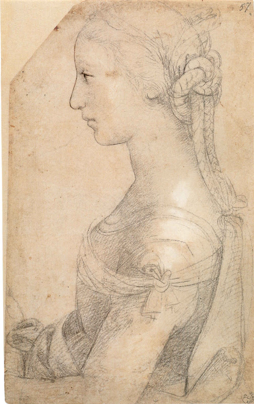
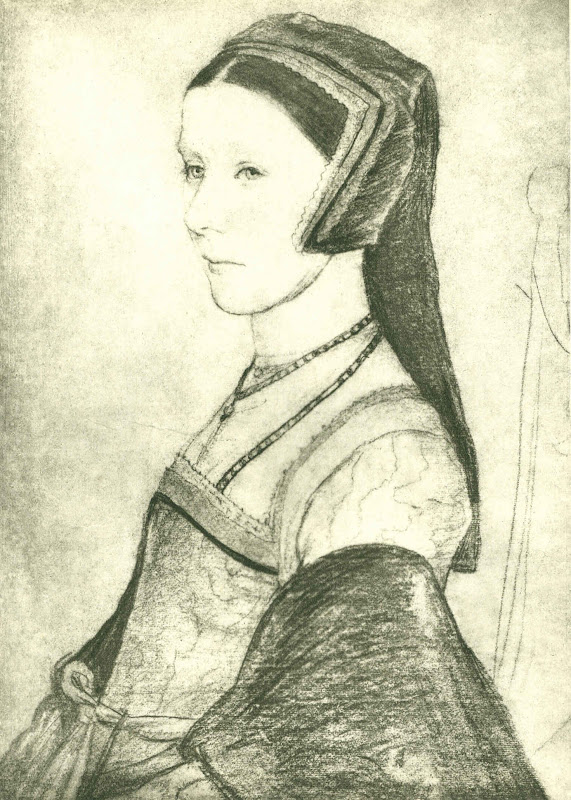
Above, (top) Fig. 21: A Young Woman in Profile, Galleria degli Uffizi, Florence, presently Raphael but formerly Mino da Fiesole and “sixteenth century Florentine”;
Above, Fig. 22, Holbein’s 1527 drawing of Anne Cresacre (reversed).
Above, Figs. 23, 24 and 25: Details of Figs. 14, 15 and 16 – and so, from no later than: 1956; 2000-01, and, 20012 respectively.
BELOW: IT’S A WASHOUT – IS IT NOT?
Above and below, Figs. 26, 27, 28 and 29: Details of Figs. 14, 15 and 16 – and so, again, from no later than: 1956; 2000-01, and, 20012 respectively.
WHAT MORE CAN BE SAID?
The sequence of three states of the head shown above and below shows why commenting appropriately on the qualities of the portrait made by Klimt in 1905 can no longer be done solely on the basis of the painting as it is encountered today. Klimt’s last intended word has departed involuntarily. What is left is an impersonation of the now lost original and superior state. We should not appraise or speak of the present work without reference to the testimony of its photographic history. For such reasons it is a matter of urgency that the full photographic record of Klimt’s work be assembled and made available to all scholars and art lovers. If we were talk about the portrait today on the selection of three reproductions above, to which image should greatest credence be given: the most recent, the earliest, or the one in the middle? It is not really a difficult question to answer – is it? Graphically-speaking, the three images resemble successive states of an etching – but here with the states running in reverse with less material to hand, not more, at each stage.
If we analyse the changes to the original in detail, we can see for example that the mouth/nose relationship has been mangled by restorers. Assuming that no injury had occurred before the first recorded state (when the painting was no more than fifty years old), we can see among many losses and alterations that the design of the nostril aperture was altered from its original sharply turned upper contour to a blander formulation. Such differences are immensely significant in terms of expression. The greatest student of the pinched, translucent, breathing nostril in women was Rubens. Klimt was very good at and attentive to nostrils. He was also good at mouths. Both are products of astonishingly complex anatomical forces (see Fig. 34 for an entirely unrestored graphic attempt by the author to grapple with just such plastic complexities). Here we see that by 2000/01 the mouth had met with an accident. Both the upper and the lower lip had been garbled in restoration. The loss of definition in the relationship between the lower lip and its surrounding surfaces has resulted in a most unfortunate appearance of an emerging ‘Hapsburg Lip’, the product not of some physical deformity but of an anatomically illiterate restorer who reconstituted beautifully nuanced tonal modelling as a crass, plastically misread linear simplification. More recently, attempt has been to mitigate the previous errors but the general washing-away process continued. Such rapid undoing and redoing of botched restorations is a growing phenomenon, even at the highest levels of the “museum community” (see Fig. 40).
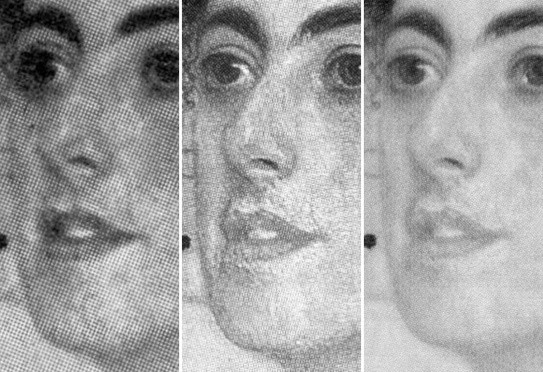
Above, Fig. 30. Note: we are straining below at the edge of enlargements of details of the record as published. Imagine how much more eloquently horrific this comparative investigative exercise would be if we were able to work from high quality copies of the original photographs.
Above, Figs. 31, 32 and 33: Details from no later than: 1956; 2000-01, and, 20012 respectively.
Above, Fig. 34: a detail of
a caricature drawn by the author for the
Independent on Sunday.
Below, Fig. 35: a detail of a paraphrase of Klimt’s Judith II (Salome) made by the author in an illustration for the Independent, 3 June 1992. Note the similarity of the arched nostril apperture and upturned nose with that seen in the painting of Margaret Stonborough-Wittgenstein until 1956. It has been claimed, however, that the model for both of Klimt’s Judith paintings was Adele Bloch-Bauer – see Susanna Partsch, Gustav Klimt ~ Painter of Women, p. 78. Even as a young woman, Bloch-Bauer did have markedly heavier eyelids – perhaps Klimt was fusing features from different models when composing invented characters?
Above, Fig. 36: A detail of Klimt’s Judith II (Salome) of 1909, as published in 1956 (left) and in Angelica Bäumer’s 1985 Gustav Klimt ~ Women.
Above and below, Figs. 37, 38 and 39: The ear from Michelangelo’s Erythraean Sibyl on the Sistine Chapel Ceiling, before and after cleaning. Those responsible for the losses in the Sistine Chapel claimed in response to criticisms that the disappeared material had not been Michelangelo’s own finishing adjustment but arbitrary accumulations of centuries old dirt, soot and restorers’ glues. Klimt’s restorers are luckier: the losses have yet to be acknowledged.
Morelli famously held that attributions lay in the details of figures – ear lobes, finger tips and such. Which of Margaret Stonborough-Wittgenstein’s ears might best now be taken as carrying the fingerprint of Klimt – the earliest, or the most recent?
AN UPDATE: THE FINE ART OF SELLING KLIMT
Fig. 41: “Two employees of Sotheby’s auction house pose by a portrait of Gertrud Loew (Gertha Felsovanyi) by Austrian artist Gustav Klimt painted in 1902” ~ The Daily Telegraph 19 June 2015.
On June 5th we examined the photographic record of Klimt’s 1902 painting of a young Jewish woman (Gertrud Loew) that had been restored to the heirs of her family (Now Let’s Murder Klimt). Despite its manifestly degraded condition (see below), the portrait sold at Sotheby’s on June 23rd for £24.8m (on a £12-£18m estimate). The July/August Art Newspaper attributes the high price not to the picture’s condition – which it does not discuss – but to the history and poignancy of its backstory which Sotheby’s held to have “added to its value” (“The Lure Of A Backstory”, The Art Newspaper, Section 2, p.12). Restoring works to families whose forbears were robbed and murdered is an indisputable good. Questions of ownership, however, like questions of attribution, are less urgent than questions of condition. Whatever their gravity, ownership or attribution disputes might always be resolved at some future point. With restorations, injuries are irreversible and cumulatively compounding. Nothing might now return Gertrud Loew to the beautifully nuanced condition in which she was bequeathed to posterity by Klimt.
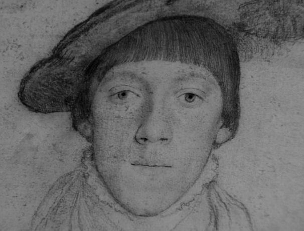

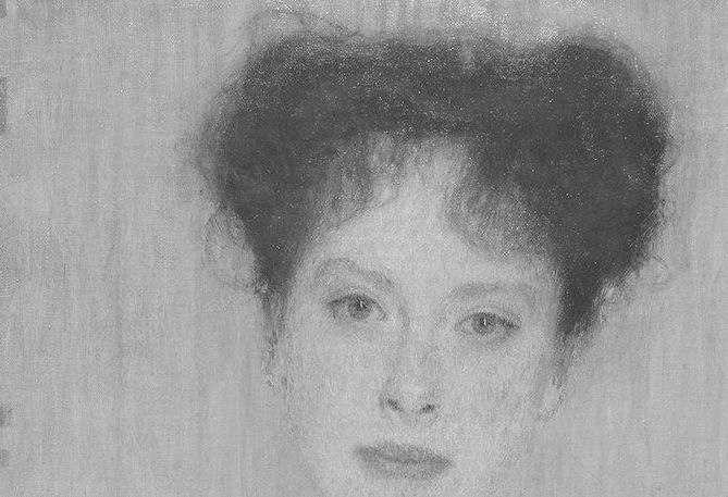
Above, Figs. 42, 43 and 44: (Top) Holbein’s portait of the fifteen years old Henry Howard. (Centre) Klimt’s 1902 portrait of Gertrud Loew, as seen before 1956, and (above), as seen today.
Note, among many alterations, how the definition of the eyebrows and the shading around the eyes have been debilitated. Note, too, how changes to the line of parting in the lips have altered the subject’s expression; how an eyebrow has been cocked; how the eyes are now open wider. Note how the loss of shading at the sides of the nose makes the present nose larger than its original self. Note how credibly and well this portrait once lived in the company of Holbein’s full-on portrait of the young Henry Howard and ask if this picture might not have had the mother-of-all ‘cosmeticising’ restorations? Perhaps it’s backstory is richer than Sotheby’s and the Art Newspaper have appreciated?
Michael Daley, 25 July 2015
ENDNOTES:
1) In the massive, ambitious and welcome 2007 book Gustav Klimt, the editor writes: “It was a major concern of ours to see, as far as possible, all Klimt’s paintings in the original, and to take new photographs of all them.” With so many recent photographs of Klimt’s works the authors’ were perfectly placed to make comparative studies with the earliest photographs. As seen above, one such a photographic comparison was made with a portrait to show the differences before and after its completion. So why not show some, if not all, of the earliest visual records against their most recent counterparts? In the catalogue, another photo-comparison is made with with Klimt’s portrait of his niece Helene – but this is with a portrait by Fernand Khnopff, and not with the picture’s own earlier recorded self. This was a terrible lost opportunity: as shown below, there are such great differences between the Helenes seen in 1956 and in 2007 as to suggest the existence of two versions of the portrait. There are dramatic differences of design in the dress. In 1956 the lightest part of the hair was at the crown and the back of the head. The hair got progressively darker as it ran down and as it approached the girl’s face, which it emphatically framed. That logic has been reversed. The darkest part is now at the crown and the hair lightens as it approaches the face.
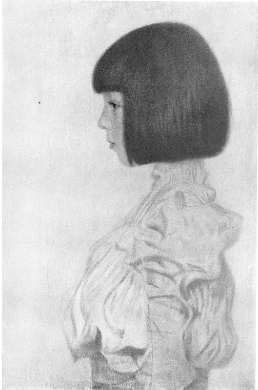
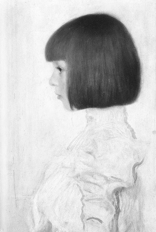
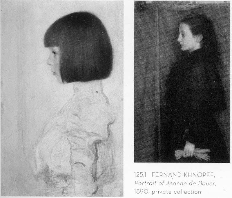
Above, (top) Fig. 45: Klimt’s portait of his niece Helene in 1956.
Above (centre) Fig. 46, showing the niece as seen in 2007.
Above, Fig. 47: The juxtaposition of photographs of Klimt’s and Khnopff’s portraits made in the 2007 Gustav Klimt catalogue.
Below, figs. 48 and 49: Further comparisons of Helene’s drapery.
Does the treatment of the drapery now present (above, right) on this privately owned work on loan to the Kunstmuseum, Berne, seem worthy or typical of Klimt in 1898?
2) In a recent BBC “Fake or Fortune” television programme the resident art sleuths faced the challenge of proving that three small Lowry paintings (all of which which carried labels and numbers on the back from the reputable gallery that had sold them) were authentic Lowrys even though the present owner had no paperwork showing right of ownership. What proved to be the programme’s MacGuffin was the presence in the paintings (revealed by technical analysis) of the wrong kind of white paint – zinc not lead. To surmount this hurdle the sleuths examined old photographs of Lowry at work in his studio. A bit of digital enhancement of one showed a whole boxful of the ‘wrong white’ in use. The question still to be resolved still was whether these labelled, numbered paintings really were Lowry paintings. Another old photograph of Lowry’s studio was found to show the three presently ‘homeless’ paintings. When a small image of one of the paintings was digitally enhanced and superimposed over a photograph of the painting today, it proved a perfect match, “brush stroke by brush stroke”. This accumulation of photo-evidence was taken to be so clinching that it trumped both the potentially lethal absence of any paperwork and the scientifically established presence of a ‘wrong’ pigment. When the Big Four Lowry experts were duly assembled to examine the three paintings (away from the cameras) they emerged after a couple of hours to give the trio of paintings the thumbs up. And so, it was photo-evidence that carried the day, not science, not documents. Things might, however, have been very different had the Lowrys been restored to the point where their brushmarks no longer coincided with those recorded in the artist’s studio.
3) At the 2011 ICOM conference in Lisbon, two conservators complained in a joint paper (“To Err is Human: Understanding and Sharing Mistakes in Conservation Practice”) that because a belief exists that it is unacceptable for conservators to damage objects, members of the conservation fraternity are hampered in their desire to make a “collective acknowledgement and sharing of mistakes”. The experience of other fields, such as medicine and aviation, it was explained, demonstates the value of admitting and sharing errors so as to “reduce the risks of their occurrence”. This proposal/demand will be discussed in the Autumn issue of the ArtWatch UK Journal by Michel Favre-Felix, the president of ARIPA (association for the respect of the integrity of artistic heritage).
July 25, 2015 | Categories: news | Tags: "Fake or Fortune", "Veronese Nose-jobs", Adele Bloch-Bauer, Alfred Weidinger, Andrew Wilton, Gertrud Loew, Gustav Klimt, Holbein Henry Howard, Holbein's Anne Cresacre, International Art Exhibition, Isetan Museum Tokyo, Klimt Judith II, Klimt's Danae, Klimt's Serena Lederer, Lowry, Margaret Stonborough-Wittgenstein, Michael Daley, Michel Favre-Felix, Michelangelo Erythraean Sibyl, Raphael A Young Woman in Profile, Renoir's Umbrellas, Rome 1911, Serge Sabarsky, Sonya Knips, Susanna Partsch, Van Dyck's Lucy Percy, Verones The Supper at Emmaus, Walter Sickert | Comments Off on THE ELEPHANT IN KLIMT’S ROOM
We have seen that works of art are under physical threat and that proper contemplation of them is becoming impossible through commercial exploitation and lax administration. (We will return shortly to the especially alarming case of the British Museum.) Aside from institutional mismanagement, all the while the stock of art is being debilitated in the name of its conservation.
It goes without saying that it is easier to destroy art than to create it. Gothic churches can be razed in an afternoon (and without explosives). With restoration injuries it is easy to recognise them but impossible to reverse them. Restoration is a one-way street: every little hurts; the harm that restorers can do individually and do do cumulatively can never be undone.
It was long ago contended that every picture restoration is a partial destruction, but every restoration is also a falsification. When destructive subtractions of material are completed, the restorer’s own painted additions begin. Restorers do not make the soundest judges of their own performance. Their accounts claim lots of different things simultaneously. First, that their additions (somehow) help to recover lost original conditions. Second, that their additions/ “recoveries” are made with removable synthetic materials so that the next restorer can easily impose his or her own interpretation of the lost original state. Worse, not only is there an expectation that each generation of restorers will have a different estimation of lost original states, within generations one restorer will have a different understanding from another. At the National Gallery (London) relativity has been written into the institution’s “philosophy” of restoration practice. It does not matter, the gallery claims, if restorers do their own things when attempting to recover authentic original states, so long as each version is realised “safely”.
Use your eyes – everything is in the looking
The proof of picture restoration’s pudding is not in self-protective philosophising or proclaimed professional “ethics”. It is in the looking – pictures are made by hand, brain and eye to be looked at, not to be bombarded by solvents, swabs, scalpels, heat-inducing imaging techniques, hot irons, adhesives, synthetic materials and such. In this regard, every day brings a new alarm.
Yesterday, the Daily Telegraph and many other media outlets reported that a painting made in 1902 of a young Jewish woman (Gertrud Loew) by Gustav Klimt has been “restored” to her family. Such cases are heartening and just, but so often the accompanying photographs of returned works are, as here, disturbingly unlike early photographic records. The image shown above of this returned painting is from a printed paper copy of the Daily Telegraph. Newsprint photography is never of the highest quality but, with all allowances made, the strikingly washed-out appearance of the painting is evident also in the higher quality online reproductions, as below where all images are shown in greyscale to facilitate fair visual comparisons. What can be seen in all of these comparisons is a progressive and debilitating loss of values in the painting’s design, drawing, modelling and spatial ‘envelope’. Such sequences invariably run chronologically from darker, richer, sharper and better-modelled depictions, to lighter, brighter, flatter, more abstract, less plastic, less life-like arrangements. If dirt alone had been removed, the opposite effect would be obtained: all values would be more intense; all relationships would be more vivacious in their effects.
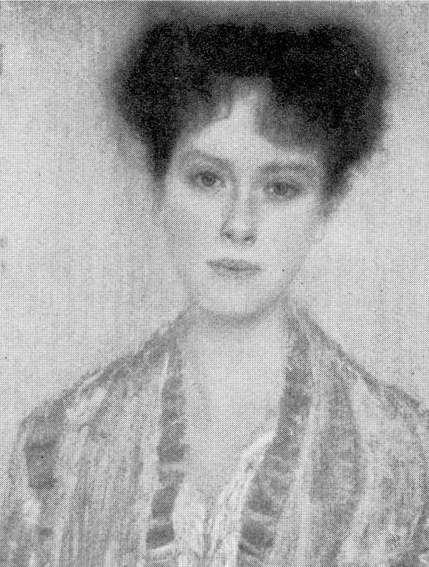
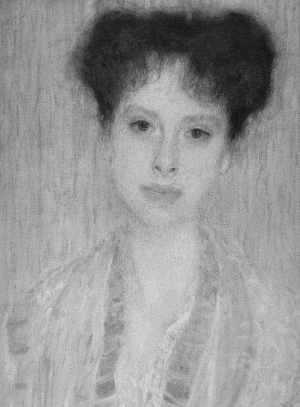

Above, these details show the painting as successively recorded a) before 1956 (top), when it was at most 54 years old and probably never previously restored; b) as before 1986 (centre); and, above c) as it is today (albeit, here, in an over-enlarged detail).
Above, top, a detail of the painting as before 1956; above, the detail as seen today. In this comparison we see, for example, that the contour of the subject’s left arm was more clearly drawn and shaded before 1956; that the shaded modelling around the eyes was more emphatic before 1956 than it is today; that the costume had two distinct parts – a darker over-garment and a lighter undergarment; and, that the tone of the flesh at the neck and above the undergarment was appreciably darker before 1956.
Above, a detail of Klimt’s 1910 picture The Black Feathered Hat shown (top) before 1956; as seen on a Dover postcard (centre); and (above), as seen today.
The Black Feathered Hat, as used on a CD cover of music accompanying an exhibition at the Neue Galerie, New York.
Below, a detail of Klimt’s Danae of 1907-08.
Above (top) Danae before 1956 and (above), as seen today. Note in particular the radically altered (and weakened) relationships at the crucially intense and psychologically-charged face/sheet/hand/breast configuration.
Below, the figure Poetry from Klimt’s 1901-02 Beethoven Freeze, before 1956 (top) and today (bottom).
Below, finally: SPOT THE DIFFERENCES – AND WEEP
Michael Daley, 5 June 2015.
June 5, 2015 | Categories: news | Tags: Gertrud Loew by Gustav Klimt, Gustav Klimt’s Beethoven Freeze, Gustav Klimt’s Danae, Gustav Klimt’s The Black Feathered Hat, Klimt Music, Klimt restorations, Michael Daley, New York, Now let's murder Klimt, The Neue Galerie | Leave A Comment »
Works of art are under physical threat as never before and proper contemplation of them is being made impossible. Aside from the absolute nihilistic depredations of Isil, within the West itself it is now feared that the long-chronicled growth of mass-tourism and its associated delinquent behavioral patterns – is about to create cultural gridlock in Europe.
SPECIES OF ABUSE
Something has to give. As things stand in the visual arts, the pressures for endless year-on-year growth in visitor numbers are irresistible even though the deleterious consequences are already manifest. While theatre, concert hall and cinema venues are designed (and behaviour therein is regulated) so as to permit all present to see, hear and think their own thoughts in companionable collectivity, in galleries and museums there are no such constraints on numbers or behaviour. In the remorseless drive to increase the “through-put” of paying visitors, people are packed and jostled into over-heating galleries in conditions that deny time and space for contemplation. The magnitude of this deterioration is shaming. The effects are exacerbated by restricted hours of paying-public access in order to provide privileged evening viewing to, for example, the clients of corporations which sponsor exhibitions or restorations – which organisations find the accruing good will to be a cost-effective form of self-promotion (see “Leaving your mark” below). The unfolding arithmetic of crush is terrifying.
In 2012 the annual number of international tourists passed one billion for the first time. In Britain what the Arts Council terms “The UK arts and culture industry”, generated £12.4billion in 2011. The Museums Association reports that in 2013 visits at the National Gallery were 14% higher than in the previous year and were 20% higher at the British Museum. Such rates of increase are unsustainable but for administering directors and trustees this “rising footfall” is taken to testify to the “enduring success” of museums. China is now the world’s largest contributor to this growth with its tourists spending over $100 billion in 2012. According to World Tourism Organization statistics, the Chinese are projected to take some 100 million overseas trips a year by 2020 – a twenty-five per cent increase on present levels. The Wall Street Journal reports that with the U.S. dollar about twenty-five per cent stronger against the euro than this time last year, bookings at the Louvre and the Sistine Chapel are sixty per cent higher this year than last (Europe Braces for a Summer Travel Crush, WSJ, 28 May).
The threat to the Sistine Chapel frescoes
With regard to the Sistine Chapel, the prospect is truly horrendous: we have already had confirmation of how the present visitor numbers are exacerbating the partial destruction of the frescoes that was begun in 1980 by the multi-million dollars Nippon TV-sponsored cleaning (see Michelangelo’s disintegrating frescoes).
Above, top: The Sistine Chapel ceiling during cleaning showing (at the bottom, below the scaffolding) the last surviving section of Michelangelo’s original two-stages painting.
Above, the stripped-down, first-stage ceiling, as experienced in the chapel today.
Systemic overcrowding in museums
Above, top: The Mona Lisa at the Louvre.
Above, centre: Rembrandt’s The Night Watch at the Rijksmuseum.
Above: The temporary exhibition “Late Rembrandt” at the Rijksmuseum. The Grumpy Art Historian described the over-crowding at this blockbuster as “the worst I can recall” and reported that the museum’s director, Wim Pijbes, had responded to criticisms by saying that “if you want a contemplative experience you should buy your own Rembrandt”.
“Roll up! Roll up!”
Above, top: A poster on the London Underground showing Turner’s (restorations-wrecked) painting Rockets and Blue Lights in the promotional campaign that accompanied the launch of the National Maritime Museum’s exhibition “Turner and the Sea”. For an account of that and other advertising campaigns, see “From Veronese to Turner, Celebrating Restoration-Wrecked Pictures“.
Above: One of “many plugs for the Rijksmuseum’s ‘Late Rembrandt’ exhibition” spotted at Amsterdam airport on May 14th by the art history blogger Bendor Grosvenor.
“Eyes down!”
Above, top: Otherwise engaged teenagers at the Rijksmuseum.
Above: McClachlan’s masterly take in Private Eye on other otherwise engaged victims of the near-universal mobile phone addiction.
Taking Possession of the Past
Above, top: Morgan Schweitzer’s illustration for the Ellen Gamerman, Inti Landauro and Liam MoloneyWall Street Journal article “Europe Braces for a Summer Travel Crush”.
Above, and above centre: Images from bing’s feature “Properly Posing with Statues“
Leaving your mark
Above: A (French) visitor at the National Gallery who, following reductions in warding staff, had time to deface two Poussin paintings with spray-paints on 16 July 2011. See “Dicing with Art and Earning Approval”.
Above: In 1999 the National Gallery allowed the Yves Saint Lauren fashion house to shoot a display of art-inspired clothing at the unveiling of the gallery’s Room 22, the £1m refurbishment of which had been met by the French fashion house. Not long afterwards we encountered a wall stripped of paintings and bearing massive water stains caused by rain which had overwhelmed the new guttering. We indicated the extent of water damage with white paint in the spring 1999 ArtWatch UK newsletter. The hastily removed paintings had included Le Valentin’s Four Ages of Man and Philippe de Champaigne’s The Vision of St Joseph.
Assaults on sculpture
Above: the Huffington Post reported in August last year that an American tourist broke a finger off a statue at the Museo dell’Opera del Duomo in Firenze, Italy. A security guard monitoring the exhibit had intervened immediately but, apparently, a moment too late.
One 3 June 2015, THE LOCAL reported that “Vandals in Florence have broken a finger off Pio Fedi’s famous statue of the Rape of Polyxena, Italian media has reported [See below]. It’s only the latest act of vandalism by careless visitors to the city.”
Florence’s mayor Dario Nardella is said to have called for harsher punishments for vandals.
“Damaging art is one of the most horrific and cowardly acts possible. I hope that the vandal who damaged the Rape of Polyxena yesterday in the Loggia dei Lanzi will be brought to justice soon,” Nardella wrote on Tuesday.
“Whoever strikes culture strikes at the heart of history and the identity of a community. I will be promoting harsher punishments for crimes against artistic heritage in parliament, as with environmental crimes, with imprisonment of up to 15 years and double the limitation periods.”
Above: On May 4th artnet reported that in Cremona, Italy, the Statue of the Two Hercules (circa 1700 and now, with its central coat of arms, effectively a symbol of the city itself) had been damaged as: “The scourge of the selfie has struck again: over the weekend, a pair of tourists accidentally broke an Italian sculpture while taking a photo with it, knocking off a portion of the statue’s crown, which shattered on the ground.” For other instance of selfie-takers’ damage, see Selfie-Taker Smashes Priceless Historic Italian Statue of Hercules
“Ding Minhao was here”
Above: The International Business Times has reported that a 3,500-year-old Egyptian carving in the Temple of Luxor had been defaced by a Chinese teenager with the words “Ding Minhao was here”. The paper also reported that China’s Vice Premier Wang Yang had earlier contended the country’s reputation overseas was being tarnished by the “uncivilized behavior” of some Chinese tourists. Wang made the remarks about the nation’s tourists during a teleconference held by the State Council, China’s cabinet, stressing that tourists need to be on good behavior when traveling abroad, according to the state-owned Xinhua News Agency.
Wang was reportedly referring to the poor manners and low “quality and breeding” of some Chinese tourists, saying they have harmed China’s international image, People’s Daily reported. “They speak loudly in public, carve characters on tourist attractions, cross the road when the traffic lights are still red, spit anywhere and [carry out] some other uncivilized behavior. It damages the image of the Chinese people and has a very bad impact.” In the wake of Wang’s words, the identity of the Luxor vandal emerged on Chinese social media. In an interview with Nanjing newspaper Modern Express on Saturday, the parents apologetically said it was the lack of education and supervision that led to their son’s mischievous behavior.
“We have taken him sightseeing since he was little, and we often saw such graffiti. But we didn’t realize we should have told him this is wrong,” the boy’s mother said in the interview, adding that she hopes China’s relentless Internet users stop tracking down her son, who had “cried all night.” The boy’s father said the boy had realized his mistake, and hopes that the public will give his young son a chance to fix his mistake and move on.
Nothing is sacred or inviolable
Above: Sadly necessary security measures in a Cotswold church.
Michael Daley, 1 June 2015
Grumpy Art Historian draws our attention to a further deliquency encountered among Chinese tourists: “Nature Vandalism”. In a Shanghai Daily report, (City’s parks tormented by ‘nature vandals’), it is said that:
“SHANGHAI Chenshan Botanical Garden is enhancing park patrols and adding volunteer monitors to address a growing problem of nature vandalism. Among recent incidents are Chinese characters carved onto the giant leaves of aloe and American century plants. The garden isn’t the only park in Shanghai suffering from public abuse. Other popular sites report problems arising from people who don’t seem to respect the native environment”.
Below: A yucca plant at Shanghai Chenshan Botanical Garden is covered in Chinese characters carved by vandals.
May 31, 2015 | Categories: news | Tags: "Turner and the Sea", 'Europe braces for a summer of Travel Crush', 'Properly Posing with Statues', Bendor Grosvenor, cremona, Dicing with art, Ding Minhao, Florence, Grumpy Art Historian, Michael Daley, Morgan Schweitzer, Museo Dell'Opera del Duomo, Nature vandals, Nippon TV Corporation, Rembrandt's Night Watch, Restoration-wrecked pictures, Shanghai Chensham botanical gardens, The Arts Council, The International Business Times, The Mona Lisa, The Museums Association, The People's Daily, The Statue of Two Hercules, The threat to the Sistine Chapel frescoes, The UK Art and Culture Industry, The World Tourism Organisation, Vice Premier Wang Yang, Wim Pijbes, Yves Saint Lauren | Leave A Comment »
The forthcoming ArtWatch UK members’* Journal examines restoration problems; betrayals of trust; the role of conservators in the illicit trade in antiquities; and, the escalating commercial scramble by museums that is disrupting collections and putting much of the world’s greatest art at needless risk.
* For membership details, please contact Helen Hulson, Membership Secretary at hahulson@googlemail.com
ArtWatch UK Journal No. 29
Preview ~ Journal No. 29’s Introduction:
MUSEUMS, MEANS and MENACES
Museums once provided havens for art and solace to visitors. They were cherished for their distinctive historically-given holdings and their staffs were answerable to trustees. Today they serve as platforms for conservators to strut their invasive stuff and as springboards for directors wishing to play impresario, broadcaster or global ambassador. Collections that constituted institutional raisons d’être, are now swappable, disrupt-able value-harvesting feasts. Trustees are reduced to helpmeet enablers of directorial “visions”. No longer content to hold display and study, museums crave growth, action, crowds and corporately branded income-generation. For works of art, actions spell danger as directors compete to beg, bribe and cajole so as to borrow and swap great art for transient but lucrative “dream” compilations. Today, even architecturally integral medieval glass and gilded bronze Renaissance door panels get shuttled around the international museum loans circus.
Above, a window that depicts Jareth – one of no fewer than six monumental windows depicting the Ancestors of Christ that were removed from Canterbury Cathedral (following “conservation”) and flown across the Atlantic to the Getty Museum, California, and then on to the Metropolitan Museum, New York. (For a report on how such precious, fragile
and utterly irreplaceable artefacts become part of the international museums loans and swaps circuit, see How the Metropolitan Museum of Art gets hold of the world’s most precious and vulnerable treasures.)
Above, top, one of Ghiberti’s Florence Baptistery doors (which were dubbed “The Gates of Paradise” by Michelangelo) during restoration. Above, one of three (of the ten) gilded panels from the doors that were sent from Florence to Atlanta; from Atlanta to Chicago; from Chicago to the Metropolitan Museum, New York; from New York to Seattle; and, finally, from Seattle back to Florence. To reduce the risk of losing all three panels during this marathon of flights, they were flown on separate airplanes.
In such an art-churning milieu this organisation’s campaigning becomes more urgent. Fortunately, our website (http://artwatch.org.uk/) has increased our following fifty-fold – and see, for example: “How the Metropolitan Museum of Art gets hold of the worlds most precious and vulnerable treasures”. Here, we publish an abridged version of the fifth lecture given in commemoration of ArtWatch International’s founder, Professor James Beck, and examine persisting betrayals of trust, errors of judgement and historical reading, problematic “conservations”, and questionable museum conservation treatments of demonstrably looted antiquities. For these we warmly thank Martin Eidelberg, Alec Samuels, Alexander Adams, Einav Zamir, Selby Whittingham and Peter Cannon-Brookes. We commend two books, one for its freshness of voice, the other for a pioneering combination of high-quality images and scholarly texts in coordinated print and online productions. We also reproduce our online archive and related letters to the press.
Last July the outgoing chairman of the British Museum’s board, Niall Fitzgerald, disclosed in the Financial Times that because the director, Neil MacGregor, “obviously isn’t going to stay for ever” it was right that a new chairman [in the event a long-standing BM trustee and former editor of the Financial Times, Sir Richard Lambert] should lead the search for his successor. In December – and with levels of secrecy that would have thrilled his one-time mentor at the Courtauld Institute, Anthony Blunt – MacGregor dispatched one of the most important free-standing Parthenon sculptures, the carving of the river god Ilissos, to the Hermitage Museum in St. Petersburg. In lending Ilissos to St Petersburg just months after Russian troops had annexed part of Europe and Russian-armed separatists in Eastern Ukraine had brought down a Malaysian Airlines Boeing with a loss of 298 lives including around 100 children (see cover), the British Museum conferred an institutional vote of confidence in Putin’s Russia at a time when the West has mounted economic sanctions against his incursion and his continuing de-stabilisation of Eastern Europe. Moreover – and in a gratuitously provocative manner – by subjecting one of its most precious and controversially held works to needless and inherent risks, the British Museum presented its institutional a*** to everyone in Greece who is seeking to re-unite all of the surviving Parthenon carvings. On 9 December 2014 we protested in a letter to the Times (“Where should the Elgin Marbles be housed?” – see p. 29) that the action had gravely weakened the case for the British Museum retaining its controversially held “Elgin Marbles” and that it constituted a failure of imagination and a dereliction of duty on the part of the museum’s trustees.
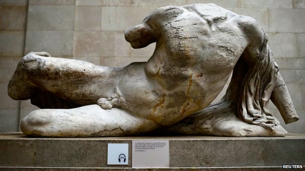
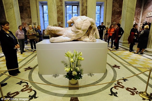
Above, the carved figure of Ilissos, as displayed (top) at the British Museum, in the context of the surviving group of free-standing figures from the West pediment of the Parthenon; and, (centre and above) as displayed when on loan to the Hermitage Museum, St. Petersburg.
Above, details of the back of Ilissos, (as photographed by Ivor Kerslake and Dudley Hubbard for the 2007 British Museum book, “The Parthenon Sculptures in the British Museum”, by Ian Jenkins, a senior curator at the museum) showing the faultline in the stone that runs through the entire figure.
Perhaps the provocative loan was a piqued riposte to Mr and Mrs George Clooney’s attempts to have the British Museum’s Parthenon sculptures returned to Athens? Or, perhaps, simply a flaunting confirmation that nothing within the museum’s walls is now considered sacrosanct. In any event, 5,000 objects were put at risk (see below) last year in pursuit of MacGregor’s desire to transform the great “encyclopaedic” museum into a glorified lending library – or, as he puts it, into “a universal institution with global outreach”. The loan to Russia breached a two centuries old honouring of the original terms of purchase which required the Parthenon carvings collection to be kept intact. We now learn that those sculptures are to be further denuded with three more loan requests under consideration. We have supported the British Museum’s retention of the Elgin Marbles for over a decade, in print and in debates in New York, Athens and Brussels. (See Journals 19, 20, 25 and 26.) A key consideration was the relative safety of the sculptures in London and Athens. This latest policy reversal tips that balance in favour of Athens and thereby blows the moral case for the retention of the sculptures in London. It makes it impossible for us to maintain our previous support.
Such was the secrecy of this operation that the British Government was informed of it only hours before the story broke in a world-exclusive newspaper report. Under its new chairman the museum’s board proved supine, authorising the manoeuvre despite its own concerns over the sculpture’s safety. Officially, the museum betrays an almost delusional insouciance on the inherent risks when fork-lifting, packing, fork-lifting, lorrying, fork-lifting, flying, fork-lifting, lorrying, fork-lifting, unpacking – twice-over – an irreplaceable world monument on a single loan. Art handling insurers testify that works are at between six and ten times greater risk when travelling. Against this actuarial reality, the museum’s registrar variously boasted that “museums are good at mitigating risk”; that the loan had needed undisclosed insurance; and that, if intercepted by thieves, “they would be unable to sell it”. The source of this institutional confidence is unclear. As we reported in 2007 (Journal 22, p.7), in 2006 the British Museum packed 251 Assyrian objects – including its entire collection of Nimrud Palace alabaster reliefs and sent them in two cargo jets to Shanghai, with stop-overs in Azerbaijan, thus subjecting the fragile sculptures to four landings and take-offs. On arrival in Shanghai the recipient museum’s low doorways and inadequate lifts required the crated sculptures to be “rolled in through the front door”. Three crates remained too large and had to be unpacked “to get a bit more clearance”. One carving was altogether too tall and “we had to lay him down on his side” to get him in, the British Museum’s senior art handler said. It was then found that the museum’s forklift truck was unsafe (and needed to be replaced), and, that “a few little conservation things had to be done”.
When the resulting quid pro quo loan of Chinese terracotta figures was sent to the British Museum the following year, two dozen wooden crates were held for two days at Beijing airport because they were too big to enter the holds of the two cargo planes that had been chartered. When the crated sculptures arrived at the British Museum, they were also found to be too big to pass through the door of the Reading Room (from which Paul Hamlyn’s gifted library had been evicted – then temporarily, now permanently). The door frame was removed but three cases were still too big. These had to be unpacked outside the temporary exhibition space in the Great Court. The “temporary” misuse of the Reading Room became a permanent fixture until the new £135m (on a £70-100m estimate) exhibition and conservation centre in the antiseptic style of a Grimsby frozen food factory was opened last year (see back cover). Having insultingly evicted the Paul Hamlyn art library, it is now being said that the Reading Room “lacks a purpose” and that Mr MacGregor is musing on possible alternative uses to … reading books in a fabulous library previously occupied by national and international literary and political luminaries. One of these alternatives would be to raid the museum’s own diverse and encyclopaedic sculpture collections so as to tell a singular, MacGregoresque multi-cultural world story. Were he to be indulged in this (English Heritage witters alarmingly that the Reading Room’s Grade 1 listing does not necessarily preclude changes of uses), the director would leave a monument to himself achieved by subverting the historically-resonant, listed purpose made classical building in order to patronise and spoon-feed future visitors who might better have made their own judgements on the relative merits of the artefacts held in the museum’s various assembled civilisations.
If the present lending policies are not curtailed a further monument to MacGregor’s reign will be found in the art handling facilities of the new “improbably large” conservation and exhibitions centre. These are such that a crated elephant would now “arrive elegantly, the right way up”. What – surprisingly – did not arrive was the exhibition of treasures from the Burrell Collection that is being sent on a fund-raising world tour. This tour was made possible by the overturning in the Scottish Parliament of the terms of Burrell’s bequest which prohibited foreign loans. The overturning was made with the direct support and participation of Neil MacGregor and the British Museum was to have been the tour’s first stop. (Only three voices against the overturning were heard in the Scottish parliamentary proceedings: our own; the Wallace Collection’s academic and collections director, Jeremy Warren; and, the National Gallery’s director, Nicholas Penny, who attacked the “deplorable tendency” for museum staffs to deny the grave risks that are run when works of art are transported around the world.) As we reported online (“A Poor Day of Remembrance for Burrell”, 11 November 2013, Item: MR MACGREGOR’S NO-SHOW AT THE SCOTTISH PARLIAMENT HEARINGS), after a reproach in the Scottish Parliament, Mr MacGregor replied: “It was suggested by the Convener on 9th September (column 33) that as the British Museum might be involved in helping organise the logistics of a possible loan, and as works from the Burrell Collection might be shown at the British Museum, I might find myself in a position of conflict of interest. I think I can assure the Convenor that this is not so. The British Museum would not profit financially from either aspect of such co-operation with our Glasgow colleagues…” In the event, the first stop of the world tour was at Bonhams, the auctioneers, not the British Museum.
Michael Daley. 1 March 2015.
March 1, 2015 | Categories: news | Tags: Accidents to british Museum sculptures when on loan, Alec Samuels, Alexander Adams, Anthony Blunt, Betrayals of trust, Bonham's auctioneers, British Museum loan to the Hermitage, Einav Zamir, English Heritage, Ghiberti door panels loaned to America, Jeremy Warren, Loan to the Hermitage Museum, Malaysian Airline Boeing brought down in Eastern Ukraine, Martin Eidelberg, Means and Menaces, Michael Daley, Mr and Mrs george Clooney, MR MACGREGOR’S NO-SHOW AT THE SCOTTISH PARLIAMENT HEARINGS, Museums, Neil MacGregor, Neil MacGregor's replacement, Niall Fitzgerald, Nicholas Penny, Peter Cannon-Brookes, Restitution of the Elgin marbles, Russian destabilisation in Eastern Europe, Selby Whittingham, Sir Richard Lambert, St Petersburg, Taking risks with art treasures, The British Museum Reading Room, The Burrell Collection world tour, The carving of Ilissos, The Chinese terracotta Warriors, The Elgin Marbles, The loan of the Elgin Marbles, The Metropolitan Museum borrows windows from Canterbury Cathedral, The Nimrud Palace carvings, The Paul Hamlyn Bequest to the British Museum, The Wallace Collection | Leave A Comment »
As we predicted at the time of the last restoration of the Sistine chapel ceiling, by removing all of the glue-painting applied by Michelangelo to finish off and heighten the effects of his frescoes, the Vatican’s restorers exposed the bare fresco remains for the first time in their history to new dangers from the atmospheric pollution that is exacerbated by huge numbers of paying visitors.
Then, 2 million visitors entered the chapel every year. Now, that figure is 6 million.The Vatican has been carrying out secret attempts to remove disfiguring calcium deposits building up over the remains of Michelangelo’s painting. These deposits are caused when moisture given off by tourists and air-borne pollutants are absorbed by the plaster. This now-acknowledged process will also activate, as we specifically contended, the remnants of the cleaning agents (sodium and ammonia) that were washed into the frescoes during the rinse cycles of their last so-called restoration and conservation treatments. At the time, the use of the ferociously aggressive cleaning agent AB 57 was justified by the Vatican on the grounds that it was necessary to remove, among other things…ordinary solvent-resistant calcium deposits that had built up over the centuries in parts of the ceiling exposed to leaks in the roof.
Then, the Vatican promised that special air-conditioning systems would protect the newly exposed fresco surfaces in perpetuity. That system had failed even before the Vatican recently celebrated the twentieth anniversary of the end of the last restorations of Michelangelo’s paintings. Today, as the new physical threat is seen to be turning the frescoes white, the Vatican promises new, improved air conditioning units (from the same firm). To counter the new pale appearance, the Vatican recently installed thousands of LED lights, each individually attuned to heighten the colours in Michelangelo’s painting. Michelangelo’s now twice-injured painting has been left a colourised but still lucrative wreck – and an EU-funded (EUR 867 000) showcase (“This made the Vatican City’s Sistine Chapel the ideal venue for LED4ART”) for a company that shows in its advertisements that it has no idea what the Sistine Chapel looks like.
We said at the time that the restoration constituted a crime against art. Now, the Vatican promises to limit the numbers of visitors inside the chapel to 2,000 at any one time. But that means allowing a crowd as big as a full capacity audience at the Royal Opera House in Covent Garden, London, to pack into the small chapel all day long. The Vatican’s administrators – who have known of the present problems since 2010 – now concede that the glue coatings (that were in truth Michelangelo’s own final painted adjustments) had served as a protective barrier against all air-borne pollutants. The tills will continue to ring. Art lovers remain weeping. Shame on the Vatican’s administrators.
For our previous coverage, see:
Misreading Visual Evidence ~ No 2: Michelangelo’s Sistine Chapel Ceiling;
The Sistine Chapel Restorations: Part I ~ Setting the Scene, Packing Them In;
The Sistine Chapel Restorations, Part II: How to Take a Michelangelo Sibyl Apart, from Top to Toes;
The Sistine Chapel Restorations, Part II – CODA: The Remarkable Responses to Our Evidence of Injuries; and Thomas Hoving’s Rant of Denial;
The Sistine Chapel Restorations, Part III: Cutting Michelangelo Down to Size;
The Twilight of a God: Virtual Reality in the Vatican;
Sistina Progress and Tate Transgressions;
ArtWatch Stock-taking and the Sistine Chapel Conservation Debacle;
Coming to Life: Frankenweenie – A Black and White Michelangelo for Our Times
11th November 2014. Michael Daley
UPDATE: 16 November 2014
While the Vatican now admits the hitherto concealed fact of the damage that is being caused to Michelangelo’s frescoes by the massive increase of tourist numbers, it remains in denial about the destruction during the last restoration of the final a secco adjustments that Michelangelo had made to those frescoes. That autograph last-stage painting – which was observed and described with perfect, detailed clarity by the painter Charles Heath Wilson in the 1881 (second) edition of his book Life and Works of Michelangelo Buonarroti – is characterised, preposterously, and against the evidence of all contemporary and subsequent copies of the Sistine ceiling, as consisting of “centuries of built-up candle wax, dirt and smoke”, as if such substances might somehow have disported themselves along the lines of Michelangelo’s design so as to reinforce his modelling and depict shadows cast by his figures. This latest apologia is carried in an Associated Press article “Sistine Chapel frescoes turning white ~ Humidity, tourists’ CO2 to blame”.
A paperback facsimile of a 1923 edition of Wilson’s milestone book (in which he describes his close examination of the ceiling on a special portable scaffold) is now available. It is time for the Vatican to acknowledge that Michelangelo had indeed finished his frescoes with secco painting, and that its curators, restorers and conservation scientists had blundered badly and inexplicably when, having judged Michelangelo’s specific, purposive pictorial enhancements and modifications to be nothing other than arbitrary accumulations of polluting material, removed it – and, thereby, exposed the lime plaster surfaces of the frescoes to their present dangers. That initial error and the subsequent falsification of art history that was made on its back, have both now been maintained for two decades.
November 11, 2014 | Categories: news | Tags: A crime against art, AB 57 cleaning agent, Corbis, ECN Impact Awards, Frankenweenie, LED4ART, Michael Daley, Michelangelo, Michelangelo's frescoes, The Royal Opera House, The Sistine Chapel, The Sistine Chapel Ceiling, The Vatican, The vatican's administrators, Thomas Hoving. | Leave A Comment »
Jonathan Jones, the Guardian’s visual art blogger, has taken a second swipe at ArtWatch UK (- he was livid some years ago when leading scholars and conservators in Poland appealed to this organisation for support – An Appeal from Poland.) His viciousness then seemed bizarre – see Response to Attack.
Now, we are just collateral damage, caught in his (very, very) cross wires for having been cited by one of Fleet Street’s funniest (and most trenchant) critics, Quentin Letts, who had observed in his review (“Tracey Emin’s vulgar show proves the art luvvies are dragging civilisation backwards”) of Tracey Emin’s current exhibition, that: “The art critic of The Guardian almost self-immolated, he was so hot for this show. He called it ‘eerie, poetic and beautiful’, and ‘a masterclass in how to use traditional artistic skills in the 21st century’.” That, in our view, was a fair and moderate account of Jones’s own, over-heating review: “Tracey Emin: The Last Great Adventure is You review – a lesson in how to be a real artist”. Jones may be in thrall to the talents of the Royal Academy’s former, short-lived [not current, Ed., 26 Oct.] Professor of Drawing – to the point, even, of likening her to Michelangelo. I (as an alumnus of the Royal Academy Schools, as it happens), am not and would not. Words are Jones’ currency. Drawings are mine. He talks about drawing. I do it. Each to his own? – Michael Daley
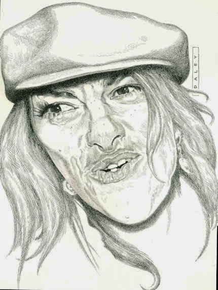
Mike Dempsey, in his blog Graphic Journey [http://mikedempsey.typepad.com/graphic_journey_blog/art/] writes:
“In the glowing, five-star review, art critic Jonathan Jones linked Emin’s understanding of drawing with that of Michelangelo. I had to read that line twice. Why?
Well, this is a drawing by Michelangelo…

And this is a drawing by Emin…

“Either Jones should have gone to Specsavers or he needs to be certified – or perhaps both. Emin’s drawing ability is frankly laughable. However, Jones went on and on to say that Emin’s drawing skills are ‘a master class in how to use traditional artistic skills in the 21st century’. He added that her nudes ‘have a real sense of observation’.
“And three more descriptions I couldn’t resist sharing: ‘Framed blue meditations on the human body’, ‘Flowing and pooling lines of gouache define form with real authority’ and ‘The rough, unfinished suggestiveness of her style evokes pain, suffering, and solitude’. I agree with the pain and suffering.
“I have loved the skill of artists who draw beautifully ever since I was a small boy. In my professional life, I have had the pleasure of commissioning very many great people. So, it was baffling for me when Emin was appointed ‘Professor’ of Drawing at the Royal Academy a few years back. Emin has said she’d never learnt to draw. But the RA still went ahead with the appointment. In a recent Guardian web chat, she said: ‘They sacked me.’ I wonder why?”
COMMENTS:
October 26th 2014 ~ The sculptor and draughtsman Michael Sandle responds:
I read Monsieur Jones’s review of Tracey’s show – I thought I’d better go to the Bermondsey White Cube and see if there was something I wasn’t getting.
There is indeed a “bat-squeak” of emotion to be felt in her work – which I suppose is positive compared to the sterility of much Contemporary “art”. But the sketches – not really drawings as I understand it – are very definitely formulaic. They are not based on “looking” and she could do them in her sleep. To compare her with Michelangelo is worse than stupid it because it shows a profound ignorance. The poor man doesn’t understand that there is something known as “High Art”. Her little bronzes are like doodles in clay – they have, I suppose, an “innocence” which, considering the effort (including anatomical dissection) that Michelangelo undertook to master his craft, means it is extraordinarily difficult to see any connection whatsoever. Her problem is, that like that of a lot of people who can’t really draw, she can’t see “shape” – if you can’t see “shape” you can’t draw, it’s as simple as that. If Jones’ comments had any truth it would mean that we are “dumbed-down” beyond hope i.e. “f*****” – which I actually think we are.
Michael Sandle, R.A.
October 27th 2014 ~ The painter and critic William Packer (and art critic of the FT from 1974 to 2004) writes:
I remember a particular moment in the life room when I was a student: the tutor looked over my shoulder and remarked that I had not drawn the feet. “No”, I said, “I wasn’t really interested in the feet.” “Hmmm”, he replied, “difficult, aren’t they”, and strolled off. I could have hit him, but of course he was right, and I’ve never forgotten, either him or the feet, since.
William Packer
October 27th 2014 ~ The painter Thomas Torak writes:
I find Tracey Emin, herself, her artistic endeavours and her sex life, profoundly uninteresting. If there were anything in her work that was worthy of criticism I would happily do so. To quote Abraham Lincoln “People who like this sort of thing will find this is the sort of thing they like.” As for Mr. Jones’s review, well, let me just say if I were to have dinner with someone who made a favourable comparison of the work of Ms. Emin to that of Michelangelo I would not let him pick the restaurant.
Thomas Torak
October 28th 2014 ~ Who wrote:
“Art criticism has become too fawning – time for a best hatchet job award?
“Jenny Saville? A heroic mediocrity. Tracey Emin? Outshone by your average newspaper cartoonist. And art critics, like their literary counterparts, should be encouraged to say so”
…and the answer is:
JONATHAN JONES, on 9 January 2013, in the Guardian.
October 24, 2014 | Categories: news | Tags: Jackdaw magazine, Jenny Saville, Jonathan Jones, Jonathan Jones overheats, Michael Daley, Michael Sandle, Mike Dempsey, Tracey Emin, Tracey Emin's drawings | Leave A Comment »
30 September 2014
“Buy land”, Mark Twain advised, “they’re not making it anymore”. This logic ought to apply to the old masters but does not. Land makes sound investment not only because of its scarcity and its potential for development but because, in law-abiding societies, it comes fixed with legally defendable boundaries. Karl Marx, plundering English classical economists, held that all value is unlocked by human labour – but all labour does not generate equal values. In given periods and places all painters work pretty much with the same materials but their artistic transformations of those materials are various and unequal in accomplishment and merit. Such differences drive reputations and hence the market value of artists’ works but they do so in ways that are intrinsically problematic.
Artists’ reputations may or may not endure. With many surviving works the identities of authors are either not securely established or entirely unknown. In such cases paintings are appraised and then attributed to particular artists or schools. Attributions, however, are neither guaranteed nor immutable. They are made on mixtures of professional judgement, artistic appraisal, art critical conjecture and, sometimes, wishful thinking or deceiving intent. They remain open to revision, challenge, manipulation or abuse. The experts who make attributions exist in professional rivalry with one another (sometimes with vehemence) and while their disagreements are signs of art critical health, a consequence is that legal guarantees for attributions are untenable and non-existent, as some buyers later discover to their costs. Buyers are advised in the small print to beware and to proceed on their own judgement. With art, as we recently pointed out (see Endnote 1) it can be safer to buy a second-hand car than an old master painting (- and few people would dream of buying a house without legal searches and a structural survey.)
“Scientific” red herrings
In recent years attempts have been made to impart quasi-legal assurances to attributions by appealing to the authority of supposedly “scientifically verifiable” technical proofs. The exercise is vain and, technically, philistine: by its very nature, art is not reducible to scientifically quantifiable component parts. The technical evidence cult reflects a collapse of confidence in powers of connoisseurship on the one hand and a grab for cultural and institutional power by technocrats and bureaucrats on the other. The new hybrid discipline “Technical Art History” in which restorers, conservation scientists and curators pool expertises in attempt to arrive at professionally impregnable positions, has proved pernicious. Art-politically, this united front seeks to neutralise all charges of art critical and methodological failure with professional mystification and displacement activities – by fostering a “closed-shop” mentality and claiming that its mysteries are beyond the reach of any outsiders [2]. The new technocrats insufficiently appreciate that paintings are no more and no less than the products of artists who, working by brain, eye and hand, fix values and the relationships between values so as to produce specific and unique artistic effects that can be comprehended by others using eyes and minds in response. In the visual arts the visual should remain paramount – what you see is what it is about. Art loving viewers and professional art experts alike might be said to have duties of appropriate response to art itself and not to its shadows and encumbrances. It is the optically perceived quality of artists’ artefacts that drives reputations and market values. Understanding art is not the same thing as poking and poring over the component parts of its fabric – let alone presuming, as “restorers” (or now, “conservators”) perpetually do, to undo and redo its features at regular intervals. What matters is what you see, not what might be said or thought to lie under the surface.
Managing lapses of connoisseurship
This is not, of course, to say that technical examinations can serve no purposes. Rather, it is to say that in matters of art attribution and appreciation technical examinations of the physical composition of works might supplement informed visual appraisals but they cannot stand in lieu of them. Nor can the supposedly disinterested and neutral character of technical examinations themselves be taken at face value. In practice, with every technical investigation and its resulting “findings”, someone, some institution, some interest group, has commissioned/conducted the exercise and controlled its dissemination. Paintings in powerful institutionally-protected locations (particularly major museum) can be afforded dispensations from otherwise injurious findings [2]. It sometimes seems that just as banks are now too big to be allowed to fail, so big museum attributions cannot be allowed to fall, whatever evidence and arguments accumulate against them [3], for fear of undermining public, political and art market confidence.
Follow the money and look at the drawings
Concerning the frequency of art world upgrades, it would seem easier to grow old master drawings than paintings. Where only 250 sheets of drawings were attributed to Michelangelo in the 1960s, today that oeuvre has been expanded to over 600 sheets. Although drawings do not command the high prices of paintings they can greatly assist their attributions. In the late 1920s a firm of antiquarian dealers in Holland, R.W.P. de Vries of Amsterdam, sold a number of old master drawings some of which have ended in museums, and two of which concern us here (Figs. 1 and 2). Neither of these had a provenance (i.e. a proven history of previous ownership). Both had simply materialised in the dealers’ hands with old master attributions. The first sold in 1927 for 26 florins (guilders), some € 235.80 at today’s values. The second sold two years later for 750 florins, some €6,801.91 today. The first was attributed to van Dyck, the second to Veronese. Neither attribution survived and the original perplexing ratio of value between them (which approached thirty to one) has reversed dramatically.
The Veronese attribution crashed in 1984 when Richard Cocke published his catalogue raisonné Veronese’s Drawings and dismissed the drawing with the single (apt) sentence: “The heavy forceful cross-hatching in the drapery and the forms of the head and hands have nothing to do with Veronese.” That drawing sold in 1991 at Christie’s for £7,000 as “attributed to Agostino Carracci”. In contrast, the former van Dyck drawing morphed into the work that sold at Christie’s on July 10th as an autograph Rubens ink sketch for a world record Rubens drawing price of £3,218,500. The former “van Dyck” has thus enjoyed a 14,000-fold increase of value since 1927.
The extraordinary success of the van Dyck that is now a Rubens was due only in part to Christie’s masterful promotion. It was very much on the strength of its current art-historical position that the drawing was drum-rolled as the starred lot in a sale of part of the prestigious I. Q. van Regteren Altena drawings collection. Most helpfully of all, the drawing was precisely characterised as Rubens’s “first thought” preparatory ink sketch for the National Gallery’s Samson and Delilah painting (Fig. 4). Notwithstanding its anomalous traits (see our previous post), its artistic shortcomings and its dubious provenance, the drawing remains bolstered by its crucial allotted role in a sequence of three Samson and Delilahs, two of which have been acquired by museums (Figs. 3 & 4). Although Christie’s July 10 sale realised more than twice its highest estimates and broke many records for individual artists, only one of the top ten works went to an art gallery or museum. Two were sold on to the trade. Seven, including the Samson and Delilah drawing, went to anonymous individuals.
Making four Rubens’s
Christie’s catalogue entry burnishes the drawing’s pedigree with upbeat optimism. It is said for example: “When I. Q. van Regteren Altena bought the drawing in 1927, he listed it in his inventory under its traditional attribution to Sir Anthony van Dyck (1599-1641). That attribution also accounts for an earlier owner’s inscription of the letters ‘V.D.’ in the lower left corner.” What traditional attribution? Which earlier owners? Christie’s account of the provenance begins: “with R.W.P. de Vries Amsterdam; from whom purchased by I.Q. van Regteren Altena on 20 December 1927 for 26 guilders (‘387.t. A. v. Dijck. Samson & Delilah’)”. And that is all. There had been no previous owners and no evidence exists of any “traditional” reception as a van Dyck – or anything. Any suppositions aside, all that can safely be said is that this drawing emerged from nowhere at a time when forgery was rife and the art world suffered from what Bernard Berenson [!] described as “the universal tendency to ascribe a given work of art to the greatest artist to whom wishful thinking and excited imagination can ascribe it.” (“Essays in Appreciation”, 1958, p. 95.)
Christie’s entry continues: “With the emergence of the finished painting and the connected oil sketch the drawing’s significance rapidly became apparent.” There was no rapidity and the claimed significance is mythic. The supposed second stage oil sketch or modello did not appear until 1966. The claim that, “The picture of Samson and Delilah was only rediscovered in 1929”, also misleads. The painting was not “rediscovered” as a Rubens. It had never been a Rubens. When it appeared in 1929 it was, just like the ink drawing three years earlier, without provenance and it was not judged a Rubens by its German dealers, Van Diemen and Benedict, who were offering it as a Honthorst. It was later upgraded to Rubens in a certificate of authenticity by Dr Ludwig Burchard and it then sold in 1930 to August Neurburg, a German tobacco magnate.
Burchard was a leading Rubens scholar, but today his attributions have a notoriously poor record [4]. Far from the ink drawing being corroborated as a first stage sketch by the arrival of the painting, Burchard had upgraded the painting on the authority of the drawing which he had himself upgraded to Rubens in 1926. In Christie’s catalogue the drawing’s “Literature” begins with Burchard’s attribution: “L. Burchard, ‘Die Skizzen des jungen Rubens’ in Sitzungsberichte der Kunstgeschichtlichen Gesellschaft, Berlin, 8 October 1926, p. 30, no. 2.” At that date no one had previously owned or discussed the work. Burchard thus upgraded a drawing that had never been exhibited and was in a dealer’s hands without any provenance. Notwithstanding his claims on behalf of the drawing, in 1927 both the dealer selling and the collector buying still held it to be a van Dyck.
When the modello eventually appeared in 1966 it had no provenance. Its history consisted of a hearsay account (from the anonymous lady vendor) of an ancestor said to have bought the work for a few shillings in an antique shop in York during the 1930s because she liked the frame. This supposed Rubens oil sketch had been painted on a support that is found in none of the artist’s oil sketches – on a soft, conifer wood, not on his customary oak panel. Its appearance was, for a Rubens oil sketch, disturbingly close in design and effects to those of both the ink drawing and the finished painting (see Figs. 2, 3 and 4). Its arrival completed an unicum in Rubens’ oeuvre: a suite of stages of work without evidence of development. Notwithstanding that problem, the modello on the wrong wood was given to Rubens by Christie’s themselves, to join the company of a panel painting whose back, it later emerged, had disappeared in an operation for which no one acknowledged responsibility, and a drawing whose back was concealed by being pasted onto a second sheet even though it bore drawing itself. The modello sold to a London gallery for £24,000, going to a private collector before passing through Agnews to the Cincinnati Art Museum in 1972. The last of the trio to emerge, this technically problematic work-without-provenance was the first to achieve museum status. At some point, pieces of wood were removed from its sides (creating a closer compositional alignment with what is now the National Gallery painting) and, at another, the Cincinnati museum claimed the panel to be oak. Presently the wood is not identified, the work being described as on “panel”.
Why? Why? Why? Delilah?
In July 1980, the supposed third stage, the Samson and Delilah painting, was sold by Neurburg’s heirs through Christie’s to Agnews, acting on behalf of the National Gallery, for a then Rubens world record price of £2.53m. In 2002, with two parts of the Samson and Delilah trio now secure in museums and the third in a respected private collection, Sotheby’s sold a painting, The Massacre of the Innocents (see Fig. 13), as an autograph Rubens on the back of its perceived shared characteristics and collections history with the National Gallery’s Samson and Delilah for £49.5m, to Lord (Kenneth) Thompson. Even though those paintings are riddled with problems (see “Is this really a Rubens?” Michael Daley, Art Review, July/August 1997, and “Is this a Rubens?” Michael Daley, Jackdaw, October 2002), and the Samson and Delilah had been challenged for over a decade [5], the price was an outright old masters’ world record. Thompson loaned the Massacre to the National Gallery and then bequeathed it to the Art Gallery of Ontario, Toronto, thereby making it publicly available and greatly enhancing its pedigree. Thus, today, three high valued well-placed but individually problematic museum Rubens’s owe their positions to a belated acceptance of Burchard’s initial attribution of what is still a privately (but now anonymously) owned ink drawing.
Who cut Samson’s toes?
The reason why all of these subsequent Rubens upgrades rest on the authority of this ink drawing is because of a glaringly anomalous feature in the National Gallery painting – the fact that the toes of Samson’s right foot are cropped by the edge of the picture. This was not because the panel had been trimmed at some point. Rather, it is because the painting simply stops disturbingly, inexplicably, at the beginning of the toes. Thus, without the drawing’s seeming testimony that Rubens had planned to crop Samson’s toes by cropping his own initial design within a precisely drawn ruled box that anticipated (even before he had executed an oil sketch) the final format of what is now the National Gallery painting, that painting could never have been attributed to him. This is so for reasons that are implicit in Burchard’s 1930 certificate of authenticity. It read:
“The photographed painting on the other page is one of Peter Paul Rubens’ major works from the time of the master’s return from Italy. It must have been painted in 1609 or 1610. With Rubens’ agreement, Jacob Matham reproduced the painting with a copper engraving around 1615. As witnessed by the inscription of the painting, the picture at that time was in the possession of Antwerp mayor Nicolas Rockox. Indeed, the inventory of Nic. Rockox’ estate, dated 19 Dec. 1640, lists the picture as “Eene schilderne…(Annales de l’Academie d’Archaeologie de Belgique, Anvers 1881, p. 437). On pp. 143-44 in vol. I of 1886, the five-volume catalogue of Rubens’ work by Max Rooses, the painting is described in detail as number 115, based on the Matham engraving and mentioning the Rockox inventory. The picture itself remained as unknown to Rooses as to all literature since. It is further notable that a picture of an interior by Frans Francken (Pinakothek Munchen No 720), which appeared to be of mayor Rockox’s living room, showing the painting in pride of place above the mantelpiece, while in an adjoining room is the picture of the “Doubting Thomas” which we know Rubens painted for Rockox. According to S. Hartveld of Antwerp, the room with the mantelpiece exists even today in the Kaiserstraat in Antwerp where Frau Gruter-Van der Linden now lives in the Rockox house. A sketch for the Samson picture (pen, varnished, 16.4 x 16.2) is in Amsterdam in the collection of Mr J.Q. Regteren, Altena. The picture is in a remarkably good state of preservation, with even the back of the panel in its original condition.” [By courtesy of the National Gallery Archives Department.]
Note, even as Burchard asserts that this is the original painting of the subject that Rubens is known to have made shortly after 1608, he acknowledges that the original painting itself had universally been understood to have been lost since 1641. (To this day, despite detailed and sustained searches, nothing connects the present version to the original painting.) Crucially, Burchard also acknowledges that the appearance of the original Samson and Delilah had been recorded in two contemporary copies, one of which had been supervised by Rubens. Both of these copies by two artists who likely worked decades apart, testify that Samson’s original right foot had not been (improbably) cropped at the toes, as in the National Gallery version, but had originally been painted intact and set comfortably inside the composition and consistently with the artist’s known manner. See, for example, the almost contemporary, probably pendant (and near mirror-image compositional group) Cimon and Pero – “Roman Charity”, at Fig. 9.
A perplexing silence
It was in defiance of such hard historical testimony that Burchard claimed his own upgraded ink drawing to be not only by Rubens but, specifically, to be his preliminary sketch for the former Honthorst painting that is now in the National Gallery. When attributing that painting to Rubens Burchard executed a sleight of hand by implying but not stating that the ink drawing (which had only recently been sold as a van Dyck) was by Rubens. The truth is this ink drawing-from-nowhere and without-history had needed to exist if the Berlin Honthorst were to be presented remotely credibly as a Rubens. Had Burchard sincerely believed that the cropped-foot drawing was Rubens’ original ink sketch, he would have felt himself the agent of a remarkable double art historical coup: first, for having identified a famous masterpiece that had been lost for 289 years; second, for having further established that both of the contemporary copies of that original Rubens’ painting (through which it had been known for centuries), had been compositionally misleading in identical manners.
Conspicuously, Burchard trumpeted neither of these “discoveries” [6]. His diffidence contrasts markedly with the reaction of the day’s leading Vermeer scholar, Dr. Abraham Bredius, who believed in 1937 that he had found an unknown Vermeer (in what was the first of a stream of Han van Meegeren fakes). Firstly, Bredius’ certificate of authenticity was ecstatically and unreservedly fulsome: “…I found it hard to contain my emotions when this masterpiece was first shown to me and many will feel the same who have the privilege of beholding it. Composition, expression, colour – all combine to an unity of the highest art, the highest beauty”. Secondly, he rushed news of his discovery onto the scholarly record via the Burlington Magazine (“A New Vermeer”, November 1937).
If Bredius betrayed credulousness as an eighty-two year old scholar, what of Burchard’s manoeuvres as a forty-four year old at the peak of his powers? It can only be said that suspicions are in order. When, shortly after the First World War, the great German scholar, Wilhelm von Bode, was reproached for having certificated an implausible Petrus Christus, he replied, “You don’t understand the intricacies of the German language. After a brief description of the subject I say ‘I have never seen a Petrus Christus like this!'” (- “The Partnership”, Colin Simpson, 1987, p. 240). One must suspect that Burchard’s twinned and circular Rubens attributions were made sotto voce out of fear that his “attributional” heist might be exposed by anyone with an alert eye who appreciated that it is surprisingly common for later copies of original works to be cruder compositionally cut-down and abridged versions – and who would, therefore, recognise the “Honthorst” as a prime member of that type.
We have found that not only are such insensitively truncated pictures frequently encountered (in Rubens twice-over with the Samson and Delilah and the Ontario Massacre, and in artists like Leonardo, Raphael, Caravaggio and Annibale Carracci – see opposite) but, also, that with a little effort they can in almost every instance be shown to post-date the superior models and prototypes from which they derive. As shown opposite, in copyists’ hands, no part of an original composition can be considered sacrosanct. As well as toes, dogs’ noses and cupids’ wings, even portions of dead infants have been cropped to fit pre-existing images to new supports and formats. Mistaking a copy for an absent original is one thing. Disregarding clear and contrary historical evidence, as Burchard would seem to have done, is another altogether. Knowingly elevating adulterated versions to a master’s oeuvre pollutes the well of scholarship and ultimately threatens the credibility of the field.
Such lapses of critical judgement are as common in appraisals of restorations as they are in the making of attributions. How much or little of an original surface has survived the vicissitudes of time and “conservators” attentions might seem a lesser matter but it is not. Professional art critical failures to spot the tell-tale differences between autograph and studio works are the twins of failures to recognise restoration-induced injuries. The differences of states within individual works can be as pronounced as the differences between autograph and studio works (see Figs. 28a, 28b, 29 and 30). Failures of judgement in both areas are frequently found in even the most high-ranking individual scholars.
Making two Caravaggios in one decade
Within little more than a decade the late Sir Denis Mahon upgraded two pictures to autograph Caravaggio status. This might seem unremarkable given that Mahon was a prolific finder/maker of old masters. What is remarkable is that he did so with two versions (of more than a dozen) of the same painting – Caravaggio’s The Taking of Christ. This Caravaggio survives in two formats, one being a truncated version of the other. Mahon managed to endorse one version of each type, doing so in the wake of two “investigative” restorations in which each team claimed revealed authenticity on the basis of its own “discoveries”. (Mahon had serious form in the double attributions stakes – we discuss opposite a painting of Annibale Carracci where he authenticated one version and later suavely switched to another, less abridged, picture. See Figs. 25-30.)
During the first restoration in 1993 in Dublin, a long-attributed Honthorst copy was found to have been made largely without revisions and it was declared the original autograph Caravaggio by Mahon precisely by virtue of its revisions-light painterly fluency. This version was of the truncated type. In Rome in 2004 Mahon conferred autograph Caravaggio status on a work from Florence (where acquired from the Sannini family) that was found to have been made with many and major revisions taken to be “serious afterthoughts as was Caravaggio’s wont”. This version was composed in the larger format and Mahon reportedly said he had “no doubt that this was now the original work”. Dublin was not best pleased and Mahon promptly rowed his position back and claimed that both versions were now original but that one was rather more so than the other. (See “New twist in the tale of two Caravaggios”, Daily Telegraph, 17 February 2004; “A dangerous business”, Michael Daley, letter, Daily Telegraph, 19 February 2004; and, “The real Caravaggio is . . . both of them” Daily Telegraph, 20 February 2004.)
Like the two R.W.P. de Vries of Amsterdam drawings, the two “autograph” Mahon Caravaggios have enjoyed unequal fortunes. In 1993 the (revisions-light) Dublin Caravaggio was loaned to the National Gallery in London and then, permanently, to the National Gallery in Dublin. The later 2004 Florence/Rome Caravaggio with numerous major revisions and other “cast iron” technical proofs enjoyed no institutional protection, being still in private hands. Its cause seems to have fallen into abeyance following legal disputes over ownership. In 2005 the initial 1993 “discovery” of the now institutionally protected Dublin Caravaggio (Mahon enjoyed a long-standing relationship with the National Gallery in London, as a trustee and as a generous benefactor-in-waiting) became the subject of an illuminating, if somewhat parti pris book, “The Lost Painting”, by Jonathan Harr.
In an epilogue, Harr has described a falling-out over the ownership of the Florence/Rome version. Technical examinations of the painting were ordered by court prosecutors without the knowledge of the owners. They were carried out by Maurizio Seracini, a leading private technical diagnostician who has examined something like half of Caravaggio’s output. The pigment Naples Yellow, which contains the metal antinomy, was found. Because that pigment is presently said not to have been used on paintings before 1630 (or “from around 1620”, according to Wikipedia), and therefore twenty years after Caravaggio’s death in 1610, Seracini held the painting inauthentic. Harr accepts the force of this technical testimony and, concluding that Mahon had demonstrably blundered in his support for the Rome/Florence painting, imagines that that old scholar’s long-time adversary, Roberto Longhi, might now be enjoying “a mirthless laugh” over Mahon’s discomfiture. The conclusion was hasty and perhaps too trusting of technical testimony.
It is certainly the case that the presence of a modern, manufactured pigment within the fabric of a supposedly old painting can safely be considered fatal to an attribution. However, Naples Yellow is not a product of a known and precisely dated modern manufacture – such as Prussian Blue of 1704 – it is ancient and greatly pre-dates Christ. Harr acknowledges that the pigment is found on a painting of 1615 by Orazio Gentileschi – just five years after Caravaggio’s death. Harr further reports that traces of this pigment had been found on another Caravaggio, his Martydom of St Ursula, which is owned by Banca Intesta in the Palazzo Zevallos, Naples. He reports a suggestion that the offending material might have come from an 18th century restoration that had subsequently been removed. Such hypothetical exculpation would only be necessary if claims that Naples Yellow could not have been used by anyone before 1630 were Gospel and if the painting’s attribution was insecure. Neither is the case. The Martyrdom is one of Caravaggio’s most reliably and completely documented works so there can be no question about its authenticity. Further, it was almost certainly his last work. It was recorded as still being wet in May 1610. If this painting contains antimony, and unless evidence exists to support the former existence of a now entirely disappeared 18th century restoration, we should accept that this material has now been found in two Caravaggio paintings and adjust the technical literature chronologies accordingly.
In this episode, we see that negative hard “scientific evidence” can be discounted on the basis of assumptions, hunches, and suspicions. We also see that the claimed chronologies of materials within the literature of technical analysis are moveable and, only ever, provisional feasts. (For such chronologies to be considered reliable it would be necessary for every painting in the world to be analysed at the same time by the most advanced technologies – and even then, subsequent technical advances would require further examinations: it is common for old formerly “advanced” tests to be re-run in conservation departments when new and improved apparatus become available.) We have asked Seracini, in the light of Harr’s comments, if “it is still the case that the presence of antimony is considered an absolute technical disqualification in paintings made before 1630?” Meanwhile, Jacques Franck, the Consulting Expert to The Armand Hammer Center for Leonardo Studies at The University of California, Los Angeles, advises that:
“The best scientific bibliographic reference concerning the history and chemistry of pigments over here is: J. Petit, J. Roire, H. Valot, “Des liants et des couleurs pour servir aux artistes peintres et aux restaurateurs”, EREC éditeur, Puteaux, 1995. Regarding Naples yellow, it says: ‘(Lead antimonate yellow) was rediscovered in Europe at the end of the Middle-Ages and was later mentioned in a document dating from 1540, “Pirotechnia”. The oldest recipes, written in 1556-1559, were supplied by Cipriano Piccolpaso…who was a painter of ceramics”
Although those recipes were indeed written primarily in connection with ceramics, given that they existed before Caravaggio’s birth (1571) it should never have been insisted that knowledge of them could not have been obtained by contemporary painters. As it happens, a study on Lorenzo Lotto’s pigments was made in connection with the exhibition “Lorenzo Lotto” (Venezia, 1480 – Loreto, 1556-57) at the Scuderie del Quirinale in Rome in spring 2011. On that occasion, more than fifty Lotto paintings spanning from 1505 to around 1556 were studied using non-invasive techniques by Maria Letizia Amadori, Pietro Baraldi, Sara Barcelli and Gianluca Poldi. The authors’ report (pages 2 and 19):
“About yellows, he uses both lead-tin and lead-antimony (Naples yellow) pigments, the latter found by XRF, in works starting from 1530 to the last years: it can be related to the ‘zalolin da vasarj’ cited by Lotto in 1541 in his account book (Libro di spese diverse)”, and, “As XRF analyses show, in some works, starting from 1530 to the last years of the century, also lead-antimony (Naples yellow) pigments, can be found, together with the previous yellow or almost alone: they can be related to the “zalolin da vasarj” cited by Lotto in 1541 in his account book (Libro di spese diverse).”
Thus, the presence of antimony would seem not to have given grounds for dismissing the Florence/Rome version of the Taking in the courts. Perhaps we can see that it might have been more to the point for the courts to require the production of the best possible photographs of as many of the versions as possible to permit visual comparisons of the two rival versions. There are many indications of the limitations of modern conservation practices to be had in Harr’s fascinating account. On page 169 he describes an encounter between the Dublin National Gallery of Art’s two picture restorers, Andrew O’Connor and Sergio Benedetti (who had re-attributed the Hontorst Taking to Caravaggio, and who had experienced “a fleeting moment of doubt” about his attribution while cutting ever larger ‘windows’ through the painting’s varnish):
“One day, about three weeks after the painting’s arrival, O’Connor and Benedetti crossed paths in the studio. Benedetti was staring at the painting. He stood with his arms crossed, his eyes narrowed in concentration, his mouth compressed into a frown. ‘Look at the arm of Judas’, Benedetti said to O’Connor. ‘What do you think?’ O’Connor studied the painting. ‘What are you getting at?’ he asked. ‘It seems too short, doesn’t it?’ said Benedetti. It did…O’Connor realised that Benedetti was wrestling with his doubts. ‘Well’, said Benedetti finally, ‘he wasn’t a perfect anatomist. He made other errors like this. In the Supper at Emmaus, the apostle’s hand is too large.’”
In this recollection we might be witness to a double failure of art critical methodology. Given his doubts, Benedetti might have assembled all available photographs of the many versions of this painting to determine whether or not the short-coming that concerned him was unique or common to (some or all) other versions. A greater lapse may be evident in the fact that while Benedetti expressed anxiety over the arm of Judas, he seems not to have done so over the compositionally and emotionally more important advancing left arm of the fleeing St John who is seen behind Christ and Judas. In the Dublin version, the arm of St John is cropped above the elbow and not above the wrist as it is in the Florence/Rome version. (On the compositional function of the arm in the Florence/Rome version, see comments at Figs. 21 and 22.)
To repeat what should be self-evident: pictures are made to be looked at. When, as with this Caravaggio, multiple versions exist we should make hard detailed visual comparisons of each against the others, if necessary (and it could hardly be otherwise when so many versions exist) by photographic means. When later copies or engravings exist we should make careful comparative estimations of their relationships to the various contenders. Whenever there are cut-down versions of more expansive compositions, we should always consider which state is likelier to have been the primary and which the secondary one. Visual comparisons in attributions, as in restorations, are of the essence. They should never be neglected, let alone discounted, on the authority of some technical evidence that may or may not be soundly framed; that may or may not be selective or loaded in its presentation; and, that will, in any event, soon be rendered obsolete by more up-to-date equipment. The informed human eye is our best “diagnostic tool” in the study of art and will remain so no matter how much money and resources might be thrown into technical studies. It remains the greatest tragedy that Bernard Berenson so badly debased his own critical currency with his shady Duveen dealings. On the primacy of the visual in visual art forms he was peerless:
“I am here concerned with names in painting. When I pronounce the words Giotto, Michelangelo, Leonardo, Giorgione, Durer, Velazquez, Vermeer, Ingres, Manet, Degas and hundreds of others, each stands for certain qualities which I expect to find in a painting ascribed to them. If the expectation fails, then no argument, no documentary evidence, be it biographical, historical, psycho-analytical, or radiological and chemical will persuade me.”
That was and is how it should be.
Michael Daley
ENDNOTES:
1 The Times, letter, 13 August 2014:
“Sir, Gerald Fitzgerald (letter, Aug 12), misses an important point when calling for a tiny levy on art sales to fund an independent centre for provenance research. Although such a levy might cost only .05 per cent of annual art sales, currently standing at some $60 billion, if effective, such a centre would reduce the supply of works on the market by something like 40 per cent – at least in the view of the late Thomas Hoving, a former director of the Metropolitan Museum of Art, New York. The art world is very quick on its feet: when calls were made in the 1930s for an independent centre of art restoration research, then director of the National Gallery in London, Kenneth Clark, promptly established a department of conservation science in order, as he later confessed, to ‘have in the background what purported to be scientific evidence to “prove” that every precaution had been taken’. Although self-policing may be an unrealistic ambition, governments could help considerably and at little cost by making it a statutory requirement that vendors should disclose all that is known and recorded about the provenance and the restoration treatments of works of art. As things stand, it can be safer to buy a second-hand car than an old master painting.”
Michael Daley, Director, ArtWatch UK, London
2 The Massacre of the Innocents which came up at Sotheby’s on 10 July 2002 as a very recent Rubens upgrade is a case in point of misleading assurances and over-ridden technical evidence. In a long sale catalogue entry it was said that technical analyses and condition reports had been commissioned and that these were available on request. The implication was clear: we have exercised all possible due diligence and this painting has emerged with flying colours. That implicit reassurance evaporated on a close reading of the material – as we reported in the October 2002 Jackdaw (“Is this £49.5 million painting by Rubens?”). The reports were, by their nature dense and couched in technical language. Nonetheless they clearly contained information that was highly injurious to the attribution and to the picture’s claimed early dating of c. 1609-11. One technical fact alone should have sunk the attribution. It was found in the last paragraph of the last report. As we put it: “The author of a report on the tree-ring dating…concludes that a date of execution for the picture only becomes ‘plausible from 1615 upwards’.” In other words, the panel on which this picture was painted could not have been manufactured at the time the picture is said to have been painted – and this dating could not be amended because, like the Samson and Delilah, the picture was only remotely credible on stylistic grounds if seen as the product of a (fancifully claimed) brief stylistic abberation in Rubens’ oeuvre said to have occurred on his immediate return from Italy in 1608. As well as being on wood that was too recent, the picture contained the wrong materials: “A pigment, orpiment, that is found in no Rubens is present here. A second pigment, smalt, said to have been in use ‘mainly in the mid-seventeenth century’ and which seems only to be found in Rubens’ later works is also present. The orpiment yellow is anomalous not only in its presence but in its manner of application – it is mixed with lead-tin yellow. Such a combination is said to be ‘unusual since it was considered unstable’ and, even, to be a practice ‘not encountered in 17th century works’”. This was not just a twice-over dead attribution: “Speaking of Rubens’ debt to classical sources, the anonymous author of the catalogue entry correctly concedes, ‘one of the background figures appears to derive from the Borghese Gladiator’. There follows immediate self-disavowal: ‘it cannot’ so derive, he/she contends, because ‘though famous in subsequent centuries, the Borghese Gladiator was not excavated until late in 1611”. This painting on the wrong (too recent) wood, with what would normally be considered disqualifying (out of period)materials, and which contained a miraculous allusion to a future event, was presented to the world as a major art historical discovery. That “discovery” had taken place very shortly before the sale. The upgrading of this centuries old studio work had been made by just five experts only three of whom were identified. We put the question: “Can it be right that we are all being asked to share this leap of faith when the experts, displaying a seeming ignorance of – or disregard for – so much germane material evidence, have yet to declare their hands or publish accounts of their vital endorsements?”
3 Jonathan Harr reports in his 2005 account of the upgrading of a Honthorst to Caravaggio (“The Lost Painting” p. 222) that when the picture, The Taking of Christ, was examined at the National Gallery in London it was found that its ground (priming layer) was anomalous: Ashok Roy, the head of science, observed, as Harr reports, that “the composition of this particular ground was strange – ‘bizarre’ was the word used. It contained reds and yellows and large grains of green earth, a pigment composed of iron and magnesium. Grounds usually contained lead-based pigments and calcium, which dry quickly. Green earth dries slowly. This primer looked to Roy like a ‘palette-scraping’ ground – the painter had simply recycled leftover paints from his palette board to make the priming layer.” Well, yes, someone evidently had – but what in Roy’s detailed technical analysis of the ground might have suggested that on this occasion Caravaggio had departed from his own habits in order to do so? When the painting was exhibited in a special exhibition (“Caravaggio ~ The Master Revealed”) at the National Gallery of Ireland in 1993, the catalogue gave a different spin to Roy’s research: “Analyses have shown that the ground is composed of a brown pigment, heterogeneous and unevenly applied. Several pigments were mixed with it: lead white, red and yellow ochre, umber and large granuli of green earth.” On a casual reading: impressive and reassuring technical detail and expertise. No mention of bizarreness. No acknowledgement of what was for Dr. Roy, a perplexing departure from Caravaggio’s known practices. On page 160 Harr reports that Sergio Benedetti (the Dublin National Gallery of Art restorer who first made the attribution)“saw immediately that the painting had been relined at least once before” and judged the present lining canvas to be at least a hundred years old. In the National Gallery catalogue Benedetti reported that “the picture has undergone at least three interventions, probably accompanied each time by a relining of the canvas. One of these linings caused a shrinking of the surface in some limited areas.” What is not said is that Benedetti two of the three-plus hypothecated linings had been made by Benedetti himself the first having caused cracking. Harr reports that after the first lining “There is much dispute about what happened next. For Benedetti, restoring the Taking of Christ was the greatest moment in his professional career, and to this day he adamantly denies that he had any problem relining the painting. O’Connor and others at the gallery, however, tell a very different story. According to them, he came close to ruining the painting.” Andrew O’Connor, the Gallery’s chief restorer, said that Benedetti had elected to use a densely-woven Irish canvas rather than wait for an appropriately matching loose-weave canvas to arrive from Italy. When Michael O’Olohan, the gallery’s photographer, who had made detailed photographic records of every inch of the picture’s surface, saw the painting immediately after its first relining, he could not believe his eyes and recalled “There were areas that had hairline cracks, like a sheet of ice that has started to melt, a flash of cracks all over it. I was shocked. I couldn’t believe it.” O’Connor explained that because the Irish canvas was densely woven, “it did not absorb the [water-based] glue at the same rate as the old Italian canvas. It had not dried properly and had contracted, pulling with it the Italian canvas and raising ridges, small corrugations, in the paint surface. Along these corrugations, the paint layer had cracked and lifted.”
4 In the ArtWatch UK Journal No. 21, (“The ‘Samson and Delilah’ ~ a question of attribution”), Kasia Pisarek wrote: “Dr. Ludwig Burchard was an active Rubens attributionist in Berlin before the Second World War and in London afterwards. Several paintings formerly attributed to Rubens’s school or studio or even to another artist (such as Sampson and Delilah), were reinstated by Burchard as by the master. I traced many of his attributions – he was not infallible in his judgement and changed his mind. Surprisingly, over 60 pictures attributed by Burchard to Rubens were later down-graded (in Corpus Rubenianum) to studio works, copies or imitations.”
5 The principal challenges to the attribution came from two artist/scholars, Euphrosyne Doxiadis, author of the award-winning 1995 book “The Mysterious Fayum Portraits: Faces from Ancient Egypt”, and Kasia Pisarek whose 2009 doctorate dissertation was entitled “Rubens and Connoisseurship ~ On the problems of attribution and rediscovery in the British and American collections (late XIX – XX c.)”. In 1986 Euphrosyne Doxiadis began researching the painting’s credentials with fellow art students Steven Harvey and Siân Hopkinson. Their findings were compiled in a report submitted to the National Gallery in 1992 and which is now held in the painting’s dossiers. (It is also available online at this site: www.afterrubens.org.) Their challenges to the attribution were covered in reports in the Times (“Artists raise fresh doubts on gallery’s Rubens masterpiece”, 22 September 1996, and “Expert denounces National Gallery’s Rubens”, 25 November 1996), and in The Independent on Sunday (“Tell-tale sign that £40m Rubens could be a copy”, 21 May 2000). Researches begun in 1990 by Kasia Pisarek prompted two articles on 5 October 1997 by the Sunday Times’ art critic, Waldemar Januszczak (“A Rubens or a costly copy?” and “National’s £40m Rubens could be fake”). In the latter article, the then director of the National Gallery, Neil MacGregor, conceded that “the scholar raises some serious questions that I cannot easily answer”.
6 As Dr. Pisarek put it in the ArtWatch UK Journal 21 (“The ‘Samson and Delilah’ ~ a question of attribution”): “Both the rediscovery and the sale of this early Rubens masterpiece should have been well publicised in the press, yet there are no records of it in any art magazine (I checked most art journals published in 1929-30). However, other, even minor, Rubens discoveries could easily be traced (‘Forgotten Rubens found in Austria’ – Art News, 1930; ‘Van Diemen sells notable Rubens’ – Art News, 1931 etc.) Strangely, the Samson and Delilah was not even included in Valentiner’s ‘Unknown Masterpieces’, co-edited with Burchard, and published in 1930, which presented important little-known and rediscovered paintings. Dr. Burchard only wrote about it briefly in 1933, and only in a short note.”
Above, Fig. 1: A chalk drawing that originated with the firm R.W.P. de Vries of Amsterdam in 1929 and sold as a Veronese for 750 florins (guilders) or some €6,801.91 at today’s exchanges.
Below, Fig. 2: An ink and wash drawing that originated with the firm R.W.P. de Vries of Amsterdam in 1926 and sold the following year as a van Dyck for 26 florins (guilders), or some €235.80 at today’exchanges
Above, top, Fig. 2: The ink and wash drawing sold on 10 July 2014 as a preliminary ink sketch for Rubens’ Samson and Delilah painting.
Above, middle, Fig. 3: An oil painting on panel that sold at Christie’s for £24,000 in 1966 as Rubens’ oil sketch (or modello) for what is now the National Gallery’s Samson and Delilah painting.
Above, Fig. 4: The oil painting on panel sold for £2.53m at Christie’s in 1980 to the National Gallery as Rubens’ original Samson and Delilah.
The three works above are claimed to comprise an entirely autograph suite of successive stages of Rubens’ treatment of Samson and Delilah.
Above, top, Fig. 5: An engraved copy (here as a mirror image) made in c. 1611-14 of Rubens’ (now lost) original Samson and Delilah painting.
Above, Fig. 6: A detail of a painting (made before 1640) by Frans Francken of the original Rubens Samson and Delilah as it was displayed in the home of his friend and patron Nicolaas Rockox. This painting and the engraving above both show that Samson’s right foot was originally intact and set comfortably away from the edge of the painting.
Above, top, Fig. 7: A larger detail of Frans Francken’s c. 1630-35 oil painting A Feast in the House of Nicolaas Rockox, showing the original Rubens Samson and Delilah in pride of place in Rockox’s home.
Above, Fig. 8: The National Gallery Rubens’ Samson and Delilah when on loan in 2007 to what is now the Rockoxhuis museum, Antwerp.
Above, top, Fig. 9: Rubens’ painting Cimon and Pero – “Roman Charity” of 1611-13 (here as a mirror image) in the Hermitage, St. Petersburg.
Above, Fig. 10: The National Gallery Samson and Delilah painting.
Comparison of the two works shows in the former, the exceptional grace, composure of design and warmth of colouring for which the artist is revered, while the latter asserts an uncharacteristic stridency that required the National Gallery to posit a “special-but-brief” stylistic Rubens interlude.
Above (left) Fig. 11a: Cimon’s feet, as painted by Rubens. Above (right) Fig. 11b: The right-hand edge of the National Gallery Samson and Delilah.
It is not credible to suggest than an artist so brilliantly attentive to feet and hands might have painted the foot encountered in the National Gallery.
Above, top, Fig. 12: The version of Rubens The Massacre of the Innocents that is owned by the Musée des Beaux-arts in Brussels.
Above, Fig. 13: The version of Rubens The Massacre of the Innocents loaned to the Art Gallery of Ontario, Toronto.
Just as the National Gallery’s The Virgin of the Rocks (below) is a cut-down replica version of the Louvre’s Leonardo original, so the Ontario Massacre of the Innocents is a cut-down version of the larger canvas at the Musée des Beaux-arts in Brussels. Although now said to be a “studio replica” the latter was judged original by such eminent Rubens authorities, as Gluck, Held, Van Puyvelde and Michael Jaffé.
The cropping of motifs in the Ontario version seems particularly insensitive as it includes the two murdered infants who, in the Brussels version, were depicted whole and set (like Samson’s original toes) comfortably inside the edge of the painting. How likely is it that Rubens would have cropped his figures in this manner or, if by chance he had, that a copyist would presume to extend and make whole his composition ?
Above, Figs. 14a and 14b. The regretably unequal photographic quality of this comparison does not mitigate the disturbing cropping of the infants in the Ontario version (left) which, like the National Gallery Samson and Delilah, spent many years as studio copy in the Liechtenstein Collection.
Above, top, Figs. 15a and 15b: Left, the Louvre’s original Leonardo da Vinci The Virgin of the Rocks; right, the National Gallery’s later version of the painting.
Above, Figs. 16a and 16b: The infant St. John in Leonardo’s The Virgin of the Rocks (left) and (right) the infant in the National Gallery’s later version of the painting.
In the latter we encounter an uncharacteristic indifference to design, sloppiness of treatment and iconographic brutality in the depiction of an infant saint. While the securely autograph Louvre painting has never been in question, considerable argument has arisen over the extent to which Leonardo’s hand is present in the National Gallery version.
In the catalogue to the National Gallery’s 2011-12 exhibition “Leonardo da Vinci ~ Painter to the Court of Milan”, the gallery’s head of restoration, Larry Keith, (who had
restored the
Virgin of the Rocks prior to the exhibition), was in no doubt that the London version was entirely autograph. He wrote of
“discoveries” made in the course of restoration:
“…What we discover is a painter firmly grounded in traditional practice who was able to stretch his methods and materials to express unprecedented intellectual and artistic concerns. However, these painterly interests were only a part of a larger pursuit; he believed that careful observation of all manner of natural phenomena was essential for both new knowledge and a deeper understanding….The National Gallery Virgin of the Rocks is a painting that is at once unique and highly representative of how Leonardo worked. Produced in fits and starts over the last 15 or so years of a commission that took 25 years to complete, it is a composition of the most artful complexity and an image where local colour was sublimated to the newer demands of tonal unity…The National Gallery Virgin of the Rocks…is manifestly uneven in finish and execution but, perhaps, paradoxically, this quality allows us to explore key issues in his painterly practice – methods, materials, collaboration, delegation and finish – and thereby understand better the larger question of the relationship between his painting techniques and his artistic intent…”
Needless to say, this conviction that the picture is an entirely autograph, unique-but-representative Leonardo is not universally accepted. Even at the National Gallery, Leonardo’s authorship has not always been accepted. In 1947 the curator Martin Davies took issue with the picture’s very many doubters (who included the recently former director of the gallery, Kenneth Clark):
“It has to be admitted at the outset that the identification of Leonardo da Vinci’s pictures is by no means the sure and simple thing one might think. It is a fact that there exists no picture of his Milanese period that has not at one time been rejected by famous critics; except for the Cenacolo, which is ruined, and hardly suitable for stylistic criticism at all! The whole subject of Leonardo’s style is therefore somewhat doubtful; but in the particular case of the Virgin of the Rocks in the National Gallery, there has been a good deal of agreement that Leonardo himself painted little or none of it…”
Davies believed the critics to be wrong, but in making his case he conceded many things germane to our concerns here. He acknowledged that this painting was a replica and that it was “quite likely under these circumstance that he [Leonardo] had no great interest in the work”. Although a replica in the sense that Leonardo had been obliged to paint a second version of a commission, Davies draws an ingenious distinction: “the picture is not simply a replica” because so much time had passed that Leonardo had left one artistic era and entered another, making “the picture […] the replica of a work in an older and different style”. Leonardo’s new style “was perhaps expressed rather imperfectly, because the picture is a replica.”
The National Gallery’s suggestion that its “Rubens”
Samson and Delilah does not look like any of its twenty-odd secure Rubens’s because he had worked for a brief period
in a style like none of his others was a desperate denial of the fact that its “out-of-style” traits stem from its true status as a replica. A more frank acceptance of the
Virgin of the Rocks’ acknowledged replica status might might have spared decades of convoluted apologias. Where Larry Keith sees in the
Virgin of the Rocks material evidence throughout that
“careful observation of all manner of natural phenomena was essential for both new knowledge and a deeper understanding”, another student of Leonardo and Nature, Ann Pizzorusso (who trained as a geologist before becoming an art historian) took an entirely contrary view. For Pizzorusso, the gallery’s claims of some radical shift of style as a means of accounting for the London picture’s problems were entirely and demonstrably without foundation. She was clear
on this site that no shift of style could account the picture’s problems
because none had occurred:
“Using a date of 1510 for the Virgin and St. Anne and a date of 1483-86 for the Virgin of the Rocks, both in the Louvre, we have proof that Leonardo did not change his style, and that, if anything, he became more fanatical in his quest for geologic accuracy, developing new paints and techniques for natural depiction and driving his students to deliver the most accurate depiction of nature in their own works. So we must ask the question ‘How and why could Leonardo have changed his style to produce a work so lacking in geological and botanical accuracy as the Virgin of the Rocks in the National Gallery in London?’ There is no evidence Leonardo changed his style and now, with the recently cleaned Virgin and St. Anne, we have that proof. We also know that his students were inculcated with his passion for accurate depiction of natural objects so we must also exclude his students as authors of the National Gallery work.”
Writing nearly a decade earlier than Davies, Kenneth Clark, discussed the head of the angel in the London Virgin of the Rocks in his 1938 book of (marvellous black and white comparative photographs) “One Hundred Details from Pictures in the National Gallery”. Of the angel’s head, he wrote “This is the one part of our Virgin of the Rocks where the evidence of Leonardo’s hand seems undeniable…” For Clark, changes in Leonardo’s work over the years were evident, but unlike Davies later and Keith much later, he seems not to have seen evidence of the Later Leonardo equally and everywhere across the painting. For Clark, this curate’s egg of a picture was, in only select parts, very, very good indeed. Of the angel’s head:
“Beautiful as it is, this angel lacks the enchantment of the lighter more Gothic angel in the Paris version. It embodies the result of Leonardo’s later researches in which ideal beauty and and classic regularity of chiarascuro were combined, with a certain loss in freshness, but with an expressive power which almost hypnotized his contemporaries.”
Clark was onto something interesting when speaking of Leonardo’s “hand” – the characteristic touch and surface of his paintwork. It so happens that there was a tool to hand that could have been the greatest boon to those charged with making attributions: high quality micro-photography. Clark, as his own two books of National Gallery details show, was certainly alert to the potency of high quality photographs but he used his comparisons of details to flag up differences between artists in their treatments of similar subjects. That was a perfectly interesting and instructive application. He overlooked, however, the possibility (and the great profitability) of taking, assembling and collating many thousands of details from the most secure, “Gold Standard” paintings, so as to create visual benchmark indicators of artists’ distinctive methods. (Just imagine Morelli and His Ears in an era of digital photography and computers.) If the failure to pursue such programmes in the immediate impoverished years after the Second World War might be excusable, what excuse exists in today’s digital era? The pioneering photographs (shown here at Figs. 18 and 19) by Professor A. P. Laurie in his 1949 book “The Technique of the Great Painters” constituted a perfect template for a means of more accurate visual appraisals – we surely have fewer excuses today than any generation in history for stumbling as if half-blind through the minefield of attribution?
Below, Fig. 17: Martin Davies’ 1947 large format essay on the gallery’s Virgin of the Rocks carried 16 highly informative plates (including this one below of the infant St. John which appears to suggest multiple but vain attempts to keep the toes within the picture?
Above: an unexplained cropped foot
DOGS THAT DON’T BARK
Below: an almost never-used photographic method of comparing brush strokes
Above, Fig. 18: Professor A. P. Laurie explained the significance of this pair of spliced photographs in his 1949 book “The Technique of the Great Painters”:
“This illustration is a photomicrograph of the highlight on the shoulder of [Rembrandt’s] Woman Bathing, National Gallery, No.54. The patch pasted on is from a photomicrograph of a picture whose attribution had to be tested. It will be seen that the brushwork is identical in both cases. It is possible for a skilled forger to imitate a signature, but it is quite impossible to combine the quality of the paint, the nature of the brush, and the handling of the painter, so as to reproduce this complete identity.”
Below, Fig. 19: Prof. Laurie explained the significance of the brushwork below in these terms:
“There is a very interesting portrait of Verdonck [in the National Gallery of Scotland] holding in his hand the jawbone of an ass. It was known from an engraving that such a picture must have existed, but it had apparently disappeared. The Edinburgh gallery possessed a picture by Frans Hals of a man holding a wine glass in his hand. An X-ray revealed that underneath the the wine glass was a painting of the jawbone of an ass which had been painted out by some restorer and replaced by the wine glass. On careful cleaning, the restorer’s work was removed…[this photomicrograph reveals] the rapidity with which Frans Hals laid in stroke after stroke with absolute certainty. In fact the painting seems to be alive, and one can almost see the brush moving over the surface. it would be impossible to mistake this work for the brushwork of Rembrandt…”
Above, Fig. 20:“From Duccio to Raphael ~ Connoisseurship in Crisis”, James H. Beck, Florence, Italy, 2006
In this his last book, the late Professor James Beck of Columbia University, and the founder of ArtWatch International in 1992, wrote:
“Two paintings, a mini aspiring Raphael da Urbino Madonna and an equally tiny aspiring Duccio di Buoninsegna Madonna were sold for record prices in 2004. The first was bought by London’s National Gallery and the second by New York’s Metropolitan Museum of Art. These objects and the mode in which their attributions to their famous presumed authors were achieved document a breakdown in modern connoisseurship. The two objects represent a total expenditure of public money exceeding 100 million dollars for pictures the size of a sheet of paper. These remarkable sales could not have transpired without the participation of art experts whose role was indispensable in offering authentifications of the pictures. This book will seek to define the system of attributing works of art, examine the methodology, treat in depth case studies of recent connoisseurship including the two pictures just mentioned. In addition to what is regarded as a monumental failure on the part of the experts, the use and misuse of public funds is an issue that lies just beneath the surface.”


Above, top, Fig. 21: The version of Caravaggio’s The Taking of Christ in the National Museum of Art, Odessa.
Above, top, Fig. 22: The version of Caravaggio’s The Taking of Christ that was formerly in the Ladis Sannini collection in Florence; was then restored in Rome and authenticated by Sir Denis Mahon; and, is presently being held during legal proceedings.
This small pair of photographs from 1967 is sufficient to show the profound compositional consequences of an extension of one work or a truncation of another. Regardless of the photographs’ poor quality and regardless of the paintings’ relative merits, (both of these, incidentally, have been supported as autograph), the question can be posed in the abstract: Which of the two compositional formats is likelier to be the prime version? Further, if Caravaggio had painted in the truncated format, would he or a copyist then likely have added an extension to the arm of the fleeing disciple in another version? Our feeling is that the Florence format has to be considered to be superior compositionally; more dynamic dramatically; less like a stiff and claustrophobic tableau; and, altogether more expressive of the magnitude of the pandemonium and horror that attended Judas’ fateful act. Whether the Florence picture is the original autograph version has to be established but reports of its pronounced revisions weigh in its favour. Desperately needed is a collation of high quality photographs of all the versions of the paintings, along with detailed photographs of the same, or greater, quality of those published by Prof. Laurie.


Above, Figs. 23 and 24: The Dublin and Rome/Florence versions of Caravaggio’s The Taking of Christ, as reproduced in the Daily Telegraph. Sir Denis Mahon deemed both of these works – at the same time – to be the Caravaggio original.
Above, Figs. 25 and 26: The Prado’s Annibale Carracci’s Venus, Adonis and Cupid, of c. 1588-90, top, as photographed in 1965 (by Hauser y Menet) and before restoration; and, above, as seen after a restoration funded by The Fundación Reale.
Of the two versions (see a detail of the rival Vienna picture below at Fig. 28b) Mahon has supported both as the authentic original work – but this time did so consecutively, not simultaneously, as with the Caravaggio Taking. He championed the Vienna picture until the Prado one emerged. Unabashed, he saw merit in his own mistake, saying (in the 2005 exhibition catalogue) of his critical re-positioning :
“When I first wrote about this composition, some fifty years ago, my observations on style and chronology were based not on the Prado painting, since this was as yet unknown, but on the excellent early copy in the Kunsthistorisches Museum in Vienna and on the preparatory drawings for the figure of Adonis in the Uffizi. When the Prado painting was first published in 1965, by Pérez Sánchez, it was gratifying to realize that, although all those of us who concerned ourselves with Emilian painting had mistakenly assumed that the Vienna picture was Annibale’s original, one’s intutitions about the importance of the work and where it fitted in the artist’s evolution were confirmed.”
This was dissimulation: had Mahon been alert to what might be called The Problem of Arbitrary and (otherwise) Bizarre or Inexplicable Croppings, he would have spotted the tell-tale warning in the cropped nose of the hound on the right of the Vienna version. This would have been the more likely had he consulted, as well as figure studies in the Uffizi, the etched copy of the original made in of 1655 by Luigi Scaramuccia (see Fig. 27, below). This delightful record shows not only that the hound’s head (like Samson’s toes elsewhere) had been set comfortably inside the picture, but, also, that the landscape at the top right was more extensive and contained an architectural feature (doubtless of some iconographic significance). Curators and restorers too often disregard the testimony of graphic artists, when, within their limits and styles, they are essentially respectful of the works they were paid to copy. (A copyist inclined to go his own way would likely get less not more employment.)
Below, Fig. 27: Luigi Scaramuccia, Venus, Adonis and Cupid, 1655, second state, The British Museum (here mirrored).
Above, Figs. 28a and 28b: Details of the Prado’s Carracci Venus, Adonis and Cupid (left), and the Vienna Kunsthistorisches Museum version (right).
If Mahon corrected one error with this painting, he perpetuated others. The catalogue to the exhibition that celebrated the Prado’s restoration, produced the customary self-congratulatory sponsor’s waffle (here The Fundación Reale). Less forgivable was Mahon’s claim that the restoration helped establish the date of the original work. Mahon had been a belligerent champion of National Gallery restorations when at their worst in the post-war years, mocking, in tandem with the gallery’s head of science, the objections of scholars like Sir Ernst Gombrich (who had to wait a third of a century for a full technical vindication of his objections – see
How the National Gallery belatedly vindicated the restoration criticisms of Sir Ernst Gombrich and
24 November 2011)
What is unsaid in the hype of big business-sponsored restorations, is that a restorer can never recover what has been lost and that by cosmetically dressing up degraded works, imparts a spurious simulation of health and historical veracity. No restoration exhibition should ever take place without the inclusion of all extant visual records of the work(s) in question. If we disregard the testimony that exists in this area, we enter a world of “art conservation” make-believe. In doing so, we leave ourselves ill-quipped to address the most urgent questions of attribution and condition. Sadly, with this Carracci painting, the two versions have experienced what restorers euphemistically call “different conservation histories”. Which means is that they have suffered to varying and unequal degees, physical assaults on their fabrics and their pictorial skins. We are all obliged to acknowledge and address these terrible truths. Not least because all the inherent difficulties of making attributions are exacerbated by these various histories of “treatments”. On the testimony of the etching, it would seem that the Vienna hound lost considerable shading to the side of his head, while his elaborately jewelled collar survived much better than that seen in the Prado version. This tells us that neither work remains a true witness to its own original self and that, therefore, theories and judgements made on the basis of the pictures’ present selves should come with careful qualifications and health warnings, and not with some facile celebration of glorious recoveries.
The differences that restorations make to individual pictures can be as great or greater than the differences that might originally have existed between an authentic original work and an extremely high quality copy of it. It should be accepted that one of the consequences of past restorations is that making sound appraisals of the merits of once closely related versions of paintings is made the more difficult. Some indication of how dramatically transforming restoration treatments can be can be might be gauged by the pair of details below (Figs. 29 and 30) from the Prado’s records of the same painting. Properly read, their inclusion, and that of the two states of the Scaramuccia etching in the Prado exhibition catalogue might constitute a most useful contribution to knowledge and understanding in this arena.
October 3, 2014 | Categories: blog | Tags: "The Lost Painting", "The Virgin of the Rocks", Abraham Bredius, afterrubens, Agnews, Agostino Carracci, Andrew O'Connor, Anibale Carracci, Ann Pizzorusso, Annibale Carracci, Antinomy, Art gallery of Ontario, Art's Toxic Assets, ArtWatch UK, Ashok Roy, Attributions, August Neurburg, Banca Intesta, Bernard Berenson, brussels, Burlington Magazine, Buyer Beware, Caravagio, Christie's, Cincinatti Museum, Crisis of Connoisseurship, Essays in Appreciation, Euphrosyne Doxiadis, Fayum Portraits, Gerald Fitzgerald, Han van Meegeren, Honthorst, I Q van Regteren Altena, Jacob Matham, Jacques Franck, Jonathan Harr, Karl Marx, Kasia Pisarek, Kenneth Clark, Larry Keith, Leonardo, Liechtenstein Collection, Lord Duveen, Lorenzo Lotto, Ludwig Burchard, Mark Twain, Martydom of St Ursula, Maurizio Seracini, Max Rooses, Michael Daley, Michael Jaffe, Michelangelo's drawings, Musee des Beaux-arts, Naples Yellow, Neil, Nocolaas Rockox, Orazio Gentileschi, Orpiment, Palazzo Zevallos, Prussian blue, R W P de Vries, Relining canvases, Richard Cocke, Roberto Longhi, Samson and Delilah, Sannini Collection, Sergio Benedetti, Sian Hopkinson, Smalt, Steven Harvey, Technical Art History, Technical Evidence, Technical Examination, The Borghese Gladiator, The Jackdaw Magazine, The Massacre of the Innocents, The National Gallery, The Taking of Christ, Thomas h, Van Diemen and Benedict, Van Dyck, Van Puyvelde, Vermeer, Veronese, Veronese Drawings, Waldemar Janusczcak, Why?Why?Why? Delilah? | Comments Off on Art’s Toxic Assets and a Crisis of Connoisseurship

10 July 2014
Today, in a sale of old master drawings (and on an estimate of £1.5m -£2.5m), Christie’s is offering large claims for the artistic and historical significance of a small (roughly 16cms square and shown here at Fig. 1) pen and brown ink drawing:
“This is the only known preparatory drawing for Rubens’s Samson and Delilah in the National Gallery, London (inv. NG 6461), and it was followed by a modello oil sketch now in the Cincinnati Art Museum (inv. 1972.459). Commissioned by Nicolaas Rockox (1560-1640), who was Rubens’s most important early patron, this powerful composition dates from shortly after the artist’s return to Antwerp from Italy, where he had been from 1600 until 1608, and provides a valuable insight into his developing style and preparatory processes.”
This account is conventional but, nonetheless, contentious. No hint is given that the relationships between these three linked works are highly problematic or that all three have suffered cuts or thinning. The authorship of this group has been contested for over two decades. On February 19 2004 the Daily Telegraph published a letter from ArtWatch on the painting’s problems (“Is the National Gallery’s Samson and Delilah another copy?) We have published two special issues of the Artwatch UK Journal mounting challenges (Figs. 2 and 3) and have written a number of articles on the subject for the Art Review. The principal challenges to the attribution came from two artist/scholars, initially, Euphrosyne Doxiadis, whose findings (made with fellow artist Steven Harvey and Siân Hopkinson) were compiled in a report (see this website) that was submitted to the National Gallery in 1992 and later covered in the Times and the Independent. In 1997 researches by Kasia Pisarek, prompted two articles by the Sunday Times’ art critic, Waldemar Januszczak (“A Rubens or a costly copy?” and “National’s £40m Rubens could be fake”). In the latter article, the then director of the National Gallery, Neil MacGregor, conceded that the evidence “is respectable, and the scholar raises some serious questions that I cannot easily answer”. Those questions have never been answered. In October 1997 the National Gallery issued a press release in which it was said that:
“Debates of this sort require patient consideration of different sorts of evidence. The best format is for this evidence to be presented at some length for public discussion – and the National Gallery will be arranging such a lecture and debate over the next few months.”
A debate that has yet to take place
Within a few days the commitment was dropped when the press release was re-issued and the debate never took place. To this day there remains an enormous accumulation of problems with the National Gallery’s “Rubens” Samson and Delilah and, therefore, with its two closely associated works – the ink drawing and the oil sketch. All three works, which are dated to 1609-10, have unusual and anomalous features – and all appeared only in the 20th century. The modello arrived last without name or history in 1966 and was upgraded by Christie’s to Rubens even though it is painted on a soft wood and not the oak which Rubens invariably used.
Ludwig Burchard’s cunning plan?
Behind the successful 20th century elevation of this trio, is the fact that both the drawing and the large finished painting in the National Gallery were attributed to Rubens barely two years apart by the same man, Ludwig Burchard. Burchard was a great authority on Rubens who, notoriously, was unable to publish his life-long Great Work on the Artist for fear of having to de-attribute very many paintings for which he had supplied unwarranted certificates of authenticity. In the ArtWatch UK Journal No. 21(Spring 2006) Kasia Pisarek, whose PhD Dissertation was on Rubens and Connoisseurship, identified over sixty Burchard Rubens attributions that had subsequently been demoted in the Corpus Rubenianum itself.
Dr Pisarek felt that the year of launch for the picture now in the National Gallery might be signicant. As she put it:
“That year 1929 was not free of strange coincidences. By a bizarre stroke of luck, the painting re-emerged 48 years after its disposal by the Prince of Liechtenstein in Paris in 1881 (not 1880, as is commonly said), the exact same year as the deaths of the Prince Johannes II, the previous owner of the painting, and of his picture adviser Wilhelm von Bode, the then General Director of the Berlin Museums. The former died in February 1929, the latter a month later, in March. Moreover, we know that the Prince himself had weeded out a considerable number of pictures, Samson and Delilah included. He also financed many research projects, and the collection was accessible to scholars. The art historian Wilhelm von Bode published (in 1896) the first comprehensive and illustrated book on the Liechtenstein collection, so he could have been aware of the Samson and Delilah’s disposal. Why didn’t he identify the picture as the long lost Rubens if he was also a Rubens expert and had even co-signed certificates of authenticity with Ludwig Burchard?
In 1927 the drawing was bought from a private collector by a scholar of drawings and prints, I.Q. van Regteren Altena, for 26 guilders as a Van Dyck (whose initials it still bears). It was promptly upgraded to Rubens by Burchard, who then cited it as such in his 1930 certificate of authenticity for the Honthorst on offer by a Berlin dealer that is now in the National Gallery as an entirely autograph Rubens.
A precursor or a successor – or both?
It is claimed that Rubens’ characteristic stylistic development through stages of work is evident in the three works’ sequence, when the essential motif remains remarkably constant throughout. In fact, the modello (see Figs. 5 and 7) is so like the finished work that one supporter of the attribution, the former senior curator of the National Gallery, David Jaffe, has suggested that this oil sketch might be a ricordo – a record of the finished painting[!] However, if the presently accepted 1, 2 and 3 sequence of drawing, oil sketch, finished painting were to become 1, 3 and 2, it would make nonsense of the National Gallery’s technical reports which stated that the finished picture’s uncharacteristic thin, swift and little-revised paint work – paint work which today remains preternaturally fresh and unblemished (see Figs. 10 and 11) – was a product of the fact that Rubens had made such an unusually complete and resolved oil sketch that he had been able to paint the larger panel (which, the gallery claims, itself resembles a large sketch) out of his head and at a stroke and without any need for his customary revisions. Then again, the ricordo suggestion constitutes, perhaps, a kind of insurance policy, a way of covering against the possible outcomes of an eventual debate and presentation of evidence? If so, the sequence 1, 2, 3 and 2 again, would make a kind of institutional sense? This might indeed constitute a veritable “belt and braces” insurance: given that the gallery has admitted that its large finished panel is so very swift and sure-footed in its execution (or uncharacteristically sloppy and out-of-character to its critics), that it is itself but an over-blown sketch, the formulation 1, 2/4, 3/2 and 2 might serve perfectly to cover all eventualities.
The evidence of our eyes
The Samson and Delilah ink sketch, as a drawing, lacks the customary force, focus and eloquence of design seen in Rubens’ initial compositional ideas (- see Figs. 8b, 9a and 16). This supposed preliminary study has a curiously finished, pictorial air. Iconographically it has a pronounced “portmanteau” quality, showing, for example, Delilah’s draped right leg as seen in the secure Rubens oil sketch of 1609-10, The Taking of Samson in Chicago, while her draped left leg is as seen in the insecure National Gallery picture. Most disturbingly (to this draughtsman, at least) is that fact that when looking at the drawing in the flesh it is impossible to read an order or purpose to which its many and various components might have been made or to locate the essential, determining compositional and figural point at which Rubens always and brilliantly drove (see Figs. 8b and 16).
A ruled ink border surrounds and compositionally confines the ink and wash drawing (Fig. 1). When seen in reproduction, this border gives an impression that Rubens designed a format from the outset precisely in order to achieve an effect that is the single most problematic feature of the finished painting – the fact that the toes on Samson’s right foot were cropped at the edge of the painting. The border, like the drawing, is drawn in brown ink but clearly, as Christie’s describes, it can be seen by eye to comprise later framing lines. However, while this usage is seen to be common in the collection where the drawing has lived since 1927 – and while the border lines themselves can be seen to pass over a number of tiny losses on the edges of the sheet – the particular placement of the border is disquieting because the sheet on which the drawing was made has been trimmed at either the outside edges of the border or even within the border lines themselves. Why and when was this done? While some of the ink lines of the drawing can be seen by eye to run into the ruled borders, we cannot calculate where they might have terminated because of the severity of the sheet’s cropping. For whatever reason, this is now an artificially constrained and possibly edited image.
Flouting historical evidence
While the toes on Samson’s right foot are cropped at the edge of the National Gallery painting (Fig. 12), both of the contemporary copies that were made of the original Rubens painting show the foot, as painted by Rubens, to have been both whole and set well within the right-hand edge of the painting (see Figs. 4, 5 and 6). It is hard to see on what grounds this testimony might be disregarded: the first copy, an engraving (see Fig. 14), was made in c 1613 and very possibly under Rubens’ instruction. The second was a painting in oil commissioned by Rockox to show off his collection of paintings in the grand salon of his home (see Figs. 6 and 13). Is it conceivable that he – and Rubens, who was still alive – would have permitted a man famous for the accuracy of his records, to make a gratuitous, out-of-character “improvement” to the Rubens painting that occupied pride of place above the mantelpiece? Because of the inked box and the trimmed sheet it is not possible to determine whether the drawing’s author might originally have drawn the foot whole.
The panel support of the modello, as reproduced in the catalogue (see Fig. 7), is seen to have been cropped on its vertical edges since being sold to the Cincinnati Art Museum by the removal of two strips of wood, thereby conferring a clear crop onto Samson’s foot and bringing it into accord with the foot seen in both the National Gallery picture and the ink drawing. At one point the Cincinnati Museum claimed that the oil sketch’s panel was made of oak. When the picture was loaned to the National Gallery we asked if the panel was oak or softwood. It was not possible to say, we were told, because the back of the frame was enclosed and the gallery was not permitted to remove it. The museum today ducks the issue by saying that its painting is “on panel”.
The National Gallery’s picture was doctored at some undisclosed point by planing rather than cutting. The gallery restored the picture after purchasing it and reported that the panel had been planed down to a thickness of 2-3mm and set into a sheet of block-board. We knew for technical reasons that that was most unlikely: block-board is held together by its outer veneer layers and cutting one of them away would have had catastrophic structural consequences. When pressed, the gallery acknowledged that the planed-down panel had in fact been glued onto, and not set into, a larger sheet of block-board, with its edges being concealed by a bevelled putty. The restorer, David Bomford (now of the Museum of Fine Arts, Houston), said in his report, that the planing had taken place at some point in the early twentieth, or possibly during the late 19th century. That, too struck us as improbable: could there be no record of the back of a panel bought for a world record price (£2.5m) for a Rubens? Had the gallery not made a record of condition when the picture was loaned to it before the sale at Christie’s? We asked Neil MacGregor, if the gallery had any record of the back – and he said not. We asked if we might see picture’s conservation dossiers and there found Burchard’s 1930 certificate of authenticity, which described the panel as being intact and in excellent health.
At Christie’s we asked, and were kindly permitted, to examine the back of the drawing which is said to bear other drawings. A little (unintelligible) drawing is present but most of the surface bears the remains of a second sheet of paper to which the ink sketch had once been pasted. Effectively, the drawing’s verso is invisible – just as is the back of the National Gallery’s picture, any evidence on which has ceased to exist.
As for the contention – made against the evidence of the contemporary copies – that Rubens deliberately cropped Samson’s toes at every stage of the work, we know that he was very attentive to his toes. When drawing one of Michelangelo’s ignudi in the Sistine Chapel, he ran out of room on the paper for the toes on one of the feet and then drew them separately elsewhere on the sheet. On his return from Italy, and virtually simultaneously with working on the Samson and Delilah, Rubens made the magnificent Michelangelesque study of a nude man kneeling shown at Fig. 17. On that sheet, the right foot was truncated by the edge of the paper and, again, Rubens redrew the whole lower leg so as to include the foot and toes.
What kind of artist was Rubens?
The National Gallery has admitted that its painting is not typical of Rubens’s oeuvre, which fact it attempts to explain by claiming that immediately after his return to Antwerp from a long stay in Italy, Rubens was working “experimentally”. Unfortunately, it so happens that at the date of the Samson and Delilah’s execution, Rubens was also working on the very large altarpiece The Raising of the Cross (see Fig. 10). No one has ever suggested that that great work occupied a position in some experimental mode. To the bizarre and unsupported suggestion that Rubens, on his return from Italy, simultaneously worked experimentally and not-experimentally within the same brief period, Christie’s lend support with a contention that:
“The exact date of Samson and Delilah is unclear, partly because Rubens experimented with two very different approaches to the same subject in these post-Italian years.”
The truth is that attempts to keep this Burchard-initiated show on the road require that everything today be considered part of a moveable feast. It is neither a satisfactory situation nor a tenable position. Attribution is a difficult and taxing activity at the best of times and there is no shame in admitting error – and least of all with Rubens. As we put it in the 2006 Spring Journal:
“The upgrading of copies or studio works to autograph status frequently flouts the most elementary visual and methodological safeguards. Identification of the autograph hand of a master requires a ‘good eye’, sound method, and a recognition that comparisons are of the essence, that like should be compared with like. Procedural fastidiousness and visual acuity are nowhere more essential than with Rubens, who not only ran a large studio of highly talented assistant/followers but who famously placed a very high premium on studio works that had been modified or finished off by his own hand. When wishing to claim unreserved autograph status for a ‘Rubens’, it would seem imperative that some plausible connection between the aspirant and an unquestionably secure work be established. With the National Gallery’s Samson and Delilah, exemption is claimed on grounds that this work was special product of a peculiar moment in the artist’s career. Unfortunately for the attribution – and the picture’s supporters – this special ‘moment’ coincides precisely with a work of bedrock security – The Raising of the Cross of 1609-1610. An artist’s designs and motifs are easily replicated – and with Rubens, were often intended to be so ‘in house’. Pronounced similarities of subject matter or motif, therefore, are no guarantors of authenticity. What is most distinctive to a master and impossible to replicate – even by close associates within his own studio – is what is termed his touch, his individual, characteristic manner and speed of execution. Artistic mastery lies in some particular combination of technical fluency and commanding thought. The quality of an artist’s thoughts and his authorial ‘fingerprints’ are certainly made manifest in and through material – it cannot be otherwise – but only in material as handled, not in terms of its intrinsic, chemically analysable composition. A flat-footed analysis of the material components of pictures can no more corroborate authorship than they can validate a restoration. There are no material tests for authenticity…”
Update:
16.00, 10-07-14. The editor of Jackdaw, David Lee, writes to point out that, R W P de Vries, the person who sold the Samson and Delilah ink sketch produces this note, when Googled:
“Reinier Willem Petrus de Vries Jr. (Amsterdam , March 3, 1874 – Hilversum , 27 May 1953 ) was a Dutch artist. He was a painter , illustrator , book cover designer , and made ??etchings and woodcuts . He was a student at the State Normal School in Amsterdam, obtained his MO drawing. From 1913 to 1935 he was a teacher at a secondary school in Hilversum.”
The Jackdaw’s distinguished editor reflects: “An artist and secondary school teacher who flogs drawings. Not exactly what you’d expect…” No, indeed, but precisely the kind of thing about which we have learned not to expect to be given information.
Michael Daley
Above, Fig. 1: The pen and wash brown ink drawing that is said to be “the only known preparatory drawing for Rubens’s Samson and Delilah in the National Gallery, London”.
Above, Figs. 2 and 3: The covers of ArtWatch UK journals given to discussions of the attribution of the National Gallery’s Samson and Delilah panel painting.
Above, Figs. 4 and 5: The two centre spread pages of the ArtWatch UK Journal No. 21, showing the connections between: Rubens’ two oil sketches of Samson being taken and of being blinded; the engraved copy of the original, now lost, Rubens Samson and Delilah made by Jacob Matham, c. 1613; part of Frans Francken II’s painting of The Great Salon of Nicolaas Rockox’s house with Rubens’ original Samson and Delilah, as seen above the mantelpiece at some point between 1615 and 1640; the ink sketch said to be Rubens’s original design for the National Gallery Samson and Delilah; the Samson and Delilah painting on panel at the National Gallery; and, the panel at the Cincinnati museum that is said to be either a preliminary sketch for the National Gallery Samson and Delilah painting or a record of it made afterwards.

Above, Figs. 6 and 7: The presentation in Christie’s sale catalogue of a detail (top) of Frans Frankens’ copy of the original Rubens Samson and Deliah; and (above), the Cincinnati panel as seen after strips of wood on the vertical edges had been removed, producing a more emphatic cropping of Samson’s toes.
Although the Francken painted record testifies to the original ‘wholeness’ of Samson’s foot, the catalogue entry does not discuss this awkward evidence. Nor is the fact of the reduction by the removal of two vertical strips on the Cincinnati panel discussed.
Above, Figs. 8a and 8b: showing a detail (left) of the Samson and Delilah ink sketch, and (right) a detail of Rubens’s ink drawing at the Washington National Gallery, Venus Lamenting Adonis, of c. 1608-12. We find the suggestion that Rubens might have been drawing during this period in two such radically opposed styles, and with such great disparities of accomplishment, to be simply beyond belief. Nowhere does one see in Rubens’ drawings arms that appear to have digested or acquired disconnected pieces of drapery of the type seen on the barber’s left arm and Delilah’s right arm in the Samson and Delilah ink sketch.
Above, Figs. 9a and 9b: Left, a detail (flipped) of the British Museum’s Rubens Venus Lamenting Adonis, and (right) a detail of the Samson and Delilah ink drawing.
Above, Figs. 10 and 11: Top, an indisputably autograph version of Rubens’ striking blond female head type, as seen on his The Raising of the Cross altarpiece, and, above, in a version of that type found in Delilah’s head on the National Gallery panel. Aside from uncertainties of drawing in the National Gallery head, the differences of paintwork and evidence of age in the two works is striking.
Above Fig. 12: The National Gallery Samson and Delilah, as reproduced in our Journal No. 21.
Above, Fig. 13: A detail of Frans Francken’s record of the original Rubens Samson and Delilah, as reproduced in our Journal No. 21.
Above, 14: Jacob Matham’s engraved copy in a late impression of c.1613 with added hair on Delilah’s neck (and here flipped) of the original Rubens Samson and Delilah, as produced in our journal.
Above, Fig. 15: A greyscale version of the Samson and Delilah ink sketch.
Above, Fig. 16: The British Museum’s Rubens c.1608-12 ink drawing Venus Lamenting Adonis.
Above, Fig. 17: Rubens’ study Nude Man Kneeling at the Museum Boymans, Rotterdam, which includes a drawing made separately of the right leg so as to show the foot and toes. This drawn study was made in preparation for Rubens’ painting of 1609, The Adoration of the Magi. It therefore shows that, as with Rubens’ The Raising of the Cross, Rubens returned from Italy saturated in Michelangelo and classical sculpture, pounding with energy, enthusiasm and inspiration, and altogether in no need of engaging in “experimentalism” of the kind fancifully attributed to wrongly upgraded works.
Julian Held (who accepted the Samson and Delilah ink sketch) wrote of the Nude Man Kneeling in his critical catalogue in Rubens ~ Selected Drawings:
“L. Burchard alone (Cat.Exh.London, 1950) seems to doubt the early date of this drawing, which has always been connected with the Adoration of the Magi of 1609 in the Prado (KdK.26)…there is every reason to assume that the drawing in Rotterdam, as well as the one in the Louvre, was made in 1609 when Rubens prepared the Madrid Adoration”
Held also accepted the Cincinnati oil modello/ricordo even when made aware that it was, unprecedentedly, painted on soft wood and not on an oak panel.
September 15, 2014 | Categories: blog | Tags: ArtWatch UK, ArtWatch UK Journal, Christie's, Cincinnati Museum, Corpus Rubenianum, David Bomford, David Jaffe, Euphrosyne Doxiadis, Frans Francken II, I Q van Regteren Altena, Jacob Matham, Julius Held, Kasia Pisarek, Liechtenstein Collection, Ludwig Burchard, Michael Daley, Michelangelo, Neil MacGregor, Nicolaas Rockox, Oil sketches, Prince Johannes II, Princes Liechtenstein, Rubens ink drawing, Rubens' drawings, Samson and Delilah, Samson's toes, Sian Hopkinson, Wilhelm von Bode | Leave A Comment »

6 June 2014
The tide continues to run against supporters of the Vatican’s 1980s and 1990s restorations of Michelangelo’s Sistine Chapel frescoes, but it looks as if the National Gallery’s technical conservation division might be about to attempt a last-stand defence of the proclaimed “Gloriously Recovered Colours” that were said to have resurrected a “New Michelangelo”. An exhibition at the Gallery, Making Colour (June 18 to September 17), is to examine the stuff of pigments, in the course of which… Michelangelo is to be enthroned among the great colourists Titian, Turner and Matisse. The manoeuvre shows signs of back-firing.
The Times’ art critic Rachel Campbell-Johnston was healthily wary and alert to art world conservation politics when previewing the exhibition (“True colours: from Titian to Turner”, The Times, 31 May 2014):
“It is wilfully provocative to put a sculptor most famous for his pallid stone carvings on a list of the world’s greatest colourists. But his Sistine Chapel paintings – coming together as they do to create the single greatest pictorial scheme of the Italian High Renaissance – are among the most vibrant works of western art ever created. And after a recent and highly controversial restoration in which solvents were used to strip away half a millennium’s worth of accrued candle smoke and grime – and with it, many argue, the artist’s own shadowy subtleties – Michelangelo is being reassessed. Every book on this artist will have to be rewritten declare historians who marvel at the newly revealed drama of vivid colour. Others, however, remain not just sceptical but deeply dismayed at the irreversible damage that the cleaning has done.”
Even the restoration-friendly Art Newspaper carries seditious words on conservation and the Sistine Chapel in its current (June) issue. The spat that we reported between Bendor Grosvenor (“Art historian, dealer and broadcaster”, of the Philip Mould and Company gallery), and Martin Myrone (“Lead curator, pre-1800 British art at Tate Britain”), at last month’s Mellon Centre conference on connoisseurship and educated eyes, is re-run in the Art Newspaper under the heading: “Do we need a return to connoisseurship?” Dr Grosvenor’s latest comments on restoration and connoisseurship are, however, almost cryptically condensed. They read in full:
“I despair at seeing a picture over-cleaned through a conservator’s misunderstanding of how an artist worked, and the removal of an original glaze in the belief that it is either dirt or over-paint (the Sistine Chapel is the most depressing example of this).”
For the record, Dr Grosvenor’s Mellon Centre mea culpa of May 2nd was delivered as follows:
“And to show why I think that connoisseurship has such a valuable role to play in conservation, let me mention what is – let me end with what is probably the most single important painting in Western art history: Michelangelo’s Sistine Chapel ceiling. I recently went to Rome and saw the ceiling for the first time, and as I was standing underneath it with my binoculars, being jostled this way and that by the crowds, I am afraid I got a terrible shock. I always used to think that critics of the Sistine Chapel restoration were being slightly myopic, or a little bit obsessive, and that trained restorers surely at this level were infallible, and couldn’t possibly damage pictures. But how wrong I was! The Sistine Chapel has been subjected to the most brutal over-cleaning imaginable. I don’t mean the exposure of the bright colours which we see looking so nice here, which most people fixate on, but the actual removal, through simple abrasion with solvents and a rough sponge, of the crucial darks and shadows which gave the ceiling so much meaning and form. Though we don’t have time to go into the debate here as to whether Michelangelo worked a secco on the ceiling or purely in fresco it seems to me that the whole approach to the cleaning of the ceiling was fundamentally misunderstood. But my contention is that if the restorers had, in fact, been real trained connoisseurs of Michelangelo’s work and were not just pure technicians and had a feeling and an eye for how Michelangelo intended his pictures to work they might not have made the same mistakes. And I don’t think I can really make a greater example of why connoisseurship matters. Thank you very much.”
The now linked battles over art restoration and connoisseurship are intensifying. (We are intrigued to know what Dr Grosvenor thinks of the Philip Mould gallery’s own picture cleaning methods. We do know that even when restorers aim to remove just “varnish”, real paint often comes off in the wash – as seen at Figs. 12 and 13. Would the risks not be all the greater when restorers are removing what they take to be “re-paints” from pictures in a hunt for better work underneath?) The museum world’s phoney “Culture Wars” between a supposed but now mythic Art Establishment (look at the recent membership of the Royal Academy and its Summer Show banner “Discover the new; discover the now”) and the Tate and State-pampered, edgy, head-banging contemporary art sensationalists is masking a fundamental art world schism that shows signs of turning ugly. Dr Grosvenor’s ideologically opposite number at both the Mellon Centre conference and the Art Newspaper forum, was Dr Martin Myrone – who happens to have hit the headlines. Tate Britain is mounting an exhibition of British folk art (see “Tate Britain rejects ‘elitist’ Old Masters as Turner makes way for thatched king”, the Times, 5 June 2014). Tate’s press release declared “British Folk Art will include surprising and diverse examples of British folk art, from rustic leather toby jugs to brightly coloured ships’ figureheads. The imposing larger than life-size thatched figure of King Alfred created by master thatcher, Jesse Maycock, in 1960 is one of the exhibition’s highlights.”
News of this exhibition almost caught us off-guard: when Tate spokespeople witter about “diverse” and “surprising” things, we instinctively reach for our cultural pistols, so to speak. But for once, the artefacts clearly are of interest (see Fig. 11) and worthy of attention. The bone cockerel shown in the Times is, in its wit, force and verve of plastic articulation, the superior of the over-sized blue cockerel presently occupying the fourth plinth in Trafalgar Square – which itself is the best of a very long, very bad bunch of occupants. The straw man, likewise is, with its subtle, ominously Germaine Richier-like weight-shifting presence, more than an expressive sculptural match for, say, Sir Anthony Gormley, R. A.’s turgid “Angel of the North”. In short, we have no problem with the subject of the exhibition: quality is, as quality is found. No problem, that is, except this: the Tate is not parking this exhibition in Tate Modern’s vast halls or spinning it as an overdue and welcome blast against the enfeebled self-indulgence of today’s decayed fine art tradition. Instead, it treats this folk art as vindication of that very sector (because Tracey sews and Grayson potters) and is using it as yet another way of denigrating and humiliating odious, elitist Old Masters. (One more sign, perhaps, of the un-wisdom of permitting one man an unbroken, guaranteed-for-life, twenty-six years long reign of tenure at the Tate?)
Insofar as Dr Myrone’s dense sub-Marxian jargon in the Art Newspaper permits appraisal, it would seem that his antipathy to the notion and practice of connoisseurship is deep and visceral. As he puts it in the Art Newspaper:
“…Instead, contriving the resuscitation of connoisseurship on the basis that its worth is self-evident may be retrogressive, obscuring the stakes and investments actually brought into play as the different parties involved (academics, curators, dealers and so forth) establish their relative authority and their claims to public attention…Arguably, the only thing that now distinguishes connoisseurship as such is the element of economic and social purposefulness, its specific role as a way of talking about art and asserting aesthetic merit in terms which are readily translatable into economic value. The language of connoisseurship is simply more compliant to the needs of the market than other forms of historical discussion, which may be more open-ended and questioning, less certain about the judgement of value.
“Moreover, allowing the issues of authenticity and authorship to overshadow all the other issues and questions around historical works of art risks impoverishing our understanding and enjoyment of art’s rich histories and our ability to communicate this in genuinely open-minded, engaging and thought-provoking ways. There is nothing, I think, radical or outrageous in pointing out that connoisseurship has served to reinforce social difference and further material interests over history.There are numerous studies which testify to this. What would be absurd would be to claim that this has somehow stopped in the present age and that connoisseurship is now absolutely removed from struggles over cultural authority…”
What is so sad and alarming is that art professionals working in the most elevated art institutions should be so antipathetic to art as art. As for lucre, they are happy to pursue careers and draw salaries working among art as long as it can be made instrumental – serve some “enlightened” progressivist, consciousness-altering, society-levelling social force. This is sad because it is philistine. It fails to respond directly, unashamedly, unapologetically to art itself. It is dangerous because should such blinkered aversions gain an absolute upper hand, cultural repression would result. Dr Myrone is clearly a conscientious man with the interests of the common weal at heart. But if we were to deny contemplation of the highest, the best, and the most life-enriching art to all, we would gain nothing and simply add cultural and personal impoverishment to existing social ills.
This antipathy to connoisseurship must be defused. First, let us recognise that it really doesn’t necessarily come with snooty baggage or an eye on the financial main chance. That, at heart, it is a perfectly simple, decent and desirable matter; that it is comprised of nothing more odious than an ability to discern qualities that are of value. Second, that every art school lecturer used to recognise “the hand” of every student. We say “used to” because artistic hands are only evident when common cultural purposes are pursued through limited artistic means (as when all art students drew and drew from the same casts or figures). If scrunching paper and blinking lights count as art today then connoisseurship is already dead – and Dr Myrone can chill. He may, on the other hand, already be halfway to connoisseurship himself – in the Art Newspaper, he also writes:
“It is perfectly possible to talk about technique, authorship, authenticity and quality without recourse to the rubric of connoisseurship. Moreover, the application of skill in these various matters is part of the every day work of the art historian and curator, tending in practice to be rather modest and mundane. It is just part of the job.”
Well, which is it to be? If connoisseurship is being done routinely, albeit under a different name, what is the problem? And why should we not talk about the doing of it, on the assumption that some may be doing it better than others?
In art practice itself, every proper artist is a connoisseur, not least of his own work. Every teacher forms preferences and will see more of value in the productions of one student over another. That is connoisseurship in action. Nothing to be ashamed about. When teaching in art schools it is not unheard of to encounter a student from Eton or from the Old Kent Road. Proper professional concern for quality and talent puts the Old Etonian on a level playing field and at risk of being outclassed by the greater talent of someone from nowhere. Dr Myrone complains, as reported in the Times, “We have rested much more on the idea of a canon of great masters, a Hogarth-to-Turner story…it is a fairly narrow kind of canon. A select few artists have been elevated, but there is a whole world of making and physical production which is really exciting.” And so there is – but what humbug: narrow canons? How many working illustrators, film animators or car designers win Turner Prizes or get elected to the Royal Academy? Is everything really of equal value to the Tate? Are all avant gardists of the same merit? On what basis, then, are the Turner Prizes awarded? If someone scrubs a painting and features come away, as was the case with the group of lads holding a ladder at the top of Fig’s. 7 and 8, would it be a good and desirable thing if art historians lacked the critical visual ability to notice – or the courage to speak out? Dr Grosvenor has at last cottoned on to the menace – is Dr Myrone still not up to it? Has he not yet come across the excellent post on Grumpy Art Historian which carries this helpfuly clarifying comment:
“Why cannot the art historian emulate [the archaeologist] and treat all images simply as artefacts of a given culture? I think the answer is simple. Such pretended scientific objectivity would rapidly lead to the suicide of our subject. On a purely practical level the archaeologist is saved from the agony of selection by the relative scarcity of his evidence. We are in a very different position. Once we decided not to make any distinctions between painting ceilings or, for that matter, assembly halls, we would be so swamped with material that Michelangelo’s or Wren’s creations would be lost in an ever-swelling card index”
Michael Daley
Above, Figs. 1, 2, 3 and 4: Michelangelo’s Sistine Chapel Libyan Sibyl, as seen before and after restoration in colour (Figs. 1 and 2), and in greyscale (Figs. 3 and 4).
Above, top, Fig. 5: The Sistine Chapel ceiling as seen after cleaning in the 2006 Scala book The Vatican Museums ~ Masterpieces from the Incomparable Papal Collections. The book carries this statement-in-brief of the enduring official account of the restoration: “It took nine years from 1980 to 1989, for the restorers to rid the frescoes on the ceiling of the Sistine Chapel of the accumulated grime of centuries to recover the original bright colouring, allowing us to enjoy these extraordinary figures once more.”
Above, Fig. 6: A detail, as recorded in a large-scale lithograph of the entire ceiling that was printed in twenty-one colours on two sheets of paper. The lithograph measures 1,027 x 470mm and was made from an 1853 drawing by Pratesi by C. Köpper, under the art direction of L. Gruner and supervision of J. Storch at Winckelmann and Sons, Berlin.
(The lithograph is reproduced in Michael Twyman’s stunning
A history of Chromolithography as described in our
previous post.)
The testimony of this large-scale work which faithfully recorded the Ceiling’s then chromatic and tonal relationships is immensely valuable. Partly because it shows all of Michelangelo’s upper walls and ceiling frescoes simultaneously on the same plane and without any perspectival distortion (and, thus, in a manner that was inconceivable photographically), but more especially because it captured the hierarchy of tones and colours which progressed from the darker more subdued lower sections (seen in this image in its outer parts) toward the brightly lit ‘windows’ which cut through the illusionistic architecture and permitted the biblical scenes to be set in the sky or out in the wider world. This single image gives the lie to the original claims of the restorers – and their once-numerous supporters – that the shading in Michelangelo’s frescoes had not been a deliberate artistic intention, but was simply the arbitrary consequence of accumulations of soot and varnish. That claim was always preposterous – but it explains why, even to this day, some supporters of the restoration cling to the once-confident and near-universal belief that the “transforming” (i.e. artistically devastating) effects of the cleaning constituted an almost God-given revelation. The ‘political’ need for this restoration to be defended at all costs has inflicted considerable theological collateral damage as well as immense artistic damage.

Above, Figs. 7 and 8: A section of the upper-right corner of Michelangelo’s Last Judgement wall, before cleaning (top) and after cleaning (above). Again, looking at the areas and the scale of the shading that was lost here, makes clear how absurd was the claim that Michelangelo had originally painted as as in the cleaned state at Fig. 8, and, then, centuries worth of grime had conspired to alter Michelangelo’s painting so as to bring it to the condition see at Fig. 7.
Above, Figs. 9 and 10: The head of a boy seen in the Sacrifice of Noah scene on the ceiling, before cleaning (top) and after cleaning above.
Above, Fig. 11: Part of the Times’ coverage of Tate Britain’s new exhibition “British folk Art” (“Tate Britain rejects ‘elitist’ Old Masters as Turner makes way for thatched king”).
Above, Fig. 12: Sir Nicholas Serota, Director of the Tate since 1988, (as drawn by Michael Daley for the cover of
Jackdaw No 5, February 2001: “Serota a dangerous dictator?”).
A RECENT RESTORATION “DISCOVERY”: WHAT COMES OFF IN THE VARNISH REMOVAL WASH
Above, Figs. 12 and 13: A painting – View of Scheveningen Sands, by Hendrick van Anthonissen – as seen (top) before “varnish removal” at the Hamilton Kerr Institute, the art conservation branch of the Fitzwilliam Museum, and after cleaning (above).
View of Scheveningen Sands is on permanent display in the Fitzwilliam Museum in the recently refurbished gallery of the Dutch Golden Age, which reopened on 3 June.
Cambridge University’s
Varsity website
reports that whilst removing the varnish from this painting, the restorer, postgraduate student Shan Kuang, discovered that
“a figure started appearing standing directly on the horizon line [of the sea].” And then, soon after, the fin of the whale was discovered, being at first thought to be the sail of a ship. However, eventually, the body of the stranded whale was fully revealed…and another glorious restoration discovery and Good News Story had been made and announced to the world.
…AND, YET ANOTHER RESTORATION DISCOVERY:
“Paris Street; Rainy Day” – now not!
The Wall Street Journal reports that The Art Institute of Chicago’s six-month restoration of Gustave Caillebotte’s 1877 painting revealed surprises. A previous restoration left the sky
“duller and more one-dimensional [sic]”. As a result of the varnish removal – and the removal of what was taken to be an earlier restorer’s repaint in the sky – curators now believe Caillebotte is likely to be viewed more as an Impressionist and less a traditional realist. Moreover, the restorer said that Caillebotte had not (as had been thought) depicted a generic rainy day in this bustling street scene near the Gare St. Lazare. Instead, he had had in mind
“a precise moment right after the rain has stopped and the sun is trying to break through” — which is why everyone in the picture continues to walk around with umbrellas up. To the present restorer, this newly recovered state of the painting constitutes
“the kind of specificity that was a hallmark of the Impressionists”. Another great conservation-led advance for scholarship, then.
June 6, 2014 | Categories: blog | Tags: Angel of the North, Anthony Gormley, Art Institute of Chicago, Bendor Grosvenor, British Folk Art, Cleaning the Sistine Chapel, Connoisseurship, Futzwilliam museum, Grumpy Art Historian, Gustave Caillebotte, Hamilton Kerr Institute, Making Colour, Martin Myrone, Michael Daley, National Gallery, Old Etonian, Old Kent Road, Philip Mould, Rachel Campbell-Johnston, The Art Newspaer, The Mellon Centre, The Royal Academy, The Sistine Chapel, The Tate, Tuate Modern, Turner Prize | Leave A Comment »

18 May 2014
On the 3rd of May, the Mellon Centre hosted a lively conference on the divisive subject of art connoisseurship – “The Educated Eye?”, now available on Webinar (http://new.livestream.com/accounts/7709097/connoisseurshipnow). Yesterday, a three-day congress opened at the Hague on “Authentication in Art” (7-9 May) carrying the subtitle “What happens when the painting you are buying, selling, investigating, exhibiting, insuring – Turns Out to be a Fake or a (Re)Discovery…” A small ground-breaking exhibition with bearing on the two conferences (“Diverse Maniere: Piranesi, Fantasy and Excess” – see below and Figs. 1 and 2) is running at the Soane Museum until May 31st.
Curating the Future
The question mark in the Mellon Centre’s conference title, reflects persisting antipathies to connoisseurship, which practice/discipline/pose nonetheless shows signs of rehabilitation. The conference proved admirably even-handed “ideologically” but somewhat constricted in its composition and terms of engagement.
The first speaker, Dr Stephen Deuchar, a former director of Tate Britain who has followed a former chairman of the Tate’s board (David Verey) into the Art Fund’s management, might be taken to represent the official modernist/progressivist museum world establishment. In his paper, “Connoisseurship Now: Some Thoughts”, Dr Deuchar disclosed that the Art Fund no longer confines itself to helping museums buy great works of art that might otherwise be lost to the nation, and now, for example, has contributed “generously” towards something involving the conceptualist Martin Creed (who turns lights on and off), even though no object will be acquired. Gifting this munificence to the Tate required Deuchar (and, perhaps, his chairman?) to step aside from the trustees’ deliberations.
There were two problems with Deuchar’s position. First, in espousing a Connoisseurship of The New-and-the-Forthcoming, the curator effectively operates blind in bandit territory. As the National Gallery’s director, Nicholas Penny, has pointed out, it takes time to evaluate new art, we cannot yet know how it will compare with other art that will shortly follow, or with other yet-to-be-seen contemporary art. Second, his position is old hat and inadvisable: in the 1960s and the 1970s critics championed contemporary art not on quality but on the degree to which it “challenged” existing art practices. So-called “New Activities” were heavily promoted by such critics and curators as Richard Cork and Sir Nicholas Serota of the Museum of Modern Art, Oxford, the Whitechapel Gallery and, for the last twenty-six years, the Tate. With the dismantling of quality as the principal criterion of judgement, and with the aid of the state-funded, respectability-conferring Arts Council, new activities soon became official activities, leaving most fine art practices and practitioners marginalised. Few noticed that “fine art” had cut itself off from related design and craft activities, and from its own history, to become a cosseted licensed playground where rules were the property of “artists” who played by no rules.
Culturally determinist Marxist art historians (like John Berger and, for a while, Peter Fuller), had gone further; had become more mystical and taken to praising art that they judged to have “anticipated the future”. Insofar as art might ever be said to do such a thing, it could only be seen to have done so in retrospect. When asked to comment on the significance of the French Revolution, the connoisseur of history, Mao Tse Tung, replied, “It’s too soon to say”.
The New Art History
The Mellon conference pitted (trade) chalk against (museum) cheese with Dr Bendor Grosvenor of the Philip Mould gallery and Dr Martin Myrone, a Tate curator and champion of the New Art History which pursues the socially signifcant in favour of the aesthetically desirable (“The Limit of Connoisseurship”). In the course of his conceptually suave paper, “Why Connoisseurship Matters”, Dr Grosvenor made two startling disclosures. First, having just seen Michelangelo’s Sistine Chapel ceiling, he now appreciates that the critics he had held to be “myopic” – were right all along: Michelangelo’s work has indeed been ruined. Second, that he stands behind restorers to prevent them from destroying glazes on Van Dyck paintings. (See Figs. 12a to 15.)
Dr Myrone declared allegiance to the New Art History where the social has routed the aesthetic. The resulting knock-about reminded this observer of days on the New Left in the late 1960s when Kim Howells, a rebellious Hornsey College of Art student (but later a New Labour government junior minister), wanted all potentially saleable object-based art to be outlawed – unlike the “democratising” mass medium of TV in which he was dabbling. When we asked Howells how he regarded Goya’s Horrors of War etchings, he replied that, although in sympathy with the works’ politics, the fact that they were printed on paper, “which is a capitalist commodity”, meant that they, too, would have to go. Dr Howells later grew up artistically and, as a visiting minister to the Tate, left a rude comment on a Turner Prize exhibition. Soon after, he lost his place in government.
Parts and Wholes
The afternoon session paired Spike Bucklow, the Hamilton Kerr Institute’s Senior Research Scientist (“Connoisseurship, technical knowledge and conservation”), and the British Museum’s head of prints and drawings, Hugo Chapman (“Dodging the label connoisseur from Christie’s to the British Museum”). Mr Chapman told how, when working in trade (Christie’s), he had been advised to describe himself as “an expert” rather than a connoisseur. It seems that the public can more easily forgive mistakes made by the former. Chapman told a story about a librarian who once hid a key drawing from an artist’s box when showing it to a scholar, and then, when duly reviewing the scholar’s book, professed himself astonished that no mention had been made of the said drawing.
The Hamilton Kerr conservator opted to address small things because “fragments are easier than wholes”, while the embarrassed-connoisseur attempted (more sensibly) to make artistic sense of the whole effects of drawings, and to understand, thereby, how they were executed. Dr Bucklow first showed how eloquently cracks on paintings can testify to a picture’s age, medium, underlying support, country of origin and so on. Having thus demonstrated an evidently usefully diagnostic tool (a kind of Connoisseurship of Cracks), he dismantled his own edifice by demonstrating how the vagaries of individual works’ histories and compositions so complicate the system as to render it effectively useless.
Mr Chapman, while conceding the very great difficulties of making sensible identifications of authorship in drawings, described how he tried to establish Michelangelo’s authorship of a drawing by considering its overall relationships and effects. In a nod towards Myrone’s position, he conceded that because many works in collections are ephemera, it would be futile to attempt to establish authorship of every piece of paper, even though such works often have great social significance and interest.
Salvage Operation
In the final paper (“New Connoisseurship, Old Europe, and the Future of Art history”), Professor Liz Prettejohn, head of York University’s Department of Art History, made a spirited attempt to retain a still-vital discipline that might be free of the more toxic ingredients of past connoisseurship practices. Prof. Prettejohn’s credentials in this respect were well established by a demonstration of her undergraduate response to a formal analysis test set by an old-style connoisseur professor. Prettejohn showed a Rembrandt etching about which students who had been reared exclusively on the study of modern art had been able to volunteer only that it was “old” and “probably Victorian”.
A Missing Link
This constructive, even illuminating, conference had two constricting deficiencies. First, connoisseurship’s purpose was largely confined to determining authorship, with, Dr Grosvenor’s startling asides apart, no consideration given to the urgent need to appraise restorers’ often radically transforming changes – an unforgivable lapse given that unsound attributions can always be corrected, while bad restorations are forever. Second, no artists contributed to this conference. While all speakers addressed the problem of producing an Educated Eye, none seemed aware that nothing educates the eye faster than producing or copying art. With artists, critical faculties were developed in academies and art schools by doing rather than by reading about or simply looking at. Listening to conscientious people grappling with the difficulties of connoisseurship while seemingly indifferent to or ignorant of art practices and blasé about restoration injuries, left an impression of a profession viewing fundamental problems through the wrong end of a telescope.
It is no accident that artists have initiated most of the great picture-cleaning controversies. Those who create art best identify injuries to it. The present state might easily be corrected: it would take small resources to have student scholars make brief drawn copies of the works they study, thereby appreciating art’s vital mind/eye/hand connections. Appreciation and discrimination may be of the theoretical essence in connoisseurship, but taken alone, without knowledge of and engagement with art’s practices, they leave practitioners susceptible to the traditional charge of being pretentious poseurs.
Drawn to Distinguish
Hugo Chapman’s sound quest to grasp the logic of the whole triggered theoretical and practical thoughts. Drawing provides the best route into questions of connoisseurship, being the most private, direct and likely entirely autograph form of image-making. If trainee art historians were required to make different types of drawing, even for brief periods, it would be incalculably helpful in establishing connections between historical artefacts and their original purpose.
Students might, for example, practice drawing as Rodin did with his famous late quick figure studies – never taking their eyes off the model while enclosing a complete figure with a swift continuous contour. Rodin did so, he explained, to fix in his memory the unique total effect of the body – its gestalt – and to test his own grasp of the miracles he had observed. The means required for drawing are miniscule: an American newspaper illustrator who illustrated first night performances of plays concealed a small pad and a very short pencil in a jacket pocket so that he could make discretely drawn notes of the actors to use later to prepare his finished illustrations.
By helping to fix images in the mind, drawing is the very opposite of taking photographs, which practice can evade thought and appraisal. Rodin once reproached himself for having failed to appreciate that the most important part of a head lay not in any of its individual features but in the manner in which they were all fused into a whole. In perverse contrast, the decision to restore the entire cycle of Michelangelo’s Sistine Chapel frescoes was made not on any analysis of the whole and its internal relationships but on the basis of brief chemical tests made on a single lunette (the sections of wall above the arched windows in the Chapel) that happened to be within the reach of restorers who were working on minor frescoes. Misplaced faith in the validity of those “scientific” tests (of an insufficiently tested cleaning agent – it was later discovered to have etched the surfaces of stone, producing corrugations that scattered light, rather than to have cleaned them) permitted the Vatican’s curators and restorers to launch a cleaning programme on the entire fresco scheme with uniform and pre-determined applications of a single, ferocious stone-cleaning material (a soda, ammonia and detergent cocktail) even though, to those with eyes to see, the lunettes had played a subdued and subordinate role to the ceiling proper in Michelangelo’s grand scheme. (See Figs. 4 to 9.)
There is a another way
By all accounts, the finest, least controversial, most sensitive picture restorer working in Britain in the 20th century was the German émigré, Dr. Johannes Hell. His method was utterly respectful of the whole and overall effects of pictures. Dr Hell had trained first as a fine artist and then taken a doctorate on Rembrandt’s drawings. He deplored restorers’ practice of cutting “windows” through (assumed) dirt and varnish until bright colours and light tones are exposed (as at Fig. 7). He worked overall on the entire surface of a picture with the mildest solvents so that no optically and conceptually deranging relationships could emerge. His slow method was made slower by frequently “resting” a picture to give it time to air out, so that no corrosive solvents might accumulate within the paint layers. With Hell’s method in mind, it can be painful to consider the haste in which today’s restorers procede with their swabs, acetone, scalpels and “windows” when in pursuit of more authentic and original paint underneath a picture’s surface.
Connoisseurship in action
We take a degree of pride in the fact that the (proper) exercising of connoisseurship has been alive and flourishing within this organisation for over two decades. From its inception in 1992, Artwatch has deployed aesthetic discrimination and visual analysis in demonstrations of injuries made during “conservation treatments”. Specifically and in terms of methodology, we have done so by the correlation of photographic records of the pre and post-restoration states of works. (This website was custom-made to carry directly corresponding images side by side or in continuous vertical sequences so as to facilitate the most directly revealing visual comparisons.) In the Witt Library, we see photographic records that do not just assist the making of attributions but that also record the progressive debilitation of paintings over successive restorations. We notice that the difference between an authentic work and a close copy can be far smaller than that between an authentic work seen before and after a bad restoration. Dr Grosvenor really did not need to wait until he could join the scrum in the Sistine Chapel to appreciate that Michelangelo’s work has been ruined – he needed only to study the countless pre and post-restoration photographic records that we have carried on this site and had described earlier at length in the 1993 (James Beck and Michael Daley) book “Art Restoration ~ The Culture, the Business and the Scandal”.
The nature of evidence
Defenders of restorations often say that they cannot be judged on photographic evidence. In other regards, art dealers have great faith in the veracity of photographs – they will bid online on the strength of a single photograph. Bernard Berenson preferred to examine Michelangelo’s ceiling by looking at large photographs in books rather than by eye when craning his neck in the chapel. We should be clear on two points: there are no good grounds for disregarding photographic proofs of restoration injuries; the kind of evaluative test that Prof. Prettejohn’s old style connoisseur teacher devised for undergraduates might just as profitably be applied to analysing the differences between pre and post-restoration conditions. (See “An Old Style Connoisseur Test for Undergraduate Art Historians:” opposite.)
For all the social alertness of the New Art Historians, little comment has been made on the major organisational and “ideological” changes within the museum world over the last half century or so. In our view, the failure of scholars and curators to heed artists’ complaints stems from the fact that they have allowed themselves to become dependent on the technical expertise of the very many restorers who have become institutionally embedded throughout the museum world. It is now restorers not painters who pontificate on the making of paintings. It is they who insist that photographic records of their own “treatments” may not be held up and used in evidence against their actions.
Speaking generally, as an organisation, we are bemused by a profession that uses photographs for all manner of curatorial, scholarly and critical ends except for the indentification of restoration injuries. Scholars now routinely revise their own professional scholarly accounts in order to bring them into line with restorers’ latest, often radical, transformations. In the published accounts of restorers and curators alike, nothing ever counts as an injury – every change is presented with drum rolls as a “discovery”. Whole steamships, Vermeer necklaces and sheep can go missing without an art historical murmur or any ruffling of connoisseurs’ feathers. Even in terms of attributions, Artwatch has been pro-active on the connoisseurship front.
The misappliance of science and early calls for the the return of connoisseurship
While protesting since the early 1990s against the cult of “scientific” conservation and its disparagement of “subjective” aesthetic judgements, we have throughout commended a return to proper and rigorous applications of connoisseurship. In the October 1994 Art Review article “How to Make a Michelangelo”, we suggested that “The fact that our scholars and technical experts flit quite so promiscuously through time and space might suggest uncertainty of connoisseurship and ability to ‘read’ paintings”. Three years later, in connection with another National Gallery attribution, we wrote: “In recent years the art of connoisseurship has become entangled with the scientific analysis of paintings. Problems of attribution, once resolved by the educated ‘eyes’ of individuals, are increasingly seen as the property of interdisciplinary teams of curators, restorers and scientists who enjoy the technical, financial and professional support afforded by large museums. But how sound are the new proceedures – and how reliable are the published accounts given of them?” (Art Review, July/August 1997, “Is this really a Rubens?”).
In truth, it might fairly be said that the campaigning essence of Artwatch has been a constant assertion of the primary value of visual connoisseurship – see also, “Is Michelangelo’s Entombment in the National Gallery by Michelangelo?” by James Beck in the Gazette des Beaux Arts, CXXXVIII, 1996. We have devoted two entire ArtWatch UK journals to critiques, successively formulated and advanced by the painter/scholars Euphrosyne Doxiadis and Dr Kasia Pisarek, of the National Gallery’s Rubens “Samson and Delilah” attribution. The title of the last book (2006) by ArtWatch’s founder, the late Prof. James Beck, was “From Duccio to Raphael: Connoisseurship in Crisis”. It received few reviews – and no mention at the Mellon Centre conference.
A connoisseur of Ephemera
No mention was made, either, of a remarkable new work of scholarship published last year by the British Library and the Oak Knoll Press in the USA – Michael Twyman’s “A history of chromolithography ~ printed colour for all” – which we first encountered in the Institute of Conservation’s Chantry Library, Oxford. The ingenious lengths to which printers went in the pre-photographic era to replicate any image, and all things in the world, in reliable colour on multiple, co-ordinated slabs of stone is truly astonishing to behold (see Fig. 3). It is impossible to exaggerate either the illuminating usefulness of this major, beautifully produced book, or the sheer delightfulness of its immense pictorial riches. For those who might feel that a major tome on a history of a printing method might make for dull or excessively technical reading, we would urge, “think again”: here are to be found ephemera (printed bills, advertising cards and the likes) alongside early pioneering hand-drawn attempts faithfully to produce such elusive epically heroic fine art subjects as paintings by Turner and Michelangelo. The faithfulfulness of the attempts to replicate the values of the most hallowed artists summoned applications of great sensibility and powers of aesthetic discrimination. Here, the connoisseur, the scholar, the social historian, the technical historian and the lover of fine drawing and colouring might all feast together, in awe at the dedication, the talent, the artistic insight found in an unsung publishing trade.
We were delighted, for example, to find so full an account of the production of Robert Carrick’s 30 x 44 inches 1852 chromolithographic copy of Turner’s “ Rockets and Blue Lights…” made in no fewer than fourteen colour separations (see Fig. 9). That faithfully made, expensive and then state of the art record (“the only perfect reproduction of a picture ever issued” – as it was claimed to have been in 1900) testifies indisputably to the destruction of the principal boat in the painting on which we have commented a number of times, most recently on the obtuse (or brazen) presentation of this wrecked picture as a jewel in Turner’s crown – see “From Veronese to Turner, Celebrating Restoration-Wrecked Pictures”.
Even more importantly, there is also reproduced, in its entirety, a massive 1,027 x 470 mm (40 by 27 inches) faithful cartography-like, on-the-flat, full colour image of 1852-53, that simultaneously depicts the entire curving geometries of Michelangelo’s combined ceiling and upper walls decorations (see Figs. 4 to 8). We had never before seen this work in its entirety. It reproduces every single figure (there are over three hundred) and architectural motif Michelangelo depicted. Most preciously of all, this encyclopaedic record testifies to the hierarchy of values within which Michelangelo situated his images.
By capturing the tonal and chromatic logic of the whole, not the fragment, of Michelangelo’s murals, this hand-drawn lithograph corroborates precisely the written testimony of the painter Charles Heath Wilson who examined the ceiling on a special scaffold in the 19th century. All parts of this great pictorial ensemble were not equal in their treatment. The “outer” section (as here seen at Figs. 4 and 5) was the semi-circular sections of painting made around the windows on the upper walls (the lunettes). They were the darkest passages of painting. They contained in their illusionistic recesses (see Fig. 7) depictions of the ancestors of Christ. This dark band of human figures set Michelangelo’s work apart from the wall paintings below – as did his great escalation of scale in his figures. Far from being an arbitrary but precisely situated zone of dirt, as the Vatican authorities preposterously and against all scholarly records claimed, this dark zone served aesthetically and symbolically as a kind of visual plinth for the even more monumental figures and the Divine Events depicted above on the ceiling. The next row comprised an architectural screen against which Michelangelo’s stupendous giant prophets and sibyls were set and relieved in the brilliant cinematic, shadows-casting light we have previously described. Above them, set in the sky glimpsed through illusionistic apertures in ceiling’s architectural scheme are the biblical scenes and the depictions of God Himself – Whose restoration injuries we have also chronicled. Today, by the miracles of our technology, we can see and move around the entire, now restoration-ruined surfaces of the Sistine Chapel, but the Vatican will not release a TV film made in the 1960s of the pre-restored state. Recent technical advances have carried us into a world where it is possible to produce perfect facsimiles not only of images but of three-dimensional objects and, even architectural spaces and forms.
CODA
The small exhibition currently showing at the Soane Museum shows three-dimensional realisations of graphic inventions of Piranesi by the foundation Factum Arte. A full size replica made by the foundation of Tutankhamun’s tomb in Egypt was unveiled this week. It was reported by Peter Aspden in the Financial Times “Fit for a king: Tutankhamun’s replica burial chamber”(see Fig.). Such technical capacities for replication raise issues that we will explore in coming posts. This fertile new territory is one for which scholars and connoisseurs will be ill-prepared to assess for as long as they ignore the mistreatment of unique and historic art objects by technicians who transform them into synthetic, polished replications of their (assumed) original autograph states. This website launched in 2010 with a discussion on authenticity in art and music (“The New Relativisms and the Death of ‘Authenticity'”). It did so in response to a restorer’s imposition (in new but deceivingly aged and cracked paint) of a piece of computer-generated “virtual reality” onto Holbein’s The Ambassadors. Connoisseurship is more urgently needed today than ever.
Michael Daley
Above, Figs. 1 and 2: Top, a page of a review by Daisy Dunn (April issue of
Standpoint magazine) of the Factum Arte “Diverse Maniere: Piranesi, Fantasy and Excess” exhibition at the Soane Museum, London, showing the gilt seashell-based chair that has been realised from an engraved design by Piranesi. At Fig. 2, above, we see a preliminary computer generated realisation of another Piranesi design – for a coffee pot – that was subsequently replicated in three dimensions and is now on show at the Soane Museum.
Above, Fig. 3: An illustration from Michael Twyman’s “A history of Chromolithography” (p. 452), showing a 1904 photograph (Modern Lithographer, vol 1, no. 4, April 1904) of printers at Messrs. W. H. Smith & Son’s chromolithographic establishment, London, moving a lithographic stone weighing about half a ton.
Above, figs. 4 and 5: Top, a detail, and, above, the whole of a lithograph printed, probably, in twenty-one colours on two sheets of paper, showing the entire Sistine Chapel ceiling and adjoining sections of the chapel’s upper walls and windows. The lithograph measures 1,027 x 470mm and was made from an 1853 drawing by Pratesi by C. Köpper under the art direction of L. Gruner and supervision of J. Storch at Winckelmann and Sons, Berlin.
The lithograph is reproduced in Michael Twyman’s “A history of Chromolithography”, with the image running across the book’s centrefold as seen here at Fig. 5.

Above, Figs. 6a and 6b: Left, the section of wall and ceiling in the Sistine Chapel that adjoins the wall of Michelangelo’s Last Judgement (here seen the thin dark strip on the right of the photograph). In this photograph, taken before the last restoration, we still see the dark zone of the lunettes which set Michelangelo’s frescoes apart from those on the walls below, much as had been reproduced in C. Köpper’s 1852-53 lithograph shown above at Figs. 4 and 5. Fig. 6b: The photograph on the right was taken after the cleaning of the lunettes and the ceiling, but before the cleaning of the Last Judgement. We see here how the former clear pictorial articulation between Michelangelo’s wall painting and that by others below it has been erased. At this stage, the not-yet-cleaned Last Judgement, seen in the bottom right-hand corner, is glaringly out of tone with the rest of Michelangelo’s work.

Above, Fig. 7: A test cleaning strip made on a lunette, to show the effects of the AB57 cleaning gel when left in place for varying lengths of time.
Above, Fig. 8: One of the ancestors of Christ depicted by Michelangelo on the lunettes (the sections of wall that surround the tops of the Sistine Chapel’s arched windows), as recorded before cleaning (left) and after cleaning (right).
This photo-comparison was one of a number of such published in a December 1989 article, “SALVIAMO ALMENO il Giudizio Universale”, in the art magazine Oggi e Domani by the sculptor Venanzo Crocetti. As a young man Crocetti had worked on a restoration of the Sistine Chapel ceiling in the 1930s and was one of the earliest critics of the last restoration. His photo-comparison shows the inversions of relative pictorial value that occurred; where what was once darker-than, becomes lighter-than, and vice versa; when, if the work had simply been cleaned, the lights would have become lighter and the darks would have become darker. Such inversions of pictorial value only arise when paint is lost. And, yet, in defence of this cleaning, one of the co-directors of the restoration, the Vatican Museums’ curator, Fabrizio Mancinelli, claimed that his cleaning had led to the “surprising conclusion that the kind of suggestive painting by shadows for which Michelangelo was admired until a few years ago was essentially the product of candle-smoke and still more of glue varnishes”.

Above, Fig. 9: Turner’s painting Rockets and Blue Lights as reproduced in Michael Twyman’s “A history of Chromolithography” (p. 592). This image shows the final stage of proofs (the strip to the left contains one of a pair of registration marks showing fourteen intersections that co-ordinated the printing of the fourteen colour stages) of a copy of the painting made by Robert Carrick and printed by Day and Son in London, 1852. The image is 760 x 565mm.
It was unusual for important, original works of art to be brought to the chromolithographers’ studios because of the obvious dangers. Michael Twyman reveals in his chapter “Visuals and the Visualiser” that in the case of Turner’s Rockets and Blue Lights, this was done by William Day of the firm Day & Son because the printing and publishing house wished to make a reproduction that would serve as a demonstration of the firm’s capabilities in chromolithography.
Above, Figs. 10 and 11: Top, the illustration by Jenny Nyström for the cover of “Snövit: Barnens Julkalender”, as on the book’s 15th edition in 1914. Above, left column: top, the “Snövit: Barnens Julkalender” cover, in its 1914, 15th edition, when chromolithographed in five colours with mechanical tints; above, detail. Above, right column, top, the “Snövit: Barnens Julkalender” cover, in its 1917, 18th edition, when printed photo-mechanically, in relief and in three colours; above, detail
Both illustrations as reproduced in Michael Twyman’s A history of chromolithography.
An Old Style Connoisseur test for undergraduate art historians:
Compare the two sets of details of Van Dyck’s portrait Lucy Percy, Countess of Carlisle, (shown left before cleaning, and, right, after cleaning) in terms of: a) their relative vivacity as image and as a portrayal of the subject; b) their tonal gradations; and, c) their colouring.
Above, Figs. 12a and 12b, top, and 13a and 13b, above: Van Dyck’s portrait Lucy Percy, Countess of Carlisle. The details on the left are as reproduced in the Tate Gallery’s 1992 catalogue to the 1992-1993 exhibition organised by Andrew Wilton, “The Swagger Portrait”. The details on the right are from the catalogue to the Tate Gallery’s 2009 exhibition, “Van Dyck in Britain”.
Above, Figs. 14 and 15: Van Dyck’s portrait Lucy Percy, Countess of Carlisle, top, detail as in the Tate Gallery’s catalogue to the 1992 “The Swagger Portrait” exhibition; above, the same detail from the Tate Gallery’s 2009 exhibition, “Van Dyck in Britain”.
The Continuing Questions for Undergraduates here are: e) Are the drawing and the modelling in the flesh areas clearer and stronger on the top detail or that immediately above? f) Could the removal of discoloured varnish alone account for the dramatic chromatic change in the fabric of the dress? g) Was any other colour than blue discernable in the dress as seen before restoration? h) Has any loss of velatura occured in the course of the cleaning? i) Are all the changes that have occured in this painting attributable to a straightforward removal of surface dirt and discoloured varnish? j) Can we expect the painting to return to its previous subtlety and richness of colouring – and strength of modelling – when its present varnish discolours?
A brilliant tour de force:
Above, Fig. 16: “Brilliant flambé vase”, plate 46 of S. W. Bushell’s Oriental ceramic art (New York, 1897), lithographed by C. Thurwanger, August 1891, and printed in twenty-eight colours by L. Prang & Co., Boston. 330 x 212mm. (As published in Michael Twyman’s A history of chromolithography, p. 547, and by courtesy of The Winthur Library: Joseph Downs Collection of Manuscripts and Printed Ephemera.)

Above, Fig. 17: A plate from A history of chromolithography (p. 609), showing two proof stages of the lithograph shown at Fig. 16. The upper image here shows part of the key-line drawing made to guarantee the perfect registration of all twenty-eight coloured stages of the printing. The key-line drawing contains two rows of spaces to record the individual colours used to make the image. The lower image shows the final proof when all twenty-eight colours have been printed. It also contains the record of every individual colour and tint used in the row of colour tablets, and below that is seen the successive build-up of colouring as each stage is completed.
Above, Fig. 18: The Lithographic artists’ room of the Dangerfield Company’s works, St Albans. From L. Gray Gower, “How a chromolithograph is printed”, Strand Magazine, February-July1904 (as published in Michael Twyman’s A history of chromolithography, p. 417).
Above, Fig. 19: Emilio L. Tafani, oil painting of a lithographic studio. Probably the painting exhibited at the Royal Academy, London, 1944 as “The mystery of the craft”. 785 x 1,140mm. (Courtesy Department of Typography and Graphic Communication, University of Reading). As published in Michael Twyman’s A history of Chromolithography, p. 557.
An Original Drawing Redrawn – and how!
Above, Fig. 20: An original drawing for “Tokyo white figure”, plate 96 of S. W. Bushell’s Oriental ceramic art (New York, 1897), signed “Jas & C Callowhill” and marked up with trim marks and outline colour tablets. (Courtesy Walters Art Museum, Baltimore). As published in Michael Twyman’s A history of chromolithography, p. 548.
Above, Fig. 21: “Tokyo white figure”, plate 96 of S. W. Bushell’s Oriental ceramic art (New York, 1897), printed in about nineteen colours by L. Prang, Boston. Image 363 x 182mm. As published in Michael Twyman’s A history of chromolithography, p. 548.
Above, Figs. 22 and 23: Details of a printed key-line drawing and the finished chromolithograph for a Christmas Card, designed by Rebecca Coleman and printed in sixteen colours by Raphael Tuck & Sons,1881. Both 45 x 68mm. As published in Michael Twyman’s A history of chromolithography, p. 565.
Death to world imperialism:
Above, Fig. 24: Dimitrii Moor, “Death to world imperialism”, published by the Vyacheslav Polonsky’s Litzidat (Literature and Publishing department of the revolutionary Military Administration of the Soviet Republic), c. 1919. Printed in five colours from ink-drawn stones, with stippling. Sheet 1,100 x 748mm. (Courtesy David King Collection, London). As published in Michael Twyman’s A history of chromolithography, p. 279.
Above, Figs. 25 and 26: Histoire des quatre fils Aymon (Paris: H. Launette, 1883), illustrated by Eugène Grasset. The plates made and printed by Charles Gillot using the “gillotage” process patented by his father, Firmin Gillot. Second title-page printed in four colours. Page 280 x 227. As published in Michael Twyman’s A history of chromolithography, p. 321.
Above, Figs. 27a and 27b: The cover wrapper of Michael Twyman’s A history of chromolithography
Below, Fig. 28: The FT Weekend Magazine (Supplement of the year), April 19/20 2014, carrying Peter Aspden’s report “Fit for a King”.
May 8, 2014 | Categories: blog | Tags: a history of chromolithography, ArtWatch International, ArtWatch UK, Bendor Grosvenor, Charles Heath Wilson, David Verey, Diverse maniere:Piranesi, Dr Johannes Hell, Euphrosyne Doxiadis, Factum Arte, Hamilton Kerr Institute, Hugo Chapman, John Berger, Kasia Pisarek, Kim Howells, Liz Prettejohn, Mao Tse Tung, Martin creed, Martin Myrone, Michael Daley, Nicholas Penny, Nicholas Serota, Peter Aspden, Peter Fuller, Richard Cork, Robert Carrick, Rodin, Spike Bucklow, Stephen Deuchar, the art fund, The Chantry Library, The Educated Eye, The Mellon Centre, The soane museum, The Witt library, Turner Prize, Van Dyck | Leave A Comment »

13 April 2014
An exhibition of stained glass that has been removed from “England’s historic Canterbury Cathedral” has arrived at the Metropolitan Museum, New York, after being shown at the Getty Museum in California. The show (“Radiant Light: Stained Glass from Canterbury Cathedral at the Cloisters”) is comprised of six whole windows from the clerestory of the cathedral’s choir, east transepts, and Trinity Chapel. These single monumental seated figures anticipate in their grandeur and gravity the prophets depicted by Michelangelo on the Sistine Chapel ceiling. They are the only surviving parts of an original cycle of eighty-six ancestors of Christ, once one of the most comprehensive stained-glass cycles known in art history. (See Figs. 1 – 5.)
The Met boasts that this exhibition of “Masterpieces of Romanesque art…represents the first time they have left the cathedral precincts since their creation in 1178-80”. Who, then, gave permission for the loan of such fragile, precious and architecturally integral material?
The New York Times says of the exhibition that it “Seemed to have been beamed down from on high”, when it undoubtedly had been flown and vibrated down from on high in an aeroplane. The museum world repeatedly offers assurances that modern air transport is perfectly safe for moving treasures around, even though, as the world now well appreciates, aeroplanes do sometimes crash or disappear. Aside from in-flight hazards, works of art get taken by roads to and from airports where they disappear from curatorial view and supervision into high-security cargo depots, sometimes being injured by forklift trucks, and the like, in the process.
The bureaucrats of “Glasgow Life” who administer Glasgow’s museums recently argued (successfully) in Scotland’s Parliament that, as Sir William Burrell had permitted loans from his bequeathed collection within Britain, and as the most dangerous part of lending works is dismantling them in one place and reassembling them in another, overturning his prohibition on foreign travels would be no more dangerous than moving works within Britain. The bureaucrats were similarly successful in overturning Burrell’s prohibition on lending certain categories of fragile works at all, within or outside Britain, such as glass, tapestries and pastels, by arguing that advances in modern packaging skills meant that even the most fragile work could now safely be moved subject to prior conservation examinations.
With the Burrell Collection we know precisely who will carry responsibility for any future travel injuries or losses but with the Canterbury treasures, who at the Cathedral (or in the Church) would take responsibility were these windows to be harmed or lost during their trans-Atlantic travels?
Were these windows insured for their travels, and, if so, what price was put on them?
Has the Church received any payment for this loan, and, if so, how much?
Were the six windows which travelled from London to California and from California to New York flown in separate aeroplanes – as were the three (of ten) gilded panels from Ghiberti’s Florence Baptistery doors (dubbed “The Gates of Paradise” by Michelangelo) when they were sent from Florence to Atlanta; from Atlanta to Chicago; from Chicago to the Metropolitan Museum, New York; from New York to Seattle; and, finally, from Seattle back to Florence? (See Figs. 6 and 7.)
The Metropolitan Museum seems to be a common destination point on many of the most ambitious and hazardous inter-continental tours of art (it will receive the current Tate show of Matisse’s monumental, previously too-fragile to loan, cut-out paper works). In the case of the Burrell Collection even before the Scottish Parliament had heard all the evidence arrangements for an international tour of works were in motion. On 10 September 2013, Joan McAlpine, SNP, the Chair (“Convener”) of the scrutinising Parliamentary committee, disclosed in The Scotsman that “Sir Angus Grossart was giving some hints [the day before, during evidence to the committee’s first session] of the kind of people he’s been speaking to in terms of a world tour…I know they’re talking to the Met in New York, and from the point of view of the people at Glasgow Life, that’s an opportunity to enhance the reputation of the collection, the city and Scotland.”
Crucially, Grossart’s moves were not being made under the aegis of the Burrell Trustees, who are charged with protecting the collection according to the terms of Burrell’s fabulously generous bequest (the 8,000 bequeathed works still constitute the largest gift ever made to a city), but by “Glasgow Renaissance”, an interceding body set up by Glasgow Life expressly to “oversee the Burrell Collection’s immediate future”, advise on the refurbishment of the leaking building which has suffered decades of neglect, and to facilitate the fund-raising, profile-heightening international tour of key works. Sir Angus Grossart, a member of Glasgow Life’s board of directors is the appointed chair of Burrell Renaissance.
In January 2013 it was reported (Herald Scotland) that the first, six months-long stop of the tour would be at the British Museum, whose director, Neil MacGregor, had been co-opted by Glasgow Life to serve on Burrell Renaissance (– as had been his fellow Glaswegian, Lord Kerr, the deputy chairman of Scottish Power). Grossart claimed in evidence given to the Scottish Parliament’s Burrell committee that no conflict of interest existed because no other venue in London had been thought appropriate to receive Burrell works – which is to say, not the Victoria and Albert Museum; not the Royal Academy; nor even the Hayward Gallery where an exhibition “Treasures from the Burrell Collection” was mounted in 1975.
When we appeared for ArtWatch UK as one of only two opposing witnesses before the Scottish Parliamentary committee (the other being Jeremy Warren of the Wallace Collection), we pointed out that the Metropolitan Museum’s present director, Thomas Campbell, had said of a major exhibition he had organised, “No one but the Met could have pulled off the exhibition of Renaissance tapestries we had a few years ago…We bribed and cajoled and twisted the arms of institutions around the world – well, we didn’t bribe of course – but politically it was very complicated negotiating the loan of these objects, which came from the British Royal Collection, the Louvre, the Hermitage, the Vatican and were just all absolute masterpieces.” (“Museum: Behind the Scenes at the Metropolitan Museum of Art”, Danny Danziger, 2007, p.40.)
It will now be greatly less complicated for Burrell’s fragile glass, tapestries, lace and pastels to be sent to the Metropolitan Museum – or anywhere else. Where Jeremy Warren of the Wallace Collection had testified “It is disingenuous to suggest that when one moves a 500-year-old tapestry from one country to another – perhaps taking it across the Atlantic – one is not shortening its life”, Councillor Archie Graham, Glasgow Council’s deputy Leader and the chairperson of Glasgow Life, thrilled at the prospect of “unlock[ing] the potential of this outstanding collection” and of being able thereby to “realise the full benefits of his gift.” We were not surprised to read Jackie Wullschlager’s report in the Financial Times (“Scottish independence”, 5/6 April 2014) that within months of overturning Burrell’s terms of bequest, a themed exhibition of works from within the collection (“Bellini to Boudin: Five Centuries of Painting in the Burrell Collection”) should open with all of Degas’s “glorious, delicate, light-sensitive” pastels shown in their entirety for the first time in a gallery in which water was dripping from the still unfixed roof “the day before” the show opened – that is to say, opened while on the watch of co-opted art world big-wig guarantors, the likes of Sir Angus Grossart and Mr Neil MacGregor. We did not, however, expect, when opposing the attempt to harvest the benefits of a collection bequeathed to the city of Glasgow, so soon to see the Church of England recklessly playing the same value-harvesting game with an irreplaceable part of the fabric of a cathedral and of our national heritage.
Michael Daley
Above, Figs. 1-5: Windows removed from Canterbury Cathedral that depict the Ancestors of Christ and are presently on show at the Metropolitan Museum, New York, after an earlier exhibition at the Getty Museum, California. The Ancestors shown here are, successively from the top, Lamech (detail), Jareth, Lamech, Noah and Abraham.
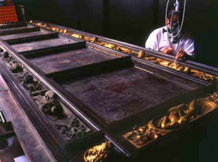
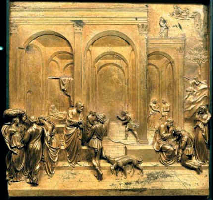
Above, Figs. 6 and 7: Top, one of Lorenzo Ghiberti’s monumental gilded bronze doors (“The Gates of Paradise”) for the Baptistery in the Piazza del Duomo in Florence during restoration. Above, one of the three (of ten) panels that were unveiled in Florence in 1452 and were sent on tour to Atlanta, Chicago, New York and Seattle in the United States during 2007 and 2008. This panel is Ghiberti’s famous perspectival tour de force depiction of Jacob and Esau. It was said that the purpose of the exhibition was as a way of saying thank you to the young Americans who helped in Florence after the damaging floods of 1966, and, as “a way of allowing a wider audience to view the impressive abilities of the Italian restorers who have returned Ghiberti’s masterpiece to its original [sic] splendor through more than twenty-five years of painstaking and careful work.”
April 13, 2014 | Categories: blog | Tags: Abraham, ArtWatch UK, Bellini, Boudin, Burrell Renaissance, Canterbury Cathedral, Councillor Archie Graham, Danny Danziger, Degas' pastels, Ghiberti, Ghiberti bronze doors, Ghiberti Gates of Paradise, Glasgow Life, Jackie Wullschlager, Jacob and Esau, Jareth, Jeremy Warren, Joan McAlpine SNP, Lord Kerr, Michael Daley, Michelangelo Sistine Chapel ceiling, Neil MacGregor, Noah, Radiant Light, Romanesque art, Sir Angus Grossart, Sir William Burrell, The Ancestors of Christ, The Burrell trustees, The Church of England, The Financial Times, The Getty Museum, The Hermitage, The Louvre, The Metropolitan Museum of Art, the new york times, the scottish parliament Burrell Bill, The Vatican, The Wallace Collection, Thomas Campbell | Leave A Comment »

24 March 2014
Part 1: Veronese into Botero
A rupture between words and pictorial realities has emerged in the museum world. It is the product of an over-heated international scramble to produce blockbuster exhibitions. After prising and pulling together works from many quarters, curators of temporary exhibitions write as if blind to the most glaring differences of condition and as if ignorant of all restoration-induced controversies. This widespread critical failure to address the variously – and often very recently – altered states of pictures corrupts scholarship and confers international respectability on damaging local restoration practices. In doing so, this effective pan-national conspiracy “not to notice” also compounds and sanctions the general reluctance of museums ever to acknowledge their own errors in the “conservation” treatment of art. The injuriousness of so much picture restoration is more the product of aesthetic/artistic incomprehension than of any self-agrandising intent. If every unhappy restoration is unhappy in its own way, so to speak, with Veronese, the best balanced of all painters, the most commonly encountered crime against his art is the debilitation of his firm plastic grip by restorers in hot pursuit of brightened and heightened colours.
The catalogue to the National Gallery’s show “Veronese: Magnificence in Renaissance Venice” provides a usefully explicit and clear-cut case in point. Its text is entirely the work of the show’s “guest” curator, Xavier Salomon. The National Gallery’s director, and fellow Veronese authority/champion, Nicholas Penny, declares the catalogue “a significant book”. Formerly of the Dulwich Picture Gallery and the Metropolitan Museum, and presently the chief curator of the Frick Collection, New York, Dr Salomon has (with the National Gallery’s own ten Veroneses) assembled no fewer than fifty, often very large, works. Salomon describes his own catalogue/book as both a general introduction for the public and a work offering “stimulating and original insights for experts and longstanding lovers of Veronese’s work”. In doing so, he claims that:
“The two over-arching principles in the selection of paintings for the London exhibition have been quality and condition, in order to show Veronese’s art at its best.”
We recognise that (as Dr Penny once acknowledged to us) it can be impolitic as well as seem ungracious to attack the conditions of generously loaned works. However, given Salomon’s own declaration on the importance of condition – which he reiterates as being “crucial” – we must assume that he is untroubled, for example, by the present condition of the Louvre’s Veronese The Supper at Emmaus and that he is happy for it, along with all other works in this compilation, to be seen as both of the highest artistic quality and in the best possible physical condition.
Concerning the condition of this particular painting, among many procedural shortcomings present in the course of its recent treatment at the Louvre (as here reported in December 2010), the restorers were discovered by our colleague, Michel Favre-Felix, to have repainted a face twice within five years, on each occasion atrociously, and the second time in a secret intervention at which no records were made (– see below and Figs. 1 to 4b ). Far from alerting neophyte visitors or readers to this picture’s now grossly adulterated state, Salomon specifically praises its “opulent and majestic” overall effect; its “superb” portraits; and its details in which “Veronese reached a level of poignant harmony that was unprecedented”. This is an exhibition and an issue to which we will return but, first, another wrecked painting that is presently being flaunted in London calls for attention.
Part 2: Smoke into Steam
Turner’s Rockets and Blue Lights
An extraordinary publicity barrage accompanied the launch of the National Maritime Museum’s “Turner & The Sea” blockbuster. It centred on a single painting – the artist’s Rockets and Blue Lights. The decision to favour that particular wrecked and challenged work passed beyond the brazen. As Maurice Davies observes in the spring issue of Turner Society News:
“The most unnecessary loan is Rockets and Blue Lights … The catalogue talks diplomatically of ‘alterations to some areas of the painted surface.’ It is in fact so horribly damaged that there’s little value in seeing it in the flesh. ArtWatch talks of the picture as an example of ‘the bizarre and perverse phenomenon of promoting demonstrably wrecked paintings in special loan exhibitions.’ It would have been quite enough to include a small illustration in the catalogue and move swiftly on.”
That painting is held by the Sterling and Francine Clark Art Institute, Williamstown, USA (see “Taking Renoir, Sterling and Francine Clark to the Cleaners”). We first discussed its restoration fate in an article published in the winter 2003 ArtWatch UK journal by the painter Edmund Rucinski who disclosed that the restorer, David Bull, had not only removed the surviving remains of one Turner’s two steamboats but had defended his decision on the grounds that the boat had probably been some later restorer’s invention – even though the existence of a second steamboat was confirmed by the plural “steamboats” in the picture’s full title: Rockets and Blue Lights (Close at Hand) to Warn Steamboats of Shoal Water, and by visual records of the painting, as shown below right.
As we later reported in the summer 2005 ArtWatch UK journal, the picture had been restored in preparation for its inclusion in a travelling exhibition (“Turner, The Late Seascapes”) which began at the Clark Institute and moved first to Manchester and then to Glasgow. It was said that seventy-five per cent of the picture’s surface (which had last been restored and relined in 1963-64 by William Suhr) was repaint and that by removing this paint Turner’s own brushwork would be liberated. What was “liberated” was a wrecked work in which a boat disappeared and the dark coal smoke from its funnel was converted into a white water spout. Despite this pictorial corruption, when the picture came to Britain, the Tate issued a press release in which it was claimed that:
“One of the stars of the show is Turner’s dramatic Rockets and Blue Lights (Close to Hand) to Warn Steamboats of Shoal Water, 1840, which has recently undergone major conservation and is a loan from the Sterling and Francine Clark Art Institute, Williamstown, USA.”
In 2003 Eric Shanes, of the Turner Society, wrote (TLS 19 December) that although the painting had long been a physical wreck, “until its recent ‘conservation’ it at least constituted a pictorially coherent image. Now it’s right half has been entirely rubbed away, leaving an incoherent shambles that not only bears no similarity to Turner’s original but looks like nothing else in the artist’s oeuvre…”
Shanes later took a more indulgent stance towards the Clark Institute. Writing in the May 2005 Apollo, he held:
“…Yet if we adopt a wider perspective it is easy to see that the Clark Institute found itself in a fairly impossible situation in 2003: it was damned if it restored the painted and damned if it didn’t.”
This seemed to assume the institution had to send the painting across the Atlantic to Manchester and Glasgow. It did not. On October 28th 2003 the Times had reported the disclosure by Selby Whittingham that the Boston Museum of Fine Arts had refused to lend its Turner Slavers throwing overboard the dead and dying – Typhoon coming on to the Clark exhibition because when it had returned from a loan to the Tate, the previously sound picture had been found damaged and “extremely unstable” (see below). By 2005, the incoherent work that had borne no resemblance to anything in Turner’s oeuvre in 2003 had, for Shanes, staged a partial recovery, becoming a presentable work once again, albeit if accompanied by a health warning:
“Without doubt the Clark Institute can validly argue that Rockets and Blue Lights is once again fully a work by J. M. W. Turner, possibly for the first time in well over a hundred years. But quite evidently, the museum also faces the concomitant duty to be absolutely honest with its public by making it abundantly clear that the Turner now seen by that clientele is but a shadow of its original self. To claim otherwise is very dangerous…”
Institutional intransigence
When on October 15th 2003, the Times reported the article we were about to publish by Edmund Rucinski, Libby Sheldon, a paint materials historian at University College, London, said: “It’s good that [institutions] are being challenged. It makes them take more care. Organisations like ArtWatch, irritating though they are to institutions, are a good watchdog”. In response, a spokeswoman for the Tate Gallery which had extolled the restoration of Rockets said “We don’t want to comment further.” The Tate might have been sanguine about British newspaper reports of criticisms because elsewhere in the press the gallery’s hyperbolic estimation of Rockets, as transmitted through its press release, found many echoes among art critics:
“…this show contains some of the most extraordinary passages of painting ever applied to canvas. Its centrepiece, the recently restored Rockets and Blue Lights… is an unbelievable vision of swirling blue, orange and white light thrusting through fog [Sebastian Smee, Daily Telegraph]; Easily the most stunning picture in the show is Rockets and Blue Lights…The canvas has been given a restorative makeover…Turner’s brushwork is revealed in all its glory” [Lynne Walker, the Independent]; Most splendid…is the dramatic and recently restored Rockets and Blue Lights, a picture so spectacular, that like the shadowy group of figures on the foreshore, you can only stare and wonder [ Rachel Campbell-Johnson, the Times].”
Just as exhibition organisers might seem incapable of spotting or acknowledging an abused picture, so it would seem that the temptations (or the pressures) to lend precious and vulnerable works of art remain irresistible for many institutions. On 24 October 2007 we wrote in a letter to the Daily Telegraph:
“The Mellon Center’s decision (report, October 17) to break its own rule never to lend Turner’s fragile ‘Dort or Dordrecht: The Dort Packet-Boat from Rotterdam Becalmed’ seems perverse: only seven years ago, the Museum of Fine Arts in Boston lent its Turner ‘Slavers throwing overboard the dead and dying, Typhoon coming on’ to the Tate. On its return to Boston, that painting was found to have suffered losses of paint and to be in an ‘extremely unstable’ condition. A Tate Spokeswoman said: ‘It arrived here safely…Its condition was stable…However, Turner’s paintings are notoriously unstable’. This being so, why are trustees and curators prepared to take such risks with priceless works of art?”
When asked why no records had been kept of the second bungled repainting of the Veronese face in the Supper at Emmaus, a Louvre spokeswoman described the second restoration attempt as one in which the picture was simply being spruced up (“bichonnée”) and added, “That’s why you cannot find it in the painting’s dossier”.
Michael Daley
Above, Fig. 1: A detail of the Louvre’s Veronese The Supper at Emmaus, as published in the catalogue to the National Gallery’s Credit Suisse sponsored exhibition “Veronese: Magnificence in Renaissance Venice”.
Above, Figs. 2a and 2b: Photographs (
as supplied to Michel Favre-Felix) showing the group of the mother and children on the right hand side of Veronese’s
The Supper at Emmaus. Fig. 2a (left) shows this group before the painting’s recent restoration and Fig. 2b shows it afterwards.
Among the many injuries evident in this photo-comparison, notice the reductions of sparkle and vivacity in the treatment of draperies, when, if disfiguring varnish and dirt alone had been removed, the former vivacity of those passages that was present and evident – even under discoloured varnish and dirt – would reasonably be expected to increase, not diminish. On the logic of restoration’s own declared practices, such reversals require explanation from both restorers and (supervising?) curators alike. Notice, too, the weakening of the modelling of the heads and, once again, the reductions of former tonal contrasts when increases of tonal ranges should be expected to follow a cleaning, not their compression.


Above (top), Figs. 3a and 3b; above, Figs. 4a and 4b: Fig. 3a shows the head of the mother before the recent restoration. Fig. 3b shows the head after cleaning and after the first of its two (disastrous) repaintings. Fig. 4a shows the head after the second repainting (and as reproduced in the new National Gallery catalogue).
In the early post-war years the great French scholar René Huyghe (rightly) complained of the tendency of overly-invasive “Anglo-Saxon” restorers in London and the USA to impose entirely inapproriate modernist values on the old masters. How depressingly ironic it is, therefore, that restorers working within the Louvre should now be permitted to impart to a Veronese head (as seen at Fig. 4a) the bloatedly pneumatic forms found in the playful spoof Mona Lisa painted by Fernando Botero shown above at Fig. 4b.
Above, Figs. 5, 6, 7, 8 and 9: Examples of the use of Turner’s Rockets and Blue Lights in the promotional campaign that accompanied the launch of the National Maritime Museum’s exhibition “Turner and the Sea”.
Above, Figs. 10, 11 and 12: Coverage in the ArtWatch UK Journals 19 and 20 of the last restoration of Turner’s Rockets and Blue Lights.
Above, Figs. 13 and 14: Turner’s Rockets and Blue Lights after its 1963-64 restoration by William Suhr (top); above, Turner’s Rockets and Blue Lights after its restoration by David Bull in preparation for the Clark Institute’s travelling exhibition “Turner, The Late Seascapes”.
Above, Figs. 15, 16 and 17: A sequence of photographs showing the disappearance of one Turner steamboat (on the right) and the grave weakening of the second. Top, Fig. 15, the now “disappeared” steamboat as recorded in Robert Carrick’s 1852 chromolithographic copy of Turner’s Rockets and Blue Lights. Centre, Fig. 16, the steamboat as recorded in a photograph of 1896 (shown by courtesy of Christie’s). Above, Fig. 17, the section of the sea formerly occupied by the steamboat, as left after the last restoration.
March 24, 2014 | Categories: blog | Tags: "Turner, "Turner and the Sea", David Bull, Edmund Rucinski, Eric Shanes, Fernado Botero, J M W Turner, Libby Sheldon, Lynne Walker, Maurice Davies, Michael Daley, Michel Favre-Felix, Nicholas Penny, Robert Carrick, Sebastian Smee, Selby Whittingham, The Boston Museum of Fine Arts, The Clark Institute, The Dulwich Picture Galleryy, The Frick Collection, the Late Seascapes", The Mellon center, The Mona Lisa, The National Gallery "Veronese: Magnificence in Renaissance Venice, The National Maritime Museum, The Supper at Emmaus, Turner "Rockets and Blue Lights", Turner "Slavers throwing overboard the dead and dying", Turner Society News, University College London, Veonese, William Suhr, Xavier Salomon | Leave A Comment »
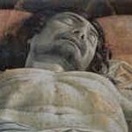
13 March 2014
The first curators and directors of museums and galleries were titled “Keepers”. It was a nicely ungrand reminder that the curator did not own but was merely required to guarantee the safe-keeping of collections. Those modest days are past. Today’s museum is no longer the means by which interested members of the public are granted access to fine collections of art in circumstances conducive to tranquil contemplation and reflection. The Modern Museum is an instrument wielded simultaneously (and rarely coherently) on behalf of assorted vested interests. Governments can treat museums as tools of social engineering. Sponsors can use them as means of burnishing tarnished corporate personas. For many groups and interests they constitute both job-creation schemes and marketing or catering opportunities. Possession, notoriously, is nine parts of the law and today’s museum directors and curators often act as if, for the duration of their tenures of office, they themselves own the works. For some, art collections constitute harvestable assets, a kind of tradable currency that can project institutional and personal brands/egos onto the global stage. No one retains a career interest in leaving well alone. Even when they are not being shuttled around the world, pictures can be physically or virtually “restored” so as to generate newsworthy “discoveries” and dramatically upgraded attributions. Even when circumstances preclude the generation of physical transformations and excitements, curators can, as our colleague, Michel Favre-Felix, the president of ARIPA (Association Internationale pour le Respect de l’Intégrité du Patrimoine Artistique), here discloses, deploy purely “presentational” techniques to identically detrimental effects. [M. D.]
Michel Favre-Felix writes:
In her desire to give “more visibility” to Mantegna’s Dead Christ (see Fig. 1), the iconic masterpiece of the Brera’s magnificent collections, the museum’s director, Sandrina Bandera, could have given carte blanche to a trendy museum designer or to a provocative artist. Instead, she chose the movie-maker Ermanno Olmi as “a humanist concerned by the human tragedies and a humble artist who would not try to hold his own with the painting.” [See, bottom right: Endnote 1.]
The result, as seen since late December, is that the Dead Christ is now housed in a special crypt-like dark room, stripped of His historic frame and visually isolated by spot-lighting, as if now embedded into a monolithic black wall – and at a height of only 67 cm from the ground. (See Figs. 2, 3, 4 and 5.) This presentation is intended to be permanent and the film-maker, humility notwithstanding, declares “This will last: I will fight for it”. [1] (See Figs. 6 and 7.)
While not doubting the sincere empathy of the 83 years old film director with Mantegna’s tragic moving image, likely created in the mid-1480’s, after the loss of his two beloved sons, his declared ambition, after a “deep intellectual research” (“profonda ricerca intellettuale”) to “present the painting just as its creator wanted” [2] cannot be accepted. To begin with, Ermanno Olmi holds that “the frame was a nuisance. It is a painting that would have been hung upon Mantegna’s bed or on its side, not a decoration.” [1] This discarding of the frame (see Fig. 8) is a matter of no regret for the Brera, which states that it was documented “only” from the XVIth century. However, the idea that a religious painting rightly becomes a “decoration” as soon as it gets a frame is a post-modern conception that rests on an inability to comprehend how paintings were conceived and viewed in the religious climate of the 15th century.
Far from being an alien ornamental addition, the frame is a device that serves as a gateway marking a separation between the surrounding real/material world and the depicted ideal world. It marks the step away from our daily views into the world of artistic and spiritual contemplation – both a border and a bridge: the intermediary moment that permits the introduction of the “epiphany” of the image.
Decorum was, on the contrary, a native part of the religious display and sincere piety was expressed through the enriched appearance of images. Dismissing “decoration” with Mantegna, who gave unequalled expressive importance to decorative elements in his own art by elevating ornamentation to the highest degree of artistic and spiritually expressive means, is singularly regrettable. (See Figure 9, which shows the outstanding subtlety and complexity of Mantegna’s design and its interrelationships between the carved gilded architectural frame and rich depicted ornaments.)
Clearly, in his quest of the essence of the image, Olmi felt compelled to “liberate” the Dead Christ from any kind of “decorum”. Instead, by acting without any self-critical distance, he has merely wrapped the sacred image in the stereotypical “decorum” of our modern times: the non-framing of modern paintings and the omnipresent practice, in books and on computers screens, of reproducing old paintings without their frames. Such a reading might have been acceptable had the museum announced: “this is the creative movie-director’s own personal vision of the painting”. But M. Olmi claims to have “recovered” Mantegna’s original intentions by means of new historic-scientific deductions.
He does so with contradictory explanations. First, he asserts that, historically, “this painting has not been painted to be exhibited for all to see but was intended to remain hidden from any external sight”. [3] (Giovanni Agosti, the art historian and Mantegna specialist at Milan University, refutes this account.) Why, then, has Olmi gone to such lengths to give “more visibility” to the painting – which was the very aim of the Brera’s project?
Other inconsistencies stem from Olmi’s singular and highly specific conviction that the raison d’être of the Dead Christ was to be a private devotional image positioned on the side of the artist’s bed at 67 cm from the ground – at which height he claims to insure a “correct” prospect for a viewer not in the bed but in a standing position next to it. As Olmi argues: “If I have placed the painting at 67 cm from the ground it is because, when it is placed at the eyes level, the Christ looks deformed and stunted as if he was hanging by his arms. It is true that one could feel inclined to kneel, but the viewpoint that I impose is not religious. It is the most adequate with the view chosen by Mantegna.” [1]
The film-director’s attempts to “correct” the prospect with his disconcerting and precise 67 cm calculation fails to address the long established but puzzling fact that at least two, contradictory prospects were used in the construction of the scene. Actually, Mantegna’s representation is not bound to a formulaic appliance of mathematical prospect but, rather, used an expressive, sensitive one (in accordance with Alberti’s conceptions). Should the Brera’s visitors be instinctively inclined to kneel, M. Olmi might consider that they might instinctively be right, and that he is intellectually wrong.
Let us test Olmi’s calculations. The painting would have hung near Mantegna’s bed, at 67 cm from the floor, as a devotional image for his own kneeling prayers. Nevertheless, the artist would have set the “correct” prospect for the viewpoints of rare visitors to his bedroom. And thus, every day, Mantegna, while kneeling would have, on Olmi’s account, seen no more than a “deformed and stunted” Christ. That the Brera also asserts that this level is “the same that the artist wanted ” [4] only illustrates the well-known phenomenon of collective misleading.
In truth, Mantegna’s intentions are implicit within the painting. The key is the position of the three lamenting figures at the Christ’s side. These three mourners (the Virgin, St John and the Magdalena) are not standing but kneeling. A recently rediscovered ink drawing, dated to the 1460’s and which may be thought to be part of Mantegna’s own steps towards his final composition shows figures, standing and leaning around the Christ (see Fig. 10). As Mantegna eventually chose kneeling figures, he thereby rethought the prospect. The resulting unusual viewpoint in the Brera masterpiece makes sense when we realize that it represents the prospect drawn from a position similar to that of the three mourners: Mantegna places the spectator as a fourth mourner looking from a similar kneeling position and point of view (See Fig. 1).
Now, there are not so many plausible solutions. In the first, the painting is positioned near the ground, hypothetically as in the artist’s bedroom or – in another hypothesis – as it might have been placed on Mantegna’s grave. In both cases the spectators are rightly situated when kneeling. But a museum is not a church, nor a graveyard, nor an artist’s bedroom. In another reading, the painting hung at eye level and the standing spectators share the sight of the kneeling mourners. Although dashing the Brera’s hopes to revolutionize the traditional display, this solution works perfectly and is consistent with other sight level solutions by Mantegna, as can be seen in his “Wedding Chamber” of 1465-1474 in the Ducal palace of Mantua (See Figs. 11, 12 and 13).
The only wrong choice is that of M. Olmi. Andrea Carandini, the archaeologist president of the Italian equivalent of the British National Trust, put it trenchantly: “this means placing the body of Jesus at the level of the genitals that have everything except eyes” [5]. The Italian professor further slammed Olmi’s failure to understand what a painting is and is not, by confounding an artistic representation of the sepulchre with a mimicked reproduction of a sepulchre room.
Of Olmi’s overly theatrical design, Carandini stresses that the painting is now dematerialized and degraded to a projected image. This new projected slide effect of the Dead Christ offends art historian Philippe Daverio who complains of a present resemblance to the reddish glow of a Pizza furnace [1]. Personally, I am even more struck by the similarity with a movie screen. Could it be that M. Olmi does not realize that he is here replicating the very situation, so familiar to him, of a cinema showing in the dark? Should a row of cinema chairs be put in the present gallery, the seated spectators would be at the perfect height for looking at his Dead Christ film.
As for the Brera’s desire to increase the “visibility” and to recover the “true” (original) the viewing of the Dead Christ, such aims coincide with current (controversial) definitions of contemporary restoration, which pretend to increase the “legibility” of the artwork [6] and to reveal its “true” colours, by some supposed recovery of its original state.
As with the numerous controversial restorations that have been the subject of critical analysis by ArtWatch and others, hypotheses that are cast up as alleged discoveries are given the status of facts and misleading calculations are supplied for “scientific” proofs. Ambitious restorations and spectacular displays alike are – however awkward their results – made in the name of retrieving the artist’s original intentions.
In both cases, close analysis shows a contemporary aesthetic prevailing over the artist’s own original one. Professed humility in restorers and exhibition designers is unable to constrain the contamination of the past by our present artistic prejudices. By similar processes, through invasive restoration or intrusive display, the old masterpieces are modernized and thus, for ongoing decades or even irreversibly, falsified.
Michel Favre-Felix
Above, Fig. 1: The Lamentation over the Dead Christ, circa 1480, distemper on canvas, 68 x 81 cm, Pinacoteca di Brera, Milano.
Above, Figs. 2, 3, 4 and 5.
Fig. 2: The Dead Christ (top) isolated in the dark – in the forefront, Bellini’s Pietà. (Source: arte.sky.it.)
Fig. 3, 4 and 5: Other views of the painting embedded into the black wall. Source for Figs. 3 and 4: Milano.corriere.it
Above, Fig. 6: Ermanno Olmi in his new and, he hopes, permanent display in the Pinacoteca di Brera, Milano.
Above, Fig. 7: Ermanno Olmi during the presentation of his new display and debate held in the Sala della Passione of the Brera Palace on the 12th of December 2013. Source: Milano.corriere.it
Above, Fig. 8 Mantegna’s masterpiece with its frame, before December 2013. Source: lacittanuova.milano.corriere.it
Above, Fig. 9: a detail of the central panels of Mantegna’s The San Zeno Altarpiece of circa 1457-1460. This work of tempera on panel (the whole altarpiece being 480 x 450 cm) is housed in the San Zeno basilica, Verona. Source: en.wikipedia.org
Above, Figs. 11 and 12: A view of Mantegna’s the Bridal Chamber (Camera degli Sposi) 1465-1474, frescoes, Ducal Palace, Mantova, indicating (top) the elevated viewpoint of the frescoes.
Above, fig. 13: A detail of Mantegna’s the Bridal Chamber (Camera degli Sposi).
CODA:
Above, Fig. 14: Mantegna’s Ecce Homo, circa 1500, distemper and gilding on canvas, 54 x 42 cm, Musée Jacquemart-André, Paris.
This distemper painting by Mantegna is one of the best preserved paintings in the world. It has never been lined. It has never been varnished and, so, has never been “dis-varnished”. It retains its original panel on which the original canvas is glued only by its edges [7]. Crucially, we can see that this miraculous survivor of Mantegna’s art displays the same subdued tones (albeit in even smoother and more delicate manner) as those found in the artist’s Dead Christ (Fig. 1). As works painted with pigments bound in distemper (glue) not oil or tempera or resin, both the Dead Christ and the Ecce Homo belong to a kind of painting that inevitably looks slightly muted and darkened and which cannot be enhanced or “brought out” by any restoration means. Disappointing as this might be to the curators of the Brera, no cleaning could ever uncover – as is otherwise invariably promised by restorers – any bright colours under its subdued looking tones. Those tones are the birthmarks, the intrinsic pictorial characteristic of the distemper painting technique. However, it might seem that for the resourcefully modernising contemporary curator, the physical impossibility of brightening and colourising an historic work, need constitute no obstacle. As the above described (mis-)treatment of Mantegna’s Dead Christ demonstrates, other substitute technological subterfuges exist in the displaying of paintings. The increasingly frequent curatorial resort to historically and artistically falsifying theatrical/cinematic/virtual techniques might deserve further commentaries.
ENDNOTES:
[1] ”Le « coup » du Christ”, by Philippe Ridet, Le Monde, 15/02/2014 [2] The Brera’s website [3] “Capolavori meditazione da”, Francesca Bonazzoli, Corriere della Sera, 3/12/2013 [4] “Brera, «processo» pubblico per il Cristo del Mantegna ”, Giacomo Valtolina, Corriere della Sera, 13/12/2013 [5] “Un Mantegna da vedere in ginocchio”, by Andrea Carandini, Corriere della Sera, 11/12/2013 [6] For critical studies of the use of this term in conservation, see: Salvador Muñoz Viñas, Contemporary Theory of Conservation, , Elsevier Butterworth-Heinemann, 2005, and, Hiltrud Schinzel, “Visibility of Restoration – Legibility of Artworks : the Topicality of Compromise”, in Visibilité de la restauration, lisibilité de l’œuvre, 5th colloquium ARAAFU, 2003 – Debate in the Italian restoration review Kermes n°44, 2001 / n°47, 2002 / n°50, 2003, with Antonio Natali, Giorgio Bonsanti, James Beck, Anna Maria Maetzke, Walter Schudel et al) [7] Andrea Rothe, “Andrea Mantegna’s Adoration of the Magi”, Historical Painting Techniques, Materials and Studio Practice, The Getty Conservation Institute, 1995
March 13, 2014 | Categories: blog | Tags: ARIPA, ARIPA Nuances, arte.sky.it, Artists original intentions, Association Internationale pour le Respect de l’Intégrité du Patrimoine Artistique (ARIPA), Bellini's Pieta, Ducal Palace of Mantua, Ermanno Olmi, Giovanni Agosti Milan University, Keepers of collections, Mantegna, Mantegna's camera degli Sposi, Mantegna's Ecce Homo, Mantegna's Lamentation over the Dead Christ, Mantegna's San Zeno Altapiece, Mantegna's study Lamentation of Christ, Michael Daley, Michel Favre-Felix, Milano.corriere.it, Musee Jacquemart-Andre, Philippe Daviers, Prof Andrea Carandini, Sandrina bardera, the Brera, The History Blog, The Modern Museum, The Pinacoteca di Brera | Leave A Comment »

24 February 2014
On February 10th the Daily Telegraph published a letter from a professor of chemistry at University College London (Robin J. H. Clark) questioning the relationship between art and science in general terms and with regard to a supposed Chagall painting featured on a recent BBC Fake or Fortune television programme. Prof. Clark expressed particular concern over art world failures to heed the testimony of available scientific techniques.
In the late 1980s the UCL chemistry department had developed a non-invasive technique (“Raman microscopy”) for identifying both natural and synthetic pigments within paintings. Because the latter have known dates of invention, their presence in a picture can establish the earliest date at which it could have been produced. This technique is said by Prof. Clark to have been known to Sotheby’s by 1992. The Chagall painting, he pointed out, could have been exposed as a fake at any point in the last 20 years. He further reported that the painting was exposed as a forgery in his UCL laboratory in July last year in the presence of its owners and the presenters of Fake or Fortune:
“I am disappointed that neither of the presenters of Fake or Fortune made this clear. The conclusion that the painting is a forgery is based on our spectroscopic results, which showed that at least two of the key pigments had not been synthesized until the late Thirties, putting the earliest date for the painting at 1938, long after the supposed date of 1909-10.”
Because of the unequivocal nature of those technical findings, Prof. Clark (rightly) observed that the Chagall Committee in Paris, to which the painting was sent, had no option but to confirm the forgery. He also asked how art historians might be encouraged to read science journals so as be informed about “significant developments in science as applied to arts”. In part, his question is fair and urgent. The art market’s notorious governing trade dictum is caveat emptor (buyer beware) – while auctioneers and dealers may take every pain to verify their claims, it is ultimately for buyers to satisfy themselves that attributions and conditions are as described. Auctioneers can only submit works to (possibly disqualifying) technical analysis with owners’ permission. Dealers who buy at auctions almost invariably have works restored but are not required, when selling works on, to disclose which if any tests may have been run.
Support on the extent to which scientific (and also historical and visual) evidence is ignored or manipulated in the interests of “boosting financial rewards in attributing paintings to particular masters” was given in an Observer interview on February 23rd (“Revelealed: the art experts who pass fakes as authentic”) by Professor Martin Kemp, a Leonardo specialist. In the same report by Dalya Alberge, Nicholas Eastaugh, a leading independent scientist (of Art Access and Research), described the present climate as being both without standards and “totally unregulated. It’s a Wild West.”
However, much as we sympathised with Prof. Clark’s impatience with some art world practices, we could not endorse his call for a blanket acceptance of all scientific methods presently being applied to works of art. As we put it in a letter to the Daily Telegraph (published 12 February):
“Professor Robin Clark (letters February 10) calls for developments in science to be applied to art. If sound science is underused by the art trade, more questionable ‘scientific studies’ have been used for many years to offer assurances that picture-cleaners’ solvents have been a safe method of stripping varnishes and repaint from old pictures. As the current issue of the journal of the International Institute for Conservation of Historic and Artistic Works makes clear, the understanding in the art and museum world since the Sixties of how solvents work has been seriously flawed scientifically. Because important intermolecular interactions have been ignored, the theoretical model used cannot predict, as assumed, the actions of solvents on the underlying paints.”
History teaches that the many cumulative “scientific” defences of restorations have best been treated with scepticism. In 1977 Kenneth Clark admitted founding the National Gallery’s conservation science department precisely to bamboozle critics and dupe the public. In later years the Gallery pioneered a new mongrel discipline known as Technical Art History in which curators, conservators and conservation scientists pool expertises so as to arrive at some seemingly “scientifically underpinned” consensus on aesthetic decisions. In reality curators were glossing authority already-ceded to restorers. As the National Gallery restorer Helmut Ruhemann wrote in 1968: “Although the art historians in charge of pictures are officially responsible for the policies regarding cleaning, they naturally form their ideas in the first place from what they are told by their restorers.”
In its guides to conservation the National Gallery presently claims that while its restorations are carried out for aesthetic rather than conservation purposes, and while each restorer imposes a personal aesthetic taste on pictures, it considers all aesthetically various outcomes to be equally valid so long as they have been carried out “safely”. The contention that the (claimed) safety of cleaning methods can underwrite conflicting aesthetic outcomes is a non sequitur. Besides which, no claims have proved more unreliable than those of cleaning solvents’ safety.
The crucial and sometimes wilfully over-looked cultural truth is that there are no properly scientific means of comprehending art’s variously created aesthetic values and relationships. When reiterating this point in our post of 7 February 2014 (“From the Horse’s Mouth ~ Seventy years of worthless ‘science’ and reassurances on the safety of picture cleaning solvents”) we were able to disclose the most recent and most damning evidence of the un-soundness of past scientific endorsements of picture-cleaning solvents.
Notwithstanding these spectacular technical reverses, this month the press has been chocked with uncritical “Good News” accounts of scientific advances in the arts. Most newspapers and the BBC carried claims that scientists had “digitally reconstructed” the original appearance of a Renoir painting in which a former pink background had faded. By coincidence, this claimed miraculous virtual recovery had also been made by “a technique known as Surface-Enhanced Raman Spectroscopy (SERS)” carried out at the Art Institute of Chicago.
The BBC reported that “Northwestern University chemist Prof Richard Van Duyne pioneered SERS. He said the Renoir demonstrated why the Raman technique was fast becoming an invaluable tool for studying artworks: ‘You get tremendous information about the origins of the painting, the techniques of the artist, an understanding of the fading mechanism, and the ability to restore the painting.’” Note that speculative hypotheses are now being presented as sound platforms for restorations. In the art world it is frequently the dogs that don’t bark that matter most. Note that this wonder technique which addresses changes resulting from natural causes would seem to have no powers or potential with regard to the more common and much more seriously deleterious man-made changes made by restorers. Given that both types of injury are easily evident by eye to anyone lifing a picture out of its frame (see Figs. 2 and 3), the silence of “science” on the latter injuries can only seem self-compromising .
In a letter to the Times (February 17) we protested:
“The claim that scientists have recreated the original appearance of a Renoir painting (‘Laser technique shows masterpiece as Renoir intended’, Feb 14) is unfounded. All elements of a picture undergo natural changes over time. To these, further unnatural changes are added by restorers and their invasive paint-penetrating solvents. Compensating for a single faded pigment does not constitute a recovery of a picture’s original appearance. Rather, it offers a further falsification: a single artificially simulated ingredient within a remaining, generally altered and debilitated surviving whole.”
Our letter was accompanied by one from a Professor of Allergy and Clinical Immunology at Imperial College London, making a far-fetched claim that the fact that a synthetic red dye used in paintings had also helped in the discovery of an important white blood cell constituted an unusual “bridging [of] fine art and science”.
While Raman microscopy could certainly disprove the claimed date of the fake Chagall, it seriously misleads the public to present speculative and hypothetical digitally manipulated reconstructions as if literal recoveries of original conditions. On February 22nd the Economist reported an account of another digital re-mastering of real paintings delivered at this year’s meeting of the American Association for the Advancement of Science. The Economist too saw a bridging of the divide between art and science, which it likens to a resolution of the science/art schism of which the chemist and novelist C. P. Snow complained in his famous 1959 lecture “The Two Cultures”. The report also reveals, however, that what was presented as a recovery of the murals’ original conditions was in fact a double hypothetical reconstruction. Not only had Rothko’s colours faded, so too had those of the contemporary photographs of his murals that were to serve as the basis for a digital re-mastering of the actual paintings. Despite the methodologically dubious procedure of digitally re-mastering actual paintings on the back of digitally re-mastered photographs, there was customary breathless admiration for this latest claimed technical miracle:
“In the case of the Holyoke Centre’s Rothkos […e]ach had faded differently, depending on its original colours and how much sunlight it had seen. And various parts of individual paintings had faded at different rates, too. But modern technology allows optical illusions to be finely crafted indeed. The paintings are continuously observed by a high-resolution camera. Its images are compared, pixel by pixel, with the idealised versions provided by the restored photographs. A computer then works out, moment by moment, what mixture of light to shine back to make the faded originals match the vibrant reconstructions—with no messy repainting necessary. For now, the paintings remain under wraps while the museum at which they are stored is renovated. One day soon, though, they will be on display in all their illusory glory.”
There was no discussion of the consequences of viewers’ bodies blocking the projected “correcting” coloured lights. What we are witnessing in this heavily promoted technical bonanza is not a genuinely increased understanding of art by courtesy of scientific advances. If the attempt to increase public understanding of the degree to which even quite modern paintings have suffered alterations since their executions was a real ambition of museum staffs and conservation scientists, it would be imperative for them to discuss (and demonstrate) the largest single source of alterations and adulterations: “restoration” treatments. In the absence of such an agenda, what we see unfolding is a cultually diversionary Big Push by certain professional groups into new and uncontroversial employment pastures where the potential pickings and funding opportunities are immense – there is scarcely an old picture in existence where some pigments have not faded. This virtual remastering show is one that could run and run. But who might fund and who might execute research into all those paintings that suffered far more grievously from the chemical coshes of restorers?
The real problem in the arts is not an insufficiency of technical or scientific assistance. It is deeper and more fundamental. Its root lies within institutional withdrawals from exercising properly critical considerations. The non-appliance of due critical practices is long-standing. There were uncritical responses in the late 1990s when (as we reported in our first post) the National Gallery used a computer-manipulated photograph of an actual skull as the basis for a hypothetical virtual reconstruction of missing parts in Holbein’s “The Ambassadors” which led to the redrawing of Holbein’s skull in defiance (or ignorance) of the perspectival systems of the artist’s times. More recently, the Tate repainted large lost parts of a flood-damaged work on the basis of early colour photographs in the course of a “restoration”. In our uncritical, increasingly “virtual” cultural universe it is more urgent than ever that museum curators should return to acting primarily on sound scholarly appraisals and aesthetically informed insights, and that they should not further devolve their responsibilities to technicians who may or may not be properly alert to matters aesthetic and artistic.
Michael Daley
Fig. 1: Above, top, Marc Chagall’s “Reclining Nude 1911” which is said to have been the source for the fake Chagall, “Nude 1909-1910” (above), as reproduced together in the Sunday Telegraph (2 February 2014).
An entire programme in the BBC’s Fake or Fortune series was spent examining the technical composition and the provenance of the fake version (which, incredibly, was dispatched to the Chagall Committee in Paris which not only declared the work a dud but threatens to have it destroyed) when a single glance at the two works should have been sufficient to establish that both cannot be by the same artist. Where that of 1911 displays a boldly deconstructing and reconstructing treatment of forms and spaces that is expansive and pictorially dynamic (as well as being massively indebted to Picasso’s then recent and revolutionary cubist works), the other is manifestly derivative and feebly handled, leaving the picture’s subject looking not so much set in a specially re-ordered non-Euclidian space, as pasted onto a monotonously and repetitively drawn and coloured theatrical back-cloth.

Above, Fig. 2: a detail of a Turner water-colour in the British Museum which had been protected from light damage at the left edge by the frame. (See plate 5 in the “Museum Environment”, 1986, Butterworth-Heinemann.)
Above, Fig. 3: a detail of Frans Hals’ “Banquet of the Officers the St. George militia company”, showing a strip of original green glazing that had been protected from restorers solvents by the frame.
Above, Fig. 4: the much reproduced Renoir, “Madame Léon Clapisson” (here as on the BBC) showing the painting in its present condition at the Chicago Art Institute on the left, and in an attempted digital reconstruction of its original (1883) condition on the right.
Above, Figs. 5, 6 and 7: details, top and centre, of “Madame Léon Clapisson” as found today, showing along the picture’s top edge a surving strip of an originally pink background achieved with a glaze of carmine lake, or cochineal, pigment. Scientists have used the investigative method known as “Surface-Enhanced Raman Spectroscopy (SERS)” in an attempt (above, at Fig. 7) to recreate the picture’s original appearance.
There has been no mention in any reports on this attempted reconstitution of some consideration having been given to changes in the painting that had occurred not as a result of exposure to light but as a result of exposure to restorers’ solvents, swabs and scalpels.
The painting itself and the virtual reconstruction is presently on exhibition at the Chicago Art Institute. The exhibition was
supported by research funding provided by the Getty Foundation, the Grainger Foundation, the David and Mary Winton Green Research Fund, the Samuel H. Kress Foundation, and the Andrew W. Mellon Foundation. It is said that with
“this new knowledge and new technologies such as nanotechnology, laser light, and advanced image processing software, the conservation department has been able to reconstruct the work’s original colors in a full-scale digital reproduction.” A PIONEERING DIGITAL ATTEMPT TO RECOVER A PICTURE’S ORIGINAL CONDITION AT THE NATIONAL GALLERY (LONDON)
Above, Fig. 8: The National Gallery’s “The Conversion of the Magdalen” attributed to Pedro Campaña.
Above, Fig. 9: The near contemporary copy of the National Gallery’s “The Conversion of the Magdalen” that was made by Luca Longhi and is presently in the Villa Borghese Collection, Rome.
The National Gallery claims credit for pioneering the new collective discipline known as Technical Art History. A key weapon in its long, proselytizing campaign has been the publication since 1977 of an annual report dedicated to conservation activities – its
Technical Bulletin. The issue of 2001 (Vol 22) carried an article “Colour change in
The Conversion of the Magdalen attributed to Pedro Campaña” that was jointly authored by Marika Spring, Nicholas Penny, Raymond White and Martin Wyld. Spring and White were members the science department, Penny was a curator, and Wyld was the head of conservation. It was thus a textbook collaborative effort made under the rules of Technical Art History.
The combined expertises were brought to bear on a striking problem with the painting’s physical and optical conditions: there had been severe deteriorations in the colours of many of the draperies, not least in those of Christ. Many draperies were now brown or yellow-brown, where once they had been blue, green or red.
Microscopic samples were taken from some of the figures and analysed in an attempt to identify their pigments and to “investigate whether there was any peculiarity in the technique and the materials that could have caused such serious degradation.” Highly detailed examinations established that the blue pigment – smalt – had deteriorated; that a red lake pigment (likely containing dyestuff from the cochineal insect) had faded; and that green glazes containing copper had turned brown. None of these changes were remarkable in themselves, except, perhaps, in their extent.
What was remarkable was that an attempt was made to reconstruct the “altered colours by digital imaging”. It was explained that the changes which had destroyed the picture’s balance of colours had to be accepted as irreversible. Nonetheless, the attempt was made to gain some impression of the original appearance by manipulating a digital image of the painting – specifically, “by applying image-processing techniques”. Clearly, in such an exercise, the nature and type of image-processing software used would be of crucial methodological significance – how and in what manner was the base digital reproduction of the picture to be manipulated?
Explanation seemed to be to hand in a footnote [27]. Alas, it read flatly as follows: “The technical details of the process of reconstruction of the colours by image processing on the digital image will be described elsewhere.” No less disturbing than having to take the means and manner of the manipulations on trust, the account that followed of the factors of consideration suggested a Technical Art Historical methodology more Heath Robinson Contraption than Hi-Tech Sophistication.
Because the original colours no longer exist on the painting, some simulacrum of each had to be produced to feed into the image-manipulating software. Thus, “colourimetric measurements on painted-out samples matching the pigment mixtures and the layer structures were used as a reference.” Clearly, achieving a reliable point of colour reference was vital to the integrity of the exercise. But how reliable were the painted-out samples? Not very, it seemed on the authors’ own account:
“For the smalt and red lake pigments this posed some problems. Smalt manufactured to a nineteenth-century recipe is available today, but contains a higher percentage of cobalt than than smalt in sixteenth-century paintings and none of the impurities that are commonly found in the glass.” Notwithstanding these departures from the original materials used on the painting, this smalt was used for the base references. Because the modern smalt is much stronger in colour than that of the sixteenth-century, an attempt was made to correct (lessen) its force by adulterating it with “finely ground alumina” in attempt to “to try to simulate the colour of the sixteenth century smalt”. Confidence in this adjustment was not high because “this is a difficult judgement to make, since in paintings of the period smalt has always degraded.” Had the painting been a seventeenth-century work the exercise would have been easier because by then the smalt was commonly mixed with lead white pigment, which afforded some protection. Even though this work was not of the seventeenth-century, samples from that period were used a guide reference in the digital manipulations.
Establishing a reference point for the original lake pigments was no less problematic: “Comparison with the deep shadows on Christ’s red robe, which retain their red colour, made it clear that the hue of the test plate was more purple than the red lake in the painting…” And what of the outcome of this, at best, approximate method?
Above, left, Fig. 10a: the computer-manipulated attempt to recover the original colours of Christ’s draperies.
Above, right, Fig. 10b: a detail of the Borghese Villa copy shown above at Fig. 9.
It probably goes without saying that the figure of Christ seen at Fig. 10a seems a most implausible reconstruction. It is claimed by the authors, however, that: “The deeply saturated colours which replace the deteriorated brown, although rather flat because of the loss of the modelling which cannot be reconstructed, balance well with the well-preserved draperies painted with vermilion and ultramarine.” Given that, on the authors’ own admission, the simulated blues and reds are significantly different and more intense pigments, how credible can this claimed correspondence of colours seem?
The article concludes on an assertive note of self-satisfaction: “The detailed technical examination of the ‘Conversion of the Magdalen’, and the process of reconstruction of the colours in the digital image, has produced some deeper insight into how the deterioration of pigments has affected the colours in the painting.”
This was followed by a claim that is quite remarkably at odds with the visual evidence presented (see Figs. 10a and 10b): “Although the strong and deep colours of the reconstruction initially seemed rather startling, they receive strong support from comparison with the Borghese version of the painting [shown here at Figs. 9 and 10b] – which is especially gratifying since the reconstruction was made before the transparency of the Borghese version was available to us.” Given that the Borghese version is on all accounts markedly better preserved that the London picture, what might explain the former’s richer, warmer red drapery and darker, more sombre blue drapery?
Although the authors express themselves as being satisfied with the accuracy of the reconstructed colours, they do concede other problems: “The reconstruction is not, of course, an accurate portrayal of the original appearance of the painting – the lost modelling in some of the draperies cannot be recreated…”
Thus, we see that this exercise has been directed at a single component part of the painting – its self-contained areas of local colours – and that, in the execution, that part has been wrenched from any relationship with the picture’s tones, shading and modelling. This severance is painfully evident in the comparison at Figs. 10a and 10b. It would beggar belief that the National Gallery’s experts could see any sort of vindication for their efforts in the Borghese version were it not for that institution’s by now too-deeply ingrained to be recognised tradition of pursuing autonomously bright colours during restorations at the expense of form and pictorial coherence. Not only are the colours of the Borghese drapery more sombre and chromatically integrated – and jointly more skilfully integrated with the plastic values – but we see also in the National Gallery picture a characteristic debilitating weakness of modelling in the too-brightly scrubbed surfaces of the flesh areas. (It is depressing beyond belief that our national pictorial vice should recently have crossed the English Channel and now be menacing
Leonardos at the Louvre.)
It might be contended that we are not comparing like with like. As the authors point out, the one work is a not an altogether strict copy of the other. Moreover, the Borghese version is acknowledged to be in superior condition: “the better condition of areas painted in red lake in the Borghese painting is strong evidence that it has not been subjected to such harsh environmental conditions as the National Gallery painting…The Borghese picture has spent almost all its life in two collections in the same city, whereas, the National Gallery’s picture has belonged to at least half a dozen collections and has passed on at least three occasions through the art trade, but too little is known about the conservation history of these paintings, and the conditions in which they have been kept, to explain the difference in preservation.” The euphemistic use of the term “environmental” in lieu of “restorational” and the sly allusion to possible bad restoration experiences at the hands of the “art trade” cannot gainsay the fact that there is abundant evidence of works held at and restored within the National Gallery suffering catastrophic losses in the course of a single in-house restoration – as the before restoration (left) and after restoration (right) comparative details of Rubens’ portrait of Susannah Lunden (shown below at Figs. 11a and 11b) testify.
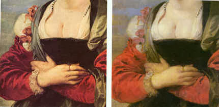
February 24, 2014 | Categories: blog | Tags: aesthetically informed judgements, Allergy and Clinical Immunology Imperial College, Art Access and Research, BBC "Fake or Fortune", C P Snow, caveat emptor, Chagall Reclining Nude 1911, Chemical coshes, Computer manipulated paintings, Dalya Alberge, Fake Chagalls, Frans Hals Banquet of Officers, Good science, Helmut Ruhemann, Holbein The Ambassadors, Kenneth Clark, Marika Spring, Martin Wyld, Michael Daley, Michael Daley letter daily Telegraph, Michael Daley letter The Times, national gallery conservation guides, Nicholas Eastaugh, Nicholas Penny, Over-promoted science, Over-reaching science, Prof Martin Kemp, Prof. Robin J H Clark UCL, Raman Microscopy, Raymond White, recovering Rothko's colours, Rubens Portrait Susannah Lunden, scholarly appraisals, solvents safety, Sotheby's, Surface-enhanced Raman Spectroscopy, Technical Art History, The Andrew W Mellon Foundation, The Art Institue of Chicago, The Chagall Committee, The Conversion of the Magdalen, The david and mary Winton Green Reseach Fund, The Economist, The Getty Foundation, The Grainger Foundation, The IIC Studies in Conservation, The Louvre's Leonardos, The Museum Environment, The National gallery Conservation Department, The Observer, The Samuel H Kress Foundation, The Two Cultures C P Snow, The Villa Borghese Rome | Leave A Comment »
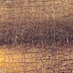
7 February 2014
In our post of 4 February 2014, we challenged the “conservation science” said to have delivered absolute physical safety and absolutely aesthetically and historically correct recoveries of the original condition of pictures during restorations at the Louvre. How could this be so, we countered, when directly comparative photographs recording the pre and post-restoration states of Leonardo’s “The Virgin with Child and St. Anne” showed such clear evidence of injuries? At the time of that controversial 2011 restoration (which prompted resignations by two leading authorities from the restoration’s own advisory committee) we were assured that the Louvre’s varnish removal techniques were so advanced and precise that an imperceptible microns-thin film of original varnish had been left in place. How, therefore, it was asked, could the restorers possibly have damaged the painting? This is a common ploy and we were no more persuaded by it than we had been twenty-five years earlier when restorers of Michelangelo’s Sistine Chapel ceiling claimed to have left a thin protective layer of “original patina” on the ceiling.
To the contrary, we held that when claimed “science” conflicts with the evidence of our eyes, the eyes should have it:
“The currency with which artists work is values and the relationships between values. Through these they work by eye to produce artefacts which fix and carry their intentions, so that they might subsequently be optically apprehended by others. In the production of a painting, every last feature is a product of thought. But every judgement, evaluation and adjustment is transmitted exclusively through human sight, and not, as techno-conservationists might prefer, through sub-atomic particles of matter, complex chemical formulations or other mystifying hi-tech red herrings.”
We reminded viewers of the butchery – no other word suffices – witnessed during the cleaning and repainting of a Veronese head at the Louvre. When that “restoration” was challenged, the Louvre’s restorers made a second (this time secret and unrecorded) attempt to put matters right. They failed and grossly compounded the original blunder (see the lower sequence of photographs at Fig. 3). On such a track record, we suggested, it was surely provocative of the museum to announce not only another Leonardo restoration (his “La Belle Ferronnière”), but even a desire to restore the desperately fragile “Mona Lisa” (details of the mouth of which we show at Figs. 1 and 2).
Yesterday evidence came in that suggests that some restorers may now be doubting their own earlier propaganda. The new (January 2014) issue of the IIC’s journal Studies in Conservation – which describes itself as “the premier international peer-reviewed journal for the conservation of historic and artistic works” – is devoted to “paintings…a subject that has been discussed in publications over many years and frequently”. Indeed it has – and this issue contains a bombshell for much of that earlier research and its implicit reassurances.
It is contained in an article titled “Parametrization of the solvent action on modern artists’ paint systems”. For long-term students of such “Technical Art History” studies, the article begins with what can only be considered a professional confession:
“Effective and responsible use of solvents is an essential skill of a conservator or restorer. The complexity of the solvent processes in the field of conservation/restoration arises from the intent to selectively remove surficial components of a paint build-up without affecting underlying strata. High demands are thus set on the restorer/conservator with respect to specific knowledge on the dissolving properties of a wide range of materials. Owing to the complexity of the solvation and dissolving processes several approaches have been made to simplify solvent action and deliver some selection criteria to the restorer. The ternary ‘Teas chart’ (Teas, 1968) is the most widely applied solvent classification scheme in conservation…even though the system does not permit the prediction of material solubility. With the ternary Teas chart it is not possible to map the solvent action quantitatively…This is due to the fact that the system ignores important intermolecular intereactions. With this simplification, the relation of the individual paramaters to the total strength of interaction is lost. In addition, while this system describes the solvents’ properties, it does not deliver information on material solubility.” (Emphases added.)
Well, so much for that Great White Hope of restorers over the last forty-odd years. In conservation’s technical literature, confessions are delivered only when fresh technical hopes and promises are to hand (as in Fig. 8). And, thus, here we find: “It is a first step towards the development of a systematic tool aimed at the responsible and reliable use of solvents in the field of conservation/restoration.” A bit late in the day for a “first step” towards responsible and safe practice?
Michael Daley
Above, Figs. 1 and 2: Details of the mouth of Leonardo’s “Mona Lisa” showing the badly fractured “topography” of the paint and varnish layers. In view of the results shown below of the recent cleaning of Leonardo’s “The Virgin and St. Anne”, it is impossible to consider the prospect of a restoration of this painting with anything other than absolute dread. By what means might an attempt be made to separate the infinitely subtle brown modelling of the mouth from the ancient varnishes in which they are presently incorporated?
Fig 3: The cover of the Artwatch UK members’ journal which discussed recent botched restorations at the Prado and the Louvre
Above, Figs. 4, 5, 6 and 7: Comparative details of St Anne in Leonardo’s “The Virgin and St Anne” showing the head before and after its recent “cleaning” and “restoration”. In each pairing, we see more substance, more shading, more modelling before the “technically advanced treatment”.
Above, Fig. 8: Above: an advertisement in Studies in Conservation, the journal of The International Institute for Conservation of Historic and Artistic Works, Volume 42, Number 4, 1997.
February 7, 2014 | Categories: blog | Tags: "Parametrization of the solvent action on modern artists' paint systems", Artwatch UK members’ journal, Leonardo’s “The Virgin with Child and St. Anne”, Louvre restorations, Michael Daley, Solvent cleanings, Stefan Zumbuhl, The IIC, The IIC journal "Studies in conservation" | Leave A Comment »
wibble!