
Leonardo and the Growing Sleeper Crisis
Another day, another new Leonardo drawing – this time a St. Sebastian with a mismatched verso and recto, with as many legs as a millipede, and lashed in a gale-force wind to a tree set in a landscape of icebergs…

Above, Fig. 1. A newly proposed Leonardo whose problems will be the subject of our next post. See Scott Reyburn’s “An Artistic Discovery Makes a Curator’s Heart Pound”, the New York Times, 11 December 2016.
The old masters world is bursting with Leonardo “discoveries” that flaunt their five-century no-histories. (See Problems with “La Bella Principessa”~ Parts I, II and III; and, “Fake or Fortune: Hypotheses, Claims and Immutable Facts”. “Problems with La Bella Principessa ~ Part I: The Look”.) At the same time there is a near meltdown over a spate of recent high quality exposed fake “sleepers” and “discoveries”. Sotheby’s has hired its own in-house technical analyst to spot inappropriate materials in new-to-the-scene old masters so as to “help make the art market a safer place” (“FBI expert to head up Sotheby’s new anti-forgery unit”, 6 December 2016, the Daily Telegraph). This is no bad thing and the appointment has been universally welcomed when, following the fake Frans Hals affair, it is reportedly feared that 25 forgeries sold for up to £200million are on the walls of unsuspecting owners, and when the new Sotheby’s appointee had himself single-handedly unmasked 40 supposed modern masterpieces sold for £47million at the now deservedly gone Knoedler Gallery, New York.
The real crisis, however, is the product of failures of judgements even more than failures to carry out due diligence checks on the material components of works. It remains the case that aside from works instantly disbarred by technical diagnosis, identifying authorship and establishing authenticity will necessarily and inescapably continue to be a matter of professional judgement. (We hold that here is systemic methodological flaw in appraisals that has yet to be addressed.) Meanwhile, dealers, critics, scholars and collectors embarrassed by suspected fakes are left agonising: should they concede error and take a hit on credibility but thereby limit damage, or should they stand firm and double the risks?
Even professional sleeper-hunters are falling out in acrimonious fashion over rival BBC television platforms – sorry, programmes – with one said to believe the other jealous of his good looks and success: “It’s a copy: Fake or Fortune? Stars try to halt rival show”, Richard Brooks, Sunday Times, 4 December 2016.
One auctioneer shouts you’ve ruined my sale at a musical scholar on Radio4. “Sotheby’s view is shared by the majority of world renowned Beethoven scholars who have inspected the manuscript personally”, the Sotheby’s man insists when characterising a scholar’s refusal to come in to view the manuscript as “irresponsible” (“Sotheby’s give Beethoven expert an earful after copied manuscript row scuppers sale”, The Times, 30 November 2016.)
The charge is a red herring, we say: if errors in the manuscript are visible in an auction house’s high quality photographs, coming in to touch the paper will not make them go away. If the auction house’s (anonymous) world authority musical experts think there are no errors, we add, they should come forward and say so. A Cambridge professor of musical theory did step forward to affirm his endorsement of the manuscript but he also admitted having been bothered by an anomaly (“Sotheby’s expert admits doubts over Beethoven script”, The Times, 3 December 2016.) To Sotheby’s likely mortification, it was revealed that arch-rival Christie’s had refused to sell the score last year, after being unable to confirm its authenticity – “Beethoven manuscript row remains unfinished”, the Daily Telegraph, 30 November 2016: “There was some good news for Sotheby’s however as the auction house succeeded in breaking a new auction world record for another musical manuscript…Gustav Mahler’s complete Second Symphony (the ‘Resurrection’), written in the composer’s own hand…went for £4,546,250.”
“Sotheby’s catalogue was an artful dodge, claims Russian billionaire” – the Times, which reported on 8 December: “Mr Ivanov said that honest mistakes were understandable. The problem is at Sotheby’s the fakes are listed as the top lots and are published”. With experts in as much disarray as auction houses and dealer/broadcasters, what perfect timing, then, for the appearance of a new, cool and calm legal anatomy of the sleeper phenomenon and its associated problems of authentication.
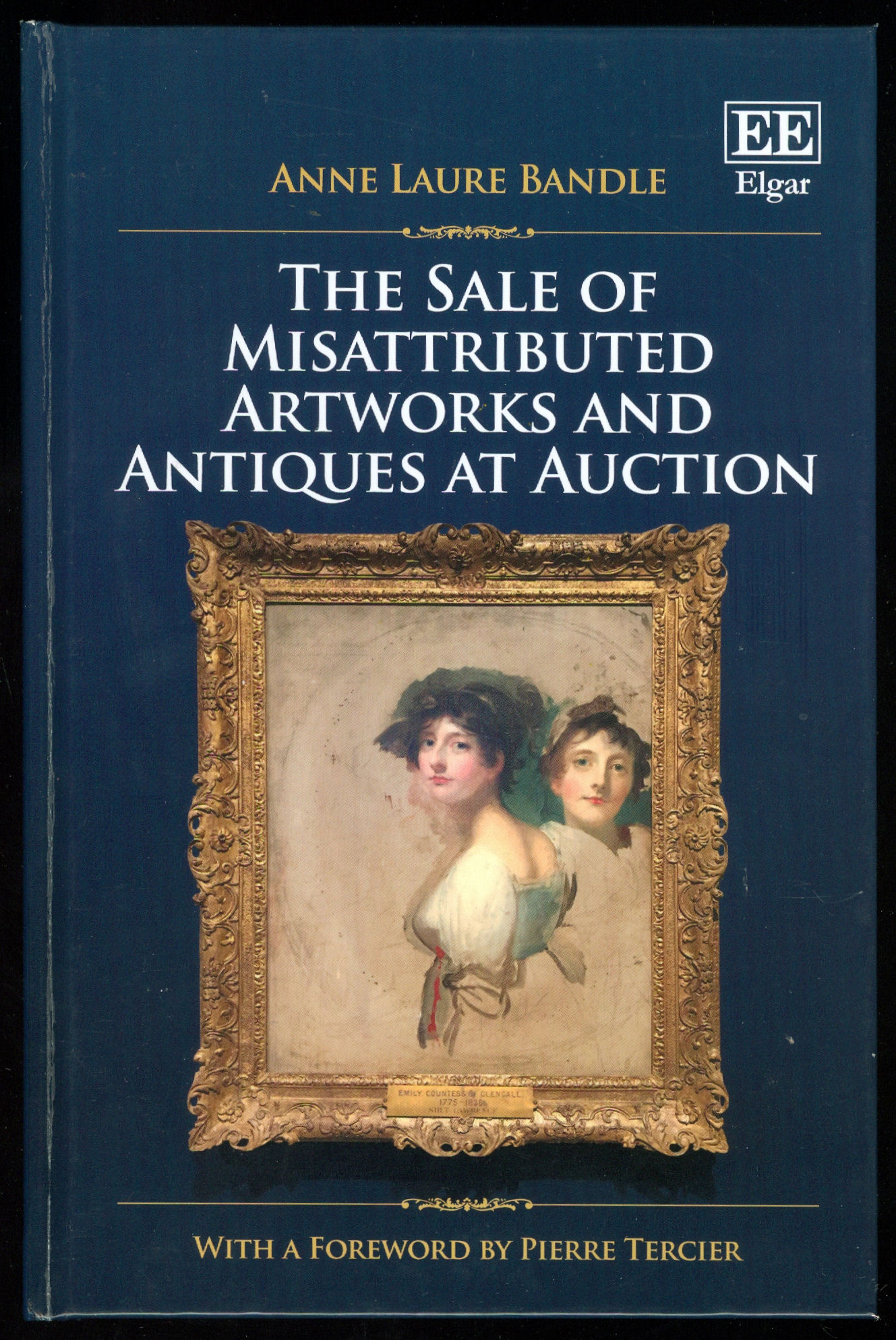
Above, Fig. 2. In “The Sale of Misattributed Artworks at Antiques at Auction” by Anne Laure Bandle of the London School of Economics and a director of the Art Law Foundation (Geneva), we encounter a book greatly richer and more urgently required than what is simply “said on its tin”. This work, the product of a PhD at the LSE, deftly turns over the law with regard to art market workings as encountered and applied under three key (for the art market) systems of law, those of Swizterland, England and the United States. Under all three it is shown how the auctioneer’s primary duty is to the seller (the consignor) not the buyer. It follows therefore that failing to identify the proper status of a work of a work when conferring an attribution can/should carry penalties of compensation to the consignor. However, in response to this duty/financial danger, auctioneers insert massive disclaimers of liability into their contracts and attributions. These disclaimers are also widely appreciated in terms of warnings to buyers of a need to satisfy themselves of the validity, accuracy and reliability of any catalogue description before buying. Such self-protective clauses have consequences that can bite hard on those who apply them. For one thing, we would add, forgers have not been slow to notice them.
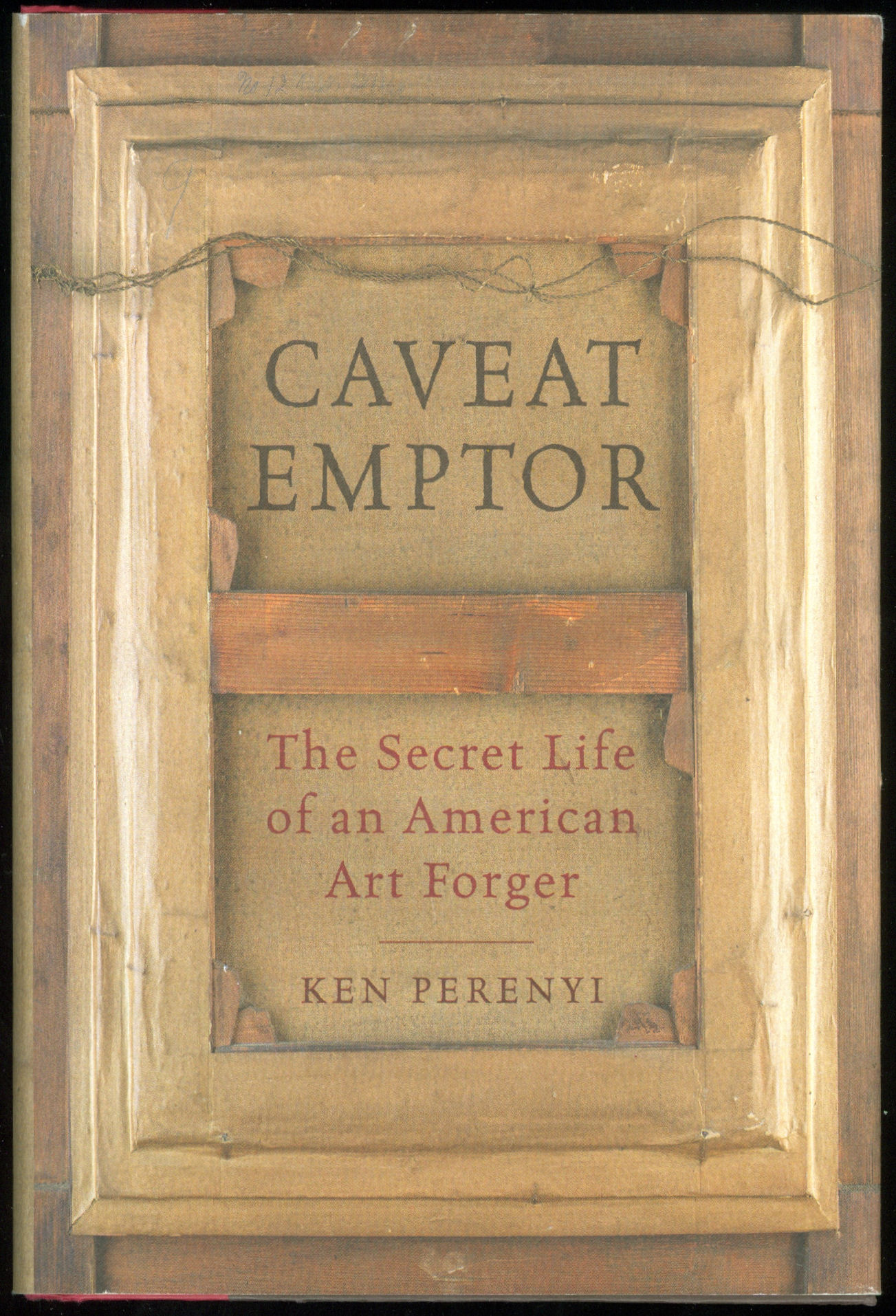
Above, Fig. 3. The American Ken Perenyi, cheekily called his 2012 Forger’s Memoir Caveat Emptor – The Secret Life of an American Forger. With little interest in consignors’ rights – he being both the knowing maker and the eager consignor of forgeries – Perenyi, after first studying the terminology of attributions in London auction house catalogues (“Attributed to; Signed; Studio of; Circle of; Manner of…”) swiftly moved to “Conditions of Business”; “Limited Warranty”; and thence “Terms and Conditions”. He reported (pp. 228-247) that when in London he noted that:
“In what can only be described as a masterpiece of duplicity, the terms and conditions made it clear (that is, if one has a law degree) that they warranted and guaranteed absolutely nothing. However, farther down, a paragraph entitled ‘Guarantee’ made it plain for even the most thickheaded. It stated: ‘Subject to the obligations accepted by Christie’s under this condition. Neither the seller Christie’s, its employees, or agents is responsible for the correctness of any statement as to the authorship, origin, date, age, size medium, attribution, genuiness, or provenance of any lot.’”
On return to the United States he then examined New York auction house catalogues: “Again and again we saw the phrase neither Christie’s nor the consignor make any representations as to the authorship or authenticity of any lot offered in this catalogue. ‘Hell, they don’t guarantee anything [over] here either!’ I said.”
After reading a paragraph on forgeries stating that if within five years of a sale the buyer could establish “scientifically” that a purchased painting was a fake, the “Sole Remedy” would be a refund of monies paid [- But for a cautionary case-in-point today, see UPDATE , below] Perenyi concluded the following: “A) Virtually nothing sold here was guaranteed to be what it claimed to be, B) Neither the auction house nor the seller assumed any responsibility whatsoever, C) Even if a buyer discovered a painting to be an outright fake, all he could do was ask for a refund, I came to the conclusion that this was an engraved invitation to do business.”
His late partner, José, concluded “Well, maybe we could save people the trouble of going to London and sell them [Perenyi’s forgeries] right here!”

In her new book, Dr Bandle carries the full terms and conditions of three auction houses (Christie’s, Koller Auctionen’s and Sotheby’s) as an appendix. She notes that notwithstanding disclaimers, such is the volume and reach of art sales that many art market players take auction house catalogues as reference points on the identification and evaluation of art and antiques and do so particularly with regard to attributions, confidence in which confers authority and engenders trust. In this regard the “sleeper”, as an under-identified and therefore under-valued work, is a special problem. A (conceptually subtle and fascinating) chapter is devoted to the sleeper’s elusive and problematic character. In fact, a delight of this book is its constant precision, economy and deftness of language in what is a perpetually shifting and re-forming arena where the market structures have both democratised and globalised the ownership of art but where buyers gathered from around the globe must compete in heated races to acquire multi-million valued art in spectacular shows of competitive bidding that are over in minutes. In a recent double television celebration of Christies-in-the-World, the term “buyer’s remorse” was heard in counterbalance to auctioneers’ seductively whispered advice to “think how terrible you will feel tomorrow if you don’t get this”.
A “sleeper” is first identified as being not a legal term but a figurative illustration of a legal problem. It is one that fleshes the notion that an artwork can remain a “dormant treasure” until it is properly identified. If not so identified, it stands dangerously (to auctioneers, and expensively to consignors) as a work that has been “undervalued and mislabelled due to an expert’s oversight and consequently undersold”. Sleepers are products of three types of error and each receives its own section. The extent to which restorations aiming and claiming to recover original conditions may alter objects and mislead authenticators is examined.
(But for our specialised concerns, recognition of the inherently problematic nature of restoration’s role in the identification and subsequent elevation of authenticity is a rare instance of under-examination in this book. Stripping off later materials does not in itself recover original states. It may disclose little more than badly damaged remains of an earlier, more “authentic” state. How much repainting, or “retouching” as it is euphemised, should be considered permissible before a worked-over sleeper approaches a forged recovery of authenticity? – See “A restorer’s aim – The fine line between retouching and forgery”.
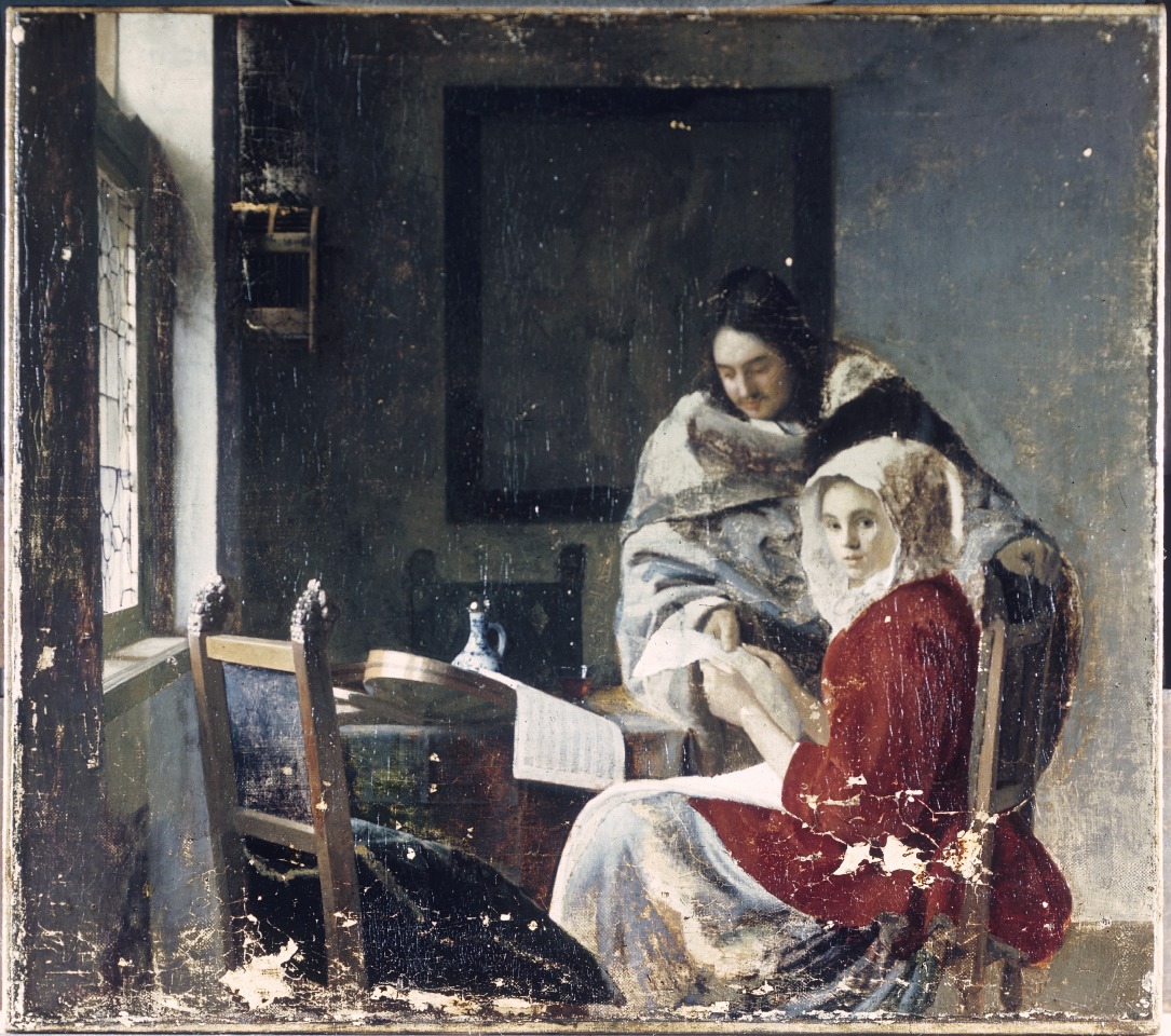
It should be said that sensitivity in this arena is not an art market-confined problem: the Frick Museum does not publish the photograph below – Fig. 6 – of a stripped-down, not-yet repainted Vermeer that the Getty Institute holds and makes freely available – and many museums, in our experience, sit on photographs of their own restoration-wrecked paintings.)
Dr Bandle’s section on the relationship between sleepers and fakes or forgeries, between the unrecognised and the counterfeit, is adroitly introduced: “sleepers are the negative reflection of counterfeits: both are held as something that they are not.” Fine distinctions are drawn between a fake and a forgery. Both are characterised “negative concepts, referring, as they do, not to qualities but to their absences.” Before considering the legal status of sleepers, a fascinating examination is made of the tools and methods of attribution. So examined, too, are the hoped-for instruments of probity, the best-practice and ethical codes for authentication and dealing. Like auction house terms and conditions, ethical codes are shown carry their own disclaimers: “Similarly, the Swiss Association of Dealers in Antiques and Art contains a disclaimer of the attribution and appraisal’s accuracy.” (One hears a Perenyi expletive of delight here.) As for auction houses, while they “issue attributions in sale catalogues, they are not considered to be formal authentication reports”, whatever weight they might carry in the market and for buyers.
The section on the “Essence of Attribution” might be considered essential reading for all art market players and commentators, not least because the art market “greatly relies on scholarship”, and such expert appraisal is uniquely challenged “by the peculiarities of the art world” – one of which is that however long debates rage, scholars themselves “may very well never achieve a consensus”, in which case, the circularity is complete: “scholarship cannot halt during the art object’s identification process by establishing an attribution, not even temporarily”. Like painting the Forth Bridge, attributing an art object can be “an ongoing undertaking that never settles”. Existing attributions are constantly subject to challenge or revision.
The law itself can seem helpless or exasperated in the face of art world processes. Elusive notions of authenticity tax judges as well as scholars. With regard to establishing the merit or applicability of warranties of authenticity or the diligence of experts, even the admission of testimony is problematic within both Swiss civil law and the English and United States traditions of common law. Swiss courts can commission reports and instruct experts to answer set questions. Under common law conflicting parties support their rival positions by calling rival and conflicting experts. Courts may confine these adversarial jousts to “that which is reasonably required”. Under US Federal rules courts may exclude what they consider “unreliable expert testimony” and even when testimony is based on scientific principles it may be held acceptable only when these principles have “gained general acceptance”.
Under Swiss, English and United States jurisdictions alike, contractual relationships governing art auction sales are not clearly defined by law and are subject to scholarly debate (which, as mentioned, is a never-ending process). Further complications arise from the dual and conflicted position of the auctioneer. Does he really serve the buyer’s or the seller’s interest – or, somehow, both? In practice, we might think, he should/must aim to serve both since different people must always be persuaded any moment that it is a “good time” to sell and a “good time” to buy. Failures to recognise “sleepers” are the mirror image of failures to recognise fakes or forgeries: the one injures consignors’ interests, the other those of the buyer. But how to stay out of trouble as an auctioneer when case law results in unclear and unreliable notions of liability – and while there is a requirement to perform diligently but not one to produce to specific results?
By increments the law emerges as unfit for its presently allotted purpose in resolving sleeper disputes. Auctioneers are judged by standards predicated on what is little more than a fiction. Standards of performance must be interpreted on a case-by-case basis but these provide no benchmark in cases of sleepers sold at auctions. Aside from these problems, judges generally lack connoisseurship in art and art auction sales and may have difficulty in assessing authenticity and in reconstructing the attribution process – and while this is understandable because art connoisseurship and art market mechanisms are both highly sensitive and influential forces, judges, no matter how well educated and competent in other areas of the law, will struggle to redress a present structural imbalance between the interests of (favoured) buyers and (disfavoured) consignors.
Can applications of the law be made to work in this arena? Are alternatives to the law presently or potentially available? For answers to these questions it is necessary to read the concluding section of a timely book that will commend itself to Art’s players and watchers alike.
The Sale of Misattributed Artworks and Antiques at Auction, Anne Laure Bandle. ISBN: 978 1 78643 100 4 Price £100 or Web: £90
Michael Daley, 15 December 2016
UPDATE 17 December 2016
In the 17/18 December Financial Times “The Art Market”, Melanie Gerlis writes:
“ Art is notoriously a ‘buyer beware’ market, but even prolific professionals can get caught out. Micky Tiroche, a private dealer in London and co-founder of the Tiroche auction house in Israel, bought ‘Sun and Stars’, a gouache attributed to Alexander Calder, for £28,000 (with fees) at Bonhams, London in 2007. The purchase was made through his dealing company, Thomas Holdings, which has about 160 works on paper by Calder.
“In 2013, the gouache was submitted, along with other works, to the Calder Foundation in New York, which doesn’t officially authenticate the artist’s works but gives them an inventory number (known as an ‘A-number’ because the digits are prefixed with the letter A). ‘Sun and Stars’ was not given an A-number, making it effectively unsellable.
“Christie’s, Sotheby’s and now Bonhams will not sell Calder works that do not have an A-number.
“Tiroche, who buys frequently at Bonhams as well as elsewhere, says that he asked the auction house for a refund and was refused. He has suggested alternative, less visible ways of refunding (such as deducting its value from other works) and legal letters have been exchanged, but to no avail.
“A spokesman for Bonhams said: ‘It is [the auction house’s policy] not to discuss individual cases, beyond saying that we are in communication with Mr Tiroche’s company about the situation.”
Fake or Fortune: Hypotheses, Claims and Immutable Facts
We have received two communications on “La Bella Principessa”, which drawing some take to be by Leonardo da Vinci. One came from the work’s owner, the other from a disinterested scholar in confirmation that the work could not, for reasons of arithmetic and plain physical facts, have been made by Leonardo for inclusion in a book.
THE DRAWING
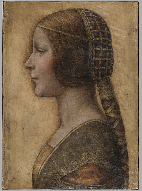
Above, Fig. 1: The full vellum sheet of the proposed Leonardo drawing “La Bella Principessa”.
THE DRAWING’S CLAIMED ORIGIN
This drawing was presented anonymously to the world in 1998 without authorial ascription and without an atom of provenance. When claims of autograph Leonardo authorship were made after barely a decade, it became necessary to fill a five-hundred years long void of records in order to dispel suspicions of forgery or pastiche. In 2010 Professor Martin Kemp bundled together what he held to be a “barrage of evidence – stylistic, historical or technical” that somehow provided collectively what no individual parts constituted: proof that Leonardo da Vinci was the author of what he (Kemp) dubbed “La Bella Principessa”. Thus, a collection of not-evidence was vested with quasi-evidential force on a circular, question-begging appeal to the claimed authority of a “sustained, collective sense that the portrait ‘belongs’ to Leonardo and contributes something new to the Leonardo we currently know.”
Although some scholars (chiefly Italian) were persuaded by the claims, for the consensual majority who did not see Leonardo’s hand in the drawing, Kemp’s methodological ju-ju gained no traction. His claims were advanced in a portmanteau book of collective advocacy, La Bella Principessa – The Story of the New Masterpiece by Leonardo da Vinci, which he co-wrote with Pascal Cotte of Lumiere Technology (the firm hired by the drawing’s owner, Peter Silverman, to conduct technical research) and which carried highly supportive contributions by Peter Paul Biro, Eva Schwan, Claudio Strinati and Nicholas Turner; London, 2010 (– see pp. 187-88).
THE THREE STITCH HOLES
During Pascal Cotte’s technical analysis of the drawing it was noticed that three holes are present on the left-hand edge. Cotte took these to “prove that it originally came from a book or a manuscript” (- Kemp/Cotte 2010, p. 113). Working with Mr Cotte, Prof. Kemp proposed that the hypothetical book might well have been a collection of celebratory poems of Bianca Sforza who had died in childhood and that “La Bella Principessa” had been made as an illustration to such a book.
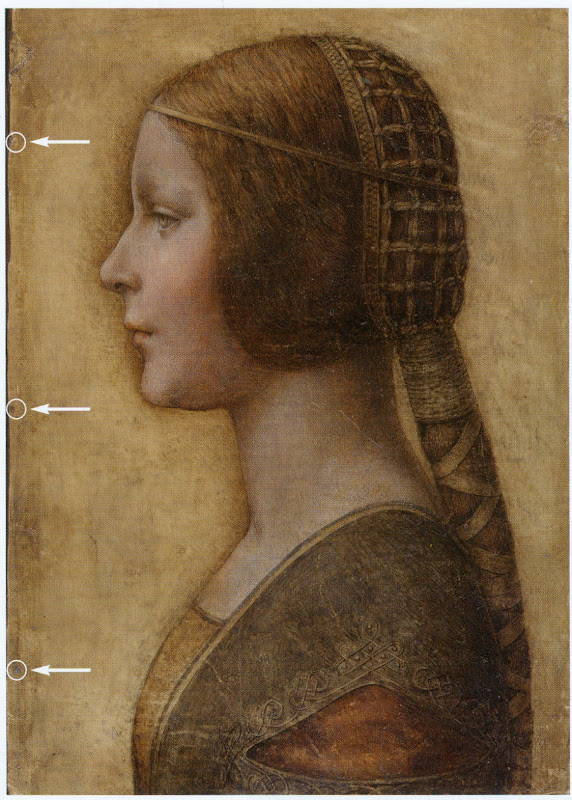
Above, Fig. 2: “La Bella Principessa” with Pascal Cotte’s indicated locations of the three supposed stitch holes.
Kemp’s elaborate hypothetical advocacy constituted a daisy-chain of improbabilities. This is a drawing made in the manner of a distinctive (and invariably painted) profile portrait type that is nowhere encountered in recorded Leonardos – and, indeed, this is the very type which Leonardo famously subverted with his own revolutionary plastically dynamic figural innovations. Within the rigorous constraints of the strict profile type, this drawing’s supposedly high-born subject is bereft of the customary/requisite opulence in clothing and jewellery. The eccentric iconography was made on an atypical support – vellum. It was drawn, Kemp holds, either directly from the subject in celebration of her wedding, or, as a commemorative portrayal after her death and thus made either in recollection or from some other depiction. No explanation was offered for how this single image might have resulted from two radically different circumstances of execution.
THE CLAIMED CORRESPONDENCE BETWEEN THE “LA BELLA PRINCIPESSA” DRAWING AND THE WARSAW SFORZIAD
On a suggestion from Professor David Wright, Kemp proposed that this from-life or post-death portrait had been made to be incorporated within a large, heavy book of the mid-1490s that is now housed in Poland, the so-called Warsaw Sforziad. In the wake of a great deal of (Kemp and Silverman-activated) archival research which found no mention of any work resembling “La Bella Principessa”, it can be seen that without this claimed Warsaw connection, the drawing would remain what it was on its 1998 debut: a stylistically untypical and unprecedented work without any history – the inclusion of which within Leonardo’s oeuvre would, in Prof. Kemp’s own advocacy, “contribute something new to the Leonardo we currently know” and “reveal a previously unknown dimension to the way in which he fulfilled his duties at the court of Duke Ludovico Sforza”. (Kemp/Cotte, 2010, p. 188.) Without history, that is to say, other than the time it is now said to have been in the possession of the restorer/painter Giannino Marchig, the late husband of the anonymous vendor in 1998.
It has been claimed many times that a ‘match’ exists between the drawing’s holes and the book’s stitches but, aside from the small format photo-diagram at Fig. 3, this has never been demonstrated or independently corroborated. Similarly, it has been said that carbon dating tests established that the vellum sheet on which the drawing was made is of an age securely consistent with a drawing being made by Leonardo in the mid-1490s. This claim is seriously misleading, as is shown below.
THE TESTIMONY OF HOLES
Before Prof. Wright’s suggestion, in 2010 Pascal Cotte regarded the three holes on the drawing’s left-hand edge as evidence that might identify incorporation within a specific book:
“It would be interesting to use the evidence of the nature and placement of these needle holes to look for other surviving quires from the same codex, which, with other physical clues, might shed further light on the provenance and original commission.”
(Kemp/Cotte, 2010, page 113.)
Cotte’s hope was reasonable but such testimony can cut both ways. Establishing a relationship between the drawing and a particular book requires an exact correspondence between the drawing’s holes and a book’s stitches. Two separate claims were made of a discovered fit with the Warsaw Sforziad, first by the drawing’s owner, Peter Silverman, and then jointly by Martin Kemp and Pascal Cotte. Both occasions were filmed by National Geographic but only the second was broadcast. In it, Kemp expressed himself as being 80% confident. The presently claimed location of the drawing is at the front of the Sforziad. Clearly, the credibility of what is now a 200 million euro-insured drawing that is stored in the Geneva Free Port depends greatly on confidence being maintained in this claimed connection.
Above, Fig. 3: A facsimile of “La Bella Principessa” inserted into the Warsaw Sforziad with five arrows marking the
book’s stitches and three circles in which matches are claimed, but are not evident, between the drawing’s holes and
the book’s outer and central stitches. (The stitch marked by the right-hand arrow is shown in close-up below at Fig. 5.)
As previously shown, our colleague in ArtWatch, Dr Kasia Pisarek, has catalogued very many discrepancies between the drawing and the book, the most problematic being that the former has only three stitch holes, when the latter was bound with five stitches. To cope with this material/arithmetical incompatibility, Kemp and Cotte conjured two hypotheses.
The first was that the book had originally been bound with only three stitches and that at some undated point the drawing had been removed during a rebinding in which two extra stitches were added to the book. That (unsupported) contention was technically implausible: the book is too large and heavy to be supported by just three stitches – and
both of its sister volumes in London and Paris were bound with five stitches.
The second, and now preferred, hypothesis is that the book was indeed originally bound with five stitches and that, as
a part of this book, the drawing originally possessed the requisite five stitch holes, two of which had subsequently been cut off from the sheet. We demonstrated the impossibility of that claim in an earlier post. (To recap briefly: as Cotte had acknowledged in 2010, stitch holes are always made in a straight line along the crease in a group of folded sheets. Given that a central and two outer stitch holes are all present on the “La Bella Principessa” sheet, any original intermediary stitch holes would necessarily be found in alignment with the present three holes on the sheet as it is today.)
In addition to the absence of the two requisite stitch holes, the sheet itself is a mismatch in terms of colour, texture and size with the sheets in the book. Kasia Pisarek now adds a further mismatch:
“The follicles in the ‘La Bella Principessa’ vellum are tightly spaced, while those in the Sforziad vellum are widely spaced. This can be seen on the Polona website, where you can zoom in until you can see the follicles as dots. I remember seeing some pages where the dots were more apparent and they were definitely widely spaced.”
WHAT LIES BENEATH?
Yet another unaddressed difficulty concerns the back of the drawing. One of the earliest proponents of a Leonardo ascription, Dr Cristina Geddo, has described the presence on the reverse of the drawing of random lettering and an image of a dragon. Kemp and Cotte seem not to have offered an explanation for this content (which, presumably, was revealed by Cotte’s penetrative photography) even though they now claim that the back of the drawing would have faced the book’s beautiful and elaborately painted, symbolically-charged frontispiece. What conceivable iconographic function might such a melange have served in that strategic context of so important and precious a book? Dr Geddo has called for the vellum drawing to be removed from its (most unusual) oak panel support but the owner has declined to do so on grounds of safety. Some of the lettering is visible in an X-ray photograph published in the 2010 and 2012 English and Italian editions of the Kemp/Cotte joint book.
FIVE HOLES GOOD, THREE HOLES BAD
As we reported previously, with regard to the Three Holes v. Five Stitches conundrum, the problems for supporters of “La Bella Principessa” have now become insurmountable: Pisarek established on her second examination of the Warsaw Sforziad in the Polish National Library that while the drawing bears only three holes, the book itself was not only bound with five stitches but that each of those stitches passed through two holes that were two or three millimetres apart (see Figs. 6, 7 and 8 below). At a stroke, the previously claimed ‘fit’ between the drawing and the book is demolished: the drawing possesses only three single stitch holes when it should have five pairs of holes making ten in total. Even if it were to be conceded that two inner stitches might once have been present, today’s three single holes should be three pairs of holes, making six holes in total, not three.
AN OWNER’S RESPONSE
When we sent our previous “La Bella Principessa” post with the newly disqualifying physical/technical evidence to the drawing’s owner, Peter Silverman, (13 June), he dismissed the bearers of the information by alleging lack of expertise: “I leave the attribution question to serious and highly qualified experts!!!” In support of his professional slur, Silverman copied-in two messages to us. The first had been sent to him, at his request, by a costume expert, Elisabetta Gnigera. The second Silverman had sent to Jean Penicaut, the CEO of Lumiere Technology. It was evidently written in haste and heat:
“Dear Jean
I am sorry but we, as owners of the BP, are not to be told how and with whom to talk! I understand your frustration in dealing with Artwatch and Franck but i feel that Pisareks statement must not and cannot be left unchallenged! I therefore request you to rebut each and every point in this latest statement-most importantly of all i would like to see the INDISPUTABLE proof of the binding holes, in a first and separate email to me! Unfortunaley Martin has made statements which can be perverted by anyone in bad faith-equivocal statements quoted in the first part of the enclosed article!!
“I would like Elisabetta to comment on the costume questions.
And i would like YOU to extensively quote from the lab results of La Veneria*, which is very helpful to our cause! [*This is a reference the conservation laboratory “La Venaria Reale” which has conducted analysis of the drawing.]
“We cannot afford to lose the high ground’ in this battle-no matter the bad faith of our ennemy.
“To avoid your corresponding with them please send the rebuttal to me. I INSIST THAT THIS IS AN ABSOLUTE NECESSITY!!
Best, peter
http://artwatch.org.uk/problems-with-la-bella-principessa-part-iii-dr-pisarek-responds-to-prof-kemp/
“PS-the good news is that there is a very serious party interested in acquiring a share in the BP(highly confidential) and July 1 will be a decisive day!!!”
It would seem after more than a month that Lumiere Technology has not provided the owner with indisputable evidence of a connection between the drawing and the Warsaw book that would counter Pisarek’s account. On 14 June we replied to Mr Silverman:
“Speaking of clarification and your requests, I note the various requests from the ‘owners of the BP’ to your associates
to read our current post, and your talk of a prospective part-sale of the BP. Can I take it that the potential buyer of whom you speak has been similarly advised?
“Also, perhaps you might say how you will respond if Jean Penicaut advises you, as we would predict, that he can find
no ‘INDISPUTABLE proof of the binding holes’ that might enable you – or he on your behalf – ‘to rebut each and every point in this latest statement [in the then current AWUK post]’”?
Concerning the La Venaria Reale laboratory reports, we asked Mr Silverman on 15 June:
“On your technical ‘proofs-of-authenticity’ and our possible viewing of your Swiss-vaulted, soon-to-be part-sold drawing, might we not deal with both by: a) your sending to us all reports and data that have been made available to you; and, b) your bringing the drawing to either Paris or London so that we might arrange a group viewing by sceptics and rejecters?”
MISINTERPRETED REPORTS
After more than a month we have received no technical reports on “La Bella Principessa”. Lumiere Technology’s
apparent silence on the conflicting number of stitch holes seems remiss. In our experience it is valuable to see the reports themselves because evidence can sometimes be interpreted and presented in ways that might mislead. For example, it has been claimed (technically-speaking correctly) that carbon dating has established a 95.4% probability
that “La Bella Principessa” had been made at some point between 1440 and 1650. On that particular technical examination and very wide range of possible ages, Pascal Cotte (2010, p. 110) has claimed a number of things in a single sentence:
“This dating confirms that the portrait could well have been made in Leonardo’s lifetime, supporting Martin Kemp’s proposed date in the mid-1490s and virtually eliminating the possibility that it is a 19th century pastiche.”
This was all quite misleading. A confirmed “could well have” remains a “could have” and does not become a confirming “was”. A “virtually eliminated possibility” remains a possibility. Taken as a whole and properly appraised, the data itself cannot reasonably be said to support Kemp’s claimed date and authorship – in fact, it does the opposite.
Cotte’s claims rest on what is only a loose and very wide overall estimation of probability. While it is true to say there is a 95.4% chance that the sheet appeared at some point between 1440 and 1650, there is not a 95.4% probability that it appeared before the mid-1490s when the Sforziad was made. Even on that loose, overall range of possibilities, it would be more accurate to say that because we know (today) that the Warsaw book was made in the 1490s (and had known in 2010 that the proposed subject of “La Bella Principessa”, Bianca Sforza, had died in 1496), it is three times more likely that the “La Bella Principessa” sheet post-dated rather than predated the book. What has not been acknowledged is that within the overall figure, the probabilities had been greatly more precisely quantified.
It was said in the report, for example, that there was a 68.2% probability that the sheet was made between 1470 and 1650 and that, within this period (see Fig. 4 below), there was only a 27.2% probability that the drawing was made between 1470 and 1530 – and this was compared against the appreciably greater probability (41.0%) that the sheet was made some time between 1550 and 1650 – which would place the sheet altogether much later than Leonardo who died in 1519. Properly read, with a proposed date for the drawing set in the mid-1490s, the data shows that there was only a 13.6% probability that the “La Bella Principessa” sheet existed when the book was made. When the general 95.4% probability of an origin anywhere between 1470 and 1650 and the 13.6% probability of an origin between 1470 and 1495 are expressed as racing odds, it is seven times more likely that the sheet was made after the book than before it. And the odds of seven to one against pertain to the vellum sheet itself, not to the possible dates of execution for the drawing. Even if this sheet had once been present in that book, such a dating would indicate only the age of the material, not the date of the drawing’s execution. On this last, we should recall that Eric Hebborn advised in his The Art Forger’s Handbook that a prime source of old materials for forged drawings is obtained from blank end papers in books. Thieves cut valuable illuminated pages from books. Forgers crave blank pages but will make use of a blank side by gluing its reverse firmly to some impenetrable material.
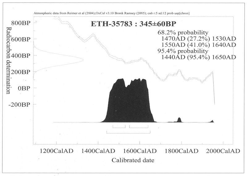
Above, Fig. 4: The carbon dating report on the “La Bella Principessa” sheet (as published by Kemp/Cotte, 2010, p. 110).
FOR THE RECORD
Where Mr Silverman declines to make reports available to us, and Pascal Cotte fails to demonstrate a fit between the drawing’s three stitch holes and the book’s ten stitch holes, we now present further visual proofs and documentary confirmation of the previously claimed mismatch to demonstrate precisely why “La Bella Principessa” could never have been part of the Warsaw Sforziad.
INSTITUTIONAL CORROBORATION
On 23 June 2016 Barbara Dzierzanowska, the Head of Department of Old Prints BN at the National Library of Poland, wrote to Kasia Pisarek:
“Dear Madam,
I would like to inform you that yesterday we entered the Treasury and re-examined the Sforziad, which has confirmed that the binding stitches are double and there are 10 holes.
Yours sincerely,
Barbara Dzierzanowska”
PHOTOGRAPHICALLY-RECORDED AND ELECTRONICALLY TRANSMITTED PROOF OF THE DOUBLE STITCHING OF THE WARSAW SFORZIAD
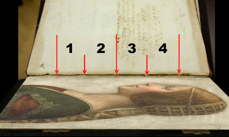
That the stitching of the Sforziad was made through double holes can be seen by eye on the book itself, as shown below at Fig. 5.

Above, Fig. 5: A stitch made through two holes, as seen on the numbered page 1 of the Warsaw Sforziad. In this photograph, the top stitch and the two flanking holes are shown but some of the other holes can also be seen on stitches below it. This stitch/holes configuration would have been evident when (as described above) a full-size facsimile of “La Bella Principessa” was inserted into the Sforziad at precisely this point. This evidence is also available online: our image was taken from the detailed record of the entire book that is carried on this site: Polona – La Sforziada.
ESTABLISHING THE TRUE DIMENSIONS
When Kasia Pisarek inspected the book for the second time, she asked that the dimensions of the pages and the relative positions of the stitch holes be marked along the edge of a piece of paper. This was done by the library’s books’ conservator in her presence and that of the chief librarian. Intervals between the stitch holes were marked in pencil along the two sides of the strip of paper and these are shown here at Figs. 6 and 7. When we marked off those measurements onto a separate sheet of paper, to prepare the diagram at Fig. 8, and then measured them on our sheet with a ruler, they were all exactly as given by Pisarek. We can be sure, therefore, that the dimensions and ratios between the stitch holes as shown below at Fig. 8 have been accurately established and physically transported to ArtWatch UK – and at practically zero-cost by means of sharp pencils and two pieces of paper.


Above, Figs. 6 (top) and 7: The strip of paper on which the book’s page size and stitch holes were recorded, as described above.
The conservator explained to Pisarek that the present positions of the stitch holes were those of the original construction of the book and that, therefore, there was no possibility that the book had once been bound with only three stitches. She made diagrams on the strip showing (at Fig. 7) different ways of executing stitching with double holes.
THE DIMENSIONS OF THE INTERVALS BETWEEN THE STITCHES IN THE BOOK – A NOTE FROM KASIA PISAREK:
1) According to Kemp and Cotte, the dimensions of the vellum pages of the Sforziad vary from 33.0 to 33.4 cm in height, while the drawing is 33 cm high.
2) I have carefully checked the dimensions with the Librarian in March 2016. All the pages are at least 33.4 cm high and more, up to 33.7 cm. The size of 33 cm would be far too small for the book.
3) The 5 holes in the book are in fact all double holes. Each of the 5 holes is two small holes, between which a string passes. The distance between the two small holes is about 3 mm. The double holes were never mentioned by Kemp or Cotte.
4) According to the conservator who was present at the time of my last visit, this is the binding that follows the original binding as there is no damage of any kind. So in total there were as many as 10 small holes, not 3 single ones as in the drawing.
5) I measured the distances between the 3 holes that Kemp and Cotte measured in La Bella Principessa. The measurements were taken from the middle of the double holes.
6) The distance between the bottom hole and the middle hole is 11.35 cm in the Sforziad, while in the drawing it is 11.06 cm.
7) The distance between the middle hole and the top hole is 11.7 cm in the Sforziad, while in the drawing it is 11.44 cm.
THE MISMATCHED HOLES AND STITCHES
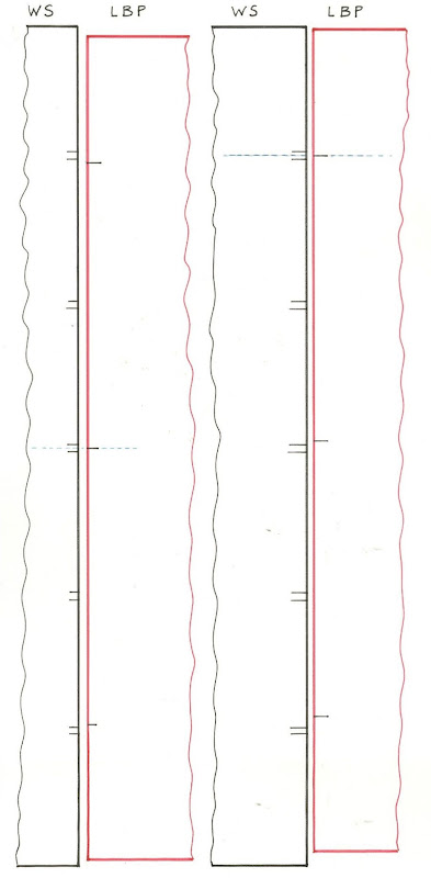
Above Fig. 8: We took the dimensions of the Sforziad’s page and stitch holes from the strip of paper marked by the Polish National Library’s books’ conservator (as shown at Figs. 6 and 7) and drew them in black, as above, and marked “WS”. We then drew in red the “La Bella Principessa” sheet (here marked “LBP”) and its stitch holes as given above by Pisarek.
As can be seen above, it is impossible to align the drawing’s single stitch holes with their claimed counterparts in the book. If the drawing’s centre hole is aligned with the centre of the two central holes in the book (as shown on the left here), its other two holes fall short of their claimed counterparts.
If the LBP drawing’s upper hole is aligned with the centre of book’s two upper holes, its central and lower holes fall progressively further short of their claimed counterparts on the book.
In short, there is no fit or match between the book and the drawing – and which drawing in all probability post-dated the book, for reasons indicated above.
Those who would continue to give this drawing to Leonardo must now find some other means of filling a five centuries absence of provenance and of squaring intractable technical circles. We will examine next the supposed left-handed execution of “La Bella Principessa”.
Michael Daley, 21 July 2016
Problems with “La Bella Principessa”~ Part I: The Look
The world famous drawing that was dubbed “La Bella Principessa” by Professor Martin Kemp is insured for $150 million and lives in a “secure vault in Zurich”. It is not a portrait of Bianca Sforza by Leonardo da Vinci, as has been claimed, but a twentieth century forged or pastiche Leonardo.
WHITHER “LA BELLA PRINCIPESSA”
In 1998 the now so-called “La Bella Principessa” appeared from nowhere at Christie’s, New York. A hybrid work made in mixed media that were never employed by Leonardo (three chalks, ink, “liquid colour”), on a support that was never used by Leonardo (vellum), and portraying a woman in a manner that is nowhere encountered in Leonardo, it was presented as “German School, early 19th century” and “the property of a lady”. It went for $22,850 to a New York dealer who sold it nine years later on a requested discount of 10 per cent for $19,000 to an art collector, Peter Silverman, who said he was buying on behalf of another (unidentified) collector whom he later described as one of “the richest men in Europe”. Thus, at that date, it was not known who owned the drawing or by whom it had been consigned to Christie’s and it remained entirely without provenance. In its nine years long life, no one – not even its new owner(s) – had taken it to be by Leonardo.
In a 2012 book (Lost Princess ~ One man’s quest to authenticate an unknown portrait by Leonardo da Vinci), Silverman claimed a successful upgrading to Leonardo and described how he had gained the support of distinguished scholars including Professor Martin Kemp who had formulated an elaborate hypothetical history in which the drawing was said to be a Leonardo portrait made either from a living subject in celebration of her wedding or in commemoration after her death in 1496.
Nonetheless, the drawing failed to gain a consensus of scholarly support and is rejected in centres like New York, London and Vienna. Carmen Bambach, the Metropolitan Museum’s Renaissance drawings authority dismissed “La Bella” on the grounds that “It does not look like a Leonardo”. Thomas Hoving, a former Metropolitan Museum director, held it to look “too sweet” to be Leonardo. ARTnews reported that the Albertina Museum’s director, Klaus Albrecht Schröder, had noted “No one is convinced it is a Leonardo”. In the Burlington Magazine Professor David Ekserdjian suspected it to be “counterfeit”.
THE LOOK OF “LA BELLA” AND THE COMPANY SHE BEST KEEPS
In matters of attribution the most important consideration is the look of a work. Many things can be appraised simultaneously but, conceptually, the “look” of a work might be broken down into two aspects: an initial at-a-glance response to a work’s effects and appraisal of its internal values and relationships; and, a comparison of the effects, relationships and values with those of bona fide productions of the attributed artist, or with those of the artist’s students, associates or followers. It can also be useful to compare the looks of works with those of copyists and known forgers. It might fairly be said that in connoisseurship, as in the evaluation of restorations, visual comparisons are of the essence. (In ArtWatch we take pride in the extent to which we seek out all possible comparative visual material and regret that some institutions still hinder our efforts in this regard.)
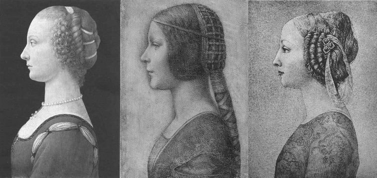
Above, Fig. 1. If we put aside questions of attribution and simply look at the group above, we find works of remarkably similar figural motifs and formats that clearly relate to and derive from a most distinctive type of 15th century Italian profile female portrait. These similar-looking works are similarly sized, being, respectively from left to right:
A Young Woman, 14 and 1/4 x 10 inches;
“La Bella Principessa”, 13 x 9 and 3/4 inches; and,
A Young Woman, 18 x 12 1/2 inches (here shown mirrored).
All show young women depicted in the strict early Renaissance profile convention made in emulation of antique relief portraits on coins and medals. Although very widely encountered (see Fig. 4), Leonardo side-stepped the type in order to intensify plastic and expressive values with sculpturally-purposive shading and axial shifts in the bodies and gazes of his portraits (see Fig. 6). The portrayals above are strikingly similar in their head/torso relationships; in their absences of background; in their highly elaborated coiffures which offset ‘sartorially’ skimped and unconvincing simplifications of costume; in their sparse or wholly absent depictions of jewellery; and, even, in their almost identically cropped motifs. Collectively they might be taken as a suite of variations on a simple theme. We take all three to be twentieth century Italian artefacts. At least two of them are linked to Bernard Berenson and the two on which reports have been published have unusual and problematic supports.
As mentioned below, the Detroit picture is painted on top of photographic paper. It is suspected that it might have been a photograph of the Frick sculpture to which the painting was initially related. The “La Bella Principessa” is drawn, exceptionally for Leonardo, on a sheet of vellum which appears to have been removed from a book and it is, most unusually, glued to an oak panel. The panel itself is a curiosity: although a number of “butterfly keys” have been inserted into its back, as if to restrain splitting, there is no evidence of splits in the panel and, if there were, the present four such keys in such a small panel might be considered restoration “over-kill”. If the panel had split while the vellum was glued to it, the drawing would have split with the panel. The fact that the vellum has been “copiously glued” to a (possibly pre-restored) oak panel makes it impossible to examine the back of the drawing which is said by one of its proponents, (Cristina Geddo, an expert in Leonardo’s students and Milanese “Leonardesques”) to bear “superimposed numbers…a written inscription…[and a] little winged dragon – at least that is what it seems.” For Geddo, this unexamined content is reassuring: “This feature, too, counts in favour of an attribution to Leonardo, who, even though he never to our knowledge used a parchment support in his work, was in the habit of re-using the paper on which he drew.”
(In reading the compendious literature on this proposed attribution, we have sometimes wondered what might be allowed by its supporters to count as evidence against the attribution.)
CONSIDER THE HISTORIES
The portrait on the left, A Young Woman, was bought in 1936 by the Detroit Institute of Arts as by Leonardo da Vinci or Andrea del Verrocchio. The institute’s director, W. D. Valentiner, made this attribution on the strength of clear correspondences with the curls in the hair of Leonardo’s painting Ginevra de’ Benci (see Fig. 6) in the National Gallery of Art, Washington, and with those found in the above-mentioned marble sculpture in the Frick Museum, A Young Woman, given to Andrea del Verrocchio. (Valentiner had made a study of Leonardo’s work in Verrocchio’s workshop.) In 1991 Piero Adorno, specifically identified the Detroit picture as Verrocchio’s lost portrait of Lucrezia Donati. Notwithstanding seeming correspondences with secure works, this picture is now relegated to “An Imitator of Verrochio” – and this is an extremely charitable formulation. In Virtue and Beauty, 2001, David Alan Brown described it as “a probable forgery by its anachronistic materials and unorthodox construction”. “Probable” [!] because: “after a recent technical examination, the picture turns out to have been painted on photographic paper applied to a wood panel that was repaired before it was readied for painting. And at least one of the pigments employed – zinc white – is modern…” Valentiner judged one of two Leonardo studio works of the Madonna with a Yarnwinder to be “more beautiful than the Mona Lisa”.
The portrait on the right, A Young Woman, was attributed to Piero Pollaiuolo by Berenson in 1945. While this figure is perhaps the most attractive of the above three, with its nicely constructed counterbalancing of the thrusts in the neck/head and torso, and its credibly proportioned arm, the work itself has, so far as we can ascertain, sunk without trace. In truth, this female profile portrait type has been assailed by forgeries. Alison Wright notes in her 2005 book The Pollaiuolo Brothers, that “Complications for the historian lie both in the fact that the subjects of most female portraits are no longer identifiable and that, because of their exceptional decorative and historical appeal, such portraits were highly sought after by later nineteenth- and early twentieth-century collectors, encouraging a market for copies, fakes and over-ambitious attributions.”
The portrait in the centre (“La Bella Principessa”) has been precisely attributed by Kemp to Leonardo as a book illustration portrait of Bianca Sforza of 1495-96.
DISTINGUISHING BETWEEN THE LOOKS OF THEN OF NOW
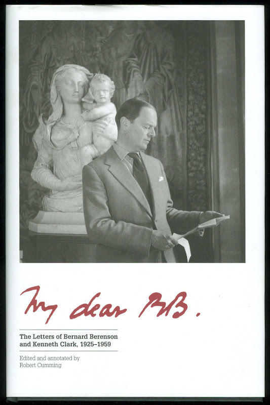
Above, Fig. 2. In My dear BB (an incalculably valuable new resource edited and annotated by Robert Cumming), we learn that in November 1930 Kenneth Clark’s wife, Jane, wrote to Berenson: “K has seen Lord Lee’s two new pictures…The Botticelli Madonna and Child you probably know too. K thinks the latter may be genuine about 1485 or rather part of it may be, but it is not a pretty picture…” A footnote discloses that Lee had bought The Madonna of the Veil, a tempera painting on panel in 1930 from an Italian dealer for a then huge sum of $25,000 (Fig. 3). It was widely accepted by scholars as autograph Botticelli and published by the Medici Society as a “superb composition of the greatest of all Florentine painters”. Clark, doubting the attribution on sight, objected that it had “something of the silent cinema star about it” – and he likened the Madonna to Jean Harlow (Fig. 3). Lee donated the picture to the Courtauld Institute Gallery in 1947. In June 2010 Juliet Chippendale (a National Gallery curatorial intern working in association with the Courtauld Institute MA course) disclosed that scientific examination had identified pigments not known before the 18th and 19th centuries and worm holes that had been produced by a drill. It is now designated a work of the forger Umberto Giunti (1886-1970), who taught at the Institute of Fine Art in Siena and forged fresco fragments.
ART HISTORICAL SILENCES
Four months later Clark wrote to Berenson: “Just in case Lee has sent you a photograph of his new Botticelli may I ask you to forget anything Jane may have reported me as having said of it. It is one of those pictures about which it is best to be silent: in fact I am coming to believe it is best for me to be silent about every picture. Did I tell you that my Leonardo book was a mare’s nest. The man had sent photographs of two drawings from the middle of the Codice Atlantico. They must have been early copies done with some fraudulent motive – perhaps the book really did belong to Leonardo – he certainly had read it – & some pupil thought to enhance its value.”
Above Fig. 3. The young Kenneth Clark (then twenty-seven years old) displayed an admirable “eye” by spotting a fraud on sight some eighty years ahead of the pack. Is it better for a connoisseur to see but not speak than it is not to see at all? Undoubtedly, it is. Would Clark have enjoyed his meteoric rise had he humiliated the mighty and exposed the big-time fraudsters of his day? (That question might be taken as self-answering.) If Clark bided his time on Berenson, eventually he delivered an unforgiving former-insider’s repudiation in 1977 by chronicling how Berenson had “sat on a pinnacle of corruption [and] for almost forty years after 1900… [done] practically nothing except authenticate pictures”
PRETTY – AND NOT SO PRETTY – WOMEN
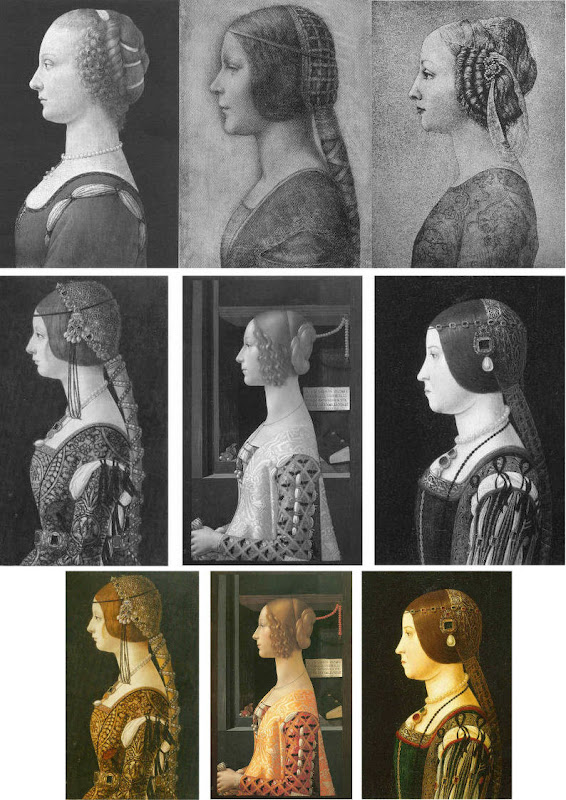
Above, Fig. 4. In the middle and bottom rows we see three bona fide works of the female profile type – respectively:
Portrait of Bianca Maria Sforza, c. 1493, by Ambrogio de Predis, The National Gallery of Art, Washington;
Domenico Ghirlandaio’s 1488-1490 Giovanna degli Albizzi Tornabuoni, Museo Thyssen-Bornemisza, Madrid; and,
a portrait of Beatrice d’Este tentatively attributed by Kemp to Ambrogio da Predis.
The differences between this trio and the works in the top row are pronounced and eloquent. The secure works are highly individuated and immensely richer in their effects. Collectively, they do not constitute an inadvertent suite. Individually, they are greatly more various compositionally. Collectively, they are markedly richer in jewellery and ostentatiously sumptuous costumes. The distinctive physiognomies of their subjects derive from living persons, not from other art or photographs of other art. Flattery and loving attention are channelled more into the costume and bling than into the facial features. In every respect the opposite is the case in the top row where prettiness has been held at a premium with an eye on the modern photographically-informed market.
LEONARDO BREAKS THE MOULD
Above, Fig. 5: As mentioned, “La Bella Principessa” and her two companions are of a piece, and of a type never followed by Leonardo whose female portraits (see below) pioneered an unprecedentedly complex and sophisticated evocation of real, sculpturally palpable women in tangible spaces or landscapes. To include the figurally impoverished and stylistically anachronistic “La Bella Principessa” in Leonardo’s oeuvre would disjunct his revolutionary arc of insights and innovations in portraiture. Such inescapably disruptive consequences have been ceded tacitly by Kemp, “La Bella Principessa’s” principle defender – some say advocate. In “La Bella Principessa ~ The Story of the New Masterpiece by Leonardo da Vinci” (Kemp’s 2010 book jointly written with Pascal Cotte of Lumiere Technology and including chapters by the drawings scholar Nicholas Turner and the recently discredited fingerpints expert Peter Paul Biro), Kemp converts an intractable problem into an asset by begging the essential question. That is, he underwrites “La Bella’s” credibility on an assertion that “Any important new work, to establish itself, must significantly affect the totality of Leonardo’s surviving legacy over the longer term.” Without question, the de-stabilising inclusion of “La Bella Principessa” would produce knock-on effects, but arguing backwards from that predictable disturbance to some endorsement of its source is patently unsound methodologically – the inclusion of any atypical work, whether bona fide or forged, into an oeuvre would affect its “legacy”.
LEONARDO’S ACCOMPLISHMENTS
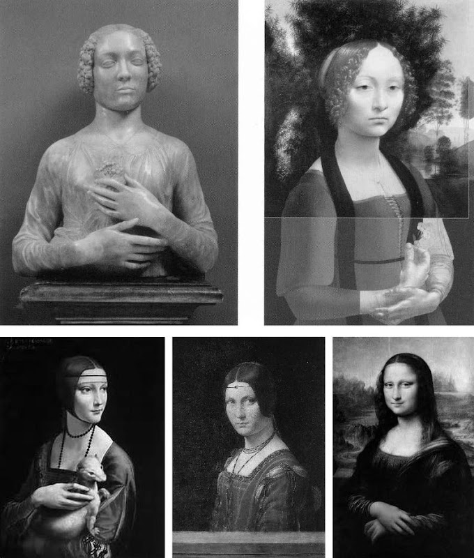
Above, top, Fig. 6: Left, Andrea del Verrocchio’s Lady with a Bunch of Flowers of c. 1475; and (right) Leonardo’s (hypothetically extended) Ginevra de’ Benci of c. 1474-1478.
Above, Fig. 7: Left, Leonardo’s The Lady With an Ermine of about 1489-90; centre, Leonardo’s La Belle Ferronnière of about 1495-96; right, Leonardo’s Mona Lisa (La Giaconda) of about 1503-06 onwards.
In the group above we see extraordinary development in Leonardo’s portraits of women over the last quarter of the fifteenth century as he strove to incorporate the entirety of sculptural, plastic, figural knowledge, and to surpass it by making it dance to an artistically purposive tune liberated from the happenstance, arbitrary lights of nature on which sculpture then necessarily depended. Some have attributed the Bargello sculpture, the Lady with a Bunch of Flowers, to Leonardo on the grounds that its subject was Ginevra de’ Benci, the subject of Leonardo’s painting. Others have seen Leonardo’s authorship of it in the beauty of the hands. In Leonardo da Vinci and the Art of Sculpture, 2010, Gary M. Radke holds that the two works show differences that emerged in the mid-1470s between the two artists. Against this, it has been suggested that the painting might originally have borne a closer relationship to the sculpture with a possible inclusion of hands in a fuller length treatment. A study of hands by Leonardo was incorporated in a hypothetical and digitally realised extension of the painting by David Alan Brown (Virtue and Beauty, 2001, p. 143). Frank Zollner sees the painting as marking the point (1478-1480) at which Leonardo broke away from “the profile view traditionally employed in Florence for portraits of women” in favour of the three-quarters view in order to impart “a pyschological dimension to his sitter – something that would become the hallmark of Renaissance portraiture”. Which is all to say that Leonardo had broken away from the profile convention some sixteen to eighteen years before, on Kemp’s hypothesis, he made a solitary and exceptional “return” to it.
Speaking of the reconstruction of Leonardo’s Ginevra de’ Benci painting, Brown writes:
“Ginevra’s portrait, the lower part of which was cut down after suffering some damage, may have included hands. A drawing of hands by Leonardo at Windsor Castle, assuming it is a preliminary study, aids in reconstructing the original format of the picture. As reconstructed, Leonardo’s portrait may be seen to have broken with the long-standing Florentine convention of portraying women in bust-length profile. In seeking an alternative to the static profile, Leonardo, like Botticelli, seems to have turned to Verrocchio’s Lady with a Bunch of Flowers in the Bargello, Florence. Because of the sitter’s beautiful hands which mark an advance over the earlier head-and-shoulders type of sculpted bust, the marble has even been attributed to Leonardo. But the highly innovative conception of the half-length portrait bust is surely Verrocchio’s achievement. What young Leonardo did was to was to translate this sculptural protype into a pictorial context, placing his sitter into a watery landscape shrouded in a bluish haze…”
A CASE CONSPICUOUSLY NOT MADE
For the owner and the art historical proponents of “La Bella Principessa”, the very chronology of Leonardo’s female portraits constitutes an obstacle. Given Leonardo’s famous eschewal of strict profile depictions of women, the onus is on those who would include “La Bella Principessa” (- albeit as a solitary and exceptional stylistic regression that was undertaken without ever attracting attention or comment) to make a double case.
First, they must show how and where “La Bella Principessa” might plausibly have fitted within the trajectory of Leonardo’s accepted works. Second, they must demonstrate by comparative visual means that “La Bella Principessa” is the artistic equal of the chronologically adjacent works within the oeuvre. Kemp has proposed the precise date of 1495-96 for the execution of “La Bella Principessa” but, conspicuously, has not presented direct, side-by-side visual comparisons with Leonardo’s paintings. Instead of comparing “La Bella Principessa” of 1495-6 directly with Leonardo’s La Belle Ferronnière of about 1495-6, Kemp writes:
“If the subject of Leonardo’s drawing is Bianca, it is likely to date from 1495-6. In style, it seems at first sight to belong with his earlier works rather than to the period of the Last Supper. However, Leonardo was a master of adapting style to subject. Just as his handwriting took on an earlier cast when he needed to adopt a formal script, so his drawing style could have reverted to a meticulous formality, appropriate for a precious set-piece portrait on vellum of a Sforza princess.”
“If”? “Could have”? “At first sight”? The pro-attribution literature is bedecked with daisy-chains of such tendentious and weasel words and terms. With which earlier works is “La Bella Pricipessa” deemed to be artistically comparable or compatible? With the Ginevra de’ Benci of c. 1474-1478? With The Lady With an Ermine of about 1489-90? Never mind the red herrings of handwriting and the giant, near-obliterated historical figures of the Last Supper, what of the relationship with Leonardo’s (supposedly) absolutely contemporaneous La Belle Ferronnière of 1495-96? (On this last we volunteer a pair of comparisons below.)
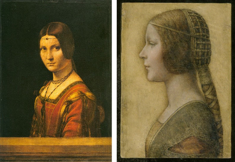
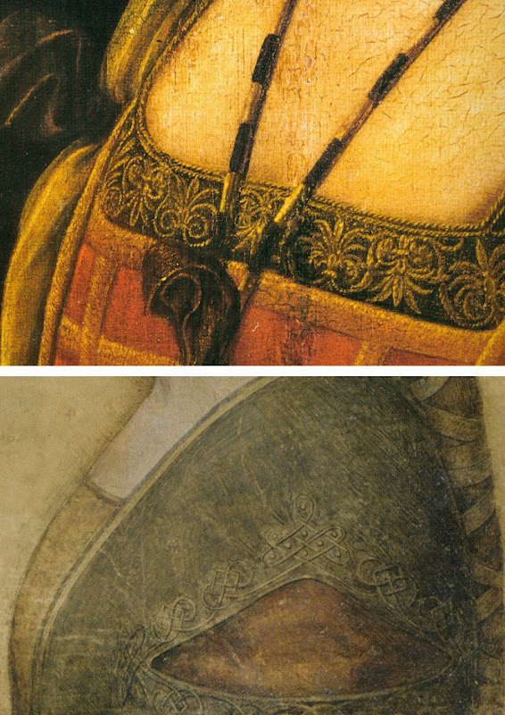
Above, Top, Fig. 8: Leonardo’s La Belle Ferronnière, left, and the “La Bella Principessa”.
Above, Fig. 9: Details of Leonardo’s La Belle Ferronnière, left, and the “La Bella Principessa”.
Kemp insists: “The Lady in profile [“La Bella Principessa”] is an important addition to Leonardo’s canon. It shows him utilizing a medium that has not previously been observed in his oeuvre…It testifies to his spectacular explosion and development of novel media, tackling each commission as a fresh technical challenge. It enriches our insights into his role at the Milanese court, most notably in his depiction of the Sforza ‘ladies’ – whether family members or mistresses. Above all, it is a work of extraordinary beauty.”
Even if we were to assume that for some reason Leonardo had opted to “revert” in 1496 to a type he had never employed, what might explain a pronounced indifference in “La Bella Principessa” to the detailed depiction of the “stuffs” of costume with which the artist was simultaneously engaged in La Belle Ferronnière? Given that Leonardo clearly appreciated and celebrated the fact that courtly costume required sleeves to be made as independent garments held decorously in place by ribbon bows so as to permit undergarments to peep through; and, given that Leonardo lovingly depicted not only the varying thicknesses of the costume materials but every individual twist in the threads of the elaborately embroidered band in La Belle Ferronnière, how could he possibly – when working for same ducal master, at the same time – have been so negligent and indifferent in the execution of “La Bella Principessa’s” costume? Kemp acknowledges and offers excuse for the distinct poverty of the costume: “It may be that the restraint of her costume and lack of celebratory jewellery indicates that the portrait was destined for a memorial rather than a matrimonial volume.” In so-saying, he jumps out of one frying pan into another.
If “La Bella Principessa” was made after Bianca Sforza’s death, from whence did the likeness derive? One reason why Kemp settled on Bianca as the preferred candidate subject for “La Bella Principessa” was that while (disqualifying) likenesses of the other Sforza princesses existed, none survives for her – she is an image-free figure. Kemp offers no indication of a possible means for Leonardo’s (hypothesised) post-death conjuring of Bianca’s supposed likeness other than to claim that “Leonardo has evoked the sitter’s living presence with an uncanny sense of vitality.” This again begs the crucial question and fails to consider any alternative explanations for the image’s qualities. (We will be showing how the profile of “La Bella Principessa” could well have been a “portmanteau” composite image assembled from one particular work of Leonardo’s and from that of another, unrelated painter.)
The most strikingly “Leonardesque” feature on the costume of “La Bella Principessa” – the knot patterning around the (implausible) triangular slash in the outer garment – is a source of further concern and constitutes evidence of forgery. First, the motif on which much effort will have been expended, is brutally cropped along the bottom edge of the sheet, as if by a careless designer laying a photograph into a book. Why would any Renaissance artist, let alone Leonardo, design a complicated feature so as to “run it off the page”? Further, the illusion of form (created by lights and shades) in the patterning is feeble in the extreme for Leonardo – as when compared with his treament of relief seen in the above embroidered passage in La Belle Ferronnière, for example. Leonardo probably better understood than any artist in history the vital connection between a thing made and a thing depicted. He took bodies and organs apart to understand their construction and he sought to create mental models that would make the otherwise terrifyingly arbitrary and capricious forces of nature graspable if not checkable. Most seriously of all, as our colleague Kasia Pisarek has noted and reported, while the patterning present on “La Bella Principessa” matches none found in any work of Leonardo’s, it more closely matches that found in a carved marble bust by Gian Cristoforo Romano in the Louvre – see “La Bella Principessa – Arguments against the Attribution to Leonardo”, Kasia Pisarek, artibus et historiae, no. 71, 2015. (To receive a pdf of Dr Pisarek’s article please write to: news.artwatchuk@gmail.com )
Michael Daley, 24 February 2012.
In Parts II and III we examine: the provenance of “La Bella Principessa” and the work’s problematic emergence from within the circle of Bernard Berenson; the claim by the forger Shaun Greenhalgh to have produced “La Bella Principessa” in Britain in the 1970s; the spurious “left-handed-ness” of “La Bella Principessa” and the low quality of, and the means by which the drawing was made…
Could the Louvre’s “Virgin and St. Anne” provide the proof that the (London) National Gallery’s “Virgin of the Rocks” is not by Leonardo da Vinci?

When the National Gallery’s restored “Virgin of the Rocks” was pronounced an entirely autograph Leonardo we were left reeling with incredulity. Picture restorers rarely decline opportunities to claim “discoveries” but could they really be claiming an ability to make a picture an autograph Leonardo simply by thinning its varnish? During the media frenzy of the National Gallery’s £1.5bn Leonardo blockbuster, its chief restorer, Larry Keith, was asked if a distinctive Leonardo brushstroke had emerged. “No”, he said, proof of authenticity lay in the picture’s internal relationships. Given that those relationships differ markedly from the ones present in the Louvre’s unquestionably autograph “Virgin of the Rocks”, what accounted for the discrepancies? The then curator, Luke Syson, replied that Leonardo’s style had, in the London copy, become abstracted, less naturalistic and more “metaphysical”. This seemed fanciful: had not all of Leonardo’s pictures carried a beguiling air of the metaphysical – and had this quality not derived from the artist’s preternaturally intense engagement with natural phenomena and the mysterious powers which operate through them? Had a new corroborating body of drawn studies emerged? The Gallery admits that not only is there no identifiable Leonardo brushwork but that the picture itself is “manifestly uneven in finish and execution” and that there has been “a good deal of agreement that Leonardo himself painted little or none of it”. When we asked if any securely autograph Leonardo paintings shared these newly claimed characteristics, Syson said that they were also found in the “Last Supper”, when only 20% of that large, fragmented, degraded, many-times restored, de-restored and re-restored mural survives – and when its recent restorers “discovered” that it had originally been choc-full of tiny naturalistic details (curtain hooks, slices of lemon, reflections on glassware, tablecloth patterns and so forth). Above all, the National Gallery’s latest upgrade flew in the face of – and seemingly sought to circumnavigate – a landmark 1996 article by a geologist (and now art historian), Ann Pizzorusso, who has shown that while the rock configurations in the Louvre version were entirely consistent with precise formations found in nature and in Leonardo’s own studies, those seen in the London version were found in neither. (See Pizzorusso, “Leonardo’s Geology: The Authenticity of the Virgin of the Rocks”, The MIT Press, Vol. 29, No. 3, and “Leonardo’s Geology: The Authenticity of the Virgin of the Rocks”, in Leonardo Magazine, Vol. 29. No. 3, 1996, pp. 197-200.) Here, Pizzorusso presents further elegant demonstrations of the London picture’s non-autograph status that are manifest in the (recently restored) late Leonardo masterpiece, “The Virgin and Child with St Anne”.
Ann Pizzorusso writes:
London’s National Gallery recently announced that its version of the “Virgin of the Rocks”, previously attributed to various artists who worked in Milan, was now, after being cleaned, solely the work of Leonardo da Vinci. The National Gallery supports its claims by stating that the work represents a change in style and that the geology in the picture is rendered in a more abstract, monumental style (see Appendix A).
While art historians have long discounted the National Gallery’s version as one by Leonardo, the Gallery has now discounted centuries of scholarship with their new interpretation and subsequent attribution of the painting to Leonardo. What is most ironic and troubling about the National Gallery’s position is that there are reams of contractual documents which still exist today documenting a 25 years long lawsuit concerning the two versions of the painting and which show, unequivocally, that Leonardo did not paint the version in the National Gallery. Prof. Charles Hope, a former director of the Warburg Institute, London, and an expert in notarial Latin states that there is no doubt that Leonardo painted the first version and not the second (New York Review, 9 February 2012).
While we may be able to forgive the National Gallery for not being up on notarial Latin, there is no excuse for their proposal that Leonardo changed his style. In the decades in which I have studied Leonardo from all aspects (we must remember, Leonardo did not consider himself primarily a painter) one thing stands out in all his works—a fidelity to nature and a lifelong effort to depict natural objects as realistically as possible.
The father of Leonardo studies, Carlo Pedretti, in his book analyzing Leonardo’s nature drawings, “Leonardo da Vinci Nature Studies from the Royal Library at Windsor Castle” (with a forward written by Kenneth Clark, a former director of the National Gallery in London), devotes the entire volume to discussing Leonardo’s preoccupation with natural objects and his fanaticism in attempting to depict them as realistically as possible. This passion was imparted to his students, Francesco Melzi, Cesare da Sesto, Giovanni Boltraffio and Marco d’Oggiono. So much so that a drawing of a Tree (RL 12417), long thought to be by Leonardo, was later attributed to Cesare da Sesto and a view of Amboise (RL 12727) to Francesco Melzi. In analyzing the works of Leonardo’s students one can see that they have followed Leonardo’s technique and depicted natural objects as realistically as possible. They had obviously heard quite a bit of ranting by Leonardo about “Botticelli’s bad landscapes” (see Appendix B).
Another reason why Leonardo’s approach is reflected in his art is that he was born in the transitional era of the late Middle Ages, an age still filled with superstition and fear, especially about such things as mountains, natural catastrophes and death. He grew up leading the way into the Renaissance, faced all these fears, and debunked them. He travelled extensively in the Alps outside of Milan taking note of nature and geology. He noted landslides and torrential flooding with its associated damage (see Figs. 3 & 4), he dissected corpses to provide the most accurate depiction of human anatomy we have ever had until relatively recent times. His work as engineer, geologist, botanist and astronomer cannot be disconnected from his work as an artist (see Figs. 8 & 9). To understand Leonardo, one must understand him completely. And to understand him completely is not difficult. He has written everything down. He was faithful to nature. If one applies just that one rule to Leonardo da Vinci, looking at his work from a scientific standpoint, the answer is crystal clear: fidelity to nature is a Leonardo trademark that can be used to determine the authenticity of his work.
Now that we have seen that the National Gallery has preferred not to acknowledge the work of many esteemed Leonardo scholars, maybe looking at the recently cleaned “Virgin and Child with St. Anne” in the Louvre will change its mind (see Figs. 1, 7, 10, 11, 14, 17, & 21). The “Virgin and Child with St. Anne”, dated to about 1510, came later than the National Gallery version of the “Virgin of the Rocks”. We do not know how much later, as the National Gallery has now dated the initiation of its version of the “Virgin of the Rocks” as 1491/2-9 and its completion to 1506-08. Professor Hope, in his review of the notarial documents regarding the lawsuit states that the National Gallery version of the “Virgin of the Rocks” could not have been painted before 1508.
If we use the 17 year time period (1491-1508) which the National Gallery cites for its “Virgin of the Rocks”, it would mean Leonardo was painting the “Last Supper” (1492-7/8), completing the Burlington Cartoon (1499-1500 or 1506-08) and the “Virgin of the Rocks” at the same time. On page 96 of Kenneth Clark’s book entitled “Leonardo da Vinci” he indicates that Leonardo was exceptionally busy. Apart from the first “Virgin of the Rocks” his time was taken up with work for the court. He was the court limner and also painted two portraits of the Duke’s mistresses Cecilia Gallerani and Lucrezia Crivelli. With these portraits, we would be up to five major works in progress by Leonardo if we include the National Gallery’s “Virgin of the Rocks”.
This being said, all of these works being done at nearly the same time gives us the perfect opportunity to appraise, determine and evaluate the stylistic traits of the artist at that period of his career. In looking at the Burlington Cartoon and the “Virgin and St. Anne”, both are rich with geologic detail and accuracy. Leonardo has risen to new heights in his portrayal of landscape elements. His talent and passion are vividly displayed in the Burlington Cartoon and he reaches a level of sophistication, subtlety and accuracy in rendering the geology in the “Virgin and St. Anne” which had never been seen before (see Appendix C).
The St. Anne is a geologic tour-de-force. In fact, Leonardo experimented extensively on developing paints and a technique for depicting the pebbles of agate, chalcedony and marble at the feet of the Virgin and St. Anne (see in particular, Figs. 1 & 21). Leonardo writes in his notebooks about his efforts and how satisfied he was to have developed an approach to rendering the pebbles in such a realistic fashion. In fact the entire painting is one geologic treat after another. He had spent years in the Alps so he knew the landscape and geology exactly. With his newly developed technique for painting marbleized pebbles he was delighted (- see Appendix D).
Using a date of 1510 for the “Virgin and St. Anne” and a date of 1483-86 for the “Virgin of the Rocks”, both in the Louvre, we have proof that Leonardo did not change his style, and that, if anything, he became more fanatical in his quest for geologic accuracy, developing new paints and techniques for natural depiction and driving his students to deliver the most accurate depiction of nature in their own works.
So we must ask the question “How and why could Leonardo have changed his style to produce a work so lacking in geological and botanical accuracy as the ‘Virgin of the Rocks’ in the National Gallery in London?” There is no evidence Leonardo changed his style and now, with the recently cleaned “Virgin and St. Anne”, we have that proof. We also know that his students were inculcated with his passion for accurate depiction of natural objects so we must also exclude his students as authors of the National Gallery work.
It would be best for the National Gallery to reopen the case for the attribution of the work to Leonardo. Hundreds of years of scholarship by Leonardo critics as well as the words and the works by Leonardo himself should not be discounted. The National Gallery does a disservice to those who have worked so hard to come up with incontrovertible evidence regarding the attribution of this work and most of all the National Gallery does a disservice to Leonardo himself.
Ann Pizzorusso
Appendix A
The National Gallery’s claimed shift within Leonardo’s oeuvre
“We know that Leonardo’s painting technique gave priority to the figures. The Virgin is designed first, as she is in so many of his drawings, and the landscape seems to flow from her. Since Leonardo saw the painter’s acts of creation as analogous to God’s, his generation of the landscape in the Virgin of the Rocks and the absolute, unalterable perfection of the Madonna at the center could be understood as precisely connected with the doctrine of the Immaculate Conception. But the appearance of the Virgin and her companions, and of the plants and rocks, are different, in the two versions: the theological meaning of his stylistic choices has shifted slightly. In the Louvre picture Leonardo relies on entirely naturalistic tactics to give the picture its spiritual flavor: the sinless beauty of the Virgin becomes the same kind of truth as the natural beauty of the irises nearby. But in the London Virgin of the Rocks, the Virgin and Christ are supernatural, the world around rendered notably less naturalistically, the rocks are straightened to become great columns; the flowers appear to be ideal composites of the leaves and petals of real plants. Tackling the theme for a second time, Leonardo chose to show the viewer not just a vision of the Virgin Mary, but Gods’ perfect ideas for everything around her. What we are shown here is an ideal world made before the physical creation of our own imperfect cosmos, before the need for humankind’s salvation.”
The National Gallery catalogue, “Leonardo da Vinci, Painter at the Court of Milan”, page 174.
Appendix B
Leonardo on Botticelli’s bad landscapes
“He is not universal who does not love equally all the elements in painting, as when one who does not like landscapes holds them to be a subject for cursory and straightforward investigation-just as our Botticelli said such study was of no use because by merely throwing a sponge soaked in a variety of colours at a wall there would be left on the wall a stain in which could be seen a beautiful landscape.”
Leonardo da Vinci, from: “Treatise on Painting”, the chapter on Criteria and Judgments, the subsection “How a painter is not worthy of praise unless he is universal”.
Appendix C
Walter Pater
“Saint Anne–that delicate place, where the wind passes like the hand of some fine etcher over the surface, and the untorn shells are lying thick upon the sand, and the tops of the rocks, to which the waves never rise, are green with grass, grown fine as hair. It is the landscape, not of dreams or of fancy, but of places far withdrawn, and hours selected from a thousand with a miracle of finesse. Through Leonardo’s strange veil of sight things reach him so; in no ordinary night or day, but as in faint light of eclipse, or in some brief interval of falling rain at daybreak, or through deep water.”
Walter Horatio Pater, “The Renaissance, Studies in Art and Poetry”, The Echo Library 2006, page 54.
Appendix D
Carlo Pedretti
“The movement of the fifteenth century was twofold; partly the Renaissance, partly also the coming of what is called the ‘modern spirit’, with its realism, its appeal to experience. It comprehended a return to antiquity, and a return to nature. Raphael represents the return to antiquity, and Leonardo the return to nature. In this return to nature, he was seeking to satisfy a boundless curiosity by her perpetual surprises, a microscopic sense of finish by her finesse, or delicacy of operation, that subtilitas naturae which Bacon notices. So we find him often in intimate relations with men of science – with Fra Luca Paccioli the mathematician, and the anatomist Marc Antonio della Torre. His observations and experiments fill thirteen volumes of manuscript; and those who can judge describe him as anticipating long before, by rapid intuition, the later ideas of science. He explained the obscure light of the un-illuminated part of the moon, knew that the sea had once covered the mountains which contain shells, and of the gathering of the equatorial waters above the polar.
“Notebooks and sheets of about 1508 contain a number of notes on ‘mistioni’ (mixtures), a plastic material of his own invention with which he aimed at imitating the colour and design of semi-precious stones. He describes his production process and how, once the objects were thus produced, he spent much time finishing them with his own hand to a smooth and glossy surface…At the same time he was much taken by anatomical studies, so that when he described the production process of his ‘mistioni’ he came to specify the effect that was to be achieved: ‘…then you will dress it with peels of various colours, which will look like the mesentery of an animal’.
“In 1502, Francesco Malatesta wrote Isabella d’Este that Leonardo had looked at many of the Medici gems and objets d’art made of stone. Leonardo praised ‘the one of amythyst or jasper as Leonardo baptized it, because of the admirable variety of its colours’”.
Carlo Pedretti, Leonardo, A study in Chronology and Style, London, 1974, pages 132-137.
Ann Pizzorusso
For an in-depth comparison of the two versions of the Virgin of the Rocks see:
Comments may be left at: artwatch.uk@gmail.com


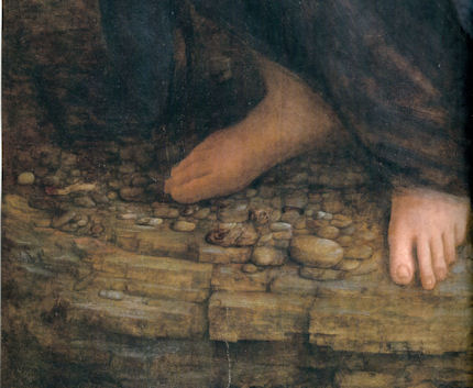
![]()
Another Restored Leonardo, Another Sponsored Celebration – Ferragamo at the Louvre…

The penny dropped last week in Paris: museum picture restoration is becoming a money-making machine in which the artistic sums may not necessarily add up. The Louvre’s restored Leonardo “Virgin and Child with St. Anne” re-appeared in a series of openings for a swish exhibition-of-celebration, “La Sainte Anne l’ultime chef-d’oeuvre de Léonardo de Vinci”, sponsored by the Italian fashion house Salvatore Ferragamo (whose 2012 fashion show is to be held within the Louvre). The official defences of the restoration are found in the exhibition literature and in a DVD film (“Leonardo de Vinci The Restoration of the Century”) celebrating “The spectacular operation, the likes of which occurs only once a century”. Although there may be a touch of “The Official” in the film, acknowledgement is certainly made of opposition to the course of the restoration that came from within the advisory committee itself. Jean-Pierre Cuzin, the former director of paintings at the Louvre, is seen to speak with great eloquence on the option of, essentially, leaving well enough alone. Reference is also made to wider opposition that was reported in what is described as “a virulent press campaign”. The organisation of the exhibition itself is seen to testify to the rapid growth of mutual support systems within the international museum community. At the same time, we can now better gauge the restoration’s artistic consequences and better appreciate why two eminent art authorities, Ségolène Bergeon Langle, the former director of conservation for the Louvre and France’s national museums, and Jean-Pierre Cuzin, resigned from the restoration’s international advisory committee.
As with the Credit Suisse sponsored exhibition “Leonardo da Vinci – Painter at the Court of Milan” which gathered £1.5bn worth of Leonardos in celebration of the National Gallery’s restored “Virgin of the Rocks” (see Figs. 17 & 18), this Ferragamo/Louvre exhibition has drawn masterpieces by Raphael, Michelangelo, Pontormo, Andrea del Sarto and others. The National Gallery (two of whose staff members served on the St. Anne restoration’s international advisory committee) loaned its hitherto unloanable Leonardo “Burlington House Cartoon” in a straight swap for the Louvre’s earlier loan of Leonardo’s original “Virgin of the Rocks” to the London Leonardo-fest. It would seem that in this international bonanza, one restored Leonardo begets another and each begets a plumply lucrative exhibition and catalogue. The current escalation in travel and restoration risks for works of art is terrifying.
The Louvre’s current exhibition is said by the curator, Vincent Delieuvin, to comprise “a science workshop”. But this “workshop” could not inform the treatment of the painting because it followed, not preceded, the restoration. Moreover, the exhibition itself imposed a guillotine on the restoration. Members of the international advisory committee who wished for more tests, for more consideration of vexing issues, felt thwarted by the Louvre’s need to finish the restoration in time for the arrival of the stupendous borrowed treasures. The cumulative assembled testimony of the exhibition’s many borrowed copies and derivatives of the “St. Anne” might well have been instructive, but, not having been seen, it finds no reflection in the restored Leonardo which artistically has pulled away from its own off-spring (see Figs. 13-16). Delieuvin’s reported twin claims that the restoration “is a true resurrection of the ‘St. Anne’” and that “The painting has recovered a depth and a relief almost like sculpture, with an intense palette of lapis lazuli blue, lacquer red, grays and vibrant browns”, seem both rather tastelessly hyperbolic and at variance with visual evidence (- see right).
Certain structural stresses in the over-heating art economy have become visible. At the exhibition’s epicentre the “Burlington House Cartoon” and the “St. Anne” (for which picture the drawing was a study), have been brought together side by side in a spectacular but counter-productive coup de théâtre (see Figs. 13 & 14). The drawn study, now discoloured but sombrely potent in a magnificently worthy black frame, conjures a breath-taking orchestration of monumentally poetic forms, forms that rightly have been seen to rival the pedimental female groupings of the Parthenon sculptures. Since the Second World War there has been no drawing in existence to rival this fragile and brittle manifestation of the grandeur of Leonardo’s thoughts. (If lost – and in recent years lorries have been burnt-out in the Channel Tunnel and a ferry and its lorry cargo was lost in the Channel – no insurance money or state indemnity could acquire another of its kind.) In contrast, the restoration-weakened “St. Anne”, with its now arbitrarily floating, obtrusively abstract and glitzy lapis lazuli blue drapery, has departed from its formerly-realised self, as the adjacent cartoon and the exhibition’s many derivative pictures mutely testify. To see strong colours subsumed within tight sculpturally integrated groups, we must now look to derivatives of Leonardo rather than to their progenitor (see Figs. 15 & 16).
As if to inoculate the exhibition viewer against this back-firing juxtaposition, the wall immediately opposite the cartoon and the “St. Anne” carries a portentous notice headed “A fundamental restoration”:
“A fundamental restoration of Leonardo da Vinci’s St Anne was initially envisaged in the 1990s when a few quite conclusive cleaning tests were carried out.
“The picture’s dull appearance, its hues discoloured and distorted by numerous repaintings of the sky and the Virgin Mary’s blue mantle, demanded the intervention that finally began in 2009. Minute bulges, very probably caused by the stress exerted on the picture layer by the hardening of old restoration varnishes rendered the restoration inevitable.
“Preceded by an exceptional series of preliminary examinations and scientific imagery analyses carried out by the laboratories at the Centre de recherche et de restauration des musées de France (C2RMF) and generously financed by Mr Barry Lam, the restoration itself began late in 2010. The restorer, Cinzia Pasquali, was chosen following an invitation to tender and worked for more than a year at the C2RMF in the painting workshop in the Pavillon de Flore.
“The restoration comprised two principle problems: the removal of the discordant repaintings, some resulting from very ancient and thick accumulations of retouches, the thinning of restoration varnishes oxidised and deteriorated by too many partial cleanings, the moving of excess varnish from one area to another using solvents, retouches and refixings down the centuries throughout its long history, the picture had obviously been devarnished and revarnished many times but fortunately the picture layer had been sufficient robust to resist this. The extremely irregular and oxidised state of the surviving varnishes distorted all the tints and, by a well-known physical effect, ‘decolourised’ and yellowed the original hues.
“The gradual thinning of these varnishes to a uniform level was therefore the restoration’s major challenge. During this process, resin analyses and measurements of varnish thickness, conducted by new techniques developed at the C2RMF enabled an extremely precise approach to the thinning, which had to be undertaken delicately, both to preserve a degree of patina on the picture and protect the painting itself from any contact with the solvents used. This extremely gentle cleaning process revealed a painting in vivid colours and resuscitated the splendid lapis lazuli blues and refined violet reds and crimson kermes gum lacquer.”
In this classic museum PR conflation of aesthetic and conservation “needs”, we are variously told that aesthetic changes had been necessary on urgent conservation grounds; that the restoration was “envisaged” some time ago and that this aspiration had been reinforced by the picture itself whose dull appearance “demanded” a restoration. Meeting this demand from the inanimate is said to have been made “inevitable” by a mysterious conservation ailment in the form of “minute bulges” which “very probably” were being caused by the varnish itself.
“Very probably” is a distinctly weasel-phrase and seemed the more so because Ségolène Bergeon Langle had very recently pointed out that the minute manifestations were confined to a single board (which had been badly cut when first made) within the panel, and therefore could not have derived from overall varnishes which some were itching to remove. This analysis of the actual cause was accepted on the DVD film where it was claimed that the restoration had had to proceed because of “lifting due to contraction of the wooden panel”. That raised the larger restoration question: if the varnish was not causing the lifting, was there any conservation reason for removing it at all? A frankly negative admission on that point would, of course, have greatly strengthened the position of the “moderates” on the advisory committee who were, under any circumstances, urging restraint and caution. We now hear that not only is it admitted that the liftings of paint were indeed caused by this plank, but also that they had easily been repaired locally. In hope of preventing future liftings, the panel painting is to be encased in framing that will incorporate a suitable micro-climate designed to stabilise the offending wood. On the face of it, this is good news but, in today’s museum practice, a risk removed often seems to make space for another to be incurred. And, sure enough, we also hear it is now thought that, with the provision of its own micro-climate, this great picture can be regarded as safely peripatetic – and that as such it is to be despatched in the first instance to an annexe of the Louvre at Lens, in northern France. But then where next – Tokyo? Dubai? California? And on what tariff? Perhaps in addition to adding this “restoration of the century” to our list of cleanings sold on misleading conservation-necessity prospectuses, the picture should also be put on our Now At Grave Risk of Travel Injuries category? We trust that the Louvre authorities will amend their misleading wall notice on the restoration.
The material on the picture’s surface is said to have been the accumulated product of many and various previous restorations (some with caustic substances), throughout all of which Leonardo’s original paint had suffered no injury. What chance, therefore, could the last restoration’s highly advanced, “extremely precise” techniques have produced anything other than an “extremely gentle” cleaning? Well, first of all, the proof of the pudding is in the appraising of the result – see right. Second, it is never wise to take restorers’ own prognoses at face value. Errors can occur at any point of the restoration process. The suggestion that a uniform layer of varnish had been left in place might surprise members of the international advisory committee who had been under the impression that varying thicknesses of varnish would be left in place according to specific needs for caution (as with the especially vulnerable face of “St. Anne” – see right).
Further, questions arise in terms of conservation methodological practice. In restorations, paintings are stripped down and then reassembled by repainting. Where, then, are the detailed photographic sequences showing the painting before cleaning; after cleaning but before retouching; and, after cleaning and retouching? Without such hard visual documents the path of the restoration cannot be retraced. It was only when the National Gallery kindly provided such photographs that we were able to identify an unacknowledged change that had been made to the angel’s mouth in the London “Virgin of the Rocks” (see comments at Figs. 17 & 18).
In the two versions of the Louvre exhibition catalogue (one of 52 pages at 8 Euros and one of 448 pages at 45 Euros) there are not even any facing images showing the picture before and after restoration. Such a pairing is found in the (excellent) Beaux Arts special “Léonard de Vinci – Les secrets d’un génie” at 6.90 Euros (a similar comparison is shown here in Figs. 14 & 16). There is also a helpful before and after restoration record of the National Gallery’s “Virgin of the Rocks” (see Figs. 17 & 18).
The Louvre and the National Gallery leonardo restorations share a common methodological feature: in both cases it is said that old varnishes were thinned but not completely removed. This claim creates a conundrum because in both cases changes have taken place which seem inexplicable in terms of a mere thinning of varnish. When explanations are sought or when appraisals are attempted, restoration authorities sometimes take fright, retreating behind claims that theirs is a highly specialised technical field whose mysteries are simply unfathomable to outsiders. Restorers themselves often don the proverbial doctors’ white coat and claim to have acted on not aesthetic grounds at all but on (quasi-) medical ones. For the “St. Anne” restorer, Cinzia Pasquali, this restoration was not made for aesthetic reasons. Instead: “This was about caring for a sick patient. From the conservation point of view we had to intervene, primarily to address a cracking of the varnish that could leave the paint exposed to damage.” Well, we now know that in this particular case the patient was not as sick as had been thought. But more importantly, we should remember at all times that works of art are made by people to be looked at by people. They are not created as laboratory specimens. Artists work with materials so as to produce values and relationships between values. No scientific test can analyse a value, let alone an inter-related group of values. To its maker, the professional test of a work of art is how it looks – the painter stops working precisely when the picture looks right.
In the realm of art and away from corporately funded museum politics, the ultimate test of a restoration is also how it looks – but that is to say, not how it strikes the passing viewer (who may or may not be thrilled by solvent-brightened colours) but how it looks now as compared with how it looked previously; how it looked not just immediately prior to restoration but in its successively recorded history; and, most especially, how it looked the last time it was cleaned. If picture cleanings did no harm, if they were as simple and non-destructive as cleaning a window, each restored work would return to its appearance when last cleaned, and there would be no surprises, “discoveries”, “revelations”, “restorations of the century” – or controversies. While no one ever berates a window cleaner for ruining the views, restorations irreversibly change a picture’s “view” on to the world. Restoration is a one-way street that runs away from history, away from the original work.
All cleaning controversies turn on the extent to which pictures suffer during restoration. Even among those who authorise restorations, some concede that there are losses as well as gains and frankly admit to seeking the best trade-off between improved legibility and pictorial injury. Defensive restorers insist that pictures cannot be harmed by their own “advanced”, “gentle” and “scientifically underpinned” methods. Making a fetish of the “safety” and the “science” of restoration methods attempts to shelve restorers responsibility to identify and account for all material and aesthetic changes. Given that all restorers’ methods cannot be superior, none should be held beyond question. With the physical alteration of art, aesthetic appraisal is essential to scholarship and art’s protection. In appraising restorations, the comparison of like with like is of the essence.
In visual arts, appraisals are necessarily made by visual comparisons. Pictures are made by eye, hand and mind, to be viewed by eye and mind. Because each cleaning destroys the earlier state, comparisons can only be made between pre and post-restoration photographs. While straightforward cleaning might always be expected to achieve a greater vivacity of pictorial effect, it should never be made at the expense of the pictorial relationships, patterns, or gradations made in the service of modelling, that can be seen to reside in the uncleaned work. If the relationships can be seen it is because they are there – whatever chemical analyses might suggest to the contrary. The aesthetic production of pictorial values by artists is the proper science of art. Unfortunately, in such terms, the values that were formerly evident in this great picture seem not to have fared well in this last cleaning.
Michael Daley
Comments may be left at: artwatch.uk@gmail.com


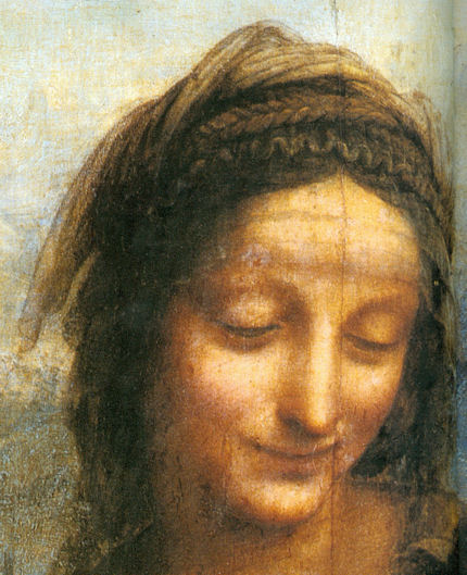

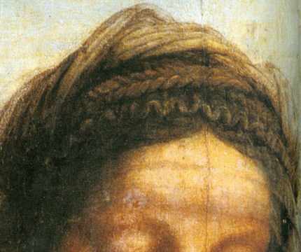


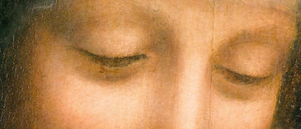


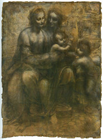
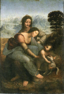


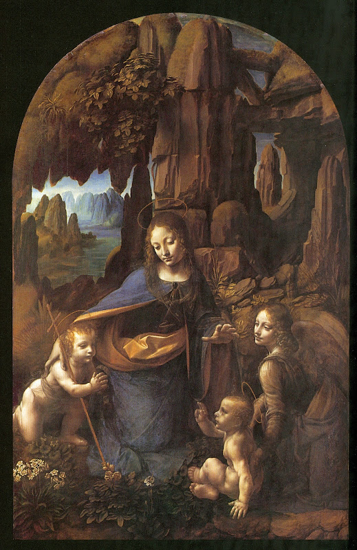


![]()
The National Gallery’s £1.5 billion Leonardo Restoration

Two decades after recognising that art restoration “discoveries” and “revelations” had become very big business, we encounter a blockbuster exhibition that required a Government indemnity of £1.5 billion and was specifically launched as a vehicle to celebrate a restoration that had yet to take place: “We started thinking about this five years ago, when we were beginning to plan the restoration of ‘The Virgin of the Rocks’, so an exhibition to celebrate that project seemed like the right thing to do.” So said Luke Syson, the curator of the National Gallery’s “Leonardo da Vinci: Painter of the Court of Milan” exhibition, in a BBC interview.
Museum restorations never take place in vacuums. If you build an exhibition on the proposed restoration of a very famous artist’s work you set certain narrative expectations in motion; create pressures and hopes of big, dramatic results. When the “Virgin of the Rocks” was put back on display after its restoration – and pronounced an entirely autograph Leonardo, even though the restorer had not removed all of his predecessor’s varnish – I was pleased to discuss the then forthcoming Leonardo exhibition with Luke Syson who said that its scholarly focus would be an analysis of the influence that a new type of Leonardo painting had had on his followers. Namely, that during the 15 or so years long gestation of the National Gallery’s version of the “Virgin of the Rocks” which was delivered unfinished in 1508, and the contemporaneous (1492-98) “Last Supper” in Milan, Leonardo’s painting style had become distinctly abstracted, less naturalistic and more metaphysical in character. When I expressed scepticism that this thesis might rest secure on two such different works as the “Virgin of the Rocks”, with its uncertain condition and status (the Gallery admits the picture is “manifestly uneven in finish and execution” and that there has been “a good deal of agreement that Leonardo himself painted little or none of it”), and the degraded, fragmented, many-times restored “Last Supper”, Syson disclosed that the Royal Academy’s full-size copy of the latter by Giampietrino was being borrowed. At this, I asked if the Gallery’s own Giampietrino “Christ carrying his Cross” (which had recently been relegated to the reserve collection – on Syson’s instruction, I learned) would also be included in the exhibition. It would not. This was disappointing – and a lost opportunity to right an ancient wrong.
The “Christ carrying his Cross” had been discussed by Larry Keith, the Gallery’s new head of conservation who has restored the “Virgin of the Rocks”, and Ashok Roy, the Gallery’s head of science, in the Gallery’s 1996 Technical Bulletin under the title “Giampietrino, Boltraffio, and the Influence of Leonardo”. This followed the restoration of two Giampietrinos (his “Christ” and his “Salome”) and Boltraffio’s “Virgin and Child”. A remarkable technical discovery had been made on “Christ carrying his Cross” the ramifications of which seemed not fully to have been appreciated. Keith and Roy did acknowledge that Giampietrino’s Leonardo borrowings were “not restricted to matters of composition alone, but also include other aspects of painting technique”; they granted that the “strong chiaroscuro and dark backgrounds of Giampietrino’s small format panels are clearly an attempt to emulate the more striking pictorial effects that Leonardo had introduced to Milan”; they explicitly acknowledged that Giampietrino’s painting technique was much influenced by Leonardo’s, and that this could be “seen in the sfumato and relief of the National Gallery Christ carrying his Cross” – which painting was “clearly derived from Leonardesque prototypes” and for which “A silver-point study of Christ carrying his Cross by Leonardo [was] clearly the compositional source…” And yet, despite all of this, they seemed at pains to cast Giampietrino as a pronouncedly lesser follower of Leonardo than Boltraffio.
While excluded from the forthcoming show, Giampietrino’s “Christ” has at least been liberated from the reserve collection, making it possible for the picture and its condition to be studied before visiting the Leonardo blockbuster. Not only is it as closely related to Leonardo’s imagery and methods as has been acknowledged, it is arguably the best preserved Renaissance picture in the National Gallery. Its good condition is a byproduct of what the Gallery describes as “an unusual pigmented glaze layer”. After carefully building and modelling his forms with successive layers of paint and glazes to “an illusion of relief”, Giampietrino covered the whole painting with a single “final extremely thin overall toning layer consisting of warm dark pigments and black”. This had had remarkable aesthetic and physical consequences. The layer was contemporary with the painting and, being composed of walnut oil with a little varnish, resistant to the usual varnish stripping solvents. The use of walnut oil further relates this picture to the “Virgin of the Rocks” where that oil had been used throughout.
During the picture cleaning controversies at the National Gallery after the Second World War, the possibility that just such toning overall finishes might exist on old paintings was advanced by Ernst Gombrich. In a letter to the Burlington Magazine in 1950 and in his 1960 book “Art and Illusion”, he cited a famous report by Pliny which described the overall dark veiling finishes that Apelles had applied to his paintings to wondrous effect, and asked “is it conceivable that such famous testimonies would never have induced a master of the sixteenth or seventeenth centuries to emulate Apelles and apply a darkening varnish to achieve a more subtle tonal unity?” He then reflected “I do not think it is even claimed that our ‘safe’ cleaning methods could detect such a varnish, let alone that they could preserve it.” This provoked the National Gallery’s restorer Helmut Ruhemann (who had cleaned Leonardo’s “Virgin of the Rocks” in 1948-9 to unfortunate effect – see right) into a vehement dogmatic dismissal: “there is no evidence for anything so inherently improbable as that a great old master should cover his whole picture with a ‘toning down layer’.”
That Leonardo was a learned man and a reader of Pliny is acknowledged by both Syson and Keith in the present exhibition catalogue. In his 1962 Burlington Magazine article (“Dark Varnishes: Variations on a Theme from Pliny”), Gombrich repeated what Pliny had said of Apelles:
“He used to give his pictures when finished a dark coating so thinly spread that, by reflecting, it enhanced the brilliance of the colour while, at the same time, it afforded protection from dust and dirt and was not itself visible except at close quarters. One main purpose was to prevent the brilliance of the colours from offending the eye, since it gave the impression as if the beholder were seeing them through a window of talc, so that he gave from a distance an imperceptible touch of severity to excessively rich colours.”
How could the connection between Apelles’ final “dark coating so thinly spread” and Giampietrino’s “final, extremely thin overall toning layer [with] warm dark pigments and black” have passed without comment? The cleaning controversy of the 1960s had hardly faded from memory: as recently as 1985 it had been described by a subsequent director of the National Gallery, Neil MacGregor, as “one of the most celebrated jousts” in the Burlington Magazine. In the current National Gallery Technical Bulletin, (Vol. 32) Larry Keith, Ashok Roy, Rachel Morrison and Peter Schade, say of the restoration of the “Virgin of the Rocks” that while its practical intent was “primarily aesthetic” it also served to provide an example of the gallery’s interdisciplinary approach: “Whenever possible, major restorations are intended as the hub of a wide range of research activity that sees curators, scientists and restorers working together – increasingly alongside colleagues from other institutions”. Our criticsms of the Gallery’s customary use of restorations as effective “laboratory test cases” for conducting multidisciplinary research with an input from curators are longstanding, but what makes this unusual and pronounced “non-singing” of such a very important finding all the more perplexing is the fact that this discovery may be the tip of a scholarly iceberg. Tucked in footnote 24 of the 1996 Keith/Roy account is a disclosure that such overall toning layers are “quite rare in Italian painting of the period” and that they “may be confined to Milanese technique”. Did this mean that other instances had been found at the Gallery? Or even, given the Milanese locus, that Leonardo himself might have been the instigator or a user of such applications? (Kenneth Clark had earlier attributed disparities of finish in the “Virgin of the Rocks” precisely to damaged glazes – see right.)
When Larry Keith writes in the current catalogue that Leonardo exploited oil paint in the “Virgin of the Rocks” for its “subtle transitions and distinctions within the deepest tones, all of which were carefully orchestrated within a system of unified lighting”, he might as appropriately be describing the well-preserved effects of Giampietrino’s “Christ” as those in the “Virgin of the Rocks” where, despite the picture’s acknowledged “inconsistencies” of finish, Leonardo is said to have created a “new and remarkable unified coherence…by a carefully considered manipulation of lighting, colour and tonal values”.
Whatever the merits of Giampietrino as an artist, no Renaissance work in the Gallery shows a more tightly and subtly controlled overall development of forms, tones, colours, and expressively purposive lighting, than his “Christ”. It was unjust if not perverse when Keith/Roy, gave the laurel to Boltraffio, in part as “an artist capable of a more subtle understanding of Leonardo” but also as one who had been working in Leonardo’s studio “by 1491”, as opposed to Giampietrino of whom “it is not certain how much direct contact [he] would have had with Leonardo’s actual painting methods, and it would be misleading to assume that the imitation of Leonardo’s effects required direct reproduction of his techniques.” Under what circumstances and on whose authority other than Leonardo’s, might someone have made a full sized, exactly matching, oil-painted copy of the “Last Supper”? Besides which, in the current catalogue, Minna Moore Ede, when describing Giampietrino’s copy of Leonardo’s “Last Supper” as being with its “great clarity and three-dimensionality” the most faithful and accurate record of all, discloses that Giampietrino, just like Boltraffio, is now understood to have been a live-in apprentice who joined Leonardo’s workshop in the mid 1490s.
In the Technical Bulletin Keith/Roy saw “differences of palette” between the “more highly saturated local colour” of Giampietrino’s copy of Leonardo’s “Last Supper” and a “pictorial unity produced by a tightly controlled, restricted range of tone and value” in the work itself. That reading has been dropped: Keith now sees (Leonardo exhibition catalogue entry, p. 70) that the “Last Supper” was, as Giampietrino’s copy had testified, executed in a “higher-keyed, lighter palette” than that of the London “Virgin of the Rocks”.
Even if Giampietrino’s work had been “essentially imitative, showing more of an attempted simulation of the painted appearance of Leonardo’s works than an understanding of his ideas”, as opposed to Boltraffio’s “more sophisticated” grasp, it might for that very reason leave him the more reliable guide to the original appearances of Leonardo’s paintings than Boltraffio in his more ambitious attempts to think and compose in the manner of his master and superior. In their 1996 account, Keith and Roy undermine their own slur that Giampietrino’s overall toning layer attempted a spurious impression of a Leonardesque suppressed colourism by explaining how, in his “Christ”, Giampietrino had covered his white gesso ground with “a stiffly brushed, rather opaque imprimiture of a light brownish grey”, while for his “deep red” draperies he had first applied “an unusual strongly coloured dense red-brown underpaint consisting of vermilion, red earth and black, with an increased proportion of black used under the shadow of the folds.” Those passages of painting were further reinforced with “dark red glazes”. Taken together, it was precisely admitted that (- and quite remarkably Apelles-like), “The overall effect is restrained in spite of the intensity of colour and creates a more naturalistic effect.”
The late-discovered existence of Giampietrino’s dark toning layer constituted a repudiation of the Gallery’s former head of science, Joyce Plesters, who (in the Burlington Magazine in 1962 – “Dark Varnishes – Some Further Comments”) had parodied the very idea as a “crude device of indiscriminately deadening all the colours by the application of an overall yellow, brown, or blackish varnish”. In 1996 Plesters was then still alive (as was a long-serving trustee of the National Gallery, Denis Mahon, who had joined her in attacks on Gombrich in the 1962 Burlington Magazine – “Miscellanea for the Cleaning Controversy” ). In 1996 I asked Gombrich if the Gallery had informed him of its discovery of an overall toning layer of “warm dark pigments and black in a medium essentially of walnut oil, with a little resin”. He said not but that he was pleased to learn of the Gallery’s “final conversion to an obvious truth”. We published our first account of this episode thirteen years ago (“The Unvarnished Truth”, Art Review, November 1998). Could it be that a continuing institutional desire to spare the posthumous blushes of departed Gallery players who bungled in spectacular fashion is permanently to blight an interesting artist’s reputation, retard the gallery’s own (in many respects admirable and generously shared) scholarship and thwart full recognition of the achievements of one of the most distinguished art historians to have made home in this country?
Michael Daley
Comments may be left at: artwatch.uk@gmail.com

Above, Fig. 1: “Christ carrying his Cross” by Giampietrino. NG 3097, c.1510-30. Poplar, 60 x 47 cm.
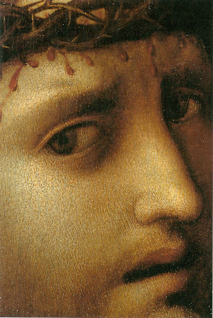


“There is no longer any doubt that our Virgin of the Rocks is a second version of the subject, undertaken by Leonardo some twenty years after the picture in the Louvre…”
On the faces of the Virgin and the angel (Figs. 7 & 8 below), he reflected:
“It is uncertain how much of this replica he painted with his own hand, and this head of the Virgin is the most difficult part of the problem. It is too heavy and lifeless for Leonardo and the actual type is un-Leonardesque; yet it seems to be painted in exactly the same technique as the angel’s head in the same picture…”
Of the angel, he wrote:
“This is the one part of our Virgin of the Rocks where the evidence of Leonardo’s hand seems undeniable, not only in the full, simple modelling, but in the drawing of the hair. The curls round the shoulder have exactly the same movement as Leonardo’s drawings of swirling water.”
Even so, he added:
“Beautiful though it is, this angel lacks the enchantment of the lighter, more Gothic angel in the Paris version. It embodies the result of Leonardo’s later researches in which ideal beauty and classic regularity of chiaroscuro were combined, with a certain loss in freshness, but with an expressive power which almost hypnotised his contemporaries.”
In the 1990 re-issue, this note was added to Clark’s comments on the heads:
“As a result of the cleaning of the altarpiece in 1949 the differences between the heads are rather less apparent.”
It would be nice to take this as an official confession of a restoration injury within the Gallery (Clark had concluded that “A pupil did the main work of drawing and modelling, and before his paint was dry Leonardo put in the finishing touches. Most of these have been removed from the Virgin’s face but remain in the angel’s, where perhaps they were always more numerous.”) Consider, then, this account from a privileged art critic who was, so to speak, embedded in the Gallery’s conservation department during the recent, blockbuster-launching restoration, the Guardian’s Jonathan Jones:
“For a long time, the National has believed its Leonardo to be mostly the work of assistants, with only the basic design and some perfect parts – above all, that angel – recognisable as his handiwork. What a difference a cleaning can make. In its official statement yesterday, the gallery was naturally cautious (‘it now seems possible that Leonardo painted all the picture himself’); but talking to me over several weeks in the workshop, in front of the painting, the National’s experts made it clear they believe this to be a pure and unsullied painting by Leonardo’s own hand. ‘We now have a picture which I believe is entirely by Leonardo,’ said Luke Syson, curator of Italian Renaissance paintings and the man who has spearheaded this restoration. If he is right, this is a Leonardo to rank alongside The Last Supper and the Mona Lisa.”
Yes, if he is right – but what counts as “right” in matters of attribution? And in what sense do we “now have” a different picture? The restorer has claimed not to have removed all of his predecessor’s varnish, so nothing can have been seen that was not visisible in 1948-9. During this last restoration Syson claimed that “every age invents its own Leonardo.” Such art critical relativism might be taken as an innocuous socio-cultural observation were it not tied to the work of restorers who claim individual interpretive “rights”. The Gallery’s handbook “Conservation of Paintings” acknowledges that pictures are now “changed primarily for aesthetic reasons” (p. 53) and (p. 45) that restorations are carried out on the “aesthetic objectives of those responsible for the cleaning”. Moreover, (p. 53) although the “different aesthetic decisions” taken by individual restorers produce results that “may look very different”, all of such different outcomes are “equally valid”, provided they have been carried out “safely”.
In matters of aesthetic and artistic integrity, the “safety” or otherwise of the cleaning materials is a red herring – if pictures end up looking different, they are different, and these differences are material and irreversible. It is therefore vital that there be the fullest possible disclosure of the changes that are made – especially those made with the retouching brush.


![]()
Why is the European Commission instructing museums to incur more risks by lending more art?

Given the notorious risks of loaning works of art (see: An Appeal from Poland) and the high costs of insuring against those risks, why should the European Commission now be doing everything in its power to increase the practice throughout all of Europe’s museums?
In 2009 the Commission, through its “Culture Programme of the European Union” (which is funded to the tune of €400m), set up “Collections Mobility 2.0 Lending for Europe – 21st century”. This latter organisation, has itself funded international junkets – already – in Shanghai, Amsterdam, Antwerp, Budapest, Paris, Amsterdam (again) and, for this coming November, Athens. (Why Shanghai? – Is China seeking entry into the European Union?)
The ostensible prospectus for this pan-European project to “set culture in motion”, under the aegis of the 2007 “European Agenda for Culture in a globalising world”, rests on an evident conviction that an ever-greater shuffling around of the stock of art that is housed in Europe’s historical and nationally distinctive museums is a self-evident Good Communautaire Thing. While lip service is paid to “retaining the cultural diversity of the member states” it is hard to see how this might be achieved through a project which by design “contributes to European integration” and aims to bestow “a context” upon the art which is moved. When reading the promotional literature, it is hard not to see an overarching desire to homogenise European cultural life precisely by subverting the richly individual historically-forged identities of national institutions. It is hard to see how, in the real Euro-world of collapsing economies and soaring unemployment, a massive bureaucratized drive to increase inter-museum loans and their attendant risks might be considered other than whimsical and irresponsible.
As if in denial of the inherent risks, Collections Mobility 2.0 has constructed top-down national training programmes to be run in all European member states with the express purpose of encouraging more loans by the imposition of tiers of pre-cooked administrative procedure. All participants on these crash courses are required to:
“…cascade the training programme to other professionals in their own country using the training package that is being developed.”
The targets of this training package are to be:
“…professionals dealing directly with the administration of international loan of artworks as collection keepers, registrars, etc.”
The enterprise itself is dressed in pure dissembling management-speak:
“The Collections Mobility 2.0, Lending for Europe – 21st Century project organises training courses and provides a training package in order to introduce the most recent developments, best practices, concepts, standards and procedures on lending and borrowing of museum collections. ‘Getting practical’ is the aim of the project.”
Getting practical is not the same as “Getting real”. The risks to loaned works are real and the cost of insuring against them is correspondingly and appropriately high. As if to bypass this latter reality, Collections Mobility 2.0 charged a group of experts to examine over 5,000 loans made in five years under state indemnity schemes. This group duly reports that only seven claims for minor damage were made under those schemes. Taking these findings at face value and making no allowance for the under-reporting of travel injuries in the art world, Collections Mobility 2.0 seeks to increase loan traffic volumes by advising museums to insure less, to insure their works only for the specific short periods of travel at the beginning and end of a loan period, and not for the full duration of the loan.
This would greatly compound the hazards. TheArt Newspaper reports (February) that Sandy Nairne, the director of the National Portrait Gallery, has pointed out that loaned paintings get stolen from within museums and not just while on the road. He should know, having been charged when at the Tate with making the arrangements for the recovery of two of its Turners that were stolen when on loan to a museum in Germany.
Mr Nairne’s warning that “Without insurance the Tate would have had no money, nor the paintings”, cannot be gainsaid. What might be said is that by paying a ransom of over £3m to what Geoffrey Robinson, the former Paymaster General, described as “a group of particularly nasty Serbs”, the Tate established a going-rate “reward” of fifteen per cent of a work’s insurance value to obtain a recovery and avoid a full insurance pay-out. Whether such ransoms masquerade as “payments for intelligence” or not, they make art theft an increasingly tempting prospect.
For example, were the Krakow, Czartoryski Foundation’s, Leonardo da Vinci, Lady with an Ermine, to be stolen during its proposed trips to and from the National Gallery in London, it would, with its current insurance rating of €300m, afford a juicy potential haul of €30-45m to thieves. Were that Leonardo to be insured only during its times of travel, as Collections Mobility 2.0 now urges, the insurance cost might fall “considerably” – but the painting would remain a plump €30-45m target. Were it to be stolen from within the National Gallery, the owners, having acted on Collections Mobility 2.0’s advice, would receive nothing from the insurers. Similarly, if the painting were to be dropped and smashed at the National Gallery during the periods of installation or de-installation (as happened recently to a panel by Beccafumi), the Polish owners would receive nothing from the insurers. Were private insurance arrangements to be replaced by state-guarantees of indemnity, in the event of thefts, states would find themselves in “recovery” negotiations with nasty criminal groups and without the political cover afforded by commercial insurers.
There are no limits to the problems associated with Collections Mobility 2.0. Were the Lady with an Ermine to be loaned by her owners to France instead of, or in addition to Britain (and any or all venues would seem to be on the cards with this painting under its present aristocratic stewardship – in recent years she has been loaned to: Washington, 1991; Malmo, 1994; Kyoto, 2001; Nagoya, 2001; Yokohama, 2002; Milwaukee, 2002; Houston, 2003; San Francisco, 2003; Budapest, 2009) the risks of theft or injury would likely be higher still. The Daily Telegraph recently reported growing concerns that French museums are easy targets for thieves (“Lending works of art to France is a risky business”, 29 August 2010). For the past fifteen years thefts from French museums have run at three a month. In May 2010 thieves broke into the Museum of Modern Art in Paris and stole five paintings valued at £86m.
Two works loaned to France from the Victoria and Albert museum have been damaged in the past two years. An official at Apsley House, London, has said of the museum’s art “We wouldn’t lend that to the Louvre. We don’t know what state we’d get it back in.”
Whether or not one supports the European “Grand Project” to forge a United States of Europe, we should all be clearer about the implicit cultural price of ironing-out nationally distinctive institutions. It is barely over half a century since Hans Tietze, writing in the aftermath of the devastation of the Second World War, said of The Great National Galleries of Europe and the United States:
“The least part of their value lies in the millions they would fetch on the market; their real worth lies in the intellectual labour which they embody and in the spiritual pleasure stored up in them. To create these possessions the nations contended one with the other, and each land has built its own memorial in the Gallery which enshrines its history and its way of life.”
If Eurocrats are offended by these nationally expressive institutions, they should say so openly. Better yet, they might resolve to leave them in peace to speak for themselves. Since we already have the free movement of all European citizens, there is no impediment to their visiting any art – in its own already culturally rich context – anywhere on the continent. Let us cherish Europe’s unequalled and diverse cultural achievements for what they are and avoid putting them to unnecessary risks.
Michael Daley
Comments may be left at: artwatch.uk@gmail.com
Below: Leonardo da Vinci’s late 15th C. Lady with an Ermine, oil on wood panel, 54 cm x 39 cm. This painting, normally housed at the Czartoryski Museum, Kraków, is presently on show at the National Museum in Warsaw. It has recently been loaned to the Budapest Museum of Fine Arts. It is planned to move the picture again to London for the National Gallery’s exhibition “Leonardo da Vinci: Painter at the Court of Milan” exhibition from November 2011 to February 2012.
In an appeal to ArtWatch UK on November 30th November 2010, Prof. Grazyna Korpal, the expert of the Ministry of Culture and National Heritage in the field of painting restoration, at ASP Krakow, commented:
“The work of Leonardo da Vinci called Lady with an Ermine, from the collection of the Czartoryski Museum is one of the most valuable paintings not only in the context of the Polish collections, but also of the world heritage. Such masterpieces require exceptional protection. Prevention is the main priority. Its fundamental principle is the unconditional restriction of movement and transfer to the absolutely necessary. If you transport a picture panel such as the Lady with an Ermine, even the most ideal methods in the form of modern environmental chambers or special anti-shock frames are not able to sufficiently protect the work against a variety of vibrations, shocks or changes in pressure. By allowing the painting to travel we create yet another serious threat, largely extending the area of possible human error, while increasing the likelihood of the impact of the so-called independent factors.
“Given the technology of the picture, it is necessary to keep it under constant microclimatic conditions, in one place, in a tight microclimatic frame of the new generation, made on the basis of the already proven solutions used for panel masterpieces in renowned museums. Only by storing the picture in a fixed location will eliminate to the maximum such basic threats as unavoidable external pollution, changes in the microclimate, all kinds of shock, vibration, drastic changes in pressure, and reduce the risks resulting from independent factors.
“To sum up the basic arguments put forward for the protection of the painting Lady with an Ermine, I firmly declare that each loan and the associated with it transport are a serious, even reprehensible, threat to the state of preservation and safety of this priceless work of art. I also believe that based on the special immunities provided for outstanding works of art already developed and operating in Austria, Germany or the United States, it is necessary to grant such immunity to the painting from Krakow.“Like every masterpiece the painting Lady with an Ermine has a historical value, and in this value is also included – the Czartoryski Museum, Cracow’s atmosphere and the tumultuous history of the picture during the last century. Each loan ‘strips’ the work of this unique ‘setting’, which while not indifferent to the viewer, should be especially nurtured and protected in the Polish reality.

“Around 600 people registered to attend the Culture in Motion conference 15-16 February in Brussels! Discover the new brochure!
Secure your place now before it’s too late, and get a sneak preview of the brand new Culture in Motion brochure full of exciting project interviews.
Around 600 people have already registered to attend the Culture in Motion Conference and the Stakeholder Consultation Meeting on the Future Culture Programme 15-16 February in Square Meeting Centre, Brussels.
Don’t wait; register now to secure your place, using this link: www.culture-in-motion-2011.eu
The fresh, new Culture in Motion brochure is now available to you in English, French and German, with sizzling stories from people involved in running EU-projects – projects you’ll get to meet during the Culture in Motion Conference – plus everything you need to know about handing in your own application. You don’t want to miss this!”
![]()