
Degas and the Problem of Finish
Alexander Adams
Daphne Barbour & Suzanne Quillen Lomax (eds.), Facture: Conservation, Science, Art History. Volume 3: Degas, National Gallery of Art, distr. Yale University Press, 2017, 196pp, fully illus., pb, £50, ISBN 978 0 300 23011 6
Jane Munro, Degas: A Passion for Perfection, Yale University Press, 2017, 272pp, 250 col./mono illus., hb, £40, ISBN 978 0 300 22823 6
The new title published by the National Gallery of Art, Washington D.C., Facture: Conservation, Science, Art History. Volume 3: Degas, examines its large collection of art by Edgar Degas as a starting point for discussions about issues of interpretation, finish and conservation regarding Degas’s oeuvre. The problem of finish is one that applies more to Degas than any other French artist of the Nineteenth century. Contemporaries criticised (and, more rarely, praised) Degas’s art for its open and unfinished appearance. This was not a case of stuffy regressives wanting a glossy varnished surface to paintings but often genuinely perplexed viewers feeling the artist had not fully resolved matters. What Degas considered finished and unfinished was also unclear to the artist himself. He would exhibit pieces that seem to have been arrested at an early stage; at other times he would retrieve and rework paintings he had already signed, exhibited and sold. Multiple signatures on a work indicate radical revision of a piece as the artist reconsidered what he considered to be finished. His standards evolved over his long career but even experts have trouble deciding what is finished and what is unfinished, especially as the bulk of his art remained in the studio and much of it was unsigned.
Classicism and Radicalism
Visible pentimenti could be intrusive and Degas’s habit of sanding down surfaces of oil paintings but then not fully repainting them left viewers doubtful about whether the painting had actually been completed. (Specifically, the long working periods, extensive revisions and awkward and incomplete appearances of the canvases The Fallen Jockey and Edmondo and Thérèse Morbilli make these “problem pictures”.) Signatures do not resolve such questions as Degas did not sign all works, especially drawings, which could be categorised as either working material or finished art depending on who was appraising it (or trying to sell it).
Degas was the Impressionist who received the most thorough grounding in academic fine-art tradition and also the one who experimented most technically and aesthetically. He could be reckless and sometimes destroyed art by overworking it. He could also be impatient and imprudent. Hoenigswald and Jones (in Facture) mention the case of Portrait of Mlle Fiocre in the ballet “La Source” (c. 1867-8) as an instance when Degas prematurely varnished an oil painting for salon display. The varnish interacted with the wet paint and he had to call on the services of a conservator to remove the varnish, which inevitably damaged the picture surface. He rarely varnished work himself but did not rule it out and recommended that Pau museum varnish his Cotton Office in New Orleans (1873) when the museum acquired it. However, that instruction regarding an early highly-finished oil is not carte blanche for the varnishing of all his oils, especially later ones.
Degas could be both methodical and capricious. He would prepare carefully and spend long periods of reflection. There is Vollard’s famous anecdote of him “sunning” his pastels for extended periods to degrade fugitive pigments so that he could be confident of his colours not ageing too drastically once applied. At other times he could work hectically, impatiently fixing broken limbs of his statuettes with gimcrack bodges, later allowing his clay pieces to be reduced to crumbled dust. Rather than always fully conceiving his compositions beforehand, he would start a work and have to add strips of paper to expand the surface. The use of tracing paper – mainly to allow tracing and transferring of designs – as a support for finished drawings is problematic as the vegetable starch in the calque makes the support fragile and prone to discoloration; the oils in the paper oxidise and discolour. Degas would have tracing paper sheets glued to board supports to impart rigidity and prevent the paper curling or ripping. Exquisite sketches exposing areas of untouched paper have been changed irretrievably by the fading effect of sunlight on the dyes in the commercially prepared colour paper. (For whatever reason, many similar works by a colleague of Degas’s student days, Moreau, have fared rather better.)
The perplexing confluence of technical brilliance, peculiar material combinations, unconventional working methods and appalling insouciance makes Degas’s art a tricky proposition for conservators. Respecting the artist’s wishes is not always possible when the artist can be so contradictory in his approaches apparent even in one work of art.
Degas’s technique for many works was mixed. Monotypes in black ink would often be worked over so extensively in pastel, gouache and body colour that the original print disappeared under the colourful top layer. The artist’s penchant for privacy meant that his techniques and attitudes are a mystery which scientific analysis is only now uncovering. One of the great mysteries is his formula for pastel fixative. Pastels (particularly heavily worked ones) require fixing with a clear sealant for transport or for reworking. This fixative impairs colour intensity and tonal contrast and artists have struggled to find a solution that is effective yet as unobtrusive as possible. Views on the subject have ranged from the idea Degas creating his own secret formula (which has never been uncovered) to the view that Degas used a standard mixture common to the period. Microscopic analysis of a pastel in the NGA collection reveals a dried bubble of fixative (less than half a millimetre across) which contains protein, implying a solution including casein or rabbit/fish-skin glue applied with an atomiser.
Forensic analysis suggests that Degas worked pastels wet and dry, using hard and soft tools, brushes, his fingers, adding, subtracting and burnishing, with frequent layers of fixative. Despite the liberal use of fixative, the absence of tooth on the smooth tracing-paper support makes those drawings especially fragile, something that has to be born in mind in this age of frequent and distant travel for temporary exhibition.
Dance Examination
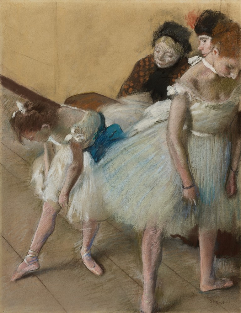
Above, Fig. 1: Edgar Degas (1834–1917), Dance Examination (Examen de Danse), 1880, pastel on paper, 622 x 465 mm, Denver Art Museum, anonymous gift. Photography courtesy Denver Art Museum
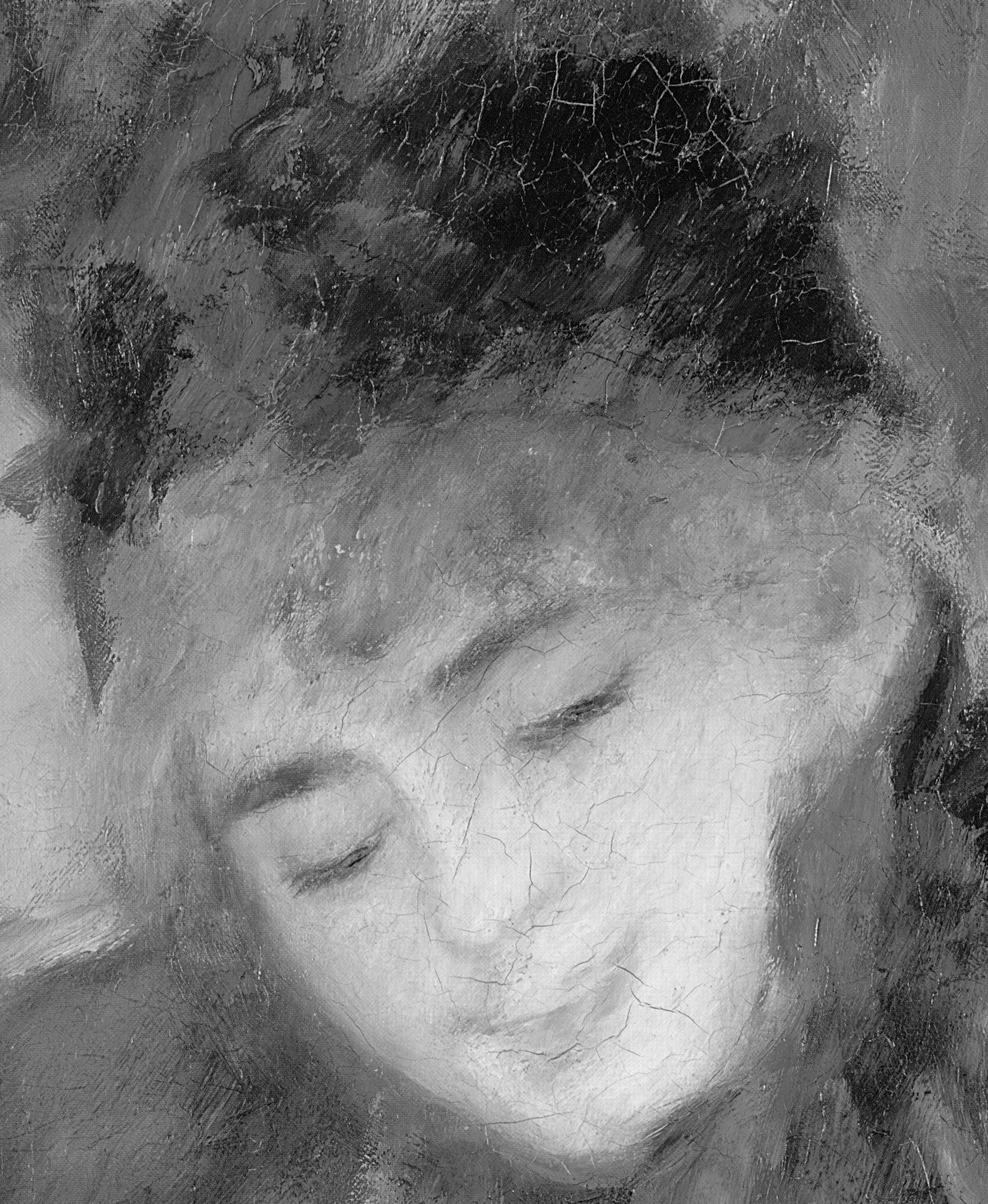
The new exhibition at Fitzwilliam Museum, Cambridge (closes 14 January; tours to Denver Art Museum 18 February-20 May 2018) allows viewers to decide what they think of the condition of Dance Examination (1880) [See “Fakes, Falsifications and Failures of Connoisseurship” – Ed.]. The catalogue Degas: A Passion for Perfection includes high-quality illustrations of this pastel and others. This pastel has previously been discussed by Artwatch. Compared to the 1918 photograph there has been noticeable change. It is difficult to ascertain what is due to fading, restorer intervention and variation in photography. Some changes seem clearly evidence of fading. The blue of the bending dancer’s sash is increasingly showing through the white overdrawing of the standing dancer’s dress. The top layer of white is less opaque than it was. The red cockade is less prominent than it was, though why that might be is unclear. Some areas do seem to have been deliberately altered: the wall seems to have been cleaned; the shadow between the leftmost leg of the bending dancer has been streamlined by slimming the wedge of shadow adjacent to the dancer’s other foot (to our right) and making the shadow more uniform; the bench seems to have been smoothed, with some near horizontal lines in the original (in the centre and right) having been blended or over drawn. That said, the new photograph has more contrast than the 2002 photograph, which seems way too pale and lacking contrast, demonstrating that the 2002 reproduction was a poor one. The new photograph suggests that there has not been a determined campaign to retouch the whole drawing but instead very particular instances of alteration (probably early, between photographs one (1918) and two (1949)) combined with fading of particular pigments. The pastel entered the Denver Art Museum collection in 1941.
The Bronzes
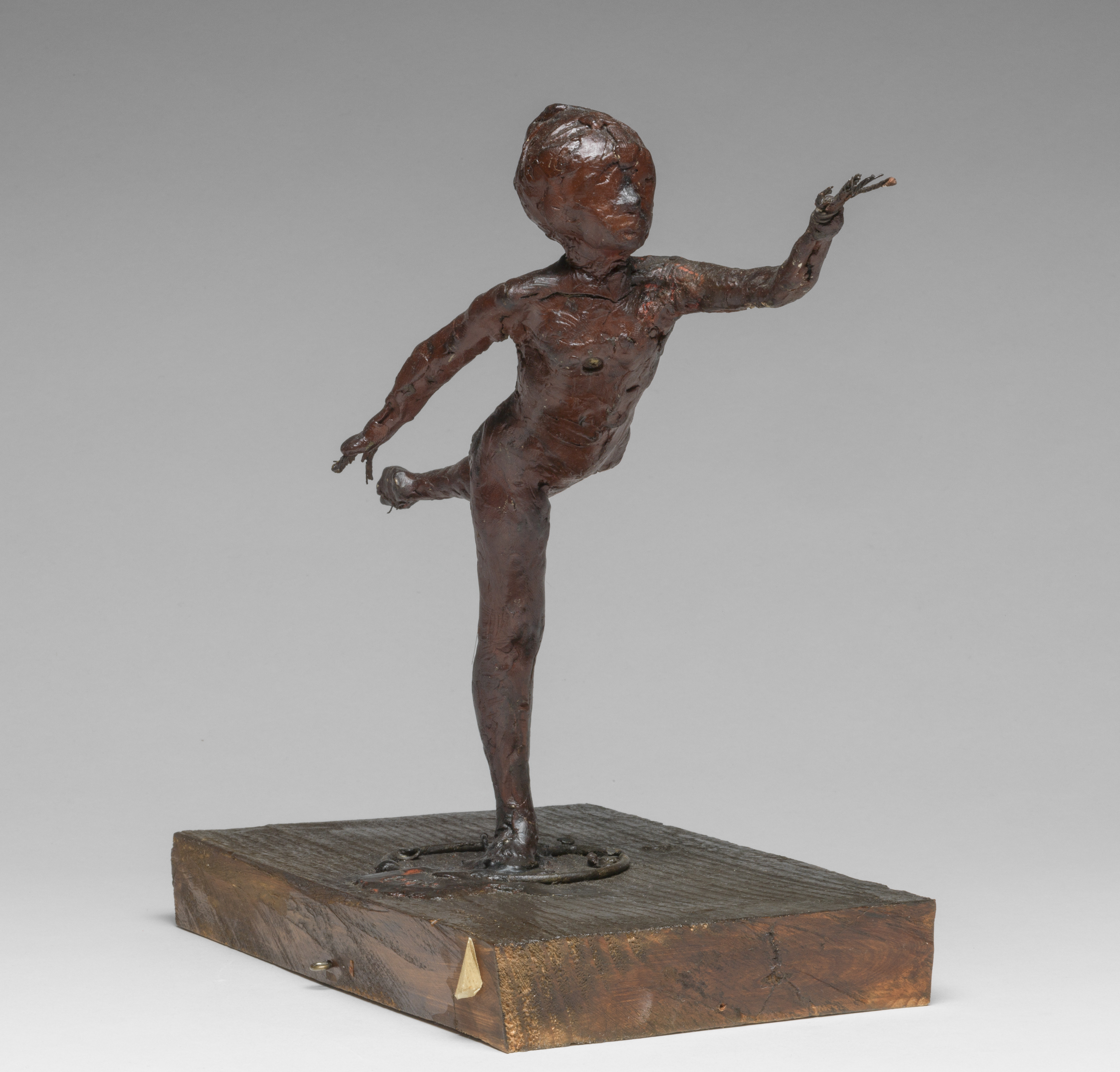
Above, Fig. 2: Edgar Degas (1834–1917), Arabesque over the Right Leg, Left Arm in Front, First Study, c.1882–95, coloured wax over a commercially prefabricated metal wire armature, attached to a wooden base, 23.5 x 13.7 x 27.5 cm, © The Fitzwilliam Museum, Cambridge
What makes the NGA’s Degas collection unique is the group of the artist’s original statuettes. These were retrieved from multiple floors of Degas’s last house in the months after his death. The heirs agreed to the figures being catalogued, graded and (if possible) repaired with a view to casting them. Many remains were found to be unsalvageable but 74 items were repaired and cast in bronze in various editions. Exact casting details were not recorded methodically. The majority of original items were in pastiline (like plasticine) over a commercially manufactured articulated wire armature adapted by the artist, which was later coated with pigmented beeswax, which allowed detailed finish, though Degas rarely applied fine details. The exception is Little Dancer Aged Fourteen (1878-81), his famous life-size statue in a real bodice and tutu, which was the only sculpture he publicly exhibited. (The original is now in the NGA collection.) X-rays reveal Degas used clay, corks, paintbrush handles and rags to add bulk to the statuettes and when limbs became detached he would use pins of nails to reattach them. The figures (almost all of them either female figures or horses) were attached to wooden base boards, sometimes with props to support them.
Degas’s attitudes to his statuettes were mixed. He worked hard on them and sometimes showed them to visitors. He kept some in vitrines. Yet he neglected some finished pieces and allowed them to become badly damaged. He never cast any pieces in bronze though he did make notes about foundries; it was apparently his wish that none of the models be cast in bronze.
The restorer(s) of the statuettes who prepared the models for casting approached the task with a mixture of attentive respect and no-nonsense pragmatism. The decision to disregard Degas’s aversion to casting in bronze was a matter for the heirs. The restorer(s) had the practical task of repairing damage, most often in limb breakages. Sometimes the limbs had been fractured, sometimes completely detached. Breaks were repaired and blended with the original facture. Often props on the originals were replaced and completely removed from the casts. (There exists an incomplete photographic record that documents the original statuettes before preparation for casting, showing breakages.) The restorer(s) attempted to preserve as much as possible of the originals but felt no compunction about making alterations to suit the expectations of collectors of the day, including blending their repairs with the original facture. Obviously, the casting process made almost invisible the visible repairs in the original figurines.
In the 1950s the original wax statuettes resurfaced in the foundry. They were purchased by Paul Mellon and most were donated to the NGA. Three original dancer figurines ended up in the Fitzwilliam Museum collection and are included in the current exhibition; the catalogue reproduces x-rays of them, showing the armature and packing inside.
In Facture expert essayists from NGA staff address the chaotic editioning of the bronzes, authorised, unauthorised and possibly pirated. Two foundries cast bronzes from 1920 until the mid-1930s, often as and when demand necessitated new sets. Foundry records are incomplete or suppressed. Two essays in this book study of the construction of the sculptures and various stamps; measurement in millimetres of the exact dimensions of casts and metallurgical analysis suggest the chronology and status of hundreds of the over 1,200 genuine casts. Further sets, which are considered by some to be fakes, continue to circulate. Comparative photographs show differences between casts. These photographs show the variable results of the moulding and casting processes and others which might the work of the finishers.
These volumes (especially the NGA’s Facture) will be essential references for collectors, dealers and scholars in Degas.
Alexander Adams, 3 November 2017
[See also, Alexander Adams: Degas: Themes and Finish. For details of the 2017 James Beck Memorial Lecture (the speaker: Robin Simon – “Never trust the teller, trust the tale”) see A memorial lecture, two journals and an assault on scholarship.]
Leonardo, Salvator Mundi, and an “unusual lapse”
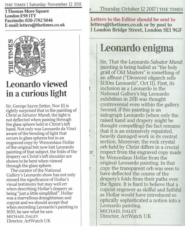
On 20 October, Bendor Grosvenor posted an attack, “’Mystery’ over Leonardo’s ‘Salvator Mundi’”, on a Guardian article written by Dalya Alberge, “‘Puzzling anomaly’ at heart of £75m artwork”.
The Guardian piece had reported my views on the viability of the recent attribution to Leonardo of a damaged and re-restored Salvator Mundi painting (Fig. 3 below) and it had noted the addressing of those views by Walter Isaacson in his new book Leonardo da Vinci ~ The Biography. (My concerns had been published in two – unchallenged – letters to the Times: “Leonardo viewed in a curious light”, 12 November 2011, and “Leonardo enigma”, 12 October 2017. See Fig. 1 below).
Grosvenor carries the following passage from Alberge’s article:
“But in a forthcoming study, Leonardo da Vinci: The Biography, Walter Isaacson questions why an artistic genius, scientist, inventor, and engineer showed an ‘unusual lapse or unwillingness’ to link art and science in depicting the orb.
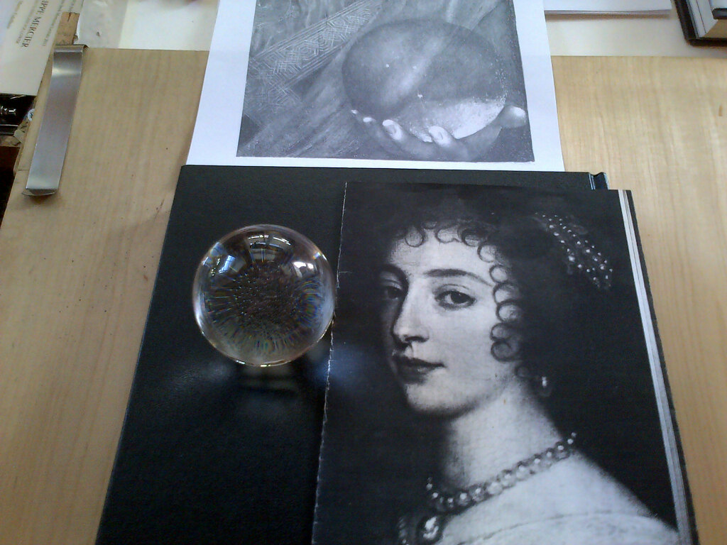
“He writes: ‘In one respect, it is rendered with beautiful scientific precision…But Leonardo failed to paint the distortion that would occur when looking through a solid clear orb at objects that are not touching the orb.’
“‘Solid glass or crystal, whether shaped like an orb or a lens, produces magnified, inverted, and reversed images. [See Fig. 4 below] Instead Leonardo painted the orb as if it were a hollow glass bubble that does not refract or distort the light passing through it.’
“He argues that if Leonardo had accurately depicted the distortions, the palm touching the orb would have remained the way he painted it, but hovering inside the orb would be a reduced inverted mirror image of Christ’s robes and arm.”
Grosvenor then contends that:
“All of which might lead you to believe that Isaacson did not think the painting was by Leonardo, or at least was raising serious questions.”
In so claiming, Grosvenor seemed to have overlooked this further passage in which Alberge reports a conversation she had with the author:
“Isaacson said Leonardo filled his notebooks with diagrams of light bouncing around. So did he [Leonardo] choose ‘not to paint it that way, because he thought it would be a distraction…or because he was subtly trying to impart a miraculous quality’.”
That passage correctly indicates that Isaacson was genuinely perplexed as to why Leonardo had on that occasion not painted in a way that might have been expected, given his great interest and passion for optical laws. It did not say that Isaacson himself had concluded that Leonardo had not painted the picture. However, Grosvenor adds:
“But on his Facebook page, Isaacson writes: ‘Just to be very clear, this article leaves a bit of a false impression. In my new book, I state clearly and unequivocally that the painting of Salvator Mundi is by Leonardo. And I explore the reasons that he did not show the crystal orb distorting the robes of Christ. I say it was a conscious decision on Leonardo’s part. I do not say in my book, nor did I say in the interview, nor do I believe, that anyone but Leonardo painted this painting. I believe he made a decision to paint the crystal orb in a way that is miraculous and not distracting. All of the experts I know agree, from Martin Kemp to Luke Syson.’”
It is not the case that all Leonardo experts endorse the Leonardo attribution. Nor is it apparent why Isaacson might have felt impelled to make such a “lawyered-sounding” statement over what he feared might at most be “a bit of a false impression” but Grosvenor seemed to relish the fact of it:
“So that’s that; nothing to see here. And please don’t be at all persuaded by the attempt, elsewhere in the article, to use Wenceslaus Hollar’s engraving of the Salvator Mundi to cast doubt on the painting. It has been suggested that because the engraving shows some small, in some cases actually imperceptible, differences to the painting at Christie’s, then the painting at Christie’s might not be the painting which was engraved. This is fantasy art history. First, such differences reflect more on Hollar’s ability as an engraver than the painting. Second, compare other examples of Hollar’s engravings with the paintings to which they relate and you will see that he regularly altered aspects of the composition. Third, we cannot know how long Hollar had to study the original. Finally, Hollar saw the painting more than one hundred years after it was painted. Who knows what might have happened to it in that period?”
Grosvenor’s strained disparagement of Hollar’s engraved testimony (“small, in some cases imperceptible”) alludes to quoted remarks of mine in the Guardian article and to my 12 October Times letter (“Leonardo enigma”). Coming as this does from a man who has likened himself to a Mozart among Salieris in the art dealing, sleeper-hunting community, it may require a response consisting of the very clearest visual evidence. Such will follow in a later post. Here, it might be noted that although my position is certainly not shared by Isaacson, it was not disparaged by him in his book. To the contrary, during his interview for the Guardian article he generously acknowledged having been prompted by my views to raise the very question of why Leonardo might have painted the orb in such a strikingly unexpected fashion. In addition, he cited our 12 June 2012 article “Could the Louvre’s ‘Virgin and St Anne Provide the Proof that the (London) National Gallery’s ‘Virgin of the Rocks’ Is Not by Leonardo da Vinci?”. (See Fig. 2 below.)
CODA – Walter Isaacson on the Salvator Mundi in his Leonardo da Vinci ~ The Biography:
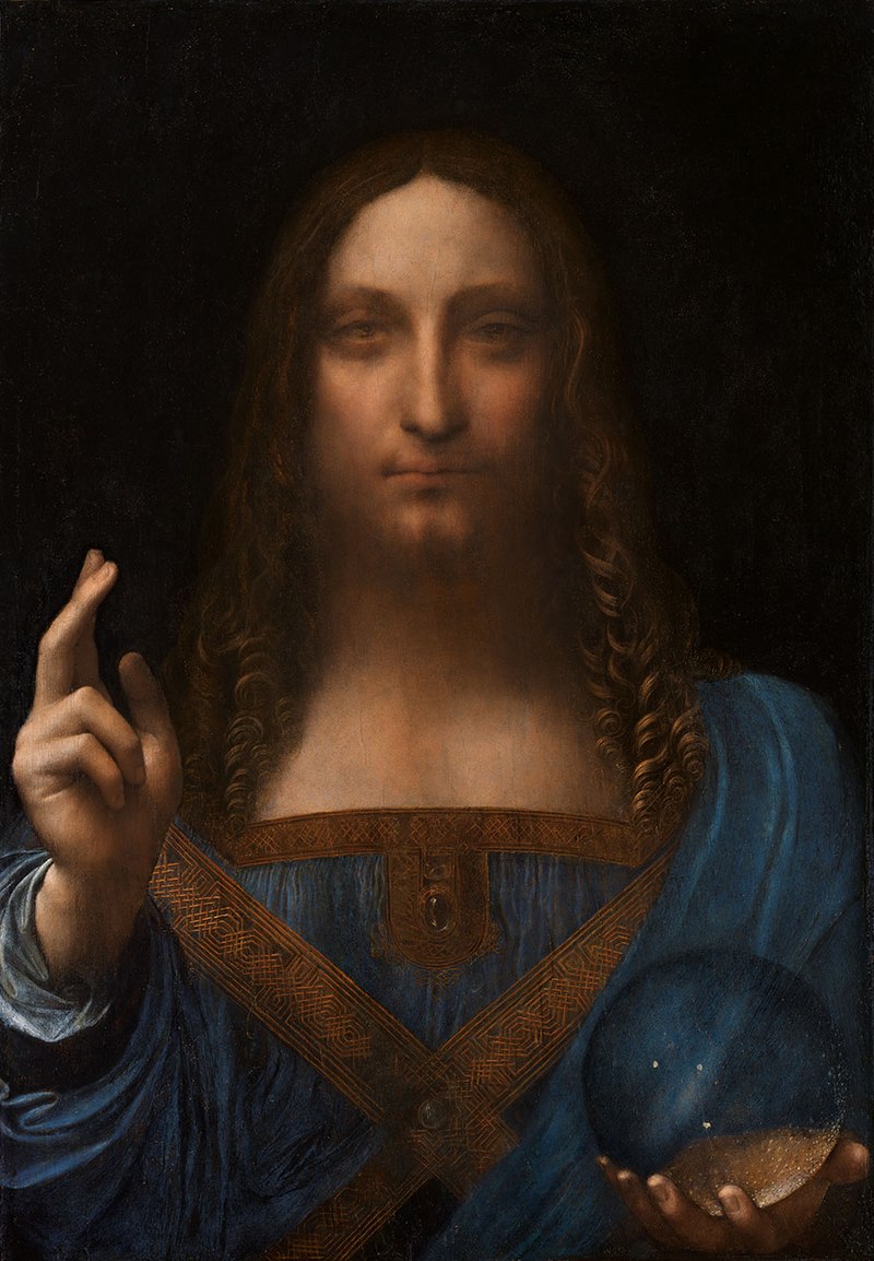
“There is, however, a puzzling anomaly in the painting [see Fig. 3 above], one that seems to be an unusual lapse or unwillingness by Leonardo to link art and science. It involves the clear crystal orb that Jesus is holding. In one respect, it is rendered with beautiful scientific precision. There are three jagged bubbles in it that have the irregular shape of the tiny gaps in crystal called inclusions.
“Around that time, Leonardo had evaluated rock crystals as a favor for Isabella d’Este, who was planning to purchase some, and he captured accurately the twinkle of inclusions. In addition, he included a deft and scientifically accurate touch, showing he had tried to get the image correct: the part of Jesus’ palm pressing into the bottom of the orb is flattened and lighter, as it would indeed appear in reality. But Leonardo failed to paint the distortion that would occur when looking through a solid clear orb at objects that are not touching the orb. Solid glass or crystal, whether shaped like an orb or a lens, produces magnified, inverted, and reversed images. Instead, Leonardo painted the orb as if it were a hollow glass bubble that does not refract or distort the light passing through it. At first glance it seems as if the heel of Christ’s palm displays a hint of refraction, but a closer look shows the slight double image occurs even in the part of the hand not behind the orb; it is merely a pentimento that occurred when Leonardo decided to shift slightly the hand’s position. Christ’s body and the folds of his robe are not inverted or distorted when seen through the orb. At issue is a complex optical phenomenon. Try it with a solid glass ball [see our demonstration at Fig. 4 below]. A hand touching the orb will not appear to be distorted. But things viewed through the orb that are an inch or so away, such as Christ’s robes, will be seen as inverted and reversed. The distortion varies depending on the distance of the objects from the orb. If Leonardo had accurately depicted the distortions, the palm touching the orb would have remained the way he painted it, but hovering inside the orb would be a reduced and inverted mirror image of Christ’s robes and arm.
“Why did Leonardo not do this? It is possible that he had not noticed or surmised how light is refracted in a solid sphere. But I find that hard to believe. He was, at the time, deep into his optics studies, and how light reflects and refracts was an obsession. Scores of notebook pages are filled with diagrams of light bouncing around at different angles. I suspect that he knew full well how an object seen through a crystal orb would appear distorted, but he chose not to paint it that way, either because he thought it would be a distraction (it would indeed have looked very weird), or because he was subtly trying to impart a miraculous quality to Christ and his orb.”
Michael Daley, 23 October 2017
A memorial lecture, two journals and an assault on scholarship
‘Never trust the teller trust the tale’, cautioned DH Lawrence. He meant: don’t pay attention to what anyone tells you about a work of art, not even the artist; nor, we might add, a ‘curator of interpretation’. Study it yourself. But can we always trust the evidence of our own eyes?
THE ANNUAL JAMES BECK MEMORIAL LECTURE: ‘Never trust the teller trust the tale’
On 7 November the ninth annual ArtWatch International James Beck Memorial Lecture will given by Robin Simon and held in Burlington House, Piccadilly, London, W. 1. Robin Simon is Honorary Professor of English at University College, London, and the editor of The British Art Journal, which esteemed publication has launched an attack on the prohibitively high fees that museums now charge scholars for reproducing works of art – even when, as often, these are publicly owned and out of copyright – in their publications and lectures (- see below “A licence to print money, a licence to kill scholarship, at the Tate, the British Museum and the National Portrait Gallery”). His recent books include Hogarth, France and British Art and (with Martin Postle) Richard Wilson and the Transformation of European Landscape Painting. Professor Simon writes:
‘Never trust the teller trust the tale,” cautioned DH Lawrence. He meant: don’t pay attention to what anyone tells you about a work of art, not even the artist; nor, we might add, a ‘curator of interpretation’. Study it yourself. But can we always trust the evidence of our own eyes?
Above, Mars chastising Cupid by Bartolomeo Manfredi (1582–1622), 1613. Art Institute of Chicago.
For details of the (evening) lecture and tickets, please contact Helen Hulson at:hahulson@gmail.com.
THE ARTWATCH UK JOURNAL AND THE PROCEEDINGS OF THE 2015 CONFERENCE ‘ART, LAW AND CRISES OF CONNOISSEURSHIP’
Later this month we publish the ArtWatch UK members’ Journal No. 31. It comprises 112 pages and contains the full and illustrated proceedings of the 5 December 2015 conference “Art, Law and Crises of Connoisseurship” organised by ArtWatch UK, the Center for Art Law, New York, and LSE Law – see below. It will be followed in December by issue No. 32, a special edition on Michelangelo. The ArtWatch UK Journal, is not sold but is distributed free to all members. For membership details please contact Helen Hulson at: hahulson@gmail.com.


A LICENCE TO PRINT MONEY, A LICENCE TO KILL SCHOLARSHIP, AT THE TATE, THE BRITISH MUSEUM AND THE NATIONAL PORTRAIT GALLERY
The British Art Journal (XVIII, 1 2017) editorial in full:
Compare two statements, beginning with the National Gallery of Art, Washington:
NATIONAL GALLERY OF ART. OPEN ACCESS POLICY FOR IMAGES OF WORKS OF ART PRESUMED IN THE PUBLIC DOMAIN.
‘With the launch of NGA Images, the National Gallery of Art implements an open access policy for digital images of works of art that the Gallery believes to be in the public domain. Images of these works are now available free of charge for any use, commercial or non-commercial. Users do not need to contact the Gallery for authorization to use these images. They are available for download at the NGA Images website (images.nga.gov).’
Now the Tate:
‘One of Tate’s core goals is to promote enjoyment of, and engagement with, art and artists within our collection, to audiences wherever they are in the world. As part of this, we are releasing some of our Archive collection digital content and some items from our main Collection for use for non-commercial and educational purposes under a Creative Commons CC-BY-NC-ND 3.0 (Unported) licence. The aim is to provide a simple, standardised way to grant copyright permission for the use of Tate’s intellectual property (its photography) and artists’ creative work for specific uses only, whilst safeguarding Tate’s own income from its IP in commercial contexts whilst ensuring artists, copyright holders and Tate get credit for their work and are protected by law.’
And so what, then, is ‘commercial’ use? The Tate begins:
‘Creative Commons defines commercial use as “reproducing a work in any manner that is primarily intended for or directed toward commercial advantage or monetary compensation”.’
Unfortunately for the Tate, this does not suit it at all, since no-one could argue that academic work in particular is ‘primarily intended for or directed toward commercial advantage or monetary compensation’. If it were to be excluded, the Tate would not be able to seize fees for the vast majority of publishing about its collections. And so it simply invents its own definition, even while still invoking the Creative Commons licence, bringing academic (and indeed any other) work within ‘commercial use’, as follows:
‘Tate further defines commercial use… [our italics] [as] use on or in anything that itself is charged for [! our exclamation], on or in anything connected with something that is charged for, or on or in anything intended to make a profit or to cover costs [we are running out of !s]… Tate would usually regard the following uses of Tate imagery as commercial activity: use online or in print by commercial organisations, including (for the avoidance of doubt) trading arms of charities; use on an individual’s website in such a way that adds value to their business, or for promotional purposes, or where offering a service to third parties; use of images by university presses [we can afford one more !] in publications online or in print; use in publicity and promotional material connected with commercial events; unsolicited use of images by news media, including front covers and centre-page spreads; use in compilations of past examination papers; use by commercial galleries and auction houses.’
And so any publication, however useful to the Tate in expanding public knowledge and understanding of works in the collection, if it is to avoid the hefty fees that the Tate imposes, must needs be handed out free and never, ever, published by a university press… This attitude is disgraceful. Alas, the British Museum, which under Neil MacGregor and Antony Griffiths had a praiseworthy free use of images in Prints and Drawings, has followed the Tate’s lead and now invokes a Creative Commons licence with the purpose of imposing reproduction fees, as does the National Portrait Gallery.
The Tate has given up on attempts to assert copyright in works of art that are actually out of copyright, and instead asserts that it is now, rather, protecting the copyright of its photographs of those works, defining them as its ‘intellectual property’ (IP) in what is meant to be a nifty sidestep. That cannot, however, avoid the fact that, as we have pointed out in these pages, this is unsound in law, in view of the purely mechanical nature of the image-recording operation. Fascinatingly, the NPG seems to have a different understanding of the matter, asserting in a letter in response to an enquiry about it:
‘The National Portrait Gallery owns the copyright of the majority of the images in its collection. Even if an image is “out of copyright”, as it is still part of the collection of the National Portrait Gallery, then copyright continues to be managed by the Gallery.’
This runs directly contrary to copyright law defined in the NPG’s own ‘Introduction to copyright’, as follows:
‘Under the UK Copyright, Designs and Patents Act 1988 (as amended), copyright protects original literary, dramatic, musical and artistic works; films; sound recordings; broadcasts and typographical arrangements… Copyright usually lasts for the creator’s lifetime, plus the end of 70 years after their death.’
Precisely. We note that works under copyright must be ‘original’ in UK law. But the photographs of works in these collections, if they are to the job they are required to do, must needs exclude originality and remain precisely faithful to, yes, the original works – most of which are, of course, out of copyright.
The adoption of Creative Commons licences has nothing to do with the law of copyright in the UK. It is simply a device adopted in order to allow the museums to continue to charge for the reproduction of out-of-copyright works of art in their care, which, moreover, belong to the public they are charging for use. There seems, frankly, no good reason for this restrictive practice if these museums are indeed concerned, as the Tate puts it, ‘to promote enjoyment of, and engagement with, art and artists’. Could it be, then, that its purpose is to perpetuate the employment of the gallery staff who collect the money? Any fees collected will be largely cancelled out by costs: salaries, administration, office space, equipment, pensions and so on. Any profits are likely to be minimal and of no real help to the institution: but they are obtained at the greatest possible cultural and educational cost.
For a museum that is not a profit; it is a loss.
For whose benefit do these museums exist? Do they exist for the benefit of the staff who run them or for that of the public and the world of knowledge they were created to serve? Do they aim to enhance knowledge of their collections? If so, why do they go out of their way to penalize any publication or form of dissemination of images that does that work for them? The use of images of works of art in ‘news media… front covers’ or even on biscuit tins, bathmats or shower curtains, all serve the same purpose, which, to repeat, the Tate defines as ‘to promote enjoyment of, and engagement with, art and artists’.
Strange to say, these ‘Creative Commons’ licences originate in the USA where, however, the position, as set out by the NGA above, is clear and simple, and directly contrary to that of these UK museums. No wonder the Tate has to add so many subordinate clauses and pseudo-legal assertions to the provisions of the Creative Commons licence it invokes.
It would be a far, far better thing if these pointlessly rapacious museums in the UK adopted a different, transatlantic, model: that of the National Gallery of Art in Washington and of countless other museums throughout the USA. What are they afraid of?
And who pays for digitizing their images? It so happens that the Paul Mellon Centre for Studies in British Art handed out it largest ever grant, £500,000, to the British Museum to digitize its British drawings, surely not with the intention that the museum might now charge for their use. The Mellon Centre’s parent institution is the Yale Center for British Art – where images of artworks in the collections are offered free for any purpose.
To return to the Tate… If, say, you look up Arthur Melville on the Tate website you will find that his biography, far from being written by a curator, as one might hope, is simply a link to Wikipedia. By what right? Yes, by yet another Creative Commons licence which, luckily for the cynical Tate, states on the Wikipedia site that anyone may ‘share… copy, distribute and transmit the work… for any purpose, even commercially.’
Now that sounds like a sensible licence.
Michael Daley, 17 October 2017
The (not so-new) latest New Leonardo Discovery
On 29 September it was widely reported that researchers at the Louvre now believe that a drawing at the Musée Condé in Chantilly – the so-called “Joconde nue” – to be Leonardo’s lost preparatory nude study for the Mona Lisa.
The claimed discovery seemed bold and unleashed global coverage – see, for example, the BBC’s ‘Mona Lisa nude sketch’ found in France, National Geographic’s ‘Nude Mona Lisa’ Sketch May Have Been da Vinci’s, and Fortune’s ‘Historians Think They’ve Found a Nude Drawing of Mona Lisa’
In reality, this latest New Leonardo Discovery is a warm-up of an old, on-the-record, attribution. In 1988 Jacques Franck, the art historian/painter trained in Old Master techniques (and a current restoration adviser to the Louvre), had closely examined the Joconde nue in the Château of Chantilly along with Amélie Lefébure, former Head curator of the Musée Condé, and Dominique Le Marois, a restorer in the French museums. At that date the drawing had long been considered the work of an anonymous Leonardo imitator and contemporary but on close visual examination Franck concluded that it was mostly executed by Leonardo and he advised the then director of the Chantilly Estate, Prof. Germain Bazin, accordingly. His (written) ascription was accepted by leading Leonardo specialists, including Profs. Bazin and René Huyghe.
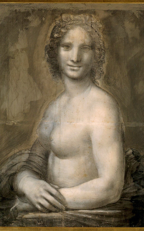
Above, Fig. 1: Here attributed to Leonardo da Vinci, Joconde nue, c. 1500-1506 ?, black chalk on brown prepared paper, 72 x 54 cm. Chantilly, Musée Condé, Inv. 32 (27).
Above, Fig. 2: a detail of Joconde nue (as published showing prick marks when the design was transferred for use on panel.)
Because the Joconde nue had been heavily retouched over the centuries and rendered barely legible in many sections, some thought it necessary that it be subjected to a wide range of forensic tests. This was rejected by Prof. Bazin for fear that, should the work be widely accepted as a true Leonardo, it would then undergo a drastic and likely harmful cleaning. Although forensic investigations have improved significantly in the last thirty years, that risk remains. On his personal recollections of the sheet and in the light of the restorer M. Le Marois’s alarming and still extant 1988 condition report, Franck now fears that an essentially technical underpinning of the Leonardo ascription will prompt further and more invasive technical interventions. He tells AWUK:
“The Joconde nue’s authentication by scientific means will be quite a challenge to the Louvre’s laboratory. For sure they will be able to check the paper and date it correctly, yet the materials in themselves cannot establish that the drawing is the work of Leonardo himself as opposed to that of a close disciple. The composition has been considerably harmed by apocryphal retouchings and the pricking for transfer onto a panel to get an oil painting out of it [See Fig. 2 above and Fig. 5 below]. Further, at a later date, possibly in the 19th century, some thick aqueous paint was applied to the background in order to conceal various alterations (stains, rings, etc.). As a result, many of the forms are hardly legible in terms of Leonardo’s artistic standards.
“The brutal interference of the alterations with the impalpable modelling on which Leonardo’s overall drawing is based has grossly denatured it. When I realized this, I intended to clean the work ‘virtually’ by reconstructing the drawn composition as closely as possible to what it had once been. The task would have been huge but this reaffirmation of my conclusions on the drawing’s status provides a compelling and urgent occasion for that task to be undertaken soon. The growing conceit of restorers that they can recover original states that have been largely subsumed within alien and deleterious additions has repeatedly been shown to be foolhardy with Leonardo.”
As in 1988, the authenticity of the Chantilly cartoon should stand or fall today on the strength of its aesthetic force and originality, which is to say: as seen by eye and not on the basis of some technical analysis of the drawing’s component material innards. Nearly three decades ago Jacques Franck felt that he had seen enough with his trained draughtsman’s eye to make a firm ascription to Leonardo (as was reported in letters to the then director) and today he recalls that:
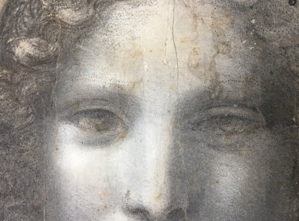
“Besides the characteristics of Leonardo’s late style visible in so many chalk drawings (either red or black), kept notably in the Queen’s collections at Windsor, what struck me at once was the hands. Their execution reminded me of the underdrawing of the Mona Lisa’s own hands in the Louvre picture as revealed in infrared light [See Figs. 3, 4, 6, 7 and 8]. Although such forensics weren’t as developed in 1988 as they are now, at the time the extant infrared images of the Mona Lisa [see Fig. 7 for a more recent image] were defined well enough to help my eye notice that extraordinary resemblance between the painted and drawn hands at first glance. Leonardo had clearly used a very fine brush to trace the contours of the fingers in the cartoon and the painting, hence the thin outlines to be seen in the fingers in both. This similarity isn’t mere chance, it simply means that the hands and, of course the rest of the cartoon is indeed a Leonardo work. Also, the Joconde nue’s forefinger was obviously longer at the outset [Figs. 7 and 8] but Leonardo changed his mind and reduced its length afterwards using wash, exactly as it is in the Louvre picture now. A crucial pentimento probably meaning that the Chantilly cartoon preceded the painted version of the famous portrait.”
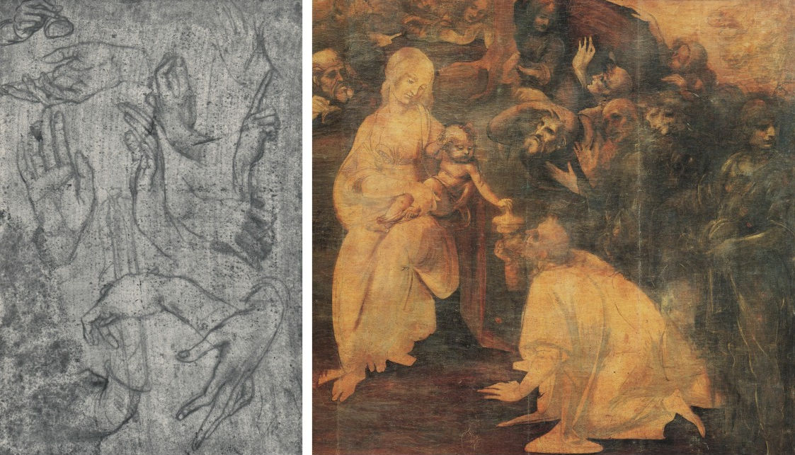
Above, Fig. 3: (left) Leonardo da Vinci, Studies of hands, c. 1480-81, silver-point on pink prepared paper, Windsor Castle, Royal Library, n° 12616; (right) a section of Leonardo da Vinci, the Adoration of the Magi, 1480-81, oil on wood panel, 246 x 243 cm. Florence, Uffizi Gallery, Inv. 1890 : n° 1594.
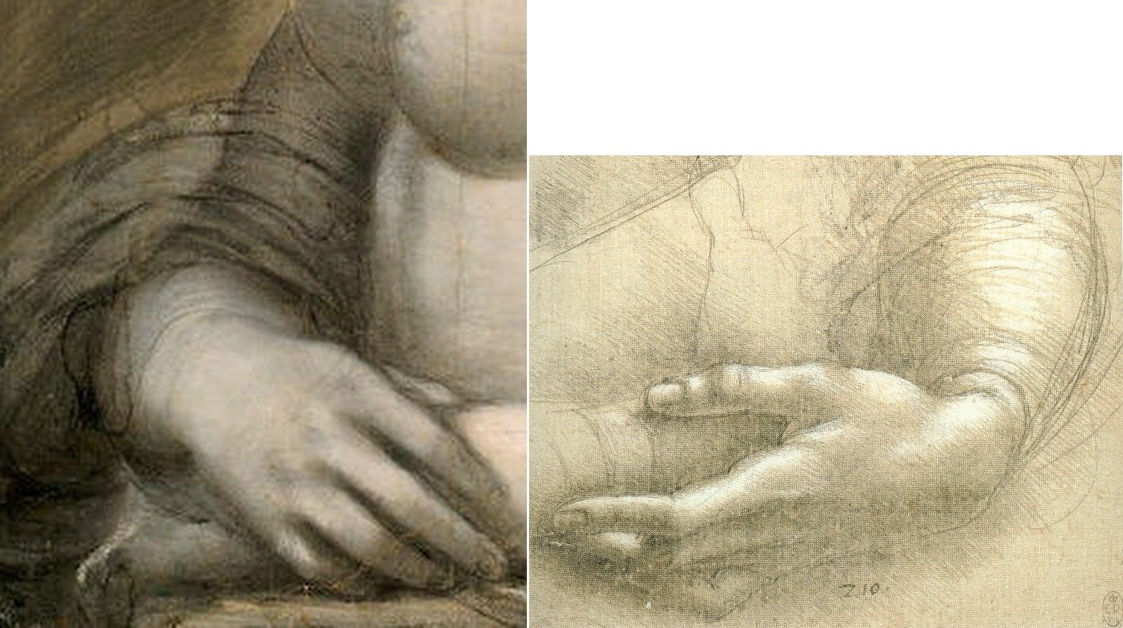
Above, Fig. 4: (left) a detail of the hands of Joconde nue, at Fig. 1; (right) Leonardo da Vinci, Studies of a woman’s hands, c. 1478 (?), silver-point, heightened with white on pink prepared paper, 21. 5 x 15 cm. Windsor Castle, Royal Library, n° 12558.
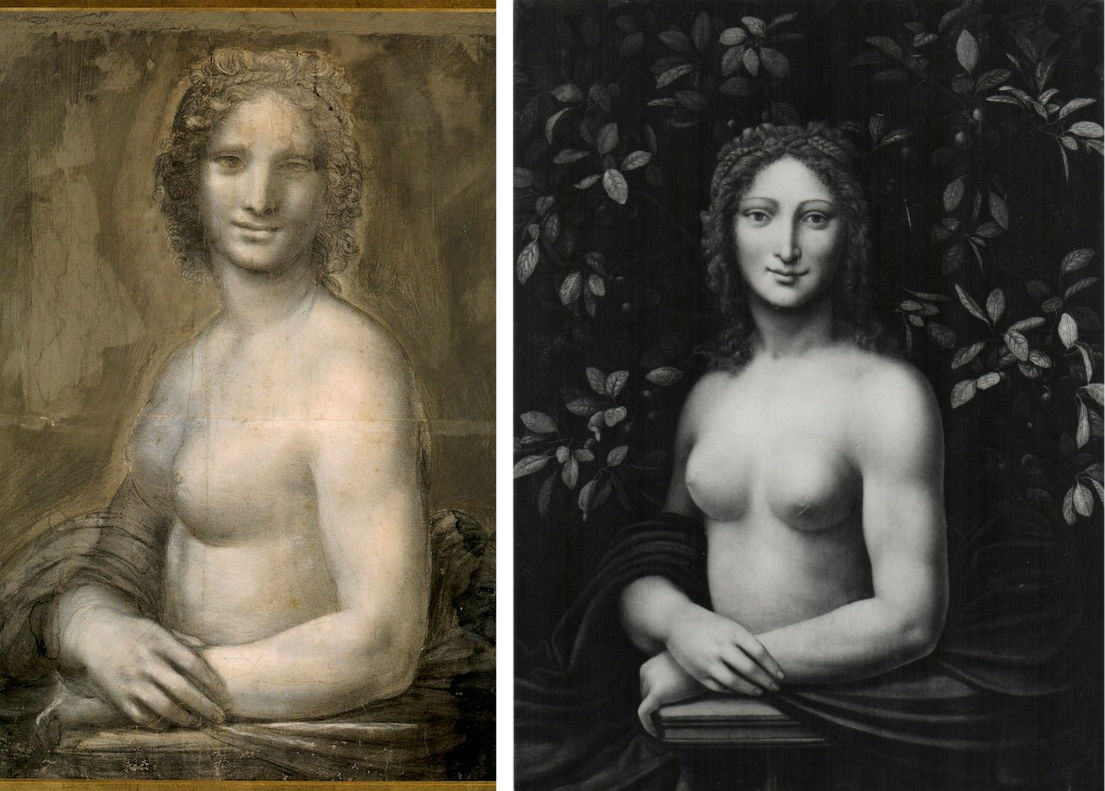
Above, Fig. 5: (left) Joconde nue; (right) After Leonardo da Vinci, Joconde nue as Primavera, 16th century (?), 89 x 65 cm. Switzerland, private collection (formerly Mackenzie collection).
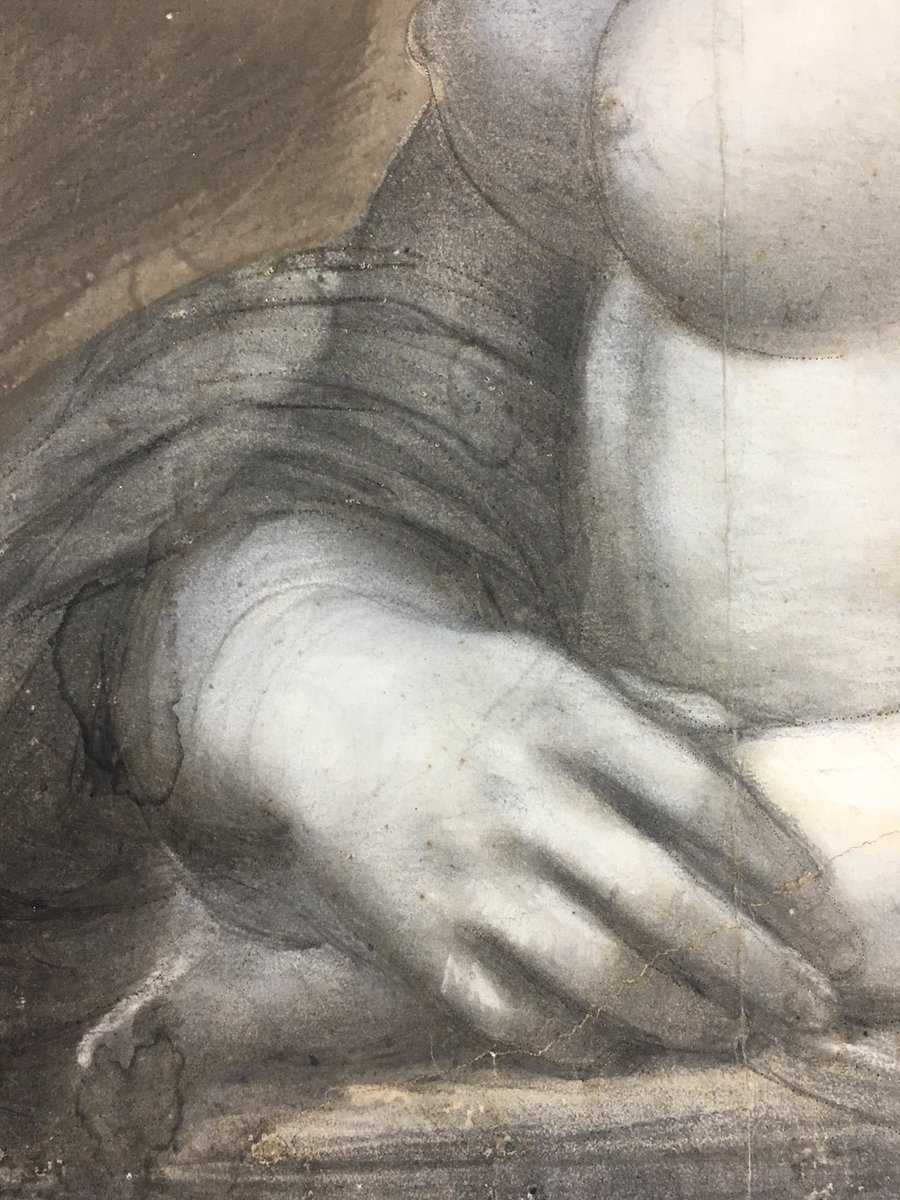
Above, Fig. 6: a detail of Joconde nue showing prick marks used for transferring the design, and, the artist’s revision and shortening of the index finger.
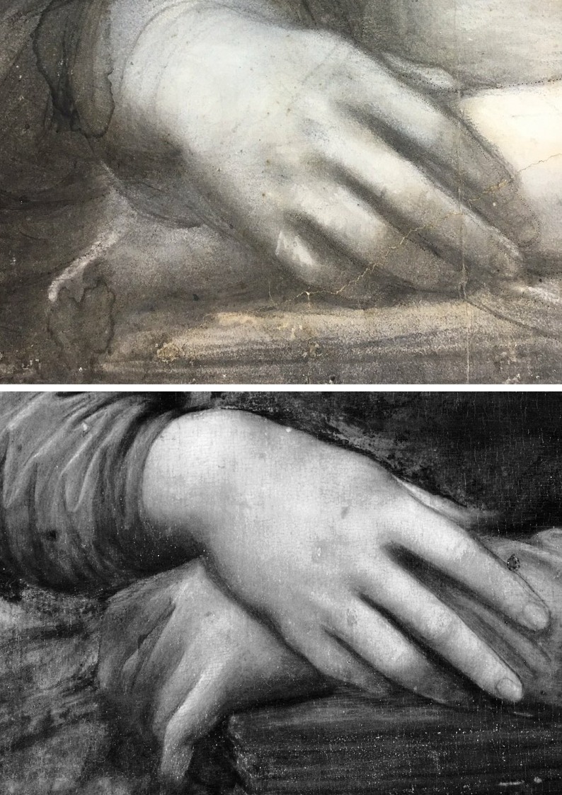
Above, Fig. 7: (top) the revised right hand of Joconde nue and (bottom), by way of comparison, a circa 2004 Louvre infra-red image (all rights reserved) of the right hand of the Mona Lisa.
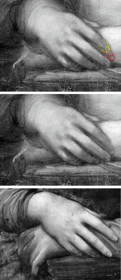
Above, Fig. 8: showing (top) the revised right hand of Joconde nue with the first state of the forefinger indicated in red and the revised state indicated in yellow – graphic by Gareth Hawker; (centre) the right hand of Joconde nue and, by way of comparison, (bottom) the right hand of the Mona Lisa as seen in the Louvre infra-red image at Fig. 7.
Michael Daley, 3 October 2017
Mondrian, Schmondrian – another lapse of museum expertise
Another day, yet another herd of museum experts are bitten by a work that should not, on a cursory glance, have been taken as what it purported to be.
Yesterday Nina Siegal reported in the New York Times (‘It Might Have Been a Masterpiece, but Now It’s a Cautionary Tale’) on the mega-embarrassment of museum experts at the Bozar Center for the Arts in Brussels, the Stedelijk Museum in Amsterdam and the Zentrum Paul Klee in Bern, Switzerland, who had all taken on trust a work of unexamined provenance owned by an anonymous private collector who lives in Switzerland. As Ms Siegal puts it:
“What started out as a potentially major cultural discovery now turns out instead to be a cautionary tale about the dangers of presenting works of art owned by private collectors that have not been systematically vetted. In this case, art experts seem to have passed the buck on conducting basic due diligence on the artwork before displaying it as a Mondrian — putting their own reputations on the line because they gave such credence to a private collector.”
It seems that the director of the Stedelijk Museum saw the pretendy Mondrian at the home of the said collector and discussed the possibility of exhibiting it at the Stedelijk – to which museum it was sent for examination. In self-exculpation the museum now bleats in a reported official statement that a) the Stedelijk was unaware of any doubts about the painting’s authenticity – despite the fact that it had twice been rejected by a leading authority on the artist, and, b) that, besides, the task of a museum is: “to promote art, try to show works that are not yet known to the public and in order to do so, build connections with private collectors. It is not the role of a museum to determine authenticity of a work.”
We beg to differ. We would respectfully suggest that it is the first and prime duty of a museum to know its art from its elbow. All museums should look carefully and critically at any work offered on loan and take nothing on trust. In this case the most obvious first step would have been to compare the photograph of the bona fide Mondrian that had been thought lost during the Second World War with a photograph of the newly presented work and see if any differences emerge. We show below the lost Mondrian on the right and its supposedly resurrected self on the left. Is it really so difficult these days for museum experts to see that these two photographic records are not of the self-same work?
Michael Daley, 20 September 2017
23 September 2017, UPDATE. Philip Coucke, a member of the Brussels Bar, writes:
“The Belgian Bozar ‘center of the arts’ paid several thousand euros for a restoration of the fake Mondrian in consideration of the loan. Their lame excuses sound like a politician trying to explain away the inexplicable – ‘We are not a museum’ and we don’t do ‘authentications’. Why would any publicly funded institution pay for the restoration of admittedly ‘unauthenticated’ paintings?”
BOOK REVIEW – “For Our Freedom and Yours”
Don Reynolds, The Art and Life of Andrew Pitynski, Perennial Wisdom Press, 2015, hardback, 536 pp, ISBN: 978-0-9814755-0-9

“A monument is an expressive symbol. A good one, looked at for even a few minutes, will remain in memory for years or even for an entire lifetime. Monuments are the milestones in a nation’s history.” – Andrew Pitynski
Peter Gibbon writes: On Boston Common once stood a gigantic sculpture of gaunt soldiers riding emaciated horses, spears pointed to the sky. The soldiers are Polish partisans resisting Joseph Stalin. A statue of Marie Curie, wearing her two Nobel Prize medals, stands in front of the Bayonne Public Library in New Jersey. The aluminum portrait bust of a proud, sad Frederick Chopin stares at a visitor in an artist’s studio in Poland.
These are just a handful of the 200 sculptures, commemorative medals, and portrait busts created by the Polish-American sculptor Andrew Pitynski that can be found in Donald Martin Reynolds’ splendid and beautifully illustrated new biography, “For Our Freedom and Yours,” The Art and Life of Andrew Pitynski, Portrait of an American Master.
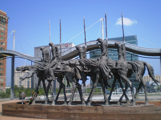
Above: Partisans 1, Andrew Pitynski’s 1979 sculpture, as installed in 2007 at The Silver Line World Trade Center Station, Boston MA.
Reynolds brings to Pitynski a lifetime of studying sculpture, a belief in the importance of monuments, and a commitment to the figure and realism. “Monuments,” Reynolds writes, “when properly celebrated, can become forces within society for the perpetuation of traditions and human values.” To research Pitynski, Reynolds travelled to Poland, interviewed Pitynski’s family and friends, walked through cemeteries, toured battlefields, visited the sculptor’s classrooms and studios, and immersed himself in the craft of shaping the human figure out of metal and clay.
The result is a vivid, often tragic family history, a compelling personal biography, and an odyssey through Poland’s painful past, filled with war, imprisonment, tyranny, and torture. The book is also a celebration of Polish resistance and resilience. It is elegant, nearly 500 pages filled with historical photographs, hundreds of Pitynski’s etchings and charcoal drawings, portrait busts, reliefs, commemorative medals, and monumental sculptures. The endnotes testify to Reynolds’ diligent research, and the detailed explanations of Pitynski’s intricate art demonstrate Reynolds’ critical acumen.
Reynolds starts by telling the fascinating story of how a young man, marooned in Communist Poland, became an artist. Pitynski comes from a distinguished Polish family. Embedded in his DNA are horses, rafting, fishing, Catholicism, and a fierce resistance to Poland’s many oppressors, particularly the Communists who shot Pitynski’s grandmother and captured, imprisoned, and tortured his father. One of the most powerful images in the book is the bronze portrait bust of his father, his face clearly battered by beatings, his gaze stubborn and defiant.
Under Communist rule, Pitynski struggled to get an education and find his artistic voice. An elementary school teacher recognized his talent and a high school principal encouraged his defiance. Though discouraged by Communist officials, Pitynski persisted, remembering, “I knew my day would come when I could speak out through my art.” Eventually, he was admitted to the prestigious Cracow Academy of Fine Arts, which in the words of Reynolds was “…a formal and tangible affirmation of the vitality and continuity of Polish culture…”
At the Cracow Academy, Pitynski learned the craft of bronze casting, studied Polish folk art, took a few lessons from “socialist realism,” and tried to ignore the Communist message he detested. By chance, in 1974 he obtained a visa to America. He remembers: “As I stepped on to that American plane on October 3, 1974, I looked back and smiled to myself. I knew that I would never return to that Poland, to those Communist bastards. And for the first time in my life, I felt really free.”
Pitynski worked in demolition, made contacts, and taught art and sculpture at schools in Princeton, New Jersey, and Greenpoint, Brooklyn. He received commissions and came to the attention of Seward Johnson, America’s foremost artisan/entrepreneur. Johnson founded the International Sculpture Center of Hamilton, New Jersey, and is known for his life-sized sculptures of ordinary people engaged in day-to-day activities. These sculptures can be found in cities all over America. Johnson encouraged Pitnyski to create his monumental partisan statue on the Boston Common. At the end of the Cold War, as Poland moved itself towards independence and self-determination, Johnson commissioned a more heroic version for his sculpture gardens in New Jersey
Pitynski has chosen to represent his nation’s calamity: Chopin’s exile, the 1940 Katyn Massacre of Polish officers and intellectuals by Russia, the deportation of Polish men and women to Siberia, the German and Russian torture chambers, the bitter civil war and underground resistance that continued after 1945.
Simultaneously, Pitynski portrays with painstaking research and historical accuracy his nation’s commitment to resistance and freedom. He also portrays its heroes: Jan Paderewski, the famous pianist who persuaded Woodrow Wilson in 1920 to include an independent Poland in his Fourteen Points; Jan Karski, the Polish resistance fighter, who first alerted the world to the reality of the Nazi death camps; and Pope John Paul who, along with the partisans, helped end Communist rule.
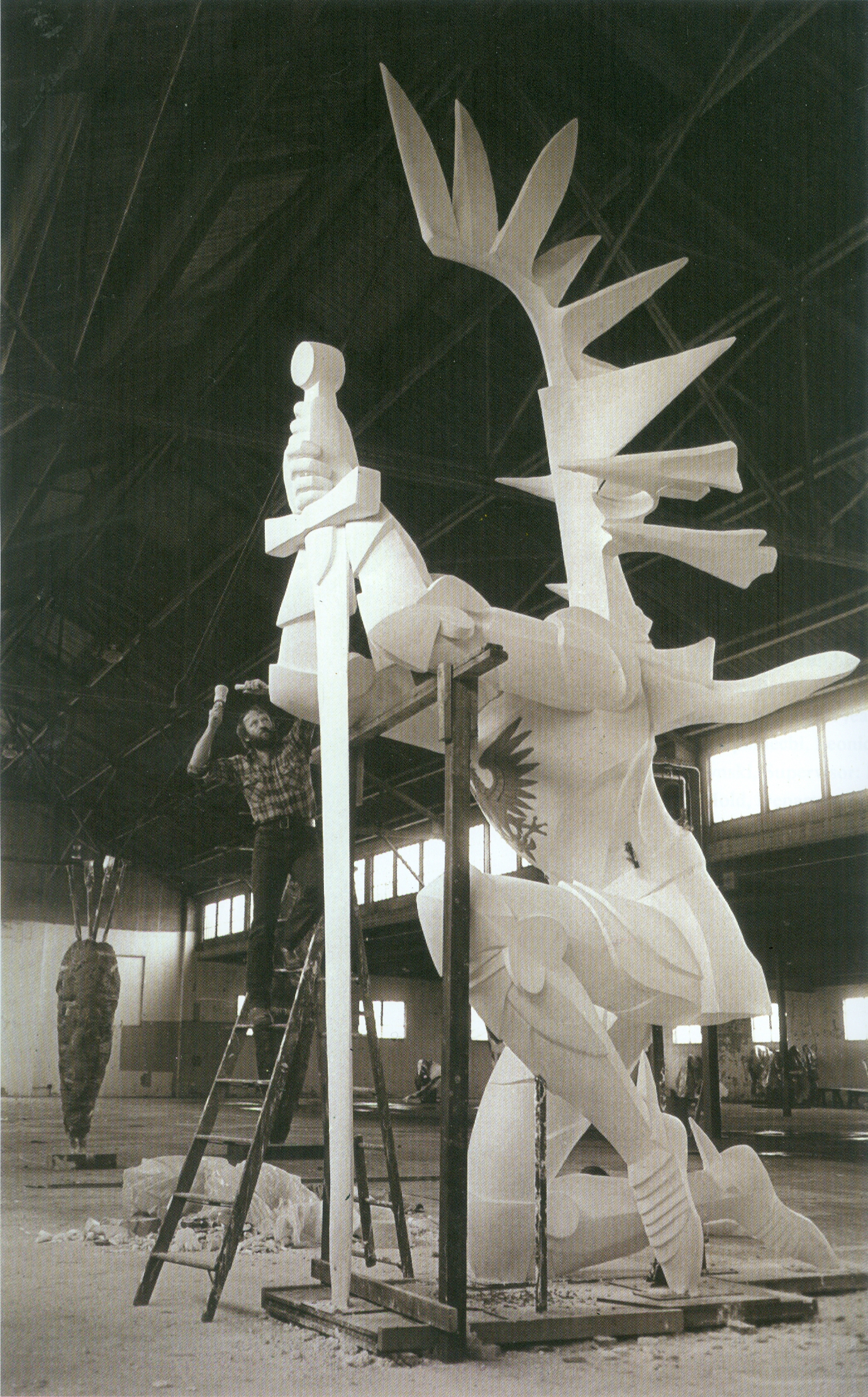
Above: Andrew Pitynski at work on the plaster for Avenger in 1986; below, the bronze and granite Avenger monument at Doylestown, PA, 1988.


Why does Pitnyski’s work matter to Americans? There are Polish Americans living in Greenpoint, Brooklyn; in Doylestown, Pennsylvania; on the Lower East Side of Manhattan; in Chicago’s South End; and spread out in Milwaukee. They and their ancestors fled deprivation and tyranny. They remember Poland’s catastrophic 20th century, offer commissions to an artist who remembers his homeland, and attend the dedication of his monuments.
Pitynski also celebrates Poles who fought for America’s freedom. In medals he celebrates Kazimierz Pulaski, the father of American Cavalry who, as Reynolds notes, wrote to George Washington: “I came here, where freedom is being defended, to serve it, and to live or die for it.” In St. Petersburg, Florida, a bronze, eight-foot high stature of Thaddeus Kosciuszko stands on top of a granite base. An engineer, Kosciuszko designed the fortifications along the Hudson River at West Point. He is portrayed in military uniform, his right arm thrusting forward his famous will in which he leaves his entire estate to the Negroes of America so that they could be free, educated and assimilated. Of Kosciuszko Jefferson said: “He is as pure a son of liberty, as I have ever known and of that liberty which is to go to all, and not to the few or rich alone.” Pitynski reminds us he is engaged in an eternal fight “for our freedom and yours.”
In a cynical age, Pitynski is patriotic, idealistic, and realistic. Where moral relativism is common, Pitynski is didactic and certain. In an art world fond of abstract sculpture, Pitynski is devoted to classical beauty, representation, romanticism, and reality—all making his work arresting and moving.
Donald Martin Reynolds has spent his career describing and appreciating monuments. They are, he insists, a reflection of a society’s values, a preservation of the past, an escape from death, and an inspiration to the living. In Pitynski’s work, he sees “the deeper truths of nobility, patriotism, and loyalty.” In this, Reynolds is describing his own credo.
Peter Gibbon is a Senior Research Scholar at the Boston University School of Education and the author of A Call to Heroism: Renewing America’s Vision of Greatness (Atlantic Monthly Press, 2002). He has directed four Teaching American History programs and is currently the director of an NEH Seminar, “Philosophers of Education: Major Thinkers from the Enlightenment to the Present.”
Don Reynolds gave the 2016 James Beck Memorial Lecture on the art and life of Andrew Pitynski.

25 June 2017.
BOOK REVIEW – A Restoration Palindrome
Noémie Étienne, The Restoration of Paintings in Paris, 1750-1815: Practice, Discourse, Materiality, Getty Publications, 2017, paperback, 302pp + xiv, 35 col./34 mono illus., £45/$69.95, ISBN 978 60606 516 7
Alexander Adams writes: This title does not discuss the actual techniques used by restorers of the period but discusses the way restoration was seen and how business was conducted. The author examines the underlying assumptions of collectors, critics, administrators and restorers at time of great change in French (and European) history.
“A painting cleaned is a painting ruined; a thing to which the dealers never agree, but it is nonetheless true.” So Pierre-Jean Mariette (1694-1774) wrote posthumously in 1851-3. Restoring was a controversial practice even in its early days. “Individuals engaged in some kind of restoration in Paris between 1750 and 1815 were generally also dealers, experts, copyists, or painters. That versatility underscores the breadth and variability of the profiles involved. The activity itself was nurtured by numerous related occupations, such as painting and forgery.” In business directories of the time, the classification of restorers was unclear and changeable. Dealers – initially based near the Louvre but later more widely distributed in central Paris – commonly repainted, retouched, cropped and expanded paintings that passed through their hands and a small community of restorers grew up to support such activity.
Restorers worked for the Louvre, the court and for private collectors. Restorers long maintained secrecy to prevent competition and to avoid criticism, though they were often berated for their secrecy, which began to dissipate in 1802 when the first published description of technique used on a specific art work by the restorer in question. There was a clear conflict here. Museum administrators recognised the right (and necessity) of allowing private craftsmen to conceal their methods from competitors; at the same time the administrators needed to know the safety and permanency of operations being carried out upon museum property.
Renowned restorers such as Robert Picault could command huge sums for work on important pictures, such as Raphael’s St Michael. Despite these triumphs there are cases such as that of a 35,000-franc Rubens painting being reduced in value to 5,000 francs due to Picault’s aggressive overpainting. Restoration sometimes made paintings more saleable, sometimes worthless wrecks.
Only after the Revolution (and then only gradually) did restoration become to be seen as a distinct discipline. The proposed professionalization of restoration practitioners in Paris was complicated by the unclear division between the menial craftsmen who made the panels and stretchers and were more likely to do the work of relining oil paintings and detaching frescoes and the skilled artisans who reserved the prerogative of cleaning, varnishing and retouching the painting surfaces.
Already at this time there was a division between those favouring methods which distinguished between original and restoration and those advocated extensive, invisible in-painting, including invention of absent passages. Bedotti recommended improving works where possible:
“For it sometimes happens to even the most skilful painters to make mistakes that are too gross and too visible. In that case, one must not fear to seek and to remedy, wherever possible, and to improve the painting by eliminating or concealing the most shocking mistakes.”
Others explicitly opposed such intervention, sometimes on the purely aesthetic grounds that retouchings discoloured at a different rate (and in a different way) to the original paint, thus leaving old restored paintings an ugly patchwork of tones.
The more famous the master, the more enthusiastically it was overpainted in order to freshen it. Work on the Raphael St Michael was considered especially egregious, with details repainted. Jacques-Louis David was also critical of restorations to Raphaels, which had subdued the master’s colours. By 1800 the relining process was heavily criticised for flattening impasto and removing the brushstroke, thereby altering the character of paintings.
Attitudes towards cleaning differed. Some said darkening through age, dirt and deteriorating varnish was a patina which imparted special qualities to the art work, mellowing and harmonising colours. Others suggested moderate cleaning, even leaving a light veil of dirt. One writer stated that cleaning was more injurious to a painting than the yellowing of varnish.
Étienne makes the point that the practice of transferring paintings from their original supports to new ones (usually canvas) altered not only the character of the art physically but also conceptually, turning altarpieces, furniture panels and murals into cabinet pictures, moveable chattel. German historian Johann Dominicus Fiorillo wrote “Nothing is independent in an art work; each singular part is bound up in a coherent whole, and that unity and singular internal constitution means that it forms a unit. If one part is destroyed, then only a fragment remains, and the work can never regain its unity.” For the French, a painting consisted of a painted surface and the support was – technical considerations aside – a matter of indifference. Conversely, the dismemberment of altarpieces (common practice in Italy and Belgium) was apparently rare in France.
Political considerations also encouraged the mobility of art in order to make it available in grandes projets of the period – the construction of new museum collections which would centralise newly mobile paintings. When Vivant Denon, director to the Louvre, required works to fill gaps in the museum’s collection, there was a drive to transfer Daniele da Volterra’s Descent from the Cross (c. 1545) from its wall in Rome to a canvas support so it could be taken to Paris. French officials suggested that transfer was the only way to save the work that would surely be damaged or destroyed otherwise – hardly more veiled than an outright threat issued to reluctant Roman authorities. It was indeed detached and damaged but later replaced in situ, the French effort stymied by Italian resistance. The wholesale detachment and transferring of the Sistine Chapel murals was seriously considered.
Paintings were considered decorative in function and so were often altered in shape to fit a new location or to make a group of works conform in size. The author suggests that the Revolution altered perceptions among authorities regarding the function of art. No longer in the new French Republic would art be titillating and comforting decoration but moral, uplifting and didactic. As part of a wholesale reappraisal of Louvre practice in the wake of the Revolution, a review concluded that art works no longer be altered in size. Denon had had a change of outlook and adopted a minimalist approach to restoration.
Étienne describes the hectic rush to clean, re-varnish and frame paintings which had been the spoils of military campaigns in the Low Countries and Italy, in order that they could be exhibited in Paris. These restorations were acts of appropriation, as the French asserted ownership of these trophies. “Restoration work performed on the paintings was part of the process of appropriation of newly arrived items. The reasoning worked as a palindrome: Whoever owns the painting restores it, and whoever restores it owns it.”
This title is not intended as a discussion of practice and illustration is minimal. The notes and bibliography are thorough and there is a full index. There is a general biographical directory of restorers of the period. For anyone studying the history and theory of restoration, Étienne’s book is a fascinating, considered and informative survey with implications for practitioners today.
Alexander Adams, 6 June 2017
Fakes, Falsifications and Failures of Connoisseurship
2017 marks the twenty-fifth anniversary of ArtWatch International and, today, the tenth anniversary of the death of its founder, Professor James Beck. This year, the eleventh anniversary of Beck’s From Duccio to Raphael: Connoisseurship in Crisis, will see the ninth annual James Beck Memorial Lecture (in London) and publication of the proceedings of the 2015 ArtWatch UK, LSE Law, and the Center for Art Law conference “Art, Law and Crises of Connoisseurship” – which examined the crises from the perspectives of artists, scholars, scientists, and lawyers.
During the early 1990s Michelangelo restoration battles we soon saw misattributions and restoration injuries as twinned failures of connoisseurship. Subsequent events confirmed that analysis and vindicated our warnings on toxic attributions [1]. Our recent protracted silence covered studies of the present fakes/connoisseurship malaise and the results will be published during the year.
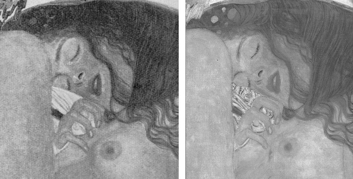
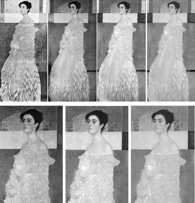
Above, Figs. 1 and 2: restoration degradations to two Klimt paintings – his Danae of 1907-08, as seen before 1956 and today; and his oil on canvas Portrait of Margaret Stonborough-Wittgenstein, as seen, left in 1905 when not-yet finished and subsequently in 1911, pre-1956 and today.
The starburst of exposed fakes that brought down New York’s (unrepentant) House of Knoedler, embarrassed ancient firms like Colnaghi’s and venerable publications like the Burlington Magazine has also humiliated the Louvre, the National Gallery, the Metropolitan Museum, the British Museum, the Art Institute of Chicago, the Tate, the Galleria Nazionale in Parma, the Van Gogh Museum and the Kunsthistorisches Museum in Vienna. On 11 April the FBI warned there could be hundreds more fakes in circulation in addition to the forty the agency has identified from a single forger who donated works to the Smithsonian American Art Museum, the Los Angeles County Museum, the Museum of Fine Arts, Boston, and the Detroit Institute of Arts. Had the FBI prosecuted the forger Ken Perenyi there might have been as many embarrassments again [2]. The problem of fakes occurs online, on land, and at sea outside of legal jurisdictions, as Anthony Amore has shown in his 2015 compendium of scams, The Art of the Con.
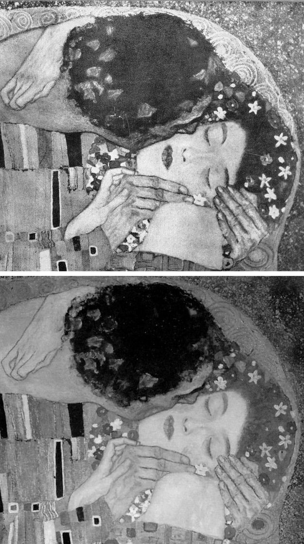
Above, Fig. 3, Klimt’s 1907-08 The Kiss, (detail) as seen before 1956 (top) and today.
With fakes and restoration injuries, the latter are greatly more destructive. Misattributions can be corrected, money can be paid back. However it might be ascribed at a given moment, the work of art – the art object – remains its own prime document (insofar as restorers permit). Sometimes restoration injuries are localised within a work, sometimes they are overall and catastrophic. Successive damaging restorations compound injuries and falsifications irreversibly (as seen above with Klimt and below with Renoir, Degas and Michelangelo). Slow cumulative damages are perhaps more serious than abrupt aberrant mistreatments that draw immediate notice. Scholars who shy from considerations of condition [3] must proceed on the premise that what is today is what originally was – an untenable view given that every restorer loves to undo and redo the works of predecessors but does so at a yet further remove from the work’s original condition and artistic milieu.
RESPONSES TO THE PRESENT ATTRIBUTIONS CRISIS
Responses to the attributions crisis have ranged from panic through self-exculpation and blame-casting to denial and cheerleading assurances of future streams of discoveries from sleeper/hunters. This is not an exclusively art market problem. Its roots are deeper and wider. The market trades objects on what others claim them to be. There has been concern among leading experts over the trade’s capacities of recognition and discrimination because of a precipitate decline in hands-on objects-informed expertise within the academic and museum spheres which have traditionally underpinned market activity [4]. Where Sotheby’s swiftly refunded purchases and took technical precautions, public museums are still flaunting restoration-wrecked pictures [5] and dubious attributions [6]. Much of art historical academia absents itself, fretting over alleged “engendered gazes”, for example, while missing (or disregarding) restoration-wrecked Renoirs and Klimts.
Above (top), Fig. 4, Klimt’s portrait of his niece Helene in 1956 and in 2007. Above, a detail of Klimt’s Judith II (Salome) of 1909, as published in 1956 (left) and in 1985 (Gustav Klimt ~ Women).
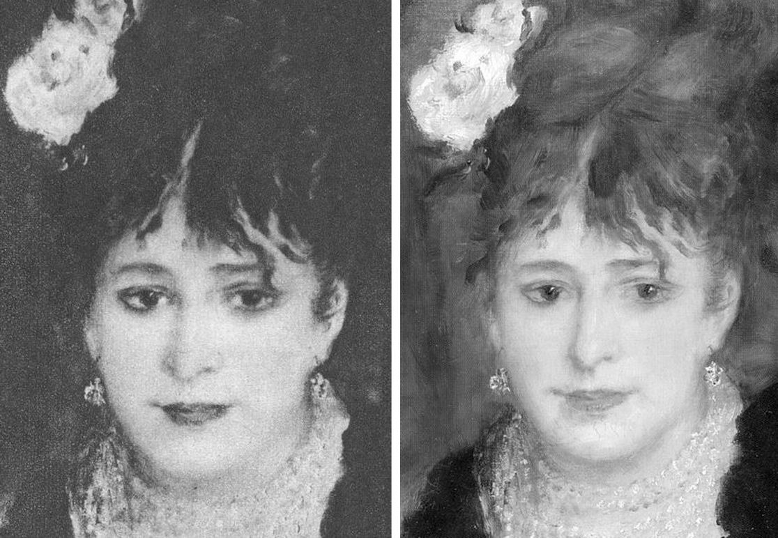
Below (left), Fig. 5, a detail of Renoir’s La Loge, as seen in 1921 and in the Courtauld Gallery’s 2008 exhibition catalogue Renoir at the Theatre – Looking at La Loge.
MUSHROOMING MARKETS
Without the cover of museums’ previously thought invincible technical authority, the mechanics of error are suddenly in plain view. To repeat our warnings, three years ago in “Art’s Toxic Assets and a Crisis of Connoisseurship” we wrote:
“‘Buy land’, Mark Twain advised, ‘they’re not making it anymore’. This logic ought to apply to the old masters but does not. Land makes sound investment not only because of its scarcity and its potential for development but because, in law-abiding societies, it comes fixed with legally defendable boundaries… Attributions, however, are neither guaranteed nor immutable. They are made on mixtures of professional judgement, artistic appraisal, art critical conjecture and, sometimes, wishful thinking or deceiving intent. They remain open to revision, challenge, manipulation or abuse… as some buyers later discover to their cost. Buyers are advised in the small print to beware and proceed on their own judgement… few people would dream of buying a house without legal searches and a structural survey.”
Eleven years ago we noted: “…The artists themselves may be dead but their works proliferate. As recently as the 1960s, 250 sheets of drawings were accepted as authentic Michelangelo. Today, over 600 sheets are. Such increases are fed not so much by forgery or the discovery of genuinely long-lost original works (both of which occur) but by a too-ready upgrading of copies, or studio works, to ‘original’ status.” [7.]
Three years ago we warned that buying old master paintings could be riskier than buying second-hand cars and asked for vendors to be required to disclose all that is known about a work’s provenance and restoration history (13 August 2014, letter, the Times – Fig.6, above). At the time we received silence. This month the art market blogger, Marion Maneker, complained (Art Market Monitor, 2 May 2017) that:
“The Financial Times has yet another ‘How Transparent Is the Art Market?’ story written by an announced participant in an upcoming art market regulation conference revealed in the pages of the Financial Times the week before. Considering the amount of interest the FT has shown in regulating the art market, one would expect the international business newspaper to have some proposals about how to police the trade.” See Georgina Adams, “How transparent is the art market”. Where Maneker complained: “The closest the story comes to offering ideas is to compare the art market to the second-hand car market (unfavorably)” Adams had quoted two art world players who so liken the art market:
“The fundamental problem, according to the FBI’s art and antiquities special agent Meredith Savona, is the lack of records of ownership. ‘Even for cars, I can see who owned it for a certain period of time,’ she says. ‘In the art market there is nothing, no regulation. If someone will not tell you who was the previous owner there’s a reason. There needs to be a way of having records maintained for, say 20 or 30 years.’ This chimes with the stand taken by Nanne Dekking, a Dutch entrepreneur whose start-up Artory aims to bring more transparency to the market through catalogue raisonnés and provenance research – ‘In Holland there is a digital registry for second-hand cars – it’s obligatory to register, so if you buy a car you know exactly what you are getting’, he says. ‘…That’s the kind of transparency we’re after.”
In 2013 Dekking was appointed Sotheby’s Executive Vice President and Vice Chairman, Americas after eleven years with Wildenstein & Co. He is a board member of the Authentication in Art group which first welcomed and then rejected a proposed paper we had offered on the flaws of Technical Art History for a forthcoming AiA conference. We see open and freely published debate as a precondition to reforming a system that is proving unfit for purpose.
PROVENANCE RESEARCH
Georgina Adams also reported calls for a levy on art sales to fund independent bodies to establish and maintain standards in the protection of buyers but such suggestions, in our view, are unworkable. The art market is global and increasingly an arena of private/secret transactions. Taxes are levied by governments. How and by whom would levies be collected around the world, pooled and then disbursed? Who would guarantee the independence of such bodies? Would they be national or international and to whom would they be answerable? Would they charge fees to offset their own costs? Less problematic, much cheaper and perhaps more to the point would be for governments to give buyers enshrined statutory rights to be informed about what should appropriately be known when buying a work of art. Presently, vendors enjoy de facto rights not to disclose their identities; not to disclose how often and to what extent works have been made over by restorers.
CONCEALMENT OF IDENTITIES
In 1998 a pastiche Leonardo drawing was put on the market by Christie’s NY as “German School, early 19th century” and “the property of a lady”. When the work was claimed to be a Leonardo worth $200million (as the so-called “La Bella Principessa”) the lady concerned disclosed her identity and brought an action for damages against the auction house on what was only a claimed valuation, not a sale. Only then did we learn that the vendor was the widow of a painter/restorer (of Leonardo, among others) who had been an intimate of Bernard Berenson, helping him to conceal his collection from the Germans during the War, and the drawing’s only known owner. When the new owner, and Professor Martin Kemp, an AiA board member and a leading advocate of the Leonardo attribution, trawled the Berenson archives together in search of an earlier reference to the drawing they drew a blank. The drawing remains without history outside of the studio of the artist/restorer who is said to have restored it. Such is precisely the kind of information to which potential buyers should rightfully be privy.
THE LAW, SECRECY AND MAKING THE BONA FIDE FAKE
When the Art Newspaper examined the legal ramifications of the current crisis (“It’s time the art market got tough on fakes” 2 February 2017) it found no appetite for either external regulation or self-policing and a blithe acknowledgement that bad restorations convert bona fide pictures into effective forgeries:
“At the annual art-crime symposium held in November at New York University, participants agreed that the culprit was the market’s notorious secrecy. But discussions revealed deep divisions about what should be done. Insurers, auction houses, dealers and other players each have their own interests to protect in a market where, as one participant remarked, the ‘level of greed…is so great’.
‘Information is the currency of the art market,’ said lawyer Steven Thomas, the head of the art law practice at the Los Angeles law firm Irell & Manella. He offered an example showing how information was withheld in trying to close a sale. When one of his clients learned that an impressionist painting he was interested in had been restored so extensively it was no longer considered authentic, he confronted the dealer, a prominent New York gallerist. ‘Oh, you found out,’ was the cavalier response. Such is the attitude in a market where the burden of due diligence as a practical matter may fall on the buyer.”
ACKNOWLEDGING RESTORATION INJURIES TO SAVE AN ATTRIBUTION – AND THE PARAMOUNT IMORTANCE OF PHOTOGRAPHIC RECORDS
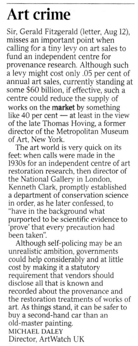
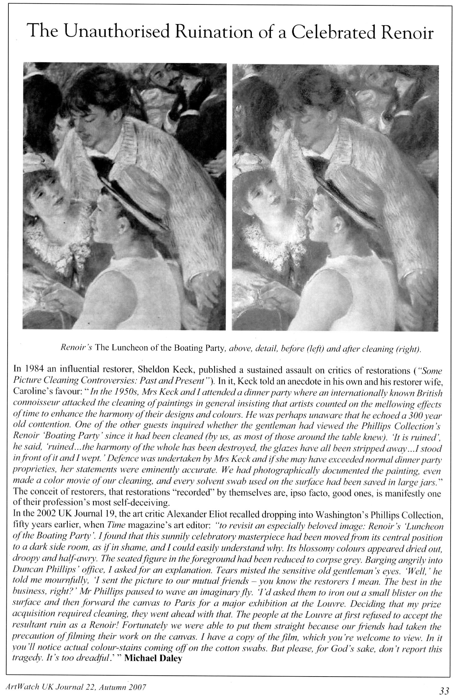
Secrecy on condition can tempt owners. Duncan Phillips privately admitted that his great Renoir The Luncheon of the Boating Party (detail below, Fig. 7) was so mauled by two pre-eminent restorers that it was rejected as authentic when loaned to the Louvre:
“Fortunately we were able to put them right because our friends had taken the precaution of filming their work on the canvas. I have a copy of the film which you’re welcome to view. In it you’ll notice actual colour stains coming off on the cotton swabs. But please, for God’s sake, don’t report this tragedy. It’s too dreadful.” [8.]
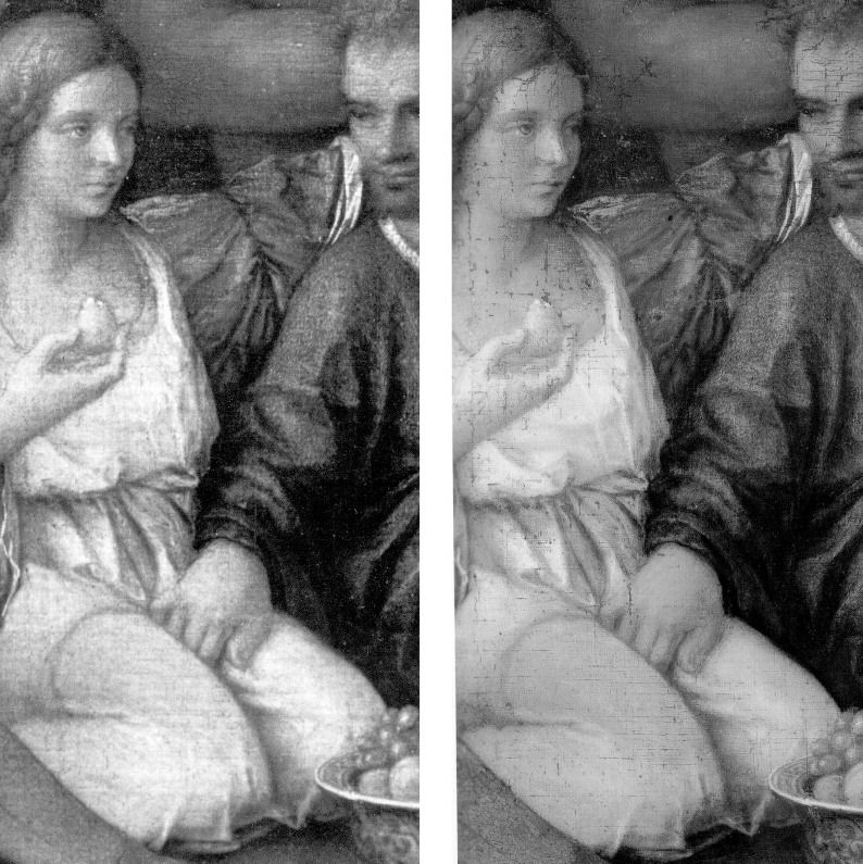
Today one can see on the painting where a colour in one part was introduced into the cracks of another area – and yet Phillips’s widow, Marjorie, wrote in her 1970 memoir Duncan Phillips and his Collection “the Sheldon Kecks, outstanding restorers, operated on the Renoir successfully!” We have asked the Phillips Collection’s director several times to see the film and the painting’s restoration records but always without reply. At the National Gallery, under the directorships of Charles Saumarez-Smith and Nicholas Penny, we were given permission to examine the historic and conservation dossiers of paintings with the kind and helpful assistance of the gallery’s librarians and archivists. In contrast, when we asked to see the records of the Bellini/Titian The Feast of the Gods at the National Gallery, Washington, the conservation department refused outright. A curatorial department was more open and supplied good-quality pre and post-restoration photographs of the painting’s states which enabled us to demonstrate losses of value during the cleaning (as at Fig. 8 below). We learn that a member of the gallery’s conservation staff keeps more sensitive photographic records at home for fear that they “might fall into the wrong hands”.
Above, Fig. 7: a page in the Autumn 2007 ArtWatch UK Journal published in memory of James Beck who died on 26 May 2007. In the same journal we published a comparison of a detail of the Feast of the Gods, as taken before cleaning (left) and after cleaning but before repainting – see Fig. 8, below:
SPURIOUS CONSERVATION SCIENCE
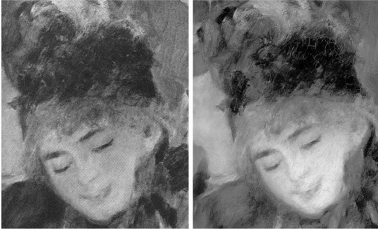
Above, top, Fig. 9: a detail from the National Gallery’s Renoir The Umbrellas before cleaning (left) and after cleaning in 1954. Below, Fig. 10, the face, after cleaning and restoring.
It should be clear to any scholar or connoisseur of paintings that the National Gallery cleaning was injurious, that the picture’s values and relationships were degraded and deranged – and yet the technical promises underpinning the restoration were “top-of-the-range” and authoritative. Cleaning was preceded by a physical and a chemical analysis of the painting by two gallery scientists who concluded that an “extremely thin” natural resin varnish could safely be removed “by solvents of a strength well below that likely to attack the paint film, which is resistant to the solvent action of pure acetone.” The scientists offered an additional assurance: “In the hands of a competent restorer [Norman Brommelle, husband of the National Gallery’s head of science, Joyce Plesters, was chosen] there is no reason to fear that the paint layers will be disturbed in the course of cleaning. Since, in this particular picture, there is no evidence of a linoxyn film, nor the presence of any resin in the medium, there is, in our opinion, no need to adopt any special precaution.”
Brommelle reported that the varnish was removed with a 3:1 turpentine/acetone mixture containing a small percentage of diacetone alcohol and that the last traces were removed with toluene but no one explained why an extremely thin varnish layer of no great antiquity needed to be removed. The cracks seen above at Fig. 10 were products of the cleaning (some local cracking had occurred previously where the canvas vibrated against a central stretcher bar on its regular exchanges between London and Dublin. (Technical information by courtesy of the National Gallery Conservation Department.)
THE TECHNICAL AND SCHOLARLY UNDERWRITING OF A FAKE AT THE NATIONAL GALLERY

One of the recently disclosed fakes, an “Orazio Gentileschi” (above right at Fig. 11 next to an authentic work), had been accepted by the National Gallery on a loan from its owner. When the now rejected no-history painting was withdrawn, the gallery justified its inclusion with the claim (Antiques Trade Gazette): “The gallery always undertakes due diligence research on a work coming on loan as well as a technical examination.” After this historical and technical examination, the Gallery label declared that “the poetic depiction of ‘David Contemplating the Head of Goliath’” had been produced by Gentileschi “for a collector’s cabinet” – an unsupported claim that, like “made for private devotion”, often serves as a flag of convenience for small recently-discovered old works without histories.
Above, Fig. 12, here we see a detail (top left) of the real Gentileschi David and (top right and below) the loan accepted as authentic by the National Gallery. If, instead of whatever technical and art historical examinations were carried out, the Gallery had run a few simple photo-comparative checks of the kind shown here, it should have been obvious to anyone with an alert eye that the picture in the top left had been the bona fide historical prototype for the other, markedly inferior and modern-looking, version. Qualitatively, they are not remotely co-equals: the one is a crude pastiche of the other. In every detail the chasm of quality should have identified the loan as a pastiche.
THE CONSEQUENCES OF (UNACKNOWLEDGED) RESTORATION INJURIES
Although this impostor has now been rejected from the National Gallery there is no redress for individual badly restored bona fide works – and often not even an acknowledgement of their plight. Nor is there any apparent means of stemming the swelling tide of destruction that masquerades as a conservation service while delivering incremental degradations of pictures, such as those that can be shown to have taken place in less than a century on what is now the Denver Art Museum’s Degas’ superb pastel and charcoal The Dancing Class or Dance Examination of 1880 below at Fig. 13. The first photograph in the sequence was published in 1918 (Degas, Paul Lafond) when the drawing was not yet forty and therefore likely to have been in an original or near-original state. The third photograph was published in 2002 in the catalogue to Degas and the Dance, a sponsored travelling exhibition organised by the American Federation of Arts (- the “the prime movers”), the Detroit Institute of Arts, and the Philadelphia Museum of Art. The show was curated by the leading Degas specialists Richard Kendall and Jill Devonyar.

The sequence of states at Fig. 13 above resembles a succession of an etching’s proof states in reverse: the most complete condition is seen in the oldest record and the most debilitated state is recorded most recently. If we make the most direct comparison with the earliest and the most recent records of this drawing, as at Fig. 14 below, the differences become startling and heartbreaking. What happens to one artist happens to all in turn, as was most shamefully seen to Michelangelo at the Sistine Chapel – see Fig. 15 where an early Anderson photograph of a lunette is shown with its post-restoration state. By such simple comparative means we can see/demonstrate that Degas and Michelangelo have not been restored or conserved so much as subjected to a cultural pathology – an infantile revulsion at or terror of darkness and a failure to appreciate that darkness, as artists appreciate, confers brilliance and radiance. Without shadows to relieve lights there is no great vivacity – art’s life-affirming gift. Our historic cultural legacy is being made over into a blander, more homogenised arbitrary colourfulness. With so much value and vivacity already lost in the Dance Class’s first century, who, if offered the chance, would today vote for “More of the same, please” in the next? Restorers can never put the clock back. They can only offer more of the same: yet further intensifications of hue and losses of form and space-creating tones.
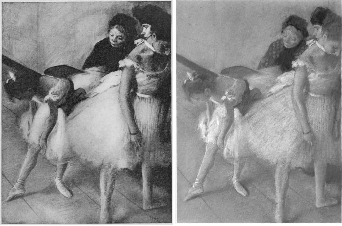
THE INCALCULABLY VALUABLE TESTIMONY OF PHOTOGRAPHS
Photographic reproductions do not have to be taken as absolutely faithful replications to have great value as record – why else would they be published and consulted in such great numbers? They are particularly eloquent as witnesses when seen in company with predecessors and successors, because the patterns that successive images make disclose the truth about present conditions. The net consequence of restorations during the last much-photographed century can be seen/shown to have been gravely damaging, effectively washing away art’s pictorial strength, disrupting the internal relationships of individual works, rendering oeuvres capriciously erratic and incoherent and, thereby, creating spaces, opportunities and, even, seeming precedents for misattributions and outright fabrications.
COLOURS V TONES
Although we do not have a colour photograph to match the black and white Durand Ruel photograph published in 1918, we can, by juxtapositions, estimate the degrees of loss today. At Fig. 16 below, the top comparison shows that the bump on the head of the woman in the upper right-hand corner was formerly a red feathery hat decoration. It now survives as a smear of colour that, tonally, is almost indistinguishable from the wall behind. We can see in the greyscale comparison at the bottom that the red decoration had originally been given a halo. On his own declared pictorial statagems, we might deduce that Degas had used the pocket of red to create a triad of local counterpointing primary colours: red feathers, ochre spots and an intense dark blue ribbon bow. Certainly, speculations aside, since that date the ineffably soft back of the standing dancer’s tutu has both hardened and become see-through. The feathered, layered back of the bending dancer’s tutu has, on some bizarre and alien tidy-minded logic, been reduced a ghostly but sharp-edged right angle. Degas is leaving us, involuntarily. He learnt and extracted much from photography. Is it too much to ask that all scholars use our very great resources of photography and historic photographic evidence to calibrate the injuries done to his oeuvre and therefore more fully appreciate and give due account of Degas’ great and supremely fresh and audacious genius?
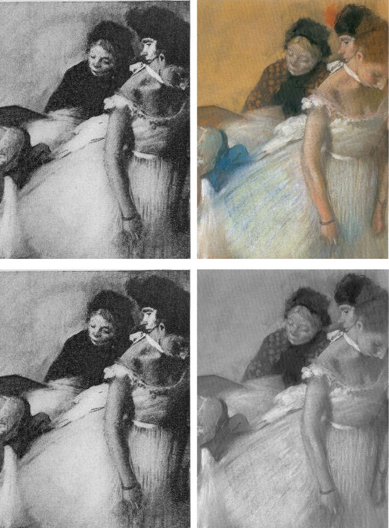
Certainly, the most urgent single reform needed in today’s crisis of connoisseurship lies in increasing the accessibility of photographic records of condition and treatments. In an age of electronically transmissible, high quality photographic images this would be easier to achieve and more instructive than ever before. There are no good reasons for institutions, owners and dealers continuing to sit on such material and thereby prevent people from seeing what’s what.
Michael Daley, 26 May 2017
Coming next: Degrading Degas and Michelangelo
ENDNOTES:
[1] We first used the term in connection with the so-called Stoclet Madonna, the Metropolitan Museum’s attributed Duccio, in “Toxic Attributions?” The Jackdaw March/April 2009.
[2] “In the end, after a five-year investigation and a mountain of evidence collected, no one, neither the two ‘conspirators’ nor I, was ever charged with a crime or indicted” – so wrote Ken Perenyi, in his 2012 memoir Caveat Emptor, p. 312.
[3] One scholar who has engaged on this territory with his pioneering book Condition:The Ageing of Art, Paul Taylor, incurred immediate wrath from some restorers who would claim monopoly rights on all discussions in the field, but a firm welcome elsewhere. Apollo noted that “There are unquestionably many art critics and even academic art historians for whom the material context of art, and particularly flat art, has become a rarefied field. That needs to change, if we are not to see total severance between those who work to preserve physical objects and those who claim to construe their meanings.”
[4] In a paper delivered at the ArtWatch UK/LSE/Centre for Art Law December 2015 conference (“Throwing the baby out with the bathwater”), Brian Allen, a former director of the Paul Mellon Centre for Studies in British Art (1992 to 2012) and Chairman of the Art Fund observed: “…increasingly, the only young connoisseurs emerging are to be found in the commercial art trade and this surely cannot be a desirable state of affairs. It might be argued that many of the best ‘eyes’ have always been in the art trade but, until recently, there was always a body of disinterested academic ‘experts’ to counterbalance commercial self-interest…” In the March 2017 Art Newspaper, Anna Somers Cocks, the paper’s Chairman and a former curator at the Victoria and Albert Museum, discloses that the V&A now considers the giving of opinions a drag on its curators’ time and devotes only three hours a month to it when, in the 1990s, it reserved two afternoons a week to telling the public what their heirlooms were. In the same issue of the Art Newspaper Mark Jones, a former director of the Victoria and Albert Museum, said that expertise, by which he meant “the ability to recognise and identify objects, surmise their history from their appearance, tell the genuine from the false and make judgements about quality” has become patchy, even rare, in museums. Mark Jones was the curator/organiser of the British Museum’s legendary 1990 exhibition “Fake? The Art of Deception”, the catalogue of which remains a seminal study in the field.
In response to Mark Jones the dealer Peter Nahum wrote in the April 2017 Art Newspaper (letter, “Dealers and curators should work together to spot fakes”):
“The art forger Shaun Greenhalgh and his father George visited my gallery in 1984. It was after 6pm and they offered me a painting they said was by Samuel John Peploe, for which I gave them a cheque. As soon as the banks opened at 9am the next morning I cancelled the cheque and called in the police. I was the first to report the family from Bolton for purveying a fake, 16 years before their arrest.
“When they were finally arrested, my cheque was still on their desk. I also advised Bolton Museum on the purchase of the painting by Thomas Moran and subsequently saved them from buying a fake watercolour purportedly by the same artist.
“I have long campaigned for the art and antiques trade and academics, especially those in museums, to work more closely together. Our job, as dealers, is to defend our clients against the legion of fakes and wrongly catalogued items on the market. As we are personally financially responsible for all transactions we make and advise on, we are the most vulnerable and, by necessity, the most careful. As a result we are often best placed to authenticate works.
“Academies and museums obviously have great experts on their staffs, but their prime focus is the history and provenance of objects and thus their visual skills often take a secondary position. When both professions work together, mistakes are lessened.
“I have made it my mission to track down and report those who make fake art, as they are the bane of our lives and can cost those who buy art a great deal of money. They are simply con-men extracting money from innocent people by deceit.
“As dealers, academics and collectors, we are all motivated to push the boundaries of our knowledge, and thus all of us are vulnerable to those who wish to take money under false pretences. We have to be constantly on our guard as each one of us will fall into one of the fakers’ traps sooner or later – we are all human after all.
“Thus, I applaud Mark Jones’s article: scholarly research is flourishing but curators’ ability to judge an object’s quality is not (The Art Newspaper Review, March, p.13) with two main comments. The painting by Samuel John Peploe was not sold, and academics have rarely been the greatest visual judges – that is more our job than theirs. That does not mean that there are not great visual experts in academia – of course there are – it simply means it has never been their primary function.
Peter Nahum.
Peter and Renate Nahum Agency (the Leicester Galleries), London.”
[5] See “From Veronese to Turner, Celebrating Restoration-Wrecked Pictures” and “Taking Renoir, Sterling and Francine Clark to the Cleaners” and THE ELEPHANT IN KLIMT’S ROOM and, finally, “Now let’s murder Klimt”.
[6] The National Gallery includes one of its most dubious and controversial attributions – the Rubens Samson and Delilah – in its list of 30 “must-see” pictures. There are more than twenty secure and superior works by Rubens in the gallery including the magnificent Minerva protects Pax from Mars (‘Peace and War’). When controversy broke over the attribution in 1997 the gallery’s director, Neil MacGregor, placed a statement next to the painting to explain why it looked like no other Rubens in the collection. Two special issues of the ArtWatch UK Journal have been devoted to this picture’s problems. See: “The Samson and Delilah ink sketch – cutting Rubens to the quick” and “Art’s Toxic Assets”
The National Gallery’s highlights list also includes the restoration-wrecked Bacchus and Ariadne by Titian, on which, see: “The Battle of Borja: Cecilia Giménez, Restoration Monkeys, Paediatricians, Titian and Great Women Conservators”
[7] “Oh Blessed Honthorst”, Michael Daley, ArtWatch UK Journal No. 21 Spring 2006 – a Rubens special issue dedicated to the National Gallery’s ascribed Rubens Samson and Delilah), p.4.
[8] As reported by Alexander Eliot, a former Time magazine art critic, in “A Conversation about Conservation”, The World and I (Volume: 15), June 2000.
Leonardo and the Growing Sleeper Crisis
Another day, another new Leonardo drawing – this time a St. Sebastian with a mismatched verso and recto, with as many legs as a millipede, and lashed in a gale-force wind to a tree set in a landscape of icebergs…

Above, Fig. 1. A newly proposed Leonardo whose problems will be the subject of our next post. See Scott Reyburn’s “An Artistic Discovery Makes a Curator’s Heart Pound”, the New York Times, 11 December 2016.
The old masters world is bursting with Leonardo “discoveries” that flaunt their five-century no-histories. (See Problems with “La Bella Principessa”~ Parts I, II and III; and, “Fake or Fortune: Hypotheses, Claims and Immutable Facts”. “Problems with La Bella Principessa ~ Part I: The Look”.) At the same time there is a near meltdown over a spate of recent high quality exposed fake “sleepers” and “discoveries”. Sotheby’s has hired its own in-house technical analyst to spot inappropriate materials in new-to-the-scene old masters so as to “help make the art market a safer place” (“FBI expert to head up Sotheby’s new anti-forgery unit”, 6 December 2016, the Daily Telegraph). This is no bad thing and the appointment has been universally welcomed when, following the fake Frans Hals affair, it is reportedly feared that 25 forgeries sold for up to £200million are on the walls of unsuspecting owners, and when the new Sotheby’s appointee had himself single-handedly unmasked 40 supposed modern masterpieces sold for £47million at the now deservedly gone Knoedler Gallery, New York.
The real crisis, however, is the product of failures of judgements even more than failures to carry out due diligence checks on the material components of works. It remains the case that aside from works instantly disbarred by technical diagnosis, identifying authorship and establishing authenticity will necessarily and inescapably continue to be a matter of professional judgement. (We hold that here is systemic methodological flaw in appraisals that has yet to be addressed.) Meanwhile, dealers, critics, scholars and collectors embarrassed by suspected fakes are left agonising: should they concede error and take a hit on credibility but thereby limit damage, or should they stand firm and double the risks?
Even professional sleeper-hunters are falling out in acrimonious fashion over rival BBC television platforms – sorry, programmes – with one said to believe the other jealous of his good looks and success: “It’s a copy: Fake or Fortune? Stars try to halt rival show”, Richard Brooks, Sunday Times, 4 December 2016.
One auctioneer shouts you’ve ruined my sale at a musical scholar on Radio4. “Sotheby’s view is shared by the majority of world renowned Beethoven scholars who have inspected the manuscript personally”, the Sotheby’s man insists when characterising a scholar’s refusal to come in to view the manuscript as “irresponsible” (“Sotheby’s give Beethoven expert an earful after copied manuscript row scuppers sale”, The Times, 30 November 2016.)
The charge is a red herring, we say: if errors in the manuscript are visible in an auction house’s high quality photographs, coming in to touch the paper will not make them go away. If the auction house’s (anonymous) world authority musical experts think there are no errors, we add, they should come forward and say so. A Cambridge professor of musical theory did step forward to affirm his endorsement of the manuscript but he also admitted having been bothered by an anomaly (“Sotheby’s expert admits doubts over Beethoven script”, The Times, 3 December 2016.) To Sotheby’s likely mortification, it was revealed that arch-rival Christie’s had refused to sell the score last year, after being unable to confirm its authenticity – “Beethoven manuscript row remains unfinished”, the Daily Telegraph, 30 November 2016: “There was some good news for Sotheby’s however as the auction house succeeded in breaking a new auction world record for another musical manuscript…Gustav Mahler’s complete Second Symphony (the ‘Resurrection’), written in the composer’s own hand…went for £4,546,250.”
“Sotheby’s catalogue was an artful dodge, claims Russian billionaire” – the Times, which reported on 8 December: “Mr Ivanov said that honest mistakes were understandable. The problem is at Sotheby’s the fakes are listed as the top lots and are published”. With experts in as much disarray as auction houses and dealer/broadcasters, what perfect timing, then, for the appearance of a new, cool and calm legal anatomy of the sleeper phenomenon and its associated problems of authentication.
Above, Fig. 2. In “The Sale of Misattributed Artworks at Antiques at Auction” by Anne Laure Bandle of the London School of Economics and a director of the Art Law Foundation (Geneva), we encounter a book greatly richer and more urgently required than what is simply “said on its tin”. This work, the product of a PhD at the LSE, deftly turns over the law with regard to art market workings as encountered and applied under three key (for the art market) systems of law, those of Swizterland, England and the United States. Under all three it is shown how the auctioneer’s primary duty is to the seller (the consignor) not the buyer. It follows therefore that failing to identify the proper status of a work of a work when conferring an attribution can/should carry penalties of compensation to the consignor. However, in response to this duty/financial danger, auctioneers insert massive disclaimers of liability into their contracts and attributions. These disclaimers are also widely appreciated in terms of warnings to buyers of a need to satisfy themselves of the validity, accuracy and reliability of any catalogue description before buying. Such self-protective clauses have consequences that can bite hard on those who apply them. For one thing, we would add, forgers have not been slow to notice them.
Above, Fig. 3. The American Ken Perenyi, cheekily called his 2012 Forger’s Memoir Caveat Emptor – The Secret Life of an American Forger. With little interest in consignors’ rights – he being both the knowing maker and the eager consignor of forgeries – Perenyi, after first studying the terminology of attributions in London auction house catalogues (“Attributed to; Signed; Studio of; Circle of; Manner of…”) swiftly moved to “Conditions of Business”; “Limited Warranty”; and thence “Terms and Conditions”. He reported (pp. 228-247) that when in London he noted that:
“In what can only be described as a masterpiece of duplicity, the terms and conditions made it clear (that is, if one has a law degree) that they warranted and guaranteed absolutely nothing. However, farther down, a paragraph entitled ‘Guarantee’ made it plain for even the most thickheaded. It stated: ‘Subject to the obligations accepted by Christie’s under this condition. Neither the seller Christie’s, its employees, or agents is responsible for the correctness of any statement as to the authorship, origin, date, age, size medium, attribution, genuiness, or provenance of any lot.’”
On return to the United States he then examined New York auction house catalogues: “Again and again we saw the phrase neither Christie’s nor the consignor make any representations as to the authorship or authenticity of any lot offered in this catalogue. ‘Hell, they don’t guarantee anything [over] here either!’ I said.”
After reading a paragraph on forgeries stating that if within five years of a sale the buyer could establish “scientifically” that a purchased painting was a fake, the “Sole Remedy” would be a refund of monies paid [- But for a cautionary case-in-point today, see UPDATE , below] Perenyi concluded the following: “A) Virtually nothing sold here was guaranteed to be what it claimed to be, B) Neither the auction house nor the seller assumed any responsibility whatsoever, C) Even if a buyer discovered a painting to be an outright fake, all he could do was ask for a refund, I came to the conclusion that this was an engraved invitation to do business.”
His late partner, José, concluded “Well, maybe we could save people the trouble of going to London and sell them [Perenyi’s forgeries] right here!”
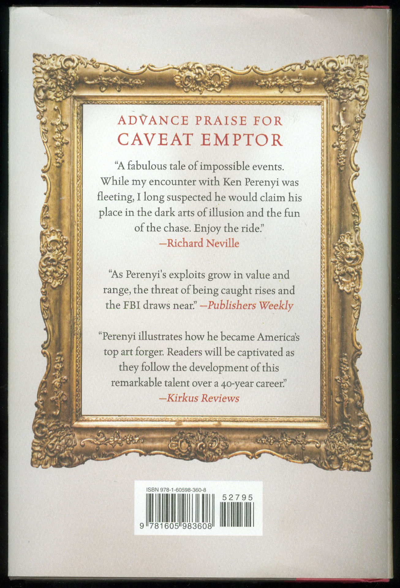
In her new book, Dr Bandle carries the full terms and conditions of three auction houses (Christie’s, Koller Auctionen’s and Sotheby’s) as an appendix. She notes that notwithstanding disclaimers, such is the volume and reach of art sales that many art market players take auction house catalogues as reference points on the identification and evaluation of art and antiques and do so particularly with regard to attributions, confidence in which confers authority and engenders trust. In this regard the “sleeper”, as an under-identified and therefore under-valued work, is a special problem. A (conceptually subtle and fascinating) chapter is devoted to the sleeper’s elusive and problematic character. In fact, a delight of this book is its constant precision, economy and deftness of language in what is a perpetually shifting and re-forming arena where the market structures have both democratised and globalised the ownership of art but where buyers gathered from around the globe must compete in heated races to acquire multi-million valued art in spectacular shows of competitive bidding that are over in minutes. In a recent double television celebration of Christies-in-the-World, the term “buyer’s remorse” was heard in counterbalance to auctioneers’ seductively whispered advice to “think how terrible you will feel tomorrow if you don’t get this”.
A “sleeper” is first identified as being not a legal term but a figurative illustration of a legal problem. It is one that fleshes the notion that an artwork can remain a “dormant treasure” until it is properly identified. If not so identified, it stands dangerously (to auctioneers, and expensively to consignors) as a work that has been “undervalued and mislabelled due to an expert’s oversight and consequently undersold”. Sleepers are products of three types of error and each receives its own section. The extent to which restorations aiming and claiming to recover original conditions may alter objects and mislead authenticators is examined.
(But for our specialised concerns, recognition of the inherently problematic nature of restoration’s role in the identification and subsequent elevation of authenticity is a rare instance of under-examination in this book. Stripping off later materials does not in itself recover original states. It may disclose little more than badly damaged remains of an earlier, more “authentic” state. How much repainting, or “retouching” as it is euphemised, should be considered permissible before a worked-over sleeper approaches a forged recovery of authenticity? – See “A restorer’s aim – The fine line between retouching and forgery”.
It should be said that sensitivity in this arena is not an art market-confined problem: the Frick Museum does not publish the photograph below – Fig. 6 – of a stripped-down, not-yet repainted Vermeer that the Getty Institute holds and makes freely available – and many museums, in our experience, sit on photographs of their own restoration-wrecked paintings.)
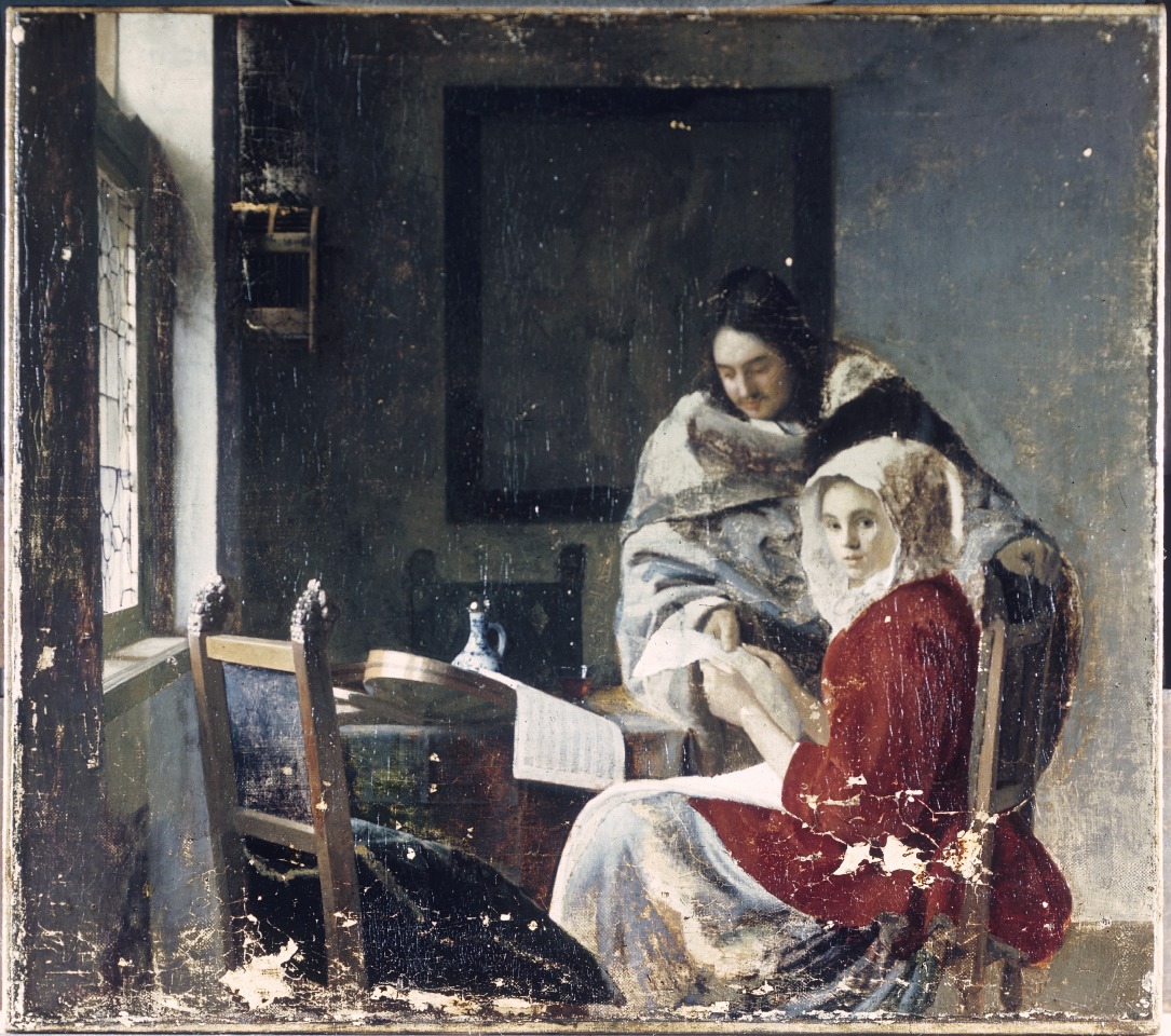
Dr Bandle’s section on the relationship between sleepers and fakes or forgeries, between the unrecognised and the counterfeit, is adroitly introduced: “sleepers are the negative reflection of counterfeits: both are held as something that they are not.” Fine distinctions are drawn between a fake and a forgery. Both are characterised “negative concepts, referring, as they do, not to qualities but to their absences.” Before considering the legal status of sleepers, a fascinating examination is made of the tools and methods of attribution. So examined, too, are the hoped-for instruments of probity, the best-practice and ethical codes for authentication and dealing. Like auction house terms and conditions, ethical codes are shown carry their own disclaimers: “Similarly, the Swiss Association of Dealers in Antiques and Art contains a disclaimer of the attribution and appraisal’s accuracy.” (One hears a Perenyi expletive of delight here.) As for auction houses, while they “issue attributions in sale catalogues, they are not considered to be formal authentication reports”, whatever weight they might carry in the market and for buyers.
The section on the “Essence of Attribution” might be considered essential reading for all art market players and commentators, not least because the art market “greatly relies on scholarship”, and such expert appraisal is uniquely challenged “by the peculiarities of the art world” – one of which is that however long debates rage, scholars themselves “may very well never achieve a consensus”, in which case, the circularity is complete: “scholarship cannot halt during the art object’s identification process by establishing an attribution, not even temporarily”. Like painting the Forth Bridge, attributing an art object can be “an ongoing undertaking that never settles”. Existing attributions are constantly subject to challenge or revision.
The law itself can seem helpless or exasperated in the face of art world processes. Elusive notions of authenticity tax judges as well as scholars. With regard to establishing the merit or applicability of warranties of authenticity or the diligence of experts, even the admission of testimony is problematic within both Swiss civil law and the English and United States traditions of common law. Swiss courts can commission reports and instruct experts to answer set questions. Under common law conflicting parties support their rival positions by calling rival and conflicting experts. Courts may confine these adversarial jousts to “that which is reasonably required”. Under US Federal rules courts may exclude what they consider “unreliable expert testimony” and even when testimony is based on scientific principles it may be held acceptable only when these principles have “gained general acceptance”.
Under Swiss, English and United States jurisdictions alike, contractual relationships governing art auction sales are not clearly defined by law and are subject to scholarly debate (which, as mentioned, is a never-ending process). Further complications arise from the dual and conflicted position of the auctioneer. Does he really serve the buyer’s or the seller’s interest – or, somehow, both? In practice, we might think, he should/must aim to serve both since different people must always be persuaded any moment that it is a “good time” to sell and a “good time” to buy. Failures to recognise “sleepers” are the mirror image of failures to recognise fakes or forgeries: the one injures consignors’ interests, the other those of the buyer. But how to stay out of trouble as an auctioneer when case law results in unclear and unreliable notions of liability – and while there is a requirement to perform diligently but not one to produce to specific results?
By increments the law emerges as unfit for its presently allotted purpose in resolving sleeper disputes. Auctioneers are judged by standards predicated on what is little more than a fiction. Standards of performance must be interpreted on a case-by-case basis but these provide no benchmark in cases of sleepers sold at auctions. Aside from these problems, judges generally lack connoisseurship in art and art auction sales and may have difficulty in assessing authenticity and in reconstructing the attribution process – and while this is understandable because art connoisseurship and art market mechanisms are both highly sensitive and influential forces, judges, no matter how well educated and competent in other areas of the law, will struggle to redress a present structural imbalance between the interests of (favoured) buyers and (disfavoured) consignors.
Can applications of the law be made to work in this arena? Are alternatives to the law presently or potentially available? For answers to these questions it is necessary to read the concluding section of a timely book that will commend itself to Art’s players and watchers alike.
The Sale of Misattributed Artworks and Antiques at Auction, Anne Laure Bandle. ISBN: 978 1 78643 100 4 Price £100 or Web: £90
Michael Daley, 15 December 2016
UPDATE 17 December 2016
In the 17/18 December Financial Times “The Art Market”, Melanie Gerlis writes:
“ Art is notoriously a ‘buyer beware’ market, but even prolific professionals can get caught out. Micky Tiroche, a private dealer in London and co-founder of the Tiroche auction house in Israel, bought ‘Sun and Stars’, a gouache attributed to Alexander Calder, for £28,000 (with fees) at Bonhams, London in 2007. The purchase was made through his dealing company, Thomas Holdings, which has about 160 works on paper by Calder.
“In 2013, the gouache was submitted, along with other works, to the Calder Foundation in New York, which doesn’t officially authenticate the artist’s works but gives them an inventory number (known as an ‘A-number’ because the digits are prefixed with the letter A). ‘Sun and Stars’ was not given an A-number, making it effectively unsellable.
“Christie’s, Sotheby’s and now Bonhams will not sell Calder works that do not have an A-number.
“Tiroche, who buys frequently at Bonhams as well as elsewhere, says that he asked the auction house for a refund and was refused. He has suggested alternative, less visible ways of refunding (such as deducting its value from other works) and legal letters have been exchanged, but to no avail.
“A spokesman for Bonhams said: ‘It is [the auction house’s policy] not to discuss individual cases, beyond saying that we are in communication with Mr Tiroche’s company about the situation.”
The Louvre’s Leonardo Restorations: The Tide Turns
Recent newspaper criticisms of the Louvre’s controversial restoration of Leonardo da Vinci’s near-monochrome painting of St. John the Baptist continue in the scholarly press.

Above, Figs. 1 and 2: Leonardo’s St John the Baptist, top, before restoration; and, above, after restoration. In some publications, the order of the before and after restorations was transposed and experts expressed preferences for the supposed after restoration state when in truth it was the before restoration record. The reason for that mis-judgement becomes clear when the photographs are shown in the right order: before restoration the painting showed a greater range of values and had a markedly more vivacious appearance. Below, Fig. 3, the December 2016 issue of Beaux-Arts magazine.
In the December 2016 issue of Beaux-Arts, France’s leading magazine of the visual arts, under the heading “New” Leonardo in the Louvre, Daphné Bétard reports:
“Following the St Anne and Belle Ferronière, Leonardo’s Saint John-the-Baptist has just been restored. It is a very fragile picture, bearing much crazing. Regina Moreira, a skilled restorer, has been trusted with its cleaning and she has done a subtle job. As a result, the Saint’s face’s character is better defined while the heavy hair, the cross and the animal fur come out better. Some toning down, however: the scientific advisory committee hired by the Louvre has obviously been overtaken by this monotone brown-gold composition as Leonardo definitely wished it to be. As a result, the Louvre seems to have over-thinned the varnish (now half thick) hoping to retrieve unlikely fresh pink flesh tones. The Saint’s lighted arm now contrasts too strongly with the face. While Saint John-the-Baptist has become more legible, doubtless that it is far less radiant.”
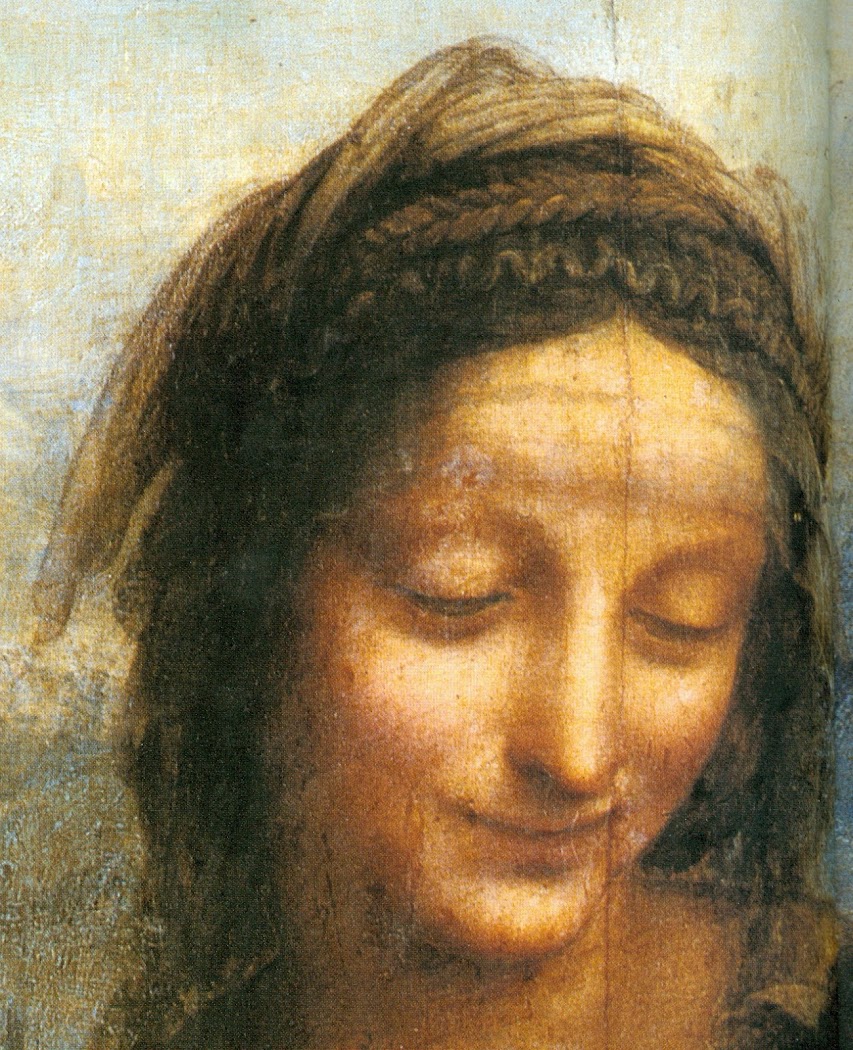
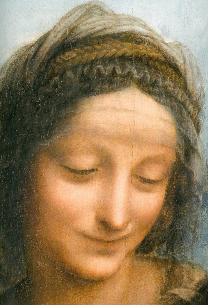
Above, Figs. 3, 4 and 5: top, Daphné Bétard’s report; centre, the head of St. Anne in Leonardo’s The Virgin and Child with St. Anne , before restoration; above, the head of St. Anne in Leonardo’s The Virgin and Child with St. Anne , as seen after restoration.
Earlier, the press reported on a number of occasions that during restoration a certain disruption had occurred between St. John’s beautifully, softly modelled face and his (proper right arm). For Eric Bietry-Rivierre in Le Figaro (5-6 November 2016), “the face and the arm are now unbalanced in terms of degree of modelling.” In La Croix online (10 November 2016), Sabine Gignoux judged that “the Precursor’s uplifted arm had acquired during cleaning a rather rigid outline along its lighted section”. Precisely such injuries to Leonardo’s uniquely subtle and refined modelling had occurred during the restoration of his “The Virgin and Child with St. Anne” – as seen above and below. Such judgements on the St. John restoration have been widely taken as vindications of warnings reported in the Wall Street Journal by Jacques Franck, a Paris-based Leonardo expert consultant to the Louvre. When the cleaning was about to start, the WSJ reported (16 January 2016) Mr Franck’s observation that: “I don’t oppose the removal of the latest layers of varnish, but am concerned they may go too far and touch original material, which could be vulnerable to the solvents used in the process for [contrary to the general belief] the aesthetics of the image were meant to be blurry and dark”.
Below, Figs. 6, 7 and 8, showing, top, a greyscale detail of the The Virgin and Child with St. Anne before cleaning, left, and after cleaning, right. The same detail is shown, centre, before cleaning, and, bottom, after cleaning.

Against such technically and aesthetically informed concerns, the Wall Street Journal, also quoted the insistence by the museum’s Head of Paintings, Sébastien Allard, that “Louvre officials say that such concerns are unwarranted because restoration techniques have evolved in recent decades to the point the process is considered safe” and that, besides, “the doctrine at the department is prudence and pragmatism”. Every generation of restorers repeats this claim of a final achievement of safety-in-restoration. While such are the stock currency of defensive museum officials the world over whenever challenged on restorations, in this case, given the manifestly injurious earlier Louvre restoration (2012) of another Leonardo masterpiece, The Virgin and Child with Saint Anne and a Lamb, as shown here, they might be thought to smack of complacency if not defiance. Such was the strength of opposition to the over-cleaning of the picture that two leading Louvre in-house curators resigned from the advisory scientific committee in protest.
For our own coverage of that controversy, see: The Louvre Leonardo Restoration Committee Resignations; What Price a Smile? The Louvre Leonardo Mouths that are Now at Risk; Another Restored Leonardo, Another Sponsored Celebration – Ferragamo at the Louvre ; and, Rocking the Louvre: the Bergeon Langle Disclosures on a Leonardo da Vinci restoration.
Mr Franck now wonders whether, before next listing the Mona Lisa for a face-lift, the authorities will consider whether the Louvre’s present Leonardo cleaners’ claims of “prudence and pragmatism are really reliable or mere imagination”. Her smile, he asks, “is what is now at stake, isn’t it?”
Above, Fig, 9, a detail of the Mona Lisa’s ineffably subtle, heavily crazed mouth.
Michael Daley, 29 November 2016
Connoisseurship: Examinations, Debates and Snap Visual Responses
The rising tide of old master “sleepers” and “discoveries” carries great dangers and demands snap judgements. Some candidates for upgrades intrigue, some look dubious, some scream “Fake!” Last week two cases caught our eye.
Fig. 1, above. Fig. 2, below. The newly discovered “Lost” Van Gogh sketchbook (above, top) rang our and many other fake bells. Then came a report that a small “Florentine School” painting on a €3-4k estimate fetched €375k at auction as a sleeping Filippino Lippi (above, Fig. 1). A link to another small work attributed to the artist at the North Carolina Museum of Art (Fig. 2, below) showed pronounced, seemingly reassuring correspondences, but something jarred.
On connoisseurship we hold that every claimant work should be rigorously “interrogated” in three crucial respects. Technically, in its physical composition; by documentation on its known or claimed histories (provenance); and, above all, by visual analysis because, in the visual arts, every picture is its own prime historical document and its inbuilt historically-generated artistic relationships constitute the primary subject of art critical appraisal and evaluation.
Failure to excise bad attributions deceives the public and corrupts oeuvres. A good picture has nothing to fear from challenges. No amount of scrutiny constitutes a threat as good pictures outlive their doubters and can fight another day. Argument is healthy and a successfully repulsed challenge can increase understanding and enhance a good picture’s lustre.
Vincent van Gogh: The Lost Arles Sketchbook
Above, Fig. 3. The controversial lost-but-now-found Van Gogh sketch book above is by Professor Bogomila Welsh-Ovcharov, a Van Gogh authority whose claims of authenticity are supported by Ronald Pickvance, author of Van Gogh in Arles, but the cover’s supposed Van Gogh ink self-portrait announces itself as a draughtsman’s pastiche, as Mark Hudson noted in the Daily Telegraph (“A romantic story but can it really live up to its promise?”, 16 November 2016).
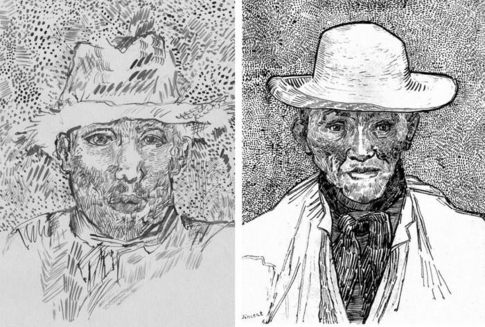
Above, Fig. 4. Simply by placing the supposed Van Gogh self-portrait next to an autograph portrait, immense and glaring differences become apparent: the author of the “discovered” drawing has abandoned symmetry with eyes of radically different sizes and a nose that seems product of a car crash. Throughout, the author mimics Van Gogh’s pen marks without comprehension of his form, power of design, and psychological acuity.
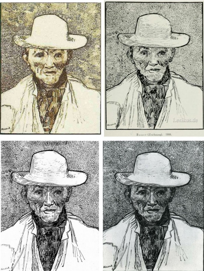
Above, Fig. 5. Instead of a form-camouflaging jumble of marks, the bona fide Van Gogh disports five graphically discrete component parts: a light-coloured jacket; a dark shirt and scarf; a varied but, on aggregate, mid-toned face; a light-toned hat with some mid and dark-toned form articulating shading; and, throwing all other values into relief, an agitated but tonally cohering background. Each of these spheres is allotted its own graphically purposive notations. The four images we show above for comparison are easily found online in historically successive reproductions. While these reproductions vary considerably, the force and artistic coherence of Van Gogh’s graphic intent and method shines through all.
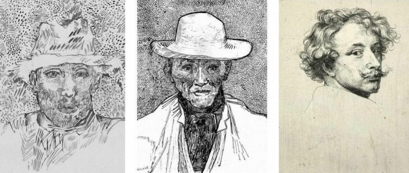
Above, Fig. 6. If we place the bona fide Van Gogh between the clumsy mimicking newcomer and a masterpiece of the greatest graphic brilliance – van Dyck’s etched self-portrait – it is clear that the Van Gogh has more kinship with the latter than with the former.
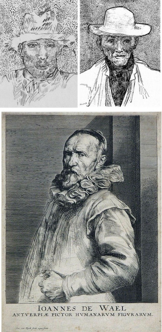
Above, Fig. 7. And if we compare the Van Gogh with an entirely autograph van Dyck etched state of a figure we find a common use of a toned background that throws both subjects’ flickeringly brilliant lights and darks into relief.
The Van Gogh Museum’s objections to the “Lost Arles Sketchbook” and its track record on Van Gogh attributions
Above, Fig. 8. Prof. Welsh-Ovcharov (top) has responded to the Van Gogh Museum’s dismissal of the drawings with a rebuttal and a challenge to debate – thereby showing conviction and good faith. Her publisher reportedly characterises the proposed debate as “an opportunity to shed light on the conditions under which the Van Gogh Museum is claiming the de facto right to a monopoly of attribution.” This is a common plaint against authorities that block would-be, high-value attributions but our impression of the museum’s judgements is favourable.
In 2006 a Van Gogh – The “Head of a Man” owned by the National Gallery of Victoria in Australia (above left, on an easel) – was challenged by the art historian and Sunday Times art critic Frank Whitford when the portrait was loaned to an exhibition in Edinburgh. The newspaper asked our opinion and, when we demurred, sent a (revelatory) high resolution full colour compilation of all of Van Gogh’s painted portraits. We supported Whitford, saying to the newspaper (as reported in ArtWatch UK Journal, Spring 2008):
“The specific warning signs that should have alerted the buyer are:
“1] It is unique in Van Gogh’s portrait oeuvre
“2] It does not fit in the stylistic chronology that exists within that oeuvre. Compare it for example with the brushwork, colours and ‘attack’ of the Old Man with Beard, painted the year before that is in the Van Gogh Museum, and the Portrait of Camille Roulin painted a year or so later and that is also in the museum. There is an enormous but clear and logical development between those two pictures, from thick, laboured, relatively coarse brushwork to much more refined and ‘decorative’ marks – but both are entirely consistent and ‘all-over’ in their treatment.
“3] If its provenance goes back no further than Germany in the late 20s or early 30s, that is particularly unfortunate. Germany at the time was notorious for the certification by scholars (for a fee or sales cut) of dud works. The dealer René Gimpel has referred to the scandalous ‘amounts obtained by means of certificates given daily by German experts to German dealers. Just as there were paper marks, so there are paper canvases, an easy way of bringing dollars into Germany…The German title of Doktor impresses the Americans. The museums are even more intent than the collectors on defending their fakes or their mistaken attributions….’ By coincidence, in the current ArtWatch Journal [No 21], Kasia Pisarek cites the case of the great Rubens scholar Ludwig Burchard who issued so many optimistic certificates that he was unable ever to write his definitive book on the artist…She has identified over 60 Burchard attributions that have subsequently fallen. It was Burchard who first upgraded to Rubens the Samson and Delilah that is now in the National Gallery.
“I would add that the fact that it seems to be admitted that it is a cut-down canvas that was glued onto a panel compounds suspicions… Why should a (presumably) then only forty years old canvas, have needed gluing onto a secondary support? It might be worth asking the Gallery curators if any scholar has questioned the picture publicly or privately.
“It may be coincidence, but two of the pictures that ArtWatch has challenged in our own National Gallery, the Rubens Samson and Delilah and the Raphael Madonna of the Pinks, no longer retain their original backs. The former was planed down to 2 or 3mm thickness and glued onto a sheet of blockboard; with the latter, the family of restorers who sold the picture in the 19th century had (most unusually) polished the back of the panel thereby removing all historical evidence.”
As we have seen more recently, the claimed lost Leonardo drawing “La Bella Principessa” that emerged anonymously in 1998 had been glued to an old oak panel. Gluing canvases or drawings onto boards conceals half the material evidence. On 3 August 2007 Andrew Bolt reported in the Australian Herald Sun:
“The curious thing about the National Gallery of Victoria’s fake van Gogh is how easily it was spotted as phoney once it went on tour…. For more than 60 years this painting hung in the NGV without anyone screaming ‘Fake!’ True, a few experts now say they had their doubts, but it was only when the NGV proudly loaned its ‘van Gogh’ to Scotland’s Dean Gallery last year that the painting was denounced. Three British critics took one look at it and snorted… Even then, there were some back in Melbourne who couldn’t accept the evidence of their own eyes, as ABC Television’s 7.30 Report found:
“‘Two of the critics include Michael Daley from ArtWatch UK and Times art critic Frank Whitford. But Robyn Sloggett [an art authentication expert at Melbourne University] has questioned their expertise. ROBYN SLOGGETT: I don’t think either of them are Van Gogh experts, certainly not known to be such…[Director of the National Gallery of Victoria] DR GERARD VAUGHAN: It is a slightly offbeat picture. It doesn’t fit into the natural progression of Van Gogh’s work at that time because it was a moment in late ’86 and into early 1887 where he was experimenting with two or three different styles. In many ways, this is slipping back into his earlier realist style of the mid 1880s where he concentrates and uses these earthier ochre colours. It is a transitional picture.’”
“Conceived at special moments” and “sometimes repeating, sometimes anticipating themselves” are commonplace apologias for disqualifying incongruities in upgrades. In 1997 and 2000 the National Gallery claimed its Rubens Samson and Delilah did not look like any other Rubens in the gallery because it was “the only work in this collection typical of the artist when he had returned from Italy in 1608”. In truth the painting was unlike the (secure) one that immediately preceded it and unlike the (secure) one that immediately followed. If a Rubens, it would be the only one on which he employed flat brushes and painted finger tips with rectangular highlights. During ABC Television’s 7 August 2006 programme (“NGV’s Van Gogh Labelled a fake”), James Mollison, a former NGV director said: “This picture has been doubted by people very often.”
The upshot of the controversy was that the NGV director announced that such was the gallery’s confidence that the painting would be submitted (voluntarily) to full technical examination at the Van Gogh Museum. A year later the Herald Sun reported the attribution’s demise at the Van Gogh Museum:
“The Dutch team used X-radiograph, digital photographs, light microscopy and paint and thread analysis. Among conclusions were: THE work’s ground layer of white paint is not found in Van Gogh’s Antwerp and Paris works. ITS use of pure ochre is not found in other Van Gogh work. THE portrait shows just the top of the man’s shoulders. Van Gogh usually showed more of the clothes. “A COMBINATION of a fairly coarse and detailed painting style”, with more detail in the mouth, eyes, skin and beard than Van Gogh used. NO reference to the portrait or the sitter in Van Gogh’s extensive letters. The experts also noted no record of the work could be found before 1928, when it appeared at Berlin’s Galerie Goldschmidt and Co.”
The Rubens Samson and Delilah emerged in Germany the following year at Van Diemen and Benedict where it was offered as a Honthorst before being upgraded by Ludwig Burchard. Previously it had been attributed to Jan van den Hoecke, a follower of Rubens. Burchard had recently upgraded the supposed Rubens ink sketch design for the Samson and Delilah (see Art’s Toxic Assets and a Crisis of Connoisseurship ~ Part II: Paper – sometimes photographic – Fakes and the Demise of the Educated Eye ).
The Newly Upgraded Filippino Lippi
Above, Fig. 9. At first glance the awakened “Filippino Lippi” (above right) seems more plausible than the new Van Gogh drawings – especially when linked to a work attributed to the painter at the North Carolina Museum of Art (above left). In terms of palette, condition and design the two seem as peas in a pod but this closely related pair triggers no recollections of anything similar in the artist’s oeuvre. If their strikingly common format suggests original incorporation in a larger work, disjunctive variations in their parapet walls and stone inscription tablets dispels the possibility. Most inexplicably of all, the new upgrade is incongruously modernist in its emphatic planar and ‘on-the-picture-surface’ geometrical vocabulary.
Above, Fig. 10. In 1901 the painting of Saints Uraldus and Fridianus was sold (not as a Philippino Lippi but as a Masaccio) to an English aristocrat, the Earl of Ashburnham. As with the recently proposed Haddo House Raphael (Fig. 10 above), there is little on the panel’s back other than a label in English for an exhibition of “Early Italian Art” (Fig. 10 top). For the Carolina Saint Donatus, the museum offers only a date – “circa 1490” – and the identity of the picture’s donor, the Samuel H. Kress Foundation. Such lacunae are perplexing because Filippino Lippi is a well-chronicled artist whose securely attributed works might easily be brought into direct comparison with the two more recent attributions.
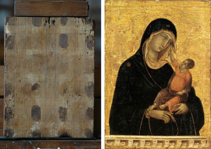
Above, Fig. 11. The backs of attribution upgrades often prove problematic, and none was more so than the small panel “discovered” as a Duccio Madonna and Child (above right) in 1904 after having been bought in an antiques shop in Italy. It was then rarely seen until bought with fanfare (but no technical examinations) for $50m in 2004 by the Metropolitan Museum of Art, New York, in a blind “treaty” sale conducted by an auction house among a few leading museums shortly after the picture was withdrawn from an imminent comparative exhibition of Duccio and his followers that would have introduced the painting to many scholars for the first time and in an instructive context. That withdrawal – despite the painting’s inclusion in the catalogue – might have been made out of fear of repeating the demise of the owners’ second Duccio, as described below.
The back of the tiny picture had been cradled with no fewer than eight mahogany bars and when these were later removed at the Met. a hand-written ascription to Duccio’s pupil “Segna” was found on the bare poplar wood from which painted work had been stripped. The Met Duccio contained modern wire nails, a fact not acknowledged in the museum’s post-purchase technical examination reports. When we asked after the antiquity of the nails the museum claimed they had been inserted as repairs after the panel had been cradled in the 1930s. As “proof” of that unsupported chronology it was said that one of the nails had entered one of the mahogany bars. However, as we pointed out, the head of that particular nail had been visible on the front of the frame throughout all of picture’s photographically recorded history and, while some nail heads were visible most were not and therefore had been applied before the (now heavily distressed) frame was gessoed and gilded. Thus, the panel arrived in the world at the beginning of the 20th century with modern nails intersecting a cradle that concealed an awkward ascription on a stripped-down back.
Above, Fig 12. A face painted in the 14th century by a follower of Duccio (identified by Pèleo Bacci as Segna) is shown above to the right of the face of the Met’s Duccio as it was before restorations established the blue of the Virgin’s mantle to be azurite, not the requisite ultramarine. No one ever suggested that the painting on the right was by Duccio and no one judged the Met’s picture an autograph Duccio before Bernard Berenson’s wife (Mary) in 1904 with the support of Berenson’s protégé Frederic Mason Perkins. An earlier suggestion had been that it was a work of Sano di Pietro, as Frances Vieta discovered in researches at the Frick Library, New York, that were kindly made available to us.
In 1933 Perkins attributed a second Madonna and Child to Duccio and persuaded the then owner of the Met.’s Ducio (the Belgian collector, Adolphe Stoclet) to buy it. In 1989 that Duccio was loaned to the Cleveland Museum of Art and was there identified on technical examination by Gianni Mazzoni as a fake by Icilio Federico Joni who ran a forgery factory fronted by middlemen, one of whom was Berenson’s protégé Frederic Mason Perkins.
Above, Fig. 13. A cult of Supreme Art Historical Importance was activated around the Met. Duccio and part of this mythology rested on the picture’s supposedly miraculously well-preserved, little-restored, condition. Comparison of the photographs above showing its present state (right) and an earlier state (left) discloses how extensively the work has been repainted – note the altered design of the dominant eye, and the extensive reworking of the veil. The potentially falsifying nature of restorations when determining attributions remains a conspicuously under-examined area – as does the extent and nature of repainting on stripped-down “sleepers”. (But see “A restorer’s aim – The fine line between retouching and forgery”. For a fuller account of the Met.’s Duccio difficulties, see Michael Daley: “Buyer Beware”; “Good Buy Duccio?” and “Toxic Attributions?” in the Jackdaw magazine issues of Nov/Dec. 2008, Jan/Feb. 2009, and March/April 2009.)
The Newly Upgraded Filippino Lippi (continued)
Above, Fig. 14. With the two small “Filippino Lippi” pictures at Fig. 9 and below, top, said to have been painted between 1490 to 1494, precise stylistic comparisons can be made with securely attributed works in the oeuvre. What is believed to be Filippino Lippi’s self-portrait above was executed by the artist in 1481-1482 in the Brancacci Chapel, Santa Maria del Carmine, Florence.

Above, Fig. 15. Filippino Lippi’s Apparition of the Virgin to St Bernard of 1480-86 was said by Bernard Berenson (in his 1938 revised Drawings of the Florentine Painters) to comprise “Filippino’s masterpiece, the last picture in which he is still a pure Quattrocentist, in which there is no sense of the Baroque.” Is it conceivable that some years later this artist painted the two small pictures shown here above the Apparition? Berenson reports that Filippino went on to betray excesses, not to purge and severely abstract his pictorial vocabulary: “Filippino’s Baroque, however had little in common with the qualities of the genuine [Baroque] style, and much with its worst vices. These were the sins of extravagance, of wantonness – the vulgarity of the newly enriched, who feel life is enhanced by the mere act of showy spending.”
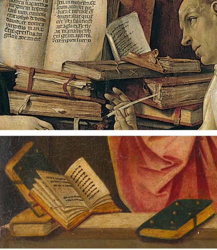
Above, Fig. 16. At the top we see how Filippino Lippi painted books before 1486 in his Apparition of the Virgin to St Bernard and before his lapse into Baroque excesses. In this secure work we not only see great technical accomplishment but a fascination with the very means by which books were stitched together in assembled folded sections. Is it conceivable that after this tour de force celebration of the book binder’s craft skills Filippino should have been satisfied with the out-of-perspective simplifications of books in the Saint Uraldus? While the opened book has been painted in utter ignorance of book binding methods, the ochre coloured book at the bottom left of the pile has managed to anticipate to a remarkable degree the appearance of a neat modern machine-bound book.
Above, Fig. 17. Again, does the chasm of technique and sophistication in this further comparison from the Apparition and the Saint Uraldus not strain credulity at claims of a common author?
Above, Fig. 18. By 1493-94 the artist had completed his Madonna and Child with St Catherine of Alexandria and St Martin of Tours as above and we see precisely the over-elaboration Berenson castigated as Filippino’s squandering “like a nabob with a heady disorderliness all the decorative motives which the heritage of antiquity, the hard earnings of his precursors, and his own fancy had put into his hands.”
Above, Fig. 19. How conceivable is it that Filippino might, at the same short period, have made two so diverse treatments of a man parting drapery with an advancing left arm as in these two paintings? In the one the “Blanket-like drapery dear to Filippino” (in Berenson’s term), curves, twists and folds naturally across the body, while in the other it moves as if fabricated by a former sheet metal worker with little regard for any underlying body, or even for the means by which the glimpsed parts of the (wildly varying) decorative border of the cope might ever have been united as woven material. Why the arbitrary, asymmetrical placement of indeterminate embroidered decorations on the cope’s border? What holds the cope together? Is it a giant garnet or ruby, or a small tambourine? Where else in Filippino might we encounter such flattening abstractions and lax indeterminacy of depiction?
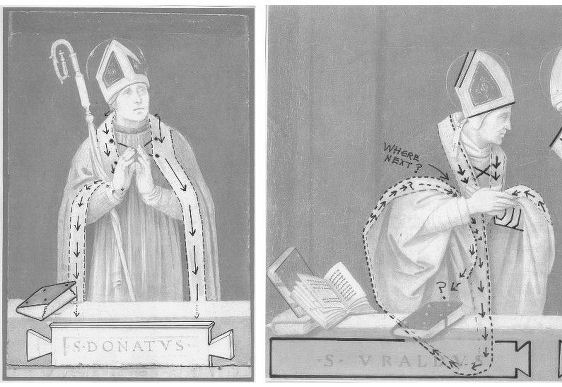
Above, Fig. 20. If the logic and treatment of Saint Donatus’ cope border (above, left) seems plausible and suitably understated, what might have carried the same artist to the Byzantine and conceptually irresolvable twin conundrums of the cope border as encountered on Saint Uraldus (above right)? What accounts for the very different depictions of the inscribed tablets on the parapet wall? If that of Saint Donatus is somewhat overly monumental and set uncomfortably close to the top of the parapet, at least it is sculpturally resolved and satisfactorily symmetrical along its horizontal axis with its twin decorative “butterfly wings” termini. Why, then, would the twinned tablets of Saints Uraldus and Fridianus meet in the middle with single butterfly-wing termini while leaving blank endings at the outer edges of the picture’s composition? Why are these two inscribed tablets skimped and devoid of projection when the saints above are greatly more dynamic and humanly engaged – almost as if in anticipation of Raphael’s later depicted dialogue between Aristotle and Plato?
Below, Fig. 21. What theological reading of Saint Uraldus’ life prompted the vast frilled neck lizard-like display of the cope’s pink lining below? If intentionally “Baroque” in its explosive ostentation and theatrical impact, why, then, its implausible combining with a geometric severity of draperies that are more snapped than folded?
With such bizarrely anomalous visual constructs, might it not be prudent to consider the waking “Filippino Lippi” sleeper as a possible product of the late 19th and early 20th century Italian forgeries boom that was tailor-made for British and American collectors? We know that many skilful artists were employed in that trade because when the Italian Government proposed stringent export taxes in 1903 to stem the country’s out-flow of art treasures, the Florentine art dealers association petitioned that the new laws would throttle the large and thriving trade in forged art and antiquities for foreign collectors. (Where did all those often excellent works go?)
At the December 2015 ArtWatch UK/LSE Law/NY Center for Art Law conference Art, Law and Crises of Connoisseurship (the proceedings of which will be published shortly), Professor Charles Hope pointed out how effectively 20th century scholarship had winnowed previously overblown numbers of Titians, Raphaels and such. Markets are good things and the London art market has long been a very good (much envied in Europe) force for Britain, but there are developing dangers. If perceptions were to grow that previously downgraded works are being systematically rehabilitated through “sleeper-discovery” mechanisms at a time when leading houses are fighting to the death for pole position on market share, confidence in the lots on offer might evaporate. Already, certain external structural changes are weakening the London market’s traditional and much-valued symbiotic relationship with disinterested scholarship. Increasing litigation by owners against dissenting independent scholars suppresses debate and frank expert appraisal. In a paper at our conference (“Throwing the baby out with the bath water – the Demise of Connoisseurship since the 1980s”), Brian Allen, former director of studies at the Mellon Centre, warned that recent changes of philosophy and views on connoisseurship in the academic world are greatly reducing the traditionally available body of disinterested academic expertise that counterbalances purely commercial interests:
“In my own field of British art the number of so-called ‘experts’ has now diminished alarmingly as the older generation dies off not to be replaced. It seems extraordinary to me that major artists such as Stubbs, Wright of Derby and Sir Thomas Lawrence, to name but three, don’t have an acknowledged expert to whom one can turn for a reasonably reliable, independent opinion. And this has also certainly happened in other specialist fields… Younger scholars nowadays, especially those in the universities, have almost no contact whatsoever with the art trade compared to fifty years ago. Yet for many years it was perfectly possible for the two worlds to co-exist harmoniously.”
Michael Daley 23 November 2016
Bendor Grosvenor’s Eye, a new Raphael, and further barbarism at the Louvre
Bendor Grosvenor has challenged our post on the so-called “Haddo Raphael” and asked for a right to reply.
Dr Grosvenor writes:
It is not correct to say that the Haddo Madonna ‘relates to no known Raphael work’. The picture bears a very interesting relation to a drawing by Raphael of the Head of a Virgin formerly in the de Triqueti collection. Sadly, that drawing is now lost, but it is listed in Paul Joannides’ 1983 catalogue, ’The Drawings of Raphael’ (no.64). A good quality reproduction is in the Witt Library. What I think Michael means is that the Haddo Madonna relates to no known work which he agrees is by Raphael (he does not agree that the de Triqueti drawing is by Raphael).
Michael seeks to establish the connoisseurial quality of my ‘eye’ by referencing the ongoing and recently uncovered fake Old Master scandal. He writes that, like numerous Hals scholars and the Louvre, I was ‘deceived’ by a Hals which has been proven to be fake. But there is an important distinction to be drawn between the Louvre’s deception and my alleged deception – I never actually saw the painting. As I make clear in the Financial Times article in which I discuss the Hals, I had only seen it via a photograph, long before the fake story ever began, and never paid it especial attention. In my business, seeing a picture in the flesh and via photographs offers a world of difference.
Michael then also states that I ‘came within a whisker of being deceived by a Gentileschi fake’ formerly on display at the National Gallery in London. I suppose that not actually being deceived by a painting which is indeed almost certainly a fake (it hasn’t yet been proved) could be characterised as ‘coming within a whisker of being deceived’. But that presentation of my views seems perhaps a little unfair. The Gentileschi is the only painting of a number of works currently being doubted as fakes that I have seen in the flesh. I have been the first to go on the record as saying that I think it is a fake. I have made that conclusion on the basis of ‘my eye’. I might be wrong, of course – in which case Michael will have further reason to doubt my connoisseurship, but for a different reason.
It might have been more helpful to ArtWatch readers if Michael had introduced them to the quality or otherwise of my ‘eye’ via the other re-attributions we made in the series ‘Britain’s Lost Masterpieces’; works by Jacob Jordaens, Peter Breughel the Younger, Allan Ramsay, and Claude Lorrain, all of which had been doubted before. (I must admit I am rather proud of them, so I’m sorry if it sounds like boasting, it’s not meant to.) For these pictures I felt confident enough to say, ‘this is what I believe them to be’, and happily had the agreement of other experts too. But in the case of the Haddo Madonna I have only ever said ‘it might be by Raphael’ (and happily had the agreement of Sir Nicholas Penny). I am very far from certain that it is. Much further work is clearly required. It seems at this stage that the preponderance of evidence, including the qualities of the painting itself, does suggest, at the very least, that the former attribution to Raphael ought to be re-considered.
I take no issue with Michael casting doubt on the possible attribution. Indeed, given his longstanding views on the Madonna of the Pinks, which Sir Nicholas Penny discovered and (rightly in my view) believes in wholeheartedly, I expected it. I welcome the debate. But I am grateful for the opportunity to respond to some of the points Michael has made so far, which I felt framed the argument in a rather unhelpful manner. I would also have preferred it if he had gone to see the Haddo Madonna in person before making such firm conclusions about its quality. But I suppose we must all practice our connoisseurship in our own ways.
Bendor Grosvenor, 23 October 2016
Above, Fig. 1: BBC4 Factual Report, 03. 10, 2016: “Britain’s Lost Masterpieces discovers hidden painting believed to be by Raphael. ‘Finding a potential Raphael is about as exciting as it gets. At first I couldn’t quite believe it it might be possible, but gradually the evidence began to all point in the right direction.’ Dr Bendor Grosvenor.” Photograph showing the co-presenters of the programme, Jacky Klein and Bendor Grosvenor with the attributed Haddo House Raphael.
Michael Daley replies:
It is good that Bendor Grosvenor is prepared to engage in debate on the nature of connoisseurship. Bendor reproaches me for not adhering to practices employed in his “business”. I take his connoisseurship to be rooted in a niche art market where works of unrecognised quality (“sleepers”) are identified, stripped down and painted back together again by restorers, before being presented as reconditioned, aesthetically and financially elevated works. Within this milieu Bendor can indeed claim successes, but his “eye” is grounded in neither artistic practice, nor art historical studies. My eye has been sharpened by a long professional training in art and crafts; through art school lecturing; and, above all, by practice as an artist and illustrator. From 1990 this was supplemented and enriched through friendship with Professor James Beck whose rigorous scholarly method was respected even by his opponents.
Bendor complains that I have not trekked to Aberdeenshire to see his claimed Raphael in the flesh but, then, he underwrites it by appealing to the authority of a drawing that he has never seen and that nobody can see because it is lost and known only through a poor quality photograph (see Fig. 3 below). Bendor insists that this singular, un-examinable, slight and problematic drawing establishes that the Haddo painting was executed by Raphael, even though it is not related to the heroic and revolutionary works of Raphael’s first “Florentine period” (1504-08) when he – more student than genius, in Michelangelo’s view – was galvanised by sight of Michelangelo’s and Leonardo’s works.
Bendor appeals to the authority of two scholars, one of whom, Sir Nicholas Penny, described the Haddo picture as “Very beautiful – I’m very impressed by parts of it.” However, this curate’s egg is itself only a part. The composition would appear to have been brutally cut out of a larger panel but Bendor tells me that while the paint runs up to the (distressed) edges of the panel, it does so without evidence of saw mark injuries. Does that unusual relationship not suggest that the painting was made to fit this particular piece of old wood?
Above, Fig. 2: The Haddo House Raphael, top left; an attempt by the author to extend the image on the cropped design of the painting, top right; a detail of a painting by Le Brun, showing a similar cross-over dress with a triangle of under garment showing (above).
On the impressive parts, would Sir Nicholas include the Virgin’s costume – a racy empire-style cross-over dress with a sash under the breasts (above) – when such costumes were as scarce as hens’ teeth in Florentine Madonnas of the first decade of the 16th century? Bendor appeals to authority of Professor Paul Joannides, the author of the 1983 complete catalogue of Raphael’s drawings, but has he read the book? Prof. Joannides gives this drawing not to the Florence Madonnas but to a group of studies made in Umbria in 1503-04 for one of the Virgin’s companions in Raphael’s first major work, The Marriage of the Virgin, (as shown below) when the artist was still under the sway of Perugino.
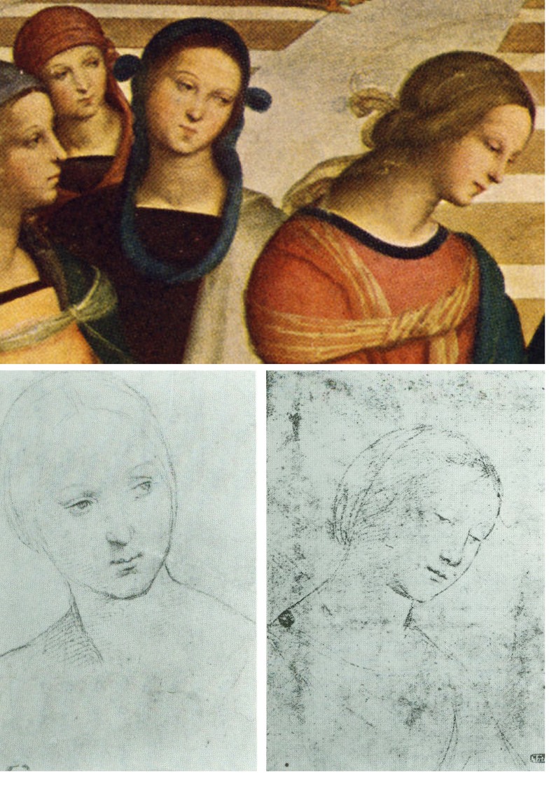
Above, fig. 3: Above, two drawings given to Raphael by Professor Paul Joannides in his 1983 The drawings of Raphael with a complete catalogue. Prof. Joannides assigns these drawings to Raphael as studies made in 1503-04 for the central companion (above, top) to the Virgin in Raphael’s The Marriage of the Virgin. The drawing whose design coincides with head and neck of the Haddo House painting is here on the bottom right
My eye tells me that the drawing is the inferior of others in its group and that it was clearly not made as an auxiliary cartoon for anything, let alone for part of the Haddo picture, it being summary not exploratory. Connoisseurship consists more of discriminating between qualities than in identifying similarities. The highly schematic drawing proposed as Raphael’s intended cartoon for the Haddo House painting shows none of the flair, absorption in the model’s features, and sheer graphic brilliance brought by Raphael to other 1503 studies of heads made as auxiliary cartoons for major paintings. That this particular drawing should closely fit with the design of (only) part of the Haddo painting, is a problem for, not a corroboration of, Bendor’s Raphael inscription. This supposed “cartoon” shows the ear covered by hair that is tightly bound and held free of the neck by a simple head-dress. Such was entirely appropriate for a secondary figure in a large group painting. In this regard it is quite unlike the Haddo painting (below) where the coiffure is elaborately braided and pulled back to expose the ear, and where a long transparent veil is draped over the neck.

Above, Fig. 4: In the monochrome block in the top right shows we see at the top how the neck on the Haddo House painting is draped with a transparent veil. Below it is two such near-identical arrangements of coiffures/necks are encountered on two of the very many copy versions of the Raphael’s Madonna of the Pinks. The one on the right, here, is the one that was attributed to Raphael by Nicholas Penny in 1992.
For Bendor’s proposed drawing to underwrite the new Haddo ascription we would have to believe that Raphael re-used an earlier atypically schematic Umbrian study at some point during his 1504-08 Florentine period, and that he elaborated it in a manner which, by a remarkable coincidence, closely anticipated the very treatment of hair and neck that is found in the painting (the National Gallery’s £35m Madonna of the Pinks) that Nicholas Penny upgraded to Raphael in 1992 as a work of c. 1507-08. Scholars of Raphael’s drawings have noted that his draughtsmanship was constantly evolving to meet the requirements of the task in hand. Bendor may believe that Raphael recycled an old study here. I do not.
As for that old chestnut, the “in-admissability” of photographic records, when I saw a before and after photo-comparison of a detail of Michelangelo’s cleaned Sistine Chapel ceiling frescoes in 1988 (see below), my artist’s eye concluded immediately that the ceiling, which I had not yet seen, had been damaged. For the longest time, Bendor held critics of the restoration to be rather myopic. But then he visited the Chapel and concluded that we had been right all along. As he says, we each have our own way of proceeding.
Above, Fig. 5: In demonstration that restorations can be appraised by photographs alone, we show above (top) a small photo-comparison of a section of the cleaned Sistine Chapel, as it was published in 1988 when I was working on the Independent as an illustrator. On first sight of that photographic testimony I saw instantly that the ceiling was being damaged; that James Beck’s criticisms were well-founded; and, that the restorers’ claims to have removed only soot and varnish were preposterously implausible. I had not yet visited the chapel and knew it only from photographs. In the second comparison above we converted the two images to grey scale and reversed their order. So, now, the cleaned state is on the left and the pre-cleaning state is on the right. It is striking how the two states resemble earlier and later stages of an etched plate (as can be seen in the third comparison which shows two stages of a van Dyck etching of a now lost Titian).
Had the ceiling really been painted and left by Michelangelo as seen in the cleaned state on the left of the second comparison, we would have to believe that over a period of more than four hundred years, soot and dirt had accumulated selectively and artistically purposively on the ceiling in patterns that followed Michelangelo’s design so closely as to complete his shading and add specific details like veins to the oak leaves. The challenge for those who continue to subscribe to this fairy story is to explain how it was that Michelangelo’s contemporaries and early copyists all contrived together to describe and record the ceiling, not as it was in their time, but as it would gradually become over the centuries.
As an illustrator I not only fully appreciate that images get built up from nothing in stages (as indicated in the development of a magazine cover drawing in the bottom photograph above) but also how much photographs can vary and then vary further still when reproduced for the printing process on different types of paper.
I have not seen the newly “restored” Leonardo St John (which is not yet on public display) but can see from the comparative before and after cleaning photographs that have just been published by the Louvre (as shown below) that it has – as with the Louvre’s recently restored Leonardo, The Virgin and St, Anne – been damaged. This time, however, it has been damaged in a most unusual and perversely misguided manner. It is virtually customary in big museum set-piece restorations for a trade-off to be licenced in which finishing, tonally-modulating layers are sacrificed in order get at the brighter, underlying colours. On this occasion, as seems obvious, none was to be found below. In consequence, this Leonardo has lost form-giving tonal modulations without even the slightest spurious intensification of hue. Worse, the Louvre (which for most of the 20th century constituted an institutional reproach to the restoration barbarians-at-large in the Anglo-Saxon sphere) has now achieved a new low: it has contrived to lower the highlights as well as the mid tones and thereby reduce the pictorial vivacity of an already sombre but divinely lucid painting. I hope that Bendor will see this too – or, perhaps we should wait and proceed to Paris together to judge the picture on the spot?
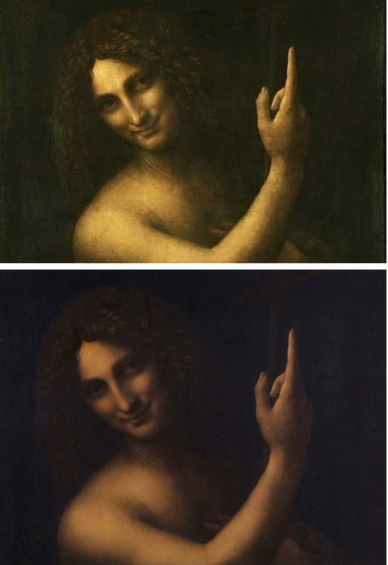
Michael Daley, 6 November 2016
Barbarism at the Louvre
“A few days ago I was in Paris again after a few years’ absence and visited the Louvre, excited to see my beloved Nike of Samothrace, the masterpiece from Antiquity which I always considered to be the pinnacle of achievement of Greek sculpture. It is on exhibition again after its recent restoration which had kept it from public view for several years.”
Euphrosyne Doxiadis continues:
The Louvre without its greatest treasure, the Nike, was to me inconceivable; so I waited impatiently for the restoration to be completed and for her to be returned to the place where she belonged. The placing of the winged Victory on the prow of her ancient ship at the top of the staircase in the Denon section of the museum was an inspired placement in museum strategy.
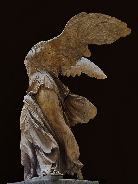
She was the rewarding apparition in store for visitors and the experience was no less than magical. The statue took your breath away as it progressively came into full view as you approached the monumental staircase from the large sculpture hall. Every time I would visit the museum I would ritually walk through this hall slowly in order to savour the upward unfolding of the miracle placed at the top, the winged Victory coming into full view. A woman with spread wings fixed in time; giving the viewer the impression that she had only just landed on her blue-grey marine pedestal. Like no other work I know, looking at her gave one a feeling of elation and liberation from gravity which its ancient sculptor had intended. He captured the fleeting moment when she had just landed from her flight, the moment of balance between weight and weightlessness, between stillness and movement, silence and the sound of wings fluttering in the wind. A total wonder. She was a powerful emblematic figure.

No longer. The recent restoration of the sculpture has reduced the Nike of Samothrace to a white ghost of her former self. Looking at her now is like looking at a modern copy of the great masterpiece we so adored. What has happened is a tragedy. Lost forever is the wonderful statue that we knew. Gone irrevocably is the fleeting moment of its greatness. What we now have, after the cleaning, is what looks like a plaster of paris replica of what we had before. Devastating and unbelievable. Who would have thought that this could ever happen?
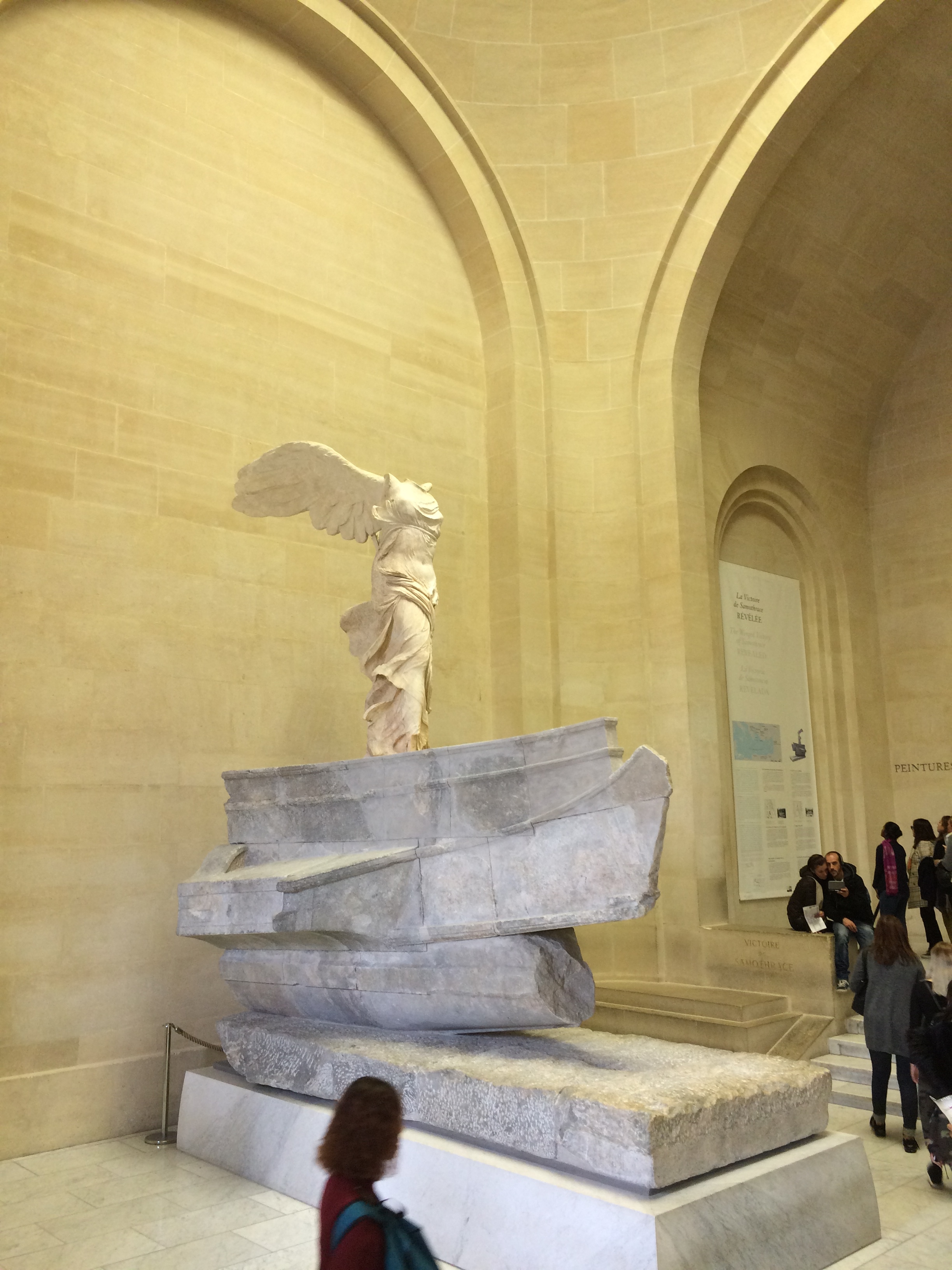
A foretaste of this permanent disaster was seeing a poster a few years ago pasted around Paris of the Nike painted an ultramarine blue by the modern artist Yves Klein. Although shocked by the insensitivity towards its great prototype, I was comforted by the fact that these were only copies of the original that Yves Klein was playing around with. He had hoped perhaps that the wings of the Victory would carry him to higher fame and fortune. Now this “game” is no longer harmless; toying with fame and infamy; it is for real. The restorers of the Nike have robbed it of its top layer, its patina which gave it much more than the sum of its parts of bruises and stains; it gave it its magical quality. The Victory we knew is alas, no longer here. What is left now is a white sculpted stone resting vicariously on its spanking clean pedestal. The Victory has flown away. Forever.
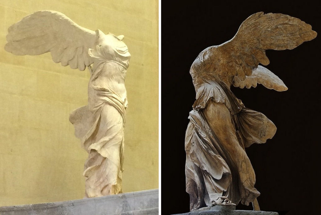
Euphrosyne Doxiadis, 23 October, 2016
The Art World’s Toxic Assets – Part III: Failures of Scrutiny
Within a couple of years of our warnings on the art world’s accumulating toxic assets of upgraded Old Master attributions, that sphere has been rocked by a spate of discovered/alleged old master forgeries that have recently deceived and embarrassed leading experts and major institutions alike.
In the midst of this turmoil, a Raphael-esque painting of insecure provenance (which is to say, of none before 1841), that relates to no known Raphael work, that is said to be good in parts and perhaps to have been a fragment of a lost unknown painting by Raphael, was launched to the world in the Guardian on October 3rd as a provisional “discovery” (“Raphael ‘copy’ once valued at £20 may be a £20m original”) to be shown on 5 October in a new three-part BBC4 series, “Britain’s Lost Masterpieces” [see Figs. 1a and 1b below]. The programmes were co-presented by an art historian, Jacky Klein, and a fast rising young player in the Old Masters attributions field, Bendor Grosvenor. Formerly of the Philip Mould Gallery and the BBC “Fake or Fortune” series, Grosvenor doubles as an art market commentator on a blog site, “Art History News” and, occasionally, for the Financial Times.
In the 8/9 October Weekend FT (“An eye for the real thing”) Dr Grosvenor held that the recently exposed failures of judgement constituted a scandal that threatens “to undermine the art world’s long established system of deducing authenticity”. He suggested that this danger stemmed from too great a reliance on the judgements of “independent, usually academic” experts who have published works on the artists they appraise, and from insufficient heed being paid to those (by implication like himself) who have not studied art history or published on artists but who, nonetheless, possess a “good eye”.

This recommendation was advanced even as Grosvenor admitted that he, along with France’s National Centre for Research and Restoration at the Louvre; a leading Louvre curator; numerous Frans Hals scholars; the Burlington Magazine; Christies (on scholarly advice); the Weiss gallery; and, Sotheby’s (at first), had been deceived by a recently exposed fake Frans Hals [Fig. 2, above], and, that he had come within a whisker of being deceived by a Gentileschi fake that snared the Guardian art critic and blogger, Jonathan Jones, and the National Gallery which had accepted the work as authentic when it was offered on loan (“Was the National Gallery scammed with a fake Old Master painting?”).
Where we held in the April 2006 ArtWatch UK Journal [Fig. 3, above] that too many in the art world were disregarding Mark Twain’s admonition to “buy land because they are not making it anymore” when buying upgraded school works as autograph masterpieces, Bendor Grosvenor often declares a state of rude good health in the old masters market. Because so many old masters have already been taken off the market and into museums, and because, by definition, old master paintings are no longer being produced, market growth increasingly depends on the discovery of “sleepers” – which is to say, of suspected hitherto unrecognised major works whose true identities will emerge during dealers’ un-monitored, sometimes radical stripping-down, repairing and retouching of paintings. (More recently we published a post that indicated means by which restorations might slide towards outright fakery in cases which, coincidentally, involved earlier “Frans Hals” paintings. See “A restorer’s aim – The fine line between retouching and forgery”.) On 13 August 2014 we called in a letter to The Times for a statutory requirement for vendors to disclose all that is known on a work’s provenance and conservation history [see Fig. 4, below]
On the BBC4 series “Britain’s Lost Masterpieces” Bendor Grosvenor got very excited at the prospect of a distinctly Raphael-esque painting in Haddo House in Scotland being an autograph Raphael [Fig. 1a]. BBC coverage of the visual arts rarely airs dissenting voices and this programme was constructed with many narrative layers all of which sang the same encouraging tune: Although this work has little provenance we should be assured by the fact that it had been bought in the early 19th century as an autograph Raphael by the 4th Earl of Aberdeen, George Hamilton-Gordon (1784-1860), who, in his early years and travels, was an impassioned devotee of the classical arts of Greece and Italy, and who somehow managed, despite being “flat broke”, to acquire a fine collection through a “shrewd nose for bargains”. Particular assurance was seen in the fact that the picture had been exhibited as a Raphael at the British Institution in 1841. However, an old hand-written label attached to one of two oak bars that reinforced the back of the poplar panel says, in English, “The Virgin Mary, Raffael or after Raffael” [see Fig. 1b]. As that is the only documentation (other than an indecipherable fragment of a wax seal) on the back of an assumed 500 years old panel, it would seem likely that the label was present when the painting was exhibited in 1841 as a Raphael. If it had not been present in 1841, why would its owner have added such a weakening document to his own painting?
The question of the label’s origin is the more perplexing because, as we now learn from Dr Grosvenor, the canny Scottish Fourth Earl of Aberdeen, George Hamilton-Gordon, had not bought the painting while on his early travels in Italy because he had not bought it all. Rather, he had inherited it more than a generation later from his brother, Robert Gordon, when he died in 1847 (by choking on a fish bone). The provenance thus descends entirely from Robert Gordon who was born in 1791 and would not likely have bought the painting (from whomever – for no one knows) much before 1810. Although Robert Gordon was the owner when the picture was exhibited at the British Institution, there are no family inventories listing the painting before 1867 and none thereafter lists it as a Raphael. In two entries it is priced at £80 and later at £20. On both occasions it was listed as a copy. In the television programme, the co-presenters describe seeing their perceived challenge as being to reverse a hypothecated “increasing scepticism” with which the painting was viewed after George Gordon’s death in 1860. But what if the Raphael attribution had always been appreciated within the family as being uncertain? Or, might not a contrary reading have been considered of the possibility that it only became politic for independent scholars to dissent on a claimed Raphael attribution after the death of the fourth earl who had been an extremely powerful and well-connected political figure – and one with with a sarcastic turn to boot?
Against the fragmentary picture’s distinctly weak provenance, it was claimed (- but not demonstrated) that a close fit existed with secure Raphael Madonnas. The belief that this work might be an autograph Raphael received high level scholarly and (implicit) institutional endorsement as Bendor Grosvenor is filmed ascending the grand stairs of the National Gallery’s Sainsbury Wing in the company of the Gallery’s former director, Sir Nicholas Penny. The camera catches the pair passing the monumental carved Roman Letters “RAPHAEL” [see Fig. 5, below] and jumps in a nanosecond to a painting in the Gallery’s substantial Raphael holdings – but not to one its finest, instead to the least secure, most recent, so-called Madonna of the Pinks that had been attributed to Raphael in 1992 by Nicholas Penny when a curator at the Gallery, and that was later bought by the Gallery for nearly £35millon after a public appeal. Towards the end of the film [Fig. 6, below] Nicholas Penny places the putative Grosvenor-Raphael, somewhere between “probably by Raphael” and “by Raphael” and suggests that with a little “more time and courage” he might well go the whole hog.
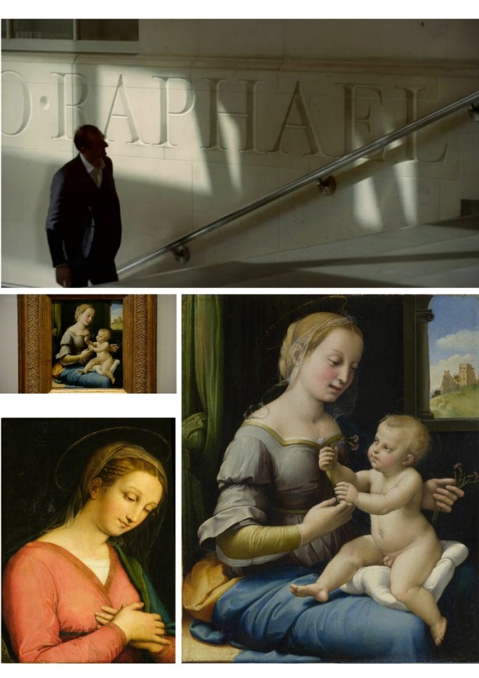
Above, (top – and running clockwise), Figure 5: Bendor Grosvenor passes the monumental carved “RAPHAEL” in the National Gallery’s Sainsbury Wing; the National Gallery’s (disputed) Raphael Madonna of the Pinks; the Bendor Grosvenor-proposed Haddo House Raphael Madonna, before restoration; and, the National Gallery’s Madonna of the Pinks, as presently framed. Above, Fig. 6: Jacky Klein, Bendor Grosvenor and Nicholas Penny seen examining the Haddo House Madonna in the 5 October BBC4 “Britian’s Lost Masterpieces” programme.
Although a caveat was offered in the programme (and reported in the Guardian) with an admission that there had not been the time and money to run all appropriate tests, Grosvenor nonetheless claimed that all the evidence seemed to point in the right direction. As if to dispel any doubts, the television programme (which was produced by Tern TV and commissioned by Mark Bell, Head of Arts Commissioning, BBC, under the Executive Producer for the BBC, Emma Cahusac) carried a strong implicit message that the Grosvenor-proposed Raphael is as sound as the National Gallery’s Penny-attributed Raphael Madonna of the Pinks. We would counter that, with both pictures, such assurances were misleading and that the principal evidence on the strength of these attributions is found in the look of the pictures, which testify in different ways[ see Fig. 5] against Raphael’s authorship, as will be shown in Part IV.
We would add two points here. First, that Dr Grosvenor seems unaware of the extent to which the Madonna of the Pinks had been rejected as by Raphael in the 19th century and more recently by scholars including Professor James Beck, the founder of ArtWatch International who devoted three chapters of his last (2006) book, From Duccio to Raphael – Connoisseurship in Crisis, to problems with the present attribution [see Fig. 7, below]. Although Nicholas Penny is a highly respected Renaissance specialist, and his Raphael attribution had been fittingly proposed in a long, thorough scholarly article in the Burlington Magazine (“Raphael’s Madonna dei garofani” Rediscovered, 134, 1992) that had impressed Professor James Beck, the attribution itself received only majority approval from a group of specialist scholars assembled at the National Gallery. Contrary to initial Gallery press claims, there had been no firm consensus of scholarly opinion – a fifth of the invited scholars dissented from the attribution when questioned directly by Beck.
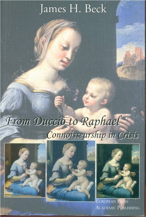
At the time, we pointed out that the then majority for support had reversed over a century’s scholarly consensus of judgement. The Penny-Raphael had been rejected as early as 1854 by Gustav Friedrich Waagen as “the small picture in the Camuccini collection which I do not consider to be original. The tone of the flesh has something insipid and heavy. The Treatment makes me suspect a Netherlandish hand.” Professor Martin Kemp rejected the Penny-Raphael Madonna on the grounds of her most disconcerting and uncharacteristic teeth-baring opened mouth: “In reality, for any Renaissance woman to be portrayed showing her teeth, American-style, is unthinkable”. (Leonardo, Oxford/New York, 2005, p. 242.)
There were structural problems with the picture, as well as stylistic incongruities. In the 2003 ArtWatch UK Journal 29, we drew attention to the disturbing fact that the National Gallery’s Madonna of the Pinks Raphael – like the Gallery’s (challenged) Rubens Samson and Delilah painting – had lost vital physical and documentary evidence. With both paintings the original, evidence-bearing back is missing, as is also the case in the drawing that has been dubbed “La Bella Principessa” and given to Leonardo da Vinci by Martin Kemp, even after it emerged that the supposedly 500 years old work had been sold anonymously and without a shred of provenance by the widow of a restorer who was the work’s first known and sole owner. That atypical drawing on an atypical medium has been (unusually) glued down onto an oak panel, thereby preventing an appraisal of drawings known to be present on its reverse.
The Samson and Delilah panel painting had been planed down to wafer thinness and glued onto a modern sheet of blockboard in an operation of which no record exists. The back of the Madonna of the Pinks was “polished”, coated and given three wax seals in the 19th century when in the hands of its first known owners, the notorious Camuccini family
of artists, copyists, restorers, art dealers and art smugglers. We cited much else that was problematic about the Madonna of the Pinks:
“It possesses, for example, an irregular border of unpainted wood that is ‘unusual’ for Raphael. The picture’s unusually highly-wrought finish, ‘jewel-like, as Dr Ekserdjian and associates put it; made up of ‘tiny, almost invisible brushstrokes’, as the National Gallery puts it, is said to have been the result of the work’s especial execution for the close contemplation of a nun…Even if this fanciful explanation for the unusual brushwork were to be accepted, it would not also explain the picture’s atypical colour scheme [which] Dr Penny suggests, may reflect ‘a particular moment of indebtedness by Raphael to Leonardo…’ ”
We complained that “Dr Penny’s case seems to rest on the belief that the outcome of technical analysis carried out at the National Gallery somehow displaces or neutralises all accumulations of otherwise awkward evidence…A manifest weakness of Dr Penny’s case is that no technical analysis or even photographic comparison is offered on any of the picture’s forty or so rival contenders…” It was later learned that scientific analysis had identified the wood of this most unusual artefact as being, not poplar, as might have been expected, or even a fruit wood, as is the case with one large Raphael panel, but yew – a wood nowhere encountered in Raphael or, so far as we know, in any Italian Renaissance painting. As will be seen in Part IV, the proposed Grosvenor-Raphael bears many handicaps.
Michael Daley, 20 October 2016
The 2016 James Beck Memorial Lecture
Our seventh annual James Beck Memorial Lecture and reception to commemorate Professor Beck’s scholarly career at Columbia University and his founding of ArtWatch International (in 1992), will be held this year at the Art Students League in New York on Thursday, 22 September.
The speaker is the art and architecture historian and founder of the Monuments Conservancy in New York, Dr. Donald Martin Reynolds, for whom “every monument carries a history”.
His Lecture title is:
“For Our Freedom and Yours”: The Art and Life of Andrew Pitynski, Portrait of an American Master.
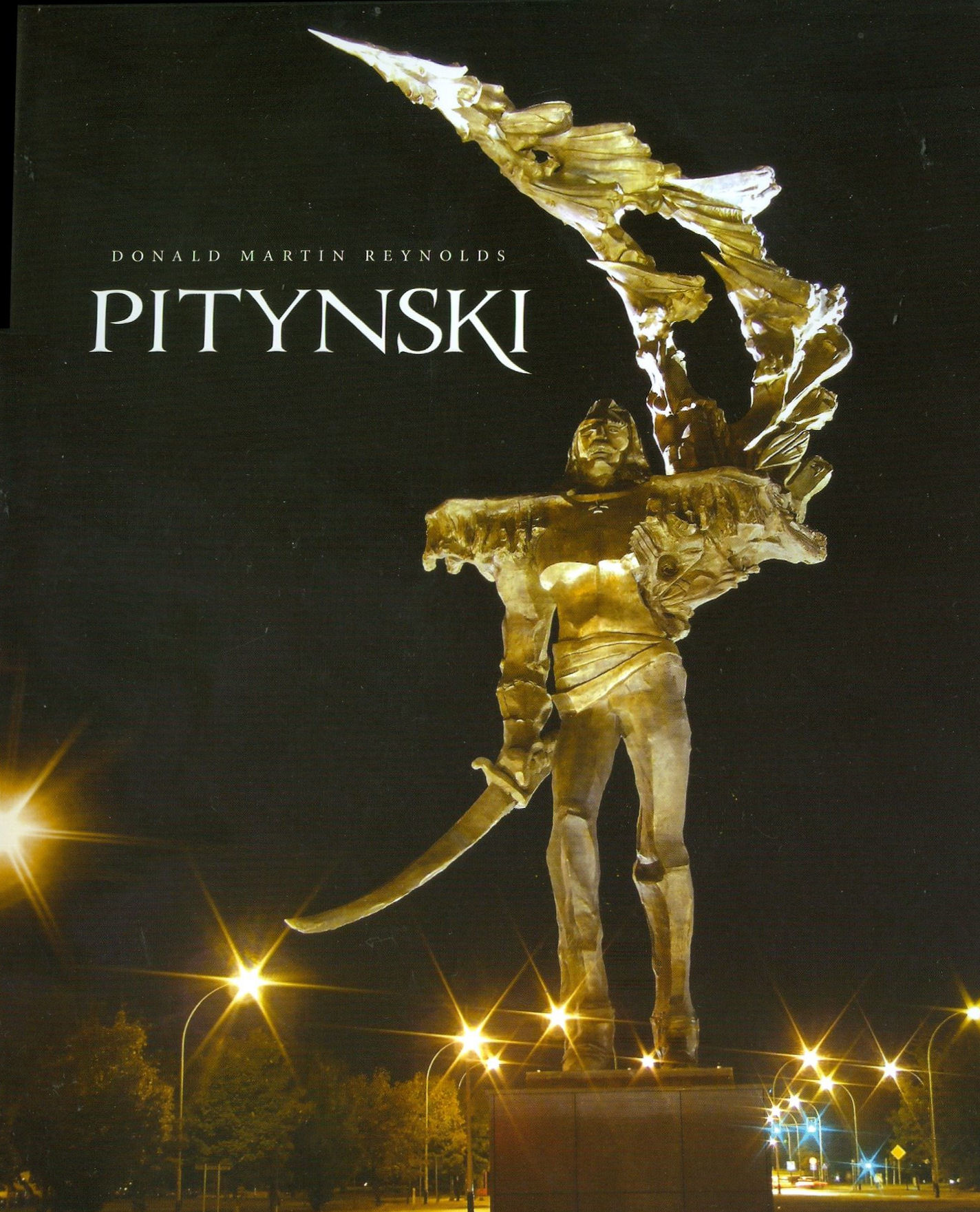
Don Reynold’s 2015 monograph on the sculptor Andrew Pitynski
The lecture and reception will be held between 6-8 pm at:
The Art Students League, 215 W. 57th St., New York, NY 10019
For details, please contact ArtWatchNYC@gmail.com or follow this link to the Art Students League website (upcoming events)

Andrew Pitynski’s “Avenger”, Bronze and Granite, 1988, Doylestown, Pennslyvania
Dr Reynolds came to New York in 1959 and worked as a copywriter for J Walter Thompson. There, he began his lifelong passionate involvement with public sculpture, on seeing such monuments as the Firefighters Memorial at W. 100th St. and Riverside Drive.
The Firefighters Memorial at W. 100th St. and Riverside Drive, New York
In 1965, Dr Reynolds’ switched careers by enrolling in the School of General Studies at Columbia University as a Ford Foundation Fellow, earning a B.A. in 1968 and an M.A. in art history in 1969. He was awarded the Ph.D. in 1975 for his dissertation on the sculpture of Hiram Powers and he taught at the university from 1970 to 2003.
He was curator of New York City parks from 1986 to 1988, where he oversaw the more than 1,500 public monuments, statues and plaques in 1,000 parks. Most of them “celebrate events or mark people’s accomplishments,” he says. But when events fade or benefactors die, “they are forgotten, and so are their principles,” he says. To help stem this erosion, he founded The Monuments Conservancy, an organization devoted to “making people aware of our public monuments and what they stand for.”
In 1991 he founded the annual Samuel Dorsky Symposium on Public Monuments in honour of the great historian of Baroque art and architecture, Rudolf Wittkower.
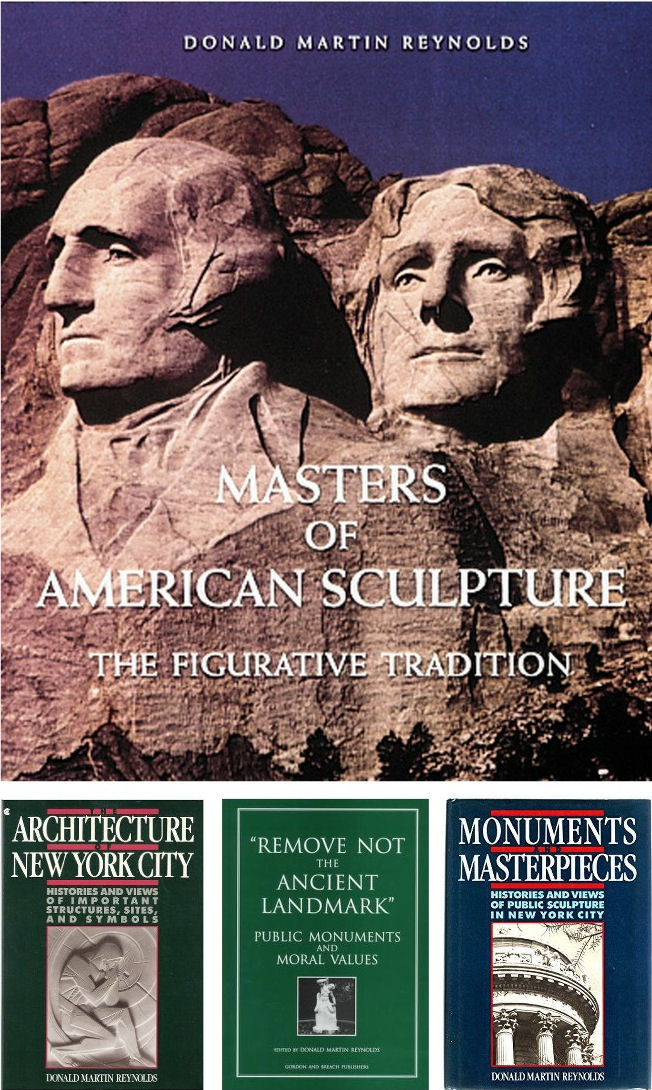
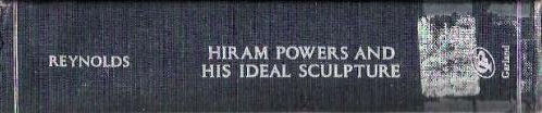

Above, Hiram Powers’ “California” was created in 1858, ten years after the Gold Rush. It was bought by William B. Astor, one of America’s wealthiest men, and installed in a special room created for it in Astor’s house in NYC. She holds a divining rod and the ‘prop’ behind and next to her right leg depicts the crystals from which gold was extracted. The sculpture is of Serra Vezza marble, the medium re-discovered by Powers – and which discovery revolutionized statuary marble from then on. Powers preferred Serra Vezza, even above Carrara marble, not only because it had fewer flaws but because its finished surfaces most closely resembled the porosities of human flesh. This sculpture was the first work by an American artist to be acquired by the Metropolitan Museum of Art.
Among Dr Reynolds’ many books and publications are: The Architecture of New York City: Histories and Views of Important Structures, Sites, and Symbols, 1984 and 1997; Monuments & Masterpieces, 1988 and 1997; Masters of American Sculpture: The Figurative Tradition from the American Renaissance to the Millennium, 1994; Remove Not the Ancient Landmark: Public Monuments and Moral Values, 1996; and, most recently, Pitynski, 2015. In 1977 His PhD dissertation Hiram Powers and His Ideal Sculpture (“The Unveiled Soul”) was declared an “Outstanding Dissertation in the Fine Arts” by the Garland Press.
Professor Hellmut Wohl has said of Dr Reynolds’ 2015 book on the art and life of Andrew Pitynski:
“I can’t think of any artist on whom an author has lavished such exhaustive and justly deserved admiration and documentation. He manages to bring together a synthesis of biography, history, politics, religion, es
SAVE THE HITCHCOCK ODEON!
London’s architectural heritage is being devoured as a consequence of planning laxity in the face of Britain’s thriving economy and uncontrolled net inward migration (which, on official figures, is presently running at a rate in excess of three million people per decade).
That cities are living entities not museums is, as developers frequently claim, perfectly true – and migration brings benefits as well as pressures – but all that is new and lucrative is not necessarily of net social and cultural benefit. Today, every walk in the city reveals a fresh hole in the familiar and an ominous sprouting of cranes. As the Observer reports, some 400 skyscrapers are planned and 60% of Londoners oppose them. Initially clustered in the City of London, they now march westwards as planning authorities repeatedly prove toothless or supine with excesses granted in exchange for tiny “civic gains” or promised “modifications”. Every skyscraper serves immediately as precedent for a further neighbouring blight. (See also “A clear strategy on tall buildings is the only way to control developers”.)
A hideous 25-storey tower of 54 luxury flats in Somers Town that incenses heritage bodies and threatens to eclipse Nash and Burton terraces in Regent’s Park gained Camden Council planning approval by earmarking a portion of profits to a new primary school and other social purposes. The developer is none other than Camden Council itself. Further west, an approved private scheme to build forty-two townhouses and apartments in Kensington requires the destruction of the Art Deco cinema frequented by Alfred Hichcock. The (private) developers promise a seven-screen cinema amidst their housing project and to work hand in glove with the authorities “to the very highest standards”.
Cinema plus Design Museum
As the Evening Standard reports the new cinema-for-old scheme with a housing bonanza on top has triggered an imaginative and popular counter-proposal. A group, “Friends of the Kensington Odeon”, has marshalled support from 30,000 residents and a number of “philanthropic billionaires”. It propose a mixed arts centre (“The Hitchcock Odeon”) that would generate a “cultural hub” when joined nearby in November by The Design Museum. This scheme is backed by such distinguished actors as Sir Ian Mckellen, Dame Kristin Scott-Thomas, Sir john Hurt, Benedict Cumberbatch and David Suchet, and, “wholeheartedly” by Hitchcock’s daughter Patricia Hitchcock O’Connell.
Film-maker plus House
Hitchcock’s residency in Kensington was at 153 Cromwell Road. The recent history of that house testifies to a certain enduring commercial rapacity, as one of its present culturally distinguished residents, Selby Whittingham, outlines below. In 1975 Dr Whittingham, a student of medieval art and a devotee of both Watteau and Turner (two of the more restoration-vulnerable painters) founded a campaign for the creation of a proper and fitting Turner Gallery to house Turner’s great bequest. The campaign enjoyed much support – including that of Henry Moore, Hugh Casson, Kenneth Clark, and John Betjeman – and its committee meetings were held at 153 Cromwell Road until ended by dissensions that have left the realisation of a Turner Gallery unfinished business.
Selby Whittingham writes:
HITCHCOCK HOUSE AND OTHER DRAMAS
A recent proposal has been made, supported by cinematic celebrities, that the Odeon Kensington should become a new arts centre, The Hitchcock Odeon. The name was presumably prompted by the occupancy of the Kensington house where I have lived since 1970 by Alfred Hitchcock during the 1930s following his marriage at the Brompton Oratory, in token of which his daughter (Patricia Hitchcock O’Connell) unveiled a blue plaque on the centenary of his birth in August 1999.
The plaque celebrating Alfred Hitchcock’s residency at 153 Cromwell Road Kensington from 1926 to 1939
The Kensington Odeon was where I saw my first film, Scott of the Antarctic. I had come with my mother 70 years ago to live at 1 Scarsdale Villas, the previous tenant of which was Lady Benson, whose husband, Sir Frank, had toured the country with his company of actors selected mainly for their ability to play cricket. They had inspired my mother with a love of Shakespeare, which she transmitted to me. Lady Benson’s drama school was where John Gielgud received his first training as an actor. After her death the studio at the back reverted to being that of an artist called Maclaren, a loner of rather sinister appearance. It had been built for an illustrator, Leslie Brooke, ancestor of the onetime Culture Minister, Peter Brooke. Maclaren left and his place was taken by Flanders and Swann, attempts to commemorate whom with a blue plaque have so far been thwarted.
Alfred and Alma Hitchcock in their 153 Cromwell Road sitting room with a production secretary, right, taking notes. The photograph above comes from The Life of Alfred Hitchcock: the Dark Side of Genius by Donald Spoto.
In the 1930s many London cinemas were part of the Gaumont British empire controlled by the Ostrers. The presiding genius was Isidore Ostrer, for whom my mother-in-law worked for 30 years. One of his daughters married James Mason and another is my wife’s lively godmother. The history of the family and its eccentricities has been chronicled by Isidore’s nephew, Mark Ostrer, who has improved his portrait by Picasso, he says, by partially repainting it. In the 1970s he lived in Earls Court in a mews house, where he hid under the floorboards (where they remained when he sold it) giant tins of baked beans in preparation for World War III.
In the 1930s many London cinemas were part of the Gaumont British empire controlled by the Ostrers. The presiding genius was Isidore Ostrer, for whom my mother-in-law worked for 30 years. One of his daughters married James Mason and another is my wife’s lively godmother. The history of the family and its eccentricities has been chronicled by Isidore’s nephew, Mark Ostrer, who has improved his portrait by Picasso, he says, by partially repainting it. In the 1970s he lived in Earls Court in a mews house, where he hid under the floorboards (where they remained when he sold it) giant tins of baked beans in preparation for World War III.
That may not have broken out yet, but since 1983 at Hitchcock’s former home there have been intermittent skirmishes between the leaseholders which have enraged them and successive managing agents. In 1970 the superior lease was owned by a benevolent lady living nearby in Cornwall Gardens. She now decided to sell it. The purchaser was an outfit called Stateplan Ltd, of which the directors were Simon Longe and Richard Weston, who thought that they could make money by splitting up the two maisonettes (the top one having been Hitchcock’s) and two flats into a series of studio flats, the leases for the unexpired term being sold to the occupants and newcomers.
Longe started a series of enterprises which, like Stateplan, failed, and Weston, who practised as a solicitor at Taunton, was struck off the roll in 1991 and fined a few years ago for pretending to be a qualified solicitor. These geniuses helped provoke a new Thirty Years War. Weston drew up our lease whereby we would pay service charges in proportion to the relative values of the flats, there then being still only four, which of course changed after new ones were created, making nine in total. But in the leases he subsequently drew up for the new ones he took no account of that, with the result that we were at loggerheads with other owners almost from the start.
Above, Hitchcock film posters; top, a still from “The Lady Vanishes”
The inconsistency, and the consequent overcharging of ourselves, was quickly pointed out by our solicitors, Loxdales, also of Cromwell Road. A century ago they had acted for Sir Thomas Beecham, whose American father-in-law lived in South Kensington, in his dispute with his father, who had upset him by banishing his wife, Thomas’s mother, to a mental asylum. The father had as his lawyers my great-grandfather and grandfather. As a teenager I photographed his first wife in the garden of Clopton Manor, from where she claimed several of Shakespeare’s most famous scenes took their origin, a claim treated with contempt by a Shakespearian professor who called on me at Hitchcock House, which I had earlier named Turner House (I had founded the Old Turner Society there in 1975), in pursuit of his wife’s claim to be related to J.M.W.Turner, just as Lady Beecham claimed a family relationship to Shakespeare.
Mr Longe had promised to put the whole house in good repair before he started levying service charges. This did not happen. After the bedlam of the conversion of the other flats there suddenly collapsed the ceiling over the impressive staircase, up which luminaries such as G.B.Shaw and Michael Redgrave, whose rehearsals at Stratford I once witnessed, trod as Hitchcock worked on films such as The Lady Vanishes and Thirty-Nine Steps. Great chunks of plaster landed outside our flat door, through which I had passed minutes before. An even more impressive staircase in Belgravia was centre stage in a film by Graham Greene and Carol Reed in which my cousin Bobby Henrey, its boy star, imagined (or was it real?) he saw, as he leant over the banisters, a murder committed. (His mother wrote a book about the making of the film and more recently Bobby has published his own account). There have been no murders on our staircase, real or imagined – so far.
Next a water tank in the roof burst flooding many flats including ours. Repeated inundations afflicted the half-landing room which formed part of our “flat”, the lessors refusing to repair its roof, on to which all sorts of rubbish mysteriously landed making the flooding worse. Eventually we sold it to other leaseholders for a modest £12,500 on condition that our percentage of the service charges, which after 15 years of stalling had been reduced, should be further reduced. They reneged on the agreement to do that. They adapted the room to make a self-contained pied-à-terre which now must be worth at least ten times what they paid for it. Yet they felt indignant at having to pay the agreed increase in service charges, enforced only 10 years later after we took the matter to a tribunal, or indeed any service charges at all on it.
They named the studio Flat 2B (ours being 2). When we pointed out that it constituted a tenth flat, but was not listed among the flats paying service charges, all signs indicating 2B disappeared. At the tribunal it was still claimed that it was still just a spare room, though the council had at last got round to acknowledging its existence and had registered it as liable for Council Tax! We had drawn the council’s attention to its existence earlier, but it had done nothing and now said that it was too late to prosecute the owners. The Royal Borough moved in a similarly stately way over Leighton House, only accepting it long after all the contents from Lord Leighton’s time had been sold.
Troubles continued over the years and some disgruntled leaseholders sold their flats. At the top of the house remained the panelled room which the Hitchcocks had as their living room, decked out for them by Heal’s, while the bedrooms were on the floor below. On hearing that the panelling was being sold by its departing owner, Sandra Shevey, biographer and interviewer of Hitchcock and organiser of Hitchcock Walks, complained to the council, which again declined to do anything. Yet the house, if anywhere, should be Hitchcock’s London shrine. The dramatic spirit which invests it, and which has suspended our hopes of justice for so long, indicates that his ghost lives on in the crucible of his first triumphs.
Selby Whittingham, 30 August 2016
Trouble at Yale University Press London
This week Yale University Press published Art History and Emergency, a book of essays assessing art history’s role and responsibilities in what has been described as today’s “humanities crisis”. It explores how artists, art historians and related professionals respond to pressures and demonstrate worth.
It considers how it might be possible to think deeply about art objects and images without losing the intellectual intensity of the best works being studied. (We are tempted to hold that a clear distinction should always be drawn between making and appraising art. Fuseli held it desirable to maintain such a division even within the production of art when he advised artists to conceive with fire but to execute with phlegm.)
The content and timing of Art History and Emergency must coincide embarrassingly for its publisher with the profound collapse of scholarly confidence triggered by a radical restructuring of Yale University Press’s own art historical programme. There is also irony in the fact that this particular examination of the “humanities crisis” is published in the “Clark Studies in the Visual Arts” series. ArtWatchers will be familiar with the Clark Institute’s own contribution to that crisis through mistreatment of paintings and breaches of its founder’s terms of bequest. (See “Taking Renoir, Sterling and Francine Clark to the Cleaners” and “From Veronese to Turner, Celebrating Restoration-Wrecked Pictures”.)
Art is perpetually vulnerable to wrong-headed, impetuous and destructive administrative impulses. Its traditions are slow to build but all too easy to dismantle – an architect in revolutionary France devised a way of destroying Gothic churches in an afternoon. When Sterling Clark’s widow died the Institute’s staff rushed to “restore” paintings against Clark’s explicit terms and despite the fact that he had carefully bought un-restored works in excellent condition. Paintings are not the only victims of administrators wishing to make their mark.
A LETTER OF MASS PROTEST BY SCHOLARS
On 8 July a letter signed by more than 290 scholars from 77 universities, and 30 museums and institutions in 9 countries, was sent to Peter Salovey, the President of Yale University; Susan Gibbons, the Librarian and Deputy Provost for libraries and scholarly communications, Yale University; and John Donatich, the Director of Yale University Press. The letter had been framed by two scholars, Professor Andrew Saint and Professor Jules Lubbock, in protest against what has been widely taken to be:
“[A] grave threat to the future of excellence in publishing books on art, architecture and design in Britain, the United States and around the world.”
This threat is seen to come from a “restructuring” of the Yale University Press (London)’s art books under the Managing Director, Heather McCallum, whose actions are supported by the (interlocking) directors and trustees.
Over the past forty years this university press is widely regarded as having built an unparalleled record for first-class, good-looking and scholarly books on the visual arts. This much-admired tradition was established by John Nicoll in the early 1970s and has continued under two outstanding editors, Gillian Malpass and Sally Salvesen, whose experience, scholarship and eye for design earned international acclaim, the gratitude of many eminent authors, and many awards.
Malpass and Salvesen are being sacked to make way for an editorial director (on whom, see below). This restructuring – for which no financial requirement or other necessity has been demonstrated – has caught the art world unawares. No one had been consulted in London – not even The Paul Mellon Centre in London whose generous financial support, together with that of The Yale Centre for British Art, lies behind much of this outstanding publishing. Although the top-down restructuring operation was hatched in secrecy and executed by fiat, its intended means and underlying rationale had peeped out two years ago.
A BAD IDEA IN THE MAKING
In the absence of consultation and transparent policy-making, institutional players put the spotlight on their own standing and tastes. At a conference in Berlin in 2014, Francis Bennett, the deputy chairman of Yale University Press, issued a “Positioning statement” that was both portentous and alarming. (It is to be found in full here.) Mr Bennett’s c.v. seemed to have run into the sand when, after a mixed career in publishing (“My first managing directorship [was] an unhappy time at WH Allen, but I learned to run a company”), he became an electronic publisher and set up a company, Book Data, that was sold in 2002.
Today, as deputy chairman of Yale University Press, Mr Bennet’s views and his declared “vision for the future of academic publishing (2020)” merit close examination. He prides himself on a commitment to professionalism and “a questioning of orthodoxies” when his own views betray prevalent patterns of banal management-speak and received wisdom. He fixates on “trends which will force change on university presses” when Yale University Press is anything but a run of the mill university press. He sees university education as “becoming a global trading commodity, aka the knowledge economy”.
In other generations such over-heating and simplistic techno-Futurist visions might well have been taken as disqualifications for a leading role in venerable and high-minded cultural institutions. Mr Bennett thrills that “Communication is instant” and that “Market expectations are immediate”, seemingly without awareness that current trends are never irreversible escalators to the future and that the chief distinguishing traits of markets are volatility and unpredictability. As for the supposedly irresistible force of techno-determinism, far from knocking out hard-copy books, e-book tablet sales have already levelled off. Television did not kill off cinema or radio. The world, for the imaginative and the enterprising, remains full of niches and opportunities, and books remain phenomenally attractive and enduringly user-friendly artefacts.
BRAVE NEW ACADEMIC WORLD AND THE DEMISE OF PEER REVIEW
Mr Bennett betrays a strikingly short term view of the future and confidently predicts that within four years we will occupy “A new academic publishing world” in which the printed book with a high price and a small market will have vanished. Peer review will also have gone on grounds of being too slow. To survive at all, university presses must now accept that their “traditional methods must change”. Under the Bennett Prescription, change means becoming “brands” that support the “extended reach of their owners”. One word is absent in Bennett’s programme. It is scholarship.
On the internal evidence of this particular positioning statement it might seem that the lacuna is the product of a personal aversion as much as a reflection of institutional policy. The deputy chairman of Yale University Press came from an academically distinguished family. His father was a Cambridge don. His mother was an author of biographies. An aunt was principal of St Hilda’s Oxford. One uncle was a don and then a civil servant; another was a don and then the Astronomer Royal. This Bennett confesses that he “couldn’t compete, so became a publisher.” Also absent is the term “charitable mission” which notion is central to Yale University purposes and is stated like this:
“Yale is committed to improving the world today and for future generations through outstanding research and scholarship, education, preservation, and practice. Yale educates aspiring leaders worldwide who serve all sectors of society. We carry out this mission through the free exchange of ideas in an ethical, interdependent, and diverse community of faculty, staff, students, and alumni.”
For Mr Bennett the future is pre-ordained and it’s anticipated imminent impositions are relished in business-speak:
“The academic publishing process must respond by creating a new model. The present system is too slow at experimenting and adopting new models – and will be left behind if it doesn’t change.”
Left behind what? The publishing world is various and serves many purposes well and simultaneously. What law says that academic publishing must travel in tandem with cut-throat commercial publishing where economies can be made through skilful mass-marketing? Why must great, richly-endowed and tax-favoured universities cease to give succour to scholars?
YALE UNIVERSITY’S MISSION
Yale University Press happens to have its own mission. Its purpose is to play a key role in the university’s core mission of “improving the world today and for future generations through outstanding research and scholarship, education, preservation, and practice” and, specifically, to do so by publishing “books and other materials that further scholarly investigation, advance interdisciplinary inquiry, stimulate public debate, educate both within and outside the classroom, and enhance cultural life.”
AN EGREGIOUS REPLY
How, then, did this month’s appeal from Professors Lubbock and Saint and their many scholarly associates go down when sent to Salovey, Gibbons and Donatich? The reply came only from John Donatich, who is both the Director of Yale University Press and the Chairman of the Board of Trustees, Yale University Press London, and Heather McCallum, the Managing Editor of Yale University Press London.
John Donatich’s appointment in 2003 was highly welcomed. He arrived as the departing publisher and vice president of Basic Books, having previously served at HarperCollins from 1992-1996 and before that from 1989-1992 as the director of national accounts for the Putnam Publishing Group. All was auspicious in that now long ago-seeming world. Anthony Kronman, the dean of Yale Law School and the chair of the search committee, said of him: “John has a scholar’s taste, an editor’s eye and bookseller’s experience and judgment,” and, “He possesses just the combination of qualities we sought when we began our search and he brings to the Press great vitality, high idealism and a profound love of books.” Mr Donatich responded graciously and fittingly:
“I am thrilled to be joining this prestigious press and invited to help shape its future. Yale University Press commands a unique and leading position among university presses. I can’t imagine a better place for scholars and intellectuals to publish books.”
Quite so – but today Donatich’s and McCallum’s (seemingly “lawyered”) joint reply to the anxious scholars insults their intelligence. It describes their anxieties as products of (a mass) confusion. It contends that, on the one hand, they have nothing to fear, and that on the other, they can do nothing to reverse the done deal. In a torrent of blather about seeking to help YUPL to “flourish and lead in the years ahead” by a reorganisation that “is by no means confined to the Art department [because] it is part of a company-wide initiative” the pair insist that the restructuring “was thoroughly researched and discussed at great length” and, besides, that “it has the full support of the YUPL Trustees, Yale University Press and Yale University leadership”. On the nature and purpose of the restructuring, we find echo of Bennett: “However, in the context of the ever-changing publishing arena, maintaining these standards requires a fundamental reappraisal of YUPL’s entire operation”.
Logic escapes the twin authors who insist that the restructuring has been discussed at great length while justifying their own secrecy about it and its consequences: “As we hope you will appreciate, a complex company-wide restructure of this magnitude is a confidential process and it would not be appropriate for us to enter into discussions about individual members of staff.” At the same time there is a brass-faced insistence that “We have fully apprised both the Yale Centre for British Art and the Paul Mellon Centre about the reorganisation of YUPL and have regularly informed them about the changes of personnel that have followed…”
The facts must speak for themselves. Two principal and outstanding editors at Yale University Press (London), Gillian Malpass and Sally Salvesen – who have established the very qualities at issue – are to be replaced by an Editorial Director for Art and Architecture, Mark Eastment, under whose direction “we will develop exciting and innovative books which lead agendas…” When asked last year what he most enjoyed about his job as director of publishing at the V&A, Mr Eastment replied “the challenge of balancing the financial expectations of the museum, by generating as much revenue as possible (all our end-year profits are given back to the museum) along with the academic wishes of curators.”
It would thus seem that proven and acclaimed excellence is being put at risk on an opaque, non-discussable promise of changes being made within some vaguely perceived “ever-changing” and economically-menacing publishing arena. On such an inadequate prospectus, scholars have very clear cause for alarm. To indicate the potential loss we now face under an apparently panicked and insecure Yale Administration, we cite an earlier demonstration that serious scholarship is a collective, slow-running cumulative process. (See Art’s Toxic Assets and a Crisis of Connoisseurship ~ Part II: Paper (sometimes photographic) Fakes and the Demise of the Educated Eye.)
HOW SCHOLARSHIP WORKS
In her magnificent 2005 Yale University Press monograph The Pollaiuolo Brothers – The Arts of Florence and Rome, Alison Wright describes a particularly vexing “market for copies, fakes and over-ambitious attributions” but gives gratitude for the fact that she need not re-invent a particular wheel by sifting it all afresh. Instead, she cites Professor Hellmut Wohl’s 1980 New York University monograph The Paintings of Domenico Veneziano – A Study in Florentine Art of the Early Renaissance in which he had, as Dr Wright acknowledges, “listed the myriad attributions under which surviving Florentine female profiles have passed…” Writing a full generation on, she gives specific thanks that “Wohl’s study absolves me from a repetition of this unrewarding task.” Prof. Wohl had taught art history at Yale University before his Professorship at Boston University and he had studied Domenico for three decades. Dr Wright is Reader in the History of Art at University College, London. Such books as theirs are bricks in civilisation’s walls. They should be cherished, not implicitly slighted – and other scholars should not be denied the opportunity to produce such books through a major university’s press.
The President of Yale University, Peter Salovey, may prove wise not to have attached his own name to so egregious and unsatisfactory a reply as that sent by two of his officers to an esteemed body of appropriately anxious scholars. Evidence is everywhere to be seen that Yale University Press have created a self-fulfilling prophesy without the crisis that might have triggered it.
Michael Daley ~ 28 July 2016
Fake or Fortune: Hypotheses, Claims and Immutable Facts
We have received two communications on “La Bella Principessa”, which drawing some take to be by Leonardo da Vinci. One came from the work’s owner, the other from a disinterested scholar in confirmation that the work could not, for reasons of arithmetic and plain physical facts, have been made by Leonardo for inclusion in a book.
THE DRAWING
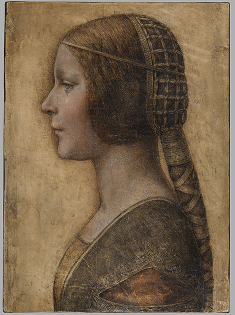
Above, Fig. 1: The full vellum sheet of the proposed Leonardo drawing “La Bella Principessa”.
THE DRAWING’S CLAIMED ORIGIN
This drawing was presented anonymously to the world in 1998 without authorial ascription and without an atom of provenance. When claims of autograph Leonardo authorship were made after barely a decade, it became necessary to fill a five-hundred years long void of records in order to dispel suspicions of forgery or pastiche. In 2010 Professor Martin Kemp bundled together what he held to be a “barrage of evidence – stylistic, historical or technical” that somehow provided collectively what no individual parts constituted: proof that Leonardo da Vinci was the author of what he (Kemp) dubbed “La Bella Principessa”. Thus, a collection of not-evidence was vested with quasi-evidential force on a circular, question-begging appeal to the claimed authority of a “sustained, collective sense that the portrait ‘belongs’ to Leonardo and contributes something new to the Leonardo we currently know.”
Although some scholars (chiefly Italian) were persuaded by the claims, for the consensual majority who did not see Leonardo’s hand in the drawing, Kemp’s methodological ju-ju gained no traction. His claims were advanced in a portmanteau book of collective advocacy, La Bella Principessa – The Story of the New Masterpiece by Leonardo da Vinci, which he co-wrote with Pascal Cotte of Lumiere Technology (the firm hired by the drawing’s owner, Peter Silverman, to conduct technical research) and which carried highly supportive contributions by Peter Paul Biro, Eva Schwan, Claudio Strinati and Nicholas Turner; London, 2010 (– see pp. 187-88).
THE THREE STITCH HOLES
During Pascal Cotte’s technical analysis of the drawing it was noticed that three holes are present on the left-hand edge. Cotte took these to “prove that it originally came from a book or a manuscript” (- Kemp/Cotte 2010, p. 113). Working with Mr Cotte, Prof. Kemp proposed that the hypothetical book might well have been a collection of celebratory poems of Bianca Sforza who had died in childhood and that “La Bella Principessa” had been made as an illustration to such a book.
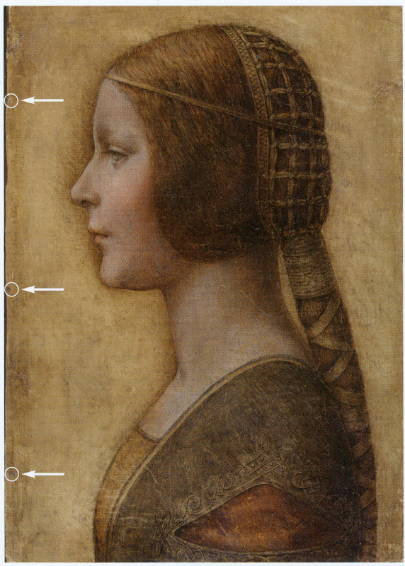
Above, Fig. 2: “La Bella Principessa” with Pascal Cotte’s indicated locations of the three supposed stitch holes.
Kemp’s elaborate hypothetical advocacy constituted a daisy-chain of improbabilities. This is a drawing made in the manner of a distinctive (and invariably painted) profile portrait type that is nowhere encountered in recorded Leonardos – and, indeed, this is the very type which Leonardo famously subverted with his own revolutionary plastically dynamic figural innovations. Within the rigorous constraints of the strict profile type, this drawing’s supposedly high-born subject is bereft of the customary/requisite opulence in clothing and jewellery. The eccentric iconography was made on an atypical support – vellum. It was drawn, Kemp holds, either directly from the subject in celebration of her wedding, or, as a commemorative portrayal after her death and thus made either in recollection or from some other depiction. No explanation was offered for how this single image might have resulted from two radically different circumstances of execution.
THE CLAIMED CORRESPONDENCE BETWEEN THE “LA BELLA PRINCIPESSA” DRAWING AND THE WARSAW SFORZIAD
On a suggestion from Professor David Wright, Kemp proposed that this from-life or post-death portrait had been made to be incorporated within a large, heavy book of the mid-1490s that is now housed in Poland, the so-called Warsaw Sforziad. In the wake of a great deal of (Kemp and Silverman-activated) archival research which found no mention of any work resembling “La Bella Principessa”, it can be seen that without this claimed Warsaw connection, the drawing would remain what it was on its 1998 debut: a stylistically untypical and unprecedented work without any history – the inclusion of which within Leonardo’s oeuvre would, in Prof. Kemp’s own advocacy, “contribute something new to the Leonardo we currently know” and “reveal a previously unknown dimension to the way in which he fulfilled his duties at the court of Duke Ludovico Sforza”. (Kemp/Cotte, 2010, p. 188.) Without history, that is to say, other than the time it is now said to have been in the possession of the restorer/painter Giannino Marchig, the late husband of the anonymous vendor in 1998.
It has been claimed many times that a ‘match’ exists between the drawing’s holes and the book’s stitches but, aside from the small format photo-diagram at Fig. 3, this has never been demonstrated or independently corroborated. Similarly, it has been said that carbon dating tests established that the vellum sheet on which the drawing was made is of an age securely consistent with a drawing being made by Leonardo in the mid-1490s. This claim is seriously misleading, as is shown below.
THE TESTIMONY OF HOLES
Before Prof. Wright’s suggestion, in 2010 Pascal Cotte regarded the three holes on the drawing’s left-hand edge as evidence that might identify incorporation within a specific book:
“It would be interesting to use the evidence of the nature and placement of these needle holes to look for other surviving quires from the same codex, which, with other physical clues, might shed further light on the provenance and original commission.”
(Kemp/Cotte, 2010, page 113.)
Cotte’s hope was reasonable but such testimony can cut both ways. Establishing a relationship between the drawing and a particular book requires an exact correspondence between the drawing’s holes and a book’s stitches. Two separate claims were made of a discovered fit with the Warsaw Sforziad, first by the drawing’s owner, Peter Silverman, and then jointly by Martin Kemp and Pascal Cotte. Both occasions were filmed by National Geographic but only the second was broadcast. In it, Kemp expressed himself as being 80% confident. The presently claimed location of the drawing is at the front of the Sforziad. Clearly, the credibility of what is now a 200 million euro-insured drawing that is stored in the Geneva Free Port depends greatly on confidence being maintained in this claimed connection.
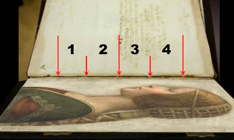
Above, Fig. 3: A facsimile of “La Bella Principessa” inserted into the Warsaw Sforziad with five arrows marking the
book’s stitches and three circles in which matches are claimed, but are not evident, between the drawing’s holes and
the book’s outer and central stitches. (The stitch marked by the right-hand arrow is shown in close-up below at Fig. 5.)
As previously shown, our colleague in ArtWatch, Dr Kasia Pisarek, has catalogued very many discrepancies between the drawing and the book, the most problematic being that the former has only three stitch holes, when the latter was bound with five stitches. To cope with this material/arithmetical incompatibility, Kemp and Cotte conjured two hypotheses.
The first was that the book had originally been bound with only three stitches and that at some undated point the drawing had been removed during a rebinding in which two extra stitches were added to the book. That (unsupported) contention was technically implausible: the book is too large and heavy to be supported by just three stitches – and
both of its sister volumes in London and Paris were bound with five stitches.
The second, and now preferred, hypothesis is that the book was indeed originally bound with five stitches and that, as
a part of this book, the drawing originally possessed the requisite five stitch holes, two of which had subsequently been cut off from the sheet. We demonstrated the impossibility of that claim in an earlier post. (To recap briefly: as Cotte had acknowledged in 2010, stitch holes are always made in a straight line along the crease in a group of folded sheets. Given that a central and two outer stitch holes are all present on the “La Bella Principessa” sheet, any original intermediary stitch holes would necessarily be found in alignment with the present three holes on the sheet as it is today.)
In addition to the absence of the two requisite stitch holes, the sheet itself is a mismatch in terms of colour, texture and size with the sheets in the book. Kasia Pisarek now adds a further mismatch:
“The follicles in the ‘La Bella Principessa’ vellum are tightly spaced, while those in the Sforziad vellum are widely spaced. This can be seen on the Polona website, where you can zoom in until you can see the follicles as dots. I remember seeing some pages where the dots were more apparent and they were definitely widely spaced.”
WHAT LIES BENEATH?
Yet another unaddressed difficulty concerns the back of the drawing. One of the earliest proponents of a Leonardo ascription, Dr Cristina Geddo, has described the presence on the reverse of the drawing of random lettering and an image of a dragon. Kemp and Cotte seem not to have offered an explanation for this content (which, presumably, was revealed by Cotte’s penetrative photography) even though they now claim that the back of the drawing would have faced the book’s beautiful and elaborately painted, symbolically-charged frontispiece. What conceivable iconographic function might such a melange have served in that strategic context of so important and precious a book? Dr Geddo has called for the vellum drawing to be removed from its (most unusual) oak panel support but the owner has declined to do so on grounds of safety. Some of the lettering is visible in an X-ray photograph published in the 2010 and 2012 English and Italian editions of the Kemp/Cotte joint book.
FIVE HOLES GOOD, THREE HOLES BAD
As we reported previously, with regard to the Three Holes v. Five Stitches conundrum, the problems for supporters of “La Bella Principessa” have now become insurmountable: Pisarek established on her second examination of the Warsaw Sforziad in the Polish National Library that while the drawing bears only three holes, the book itself was not only bound with five stitches but that each of those stitches passed through two holes that were two or three millimetres apart (see Figs. 6, 7 and 8 below). At a stroke, the previously claimed ‘fit’ between the drawing and the book is demolished: the drawing possesses only three single stitch holes when it should have five pairs of holes making ten in total. Even if it were to be conceded that two inner stitches might once have been present, today’s three single holes should be three pairs of holes, making six holes in total, not three.
AN OWNER’S RESPONSE
When we sent our previous “La Bella Principessa” post with the newly disqualifying physical/technical evidence to the drawing’s owner, Peter Silverman, (13 June), he dismissed the bearers of the information by alleging lack of expertise: “I leave the attribution question to serious and highly qualified experts!!!” In support of his professional slur, Silverman copied-in two messages to us. The first had been sent to him, at his request, by a costume expert, Elisabetta Gnigera. The second Silverman had sent to Jean Penicaut, the CEO of Lumiere Technology. It was evidently written in haste and heat:
“Dear Jean
I am sorry but we, as owners of the BP, are not to be told how and with whom to talk! I understand your frustration in dealing with Artwatch and Franck but i feel that Pisareks statement must not and cannot be left unchallenged! I therefore request you to rebut each and every point in this latest statement-most importantly of all i would like to see the INDISPUTABLE proof of the binding holes, in a first and separate email to me! Unfortunaley Martin has made statements which can be perverted by anyone in bad faith-equivocal statements quoted in the first part of the enclosed article!!
“I would like Elisabetta to comment on the costume questions.
And i would like YOU to extensively quote from the lab results of La Veneria*, which is very helpful to our cause! [*This is a reference the conservation laboratory “La Venaria Reale” which has conducted analysis of the drawing.]
“We cannot afford to lose the high ground’ in this battle-no matter the bad faith of our ennemy.
“To avoid your corresponding with them please send the rebuttal to me. I INSIST THAT THIS IS AN ABSOLUTE NECESSITY!!
Best, peter
http://artwatch.org.uk/problems-with-la-bella-principessa-part-iii-dr-pisarek-responds-to-prof-kemp/
“PS-the good news is that there is a very serious party interested in acquiring a share in the BP(highly confidential) and July 1 will be a decisive day!!!”
It would seem after more than a month that Lumiere Technology has not provided the owner with indisputable evidence of a connection between the drawing and the Warsaw book that would counter Pisarek’s account. On 14 June we replied to Mr Silverman:
“Speaking of clarification and your requests, I note the various requests from the ‘owners of the BP’ to your associates
to read our current post, and your talk of a prospective part-sale of the BP. Can I take it that the potential buyer of whom you speak has been similarly advised?
“Also, perhaps you might say how you will respond if Jean Penicaut advises you, as we would predict, that he can find
no ‘INDISPUTABLE proof of the binding holes’ that might enable you – or he on your behalf – ‘to rebut each and every point in this latest statement [in the then current AWUK post]’”?
Concerning the La Venaria Reale laboratory reports, we asked Mr Silverman on 15 June:
“On your technical ‘proofs-of-authenticity’ and our possible viewing of your Swiss-vaulted, soon-to-be part-sold drawing, might we not deal with both by: a) your sending to us all reports and data that have been made available to you; and, b) your bringing the drawing to either Paris or London so that we might arrange a group viewing by sceptics and rejecters?”
MISINTERPRETED REPORTS
After more than a month we have received no technical reports on “La Bella Principessa”. Lumiere Technology’s
apparent silence on the conflicting number of stitch holes seems remiss. In our experience it is valuable to see the reports themselves because evidence can sometimes be interpreted and presented in ways that might mislead. For example, it has been claimed (technically-speaking correctly) that carbon dating has established a 95.4% probability
that “La Bella Principessa” had been made at some point between 1440 and 1650. On that particular technical examination and very wide range of possible ages, Pascal Cotte (2010, p. 110) has claimed a number of things in a single sentence:
“This dating confirms that the portrait could well have been made in Leonardo’s lifetime, supporting Martin Kemp’s proposed date in the mid-1490s and virtually eliminating the possibility that it is a 19th century pastiche.”
This was all quite misleading. A confirmed “could well have” remains a “could have” and does not become a confirming “was”. A “virtually eliminated possibility” remains a possibility. Taken as a whole and properly appraised, the data itself cannot reasonably be said to support Kemp’s claimed date and authorship – in fact, it does the opposite.
Cotte’s claims rest on what is only a loose and very wide overall estimation of probability. While it is true to say there is a 95.4% chance that the sheet appeared at some point between 1440 and 1650, there is not a 95.4% probability that it appeared before the mid-1490s when the Sforziad was made. Even on that loose, overall range of possibilities, it would be more accurate to say that because we know (today) that the Warsaw book was made in the 1490s (and had known in 2010 that the proposed subject of “La Bella Principessa”, Bianca Sforza, had died in 1496), it is three times more likely that the “La Bella Principessa” sheet post-dated rather than predated the book. What has not been acknowledged is that within the overall figure, the probabilities had been greatly more precisely quantified.
It was said in the report, for example, that there was a 68.2% probability that the sheet was made between 1470 and 1650 and that, within this period (see Fig. 4 below), there was only a 27.2% probability that the drawing was made between 1470 and 1530 – and this was compared against the appreciably greater probability (41.0%) that the sheet was made some time between 1550 and 1650 – which would place the sheet altogether much later than Leonardo who died in 1519. Properly read, with a proposed date for the drawing set in the mid-1490s, the data shows that there was only a 13.6% probability that the “La Bella Principessa” sheet existed when the book was made. When the general 95.4% probability of an origin anywhere between 1470 and 1650 and the 13.6% probability of an origin between 1470 and 1495 are expressed as racing odds, it is seven times more likely that the sheet was made after the book than before it. And the odds of seven to one against pertain to the vellum sheet itself, not to the possible dates of execution for the drawing. Even if this sheet had once been present in that book, such a dating would indicate only the age of the material, not the date of the drawing’s execution. On this last, we should recall that Eric Hebborn advised in his The Art Forger’s Handbook that a prime source of old materials for forged drawings is obtained from blank end papers in books. Thieves cut valuable illuminated pages from books. Forgers crave blank pages but will make use of a blank side by gluing its reverse firmly to some impenetrable material.
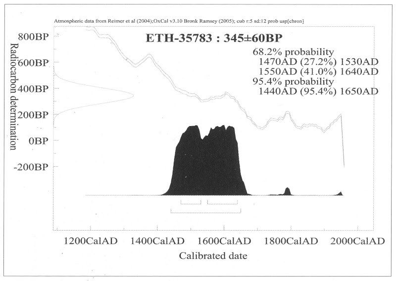
Above, Fig. 4: The carbon dating report on the “La Bella Principessa” sheet (as published by Kemp/Cotte, 2010, p. 110).
FOR THE RECORD
Where Mr Silverman declines to make reports available to us, and Pascal Cotte fails to demonstrate a fit between the drawing’s three stitch holes and the book’s ten stitch holes, we now present further visual proofs and documentary confirmation of the previously claimed mismatch to demonstrate precisely why “La Bella Principessa” could never have been part of the Warsaw Sforziad.
INSTITUTIONAL CORROBORATION
On 23 June 2016 Barbara Dzierzanowska, the Head of Department of Old Prints BN at the National Library of Poland, wrote to Kasia Pisarek:
“Dear Madam,
I would like to inform you that yesterday we entered the Treasury and re-examined the Sforziad, which has confirmed that the binding stitches are double and there are 10 holes.
Yours sincerely,
Barbara Dzierzanowska”
PHOTOGRAPHICALLY-RECORDED AND ELECTRONICALLY TRANSMITTED PROOF OF THE DOUBLE STITCHING OF THE WARSAW SFORZIAD
That the stitching of the Sforziad was made through double holes can be seen by eye on the book itself, as shown below at Fig. 5.
Above, Fig. 5: A stitch made through two holes, as seen on the numbered page 1 of the Warsaw Sforziad. In this photograph, the top stitch and the two flanking holes are shown but some of the other holes can also be seen on stitches below it. This stitch/holes configuration would have been evident when (as described above) a full-size facsimile of “La Bella Principessa” was inserted into the Sforziad at precisely this point. This evidence is also available online: our image was taken from the detailed record of the entire book that is carried on this site: Polona – La Sforziada.
ESTABLISHING THE TRUE DIMENSIONS
When Kasia Pisarek inspected the book for the second time, she asked that the dimensions of the pages and the relative positions of the stitch holes be marked along the edge of a piece of paper. This was done by the library’s books’ conservator in her presence and that of the chief librarian. Intervals between the stitch holes were marked in pencil along the two sides of the strip of paper and these are shown here at Figs. 6 and 7. When we marked off those measurements onto a separate sheet of paper, to prepare the diagram at Fig. 8, and then measured them on our sheet with a ruler, they were all exactly as given by Pisarek. We can be sure, therefore, that the dimensions and ratios between the stitch holes as shown below at Fig. 8 have been accurately established and physically transported to ArtWatch UK – and at practically zero-cost by means of sharp pencils and two pieces of paper.

Above, Figs. 6 (top) and 7: The strip of paper on which the book’s page size and stitch holes were recorded, as described above.
The conservator explained to Pisarek that the present positions of the stitch holes were those of the original construction of the book and that, therefore, there was no possibility that the book had once been bound with only three stitches. She made diagrams on the strip showing (at Fig. 7) different ways of executing stitching with double holes.
THE DIMENSIONS OF THE INTERVALS BETWEEN THE STITCHES IN THE BOOK – A NOTE FROM KASIA PISAREK:
1) According to Kemp and Cotte, the dimensions of the vellum pages of the Sforziad vary from 33.0 to 33.4 cm in height, while the drawing is 33 cm high.
2) I have carefully checked the dimensions with the Librarian in March 2016. All the pages are at least 33.4 cm high and more, up to 33.7 cm. The size of 33 cm would be far too small for the book.
3) The 5 holes in the book are in fact all double holes. Each of the 5 holes is two small holes, between which a string passes. The distance between the two small holes is about 3 mm. The double holes were never mentioned by Kemp or Cotte.
4) According to the conservator who was present at the time of my last visit, this is the binding that follows the original binding as there is no damage of any kind. So in total there were as many as 10 small holes, not 3 single ones as in the drawing.
5) I measured the distances between the 3 holes that Kemp and Cotte measured in La Bella Principessa. The measurements were taken from the middle of the double holes.
6) The distance between the bottom hole and the middle hole is 11.35 cm in the Sforziad, while in the drawing it is 11.06 cm.
7) The distance between the middle hole and the top hole is 11.7 cm in the Sforziad, while in the drawing it is 11.44 cm.
THE MISMATCHED HOLES AND STITCHES
Above Fig. 8: We took the dimensions of the Sforziad’s page and stitch holes from the strip of paper marked by the Polish National Library’s books’ conservator (as shown at Figs. 6 and 7) and drew them in black, as above, and marked “WS”. We then drew in red the “La Bella Principessa” sheet (here marked “LBP”) and its stitch holes as given above by Pisarek.
As can be seen above, it is impossible to align the drawing’s single stitch holes with their claimed counterparts in the book. If the drawing’s centre hole is aligned with the centre of the two central holes in the book (as shown on the left here), its other two holes fall short of their claimed counterparts.
If the LBP drawing’s upper hole is aligned with the centre of book’s two upper holes, its central and lower holes fall progressively further short of their claimed counterparts on the book.
In short, there is no fit or match between the book and the drawing – and which drawing in all probability post-dated the book, for reasons indicated above.
Those who would continue to give this drawing to Leonardo must now find some other means of filling a five centuries absence of provenance and of squaring intractable technical circles. We will examine next the supposed left-handed execution of “La Bella Principessa”.
Michael Daley, 21 July 2016
A restorer’s aim – The fine line between retouching and forgery
“What is the difference between a fake and an expertly restored genuine but damaged painting?”
SUSAN GRUNDY writes:
What is the difference between a fake and an expertly restored genuine but damaged painting? The line that differentiates between the two is extremely fine and, as such, the skilled restorer is sometimes also the skilled forger, as was the case with the twentieth-century Dutch artist Han van Meegeren.
Frans Hals and Van Meegeren’s first forgeries
Fig. 1. Attributed to Han van Meegeren The Laughing Cavalier, pastiche after Frans Hals (updated c.1923). Oil on panel, 36 cm in diameter. Whereabouts unknown.
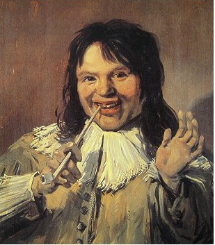
Fig. 2. Attributed to Han van Meegeren The Satisfied Smoker, in the style of Frans Hals (updated c.1923). Oil on panel, 57 x 49 cm. Groninger Museum, Groningen.
The Dutch artist Han van Meegeren (1889–1947) is best known for his fake Vermeers, at least one of which ended up in Nazi hands. However, his first (almost successful) known forgeries were actually restorations. He and Theo van Wijngaarden (1874–1952), his partner at the time, scoured around for low-valued works, genuine only in their antiquity. In 1923 they managed to scout out two panels, in the style of Frans Hals (1580–1666), that were “murky and badly damaged” (Wynne 2007 – see Endnote 1). The outline of a composition existed, in this case portraits, and the spirit of the times was already evident in the technical application, that is, in the way epochal followers of Frans Hals handled materials. Han had just to clean and stabilize the paintings, and then to extensively remodel them. Was this repainting or overpainting, or even “‘inpainting,’ ‘loss integration,’ ‘loss compensation,’ or ‘retouching’” (- Hill Stoner & Rushfield – see endnote 2)? The answer is semantically determined by the aims of the practitioner, not by the response of the viewer.
Nevertheless, what Han and Theo did next was to cross the line. Han tried to mask the extensive freshness of his paintwork by using lavender oil, at Theo’s suggestion, and Theo explained away any suspicious objections of critics with the phrase “recent restoration” (Wynne 2007). Theo organized for the panels to be shown to Cornelis Hofstede de Groot (1863–1930), a former “deputy-director of the Mauritshuis and a critic instrumental in defining the oeuvre of both Rembrandt and Vermeer”, and had them presented to him as a recently restored possible autograph Frans Hals (Wynne 2007.) In this way Han van Meegeren and Theo van Wijngaarden became criminals.
Blending and integration
In order to raise a blended surface retouchers will sometimes add faked painted craquelure. High levels of retouching are demanded, even today, with the aim for restored works to be as fully integrated as possible, that is, original areas merging visually with filled and retouched areas. Such practices facilitate the ease with which cavalier restorers can cross that fine line from restoration to forgery, making it much easier to slip forgeries into an artist’s canon. Furthermore, as Han and Theo were both restorers, they knew the value of having panels in less than optimal condition, which they then fixed, adding to the veneer of originality as was the case with one of the Frans Hals copies, The Laughing Cavalier (updated c.1923 – Wynne 2007, Fig. 1). Indeed, throughout his career Han was careful to bash his works about a bit, and then “restore” them again, in order to sustain the authenticity of age.
Forgery and the connoisseur
Han van Meegeren was not only a practical artist, but it would appear also a studious connoisseur. He knew his Old Masters. “His long years studying the Golden Age and his passion as an apprentice for imitating the work of the masters gave him an understanding of Hals’s rapid brushstrokes, his dramatic shading and the characteristic silvery sheen of his work, so different from the golden glow of a Rembrandt” (Wynne 2007). Han was no mere imitator, however. He took a discarded copy by an unknown artist, and by careful restoration methods and creative additions, he turned it into an autograph “Frans Hals”. De Groot took the bait. He wrote a certificate for the van Meegeren The Laughing Cavalier, categorically attributing the work to Frans Hals, and the panel sold to the auction house Frederik Muller for the equivalent of £120,000 in today’s money (Wynne 2007). This is evidently substantially more than it would have realized sold honestly as the heavily restored copy it was. The second panel, The Satisfied Smoker (updated c.1923, Fig. 2), de Groot bought directly from van Wijngaarden as a Frans Hals and added it to his own collection (Lopez 2009 – endnote 3).
However, it did not end all in the bag for Han and Theo because even before the cheque was cashed another art historian and connoisseur Abraham Bredius (1855–1946) stepped in and denounced The Laughing Cavalier as a fake. De Groot fought him on the issue, claiming that evidence of modern materials found on the painting, which was subsequently studied by a panel of experts, were only the result of the recent restoration. The team found artificial ultramarine, cobalt blue and zinc white, in the “extensive recent repainting” (Wynne 2007). It is not clear if these pigments were found only in infill sites, or also over more authentic pigments. Indeed, by definition, the presence of these pigments on areas of loss would not constitute immediate grounds for denouncing a work fake, even today. De Groot went on to defend his authentication of this work in print, publishing an article “Echt of Onecht [Genuine or Forgery]” in 1925 (Wynne 2007).
De Groot never accepted that Han van Meegeren’s The Laughing Cavalier was a forgery. In fact De Groot never even knew the forger was Han van Meegeren, as he died in 1930 long before van Meegeren was outed. De Groot bought The Laughing Cavalier from Frederik Muller (Wynne 2007) and his collection thereafter was bequeathed to the Groninger museum in 1930. The Satisfied Smoker in the style of Frans Hals, but now attributed to Han van Meegeren, remains in that museum. The other work on panel, The Laughing Cavalier, is whereabouts unknown.
These events, although historical, highlight the role of restoration not only in authenticating artworks, but also in (re)creating them.
Susan Grundy, 1 July 2016
Susan Grundy is an independent art historian and collector. She is currently exploring the concept of Old Master collecting, restoration and authentication as a type of Performance. Her Doctoral (2009) and Masters (2005) research concentrated on Art and Optics, in the new field of quantitative, scientific and technical art history, and she has subsequently published extensively on issues of authenticity in art.
Endnotes
1 Wynne, F. 2007. I was Vermeer: the forger who swindled the Nazis. London, Bloomsbury: pp 74-77.
2 Hill Stoner, J. and Rushfield, R. (eds). 2012. The conservation of easel paintings. London and New York, NY, Routledge: p. 607.
3 Lopez, J. 2009. The man who made Vermeers: unvarnishing the legend of master forger Han van Meegeren. Boston & New York. Marina: p. 9.
[Coming next: Bye-bye Bella Principessa]
Problems with “La Bella Principessa” – Part III: Dr. Pisarek responds to Prof. Kemp
In June 2015 Kasia Pisarek, an independent scholar (and a member of ArtWatch UK) published an article, “La Bella Principessa – Arguments against the Attribution to Leonardo”, in the Polish scholarly journal Artibus et Historiae.
In her article Dr Pisarek presented a number of interlocking historical, aesthetic and technical criticisms of the attribution to Leonardo of the drawing “La Bella Principessa”, as it has been made and advanced by Professor Martin Kemp. In response, Prof. Kemp produced an article (“Leonardo da Vinci La Bella Principessa: Errors, Misconceptions, and Allegations of Forgery”) which challenges Dr Pisarek’s account on grounds of what he claims and alleges to be: “mistakes, misconceptions and a series of false allegations”.
A TACTICAL RETREAT?
In his response Kemp says “I do not run an authentication service, but research items of special interest regardless of ownership.” More recently ( May 16) Kemp announced on his website that “After speaking at the Art in Authentication Congress in The Hague, I confirm that I am withdrawing the [unpaid – Ed.] ‘advice service’ I have been providing.”
A SIDEWAYS SWIPE
Kemp discloses that in responding to Pisarek’s article he also sought by “extension” to counter other un-identified challenges to his Leonardo attribution. When this multi-targeted professional defence was submitted to Artibus et Historiae, it was rejected, as Kemp acknowledges, and as the Art Newspaper reports (“La Bella Principessa: Still an Enigma”, Features, May 2016), because of its resemblance to “an errata list”. The article was subsequently carried on the Authentication in Art website to accompany a paper given by Kemp at the AiA’s May 2016 Congress. This non-profit organisation, on which Kemp serves as an advisor, was founded in 2012 at The Hague. On May 8th we made a formal request to the AiA for Kasia Pisarek’s Artibus et Historiae article also to be posted so that the congress speakers and attendees might see both of what Dr Pisarek’s compilation of evidence consisted and of what Prof. Kemp complained. We have yet to receive a reply. For Kasia Pisarek’s Artibus et Historiae article, “La Bella Principessa – Arguments against the Attribution to Leonardo” click here. For Martin Kemp’s response to it, see: “Leonardo da Vinci La Bella Principessa: Errors, Misconceptions, and Allegations of Forgery”.
A CONFERENCE AMBUSH
In December 2015 Kasia Pisarek delivered a paper based on her Artibus essay at the ArtWatch UK/LSE Law Department/Center for Art Law conference “Art, Law and Crises of Connoisseurship”. At this conference, an arts journalist, Simon Hewitt, delivered an attack from the floor on her article. He did so as a proxy for Kemp, by whom he had been briefed, and for the collector/dealer owner of “La Bella Principessa”, Peter Silverman, with whom he is co-writing a book on what Silverman describes to us as “various aspects of the art market, sometimes highlighted by others’ and my own discoveries”. A research assistant of Kemp’s, Kasia Wozniak, who had spent four years attempting to show that “La Bella Principessa” had once been part of a late 15th century book known as the Warsaw Sforziad, had also written to us in denigration of Pisarek’s article which we had forwarded to her at her request.
Earlier, both Professor Kemp, who had declined an invitation to speak at this conference, and Mr Silverman, had suggested that we invite Hewitt to speak at the conference. Silverman expressly requested that this be done so that Hewitt might “present his discoveries as a counterweight to Ms. Pisarek”. We carry Pisarek’s full reply to Kemp’s listed objections below but comment first on a crucial new aspect of this disputed attribution that has emerged in Kemp’s response to Pisarek.
NO HISTORY. NO PROVENANCE. WRONG HOLES. NO FIT.
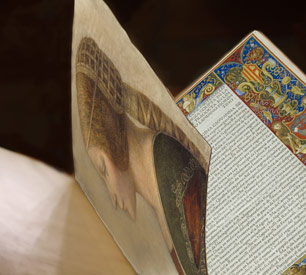
Above, Fig. 1: A facsimile of the “La Bella Principessa” drawing being inserted into the Warsaw Sforziad (but showing only the relationship of the top of the facsimile to the top of the book and not the accompanying relationship of the facsimile and book at the bottom). Photo by courtesy of Lumiere Technology.
For many reasons, it is essential to Prof. Kemp’s Leonardo ascription that it be accepted that “La Bella Principessa” had originally been incorporated within the Warsaw Sforziad now held in the National Library, Poland. It has not been so accepted because, contrary to press releases claims and media coverage thereafter, nothing material or documentary has established such a relationship. No record of any connection between the drawing and the book has been found despite extensive searches by researchers such as Kasia Wozniak. Moreover, despite extensive searches of Berenson’s archives by Kemp and Silverman, no record of the supposed 15th century drawing in any context predates its only-recently acknowledged ownership by the late painter/restorer Giannino Marchig. This pictorially and graphically mongrel work remains without a history and, prior to September 2011, without any claim – even by its only known previous owner – that it might have been a work by Leonardo da Vinci.
Martin Kemp has challenged Kasia Pisarek’s measurements between the stitches in the book’s binding. He and Pascal Cotte (of Lumiere Technology) claim that three stitch holes are present on the left hand edge of the “La Bella Principessa” sheet and that these match three of the book’s five stitches. No confirming visual evidence has been produced in support of this claim. In addition to fresh evidence on dimensions provided below by Pisarek, it might be noted that the Kemp/Cotte claims of a match have been variously and only rarely unequivocally phrased. All emphases below are added:
“The stitch holes in the vellum of the portrait match those in the book” – “The Original Source of the New Leonardo Portrait Discovered”, a Martin Kemp press release, 27 September 2011.
“Three of the stitch marks, the ones that we can still see on the edge of the ‘Bella Principessa’, match as well as they conceivably could” – Martin Kemp, Artinfo interview, “The Da Vinci Detective: Art Historian Martin Kemp on Rediscovering Leonardo’s Tragic Portrait of a Renaissance Princess”, by Andrew M. Goldstein, 11 October 2011;
“During our studies at the National Library, we inserted a facsimile of the portrait into the relevant opening of the book where the size matched very closely” – Martin Kemp, item 14, “Leonardo da Vinci La Bella Principessa: Errors, Misconceptions, and Allegations of Forgery”, on the Authentication in Art website. See Fig.1, above;
“The current stitching of the volume involves five holes, whereas there are only three holes now visible along the left margin of the ‘La Bella Principessa’. However, these three holes correspond very closely to the corresponding ones in the book.” – Martin Kemp and Pascal Cotte, “La Bella Principessa and the Warsaw Sforziad”, Lumiere Technology website, September 2011.
FAILING TO GET THE MEASURE OF HOLES
With linear measurements a near-miss is as good as a mile. If a hole is two millimetres adrift of a stitch there is no match. Claiming “correspondences” and “close” matches between the three holes and the five stitches is problematic enough, but, as Kasia Pisarek has now re-confirmed, the three holes in the “La Bella Principessa” drawing do not correspond with three of the book’s five stitches. Moreover, Kemp’s imprecision came with a perplexing multiple caveat: “In measuring the distances between the holes and matching these distances in the book and the portrait we allowed for four potential sources of error” – Kemp/Cotte, item 13, “La Bella Principessa and the Warsaw Sforziad”, Lumiere Technology website.
If incorporating an allowance for one potential source of error would necessarily be weakening to the force of a claimed match, how might allowances have been made for four different sources of error? How were the different “potentials-for-error” calibrated and weighted one against the three others? With accounts of this attribution, too many features remain in flux. For example, explanations offered for the disparity between the drawing’s three stitch holes and the book’s five stitches have shifted. In 2011 Kemp/Cotte wrote:
“The second task was to see if the holes in the portrait and the stitching pattern in the book corresponds. There is an obvious difference. The current stitching of the volume involves five holes, whereas there are only three holes now visible along the left margin of “La Bella Principessa”. However, these three holes correspond very closely to the corresponding ones in the book…The different number of stitching holes may result from the untidy way the left margin of the portrait has been cut, or from two intermediate stitches being added when the book was later rebound in standard Zamoysky livery. The former explanation is more likely.” (Emphases added.)
The suggestion that the book might possibly have been bound originally with only three stitches seems to have been abandoned altogether. Martin Kemp now accepts in his response to Kasia Pisarek that the book always had five stitches but claims as a countering fact against this recognition that: “The irregularity and extensive damage along the left margin explains why two of the five stitch holes are no longer clearly discernible.”
NOT AN EXPLANATION
The posited stitch holes cannot be said to be “no longer discernible” because there is no evidence that they were ever present. Prof. Kemp here begs a question on which this attribution turns. The roughly cut edge cannot be taken to have explained these absences. What Kemp offers, in truth, is (an implausible) hypothesis that ignores the technical exigencies of book binding and the dimensional realities of the “La Bella Principessa” sheet. When books are being made, the stitches are inserted along the line of a fold made collectively to the small number of sheets that form one of the book’s sections or “quires”. In the case of the Warsaw Sforziad, Pascal Cotte established (by taking and combining 70 precisely-focussed macro-photographs) that each quire was composed of four sheets (folios) which, when folded and stitched, comprised sixteen numbered pages. The book binder’s craft requires that the stitching occurs precisely along the crease line of the folded sheets. This careful alignment is necessary if the pages are not to cockle and for the book to open easily.
The three holes on “La Bella Principessa” have been taken to relate (- more or less, but never exactly) to the book’s central and two outer stitches. Had the “La Bella Principessa” sheet been incorporated in the Warsaw Sforziad when it was made in the late 1490s, the two inner stitch holes would be expected to be present on the sheet, even as it is today, and notwithstanding its roughly cut left-hand edge.
At Fig. 2 below, we see the white arrows and circles with which Pascal Cotte identified what are said to be “La Bella Principessa’s” three stitch holes. On the image on the left, we have drawn in red the alignment of the present three holes and have indicated with arrows where the two hypothesized additional stitching holes would be expected to be located. Both holes would fall within the present sheet despite its roughly cut left-hand edge. In the image on the right of Fig. 2 we again indicate (in black) the alignment of the present three holes, but show in red how the alignment would be disrupted had the two hypothesized additional stitch holes been situated to the left of the present sheet, as Prof. Kemp now claims in “explanation” for their absence from the sheet itself. Such a positioning would have resulted in a zigzag, not a row, of stitch holes. It is impossible to envisage how four sheets of vellum might have been folded so as to produce a neatly zigzagging crease.
Aside from the above problem, any lingering hope that this “La Bella Principessa” sheet might once have formed part of the Warsaw Sforziad will have to be abandoned in the light of Kasia Pisarek’s latest findings described below on her second examination of the Warsaw Sforziad.
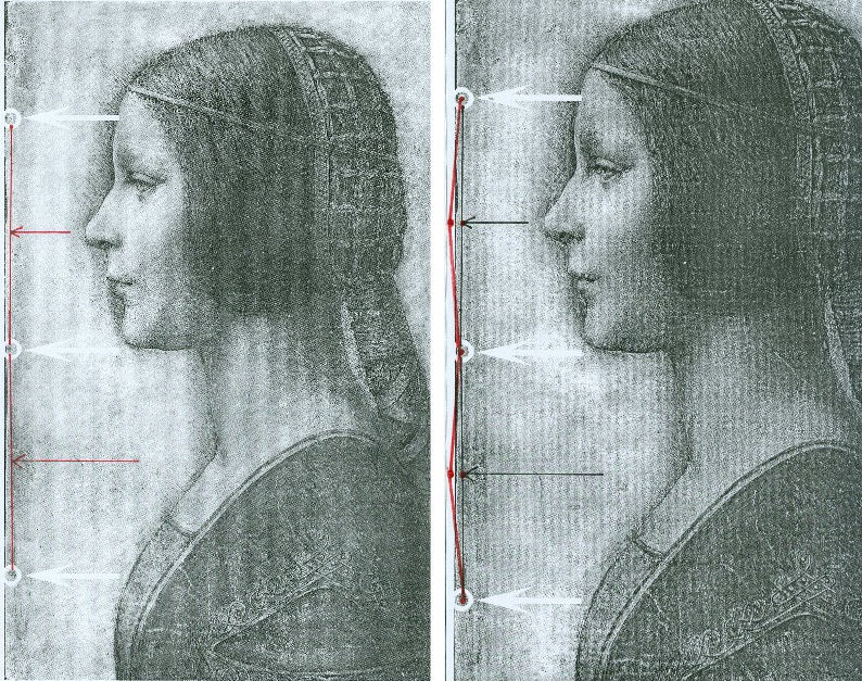
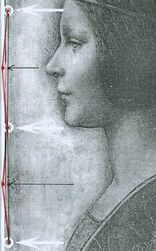
Above, Figs. 2 and 3. In Fig. 2 (top) we see, in the left and right images, the white arrows and circles with which Pascal Cotte located the “three holes showing that the image was once part of a codex or manuscript”. Given that the book (the Warsaw Sforziad) from which this sheet is said to have been cut was originally bound with five stitches, had the “La Bella Principessa” sheet once formed part of that book, it would today have five stitch holes, not the present three. In Figs. 2 and 3, we indicate with arrows (in red and then in black) where the missing two stitch holes would, for the reasons given above, be expected to have been located.
THE DOUBLE ‘DISCOVERY’ OF THE SUPPOSED POSITION OF LA BELLA PRINCIPESSA IN THE WARSAW SFORZIAD
When Andrew Goldstein asked Martin Kemp in an Artinfo interview in October 2011 what, on seeing the drawing, had convinced him it might be a Leonardo, he replied:
“So the initial connoisseur’s reaction merely tells you that something is worth looking at, but at any point one wrong thing can throw that all away — a later pigment, a bit of something that might come up about its history to indicate it was forged at some point, and so on. I was trained as a scientist, and if you have a scientific theory, you only need have one bit of the experiment that says, ‘this is not right,’ and the whole thing collapses. You always have to be looking for that one thing that is going to demolish the whole expectation that’s being set up.”
Kemp has given other grounds for caution when making attributions. On first encountering “La Bella Principessa”, he told Silverman, “I immediately saw it was in a different league from the others. But I was still very, very cautious. I didn’t want to jump at it because once you start believing you can summon up all the evidence you need.” (Peter Silverman, Leonardo’s Lost Princess: One Man’s Quest to Authenticate an Unknown Portrait by Leonardo da Vinci, 2012, p. 74.) Kemp had become a believer in the Leonardo attribution by 28 September 2011 when he issued a press release “The Original Source of the New Leonardo Portrait Discovered”. He added, “This (press release attached without the pics) should more or less settle the arguments – though probably not knowing the myopia of the art world.”
In 2011, after Kemp and Cotte had inserted their facsimile “La Bella Principessa” into the book, Kemp expressed himself 80 per cent confident of the drawing’s Leonardo attribution in a National Geographic film of the occasion. However, this was not the first time that a claimed “fit” between the facsimile and the book had been made and filmed by National Geographic. Peter Silverman describes in his book how, in December 2010, he had established a match in a different part of the book:
“We began by measuring the page size to see if it corresponded to “La Bella Principessa” and were gratified to see that it did, within a millimeter or two (a minute fraction of an inch)… Martin [Kemp] had surmised that the drawing would have been placed either at the very beginning or the very end of the book, but after careful examination we could find no trace of a cut page in either place. ‘May we turn each page?’ I asked. It was not a simple request. The book was nearly two hundred pages, and it would be a bit laborious for her [Anna Zawisza, the head of manuscripts] since utmost care had to be used so as not to damage the precious work in any way…It was apparent that the three pinholes where the binding had been sewn, noted earlier by Martin, which we had hoped would be a key to matching, would not be relevant, since the book had been rebound using five sutures…We slowly continued to turn each page, but there was no sign of a missing page…I had begun to abandon hope and to mentally prepare myself to return empty-handed. But then Zawisza turned page 161. There was a momentary beat of silence, and then she and I let out muffled cries. There, before our incredulous eyes, was what seemed to be the missing link, the element we longed to find: a remnant of a cut and extracted page of vellum that was the same darkish yellow as “La Bella Principessa”. We could barely contain our emotions. We measured the undulation of the remnant, and it corresponded exactly. Kathy [Silverman’s wife] and Kasia [Wozniak, art historian] came round to see for themselves, while David [Murdoch, National Geographic producer] filmed the historic moment. Even the armed guard was caught up in the excitement. Zawisza, who had carefully studied the book on past occasions, murmured how unhappy she was that she’d never noticed the missing page, now so glaringly obvious from the protruding remnant…”
That filmed historic moment was eclipsed by the moment in which Kemp and Cotte discovered a (preferred) location for the drawing at the front of the book. On her second examination of the Warsaw Sforziad, Dr Pisarek has learned that each of the five stitches in the book’s binding resulted in two holes, through which a string was passed. Thus, now that it is accepted that the book was originally bound with five stitches, each of which generated two holes, and that the “La Bella Principessa” sheet possesses only three of the necessary ten holes – and three where there should be six – there is no physical match between the drawing and the book, just as there is no documentary record of a Leonardo drawing having been bound within the book. Those who continue to see the hand of Leonardo in the drawing itself must now find an alternative history and another princess to accompany and bolster it.
Michael Daley 24 May 2016
Kasia Pisarek: A reply to Martin Kemp’s essay “Leonardo da Vinci La Bella Principessa. Errors, Misconceptions and Allegations of Forgery”
Professor Kemp has written an essay in response to my article “La Bella Principessa; Arguments against the Attribution to Leonardo”, Artibus et Historiae, No. 71, XXXVI, June 2015, pp. 61– 89.
In his essay, Prof. Kemp lists what he deems a series of errors and misconceptions in the Artibus article, but says he does not wish to address the issues of attribution I raised.
The purpose of his article is, however, an attempt to counter or undermine my findings.
I will answer his points in the order and with the numbered headings used by Kemp in his text.
[Martin Kemp] “1) Bibliographical”
[Kasia Pisarek] Martin Kemp says that most of my material is quoted from the internet and that I make only one reference to his book in my footnote 50.
This is incorrect. I make extensive reference to his book on the opening page and further references in footnotes 54, 57, 59 and 64. I have examined it as thoroughly as would be expected of any researcher. I also referred to many other books and articles which were accessed from libraries and not from the internet. These were:
M. Kemp and P. Cotte, The Story of the New Masterpiece by Leonardo da Vinci: La Bella Principessa, London, 2010; M. Kemp, Leonardo (rev. ed.), Oxford, 2004; P. Silverman, Leonardo’s Lost Princess: One Man’s Quest to Authenticate an Unknown Portrait by Leonardo Da Vinci, New Jersey, 2012; C. Geddo, ‘A “Pastel” by Leonardo da Vinci: His Newly Discovered Portrait of a Young Woman in Profile’, Artes, 2008–2009, pp. 67–87; C. C. Bambach, ‘Leonardo’s Notes on Pastel Drawing’, Mitteilungen des Kunsthistorischen Institutes in Florenz, vol. 52, 2008, no. 2/3 (Le tecniche del disegno rinascimentale: dai materiali allo stile. Atti del convegno internazionale, Firenze, 22–23 settembre 2008, ed. By M. Faietti, L. Melli, A. Nova), pp. 177–204; M. Gregori, ‘A Note on Leonardo’, Paragone, LXI, 2009, no. 723, pp. 3–4; D. Ekserdjian, ‘Leonardo da Vinci: “La Bella Principessa” – The Profile Portrait of a Milanese Woman’ (book review), Burlington Magazine, vol. 152, 2010, no. 1287, June (Attributions, copies, fakes), pp. 420–421; P. C. Marani, ‘Deux nouveaux Léonard?’, Dossier de l’art, 2012, no. 195, avril, pp. 58–63. Giannino Marchig, 1897–1983: paintings and drawings, exh. cat. London, 1988; Giannino Marchig, 1897–1983, exh. cat., Geneva, 1985; Giannino Marchig: 1897–1983: dipinti, disegni, incisioni, exh. cat. Florence, Gabinetto disegni e stampe degli Uffizi, 12 March – 5 June 1994 (Italian ed.); J. Cartwright (Mrs Henry Ady), Beatrice d’Este, Duchess of Milan, 1475–1497. A Study of the Renaissance, London, 1910; B. Horodyski, ‘Miniaturzysta Sforzów’, Biuletyn Historii Sztuki, 16, 1954, pp. 195–213; E. McGrath, ‘Ludovico il Moro and His Moors’, Journal of the Warburg and Courtauld Institutes, vol. 65, 2002, pp. 67–94; L. Syson with L. Keith, Leonardo da Vinci, Painter at the Court of Milan, exh. cat. National Gallery, London, 2011; Dizionario delle origini, invenzioni e scoperte nelle arti, nelle scienze…, Milan, 1831; B. Berenson, The Drawings of the Florentine Painters, vol. III, Chicago, 1938; Leonardo da Vinci, Master Draftsman, ed. by C. C. Bambach, exh. cat., The Metropolitan Museum of Art, New York, 2003; Z. Zygulski Jr, ‘Ze studiów nad Dama z gronostajem. Styl ubioru i wezly Leonarda’, in: Swiatla Stambulu, Warsaw, 1999 (first published in Biuletyn Historii Sztuki, vol. 31, 1969, no. 1, pp. 3–40).
The 2012 Italian version of Kemp/Cotte’s 2010 book is a translation from the English with the addition of the Sforziad hypothesis. The latter had already been published on the Lumiere Technology website and I discussed it at length.
Gnignera’s text was in Italian so I used Prof. Zygulski’s extensive knowledge of historic costume in general and coazzone in particular. The Monza catalogue (2015) was not published when I submitted my paper. The 2014 exhibition catalogue from the Galleria Nazionale in Urbino was also unavailable. To my knowledge these later publications have not yielded any conclusive evidence.
Prof. Kemp said that I have not addressed any of ‘the scientific evidence in the two books related to the lower layers of the image, the pentimenti or the condition and retouching in various media’ and goes on to say ‘contrary to Pisarek’s assertions, the interventions of restorers are documented in both books’. The latter sentence must refer to my ‘it is also strange that he did not consider that the drawing might have been retouched and repainted at a later time’ (p.79). Prof. Kemp has taken this out of context. I said that he did not mention the restorations in that particular passage of his book Leonardo (p. 210).
I not only analysed his art historical arguments in my text, but also the technical evidence presented by Cotte – which is to say:
– The trois crayons, pen and ink and bodycolour technique on vellum (unprecedented for Leonardo);
– The X-rays (inconclusive, in Cotte’s own words “did not yield significant new findings”, p. 154)
– The Carbon-14 dating of the vellum (wide-ranging 1440-1650, not constituting proof in itself as anyone could draw at any time on a blank folio removed from a manuscript)
– The quality of the vellum (rough; drawing on the hair-side; does not match the Sforziad’s smooth and well-prepared support; Birago’s illumination on the skin-side)
– The left-hand hatching (dry, timid and mechanical; on the outside of the contour of the profile, unlike in all Leonardo’s female portraits)
– The presence of three stitch holes (the Warsaw National Library Sforziad has five holes)
– The ‘knife marks’ when the folio was cut off (unnecessary, if the folio has been removed during rebinding).
– The retouchings of a later restorer (Marchig’s)
– The fingerprint evidence (no longer valid)
– The pentimenti, in the same place as in Leonardo’s Windsor portrait (a negative point, as La Bella Principessa could be based on that drawing).
At this point I would like to discuss some more scientific evidence:
On page 109:
“The support is probably the fine-grained skin of a calf”.
To the contrary, the images show an irregular grainy surface with visible follicles. Both Geddo and Turner described the support as “rough animal hide” and the surface of the vellum as being “pitted”.
“The portrait was drawn on the smooth ‘hair’ side”.
To the contrary, the hair-side has follicles so it is the rough side, not the smooth side.
Contrary to Prof. Kemp’s claim that I ignored Geddo’s contributions, I quoted her (p. 76), and she said exactly the opposite: “Besides the presence of the follicles, the rough unworked surface of the hide and its darkened, somewhat yellowish colour show that the portrait was made on the outer surface of the skin (formerly furcovered) and not on the inner one covering the flesh, which was aesthetically the superior of the two and commonly used as a support for written documents”.
I quoted extensively from Geddo’s article “A ‘Pastel’ by Leonardo da Vinci: His Newly Discovered Portrait of a Young Woman in Profile”, in Artes, 2008–2009, pp. 67–87, on my pages 62, 76 and 88.
On page 114:
The discovered “small area of pen marks along the left edge of the support” described by Cotte as Leonardo’s “pen trials”. This would surely have no place in a drawing destined for a luxury book presented as a gift to the Sforzas.
On page 154:
A problem with the X-rays:
‘Because white chalk (calcite or calcium carbonate) does not absorb X-rays to any great extent, the luminous zones of the sitter’s face ought to have appeared grey in the X-ray. On the contrary, however, they appear very white here, indicating the presence of a significant amount of dense material in the chalks area – which seems to contradict all the physical evidence considered so far.’
Cotte attributes this anomaly to the technician supposedly over-exposing the plate. This confirms his own observation that X-rays “are vulnerable to diverse interpretation”.
[MK] “2) PROVENANCE”
[KP] I did not say that the Marchigs were involved in forgery of any description. What I did say was that Giannino was familiar with Leonardo’s technique as a restorer and a “Leonardesque painter”. He was able to make such a drawing if he had wanted to, but clearly he had not tried to sell La Bella Principessa as a work by Leonardo.
Prof. Kemp does not explain, however, why the drawing had no provenance prior to Marchig’s ownership, and, as Michael Daley has recently pointed out, Professor Kemp and the drawing’s owner, Peter Silverman jointly trawled Berenson’s archive in hope of finding some pre-Marchig record but found none.
[MK] “3) The assertion that there is an ‘almost total absence of close comparisons with unimpeachable works by Leonardo.’”
[KP] The offending phrase above was written not by me but by David Ekserdjian in “Leonardo da Vinci: ‘La Bella Principessa’ – The Profile Portrait of a Milanese Woman”, The Burlington Magazine, vol. 152, 2010, no. 1287, June (Attributions, copies, fakes), pp. 420–421.
I used the same Leonardo comparisons as Prof. Kemp, but where he saw striking similarities, I saw possible imitation.
As to Cecilia Gallerani, although the structure of the eye looks comparable, it is round, soft and alive in Leonardo’s portrait, and dry, linear and lifeless in La Bella Principessa. The iris is drawn as a flat disc and the eyelid is marked with clear cut lines, unlike in nature.
Cotte states on p. 177: “Leonardo, for example, consistently made the bottom of the eye’s iris coincide exactly with the edge of the lower eyelid”.
This is not always the case. In Portrait of a Woman in Windsor or in La Belle Ferroniere the iris does not touch the lower eyelid, while in some works by Leonardo’s followers it does.
[MK] “4) The lack of records of Leonardo making the drawing”
[KP] Prof. Kemp wrote that all Leonardo’s known works are “unrecorded in his writings”. Leonardo does in fact mention two Madonnas in a sheet of sketches (Gabinetto Disegni e Stampe degi Uffizi, Florence, 446 E) inscribed: “…1478, I began the two Virgin Marys”, possibly referring to the Benois Madonna in St. Petersburg. He also mentions in a note his sculpture of the Sforza Horse (Ms. C, fol. 15v; R 720; B 44; V 53). And in an undated letter (about 1491-95), he writes together with De Predis about being underpaid for the Virgin of the Rocks.
The 16th century record in the Zamoyski collections Kemp refers to applies only to the Sforziad, not to the drawing, which was unrecorded there.
[MK] “5) ‘The entirely unusual for Leonardo medium of vellum commonly found in manuscripts led Prof. Kemp and his colleagues, including David Wright, Emeritus Professor of Art History at the University of South Florida, to search fifteenth-century codices for an excised illumination.’”
[KP] Prof. Kemp writes that “the author’s narrative of an extensive search is imaginary.”
But Dalya Alberge wrote in her article, “Is this portrait a lost Leonardo?” in The Guardian, on 27 September 2011:
“Earlier this year, he [Prof. Kemp] embarked on what he describes as a ‘needle-in-a-haystack’ search for a 15th-century volume with a missing sheet. […] Against the odds, Kemp tracked the volume down, to Poland’s National Library in Warsaw.”
[MK] “6) Forging a Leonardo?”
[KP] To be clear, I only said that the drawing could be a compilation of Leonardo’s works and other sources such as a bust by Cristoforo Romano.
[MK] “7) Pisarek’s reliance on Julia Cartwright”
Cartwright’s work is the only one specifically on Bianca Giovanna Sforza I could find in the English language. As there are no other secure portraits of Bianca Giovanna, the Principessa hypothesis is not supported by any evidence either.
Cartwright’s identification of The Musician as the portrait of Galeazzo Sanseverino, Bianca’s husband, looks convincing. The companion portrait in the Ambrosiana could then be showing his wife Bianca, but she looks very different to La Bella Principessa. Also Professor Carlo Pedretti in his Leonardo: The Portrait, 1999, called the Ambrosiana portrait (p. 23) “a probable portrait of Bianca Giovanna, the illegitimate daughter of Francesco Sforza.”
[MK] “8) Bianca Maria Sforza and earlier scholarship”
Even if the identification and dating of the portrait ‘pre-dates the research into the Sforziad’, as stated by Prof. Kemp, there is still the problem of the dating and the too ‘archaic’ style of the drawing.
Kemp does not explain why Vezzosi and Turner identified La Bella Principessa as Bianca Maria Sforza, even if she looks so different to her other known likenesses.
[MK] “9) Cutting out the portrait from the Sforziad in Warsaw”
[KP] There is no evidence that the folio was in the Sforziad and was removed during rebinding. But if it were so, there would be no need to cut out the folio, only to remove it as a complete sheet. A complete sheet (two folios) is indeed missing in the book, which would eliminate the need for excision.
If the folio had been removed during rebinding for its beauty or high value by the Zamoyskis, it would have been recorded in their collections, but there are no such records. Kasia Wozniak’s research has not found any evidence to this effect.
Her hypothesis that the drawing went to the Czartoryski collections in Pulawy where it was identified as by Leonardo is also so far unsubstantiated. There were no such records in the Czartoryski collections. The late Director of the Czartoryski Museum, Prof. Zygulski Jn. never mentioned the existence of a Leonardo drawing in their collections.
The Bona Sforza drawing listed in the 1815 inventory of the Temple of Sybil in Pulawy and mentioned by Wozniak as the possibly misidentified Bianca Giovanna Sforza, refers to a miniature watercolour on vellum illustrated in D. Dec and J. Walek’s, Czasy! Ludzie! Ich dziela. Teatr obrazów ksieznej Izabeli, listed as no. 99. ‘Polish, 16th century’.
There is no connection between my article in Artibus and the interests of the National Library in Warsaw.
[MK] “10) The foliation and inserted paper pages”
[KP] Prof. Kemp himself used the word ‘codex’ to describe the Sforziad in his book Leonardo: Revised edition, 2011, p. 256:
“this tender and refined formal portrait in ink and coloured chalks on vellum has been cut from a codex (a book), namely the copy of the Sforziada in Warsaw produced for Galeazzo Sanseverino.”
The three folios missing in the Warsaw Sforziad were originally left blank as in the other copies of the book in Paris or London.
Geddo described the drawing’s “apparent crudeness in the preparation of the parchment” and “the rough unworked surface of the hide” (A Pastel by Leonardo da Vinci… reprinted in P. Silverman, Leonardo’s Lost Princess, pp. 219-220). This is not true of the Sforziad’s parchment.
I have seen the Sforziad on two occasions. Once in the summer 2012 and more recently in March 2016; the parchment is finely grained and of high quality, as expected in a luxury book for the Sforzas.
My illustrations Fig. 7, 10 and 11 indeed show paper pages. Because they look so similar it is easy to mistake the paper pages for the vellum ones. My Fig. 6 and Fig. 8 are vellum and they look very similar in colour and texture.
Kemp states that I inaccurately said that his “reconstruction of the insertion of the drawing in the Warsaw Sforziad looks unrealistic, as it is facing a printed page”. He wrote that “The reconstruction shows that the portrait would have faced a blank page”. This is incorrect. His “Fig. 12 – ‘Hypothetical Reconstruction of La Bella Principessa as folio 6r” in the online article “La Bella Principessa and the Warsaw Sforziad” does face a printed page.
[MK] “11) Iconography”
[KP] According to Kemp, Horodyski’s pioneering research on the Sforziad I support ‘has been superseded in the light of more detailed knowledge of Sforza court iconography and analyses by later scholars, including Wright’.
Horodyski suggested Gian Galeazzo Sforza and his offspring, such as Bona Sforza, the later owner of the book in Warsaw as the recipient of the Sforziad.
But according to D.R.E. Wright in his article on the Lumiere Technology website (which has now been removed), M. L. Evans and E. McGrath, the Warsaw Sforziad was destined for Galeazzo Sanseverino, Bianca’s husband.
So why is Galeazzo Severino’s profile absent on the Warsaw frontispiece by Birago, where Ludovico’s is in London and Gian Galeazzo’s in Paris, the recipients of the other Sforziads?
Moreover, Galeazzo Sanseverino was not part of the Sforza dynasty and Bianca was illegitimate. All the copies of the Sforziad on vellum were dedicated to members of the Sforza family.
Horodyski’s reading of the symbolic content of the Birago frontispiece more logically pointed to the death of Gian Galeazzo: the lack of the recipient’s profile as emblem, the missing figure of Gian Galeazzo in the boat with Ludovico il Moro, the tears in the handkerchief, the sarcophagus, the broken shield with the initials GZ, the crest with one half with arms of Milan and the other of Aragon for Gian Galeazzo.
After my defence of Horodyski’s interpretation, an Italian scholar Carla Glori published online her very detailed new iconographic study of the illumination: ‘The Illumination by Birago in the Sforziad incunabulum in Warsaw: in defence of Horodyski’s thesis and a new hypothesis’. I am quoting her extensively below.
She said: “The incunabula with the illuminations now in London and Florence were the property of Ludovico il Moro, given the recurrence of the central upper figure of a moor, and the presence of the ensign of the Duke of Bari with his devices called “la scopetta” (the little broom) and “I due fanali” (the two beacons). The Paris and Warsaw incunabula were the property of Duke Gian Galeazzo Sforza and his family, because they are reproducing the devices of Gian Galeazzo himself and of his father, Galeazzo Maria.”
The sieve, which was said to be the emblem of Galeazzo Sanseverino, was Gian Galeazzo’s personal device (created by his father) called “il buratto” (a sieve held by two hands) with the motto TAL A TI QUAL A MI, as illustrated by the “Cassone dei tre Duchi”, Sforza Castle, Milan, 1479-1494.
Glori also added that the sieve device (“il buratto”) is duplicated in symmetrical position in the central area of the Warsaw illumination.
She concluded that “the Warsaw illumination was dedicated to the memory of the deceased Gian Galeazzo Sforza and his family, and that it was certainly dated after his death (1494)”.
Her argument against the Sanseverino coat of arms or imprese supposedly identified in the Birago’s illumination includes:
– The missing Aragonese “A” in the device of the “three intertwined rings with diamonds” appearing on the Warsaw illumination
– The missing Sanseverino NOSTRO È IL MESTIERE motto
– The fact that the hybrid coat of arms of the Warsaw illumination does not correspond to the coat of arms of the Sanseverino dynasty; it should be silver/white not gold/yellow. “Every armorial certifies that the field (“campo”) of the Sanseverino coat of arms was “SILVER” (white), while the field (“campo”) of the coat of arms in the illumination of Warsaw is “GOLD” (yellow)”. “According to Horodyski’s logical and symbolical interpretation, the emblem is an artistic fusion of the traditional emblem of the city of Milan with the yellow and red lines of the Aragona coat of arms.”
– The reference of the initials “GZ” (appearing in the ducal documents and iconography, also on the ‘Cassone dei Tre Duchi’) to the memory of the deceased dukes Galeazzo Maria and Gian Galeazzo, not Galeazzo Sanseverino.
– The absence of any reference to Galeazzo Sanseverino and his biography such as the tournament lance of the famous jouster, while the ducal arms on the “Cassone dei Tre Duchi” are present: the round shield, the quiver with arrows and the sword. The depicted starry armour on the left is not the typical armour of a jouster. It is empty as Gian Galeazzo is dead, and it is almost identical to the one worn by him in the Paris illumination.
– The presence of a body of heraldic devices celebrating the Visconti-Sforza dynasty and referable in particular to Galeazzo Maria Sforza and his son Gian Galeazzo such as the greyhound/the tree/the divine hand (Francesco Sforza); the “capitergium” device (a bandage with a knot) dedicated to Gian Galeazzo Visconti, the first Duke of Milan, celebrating the Visconti dynasty; the rising waves (“onde montanti”); the three intertwined rings with diamonds (“i tre anelli intrecciati con diamante), by Muzio Attendolo, the founder of the Sforza dynasty: it was probably given to him in 1409 by the Marquis of Ferrara Niccolò II d’Este after the conquest of Reggio Emilia. They are not emblems of Bianca Giovanna as was advanced, but of members of the Sforza family in general.
According to Glori, “we have no evidence that the incunabulum now in Warsaw was confiscated in Milan during the French invasion. In 1517 Antonio de Beatis saw some precious incunabula in the Royal Library of Blois, but he did not cite the Sforziad as being amongst them in his autograph manuscript XF28 of the National Library in Naples. It is plausible that the incunabulum now in Warsaw was a wedding gift to Bona Sforza from her mother Isabella; I propose also the hypothesis that she received the gift from her aunt Caterina Sforza, probably when she left Milan with Isabella after the downfall of Ludovico il Moro.”
[MK] “12) Betrothal and Marriage”
[KP] Although the word ‘betrothal’ might have been more appropriate than ‘marriage’ in the case of Bianca Sforza, others also wrote that her ‘wedding’ (or nuptials) took place in 1490 or late 1489.
Julia Cartwright in her Italian Gardens of the Renaissance and Other Studies, 1914, (reprint 2013) wrote p. 174: “On the 10th of January, 1490, the wedding [of Bianca and Galeazzo] was solemnised in due splendour in the Castello of Milan (…)”.
Edward McCurdy in The Mind of Leonardo da Vinci, New York, 2013, wrote “Bianca Sforza, a natural daughter of Ludovic who in 1489, while still a child, was married to the famous captain Galeazzo di Sanseverino.” p. 301.
Wikipedia entry for Galeazzo Sanseverino also says “He was married to Bianca, illegitimate daughter of Ludovico Sforza, in 1489.”
[MK] “13) The Technique”
[KP] It was Prof. Kemp himself who said that Leonardo never worked on vellum in his book The story of the new masterpiece… p. 35: “There are no other known works by Leonardo on vellum, but there is previously neglected evidence of his interest in making coloured images on prepared animal skin.”
Turner also wrote in his online Statement concerning the portrait on vellum by Leonardo, p.3: ‘Also apparently unprecedented [for Leonardo] is the use of vellum or parchment as a support for the new portrait.’
Geddo also wrote: “The use of parchment was until now unknown in the work of Leonardo (…)”, in P. Silverman, Leonardo’s… p. 226.
In reference to Jean Perréal and dry colouring, the quotation in full is as follows: “Piglia da Gian de Paris il modo di colorire a secco e’l modo del sale bianco e del fare le carte impastate, sole e in molti doppi, e la sua casetta de’colori”.
The translation for carte impastate as ‘paste-board’ is not anachronistic, as it was used as early as 1760 in Joseph Baretti’s, A dictionary of the English and Italian languages, Vol. 1: “Cartone [composto di piu carte impastate insieme] paste-board.”
I have only inspected the vellum of the Sforziad in Warsaw, not the vellum of the drawing, but both Geddo and Turner have described it as ‘rough animal hide’. This is most certainly not what you will find in the Sforziad in Warsaw.
[MK] “14) Dimensions”
[KP] According to Kemp and Cotte, the dimensions of the vellum pages of the Sforziad vary from 33.0 to 33.4 cm in height, while the drawing is 33 cm high.
I have carefully checked the dimensions with the Librarian in March 2016. All the pages are at least 33.4 cm high and more, up to 33.7 cm. The size of 33 cm would be far too small for the book.
The 5 holes in the book are in fact all double holes. Each of the 5 holes is two small holes, between which a string passes. The distance between the two small holes is about 3 mm. The double holes were never mentioned by Kemp or Cotte.
According to the conservator who was present at the time of my last visit, this is the binding that follows the original binding as there is no damage of any kind. So in total there were as many as 10 small holes, not 3 single ones as in the drawing.
I measured the distances between the 3 holes that Kemp and Cotte measured in La Bella Principessa. The measurements were taken from the middle of the double holes.
The distance between the bottom hole and the middle hole is 11.35 cm in the Sforziad, while in the drawing it is 11.06 cm.
The distance between the middle hole and the top hole is 11.7 cm in the Sforziad, while in the drawing it is 11.44 cm.
[MK] “15) The profile and the cartoon portrait of Isabella d’Este”
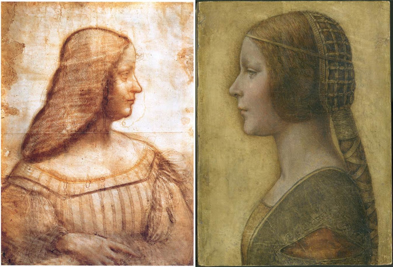
Above, Fig. 4: A comparison of La Bella Principessa with Leonardo da Vinci’s, Portrait of Isabella d’Este, c. 1499–1500, Paris, Musée du Louvre.
[KP] The portrait of Isabella d’Este shows the face in profile but the body in three-quarters, unlike La Bella Principessa. The former is also unfinished, rendered softly with the sfumato effect, fluid in execution, while the shading is on the inside of the profile.
La Bella Principessa is shown in full profile, highly finished, rigid and linear, while the shading is on the outside of the profile.
The similarities between the two profiles are only superficial.
The use of the word ‘repaint’ was an incorrect translation of the French word ‘repentir’, which means pentimento. I would like to mention that I have a good enough grasp of drawing techniques as I also trained as a copyist of Old Masters and an art restorer.
[MK] “16) Left-handedness”
[KP] I disagree that “the left-handed execution cannot undermine the attribution”, as it indicates the intention to imitate Leonardo. None of his collaborators or followers were left-handed, so the drawing is either by him or by an imitator/forger.
[MK] “17) The costume”
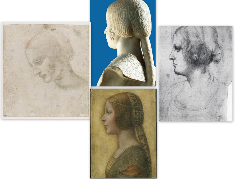
Above, Fig. 5: Comparisons of La Bella Principessa with Leonardo da Vinci’s, Head of a Woman, c. 1488–1490, National Gallery, Parma (left); Leonardo’s Portrait of a Woman in Profile, c. 1489–1490, Windsor Royal Collection (right); and, Gian Cristoforo Romano’s sculpture, Bust of Beatrice d’Este, c. 1491, Paris, Musée du Louvre (top).
[KP] The simplified and flatly rendered dress as well as the coazzone hairstyle do indeed show similarities with the sculpted busts by Gian Cristoforo Romano (Bust of Beatrice d’Este) and Francesco Laurana. But this could be a negative point, as the drawing could be based on one of these busts.
Incidentally, the opening in Laurana’s sculptures differs from that in La Bella Principessa. In the former it is a wide horizontal cut facilitating the movement of the arm, while in the drawing it is a triangular hole which doesn’t seem to play such a role.
Above, Fig. 6: Gian Cristoforo Romano, Bust of Beatrice d’Este, c. 1491, Paris, Musée du Louvre.
Above, Fig. 7: A comparison of the knots on La Bella Principessa’s dress and Gian Cristoforo Romano’s Bust of Beatrice d’Este, c. 1491.
[MK] “18) The fingerprint”
[KP] The fingerprint evidence which was originally published in the book as “strongly supportive of Leonardo’s authorship” is now considered invalid.
It was not possible to compare the palm imprint to Leonardo’s other examples, and it was described as perhaps unintentional as it is single and isolated, unlike in the execution of Cecilia Gallerani, where many imprints were found where the blending of hues had taken place.
[MK] “19) On Method”
[KP] The “accumulative build-up of different types of evidence” against the attribution to Leonardo is strong, but, as mentioned above, my main arguments were not addressed by Prof. Kemp.
Why is the shading on the outside of the profile? What is the significance of the hand writing on the reverse of the drawing and why was it not investigated? Why is the profile of La Bella Principessa so similar to that in the sculptural Bust of Beatrice d’Este by Cristoforo Romano? Why is the knot on the dress similar to the one on the bust and unlike other Leonardo’s knots? Why are the proportions of the face flawed? Why the vellum of the drawing was described as ‘rough animal hide’ and could it be part of the luxury book of the Sforziad? Why Marchig’s friend the famous Renaissance expert Bernard Berenson had not attributed the drawing to Leonardo? Why there is no known provenance prior to Marchig’s in the 1950s?
In the field of attributions the level of inconsistencies and contradictions always undermine any evidence in favour of a proposed attribution.
[MK] “20) The damaging allegation in the opening to Pisarek’s article that the owner was to set up ‘non-profit-making foundation for multi-disciplinary Classical and Renaissance studies near Florence, to be headed by Professor Martin Kemp’.”
[KP] I made no such allegation. This was a quotation from an article by Simon Hewitt who supports the attribution to Leonardo. This information was published in an Antiques Trade Gazette article by Simon Hewitt in 2009. The article can be found here.
In my article I also wrote: “Prof. Kemp and his colleagues are no doubt genuinely convinced of the authenticity of the drawing, as well as highly enthusiastic about the rediscovery.” This shows that I in no way question Prof. Kemp’s integrity on this matter, only the methodology and the results of the proposed attribution.
Kasia Pisarek, 24 May 2016
Problems with “La Bella Principessa” – Part II: Authentication Crisis
In Part I we discussed the look of the so-called “La Bella Principessa” drawing and showed that while it bears no comparison with Leonardo’s female portrait type, it sits comfortably among 20th century fakes (see Fig. 1). Here, we consider the singular campaign to have this work accepted as a Leonardo.
“LA BELLA PRINCIPESSA” AND THE (DECOROUS) COMPANY SHE BEST KEEPS
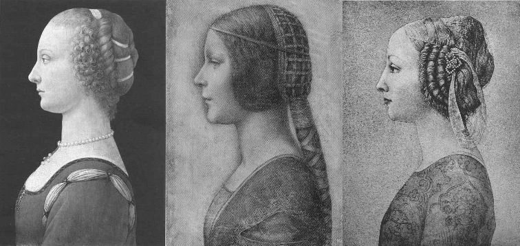
Above, Fig. 1: “La Bella Principessa” (centre) among 20th century fakes. For the drawing’s striking mismatch with secure Leonardo works – and with other bona fide associated works of the period – see Problems with “La Bella Principessa” – Part I: The Look.
A SINGULAR CAMPAIGN OF ATTRIBUTION
The nine years long campaign to have the drawing “La Bella Principessa” accepted as an autograph Leonardo da Vinci is faltering even before our series of examinations is completed. The leading proponent, Professor Martin Kemp, is said in the May 2016 Art Newspaper (Vincent Noce’s “La Bella Principessa: Still an Enigma”) to have his “reputation on the line” in the wake of our posts and an article “How reliable are today’s attributions in art? The case of ‘La Bella Principessa’ examined”, that was published in the Polish scholarly journal Artibus et Historiae, no. 71, 2015 (“La Bella Principessa – Arguments against the Attribution to Leonardo”) by Dr. Kasia Pisarek, an independent art historian (and ArtWatch member). In delayed response to our January 2014 suggestion that the disputed drawing’s author might have been the painter/restorer Gianinno Marchig (see Art’s Toxic Assets – Part II), Kemp now alleges on his blog that we are making “scurrilous and unsupported” attempts to “divert the argument into claiming that Jeanne Marchig lied profusely”. This is not the first such slur against us from that quarter. When Professor Kemp reviewed the James Beck/Michael Daley book Art Restoration: The Culture, the Business and the Scandal in 1994 he made similarly unfounded charges which we rebutted immediately. In recent years Kemp has cast his denunciations more widely and generally against his fellow scholars. (See below.)
Notwithstanding the “La Bella Principessa” campaigners’ belligerence towards doubters, and Professor Kemp’s own publicly bullish support for the attribution, his position on “La Bella Principessa” is untenable in terms of the work’s artistic properties and its emerging circumstances – as indeed is the methodological model for attributions that he hubristically offers to fellow scholars in connection with the Leonardo upgrades that he supports (see below).
Pace Kemp’s charge of evasion, it would be evasive not to consider Marchig’s role when appraising a drawing reportedly bought by a Panamean, Jersey-based company nine years ago at a requested discount for $19,000 but which now, as a claimed Leonardo, lives in a Swiss vault and is said to be insured for $150 million. We should all consider the circumstances and nature of this particular work and the assiduous, sometimes muscular campaign to upgrade it. The old masters market is fragile. The accelerating expanionism of recent years cannot be sustained. The market cannot afford to take in too many too-hopefully upgraded Leonardos, Michelangelos, Rubens’s, Van Dycks, Caravaggios and so forth. Aside from the resulting adulteration of scholarship, markets, as we all now appreciate, lose confidence and crash when too high a proportion of toxic assets is thought to have been bundled in among the bona fide.
PROMOTING THE DRAWING THAT CAME FROM NOWHERE
What is now presented as Leonardo’s “La Bella Principessa” of c. 1496 was sold anonymously at Christie’s, New York, in 1998 for $22,850 as a work without provenance. Twelve years later, Jeanne Marchig, the widow of the artist/restorer Giannino Marchig who had worked as a restorer for Bernard Berenson (who, Kenneth Clark said, sat on a pinnacle of corruption), identified herself as the vendor. She did so not in the disinterested cause of scholarship but to claim damages after sensational but unfounded and misleading media reports that fingerprint evidence had shown the drawing to be a Leonardo.
As we reported, aside from the widow’s hearsay claims concerning the ownership of the drawing by the painter/restorer, the drawing otherwise possesses not a shred of recorded history in its supposed five centuries. On the widow’s account (as variously reported by Kemp, by the drawing’s owner, Peter Silverman, and by a journalist selected by Silverman to promote the attribution, Simon Hewitt), Marchig, an unsuccessful artist who had grown rich and acquired a collection of valuable historic works, had declined to say even to his wife when or from whom he had acquired the framed drawing which he is said to have kept in a portfolio.
Jeanne Marchig dangled the possibility that he might have acquired it from Berenson, with whom he had grown close and for whom he had hidden paintings, photographs and documents during the war. Had he done so that would hardly dispel doubts and suspicions but even that possible lifeline to a past now seems unlikely: the drawing’s present owner and Kemp vainly trawled Berenson’s archives at I Tatti for any sign or mention of the drawing. The trail of this supposed Leonardo begins and ends with the Marchigs. Marchig, if his widow is reliable, said nowt and simply had. By coincidence, the widow was born in Warsaw where a book is housed that was later said (unpersuasively for reasons given by Dr Pisarek) to have contained the vellum sheet on which the drawing was made. Professor Kemp thinks the late Jeanne Marchig “a person of great credibility”. The journalist Simon Hewitt reported in the Huffington Post that:
“Jeanne Marchig was born Janina Paszkowska in Warsaw, into a family of doctors and lawyers. She was an only child: her father died in an accident before she was born. Her mother Elzbieta Chrostowska, an amateur wood-carver, took her to Sweden in 1939, where she grew up and married, became Janina Hama. The marriage didn’t last. She met the artist Giannino Marchig on a train between Stockholm and Florence, where he worked as a picture restorer. Berenson and Wildenstein were his top clients. Although a youthful exponent of racy nudes, Giannino was no lady’s man. He lived at home with his mother on the banks of the Arno. He was over 50. Jeanne was an art student. Their age-difference ran into decades. They married. People talked. Talked, too, about Giannino’s wealth. What had he done during the war? Helped hide Berenson’s collection from the Nazis, among other things. Did Berenson give him the Bianca portrait? Jeanne Marchig didn’t know. Or wasn’t saying. They moved to Switzerland. She morphed from a flirtatious livewire into a coquettish Miss Marple of unfluffy shrewdness. Giannino died in 1983. Jeanne published a sumptuous catalogue of her husband’s career and religiously kept the box of pastels he had used to restore the Leonardo.”
PROFESSOR KEMP’S EYE
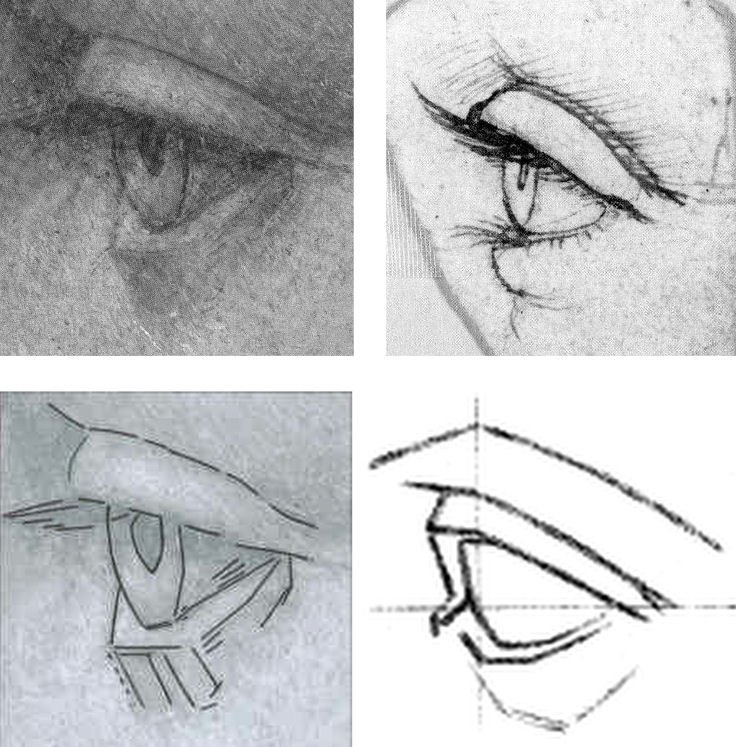
Above, Fig. 2: The eye of “La Bella Principessa”, top left, and above left (with a superimposed diagram). Top right, an eye drawn by Leonardo (reversed). Above right, an eye featured on a sheet of eyes drawn and reproduced as aids to students and artists in a famous drawing course published in the late 1860s – and later used by the young Picasso.
THE NUB OF CONNOISSEURSHIP DISPUTES IN THE VISUAL ARTS
Martin Kemp and I have recently discussed the eye in “La Bella Principessa” (top left) vis-à-vis the eye by Leonardo (top right) and I am grateful to him for this.
He believes that both eyes are drawn by Leonardo. I (a left-handed draughtsman) hold that the “La Bella Principessa” eye, with its pronounced, almost Cubist, angular and planar construction cannot conceivably have been drawn by Leonardo. There is simply nothing like it in Leonardo’s oeuvre. It is a construct of an alien, more modern kind. Kemp now admits that the unnaturally thick and angular lower lid is problematic but writes: “With the exception of the angularity of the lower lid, which is in an area of some damage, it is consistent (above all the amazingly delicate lashes) with the attached [the eye by Leonardo, top right]. Leonardo’s works of art are not anatomical demonstrations. It’s easy to find ‘anatomical erors’. I find the seizing on such things is to divert the arguments into issues of a peripheral nature in the face of evidence of a non-arbitrary kind.” This is a helpfully clarifying statement, but the suggestion that the eye might have been repaired is new.
In the 2010 Martin Kemp and Pascal Cotte book Leonardo da Vinci “La Bella Principessa” The Profile Portrait of a Milanese Woman, there is no indication given in Cotte’s map (Fig. 3) of repairs to “La bella Principessa” that the eye had been damaged, and Kemp, when comparing the eye with that of Leonardo’s Windsor Castle drawing Portrait of a Woman in Profile (Fig. 5), wrote of it “Even Boltraffio could not achieve this. The structure of the eyelids, the delicate flicks to create the lashes, and the translucent iris of the eye are extremely close on both portraits…” Pascal Cotte goes further, claiming a “distinct and identical logic” with the eye in Leonardo’s portrait of Cecilia Gallerani (The Lady with an Ermine, Fig. 4). Making no reference to injuries or repairs, Cotte specifically points in his diagram (Fig. 4) to the “The juxtaposition of the edge of the lower eyelid with the bottom of the iris”. Speaking generally of the analysed physical evidence of the drawing, Cotte adds “There have been some diplomatic retouchings over the years, but this has not affected the expression and physiognomy of the face to a significant degree or seriously affected the overall impact of the portrait.”
THE PRIMACY OF VISUAL EVIDENCE IN THE VISUAL ARTS
What Kemp sees as a peripheral issue that lacks “non-arbitrary” evidential value, I take to be of the essence in the evaluation and critical appraisal of (visual) works of art. In traditional connoisseurship – an area which Kemp frequently disparages on quasi-scientific professional and leftist political grounds – the test is not to identify similarities (which exist in abundance between authentic works, copies and forgeries) but to discern differences, to discriminate between products of the authentic autograph hand and closely related but variant artefacts.
Of course, Leonardo did not draw every eye as an anatomical demonstration, but nor did he ever draw an eye in ignorance of that crucial feature’s anatomical construction. The eyeball, being an orb, determines the shape and forms of the surrounding soft protective tissue of the lids. Leonardo’s eyes and lids are constructed with curves, not straight lines. With the four images above at Fig. 2, a connoisseur’s ‘eye’ should recognise that even when constructing an eye with straight and not curved lines (as in the lower right demonstration drawing) it is possible to render the visible part of the eyeball conceptually if not literally spherical. That schematic drawing displays greater sculptural and anatomical acuity than does the more laboured and “finished” “La Bella Principessa”. It recognises and describes with three (faint) straight lines, what Leonardo depicts with curves: the line(s) of collision between the bulging soft flesh of the lower eyelid (when the eye is open) and the more taught flesh that is stretched over the cheekbone. In the infrared image at Fig. 6 we can see with crystal clarity how Leonardo saw the structure of the lower eyelid and how he set out this structure in preliminary drawing form. While Leonardo gave fluent anatomically-informed account of eyes, Marchig was insecure in his treatment (see Art’s Toxic Assets – Part II). Had Leonardo complied – against everything else in his output – with an irresistible court demand for a strictly profile treatment of a female subject’s head and torso, as Kemp claims in defence of La Bella Principessa, he would have had the wit and the judgement to render the eye, too, in strict profile. “La Bella Principessa’s” eye – which is smaller – is not drawn in accord with that strict out-of-perspective formal convention. Rather, it strays into looking both outwards and downwards, imparting an insecure, wary, not proud air.
MAPPING THE “RESTORATIONS” OF “LA BELLA PRINCIPESSA”
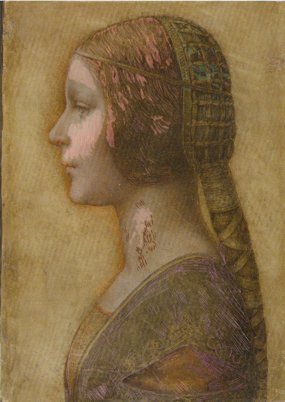
Above, Fig. 3: The colour coded map that is said to show areas of restoration in “La Bella Principessa”, as published on page 133 of the 2010 Kemp/Cotte book Leonardo da Vinci “La bella Principessa” The Profile Portrait of a Milanese Woman. It is striking how discretely localised are the areas of “restoration”, and how fortuitously the corresponding areas of injury had fallen in the least important parts of the image.
CONFOUNDING THE SIMILAR AND THE DISSIMILAR
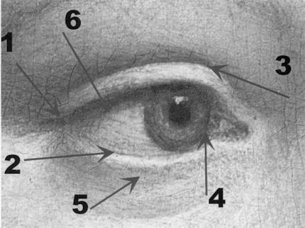
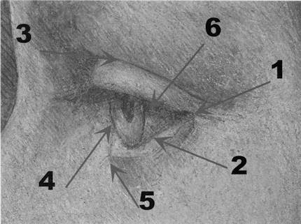
Above, Fig. 4: Top, the (true) right eye of The Lady with an Ermine. Above, the eye of “La Bella Principessa”. In this diagram Pascal Cotte, a brilliant engineer, sees confirmation of a common author – even at his arrowed point 2 where Leonardo’s curved demarcation between the eyeball and the lower lid is set against the form-denying straight demarcations in “La Bella Principessa”.
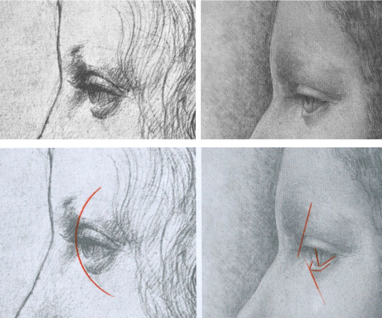
Above, Fig. 5: Left, the eye of Leonardo’s Windsor Castle Portrait of a Woman in Profile (reversed). Right, the smaller, more angular and more sunken eye of “La Bella Principessa”.
A common fault of copyists, pastiche-makers and forgers is to get details correct while missing the larger unified relationships which, collectively, they should constitute. The author of “La Bella Principessa” not only misses the cohering sense of the eye as a ball but even misconstrues the form and anatomical function of particular details. This error testifies to forgery rather than pastiche. We will be showing “La Bella Principessa” to be a “portmanteau work” composed from features drawn from a number of bona fide Leonardos. It can hardly seem a coincidence that the most disqualifying error of drawing in “La Bella Principessa” – the lower eyelid – occurs at the very point where damage is found in the (“prototype”) work which it is most closely said to resemble. At this point the drawing’s author has clearly been required to invent rather than copy or paraphrase. Indeed, in “La Bella Principessa’s” eye we find a progressive falling off of anatomical and artistic credibility from top to bottom: most plausible in “La Bella Principessa” is the somewhat simplifying paraphrase of the upper eyelid. Less plausible is the treatment of the more complex and elusive eyeball and iris. Least plausible of all is the fabricated lower eyelid. Martin Kemp’s claim that by drawing attention to such incompatibility we seek to divert the arguments “into issues of a peripheral nature in the face of evidence of a non-arbitrary kind” is not only unfounded – much material is in train on this attribution – it betrays a technically philistine misapprehension of sound scholarly method. Let us be clear: art, not the devil, lies in artistic detail and these details testify to authorship. We have the clearest possible understanding of how much Leonardo knew and how well he gave expression/record to what he knew/saw. It is for those who would count “La Bella Principessa” as a Leonardo to explain the disparity between its eye and that below at Figs. 7 & 8, which, on Kemp’s account, were both made at the same date.
SPOT THE ODD ONE OUT
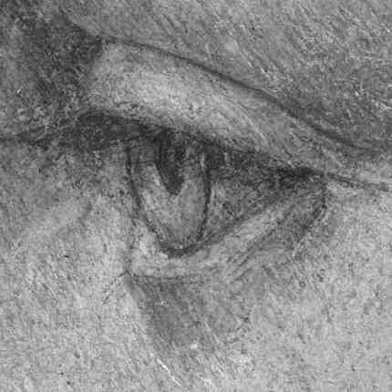
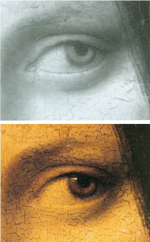
Above, Figs. 6, 7 & 8: Top, the eye of “La Bella Principessa”; Centre, the (true) left eye of Leonardo’s La Belle Ferronnière, as seen in an infrared reflectogram by E. Lambert for C2RMF as published in Leonardo’s Technical Practice, Paris, 2014; Above, the (true) left eye of Leonardo’s La Belle Ferronnière, as seen in Pietro Marani’s Leonardo da Vinci – The Complete Paintings, New York, 2000. It is, for reasons given here, inconceivable that both of these eyes could have been produced by Leonardo at the same time – c. 1496.
There is another sense in which Kemp’s espousal of “La Bella Principessa” exposes his art historical method. By drawing attention to “La Bella Principessa’s” many points of direct correspondence with the Windsor Castle profile portrait in terms of overall effects, pentimenti, anatomical details and so forth, the scholar strains credulity. The Windsor Castle portrait is clearly of a mature woman. It was made some 15 years earlier than the supposed portrait of Bianca Sforza who died when a child of fourteen. The Windsor drawing is made in another (and single) medium – silverpoint – in which Leonardo was effortlessly, supremely fluent. “La Bella Principessa”, however, was made in an unprecedented combination of materials on a never or extremely rarely encountered-in-Leonardo support. How likely, then, is it that Leonardo would produce an elaborately finished drawing in an un-encountered mix of graphic and pictorial media and of a type nowhere else encountered in his oeuvre, of a young girl who, on Kemp’s account, was drawn either directly from life or from some other unknown record of her appearance, in commemoration after her death, some fifteen years later, that would, when reversed, produce a near perfect coincidence of proportions, features and, even, pentimenti?
It would, of course, be entirely unremarkable for a forger or pastiche-maker to engineer a similar reversed coincidence of features and traits with a bona fide Leonardo work. A canny forger who happened to be a restorer of old masters – including Leonardo, as was the case with Marchig – would well appreciate the need for evidence of one or two reassuring “campaigns of restoration” in a supposed work of five centuries of age. Marchig’s widow has reportedly claimed that he had indeed conducted restorations on the front of the drawing and on the back of the oak panel to which it was – unprecedentedly and, it is now claimed, irreversibly – glued. Kemp has not discussed, as far as we know, technical evidence that has been discussed by another Leonardo scholar – Cristina Geddo – that the back of the vellum is not blank as it would surely have been had it ever faced the the elaborately illuminated frontispiece of a major book as Kemp claims. For Dr Geddo, it is reassuring that the back of “La Bella Principessa’s” vellum support bears “superimposed numbers…like others written in pen, such as a very pale inscription visible along the upper border of the sheet and the little winged dragon – at least this is what it seems – in the lower left corner. This feature, too, counts in favour of an attribution to Leonardo, who, even though he has never to our knowledge used a parchment support in his work, was in the habit of re-using the paper on which he wrote or drew.” Of course, forgers too re-use old material.
THE AiA: AN OPEN FORUM; A PROFESSIONAL TALKING SHOP; OR, A CONSERVATION-FRIENDLY CLOSED SHOP?
Nothing can bring greater benefit to the art world than free, frank discussions and debate. The annual three-day Hague Congress is organised by a body that addresses the subject of authenticity in art and is titled AUTHENTICATION IN ART. This year’s AiA congress (11-13 May) specifically addresses the voguish museum world hybrid discipline known as Technical Art History, the misapplied and anti-aesthetic scientism of which we have criticised since its earliest days (see, for example, the first post on this site The New Relativisms and the Death of “Authenticity”). Attendees at this year’s AiA congress comprise “art collectors, collection managers, directors of museums and galleries, art dealers, appraisers, connoisseurs, advisors, auctioneers, insurers, investors, lawyers, authors of catalogues raisonnés, restorers, conservators, material scientists and art historians.” This particular critic of Technical Art History will not be speaking even though our proposal for a paper was encouragingly received by a congress organiser who wrote:
“Dear Michael, Thank you. Very valuable to the whole set up of AiA 2016. Get back to you in the coming weeks.”
The proposal had opened:
“Technical Art History is presented as a multi-discipline, international museum-standard professional synthesis that eliminates error and delivers enlightenment when, in truth, it testifies to little more than the ascendency in museums of technicians over curator/connoisseurs. This putsch began with the creation of in-house museum restoration departments where staff restorers could no longer be sacked. The National Gallery in London claims pioneering authorship of the new hybrid discipline and it perfectly reflects the new pecking order.”
We were subsequently “dis-invited” through a form notification to unsuccessful applicants. Among this year’s speakers will be Professor Kemp, a member of the AiA’s advisory board, and Pascal Cotte, of Lumière Technology. Cotte was, as mentioned, co-author with Kemp of the 2010 and 2012 English and Italian editions of a book of advocacy, La Bella Principessa – The Story of the New Masterpiece by Leonardo da Vinci. (Kemp has been critical of Cotte’s recent, go-it-alone book Lumière on the Mona Lisa – Hidden Portraits.) A working group was set up to organise this year’s congress. It is comprised entirely of conservators or conservation scientists. Curators and connoisseurs are not represented. One member of this advisory group was David Bomford, who is presently the Chair of Conservation and Head of European Art at The Museum of Fine Arts, Houston. Formerly, as a senior restorer, Bomford was the architect of the National Gallery’s presently stated cleaning philosophy – which we had discussed in some detail in our proposed congress paper (“…The false assurances of Clark’s aesthetics/science sleight of hand haunt and deform the National Gallery. Its official conservation guide declares restorations to rest on individual restorer’s own aesthetic inclinations…”)
PROFESSOR KEMP’S ART HISTORICAL METHOD
In his 2014 AiA congress paper (“It Doesn’t Look Like Leonardo”) Kemp discussed two other Leonardo upgrading attributions with which he is associated. Namely, the two versions of the Madonna of the Yarnwinder (one of which was restored badly, Kemp once complained, by Marchig) and the massively restored wreck of a panel painting, the Salvator Mundi. His paper’s abstract ran:
“The state of methods and protocols used in attribution is a professional disgrace. Different kinds of evidence documentation, provenance, surrounding circumstances of contexts of varied kinds, scientific analysis, and judgement by eye are used and ignored opportunistically in ways that suit each advocate (who too frequently has undeclared interests). Scientific evidence is particularly abused in this respect. The status of different kinds of evidence is generally not acknowledged, particularly with respect to falsifiability… I will attempt to bring some systematic awareness into this area, which is a necessary first step in establishing some rational protocols. The case studies will be drawn from Leonardo.”
On reading this abstract with its scattergun slurs “opportunistically”, “disgrace” and “undeclared interests”, we laughed out loud. Partly because of the grandiose title – “The 2014 Hague Congress Authentication in Art – What happens when the painting you are buying, selling, investigating, exhibiting, insuring – Turns Out to be a Fake or a (Re)Discovery…” – chosen at a time when Kemp and others had failed to achieve a consensus of support for the drawing he had portentously dubbed “La Bella Principessa”. But also because, as mentioned, two decades earlier we had experienced Kemp’s invective and sneering distaste for traditional connoisseurs whom he sees as “a self-proclaimed (and often class-based) elite whose skills are insulated from systematic scrutiny”.
In his review of the James Beck/Michael Daley book Art Restoration – The Culture, the Business and the Scandal”, the authors – much as with Kemp’s peers today – were found professionally wanting and morally deficient: “…Their problem is that they seem unwilling to acknowledge the status of different kinds of evidence…The slanting of arguments, manipulation of quotations, and rigging of visual evidence may be effective journalism but it is poor history…” A more focussed barb was aimed at artists’ evaluations of conservation treatments: “Stalking throughout their book… is a very particular notion of ‘Art’ and its creators. ‘An Artist’ (ie What Beck and Daley understand as an artist in today’s terms) is adduced as the most important arbiter of the criteria for the treatment of our historical heritage. I am unclear about the identity of this archetypal beast.” Unclear indeed.
Kemp’s professional aversion to the views and judgements of artists is presented as a token of “higher”, more philosophically sophisticated notions of scholarly method and a scientist’s preference for non-judgemental, non-subjective “evidence” within it.
CRITICAL SILENCES
While some are cowed by Professor Kemp’s trademark abusive critical put-downs, others, like the blogger and art “sleeper” hunter, Bendor Grosvenor (21 April), openly admire them. We called Kemp’s bluff in a letter to the THES (2 May 1994):
“…he alleges… a misuse of historical and material evidence. Professor Kemp’s notions of misuse would seem to be singular: he complains, for example, that Professor James Beck and I accepted Charles Heath Wilson’s clear and detailed testimony that Michelangelo had extensively revised his frescoes with glue painting, ‘with unquestioning approval’. This is presented as proof of our ‘lack of discrimination’. But Wilson saw what he saw and said what he said… Does Kemp have any grounds for rejecting Wilson’s record?… Kemp is silent on this evidence. Why? The photographic evidence we supply of restoration-induced injuries is impugned by Kemp as ‘rigged’. It is nothing of the sort – most of it was provided by the restoration authorities themselves… Does Kemp wish to defend that restoration? Is he in possession of any photographs which tell a different story?”
No grounds for rejecting Wilson were offered in reply. No contra-testifying un-rigged photographs were ever produced.
For a fuller account of the spurious charges raised by art conservators and Kemp to Art Restoration, see “Why are picture restorers allergic to appraisal?”, Jackdaw, May/June 2016.
THE 2016 AUTHENTICATION-IN-ART CONGRESS AND ‘DISORDERLY’ SCHOLARSHIP
In this year’s AiA congress paper Kemp returns to his 2014 AiA congress attack on the shortcomings and abuses he perceives in the methodologies and behaviour of all other scholars in the field, albeit in muted form. Today his abstract reads:
“A speech on Technical Art History and the way he [Kemp] implements the research on Leonardo’s La Bella Principessa: the varieties of evidence and arguments, and how reactions to the attribution shed light on the disorderly nature of current methods”.
A clue to where he might be going can be found on his blogsite where he has published a “reworked” version of his 2014 paper that excludes his earlier linking remarks on other Leonardo attributions he supports – “Science and Judgement by Eye in the Historical Identification of Works of Art”.
The methodological schema Kemp outlines and censoriously offers to others seems little more than an overly complicated regurgitation of the tendentious, the self-evident and the true-by-definition. It leans heavily on and misapplies Karl Popper’s famously illuminating discussion of scientific knowledge and methods. Kemp seems to crave an aesthetic equivalent of the decisive Popperian test of scientific “falsifiability”. This is a vain, misdirected quest. Because of the profound differences between appraisal of works of art and the technical analysis of their constituent materials, Kemp is forever complicating and caveating his proposed model method. He compiles tables of hierarchies that are organised into polarising dualities. He is constantly extricating himself from fogs of his own making:
“In this and the following table, I am using the terms ‘scientific’ and ‘art historical’ in a conventional way without intending to signal that they can be isolated in the actual practice of attribution – and certainly not to suggest that the application of scientific analysis necessarily delivers more certainty than art historical evidence. In the actual practice of art history, its isolation from scientific analysis is all too common.”
Which? What? To help orientate us, Kemp devises a table of criteria that are more traditionally “art historical” with the “the most malleable [being] at the top.” But nothing ever comes to rest. Here, “I have added standard kinds of evidence relating to provenance and documentation that are highly constructive.” If baffled by the usage “constructive”, the reader must back-track to an earlier explanation that “The kinds of evidence and explanation that can be subject to various degrees of falsification can be grouped under two headings: constructive and permissive.” Thus, “By constructive I mean those that add positively and accumulatively to the case being made for a specific attribution. By permissive I am signalling those that present no obstacle to the attribution being made, i. e. they offer a nil obstat.”
JUDGEMENT BY EYE
When Picasso was asked what he thought of the philosophical discipline aesthetics, he replied: “Aesthetics is to the artist what ornithology is to birds.” In Kemp, everything is dunked in pseudo-philosophical terminology. Take the simple clear self-explanatory notion “judgement by eye” which he offers in preference to snobby, elitist, class-based etc “connoisseurship”:
“As we have seen, judgement by eye plays a key role in key scientific techniques. Although the most constructive of the kinds of art historical evidence, documentation and provenance, do not rely upon judgement by eye, it is common that this kind of evidence is not available or is less conclusive than we would wish. In many cases judgement by eye necessarily provides the actual starting point, before other kinds of investigation are undertaken. This is often the situation when a previously unknown or unrecognised work first emerges with specific claims attached to it. Let us try to formulate some propositions about judgement by eye in a somewhat Popperian manner”
Why, apart from intellectual snobbery, in a “Popperian” manner? Well, they help Kemp to conclude with the twin observations that “Judgement by eye is malleable in the light of multiple interests”, and “Judgement by eye is falsifiable only by factors outside of itself.” Kemp’s Popperian edifice is, as it were, a perniciously misleading red herring. In truth judgements by eye cannot be equated with falsifiable scientific propositions, they are a different beast – they are critical appraisals. As such they are gambits in a discussion. They can be countered by demonstrably superior, more percipient and persuasive judgements that accord better with the material circumstances and visual facts of a given work of art. Because Kemp sets the hard and “irrefutable facts” of material analysis (many of which, he acknowledges, require judgement by eye) against what he deems the “subjective”, “relative” and “malleable” act of appraisal of the (despised) connoisseur, he misrepresents what is indispensable to proper appraisals of art. Connoisseurship (the term should not frighten or repel us) cannot sensibly be treated as a natural science – properly, rigorously conducted it is an open, competitive adversarial system that is full of checks and balances wherein anything that is proposed may examined, challenged and deposed. Art world abuses certainly exist but they flourish best when legitimate criticisms and demonstrations are blocked and disqualified and critics are ruled out of court. Kemp, who despises the “class-based” connoisseur, does not respond well to criticism and prefers abuse and denigration to straightforward and healthy critical engagement. That is his loss, but also, he being a talented man, it is that of scholarship itself.
AN INTELLECTUALLY OPEN CONFERENCE
When ArtWatch UK, The Center for Art Law, and the London School of Economics Law Department, organised a conference on connoisseurship in London last December (“Art, Law and Crises of Connoisseurship”), one of the papers, “How reliable are today’s attributions in art? The case of ‘La Bella Principessa’ examined”, by Kasia Pisarek, presented a number of the interlocking art historical, aesthetic and technical criticisms she had recently published in the above mentioned Polish scholarly journal Artibus et Historiae.
Because this paper was a strong and detailed rejection of the attribution, we invited Martin Kemp to give a paper. He declined. We then invited Nicholas Turner, an independent scholar and drawings expert who had championed the “La Bella Principessa” drawing before Prof. Kemp. He, also, declined to speak. To represent the restoration-pro-active, attribution-making school of art dealers, we invited Philip Mould. Mr Mould, too, declined to speak. Shortly before the conference, Kemp, Silverman and a Polish art historian, Kasia Wozniak, all lobbied for the “balancing” inclusion in our conference proceedings of the journalist Simon Hewitt who is writing a book with the owner of La Bella Principessa, Peter Silverman – who tells us that the book is on “various aspects of the art market, sometimes highlighted by others’ and my own discoveries”. Hewitt attended the conference and, from the floor, launched an assault on Pisarek’s case – but did so, we later learned, on the borrowed authority of Kemp who had “prepped” him for the occasion on objections he had framed in response to Pisarek’s Artibus et Historiae article. Kemp later submitted his lengthy response to Artibus et Historiae for publication but it was turned down. This article has now been posted on the AiA Congress website. Perhaps, in the interests of scholarly balance, the AiA congress will now also post the article by Dr Pisarek which Professor Kemp aims to rebut? Perhaps the Congress might also consider posting our own initially valuable-to-proceedings but later rejected paper on Technical Art History?
Michael Daley, 3 May 2016
COMING SOON: The Salvator Mundi, Giannino Marchig, Left-handedness and “La Bella Principessa”
Restoration criticism should be banned: official
An art historian has mentioned the restoration of the Sistine Chapel and professional restorers are furious. Art restorers, it seems, cannot cope with criticism and would like certain discussions of restorations to be proscribed.
A reviewer of a book on the condition of works of art, protests that its author became “enmeshed” in the debates over the controversial cleaning of the Sistine Chapel, thereby committing “error” in an otherwise “thoroughly accurate and levelly argued book”.
Why should a discussion of the greatest art restoration controversy of modern times – and a discussion that was made precisely when writing of the importance of condition in works of art – trigger defensive and totalitarian impulses, as if some Index Librorum Prohibitorum on restoration controversies has been breached? The review of Paul Taylor’s book Condition – The Ageing of Art appeared in the March 2016 ICON NEWS, the magazine of the Institute of Conservation. The reviewer, Dr Clare Finn, ACR, is a member of the Institute of Conservation. She runs a firm, Clare Finn & Co Ltd, which is described on its online home page as being “a well-known and highly respected firm of painting restorers and conservators”. Dr Finn is not alone among restorers in seeking such a prohibition on this topic.
As we discussed in the recent conference on connoisseurship and law, another of the art restoration trade’s many Sistine Chapel injury-deniers, Will Shank, reviewed Paul Taylor’s book in the December 2015 Art Newspaper. Shank, who is said to work “privately in collections care in from his base in Barcelona” is the co-chair of the US initiative Rescue Public Murals. He also complained of Taylor’s discussion of the Sistine Chapel restoration controversy. He, too, did so despite finding Taylor’s research thorough and his presentation “for the most part unbiased.” What gave offence was the scholar’s “choice to light a fire under a long dead controversy.” Shank gratefully acknowledges that the Sistine Chapel restoration controversy brought the term art restoration into the consciousness of the “lay public”. Writing thusly from within the cosy confines of the art conservation priest-craft, Shank had the brass to complain that it failed to do so “in a positive way”.
For well over half a century, picture restorers (who used to be dubbed Picture Rats) have sought to present their trade as academically respectable with ethical, rigorously conducted and reported procedures. (Shank obtained a Certificate in Paintings Conservation from Harvard University Art Museums in 1983 after taking a Master of Arts in Art History in 1981 at the Institute of Fine Arts, New York University, following a Bachelor of Science, 1973 in languages and linguistics at Georgetown University, Washington, D.C.). Picture restorers should recognise that in properly rigorous intellectual disciplines, no topics are proscribed; that all are fair game for scrutiny and discussion; and, that there are no heresies. Shank and Finn will be aware that although the Vatican has yet to publish a technical report on its still-controversial restoration of Michelangelo’s Sistine Chapel frescoes, it abolished its list of banned books in 1966.
Michael Daley, 5 April 2016
Bring on the Clowns (- or, “Italy Loses It”)
Italy has decided to play international museum world catch-up at precisely the wrong moment and with a panicked, plagarising zeal that bodes ill for art lovers and that country’s own cultural well-being.
MR JAMES BRADBURNE LANDS A NEW JOB AND SEMAPHORE’S “CHANGES AHEAD”
Above, James Bradburne in front of “St Mark Preaching in Alexandria” at the Brera, Milan.
We had hoped against hope that the reports were not true. We could not believe that a deranged Italy had engaged in a mass cull of museum directors in hope of a making another of its periodic surges away from itself and into the future.
It was true, of course, and we should not have averted our eyes and stuffed our ears. In a chilling report carried in the travel section of this weekend’s Finanacial Times, Claire Wrathall (“Shaking up Milan’s Pinacoteca di Brera”) anatomises a cultural spasm-in-the-making:
“In January 2015 an advertisement placed by the Italian Ministry of Culture appeared in the Economist seeking directors-general for 20 of Italy’s leading museums…(Existing incumbents had to apply for their own jobs; only one, Anna Coliva of the Galleria Borghese in Rome, was rehired.) As the culture minister, Dario Francheschini, put it, ‘Italian museums should be dynamic. A country with 4,000 museums should see that as a formidable economic resource.'”
Mr Bradburne, a British-Canadian architect and museum expert has landed the directorship of the Brera in Milan (the Pinacotecca di Brera), with, as Ms Wrathall reports, the fatuous governmental brief “to turn one of the world’s greatest collections of Renaissance masterpieces (not to mention works by 20th-century Italian artists such as Modigliani, Morandi and Severini)” into “an outstanding museum.” Since when was the Brera not an outstanding museum? Since when have museums in Italy not been a formidable economic force? Italy can hardly be chasing even more tourists? If Brits are the cat’s pyjamas as curators, how come our own museums are filling up with Germans? (Could this be an EU conspiracy to simulate dynamism in a moribund entity by artificially increasing the velocity of trans-national exchanges?)
POSSIBLE USES FOR MR JAMES BRADBURNE
It seems that Mr Bradburne’s reputation at the Palazzo Strozzi awakened the culture minister to “the need to shake up the nation’s moribund museums”. So, how do you shake a museum blessed with great art and enjoying an ideal natural lighting in which to view paintings? Official Answer: as Mr Bradburne puts it, “When I got here I was shocked by the dull flat approach to lighting which strove to recreate the sort of northern light the artist would have worked in.”
In other words, to shake things up, you obliterate the best and most sympathetic lighting imaginable – the very light in which the work was made. And then you replace it with what? In Mr Bradburne’s own words, you swap old orthodoxy with today’s fashion, “That is an old orthodoxy; the prevailing fashion nowadays is to put things in the spotlight. We speak with light and colour now.” Note the brazen and presumptuous sleight of hand: it is we, the adminstrators, not the art, who now speak. And, “we” may now play pseudo-theatrical games with all the inappropriate and intrusive vulgarity and gusto of interior designers on the loose in a boutique: “By making the walls darker you can make more contrast”.
THE PONG OF ART
As well as changing the light, Bradburne plans to add smells. Oh yes! That’s right, he will add “the smells of the plants that give colours to paints”. Bradburne does not explain how the smells of mineral or insect-derived pigments will be introduced into the galleries or how if the smell of all the pigments in a painting could be captured it would be possible for the vistor to tell them apart. Bradburne does freely admit to one problem: even if he were to succeed in reproducing all the smells, “the difficulty is the scents diffuse very quickly”.
More gimmicks are in train. Labels are to be written not by museum curators but by (non-Italian?) novelists like Julian Barnes, Sarah Dunnant, Ali Smith and Orhan Pamuk.
A MUSEOLOGICAL CURATE’S EGG
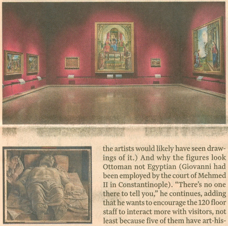
Above (top), one of the Bradburne-Refurbished galleries; above, “The Dead Christ and Three Mourners” (1474) by Andrea Mantegna.
A LITTLE CHEER
It has to be said that there are two cheering prospects. Although the glass wall will remain through which visitors can watch restorers nibbling away at the once-gloriously little-touched works (- I well recall being shown round the gallery by Pietro Marani, when Leonardo’s “Last Supper” was part-way through its debilitating restoration and repainting, and he proudly pointed out how well his Cima altarpiece then looked against its counterpart in the National Gallery, London), Bradborne will, at least, be eschewing the Blockbuster Game. That, he well and aptly describes as “cannibalising our collections”. Presently, he notes, “People come and never see the permanent collection”.
Further, one of the most gratuitously offensive pieces of contrived theatrical staging that predates his reign in the museum is to go. That is to say, “the most complained-about display in the museum” – Mantegna’s “Dead Christ”.
Followers of this site will recall Michel Favre-Felix’s shocking post of 13 March 2014 (“Mantegna’s Dead Christ : They Know Not What They Do”): “…the Dead Christ is now housed in a special crypt-like dark room, stripped of His historic frame and visually isolated by spot-lighting, as if now embedded into a monolithic black wall – and at a height of only 67 cm from the ground. This presentation is intended to be permanent and the film-maker, humility notwithstanding, declares ‘This will last: I will fight for it’.” Good riddance to that.
Michael Daley, 2 April 2016
ArtWatch and the Death of the Independent
On 26 March 2016 the printed Independent newspapers died. As Michael Daley reports, it was a poignant moment for those like himself who were in at the Great Project’s beginning in 1986 and had experienced the rush of excitement as the new newspaper’s pioneering innovations rapidly achieved commercial success and professional acclaim.
The paths of the Independent and ArtWatch were cross-linked for over two decades. The Independent was launched in 1986 as a newspaper in which much had been rethought and with firm editorial convictions that there should be no “freebies” (copy produced in exchange for free holidays or such) and no sacred cows – least of all with the royal family. At that date, twenty years after the heroic rescue operations that followed the flooding of Florence, one of the most sacrosanct received wisdoms was that art restoration was a safe and miraculous means of rejuvenating old works of art. I had left the Financial Times to work as the Independent’s principal illustrator shortly before the launch.

Above, the first issue of the Independent which was published on 7 October 1986.
A CRITICAL REVERSAL
Today, criticisms of even the grandest restorations are commonplace and no longer prompt ridicule and abuse. To the contrary, it is now restorations that attract ridicule. (See “And the World’s Worst Restoration is…”) In the brain-stretching BBC2 television quiz show Only Connect, a recent winning answer was: “They are all paintings that have been ruined by restorers”. Strictly speaking as the host, Victoria Coren, advised (on legal advice no doubt ), the correct answer was: “They are all paintings that have been controversially restored”. Controversially for sure – all had been condemned on this site: the Monkey-faced Christ; the Louvre’s botched Veronese nose jobs; the reconfigured-little that survived the last restoration of Leonardo’s Last Supper (see below); and the “Disney-fied” repainting of an ancient Chinese mural. The Guardian now asks readers to submit photographs of the worst restorations they have witnessed: “Restoration disasters around the world: share your pictures and stories”. Auctioneers and dealers place premiums on little- or never-restored works, not vice versa. No one would dream of producing a television or radio series called “Your Hundred Best Restorations”. No one (“sleeper” hunters aside) would celebrate a many-times restored painting. How we got to this stage is a long story. The Independent’s contribution to it was crucial, honourable and is worthy of greater recognition.
NINE MEN, ONE WOMAN, AN EXECUTIVE CHAIR AND NO PROPRIETOR
On 7 October 1988, Campaign magazine observed and reported on the Independent’s workings and progress at the time of its second anniversary, by which date it had exceeded its initial target of 375,000 sales.
Above, from left to right: Jonathan Fenby, Home Editor; Chris McKane, Picture Editor; Charles Burgess, Sports Editor; Sarah Hogg, Business and City Editor; Peter Jenkins, Political Columnist; Andreas Whittam Smith, Editor; Stephen Glover, Foreign Editor; Alexander Chancellor, Magazine Editor; John Torode, Leader Writer; Tom Sutcliffe, Arts Editor. (Not present, Michael Crozier, Art Editor.)
Below, Campaign’s photographer followed Andreas Whittam Smith’s day, showing here (top) a meeting with the leader writers, Roger Berthoud and John Torode; (centre), the principal illustrator, Michael Daley, at work; and, (bottom) with the home desk editor, Jonathan Fenby.
THE LOOK OF THE PAPER
The smart and distinctive look of the Independent contributed greatly to its initial success. Much as everyone in the city and business had felt impelled to sport the pink Financial Times, so everyone in advertising, design, architecture, photography and the visual arts seemed to have taken to the Independent. The newspaper – the first to exploit digital typesetting – was printed on good white paper that had little “show-through” from adjoining pages. By editorial requirement, its photography and graphics were distinctive and of high professional quality.
INNOVATIVE CONTENT
A journalistically novel and distinctive development on the paper had been a decision to expand and elevate the non-news, “features” sections, giving each a dedicated, professionally expert editor. In consequence I worked for sections as diverse as Law, Health, Food, Books, Gardening, Music, Wine, Architecture and so forth. For a fine art-trained illustrator, working with top calibre journalists (and an art editor who gave drawings due space and air) was a privileging and highly stimulating situation. The paper’s famous high-mindedness and unashamedly high-brow arts coverage, left one free to reference anything (including past art) that might best help illustrate pieces that ranged from, say, written evocations of the tastes and smells of food; cultural anxieties over decadence felt as the end of the century approached; and, acrimonious disputes of custody that sometimes arose when lesbian couples broke up after having had children by complicated paternity arrangements. Thus, by way of example, seven images:
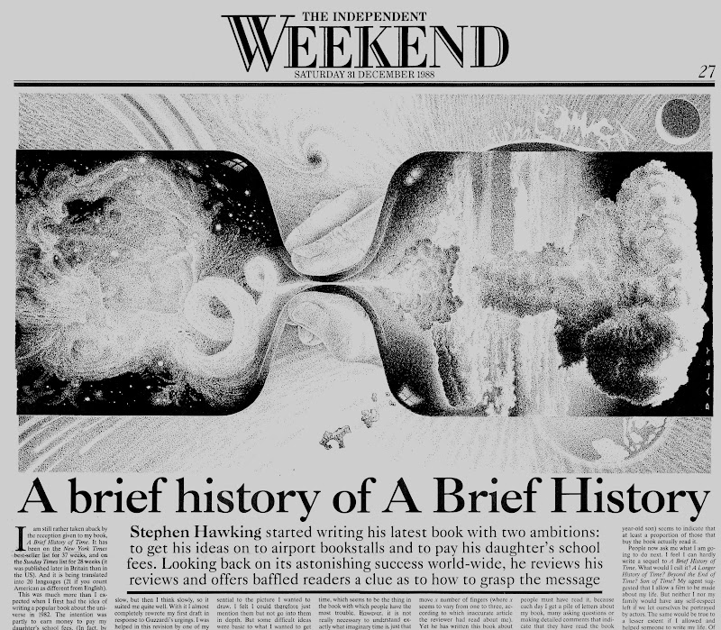
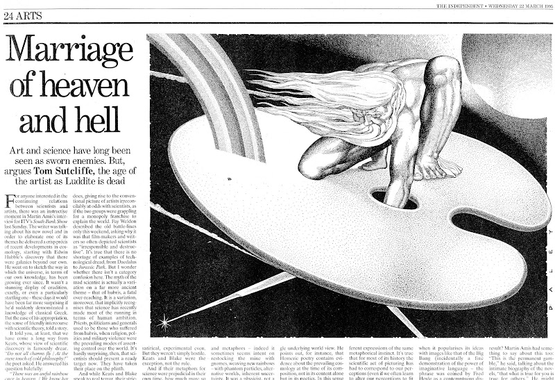
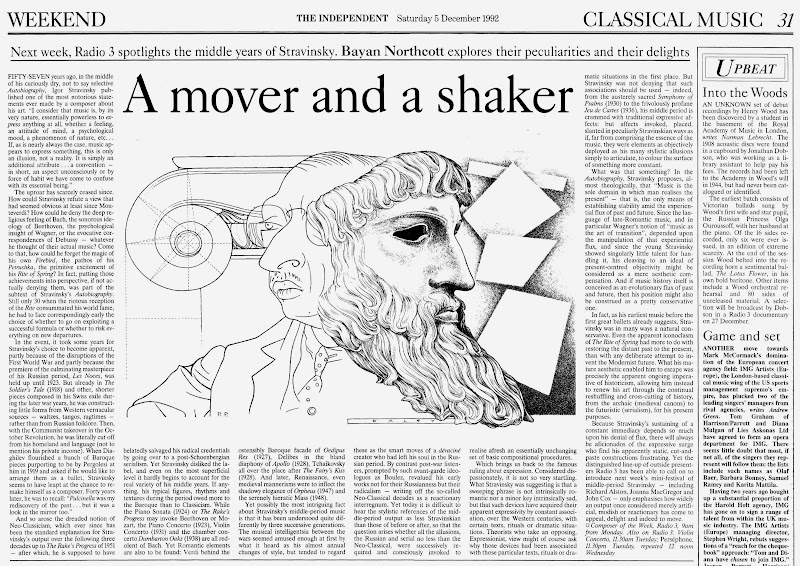

Above, seven drawings for the Independent, by Michael Daley.
THE GRAPHIC TECHNIQUE
If the conceptual challenges on the Independent were exhilarating, deadline pressures meant that there was rarely more than 24 hours from inception to delivery of a drawing. The ink drawing technique (which I had developed during the previous four years on the Financial Times and the Times’ educational supplements), aimed to exploit as much as possible the easy extremes of graphic art with solid blacks (quickly brushed) and pure whites (paper left bare). Between those polar graphic opposites, slow-to-realise shading was judiciously deployed with cross-hatched lines and stippled dots. To speed output, all preliminary drawing was made in pencil on the finished sheet and then directly inked over so that the sketching stage could be completely erased. I had come to recognise that a drawing for reproduction in a newspaper is not a thing-in-its-own-right but a piece of page furniture that must live variously with the “grey” of closely set print texts, the assertive blacks of headlines, and, the graphically strident clamour of advertisements.
RECOGNITION
The novelty of the Independent’s employment of an illustrator who had trained principally in sculpture and etching swiftly resulted in a press award and commissions from book publishers and advertising agencies. The sweetest and most surprising outcome was earning the respect as an illustrator of established practising fine artists. One of the most generous was Peter Blake, who sent a kind note of thanks and respect with a book of illustrations he had made for Michael Horovitz’s poem of celebration, love and homage to Frances Horovitz. Blake had surmised (correctly) that I, like he, was an admirer of Maxfield Parrish. Such recognition almost immediately took on an art political significance in an entirely unanticipated way.
THE SISTINE CHAPEL RESTORATION DISPUTE
Within a month of receiving Peter Blake’s gift, the Sunday Times Magazine published an article on the restoration of Michelangelo’s Sistine Chapel ceiling frescoes. It told of condemnation from artists and an art historian, Professor James Beck of Columbia University, New York. Against them, the art historical establishment claimed momentous restoration “discoveries” and “revelations” that were said to require nothing less than a rewriting of five centuries of art history. The profound changes that all parties conceded had been achieved by repeatedly brushed-on and washed-off applications of a ferocious solvent gel that had left Michelangelo’s painting a pale and deformed reflection of its former self (see below). Beck was being likened to the man who refused to look through Galileo’s telescope for his refusal to acknowledge as a miraculous “recovery” a hitherto unsuspected and nowhere-recorded “New Michelangelo”. “We didn’t need one”, Beck had retorted, “There was nothing wrong with the old”.
To this working artist, the photographic evidence of the pre- and post-cleaned sections made it clear that the proposed art historical edifice being offered in post hoc defence of a demonstrably bungled restoration threatened a compounding falsification of history itself. Suspicion arose that because so many art historians had authorised or endorsed the restoration on which so much institutional capital and foreign sponsorship monies had been invested, none could break ranks. Further, it seemed to have been especially galling to art historians that their endorsements had been rejected on visual evidence cited by artists. (One scholar/supporter of the restoration, Professor Martin Kemp, would later complain in the Times Higher Educational Supplement: “I am unclear about the identity of this archetypal beast. Is ‘an artist’ to be identified with Andy Warhol or one of his fellow practitioners who protested during the cleaning of the Sistine ceiling?”)
COPYING OTHER ARTISTS’ WORK
It so happened that having switched to illustration from art school teaching and fine art practice in 1982, working long hours, six or seven days a week left little time for travel or even museum attendance. Partly in substitution, I had kept touch with art through books and, as an illustrator, took every opportunity to incorporate work by artists I admired. These ranged from classical Greek sculpture, through Michelangelo, to certain favourite modern artists like Gustav Klimt, the painter/sculptor Max Klinger and Picasso (on our homage to Klimt and Klinger, see “At the end of another century” above).
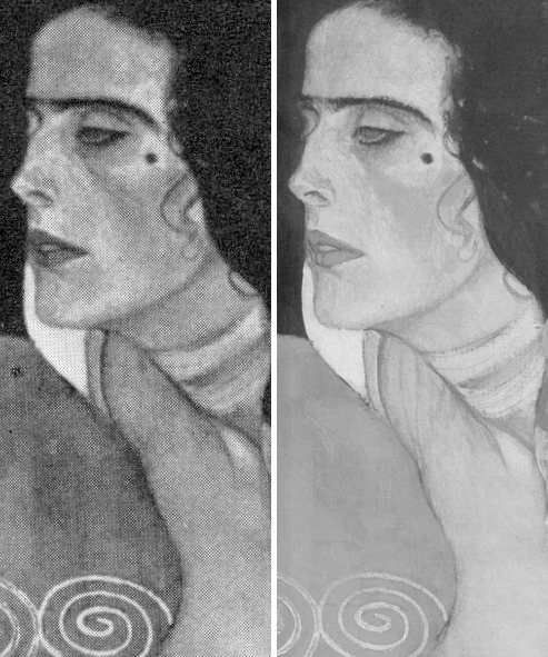
Above: (top) a detail of a copy of a Klimt portrait of Judith made by Michael Daley for the Independent in illustration of a Health article. Below it is a comparison of a section of the Klimt painting, as seen before (left) and after restoration(s). (For sight of the wholesale destruction of this modern artist’s work at the hand of restorers, see “The Elephant in Klimt’s Room” and “Now let’s murder Klimt”.)
APPRECIATING OTHER ARTISTS’ WORKS AND THE RELEVANCE OF COPYING TO APPRAISING RESTORATIONS
To copy the work of another artist it is necessary to look closely and attentively at it. You cannot draw what you have not analysed and understood. Indeed, drawings produced after the works of others are tests of understanding even more than of skill. Spending a working life both copying the various uses of shading made by other artists, and applying one’s own marks to paper so as to create plastically coherent and expressive tonal relationships, sharpens the eye and confers an ability to detect injuries to original tonal relationships in the works of others. This should not be considered surprising or remarkable: those who organise and dispose marks on surfaces, are perfectly placed to recognise the obverse – which is to say, the adulteration or deconstruction of artistically purposive values during so-called restorations.
Pace sneering art historians, to artists’ art practice trained eyes, spotting such injuries is as easy as it is for accountants to spot errors of arithmetic. That many art historians fail to recognise injuries to the works of the artists they study, might indeed suggest (as others have recently claimed) that something very wrong has been going on in art history education. And yet, at the end of the 1980s, when artists and rare visually discerning scholars challenged officially-sanctioned and endorsed restorations, it was they, not the visually-limited, who met with abuse. When I introduced myself to James Beck, prior to writing the 1990 Independent on Sunday article discussed below, he had been reviled in scholarly print by his peers – not least by a sister professor who served the Vatican as its art historical adviser/spokesman on the Sistine Chapel restoration. When I asked him if it might be helpful for an artist to make visual demonstrations of the injuries to Michelangelo’s work, he replied that it would be the most important thing to do, because “only artists understand these matters”. (Beck’s sister was a painter and he had studied fine art before switching to art history.)
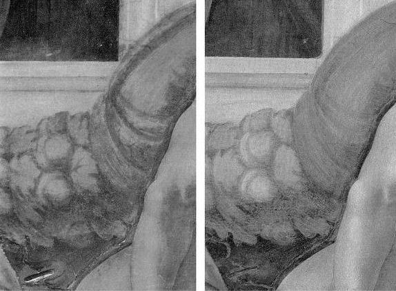

Above, A detail shown in greyscale and in colour of a section of Michelangelo’s Sistine Chapel ceiling, as seen before (left) and after cleaning in the 1980s.
THE VALUE OF DIRECT PHOTO-COMPARISONS
To identify restoration injuries it is helpful to place photographs of small sections of a restored work directly side-by-side (as in the Klimt Judith above, where the relative weakening of the spirals at the bottom, for example, should be apparent to the most untutored eye). The above detail of the Sistine Chapel ceiling was reproduced in the December 1988 Sunday Times article. It was immediately clear to me that the cleaning had weakened and in some places altogether erased bona fide features of shading and specific details like veins on the giant symbolic oak leaves. I asked the Independent’s arts editor if I might write a short article explaining why Prof. James Beck was right and the art historical establishment was wrong. On the face of it, this was a perfect Independent “questioning-of-authority” story. Unfortunately, the request could not be granted because the paper’s then art critic had recently visited the restorers’ scaffold in the chapel and had judged the restoration… a success. His art critical authority could not be challenged by a working artist with clear “standing” within the paper. Fortunately, when the Independent on Sunday was launched in 1990, its arts editor, Michael Church, commissioned a piece showing the damaging consequences of the restoration. Many criticisms of the restoration had previously been reported in the press but no one before had been given space in a national newspaper to set out evidence of injury. That article proved to be a game-changer.
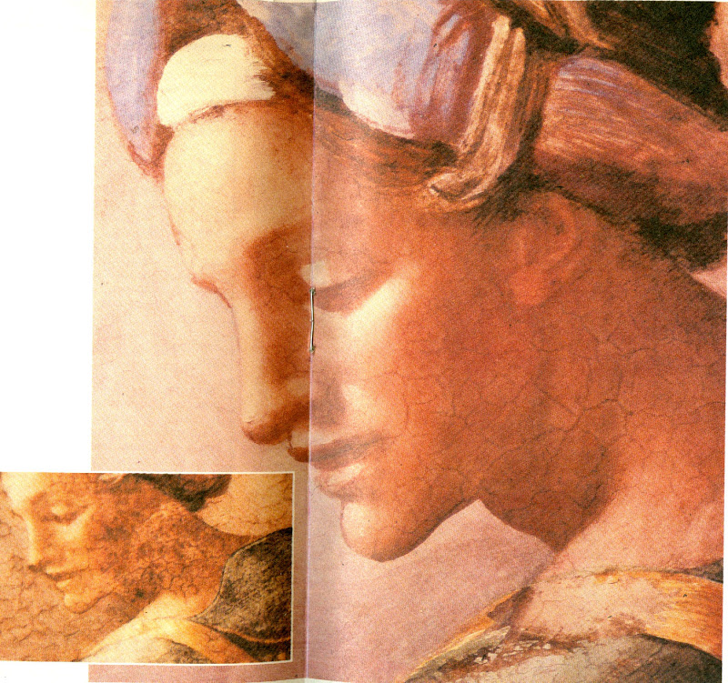
Above, top, the Independent on Sunday magazine of 25 March 1990 which carried (above) photographs showing restoration injuries in Michael Daley’s “Michelangelo: found or lost”
ESTABLISHMENT INTIMIDATION OF THE PRESS
Newspapers are complex entities comprised of many distinct departments that speak to particular constituencies. Dedicated arts journalists must swim in the art world and negotiate with its players and institutions. For them, breaking the “rules of engagement” can incur ostracism and worse. Those who play by the rules can be rewarded with exclusive stories and material. They might receive invitations to accompany globe-trotting museum directors on blockbuster shows. They might be invited to become embedded within a conservation department so as to counter anticipated criticisms. News journalists are less constrained. They are licensed to get and follow stories; to look for bodies; to follow money; to report mishaps and so forth.
When the Independent on Sunday article on the Sistine Chapel restoration was published the news editor on the daily Independent was intrigued by the magnitude of the controversy and he commissioned the above pair of articles. Despite such strong editorial support the articles nearly failed to see the light of day. Even though I had professional “standing”, the paper’s arts correspondent, David Lister, was taken aback by the high-level hostility and abuse levelled at me and Professor Beck. He became fearful of challenging key and venerable sections of the art establishment. How could the two of us be right and all of them wrong, he asked? It was a fair and sensible question: newspapers can never afford to back losers and must always invite responses from those under attack.
By way of reassurance, I showed the catalogues to the 1969 Olivetti-sponsored Frescoes from Florence travelling exhibition to London and New York. This exhibition consisted of murals that had been detached (on grounds of conservation) from buildings in Italy and then mounted on panels as stand-alone works of art that might be flown around the world – much as restored medieval glass from cathedrals is being despatched today. Both catalogues groaned under the weight of luminaries included in the exhibition’s “Committees of Honour”. At the time the show had been a sensation on two continents but I was able to show a recent Burlington Magazine editorial which condemned the detachment of frescoes from buildings as a barbarous and now discredited practice that had injured the paintings and buildings alike, and left many frescoes mouldering like rolled-up like rugs in church and chapel basements.
The procedural obstacle was cleared and both articles were published. The sky did not fall in and although squeals were heard, thereafter, the paper had confidence and trust in my judgements and accounts, enabling me to write further on the Sistine Chapel debacle and restorations at the National Gallery – including a review (below) of a book extolling the Sistine Chapel restoration that was written by the Sunday Times’ art critic, Waldemar Januszczak.
PROFESSOR BECK GETS SUED
In 1991, after surviving years of abuse over the Sistine Chapel controversy, Beck was hit with a criminal action in the Italian courts over reported criticisms he had made in Lucca Cathedral on the restoration of a marble tomb by the early Renaissance sculptor Jacopo della Quercia. The restorer (in fact, the head of a restoration company) had not sued the Italian newspapers that had reported Beck’s (oral) criticisms. Instead, he sued the scholar alone for aggravated criminal slander – a charge that carried a possible three years jail sentence – and for damages of 60 million Lire. By not suing those who had transmitted the criticisms (and therefore had, allegedly, harmed his reputation), the restorer ensured that Beck could receive no support from the newspapers and their lawyers and would have to bear all the risks alone. As the world authority on this early Renaissance sculptor, he felt compelled to do so. Although the trial’s ramifications might have been horrendous for scholarship generally, he received no public expressions of support from his peers. When I asked the editor of the Burlington Magazine why this was the case, she replied “Because he is going to lose”. The public needed to be alerted to the case. Once again, the Independent came through. On 8 November 1991, David Lister reported the imminent trial:

Below, part of David Lister’s 8 November 1991 article.
Below, a book Beck had produced on the Lucca Cathedral monument
THE TRIAL AND THE PROFESSIONAL SILENCE
Like the editor of the Burlington Magazine, the judge at Beck’s trial in Florence knew that he was going to lose. Indeed, he declared an intention to find him guilty to the prosecuting lawyer, as they left the court together discussing the case at lunchtime after the trial’s first morning session. “Eh, but I shall find him guilty” he said. Fortunately, he was overheard by an off-duty policeman who was working as an intern for Beck’s lawyer. When challenged, the judge refused to recuse himself but eventually he disappeared and Beck, under a new judge, was soon acquitted.
REPORTING THE TRIAL OUTCOME
At the time we were able by courtesy once more of the Independent (22 November 1991) to raise a cheer for Beck and for the blow he had struck for the free expression of scholarly judgements on matters of artistic welfare and integrity. But this had been an extremely close call and, while contemplating a possible jail sentence, Beck decided that a dedicated international organisation was needed to speak for the interests of the world’s great and insufficiently protected works of art. A year later ArtWatch International was founded in New York.
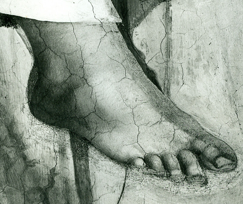
On the day of publication of the Independent’s 22 November article, Grant McIntyre, an editor at the venerable and (then) still independent publishing house John Murray, telephoned to ask if there might be a book on the trial and on matters of restoration. There was and, following its initial publication in 1993, it ran to many subsequent editions (see below).
THE BOOK’S RECEPTION
The book soon faced a formidable hurdle: it was to be reviewed in the New York Review of Books by a formidable Renaissance scholar, Professor Charles Hope, a supporter of the Sistine Chapel restoration. In the event, Prof. Hope was persuaded by the art historical and technical proofs of injury we had amassed. Moreover, he held that Beck had performed an admirable and brave service to scholars and scholarship alike. He also pointed that while many scholars of his acquaintance had initially supported the restoration enthusiastically, many had recently fallen silent on the subject.
After the trial turmoil and the creation of ArtWatch International, I continued to draw the art I loved and to criticise restorations in the Independent.
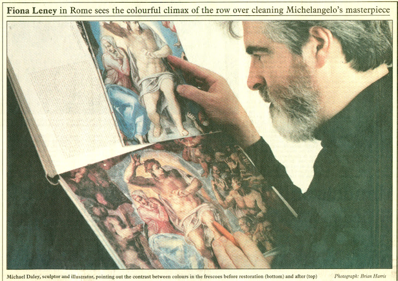
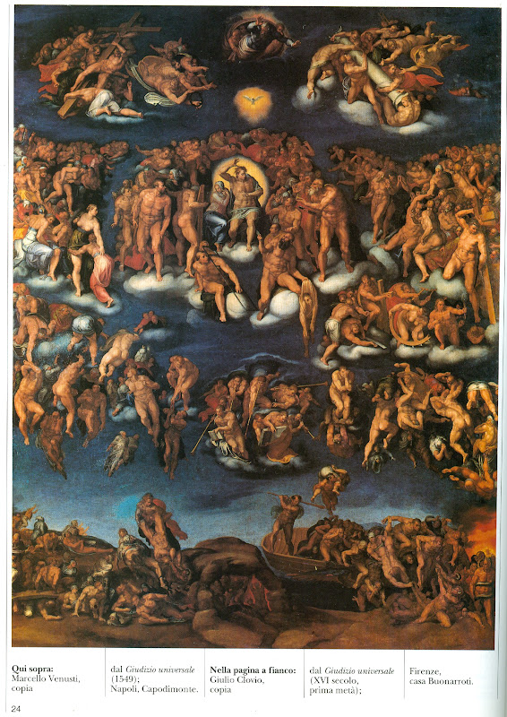
DENIAL AT THE VATICAN
After the horrors on the ceiling, we later witnessed the injuries to Michelangelo’s Last Judgement. There are still institutionally ensconced scholars and administrators who are in denial on the injuries at the Sistine Chapel and insist against all evidence – such as is found in the contemporary painted copy of the “Last Judgement” by Marcelo Venusti shown above – that Michelangelo had painted in today’s vapid tones and hues. In part this New Pallor is not only the product of the last restoration but also of the quarter of a century since in which the interactions of tourism-induced airborne pollution and chemical residues of the cleaning have been devouring the fresco surfaces. So great has been the debilitation that, in addition to a new air-conditioning system, thousands of colour-enhancing LED lights have been installed on the ceiling.
THE INDEPENDENT AND A CHANGED CRITICAL CLIMATE
The Independent gave fair and generous voice to previously unheard criticisms. By doing so it made an invaluable contribution to artistic health – not only directly but indirectly by opening up the rich, hitherto unexamined field to the rest of the press. The Times, the Sunday Telegraph, the Daily Telegraph, the Guardian and the Observer and others all saw the importance of the subject and recognised that “news” is that which somebody, somewhere, would prefer not to see published. The importance of newspapers in this regard cannot be exaggerated – our colleagues in the United States and France cannot believe that newspapers can be so challenging to entrenched authorities in the arts. The vigour of the British press can also be seen by comparison with our broadcast media which remains perpetually asleep on the job, treating the visual arts as little more than a gifted succession of diverting, institution-promoting “Good News” stories.
ARTS BROADCASTING PAP
When the Beck/Daley art restoration book was published in 1993 a number of independent television companies rightly saw the potential for a televisual “public affairs” type of treatment. All of these proceded well until they reached the top of their commissioning chains. Once, the head of music and arts at the BBC went so far as to offer a whole arts programme, reassuring us that although the BBC and the National Gallery were commercial partners “that shouldn’t create a problem”. But it did: the almost-commissioned independent meticulously even-handed examination of the pros and cons of picture restoration was swiftly killed off. In its place the BBC permitted the National Gallery to make its own effective tele-promotional “selfie” (with gallery staff using left-in-place BBC cameras) of its mangled, falsifying restoration of Holbein’s The Ambassadors. On 29 January 2000 the Independent carried a letter from ArtWatch UK entitled “‘Virtual reality’ art”:
“…When the National Gallery recently restored Holbein’s The Ambassadors, the famous anamorphic skull in the foreground was repainted to a new design not according to the laws of perspective by which it had been produced but after a computer generated distortion of a photograph of a real skull. This Bizarre imposition of ‘virtual reality’ into an old master painting is defended by the gallery on the grounds that ‘modern imaging techniques’ offer more ‘scope for exploring possible reconstructions’ than do the 16th century perspectival conventions by which the artist’s original image had been generated. The difference between the original and the new parts has been concealed from the general public by the restorer’s attempt to integrate the handiwork of his own ‘tentative reconstruction’ with surrounding old paint by painting fake lines of cracking to match the old, actual, cracks.”
It is a tragedy that the lights should have gone out on a newspaper that had caused justifable discomfort in so many art world recesses. As described above, it is a measure of the success of the campaigning that first gained exposure in the Independent that we now enjoy a quite different and healthily expanded art critical universe. We thank the Independent for good times past and wish it all good fortune in its new streamlined format with global outreach at The Independent.
Below (top): The last Independent coverage of ArtWatch UK by Dalya Alberge on 14 March 2012. (On the restoration of Leonardo’s Last Supper, see: A different Leonardo and, The Law of Diminishing Returns ); below (bottom) the last editions of the Independent on Sunday and the Independent.
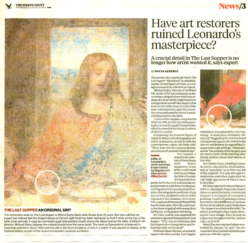
Michael Daley, 30 March 2016